

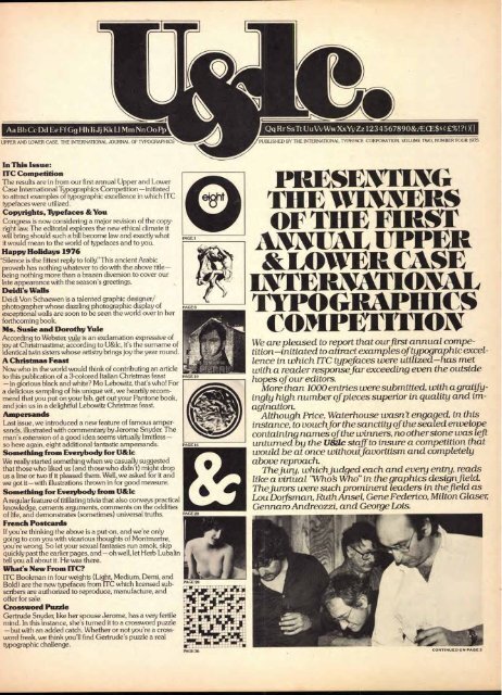
PRESENTING THE WINNERS OF THE FIRST ANNUAL UPPER ...
PRESENTING THE WINNERS OF THE FIRST ANNUAL UPPER ...
PRESENTING THE WINNERS OF THE FIRST ANNUAL UPPER ...

Create successful ePaper yourself
Turn your PDF publications into a flip-book with our unique Google optimized e-Paper software.
Aa Bb Cc Dd Ee Ff Gg Hh IiJj Kk LI Mm Nn Oo Pp<br />
<strong>UPPER</strong> AND LOWER CASE, <strong>THE</strong> INTERNATIONAL JOURNAL <strong>OF</strong> TYPOGRAPHICS<br />
In This Issue:<br />
ITC Competition<br />
The results are in from our first annual Upper and Lower<br />
Case International Typographics Competition—initiated<br />
to attract examples of typographic excellence in which ITC<br />
typefaces were utilized.<br />
Copyrights, Typefaces &You<br />
Congress is now considering a major revision of the copyright<br />
law. The editorial explores the new ethical climate it<br />
will bring should such a bill become law and exactly what<br />
it would mean to the world of typefaces and to you.<br />
Happy Holidays 1976<br />
'Silence is the fittest reply to folly" This ancient Arabic ,<br />
proverb has nothing whatever to do with the above title —<br />
being nothing more than a brazen diversion to cover our<br />
late appearance with the season's greetings.<br />
Deidi's Walls<br />
Deidi Von Schaewen is a talented graphic designer/<br />
photographer whose dazzling photographic display of<br />
exceptional walls are soon to be seen the world over in her<br />
forthcoming book.<br />
Ms. Susie and Dorothy Yule<br />
According to Webster, yule is an exclamation expressive of<br />
joy at Christmastime; according to U&lc, it's the surname of<br />
identical twin sisters whose artistry brings joy the year round.<br />
A Christmas Feast<br />
Now who in the world would think of contributing an article<br />
to this publication of a 3-colored Italian Christmas feast<br />
— in glorious black and white? Mo Lebowitz, that's who! For<br />
a delicious sampling of his unique wit, we heartily recommend<br />
that you put on your bib, get out your Pantone book,<br />
and join us in a delightful Lebowitz Christmas feast.<br />
Ampersands<br />
Last issue, we introduced a new feature of famous ampersands,<br />
illustrated with commentary by Jerome Snyder. The<br />
man's extension of a good idea seems virtually limitless—<br />
so here again, eight additional fantastic ampersands.<br />
Something from Everybody for U&lc<br />
We really started something when we casually suggested<br />
that those who liked us (and those who didn't) might drop<br />
us a line or two if it pleased them. Well, we asked for it and<br />
we got it—with illustrations thrown in for good measure.<br />
Something for Everybody from U&Ic<br />
A regular feature of titillating trivia that also conveys practical<br />
knowledge, cements arguments, comments on the oddities<br />
of life, and demonstrates (sometimes) universal truths.<br />
French Postcards<br />
If you're thinking the above is a put-on, and we're only<br />
going to con you with vicarious thoughts of Montmartre,<br />
you're wrong. So let your sexual fantasies run amok, skip<br />
quickly past the earlier pages, and — oh well, let Herb Lubalin<br />
tell you all about it. He was there.<br />
What's New From ITC?<br />
ITC Bookman in four weights (Light, Medium, Demi, and<br />
Bold) are the new typefaces from ITC which licensed subscribers<br />
are authorized to reproduce, manufacture, and<br />
offer for sale.<br />
Crossword Puzzle<br />
Gertrude Snyder, like her spouse Jerome, has a very fertile<br />
mind. In this instance, she's turned it to a crossword puzzle<br />
—but with an added catch. Whether or not you're a crossword<br />
freak, we think you'll find Gertrude's puzzle a real<br />
typographic challenge.<br />
_loin 111 SA d ar<br />
NENE d ME is dEMESSA<br />
!I lf AI"' Ilm<br />
. ■Pile+ firrhati<br />
WM d 1 -<br />
SEIMILAMILIE MOM<br />
li<br />
Li' 1 kLed li dal d<br />
d Mei dill<br />
dalinSN rfatiai liii4<br />
LOIlirm a 4.1.- I. d<br />
L a - ■ 11.1..o.r Sill<br />
d MUM<br />
Qq Rr Ss Tt UuVvWwXxYy Zz12345678908t/ECE$$£%!?( )H<br />
PUBLISHED BY <strong>THE</strong> INTERNATIONAL TYPEFACE CORPORATION, VOLUME TWO, NUMBER FOUR 1975<br />
<strong>PRESENTING</strong><br />
<strong>THE</strong> <strong>WINNERS</strong><br />
<strong>OF</strong> <strong>THE</strong> <strong>FIRST</strong><br />
<strong>ANNUAL</strong> <strong>UPPER</strong><br />
&LOWER CASE<br />
INTERNATIONAL<br />
TYPO GRAPHICS<br />
COMPETITION<br />
We are pleased to report that ourfirst annual competition—initiated<br />
to attract examples of typographic excellence<br />
in which ITC typefaces were utilized—has met<br />
with a reader responsefar exceeding even the outside<br />
hopes of our editors.<br />
More than 1000 entries were submitted, with a gratifyingly<br />
high number of pieces superior in quality and imagination.<br />
Although Price, Waterhouse wasn't engaged, in this<br />
instance, to vouchfor the sanctity of the sealed envelope<br />
containing names of the winners, no other stone was left<br />
unturned by the U&lc staff to insure a competition that<br />
would be at once withoutfavoritism and completely<br />
above reproach.<br />
Thejury, whichjudged each and every entry, reads<br />
like a virtual "Who Who" in the graphics designfield.<br />
Thejurors were such prominent leaders in thefield as<br />
Lou Dod .sman, Ruth Ansel, Gene Federico, Milton Glaser;<br />
Gennaro Andreozzi, and George Lois.
VOLUME 2, NUMBER 4, 1975<br />
HERB LUBALIN, EDITORIAL & DESIGN DIRECTOR<br />
AARON BURNS, EDITORIAL DIRECTOR<br />
EDWARD RONDTHALER, EDITORIAL DIRECTOR<br />
JACK ANSON FINKE, ASSOCIATE EDITOR<br />
JAN McKAY. ANNA McCUSKER, TONY DISPIGNA, ANDY DIDORA<br />
ART & PRODUCTION EDITORS<br />
JOHN PRENTKI, BUSINESS AND ADVERTISING MANAGER<br />
C 1975 AND PUBLISHED FOUR TIMES A<br />
YEAR IN MARCH, JUNE, OCTOBER AND DECEMBER<br />
BY INTERNATIONAL TYPEFACE CORPORATION<br />
216 EAST 45TH STREET. NEW YORK. N.Y. 10017<br />
A JOINTLY OWNED SUBSIDIARY <strong>OF</strong><br />
PHOTO LETTERING, INC. AND LUBALIN, BURNS & CO. INC.<br />
CONTROLLED CIRCULATION POSTAGE PAID AT NEW YORK.<br />
N.Y.AND AT FARMINGDALE, N.Y.<br />
BOARD <strong>OF</strong> DIRECTORS:<br />
EDWARD RONDTHALER. CHAIRMAN<br />
AARON BURNS, PRESIDENT<br />
HERB LUBALIN, EXECUTIVE VICE PRESIDENT<br />
JOHN PRENTKI. VICE PRESIDENT. GENERAL MANAGER<br />
BOB FARBER, SENIOR VICE PRESIDENT<br />
ED BENGUIAT, VICE PRESIDENT<br />
STEPHEN KOPEC, VICE PRESIDENT<br />
U.S. SUBSCRIPTION TO INDIVIDUALS 56.00;SINGLE COPIES 81.50<br />
ELSEWHERE SUBSCRIPTION.$8.00SINGLE COPIES 52.50.<br />
Copyrights,Typefaces4),You<br />
Where are we now?<br />
Congress is now considering a major revision<br />
of the copyright law. This could include<br />
provisions for copyrighting new typeface<br />
designs. In recent hearings the pros and<br />
cons of such protection have been presented<br />
to a Subcommittee of the House Committee<br />
on the Judiciary by Ms. Barbara Ringer, the<br />
Register of Copyrights, and by proponents<br />
and opponents of such legislation from the<br />
typographic industry as well as representatives<br />
of publishers, designers and other<br />
interested parties.<br />
Where are we heading?<br />
The tone of the recent hearings is most<br />
encouraging. A new copyright law may<br />
include protection for new typeface designs'<br />
coupled with safeguards for the several<br />
interests concerned about the side effects of<br />
such protection. We believe that the great<br />
interest shown by thousands of people concerned<br />
with this important issue helped<br />
create a climate contributing to such an outcome.<br />
Pros and cons<br />
The arguments for and against amending<br />
H.R. 2223 to protect new typeface designs<br />
were summarized by Ms. Ringer as follows:<br />
"Proponents of typeface design protection<br />
argued that new photocomposition techniques<br />
have made unauthorized copying of<br />
typefaces an urgent problem, that original<br />
designs for fonts of type are the 'writings of<br />
an author' in both the constitutional and the<br />
statutory sense, that no case law in any field<br />
rules out their copyrightability, that registration<br />
for typeface desighs would impose no<br />
burden on authors and reprinters, and that<br />
both Titles I and II of the revision bill should<br />
be amended to make clear that typeface<br />
designs can be considered 'original' and that<br />
fonts of type are 'useful articles.' They also<br />
recommended that the term of protection<br />
under the design bill be extended for 15<br />
years, to conform with international standards.<br />
"Opponents argued that neither Title I nor<br />
Title II of the bill as drafted protects typeface<br />
designs; they opposed any amendment<br />
of Title I to bring typeface designs within the<br />
scope of traditional copyright protection,<br />
and they stated that Title II would be inappropriate<br />
without 'very extensive amendment<br />
including mandatory licensing at<br />
reasonable rates.' They argued that the<br />
issue is not one of 'typeface piracy,' but of<br />
creating exclusive rights for a few big manufacturers,<br />
who would use them to enforce<br />
tying arrangements between their machines<br />
and fonts. Concern was expressed by a rep-<br />
resentative of magazine publishers lest recognition<br />
of exclusive rights might lead to<br />
suits to enjoin publication of printed matter.<br />
Representatives of typographers and the<br />
American Institute of Graphic Arts<br />
expressed concern about the danger of<br />
excessive protection that would foreclose<br />
the use of certain typefaces."<br />
Recommendations<br />
The Register of Copyrights recommended<br />
that protection with safeguards be written<br />
into the bill and advised that under the<br />
present law registration should only be<br />
made on the basis of a clear-cut judicial decision<br />
which may be forthcoming. However,<br />
she advocated protection under Title II of<br />
the bill and advised that the various positions<br />
might be accommodated if:<br />
"[a] Liability were clearly restricted to the<br />
unauthorized duplication of the design in<br />
the manufacture of fonts, matrixes, etc.,<br />
and if printers, authors, publishers, etc.,<br />
were clearly freed from any risk of liability;<br />
and...<br />
[b] a compulsory licensing system were<br />
established under Title II, allowing anyone<br />
to manufacture a font, etc., reproducing<br />
a protected typeface design on<br />
payment of a reasonable fee.<br />
"This proposal would obviously require<br />
careful elaboration as to content, form, and<br />
procedure. However, the Copyright Office<br />
considers this the best hope of resolving an<br />
important and difficult problem, and would<br />
do its best to contribute to a productive<br />
result."<br />
She farther recommended that protection<br />
be for five years with two five-year renewals,<br />
thus putting the new law in agreement with<br />
the provisions of the 1973 Vienna Typeface<br />
Convention.<br />
What all this means to you<br />
When such a bill becomes law, it will promote<br />
an ethical climate as well as typeface<br />
and typographic quality, quantity, and availability.<br />
The effect on costs, to all concerned,<br />
will be literally negligible.<br />
Ethically, it will make possible a royalty<br />
structure that will properly reward the talent<br />
and labor of the creator of new typefaces,<br />
and it will make it economically possible for<br />
manufacturers to develop and promote such<br />
new faces as may be considered useful and<br />
desirable for contemporary needs.<br />
In today's photo/electronic typesetting<br />
era, the designer of a new typeface has his<br />
income limited since each font is normally<br />
sold only once to a customer. There are<br />
rarely replacement orders as is necessary<br />
with metal type or matrices. The designer,<br />
therefore, needs a broader market than ever<br />
before to replace the repeat markets of yesterday<br />
if he is to be encouraged to continue<br />
to practice his creative craft. The new copy-<br />
right law would assure the designer of such<br />
an environment, one also in which royalties<br />
would be earned by the popularity of the<br />
design. Best sellers, with type as with<br />
books, would earn the most royalties especially<br />
if there is no unauthorized duplication.<br />
The quality of typeface designs should rise<br />
as the best talents, many now avoiding this<br />
field, are attracted to it by copyright protec ,<br />
tion and a fair royalty structure.<br />
The quantity of new designs, subject to the<br />
needs and demands of the market, should<br />
more easily and promptly meet the market<br />
demand as the economic hazards of marketing<br />
new typefaces are reduced by copyright<br />
protection.<br />
The availability of the new faces all over<br />
the world and across the spectrum of<br />
machines and materials will be potentially<br />
universal. And, with manufacturers no<br />
longer deterred by fear of unauthorized copying,<br />
more fonts will reach the market more<br />
rapidly than is now possible.<br />
The cost of these gains to the manufacturer,<br />
designer, type shop, and material supplier<br />
or ultimate customer is literally<br />
negligible, especially considering that typeface<br />
film fonts today cost a fraction of what<br />
the same typeface would cost if made for<br />
metal typesetting, and further, considering<br />
that a machine owner usually purchases a<br />
particular film font only once.<br />
The prices for film fonts will be competitive<br />
under any mandatory licensing provisions<br />
of the proposed copyright laws<br />
because manufacturers will be required to<br />
make all copyrighted typefaces licensable to<br />
each other. It is our belief that the principles<br />
of price competition will prevail in this field<br />
as they always have in every other industry and<br />
the prices for film fonts will be kept in line.<br />
The only manufacturers who stand to lose<br />
under the new copyright law are those that<br />
choose to wait until others have invested<br />
time, money, and effort and then, as in the<br />
past, make unauthorized copies of the work<br />
product of other manufacturers and offer<br />
such copies at lower prices than can be<br />
offered by the original developer.<br />
And finally, the acid truth. The incredible<br />
fact is that the purchase of a copyrighted .<br />
typeface film font, which may include such<br />
items as a designer's royalty fee, development<br />
costs, and marketing overhead, might<br />
not add one full cent to the cost of any single<br />
job in the course of just one year of the font's<br />
normal use!<br />
Conclusion<br />
Passage of the copyright bill with new typeface<br />
design coverage may be in sight. If it<br />
includes the safeguards called for by the<br />
Register of Copyrights, it promises a bright<br />
future for all concerned with typographic<br />
ethics and quality. U&lc will keep you<br />
informed as this bill moves through Congress.<br />
THIS EDITORIAL WAS SET IN TIFFANY
<strong>PRESENTING</strong><br />
<strong>THE</strong> <strong>WINNERS</strong><br />
<strong>OF</strong> <strong>THE</strong> <strong>FIRST</strong><br />
<strong>ANNUAL</strong> <strong>UPPER</strong><br />
&LOWER CASE<br />
INTERNATIONAL<br />
TYPOGRAPHICS<br />
COMPETITION<br />
Lou Dorfsman Milton Glaser Ruth Ansel George Lois GennaroAndreozzi Gene Federico<br />
For those who,for one reason or another, may not be as<br />
familiar with these names as those in the trade who<br />
have long considered them (as is said) "household<br />
words," a brief note on each may be in order:<br />
Lou Dolfsman probably holds some sort of unofficial<br />
record with his year in-year out of garnering ofArt Director<br />
medals, CA citations, and AIGA awards. As VP of Ad-<br />
vertising and Design for the CBS Broadcast Group,<br />
Dofsmans work epitomizes the very best to befound in<br />
the area of corporate design.<br />
Milton Glaser has been largely instrumental in putting<br />
graphic design on the modern art map. Glaser's<br />
interests are protean—rangingfrom editorial to city projects<br />
to museums and you name it Among his many accomplishments,<br />
he is design directorfor New York<br />
Magazine and The Village Voice and, with Seymour<br />
Chwast, initiated what has come to be known as the<br />
"Push Pin" style.<br />
Ruth Ansel, the lone woman juror, is that "rara avis"<br />
of her profession—an art director of thefirst class in the<br />
specializedfield of newspapers. Readers of the New<br />
York Times Sunday magazine section, of which she is<br />
art director, have seen her impeccable design accomplishments.<br />
George Lois is Chairman of Lois Holland Callaway,<br />
the second agency to share his well-known Greek<br />
name. This much lauded art director is a controversial,<br />
dynamic, enterprising talent who is never afraid to say<br />
what he thinks—and never afraid to think. From don't<br />
hab a code?" to "Launch a Cutty" (Sark), his advertising<br />
campaigns dare not only to be different but to rate<br />
among the veryfinest.<br />
Gennaro Andreozzi is a shining example of art director<br />
tumedfilm director. Head of his ownfilm company,<br />
GennaroAndreozzi, Inc. he was in theforefront of the<br />
creative revolution in advertising and design, and produces<br />
commercials and industrialsfor clients like Guerlain<br />
who appreciate the award-winning style and<br />
freshness of the "Andreozzi touch."<br />
Gene Federico, last butfarfrom least, is hands-down<br />
first choicefor art directors art director. Whetherfor<br />
Cornsilk, The New Yorker, Elizabeth Arden, or Steinway,<br />
Gene has established Lord Geller Federico as an<br />
agency devoted to the taste and distinction that makes<br />
art direction a true art<br />
So muchfor thejurors. Now, on to the winners—of<br />
which there are twelve who were chosen unanimously.<br />
Another twenty four were chosen by a majority. There<br />
are no best-of-category or best-of-show selections. All<br />
pieces shown are considered by the judges to be of outstanding<br />
quality and will subsequently be put together<br />
as a traveling show available on loan throughout the<br />
world.<br />
It is interesting to note that, out of all the selected entries,<br />
only five were submittedfrom New York (winners<br />
hailingfrom such diverse corners of the globe as Solna,<br />
Sweden; Sunnyvale, California; Frankfurt, West Germany;<br />
and Hookstown, Pennsylvania). Insomuch as<br />
only two of the New York entries were unanimous winners,<br />
it would seem to bear out the old adage: "You're<br />
never a hero in your own home town."<br />
The designs submitted speak eloquently for themselves.<br />
But, afinal word:<br />
With "anything goes" now infilm and electronic typography—with<br />
minus leading and minus word and<br />
letter-spacing as easy to accomplish as pushing one key<br />
on a keyboard—it's a whole new ball gamefor today's<br />
designer; requiring an intensified blend of imagination<br />
and restraint and a keener eye than everfor the typographic<br />
nuance. The pieces shown here demonstrate<br />
how very well the typefaces and the new typographic<br />
systems can be used to produce typographics possessing<br />
an optimum blend of creativity and craftsmanship.<br />
Speakingfor thejurors, Lou Doy'sman puts it this way:<br />
'Typography in the hands of inventive designers—<br />
known or unknown proves once again to be the startling<br />
illustrative medium it can be. The designers whose<br />
good work we viewed could have done well in any<br />
typeface. The well-structured ITC typefaces, however;<br />
generally offered additional opportunities to perceptive<br />
designers to excel."<br />
And excel they have.<br />
Seefor yourself.<br />
THIS ARTICLE WAS SET IN ITC BOOKMAN LIGHT, DEMI AND MEDIUM ITALIC.<br />
3
4<br />
<strong>PRESENTING</strong><br />
<strong>THE</strong> <strong>WINNERS</strong><br />
<strong>OF</strong> <strong>THE</strong> <strong>FIRST</strong><br />
<strong>ANNUAL</strong> <strong>UPPER</strong><br />
&LOWER CASE<br />
INTERNATIONAL<br />
TYPOGRAPHICS<br />
COMPETITION<br />
1<br />
Designer: Torbjorn Lenskog, Solna, Sweden<br />
Client: Typografen AB<br />
Typeface: Korinna<br />
Typographer: Typografen AB<br />
Torbjorn Lenskog<br />
Lenskog & Co. Advertising Agency was founded<br />
three years ago. It is a 12-person agency and already<br />
among the top ten in Sweden, with its<br />
highly creative profile. Clients, the oldest of<br />
which is Typografen AB, range from heavy industrial<br />
companies to fast-moving consumer<br />
goods. Prior to establishing the agency, Mr.<br />
Lenskog worked as an advertising consultant<br />
and art director.<br />
2<br />
Designer: Christof Gassner, Frankfurt,<br />
West Germany<br />
Client: Deutsche Letraset GmbH<br />
Typeface: Fat Face, Avant Garde Gothic<br />
Christof Gassner<br />
Born in 1941 in Zurich, where he studied "Swiss"<br />
graphic design at the Kunstgewerbeschule.<br />
Upon graduation he went to Germany to discover,<br />
to his amazement, that there were other<br />
typefaces than "Helvetica." Later he set up his<br />
own graphic design studio in Frankfurt, dealing<br />
mainly with typography and typographical illustrations.<br />
He has designed several new typefaces:<br />
Vexier, for Letraset, and Knirsch and Leopard for<br />
Berthold Fototypes.<br />
3<br />
Designer: Joseph Scorsone, Philadelphia, Pa.<br />
Client: Temple University<br />
Typeface: Avant Garde Gothic X-Light<br />
Typographer: The Composing Room, Inc.<br />
Joseph Scorsone<br />
An Assistant Professor at Temple University,<br />
Tyler School of Art, where he teaches graphic<br />
design and typography. He is also a freelance designer<br />
working mainly in book and poster design.<br />
His work has been shown in the leading<br />
design publications here and abroad. BFA from<br />
the State University of New York and MFA from<br />
the University of Illinois.<br />
4<br />
Designer: Larry Bender/Mark Wallin, Sunnyvale,<br />
California<br />
Client: Micro Mask, Inc.<br />
Typeface: Serif Gothic<br />
Typographer: Atherton's Advertising Typography<br />
Larry Bender/Mark Wallin<br />
Mr. Bender formed Lawrence Bender & Associates<br />
in Palo Alto in 1970. He had previously<br />
attended Art Center, worked at Carson/Roberts<br />
and with J. Chris Smith in Los Angeles, and also<br />
art-directed at Fairchild Semi-conductor. He<br />
teaches Advertising Design at Foothill College.<br />
Mark Wallin joined the studio after his graduation<br />
from Art Center in 1974.<br />
5<br />
Designer: Gus Carlgren, Hookstown,<br />
Pennsylvania<br />
Client: Experimental<br />
Typeface: Avant Garde Gothic Medium<br />
Gus Carlgren<br />
Largely self-taught, Mr. Carlgren is a Swedishborn<br />
American artist/designer/photographer.<br />
He is presently free-lancing out of Hookstown,<br />
Pennsylvania, having gone the corporate and<br />
agency AD route in Cleveland, Indianapolis and<br />
Pittsburgh. His career emphasis has been in-<br />
dustrial, pharmaceutical and financial accounts,<br />
but the broad spectrum includes writing, cartooning<br />
and lettering.<br />
1<br />
6<br />
Designer: Carol Fulton, Palo Alto, California<br />
Client: Carol Fulton<br />
Typeface: Avant Garde Gothic<br />
Typographer: Frank's Type<br />
Carol Fulton<br />
A free-lance designer/photographer in Palo Alto<br />
since 1972, she was president of the Western Art<br />
Directors Club in 1974. Her work won six gold<br />
medals for design/photography in 1975. She was<br />
born in Toronto in 1946.<br />
7<br />
Designer: Joseph M. Essex, Chicago, Illinois<br />
Client: Mas Nakagawa<br />
Typeface: Serif Gothic<br />
Joseph M. Essex<br />
A designer with the Center for Communication<br />
Planning, a Division of CCA in Chicago, Mr. Essex's<br />
design career has taken him from the<br />
Richmond (Virginia) Professional Institute to<br />
Pittsburgh's WQED and then to the Design Centre<br />
where he developed graphics for television,<br />
posters, packaging, and designed logos and<br />
magazines; then on to Unimark in Chicago before<br />
joining CCAs Center for Communication<br />
Planning. He is currently involved in advertising<br />
graphics, identity programs, film, marketing and<br />
packaging programs.<br />
8<br />
Designer: Lawrence Miller, New York City<br />
Client: Marketing Design Alliance<br />
Typeface: ITC Tiffany (Alphatype modified<br />
version)<br />
Mark Twain:<br />
Da jag senastvar sekreterare<br />
hos en senator.<br />
r eee.<br />
yes ,r<br />
- Dereeevaeen<br />
...ea .<br />
fere Mea<br />
emp e toac Neer e<br />
eV. eg dee leee..<br />
eeeee een e .. oda<br />
eee<br />
eeee.<br />
:tees 0. Dad* ers.14.<br />
.va ierze fel etPeeeee<br />
eeT,, e Ge,<br />
ootr* 3., " '`'<br />
fiefrrn m d"""*.<br />
ee<br />
e e .1.010 - pose den<br />
Mee* - bees peasee Wm an.<br />
en'TralEir= Ze"= '''"="' ■=n=1 b.** at.,<br />
-3:72-:42&<br />
Typografen<br />
---------- ---------<br />
dee<br />
menewee Me he .4.<br />
ewen Me*<br />
tee, ewe wee<br />
t;r1 C.!<br />
2<br />
Typographer: Typros<br />
Lawrence Miller<br />
Mr. Miller is president of Marketing Design<br />
Alliance, a New York-based, small, conceptoriented,<br />
all-media design firm. He has worked<br />
for Doyle Dane Bernbach, CBS, Lippincott & Margulies,<br />
among others, and has over 50 design<br />
awards, including five gold medals, to his credit.<br />
9<br />
Designer: Ron Criswell, Dallas, Texas<br />
Client: Morris Photography<br />
Typeface: Avant Garde Gothic X-Light<br />
Typographer: Jaggers, Chiles, Stovall Inc.<br />
Ron Criswell<br />
29-year-old Ron Criswell, a Dallas resident for<br />
the past ten years, has been working out of his<br />
own studio for the past three years. It is a design<br />
and illustration-oriented shop with emphasis on<br />
fun and youthful projects. Ron came up through<br />
the ranks in the Dallas market, working directly<br />
with clients and through advertising agencies.<br />
10<br />
Designer, client: John Langdon, Woodbury,<br />
New Jersey<br />
Typeface: Avant Garde Gothic Medium<br />
John W. Langdon<br />
Currently dividing his time between free-lance<br />
designing and Sulpizio Associates, a Philadelphia<br />
design studio. Mr. Langdon graduated from<br />
Dickinson College, attended the Philadelphia<br />
College of Art and worked at Headliners of Philadelphia<br />
before joining Sulpizio Associates<br />
three years ago.<br />
11<br />
Designer: Rich Newman, San Francisco,<br />
California<br />
Client: Rich Newman/Graphic Communications<br />
Typeface: Lubalin Graph Medium<br />
Rich Newman<br />
Rich Newman/Graphic Communications was<br />
established in 1974 in San Francisco. Mr. Newman,<br />
31, is a graduate of the Palter School of Art<br />
and the California Institute of the Arts/Design<br />
School. Before setting up his own design service<br />
he worked for Tepper-Steinhilber Associates and<br />
served with the Air Force Exhibit Unit.<br />
12<br />
Designer: Craig Bernhardt, New York City<br />
Client: Graphics-To-Go Inc.<br />
Typeface: Avant Garde Gothic Demi<br />
Typographer: Franklin Photo Lettering<br />
Craig Bernhardt<br />
Is currently a principal of Graphics-To-Go Inc. in<br />
New York, and of Bernhardt & Fudyma, a newlyformed<br />
corporate graphics company within<br />
Graphics-To-Go. Born in 1948 in Lancaster,<br />
Pennsylvania, he studied graphics at The Tyler<br />
School of Art in Philadelphia, and the Tyler<br />
School in Rome, Italy.<br />
1 1' i 0 .0'<br />
' 4 ' 114■1 ,'<br />
gift T CPtflYT<br />
r( 15tIlt Y Pl.<br />
PM' WI)<br />
P<br />
wyboygrid tfl 1 °Yqrlatfi CirtirtE k ' ,,..,I;) P 1 clao Sr<br />
TIMPTT71L1 i',,,, cID7 OTPL11<br />
PLfliFYclrIL P
SH<br />
6 7<br />
Graphic Design & Consulting for: Publications, Visual Identity, Sigmage. Publicity, Diagrams and Packaging 112<br />
Rich Newman/Graphic Communications 120 Broadway San Francisco California 99111 USA (415) 982-1227<br />
5<br />
bens & hedges<br />
100's<br />
5
6<br />
13 14<br />
Senator<br />
George McGovern Utoknase<br />
Reports on<br />
Cuban Medical<br />
Ca re<br />
Unblocks Arterial and<br />
Venous Clots<br />
"'" °"" tr.!."7<br />
17 18<br />
inonbnown<br />
and<br />
3414.7 111,111.1TA 7<br />
inisobnassen<br />
riominornmA.11<br />
1N0::)1101<br />
11,100<br />
ss,<br />
/Slott<br />
orsolitOn<br />
nba nroaanOinak<br />
::011, nter tInd Obinne<br />
tic n.4 murtio,<br />
cbn itnc<br />
Amu.,<br />
`4111.1<br />
iflinalv<br />
anlasssen<br />
pry,<br />
r ausis kit<br />
21 23<br />
25<br />
<strong>PRESENTING</strong><br />
<strong>THE</strong> <strong>WINNERS</strong><br />
<strong>OF</strong> <strong>THE</strong> <strong>FIRST</strong><br />
<strong>ANNUAL</strong> <strong>UPPER</strong><br />
&LOWER CASE<br />
INTERNATIONAL<br />
TYPOGRAPHICS<br />
COMPETITION<br />
laa<br />
Renned<br />
Double Contrast<br />
Improves Gastric<br />
Diagnosis anti<br />
roarnol 1p<br />
28<br />
1111 E<br />
TIIING<br />
HIM OK<br />
X.Vannalakcti(Huctithig(1)fit?<br />
15<br />
19<br />
26<br />
123456789010<br />
123456789010<br />
:30.AMPM :<br />
1 23456789010:30AMPM—::17;;<br />
123456789010:30AMPM " " 10;<br />
KR Kit WW 77 X YZ — Z<br />
ABODE PGHIJKLMNOPQRSTU<br />
AB CDEFGRIJKLMNOPQRSTUVWXYZVW<br />
Ssa<br />
GOD<br />
meAvem<br />
}Pea<br />
;.;<br />
16<br />
20<br />
24<br />
27<br />
29<br />
Turnips<br />
a la Creme<br />
Dolly Varden Cake<br />
Raisin Puffs<br />
Cottage Pudding<br />
Succotash<br />
Plum Marmalade<br />
Butter Scotch<br />
Orange Pie<br />
Delicious Dish<br />
of Peaches<br />
Rusks<br />
\A-ION'<br />
B SI \ 1-S<br />
****<br />
On<br />
B„SI \ESS<br />
MAGAZINE<br />
CRITIQUE<br />
Ducn<br />
--? ■11\lx 3C P C
30<br />
31<br />
33<br />
NUR<br />
HABEN<br />
UNS<br />
GEHEIRATEr<br />
22. MAI<br />
1975<br />
13<br />
Designer: Tom Fowler, Stamford,<br />
Connecticut<br />
Client: T.G. Publishing Co., Inc.<br />
Typeface: Friz Quadrata, Souvenir<br />
Typographer: Nortype<br />
14<br />
Designer: Christof Gassner, Frankfurt,<br />
West Germany<br />
Client: Canton HiFi Elektronik<br />
Typeface: Caslon 223, Avant Garde Gothic<br />
Typographer: Typo Bach<br />
15<br />
Designer: Ted Andresakes, New York City<br />
Client: WSBC-TV (CBS affiliate)<br />
Typeface: American Typewriter Bold<br />
Condensed, American Typewriter<br />
Medium Condensed<br />
Typographer: TypoGraphics Communications,<br />
Inc.<br />
16<br />
Designer: Michael Lauretano, East<br />
Meredith, New York<br />
Client: The West Kortright Center<br />
Typeface: Souvenir Bold and Bold Italic<br />
Typographer: IGI (text)<br />
17<br />
Designer: Ric Bayless, Denver, Colorado<br />
Client: Bayless Advertising Design<br />
Typeface: Souvenir, Tiffany<br />
Typographer: Mel's Typesetting<br />
18<br />
Designer: Mamoru Shimokochi, Hollywood,<br />
California<br />
Client: Mamoru Shimokochi<br />
Typeface: Souvenir Light<br />
Typographer: Fotoset, Inc.<br />
19<br />
Designer: Larry Bender/Mark Wallin, Palo<br />
Alto, California<br />
Client: Lawrence Bender & Associates<br />
Typeface: Serif Gothic<br />
20<br />
Designer: Claude Skelton, Washington, D.C.<br />
Client: Wickham & Associates<br />
Typeface: Avant Garde Gothic X-Light,<br />
Aki Lines<br />
Typographer: Photo-Lettering, Inc.,<br />
Typographic Service, Inc.<br />
21<br />
Designer: Phillip Collier, Birmingham,<br />
Alabama<br />
Client: University of Alabama in<br />
Birmingham<br />
Typeface: Avant Garde Gothic X-Light<br />
Typographer: Forstall Typographers<br />
22<br />
Designer: Alan Peckolick, New York City<br />
Client: Harmony Books<br />
Typeface: Tiffany Heavy<br />
Typographer: Lubalin, Smith, Carnase<br />
23<br />
Designer: Larry Bender, Palo Alto,<br />
California,<br />
Client: M&N Typography<br />
Typeface: Serif Gothic Regular<br />
Typographer: M&N Typography<br />
24<br />
Designer: Dan Hobbs/Steve Hall, Louisville,<br />
Kentucky<br />
Client: Landscape Architecture Magazine<br />
Typeface: Souvenir<br />
Typographer: Typo/Graphic Services, Inc.<br />
7<br />
25<br />
Designer: Elizabeth Marschke, Louisville,<br />
Kentucky<br />
Client: Adpro /Typesetters<br />
Typeface: Avant Garde Gothic X-Light, Book,<br />
Medium, Demi, Bold (all hand drawn)<br />
26<br />
Designer: John Langdon, Woodbury<br />
New Jersey<br />
Client: John Langdon<br />
Typeface: Korinna Bold<br />
27<br />
Designer: Stan Malcolm, Wakefield,<br />
Massachusetts<br />
Client: Stan Malcolm Advertising Art<br />
Typeface: Avant Garde Gothic<br />
28<br />
Designer: Larry Arnbrosino, Schenectady,<br />
New York<br />
Client: Madison North<br />
Typeface: Avant Garde Gothic, hand<br />
modified<br />
Typographer: Royal Type<br />
29<br />
Designer: John Langdon, Woodbury,<br />
New Jersey<br />
Client: Frank Duca Press<br />
Typeface: Avant Garde Gothic X-Light<br />
Typographer: John Langdon<br />
30<br />
Designer: Douglas Hoppe Stone, Tustin,<br />
California<br />
Client: Skysailing Publications<br />
Typeface: Busorama, Avant Garde Gothic<br />
X-Light<br />
Typographer: Orange County Typesetters<br />
31<br />
Designer: Ellen Shapiro, New York City<br />
Client: The Eugene O'Neill Theater Center<br />
Typeface: Serif Gothic, Souvenir<br />
Typographer: Cardinal; Innovative Graphics<br />
International<br />
32<br />
Designer: Hartmut Bruckner, Bremen,<br />
West Germany<br />
Client: Hartmut & Christel Bruckner<br />
Typeface: Tiffany Medium<br />
Typographer: Headline Fotosatz<br />
33<br />
Designer: Douglas Hoppe Stone, Tustin,<br />
California<br />
Client: Bardeen /Stone Advertising<br />
Typeface: Serif Gothic<br />
Typographer: PM Graphics<br />
34<br />
Designer: Guy Salvato, Columbus, Ohio<br />
Client: Prem Gehani<br />
Typeface: Korinna, Korinna Bold Outline<br />
Typographer: Yaeger Typesetting<br />
35<br />
Designer: Stephen Snider, Boston,<br />
Massachusetts<br />
Client: Harrington's Barber Shop<br />
Typeface: Souvenir<br />
Typographer: The Composing Room<br />
36<br />
Designer: Alan Peckolick, New York City<br />
Client: Squeezit Corporation<br />
Typeface: Serif Gothic Regular<br />
Typographer: Lubalin, Smith, Carnase<br />
SQUEEZIT<br />
THIS ARTICLE WAS SET IN ITC BOOKMAN MEDIUM WITH BOLD
8<br />
Happy Holidays1976<br />
p<br />
New Year's Day,<br />
Thursday January<br />
1<br />
St.PatricI8 Day,<br />
Wednesday March<br />
Mother's Day,<br />
Sunday May<br />
Lincoln's Birthday<br />
Thursday February<br />
12<br />
Palm Sunday<br />
April<br />
11<br />
Armed Forces Day,<br />
Saturday May<br />
St. Valentines Day<br />
Saturday February<br />
14<br />
CONCORD GRAPE<br />
Jewish Passover;<br />
Thursday, April<br />
Memorial Day<br />
Monday May<br />
Washington:5 Birthday<br />
Monday February<br />
Trinity Sunday<br />
June<br />
Ash Wednesday,<br />
March<br />
Easter Sunday<br />
April<br />
18<br />
Children Day<br />
Sunday June<br />
15 13<br />
In lieu clan adequate picture ofSt. Patrick we hazy substituted an inadequate picture of Herb Lubalin, whose birthday on March 17th, is honored by a grand parade up ith Avenue, after which, be gets appropriately bombed.
Flag Day<br />
Monday, June<br />
Jewish New Yew;<br />
Saturday September<br />
25<br />
Halloween,<br />
Sunday October<br />
31<br />
Father's Day<br />
Sunday June<br />
20<br />
Yom Kippur,<br />
Monday, October<br />
4<br />
Election Day,<br />
Tuesday, November<br />
2<br />
Independence Day,<br />
Sunday July<br />
Columbus Day,<br />
Monday October<br />
11<br />
Thanksgiving Day,<br />
Thursday, November<br />
25<br />
Labor Day Monday<br />
September<br />
- .<br />
United Nations Day<br />
Sunday Oc ber<br />
First Sunday of<br />
Advent, November<br />
28<br />
Citizenship Day<br />
Friday September<br />
17<br />
Veterans Day,<br />
Monday October<br />
25<br />
Christmas Day<br />
Saturday December<br />
25<br />
THIS ARTICLE WAS SET IN ITC GARAMOND BOOK & ULTRA ITALIC<br />
9
10<br />
CONTACT--=<br />
LENSES<br />
BY<br />
abe<br />
HOUR<br />
OPEN<br />
DAYSA-WEEK<br />
A. ALL HOLIDAYS<br />
54 'RAY<br />
DAILY 9.9 SAT.9.9<br />
FRIDAY 97
Walls were created to house people, shelter<br />
them against the elements, and protect<br />
them from oppressors. Over the ages their<br />
original purpose has become subverted. In<br />
recent years walls have become a means to<br />
shut in or shut out people and ideas. These<br />
walls, by Deidi Von Schaewen, are different.<br />
They represent a fascinating means for dispensing<br />
information. They have, magically,<br />
opened up an entire avenue of esthetics that<br />
stimulates discerning people, creates ideas<br />
and insights that reflect cultures and conditions<br />
that are, unfortunately, slowly disappearing<br />
from the face of the earth. As a<br />
graphic designer, with a particular interest<br />
in letterforms and their application to surfaces,<br />
I am particularly enthralled with the<br />
graphic images so aptly captured by Deidi<br />
Von Schaewen in this small sampling from<br />
hundreds of photographs appearing in her<br />
forthcoming book on walls. Our highly sophisticated<br />
printing techniques have robbed<br />
contemporary posters and billboards of a<br />
textural quality that can be achieved only<br />
by the reaction of time and the elements<br />
(rain, snow, sunshine), on a painted surface.<br />
The marvelous de la Francesca, weathered,<br />
fresco-like appearance of faded paint,<br />
cracked plaster, crumbled brick and cement,<br />
1 1
12<br />
Original prints of Deidi Von<br />
Schaewen's photographs will<br />
be on view at Multiples, Inc.,<br />
55 East 80th Street, New York<br />
until January 31st, 1976.<br />
plus the thiee-dimensionality of old windows<br />
and doors appearing, mysteriously,<br />
through images of faces, bodies, and letterforms,<br />
provides an extra dimension that boggles<br />
the mind of the esthete, a phenomenon<br />
that cannot be reproduced by contemporary<br />
printing methods on the uninspiring surface<br />
of a piece of coated paper. What strikes me<br />
as significant in these photographs is, firstly,<br />
Deidi's ability to discern and select out of<br />
the thousands that are available for the eye<br />
to see only those walls that have become<br />
artistically credible. And secondly, the volume<br />
of work she has created in this area<br />
surpasses anything I have seen in the past,<br />
not only for its proliferation but for the<br />
consistent photographic and design quality,<br />
all of which attests to her ability as a graphic<br />
designer as well as a talented photographer.<br />
This new book of walls is, probably, the most<br />
important document on a subject that surrounds<br />
people, a subject that they look at<br />
everyday, but never see. This book will open<br />
many eyes to what has happened in the past,<br />
and how it reflectsupon the future. I remember,<br />
a few years back, seeing the words,<br />
"Kilroy was here:' emblazoned on walls in a<br />
myriad of graphic styles. It should have read,<br />
"Deidi was here ... there ... and everywhere:Yu.
115<br />
Mao<br />
V.11,1Lit Psf,damer<br />
1 4i to Filialens<br />
liOneberg<br />
Hauptstr.20<br />
rorlialuthetstra<br />
13
14<br />
cv ON er Crt<br />
C\I te■ S Ln<br />
N Met in<br />
, -<br />
s ' - - -.4. -.4. ., t.<br />
et/ /19: 42/4 t ""<br />
. . ." 9 )7631:,-._ -<br />
1;48 62/.43 8 0 9:2.5 5 79 /1-266 8340 i_t i-<br />
611E1621438 092 35 19 1A1_-2.66133401<br />
bio6Z111-.5 09,2,5/9 ilF,e.t.)6 834015<br />
61862 74 3 0 9 Z 35 7914266<br />
comfiz 743 ficp4z354<br />
a34on<br />
9 14266:S340i<br />
611362/11-3 0 9235 9 14266 83401<br />
meoz 74 3 8 092 351914266 tat-4-01<br />
61 e6dzifi-, 092357 914-266 133493<br />
_ t<br />
92421660340z<br />
Aoczzi.3:309?35,904-z66/334o<br />
e - 7.54C<br />
6186274-3 809235 IF (J683401,,<br />
6 ,7 862 13 - ,191.5445.1 1 `<br />
6113, 'S 8 0 92 ,z)b 8 3401<br />
- - 6- '54 C'<br />
f1 c3t2 001123‘1 9142669340<br />
st "-N W, ■.0<br />
Met Lm ir.1/4o C.--<br />
Cs.t tN ed te‘ t44 2c\ er u.211A (4.4 M-er 4.0 N Q)<br />
N M er it C\1 teN te‘ : ir\ u-N 1,10 1/4C' r-N CO C°<br />
pi=1,,U1..irai C,1 teN cl Lr cosmogrxnamcomnoimolowicnoloximomocomo)N M ...> >.> ... >> .., ,>., ,;4..,' P, ;L. ,,,, Lr'S,11c-4,1 .1.6 ,1,1 4.-14-1 4,1.-I -r-Tal N. N I (!:\,, Gl;4 tr13 ,-iCtir-10.-10<br />
'4"/ " / ) .6 - ' v) (r) 4 Cr' 4 tr".1 rs=.41.).P4;414);7411-1-117.1-4'PrIa41=N NI t^.HPHcs1H Q-4 40-il QH m<br />
, !:.',1) .9 9 9 b.0 .0 40 s s. -a tr\ \14 -1,1.-1,4.-1.-1.-4.-1,41-6-1,14-1.-4.-1,14-11-44-444,44+-1.-.14-4.-1.-4 \ I Cr'. .H.s.4 c..friufriafroweif.<br />
e .r., 41 .,7; 21 41 „'-1 , coo, to . _4 . r9.04N-..t .-, .., um um um mm um um , u)-, rnowoa)w-,-<br />
r6 0.3 ro ;3 .u.3 r„, 2 J Cr'. ..,t- u-,,,, HP HP PP PP f.-4-4 P4-1 N.4 pr, 4_,..ax. C11.04,4_, 01DWO ,HA T-1013., ..-<br />
1. -.-1 ' 1' 1 ''''l '-' i' 41 .,1 ',1 '', ..-1 4 M 0101 MCO COM MO) 0)(1) COCI)N M r4r41. -40,44arICtiriOriC<br />
000<br />
.t. LI' -I -64;01000V-Amm-grrin- nrn.nicr immtn.o1H0000-0Hol '4 Pr', 44nlocs-4-o-1-, ,<br />
F-, k $', P p F-I p ,--1 p 4 M4 it -4 NPWAS-IFAPSZa-11:4aii:11-ii-iaiPP$444$4-i \J Ma3r-ia,-;iai -■aia; 41/<br />
r ,0 lo fo 1fo e 3 f3 f.1 1. , sit LP, .4 -r4.-1.4.-1,1,1 ,--Irldri -4t-1 ,-1.-4 ,-4,1ririo-4-4.-11-1.-1,4.-1,4.-4 'V<br />
f40o n e-la..-..E E 5<br />
, ,-.1 ,-1 ..-1 ,-1 ,-1 ..4 .,-1 .4 4r1 . -1<br />
..0 .O ..0 4 4 .4 .4 .4 .-4 .4<br />
r $4 PI $.1 P P f.-4 N P ki F-1<br />
a) 0 (1.) 0 CD 0 CD 0 The big world out there,<br />
beyond the hill and the A & P<br />
, Ps P. P. P. 01 P. 0, P., P., cl,<br />
ct3 al al al cd al cd {0 ctl tt<br />
r 0 0 0 0 0 0 0 0<br />
03 01 >-, 03 03 m 00 4,7: (f) C.)<br />
✓ ..S4 ›. .-,<br />
'AA2AAAAAAA<br />
''' N) ''') N)<br />
at the other end of the rumbly railroa<br />
'd<br />
r -.1 4,4 4,4 4,1 4,1 4.6 ..--1 .r1 4_1 446<br />
, moo, co 0) . ri) D) 0) . in the hurry of tall buildings and traf<br />
ri.b5 p p fi f-1 fl f4 fl<br />
liter .2) 0) CD cD CD st as<br />
, it er : g. g. g . g. g. cc,t. g for whatever mysteries of counting<br />
PP PPPP<br />
...el t I:4) ri C4C)°+; .18 14° rt-1 t4 li 1:6 P'3<br />
,.-1 ,-1 ,-1 ,-1 ..-1 claimed you every day<br />
f v 3.. FA<br />
lbe + i; 0 ° 8 ° 0 8 it was hard to understand.<br />
3. er 1 ert ›, ›, g ` c>,<br />
± ef<br />
1 ei„, er<br />
err J--eeirlt<br />
-,,y ±<br />
I.N.) 10<br />
1 .et<br />
i').3 i'.. .0 .; Ct;-; I, ,,, `" '4, -i)C411-11A)Calri-aiI4.°4-'111141-11-114-1P4M-V-1)a-31 4 t'N -,4 .1 .q '-',14,4H.-:. :r1 V-1 r-1 ,4<br />
4 Cr" d „..„1 -4,-1,4 -b-1 .-1,4-1,4-1.-o-4.-1.-1 ,-1,44-1,14-1 ,-1,-1.-1,-1,14.1.-1q4 t tr-\ 044 0 0 0 .0 . 0<br />
Pm<br />
s.<br />
PP mm PP A A<br />
frfrattetwatat ,' ,,4 ..., v) ..,m .... ° ...9 4 0.` -4. ir, kl $4-. w-■ ..0 ..0<br />
PP Ponr,<br />
PP HP PP 4 Pr‘ -4. +.' -I.> .4-nis-,24,0<br />
pl-r7177L-1,-i,li ... ' 'P.:. .L'I.. .9 'HP.. s4 Cr'. scr<br />
1 q<br />
q<br />
Pk Hp PP Hp<br />
et t.r. Ln ' I "ort cocorpo. mrlulcomcri.4 spolocom"molcrsoxnolVlomoo'clol 4 p-N r\ cs° a.,°asucsD ") . ,T '''". ''''' ''''' '''. ..i. .0. F-- IFDria9c... '<br />
.47.44.0-0-4PHI- 444-444.44..44-14- .4 in. MEI:141(1E00)M E<br />
25341-'''''44"?!.1) . .`., . ±.-■ ,1 t. t'r.■ ‘t irs‘4 "+"'"Hr"Hr44.4e."He"Hr."'4.4+41.-"V 1....' +Waif'CIPU4'41tMj<br />
3'41-PH-411.411-1 f, ..s9 f, f, fi 4 KN't tr, NH 2r, (4),Z1 22 22 11) ,) ,r, .°) (C1-31V*(44,<br />
'41-1-101111000 wry .„ 4 1, \ -et- IA. -1<br />
.4 ..-1,1 -1,1 4-6-1 ..-1,1 r.-1,-1 ,i,-0,1 4,,N p/p)00 ppar40,...<br />
1-41 :,"1.. 24-'■ si P.' gti P. tt94 cdP' s4s-, ,..-4-4-0-a4-a-a-o-o4wAs-04-4.4144-444-44 ., pr.<br />
6-1<br />
1WO 1-1--PCM `, a) a) ci) W V M .4. is^1 cnumnsm omounouncomolomontnoMmon/oN m<br />
0\ rai<br />
abt133.751 1-1<br />
. 41-1 41)<br />
tz<br />
1 1 I g:, A $., F., F..,, , Cr'. ,,,:t . to .,-4 .-■,-b-i.-4,1,111.4.-1.1,1,-1,1,0-1.-6-1-14-1,,1,1.-1,1,, te., p/-14-1 0<br />
"Dil , >x>. 0 0 0 0 0 . pr.., .._,. _ . , scut um tom ma um tom_ In se1,4.4.4.-'<br />
1-41 ,4R 4-4-r4 14‘4`1'i ,<br />
..-1 4 .4-4<br />
E. o) co o) 0) ` 4 1'4 1, H$4 F-4-1<br />
ot,
▪<br />
M<br />
0<br />
°good<br />
o gaRgIi. °do<br />
ear<br />
0;t gOolvail earo<br />
ear<br />
0g0 r a<br />
°got cyz<br />
00<br />
%tie<br />
0<br />
....., w. 5 Fr .. yk o e. rr rr rr rr Cf. GI. ff Cf. 0.<br />
r 5 5 r r r 5<br />
CO to A CO co CO CO CO CO<br />
40 sky o<br />
h, h' h' h' F, P, h '<br />
.< ..0 'A tc: '.4 4 ..4 ‘4 ..<<br />
CY& Or CY cr a' a' cr a<br />
ocuo0oo<br />
4.44P+.0)-.<br />
skit<br />
+ fi. Ci. fl. O. CF ch ch ch ch<br />
ggiiRe lulky z o o m z<br />
p . to t o P ) (1) C a o C G P . o t g0P0g0000<br />
...ngraac ne<br />
dcdcD0t0<br />
4 4 4 4 4 4 4 4 41<br />
-PI-f-'<br />
eh eh eh eh eh eh eh eh rh 0-<br />
a' ce or q' a' a' o a' a'<br />
(=MOM) Si/<br />
000000000<br />
weewoowoo r, et r, r,<br />
00kC4.4-4-4,34,34,0 41 41 41 41 41 41 41 41 41<br />
$44,14.-6-b-i.,,o-o-ldf,<br />
.-I- oo .-l- .4.. d-<br />
CY CY Ce CY CY CY CY 0' Cr<br />
.-1.-10.<br />
000000000<br />
BP99099999900.<br />
r, fL et 11 et P. P. P. P. P. °Y2 Pa Pb P. Co SOM A COmmco_co C ...<br />
9stoemuvvivaxLco5<br />
e- as a% H CV ON '0. tn 0.I orN et En<br />
c4 co<br />
h, 1.-. I-" I., h' 0 0 C.) 0 t-<br />
WWWWOOWOWOWWW<br />
t - OVI CT r -i CNI IA .0. tn CV tn NI. t"<br />
et e+ c-4- rt. t-4- 0 al a3 cd a3 al cd re<br />
a' a'<br />
C.-<br />
WOMCW.****.sh.1,1"4-,PWW0<br />
C.- ODD 041-.1CV Dr\ .4. In<br />
CV " st In<br />
000000000 CO l.....<br />
+.1-.01-NOCICCICOCCIdtCdOSCdf"1"4"<br />
alalalalIN'iN1I'i N1'1,01003<br />
h CO CO3-.101 tr% ol LIN<br />
N Or, cl-<br />
-UPPPMMCOMOMMCOMMOI-sh.<br />
t<br />
C.-- CO O. r, CV te■ .d Ine<br />
F,' a a a a 0. a a 01 Rti g i: t--<br />
,-<br />
N co a..--4 cv 0\ .0. Lo cv Csj ete4i "t i IC% LC \<br />
re- e+ e+ e+ t+ 0 e.) 0 0 0 0 0 0 0 0 0 0 0 0 0 0 0 N ,...1 c‘jr‘ .4.tc„,01„....<br />
MCOMMWWWW0WWWWWCOMM iRe<br />
m 0,1 r., Ill go al al a3 al al al al<br />
wpwaxrag4-44$4kpimpekpraxvecow t t r t t<br />
N .? t.), I) .,- g 09 09 g 09 g g g 0 , . UT8 0.6 Ca oF0, mi C70. %' \‘, sT, ;- :<br />
.11Seircuseircuscir<br />
0)0)0)0)0)0)0)0)0)0)0)0)0)<br />
0)0)0)0)0)0)0)0)0)0)0)0)0)Mad<br />
44:441PPPPPP4441PPPPPPP.aca zo artpwwwwwwwwwarz<br />
4 : ClrOUSO1r0V.SCirCUSCir :.ers ...F. , ...1-' .. g g go3 (4 go3 ,e1 g g g .0 . , .., E 5 .4. '4_9. '45..? '49,- 4. '42, '42- el y0a4"44° p„.,23›,,,, rp0 1/4 1.4 t-<br />
999099059099999099999990z z 2 2 Z Z 2 Z I Z Z Z .0-10-4-1.-11-1.-10-1,1,11-10-1,6- .circuscircusc,xcuscircueci<br />
anDw'ma'amuw°00°"'°°44,00000 z z z z z z sz z z z z 5m 055550. 55s5 1 I etrOLISQl.rellQ91104§01rQ11.§01rSiS0 E 0 0 ' '51 0-3 V5 Ui 715 UP ca WI, 'Fi ""`" - .- - . '-' . . '-‘ 01-103.-loldrOdol-1 01-1‘%0 c.znzar<br />
i 1-. >. >.. ca In co 4 02 ca to .-I i _..g71,41...-4,0:1g-t _4 N.0 L--axluOWeex°000°4444x14.4)Wee'W<br />
`lx° 2 2 2 QWZ 1 z zsnzar z z i zruzn t z 0000000000000 fg u+g U+g U+g v+I6<br />
Z Z ZOWZ z zsnzar z z zruzn z 0000000000000 ni t<br />
am : 2 rcs c0 1- ;‘' c„ .. " . go i Led ili i i 1 i mo o 0 3 1 t li 4c. 05 705 i go ' i .. 4.,.. ii r .2 .„ . a ,,, c, , .. .03 0,0 0) ,, 4, 1 r...... i: ...<br />
30,1,301030ekOodeleldeiekto30Woldeicoo3z z z owz z zsnzarz z zruzn z r-s-rL-r-i-i-i-r-i-t-I ME °<br />
zoozooz ozoozoozoozoozoozoozo ZOOZOOZOXDOCIA4CIPPA440f; V p<br />
VEloiElgoinElagEteolno v 1-, I-6n M m<br />
t*-4 '4 .-4 .4 .4 `-< 4.4 .< 0 0 0 0<br />
wO00000000000wwww0000000c- e imal are sleepzz .ri .-4 .5-1 ..-1 .. - 1 .1- 1 .4-1. Inc i WS0 IWV1 v2rW egoCTIviz "ngoilv era 0. e-0 0 0 0 0 0 0 0 0 t &.... ...q. Ci °" ... & g'. g' °. "H * 0-40,10,40040,CC4-1 \ l0 ts<br />
kr-644-1$41.1$4$4-13-1$-11-44$41.44-4440-4PIP c en" i a a T r zZ 0 0 i<br />
C.1.080 1M98-999.0 .0 .0 4. met halethatlanlinanaratiallana tT9 Pa W ■ cd al g ea al a3 al .0 r P ,- P 0 P g ..-.:,.0.0.-.0.-.0-03,-..,,o HH.-6.-114.-1,6-44-0-4.-4HHHHHHH.-h-le-6-F-h-lce-n 1...ra<br />
ial.<br />
0 0<br />
6 MOIMCOMME00<br />
PRPPoPPAPPP.0":44344°PgPPc en ra<br />
..m...mm...m.<br />
909990009959E1909909E1009Ec en ra ar H.' lip eml 1188eR ia na;<br />
°<br />
emi ecen r ar mmommwommmomm'IU pcircuscircuscircuscircuscirprs 1- 0. , 1-4 0., p..,, g ›., m ›... i ›,<br />
I<br />
›., ›.,<br />
I u5 ,„,,4 .< 4 4 4 4 4 4 0;40-'0,a...so-Lora N 4;11.N<br />
y., ›,, _ . LY 0 0 0 0 0. CY 0" 014-1COPCOPON-,C0f-401-.0) \ 1/40 h<br />
✓ ar li n emi ec en r ar 'Ho vg-thigva.g-d. madisonsquaregardengrowsnoflowers r, ,92; cal, ocali 2 2 (63) 2 o g 1, i. Vs g g V 4 4 g g ,zroont,g2N00 4,02rw coo ..,:2 t...<br />
✓ ar cen r ar<br />
Cd<br />
✓ ar en r ar 0000000000000 madisonsquaregardengrowsnoflowers I- , ... s 9 El 9 e e 0 0 e 4) eq m NI'<br />
✓ a * ra ar 0000000000000<br />
a ar H-t-t-t-r-L-L-4<br />
4-0404444-1N`13 N<br />
✓ ar .1-414qacu:LAEL<br />
04-.000000\1/40h<br />
✓ ar<br />
.2 .'4 .2 ..`. . twice a year you would herd us into the station wagon .mm.....,0,-<br />
✓ ar m m CD CO 0.) 0 CO 1 q;) Ls- ......., ,-<br />
F<br />
r<br />
1° og8<br />
ra<br />
r- DarK<br />
r seoli;o mommommm frr<br />
:-:<br />
00000d0c01000WOW00dWcOdoId0<br />
tre t 0000000000000<br />
ks tree tre ■-fl-f-1,4-i-i-f-1-4-1-4-4<br />
appplappotaPPP0ProPPPP, e ee roc rock tree_ trees troz11444Qq44ct<br />
OMEE0050EMEMMEOSOISEE ese ve<br />
Fit 'f4 -`ieee fe -.8 'H<br />
F8 TO a tre<br />
sroc s rg<br />
StRe roc sroc s re.<br />
e<br />
0 Ie ail.' -6<br />
e i su T so.<br />
m<br />
e CD<br />
r iRs tr o<br />
w<br />
driti 'H<br />
'H<br />
dein E 0 0<br />
aufkcis 8 dEe<br />
t eesanatw '- ses ,--,<br />
o<br />
t$$$$$$$$$$$$Unmeesugn<br />
cocommincomiommocomommoommmcommc RR<br />
eLowwwwwwaraLowaxmcmocuoctwoo c 4.H<br />
144-4-4-0-11-4-1$-Ii-IPHF ■PH74-4-4-1F-1H1-4-0-1 C<br />
6-1,10-1.-6-6-10-1,10-10-0-4.-1,-1.4.-10-6-1.-1,1 ° en<br />
apptapta04104:10pPLaraPPPPPPPLata cen<br />
amwmagoammcmommwommamom<br />
oommEossmseaetwoEgvac R<br />
vmmmmwmamommmmosmomommmwm8 R<br />
commommaimmmakommcomcommmmdmm 8 a<br />
mcommmomommmammmommummomm c en<br />
wwwwwwwwwwwwwarmwa.LowviDocmc2R<br />
0 4949,190E£1alga9gwEga949005,11004,0 PP 14E1Eis eehi nn rICIPPCIPPPPCIPPPPPPPCP(1 een W0WwWWWWWWWWWwWwW00WWW0W<br />
cdtdataialcdcdalcOcedgedrealcdaialdalodcOcdrR<br />
ai<br />
momincomotomcomumouncnomooman ce R<br />
mmmmwomommwmwmm<br />
$4<br />
rErr ro<br />
r e sun o ..:. 4 ress<br />
c 0 Ure ss 0<br />
..-1<br />
4<br />
0<br />
0)0)0)0)0)0)0)<br />
0)0)0)0)0)0)0)<br />
s ,5-1 .,-C .r1 .,4 .,1<br />
0 0 0 0 0<br />
R<br />
mwmwm<br />
£4$4f-iNIATANS-44-11-44-14-14S-d-ikari<br />
,h-h-1,6-4,1.4.-1,1HHHHHHHHH,1,04.-14-41e1<br />
4,,,,,,,,,pp4app.pprappppjappppraprlhreS<br />
0<br />
osegoomsEsEsEEEEEEEEEssu nasties pee n<br />
clra_taiqinnthemilfiecentraitakmamomm<br />
cen ra_ an= n em ecen r ar mmwmwmmm<br />
mm cen ra_ aracr n em ecen ram ar e_ 0 0 0<br />
000000000000000000000000<br />
OD rN, „L, D)19<br />
to macaroni and cheese. a) a) a) (u a )<br />
mommmmmmmmmommmmmmmmom<br />
9E099999<br />
wowww0cowocomoco00000w00000<br />
Pitat,3-4-0,3-4-4-13-4,F454-4.3,34.3-143,k14, t t t<br />
00000000ww00000000o0coaxow<br />
lo0000000m000ww000o000coom<br />
alatalcOcticdalaSalcdcdcdalalcdalcdalaldgalaial<br />
MMMcOMmcommmmmmommcomMcOMMMO<br />
.3)000000ww0000000000000mW l e pin p t tee ta<br />
44$44-4-11-1Cd-6-4-1$44$4-443,144,i413-$4 r in ree la w<br />
r pine in u aog<br />
r<br />
ep r<br />
VOWWWWWWWWWWWWWWWWWWW0WW lil k n<br />
,WWWWWWWWWWWWWWWWWW0000WW e<br />
iga3a1cdcdatalgalcOalctlaScOoSakclalalga3aScdal 8S8 FE f i Mitit4iss<br />
c n ra- i n gli ecen ra<br />
immcmommommmmcommomommommum c<br />
ren a<br />
mmmmmma.mmwmommuumammomeow sw sgi4IF,<br />
6-0.4.-1,1HHHHHHHH,h-6-1.4.4.44.4rh-6-1,4 2 Isan waTI iaT/Sw iTts $ 0 0 0 0 0 0 0<br />
12a.mommmcummmmowaxmmummowalira switargiacr. wrigfkiine remwtaXiwewcenrei rlipLafi .0'2' " ' 2 I P.21 -24<br />
a '1' i0 FfinitiliktfiltgalaalnEtillttr<br />
k e<br />
as<br />
west<br />
1.).<br />
cars<br />
eas<br />
h<br />
care Car<br />
111 cait0fRro caiaMo- l<br />
8<br />
16 111114:c b b<br />
as<br />
0 0 0 0<br />
,-1 ..-1 .-1 ■-1 -ri .0-1 -1<br />
ar<br />
ar c > Vaal gi ra9 or onto the double-decked train cars ar<br />
,c3ttttttg°<br />
0 0 OA:10 CD CD<br />
000mow00000do<br />
r-<br />
8 Og isiOggn 4,14,34,414414-14, eN C ---<br />
TT cc es Eleamm<br />
uffo SVII-vgko.anamg-”eee g000rp000<br />
rg m p<br />
oc00000c to the museum full of dinosaurs or the circus or the zoo, "igc`kgi. H3"areirg:;',1E-<br />
tWWW0kW000000'<br />
0<br />
Yew<br />
ew 8ertiNeI tefigke8 :Z1 to the automat where nickels magically opened the doors ;:1M82°14 ,-..1.-, 2°.?1,P,IL<br />
as<br />
t rs. Q eas<br />
d tow t aee teas<br />
d w<br />
d wd<br />
00<br />
tgli<br />
MO 0)0)0)0)0)0)0)0) c'<br />
ar 9100091905<br />
„ .<br />
cgc0oz0000 t's<br />
88888888 and lead us through a labyrinth cm d imly lit subway trains, arer„,,,,Tii 41 r.: (--<br />
0 0<br />
4-03.0,40.0.40.10.4 7‘%0 h<br />
it 41 9g iitt gift ifftffn q<br />
emi ecen ar el we all emerged in sunlight and the very grownup office. tc8 48 48 48<br />
ennHfnoe sts,n ,.0 ,<br />
a) 0) 03 03 0) CO 07\43 t--<br />
1 re reen w is0000<br />
oug h t the e co Ron o f t the e city you a ways knew t e way H0 ,10,1T4,10,10ri0H<br />
,CIRCIOICARA<br />
o<br />
4-■ 4-1 4-1 4-0<br />
6"WiliSagg-4 automatautomatautomatauton % WI d 1,3 d co 103 co C"- CO cn ,-4 tv li`<br />
. N a) ON.-40.1 Icled Ater clitirtritrom-iMimmm°<br />
OW ses'-'<br />
OW<br />
OW food<br />
t. t t g 0 E El E 1E1 E el by v;) t.-. 03 aN,--Lemuseummuseustsp.›itoom7Doutn. ettfo j<br />
o food o food o fo c..,<br />
O 0 SSISSSEI U<br />
m m e'<br />
s<br />
crmuseummuseummuseuni i<br />
°uses, 1<br />
e.<br />
,d 0 1/4„2 tz !mnuatsur eummu ainsewilm .tory_ uzilewreWegreiln ea t ftig7"-'<br />
.., -a )mrocn<br />
xtmotuatamotuaiamol i .<br />
o es amotuaa ec: seabe s<br />
r-1<br />
o es ess r,..--;: - , hr-11.Z j t, 41`,V,2,1,1 .\ A., %':: riit-TFAA . ::: A ,., s 2-5-54 RI i 0 sclial.iteauffiliSWMILI TY_Yrtt a geUMM_AS -1,,,L4.9krdmm kPt,,AP-1<br />
0 es<br />
:museummuseummuseu=useunmia2 -- -- ..... --<br />
r- tu cr H CV t -\ it tr , 0<br />
cmuseummuseutomuseummuseurtmluseumt 0)0)0)0)0)0)0)0)<br />
S es ,4 .r., r- .s- at\ t-- CO ON r-I cv V N .1r 41 ,*<br />
°uses -c - T s. N O D 0.-4 , C V t" wo t e JI= A , ' SEMUSEUIDIUSEUMITSEIIMMUSPONSONSO<br />
ouses ti<br />
,4,64.-64e-h-M-6-114<br />
0 sg in<br />
- .,0 t1/4-.- to ,....1 04 tr,
16<br />
EMD<br />
Mcrlaa UnM4<br />
Graphic people always seem to want to redesign every zing.But<br />
most of them won't get around to doing anyhing until they get a<br />
fee for it. That leaves a lot of room for a guy 11_,c.e me to slip in and<br />
have some fun at nobody's expense except my own ... and, I finc<br />
the results eminently more rewarding than any fee could be. All of<br />
which is a long way of saying that at The Anticue Press I have a<br />
hell of a good time every day cooi,cing, eating, drinling wines, listen-<br />
ing to Mozart, and even managing to print a little (naturally, about<br />
the aforementioned). I even maie a living. While discussing this<br />
column with Editor Lubalin, tne subject of food came up as usual,<br />
and Christmas I )inner became a design project. Heing hungry and<br />
thirsty with visions of lunch approaching, I greedily too=i the chal-<br />
lenge. Here's the result: Christmas, graphically, is a Red-and-Green-<br />
on-White-Background-Holiday. And the colors are Italian. So why<br />
not do the feast to match those colors? Hven add a little blac_ ,c. to<br />
snap it up and help hold everyhing in register a little better. Thus,<br />
this is a Three-Color Italian Christmas I )inner presented to you in<br />
blacks-and-white. Use your imagination. Takie out your Pantone boolK<br />
andpicture this. The Menu: A feast for six people. Cheeses: Gorgonzola<br />
Appetizer: (B lack-and-<br />
White) Mussels in White<br />
Wine served with a white<br />
wine like Verdicchio or<br />
Castelli Romani.<br />
Entree: (Green-and-Redon-White)<br />
Green Noodles<br />
with Sauce Genoese with<br />
a red wine like Chianti<br />
Classico Reserva, Inferno,<br />
or a Grignolino. A green<br />
salad with a simple lemon<br />
and oil dressing and<br />
crusty bread.<br />
PHOTOGRAPHS BY SIMON CHERPITEL<br />
(white-with-green-flecks),<br />
Edam (wrapped in red<br />
wax), and a Bel Paese<br />
(basic green wrapper).<br />
A red wine of cit laity like<br />
a Barolo or Gattinara, old,<br />
old.<br />
Dessert: A simple but<br />
good dish of ice cream<br />
with three flavors:<br />
Vanilla, Pistachio, and<br />
Strawberry.<br />
Espresso.
The Mussels:<br />
Ingredients:<br />
7 Dozen Mussels.<br />
1/2 Cup Olive Oil.<br />
1 Cup Dry White Wine.<br />
2 Cloves of Garlic, Minced.<br />
1 Fistful of Chopped Parsley.<br />
On the day before the feast get<br />
a dozen mussels per guest.<br />
More if you know they really<br />
like them. Scrub them clean<br />
with a wire brush and trim off<br />
their beards (or the hairs that<br />
protrude from between the<br />
shells on the side opposite the<br />
hinge). Throw away any that<br />
feel light, won't close or feel<br />
too heavy (they're probably<br />
full of sand... and dead). Put<br />
them in a big pot and cover<br />
them with cool water for an<br />
hour or two. This gives them a<br />
chance to clean themselves of<br />
any sand or debris and saves<br />
your teeth.<br />
Into a large, wide pan, pour<br />
enough olive oil to cover the<br />
bottom well. Drain the mussels<br />
and dry them off. Heat the<br />
oil and add the mussels so<br />
they're cooking at a pretty<br />
fast clip. As they start to open,<br />
remove them to a bowl. Keep<br />
the top layer moving to the<br />
bottom because the mussels<br />
will cook faster at the bottom<br />
and overcooking will toughen<br />
them.<br />
As they open they'll release chilled. The Castelli Romani<br />
the liquid in their shells. When comes from Latium and is<br />
they all open and are removed, ready to drink in about three<br />
strain the liquid they've left or four years from the vintage<br />
and return it to the pan which date. Use the dry style (they<br />
has been cleaned. Add a cup of also make a sweet version).<br />
white wine, 2 cloves of garlic It's austere and smooth with a<br />
which have been very finely high alcohol content. Or try a<br />
chopped, and a good fistful of Corvo which comes from the<br />
chopped parsley. Let this mix- southern Palermo. Ready<br />
ture boil at a high heat until it younger at two years, it has a<br />
has thickened. Don't overdo it: higher alcohol content and<br />
the more it reduces, the saltier tends to be a little drier.<br />
it gets. Taste it as you go along.<br />
Leave the mussels on their<br />
half shell and throw away the<br />
tops. Put them in a bowl in<br />
layers and pour the sauce over<br />
them. Let them cool, cover, and<br />
refrigerate them. Baste them<br />
with a bulb-baster whenever<br />
you think about it.<br />
The next day when you're<br />
ready to serve them, put a<br />
dozen each into soup bowls<br />
and dollop the marinade over<br />
each.<br />
The wine should be good and<br />
The Green Noodles:<br />
17<br />
Ingredients:<br />
A 1 0-ounce Package of Frozen<br />
Chopped Spinach or a Pound of<br />
Stemmed Fresh Spinach.<br />
2 Cups of unbleached All-Parpose<br />
Flour.<br />
2 Eggs.<br />
1 Teaspoon of Salt.<br />
1 Teaspoon of Water.<br />
2 Tablespoons of Fresh Chopped<br />
Parsley or Basil.<br />
Make a pile of the flour on a<br />
smooth, dry, cool surface like<br />
a breadboard or formica top.<br />
(Marble is the classic surface,<br />
but don't use the coffee table.)<br />
Punch down a hollow with<br />
your fist and break the eggs<br />
into it. Add the salt, water, and<br />
spinach which has been<br />
steamed for a minute or two,<br />
squeezed thy and put through<br />
a food mill or blender until it<br />
is a green puree. Make a verti-<br />
714.6.4i,m_ 161_1,a4c-yfluz_. / 9 „L Net /'fit-- PA-mt.-xi— 3 4 3
18<br />
cal circular motion with the<br />
fork mixing the flour and<br />
liquiduntil it begins to thicken<br />
to a ball of doughy consistency<br />
Knead the dough more in a<br />
little flour with the heel of<br />
your handuntil it won't absorb<br />
any more flour.<br />
At this point you can either<br />
make the noodles by hand or<br />
use a pasta machine. To do it<br />
by hand you must continue to<br />
knead the dough about 10<br />
minutes until it becomes completely<br />
amalgamated and takes<br />
on the consistency of skin<br />
when you touch it. It's not<br />
sticky, but will yield to the<br />
touch with some firmness.<br />
With a pasta machine just<br />
set the dial to 1 and keep running<br />
the folded dough through<br />
until it reaches the same con-<br />
sistency as I've described<br />
above. Then set the dial to<br />
number 5 or 6 and roll the<br />
dough through to make long<br />
sheets of noodle-thin pasta<br />
onto which more flour is<br />
sprinkled to prevent sticking<br />
to the surface on which it's<br />
placed or to other sheets. Cut<br />
these into 5- or 6-inch swatches<br />
and run them through the<br />
wide noodle blades of the<br />
machine.<br />
By hand, it's a little more<br />
difficult. But it's an easily<br />
acquired knack. Roll out the<br />
dough-ball with a rolling pin<br />
until it must be cut to be handled<br />
easily... about 12-inch<br />
squares. When the dough gets<br />
about a sixteenth of an inch<br />
thick,roll it up into itself like a<br />
jelly roll, flouring it to prevent<br />
sticking together. Then slice<br />
the roll across at 3/8" intervals.<br />
Unravel them and you've<br />
got noodles! In both cases the<br />
noodles should be set out to<br />
dry a little for an hour before<br />
you cook them.<br />
About five minutes before<br />
you're ready to serve the<br />
entree ,bring 8 quarts of previously<br />
simmering water back<br />
up to a rolling boil. Throw in<br />
the noodles and cover the pot<br />
to bring it quickly back to the<br />
boil. Immediately upon the<br />
return to boil, remove the pot<br />
and pour it into a colander<br />
placed in the sink. Be careful<br />
of the steam. Drain the noodles<br />
and transfer them to a warm<br />
bowl or platter to which you<br />
have previously added 3 table-<br />
. spoons of butter in small pieces<br />
and some salt and pepper to<br />
taste. Toss the<br />
noodles and sprinkle<br />
on the chopped<br />
herbs.<br />
The Sauce Genoese:<br />
Ingredients:<br />
A pound of chopped Veal.<br />
2 Carrots, sliced thinly.<br />
2 Onions, sliced thinly.<br />
2 small pieces of Celery, chopped.<br />
A half-pound of Mushrooms,<br />
sliced.<br />
8 Tomatoes, skinned., seeded, and<br />
chopped (or 1-112 cans of<br />
peeled, Italian style).<br />
1 Tablespoon of Flour.<br />
A cup and a half of Beef Bouillon<br />
(or my brown sauce prepared<br />
by melting 3 Tablespoons of<br />
butter, adding 2 tablespoons<br />
of flour and browning. Add 1<br />
cup of red wine, 4 cups of beef<br />
bouillon, 1 bay leaf, 1/2 teaspoon<br />
of thyme, and 4 tablespoons<br />
of tomato paste. Bring<br />
to a boil and let reduce to half<br />
or about 2-1 /2 cups. Make a lot,<br />
it can be frozen).<br />
A cup White Wine.<br />
Butter.<br />
Brown the sliced onion in the<br />
butter; add the other vegetables<br />
and the chopped veal. When<br />
all have browned, put in the<br />
skinned and chopped tomatoes,<br />
then stir in the flour.<br />
When thickened add the white<br />
wine. Let it bubble a few minutes<br />
and add the Brown sauce<br />
or bouillon. Season the sauce<br />
to taste and let it simmer, half<br />
covered, for about 45 minutes.<br />
Serve with the noodles.<br />
There is not a lot of sauce here,<br />
but I feel that the noodles have<br />
such a flavor of their own that<br />
it's a shame to completely<br />
mask them with an overabundance<br />
of sauce.<br />
The Red Wines:<br />
The red wines for this pasta<br />
and red meat sauce should have<br />
character, style, and tend<br />
toward the lighter side. The<br />
biggest wine I recommend is<br />
the Chianti Classico Reserva.<br />
Try to find one from 1967 or<br />
before. They come only from a<br />
small area around Florence in<br />
the Tuscany region. Reservas<br />
must stay in wood for five<br />
years minimum and will improve<br />
in bottle when stored<br />
properly for up to twenty<br />
years. They remind me of a<br />
good Claret from France with<br />
their bouquet hinting at violets.<br />
The difference is in the<br />
Special tang they save for their<br />
aftertaste. This is not the<br />
same Chianti that you've skirmished<br />
with at your local<br />
Pizza Parlor ... and lost to.<br />
Good alternate wines are the<br />
Grignolino and the Inferno.<br />
A Grignolino is like a French<br />
Beaujolais: quick-maturing,<br />
fresh and bright with a lot of<br />
fruitiness. A different wine<br />
than the Chianti, but just as<br />
good in its own way with this<br />
dish. The wine is named for its<br />
grape and it comes from the<br />
Piedmont region.<br />
Inferno is from the Lombardy<br />
region and, to me, is the<br />
wine that's inbetween the<br />
Chianti and the Grignolino in<br />
style. It ages better than the<br />
Grignolino and has more color<br />
and class. It is also like a<br />
Claret which puts it closer to<br />
the Chianti. I have tasted some<br />
good examples recently and<br />
they are reasonably priced.<br />
The wines for the Cheese<br />
course, the Barolo and the<br />
Gattinara, are sturdier and<br />
more complex wines, and need<br />
a lot of aging to show their<br />
best. They are both from the<br />
Piedmont region and use the<br />
Nebbiolo grape.<br />
They are different,however,<br />
inthat the Barolo tends toward<br />
a Burgundian style, while the<br />
Gattinara will become more<br />
Claret-like with age. They are<br />
both among the great wines of<br />
the world and good cheeses<br />
should provide them the platform<br />
from which to finish off<br />
a good meal with a great explosion.<br />
Look for 1964 or older,<br />
and they won't be cheap.<br />
Ingredients:<br />
The Music:<br />
Bach<br />
Mendelssohn<br />
Vivaldi<br />
While you're devouring all<br />
this great food, do something<br />
different and accompany it all<br />
with a great piece of music.<br />
Play something colorful on<br />
your stereo like Mendelssohn's<br />
Fourth Symphony (The Italian<br />
Symphony), or Bach's Concerto<br />
in the Italian style. And<br />
knowing that Vivaldi was<br />
nicknamed "The Red-Headed<br />
Priest:' he would be an appropriate<br />
choice.<br />
Remember to take it easy.<br />
I'd hate to see you turn green<br />
after it's all over.<br />
THIS ARTICLE WAS SET IN AMERICAN TYPEWRITER
torefiefoin.uflheast.e<br />
0.11.1“....nringprad.v,<br />
sir.r.alyawnea,*avow dew<br />
Aaldememeto..14.. 1+4,11<br />
a.<br />
Maosinft..60, an - ee,lann<br />
we,. Itemrawat"<br />
Tlee,Awneme.<br />
Rlie.nabodLcase,e.<br />
rne<br />
(.6.1NrumNap,e,<br />
StA.avt■wed AM<br />
YOU'LL<br />
GET<br />
A BOOT OUT <strong>OF</strong><br />
TNE ITALIAN WINES.<br />
Editor's Note: No article by or about Mo Lebowitz<br />
would be complete without a sampling of his unique<br />
wit and impeccable taste (beyond that which he cisplays<br />
in his appreciation of fine wine, food, and<br />
music) in his approach to typographies. The exhibits<br />
on this page were printed on The Antique Press,<br />
of which he is proprietor. We can't t of a better<br />
way to finish off a great "festa:'<br />
NowonderJnhamSebaRion Rd waallainque all the dmeltehad<br />
supplri a Int, kirk SCA mu.ic ,11,,,M1 it dillicorike,ping arm or<br />
ord,r ,Bach That swI. he% ,x.somany clavier<br />
Asau yank the Prop of Mc,. lque l're.Mor ..Anchivts.<br />
herel audi,mphieclarifyingthe beginnmg with As,<br />
Mum.<br />
u5,1,<br />
Car. rtaito,,ren....1<br />
SAY E E<br />
eefOP<br />
tromtbelstdclOvert,<br />
1). Wand std , it 4,<br />
1, ■rovithecheffoteboyarydstut,<br />
h you, i.ats Burandis.POrls.<br />
%ernes, huNand nuts:Th.51s<br />
from the A.q.Press blo<br />
Molebrwa.1<br />
the 611ptur<br />
Mnsanmplumieeran,<br />
witbLiro.f.aodea.a.,befel<br />
The.0 ow, omyeenol !tit, AleameCailse.b.0.4.<br />
..eye,n ■ 1,-”Inkg n.sactl,<br />
rtftiNI<br />
19
Bach, Beethoven, & Brahms<br />
Three musical figures of such magnitude<br />
are not likely ever to come<br />
along again. Certainly not three<br />
giants, all living about the same life<br />
span, each with his last name beginning<br />
with the same letter (if we<br />
sidestep Beethoven's van), and<br />
following each other in neat historical<br />
sequence. Some psychologists<br />
and educators should also be<br />
hard put to explain how three<br />
geniuses emerge from differing<br />
family backgrounds, each of the<br />
sort that is supposed to stifle<br />
creativity. Johann Sebastian Bach,<br />
who lived from 1685 to 1750, was<br />
born into a musical family but by<br />
the age of 10, when his father died,<br />
had to live with his elder brother—<br />
no mention of a mother. Along with<br />
his musical productivity, young<br />
Bach was no slouch at increasing<br />
the population. In the first 13 years<br />
of his first marriage, when he was<br />
22, he and his wife produced seven<br />
children. A year after his first wife's<br />
death, he married again. With wife<br />
number two he fathered 13 children.<br />
That makes 20 in toto; but, from<br />
all accounts, his musical progress<br />
in no way interfered with his being<br />
a model father. While still in full<br />
command of his creative power,<br />
a period that included a revision of<br />
18 choral preludes and the art of the<br />
fugue, Bach's creativity was halted<br />
by blindness. Shortly after, he was<br />
a victim of a paralyzing stroke, and<br />
in 1750 he died in his native Germany.<br />
Ludwig van Beethoven who came<br />
on the scene in 1770 is a German of<br />
quite a different color. His father<br />
was an alcoholic who had blunted<br />
his own career as a musician. Young<br />
Ludwig, showing little interest or<br />
aptitude for music, nonetheless was<br />
forced by his frustrated father to<br />
practice from the moment he could<br />
"pound a piano" or "scratch a<br />
fiddle:' By the age of seven he was<br />
already giving public performances.<br />
In fact, he became a superb musician<br />
on several instruments and performed<br />
in concerts regularly. His<br />
mother, by the way, was a gentle,<br />
stoically suffering, unsmiling woman<br />
who had little influence on his career,<br />
yet was deeply loved by Beethoven.<br />
When it came to love, Beethoven's<br />
life was pretty stormy. Ludwig, not<br />
the best looking guy around, seems<br />
to have made an ardent play for any<br />
number of his pupils, countesses,<br />
singers, and a host of others. If failing<br />
in the sex department weren't<br />
enough, deafness began to show up<br />
before he was 30. Neither amatory<br />
nor auditory failure had any effect<br />
on Beethoven's musical output<br />
except to create an accompanying<br />
personal exasperation. Eventually,<br />
while transporting his adopted<br />
nephew to Vienna, Beethoven caught<br />
pneumonia from the carriage trip.<br />
He died in 1827 in Gay Vienna.<br />
Finally, there's Johannes Brahms.<br />
Maggie & Jiggs<br />
Long before the TV sit-corn took<br />
over the job, the comic strip provided<br />
the social mirror of public fun and<br />
foible. One of the best running strips<br />
was George McManus' "Bringing Up<br />
Father" that gave us the imperishable<br />
Maggie & Jiggs. This "Funny,'<br />
as they were then called, took a<br />
"nouveau riche" Irish family as its<br />
premise, following its social pretenses<br />
and marital mishaps in a sort<br />
of pioneer "Beacon Hill:' The strip<br />
started in 1913. "Bringing Up Father"<br />
took care of daily doings, and<br />
"Rosie's Beau" the Sunday antics.<br />
Jiggs' charm and style were the<br />
Born in 1833 into a quiet, bourgeois<br />
family, he got his musical start from<br />
his father. Just for the record,<br />
Johannes' mother was 17 years older<br />
than her husband. Although he<br />
performed as a pianist from age 16,<br />
he had been a closet-composer from<br />
student days on. Robert Schumann<br />
recognized Brahms' genius early,<br />
and Clara, Schumann's wife, a<br />
famed pianist, gave concerts with<br />
Brahms. Brahms, in fact, became<br />
Clara's closest companion and was<br />
a source of great comfort while<br />
she nobly suffered Robert's mental<br />
aberrations. Like a German "seifoper,"<br />
Brahms contracted a cold<br />
at his beloved Clara's funeral that<br />
finally did him in. Of course, he had<br />
cancer of the liver to start with, but<br />
the cold didn't help matters. Brahms,<br />
a shy, avuncular, cigar-smoking<br />
type, never got his just recognition<br />
while alive. Yet today, music just<br />
wouldn't be right without that third<br />
big B.
graphic incarnation of his creator,<br />
George McManus, a prankish, elegant,<br />
cigar-smoking, cane-sporting<br />
wit. A complete charmer, McManus<br />
was as popular personally as were<br />
his cartoon personalities. His drawing<br />
had stylistic sophistication as<br />
well as clean draftsmanship that<br />
may have given a few ideas to John<br />
Held, Jr. Jiggs, despite his top hat,<br />
frock coat, and fancy digs, had his<br />
heart and soul back with the boys in<br />
the pool hall. Maggie, more the<br />
social climber, kept the good-natured<br />
Jiggs doing an upper class jig, whose<br />
unfamiliar steps he never mastered.<br />
Although the strip continued after<br />
McManus' death in 1954, it just<br />
wasn't the same without the genial<br />
genius of George. Even if McManus<br />
had lived longer, it's not likely that<br />
Maggie & Jiggs, a pair of Irish<br />
parvenus, would capture the present<br />
public fancy. 0 Tempora, 0 Mores.<br />
Holmes & Watson<br />
Sherlock Holmes is without a shadow<br />
of doubt the most famous detective<br />
in the history of such fictional<br />
creation. He is also the first consulting<br />
private eye—and what an eye!<br />
Beyond that, it is impossible to think<br />
of a deer stalker cap, an Inverness<br />
cape, a calabash pipe, and a magnifying<br />
glass without putting them<br />
together with a tall, thin, aquilinenosed,<br />
sharpeyed, aloof figure. Basil<br />
Rathbone as the cinematic avatar<br />
probably deserves most of the contemporary<br />
credit for establishing<br />
Holmes as a worldwide symbol of<br />
cool, brilliant reasoning. Holmes'<br />
constant companion and sort of<br />
Boswell was and is John H. Watson,<br />
M.D., played to engaging perfection<br />
by Nigel Bruce. Holmes is thin and<br />
angular, Watson is plump and rotund.<br />
Where Holmes is a paradigm of percipience,<br />
Watson lives in ingenuous<br />
astonishment. Holmes monastic,<br />
Watson gregarious. One icily remote,<br />
the other bubbling with kindness<br />
and warmth. Speaking of odd<br />
couples, Arthur Conan Doyle's contrasting<br />
duo must rank among the<br />
oddest. Uneven or odd, Holmes &<br />
Watson were inseparable friends<br />
and crime-solvers. It might be noted<br />
that, despite Holmes' heavy use of<br />
cocaine, his mind never seemed to<br />
deteriorate. What is more —he played<br />
a mean fiddle, whereas all Watson<br />
ever played with was his bull pup.<br />
After the final battle with his archenemy,<br />
Professor Moriarty, Holmes<br />
took up beekeeping. And supposedly<br />
lives on through some Tibetan<br />
secret. Watson—quien sabe?<br />
Napoleon & Josephine<br />
No man for hiding his light under a<br />
bushel, Napoleon Bonaparte, in his<br />
52 years, never stayed put long<br />
enough to allow grass to grow<br />
beneath his feet, let alone to have a<br />
love mature. At the ripe old age of<br />
26, while still only a general, he<br />
married the widow Josephine de<br />
Beauharnais who already had some<br />
experience with generals. Josephine,<br />
born Marie Josephine Rose Tascher<br />
de la Pagerie, had been the wife of<br />
Alexandre Vicomte de Beauharnais,<br />
a general who had fought in the<br />
American Revolution. But<br />
that cut little ice with the<br />
powers that be in France<br />
in 1794. De Beauharnais<br />
fell on dark days for,<br />
losing the Battle of<br />
ainz, he lost his head<br />
y guill tine in 1794. A year or so<br />
must have been sufficient for<br />
Josephine's grief to subside, for<br />
on March 9, 1796, she and<br />
Napoleon were wed. There was<br />
hardly time for an embrace<br />
before Napoleon took French<br />
leave to lead the Italian<br />
Campaign. Throw in<br />
he Egyptian Campaign<br />
(1798),<br />
a coup<br />
d'etat in<br />
1799, the<br />
establishment of<br />
a new government, The Consulate,<br />
a concordat with the Church in<br />
1801, and you have the picture of a<br />
man who kept himself on the move.<br />
Things must have looked bright on<br />
December 2, 1804, when the cocky<br />
Corsican was crowned Emperor,<br />
and Josephine, by her Corsican/<br />
French connection, became Empress.That<br />
was the good news. The<br />
bad news came five years later<br />
(1809), when Napoleon had his<br />
marriage to Josephine brought to<br />
a tearful close. No children, no<br />
marriage. A year later our energetic<br />
emperor cemented political alliances<br />
by marrying Marie Louise, daughter<br />
of Emperor Francis I of Austria.<br />
Napoleon II was the son of that<br />
union. He got to be the King of<br />
Rome for about a year after<br />
Napoleon I abdicated in 1814.<br />
Josephine retired to Malmaison,<br />
a pretty classy chateau, where she<br />
died in 1814. Napoleon picked up the<br />
tab on her child Eugene, from<br />
Beauharnais, by adopting him. He<br />
ended his days as a duke. After<br />
Napoleon died on St. Helena, his<br />
remains were brought back to<br />
France. Current address: Hotel des<br />
Invalides, Paris.<br />
Notre nature est dans le mouvement;<br />
le repos entier est la mort.<br />
(We are by nature active; complete<br />
rest is death.)—Blaise Pascal.
S2<br />
David & Goliath<br />
The way Samuel tells it in The Old<br />
Testament (1:17), this match of the<br />
millennia came off without much advance<br />
promotion. After all, you're<br />
not about to find a surplus of volunteers<br />
breaking down the gates, ready<br />
to do mano a mano with a guy who<br />
is 6 cubits and a span high. In case<br />
you're puzzled by biblical measurements,<br />
a cubit equals 21 inches and<br />
a span about 10—the total brings<br />
Goliath, our giant of Gath, up around<br />
the 11-foot mark; no small potatoes<br />
even in The National Basketball<br />
Association. No slouch when it<br />
comes to chutzpah, David, a mere<br />
bantamweight, offered to fight to the<br />
finish with the well armored and<br />
armed Philistine. To be sure, David<br />
with God in his corner had a great<br />
manager; but his stone-slinging<br />
stratagem seems to be of his own<br />
design. As we know,the big fight<br />
ended in the first round with a<br />
well-slung roundhouse to Goliath's<br />
temple. As the biblical report<br />
describes it: "And David put his<br />
hand in his bag, and took<br />
thence a stone, and<br />
slang it, and smote the Philistine in<br />
his forehead, that the stone sunk int<br />
his forehead; and he fell upon his<br />
face to the earth:' Taking no chance<br />
David followed the knockdown with<br />
a couple of whacks of Goliath's<br />
sword, lopping off the big fellow's<br />
dented noggin. David, who in later<br />
life had his share of problems, must<br />
have often thought that he who<br />
casts the first stone has time<br />
to check up after the fact to<br />
see if he is without sin.<br />
Abercrombie & Fitch<br />
There isn't much to say about David<br />
T. Abercrombie & Ezra H. Fitch, the<br />
former a lawyer and the latter a<br />
miner, prospector, and inventor.<br />
What brought them together was a<br />
mutual love of sports and one also<br />
concludes that they loved the profit<br />
that comes from the sale of sporting<br />
goods no less. In 1892 they started<br />
up in a tent-covered enterprise at<br />
lower Broadway where the merchandise<br />
was displayed in a manner<br />
closely resembling realistic conditions.<br />
Personal history from our<br />
sources seems to end there but time<br />
has shown that David and Ezra had<br />
latched on to something big. The<br />
notion of merchandising caught on,<br />
and not long after the tents were<br />
folded and exchanged for more permanent<br />
quarters. There was one<br />
move to 36th Street and 5th Avenue,<br />
but by 1917 Abercrombie & Fitch was<br />
established in the building on 45th<br />
Street and Madison Avenue New<br />
Yorkers know so well. There were<br />
several business acquisitions, city<br />
branches established, and on each<br />
occasion moving away from the<br />
simple ideas of the founders. Corporate<br />
history doesn't tell us what<br />
happened to Abercrombie & Fitch,<br />
how long they stayed around, when<br />
they died. Only the names remain on<br />
the building plaque which, when you<br />
come to think about it, is sort of<br />
sporting.
Leda & The Swan<br />
Mythology and fairy tales seem to<br />
have a penchant for teaming up<br />
women with animals in rather intimate<br />
activity. Yet, it would appear<br />
that Leda coupling with a swan is<br />
about as kinky as you can get. But<br />
before you jump to the wrong conclusion,<br />
this seeming deviation turns<br />
out to be a simple case of top level<br />
adultery. First of all, Leda is really<br />
Thestias (daughter of Thestius), and<br />
she's married to Tyndareus, the King<br />
of Sparta. The swan is none other<br />
than Zeus in one of his zoomorphic<br />
guises, who seduces Leda while she's<br />
bathing. The children of the union<br />
are Castor and Pollux and/or Helen<br />
of Troy. Clytemnestra, the sister, is<br />
generally acknowledged as being<br />
fathered by Tyndareus. The more<br />
orthodox believe that all the children<br />
were Tyndareus' issue. It gets<br />
even more complicated as Castor<br />
and Pollux go on to heroic feats, an<br />
account too complicated for description<br />
in this short space. Whether it<br />
was Thestias and Tyndareus or Leda<br />
and The Swan and/or Zeus, the<br />
myth has kept a host of painters<br />
busy over the years, including Leonardo<br />
Da Vinci, a man for all cygn s.<br />
23<br />
Dempsey & Firpo<br />
This heavyweight championship<br />
fight may have been short but it was<br />
anything but sweet. Luis Angel<br />
Firpo, the challenger, a tough, crude,<br />
powerful hombre from Argentina,<br />
was billed as the "Wild Bull of the<br />
Pampas!' Jack Dempsey, the champion,<br />
was known as the "Manassa<br />
Mauler:' The two met on September<br />
14,1923, before 82,000 people who<br />
forked over 1,188,603 dollars, for<br />
the spectator privilege, and that<br />
was when a dollar was a fully-packed<br />
100 cents. In the first round it looked<br />
like the wild bull was going to be<br />
mauled to death. Although knocked<br />
down seven times, Firpo always<br />
managed to get up; then drawing<br />
upon a punch that must have started<br />
from the pampas, he hung the roundhouse<br />
on Jack. The first shot dropped<br />
the champ. When he arose, the<br />
unangelic Luis Angel tried to send<br />
Jack on a quick flight back to<br />
Manassa. A terrific shot lifted<br />
Dempsey clear out of the ring head<br />
first. Only with the aid of some<br />
shocked boxing reporters, with a<br />
sweat-covered heavyweight on their<br />
hands and typewriters, was the<br />
champ able to get back in the<br />
charmed square before the count<br />
of 10. To his credit, sturdy Jack was<br />
able to keep the Bull at bay for the<br />
rest of the round. Round two started<br />
out furiously, but Dempsey was the<br />
sharpshooter and Firpo remained<br />
the enraged bull. A short, powerful<br />
right caught El Toro,and before<br />
Firpo hit the canvas he was already<br />
dreaming of a white pampas.<br />
The two never fought again.<br />
Dempsey went on fighting until the<br />
famous Tunney long-count and is<br />
still alive but not so well. Firpo also<br />
kept on his feet until, at the age of<br />
40, he lost by a knockout in three<br />
rounds to Arturo Godoy, another<br />
Hispanic. That was only his<br />
second and last loss in 17years<br />
of fighting.The wild bull<br />
etired to Argentina,<br />
became a successful<br />
businessman,and died<br />
in 1960 with both his<br />
ears intact.
24<br />
ern<br />
crozpoidc Juay,<br />
dont foret.to *Include<br />
yne oft- your nV1lit4<br />
LT<br />
Dear Mr. Lubalin:<br />
I just received the latest issue of U&lc<br />
which I enjoyed very much. It also<br />
stirred my professional ethics with regard<br />
to the theft of typographic art.<br />
Very near my office is a sign on the<br />
road for a firm called "le I borrowed<br />
a friend's Polaroid and shot the enclosed<br />
photograph. You can see that the logo<br />
as well as the ampersand is a direct copy<br />
of portions of the U&lc masthead. I can<br />
think of no more blatant we of thievery.<br />
How anyone could Steal the logo of a<br />
journal whose editorial line is that of<br />
absolute opposition to the theft of<br />
typographic art is beyond me.<br />
I support you and your cause wholeheartedly.<br />
If I might be of any help to<br />
you, please let me know.<br />
Sincerely,<br />
Bob Bak<br />
Dime-a-Dozen Studios<br />
Ambler, Pennsylvania<br />
ailp bean and john:fon, Inc:<br />
Lfae ONe isS LI<br />
PEri °DCA<br />
Du in 1111 mar k eD<br />
wta.pe. alp eLs<br />
All eLL will bctickk<br />
♦ociee (here) )<br />
DEAR<br />
reDAY WiLIWAS<br />
7 .1 -.--"1100‘.011saml<br />
481 WILLOU1410 AWL<br />
8R0OKLYN nivirogs /toe<br />
TO Mr Mr biskalm. Dale Octoter I#"PI<br />
11.8k<br />
2M Bast 45° Street<br />
NewYork.HY low<br />
Dear Mr Herb - lubatv4<br />
I am a great advocate<br />
of your sublIcahoe_<br />
tittle and ,...„<br />
would ilbeyerymusb - r<br />
to add my nacre. ,att 'cat<br />
to your list aP current -<br />
sutecriter5 PleaSE let me lascsv<br />
thcre Is a cash transacticei<br />
Involved iE<br />
with a subscript.<br />
-"rhan very,gaTirX<br />
' - -<br />
- - - Svicerely<br />
Something from Everybody for U&lc<br />
tart<br />
In re:<br />
for the first two issues<br />
cfvoiume two I would SIE<br />
in tne spot,/ and Freez_e niy<br />
Tzdrato 071 For more issues<br />
I'd even gve up g&din my<br />
avant! what a beautifurpaper!<br />
thank. you .<br />
1_9* freeman. graphic clecr<br />
eigteenth avenue .veni<br />
Ca 90291<br />
DEAR LVL-CASe-<br />
f-AVE A 0ZON-E1,1 1 I Am<br />
LEAvmly. <strong>THE</strong>SE onFTEp srATEs<br />
oFAWIERCA Ar<strong>THE</strong> END °FAL/GUST, I1<br />
000-10 FOR aNcl-AND WITH A LLFII air<br />
o0..0.4ea1cA.4 KNOW n-10,A/LAIPER, tSEJ-17 &IT<br />
c=oNir wAntr To 1.-i;Avt wiTHoirr uh_cAse .c44<br />
oo sEND ir To n/E,ovER.<strong>THE</strong>R.E. a- is *city<br />
THaqksorgs-rrnit4q ro come ouT <strong>OF</strong><br />
AMERICA SINCE. eirrerioN oFHcv.Y-<br />
WooD,RN 0 A TREAT I SHOULD<br />
SHAR& WLTH My<br />
EIALISH ccomrie foes<br />
I 1'WK R.L.4000T-ThE<br />
CO1 1 .1.4 /FA PAPF.:R<br />
Licogz APveRvisees<br />
FIX ow /0E_ itda,<br />
T43 Tfri<br />
r'45,4 Ea& 144KE M eapvisr<br />
RNsgassi-E. A-EASE LAE aca<br />
s n-1 a c.ouR5N It.rz<br />
REA-Y,kFrtue -n-A-T. si-rAta.-<br />
gex-r- A DIDea-SS<br />
ERIC 4014-Mi,1 (A de EAF<br />
tEs qe.AHAvt, 72.vokNosicia)<br />
440VE, RzESToNI IUD, Huth,<br />
Etets-r yoQ KSH I QE, Er4q ,Aqa<br />
FLF.ASC ME. ,03-zity<br />
As soot,' RS fbssti31-E<br />
K oU EOC 841-4<br />
d3rhablubais<br />
Liocceranol lowercase<br />
°Keys (arch, style in type-Pace<br />
i *MK 4ew paper is Tani<br />
out herb you are Vi‘.1../1<br />
Mu*, qco slop scsdin5 pow<br />
le it<br />
ii.044, mydee,o,5ka.frng Gil<br />
e.0% -bft7.6<br />
cad Tab your to, my men bock<br />
hand<br />
plane herb, AvpiliepaFet coming<br />
qo Keep 411., loicwleciar roqinlfigi<br />
nod iql release (icor icos<br />
cini hur peens 1oi, *aoe( nix will te no more<br />
AN1<br />
Avid Dablet;-el<br />
hA<br />
1955-A Curtis Ave.<br />
Redondo Beach, Ca 90278<br />
p100' nternetioasl Typc4Corperstion<br />
(Tee<br />
216 Bast 45th Street<br />
Kew York, N.Y. 10017<br />
st..44 -IbusE et-Tys W.5AZJA-IL'<br />
OP=2.1? AIL-1‘ 774cDr...)61i-rr- rr<br />
FFErry 6,,cotz, w=6,<br />
I 6,1 r-, -77 0', HazE<br />
MY cwt-/<br />
I F Xx l CAI,J r=ELIVE12 Pt Lx'<br />
AS ! p44.VE t=) - ro<br />
WRAP— Mort," ,,Nt-f=><br />
UKE<br />
FL -TirTZD P1-57- 4,4 At'azE 1-4641EfD<br />
wiliMA41-4 Iu 174E Fun-WE. jai Iii, E:70<br />
.9.-E,94ser-EF71,-rvary icreges,<br />
705. 27 robh bruisEM<br />
tA.Arvo 16. 6,05<br />
new<br />
00001 201<br />
on my education. I'm studying Graphic Design under the<br />
114FO Dear Head Honcho,<br />
,ba4<br />
-After recently reviewing your interesting, inform-<br />
"h. ative and stimulat+publication (disguised as lowf<br />
budget "we can't afford better paper" news rag), I<br />
[decided that I should be on your exclusive mailing list.<br />
course f it's not 'exclusive', it soon will be0----er--0<br />
re is, however, anothez_eopaideration --<br />
ioee.cs. If you fhargs under 50( for each exquisite<br />
A ,...-.6- issue, I would be delighted to remit. on the other hand<br />
/Nor<br />
if it's more than, you can keep your filthy Ag trash<br />
and store my copy in any conveneint xsoseqpia porcelan<br />
receptacle.<br />
You see, I'm unable to lay out much cash for this<br />
type of thing as Ihm currently spending my fislloon bills ,<br />
llJ<br />
„toe<br />
brown sunshine at Art Center.<br />
By the way, if you happen to have any ideas con<br />
earning the employment of a talented young designer who<br />
will need'-corkL-In June 1976, you could drop moms<br />
to the above address.<br />
To stimulate your interest, I have enclosed a<br />
small list of my humble achievements and qualifications.<br />
A<br />
izetet,TrLy<br />
aegsarde,<br />
RGENYT- REC206.&T<br />
A Lcey oF youR PUBLIC-4,Zr I c>!, )<br />
U &LC)<br />
David Dahlstrom<br />
RIAKIE<br />
ULMAillk14<br />
b ItT DuTLA-IN6RID eVMER<br />
44751-Pitt SAREET<br />
SAN FRANC<br />
CAUFcRNIA, 944<br />
Pi A PUT ME<br />
oN tiotg mikiLIN6 1-9<br />
1s1<br />
ULD Ya)<br />
NEAL<br />
mew n4 ye.I57,15 .Kr<br />
7...., 5nomi vieK 1=22.zme oo K
0571920<br />
SUSAN. LKLW '<br />
AVIA St.',N ALSLEY PUd<br />
SAM.) 1-11.1 RD<br />
Pt NL 1, PARK<br />
Please put me on your<br />
mailing list or this<br />
HEART will surely die.<br />
William C. Howard Jr.<br />
Designer/Artist<br />
Hillcrest Hgts. Md.<br />
*Pre, BcQ, 111(2,ro...c Y J pkin5<br />
50 Thitt‘tp<br />
710. (11501.1, WI5L. 53103<br />
wouAd be, pori ■ualarly vilara5q,41<br />
1probabtpremZ, pSiA4:101 ard zed<br />
s S- ccinci<br />
for M 47'<br />
_ 1,5 tjAP;t,<br />
-4.37.., ,,,-,2„)1 thi5<br />
1:,),;c1)1 13rOtnpl4(7.Ttligc),<br />
in<br />
lou:5 ,<br />
8055(E5pavOLEr 0LI)r IC01,<br />
WW(..) 1 will prom prouly<br />
Lot.5 °<br />
1110.LI\i Jc/J11v15<br />
III0Mfg
26<br />
Something For Everybody From U&lc<br />
Bob Farber, who is a long-time friend, a board member of<br />
ITC, and a Fabulous designer and typographer, sent us this<br />
message. Coming from him we take it as a compliment,<br />
whatever it means.<br />
FANTASTIC FABLES<br />
BY AMBROSE BIERCE<br />
The Cat and the Youth<br />
A Cat fell in love with a hand-<br />
some Young Man, and entreated<br />
Venus to change her into a woman.<br />
"I should think;' said Venus,-you<br />
might make so trifling a change<br />
without bothering me. However,<br />
be a woman:'<br />
Afterward, wishing to see if the<br />
change were complete, Venus<br />
caused a mouse to approach,<br />
whereupon the woman shrieked<br />
and made such a show of herself<br />
that the Young Man would not<br />
marry her.<br />
Metric, Shmetric. Give a European<br />
an inch and he'll try to foist a whole<br />
new measurement system on you.<br />
The metric system. It's easy for him.<br />
What does he know about inches,<br />
feet, yards, etc? All I know is, if I have<br />
to adapt to millimeters & centimeters<br />
(see accompanying precision rules,<br />
compliments of John Schaedler, producer,<br />
& Taro Yamashita, designer),<br />
at this point in my career, I'll give it<br />
all up and become a meat slicer in<br />
a Kosher delicatessen where nobody<br />
cares if the hot pastrami is 1 /32"<br />
thick or 1.3mm thin, as long as it's<br />
hot, U&Ic will cover this subject, in<br />
depth, in a future issue.<br />
How to resign your job with grace and<br />
charm. Joe Sundwall, who graced our<br />
premises for a number of years, decided<br />
to seek fame and fortune elsewhere. He<br />
adopted this unique, and highly creative<br />
method, utilizing all of his multitude of<br />
skills (designer, handletterer, poet) plus<br />
a considerable amount of time and money<br />
(one T-shirt cr $2.98), to tell us off: We<br />
appreciate the magnanimous gesture,<br />
Joe, but next time please check our size.<br />
A T-shirt is a T-shirt, not a nightgown.<br />
Lou Dorfsman and Herb Lubalin, who are fast becoming<br />
known as the lox and bagel of the AD circuit, were given the<br />
red carpet treatment by the Richmond Society of Com-<br />
municating Arts in November. They were unanimous in their<br />
praise of the announcement reproduced here and thought it<br />
noteworthy enough for us to share with our readers. It was<br />
designed by Paxton Higgins of Richmond, which goes to<br />
show that not everything good comes from the Big Apple.<br />
The rough layout above, was sent out first to intrigue people.<br />
The finished art, below, was mailed a few days later to stimu-<br />
late action. Herb & Lou figured out that Paxton cheated. He<br />
did the finished art first and then traced it off for the rough<br />
CENTIMETERS 0 1<br />
MET R IC<br />
CO<br />
01<br />
QJ<br />
a)<br />
CID<br />
1 234 56789<br />
-;f<br />
;74<br />
MI LLIMETERS<br />
IIIII HM<br />
=<br />
INCH ES<br />
a-<br />
Aka<br />
AKa<br />
C51<br />
NJ CO<br />
CAD<br />
Ava<br />
aaa<br />
AI-<br />
dl—<br />
Aka<br />
aal<br />
ara,<br />
[elf.a<br />
Alfa<br />
CO<br />
cow.<br />
1,21—<br />
AK.<br />
si<br />
a N<br />
Al-<br />
1.21—<br />
ea.<br />
Aka<br />
N.)
RRY GERSTEN<br />
f you are<br />
afraid to enter the Thirteenth<br />
Annual Awards of the Art Directors<br />
Club of New Jersey, you may have the symptoms<br />
of Triskaidekaphobia —the fear of the number 13.<br />
But you say the numberl3 doesn't bother you, and<br />
you still won't enter. In that case, here are 250 other<br />
cop-outs.<br />
Aehloophobia-a morbid fear of the darkness<br />
Aeonstieophobia-an unusual dread of sounds<br />
Acrophobia-fear of high or elevated places<br />
Acrophobia-unusual fear of drafts of air<br />
Aearophobia-an abnormal fear of itches<br />
Agoraphobia-fear of large open spaces<br />
Agyiophobia-a strange aversion to streets<br />
Alchamphobia-fear of X-acto-knives, razors<br />
Ailurophobia,a morbid dread of cats<br />
Aleoholophobia-fear of alcoholic beverages<br />
Algophobia-an abnormal aversion to pain<br />
Aguathophobia-an unusual fear of dust<br />
Amyehophobia-fear of injury to spinal cord<br />
Androphobia-an unexplainable fear of men<br />
Anemophobia-an aversion to winds or drafts<br />
,Anginophobla-a morbid dread of chest pains<br />
Anthrophobia-a strange fear of flowers<br />
Anthropophobia-a fear of human beings<br />
Antiophobia-an aversion to floods<br />
Apeirophobia-an abnormal dread of infinity<br />
Aphephobia-a morbid dread of people<br />
Apiphobia-an unexplained aversion to bees<br />
Aquaphobia-an unusual aversion to water<br />
Arachnephobia-an abnormal dread of spiders<br />
Aseerophobia-an aversion to anything sour<br />
Asthenophobia-an unusual dread of weakness<br />
Astraphobia-an aversion to anything astral<br />
Astrephobta-a fear of thunderstorms<br />
Acrophobia-an unexplained fear of the sky<br />
Antropophobia-an unusual fear of lightning<br />
Ataxiophobia-fear of involuntary movement<br />
Atephobia-an abnormal aversion to ruin<br />
Aaiophobia-an unexplainable fear of flutes<br />
Agaroraphobia-fear of the northern lights<br />
Aatoistysophobbi-fear of uncleanliness<br />
Aatophobia-a morbid dread of being alone<br />
Haeillophobia-an abnormal fear of microbes<br />
Ballistophobia-an unusual fear of missiles<br />
Barophobia-a strange aversion to gravity<br />
Basiphobia-a morbid dread of walking<br />
Bathophobia-looking down from high places<br />
Batraehophobia-a strange aversion to frogs<br />
Thanks, New Jersey Art Director's<br />
Club. In spite of the fact that your entry in<br />
the first ITC/U&lc Type Competition was<br />
not selected by the judges, we, the editors,<br />
felt that it contained information of unusual<br />
interest to our audience. By publishing<br />
your efforts, we hope to stimulate our<br />
readers to send us similar kinds of interesting<br />
material.<br />
Belonophobia-fear of compass needles<br />
Bibliophobia-an unusual aversion to books<br />
Bromidrosiphobia-fear of perspiration<br />
Brontophobla-an abnormal fear of thunder<br />
Cainotophobta-fear of anything new<br />
Careinomatophobia-a strange fear of cancer<br />
Cardiophobia-a morbid fear of heart attack<br />
Carnophobia-an abnormal dread of meat diet<br />
Catoptrophobia-an abnormal fear of mirrors<br />
Cogeophobia-fear of empty rooms, open spaces<br />
Cormutophobia-an unusual fear of thunder<br />
Chetanophobia-an abnormal fear of winter<br />
Cherophobia-an abnormal aversion to gaiety<br />
Chionophobia-an unusual fear of snow<br />
Choleraphobia-a morbid dread of cholera<br />
Chronophobia-a fear of time, deadlines<br />
Churystallophobia-a fear of crystal glasses<br />
Cibophobia-an unexplained aversion to food<br />
Claustraphobia-fear of enclosed places<br />
Clinaneopkobia-a fear of stairs, climbing<br />
Cilthropbobia-a dread of being locked in<br />
Ciotophobia-a fear of sexual intercourse<br />
Cometophobia-an unexplained fear of comets<br />
Coprophobia-an abnormal fear of feces<br />
Crematophobia-a strange dread of money<br />
Creantophobia-an unusual fear of presipices<br />
Croatophobia-a morbid dread of color<br />
Cynophobia-an unusual aversion to dogs<br />
Dentogtophobia-a strange aversion to demons<br />
Demophobta-an abnormal fear of crowds<br />
Dermatosiophobia-fear of skin diseases<br />
Dextrophobia-the fear of the right side<br />
Dikephobia-an abnormal fear of injustice<br />
Dipeophobta-a strange aversion to drinking<br />
Dontatophobbt-an unusual aversion to houses<br />
Doraphobia-a fear of fur, animal skin<br />
Dyngnorphophobia-an aversion to deformity<br />
Eeophobia-a fear of home surroundings<br />
Eisoptrophobia-an abnormal fear of mirrors<br />
Electrophobia-a morbid fear of electricity<br />
Egnetophobia-an abnormal fear of vomiting<br />
Entonophobia-an abnormal dread of insects<br />
Cosophobia-an unexplainable fear of dawn<br />
Eremophobia-fear of solitude, stillness<br />
Cretephobia-an unexplainable fear of pins<br />
Ergasiophobia-fear of surgical operation<br />
Ergophobia-an unusual dread of work<br />
Erotophobia-an unusual fear of sexual love<br />
Erendaphobia-an abnormal dread of solitude<br />
Erythrophobia-fear of blushing, red<br />
Gamophobia-a strange aversion to marriage<br />
Gatophobia-an unexplainable fear of cats<br />
Genophobia-an abnormal aversion to sex<br />
Gephyrophobia-a fear of crossing bridges<br />
Getunaphobia-an unusual dread of taste<br />
Graphophobia-a strange aversion to writing<br />
Gynotophobia-fear of nakedness, undressing<br />
Gynephobia-an unexplainable fear of women<br />
Hadephobia-air unusual fear of hell<br />
Haphephobia-touching or being touched<br />
Hargnatopholda-a morbid fear of error, sin<br />
Harpaiophobia-an abnormal fear of rubber<br />
Illedonophobia-an unusual fear of pleasure<br />
Hetrophobia-fear of religious objects<br />
Hellophobia-a strange aversion to the sun<br />
H eladothropophobia-dread of worms<br />
Hematophobia-a morbid dread of bleeding<br />
Hemophobia-an unusual aversion to blood<br />
Hodophobia-an abnormal fear of traveling<br />
Hoodettlophobia-an unexplained fear of fog<br />
Homflophobia-a strange aversion to sermons<br />
Hormephobia-an unexplainable fear of shock<br />
Hyalophobia-an abnormal fear of glass<br />
Hydrophobia-an unusual aversion to water<br />
Hygrophobia-a fear of moisture, dampness<br />
Hylophobia-an unusual fear of forests<br />
Hypengrophobia-fear of responsibility<br />
Hypeophobia-an abnormal fear of sleeping<br />
Hypsophobia-an unusual fear of heights<br />
lehthyophobia-an unexplained fear of fish<br />
Ideophobia-an unusual aversion to ideas<br />
Illyngophobia-a strange fear of vertigo<br />
lophobia-a morbid dread of rust poisoning<br />
Kainotophobia-a fear of novelty, change<br />
Kakorraphiaphobia-a dread of failure<br />
Katagalophobia-an unusual fear of ridicule<br />
Kenophobia-fear of a void, open spaces<br />
Keraunophobia-fear of thunder, lightning<br />
Kinesophobia-a morbid dread of motion<br />
Kleptophobia-an abnormal fear of stealing<br />
Kopephobia-an unusual fear of fatigue<br />
Kristallphobia-an.unexplained fear of ice<br />
Lalophobia-a strange aversion to speaking<br />
Leprophobla-an unusual aversion to leprosy<br />
Levephobia-an unexplained fear of the left<br />
Linonophobia-a strange aversion to string<br />
Logophobla-an abnormal aversion to words<br />
Lyssophobia-fear of rabies, insanity<br />
Mateosiophobia-a strange fear of pregnancy<br />
Maniaphobia-a morbid dread of insanity<br />
Mastigophobia-an abnormal fear of flogging<br />
Meehanophobia-a strange fear of machinery<br />
Mellisophobia-an unusual dread of bees<br />
Merinthophobia-an aversion to being bound<br />
Metallophobia-a fear of metal objects<br />
Metoorphobia-a strange fear of meteors<br />
Mierophobia-a fear of micro organisms<br />
Motymoophobia-a strange dread of infection<br />
Monophobia-an abnormal fear of one thing<br />
Musiconhobia-an unusual aversion to music<br />
Monophobia-an unexplainable fear of mice<br />
Mysophobia-a fear of contamination, dirt<br />
Mythophobia-of making false statements<br />
Seerophobia-an unusual fear of corpses<br />
Nelophobia-a strange aversion to glass<br />
Neophobia-an unusual fear of anything new<br />
Nephelopholda-a strange aversion to clouds<br />
Nomatophobia-an unusual dread of names<br />
Nomophobia-a fear of symptoms, disease<br />
Nadophobia-an unusual dread of nudity<br />
Nyetophobia-a strange fear of night, dark<br />
Oehlophobia-an abnormal dread of crowds<br />
Ochophobia-a strange aversion to vehicles<br />
Odontophobia-an abnormal fear of teeth<br />
Odynephobia-an unexplainable fear of pain<br />
Oikophobigt-a fear of home surroundings<br />
Offactophobia-an unusual aversion to smell<br />
Ombrophobia-an unexplainable fear of rain<br />
Oganatophobia-a strange fear of eyes<br />
Oneirophobia-an unusual aversion to dreams<br />
Onomatophobia-an aversion to certain names<br />
Ophidiophobia-a strange aversion to snakes<br />
Orolthophobia-an unusual fedr of birds<br />
Osatophobia-an unexplainable fear of odors<br />
Osphresiophobia-a fear of body odors<br />
Oeuranophobia-an abnormal dread of heaven<br />
Panophobia-an unusual aversion to anything<br />
Paralipophobia-fear of neglect, omission<br />
Parthogeophobia-an unusual fear of girls<br />
Pathophobia-an abnormal dread of disease<br />
Patriolophobla-a strange dread of heredity<br />
Peeestophobta-of social errors, sinning<br />
Pedienlophobia-a strange fear of lice<br />
Pediophobia-dread of children, dolls<br />
Peniaphobia-an unusual dread of poverty<br />
Phaggophobia-an unusual aversion to eating<br />
Pharnmeophobia-a dread of medicine, drugs<br />
Phasmophobia-a strange fear of ghosts<br />
Phengophobia-an abnormal dread of daylight<br />
Flhobophobia-"fear of fear itself"<br />
Phonophobia-fear of noise, loud talking<br />
Photaugiaphobia-a strange fear of glare<br />
Phronemophobia-an unusual fear of thinking<br />
Phthiriophobia-a morbid dread of parasites<br />
Phthisiophobia-an aversion to tuberculosis<br />
Poigophobia-fear of choking or smothering<br />
Poinephobia-an abnormal fear of punishment<br />
Polophobia-an unexplained fear of drinking<br />
Polyphobia-an unusual dread of many things<br />
P000phobia-an unexplainable fear of work<br />
Potamophobia-an unusual fear of rivers<br />
Proctopbobia-an aversion to rectal disease<br />
Psychrophobia-a strange dread of the cold<br />
Pyreadlophobia-an unusual aversion to fever<br />
The last issue of U&lc contained an article on straight lines by famous illustrators. Two,<br />
who are famous, but not punctual, submitted their efforts after we went to press. Here<br />
are the contributions from Dick Hess and Bob Grossman.<br />
27<br />
Pyrophobia-an unexplained aversion to fire<br />
Psychophobia-an unusual dread of the mind<br />
Rhabdophobia-fear of beatings, punishment<br />
Rhypophobia-a morbid fear of soiling, dirt<br />
Satanophobia-a fear of satan, the devil<br />
Scabiophobia-an unusual dread of an itch<br />
Seopopbobbt-fear of being stared at<br />
Seotophobia-a strange fear of darkness<br />
Selaphobia-an unusual dread of a flash<br />
Siderophobia-an abnonnal fear of stars<br />
Siderodrontophobia-fear of railways<br />
Sitophobia-an abnormal dread of food<br />
Speetrophobia-morbid aversion to mirrors<br />
Spermaphobia-a morbid fear of germs, semen<br />
Stasibasiphobia-fear of standing upright<br />
Stasophobia-a strange dread of walking<br />
Stygiophobia-an abnormal fear of hell<br />
Symbolophobia-of having symbolic meaning<br />
Syphilophobia-an unusual fear of svphillis<br />
Tabophobia-a morbid fear of tabes dorsalis<br />
Taenlophobila-an abnormal fear of tapeworms<br />
Taphophobia-fear of beink buried alive<br />
Teniophobia-a morbid dread of tapeworms<br />
Teratophobia-fear of monstrosities<br />
Tisalassophobia-an abnormal fear of the sea<br />
Thanatophobia-an unusual aversion to death<br />
Thassophobia-an unusual dread of sitting<br />
Theophobia-an unexplained aversion to God<br />
Thermophobia-an unexplainable fear of heat<br />
Theophobia-an unusual dread of childbirth<br />
Tonitrophobia-an abnormal fear of thunder<br />
Topophobia-a strange fear of places<br />
Toxieophobia-an unusual dread of poison<br />
'Fratonatiphobia-a morbid aversion to injury<br />
'Fremophobia-an unusual dread of trembling<br />
Trlehinophobia-an aversion to trichinosis<br />
13richophobia-an abnormal fear of hair<br />
Tabereodopbobila-fear of tuberculosis<br />
Vanoiniophobta-fear of vaccination<br />
Venereophobia-a fear of veneral disease<br />
Xenophobia-an abnormal fear of strangers<br />
Zoinophobia-a strange fear of strangers<br />
Zolophobia-an unusual dread ofjealousy<br />
Zoophobia-a morbid dread of animals'<br />
It should be obvious by now that if you are<br />
a New Jersey Art Director, and proud of<br />
your work, there is no real reason for not<br />
entering the New Jersey Art Directors 13th<br />
Annual Awards. "We have nothing to fear but<br />
fear itself" F.D.R. See enclosed forms for<br />
your entries and further inforination.<br />
New<br />
maN<br />
In keeping with our tradition of<br />
showing typographics that can be<br />
read either by standing on one's<br />
feet or by standing on one head,<br />
we are reproducing this design<br />
which was brought to our attention<br />
by Cipe Pineles who saw it in a<br />
Chelsea, London,shoppe window.<br />
It is the logo for a line of men's<br />
haberdashery.
28<br />
A French Postcard...is a French Postcard...is a French Postcard?<br />
icture yourself walking through the<br />
streets of Montmartre, looking up at<br />
teary, wide-eyed Keane children peering<br />
disconsolately out of gallery windows,<br />
breaking your heart, when a sleazy<br />
character slithers up to you wearing a<br />
beret, a black leather trenchcoat, dark<br />
shades, a cigarette dangling jauntily<br />
t r.<br />
■ r fsi,<br />
from under a majestic moustache. He<br />
hands you a packet wrapped in a plain<br />
brown wrapper, with tobacco-stained<br />
yellow fingers. He says: "Voulez vous<br />
acheter les French Postcards?"<br />
Right away, your sexual fantasies<br />
run amok and you begin to visualize<br />
lascivious,19th-century French femmes,<br />
lying indiscreetly, on ornate chaises,<br />
undraped, with pubic hair judiciously<br />
retouched out. Tempering these fan-<br />
tasies is the suspicion that what you're<br />
really going to get are pictures of the<br />
Eiffel Tower, the Arc de Triomphe,<br />
Notre Dame, Les Bateaux Mouche, etc.<br />
Your fantasies overcome your suspicions,<br />
as you say to yourself, "What the<br />
hell, it's only six francs ($1.50)7 You<br />
hand him l'argent, he hands you les<br />
cartes postales, and you slink off to the<br />
privacy of your hotel room, tear open<br />
the brown wrapper in a frenzy of sexual<br />
excitement and anticipation and, to and<br />
behold, revealed before you are twentysix<br />
of the most luscious titillating characters<br />
you have ever laid eyes on.<br />
Typographic characters. A complete<br />
array of fantastic art nouveau letterforms,<br />
from A to Z. You indulge yourself<br />
in a veritable visual orgy, forgetting<br />
completely your oft-quoted statement<br />
that type forms sink into obscurity when<br />
compared to the human female form.
30<br />
hat was the interesting version of<br />
how it happened. Now, for the truth.<br />
You look up ABC Libraire-Antiquaire,<br />
36 Rue Richard-Lenoir, who is France's<br />
leading purveyor of art nouveau graphics,<br />
and spend hours looking through portfolios<br />
of the most magnificent 19thcentury<br />
postcards. After much hassling,<br />
with promises to make them rich and<br />
famous through the pages of U&Ic,<br />
which they need like a hole in the<br />
head, you lay 250 francs ($60.00) on<br />
them in exchange for the only complete<br />
set of art nouveau alphabet postcards<br />
in captivity.<br />
So they say.<br />
I say: "The next time you're in Paris<br />
leave Montmartre to the tourists and<br />
give my regards to ABC:' H.L.
What's New from ITC?<br />
ITC Bookman Light, Medium, Demi,<br />
and Bold are new typefaces from ITC.<br />
Only licensed ITC Subscribers<br />
are authorized to reproduce,<br />
manufacture, and offer for sale these<br />
and all other ITC typefaces shown<br />
in this issue. This license mark<br />
is your guarantee of authenticity.<br />
COMED<br />
ITC BOOKMAN<br />
LIGHT& ITALIC<br />
ITC BOOKMAN<br />
MEDIUM &ITALIC<br />
ITC BOOKMAN<br />
DEMI 8L ITALIC<br />
ITC BOOKMAN<br />
BOLD &ITALIC<br />
ITC Bookman Light<br />
History has given us certain graphic<br />
classics that-we hold in high respect not<br />
only for their dateless artistic charm<br />
but for their continuing power to stimulate<br />
and motivate.<br />
In typographic circles Bookman is one<br />
of these classics but, like the<br />
brownstone, the time finally comes<br />
when it needs a thorough renovation to<br />
be useful to us here and now. Modern<br />
presses, modern papers, new ways to set<br />
type, new ease of kerning, tighter fit,<br />
contemporary weights —these are but a<br />
few of the important tools that have<br />
become commonplace since Bookman's<br />
first appearance years ago.<br />
When Ed Benguiat undertook the<br />
task of updating Bookman, he did so<br />
with complete respect for the integrity<br />
of its original design. With perceptive<br />
discretion he intensified the original<br />
classic flavor, at the same time moulding<br />
into the shapes those important<br />
typographical niceties that would bring<br />
Bookman back to its rightful place in<br />
the graphic mainstream.<br />
It is of considerable significance to<br />
note that , while the original Bookman<br />
text typeface has heretofore been available<br />
only in one weight of roman and<br />
oblique, the new ITC Bookman has been<br />
designed in four contemporary weights<br />
of roman, Light, Medium, Demi, and<br />
Bold, and is complemented by four newly<br />
created cursive italics.<br />
Furthermore, in addition to the alternate<br />
characters that accompany each<br />
alphabet, a complete assortment.of<br />
swash letters, in all weights of roman<br />
and italic, has been developed. These<br />
swash characters offer the creative user<br />
of typography a new dimension of<br />
design opportunities when using<br />
ITC Bookman for display and headline<br />
purposes.<br />
ABCDEFGHIJKLMNOPQRSTUVWXYZ<br />
abcdefghijklmnopqrstuvwxyz<br />
1234567890$:;,.?!<br />
ITC Bookman Light Italic<br />
History has given us certain graphic<br />
classics that we hold in high respect<br />
not only for their dateless artistic<br />
charm butfor their continuing power to<br />
stimulate and motivate.<br />
In typographic circles Bookman is<br />
one of these classics but, like the<br />
brownstone, the timefinally comes<br />
when it needs a thorough renovation to<br />
be useful to us here and now Modern<br />
31
32<br />
presses, modern papers, new ways to<br />
set type, new ease of kerning, tighterfit,<br />
contemporary weights —these are but a<br />
few of the important tools that have<br />
become commonplace since Bookman's<br />
first appearance years ago.<br />
When Ed Benguiat undertook the<br />
task of updating Bookman, he did so<br />
with complete respectfor the integrity<br />
of its original design. With perceptive<br />
discretion he intensified the original<br />
classicflavor, at the same time moulding<br />
into the shapes those important<br />
typographical niceties that would<br />
bring Bookman back to its rightful<br />
place in the graphic mainstream.<br />
It is of considerable significance to<br />
note that, while the original Bookman<br />
text typeface has heretofore been<br />
available only in one weight of roman<br />
and oblique, the new ITC Bookman<br />
has been designed infour contemporary<br />
weights of roman, Light, Medium,<br />
Demi, and Bold, and is complemented<br />
byfour newly created cursive italics.<br />
Furthermore, in addition to the alternate<br />
characters that accompany each<br />
alphabet, a complete assortment of<br />
swash letters, in all weights of roman<br />
and italic, has been developed. These<br />
swash characters offer the creative<br />
user of typography a new dimension<br />
of design opportunities when using<br />
ITC Bookmanfor display and headline<br />
purposes.<br />
ABCDEFGHIJKLMNOPQRSTUVWXYZ<br />
abcdefghijklmnopqrstuvwxyz<br />
I 234567890$::,.?!<br />
ITC Bookman Medium<br />
History has given us certain graphic<br />
classics that we hold in high respect<br />
not only for their dateless artistic<br />
charm but for their continuing power<br />
to stimulate and motivate.<br />
In typographic circles Bookman is<br />
one of these classics but, like the<br />
brownstone, the time finally comes<br />
when it needs a thorough renovation<br />
to be useful to us here and now. Modern<br />
presses, modern papers, new ways<br />
to set type, new ease of kerning, tighter<br />
fit, contemporary weights —these are<br />
but a few of the important tools that<br />
have become commonplace since<br />
Bookman's first appearance years ago.<br />
When Ed Benguiat undertook the<br />
task of updating Bookman, he did so<br />
with complete respect for the integrity<br />
of its original design. With perceptive<br />
discretion he intensified the original<br />
classic flavor, at the same time moulding<br />
into the shapes those important<br />
typographical niceties that would<br />
bring Bookman back to its rightful<br />
place in the graphic mainstream.<br />
It is of considerable significance to<br />
note that, while the original Bookman<br />
text typeface has heretofore been<br />
available only in one weight of roman<br />
and oblique, the new ITC Bookman has<br />
been designed in four contemporary<br />
weights of roman, Light, Medium,<br />
Demi, and Bold, and is complemented<br />
by four newly created cursive italics.<br />
Furthermore, in addition to the<br />
alternate characters that accompany<br />
each alphabet, a complete assortment<br />
of swash letters, in all weights of<br />
roman and italic, has been developed.<br />
These swash characters offer the creative<br />
user of typography a new dimension<br />
of design opportunities when<br />
using ITC Bookman for display and<br />
headline purposes.<br />
ABCDEFGHIJKLMNOPQRSTUVWXYZ<br />
abcdefghijklmnopqrstuvwxyz<br />
1234567890$:;,.?!<br />
ITC Bookman Medium Italic<br />
History has given us certain graphic<br />
classics that we hold in high respect<br />
not onlyfor their dateless artistic<br />
charm butfor their continuing power<br />
to stimulate and motivate.<br />
In typographic circles Bookman is<br />
one of these classics but, like the<br />
brownstone, the timefinally comes<br />
when it needs a thorough renovation<br />
to be useful to us here and now. Modem<br />
presses, modern papers, new<br />
ways to set type, new ease of kerning,<br />
tighterfit, contemporary weights—<br />
these are but afew of the important<br />
tools that have become commonplace<br />
since Bookman'sfirst appearance<br />
years ago.<br />
When Ed Benguiat undertook the<br />
task of updating Bookman, he did so<br />
with complete respectfor the integrity<br />
of its original design. With perceptive<br />
discretion he intensified the original<br />
classicflavor, at the same time moulding<br />
into the shapes those important<br />
typographical niceties that would<br />
bring Bookman back to its rightful<br />
place in the graphic mainstream.<br />
It is of considerable significance to<br />
note that, while the original Bookman<br />
text typeface has heretofore been<br />
available only in one weight of roman<br />
and oblique, the new ITC Bookman<br />
has been designed infour contemporary<br />
weights of roman, Light,<br />
Medium, Demi, and Bold, and is complemented<br />
byfour newly created<br />
cursive italics.<br />
Furthermore, in addition to the<br />
alternate characters that accompany<br />
each alphabet, a complete assortment<br />
of swash letters, in all weights of<br />
roman and italic, has been developed.<br />
These swash characters offer the<br />
creative user of typography a new<br />
dimension of design opportunities<br />
when using ITC Bookmanfor display<br />
and headline purposes.<br />
ABCDEFGHIJKLMNOPQRSTUVWXYZ<br />
abcdefghijklmnopqrstuvwxyz<br />
1234567890$:;,.?!<br />
ITC Bookman Demi<br />
History has given us certain graphic<br />
classics that we hold in high respect<br />
not only for their dateless artistic<br />
charm but for their continuing power<br />
to stimulate and motivate.<br />
In typographic circles Bookman is<br />
one of these classics but, like the<br />
brownstone, the time finally comes<br />
when it needs a thorough renovation to<br />
be useful to us here and now. Modern<br />
presses, modern papers, new ways to<br />
set type, new ease of kerning, tighter<br />
fit, contemporary weights—these are<br />
but a few of the important tools that<br />
have become commonplace since<br />
Bookman's first appearance years ago.<br />
When Ed Benguiat undertook the<br />
task of updating Bookman, he did so<br />
with complete respect for the integrity<br />
of its original design. With perceptive<br />
discretion he intensified the original<br />
classic flavor, at the same time moulding<br />
into the shapes those important<br />
typographical niceties that would bring<br />
Bookman back to its rightful place in<br />
the graphic mainstream.<br />
It is of considerable significance to<br />
note that ,while the original Bookman<br />
text typeface has heretofore been<br />
available only in one weight of roman<br />
and oblique, the new ITC Bookman has<br />
been designed in four contemporary<br />
weights of roman, Light, Medium,<br />
Demi, and Bold ,and is complemented<br />
by four newly created cursive italics.<br />
Furthermore, in addition to the<br />
alternate characters that accompany<br />
each alphabet, a complete assortment<br />
of swash letters, in all weights of roman<br />
and italic, have been developed. These<br />
swash characters offer the creative
user of typography a new dimension of ITC Bookman Bold<br />
design opportunities when using ITC<br />
Bookman for display and headline<br />
purposes.<br />
ABCDEFGHIJKLMNOPQRSTUVWXYZ<br />
abcdefghijklmnopqrstuvwxyz<br />
1234567890$:;,.?!<br />
ITC Bookman Demi Italic<br />
History has given us certain graphic<br />
classics that we hold in high respect<br />
not onlyfor their dateless artistic<br />
charm butfor their continuing power<br />
to stimulate and motivate.<br />
In typographic circles Bookman is<br />
one of these classics but, like the<br />
brownstone, the timefinally comes<br />
when it needs a thorough renovation<br />
to be useful to us here and now. Modern<br />
presses, modern papers, new<br />
ways to set type, new ease of kerning,<br />
tighterfit, contemporary weights—<br />
these are but afew of the important<br />
tools that have become commonplace<br />
since Bookman'sfirst appearance<br />
years ago.<br />
When Ed Benguiat undertook the<br />
task of updating Bookman, he did so<br />
with complete respectfor the integrity<br />
of its original design. With perceptive<br />
discretion he intensified the<br />
original classicflavor, at the same<br />
time moulding into the shapes those<br />
important typographical niceties<br />
that would bring Bookman back to its<br />
rightful place in the graphic<br />
mainstream.<br />
It is of considerable significance to<br />
note that, while the original Bookman<br />
text typeface has heretofore been<br />
available only in one weight of roman<br />
and oblique, the new ITC Bookman<br />
has been designed infour contemporary<br />
weights of roman, Light,<br />
Medium, Demi, and Bold, and is complemented<br />
byfour newly created<br />
cursive italics.<br />
Furthermore, in addition to the<br />
alternate characters that accompany<br />
each alphabet, a complete assortment<br />
of swash letters, in all weights<br />
of roman and italic, have been<br />
developed. These swash characters<br />
offer the creative user of typography<br />
a new dimension of design opportunities<br />
when using ITC Bookmanfor<br />
display and headline purposes.<br />
ABCDEFGHIJKLMNOPQRSTUVWXYZ<br />
abcdefghijklmnopqrstuvwxyz<br />
1234567890$:;,.?!<br />
History has given us certain graphic<br />
classics that we hold in high respect<br />
not only for their dateless artistic<br />
charm but for their continuing<br />
power to stimulate and motivate.<br />
In typographic circles Bookman is<br />
one of these classics but, like the<br />
brownstone, the time finally comes<br />
when it needs a thorough renovation<br />
to be useful to us here and now. Modern<br />
presses, modern papers, new<br />
ways to set type, new ease of kerning,<br />
tighter fit, contemporary weights —<br />
these are but a few of the important<br />
tools that have become commonplace<br />
since Bookman's first appearance<br />
years ago.<br />
When Ed Benguiat undertook the<br />
task of updating Bookman, he did so<br />
with complete respect for the integrity<br />
of its original design. With perceptive<br />
discretion he intensified the<br />
original classic flavor, at the same<br />
time moulding into the shapes those<br />
important typographical niceties<br />
that would bring Bookman back to<br />
its rightful place in the graphic<br />
mainstream.<br />
It is of considerable significance to<br />
note that, while the original Bookman<br />
text typeface has heretofore been<br />
available only in one weight of roman<br />
and oblique, the new ITC Bookman<br />
has been designed in four contemporary<br />
weights of roman, Light,<br />
Medium, Demi, and Bold, and is complemented<br />
by four newly created cursive<br />
italics.<br />
Furthermore, in addition to the<br />
alternate characters that accompany<br />
each alphabet, a complete assortment<br />
of swash letters, in all weights<br />
of roman and italic, has been<br />
developed. These swash characters<br />
offer the creative user of typography<br />
a new dimension of design opportunities<br />
when using ITC Bookman<br />
for display and headline purposes.<br />
ABCDEFGHIJKLMNOPQRSTUVWXYZ<br />
abcdefghijklmnopqrstuvwxyz<br />
1234567890$:;,.?!<br />
ITC Bookman Bold Italic<br />
History has given us certain<br />
graphic classics that we hold in<br />
high respect not onlyfor their<br />
dateless artistic charm butfor<br />
their continuing power to stimulate<br />
and motivate.<br />
In typographic circles Bookman<br />
is one of these classics but, like<br />
the brownstone, the timefinally<br />
comes when it needs a thorough<br />
renovation to be useful to us here<br />
and now. Modern presses, modern<br />
papers, new ways to set type, new<br />
ease of kerning, tighterfit, contemporary<br />
weights—these are but<br />
afew of the important tools that<br />
have become commonplace since<br />
Bookman'sfirst appearance years<br />
ago.<br />
When Ed Benguiat undertook the<br />
task of updating Bookman, he did<br />
so with complete respectfor the integrity<br />
of its original design. With<br />
perceptive discretion he intensified<br />
the original classicflavor,<br />
at the same time moulding into the<br />
shapes those important typographical<br />
niceties that would<br />
bring Bookman back to its rightful<br />
place in the graphic mainstream.<br />
It is of considerable significance<br />
to note that, while the original<br />
Bookman text typeface has heretofore<br />
been available only in one<br />
weight of roman and oblique, the<br />
new ITC Bookman has been designed<br />
in four contemporary<br />
weights of roman, Light, Medium,<br />
Demi , and Bold , and is complemented<br />
byfour newly created cursive<br />
italics.<br />
Furthermore, in addition to the<br />
alternate characters that accompany<br />
each alphabet, a complete<br />
assortment of swash letters, in all<br />
weights of roman and italic, has<br />
been developed. These swash<br />
characters o ffer the creative user<br />
of typography a new dimension of<br />
design opportunities when using<br />
ITC Bookmanfor display and<br />
headline purposes.<br />
ABCDEFGHIJKLMNOPQRSTUVWXYZ<br />
abcdefghijklmnopqrstuvwxyz<br />
1234567890$:;,. ?!<br />
33
ABCDEFGHIJ<br />
JKLMNOPQRS<br />
TUVWWXYZ&<br />
C&P/ECE0c<br />
1234567890!?<br />
]1234567S90<br />
Light "'a" abcddeefghijkl<br />
mnopqrstuuv<br />
wxyzoeaeaeoe`Ifi<br />
ic,m,ra6ffiger<br />
ctirwrir(%I$(P:t,:',)<br />
cAcig-VaBeDGE<br />
7gFrld'IQLc5V1<br />
cl\t,0`13g1tRSTU<br />
Arc\I"`WW,cYZ<br />
ABCDEFGHIJ<br />
JKLMNOPQR<br />
STUVWWXYZ<br />
8z,CWECE0c<br />
1234567890!?<br />
r11234567890<br />
abcdefghijkl<br />
mnopqrstuv<br />
wxyzocexrer<br />
701-1fifipqp,m.€<br />
cA cya3c,-BODE<br />
TVHITICEJVI<br />
`1\g9PQXRSTV<br />
`11171VWXYZ<br />
ABCDEFGHIJ<br />
JKLMNOPQRS<br />
TUVWWXYZ8E<br />
C&6226EscE0c<br />
1234567890!?<br />
H12345678'90<br />
abcddeefghijkl ITC Boolunan<br />
Medium<br />
mnopqrstumr<br />
wxyzoecielD<br />
Icom,n26ffipp"<br />
cLIWYNg$S:r.:)<br />
cAcAliGGDGE<br />
Tgliciacklacn4<br />
ckopgck,ascru<br />
AfirtryWcwaxcicz<br />
ABCDEFGHIJ<br />
JKLMNOPQR<br />
STUVWWXYZ<br />
82.C&ECE0c<br />
1234567890!?<br />
H1234567690<br />
abcdefghijkl<br />
mnopqrstuvw<br />
xyzclexocra .'<br />
► fifiEETIT ►Le"<br />
etiqtf§(% 4@i1.7)<br />
ciLIADOODE<br />
TO-17374(7011<br />
4ALOPQRTSTV<br />
li`V`IVWX"1/2<br />
ITC Bookman<br />
Medium Italic
ABCDEFGHIJ<br />
JKLMNOPQRS<br />
TUVWWXYZ&<br />
C&SYECE0c<br />
1234567890!?<br />
[11234567890<br />
Demi ookman ITC abcddeefghijkl<br />
mnopqrstuuv<br />
wxyzoammae30<br />
lc,m,n,16.1fiEcr<br />
cLIWYK£0:6;:;)<br />
cAeligBG6DS<br />
Tgliglagic<br />
SLOTQGKRST`U<br />
gligV1VWX1EZ<br />
ABCDEFGHIJ<br />
JKLMNOPQR<br />
STUVWWXYZ<br />
81,0)14tEcE0c<br />
1234567890!?<br />
H1234567690<br />
ITC Bookman<br />
Demi Italic abcdefghijkl<br />
mnopqrstuvw<br />
xyzcew0cro"<br />
41* 11knEcante"<br />
cAc,11300DE<br />
Tg 4H151(`LeVI<br />
41V,011QX`RST`II<br />
1117`14/447XTZ<br />
ABCDEFGHIJ<br />
JKLMNOPQR<br />
STUVWWXYZ<br />
&C&IPACCE0c<br />
1234567890!?<br />
[ ]1234567890<br />
abcddeefghijkl ITC Book11311:1:11<br />
mnopqrstuuv<br />
wxyzaemaeoegIO<br />
Ickn.n.26ffiep"<br />
cetirjreYoZ$40:441<br />
clierB/364DgE<br />
Tggliglalk,`Leni<br />
SLO`PQ1EtRSPU<br />
vir`V`Wcii0E41EZ<br />
ABCDEFGHIJ<br />
JKLMNOPQR<br />
STUVWWXYZ<br />
086ECE0c<br />
1234567890!?<br />
P234567E190<br />
abcdefghijkl<br />
mnopqrstuv<br />
wxyzooeweer<br />
101LkfiEtil-nLe"<br />
ttleOce§ (%#P 6:17)<br />
viersz e<br />
4Fg4H1471Cidell<br />
ItZ,01 1941CRSTIT<br />
cireiriirgIVX 4IPZ<br />
ITC Bookman<br />
Bold Italic
36<br />
U&LC<br />
D<br />
PUZZLE<br />
BY<br />
GERTRUDE<br />
SNYDER<br />
WITH A LITTLE<br />
HELP FROM<br />
J.S.<br />
CROSS
This is a crossword puzzle mainly for<br />
people in and around the world of graphic<br />
arts. Of course this does not exclude<br />
others who may want to try their hand at<br />
solving it. They are bound to find some<br />
fun and may even pick up a bit of the<br />
in-terms along the way. In addition to<br />
whatever entertainment one finds there<br />
is the lure of fame, if not fortune, for<br />
successful solutions.<br />
Here is one simple rule to follow: Those<br />
answers that require type definitions<br />
must be "camped" in the required typeface.<br />
At last count there were eight of<br />
that genre: 41, 61, 110, 112 across and 17,<br />
18, 19, 91 down.<br />
Caveat: We've made the questions oblique<br />
and gently mischievous. Answers in<br />
many cases will call for puns, abbreviations<br />
with a tricky twist here and there.<br />
The successful solutions will be published<br />
in our next issue along with brief biographies<br />
of the puzzle unravelers. Success<br />
will be based on the correctness of all<br />
words plus the quality and accuracy of<br />
the typographic rendering. Neatness<br />
counts.<br />
Send your solution to U&lc by February<br />
16th, 1976.<br />
We wish you 2 four-letter words which<br />
have the same connotation as a four<br />
leaf clover.<br />
Across Down<br />
1 When you work through the night, you 2 Without this, no typesetting<br />
finish here<br />
3 Stories, but not old<br />
3 First newspaper published in New York —1725 4 "Wider, please"<br />
11 Elementary, my dear Watson<br />
5 Old-time auto<br />
13 It's done to type<br />
6 Out-foxed the Audi<br />
15 To hem and haw<br />
7 Meeting place for art and copy<br />
16 Greek female-person god<br />
8 Last of the English letters<br />
18 "Open wider" 9 One by one<br />
20 A type of yesteryear 10 Carnese and Geismar<br />
22 Wide-open spaces<br />
12 Wrap-up for magazines<br />
25 The high and low of it 14 LP's aren't called this anymore<br />
27 Kissinger no longer heads it 17 One of the wanted faces<br />
29 Photostatters know this 18 The Lullaby of Broadway<br />
30 His Ma is Bell 19 Thin is in<br />
31 Graphic communicator 21 Set everything else, not this<br />
33 Rates a highball 22 N's make it light up<br />
34 It makes more of a die<br />
23 Cost a lot<br />
35 An ornament, not type 24 Exactly as it is<br />
36 Adverb 26 Not upper<br />
37 Find it in Column A and Column B 28 Compositor's modern magic<br />
39 These characters are fancy 29 No charge for this<br />
41 Gave us a Sans Serif 32 Adverb<br />
43 More than one page 34 Artist impressario<br />
45 What deadlines must not be 38 Impressario artist<br />
46 Weighs one hundred 40 Sometimes less is more<br />
47 A measure for measure 41 Spanish architect who left no stone<br />
50 L'enfant de Cassandre unturned<br />
52 Teachers belong to this 42 May be nearing its end<br />
53 Truly 43 Camera-ready<br />
54 Retouchers and engravers know this 44 One-man design think-tank<br />
55 The older league 48 Belonged to Clara Bow<br />
56 Copycat 49 Never enough time to do it this way the<br />
58 Small town postal service first time<br />
59 Free example 51 Bases of information<br />
60 Article 54 U.C.<br />
61 Everyone should have this type in 1776 57 They all have characters<br />
65 On de la Paix, you meet everybody 59 Things are seldom what they<br />
66 Promoted directly 60 Carl Who?<br />
67 Fills an editorial blank 62 Bodoni's wasn't golden<br />
68 The right hand doesn't know what this does 63 Behind every Mss.<br />
69 Something to go in for 64 End of the month blues<br />
71 Used to be 70 Lois knows it's a Greek holdup<br />
73 More or less 72 From one, Mary<br />
74 Illustrators lean heavily on this 75 Highly-paid, but not topless<br />
76 Billed and paid for before setting 76 You don't have to be Jewish to work here<br />
79 He'd make an illegible ligature of them 77 Process color would rather be this<br />
80 Venerable New York school, not for designers than dead<br />
81 Paper source (state) 78 Cousin of Trade and Mark<br />
82 Preacher played the game 83 Job hunter's caveat<br />
85 Your bulletin board could be made of these 84 We all make it<br />
oak species 85 Supreme ruler<br />
86 Typefounder's rough edge 90 Dear and dead<br />
87 Add "or and problems go 91 A famous Egyptian<br />
88 Better check the art 93 First in the pecking order<br />
89 Two-thirds of international designer's 94 The Long March had lots of them<br />
organization 95 Hamlet had trouble with this<br />
90 Who scrambled the type? 96 What every AD knows<br />
91 Between AD 97 Mightier than the sword<br />
92 For emphatic typography 101 Letters grow from this<br />
95 No trace of obscenity 102 ...say can you see<br />
98 Delivered to the Hall of Fame 103 Prints take a bath<br />
99 Kat? 104 Not the newest<br />
100 East Coast ADC extravaganza 106 Alphabet<br />
104 Gives you a choice 107 Part of musical alphabet<br />
105 Sir Joshua Reynolds was a member 111 Pressman<br />
108 Wider than a wide receiver 113 Not gross<br />
109 Tricky suffix 115 Roman letter<br />
110 Creator of a Bookman face 116 Editorial modesty<br />
112 L&C Hairline 117 Not Northeast<br />
114 Sometimes it's Gothic 118 Stamped on a cartoonist's idea of an idea<br />
118 Doebler's principle 119 AD turned film-maker<br />
120 Less space than wide-open 121 Not Southwest<br />
122 Oldest living newspaper in U.S. — 1877 THIS ARTICLE WAS SET IN ITC CHELTENHAM BOOK AND ULTRA<br />
37
ATA Shops<br />
Akron, Ohio<br />
The Akron Typesetting Co.<br />
37 North High Street<br />
Atlanta, Georgia<br />
Action Graphics, Inc.<br />
1015 Collier Road, N.W.<br />
Baltimore, Maryland<br />
Maran Printing Services<br />
320 North Eutaw Street<br />
Benton Harbor, Michigan<br />
Type House, Inc.<br />
101 Hinkley, P O. Box 707<br />
Bloomfield, Connecticut<br />
New England Typographic<br />
Service, Inc.<br />
14 Tobey Road<br />
Boston, Massachusetts<br />
Berkeley Typographers, Inc.<br />
286 Congress Street<br />
Composing Room of New<br />
England<br />
131 Beverly Street<br />
Charlotte, North Carolina<br />
Interstate Graphics Incorporated<br />
129 West Summit Avenue<br />
Chicago, Illinois<br />
J. M. Bundscho, Inc.<br />
180 North Wabash Avenue<br />
Frederic Ryder Company<br />
500 North Dearborn Street<br />
Total Typography, Inc.<br />
901 West Monroe Street<br />
Cleveland, Ohio<br />
Bohme & Blinldnann, Inc.<br />
812 Huron Road<br />
Columbus, Ohio<br />
Yaeger Typesetting Co., Inc.<br />
177 East Naghten Street<br />
Dallas, Texas<br />
Jaggars-Chiles-Stovall, Inc.<br />
714 Crockett Street<br />
Southwestern Typographies, Inc.<br />
2820 Taylor Street<br />
Dayton, Ohio<br />
Craftsman Type Incorporated<br />
605 S. Patterson Blvd.<br />
Denver, Colorado<br />
Hoflund Graphics<br />
700 Lincoln Street<br />
Detroit, Michigan<br />
Willens + Michigan<br />
1959 E. Jefferson<br />
Houston, MIX71/1<br />
The Type House, Inc.<br />
616 Hawthorne Street<br />
Indianapolis, Indiana<br />
Typoservice Corporation<br />
1233 West 18th Street<br />
Kansas City, Missouri<br />
Lettergraphics/<br />
Kansas City Inc.<br />
1737 McGee<br />
Memphis, Tennessee<br />
Graphic Arts, Inc.<br />
3123 Chairman Drive<br />
Miami, Florida<br />
Wrightson Typesetting, Inc.<br />
219 N.W. 24th Street<br />
Minneapolis, Minnesota<br />
Dahl & Curry, Inc.<br />
50 Spruce Place<br />
Duragraph, Inc.<br />
212 Twelfth Avenue South<br />
Montreal, Canada<br />
McLean Brothers, Ltd.<br />
1000 Wellington Street<br />
Nashville, Tennessee<br />
Typographies, Inc.<br />
300 12th Avenue South<br />
Newark, New Jersey<br />
Arrow Typographers, Inc.<br />
a Patrick & Highton Company<br />
2-14 Liberty Street<br />
New York, New York<br />
Advertising Agencies/<br />
Headliners<br />
216 East 45th Street<br />
Artintype-Metro<br />
228 East 45th Street<br />
the Composing Room, inc.<br />
387 Park Avenue South<br />
Franklin Typographers, Inc.<br />
225 West 39th Street<br />
King-Weltz Graphics<br />
240 West 40th Street<br />
Master Typo Company, Inc.<br />
461 Eighth Avenue<br />
Royal Typographers, Inc.<br />
311 West 43rd Street<br />
Tri-Arts Press, Inc.<br />
331 East 38th Street<br />
TypoGraphics<br />
Communications, Inc.<br />
305 East 46th Street<br />
Volk & Huxley, Inc.<br />
228 East 45tir Street .<br />
Not at an ATA type shop<br />
Philadelphia, Pennsylvania<br />
Walter T Armstrong, Inc.<br />
1309 Noble Street<br />
Typographic Service, Inc.<br />
1027 Arch Street<br />
Arizona<br />
Morneau Typographers, Inc.<br />
330 North 3rd Avenue<br />
Pittsburgh, Pennsylvania<br />
Davis & Warde, Inc.<br />
704 Second Avenue<br />
Portland, Oregon<br />
Paul 0. Giesey Adcrafters, Inc.<br />
2115 N.W. 20th Avenue<br />
Rochester, New York<br />
Rochester Mono/Headliners<br />
360 North Street<br />
St. Louis, Missouri<br />
Master Typographers, Inc.<br />
4404 St. Vincent Avenue<br />
Syracuse, New York<br />
Dix Typesetting Co., Inc.<br />
1 Commerce Boulevard<br />
Toronto, Canada<br />
Cooper & Beatty, Ltd.<br />
401 Wellington Street, W<br />
Winnipeg, Canada<br />
B/W Type Service, Ltd.<br />
61 Gertie Street<br />
Brisbane, Qld., Australia<br />
Savage & Co., Pty., Ltd.<br />
36 Costin Street, Valley<br />
Solna, Sweden<br />
Typografen AB<br />
Box 1164<br />
Headquarters:<br />
Advertising Typographers<br />
Association of America, Inc.<br />
461 Eighth Avenue<br />
New York, N.Y. 10001<br />
Walter A. Dew, Jr.<br />
Executive Secretary<br />
ATA is the Advertising Typographers Association of America
Hamburgefons, if you're not hip to<br />
German type-foundry tradition, is the<br />
first word designed and found in a<br />
new type face.<br />
Because it contains all the elements<br />
of a typical typeface character, it's<br />
very useful for making quick typeface<br />
judgements.<br />
And now, in the unique Typefinder<br />
section of our new, 500-plus-page<br />
compendium of phototype faces —<br />
Berthold Fototypes Edition 1 —<br />
we've made it even more useful.<br />
We've arranged Hamburgefons samples<br />
by classification of typefaces,<br />
according to DIN Standards.<br />
Humanists, Garaldes, and Transitionals<br />
are all together. Gothics have<br />
their own section. Inlines, outlines,<br />
and ornamentals are grouped. Lineals,<br />
graphics, didones, and scripts are<br />
shown separately.<br />
If you are the type of designer who<br />
can't be satisfied with almost-right<br />
faces — if you have that unfortunately<br />
Ha rroborge<br />
Hary morgefons<br />
pior oborgefons<br />
Harn burgefons<br />
tion,borgelons<br />
Ha rribUrgefOns<br />
Har nburgefOns<br />
Harribtirgefons ---<br />
pla nibiargeforis<br />
N 41C<br />
1 E. C3NOTLSK<br />
urgefons<br />
Harrib urgettons<br />
Hainn burgefons<br />
IHIlanrab urvefons<br />
Hlairrib urgetorts<br />
Humbug- gets:wins<br />
Harri burgafons<br />
111,am bursefon,<br />
iliembis tveforts<br />
Hallia burgefons<br />
1200 Hallaburgelorn to go: WAS<br />
rare combination of sensitivity to the<br />
character of a face and the trained<br />
instinct to match the face to the task<br />
at hand — this section alone would<br />
justify having the Berthold Fototype<br />
Edition 1 at your side.<br />
At a glance, you see 50 to 100 related<br />
typefaces — the way you think of<br />
them. By feel. By color. By strength.<br />
By mood.<br />
But there's more. Hundreds of 12" by<br />
12" pages more. (250 pages.of lexically<br />
arranged upper-and-lower<br />
case-with-figures alphabets, for instance.)<br />
Plus substantial sections of<br />
four line text samples. Over 350<br />
ornaments and borders.<br />
There's too much more, in fact, to<br />
cover here. You have to see this<br />
book, use this book, to realize What<br />
a help it can be.<br />
So we'll let you try it, free, for two<br />
weeks. Just mail the coupon and<br />
we'll mail your book. If you're not<br />
convinced that this is the most<br />
useful single source of phototype<br />
faces you've ever seen, just send<br />
it back. Fair enough?<br />
Berthold fototype Company<br />
P.O. Box 430, 59 Willet Street<br />
Bloomfield, New Jersey 07003<br />
Send me copies Berthold Fototype Edition 1 at<br />
$39.95 each. If I don't like it, I'll send it back and owe you<br />
nothing.<br />
Name<br />
Company<br />
Address<br />
City<br />
❑ Bill me<br />
berthold<br />
fototype<br />
Title<br />
State Zip<br />
❑ Bill my company<br />
89
40<br />
17761AinericanN toeffs/wriot- I 1 w€ OritiNk.<br />
Oat to ce/eGratt two /zwitiPeaftkyear-oitr-<br />
' I ' 41,1`01,1dt0<br />
g- A,e,sr./417)ejoic-<br />
co/aO0Pate Wit4 OPitiNk<br />
to- /-Y .fi (y.oe t% `:yoodromatazaw2 " dae coal Hestazza g'commetc,&,<br />
tizeffen gOea-neff den/ antinowc.,<br />
Captep-<br />
Mergenthaler Linotype Company, an Eltra company, Mergenthaler Drive, Plainview N.Y 11803, (516) 694 1300.
Ask-We probably have it. RydeiTypes<br />
,l<br />
1,<br />
,<br />
Aechan Bold<br />
a.„,...,....<br />
ISZ7Bang (see Ps.<br />
Cactus Ugh.<br />
Cactus Bal.<br />
C000d Condense,<br />
COnlect Bold Condensed<br />
:Oi LS., ans: ixd.., ;:1711,ing<br />
Anlene<br />
Bank .0. M.=<br />
Cadence<br />
Coated Bold Conclanso.a.<br />
Celgoonla<br />
Gonslarse Weals<br />
Gal San......<br />
Acapulco Nerkuro<br />
AoPol. Neld<br />
Ad Bold No X /see Cask. 14.1.1<br />
Bank Goil. Cond.. Boldt<br />
Bank Note ealn<br />
Bank Note MOP Rea Cheguel<br />
Bank Se.<br />
Cale.. nalro<br />
Cale.nra Bold<br />
Caledonia Bola In.<br />
Cattorma<br />
Con...WC<br />
Contempo Bolen<br />
Eons<br />
:1 roll:a ialon, s, Poo,en slar<br />
Ore seneshedo, to ,<br />
GLI Sans Shadow No 2<br />
Ad Goole...A..<br />
Ad LO<br />
Badoe<br />
Call,.<br />
..,,,.....<br />
0 ,■1,1,, ,o,: ,o,,,,, 111„■,c Bold<br />
Ad Let .I.<br />
Conlin. Black<br />
Fnnerne Roe Sm.,<br />
CoMm<br />
Ad So.<br />
Basilea<br />
FRI. Welt<br />
GlaSet S..,<br />
Ad Outline<br />
Bosilea Ilakc<br />
MOW Mk<br />
Rifted BOW<br />
.S.dow<br />
Baskeniket<br />
Cooper ital. Se;aah<br />
Cankni Casual<br />
Fancy Cal.<br />
Gio. tiono Eden.<br />
AdoosEsended<br />
Bosteolle Bon.<br />
coo,. GCoo7or:B: la:elt<br />
. ea.<br />
:..., Gollhe Bold<br />
Baskerville Pomo liabot ='kledlh.<br />
cCooz1Lack,..nelensed<br />
Cilo. God. Bold Extended<br />
Pogo<br />
Gloria<br />
An..<br />
hguarad 5<br />
A... 6<br />
Ameto Lsee Woe Roper.<br />
A. e<br />
Sow. lsooGoolockt<br />
Astor<br />
sum<br />
Neva<br />
Aurora Conaens.<br />
AOC. Bold Candonsed<br />
Eldro ldfln<br />
Avant Garde Book moon.<br />
ORM C.o.d. condensed<br />
Axon Code No..<br />
Axant Garde... C...<br />
Avent Gar. Bold<br />
ARO Ger. Bog Condeno.<br />
Bodoni Bola<br />
Bodom Bo. Condone.<br />
riodo. Open<br />
' rtorroXa:h7"<br />
B. Edge<br />
Bold Kona. &op ,<br />
BO.<br />
Book ocket<br />
Bookman<br />
trrn7n .ltato<br />
Bookman Modern BOO Condensed<br />
Wel-knock<br />
Bool Mich<br />
Brace MOSee Fat..<br />
pose cos sar p a. cod<br />
Redo.<br />
Bra.ey Oath.<br />
Brapganono<br />
&wad,<br />
tionnonnet<br />
r.....,<br />
Selena<br />
All.<br />
A.S.,<br />
AIRche Modeene<br />
Agency GOI.O.<br />
Az..<br />
BOSSOS. Mantel<br />
Boo Bodom ite.<br />
Bauer Bodoni Bold kaln<br />
Bauer Bosom Foe Bold no.<br />
Molts Roman..<br />
Goo. Roman Outline<br />
corouol<br />
carper. SOO,<br />
Coo. B...<br />
Copperplate Co. Ugh,<br />
Copperplate Colhn OR. EN l<br />
Co...plate Got. LlgO Cond l<br />
Coppenatale Milo Itaket<br />
Copperpiale Golko BOW<br />
'FRT:Irene<br />
rFat, A, l.tre ,rlOtti.ne.r<br />
Fat Col<br />
Xot Face<br />
Gels:: Backstant<br />
cloths 0....<br />
Otyptec Oulto<br />
Rohn OA. Ile.<br />
:),,,,,,,, lyehro..,:dne., Coonensed<br />
Gold Bush<br />
me<br />
Bauer Boeloolnitle<br />
Copperplale Gol. Rao.<br />
,ka: d7k:ac. e Condensed .lic<br />
Axpon Bleck<br />
Won Black Mo..<br />
'CZ.= dr<br />
co n.o,p,,, pertalR, ttLre ,H.n414ry ,,, Co.xo t<br />
'COT'. No 16<br />
eat Lled.<br />
=1 *.<br />
Banor CaStan An..<br />
Comball<br />
Ferran Sha., Col. Conde,. No 529t<br />
...No 545<br />
Cos. No MI Italo<br />
Como. Goals<br />
,i.., atte.C..d . tone :re:Shaded<br />
Anodes Black Casio, No 47111.Swash<br />
clo.„4, 1111c Soiled Condone.<br />
Albedus In. B.O..<br />
Nem...<br />
Casion No 540<br />
nen. No MO ita.<br />
Fiesta LOI<br />
Pealla Lon ita.<br />
Ater. Ofing<br />
Callon No CV<br />
AlbedusOtog Bo. rdlr"'"<br />
Come. URN Italic<br />
Alfa.<br />
New Ceske<br />
Conan. Med.<br />
Apon S.d.t<br />
New Colon !lake<br />
..9.<br />
Baxley Leg,<br />
Ler17:,...<br />
Amnon Melon hetet<br />
Colon Bold<br />
Ms. Bold Condensed<br />
F.. Coml..<br />
Cowry 0.00 MO<br />
on., Cale.<br />
Op. Om. Boney Oultnat Rena B...<br />
Alp. MO Osy<br />
Cason Ad B.<br />
::::::cld<br />
Pte. Ex. Bold<br />
rlok:,:mOttra Iiii:<br />
Boling<br />
MM.... Slope<br />
Aloha M..<br />
,..,...„ ,..„...„......<br />
..9 kaln<br />
Bedng Mn<br />
Caolon Ad Bold con..<br />
Melon Headline<br />
Muoy Mativytace Condensed<br />
Alpine tod<br />
goo.. , o, ,to ,<br />
Bernhard Gonne Bo.<br />
...ROW. Lphl<br />
Melon Rack<br />
"gr2t2s7" C'e ""'''''<br />
Caslon Extra Bold Nee Arr. Cas. =Lr'. ,... go„,<br />
:IreEFF,....o earoreneel<br />
Lou:: 0, 1ken:IOCe Ede...,<br />
,<br />
t<br />
1<br />
Allernale O.. No 210.<br />
..... coo. to 3 peg,. Bernhard Col. Bea,<br />
Colon ODen Moia<br />
:.61 ,,,, ay 711z. vta.deel<br />
All...desk. I<br />
...lee G.... 2<br />
Anol R.Anletral<br />
Bate.. LIO,C Et. Hewn<br />
Bernhard andeem Bono<br />
Bernhard Modern On,<br />
Bernhard Modern Bold lialot<br />
_Cron e' io' n'rgo<br />
L.0 Cat. kOlk' ' RN<br />
LSC Malan Peg.<br />
LSC Colon Regular lie.<br />
CRC<br />
Ovsyland<br />
Cooly Melees. eels<br />
Coady Ole<br />
Arnahe<br />
Amnon Colon Olio<br />
Amer.. Gal. Lig. ua,<br />
Amen. Conic..<br />
Am.. Goats Be. lieln<br />
Bern.. rang,<br />
Besse.<br />
,....„.<br />
Mon 1..1<br />
ri7e, Va....<br />
LSCCallon Bold<br />
LSGMOn add ea.<br />
LSC Melon Et. Bola<br />
1.3C Melon Extra MO ne.<br />
Castello<br />
Caveman<br />
Casual 001hs<br />
Casual Geiths Condensed<br />
:11.1,Goths<br />
DK Or Plac.<br />
MX.. B.11.<br />
Flambra<br />
Cone Expanded.<br />
Nano<br />
Fla. Ile,<br />
F. Co.ensed<br />
e.Cly Hook l lMo<br />
d<br />
GLond";1*LOnill;rn.<br />
Goody Long/Fan,<br />
Goody L.g MoRc<br />
cody tongSwash/Fancy<br />
Prnenean lypeanier M. Gond<br />
Mutton ...ler Bald Gond<br />
Pfeereed TIMOR. , R..<br />
Mon COle<br />
Mon O. Conde..<br />
Big Fan<br />
Bk.<br />
ti.e.yle Md<br />
Casual Gal. Bold<br />
Moe, Got. Bo.C.dons.<br />
Caeual Gothic Extra Bold<br />
c. CaLoal no ,„c.thEiot%Itha Sold Co.<br />
COalina<br />
Comte<br />
Dolph.<br />
polOnin NO l<br />
Dolph. No 2<br />
'il:. 'Mt<br />
Ramesh Blank.<br />
Flotheck SOM<br />
Fla., Sold Rude,<br />
Rebook Outtelso<br />
Fla.; 0:rlext.STed<br />
love :ent7l.e trer17 .0Den<br />
Goon. MM... 8 Mk.<br />
oria:10.0.<br />
erne,. typeorret Open Mod<br />
Amen. Uncal Bold<br />
ereencan U.. OP,<br />
BROy<br />
Bona.<br />
Canienreal S.,<br />
0,,:eli, tned.,,,,,r, iunOlalio<br />
Della Bola<br />
k co<br />
F. no em<br />
Granby E511 ra Bold<br />
cG.t.ankry ,,,,,..phani<br />
Preen,.<br />
Monk. lie.<br />
Americana lebid<br />
Black Ole<br />
Oen... SI.<br />
De Boos..<br />
F' 017;l'ph.<br />
oi..,... it,<br />
nosh Me Luba. Graph,<br />
Mom. Bold Itarn<br />
On.. dein Bold<br />
...a Black<br />
Onentene OM..<br />
Amoeba Bold<br />
on.. Bold<br />
...O..<br />
A...<br />
B..<br />
Bleapo Bo.<br />
BILL., BZ ZItirne Ls. Bodo<br />
BO...<br />
Blopo Black Ouilina<br />
Bhp. Modern idol. loeSuld. ILO.,<br />
Bent, OR Shke Mn<br />
Mrduo Es... Ilatc<br />
Genkcy Expand. Bpi.<br />
MN., Sch.lhoo<br />
,,,,t, ,,,,,,,,,, con,.s.,<br />
Da 'loos Ones INNIS<br />
Pe 'r.mpner7Lp'll'ik'<br />
Wog. Bold<br />
Pplel...rn<br />
Foie Id.. Extended lie,<br />
Goa Ser. lIalic<br />
Bre. Anon.<br />
Go. Bold<br />
Bal..<br />
Canto Schoolbook Ma<br />
to...Condensed<br />
o.n Orttete .vie....<br />
Ando OM.<br />
0.1.1<br />
:R1,,,47,. .o o.,,,,,,, ,x,est MoOrnL.:ISCeSteone<br />
Oaeide,......coxid..,<br />
Cantu. Schoolbook Black<br />
Ott7nn"e Mornenlal ilehe<br />
Folio Boni Coolers. OR<br />
Goo,<br />
GOoold Om<br />
An.<br />
On. Ex. Bold<br />
An.. Bold<br />
Sloe<br />
Nolen<br />
:e n,ILN,o,.,,, Bold COM.. X..<br />
MOW Shad.<br />
.a.<br />
Dean. San,<br />
:,01:0„Ean. ere Bold Ombra.<br />
Fon..<br />
oroon, -1-hoe<br />
coovey OW<br />
„Ort,,e,.., ovey:hado ;n, nee O. Shad.,<br />
kkeeke Bola lte.<br />
Blow,<br />
Cerilury BOO Ilalle<br />
Omens. IlsCha.lePoo/<br />
Z7".<br />
Anhe. Co...<br />
Oka. Cm.. Bold<br />
Anhl. Marge.<br />
M.. len ,<br />
Bono BM<br />
G'sr''''''' ury ROO ,..<br />
Ceolury One<br />
1.h<br />
,,Cr., sous.<br />
.......<br />
Fon. Ogle<br />
Fodune Ba.<br />
Fortune Bo. ono<br />
'Brot r'"' nesul Lkittum''''<br />
NOrmal entleek Bold<br />
...sp.. SM....<br />
Arthpue Bo. GeoZir,toce Ree Sen Sent<br />
Cho..<br />
Cho..<br />
Ghellenhani Old Slyla<br />
Cheltenham Old SR. Condensed<br />
Mellen. Med.<br />
Chellenhaen Bold<br />
Mellen. Bold<br />
Chekanharn Ilalto<br />
Chenotham Bold Ene, Condensed<br />
MO.. Bold Man.<br />
Cheltenham Bold Ovene<br />
BOSIOnan Bola<br />
Chenenhern Neon<br />
Mellen. Mira Cond InIne<br />
Bookman Extra BM Chen.. 9,00.<br />
00.71an Modem Po. Roman ChOlenharn Ora<br />
Perninarl BlaCk<br />
'O'd=<br />
Comm<br />
Morn.<br />
Bon Imke COI<br />
00a<br />
Mode Mon<br />
Boudee<br />
Ora..<br />
Bruekhaus Ankcoa Bold<br />
Cooke<br />
Duo Sold<br />
Eagle Bold<br />
Eeole Fancy.<br />
Eagle Fano Cue.<br />
-<br />
"=otttrr<br />
G.porran<br />
otlune Exita Bold teteekl<br />
Geolesp.No 8<br />
Charier Oak Slooe<br />
Colo. SO,<br />
Dam Bold<br />
Po Casual<br />
Dom<br />
Rea. No It<br />
MHO 2<br />
Pox<br />
Grolopue No 9<br />
Co.. No 31Moralic<br />
GrOlearele140 60<br />
Grotesque Boid thing t<br />
1<br />
Clarendon Book I.e.<br />
Clarendon ICrawl Egyphen 505 BOO<br />
Clare.on conc.. (COO .10.. Out.<br />
GEOM. lOrawl otiMine Egyp,n .. Conde..<br />
pa. Areoelde<br />
Baby..<br />
Paddy Light Condense,<br />
EON..<br />
MOM<br />
Boar.<br />
Bre.. Bold<br />
Clare....<br />
Clarendon Medium<br />
Oarenden Sem..<br />
Clare.. Bald<br />
Egypilan Bola Expend.<br />
Emplion B010 Cot. Oulloe<br />
Egyptian EXPO..<br />
Egenean COnded Open<br />
Bailo told Ode...<br />
Broadwak Pare.. /Meal Rened.<br />
Egyptian IFannyl<br />
Egeolion Initials Ls.S.1 Shacledl<br />
Bailey Medon O...<br />
EgyptienneM.ensed<br />
1:7,r"'""'"'<br />
Rona. Bald ECM Ball<br />
Eight Ball Coen<br />
Bronze Sign<br />
Meet. Go. Bold .reler BOP.<br />
Ei Conposiado<br />
Zit'e'rZen:R■o' r''<br />
Baker Aroone. Mlle 2<br />
Brucel.lt Menlo...11RO<br />
Ona.Oinamenlel ilsee P.m...<br />
=Itt<br />
Clearlace Newel ..<br />
Clearleoa Neao condensed<br />
'''s'Inl'ZIk'ta'''''""'<br />
CO...Style..<br />
Cloister Bold<br />
Elect.<br />
Flalan<br />
Eleterue<br />
Elelar. OvIline<br />
Regan.<br />
Eltt.al<br />
El Greco<br />
:.= Argon= L.. triede Ska.w<br />
Cloleter Bold MN<br />
Clot. Bold Condensed<br />
Elm.. Pal.<br />
Emphaws<br />
Baker Argon..., Cloister Black Erni.<br />
Balmer COOrner<br />
O.. senk<br />
Enge Elhen.Ree Sexen Ro t /<br />
Enge Viol.<br />
Clyde<br />
=Rack<br />
LoCOn Old Style No 81<br />
Ertr",;?„n,-----<br />
Bakst Benno," Burgo.k Blght<br />
BurkoFunko<br />
NM of But.<br />
Code<br />
Cote...<br />
Color.<br />
...era Porno<br />
Engravers Bold<br />
knotaveta Old Eng.<br />
Baker Danmark CM. rot. of Berko Colon.<br />
Boo .., Bus. Colombia Itabc Ensign<br />
...Boni No I Columbia Bold EP.<br />
Burk° Bold No. 2 Golum. Bold Ita.<br />
E. Solid. Oise nol<br />
'El'ol:: rens" O'171'.1eerk<br />
Colo. Be. Con..<br />
Baker ....lay Ma<br />
Bo. COp-Out<br />
Columbus<br />
Col.. Rach<br />
EC'e SMded k OM NNL<br />
Eras<br />
Pe....<br />
E Oarel. !peals set. I<br />
Mine Sone Foe L. N..<br />
guekostiao<br />
erlie Super Duper<br />
.lkll';:a Erasmus °Pen<br />
Er.<br />
Burmese Bop Shod. CompaCki<br />
Lrght<br />
Baker Sans Moo Bold BurfOn hp. Compacta Bold Etceteras No 2<br />
Etceteras No 3<br />
2tSprel Black latito<br />
BwIon sha.w Gornalock<br />
ccoRook cou..<br />
Lpo<br />
Comstock Condone.<br />
cone.<br />
Gable ZOO Loa Kobel bell<br />
Cana Beao Nee.<br />
Gondar.. Goths Ree Glenn<br />
:=Ie Normal<br />
EuieS. BOO<br />
Prarialder<br />
Flank. Go..<br />
Franon MON Condensed<br />
Can., noths Mhate<br />
Fran.. Gono Bold Et. Cond<br />
Freehand<br />
Freehand tedro<br />
Freon Flash to.Pons flaahl<br />
Foos 0 S IlSto AO0010.S.1<br />
Cruadrala<br />
Fuchew Ls. 0.ellandl<br />
Fon,<br />
Fore Ingh,<br />
Fount<br />
iulura Book<br />
Future Book Oho<br />
P.M BoO<br />
e.-<br />
so u. ,Bod con.. e at.<br />
Roo pod<br />
Puluia El. load<br />
Peen Ullte Bold Condos.<br />
Pulura O... Condensed ila.<br />
Oats/101ra Bo. Eve:need,<br />
Fours Otra Bold Ounirte<br />
,ture Ulla. Odd Cond Ouilne<br />
Fume Mee Bold Cond Shad.<br />
Fulura Wet<br />
ORM<br />
GaineriOn..311.<br />
Garealend OldSlOe dale<br />
Geeinlaed Bo.<br />
Mooed Book nal.<br />
Oafainend Para<br />
Ga'ained<br />
e.t.a<br />
Coo. Sw. characters<br />
Gazelle<br />
Gate. No One<br />
Gazelle No Orae<br />
Gazette No Fro,<br />
Gazelle No Seven.<br />
GaZelle NO Rohn<br />
Gazelle No nen<br />
Gamma<br />
Borst. Program Light<br />
GeOner PrOgram ROM OR.<br />
P.1.0a Bald CO. nano No<br />
Grotesque Old Style<br />
6.1aseue Oulline (Greek,<br />
Cgel<br />
ond. Cp.<br />
Ate. Sea,<br />
Had, Pal<br />
Bony Mese Sou..<br />
nerhoetd<br />
ROO. lrgel<br />
Lohl<br />
Halvelm Rea Bold Conn Dunne<br />
Nogarrh<br />
Otte<br />
Belo. Etna COn.emeel<br />
ComPressed<br />
Nak.<br />
lierOld<br />
Hass Light.<br />
Ness Neo-Bold<br />
BON.<br />
HOlgo<br />
Bolo<br />
0.01.1<br />
Boirox.L.EOCO<br />
.011.R. Soh,<br />
Boll...A. 9C. ken Oul...1<br />
Hollywood shed. Nee Mc Shectedal<br />
dotes Medium I. NAM Neavel<br />
„owner fRogonl..rn<br />
Nora. Bolls. Retry Fon<br />
CooneBrogram Medium Esp<br />
Mennen Rope. Stmt. dor.,<br />
Cermet Noose Bold<br />
Camino Odorant Bold...<br />
Heed. !tele<br />
Hone. Bold Condeno.<br />
croon IRON.,<br />
Onions Open<br />
Hod Bold<br />
Hurilogron<br />
Ponyadi<br />
Frederic Ryder Company 500 North Dearborn Chicago 60610 312 467-7117<br />
NY OR NO 2<br />
NY Lille NO 3<br />
M.... 4<br />
Hy Lene No 5<br />
eloact<br />
Morrnal Collo<br />
now..<br />
naivete...Os...ma Corn"<br />
nerMont<br />
na<br />
Oen Reck Shaded Nee MM.<br />
tairoone<br />
Render tee. Neely,' Madam Sweshl<br />
=1=<br />
MillgroOra Antouelsee<br />
Karen<br />
Mon Black ...Rd<br />
Kama Bleck<br />
darned<br />
Oro. nal,.<br />
Xa rakena Bed<br />
SaMkana Mse<br />
nO I (I<br />
e<br />
Rao ea, Isee AnOrroh Mtnenie MM.<br />
ttolend Dee<br />
o iu<br />
Pria,e<br />
Bola Oro.- WO<br />
ityiee Shad. One Mehl Bell<br />
d C BRA.<br />
G y<br />
Lon<br />
La. Elongated<br />
re -<br />
tub... Es. Lon<br />
Luballn GraOh.N.<br />
Isnky Shadow<br />
Maclahne Shad.<br />
Reason<br />
l'And<br />
...., ....<br />
0. Nee,<br />
0. Antique<br />
UM. 39<br />
01. AMR. as.<br />
Bo. Cc.,<br />
Soo. Deep Rack<br />
SPOrrilm<br />
Univers itS-Llght<br />
Woos 411-Lighl Ms<br />
Mo. Bodes Shado, Son. Univers 47-Ligin Condensed<br />
Olive Ohoue Bold Pa. OS. Oman 48-Lphi con.osed Oak<br />
RR. Boman le.0..1 SP. Univere kg- Lphl Extra Coo..<br />
OM PnapPe Me. E.ereied ORO Mhos S5-mohum<br />
Bala,<br />
OM Enda<br />
Pal.. Curs. Spring. MN. 55-Med. Outime<br />
Man, Sloded Ont.<br />
.nlarate OMB..<br />
p000n m.o.<br />
BeehteCoe<br />
SO. Odpue<br />
Slack<br />
Slegg Shad.<br />
Sten Gomproose No. I<br />
Moos 57-1.. M...<br />
Mixers St -Mea Cond Oull.<br />
Man,<br />
nee. GoIhro iholme Cond<br />
orrobts.C. Boom. BOO<br />
onaine<br />
Peg.<br />
Begrna 'Ming.<br />
Sren "'I''''''''''<br />
S. Mehd . I<br />
MR. M-Mearum Foe..<br />
12::l'en:ad<br />
Zorn<br />
MVO ,. Belno Blaell Stan Control No. 3<br />
Ranoard atrA.IRIen.<br />
Marianna Bleck COok. Slandarel 1.1<br />
stern Cond.sectt<br />
Mar..<br />
Markel Bold Isea Ma.<br />
pp.o. cense..<br />
CO. Semlhold<br />
Opt. Sermhold Condensed<br />
Papro Son.<br />
Beino<br />
NM<br />
LedandtM<br />
Slaodard M..<br />
Conon fie-Banneord Olnd Ilato<br />
Mo. lit-Derorno. Ounne<br />
Cows 83-Benniold Ono.<br />
Opt. See.. Extendod Map.. Owen 75-Bold<br />
Mason<br />
malallor<br />
Malador Oultne<br />
Mom<br />
...BO.<br />
Optana Black<br />
Oollrna O.. it.<br />
mardo<br />
Boma Cone.......10<br />
= t's,.....<br />
Rem...<br />
.= Babone%ono Sold<br />
Onsers 76-Bold itals<br />
Minato 17-B. ConcOnsea<br />
Malura<br />
',,,r.v.:"' Matimus<br />
McGrath km. No 4.<br />
CM ofSons Rea,. Soho,<br />
00 ot Skye (see Aloha ASOIDayl<br />
COO Mmel Roe Aloha 700<br />
Out 0 The Vim. ...Aloha Memo.<br />
Or Or.,<br />
0.1-B Outline Shadow<br />
Zt?O'd:<br />
Bohena Black<br />
Mb. Foxy<br />
Bo.. ill<br />
Oark MS., Bold<br />
Staleman<br />
S.W. BO. Bold<br />
Ste.<br />
SM. Boin<br />
Sterol Antos..<br />
UptoR Neon<br />
CORM Be..<br />
.<br />
Reiter co.ensad<br />
Nem..<br />
Oakwood<br />
Oche Emended<br />
Old Bowery<br />
cm COSMO..<br />
Old Go. Bold Italic<br />
Old row. No OM<br />
ono<br />
Organ. B.. ...Ono.<br />
Bohn<br />
Pm. Beld<br />
Orleans Open<br />
tt:r<br />
Sno<br />
Otpl.<br />
Rop<br />
Olhello Cols,<br />
nananl Reeky<br />
Pad. Bold<br />
Badianl Bold COO COn.nsed<br />
Radon1 Ornele Nee Spring.,<br />
Pad. legal .<br />
streak.<br />
valentna C.D....an an.<br />
me., Bold Condensed S/ste<br />
Otkoro<br />
Pl'"'an'a tr'rd"'<br />
g=1:r1<br />
'..,....<br />
Rept<br />
Soho.. Me BOOM.<br />
Slyiesce. No 425<br />
Moed leen Go. S.W.. /<br />
On Onkelstzguts tenahold<br />
Moot Oita Bold Mee Illomenusue No 2 .r... o ont 7,1¢1<br />
...Lig.<br />
Woe tight Mtn<br />
VI., Bake<br />
Memphis leee Casual Golhs IRMO. I<br />
Menlo Oghl<br />
Menlo,<br />
Pagoda BOICI lees Malum/<br />
Peace Sonpt Oka Excel.<br />
S., Sem..<br />
Pale.<br />
"1:: "'hold<br />
Poma„<br />
Roe<br />
'te7/Z Bold<br />
Ware...<br />
Shoo Mao. ?lake<br />
Slone Medium IOW<br />
B.. Oherrdt<br />
S.. MOM Mael.Cond<br />
Va.. Oullote<br />
Va.. Shad.<br />
...spa Open Madame<br />
....-- 0......,......<br />
Va-7<br />
‘,...<br />
...., 0.-<br />
Mei,. Log.<br />
Mexcaler<br />
Paled. Black<br />
Z'ar,:=:: ■Poc<br />
Pala. seem. condensed<br />
.,.. 0..<br />
Pen. Bold<br />
SO. 13. Ile.<br />
'' ,.7e= noo<br />
SRoa dace<br />
Nope<br />
Posh.. '- Go. Me..<br />
Ornia Reck Slope<br />
l'Rt=I Condos.<br />
Veneer Oen mehotOokholdOunmel<br />
Bost... Bola SM. Om Bole M. No 490<br />
Pan Am %re...<br />
Shohe OPon<br />
Coo Open Condensed<br />
Nem Ogre<br />
Mendo Med.<br />
Mendlen Bleck<br />
'Prd 'Mr M<br />
=Nia. 74<br />
Boone..<br />
Saba,<br />
Sundon<br />
Venus le). Fthhickd'<br />
M.O. 15<br />
Meh000ks Bo.<br />
Zilk7enue<br />
Supo DOOper<br />
Metro., S..<br />
Marro.. Shaded .<br />
Mohal<br />
Zor.<br />
Pan<br />
Bal.<br />
Palatal No 53.3<br />
Peak<br />
Bubens Omate Ism Melon,<br />
Bolo<br />
Ruby Sm.<br />
SuPeralar She..<br />
Son<br />
'S;17 Shadan<br />
Venus Bold ealio<br />
Venus Bold Condensed<br />
vows Bold Ext..<br />
Onus Eno BOOM...<br />
i<br />
Merneromme Bola Extended<br />
klicrogrontrna Bola COI.<br />
irgh'ol knnn<br />
Mono Bo.<br />
Mho. dear<br />
Tabasco Bo..<br />
'dor''n'el=r L''''''''<br />
verdon Rae OM Ounr.<br />
'aril =Sent<br />
RR..<br />
Milano Ronan<br />
ma, .....<br />
Weston Gollo<br />
Penid.ae Medium 0....eidaral<br />
Poorhouse Bold Isea Arpad Boldl<br />
ZolZse °doe (see Aroad Ouerne> Bioko. Semibold<br />
Buerrkain Bold<br />
o.,....n.<br />
7.,...<br />
Tasman Ogee<br />
Tasman Bold<br />
=nest<br />
Vam Rm..<br />
Vero Serm Block<br />
Vero Nom.<br />
Vero Fah...<br />
veto 1-0 Arnel.<br />
MR BOO<br />
Tangle..<br />
Sao. toes<br />
'v'elenOrr ""'<br />
Mona nolo<br />
Mod OMIsh<br />
Sal.<br />
Peel...<br />
Moo MO BM<br />
Vele. la. Itteuo M.o. On..<br />
Mae Renew Goihn<br />
Moe Renew CO...<br />
Mod.. 20<br />
S.<br />
ral'nk'l<br />
Menem Bold<br />
Teo<br />
1 X ale,. OP.<br />
Vorard Isee U.S70Ohnali<br />
Ono. IseeVNO.<br />
P.a.<br />
=.1": ,7Z'4.„.<br />
Modem No Mt<br />
Modern Cohn No I...<br />
Module<br />
Mod. BO.<br />
Mote,.<br />
Parma.. Mae.<br />
Xeneekra<br />
Per.. I..<br />
......d<br />
peoatua Bod Mope<br />
Per... Bola Condensed<br />
Pero.. Bold Gendensed M.<br />
Pen.... Elladad<br />
Pope. Black<br />
p.,,,,o. L,. Tieing<br />
Miute<br />
dors Black.<br />
ee„ Eee, xed on.*<br />
sans sot,.........<br />
Sans....<br />
Sans Setil Shaded Xs.<br />
7 H Uncle Sam<br />
the.<br />
Thom.. Crial.l.1<br />
Thor<br />
inonne Shaded<br />
Inana Ma.<br />
Mamma, Lpht nal.<br />
thomegod<br />
thoxongood Ole<br />
thotOw0000 Co.ensen<br />
Roo.. Modena. ealic<br />
Thumeetterd<br />
Mgd Simeled Mho<br />
klgot lace...de..<br />
W.Ova<br />
O.<br />
On...<br />
Inn. 70<br />
Znate 7011.0<br />
Va. MI.<br />
M. haddle Ita.<br />
Vneta Me. Op.<br />
Voeta lik. Open..<br />
.1.3 I..,<br />
Onors Ner. lie.<br />
On. Woos Open<br />
Monogram<br />
Monza .1.<br />
Mono Cam,<br />
PRI. Nee Arnholm Sans M.o.<br />
qp.,,,,,,,<br />
Mole 1-letoy letle Marg.<br />
Pn Ball<br />
orncoe<br />
So.or Norm<br />
Schadow Wetk<br />
zoo. P.W. Moen<br />
Se.. Arit,U8 rya.<br />
TOY, loft<br />
Many Med.<br />
B., Hmey<br />
7.herlale<br />
...now 0.11.<br />
M. O.<br />
Co.°. II.<br />
M. Oman*<br />
Ogg. Leot Garen. [Craol O..<br />
Z:r7e.: halsr<br />
Om<br />
Scrod. ArNsua Bold<br />
Sch.. Anix. R. Condensed<br />
Time Sonet<br />
Tv...! Moho.<br />
1-. Cons Fe.<br />
Megoe Eno UR,<br />
orgr. L..<br />
:"'. us<br />
Moe...,<br />
"'R:ats'etlhl'''''' '''''''"<br />
Idox ;sae Casual Gotho Extra<br />
Mozan<br />
NO Bot,<br />
Placard ...Condone.<br />
Plante<br />
Man. LIN eels<br />
Pio.. Sryke<br />
SOlOw Lip.<br />
Sot. Llpht ..<br />
Schow<br />
Sono. Ilehe<br />
Schm Bo.<br />
Schow Bold Mho<br />
cso.., cod.,<br />
OM .0011,<br />
Scol. Boman<br />
Scoot Bo. lBoadshokerCosne/<br />
Sete.,<br />
1..s Plet...21. I. 2<br />
17e's ZeXkl■an ''' tutu<br />
Toes noon Ma<br />
Soles ROInall Bo. hakc<br />
Teries Roman Bold Exiendied<br />
Pen. Biarnan.....<br />
T.. COO.<br />
or.so No I<br />
Ii ,l. ,daloso Ho 2<br />
Waft. ..<br />
wordetaum Med.<br />
Welke. Shade,<br />
wan. Square<br />
Ol.. ElOrpoted<br />
Murray Oil<br />
moo Hs Bold<br />
M.O.. N.. SOO<br />
Moo Onetne Ion coon,<br />
Plan. Bo...<br />
Ser-g<br />
cegood (sae S./<br />
Sven., Mao roes Black Rae<br />
Nerw on...<br />
Washing. Edo bole<br />
Washogton Ogle<br />
woo....<br />
Na.y. Isee dilly Mo.<br />
New Too Coe,<br />
WilaNpg., Biwa<br />
Wieddi. Tee<br />
Rayne Soil Gol. Ct. Seadow rielorfille Woo...<br />
N<br />
lap Pap daell reap,<br />
Noir Bold<br />
Nell B.O.<br />
N. 8.1 .4.<br />
Neo Poona<br />
Neon Shaded<br />
4te:Zel lsee Amellal<br />
Noland Black<br />
Noland Dui.. 1<br />
NeLdand Dui. No. 2<br />
Roo.<br />
Sod Beam Open Bold<br />
Seel Go.. Ex. BOP<br />
TM CM. No II Co. Come<br />
rale.. No 12 Extra cord<br />
..... nom.„ B..<br />
....,.........,.<br />
Polo<br />
Son, Gains Extra Bdel Woe<br />
Senl Goltic Remy<br />
Sere Go. Lora<br />
doge =lg.<br />
doile d RIM Me.<br />
Tom Bak,<br />
Mcs Inn. der.,<br />
oosi Condensed Sop.. Idedom<br />
Sarno,. Sold<br />
Tom, Boron<br />
Post Menteval Ilaln W.. caps<br />
Posl Meareval Med.<br />
Post MO. llakd<br />
Post Oddly. C.d..<br />
Poet PaManOldelyle No 2<br />
Mleene.....<br />
Me. Role<br />
...a,<br />
1.1.4.Cleet<br />
..,,,,o.....<br />
dom., shedo.<br />
Top...<br />
Tomo Bold ILO<br />
Pepe Bold<br />
nosier Signature Brock 1Baker SP.. dolaktodOrolour<br />
"' ''=.V:Z.V--<br />
IV=R11'."'lrn"l'l'<br />
Cones ...R.<br />
TroPoPore<br />
Torian.<br />
New.. Ponds Bold Torino Boman<br />
N.G.. Rens del..<br />
Simplot LEogkeht<br />
Valiant<br />
We. Ofnamen, Imo.<br />
wells Iseclook.-RX.1<br />
R.Inglon Bloke<br />
rAleliezl: Rack MN.<br />
ZasTs7Le' "'W<br />
Wes1 Onl-ea<br />
Wedold 11. Bold<br />
mt. , ...........<br />
Whee PO<br />
MOM.<br />
wolm Black<br />
WI-On Back M.o.<br />
News Goino Bold<br />
News Go... M.o.<br />
Coned tlgat<br />
Nexted Bold<br />
Brelona<br />
Pram Boldtt<br />
ithimus<br />
SO. -RI.<br />
Vol.<br />
Skidoo.<br />
Ski.0 CO..<br />
Sae a ...a<br />
Toter.<br />
lounal Colhe Rae Modem ...<br />
7= Cot. tpht<br />
....No.,. coo aalie<br />
Mcia Bubo. Om lichens Eman.<br />
WM .1<br />
Willow<br />
Wilshire<br />
Mit. Co.<br />
Wean Coll, Extie edd ealic<br />
W.. Gall, Inlina<br />
Nichol, L.ent<br />
MO.. OaChie 110PO<br />
Pene1118 Cochin MO<br />
,... soot.<br />
Prrnk Mod,<br />
Prism<br />
Pro Ana<br />
Prokl<br />
Skylark<br />
OW<br />
.31.1 N.,<br />
SOshank<br />
=<br />
Snell Boodhand<br />
Mae Gothic Bold..<br />
O... M.o.<br />
Redo COM Rena<br />
...., tLg.<br />
Nene. Lug...<br />
Mosher kohl Condensed<br />
Windsor II.<br />
Wino...<br />
Mon Bal,<br />
Nobel Lola<br />
Naleal ton eh,<br />
Nobel<br />
..1 Cordons.<br />
Pra-Lellel N. ■<br />
...Bold<br />
Sof kl al<br />
.1 HkEnry<br />
:ol IT:<br />
.0.dere<br />
= =„a„c<br />
W.., Ea. aa,<br />
Wed.,. Condensed<br />
M.o. E I ongal.<br />
...Id Co.onead<br />
nom..<br />
So.. Odic Whnisor Como.<br />
Trooper Pomo Ex. Bold<br />
Soul high.<br />
No.M Ogle<br />
...en<br />
Noodles.. P 7 Barnum Soul Bold Wined<br />
No.<br />
,Elifily God.<br />
Wolf NO.<br />
„.„<br />
,.........„.<br />
uuzil,secaurkoCOnleol tat",<br />
drop Mediaeval Bo.<br />
tn. Modiackal Bold MO Wo.Oroloegue<br />
Nouveau Jenson Bold 00...<br />
Cluadrenl Leghl<br />
ORM<br />
No. tsee Corns. Condense.<br />
Oueolln<br />
Ilig. Mash<br />
Tor.<br />
Tuscan Coale<br />
ittodere<br />
rapt BOd<br />
rani llost.<br />
v.,. L.<br />
MO L. Double<br />
OW Shaded. OR So. '<br />
Ltu.. ,..<br />
P.. 0.2.<br />
Clelll<br />
Ow,<br />
dd....<br />
Type Spiel 12,1<br />
.....aeliEerle,<br />
adOte<br />
Va..,<br />
Typo UPoOM<br />
Typo Boman Stotoill<br />
Typo Snadedt<br />
Sakes,' Comstock Oulbre Shadow<br />
S.. Age<br />
OM<br />
ZeM<br />
ZMOt Bold Line<br />
Space Age NI.<br />
spa.Age Solid<br />
ZOO .O<br />
zek.<br />
Zen L.,<br />
Spat, Zen ..<br />
Zen Contour<br />
Code, Me..<br />
Zephyr<br />
41<br />
Advertising Typographers
42<br />
Trautensilierna i ett tryckeri aro ingalunda en oviktig faktor, for trefna<br />
ordningens och ekonomiens uppratthallande, och dock ar det icke sa<br />
som sorgliga erfarenheter gbras ?a grund af det oforstand med hvilke<br />
kaster, formbraden och reglaer tilverkas och forsaljas. Kaster som aro<br />
daligt hopkomna och af otillrackhgt torrt tra, asamka snart nog officine<br />
extra kostnader i reparationer. Kasten bar vara af kvistfritt och torrt tra<br />
kannas latt, och bottnen bor icke vara limmad men daremot val fastad<br />
med skrufvar saval rundt kanterna som den grofre midtbalken samt yt<br />
ytterligare med en skruf i kryssen mellan facken. Framstycket med ra<br />
bar vara af ett fastare traslag, sasom bjork eller rodbok samt heist for t<br />
trefnadens skull fernissadt, det kan da afven vid eventuellt behov aftva<br />
Bottenmellanlagget bar vara af godt tjockt papper, som icke upplases<br />
af vatten, och ligga fullkomligt slatt utan vagor. Alla mellanvaggarne i 1<br />
ladan bora sitta stadigt och na sa langt upp i urskarningen, att de fylla<br />
densamma anda upp i dess langdriktning, sa att stycket icke kan lyfta<br />
sig fran bottnen efter nagon tids torkning. Kaster som icke uppfylla de<br />
fordringar borde aldrig accepteras sasom fullgodt fabrikat, de blifva i<br />
langden alltfor dyra! Trautensilierna i ett tryckeri aro ingalunda en ovik<br />
faktor, for trefnadens, ordningens och ekonomiens uppratthallande, o<br />
dock ar det icke sallan som sorgliga erfarenheter goras pa grund af d<br />
oforstand med hvilket kaster, formbraden och regaler tillverkas och fa<br />
forsaljas. Kaster som aro daligt hopkomna och af otillrackligt torrt tra<br />
asamka snart nog officinen extra kostnader i reparationer. Kasten bar<br />
vara af kvistfritt och torrt tra, kannas latt, och bottnen bor icke vara lim<br />
men daremot val fastad med skrufvar saval rundt kanterna som den g<br />
grafre midtbalken samt ytterligare med en skruf i kryssen mellan fack<br />
Framstycket med rand bar vara af ett fastare traslag, sasom bjork eller<br />
rodbok samt heist for trefnades skull fernissadt, det kan da afven vid e<br />
eventuellt behov aftvattas. Bottenmellanlagget bar vara af godt tjockt<br />
papper, som icke upplases af vatten, och ligga fullkomligt slatt utan va<br />
Alla mellanvaggarne i ladan bora sitta stadigt och na sa hogt upp i urs<br />
urskarningen, att de fylla densamma anda upp i dess langdriktning sa<br />
att stycket icke kan lyfta sig fran bottnen efter nagon tids torkning. Kas<br />
som icke uppfylla dessa fordringar borde aldrig accepteras sasom full<br />
fabrikat, de blifva i langden alltfa<br />
dyra! Trautensilierna i ett trycker<br />
aro ingalunda en oviktig faktor, f<br />
trefnadens, ordningens och eko<br />
uppratthallande, och dock ar de<br />
icke sallan som sorgliga erfaren<br />
gOras pa grund af det oforstand<br />
med hvilket kaster, formbraden<br />
regaler tillverkas och forsaljas. K<br />
Kaster som aro daligt hopkomna och af otillrackligt torrt tra, asamka s<br />
nog officinen extra kostnader i reparationer. Kasten bar vara af kvistfri<br />
och torrt tra, kannas latt, och bottnen bar icke vara limmad men dare<br />
val fastad med skrufvar saval rundt kanterna som den grbfre midtbalk<br />
saint ytterligare med en skruf i kryssen mellan facken. Framstycket m<br />
rand bar vara af ett fastare traslag, sasom bjork eller rodbok samt hels<br />
for trefnadens skull fernissadt, det kan da afven vid ett eventuellt beho<br />
aftvattas. Bottenmellanlagget bar var af godt tjockt 'Dapper, som icke u<br />
upplases af vatten, och ligga fullkomligt slatt utan vagor. Alla mellanva<br />
i ladan bora sitta stadigt och na sa hogt upp i urskarningen, att de fylla<br />
densamma anda upp i dess langdriktning, sa att stycket icke kan lyfta<br />
sig fran bottnen efter nagon lids torkning. Kasfer som icke uppfylla de<br />
fordringar borde aldrig accepteras sasom fullgodt fabrikat, de blifva i<br />
langden alltfor dyra! Trautensilierna i ett tryckeri aro ingalunda en ovik<br />
faktor, far trefnadens, ordningens och ekonomiens uppratthallande, o<br />
dock ar det icke sallan som sorgliga erfarenheter goras pa grund af d<br />
oforstand med hvilket kaster, formbraden och reglaer tillverkas och fa<br />
forsaljas. Kaster som aro daligt hopkomna och af otillrackligt torrt tra<br />
asamka snart nog officinen extra kostnader i reparationer. Ka sten bar<br />
vara af kvistfritt och torrt tra, kannas latt, och bottnen bar icke vara lim<br />
men daremot val fastad med skrufvar saval rundt kanterna som den g<br />
rafre midtbalken samt ytterligare med en skruf i kryssen mellan fack<br />
ramstycket med rand bar vara af ett fastare traslag, sasom bjork eller<br />
rodbok samt heist far trefnadens skull fernissadt, det kan da afven vid<br />
ett eventuellt behov aftvattas. Bottenmellanlagget bar vara af godt tjoc<br />
papper, som icke upplases af vatten, och ligga fullkomligt slatt utan va<br />
Ma mellanvaggarne i ladan bora sitta stadigt och na sa hogt upp i urs<br />
urskarningen, att de fylla densamma anda upp i dess langdriktning, sa<br />
att stycket inte kan lyfta sig fran bottnen efter flagon tids torkning. Kas<br />
som icke uppfylla dessa fordringar borde aldrig accepteras sasom full<br />
fabrikat, de blifva i langden alltfor dyra! Trautensilierna i ett tryckeri ar<br />
ingalunda en oviktig faktor, far trefnadens, ordningens och ekonomie<br />
uppratthallande, och dock ar det icke sallan som sorgliga erfarenheter<br />
goras pa grund af det oforstand med hvilket kaster, formbraden och r<br />
regaler tillverkas och forsaljas. Kaster som aro daligt hopkomna och a<br />
otillrackligt torrt tra, asamka snart nog officinen extra kostnader i repa<br />
Kasten bar vara af kvistfritt och torrt tra, kannas latt, och bottnen bar i<br />
1234567890123456789012345678901234567890123456789012345<br />
STYMIE LIGHT (TAAC)<br />
Trautensilierna i ett tryckeri aro ingalunda en oviktig faktor, for<br />
trefnadens, ordningens och ekonomiens uppratthallande, och do<br />
ar det icke sallan som sorgliga erfarenheter goras pa grund af d<br />
oforstand med hvilket kaster, formbraden och regaler tillverkas<br />
och forsaljas. Kaster som aro daligt hopkomna och af otillrackligt<br />
torrt tra, asamka snart nog officinen extra kostnader i reparation<br />
Kasten bor vara af kvistfritt och torrt tra, kannas latt, och bottnen<br />
bor icke vara limmad men daremot val fastad med skrufvar saval<br />
rundt kanterna som den grOfre midtbalken samt ytterligare med<br />
en skruf i kryssen mellan facken. Framstycket med rand bar vara<br />
af ett fastare traslag, sasom bjOrk eller rodbok samt heist for trefn<br />
skull fernissadt, det kan da afven vid eventuellt behov aftvattas In<br />
Bottenmellanlagget b6r vara af godt tjockt papper, som icke upp<br />
Rises af vatten, och ligga fullkomligt slatt utan vagor. Alla mellan<br />
vaggarne i ladan bor sitta stadigt och na sa Mgt i urskarningen, a<br />
de fylla densamma anda upp i dess langdriktning, sa att stycket ic<br />
kan lyfta sig fran bottnen efter nagon tids torkning. Kaster som ick<br />
uppfylla dessa fordringar borde aldrig accepteras sasom fullgod<br />
fabrikat, de blifva i langden alltfor dyra! Trautensilierna i ett tryc<br />
aro ingalunda en oviktig faktor, for trefnadens, ordningens och e<br />
ekonomiens uppratthallande, och dock är det icke sallan som sor<br />
erfarenheter goras pa grund af det oforstand med hvilket kaster<br />
formbraden och regaler tillverkas och fOrsaljas. Kaster som aro<br />
daligt hopkomna och af otillrackligt torrt tra, asamka snart nog of<br />
officinen extra kostnader i reparationer. Kasten b6r vara af kvist<br />
fritt och torrt tra, kannas latt, och bottnen bor icke vara limmad m<br />
men daremot val fastad med skrufvar saval rundt kanterna som<br />
den grofre midtbalken samt ytterligare med en skruf i kryssen m<br />
mellan facken. Framstycket med rand bar vara af ett fastare tras1<br />
slag, sasom bjOrk eller rodbok samt helst for trefnadens skull fer<br />
nissadt, det kan da afven vid eventuellt behov aftvattas. Bottenme<br />
mellanlagget bar vara af godt tjockt papper, som icke upplOses a<br />
vatten, och ligga fullkomligt slatt utan vagor. Alla mellanvaggarn<br />
i ladan bOr sitta stadigt och na sa Mgt i urskarningen, att de fylla<br />
densamma anda upp i dess la<br />
riktning, sa att stycket icke ka<br />
lyfta sig fran bottnen efter nag<br />
tids torkning. Kaster som icke<br />
uppfylla dessa fordringar bor<br />
aldrig accepteras som fullgod<br />
fabrikat, de blifva i langden al<br />
fOr dyra! Trautensilierna i ett t<br />
aro ingalunda en oviktig fakto<br />
trefnadens, ordningens och ekonomiens uppratthallande, och do<br />
är det icke sallan som sorgliga erfarenheter goras pa grund af d<br />
oforstand med hvilket kaster, formbraden och regaler tillverkas<br />
och forsaljas. Kaster som aro daligt hopkornna och af otillrackligt<br />
torrt tra, asamka snart nog officinen extra kostnader i reparation<br />
Kasten bar vara af kvistfritt och torrt tra, kannas latt, och bottnen<br />
bOr icke vara limmad men daremot val fastad med skrufvar saval<br />
rundt kanterna som den grofre midtbalken samt ytterligare med<br />
en skruf i kryssen mellan facken. Framstycket med rand bar vara<br />
af ett fastare traslag, sasom bjork eller rodbok samt heist for trefn<br />
skull fernissadt, det kan da afven vid eventuellt behov aftvattas In<br />
Bottenmellanlagget bar vara af godt tjockt papper, som icke upp<br />
loses af vatten, och ligga fullkomligt slatt utan vagor. Alla mellan<br />
vaggarne i ladan bar sitta stadigt och na sa Mgt i urskarningen, a<br />
de fylla densamma anda upp i dess langdriktning, sa att stycket ic<br />
kan lyfta sig fran bottnen efter nagon tids torkning. Kaster som ick<br />
uppfylla dessa fordringar borde aldrig accepteras sasom fullgod<br />
fabrikat, de blifva i langden anti& dyra! Trautensilierna i ett tryc<br />
aro ingalunda en oviktig faktor, for trefnadens, ordningens och e<br />
ekonomiens uppratthallande, och dock ar det icke sallan som sor<br />
erfarenheter goras pa grund af det oforstand med hvilket kaster<br />
formbraden och regaler tillverkas och fOrsaljas. Kaster som aro<br />
daligt hopkomna och af otillrackligt torrt tra, asamka snart nog of<br />
officinen extra kostnader i reparationer. Kasten bar vara af kvist<br />
fritt och torrt tra, kannas latt, och bottnen b6r icke vara limmad m<br />
men daremot val fastad med skrufvar saval rundt kanterna som<br />
den grofre midtbalken samt ytterligare med en skruf i kryssen m<br />
mellan facken. Framstycket med rand bOr vara af ett fastare tras1<br />
slag, sasom bjork eller rodbok samt helst for trefnadens skull fer<br />
nissadt, det kan da afven vid eventuellt behov aftvattas. Bottenme<br />
mellanlagget bar vara af godt tjockt papper, som icke upploses a<br />
vatten, och ligga fullkomligt slatt utan vagor. Alla mellanvaggarn<br />
i ladan bar sitta stadigt och na sa Mgt i urskarningen, att de fylla<br />
kan lyfta sig fran bottnen efter nagon tids torkning. Kaster som ick<br />
uppfylla dessa fordringar borde aldrig accepteras sasom fullgod<br />
fabrikat, de blifva i langden alltfor dyra! Trautensilierna i ett tryc<br />
aro ingalunda en oviktig faktor, for trefnadens, ordningens och e<br />
1234567890123456789012345678901234567890123456789012345678<br />
ROCKWELL 390<br />
TYPOGRAFEN AB, PYRAMIDVAGEN 7, 171 23 SOLNA 1, TEL 08-27 27 60 TYPOGRAFEN AB, MALMO, TEL 040-11 26 50, 11 26 60<br />
TY/PHO/GRAFEN A/S, KOBENHAVN, TEL 01-15 11 34 NORSKE TYPOGRAFEN AS, OSLO TLF. (02)33 00 19, 33 2001 OY SUOMEN TYPOGRAFI, HELSINKI PUH. 13695
OL<br />
Your product's position is perfect.<br />
The guy who came up with<br />
the concept must live right. Your<br />
research mavens have pointed to<br />
Fat City. The creative types made<br />
layouts crisp and bold: had artwork<br />
done that lives, wrote words that sing<br />
(not rum-da-dum-da-dum, but chick<br />
chicka chicka chick chick). The A.E.s<br />
presented it all with a logical rationale.<br />
Even the lawyers are happy.<br />
And now it's the last possible minute.<br />
Just enough time's left to screw<br />
the whole thing up. To set type with<br />
wide open spacing. Bad kerning. Widows.<br />
Raggedy rag rights.<br />
But it doesn't have to be that way.<br />
<strong>THE</strong> MARKET RESEARCH<br />
TOOK MONTHS.<br />
<strong>THE</strong> LAYOUT AND PHOTOGRAPHY<br />
TOOK WEEKS.<br />
<strong>THE</strong> COPY AND POLISHING<br />
TOOK DAYS.<br />
NOW GET <strong>THE</strong> TYPE SET FAST.<br />
AN<br />
You could have the ad set on an<br />
AlphaSette System.<br />
You could choose from over 2,000<br />
fonts, including the ITC faces.<br />
You could get the kind of optically<br />
perfect type that has made AlphaSette<br />
the typographer's standard of quality.<br />
ALPHASETTE<br />
FROM ALPHATYPE<br />
The people who still care about typographic quality<br />
7500 McCormick Boulevard<br />
Skokie, Illinois 60076<br />
Telephone: 312/675-7210<br />
'And, your typesetter could deliver<br />
your beautifully set rush job on time<br />
because of all the automatic features<br />
built into the AlphaSette system.<br />
Features like automatic justification<br />
controls, automatic letterspacing<br />
and kerning controls,<br />
automatic font mixing, and, just about,<br />
automatic anything.<br />
Have heart. There's still time to<br />
get the next ad set right the first time.<br />
Ask your typographer if he has an<br />
AlphaSette System. If not, tell him to<br />
get one while you call the type craftsman<br />
down the street who has already<br />
seen the Alpha-light.
44<br />
Liberty, Equality, Fraternity<br />
Meridien*<br />
The French are famous for a few things<br />
Freedom fighting, food, fashion<br />
Things like that<br />
Things you can't do without. Like Champagne & Meridien<br />
Adrian Frutiger's popular French classic, Meridien<br />
Designed in 1957 for Deberny Fr Peignot<br />
A standard in France ever since<br />
Meridien Regular Roman, Medium Roman, Bold Roman<br />
*The Meridien typeface family,<br />
now available for all V-I-Ps, Linocomps, Linofilms, and Linotrons<br />
from Deberny & Peignot, part of the Mergenthaler Group.<br />
Mergenthaler Linotype Company, Mergenthaler Drive,<br />
Plainview, NY, 11803<br />
Mergenthaler<br />
J COMParlY
What you see is<br />
what you set.<br />
Check these outstanding features<br />
❑ 4 fonts on-line<br />
❑ disc change in less than one minute<br />
❑ width programming built into type disc<br />
❑ 33 sizes on-line<br />
❑ 51/2 to 36 point size range<br />
❑ unlimited font and size mixing<br />
❑ font and size selection from the keyboard<br />
❑ all type base aligned<br />
❑ 45-pica maximum line length in all sizes<br />
❑ single key mortise control<br />
❑ automatic white space reduction<br />
❑ automatic and manual justification<br />
❑ controllable word space values<br />
❑ controllable letterspace values<br />
❑ fail-safe overset prevention<br />
❑ all commands displayed on screen<br />
❑ automatic leader insertion<br />
❑ leading to 991/2 points in half-point graduations<br />
❑ automatic last word delete<br />
❑ complete correction ability on copy being keyboarded<br />
❑ tab storage<br />
❑ data storage<br />
ADDRESSOGRAPH MULTIGRAPH<br />
VARITYPER DIVISION<br />
11 MT. PLEASANT AVENUE EAST FIANOVER, NEW JERSEY 07936<br />
T<br />
L<br />
SIZE i2 FONT 1 LI 19 08 Pt. 148 Si 160 8 AU. se 42<br />
LI; *10 JSP 2 TO 98 1.7 1 FS 4e8 TAI3 Ge<br />
vardin<br />
❑ Please send full details on the Comp/Set 500<br />
❑ Please arrange a demonstration of the Comp/Set 500<br />
❑ Please send a type specimen booklet<br />
name<br />
title<br />
company<br />
address<br />
city<br />
state zip<br />
1<br />
COMP SET 500<br />
Introducing the Comp/SetTM 500 direct entry phototypesetter,<br />
the low-cost* unit that's revolutionizing typesetting.<br />
The Comp/Set 500 direct entry phototypesetter is<br />
the low-cost unit with big-machine power, versatility,<br />
and dependability, whose output meets the highest<br />
standards of quality.<br />
The Comp/Set 500 is remarkably versatile. Four<br />
112-character fonts on-line, 33 sizes on-line from 5 1/2 to 36 point with easy keyboard selection. Complete<br />
font and size mixing, sophisticated formatting<br />
capability, and top-quality output mean there isn't<br />
a job the Comp/Set 500 can't handle well. High<br />
productivity together with low initial investment and<br />
low operating cost add up to a really exceptional<br />
machine value.<br />
Versatile as it is, the Comp/Set 500 is remarkably<br />
easy to operate because it puts all the controls where<br />
they belong, right at the operator's fingertips on the<br />
simple, typewriter-oriented keyboard. All format<br />
data is continuously displayed on the big, easy-toread<br />
screen, along with over 500 characters of copy.<br />
And there is easy correction ability on the copy<br />
being keyboarded. So what you see is what you set!<br />
But to fully appreciate what the Comp/Set 500<br />
can do for you, you really have to see it in action, and<br />
try it for yourself. Call your local VariTyper office<br />
or mail the coupon to arrange a demonstration.<br />
*Lease payments as low as $265<br />
per month; subject to change.<br />
All the type in this ad was composed on<br />
the Comp/Set 500 phototypesetter.<br />
U&Ic 75<br />
45
46<br />
This advertisement set using Visual Graphics original award winning alphabet Friz Quadrata.<br />
The Visual Graphics<br />
Alphabet Library, 1976 Edition,<br />
containing over 350 pages with<br />
hundreds of new alphabets,<br />
the complete ITC collection...<br />
and more.<br />
Pre-publication prices<br />
are now available.<br />
For information, write to<br />
VGC Alphabet Division today.<br />
Visual Graphics Corporation<br />
VGC Park. 570 I N.W. 94th Ave., Tamarac. Florida 33321
A CURE FOR <strong>THE</strong><br />
COMMON COLD.<br />
Do you suffer from the nagging limitations of common<br />
cold type? Does your old strike-on equipment cause<br />
annoying job congestion and give you that run-down<br />
feeling? Do you experience the headache of calculation,<br />
the irritation of double typing?<br />
Well, now there's fast, fast relief for the symptoms of<br />
common cold type. The remedy is photocomposition<br />
from Compugraphic. And it's quicker, easier and more<br />
economical than ever before.<br />
You get uncommon productivity with automatic justification,<br />
centering, ragged right or ragged left on the<br />
first and only typing. Without calculation.<br />
You get uncommon versatility with choice of different<br />
type styles and sizes directly from the keyboard. With<br />
selection from a comprehensive type library including<br />
popular ITC faces (like Souvenir, Tiffany, Serif Gothic<br />
and many more).<br />
And you get uncommonly low price:<br />
Text composers start at $3,750.<br />
Headline machines for as low as $2,250.<br />
Text composers that set our full type library—as<br />
low as $5,950.<br />
Composers with many type styles and sizes (32 to<br />
96 fonts) from the keyboard—as low as $9,450.<br />
So why suffer with common cold type when the sure<br />
remedy is so effective and so painless? Take the cure.<br />
Contact Compugraphic today.<br />
11111 compugraphic<br />
1 80 Industrial Way, Wilmington, Massachusetts 01887/ (617) 944-6555<br />
SALES AND SERVICE <strong>OF</strong>FICES: ATLANTIC: 1901 North Moore Street, Rosslyn, Virginia<br />
22209, (703) 525-1678 NEW YORK METRO: 2 Pennsylvania Plaza, New York, New York<br />
10001, 1212) 736-4444 SOUTH ATLANTIC: 2527 Lantrac Court, Decatur, Georgia 30032,<br />
(4041 981-9500 CENTRAL: 527 West Golf Road, Arlington Heights, Illinois 60006, (3121<br />
540-1140 MID-AMERICA: 11503 West 75th Street, Shawnee, Kansas 66214, (914)<br />
268-7400 SOUTH CENTRAL: Carillon Plaza East, 13601 Preston Road, Dallas, Texas 75240,<br />
1214) 661-8940 PACIFIC: 2908 Oregon Court, Building G, Torrance, California 90503, (213)<br />
320-5780 NORTHWEST: Centennial Building, 25, 102nd Avenue N.E., Bellevue, Washington<br />
98004, (206) 454-9798.<br />
SEND TO: Compugraphic Corporation, 80 Industrial Way, Wilmington, Mass. 01887<br />
Please<br />
❑ Have a sales representative call<br />
❑ Arrange a demonstration<br />
OR<br />
Send a package of materials, including<br />
prices, tailored to my applications—<br />
text composition, headlines, area composition<br />
(heads and text set in place):<br />
Plant Description<br />
❑ In-plant facility ❑ Typesetter<br />
❑ Government facility ❑ Design studio<br />
❑ Ad agency ❑ Institutional graphics<br />
Current Composition Source<br />
❑ MT/SC ❑ Photocomp<br />
❑ Other strike-on ❑ Purchased outside<br />
Name<br />
Title<br />
Organization<br />
City/ State Zip<br />
Telephone<br />
ExecuWriter Display<br />
Headline composer<br />
82,250<br />
47<br />
ExecuWriter II<br />
Two-font text composer<br />
84,250
48<br />
Antique Olive*<br />
The best thing to happen<br />
to an olive<br />
since the martini.<br />
Roger Excoffon of Paris designed Antique Olive<br />
for the Fonderie Olive, Marseilles, in 1962.<br />
Antique Olive Roman, Italic, Bold Roman, Black Roman,<br />
Light Roman and Compact Roman.<br />
Which is a lot of Romans for a French face.<br />
Now available for all V-I-Ps, Linocomps, Linofilms, and Linotrons,<br />
from Mergenthaler, Linotype, Stempel, Haas.<br />
*The Antique Olive typeface family<br />
is licensed to D. Stempel AG by Fonderie Olive, France.<br />
Mergenthaler<br />
Eltra<br />
Mergenthaler Linotype Company, Mergenthaler Drive, Plainview, NY, 11803.
CLEARFACEB ,GOTHIC<br />
ABCDEFxGHIJKLMN<br />
OPQRSTUVWXYZ CEO<br />
abcdefghijklm<br />
nopqrstuvwxyzaeo<br />
1234567890<br />
&?!f$<br />
GILL SA\S BOLD<br />
ABCDEFGHIJKLM<br />
NOPQRSTUVW<br />
XYZ/E0<br />
abcdefghijklmno<br />
pqrstuvwxyzmo<br />
1234567890<br />
&?!E$B<br />
JENSON EXTRA BOLD<br />
ABCDEFGHIJKL<br />
MNOPQRRSTU<br />
VWXYZ4E0<br />
abcdeffgghijklmno<br />
pqrsttuvwxyyzaeo<br />
1234567890<br />
U\IVERSITY ROMAN<br />
MCIDCHIJKLM<br />
NOPQR6TUVW<br />
XYZA0<br />
abcdcfshijklmno<br />
pqrAuvwxyzo<br />
1234567890<br />
0?! 3E$<br />
CLOISTER BOLD<br />
ABCDEFGHIJKL<br />
MNOPQRSTUVW<br />
XYZ/E0<br />
abcdefghijklmno<br />
pqrstuvwxyzxo<br />
1234567890<br />
&?!E$B<br />
GOUDYco HEAVYFACE<br />
ABCDEFGHIJKLM<br />
NOPQRSTUVW<br />
XYZEO<br />
abcdefghijklmno<br />
pqrstuvwxyzmo<br />
1234567890<br />
LE GRIPPE<br />
.R.,(13cfiCcDcbcFrifyg<br />
OgyycvldkA4V/OPOQQ ;qct<br />
STTcacuctVcX1Z0<br />
aukoifteceffcggirgax-iiijAk)<br />
16cinmmx-ntuvocrrArrics<br />
fittifrumvvc-vcivwxxx-22,z vx<br />
12340,,g_)?ifi$<br />
r<br />
These ten typefaces<br />
will be available from your<br />
Letraset dealer February 15, 1976<br />
Push Pin Studios have designed the first issue<br />
of our newsletter — Letragraphix.<br />
Send us the coupon<br />
and we'll see you get a copy<br />
plus our<br />
New Typefaces '76 leaflet.<br />
Name:<br />
Company -<br />
Address:<br />
State Zip:<br />
Title Telephone:<br />
L. _J<br />
FUTURA EXTRA BOLD<br />
ABCDEFGHIJKL<br />
MNOPQRSTUVW<br />
XYZIE0<br />
abcdefghijklmno<br />
pqrstuvwxyzaeo<br />
1234567890<br />
&MSS<br />
49<br />
JE\SO\ MEDIUM<br />
ABCDEFGHIJKL<br />
MNOPQRRSTUVW<br />
XYZA0<br />
abcdeffgghijklmno<br />
pqrrstuvwxyyzei<br />
1234567890<br />
&?!£$B<br />
PUMP IV EDIUM<br />
ABCDEPGHIJKLM110<br />
PORSTUVW<br />
KYZ FE0<br />
abcdefghijklm<br />
nopqrstuvwmyzoze<br />
1234567890<br />
&?!E$13<br />
Letraset<br />
Instant<br />
Lettering:<br />
Ask<br />
for it.<br />
Letraset USA Inc.<br />
33 New Bridge Road<br />
Bergenfield, New Jersey 07621<br />
(201) 387-0700
50<br />
Lettergraohics<br />
Photo Process Lettering<br />
is now avci ode in<br />
Rochester Sr Sydney. Australia<br />
not to mention:<br />
dos AnyelQs<br />
Lettergraphics Main Offices 870-4828<br />
Detroit<br />
Lettergraphics/Detroit 259-0030<br />
DAYTON<br />
Dayton Type Service 223-8241<br />
Boston<br />
Franklin Photo Service 426-0272<br />
Indianapolis<br />
Typoservice Corp 634-1234<br />
p<br />
saola aim 9 co<br />
Orange County Type 541-2288<br />
Lettergraphics/Tokyo CA TKO PA)<br />
563-6_91<br />
Germany<br />
Typographica GmbH, Munich 29 50 47<br />
(Also in Frankfurt Stuttgart)<br />
Fotosatz Udo Richter, W. Berlin 887-2319<br />
Lichtsatz Centrum, Hamburg 31 12 56<br />
new York<br />
Marvin Komrnel Prod MU 2-3498<br />
offino,soiomon Co. JU 2-4274<br />
M5-11 gnT<br />
Lettergraphics/Kansas City 471-2585<br />
Philadelphia<br />
Walter T Armstrong, Inc 923-4410<br />
Memphis<br />
Lettergraphics/Memphis 725-1866<br />
FMICIEZTI2E<br />
Killgore Graphics 252-3456<br />
SAN DIEGO<br />
Central Graphics 234-6633<br />
Holvitomi<br />
New New Office to be Announced<br />
/<br />
England<br />
New Office to be Announced swE DEN<br />
Typograten AB. Solna 27 27 60<br />
FRANCE<br />
La Typographie Int. Paris 277 87 87<br />
Typo, Honolulu 538-3965<br />
Chk090<br />
Frederic Ryder Company 467-7117<br />
Rtkanta<br />
0/46kLLiCk0<br />
aggers/Chiles/Stovall Inc 742-1741<br />
Typog phy Shop 875-7676<br />
Zan Trancizco<br />
Timely Typography GA 1-7520<br />
New (rims<br />
Ad Shop/Forstall Typographers 524-0822<br />
Rono,Novada<br />
Alpha Typographer. -825 8677<br />
VANCOUVER<br />
Advertising Typographers, L10. 861-7231<br />
Winnipeg<br />
Vt Type Se ce d<br />
947-0538<br />
0<br />
Austria<br />
Typographies Ges mbH, Wien 83 91 10<br />
=ere new STWAS ano meas are an evervoav THING<br />
Call your local Lettergraphics office for showings of these and other new styles Lettergraphics Corporate Offices: Box 552. Culver City, C. 90230 (2131870-4828<br />
Specifying Type for Phototypesetting Equipment<br />
Have you ever taken a piece of copy,<br />
patiently counted every character to be<br />
sure it will fit, and then sent it out to the<br />
typographer only to have it come back<br />
too long or too short? Well, if you have,<br />
you are not alone.<br />
Fitting type accurately for phototypesetting<br />
equipment is one of the biggest<br />
problems the designer has to face every<br />
day. The problem is not that phototypesetting<br />
equipment cannot set type accurately;<br />
they can and do. The problem is<br />
that today there are dozens of companies<br />
manufacturing phototypesetting<br />
equipment and each company has its<br />
own version of most typefaces. This'<br />
means that on any given typeface the<br />
x-height may be different, the weight<br />
may be different, and what is most important,<br />
the number of characters per<br />
pica may be different. Add to this the<br />
varying degrees of letterfit and wordspacing<br />
possible, and you can begin to<br />
see why you have to be extra-careful<br />
11111111.111.011P<br />
411011111VA<br />
Wallop your office. Over<br />
three complete alphabets.<br />
Enough to cover an 8' x<br />
area. Make up your own<br />
words. It goes up in squares.<br />
Send $19.95 to Spiffy Things,<br />
Inc., 512 Nicollet Mall,<br />
Minneapolis, MN 55402.<br />
when specifying type for phototypesetting<br />
equipment.<br />
Therefore, before specifying type, check<br />
your supplier's catalog and charactercount<br />
tables. If these are not available,<br />
then find out the kind of equipment the<br />
copy is to be set on. (Too often the designer<br />
will use a character count for<br />
equipment A when his copy is being set<br />
on equipment B.) Then, if you don't<br />
have a type specimen book for that particular<br />
piece of equipment, ask the<br />
typographer how many characters set<br />
to the pica. Then specify the type.<br />
JAMES CRAIG
The dynamic<br />
phototypesetter<br />
Pacesetter . . . constantly improving—in reliability,<br />
quality of output and its productive capabilities.<br />
The evolution of the Pacesetter has been<br />
one of adaptation to user requirements.<br />
Initially it became the standard to which<br />
all second generation phototypesetters<br />
were compared, with its unequalled<br />
font/size ranges, mixing abilities,<br />
programmability and its reputation for<br />
"running the longest with the least<br />
maintenance." Today, there are 25 useroriented<br />
models that fit all composition<br />
requirements and budgets, including<br />
those of the most discriminating<br />
typographer. Here are but a few of the<br />
more recent improvements that are<br />
standard or optionally available with the<br />
Pacesetter line to make it unsurpassed in<br />
productive capacity and output quality.<br />
Compare the Pacesetter with any other<br />
phototypesetter ... today.<br />
Write or call for all the details.<br />
Expanded Type Library - More than 1000<br />
typefaces including the latest<br />
contemporary and royalty faces.<br />
Standard and Segmented Matrix Discs<br />
-Now user has choice of standard 4,8, or 16<br />
font discs that never wear out or change<br />
character alignment; or individual 108character<br />
segments for Mark 1.<br />
Exposure Control - Programmable control<br />
of exposure by user permits optimum<br />
density for all typefaces in font dress (e.g.<br />
light scripts with heavy display). New fast<br />
on-off flash control increases crispness of<br />
character definition.<br />
Reverse Leading - Up to 22 inches is<br />
standard on all models.<br />
L<br />
Send new Pacesetter brochure<br />
Have representative call ❑<br />
Name<br />
Firm<br />
Address<br />
City<br />
State Zip<br />
Tel<br />
ovnno<br />
355 Middlesex Avenue<br />
Wilmington, Massachusetts 01887<br />
Telephone: (617) 933-7000<br />
Dymo Graphic Systems<br />
Ad set in Dymo Graphic Systems'"Chelmsford" series.
52<br />
ryo x-height<br />
hp hp X GARAMOND<br />
The x-height is the height of the lowercase<br />
letter exclusive of ascenders and<br />
descenders. Although this is not a unit<br />
of measurement, it is significant because<br />
it is the x-height of the letter which<br />
conveys the visual impact of the type<br />
size. The four samples set shown here<br />
are all 10-point, yet see how much<br />
smaller the Garamond appears in relation<br />
to the Helvetica. Furthermore, it is<br />
the x-height, along with line length,<br />
rather than the point size that dictates<br />
the proper amount of linespacing: the<br />
Garamond, with its small x-height, certainly<br />
requires less linespacing than the<br />
Helvetica, with its large x-height. One<br />
reason for the popularity of faces with a<br />
large x-height is that they permit use of<br />
a smaller size without sacrificing legibility<br />
or readability and thus enable more<br />
copy to fit a given space.<br />
X h BODONI<br />
Adapted from James Craig's Production for the Graphic Designer<br />
AAAAAAAAVA 13;<br />
ji3713CCCCDDDDEEEEEE;<br />
EEEMEFFFFGGGG;<br />
IIHHHHIIIIIIIIJ<br />
t jjJ_KKKKIcKl(KK ,L.L.r,<br />
IJJ4MMMMNNNN NNN<br />
NKNAN,Q00 000-00P?<br />
PPPQQ_RRRRRR RRR<br />
R,IM,ILS__S_S$SS$8 8888<br />
TTTTTTryt GrGrGr oru#<br />
UUTJUUVVVVW —WW;<br />
WWXXYYYYYZZZ at<br />
aaaeeeetitilmm ®,1<br />
,mtimminrrilic cc$<br />
7E-Xlat ---0010_0014-:<br />
6 6 6 77 'IS fi 8 9 99-<br />
.<br />
-00<br />
- -<br />
The x-height is the height of the lowercase<br />
letter exclusive of ascenders and<br />
descenders. Although this is not a<br />
unit of measurement, it is significant<br />
because it is the x-height of the letter<br />
which conveys the visual impact of<br />
the type size. The four samples set<br />
shown here are all 10-point, yet see<br />
how much smaller the Garamond appears<br />
in relation to the Helvetica.<br />
Furthermore, it is the x-height, along<br />
with line length, rather than the point<br />
size that dictates the proper amount<br />
of linespacing: the Garamond, with<br />
its small x-height, certainly requires<br />
less linespacing than the Helvetica,<br />
with its large x-height. One reason<br />
for the popularity of faces with a<br />
large x-height is that they permit use<br />
of a smaller size without sacrificing<br />
legibility or readability and thus enable<br />
more copy to fit a given space.<br />
This sheet is comparable to brands selling for 83.50 - 84.00 and<br />
84.58 per sheet. Sharp clear printing (suitable for reproduction)<br />
and a heat resistant adhesive compliment our Unbelievable low<br />
price. Join the thousands of satisfied customers already using<br />
TRESS-SURE LETTERING". Available only from PRESSURE<br />
GRAPHICS (not available through dealers), so write for free<br />
samples and complete typeface listing<br />
XCENTURY<br />
EXPANDED X<br />
The x-height is the height of the<br />
lowercase letter exclusive of ascenders<br />
and descenders. Although<br />
this is not a unit of measurement,<br />
it is significant because it is the<br />
x-height of the letter which conveys<br />
the visual impact of the type<br />
size. The four samples set shown<br />
here are all 10-point, yet see how<br />
much smaller the Garamond appears<br />
in relation to the Helvetica.<br />
Furthermore, it is the x-height,<br />
along with line length, rather than<br />
the point size that dictates the<br />
proper amount of linespacing: the<br />
Garamond, with its small x-height,<br />
certainly requires less linespacing<br />
than the Helvetica, with its large<br />
x-height. One reason for the popularity<br />
of faces with a large x-height<br />
is that they permit use of a smaller<br />
size without sacrificing legibility<br />
or readability and thus enable<br />
more copy to fit a given space.<br />
$1.00<br />
Pressure Graphics, Inc.<br />
1725 Armitage Court<br />
Addison, Illinois 60101<br />
(312) 620-6900<br />
HELVETICA<br />
The x-height is the height of the<br />
lowercase letter exclusive of<br />
ascenders and descenders.<br />
Although this is not a unit of<br />
measurement, it is significant<br />
because it is the x-height of the<br />
letter which conveys the visual<br />
impact of the type size. The four<br />
samples set shown here are all<br />
10-point, yet see how much<br />
smaller the Garamond appears in<br />
relation to the Helvetica. Furthermore,<br />
it is the x-height, along<br />
with line length, rather than the<br />
point size that dictates the proper<br />
amount of linespacing: the Garamond,<br />
with its small x-height,<br />
certainly requires less linespacing<br />
than the Helvetica, with its<br />
large x-height. One reason for<br />
the popularity of faces with a<br />
large x-height is that they permit<br />
use of a smaller size without sacrificing<br />
legibility or readability<br />
and thus enable more copy to fit<br />
a given space.<br />
Unbelievable:<br />
But True:<br />
a LARGE 10"x15"<br />
skeet<br />
DRY TRANSFER<br />
LETTERING<br />
Buy Direct and Save:
TAKE ANY 5 FREE<br />
with a short trial subscription to<br />
America's top clip-&-paste art service<br />
That's right! Pick any five of the newest "Clip<br />
Books of Line Art" shown. Choose from the two<br />
above (all the Bicentennial art you'll ever need)<br />
and the 27 at right. Take five bread-and-buffer<br />
books you'll need most in the weeks ahead. The<br />
time & money savers.<br />
Yours to clip and paste without extra cost,<br />
without extra reproduction fees. Your gift with<br />
a limited trial subscription to the original "Clip<br />
Books" at a low introductory rate. No further<br />
obligation. Nothing more to buy!<br />
A whole new world of wonderfully good art at<br />
an average of less than $2.50 a week! And,<br />
you'll use the art effectively in company publications,<br />
newspapers, trade papers, bulletins,<br />
booklets, circulars, direct mail, TV, audio visuals,<br />
dealer aids, collateral material.<br />
You'll clip and paste an art proof just like an<br />
original illustration (which it is) for each is pure<br />
black-and-white line. Ready for a simple camera<br />
shot-no hard-to-handle halftones. Reduce, enlarge,<br />
use same size. Print handsomely by offset,<br />
letterpress, silk screen, gravure, etc.<br />
You'll be delighted with the art quality in your<br />
25 books in this introductory offer. You'll agree<br />
the art is directed to the contemporary standards<br />
of the knowledgeable pro who demands<br />
taste and quality — even in his short-deadline,<br />
low-budget jobs.<br />
The "Clip Books" are strong on handsome<br />
realistic illustrations - best in the field! And,<br />
the art reflects today's fashions, hair, etc. since<br />
it's drawn for each month's new books. Plus<br />
useful decorative, humorous spots. All the current<br />
art styles - pen & ink, dry brush, litho crayon,<br />
felt point, etc.<br />
The "Clip Books" will help you beat the shortage<br />
of skilled professional help, cut art and<br />
production costs, meet and beat deadlines.<br />
You'll whip out handsome printed pieces on<br />
short notice and an even shorter budget!<br />
But please don't let the low price mislead<br />
you! The art is used in many ways by many<br />
of America's top firms - some for over 22 years.<br />
They'd willingly spend more, but there is no<br />
better ready-to-use art at any price.<br />
Our 22 years of leadership in the field assure<br />
you of top creativity, taste and quality. Many<br />
art studios, ad agencies, creative printers, etc.<br />
use the art profitably on a custom basis for<br />
individual clients. (The art, however, may not<br />
be resyndicated for multiple resale.)<br />
The art is faithfully reproduced on "Kromekote"<br />
repro stock with the 5x8-inch pages<br />
printed one side only. Two 12-page and two<br />
eight-page books monthly for five months.<br />
Plus a matching index folder on each, with all<br />
art reproduced in half size. For fast look-up,<br />
as a quick source of smaller art proofs.<br />
The cost? Only $59.95 for five months - ten<br />
12-page books, ten eight-page books, 20 index<br />
folders. Plus your choice of any five gift books<br />
with indexes. (Save! Enclose check with order<br />
and deduct 10 percent - only $53.95, postpaid!)<br />
Use the coupon at lower right and start saving<br />
time and money.<br />
(This trial offer is for new subscriptions only.<br />
None of the current books shown may be purchased<br />
separately.)<br />
k<br />
1 0 MINIMMONS<br />
Tourism<br />
Clip Book of Line Art<br />
0);ai, Goat Clip Book of Line Art 4-„,de. Guam<br />
r<br />
YES! WE'LL TAKE <strong>THE</strong>SE 5 FREE<br />
(We've listed our bonus books by number above)<br />
VOLK CORPORATION, BOX 72L<br />
PLEASANTVILLE, N.J. 08232<br />
Please rush the five gift books which we've listed<br />
by number above. We will be free to clip and use<br />
the art without extra cost in connection with our<br />
limited 5-month trial subscription to the "Clip<br />
Book of Line Art" at only $59.95. No further<br />
obligation! Mail us each of the five forthcoming<br />
monthly issues (4 books and 4 indexes in each)<br />
by first class mail. Invoice us for $59.95 which<br />
includes postage.<br />
❑ We wish to save 10 percent (your bookkeeping<br />
and billing costs) - our check for $53.95,<br />
in full payment, is enclosed. (Outside USA: payment,<br />
in U.S. funds, with order. In N.J. include<br />
5 percent sales tax.)<br />
Firm Name (P/ease Print)<br />
Authorized by<br />
Street or Box Number<br />
City, State, Zip Code<br />
53
54<br />
HOW <strong>THE</strong> *#Z!<br />
DOES HE JUSTIFY<br />
$250 IN STATS<br />
WHEN WE CAN<br />
OWN A DUO STAT<br />
MACHINE FOR<br />
$100*A MONTH<br />
11 MODELS TO CHOOSE FROM<br />
UP TO 18 x 24.<br />
daostatte.<br />
L<br />
HE CAN'T<br />
Not when times are so rough<br />
and DuoStat is so easy. Like an<br />
office copier; dial a size and<br />
push a few buttons. In seconds,<br />
automatically and without<br />
plumbing or darkroom, reproquality<br />
razor sharp stats or<br />
veloxes enlarged or reduced<br />
from 255% to 40% are made.<br />
A single photographic solution<br />
with no critical temperature<br />
control and no warm-up time<br />
means you need only a regular<br />
20 amp electrical outlet.<br />
Imagine, an 8x10 stat or<br />
velox for only 32 cents<br />
and no more missed<br />
deadlines.<br />
Based on individual credit approval and prevailing leasing term.<br />
Offices in principal cities Nationwide<br />
P. 0. Box 187 — 114 Beach St., Rockaway, N. J. 07866 Phone (201) 625-4400 DIAL TOLL FREE (800) 631-9353
YpuiConereive<br />
too io<br />
WeDeliver!<br />
Concept:<br />
Lou Dorfsman<br />
Animation:<br />
Edstantudio .<br />
240 Madison Ar.<br />
NewYork 1001<br />
686-36V<br />
so<br />
se<br />
i<br />
se<br />
oitYPe<br />
You need dry transfer lettering<br />
you can depend on. Especially<br />
when you're under the gun.<br />
Trans-Artype dry transfer lettering<br />
will never let you down.<br />
These fine quality sheets are precision<br />
printed. They won't crack<br />
or break during application.<br />
H/R-Artype cut-out sheets also<br />
perform. They're flexible, durable<br />
and heat resistant with guide<br />
lines that won't transfer.<br />
And only Artype carries ITC<br />
licensed alphabets in both pressure-sensitive<br />
and cut-out lettering.<br />
Choose from over 215 type<br />
styles and 850 sheets. Ask your<br />
dealer for a free wall chart.<br />
Rub us. You'll luv us.°<br />
tsecause Artype graphic art, supplies save you<br />
time, work and money. H/R artype cut out sheets<br />
Linotape Art & Drafting Tape Burnishers<br />
Artmask Screens and color sheets<br />
ottypen<br />
345 Terre Cotta Avenue Crystal Lake, Ill. 60014<br />
55
56<br />
o 1_<br />
Our latest booklet.<br />
Send for your<br />
free copy.<br />
ebostiivz.Typography by SAI.Saurossiekl<br />
■<br />
M J B4UMVVELL1 PHY<br />
46181H AVENUE<br />
NEW YORK NY10001<br />
(212)868-0515<br />
Normal<br />
Tight<br />
Very Tight<br />
Touching<br />
TV Spacing<br />
Letterspacing Display Type<br />
The best way to get the letterspacing you want<br />
is to make an accurate comp showing the typographer<br />
exactly how you want each letter set.<br />
One quick way to do this would be to use transfer<br />
sheets. This way you can show not only which<br />
letters are to be kerned or set touching, but by<br />
how much. Unfortunately, there is not always<br />
time to make an accurate comp and, more often<br />
than not, instructions must be either written<br />
or spoken. In this case what is needed is a simple<br />
space guide showing three or four variations<br />
of letterspacing with a terminology that can be<br />
agreed upon by both designers and typographers.<br />
Of all the terms used today it would seem that<br />
the best candidates for a standardized letterspacing<br />
guide are: TV spacing, normal, tight, very<br />
tight, and touching (where desirable).<br />
Using the above space guide will not only solve<br />
individual letterspacing problems, but it will generally<br />
improve communication between designers<br />
and typographers.<br />
Adapted from James Craig' s Production for the Graphic Designer
contact<br />
national typographers<br />
Isn't it nice to know the<br />
number you call when you<br />
want fast professional<br />
typography is the same<br />
number you call when you<br />
want the most up-to-date,<br />
extensive selection of type<br />
available?<br />
Contact 314-241-8297, and<br />
you'll have 44 professionals<br />
ready to serve you! From the<br />
rep who calls on you to<br />
assist with type selection<br />
and specification, to the<br />
friendly voice on the<br />
National line, to the shop<br />
where more than 535 years<br />
of combined experience go<br />
to work for you, ...<br />
WE'RE <strong>THE</strong> BEST CONTACT<br />
YOU'VE GOT!<br />
National Typographers Inc. -<br />
914 Pine Street<br />
St. Louis, Missouri 63101<br />
314-241-8297<br />
We set<br />
National Airlines'<br />
Annual Report<br />
in one day<br />
This may be a new<br />
world's record for<br />
Annual Reports,<br />
considering the<br />
time and work<br />
involved. What's more,<br />
we kept quality up and<br />
costs down. And we<br />
can do the same thing<br />
for you even if you're in<br />
NewYork.<br />
We have first class,<br />
NewYork trained typographers.<br />
We have one<br />
Birmy Graphics<br />
/ of the largest photo-<br />
/ type libraries in<br />
America.We have<br />
telecopiers for<br />
practically instant<br />
communication. And<br />
we're only 2 1/2 hours by<br />
jet from your backyard.<br />
Birmy. The best in the<br />
business for advertising<br />
typography. Because we<br />
don't keep you waiting<br />
a year for what you<br />
needed yesterday.<br />
2244 N.W. 21 Terrace, Miami, Florida 33142. Tel: (305) 633-5241/635-0482<br />
Send for our specimen book and price list.<br />
30 pt. AMERICAN TYPEWRITER BOLD__ 42 pt. SWING<br />
30 pt. KORINNA<br />
60 pt. LUBALIN<br />
36 pt. AVANT GARDE MED COND. GRAPH BOLD<br />
36 pt. AMERICAN TYPEWRITER<br />
MED. COND<br />
72 pt. KORINNA___<br />
72 pt. LUBALIN GRAPH BOLD<br />
60 pt. KORINNA BOLD<br />
48 pt. LUBALIN GRAPH MED.<br />
48 pt. AMERICAN TYPEWRITER<br />
BOLD COND<br />
36 pt. LUBALIN GRAPH BOLD<br />
30 pt. AMERICAN<br />
TYPEWRITER BOLD<br />
36 pt. AVANT GARDE<br />
MED. COND.<br />
36 pt. KORINNA<br />
EXTRA BOLD<br />
36 pt. HELVETICA<br />
ULTRA LIGHT 9<br />
10 0 1<br />
30 pt. LUB.ALIN<br />
GRAPH X-LIGHT<br />
11<br />
9<br />
)<br />
--------<br />
MADE by ZIPATONE®<br />
dry transfer lettering<br />
And a NEW exciting selection of 'Type Styles from INTERNA-<br />
TIONAL TYPEFACE CORPORATION and others. These new<br />
styles are available in point sizes 24 through 72 pt. ZIPATONE<br />
DRY TRANSFER lettering sheets offer many advantages<br />
such as; easy handling size, more letters per sheet, sharp<br />
printing, low distortion carrier sheet, no accidental transfer.<br />
All these and others make Zipatone the best dry transfer<br />
going.<br />
Make it!...with Zipatone®<br />
We'll help you make it...with a free sample and brochure<br />
on these and other new type styles if you'll send in this coupon,<br />
or ask your local Zipatone Products Dealer.<br />
zipalone i -Icorporcled<br />
150 fend lane, hillside, illinois 60162<br />
Let's Make It! ...Send the following: 1<br />
❑ New Typeface Sample & Brochure<br />
❑ Full Line of Zipatone products samples<br />
❑ Zipatone Products Catalog<br />
Zipatone Wall Chart of 200 Type Styles<br />
I NAME TITLE<br />
COMPANY<br />
ADDRESS<br />
)\ CITY STATE ZIP<br />
57
58<br />
"What's a<br />
Photolettering<br />
A photolettering is the process by which letters are positioned on film or paper by means<br />
of a photographic step. At least that's the way it was. Photolettering today can be compared<br />
to the tip of an iceberg—the real substance lies beneath the surface. Many sources can offer<br />
photolettering, but only Photo-Lettering Inc, can offer itself as the one true source for all<br />
your graphic needs. After all, we started the idea over forty years ago. Compare what your<br />
supplier offers, then check us out for reproportioning, perspectives, curvings, hand lettering,<br />
alphabet designing, film mechanicals, Spectrakrome, Artron (text composition), Spectratransfer,<br />
bas reliefs, sphereography, step and repeats, dummy package assemblies, borders,<br />
cosmographs, cartouches, outlining, shadowing, backslanting, oval constructions, Spectraconversions<br />
for TV, photo-quill, circoflairs, varigams, etc, etc, and etc. Our library of over<br />
9,000 alphabet styles for display use is the largest in the world. In addition,every ITC alphabet<br />
design is available for display and text use. Now that's a PHOTO-LETTERING, INC!<br />
Photo-Lettering Inc<br />
216 EAST 45TH STREET- NEW YORK CITY-10017 212/MU2-2345<br />
A<br />
Announcing Slide Workbook 1, a new concept<br />
that lets you take your pencil and follow<br />
7 easy steps to produce professional<br />
quality slides at savings up to 50%.<br />
1,000 free copies available on a first come,<br />
first serve basis. Phone or write, and<br />
The<br />
Slide<br />
House,<br />
Inc.<br />
All you<br />
need<br />
to make<br />
terrific<br />
slides is a<br />
sharp pencil.<br />
reserve your copy today.<br />
305 East 47th St.<br />
New York, N.Y. 10017<br />
(212) 758-5171<br />
TYPOGRAPHIC IMAGES IMAGES<br />
IMAGES imam IMAGES IMAGES<br />
IMAGES IMAGES IMAGES IM<br />
(OUR FACES WORK FOR YOU.. YOU'LL NEVER FORGET 'EM)<br />
TYPOGRAPHIC IMAGES, INC. 9-11 EAST 37TH STREET/NEW YORK, N.Y. 10016/889-8510
type to fit<br />
your layout<br />
your budget<br />
or both!<br />
The Latest ITC Faces are currently available on all our photocomposition<br />
equipment. We also have all the Helveticas, Times<br />
Romans, Optimas, etc. etc. etc. All sizes from 6 through 24 point.<br />
Your job is handled with the patience, knowledge and interpretation<br />
that you deserve. The result is excellent quality and fine<br />
service at a reasonable price. We are also equipped to produce<br />
fast, inexpensive keyboard display headlines.<br />
Photo Typositor is another quality service with a selection of<br />
over 3,000 faces currenty available. All ITC FACES included.<br />
Make-up, Board Work, Handwork, call it what you will, we do it,<br />
or you can do your own.<br />
All in All we offer you a good source of supply for all your<br />
typographic needs. We try to match this with an understanding<br />
of what the individual client requires. We consider all our work<br />
LETTER PERFECT.<br />
For any additional information, please call us.<br />
CONTEMPCI-TYPE LETTER PERFECT<br />
INCORPORATED<br />
CORPORATION<br />
377 PARK AVENUE SOUTH, NEW YORK, N.Y. 10016<br />
(2123 726-1164-5-6<br />
PRODUCTION FOR <strong>THE</strong> GRAPHIC DESIGNER BYJAMES CRAIG<br />
A great, great book—Aaron Burns. All the key topics are covered with<br />
taste and authority. Nothing I have seen approaches it—Ben Rosen.<br />
A very clear and sensible book—George Lois. An exceptional book—<br />
Gene Federico. An excellent and, at last, up-to-date book on the problems<br />
and possibilities of production—Ivan Chermayeff. Excellent, well<br />
conceived, well designed ...extremely useful—Milton Glaser. ... truly<br />
unique and of unsurpassable quality; one of the best production books<br />
made—Print.<br />
208 pages<br />
8 1/2 x 11<br />
Over 400 illus.<br />
Extensive section<br />
on phototypesetting<br />
Glossary<br />
Index<br />
$18.50<br />
To order,<br />
circle No. 103<br />
in U&Ic order<br />
coupon on<br />
page 63<br />
YORK TYPE/PETER PICA, INC./480 Canal Street, New York 10013/925-3364<br />
Sy Lemler Ceil Singer<br />
DESIGNING WITH TYPE BYJAMES CRAIG<br />
I am impressed ...an excellent teaching tool—George Sadek. A beautiful<br />
book ...the best-designed, most informative student-type book I've<br />
seen—Seymour Chwast. it is unassuming and basic—Mo Lebowitz.<br />
Very complete; presented beautifully—Don Kubley. ... a fine primer for<br />
the beginner—also there is good information for the seasoned professional—Rudolph<br />
DeHarak. Excellent ... really the best book so far on<br />
the subject—Alvin Eisenman. ... clear, straightforward presentation of<br />
the basics of working typography—Ivan Chermayeff.<br />
176 pages<br />
9 x 12<br />
Over 200 illus.<br />
Glossary<br />
Index<br />
Wire-0 binding<br />
$11.95<br />
To order,<br />
circle No. 132<br />
in U&Ic order<br />
coupon on<br />
page 63<br />
59
60<br />
SET YOUR OWN<br />
HEADLINES...<br />
FOR$3.A DAY.<br />
Thinking of setting your own<br />
headlines? The Spectra Setter<br />
1200 does it all. The most versatile<br />
headline setter made in the U.S.<br />
- yet half the price of others. Set<br />
from Ye" to over 6" high letters,<br />
condense, extend, italic,<br />
etc., all from one $21.00<br />
font. Over 2500 styles<br />
available. Automated push<br />
button system. NO hand cranks to<br />
turn! See your complete job letter by letter<br />
PhotoVision of California, Inc. P.O. Box 552-R4 Culver<br />
COMPANY<br />
ADDRESS<br />
L<br />
Dealer Inquiries Invited<br />
STATE ZIP<br />
TELEPHONE<br />
Designers & Manufacturers of<br />
Display Headline Setters 2" Film Fonts<br />
Automatic (Film & Paper) Processors Modification Systems<br />
as exposed on a 9" x 20" table<br />
area. Set headlines in less time<br />
than 'comping a layout. We're<br />
so proud of the Spectra<br />
Setter 1200 that we offer you<br />
a 30 day trial. If it's not everything<br />
we say- return it for a<br />
refund. How's that for a no<br />
risk offer? You also receive a<br />
film font selection of your choice,<br />
FREE. Call or send for full details<br />
and a demonstration.<br />
City, California 90230 (213) 870-4828<br />
PHOTOVISION<br />
=I<br />
IF YOU ARE NOT NOW RECEIVING<br />
Mc AND WOULD LIKE TO BE<br />
PLACED ON OUR MAILING LIST,<br />
PLEASE COMPLETE <strong>THE</strong><br />
INFORMATION ON THIS FORM<br />
AND MAIL TO U&LC, 216 EAST<br />
4 STREET, NEW YORK, N.Y. 10017.<br />
NANIE<br />
TITLE<br />
COMPANY<br />
ADDRESS CITY STATE ZIP<br />
SIGNATURE<br />
V41<br />
V ITED<br />
Q„A\TITIES <strong>OF</strong> EARLY<br />
ISSUES FOR SALE<br />
The publishers of U8c1c have available some<br />
copies of earlier issues. There is a charge of<br />
$1.50 each, to cover mailing, handling and<br />
paper work. Presently available are Volume 1<br />
No. 2 and No, 3, Volume 2 No, 1, No. 2 and No. 3.<br />
Please send your check, payable to ITC..<br />
Specify Volume and Issue Number, and mail<br />
to Internation'al Typeface Corporation,<br />
216 East 45th Street, New York, N.Y. 10017<br />
BUSINESS CLASSIFICATION<br />
(Check one only)<br />
(a) Printer (Commercial, forms, etc.)<br />
(b) Typesetting, Composing<br />
(c) Advertising Agency, Art Studio, Design<br />
(d) Newspaper, Magazine<br />
(e) Book Publisher<br />
Packaging<br />
(g) Internal Printing (not for resale)<br />
(h) Education<br />
Libraries<br />
(j) Government<br />
(k) Corporation advertising, design, promotion<br />
(I) Student<br />
(m) Other<br />
MY PRIMARY JOB FUNCTION IS:<br />
(Check one only)<br />
(n) Artist, Illustrator<br />
(o) Art Director, Creative Director<br />
(p) Pasteup Artist<br />
(q) Type Director<br />
(r) Graphic Designer<br />
(s) Advertising Manager, Sales Promotion Manager<br />
(t) Production Manager<br />
(u) Printing Buyer, Purchasing Agent<br />
(v) Principal, Officer<br />
(w) Other<br />
NUMBER <strong>OF</strong> PERSONS EMPLOYED<br />
IN YOUR ORGANIZATION<br />
(1) 1-9<br />
(2) 10-19<br />
(3) 20-49<br />
(4) 50-99<br />
(5) 100-249<br />
(6) 250 and over
January 15,1969<br />
ITC<br />
IXIDICIETS<br />
FOR<br />
SALE<br />
These handsomely designed, colorful ITC specimen booklets<br />
are available for your personal use and collection. To<br />
obtain the entire set, or the booklets of your choice, complete<br />
this order form and mail to us. All orders must be<br />
accompanied by a remittance. No CODs, or purchase orders<br />
without remittances, can be handled. Future issues of<br />
U&Ic will continue to introduce new ITC typefaces for use<br />
in photocomposition, display and transfer letters. Type<br />
specimen booklets will be prepared for each new typeface.<br />
Each booklet will illustrate all available weights of the<br />
typeface, in a range of sizes from 6 point to 24 point, plus<br />
a sampling of display sizes. The back of each booklet contains<br />
a copyfitting chart for your use in specifying. Start<br />
your collection of ITC typefaces now.<br />
T A<br />
rIF'EWIIPPER<br />
el I. I' S<br />
January 15,1976<br />
We are celebrating our 12th anniversary<br />
by announcing the addition of the letter P,<br />
for Peckolick, to our name. Ernie Smith,<br />
formerly the S in our logo, has left us to go<br />
fishing. Alan Peckolick has replaced him as a<br />
principal of our company, thus, making it<br />
possible forHerb Lubalin and Tom Carnase<br />
to, occasionally, go fishing with Ernie Smith.<br />
If or when, you call us (our phone number<br />
and address are the same) a delightful voice<br />
will say, "LSC&P." Ask for Herb Lubalin,<br />
Tom Carnase or Alan Peckolick. If you want<br />
Smith, look him up in the Lake George, N.Y.<br />
directory. He'll tell you what's biting.<br />
.ti.<br />
:"<br />
r Ott<br />
American Typewriter<br />
Unit Price<br />
75C<br />
Total<br />
International Typefoce Colporation<br />
216 East 45th Street<br />
Mont Garde Gothic 75C New York, N.Y. 10017 (212) 371-0699<br />
tvant Garde Gothic Cond 75C<br />
Friz Quadrata<br />
Korinna<br />
75C<br />
75C<br />
Name<br />
Lubalin Graph 75C<br />
Newtext' 750 Company<br />
Serif Gothic 75C<br />
Souvenir 75C Title<br />
Tiffany 75C<br />
ITC Typeface Catalog . .$1 .50 Street Address<br />
Special S7 50<br />
Entire collection City<br />
Total Order<br />
I<br />
souvuaR<br />
K<br />
KORINNA<br />
T<br />
T1 FE VNY<br />
New York residents odd State Sales Tax<br />
Add Postage 50<br />
Stale Zip Code<br />
Remittance enclosed<br />
'To be mailed as soon as completed<br />
Country<br />
61
62<br />
New new new.. There<br />
are eleven new books<br />
offered in your U&Ic Book<br />
Shop.They are: #123 —The<br />
54th Annual of Advertising,<br />
Editorial & Television Art &<br />
Design; #124 — Photographis<br />
'75; #125 —<br />
Graphis Posters '75; #126<br />
— European Illustration<br />
'75; #127 — Illustrators 16;<br />
#128—Bauhaus; #129 —<br />
Halftone Reproduction<br />
Guide; #130—Compen-<br />
dium for Literates; #131 Manuale Typographicum;<br />
#132 — Designing With Type; #133 —Cameraready.<br />
Many of these are new editions of outstanding annuals.<br />
Two, Bauhaus and Manuale Typogrophicum are established<br />
classics that are still available. Every book listed<br />
here was carefully reviewed by U&Ic editors to bring you<br />
the best of the current crop on a wide range of subjects.<br />
IIIIMM1■111MMIllk<br />
#123 - The 54th Annual of Advertising, Editorial & Television<br />
Art & Design with the 15th Annual Copy Awards. This<br />
is the complete visual record of the combined Art Directors<br />
Club and Copy Club shows, the most influential competition<br />
in the communication arts. It is at once an unequalled<br />
idea source and a record of the best art, design and<br />
copy, internationally, in a wide variety of media including<br />
print, radio and TV commercials, editorial, covers,<br />
sales promotion and graphic design, art, photography,<br />
and film. This is really two books in one: The One Show<br />
International Advertising Awards and The One Show<br />
International Editorial and Graphic Design Awards.<br />
Beautifully designed and produced. 800 pages. 8Y2x11.<br />
Over 1000 entries. 32 full color pages. 525.00.<br />
#124— Photographis '75<br />
Ed. Walter Herdeg<br />
This is the international<br />
annual of advertising, editorial,<br />
and television photography.<br />
High standards of selection<br />
and presentation make it an<br />
excellent reference and idea<br />
source. Outstanding photography<br />
from 30 countries with<br />
80 of the 800 illustrations in<br />
color<br />
264 pages, 91/2 x12. $37.50.<br />
#125—Graphis Posters '75<br />
Ed. Walter Herdeg<br />
This new, third edition<br />
covers four major categories:<br />
advertising, cultural, social,<br />
and decorative posters. The<br />
contemporary use of the<br />
poster for art, stage, trade,<br />
industry, and propaganda<br />
shows the best of today's<br />
posters for the record and for<br />
inspiration.<br />
240 pages. 91/2 x12, Over<br />
800 illustrations with more<br />
than 100 in color. $35.00.<br />
# 103 — Production for<br />
the Graphic Designer<br />
By James Craig<br />
Written by a designer for the<br />
designer. Covers typesetting,<br />
printing, paper, inks, binding/<br />
folding/imposition, and preparation<br />
of mechanicals. A<br />
basic fact book. Glossary of<br />
1100 entries. Paper section<br />
lists papers by generic names,<br />
describes their characteristics<br />
and uses.Type specimens. An<br />
excellent table of comparative<br />
typesetting systems. Bibliography,<br />
index.<br />
208 pgs. 81/2 x 11. Over 400<br />
illustrations. $18.50.<br />
#104 and #105—<br />
Trade Marks & Symbols<br />
By Yasaburo Kuwayama<br />
Volume I shows over 1500<br />
alphabetical designs from<br />
around the world. Indices list<br />
company names, type of industry,<br />
product or service, and<br />
designer. Historical review of<br />
marks in the West and in<br />
Japan, their varieties, roles,<br />
formative components. Volume<br />
II is similarly indexed,<br />
reviews changing of marks<br />
with the times, similarities,<br />
design competitions, and<br />
illustrates over 1500 symbolical<br />
designs in 25 categories.<br />
Each volume 7 x 10, 228 pgs.<br />
No. 104—Vol. 1 Alphabetical<br />
Designs.$9.95.<br />
No. 105—Vol. 2 Symbolical<br />
Designs. $9.95.<br />
#106— Packaging<br />
By Robert G. Neubauer<br />
A definitive study of the art<br />
of packaging.Tells how to<br />
make the package a more<br />
effective means of communication,analyzescurrent<br />
trends,<br />
Packaging<br />
the contempoi Ary media<br />
discusses elements required<br />
to make the package sales<br />
effective, describes characteristics<br />
and functions of many<br />
kinds of packages.<br />
208 pgs. 8 3/4 x 10/. 253<br />
b/w photos, 33 color. $20.00.<br />
#107— Publication Design<br />
By Allen Hurlburt<br />
A guide to page layout,<br />
typography, format and style<br />
by an internationally recognized<br />
authority. Basic ideas<br />
and current techniques of top<br />
designers as well as the<br />
process of publication design<br />
with full coverage of the design<br />
elements; a technical section<br />
on color, typography,and production<br />
technique and a<br />
history of magazine design<br />
from the 1920s on.<br />
138 pgs. 83/4 x 91/2. $16.95.<br />
#111—Graphic Arts Manual<br />
Edward M. Gottschall,<br />
Executive Editor<br />
Michael Bruno, Paul Doebler,<br />
Editorial Consultants<br />
This is the most complete,<br />
most up-to-the-minute, most<br />
authoritative, most useful<br />
compendium of information<br />
on all phases of graphics arts<br />
production.Top authorities on<br />
typography, art and copy<br />
preparation, photography and<br />
processing, platemaking,<br />
printing processes, binding,<br />
finishing methods, paper and<br />
other printing surfaces, and<br />
inks make this a unique<br />
reference work. Back-of-book<br />
matter includes bibliography,<br />
index, classified source of<br />
supply directory, data on<br />
trade practices and legal<br />
matters, and more.<br />
850 pgs. 81/2 x11. Pre-pub.<br />
through February 15, $38.50,<br />
Reg. $43.50.<br />
#114—The Corporate<br />
Search for Visual Identity<br />
By Ben Rosen<br />
A comprehensive and penetrating<br />
analysis of corporate<br />
symbolism. Explains the<br />
graphic thinking behind packages,<br />
interior design, display,<br />
logos, etc., of 15 top corporations<br />
and tells why each is<br />
I<br />
RaTe seaRcH<br />
The<br />
FOR<br />
COR<br />
IS L IDeNTITY<br />
highly effective.<br />
259 pgs. 9 x 12. 250<br />
illustrations. $20.00.<br />
#112— Calligraphic<br />
Lettering, 3rd Ed.<br />
By Ralph Douglass<br />
A basic introduction to the<br />
tools, techniques, historic and<br />
contemporary styles. All hand<br />
lettered. Spiral bound.<br />
112 pgs. 7 7/8x 101/4 $7.95.<br />
watoon-guptitt publicatiooe-,..<br />
#126— European<br />
Illustration '75-'76<br />
Ed. Edward Booth-Clibborn<br />
This is the international<br />
EUROPEAN ILLUSTRATION 75 76
showcase for leading artists<br />
and illustrators in European<br />
publishing and communication.<br />
Covers book, advertising,<br />
television, cinema,and graphic<br />
design. Illustrates 350 subjects,<br />
40 in color.<br />
256 pages. 9 x11. $37.50.<br />
918— Graph's Annual<br />
1974-75<br />
Ed. Walter Herdeg<br />
A beautifully presented collection<br />
of the best advertising<br />
and editorial graphics from all<br />
over the world.This 23rd<br />
edition features 947 illustrations<br />
with 64 in full color. Fully<br />
indexed. Its stepped-up coverage<br />
of editorial design rounds<br />
out its coverage of advertisements,<br />
annual reports,<br />
booklets, book jackets and<br />
magazine covers, film and<br />
television, letterheads, etc.<br />
244 pgs. 91/2 x12. $37.50.<br />
#121—Graphis<br />
Diagrams-1974-75<br />
Ed. Walter Herdeg<br />
Proven techniques for combining<br />
legibility of information<br />
with aesthetically satisfying<br />
solutions. Covers statistical,<br />
comparative diagrams such<br />
as charts, graphs, tables,<br />
flow diagrams, organization<br />
and time charts; diagrams<br />
visualizing functions; tabulations,<br />
timetables, etc.<br />
184 pages. 91/4 x 9 3/8<br />
$24.50 .<br />
*127— Illustrators 16<br />
Ed. Walter Brooks for the<br />
Society of Illustrators<br />
Deservedly, these annuals<br />
have become the standard<br />
visual reference and idea<br />
source for what is best in<br />
book, editorial, institutional,<br />
and advertising illustration in<br />
America. Some 515 examples<br />
run the gamut of style and<br />
technique in print, 11/ and film<br />
illustration. A full index is supplemented<br />
with the addresses<br />
of all the artists represented.<br />
9 x12. $24.50.<br />
*131 —Manuale<br />
lypographicum<br />
By Hermann Za i f<br />
Here are 100 beautifully<br />
designed pages with quotations<br />
from the past and<br />
present on types and printing<br />
in 16 different languages.<br />
English translations and list of<br />
authors in the back. Selected<br />
and designed by Hermann<br />
Zapf, the creator of Optima,<br />
Melior, Palatino and many<br />
other widely used contemporary<br />
typefaces. Stimulating<br />
to the eye and the mind.<br />
118 pages. 8 1/2 x 12.<br />
$75.00.<br />
*128—Bauhaus<br />
By Hans M. Wingler<br />
This could be the most<br />
important, most provocative,<br />
most useful, stimulating and<br />
beautiful book in your graphics<br />
library. It is the word and<br />
picture story of the Bauhaus<br />
from its roots through its<br />
founding in 1919to its<br />
influence and meaning today.<br />
Some 200 documents and<br />
800 illustrations offer the<br />
most comprehensive collection<br />
of material about the<br />
Bauhaus school and movement<br />
ever published. This<br />
edition is a translation of the<br />
original which was written in<br />
German and includes an<br />
updating of data on the New<br />
Bauhaus and its successor<br />
institutions in Chicago since<br />
1937.<br />
696 pages. 10 x14. 24 color<br />
Halftone Reproduction Guide<br />
129—Halftone<br />
Reproduction Guide<br />
By Harvey Sternbach<br />
This isa reprintof a mostvaluable<br />
reproduction planning<br />
tool. It enables the user to<br />
visualize results in two-color<br />
printing by showing how a<br />
halftone looks when a second<br />
color is added by using flat<br />
930 —Compendium for<br />
Literates By Karl Gerstner<br />
This is a system of writing.<br />
It is a thoughtful, provocative,<br />
philosophical book, not a<br />
how-to and not a histo It<br />
covers language and writing,<br />
craft, pictures, function,and<br />
expression. Instead of the<br />
usual rules and guidelines,<br />
this book helps you develop<br />
the insight one needs to make<br />
sound individual judgments<br />
for each lettering/typographic<br />
decision. It puts thinking about<br />
letterform into a system and<br />
thus facilitates analysis<br />
whether one is considering<br />
Still available:<br />
plates. Boxed. $75.00. MIN<br />
tints, duotones,or triple dot<br />
techniques. Tints of 20%, 40%,<br />
60%,and 80% are shown,as<br />
are reverse and surprint effects<br />
and all on both coated and<br />
uncoated paper. 100 colors<br />
shown, including the standard<br />
AAAA colors. Over 1200 halftone<br />
effects.<br />
210 pages. 12x9 1/2. $29.95.<br />
handlettering or computercontrolled<br />
typography.<br />
180 pgs. 6 x 6. Illustrated.<br />
$15.00.<br />
*115—Graphic Design Manual<br />
By Armin Hofmann<br />
A methodical approach to<br />
design problems taking the<br />
reader beyond the pictorial<br />
idea to a definitive graphic<br />
form language. Progresses<br />
from rudiments to complicated<br />
processes, providing sound<br />
foundation upon which a<br />
personal style can be built.<br />
172 pgs. 81/4 x 9y. $12.95.<br />
*101—The 53rd Art Directors Club Annual. $25.00.<br />
*102—Milton Glaser Graphic Design. 630.00.<br />
9 08-1ype and typography, by Ben Rosen. $18.95.<br />
U&Ic Book Shop<br />
216 East 45th Street<br />
New York, N.Y. 10017<br />
*132—Designing With 'Pipe<br />
By James Craig<br />
Aimed atthe design educator<br />
and the student working with<br />
type, this is at once a book<br />
and a working tool. It is basic,<br />
clear and contemporary in<br />
viewpoint and content. As a<br />
book on this subject should be,<br />
it is heavily visual, with over<br />
180 typographic illustrations.<br />
It is not simply a schoolbook<br />
but of much value to anyone<br />
in the graphic arts who wants<br />
a clear, concise understanding<br />
of typefaces, typesetting<br />
systems and procedures. It<br />
has a good selection of display<br />
type showings and in-depth<br />
coverage of five basic text type<br />
families. Design projects at<br />
end of each chapter.<br />
176 pgs. 9 x12. Semiconcealed<br />
Wire-0 Binding.<br />
Glossary. Index. Bibliography.<br />
$11.95.<br />
*133 —Cameraready<br />
By Kenneth Caird<br />
A loose-leaf practical guide<br />
aimed at production personnel<br />
on technical publications,<br />
particularly the in-plant<br />
operator who puts together<br />
limited-edition, specialized<br />
documents. Also useful to their<br />
editors and authors.This is a<br />
training manual with considerable<br />
technical detail.<br />
Covers text composition,<br />
illustration processing, printing,<br />
binding, distribution. Over<br />
300 pages and 400 illustrations<br />
including full-size page<br />
Please enter my order for the books whose numbers are circled below:<br />
101 102 103<br />
118 121 122<br />
63<br />
layouts.Tab indexed, with<br />
subject index and many cross<br />
references. Includes paper<br />
samples and samples of many<br />
kinds of forms for production<br />
control. Ring binder facilitates<br />
updating. A very down-toearth<br />
manual.<br />
300+ pgs. $30.00.<br />
To order<br />
any of these<br />
books,<br />
corn plete<br />
the coupon<br />
below or<br />
a copy of it<br />
and forward<br />
it with your<br />
check to<br />
the address<br />
below<br />
*110—Letter and Image, by Massin. S20.00.<br />
*113—Top Symbols and Trademarks of the World. 3000 pgs. $135.<br />
*122—Graphis Record Covers. Ed. Walter Herdeg. $21.50.<br />
MIN II= MI<br />
104 105 106 107 108 110 111 112 113 114 115<br />
123 124 125 126 127 128 129 130 131 132 133<br />
Enclosed is my check for $ All orders will be shipped postpaid. No COD's. New York<br />
residents add sales tax. Shipments out of the United States, add 5%.<br />
NAME<br />
ADDRESS<br />
CITY STATE ZIP<br />
Please Print<br />
MIN MN EM
Wism)<br />
This is the ITC bug.<br />
It identifies typefaces developed and offered by<br />
the International Typeface Corporation.<br />
These are the typefaces currently available from ITC.<br />
Aki Lines ITC Bookman Medium Fat. Face Newtext Light Italic<br />
American Typewriter Light ITC Bookman Demi Firenze Newtext Book Italic<br />
American Typewriter Medium ITC Bookman Bold Friz Quadrata Newtext Regular Italic<br />
American Typewriter Bold ITC Bookman Light Italic Friz Quadrata Bold Newtext Demi Italic<br />
American Typewriter Light Condensed ITC Bookman Medium Italic ITC Garamond Book Pioneer<br />
American Typewriter Medium Condensed ITC Bookman Demi Italic ITC Garamond Book Italic Ronda Light<br />
American Typewriter Bold Condensed ITC Bookman Bold Italic ITC Garamond Ultra ^ Ronda<br />
American Typewriter Bold Outline ITC Bookman Contour ITC Garamond Ultra Italic Ronda Bold<br />
Avant Garde Gothic Extra Light ITC Bookman Outline Gorilla Serif Gothic Light<br />
Avant Garde Gothic Book Busorama Light Grizzly Serif Gothic Regular<br />
Avant Garde Gothic Medium Busorama Medium Grouch Serif Gothic Bold<br />
Avant Garde Gothic Demi Busorama Bold Honda Serif Gothic Extra Bold<br />
Avant Garde Gothic Bold Caslon Headline Korinna Roman Serif Gothic Heavy<br />
Avant Garde Gothic Book Condensed LSC Caslon Light No. 223 Korinna Bold Serif Gothic Black<br />
Avant Garde Gothic Medium Condensed LSC Caslon Regular No. 223 Korinna Extra Bold Serif Gothic Bold Outline<br />
Avant Garde Gothic Demi Condensed LSC Caslon Bold No. 223 Korinna Heavy Souvenir Light<br />
Avant Garde Gothic Bold Condensed LSC Caslon Extra Bold No. 223 Korinna Bold Outline Souvenir Medium<br />
Bauhaus Light LSC Caslon Light No. 223 Italic Lubalin Graph Extra Light Souvenir Demi<br />
Bauhaus Medium LSC Caslon Regular No. 223 Italic Lubalin Graph Book Souvenir Bold<br />
Bauhaus Demi LSC Caslon Bold No. 223 Italic Lubalin Graph Medium Souvenir Light Italic<br />
Bauhaus Bold LSC Caslon Extra Bold No. 223 Italic Lubalin Graph Demi Souvenir Medium Italic<br />
Bauhaus Heavy ITC Century Book Roman Lubalin Graph Bold Souvenir Demi Italic<br />
Bauhaus Heavy Outline ITC Century Book Italic LSC Manhattan Souvenir Bold Italic<br />
Bernase Roman ITC Century Ultra Roman L&C Stymie Hairline Souvenir Bold Outline<br />
Bolt Bold ITC Century.Ultra Italic Machine Tiffany Light<br />
LSC Book Regular Roman ITC Cheltenham Book Roman Machine Bold Tiffany Medium<br />
LSC Book Bold Roman ITC Cheltenham Book Italic Milano Roman Tiffany Demi<br />
LSC Book Extra Bold Roman ITC Cheltenham Ultra Roman Neon Tiffany Heavy<br />
LSC Book Regular Italic ITC Cheltenham Ultra Italic Newtext Light Tom's Roman<br />
LSC Book Bold Italic LSC Condensed Newtext Book Uptight Neon<br />
LSC Book Extra Bold Italic LSC Condensed Italic Newtext Regular Uptight Regular<br />
ITC Bookman Light Didi Newtext Demi<br />
Only the following manufacturers of equipment and materials are licensed to market ITC typefaces:<br />
ADDRESSOGRAPH MULTIGRAPH<br />
CORPORATION/VARITYPER DIVISION<br />
ALPHATYPE CORPORATION<br />
AMERICAN TYPE FOUNDERS CO., INC.<br />
ARTYPE, INC.<br />
AUTOLOGIC, INC.<br />
H. BERTHOLD AG<br />
J. BOBST ET FILS SA<br />
DR. BOGER PHOTOSATZ GmbH<br />
CELLO-TAK MFG., INC.<br />
CHARTPAK<br />
COMPUGRAPHIC CORPORATION<br />
DEANS GEOGRAPHICS LTD.<br />
DYMO BELGIUM N.V.<br />
DYMO GRAPHIC SYSTEMS, INC.<br />
FOTOSTAR INTERNATIONAL<br />
FILMOTYPE<br />
HARRIS CORPORATION<br />
LETRASET INTERNATIONAL, LIMITED<br />
LETRASET U.S.A., INC.<br />
MECANORMA<br />
MERGENTHALER LINOTYPE COMPANY<br />
MGD GRAPHIC SYSTEMS<br />
3M COMPANY<br />
<strong>THE</strong> MONOTYPE CORPORATION LIMITED<br />
PHOTOVISION <strong>OF</strong> CALIFORNIA, INC.<br />
PRESSURE GRAPHICS, INC.<br />
PROTYPE, INC.<br />
D. STEMPEL AG<br />
TACTYPE, INC.<br />
TECHNOGRAPHICS/FILM FONTS<br />
VISUAL GRAPHICS CORPORATION<br />
ZIPATONE, INC.<br />
For further information,write or call:<br />
International Typeface Corporation, 216 East 45th Street New York, New York 10017 (212) 371-0699<br />
r -<br />
L<br />
MOVING?<br />
CHANGE <strong>OF</strong><br />
ADDRESS:<br />
SEND THIS LABEL<br />
(OR COPY <strong>OF</strong> IT)<br />
WITH YOUR<br />
CORRECTIONS<br />
TO: U&LC<br />
216 EAST<br />
4 STREET<br />
NEW YORK<br />
N.Y. 10017


