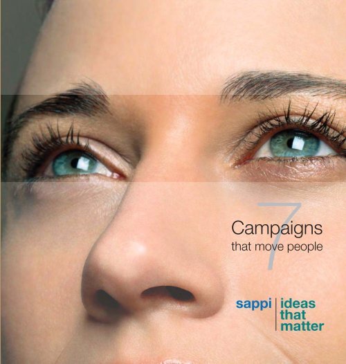
Sappi Ideas that Matter - Book 7
Sappi Ideas that Matter - Book 7
Sappi Ideas that Matter - Book 7

You also want an ePaper? Increase the reach of your titles
YUMPU automatically turns print PDFs into web optimized ePapers that Google loves.
Some ideas are designed to move products.<br />
Others are designed to move people.<br />
Welcome once again to <strong>Sappi</strong> <strong>Ideas</strong> <strong>that</strong> <strong>Matter</strong>, a celebration of ideas <strong>that</strong> are not only contrived to ‘do well’, but<br />
strive to ‘do good’.<br />
As a leading global producer of coated fine paper, <strong>Sappi</strong> believes in the power of ideas to move people. Every year<br />
since 1999, when we first launched the <strong>Sappi</strong> <strong>Ideas</strong> <strong>that</strong> <strong>Matter</strong> initiative, we have discovered <strong>that</strong> there are many<br />
people around the world who share our belief; designers who, guided by conscience and a desire to help others,<br />
have focused their talent on developing work <strong>that</strong> motivates others to create a better world.<br />
Every year, in each region, a selection panel comprising design industry luminaries is invited to consider the merits<br />
of their work, both from a design perspective and its potential power to generate a response from the public.<br />
For those campaigns <strong>that</strong> stand up to the panel’s scrutiny, the reward is a share of the US$1 million <strong>that</strong> <strong>Sappi</strong> makes<br />
available every year. Grants vary in size depending on the scope of the campaigns, with the money being used to<br />
produce the campaigns as specified by the designers.<br />
In this book you will find the creative work <strong>that</strong> was selected in 2006; proof <strong>that</strong> the desire and ability to move people<br />
is alive and well.<br />
We hope <strong>that</strong> everyone who contributed this year will be moved to do so again next year. We also hope <strong>that</strong> you,<br />
after reading these stories of adversity and triumph, will be moved to participate in <strong>Ideas</strong> <strong>that</strong> <strong>Matter</strong> next year, too.<br />
André Oberholzer<br />
Group Head of Corporate Affairs<br />
<strong>Sappi</strong> Limited
Contents<br />
4 AFRICA<br />
6 Gomolemo Clean Environment/Gomolemo<br />
10 Gun Free South Africa/Straight Edge – Guns<br />
Don’t Give<br />
14 Imibala/Imibala Sponsor a Child<br />
18 South African Guide Dogs Association/<br />
My Eyes Are Used to Help Someone<br />
20 Zip Zap Circus School/Build Your Team, Build<br />
Our Dream<br />
24 EUROPE<br />
26 Alzheimer Forschung Initiative eV/Alzheimer<br />
30 Amnistía Internacional/Essay About the<br />
Relativity of Blindness<br />
34 Association Emmaüs/Beyond Clichés (Au-delà<br />
des Idées Reçues)<br />
38 British Heart Foundation/Lost and Found in Action<br />
42 EMMA Institute/How Long Are You Still Going<br />
to Wait?<br />
44 Handicap&Arte/TIR: Teatri in Rivoluzione<br />
48 in-kick.org/Offside<br />
52 International Confederation Of Midwives/The<br />
World Needs Midwives – Now More Than Ever!<br />
56 Kinderschutz-Zentrum Linz/Covering Reality<br />
(Das Unsichtbare Wahrnehmen)<br />
58 Medici con l’Africa CUAMM/In the Name<br />
of Africa. Words That Help<br />
64 Samantha Dickson Brain Tumour Trust/<br />
Sam’s Campaign<br />
68 UNESCO Vlaanderen/Freedom of Press<br />
72 NORTH AMERICA<br />
74 Art of Yoga Project/Art of Yoga Project<br />
78 Camp Alkulana/Bright Eyes – Celebrating the<br />
Alkulana Experience<br />
80 CYCLE Kids Inc/CYCLE Kids Awareness<br />
Campaign<br />
84 DePelchin Children’s Center/After Harm, Hope<br />
Building a Forever Family<br />
88 Family Service Agency of Santa Barbara/Find<br />
the Help You Need, DIAL 211<br />
92 Fraser/Who Asked Me?<br />
94 Green Map System/Directions to a Sustainable<br />
Future<br />
98 Homeward Bound of Marin/Fresh Starts Catering<br />
102 Madagascar Ankizy Fund/Grace Pease:<br />
Fundraising for Madagascar Ankizy Fund<br />
106 Open Door Family Medical Centers Inc/<br />
Colorectal Cancer Screening Promotion for<br />
the Uninsured/Underinsured Population<br />
110 Public Architecture of San Francisco/The 1%<br />
User’s Guide<br />
114 The Santa Fe Art Institute/Art in Transit<br />
118 US Metric Association/Ametrica!<br />
122 LIST OF APPLICANTS
“A signifi cant number of works created primarily by hand; providing a<br />
rustic and unique fl avour to the works presented. There is the defi nite<br />
emergence of a South African aesthetic.” – Tebogo Serobatse<br />
4
Africa<br />
Glenda Venn/It’s a Go!/Founder and Creative Director<br />
After working within a number of top agencies and winning several awards (Loeries, Spadas,<br />
Apex, New York Festival and One Show) Glenda started It’s a Go! Seven years later, It’s a Go!<br />
is going fine. It has won awards and clients. It has also lost awards and clients. But it has got<br />
a nice coffee machine.<br />
Mohammed Jogie/Morning Star Design, think*, Adobe, Café/Designer<br />
Mohammed is a board member of think, an executive member of Café, a member of the<br />
International Society of Typographic Designers, and has done duty on the judging panels<br />
of South Africa’s Loerie Awards, as well as the Design Achievers Awards.<br />
Tebogo Serobatse/NEMISA (National Electronic Institute of South Africa)/Senior Lecturer<br />
Tebogo is a qualified graphic designer and web-developer, serving on the boards of think* and<br />
the National Council of Design South Africa (DSA). She holds an MTech in Graphic Design and<br />
is currently completing a Master’s degree in Education at the University of the Witwatersrand.<br />
Tiffany Turkington-Palmer/think/Board Member<br />
In addition to her work for think, Tiffany was Secretary General of Icograda (the International<br />
Council of Graphic Design Associations) and has judged the Taiwan International Poster<br />
Competition, the Loeries, the thinkAhead Awards, and is a member of the national SGB<br />
(Standards Generating Body) for Art, Craft and Design.<br />
* South African Graphic Design Council
Africa<br />
Gomolemo<br />
Gomolemo Clean Environment<br />
Gomolemo Clean Environment (GCE) is a nongovernmental<br />
environmental organisation in the North<br />
West of South Africa <strong>that</strong> works with government<br />
departments and other stakeholders to help people help<br />
the environment, and in so doing, help themselves.<br />
But it was the specific focus on food gardening <strong>that</strong><br />
attracted the attention of a group of students at North<br />
West University in Potchefstroom, South Africa. Elisma<br />
Groenewald (designer, art director and copywriter),<br />
Irmgard Putter (designer, production manager and<br />
copywriter), Corlia Lombard (strategist, designer<br />
and client service executive) and Mike Cruywagen<br />
(illustrator, designer and copywriter) all agreed <strong>that</strong><br />
this was something different. With a keen interest in<br />
recycling and the maintenance of a clean environment,<br />
they chose to apply their combined creative muscle<br />
to Gomolemo’s cause.<br />
them to donate either money or equipment. Secondly, the<br />
calendars were distributed door-to-door in the Sarafina<br />
area by members of Gomolemo, in an effort to make<br />
them aware of the critical nature of environmental matters<br />
to everyday life, and the benefits of vegetable gardening.<br />
The response was felt primarily at the workshops held<br />
by volunteers at the Gomolemo Clean Environment for<br />
the people of Ikageng, who turned up in ever-increasing<br />
numbers to find out how to create and maintain their<br />
own vegetable gardens.<br />
The team from North West University see a long<br />
road together with Gomolemo, and have committed<br />
themselves to ensuring the sustainability of the charity<br />
by helping to create jobs for the future.<br />
6<br />
The calendar they created had a two-fold focus. Firstly,<br />
it appealed to prominent companies in the North West<br />
region, challenging them to consider their stance<br />
towards a clean and healthy environment and inviting
Creative Team/Mike Cruywagen,<br />
Corlia Lombard, Irmgard Putter and<br />
Elisma Groenewald
The campaign consists of:<br />
- Calendars printed on Reviva Plus White 250g/m 2
Africa<br />
Straight Edge – Guns Don’t Give<br />
Gun Free South Africa<br />
10<br />
Since 1994, Gun Free South Africa (GFSA) has worked<br />
tirelessly to build safer communities by reducing the<br />
amount of guns in circulation. In 2004, a decade of<br />
hard work paid off and a new Firearms Control Act was<br />
passed. But while it brought GFSA one step closer to<br />
their vision of a gun-free South Africa, there was clearly<br />
much work to be done.<br />
The alarming level of gun ownership, particularly<br />
amongst the youth, was not lost on a group of students<br />
at the Cape Peninsula University of Technology in<br />
Cape Town. Designers Adam Samuel and Tracy Gerber,<br />
strategic planner Leselle Bester and writer Meghan<br />
Lötter were all aware of the rising levels of gang culture<br />
and gun violence on Cape Town’s Cape Flats, and<br />
resolved to do something about it.<br />
The campaign they devised communicated a simple<br />
message: Life is short and guns don’t give, they<br />
take away. Targeted at schoolchildren at Cape Flats<br />
schools, a mail pack informed them of the dangers<br />
of guns and gun violence and suggested what could<br />
be done to address the problem. ‘Ammunition’ in the<br />
packs gave the pupils the tools they need to fi ght<br />
back against gun violence, reclaim their freedom, and<br />
take their best shot at claiming their rightful place in<br />
a brighter, gun-free future.<br />
Consisting of packs and posters in schools, as well as<br />
mobile media in the form of tattoos, the campaign was<br />
intended to reach parents as well, encouraging them<br />
to attend a GFSA workshop <strong>that</strong> showed them how to<br />
create gun-free zones, unite against the insidious gun<br />
culture and change the perception of guns held by<br />
their children.<br />
While the campaign had not been exposed at the time<br />
of judging, it was agreed by the judges <strong>that</strong> such a<br />
single-minded and powerful campaign would certainly<br />
have an enormous impact.
Creative Team/Leselle Bester,<br />
Adam Samuel, Tracy Gerber and<br />
Meghan Lötter
The campaign consists of:<br />
- Folders printed on HannoArt Silk 350g/m 2<br />
- Folder sleeves printed on HannoArt Silk<br />
350g/m 2<br />
- Mission statements printed on HannoArt Silk<br />
150g/m 2<br />
- Posters printed on HannoArt Silk, double<br />
walled corrugated board 170g/m 2<br />
- Principal letter<br />
- Transferable tattoos
Africa<br />
Imibala Sponsor a Child<br />
Imibala<br />
In the beautiful Helderberg basin near Cape Town,<br />
South Africa, many parents cannot afford to pay the<br />
school fees or buy the school uniforms <strong>that</strong> would give<br />
their children access to an education. Appealing to<br />
both local and international donors, Imibala’s ‘Sponsor<br />
a Child’ campaign is able to pay fees and clothe a<br />
schoolchild for just ZAR600 (under US$100) a year.<br />
Designer and photographer Christine Meintjes<br />
of Christine Meintjes Design & Photography in<br />
Stellenbosch, South Africa, saw in Imibala an<br />
organisation <strong>that</strong> was playing a vital role in the<br />
upliftment of the previously disadvantaged, and<br />
contributing in a tangible way to the future of this<br />
country. After visiting the Imibala-run art centre (where<br />
children from underprivileged communities receive free<br />
arts and craft training) she knew she had to extend<br />
her services as a graphic designer and photographer<br />
to Imibala, if only to create an awareness of the<br />
miraculous job they are doing in the community and<br />
to give people the opportunity to ‘Sponsor a Child’.<br />
Visits to the centre also helped her formulate a concept;<br />
art was a way in which children could literally learn the<br />
skills to help them fulfil the Imibala slogan of ‘turning<br />
grey todays into colourful tomorrows’. She chose to fill<br />
her material with childlike figures, creating the appeal<br />
and naivety of youth.<br />
‘The feeling <strong>that</strong> one is left with is <strong>that</strong> unhappiness is<br />
grey and dull, such as the unhappy faces in my work,<br />
but the bright colours are brought by Imibala as they<br />
change children’s lives,’ says Christine.<br />
The campaign has proved an inspiration to children<br />
and Imibala staff alike. And while it’s still too soon to<br />
quantify the effect of the campaign, the future for the<br />
organisation must surely be as bright and colourful as<br />
Christine’s work.<br />
14
Designer/Christine Meintjes
The campaign consists of:<br />
- Colouring-in pages printed on Enigma Polar<br />
White 120g/m 2<br />
- Postcards printed on Enigma Polar White<br />
260g/m 2<br />
- Postcards / Flyers printed on Enigma Polar<br />
White 260g/m 2<br />
- Posters printed on Enigma Polar White<br />
120g/m 2
Africa<br />
My Eyes Are Used to Help Someone<br />
South African Guide Dogs Association<br />
18<br />
As a young girl, Cherece-Lara Wolf belonged to the<br />
Junior Guide Dogs club. Her fascination with the way<br />
in which puppies are trained to be someone else’s eyes<br />
stayed with her over the years, as did her amazement at<br />
how visually impaired people could adapt their handicap<br />
to lead a normal and independent life.<br />
Now a third-year graphic design student at Inscape<br />
Design College in Roodepoort, South Africa, Cherece-<br />
Lara soon saw a way in which her passion and her<br />
training could come together to assist an organisation<br />
<strong>that</strong> provides such a critical lifeline for the visually<br />
impaired.<br />
Founded in 1953 by Gladys Evans, the South African<br />
Guide Dogs Association (SAGA) for the blind is<br />
fully dependent on fund raising, donations, sales of<br />
Christmas cards, collections and the generosity of the<br />
public. SAGA is a founder member of the international<br />
federation of Guide Dog Schools for the blind of which<br />
there are 71 schools in 29 countries. With the training<br />
of each guide dog costing more than ZAR7,500 (over<br />
US$1,000) and taking 18 months to complete, her help<br />
was more than welcome.<br />
With the goal of raising both awareness and money<br />
for the organisation, Cherece-Lara developed a printed<br />
magazine insert consisting of two pages. On the first<br />
page, a guide dog with ‘My eyes are used to help<br />
someone’ written in Braille was featured. On the second<br />
page, a donation form appeared alongside the visual<br />
of the dog and the same text in Braille.<br />
Due to appear in Cosmopolitan magazine (with a<br />
circulation of 145,000 copies and a readership of more<br />
than 758,000) Cherece-Lara’s endearing communication<br />
will no doubt open readers’ eyes to the plight of the<br />
visually impaired, and hopefully open their pockets too.
Designer/Cherece-Lara Wolf<br />
The campaign consists of:<br />
- Donation forms printed on Camelot Cartridge 120g/m 2<br />
- Print adverts printed on Camelot Cartridge 120g/m 2
Africa<br />
Build Your Team, Build Our Dream<br />
Zip Zap Circus School<br />
Based in Cape Town, South Africa, the Zip Zap Circus<br />
School is a unique organisation <strong>that</strong> uses the magical<br />
yet challenging medium of circus arts training and<br />
performance for the purpose of educational outreach<br />
and youth development. To enable them to offer this<br />
training free of charge, they also offer skilled riggers<br />
and stunt performers for corporate clients and the<br />
film industry.<br />
Cheri Kroeger and Justin Soodyall (designers), Giselle<br />
Kroeger (paper mechanic and copywriter) and Bradley<br />
Urion (paper mechanic) of the Cape Peninsula University<br />
of Technology in South Africa all felt very strongly about<br />
their cause and, after spending some time in the circus<br />
school environment, felt a strong connection with the<br />
organisation.<br />
‘The organisation has such a positive outlook on life,<br />
and really put all their efforts into making Zip Zap<br />
successful in the sense of enriching children’s lives,’<br />
they enthused.<br />
They decided to start with the most pressing need of the<br />
organisation: the need for their own permanent home.<br />
An interactive pop-up book was designed to appeal<br />
to large corporations as well as people in the building<br />
industry, giving them an overview of what Zip Zap is<br />
about, and an idea of the proposed building. In the back<br />
of the book a pledge form invites the reader to choose<br />
between donating funds, or donating building materials<br />
for the new home. Once they send the form back to<br />
Zip Zap, a poster is mailed back, inviting them to a free<br />
teambuilding session for their company at the Zip Zap<br />
Circus School.<br />
In this way, the team from the Cape Peninsula University<br />
of Technology arrived at a magical win-win concept; the<br />
donors help Zip Zap build their dream, and in turn, Zip<br />
Zap helps them build their team.<br />
20
Creative Team/ Bradley Urion, Giselle Kroeger,<br />
Cheri Kroeger, Justin Soodyall
The campaign consists of:<br />
- <strong>Book</strong>s (cover) printed on El Toro 240g/m 2<br />
- <strong>Book</strong>s (inner) printed on Presto Gloss 135g/m 2<br />
- Leaflets printed on Camelot Cartridge 90g/m 2<br />
and Presto Silk 250g/m 2<br />
- Pledge forms printed on Camelot Cartridge<br />
90g/m 2<br />
- Posters printed on Presto Silk 115g/m 2<br />
- Tickets printed on Presto Silk 170g/m 2
“The causes of these organisations or associations are all worthy<br />
of attention ... Very diffi cult task, sometimes heart-breaking.”<br />
– Laurence Madrelle<br />
24
Europe<br />
Anneke Bosman/Amnesty International/Head of Campaigns<br />
As head of campaigns for the Netherlands, Anneke has executed a number of successful<br />
fundraising and membership campaigns (including recruiting about 40,000 new members)<br />
and theme campaigns to put human rights issues, such as the death penalty, torture and<br />
‘disappearances’ on the national and international agenda.<br />
Jean Robert/Robert & Durrer Design/Graphic Designer<br />
Jean is best known for his design work for Swatch, which revolutionised watch design<br />
and saw sales rocket from 100 thousand to 100 million. He is a member of AGI* and<br />
has taught design at Ohio State University and the High Schools of Design in Zurich<br />
and Luzern.<br />
Laurence Madrelle/LM Communiquer/Founding Designer<br />
In addition to teaching visual communication at the École Nationale Supérieure d’Architecture<br />
de la ville et des territories, Laurence’s work (exclusively for the public domain) has been winning<br />
competitions for clients such as the Agency for the Fight against Aids, visual identities and<br />
signage for many French cultural institutions and cities.<br />
Mervyn Kurlansky/Mervyn Kurlansky Design/Principal<br />
Mervyn’s extensive body of work – corporate identities, sign systems, annual reports, books,<br />
brochures, catalogues, posters and packaging – in every part of the world has won him<br />
numerous awards, including a place in the permanent collection of the MOMA**, NY.<br />
He is the author of several books on design and serves on design juries worldwide.<br />
Sadik Karamustafa/Karamustafa Design Ltd/Graphic Designer<br />
A career in advertising and publishing was followed by more than a decade as a freelance<br />
designer, and finally, the formation of his own company with his daughter, Ayse. Sadik has<br />
judged and received awards throughout the world and held solo shows of his design work<br />
from Tehran to Tokyo.<br />
* Alliance Graphique Internationale<br />
** Museum of Modern Art
Europe<br />
Alzheimer<br />
Alzheimer Forschung Initiative eV<br />
The symptoms of Alzheimer’s Disease can be alarming.<br />
As a disease <strong>that</strong> affects the brain and brings on<br />
dementia, sufferers can feel restless and moody, or<br />
have difficulty remembering, speaking, learning, making<br />
judgments and planning.<br />
The Alzheimer Research Initiative (AFI) is a non-profit<br />
association which was created in 1995 to provide muchneeded<br />
funding for Alzheimer research, and educates<br />
the public regarding the nature of Alzheimers.<br />
Seonmee Kong and Youngju Cha, design students at<br />
Fachhochschule Düsseldorf (the University of Applied<br />
Sciences Düsseldorf) in Germany, were moved by<br />
the helplessness experienced by sufferers, the sense<br />
of futility of living with an incurable disease such as<br />
Alzheimers, as well as the impact the disease can have<br />
on family members and caregivers.<br />
shoes in the refrigerator, letters in the toaster and<br />
dentures in a goldfish bowl; all seemingly innocent and<br />
funny, but frustrating for those who must deal with these<br />
images as a daily reality. It is only when one imagines the<br />
consequence of these images <strong>that</strong> one can understand<br />
the dangers of living with Alzheimer’s Disease.<br />
Powerfully presented in press, on posters in more<br />
than 1,000 locations and through a series of popular<br />
postcards, the campaign had an enormous impact, with<br />
several mentions on local radio stations. The proof of<br />
the impact of the campaign comes from AFI themselves,<br />
who have experienced an exponential increase in mail<br />
and telephone interest in the organisation whenever the<br />
campaign is exposed.<br />
26<br />
To generate an understanding of the frustrating world<br />
in which sufferers live, they developed a campaign <strong>that</strong><br />
portrayed situations <strong>that</strong> seem humorous, but are very<br />
real for Alzheimer’s sufferers. Toothpaste on a sausage,
Creative Team/Karl-Josef Laumann<br />
(Minister of Work, Health and Society for<br />
the region Nordrhein-Westfalen), Youngju<br />
Cha and Seonmee Kong
The campaign consists of:<br />
- Postcards printed on Algro Design 300g/m 2<br />
- Posters printed on Hello Matt 170g/m 2
Europe<br />
Essay About the Relativity of Blindness<br />
Amnistía Internacional<br />
30<br />
In order for the abuse of human rights to exist or to<br />
continue, it must remain hidden. Often perpetuated<br />
out of the public eye, always hidden by those with<br />
the power to do so, the most powerful tool in the fight<br />
against human rights violations is exposure. And <strong>that</strong>’s<br />
just what this innovative campaign does, in the most<br />
literal way.<br />
Before your very eyes, violations you never knew existed<br />
make themselves visible; everyday occurrences <strong>that</strong><br />
take place in all corners of the world, to many people.<br />
The technique developed by Noé Mendoza Cuevas,<br />
Art Director and designer at Señor Piruleta in Madrid,<br />
involves printing on card with thermocromatic ink, <strong>that</strong><br />
reveals itself when temperatures change, presenting<br />
the reader with yet another frightening occurrence <strong>that</strong><br />
Amnesty International (AI) fights every day to abolish.<br />
With a network of more than 1.8 million members,<br />
supporters and subscribers in over 150 countries<br />
and territories in every region of the world, AI is held<br />
together by dedicated individuals committed to a vision<br />
of a world in which every person enjoys all of the human<br />
rights enshrined in the Universal Declaration of Human<br />
Rights and other international human rights standards.<br />
A long-time AI devotee, Noé’s remarkable campaign<br />
is the culmination of years of collaboration on AI’s<br />
advertising and promotion in Spain. And thanks to his<br />
deep understanding of the organisation, he was able to<br />
identify the symbol of the candle as key to their mission,<br />
he says.<br />
“The candle needs people who want to light it, who<br />
want to continue to shed light on violations, to enable<br />
them to be investigated, to denounce them and bring<br />
them to an end.”<br />
With no fewer than 5,000 mailings, and a response rate<br />
of 2.15% resulting in an impressive €20,000 in funding,<br />
<strong>that</strong>’s a lot of people lighting a lot of candles.
Designer/Noé Mendoza Cuevas
The campaign consists of:<br />
- Cards printed with thermocromatic ink on<br />
Magno Matt 300g/m 2<br />
- Cards and coupons printed on Magno Matt<br />
300g/m 2
Europe<br />
Beyond Clichés (Au-delà des Idées Reçues)<br />
Association Emmaüs<br />
Established by the legendary Abbé Pierre during<br />
a bitterly cold Parisian winter in 1954, Association<br />
Emmaüs assists homeless people by helping them<br />
assert their right to health, education, employment and<br />
housing. To help achieve this, Association Emmaüs has<br />
launched a number of welcome centres, emergency<br />
shelters and social housing programmes over the years.<br />
Since 2000, they have benefited from the help of a<br />
dedicated group of individuals at Nous Travaillons<br />
Ensemble (NTE), a Paris design agency with clients<br />
including municipalities and institutions, as well as a<br />
number of humanitarian and educational organisations.<br />
For designers Valérie Debure, Isabelle Jégo, Alex<br />
Jordan, Ebdie Cavel, Sébastien Courtois and Ronit<br />
Meirovitz, this co-operation has been successful as<br />
a result of a shared vision on philosophy and design;<br />
how to communicate the work of the association and<br />
how to address the misconceptions <strong>that</strong> people have<br />
of the homeless.<br />
This shared vision resulted in a campaign awarded by<br />
<strong>Ideas</strong> <strong>that</strong> <strong>Matter</strong> in 2003 and an exhibition in 2006. But<br />
it is to the topic of addressing misconceptions <strong>that</strong> they<br />
have returned for their latest campaign.<br />
Said the designers, “Our goal was to present the clichés<br />
surrounding the homeless through an exhibition of<br />
posters. The prevailing mood is quite provocative, the<br />
way clichés generally are. This is intended to provoke<br />
discussions among a large target group, and to be<br />
educational, lively and legible from a distance.”<br />
They placed their challenging posters in metro stations<br />
and in schools, cards in schools and public places. They<br />
arranged meetings in many high schools and multimedia<br />
libraries, and facilitated discussions and debates<br />
with people and students. At all events, the exhibition<br />
of posters provided a point of departure for talking<br />
about homeless people, their lack of job security and<br />
assistance, as well as how to finance social assistance.<br />
34
Creative Team/Ebdie Cavel, Ronit Meirovitz,<br />
Isabelle Jégo, Alex Jordan, Valérie Debure<br />
and Sébastien Courtois
The campaign consists of:<br />
- Cards printed on Magno Silk 350g/m 2<br />
- Posters printed on Magno Matt Classic 170g/m 2
Europe<br />
Lost and Found in Action<br />
British Heart Foundation<br />
38<br />
Every year, thousands of people die prematurely from<br />
heart disease. For those who survive, the daily battle<br />
has just begun.<br />
The British Heart Foundation is committed to preventing<br />
people’s lives being devastated by heart disease. They<br />
fund pioneering research, care for patients and their<br />
families, and provide vital information to help people<br />
understand the causes of heart disease, how it can be<br />
avoided and what treatments are available.<br />
Aware <strong>that</strong> the average age of students at Southampton<br />
Solent University was between 18 and 22, and <strong>that</strong><br />
young people tend to be reckless with their health<br />
(particularly their hearts), lecturer Steve Lannin,<br />
(Creative Direction, Copy and Planning), and students<br />
Paul Jones (Design, Typography and Photography)<br />
and Darren Whitney (Illustration), working closely with<br />
Julian Temblett and Mandi Simms of the British Heart<br />
Foundation, took up the challenge.<br />
Rather than lecture on the dangers of high fat foods<br />
and smoking, they decided to target students with<br />
a campaign about how good it is to buy from charity<br />
shops, in particular the British Heart Foundation. If they<br />
drop by and pick up a ‘worn in’ jacket, they reckoned,<br />
students might also pick up a leaflet about heart disease<br />
when they visit.<br />
So they geared their concept towards the ‘charity<br />
shop’ aesthetic; the rough and ready ‘distressed’ look,<br />
individuality, teamwork and concern for the environment.<br />
Appearing in book, poster and postcard form, the<br />
campaign spread to barber shops, garages, pubs<br />
and clubs where young men meet, as well as broader<br />
posters and signage across Hampshire.<br />
The response to the material was overwhelmingly<br />
positive, with some outlets noticing a sizeable increase<br />
in the number of young people visiting the charity<br />
shops. In the ultimate tribute to the team, the iconic<br />
posters even became sought after collectables in their<br />
own right.
Creative Team/Paul Jones, Darren Whitney<br />
and Steve Lannin
The campaign consists of:<br />
- <strong>Book</strong>s (cover) printed on Magno Matt Classic<br />
300g/m 2<br />
- <strong>Book</strong>s (inner) printed on Magno Silk 170g/m 2<br />
- Over-riders printed on Magno Matt Classic<br />
300g/m 2<br />
- Postcards printed on Magno Matt Classic<br />
300g/m 2<br />
- Posters printed on Magno Matt Classic<br />
300g/m 2
Europe<br />
How Long Are You Still Going to Wait?<br />
EMMA Institute<br />
42<br />
In Slovenia, everyone knows someone who is a victim<br />
of violence. But, due to the social taboo of the subject<br />
– and to avoid trouble and the risk of ‘getting involved’<br />
– most prefer to look the other way and ignore it.<br />
Matija Ošlak, Eva Barbori, Blaž Ritmani and Tomaž Cör,<br />
a team of designers and writers at Formitas, a member<br />
of BBDO International in Ljubljana, Slovenia, chose not<br />
to look the other way.<br />
Instead, they chose to get very involved, putting their<br />
time and considerable effort behind EMMA, an NGO<br />
<strong>that</strong> helps children and women, who were – or still are<br />
– victims of violence.<br />
Realising <strong>that</strong> the key challenge in lifting the lid off<br />
abuse was simply breaking the silence, they developed<br />
an arresting piece of work: a flyer in form of an arm.<br />
Distributed in areas where possible victims of violence<br />
or possible witnesses of violence could see it, the arm is<br />
what they called a ‘bruise-tester’. Based on the bruises<br />
<strong>that</strong> are the tell-tale signs of abuse, the ‘bruise-tester’ is<br />
a way of challenging victims or witnesses of violence not<br />
to wait too long before telling somebody about it.<br />
An astonishing 100,000 ‘arm-flyers’ were distributed.<br />
In public schools (hanging from wardrobe hooks in<br />
closets), in public buses (hung over hand rails), at<br />
apartments (hung over front door handles), the ‘armflyers’<br />
became ubiquitous in Koper, Ljubljana, Celje,<br />
Maribor and Murska Sobota, the five main metropolitan<br />
hubs of Slovenia, and the centres where most victims<br />
and witnesses could be reached.<br />
After a wave of publicity from all the daily newspapers<br />
in Slovenia, a breakthrough – and the ultimate<br />
acknowledgement of the problem. In an audience<br />
with the mayor of Ljubljana, Danica Simši, the creative<br />
team and the directors of the EMMA organisation were<br />
promised support for their efforts to assist the victims of<br />
violence, and to encourage witnesses to come forward.
Creative Team/Eva Barbori, Matija Ošlak,<br />
Tomaž Cör and Blaž Ritmani<br />
The campaign consists of:<br />
- Flyers printed on Hello Silk 300g/m 2
Europe<br />
TIR: Teatri in Rivoluzione<br />
Handicap&Arte<br />
Not many would imagine <strong>that</strong> the handicapped and<br />
the stage would be a suitable combination. Yet it is<br />
for exactly this reason <strong>that</strong> Handicap&Arte in Italy<br />
developed their revolutionary theatre programme.<br />
Active in the field of integrated social theatre activity<br />
since 1998, Handicap&Arte Italy holds annual<br />
workshops, seminars and conferences to help the<br />
disabled go beyond their limits, promoting equality<br />
of integration for the sake of diversity, and enhancing<br />
the creative potential of disabled people through<br />
performances on stage.<br />
In an effort to transform the subculture <strong>that</strong> goes against<br />
the handicapped and to turn it into a culture of diversity,<br />
they produced a campaign consisting of a series of<br />
posters showing able and disabled people together in<br />
highly emotional situations.<br />
The headlines asked the question “Who is the richest?<br />
Who is the poorest?” The embarrassment of showing<br />
the handicap gives way to the certainty <strong>that</strong> mixing with<br />
‘differently able’ people means to enrich the human<br />
condition, to promote an exchange of ideas, and to<br />
encourage contributions to the organisation.<br />
44<br />
Designers Monica Zaffini and Massimiliano Patrignani<br />
and copywriter Noemi Rinolfi at ma:design in Pesaro,<br />
Italy, felt very strongly about reversing the negative<br />
attitude <strong>that</strong> generally accompanies the public<br />
perception of the handicapped. They also felt they<br />
could communicate Handicap&Arte’s belief <strong>that</strong> the<br />
limits of the disabled are resources for the arts and <strong>that</strong><br />
the arts are a resource to help the disabled to overcome<br />
their limits.<br />
This was followed up with flyers, books, conferences<br />
and workshops, at which lively debate and a gradual<br />
changing of attitudes were evidence of the success<br />
of the campaign.
Creative Team/Monica Zaffini and<br />
Massimiliano Patrignani
The campaign consists of:<br />
- <strong>Book</strong>s printed on Presto Silk 150g/m 2<br />
- Envelopes<br />
- Flyers printed on Presto Silk 150g/m 2<br />
- Posters printed on Parade 90g/m 2
Europe<br />
Offside<br />
in-kick.org<br />
48<br />
The youth, the homeless, the unemployed, drug addicts<br />
and alcoholics. Each one a star striker, defender or<br />
goalkeeper in the making, with a sense of purpose and a<br />
bright future. This is the mission of in-kick.org, a project<br />
of Switzerland Sports Integration <strong>that</strong> takes those<br />
marginalised by society and reintegrates them through<br />
exposure to the beautiful game.<br />
It’s certainly an innovative approach, and one which<br />
attracted the attention of Claudia Klat and Dominique<br />
Berrel, students in graphics and media design at<br />
the F+F School for Art and Media Design in Zürich,<br />
Switzerland.<br />
But the activities of in-kick.org are so much more<br />
serious than simply offering the homeless a distraction<br />
to keep them off the streets. Every year, in-kick.org<br />
organises the Homeless Swiss Championship, and<br />
recruits 16 star players for the Swiss Homeless<br />
National Team, and eight players to compete at the<br />
Homeless World Cup.<br />
So, last year, Claudia and Dominique designed ‘Offside’;<br />
a book publicising the organisation, which took the<br />
form of a diary of the Swiss Homeless national team’s<br />
preparation for the Homeless World Cup.<br />
Training sessions and qualification tournaments were<br />
presented as pages from a journal. The first few pages<br />
of the book display participating teams in the style of<br />
football stickers. For 18 chapters, the book moves to<br />
a thrilling conclusion; the 2006 Homeless World Cup in<br />
Cape Town, South Africa.<br />
Team posters complete the collateral, contributing<br />
further towards building the self-esteem of the players,<br />
and made available for sale in bookstores in Germany,<br />
Austria and Switzerland and sold in the streets of Zürich,<br />
Bern and Basel by the vendors of Surprise, the Swiss<br />
Homeless newspaper.<br />
Described as one of the ‘most beautiful Swiss books<br />
of 2006’, Offside is ‘a dynamic, lively arrangement<br />
of colour photographs and informative texts <strong>that</strong> ...<br />
convinces with its coherent visual implementation.<br />
A committed book about an unconventional and<br />
remarkable event.’ Surely the Swiss will never look<br />
at the homeless or footballers in the same way again.
Creative Team/Claudia Klat and<br />
Dominique Berrel
The campaign consists of:<br />
- <strong>Book</strong>s
Europe<br />
The World Needs Midwives – Now More Than Ever!<br />
International Confederation of Midwives<br />
52<br />
Every year, more than 500,000 women die during<br />
pregnancy and birth. Most of these tragedies could be<br />
avoided if governments invested in efficient health care<br />
systems with qualified and skilled providers. In fact, it<br />
has been shown in many countries <strong>that</strong> investment in<br />
a strong midwifery profession can lead to a significant<br />
reduction of maternal deaths, prompting The World<br />
Health Report in 2006 to stress the need for a greater<br />
midwifery capacity in the world.<br />
The International Confederation of Midwives (ICM) is a<br />
not-for-profit international organisation <strong>that</strong> represents<br />
midwives and the midwifery profession, and aims to<br />
improve the care available to mothers and newborns<br />
throughout the world.<br />
Graphic designers Marije Fransen and Marieke Dona<br />
of MaMa design in Veldhoven and Tilburg in the<br />
Netherlands agreed with ICM <strong>that</strong> branding in the form<br />
of an updated corporate identity was an important first<br />
step to creating a positive image for the organisation<br />
and to inform others outside the traditional circles<br />
of partners and collaborating organisations of the<br />
important work of the organisation.<br />
They proposed a logo showing ICM’s vision of the<br />
continuum of care provided universally by midwives.<br />
This includes the three most important phases in and<br />
around birth: pregnancy, birth itself, and postpartum<br />
care. They designed attractive and informative flyers,<br />
and posters highlighting the many activities of the ICM,<br />
as well as foldable, adhesive printed flyers in the shape<br />
of stethoscope with contact details of midwives <strong>that</strong><br />
pregnant mothers could access.<br />
The enthusiastic reception <strong>that</strong> the campaign has<br />
received is a clear indication <strong>that</strong> the new image for<br />
ICM will help them fulfil their goal of strengthening the<br />
midwifery profession to provide the best care for mothers<br />
and babies throughout the world, thus reducing the<br />
tragedy of death and disability related to childbearing.
Creative Team/Marije Fransen and<br />
Marieke Dona
The campaign consists of:<br />
- Business cards<br />
- Compliment cards<br />
- Flyers printed on Magno Matt Classic 115g/m 2<br />
- Paper stethoscopes printed on Magno Matt<br />
Classic 250g/m 2<br />
- Postcards printed on Magno Matt Classic<br />
250g/m 2<br />
- Posters printed on Magno Matt Classic 170g/m 2<br />
- Writing paper
Europe<br />
Covering Reality (Das Unsichtbare Wahrnehmen)<br />
Kinderschutz-Zentrum Linz<br />
56<br />
Child abuse most often happens within the family and<br />
behind closed doors, taking the form of negligence,<br />
physical maltreatment and sexual abuse. In Linz,<br />
Austria, there is a centre <strong>that</strong> has committed employees<br />
and effective strategies to both prevent and treat the<br />
aftermath of child abuse. But it is not well known, and<br />
has limited funds for the purpose of reaching those<br />
in need.<br />
Now 20 years old, the Kinderschutz-Zentrum Linz<br />
(Child Abuse Prevention Centre, Linz) has worked<br />
tirelessly to create a violence-free environment for<br />
children, teenagers and their families, offering free<br />
counselling and therapy at the centre. In addition to<br />
counselling, the centre does what it can to educate<br />
the people of Linz about issues of abuse in an effort<br />
to prevent problems occurring.<br />
Realising the desperation of the centre’s situation,<br />
designers Christoph Kerschner and Walter Stromberger,<br />
together with writer Norbert Tomasi of Kest: strategie,<br />
kommunikation, design, approached the centre’s<br />
director Barbara Künschner with an audacious plan.<br />
They found Barbara to be open minded and the plan<br />
became a reality. To illustrate the ‘cover-up’ (the hidden<br />
nature of abuse and the unwillingness of the public to<br />
acknowledge it) they covered the city centre of Linz in<br />
pink paper; cars, public objects, shop windows, clothes,<br />
coats and books in stores, all were wrapped in pink.<br />
This was supported with posters, flyers and brochures,<br />
focusing attention on child abuse and the role the centre<br />
could play in both preventing and treating it.<br />
“For once, the public could not close their eyes to<br />
the reality. No-one could ignore the campaign or the<br />
subject,” enthused the team.<br />
From a press conference to coverage in local<br />
newspapers, on radio stations and TV channels, a<br />
professional Public Relations agency supported the<br />
campaign. The end result: dramatically increased<br />
awareness of the centre, which is now regularly<br />
contacted by local media for interviews and comment<br />
on abuse related issues.
Creative Team/Christoph Kerschner and<br />
Walter Stromberger
The campaign consists of:<br />
- Blank books<br />
- City light posters<br />
- Door hangers<br />
- Folders printed on Hello Silk 300g/m 2<br />
- Giveaways<br />
- Leporellos printed on Hello Silk 200g/m 2<br />
- Paper bags<br />
- Paper glasses<br />
- Posters printed on Hello Silk 115g/m 2<br />
- Stickers<br />
- Wrapping paper rolls<br />
- Wrapping paper printed on Hello Silk 115g/m 2
Europe<br />
In the Name of Africa. Words That Help<br />
Medici con l’Africa CUAMM<br />
In Africa, in this age of universal healthcare, women still<br />
die in childbirth, unable to get to a hospital because it is<br />
too far or too expensive. For those who believe in public<br />
heath care, development and human rights, this is an<br />
untenable situation.<br />
Doctors with Africa CUAMM is an organisation which<br />
works to develop respect for the fundamental human<br />
right to health, and to ensure <strong>that</strong> healthcare services<br />
are available to everyone. Founded in 1950 with the aim<br />
of training doctors to work in developing countries under<br />
the name of CUAMM (University College for Aspiring<br />
Missionary Doctors), it has over the years chosen to<br />
focus its work on the African continent, hence the name<br />
‘Doctors with Africa’.<br />
In partnership with their client, they selected words<br />
– such as Equity, Rights, Health, Service, Maternity,<br />
Motivation and Infancy – which express this profound<br />
connection and a story of service. In this way, they have<br />
used the power of words to reverse the commonplace<br />
perception of public service campaigns and the demand<br />
‘give me facts not words’.<br />
Using materials <strong>that</strong> are familiar to the medical<br />
profession, such as gauze and medicine boxes, they<br />
have developed a powerful campaign <strong>that</strong> will awaken<br />
people to the plight of people in Africa, and give them<br />
a sense of the essential co-operation <strong>that</strong> brings real<br />
empathy and change.<br />
60<br />
For Laura Morandini, Susi Grion, Daniele Varelli at CDM<br />
Associates in Udine, Italy, the title ‘Doctors with Africa’<br />
was significant. They wanted to emphasise the meaning<br />
of ‘with Africa’ as opposed to ‘for Africa’, and the way<br />
in which it expresses profound participation in the<br />
problems experienced in Africa.
Creative Team/Laura Morandini, Susi Grion<br />
and Daniele Varelli
The campaign consists of:<br />
- <strong>Book</strong>s printed on Magno Satin 140g/m 2<br />
- Folders printed on Magno Satin 140g/m 2<br />
- Posters printed on Magno Satin 140g/m 2
Europe<br />
Sam’s Campaign<br />
Samantha Dickson Brain Tumour Trust<br />
The Samantha Dickson Brain Tumor Trust (SDBTT) is<br />
the UK’s largest brain tumour charity. Set up after the<br />
death of Samantha Dickson at 17 years old, it has just<br />
celebrated its ten year anniversary (with the help of this<br />
campaign). The trust has provided over £2 million in<br />
funding for research into brain cancer and continues<br />
to fund research and find treatments.<br />
Brain cancer is known as the forgotten cancer. And<br />
Chris Catchpole (art director, designer and writer on all<br />
work) of catchpole&friends in London, England knew<br />
<strong>that</strong> good advertising and PR could not only help raise<br />
the profile of the charity but bring greater awareness<br />
nationwide to their cause.<br />
Also, as many of their long-standing patrons are very<br />
well-known celebrities, he chose to run a follow-up<br />
campaign using four of them showing their support.<br />
The campaign was covered on national television<br />
(Channel 4 and Meridian), in national magazines and<br />
press, in numerous local magazines and regional<br />
press, and on the radio (multiple interviews).<br />
Around £2.1 million of media exposure and over £60,000<br />
in donations have been generated by this campaign<br />
to date.<br />
He chose to dramatise many of the common symptoms<br />
of brain tumours to educate people and give them some<br />
idea of a checklist of things to look out for. One or two<br />
symptoms together are not necessarily indicative of<br />
a tumour. More than this and it is recommended <strong>that</strong><br />
a doctor is seen immediately.<br />
64
Designer/Chris Catchpole
The campaign consists of:<br />
- Door drops and inserts<br />
- Posters (A1, A2, A3 and 6 sheets)<br />
- Press adverts<br />
- Press releases<br />
- Stationery<br />
- Taxis (including seat backs)
Europe<br />
Freedom of Press<br />
UNESCO Vlaanderen<br />
In most European countries, freedom of the press is<br />
taken for granted. Certainly in Belgium, readers of a<br />
wide range of independent, uncensored newspapers<br />
open their newspapers every day and expect unfettered<br />
and uncensored news coverage. Imagine their surprise<br />
then, when readers of ‘De Morgen’ found to their<br />
horror <strong>that</strong> their newspapers had been stapled closed,<br />
preventing access to the information within.<br />
This disruptive tactic by the team from Dubois meets<br />
Fugger in Antwerp, Belgium (comprising copywriter Ben<br />
Van Asbroeck, art director Caroline Vermaerken, creative<br />
director Peter Foubert and account executive Lien<br />
Brouillard) was a deliberate ploy to alert readers to the<br />
fact <strong>that</strong>, while they may take press freedom for granted,<br />
there are many countries where readers are not so lucky.<br />
Working with their client Marino Bultinck, this<br />
intervention was remarkably successful. Readers, once<br />
past their frustration with an inaccessible newspaper,<br />
would discover a card stapled to the back of the<br />
newspaper telling them “Freedom of press isn’t <strong>that</strong><br />
obvious everywhere”, alerting them to the plight of<br />
the press in other countries and directing them to the<br />
organisation’s website.<br />
As a result of the campaign, hits on the organisation’s<br />
website showed a dramatic increase – proof of a<br />
heightened awareness of the general public to the<br />
issues surrounding press freedom.<br />
68<br />
UNESCO (United Nations Educational, Scientific and<br />
Cultural Organisation) describes itself as ‘a laboratory of<br />
ideas and a standard-setter to forge universal agreements<br />
on emerging ethical issues’ – had chosen to focus on<br />
press freedom for a full year in the Vlaanderen region.
Designer/Peter Foubert
The campaign consists of:<br />
- Newspapers printed on Hello Silk 150g/m 2
“These grants are uncommon opportunities to use fresh design thinking<br />
to make a tangible change in the world. Making a measurable difference<br />
in someone’s life is hard. And the best of this work aims to do just <strong>that</strong>.”<br />
– Brian Collins<br />
72
North America<br />
Arvi Raquel-Santos/Weymouth Design/Senior Designer<br />
Arvi’s work has been recognised in AR100, Best of New England Show (BoNE Show), Best<br />
of Brochure Design 8, Big <strong>Book</strong> of Logos 3, Graphic Design USA, Graphis Annual Reports,<br />
Graphis Design Annual, Hot Graphics 2, Print’s Regional Design Annual, Web Awards 2000<br />
and 1000 Greetings.<br />
Brian Collins/Brand Innovation Group/Chief Creative Officer<br />
For almost a decade, Brian has led teams of designers, writers, architects, filmmakers and<br />
strategists to transform some of the world’s most powerful brands, including Motorola, BP,<br />
Hershey, AT&T, Mattel, American Express and Coca-Cola. He speaks globally on innovation<br />
and design, including the World Economic Forum in Davos, Switzerland.<br />
Keith Helmetag/C&G Partners/Partner<br />
Keith received a <strong>Sappi</strong> <strong>Ideas</strong> <strong>that</strong> <strong>Matter</strong> grant for promoting literacy and lemur conservation<br />
in Madagascar and also served on their 2005 selection jury. He is a recipient of the American<br />
Institute of Architect’s Committee on the Environment (COTE) award for Philadelphia’s Heinz<br />
Tinicum Nature Reserve, and designed The New York Vietnam Veterans Memorial.<br />
Kim Baer/KBDA/Founder<br />
Kim Baer frequently judges design competitions and speaks at design conferences across the<br />
USA. She recently received the Fellows Award from the Los Angeles Chapter of the American<br />
Institute of Graphic Arts (AIGA) in honour of lifetime achievement. Her work has been honoured<br />
by every major design and business organisation in the country.<br />
Laura Des Enfants/desenfantsaldrich/Partner<br />
A founding partner of desenfantsaldrich, a sales and marketing consulting firm with a reputation<br />
for developing new communication channels, Laura has been honoured through her association<br />
with the Art Directors Club, Core77, Flashforward Conference & Film Festival, Dx3 Conference,<br />
Noble Desktop, sessions.edu and X-rite.<br />
Steffanie Lorig/Heart Seattle/Executive Director Art<br />
Steffanie graduated from Northern Arizona University with a degree in Visual Communications,<br />
emphasising graphic design and illustration. Her work has won awards from Print, Communication<br />
Arts and Step Inside Design. She has served on the AIGA board of directors and has<br />
authored several children’s books.
North America<br />
Art of Yoga Project<br />
Art of Yoga Project<br />
74<br />
Founded in 1999 by family nurse practitioner and yoga<br />
instructor Mary Lynn Fitton, the Art of Yoga Project has a<br />
mission to guide young women to use yoga and creative<br />
expression as tools for well-being, accountability and<br />
empowerment. With a specific focus on ‘at risk’ girls<br />
(such as those in the juvenile justice system), the project<br />
has developed a Yoga and Creative Arts Curriculum <strong>that</strong><br />
combines health education, yoga and the creative arts<br />
to give at-risk girls lifelong focus and discipline.<br />
Art Director Michael Osborne and designer Jeff Ho of<br />
Joey’s Corner in San Francisco, California, USA have<br />
always believed in alternative means of reaching youth.<br />
Inspired by the project’s fun, modern and energetic<br />
curriculum, they set out to create a graphic system <strong>that</strong><br />
is synonymous with these attributes.<br />
The logo targets young women, funders and the<br />
juvenile justice system. The stationery <strong>that</strong> bears it<br />
(encompassing everything from letterheads to thankyou<br />
cards and brochures) was designed to help the Art<br />
of Yoga with promotion and implementation of their<br />
programme in a clear and concise way.<br />
Throughout, the work reflects the team’s belief <strong>that</strong> the<br />
Art of Yoga Project is a very modern and interesting<br />
approach to helping at-risk girls.<br />
In response to the campaign, the project was featured<br />
in local newspapers, its work was featured as a<br />
revolutionary programme in Yoga Journal, and was<br />
discussed at Yoga Workshops and Yoga Conferences.<br />
As a result, the project was able to double its<br />
classes at the San Mateo County Juvenile facility,<br />
expand its volunteer staff to over 20 certified yoga<br />
teachers and assistants, launch a new website (www.<br />
theartofyogaproject.org) and improve teacher training.<br />
Thanks in part to Jeff and Michael’s campaign, the Art<br />
of Yoga Project received the San Mateo County<br />
Probation Department’s 2007 Excellence Award.
Creative Team/Jeff Ho and<br />
Michael Osborne
The campaign consists of:<br />
- Business cards<br />
- Business envelopes<br />
- Curriculum<br />
- Envelopes<br />
- Labels<br />
- Letterheads<br />
- Thank you cards<br />
- Trifold brochures
North America<br />
Bright Eyes – Celebrating the Alkulana Experience<br />
Camp Alkulana<br />
At Camp Alkulana, a summer camp for the underprivileged<br />
youth from Richmond, Virginia, Meredith<br />
Carrington learned many lessons. First as a camper,<br />
then as a counsellor during high school and college,<br />
then as a member of the camp’s support team, which<br />
acts as its Board of Directors.<br />
With a unique understanding borne of first hand<br />
experience, Meredith – a designer at Merit Ink Design<br />
in Richmond – was trying to find a way of distilling the<br />
essence of Camp Alkulana.<br />
Regarding design, she decided to keep things extremely<br />
minimal; large colour solids, simple serif text, and full<br />
bleed photography. She felt <strong>that</strong> too much ‘design’<br />
would take away from the beauty of the simplistic<br />
photos and touching stories.<br />
The campaign was kicked off with a reception to<br />
which the entire camp ‘family’ (consisting of all past<br />
and present campers and counsellors, as well as<br />
every recorded volunteer) was invited, as well as key<br />
community leaders and press.<br />
“When considering how to communicate almost 100<br />
years of camp history, and thousands of personal<br />
stories, I knew I could not possibly cover it all. I decided<br />
to solicit personal photos and stories from anyone<br />
associated with Alkulana – campers, counsellors<br />
and volunteers. From their submissions, I selected a<br />
variety of serious, sentimental, historical and humorous<br />
accounts, which created a feeling of visual and textual<br />
collaboration,” she said.<br />
The impact of the book on the hundreds of campers<br />
<strong>that</strong> turned up at the event exceeded even Meredith’s<br />
expectations, and the praise <strong>that</strong> the campaign has<br />
garnered from the press for the sensitive way in which<br />
individual stories were told in words and pictures has<br />
placed Camp Alkulana and the underserved children<br />
of Richmond, Virginia on the public agenda.<br />
78
Designer/Meredith Carrington<br />
The campaign consists of:<br />
- <strong>Book</strong>s printed on Lustro Dull Cream, Cover 100lb<br />
(270g/m 2 ) and Text 80lb (118g/m 2 )
North America<br />
CYCLE Kids Awareness Campaign<br />
CYCLE Kids Inc<br />
With child obesity statistics climbing at an alarming rate,<br />
getting kids to eat healthily and enjoy the benefits of<br />
fresh air and exercise is as easy as riding a bicycle.<br />
This is the simple philosophy of CYCLE Kids Inc, an<br />
independent, non-profit organisation established to<br />
introduce children to the joys of cycling, the benefits of<br />
healthy eating, and the world of physical science. The<br />
organisation grew out of the founders’ strong desire to<br />
address the health and emotional issues facing today’s<br />
under-active, often overweight, children.<br />
healthy it is for the body and the heart. Using these<br />
stories as a starting point, each of the collateral pieces<br />
informs readers about how the organisation empowers<br />
children to stay fit and how much they benefit from the<br />
programme.<br />
A wide range of collateral was used: an organisational<br />
brochure, pocket folders, posters, local bus advertising<br />
and, of course, thank you cards. All were designed to<br />
work together in a number of different combinations to<br />
suit different audiences.<br />
80<br />
In fact, it was the sheer joy of riding a bike <strong>that</strong> inspired<br />
Lucas Roy, an independent designer from Boston,<br />
Massachusetts, together with writer Jean Gogolin,<br />
photographer Tim Llewellyn and CYCLE Kids Founder<br />
and Executive Director, Julianne Idlet, to design this<br />
charming campaign.<br />
Through the playfulness of illustration and the<br />
enthusiasm of photography, the brochure invites readers<br />
to reminisce about the sheer joy of owning and riding<br />
a bike as a child, how good it feels to exercise, how<br />
Proof of the efficiency of the appeal lies in the growing<br />
popularity of CYCLE Kids in Cambridge, Massachusetts.<br />
Proof of the campaign’s timeless appeal lies in the effect<br />
it had on designer Lucas Roy: ‘Throughout the process<br />
we received a generous amount of support and to see<br />
the kids <strong>that</strong> benefited from the classes was worth all<br />
the hard work. We were just happy to be part of the<br />
big picture.’
Creative Team/Tim Llewellyn,<br />
Jean Gogolin, Julianne Idlet and Lucas Roy
The campaign consists of:<br />
- Brochures printed on McCoy Matt Text, Cover<br />
100lb (270g/m 2 ) and Text 100lb (118g/m 2 )<br />
- Bus advertising<br />
- Folders<br />
- Posters printed on McCoy Matt Text 100lb<br />
(118g/m 2 )<br />
- Thank you cards printed on McCoy Matt Cover<br />
100lb (270g/m 2 )
North America<br />
After Harm, Hope. Building a Forever Family<br />
DePelchin Children’s Center<br />
In the United States, thousands of children are removed<br />
from their biological families or guardians each year due<br />
to child abuse, neglect or other factors. Most of these<br />
children are older kids, sibling groups or children with<br />
highly specialised needs. Finding safe and loving homes<br />
for them is often problematic. But without permanent<br />
adoptive homes, these children will remain in foster care<br />
until they reach adulthood or are no longer eligible for<br />
foster care.<br />
Many of them will grow up with no home, without a<br />
mom or dad to walk them to class on their first day of<br />
school, to take them to the park to play or to sit in the<br />
stands and watch them play Little League baseball.<br />
Doug Hebert, Design Director of Savage Design Group<br />
Inc, was lucky enough to be adopted into a loving home<br />
when he was just a month old. But his awareness of<br />
the plight of those who weren’t so fortunate has been<br />
with him all his life, and prompted his involvement in the<br />
DePelchin Children’s Center, an organisation committed<br />
to finding safe and loving homes for children.<br />
For Doug, it’s all about the children’s stories. So when<br />
it came to designing the introductory packet and<br />
orientation material for prequalified, proactive parents,<br />
he saw this as an opportunity to highlight the long-term<br />
rewards of adoption by showing what it meant to the<br />
children themselves.<br />
As a result, the book he produced is all about hope and<br />
the positive impact <strong>that</strong> ‘family’ can have in a child’s<br />
life. Featuring important information on the DePelchin<br />
process, statistics and figures regarding adoption, the<br />
heart of the book focused on six different vignettes <strong>that</strong><br />
tell the story of youth lost and then found; a backdrop<br />
of the harsh realties shared by all the children, and the<br />
promise of a better tomorrow <strong>that</strong> adoption offers.<br />
84
Designer/Doug Hebert
The campaign consists of:<br />
- <strong>Book</strong>s (inner) printed on McCoy Gloss Text<br />
100lb (118g/m 2 )
North America<br />
Find the Help You Need, DIAL 211<br />
Family Service Agency of Santa Barbara<br />
88<br />
Everyone is familiar with 911. As an emergency<br />
services helpline, it is imprinted into the memory of<br />
every American old enough to operate a telephone.<br />
But there are some domestic crises <strong>that</strong> a conventional<br />
emergency helpline is not able to cover. Which is why<br />
the Family Service Agency of Santa Barbara introduced<br />
Helpline 211.<br />
Founded in 1899, Family Service Agency is Santa<br />
Barbara County’s oldest non-sectarian, human-service<br />
non-profit. Its mission, to strengthen and advocate<br />
for families and individuals of all ages and diversities,<br />
helping to create and preserve a healthy community, is<br />
met through its many programmes for children, families<br />
and seniors.<br />
Plugging directly into this mission, the new Helpline 211<br />
offers free, confidential, and multilingual counselling<br />
24 hours a day, providing callers with immediate crisis<br />
intervention and access to health and human services,<br />
thereby increasing their well-being and safety.<br />
Mary Schlesinger, Graphic Designer at Schlesinger<br />
Design in Santa Barbara, California, was fi rst<br />
introduced to Family Service Agency of Santa Barbara<br />
by a friend, one of the agency’s stellar board members.<br />
Intrigued by their latest offering, and aware of the need<br />
for critical communication within the community, she<br />
resolved to help.<br />
“In the broadest terms, we asked ourselves: how<br />
can we promote 211 Helpline’s role as a tool for<br />
communication at the neighbourhood level? And<br />
what are the characteristics of a successful social<br />
marketing campaign for hard-to-reach sectors? Our job<br />
was to target and access these community members<br />
without employing a one-size-fits-all, universal design<br />
approach,” Mary explained.<br />
Posters, brochures, stickers, booklets and flyers<br />
were distributed to local social service providers,<br />
community agencies and schools, approximately 1,400<br />
organisations in all. Reaching even further into the<br />
community, posters, flyers and coffee cup sleeves were<br />
distributed to local merchants, and bus ads ran for a full<br />
year on local bus routes.
Designer/Mary Schlesinger
The campaign consists of:<br />
- <strong>Book</strong>lets printed on McCoy Silk Cover 100lb<br />
(270g/m 2 )<br />
- Brochures printed on McCoy Silk Cover 100lb<br />
(270g/m 2 )<br />
- Coffee sleeves<br />
- Exterior / interior bus adverts<br />
- Flyers printed on McCoy Silk Cover 100lb<br />
(270g/m 2 )<br />
- Posters printed on McCoy Silk Cover 100lb<br />
(270g/m 2 )<br />
- Stickers
North America<br />
Who Asked Me?<br />
Fraser<br />
“As a mother of a child with a disability, I witnessed the<br />
range of emotions my other two children experienced<br />
growing up with a sibling with special needs – including<br />
feelings of isolation, guilt, resentment, perceived<br />
pressure to achieve, and concern for the future. Since<br />
about seven million children in the US have a brother or<br />
sister with a special need, I wanted to create a resource<br />
<strong>that</strong> lets these children explore the sometimes hard-todiscuss<br />
feelings they might have about their sibling, as<br />
well as share the unique bonds <strong>that</strong> develop between<br />
them and their sibling.”<br />
This is how Adele L Bergstrom, designer and editor at<br />
A Light Communications in Minneapolis, describes her<br />
motivation for producing a book ‘by and for’ siblings<br />
of children with special needs.<br />
The book itself takes the form of a journal ‘by and for’<br />
siblings of special needs children. The result is a book<br />
of striking honesty and candour, covering such topics<br />
as this is my life, what our siblings have taught us,<br />
sharing good times ... and hard times, and twenty years<br />
from now. The vibrant colour scheme, combined with<br />
splashy layouts <strong>that</strong> include family photos along with<br />
handwriting fonts, all contribute to a contemporary,<br />
youth-oriented piece.<br />
During spring 2007 alone, the book was presented<br />
at six conferences on special needs, followed by a<br />
book signing event with the authors in the summer<br />
and a significant promotional schedule including press<br />
releases, news articles, and disability newsletters set<br />
to continue for several years.<br />
92<br />
Adele chose to work with Fraser because of the<br />
agency’s focus on serving the total family – not just the<br />
individual child enrolled in their programme. Fraser also<br />
had the national credibility and distribution outlet<br />
(www.fraser.org) needed to get her book into as many<br />
hands as possible.<br />
Initial feedback has been positive and, with 2,000<br />
comment cards due to return from 2,000 copies in the<br />
first year, the enthusiastic reception of Adele’s book is<br />
sure to continue.
Designer/Adele Bergstrom<br />
The campaign consists of:<br />
- Wire-o bound books printed on McCoy Matt,<br />
Cover 120lb (325g/m 2 ) and Text 100lb (270g/m 2 )
North America<br />
Directions to a Sustainable Future<br />
Green Map System<br />
94<br />
The key to greening the planet is critical mass: the<br />
ability to align a network of people behind the cause<br />
of sustainability for environmental issues to become<br />
mainstream, not the esoteric ramblings of a privileged<br />
few. Green Map system is just such a network.<br />
Started in 1995, this award-winning organisation<br />
develops local sustainability networks and expands the<br />
demand for healthy, green choices across the world.<br />
To date, more than 300 unique locally-published Green<br />
Maps have helped to bring people of all ages, cultures<br />
and economic levels together to discover, share and<br />
care for their communities.<br />
For Millie Tien-Hui Lin, a graphic designer at Whitehouse<br />
& Company, New York, the challenge lay in solving<br />
design problems <strong>that</strong> could have a meaningful impact<br />
on a wide range of audiences and a tangible benefit to<br />
the future of the planet. Working with brand consultant<br />
and Green Map board member DK Holland, board<br />
member Sara Tucker, and founder Wendy Brawer,<br />
Millie applied herself to designing an identity for the<br />
organisation <strong>that</strong> would make it more visible, and invite<br />
people to find out more about it.<br />
The task was more daunting than it sounds, however,<br />
as it could not afford to alienate the mapmakers in<br />
communities around the world. Except for the universal<br />
icons on every Green Map, the design choices are<br />
determined locally, resulting in little conformity from one<br />
map to another.<br />
From its release in May 2007, the campaign was well<br />
received. To date distribution has included the US<br />
Environmental Protection Agency (EPA) Environmental<br />
Quality Awards (Green Map was a 2007 recipient),<br />
Washington DC’s Sustainable Design Expo, the<br />
American Planning Association National Conference<br />
(Philadelphia), Yale University’s Envirolution and the<br />
United Nations. In anticipation of Green Map meetings<br />
in those countries, copies have even been shipped to<br />
China and Taiwan.
Creative Team/DK Holland, Wendy Brawer,<br />
Sara Tucker and Millie Tien-Hui Lin
The campaign consists of:<br />
- Business cards<br />
- DVDs<br />
- Folders printed on Opus Dull Cover 100lb<br />
(270g/m 2 )<br />
- Global and local newsletters<br />
- Icon cards printed on Opus Matt Postcard 80lb<br />
(105g/m 2 )<br />
- Organisational booklets printed on Opus Matt<br />
Cover 65lb (176g/m 2 ) and Text 80lb (215g/m 2 )<br />
- Stationery
North America<br />
Fresh Starts Catering<br />
Homeward Bound of Marin<br />
“Eat a Halo and take a bite out of homelessness.” It is<br />
with this irresistible challenge <strong>that</strong> Kristie Hansen-Kemp,<br />
designer and owner of Hansen-Kemp Design in Novato,<br />
California, urges the public to contribute to fighting<br />
homelessness in her community.<br />
Kristie has worked with Homeward Bound of Marin as<br />
a contract designer for many years. In <strong>that</strong> time, she<br />
has been impressed with the staff’s absolute belief<br />
in the possibility of ending homelessness, and their<br />
commitment to providing residents of Homeward Bound<br />
with more than a meal and a bed for a night, but with<br />
the means to change their lives.<br />
Now Kristie has helped Homeward Bound move into<br />
the mainstream, with its Fresh Starts Catering business<br />
and a line of products called Halo HomeMades and<br />
Halo Truffles.<br />
various stages of preparation juxtaposed with student<br />
chefs and servers.<br />
The playfulness of her design extends to the logo, where<br />
a fork as an icon has the organic look of a growing<br />
sprout, representing both the growth of the student<br />
and the fresh foods <strong>that</strong> the catering service provides.<br />
The logo is supported by the green rolling hills, which<br />
represent the local area and grounds the logo.<br />
Exposed primarily through Homeward Bound<br />
newsletters, newspaper ads and mailings, as well as<br />
distribution to visitors touring Homeward Bound’s<br />
facilities and weekly presentations, the campaign has<br />
already resulted in an established customer base for<br />
the catering business. These loyal customers also<br />
voluntarily distribute material to other members of the<br />
community on Homeward Bound’s behalf.<br />
98<br />
Under the banner ‘Fresh Food, Fresh Starts’, Fresh<br />
Starts Catering provides a great meal, while providing<br />
culinary students the opportunity to make a fresh start<br />
in life. The approach of the campaign is elegant, friendly,<br />
fresh, and healthy, with photographs of fresh food in<br />
“The general response from customers, as well as board<br />
members and funders, has been ‘Wow’! The materials<br />
are stunning, powerful, and they express the goal of<br />
our social enterprise very clearly,” says Paul Fordham,<br />
Homeward Bound of Marin’s Development Director.
Designer/Kristie Hansen-Kemp
The campaign consists of:<br />
- Brochures printed on McCoy Silk 100lb<br />
(270g/m 2 )<br />
- Business system<br />
- Delicious <strong>Ideas</strong> small brochures printed on<br />
McCoy Silk 100lb (270g/m 2 )<br />
- Direct mailers printed on McCoy Silk 100lb<br />
(270g/m 2 )<br />
- Postcards series-4 printed on McCoy Silk<br />
100lb (270g/m 2 )<br />
- Presentation folders printed on McCoy Silk<br />
100lb (270g/m 2 )
North America<br />
Grace Pease: Fundraising for Madagascar Ankizy Fund<br />
Madagascar Ankizy Fund<br />
Imagine an island – the fourth largest in the world<br />
– with more than 17 million people, 75% of whom live<br />
below the poverty line, and an average life expectancy<br />
of 53 years. Imagine <strong>that</strong> the mortality rate is 11 times<br />
higher than in the United States, 50% of children are<br />
severely stunted in their growth, more than 50% of the<br />
population are under the age of 18, and yet there are no<br />
schools in the rural areas where they are needed most.<br />
It was this bleak scenario on the island of Madagascar<br />
<strong>that</strong> inspired Grace Pease, a 15-year-old girl from<br />
Maine, USA, to do something to help. And it was her<br />
commitment, passion, and hard work <strong>that</strong> inspired<br />
the team <strong>that</strong> produced this moving campaign for<br />
Madagascar Ankizy: Fund for the education and health<br />
care of Malagasy children.<br />
‘Ankizy’ is the Malagasy word for children, and it was in<br />
order to foster the education and physical well being of<br />
Malagasy children <strong>that</strong> Madagascar Ankizy came about.<br />
brochures for her to use when she goes to area<br />
schools to tell students and teachers about her work<br />
in Madagascar. Since Grace’s story is so inspirational,<br />
we wanted to create publications <strong>that</strong> would help<br />
educate people about Madagascar and to describe<br />
the work of the Madagascar Ankizy Fund,” explains<br />
Brad Woodworth, designer at Woodworth Associates<br />
of Brunswick, Maine.<br />
In addition, Grace and her mother produced a<br />
PowerPoint presentation using many of the photos<br />
<strong>that</strong> appeared in the brochures, forming a complete<br />
package to inform teachers and students in the United<br />
States about the plight of Malagasy children, and how<br />
they can help.<br />
Grace and her mother will soon be heading back to<br />
Madagascar to share the good news with the families<br />
they have worked so hard to help.<br />
102<br />
“With Grace as our role model for making a difference,<br />
we designed a fundraising package with two separate
Designer/Brad Woodworth
The campaign consists of:<br />
- <strong>Book</strong>s printed on McCoy Silk, Cover 100lb<br />
(270g/m 2 ) and Text 100lb (148g/m 2 )<br />
- Folders<br />
- Gift return envelopes<br />
- Letterhead<br />
- Pocket folders
North America<br />
Colorectal Cancer Screening Promotion for<br />
the Uninsured / Underinsured Population<br />
Open Door Family Medical Centers Inc<br />
Founded in 1972 by a group of community volunteers,<br />
Open Door Family Medical Centers Inc began as a free<br />
clinic in the basement of Ossining’s First Baptist Church.<br />
Over 30 years later, Open Door has evolved in a full<br />
service primary care provider with four sites of care<br />
in Westchester County, New York, and one of the<br />
largest providers of health care for low-income<br />
patients in Central and Northern Westchester County,<br />
assisting more than 25,000 and making more than<br />
100,000 visits annually.<br />
Aware <strong>that</strong> many of these people are not adequately<br />
screened for colorectal cancer because of little or no<br />
insurance, Kurt Finkbeiner, Colin Goedecke and Stephen<br />
and Benjamin Ferrari of Graphic Expression Inc in New<br />
York decided to design materials to make the audience<br />
aware of a free or low-cost alternative to colonoscopy.<br />
good health. Presented as handouts and posters at<br />
Open Door sites, the campaign was also made available<br />
on the Internet to other community health centres<br />
nationally via the Open Door website and a national<br />
cancer collaborative, as well as on the National Cancer<br />
Institute website.<br />
The results of the campaign speak for themselves, with<br />
a dramatic increase in the number of people taking<br />
the test and, more importantly, because of the clearly<br />
designed instructions, returning the test to Open Door<br />
for analysis. Requests for material from other community<br />
health centres have also satisfied the team and their<br />
client <strong>that</strong> significant progress has been made.<br />
106<br />
Their concept was to make people aware <strong>that</strong> this<br />
screening was important not only for their own health,<br />
but also for loved ones who also cared for them,<br />
and worked towards giving people a reason beyond<br />
themselves for doing the screening and maintaining
Designer/Kurt Finkbeiner and<br />
Stephen Ferrari
The campaign consists of:<br />
- Brochures printed on Opus Dull Cover 100lb<br />
(270g/m 2 ) and Text 100lb (148g/m 2 )<br />
- Instruction cards printed on Opus Dull Cover<br />
100lb (270g/m 2 )<br />
- Posters printed on Opus Dull Text 100lb<br />
(148g/m 2 )
North America<br />
The 1% User’s Guide<br />
Public Architecture of San Francisco<br />
110<br />
Established in 2002 and based in San Francisco,<br />
Public Architecture identifies and solves practical<br />
problems of human interaction in the built environment.<br />
It acts as a catalyst for public discourse through<br />
education, advocacy, and the design of public spaces<br />
and amenities.<br />
Believing <strong>that</strong> design is a process of making things <strong>that</strong><br />
build constructive values directly into the work, the team<br />
from MendeDesign of San Francisco saw a coming<br />
together of their own values and vision with those of<br />
Public Architecture.<br />
They identified in particular with the 1% Solution, an<br />
attempt to bring design sensitivity to the non-profit<br />
sector, a sector typically woefully short of access to<br />
thoughtful space planning and design. By pairing nonprofit<br />
organisations with interested architects, the 1%<br />
Solution enables those organisations to develop more<br />
healthy, dignified, efficient, user-friendly and meaningful<br />
working environments <strong>that</strong> function to better serve their<br />
clients and overall mission.<br />
So Jeremy Mende (creative director, designer, writer),<br />
Vinnie Chieco (writer), Steven Knodel (designer),<br />
Amadeo DeSousa (designer) and Diana Martinez (junior<br />
designer) came up with the 1% User’s Guide, a package<br />
of related print materials <strong>that</strong> seek to forge real, projectoriented,<br />
working relationships between architects and<br />
501(c)(3), non-profit organisations.<br />
The 1% User’s Guide consists of two booklets: one written<br />
to engage principals of architecture firms, the other<br />
to engage the executive directors of non-profit organisations<br />
in need of design services. Users must complete<br />
a series of fill-in-the-blank style questions <strong>that</strong> remind<br />
them of the power of design to elevate quality of life.<br />
The two books adjoin one another, sharing a single<br />
spine. In this way the architect’s booklet leads into<br />
the back of the non-profit booklet, and the non-profit<br />
booklet leads into the architect’s booklet, creating a<br />
physical model of the architect-nonprofit relationship<br />
the project advocates.
Creative team/MendeDesign
The campaign consists of:<br />
- <strong>Book</strong>s<br />
- Brochures<br />
- Envelopes<br />
- Post-it style notepads
North America<br />
Art in Transit<br />
The Santa Fe Art Institute<br />
Believing <strong>that</strong> art is not a luxury but a necessity in<br />
society, and appalled by the lack of exposure to<br />
art experienced by lower-income members of the<br />
community, a creative team from Minelli Inc in Boston<br />
developed Art in Transit for the Santa Fe Art Institute.<br />
But why Santa Fe? Noel Cunningham explains<br />
<strong>that</strong> Santa Fe, recently designated as the first<br />
UNESCO American World Creative City, experiences<br />
a unique paradox.<br />
With astounding cultural diversity, a vibrant artists’<br />
community, a huge art market (the second largest in the<br />
US) and one of the most beautiful natural settings in the<br />
world, it is also a city of ‘haves’ and ‘have-nots’ where a<br />
large proportion of the inhabitants live below the poverty<br />
line and see little of the art <strong>that</strong> makes Santa Fe so<br />
culturally rich.<br />
Making use of brief informative sentences in both<br />
English and Spanish, placed alongside photographs<br />
of work created by artists-in-residence at the Santa Fe<br />
Art Institute, travellers experience the artwork without<br />
distracting design elements, and as closely as possible<br />
to how it would be viewed in a gallery or museum.<br />
Backed by press releases, media exposure and<br />
postcards featuring the art seen on the buses for riders<br />
to take home with them, the campaign was both highly<br />
visible and highly successful; the unexpectedness of art<br />
covering an entire bus in their everyday landscape has<br />
offered the public a true moment of surprise for those<br />
who use and interact with the transit system.<br />
114<br />
In an attempt to enrich and excite these people with the<br />
possibilities of art, Art in Transit presents artwork in the<br />
simplest way possible, adorning the public transport<br />
<strong>that</strong> these people use everyday.
Creative Team/Mark Minelli,<br />
Noel Cunningham, Margarita Barrios Ponce,<br />
Emily Kaplan, Lori Lutton and Oliver!
The campaign consists of:<br />
- Benchbacks<br />
- Bus exterior wraps<br />
- Bus interior posters<br />
- Bus shelters<br />
- Postcards
North America<br />
Ametrica!<br />
US Metric Association<br />
118<br />
The United States is one of three nations today still not<br />
committed to metric conversion, keeping company with<br />
Liberia and Myanmar. Using a measurement system<br />
other than the international standard has caused<br />
inefficiencies in education and manufacturing, and put<br />
US business and labour at a competitive disadvantage<br />
in the global market.<br />
The US Metric Association (USMA) maintains an<br />
archive of metric information in order to advise<br />
government and industry at meetings where the metric<br />
system is a topic of concern. The USMA qualifies<br />
Certified Metrication Specialists, encourages the<br />
public to enrol as members and as spokespeople for<br />
metrication, with the ultimate goal of converting the<br />
United States to the metric system.<br />
Growing up in Taiwan and the Dominican Republic,<br />
studying science first, as an undergraduate, then<br />
graphic design for a Master’s degree, and finding herself<br />
with friends from around the world, designer Amy Wang<br />
of Carbone Smolan in New York City, became convinced<br />
through personal experience of the need to go metric.<br />
Her feeling was <strong>that</strong>, while the USMA carries out vital<br />
work, it lacks a public-friendly component: Ametrica!<br />
was therefore an attempt to preach to the unconverted,<br />
as well as motivating and unifying those who already<br />
believe in the benefits of metric conversion.<br />
Using outdoor advertising, such as bus shelters,<br />
phone booth posters, wrapped buses, painted trucks,<br />
electronic taxi billboards, as well as indoor media, such<br />
as coffee cup sleeves, grocery bags, packing tape,<br />
campaign pins, television and web, Amy’s campaign<br />
injects cheeky humour into a subject <strong>that</strong> is generally<br />
quite dry.<br />
Along with a pitch book <strong>that</strong> appeals to cultural,<br />
financial and legislative leaders, the campaign has<br />
already aroused the curiosity of all who’ve seen it,<br />
prompting most to question why one of the world’s<br />
leading nations is still out of sync with the rest of<br />
the globe.
Designer/Amy Wang
The campaign consists of:<br />
- <strong>Book</strong>s printed on McCoy Silk, Cover 120lb<br />
(325g/m 2 ) and Text 100lb (148g/m 2 )
List of Applicants<br />
<strong>Sappi</strong> would like to thank the following designers, art directors, copywriters, students and communications professionals<br />
for their valuable contributions to the <strong>Sappi</strong> <strong>Ideas</strong> <strong>that</strong> <strong>Matter</strong> project. A complete list of the organisations<br />
for which they contributed campaigns can be seen at www.sappi.com/<strong>Ideas</strong><strong>that</strong><strong>Matter</strong><br />
While the work featured in the body of this book represents only the successful contributions, we’d like to praise all<br />
those who took the time to do the work, complete the forms and make their contribution.<br />
We hope you continue to favour your chosen organisations with your support – whether it was featured here or not –<br />
and we look forward to seeing it in future.<br />
122
Rashieqh Abader<br />
Mark Bevington<br />
Gregory Chew<br />
Kurt Dornig<br />
Robert Abbrederis<br />
Uta-Cornelia Bieger<br />
Seyoung Chung<br />
Fabia Dos Santos<br />
Wahiden Abdolvahab<br />
Simon Blacker<br />
Marcus Chwalczyk<br />
Kirsten Douglas<br />
Linda Abisdid<br />
Maria Blanco Roman<br />
Eduard Claasen<br />
An Driesen<br />
Jessica Aguilera<br />
Laurel Bonhage<br />
Elène Cloosterman<br />
Kim du Preez<br />
Cédric Albéric<br />
Davide Boscacci<br />
Sandy Coffey<br />
Stéphane Dufour<br />
Luis Alenda<br />
Marianne Bosshart<br />
Joe Coll<br />
Eileen Dunne<br />
Tracy Allanson-Smith<br />
Janet Botes<br />
Jennifer Cook<br />
Mirsad Dzombic<br />
Devina Amtha<br />
Derick Botha<br />
Tomaz Cör<br />
Debra Eaves<br />
Katalin Andrasi<br />
Leanne Botha<br />
Simone Corami<br />
Janine Eilhoff<br />
Levente Antal<br />
George Bouwer<br />
Francesca Cortesi<br />
Justin Enderstein<br />
Christine Armstrong<br />
Matteo Bragaglio<br />
Sébastien Courtois<br />
José Esquirel<br />
Randall Arries<br />
Jessica Braun<br />
Ruben Cremers<br />
Andy Eugenio<br />
Clement Arthur<br />
Esmerelda Bretteny<br />
Mike Cruywagen<br />
Kalayame Fembo<br />
Astrid Taub<br />
Nicole Brid<br />
Zsolt Csapkay<br />
Claudia Fendler<br />
Mariska Avenant<br />
Kevin Brown<br />
Philippe Daamen<br />
Stephan Ferrari<br />
Amy Babcock<br />
Laura Buckenham<br />
Valérie Daher<br />
Massimo Fiameni<br />
Dörthe Balan<br />
Daniel Bürger<br />
Michel Dauvergne<br />
Patricia Figuero Correa<br />
John Ball<br />
Jeff Burne<br />
Jill Davis<br />
Ján Filípek<br />
Agnes Balogh<br />
Ivan Cackz<br />
Jean De Benedictis<br />
Petra Finy<br />
Marco Barberis<br />
Giorgio Canale<br />
Raphaële De Gorostarzu<br />
Lehze Flax<br />
Eva Barboric<br />
Candy Cannon<br />
M de Vries<br />
Antionette Fourie<br />
Brian Bean<br />
David Cano Lozano<br />
Valérie Debure<br />
Julia Franken<br />
Christoph Bebermeier<br />
Christina Canright<br />
Natalia Devos<br />
Marije Fransen<br />
Mirco Becker<br />
Arthur Cantwell III<br />
Sheila Dhir<br />
Debora Froldi<br />
Kevin Beetge<br />
Melissa Carolissen<br />
Paula Differding<br />
Freddy Fuss<br />
Adele Bergstrom<br />
Merit Carrington<br />
Gabor Dinya<br />
Katrin Gamerschlag<br />
Sarah Berndes<br />
Chris Catchpole<br />
Eleonora Diquattro<br />
Mario García calvo<br />
Dominique Berrel<br />
Melissa Cavanagh<br />
Marieke Dona<br />
Pierre Gardeux<br />
Maria Berrios-Carter<br />
Anne-Laure Cavigneaux<br />
Won Dongwook<br />
Benedetta Gargiulo<br />
Willem Besters<br />
Larissa Cerny<br />
Karen Donovan-Godt<br />
Bill Geenan
Didier Georges<br />
Sara Jane Hoida<br />
Henriette Kleppan<br />
Tien-Hui Lin<br />
Ernest Gerber<br />
Stefni Holtzhausen<br />
Robyn Knight<br />
Tosca Lindeboom<br />
Tracy Gerber<br />
Thinus Holtzhuisen<br />
Phelisa Kobo<br />
Blaine Lingard<br />
Jose M Ghaillane<br />
Mark Hopkins<br />
Anita Kok<br />
Melissa Litecky<br />
Laurent Gilbert<br />
Ulrik Horton<br />
Yolanda Kölla<br />
Corrado Locati<br />
Claudio Gnani<br />
Stephan Hugo<br />
Byron Koller<br />
Vernon Lockhart<br />
Agustín González-Calero<br />
Nicola Huisman<br />
Seonmee Kong<br />
Corlia Lombard<br />
Daniel Goodman<br />
Samantha Humpres<br />
Anna Kraemer<br />
Carin Loots<br />
Huberto Gregorio<br />
Leigh Hunter<br />
Justina Krasinzki<br />
Kristina Lorenz<br />
Fred Greneron<br />
Saleem Ibrahim<br />
Vivien Krauß<br />
Robert Lorincz<br />
Gareth Grey<br />
Meejah I-ley<br />
Jessica Kreidel<br />
Esteé Loubser<br />
Susi Grion<br />
Sarah Irmscher<br />
Kitty Kreutz<br />
Nicola Lourens<br />
Elizma Groenewald<br />
Stacey Irvine<br />
Robert Krivicich<br />
Bettina Lüber<br />
Franka Grosse<br />
Isabelle Jego<br />
Cheri Kroeger<br />
Lori Lutton<br />
Bas Gruyters<br />
Mélanie Joly<br />
Stefanie Krynauw<br />
Ivanka Mabic<br />
Kerstin Hamburg<br />
Paul Jones<br />
Katharina Kuhn<br />
Katja Macioszek<br />
Intse Hamstra<br />
Alex Jordan<br />
Lena Kuppens<br />
Laura Malan<br />
Kristie Hansen-Kemp<br />
Elizabeth Jowaisas<br />
Angel Laguna Chico<br />
Sahra Malik<br />
Sabine Harmouche<br />
Young Ju Cha<br />
Brian Landis<br />
Michaël Mannarino<br />
David Owen Hastings<br />
Jérémie Jung<br />
Steve Lannin<br />
Jake Marshall<br />
Maria Hatzigiannidis<br />
Lisa Kahn<br />
Sam Larson<br />
Nick Maschinski<br />
Gabor Havasi<br />
Carlo Kaminski<br />
Deborah Latouche<br />
Catharina Luisa Maschke<br />
Nina Havenga<br />
Sanver Kanidinc<br />
Sébastien Lavergne<br />
Marilyn Maseko<br />
Doug Hebert<br />
Octavio Kano-Galvan<br />
Florent Lazare<br />
Elisabeth May<br />
Gregory Hendricks<br />
Claudia Kanther<br />
Marion Lecesne<br />
Nic Mayger<br />
Angelique Hendriks<br />
Linda Karp<br />
Lillian Lee<br />
Ann McCrea<br />
Fiona Heron<br />
Boitumelo Kembo<br />
Jorge Lens Leiva<br />
Christine Meintjies<br />
Ainhoa Herrera<br />
Christoph Kerschner<br />
Marisa Lensink<br />
Ronit Meirovitz<br />
Clara Herrero Peree<br />
Beatrice Ketterlin<br />
Monika Lestar<br />
Jeremy Mende<br />
Jeff Ho<br />
Antje Kharchi<br />
Marilie Liebenberg<br />
Noé Mendoza Cuevas<br />
Sandra Hoferer<br />
Claudia Klat<br />
Jan Lijmen<br />
Claudia Mertens
Laura Messing<br />
Catherine Parrish<br />
Blaz Ritmanic<br />
Janet Schürmeyer<br />
Laura Messing<br />
Jan Paschetag<br />
Deborah Rizzi<br />
Tanja Scoric<br />
Manuela Meyer<br />
Massimiliano Patrignani<br />
Cara Robert<br />
Nick Seay<br />
Nikki Meyer<br />
Carolyn Patron<br />
Tom Roberts<br />
Meera Sethi<br />
Olivier Michel<br />
Eva Pauli<br />
Jordi Roca Viladrich<br />
Jesse Sharkie<br />
Elena Micheloni<br />
Edwin Peacock<br />
Sara Rodriguez<br />
Shaun Sherman<br />
Moc Minkara<br />
Grace Pease<br />
Raul Rodriguez Allen<br />
Maren Sieker<br />
I<strong>that</strong>eng Mokgoro<br />
Fabio Pedrotti<br />
Marc Rogmans<br />
Tim Singer<br />
Ari Moore<br />
Carlos Perez<br />
Juan Roldan Martin<br />
Solomon Sithole<br />
Laura Morandini<br />
Jesús Pérez Seoane<br />
Alejandro Rosas Vera<br />
Hannah Smotrich<br />
Rachelle Mostert<br />
Merry Perry<br />
Graham Rothschild<br />
Jan Solms<br />
Margot Muir<br />
Roberto Perusi<br />
Catherine Rothstein<br />
Brian Sooy<br />
Fabian Müller<br />
Earl Petersen<br />
Ana Ruiz<br />
Sarah Spargo<br />
Lisa Mullis<br />
Zaynab Petersen<br />
Aldine Rutledge<br />
Elizabeth Spaulding<br />
Belinda Nel<br />
Steyn Pretorius<br />
Angelika Rütter<br />
Lidewij Spitshuis<br />
Sophia Nel<br />
Steyn Pretorius<br />
Jesus Saiz Sedano<br />
Jean-Pierre Spycher<br />
Alae Newington<br />
Rebeca Prieto Vallejo<br />
Guy Salens<br />
Leandra Stander<br />
Pam Newman<br />
Irmgard Putter<br />
Meghan Sales<br />
David Stanton<br />
Preston Noon<br />
Tom Quish<br />
Indira Sam Sin<br />
Alret Stegmann<br />
Koni Nordmann<br />
Anne Quito<br />
Esther Sanchee<br />
Vanessa Stelte<br />
John Nordyke<br />
Gabriella Racz<br />
Scott Santoro<br />
Renait Stephens<br />
Mirjam Oberle<br />
Ross Rademacher<br />
Diane Sawyer<br />
David Stratton<br />
Karla Oceanak<br />
Franziska Raether<br />
Susan Schadt<br />
Walter Stromberger<br />
Gillian Okombo<br />
Jara Rajnhart<br />
Yolanda Schellekens<br />
Jakolien Strydom<br />
Matija Oslak<br />
Elyse Ranart<br />
Heike Schleehauf<br />
Karen Strydom<br />
Michael Oswald<br />
Juan Manuel Redondo de<br />
Mary Schlesinger<br />
Peter Sturgess<br />
Robin Ott<br />
Luna<br />
Jan-Peter Schlicht<br />
Janie Swart<br />
Bianca Otto<br />
Arta Reikmane<br />
Kim Schlossberg<br />
Tarryn Swift<br />
Brett Palframan<br />
Janina Reisberg<br />
Moritz Schmidt<br />
Jerry Takigawa<br />
Monika Parciak<br />
Beate Reußner<br />
R Thomas Schorer<br />
Ross Taylor<br />
Nadejda Parpanova<br />
Alberto Rigau<br />
Tino Schulter<br />
Yvette TerBlanche
Ilanda Terblanché<br />
Diane Tessaglia-Hymes<br />
Peter Thielen<br />
Lorén Thompson<br />
Shannon Thompson<br />
Matthew Thomson<br />
Stanley Tigerman<br />
Katharina Timm<br />
Wouter Tolenaars<br />
Sarah Tompos<br />
Anne Touquet<br />
Wolfgang Traub<br />
Tanya Trichardt<br />
Olivier Trotta<br />
Pascal Trutin<br />
Kosta Tsetsekas<br />
Tina Turk<br />
Loredana Ulivi<br />
Martine Ullmann<br />
Jenny Urbaniak<br />
Widianto Utomo<br />
Frank Uytdenhouwen<br />
Rick Valicenti<br />
Moniek Van Baar<br />
Bas van Breemen<br />
Kirsten Van Dam<br />
Danny Van de Genachte<br />
Mirjan van de Goor<br />
Frans van de Werken<br />
Ronald van den Burg<br />
Remco Van der Heyden<br />
Rouleaux van der Merwe<br />
Ella van der Walt<br />
Minette van Greening<br />
Jolande van Hoeij<br />
Dorus van Keulen<br />
Marianne van Onselen<br />
Felix van Schalkwyk<br />
Nicolas van Schalkwyk<br />
Roos van Sen<br />
Carmen Van Vlierden<br />
Kitty Van Wijk<br />
Marike van Zijl<br />
Erin van Zyl<br />
Ronelle van Zyl<br />
Daniele Varelli<br />
Diana Vargas<br />
Stefan Vegattini<br />
Gabriella Ventaglio<br />
Fritz Vesely<br />
Werner Viljoen<br />
Marta Villarroya Maroto<br />
Isabell von Buol<br />
Nina Voordes<br />
Daniel Vukovic<br />
Jenni Walker<br />
Amy Wang<br />
Esther Weber<br />
Francois Wessels<br />
Irma Weyers<br />
Roger Whitehouse<br />
Kathrin Wiessner<br />
Sem Wigman<br />
Luke Wilhelm<br />
Lillian Wilkinson<br />
Patricia Willems<br />
Sunet Willemse<br />
Emily Wilson<br />
Peter Winkel<br />
Cherece-Lara Wolf<br />
Darren Wouters<br />
Sherman Wright<br />
Harriet Yim<br />
Nühan Yssel<br />
Monica Zaffini<br />
Jennifer Zech<br />
Annette Zehner<br />
Ilka Zentgraf<br />
Nadia Zorzin<br />
B Zsigmond
For further information visit www.sappi.com/<strong>Ideas</strong><strong>that</strong><strong>Matter</strong><br />
or e-Mail <strong>Ideas</strong>.That.<strong>Matter</strong>@sappi.com<br />
Design, Text and Production<br />
Troika Imagineering Works (South Africa)<br />
Published by<br />
<strong>Sappi</strong> Limited<br />
Printing<br />
Ultra Litho (South Africa)<br />
© 2007 <strong>Sappi</strong> Limited. All rights reserved under universal copyright<br />
convention.<br />
No part of this book may be reproduced in any form without<br />
written permission of the publisher. The information in the book<br />
has been provided by the designers concerned and every effort<br />
has been made to maintain its accuracy and character. <strong>Sappi</strong> is<br />
not responsible for any errors or omissions.<br />
Paper<br />
Cover: Magno Satin 300g/m 2<br />
Inside: Magno Satin 150g/m 2<br />
Typography<br />
Helvetica Neue 35 Thin, Helvetica Neue 55 Roman<br />
Helvetica Neue 55 Medium, Helvetica Neue 75 Bold
Contact Us<br />
<strong>Sappi</strong> Limited/48 Ameshoff Street, Braamfontein, 2017, South Africa/Tel +27 (0)11 407 8438<br />
<strong>Sappi</strong> Fine Paper Europe/154 Chaussée da la Hulpe, Brussels, BELGIUM/Tel +32 (0)2 676 9700<br />
<strong>Sappi</strong> Fine Paper North America/28th Floor, 225 Franklin Street, Boston, MA, 02110/Tel +1 617 423 5437<br />
<strong>Sappi</strong> Fine Paper South Africa/48 Ameshoff Street, Braamfontein, 2017, South Africa/Tel +27 (0)11 407 8190<br />
<strong>Sappi</strong> Fine Paper Trading/41st Floor, AIA Tower, 183 Electric Road, North Point, Hong Kong/Tel +852 (0)2877 3229<br />
128