here - Stefan-Marr.de
here - Stefan-Marr.de
here - Stefan-Marr.de

You also want an ePaper? Increase the reach of your titles
YUMPU automatically turns print PDFs into web optimized ePapers that Google loves.
8. Evaluation: Performance<br />
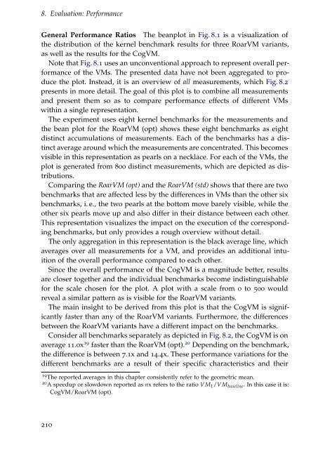
General Performance Ratios The beanplot in Fig. 8.1 is a visualization of<br />
the distribution of the kernel benchmark results for three RoarVM variants,<br />
as well as the results for the CogVM.<br />
Note that Fig. 8.1 uses an unconventional approach to represent overall performance<br />
of the VMs. The presented data have not been aggregated to produce<br />
the plot. Instead, it is an overview of all measurements, which Fig. 8.2<br />
presents in more <strong>de</strong>tail. The goal of this plot is to combine all measurements<br />
and present them so as to compare performance effects of different VMs<br />
within a single representation.<br />
The experiment uses eight kernel benchmarks for the measurements and<br />
the bean plot for the RoarVM (opt) shows these eight benchmarks as eight<br />
distinct accumulations of measurements. Each of the benchmarks has a distinct<br />
average around which the measurements are concentrated. This becomes<br />
visible in this representation as pearls on a necklace. For each of the VMs, the<br />
plot is generated from 800 distinct measurements, which are <strong>de</strong>picted as distributions.<br />
Comparing the RoarVM (opt) and the RoarVM (std) shows that t<strong>here</strong> are two<br />
benchmarks that are affected less by the differences in VMs than the other six<br />
benchmarks, i. e., the two pearls at the bottom move barely visible, while the<br />
other six pearls move up and also differ in their distance between each other.<br />
This representation visualizes the impact on the execution of the corresponding<br />
benchmarks, but only provi<strong>de</strong>s a rough overview without <strong>de</strong>tail.<br />
The only aggregation in this representation is the black average line, which<br />
averages over all measurements for a VM, and provi<strong>de</strong>s an additional intuition<br />
of the overall performance compared to each other.<br />
Since the overall performance of the CogVM is a magnitu<strong>de</strong> better, results<br />
are closer together and the individual benchmarks become indistinguishable<br />
for the scale chosen for the plot. A plot with a scale from 0 to 500 would<br />
reveal a similar pattern as is visible for the RoarVM variants.<br />
The main insight to be <strong>de</strong>rived from this plot is that the CogVM is significantly<br />
faster than any of the RoarVM variants. Furthermore, the differences<br />
between the RoarVM variants have a different impact on the benchmarks.<br />
Consi<strong>de</strong>r all benchmarks separately as <strong>de</strong>picted in Fig. 8.2, the CogVM is on<br />
average 11.0x 19 faster than the RoarVM (opt). 20 Depending on the benchmark,<br />
the difference is between 7.1x and 14.4x. These performance variations for the<br />
different benchmarks are a result of their specific characteristics and their<br />
19 The reported averages in this chapter consistently refer to the geometric mean.<br />
20 A speedup or slowdown reported as nx refers to the ratio VM 1 /VM baseline . In this case it is:<br />
CogVM/RoarVM (opt).<br />
210