Wenger Brand Standards Guide-Fall2011 v1_03.pdf - TRG Group
Wenger Brand Standards Guide-Fall2011 v1_03.pdf - TRG Group
Wenger Brand Standards Guide-Fall2011 v1_03.pdf - TRG Group
Create successful ePaper yourself
Turn your PDF publications into a flip-book with our unique Google optimized e-Paper software.
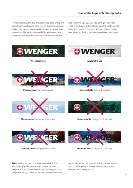
Use of the logo with photography<br />
In most instances, the logo should not be placed on top of a<br />
photographic background. However, if it becomes necessary<br />
to place the logo on a photograph, be sure to place it on an<br />
area with as little variety as possible (it may be necessary to<br />
retouch the photograph to do this). When determining which<br />
logo version to use, you may follow the gray box rules<br />
(“Use of the logo on colored backgrounds”), but be sure to<br />
consider the entire background and not just one specific<br />
area. See the following color photograph examples below:<br />
Acceptable use<br />
Acceptable use<br />
Unacceptable: too much contrast<br />
Unacceptable: too much contrast<br />
Unacceptable: background is too light<br />
Unacceptable: background is too dark<br />
Unacceptable: background is too busy<br />
Unacceptable: background is too busy<br />
Note: placing the logo on any background other than<br />
<strong>Wenger</strong> gray quickly becomes a matter of personal<br />
judgement. If you do not feel comfortable making such a<br />
judgement, or if you feel than any of the previous examples<br />
are unclear, we strongly suggest that you simply use the<br />
logo on a <strong>Wenger</strong> gray background as shown at the<br />
opening of the “Logo” section.<br />
12


