

Using TAdvShapeButton & TAdvPreviewMenu - TMS Software
Using TAdvShapeButton & TAdvPreviewMenu - TMS Software
Using TAdvShapeButton & TAdvPreviewMenu - TMS Software

Create successful ePaper yourself
Turn your PDF publications into a flip-book with our unique Google optimized e-Paper software.
<strong>Using</strong> <strong>TAdvShapeButton</strong> & <strong>TAdvPreviewMenu</strong><br />
<strong>Using</strong> <strong>TAdvShapeButton</strong> & <strong>TAdvPreviewMenu</strong><br />
Introduction<br />
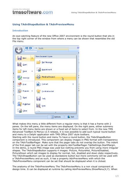
An eye-catching feature of the new Office 2007 environment is the round button that sits in<br />
the top right corner of the window from where a menu can be shown that resembles the old<br />
File menu.<br />
What makes this menu a little different from a regular menu is that it has a frame with 2<br />
panes. On the left pane, the menu items are displayed. On the right pane, either submenu<br />
items for left menu items are shown or a fixed set of items to select from. In the new <strong>TMS</strong><br />
Advanced ToolBars & Menus v2.5 release, it is now possible to add such typical round button<br />
and menu to a Delphi application with <strong>TMS</strong> Office 2007 style toolbars.<br />
Starting with the round button and menu To have a round button, the <strong>TAdvShapeButton</strong><br />
component is introduced. This component can display images in PNG format with transparency<br />
on the TAdvToolBarPager. Make sure that the pager tabs do not overlap the button. The indent<br />
of the first pager tab can be set with the property AdvToolBarPager.TabSettings.StartMargin.<br />
In the demo, a round PNG image was used but nothing prevents you from using more irregular<br />
shapes. The <strong>TAdvShapeButton</strong> supports 4 images: Picture, PictureHot, PictureDisabled,<br />
PictureDown which set images to display for normal, hot, disabled and down state respectively.<br />
The <strong>TAdvShapeButton</strong> can be used as standalone button but more commonly will be used with<br />
a <strong>TAdvPreviewMenu</strong> and as such, it has a property AdvPreviewMenu with which the<br />
<strong>TAdvPreviewMenu</strong> component can be set that should be displayed when it is clicked.<br />
The anatomy of the <strong>TAdvPreviewMenu</strong> The <strong>TAdvPreviewMenu</strong> is a non visual component at<br />
design time. It can be displayed at runtime by calling AdvPreviewMenu.ShowMenu(X,Y). When<br />
1/3
<strong>Using</strong> <strong>TAdvShapeButton</strong> & <strong>TAdvPreviewMenu</strong><br />
assigned to a <strong>TAdvShapeButton</strong>, it will be displayed automatically at the correct position by the<br />
<strong>TAdvShapeButton</strong>. The <strong>TAdvPreviewMenu</strong> has a frame with 2 panes. The left pane is being<br />
used to show MenuItems and the right pane is used to show SubMenuItems. The MenuItems<br />
are defined through the property <strong>TAdvPreviewMenu</strong>.MenuItems which is a collection of<br />
<strong>TAdvPreviewMenu</strong>Item instances. This class has following properties:<br />
<br />
<br />
<br />
<br />
<br />
<br />
<br />
<br />
<br />
<br />
<br />
<br />
<br />
CanSelect: when true, the item can be selected (clicked) otherwise, it is only used to<br />
show SubMenuItems that can be selected.<br />
Caption: sets the caption of the menu item DisabledPicture: sets the picture for the<br />
disabled state of the menu item<br />
Enabled: when true, the menuitem is enabled<br />
ImageIndex: sets the picture for a menu item through an ImageList assigned to<br />
<strong>TAdvPreviewMenu</strong>.MenuImages<br />
OfficeHint: sets the Office 2007 style hint that is displayed when the mouse hovers the<br />
menu item<br />
Picture: sets the picture for the normal state of the menu item<br />
Separator: when true, the menu item is just a separator, ie. small horizontal line<br />
between menu items<br />
ShortCutHint: this sets the shortcut hint text that is shown when the menu is opened<br />
through its shortcut on the TAdvToolBarPager.<br />
ShortCutSubItemsHint: this sets the shortcut hint text used to open the subitems<br />
SubItems: this is a collection of subitems that can be displayed for a MenuItem.<br />
When items are available in the SubItems collection, a little arrow on the right side of<br />
the menu item indicates this.<br />
SubMenuCaption: this sets the caption text of the submenu, shown at the top of the<br />
right pane<br />
SubMenuItemSpacing: this sets the spacing between items in the submenu<br />
When a menuitem is clicked, it triggers the event OnMenuItemClick with ItemIndex parameter<br />
indicating the menu item index that was clicked.<br />
The right pane shows submenu items. These submenu items can either be defined globally for<br />
the <strong>TAdvPreviewMenu</strong> (and will be displayed for all MenuItems that have no SubItems defined)<br />
or can set per MenuItem. The global defined submenu items are set through<br />
<strong>TAdvPreviewMenu</strong>.SubMenuItems while the subitems per menu are set through<br />
<strong>TAdvPreviewMenu</strong>.MenuItems[index].SubMenuItems. A submenu item has following<br />
properties:<br />
<br />
<br />
<br />
<br />
<br />
<br />
<br />
<br />
DisabledPicture: sets the picture for the disabled state of the submenu item<br />
Enabled: when true, the menuitem is enabled<br />
ImageIndex: sets the picture for a submenu item through an ImageList assigned to<br />
<strong>TAdvPreviewMenu</strong>.SubMenuImages<br />
Notes: this is a stringlist that can hold a description text for a submenu item<br />
OfficeHint: sets the Office 2007 style hint that is displayed when the mouse hovers the<br />
submenu item<br />
Picture: sets the picture for the normal state of the submenu item<br />
ShortCutHint: this sets the shortcut hint text that is shown when the submenu is<br />
opened through its shortcut of the menu item.<br />
When a submenu item is clicked, it triggers the event OnSubMenuItemClick with<br />
ItemIndex parameter indicating the menu item index the submenu belongs to and<br />
SubItemIndex the submenu item index.<br />
Finally, the <strong>TAdvPreviewMenu</strong> also has the capability to have one or more buttons at the<br />
bottom of the frame. The properties of the buttons are set through the Buttons collection. Each<br />
button is defined by a TButtonCollectionItem class with following properties:<br />
<br />
Caption: sets the caption of the button<br />
2/3
<strong>Using</strong> <strong>TAdvShapeButton</strong> & <strong>TAdvPreviewMenu</strong><br />
<br />
<br />
<br />
<br />
<br />
<br />
<br />
DisabledPicture: sets the picture for the disabled state of the button<br />
Enabled: when true, the button is enabled<br />
Font: sets the font of the button<br />
ImageIndex: sets the picture for a menu item through an ImageList assigned to<br />
<strong>TAdvPreviewMenu</strong>.ButtonImages<br />
OfficeHint: sets the Office 2007 style hint that is displayed when the mouse hovers the<br />
button<br />
Picture: sets the picture for the normal state of the button<br />
Width: sets the width of the button.<br />
When a button is clicked, it triggers the event OnButtonClick. This event returns the<br />
parameter ButtonIndex to indicate what button was pressed. Note that the<br />
<strong>TAdvPreviewMenu</strong> will not automatically close when a button is clicked. The menu can be<br />
programmatically closed by calling : AdvPreviewMenu.HideMenu<br />
Choosing a style with the TadvPreviewMenuOfficeStyler<br />
Like a lot of components in this area today, <strong>TAdvPreviewMenu</strong> has a lot of color settings to<br />
customize every aspect of the control. To save the developer time, common sets of colors<br />
that emulate the Office 2007 or Office 2003 colors have been embedded in a separate<br />
styler component: <strong>TAdvPreviewMenu</strong>OfficeStyler. The component can be dropped on the<br />
form and assigned to <strong>TAdvPreviewMenu</strong>.Styler. In this styler, appearance for buttons,<br />
menuitem and frame can be set or more conveniently, a style can be chosen by setting the<br />
Style property. <strong>TAdvPreviewMenu</strong>OfficeStyler is also TAdvFormStyler, TAdvAppStyler<br />
compatible to make it easy to change the style of a complete form or application with a<br />
single property.<br />
3/3


 Change language