Lab 15: Population Genetics - eScience Labs
Lab 15: Population Genetics - eScience Labs
Lab 15: Population Genetics - eScience Labs

Create successful ePaper yourself
Turn your PDF publications into a flip-book with our unique Google optimized e-Paper software.
<strong>Lab</strong> 1 : Scientific Method<br />
<br />
<br />
Title the graph and both the x and y axes such that they correspond to the table from<br />
which they come. For example, if you titled your table “Heart rate of those who eat<br />
vegetables and those who do not eat vegetables”, be sure to title the graph the same.<br />
Determine the most appropriate type of graph. Typically, line and bar graphs are the<br />
most common.<br />
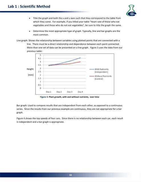
Line graph: Shows the relationship between variables using plotted points that are connected with a<br />
line. There must be a direct relationship and dependence between each point connected.<br />
More than one set of data can be presented on a line graph. Figure 3 uses the data from our<br />
previous table:<br />
Height<br />
(mm)<br />
Figure 3: Plant growth, with and without nutrients, over time<br />
Bar graph: Used to compare results that are independent from each other, as opposed to a continuous<br />
series. Since the results from our previous example are continuous, they are not appropriate for a bar<br />
graph.<br />
Figure 4 shows the top speeds of four cars. Since there is no relationship between each car, each result<br />
is independent and a bar graph is appropriate.<br />
16