Magazine 2/2010 - Emma
Magazine 2/2010 - Emma
Magazine 2/2010 - Emma
- No tags were found...

You also want an ePaper? Increase the reach of your titles
YUMPU automatically turns print PDFs into web optimized ePapers that Google loves.
2 / 2 010
Exhibition programme18.6.–29.8.<strong>2010</strong>EMMAPrize <strong>2010</strong>The finalists in the first EMMA Prize visual arts competition– ten photographers present their series of 3–5 images.29.9.–9.1.2011The Story of Chinese SilkThe exhibition presents Chinese silk garments, accessories and fabrics, some of whichare 5 000 years old. Other exhibits show silkworm cultivation, silk production, weavingtechniques and looms.Between the idea and the reality, 2009.Jorma PuranenThis extensive exhibition of the output of photographic artist Jorma Puranen (b. 1951)focuses on his most recent works but includes others from earlier years. Jorma Puranen isknown for his studies of the Nordic landscape, a subject he approaches conceptually andrevealing the impression left by man and culture on nature and history in his photographs.Juba TuomolaEver since its appearance in 1997, Juba Tuomola’s Viivi & Wagner has been the mostpopular comic strip in Finland. What’s makes the world of this unconventional cartoonso special? What lies behind its humour? EMMA’s exhibition reveals the themes behindthe Viivi & Wagner cartoon as well as the diversity of their creator – caricaturist, painter,playwright and book illustrator.Jorma Puranen, Icy Prospects 5, 2005.You’ve no hairson your chest.Woman, ifyou wanthairs buy afurcoat.Don’t blowyour top.Leave off!I once saw a bloke withsuch hairy legs I thoughtthey were longjohns.Jesus!Juba TuomolaPermanentlyRed in the Saastamoinen Foundation’s collectionThis radiant exhibition built around the myriad hues of red presents morethan 40 works of mainly contemporary art by almost as many artists.The first colour concept exhibition created by the Hannele Grönlund,Päivi Karttunen and Hannu Väisänen team was built around the colourgrey in the on-going Entre chien et loup – at dusk.Leena Luostarinen, Kerameikos, 2001.
Content is everythingEMMA – <strong>Magazine</strong> ofthe Espoo Museumof Modern ArtNext issueSeptember <strong>2010</strong>PUBLISHEREMMA – EspooMuseum of Modern ArtEDITOR-IN-CHIEFLeena JoutsenniemiEDITORIAL BOARDAri Karttunen,Päivi Karttunen,Nana Salin,Päivi TalasmaaENGLISH TRANSLATIONMichael Wynne-EllisLAYOUT Station MIR OyPRINTERSArtPrint OyEdition: 25000 copiesChange in address,orders (gratis)and feedback:info@emma.museumContact informationon back cover.My exhibition ”Photographer Caj Bremer” at the Ateneum Art Museum in Helsinkiis over. The outcome of four years of preparatory work was an unforgettableexperience. It was tremendously popular, with 60 thousand visitors, and a wonderfultribute to me and my pictures, but also to photography in general.Photography these days is divided into numerous different branches and directions,and there are countless differing outlooks. Simultaneously there has been a revolutionarychange in photographic technique. The highly sophisticated technology available totoday’s photographers allows them to do anything.For many, the word photographer no longer suffices. You have to tag on such wordsas free, art, documentary or journalist to give the correct classification. Some just callthemselves artists. Perhaps photo artist is nearer the mark?For young photographers like the EMMA Prize finalists the way forward is wideopen. Many have taken up photography full time and work as freelancers. They participatein competitions and exhibit their works in galleries and art museums. Some succeed,others don’t. Competition for recognition is tough, you always have to be thinkingup new ideas and subjects.I’ve often been asked what makes a good photograph and my answer is always thesame: content. Whatever camera it’s been taken with, whatever the technique usedor the enthusiasm involved, the picture has to say something. You have to create thecontent yourself; technique alone doesn’t help.In my exhibition I saw many laughing,smiling, contemplative and serious faces.My days were filled with guiding all kinds of groups around and in doing so I tried togive a colourful account of the stories behind the pictures. Apparently I was successfulbecause people were generous in expressing their thanks not only for the guidance,but also for the photos and the exhibition as a whole.My experience shows that there is still sufficient interest in the traditional documentaryphotograph. Fictional art photography may have its own appeal, but whether thistrend survives is another story. It seems that people would also like to see contemporaryhistory documented. Who will photograph ordinary life today?Caj BremerPhotographerPatron of the EMMA Prize <strong>2010</strong> competition3
The crop for the firsttriennial EMMA Prize visualarts competition is now ripefor the public to enjoy.This time the art form wasphotography, next time itwill be something else.This summer’s exhibitionof the ten finalists offers astimulating cross-sectionof the work of the youngergeneration of photographersin this country. They eachhave their own distinctiveway of playing with lightand shadow, whetherproducing classicalportraits or digital,computer- generatedcollages.Text Leena JoutsenniemiBetween the idea and the reality, 2009.Mikko Rikala studiesthe relationship betweenless than 146 series were entered, aNO total of 590 photographs, which thejury viewed anonymously. There was a clearemphasis on narratives and art prints but veryfew documentary pictures.- The entries were of very high standard,says jury chairman Markku Valkonen, so it wasno easy task selecting the ten finalists.The competition was won by Mikko Rikalafor his series Between idea and reality.- The series shows a masterly ability tograsp both moment and situation that is soessential in photography. The works are enigmatic,almost surrealist, fresh and optimistic.Although the first impression comes quickly, tocapture everything you are forced to linger. Interms of composition and colour they functionbeautifully together, says Valkonen summingup the jury’s impressions.In addition to the chairman Markku Valkonen,the members of the jury were EMMAcurator Päivi Talasmaa, Tapiola Group directorArto Jurttila, photographers Timo Kelaranta andRitva Kovalainen of the Union of Artist Photographersand artist Anja Rahola, of the Friendsof EMMA Society.
EMMA PrizeElina Julin (born 1979 )Anna Katariina Pesonen (born 1979)Elina Julin, Ghosts, <strong>2010</strong>.Ghosts / Haamut, <strong>2010</strong>Ghosts here are the ghosts of pictures, theunseen parts of my photographs, the masks ofpictures familiar to the photographer. I work alot on the screen and that’s where these interestingfigures appeared from. I have processedmasks in the same way as I would have processedany of my photos. In any case I wish todraw attention to those insignificant and soundlessthings that often remain unnoticed. Simplethings are often the most complex. Theseghosts, as my friend calls them, have now materialisedout of nothingness. The series revealsmy interest in how a picture is made, the roleof light and shadow, and simplified expression.I think my work could as easily be from ink orcharcoal as a photogram, even if they are justsimply photographs.Autobiography, 2009My series is based on Laura Mulvey’s feministfilm theory, the main thesis of which is that inmainstream commercial cinema women arealways shown as the object of the male gaze.Experimental film avoids treating women as apassive object because the viewer is aware thatit is only a story on a screen.In my series I am using a traditional set ofmotifs. Perhaps the most featured parts of thehuman body are the torso, the back and thecurve of hip. Using different elements and photographicmethods, I have tried to distance theviewer from the body as such. In the individualphotographs, I refer to the models, phenomena,but also the idols and fancies imposed onwomen during their lives.Mikko Rikala (born 1977)Kimmo Metsäranta, A falsesense of space, <strong>2010</strong>.Nelli Palomäki, Sanni at 30 years, <strong>2010</strong>.Kimmo Metsäranta (born 1978)A False Sense of Space, <strong>2010</strong>In my series I study how the imagination canfashion a space in the dark and tell a storyon the basis of the fragments I’ve provided.Spaces are like stages for events in which manis present in one way or another. These staticlooking places retain the assumption of pastor future events whilst the darkness feeds theimagination. Similarly, the absence of allusionsallows viewers to have their own interpretationbased on fantasies. Story-telling has a powerfulpresence in my series, partly due to the tensioncreated by the darkness in the photos, butabove all because of the influence of the cinematographicnarrative. Our way of interpretingpictures is strongly influenced by what we havealready seen.Between the idea and the reality, 2009My work examines how man adapts to theenvironment. Instead of concrete documentationI approach the subject more abstractly.The element of hiding in the pictures is a metaphoricalway of reacting to the environment. Itleaves room for the viewer’s own experiencesand associations. The figures in my picturesdo not directly adapt to their environment orrise up against its demands. They react tothe environment, relate to it in some way anduse elements of it to create a kind of maskbetween them and the viewer. The gesture ofmasking removes their seen identity, whichdefines them according to age, colour, genderand social role. At the same time the way inwhich they mask themselves reveals somethingessential about their character. What isrevealed when the surface is concealed?Nelli Palomäki (born 1981)6Anna Katariina Pesonen, Frida, <strong>2010</strong>.Aino 27 years, Julia 5 yearsand Sanni 30 years, from theseries Elsa and Viola, <strong>2010</strong>.My works are pure portraits. I believe that a portraithas the ability to convey memories of a specifictime, at its most successful to show eventsfrom a number of years. A picture can simultaneouslyreveal, conceal or even harm. Whatis most important is the presence of the sitterand the look that focuses on the photographer,the thoughts of viewer and sitter. The intimatemood of the pictures is created by the degree ofsensitivity and interactivity that exists betweenme and the sitter when I’m taking the picture.I don’t want colours in my pictures. Black andwhite supports the feeling of timelessness; sittersare not bound to any specific day.Jarkko Räsänen (born 1984)1 & 3 ways (<strong>2010</strong>)The pictures in the series are photographic collages.I have written a computer program thatenables me to slice the digital picture file intothin strips and reorganise them according todifferent parameters. The result is three versionsof the same file, not one of which lookslike the original photo of the stairway. Thespaces portrayed in this parallel series of largeprints communicate with each other and createimages of new spaces.
FinalistsBetween the idea and the reality, 2009.Anu Suhonen, Reflection:Surface and Depth, <strong>2010</strong>Jarkko Räsänen, 1&3 ways, <strong>2010</strong>Saku Soukka, Between, <strong>2010</strong>Saku Soukka (born 1982)Always 2009-<strong>2010</strong>In my pictures I visualise the emotions relatedto the reflection of my identity through the personwith whom I intend to share the future.This involves the attempt to become as consciousas possible of my own identity via theemotions of identification and alienation.When taking the photos I have paused andrecorded views taken at different times. Also Ihave often photographed the space from differentangles and points. Later by combiningthe pictures, I express chronological transfersand changes, and try to create various andsometimes surrealistic impressions of thespace. In this process I am also interested increating a narrative similar in style to the videosand cartoon strip.Anu Suhonen (born 1970)Reflections*, <strong>2010</strong>This work consists of five circular photographsand two round mirrors. It lives the whole timedepending on the angle from which it is viewed– what is reflected in the mirrors – and howwhat is reflected in the mirrors compares tothe photographs. The relationship of the mirrorand the photograph to reality is the same –except that photograph’s mirror reflection hasbeen arrested.*reflect (mirror, project, ponder, cogitate,deliberate, describe, to “reflect” visually or“reflect” light).Linda Maria Varoma (born 1985)From zero to a hundredin three minutes, <strong>2010</strong>My work tells how our continuous need to succeedaffects us and our way of thinking. Themore we free ourselves from the dominationof these expectations and pressures, the moreroom we have for our thoughts.Filippo Zambon (born 1981)The state of things, <strong>2010</strong>In January <strong>2010</strong> my friend, a doctor workingfor the Physicians for Human Rights organisation,invited me to visit a small hospital in thenorthern savanna area of Burkina Faso, a fewhundred kilometres from the capital Ouagadougou.Whilst in Burkina Faso I photographedthe state of the country’s health service andeveryday life in the nearby villages. My interestfocused in particular (though not exclusively)on the condition of children in the countrysidemost of whom suffer from malnutrition.Linda Maria Varoma, From zero to ahundred in three minutes #3, <strong>2010</strong>Filippo Zambon, The State of things, <strong>2010</strong>7
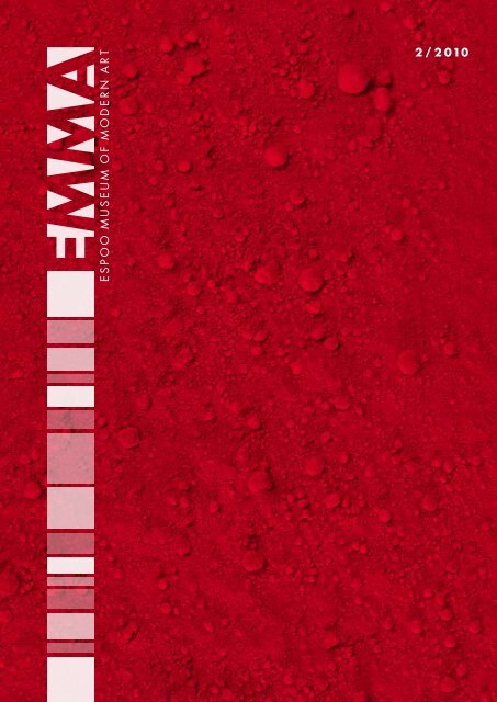
Talkingof red” Red is perhaps themost diverse and eloquentof all colours and for thatreason the most living”Carolus EnckellArtistCarolus Enckellinterviewed byPäivi KarttunenPhotosAri Karttunen,Milja LaurilaPäivi Karttunen: Let’s talk about the colour redin art. You mentioned Fra Angelico, Breugheland Barnett Newman, when I asked you whichartist comes first to mind when you think aboutthe use of red in art. Why these three?Carolus Enckell: Because they all used itinterestingly, differently, metaphorically. FraAngelico, in my opinion, used it to symbolisethe divine state, as an expression of gentledevoutness on the faces of people in hispaintings. For Breughel red, or more correctlyorange-red, portrays the profane life, somethingmundane, close to man, whereas BarnettNewman, contrary to the other two, createscolour. For Newman, colour is a pure state,something archaic into which you can becomesubmerged.PK: You’re a painter and use a lot of red inyour work. You’ve said that this was due to yourvisit to Morocco in the 1970s. You experiencedMorocco as a country of red landscapes thatappealed to your senses. How did your relationshipto the colour red begin?CE: Largely because I felt that the characterof red was more dominant than any other colour.More than others it makes a statement– it has authority, it has the widest register ofall colours, the most hues. Perhaps the onlyother colour that can compete with it is green.Another source of red came from my interestin Kasimir Malevich and his Suprematism –the symbol of revolution. Perhaps not in thepolitical sense but as a symbol of change, thenecessity for spiritual growth, just as whitesymbolised for him eternity.PK: Now and then you have titled your workswith references to certain artists. Let’s get backto the reds of Fra Angelico and Breughel andyour creative work.CE: In some of my works I’ve used Lefranc& Bourgeois’s oil paints with names like FraAngelico Red, Uccello Red and Breughel Red.I presume the object of the company was tosimulate these artists’ reds in their paints. Thishas made me think whether the viewer is ableto associate these colours with the relevant art-The Saastamoinen Foundation’s new hanging around the theme of Red is now showing at EMMA.8
ists. The works in which I use these titles aresimultaneously both question and proposition.How do you think aboutcolour and colour theory?CE: If you mean the ”colour theories” used inart schools and intended to be applied to practicalworking, their structure is not based onany theory, neither are they abstract in character,but based to a large extent on seeing,observation.This could be called the empirical method ofseeing colours as artistic tools. Hence teaching,not theory. Colour theories come from theworld of physics.You mention two traditions ofcolour theory. What are they?CE: To my mind the first is the so-called analyticalmethod based on the observations ofNewton and Chevreul concerning the relationshipbetween light and colour. This was furtherdeveloped by the Neo-Impressionists whodivided light into coloured segments (divisionism),bringing about an optical colour mixturein the eye. This meant that colour was used torecreate light.The second theory stems from Romanticismand Goethe, which attempts to create coloursvia observation. Josef Albers’s view is a systematicdevelopment of this.What is your theory of colour?CE: My view is based on the colours of myimagination. The colours that take shape inme, ie, the colours that become independentvalues without observable models.PK: You have been teaching at the FreeArt School for a long time now. What has thismeant to you most?CE: The school and its pedagogical content.For me it has meant not only excellent teachingmethods but a kind of all-round university educationin art history with a special emphasison modern painting, yet not forgetting classicalpainting. In addition the school has functionedas a creative forum on issues relating to thearts.In the 1970s, the Free Art School was thefirst art school to organise long-term colourteaching. This was based on Josef Albers’sideas. The courses were attended by peoplefrom outside the school and from other artschools. The School published a translation ofAlbers’s book so other schools could arrangecourses on the subject. Colour theory coursesare no longer compulsory or play a central rolein teaching. Goethe’s theory of colour, however,is still taught at the School.
Tony OurslerMercurytext Leena KuumolaPhoto Ari Kartttunendark, star-speckled sky, two soft sculpturalshapes. Reflections and endlessAmovement as two voices talk. These are theelements in Tony Oursler’s video installationMercury. Tony Oursler (born New York 1957) isan American artist known throughout the worldfor his enigmatic works. He’s into performance,video, painting and sculpture as the call takeshim. He’s curious about people in odd situationsand different mutations.Oursler’s video installations are spatial happeningsin which sound and image combinewith physical form to create integral experiences.In his works the often nature-inspiredsurrealist elements create imaginary and multifacetednarratives. His moving image cannotbe seen on the angular screen of the monitorsbut on the surface of the changing objects inwhich its ever-changing nature emphasisesalienation.The Mercury on show at EMMA consists ofseveral different layers. The dark spacescapewith all its stars in the dimly lit room is full of10mystery. The shadows cast on the walls are oftwo soft, spherical shapes outlined by a shininglight with a profusion of stars in between.Some of them are moving slowly and deliberatelytowards the viewer. The surface of thesesculptural bodies glitters and continuouslychanges in the reflection of the moving image.A flood of chatter gushes from the women’stalking mouths. Slowly opening and shuttingeyes can be clearly seen in the shining formaround one of them. Occasionally, the otherone metamorphoses, turns slowly up-sidedown,becoming momentarily discernible. Themoving image assumes round shapes, thuscreating optical illusions and impressions. Justlike the images reflected on the moving surfaceof water become but pale shadows of reality.The shapes stretch and contract, fracture andreform in this continuous organic movementevery so often reverting into a recognisableshape. The chatter from the mouths is far froma dialogue as each is completely withdrawninto its own world.This world is characterised by a passionateconcentration, a stream of consciousness thatoccasionally drops to a mere whisper. Wordsfollow each other, are sometimes repeated andchange into a confusing emotional expression.The occasional eerie laugh brings recollectionsof shattering mental delusions. An intensivehumming sound of varying density echoes inthe space above. In his works Oursler playswith powerful opposites. The lyrical and tranquilnature of the background is continuouslybeing fractured by perpetual movement, ramblingimages and chaotic sound. Its enigmatictranquility only emphasises the comminutionof the intensity of continuous change. At thesame time as we feel we are in an enclosedspace so the work strongly suggests the infinitybeyond everyday reality.
ASK!Does some artterm puzzle you?Send your questions to:info@emma.museumWhat doesLambdamean?Or Diasec orChromogeniccolour print?xhibition visitors are often bewildered byE the terms used to describe the varioustechniques in photography. Is the work on thewall a photograph even though the techniqueis called ”Lambda”? EMMA’s photographerMilja Laurila reveals all the secrets behind theterms on labels.Get to know these techniques by visiting theEMMA Prize exhibition and the SaastamoinenFoundation collection.LambdaThis is the name used for photographs printedon genuine photographic paper from a digitalfile. The computer generated digital image isexposed onto photographic paper by lasers,which is then developed using traditional photographicchemicals. Lambda is the name forthe equipment of one manufacturer – the usualterm for this technique is digital colour print.Chromogenic colour printA print developed from a negative onto photographicpaper. The image is reflected ontophotographic paper via an enlarger and theexposed paper developed with photographicchemicals. Traditional ”10 x 15” prints arechromogenic colour prints. Another term forthe process is analogical colour printas opposed to a digital colour print.DiasecThis is a patented process for face-mountingphotographic prints on approximately 1 centimetre-thick,transparent acrylic glass. This isthen fixed to a carrier at the backside, like athin sheet of aluminium, with the result thatthe print lies between two sheets. It is saidthat Diasec enhances the detail and colourof photographs which is why the process hasbecome popular with exhibiting photographers.Diasec is not available in Finland which usesan equivalent, optical silicon process calledSilisec.MountingThe finished print is bonded to a thin sheet ofeither aluminium or acrylic glass. This makes itpossible to fix a profiled bar behind the photoenabling it to be hung on the wall. The photocan also be framed. An aluminium-bondedprint will keep its shape and can be hung on awall without damaging the photograph itself.Aluminium-bonded photographs in exhibitionsare often laminated with a transparentprotective film with either a gloss or matt finish(rather in the same way as protecting bookswith contact paper).Guided tours and workshopsIn July we will also be arranging a short-noticeArt Quarter in English. Ask from the EMMAInfo Desk on the ground floor for the day’sprogramme.Guided tour reservations in advance only.Mon–Fri, 9.00–12.00.Tel. +358 (0)9 8163 0493.Art QuarterWeekdays 45€, Sat–Sun 70€This is a short introduction to a varying individualwork in the current exhibition. The ArtQuarter guide will answer questions and holddiscussions. Group size 25 persons max.Duration 15 min.Art HourWeekdays 45€, Sat–Sun 70€A tour of selected works in the currentexhibition. Group size 25 persons max.Duration 45 min.Supervised workshopsWeekdays 100€, Sat 120€,children under 18 years 80€Introduction to the exhibitions and differentways of working with art. Recommended groupsize 25 persons max. Duration 1h 30 min– 2 h30 min. Larger groups may be split between2 guides when the charge is doubled.Art fairy workshop invitationsFor children over 4 years. The invitationincludes fairytale guidance around theexhibition, supervised workshop inclusive ofmaterials and a fabulous meal at Café WeeGee.Duration 2 h + (unsupervised) meal ½ h.Group size max. 15 children + 5 adults.Reservations to be made at least oneweek before the invitation.Charge: 80 € / group and optionalmenu 7.30 € / personAUDIO GUIDEIn Between the dog and the wolf, painter andwriter Hannu Väisänen takes the listener intothe world of black, white and grey.Languages: Finnish, Swedish, English, French.Duration: 15 min.No charge.Juneand JulyArt QuarterIntroduction to Red, the new hangingof works from the SaastamoinenFoundation collection. Duration 15 min.Sundays in English at 2 pm.11
WeeGee-building, 2nd floorcv e r a n t aEMMA pRiZEOURSLEREMMA pRiZEvideogalleriasaliEntRE chiEn Et LOUp –At DUSkagorastairsraittithE SAAStAMOinEn FOUnDAtiOn ARt cOLLEctiOnExpo ciné 20.-29.8. Expo ciné 20.-29.8.boxiRED RED REDsalonkiliftEMMAshopiLME workshopEMMA Espoo Museum of Modern ArtExhibition center WeeGee,Ahertajantie 5, Tapiola+ 358 (0)9 8165 7512www.emma.museumGuided tour reservationsin advance only.Mon–Fri, 9.00–12.00.Tel. +358 (0)9 8163 0493.Open Tues-Fri 11–18,Sat-Sun 11–17WeeGee-ticket (5 museums) 10/8 €Visitors under 18 andover 70 years are admitted free.Busses from Kamppi, Helsinki:106 and 110Exhibition Centre WeeGee(09) 8163 1818