2012 media KiT - Clear Channel Outdoor
2012 media KiT - Clear Channel Outdoor
2012 media KiT - Clear Channel Outdoor
You also want an ePaper? Increase the reach of your titles
YUMPU automatically turns print PDFs into web optimized ePapers that Google loves.
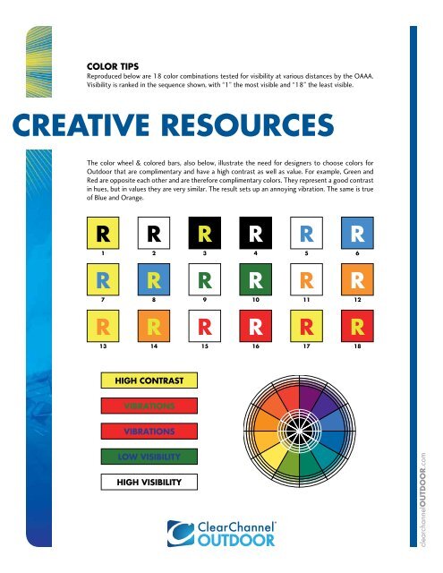
COLOR TiPS<br />
Reproduced below are 18 color combinations tested for visibility at various distances by the OAAA.<br />
Visibility is ranked in the sequence shown, with “1” the most visible and “18” the least visible.<br />
CREATIVE RESOURCES<br />
The color wheel & colored bars, also below, illustrate the need for designers to choose colors for<br />
<strong>Outdoor</strong> that are complimentary and have a high contrast as well as value. For example, Green and<br />
Red are opposite each other and are therefore complimentary colors. They represent a good contrast<br />
in hues, but in values they are very similar. The result sets up an annoying vibration. The same is true<br />
of Blue and Orange.<br />
R<br />
1<br />
R<br />
7<br />
R<br />
13<br />
R<br />
2<br />
R<br />
8<br />
R<br />
14<br />
HiGH CONTRaST<br />
ViBRaTiONS<br />
ViBRaTiONS<br />
LOW ViSiBiLiTY<br />
HiGH ViSiBiLiTY<br />
R<br />
3<br />
R<br />
9<br />
R<br />
15<br />
R<br />
4<br />
R<br />
10<br />
R<br />
16<br />
R<br />
5<br />
R<br />
11<br />
R<br />
17<br />
R<br />
6<br />
R<br />
12<br />
R<br />
18<br />
clearchannelOUTdOOR.com


