- Page 1 and 2:
COPYRIGHT 2008, PRINCET O N UNIVE R
- Page 3 and 4:
−101COPYRIGHT 2008, PRINCET O N U
- Page 5 and 6:
Copyright © 2008 by Princeton Univ
- Page 7 and 8:
−101COPYRIGHT 2008, PRINCET O N U
- Page 9 and 10:
viiicontents2.3 Experimental Error
- Page 11 and 12:
xcontents6.3 Experimentation 1356.4
- Page 13 and 14:
xiicontents9.7.1 Friction: Model an
- Page 15 and 16:
xivcontents12.8 Signals of Chaos: L
- Page 17 and 18:
xvicontents14.15.2Exercise 2: Cache
- Page 19 and 20:
xviiicontents18.4 Waves for Variabl
- Page 21 and 22:
xxcontentsC.3 DX Tools Summary 576C
- Page 23 and 24:
−101COPYRIGHT 2008, PRINCET O N U
- Page 25 and 26: xxivprefacewhich includes understan
- Page 27 and 28: −101COPYRIGHT 2008, PRINCET O N U
- Page 29 and 30: 2 chapter 1PhysicsCPFigure 1.1 A re
- Page 31 and 32: 4 chapter 1Scientific LibrariesPerf
- Page 33 and 34: 6 chapter 1C DWe have tried to make
- Page 35 and 36: 8 chapter 1possibly when installing
- Page 37 and 38: 10 chapter 11.4.1 Structured Progra
- Page 39 and 40: 12 chapter 17. Revise Area.java so
- Page 41 and 42: 14 chapter 1argv). Because main met
- Page 43 and 44: 16 chapter 1Package Class Tree Depr
- Page 45 and 46: 18 chapter 1Memory and storage size
- Page 47 and 48: 20 chapter 1TABLE 1.4The IEEE 754 S
- Page 49 and 50: 22 chapter 1gives 24-bit precision
- Page 51 and 52: 24 chapter 1TABLE 1.6Representation
- Page 53 and 54: 26 chapter 1The computer fetches th
- Page 55 and 56: 28 chapter 1Your problem is to use
- Page 57 and 58: 2Errors & Uncertainties in Computat
- Page 59 and 60: 32 chapter 2purposes, let us consid
- Page 61 and 62: 34 chapter 2can be avoided by combi
- Page 63 and 64: 36 chapter 2means that a program ru
- Page 65 and 66: 38 chapter 2To be more specific, le
- Page 67 and 68: 40 chapter 2Let us assume that an a
- Page 69 and 70: 42 chapter 2To see if these assumpt
- Page 71 and 72: 44 chapter 2computation. Accordingl
- Page 73 and 74: 46 chapter 3is regular practice to
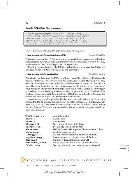
- Page 75: 48 chapter 3to plot for x and y, we
- Page 79 and 80: 52 chapter 3TABLE 3.1Text Files Gra
- Page 81 and 82: 54 chapter 3Figure 3.4 Left: A plot
- Page 83 and 84: 56 chapter 3TABLE 3.2Grace Menu and
- Page 85 and 86: 58 chapter 33.4.1 Gnuplot Input Dat
- Page 87 and 88: 60 chapter 3gnuplot> set output "pl
- Page 89 and 90: 62 chapter 3gnuplot> set terminal e
- Page 91 and 92: 64 chapter 3By setting terminal to
- Page 93 and 94: 66 chapter 33.6 Texturing and 3-D I
- Page 95 and 96: 68 chapter 4R R 2RL L 2LC C 2CFigur
- Page 97 and 98: 70 chapter 44.3 Resistance Becomes
- Page 99 and 100: 72 chapter 4be either static or dyn
- Page 101 and 102: 74 chapter 4On line 8 we see a meth
- Page 103 and 104: 76 chapter 44.4.3 Static and Nonsta
- Page 105 and 106: 78 chapter 42. Compile and execute
- Page 107 and 108: 80 chapter 41 / Z0.51400R0400R80021
- Page 109 and 110: 82 chapter 4no arguments and return
- Page 111 and 112: 84 chapter 42. Define a daughter cl
- Page 113 and 114: 86 chapter 4new features without
- Page 115 and 116: 88 chapter 4qFigure 4.7 Left: The t
- Page 117 and 118: 90 chapter 4with properties differi
- Page 119 and 120: 92 chapter 4In a project such as th
- Page 121 and 122: 94 chapter 4data types called objec
- Page 123 and 124: 96 chapter 46. Change the mass of t
- Page 125 and 126: 98 chapter 4Check that all the plot
- Page 127 and 128:
100 chapter 43. You should see now
- Page 129 and 130:
102 chapter 44.9.11 Complex Object
- Page 131 and 132:
104 chapter 4✞/ / KomplexTest : t
- Page 133 and 134:
106 chapter 4motion in other direct
- Page 135 and 136:
108 chapter 4✝protected double y(
- Page 137 and 138:
110 chapter 5Mathematically, the li
- Page 139 and 140:
112 chapter 5The linear congruent m
- Page 141 and 142:
114 chapter 5TABLE 5.1A Table of a
- Page 143 and 144:
116 chapter 55.3 Unit II. Monte Car
- Page 145 and 146:
118 chapter 5300y0-10-20R2001000 20
- Page 147 and 148:
120 chapter 54100,000log[N(t)]10,00
- Page 149 and 150:
122 chapter 5✞/ / Decay . java :
- Page 151 and 152:
124 chapter 6f(x)a x i x i+1 x i+2
- Page 153 and 154:
126 chapter 6f(x)f(x)parabola 1para
- Page 155 and 156:
128 chapter 6evaluate the function
- Page 157 and 158:
130 chapter 6⇒ N =( ) 2/91 1(ɛ m
- Page 159 and 160:
132 chapter 63. [−∞→∞], sca
- Page 161 and 162:
134 chapter 6}public static double
- Page 163 and 164:
136 chapter 6the integral of f(x)=1
- Page 165 and 166:
138 chapter 6f(x)< f(x) >xFigure 6.
- Page 167 and 168:
140 chapter 61. Conduct 16 trials a
- Page 169 and 170:
142 chapter 6acceptrejectFigure 6.6
- Page 171 and 172:
144 chapter 6The crux of this techn
- Page 173 and 174:
7Differentiation & SearchingIn this
- Page 175 and 176:
148 chapter 7the forward-difference
- Page 177 and 178:
150 chapter 7algorithm (7.7) is O(h
- Page 179 and 180:
152 chapter 7algorithms in which de
- Page 181 and 182:
154 chapter 7we know a zero occurs.
- Page 183 and 184:
156 chapter 7Figure 7.3 Two example
- Page 185 and 186:
8Solving Systems of Equationswith M
- Page 187 and 188:
160 chapter 8the spheres, and the d
- Page 189 and 190:
162 chapter 8We now have a solvable
- Page 191 and 192:
164 chapter 8of (8.19) by A −1 :x
- Page 193 and 194:
166 chapter 8Row MajorColumn Majora
- Page 195 and 196:
168 chapter 8having different varia
- Page 197 and 198:
170 chapter 8Matrix objects, add an
- Page 199 and 200:
172 chapter 8✞/∗ JamaFit : JAMA
- Page 201 and 202:
174 chapter 8( ) α β3. Consider t
- Page 203 and 204:
176 chapter 8discarding some inform
- Page 205 and 206:
178 chapter 8Lagrange interpolation
- Page 207 and 208:
180 chapter 8Figure 8.3 Three fits
- Page 209 and 210:
182 chapter 8if you have the abilit
- Page 211 and 212:
184 chapter 840fitNumber20dataN(t)0
- Page 213 and 214:
186 chapter 8theoretical curve went
- Page 215 and 216:
188 chapter 8This is a measure of t
- Page 217 and 218:
190 chapter 88.7.4 Linear Quadratic
- Page 219 and 220:
192 chapter 8Your problem here is t
- Page 221 and 222:
9Differential Equation Applications
- Page 223 and 224:
196 chapter 9V(x)HarmonicAnharmonic
- Page 225 and 226:
198 chapter 9B(t) are solutions of
- Page 227 and 228:
200 chapter 9This expresses the acc
- Page 229 and 230:
202 chapter 9derivative:dy(t)dt≃
- Page 231 and 232:
204 chapter 9As an example of the u
- Page 233 and 234:
206 chapter 9C Dhigh-precision work
- Page 235 and 236:
208 chapter 9Amplitude Dependence,
- Page 237 and 238:
210 chapter 9Here N is the normal f
- Page 239 and 240:
212 chapter 99.9 Unit II. Binding A
- Page 241 and 242:
214 chapter 9the Schrödinger equat
- Page 243 and 244:
216 chapter 99.11.1 Numerov Algorit
- Page 245 and 246:
218 chapter 9}}xl = xl0+i∗h;ul[i]
- Page 247 and 248:
220 chapter 9public static double d
- Page 249 and 250:
222 chapter 99.13 Unit III. Scatter
- Page 251 and 252:
224 chapter 9The equations for the
- Page 253 and 254:
226 chapter 9Figure 9.9 The traject
- Page 255 and 256:
228 chapter 9fFigure 9.10 Left: The
- Page 257 and 258:
230 chapter 99.17.1.1 EXPLORATION:
- Page 259 and 260:
232 chapter 10y(t)10Y( )10-1t-10 20
- Page 261 and 262:
234 chapter 10As seen in the b n co
- Page 263 and 264:
236 chapter 1010.4 Fourier Transfor
- Page 265 and 266:
238 chapter 10Regardless of the act
- Page 267 and 268:
240 chapter 10for the exponential a
- Page 269 and 270:
242 chapter 10102 4 6-1Figure 10.2
- Page 271 and 272:
244 chapter 10coefficients a k . If
- Page 273 and 274:
246 chapter 104. As always, check t
- Page 275 and 276:
248 chapter 10A special case of the
- Page 277 and 278:
250 chapter 10Figure 10.4 Input sig
- Page 279 and 280:
252 chapter 10Figure 10.5 Left: An
- Page 281 and 282:
254 chapter 10A 1.5mp1.0lit 0.5ud 0
- Page 283 and 284:
256 chapter 1010.8 Unit III. Fast F
- Page 285 and 286:
258 chapter 10Figure 10.9 The basic
- Page 287 and 288:
260 chapter 10TABLE 10.1Binary-Reve
- Page 289 and 290:
262 chapter 10✞/∗ FFT. java : F
- Page 291 and 292:
11Wavelet Analysis & Data Compressi
- Page 293 and 294:
266 chapter 11the second derivative
- Page 295 and 296:
268 chapter 1111.2.1 Wave Packet As
- Page 297 and 298:
270 chapter 11localized in time, su
- Page 299 and 300:
272 chapter 11201 Y100Signal0-10-10
- Page 301 and 302:
274 chapter 11you have been using f
- Page 303 and 304:
276 chapter 11}return Math . sin (8
- Page 305 and 306:
278 chapter 11FrequencyTimeFigure 1
- Page 307 and 308:
280 chapter 11N SamplesInputN/2(1)c
- Page 309 and 310:
282 chapter 11Figure 11.10 The filt
- Page 312:
wavelet analysis & data compression
- Page 315 and 316:
288 chapter 113. Reproduce the scal
- Page 317 and 318:
290 chapter 12discrete decay law,
- Page 319 and 320:
292 chapter 120.80.400 10 20Ax nn n
- Page 321 and 322:
294 chapter 12b. Repeat the simulat
- Page 323 and 324:
296 chapter 121b=1.0b=4.0b=5.0X0-1-
- Page 325 and 326:
298 chapter 12TABLE 12.1Several Non
- Page 327 and 328:
300 chapter 12✞/ / LyapLog . java
- Page 329 and 330:
302 chapter 1212.10 Unit II. Pendul
- Page 331 and 332:
304 chapter 12In Chapter 9, “Diff
- Page 333 and 334:
306 chapter 12Figure 12.6 The data
- Page 335 and 336:
308 chapter 12rotating solutionsθ2
- Page 337 and 338:
310 chapter 12θ(t)8040.θ(0)=0.314
- Page 339 and 340:
312 chapter 12Figure 12.11 Top row:
- Page 341 and 342:
314 chapter 12|θ(t)|200 1 2Figure
- Page 343 and 344:
Angular Velocity of Lower Pendulum3
- Page 345 and 346:
318 chapter 12some fraction of a ch
- Page 347 and 348:
320 chapter 1212.19 Lotka-Volterra
- Page 349 and 350:
322 chapter 12numbers that accounts
- Page 351 and 352:
324 chapter 12400200pPopulationpP00
- Page 353 and 354:
13Fractals & Statistical GrowthIt i
- Page 355 and 356:
328 chapter 1330010,000 points20010
- Page 357 and 358:
330 chapter 13Figure 13.2 Left: A f
- Page 359 and 360:
332 chapter 13copy of a frond, and
- Page 361 and 362:
334 chapter 13The results of this t
- Page 363 and 364:
336 chapter 13log N(r) = log C −
- Page 365 and 366:
338 chapter 13to determine the slop
- Page 367 and 368:
340 chapter 13✞☎import java . i
- Page 369 and 370:
342 chapter 13Figure 13.8 Number 8
- Page 371 and 372:
344 chapter 13Conway in the 1970s,
- Page 373 and 374:
346 chapter 13(x 0, y 1)(x 0, y 0)(
- Page 375 and 376:
348 chapter 13yxFigure 13.13 After
- Page 377 and 378:
350 chapter 13gradient // Vertical
- Page 379 and 380:
14High-Performance Computing Hardwa
- Page 381 and 382:
354 chapter 14A(1)A(2)A(3)CPUA(N)M(
- Page 383 and 384:
356 chapter 14ADBCFigure 14.4 Multi
- Page 385 and 386:
358 chapter 14as Fortran or C, tran
- Page 387 and 388:
360 chapter 14TABLE 14.2Computation
- Page 389 and 390:
362 chapter 14The processors in a p
- Page 391 and 392:
364 chapter 14Figure 14.7 Two views
- Page 393 and 394:
366 chapter 14Speedup8Amdahl's Lawp
- Page 395 and 396:
368 chapter 1414.11 Parallelization
- Page 397 and 398:
370 chapter 14The problem affects p
- Page 399 and 400:
372 chapter 14• A race condition
- Page 401 and 402:
374 chapter 14yet in order to obtai
- Page 403 and 404:
376 chapter 14slightly faster or sm
- Page 405 and 406:
378 chapter 14You see (Listing 14.1
- Page 407 and 408:
380 chapter 14/optimize:4/optimize:
- Page 409 and 410:
382 chapter 14• As indicated in
- Page 411 and 412:
384 chapter 1410,000Execution Time
- Page 413 and 414:
386 chapter 14as high-performance c
- Page 415 and 416:
388 chapter 14✞Dimension Vec( idi
- Page 417 and 418:
16Simulating Matter withMolecular D
- Page 419 and 420:
426 chapter 16+ +Figure 16.1 The mo
- Page 421 and 422:
428 chapter 16the molecules stay cl
- Page 423 and 424:
430 chapter 162 3 2 3 2 31 4 1 4 1
- Page 425 and 426:
432 chapter 16Velocity-Verlet Algor
- Page 427 and 428:
434 chapter 16Energy vs Timefor 36
- Page 429 and 430:
436 chapter 16Figure 16.7 A simulat
- Page 431 and 432:
thermodynamic simulations & feynman
- Page 433 and 434:
thermodynamic simulations & feynman
- Page 435 and 436:
thermodynamic simulations & feynman
- Page 437 and 438:
thermodynamic simulations & feynman
- Page 439 and 440:
thermodynamic simulations & feynman
- Page 441 and 442:
thermodynamic simulations & feynman
- Page 443 and 444:
thermodynamic simulations & feynman
- Page 445 and 446:
thermodynamic simulations & feynman
- Page 447 and 448:
thermodynamic simulations & feynman
- Page 449 and 450:
thermodynamic simulations & feynman
- Page 451 and 452:
thermodynamic simulations & feynman
- Page 453 and 454:
thermodynamic simulations & feynman
- Page 455 and 456:
thermodynamic simulations & feynman
- Page 457 and 458:
thermodynamic simulations & feynman
- Page 459 and 460:
thermodynamic simulations & feynman
- Page 461 and 462:
thermodynamic simulations & feynman
- Page 463 and 464:
thermodynamic simulations & feynman
- Page 465 and 466:
simulating matter with molecular dy
- Page 467 and 468:
simulating matter with molecular dy
- Page 469 and 470:
simulating matter with molecular dy
- Page 471 and 472:
simulating matter with molecular dy
- Page 473 and 474:
simulating matter with molecular dy
- Page 475 and 476:
simulating matter with molecular dy
- Page 477 and 478:
17PDEs for Electrostatics & Heat Fl
- Page 479 and 480:
pdes for electrostatics & heat flow
- Page 481 and 482:
pdes for electrostatics & heat flow
- Page 483 and 484:
pdes for electrostatics & heat flow
- Page 485 and 486:
pdes for electrostatics & heat flow
- Page 487 and 488:
pdes for electrostatics & heat flow
- Page 489 and 490:
pdes for electrostatics & heat flow
- Page 491 and 492:
pdes for electrostatics & heat flow
- Page 493 and 494:
pdes for electrostatics & heat flow
- Page 495 and 496:
pdes for electrostatics & heat flow
- Page 497 and 498:
pdes for electrostatics & heat flow
- Page 499 and 500:
pdes for electrostatics & heat flow
- Page 501 and 502:
pdes for electrostatics & heat flow
- Page 503 and 504:
pdes for electrostatics & heat flow
- Page 505 and 506:
pdes for electrostatics & heat flow
- Page 507 and 508:
pdes for electrostatics & heat flow
- Page 509 and 510:
pdes for electrostatics & heat flow
- Page 511 and 512:
pdes for electrostatics & heat flow
- Page 513 and 514:
pdes for electrostatics & heat flow
- Page 515 and 516:
pdes for electrostatics & heat flow
- Page 517 and 518:
pdes for electrostatics & heat flow
- Page 519 and 520:
θpde waves: string, quantum packet
- Page 521 and 522:
pde waves: string, quantum packet,
- Page 523 and 524:
pde waves: string, quantum packet,
- Page 525 and 526:
pde waves: string, quantum packet,
- Page 527 and 528:
pde waves: string, quantum packet,
- Page 529 and 530:
pde waves: string, quantum packet,
- Page 531 and 532:
pde waves: string, quantum packet,
- Page 533 and 534:
100pde waves: string, quantum packe
- Page 535 and 536:
pde waves: string, quantum packet,
- Page 537 and 538:
pde waves: string, quantum packet,
- Page 539 and 540:
pde waves: string, quantum packet,
- Page 541 and 542:
pde waves: string, quantum packet,
- Page 543 and 544:
pde waves: string, quantum packet,
- Page 545 and 546:
pde waves: string, quantum packet,
- Page 547 and 548:
pde waves: string, quantum packet,
- Page 549 and 550:
solitons & computational fluid dyna
- Page 551 and 552:
✞solitons & computational fluid d
- Page 553 and 554:
solitons & computational fluid dyna
- Page 555 and 556:
solitons & computational fluid dyna
- Page 557 and 558:
solitons & computational fluid dyna
- Page 559 and 560:
solitons & computational fluid dyna
- Page 561 and 562:
solitons & computational fluid dyna
- Page 563 and 564:
solitons & computational fluid dyna
- Page 565 and 566:
solitons & computational fluid dyna
- Page 567 and 568:
solitons & computational fluid dyna
- Page 569 and 570:
solitons & computational fluid dyna
- Page 571 and 572:
solitons & computational fluid dyna
- Page 573 and 574:
solitons & computational fluid dyna
- Page 575 and 576:
solitons & computational fluid dyna
- Page 577 and 578:
solitons & computational fluid dyna
- Page 579 and 580:
solitons & computational fluid dyna
- Page 581 and 582:
integral equations in quantum mecha
- Page 583 and 584:
integral equations in quantum mecha
- Page 585 and 586:
✞integral equations in quantum me
- Page 587 and 588:
integral equations in quantum mecha
- Page 589 and 590:
integral equations in quantum mecha
- Page 591 and 592:
integral equations in quantum mecha
- Page 593 and 594:
integral equations in quantum mecha
- Page 595 and 596:
Appendix A: Glossaryabsolute value
- Page 597 and 598:
glossary 557control character — A
- Page 599 and 600:
glossary 559log in (on) — To sign
- Page 601 and 602:
glossary 561supercomputer — The c
- Page 603 and 604:
installing ptplot & java developer
- Page 605 and 606:
installing ptplot & java developer
- Page 607 and 608:
installing ptplot & java developer
- Page 609 and 610:
industrial-strength data visualizat
- Page 611 and 612:
industrial-strength data visualizat
- Page 613 and 614:
industrial-strength data visualizat
- Page 615 and 616:
industrial-strength data visualizat
- Page 617 and 618:
industrial-strength data visualizat
- Page 619 and 620:
industrial-strength data visualizat
- Page 621 and 622:
industrial-strength data visualizat
- Page 623 and 624:
industrial-strength data visualizat
- Page 625 and 626:
industrial-strength data visualizat
- Page 627 and 628:
industrial-strength data visualizat
- Page 629 and 630:
industrial-strength data visualizat
- Page 631 and 632:
industrial-strength data visualizat
- Page 633 and 634:
Appendix D: An MPI TutorialIn this
- Page 635 and 636:
an mpi tutorial 595• Open a shell
- Page 637 and 638:
an mpi tutorial 597of all the compu
- Page 639 and 640:
an mpi tutorial 599TABLE D.1Some Co
- Page 641 and 642:
an mpi tutorial 601jobs to MPI. 2 A
- Page 643 and 644:
an mpi tutorial 603✞> cd $HOME Do
- Page 645 and 646:
an mpi tutorial 605✞/ / MPIhello
- Page 647 and 648:
an mpi tutorial 607Argument Namemsg
- Page 649 and 650:
an mpi tutorial 609D.3.4 Broadcast
- Page 651 and 652:
an mpi tutorial 611D.4 Parallel Tun
- Page 653 and 654:
an mpi tutorial 613✝}MPI_Recv ( &
- Page 655 and 656:
an mpi tutorial 615✞/ / Code list
- Page 657 and 658:
an mpi tutorial 617-1) does not sen
- Page 659 and 660:
an mpi tutorial 619D.6.1 Nonblockin
- Page 661 and 662:
an mpi tutorial 621D.9 List of MPI
- Page 663 and 664:
Appendix E: Calling LAPACK from CCa
- Page 665 and 666:
calling LAPACK from C 625E.2 Compil
- Page 667 and 668:
software on the CD 627JavaCodes Con
- Page 669 and 670:
software on the CD 629JavaCodes Con
- Page 671 and 672:
software on the CD 631Applets Direc
- Page 673 and 674:
software on the CD 633Fortran77code
- Page 675 and 676:
Appendix G: Compression via DWTwith
- Page 677 and 678:
compression via DWT with thresholdi
- Page 679 and 680:
compression via DWT with thresholdi
- Page 681 and 682:
BIBLIOGRAPHY[Abar 93] Abarbanel, H.
- Page 683 and 684:
ibliography 643[Erco] Ercolessi, F.
- Page 685 and 686:
ibliography 645[L&F 93] Landau, R.
- Page 687 and 688:
ibliography 647[P&W 91] Pinson, L.
- Page 689 and 690:
ibliography 649[VdeV 94] van de Vel
- Page 691 and 692:
IndexAbstract data structures,70Abs
- Page 693 and 694:
index 653drand, 114Driving force, 2
- Page 695 and 696:
index 655Libraries, see Subroutines
- Page 697 and 698:
index 657structured, 10for virtual


![Práctica [PDF] - Universidad de Carabobo, FACYT - computacion](https://img.yumpu.com/48491415/1/190x245/practica-pdf-universidad-de-carabobo-facyt-computacion.jpg?quality=85)