2012 Annual Report - Brighton Secondary School
2012 Annual Report - Brighton Secondary School
2012 Annual Report - Brighton Secondary School
You also want an ePaper? Increase the reach of your titles
YUMPU automatically turns print PDFs into web optimized ePapers that Google loves.
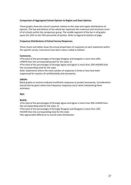
Comparison of Aggregated <strong>School</strong> Opinion to Region and State Opinion. These graphs show the school's position relative to the state and region distributions of opinion. The top and bottom of the whole bar represent the maximum and minimum score of all schools within the comparison group. The middle segment of the bar in all graphs spans the 25th to the 75th percentile of opinion. Refer to legend at bottom of page. Frequency Distributions of <strong>School</strong> Survey Responses. These charts and tables show the actual proportions of responses to each statement within the specific survey. Comments have been colour coded as follows: Comments. •The total of the percentages of Strongly Disagree and Disagree is more than 20% LOWER than the corresponding total for the state, or •The total of the percentages of Strongly Agree and Agree is more than 10% HIGHER than the corresponding total for the state. Note: Statements where the total number of responses is three or less have been suppressed for reasons of confidentiality and anonymity. GREEN: Blank graphs or sections indicate insufficient responses to protect anonymity. Consideration should also be given where low frequency responses occur when interpreting these estimates. RED: BLACK: •The total of the percentages of Strongly Agree and Agree is more than 20% LOWER than the corresponding total for the state, or •The total of the percentages of Strongly Disagree and Disagree is more than 10% HIGHER than the corresponding total for the state. •No appreciable difference to overall state distribution. 37


