PhotoBiz Magazine // Spring 2017
The PhotoBiz magazine is a key resource for photographers, teaching strategies about SEO, website design, marketing & more. Visit blog.photobiz.com for more.
The PhotoBiz magazine is a key resource for photographers, teaching strategies about SEO, website design, marketing & more. Visit blog.photobiz.com for more.

Create successful ePaper yourself
Turn your PDF publications into a flip-book with our unique Google optimized e-Paper software.
your logo<br />
WHY YOUR LOGO MATTERS<br />
Written by HOLLY H.<br />
Your logo is the face of your brand, and it speaks volumes<br />
about your business. But sadly, so many companies settle<br />
for a mediocre logo. Or worse — none at all!<br />
Whether because of time or cost, many small business<br />
owners are so eager to get their business up and running<br />
that they settle for a “first” logo, thinking that having<br />
something is better than nothing. But is it?<br />
Your Logo Makes a Statement About<br />
the Quality of Your Business<br />
A slapdash logo can be a warning to consumers, signaling<br />
that you have no eye for design or that you are OK with<br />
sub-par work. Even worse, potential customers may think<br />
that the products and services you offer are of poor quality.<br />
Not the message you want to send.<br />
A well-designed logo makes customers feel at ease with<br />
your brand. It says that you care about quality and are willing<br />
to invest in your business to ensure its success. It says that<br />
they can trust in you and the quality of your work.<br />
So How Do You Know Your Logo is<br />
on Target?<br />
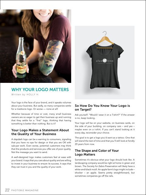
Ask yourself: “Would I wear it on a T-shirt?” If the answer<br />
is no, keep looking.<br />
Your logo will be on your website, on business cards, on<br />
the side of your building, on company cars – and yes –<br />
maybe even on a t-shirt. If you can’t stand looking at it<br />
every day, reconsider your choice.<br />
The goal is to get a logo you’d want as a tattoo. One that<br />
will stand the test of time and that you’ll still look at fondly<br />
20 years from now.<br />
The Shape and Color of Your<br />
Logo Matters<br />
Sometimes it’s obvious what your logo should look like. A<br />
landscaping company would be right at home in green and<br />
brown. The Society for Zebra Preservation will likely have a<br />
white-and-black motif. An apple farm’s logo might include –<br />
shocker – an apple. Seems pretty straightforward, but<br />
sometimes companies go off the rails.<br />
Take Airbnb’s squishy pink logo. Would you feel the same<br />
way about the company if they replaced their logo with<br />
something more like this? (See above.)<br />
One represents a comfy place to sleep. The other<br />
represents the glory of the Klingon Empire.<br />
We’re guessing you wouldn’t.<br />
The shapes, angles and curves of logos have been studied<br />
by brand researchers and scientists alike. What have they<br />
learned? Well, a lot of things. For example, round shapes<br />
make people feel comfortable, while angular shapes<br />
indicate that a product or company is more durable (but<br />
less empathetic).<br />
In addition to shape, your logo’s colors matter, too.<br />
Green is soothing and sincere, while red is energizing and<br />
powerful. Blue is stable and reliable. Pink cues femininity.<br />
Different colors communicate different things to consumers<br />
about your brand and your level of service. Your logo needs<br />
to send the right signals.<br />
But aren’t logos expensive? (Nope.)<br />
When professional design comes up, the next thought<br />
is often the cost. Big design firms can charge into the<br />
thousands for a professional logo, but that’s not the rule.<br />
<strong>PhotoBiz</strong> offers custom logo design for just $250. You<br />
can’t beat that deal with a stick.<br />
I could go on and on about our world-class designers and<br />
how they capture your brand with unique, hand-designed<br />
logos. But suffice it to say that if you’re looking to revamp<br />
your business image, you should at least take a glance<br />
at your logo. If it’s not thrilling you, it may be time for<br />
an upgrade.<br />
22 PHOTOBIZ MAGAZINE