
Create successful ePaper yourself
Turn your PDF publications into a flip-book with our unique Google optimized e-Paper software.
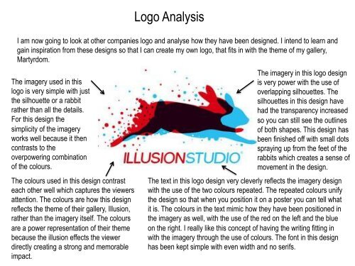
Logo Analysis<br />
I am now going to look at other companies logo and analyse how they have been designed. I intend to learn and<br />
gain inspiration from these designs so that I can create my own logo, that fits in with the theme of my gallery,<br />
Martyrdom.<br />
The imagery used in this<br />
logo is very simple with just<br />
the silhouette or a rabbit<br />
rather than all the details.<br />
For this design the<br />
simplicity of the imagery<br />
works well because it then<br />
contrasts to the<br />
overpowering combination<br />
of the colours.<br />
The colours used in this design contrast<br />
each other well which captures the viewers<br />
attention. The colours are how this design<br />
reflects the theme of their gallery, Illusion,<br />
rather than the imagery itself. The colours<br />
are a power representation of their theme<br />
because the illusion effects the viewer<br />
directly creating a strong and memorable<br />
impact.<br />
The imagery in this logo design<br />
is very power with the use of<br />
overlapping silhouettes. The<br />
silhouettes in this design have<br />
had the transparency increased<br />
so you can still see the outlines<br />
of both shapes. This design has<br />
been finished off with small dots<br />
spraying up from the feet of the<br />
rabbits which creates a sense of<br />
movement in the design.<br />
The text in this logo design very cleverly reflects the imagery design<br />
with the use of the two colours repeated. The repeated colours unify<br />
the design so that when you position it on a poster you can tell what<br />
it is. The colours in the text mimic how they have been positioned in<br />
the imagery as well, with the use of the red on the left and the blue<br />
on the right. I really like this concept of having the writing fitting in<br />
with the imagery through the use of colours. The font in this design<br />
has been kept simple with even width and no serifs.