
You also want an ePaper? Increase the reach of your titles
YUMPU automatically turns print PDFs into web optimized ePapers that Google loves.
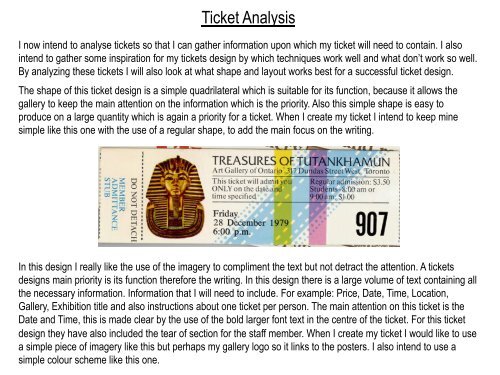
Ticket Analysis<br />
I now intend to analyse tickets so that I can gather information upon which my ticket will need to contain. I also<br />
intend to gather some inspiration for my tickets design by which techniques work well and what don’t work so well.<br />
By analyzing these tickets I will also look at what shape and layout works best for a successful ticket design.<br />
The shape of this ticket design is a simple quadrilateral which is suitable for its function, because it allows the<br />
gallery to keep the main attention on the information which is the priority. Also this simple shape is easy to<br />
produce on a large quantity which is again a priority for a ticket. When I create my ticket I intend to keep mine<br />
simple like this one with the use of a regular shape, to add the main focus on the writing.<br />
In this design I really like the use of the imagery to compliment the text but not detract the attention. A tickets<br />
designs main priority is its function therefore the writing. In this design there is a large volume of text containing all<br />
the necessary information. Information that I will need to include. For example: Price, Date, Time, Location,<br />
Gallery, Exhibition title and also instructions about one ticket per person. The main attention on this ticket is the<br />
Date and Time, this is made clear by the use of the bold larger font text in the centre of the ticket. For this ticket<br />
design they have also included the tear of section for the staff member. When I create my ticket I would like to use<br />
a simple piece of imagery like this but perhaps my gallery logo so it links to the posters. I also intend to use a<br />
simple colour scheme like this one.