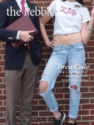
the Pebble Spring 2017

You also want an ePaper? Increase the reach of your titles
YUMPU automatically turns print PDFs into web optimized ePapers that Google loves.
“convey a sense of possibility and growth” at<br />
MPH.<br />
“The shades of green and blue represent<br />
possibility, opportunity (<strong>the</strong> sky’s <strong>the</strong> limit!),<br />
energy, life and development—as in <strong>the</strong><br />
spring, green signifying growth,” Albetta said<br />
in an email.<br />
Arriving at <strong>the</strong>se colors and building <strong>the</strong><br />
marketing campaign was a delicate process.<br />
When Crane first pitched <strong>the</strong> green-<strong>the</strong>med<br />
color scheme in June following months of<br />
on-site interviews with 17 different focus<br />
groups, <strong>the</strong> administration members were<br />
taken aback.<br />
“There wasn’t one single person in <strong>the</strong><br />
room at this presentation that didn’t fidget a<br />
little bit when <strong>the</strong>y saw those colors,” Neuner<br />
said. “It is uncomfortable. It’s a hard thing to<br />
grasp.”<br />
But ultimately, <strong>the</strong>se same people became<br />
sold on <strong>the</strong> idea that change was necessary to<br />
represent MPH as a school moving forward.<br />
“I wouldn’t have accepted <strong>the</strong> color<br />
change had [Crane] not been so persuasive,”<br />
Head of School Jim Dunaway said.<br />
Stegeman said he was aware that <strong>the</strong> new<br />
colors would represent a break in tradition,<br />
and as such, some people might not like it.<br />
But he views <strong>the</strong> campaign as a necessary<br />
departure from MPH’s recent troubles.<br />
“I think that sometimes breaks from<br />
tradition can be a really good thing,” he said.<br />
“Part of what this marketing campaign was<br />
intended to do was separate us from <strong>the</strong><br />
financial turmoil of two years ago, and so<br />
if that’s what [we’re] trying to do, <strong>the</strong>n that<br />
break is a good thing.”<br />
However, a considerable portion of <strong>the</strong><br />
MPH community interviewed by <strong>the</strong> <strong>Pebble</strong><br />
questions <strong>the</strong> school’s decision to introduce<br />
<strong>the</strong> new logo and colors, as well as <strong>the</strong> concept<br />
of having two sets of colors. The <strong>Pebble</strong><br />
interviewed 24 community members, and of<br />
<strong>the</strong> 24, only four said <strong>the</strong>y liked <strong>the</strong> addition<br />
of <strong>the</strong> new colors. In an online Google survey<br />
conducted by <strong>the</strong> <strong>Pebble</strong>, while 67 percent of<br />
111 respondents (mostly students) said <strong>the</strong>y<br />
understood <strong>the</strong> reasoning behind <strong>the</strong> new<br />
colors and logo, only 19 percent said <strong>the</strong>y<br />
supported <strong>the</strong> decision to introduce <strong>the</strong>m.<br />
Thirty percent said <strong>the</strong>y supported it somewhat,<br />
but 43 percent said <strong>the</strong>y did not.<br />
Some students, including senior Spencer<br />
Krywy, said <strong>the</strong> new colors highlight <strong>the</strong><br />
disconnect between <strong>the</strong> decision makers and<br />
<strong>the</strong> student body.<br />
“I think <strong>the</strong>y represent <strong>the</strong> new administration.<br />
I don’t think <strong>the</strong>y represent <strong>the</strong><br />
students,” Krywy said. “The administration is<br />
pushing a very different angle than how we<br />
feel.”<br />
Annie Weiss, senior and Student Council<br />
President, raises similar sentiments.<br />
“It’s almost like we have two different<br />
schools in some ways: one that we know<br />
MPH as, and <strong>the</strong> o<strong>the</strong>r that we’re trying to<br />
market MPH as,” said Weiss, who has been<br />
at MPH since third grade. “It kind of makes<br />
MPH less wholesome.”<br />
Long-term implications are also on<br />
students’ minds. Weiss said she’s concerned<br />
by how strong MPH’s identity and sense of<br />
community will be in <strong>the</strong> future.<br />
“In a couple of years, I worry [<strong>the</strong> red and<br />
white] could lose its meaning,” Weiss said.<br />
MPH and Crane agreed that it was time<br />
for rebranding. In 1970, when <strong>the</strong> Manlius<br />
School and <strong>the</strong> <strong>Pebble</strong> Hill School merged,<br />
MPH adopted <strong>the</strong> colors red (from Manlius’s<br />
red and black colors) and white (from <strong>the</strong><br />
latter’s green and white). Since <strong>the</strong>n, besides<br />
a 2012 marketing campaign with <strong>the</strong> <strong>the</strong>me<br />
“Uncommon to <strong>the</strong> Core,” <strong>the</strong> school hadn’t<br />
updated its look or logo since <strong>the</strong> early 2000s,<br />
when it wrapped “Manlius <strong>Pebble</strong> Hill: Think,<br />
Imagine, Learn, Grow” around <strong>the</strong> original<br />
Farmhouse logo.<br />
As a result, Neuner said, <strong>the</strong> external<br />
community viewed MPH as having an “oldschool”<br />
and “failing” vibe; with <strong>the</strong> crisis that<br />
almost closed <strong>the</strong> school, it was imperative to<br />
prove to <strong>the</strong> external community that MPH<br />
was thriving.<br />
That one of <strong>the</strong> <strong>Pebble</strong> Hill School’s<br />
colors was green, however, was not a source<br />
of inspiration for Crane as it sought <strong>the</strong> best<br />
colors to do this. The overlapping letters and<br />
three different colors in <strong>the</strong> logo, ra<strong>the</strong>r, is a<br />
nod toward <strong>the</strong> close relationship between<br />
MPH, <strong>the</strong> <strong>Pebble</strong> Hill School and <strong>the</strong> Manlius<br />
School.<br />
For English teacher and department<br />
spring <strong>2017</strong> | 25