the Pebble Spring 2017

Create successful ePaper yourself
Turn your PDF publications into a flip-book with our unique Google optimized e-Paper software.
“MPH is a thoughtful, organic place<br />
headed into a new future and full of nuanced<br />
teaching and insightful students,” she said.<br />
Red, <strong>the</strong>y concluded, wasn’t <strong>the</strong> best color<br />
to reflect this, as it can be perceived as uninviting,<br />
overly traditional and shrill.<br />
“MPH’s athletic colors are vibrant and<br />
strong—but that strength and saturation of<br />
<strong>the</strong> red makes it a bit hard to work with in<br />
brochures, advertising, and posters,” Albetta<br />
said. “And with that red, we were limited in<br />
finding companion accent colors we could<br />
introduce.”<br />
It was important to brand MPH as a<br />
modern and thriving school to improve <strong>the</strong><br />
school’s credibility in <strong>the</strong> eyes of <strong>the</strong> Syracuse<br />
community, Neuner said. MPH needed to<br />
reinvent its image without reinventing itself.<br />
“It wasn’t our programs, it wasn’t our<br />
teachers, it wasn’t our students,” she said. “It<br />
was our reputation that was on <strong>the</strong> line.”<br />
That being said, Dunaway and <strong>the</strong> administration<br />
wanted to ensure that <strong>the</strong> campaign<br />
would depict MPH au<strong>the</strong>ntically.<br />
“You can advertise something and make<br />
it sound really good, even if it’s not,” Dunaway<br />
said. “There are lots of things that have<br />
great advertisements but when you buy <strong>the</strong>m,<br />
<strong>the</strong>y’re not very good. And we didn’t want<br />
that.”<br />
While <strong>the</strong> logo and colors underwent<br />
only about 10 modifications, coming to <strong>the</strong><br />
final draft for <strong>the</strong><br />
written component<br />
of <strong>the</strong> marketing<br />
campaign—one that<br />
would perfectly encapsulate<br />
<strong>the</strong> essence<br />
of MPH—was a<br />
much more meticulous<br />
process. But<br />
<strong>the</strong> administrative<br />
team ultimately felt<br />
that each and every<br />
revision was necessary<br />
in order to better<br />
represent MPH.<br />
Some<br />
Unintended<br />
Results<br />
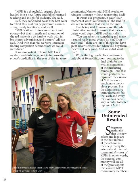
Kristin Bernazzani and Erica Stark, MPH employees, showing <strong>the</strong>ir school<br />
spirit on a Friday “Spirit Day.”<br />
Stegeman<br />
maintains<br />
that <strong>the</strong> new<br />
colors and logo are<br />
in <strong>the</strong> best interest<br />
of <strong>the</strong> school, as<br />
<strong>the</strong>y help marry <strong>the</strong><br />
external and internal<br />
community’s views of<br />
MPH: in o<strong>the</strong>r words,<br />
<strong>the</strong> external community<br />
will see all<br />
of <strong>the</strong> great aspects<br />
that current MPH<br />
community members<br />
28