SPACES feb issue 2017

You also want an ePaper? Increase the reach of your titles
YUMPU automatically turns print PDFs into web optimized ePapers that Google loves.
Interior<br />
To understand the effect of colors on<br />
students, a research was conducted<br />
between 2007 and 2008 by the<br />
University of British Columbia. The<br />
performance of 600 participants on<br />
six cognitive tasks that either required<br />
detail-orientation or creativity were<br />
analyzed thoroughly. The tasks<br />
involved spelling, punctuation and<br />
word recall when words or images<br />
were displayed against different<br />
colored backgrounds.<br />
Red for Accuracy<br />
The research indicates that red<br />
increased the accuracy of students<br />
on detail- oriented tasks such as<br />
memory retrieval and proofreading<br />
by 31 percent as compared to blue.<br />
This also generated a theory that red<br />
is associated with danger that may<br />
have pushed the students to pay more<br />
attention to detail. However, when<br />
students were exposed to red before<br />
an IQ test, they scored significantly<br />
lower than students who were<br />
exposed to green. This can be traced<br />
back to the fear of red markings that<br />
bring out the feelings of caution and<br />
anxiety. Students showed caution<br />
while answering the test by choosing<br />
the easier questions to answer.<br />
Blue for Creativity<br />
Blue boosted the performance of<br />
students on creative tasks where toys<br />
had to be created from shapes and<br />
new uses of the displayed items were<br />
to be invented. Similarly, for other<br />
creative tasks such as a brainstorming<br />
session, a blue environment<br />
encouraged the students to produce<br />
twice as many creative outputs as in<br />
a red setting.<br />
CHOOSING THE RIGHT HUES:<br />
It is always difficult to pick one hue<br />
over the other for the collection of<br />
the most appropriate hue for various<br />
spaces within an institution. The<br />
emotional attribute of each hue can<br />
then be taken into consideration to<br />
make sure that chosen color aligns<br />
with the purpose of the space.<br />
Blue: Often associated with the quality<br />
of stimulating the mind, blue is the<br />
most preferred hue for science and<br />
math based classrooms. The calming<br />
trait of blue is believed to enhance<br />
concentration in students by lowering<br />
their heart rate.<br />
Green: The nature’s color of balance,<br />
green also balances the serenity of<br />
blue and the creativity of yellow to<br />
generate an arena for multi-tasking.<br />
The versatility of green can be proven<br />
by its effectiveness from classrooms<br />
centered on history and social studies<br />
to social spaces such as counselling<br />
rooms and libraries.<br />
Yellow: The lively yellow tones that<br />
derive the energy from the sun are<br />
believed to be in touch with our creative<br />
side. Gentle yellows spark the creativity<br />
of students in language classrooms<br />
and other areas of artistic pursuits such<br />
as culinary, fine art and dance.<br />
Orange: Associated with movement,<br />
orange can be used to connote energy<br />
in activity spaces such as athletic<br />
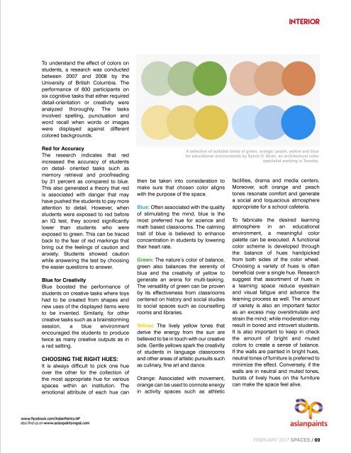
A selection of suitable tones of green, orange/ peach, yellow and blue<br />
for educational environments by Sylvia O’ Brien, an architectural color<br />
specialist working in Toronto.<br />
facilities, drama and media centers.<br />
Moreover, soft orange and peach<br />
tones resonate comfort and generate<br />
a social and loquacious atmosphere<br />
appropriate for a school cafeteria.<br />
To fabricate the desired learning<br />
atmosphere in an educational<br />
environment, a meaningful color<br />
palette can be executed. A functional<br />
color scheme is developed through<br />
the balance of hues handpicked<br />
from both sides of the color wheel.<br />
Choosing a variety of hues is often<br />
beneficial over a single hue. Research<br />
suggest that assortment of hues in<br />
a learning space reduce eyestrain<br />
and visual fatigue and advance the<br />
learning process as well. The amount<br />
of variety is also an important factor<br />
as an excess may overstimulate and<br />
strain the mind; while moderation may<br />
result in bored and introvert students.<br />
It is also important to keep in check<br />
the amount of bright and muted<br />
colors to create a sense of balance.<br />
If the walls are painted in bright hues,<br />
neutral tones of furniture is preferred to<br />
minimize the effect. Conversely, if the<br />
walls are in neutral and muted tones,<br />
bursts of lively hues on the furniture<br />
can make the space feel alive.<br />
February <strong>2017</strong> <strong>SPACES</strong> / 69