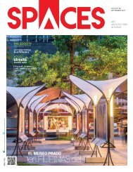
SPACES feb issue 2017

You also want an ePaper? Increase the reach of your titles
YUMPU automatically turns print PDFs into web optimized ePapers that Google loves.
Interior<br />
Turquoise aids in calming the nerves<br />
of public speakers thus building<br />
confidence. Moreover, teaching in<br />
a room with turquoise walls gives<br />
a clarity of thought and a control<br />
over our talk. A splash of yellow on<br />
a wall of the lecture room preferably<br />
in close proximity to the teaching<br />
material helps the students retain the<br />
knowledge for a long time.<br />
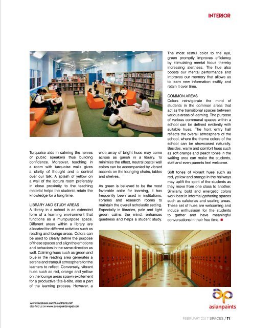
LIBRARY AND STUDY AREAS<br />
A library in a school is an extended<br />
form of a learning environment that<br />
functions as a multipurpose space.<br />
Different areas within a library are<br />
allocated for different activities such as<br />
reading and lounge areas. Colors can<br />
be used to clearly define the purpose<br />
of these spaces and align the emotions<br />
and behaviors in the same direction as<br />
well. Calming hues such as green and<br />
blue in the reading area generates a<br />
serene and tranquil atmosphere for the<br />
learners to reflect. Conversely, vibrant<br />
hues such as red, orange and yellow<br />
on the lounge areas spawn excitement<br />
for a productive tête-à-tête, also a part<br />
of the learning process. However, a<br />
wide array of bright hues may come<br />
across as garish in a library. To<br />
minimize the effect, neutral pastel wall<br />
colors can be accompanied by vibrant<br />
accents on the lounging chairs, tables<br />
and shelves.<br />
As green is believed to be the most<br />
favorable color for learning, it has<br />
frequently been used in institutions,<br />
libraries and research rooms to<br />
maintain the overall scholastic setting.<br />
Especially in libraries, pale and light<br />
green calms the mind, enhances<br />
quietness and helps a student study.<br />
The most restful color to the eye,<br />
green promptly improves efficiency<br />
by stimulating mental focus thereby<br />
increasing alertness. The hue also<br />
boosts our mental performance and<br />
improves our memory that allows us<br />
to learn new information swiftly and<br />
retain it over time.<br />
COMMON AREAS<br />
Colors reinvigorate the mind of<br />
students in the common areas that<br />
act as the transitional spaces between<br />
various areas of learning. The purpose<br />
of various communal spaces within a<br />
school can be defined evidently with<br />
suitable hues. The front entry hall<br />
reflects the overall atmosphere of the<br />
school, where the theme colors of the<br />
school can be showcased naturally.<br />
Besides, warm and comfort hues such<br />
as soft orange and peach tones in the<br />
waiting area can make the students,<br />
staff and even parents feel welcome.<br />
Soft tones of vibrant hues such as<br />
red, yellow and orange in the hallways<br />
may uplift the spirit of the students as<br />
they move from one class to another.<br />
Similarly, bold and energetic colors<br />
work best in informal gathering spaces<br />
such as cafeterias and seating areas.<br />
These set of hues are welcoming and<br />
induce enthusiasm for the students<br />
to gather and have meaningful<br />
conversations in their free time. •<br />
February <strong>2017</strong> <strong>SPACES</strong> / 71