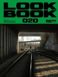
Montana LOOKBOOK 2018
The new MONTANA-CANS LOOKBOOK 2018 out now featuring special MONTANA-CANS products, brand collaborations, events and artists. At MONTANA-CANS we benefit, as a team and as company, from working closely with creative heads, our friends and partners. In return, it is our pleasure to support events, projects and artists. In our opinion, a fruitful cooperation is the source for creativity, development and growth on all levels. We are fortunate and grateful for the fact that we are approached by artists and collaboration partners alike, who have incredible ideas and inspirations, is something that we are very thankful for. Also check the previous issues MONTANA-CANS LOOKBOOK 2016 and 2017
The new MONTANA-CANS LOOKBOOK 2018 out now featuring special MONTANA-CANS products, brand collaborations, events and artists. At MONTANA-CANS we benefit, as a team and as company, from working closely with creative heads, our friends and partners. In return, it is our pleasure to support events, projects and artists. In our opinion, a fruitful cooperation is the source for creativity, development and growth on all levels. We are fortunate and grateful for the fact that we are approached by artists and collaboration partners alike, who have incredible ideas and inspirations, is something that we are very thankful for. Also check the previous issues MONTANA-CANS LOOKBOOK 2016 and 2017

You also want an ePaper? Increase the reach of your titles
YUMPU automatically turns print PDFs into web optimized ePapers that Google loves.
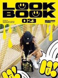
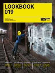
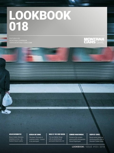
<strong>LOOKBOOK</strong><br />
018<br />
EDITION # 03<br />
MONTANA <strong>LOOKBOOK</strong><br />
WWW.MONTANA-CANS.COM<br />
#CLASSICGRAFFITI<br />
BERLIN ART BANG<br />
BOLD IS THE NEW BLACK<br />
EDWARD NIGHTINGALE<br />
ACRYLIC SERIES<br />
Brand Collabo: <strong>Montana</strong><br />
deciphers an icon - the<br />
Reebok Classic Leather<br />
The Haus: The bank of<br />
creatives minds - Created<br />
to be destroyed!<br />
The new Marker Range<br />
with an alcohol-based<br />
permanent black ultra ink!<br />
Portrait of the contemporary<br />
graffiti photographer<br />
Edward Nightingale<br />
Recent series featuring<br />
Hamburg graffiti artist &<br />
illustrator Golden Green<br />
<strong>LOOKBOOK</strong> / ISSUE # 03 / <strong>2018</strong>
WHEN PASSION MEETS PRECISION.<br />
MONTANA-CANS - HIGHEST QUALITY MADE IN GERMANY
MONTANA <strong>LOOKBOOK</strong> <strong>2018</strong> | PRINTED IN GERMANY
Content<br />
<strong>Montana</strong> Lookbook 018 / Editorial 06<br />
Reebok Classic X <strong>Montana</strong> Cans 08<br />
#Classicgraffiti FW17<br />
Black Artist Series 18<br />
Edward Nightingale 28<br />
Bold is the new black 36<br />
New <strong>Montana</strong> Cans Marker Range<br />
Artist Feature: Wane Cod 40<br />
Mural Festival Canada 50<br />
POW! WOW! 2017 Recap 56<br />
THE HAUS 68<br />
The bank of creatives minds<br />
Artist Feature: Buff Monster 80<br />
The melty misfits<br />
Portrait: Low Bros 90<br />
The Urban Nation Museum 98<br />
Portrait: Nevercrew 110<br />
Quintessenz 116<br />
Colormaze<br />
Pangeaseed / Seawalls 124<br />
Interview: aptART 134<br />
Acrylic Series feat. Golden Green 142<br />
Rust Magic, Canada 150<br />
Introducing: La Franz 156<br />
Imprint 162<br />
5
At the MONTANA-CANS headquarters in Heidelberg/Germany, we benefit as a<br />
team and as company from working closely with creative minds, our friends<br />
and our partners worldwide.<br />
In return, it is our pleasure to support events, projects and artists. In our opinion,<br />
a fruitful cooperation is the true source for creativity, development and<br />
growth on all levels for all creative disciplines. We are so fortunate and grateful<br />
for the fact that we are approached by artists and collaboration partners alike,<br />
who have incredible ideas, concepts and inspiration. It is something that we<br />
are very thankful for.<br />
Cultural sponsorship and social commitment mean a great deal to us, which is<br />
why we are honored and happy to invest in projects and event sponsorship that<br />
support the very causes which are so extremely close to our hearts. This is our<br />
great privilege. As a follow-up to the second edition, we are now happy to present<br />
the third edition of the MONTANA-CANS Lookbook series, in which we’d<br />
like to take the time to feature some of the special projects and partnerships<br />
we have established throughout the year and share our pride and gratitude<br />
with you!<br />
More information on MONTANA-CANS<br />
and its products can be found at:<br />
WWW.MONTANA-CANS.COM<br />
#GERMANSPRAYPAINT<br />
Photography by Edward Nightingale<br />
6
7
8<br />
#CLASSICGRAFFITI
MONTaNA-CANS BRAND COLLABO<br />
<strong>Montana</strong> deciphers<br />
an icon: THE REEBOK<br />
CLASSIC LEATHER<br />
OUT AND ABOUT WITH BLACKOUT AND<br />
WITHEOUT: <strong>Montana</strong> Cans teamed up with<br />
Reebok to reimagine a classic, the Reebok<br />
classic to be precise.<br />
Inspired by the Blackout and Whiteout Series,<br />
the outcome presents a playful approach<br />
which takes upon a constant duality which<br />
revolves around the game of graffiti.<br />
9
The pack consists of a predominantly black pair, with<br />
a white heel and a somewhat inverted white version.<br />
On the black pair, the details seem to be applied with a<br />
white enamel, whereas its counterpart depicts a more<br />
prominently placed black Reebok logo on the side of the<br />
otherwise all-white shoe. Usually details like paint stains<br />
come with time, involuntarily and by accident, due to the<br />
wear and tear caused under mysterious circumstances,<br />
often whilst midnight marauding. In this case however,<br />
these details are carefully placed and a conscious choice,<br />
paying hommage to <strong>Montana</strong>'s heritage. Hints towards<br />
the origin of these marks are subtle, yet members of the<br />
club will decode them with ease. As several analogies to<br />
urban art contexts are translated into the design of both<br />
pairs, the result of the collaboration between <strong>Montana</strong><br />
and Reebok almost feels natural.<br />
Black and white represent complete opposites of the<br />
visible light spectrum. As black absorbs all light, white on<br />
the contrary, reflects all light.<br />
The stark contrast between the inherent properties of the<br />
two tones easily allows an allegory to day and night. A<br />
nocturnal scenery, as mirrored in the black pair, provides<br />
a perfect surrounding for hidden adventures, such as<br />
painting graffiti.<br />
The combination of black and white spraypaint is also<br />
an essential choice for urban artists, who want to<br />
emphasize their style and maximize the legibility of their<br />
artworks. Black and white is always a timeless choice,<br />
especially for #classicgraffiti. Maybe the underlying<br />
reference to the light of the day versus the dark of the<br />
night subconsciously influences artists in their choice of<br />
color. Black paint drizzles are clearly visible on the white<br />
pair, as if a flash picture has been taken in total darkness.<br />
Being a little more blunt than the black pair, the white one<br />
might just be as useful to camouflage and blend into an<br />
urban crowd, after secretly emerging from a hatch.<br />
Photography by MONTANA-CANS /<br />
Edward Nightingale<br />
10
#CLASSICGRAFFITI<br />
11
12
So, the collaboration represents seemingly contradicting<br />
notions of light and dark. They are public yet discreet.<br />
Like ying and yang, both colorways complement each<br />
other. The given context will determine which of the two<br />
will be the more suitable choice. However, either pair<br />
also carries properties of its opponent. In night missions,<br />
luminous flash pictures might be taken for mere safety, in<br />
case the sunny next morning benching is sabotaged by a<br />
too eager buff, let alone the boys in blue.<br />
The interplay of sunrays and shadows is cleverly<br />
resonated in the design of both versions. Simultaneously,<br />
the design approach plays with the idea of an individual<br />
and authentic look after accompanying their owner during<br />
their adventures, where paint stains might be collateral<br />
damages. Like creases, their amount may increase with<br />
wear. Here, these details particularly show the dna of<br />
<strong>Montana</strong> already on the brand new crisp pair. The upper<br />
sits on a comfy Eva sole that provides a comfortable<br />
ride in any situation. Fully made of leather, both pairs are<br />
made to stand the test of time and fit as easily through<br />
the hole in a freshly cut fence, as they navigate through<br />
the lines in front of your favourite nightclub.<br />
www.montana-cans.com/reebok<br />
#classicgraffiti<br />
13
14
Photography by MONTANA-CANS | Alexander Krziwanie<br />
15
16
#CLASSICGRAFFITI<br />
17
<strong>LOOKBOOK</strong><br />
018<br />
www.montana-cans.blog<br />
#BLACKARTISTEDITION<br />
#MONTANABLACK<br />
#GERMANSPRAYPAINT<br />
18
BLA<br />
CK<br />
ART<br />
IST<br />
SERI<br />
ES<br />
MONTANA-CANS prides itself on the recently introduced<br />
limited edition Artist Series cans. Each can features a world<br />
renowned Graffiti artist that will have the opportunity to<br />
design personalised artwork for their favourite <strong>Montana</strong><br />
BLACK color, from the 187 colors in the <strong>Montana</strong> BLACK<br />
range. These designs are then implemented for a limited<br />
time in the production of the artists chosen color. Thus<br />
making any versions of the Artist Series cans exclusive,<br />
functional and collectable. These designs are featured 4<br />
times a year at the same price as the regular version. they<br />
can only be obtained while they are available!<br />
19
<strong>LOOKBOOK</strong><br />
018<br />
RA<br />
MBO<br />
The <strong>Montana</strong> BLACK Artist Edition No. 12 features the Moscow<br />
based Graffiti Artist RAMBO. Hailing from one of the largest<br />
cities in the world, Rambo played with the contrasts of Moscow´s<br />
city lights and skyline. The Russian Artist chose the color tone Silverchrome<br />
of the famous and proven <strong>Montana</strong> BLACK Range for<br />
his Artist Edition. Silverchrome is notorious for its coverage and<br />
speed and therefore many writers chose it to paint the streets during<br />
the last financial crisis. Perfect for Rambo´s fast and simple<br />
pieces and styles. The design is inspired by the artist’s environment<br />
— impressions that Rambo sees everyday: the city lights,<br />
the skyline of Moscow and of course a lot of Graffiti!<br />
instagram.com/rambch<br />
20
21
<strong>LOOKBOOK</strong><br />
018<br />
FUNC<br />
The <strong>Montana</strong> BLACK Artist Edition No. 13 features the Paris based<br />
Graffiti Artist Func’88 who chose the color BLK 3940 Magic<br />
out of the <strong>Montana</strong> BLACK 400ml high pressure Line. Graphic<br />
designer, but also graffiti writer and illustrator, Func’88 started<br />
as it name says, in the year of 1988. Func proclaims "Living the<br />
golden age” of graffiti in France has been “the best times without<br />
being too nostalgic”. Trying to perpetuate the spirit of the old Parisian<br />
style, Func adds a modern ultra touch. For him, the 80’s were<br />
days full of innocence and discoveries, in terms of creation. „My<br />
favorite one is the <strong>Montana</strong> „BLACK“ so when the idea of an artist<br />
edition came along, I obviously chose it and pick the 3940 Magic<br />
color because it's a tone I frequently used in my pieces and I love<br />
the name — „BLACK Magic." he said.<br />
instagram.com/koolfunc88<br />
22
23
<strong>LOOKBOOK</strong><br />
018<br />
LUGO<br />
The <strong>Montana</strong> BLACK Artist Edition No. 14 features the Italian based<br />
Graffiti Artist LUGO. The illustrator and tattoo artist has chosen<br />
his favorite color from the <strong>Montana</strong> BLACK range, Lambrate<br />
BLK 7130. And in true LUGO fashion there is also a hidden irony<br />
to this choice as the name Lambrate was chosen after the much<br />
beloved district of Lambrate in the Milano city outskirts. Lugo is<br />
no stranger to the street. As a and writer, he has his artwork<br />
covered on surfaces and people globally. Known for his humor,<br />
illustrative style and his rebellious tendancies, Lugo has a way of<br />
making you laugh and impressed at the same time. He is a quiet<br />
achiever whom pops up in all the right places. As a crew member<br />
of the JBCB crew, his artwork and personality has also become part<br />
of a wider audience as their artwork as a crew crosses all borders.<br />
instagram.com/lugosis<br />
24
25
Photography by SMASH137 – Train panel<br />
"SMASH137" on freight
<strong>LOOKBOOK</strong><br />
018<br />
For constant Graffiti updates<br />
check the MONTANA-CANS Blog:<br />
www.montana-cans.blog/graffiti
[ ]<br />
EDWARD<br />
NIGHTINGALE<br />
A CONTEMPORARY<br />
GRAFFITI PHOTOGRAPHER<br />
28
29
EDWARD NIGHTINGALE<br />
30<br />
"Roots"<br />
Mexico City, 2017
<strong>LOOKBOOK</strong><br />
018<br />
If you like graffiti photography, Edward Nightingale<br />
will not be a name you are not aware<br />
of. Based in Europe, Nightingale is an artist<br />
that sees things that many don’t see. As one<br />
of the most prolific photographers of the<br />
contemporary train graffiti documentation<br />
movement, Nightingale’s speciality is capturing<br />
the essence and mood of the graffiti<br />
discipline that is often over looked by general<br />
public. Whether it be in a tunnel, on a<br />
fence line, at the dead of night or the middle<br />
of the day. A reference point for most<br />
prolific contemporary train painters who<br />
are happy to have him by their sides, Nightingale<br />
is not just along for the ride. He is<br />
the artist next to the artists. Shooting from<br />
above, up close, a far and right in the heat<br />
of the action. Taking the same risks, the<br />
same steps as any other participant of the<br />
action he is capturing, but yet with a completely<br />
different agenda.<br />
With exceptional technical ability and an<br />
amazing eye that looks at the right spot at<br />
the right moment, Nightingale’s work stands<br />
to survive the test of time!<br />
31
EDWARD NIGHTINGALE<br />
„I came into contact with graffiti through hiphop<br />
in my early teenager years. since I was a young,<br />
insecure boy I was thankful for this opportunity<br />
to get some kind of identity without being in the<br />
center of attention. Ever since my fascination for<br />
graffiti started I was obsessed with books about<br />
it. Like many others I soaked up everything about<br />
graffiti that I could get my fingers on. Wich sadly<br />
was not too much at that time. What I always liked<br />
most were the pictures showing the act of writing<br />
over the finished pieces. It gave me a glimpse of<br />
how it was to be there. To paint in a certain place. I<br />
have to say that that to me graffiti is mainly about<br />
the experience and the feelings that you get while<br />
being in unusual places. Many people might have<br />
a different opinion about that but that’s just what<br />
it’s like to me.<br />
When I got older my technical knowledge and<br />
the advantages of digital imaging allowed me to<br />
go deeper into that topic. The need or the urge to<br />
capture those wonderful moments slowly took<br />
over the urge to paint myself. While painting I was<br />
always focused on the act itself but while taking<br />
pictures I could capture this place. It’s like writing<br />
down a beautiful memory.<br />
Today, more than ever I feel the urge to capture as<br />
much as possible of Graffiti's first child: trainwriting.<br />
The look and feel of train tracks and especially<br />
tunnels is unique and the adrenaline I get from<br />
it helps me to forget the grey swath of my daily<br />
routines. I wish I would have used my younger years<br />
more for traveling than going to the same yards<br />
over and over again because a lot of nice trains<br />
have disappeared and<br />
a lot of places became<br />
really hard to acces<br />
due to today’s technological<br />
possibilities.<br />
“It’s like<br />
writing down<br />
a beautiful<br />
memory.”<br />
When I see the heroes<br />
of my childhood like<br />
Martha Cooper, Kaos,<br />
Chintz and others growing<br />
old with graffiti<br />
this gives me this wonderful feeling that maybe<br />
I’ll be also this lucky to grow old with the most<br />
wonderful form of vandalism.“<br />
]<br />
32
<strong>LOOKBOOK</strong><br />
018<br />
33
EDWARD NIGHTINGALE<br />
MONTANA-CANS collaborated<br />
with Edward Nightingale<br />
on recent projects like the<br />
<strong>Montana</strong> X Reebok<br />
#CLASSICGRAFFITI as<br />
well as a <strong>Montana</strong> BLACK<br />
print advertisement campaign.<br />
Photography by Edward Nightingale<br />
www.edwardnightingale.com
<strong>LOOKBOOK</strong><br />
018<br />
35
36
BOld is the<br />
NEW BLACK<br />
(BOLD IS BLACK –<br />
NEW MONTANA-<br />
CANS MARKER<br />
RANGE)
The new <strong>Montana</strong>Cans<br />
Marker range has gone<br />
BOLD! #<strong>Montana</strong>bold<br />
As any writer knows, within the<br />
essence of graffiti lies the tag, or<br />
otherwise known as the „hand<br />
style“. A flawless handstyle reveals<br />
true talent. It is true that<br />
practice makes perfect, but with<br />
the right equipment, you can<br />
take your hand style to a BOLD<br />
next level and beyond.<br />
With BOLD, <strong>Montana</strong>-Cans<br />
has created tagging markers<br />
that merge function, quality and<br />
style. Made in Germany, these<br />
sleek #montanamarkers will be<br />
the basis of your tagging needs.<br />
The marker bodies are<br />
made of premium aluminum that<br />
provide a superb haptic. Filled<br />
with the finest alcohol-based<br />
aptly named Ultra black ink.<br />
This luscious, deep black ink is<br />
waterproof and UV-resistant,<br />
but not clothing friendly, so take<br />
care when using it while wearing<br />
your Sunday bests. The<br />
combination of our low viscosity<br />
ink and the premium German<br />
made pump action valve, allows<br />
high flowing marking on almost<br />
any surface, reliabily and consi-stantly.<br />
In the tagging game,<br />
the artist always decides, juicy,<br />
drippy, clean or tight? The BOLD<br />
marker range is uncompromising<br />
and functional fusing a sophisticated<br />
and lean look that is<br />
classic, not plastic.<br />
As Cap famously stated in<br />
the iconic graffiti documentry<br />
Stylewars, „The object of the<br />
game is more!“. <strong>Montana</strong> BOLD<br />
Markers have durable-replaceable<br />
tips, refillable alluminium<br />
bodies offering longevity<br />
and endurance for HEAVY USE.<br />
In the streets, the buff never<br />
sleeps. With <strong>Montana</strong> BOLD Markers<br />
you can get up and, most<br />
importantly, stay up. Whether it<br />
be with your newly hit, rich and<br />
shiny fresh black tags or the<br />
aesthetic stain left once buffed.<br />
An experienced writer<br />
knows that the key to success is<br />
to keep both yourself and your<br />
tools stealth. With BOLD markers<br />
that look so impressive, this<br />
may be harder than it sounds.<br />
The range consists of four<br />
model sizes plus refill ink making<br />
any idea you have possible.<br />
The BOLD range starts with a<br />
3mm chisel (6ml), followed by<br />
an 8mm round (20ml), 10ml chisel<br />
(20ml) and a 15mm standard<br />
(20ml) tip. To reload, we have a<br />
180ml refill ink bottle that completes<br />
the range. The changeable<br />
tips breathe new life into any<br />
battle scared marker, what ever<br />
surface you have used it on.<br />
The <strong>Montana</strong> BOLD marker<br />
range is your choice to make your<br />
mark on society.<br />
38
<strong>Montana</strong> Bold offers<br />
the perfect choice to make<br />
your mark on society.<br />
#<strong>Montana</strong>bold<br />
39
WANE COD<br />
It’s all<br />
about<br />
letters
<strong>LOOKBOOK</strong><br />
018
WANE COD<br />
Well known for his great style, Wane<br />
Cod has dedicated his life to the power<br />
of letters. He was born in London and<br />
lived in England and Greneda until he<br />
was seven years old. In 1978 his parents<br />
brought him and his brother to the U.S.<br />
and moved to the North Bronx. During<br />
1983, he became “Wane One” when he<br />
painted his first train.<br />
<strong>Montana</strong> Cans had the chance to go to<br />
his studio recently and also follow him<br />
for a little while, to check out what is<br />
going on with him recently!<br />
Today, he divides his time between<br />
painting and running his company:<br />
Writers Bench. As an artist and <strong>Montana</strong><br />
Cans heavy user, he states that<br />
“it’s all about letters” and graffiti is<br />
basically a type of typography that<br />
they can call style.<br />
For Wane spray cans have become a<br />
medium, but the culture of graffiti is a<br />
big movement, and the reason why he<br />
still goes out and does it the so called<br />
“illegal” way is because it keeps him<br />
grounded. It also keeps him knowing<br />
of what’s happening in the culture of<br />
graff. In the real world of how graffiti<br />
writers live the moment. “If you don’t<br />
go out and do it illegally, you’re clueless<br />
to what’s really going on. You are just a<br />
commercial artist using spray cans,” he<br />
quoted to the Creative Independent a<br />
couple of months ago.<br />
42
<strong>LOOKBOOK</strong><br />
018<br />
“If you don’t go<br />
out and do it<br />
illegally, you’re<br />
clueless to what’s<br />
really going<br />
on. You are just<br />
a commercial<br />
artist using spray<br />
cans.”<br />
43
44<br />
WANE COD
<strong>LOOKBOOK</strong><br />
018<br />
(…)<br />
“it’s all<br />
about<br />
letters” and<br />
graffiti is<br />
basically<br />
a type of<br />
typography<br />
that they<br />
can call<br />
style.<br />
IN 1983,<br />
he became “Wane One” when he<br />
painted his first traiN.<br />
Photography by WANE, Ven AOK,<br />
Jordan Katz | MONTANA-CANS<br />
45
46<br />
WANE COD
<strong>LOOKBOOK</strong><br />
018<br />
From graffiti in the<br />
streets of NYC to trucks,<br />
trains and big walls,<br />
Wane has become<br />
a living legend and<br />
representative in the<br />
culture of graffiti, not<br />
only because of his<br />
history, trajectory and<br />
specific style, but also<br />
because his honesty.<br />
There’s no secret, but Wane believes the<br />
only way to become good at something is to<br />
keep trying, knowing your past, your roots<br />
and work hard to until you get what want.<br />
www.waneone.com<br />
47
G7050 ROOF<br />
The classic NYC rooftop tint. Bring the flavor of the city that never sleeps<br />
to your work. Make your choice among 215 tones in <strong>Montana</strong> GOLD’s flowing<br />
color system #montanacans #germanspraypaint
50<br />
MURAL FESTIVAL<br />
MONTRÉAL
MURAL<br />
FESTIVAL<br />
Montréal<br />
Five Years<br />
of Art<br />
attend Austin during that time of the year, know what we mean. The full<br />
city is part of the celebration and the program includes not just art, but<br />
music, film, conferences, exhibitions, yoga, carnival, food, parties an art<br />
fair and pop-up shows. As for the muralists, this edition reunited leading<br />
international artists from seven countries, including: Ron English (USA),<br />
INSA (UK), 1010 (Germany), Mad C (Germany), Ricardo Cavolo (Spain),<br />
Fintan Magee (Australia), Ruben Sánchez (Spain), Nuria Mora (Spain),<br />
Smithe (Mexico) and Onur (Switzerland). Many prominent Canadian artists<br />
also attended the festival, including: Fluke and Dodo, SbuOne, Scribe csx,<br />
Kevin Ledo, who painted a tribute to Leonard Cohen; Monosourcil, Mort,<br />
Aydin Matlabi and Miss Me.<br />
Montréal goes from a thick intense winter to a hot busy summer<br />
full of festivals. But there’s nothing more exciting than looking<br />
to those empty walls turning into vivid candid pieces of art.<br />
MURAL International Public Art Festival celebrated its 5th edition this year. We<br />
were there to experience a magnificent diverse array of activities, including murals,<br />
music, exhibitions, pop-up installations, conferences and their third art fair. MURAL<br />
Festival activities and events take place in a free-access pedestrian zone located<br />
Saint-Laurent Boulevard, between Sherbrooke Street and Mont-Royal Avenue. Some<br />
twenty new murals created this year enhance an already impressive and wellrounded<br />
route of legacy of over 80 major works created by the Festival since 2013.<br />
It’s the closest to be in a festival like SXSW, for those who have had the chance to<br />
51
MURAL FESTIVAL<br />
MONTRÉAL<br />
Aaron Li-Hill, Canadian artist living in New York also produced a large-scale art<br />
installation to adorn Saint-Laurent Boulevard all summer long. Some of the<br />
favorite events were Ricardo Cavolo and 123Klan’s conferences, Ron English<br />
‘Propaganda’ pop-up show, Felipe Pantone ‘Planar Direction’ exhibition at<br />
Station16 Gallery and the ‘Nasty Women’ exhibition at Boxotel with work of<br />
Ness Lee, Sarah Blais, Cécile Gariépy, Lydia Maria, Ranji Perera, Kathryn<br />
Macnaughton and Dana Peebles. Very fresh to see a series of art pieces by all<br />
Montréal and Toronto based women artists. <strong>Montana</strong> Cans is proud of being a<br />
continuous supporter to the festival, with the purpose to being an ally to the<br />
artistic movement in Montréal. During our time there, we had the chance to chat<br />
with Ron English and when we asked him: If Montréal could be a<br />
character, what kind of character would it be? He replied, "Would it be a<br />
multicolored polar bear?"<br />
52
53
54<br />
MURAL FESTIVAL<br />
MONTRÉAL
www.muralfestival.com<br />
#muralfestival<br />
Photography by Maria Enriqueta Arias,<br />
Davi Tohinnou, Daniel Weintraub<br />
55
POW!<br />
WOW!<br />
WORLD<br />
WIDE<br />
2017<br />
U ND THE GLOBE<br />
OART WARRIORS AR<br />
56
<strong>LOOKBOOK</strong><br />
018<br />
MontanA-Cans is proud to be<br />
one of the major partners of<br />
this festival for many years.<br />
2017 was no exception.
58
<strong>LOOKBOOK</strong><br />
018<br />
59
60
<strong>LOOKBOOK</strong><br />
018<br />
61
62
<strong>LOOKBOOK</strong><br />
018<br />
Because it takes place on the<br />
city streets, POW! WOW! is by<br />
default open to the public and<br />
the featured artists always<br />
includes a final block party<br />
and speaking events in public<br />
spaces. The most important<br />
thing is also the artists could<br />
experience the place and to<br />
have the interaction with the<br />
community to create a major<br />
symbiosis between the art<br />
pieces and the audiences.<br />
One of the most impressive<br />
editions of the year was in Israel,<br />
an event that actually started<br />
as a small road trip between<br />
artists that couch surfed and<br />
collaborated to create public<br />
art that mattered. But ended<br />
up bringing the POW! WOW! art<br />
community to a whole nother<br />
level. It was a perfect fuel for<br />
creativity and the original quest<br />
to make art with a backdrop of<br />
sun and dust, the color made its<br />
way on to surfaces that are not<br />
standard at all.<br />
The Worchester edition of<br />
POW!WOW! included artists like<br />
It’s a Living, Kristin Farr, Pichi<br />
Avo, Christopher Konecki, just<br />
to mention a few that described<br />
their experience as one of the<br />
greatest ones during the year.<br />
63
Nosego, a POW! WOW! veteran<br />
who has experienced various<br />
locations affirms that the<br />
amazing thing about the festival<br />
is that it seems like a tribe of<br />
an outdoor annual presence in<br />
Hawaii and Long Beach, as well<br />
as satellite locations worldwide<br />
throughout the year, such as<br />
Seoul.<br />
people that live in different<br />
parts of the world, but once they<br />
are there—at any POW! WOW!<br />
location—they all meet up to<br />
celebrate what they love, art.<br />
The invited artists list includes:<br />
Royal Dog,<br />
Sixcon, Xeva,<br />
Yoon Hyup and<br />
POW! WOW! founder<br />
POW! WOW! Korea 2017<br />
Jasper Wong.<br />
A lot stunning murals were<br />
created, but this was the first<br />
time ever for POW!WOW! in<br />
Korea. The mural art festival<br />
that has been taking place in<br />
cities like Hawai'i, Washington<br />
D.C., Tokyo and Taipei, arrived<br />
in Seoul for the first time<br />
with guest artists such as<br />
Andrew Hem, Sheryo, Jay Flow,<br />
Laurence Vallieres, Cryptik and<br />
massive collaborations such as<br />
Tristan Eaton, who’s a heavy<br />
<strong>Montana</strong> Cans user and Dave<br />
Persue, whom painted a 13-story<br />
building titled “Forever Peace”,<br />
which is certainly one of the<br />
centerpieces of the festival.<br />
For all these reasons and more<br />
<strong>Montana</strong> Cans, has been a<br />
continued supporter of POW!<br />
WOW! featuring a Collab Can<br />
series at the beginning of this<br />
year. In celebration of the event,<br />
a limited edition of MONTANA<br />
GOLD POW! WOW! can that was<br />
dedicated to the 2017 event<br />
and it’s participating artists.<br />
The chosen color was the high<br />
covering Shock Black SH9000, of<br />
<strong>Montana</strong> Gold’s shock color rage.<br />
Find all POW! WOW! recaps<br />
on our blog:<br />
www.montana-cans.blog or<br />
on the POW! WOW! Websites!<br />
POW! WOW! was initially created<br />
to bring together friends and<br />
collaborators. The festival has<br />
www.powwowhawaii.com<br />
@powwowworldwide<br />
64
<strong>LOOKBOOK</strong><br />
018<br />
65
Photography by Brandon Shigeta (@bshigeta), Andrew Tan (@weerdnaa),<br />
Jonas Maon (@jonasmaon), Andy Song (@andyisong)<br />
66
<strong>LOOKBOOK</strong><br />
018<br />
67
The Haus—<br />
The Bank<br />
of Creatives<br />
Minds<br />
Created<br />
to Be Destroyed♥<br />
68
This motto has been fulfilling<br />
the brilliant, fresh and bizarre<br />
art concepts from different<br />
artists in an abandoned bank<br />
building on Berlin’s most<br />
famous streets: The Kudamm-<br />
Kurfürstendamn. More than<br />
165 artists have turned this<br />
building into a whole new<br />
experience to the viewer. Since<br />
April 2017, when this event was<br />
known as The Berlin Art Bang,<br />
it hosted different artists, from<br />
various disciplines. This is<br />
what has enriched it the most.<br />
Eventhough, the concept of<br />
the project was created with<br />
the knowledge of this building<br />
going to be destroyed and<br />
demolished in August of 2017.<br />
“The uniqueness of THE HAUS<br />
isn’t the simple fact of existing,<br />
but the limitation to exist”,<br />
stated DIE DIXONS. The effect<br />
of the idea of this place to be<br />
destroyed, also enhanced the<br />
audience and the artists to<br />
create images and experiences<br />
that would be burnt in your<br />
memory and seaze the moment<br />
of creation, while you still can.<br />
To experience THE HAUS with<br />
all your senses.<br />
69
THE HAUS<br />
THE HAUS is a project initiated<br />
by XI Design / DIE DIXONS,<br />
who’s a Berlin based street art<br />
crew driven by the tension to<br />
messages. The gang gather a<br />
collective of freethinkers to<br />
spread one statement, which is:<br />
It doesn’t matter who you are,<br />
what your name is or what you<br />
do, make time to create things<br />
on your own and use time<br />
to really experience created<br />
things before it’s too late.<br />
70
<strong>Montana</strong> Cans has been a<br />
proud supporter of this unique<br />
project. “We thank to all<br />
THE HAUSMEISTERS for this<br />
incredible happening in the<br />
heart of Berlin, which was<br />
really impressive. MONTANA-<br />
CANS feels lucky enough to be<br />
a partner on this project from<br />
the early beginning, not only<br />
providing material such as<br />
spray cans, technical aerosols,<br />
effects and markers to support<br />
the participating artists, but<br />
also our belief in the project<br />
and the cause,<br />
enhance and<br />
accompanied<br />
THE HAUS<br />
with its creative<br />
revolutionary<br />
ideas,” <strong>Montana</strong> Cans<br />
affirmed. The artists<br />
bring the streets to the<br />
old bank and build their<br />
own dreams: sculptures,<br />
video installations, virtual<br />
realities, projections,<br />
photography, illustration,<br />
etcetera. All these to express<br />
themselves and their ideas.<br />
71
THE HAUS<br />
Artwork © Case<br />
72
73
THE HAUS<br />
74<br />
Artwork © Felix Rodewaldt
This universe of creation<br />
inhabits in the center of Berlin’s<br />
commercial-heart. Every visitor<br />
of crew gets one space to<br />
generate a metamorphosis of<br />
the place and of their own ideas.<br />
Artwork © Dixons<br />
75
THE HAUS<br />
Artwork © GHS<br />
Artwork © Herakut<br />
www.thehaus.de<br />
#thehaus<br />
Photography by Eugen Lebedew | THE HAUS<br />
76
Artwork © Rocco<br />
“We have only one frame<br />
and one aim. The frame<br />
is the room. The aim is to<br />
create a mind-blowing<br />
something that the<br />
viewers are forced to<br />
tell the others about it.”<br />
THE HAUSMEISTERS<br />
77
www.thehaus.de<br />
#thehaus
Buff Monster<br />
The Melty<br />
Misfits<br />
80
81
82
Buff Monster is an artist from<br />
New York City, who uses brightly<br />
colored creatures, bold lines<br />
and funny characters to make the<br />
world a better place. His career<br />
started in Hawaii, some years ago.<br />
He lived in Los Angeles for 15<br />
years and finally arrived in New York<br />
City, where his inspiration came<br />
from black metal music (amazingly<br />
good and always great to have),<br />
ice cream, graffiti, Garbage Pail<br />
Kids and the Japanese cute culture.<br />
83
Buff Monster works in a variety of<br />
creative fields, from murals to designer<br />
toys, from books to illustration.<br />
He is also included in Banksy’s<br />
Oscar-nominated documentary<br />
"Exit Through the Gift Shop". His<br />
work has been featured in different<br />
art galleries like StolenSpace Gallery<br />
in London, Galo Arte Gallery in<br />
Turin, Italy and Corey Helford<br />
Gallery in Los Angeles, California,<br />
just to mention a few.<br />
And the Bristol City Museum has<br />
a painting in their permanent<br />
collection. He’s worked with<br />
some of the most recognizable<br />
brands, such as Disney, Converse,<br />
Hello Kitty, Samsung, Nike and<br />
Coca-Cola. Now under the brand<br />
name "Stay Melty", he continues to<br />
release a variety of limited-edition<br />
collectibles, including vinyl and<br />
resin toys, prints, shirts, stickers<br />
and trading cards.<br />
“As an artist, I think it’s your<br />
responsibility to shepard your<br />
work into the world.”, is something<br />
he says with confidence.<br />
Buff Monsters knows how to balance<br />
his true self as an artist and the<br />
needs of the commercial clients<br />
and brands he works with. It’s always<br />
meticulously executed, brightly<br />
colored and delivered on time.<br />
84
Buff has been a long-time user of<br />
<strong>Montana</strong>-Cans for outdoor murals,<br />
as well as <strong>Montana</strong> ACRYLIC inks<br />
for paintings and drawings in the<br />
studio.<br />
In 2017, Buff showed his work in<br />
NYC and Europe. He completed<br />
a large mural in Bristol England<br />
and launched a new website<br />
(StayMelty.com). He was also featured<br />
in the <strong>Montana</strong> BLACK cans<br />
limited edition artists series. More<br />
to find on the artist’s website as<br />
well as on the <strong>Montana</strong> Cans blog.<br />
Recently we visited his studio<br />
and tagged along to watch as<br />
he used his favourite “popping”<br />
<strong>Montana</strong> BLACK colors for a mural<br />
in Queens. In true Buff Monster<br />
fashion the sugary color scheme<br />
was enough to make us want to<br />
brush our teeth, but smile at the<br />
same time.<br />
“As an artist, I think<br />
it’s your responsibility<br />
to shepard your work<br />
into the world.”<br />
85
<strong>Montana</strong> BLACK ARTIST EDITION<br />
BUFF MONSTER<br />
Two icons that immediately come<br />
to mind as pretty much owning the<br />
color pink are Hello Kitty and Buff<br />
Monster. No surprise as to which<br />
color Buff Monster chose after<br />
agreeing to design one of our special<br />
BLACK artist edition cans for us:<br />
our P 4000 “Power Pink”. To him,<br />
the color pink symbolizes confidence,<br />
individuality and happiness. For<br />
his design, Buff Monster chose to<br />
drift away a little from the original<br />
BLACK can design, and create<br />
a unique lettering of his own. Of<br />
course, all of his distinctive Buff<br />
Monster design elements like dripping<br />
ice-cream, one-eyed monsters<br />
and skulls are integrated into the<br />
design. The typical Buff Monster<br />
character has two teeth and freckles<br />
and seems to drip like melting<br />
ice-cream. The can design sports<br />
three of these little fellows, plus he<br />
decided to use a cool technique in<br />
which a few chosen elements have<br />
been left out in the litho printing<br />
process, leaving the metallic colored<br />
base of the litho exposed for a<br />
metallic effect and adding depth.<br />
THE MONTANA BLACK ARTIST EDITION No 11<br />
86
uffmonster.com<br />
www.montana-cans.blog/buffmonster<br />
#buffmonster<br />
Photography by Jordan Katz | MONTANA-CANS, Buff Monster<br />
87
Designed and manufactured in Ger<br />
has proven its worth as a favored cr<br />
studios and DIY workshops, by mur<br />
The flowing color system is inspir<br />
everyday life. With 215 color shade<br />
spray paint. The <strong>Montana</strong> GOLD NC<br />
ximum coverage and quick-drying p<br />
surfaces. The specially developed lo<br />
maximum accuracy. The strengths<br />
tana Level Cap System, with each c<br />
Medium and Soft flow, to extra fat p<br />
The <strong>Montana</strong> GOLD flowing color s<br />
leashing an incredible scope of fu<br />
spray paint the supreme tool for cre<br />
G8180 BRAIN<br />
A fine, cerebral color shade that will electrify the synapse density of any<br />
project. Make your choice among 215 tones in <strong>Montana</strong> GOLD’s flowing color<br />
system. #montanacans #germanspraypaint
many to the highest standards, the <strong>Montana</strong> GOLD spray paint line<br />
eative tool worldwide; greatly valued by street and urban artists, in art<br />
al painters and graffiti writers everywhere.<br />
ed by the colors around us, be it in nature, the urban landscape or<br />
s we offer one of the largest and most concise ranges available in<br />
-Acrylic lacquer has a high pigment load, is lightfast and provides maerformance<br />
on canvas, wood, concrete, metal, glass or even flexible<br />
w-pressure valve system allows for controlled, smooth handling and<br />
of the system are particularly striking in combination with the Monap<br />
offering unique advantages, ranging from extra fine lines, through<br />
ressure, or even from light to dark in one smooth stream!<br />
ystem is compatible with the <strong>Montana</strong> EFFECT and TECH lines, unrther<br />
creative applications and possibilities, making <strong>Montana</strong> GOLD<br />
ative minds all over the world.<br />
#GERMANSPRAYPAINT<br />
#MONTANAGOLD
A Blink<br />
A Bounce<br />
90
to the Future<br />
to the Past
LOW BROS<br />
Born in Hamburg, but based<br />
in Berlin, Low Bros is an artist<br />
duo made up of Christoph<br />
and Florin Schmidt—a.k.a.<br />
Nerd and Qbrk. These guys<br />
know perfectly how to mix<br />
the geometrical shapes<br />
with the natural essence<br />
of things. Influenced by<br />
the mass culture, graffiti,<br />
skateboarding and hip hop,<br />
their unique work stands<br />
out either digital or on the<br />
streets. Either a bright color<br />
palette or three-dimensional<br />
executions, they create<br />
stylized-animal characters<br />
with some human features.<br />
Cubic effects, acid colors,<br />
flamboyant esthetics, virtualminded<br />
characteristics. They<br />
know how to make us believe<br />
their pieces could be part of a<br />
video game, and we are only<br />
visitors in this cool colorful<br />
world. But always precise<br />
and perfectly detailed, their<br />
art is a blink to the future.<br />
92
Cubic<br />
effects,<br />
acid<br />
colors<br />
93
LOW BROS<br />
Always passion-driven by<br />
their work, they talk a lot<br />
about their ideas ‘till they<br />
catch fire and have to realize<br />
them. Their year was fulfilled<br />
with enormous projects all<br />
around the world. Some of<br />
our favorite murals were<br />
located in Morocco and of<br />
course the one in Mannheim<br />
for Stadt.Wand.Kunst.<br />
Saying that, their exhibition<br />
in London at Stolenspace<br />
Gallery and their<br />
participation at the Urban<br />
Nation Museum of Urban<br />
Contemporary Art are just<br />
some of the main projects<br />
they completed this year.<br />
flamboyant<br />
esthetics,<br />
virtual-minded<br />
characteristics<br />
they know how to<br />
make us believe<br />
their pieces<br />
could be part of a<br />
video game<br />
94
95
LOW BROS<br />
It has been very interesting to<br />
see the way the Low Bros have<br />
evolved and consolidate their<br />
work in such a strong way. They<br />
speak for today's generation<br />
when creating something new,<br />
despite the persisting things<br />
that connect and reoccur. It<br />
keeps tradition in the corner of<br />
their eyes while perpetuating<br />
the fact that there are roots and<br />
historyto respect and preserve.<br />
On out recent interview with<br />
them, they talked about how the<br />
character of wolves are the main<br />
characters in their paintings.<br />
LOW BROS connect with nature<br />
and they observe how society<br />
see's wolves as still a counter<br />
part of human beings and reflect<br />
their inner state and behavior.<br />
Don’t forget to go check our recent<br />
interview with them on our Blog:<br />
www.montana-cans.blog<br />
www.lowbros.de<br />
Photography by Jordan Katz &<br />
Manuel Wagner | MONTANA-CANS<br />
the counterpart<br />
“Hiding the eyes and their<br />
personality with reflecting<br />
shades and coated with a<br />
stone-like surface, they keep<br />
a certain distance and appear<br />
more like a projection screen<br />
for the generation of the digital<br />
age,” affirmed the Low Bros.<br />
They have started working<br />
on their next solo exhibition,<br />
which will be at Mirus Gallery in<br />
San Francisco in April next year.<br />
This will be the final chapter<br />
of a trilogy, together with the<br />
two latest shows: “Perfiction“<br />
& “Wired”, at Golden Hands<br />
Gallery in Hamburg and the one<br />
at StolenSpace in London.<br />
Stay tuned to see what the<br />
LOW BROS come up with next,<br />
but in the mean time we keep<br />
their best advice for us: “Trust<br />
yourself rather than other<br />
people’s advice, if it comes to<br />
making art. If you want to walk<br />
an unknown path, you better<br />
not listen to those who never<br />
went even close to it.”<br />
of human<br />
beings<br />
96
Stadt.Wand.Kunst 2017<br />
Mannheim<br />
97
98
100
BERLIN MUSEUM<br />
FOR URBAN<br />
CONTEMPORARY ART:<br />
“Diversity is<br />
our treasure”<br />
Yasha Young, Director Urban Nation<br />
All Nations<br />
Under One Roof<br />
101
102<br />
<strong>LOOKBOOK</strong><br />
018
This past September 16th, a unique new center and institution<br />
for research, exhibitions and exchange, focusing<br />
on one of the most important art forms, and the most documented<br />
art movements in the 21st century opened its<br />
doors to the public.<br />
Urban Nation worked on this vision since 2013, and they<br />
built the first independent and non-commercial space for<br />
urban contemporary art. With more than 100 artists, Urban<br />
Nation Berlin made the impossible possible, and with the<br />
support of Berlin’s secretary of cultural affairs, Tim Renner,<br />
this initiative was congratulated because of its vision and<br />
ambition.<br />
The unique institution houses all nations under one roof<br />
and its located in the Wilhelminianera building at Bülowstrasse<br />
7 in Schöneberg. Berlín. For the inaugural day, ten<br />
curators have selected approximately 100 urban artists,<br />
including Seth Globetrotter, Franco Fasoli Jaz, Miss Van,<br />
Shepard Fairey, Ron English, Faith47, Icy and Sot, Herakut,<br />
Nychos, Low Bros, Saner, just to mention a few. Their pieces<br />
also were created specifically for the museum and<br />
exhibited for the very first time.<br />
“Urban contemporary art is the logical next step to<br />
follow what is happening on the street,” Museum Director<br />
Yasha Young said recently. Besides to the Museum,<br />
the installations located at the Art Mile invited the public to<br />
come along and discover the artworks.<br />
Regarding the opening of the museum, <strong>Montana</strong> Cans released<br />
a special edition, can celebrating a long-term partnership<br />
with Urban Nation Berlin.<br />
The Museum also featured the Martha Cooper library, named<br />
after the beloved legend and photographer, who has<br />
dedicated for more than 30 years of her life to document<br />
graffiti and the street art movement. This has become one<br />
of the biggest documentation libraries of street art and urban<br />
culture, to educate and preserve all this history. The<br />
man responsible to take care and curate this compound is<br />
Christian Omodeo.<br />
It’s a fact we all wonder about the current direction of the<br />
urban movement, which is dangerously becoming bigger<br />
and bigger. So, that’s why Yasha assures the key purpose of<br />
the museum is “to give some more grounding and integrity<br />
to street art, before it becomes a little thing<br />
that was swallowed up by advertising.”<br />
www.urban-nation.net<br />
montana-cans.blog/urban-nation-berlin<br />
instagram.com/urbannationberlin<br />
Photography by Nika Kramer,<br />
Sabine Dobre (interior),<br />
Jordan Katz<br />
103
104
105
montana-cans.blog/urban-nation-berlin<br />
www.urban-nation.com<br />
107
Nevercrew<br />
A Trigger<br />
Mechanism
NEVERCREW<br />
For them,<br />
mechanisms are<br />
the trigger of their<br />
paintings. The<br />
generator from<br />
which the rest is<br />
developed.<br />
NEVERCREW is a Swiss based artists duo,<br />
founded by Christian Rebecchi & Pablo Togni,<br />
and they have been working together since<br />
1996. Recently, NEVERCREW worked on<br />
particular “living systems”. Overviews<br />
that are made perceptible in their totality<br />
and in their structure by the act of sectioning,<br />
which allows to see them as they are<br />
inside while maintaining the perceptible<br />
global shape.<br />
The guys apply and generate a simultaneous<br />
vision, layered in systems that start<br />
from the individual mechanical or natural<br />
components up to the overall composition<br />
given by the association of different<br />
subjects, to finally expand out in a personal<br />
relationship with the observer and the<br />
environment.<br />
For them, mechanisms are the trigger of<br />
their paintings. The generator from which<br />
the rest is developed. They proclaimed<br />
their own contradictions and still aware of<br />
how human race determine their position<br />
in an environment that overtakes and overwhelms<br />
it. Their paintings are realistic and<br />
paradoxical, even though there is a sense<br />
of realism, it opens the possibilities to go<br />
beyond the imagination.<br />
110
living<br />
systems<br />
111
Propagating<br />
Machine<br />
Stadt.Wand.Kunst,<br />
Mannheim 2017<br />
112
The issues that they want to examine are<br />
closely connected to the base of their<br />
work: it’s especially a view on the human<br />
condition, on the relationship between<br />
mankind and nature, between mankind<br />
and its nature, and on economic or social<br />
systems. They work on all of this developing<br />
a way to incorporate everything into<br />
a broader and more global topic that could<br />
gradually shows itself as a whole. This can<br />
be readable in every component in a vision<br />
of total and inevitable relationship between<br />
everything, between all parts, where<br />
only the point of view, the location within a<br />
system, defines a selection.<br />
Working together for almost twenty years,<br />
Christian Rebecchi & Pablo Togni developed<br />
the issue of the comparison—the confrontation<br />
between two persons, between<br />
ideas, between forces—and at the same<br />
time, interacting in the public space as<br />
street artists. They extended this confrontation<br />
outside in a direct way, making this<br />
perennial dual "discussion" one of the hubs<br />
of their work.<br />
They recently participated in Stadt. Wand.<br />
Kunst—where MONTANA-CANS was also<br />
a partner of the project—with their piece<br />
titled “Propagating Machine”. They went<br />
to Mannheim, Germany to tackled the local<br />
environment and give something back to<br />
the visual aesthetic of the heavily painted<br />
town, where they took the challenge of making<br />
art around the notion of the relationship<br />
between mankind and nature beyond<br />
the aesthetics. Their complex color choices<br />
are also reflections and connections to the<br />
transformation between penguins, in the<br />
stencilled scenery at the base of the mural,<br />
which portrayed it as light and reflection in<br />
the quartz, like a rock formation at the top.<br />
a view on<br />
the human<br />
condition,<br />
on the<br />
relationship<br />
between<br />
mankind<br />
and nature<br />
“A beautiful marriage of technical and<br />
conceptual comes to life in a variation of<br />
marks and tonal shifts,” the artists say.<br />
Photography by Christian Rebecchi &<br />
Pablo Togni (NEVERCREW),<br />
Alexander Krziwanie<br />
113
114<br />
NEVERCREW
Encumbering<br />
machine<br />
— Kiev<br />
115
Color<br />
maze<br />
Quintessenz<br />
Amazing installation in Berlin<br />
with <strong>Montana</strong> GOLD’s Flowing<br />
Color Palette.<br />
116
117
QUINTESSENZ<br />
Quintessenz is an artist<br />
duo from Hannover and<br />
Berlin, originally formed<br />
by Thomas Granseuer<br />
and Tomislav Topic.<br />
They both met at HAWK<br />
Hildesheim (University<br />
of Applied Sciences and<br />
Arts Hildsheim) in 2006<br />
and since then they<br />
have been working together<br />
on film, in-stallation<br />
and painting projects<br />
for a long time.<br />
Their abstract works make reference<br />
to the environments in<br />
which they are made. Structures<br />
and compositions are filtered<br />
from space and translated into<br />
pictures or installations. The<br />
final result of these two artist is<br />
a subtle tension that both have<br />
explored in many different studies<br />
and contrasts created by<br />
adding color.<br />
Recently they did “COLORMA-<br />
ZE”, an installation the artists<br />
did as a labyrinth using colored<br />
modules, allowing visitors to<br />
travel through different worlds<br />
of color. Light and shadow<br />
underscored the modules’ repetitive<br />
visual aesthetics. Each<br />
module comprises 20 to 40<br />
shades of color and they coordinated<br />
to yield harmonious<br />
gradients, from multi-chromatic<br />
to monochrome, from dark to<br />
light. Around 24 modules in various<br />
formats. Altogether, they<br />
consumed nearly 1000 <strong>Montana</strong><br />
spray cans. With a total of 170<br />
different shades from <strong>Montana</strong><br />
GOLD spray paint. They installed<br />
and moved 8,5 tons of wood.<br />
Over 10,000 screws turned in<br />
and several liters of white lacquer<br />
used for priming.<br />
The main attraction of Quintessenz<br />
in all works, whether<br />
2D or 3D, is primarily based on<br />
color and its properties. Objects<br />
and paintings refer to the<br />
surroundings and still stand<br />
out. Something’s shown in Color<br />
sequences as in the installation<br />
Colormaze create interaction<br />
with the viewer. In the installation<br />
the color selection shows<br />
a complete color circle, so each<br />
visitor can be found in a color<br />
world, simply by the clothes or<br />
on the more subtle emotional<br />
level. Color sequences can be<br />
found in everyday life, but also<br />
in very special moments such<br />
as the skies / clouds or the process<br />
of an autumn leaf.<br />
Beside the art, it’s a great presentation<br />
of the flowing<br />
<strong>Montana</strong> cans color system as<br />
they play with gradients from<br />
the <strong>Montana</strong> Cans Color Range<br />
(mainly <strong>Montana</strong> GOLD).<br />
www.montana-blog.com<br />
www.quintessenz.art<br />
Photography by Quintessenz<br />
118
119
QUINTESSENZ<br />
"Collusion"<br />
Metropolink Festival,<br />
Heidelberg, 2017<br />
120
"After Laughter"<br />
The Haus, Berlin, 2017<br />
121
122<br />
QUINTESSENZ
"Paradis Perdus"<br />
Festival A-part, France, 2017<br />
123
PANGEASEED / SEAWALLS<br />
artists for oceans<br />
Because Our<br />
Oceans Matter<br />
124
<strong>LOOKBOOK</strong><br />
018<br />
125
“The power of public<br />
art and activism has<br />
the ability to educate<br />
and inspire the global<br />
community to help<br />
save our oceans,”<br />
says PangeaSeed<br />
Foundation founder and<br />
Executive Director,<br />
Tre' Packard.<br />
No matter where you are in the<br />
world, the ocean supplies us<br />
with every second breath we<br />
take and life on Earth cannot<br />
exist without healthy oceans.<br />
With dwindling global fish<br />
stocks, rising sea levels, ocean<br />
acidification, and widespread<br />
pollution, whether you live on<br />
the coast, in the city or in the<br />
mountains, we should all feel<br />
responsible for the health of<br />
our oceans and life that lives<br />
within it. Simply put, without<br />
healthy oceans, life on land is<br />
impossible.<br />
In 2014, PangeaSeed<br />
Foundation, the Hawaiibased<br />
non-profit organization<br />
established the Sea Walls:<br />
Artists for Oceans program, a<br />
public art initiative, and the<br />
first of its kind, that brings<br />
the oceans into streets around<br />
the world. Since its inception,<br />
they have created over 300<br />
public murals in coastal<br />
communities around the<br />
world helping to inspire and<br />
educate individuals to become<br />
better stewards of our seas.<br />
“Through the Sea Walls<br />
program, we aim to generate<br />
awareness for pressing marine<br />
environmental issues, and<br />
catalyze positive change<br />
within the communities we<br />
work in by fostering a sense<br />
of pride and ownership for<br />
the murals and their natural<br />
resources,” Packard adds.<br />
126
<strong>LOOKBOOK</strong><br />
018<br />
Forging a synthesis<br />
between public art, nature,<br />
and society, PangeaSeed<br />
Foundation has collaborated<br />
with renowned contemporary<br />
artists to create large-scale<br />
public murals in New Zealand,<br />
Canada, Grenada, Vietnam,<br />
Mexico, Estonia, China, Sri<br />
Lanka, and throughout the<br />
U.S. By creating a worldclass<br />
platform and unifying a<br />
global network of concerned<br />
creative individuals painting<br />
for a purpose, they are one<br />
step closer to helping save<br />
the lungs of the planet.<br />
Upcoming Sea Walls projects<br />
are slated to take place in<br />
Australia, South Africa, and<br />
the Philippines.<br />
Due to the nomadic nature<br />
of the Sea Walls: Artists<br />
for Oceans program,<br />
international partnerships<br />
with organizations and<br />
brands are paramount to<br />
the success of the initiative.<br />
<strong>Montana</strong> Cans has been a vital<br />
partner and supporter of the<br />
cause supporting multiple<br />
Sea Walls projects around the<br />
world.<br />
127
128<br />
PANGEASEED / SEAWALLS
129
PANGEASEED / SEAWALLS<br />
About PangeaSeed Foundation<br />
PangeaSeed Foundation is<br />
an international non-profit<br />
organization acting at the<br />
intersection of culture and<br />
environmentalism to further<br />
the conservation of our<br />
oceans through ARTivism,<br />
Education, and Science.<br />
You can support the initiative<br />
with a donation, artwork or as<br />
volunteer:<br />
pangeaseed.foundation/<br />
Photography by<br />
PangeaSeed| Tré Packard<br />
130
<strong>LOOKBOOK</strong><br />
018<br />
131
YELLOW SUBMARINE<br />
Bring the flow from beneath the waves with our yellow submarine, a distinctive and<br />
inspiring hue of yellow. #montanacans #germanspraypaint
134
INTERVIEW<br />
aptART<br />
“Public art is a<br />
language for<br />
everyone”<br />
Interview with Founder<br />
Samantha Robison<br />
135
APTART<br />
Artwork © Herakut<br />
136
Artwork © Maranje<br />
AptART is an acronym for Awareness and Prevention<br />
Through art. The woman behind this project strongly<br />
believes that public art sparks strong conversations<br />
and create spaces for disadvantaged communities to<br />
express themselves and also could be heard.<br />
Samantha Robison studied art and politics at<br />
Lewis and Clark College, which is a small liberal arts<br />
school. After she graduated, she moved overseas and<br />
volunteered and got involved with art projects focused<br />
on children. This was just the trigger to keep doing<br />
projects around the world and finally create her own.<br />
Seven years after, she’s the founder of aptART, a project<br />
that brings public art inside the confines of refugee<br />
camps, as well as conflict and post conflict zones<br />
with the aim of amplifying voices of displaces people.<br />
With the strong statement of creating art for everyone,<br />
regardless their nationality, race, religion, sex, etc.<br />
<strong>Montana</strong> Cans as a continued supporter of apt-<br />
ART had the chance to talk to Samantha, so read it up!<br />
<strong>Montana</strong> Cans: When and how did you started with Apt-<br />
Art? Samantha: I started aptART in 2010 along with 3 friends:<br />
Leah O’Bryant (activist), Jonathan Darby (artist) and Nick<br />
Renn (logistics). In 2012 Jonathan and I were in San Francisco<br />
working on an exhibition, we had done with street kids from<br />
Congo. We were staying in an apartment across from Jasmin<br />
and Falk (Herakut) and they’ve been helping us ever since.<br />
We believe all people should have access to art, regardless<br />
of their circumstances. We use street art, and all the social<br />
and conventional media that goes with it, as a tool to build<br />
awareness about issues affecting people’s lives. Our aim is<br />
to raise awareness and connecting people, to prevent issues<br />
that damage their environment. We mostly work in refugee<br />
camps, war zones and post conflict areas. We organize<br />
workshops with the community existing around the area<br />
to find out what they might like to paint about. After the<br />
workshops and discussions, a concept is formulated and we<br />
work with the community to paint the wall. We work mostly<br />
with kids and youth, but adults are invited too.<br />
137
APTART<br />
<strong>Montana</strong> Cans: Through all these projects, how do<br />
you choose which cause to focus on?<br />
Samantha: We try to select places with the most need.<br />
Places where street art isn’t common. When we first<br />
started in 2010 public art was becoming more popular<br />
but eight years later it is significantly more common.<br />
We also try to select places where most artists wouldn’t<br />
normally go. We work in refugee camps, slums or post<br />
conflict areas. We select places where there is social<br />
tension and public art can be used to unite a divided<br />
community through a collaborative activity.<br />
<strong>Montana</strong> Cans: As a woman activist, but<br />
also involved in the arts, what are the obstacles<br />
you have faced through the years?<br />
Samantha: Street art and graffiti are a male dominated<br />
industry; there can be a lot of ego. I have been lucky<br />
enough to only work with extremely supportive men.<br />
The industry is slowly changing, but it is changing.<br />
<strong>Montana</strong> Cans: For you, what is the<br />
importance of art as a medium / a tool to educate<br />
and change our world?<br />
Samantha: Art is a language for everyone. It's a peaceful<br />
way of expressing ideas or feelings, but also a unique<br />
and universal way of communicating with people from<br />
other cultures or countries, different to our own.<br />
<strong>Montana</strong> Cans: If you could tell something to your<br />
younger ‘you’, "like 10 years back", what do you<br />
think that would be?<br />
Samantha: So many things! Wear sunscreen, study harder,<br />
stop drinking cheap beer. Those things and so many<br />
more, but probably the most important would it be to<br />
spend time with people<br />
who have different<br />
culture and ideas than<br />
mine. The more ideas<br />
you expose yourself to,<br />
the better you examine<br />
your own ideas and the<br />
broader your perspective<br />
becomes. I used to<br />
believe there was a clear<br />
right and wrong. My<br />
perspective was black<br />
and white, but now I<br />
see things more nuanced,<br />
and that makes me<br />
a happier person. There<br />
“Out beyond<br />
ideas of<br />
wrongdoing<br />
and rightdoing<br />
there is a field.<br />
I’ll meet you<br />
there.”<br />
is a Rumi quote I think sums this up completely: “Out<br />
beyond ideas of wrongdoing and rightdoing there is a<br />
field. I’ll meet you there.”<br />
138
<strong>LOOKBOOK</strong><br />
018<br />
139
APTART<br />
<strong>Montana</strong> Cans: I bet you have seen, learn't,<br />
listened to and experienced so many life changing<br />
experiences though aptART, but do you have any<br />
significant one you want to tell us about?<br />
Samantha: Every experience taught me something, but<br />
I don’t think one experience sticks out. Certain people<br />
stick in your mind though. There was this one 8 years<br />
old kid name Mohamed from Syria. He lived in Zaatari<br />
refugee camp and I am pretty sure he is still there. He<br />
had a learning disorder and at school his teachers didn’t<br />
have the chance to help him. During a workshop with<br />
Jumana Hokan—one of the artists—she asked him to<br />
tell her about himself. He told her that he didn’t know<br />
how to read or write but he knew how to draw because<br />
she taught him how to draw. Mohamed also asked us<br />
to bring him an umbrella. He must have asked us every<br />
day for a month straight. No one knew why he wanted it<br />
and when we asked, he would tell us to stop asking silly<br />
questions and just bring it. On our last day in his section<br />
of the camp, we brought him an umbrella. He grabbed it<br />
with a massive smile and shouted: “Shukran”, as he ran<br />
off. We still have no idea why he wanted the umbrella,<br />
but maybe that doesn’t matter.<br />
<strong>Montana</strong> Cans: In which sense has<br />
<strong>Montana</strong> Cans have helped aptART to keep going<br />
and doing what you guys do at the organization?<br />
Samantha: The love of spray paint is universal. It<br />
transcends age, gender, nationality and religion. Everyone<br />
loves to press that nozzle and watch colorful magic spew<br />
out into the world. It’s pretty special to be able to give<br />
kids the opportunity to use a spray<br />
can, but also such vibrant colors and<br />
high-quality paint. There is always a<br />
look of sheer joy across a child’s face<br />
as they blast paint onto a wall. Also,<br />
the spray paint available in most of<br />
the countries we work is pretty poor<br />
quality so for artists it can be critical<br />
for the quality of the art.<br />
Any and every project we have asked <strong>Montana</strong> Cans<br />
to support us, they have done it! I met them through<br />
Herakut back in 2012. Alex was super supportive with<br />
the idea of the work we do and offered to send us some<br />
cans to the Democratic Republic of Congo where we<br />
were painting an ambulance with street girls. There was<br />
a lot of violence and displacement in Congo at that time<br />
and needless to say, it was a logistical challenge but the<br />
<strong>Montana</strong> guys made it happen. They have been making it<br />
happen for us all over the world ever since.<br />
The future projects of aptART involves an upcoming<br />
book, next to Jonathan Darby. It’s slowly going but will<br />
be a retrospective of sorts chronicling the past seven<br />
years of work.<br />
Samantha would really<br />
like to do some work<br />
with communities in<br />
Mosul, Iraq as they<br />
rebuild and she is also<br />
looking forward to a<br />
project in Greece, at<br />
the camps for newly<br />
arrived refugees.<br />
“I always have a million<br />
and one ideas but… like<br />
everything, it’s just a<br />
matter of finding the<br />
funding”, concludes<br />
Samantha.<br />
www.aptart.org<br />
Photography by Apt Art/<br />
Samantha Robison,<br />
Falk Lehmann<br />
140
<strong>LOOKBOOK</strong><br />
018<br />
Artwork © Addison Karl<br />
Artwork © Kevin Ledo<br />
Artwork © David Shillinglaw & Billy<br />
141
Acrylic Series<br />
GOLDEN GREEN<br />
Shaping Up<br />
a Unique<br />
Graffiti<br />
Aesthetic<br />
Hamburg-based artist Mortiz G. Green, better known as GOLDEN<br />
GREEN bursts a universe of color and also encrypts the typical<br />
stylistic elements into his own new language. We know his work and<br />
style, but we also know he’s a heavy user of <strong>Montana</strong> ACRYLIC tools.<br />
This time, we will talk about his creative process and how he takes<br />
the futuristic designs to a whole to another level.<br />
142
143
THE MONTANA ACRYLIC SERIES<br />
He has had numerous “odd jobs”, including<br />
working as a stage-builder, working at a fish<br />
market and as a call center agent. But in<br />
2008 he completed his studies to become a<br />
graphic designer and now he works as a freelance<br />
artist and has constructed a universe<br />
full of surreal characters, clever retro futuristic<br />
flickered shapes and has quite a long list<br />
of publications, solo shows and group exhibitions<br />
to show for it. We had the chance to visit<br />
his studio and closely observe his creative<br />
process which not only includes watching<br />
how he uses the <strong>Montana</strong> Cans tools, but<br />
also getting involved with his imagery and<br />
so on. GREEN combines a pastel color scheme<br />
with his graffiti aesthetic, and his preference<br />
of <strong>Montana</strong> ACRYLIC shades, as well as<br />
2mm, 15mm and 50mm markers. With extra<br />
wide marker tips he can achieve extensive<br />
coverage in a short amount of time, whilst<br />
still working with a 100% precision tool. His<br />
designs involved large areas to be covered<br />
with one color, and that is why he also uses<br />
<strong>Montana</strong> GOLD spray paint for uniform, fast<br />
and easy coverage on his artworks.<br />
144
145
THE MONTANA ACRYLIC SERIES<br />
In addition to the almost futuristic implementation<br />
of figurative characters influenced<br />
by Cubism and Minimalism, his preference<br />
for artists from the Golden Twenties<br />
influenced both GOLDEN’s artwork and naming.<br />
One of the main characteristic the art<br />
during this era was, that it did not always<br />
show the world as a perfect place to live in.<br />
It integrated marginal figures and situations<br />
as well – a factor that plays a role within<br />
GOLDEN GREEN’s artwork too.<br />
146
goldengreen179.com<br />
www.montana-cans.blog<br />
147
THE MONTANA ACRYLIC SERIES<br />
<strong>Montana</strong> ACRYLIC markers and <strong>Montana</strong><br />
GOLD spray paint are build to match up perfectly<br />
and absolutely compatible, even with<br />
high coverage during layering. This is one of<br />
the main reasons why GOLDEN GREEN uses<br />
180ml refills to create the colors of his choice,<br />
as they enable to mix the tones directly in the<br />
empty markers. This enables him to have the<br />
flexibility to go further in terms of a color palette<br />
or color scheme, applying any shade he<br />
wants. For the finest details, GOLDEN GREEN,<br />
who’s also a member of the Ultra Boyz crew,<br />
chooses the 2mm fine marker to accentuate<br />
his artworks and make his pieces sing. We<br />
are very impressed of how he’s developed a<br />
very unique style, always nailing the use of the<br />
spray can and his versatile talent which includes<br />
print-making skills and the realization of<br />
his ideas with all different media.<br />
148
Photography by MONTANA-CANS/<br />
Jordan Katz<br />
149
RUST MAGIC<br />
EDMONTON<br />
TRANSFORMS THE<br />
CITY INTO AN<br />
OPEN-AIR MUSEUM<br />
Edmonton in Canada, holds a one of a kind festival called Rust Magic.<br />
However this festival is not actually an exception. It belongs to the<br />
family of festivals held in similar other big cities directed by Annaliza<br />
Toledo and Trevor Peters. These festivals aim to open up street art and<br />
graffiti projects to the world.<br />
152
153
154<br />
“We see how<br />
art makes such<br />
a difference<br />
in community.”
www.rustmagic.ca<br />
Photography by Jeremy<br />
Filmsmore, Shayne Woodsmith<br />
Rust Magic have invited dozens of graffiti<br />
artists from around the world over the past<br />
years and to give some of the city's buildings<br />
a new face and spirit.<br />
<strong>Montana</strong>-Cans has been a loyal supporter<br />
of the Rust Magic event which has become<br />
one of the main graffiti festivals in Canada.<br />
During the festivals activities, the city of<br />
Edmonton, Alberta is converted into a popping<br />
open-air museum for one weekend where<br />
a selection of walls and trucks were happily<br />
face lifted with a new, vibrant look.<br />
We had the chance to talk with one of the<br />
invited female artists, Carly Ealey and she<br />
affirmed: “Edmonton is a rad little city<br />
that is really embracing the graffiti and<br />
street art cultures. The curators and fellow<br />
artists were insanely supportive and<br />
made me feel like family. At the time, it<br />
was my largest mural to date which was<br />
an exciting challenge. The festival was<br />
a welcoming environment to grow as an<br />
artist and overall cool experience."<br />
of uncertainty and unrest concerning the<br />
world we live in,<br />
Carly stated. So much space and lifeless<br />
walls, their past event gave enough room to<br />
the 23 artists who attended the event. It was<br />
a mix of homegrown superstars like<br />
Amuse,<br />
Stare NME,<br />
Wane and<br />
Stash,<br />
as well as some other international names.<br />
The renowned US artist Wane One painted<br />
his first train in 1983, subway cars and walls<br />
would become his preferred medium. Having<br />
such legendary graffiti artists such as Wane<br />
being part of this festival in Alberta, validates<br />
and highlights the importance of graffiti<br />
in our culture and this city. The city has got<br />
international love and the initiative to starting<br />
up Rust Magic is most definitely putting them<br />
on the map.<br />
At the most recent festival, she painted two<br />
female characters. One of them floats among<br />
the jellyfish. She feels the energy of their<br />
glowing bodies as they reflect their unique<br />
hues back onto her. They drift like thoughts<br />
through her mind, stirring up deep emotions<br />
“We see how art makes such a difference<br />
in community,” affirmed Toledo, one of the<br />
founders and organizers.<br />
“We wanted to bring that here because<br />
there’s such an obvious lack of it.”<br />
155
INTRODUCING<br />
THE ITALIAN<br />
GRAFFITI ARTIST<br />
La Franz<br />
LA FRANZ<br />
"When in Rome, do as the Roman's<br />
do". Unless your name is La Franz,<br />
then you do it your own way. Born<br />
in Naples, Rome was the place she<br />
called home before she realized she<br />
was an artistic citizen of the world.<br />
156
158<br />
LA FRANZ
Rome is not a city for the<br />
faint hearted. So if you<br />
want to be a writer in<br />
Rome, you need to keep<br />
your head down and your<br />
can up. And in this case,<br />
your <strong>Montana</strong> BLACK up.<br />
LA FRANZ knows this all<br />
to well. She loves graffiti,<br />
but not always graffiti<br />
writers. With a style that<br />
is vibrant, dynamic and<br />
FRESH, she pays homage<br />
to graffiti’s greats but is<br />
working on that strong<br />
foundation to create new<br />
colorful energetic letters.<br />
And she is doing her own<br />
thing, her own way. Since<br />
2004 she is proving that<br />
she is here to stay. With<br />
her graffiti beginnings starting<br />
in a small city near Rome, La<br />
Franz who was born in Napoli<br />
and started writing at a time<br />
when only a handful of active<br />
writers were painting detailed<br />
complex work in her neighborhood.<br />
It was most likely a rough transition<br />
to the big city mentality<br />
of Rome, where works are<br />
created and gone over in days<br />
depending on context. Now residing<br />
and working in Northern<br />
Italy, La Franz is not restricted<br />
to a city or hood to make her<br />
art. As can be seen by her outstanding<br />
visual vocabulary.<br />
159
LA FRANZ<br />
facebook.com/lafranzofficial<br />
instagram.com/__lafranz__<br />
Photography by La Franz &<br />
Vincenzo, Hard2Buff Staff
G8170 LIP<br />
A sultry, almost maroon shade of earthy red. A perfect hue to sensualize your<br />
creations with a certain, delicate sexiness. Make your choice among 215 tones in<br />
<strong>Montana</strong> GOLD’s flowing color system #montanacans#germanspraypaint
<strong>LOOKBOOK</strong><br />
018<br />
IMPRINT<br />
Media owner and publisher:<br />
MONTANA-CANS<br />
Editorial design | Art direction:<br />
RB02 Design Raum & MONTANA-CANS<br />
Juliane Gutschmidt, Frank Bässler, Alexander Krziwanie<br />
Texts:<br />
Maria Enriqueta Arias, René Van Kan, Julian Rink, Lydia Scott<br />
Special thanks to all contributing photographers:<br />
Edward Nightingale, Maria Enriqueta Arias, Jordan Katz,<br />
Alexander Krziwanie, Jok Sauer, Manuel Wagner (MONTANA-CANS)<br />
Wane, Rambo, Lugo, Func, Smash137, Buff Monster<br />
Brandon Shigeta, Andrew Tan, Jonas Maon, Andy Song (POW! WOW!)<br />
Tré Packard (PangeaSeed)<br />
Jeremy Filmsmore, Shayne Woodsmith (Rust Magic)<br />
Eugen Lebedew, The Dixons & all Hausmeisters (The Haus)<br />
Nika Kramer, Sabine Dobre (Urban Nation)<br />
Davi Tohinnou, Daniel Weintraub (Mural Fest)<br />
Christian Rebecchi, Pablo Togni (Nevercrew)<br />
Thomas Granseuer, Tomislav Topic (Quintessenz)<br />
Samantha Robison (AptArt)<br />
La Franz, Vincenzo (Hard2Buff)<br />
© <strong>2018</strong>, MONTANA-CANS<br />
All rights reserved.<br />
Reprinting, even in part, only with the approval of the<br />
publisher. No liability can be accepted for unsolicited<br />
photos, slides, films or manuscripts received.<br />
/<br />
MONTANA-CANS<br />
Häusserstraße 36<br />
69115 Heidelberg<br />
Deutschland<br />
Ph: +49 (0) 6221 36 333 0<br />
info@montana-cans.com<br />
WWW.MONTANA-CANS.COM<br />
WWW.MONTANA-CANS.BLOG
<strong>LOOKBOOK</strong> / EDITION # 03 / <strong>2018</strong><br />
WWW.MONTANA-CANS.COM<br />
TNR 447181