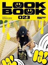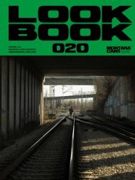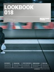
MontanaCans Lookbook 2019
Every organisation that was built up on passion and a love of what they do, finds themselves more and more pro-active in their work each year. Montana Cans is no exception as we strive to make the best cans on earth. But that is no excuse to reflect on all the extra curriculum activities like collaborations, festival, project and artist support that happen through the year as well. After all this helped create history. The Montana Cans LOOKBOOK gives an outlet to remember, reflect and reward those who deserve a little extra attention with some extra glow of the spotlight. With great pleasure, we announce the online release of the Montana Cans LOOKBOOK 2019, looking back at some of the highlights of 2019. This edition delves into many projects such as the Montana Cans limited edition cans that featured Mina & Bruce (plus interview), Felipe Pantone, Most and Flying Förtress. We reminisce on the cool collabo's we were involved in with Happy Socks, Good Guy Boris and Reebok Sneakers. We get re-inspired by feature articles on artists IMAGINE, THE LONDON POLICE, FRAU ISA, 1010 and 1UP CREW. We take a look at some of the urban art festivals that raised the bar even higher like METROPOLINK, POW!WOW ROTTERDAM and the THE BERLIN MURAL FESTIVAL. With eyes wide open we scratch under the surface of some alternative disciplines within graffiti culture. The spotlight gets turned on ABSTRACT LETTERING, GRAFFITI ON FREIGHTS and CALLIGRAFFITI. We share some knowledge on the new products like the Montana BLACK INFRA colors and Montana BOLD marker line, which took the industry by storm. Just as the special moment that was the grand opening of the MONTANA STORE VIENNA with our industry partners CONCRETE, did. All this and more over 160 enthralling full color pages.
Every organisation that was built up on passion and a love of what they do, finds themselves more and more pro-active in their work each year. Montana Cans is no exception as we strive to make the best cans on earth. But that is no excuse to reflect on all the extra curriculum activities like collaborations, festival, project and artist support that happen through the year as well. After all this helped create history.
The Montana Cans LOOKBOOK gives an outlet to remember, reflect and reward those who deserve a little extra attention with some extra glow of the spotlight. With great pleasure, we announce the online release of the Montana Cans LOOKBOOK 2019, looking back at some of the highlights of 2019.
This edition delves into many projects such as the Montana Cans limited edition cans that featured Mina & Bruce (plus interview), Felipe Pantone, Most and Flying Förtress. We reminisce on the cool collabo's we were involved in with Happy Socks, Good Guy Boris and Reebok Sneakers. We get re-inspired by feature articles on artists IMAGINE, THE LONDON POLICE, FRAU ISA, 1010 and 1UP CREW. We take a look at some of the urban art festivals that raised the bar even higher like METROPOLINK, POW!WOW ROTTERDAM and the THE BERLIN MURAL FESTIVAL. With eyes wide open we scratch under the surface of some alternative disciplines within graffiti culture. The spotlight gets turned on ABSTRACT LETTERING, GRAFFITI ON FREIGHTS and CALLIGRAFFITI.
We share some knowledge on the new products like the Montana BLACK INFRA colors and Montana BOLD marker line, which took the industry by storm. Just as the special moment that was the grand opening of the MONTANA STORE VIENNA with our industry partners CONCRETE, did. All this and more over 160 enthralling full color pages.

Create successful ePaper yourself
Turn your PDF publications into a flip-book with our unique Google optimized e-Paper software.
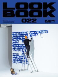
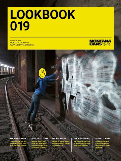
LOOKBOOK<br />
019<br />
EDITION # 04<br />
MONTANA LOOKBOOK<br />
WWW.MONTANA-CANS.COM<br />
BLACK ARTIST EDITION<br />
HAPPY SOCKS COLLABO<br />
ONE WEEK WITH 1UP<br />
GRAFFITI ON FREIGHTS<br />
ABSTRACT LETTERING<br />
The Montana BLACK gets<br />
a facelift by Mina & Bruce,<br />
Most and Felipe Pantone<br />
Montana injects some<br />
street into the humble<br />
sock—With a little help<br />
from Good Guy Boris<br />
Holiday, far from it! Martha<br />
Cooper and Ninja K capture<br />
a week with 1UP<br />
The other steel that is just<br />
as real—Watch your name<br />
go by again and again<br />
When pressing repeat<br />
is not an option—The<br />
new pioneers of graffiti<br />
lettercraft
COVER: PHOTO BY ZZTOP<br />
WHEN PASSION MEETS PRECISION.<br />
MONTANA-CANS - HIGHEST QUALITY MADE IN GERMANY
MONTANA LOOKBOOK <strong>2019</strong> | PRINTED IN GERMANY
Content<br />
MONTANA LOOKBOOK 019 / EDITORIAL 07<br />
BLACK ARTIST SERIES 08<br />
HAPPY SOCKS X MONTANA CANS X<br />
GOOD GUY BORIS COLLABO<br />
18<br />
INTERVIEW: MINA & BRUCE 24<br />
MONTANA CANS X REEBOK COLLABO 30<br />
MONTANA CANS BLACKBRÄU EDITION<br />
BAVARIAN BLUE<br />
48<br />
ARTIST FEATURE: IMAGINE 52<br />
PORTRAIT: THE LONDON POLICE<br />
NO NEED TO CALL THE COPS<br />
58<br />
ACRYLIC SERIES FEAT. FRAU ISA: 64<br />
THINGS JUST GOT "WEIRD"<br />
ABSTRACT LETTERING 70<br />
MONTANA STORE VIENNA 80<br />
GETTING 1UP ON SOCIETY 88<br />
GRAFFITI ON FREIGHTS 98<br />
THE MONTANA BOLD 104<br />
CALLIGRAFFITI – CONTEMPORARY<br />
CALLIGRAPHY IN THE URBAN SPACE<br />
108<br />
POW! WOW! 118<br />
ROTTERDAM 2018<br />
1010 FOR STADT.WAND.KUNST 126<br />
THE BERLIN MURAL FESTIVAL 132<br />
METROPOLINK FESTIVAL 140<br />
THE MONTANA BLACK<br />
INFRA COLORS<br />
150<br />
5
6
EDITORIAL<br />
We the Montana-Cans team at our headquarters<br />
in Heidelberg/Germany, love working with creative<br />
minds, our friends and our partners, worldwide. It’s<br />
mutually beneficial for everyone.<br />
It is our honour to be able to support events, projects<br />
and artists in fruitful collaboration. For us this<br />
is a vital aspect for development and growth, on all<br />
levels of creativity. We are extremely fortunate and<br />
grateful that artists and collaboration partners alike,<br />
approach us for involvement and support for their<br />
projects. They bring with them incredible ideas and<br />
concepts that inspire and motivate. For this, we are<br />
thankful.<br />
Social responsibility and cultural commitment also<br />
mean a great deal to us. Often the many projects<br />
that we support, and the varied events that we sponsor<br />
are already geared toward helping the very causes<br />
that are dear to us. This makes assisting a privilege.<br />
Sometimes, we are even lucky enough to help<br />
make a positive difference to causes that weren’t already<br />
on our radar.<br />
This, the fourth edition of the Montana-Cans<br />
LOOKBOOK series, is an opportunity to share some<br />
of the special projects and partnerships with you.<br />
Projects that we have been able to establish or<br />
nurture throughout 2018. It is our pleasure, and with<br />
great pride that we are able to shine some extra light<br />
on them and show our gratitude to those that helped<br />
make it possible.<br />
7
LOOKBOOK<br />
019<br />
www.montana-cans.blog<br />
#BLACKARTISTEDITION<br />
#MONTANABLACK<br />
#GERMANSPRAYPAINT<br />
8
BLA<br />
CK<br />
ART<br />
IST<br />
SERI<br />
ES<br />
The MONTANA-CANS Limited Artist<br />
Edition cans are the jewels in the<br />
crown for the world’s most favourite<br />
graffiti can, the Montana BLACK range.<br />
Each can gives a world-renowned<br />
graffiti artist the opportunity to redesign<br />
and personalise their favourite<br />
Montana BLACK color. Choosing one<br />
from the 187 impressive colors is no<br />
easy task. Each artist knowing that<br />
their design will come into circulation<br />
for a limited time making their can<br />
exclusive, functional and collectable!<br />
There are 2-3 designs featured per<br />
year, most in keeping with the change<br />
of the seasons. Each artist series can<br />
is sold at the same price as the regular<br />
version of that color and can only<br />
be obtained while stocks last. Each<br />
consumer having to decide if they use<br />
it, or collect it.<br />
9
LOOKBOOK<br />
019<br />
MINA<br />
For 15 th Edition of the Montana-Cans Artist Edition cans we created<br />
a double feature working with the artist duo, Mina (from<br />
Germany) & Bruce (from France). For her can, the German artist<br />
MINA has very cleverly combined graffiti style, with illustrative<br />
humour. Choosing her favourite color from the Montana BLACK<br />
range BLK6310 Olymp, MINA created a well-designed female<br />
Olympiad figure that walks a fine line between street knowledge<br />
and physical strength. With a Montana BLACK can in hand, her<br />
character exhibits the optimal amount of “know how”, with classic<br />
graffiti style. Possibly like MINA herself, who is no stranger to<br />
connecting the dots to all the elements of her artistic personas.<br />
@theminamania<br />
10
11
LOOKBOOK<br />
019<br />
BRU<br />
CE<br />
For 15 th Edition of the Montana-Cans Artist Edition cans we created<br />
a double feature working with the artist duo, Mina (from<br />
Germany) & Bruce (from France). For his can, the native Parisian<br />
artist Bruce chose the color BLK5200 Ice Blue. If the Parisian<br />
streets taught BRUCE one thing, it was not to waste time and to<br />
paint fast! For Bruce it was not enough to be just fast, he also<br />
wanted to be extremely good at what he does at the same time.<br />
He expresses that he loves high covering pastel shades and Ice<br />
Blue reminds him of Berlin winters. And after living in Berlin for<br />
five years, he knows what he is talking about.<br />
@bruceontherocks<br />
12
13
LOOKBOOK<br />
019<br />
MOST<br />
The 16 th release of the Montana-Cans Limited Edition Artist cans<br />
was no spontaneus matter. In fact it was foreseen long before it<br />
actually took place. Why? Because in the words of the featured<br />
artist and self professed graffiti prophet MOST, "I saw it all coming".<br />
MOST the Hamburg based stylemaster has been pushing<br />
letter forms since the 1990's. Originating from the Ruhrgebiet in<br />
Western Germany, this founding member of the JBCB crew and<br />
all-round prolific contributor to graffiti culture chose the much<br />
loved Montana BLACK color, Nostradamus BLK 7230. Or as we<br />
should call it now, MOSTradamus.<br />
@thatsallmost<br />
14
15
LOOKBOOK<br />
019<br />
FE<br />
LIPE<br />
PA N<br />
TONE<br />
The 17 th edition of the Montana-Cans Limited Edition Artist cans<br />
is as much from the future, as it was from the past. The featured<br />
artist Felipe Pantone (Pant1) is a self confessed child of the internet<br />
era, who has taken his graffiti above and beyond letters<br />
achieving a unique style that is somewhere between fine art and<br />
the future itself. Far from it's final destination, the work is dynamic<br />
and striking. In keeping with the forward momentum of his<br />
artwork, Pantone chose the color Infra Red BLK IN3000. The Argentinian/Spanish<br />
artist is based in Valencia, Spain, and can now<br />
be seen on a multitude of surfaces all over the globe, unrestricted<br />
by two dimensionality.<br />
@felipepantone<br />
16
17
Montana-Cans<br />
HAPPY SOCKS<br />
Good Guy Boris<br />
Three is not<br />
always<br />
a Crowd<br />
In the modern world of business and economic growth, it's easy to<br />
loose sight of the important things in life. Those fundamental things<br />
like waking up and putting on clean socks and underwear, or simply<br />
drawing an idea on a piece of paper. But there are some fundamental<br />
ideals that we all have in the beginning, that are important not to<br />
loose or let go of.<br />
Those things that motivated you in the first place like creativity, color<br />
or freedom to express yourself. Every now and then an opportunity<br />
arises to collaborate with good people that bring us back to those<br />
fundamental values. In 2018 we were able to connect all the dots in<br />
collaboration with our good friends at the Swedish based sock company,<br />
HAPPY SOCKS.<br />
18
19
20
Since 2008, the Happy Socks Team have been turning the<br />
essential clothing items of socks and underwear into creative<br />
canvases of endless possibilities. Not to mention<br />
keeping feet warm and putting smiles on faces all over the<br />
world.<br />
Rewind back to a few years earlier, back to the humble<br />
little town of Heidelberg Germany where we, the team at<br />
Montana-Cans, have been re-inventing the spray can in all<br />
its glory since 1996. With the goal and motivation to offer<br />
writers and artists the best possible cans and creation<br />
tools on earth. Putting color and freedom<br />
of expression back into the streets, galleries<br />
and spaces of the world over for everyone<br />
to enjoy.<br />
The outcome of our collaboration was an<br />
exciting, limited edition, athletic, cotton<br />
sock collection. All laced with graffiti and<br />
paint based designs, the socks were served<br />
up in a can like container, celebrating our<br />
common love of all things color and graffiti.<br />
In this shared spirit of rebellion and creation,<br />
it was obvious to us that we needed<br />
to call in the master of freedom of expression<br />
and boisterous rebellion, GOOD GUY<br />
BORIS to capture the essence of our collaboration<br />
on film. And this he did.<br />
Set in the sun soaked background of Greece, the graffiti<br />
covered trains and streets were as much of a reflection of<br />
the Montana-Cans X HAPPY SOCKS collaboration as the<br />
socks themselves. In his short film "Wear under pressure",<br />
GOOD GUY BORIS brought a smile to our faces and a much<br />
needed touch of color to our world. And our feet.<br />
21
MONTANA-CANS.BLOG/HAPPYSOCKS<br />
HAPPYSOCKS.COM/MONTANACANS<br />
22
23
24
MINA<br />
Montana<br />
BLACK Artist<br />
Edition feat.<br />
&<br />
BRUCE<br />
25
When we work with artists who become featured on the Montana BLACK Limited Edition<br />
can series, we like to know what lies below the surface of their artistic skin. It is not<br />
always possible to get the dirt on an artist, so when we managed to speak to MINA and<br />
BRUCE about the 15th edition of the Montana BLACK LimitEd Edition Artist Series, we were<br />
twice as excited. Here is a little insight on what makes them tick and how the project<br />
fit within their art practice.<br />
Montana Cans just released the limited<br />
BLACK Artist Edition cans with your designs.<br />
Are you happy with the result of your<br />
work?<br />
MINA & BRUCE: Yes, we are very happy with<br />
the outcome of the cans!<br />
Maybe the both of you could introduce<br />
yourself shortly – where do you come<br />
from and where do you live / work currently?<br />
BRUCE: I’m originally from Paris. I lived in<br />
Berlin, Germany for about 5 years and I<br />
currently live and work in Belgium.<br />
MINA: My studio base is in Berlin at the<br />
moment. I am travelling a lot and living<br />
from time to time in different places.<br />
Like Berlin, Amsterdam, Paris.<br />
Your roots are within<br />
classic Graffiti writing.<br />
What did Graffiti mean<br />
to you in the past and<br />
what’s the value nowadays<br />
for the development<br />
of your art?<br />
MINA: Yes, our roots are<br />
within classic graffiti<br />
writing, which is<br />
still very important<br />
to us now as it was in<br />
the past. For me both<br />
within my life and my<br />
artistic work. My studio<br />
work is inspired by the formal language<br />
of my graffiti, but in an abstract<br />
way. The energy I feel when I’m painting<br />
outdoors is a constant motor and motivator<br />
for my studio work.<br />
When did you start writing Graffiti? Who<br />
did you influence at that time?<br />
BRUCE: I started painting graffiti in the<br />
mid-nineties when I was a teenager. I<br />
recall I was about 15 years old. I used to<br />
look at a lot of graffiti pieces around the<br />
city. Once, I found out that an older guy<br />
from my school was the person painting<br />
them. I started talking to him and asked<br />
if it was possible to paint with him and<br />
how? That’s how it all started.<br />
Your paintings are shown in galleries<br />
and can be seen in the streets. Do you<br />
relate more to your street based work,<br />
or work for the gallery context?<br />
MINA: I have to admit, I love both.<br />
When did you meet Mina for the first<br />
time?<br />
BRUCE: I met Mina 8 years ago in Paris<br />
during an opening event. We got to<br />
talking and decided to go painting the<br />
day after.<br />
What does it mean to you to be printed<br />
on a limited edition Montana spray can?<br />
MINA: It is a honour for our work to be<br />
featured on a limited edition Montana<br />
BLACK spray can. At the same time it<br />
means an appreciation of our work and<br />
a recognition of us as artists. And for<br />
me personally, also my contribution to<br />
the graffiti culture.<br />
You did an Artist Edition of Montana<br />
BLACK – which color did you pick and<br />
why?<br />
BRUCE: I chose the ICE BLUE color, I like<br />
pastel colors and it reminds me of Berlin<br />
winters.<br />
26
MINA: I chose the color “Olymp”, because<br />
the mint shade is fresh and one of my<br />
favourite high covering colors.<br />
Tell us something about your work.<br />
BRUCE: I started by painting walls, then<br />
quickly switched to trains for many<br />
years. After a while, I went back to doing<br />
walls. I started doing more bombing<br />
in the streets because for me, it’s more<br />
interesting. I like walking in the streets,<br />
painting easy and doing quick throwups.<br />
I don’t want to spend too long in<br />
front of one wall. Sometimes I will add<br />
eyes, hands or feet which makes kind of<br />
a mix between a throw-up and a character.<br />
But the main focus and the most<br />
important thing for me is doing short,<br />
quick pieces. This I like the most.<br />
How would you describe the subject of<br />
your designs with your own words?<br />
MINA: My design represents the goddess<br />
Athena, the most famous greek goddess<br />
and one of the twelve olympic deities.<br />
She is the goddess of art, wisdom, strategy<br />
and war. Not to mention the goddess<br />
and namesake of the Greek city of<br />
Athens.<br />
What does Graffiti mean for you?<br />
BRUCE: To me graffiti is a kind of freedom.<br />
It’s real freedom. You paint for yourself<br />
and for your friends, wherever and<br />
whenever you want. It’s also a kind of<br />
sport. Some people play football, I like<br />
to do graffiti.<br />
What’s the importance of spray cans for<br />
your paintings and why did you choose<br />
to work with lacquer?<br />
MINA: Spray cans are my tool of choice and<br />
my preferred material to paint outdoors.<br />
What do you like about Montana<br />
BLACK?<br />
BRUCE: You don’t lose any time when you<br />
paint. The pressure is high and the coverage<br />
is great. That’s perfect for me.<br />
If you could pick any spot to paint with<br />
your BLACK Artist Edition, where would<br />
it be and what would you paint?<br />
MINA: I would love to paint the Mina Athena<br />
in Athens.<br />
What are your plans for the future?<br />
MINA & BRUCE: Keep on going, never give up!<br />
Thanks guys for the interview!<br />
27
28<br />
What makes art stay<br />
interesting and inspiring?<br />
Balance, and Mina & Bruce<br />
have achieved just that.<br />
Merging graffiti with fine<br />
art, the street with the<br />
white cube of the gallery.<br />
The artists have become<br />
one entity finding common<br />
ground through two very<br />
different approaches<br />
to creativity. All while<br />
maintaining integrity<br />
so that their work<br />
stays contemporary and<br />
relEvAnt.
INSTAGRAM.COM/THEMINAMANIA<br />
INSTAGRAM.COM/BRUCEONTHEROCKS<br />
#BLACKARTISTEDITION<br />
29
MONTANACANS<br />
REEBOK<br />
COLLABORATION<br />
Spring/Summer 2018<br />
If the shoe fits, wear it<br />
March 2018 saw the global release of the Spring/Summer MONTANA-CANS x REEBOK Club C 85, Classic<br />
Leather and Workout Plus sneakers. For the second time, the synergy between these two iconic<br />
brands went flawlessly hand in hand, just like sneakers and graffiti culture do. The three SS18 ranges sold<br />
through, quickly making them instant collectors items, or proud straight-to-service footwear for their<br />
new owners. Each release was celebrated with exclusive events and release parties at key footwear retailers<br />
around the globe. Making the energy of the collaboartion even more infectious for participants<br />
and onlookers.<br />
The collaboration that originated back in early 2017, started it's path with the release of the Reebok<br />
Classic #ALWAYSCLASSIC. Celebrating the basis of the Montana GOLD spray paint range, the series<br />
rolled out in two powerful color ways featuring the tried and true Shock Black SH9000 and Shock White<br />
SH9100.<br />
The SS2018 campaign titled #ALWAYSCLASSIC, was amplified with the involvment of #HIDDENCLASSICS, in<br />
the form of two very special, internationally renowned artists. The first being Czech born and Prague based<br />
Sany. The second being the Argentinian/Spanish artist that never sleeps, Felipe Pantone (aka Pant1). Sany,<br />
known as a female master of her game in a male dominated scene, continually delivers the anticipated highend<br />
New York inspired, classic graffiti on the streets, that she is known and loved for. All with a fresh female<br />
touch that breathes fresh air into this classic style. Felipe Pantone, king of the contemporary kinetic-meets<br />
graffiti game, boldly goes where no writer has gone before. Taking with him a dynamic color pallet that is as<br />
simple as it is complicated. With their attention to detail, they served up style as classic as the #ALWAYS<br />
CLASSIC sneaker series itself.<br />
THER | CLAS<br />
Internationally, a multitude of media campaigns rolled out on all platforms. The audience for both<br />
Montana-Cans and Reebok Classic both widened and strengthened considerabally. A historical collaboration<br />
that is a true example of what can happen when two great entities with their hearts in the right<br />
place come together.<br />
GENDER: MEN’S<br />
30
#CLASSICGRAFFITI<br />
#HIDDENCLASSICS<br />
#ALWAYSCLASSIC<br />
#REEBOKCLASSIC<br />
#MONTANACANSXREEBOK<br />
31
32
33
REEBOK CLASSIC LEATHER<br />
Never before was the statement "Classic not plastic" more relevant then<br />
with the SS18 REEBOK CLASSIC LEATHER. The series was released in four<br />
colorways which included Fern Green/Chalk, Blue Note/Chalk, Duck Season/<br />
Chalk and Paris/Chalk.<br />
#alwaysclassic #Reebok<strong>MontanaCans</strong><br />
34
G6030 Lime<br />
G6040 Lawn Green<br />
G6050 Greenery<br />
G6060 Fern Green<br />
G6070 Smaragd Green<br />
Montana GOLD Green Series G 6000-6090<br />
The Montana GOLD with 215 colors gave an endless source of inspiration<br />
for the development of the REEBOK CLASSIC LEATHER colorways. Keeping<br />
grounded and staying in touch with terra firma is important what ever your<br />
game plan. The G6000 green tones achieve just that so you never skip a beat.<br />
#<strong>MontanaCans</strong>XReebokClassic #MontanaGOLD #GermanSpraypaint<br />
35
REEBOK CLASSIC LEATHER<br />
Grey tones are timeless. Just like the REEBOK CLASSIC LEATHER itself.<br />
This edition of the SS18 REEBOK CLASSIC LEATHER was available in three<br />
colorways featuring Marble/Iron/Gravel (as shown), Cappucino/Toffee/Hot<br />
Chocolate/Mushroom/Bone and Malachite Lite/Malachite.<br />
#alwaysclassic #Reebok<strong>MontanaCans</strong><br />
36
G7000 Pebble<br />
G7010 Marble<br />
G7020 Wall<br />
G7030 Iron Curtain<br />
G7050 Roof<br />
Montana GOLD Grey Series G 7000-7090<br />
With this edition of the REEBOK CLASSIC LEATHER we kept our feet on the<br />
street, inspired by the Montana GOLD G7000 grey series, featuring the colors<br />
of the pavements we walk and the cities we love. With 215 colors to choose<br />
from and the most extensive selection of aesthetic grey tones, we only had to<br />
follow our instincts.<br />
#<strong>MontanaCans</strong>XReebokClassic #MontanaGOLD #GermanSpraypaint<br />
37
REEBOK CLUB C 85<br />
1985 was a great year for sneaker innovation. As was 2018 with the<br />
release of the SS18 REEBOK CLUB C 85 series that had a brand new look,<br />
in five exciting colorways. The featured colorways were Manila Light/<br />
Chalk, Purple/Dusty Pink/Chalk, Biege/Pebble/Chalk, Make Up/Chalk and<br />
Mt. Fuji/Chalk.<br />
#alwaysclassic #Reebok<strong>MontanaCans</strong><br />
38
G4000 Baby Skin<br />
G4010 Mortadella<br />
G4020 Dusty Pink<br />
G4030 Ancient Pink<br />
G4040 Powder Pink<br />
Montana GOLD Pink Series G 4000<br />
In the developing of the SS2018 series REEBOK CLUB C 85 with five colorways,<br />
it was important that all of the available 215 Montana GOLD colors<br />
were carefully considered. Without fail good taste prevailed, and just the right<br />
amount of steet style to make them the perfect kicks for any occassion.<br />
#<strong>MontanaCans</strong>XReebokClassic #MontanaGOLD #GermanSpraypaint<br />
39
REEBOK WORKOUT PLUS<br />
It doesn't matter if your hitting the gym or out on the track. The REEBOK<br />
WORKOUT PLUS is the VIP for your feet when working up a sweat. In SS18<br />
this edition was available in three colorways featuring Blue Note/Chalk,<br />
Marble/Chalk and Manila/White....<br />
#alwaysclassic #Reebok<strong>MontanaCans</strong><br />
40
G5060 Blue Magic<br />
G5075 Signal Blue<br />
G5080 Ultramarine<br />
G5085 Blue Note<br />
G5090 Nautilus<br />
Montana GOLD Blue Series G5100<br />
The Montana GOLD 215 flowing colors leave ample room for style and class.<br />
For this series of the REEBOK WORKOUT PLUS, colors as deep as the sea<br />
were the inspiration for the G5000 blue tone colorways. With names like Blue<br />
Note and Manila it was obvious this series would take us on an iconic journey.<br />
#<strong>MontanaCans</strong>XReebokClassic #MontanaGOLD #GermanSpraypaint<br />
41
#<strong>MontanaCans</strong>XReebokClassic #MontanaGOLD #GermanSpraypaint<br />
Purple / Dusty Pink / Chalk<br />
Manila Light / Chalk<br />
42
MT. Fuji / Chalk<br />
Make up / Chalk<br />
Beige / Pebble / Chalk<br />
43
44
45
46
47
LOOKBOOK<br />
019<br />
Bavarian<br />
Montana–CANS<br />
B<br />
lue<br />
Blackbräu Edition<br />
Montana-Cans and<br />
Flying Förtress pays homage<br />
to Oktoberfest<br />
When the calender in Germany nears September, the people's<br />
excitement and anticipation rises as the worlds most famous<br />
festival is just around the corner. And the team at Montana-Cans<br />
is no exception. Everyone the world over has heard of<br />
OKTOBERFEST and this year we wanted pay homage to it.<br />
48
49
Since 1810 the Bavarian capital of Munich has celebrated this<br />
internationally renowned peoples fest. The festival, which runs from<br />
mid to late September until the first weekend in October, was<br />
originally created to celebrate the marriage of the then Crown Prince<br />
Ludwig with the Princess Therese of Saxe-Hildburghausen. Today,<br />
OKTOBERFEST celebrates all things beer, festivities, the colors light blue<br />
& white and of course, Sausage dogs (Dachshund).<br />
Thats right, Sausage dogs.<br />
The Dachshund is as Bavarian as<br />
OKTOBERFEST itself. The stubborn little four<br />
legged critter shares a lot of traits and characteristics<br />
with the Bavarian folk themselves. Characteristics like loyalty,<br />
inquisitiveness, assertiveness and determination. And did I mention<br />
they were stubborn?<br />
In the creation of the BLACKBRÄU Limited Edition<br />
Bavarian Blue, we needed to call on someone special. Someone<br />
that knew how to connect the dots on all these iconic<br />
traditions and put them into one design that paid homage to<br />
this cultural phenomenom.<br />
There was no better artist to create such an artwork then<br />
FLYING FÖRTRESS. Born and raised in Munich and<br />
now living in the northern city of Hamburg, Germany,<br />
FÖRTRESS is no stranger to the joys of drinking beer and the<br />
beauty of the legendary Bavarian blue skies! With Beer & Bavaria in<br />
his blood, the integration of the Dachshund in the limited<br />
edition BLACKBRÄU Bavarian Blue design was a logical step for this<br />
Oktoberfest insider.<br />
In the world graffiti community, FÖRTRESS is maybe as famous<br />
as Oktoberfest itself. As an integral member of the JBCB crew<br />
and purveyor of all things cool, FÖRTRESS’s<br />
work extends far into illustration, design, apparel and<br />
collectible vinyl toy design.<br />
50
51
LOOKBOOK<br />
019<br />
IMAGINE<br />
THE PATH OF<br />
A FEMALE,<br />
NEPALI ARTIST<br />
52
As a young girl growing up in Kathmandu, IMAGINE didn’t know<br />
which path her future would take her on. In a country where wealth<br />
is something only the visitors had, she grew up feeling as though the<br />
teachers at her school were actually her bullies. Not exactly a role<br />
model for self improvement or learning. But this only served as fuel<br />
to the fire for her quest for knowledge and creativity. Fast forward till<br />
the present day and what we see before us is not a victim. It is a self<br />
empowered young lady that has manage to merge her language, her<br />
culture and her creative output. With a sharp mind that can fire at will,<br />
she also has a sharp calligraphic style to follow it up. Her uniquely<br />
Nepali flair gives her a little something special that at first site can’t be<br />
understood. ACRYLIC Artist Series with IMAGINE.<br />
A Masters from the Harvard Graduate School of Education not only<br />
opened her eyes and mind to the way she see’s the world, it also<br />
taught her leadership to negotiate a path in an often male orientated,<br />
creative world. It also educated her about the business of art. Knowing<br />
how to plot a path to self sufficiency while staying true to the<br />
style of art making that she loves. We recently managed an ACRYLIC<br />
SESSION with IMAGINE and while she was making the marks, we<br />
asked her a few questions to try and get a personal insight into her<br />
life and art. Here is what she had to say:<br />
1) When was the moment when you decided you wanted<br />
to become full time artist and entrepreneur?<br />
Everything happened over time. I don’t think being an artist<br />
happens simply by deciding. There are so many other factors<br />
that need to align for this to be possible. What I did decide on,<br />
was to follow my passion and started connecting the dots after<br />
that.<br />
2) I understand you graduated from the Harvard<br />
Graduate School of Education. How do you combine<br />
this with your art? How does the merge between these<br />
two enrich your daily life?<br />
Yes, I received my Masters from the Harvard Graduate School<br />
of Education where I learned about leadership, technology<br />
and creativity in Education. Education is an area of interest<br />
for me because sharing, learning and teaching is so important<br />
to create better understanding in the world. Growing up in<br />
Kathmandu, Nepal, I didn’t get the best education. My teachers<br />
often felt like my bullies and I was convinced that I was a dumb<br />
kid. Good education should do the opposite. Children should<br />
be encouraged to see the world with limitless imagination. So I<br />
always wondered about how other Nepali children like me can<br />
best learn. One of the things that helped me with my education<br />
and overall development was art. And this is why I founded the<br />
Children’s Art Museum of Nepal in 2013, so that children growing<br />
up in Nepal like me have a place where they can express<br />
themselves creatively. So…long story short, Education is a big<br />
part of who I am as a person. My art is a visual representation<br />
of my voice. My voice comes from my understanding of the<br />
world and academia helps me inform my thoughts. Education<br />
and development issues are close to my heart because I know<br />
about these from first hand experience growing up in a poor<br />
country. So I find it’s important to learn about them and understand<br />
them beyond just my experience.<br />
3) What do you think is the role of the artists in our<br />
society nowadays and specially urban artists?<br />
I think the role of artists is to make people see things differently<br />
than they would otherwise. I see my role as beautifying spaces<br />
by sharing my culture and native language through my art.<br />
Learning about a world different than yours, can improve your<br />
understanding of the world.<br />
4) What does Montana Cans represent to you? —<br />
specially the ACRYLIC markers and inks for calligraphy.<br />
Montana Cans represents to me a creative freedom and versatility.<br />
Montana Cans has continuously improved its product<br />
similar to a creative process where iteration is a big part of<br />
the finished product. I love the chisel tip ACRYLIC Markers<br />
because it’s great to use it for my handstyle. The ink flows well<br />
and is super opaque. My work is heavily influenced by my culture<br />
and my native language. Being born and raised in Nepal,<br />
53
54<br />
LOOKBOOK<br />
019
I take rituals, philosophies and especially colors from my Hindu-Buddhist<br />
up bringing. Color is so important to my work and<br />
Montana Cans provides a range of colors that resonate with<br />
me. (Favorite color is Royal Red). Another thing is that Montana<br />
Cans products are still not fully available in Nepal so I see it as<br />
a privilege I have earned to regularly use high quality products<br />
that I didn’t have around me as a young kid.<br />
5) Do you have any special projects that you have been<br />
involved with recently that you want to tell us about?<br />
Yes! I recently released a collaboration with Reebok for their<br />
Artist Collective line. I had a great time working with the Reebok<br />
team with complete creative freedom. You can see more of it<br />
reebok.com/IMAGINE. Another great opportunity came about<br />
when Facebook invited me to participate in their Facebook<br />
Artist in Residence program. I created a large installation for<br />
their new office in Cambridge and I had a blast!<br />
I recently painted for POW!WOW! Nepal, which very special. I<br />
have had a lot of fun painting twice at POW!WOW! Worcester<br />
so I was very much looking forward for POW!WOW! Nepal because<br />
it was in my hometown of Kathmandu where I grew up!<br />
It was amazing traveling back to my hometown of Kathmandu<br />
for POW!WOW! Nepal, and I was so thankful for the opportunity.<br />
It was my two very different worlds coming together and I can’t<br />
think of a more cathartic life experience. Like… when have I ever<br />
painted a wall where I’m with all these amazing international<br />
artists, but also have my people speaking my native language<br />
around me? And I also have my best friend and my MOM watch<br />
me paint??? My street art and mural world that largely lives in<br />
the United States, met with my world in Nepal that I grew up<br />
in. I am not sure if I am able to express to you how amazing<br />
this is for a Nepali kid to experience this. My world is so big<br />
and so small at the same time. I am forever grateful for art<br />
making this possible in my life…I made sure to take time to<br />
take it all in, each and everyday. Right now I’m painting a<br />
building for the Harvard-Sparked space called “Zone 3”, on<br />
Western Ave in Allston. During my time at Harvard, I spent<br />
a lot of time at the Harvard Innovations Lab at the Harvard<br />
Business School, so coming back to paint something for this<br />
area means a lot to me.<br />
6) As a woman, what are the difficulties you have faced in<br />
the street art/ urban art scene? How do you think women<br />
and men should face these together and create awareness<br />
for everyone else, so there’s a possibility of sorority<br />
and equality for the future generations of artists?<br />
I think as a woman, there are difficulties to navigate through the<br />
art world and street art isn’t any different. I think women should<br />
face them in a way they would approach any other sort of work,<br />
stand your ground, be confident and have an undeniable work<br />
ethic. Women supporting other women is also a powerful thing<br />
and I feel lucky to be part of Few and Far Crew, where we do<br />
just this.<br />
7) What are your up and coming projects? What’s next in<br />
the career path of IMAGINE?<br />
My future plans is to continue pursuing my art career. This<br />
summer, I am wrapping up a prestigious artist residency with<br />
the Museum of Fine Arts in Boston, which I am very, very excited<br />
for. It’s another opportunity for me to create more work<br />
and share it with this city that I love so much. I will continue<br />
making my way into galleries across the country and paint as<br />
many walls as I can! I am also working on designing the Visiting<br />
Artist Program at Harvard’s South Asia Institute so I can’t wait<br />
to share it with everybody.<br />
www.imagine876.com<br />
55
56<br />
LOOKBOOK<br />
019
instagram.com/imagine876<br />
57
LOOKBOOK<br />
019<br />
It has been a long time<br />
since Chaz Barrisson and<br />
Bob Gibson have lived<br />
in London. The town<br />
that not only played a<br />
seminal role in the early<br />
development of their<br />
creativity, but also stuck<br />
with them in the naming<br />
of thier collaborative<br />
artistic identity, "The<br />
London Police", (aka<br />
TLP).<br />
In every artistic life there<br />
is a time to travel and<br />
gather new impulses.<br />
For the TLP this was<br />
1998 when Chaz and Bob<br />
set sail for Amsterdam.<br />
The purpose; to brighten<br />
the streets of the<br />
Netherlandic capital,<br />
re-charge their creative<br />
inspiration and probably<br />
drain their physical<br />
batteries a little in<br />
the party culture that<br />
Amsterdam is famous<br />
for. 2002 saw the TLP<br />
fall under the global art<br />
radar and the travelling<br />
expanded, as did the<br />
member count for the<br />
TLP itself. Since then,<br />
London Policemen have<br />
come and gone but<br />
Bob and Chaz, the two<br />
founding members are<br />
here to stay. All be it in<br />
Amsterdam.<br />
58
THE<br />
LONDON<br />
POLICE<br />
NO NEED<br />
TO CALL<br />
59
LOOKBOOK<br />
019<br />
The TLP's artistic path<br />
has been a dynamic one.<br />
The establishing of the<br />
"LAD" characters created<br />
by Chaz, have secured<br />
them a firm place in the<br />
modern history of street<br />
art and graffiti.<br />
The quirky little smiley<br />
faces first popped up<br />
everywhere like "buy<br />
now" advertising in bus<br />
stops all over the world.<br />
With the help of Bob,<br />
who can draw a mean<br />
portrait and architectural<br />
illustrations, they have<br />
now taken a multitude of<br />
shapes and contexts in<br />
various locations all over<br />
the globe.<br />
60
61
LOOKBOOK<br />
019<br />
www.stadt-wand-kunst.de/the-london-police<br />
www.thelondonpolice.com<br />
62
We first came into close contact<br />
with the TLP during their<br />
involvement with the ONE<br />
WALL project in Berlin 2016.<br />
The project curated by the UR-<br />
BAN NATION museum allowed<br />
the lads to paint their "LADS",<br />
in mammoth proportions at<br />
Tegel Park. In 2018 the second<br />
occassion presented itself for<br />
us to get to know the TLP even<br />
better.<br />
And this time thanks to the<br />
Stadt.Wand.Kunst Mural festival<br />
(SWK) in Mannheim, Germany,<br />
the meeting was in our own<br />
back yard.<br />
The TLP are a special kind of<br />
entity in the wider culture of<br />
street art. The lads Bob and<br />
Chaz are not just your standard<br />
graffiti artists. They are thinkers,<br />
film makers, exhibiting<br />
artists, photographers, installation<br />
artists and musicians. And<br />
above all, they have a positive<br />
drive behind each creative adventure<br />
they undertake.<br />
63
Things<br />
just got "WEIRD"<br />
The artist<br />
making<br />
multi tasking<br />
look easy<br />
64
65
Frau Isa is not your average lady, nor is she an average artist.<br />
This Austrian born lady is the epitomy of multi tasking. With<br />
a creative path that started many years before with classic<br />
graffiti, her creative evolution has taken her to new heights<br />
and new places. Her art isn't just a form of self indulgence.<br />
Not only does art feed her creative sole, but it also helps feed<br />
her family as well.<br />
Frau Isa simultaneously wears many hats. She is not only an artist,<br />
she is a mother, illustrator, graphic designer, mural painter and illustration<br />
company owner with her husband Oliver. When she is<br />
not spending time with her main love of painting with acrylics on<br />
canvas, then she is in the digital world creating artworks for clients.<br />
And if that alone is not enough to occupy her time, there is also her<br />
position at the trigger end of a spray can while painting murals.<br />
66
67
In the European summer of 2018, Frau Isa who is also member<br />
of the now European wide collective "The WEIRD", arrived in<br />
Mannheim, Germany with the challenge of painting an eight<br />
story building for the Stadt.Wand.Kunst festival. With a bit of<br />
support from her husband Oliver and crew mate Cone (also of<br />
"The WEIRD" crew), the mural took shape in the Mannheim urban<br />
landscape and the warm pallet brought a positive glow to<br />
the streetscape that is now adored by all. Frau Isa rose to the<br />
occasion creating the mural titled "Aeskulap".<br />
After the Aeskulap mural, we invited ourselves to visit Frau Isa<br />
in her studio/office "WALD UND SCHWERT" in Vienna, Austria.<br />
The visit enabled us to take a peak into where she thinks, creates<br />
and ponders on both free and commercial art projects. The<br />
occasion also brought on the opportunity to film the newest edition<br />
of the Montana "ACRYLIC SERIES" films.<br />
Her studio was well prepared with all the tools of a master<br />
crafts person. Montana GOLD, Montana ACRYLIC markers,<br />
Montana ACRYLIC Empties and ACRYLIC Refill paints. It was<br />
obvious to see that Frau Isa was as comfortable with small<br />
scale art making as she was with large mural work. Not disappointing,<br />
we were drawn into the world of someone who<br />
has many worlds moving at once. With passion and vigor,<br />
she brings her creativity and personality into world that has<br />
enough room for color.<br />
68
Mannheim/Germany<br />
Linz/Austria<br />
Sheffield, UK<br />
www.frau-isa.com<br />
instagram.com/frauisa<br />
69
LOOKBOOK<br />
019<br />
A<br />
L<br />
A<br />
G<br />
The genre with<br />
no end in sight<br />
Graffiti has come a long way since the<br />
kids of the Philadelphian and New York<br />
ghettos were scribbling their names<br />
on their block. What was once a silent<br />
scream to be seen rather then heard,<br />
catapulted itself into an ever-growing<br />
art form. The mold set by writers of the<br />
70's and soon after graffiti found its way<br />
in grand scale on the outside of the New<br />
York subway system. Modern graffiti as<br />
we know it was born.<br />
Graffiti spent the next 20-30 years evolving and<br />
maturing. The whole time, the underlying connection<br />
however loose it had become, was LETTERS.<br />
What was once a set pattern (first outline, fill-in,<br />
background, final outline), morphed vigerously into<br />
new territories where the shape and form of letters<br />
themselves were being constantly challenged,<br />
reinvented and reinterpreted on a daily basis.<br />
Final outlines first, backgrounds in the fill-in, or no<br />
background at all. In contemporary graffiti, any idea<br />
is possible and it is not reliant on the institution of<br />
the gallery, or the green light from the "industry"<br />
to survive.<br />
70
In contemporary graffiti it's<br />
not relevant if you’re old or<br />
young. It matters what you<br />
do, where you did it and how<br />
it looked. Instagram, Facebook<br />
and the buff limits your<br />
window of real world exposure<br />
as with most graffiti that<br />
came and went before you.<br />
Documentation and constant<br />
creation is your only hope to<br />
survive. Unlike in the white<br />
cube where artists are bought<br />
and sold/come and go, on the<br />
street your only as good as<br />
your last idea.<br />
In 2018 we were lucky<br />
enough to support and<br />
nurture some of these letter<br />
innovators that lay their<br />
focus not on regurgitating<br />
the classics, but in creating<br />
new classics for others to<br />
regurgitate later.<br />
www.montana-cans.blog/Graffiti<br />
71
LOOKBOOK<br />
019<br />
2000nce<br />
INSTAGRAM.COM/2000NCE<br />
72
Artists like<br />
BONDTRULUV,<br />
PREF, AMUSE,<br />
VOYDER,<br />
ANGEL TOREN<br />
and ERNEST<br />
are raising the<br />
bar, in their quest<br />
to see the light<br />
at the end of the<br />
never ending<br />
graffiti tunnel.<br />
AMUSE<br />
INSTAGRAM.COM/AMUSE.126<br />
73
LOOKBOOK<br />
019<br />
BOND_TRULUV<br />
INSTAGRAM.COM/BONDTRULUV<br />
ANGEL TOREN<br />
INSTAGRAM.COM/ANGELTOREN<br />
74
ERNEST<br />
INSTAGRAM.COM/ERNESTILLM<br />
75
LOOKBOOK<br />
019<br />
PREF_ID<br />
INSTAGRAM.COM/PREF_ID<br />
D<br />
76
VOYDER<br />
INSTAGRAM.COM/VOYDER<br />
77
#MontanaBLACK<br />
#GermanSpraypaint<br />
#NCFormula
"A consulting space for<br />
Concrete to base themselves,<br />
a location that stocks the<br />
worlds number one paint brand<br />
(Montana Cans) with it's whole<br />
product range, an exhibiting<br />
space for world class graffiti/<br />
urban/ fine art, a venue for<br />
inspiring events and a new<br />
"go-to" location for writers and<br />
artists alike to exchange ideas<br />
and build relationships."<br />
80
#MontanaStoreVienna<br />
81
The last 10 years has been a dynamic period for<br />
graffiti, urban art and street culture in Austria. With<br />
Vienna being the capital, it has also served as the<br />
hotspot for artists to come together, imagine and<br />
create. In the wave of activity, the art consultancy<br />
agency "Concrete" has been in the thick of it<br />
all. Not to mention a driving force in the need<br />
and consumption, of Montana Cans products in<br />
Vienna. Through their hard work and increased<br />
agency jobs, a logical idea arose that maybe they<br />
should be a destination for materials and ideas.<br />
On Saturday 26th of May 2018, the MONTANA STORE<br />
VIENNA x CONCRETE was born. The store unites all<br />
the strengths of the Austrian graffiti movement in one<br />
location. A Consulting space for Concrete to base<br />
themselves, a location that stocks the worlds number<br />
one paint brand (Montana Cans) with it's whole product<br />
range, an exhibiting space for world class graffiti/ urban/<br />
fine art, a venue for inspiring events and a new "go-to"<br />
location for writers and artists alike, to exchange ideas<br />
and build relationships.<br />
82
Photography by Akos Vincze<br />
83
The proprietors of the store Maira Kerschner,<br />
Paul Hoffman and Fabian Pohl bring with them<br />
many years of experience and paint under their<br />
finger nails. The team offers sound advice to<br />
customers combining graffiti, street and fine art<br />
materials with the services of the CONCRETE<br />
agency, which includes concept development,<br />
consultancy and creation of murals.<br />
MONTANA STORE VIENNA x CONCRETE<br />
has firmly proven itself as a must see destination<br />
for local and travelling artists. It is a true compliment<br />
on board the Montana Cans store family,<br />
having close ties with its sister store, MONTANA<br />
STORE FRANKFURT-CANPIRE.<br />
montanastorevienna.com<br />
instagram.com/montanastorevienna<br />
84
85
#ULTRAWIDE #GAMECHANGER #GermanSpraypaint
NE UNITED<br />
OWER<br />
ETTING<br />
UP ON<br />
OCIETY<br />
The crew that plays together, stays together.<br />
Bonded by the love of graffiti.<br />
88
89
The concept of crews is one that has been in the<br />
graffiti community since the beginning.<br />
90
@1up_crew_official<br />
91
92<br />
1UP is a force to be reckoned with and shows<br />
no signs slowing down.
GETTING 1UP<br />
ON SOCIETY<br />
The concept of crews is one that has been in the graffiti community<br />
since the beginning. If we look closer at the history of graffiti, we<br />
can see that the culture of acting in groups existed in the form of<br />
gangs marking their turf even long before it became organized<br />
and we called it graffiti.<br />
Thankfully the gang element has receeded into the background<br />
for most artists, it is no wonder that there are many crews in the<br />
world today practicing their art in the bond of friendship. One crew<br />
is truely unique in their focus on the idea of "just for the crew". This<br />
crew is ONE UNITED POWER crew (aka 1UP). Primarily based in<br />
Berlin, 1UP is more like a family. A network, a secret society, or<br />
even an organisation of friends that have become such a close<br />
unit that they have left their own graffiti identities behind, all for<br />
the benefit of the crew.<br />
1UP is now a global entity which doesn't just recruit strategic<br />
members in key cities or graffiti hotspots to increase their<br />
brand strength. Each member entering the fold through friendship<br />
and shared experiences that were founded on trust. 1UP is humans<br />
of all professions and orientations that have come together to<br />
share their skills and create. Bonded by the love of graffiti.<br />
In the background, a James Bond like underground network<br />
of helpers and supporters that carry out varied tasks to assure the<br />
crews safety. Like checking, spotting new locations, escape routes,<br />
developing entry methods and collecting devises for untraceable<br />
communication. The essential crew code is "all for the crew", and<br />
safety is a top priority.<br />
2018 has seen a plethora of actions, projects and exhibitions<br />
the world over for 1UP. Whether it be collaborations with world<br />
renowned graffiti photographer Martha Cooper to create the "One<br />
week with 1UP" book, or showing at the now iconic Urban Nation<br />
Museum in their home town Berlin. 1UP is a force to be reckoned<br />
with and shows no signs slowing down with the relentless drive to<br />
create and achieve.<br />
93
94
Photography by Martha Cooper,<br />
Ninja K & 1UP<br />
95
#MontanaBLACK<br />
#GermanSpraypaint<br />
#NCFormula
STEEL IS REAL, a<br />
proverb that often<br />
exits the mouths<br />
of graffiti artists<br />
globally.<br />
In every country where<br />
freight trains can be<br />
found, whether it is due<br />
to long transport distances,<br />
few inhabitants or a<br />
strong economy of import/export.<br />
Freight trains<br />
are that "other" steel that<br />
a lot of artists turn to,<br />
to develop their creative<br />
tendencies.<br />
Over the years, the changing<br />
shape of freight trains<br />
and ever growing distances<br />
that they travel across<br />
borders and continents<br />
has made them an even<br />
more attractive target<br />
as substrate for graffiti<br />
artwork.<br />
Freight<br />
Train<br />
Graffiti<br />
That other "steel"<br />
that is<br />
just as real<br />
98
In the high security world<br />
of camera's, guards,<br />
sensors and unscalable<br />
fences, the prospect of<br />
more time and less stress<br />
is an enticing one. For<br />
those well practiced in<br />
the art of freight train<br />
painting, a sense of preference<br />
can occur when<br />
the artwork being created<br />
becomes more suitable<br />
for the windowless shape<br />
of the often-giant metal<br />
monsters. Watching your<br />
name go by 6 months,<br />
12 months or even years<br />
later is a novel luxury not<br />
often possible in other disciplines<br />
of illegal graffiti.<br />
Watch this space, as your<br />
name could go by over,<br />
and over again. Each time<br />
with a little more dust, a<br />
little more rust and a little<br />
more romance then the<br />
last time.<br />
99
100
102
103
104
Montana<br />
BOLD<br />
With alcoholbased,<br />
MADE-TO-<br />
STAY Ultra Ink<br />
An experienced writer knows that the key to success<br />
is to keep both yourself and your tools stealth.<br />
With BOLD markers that look so impressive, this may<br />
be harder than it sounds.The BOLD marker range<br />
is uncompromising and functional, fused with a<br />
sophisticated and lean look that is classic, not plastic.<br />
The marker bodies are made of premium aluminum that<br />
provide a superb haptic. Filled with the finest alcoholbased<br />
ultra black ink, they come in a tone aptly<br />
named „strong black“. This luscious, deep black ink is<br />
waterproof and UV-resistant, but not clothing friendly<br />
so take care when using it while wearing your Sunday<br />
bests. The combination of our low viscosity ink and<br />
the premium German made pump action valve, allows<br />
marking on almost any surface with high ink flow,<br />
reliably and consistently. Because in the tagging game,<br />
it is the artist whom decides, juicy and drippy, or clean<br />
and tight?<br />
The range consists of four model sizes, plus refill ink,<br />
which covers all your bases to make any idea you have<br />
possible. The BOLD range starts with a 3mm chisel (6ml),<br />
followed by a 8mm round (20ml), 10mm chisel (20ml) and<br />
a 15mm standard (20ml) tip. To reload, we have a 200ml<br />
refill inkbottle that completes the range with ease and<br />
efficiency. The changeable tips breathe new life into any<br />
battle scared marker, whatever surface you have used it<br />
on. Montana BOLD, ready for anything.<br />
105
#MontanaMarkers<br />
#MontanaBOLD<br />
#BOLDUltraInk<br />
www.montana-cans.com/bold<br />
106
107
108
Calli-<br />
Graffiti<br />
Contemporary<br />
calligraphy<br />
in the<br />
urban space<br />
Even before books were created and printed, artisans were covering<br />
pages with ornate calligraphy; to inform and impress those<br />
educated enough to be able to read. Stemming into an art form of<br />
its own, the evolution of the printing press meant that calligraphy<br />
would no longer exists in the same way as it did next to its industrialized<br />
brother—the printed letter.<br />
Many years later for the second time, it would experience another<br />
attach from a letter writing practice that was not actually out kill<br />
it off. In fact the opposite would occur when graffiti came along<br />
and graffiti writers with an inclination for hand styles, would<br />
merge it into their practice creating a new discipline that is affectionately<br />
known as CALLIGRAFFITI.<br />
109
110<br />
www.montana-cans.blog
The straight caps that were once the norm for many spray can producers<br />
around the world, would also celebrate a return to popularity<br />
as artist interested in Calligraphy tried their hand at creating larger<br />
then life Calligraffiti tags. The larger and straighter the output, the<br />
closer the practice came to its roots. The closer it came to its roots, the<br />
more it developed into a new form of graffiti writing within the many<br />
disciplines of the art form.<br />
Then came the game changer, the Montana ULTRAWIDE. The introduction<br />
of this can opened creative doors for Calligraffiti practitioners,<br />
that had never before been thought possible. The result is a<br />
traditional practice that now breathes new life in a new environment.<br />
And with artists like STOHEAD, SICOER and OSCAR, we hope to see<br />
the Calligraffiti envelope being pushed for a long time to come.<br />
111
In every sub movement of art, there has always some star performers,<br />
innovators or flag bearers. Artists that take their new discipline<br />
and turn it into something much, much, more. Christoph Hässler<br />
is one such person. Also known as STOHEAD, he was born 1973 in<br />
Schwäbisch Hall, Germany. Being there from the beginning of the<br />
global graffiti surge, STOHEAD whom now works and resides in Berlin<br />
was part of the "Getting Up" group show in 1999. The "Getting Up",<br />
exhibition was one of the most important contemporary Graffiti-Fine<br />
Art group exhibitions to put graffiti onto the European gallery radar<br />
since Yaki Kornblit brought New York graffiti to the Amsterdam art<br />
scene in 1983. Later representing BC Gallery in 2015 at the SCOPE Basel,<br />
STOHEAD has come a long way taking his love of tags, script, calligraphy<br />
and the context of words, way beyond those humble times in 1999.<br />
The discipline of calligraffiti rising to another level. Whether it be exploring<br />
societies new buzz words, song lyrics or just randomly chosen<br />
words, he recreates, repeats and abstracts his content till it becomes<br />
abstract patterns that intern become the basis for new mark making<br />
and image building. A heavy user of the Montana SPIDER can, STO-<br />
HEAD has forged a path in contemporary art and taken calligraffiti<br />
with in the process using an innovating tool that back then no one<br />
else quite knew what to do with. But it wasn't just STOHEAD that "got<br />
it". The international graffiti world was watching and his global peers<br />
112
that also focused on the new direction of raw script based graffiti, also<br />
morphed it into an artform of it's own. With fellow international innovators<br />
like Astro, Theosone, Oscar, Sicoer and Hoker, the unspoken<br />
graffiti rule of left to right classic graffiti in horizontal format is being<br />
actively re-written. With new virticle, circular and geometric postioning<br />
opening not just doors for calligraffiti artists, but the graffiti<br />
movement as a whole. Including the introduction of innovative new<br />
tools such as the Montana SPIDER, ULTRAWIDE and MARBLE EFFECT<br />
sprays, the future for the art of Calligraffiti is limitless.<br />
INSTAGRAM.COM/STOHEAD<br />
113
114
115
116
Deception as far as the eye can see<br />
Hailing from the suburbs of Northern Paris, since 2000 the artist<br />
Astro has been questioning the bounds of the very space he paints<br />
on. With strong ellements of calligraphy, graffiti and abstract art,<br />
his exploitation of shadows and light results in optical illusions<br />
that draw viewers into a 2 dimensional space, that looks deceivingly<br />
3 dimensional.<br />
INSTAGRAM.COM/ASTRO_ODV_CBS<br />
117
LOOKBOOK<br />
019<br />
ROTTERDAM 2018<br />
EUROPE GETS<br />
ITS FIRST TASTE<br />
OF POW! WOW!<br />
118
119
120
With a city slogan like "Rotterdam—Make it happen", it was<br />
no wonder that the harbour city of Rotterdam, in the Netherlands<br />
is the first city to host the internationally renowned<br />
and proudly Montana Cans supported, POW! WOW! Festival.<br />
This lively city has been experiencing a boom like never<br />
before. The financial and cultural progressions have meant<br />
the city has outgrown its tall, grey, dreary, concrete structures.<br />
All of which cover this shipping metropolis. These<br />
are the very same structures that have until now, given it<br />
its mood. Grey, industrial and far from motivational. However<br />
the Rotterdam of today runs at a different speed. It's<br />
spritely, upbeat and multicultural. On the ground, there is<br />
color, action and the atmosphere is positive.<br />
The perfect time, place and context to host<br />
A hub of creativity and a centre for art, Rotterdam has<br />
been home to artists for centuries. Names like the late Willem<br />
De Kooning are amongst some of the talents to call the<br />
city home. Fast forward to September 15 & 16, 2018 and<br />
the POW! WOW! Festival arrives. Bringing with it more artistic<br />
big names with the common goal to spread color and<br />
create together. The only greys as far as the eye could see<br />
were the specifically chosen Montana Cans grey tones that<br />
carefully fit within their specifically chosen concepts. The<br />
local aerosol heavy weights rubbed shoulders and shared<br />
ideas with their equally motivated, international peers. An<br />
energy shared and celebrated by the onlookers and festival<br />
goers who were also rewarded in the evening by the<br />
classic POW! WOW! musical celebrations, that also saw<br />
both local and international artists rock the stages.<br />
Unique to the POW! WOW! Rotterdam event, the artistic<br />
endeavours were split into three artistic platforms.<br />
POW! WOW!<br />
ROTTERDAM — 2018.<br />
Large-scale murals featuring:<br />
BIER EN BROOD, DAN KITCHENER,<br />
DANNY RUMBL, DILK, DOPIE,<br />
DZIA & SONS,<br />
ENIGMA GEOMETRICKS,<br />
FANAKAPAN, I AM EELCO,<br />
KARSKI & BEYOND,<br />
ME LIKE PAINTING, MR. JUNE,<br />
NUNO VIEGAS, OZON, SUPER A,<br />
TELMO MIEL, ZEPHA.<br />
20 vans 30 cans (van painting) featuring:<br />
CES53, HIPSTERSKULLS,<br />
JOREN JOSHUA.,<br />
ILSE WEISFELT, IVES ONE,<br />
JAKE, LEMPKE, GOMAD,<br />
MICK LA ROCK, MISTER,<br />
NASH, NEAS, OLES, OX ALIEN,<br />
PAGE3, POP-EYE, SAID KINOS,<br />
SREK, STOOG, SUNK.<br />
And PART ONE unique group exhibition, curated by<br />
Rewriters010 featuring:<br />
DAGMAR DERKSEN, DALIT LYMOR,<br />
FRANKY STICKS, ILONA BAL,<br />
KID KURA, NAAMLOOOZZ,<br />
QUIN DE VREEDE, RIQ E TIQ,<br />
THIJS LANSBERGEN, TIM MULDER.<br />
121
122
123
124
No one has a crystal ball telling us what will happen when<br />
in the future. But it is safe to say that POW! WOW! Rotterdam<br />
was not only the first POW! WOW! in Europe, but it was<br />
also one of the major graffiti and street art events for the<br />
Netherlands, and surrounding European region. The proof<br />
is in the pudding, Rotterdam "Made it happen".<br />
Photography by Martine Kiers<br />
125
126
127
The artist actually known as… 1010 (Ten<br />
Ten). The name, the word, the numbers.<br />
It all sounds as mysterious as the artist<br />
himself, who by choice tries to stay anonymous.<br />
Most readers today are spoilt with<br />
a gamut of information when they read an<br />
article about a contemporary artist. And<br />
the lack of information makes 1010 the<br />
artist, and his art work even more intriguing<br />
and appealing.<br />
So what do we actually know about<br />
1010? The internet tells us he was born in<br />
1979 in Poland, moving to Germany when<br />
he was 8 years old. And that he now resides<br />
in Hamburg. In an interview below he tells<br />
us he did his first pieces in 1994. This must<br />
mean he was 15. We know first hand that<br />
Montana-Cans is a proud regular supporter<br />
of his work. His work is inspired by his<br />
old Amiga 500, cartoons, fantasy novels<br />
and comics. And the breakthrough year<br />
when his iconic wall portals surfaced in<br />
his art was 1994.<br />
It is not just his designs that are illusionary.<br />
With a clever twist of decision<br />
and fate, 1010 happily uses the Montana<br />
GOLD fluorescent colors, knowing that<br />
all fluor colors fade faster and have limited<br />
life spans against UV exposure. As the<br />
sun takes control these fluorescent colors<br />
descend back into the portals as the color<br />
tones do themselves. Illusively drawing us<br />
in further.<br />
Over recent years his popularity has exploded,<br />
as has the complexity of his artworks.<br />
A now global artist, 1010 worked<br />
at the <strong>MontanaCans</strong> supported “STADT<br />
WAND KUNST” (SWK) festival in Mannheim,<br />
Germany. The festival which has<br />
run since 2013 initiated by Alte Feuerwache<br />
Mannheim, has seen the contents of<br />
many Montana GOLD and Montana BLACK<br />
cans emptied upon the grand facades of<br />
the Mannheim streetscapes. With 16 world<br />
class murals already on it’s list, 1010 became<br />
an honorary part of the 2018 addition<br />
to this massive open air gallery.<br />
With a prolific international gallery<br />
presence as well, 1010 is in no way limited<br />
by size or scale. His illusionary black holes<br />
and organic dissenting portals move visually<br />
into a 3rd dimension that doesn’t<br />
physically exist. They function just as well<br />
in the studio as they do on the street.<br />
Whether it be on paper, canvas or any<br />
other substrate, acrylic paint, water color<br />
and even pixels in the digital realm are all<br />
tools to create for this diverse artist. We<br />
had the chance to ask 1010 a view questions—interview<br />
on the next page!<br />
128
129
130
SOME QUESTIONS FOR 1010<br />
Q: In the art world where your<br />
identity is often your business<br />
card, what actually brought you<br />
to the decision to stay anonymous?<br />
Is it working and do you<br />
still have your private sphere?<br />
A: I just want to do art and show<br />
the results, not to share my<br />
private life online. I’m not too<br />
worried though about people<br />
coming up to me while I’m<br />
painting at a wall and having a<br />
chat.<br />
Q: Does this effect the success of<br />
your artistic career path?A: No<br />
idea, I haven´t tried the opposite!<br />
Q: Was there a single moment<br />
in 2012 where you had a break<br />
through that led to the path of<br />
creating the illusionary portals<br />
that you are now famous for<br />
(if we may call them that)? If<br />
yes, what was the context of<br />
that moment? Do you ever feel<br />
trapped in this decision or even<br />
without experiencing success<br />
with this concept, would you be<br />
painting this idea anyway?A: No<br />
special moment. But a period of<br />
time where I’ve shifted from describing<br />
in paintings, to searching<br />
through paintings. I started<br />
painting in 1994, so its not the<br />
first time I shifted. Coming from<br />
classic graffiti characters with<br />
their 15 standard expressions,<br />
the first bigger change in my<br />
works was to reduce the color<br />
palette and also to get rid of every<br />
kind of face, or easy to interpret<br />
pose… Over time, I also got<br />
rid of characters and my main<br />
focus at the moment is perception.<br />
Basically as an artistic<br />
method I add or I take away. I<br />
check if the opposite of what I<br />
think is right or functions best<br />
might also work. If something<br />
works or something doesn´t<br />
work, I would just try the opposite<br />
to find out if it maybe works<br />
too? From there you just take<br />
the next step.<br />
Q: Montana Cans prides itself<br />
on making world class tools for<br />
creating. And in this case as you<br />
are a world classed artist, we<br />
were wondering what is your<br />
favorite Montana Cans product<br />
and why? How did you come to<br />
this conclusion.A: For outside:<br />
The calligraphy and flat jet caps,<br />
some of the Montana GOLD<br />
transparent tones. For Inside:<br />
Since I work with an airbrush in<br />
my studio and I mix most of my<br />
colors myself, I really got hooked<br />
on the ACRYLIC 180ml refill bottles,<br />
especially also the empty<br />
ones.Q: Is there any place, space<br />
or substrate on your artistic<br />
wish list that you would love to<br />
paint one of your designs on? If<br />
so which/where?A: Yes, a ton of<br />
them…<br />
Q: Do you first create designs<br />
that you execute large scale on<br />
walls and then get inspired to<br />
make smaller studio works from<br />
this experience? Is it a classic<br />
draw first, expand and paint<br />
later? Or do all projects studio/<br />
street/festival all mix into each<br />
other?A: It goes all the different<br />
ways.<br />
Q: How many coffee’s do you<br />
need to finish one painting?<br />
A: Usually I drink around 2 coffees<br />
a day. So mannheim took<br />
me 10 coffees and 8 Club Mate’s<br />
It is safe to say that it doesn’t really<br />
matter who 1010 the person<br />
is. His art work amazes and has<br />
the ability to invite any viewer,<br />
of any experience level, in any<br />
language, to stop and contemplate<br />
what they are looking at.<br />
More often than not also offering<br />
a positive experience while<br />
doing it. This is a skill that not all<br />
artists possess.<br />
www.stadt-wand-kunst.de/1010<br />
www.montana-cans.blog/murals<br />
@stadtwandkunst<br />
@1010zzz<br />
131
HE<br />
ERLIN<br />
URAL<br />
ESTIVAL<br />
132
NOTHER<br />
ERLIN<br />
RT BANG
A STIFF<br />
NECK<br />
GUARAN-<br />
TEED!<br />
#nackenstarregarantiert<br />
Many mural festivals brace the bricks and concrete of walls all<br />
over the world. Some are unique, others are even more unique! In<br />
2017, Montana Cans was proud to support the Berlin collaborative<br />
team of “Die Dixons”. Die Dixons made public art history<br />
with their unique project, THE HAUS. Through a fruitful long term<br />
partnership with DIE DIXONS, Montana-Cans recognised a long<br />
time ago the efforts of this prolific and dynamic trio. Just as the<br />
people of their home town Berlin who have welcomed the many<br />
amazing artworks that resulted from their engagement and hard<br />
work.<br />
DIE DIXONS consists of artists Bolle, Kimo und Jörni. THE HAUS<br />
which was conceptualised and curated by them, took over a<br />
full building with the help of 165 other artists in the creation of<br />
installations in many artistic disciplines prior to the buildings destruction.<br />
The site which was a former bank was a “no camera’s<br />
allowed” environment, leaving only memories and experiences to<br />
hold on to (or let go of), for those that visited and participated in<br />
the project.<br />
But behind closed doors a new dream was being had by DIE<br />
DIXONS. With a little creative watering and some of Berlin’s first<br />
rays of pre-summer sunlight, the seed of THE BERLIN MURAL<br />
FESTIVAL (BMF) had grown, and its inaugural opening happened<br />
on May 19th, 2018. At colossal speed, the city of Berlin saw an<br />
impressive array of color burst into its streetscape in the form of<br />
over 30 painted house facades.<br />
134
135
montana-cans.blog/berlin-mural-fest<br />
berlinmuralfest.de<br />
136
PARTICIPATING<br />
ARTISTS WERE<br />
Mario Monkey, Huariu,<br />
Tank, Telmo Miel & James<br />
Bullough, Onur, Wes21,<br />
Heraut, Arsek & Erase,<br />
One Truth, Notes of Berlin,<br />
Natalia Rak, Millo, Snik,<br />
Nuno Viegas, Klebebande,<br />
Isakov, Insane51, SizeTwo,<br />
MTO, Elle, Tasso, El Bocho,<br />
Case Maclaim, Akte One,<br />
Cren, Mr. Woodland, Kera,<br />
Ghettostars<br />
and many more!<br />
137
Photography by Berlin Mural Fest<br />
138
139
Metropolink Festival 2018
141
LOOKBOOK<br />
019<br />
<br />
METROPOLINK<br />
FESTIVAL<br />
2018<br />
<br />
Metropolink Festival 2018 <br />
www.<br />
metropolink-festival<br />
.net
Taking spaces<br />
in Heidelberg,<br />
Germany<br />
In 2018, the METROPOLINK Festival has reached<br />
its 4th consecutive year running. And as a proud<br />
supporter, Montana-Cans and all the onlookers<br />
saw another diverse line up of internationally recognized<br />
and very talented artists do their thing.<br />
With diversity being the key word, just some of<br />
the artists featured this year were HERAKUT,<br />
QUINTESSENZ, KERA, JAN PAUL and SWEET<br />
UNO. With a generous supply of walls through<br />
out the Heidelberg district, and abundance of<br />
Montana BLACK and Montana GOLD cans did<br />
what they were made to do in the creation of<br />
many large-scale murals. With a unique mix<br />
of the inhabited and uninhabited, many walls<br />
painted were on old US army barrack buildings<br />
located in the now sought after development district<br />
of Heidelberg. Each building brought with it a<br />
certain mystique, adding to the final outcome of<br />
artwork being created on it.<br />
With the scent of military personnel being long<br />
gone, the smell of acrylic paint and Montana<br />
Cans was the relevant fragrance of choice. No<br />
two artworks the same, the festival explored<br />
the whole gamut of street art, fine art and<br />
graffiti. As far as the eye could see, color was<br />
creeping up on every square meter of brick.<br />
Daunting eyes, linear graphic work, and typographic<br />
graffiti-ism.<br />
Photography by Daniel Schreiber<br />
www.metropolink-festival.net<br />
143
LOOKBOOK<br />
019<br />
Metropolink Festival 2018 <br />
<br />
<br />
A definite highlight for METROPOLINK<br />
2018 was the presence of the Portuguese<br />
street artist Bordalo II who tackles<br />
a socially relevant global issue of<br />
plastic waste. The artist is scratching<br />
the nerves of our time while building<br />
huge animals out of trash bins, carwheels<br />
or plastic pipes. Bordalo II created<br />
two unique works of art: With the<br />
mentioned materials, the artist created<br />
the 6x5m Half Martha on the facade<br />
of a former US church in Heidelberg<br />
Südstadt.<br />
For the second piece he collaborated<br />
with a group of refugees<br />
on the former US Army Housing<br />
Estate Patrick-Henry-Village.<br />
Staring in the face of the truth<br />
however distorted, the onlookers<br />
were left with the oily taste<br />
of contemplation and colorful<br />
amazement.<br />
Photography by Daniel Schreiber
145
LOOKBOOK<br />
019<br />
<br />
Metropolink Festival 2018
147
148
LOOKBOOK<br />
019<br />
150<br />
@mr.stan_nats
THE MONTANA BLACK<br />
INFRA COLORS<br />
The Montana BLACK INFRA Fluorescent colors glow under incident<br />
UV-Light! Now available with an optimized formula!<br />
151
BLK IN 1000 Infra Yellow<br />
Warning!! No need to look away or put on a safety vest. Montana BLACK Infra Yellow has<br />
got it covered and has everyone paying attention.<br />
BLK IN 2000 Infra Orange<br />
The night sky is full of luminous lights that shine brightly even without the obvious help of the<br />
sun. Take your artwork to another galaxy with Montana BLACK Infra Orange!<br />
BLK IN 3000 Infra Red<br />
It’s getting hot in here, but leave your clothes on as Montana BLACK Infra Red is<br />
bringing the heat. So hot it burns, making any graffiti artwork pop with vibrance.
BLK IN 4000 Infra Pink<br />
The Pink Panther would have been jealous of the new quality Montana BLACK Infra Pink. As<br />
classy as a panther, this fluorescent is definitely an eye catcher.<br />
BLK IN 4500 Infra Violet<br />
If lavender fields of southern France could glow in the dark, they would probably be as<br />
intense as Montana BLACK Infra Violet on a white background.<br />
BLK IN 6000 Infra Green<br />
Take yourself back to those classic 80’s monster films, the Montana BLACK Infra Green’s intensity looks as toxic as<br />
any slime or goo that any of those monsters may have had dripping off them. Add a touch of goo to your artwork!
LOOKBOOK<br />
019<br />
THE Montana BLACK<br />
INFRA UPDATE<br />
Since the beginning of time, man has been using<br />
color to mark his surroundings and record his path<br />
in life. Fluorescent colors which were a completely<br />
man made creation, took the playing field of color to<br />
a complete other level. Graffiti art was not immune<br />
to the alure and intensity that fluorescent colors can<br />
offer. But it took quite a while before the balance<br />
of beauty and science would occur, bringing with it<br />
paint in the quality that graffiti writers needed.<br />
Since the creation of the current quality Montana<br />
BLACK range, the INFRA colors have always been<br />
high performing fluorescent colors in the eyes of<br />
graffiti artists the world over. Without fail, they delivered<br />
luminosity, coverage and handling. But that<br />
was never enough for us. We wanted them to be<br />
even better! The new formula INFRA colors don’t<br />
just cover more surface area then before, they boast<br />
increased color vibrance and the same performance<br />
and handling that you know and love from the Montana<br />
BLACK range.<br />
But we didn’t rest on our laurels. We knew we needed<br />
to get the green light from some serious color users<br />
before we had a formula that was ready to hit the<br />
streets of the world. So we called in some of the best.<br />
SOBEKCIS, STAN NATS and ONE TWO SPLASH, to<br />
push the new BLACK INFRA colors to their limits to<br />
make sure they were as good as we thought they had<br />
become. The results are easy to see with some eye<br />
popping artwork with ultra intensity.<br />
The new Montana BLACK INFRA colors have more<br />
opacity for better coverage and an increased color<br />
brilliance, making the colors even more intense. So<br />
you can cover a greater surface area in a shorter period<br />
of time. The INFRA Fluorescent colors also glow<br />
under incident UV-Light.<br />
154
ON INSTAGRAM:<br />
@MR.STAN_NATS<br />
@ONE_TWO_SPLASH<br />
@SOBEKCIS<br />
WWW.MONTANA-CANS.COM<br />
#BLACKINFRA<br />
#GERMANSPRAYPAINT<br />
155
156
157
LOOKBOOK<br />
019<br />
IMPRINT<br />
Media owner and publisher:<br />
MONTANA-CANS<br />
Editorial design | Art direction:<br />
MONTANA-CANS,<br />
Juliane Gutschmidt, Alexander Krziwanie<br />
Texts:<br />
René Van Kan, Maria Enriqueta Arias<br />
Special thanks to all contributing photographers:<br />
Jordan Katz, Alexander Krziwanie, Jok Sauer (MONTANA-CANS)<br />
Felipe Pantone, ZZtop, Edward Nightingale, Martine Kiers,<br />
Daniel Schreiber, Daniel Wetzel, Ninja K, Martha Cooper, Akos Vincze<br />
Special thanks to:<br />
Mina & Bruce, Most, Felipe Pantone, Good Guy Boris,<br />
Happy Socks, Flying Förtress, Reebok Classic, Imagine876, The London Police,<br />
Montana Store Vienna, Amuse126, Frau Isa, BondTruLuv, 2000nce, Angel<br />
Toren, Ernest Illm, Pref_ID, Voyder, 1UP, Sicoer, Oscar Handstyles, Sweetuno,<br />
1010, Theosone, Hokerone, Stohead, Astro, POW! WOW! Rotterdam, Nuno<br />
Viegas, Berlin Mural Fest, Die Dixons, Stadt.Wand.Kunst, Metropolink, Stan<br />
Nats, Sobekcis, One Two Splash, Herakut, Case Maclaim, Kid Roise, Frost<br />
(legz), Osman, Kaer, Taps, Moses, JBCB.<br />
© <strong>2019</strong>, MONTANA-CANS<br />
All rights reserved.<br />
Reprinting, even in part, only with the approval of the<br />
publisher. No liability can be accepted for unsolicited<br />
photos, slides, films or manuscripts received.<br />
/<br />
MONTANA-CANS<br />
Häusserstraße 36<br />
69115 Heidelberg<br />
Deutschland<br />
Ph: +49 (0) 6221 36 333 0<br />
info@montana-cans.com<br />
WWW.MONTANA-CANS.COM<br />
WWW.MONTANA-CANS.BLOG<br />
158
159