5 Trick Pony Brand Guidelines v3

You also want an ePaper? Increase the reach of your titles
YUMPU automatically turns print PDFs into web optimized ePapers that Google loves.
<strong>Brand</strong> Book<br />
New <strong>Guidelines</strong> for 2016<br />
www.5trick.com
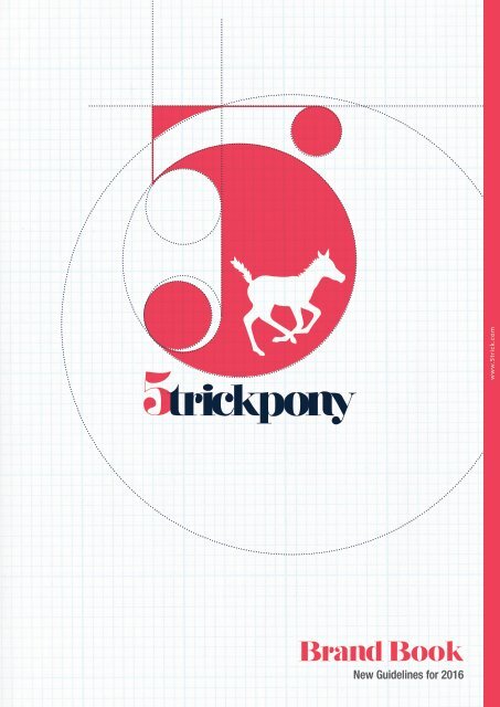
The 5 <strong>Trick</strong> <strong>Pony</strong> <strong>Brand</strong><br />
The 5 <strong>Trick</strong> <strong>Pony</strong> brand expresses the identity and goals of the<br />
association. The 5 <strong>Trick</strong> <strong>Pony</strong> logo was designed to take into<br />
account several of the association’s key strengths.<br />
The product: The logo represents the diversity of the agency and also the<br />
breadth of their involvement with the art community at large.<br />
5trick.com<br />
The social benefits: The use of fuschia and blue are a nod to the breadth of<br />
gender, making it an inclusive brand experience.<br />
The shape: The logo is built of circles and lines, a welcoming shape that is<br />
mathematically aligned. The pony is a playful touch that is intended on keeping<br />
the brand young.<br />
5 <strong>Trick</strong> <strong>Pony</strong>’s commitment to excellence in its visual identity will exemplify its<br />
commitment to quality in all other respects. When the graphic system is fully<br />
implemented, the identity will consistently distinguish all of the association’s<br />
publications and advertising - all print, electronic, and audiovisual materials.<br />
Embracing and following the standards and guidelines presented in this manual<br />
will enable the association to communicate effectively in all print and electronic<br />
venues.<br />
It is impossible to cover all possible uses and applications of the new identity.<br />
Therefore, this manual is intended to be an introduction and a guide to the<br />
basic components of the identity system. Implementation of these standards will<br />
create a greater awareness of the association.<br />
This style guide will be updated on a regular basis as more printed pieces are<br />
created and added to the family of 5 <strong>Trick</strong> <strong>Pony</strong> collateral. Please check the 5<br />
<strong>Trick</strong> <strong>Pony</strong> website for the latest edition of this manual.
Table of<br />
Contents<br />
LOGO IDENTITY & USAGE<br />
Logo Usage<br />
Final Logo<br />
PRIMARY COLOR<br />
Color Specifications<br />
Color Overview<br />
5trick.com
Logo Identity &<br />
Usages<br />
The 5 <strong>Trick</strong> <strong>Pony</strong> Logo<br />
Please use only camera-ready copies or electronic versions of the logo. Redrawing, tracing,<br />
scanning or use of photocopies results in distortion and a loss of sharpness.<br />
The logo should be used in its entirety, not separated into component parts, altered in proportion or printed in<br />
colour combinations other than those outlined in this guide. Avoid using design features such as screening,<br />
reproportioning, rotating or including the logo as part of a pattern or larger image. Such uses tend to diminish<br />
visual strength and undermine the goal of creating a stronger image.<br />
Where to get Copies of the logos<br />
Authorised versions of the 5 <strong>Trick</strong> <strong>Pony</strong> logo may be downloaded from the 5 <strong>Trick</strong> <strong>Pony</strong> web site or by contacting<br />
the 5 <strong>Trick</strong> <strong>Pony</strong> office at Tel + 01 720 273 6419
Logo Usage<br />
Print and Web<br />
The Graphic Marker:<br />
The graphic marker is composed of circles and an<br />
illustration of a pony. This marker will be an important<br />
element of the 5 <strong>Trick</strong> <strong>Pony</strong> identity and be used in<br />
most 5 <strong>Trick</strong> <strong>Pony</strong> communication tools<br />
The Baseline:<br />
The baseline is full name of the association, it is<br />
always written in English.<br />
For Print:<br />
The minimum size of the standard logo is 34mm. It<br />
also exist a alternative version without the baseline<br />
which can be used in exceptional circumstances<br />
with a minimum length of 15mm. Never use the<br />
alternative version for sizes greater than 34mm.<br />
For Web:<br />
The minimum size of the standard logo is<br />
200pixels. An alternative version also exists without<br />
the baseline which can be used in exceptional<br />
circumstances with a minimum length of 16pixels.<br />
Never use the alternative version for sizes greater<br />
than 200pixels.<br />
PRIMARY COLOR<br />
C=002 M=094 Y=083 K=000<br />
SECONDARY COLOR<br />
C=097 M=082Y=047 K=054<br />
PRIMARY COLOR<br />
C=002 M=094 Y=083 K=000<br />
SECONDARY COLOR<br />
C=097 M=082Y=047 K=054<br />
Logo on White<br />
The 5 <strong>Trick</strong> <strong>Pony</strong> logo should always be reproduced<br />
using the correct colours. On light backgrounds,<br />
the 5 <strong>Trick</strong> <strong>Pony</strong> logo should be reproduced using<br />
its original colours, on dark backgrounds, the<br />
reversed version should be used.<br />
Logo on Blue<br />
The 5 <strong>Trick</strong> <strong>Pony</strong> logo should always be reproduced<br />
using the correct colours. On light backgrounds,<br />
the 5 <strong>Trick</strong> <strong>Pony</strong> logo should be reproduced using<br />
its original colours, on dark backgrounds, the<br />
reversed version should be used.
<strong>Brand</strong><br />
Colors<br />
Color Specifications<br />
These colours constitute 5 <strong>Trick</strong> <strong>Pony</strong>’s primary<br />
and secondary colour palette. These colors<br />
should be used when developing publications,<br />
presentations or other communication tools. A<br />
consistent use of the colour palette will help 5<br />
<strong>Trick</strong> <strong>Pony</strong> build a strong and recognisable brand.<br />
The secondary colours may be used when<br />
deemed appropriate to support the primary<br />
palette, e.g. in a pie chart. They may, however<br />
never, dominate the primary colour palette.
Dark Grey<br />
Navy Blue<br />
PANTONE<br />
446 C<br />
FOR WEB USE<br />
R: 91 G: 89 B: 87<br />
FOR PRINTING USE<br />
C: 49 M: 41 Y: 41 K 50<br />
PANTONE<br />
115 U<br />
FOR WEB USE<br />
R: 40 G: 56 B: 72<br />
FOR PRINTING USE<br />
C: 85 M: 71 Y: 48 K 42<br />
Grey<br />
Blue<br />
PANTONE<br />
115 U<br />
FOR WEB USE<br />
R: 40 G: 56 B: 72<br />
FOR PRINTING USE<br />
C: 85 M: 71 Y: 48 K 42<br />
PANTONE<br />
7689 C<br />
FOR WEB USE<br />
R: 40 G: 56 B: 72<br />
FOR PRINTING USE<br />
C: 84 M: 47 Y: 22 K 2<br />
Light Grey<br />
Light Blue<br />
PANTONE<br />
115 U<br />
FOR WEB USE<br />
R: 40 G: 56 B: 72<br />
FOR PRINTING USE<br />
C: 85 M: 71 Y: 48 K 42<br />
PANTONE<br />
7689 C<br />
FOR WEB USE<br />
R: 40 G: 56 B: 72<br />
FOR PRINTING USE<br />
C: 84 M: 47 Y: 22 K 2<br />
Yellow<br />
Fuschia<br />
PANTONE<br />
3945 C<br />
FOR WEB USE<br />
R: 242 G: 231 B: 85<br />
FOR PRINTING USE<br />
C: 10 M: 0 Y: 76 K 0<br />
PANTONE<br />
213 C<br />
FOR WEB USE<br />
R: 229 G: 51 B: 81<br />
FOR PRINTING USE<br />
C: 85 M: 71 Y: 48 K 42
Fonts, Lines &<br />
Typography<br />
Font Usage<br />
Helevetica Neue is a family that offers an exceptionally wide range of weights and/or styles. It is<br />
the slightly reworked version of a truly universal font. This font was chosen for its modern look &<br />
feel and its amazingly broad selection (identified by number) of weight including:<br />
23 Ultra Light Extended Oblique<br />
25 Ultra Light<br />
26 Ultra Light Italic<br />
27 Ultra Light Condensed<br />
27 Ultra Light Condensed Oblique<br />
33 Thin Extended<br />
33 Thin Extended Oblique<br />
35 Thin<br />
36 Thin Italic<br />
37 Thin Condensed<br />
37 Thin Condensed Oblique<br />
43 Light Extended<br />
43 Light Extended Oblique<br />
43 Extended Light<br />
43 Extended Light Oblique<br />
45 Light<br />
46 Light Italic<br />
47 Light Condensed Oblique<br />
53 Extended<br />
53 Extended Oblique<br />
55 Roman<br />
56 Italic<br />
57 Condensed<br />
57 Condensed Oblique<br />
63 Medium Extended<br />
63 Medium Extended Oblique<br />
65 Medium<br />
66 Medium Italic<br />
67 Medium Condensed<br />
67 Medium Condensed Oblique<br />
73 Bold Extended<br />
73 Bold Extended Oblique<br />
75 Bold<br />
75 Bold Outline<br />
76 Bold Italic<br />
77 Bold Condensed<br />
77 Bold Condensed Oblique<br />
83 Heavy Extended<br />
83 Heavy Extended Oblique<br />
85 Heavy<br />
86 Heavy Italic<br />
87 Heavy Condensed<br />
87 Heavy Condensed Oblique<br />
93 Black Extended<br />
93 Black Extended Oblique<br />
95 Black<br />
96 Black Italic<br />
97 Black Condensed<br />
97 Black Condensed Oblique<br />
107 Extra Black Condensed<br />
107 Extra Black Condensed Oblique<br />
The body font for 5 <strong>Trick</strong> <strong>Pony</strong> publications is ITC<br />
conduit. The font is clear and legible and makes 5 <strong>Trick</strong><br />
<strong>Pony</strong> publications stand apart from more traditional<br />
alternatives.<br />
In addition to ITC Conduit’s six original weights (light,<br />
medium and bold with italic counterparts), the family<br />
now includes extra light, regular, extra bold and<br />
black. Each new font includes italic and small cap<br />
counterparts, and seven sets of oldstyle figures have<br />
been added to complement the non-italic weights.<br />
ITC has also fine-tuned the spacing and other digital<br />
aspects of the original design. The typeface with its<br />
original six weights was released in 1997 and quickly<br />
became one of ITC’s most recognized and best- selling<br />
typefaces. Shortly after the debut, Fast Company<br />
magazine asked designer Mark van Bronkhorst to<br />
develop the 29 additional weights for the magazine’s<br />
exclusive use.<br />
When designing ITC Conduit, van Bronkhorst had<br />
parking lot signs in mind. “It’s the kind of lettering<br />
you might find on boilers, assem- bly diagrams, and<br />
desiccant packets,” he said, adding that the design was<br />
a cut-and-paste job constructed from a set of character<br />
parts. “It’s plain, grid-based, visually incompetent, yet<br />
legible and direct.” As van Bronkhorst developed the<br />
face, the 90-degree turns on the shapes reminded him<br />
of electrical conduits; hence, the name.
Headings<br />
Headings must be in Helvetica Neue LT Std 43 Light or Ultra Light Extended and Nouvelle Vague and<br />
in brand colors. The leading heading shold be in Helvetica Neue LT Std 43 Light Extended with 20pt<br />
tracking and the main heading should be in Nouvelle Vague. They must be significantly larger than<br />
the type they are heading.<br />
Helvetica Neue LT Std 43 Light Extended<br />
1234567890!@#$%^&*()<br />
ABCDEFGHIJKLMNOPQRSTUVWXYZ<br />
abcdefghijklmnopqrstuvwxyz<br />
Nouvelle Vague<br />
1234567890!@#$%^&*()-<br />
ABCDEFGHIJKLMNOPQRSTUVWXYZ<br />
abcdefghijklmnopqrstuvwxyz<br />
Body Copy<br />
Body copy must be 10pt Helvetica Neue LT Std 47, 57, 67, or 77 condensed. Keep 20 pt tracking<br />
on all body copy.<br />
Helvetica Neue LT Std 43 Light Condensed<br />
1234567890!@#$%^&*()<br />
ABCDEFGHIJKLMNOPQRSTUVWXYZ<br />
abcdefghijklmnopqrstuvwxyz<br />
Helvetica Neue LT Std 67 Medium Condensed<br />
1234567890!@#$%^&*()<br />
ABCDEFGHIJKLMNOPQRSTUVWXYZ<br />
abcdefghijklmnopqrstuvwxyz
Music, Geometry, &<br />
Typographic<br />
Style<br />
Art and Moral Treason<br />
This section is a collection of handwritten notes and excerpts from essays on the subject of<br />
typography as it relates to music theory, through geometry.<br />
Typography is the craft of endowing human language with a durable visual form, and thus with an independent<br />
existence. Its heartwood is calligraphy - the dance, on a tiny stage, of the living, speaking hand - and its roots reach<br />
into living soil, though its branches may be hung each year with new machines. So long as the root lives, typography<br />
remains a source of true delight, true knowledge, true surprise.<br />
As a craft, typography shares a long common boundary and many common concerns with writing and editing on the<br />
one side and with graphic design on the other; yet typography itself belongs to neither. This book in its turn is neither a<br />
manual of editorial style nor a textbook on design, though it overlaps with both of these concerns.<br />
The perspective throughout is first and foremost typographic - and I hope the guide will be useful for that very reason<br />
to those whose work or interests may be centered in adjacent fields.<br />
Everything written symbols can say has already passed<br />
by. They are like tracks left by animals. That is why the<br />
masters of meditation refuse to accept that writings<br />
are final. The aim is to reach true being by means of<br />
those tracks, those letters, those signs but reality itself<br />
is not a sign, and it leaves no tracks. It doesn’t come<br />
to us by way of letters or words. We can go toward it,<br />
by following those words and letters back to what they<br />
came from. But so long as we are preoccupied with<br />
symbols, theories and opinions, we will fail to reach<br />
the principle.<br />
- But when we give up symbols and opinions, aren’t we<br />
left in the utter nothingness of being?<br />
-Yes.<br />
A true revelation, it seems to me, will only emerge<br />
from stubborn concentration on a solitary problem. I<br />
am not in league with in- ventors or adventurers, nor<br />
with travelers to exotic destinations. The surest - also<br />
the quickest - way to awake the sense of won- der<br />
in ourselves is to look intently, undeterred, at a single<br />
object. Suddenly, miraculously, it will reveal itself as<br />
something we have never seen before.<br />
CESARE P A VESE,<br />
DIALOGHI CON LEUCO, 1947<br />
KIMURA KYUHO, KENJUTSU FUSHIGI<br />
HEN [ON THE MYSTERIES OF<br />
SWORDSMANSHIP], 1768
Typography exists to honor content.<br />
1.1<br />
First<br />
Principles<br />
One of the principles of durable typography is always legibility; another is something<br />
more than legibility: some earned or unearned interest that gives its living energy to the<br />
page. It takes various forms and goes by various names, including serenity, liveliness,<br />
laughter, grace and joy.<br />
These principles apply, in different ways, to the typography of business cards, instruction sheets and<br />
postage stamps, as well as to editions of religious scriptures, literary classics and other books that aspire<br />
to join their ranks. Within limits, the same principles apply even to stock market reports, airline schedules,<br />
milk cartons, classified ads. But laughter, grace and joy, like legibility itself, all feed on meaning, which the<br />
writer, the words and the subject, not the typographer, must generally provide.<br />
The satisfactions of the craft come from elucidating, and perhaps even ennobling, the text, not from<br />
deluding the unwary reader by applying scents, paints and iron stays to empty prose. But humble texts,<br />
such as classified ads or the telephone directory, may profit as much as anything else from a good<br />
typographical bath and a change of clothes. And many a book, like many a warrior or dancer or priest of<br />
either sex, may look well with some paint on its face, or indeed with a bone in its nose.<br />
“Type is a beautiful group<br />
of letters, not a group of<br />
beautiful letters.”<br />
- MATTHEW CARTER
Letters have a life and dignity of their own.<br />
1.2<br />
First<br />
Principles<br />
Letterforms that honor and elucidate what humans see and say deserve to be honored in<br />
their turn.<br />
Well-chosen words deserve well-chosen letters; these in their turn deserve to be set with affec- tion,<br />
intelligence, knowledge and skill. Typography is a link, and it ought, as a matter of honor, courtesy and pure<br />
delight, to be as strong as the others in the chain.<br />
This excuse for setting texts in type has disap- peared. In the age of photolithography, digital scanning<br />
and offset printing, it is as easy to print directly from handwritten copy as from text that is typographically<br />
composed. Yet the typographer’s task is little changed. It is still to give the illusion of superhuman speed<br />
and stamina - and of superhuman patience and precision - to the writing hand<br />
Typography is just that: idealized writing.<br />
In a badly designed book, the letters mill and stand like starving horses in a field. In a book designed by<br />
rote, they sit like stale bread and mutton on the page. In a well-made book, where designer, compositor<br />
and printer have all done their jobs, no mat- ter how many thousands of lines and pages they must occupy,<br />
the letters are alive. They dance in their seats. Sometimes they rise and dance in the margins and aisles.<br />
Read the text before designing it.<br />
1.3<br />
First<br />
Principles<br />
The typographer’s one essential task is to interpret and communicate the text.<br />
Its tone, its tempo, its logical structure, its physical size, all determine the possibilities of its typographic<br />
form. The typographer is to the text as the theatrical director to the script, or the musician to the score.<br />
The first task of the typographer is therefore to read and understand the text; the second task is to analyze<br />
and map it. Only then can typographic interpretation begin. If the text has many layers or sections, it may<br />
need not only heads and subheads but running heads as well, reappearing on every page or two-page<br />
spread, to remind readers which intel- lectual neighborhood they happen to be visiting.<br />
Writing merges with typography, and the text becomes its own illustration.<br />
“Readers usually ignore the typographic interface, gliding<br />
comfortably along literacy’s habitual groove. Sometimes,<br />
however, the interface should be allowed to fail. By making<br />
itself evident, typography can illuminate the construction and<br />
identity of a page, screen, place, or product.”<br />
- ELLEN LUPTON
Make the visible relationship between the<br />
text and other elements.<br />
1.4<br />
First<br />
Principles<br />
If the text is tied to other elements, where do they belong? If there are notes, do they go at the side of the<br />
page, the foot of the page, the end of the chapter, the end of the book? If there are photographs or other<br />
illustrations, should they be embedded in the text or should they form a special section of their own? And if<br />
the photographs have captions or credits or labels, should these sit close beside the photographs or should<br />
they be separately housed?<br />
If there is more than one text - as in countless publications issued in Canada, Switzerland, Belgium and<br />
other multilingual countries - how will the separate but equal texts be arrayed? Will they run side by side<br />
to emphasize their equality (and perhaps to share in a single set of illustrations), or will they be printed<br />
back- to-back, to emphasize their distinctness?<br />
No matter what their relation to the text, photos or maps must sometimes be grouped apart from it because<br />
they require a separate paper or different inks. If this is the case, what typo- graphic cross-references will<br />
be required?<br />
These and similar questions, which confront the working typographer on a daily basis, must be answered<br />
case by case. The typographic page is a map of the mind; it is frequently also a map of the social order<br />
from which it comes. And for better or for worse, minds and social orders change.<br />
Choose a typeface that honors the text.<br />
1.5<br />
First<br />
Principles<br />
This is the beginning, middle and end of the practice of typography: choose and use the<br />
type with sensitivity and intelligence.<br />
Letterforms have tone, timbre, character, just as words and sentences do. The moment a text and a<br />
typeface are chosen, two streams of thought, two rhythmical systems, two sets of habits, or if you like, two<br />
personalities, intersect. They need not live together contentedly forever, but they must not as a rule collide.<br />
The root metaphor of typesetting is that the alphabet (or in Chinese, the entire lexicon) is a system of<br />
interchangeable parts. The word form can be surgically revised, instead of rewritten, to become the<br />
wordfarm orfirm orfort orfork orfrom, or with a little more trouble, to become the word pineapple. The<br />
old compositor’s typecase is a partitioned wooden tray holding hundreds of such interchangeable bits of<br />
information. These subsemantic particles, these bits - called sorts by letterpress printers - are letters cast<br />
on standardized bodies of metal, waiting to be assembled into meaningful combinations, then dispersed<br />
and reassembled in a different form. The compositor’s typecase is one of the primary ancestors of the<br />
computer - and it is no surprise that while type- setting was one of the last crafts to be mechanized, it was<br />
one of the first to be computerized.
Shape the page to honor its contents.<br />
1.6<br />
First<br />
Principles<br />
Selecting the shape of the page and placing the type upon it is much like framing and<br />
hanging a painting.<br />
If the text is long or the space is short, or if the elements are many, multiple columns may be required. If<br />
illustrations and text march side by side, does one take precedence over the other? And does the order<br />
or degree of prominence change? Does the text suggest perpetual symmetry, perpetual asymmetry, or<br />
something in between?<br />
Again, does the text suggest the continuous unruffled flow of justified prose, or the continued flirtation with<br />
order and chaos evoked by flush-left ragged-right composition? (The running heads and sidenotes on the<br />
recto (righthand) pages of this book are set flush left, ragged right. On the verso (lefthand) pages, they are<br />
ragged left.<br />
Shaping the page goes hand in hand with choosing the type, and both are permanent typographical<br />
preoccupations.<br />
Give full attention to incidental details.<br />
1.7<br />
First<br />
Principles<br />
Some of what a typographer must set, like some of what any mu- sician must play, is simply passage<br />
work. Even an edition of Plato or Shakespeare will contain a certain amount of routine text: page<br />
numbers, scene numbers, textual notes, the copyright claim, the publisher’s name and address, and the<br />
hyperbole on the jacket, not to mention the passage work or background writing that is implicit in the text<br />
itself.<br />
But just as a good musician can make a heart-wrenching ballad from a few banal words and a trivial<br />
tune, so the typographer can make poignant and lovely typog- raphy from bibliographical paraphernalia<br />
and textual chaff. The ability to do so rests on respect for the text as a whole, and on re- spect for the<br />
letters themselves.<br />
Summary<br />
• invite the reader into the text<br />
• reveal the tenor and meaning of the text<br />
• clarify the structure and the order of the text<br />
• link the text with other existing elements<br />
• induce a state of energetic repose, which is the ideal condition for reading.<br />
While serving the reader in this way, typography, like a musical performance or a theatrical production,<br />
should serve two other ends. It should honor the text for its own sake - always assuming that the text is<br />
worth a typographer’s trouble - and it should honor and contribute to its own tradition: that of<br />
typography itself.
Make use of horizontal motion.<br />
2.1<br />
Making<br />
Space<br />
An ancient metaphor: thought is a thread, and the raconteur is a spinner of yarns - but the<br />
true storyteller, the poet, is a weaver. The scribes made this old and audible abstraction<br />
into a new and visible fact. After long practice, their work took on such an even, flexible<br />
texture that they called the written page a textus, which means cloth.<br />
The typesetting device, whether it happens to be a computer or a composing stick, functions like a<br />
loom. And the typogra- pher, like the scribe, normally aims to weave the text as evenly as possible. Good<br />
letterforms are designed to give a lively, even texture, but careless spacing of letters, lines and words can<br />
tear this fabric apart.<br />
Another ancient metaphor: the density of texture in a written or typeset page is called its color. This has<br />
nothing to do with red or green ink; it refers only to the darkness or blackness of the letterforms in mass.<br />
Once the demands of legibility and logical order are satisfied, evenness o f color is the typographer’s<br />
normal aim. And color depends on four things: the design of the type, the spacing between the letters, the<br />
spacing between the words, and the spacing between the lines. None is independent of the others.<br />
Design the space to suit the size of the font.<br />
2.2<br />
Making<br />
Space<br />
Type is normally measured in picas and points (explained in detail on pages 328-329), but horizontal<br />
spacing is measured in ems, and the em is a sliding measure. One em is a distance equal to the type size.<br />
In 6 point type, an em is 6 points; in 12 pt type it is 12 points, and in 6 0 pt type it is 6 0 points. Thus a<br />
one-em space is proportionately the same in any size.<br />
If text is set ragged right, the word space (the space between words) can be fixed and unchanging. If the<br />
text is justified (set flush left and right, like the text in this book), that space must usually be elastic. In<br />
either case, the size of the ideal word space varies from one circumstance to another, depending on factors<br />
such as letterfit, type color, and size. A loosely fitted or bold face will need a larger interval between the<br />
words. At larger sizes, when letterfit is tightened, the spacing of words can be tightened as well. For a<br />
normal text face in a normal text size, a typical value for the word space is a quarter of an em, which can<br />
be written M/4. (A quarter of an em is typically about the same as, or slightly more than, the set-width of<br />
the letter t.)<br />
If the text is justified, a reasonable minimum word space is a fifth of an em (M/5), and M/4 is a good<br />
average to aim for. A reasonable maximum in justified text is M/2. If it can be held to M/3, so much the<br />
better. But for loosely fitted faces, or text set in a small size, M/3 is often a better average to aim for, and<br />
a better minimum is M/4. In a line of widely letterspaced capitals, a word space of M/2 or more may be<br />
required.
Choose a comfortable measure.<br />
2.3<br />
Making<br />
Space<br />
Anything from 45 to 75 characters is widely regarded as a satisfactory length of line for a<br />
single-column page set in a serifed text face in a text size.<br />
The 66-character line (counting both letters and spaces) is widely regarded as ideal. For multiple-column<br />
work, a better average is 40 to 50 characters.<br />
If the type is well set and printed, lines of 85 or 90 characters will pose no problem in discontinuous texts,<br />
such as bibliographies, or, with generous leading, in footnotes. But even with gen- erous leading, a line that<br />
averages more than 75 or So characters is likely to be too long for continuous reading.<br />
A reasonable working minimum for justified text in English is the 40-character line. Shorter lines may<br />
compose perfectly well with sufficient luck and patience, but in the long run, justified lines averaging less<br />
than 38 or 40 characters will lead to white acne or pig bristles: a rash of erratic and splotchy word spaces<br />
or an epidemic of hyphenation. When the line is short, the text should be set ragged right. In large doses,<br />
even ragged-right composi- tion may look anorexic if the line falls below 30 characters, but in small and<br />
isolated patches - ragged marginal notes, for example - the minimum line (if the language is English) can<br />
be as little as 12 or 15 characters.<br />
On a conventional book page, the measure, or length of line, is usually around 30 times the size of the<br />
type, but lines as little as 20 or as much as 40 times the type size fall within the expectable range. If, for<br />
example, the type size is 10 pt, the measure might be around 30 x 10 = 300 pt, which is 300/12 = 25<br />
picas. A typical lowercase alphabet length for a 10 pt text font is 118 pt, and the copyfitting table tells us<br />
that such a font set to a 25-pica measure will yield roughly 65 characters per line.<br />
Use a single word space<br />
between sentences.<br />
2.4<br />
Making<br />
Space<br />
In the nineteenth century, which was a dark and inflationary age in typography and type<br />
design, many compositors were encouraged to stuff extra space between sentences.<br />
Generations of twentieth-century typists were then taught to do the same, by hitting the spacebar twice<br />
after every period. Your typing as well as your typesetting will benefit from unlearning this quaint Victorian<br />
habit. As a general rule, no more than a single space is required after a period, a colon or any other mark<br />
of punctuation. Larger spaces (e.g., en spaces) are themselves punctuation.<br />
The rule is sometimes altered, however, when setting classical Latin and Greek, romanized Sanskrit,<br />
phonetics or other kinds of texts in which sentences begin with lowercase letters. In the absence of a<br />
capital, a full en space (M/2) between sentences may be welcome.<br />
Set ragged if it suits the composition.<br />
2.5<br />
Making<br />
Space<br />
In justified text, there is always a trade-off between evenness of spacing and frequency<br />
of hyphenation.<br />
The best available com- promise will depend on the nature of the text as well as on the specifics of the<br />
design. Good compositors like to avoid consecu- tive hyphenated line-ends, but frequent hyphens are<br />
better than sloppy spacing, and ragged setting is better yet.
Kern consistently and modestly, or not at all.<br />
Kerning - altering the space between selected pairs of letters<br />
2.6<br />
Kerning tables generally subtract space from combinations such as Av, Aw, Ay, ‘A, ‘A, L, and all combinations<br />
in which the first element is T, V, W or Y and the second element is anything other than b, h, k or I.<br />
Making<br />
Space<br />
Don’t alter the widths or shapes of letters<br />
without cause.<br />
2.7<br />
Making<br />
Space<br />
When letters are maltreated in this way, their reserve oflegibility is sapped. They can do<br />
little in their turn except shortchange and brutalize the reader.<br />
Type design is an art practiced by few and mastered by fewer - but font-editing software makes it possible<br />
for anyone to alter in a moment the widths and shapes of letters to which an artist may have devoted<br />
decades of study, years of inspiration and a rare concentration ofskill. The power to destroy such a type<br />
designer’s work should be used with caution. And arbitrarily condensing or expanding letterforms is the<br />
poorest of all methods for fitting uneditable copy into unalterable space.<br />
Choose a basic leading that suits the<br />
typeface, text and measure.<br />
2.8<br />
Making<br />
Space<br />
Space in typography is like time in music. It is infinitely divis- ible, but a few proportional<br />
intervals can be much more useful than a limitless choice of arbitrary quantities.<br />
The metering of horizontal space is accomplished almost unconsciously in typography. You choose and<br />
prepare a font, and you choose a measure (the width of the column). When you set the type, the measure<br />
fills with the varied rhythm of repeating letter shapes, which are music to the eye.<br />
Vertical space is metered in a different way. You must choose not only the overall measure - the depth of<br />
the column or page - but also a basic rhythmical unit. This unit is the leading, which is the distance from<br />
one baseline to the next.<br />
eleven - point type set solid is described as 11/11. The theo- retical face of the type is 11 points high (from<br />
the top of d to the bottom of p, if the type is full on the body), and the distance from the baseline of line<br />
one to the baseline of line two is also 11 points. Add two points of lead (interlinear space), and the type is<br />
set 11/13. The type size has not changed, but the distance from baseline to baseline has increased to 13<br />
points, and the type has more room to breathe.
Don’t alter the widths or shapes of letters<br />
without cause.<br />
2.9<br />
Making<br />
Space<br />
Lists, such as contents pages and recipes, are opportunities to build architectural<br />
structures in which the space between the elements both separates and binds.<br />
The two favorite ways of destroying such an opportunity are setting great chasms of space that the eye<br />
cannot leap without help from the hand, and setting unenlightening rows of dots (dot leaders, they are<br />
called) that force the eye to walk the width of the page like a prisoner being escorted back to<br />
its cell.<br />
The following examples show two among many ways of handling a list. Splitting titles and numbers apart,<br />
setting one flush left and the other flush right, with or without dot leaders, would only muffle<br />
the information:<br />
Tend to rhythm and proportion.<br />
3.1<br />
Ordering<br />
Information<br />
The text of the book you are reading, to take an example, is set 10/12 x 21. This means<br />
that the type size is 10 pt, the added lead is 2 pt, giving a total leading of 12 pt, and the<br />
line length is 21 picas.<br />
A short burst of advertising copy or a title might be set with negative leading (18/15, for example), so<br />
long as the ascenders and descenders don’t collide:
Don’t suffocate the page.<br />
3.2<br />
Ordering<br />
Information<br />
Most books now printed in the Latin alphabet carry from 3 0 to 45 lines per page.<br />
The average length of line in most of those books is 60 to 66 characters. In English and the Romance<br />
languages, a word is typically assumed to average five letters plus a space. Ten or eleven such words fit on<br />
a line of 60 to 66 characters, and the page, if it is full, holds from 300 to 500 words. Ifyou want more than<br />
500 words to the page, it is time to consider multiple columns. A two-column book page will comfortably<br />
carry 750 words. If it must, it can carry a thousand.<br />
However empty or full it may be, the page must breathe, and in a book - that is, in a long text fit for the<br />
reader to live in - the page must breathe in both directions. The longer the line, the more space necessary<br />
between lines. Two columns of short lines are therefore more compact than a single column of long lines.<br />
Set opening paragraphs flush left.<br />
3.3<br />
Ordering<br />
Information<br />
The function of a paragraph indent is to mark a pause, setting the paragraph apart from<br />
what precedes it.<br />
If a paragraph is preceded by a title or subhead, the indent is superfluous and can therefore be omitted,<br />
as it is here.<br />
The function of a paragraph indent is to mark a pause, setting the paragraph apart from what precedes it.<br />
If a paragraph is preceded by a title or subhead, the indent is superfluous and can therefore be omitted,<br />
as it is here.<br />
In continuous text, mark all paragraphs<br />
after the first with an indent of at least<br />
one en.<br />
3.4<br />
Ordering<br />
Information<br />
Typography like other arts, from cooking to choreography, involves a balance between the<br />
familiar and the unfamiliar, the dependably consistent and the unforeseen.<br />
Typographers generally take pleasure in the unpredictable length of the paragraph while accepting the<br />
simple and reassuring consistency of the paragraph indent. The prose paragraph and its verse counterpart,<br />
the stanza, are basic units of linguistic thought and literary style. The typog- rapher must articulate them<br />
enough to make them clear, yet not so strongly that the form instead of the content steals the show. If the<br />
units of thought, or the boundaries between thoughts, look more important than the thoughts themselves,<br />
the typographer has failed.
Add extra lead before and after<br />
block quotations.<br />
3.5<br />
Ordering<br />
Information<br />
Block quotations (like the one on pp 17-18 of this book) can be distinguished from the<br />
main text in many ways. For instance: by a change of face (usually from roman to italic),<br />
by a change in size (as from 11 pt down to 10 pt or 9 pt), or by indention.<br />
Hart’s Rules for Compositors (39th ed, 1983) includes a good, brief guide to hyphenation and punctuation<br />
rules for sev- eral European languages. Its fat successor, Ritter’s Oxford Guide to Style (2002) is more<br />
thorough but much less handy. It is always worth- while, however,<br />
Don’t compose without a scale.<br />
3.6<br />
Ordering<br />
Information<br />
The simplest scale is a single note, and sticking with a single note draws more attention<br />
to other parameters, such as rhythm and inflection.<br />
The early Renaissance typographers set each book in a single font - that is, one face in one size -<br />
supplemented by hand- drawn or specially engraved large initial letters for the openings of chapters. Their<br />
pages show what sensuous evenness of texture and variety of rhythm can be attained with a single font of<br />
type: very much greater than on a typewriter, where letters have, more often than not, a single width and a<br />
single stroke-weight as well as a single size.<br />
In the sixteenth century, a series of common sizes developed among European typographers, and the series<br />
survived with lit- tle change and few additions for 400 years. In the early days, the sizes had names rather<br />
than numbers, but measured in points, the traditional series is this:<br />
This is the typographic equivalent of the diatonic scale. But modern equipment makes it possible to<br />
set, in addition to these sizes, all the sharps and flats and microtonal intervals between. Twenty-point,<br />
22-point, 23-point, and 10Vi-point type are all avail- able for the asking. The designer can now choose a<br />
new scale or tone-row for every piece of work.<br />
These new resources are useful, but rarely all at once. Use the old familiar scale, or use new scales<br />
of your own devising, but limit yourself, at first, to a modest set of distinct and related intervals. Start<br />
with one size and work slowly from there. In time, the scales you choose, like the faces you choose, will<br />
become recognizable features of personal style.
Don’t use a font you don’t need.<br />
3.7<br />
Ordering<br />
Information<br />
The marriage of type and text requires courtesy to the in-laws, but it does not mean that<br />
all of them ought to move in, nor even that all must come to visit.<br />
Boldface roman type did not exist until the nineteenth cen- tury. Bold italic is even more recent. Generations<br />
of good typog- raphers were quite content ‘without such variations. Font manu- facturers nevertheless now<br />
often sell these extra weights as part of a basic package, thereby encouraging typographers - beginners<br />
especially - to use bold roman and italic whether they need them or not.<br />
Bold and semibold faces do have their value. They can be used, for instance, to flag items in a list, to set<br />
titles and subheads u&lc in small sizes, to mark the opening of the text on a complex page, or to thicken the<br />
texture of lines that will be printed in pale ink or as dropouts (negative images) in a colored field. Sparingly<br />
used, they can effectively emphasize numbers or words, such as the headwords, keywords and definition<br />
numbers in a dictionary. They can also be used (as they often are) to shout at readers, putting them on<br />
edge and driving them away; or to destroy the historical integrity of a typeface designed before boldface<br />
roman was born; or to create unintentional anachronisms, something like adding a steam engine or a fax<br />
machine to the stage set for King Lear.<br />
Don’t clutter the foreground.<br />
3.8<br />
Ordering<br />
Information<br />
When boldface is used to emphasize words, it is usually best to leave the punctuation in<br />
the background, which is to say, in the basic text font. It is the words, not the punctuation,<br />
that merit emphasis in a sequence such as the following:<br />
But if the same names are emphasized by setting them in italic rather than bold, there is no advantage in<br />
leaving the punctuation in roman. With italic text, italic punctuation normally gives better letterfit and thus<br />
looks less obtrusive:<br />
“Typography, we’ve fostered the modern<br />
idea of individuality, but it destroyed the<br />
medieval sense of community<br />
and integration”<br />
- NEIL POSTMAN
Make the title page a symbol of the dignity<br />
and presence of the text.<br />
3.9<br />
If the text has immense reserve and dignity, the title page should have these properties as well - and if the<br />
text is devoid of dignity, the title page should in honesty be the same.<br />
Ordering<br />
Information
Edit tables with the same attention given<br />
to text, and set them as text to be read.<br />
4.1<br />
Types<br />
& Faces<br />
Tables are notoriously time-consuming to typeset, but the problems posed are often<br />
editorial as much as typographic.<br />
I f the table is not planned in a readable form to begin with, the typographer can render it readable<br />
only by rewriting or redesigning it from scratch.<br />
Tables, like text, go awry when approached on a purely tech- nical basis. Good typographic answers<br />
are not elicited by asking questions such as “How can I cram this number of characters into that<br />
amount of space?”<br />
If the table is approached as merely one more form of text, which must be made both good to read<br />
and good to look at, several principles will be clear:<br />
• All text should be horizontal, or in rare cases oblique. Setting column heads<br />
vertically as a space-saving measure is quite fea- sible if the text is in<br />
Japanese or Chinese, but not if it is written in the Latin alphabet.<br />
• Letterforms too small or too condensed for comfortable reading are not part<br />
of the solution.<br />
• There should be a minimum amount of furniture (rules, boxes, dots and other<br />
guiderails for traveling through typographic space) and a maximum amount<br />
of information.<br />
• Rules, tint blocks or other guides and dividers, where they are necessary at<br />
all, should run in the predominant reading direction: vertically in the case of<br />
lists, indices and some numerical tables, and horizontally otherwise.<br />
• A rule located at the edge of a table, separating the first or final column from<br />
the adjacent empty space, ordinarily serves no function.<br />
• A table, like any other text in multiple columns, must contain within itself an<br />
adequate amount of white space.<br />
“Una y otra vez, los lectores se han<br />
condicionado mutuamente.”<br />
- GERARD UNGER
Consider the medium for which the<br />
typeface was originally designed.<br />
4.2<br />
Types<br />
& Faces<br />
Typographic purists like to see every typeface used with the technology for which it was<br />
designed.<br />
Taken literally, this means that virtually all faces designed before 1950 must be set in metal and printed<br />
letterpress, and the majority must be set by hand. Most typographers apply this principle in a more relaxed<br />
and complex way, and settle for preserving something rather than everything of a type’s original character.<br />
On the technical side, several things can be done to increase the chance that a letterpress typeface will<br />
survive translation to digital composition and offset printing.<br />
When using digital adaptations of<br />
letterpress faces, choose fonts that are<br />
faithful to the spirit as well as the letter of<br />
the old designs.<br />
4.3<br />
Types<br />
& Faces<br />
Letterpress printing places the letterform into the paper, while offset printing lays it on<br />
the surface. Many subtle differences result from these two approaches to printing. The<br />
letterpress adds a little bulk and definition to the letter, especially in the thin strokes, and<br />
increases the prominence of the ends of thin serifs. Metal typefaces are designed to take<br />
advantage of these features of letterpress printing.<br />
thin strokes tend to get thinner and the ends of delicate serifs are eaten away. In a face like Bembo, for<br />
instance, offset printing tends to make features like the feet of i and I, and the heads and feet of H and I,<br />
slightly convex, while letterpress printing tends to make them slightly concave.<br />
Faces designed for photographic manipulation and offset printing are therefore weighted and finished<br />
differently from letterpress designs. And adapting a letterpress face for digital composition is a far from<br />
simple task.<br />
Digital fonts poorly translated from metal originals are some- times too dark or light or blunt throughout,<br />
or uneven in stroke weight, or faithless in their proportions. They sometimes lack text figures or other<br />
essential components of the original design. But digital translations can also be too faithful to the original.<br />
They sometimes neglect the subtle adjustments that the shift from three-dimensional letterpress to twodimensional<br />
offset printing requires.
Choose faces whose individual spirit and<br />
character is in keeping with the text.<br />
4.4<br />
Types<br />
& Faces<br />
Accidental associations are rarely a good basis for choosing a typeface.<br />
Books of poems by the twentieth-century Jewish Ameri- can poet Marvin Bell, for example, have sometimes<br />
been set in Bell type -which is eighteenth-century, English and Presbyterian - solely because of the name.<br />
Such puns are a private amusement for typographers; they also sometimes work. But a typographic page<br />
so well designed that it attains a life of its own will be based on real affinities, not on an inside joke.<br />
Letterforms have character, spirit and personality. Typog- raphers learn to discern these features<br />
through years of working first-hand with the forms, and through studying and comparing the work of<br />
other designers, present and past. On close inspec- tion, typefaces reveal many hints of their designers’<br />
times and temperaments, and even their nationalities and religious faiths. Faces chosen on these grounds<br />
are likely to give more interesting results than faces chosen through mere convenience of availability or<br />
coincidence of name.<br />
If, for example, you are setting a text by a woman, you might prefer a face, or several faces, designed by<br />
a woman. Such faces were rare or nonexistent in earlier centuries, but there are now a number to choose<br />
from. They include Gudrun Zapf-von Hesse’s admirable Alcuin, Carmina, Diotima and Nofret families;<br />
Eliza- beth Friedlander’s Elizabeth; Kris Holmes’s Sierra and Lucida; Kris Holmes’s and Janice Prescott<br />
Fishman’s Shannon; Carol Twombly’s handsome text face Chaparral and her titling faces Charlemagne,<br />
Lithos, Nueva and Trajan; Zuzana Licko’s Journal and Mrs Eaves, and Ilse Schiile’s Rhapsodie. For some<br />
purposes, one might also go back to the work of Elizabeth Colwell, whose ColwellHandletter,issuedbyATF<br />
in1916,wasthefirstAmerican typeface designed by a woman.<br />
“Exposition is a mode of thought, a method of<br />
learning, and a means of expression. Almost all<br />
of the characteristics we associate with mature<br />
discourse were amplified by typography, which<br />
has the strongest possible bias toward exposition:<br />
a sophisticated ability to think conceptually,<br />
deductively and sequentially; a high valuation of<br />
reason and order; an abhorrence of contradiction; a<br />
large capacity for detachment and objectivity; and a<br />
tolerance for delayed response.”<br />
- NEIL POSTMAN
Consider boldfaces on their own merits.<br />
4.5<br />
Types<br />
& Faces<br />
The original boldface printing types are the blackletters used by Gutenberg in the 1440s.<br />
For the next two centuries, blackletter fonts were widely used not only in Germany but in France, Spain, the<br />
Netherlands and England. (That is why blackletter fonts are occasionally sold in the USA as<br />
‘Olde English:)<br />
Boldface romans, however, are a nineteenth-century inven- tion. Bold italic is even more recent, and it<br />
is hard to find a successful version designed before 1950. Bold romans and italics have been added<br />
retroactively to many earlier faces, but they are often simply parodies of the original designs.<br />
Before using a bold weight, especially a bold italic, ask yourself whether you really need it at all. I f the<br />
answer is yes, you may want to avoid type families such as Bembo, Garamond or Baskerville, to which bold<br />
weights have been retroactively added but do not in fact belong. You might, instead, choose a twentiethcentury<br />
family such as Apollo, Nofret or Scala, in which a range of weights is part of the original design.<br />
If your text face lacks a bold weight, you may also find an The appropriate bold close by. Hermann Zapf’s<br />
Aldus, for example, Multicultural is a twentieth-century family on the Renaissance model, limited Page to<br />
roman, italic and small caps. But Aldus is a close cousin of the same designer’s Palatino family, which does<br />
include a bold, and<br />
Palatino bold sits comfortably enough with Aldus text.<br />
Choose your library slowly and well.<br />
4.6<br />
Types<br />
& Faces<br />
Some of the best typographers who ever lived had no more than one roman font at a time,<br />
one blackletter and one Greek.<br />
Oth- ers had as many as five or six romans, two or three italics, three blackletters, three or four Greeks.<br />
Today, the typographer can buy fonts by the thousand on compact discs, and use the telephone to download<br />
thousands more: more fonts than any human could use, yet never a complete selection.<br />
With type as with philosophy, music and food, it is better to have a little of the best than to be swamped<br />
with the derivative, the careless, the routine.<br />
The stock fonts supplied with software packages and desk- top printers are sometimes generous in<br />
number, but they are the wrong fonts for many tasks and people, and most of them are missing essential<br />
parts (small caps, text figures, ligatures, diacritics and important analphabetics).<br />
Begin by buying one good face or family, or a few related faces, with all the components intact. And instead<br />
of skipping from face to face, attempting to try everything, stay with your first choices long enough to learn<br />
their virtues and limitations before you move on.
Typography as music: on language and the<br />
chromatic scale.<br />
4.7<br />
Types<br />
& Faces<br />
Architects build perfectly proportioned kitchens, living rooms and bedrooms in which<br />
their clients will make, among other things, a mess. Typographers likewise build perfectly<br />
propor- tioned pages, then distort them on demand.<br />
The text takes precedence over the purity of the design, and the typographic tex- ture of the text takes<br />
precedence over the absolute proportions of the individual page.<br />
a
The golden section is a symmetrical relation built from asymmetrical parts. Two numbers,<br />
shapes or elements embody thegolden section when the smaller is to the larger as<br />
the larger is to the sum. That is, a: b = b: (a + b). In the language of algebra, this<br />
ratio is I :cp= I : (1 +-{5)/2,and in the language of trigonometry, it is I : (2 sin 54°). Its<br />
approximate value in decimal terms is I : I.61803. The second term of this ratio, cp (the<br />
Greek letter phi), is a number with several unusual properties. If you add one to cp,<br />
you get its square (cp x cp). If you subtract one from cp, you get its reciprocal (1/
If the text will be read on the screen,<br />
design it for that medium.<br />
4.8<br />
Types<br />
& Faces<br />
Like a forest or a garden or a field, an honest page of letters can absorb - and will repay<br />
- as much attention as it is given.<br />
Much type now, however, is composed not for the page but for the screen of a computer. That screen<br />
can be alive with flowing color, but the computer monitors have dismal resolution (about 140 dpi: less<br />
than a quarter the current norm for laser printers and less than 6% of the norm for professional digital<br />
typesetting). When the text is crudely rendered, the eye goes looking for distraction, which the screen is<br />
all too able to provide.<br />
The screen mimics the sky, not the earth. It bombards the eye with light instead of waiting to repay the<br />
gift of vision. It is not simultaneously restful and lively, like a field full of flowers, or the face of a thinking<br />
human being, or a well-made typographic page. And we read the screen the way we read the sky: in quick<br />
sweeps, guessing at the weather from the changing shapes of clouds, or like astronomers, in magnified<br />
small bits, examining details. We look to it for clues and revelations more than wisdom. This makes it an<br />
attractive place for the open storage of pulverized informa- tion - names, dates, library call numbers, for<br />
instance - but not so good a place for thoughtful text.<br />
At text size, subtle and delicate letterforms stand little chance as well. Superscripts and subscripts,<br />
footnotes, endnotes, sidenotes disappear. In the harsh light and coarse resolution of the screen, such<br />
literate accessories are difficult to see; what is worse, they dispel the essential illusion of speed. So the<br />
links and jumps of hypertext replace them. All the subtexts then can be the same size, and readers are at<br />
liberty to skip from text to text like children switching channels on TV. When reading takes this form, both<br />
sentences and letterforms retreat to blunt simplicity. Forms bred on newsprint and signage are most likely<br />
to survive.<br />
Good text faces for the screen are there- fore as a rule faces with low contrast, a large torso, open<br />
counters, sturdy terminals, and slab serifs or no serifs at all.<br />
Consult the ancestors.<br />
4.9<br />
Types<br />
& Faces<br />
Typography is an ancient craft and an old profession as well as a constant<br />
technological frontier.<br />
It is also in some sense a trust. The lexicon of the tribe and the letters of the alphabet - which are the<br />
chromosomes and genes of literate culture - are in the typographer’s care. Maintaining the system means<br />
more than merely buying the newest fonts from digital foundries and the latest updates for typesetting<br />
software.
Contact Information<br />
Christopher Cole & James Hattaway<br />
1915 Sherman St. Denver, CO 80203<br />
Tell: + 01 720 2736419<br />
E-mail: fivetrickponydenver@gmail.com<br />
www.5trick.com