5 Trick Pony Brand Guidelines v3

You also want an ePaper? Increase the reach of your titles
YUMPU automatically turns print PDFs into web optimized ePapers that Google loves.
Add extra lead before and after<br />
block quotations.<br />
3.5<br />
Ordering<br />
Information<br />
Block quotations (like the one on pp 17-18 of this book) can be distinguished from the<br />
main text in many ways. For instance: by a change of face (usually from roman to italic),<br />
by a change in size (as from 11 pt down to 10 pt or 9 pt), or by indention.<br />
Hart’s Rules for Compositors (39th ed, 1983) includes a good, brief guide to hyphenation and punctuation<br />
rules for sev- eral European languages. Its fat successor, Ritter’s Oxford Guide to Style (2002) is more<br />
thorough but much less handy. It is always worth- while, however,<br />
Don’t compose without a scale.<br />
3.6<br />
Ordering<br />
Information<br />
The simplest scale is a single note, and sticking with a single note draws more attention<br />
to other parameters, such as rhythm and inflection.<br />
The early Renaissance typographers set each book in a single font - that is, one face in one size -<br />
supplemented by hand- drawn or specially engraved large initial letters for the openings of chapters. Their<br />
pages show what sensuous evenness of texture and variety of rhythm can be attained with a single font of<br />
type: very much greater than on a typewriter, where letters have, more often than not, a single width and a<br />
single stroke-weight as well as a single size.<br />
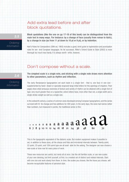
In the sixteenth century, a series of common sizes developed among European typographers, and the series<br />
survived with lit- tle change and few additions for 400 years. In the early days, the sizes had names rather<br />
than numbers, but measured in points, the traditional series is this:<br />
This is the typographic equivalent of the diatonic scale. But modern equipment makes it possible to<br />
set, in addition to these sizes, all the sharps and flats and microtonal intervals between. Twenty-point,<br />
22-point, 23-point, and 10Vi-point type are all avail- able for the asking. The designer can now choose a<br />
new scale or tone-row for every piece of work.<br />
These new resources are useful, but rarely all at once. Use the old familiar scale, or use new scales<br />
of your own devising, but limit yourself, at first, to a modest set of distinct and related intervals. Start<br />
with one size and work slowly from there. In time, the scales you choose, like the faces you choose, will<br />
become recognizable features of personal style.