5 Trick Pony Brand Guidelines v3

You also want an ePaper? Increase the reach of your titles
YUMPU automatically turns print PDFs into web optimized ePapers that Google loves.
Make use of horizontal motion.<br />
2.1<br />
Making<br />
Space<br />
An ancient metaphor: thought is a thread, and the raconteur is a spinner of yarns - but the<br />
true storyteller, the poet, is a weaver. The scribes made this old and audible abstraction<br />
into a new and visible fact. After long practice, their work took on such an even, flexible<br />
texture that they called the written page a textus, which means cloth.<br />
The typesetting device, whether it happens to be a computer or a composing stick, functions like a<br />
loom. And the typogra- pher, like the scribe, normally aims to weave the text as evenly as possible. Good<br />
letterforms are designed to give a lively, even texture, but careless spacing of letters, lines and words can<br />
tear this fabric apart.<br />
Another ancient metaphor: the density of texture in a written or typeset page is called its color. This has<br />
nothing to do with red or green ink; it refers only to the darkness or blackness of the letterforms in mass.<br />
Once the demands of legibility and logical order are satisfied, evenness o f color is the typographer’s<br />
normal aim. And color depends on four things: the design of the type, the spacing between the letters, the<br />
spacing between the words, and the spacing between the lines. None is independent of the others.<br />
Design the space to suit the size of the font.<br />
2.2<br />
Making<br />
Space<br />
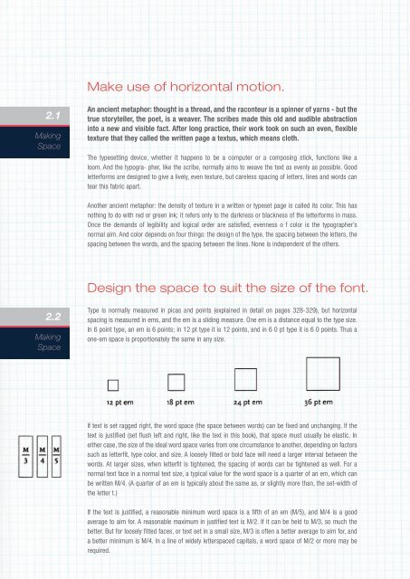
Type is normally measured in picas and points (explained in detail on pages 328-329), but horizontal<br />
spacing is measured in ems, and the em is a sliding measure. One em is a distance equal to the type size.<br />
In 6 point type, an em is 6 points; in 12 pt type it is 12 points, and in 6 0 pt type it is 6 0 points. Thus a<br />
one-em space is proportionately the same in any size.<br />
If text is set ragged right, the word space (the space between words) can be fixed and unchanging. If the<br />
text is justified (set flush left and right, like the text in this book), that space must usually be elastic. In<br />
either case, the size of the ideal word space varies from one circumstance to another, depending on factors<br />
such as letterfit, type color, and size. A loosely fitted or bold face will need a larger interval between the<br />
words. At larger sizes, when letterfit is tightened, the spacing of words can be tightened as well. For a<br />
normal text face in a normal text size, a typical value for the word space is a quarter of an em, which can<br />
be written M/4. (A quarter of an em is typically about the same as, or slightly more than, the set-width of<br />
the letter t.)<br />
If the text is justified, a reasonable minimum word space is a fifth of an em (M/5), and M/4 is a good<br />
average to aim for. A reasonable maximum in justified text is M/2. If it can be held to M/3, so much the<br />
better. But for loosely fitted faces, or text set in a small size, M/3 is often a better average to aim for, and<br />
a better minimum is M/4. In a line of widely letterspaced capitals, a word space of M/2 or more may be<br />
required.