5 Trick Pony Brand Guidelines v3

You also want an ePaper? Increase the reach of your titles
YUMPU automatically turns print PDFs into web optimized ePapers that Google loves.
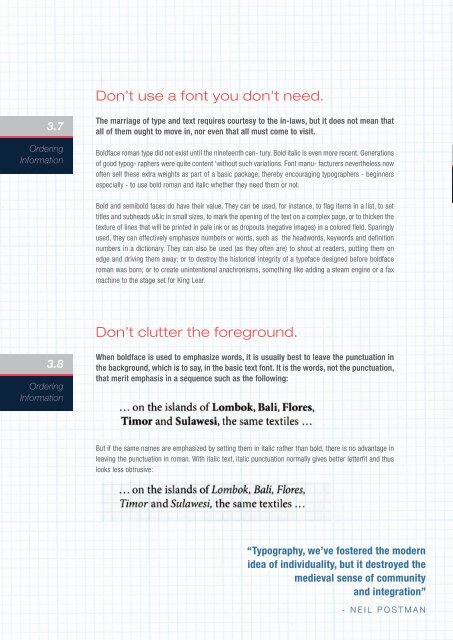
Don’t use a font you don’t need.<br />
3.7<br />
Ordering<br />
Information<br />
The marriage of type and text requires courtesy to the in-laws, but it does not mean that<br />
all of them ought to move in, nor even that all must come to visit.<br />
Boldface roman type did not exist until the nineteenth cen- tury. Bold italic is even more recent. Generations<br />
of good typog- raphers were quite content ‘without such variations. Font manu- facturers nevertheless now<br />
often sell these extra weights as part of a basic package, thereby encouraging typographers - beginners<br />
especially - to use bold roman and italic whether they need them or not.<br />
Bold and semibold faces do have their value. They can be used, for instance, to flag items in a list, to set<br />
titles and subheads u&lc in small sizes, to mark the opening of the text on a complex page, or to thicken the<br />
texture of lines that will be printed in pale ink or as dropouts (negative images) in a colored field. Sparingly<br />
used, they can effectively emphasize numbers or words, such as the headwords, keywords and definition<br />
numbers in a dictionary. They can also be used (as they often are) to shout at readers, putting them on<br />
edge and driving them away; or to destroy the historical integrity of a typeface designed before boldface<br />
roman was born; or to create unintentional anachronisms, something like adding a steam engine or a fax<br />
machine to the stage set for King Lear.<br />
Don’t clutter the foreground.<br />
3.8<br />
Ordering<br />
Information<br />
When boldface is used to emphasize words, it is usually best to leave the punctuation in<br />
the background, which is to say, in the basic text font. It is the words, not the punctuation,<br />
that merit emphasis in a sequence such as the following:<br />
But if the same names are emphasized by setting them in italic rather than bold, there is no advantage in<br />
leaving the punctuation in roman. With italic text, italic punctuation normally gives better letterfit and thus<br />
looks less obtrusive:<br />
“Typography, we’ve fostered the modern<br />
idea of individuality, but it destroyed the<br />
medieval sense of community<br />
and integration”<br />
- NEIL POSTMAN