5 Trick Pony Brand Guidelines v3

You also want an ePaper? Increase the reach of your titles
YUMPU automatically turns print PDFs into web optimized ePapers that Google loves.
Fonts, Lines &<br />
Typography<br />
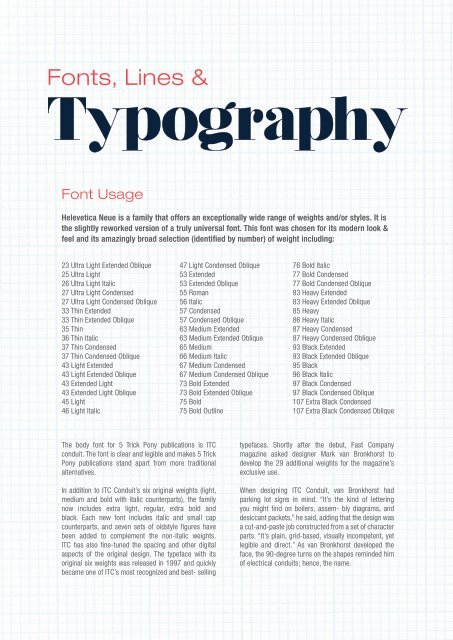
Font Usage<br />
Helevetica Neue is a family that offers an exceptionally wide range of weights and/or styles. It is<br />
the slightly reworked version of a truly universal font. This font was chosen for its modern look &<br />
feel and its amazingly broad selection (identified by number) of weight including:<br />
23 Ultra Light Extended Oblique<br />
25 Ultra Light<br />
26 Ultra Light Italic<br />
27 Ultra Light Condensed<br />
27 Ultra Light Condensed Oblique<br />
33 Thin Extended<br />
33 Thin Extended Oblique<br />
35 Thin<br />
36 Thin Italic<br />
37 Thin Condensed<br />
37 Thin Condensed Oblique<br />
43 Light Extended<br />
43 Light Extended Oblique<br />
43 Extended Light<br />
43 Extended Light Oblique<br />
45 Light<br />
46 Light Italic<br />
47 Light Condensed Oblique<br />
53 Extended<br />
53 Extended Oblique<br />
55 Roman<br />
56 Italic<br />
57 Condensed<br />
57 Condensed Oblique<br />
63 Medium Extended<br />
63 Medium Extended Oblique<br />
65 Medium<br />
66 Medium Italic<br />
67 Medium Condensed<br />
67 Medium Condensed Oblique<br />
73 Bold Extended<br />
73 Bold Extended Oblique<br />
75 Bold<br />
75 Bold Outline<br />
76 Bold Italic<br />
77 Bold Condensed<br />
77 Bold Condensed Oblique<br />
83 Heavy Extended<br />
83 Heavy Extended Oblique<br />
85 Heavy<br />
86 Heavy Italic<br />
87 Heavy Condensed<br />
87 Heavy Condensed Oblique<br />
93 Black Extended<br />
93 Black Extended Oblique<br />
95 Black<br />
96 Black Italic<br />
97 Black Condensed<br />
97 Black Condensed Oblique<br />
107 Extra Black Condensed<br />
107 Extra Black Condensed Oblique<br />
The body font for 5 <strong>Trick</strong> <strong>Pony</strong> publications is ITC<br />
conduit. The font is clear and legible and makes 5 <strong>Trick</strong><br />
<strong>Pony</strong> publications stand apart from more traditional<br />
alternatives.<br />
In addition to ITC Conduit’s six original weights (light,<br />
medium and bold with italic counterparts), the family<br />
now includes extra light, regular, extra bold and<br />
black. Each new font includes italic and small cap<br />
counterparts, and seven sets of oldstyle figures have<br />
been added to complement the non-italic weights.<br />
ITC has also fine-tuned the spacing and other digital<br />
aspects of the original design. The typeface with its<br />
original six weights was released in 1997 and quickly<br />
became one of ITC’s most recognized and best- selling<br />
typefaces. Shortly after the debut, Fast Company<br />
magazine asked designer Mark van Bronkhorst to<br />
develop the 29 additional weights for the magazine’s<br />
exclusive use.<br />
When designing ITC Conduit, van Bronkhorst had<br />
parking lot signs in mind. “It’s the kind of lettering<br />
you might find on boilers, assem- bly diagrams, and<br />
desiccant packets,” he said, adding that the design was<br />
a cut-and-paste job constructed from a set of character<br />
parts. “It’s plain, grid-based, visually incompetent, yet<br />
legible and direct.” As van Bronkhorst developed the<br />
face, the 90-degree turns on the shapes reminded him<br />
of electrical conduits; hence, the name.