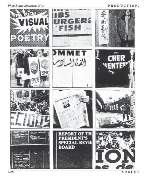
<strong>PhotoStatic</strong> <strong>Magazine</strong> Nº37 P R O D U C T I O N , 1392 A U G U S T
N O T R E P R O D U C T I O N Retrofuturism Nº10 Print Reviews 11x30 Vol. 1 Nº3. Joel Lipman, ed. 1p–11x30"–offset. Toledo Poets Center, 32 Scott House, University of Toledo, Toledo OH 43606 — A broadside, this contains “Poetry, Fiction, Articles, Literary News & Gossip” but not necessarily some of each in every issue. The current 11x30 does contain an article by Michael Kasper on short prose which, in its breezy laconism, simultaneously serves as an explanation and example of this “lawless” genre, as he puts it. At the bottom of the sheet, the promised tidbits of gossip. An orderly graphic approach and good production pull it all together. Hang this on your wall. —ld Anathema Nº3, Reality Issue. Jim Passin, ed. 32pp–letter–xerox. $2 from P.O. Box 585, Chelmsford MA 01824 — For some reason this M.A. mag (say it together like you’re stuttering) reminded me of a church bulletin (probably because of the the cheezy typeface). But after all religion is the religion of the masses and this magazine has its own religion of roughness, that special fun that only a typewriter and a xerox can provide the discontented (anarchistic) youth of America. The roughness is Anathema’s charm and the graphics are very nice (for lack of a better word). The overall effect is gently dissonant, never becoming too angry or violent, or for that matter, too visual or explicit. I liked the poetry, just because nothing makes me feel more exuberant than a poem based on getting your flesh torn off by a barbed wire fence. The whole magazine is very loose which suits it fine. —ac Arbella Nº4, Special Fast Food Issue. Anthony G. Chianese and Thomas J. Obrzut, eds. 75pp–letter–xerox. Arbella, 301 Seaman St, New Brunswick NJ 08901 — A collection of poetry, mostly verbal; and some prose. This raises this issue of what’s gained and what’s lost in our culture by chasing the carrot on a stick of progress; and it adopts as its metaphor the concept of fast food, symbolizing the loss of nutriment (food’s essence), replaced by efficiency. So often we only go through the motions, forgetting what the reasons for this doing so are; fast food is a clear example of this. The collection is uneven, but the editor’s own thoughtful works are proof of something. —ld Atticus Review #17. Harry Polkinhorn, ed. 30pp– letter–xerox. 720 Heber Ave, Calexico CA 92231 — The first two contributors, Harlan Ristau and Clemente Padín, in this 17th issue of Atticus, embody the polarities this magazine has explored for several years now. On the one hand, Atticus is interested in work like Ristau’s that are attempts to expand a medium, in this case, drawing. The three pieces that open this issue are not drawings or paintings or poems, but progeny of all three. They do not represent the external world, choosing to present a view of the internal conundrums of humankind. Of course anyone can see in them whatever they want to, which is both a danger and a joy, but they first exist for themselves. Padín’s work, which follows Ristau’s, shows the other side of Atticus. These pieces are pointedly political. They speak out; they speak up; they point away from themselves toward some injustice in the world. These pieces, Padín’s work in general, is less concerned with surface effects than with messages, barbed and aimed. Most of this issue falls on either side of the extremes, but a few attempts to fuse artistic concerns with political. The most intense are the collages by Jake Berry, combinations of hand-written texts, drawings, and snippets of photographs and other things. Berry’s work explores the fusion of several visual mediums, yet, while it 1 9 8 9 1393