
You also want an ePaper? Increase the reach of your titles
YUMPU automatically turns print PDFs into web optimized ePapers that Google loves.
TECHNICAL<br />
Unlock the power of your data<br />
with the Analysis page<br />
By Johannes Tiusanen<br />
Chief Science Officer, <strong>Soil</strong> <strong>Scout</strong><br />
One of the most useful tools<br />
on the <strong>Soil</strong> <strong>Scout</strong> Hub is the<br />
Analysis page. While the<br />
regular Device view graphs<br />
overlay data from selected<br />
devices in the same time axis, which is a<br />
great way to get an overall view of your soil<br />
conditions and trends, sometimes you need<br />
to compare data from different times. That's<br />
where the Analysis page comes in handy.<br />
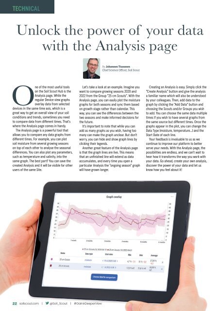
The Analysis page is a powerful tool that<br />
allows you to compare any data graphs from<br />
different times. For example, you can plot<br />
soil moisture from several growing seasons<br />
on top of each other to analyse the seasonal<br />
differences. You can also plot any parameters,<br />
such as temperature and salinity, into the<br />
same graph. The best part? You can save the<br />
created Analysis and it will be visible for other<br />
users of the same Site.<br />
Let's take a look at an example. Imagine you<br />
want to compare growing seasons 2020 and<br />
2022 from the Group "25 cm <strong>Scout</strong>s". With the<br />
Analysis page, you can easily plot the moisture<br />
graphs for both seasons and sync them based<br />
on growth stage rather than calendar. This<br />
way, you can see the differences between the<br />
two seasons and make informed decisions for<br />
the future.<br />
It's important to note that while you can<br />
add as many graphs as you wish, having too<br />
many can make the graph unclear. But don't<br />
worry, you can hide and show graph lines by<br />
clicking their legends.<br />
Another great feature of the Analysis page<br />
is that the graph lines are live. This means<br />
that an unfinished line will extend as data<br />
accumulates, and every time you open a<br />
particular Analysis the "ongoing season" graph<br />
will have grown longer.<br />
Creating an Analysis is easy. Simply click the<br />
"Create Analysis" button and give the analysis<br />
a familiar name which will also be understood<br />
by your colleagues. Then, add data to the<br />
graph by clicking the "Add Data" button and<br />
choosing the <strong>Scout</strong>s and/or Groups you wish<br />
to add. You can choose the same data multiple<br />
times if you wish to have several graphs from<br />
the same source but different times. Once the<br />
graphs appear in the plot, you can change the<br />
Data Type (moisture, temperature...) and the<br />
Start Date of each line.<br />
Your feedback is invaluable to us as we<br />
continue to improve our platform to better<br />
serve your needs. With the Analysis page, the<br />
possibilities are endless, and we can't wait to<br />
hear how it transforms the way you work with<br />
your data. Go ahead, create your own analysis,<br />
discover the power of your data and let us<br />
know how you feel about it!<br />
26 22 soilscout.com | @<strong>Soil</strong>_<strong>Scout</strong> | #GainADeeperView