

Volume 22–4 (Low Res).pdf
Volume 22–4 (Low Res).pdf
Volume 22–4 (Low Res).pdf
- TAGS
- volume
- uandlc.com

You also want an ePaper? Increase the reach of your titles
YUMPU automatically turns print PDFs into web optimized ePapers that Google loves.
FROM GRAPHICS THEORY<br />
UPPER AND LOWER CASE<br />
THE INTERNATIONAL JOURNAL Of<br />
GRAPHIC DESIGN AND DIGITAL MEDIA<br />
PUBLISHED BY INTRATIONAL TYPEfACE CORPORATION<br />
VOLUME 22, NUMBER 4, SPRING 1996<br />
S500 US S990 AU 5.495
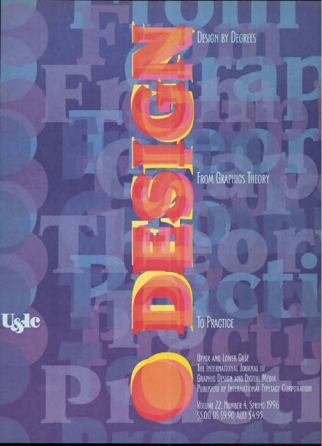
Design by Degrees:<br />
From Graphics Theory to Practice<br />
<strong>Volume</strong> 22, Number 4, Spring 1996<br />
4<br />
Design: Interpreter<br />
of the Millennium<br />
In the future, designers will be<br />
deeply involved in shaping<br />
content and culture, and schools<br />
must prepare students for that<br />
role, advise educators Katherine<br />
and Michael McCoy.<br />
26<br />
Printed Matter<br />
New typefaces from ITC range from<br />
a brooding calligraphic script to con-<br />
temporary, elegant headline faces.<br />
46<br />
PaperPlates,<br />
Envelopes and<br />
Alphabets<br />
No, not the contents of your<br />
desk drawer, but a trio of<br />
digital products to address a<br />
wide range of design needs.<br />
32<br />
The Learning Curve:<br />
Proceed with Caution<br />
Acquiring new technical skills can give<br />
you an edge, but selecting the right<br />
learning experience can be tricky.<br />
Gene Gable provides a road map.<br />
37<br />
Talent, Unleashed<br />
Three upstart design firms—<br />
Modern Dog, Smay Vision and<br />
Why Not Associates—buck the<br />
system and are justly rewarded.<br />
By Peter Hall.<br />
THE DESIGNER<br />
6<br />
Words from the Wise<br />
on How to Find Work<br />
What's that special je ne sais quoi<br />
employers are looking for in an<br />
entry-level designer? It depends<br />
on whom you ask, according to<br />
Karen S. Chambers.<br />
I nternational Typeface Corporation would like to thank<br />
Petr van Blokland of Buro Petr van Blokland + Claudia Mens,<br />
Delft, The Netherlands, for the design of this issue of U&Ic.<br />
10<br />
Masters of the Universe<br />
An overview of educational<br />
44<br />
Goony 'Toons<br />
Three new ITC spot fonts are<br />
creeping into your backyard.<br />
Be afraid. Be very afraid.<br />
3<br />
How We Did It<br />
How does an issue of<br />
U&k come into being?<br />
In collaboration with<br />
Dutch designer Petr<br />
van Blokland, the U&k<br />
team documents<br />
our own learning<br />
experience.<br />
approaches in international graduate<br />
design programs, with reports from:<br />
Yale University, by Steven Heller,<br />
The Royal College of Art,<br />
by Joyce Rutter Kaye,<br />
The Royal Academy at The<br />
Hague, by Margaret Richardson<br />
and The California School of the<br />
Arts, by Darcy DiNucci.<br />
48<br />
Beyond Quark<br />
& Illustrator<br />
A useful guide to groups,<br />
associations and organi-<br />
zations that can help you<br />
develop technical skills.<br />
By Gene Gable.<br />
2<br />
35<br />
Eastern Influences<br />
Four educators in Japan<br />
use experimental methods<br />
to teach students sensi-<br />
tivity to elements of design,<br />
writes Hiroko Sakomura.<br />
49<br />
Book Review:<br />
Desktop Security<br />
Is someone reading your<br />
e-mail? Two books pre-<br />
sent ways to make you less<br />
vulnerable to infiltration.<br />
By Rusty Weston.<br />
iry<br />
EXECUTIVE PUBLISHER:<br />
MARK J. BATTY<br />
EDITOR: MARGARET RICHARDSON<br />
MANAGING EDITOR: JOYCE RUTTER KAYE<br />
GRAPHIC DESIGN:<br />
PETR VAN BLOKLAND<br />
CREATIVE SERVICES DIRECTOR:<br />
JANE DiBUCCI<br />
ART/PRODUCTION MANAGER:<br />
CLIVE CHIU<br />
ART/PRODUCTION:<br />
JAMES MONTALBANO<br />
OPERATIONS:<br />
REBECCA L. PAPPAS<br />
SUBSCRIPTIONS:<br />
ELOISE A. COLEMAN<br />
ADVERTISING SALES:<br />
REBECCA L. PAPPAS<br />
(212) 371-0699<br />
LIST RENTAL OFFICE:<br />
CMG INFORMATION SERVICES<br />
(800) 677-7959<br />
© INTERNATIONAL TYPEFACE<br />
CORPORATION 1996.<br />
U&Ic (ISSN 0362 6245) IS<br />
PUBLISHED QUARTERLY BY<br />
INTERNATIONAL TYPEFACE CORPORATION,<br />
866 SECOND AVENUE,<br />
NEW YORK, NY 10017.<br />
ITC IS A SUBSIDIARY OF<br />
ESSELTE LETRASET.<br />
U.S. SUBSCRIPTION RATES,<br />
$30 FOR.THREE YEARS;<br />
FOREIGN AIRMAIL SUBSCRIPTIONS,<br />
$60 U.S. FOR THREE YEARS;<br />
U.S. FUNDS DRAWN ON U.S. BANK.<br />
TO CONTACT ITC<br />
CALL: (212) 371-0699<br />
FAX: (212) 752-4752<br />
E-MAIL<br />
GENERAL: itc@eworld.com<br />
intltypco@aol.com<br />
EDITORIAL/PRODUCTION:<br />
designedit@aol.com<br />
OPERATIONS/ADVERTISING:<br />
UlcRPappas@aol.com<br />
SECOND-CLASS POSTAGE PAID<br />
AT NEW YORK, NY AND ADDITIONAL<br />
MAILING OFFICES. POSTMASTER:<br />
SEND ADDRESS CHANGES TO<br />
U&Ic SUBSCRIPTION DEPARTMENT,<br />
P.O. BOX 129,<br />
PLAINVIEW, NY 11803-0129.<br />
ITC OPERATING EXECUTIVE BOARD 1996<br />
MARK J. BATTY,<br />
PRESIDENT AND CEO<br />
RANDY S. WEITZ,<br />
CONTROLLER<br />
ILENE STRIZVER,<br />
DIRECTOR OF TYPEFACE DEVELOPMENT<br />
ITC FOUNDERS:<br />
AARON BURNS, HERB LUBALIN,<br />
EDWARD RONDTHALER<br />
ITC, U&Ic AND THE U&Ic LOGOTYPE<br />
ARE REGISTERED TRADEMARKS OF<br />
INTERNATIONAL TYPEFACE CORPORATION.<br />
MICROFILM (16mm OR 35mm)<br />
AND MICROFICHE (105mm) COPIES<br />
OF U&lc ARE AVAILABLE FROM<br />
UMI, 300 NORTH ZEEB ROAD,<br />
ANN ARBOR, MI 48106-1346.<br />
PHONE: (800) 521-0600<br />
OR (313) 761-4700.<br />
FAX: (313) 761-3221.
Issues of Lioac are<br />
thematic. Design education<br />
emerged as a<br />
pressing topic since colleges<br />
and universities<br />
are addressing the changing<br />
nature and esthetics<br />
of design and the<br />
impact of rapidly evolving<br />
technology—issues<br />
we all face working in<br />
dioital environment<br />
We felt Van Blokland<br />
was the logical choice<br />
to design this issue.<br />
He is a natural teacher,<br />
we discovered, while<br />
watching him organize<br />
and work with students<br />
and guests in TypeLab<br />
at ATypl. Van Blokland<br />
also teaches typography<br />
at the Royal Academy<br />
of Art and Design<br />
at the Hague. His Buro<br />
Petr van Blokland +<br />
Claudia Mens in Delft<br />
is not only `wired: but<br />
databased with a program<br />
he has customized<br />
for his studio and<br />
his clients. At*<br />
In New York we began<br />
shaping the editorial<br />
mix by seeking content<br />
based on the theme<br />
and supplemented by<br />
strong visuals. As usual,<br />
we were helped by our<br />
repertory company<br />
of writers who contributed<br />
their ideas for<br />
`design education for the<br />
millennium:' We consulted<br />
with Van Blokland<br />
continuously since<br />
the designer's editorial<br />
gestalt and visual<br />
acuity is a strong influence<br />
in our final selection<br />
of feature articles.<br />
1 ITC Kabel Bold<br />
Putting out U&IC is a<br />
collaborative process<br />
involving the magazine's<br />
editors, production<br />
staff and a guest<br />
art director. The U6i/c<br />
staff approached Dutch<br />
designer Petr van Blokland<br />
about working on<br />
this issue during the<br />
Fuse 1994 type confer-<br />
,nce in London. That is<br />
,There the issue began<br />
Pencil & Pal<br />
Joyce Rutter Kaye es<br />
tablished a schedule<br />
and we continued<br />
MONO assembling the copy<br />
ammo and artwork. We con-<br />
tacted renowned edu-<br />
cators Katherine and<br />
Michael McCoy to write<br />
an industry overview<br />
and forecast. Karen<br />
Chambers polled designers<br />
to find out what<br />
their hiring needs are.<br />
Gene Gable provided an<br />
overview of methods of<br />
learning technical skills.<br />
Van Blokland decided<br />
to work in our offices<br />
for a two-week period<br />
between Little Christmas<br />
(December 5) and<br />
Christmas so that he<br />
could be with his family<br />
for both holidays. We<br />
then continued our contact<br />
with him by phone,<br />
fax and e-mail. (Transferring<br />
large image files<br />
electronically, however,<br />
proved to be problematic<br />
and slow, forcing<br />
us to rely on a shipping<br />
service to messenger<br />
disks and artwork.)<br />
Kaye, Steven Heller,<br />
Darcy DiNucci and I pro-<br />
filed programs at four<br />
major educational institutions.<br />
Hiroko Sakamura<br />
visited with four<br />
influential teachers in<br />
Japan. And to emphasize<br />
that design is not<br />
just about theory, Peter<br />
Hall tracked three design<br />
firms who started<br />
up their own studios.<br />
Our first planning meeting<br />
took place at an outdoor<br />
cafe in Barcelona<br />
during the ATypi Congress<br />
in September.<br />
Managing editor Joyce<br />
Rutter Kaye and director<br />
of creative services<br />
Jane DiBucci and I<br />
talked to Van Blokland<br />
about the parameters<br />
and the logistics of<br />
designing this issue<br />
and finalized the<br />
editorial lineup<br />
for this theme.<br />
Pencil & Pape<br />
Oktober November December Januari<br />
3 ITC Officina San Bold<br />
4 ITC Leawood Bold<br />
It ora:waitv Ml<br />
IeD<br />
Van Bioldand arrived in<br />
New York, set up a work<br />
space in ITC, and installed<br />
Claris FileMaker Pro on<br />
our network server. The<br />
database is the structural<br />
underpinning of Van<br />
Blokland's studio. He uses<br />
this not only to track client<br />
data but to initiate and<br />
refine designs. Using our<br />
files, he created minimaps<br />
which evolved into<br />
thumbnail sketches, and<br />
finally into real layouts.<br />
His work continued into<br />
February, long after he<br />
returned to Delft.<br />
Although we have worked<br />
with many designers over<br />
the years, we have rarely<br />
experienced the thrill and<br />
the terror of daily watching<br />
the designer work. This<br />
painstaking and formidable<br />
process is captured<br />
here in Petr's sketches.<br />
Our production team, with<br />
our editorial team, made<br />
these pages real...you are<br />
reading the result of our<br />
collective efforts.<br />
—Margaret Richardson<br />
Fontographer t17:<br />
how boor<br />
am Item bra<br />
Ott%<br />
Streamline<br />
box sundotts<br />
,<br />
y Vision<br />
Februari 1996<br />
Photoshop<br />
QuarkXPress
KATHERINE AND MICHAEL MCCOY<br />
INTERPRETATION 2<br />
As we approach the end of the century, powerful technological and cultural<br />
forces are reshaping the design landscape. The Internet, interactive multimedia,<br />
'smart' and customized products, the rise of new communications<br />
services and the demise of the mass market are changing the way design<br />
is learned and practiced. Motion, sound and interactivity are adding three<br />
new design dimensions. The profession must develop new design tools and<br />
strategies to deal with these challenges, and design education must impart<br />
these methods and insights to students.'<br />
As the design profession grows more complex, its<br />
educators need to incorporate more disciplines, from<br />
technology to psychology. Design is about the interpretation<br />
of technology, information and situations<br />
for people, and, accordingly, education should impart<br />
strategies for interpretation that students can use as<br />
tools in their work. These strategies must be robust to<br />
prepare students for the scenarios they will encounter<br />
in their careers in the next millennium.'<br />
A number of very useful theories are emerging from<br />
the social sciences, cultural anthropology, philosophy<br />
and cognitive studies that help designers understand<br />
the impact their work has on people's lives and perceptions.<br />
For example, communications theory illuminates<br />
the differences between how we see images and<br />
how we read texts. Understanding the differences<br />
between the seeing and the reading processes leads to<br />
the realization that we also can read images and see<br />
text. The application of this small bit of theory allows<br />
a graphic designer to make significant reinterpretations<br />
of both typography and imagery. New strategies<br />
give designers new insights, or new lenses providing<br />
the vision and clarity with which to develop their work.<br />
Design for interpretation involves the audience in<br />
the creative process, countering the couch-potato syndrome<br />
of the television age. A graphic communication's<br />
meaning does not truly exist until each receiver<br />
decodes, or interprets, the message. Interpretive design<br />
challenges the viewer to participate and affect the<br />
outcome. This is especially important in interactive<br />
multimedia design if we are to move beyond a simple<br />
card-shuffling and page-turning approach.<br />
Designers will be much more involved in the design<br />
of experience, rather than producing discrete objects.<br />
1 FTC Charter Regular Italic<br />
2 ITC CHARTER BOLD SMALL CAPS<br />
3 ITC Charter Regular 4<br />
4 ITC Charter Black<br />
They will be creating potential and open-ended situations<br />
for users to explore. Audiences will 'finish'<br />
designs as they negotiate nonlinear and malleable<br />
situations. New design research methods like videoethnography,<br />
appropriated from cultural anthropology,<br />
give designers advanced insights into the<br />
effects their work has on their audience.<br />
END OF MASS<br />
Technology is dissolving mass production and mass<br />
media. The forthcoming 500 interactive cable<br />
channels, wireless communication, the World Wide<br />
Web, high-quality desktop publishing, low-run<br />
color printing and flexible manufacturing will increasingly<br />
allow the needs of small audiences<br />
to be addressed. Narrowcasting is replacing broadcasting<br />
and designers can now play to smaller,<br />
more highly-defined groups. This is appropriate<br />
in our world of myriad subcultures.<br />
Design is cultural production. Because designers<br />
construct a significant portion of the informational<br />
and material culture in which we live, they must<br />
understand their culture and recognize how it constantly<br />
re-makes itself.<br />
Many designers are participants in the subcultures<br />
for which they are designing, from snow boarders and<br />
social activists to Harley-Davidson motorcyclists and<br />
Net surfers. This allows them to speak to and with their<br />
audiences in specialized verbal and visual languages<br />
with an intimacy not seen before in design. Narrowcasting<br />
allows for designs of very specific and intense<br />
flavors. When the designer does not have to speak<br />
to the broadest common denominator of a mass audience,<br />
a richer conversation among peers emerges.
Design:<br />
interpreter of<br />
the millennium<br />
Design can be stronger, more innovative and experimental<br />
when tailored to a specific subculture.<br />
New interactive technologies will make it possible<br />
to customize or individualize all kinds of communications,<br />
products and services, including personal<br />
magazines and newspapers. Designers will have<br />
to create systems that can respond to highly individualized<br />
needs and desires.<br />
CONVERGENCE<br />
The design disciplines are again converging, something<br />
that has not happened since the Modern Movement's<br />
experiments at the beginning of this century.<br />
Graphic designers and product designers will be working<br />
much more closely to accomplish the harmonious<br />
integration of electronic information and the physical<br />
world. The lines between software and hardware are<br />
increasingly blurring. It is becoming more difficult to<br />
differentiate between a manufactured product's physical<br />
service and its communication of information.<br />
The essence of this condition is `haptic software, or<br />
software you can hold in your hand.<br />
A fluid blending of hardware and software will make<br />
the access and manipulation of information and<br />
entertainment a comfortable and satisfying part of<br />
our lives. If done well, design can empower individuals<br />
and groups by providing them with access to<br />
the information they need to make intelligent decisions<br />
about their lives.<br />
Products are becoming increasingly programmable<br />
and 'smart,' integrating computer intelligence to<br />
respond and adapt to users' individual needs, and<br />
to interact with each other. The contact site between<br />
the machine and its user is the electronic interface.<br />
Now, the search is for a paradigm beyond the desktop<br />
5<br />
metaphor: what are nonlinear models for navigating<br />
through the cosmos of information and entertainment?<br />
New models must now be developed. This is<br />
the emerging domain of design.<br />
DESIGN KNOWLEDGE<br />
Given these trends it is crucial that the design disciplines<br />
begin collaborating with each other and with<br />
related disciplines. The days of specialization are over.<br />
We need culturally literate designers comfortable with<br />
philosophy, communications theory, cultural anthropology,<br />
cognitive human factors and electronic technologies.<br />
The discipline of design is about to get richer,<br />
deeper and more exciting. But it will also be more<br />
demanding of its practitioners. Sophisticated desktop<br />
publishing and multimedia software allow virtually<br />
anyone to do everyday design work; designers can no<br />
longer rely on their traditional skills alone. Designers<br />
must deliver conceptual innovations and new insights,<br />
the things that computers cannot do. This challenge<br />
will lift design beyond a service trade into the role of<br />
interpreter for culture.<br />
Katherine and Michael McCoy are senior lecturers at the Institute of Design of<br />
Illinois Institute of Technology, visiting professors at The Royal College of Art<br />
in London and former co-chairs of the Design Department at the Cranbrook Acad-<br />
emy of Art. They are partners in McCoy & McCoy, Buena Vista, Colorado. Addi-<br />
tionally, Michael is a partner with Dale Fahnstrom in Fahnstrom/McCoy design<br />
studio in Chicago and lectures internationally on design strategies to professional<br />
and lay audiences. Katherine is president of the American Center for Design.<br />
The McCoys have received many honors, including the American Center for Design<br />
Educator's Award, The Hall Distinguished Professorship at Kansas City Art Insti-<br />
tute and the Chrysler Award for Innovation in Design. They recently co-authored<br />
Cranbrook Design: The New Discourse, a book published by<br />
Rizzoli International.
Everythm eve<br />
a out<br />
Tour first job<br />
ut o know to<br />
Words from the wi<br />
By Karen S. Chambers<br />
From Dubuque to Dusseldorf, veteran graphic designers are consistent<br />
about the fundamental qualities they seek in entry-level<br />
designers. Whether the candidates are recent graduates of community<br />
colleges or master's degree holders from prestigious art<br />
schools, computer literacy is, of course, a priority. The traits that<br />
really raise eyebrows, however, are a bit less tangible and harder<br />
to quantify. Interviewers are looking for imagination, creativity<br />
and an ability to communicate visually. It also helps if job applicants<br />
have a liberal arts background and know more than just<br />
how to make a page or package look pretty. To become the new<br />
kid in the office, you need to be a team player. A sense of humor<br />
doesn't hurt. And, more than once, interviewers cited passion<br />
as the most appropriate emotional response to graphic design:<br />
A reverent study of the work of some<br />
of our predecessors, starting with<br />
Toulouse-Lautrec, would benefit the<br />
design output of many of today's<br />
young practitioners.<br />
Keith Harris,<br />
Keith Harris Package Design, DEsseldorf<br />
Be different from what you think people expect.<br />
Doing the opposite, you will be remembered.<br />
Petr van Blokland,<br />
Buro Petr van Blokland + Claudia Wiens,<br />
Delft, The Netherlands<br />
Computer technology affords us many options<br />
and opportunities, but it is only a tool.<br />
It is not the end product.<br />
Tess Durham, Creative Staffing, Hallmark Cards, Kansas City<br />
If someone can't draw,<br />
I don't want to hire them.<br />
Joe Duffy, Duffy Design, Minneapolis and New York<br />
Watch, listen, read, feel, enjoy,<br />
suffer, laugh, cry, love. Be yourself and<br />
throw yourself into design.<br />
Lucia Frey and Heinz Wild,<br />
Wild a Frey,<br />
Erten bach, Switzerland<br />
The rewards for meeting such<br />
ideals were $i8,000, FH8o,000,<br />
swF42,000, Dm42,000, fi4,000<br />
or ifz000 per year and a chance to<br />
show what you can do. It's also useful<br />
to come armed with experience<br />
in the real world from an internship.<br />
All of these things are deemed important<br />
in getting what is the most<br />
critical job of a designer's career—<br />
the first. "The job market is tough<br />
now, but perhaps it has always been<br />
tough:' observes Tom Bentkowski,<br />
director of design at Life magazine<br />
and president of the Society of Publication<br />
Designers. "But my advice<br />
is valid in any job market: I'm looking<br />
for an intelligent, well-rounded,<br />
curious individual. Computer literacy<br />
is a given, but he or she must<br />
also have ideas and taste:'<br />
Designers from around the world<br />
had similar advice for graduates:<br />
they should think creatively and<br />
visually and be able to use the Macintosh<br />
as a tool, like a T-square or<br />
an X-Acto knife.<br />
1 ITC Mendoza Roman Medium<br />
2 ITC Mendoza Roman Bold<br />
3 ITC Mendoza Roman Book, Italic<br />
4 ITC Fontoon<br />
5 ITC MENDOZA ROMAN MED. SMALL CAPS<br />
What's important is not how something<br />
is done, but why. "For a junior<br />
designer the thought process is more<br />
important than knowledge of software:'<br />
according to Jack Anderson<br />
of Hornall Anderson Design Works,<br />
Seattle. D.J. Stout, art director of<br />
Texas Monthly, notes that "over the<br />
last five years there has been a revolution<br />
in graphic design because<br />
of the computer. I hope this is just a<br />
trend and will be balanced out with<br />
more emphasis on the idea, the concept<br />
and communicating visually:'<br />
Whether it's type and images on<br />
paper or electronic design on the<br />
Web, communicating visually is<br />
the essence of the profession. And<br />
despite New York designer Milton<br />
Glaser's warning to new graduates to<br />
"look elsewhere; the field is glutted:'<br />
there are opportunities, particularly<br />
ones arising out of new technology.<br />
"Graphic design has a much bigger<br />
role to play in today's complex communications<br />
panorama:' observes<br />
Marc Gobe of Desgrippes Gobe &<br />
Associates in New York. "The advent<br />
of the Internet and the World Wide<br />
Web will increasingly require the tal-
e on how to find<br />
ent, experience and skills of graphic<br />
designers:'<br />
Woody Pirtle, a partner in the New<br />
York office of Pentagram, advises<br />
neophyte designers to "go for the<br />
technology. That's where the future<br />
is. Interactive design, film, video—<br />
all of those categories are virgin territory<br />
now."<br />
Demand will continue, true, but<br />
how do you get that first job? "Students<br />
need to know that their first<br />
job is looking for a job," explains<br />
Tom Antista, partner in Antista Fairclough<br />
Design, Atlanta. "They have<br />
to operate as if it were a job. Get up<br />
early in the morning, make phone<br />
calls, design new pieces to replace<br />
weak pieces in the portfolio. It's<br />
work, not slack time:'<br />
Practical advice comes from Aad<br />
van Dommelen, creative director<br />
of Proforma Rotterdam: "Phone<br />
the company to get the name of the<br />
person in charge. Send a letter with<br />
your curriculum vitae to announce<br />
that you will call to ask for an<br />
appointment to show your portfolio.<br />
If you have no work, try to fill your<br />
portfolio with interesting stuff!'<br />
Above all, the portfolio is the way<br />
aspiring designers can show what<br />
they've done and what they can<br />
do. D.J. Stout of Texas Monthly says,<br />
"No one asks about your grade point<br />
average or your résumé; your portfolio<br />
is what counts. If you were a<br />
cowboy-boot maker, the employer<br />
would want to see the boots:'<br />
Joe Duffy of Duffy Design (with<br />
offices in New York and Minneapolis)<br />
advises students to "only show<br />
what you are really proud of and not<br />
too much of it. Don't show work you<br />
must apologize for. Work night and<br />
7<br />
have a broad-based liberal arts<br />
4tThey<br />
background (English, history, social<br />
sciences, cognitive sciences, anthropology,<br />
literature) besides having<br />
appropriate training and skills necessary<br />
for the job: strong sense of design,<br />
layout, composition, color. Balanced life—<br />
ability to keep their priorities straight.<br />
Tess Durham, Creative Staffing and Development,<br />
Hallmark Cards, Kansas City<br />
Very open-minded, strong cultural<br />
background, multilingual.<br />
Peter Keller, Atelier National<br />
de Creation Typographique, Paris<br />
Excellent use of typography a must. A good<br />
working knowledge of design history and<br />
traditional methods. The ability to discern<br />
design styles and trends and implement<br />
them in a practical manner. Must be able<br />
to still illustrate or design with a marker<br />
and paper...get ideas down first. Computer<br />
skills will come with repetition. Must have<br />
a sense of humor; we're always looking for<br />
the perfect 'Lenny Bruce of graphic design'<br />
Kurt A. Valenta, Valenta Platt Design Group, Pittsburgh<br />
Some experience, no attitude, 'clean hands,<br />
a willingness to learn and work hard.<br />
Alexander Isley,<br />
Alexander Isley Design, Redding, Connecticut<br />
Self-governed.<br />
Sigrim Yngvadottir, Sigruns Atelie 6c Ide, Malmo, Sweden<br />
Self-organized with the will<br />
to be better than me.<br />
Lo Breier, Buro X, Vienna<br />
Be someone who is highly literate and inter-<br />
ested in many things. History. Literature.<br />
Painting. Sculpture. Dance. Theater. When I<br />
teach, I tell students to go to the opera, go<br />
to the theater. Ten years ago I would have<br />
said, don't spend so much time with your<br />
airbrush. Today I would say, don't spend so<br />
much time at the computer screen.<br />
Tom Bentkowski,<br />
Director of Design, Life Magazine,<br />
New York
LL They're overconfident<br />
about their abilities. They<br />
have a lack of discipline<br />
to apply themselves to the basics<br />
of production and printing. They<br />
don't ask enough questions.<br />
Bernie Sexton, Dynamo, Dublin<br />
Sometimes the artwork is finished<br />
sooner than the concept.<br />
Aad van Dommelen,<br />
Creative Director, Proforma Rotterdam,<br />
The Netherlands<br />
Not aware of the nitty-gritty<br />
and all the little details that have<br />
to be taken care of in a design<br />
office. In a sense spoiled in a society<br />
that works on the principle<br />
of immediate gratification.<br />
Lucia Frey and Heinz Wild,<br />
Wild & Frey, Erlenbach, Switzerland<br />
Too dependent on the Mac<br />
for design solutions.<br />
Paul Davis, Paul Davis Studio,<br />
New York<br />
Arrogant. Unwilling to roll up their<br />
sleeves and learn about the<br />
workings of a design organization.<br />
Marc Gobe, Desgrippes Gobe &<br />
Associates, New York<br />
They don't think before sitting<br />
down at the Mac. Little knowledge<br />
of typographic skills and basics.<br />
No attention to detail. Little creativity/exploration/imagination/<br />
lateral thinking when approaching<br />
a new brief.<br />
Bob Mytton,<br />
Newell and Sorrell, Ltd., London<br />
Lack of understanding about<br />
the communication process.<br />
No eye for detail. No patience.<br />
Reading difficulties.<br />
Hans Dieter Reichert, HDR Design<br />
Studio for Visual Communication and<br />
Production, East Mailing, U.K.<br />
Attitude. Wanting to be a star immediately.<br />
Trying to get press right<br />
away. Unwilling to look beyond what<br />
school has taught them. That's<br />
the biggest shock. Realizing that<br />
school has just barely given them<br />
the fundamentals.<br />
John Jay, Creative Director,<br />
Wieden & Kennedy, Portland<br />
Unfaithful. Selfish.<br />
Eun-Young Kim,<br />
Design House, Seoul<br />
Take me,<br />
e me I<br />
day to make your portfolio the best<br />
possible expression of your abilities.<br />
Work and rework, hone and refine:'<br />
It is important to make the portfolio<br />
a reflection of your own style.<br />
John Jay, creative director at Wieden<br />
& Kennedy in Portland, urges the<br />
job applicant to "develop his or her<br />
own voice. Don't try to make the<br />
portfolio look like someone else's<br />
work or show that you can emulate<br />
a variety of well-known styles. If we<br />
want a David Carson look, we can<br />
hire David Carson. We want to hire<br />
people to develop their own styles,<br />
their own signatures." But, he admits,<br />
"That's hard:'<br />
A portfolio should also reveal the<br />
designer's thought process. Jack<br />
Anderson suggests presenting an<br />
"idea" sketchbook. For second interviews<br />
at Pedersen Gesk in Minneapolis,<br />
according to president Brian<br />
Muldoon, job applicants are asked<br />
to bring their "roughs; their conceptual<br />
material."<br />
With hundreds of graphic design<br />
programs turning out thousands of<br />
graphic design graduates annually,<br />
there are degrees aplenty. Potential<br />
employers are looking for something<br />
perhaps more valuable: experience.<br />
"Try to get into an office in any job,<br />
for any pay," says Aad van Dommelen<br />
of Proforma Rotterdam. "As soon<br />
as you're in, you have a chance to<br />
show your capabilities. It's a matter<br />
of being in the right place at the right<br />
time. So make sure you're in lots of<br />
places, lots of times:'<br />
S<br />
One formal way of getting such experience<br />
is through work internship<br />
programs. The University of Cincinnati<br />
is repeatedly lauded for its co-op<br />
program where students spend six<br />
quarters of a five-year course in paid<br />
internships. They are placed in firms<br />
all over the country. Some employers<br />
know<br />
is n
such as Duffy Design and Antista<br />
Fairclough Design have ongoing<br />
intern programs. Tom Antista says<br />
that his firm offers a three-month<br />
contract to recent graduates to introduce<br />
them to the studio's style<br />
and pace. Their reward for "working<br />
hard, having merit and jumping in<br />
and becoming a part of the team"<br />
could be another three- or six-month<br />
contract or perhaps being hired for<br />
a full-time position. The pay is "not<br />
much." But, he adds, "What we're<br />
offering is an opportunity to get into<br />
a design firm and work on mainstream<br />
projects?' The Duffy Design<br />
program works similarly and allows<br />
the interns "to see if we're right for<br />
them" and the firm to see "if they're<br />
right for us;' explains Joe Duffy.<br />
That match may be as important<br />
as the graduate's visual thinking<br />
and technical capabilities. Despite<br />
emphasis in academia on the indi-<br />
vidual's design vision, graphic design<br />
is not usually done in a vacuum or<br />
an ivory tower in the real world. "We<br />
work on projects that require a group<br />
approach, rather than an individual<br />
one!' explains Joe Duffy. "We work<br />
collaboratively, so a new hire has to<br />
be someone who can get along and<br />
work well with others!'<br />
Aspiring graphic designers must also<br />
be passionate about their chosen<br />
profession. Milton Glaser of Milton<br />
Glaser Design insists that "the passion<br />
and gift" are essential qualities.<br />
Jack Anderson describes the perfect<br />
new hire as someone who is "upbeat,<br />
hungry to learn and has a passion<br />
for the craft/profession." Lucia Frey<br />
and Heinz Wild of Wild & Frey in<br />
Erlenbach, Switzerland, have a similar<br />
description: "The perfect new recruit<br />
is eager to perform and to learn,<br />
has stamina and really wants to do<br />
well, and knows that graphic design<br />
is more a passion than a means to<br />
make a living:' And Gerhard Schmal<br />
of Stohr Scheer Werbeagentur, Dusseldorf,<br />
advises first-time job seekers<br />
to "look, listen and choose, do that<br />
which touches the heart, where your<br />
passion is."<br />
perfect new recruit<br />
that graphic design<br />
)re a passion than<br />
means to make a living<br />
9<br />
ART CENTER COLLEGE OF DESIGN, PASADENA, CALIFORNIA<br />
ART INSTITUTE OF BOSTON<br />
BRIGHAM YOUNG UNIVERSITY, PROVO, UTAH<br />
CARNEGIE-MELLON UNIVERSITY, PITTSBURGH<br />
CALIFORNIA COLLEGE OF ARTS AND CRAFTS, OAKLAND<br />
CENTRAL WASHINGTON UNIVERSITY, ELLENSBURG<br />
COOPER UNION, NEW YORK<br />
CORNISH ART INSTITUTE, SEATTLE<br />
CRANBROOK ACADEMY, BLOOMFIELD HILLS, MICHIGAN<br />
EAST TEXAS STATE COLLEGE, COMMERCE<br />
IOWA STATE UNIVERSITY, AMES<br />
KANSAS CITY ART INSTITUTE, MISSOURI<br />
MASSACHUSETTS COLLEGE OF ART, BOSTON<br />
MINNEAPOLIS COLLEGE OF ART AND DESIGN<br />
MOORHEAD STATE COLLEGE, MINNESOTA<br />
NORTHERN ILLINOIS UNIVERSITY, DE KALB<br />
OHIO STATE UNIVERSITY, COLUMBUS<br />
PARSONS SCHOOL OF DESIGN, NEW YORK<br />
PRATT INSTITUTE, BROOKLYN<br />
RHODE ISLAND SCHOOL OF DESIGN, PROVIDENCE<br />
ROCHESTER INSTITUTE OF TECHNOLOGY, NEW YORK<br />
SAN FRANCISCO ART INSTITUTE<br />
SCHOOL OF VISUAL ARTS, NEW YORK<br />
SYRACUSE UNIVERSITY, NEW YORK<br />
UNIVERSITY OF THE ARTS, PHILADELPHIA<br />
UNIVERSITY OF CINCINNATI<br />
UNIVERSITY OF CONNECTICUT, STORRS<br />
UNIVERSITY OF ILLINOIS, URBANA<br />
UNIVERSITY OF MICHIGAN, ANN ARBOR<br />
UNIVERSITY OF NEBRASKA, LINCOLN<br />
UNIVERSITY OF WASHINGTON, SEATTLE<br />
UNIVERSITY OF WISCONSIN, STOUT<br />
WESTERN WASHINGTON UNIVERSITY, BELLINGHAM<br />
VIRGINIA COMMONWEALTH UNIVERSITY, RICHMOND<br />
YALE UNIVERSITY, NEW HAVEN, CONNECTICUT 5<br />
While design firms emphasize that<br />
the computer is just a tool, they also<br />
insist on computer literacy. On the<br />
following list, the first four software<br />
programs were almost invariably mentioned.<br />
Knowledge of more peripheral<br />
programs is, of course, an added plus.<br />
QuarkXPress<br />
Adobe PageMaker<br />
Adobe Illustrator<br />
Adobe Photoshop<br />
Macromedia FreeHand<br />
Macromedia Director<br />
Microsoft Word<br />
Quantel Paintbox<br />
Adobe Streamline<br />
Adobe Dimensions<br />
Smalltalk<br />
HTML<br />
SGI<br />
...plus complete command<br />
of pencil on paper<br />
Karen S. Chambers is an internationally<br />
published writer on<br />
the visual arts and design. She is<br />
the author of TROMPE L'OEIL AT<br />
HOME: FAUX FINISHES AND FANTASY<br />
SETTINGS, published by Rizzoli.
I IIGStRuion<br />
2 ITC PACEILA BOOK SMALL CAPS<br />
3 ITC Pacella Book<br />
4 ITC Pacella Book Italic<br />
Of THE<br />
UNIVERSE<br />
THE GRADUATE AND UNDERGRADUATE PROGRAMS<br />
FEATURED HERE PREPARE DESIGN STUDENTS FOR<br />
AN ELECTRONIC FUTURE THAT DEMANDS SPECIFIC<br />
SKILLS TO NAVIGATE THE INCREASINGLY COMPLEX<br />
SPHERE OF NEW MEDIA. THE ACADEMIC PROGRAMS<br />
FOCUSING ON INTERACTIVITY TEACH STUDENTS TO<br />
CREATE ENVIRONMENTS THAT FUSE THEIR KNOWL-<br />
EDGE OF TECHNOLOGY WITH AN UNDERSTANDING<br />
OF HUMAN BEHAVIOR AND NEEDS. THOSE FOCUSING<br />
ON TYPOGRAPHY BEGIN WITH THE PUREST ESSENCE<br />
OF LETTERFORMS—HANDWRITING —AND GUIDE STU-<br />
DENTS ON TO DIGITAL —AND MORE ABSTRACT—EX-<br />
PRESSIONS. ALL OF THESE PROGRAMS ARE BASED<br />
ON A BELIEF THAT STUDENTS SHOULD DEVELOP INTO<br />
FREE-THINKERS WHO UNDERSTAND AND VALUE THE<br />
THOUGHT PROCESS BEHIND A BEAUTIFULLY REN-<br />
DERED TYPEFACE OR COMPUTER INTERFACE. ARMED<br />
WITH THESE SKILLS, STUDENTS LEARN TO INNOVATE<br />
AND CREATE DESIGN SOLUTIONS THAT ARE ESTHETIC,<br />
EFFECTIVE AND USEFUL<br />
10<br />
YE UNIVERSITY<br />
SCHOOL Of ART<br />
GRAPHIC DESIGN<br />
PROGRAM<br />
As an increasing number of graphic<br />
designers work on screen-based environments,<br />
educators are beginning<br />
to redefine the designer's role, from<br />
manipulator of form to navigator of<br />
content. At the new interactive design<br />
program in Yale University's graduate<br />
school of graphic design, the process<br />
goes one step further. In a class taught<br />
by Juliet Jacobson, a former exhibition<br />
designer and information specialist<br />
with expertise in multimedia, designers<br />
are not only trained to be navigators,<br />
they are encouraged to be pilots, too.'<br />
Although analogies have been made<br />
to books and magazines, new media,<br />
including the CD-ROM and the interactive<br />
kiosk, are not governed by the same<br />
design principles. Jacobson's class is as<br />
much about behavior modification as<br />
it is about teaching new technologies,<br />
and students accustomed to thinking<br />
about graphic design in purely formal<br />
ways must now adopt more abstract<br />
methods of communication. They must<br />
become as skilled in the use of metaphors<br />
as they are skilled in the creation<br />
of literal narratives; they must reinvent<br />
old visual tools and develop new ones.<br />
While typographic hierarchies are the<br />
primary signposts in the flow of printed<br />
pages, onscreen design is more about<br />
integrating graphical devices that will<br />
guide the viewer through labyrinths of<br />
information. Designing digital space is<br />
not as simple as creating a grid and<br />
flowing in text and image; it is about<br />
providing a basic context in which<br />
users can interact. In Jacobson's class<br />
new media design might be seen as a<br />
bridge between designing a book and<br />
directing a film.<br />
Jacobson and her colleague, David<br />
Peters, a senior designer and multimedia<br />
expert at Two Twelve Associates<br />
in New York, began teaching a weekly<br />
class together in 1994 as a way to intro-
David Israel's AIDS project is an interactive<br />
conversation about dating and sex.'<br />
Rather than espousing a cautionary message<br />
about AIDS prevention, the interface<br />
allows the user to make strategic<br />
choices.<br />
you<br />
each<br />
Ii N BE A ')<br />
GOOD ITH A CONDOM"<br />
`AS -<br />
11110- LEAVE<br />
alli► TALK<br />
realty like<br />
other...<br />
11<br />
duce Yale students to the uses of Hypercard.<br />
Sheila Levrant de Bretteville, the<br />
head of the design program, wanted a<br />
class that would not only impart skills<br />
but result in a practical application; she<br />
decided that an interactive kiosk for<br />
New Haven's Hill Health Center would<br />
address a variety of community concerns<br />
and give students a tangible goal.<br />
Yet it quickly became apparent that this<br />
idea was also fraught with pedagogical<br />
problems, most notably how to keep<br />
students interested. For three semesters,<br />
Jacobson and Peters, who taught<br />
the class on alternate weeks, introduced<br />
students to the new technologies<br />
while struggling to keep up a<br />
learning curve too steep for even the<br />
most avid pupils to navigate. Jacobson<br />
says that the students were ill-served<br />
by a project that could not be finished<br />
during a single semester, which meant<br />
passing on the unfinished parts to subsequent<br />
classes, who were not excited<br />
by the idea of working on material initiated<br />
by other students. Although the<br />
health center kiosk was never corn-<br />
Mark Olsztyn's digital biography of his<br />
half brother, a rock guitarist, is an interactive<br />
game that teaches chords.<br />
pleted, the project did nevertheless<br />
force students to focus on real topics<br />
and actual audiences, which in itself<br />
was a startling introduction to the escalating<br />
challenges of new media.<br />
Jacobson, who has strong analytical<br />
skills, and Peters, who prides himself<br />
on his instinctual way of handling<br />
content, decided that each semester<br />
the students would be given a different<br />
problem to work on individually or<br />
in teams. The tasks included research<br />
(visiting the health center and learning<br />
what its clients needed most), concept<br />
(developing a workable idea) and iterations<br />
(developing the best metaphors<br />
and navigational systems). For the first<br />
semester, students had to devise functional<br />
scenarios for their demos. One<br />
example was Julia Whitney's interactive<br />
game about safe sex, which invited<br />
the player to choose from a wide range<br />
of sexual preferences. Next, selecting<br />
appropriate behaviorial options from a<br />
variety of acts determined whether a<br />
player would reach a satisfying climax.<br />
The game metaphor provided a context
in which users could be entertained and<br />
educated at the same titillating time.<br />
Likewise, Weilin Wu developed a nutrition<br />
game, which showed kids what a<br />
well-balanced diet could be. Users were<br />
invited to design their own diets, and<br />
the winner was the one who selected<br />
the most balanced meal and successfully<br />
built a food pyramid. These and<br />
other puzzle-like programs not only use<br />
the potential of the media effectively,<br />
they also suggest that the novelty of<br />
the digital environment alone is not<br />
enough to capture user attention.<br />
During the second semester the program<br />
was changed so that teams of<br />
students were assigned specific human<br />
body parts as components, or what<br />
Jacobson calls the "pillars of the architecture,"<br />
for the entire kiosk. This<br />
"body map" used age (parents, children,<br />
old and young, etc.), to provide an organizational<br />
system for the body parts.<br />
Cynthia Flaxman used the womb of a<br />
pregnant woman as a device for conveying<br />
a wide range of information,<br />
such as tips on nutrition and disease. A<br />
roughly-drawn schematic of a pregnant<br />
woman contained hot buttons that<br />
linked to more specific screens about<br />
prenatal care. Getting all the students'<br />
components to work uniformly was not<br />
so easy, since in addition to different<br />
content concerns, each had more or less<br />
a unique, albeit often primitive, style.<br />
By the third semester, Jacobson and<br />
Peters realized that this commingling<br />
of efforts at such an early educational<br />
stage was too constricting, and encouraged<br />
students to develop their own<br />
content modules. David Israel's AIDS<br />
project is a good example of independent<br />
thinking and design. Like Julia<br />
Whitney's first-semester project, it also<br />
focused on safe sex, but evoked a more<br />
interactive, flowing conversation about<br />
sex with abstract visual components<br />
and a more subtle approach to sexual<br />
issues than the earlier programmatic<br />
game. It could have been made more<br />
explicit with more directed goals and<br />
opportunity for feedback, says Jacobson,<br />
but Israel chose to tell a "casual"<br />
story based on "personal" encounters so<br />
that the user might better relate to flirtation<br />
and the sexual act—as if it were<br />
in a real-life context.<br />
For all the social value, however, the<br />
Hill Health project imposed an agenda<br />
that Jacobson admits placed an excessive<br />
emphasis on concept alone, leaving<br />
little time or room for anything more<br />
than basic design concerns. For the next<br />
Anasi Company<br />
nook of Doom<br />
donde lo the VV,V_ert-<br />
ollection of Paper<br />
Amore Valenti Angelo<br />
Cycle of the Day<br />
and Aeneas<br />
Shop Use Only<br />
' , mr Simple 'Stone<br />
of the Book of<br />
ommon Prayer of 1928<br />
:opus<br />
Gardens<br />
:lamented Types<br />
A Printer's Doren<br />
The R+1110,e0 of<br />
Pardivat cod the fiolv 64111<br />
semester the health kiosk was abandoned<br />
and replaced by a project called<br />
"Portraits," or what Jacobson calls an<br />
"interactive biography"—a narrative built<br />
around the facts of someone's life. This<br />
meant going into the community to<br />
find an individual whom the student<br />
wanted to get to know and presenting<br />
the findings through unique narratives.<br />
The project required "using new media<br />
and traditional theatrical premises," explains<br />
Peters, "to explore and report on<br />
the identity of a person and thereby present<br />
a human story." Throughout this<br />
semester students were asked to complete<br />
weekly assignments that served as<br />
building blocks for the overall project,<br />
with each block being of greater technical<br />
and documentary complexity. First,<br />
the subject was developed—student<br />
Chris Paul, for example, selected as his<br />
subject a Yale professor named David<br />
Rose, who talked about a rafting trip,<br />
which became the metaphor for an<br />
environmental exegesis.<br />
A concept statement was then written<br />
and a rough outline devised. Hand-<br />
/WOK",<br />
Yuri Sebata's biography of Yale librarian<br />
Louis Silverstein features a tour of "The<br />
Arts of the Book Collection."<br />
12<br />
list of Louis' favorite books<br />
94441, 6,U<br />
►►<br />
drawn sketches of screen layouts and<br />
storyboards were developed. The look<br />
and feel of the screen was further refined,<br />
and the form (be it 3D imagery,<br />
collage or photo-illustration) was chosen.<br />
Storyboards were scanned and an<br />
interactive mock-up was built in Macromedia<br />
Director, allowing students to<br />
experience what is impossible to approximate<br />
in the hand-drawn sketch.<br />
Another refined set of storyboards was<br />
then drawn by hand. Before the final<br />
demo, a digital sketch for each different<br />
screen and menu was presented.<br />
Just when the students thought they<br />
had it down, Jacobson requested two<br />
or three more demonstrations, because,<br />
as she says, "with every iteration one<br />
learns so much." Finally, the software<br />
was tested and feedback was incorporated<br />
into the final piece.<br />
Among the most successful of the<br />
biography series is Dina Radeka's interactive<br />
piece about artist Leon Blitshetyn,<br />
who creates installations using<br />
various symbolic icons. Radeka's main<br />
menu opens with three rhythmic circles,<br />
each one highlighting a thematic<br />
unit, which, when clicked, calls up a<br />
sub-menu or screen. One of the screens<br />
reveals a photograph of an installation<br />
with many bathroom fixtures and<br />
plumbing parts; when each fixture is<br />
clicked, it triggers an info screen or sidebar<br />
about the work. While the basic<br />
Different screens explore the subject's<br />
favorite books, while allowing the user to<br />
examine works ofpersonal interest.
design is simple, the interactive details<br />
are complex. Another smartly conceptual,<br />
though simplified design, is Mark<br />
Olsztyn's biography of his half brother,<br />
a rock guitarist, whose narrative is presented<br />
in a kind of game metaphor.<br />
Each subscreen shows the neck of a guitar<br />
that the user must finger within a<br />
certain time frame before a cigarette<br />
stuck between the strings burns down<br />
to the frets.<br />
At this early stage of Yale's interactive<br />
program, Jacobson and Peters have<br />
gotten students to author a wide range<br />
of conceptual pieces. Although the<br />
emphasis is on structure and organization,<br />
getting students to concentrate<br />
on usable, well-thought-out programs<br />
does not remove the need to bring the<br />
tenets of good design into the digital<br />
realm. Jacobson is the first to admit<br />
that "type and imagery can be refined,"<br />
but also acknowledges that "students<br />
are sometimes at a loss for how to get<br />
imagery on the screen." Since not all<br />
students with print backgrounds are<br />
good at creating screen-based imagery,<br />
she lets them follow their own visual<br />
styles, "or else we wouldn't get to the<br />
rest." So before these future pilots can<br />
really fly, they have to navigate an entirely<br />
new medium with a distinct set<br />
of new standards. If the classwork produced<br />
so far is any indication, the students<br />
are fast approaching the runway.<br />
Steven Heller, the co-author of Cover<br />
Story (Chronicle Books) is working on<br />
a book that is a critical survey of digital<br />
interfaces with Jessica Helfand<br />
(PBC International) and a handbook<br />
on designing for the digital with Daniel<br />
Drennan (Watson-Guptill).<br />
Julia Whitney's interactive game about<br />
safe sex encourages the user to select<br />
from a wide menu of sexual preferences.<br />
13<br />
high Tisk<br />
Cynthia Flaxman uses a womb and waiting<br />
room as entry-points for her project<br />
on prenatal care.<br />
MASTERS Of THE UNIVERSE<br />
Screens from Dina Radeka's interactive<br />
piece about artist Leon Blitshetyn, and<br />
Chris Paul's biography of Yale professor<br />
David Rose.
I ITC SfInGfril<br />
2 lit !Isherwood Medium Italic<br />
3 ITC Usherwood Medium<br />
4 ITC Usherwood Book Italic<br />
THE ROYAL COLLEGE Of ART<br />
BY JOYCE RUTTER KAYE<br />
First-year master's students in the Computer<br />
Related Design department at London's<br />
Royal College of Art begin their studies with<br />
a mission that takes them literally under-<br />
ground. Dispatched to London tube stations,<br />
students covertly observe commuters<br />
and tourists attempting to purchase tickets<br />
from vending machines. Though seem-<br />
ingly basic, this operation reveals volumes<br />
about interactive behavior and the frus-<br />
trations that arise from bad design. The<br />
ticket machines, for example, present a bar-<br />
rage of information and choices in a frac-<br />
tured hierarchical manner. When selecting<br />
a destination, patrons are forced to labo-<br />
riously scan through an entire station list<br />
in alphabetical order. Several buttons mys-<br />
teriously have no function at all. And only<br />
English is spoken here, thank you very<br />
much. As second-year student Katie Waters<br />
observes, "Most people—especially tour-<br />
ists—just give up and queue up at the ticket<br />
booth, where there is a live human being."'<br />
COMPUTER RELATED<br />
14<br />
DESIGN PROGRAM<br />
This one-week "pressure project" underscores<br />
the main objective of the<br />
department: to scrutinize technology<br />
as well as human behavior to find<br />
ways interactive digital tools can better<br />
relate to human needs. From there,<br />
electronic environments can be made<br />
to be more functional, easier to use<br />
and more pleasing to look at, hear and<br />
touch. In short, they could live up to<br />
the standards foreseen more than a<br />
decade ago by the department's course<br />
leader, Gillian Crampton Smith. "One<br />
of the problems with digital things:'<br />
she says, "is that technology has been<br />
moving so fast that people have been<br />
putting all their effort into making<br />
things work and keeping up with the<br />
market. They haven't considered it important<br />
to look at how to make things<br />
easy to use, or, indeed, beautiful to use." 3<br />
Above all, the program sets out to<br />
make technology feel natural, so that<br />
when a person touches an ATM screen,<br />
programs a VCR or clicks through a CD-<br />
ROM, he or she intuitively knows what<br />
to do. Ideally, the interface should be<br />
virtually invisible. "Ten years ago, one<br />
could think of computers as tools:<br />
says Crampton Smith. "But now they're<br />
in everything. When you go to the supermarket,<br />
there are computers doing<br />
your checkout; when you need cash,<br />
you get money out of a computer in the<br />
wall. It's exciting, but if they're going to<br />
be a part of life in this way, we have to<br />
think about designing them in the way<br />
we think about designing other things."<br />
The Computer Related Design department<br />
is preparing students for a<br />
future where designers will play an<br />
integral role in developing the function,<br />
as well as the form of intelligent products.<br />
The dozen students who enter the<br />
two-year program are chosen from a<br />
multidisciplinary design base: about<br />
one-third come from a graphic design<br />
background, and others may have<br />
studied architecture, industrial design,<br />
computer design, or even fashion.<br />
Students from varied backgrounds<br />
bring an array of perspectives to interactivity,<br />
a realm Crampton Smith<br />
acknowledges is far too new to be fully<br />
understood. Because interactivity is<br />
such a new territory, designers should<br />
be tapped at the outset for their greatest<br />
asset: their ability to think laterally.<br />
Lucas Girling's "Physics Music" allows<br />
users to control sound by moving blocks<br />
of virtual material."
Durrell Bishop and Andrew Herniak's<br />
application tracks factory production<br />
in real time: if you slip behind in your<br />
quota, you could get sacked.<br />
"The designers are the interface between<br />
the manufacturer and the user<br />
she says. "They are good at thinking<br />
about what users will like, and at gauging<br />
their reactions. Engineers aren't<br />
trained to do that."<br />
While the computer industry has<br />
been slow to recognize a designer's<br />
virtues, Crampton Smith took all this<br />
for granted when she bought her first<br />
computer—an Apple II—in 1981. A<br />
graphic designer, she taught herself<br />
the languages Basic and Pascal, and created<br />
programs that would allow her to<br />
draw thumbnail sketches of magazine<br />
layouts on the screen. Crampton Smith<br />
had expected the computer interface<br />
to be developed by those with a visual<br />
vocabulary, since its form was so much<br />
like other kinds of information design.<br />
But she was wrong. "I expected graphic<br />
designers to be in there helping people<br />
design computers that were easy to<br />
use, and that they would be beautiful<br />
and engaging and understandable. But<br />
that's only beginning to happen."<br />
Students in Crampton Smith's course<br />
aim for those ideals by initially sorting<br />
out and examining various "languages"<br />
Bishop and Herniak's project explores<br />
random narrative by presenting a collage<br />
of choices.<br />
of interactivity. Following the first-term<br />
Underground exercise, they delve into<br />
a sucession of crash courses on type,<br />
sound, animation, three-dimensional<br />
space and other elements. Developing<br />
a fluency in interactivity, Crampton<br />
Smith explains, gives students the ability<br />
to navigate the rapidly changing<br />
technology they will encounter in the<br />
years ahead. During the second semester,<br />
projects are more in-depth and are<br />
often sponsored by technology companies.<br />
Recently, for example, Philips<br />
hosted a project that asked students<br />
to develop ways of using sound as part<br />
of the interface.<br />
In the less-structured, more exploratory<br />
second year, students combine<br />
these skills with their growing knowledge<br />
of circuitry, sensors and authoring<br />
and illustration software programs such<br />
as Macromedia Director and Adobe Photoshop<br />
to develop interactive projects<br />
on their own. These can range from creating<br />
interface design to enhancing<br />
operating systems or inventing 'smart'<br />
haptic products. In recent years, for<br />
example, students have improved on<br />
the design of mobile telephones. One<br />
15<br />
Giles Rollestone's "Urban Feedback" layers<br />
snippets of overheard conversations and<br />
images to demonstrate non-linear narrative<br />
and movement.<br />
Girling's thesis project aims to make<br />
music composition software more accessible.<br />
The cubist shapes, he says, allow<br />
one to "mold sound like clay"
Rollestone's "Urban Feedback"<br />
incorporates layered type and<br />
sound to enhance the sensory<br />
overload.<br />
'!I:: -<br />
vc.ct !1#11<br />
Nut fr 004 (NINO In Our ,m,satt<br />
1111 Li to,turn ;JUDO bu ,ttli<br />
r , vat, gm r yyrut- n<br />
wt !,-,1 to iroixtu OJr coin<br />
SC41.11 "rwrn (1,1 num<br />
decay psychogeOgrapny t<br />
r‘ ret.1 6401 a-ZalCurye pang_ transparent<br />
c Ont 11. : . i y ut ,, to tr., , st 1.r,<br />
1 Ongs c<br />
C. , ;mhos- 1,-, : t I.,:t<br />
r slwa HS ?IRAs s,riegete<br />
d, .. ti Oniukt “or. al au<br />
Is to we holy<br />
X cOr' UM? r<br />
123 Transition, a typeface by Neil Wilson,<br />
was created specifically for the computer<br />
screen with blob-like capsules that are<br />
designed to mutate.<br />
In Jason Lewis' "Wordnozzle," type can<br />
be applied expressively and interpretively,<br />
like paint on a canvas.<br />
Beyond point and click: Katie Waters'<br />
virtual postcard uses sound, hot spots<br />
and real-time morphing.
CRD works-in-progress:<br />
123 Transition (top), and<br />
screens from the Bishop/<br />
Hernial? collaboration.<br />
A better mousetrap: Waters' vision of<br />
an improved onscreen calculator, created<br />
in one week.<br />
student envisioned a "phone glove" that<br />
could be worn as an accessory. Currently,<br />
several students are interested in<br />
exploring ways narrative can be presented<br />
and altered. CRD student Katie<br />
Waters' thesis project, for example,<br />
looks at various ways of exploring different<br />
stories in Aesop's Fables and<br />
studies how navigational devices can<br />
affect the outcome of these venera-<br />
ble tales. Others are creating applications<br />
that work in real time. A project<br />
developed by Andrew Herniak and<br />
researcher Durrell Bishop humorously<br />
tracks work production in a housewares<br />
factory. If pots are not manufactured<br />
according to schedule, the user<br />
will face suspension and, eventually,<br />
the pink slip.<br />
Working with a bevy of sophisticated<br />
tools, their own growing insights and<br />
the support of large research corporations,<br />
students are working to<br />
create solutions that are ready to<br />
The design philosophy<br />
behind Girling's "Physics<br />
Music" and other CRD<br />
projects is to make digital<br />
environments accessibl<br />
e. . even beautiful.<br />
17<br />
fly outside of the classroom—indeed,<br />
a few of their projects are being considered<br />
by the patent office. Impressive<br />
though this may be, Crampton Smith<br />
is as concerned with the thought process<br />
behind a finished project as she<br />
is with its physical refinement. Before<br />
her students build a better mousetrap,<br />
she would say, they must first stop to<br />
ask a multitude of questions, such as,<br />
what kind of mouse is this? How long<br />
are its whiskers? What kind of bait<br />
would it like? As technology evolves<br />
and our relationship with intelligent<br />
environments becomes more intricate<br />
and intertwined, the world should<br />
benefit from these gumshoe designers<br />
who are constantly querying and<br />
keeping our best interests in mind.
1 ITO SEREFIGMI<br />
2 ITC Quay Sans Book Italic<br />
3 ITC Tiepolo Book Italic<br />
4 ITC Tiepolo Book<br />
In this era of digital fonts, a signif-<br />
icant number of the most innovative<br />
and influential type designers are<br />
Dutch. Although the Netherlands has<br />
a long and venerable tradition of<br />
creative typography and respected<br />
foundries, contemporary Dutch type<br />
designers, including Lucas DeGroot,<br />
Erik van Blokland, Just van Rossum,<br />
Peter Matthias Noordzij, Petr van<br />
Blokland and Rudy VanderLans have<br />
precipitated a digital type renais-<br />
sance. These designers have one<br />
important experience in common:<br />
all attended the Koninklijke Acad-<br />
emie van Beeldende Kunsten (The<br />
Royal Academy ofArt and Design)<br />
in The Hague:<br />
KONINKLUKE ACADEMIE<br />
VAN BEELDENDE KRISTEN<br />
DEN HAAG<br />
Students at work in KABK studios. Calligraphy<br />
featured is by Paul van der Laan.3
ox sitlicio(ic<br />
123456789004el1 ?,V7<br />
acciciaacticcbcdceeeeilfiflghiiiiijklninfi<br />
06OociecrpgrOtittiltiiiiiirwxyz<br />
In 1992, the Koninklijke Academy<br />
started a postgraduate course<br />
in type design and typography,<br />
building on the success of the<br />
type curriculum in the four-year<br />
undergraduate program in the<br />
department of Graphic and Ty-<br />
pographic Design. The two pro-<br />
grams are interrelated. To date,<br />
most of the students taking the<br />
postgraduate course have grad-<br />
uated from the undergraduate<br />
program and have stayed to<br />
pursue their studies and inter-<br />
ests for a fifth year. Students<br />
accepted from other universi-<br />
ties can take the postgraduate<br />
course in two years, starting<br />
with a crash course in type de-<br />
sign and typography based<br />
on the essentials taught in the<br />
four-year degree course:<br />
Both courses focus on the<br />
study of handwriting as the<br />
essence of the structure of let-<br />
terforms. This starting point<br />
reflects the tenets established<br />
by one teacher who is credited<br />
with creating the academy's<br />
approach to type and typogra-<br />
phy: Gerrit Noordzij. Noordzij,<br />
now retired and working as a<br />
designer and typographer, is<br />
considered a catalytic force in<br />
inspiring both graduates and<br />
current teachers at The Hague.<br />
"The reason why there are so<br />
many Dutch type designers is<br />
mainly because of Gerrit Noor-<br />
dzij," says Petr van Blokland,<br />
who teaches in both programs.<br />
Noordzij's son, Peter Matthias<br />
Noordzij, principal of the re-<br />
vived Enschede foundry and<br />
another academy teacher, was<br />
also taught by his father. "The<br />
Ministry of Education gave the<br />
academy the opportunity to<br />
establish postgraduate courses<br />
in areas where The Hague was<br />
strong," he says, "and they<br />
thought we should have a post-<br />
graduate course in type and<br />
typography based on what my<br />
father did in the initial courses."<br />
Gerrit Noordzij's affinity for<br />
teaching is captured in an anec-<br />
dote he tells of two students<br />
who arrived late to class. "I asked<br />
them, 'What are you doing here?<br />
The weather is nice—why didn't<br />
you go to the beach?' They re-<br />
plied that they were halfway to<br />
the beach when they decided<br />
to peep into the school, because<br />
something might happen there.<br />
That feeling that something might<br />
happen is very important for<br />
me to enjoy teaching." Noordzij<br />
promoted an open, benevolent<br />
learning environment in his<br />
classes by "intentionally destroy-<br />
ing all self-nominated author-<br />
ities like Jan Tschichold, Stanley<br />
Morison, the Bauhaus, deStijl,<br />
the Swiss and everything. If noth-<br />
ing has predetermined authority<br />
then the students can make their<br />
Joel Ultra Light<br />
AAAAAABCDEEtaFGH<br />
11111JKLMNI■10O6000P<br />
ORSTUOUOUVWXYZaaa<br />
aaadloddeeeeef fifjghiuIiIjklm<br />
nno66666-pqrstuialiiilvwxyz<br />
1234567890<br />
Joel Book<br />
®$e%?i§] (" `;: ") - --<br />
AAAAAAAABCcDEEtEEFG<br />
HIIIIIJKLM1\1■106(506OCE<br />
PQRSTUUtJOUVWXYZaaa<br />
dadambccdeeeee'ffiflghilfiijkl<br />
mnfioOd000cepqrs13tuithiltiv<br />
wxyzest1234567890<br />
Joel Italic<br />
[!i@Sc%?14]("`;:,! ")---<br />
AAAAAAAABccDEEPEEFG<br />
HIIIIIllamNI:robc5060(E<br />
PQRSTUIVUOVWXYZaaci<br />
aidacebccdeeeeeffiflghilifijk<br />
lmntiobadoiicepqrsf3tuilClv<br />
wxyzen 23456 78 9 o<br />
Joel Display Black<br />
[- - —1(" ; " )<br />
AtilAUBCcDEEEEEF<br />
GHliiibiamouirooOO<br />
4545PQRSTUUDiAIVWX<br />
YZaiiiiiibccdeekieffig<br />
hiIIiijklmnnodboSopgrst<br />
uirkiiiivwxyz1234567890<br />
)6e11 outline<br />
[I US] ("%:,!")----<br />
AAAAAAABCcDEEEIREF<br />
GHI1IMJKLMNR06606<br />
OPQRSTUCIIJOUVWXYZ<br />
aagiliii.bccdeeeee hilfqj<br />
kl1mnitlo6666OpqrstuiratittlY<br />
wxyz 1234567890<br />
Typeface families currently<br />
being developed by postgraduate<br />
student Eyal Holtzman.
own contributions and discover<br />
for themselves what is important:'<br />
By the same token, Noordzij<br />
avoided presenting and discus-<br />
sing type in an historical con-<br />
text. "I didn't want to tell the old<br />
story of type being influenced<br />
by tools and developing indepen-<br />
dently from handwriting. So<br />
instead we returned to handwrit-<br />
ing—the basic stroke made with<br />
a pen. We tried to find what was<br />
common for all pen strokes and<br />
tried to express this in parame-<br />
ters. Then we transferred these<br />
parameters to our drawings and<br />
this resulted in something like a<br />
typeface," he says, stressing that<br />
the drawings of the letterforms<br />
were key. Although Noordzij ac-<br />
knowledges that this approach<br />
avoids teaching the influence<br />
of hot metal typography on let-<br />
terforms, he feels it also liber-<br />
ated his students and made them<br />
fluent at creating letterforms<br />
and alphabets for any medium.<br />
Drawing allowed them to be<br />
primed and flexible in design-<br />
ing typefaces on the computer.<br />
"We had our approach to mak-<br />
ing typefaces and to creating<br />
KABK graduate Claudia Kernberger created<br />
individual characters then pasted them up<br />
to test typographic color.<br />
typography with no link to the<br />
hot metal tradition, so we were<br />
ready [for the computer]," he<br />
adds. "That might explain to a<br />
degree the importance of con-<br />
temporary Dutch design!'<br />
While Anno Fekkes, head of<br />
the department, and the teach-<br />
ers now at KABK have been<br />
taught by and clearly influenced<br />
by Noordzij, they have added<br />
their own contributions and pro-<br />
fessional expertise to the grad-<br />
uate and postgraduate courses.<br />
The type and typography pro-<br />
gram within the undergraduate<br />
graphic design course begins<br />
with an approach to handwriting<br />
using a broad-nib pen and a pen-<br />
cil and focuses on drawing as<br />
the background for type design.<br />
This is taught by Frank Blokland<br />
of the Dutch Type Library. In<br />
the second year, Peter Matthias<br />
Noordzij has students do con-<br />
trast research on the thicks and<br />
thins in letterforms, progressing<br />
to whole words as forms. Peter<br />
Verheul, a graphic designer, has<br />
students make complete type-<br />
faces in the third year. In the<br />
fourth year, designer Petr van<br />
20<br />
NORMAN DIA REGULAR<br />
(Stargko+±*){ 1"!?;,.: 1"} [@#§tt]-- &<br />
AAAAAAAIEBCPEEEEE FG H I DIU KLM NOOOOOOPORST<br />
UtHJOUVWXYZAAAAAAAABCSDEEERFCH I In KLMN<br />
1;10660660PQRSTUOUOUVWXYZ1234567890<br />
NORMANDIA SLANTED<br />
($CfVf%%04-±x)("1?;,.:ir illgigttl-- &<br />
AAAAAAARBcpEatiFcHiniu KLM NO664560PQRST<br />
u0600vwxyzAAAAAAAABC(DEEEEEFGHI1111IKLMN<br />
140454506450PQRSTUOi1OOVWXYZ1234567890<br />
Blokland integrates the earlier<br />
work, moving the students from<br />
the theoretical to the practical<br />
with typography projects incor-<br />
porating their own typefaces.<br />
In the postgraduate program,<br />
Peter Matthias Noordzij, Peter<br />
Verheul and Petr van Blokland<br />
collaborate as mentors with stu-<br />
dents, who are required to select<br />
individual projects. Noordzij<br />
elaborates on the course struc-<br />
ture: "We don't give lectures,<br />
but we ask other people to give<br />
lectures, mainly about typog-<br />
raphy or type. When students<br />
need to do research, we direct<br />
them to where they might find<br />
information. For example, the<br />
Museum of the Book is located<br />
next to the academy, and the<br />
Royal Library is also very close.<br />
When we do talk about type,<br />
we try to encourage students to<br />
make their own judgments. We<br />
ask them to try to solve a prob-<br />
lem usually with their own type-<br />
faces. This tends to make them<br />
very critical of other existing<br />
typefaces:' Noordzij adds that<br />
students are expected to come<br />
up with some good type designs,<br />
Holtzman's work on his typeface family<br />
Normandia, with emphasis on accents for<br />
capitals, small caps and italic caps.<br />
..NORVIMAIMIA.301234367$916190V<br />
Jamots.uoustila..AARUAItttaillob681.61)09<br />
0.****imPq.....0 8*...344471f...—<br />
SCD4FGHIJIlLAINOPQRSTUVWXYZONIVII<br />
japerindfeetp..400.014%.,/..."<br />
bdedi.410...1.7.t...rairc.34567 ,19...--<br />
Ascoactlii iaNNOPQNsnivwxYgtHINNit<br />
reestva.,/..."*ARAAAAfittfM0000V<br />
Assparvalarnip...iiii$40031i116241.5dadOf<br />
Kernberger's graduation project:<br />
a completed, printed version of her<br />
type design Jasper.<br />
contrast<br />
contrast<br />
Kernberger's study in thick and thin<br />
contrasts for a developing typeface.
Rain Birds Regular<br />
(Se£VP//00+±g")[@#6ft]<br />
aaddilddmbscdebeeeffifIghilifijklmno66660m<br />
pgrsBruinliituwmplifiiinAllfEBCcDEttiffe<br />
filifliJHUM1110060058(EPQRSTllillinUWIEVZ<br />
1234567890<br />
Rain Birds Slanted<br />
(SitEVf%%0+ ±x°914#6*fl<br />
aadliiiiicimbcgdebeleffifiqhilifijklmnodatioare<br />
pqrsBtuitiiiiiiuumyzilffilliglifEBCcDEEEFEF0<br />
ffilifixamnfioOdOilbapoRsruininflutuni<br />
1234567890<br />
Rain Birds: an experimental typeface<br />
by Holtzman.<br />
Book design incorporating typefaces<br />
and samples of contrast studies for the<br />
letter "S" by Kernberger.<br />
and complex typography. "We<br />
don't demand a finished piece<br />
of work, but we want students to<br />
show what progress they have<br />
made in these areas. The process<br />
is the most important aspect."<br />
Peter Verheul adds that he<br />
and the teachers don't want to<br />
appear as if they have "a box<br />
filled with information" for the<br />
students. Van Blokland agrees:<br />
"Our approach is more a way<br />
of looking at things. The whole<br />
program is built upon the idea<br />
that we don't teach solutions;<br />
we teach the student how to define<br />
a problem and how to find<br />
a solution within it. Finding a<br />
solution is the important part:'<br />
The students themselves have<br />
the last word. Eyal Holtzman, a<br />
postgraduate, sees type design<br />
as fine art. "Try to think of characters<br />
as abstract paintings in<br />
black and white," he suggests.<br />
"You make one painting, a character,<br />
that has to stand in perfect<br />
harmony with itself. The other<br />
characters have to harmonize<br />
with it and with each other." One<br />
long-range project for Holtzman<br />
is designing a Hebrew type-<br />
Alchimia Regular<br />
["`!?;,.:2C]0#§f<br />
(Se/0%, -4)+---&<br />
ahaaaambccdeeeeeffiflghiiiii<br />
jklmn0000tiocepqrsiitubuiiiivwx<br />
yzAAAAAAAABCcDEttrEFGH<br />
II1MKLMNNOOMOOOCEPQRST<br />
UONOVWXYZ1234567890<br />
Alchimia Italica<br />
abcdeefghijklmnoopqrstaivwx<br />
yzAABCDEEFGHIRLMNOOPQR<br />
gruOvwxYz _72345_7_90et 6 8<br />
face with a corresponding Latin<br />
alphabet. "These could be used<br />
together in a Bible, with Hebrew<br />
translated into English or Dutch,<br />
for instance," he says.<br />
Henno Drop, another current<br />
postgraduate, is working on grayscale<br />
fonts for the screen. "I am<br />
creating bitmapped fonts in nine,<br />
twelve and fourteen point sizes,"<br />
he explains. One is called Ragnarok,<br />
he says, "based on Celtic<br />
handwritten faces from the<br />
Middle Ages that combine lowerand<br />
uppercase shapes in the<br />
Alchimia Bold<br />
["` 1 ?;9:if "le#Sf<br />
($00700 -ft)+---a<br />
ahaaaaambccdeeeieffiflghii<br />
jklmn00006ocepqrsOtoiniiiiivw<br />
xyzAAAAAAAABCcDEttEEFG<br />
Hliii1JKLMNR10060060CEPQR<br />
STU0000VWXYZ1234567890<br />
Astrology<br />
ODO9C2t>660nazOiri3v4mt<br />
The typeface Alchimia and related<br />
astrology symbols, designed by postgraduate<br />
student Henno Drop.<br />
same alphabet:' The second is<br />
called Alchimia, a family of<br />
regular, bold and italic forms.<br />
The program offers a great<br />
opportunity to focus on type design,<br />
concludes Drop. But, he<br />
adds, "I do not think you can create<br />
typefaces when you haven't<br />
been a typographer. You need<br />
quite a lot of experience in using<br />
and testing typefaces to know<br />
what characteristics they require.<br />
That's why I also want to be a<br />
graphic designer rather than just<br />
a type designer."
ITC SERENGEM<br />
2 ITC Slimbach Medium Italic<br />
3 ITC Slimbach Book<br />
4 ITC Slimbach Book Italic<br />
CALIFORNIA<br />
SCH001.<br />
Of THE<br />
ARTS<br />
BY DARCY DiNucci<br />
"My students were hoping I was only joking,"<br />
says Jeff Keedy. Advanced BFA and<br />
MFA students at the California School<br />
of the Arts, enticed to the Valencia school<br />
by the chance to study under iconoclasts<br />
such as Mr. Keedy, Edward Fella and<br />
Lorraine Wild, are initially dismayed, it<br />
seems, when they're told that the first<br />
few weeks of the type design course will<br />
be spent practicing calligraphy. Since<br />
Keedy's own typefaces, from the popular<br />
Keedy Sans to the outrageous Fuse font<br />
Lushus, are far from the calligraphic<br />
model, it's easy to see why a joke might<br />
be suspected.<br />
22<br />
This academic year marks the first time type design<br />
has been formally taught at CalArts. While<br />
Keedy had taught one or two students per term<br />
in independent studies, growing demand finally<br />
induced him to start a formal course and prodded<br />
him to think seriously about how the topic<br />
should be covered<br />
To start with the extremely practical, Keedy<br />
says he considers calligraphy the best way to<br />
learn about the basic structure of a typeface.<br />
"When you just start the traditional way, by studying<br />
the five basic groups [oldstyle, transitional,<br />
modern, Egyptian and sans serif] of typefaces,<br />
it's difficult for students to understand where the<br />
stroke weights come from, and the relationship<br />
between the x-height and the stroke width," he<br />
says. Two weeks of studying examples from<br />
the masters and practicing one of the five type<br />
groups is just enough, he figures, to learn some<br />
basic proportions and "to see how hard it is to<br />
do well."<br />
Without resorting to a step-by-step history of<br />
type development (it's a studio, not a lecture<br />
class, Keedy points out), beginning with calligraphy<br />
also helps the students understand the<br />
problems of type design historically. "You start<br />
with ideas that were important early in the history:'<br />
he explains. "You can't start with serif and<br />
sans serifs and then go into the history:' The students<br />
continue their metaphorical reenactment<br />
of type history in the second section of the class,<br />
in which they redraw their calligraphic forms<br />
in Macromedia's Fontographer, turning the letterforms<br />
into mechanically reproducible shapes<br />
using contemporary technology. During the digi-
Posters by Scott Lau reveal how his<br />
Geothic typeface was inspired by traditional<br />
Modem Gothic calligraphy<br />
commun:Non is not a human monottoig most organisms<br />
som mulnican in ono way or
0 0 TI ANTICN0 CC ONC<br />
oy compurery put Thar Is 000 ocaury oI<br />
h echuo-Locy. we caw make the DLO acv<br />
acaop we tau maize The wew appro.,/ oLd<br />
The compLerc collapse of his -ropy. this ryperacc has<br />
aposrpophe, SO 0010 aauNOT LISO .1. °pow& cc hi<br />
✓oach-m/4s. POT IncaACAIN, s9ppo5r romrpacrio<br />
would uor 11400 Drew usco much auche<br />
crohausciuprs. 4446 sou cycpy-pody oclicyco cod OWN<br />
cycpyrheuc, rhcpc was hio use fop 'he .4posrpophO-5<br />
41 10. Thep , IS 140 excLamarion,<br />
I expecr reIrrp: crawks Ord ma, use ext Laula,014 pcpurs<br />
very °Frew caner. 1400 010CP 00 50 CACITC0 0.0001- wheu<br />
youp Urc rs ,err op. up AT OAWN, car op, mush. hocoupu,<br />
off -10 CTItIf.CP Fop TWO houps, t hew spe.owc TOO OCAT<br />
rhebay cerrINC youp 1/444ds 41.1..lay white youp rocs 41.1<br />
auktes fpccyc cmt.carhep saiobi CS. 013ACINC srawb.c o4<br />
sr owe pooar ■ aa °ay—pp...40 coo, supc--our wpshop:<br />
you had 50CITS ON, op coayoc A Neccexr pen, -char MO uo<br />
cous44/44Ly alop up ow you, All 51,43 a /into 510,500<br />
eLer-rperrry fop ouce . youp Lik so you woulo uor Co<br />
01140 oy rbc NOW you ap h pry F you 0000 NOT ,..our<br />
show alpeaby [pool NOT 100-Ichmc youpseLF.<br />
1 -rho& rya- Lac-m010u polurs wspe Pre. , Y multi .01'10h"<br />
cub-opal_ re4s4o4hry. Now cycsruo4 cnapks—t 1 ,4, is a<br />
Oiffepehrr rhole al. roporhey, how couLO owe I roe Like<br />
rnar wrthocr, a Pally pip opes1,054 010,14.1<br />
aBCDOeerchilitzLLcT)Nopcups -cTvwxyz<br />
0 Be CONrusee wrrh<br />
he meolevaL SC12113€ w<br />
scwamOepeo his paTheTic,<br />
icnpovepisheO Lire<br />
11CppOoacinic The wopos or cor,<br />
coo has so DLooDy much<br />
TO COMODCINIIcaTe, I say<br />
Let hep ce-r aN e-rnaiL<br />
accounrc. The poop moNk<br />
cociLo aT LeNS-C eXCIINNCe<br />
hose samoLes ame<br />
I bar - umpuLy zwiLL<br />
FOP A oeCeNT paip o f ADIDas d_No<br />
a BLesseD, DL000y<br />
MOUSE, I<br />
op<br />
cobs<br />
sodze_<br />
0<br />
24<br />
NO<br />
ex<br />
CL<br />
am<br />
a I<br />
00<br />
IA IP 11<br />
"
'rn ,S.,,, ,eformer RAM<br />
the vat a.m., kr mordems<br />
calligraptly ea begin I* smitlies.<br />
waS Inipietl by a end.m.,,,,<br />
marusolps Remsarn, to ovate<br />
°ft y mlnusck* ured<br />
nmu- d kite, of<br />
7=ror<br />
11-1 roman type and<br />
Its simpler form,<br />
1 Snserif, we possess<br />
Vces that have been<br />
made out or not- one but<br />
two alphabets. is<br />
o itanon tqok pikelin<br />
1 t fi teenth century The dnel z<br />
alp a t e capuak, known -as<br />
m4, es was made by the uld<br />
Romans 2dys IV in tapai by t he chisel ,<br />
al the tWQinu iTZ cranti ei a The oihCC<br />
and fine-tuning the letterspacing. The goal, he<br />
says, is to create a typeface that expresses an idea<br />
that hasn't been seen in an existing type design,<br />
as well as one that has the proper letterfit and<br />
color on the page.<br />
The students' final typefaces turn out very<br />
close to their original calligraphic models, a fact<br />
that Keedy views with some satisfaction, but<br />
which might seem anachronistic to others. After<br />
all, typeface design made the leap from calli<br />
graphic, pen-based forms to shapes that reflected<br />
the move to metal a few centuries ago. Now,<br />
when technology is even better suited to geometric,<br />
or even randomly-generated shapes, what is<br />
the inherent value in hand-drawn letters? Keedy's<br />
reasons are political, and they hark back to a<br />
deconstructivist belief in non-objective design.<br />
"It connects the individual to the work. Nothing<br />
says 'person' like the design of the hand:' he says.<br />
"Without that, it's easy to assume an objective<br />
authority. The personal can't assume that position:'<br />
Keedy says he hopes that the hand-drawn<br />
Clockwise: Sibylle Hagmann's<br />
postFound, based on Foundational;<br />
a Carolingian study by Corey Holms;<br />
and Pei Fen Liao's Fen Gothic, next<br />
to its Modem Gothic roots. Opposite<br />
page: Uncial Modem, a typeface by<br />
Denise Gonzales Crisp.<br />
PER GOTHIC IS RASED OR mODERn GOTHIC<br />
DESIGRERS IDEA IS CLEARLY ALL THE<br />
STROKES FROM MODERR GOTHIC DECREASE A<br />
PER GOTHIC IS BASED on mODER11 GOTHIC<br />
nasrsnens IDEA IS CLEARLY ALL THE<br />
STROKES CROITI monann GOTHIC DECREASE<br />
ASCERDER ARDESCERDER CLEAR ALL THE<br />
SERIF ARD MARE ALL STROKES ROURDER Ann<br />
Fan GOTHIC IS RASED on mODERn GOTHIC<br />
SMOTHER THEREFORE PER GOTHIC IS mono<br />
pasysnoRs IDEA IS CLEARLY ALL THE<br />
LEGIBLE DERn GOTHIC ARD moRE<br />
FiES FRx )1 mODERnGOTHIC DECREASE<br />
EASY<br />
HE mODERn<br />
Gorn. kis. SCERDER CLEAR ALL THE<br />
DEFACE<br />
LL STROKES ROURDER ARD<br />
Talk k, ififiCillohLT<br />
LPN .7.01 GiOTHIC AM) MORE<br />
LIRE moncin<br />
TYPEFACE<br />
ki?<br />
esthetic is clear in all his typefaces; it can be seen,<br />
certainly, in such faces as his ManuSans (which<br />
he says was inspired by grade-school lettering)<br />
and Jot Bold (a cross beween script and typewriter<br />
faces). Keedy says he expects to see more<br />
of the calligraphic esthetic in coming years. "It<br />
would make sense," he observes. "We're seeing<br />
so much evidence of the hand in design these<br />
days. Combine the typeface and the hand and<br />
you have calligraphy:'<br />
Keedy says his approach to the class stems<br />
more from the hope that he'll save students from<br />
making the same mistakes he made than from<br />
any idea of having them replicate his path. "I<br />
didn't actually learn type design:' he says, noting<br />
that when he was in school in the early 1980s, the<br />
craft was still arcane and specialized. Keedy's<br />
first typeface, called Neo Theo (after modernist<br />
architect Theo Van Doesberg) was created as a<br />
way to tie together a campaign he was doing as a<br />
freelancer for L.A:s Fashion Institute in 1987. It<br />
was only after he started drawing his own type-<br />
25<br />
MASTERS Of THE UNIVERSE<br />
faces that he began to recognize the lasting importance<br />
of calligraphy, which he had studied<br />
briefly as an undergrad design major. "I was terrible<br />
at it; I got D's and everything," he says. "We<br />
would just design a sheet with the phrase 'Today<br />
is the first day of the rest of your life' over and<br />
over." Now he is considering creating some of his<br />
own calligraphic faces, growing out of his experience<br />
of teaching this class. "And if you don't<br />
see them from me, you might see them from my<br />
students," he says.<br />
Keedy adds that many of his students enter<br />
the class with ideas for their own typefaces, and if<br />
the face that comes out of this lesson isn't the one<br />
they had in mind going in, they know they'll have<br />
their chance to develop their own ideas later on.<br />
In fact, one of the special strengths of CalArts,<br />
he says, is helping students find their own design<br />
personalities and develop practices that suit their<br />
own interests. The type design class just provides<br />
students with one basic tool. "I really think every<br />
designer should learn type design," he says. "Once<br />
you actually design a typeface, you're working<br />
with the bricks you'll be building with. Once you<br />
study type design, no matter what you do, you'll<br />
be a much better typographer:'<br />
Let the students grumble about calligraphy,<br />
then. "That can be frustrating about teaching,"<br />
Keedy says ruefully. "You think the students<br />
should be grateful for the great things you're<br />
teaching them, but they just don't realize their<br />
value yet:' He laughs. "An incident just happened<br />
with one of our old students. She saw Ed Fella and<br />
said, 'You know, when I was a student I didn't<br />
realize how cool you were.' It's hard to know how<br />
to take a remark like that:' Mr. Keedy the schoolmaster<br />
stays firm. He thinks the students will be<br />
grateful—later—for the traditional skills that will<br />
help them accomplish their untraditional designs.<br />
Darcy DiNucci writes about design from her home<br />
in San Francisco.
PIIINITC, NATTER<br />
Introducing new ITC typefaces'<br />
Cigarettes 12.16<br />
Drinks 18.23<br />
Coffee 6.45<br />
Fonts 153.99<br />
Paper 4.33<br />
Time 271.45<br />
Snacks 36.28<br />
SIT 503.49<br />
Tax 40.21<br />
Tips 7.00<br />
Total $550.16<br />
Home Movies Calder's Hands<br />
How the children have changed! Rapt, we stare<br />
Rt flickering lost Edens where<br />
Pale infants, squinting, seem to hark<br />
To their older selves laughing in the dark.<br />
And then, by the trellis of some old Spring—<br />
The seasons are unaltering—<br />
We gather, smoother and less bald,<br />
Innocently clowning, having been called<br />
To pose by the off-screen cameraman.<br />
How strangely silently time ran!<br />
We cannot climb back, nor can our friends,<br />
To that calm light. The brief film ends.<br />
JOHN UPDIKE<br />
Mott Jordan<br />
Painter and Graphic Designer<br />
ITC introduces 20 new typefaces, from<br />
a subtle block serif font to a theatrical calli-<br />
graphic face. These typefaces are shown<br />
practically and poetically through excerpts<br />
from recent releases from Alfred A. Knopf:<br />
lie Verkehr -<br />
ABCDEFCHIJKIMNOPQRSTUVWXYlabcdefghijklmoop qrstuvwx yz<br />
11345618901fifl@VMOMOM(1?"--,.:;)[tt§»«]{ -- '''* It<br />
Passing by a local fruit stand day after day, Mott<br />
Jordan was struck by a hand-lettered sign that<br />
gave the illusion the letterforms were "top-heavy"<br />
and narrowed toward the baseline. Perhaps the<br />
ink flow lightened as the markers went down<br />
the paper. The intriguing effect inspired Jordan's<br />
design for ITC Verkehr. A stylized sans serif face<br />
based loosely on Grotesque No. 9 (also known as<br />
Monotype Headline Bold), ITC Verkehr is partic-<br />
ularly effective at large sizes. Jordan envisions cre-<br />
ative and colorful uses of the face. For instance<br />
in a movie poster, gradated color might follow the<br />
narrowing shapes of the letters.<br />
A painter and a graphic designer with a passion<br />
for lettering that began at the age of 10, Jordan<br />
draws illustrations for magazines, designs posters<br />
for arts organizations and creates typefaces at<br />
his studio in Santa Cruz, California.<br />
In the little movie<br />
at the Whitney<br />
you can see them<br />
at the center of the spell<br />
of wire and metal:<br />
a clumsy man's hands,<br />
square and mitten-thick,<br />
that do everything<br />
without pause:<br />
unroll a tiny rug<br />
with a flick,<br />
tug a doll's arm up,<br />
separate threads:<br />
these hands now dead<br />
never doubted, never rested.<br />
22 23<br />
26<br />
John Updike<br />
Collected Poems 1953-1993<br />
Alfred A. Knopf, New York, 1995<br />
JOHN UPDIKE<br />
I IT! OCE/1111111fil<br />
2 ITC Bailey Sans Bold<br />
3 ITC Bailey Sans Book<br />
ITC Bailey Sans Book Italic
Vacfcram, summerfloats over treesoftened<br />
-streets fie a sweet lotion halm<br />
rom a careless, languorous iorl, and the<br />
f<br />
worldfaffs in tune with - its own mysterious<br />
anthems. 'lhatted fawns fie still ancfiaiIp<br />
in the early a.m. Outside, onj,eacefufmornincgt<br />
fevelancrtreet, ,1 hear the footf<br />
alls of a lone jomer, tramjiini‘paft and'<br />
clown the &If towarct -Mft Iane and-across<br />
to the 'tkoirt offege, there to run in the<br />
demi, 5rass. in the X:gro trace, men ‘sit on<br />
stoops, pants legs rolled alove their socktops,<br />
sing coffee in Mei rowini, easeful 6 to ,)<br />
heat.= marriage enrichment class<br />
has let out at the kigk sckool, its members<br />
sleepy-eyed and -crazed, koundfor pecragain.<br />
While on the cgreen iridironcpafkt our<br />
university hand Wegins its two-a-day drills,<br />
revvinclto for the if.th: oomAafe,„,<br />
b000m-71 acCcram, boom-boom-ha-boom. gicream _<br />
Vadiram, up n- at-em Zoom-boom-ha-boo m /"<br />
,...fsewkere up the seakoarrfthe sky, f<br />
kno-w, reacrs. hazy. The heat closes in, a metal<br />
smell clocks through- the nostrils. already<br />
the mountain horizons, andits hotter where<br />
they five than where we five. Par out on the<br />
crfUZfackadrifer<br />
Zoh-- ncrerton akccrec slag' intnim2yrest7u-vivoc&,<br />
yizzaztAero-fakiM<br />
Bob Anderton's design firm is<br />
located in York, England, not<br />
far from the school attended by<br />
the infamous Guy Fawkes, who<br />
tried to blow up the Houses of<br />
Parliament in 1605 while King<br />
James I was in attendance.<br />
Intrigued by this local insurrec-<br />
tionist, Anderton looked into<br />
some of the historical materi-<br />
als that were available about<br />
Fawkes, and found among them<br />
documents with his signature.<br />
The archives revealed that after<br />
being captured and tortured,<br />
Fawkes' handwriting changed<br />
markedly, taking on a shaky,<br />
frayed quality. It was this eerie<br />
transformation that inspired<br />
Anderton's new design, ITC<br />
Blackadder. Basing his design<br />
on handwritten letterforms<br />
that were typical of that time,<br />
Anderton captured the flur-<br />
ried scrolls and curlicues of<br />
the era and then added the sin-<br />
ister tremble that defines the<br />
typeface. This elegant, yet men-<br />
acing display face is perfect<br />
for theatrical uses like posters,<br />
programs and fliers. ITC Black-<br />
adder shares its name with<br />
a river and village in Northern<br />
England.<br />
The ITC typefaces shown in this issue of U&Ic will be available<br />
to the public in various formats for the Macintosh and PC on<br />
or after February 16, depending on each manufacturer's release<br />
schedule Otily 17C, ITC Subscribers and ITC distributors are<br />
authorized to reproduce and manufacture ITC typefaces"<br />
WOcfS AcP7jcP6PrAZZ24<br />
567 00-KaffifirpA thz340Eyi--v 0A)<br />
v0ZrErf?" JP-7(1,J<br />
27<br />
the first cloucCc of a summer Y-storm fur ore<br />
main fine the breeze is right to hear the<br />
Y`k e Merchants ' hurtle<br />
(haft, *iffy. and atoll on the same<br />
breeze, a sea-salt smefffloats in from miles<br />
animifes away, minifini with -shadowy<br />
Th-cct-octencfron aromas anithe fast ofthe<br />
summers staunc h- azaleas.<br />
Yrouik hack-on my street, the first shaded -<br />
fik ek of 'Cleveland -, sweet silence reiyns.<br />
A block away, someonepatiently pounces a<br />
drive-way half sgueak. . .then &oath-if:5. . .<br />
then a faujk a cough-. . riiigh-t, that;<br />
PP<br />
the waaa. y Xne ofit too loud 1nfront of<br />
the ZumEros, two (Coors crown, the street crew<br />
finiskin5 a quiet smoke before cranking -unsettfini the crust again.<br />
their machines and<br />
creopenien ce<br />
2<br />
icharcr rord<br />
65<br />
Richard Ford<br />
Independence Day<br />
Alfred A. Knopf, New York, 1995
PRINTED 41►MTICII<br />
IranWeli Storm<br />
In case we are not here,<br />
you may leave a message<br />
at the neighbors. And if<br />
they are not there either,<br />
please go away.<br />
During his studies at the School of Graphic<br />
Design in Prague, Frantig'ek Storm learned the<br />
art of lettering for projects ranging from ban-<br />
ner design to advertising to warning labels.<br />
During that time he encountered typographic<br />
forms based on restrictive geometric rules that<br />
he considered to be particularly unattractive.<br />
Storm's new typeface, ITC Malstock, is based<br />
on a sign-painting technique that uses a flat<br />
brush and an instrument called a maulstick<br />
(from the Danish maalstok), a wooden or alu-<br />
minum bar about 18 inches long with soft pad-<br />
ding on the top. The tool is used as a rest for<br />
the painter's hand and works like a straight<br />
edge for vertical lines.<br />
The split-stem endings of ITC Malstock recall<br />
the traces of the sign writer's brush as if drawn<br />
along the maulstick. It is a narrow typeface<br />
well suited to headlines, invitations and ad-<br />
vertisements. Storm recommends combining<br />
ITC Malstock with a sans serif (except Hel-<br />
vetica) in text sizes to create "harmony," or<br />
with a classic serif type to achieve tension<br />
between the headline and body text.<br />
nt ZIT ils1 SIC "<br />
Li ght<br />
LABC`oeFolujkLmr\opqRstul3V7XYZEJ12345678c10<br />
GI[Scipergb .T-dr1).NopqRsTuvux-o<br />
Medium<br />
ABCbeFahTjkLmnopqRstul7V7XYZE112345678q0<br />
1:113CDEtEgli)Kl111NopqRSTOVIIJX1<br />
@*#%$C£YCOZECV("!?"---,.:;)its§Dd{ " " ° }<br />
Bold<br />
nsebefcluikLinnopqmiruuwxYtui234$678(10<br />
nOcvetqfliwlmNopqnsirovwXb<br />
\ 0 w )<br />
Designer Carl Crossgrove incorporated a combination of upper-<br />
and lowercase shapes to create ITC Minska, a striking display<br />
face with Cyrillic overtones. Crossgrove has drawn on his knowl-<br />
edge of historical forms, such as uncials, to create variations<br />
that are extremely unconventional, yet recognizable. With its<br />
incomplete geometry—opulent rounds juxtaposed with sharp<br />
angles—ITC Minska projects an unorthodox energy of its own.<br />
Tit ZNILNSKG1 hGIS ThREE wEicihTs: LLqbrr, RIEDLOrt.<br />
GIND BOW, each or which LNCIODES TWO VGIRi-<br />
GITLONS or aid/ LETTER ThGIT CC1N BE COM.BiNED<br />
pOR oNosorit errECTS CIND high irtipacr<br />
Dispirnj SETTiNgS.<br />
CaRl CROSSgROVE fIGIG STODiED pRiNTITIG1KiNg,<br />
pRiNTiNg, critligRapN GINE) nipogRaphy, LIND has<br />
BEEN RISCINGITED WiTh IETTERpORthS SiNCE ChiLD-<br />
1200D. hE EURNED his DEgREE LN pRirsrriNq pRorh<br />
ROChESTER INSTiTOTE or rEchNotogij, WhERE hE<br />
WCIS iltrhERSED LN GI Dipogruiphic CULTURE ThIIT<br />
LED hitt TO spEcialie iN TljpOCIRGIphU G1ND DeSigN.<br />
28<br />
IT C V a 1st °<br />
ABCVEfGNIa1NNOPQNSiUV'. 13 al ofg iiiilmnon is tuvwx yz<br />
123I5 C IO 9 0 ififIP% Mili "-<br />
46<br />
58<br />
Waiting horn<br />
Reading the signs,<br />
We learn what to expect-<br />
16 trains late,<br />
16 machines out of order.<br />
We learn what it is<br />
zo<br />
CROSSq ROVE<br />
Crossing Kansas by Train<br />
the TelephONE poles<br />
hpve SEEN boll:14%1g ThEiR<br />
nR11-15 OOT<br />
loNq Tirh.e Now<br />
tO<br />
t 1.1qT will NOT<br />
SETTLE ThERE<br />
Bur pass WiTh<br />
STRaNqe CCIWiNgS<br />
viESTW GIRD TO<br />
ill.10101110.11<br />
To stare out into space<br />
Great farms surround us,<br />
Squares of a checkerboard.<br />
Taking our places, we wait,<br />
We wait to he moved.<br />
i onaW hstice<br />
SONDITU RnLN<br />
the LIANDOW SCREEN<br />
LS TRIJ(Nq TO DO<br />
trIS CROSSWORD 1301 .6<br />
1SOT PppepRs TO KNOW<br />
ONUJ VERTLC1 WORDS.<br />
johN upaixe<br />
vthERE DARK TREES<br />
GaThER 111300T q<br />
\in:ITER hole This<br />
is krgiscis ThE<br />
mOONTIAiNs START hERE<br />
losT 13ehiND<br />
the CLOSED EKES<br />
taitillERS<br />
SONS asleep<br />
iN ThEiR WORK CLOThES<br />
OONGILD jOSTLCE<br />
Donald Justice, New and Selected Poems<br />
Alfred A. Knopf, New York, 1995<br />
21<br />
so
FTC Odyss_ee<br />
Light<br />
AEC D EFG > 44 ]<br />
Whether a letterform is engraved in stone or<br />
printed on paper, the serif has historically served<br />
as a support for the alignment of a character.<br />
With digital imaging of type came new visual illu-<br />
sions that inspired French designers Roselyne<br />
and Michel Besnard to develop ITC Odyssee. The<br />
serifs on ITC Odyssee recreate the virtual lines<br />
formed by "optical residue" on television screens,<br />
which appear to be horizontal serifs trailing off<br />
to the right of the character.<br />
Michel Besnard, a painter, sculptor and art<br />
teacher, and Roselyne Besnard, a graphic and<br />
textile artist, initially designed ITC Odyssee in<br />
1983 for an embroidered alphabet primer. The<br />
letterforms of ITC Odyssee have been subse-<br />
quently drawn, painted, engraved, sculpted<br />
and embroidered. But it was the computer that<br />
enabled the Besnards to digitize ITC Odyssee<br />
and restore it to its true typographic form, in all<br />
its vigor and contemporary beauty.<br />
A quest for legibility and clarity dominated this<br />
design and ultimately yielded a simplicity in<br />
the curves and vertical lines. The ITC Odyssee<br />
family includes seven weights and styles: light,<br />
medium and bold with corresponding italics,<br />
and an ultra weight.<br />
A Dog's Life<br />
is unfair, as we all know, and<br />
a good thing, too. ff it had<br />
gone according to plan, f<br />
would still be chained up outside some farmhouse<br />
in the middle of nowhere, living on<br />
short rations and barking at the wind. Elul fortunately,<br />
some of us are marked by fate to<br />
overcome humble beginnings and succeed<br />
in a competitive world. Lassie comes to<br />
mind, for instance, and that small creature<br />
who seems to spend his entire life with<br />
his head at an unnatural angle, listening to<br />
an antique gramophone. Rather him than<br />
me, but i suppose there's not a great choice<br />
for terriers—noisy little brutes with limited<br />
intelligence, in my experience.<br />
As my memoirs unfold, I shall_ describe rrty<br />
progress through life in more detail—alt th e<br />
way from birth to my present eminence, not<br />
forgetting the times of struggle, the months<br />
in the wilderness, house hunting, curious<br />
encounters, milestones, turning points, and<br />
Rosetyne and Riche[ Besnard<br />
Peter Mayle<br />
A Dog's Life<br />
so on. But for the rnomei<br />
aside and turn to more fi<br />
tern: mg emergence as E .<br />
decision to air my view<br />
It started as these thi<br />
chance. A photographer<br />
house, looking for a free<br />
text of doing artistic stm<br />
patch. i didn't pay him_ t<br />
apart from a cursory snit<br />
his glass long enough to<br />
portraits. i was in sithouE<br />
with the sun behind mewe<br />
say in France—and f<br />
ing something about the<br />
I stopped to water a geri<br />
At the time, i thought<br />
of us are photogenic, an<br />
a few weeks later, there<br />
full color, whiskers bristl<br />
the living essence of the<br />
dog. And they say the cz<br />
Little do they know.<br />
Alfred A. Knopf, New York, 1995
PRINTED / ►MUR<br />
ITC SERENGETTI<br />
ABCDERIUMOPQRSTUVWXYZABommIJKLMNOPQRSTUVWXYZ<br />
1234561890&@*0/60.1AC{(7--,.:;)[T$5»«]i ---<br />
Dr. I.T.C. Shrinkwropper<br />
[OR ALL YOUR PROBLEMS WITH TYPE RELATIONS<br />
866 2ND AVENUE, NEW YORK, NY 10017 USA<br />
T: (212) 371-0699 1: (212) 752-4752<br />
Tim Donaldson<br />
ITC rct mho uf"<br />
abcciefihijklmnopqrftuvwxyz<br />
ABCDGMHIJKLMNOPQR<br />
ITUVWXYZo bcdefg hijklmn<br />
oNrituvwxyz12345b78900-hfi<br />
@*#%/OcvcriJACCGO(11"-<br />
In the words of Tim Donaldson, ITC Farmhaus is<br />
where "Neil Young meets Paul Renner:' Donaldson<br />
took the perfect circles and clean, straight lines<br />
of Paul Renner's original drawings for Futura and<br />
set them on a collision course with crinkly edges<br />
and uneven, thick strokes. Although he is a Mod-<br />
ernist sympathizer, Donaldson is annoyed by<br />
the dogmatic rules the art movement lays down.<br />
In this rebellious extrapolation, his respect for<br />
Modernist design principles merges with his ob-<br />
jections to excessive discipline.<br />
ITC Farmhaus contains two sets of lowercase char-<br />
acters. In one version, larger counters formed<br />
by thin strokes are juxtaposed with thicker linear<br />
strokes. This combination of thick and thin lends<br />
a certain dynamic to the text, much as you would<br />
get with a broad-edged pen. The other version<br />
of the lowercase is heavier overall and quite sturdy.<br />
BOB ALONSO<br />
.<br />
G rooting" from our farmhouse. Greetings from our farmhouse. 0 reettocif from our farmhouse. Greeting! from our<br />
farmhouse. Greeting! from our farmhouse. Greeting! from our farrnhoUfo. Greetings from our farmhouse. Greetings<br />
from our farrnhouso. Greoting! from our farmhount Greeting! from our farmkeufe. Greeting! from our farmhount<br />
Greeting" from our farmhount. G rooting" from our farmhouse. Greeting' from our farmhount. Greeting" from our<br />
4#111104410. G roottall from our farmhouse. Gteetibcgs from our farmhouse. 0 r e el. tui 1 from our farm bout.. Greeting!<br />
° i.eotingf from our Jarrnhoule. Greeting' from our farrnbOttre Greeting; from our farrnkoOfo<br />
tang mboute. Greeting! frour farrnboule. Greeting" from our farm how& Greeting" from our<br />
owe. Grootin un our farrnhoule. G I from our farrnboufe, Greeting" from our farmhouse. Greeting"<br />
m our fcirm how' ,eting" from our reonnigt from our farmhouse. our fOtrnknU/o.<br />
eetincif from our ,,house. G rem<br />
}"ue trfa Grmr7 Otu1 'n:<br />
Greet re<br />
mho<br />
"farmhouse Groetl al<br />
, co. epee-timid<br />
rooting: from our fa rm house. G rooting! from our<br />
rill from from G reetingl from our farmhouse ,. Greeting' from our<br />
otine# from our formhoulo. ,- etiti<br />
r fltmhoUlt f fro fikkhoule<br />
ro I to out renhouto.<br />
rm house. G roeting! from our farmhouse<br />
orn our fOrMhoUfe. Greeting' from our<br />
re<br />
(ItenhoUto. Greetings<br />
. Grc,ourill<br />
mho Greeting fr . our ou e. toe<br />
Grotto-1<br />
forml-,ufo orn f<br />
ern our farm<br />
clfr f:::::: f<br />
misting" from our farm houre>15FailMrcraft4Thtfr ti<br />
Taititva r<br />
. OrcrAmolf a<br />
from our<br />
farmhouse. Greetings fro m our f a rm how. Groatinas from ounfarrnftturnt.Greioiangfen our farmhouse. Grootingl<br />
from our formhou .. a m eting" from our fa rmhoule. ha arrnhoule.<br />
0 ree tmlf from our farmhoule. Grootin<br />
a Greeting" from out formhoule.<br />
in f from our farm<br />
oetings from our farm hoUlo. tootatif<br />
reeling; from our farmhouse.<br />
n f from our fa rm use. Greeting' from our<br />
om our bogie. Greet n r formboule ,Riteeting1<br />
our farrnhouf haute.<br />
our<br />
sings<br />
a use.<br />
from ou<br />
Greetings' from our<br />
farm haute. Greetingl from our farm<br />
from our farmhouse. Greeting" from<br />
Greegs from our farmhouse. Gre<br />
farm -<br />
from ■at n Ce<br />
Greetings from our farmhoule.00<br />
farmhouse. Greeting" from our fa rrnhoule. ereetinc ir from our farmhoule. G<br />
from our farmhouse. Greeting" from our farmhoufe. 61414*M:1J from our farm<br />
DEAR MOM,<br />
AS YOU CAN SEE FROM THE<br />
OTHER SIDE Of THIS POSTCARD,<br />
I AM HAVING AN UTTERLY<br />
GOOD TIME ON THE FARM. I'M<br />
MILKING THIS VACATION fOR<br />
ALL ITS WORTH.<br />
LOVE, SUZY<br />
30<br />
A lettering artist at Master Eagle/Photo-Letter-<br />
ing for over 30 years, Bob Alonso has spent<br />
his career tailoring type—modifying faces, re-<br />
vising designs, filling in families, fashioning<br />
bits of type for hand-lettering jobs and creating<br />
original typefaces. ITC Serengetti began as just<br />
one word. Years later, Alonso returned to that<br />
one-word, hand-lettering job, and used it as the<br />
foundation for an all-capital, condensed sans<br />
serif display face. ITC Serengetti is composed of<br />
clean, geometric lines that give the face a uni-<br />
versal appeal and make it useful in virtually any<br />
headline setting. ITC Serengetti also works well<br />
in many text situations.<br />
SA<br />
2.04<br />
MRS. ALONS SERENGETTI<br />
TWO HAMMARSKJOLD PLAZA<br />
NEW YORK, 111'10011
evin Bailey, a graphic<br />
designer in Dallas, Texas,<br />
developed his first type-<br />
face family, ITC Bailey, over<br />
a period of three years. The origi-<br />
nal idea for this design came several<br />
years ago when Bailey was looking<br />
for a subtle block serif face to use in a<br />
design project, but failed to unearth<br />
one. The image of this elusive typeface<br />
stayed with him until the advent of<br />
Fontographer enabled him to create<br />
it himself, digitally.<br />
There were many twists<br />
and turns in the evolution<br />
of ITC Bailey Sans. Bailey<br />
initially intended to create<br />
a serif face, but finding that the<br />
skeleton of the design worked well<br />
as a sans serif, he pursued that. He<br />
also abandoned plans to design a<br />
single display face only, and decided<br />
to explore other weights and styles,<br />
including a true italic. As the design<br />
took shape, more variations pre-<br />
sented themselves.<br />
In the end, he sought to create<br />
a utilitarian typeface that was<br />
distinctive, but not eccentric. He<br />
pared down the design along<br />
the way, striving for a simple, yet ex-<br />
pressive form. The sans serif design<br />
is fairly hefty and has a warm qual-<br />
ity. Both the book and bold weights<br />
work well for text and display. Also<br />
part of this release is ITC Bailey Quad<br />
Bold, a sturdy design with very subtle<br />
slab serifs.<br />
Kevin Bailey<br />
ITC Bailey<br />
ITC Bailey Sans Book<br />
ABCDEFGHIJKLMNOPQRSTUVWXYZabcdefghijklmnopqrstuvwxyz<br />
1234567890&@*#%Vt£K0/ECE("!?"---,.:;)[ft§»«]{ — °<br />
ITC Bailey Sans Book Italic<br />
ABCDEFGHIJKLMNOPQRSTUVWXYZabcdefghijklmnopqrstuuwxyz<br />
123 11567890&@*#%$(tTKOIECEr!?"---,.:;)ftf§»oir " S °<br />
ITC Bailey Sans Bold<br />
ABCDEFGHIJKLIMNOPQRSTUVWXYZabcdefghijklmnopqrstuvwxyz<br />
123,4567890&@*#%$4£VCO/Earl?"---,.:;llft§»0]{' -<br />
ITC Bailey Sans Bold Italic<br />
ABCDEFGHIJKLMNOPQRSTUVWXYZabcdefthijkimnopqrstuvwxyz<br />
1234567890&@*#%0TYcO/ECEel?"---„Offf§»«]( ---- ° ")<br />
ITC Bailey Quad Bold<br />
ABCDEFGHIJKLMNOPQRSTUVWXYZabcdefghijklmnopqrstuvwx<br />
yz123 14567890&@*#%$CENCO/Ear!?"-- °-}<br />
18<br />
LANDSCAPE and MEMORY<br />
It was only when 1 got to secondary<br />
school that I realized I wasn't supposed<br />
to like Rudyard Kipling. This was a blow.<br />
Not that I much minded leaving Kim<br />
and Mowgli behind. But Puck of Pook's<br />
Hill was a different story—my favorite<br />
story, in fact, ever since I had been<br />
given the book for my eighth birthday.<br />
Fora small boy with his head in the<br />
past, Kipling's fantasy was potent magic.<br />
Apparently, there were some places<br />
in England where, if you were a child<br />
(in this case Dan or Una), people who<br />
had stood on the same spot centuries<br />
before would suddenly and inexplicably<br />
materialize. With Puck's help you<br />
could time-travel by standing still. On<br />
Pook's Hill, lucky Dan and Una got to<br />
chat with Viking warriors, Roman centurions,<br />
Norman knights, and then went<br />
home for tea.<br />
I had no hill, but I did have the<br />
Thames. It was not the upstream river<br />
that the poets in my Palgraue claimed<br />
burbled betwixt mossy banks. Nor was<br />
it even the wide, olive-drab road dividing<br />
London. It was the low, gull-swept<br />
estuary, the marriage bed of salt and<br />
fresh water, stretching as far as I could<br />
see from my northern Essex bank, toward<br />
a thin black horizon on the other<br />
31<br />
side. That would be Kent, the sinister<br />
enemy who always seemed to beat us<br />
in the County Cricket championship.<br />
On most days the winds brought us a<br />
mixed draught of aroma, olfactory<br />
messages from both the city and the<br />
sea: heavy traffic and fresh fish. And<br />
between them hung the smell of the<br />
old man himself: sharp and moldy as<br />
if it exuded from some vast subfluvial<br />
fungus growing in the primeval sludge.<br />
Ten miles further downstream was<br />
the gloriously lurid seaside town of<br />
Southend, developed at the end of the<br />
last century as "the lungs of London."<br />
The pier was strung with colored lights<br />
and loud with the blare of band music,<br />
cracklingly amplified over the black<br />
water. The promenades were littered<br />
with flaccid, vinegar-saturated chips<br />
and you could, literally, get your teeth<br />
stuck into cylinders of Day-Glo-pink<br />
rock candy, the letters bleeding as<br />
you gnawed optimistically through the<br />
stick. Closer to home, the little port<br />
of Leigh still had shrimp boats in its<br />
harbor and cockle sheds on the dock.<br />
In St. Clements were buried its fishy<br />
fathers: not merely Richard Haddock<br />
(died MO) but Robert Salmon (died<br />
.1641), whose epitaph claimed he was<br />
Simon Schama<br />
Landscape and Memory<br />
Alfred A. Knopf, New York, 1995<br />
19
y<br />
Help Wanted:<br />
Web Master'<br />
Your mission is to make our content jump<br />
on screen, and to challenge our editor to keep<br />
the material as exciting as the technology<br />
allows. We're looking for a proven graphic<br />
designer who also possesses great techni-<br />
cal skills—familiarity with the AOL toolkit,<br />
strong HTML skills and an ability to learn<br />
Java, VRML, etc. Outdoors person preferred.<br />
32<br />
Graphic Designer<br />
Nonprofit medical association seeks a<br />
full-time graphic designer with strong<br />
typographic background. Must be pro-<br />
ficient in Mac-based software, including<br />
QuarkXPress, Illustrator, FreeHand<br />
and Photoshop. Director skills a plus.<br />
3-5 years' experience in design and<br />
print production.<br />
Th e Learning Curve...<br />
Digital Photographer<br />
Catalog sales company seeks individual<br />
with at least two years' experience using<br />
digital cameras. Must be proficient in<br />
Photoshop, Quark and Illustrator. Mac<br />
Ethernet Networking systems knowledge<br />
a plus. <strong>Res</strong>ponsibilities include: photo<br />
shooting, scanning, silhouetting, retouch-<br />
ing, pre-press prep and archiving.<br />
Graphics<br />
Innovative, internationally recognized<br />
furniture manufacturer looking for a<br />
highly disciplined designer who is fluent in<br />
both Mac & PC platforms with Quark-<br />
XPress, Photoshop, Illustrator, PageMaker<br />
and FreeHand expertise (interactive<br />
multimedia design a plus). At least three<br />
years' experience.
glance at the classifieds lately, and you'll quickly<br />
realize that virtually no one has the full set oftechnical skills<br />
demanded of a graphic "specialist" these days. Th e ideal candidate<br />
not only has to be a technical whiz, Photoshop guru,<br />
Take my advice. Rather than trying to learn all these<br />
network specialist, Web expert and print-production veteran,<br />
attributes in advance of a job search, career change or<br />
but also blessed with "award-winning" design skills.<br />
The<br />
Easiest<br />
Way to<br />
Learn<br />
new project, fake it—just get the job and worry later.<br />
If you understand the basics of computer-aided produc-<br />
tion and own technically capable equipment, there are<br />
plenty of ways to learn specific applications and tech-<br />
niques as you need them. While the worst time to learn<br />
something new is amid deadline pressures, I suspect<br />
you have more important things to do with your spare<br />
time than bone up on gamma-curve adjustments or<br />
figure out the difference between under-color removal<br />
and gray-component replacement.<br />
If you are actually a real students then by all means indulge<br />
yourself in the luxury of learning for the sake of it. Take classes.<br />
Hang out at coffee houses and talk about the Web. Read all<br />
the computer trades and spend a month in Photoshop working<br />
on Christmas cards. But most of the professional<br />
world tackles the learning of new skills on an "as-<br />
Unfortunately, my favorite way of learning computer applications has been<br />
needed basis." Thankfully, we're all in the same boat,<br />
modified somewhat for the times. In the early days of personal-computer<br />
and an entire training industry has grown out of<br />
software, you could call up Adobe or Quark, for example, and have them talk<br />
our information needs.<br />
you through a problem on the phone while you sat in front ofyour screen<br />
trying to get something to print. There was nothing like a direct link<br />
to a roomful of experts who were all eager to help you get<br />
through the rough spots of a new program. But customer<br />
service and tech support as sources of primary training<br />
aren't what they used to be, thanks to considerable abuse<br />
and the evolution of tech support as a profit center. But<br />
the idea behind tech support lines is still valid: to have<br />
someone explain it directly to you in simple terms.<br />
Personal training. is a great way to learn,<br />
whether you're after computer skills or more defined<br />
abdominal muscles. There are plenty of well-trained<br />
people willing to come to your office or home and work<br />
with you on a custom program tailored specifically<br />
to your needs and skill level. You can expect to pay at<br />
least $so an hour for someone good, especially if you're<br />
looking for advanced skills. But a few hours of custom<br />
training can go a lot further than days of generic one-<br />
size-fits-all classroom work.<br />
But aski ng 9 a spouse, loved one, co-worker or friend to teach<br />
you how to use your computer or new program is asking for<br />
trouble. It's worth paying to learn from a pro who knows as much<br />
about the art ofteaching as they do the specific application. This<br />
is particularly important with computer skills—watching some-<br />
one show off how fast they can click a mouse and make things<br />
happen is not an effective teaching method.<br />
Whenever possible, learn on the machine you use<br />
regularly, running the applications you usually work<br />
in. It's been my experience that the majority of unex-<br />
pected and confusing problems have to do with con-<br />
flicts between applications, or with the system itself.<br />
There is nothing more frustrating than trying to learn<br />
a new application that, for one reason or another, is<br />
not behaving the way it is meant to. Better to discover<br />
these problems right away and fix them, than to won-<br />
der why something that worked perfectly well in the<br />
classroom or computer store suddenly goes south<br />
when you boot it up on your machine.<br />
Picking a personal trainer is not always easy—in the<br />
more arcane areas of graphic arts programs and in new<br />
media like the Web, finding someone who knows more<br />
than you may be tough. Calling a reputable service bureau<br />
or high-end printer in the area to get their opinion, or<br />
checking with friends and colleagues can help. Many com-<br />
panies, like Quark and Adobe, will refer you to authorized<br />
trainers and training centers. Learn from someone who<br />
is confident, knowledgeable and, most important, patient.<br />
Testing their knowledge of program minutia is not so<br />
important—learning how to find answers together is just<br />
as vital as knowing the answer itself. A good deal of<br />
computer training should focus on how to use<br />
the manuals—they often contain everything<br />
you need to know.
The d Ys of unlimited free phone support may be over, but many tech-support departments are run online, offering<br />
free problem solving. Depending on timing, your on question may be answe red in hours or in days.<br />
Companies like Quark and Adobe have access through commercial services like CompuServe<br />
or directly through their Web sites (http://www.quarkcom or http://www.adobe.com ).<br />
Most companies also have their most frequently asked
There are about 180<br />
design schools or<br />
universities with<br />
design departments in<br />
Japan. The most notable<br />
in the art and design<br />
field are all located in the<br />
Tokyo area: MUSASHINO<br />
ART UNIVERSITY, TAMA ART<br />
UNIVERSITY and TOKYO<br />
UNIVERSITY OF ART & DE-<br />
SIGN. Each has a long<br />
history and a reputation<br />
for excellence in design<br />
education. A fourth,<br />
EASTERN INFLUENCES'<br />
Interviews with four respected<br />
design instructors in Japan<br />
KANAZAWA INTERNATIONAL by Hiroko Sakomura<br />
DESIGN INSTITUTE, iS a<br />
new school outside of<br />
Tokyo that is affiliated<br />
with Parsons School<br />
of Design in New York,<br />
and prides itself on its<br />
internationality.'<br />
'ITC GIO4ANNI BOLD SMALL CAPS<br />
2 ITC Giovanni Bold, BOLD SMALL CAPS<br />
3 ITC Giovanni Book<br />
4 ITC Giovanni Book Italic, Boox SMALL CAPS<br />
C ITC 1-totota Script SaM<br />
6 FCC Notions tcript Manor<br />
The four teachers featured<br />
in this article are top pro<br />
fessionals in the design<br />
field in Japan whose creative<br />
works and unique<br />
approaches to design<br />
education are inspiring<br />
to students. All of them<br />
stress the importance of<br />
originality and freeing<br />
oneself from dependence<br />
on tools such as computers.<br />
They also encourage<br />
students to become more<br />
comfortable in expressing<br />
themselves verbally,<br />
graphically and esthetically,<br />
which is the foundation<br />
for design students<br />
everywhere, but is especially<br />
important in Japan? HIROKO SAKOMURA has taught<br />
Japanese as a full-time lecturer<br />
at San Diego University, has<br />
taught at several universities in<br />
Tokyo and has written books<br />
and articles on the English language,<br />
communication and cultural<br />
differences. In 1986, she<br />
founded the Transform Corporation<br />
to help businesses bridge<br />
cultural, linguistic and strategic<br />
gaps, and since then, she has<br />
been actively involved as an international<br />
coordinator in the areas<br />
of communication, culture and<br />
education. She is an adviser for<br />
the International Design Con-<br />
ference in Aspen and also serves<br />
as a board member of Kanazawa<br />
International Design Institute.4<br />
35<br />
When I was asked to<br />
teach a typography class<br />
to sophomores, I discovered<br />
that no curriculum<br />
existed that would train<br />
their eyes to their maximum<br />
capability. I believe<br />
typography is dependent<br />
on how carefully your eyes<br />
can work during reading,"<br />
says Minoru Niijima who<br />
is a widely reputed graphic<br />
designer and now also<br />
teaches at Musashino Art<br />
University. The first segment<br />
of his class focuses<br />
on gradation of colors.<br />
Niijima has observed that,<br />
in general, the Japanese<br />
are sensitive to contrast,<br />
but lack the ability to distinguish<br />
the subtlety of<br />
color gradation. Nevertheless,<br />
according to Niijima,<br />
"people can train<br />
Min/ark Niijitna<br />
PA it F-TIME LECTURER—VISUAL COMMUNICATION DESIGN DEPARTMENT—MUSASHINO ART UNIVERSITY<br />
Ttople can train their eyes if encouraged ter take off the bail skit<br />
that is a karrier ter their own sensitivity. n6<br />
their eyes if encouraged<br />
to take off the hard shell<br />
that is a barrier to their<br />
own sensitivity."<br />
The next step is learn:<br />
ing the relationship between<br />
space and letters.<br />
Students are given a cooking<br />
recipe in English as<br />
text and then must reconstruct<br />
it, based their individual<br />
interpretations.<br />
Their compositions may<br />
alter the semantics of the<br />
text, but not the syntax.<br />
This exercise teaches students<br />
to understand that<br />
tools become useful only<br />
when they are controlled<br />
by their personal vision<br />
and original thinking.<br />
"I stole the idea of<br />
using recipes from Yale,"<br />
said Niijima, who completed<br />
his graduate work<br />
at the Yale School of Art.<br />
"You may think that I am<br />
teaching something backward<br />
in this technologyoriented<br />
society. I do not<br />
reject the computer. I<br />
consider the computer a<br />
friend, but I'm counted<br />
among the old generation<br />
in this digital age because<br />
I still believe human eyes<br />
have a higher resolution<br />
than any monitor."<br />
While he encourages<br />
each student to seek his<br />
own thinking pattern and<br />
process to reach a solution,<br />
Niijima also thinks<br />
sharing a work space with<br />
others is very important<br />
for Japanese students in<br />
developing their communication<br />
and critical skills.<br />
"Therefore, I insist that the<br />
students work only in the<br />
classroom," says Niijima.<br />
"I don't allow them to work<br />
at home. In our classroom,<br />
you will often see students<br />
busily working until midnight—which<br />
is a rather<br />
unusual scene in Japan."
in his class on information<br />
design, John Maeda<br />
is trying to teach students<br />
to understand digital media<br />
without the use of<br />
computers. It is an experimental<br />
program, but he<br />
seems to have achieved<br />
some effective results. His<br />
goal is to encourage students<br />
to build a new lan-<br />
Jain! Maeda<br />
PART- M I IT:TU RER —DESIGN DEPARTMENT—TAMA ART UNIVERSITY:<br />
1 think rtutlentr in the digital age tent( to confuse what it a skill and what is a tool."<br />
guage for drawing graphics<br />
on the computer<br />
screen. The first task is to<br />
draw lines indirectly. Students<br />
work in groups of<br />
five. One becomes a commander<br />
and the remaining<br />
four become pens, in<br />
the colors of red, black,<br />
blue and green. In order<br />
to draw a line, the commander<br />
must give very<br />
precise verbal instructions.<br />
Insufficient or<br />
wrong instructions will<br />
cause errors in drawing.<br />
Through this process,<br />
students are required to<br />
invent new ways of drawing<br />
without using their<br />
(1) 33T9/910'e&ee2v-5t,ee.
Hiroshi Kashiwagi is<br />
a professor at the Tokyo<br />
University of Art &<br />
Design. He is also a wellknown<br />
design critic,<br />
specializing in modern<br />
design history. One of<br />
the courses he teaches is<br />
advertising, targeted to<br />
junior students whose<br />
major is visual design.<br />
ffirthi lcarhiwa gi<br />
PRO! ISSOR, DESIGN DEPARTMENT—TOKYO UNIVERSITY OE ART Na DESIGN<br />
"My fotuf if not an them Mt an<br />
"There are two specific<br />
goals I set for this class,"<br />
Kashiwagi explains.<br />
"Both are aimed at having<br />
the students make<br />
their own discoveries,<br />
rather than being taught<br />
everything in lectures. The<br />
first goal is to perceive the<br />
visual side of the advertisement—what<br />
kinds of<br />
visual elements such as<br />
logo, layout and typeface<br />
are being used. The second<br />
is to understand the<br />
ways in which social images<br />
and merchandise<br />
interact. In other words, I<br />
am creating an active and<br />
participatory learning<br />
environment for students<br />
to discover the methods<br />
of constructing visual<br />
language, including the<br />
methods that employ<br />
cutting-edge technology!'<br />
The 180-minute class<br />
meets 30 times a year and<br />
the average number of<br />
students is 20.This means<br />
that every student has a<br />
chance to present his or<br />
her research on a Japanese<br />
advertisement every<br />
week. "It is a very intense<br />
course," says Kashiwagi.<br />
"My focus is not on theory<br />
but on skill-building.<br />
Recreating or imitating<br />
existing advertisements<br />
is the core activity for this<br />
class. Students' drawing<br />
techniques improve but<br />
more importantly, the<br />
project leads to a better<br />
understanding of products,<br />
organizations and<br />
human nature. At the end<br />
of the year, the students<br />
create an original advertisement<br />
based on what<br />
they have learned about<br />
the essentials of visual<br />
communication!'<br />
Talent,<br />
"Graphic design can still be a cot-<br />
tage industry," says David Ellis of<br />
the London design firm Why Not<br />
Associates, "and you can still do<br />
it in your own bedroom, tradition-<br />
ally, with very little outlay" Though<br />
a low overhead is becoming<br />
increasingly difficult to main-<br />
tain with the need for ever-<br />
more-powerful computers,<br />
it is still not uncommon for a<br />
young firm to start up without<br />
backing or previous studio expe-<br />
rience. Graphic design, unlike<br />
architecture or law, is still an uncer-<br />
tified profession that requires no<br />
apprenticeship. In some instances,<br />
a lack of mainstream experience<br />
actually helps designers retain an<br />
uncompromising approach that<br />
attracts attention and work, espe-<br />
cially from clients with an eye on<br />
younger consumers.<br />
The three groups featured on the<br />
following pages all began work-<br />
ing with little or no experience in<br />
the professional world. In all three<br />
cases, the designers' education<br />
served less to prepare them for<br />
running a business than to equip<br />
them with self-belief. And in a<br />
profession frequently thwarted by<br />
cautious marketing strategies,<br />
focus groups and fierce competi-<br />
tion, a little persistence, original-<br />
ity and single-mindedness can<br />
go a long way.'<br />
unleashed<br />
Three young design<br />
firms opt out of the<br />
mainstream to follow<br />
their own course of<br />
independent study.<br />
The results have teeth:<br />
by Peter Hall
Talent, unleashed<br />
Selected highlights of<br />
the Dog box: promotion<br />
for Gilbert Paper, TotalJazz<br />
CD for Warner Brothers/Reprise<br />
Records, refrigerator magnets,<br />
K2 comic book.<br />
1 ITC Usherwood Bold<br />
2 ITC Usherwood Book<br />
3 ITC Usherwood Bold Italic<br />
4 ITC Usherwood Book Italic<br />
Robynne Raye and Michael Strassburger started up their own graphic<br />
design firm in Seattle in 1987 because, as they say in unison, "No one<br />
would hire us." This they truly believe. Both were graduates with general<br />
studio arts degrees from Western Washington University "I always<br />
wanted to be a graphic designer," says Strassburger, "but our portfolios<br />
were so awful we had no other choice than to start our own company."<br />
After a halfhearted launch under the dull name Raye Strassburger, followed<br />
by a six-month trip around the world that left them broke, the<br />
two partners reconvened in Seattle with another college friend, mustered<br />
$250 each and formed Modern Dog4<br />
odern Do<br />
Feedback, the newsletter<br />
of the Experience Music<br />
Project, posing as a CD.<br />
38<br />
College did'not, apparently, equip Raye<br />
and Strassburger to run a design business.<br />
"We'd take on four-color jobs and<br />
have no idea how to do separations or<br />
scans," says Raye. "We were so baffled<br />
by how people made things look slick:'<br />
The result was the beginning of what<br />
Raye calls a "raw, naive quality" that<br />
became inimitably Modern Dog."We<br />
tried to mask that part," she says, "but<br />
now we think it's cool" Raye maintains<br />
hat the group's ignorance of conven-<br />
1 production techniques has been<br />
ined by deliberately hiring new<br />
designers straight from college. With<br />
the exception of Strassburger, who<br />
worked at a screen-printing shop and<br />
an exhibition production company,<br />
none of the group members—Vittorio<br />
Costarella, George Estrada, and the<br />
most recent Modern puppy, Coby<br />
Schultz—had worked in a commercial<br />
studio before Modern Dog.<br />
Below: a concertina<br />
promotion for the Alice B.<br />
Theatre in Seattle.
Modern Dog's $80 client litmus<br />
test. "If the furry box<br />
scares them," says Raye,<br />
"they're not going to want<br />
to work with us."<br />
The charm of the quirky wit, vibrant<br />
colors and homespun type and illustration<br />
is only half of this fable of how<br />
a bad education produced a successful<br />
design firm. The company's first<br />
revelation about running a design business<br />
was the need to master the art of<br />
self-promotion. For Modern Dog, this<br />
quickly developed into a peculiar mix<br />
of Raye's tenacity—entering design<br />
competitions "nonstop:' because, says<br />
Strassburger, "as soon as people see<br />
your name in a book, they think you've<br />
got to be great"—and charmingly impractical<br />
ideas. After the first few lean<br />
months of business, the group came<br />
up with a wish list of dream clients and<br />
portfolios of work contained in heavy<br />
wood-and-metal boxes coated with<br />
fake fur and studded leather collars—<br />
each cost $80 to produce, but received<br />
many enthusiastic responses. They<br />
have continued to function as a litmus<br />
test to ascertain a client's openness<br />
to the Dogs' idiosyncratic approach.<br />
"If the furry box scares them, they're<br />
not going to want to work with us,"<br />
Rendered as spoofs of tabloid<br />
newspapers, Modern Dog's<br />
chaotic basketball shoe fliers<br />
for Nike carry headlines like<br />
"Scottie Pippen, Profile of<br />
the Running Man" and "Late-<br />
Breaking Developments on<br />
MichaelJordan's New Shoes."<br />
A series of screen-printed<br />
sample cards (immediate<br />
left) for Gilbert Paper. The<br />
cards were packaged in<br />
a brown bag (far left) and<br />
distributed at Gilbert's<br />
Envision 21 conference.<br />
The "Jiffy Pow" popcorn<br />
(center) doubled up as a<br />
custom invitation for a K2<br />
snowboards promotion.<br />
says Raye, who claims that the group turns<br />
down "more than half"of the work offered it.<br />
The most recent refusal was a Budweiser<br />
beer account, which the Dogs felt had too<br />
much of a"babes-in-bikinis and Prat boy"<br />
heritage to allow them a long enough leash<br />
to do their thing. But increasingly, the theater<br />
groups, snowboard manufacturers<br />
and record companies that have been the<br />
mainstay of the group's business are being<br />
joined by bigger and more impressive<br />
clients, including the department store<br />
Nordstrom and the Showtime network. The<br />
firm's approach remains remarkably consistent,<br />
no matter how big the projects<br />
get: be liberal with ideas, don't overwork<br />
and don't try to second-guess the client.<br />
"The biggest problem is when designers get<br />
into patterns," says Strassburger. "They feel<br />
most of the time that they have to water<br />
down their work and make it homogenous<br />
to please the client. We try to teach<br />
people how to talk about their work and<br />
tell them that if they can sell themselves<br />
to the client, that's half the battle.'<br />
For the evening class of "frustrated<br />
designers" that Raye and Strassburger<br />
now teach at the School of Visual<br />
Concepts, Seattle, there is a simple<br />
canine adage: "We don't pretend:' says<br />
Strassburger, "that we have a dogma<br />
we're trying to pass along!'<br />
Modern Dog's projects are<br />
also neatly summarized<br />
in a pack of playing cards<br />
(fanned out from center)<br />
that show selected posters<br />
between the card number<br />
and suit marks.<br />
39
Talent, unleashed<br />
One bitter February day in 1994, like lambs to the slaughter, Phil Yarnall<br />
and Stan Stanski went to New York City Hall to register their new design<br />
company, Smay Vision. Naively, they'd named it after a word from the<br />
dummy text in Letraset rubdowns. 'A guy in a sweater vest told us to fill<br />
out a form, WW7, available from a guy in the lobby, who was blind, with<br />
only three fingers on his left hand," says Yarnall. "We had this notarized<br />
by the candy man at 77 Center Street, and went back to the guy in the<br />
sweater vest. All right,' he said, 'what does Smay mean?' We told him it<br />
didn't mean anything 'If it doesn't mean anything, you can't have it,' he<br />
said. We said, 'Can it mean Smart Monkeys And Yams?' He looked like<br />
he wanted to kill us."<br />
ay Vision<br />
Smay's original Ginrickey<br />
typeface for MTV.<br />
CD cover for Quicksand<br />
on the Polygram label.<br />
Happily, there was a fortuitous end to<br />
this foul day now annually celebrated<br />
as Smay Day: the woolly City Hall official<br />
acquiesced to Yarnall and Stanski's<br />
hasty retraction and subsequent proposition<br />
that `smay' was, in fact, a printing<br />
term, and the company was born. For<br />
Yarnall and Stanski, two graduates from<br />
Temple University in Philadelphia who'd<br />
grown tired of working for The Man for<br />
three years, it was the beginning of a<br />
shaky start.<br />
They had a sprinkling of work. Stanski<br />
had quit a job as creative director of<br />
Guitar magazine and subsequently had<br />
the job offered to him as a freelancer,<br />
and Yarnall brought some useful connections<br />
over from his stint as designer<br />
at Polygram Records. But they set<br />
their sights a little low, working out of<br />
a shared apartment in the East Village.<br />
"Our overhead was so low we were<br />
banging our heads on it," says Yarnall.<br />
"At times I was selling the free CDs I'd<br />
got at Polygram just to be able to eat"<br />
Gradually, things began to pick up,<br />
largely due to a resourcefulness picked<br />
up at college—under their mentor Stan<br />
Sagorski, a master of "simple focused<br />
conceptual work," according to Stanskiand<br />
an ability to turn projects around<br />
on tight deadlines. Finally, last summer,<br />
Smay Vision was persuaded by its<br />
accountant to move into an office space<br />
uptown in New York's Flat Iron district.<br />
"Coming here was the best thing that<br />
happened to us," says Yarnall, gazing<br />
half-ruefully out of the relative palatial<br />
splendor of the premises overlooking<br />
Fifth Avenue, while a new assistant taps<br />
away on a hefty computer in the corner.<br />
Yarnall and Stanski are not planning to<br />
turn Smay Vision into the kind of corporations<br />
they left, however. Not yet. In<br />
these two short years, they have developed<br />
the conceptual approach of Sagorski<br />
with a vintage comic book style and<br />
gritty esthetic befitting two former band<br />
members (Philly college group The Slim<br />
Guys) and designers from the music<br />
industry. Smay's specialty is creating<br />
funky custom lettering, with characters<br />
derived from sandwiching different<br />
types of food (banana skins scratched<br />
with letters, alphabet breakfast cereal,<br />
steak) under the office scanner. The<br />
group's work is frequently characterized<br />
by eye-catching juxtapositions, such<br />
as a cover for a Meat Puppets CD called<br />
"Scum," featuring a vintage postcard of a<br />
pastoral scene and the word 'Scum' rendered<br />
in dainty Linoscript. Bigger pro-<br />
jects include a boxed set for the Velvet<br />
Underground (reprising Andy Warhol's<br />
famous peel-off banana skin) and a<br />
series of on-air promos for MTV.<br />
And thankfully, good fortune, or perhaps<br />
a Smay angel, is helping the<br />
group keep up with the expansion of<br />
its business. Shortly before the first<br />
client meeting in their new premises,<br />
Yarnall and Stanski realized they didn't<br />
have anywhere to sit, so they tore out to<br />
a local antiques store to purchase a suitably<br />
Fifties dining table. "The conference<br />
table arrived," says Yarnall, "Thirty<br />
seconds before the client!'<br />
40<br />
Spread from Guitar magazine<br />
featuring a specially<br />
prepared chili pepper font.<br />
The elegant Smay treament,<br />
with flowing Linoscript type,<br />
of the delicately-titled Meat<br />
Puppets CD "Scum."<br />
Red Hot Chili I<br />
Dave Navy<br />
Joins The Flea
Two original typefaces,<br />
Rhino (top)and Duh (below)<br />
are featured on this Dwellers<br />
CD from Smay's "gritty" collection.<br />
The image was provided<br />
by the band from a<br />
photo shoot in a sleazy hotel<br />
on 23rd St., Manhattan.<br />
Still from the MTV spots<br />
designed by Smay last fall,<br />
featuring the original typeface<br />
Ginrickey, the result of<br />
a"happy computer accident."<br />
From a 1950s tampon advertisement<br />
in an old LIFE magazine,<br />
Smay found this image<br />
of a "trippy space chick" for<br />
The Figgs CD.<br />
Meat Puppets CD cover featuring<br />
an illustration by<br />
the young daughter of one<br />
of the band members.<br />
41<br />
Images were gleaned from<br />
an old movie poster for this<br />
Greta CD cover.
Talent, unleashed<br />
Spread from In Soccer<br />
Wonderland, a book<br />
about the culture of<br />
fanatical football fans.<br />
Appropriately enough for the name, Why Not Associates was founded<br />
not with a master plan, but with a shrug. In 1987, after finishing master's<br />
degrees at the Royal College of Art in London, David Ellis and Andy Altmann<br />
had a good idea of what they didn't want to do. "Andy and I both<br />
had an inherent distrust of large design companies," says Ellis, who'd<br />
spent one Easter vacation as an intern at the then-gargantuan Michael<br />
Peters Group. "It was a horrible scenario," he recalls of MPG. "The junior<br />
designers were doing work and not meeting the clients, and everyone<br />
seemed to be more interested in playing softball after work than designing.<br />
I decided I'd become a freelancer."<br />
1137 Not Assoc<br />
He didn't have to. By chance, Ellis and<br />
Altmann's classmate Howard Greenhalgh<br />
had landed a job producing a quarterly<br />
magazine for the American cosmetics<br />
company Sebastian, and since Greenhalgh<br />
had more experience in film than<br />
print design, he enlisted Ellis and Altmann's<br />
help. The folks at Sebastian were<br />
relatively generous. "They paid us more<br />
money than we'd ever seen in our lives:'<br />
says Ellis, "£8,000 ($12,000) a year each,<br />
which seemed colossal at the time: A<br />
friend of the client, it turned out, also<br />
needed some design work, and Ellis, Altmann<br />
and Greenhalgh "fell" into working<br />
together. For a company name they<br />
chose a label they'd been given at college<br />
by a student contrasting their non-linear,<br />
somewhat whimsical design approaches<br />
with the functional methodology of Bob<br />
Gill. "Our client heard us referred to as the<br />
'why not boys:" says Ellis. "It wasn't a<br />
name we ever liked or wanted. We just<br />
got stuck with it:'<br />
Moving into their own studio a year after<br />
graduation, the why not boys began chalking<br />
up a reputation for their smart experimentalism.<br />
They produced a lavish mail<br />
order catalogue for the booming retail<br />
fashion chain Next that looked like a deconstructed<br />
coffee table book, featur-<br />
ing layered images and finely interwoven<br />
typography. Their dislocated type treatments<br />
were called "crazy:' but that didn't<br />
deter surprisingly mainstream clients<br />
from seeking them out, including Barry<br />
Robinson, the design director of the Royal<br />
Mail philately department. He commissioned<br />
the group to come up with a design<br />
proposal for the 40th anniversary stamp<br />
for the Queen's accession to the throne.<br />
Robinson, a connoisseur of design talent,<br />
clearly recognized the value of applying<br />
Why Not Associates' brand of exuberance<br />
to a subject that tended to bring out<br />
the most reverential conservativism in<br />
stamp designers.<br />
Robinson perhaps also saw that Why<br />
Not Associates' typographic acrobatics<br />
were rooted in a classical understanding<br />
of proportions and letter spacing,<br />
a quality that has enabled the group to<br />
mature over subsequent years. "When<br />
we left college we saw clients as vehicles<br />
for our graphic art," says Ellis. "But<br />
after a while certain jobs came along<br />
that weren't going to let us go crazy in a<br />
million years. We realized it was ducking<br />
the issue to bring out our bag of mannerisms<br />
and apply it to another client.<br />
With the stamps, the question was how<br />
on earth to design a stamp that would<br />
make us happy and that our Auntie<br />
Ethel would think was fitting:'<br />
The one part that hasn't matured is Ellis<br />
and Altmann's fear of large companies.<br />
That healthy corporation-phobia<br />
still leaves them reluctant to expand<br />
the company by appointing a marketing<br />
manager to help find new work.<br />
Left page: brochure and<br />
point-of-sale material<br />
for Oilily Women's Wear<br />
in Holland.<br />
42<br />
Right hand page: poster<br />
from the Philip Glass<br />
opera ofJean Cocteau's<br />
film Orphee.<br />
"There have been times when it's been<br />
tricky and we've had to go out and look<br />
for projects ourselves," says Ellis. "But we<br />
never did cook up any work by doing<br />
that. And then, thankfully, the phone<br />
would ring:' And why not?<br />
Peter Hall is a journalist who specializes<br />
in design. He writes for several publications<br />
in England and the United States.<br />
Proposal for a forthcoming<br />
slide installation at<br />
the Museum of Fashion<br />
in Kobe, Japan.
lutes<br />
Final spread (right)from<br />
Why Not's pristine book of<br />
work featuring the literature<br />
and signs fora 1992 arts<br />
festival in the city of Hull,<br />
England, and (far right) a<br />
poster for Smirnoff.<br />
Cover of a collector's pack for<br />
the Royal Mail. The design<br />
needed to say "stamps"without<br />
showing any of the special<br />
issue stamps inside. Why<br />
Not based the design on the<br />
structural forms inherent<br />
in perforated stamp sheets.<br />
Poster for the band Dodgy<br />
on the A&M label.<br />
Print ad for Nike (above) and<br />
poster (right)for a 1992 exhibition<br />
of British industrial<br />
design in Brussels.<br />
43<br />
Spread from In Soccer<br />
Wonderland, published by<br />
Booth-Clibborn editions.<br />
,MF FGHI<br />
LMNQPQ<br />
RSTUWXY<br />
Section divider from the<br />
book, Typography Now.<br />
Page (above)from a promotional<br />
brochure for the television<br />
editing facility NTR.
Goony 'Toons<br />
Four new fantasy fonts<br />
creep out of the sketchbook<br />
of Steve Zafarana.<br />
ITC Fontoonies`"<br />
ITC Gargoonies"<br />
ITC Backyard Beasties - 41k<br />
Sorry, this is the story of a<br />
dog Who Was eaten by an<br />
eyeball that Was sWallowed<br />
by a snaKe that was squished<br />
by a shoe.<br />
None of the<br />
characters in this<br />
cartoon is meant to<br />
be anything but<br />
fictitious.<br />
The pen is very<br />
much slimier<br />
than the sword.<br />
Once upon a time,<br />
there was a story of a<br />
bat who lived in a<br />
cave protected by a<br />
mighty dragon.<br />
Except for me, because I<br />
created this cartoon and<br />
brought in the Fontoonies,<br />
Gargoonies and Backyard<br />
Beasties.<br />
44<br />
As far back as he can remember,<br />
Steve Zafarana has wanted to draw<br />
cartoons. This lifelong passion is<br />
clearly the driving force behind his<br />
latest unconventional batch of type<br />
and spot font designs: ITC Fontoon,<br />
ITC Fontoonies, ITC Gargoonies and<br />
ITC Backyard Beasties.<br />
ITC Fontoon is based on Zafarana's<br />
own hand lettering, which he uses<br />
for cartoon "bubbles!' He converted<br />
What is the<br />
real story?<br />
For instance,<br />
bugs cannot and<br />
will not talk.<br />
ta _er-etzp=hiT<br />
!irt .<br />
Good.<br />
Whoops!<br />
it into a digital font for a comic strip<br />
he had planned to create on the<br />
Mac. ITC Fontoon is the voice of the<br />
wacky drawings that you'll find in<br />
ITC Fontoonies, ITC Gargoonies and<br />
ITC Backyard Beasties. These three<br />
farcical spot fonts offer an eclectic,<br />
zany assortment of illustrations.<br />
Zafarana transformed doodles from<br />
his free-form sketchbooks into ITC<br />
Fontoonies. There's no rhyme or reason<br />
to the collection of drawings<br />
(The above showings are samplings of each collection.)<br />
Just leave<br />
us alone,<br />
will ya?<br />
THIS IS THE LAST<br />
COLOR BALLOON.<br />
HOW SAD.
other than to amuse. Anyone trying<br />
to assign deeper meaning to<br />
these images is heading into a dark<br />
and disturbing territory where<br />
Zafarana himself fears to tread—<br />
though he does concede that<br />
the figures with glasses and large<br />
noses are self-portraits.<br />
ITC Gargoonies are Zafarana's rendition<br />
of gargoyles depicted with<br />
"toony" ink. The result is a collection<br />
of fantasy characters who are<br />
ready to haunt, hover and spook.<br />
If you can find it in your backyard,<br />
you'll find it in ITC Backyard Beasties.<br />
This recreational font is populated<br />
with creepy critters, nosy<br />
neighbors and buggy babies.<br />
All three spot fonts can be manipulated<br />
(stretched, colored, outlined,<br />
shadowed) like a typeface, but they<br />
maintain clarity even at large sizes.<br />
They are provided in font format (not<br />
Encapsulated PostScript) so they take<br />
up much less of your computer's memory<br />
than clip art.<br />
Lest you think it's all fun and games<br />
for Zafarana, he is an accomplished<br />
illustrator who began his professional<br />
career animating educational<br />
films. His typographic career spans<br />
nearly two decades and includes positions<br />
as a senior type designer at Cornpugraphic,<br />
Bitstream and currently<br />
at Galdpagos Design Group in Littleton,<br />
Massachussetts.<br />
45<br />
ITC Fontoon<br />
ABCDEFGHIJKLMNOPQRSTUVWXYZ<br />
abcdefghijklmnopqrstuvwxyz<br />
1234567890&@*StEKORCE13<br />
0<br />
She's a mother<br />
only a mother<br />
could love.<br />
Where<br />
has he taken<br />
off to?
T-05<br />
A-11<br />
Alpil<br />
46<br />
4, "<br />
, ' ,,'<br />
11111 0. 415111111111% sical1111mair", AS<br />
IMMO 1111111.11.11111, Ill \ r- ,,,, r,<br />
SaillentillIMMINNIE II s /<br />
INF,<br />
hree new products distributed by ITC suit a<br />
wide range of graphic design needs.'<br />
Fontek' Envelopes' is an Adobe Illustrator Plug-<br />
In that creates remarkable effects with type and<br />
graphics. Envelopes allows the user to condense, stretch,<br />
slant, scale, skew, rotate, flip, resize and reshape type without<br />
losing the integrity of the typeface. Designers can<br />
choose from 218 envelopes to manipulate the shape and<br />
appearance of type and graphics, or create customized<br />
envelopes of their own. A Starter Pack includes the Plug-In<br />
utility and 58 Envelopes. The Portfolio Pack contains the<br />
Plug-In utility and all 218 Envelopes. Additional Envelopes<br />
(without the Plug-In utility) are also available. Fontek Envelopes<br />
for Macromedia FreeHand are now available<br />
Phototone' Alphabets is composed of photographs of actual<br />
objects, from typewriter keys to stone carvings and<br />
graffiti to street signs. These royalty-free photographs of<br />
individual letters, numbers and punctuation come in<br />
digital format and can be mixed and matched to create<br />
arresting headlines and graphics. The Phototone Alphabets<br />
CD-ROM also includes four sets of alphabets with<br />
upper- and lowercase letters for a total of 550 letters in
A1 , 014 114 ,021 ACORS<br />
both high- and low-resolution formats. The program also in-<br />
cludes a thumbnail browser and a keyword search engine.<br />
ITC PaperPlates- is a versatile new collection of over 70<br />
software templates in Macintosh format for use with Adobe<br />
PageMaker. PaperPlates provides pre-formatted layouts<br />
and designs for letterheads, business cards, pamphlets,<br />
brochures, fliers, newsletters, report covers, news releases,<br />
invitations and more. Designed to create striking results<br />
quickly and easily, PaperPlates coordinates with Letraset<br />
Paperazzi. premium papers as well as with papers from<br />
other sources. Each PaperPlates template provides detailed<br />
layouts that include type specifications for text and<br />
headline copy, column width, line spacing and artwork<br />
placement. Users have complete control over all design<br />
elements and can alter any of the settings to suit their<br />
needs. More than 60 Paperazzi paper designs have been<br />
scanned as TIFF files and come with the PaperPlates templates<br />
so that users can see on screen exactly what their<br />
designs would look like on particular Paperazzi papers.<br />
Also included are 25 Fontele display typefaces, 50 illustrations<br />
from various DesignFonts') collections, 5 images from<br />
ITC's Textures & Tones- and 40 additional screen fonts.<br />
I ITC Luballn Graph Bold<br />
2 ITC Lubalin Graph Demi<br />
3 ITC Lubalin Graph Book<br />
flVet<br />
47
1 -1- ' EX TO ITC TY PEFA E<br />
Typefaces<br />
ITC Bailey SansT" 26-31<br />
ITC Beesknees® 26, 28, 30<br />
ITC Charter® , 4-5<br />
ITC Pontoon- 6-9, 44-45<br />
ITC Giovanni® . 35-37<br />
ITC HumanaT' 32-34<br />
ITC Kabel® 3<br />
ITC Legacy Sans® 2, 32-34<br />
ITC Legacy Serif® 48<br />
ITC Lubalin Graph® 46-47<br />
ITC Mendoza Roman® 6-9<br />
ITC Modern No. 216® 49, 54<br />
ITC Officina Sans® 3<br />
ITC Pacella® 10-13<br />
ITC Quay Sans® 18<br />
ITC Serengetti- Cover, 10-11, 13, 14, 17, 18, 21, 22, 25<br />
ITC Slimbach® . 22-25<br />
ITC Spirit"' 2, 33<br />
ITC Tiepolo® 18-21<br />
ITC tJsherwood® , Cover, 3, 14-17, 38-43<br />
■ 33343930 Oft 3 0 ..... 333 341 ......... 3.3 ......... 3378 ......... 6, 3“.<br />
ARE YOU<br />
PLANLN_IN_G<br />
TO 140VE?<br />
Ele sure ta take we<br />
M_QV frig Ddte:<br />
OLD Address (Please print or attach mailing label)<br />
Name Title<br />
Address<br />
with gout<br />
City State Postal/Zip Code<br />
Country<br />
NEW Address<br />
Name Title<br />
Address<br />
City State Postal/Zip Code<br />
Country<br />
Fax to 212.752.4752 or mail to U&Ic PO Box 129, Plainview, NY 11803-0129<br />
48<br />
Beyond<br />
Quark & Illustrator<br />
A RESOURCE GUIDE TO TECHNICAL TRAINING<br />
The following groups, associations and organizations can help you develop<br />
computer skills or direct you to programs in your area. For more information<br />
on various training methods, read "The Learning Curve: Proceed<br />
with Caution," on pages 32-34.<br />
The GRAPHIC ARTS TECHNICAL FOUNDATION (GATF) in Pittsburgh,<br />
PA publishes a list of post-secondary printing and graphic arts<br />
programs offered at U.S. institutions. GATF can be reached at (412)<br />
621-6941 Or (800) 214-1120.<br />
Other associations that offer specific training and referrals are the<br />
INTERNATIONAL PREPRESS ASSOCIATION in Edina, Minnesota<br />
(612) 896-19o8, and the ASSOCIATION FOR GRAPHIC ARTS TRAINING in<br />
Nashville, Tennessee (615)386-6/24.<br />
In New York City, UNITED DIGITAL ARTISTS (UDA) offers a wide variety<br />
of excellent imaging and multimedia courses, including many<br />
Internet-related topics. UDA courses take place at the Apple Market<br />
Center on the 29th floor of the Citibank building in a state-of-the-art<br />
network facility. UDA also offers custom private training for groups<br />
and corporations. Call (212) 777-720o for a schedule, or visit UDA's<br />
Web site at http://www.uda.com .<br />
COLOREXPERT INC. of Toronto puts out a well-respected series of<br />
CD-ROM training programs covering color imaging topics, photography<br />
and illustration. The CDs are sold by a number of resellers,<br />
including The Image Club (800) 387-9193 or call ColorExpert directly at<br />
(416) 504-3894. Other CD-ROM training programs are available from<br />
CASEYS' PAGE MILL (800)544-5620.<br />
series of videotapes on halftones, color trapping and other topics<br />
is available from DYNAMIC SOLUTIONS of Lawrenceville, Georgia<br />
(404) 979-5242 or (800)400-2556. Application-specific videotape training<br />
for a number of popular graphic arts programs is offered by<br />
VIAGRAFIX (800) 842-4723; MACACADEMY (800) 527-1914; and LEARNKEY<br />
INC. (8or) 674-9733.<br />
Many companies offer regional training, including ACQUIRED<br />
KNOWLEDGE of San Diego, California, which is Adobe Systems'<br />
exclusive authorized PostScript training company in North America.<br />
Call them at (619) 587-4668. THE GRAPHIC ARTS INSTITUTE has<br />
courses in Milwaukee, Wisconsin ( ,414) 443-6 424; St. Louis, Missouri<br />
(314) 644 -1107; and San Francisco, California (415) 543 -9211. A good<br />
place for training referral is always at your local service bureau or<br />
quality printer—many offer their own courses.
11.1 1 eskto<br />
ecuri<br />
How do you protect your<br />
computer ag,amst viruses,<br />
or from someone snooping<br />
intoyour e-mail? Two<br />
new boolis discuss privacy<br />
and protection.<br />
Reviews by Rusty Weston<br />
It's no wonder that most of us take computer<br />
security for granted. At best, it's a chore. Internet<br />
sites are vulnerable to hacker attacks<br />
and project files are vulnerable to viruses.<br />
Still, most of us do little to protect our business<br />
computers against these threats.<br />
Rather than install a costly security system<br />
that's only going to complicate life, most of us<br />
would prefer to spend the time actually doing<br />
our work. Security is one of the things most<br />
of us never get around to, or if we do, we don't<br />
maintain the system we install. We'll buy a<br />
virus scanner for our computer, for example,<br />
and then not update it regularly enough to<br />
catch the latest strains<br />
Security experts concede that most companies<br />
or individuals can't predict whether they<br />
are likely to be afflicted, or when. Yet there<br />
is one new statistic that does raise eyebrows:<br />
companies that give their employees access<br />
to the Internet are eight times more likely<br />
to be targeted than companies that don't. It's<br />
hard to find a company these days that isn't<br />
seriously considering creating a home page<br />
on the World Wide Web, and those sites are<br />
remarkably easy to sabotage. Playboy maga-<br />
zine, for example, saw some of its digital photographs<br />
pilfered last year despite its best efforts.<br />
What does it say about us if we become obsessed<br />
with security? Are we being paranoid if<br />
we install password protection for Quark? If<br />
we encrypt our electronic mail does that mean<br />
we believe a competitor is trying to pry into<br />
our work?<br />
When it comes to protecting your information<br />
assets—your creativity—a little paranoia<br />
is healthy. Once you begin to delve into security<br />
issues, you realize that there are a few people<br />
out to get you—the ones who are frying to<br />
sell you something. Financial institutions, retailers<br />
and even some magazines are trading<br />
personal information about you and your company<br />
for profit, from your credit history and<br />
spending habits to your medical records. Privacy<br />
experts contend that if somebody has<br />
put information about you on a computer, you<br />
might as well assume that your competitors,<br />
your clients or your suppliers can also have<br />
access to it.<br />
Are there steps you can take to stop this kind<br />
of thing from happening, or at least minimize<br />
the possible damage? Yes, argue Andre<br />
Bacard and Frederick B. Cohen, who contend<br />
in their new security books The Computer<br />
Privacy Handbook and Protection and Security<br />
on the Information Superhighway that<br />
while information about you or your company<br />
is easily obtainable, there are worthwhile<br />
countermeasures, such as data encryption—<br />
which encodes your computer files and supposedly<br />
deters unauthorized data access.<br />
Bacard classifies data peddling—selling information<br />
about you to somebody else who<br />
wants to target you with a sales pitch—as<br />
"the world's second oldest profession:'<br />
Protection and Security<br />
on the Information<br />
Superhighway<br />
(John Wiley & Sons, 1995; 301 pages)<br />
by Frederick B. Cohen, PhD.<br />
Dr. Cohen is a computer security consultant<br />
who claims to have coined the term computer<br />
virus in 1984. He has conducted information<br />
security research on behalf of the Department<br />
of Defense and numerous corporations. In<br />
short, he has serious credentials.<br />
Cohen's book is based on a hawkish premise:<br />
there is an American information infrastructure<br />
that needs to be defended from barbarians<br />
at the gate. To be more precise, there is<br />
the Internet, some large information service<br />
networks and thousands of bulletin boards<br />
and corporate e-mail systems, which together<br />
we loosely call the information highway. The<br />
so-called Information Superhighway, based<br />
on the Clinton Administration's proposed<br />
National Information Infrastructure (NII)<br />
doesn't exist yet, in any commercial sense.<br />
Nevertheless, Cohen argues: "Our national dependency<br />
on the National Information Infrastructure<br />
is so extreme that our nation and our<br />
way of life litmlly could not continue without,<br />
this infrastructure operating properly:'<br />
Contrary to Cohen's absurdly low and inaccurate<br />
estimate of 2 million Internet computers,<br />
there are more than 30 million people<br />
worldwide who rely upon the Net for services<br />
such as e-mail, newsgroups, and browsing<br />
the World Wide Web. There are more than 8<br />
million home computer users just from CompuServe,<br />
America Online and Prodigy with<br />
access to the Web and Internet newsgroups.<br />
49<br />
Continued on page 54<br />
Now Available in 12", 24" & 36"<br />
Mount your work easily with<br />
this cold, low cost system.<br />
Rollataq' is the revolutionary permanent<br />
adhesive system that's taking toxic sprays<br />
and expensive dry mounts out of the picture<br />
forever! It creates a strong, permanent bond<br />
with no heat, no fumes...in practically no<br />
time! Automatic desktop (12", 24" and 36")<br />
and hand-held models can accommodate just<br />
about everything. It's non-toxic and acid-free.<br />
It's so easy to use. Simply<br />
press the motor switch,<br />
feed material into the<br />
turning rollers and a<br />
clear adhesive coating is<br />
instantly applied. Material<br />
remains positionable for<br />
up to 5 minutes.<br />
The hand applicator rolls<br />
on a 21/2 inch wide strip<br />
of adhesive. No electricity<br />
needed and just pour<br />
in the liquid adhesive<br />
to refill.<br />
Refilling is safe and easy.<br />
Just pour the liquid adhesive<br />
into the applicator<br />
and you're ready. No<br />
mess, no odors...and at<br />
just pennies per application,<br />
no wasted money!<br />
Join the movement to Rollataq.<br />
Because you don't have to be stuck with<br />
old-fashioned mounting methods anymore!<br />
For more information please call:<br />
1-800-645-3323<br />
In NY: 516-621-2100 Fax: 516-621-1916<br />
Dealer inquiries welcome.
E-A-11<br />
Spring 1996<br />
The typefaces shown on<br />
these pages represent<br />
the complete collection<br />
of ITC typefaces as of<br />
March 1, 1996<br />
International Typeface<br />
Corporation operates<br />
under this name domestically<br />
and in foreign<br />
countries and is known<br />
as "ITC." ITC and its<br />
typeface names are registered<br />
trademarks of<br />
International Typeface<br />
Corporation in certain<br />
countries. In addition,<br />
ITC typefaces are protected<br />
by design legislation<br />
and copyrights in<br />
certain countries. (See<br />
ITC specimen booklets.)<br />
*Protected by United<br />
States patent Des.<br />
317,621, 324,535,<br />
323,849, 322,985,<br />
325,042, 325,219.<br />
ITC A;rsitcArpf<br />
TCR LINES®<br />
ITC American Typewriter ®<br />
Light<br />
Light Italic<br />
Medium<br />
Medium Italic<br />
Bold<br />
Bold Italic<br />
Light Condensed<br />
Medium Condensed<br />
Bold Condensed<br />
Boas OmMAzar;<br />
IT<br />
ITC Avant Garde Gothic®<br />
Extra Light<br />
Extra Light Oblique<br />
Book<br />
Book Oblique<br />
Medium<br />
Medium Oblique<br />
Demi<br />
Demi Oblique<br />
Bold<br />
Bold Oblique<br />
Book Condensed<br />
Medium Condensed<br />
Demi Condensed<br />
Bold Condensed<br />
ITC Backyard Beasties"<br />
dt4t 0110-i<br />
ITC Bailey- Sans<br />
Book<br />
Book Italic<br />
Bold<br />
Bold Italic<br />
ITC Bailey- Quad Bold<br />
ITC Barcelona®<br />
Book<br />
Book Italic<br />
Medium<br />
Medium Italic<br />
Bold<br />
Bold Italic<br />
Heavy<br />
Heavy Italic<br />
ITC New Baskerville®<br />
Roman<br />
Italic<br />
Semi Bold<br />
Semi Bold Italic<br />
Bold<br />
Bold Italic<br />
Black<br />
Black Italic<br />
ITC Bauhaus®<br />
Light<br />
Medium<br />
Demibold<br />
Bold<br />
Heavy<br />
Liug @rOftee<br />
IT OCUVIIICES®<br />
50<br />
ITC Benguiat®<br />
Book<br />
Book Italic<br />
Medium<br />
Medium Italic<br />
Bold<br />
Bold Italic<br />
Book Condensed<br />
Book Condensed Italic<br />
Medium Condensed<br />
Medium Condensed Italic<br />
Bold Condensed<br />
Bold Condensed Italic<br />
ITC Benguiat Gothic®<br />
Book<br />
Book Italic<br />
Medium<br />
Medium Italic<br />
Bold<br />
Bold Italic<br />
Heavy<br />
Heavy Italic<br />
ITC Berkeley Oldstyle®<br />
Book<br />
Book Italic<br />
Medium<br />
Medium Italic<br />
Bold<br />
Bold Italic<br />
Black<br />
Black Italic<br />
ITC Bemuse Roman ®<br />
TX -C Zfackadifer-<br />
ire L<br />
ITC Bodoni Brush"<br />
ITC BODONI ORNAMENTS''<br />
11** 1:1*0*0 1 (0 eAk:<br />
ITC Bodoni' Seventy-Two<br />
Book<br />
Book Italic<br />
book eftalic Xwash<br />
Bold<br />
Bold Italic<br />
:Bold Jtalic @fwash<br />
ITC Bodoni- Twelve<br />
Book<br />
Book Italic<br />
Bold<br />
Bold Italic<br />
ITC Bodoni' Six<br />
Book<br />
Book Italic<br />
Bold<br />
Bold Italic<br />
ITC Bolt Bold®<br />
ITC/LSC Book®<br />
Regular Roman<br />
Regular Italic<br />
Bold Roman<br />
Bold Italic<br />
X-Bold Roman<br />
X-Bold Italic<br />
ITC Bookman ®<br />
Light<br />
Light Italic<br />
Medium<br />
Medium Italic<br />
Demi<br />
Demi Italic<br />
Bold<br />
Bold Italic<br />
OusaIlftsag svigwe2g1<br />
Contour<br />
(i c;Bracttet/ HeivvA -<br />
c,<br />
I7 C,13.racit Ito H-9 IAD( o tor<br />
ITC BUSORAMA®<br />
G - T<br />
MEDIUM<br />
BOLD<br />
ITC Caslon Headline®<br />
ITC Gaston No. 224®<br />
Book<br />
Book Italic<br />
Medium<br />
Medium Italic<br />
Bold<br />
Bold Italic<br />
Black<br />
Black Italic<br />
ITC/LSC Caslon No. 223®<br />
Light<br />
Light Italic<br />
Regular<br />
Regular Italic<br />
Bold<br />
Bold Italic<br />
X-Bold<br />
X-Bold Italic<br />
ITC Century®<br />
Light<br />
Light Italic<br />
Book<br />
Book Italic<br />
Bold<br />
Bold Italic<br />
Ultra<br />
Ultra Italic<br />
Light Condensed<br />
Light Condensed Italic<br />
Book Condensed<br />
Book Condensed Italic<br />
Bold Condensed<br />
Bold Condensed Italic<br />
Ultra Condensed<br />
Ultra Condensed Italic<br />
Handtooled<br />
Handtooled Italic<br />
ITC Cerigo-<br />
Dook with Swash<br />
Book Italic with Swash<br />
Medium<br />
Medium Italic<br />
Bold<br />
Bold Italic<br />
ITC Charter''<br />
Regular<br />
Regular Italic<br />
Bold<br />
Bold Italic<br />
Black<br />
Black Italic<br />
ITC Cheltenham®<br />
Light<br />
Light Italic<br />
Book<br />
Book Italic<br />
Bold<br />
Bold Italic<br />
Ultra<br />
Ultra Italic<br />
Light Condensed<br />
Light Condensed Italic<br />
Book Condensed<br />
Book Condensed Italic<br />
Bold Condensed<br />
Bold Condensed Italic<br />
Ultra Condensed<br />
Ultra Condensed Italic<br />
Outline<br />
Outllfine Shadow<br />
Contour<br />
Handtooled<br />
Handtooled Italic
ITC Clearface®<br />
Regular<br />
Regular Italic<br />
Bold<br />
Bold Italic<br />
Heavy<br />
Heavy Italic<br />
Black<br />
Black Italic<br />
Outijine<br />
Outline Shallow<br />
Contour<br />
ITO I LSO Condensed®<br />
Roman<br />
kik<br />
ITC Cushing®<br />
Book<br />
Book Italic<br />
Medium<br />
Medium Italic<br />
Bold<br />
Bold Italic<br />
Heavy<br />
Heavy Italic<br />
ITC Dave's Raves"<br />
One41. 150.4*<br />
Two 10- VC 13,!<br />
Three if0104,4,11<br />
ITC Didi<br />
aim a<br />
EI<br />
0<br />
B A MB<br />
a Cd a II<br />
muNinin<br />
agT3<br />
(6/1,06//atai?<br />
e del<br />
ITC Elan®<br />
Book<br />
Book Italic<br />
Medium<br />
Medium Italic<br />
Bold<br />
Bold Italic<br />
Black<br />
Black Italic<br />
ITC Eras®<br />
Light<br />
Book<br />
Medium<br />
Demi<br />
Bold<br />
Ultra<br />
Contour<br />
ITC Esprit®<br />
Book<br />
Book Italic<br />
Medium<br />
Medium Italic<br />
Bold<br />
Bold Italic<br />
Black<br />
Black Italic<br />
EN 0<br />
ITC Parmhout-<br />
ITC Fat Face®<br />
ITC Fenice®<br />
Light<br />
Light Italic<br />
Regular<br />
Regular Italic<br />
Bold<br />
Bold Italic<br />
Ultra<br />
Ultra Italic<br />
ITC Firenze®<br />
ITC Flora ®<br />
Medium<br />
Bold<br />
ITC Fontoon"<br />
ITC Fontoonies-<br />
lkir ,A4<br />
-14;c-Ite.„‘itt3<br />
ITC Franklin Gothic®<br />
Book<br />
Book Italic<br />
Medium<br />
Medium Italic<br />
Demi<br />
Demi Italic<br />
Heavy<br />
Heavy Italic<br />
Book Condensed<br />
Book Condensed Italic<br />
Medium Condensed<br />
Medium Condensed Italic<br />
Demi Condensed<br />
Demi Condensed Italic<br />
Book Compressed<br />
Book Compressed Italic<br />
Demi Compressed<br />
Demi Compressed Italic<br />
Book X-Compressed<br />
Demi X-Compressed<br />
Contour<br />
Friz Quadrata<br />
Regular<br />
Italic<br />
Bold<br />
Bold Italic<br />
ITC Galliard®<br />
Roman<br />
Italic<br />
Bold<br />
Bold Italic<br />
Black<br />
Black Italic<br />
Ultra<br />
Ultra Italic<br />
ITC Gamma®<br />
Book<br />
Book Italic<br />
Medium<br />
Medium Italic<br />
Bold<br />
Bold Italic<br />
Black<br />
Black Italic<br />
51<br />
ITC Garamond®<br />
Light<br />
Light Italic<br />
Book<br />
Book Italic<br />
Bold<br />
Bold Italic<br />
Ultra<br />
Ultra Italic<br />
Light Narrow<br />
Light Narrow Italic<br />
Book Narrow<br />
Book Narrow Italic<br />
Bold Narrow<br />
Bold Narrow Italic<br />
Light Condensed<br />
Light Condensed Italic<br />
Book Condensed<br />
Book Condensed Italic<br />
Bold Condensed<br />
Bold Condensed Italic<br />
Ultra Condensed<br />
Ultra Condensed Italic<br />
Handtooled<br />
Handtooled Italic<br />
ITC Gargoonies-<br />
)fti<br />
31114<br />
ITC Giovanni®<br />
Book<br />
Book Italic<br />
Bold<br />
Bold Italic<br />
Black<br />
Black Italic<br />
ITC Golden Type®<br />
Original<br />
Bold<br />
Black<br />
ITC Goudy Sans®<br />
Book<br />
Book Italic<br />
Medium<br />
Medium Italic<br />
Bold<br />
Bold Italic<br />
Black<br />
Black Italic<br />
ITC Gorilla ®<br />
ITC Grizzly®<br />
/IC OP11444,0 Atnt<br />
ITC Grouch®<br />
ITC Highlander"<br />
Book<br />
Book Italic<br />
Medium<br />
Medium Italic<br />
Bold<br />
Bold Italic<br />
ITC Honda®<br />
ITC Humana"'<br />
Light<br />
Light Italic<br />
Icript Light<br />
Medium<br />
Medium Italic<br />
Script Muligin<br />
Bold<br />
Bold Italic<br />
_krill 13144<br />
ITC Humana Sans"<br />
Light<br />
Light Italic<br />
Medium<br />
Medium Italic<br />
Bold<br />
Bold Italic<br />
7TC ildadarce<br />
73ald<br />
ITC Isbell®<br />
Book<br />
Book Italic<br />
Medium<br />
Medium Italic<br />
Bold<br />
Bold Italic<br />
Heavy<br />
Heavy Italic<br />
Italia<br />
Book<br />
Medium<br />
Bold<br />
ITC Jamille<br />
Book<br />
Book Italic<br />
Bold<br />
Bold Italic<br />
Black<br />
Black Italic<br />
rc<br />
ITC Kabel®<br />
Book<br />
Medium<br />
Demi<br />
Bold<br />
Ultra<br />
@MIMI@<br />
Contour<br />
∎re te4A-<br />
ITC Korinna®<br />
Regular<br />
Kursiv Regular<br />
Bold<br />
Kursiv Bold<br />
Extra Bold<br />
Kursiv Extra Bold<br />
Heavy<br />
Kursiv Heavy<br />
BcoAdi nuidlhc'a<br />
ITC Kristen Normal<br />
ITC Kristen NOt SO NorMar<br />
ITC Leawood ®<br />
Book<br />
Book Italic<br />
Medium<br />
Medium Italic<br />
Bold<br />
Bold Italic<br />
Black<br />
Black Italic<br />
ITC Legacy® Sans<br />
Book<br />
Book Italic<br />
Medium<br />
Medium Italic<br />
Bold<br />
Bold Italic<br />
Ultra
ITC Legacy' Serif<br />
Book<br />
Book Italic<br />
Medium<br />
Medium Italic<br />
Bold<br />
Bold Italic<br />
Ultra<br />
ITC Lubalin Graph'<br />
Extra Light<br />
Extra Light Oblique<br />
Book<br />
Book Oblique<br />
Medium<br />
Medium Oblique<br />
Demi<br />
Demi Oblique<br />
Bold<br />
Bold Oblique<br />
Book Condensed<br />
Book Condensed Oblique<br />
Medium Condensed<br />
Medium Condensed Oblique<br />
Demi Condensed<br />
Demi Condensed Oblique<br />
Bold Condensed<br />
Bold Condensed Oblique<br />
ITC MACHINE®<br />
ITC MACHINE BOLD®<br />
ITC Malstocic<br />
ITC/lSC<br />
Manhattan®<br />
iT( MRT iSSC"<br />
ITC Mendoza Roman'<br />
Book<br />
Book Italic<br />
Medium<br />
Medium Italic<br />
Bold<br />
Bold Italic<br />
ITC Milano<br />
TrcmiNsxn<br />
LOT<br />
ZINEDiOth<br />
Bola<br />
ITC Mithras-<br />
ITC Mixage®<br />
Book<br />
Book Italic<br />
Medium<br />
Medium Italic<br />
Bold<br />
Bold Italic<br />
Black<br />
Black Italic<br />
ITC Modern No. 216®<br />
Light<br />
Light Italic<br />
Medium<br />
Medium Italic<br />
Bold<br />
Bold Italic<br />
Heavy<br />
Heavy Italic<br />
ITC Mona Lisa® Recut<br />
ITC Mona Lisa® Solid<br />
ITC Motter Corpus<br />
ITC Motter Corpus<br />
Condensed-<br />
ITS E<br />
ITC Newtext®<br />
Light<br />
Light Italic<br />
Book<br />
Book Italic<br />
Regular<br />
Regular Italic<br />
Demi<br />
Demi Italic<br />
ITC Novarese®<br />
Book<br />
Book Italic<br />
Medium<br />
Medium Italic<br />
Bold<br />
Bold Italic<br />
Ultra<br />
ITC Odgssee<br />
Lighl<br />
Light Italic<br />
Medium<br />
Medium Italic<br />
Bold<br />
Bald Italic<br />
Ultra<br />
ITC Officina Sans'<br />
Book<br />
Book Italic<br />
Bold<br />
Bold Italic<br />
ITC Officina Serif<br />
Book<br />
Book Italic<br />
Bold<br />
Bold Italic<br />
ITC Orbor<br />
Light<br />
Regular<br />
Bold<br />
Black<br />
xr-rc 41,zworldr<br />
ITC Pacella®<br />
Book<br />
Book Italic<br />
Medium<br />
Medium Italic<br />
Bold<br />
Bold Italic<br />
Black<br />
Black Italic<br />
ITC Panache®<br />
Book<br />
Book Italic<br />
Bold<br />
Bold Italic<br />
Black<br />
Black Italic<br />
LVE GrOLLWLIC<br />
ITC Quay Sans®<br />
Book<br />
Book Italic<br />
Medium<br />
Medium Italic<br />
Black<br />
Black Italic<br />
ITC Quorum®<br />
Light<br />
Book<br />
Medium<br />
Bold<br />
Black<br />
52<br />
ITC Ronda<br />
Light<br />
Regular<br />
Bold<br />
ITC SERENGETTr<br />
ITC Serif Gothic'<br />
Light.<br />
Regular<br />
Bold<br />
Extra Bold<br />
Heavy<br />
Black OuNMe<br />
ITCShilarkr"<br />
ITC Slimbach'<br />
Book<br />
Book Italic<br />
Medium<br />
Medium Italic<br />
Bold<br />
Bold Italic<br />
Black<br />
Black Italic<br />
ITC Snap"<br />
ITC Souvenir®<br />
Light<br />
Light Italic<br />
Medium<br />
Medium Italic<br />
Demi<br />
Demi Italic<br />
Bold<br />
Bold Italic<br />
11-C<br />
ITC Stone Informal`'<br />
Medium<br />
Medium Italic<br />
Semi Bold<br />
Semi Bold Italic<br />
Bold<br />
Bold Italic<br />
ITC Stone® Phonetic Sans<br />
ti: si: staun<br />
faulnEtik s&nz]<br />
ITC Stone' Phonetic Serif<br />
[at ti: si: staun<br />
fau'netik 'serif]<br />
ITC Stone Sans"<br />
Medium<br />
Medium Italic<br />
Semi Bold<br />
Semi Bold Italic<br />
Bold<br />
Bold Italic<br />
ITC Stone Serif®'<br />
Medium<br />
Medium Italic<br />
Semi Bold<br />
Semi Bold Italic<br />
Bold<br />
Bold Italic<br />
g / 0 Etadbo .ccr4b®<br />
ITC Stylus"<br />
ITC Stylus Bold"<br />
_C/_&C<br />
Stymie I Iairline®<br />
ITC Symbol®<br />
Book<br />
Book Italic<br />
Medium<br />
Medium Italic<br />
Bold<br />
Bold Italic<br />
Black<br />
Black Italic<br />
1TC Syndor"<br />
Book<br />
Book Italic<br />
Medium<br />
Medium Italic<br />
Bold<br />
Bold Italic<br />
ITClempw -<br />
ITS Ternpus Italic'"<br />
ITC Tempus Sans"'<br />
ITC Tempus Sans Italic -<br />
ITC Tiepolo®<br />
Book<br />
Book Italic<br />
Bold<br />
Bold Italic<br />
Black<br />
Black Italic<br />
ITC Tiffany<br />
Light<br />
Light Italic<br />
Medium<br />
Medium Italic<br />
Demi<br />
Demi Italic<br />
Heavy<br />
Heavy Italic<br />
ITC Tom's Roman®<br />
gge ?rue grit-<br />
ITC Uptight neon®<br />
IITC Uptight Regular®<br />
ITC Usherwood®<br />
Book<br />
Book Italic<br />
Medium<br />
Medium Italic<br />
Bold<br />
Bold Italic<br />
Black<br />
Black Italic<br />
ITC veljovic®<br />
Book<br />
Book Italic<br />
Medium<br />
Medium Italic<br />
Bold<br />
Bold Italic<br />
Black<br />
Black Italic<br />
ITC Verkehr
ITG Vivt-ar 411t414 TM<br />
ITC Vinyl Wad-<br />
C`N Vhy7 Ouno -<br />
ITC Vinyl<br />
Sewfoofb 131eck-<br />
YOuy(1<br />
vwfuv% arROuci"<br />
ITC Weidemann®<br />
Book<br />
Book Italic<br />
Medium<br />
Medium Italic<br />
Bold<br />
Bold Italic<br />
Black<br />
Black Italic<br />
IR' (Wisteria<br />
ITC Zapf Book®<br />
Light<br />
Light Italic<br />
Medium<br />
Medium Italic<br />
Demi<br />
Demi Italic<br />
Heavy<br />
Heavy Italic<br />
ITC Zapf Chancery®<br />
Light<br />
Light Italic<br />
Medium<br />
Medium Italic<br />
Demi<br />
Bold<br />
ITC Zapf Dingbats®<br />
* Re+ '(104› -<br />
4)( (k [ JIIVWC)<br />
iktcC<br />
ITC Zapf International ®<br />
Light<br />
Light Italic<br />
Medium<br />
Medium Italic<br />
Demi<br />
Demi Italic<br />
Heavy<br />
Heavy Italic<br />
E-■<br />
B-1<br />
z 0<br />
U<br />
ITC Boutros Calligraphy"<br />
Y<br />
Light<br />
L.);=-1-;\ "6) t.. ' L.W.)-14,4<br />
Light Italic<br />
4 Lp.),64<br />
Medium<br />
Medium Italic<br />
99.001 .i/j4a.41.64 CiAij.96.<br />
Bold<br />
SA.4 3,9.+1;$1,)42-04.1-0 1.10}$24<br />
Bold Italic<br />
ITC Boutros Kufic"<br />
04'1 t_7-D 4 0-uik<br />
Light<br />
31C) d'"A-i\ 4 011)\ 4<br />
Light Italic<br />
44-1'14910 (7-46 01:nie -2<br />
32'4) 4.1116-14) .7956 Medium Italic<br />
LTA 9A 0294d4<br />
Bold<br />
44414:,JAA \7AS' 04)*<br />
Bold Italic<br />
ITC Boutros Modern Kufic"<br />
J±L441 j.uu<br />
Light<br />
1.‘1\-0yam _ Light Italic<br />
.6U4A1514, .!LLJ..1. ,w).64<br />
Medium<br />
1110 6Auslo .AqS ,111164<br />
Medium Italic<br />
mg.wi OgA Job!<br />
Bold<br />
Vito aq.u1 141S Bold Italic<br />
-11.9Z ;LAI<br />
ITC Boutros Rokaa'<br />
Medium<br />
ITC Boutros Setting'"<br />
Light<br />
,31® 3,6-4\ j5°--'-'-oLY0=,4<br />
Light Italic<br />
Ja.4.u.910<br />
Medium<br />
SA.() 1:1.443.514 t.;S",../4:0 012,014<br />
Medium Italic<br />
09-4+/1 'e 40,004<br />
Bold<br />
Sbt4 SAIA 41'3442 41.-0<br />
Bold Italic<br />
ITC Latif"<br />
a!ki<br />
Light<br />
3113 &)4 )1 L.- 4)C:13<br />
Light Italic<br />
kA.AU9i.0<br />
.p -o kLIJUSIA<br />
Medium<br />
Medium Italic<br />
49.11AI aLLI2.11<br />
Bold<br />
%PLO 4,AIS1 UltagLi<br />
Bold Italic<br />
53<br />
IR41111141®( 1.1411111(<br />
IR=<br />
ITC Avant Garde Gothic®<br />
Cyrillic<br />
ITC ABaHrapp, FOTV1K<br />
HOpMaAbHb11/1<br />
Book<br />
HopmanbHbla HOKAOHHb11%1<br />
Book Oblique<br />
ilonywmpHbi<br />
Demi<br />
nbAY)KMPHb1171 HCIKAOHHbla<br />
Demi Oblique<br />
ITC Bauhaus® Cyrillic<br />
ITC 6oyxoy3<br />
CBeTnbIVl<br />
Light<br />
CpegHtii7i<br />
Medium<br />
Demibold<br />
HpHbIN<br />
Bold<br />
TCMHbIII<br />
Heavy<br />
IT! SECIMIEU®<br />
OPIUM!<br />
IT! 611311110<br />
ITC Bengulat gothic® Cyrillic<br />
ITC Behire-r rOTYIK<br />
t-lopmanbribin<br />
Book<br />
1-10pMaliblibln 1Vp0113<br />
Book Italic<br />
?timpribui<br />
Bold<br />
Minpribui twpcns<br />
Bold Italic<br />
ITC Bookman® Cyrillic<br />
ITC Bpcmari<br />
CBeTJIbIti<br />
Light<br />
CBer11/11:41.1 icypcue<br />
Light Italic<br />
Ilwxyzaiplibift<br />
Demi<br />
flonyaicupntaii Kypcue<br />
Demi Italic<br />
ITC Fal rue® Cyrillic<br />
ITC, (NT (bale<br />
ITC Flora® Cyrillic<br />
ITC 1:19nopa<br />
CpedHuCi<br />
Medium<br />
Bold<br />
ITC Franklin Gothic® Cyrillic<br />
ITC OpaHK/11,1H rOTHK<br />
Hopman bH 6114<br />
Book<br />
HOPMallbHia114 KYpC1413<br />
Book Italic<br />
CpegHHH<br />
Medium<br />
CpefiHnii Kypcne<br />
Medium Italic<br />
nOnynuipH bIH<br />
Demi<br />
mypcme<br />
Demi Italic<br />
TeMHIbIN<br />
Heavy<br />
Temmaii Kypcms<br />
Heavy Italic<br />
ITC Garamond® Cyrillic<br />
ITC FapaMoH<br />
CBeTTIbIcl<br />
Light<br />
Ceem.nblu xypcue<br />
Light Italic<br />
HOpMallbHbIti<br />
Book<br />
H0p711(1,7161-1bla Kypat6<br />
Book Italic<br />
)1,Cnp HULA<br />
Bold<br />
HCUPliblii NYPCU6<br />
Bold Italic<br />
YJibTpa<br />
Ultra<br />
Y.nbmpa scypcue<br />
Ultra Italic<br />
ITC Garamond® Narrow Cyrillic<br />
ITC l'apamon CyAceimbici<br />
CBeT.ilbIA<br />
Light<br />
Ceenvibia icypcut3<br />
Light Italic<br />
HopmanibmAti<br />
Book<br />
Hopmananbdi icypcue<br />
Book Italic<br />
)KHpIH<br />
Bold<br />
3/CUP/btu Kypcue<br />
Bold Italic<br />
ITC Kabel® Cyrillic<br />
ITC Ka6enb<br />
HOpMaAbHblf;1<br />
Book<br />
Cpeoimik<br />
Medium<br />
nOAYWM PIMA<br />
Demi<br />
MNPHblii<br />
Bold<br />
YAbTPa<br />
Ultra<br />
ITC Korinna® Cyrillic<br />
ITC Kopp-Ha<br />
Hopmaxiblibici<br />
Regular<br />
Hopmanblibld Kypcue<br />
Regular Kursiv<br />
Bold<br />
Bold Kursiv<br />
KypcuE3<br />
ITC MACHINE® CYRILLIC<br />
ITC MAWHH<br />
ITC New Baskerville® Cyrillic<br />
ITC Hbio BaacepBalth<br />
HopmajlbHbirl<br />
Roman<br />
Kypcue<br />
Italic<br />
Bold<br />
MUPUblii icypcue<br />
Bold Italic<br />
ITC Officina Sans® Cyrillic<br />
ITC 0(p HAHHa CaHc<br />
HOpMaIlbHblil<br />
Book<br />
HOpMallbHbIll Kypcus<br />
Book Italic<br />
Bold<br />
NUPHIlid KOCUB<br />
Bold Italic<br />
ITC Officina Serif® Cyrillic<br />
ITC O4ntw4Ha Cep4<br />
HOpMaRbHbiftt<br />
Book<br />
HopmcuibHblii Kypcue<br />
Book Italic<br />
Bold<br />
NUPUbla KYPC118<br />
Bold Italic<br />
r7Q S'tteito Eatipt" Owtiggia<br />
ITO Onvggao Oicpitaw<br />
ITC Zapf Chancery® Cyrillic<br />
PIC gancfigiancepu<br />
Cpearatii Kypcuo<br />
Medium Italic
DESIGNED BY<br />
SUMNER STONE<br />
NEW VERSIONS OF THE<br />
ITC STONE SERIF FAMILY<br />
ITC STONE SANS FAMILY<br />
ITC STONE INFORMAL FAMILY<br />
FEATURING<br />
6 WEIGHTS MEDIUM, SEMIBOLD, BOLD & ITALICS<br />
SMALL CAPITALS MEDIUM & SEMIBOLD<br />
LOWER CASE FIGURES EACH WEIGHT<br />
EXTENSIVE KERNING izoo+ PAIRS/FONT<br />
$69*PER FAMILY<br />
SPECIAL LIMITED TIME OFFER<br />
POSTSCRIPT TYPE 1 FONTS<br />
PLEASE SPECIFY MACINTOSH OR WINDOWS<br />
CALIFORNIA RESIDENTS ADD 7.75% SALES TAX<br />
VISA AND MASTERCARD ACCEPTED<br />
*ADD S4 SHIPPING PER ORDER<br />
PHONE, FAX OR MAIL YOUR ORDER TO:<br />
STONE TYPE FOUNDRY<br />
626 MIDDLEFIELD ROAD<br />
PALO ALTO, CA 94301<br />
PHONE: 415-324-1870<br />
FAX: 415-324-1783<br />
Circle 2 on Reader Service Card<br />
Continued from page 49<br />
That's not counting the millions more with<br />
access through Internet service providers,<br />
corporate networks and universities.<br />
Cohen is at his best when he simplifies his<br />
theoretical discussion of protecting information<br />
assets. "It doesn't matter how good a roof<br />
I buy for my house, it's not going to protect my<br />
house forever. It's the same with information<br />
protection. You can't just buy it, you have to do<br />
it:' And there's the rub. Most of us don't want<br />
to be troubled with backing up data stored, on<br />
our hard drives, much less encrypting it so<br />
that our employees or clients or creditors can't<br />
gain unauthorized access to our secrets.<br />
Instead of offering practical advice for PC<br />
consumers or even PC managers, Cohen sets<br />
his sights on long and drawn-out discussions<br />
about how the Information Superhighway is<br />
eventually_going to operate. He details the various<br />
ways attackers can go after your computers,<br />
but offers very little in the way of useful<br />
defenses. Money and revenge are listed as the<br />
two most likely motives.<br />
How can you prevent bribery? Try this lowtech<br />
method on for size: "Bribery is prevented<br />
by raising children with strong moral values,<br />
providing adequate compensation to employees,<br />
keeping them aware of the potential<br />
penalties for breaking the rules, keeping them<br />
aware of moral responsibilities, instilling a<br />
good sense of right and wrong, good background<br />
checks for financial difficulties, and<br />
other personnel techniques;<br />
Clearly this is not a book for individuals or<br />
small businesses seeking practical advice<br />
such as which virus software to buy or which<br />
e-mail package is most secure. From a corporate<br />
perspective, Cohen correctly observes<br />
that the cost of adding security controls to<br />
a system after it is in place is far greater than<br />
building it in up front. And he recommends<br />
that corporations hire experienced consultants<br />
(such as himself) to perform "protection<br />
posture assessments" that evaluate a company's<br />
security situation.<br />
Cohen's book is neither entertaining nor particularly<br />
valuable. Readers who are interested<br />
in learning about the Big Picture with<br />
regard to information security are advised<br />
to look elsewhere.<br />
The Computer<br />
Privacy Handbook<br />
by Andre Bacard (Peachpit Press, 1995).<br />
"Privacy is, first and foremost, about power;<br />
54<br />
Bacard writes in his new book, which<br />
espouses the popular civil libertarian view<br />
that Big Brother is online and voraciously<br />
compiling a thick dossier on you. While Bacard<br />
may not frighten you into enlisting in<br />
the digital militia, he will raise your suspicions<br />
of how corporations and government<br />
agencies use your personal information to<br />
further their own agendas.<br />
He claims that we live in a "Surveillance Age"<br />
in which the government has total access to<br />
information about you from prenatal records<br />
to your student essays—and everything you<br />
buy on credit. He is particularly alarmed by<br />
the onset of a cash-free society in which Americans<br />
would buy products with electronic<br />
debit cards, also called digital cash. His "cashfree<br />
benefits" include cleaner wallets, fewer<br />
cash robberies and curbs on drug dealing and<br />
counterfeiters. But his "cash-free nightmares"<br />
include a total loss of privacy to the extent<br />
that "every time we gave our children pizza<br />
money, the IRS would know:' Guess which<br />
side Bacard comes down on?<br />
In Bacard's view, your e-mail is about as<br />
safe from outside scrutiny as a billboard in<br />
the middle of Times Square. "It is reasonable<br />
to assume," writes Bacard, "that e-mail<br />
monitoring is widespread in corporations...<br />
on commercial information services and<br />
on Internet hookup providers:' He accord-<br />
ingly devotes half of his book to being a good<br />
basic primer on encryption software, which<br />
scrambles computer text into indecipherable<br />
code. Bacard recommends we try the inexpensive<br />
and easily obtainable Pretty Good<br />
Privacy, or PGP, to protect our data files from<br />
unauthorized users. One serious drawback<br />
to working with PGP is that it works best with<br />
ASCII text (although technically, it can encrypt<br />
anything). This is an inconvenience for<br />
typesetters and graphic designers who wish<br />
to convey their work with attractive formatting<br />
in place.<br />
Ultimately the real value of Bacard's book is<br />
not only to raise awareness of privacy issues,<br />
it's to give you a sense of which organizations<br />
are out there fighting to protect your rights.<br />
But you should take it with a small dose of<br />
salt—or even a lime Aside from encryption,<br />
which is an important lesson, the book dwells<br />
too long on stale subjects like the Clipper<br />
Chip controversy, which became moot more<br />
than one year ago when the Clinton administration<br />
killed its ill-considered attempt to<br />
set an encryption standard.<br />
Rusty Weston is a senior editor at PC Week<br />
magazine. He writes about cyberspace and<br />
pop culture, and lives in San Francisco. He<br />
can be reached at weston@well.com .
Add a phone, fax or<br />
modem—anywhere<br />
you have an outlet!<br />
Engineering advancement gives<br />
you unlimited phone extensions—<br />
without wires or costly<br />
installation fees!<br />
Use it in your:<br />
Living room<br />
Family room<br />
Kitchen<br />
Bedroom<br />
Bathroom<br />
Laundry room<br />
Garage<br />
Workshop<br />
Office<br />
Exercise room<br />
Basement<br />
An instant phone jac k in any electrical outlet<br />
ROOM ONE<br />
1. Plug base unit into any<br />
outlet near an existing<br />
phone jack and connect<br />
phone jack with base unit<br />
RCA Wireless Phone Jack Features<br />
POWER TRANSFORMER:<br />
isolates AC from<br />
telephone line<br />
INTEGRATED<br />
SMART CHIPS:<br />
state-ofthe-art<br />
circuitry<br />
QUALITY<br />
FILTERS: top-<br />
of-the-line<br />
filters allow<br />
for more<br />
efficient<br />
reception<br />
Almost everyone needs an<br />
extra phone jack around the<br />
home or office. Whether you<br />
want to add an extra jack in<br />
your teenager's room, add a<br />
fax machine to your home or<br />
office, or even a modem for<br />
your computer, there seems<br />
to always be a location that<br />
needs an extra phone jack.<br />
But it's always been so expensive<br />
to have one installed!<br />
When I decided to put an office in my home, I<br />
called the phone company to find out how much<br />
it would cost to add extra phone jacks. Would<br />
you believe it was $158?<br />
Just plug it in. A new<br />
and improved device—<br />
the RCA Wireless Phone<br />
Jack—allows you to add<br />
a jack anywhere you<br />
have an electrical outlet.<br />
It converts your phone<br />
signal into an FM signal<br />
and then broadcasts it<br />
over your home's existing<br />
electrical wiring.<br />
POWER SUPPLY REGULATORS:<br />
allow for uninterrupted<br />
maintenance of voltage<br />
RJ11 JACKS:<br />
with 15 microns<br />
of gold, these<br />
jacks meet all<br />
FCC, U/L, CSA,<br />
and military<br />
specifications<br />
SURGE<br />
SUPPRESSION:<br />
provides<br />
protection up<br />
to 6000v<br />
peak-to-peak<br />
Circle 3 on Reader Service Card<br />
Simply plug the transmitter<br />
into a phone jack and then<br />
into an electrical outlet. Now<br />
insert a receiver into any outlet<br />
in your home. You'll be<br />
able to move your phone<br />
into areas that have never<br />
had jacks before.<br />
ROOM TWO<br />
2. Plug extension jack into<br />
any outlet, connect phone<br />
cord and add a phone!<br />
■ Easily relocated-moves<br />
from<br />
room to room<br />
III 1000 foot range<br />
indoors and out<br />
■ Works throughout<br />
your home,<br />
even between<br />
floors<br />
Enhanced filtering. The RCA Wireless Phone<br />
Jack uses your home's existing electrical wiring<br />
to transmit signals. It even uses enhanced filtering<br />
for improved sound. Unwanted sounds and<br />
static will be removed, giving you crystal-clear<br />
reception that far exceeds that of cordless phones<br />
and other wireless phone jack devices. Your<br />
range extends as far<br />
as your electrical<br />
outlets: five feet, 500<br />
feet or more. If you<br />
have an electrical<br />
outlet, you can turn<br />
it into a phone<br />
jack—no matter the<br />
distance.<br />
Privacy. You can<br />
use the Wireless<br />
Phone Jack in any<br />
electrical outlet around your home—<br />
even if it is on a different circuit than the<br />
transmitter. And each Wireless Phone<br />
Jack unit uses one of 2,000 different se-<br />
curity codes. So you can be assured that<br />
only your receiver will be able to pick<br />
up transmissions from your transmitter.<br />
No monthly fee. Most phone lines<br />
can only handle five extensions with<br />
a regular jack. But with only one RCA<br />
Wireless Phone Jack transmitter, you can<br />
add as many receivers as you want. And<br />
you'll never have to pay a monthly<br />
charge to the phone company for having<br />
extra jacks in your home.<br />
Works with any telephone device.<br />
The RCA Wireless Phone Jack fulfills all<br />
of your single-line phone needs. It has<br />
a special digital interface<br />
for use with<br />
a fax machine,<br />
14,400 baud modem,<br />
and to download<br />
information<br />
to your DSS satellite<br />
system. You<br />
can even use your<br />
answering machine<br />
by just plugging<br />
it into a<br />
Wireless Phone<br />
Jack receiver.<br />
Exclusive RCA<br />
911 shut-off<br />
feature. This<br />
new feature allows<br />
you to cancel<br />
your downloading<br />
action when you<br />
download information<br />
from your<br />
DSS satellite system.<br />
The RCA<br />
Wireless Phone<br />
Jack will automatically<br />
override the<br />
DSS system and let<br />
you call an outside<br />
number, for any<br />
reason.<br />
reb_<br />
Works with<br />
Corded phones<br />
Cordless phones<br />
Fax machines<br />
Modems<br />
Digital satellite<br />
systems<br />
Answering<br />
machines<br />
IN Compatible with:<br />
Call Forwarding<br />
Call Waiting<br />
Three Way Calling<br />
Conference Calling<br />
Speed Calling<br />
You can use up to a<br />
14,400 baud modem<br />
with the RCA Wireless<br />
Phone Jack!<br />
Try it risk-free. The RCA Wireless Phone Jack<br />
is backed by our exclusive 90-day risk-free home<br />
trial and a one-year manufacturer's limited warranty.<br />
If not completely satisfied, return it for a<br />
full "No Questions Asked" refund.<br />
Special factory-direct offer. For a limited<br />
time, the transmitter is only $49. Just one transmitter<br />
works with an unlimited number of<br />
receivers priced at just $49 for the first one and<br />
$39 for each additional one. And with any RCA<br />
Wireless Phone Jack purchase, we'll throw in a<br />
phone card with 30 minutes of long distance<br />
(a $30 value) for only $9.95!<br />
When you purchase the<br />
RCA Wireless Phone jack<br />
transmitter, you will get a $10<br />
manufacturer's mail-in rebate in<br />
addition to the Comtrad savings<br />
* Manufacturer's rebate good until June 30, 1996<br />
Wireless Phone Jack transmitter $49 $4 S&H<br />
With .510 mail-in rebate only $39 $4 S&H<br />
Wireless Phone Jack receiver $49 $4 S&H<br />
Additional receivers only $39 $4 S&H<br />
30-minute long distance phone card -013tr<br />
$9.95 with RCA Wireless Phone Jack purchase!<br />
Please mention promotional code 866-UL-3600.<br />
For fastest service, call toll-free 24 hours day<br />
800-992-2966<br />
7.1<br />
To order by mail, send check or money order for the total amount including<br />
S&H (VA residents add 4.5% sales tax). To charge it to your credit<br />
card, enclose your account number and expiration date.<br />
co traci<br />
industries<br />
2820 Waterford Lake<br />
Drive, Suite 102<br />
Midlothian, VA 23113
Helvetica® New Century SchoolbookTM Palatino®<br />
Times ® Courier ITC Avant Garde Gothic®<br />
We've got the Fonts<br />
ITC Bookman '® ITC Zapf Chancery®<br />
ITC Zapf Dingbats® 4 ♦ • Cottle saps"'"'<br />
AVAILABLE<br />
JUST IN<br />
6.o<br />
ON<br />
TIME<br />
INSTANT VALUE:<br />
For those of you who do not yet<br />
work with GX-savvy applications,<br />
additional fonts with SMALL CAPS ,<br />
Old Style Figures and Expert Sets<br />
are included in the GX volumes on our<br />
new CD ROM Fonts Just In Time 6.0<br />
to give you a taste of the great new<br />
typographic benefits that<br />
QuickDrawTM GX has to offer. FAX<br />
34 OF THE MOST POPULAR TYPEFACES<br />
Linotype-Hell<br />
FROM THE LIBRARIES OF LINOTYPE-HELL AND ITC<br />
ARE NOW AVAILABLE<br />
FOR MACINTOSH IN THE QUICKDRAW GX-FORMAT<br />
PHONE<br />
Circle 4 on Reader Service Card WEB SITE<br />
Yes<br />
NAME<br />
COMPANY<br />
STREET<br />
CITY, ZIP/POSTAL CODE<br />
PHONE<br />
+1 516 434 3616<br />
800 799 4922<br />
http://www.finotype.com<br />
Please send me more information<br />
about GX fontsfrom Linotype-Hell and ITC<br />
F A X COUPON<br />
0 +44<br />
+44<br />
FAX<br />
I would like to get the new<br />
CD AM( Fonts host In Time 6.0<br />
U&le<br />
1242 285100 +49 6196 982185<br />
1242 285101 +49 6196 982731


