of Technology Kiosk for Do-it-Yourself Express Business Machine
of Technology Kiosk for Do-it-Yourself Express Business Machine
of Technology Kiosk for Do-it-Yourself Express Business Machine

Create successful ePaper yourself
Turn your PDF publications into a flip-book with our unique Google optimized e-Paper software.
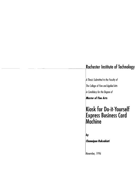
Rochester Inst<strong>it</strong>ute <strong>of</strong> <strong>Technology</strong><br />
A Thesis Subm<strong>it</strong>ted to the Faculty <strong>of</strong><br />
The College <strong>of</strong> Fine and Applied Arts<br />
in Candidacy <strong>for</strong> the Degree <strong>of</strong><br />
Master <strong>of</strong> Fine Arts<br />
<strong>Kiosk</strong> <strong>for</strong> <strong>Do</strong>-<strong>it</strong>-<strong>Yourself</strong><br />
<strong>Express</strong> <strong>Business</strong> Card<br />
<strong>Machine</strong><br />
by<br />
(hamaipan Ruksakiati<br />
November, 1996
Chief Advisor: Robert Keough<br />
Associate Advisor: James Ver Hogue<br />
<strong>Do</strong>te: 2. 2J. 17<br />
Associate Advisor: Glen Hintz
Preface i<br />
Introduction 1<br />
Three Components:<br />
<strong>Business</strong> Card 3<br />
<strong>Kiosk</strong>s 7<br />
Electronic Prepress 22<br />
Groundwork 32<br />
Body<br />
<strong>of</strong> Work:<br />
The Design <strong>of</strong> Logo 41<br />
The Design <strong>of</strong> <strong>Business</strong> Cards 43<br />
Process <strong>of</strong> Designing<br />
Interface 49<br />
The Final Work 63<br />
Conclusion 107<br />
109<br />
Acknowledgements 111
Have you ever needed to have beautiful and customized<br />
business cards? Have you ever worked under a very tight<br />
budget? Have you ever wanted to get business cards<br />
immediately? In the old days, this kind <strong>of</strong> service was<br />
ne<strong>it</strong>her while-u-wa<strong>it</strong> nor cheap. Yet, <strong>it</strong> was not easy to<br />
get one. One had to pay seperately <strong>for</strong> both design and<br />
printing. Moreover, you had to pay <strong>for</strong> a ton <strong>of</strong> cards,<br />
just to try out w<strong>it</strong>h risks and make <strong>it</strong> costs reasonably.<br />
Hopefully, you never had to make any changes <strong>for</strong> what<br />
we had already paid <strong>for</strong>.<br />
Then one day, I happened to be in the shopping mall where<br />
the business card machine was located. I was very much<br />
interested in this machine in which I can create and get the
usiness cards w<strong>it</strong>hin a few minutes just like an ATM<br />
machine. It is a great combination <strong>of</strong> business card<br />
design,<br />
multimedia kiosks and electronic prepress<br />
technology. What a wonderful machine!<br />
Beside that the first inspiration at the mall, I also<br />
had a chance to recieve catalogs from PaperDirect.<br />
This paper company produces full-color impact and<br />
beautifully predesigned papers that can be printed by<br />
laser or ink jet printers. Their products help everyone<br />
create an entire coordinated corporate image that<br />
looks pr<strong>of</strong>essionally designed.<br />
There<strong>for</strong>e, I decided to combine the business card<br />
machine and PaperDirect. I thought this is <strong>it</strong>, this is<br />
what I want to do <strong>for</strong> my thesis. It allows me to<br />
apply my skills in computer graphics design and graphic<br />
design by creating the multimedia kiosks <strong>for</strong> business<br />
card machine. It would help the non-designer produce<br />
their own business cards w<strong>it</strong>h satisfactory results and<br />
much quicker service than ever.<br />
I hope, maybe some day, this thesis could be my<br />
real business project.
WM Action<br />
My interest in this thesis subject would touch mainly upon<br />
the "<strong>Kiosk</strong> <strong>for</strong> <strong>Do</strong>-<strong>it</strong>-<strong>Yourself</strong> <strong>Express</strong> <strong>Business</strong> Card <strong>Machine</strong>"<br />
and related areas <strong>of</strong> that nature. Living in the twentieth<br />
century inspires me <strong>of</strong> the interactive era in which human<br />
interpersonal communication is rare to occur. <strong>Technology</strong><br />
in a <strong>for</strong>m <strong>of</strong> interactive machine is playing an important role<br />
in technological life. Interactive shopping is considered truly<br />
convenient nowadays.<br />
According<br />
to Aaron E. Walsh in Destination Multimedia,<br />
he sees the kiosk-based interactive multimedia as a tool<br />
to "provide direct contact w<strong>it</strong>h<br />
consumers."<br />
Aaron's idea<br />
towards the existing multimedia kiosks is extremely<br />
concrete and pos<strong>it</strong>ive upon which I truly agree:
Creating-A-Greeting machines are an ingenious<br />
twist to trad<strong>it</strong>ional kiosks. It is an on-the-spot<br />
customization and delivery <strong>of</strong> products w<strong>it</strong>hout<br />
having<br />
a salesperson.<br />
to wa<strong>it</strong> in line or seek assistance from<br />
Being a computer graphics designer, I wanted to develop<br />
the design <strong>of</strong> conservative business cards and make big<br />
changes onto <strong>it</strong>. Making the selection <strong>of</strong> business card<br />
more attractive and impressive is my crucial objective.<br />
The development <strong>of</strong> designs and systems <strong>for</strong> a business<br />
card machine would make an advanced pace in the<br />
design industry<br />
and technological society.<br />
Moreover, I would like to develop the kiosk interface to<br />
make <strong>it</strong> remarkable to replace the standard plain black<br />
and wh<strong>it</strong>e text on screen (ordinary<br />
In add<strong>it</strong>ion, my<br />
Busines Card <strong>Machine</strong>).<br />
proposal would improve the machine in<br />
the following ways: the outstandingly attractive appearance,<br />
the easy process <strong>for</strong> the first-time computer user, and the<br />
simple-but-interesting point-<strong>of</strong>-sale. Conceiving ideas <strong>for</strong><br />
this wr<strong>it</strong>ten l<strong>it</strong>erature has given me the inspiration to<br />
pursue my dream to make <strong>it</strong> <strong>for</strong> real in the near future.
patients<br />
1. BUSINESS CARD<br />
<strong>Business</strong> card design is one <strong>of</strong> the most exc<strong>it</strong>ing, yet most<br />
difficult types <strong>of</strong> design, to create. Graphic designers must<br />
convey<br />
a great deal <strong>of</strong> in<strong>for</strong>mation about and a pos<strong>it</strong>ive<br />
image <strong>of</strong> a client in a relatively small space. As an illustration,<br />
the designer must juggle typography, color, paper, visuals and<br />
graphics. All <strong>of</strong> these considerations must also comply w<strong>it</strong>h<br />
mentions are usually based on a very tight budget. Few<br />
types <strong>of</strong> design give a designer such a wonderful opportun<strong>it</strong>y<br />
to create something truely unique and original. The graphic<br />
designer must possess the basic essentials <strong>of</strong> business card<br />
design as well as creative imagination. The following parts<br />
described in a sequential and logical process in order to<br />
produce the creative yet effective business card design.<br />
^3
In order to understand how to design business card, some<br />
in<strong>for</strong>mation has been taken from Fresh Ideas in Letterhead<br />
and <strong>Business</strong> Card Design by Diana Martin and Mary Cropper<br />
as follows:<br />
1.1 What is A <strong>Business</strong> Card?<br />
The business card is the ultimate challenge <strong>for</strong> the graphic<br />
designer to develop and create a compelling message in a<br />
concise <strong>for</strong>mat. It is an image piece that creates a first and<br />
lasting impression. For example, one business card can turn<br />
a client on or <strong>of</strong>f depending upon <strong>it</strong>s pos<strong>it</strong>ive impressions<br />
or negative designing image at the first glance.<br />
1 .2 The Make-up <strong>of</strong> a <strong>Business</strong> Card<br />
The basic rule seems to be to apply a business card design<br />
solution to any printed piece that can be perceived as a<br />
selling tool. Considering<br />
the compet<strong>it</strong>ion most businesses<br />
face, <strong>it</strong> makes sense to take advantage <strong>of</strong> every possible<br />
promotional opportun<strong>it</strong>y.<br />
The business card design almost always includes the<br />
firm's or organization's name,<br />
address and telephone<br />
number, but there are many variables such as logo,<br />
fax number, employee names and t<strong>it</strong>les, list <strong>of</strong> board<br />
members, which are <strong>of</strong>ten requested to be included and<br />
present unique design challenges.<br />
The most successful business card system does two<br />
things. It communicates the appropriate image <strong>for</strong> the<br />
client through a careful and purposeful use <strong>of</strong> design and<br />
design elements,<br />
and readabil<strong>it</strong>y.<br />
and <strong>it</strong> lets the letter fulfill <strong>it</strong>s intention
1.3 Designing <strong>for</strong> a Client<br />
The rule <strong>for</strong> designing a successful business card is know<br />
thy client. Graphic designers need to become intimately<br />
acquainted w<strong>it</strong>h the client's image or style. Most clients<br />
do have an image, but sometimes <strong>it</strong> won't be defined or<br />
refined enough, or the client can't adequately articulate <strong>it</strong><br />
<strong>for</strong> the graphic designer. Besides that the graphic designer<br />
may have to help capture <strong>it</strong>. The opportun<strong>it</strong>y to do this will<br />
be in the design brief, when the client tells about his project,<br />
business and needs. One way to prepare <strong>for</strong> a design brief<br />
is to wr<strong>it</strong>e a list <strong>of</strong> questions to ask the client. The answer<br />
to all <strong>of</strong> the questions will create a personal<strong>it</strong>y and budgetary<br />
pr<strong>of</strong>ile <strong>of</strong> the client and business.<br />
Use the following questions as list starters:<br />
What does the client feel about his public image? What<br />
does the client want <strong>it</strong> to be?<br />
What, if anything, does the client like about the designer's<br />
existing business card design? How well does the client<br />
think <strong>it</strong> has worked as a selling tool?<br />
What uses does the client plan <strong>for</strong> the business card?<br />
Simple letter wr<strong>it</strong>ing?<br />
Who is the typical recipient <strong>of</strong> the business card?<br />
Who does the client want to reach?<br />
Who is going to use the business card? Secretaries?<br />
Sales representatives? Vice presidents?<br />
<strong>Do</strong>es the client have a budget <strong>for</strong> this job? How firm is <strong>it</strong>?<br />
What level <strong>of</strong> risk is the client com<strong>for</strong>table w<strong>it</strong>h? <strong>Do</strong>es the<br />
client prefer to be on the cutting edge, or does <strong>it</strong> play a<br />
conservative wa<strong>it</strong>-and-see brand <strong>of</strong> business?
1 .4 The Elements <strong>of</strong> <strong>Business</strong> Card Design<br />
Whatever design solution the designer and the client agree<br />
on, <strong>it</strong> will be implemented through the careful and creative<br />
use <strong>of</strong> various design elements. Often the visual or graphic<br />
aspect <strong>of</strong> the solution begins w<strong>it</strong>h the designer's sometimes<br />
Herculean task <strong>of</strong> designing the client's logomark. Depending<br />
on the impression the client needs to create,<br />
other graphic<br />
elements can be an effective part <strong>of</strong> the design solution. For<br />
example, the childlike stick figures used <strong>for</strong> a pediatrician or<br />
the friendly looking dalmatian used <strong>for</strong> a hot dog restaurant.<br />
Another way to communicate an image is through the<br />
selection <strong>of</strong> typeface. For example, a design <strong>for</strong> an<br />
accountant or lawyer would probably call <strong>for</strong> a trad<strong>it</strong>ional<br />
and conservative typeface. On the other hand, less trad<strong>it</strong>ional<br />
clients, many designers find more modern computer fonts to<br />
be particularly su<strong>it</strong>able <strong>for</strong> the business cards.<br />
Color selection is another important element <strong>of</strong> business card<br />
design. A graphic designer's choice must be based both on<br />
the client's budget and on the image he needs to convey.<br />
One-color printing is not only the most economical; <strong>it</strong> is <strong>of</strong>ten<br />
the most appropriate <strong>for</strong> conservative clients such as banks<br />
and insurance companies. In contrast, if the client has<br />
money <strong>for</strong> multicolor to establish himself as creative and<br />
progressive, take advantage <strong>of</strong> the opportun<strong>it</strong>y. Color<br />
can achieve a wide range <strong>of</strong> effects such as creating depth,<br />
commanding attention, organizing, dividing, intensifying<br />
orsubdueing.<br />
Probably the most basic, but sometimes least considered,<br />
ingredient in business card is the paper on which <strong>it</strong>'s printed.<br />
Today's market <strong>of</strong>fers hundreds <strong>of</strong> variations su<strong>it</strong>able <strong>for</strong><br />
business card, and determining which paper will work best<br />
w<strong>it</strong>h which printing technique is no easy job. The paper's
color, <strong>it</strong>s fiber content, <strong>it</strong>s texture, <strong>it</strong>s size and weight and<br />
<strong>it</strong>s availabil<strong>it</strong>y in business card stock will all play a part in the<br />
selection. And <strong>for</strong> the environmentally conscious, recycled<br />
paper now comes in an exc<strong>it</strong>ing array <strong>of</strong> colors and textures.<br />
1 .5 Standard Size <strong>of</strong> <strong>Business</strong> Card<br />
<strong>Business</strong> cards can be folded or unfolded. They can have a<br />
design or in<strong>for</strong>mation printed on one side or both sides; the<br />
choices are virtually lim<strong>it</strong>less. The business card, however,<br />
should be durable and easy to carry. Because cards are<br />
handled frequently, they should be printed on a heavy<br />
weight <strong>of</strong> paper. Most business cards measure<br />
3.5"<br />
but through folds and die cuts, many kinds <strong>of</strong> cards may<br />
be produced. If the business card will be folded, have <strong>it</strong><br />
scored on the press to ensure accuracy.<br />
x 2",<br />
2. KIOSKS<br />
Today, many multimedia kiosks are addressed by two<br />
basic needs. They convey the in<strong>for</strong>mation to many people<br />
in a consistent way and they make <strong>it</strong>s access appealing<br />
and useful. <strong>Kiosk</strong>s allow people to search <strong>for</strong> in<strong>for</strong>mation at<br />
their own pace and "ask<br />
questions"<br />
w<strong>it</strong>hout imposing on<br />
others. A user can request the directions over and over<br />
again and the kiosk will reply in a consistent manner,<br />
whereas a person might be tired <strong>of</strong> repeating the same<br />
in<strong>for</strong>mation and answering the same questions. The<br />
key to a successful kiosk is a highly usable interface<br />
which a wide variety <strong>of</strong> people can understand.
2.1 What Are <strong>Kiosk</strong>s?<br />
<strong>Kiosk</strong>s are public installations designed to make in<strong>for</strong>mation<br />
accessible to many people. Multimedia kiosks (computers<br />
housed in attractive shells) can be found in hotels, music<br />
stores, museums, shopping malls, galleries, airports,<br />
rental car agencies, convention centers, theme parks,<br />
zoos and other public environments. While some <strong>of</strong> these<br />
computer in<strong>for</strong>mation centers are strictly educational or<br />
service-oriented,<br />
others combine in<strong>for</strong>mation at the point-<br />
<strong>of</strong>-sale w<strong>it</strong>h advertisements and promotions. In add<strong>it</strong>ion to<br />
providing useful in<strong>for</strong>mation or advertisements,<br />
may also survey<br />
in<strong>for</strong>mation, public opinion,<br />
a kiosk<br />
users in order to collect market research<br />
or other data.<br />
Most kiosks are custom-built <strong>for</strong> a particular client and a<br />
particular environment. As a result,<br />
clear communication<br />
between the client and production house is cr<strong>it</strong>ical to<br />
creating<br />
a kiosk that per<strong>for</strong>ms <strong>it</strong>s function on schedule and<br />
under buget. Other tasks involve finding the right level<br />
<strong>of</strong> in<strong>for</strong>mation and assembling the necessary hardware to<br />
f<strong>it</strong> the function and the design. The provision <strong>of</strong> basic<br />
functions and in<strong>for</strong>mation technology at the kiosk is likely<br />
to be based solely upon the service objective and location.<br />
2.2 Considerations<br />
In the book Macromedia Director Design Guide, Cathy<br />
Clarke and Lee Swearinger, depict some considerations<br />
<strong>for</strong> kiosk multimedia design which are described in the<br />
following paragraphs:
2.2. 1 <strong>Kiosk</strong> Environment<br />
The characteristics <strong>of</strong> the environment where the multimedia<br />
project will be used may have some impacts on a project.<br />
The location, lighting<br />
and ambient sound are all elements<br />
that can affect a design. A public installation is qu<strong>it</strong>e different<br />
from a house use. A public s<strong>it</strong>e may be able to use better<br />
qual<strong>it</strong>y equipment than most consumers can af<strong>for</strong>d but will<br />
also require more durabil<strong>it</strong>y and protection from weather or<br />
theft. These followings are the issues <strong>for</strong> kiosk environment:<br />
2.2.1.1 Public Spaces<br />
Consider locations where people naturally congregate or<br />
wa<strong>it</strong>, such as lobbies, lines in a supermarket, bus terminals,<br />
airports , or hosp<strong>it</strong>als. A kiosk that allows people to have a<br />
prompt service or less timwonsuming can attract a greatly<br />
patronage.<br />
In the public spaces, privacy is an issue. Some kiosks are set<br />
up to project screen activ<strong>it</strong>y onto a larger overhead mon<strong>it</strong>or.<br />
The appropriateness <strong>of</strong> this setup depends on the content and<br />
the type <strong>of</strong> interactiv<strong>it</strong>y. For example, if the user is entering<br />
name and address in<strong>for</strong>mation, this would be a poor choice.<br />
Automated teller machine kiosks are also designed <strong>for</strong> privacy<br />
so that the display screen can only be read by a user standing<br />
dirctly in front <strong>of</strong> the kiosk. For public use,<br />
provide wheel<br />
chair accessibil<strong>it</strong>y to the kiosk and consider other physical<br />
characteristics that may be unique to your target audience<br />
such as the height <strong>of</strong> the kiosk's average user and whether<br />
this user is a child or adult.<br />
2.2.1.2 Sound<br />
The ambient noise, foot traffic noise, and nearby sound<br />
sources like air cond<strong>it</strong>ioners are all elements that will affect<br />
the abil<strong>it</strong>y <strong>of</strong> a user to hear sounds from a kiosk. A designer<br />
needs to take these into account to determine volume levels
and how much sound to use. Another issue is the impact<br />
the sound from a kiosk will have on the environment.<br />
Some places like commercial shopping areas may be noisy<br />
and more accommodating to sound. In other places like<br />
museums or libraries, sound may be obstrusive. In these<br />
cases, kiosks may need to be placed in special areas or<br />
provided w<strong>it</strong>h headphones.<br />
2.2.1.3 Lighting<br />
Glare on the screen can adversely affect the visibil<strong>it</strong>y <strong>of</strong> any<br />
displayed in<strong>for</strong>mation. <strong>Kiosk</strong>s should not be placed in direct<br />
sunlight and the ambient light should be at a readable level.<br />
Just as the impact <strong>of</strong> the sound on the environment needs to<br />
be taken into account so does the impact <strong>of</strong> the graphics.<br />
If a room has a green undertones then <strong>it</strong> may be distracting<br />
to have a kiosk w<strong>it</strong>h a blazing red display. Also, displays are<br />
commonly designed to attract people but they may take away<br />
from the environment if they are so busy as to annoy.<br />
2.2.1.4 Secur<strong>it</strong>y<br />
Secur<strong>it</strong>y can include anything from the secur<strong>it</strong>y <strong>of</strong> a kiosk,<br />
any <strong>of</strong> <strong>it</strong>s components,<br />
or the in<strong>for</strong>mation in the kiosk to<br />
the secur<strong>it</strong>y <strong>of</strong> the user while using the kiosk. Lighting,<br />
access, and pos<strong>it</strong>ioning are considerations that will affect<br />
secur<strong>it</strong>y issues.<br />
2.2.2 Network<br />
A sophisticated network <strong>of</strong> kiosks might involve a dozen<br />
kiosks stationed throughout an area, such as a shopping<br />
mall,<br />
and networked to a single server. These kiosks<br />
could provide store locations, general news,<br />
and consumer<br />
10
in<strong>for</strong>mation, such as product availabil<strong>it</strong>y and comparative<br />
descriptions. Some can be designed to receive nightly<br />
updates from merchants and advertisers.<br />
Costs can range from $1 0,000 <strong>for</strong> a single-s<strong>it</strong>e kiosk on<br />
standard equipment to over $1,000,000 <strong>for</strong> a networked,<br />
multiple-un<strong>it</strong> system. Prices vary w<strong>it</strong>h the degree <strong>of</strong> qual<strong>it</strong>y,<br />
rime, media and content complex<strong>it</strong>y, hardware components,<br />
number <strong>of</strong> stations,<br />
and maintenance required. A mid-range<br />
kiosk might showcase a company's products and capabil<strong>it</strong>ies<br />
using extensive full-color animations and video,<br />
while a<br />
simpler kiosk might be based on an interactive HyperCard<br />
stack using text, graphics,<br />
and a few simple animations.<br />
Special hardware or the use <strong>of</strong> video many increase the<br />
cost dramatically.<br />
2.2.3 Hardware<br />
A common hardware component in most kiosks is a touch<br />
screen interface,<br />
an alternative to a keyboard and mouse.<br />
It allows people to easily interact w<strong>it</strong>h a kiosk by physically<br />
touching selections on the screen. Rarely do public kiosks<br />
feature keyboards because <strong>of</strong> the difficulty and time involved<br />
in keying in requests. Another component may be a<br />
videodisc player to show video segments. These analog<br />
players are more prone to breakdowns and more expensive<br />
to update than using dig<strong>it</strong>al video compression boards, but<br />
they are still a common choice <strong>for</strong> many developers. Other<br />
components may include cred<strong>it</strong> card readers, bar scanners,<br />
printers,<br />
or other types <strong>of</strong> input and output devices. The<br />
booth that houses the equipment also needs to be tailored<br />
to the environment. It should look good, have appropriate<br />
lighting, signs,<br />
and instructions and be durable and secure<br />
enough to protect the equipment housed in the booth.<br />
__U
2.2.4 Maintenance<br />
The custom nature <strong>of</strong> kiosks, the frequency <strong>of</strong> use,<br />
and the<br />
hardware components <strong>of</strong>ten make support and maintenance<br />
a big issue. Mon<strong>it</strong>ors may<br />
need to be replaced because <strong>of</strong><br />
burn-in. Videodisc players, cred<strong>it</strong> card readers,<br />
or printers<br />
may need maintenance or replacement because <strong>of</strong> wear.<br />
<strong>Kiosk</strong>s may need backup equipment on s<strong>it</strong>e <strong>for</strong> most<br />
components,<br />
as well as people trained in both routine and<br />
special maintenance. Maintainance not only applies to the<br />
physical components but also to the in<strong>for</strong>mation and content<br />
provided by kiosk. <strong>Kiosk</strong>s that contain outdated or incorrect<br />
content may be more <strong>of</strong> a disservice than an aid.<br />
2.3 <strong>Kiosk</strong> Design<br />
Arriving at appropriate design decisions will likely require<br />
in-depth market research into traffic flow, buying patterns,<br />
and in<strong>for</strong>mation needs. A production house may benef<strong>it</strong> from<br />
having some type <strong>of</strong> marketing knowledge or expertise on<br />
hand to help interpret this research into design decisions.<br />
According to Multimedia Demystified A Guide to the World<br />
<strong>of</strong> Multimedia by Apple Computer Inc., there are two rules<br />
<strong>of</strong> thumb mentioned by many developers are to keep the<br />
interface simple and to provide prompt feedback. The<br />
organization <strong>of</strong> the in<strong>for</strong>mation and the design <strong>of</strong> the interface<br />
is important, since much <strong>of</strong> the audience may not be familiar<br />
w<strong>it</strong>h computers and may not have a lot <strong>of</strong> time to try to figure<br />
out how a system works. Most kiosks feature an attraction<br />
loop<br />
"hops"<br />
that inv<strong>it</strong>es people to use the number <strong>of</strong> or<br />
branches <strong>of</strong> in<strong>for</strong>mation to a minimum. <strong>Kiosk</strong> design is<br />
composed <strong>of</strong> two following principles:<br />
J12
2.3.1 In<strong>for</strong>mation Design<br />
Solving<br />
any<br />
communication needs is an essential design task <strong>for</strong><br />
product. In<strong>for</strong>mation design addresses ways to organize<br />
and present in<strong>for</strong>mation in a meaningful and useful <strong>for</strong>m.<br />
It includes the in<strong>for</strong>mation in all media (whether textual,<br />
aural, or visual) and, to some degree their interaction.<br />
Where graphic design is primarily concerned w<strong>it</strong>h creating<br />
a beautiful visual arrangement <strong>of</strong> in<strong>for</strong>mation, in<strong>for</strong>mation<br />
design is concerned w<strong>it</strong>h creating a clear, accurate, and<br />
meaningful arrangement <strong>of</strong> in<strong>for</strong>mation. This is not to say<br />
that graphic design and in<strong>for</strong>mation design are necessarily at<br />
odds. In the best case, in<strong>for</strong>mation can be both attractive<br />
and meaningful,<br />
and succeed from both standpoints.<br />
In<strong>for</strong>mation design can affect the color, layout, sequence,<br />
and styles <strong>of</strong> any media, but <strong>it</strong> is most concerned w<strong>it</strong>h the<br />
organization <strong>of</strong> all elements in an entire product. The<br />
organization affects the communication <strong>of</strong> those elements.<br />
For example, reorganizing all <strong>of</strong> the words in a dictionary<br />
by order <strong>of</strong> everyday use instead <strong>of</strong> alphabetical order<br />
would change how a user might search <strong>for</strong> words or make<br />
associations. Visual dictionaries use pictures and scenes to<br />
allow users to find a word <strong>for</strong> something they can identify by<br />
sight. A thesaurus groups words by similar or opposing<br />
meanings. Each solution solves a particular need.<br />
In the book In<strong>for</strong>mation Anxiety by Richard Saul Wurman<br />
identifies five general ways to organize any in<strong>for</strong>mation:<br />
_tf
2.3.1.1 Alphabet<br />
An example <strong>of</strong> organizing data alphabetically is a telephone<br />
directory or Rolodex file. Alphabetical organizations have no<br />
inherent meaning but most people who speak Roman-based<br />
languages are more than familiar w<strong>it</strong>h this sequence <strong>of</strong> letters.<br />
However, the alphabet does not necessarily translate into<br />
other languages. Users who speak Asian, Sem<strong>it</strong>ic,<br />
languages may be unfamiliar w<strong>it</strong>h "an<br />
unable to find things.<br />
2.3.1.2 Time<br />
or Cyrillic<br />
and thus<br />
alphabet"<br />
Organizing by time can be effective in relating events to each<br />
other. Train schedules and theater listings do this because<br />
this is the most important aspect <strong>of</strong> their use. A timeline<br />
might be the navigation method <strong>for</strong> a multimedia piece<br />
depicting the evolution <strong>of</strong> a species. Time is a particularly<br />
useful organization because just about every culture on earth<br />
shares a common method <strong>of</strong> measuring time. In fact, the<br />
international time standard is active in nearly every spot<br />
throughout the world (although somewhat confusingly in<br />
Southern Asia and along<br />
2.3.1.3 Location<br />
the north coast <strong>of</strong> South America).<br />
Ordering in<strong>for</strong>mation by location is a common <strong>for</strong>m <strong>of</strong><br />
presenting spatial relationships and is particularly effective<br />
when such relationships are part <strong>of</strong> the message. Maps<br />
are obvious examples <strong>of</strong> organizations by location. A less<br />
obvious example is a medical book that starts at the top<br />
<strong>of</strong> the body (the head) and works <strong>it</strong>s way down to the<br />
toes (the thigh bone's connected to the knee bone...).<br />
A multimedia piece about automobiles, <strong>for</strong> example,<br />
might explain each component and major subassembly<br />
when users click on that component from a detailed<br />
illustration <strong>of</strong> a car. The illustration essentially <strong>for</strong>ms a<br />
"Table <strong>of</strong> Contents"<br />
<strong>for</strong> the product.<br />
14
2.3.1.4 Continuum<br />
Continuums or magn<strong>it</strong>udes can be anything w<strong>it</strong>h two opposing<br />
parameters. Number systems like the Dewey Decimal system,<br />
used to catalog books in a library, are continuums where<br />
major ideas are represented w<strong>it</strong>h a number from 0 to 999;<br />
minor ideas are divisions from the major represented by a<br />
decimal number from .000001 to<br />
be from "best to<br />
.999999.<br />
Magn<strong>it</strong>ude<br />
can<br />
worst," most,"<br />
"least to or "biggest to<br />
smallest"<br />
or vice versa. A multimedia t<strong>it</strong>le about movies<br />
might be organized from highest to lowest revenues or<br />
highest to lowest budget. A game might be organized by<br />
levels <strong>of</strong> difficulty.<br />
2.3.1.5 Category<br />
Finally, content can be organized by category. Categories can<br />
be obvious or unexpected. They should be chosen to reveal<br />
something<br />
about the content <strong>it</strong>self. How content is grouped<br />
or separated speaks <strong>for</strong> the purpose and understanding <strong>it</strong>s<br />
creators intend to communicate. Newspapers, <strong>for</strong> example,<br />
are <strong>of</strong>ten organized by categories such as <strong>Business</strong>,<br />
Entertainment, Sports, Food, Books,<br />
In<strong>for</strong>mation Design Tools<br />
and Classifieds.<br />
When organizing in<strong>for</strong>mation, certain tools lend themselves<br />
well to certain functions. A map or diagram might be useful<br />
to depict interaction or relationships <strong>of</strong> different elements.<br />
Outlines describe order and sequence well. In<strong>for</strong>mation<br />
maps in<strong>for</strong>matively describe elements and their connections,<br />
especially when the connections outnumber the connecting<br />
points. (An in<strong>for</strong>mation map is a web or tree that shows all<br />
the elements and connections between them.)<br />
_L5
In film, theater,<br />
or video production an effective tool<br />
<strong>for</strong> visualzation is a storyboard. A storyboard is an illustrated<br />
scene-by-scene plan <strong>for</strong> telling a story and <strong>for</strong> indicating<br />
the balance <strong>of</strong> visual and aural elements in each scene.<br />
Storyboards, by nature, are organized by time since that<br />
is the unifying component. In many ways the experience<br />
<strong>of</strong> multimedia is like that <strong>of</strong> film or theater, meaning that<br />
several <strong>for</strong>ces are at play in creating a rich experience.<br />
A storyboard, there<strong>for</strong>e, can be a useful tool <strong>for</strong> describing<br />
the multiple "tracks"<br />
multimedia experience.<br />
that work together to create a<br />
Another useful tool <strong>for</strong> designers is a notebook to capture<br />
design ideas <strong>for</strong> future reference and to communicate them<br />
w<strong>it</strong>h others as necessary. A glimpse into a designer's note<br />
book might reveal pencil sketches <strong>of</strong> screen designs, rough<br />
outlines <strong>of</strong> navigational paths,<br />
quick studies <strong>of</strong> animated<br />
characters, phone numbers <strong>of</strong> possible recording studios, or<br />
anything that represents the flood <strong>of</strong> thoughts-in-process that<br />
are inev<strong>it</strong>able in any design process.<br />
2.2.2 Interface Design<br />
Interface design is very much like in<strong>for</strong>mation design but<br />
<strong>it</strong>s domain is mainly screen display and interactiv<strong>it</strong>y w<strong>it</strong>h<br />
computers and electronic devices. Many <strong>of</strong> the same<br />
organizational concerns apply but there are some add<strong>it</strong>ional<br />
ones that deal w<strong>it</strong>h specific media and w<strong>it</strong>h specific interaction<br />
in an electronic environment. Interface design encompasses<br />
everything a user sees, touches, hears,<br />
While many project managers, programmers,<br />
and interacts w<strong>it</strong>h.<br />
designers define interface design as a primarily visual<br />
exercise dealing mostly w<strong>it</strong>h screen, button,<br />
and interface<br />
and icon<br />
design, <strong>it</strong>s scope extends to include all visual components<br />
as well as audio elements and, most importantly, interaction<br />
and navigation.<br />
_W
The interface design orients the user to the experience or<br />
message <strong>of</strong> the project. Paradoxically, the best interface is<br />
one that is transparent to the user, meaning that <strong>it</strong> does not<br />
distract from the purpose and message <strong>of</strong> the experience.<br />
A transparent interface is one that is so subtle and quiet that<br />
users do not perceive an interface at all. Elements <strong>of</strong> the<br />
interface range from screen layout and color selection to<br />
modes <strong>of</strong> interaction such as a touch screen, keyboard,<br />
joystick,<br />
or voice control.<br />
2.2.2. 1 Principles <strong>of</strong> Interface Design<br />
Interface design presents a challenge <strong>of</strong> balancing different<br />
trad<strong>it</strong>ions <strong>of</strong> communication to create a meaningful and<br />
understandable experience <strong>for</strong> people. The first question an<br />
interface designer should ask is, "What is the experience<br />
people should have?"<br />
Defining<br />
the experience defines the<br />
interface design. If the experience is a conversation, the<br />
interface should draw from the conventions <strong>of</strong> human<br />
conversation. If the experience is that <strong>of</strong> a journey, the<br />
interface should give a person the means to orient and<br />
explore. A good interface respects human intelligence and<br />
faculties w<strong>it</strong>hout getting in the way <strong>of</strong> understanding. A<br />
poor or non-intu<strong>it</strong>ive interface continually reminds people<br />
that they are working w<strong>it</strong>h a machine.<br />
Each medium has a trad<strong>it</strong>ion <strong>of</strong> experience and a history <strong>of</strong><br />
how people relate to <strong>it</strong>. Reading a book may seem like a<br />
passive experience but people do more than just read the<br />
words. They underline them, dog-ear pages,<br />
scribble notes<br />
in the margins, look up words in a dictionary, drop the book<br />
accidentally in the tub,<br />
and lend them to friends. One <strong>of</strong> the<br />
challenges <strong>of</strong> interface design is to allow the user as much<br />
control <strong>of</strong> the environment as possible.<br />
_I7
The Apple Humon Interface Guidelines presents principles<br />
<strong>of</strong> the Apple Desktop Interface and the particular specifications<br />
<strong>of</strong> standard interface elements. These guidelines can be<br />
interwoven w<strong>it</strong>h the design conventions <strong>of</strong> other media<br />
such as l<strong>it</strong>erature, music, video,<br />
A) Metaphors<br />
and film.<br />
A metaphor allows someone to understand and experience<br />
one kind <strong>of</strong> interaaction in terms <strong>of</strong> another more familiar<br />
kind. Use metaphors based on real-world experience and<br />
make them clear so that users have a set <strong>of</strong> expectations<br />
to apply to the computer environment. Carefully craft a<br />
visual, aural,<br />
and behavioral environment to support the<br />
metaphor. Build a stable and consistent world <strong>for</strong> the<br />
metaphor. Even an interactive game that takes place on the<br />
distant planet Devargas should give the player a way to find<br />
their way around.<br />
Sometimes structuring the interface in a metaphor can clarify<br />
the interaction. One might present in<strong>for</strong>mation about a c<strong>it</strong>y<br />
w<strong>it</strong>h a street map interface. An interactive program to teach<br />
research skills to young people might use the metaphor <strong>of</strong> an<br />
archeological excavation, complete w<strong>it</strong>h maps, excavation<br />
"tools," "finds,"<br />
and perhaps a local guide. Organizing the<br />
interaction around a metaphor can only be useful if the<br />
metaphor is familiar, stable, and consistent. Misusing a<br />
metaphor can range from being corny to irr<strong>it</strong>ating to unusable.<br />
B) Direct Manipulation<br />
People want to feel that they are in charge <strong>of</strong> the computer's<br />
activ<strong>it</strong>ies. They expect their physical actions to have physical<br />
results and want their tools to provide feedback. Objects and<br />
their properties should be movable. This is especially true <strong>of</strong><br />
multimedia programs which inv<strong>it</strong>e interaction. See figure 1 .<br />
_J5
fclffl <<br />
1<br />
nteractions figure 1<br />
A A A<br />
_tf
0 Seennd-Point<br />
People select actions from alternatives presented on the<br />
screen. They rely on recogn<strong>it</strong>ion, not recall; they should not<br />
have to remember anything the computer already commands.<br />
A multimedia program that requires a complex manual <strong>for</strong> the<br />
users may not last long. If people understand what has to be<br />
done, they can usually figure out how to do <strong>it</strong>. For example,<br />
if someone wants to qu<strong>it</strong> a program, they will thru the obvi<br />
ous first (such as the word QUIT or an EXIT sign) and then<br />
explore other options to get the desired result.<br />
D) Consistency<br />
Effective applications are both consistent w<strong>it</strong>hin themselves<br />
and consistent w<strong>it</strong>h one another. People feel centered when<br />
they can rely on familiar ways to get things done. W<strong>it</strong>h<br />
consistent design a person is more likely to take chances on<br />
exploration. An icon that indicates "return to screen<br />
one"<br />
displayed on every screen is reassuring as long as <strong>it</strong> works<br />
consistently. As soon as the icon freezes or brings the person<br />
to a screen other than the one expected, that person's fa<strong>it</strong>h<br />
in the system is shaken.<br />
F) What You See Is What You Get<br />
Implement the metaphor as realistically as possible. There<br />
should be no secrets from the user,<br />
that only promise unpredictable results.<br />
F) User-In<strong>it</strong>iated Actions<br />
no abstract commands<br />
The person, not the computer, in<strong>it</strong>iates and controls all<br />
actions. People learn best when they are actively engaged.<br />
This is different from the more trad<strong>it</strong>ional model, in which<br />
the computer acts and the user responds w<strong>it</strong>h a lim<strong>it</strong>ed set<br />
<strong>of</strong> options.<br />
_ifl
G) Feedback and Dialog<br />
People appreciate immediate feedback on the progress <strong>of</strong><br />
on operation. Communication should be brief, direct, and<br />
expressed in terms <strong>of</strong> the user's point <strong>of</strong> view.<br />
H) Forgiveness<br />
Users make mistakes; <strong>for</strong>give them. Forgiveness means<br />
letting users do anything reasonable, letting them know<br />
they won't break anything, and allowing them to explore<br />
all terr<strong>it</strong>ory. All actions should be reversible let users<br />
know about any that are not.<br />
I) Perceived Stabil<strong>it</strong>y<br />
People feel com<strong>for</strong>table in a computer environment that<br />
remains understandable and familiar, rather than one that<br />
changes randomly. Consistent graphic elements provide<br />
visual stabil<strong>it</strong>y;<br />
a fin<strong>it</strong>e set <strong>of</strong> objects and actions to per<strong>for</strong>m<br />
on them provide conceptual stabil<strong>it</strong>y.<br />
J) Aesthetic Integr<strong>it</strong>y<br />
Visually confusing or unattractive displays detract from the<br />
effectiveness <strong>of</strong> human-computer interactions. Avoid clutter.<br />
Simplify<br />
representation to what is essential <strong>for</strong> the user to<br />
know, hiding the rest. Messes are acceptable only if the<br />
user makes them multimedia applications are allowed this<br />
freedom. The user should be able to control the style and<br />
individual<strong>it</strong>y<br />
<strong>of</strong> the experience.<br />
K) 90/10 Functional<strong>it</strong>y<br />
User operations per<strong>for</strong>med <strong>of</strong>ten (90% <strong>of</strong> the time) should<br />
be very simple while operations per<strong>for</strong>med infrequently<br />
(1 0% <strong>of</strong> the time) can be more difficult if necessary.<br />
Dangerous operations such as erasing all files should be<br />
difficult to do, preventing inadvertent triggering.<br />
JI1
3. ELECTRONIC PREPRESS<br />
In the mid 1 980s, the term desktop publishing was coined<br />
by Paul Brainerd,<br />
who was at that time president <strong>of</strong> the<br />
Aldus Corporation in Seattle, Washington. Aldus Corporation<br />
developed the first popular page layout s<strong>of</strong>tware application<br />
<strong>for</strong> the Macintosh computer Aldus PageMaker (now from<br />
Adobe Systems). Desktop publishing (DTP) is defined as the<br />
use <strong>of</strong> personal computers (microcomputers), scanners, laser<br />
printers,<br />
and specific s<strong>of</strong>tware applications to create a wide<br />
variety <strong>of</strong> publications.<br />
Usually,<br />
a page layout s<strong>of</strong>tware application such as<br />
PageMaker from Adobe Systems or QuarkXPress <strong>for</strong>ms<br />
the basis <strong>of</strong> a desktop publishing operation. In the basic<br />
operation, text and other typographic elements are created<br />
in word processing s<strong>of</strong>tware or directly in the page layout<br />
s<strong>of</strong>tware. Graphic images may be obtained by scanning<br />
photographs and other artwork or by creating them in a<br />
drawing or painting s<strong>of</strong>tware application such as Adobe<br />
Illustrator or Fractal Design Painter. After text and graphic<br />
elements are combined, completed publication pages may<br />
be output on a laser printer or a high-resolution imagesetter.<br />
The development <strong>of</strong> the relatively low-priced personal<br />
computers, such as the Apple Macintosh and the IBM PC,<br />
spurred the desktop publishing revolution, but electronic<br />
prepress can involve expensive hardware and s<strong>of</strong>tware.<br />
Some prepress functions are likely to be per<strong>for</strong>med by<br />
specialists employed at color trade shops (color houses),<br />
prepress service bureaus and commercial printing firms.<br />
This more specialized field is defined as high-end electronic<br />
prepress and involves the use <strong>of</strong> color electronic prepress<br />
systems (CEPS).<br />
_22
A less expensive approach to electronic prepress is represented<br />
by mid-range prepress systems. These fall somewhere<br />
between desktop publishing<br />
in cost and capabil<strong>it</strong>y.<br />
and high-end prepress systems<br />
3.1 When Desktop Publishing Becomes<br />
Electronic Prepress<br />
The degree <strong>of</strong> involvement by graphic designers and other<br />
desktop computer users in prepress activ<strong>it</strong>y depends on the<br />
sophistication <strong>of</strong> available hardware and s<strong>of</strong>tware and the<br />
abil<strong>it</strong>y <strong>of</strong> the individual. For example,<br />
a person who creates<br />
a simple advertising flyer using a page layout s<strong>of</strong>tware<br />
application on a Macintosh computer and then outputs the<br />
final layout on a desktop laser printer at 300 dots per inch<br />
(dpi) is per<strong>for</strong>ming<br />
electronic prepress work at <strong>it</strong>s most basic<br />
level. The 300 dpi output can be taken to a print shop where<br />
a printing plate can be made from <strong>it</strong>. The resulting printed<br />
flyers would be adequate <strong>for</strong> the advertising purposes <strong>of</strong> many<br />
business. In fact, this type <strong>of</strong> prepress activ<strong>it</strong>y is qu<strong>it</strong>e<br />
widespread now that desktop publishing technology has<br />
become so popular.<br />
3.2 The Publishing Process<br />
In the past, prepress work was exclusively done by people<br />
trained to do specialized jobs. Publications were usually<br />
conceived and designed by graphic designers and others<br />
whose expertise lay primarily in art and ed<strong>it</strong>orial functions.<br />
Camera-ready<br />
artwork was handed over to the specialists<br />
employed at a printing firm, and the next time the origination<br />
or saw the publication, <strong>it</strong> was in the <strong>for</strong>m <strong>of</strong> a pro<strong>of</strong> copy<br />
which showed how the publication would look when <strong>it</strong> came<br />
<strong>of</strong>f the press. For the sake <strong>of</strong> discussion, we will call this the<br />
"<br />
trad<strong>it</strong>ional publishing process". The trad<strong>it</strong>ional process has<br />
all but given way to the use <strong>of</strong> personal computers in the<br />
"desktop publishing process".<br />
-23
3.3 The Trad<strong>it</strong>ional Process and the Desktop Process<br />
In both the trad<strong>it</strong>ional process and the desktop process,<br />
a publication begins when <strong>it</strong> is conceived and designed.<br />
The designer uses rough sketches and a fully-realized<br />
mock-up called a comp (abbreviation <strong>of</strong> comprehensive)<br />
to communicate the design concepts to others involved in<br />
the project. Comps can be qu<strong>it</strong>e elaborate. They may<br />
utilize the actual paper stock that the job will be printed<br />
on, and, in the trad<strong>it</strong>ional method,<br />
rendered by marker , paint,<br />
show color elements<br />
or colored paper. In the<br />
desktop method, the comp can be much more accurate<br />
at showing whot publication will eventually look like when<br />
ifs printed on a printing<br />
being created on a computer,<br />
press. Since the publication is<br />
all the text and graphic<br />
elements can be rendered in more or less their final state.<br />
The publication can then be output to a color printer, showing<br />
colors, typography and other elements much more accurately<br />
than a trad<strong>it</strong>ional handmade comp ever could. See figure 2<br />
and figure 3.<br />
3.4 The Dig<strong>it</strong>al Mechanical<br />
The process <strong>of</strong> creating a trad<strong>it</strong>ional mechanical is being<br />
replaced by the desktop method. In the desktop method,<br />
the mechanical is created entirely in a computer. Type is<br />
created and <strong>for</strong>matted in the computer, and photographs<br />
and other artwork are e<strong>it</strong>her scanned or created in the<br />
computer. The computer replaces the trad<strong>it</strong>ional typesetting<br />
procedure,<br />
and the scanner replaces the process camera.<br />
When images are created by a scanner, they are said to be<br />
dig<strong>it</strong>ized images. The term dig<strong>it</strong>al is <strong>of</strong>ten used to describe<br />
the functions <strong>of</strong> a computer, referring to the numerical basis<br />
on which a computer processes data. Desktop publishing<br />
allows type and graphic images to be combined electronically<br />
-24
ocess Jigtml<br />
1 Concept and Design<br />
The project begins w<strong>it</strong>h a pencil rough<br />
or a color comp. Discussion among<br />
individuals involved in the project results<br />
in a final design.<br />
2 Typesetting<br />
Type is set a pr<strong>of</strong>essional typesetter<br />
from copy prepared by the designer,<br />
copywr<strong>it</strong>er, or ed<strong>it</strong>or. Type galleys are<br />
returned to the designer or production<br />
artist. Changes require add<strong>it</strong>ional<br />
typesetting<br />
time and expense.<br />
3 Camera Work<br />
Photos, logos,<br />
and other illustrations<br />
are sized to f<strong>it</strong> the layout and<br />
photograped w<strong>it</strong>h a process camera.<br />
Prints,<br />
or stats are returned to the<br />
designer or production artist.<br />
4 Camera-Ready Mechanicals<br />
The designer or production artist<br />
prepares a mechanical by pasting up<br />
type and graphic elements.<br />
5 Final Camera Work<br />
The process camera is used to make film<br />
negatives or pos<strong>it</strong>ives from the paper<br />
mechanicals. Color seperations <strong>for</strong> spot<br />
colors and color halftones are also made<br />
at this point.<br />
6 Stripping<br />
The film is prepared <strong>for</strong> plate-making by<br />
a stripper who assembles all the pages<br />
and other elements.<br />
7 Printing Press<br />
Printing<br />
plates are made and the project<br />
is printed, folded,<br />
and bound.<br />
-25
Bpsbp<br />
wkkkij<br />
Process. figure 3<br />
1 Concept, Design, and Typography<br />
The project may still begin w<strong>it</strong>h a<br />
pencil rough, but <strong>it</strong>'s just as likely that<br />
<strong>it</strong> will begin on a computer because<br />
design changes can be so easily made.<br />
Text is generated in a word processor<br />
or directly in apage layout application.<br />
Typographic changes are easy to make<br />
at any stage.<br />
2 Graphics<br />
Graphic elements are dig<strong>it</strong>ized w<strong>it</strong>h a<br />
scanner or created in a graphics<br />
s<strong>of</strong>tware application. Special effects<br />
and color adjustments can be applied<br />
w<strong>it</strong>h image manipulation s<strong>of</strong>tware.<br />
3 Electronic Mechanicals<br />
Text and graphics elements are<br />
combined in a page layout s<strong>of</strong>tware<br />
application. Color in<strong>for</strong>mation is an<br />
integral part <strong>of</strong> the publication file.<br />
4 Electronic Stripping<br />
Futher adjustments, such as inserting<br />
high-resolution dig<strong>it</strong>al halftones or<br />
trapping colors, may be made to the<br />
electronic mechanicals by a<br />
pr<strong>of</strong>essional prepress service provider,<br />
or the publication may be output<br />
directly to film or printing plates on<br />
a high-resolution imagesetter or<br />
film recoder.<br />
5 Printing Press<br />
Printing plates are made ,<br />
and the<br />
project is printed, folded, and bound.<br />
Some types <strong>of</strong> dig<strong>it</strong>al presses do not<br />
use plates, or the plates are made<br />
on the press through dig<strong>it</strong>al imaging.<br />
-26
in a manner which might be thought <strong>of</strong> as a metaphor <strong>for</strong> the<br />
trad<strong>it</strong>ional paste-up board. The resulting mechanical can be an<br />
almost exact representation <strong>of</strong> the final printed piece.<br />
3.5 The S<strong>of</strong>tware Base<br />
The basis <strong>of</strong> the desktop method is a s<strong>of</strong>tware application<br />
which provides the electronic paste-up board. This type<br />
<strong>of</strong> s<strong>of</strong>tware is known as page layout s<strong>of</strong>tware. Two have<br />
dominated the field so far PageMaker and QuarkXPress.<br />
They<br />
are both available in Macintosh and Micros<strong>of</strong>t Windows<br />
versions. Page layout s<strong>of</strong>tware allows the user to exercise<br />
complete control over typographic elements. In fact, the<br />
amount and ease <strong>of</strong> control exceeds that <strong>of</strong> any previous<br />
typesetting technology. The only problem w<strong>it</strong>h this<br />
revolutionary technology is that many <strong>of</strong> the people working<br />
w<strong>it</strong>h type in a page layout s<strong>of</strong>tware application are not<br />
pr<strong>of</strong>essional typesetters or graphic designers. Consequently,<br />
many <strong>of</strong> the resulting<br />
publications do not have the finesse<br />
that a pr<strong>of</strong>essional hand would apply. For example, a novice<br />
will <strong>of</strong>ten combine inappropriate typefaces or utilize type sizes<br />
and styles incorrectly. It seems that this is merely a matter <strong>of</strong><br />
education, however, and individuals who are working w<strong>it</strong>h<br />
page layout s<strong>of</strong>tware are learning that there is <strong>of</strong>ten more to<br />
a printed page than first meets the eye.<br />
The benef<strong>it</strong>s <strong>of</strong> computer-generated type are many. Easy<br />
access, rapid revisions, vast choice <strong>of</strong> fonts,<br />
and sheer<br />
economy are only some <strong>of</strong> the reasons computer typography<br />
is so successful.<br />
-21
3.6 S<strong>of</strong>tware Applications<br />
3.6. 1 Page Layout S<strong>of</strong>tware<br />
Standard page layout s<strong>of</strong>tware applications <strong>for</strong>m the basis<br />
<strong>of</strong> desktop publishing and electronic prepress. Special<br />
proprietary s<strong>of</strong>tware, such as Hell ScriptMaster, Sc<strong>it</strong>ex<br />
Visionary , or Crosfield StudioLink, is used in high-end<br />
prepress operations to link desktop s<strong>of</strong>tware w<strong>it</strong>h the high-<br />
end scanners and film recorders. However, there are two<br />
widely-used desktop publishing applications in the prepress<br />
systems and service bureaus; PageMaker and QuarkXPress.<br />
3.6.1.1 PageMaker and QuarkXPress<br />
PageMaker and QuarkXPress are fierce compet<strong>it</strong>ors, and<br />
users are <strong>of</strong>ten equally fierce in their advocacy <strong>of</strong> one or<br />
the other <strong>of</strong> these s<strong>of</strong>tware applications. The two s<strong>of</strong>tware<br />
companies are constantly changing and improving their<br />
products to meet the demands <strong>of</strong> the market, and<br />
PageMaker and QuarkXPress are both excellent page layout<br />
s<strong>of</strong>tware applications. Both are available in Macintosh and<br />
Windows versions. Any statements regarding which product is<br />
better are essentially subjective and affected by personal bias.<br />
Objectively, the two s<strong>of</strong>tware applications are approximately<br />
equal in their abil<strong>it</strong>y to generate sophisticated publications.<br />
3.6.1.2 How They Work<br />
A page layout s<strong>of</strong>tware application allows the user to<br />
electronically combine text and graphic elements such<br />
as scanned photos, illustrations,<br />
and lines and boxes.<br />
PageMaker and QuarkXPress each take a completely different<br />
approach to the process <strong>of</strong> incorporating elements into the<br />
electronic layout, but there are many similar<strong>it</strong>ies, especially<br />
in typographic features. Both applications can import a wide<br />
variety <strong>of</strong> file <strong>for</strong>mats.<br />
^28
Both applications create on the mon<strong>it</strong>or screen a clearly<br />
defined layout page and pasteboard area contained w<strong>it</strong>hin<br />
a document window. This page can be any size up to<br />
48"<br />
x 48"<br />
in QuarkXPress and 42"<br />
x 42"<br />
in PageMaker.<br />
Both applications allow text and graphic elements created<br />
in other s<strong>of</strong>tware applications, such as word processors<br />
and drawing and painting programs, to be imported into<br />
the publication layout. Scanned images can also be imported.<br />
It is in the manner that these elements are displayed on the<br />
page layout that the two programs differ most.<br />
In PageMaker, imported text and graphic elements are<br />
placed directly on the layout page where can be manipulated<br />
as a discrete object. Text flow is controlled e<strong>it</strong>her by column<br />
guides or by adjusting the size <strong>of</strong> the text object. Graphics<br />
appear in much the same manner as they do in their<br />
originating s<strong>of</strong>tware.<br />
On the other hand, to import text or graphics into<br />
QuarkXPress, a box must be created to contain the element.<br />
Text boxes are created <strong>for</strong> text,<br />
and picture boxes are<br />
created <strong>for</strong> graphics. Text boxes control the flow <strong>of</strong> text<br />
and can be <strong>for</strong>matted w<strong>it</strong>h column guides. Picture boxes<br />
display graphic images accurately, but the edges <strong>of</strong> all<br />
boxes are always apparent unless guide display is disabled.<br />
Both s<strong>of</strong>tware applications have similar typographic features<br />
to <strong>for</strong>mat font, size, style, character width, kerning and<br />
tracking, etc. Graphics can be resized, cropped, rotated,<br />
skewed,<br />
and flipped in both applications. Both applications<br />
have word-processing features such as spell checking and<br />
search and replace. Text and simple graphics such as lines<br />
and geometric shapes can be created directly on the layout<br />
page in both PageMaker and QuarkXPress. Other common<br />
-29
features include style sheets, dig<strong>it</strong>al halftone manipulation,<br />
text wrap-around on graphics, color <strong>for</strong>matting and separation<br />
capabil<strong>it</strong>ies, and library files <strong>for</strong> storing text and graphic<br />
elements. QuarkXPress provides built-in color trapping<br />
features. Trapping<br />
in PageMaker can be accomplished w<strong>it</strong>h<br />
an add-on called TrapMaker. Indexing, table <strong>of</strong> contents,<br />
and book assembly features in PageMaker give <strong>it</strong> an<br />
advantage <strong>for</strong> long documents. Both s<strong>of</strong>tware companies<br />
have made arrangements w<strong>it</strong>h other developers to provide<br />
s<strong>of</strong>tware adjuncts which address specialized needs or enhance<br />
the basic features. In QuarkXPress, these are called<br />
"XTensions;"<br />
"Add<strong>it</strong>ions."<br />
in PageMaker, they are known as<br />
XTensions and Add<strong>it</strong>ions per<strong>for</strong>m such functions as color man<br />
agement (EfiColor XTension) and creating printing signatures<br />
(Build Booklet Add<strong>it</strong>ion).<br />
3.6 Final Output<br />
Several options exist <strong>for</strong> outputing desktop publications.<br />
Assuming that the publication will be printed on an <strong>of</strong>fset<br />
press or by some other means <strong>of</strong> mass reproduction,<br />
the computer file containing the page layouts (electronic<br />
mechanicals) can be output to paper or film on a laser<br />
printer or on a high-resolution imagesetter. That output<br />
can then be used to make printing plates. It is even<br />
possible to output directly to printing plates.<br />
The most obvious difference between laser printers and<br />
imagesetters is the resolution. Laser printers provide output<br />
in the 300 to 1,200 dpi range,<br />
and imagesetters work in<br />
the 1,200 to 4,000 + dpi range. Another major difference<br />
is in the qual<strong>it</strong>y<br />
<strong>of</strong> the output. Although a 1,200 dpi laser<br />
printer and 1,200 dpi imagesetter have the same resolution<br />
rating, output from the imagesetter will usually look better<br />
due to <strong>it</strong>s photographic qual<strong>it</strong>y. A toner-based laser printer<br />
^30
simply cannot provide as sharp an image as the photographic<br />
process used in an imagesetter. The difference is especially<br />
apparent in dig<strong>it</strong>al halftone.<br />
If a printing press is not the ultimate goal, then a laser<br />
printer, color printer, or color copier may be the final output<br />
device. Allowing <strong>for</strong> the image qual<strong>it</strong>y lim<strong>it</strong>ations inherent in<br />
such devices, <strong>it</strong>'s not unreasonable to reproduce hundreds <strong>of</strong><br />
copies <strong>of</strong> a publication. Some business routinely reproduce<br />
letters, business cards, advertising flyers and so on w<strong>it</strong>h their<br />
laser printers. Even full color brochures can be economically<br />
produced on such deves as a Canon photocopier f<strong>it</strong>ted w<strong>it</strong>h a<br />
Fiery controller. The Fiery controller (developed by Electronics<br />
<strong>for</strong> Imaging) is a PostScript interpreter which creates good<br />
continuous-tone color images. This kind <strong>of</strong> final output <strong>for</strong><br />
business presentations and short-run color is an important<br />
aspect <strong>of</strong> electronic publishing.<br />
-31
The first thing that I decided to do is to research and to focus<br />
on the business card machines. These machines are available<br />
mostly in the public areas such as airport, shopping arcade,<br />
supermarket and wholesales store. As mentioned earlier in<br />
the preface, the first business card machine that I had seen in<br />
the shopping mall has brought the inspiration <strong>for</strong> my concept<br />
<strong>of</strong> a card machine: service rendered at ease and satisfactory<br />
system operation. See figure 4.<br />
This research was established and based on three key<br />
components: business cards; kiosks; and electronic prepress.<br />
-32
M<br />
-33
1. BUSINESS CARD RESEARCH<br />
Its "too"<br />
simple design is not qu<strong>it</strong>e attractive yet boring.<br />
It lacks design elements: visual, graphic, color, and<br />
texture. The plain standard black and wh<strong>it</strong>e typography is<br />
commonly found. The use <strong>of</strong> wh<strong>it</strong>e paper in stead <strong>of</strong> the<br />
paper stock draws back the first impressions. The design<br />
ne<strong>it</strong>her creates exc<strong>it</strong>ement nor draws any attention.<br />
See figure 5.<br />
figure 5<br />
R.I.T<br />
Rochester Inst<strong>it</strong>ute<br />
<strong>of</strong> <strong>Technology</strong><br />
Chamaipan R.<br />
Graduate Student<br />
ii Y&fi'< Hill<br />
W. Henrietta, MY 145*6<br />
OI*) $3-Ufr&*<br />
^4
2. KIOSK RESEARCH<br />
It lacks proportional visual arrangement on the screen<br />
interface design such as color, layout,<br />
and graphic.<br />
The simple black and wh<strong>it</strong>e text is not qu<strong>it</strong>e convincing.<br />
It provides a keyboard and a text on screen <strong>for</strong> interaction<br />
and navigation instead <strong>of</strong> dealing w<strong>it</strong>h buttons, icons<br />
design on screen and voice control. Moreover, the tips<br />
helps and the card design selections are misplaced next<br />
to the mon<strong>it</strong>or instead <strong>of</strong> on the screen <strong>it</strong>self that would<br />
take the user sometimes to find out <strong>for</strong> help. In add<strong>it</strong>ion to<br />
that the point-<strong>of</strong>-sale looks dull and unattractive. There are<br />
two parts <strong>for</strong> researching this machine's kiosk: Card Design<br />
Panel and Control Panel . See figure 6.<br />
figure 6<br />
-35
2.1 Card Design Panel<br />
The card design panel is on top <strong>of</strong> the machine.<br />
It separates from the screen mon<strong>it</strong>or and shows<br />
variation <strong>of</strong> business card lim<strong>it</strong>edly on both sides<br />
<strong>of</strong> the panel. The number above each card design<br />
samples are neccessary <strong>for</strong> the user in order to<br />
operate the machine. See figure 7.<br />
2.2 Control Panel<br />
The user can operate this machine by using a control panel<br />
which places below a card design panel. This control panel<br />
includes a screen mon<strong>it</strong>or (on the right side), a keyboard<br />
(below center), helps and tips (wh<strong>it</strong>e square on the left<br />
side). See figure 8.<br />
^6
2.2. 1 Screen Mon<strong>it</strong>or<br />
This screen interface has no color, buttons, or graphics.<br />
There is only text which is visible on the screen:<br />
1 . Welcome to the <strong>Express</strong> Card <strong>Machine</strong>.<br />
Press key E <strong>for</strong> English.<br />
Press key F <strong>for</strong> French.<br />
Press key S <strong>for</strong> Spanish.<br />
Select languages to view prices.<br />
2. Please select one <strong>of</strong> these followings.<br />
4 small or 2 large $1 press A.<br />
10 small or 5 large $2 press B.<br />
40 small or 20 large $5 press C.<br />
3. You have selected (quant<strong>it</strong>y <strong>of</strong> cards<br />
and prices).<br />
If you would like to change your<br />
selection,<br />
please wa<strong>it</strong> <strong>for</strong> previous<br />
display to re-appear and then make<br />
another selection.<br />
Please insert money.<br />
Accept $1 and $5 Bills.<br />
Press Enter to Continue.<br />
4. You now have 1 5 minutes to design your card.<br />
Select your card style from the samples<br />
on the display and type <strong>it</strong>s number, now.<br />
Press Enter when selection has been<br />
entered.<br />
Press Enter to Continue.<br />
Correction to Amend.<br />
^31
5. Please type your in<strong>for</strong>mation.<br />
Type Company's name.<br />
Type name (T<strong>it</strong>le/Pos<strong>it</strong>ion).<br />
Type address (Telephone/Fax).<br />
Press Enter to Continue,<br />
Press Correction to Amend.<br />
next line.<br />
Press Previous to go to the Previous line.<br />
Press Enter to Print.<br />
6. You have recieved (quant<strong>it</strong>y <strong>of</strong> cards<br />
and prices).<br />
Your card is in memory if you<br />
would like another set <strong>of</strong> cards.<br />
Press Enter to Menu to design<br />
another cards.<br />
Press Correction to make another<br />
set <strong>of</strong> cards.<br />
2.2.2 Keyboard<br />
The keyboard is the most important device <strong>for</strong> this machine.<br />
The user can command and access to <strong>it</strong> by pressing the<br />
corresponding buttons on keyboard; Previous button, Next<br />
button, Enter Button,<br />
2.2.3 Helps and Tips<br />
and etc.<br />
The helps and tips function is a fundamental need called<br />
<strong>for</strong> to a self-service machine operation. The users may<br />
take a l<strong>it</strong>tle time to understand and to remember how to<br />
use be<strong>for</strong>e starting to operate the machine. It should be<br />
the "see-and-point"; instead <strong>of</strong> the "remember-and-type".<br />
The following<br />
parts are about the explanation <strong>of</strong> helps<br />
and tips that appear on the left wh<strong>it</strong>e square:<br />
-38
2.2.3. 1 The Explanation <strong>of</strong> Help<br />
Use the <strong>Express</strong> Card <strong>Machine</strong> to make pr<strong>of</strong>essional<br />
business cards in just a few minutes. Instructions<br />
will appear on the screen once you have inserted your<br />
money. We suggest that you first take these steps :<br />
Pick a card style from the samples above.<br />
Decide what you want to put on your card.<br />
Select the language you understand by pressing<br />
<strong>it</strong>s first letter.<br />
Select the quant<strong>it</strong>y <strong>of</strong> cards you want to print by<br />
pressing<br />
the letter <strong>for</strong> that quant<strong>it</strong>y.<br />
Insert bills face up on the right front <strong>of</strong> the machine.<br />
2.2.3.2 The Explanation <strong>of</strong> Tips<br />
Print a small amount <strong>of</strong> cards first. If they are exactly<br />
the way you want them, you can print add<strong>it</strong>ional sets<br />
immediately after the first are printed.<br />
While the machine prompts <strong>for</strong> specific in<strong>for</strong>mation,<br />
like 'name', you can type any in<strong>for</strong>mation in any field<br />
or line.<br />
You can skip any line our samples include all<br />
available lines.<br />
If you run out <strong>of</strong> room on a line, try using lower case<br />
letters more will f<strong>it</strong> on a line.<br />
Remember to identify which numbers are <strong>for</strong> telephone<br />
(Phone or Tel.), Facsimile (Fax or FAX), Work, Home,<br />
Cellular, etc.<br />
Check each line <strong>for</strong> errors be<strong>for</strong>e going to the next line.<br />
It helps to wr<strong>it</strong>e the in<strong>for</strong>mation on a paper be<strong>for</strong>e<br />
putting<br />
in your money.<br />
-33
3. ELECTRONIC PREPRESS RESEARCH<br />
For this machine, electronic prepress is operated by computer,<br />
however; <strong>it</strong> is controlled by user. The printing materials and<br />
designs are available <strong>for</strong> finished products on premises. The<br />
users have absolute control over the machine. This is the<br />
way <strong>it</strong> works:<br />
The user chooses one <strong>of</strong> the business card designs from the<br />
design panel first, then he has to type all <strong>of</strong> the in<strong>for</strong>mation<br />
that he wants to appear on the business cards. After that,<br />
typography and font which have been <strong>for</strong>matted on each<br />
individual designs, are generated and ready to the next step.<br />
All publication send directly to an electronic black<br />
and wh<strong>it</strong>e laser printer. This laser printer can<br />
produce output <strong>of</strong> 300 dpi, however; the qual<strong>it</strong>y<br />
is poor and <strong>it</strong> is lim<strong>it</strong>ed to black and wh<strong>it</strong>e and also<br />
the only option which is available <strong>for</strong> this machine.<br />
JO
1. THE DESIGN OF LOGO<br />
In my opinion, this system should have a self-described<br />
name that can identify and represent the system <strong>it</strong>self.<br />
I came up w<strong>it</strong>h a couple <strong>of</strong> names such as Quick Card,<br />
Card on The Run, etc. Eventually, I picked out "Card-to-go"<br />
which I think <strong>it</strong> is the most su<strong>it</strong>able one <strong>for</strong> the system:<br />
self-explained w<strong>it</strong>h a clear description.<br />
After naming this system, I started designing the logo.<br />
See figure 9-1 2 <strong>for</strong> the first idea logos to the final logo.<br />
The concept <strong>for</strong> designing the logo is to be simple,<br />
memorable, easily recognized and timeless. All endeavors<br />
can make the client capture the essence <strong>of</strong> this system,<br />
yet realize instantly what this system is all about.<br />
11
In association w<strong>it</strong>h my concepts, the logo image is<br />
designed to be a direct translation <strong>of</strong> <strong>it</strong>s name as the<br />
following paragraphs:<br />
The inclination <strong>of</strong> the rectangle shape (visual image <strong>of</strong><br />
business card ) shows <strong>it</strong>s movement and readiness in a<br />
<strong>for</strong>warding direction.<br />
The meaning <strong>of</strong> the arrow aims at the target audience<br />
who make possible the business transaction. And <strong>it</strong> is<br />
a metaphor <strong>of</strong> the future trend business.<br />
Using the font such as Futura family can express the<br />
concept <strong>of</strong> designing the logo.<br />
The brightness <strong>of</strong> primary colors such as yellow, red, blue<br />
inv<strong>it</strong>es the target audience to try out a service as well as<br />
rein<strong>for</strong>ce a point-<strong>of</strong>-sale.<br />
The system overview expresses the easiest way <strong>of</strong> owning<br />
business card. Its simplic<strong>it</strong>y looks irresistably convincing to<br />
the new users.<br />
figure 9<br />
figure 10 Sffltego<br />
figure 1 1<br />
figure 12<br />
card<br />
Card-to-go<br />
-42
2. THE DESIGN OF BUSINESS CARDS<br />
From the various design selections <strong>of</strong> Paper Direct, I have<br />
chosen eight designs which are wonderful combinations <strong>of</strong><br />
colors, graphics, and qual<strong>it</strong>ies.<br />
Each 8.5"X1 1 "<br />
trad<strong>it</strong>ional 2"x3.5"<br />
sheet contains ten business cards that are the<br />
standard size. See figure 13. I choose<br />
the usual <strong>for</strong>mats, because all eight designs may be oriented<br />
to put e<strong>it</strong>her horizontally or vertically. See figure 14-21.<br />
Laser <strong>Business</strong> Card<br />
figure 13<br />
Layout Guide<br />
I mi7c
figure 17<br />
A4
After the design selections have been chosen, then <strong>it</strong> comes<br />
to the typography on each individual business card. Simple<br />
typography, first and lasting impressions are my concept.<br />
I choose some fonts such as Avante Garde, Futura, and<br />
Helvetica that are not too fashionable and not too trad<strong>it</strong>ional<br />
styles. These three fonts are the big type families which<br />
include various typefaces. Moreover, they are legible and<br />
su<strong>it</strong>able to design the in<strong>for</strong>mation on the business card such<br />
as name, address, telephone number and so on. W<strong>it</strong>h<br />
the vast selection <strong>of</strong> the typography on each business card<br />
designs, all business cards are appropriately<br />
every<br />
22-53.<br />
designed <strong>for</strong><br />
clients'<br />
levels <strong>of</strong> styles and personal<strong>it</strong>ies. See figure<br />
RUXA DEStON STUDIO<br />
CHAAI.*AN RUKSAKlfcTI<br />
Ruxo design studio<br />
3<br />
X<br />
439/3 Ledp-wS<br />
B-tflgkok !OPQO<br />
Thailand<br />
1*1.667 S<strong>it</strong> 071 J<br />
in<br />
<strong>it</strong>i<br />
JiguieJl<br />
figure 23<br />
figure 24<br />
JigureJl<br />
-45
figure 26<br />
figure 27<br />
JigwelL<br />
figure 29<br />
RUXA DESIGN<br />
X*<br />
r. %<br />
t^utr alfon ftuJt<strong>it</strong>j tisrl<br />
I i I * 4<br />
RUXA DESIGN<br />
3 -;:<br />
RUXA DESIGN<br />
CeW!:UN*3 8>&1&t2ti<br />
* i :<br />
x i<br />
7- -<br />
,. :: S<br />
JiguieM<br />
figure 31<br />
figure 32<br />
lgwe_32<br />
-4&
figure 34<br />
figure 35<br />
figure 36<br />
JiguieJI<br />
z<br />
RUXA DESIGN<br />
wiNWr.e-. irwa Tree<br />
^*:'-sS?S!Jil<br />
1 I<br />
662 .51 1 071 3<br />
RUXA DESIGN<br />
639/3 LAC?KA05<br />
BANGKOK 1 0900<br />
T H A i ; A N rj<br />
t:l .'.62 51 ; 0/:3<br />
FAX 662 5*3 5 :*0<br />
S 3 1<br />
f "5 s i<br />
RUXA DESIGN<br />
.19/3 IACCBA05<br />
6AMC-K0K ieoc<br />
1 H I L A J4 0<br />
Ruxa Design Studio<br />
X<br />
=3<br />
439/3 ladproo 5<br />
,hgl>.r 10900. tkoila;<br />
Tot; 662 ill 0/13<br />
fa*: 662 $ 13 61 60<br />
5 1.<br />
51<br />
"
figure 42<br />
figure 43<br />
figure 44<br />
figure 45<br />
RUXA DESIGN<br />
CRUKSAKIATI<br />
.tj<br />
<strong>it</strong>ifriii :?::<br />
Ftc; ii< S1J V:v . .<br />
Chrjir.abon Rufcinkhlti<br />
//gt/re 46<br />
%ore 47<br />
figure 48<br />
figure 49<br />
^S
figweJl<br />
C.RUKSAKIATI<br />
CSAHK DaiGNtH<br />
63973 LASMAOJ<br />
iANfl<strong>it</strong>OS !0?0 J<br />
T R A ! L A S 0<br />
662.Stl.C713<br />
3. PROCESS OF DESIGNING THE INTERFACE<br />
3.1 The Flowchart<br />
The main corncern <strong>of</strong> creating the flowchart is to give shape<br />
and structure to the content, so I can get a sense <strong>of</strong> how<br />
this project might work. It is the key component I will refer<br />
to throughout the project, as the basis <strong>of</strong> decisions about<br />
structure and navigation. Every link, <strong>for</strong>ward and backward<br />
represents an access control that I have to create <strong>for</strong> the<br />
interfaces on each screen. The utmost success in creating<br />
a flowchart is to make <strong>it</strong> clear,<br />
easy-to-understand. See figure 54.<br />
easy-to-follow as well as<br />
Diagramming the content shows the organization and access<br />
which includes the following paragraphs:<br />
19
I<br />
n<br />
t<br />
r<br />
o<br />
d<br />
u<br />
c<br />
t<br />
i<br />
o<br />
n<br />
F<br />
h<br />
w<br />
d<br />
m<br />
i<br />
i<br />
f<br />
i<br />
g<br />
u<br />
r<br />
e<br />
5<br />
'<br />
M<br />
a<br />
i<br />
n<br />
M<br />
e<br />
n<br />
u<br />
D<br />
e<br />
s<br />
i<br />
g<br />
n<br />
N<br />
o<br />
.<br />
l<br />
D<br />
e<br />
s<br />
i<br />
g<br />
n<br />
N<br />
o<br />
.<br />
2<br />
D<br />
e<br />
s<br />
i<br />
g<br />
n<br />
N<br />
o<br />
.<br />
3<br />
D<br />
e<br />
s<br />
i<br />
g<br />
n<br />
N<br />
o<br />
.<br />
4<br />
D<br />
e<br />
s<br />
i<br />
g<br />
n<br />
N<br />
o<br />
.<br />
S<br />
D<br />
e<br />
s<br />
i<br />
g<br />
n<br />
N<br />
o<br />
.<br />
6<br />
D<br />
e<br />
s<br />
i<br />
g<br />
n<br />
N<br />
o<br />
.<br />
7<br />
D<br />
e<br />
s<br />
i<br />
g<br />
n<br />
N<br />
o<br />
.<br />
8<br />
i<br />
1<br />
1<br />
1<br />
i<br />
1<br />
1<br />
1<br />
.<br />
_<br />
!<br />
,<br />
!<br />
"<br />
"<br />
l<br />
r<br />
-<br />
i<br />
1<br />
-<br />
-<br />
'<br />
-<br />
-<br />
|<br />
1<br />
i<br />
i<br />
-<br />
-<br />
L<br />
-<br />
r<br />
1<br />
I<br />
1<br />
'<br />
l<br />
1<br />
i<br />
1<br />
'<br />
r<br />
1<br />
O<br />
P<br />
P<br />
p<br />
P<br />
O<br />
P<br />
P<br />
Q<br />
f<br />
f<br />
i<br />
P<br />
Q<br />
Q<br />
O<br />
P<br />
P<br />
Q<br />
B<br />
P<br />
P<br />
O<br />
P<br />
P<br />
O<br />
O<br />
B<br />
Q<br />
O<br />
O<br />
O<br />
O<br />
P<br />
i<br />
^<br />
_<br />
_<br />
,<br />
_<br />
_<br />
i<br />
i<br />
l<br />
-<br />
-<br />
,<br />
-<br />
-<br />
!<br />
I<br />
I<br />
I<br />
-<br />
.<br />
J<br />
I<br />
!<br />
_<br />
_<br />
,<br />
_<br />
_<br />
]<br />
I<br />
I<br />
.<br />
_<br />
_<br />
,<br />
_<br />
_<br />
!<br />
I<br />
I<br />
1<br />
I<br />
I<br />
I<br />
1<br />
_<br />
_<br />
_<br />
1<br />
1<br />
I<br />
1<br />
.<br />
J<br />
1<br />
S<br />
e<br />
l<br />
f<br />
-<br />
S<br />
e<br />
r<br />
v<br />
i<br />
c<br />
e<br />
S<br />
e<br />
l<br />
f<br />
-<br />
S<br />
e<br />
r<br />
v<br />
i<br />
c<br />
e<br />
S<br />
e<br />
l<br />
f<br />
-<br />
S<br />
e<br />
r<br />
v<br />
i<br />
c<br />
e<br />
1<br />
S<br />
e<br />
l<br />
f<br />
-<br />
S<br />
e<br />
r<br />
v<br />
i<br />
c<br />
e<br />
S<br />
e<br />
l<br />
f<br />
-<br />
S<br />
e<br />
r<br />
v<br />
i<br />
c<br />
e<br />
S<br />
e<br />
l<br />
f<br />
-<br />
S<br />
e<br />
r<br />
v<br />
i<br />
c<br />
e<br />
S<br />
e<br />
l<br />
f<br />
-<br />
S<br />
e<br />
r<br />
v<br />
i<br />
c<br />
e<br />
S<br />
e<br />
l<br />
f<br />
-<br />
S<br />
e<br />
r<br />
v<br />
i<br />
c<br />
e<br />
N<br />
o<br />
t<br />
A<br />
v<br />
a<br />
i<br />
l<br />
a<br />
b<br />
l<br />
e<br />
N<br />
o<br />
t<br />
A<br />
v<br />
a<br />
i<br />
l<br />
a<br />
b<br />
l<br />
e<br />
N<br />
o<br />
t<br />
A<br />
v<br />
a<br />
i<br />
l<br />
a<br />
b<br />
l<br />
e<br />
N<br />
o<br />
t<br />
A<br />
v<br />
a<br />
i<br />
l<br />
a<br />
b<br />
l<br />
e<br />
N<br />
o<br />
t<br />
A<br />
v<br />
a<br />
i<br />
l<br />
a<br />
b<br />
l<br />
e<br />
T<br />
y<br />
p<br />
e<br />
I<br />
n<br />
f<br />
o<br />
r<br />
m<br />
a<br />
t<br />
i<br />
o<br />
n<br />
N<br />
o<br />
t<br />
A<br />
v<br />
a<br />
i<br />
l<br />
a<br />
b<br />
l<br />
e<br />
N<br />
o<br />
t<br />
A<br />
v<br />
a<br />
i<br />
l<br />
a<br />
b<br />
l<br />
e<br />
N<br />
o<br />
t<br />
A<br />
v<br />
a<br />
i<br />
l<br />
a<br />
b<br />
l<br />
e<br />
N<br />
o<br />
t<br />
A<br />
v<br />
a<br />
i<br />
l<br />
a<br />
b<br />
l<br />
e<br />
N<br />
o<br />
t<br />
A<br />
v<br />
a<br />
i<br />
l<br />
a<br />
b<br />
l<br />
e<br />
N<br />
o<br />
t<br />
A<br />
v<br />
a<br />
i<br />
l<br />
a<br />
b<br />
l<br />
e<br />
N<br />
o<br />
t<br />
A<br />
v<br />
a<br />
i<br />
l<br />
a<br />
b<br />
l<br />
e<br />
N<br />
o<br />
t<br />
A<br />
v<br />
a<br />
i<br />
l<br />
a<br />
b<br />
l<br />
e<br />
N<br />
o<br />
t<br />
A<br />
v<br />
a<br />
i<br />
l<br />
a<br />
b<br />
l<br />
e<br />
N<br />
o<br />
t<br />
A<br />
v<br />
a<br />
i<br />
l<br />
a<br />
b<br />
l<br />
e<br />
N<br />
o<br />
t<br />
A<br />
v<br />
a<br />
i<br />
l<br />
a<br />
b<br />
l<br />
e<br />
N<br />
o<br />
t<br />
A<br />
v<br />
a<br />
i<br />
l<br />
a<br />
b<br />
l<br />
e<br />
N<br />
o<br />
t<br />
A<br />
v<br />
a<br />
i<br />
l<br />
a<br />
b<br />
l<br />
e<br />
N<br />
o<br />
t<br />
A<br />
v<br />
a<br />
i<br />
l<br />
a<br />
b<br />
l<br />
e<br />
Q<br />
u<br />
a<br />
n<br />
t<br />
i<br />
t<br />
i<br />
e<br />
s<br />
N<br />
o<br />
t<br />
A<br />
v<br />
a<br />
i<br />
l<br />
a<br />
b<br />
l<br />
e<br />
N<br />
o<br />
t<br />
A<br />
v<br />
a<br />
i<br />
l<br />
a<br />
b<br />
l<br />
e<br />
N<br />
o<br />
t<br />
A<br />
v<br />
a<br />
i<br />
l<br />
a<br />
b<br />
l<br />
e<br />
N<br />
o<br />
t<br />
A<br />
v<br />
a<br />
i<br />
l<br />
a<br />
b<br />
l<br />
e<br />
N<br />
o<br />
t<br />
A<br />
v<br />
a<br />
i<br />
l<br />
a<br />
b<br />
l<br />
e<br />
N<br />
o<br />
t<br />
A<br />
v<br />
a<br />
i<br />
l<br />
a<br />
b<br />
l<br />
e<br />
N<br />
o<br />
t<br />
A<br />
v<br />
a<br />
i<br />
l<br />
a<br />
b<br />
l<br />
e<br />
N<br />
o<br />
t<br />
A<br />
v<br />
a<br />
i<br />
l<br />
a<br />
b<br />
l<br />
e<br />
N<br />
o<br />
t<br />
A<br />
v<br />
a<br />
i<br />
l<br />
a<br />
b<br />
l<br />
e<br />
F<br />
i<br />
n<br />
a<br />
l<br />
e<br />
-<br />
5<br />
0
3. 1. 1 Introduction<br />
The introduction shows a logo by short animation. It<br />
plays continual music until the user starts the transaction.<br />
Being a point-<strong>of</strong>-purchase, the introduction is created to<br />
draw attention and to be remarkable to catch the users.<br />
3.1.2 Main Menu<br />
The main menu shows the illustration <strong>of</strong> eight various<br />
business card designs. Also, each <strong>of</strong> the eight variations<br />
contain four business card designs w<strong>it</strong>h different typography<br />
in two vertical and two horizontal styles. It is created as the<br />
product's main navigation screen so that the users can select<br />
the business card that they want while viewing the selections.<br />
3. 1.3 User's self-service process<br />
This is created to give users the opportun<strong>it</strong>y to operate the<br />
machine by themselves after the selection was made.<br />
The users put in the in<strong>for</strong>mation that they need to be on the<br />
business card and <strong>it</strong> will appear on the screen <strong>for</strong> viewing.<br />
Then, the users can also see the preview <strong>of</strong> the selection<br />
and choose the quant<strong>it</strong>ies they need.<br />
3.1.4 Finale<br />
The finale shows a short animation to thank the users<br />
who use the service. Then, <strong>it</strong> goes to the introduction<br />
automatically after the transaction are completed.<br />
SI
3.2 Setting the Style<br />
Setting<br />
the style is an important procedure that assembles<br />
a unified set <strong>of</strong> elements working together to produce a<br />
cohesive personal<strong>it</strong>y and charateristic <strong>for</strong> every interface.<br />
This means I have to create the integration <strong>of</strong> elements to<br />
make up the style <strong>of</strong> each interface.<br />
The style setting<br />
is tailored to meet all levels <strong>of</strong> user's cr<strong>it</strong>eria<br />
<strong>of</strong> owning a business card. The whole idea is to underlay<br />
the meaning and ident<strong>it</strong>y <strong>of</strong> the simple style. The simplic<strong>it</strong>y<br />
<strong>of</strong> style characterizes theme and personal<strong>it</strong>ies <strong>of</strong> the whole<br />
project in terms <strong>of</strong> the conceptual aspect. According to the<br />
elements <strong>of</strong> interface style are set apart in four categories on<br />
the following chart. See figure 55.<br />
3.3 Designing<br />
the Elements <strong>of</strong> Interface Families<br />
According to the figure 55, I create a harmonious<br />
environment by <strong>for</strong>ming<br />
the elements <strong>of</strong> the interface<br />
families. They are repeated and used <strong>for</strong> representing<br />
the continuous relationships as moving on the next screen.<br />
The following is three main elements <strong>of</strong> the interface<br />
families in this project:<br />
3.3. 1 Graphic Elements<br />
3.3.1.1 Typography<br />
A) Screen layout<br />
Certain screen layouts based on print documents can be useful<br />
in interactive products because they help the users to focus on<br />
the content. Unlike the magazine layout, the screen layout is<br />
flexible and defin<strong>it</strong>e to design. The consistency <strong>of</strong> interface<br />
elements on each screen helps to guide the users all the way<br />
to the end <strong>of</strong> transaction. The followings are the rules <strong>of</strong><br />
thumb <strong>for</strong> designing the screen layout:<br />
_51
Ik ikmml u<br />
IntEmreStyk- km 55<br />
S3
Scanning from top left to bottom right.<br />
Card-to-go<br />
MM *X<br />
Assuming the larger <strong>it</strong>ems are more significant. \ ?<br />
Looking <strong>for</strong> "more-to-come"<br />
center or right.<br />
signals at the bottom<br />
if I il i , , i - jl t<br />
1 focused on the most important elements on the screen ot<br />
this project's products, which are the various business card<br />
designs. 1 placed them at the center <strong>of</strong> the background<br />
and also make <strong>it</strong> larger than other elements. For the<br />
remaining elements, 1 placed them in order <strong>of</strong> importance<br />
from top left to bottom right such as logo, buttons, text<br />
and so on. See figure 56.<br />
1 V 1<br />
C|il varMM**>**!B:Mlt!l . J? g i*".*..j\<br />
figure 56<br />
"<br />
X<br />
-54
B)Grid<br />
The grid is a system <strong>of</strong> two-dimensional guidelines <strong>for</strong><br />
pos<strong>it</strong>ioning<br />
elements in a layout. It helps to ensure<br />
accurate alignment <strong>of</strong> elements w<strong>it</strong>hin a sigle screen<br />
and to consistently place <strong>of</strong> the elements that appear<br />
on multiple screens.<br />
On the screen, however, the grid <strong>for</strong> screen designs<br />
should not be complex. In order to accommodate elements<br />
<strong>of</strong> different shapes and sizes in a variety <strong>of</strong> layouts while<br />
providing <strong>for</strong> overall consistency in balance and structure.<br />
For this project, I use the benef<strong>it</strong>s from the use <strong>of</strong> a grid<br />
because the screen design concept is based on geometric<br />
regions. As a result, I can use <strong>it</strong> rigidly in the layout. It also<br />
aids the alignment w<strong>it</strong>h a sense <strong>of</strong> balance. See figure 57.<br />
CircMo-go<br />
f-
3.3.1.2 Images<br />
A) Background<br />
Although every element on the screen contributes to the style<br />
<strong>of</strong> the interface, the background carries the greatest simple<br />
image and also the biggest element <strong>of</strong> the screen. Like the<br />
backdrop in a theater , <strong>it</strong> provides the location and context <strong>for</strong><br />
all the actions on the stage.<br />
The background doesn't have to play a dominant role in<br />
the design. In this project, a purely decorative or plain<br />
background is all thafs needed. But even in a passive role,<br />
the background serves two purposes:<br />
It influences the look, balance,<br />
other elements on the screen.<br />
and location <strong>of</strong> all<br />
It fills the empty space so other elements are not<br />
floating objects.<br />
No matter how lightly a background is intergrated w<strong>it</strong>h other<br />
screen elements, <strong>it</strong> needs to be created as an independent<br />
image so those screen elements can move and change in<br />
front <strong>of</strong> <strong>it</strong>. So I have to make the background really work<br />
w<strong>it</strong>h the interface and <strong>it</strong> has to be composed together w<strong>it</strong>h<br />
the other elements that will appear on the top <strong>of</strong> <strong>it</strong>.<br />
Moreover, the background must be created and matched<br />
w<strong>it</strong>h all objects on every screens.<br />
As described, this project relates to business card design<br />
which <strong>it</strong> is made by the paper. So I choose the texture <strong>of</strong><br />
wh<strong>it</strong>e stripe paper as the background because <strong>it</strong>s texture is<br />
realistic, decorative and fully integrated w<strong>it</strong>h this project.<br />
See figure 58.<br />
S4
QMBlL<br />
-51
B) Control panel<br />
The control panel, a distinct region <strong>of</strong> the screen, is an area<br />
that involves users to use <strong>it</strong> as a controller. The following is<br />
the purposes <strong>of</strong> control panel:<br />
It helps the burtons and instructional text not to appear<br />
floating<br />
on the screen.<br />
It adds depth to the screen and helps the buttons not to<br />
loose in the background.<br />
It is the area where the burtons can be grouped.<br />
I created <strong>it</strong> to be a simple red control panel because this<br />
color can be a first glance <strong>for</strong> the users and also can be<br />
easily matched w<strong>it</strong>h the burtons and instructional text .<br />
Moreover, I placed <strong>it</strong> separately at the bottom part <strong>of</strong> the<br />
screen because <strong>it</strong> helps the users recognize where they<br />
want to operate and control the machine. See page 69-88.<br />
C) Buttons and Image buttons<br />
Burtons are able to be a touchable part <strong>of</strong> the interface and<br />
the objects to which the users interact. They naturally need<br />
to be clear and predictable like a button or a discrete object.<br />
On the other hand, sometimes they can be any part <strong>of</strong> a<br />
screen or region <strong>of</strong> the images.<br />
In this project, I had to create both kinds <strong>of</strong> button because<br />
I needed them to represent the importance and the function<br />
to the users. Moreover, I avoided creating them not only<br />
to compete w<strong>it</strong>h the content, but also support the the style<br />
<strong>of</strong> the interface.<br />
S3
To create the buttons, I need them to look like real<br />
buttons w<strong>it</strong>h the same color as the control panel. I use<br />
words and icons on them to identify their functions to the<br />
users. They are placed at the right side on control panel<br />
because they should be convenient <strong>for</strong> the user to operate<br />
the machine. See page 69-88.<br />
I created the image buttons as the product images that<br />
represent the products and the button's function. The users<br />
can choose and click on the product any time they want while<br />
operating<br />
the machine. See page 69-88.<br />
D) Logo<br />
As everyone knows, the logo is designed or created to<br />
represent the service or product <strong>it</strong>self. Because <strong>of</strong> the point-<br />
<strong>of</strong>-purchase, I intend to represent this project's logo to the<br />
users and place <strong>it</strong> at the top left <strong>of</strong> every screens. Moreover,<br />
<strong>it</strong>'s easy <strong>for</strong> the users to memorize and recognize the service.<br />
See page 69-88.<br />
3.3.2 Media Elements<br />
3.3.2.1 Text<br />
All the elements in an interface play a major role in design.<br />
Creating the guidable text on the interface to be simple<br />
consistent in harmony w<strong>it</strong>h other important elements. It is<br />
my intention to demonstrate the mutual work <strong>of</strong> function<br />
and beauty. Even when the words are used decoratively<br />
as part <strong>of</strong> a background or imoge, their meaning matters.<br />
Text on the screen serves many masters:<br />
S9
It must look right <strong>for</strong> the message.<br />
It must be easy to read.<br />
It must work w<strong>it</strong>h the interface.<br />
In this project, text is only the guidable text, which is <strong>for</strong><br />
helping the user operate the machine. Among other things,<br />
<strong>it</strong> requires a balancing act between my design concept and<br />
reasonable ef<strong>for</strong>t. So I have to choose the appropriate<br />
typeface from the hundreds available which should be simple,<br />
clean and readable font. I decide to use the Futura typeface<br />
which is the most su<strong>it</strong>able screen font <strong>for</strong> this project. See<br />
page 69-88.<br />
3.3.2.2 Sound<br />
A) T<strong>it</strong>le and background music<br />
Music can be more than just an afterthought to the project.<br />
It can be the central focus or a rich accompaniment that<br />
enriches the content. Beside that, <strong>it</strong> can <strong>of</strong>ten punctuate<br />
action and provide continu<strong>it</strong>y between sections.<br />
For this project, I choose the jazz music as the t<strong>it</strong>le and<br />
background music because this kind <strong>of</strong> music is very simple,<br />
com<strong>for</strong>table and easy listening. This music supports the<br />
stylistic <strong>of</strong> this project, which is simple and easy-to-use.<br />
Moreover, <strong>it</strong> can establish the<br />
as confident, friendly, honest,<br />
users'<br />
mood and emotion such<br />
so on and so <strong>for</strong>th.<br />
-bO
B) Guidable voice<br />
According to the text in this project, the purpose <strong>of</strong> voice is<br />
the same as the text. It is always set to function w<strong>it</strong>h the<br />
text <strong>for</strong> guiding and helping the user step by step. I chose<br />
a middle-age-man voice because this voice is su<strong>it</strong>able to<br />
appeal the users. It does not only communicate the stylistic<br />
<strong>of</strong> this project, but also makes the users find <strong>it</strong> com<strong>for</strong>table<br />
to listen to.<br />
C) Sound effects<br />
Many times that sound effect represents a natural sound<br />
which is not actually the real sound. In this project, I choose<br />
the realistic sound which is the actual sound when we click a<br />
mouse but much louder. It is <strong>for</strong> some elements on the<br />
screen such as the buttons, image buttons and so on. This<br />
sound effect is to rein<strong>for</strong>ce the action which is taken by the<br />
users and represent a sense <strong>of</strong> place. Also, <strong>it</strong> relates to the<br />
event as well as the subject matter <strong>of</strong> this project.<br />
3.3.3 Authoring Elements<br />
3.3.3.1 Motion on Screen<br />
A) Elements that animate<br />
Animating the screen can simply mean giving life and motion<br />
to the elements <strong>of</strong> this project. According to point-<strong>of</strong>-purchase,<br />
intend to present the logo by a short animation because <strong>it</strong><br />
introduces the topic's project and gets the<br />
users'<br />
attention.<br />
So I use the elements <strong>of</strong> logo to animate which are the<br />
yellow rectangle, the blue name <strong>of</strong> this project "Card-to-go"<br />
and the red arrow. The first element begins w<strong>it</strong>h the<br />
rectangle which moves by rolling. And the second element<br />
which is the "Card-to-go"<br />
appears word by word. It starts<br />
^1
w<strong>it</strong>h "Card-", V and "go"<br />
The last one which is the<br />
arrow appears below the name. The red arrow also animates<br />
continually until the users start the transaction. Then these<br />
three elements move <strong>for</strong>ward from the middle to the left <strong>of</strong><br />
the sreen. See page 64-47.<br />
Moreover, there is another logo animation which is<br />
created as a visual bridge when the introduction changes<br />
to the main menu screen. On the main menu screen,<br />
I present the logo, placed at the top left <strong>of</strong> the screen and<br />
reduced in size. Each element moves <strong>for</strong>ward from the<br />
left to the top left <strong>of</strong> the screen. See page 68.<br />
The last animation <strong>for</strong> this project is animating<br />
words which<br />
greet the users when they finish using the machine. The blue<br />
greeting sentence is "Thank you <strong>for</strong> choosing our service".<br />
This sentence also moves from the left <strong>for</strong>ward to the center<br />
at the first appearance and then from the center foward to<br />
the right at the end <strong>of</strong> transaction. At the beginning, <strong>it</strong> greets<br />
you"<br />
w<strong>it</strong>h "Thank firstly then , "<strong>for</strong>"<br />
is the second and<br />
"choosing our<br />
service"<br />
is the third. See page 1 05-1 06.<br />
B) Elements that move<br />
The elements that can move on the screen are the various<br />
business card selections. The purpose <strong>of</strong> them are <strong>for</strong><br />
entertaining the users, emphasizing the content, and<br />
supporting<br />
the screen navigation. The users can click on<br />
the botton <strong>for</strong>ward and backward <strong>for</strong> viewing every selection<br />
that they want to see to help<br />
See page 69-88.<br />
them have the best pick.<br />
-62
4. FINAL WORK<br />
After establishing the flowchart, setting<br />
the style and<br />
designing the elements <strong>of</strong> interface families, the last<br />
process is the final work. According to the flowchart,<br />
there are four sections <strong>of</strong> the final work which contains<br />
the introduction, the main menu, the user's self-service<br />
process and the finale. On these following pages are<br />
the illustrations <strong>of</strong> the final work:<br />
-63
tato ,.<br />
auction<br />
Card-<br />
Cara -to-<br />
-64
Card-to-go<br />
Card-to-go<br />
Card-to-go<br />
Card-to-go<br />
__*5
Card-to-go<br />
Card-to-go<br />
Card-to-go<br />
* PAf f
Card-to-go<br />
***> : * * 11 * * * s *<br />
* mm<<br />
Card-t o-g o<br />
>** J0 1<br />
Card-to<br />
_67
Il^flm/ *<br />
fMi^<br />
d-to-go<br />
*<br />
Card-to-go<br />
--"^<br />
_65
Card-to-go - "* CAl U<br />
h^;;^i*i^w^.3?:;<br />
'*'.., j & .. J?*.***..;<br />
IHIW Ml ktio/is Card-to-go - to PyM 6*<br />
Card-to-go<br />
- " PAH<br />
w. nwlimwIUhV.T' .<br />
Card-to-go " rm-hh<br />
><br />
, *
Card-to-go " f*i,:f<br />
Twmfrv&M%*^m**%W<br />
Card-to-go " PAi E8<br />
Card-to-go * f*AI MjK<br />
WkOian<strong>it</strong>r. : r .
ilp_<br />
Card-togo<br />
---<br />
i<br />
Card-to-go "* PAJ I y<br />
Card-to-go<br />
1<br />
A<br />
PAI 1 1<br />
Card-to-go ** CM i&i<br />
'"'U--I "I gi<br />
|,-.i.T-l-!<br />
11
hi<br />
Card-to-go<br />
PAI B<br />
Card-to-go<br />
- * tt.tvM<br />
Card-to-go "* PAf'fS*<br />
Card-to-go m v,<br />
\z<br />
r<br />
'i.,..ai'^i-fci<br />
i*,-\ mm<br />
-12
$am (L<br />
Design<br />
Card-to-go* * PAl (t<br />
Card-to-go<br />
- * PAI tM<br />
Card-to-go
19 &<br />
lfi/p_<br />
KS"<br />
Design<br />
Card-to-go*" w PAf fM<br />
nuxx orjiGM sruoio<br />
Card-to-go<br />
- bv PAf t g<br />
Card-to-go<br />
BBi<br />
Rma Design<br />
r.<br />
(ku*>*><br />
r*..<br />
-,,-, i ::i -\,^m.:iL Jllllilill<br />
Card-to-go<br />
^i ^i,^r:ei ssi<br />
-14
mam aJL<br />
Card-to-go *>mm<br />
Card-to-go * tM (M<br />
aii)t soussv tuiiMt:;:<br />
Card-to-go<br />
-<br />
Card-to-go ""<br />
RJW<br />
?1J '<br />
FW&M<br />
: &x*.**
lelji<br />
Card-to-go<br />
.- * t%i<br />
^<br />
?<br />
CT-mwipto;.>><br />
K-<br />
; ,'.'.%.: B :v. :::<br />
4<br />
ttmoEStoi<br />
,k""~l"| .S5i ^Ir.JKj .";;1_"J_<br />
Card-to-go " PA) If<br />
Card-to-go w PAI &<br />
W<br />
Card-to-go PAM&I<br />
() 41 > frfl J<br />
n<br />
-16
iftfOT aJL<br />
Card-to-go * fAlff<br />
Card-to-go<br />
a4iMvle''<br />
- * m iu<br />
Card-to-go m &<br />
RUXA<br />
Card-to-go pai &<br />
' 'C4t% ^yriiifcj^jgJBH--<br />
":<br />
JStlam^WR<br />
RUXA<br />
i.3F..:...Jjl.. J.***<br />
11
hi<br />
Card-to-go * PAI fjftjf<br />
Card-to-go w PAI IM<br />
Card-to-go " PAI Ite<br />
RUXA<br />
Card-to-go<br />
PAI Cf<br />
''"'<br />
v'-fty ^j<br />
_28
Card-to-go * PAf i\<br />
il^mwMM**<br />
RUXA DESIGN<br />
mam (lA Card-to-g Pai iu<br />
ROX* MSfOM<br />
Card-to-go "" PA! IPA<br />
Card-to-go " PAI ft<br />
3 iy<br />
* ijf<br />
^9
-80
mmm %L<br />
Card-to-go * mi-mi<br />
DISIGB<br />
UXA D1SIGN<br />
Card-to-go<br />
*- m<br />
mi-M<br />
Ruxa <strong>Do</strong>*ign Studto<br />
Card-to-go "" PAI fSjS<br />
Card- to-go<br />
E1<br />
I :::;::;;;:; I I<br />
3.,*. by pA, (.||A<br />
RUXA |<br />
c r i a<br />
r* ^<br />
_SJ
18 &<br />
leljL<br />
imIIo<br />
r<br />
Card-to-go<br />
* * fM iM<br />
>UI DESIGN<br />
Card-to-go<br />
-<br />
*>mm<br />
Ruaa Design Studio<br />
Card-togo<br />
--* "v<br />
P/'lf^<br />
T<br />
B1IXA DESIGN<br />
I ;::::;,::; Is<br />
,..,,<br />
._,., I }<br />
Card-to-go * PAI ffM<br />
| I^'t<br />
R U X<br />
'"*<br />
i .,...:;:vW.ii<br />
_S2
man clA<br />
Card-to-go<br />
SIGN<br />
RUXA DESIGN<br />
PAI If<br />
Card-to-go<br />
"* to PAf tM<br />
M RUXA DiSIGN<br />
Card-to-go * PAi-r{<br />
Card-to-go<br />
RUH DESIGN '<br />
II<br />
RUX<br />
U DESK<br />
il$s ^<br />
goto page H9-97<br />
iifiCT aJ_<br />
Card-to-go<br />
- * m m<br />
RUXA OESION<br />
Cord-to-go<br />
RDS<br />
*- ** (Hf t f<br />
b<strong>it</strong> DeilfD Swilo<br />
'Wmm Ijtulti.<br />
RDS<br />
-85
Card-to-go<br />
-
$nm clA<br />
Crd-'o-g b PAI H<br />
1<br />
LB<br />
Card-to-go<br />
0<br />
^sz
help<br />
Card-to-go<br />
*- "<br />
PAffj<br />
Card-to-go<br />
Card-to-go^<br />
Card-to-go<br />
-** *> mi<br />
-i -!--; r-l~l<br />
_SS
}m:v;:i;i ?iL Selection 6. 1 Card-to-go * f-AM'l<br />
COMPANY'S NAME 8 KtfMA. .C-KP .(
Card-to-go<br />
1 (heat : 10 card><br />
2 stwcft : 20 cords<br />
3 4t>eeti : Mcanfs<br />
4 *h*tt : 40 canU<br />
Card-to-go<br />
*<br />
""frif^<br />
. 50 cotdt J<br />
6 shacf* 60 canli<br />
S lf>H-,i B0 cards<br />
AlEfirf<br />
9 th**n . 90 cards<br />
lOshc<strong>of</strong>t: 1 00 cards j<br />
Miheets liOcmrt<br />
T2ifc*fe : 120cqkM<br />
-90
&/fL<br />
Card-to-go - "" IAl I U<br />
COMPANY'S NAME I P<strong>it</strong>*?. fil:;:!i;N<br />
&3'!.'3 L4OPSA0<br />
Tihxr-r.or. ui'>oo. r<strong>it</strong>ATt.AHD<br />
TELEPHONE (62. Hi VH3<br />
Card-to-go<br />
NAME CHftfl&ifPftN R;)KS& Eft T<strong>it</strong><br />
|<br />
POSITION | G3UPHIC DESIGNS?:<br />
Card-to-go<br />
**- "w fAtf;|f&<br />
^w^.vlv. o'iyi^ficj<br />
*<br />
RUXA DESIGN<br />
toil K 1 /i>Ji?|~w.i?r.9{<br />
__9J
Card-to-go<br />
I sheet. 10 cord* 5 ibtw<strong>it</strong>i '<br />
90 cord* 9 sheet* 90 cants<br />
2 sheets . 20 cards 6 sheets 40 card* ; 10 sheets , 100 card)<br />
3 sfteefe : 30 can* 7 sheet) ; 70 cardt lhhdcti UOcoiOi :<br />
a sheets 40 caids 8 sheet* : 80 cards ; 12 sheets : 120 coids<br />
Card-to-gon-<br />
PAft'fej!<br />
_42
w<br />
?il Selection 6.2<br />
COMPANY'S NAME i fctfXA (-l^.'K-N<br />
TELEPHONE<br />
6;:9/? .t.DPR.0<br />
BANGLOS, 10900, THftiLiSD<br />
662.5X1. 0713<br />
Card-to-go * PAI f*<br />
chamai^an miy. :;*.*, i<br />
pos<strong>it</strong>ion | rasFii-c: dks lgnek<br />
:.'1NwtpB<br />
Card-to-go* * PAf tjfj<br />
j RUXA DESIGN<br />
-93
Card-to-go*" "" ?? I f|J<br />
1 sheet 10 cards 3 sheets : 90 cards 9 *hets ; 90 cards<br />
2 sheets 20 cards 4 sheets 40 cards : 10 sheets: 100 cards<br />
3 sheets . 30 cards 7 sheets : 70 cards 11 sheets . 1)0 cards<br />
S sheets : 40 cards i sheets : 60 cards M sheets . I20cc*di<br />
Card- to9. *mtjp<br />
8 * :"'-:f<br />
__<br />
~-~<br />
_<br />
~-<br />
~'"<br />
-.-<br />
._<br />
2<br />
--<br />
'<br />
:<br />
:;.<br />
-94
help<br />
Card-to-go "> mtM<br />
COMPANY'S NAME f RUXA DfiSIrSH<br />
639/3 tJi.WRAO<br />
(;A-X-->K 5Hr.:-AK ;<br />
ijKAFSliC s3K::;
Card-to-go<br />
>-'*--<br />
*i*t^<br />
1 sheet: 10 cards [ S sheets : 50 cards j 9 Sheets; 90 cards j<br />
2 sheets : 20 cards 6 sheets ; 60 cards 10 sheets : 100 cards ;<br />
3 sheets: 30 cards 7 | sheets'<br />
70 cards H sheets 110 cards <<br />
|<br />
A sheets 40 cord* j B sheets: 80 cords | 12 sheets: UC cards |<br />
Card-to-go '<br />
MmMmMmmmMM^^lZ^L*,<br />
Pai fcfi<br />
:'""S *, ,, ^,.^<br />
-96
mwm 'JJ SekilwLU_ Card-to-go<br />
COMPANY S NAME f S*t:Xft W/<br />
t :3W;< E./.fiFRAO<br />
fc.sii-'S.or: icsco. tkailabd<br />
Card-fo-go * PAJffi<br />
TELEPHONE j<br />
i,*./ ^1 3 . OVKJ<br />
PAjCSIMILE $ 6*2. UlCJ. 3160<br />
Card-to-go t PAI fcfi<br />
:~ti ~-|^-r--|<br />
_27
Card-to-go<br />
- ** PAf L&S<br />
1 sheet 1 0 cordi 3 sheets : 30 cords 9 sheets : 90 cards<br />
2 sheets .20 cards * sheets 60 cards 10 sheets ; 100 cords<br />
3 sheets . 30 cards 7 sheets . 70 cards il sheets . no carde<br />
4 sheets : 40 cords 8 sheet* : 60 cards 12 sheets : 120 cards<br />
Card-to-go<br />
AfCfj<br />
-98
i7 Viil<br />
\eljL Cord^t?.<br />
COMPANY'S NAME g ttUXA !?!: (C:N<br />
f.;-.9/.S l..W0<br />
Card-to-go '<br />
BSNSS.CC 10900, TBSiLASD<br />
#M fcf<br />
TELEPHONE ht>2. S3 1 . rt'/.ia<br />
FACSIMILE t.r>^-: -mji ts.u.tj<br />
Card-to-qo.. bv (%H'^<br />
91 i<br />
IIU DEHOR '<br />
^9
Card-to-go<br />
1 sheet: 10 cords<br />
2 sheets: 20 cards<br />
3 sheets : 30 cards<br />
4 sheets : 40 cards<br />
Card-to-go<br />
* m tM<br />
S sheets : SO cards<br />
e sheets : 40 cards<br />
7 sheets 70 cards<br />
Alffj<br />
i<br />
mi<br />
9sheets : 70 cards trdB i<br />
10 Sheets ; 100 cards j<br />
n sheets: 110 cards i<br />
12 sheets: IZO card* :<br />
-j.. ,,-..<br />
100
XL Selection 6.4 Card-to-go* oy PA I tiff<br />
COMPANY'S NAME i UJXA DttST.GH<br />
Card-to-go<br />
TELEPHONE<br />
FACSIMILE<br />
-35/3 LAPPSAO<br />
dak^ox iceeo, thatlskd<br />
*- * ?M $M<br />
!>i-'A . :ilA . -37A3<br />
*63. > 3.3. 5.3 >>0<br />
^(J?"<br />
Cf-AMA.EPAhIAS.<br />
fc'n:<br />
wXAOltC KS).-:5fi-3i)ft<br />
Card-to-go<br />
*- w pai ire<br />
JflJ
Card-to-go<br />
l sheet 10 cards<br />
2 sheets : 20 cards<br />
3 sheets . 10 cards<br />
4 sheets : 40 cards<br />
3 sheets 50 cards<br />
r> sheets 40 cards ;<br />
7 sheets 70 cards<br />
6 sheet* 60 cards<br />
Card-to-go * pai m<br />
9 *hee : 90 cards<br />
10 sheets : 100 cards<br />
11 sheets ;110cords i<br />
12 sheets : 120 cords j<br />
102
fo/ffife (<br />
Card-to-go<br />
**e<br />
COMPANY'S NAME i ;>;(>.*. VI !.'<br />
f GN<br />
Card-<br />
TELEPHONE<br />
FACSIMILE<br />
HAKE<br />
POSITION<br />
tO-QO<br />
(..!'.)/? l.A'-r>PAO<br />
iANOLOE lo?00, THAILAND<br />
|^.SX1.0713<br />
| >;><br />
S1CS S160<br />
| CHANAIPAB ROrLSJEIATI<br />
| GRAPHIC ^SSICNSP<br />
Card-to-go<br />
.....re. ...^ tr,- f%l,f.t<br />
I SHU DESIGN<br />
'""'i<br />
103
Card-to- go<br />
*--*<br />
Wrtft4><br />
1 sheet : 10 cards 5 sheets . SO cords 9 sheets : 90 cards<br />
2 sheets . 20 cards 4 sheets 40 cards<br />
10 sheen 100 cords<br />
3 sheets 30 cards 7 sheets : 70 cords 11 sheets 110 cards ;<br />
A sheets : 40 cards 6 sheets . 80 cards 12 sheets 120 cards j<br />
,^.,,,.[<br />
Card-to-go<br />
- * PAf'ft<br />
'! "|T"~j<br />
'<br />
104
Fmd<br />
ng<br />
Thank you<br />
<strong>for</strong><br />
Thank you<br />
Thank you<br />
<strong>for</strong><br />
our service.<br />
choosing<br />
Thank you<br />
<strong>for</strong><br />
our service.<br />
105
choosing<br />
choosing<br />
<strong>for</strong><br />
Thank you<br />
our service.<br />
our service.<br />
choosing<br />
<strong>for</strong><br />
our s<br />
106
In the end, I had a chance to fulfil my goal in completing this<br />
project. I am very satisfied w<strong>it</strong>h my work. I have gained<br />
more knowledge and have become more experienced in<br />
computer graphics design ond graphic design through my<br />
dedicated research and in<strong>for</strong>mation-gathering, all the way<br />
to the completion <strong>of</strong> the project. As I was doing this project,<br />
I found <strong>it</strong> beneficial to me in many ways and I now know<br />
more about the process <strong>of</strong> business card printing, multimedia,<br />
and electronic prepress. In add<strong>it</strong>ion, I have practised in<br />
several s<strong>of</strong>tware applications including Macromind Media<br />
Director, Photoshop<br />
and QuarkXpress.<br />
101
If my proposal is really taken into production, I would<br />
provide a wider selection <strong>of</strong> business card and make <strong>it</strong><br />
available to a large audience. It would also be extremely<br />
helpful to get an expert's assistance in terms <strong>of</strong> electronic<br />
printing. I wish my project would make the advanced pace<br />
in the <strong>Express</strong> <strong>Business</strong> Card <strong>Machine</strong> industry. It would<br />
make progress increating better service that would help<br />
everyone's needs.<br />
108
Apple Computer, Inc. Macintosh Human Interface<br />
Guidelenes. Massachusetts: Addison-Wesley, 1 992<br />
Clarke, Cathy, and Lee Swearingen. Macromedia Director:<br />
Design Guide. Indiana: Hayden, 1994.<br />
Haykin, Randy. Multimedia Demystified: A Guide to the<br />
World <strong>of</strong> Multimedia from Apple Computer, Inc. New York:<br />
Random House, 1995.<br />
Krist<strong>of</strong>, Ray, and Amy Satran. Interactiv<strong>it</strong>y by Design:<br />
Creating and Communicating w<strong>it</strong>h New Media. Cali<strong>for</strong>nia:<br />
Adobe Press, 1995.<br />
109
1<br />
Martin, Diana, and Mary Cropper. Fresh Ideas in<br />
Letterhead and <strong>Business</strong> Card Design. Ohio: North Light<br />
Books, 1993.<br />
? Parsons, Bill. Electronic Prepress: A Hands-on Introduction.<br />
New York: Delmar Publishers, 1994<br />
Thompson, John,<br />
and Sam Gottlieb. Macromedia Director:<br />
Lingo Workshop. Indiana: Hayden, 1994.<br />
Walsh, Aaron E. Destination Multimedia. Cali<strong>for</strong>nia:<br />
IDG Boob, 1995.<br />
Wurman, Richard S.. In<strong>for</strong>mation Anxiety. New York:<br />
<strong>Do</strong>ubleday, 1 989<br />
110
kkmwlmk<br />
tmVM<br />
This thesis project and report would not have been<br />
done w<strong>it</strong>hout helpful hands. I wish to express my<br />
appreciation to Robert Keough, Jim Ver Hague, and<br />
Glen Hintz who are my thesis comm<strong>it</strong>tee advisors.<br />
They contributed ideas, materials, feedbacks that were<br />
instrumental in shaping the development <strong>of</strong> this thesis.<br />
Moreover, I would like to express my grar<strong>it</strong>ude to my<br />
dad, mom, brother and his wife 'Tak', and also 'Kie'.<br />
Their generos<strong>it</strong>y, love,<br />
care and encouragement were <strong>of</strong><br />
tremendous support. Thank you all family members<br />
<strong>for</strong> always being there.<br />
Ill