Priscila Lena Farias / Anna Calvera Marcos da Costa ... - Blucher
Priscila Lena Farias / Anna Calvera Marcos da Costa ... - Blucher
Priscila Lena Farias / Anna Calvera Marcos da Costa ... - Blucher

You also want an ePaper? Increase the reach of your titles
YUMPU automatically turns print PDFs into web optimized ePapers that Google loves.
<strong>Priscila</strong> <strong>Lena</strong> <strong>Farias</strong> / <strong>Anna</strong> <strong>Calvera</strong><br />
<strong>Marcos</strong> <strong>da</strong> <strong>Costa</strong> Braga / Zuleica Schincariol (eds.)
<strong>Priscila</strong> <strong>Lena</strong> <strong>Farias</strong> / <strong>Anna</strong> <strong>Calvera</strong><br />
<strong>Marcos</strong> <strong>da</strong> <strong>Costa</strong> Braga / Zuleica Schincariol (eds.)<br />
São Paulo, 2012
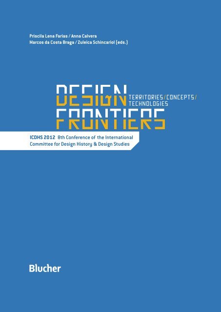
Design Frontiers: Territories, Concepts, Technologies<br />
2012 © <strong>Priscila</strong> <strong>Lena</strong> <strong>Farias</strong>, <strong>Anna</strong> <strong>Calvera</strong>, <strong>Marcos</strong> <strong>da</strong> <strong>Costa</strong> Braga, Zuleica Schincariol (eds.)<br />
Editora Edgard Blücher Lt<strong>da</strong>.<br />
Editora Edgard <strong>Blucher</strong> Lt<strong>da</strong>.<br />
1245 Pedroso Alvarenga Street<br />
4th floor, Sao Paulo, Brazil<br />
Phone: 55 11 3078-5366<br />
contato@blucher.com.br<br />
www.blucher.com.br<br />
Graphic Design Iara Camargo, Isabella Aragão e Raquel Klafke<br />
All rights reserved<br />
Editora Edgard Blücher Lt<strong>da</strong>.<br />
<strong>Farias</strong>, <strong>Priscila</strong> <strong>Lena</strong><br />
Design frontiers: territories, concepts, technologies [livro eletrônico] / <strong>Priscila</strong> <strong>Lena</strong> <strong>Farias</strong>,<br />
<strong>Anna</strong> <strong>Calvera</strong>; <strong>Marcos</strong> <strong>da</strong> <strong>Costa</strong> Braga / Zuleica Schincariol (Eds.) - São Paulo: <strong>Blucher</strong>, 2012.<br />
3 Mb; ePUB<br />
ICDHS 2012 - 8th Conference of the International Committee for Design History & Design Studies.<br />
ISBN 978-85-212-0692-7 (e-book)<br />
1. Desenho (Projetos) 2. Desenho (Projetos) – história<br />
3. Desenho industrial I. Título II. <strong>Calvera</strong>, <strong>Anna</strong> III. Braga, <strong>Marcos</strong> <strong>da</strong> <strong>Costa</strong> IV. Schincariol, Zuleica<br />
12–0174<br />
Índices para catálogo sistemático:<br />
1. Desenho (Projetos) – Discursos, ensaios, conferências<br />
2. Desenho (Projetos) – História<br />
CDD 745.2
PRESENTATION /<br />
This book is a collection of the papers presented at the 8th Conference of the International Committee for Design History and<br />
Design Studies (ICDHS). It registers the main ideas and trends on design history and design studies discussed during this<br />
academic meeting held in São Paulo, Brazil, in September 2012, which gathered researchers from 26 different countries,<br />
coming from America, Europe, Asia and Australasia.<br />
Promoted by a committee composed by well-known design scholars from America, Europe and Asia, ICDHS conferences aim<br />
to assess the current state of affairs of design history and design studies. The activity of the group began with a conference<br />
organized in Barcelona (Spain) in 1999, which was followed by a second meeting in La Havana (Cuba), in 2000. The Committee<br />
was inaugurated in the Istanbul (Turkey) conference, in 2002. The activity continued in the conferences held in Gua<strong>da</strong>lajara<br />
(Mexico, 2004), Helsinki & Tallinn (Finland & Estonia, 2006), Osaka (Japan, 2008), and Brussels (Belgium, 2010).<br />
The theme chosen for the 8th edition of the conference, “Design Frontiers: territories, concepts, technologies”, aimed to<br />
provoke discussions on how design history and design studies may push the limits of design knowledge. The frontiers of<br />
design may be challenged in many ways: by the exploration of new territories, by the establishment of new concepts, by the<br />
emergence of new technologies, as well as by rediscovering the past and by finding new ways of applying current wisdom;<br />
and the papers published in this volume address one or more of those challenges.<br />
The Call for Papers announced 6 tracks, proposed by members of ICDHS board and the Brazilian organizing committee, and<br />
resulted in 369 proposals, in form of abstracts, coming from 36 different countries. All proposals were carefully reviewed by<br />
at least 2 members of the Program Committee, composed of 88 researchers from 57 institutions in 19 different countries,<br />
appointed by the track chairs. Efforts have been done in order to ensure that the proposals selected would cover different<br />
areas, methods, approaches and positions, resulting in 150 accepted proposals. Following a second round of reviews, based<br />
on the full paper version of the proposals, 112 papers were indicated to be presented in parallel sessions, and 13 in the<br />
poster session.<br />
This book, therefore, combines the 125 papers resulting from the Call for Papers, divided in 6 sections (History of design<br />
education, Identities and territories, National policies on design, Techniques and technologies, The New Imperialism, Open<br />
strand), with the text version of the lectures by three keynote speakers.<br />
The first chapter includes papers by Régulo Franco Jor<strong>da</strong>n, director of the El Brujo archeological site and of Museo Cao in<br />
Peru, about the art and symbolism of the Moche, a pre-Inca culture; Guilherme Cunha Lima, professor and researcher at<br />
Rio de Janeiro State University School of Industrial Design, on design history in Brazil; and Veronica Devalle professor and<br />
researcher at University of Buenos Aires Faculty of Architecture, Design and Urbanism, on current problems in the historiography<br />
of design.<br />
The second chapter includes the 19 papers presented in the ‘History of design education’ sessions chaired by Haruhiko<br />
Fujita (Osaka University, Japan) and Silvio Barreto Campello (Federal University of Pernambuco, Brazil). Those papers focus<br />
on historical studies of design education, with a particular interest in comparative studies of design education in different<br />
countries, cultures, periods, in its relationship with art and technology education.<br />
The next chapter gathers 30 papers that aim at design from the perspective of identity and territorial issues, approaching<br />
topics such as micro history, collective identities, gender, internationalization, marginalization and globalization. Such<br />
papers were presented in the ‘Identities and territories’ sessions chaired by Oscar Salinas Flores (National University of<br />
Mexico, Mexico) and Clice Mazzilli (University of São Paulo, Brazil).<br />
Chapter 4, ‘National policies on design’, includes 12 papers presented in the sessions chaired by Javier Gimeno-Martínez<br />
(VU University Amster<strong>da</strong>m, Netherlands & Artesis University College of Antwerp, Belgium) and Cyntia Malaguti (University<br />
of São Paulo, Brazil). The papers address totally or partially state funded plans and institutions for the promotion of design,<br />
studied as signifying practices in both their economic and cultural dimensions.
The following chapter contains 28 papers presented in the ‘Techniques and technologies’ sessions chaired by Paul Atkinson (Sheffield<br />
Hallam University, UK) and Charles Vincent (Mackenzie Presbyterian University, Brazil). The focus here are methodologies and different<br />
models of process and practice, including histories of technique and practice and studies on cross and inter disciplinary collaborations,<br />
and on the impact of emerging and enabling technologies on the production, reception and consumption of design.<br />
Chapter 6 gathers 14 papers that were presented in the sessions entitled ‘The New Imperialism: the international face of design and<br />
design history’, chaired by Jonathan Woodham (University of Brighton, UK) and Denise Dantas (University of São Paulo, Brazil). Such<br />
investigations draw attention to the nature of design practice and history in the wider world, beyond the orthodox mapping of activity<br />
in the mainstream industrialized nations of the west, helping to redraw the world map of contemporary design activity, history and<br />
politics.<br />
Finally, Chapter 7 brings further investigations on territorial, conceptual and technological frontiers of design, congregating 22 papers<br />
presented in the ‘Open strand’ sessions chaired by Victor Margolin (University of Illinois at Chicago, US) and <strong>Priscila</strong> <strong>Farias</strong> (University<br />
of São Paulo, Brazil).<br />
We would like to thank all authors, track chairs and members of the program committee for their contribution in setting a very high<br />
stan<strong>da</strong>rd of quality while assuring a wide-range of perspectives and views for the conference, and the members of the organization<br />
committee for making it all happen. We are sure that the papers published here will foster more investigations and discussions on<br />
design history and design studies.<br />
The Editors<br />
<strong>Priscila</strong> L. <strong>Farias</strong><br />
<strong>Anna</strong> <strong>Calvera</strong><br />
<strong>Marcos</strong> <strong>da</strong> <strong>Costa</strong> Braga<br />
Zuleica Schincariol
Contents<br />
18 Keynote lectures<br />
19 Art, symbolism and power in Moche Society, North Coast of Peru<br />
/ JORDÁN, Régulo Franco<br />
25 Pioneers of Brazilian Design<br />
/ CUNHA LIMA, Guilherme<br />
29 Traditions, archaeologies and genealogies in the history of Design<br />
/ DEVALLE, Verónica<br />
33 History of design education<br />
34 Academies of Art and schools of Design: a comparative study of Art and<br />
Design education<br />
/ FUJITA, Haruhiko<br />
38 A fruitless misunderstanding: the historic models for Dutch Design education<br />
/ DE RIJK, Timo<br />
41 Japanese industrial design concepts in the transition from the nineteenth to<br />
the twentieth century: with special reference to the Japanese industrial design<br />
educators Hirayama Eizo (1855 - 1914) and Matsuoka Hisashi (1862 - 1944)<br />
/ AMAGAI, Yoshinori<br />
45 Best Maugard, Elena Izcue and Theodoro Braga: Design education in Latin<br />
America at the early twentieth century<br />
/ BARBOSA, Ana Mae<br />
50 Design history: from service subject to discrete discipline<br />
/ LEES-MAFFEI, Grace / HUPPATZ, D.J.<br />
54 Pevsner on Design education: meeting contemporary needs through the<br />
teaching of Art History<br />
/ KONDO, Ariyuki<br />
59 Antipodean Design Science: applied home<br />
/ WAITE, Noel<br />
63 Bauhaus pe<strong>da</strong>gogy and digital design<br />
/ ANAY, Hakan / ÖZTEN, Ülkü
68 The Information Department at the Ulm School of Design<br />
/ OSWALD, David<br />
73 Search for meaning: a study on the Cranbrook Academy of Art’s Graphic Design<br />
Department<br />
/ CAMARGO, Iara Pierro de / VELLOSO, Leandro M. R.<br />
78 (not)Solving (non)problems: Design contributions to Education in a complex world<br />
/ TABAK, Tatiana / FARBIARZ, Jackeline Lima<br />
82 The role of typeface categorization systems in the typographic education of the<br />
printer: a corrective legacy still with us to<strong>da</strong>y<br />
/ DIXON, Catherine<br />
89 A sparkle in people’s eyes<br />
/ PACHECO, Heliana Soneghet / TOLEDO, Guilherme<br />
93 Past, present and future of designerly ways of knowing<br />
/ LIMA, Ana Gabriela Godinho / STEFANI, Alessandra Márcia de Freitas<br />
97 John Ross’ pioneering role and contribution to printing, publication and education<br />
in Korea: 1870-1910<br />
/ RYU, Hyun-guk<br />
102 Teaching arts and crafts or the technology transfer: Ernest Bower and textile<br />
design practice in Brazil<br />
/ NEIRA, Luz García / WAIN, Sarah<br />
107 Design in Brazil: which revolution?<br />
/ NOBRE, Ana Luiza<br />
110 The historical trajectory of the pioneers of design education in Brazil: ESDI/UERJ<br />
and ED/UEMG<br />
/ DIAS, M. Regina Álvares / SAFAR, Giselle Hissa / AVELAR, Johelma Pires<br />
115 Educational practice discourse on teaching project design in graduate design<br />
courses in Brazil<br />
/ OLIVEIRA, Izabel Maria de / COUTO, Rita Maria de Souza
119 Identities and territories<br />
120 The island of Italian Design? Some notes for questioning a long-lived myth<br />
/ DALLA MURA, Mad<strong>da</strong>lena / CARLO, Vinti<br />
125 Design without borders: the nomadic journey towards sustainability<br />
/ BARBOSA, Lara Leite<br />
130 Redesigning Turkish cult objects: from tradition to ‘Modern’?<br />
/ BALCIOGLU, Tevfik<br />
135 Incubation in isolation: how distance creates the difference in New Zealand Product<br />
Design<br />
/ SMYTHE, Michael<br />
143 Design Promises: the case study of Bangchaocha Bamboo Basketry Community<br />
/ BOONLAOR, Nanthana / CHUENRUDEEMOL, Woranooch<br />
149 Who’s who in brazilian design? Notes on identity and the professional design field<br />
/ SOUZA LEITE, João de<br />
153 Territories of practice: convergence and divergence between Design and Architecture<br />
in postwar Japan<br />
/ TEASLEY, Sarah<br />
158 Paradise identity, between projection and protection: César Manrique’s lessons for<br />
current challenges in territorial innovation<br />
/ JIMÉNEZ, Carlos<br />
163 Politics of fragility in Catalonia: radical austerity in postwar context, its origins and<br />
continuity until nowa<strong>da</strong>ys<br />
/ MITRANI, Alex<br />
167 Designing ‘The House of Man’: Franco Albini and the place of Neorealism in Italian<br />
Design, 1930-1960<br />
/ MEKINDA, Jonathan<br />
171 ‘Swedish Modern’ meets international high politics: the 1959 New Delhi embassy and<br />
Ambassador Alva Myr<strong>da</strong>l<br />
/ HAGSTRÖMER, Denise<br />
175 Imported design ideas and its spreading in Latin America:<br />
/ CORTÉS, Dannae / CRUZ, Aura / GALLAND, Jani / PÉREZ, Marcela
179 Political Toys: Perón’s gifts for children, 1946-55<br />
/ BENDESKY, Mora<br />
183 The identity and design of the modern British home under the influence of<br />
the ‘feminine territory’ and Japanese Art<br />
/ YOSHIMURA, Noriko<br />
187 Lira Popular, chilean broadsheets from the late nineteenth century: a graphic<br />
referent and its relation with sheets from Brazil and México<br />
/ MALACCHINI, Simoné<br />
192 The signature of Portuguese posters from 17th Century to 20th Century: one<br />
history of identities<br />
/ BARBOSA, Helena<br />
197 From the improvisation to the solution: the Design in the casual market of the city<br />
of Rio de Janeiro<br />
/ SILVA, Camila Assis Peres / LIMA, Guilherme Cunha<br />
201 Design of dissent: the multimo<strong>da</strong>l discourse in Guerrilla Girls and DASPU<br />
/ PEREIRA DE ANDRADE, Ana Beatriz<br />
205 Design and the street<br />
/ GEIGER, Noni<br />
210 Designing new tattoos: relations about technology and tattoo design<br />
/ BITARELLO, Breno / NIEMEYER, Lucy / QUEIROZ, João<br />
214 Outside looking in: foreign perceptions of Brazilian Design culture<br />
/ SCAFF, Claudia / JOHANSEN, Douglas<br />
219 Corporate identity in a global market: the challenge of the Jotun company<br />
/ SKJERVEN, Astrid<br />
223 Mapping and analysis possibilities to vernacular typography design attributes use<br />
for mobile design interfaces and applications<br />
/ PEREIRA, Fabiano<br />
229 Graphic narratives of the domestic landscape: a case study of the back pages of<br />
telephone directories, Medellín from 1956 to 2012<br />
/ SOLóRZANO, Augusto / CORREA-ORTIZ, Didier
235 Place branding: graphic design’s participation in strategic management and brand<br />
identity of the cities<br />
/ CARDOSO, Helder / PERASSI, Richard<br />
240 Public information: Design, visibility and citizenship<br />
/ CROCCIA, Florencia Cecilia / FÁBREGAS, Silvia / ADESSI, Mariano<br />
243 Here we don’t speak, here we whistle: designing a language support system for<br />
the Silbo Gomero<br />
/ MATOS, Sónia<br />
248 Modernity boun<strong>da</strong>ries in the process of understanding Brazilian Design<br />
/ MIZANZUK, Ivan Alexander<br />
252 Packaging design in Portugal during the 20 th century as a political propagandistic<br />
device<br />
/ COELHO, Nuno<br />
256 Ocuppy Design: São Paulo and New York<br />
/ ESPÍNOLA, Vanessa<br />
260 A practical experience on acting local thinking global: design as the enabler of new<br />
sources of collaboration<br />
/ BARROS, Mário / CASIMIRO, Ana<br />
264 National policies on design<br />
265 The doctrines of Good Taste<br />
/ BÁRTOLO, Carlos<br />
270 Between art and Industry: the Art Products’ Factory in Tallinn in the 1950s and<br />
1960s<br />
/ LOBJAKAS, Kai<br />
274 Transforming territories and forging identities at the Independence Centennial<br />
International Exhibition in Rio de Janeiro (1922)<br />
/ REZENDE, Livia Lazzaro<br />
278 The Belgian participation in the Milan Triennials<br />
/ FLORÉ, Fredie<br />
281 Furnishing the street<br />
/ HERRING, Ellie
285 Design promotion in Belgium in the 1960s: national interests and european<br />
ambitions<br />
/ SERULUS, Katarina<br />
290 Carmen Miran<strong>da</strong>, Marca Brasil (Brazil Brand) and national identity: a historical<br />
glance<br />
/ MACEDO, Káritha Bernardo de / SANT’ANNA-MULLER, Mara Rúbia<br />
294 Sweden designed by Ikea<br />
/ KRISTOFFERSSON, Sara<br />
298 Opportunities and challenges for the Design in the Brazilian National Policy on<br />
Solid Waste<br />
/ BARBOSA, Elisa Jorge Quartim / SARMENTO, Fernan<strong>da</strong><br />
303 Design as strategy to improve wooden furniture production, through a network<br />
perspective<br />
/ NUNES, Viviane / ZURLO, Francesco<br />
307 The Italian public system supporting innovation: which role for design?<br />
/ MORTATI, Marzia / SIMONELLI, Giuliano<br />
313 Contributions of design: a tool to improve business performance. Metropolitan<br />
Design Center, Buenos Aires<br />
/ OFFENHENDEN, Camila<br />
321 Techniques and technologies<br />
322 A survey on low-income housing research topics in Brazil<br />
/ MENDES, Leticia Teixeira / CELANI, Gabriela<br />
327 Design of elastic form with parametric simulation<br />
/ LARA, Arthur H. / MAGRI, Paulo H. G. / CAMPOS, Patricia F. / SILVA, Nayara V. / NO-<br />
LLA, Ie<strong>da</strong> Maria<br />
332 Digital personal fabrication: social actions, ephemeral objects<br />
/ OROPALLO, Gabriele<br />
335 Living system design Studio: from digital to fabrication process<br />
/ PAIO, Alexandra / OLIVEIRA, Maria João / CARVÃO, Luís / BRIMET, Silva<br />
340 The evolving terrain of the book: Ariel Malka’s Javascriptorium<br />
/ ATZMON, Leslie
344 Joining Up: evaluating technologically augmented interdisciplinary cross-cultural<br />
collaboration<br />
/ MCARTHUR, Ian / MILLER, Brad<br />
348 Making Space: the future places, tools and technologies for open Design<br />
/ DEXTER, Matt / JACKSON, Christopher<br />
353 Designing through the loop: programming as a tool for aesthetic creation in the<br />
field of graphic design<br />
/ SILVA-JETTER, Jorge<br />
358 Sewn or Simulated: transformational fashion realizations<br />
/ MARTIN, Kathi / KO, Hyeong-Seok<br />
363 The use of ceramics within the signage project in hostile and environmental<br />
protected areas: the Keller Peninsula Case<br />
/ FERRAZ, Nicoli / ALVAREZ, Cristina Engel / PINHEIRO, Mauro / RODRIGUES, Maria<br />
Regina<br />
368 History, Design and technology in the leather trade: case studies from India and<br />
Britain<br />
/ SCHABER, Friedemann<br />
372 Design for glass: a study of the historical relationship of production with new<br />
social paradigms<br />
/ CERQUEIRA, Vicente<br />
377 How to supply designers effectively with knowledge about accessibility and<br />
inclusion?<br />
/ ZITKUS, Emilene / LANGDON, Patrick / CLARKSON, John<br />
382 Online platforms for the co-Design of alternative urban scenarios<br />
/ HANAUER, Rodrigo / HARTMANN, Patricia / REYES, Paulo / REMUS, Bruna do Nascimento<br />
/ FRANZATO, Carlo<br />
386 Relationships between Neuroscience and visual perception model Sens-Org-Int<br />
contributing to Design practices<br />
/ CSILLAG, Paula<br />
391 The voices of the users: how technology can help in co-innovation<br />
/ ESSI, Kuure / LINDSTRÖM, Antti
396 Graphic innovations implemented in the Brazilian press by Julião Machado in the<br />
end of the 19th Century<br />
/ FONSECA, Letícia Pedruzzi<br />
400 Firebird: Alex Steinweiss’ 78rpm album covers and the letterpress printing process<br />
/ NOVAES DE REZENDE, Andre<br />
404 The presence of the autotype technique in the weekly Cri-Cri’s graphic design<br />
project: traces of the graphic memory in the Brazilian state of Pernambuco<br />
/ CAVALCANTE, Sebastião A. / QUEIROZ, Malthus O. / LIMA, Clara S. / BARRETO<br />
CAMPELLO, Silvio<br />
410 Dutch maps of Pernambuco from the seventh century: the technique and the<br />
metafunctions of the graphical language<br />
/ BACIC, Lucas / BASTOS, Luiza / CAVALCANTE, Sebastião A. / QUEIROZ, Malthus O. /<br />
CAMPELLO, Silvio B.<br />
415 Co-ordinated design policy and the shift from one-off designs to comprehensive<br />
design systems<br />
/ PRESTON, David<br />
419 From ‘Do it yourself’ to ‘Open design’: users’ involvement and democratization<br />
/ MALDINI, Irene<br />
423 Contributions of improvisation techniques to interactive environment design<br />
/ MASSARA, Bruno<br />
427 Human development design centered: Mexican local case<br />
/ FLORES MAGóN Y JIMÉNEZ, Héctor / GARDUñO BARAHONA, Aralia María<br />
432 Identity across boun<strong>da</strong>ries: a study conducted by communication designers and<br />
social anthropologists<br />
/ BONINI LESSING, Emanuela F / BONIFACIO, Valentina<br />
436 Digital clothing manufacture: digital innovation and co-Design changing the<br />
clothing industry<br />
/ SMITH, Marcia Tavares<br />
441 How to go from the file to the factory<br />
/ BARBOSA, Wilson / CELANI, Gabriela<br />
445 Space, information and cosmology in to<strong>da</strong>y’s computer interfaces<br />
/ BOECHAT, Marina Pantoja
449 The new imperialism: the international face of design and design history<br />
450 Frontiers of looking past: a Nietzschean survey of introductions and intentions in<br />
Design History<br />
/ BANU, Lisa<br />
454 Design, histories, empires and peripheries<br />
/ WOODHAM, Jonathan M<br />
458 Mythification of national discourses in Poster Design:<br />
rethinking expressions of Chineseness in the globalized world<br />
/ WONG, Wendy Siuyi<br />
464 Towards a digital batavia: resonances of the VOC in the New Colonialism of the<br />
Internet of Things<br />
/ TAYLOR, Damon<br />
468 Questionable translatability: the Contested notion of ‘Japaneseness’ in the craft<br />
and Craft Design of the Japanese Empire<br />
/ KIKUCHI, Yuko<br />
472 Eastern craft in Orientalism and Modern Design<br />
/ ISHIKAWA, Yoshimune<br />
476 Mapping Cup & Saucer Design in the 21st Century<br />
/ ITANI, Yoshie<br />
480 Mappin tells the history of graphic design in São Paulo from 1913 to 1939<br />
/ TEMIN, Wilma Ruth<br />
486 “Go you too to Amazonia”: analysis of a poster designed by Jean-Pierre Chabloz for<br />
the “Rubber Campaign”<br />
/ MORAES, Ana Carolina Albuquerque<br />
490 Organic Design, MoMA 1940: the breath of modernity reaches Latin America<br />
/ SALINAS FLORES, Oscar<br />
494 Modern design meets Latin America: the role of pioneering design magazines<br />
Habitat and nueva visión in Brazil and Argentina<br />
/ AMORIM, Patricia / CAVALCANTI, Virginia<br />
498 Lina Bo Bardi and Aloisio Magalhães: other strands of Design in Brazil<br />
/ ANASTASSAKIS, Zoy
502 The graphic translation by the designer’s sensitive rationality<br />
/ DEMARCHI, Ana Paula Perfetto/ FORNASIER, Cleuza Bittencourt Ribas / MARTINS,<br />
Rosane Fonseca de Freitas<br />
506 The design of Manoel Bandeira: a historical view of periodicals in the the 1930’s in<br />
Pernambuco<br />
/ CAVALCANTE, Sebastião A./ BARRETO CAMPELLO, Silvio<br />
511 Open strand<br />
512 Brazilian Graphic Design in the ‘20s and ‘30s: Modernism and Modernity<br />
/ MARGOLIN, Victor<br />
516 The Design of book bovers in Brazil during the sixties through the covers by Marius<br />
Lauritzen Bern<br />
/ NAUFEL, Carina<br />
520 The design of Fred Jor<strong>da</strong>n<br />
/ BASTOS, Helena Rugai<br />
524 Domestic technologies and modernization of women in Chile between 1945 and<br />
1970<br />
/ ÁLVAREz CASELLI, Pedro<br />
529 La Escuela de Artes y Oficios de Santiago EAO (1849-1976)<br />
/ CASTILLO, Eduardo<br />
533 Itineraries for a Design Culture in Uruguay<br />
/ FARKAS, Mónica / STERLA, Mauricio / CESIO, Laura / SPRECHMANN, Mag<strong>da</strong>lena<br />
537 Sertanejo Art Deco: an inspiration for a Brazilian design?<br />
/ SOUzA, José Marconi B. de / ROSSI, Lia Monica<br />
544 Architectural lettering: from information to identity:<br />
a study on Gregori Warchavchik’s Condomínio Cícero Prado<br />
/ D’ELBOUX, Jose Roberto<br />
549 A dialogue between art and city through artistic interventions on streets, façades<br />
and walls in São Paulo city<br />
/ HANNS, Daniela Kutschat / DE MARCHI, Polise Moreira<br />
552 Vernacular design: a discussion on its concept<br />
/ FINIzOLA, Fátima / COUTINHO, Solange G. / CAVALCANTI, Virgínia P.
557 Italian Radicals and Dutch conceptuals: the sensation of affect in two movements<br />
/ KEULEMANS, Guy<br />
562 Art criticism and the semantic construction of the concept of Design<br />
/ VUKIC, Fedja<br />
566 Interieur Kortrijk, an edu-commercial Biennal as mediation junction between<br />
several actors<br />
/ DE VOS, Els<br />
571 The story of convertible Sofa-Bed: reading the social change in Turkey through the<br />
design of an industrial product<br />
/ MERZALI CELIKOGLU, Ozge / ER, Alpay<br />
576 Vapourware and the agency of ideas<br />
/ ATKINSON, Paul<br />
580 Pre-Columbian Asceticism: the Tuza-Piartal morphological expectation from its<br />
ocarina CRIA-269<br />
/ BUITRAGO, Juan Camilo / GUZMÁN, Adriana / PINILLA, Germán<br />
585 The collection of textbooks “Tapete Verde”: from the creation to the graphic<br />
production by Editora Globo (RS/Brazil), on the 1970s<br />
/ RAMIL, Chris<br />
589 “Their pen draws everything, as if it were print”: letterforms on the title page of the<br />
Catecismo de la lengua Guarani<br />
/ DINIZ, Kollontai<br />
594 Cruzeiro Novo Project: Design and technology for the first series of banknotes<br />
printed in Brazil<br />
/ LESSA, Washington Dias / MIRABEAU, Almir / CUNHA LIMA, Edna Lucia / CUNHA<br />
LIMA, Guilherme Silva <strong>da</strong><br />
598 Design for a sustainable culture<br />
/ PARODE, Fabio / BENTZ, Ione<br />
604 Design and biodiversity: the production of knowledge in the development<br />
sustainable products<br />
/ SANTOS, Nubia / MENDES, Josenete / GOUVÊA, Aurelio<br />
608 Lightness and beauty in furniture design<br />
/ MALUF, Marina Kosovski / SOUZA LEITE, João de / MAGALHÃES, Cláudio Freitas de
612 About the editors /<br />
613 About ICDHS /<br />
614 Scientific committee /<br />
616 Organizing committee /
Keynote lectures<br />
Design Frontiers: Territiories, Concepts, Technologies / Proceedings of the 8th Conference of the International Committee for<br />
Design History & Design Studies - ICDHS 2012 / São Paulo, Brazil / © 2012 <strong>Blucher</strong> / ISBN 978-85-212-0692-7
Art, symbolism and power in Moche Society, North Coast of Peru<br />
JORDÁN, Régulo Franco / Director of the El Brujo archeological site and of Museo Cao / Fun<strong>da</strong>ción Wiese / Peru<br />
The Moche (2nd-8th centuries A.D.) were one of the most powerful<br />
kingdoms of their time on the North Coast of Peru, as were the Nasca<br />
in Ica south of Lima and the Tiahuanaco in the altiplano between<br />
Peru and Bolivia. Their achievements in their various cultural manifestations<br />
are compared with the grandeur of the Maya in Central<br />
America. They extended over a territory of 600 kilometers, from<br />
Piura in the north to Huarmey in the south. Moche art and symbolism<br />
reflect high development in knowledge of the laws of nature<br />
that permitted them to recreate it for magical-religious uses. Moche<br />
works of art in temple murals, in goldwork, in textiles, in ceramics,<br />
etc. express, without doubt, an extraordinary artistic quality that<br />
was enjoyed by the powerful Moche lords and their gods.<br />
1. The Moche Territory<br />
The Moche occupied the deltas and slopes of the valleys that are<br />
constantly bathed by the waters that come from the mountains<br />
and that provide water for life and agriculture. They constructed<br />
complex intervalley water canals to irrigate the desertic fields<br />
and dry lands that lacked water to make them fertile. One of the<br />
aspects of these valleys is that there is little rain, with some intervalley<br />
coastal desert strips that are fed by the seasonal humidity<br />
of the winter season, forming lomas with a biodiversity<br />
of species.<br />
One of the natural resources for life has been the cold and deep<br />
waters of the Pacific Ocean. All these resources served as inspiration<br />
for Moche iconography and thought. Nevertheless,<br />
it is important to emphasize that the North Coast of Peru was<br />
always impacted by the El Niño intercontinental phenomenon,<br />
also called the ENSO phenomenon, which always put the north<br />
coastal societies at risk from very early times up to the present.<br />
Figure 1. Iconographic representation of the sacrifice ceremony. (Taken from Donnan 1999).<br />
2. Sociopolitical Organization and Economy<br />
Despite the fact that there are still many questions to be resolved,<br />
we do not know much about the sociopolitical organization<br />
of the Moche civilization. Nevertheless, it is known that in<br />
later periods, after the 15th century, there existed in each valley<br />
political units called cacicazgos, governed by local kings or Alaec<br />
in the Moche language, who had subordinate lords and specialists<br />
under their control, at least within the regions of Trujillo and<br />
Lambayeque (Zevallos 1989, 1992). In view of the evidence<br />
obtained up to now, we can deduce that the Moche were a very<br />
complex and hierarchical society and that each of the valleys<br />
was under the aegis of a principal lord who governed and acquired<br />
a semidivine image that concentrated all the powers, especially<br />
religious power which was an effective means of control<br />
of the society so that all proceeded harmoniously. Since then,<br />
it has always been thought that the Moche formed a theocratic<br />
government with efficient mechanisms of reciprocity among the<br />
intervalley ethnic groups of the whole territory, including the<br />
Lambayeque, Moche, Virú, Chao, Santa, Nepeña and possibly the<br />
Huarmey valleys. The main support for this portrayal is the ceramic<br />
iconography and other media of ideological transmission<br />
of a ceremonial nature (Figure 1).<br />
The economic aspect was based on the payment of tribute,<br />
which served for the construction of great public and religious<br />
works, as well as major extensions of efficient intervalley irrigation<br />
canals, which can be compared to large modern projects.<br />
Other economic aspects were reciprocity and redistribution of<br />
subsistence goods and merchandise, which permitted the construction<br />
of warehouses in each of the religious headquarters<br />
where the productive apparatus of the royal domain and the dependent<br />
sites was controlled (Moseley 1982).<br />
Design Frontiers: Territiories, Concepts, Technologies / Proceedings of the 8th Conference of the International Committee for<br />
Design History & Design Studies - ICDHS 2012 / São Paulo, Brazil / © 2012 <strong>Blucher</strong> / ISBN 978-85-212-0692-7
Art, symbolism and power in Moche Society, North Coast of Peru<br />
Figure 2. Iconographic representation of a navigation theme (Taken from Donnan 1999).<br />
The surplus from this redistribution made possible the maintenance<br />
of a group of fulltime artisans at the service of the elite.<br />
Many of the objects they produced were used by the lords in order<br />
to demonstrate their power and prestige in a complex and hierarchical<br />
society. Because of this, we can now admire great artistic<br />
works in the temple murals, ceramics, textiles, metallurgy, etc.,<br />
which suggest the intervention of very advanced and sophisticated<br />
technologies.<br />
The Moche were expert navigators who made diverse crossings<br />
to the north and south (Figure 2). These crossings were made for<br />
commercial and ceremonial purposes and to supply exotic products<br />
from distant lands, such as the Spondylus brought from the<br />
coasts of Ecuador for ritual purposes, or the lapis lazuli brought<br />
from Chile. At present, we can still observe in the area of Huanchaco<br />
in Trujillo, in the north of Peru, totora reed balsas boldly controlled<br />
by fisherman who sit or kneel, using cane oars in the same<br />
way their pre-Hispanic ancestors did hundreds of years ago.<br />
3. Art for the Gods and the Lords<br />
The only culture that can rival the Moche is the Maya culture.<br />
According to Elizabeth Benson (2004), the expressions in art<br />
between the Maya and the Moche are shared and in a few cases<br />
differentiated. For example, the ceramic art is very refined and informative,<br />
the use of seashells and Spondylus, and the abstract<br />
and symbolic representations, such as the interesting Moche<br />
theme of the “rebellion of the artifacts” which can be compared<br />
with the rebellion of the objects in the Popol Vuh of the Maya. But<br />
one of the principal comparative aspects is that both cultures<br />
have constructed imposing pyrami<strong>da</strong>l structures, those of the<br />
Maya in stone and those of the Moche in adobe or mud. Shared<br />
characteristics are that these sacred buildings were interred, one<br />
being built over another, containing tombs, offerings and murals<br />
of great religious significance (Figs. 3-5).<br />
Moche ceramic production as is currently shown in Peruvian and<br />
foreign museums is of great value and realism and expresses a<br />
great deal of information in sculpture and iconography about religious<br />
life. Together with Nasca ceramics of the south coast of Peru,<br />
this is perhaps in one of the richest collections of ceramic production<br />
known in pre-Columbian America (Figs. 6-7). The plastic perfection<br />
in the diverse representations, especially in the “portrait<br />
vessels”, make this culture one of the most advanced in the<br />
New World in what Wendell Bennett rightfully baptized as the<br />
Figure 3. Huaca Raja<strong>da</strong> or Sipán, where the royal tombs of Sipán were discovered<br />
Figure 4. Huaca Cao Viejo in the El Brujo Complex, where the Lady of Cao was<br />
discovered.<br />
Design Frontiers: Territiories, Concepts, Technologies 20
JORDÁN, Régulo Franco<br />
Figure 5. Huaca de la Luna, Moche Valley, where beautiful polichrome murals have<br />
been discovered.<br />
time of the “master craftsmen”. Well-known representations in<br />
Moche ceramics are scenes of ceremonial life, funerary scenes,<br />
important figures being carried in litters, figures playing musical<br />
instruments, scenes of navigation and representations of beautiful<br />
landscapes with animals and plants typical of coastal ecosystems.<br />
However, the best known scenes are those of burial,<br />
human sacrifice in mountains and purification.<br />
Moche ceramics were classified into five phases, from I to V,<br />
by Rafael Larco Hoyle (1948), which developed during approximately<br />
six centuries of occupation. Specialists also now speak<br />
of subdivisions into Early Mochica, Middle Mochica and Late<br />
Mochica (Castillo 2011). The corpus of Moche ceramics and their<br />
iconographic representations has recently been enriched by discoveries<br />
made by large projects on the North Coast and, especially,<br />
by the contributions of Christopher Donnan (1999), who<br />
has dedicated his life to study of the Moche. This investigator,<br />
for example, has studied extensively the ceramic effigy vessels<br />
of important figures of the elite that were portrayed in different<br />
ways and with different characteristics of headdress, facial<br />
painting and expressions, especially one elite Moche individual,<br />
identified by a wound or cut over the left side of his upper lip,<br />
who was depicted repeatedly from childhood to adulthood (Donnan<br />
2004). In addition, Donnan has called attention to the principal<br />
religious symbol of the Moche, defined by a shield and a club<br />
tied together with other accessories of battle and power. Thanks<br />
to the art and symbolism of the ceramics, the religious life of<br />
this classic society of the North Coast of Peru can be known.<br />
Metallurgy is another highly valued cultural manifestation. The<br />
able specialists worked at the service of the elite. Most of the<br />
metalwork was offered for ceremonies and funerary rituals.<br />
The Moche applied a very advanced technology expressed in<br />
smelting, casting, laminating, cutting out, embossing, twisting,<br />
etc., as well as other sophisticated techniques, such as filigree<br />
in the later phases (Figs. 8-9). Gold, silver, copper and four alloys<br />
of these were used for many ornaments, including masks,<br />
crowns, collars, ear ornaments, needles, depilation tweezers,<br />
hooks, small spoons and cups, among other objects (Fraresso<br />
2008). The motifs or designs on the jewelry have much to do<br />
with magical-religious elements that formed part of the Moche<br />
cosmovision.<br />
Textile production was another of the outstanding achievements,<br />
as much for the versatile command of techniques as<br />
for esthetic and iconographic beauty. The Moche formed textile<br />
workshops for the use of religious leaders and the expenses of<br />
the ceremonies. The prime material was produced thanks to a<br />
fluid exchange of products, which led to the obtaining of animal<br />
fibers, dyes and a massive production of cotton. Male or female<br />
weavers made beautiful cloaks, clothes, sashes, headdresses,<br />
cloths to cover walls and personal accessories using the techniques<br />
of tapestry, gauze, double cloth, embroidery and painted<br />
cloth (see Castillo and Ugaz 1999). Much of this textile production<br />
has disappeared due to the effects of humidity because of<br />
two factors: the cemeteries are near wetland areas and the rains<br />
of the El Niño phenomenon accelerated their destruction.<br />
Featherwork art is also outstanding, but rarely preserved in the<br />
excavations, and was used in the clothes of the dead of greatest<br />
prestige and social rank. The multicolored feathers were obtained<br />
by trade with peoples of the tropical forest.<br />
Art in wood is little known because of the scarcity of collections<br />
based on controlled excavations and because of poor preservation.<br />
Nevertheless, magnificent artistic works, such as idols, fig-<br />
Figure 6. Sculptural Moche ceramic vessel, representing a handsome warrior with his weapons, found at Huaca de la Luna (Courtesy of Ricardo Morales).<br />
Figure 7. Sculptural Moche ceramic vessel, representing a duck warrior, found at Huaca de la Luna (Courtesy of Ricardo Morales).<br />
Figure 8. Gilded copper mask with gold laminae, found at Huaca de Dos Cabezas, Jequetepeque Valley.<br />
Figure 9. Ceremonial attire made of textile and adorned with a face and small sheets of metal, found at Huaca de la Luna (Courtesy Ricardo Morales).<br />
Design Frontiers: Territiories, Concepts, Technologies 21
Art, symbolism and power in Moche Society, North Coast of Peru<br />
Figure 10. Wooden sculpture representing an idol 2.48 meters tall, found in Huaca<br />
Cao Viejo in the El Brujo Complex.<br />
Figure 11. Small wooden sculpture with incrustations of semiprecious stones,<br />
representing a Moche agricultural deity.<br />
urines and sculpted ceremonial staffs, have been recovered. For<br />
example, there are two extraordinary Moche sculptures which<br />
were covered with golden metal and incrustations of semiprecious<br />
stones, and which were recovered from archaeological<br />
contexts. One is an idol 2.40 meters high that may represent<br />
the humanized lunar deity and is accompanied on the upper<br />
part by fantastic creatures or lunar animals. It was discovered<br />
in the Huaca Cao Viejo of the El Brujo Complex (Franco and Vilela<br />
2006) (Figure 10). Another image is a handsome sculpture that<br />
adorned a ceremonial staff discovered in the tomb of a priest in<br />
the Virú Valley. It represents a Moche agricultural deity (Strong<br />
1947) (Figure 11).<br />
In the last two decades, there have been two major long-term<br />
projects of archaeological investigation: the El Brujo Project carried<br />
out by the Wiese Foun<strong>da</strong>tion and the Peruvian Ministry of<br />
Culture, and the Huacas of Moche Project carried out by a private<br />
trust and the National University of Trujillo. They recovered from<br />
obscurity two monumental pyramids of adobe, Huaca Cao Viejo<br />
and Huaca de la Luna, where there are beautiful polychrome<br />
painted images on relief-carved mud which express the sacred<br />
and divine art that could be represented in the principal Moche<br />
temples. There are images of the supernatural world linked with<br />
the propitiation and recreation of the world, some life-size images<br />
of ritual battles, a procession of prisoners, human sacrifices,<br />
the ceremonial calen<strong>da</strong>r, and supernatural beings of Moche cosmovision<br />
(Morales 2012; Franco and Vilela 2006) (Figs. 12-13).<br />
4. The Lost and Discovered Treasures of the<br />
Moche Tombs<br />
At of the time of the Spanish conquest, the plundering and destruction<br />
of many pre-Columbian relics occurred due to indifference<br />
to Andean reality. It is all part of a process of hundreds<br />
of years that still has not ended. The pillaging of treasures and<br />
important tombs was destined to feed the major collections of<br />
the world and some private museums.<br />
There had never been scientific recovery of a fabulous tomb from<br />
the pre-Inca past until 1987. In that year, Walter Alva and his team<br />
achieved a first for the scientific world when they rescued from<br />
the looters and from their very own excavations various royal<br />
tombs at the site of Sipán or Huaca Raja<strong>da</strong> in the Lambayeque<br />
Valley. This news went round the world and was published in National<br />
Geographic magazine. At the time, the tombs were considered<br />
to be the greatest in the New World, comparable to that of<br />
Tutankamon. These tombs pertained to two Moche rulers or high<br />
dignitaries, the “Lord of Sipán” and the “Old Lord of Sipán”, united<br />
in kinship by the maternal line, as well as important priests that<br />
were found with their ornaments of gold, jewels, emblems of<br />
power, animals, and sacrificed men and women (Alva and Donnan<br />
1993; Alva 2012) (Figs. 14-17).<br />
Another of the finds that has attracted world attention is the discovery<br />
in 2005 of the tomb of the Lady of Cao by the author and<br />
his team in a privileged sector of the Huaca Cao Viejo of the El<br />
Brujo Complex. It was publicized in 2006 by National Geographic<br />
magazine and other international media. For the first time in<br />
Peruvian archaeology, a tomb was found of a female Moche<br />
sovereign who governed the destinies of the Chicama Valley between<br />
300 and 400 years A.D. She was buried accompanied by<br />
Figure 12. Part of a mural in high relief with representations of stylized manta rays, found in the upper part of the Huaca Cao Viejo.<br />
Figure 13. Beautiful mural known as the “Complex Theme” or ceremonial calen<strong>da</strong>r, found at Huaca de la Luna (Courtesy of Ricardo Morales).<br />
Design Frontiers: Territiories, Concepts, Technologies 22
JORDÁN, Régulo Franco<br />
Figure 14. Beautiful ear ornament pertaining to the Lord of Sipán, with the figure of a warrior priest accompanied by two human figures.<br />
Figure 15. Gold rattle pertaining to the Lord of Sipán, representing a principal Moche deity known as the Decapitator.<br />
Figure 16. Gold nose ornament pertaining to the Old Lord of Sipán, representing a small warrior with a complex headdress bearing an owl symbol.<br />
Figure 17. Metal figurine with incrustations of semiprecious stones, found in one of the tombs of Sipán.<br />
Figure 18. Gold ornaments with semiprecious stones and ceramic vessels, found in association with the tomb of the Lady of Cao.<br />
a principal priest, a secon<strong>da</strong>ry priest, a guardian, a guide to the<br />
underworld and sacrificed maidens. The mausoleum enclosure<br />
where she was buried contains beautiful murals on its walls<br />
with representations of stylized images of the magical-religious<br />
world of the Lady of Cao and of the Moche in general. The presence<br />
of tattoos in the form of serpents, spiders, geometric figures<br />
and lunar animals on the forearms, hands and feet of this<br />
dignitary allow us to recognize that she had supernatural or<br />
clairvoyant powers to look at the heavens and perhaps to cure.<br />
The emblems of power, personal jewelry and ornaments give her,<br />
without a doubt, the investiture of a ruler (Figure 18). This find<br />
has changed the notion of power in ancient Peru (Franco 2008,<br />
2010, 2012).<br />
References<br />
ALVA, W. and C.B. DONNAN. 1993. Tumbas reales de Sipán. Fowler<br />
Museum of Cultural History, University of California, Los Angeles.<br />
1993. Royal Tombs of Sipán. Fowler Museum of Cultural History,<br />
University of California, Los Angeles.<br />
ALVA, W. 2012. “El descubrimiento de las tumbas reales de<br />
Sipán”. In: Tesoros Preincas de la Cultura Mochica, El Señor de Sipán,<br />
Huaca de la Luna y Señora de Cao, Pp. 17-33. Ayuntamiento de Cádiz.<br />
BENSON, E. 2004. “Los Mayas y los Mochicas: Expresiones en el<br />
Arte”. In: Acercarse y Mirar, Homenaje a Beatriz de la Fuente, Pp. 283-<br />
296. Instituto de Investigaciones Estéticas, Universi<strong>da</strong>d Autónoma<br />
de México, México.<br />
CASTILLO, L. 2011. San José de Moro y la arqueología del valle<br />
del Jequetepeque. Departamento de Humani<strong>da</strong>des, PUCP. Fondo<br />
editorial, Pontificia Universi<strong>da</strong>d Católica del Perú.<br />
CASTILLO, L. and UGAZ, F. 1999. “El contexto y la tecnología de los<br />
Design Frontiers: Territiories, Concepts, Technologies 23
Art, symbolism and power in Moche Society, North Coast of Peru<br />
textiles mochica”. In: Tejidos milenarios del Perú, José Antonio de<br />
Lavalle (ed.), Pp. 235-250. AFP, INTEGRA.<br />
FRARESSO, C. 2008. “El sistema técnico de la metalurgia de<br />
transformación en la cultura mochica: Nuevas perspectivas”. In:<br />
Arqueología Mochica, Nuevos Enfoques, Luis Jaime Castillo, Héléne<br />
Bernier, Gregory Lockard and Julio Rucabado (eds.), Pp. 153-171.<br />
Actas del primer congreso internacional de jóvenes investigadores<br />
de la cultura Mochica. Instituto Francés de Estudios Andinos<br />
and Pontificia Universi<strong>da</strong>d Católica del Perú.<br />
DONNAN, C.B. and MCCLELLAND, D. 1999. Moche Fineline Painting.<br />
Its Evolution and Its Artists. Fowler Museum of Cultural History, University<br />
of California, Los Angeles.<br />
DONNAN, C. 2004. Moche Portraits from Ancient Peru. University of<br />
Texas Press, Austin.<br />
FRANCO, J. R, and VILELA, J. 2006. El Mundo Mágico Ceremonial<br />
Mochica y Aproximaciones al Calen<strong>da</strong>rio Ceremonial. MINKA. Trujillo.<br />
FRANCO, R. 2008. “La Señora de Cao”. In: Señores de los Reinos<br />
de la Luna, Krzysztof Makowski (comp.), Pp. 280-287. Banco de<br />
Crédito del Perú, Lima.<br />
2010. “La Dame de Cao”. In: Pour la Science, N° 390. Paris.<br />
2012. “El Complejo El Brujo: Poder, arte. simbolismo y la tumba<br />
de la Señora de Cao”. In: Tesoros Preincas de la Cultura Mochica, El<br />
Señor de Sipán, Huaca de la Luna y Señora de Cao, Pp. 77-97. Ayuntamiento<br />
de Cádiz.<br />
LARCO, R. 1948. Cronología Arqueológica del Norte del Perú. Biblioteca<br />
del Museo de Arqueología Rafael Larco Herrera, Hacien<strong>da</strong><br />
Chiclín. Buenos Aires, Socie<strong>da</strong>d Geográfica Americana.<br />
MORALES G. R. 2004. “Espacios arquitectónicos ceremoniales<br />
e iconografía litúrgica en Huaca de la Luna, valle de Moche”. In:<br />
Tesoros Preincas de la Cultura Mochica, El Señor de Sipán, Huaca de la<br />
Luna y Señora de Cao, Pp. 111-127. Ayuntamiento de Cádiz.<br />
MOSELEY, M. E. 1975. “Prehistoric principles of labor organization<br />
in the Moche Valley, Peru”, American Antiquity 40 (2): 191-196. Society<br />
for American Archaeology, Washington, D.C.<br />
STRONG, W.D. 1947. “Finding the tomb of a warrior god”. National<br />
Geographic Magazine 91 (4): 453-482. National Geographic Society,<br />
Washington, D.C.<br />
ZEVALLOS, Q. J. 1989. Los Cacicazgos de Lambayeque. Concejo Nacional<br />
de Ciencia y Tecnología (CONCYTEC), Lima.<br />
1992. Los Cacicazgos de Trujillo. Fun<strong>da</strong>ción Alfredo Pinillos Goycochea.<br />
Trujillo.<br />
Acknowledgements<br />
My special thanks go to all the members of the El Brujo archaeological<br />
project, to the members of the Wiese Foun<strong>da</strong>tion, and to<br />
all those who in one way or another helped in the preparation of<br />
this article. Likewise, my thanks go to Steven Wegner for checking<br />
and translating the text of this modest contribution.<br />
About the author<br />
Régulo Franco Jordán studied archeology at the Universi<strong>da</strong>d<br />
Nacional Mayor de San <strong>Marcos</strong>, in Peru, and, since 1990, is the<br />
director of the archaeological program of El Brujo and of Museo<br />
Cao (Wiese Foun<strong>da</strong>tion). He has participated in several archaeological<br />
projects since 1980, including the sites of Pachacamac,<br />
Cajamarquilla, Puruchuco and Túcume. He has taught at The Getty<br />
Institute, ICROMM, CRA-Terre, Universi<strong>da</strong>d Nacional la Cantuta,<br />
Instituto Superior CEPEA and at international courses promoted<br />
by UNESCO. During his career he has received several national<br />
and international honorable distinctions, especially following the<br />
discovery of the royal tomb of the Lady of Cao. He has lectured at<br />
various national and foreign universities, such as Harvard, Yale,<br />
Flori<strong>da</strong>, Louvain (Belgium) and Dumbarton Oaks (Washington<br />
DC.). He has also participated in scientific events organized in<br />
Peru, Germany, Italy, Spain, Argentina and France, talking about<br />
archeology, heritage, tourism and land conservation. He is the<br />
author of numerous papers and books on his research at Pachacamac,<br />
Cajamarquilla, and, especially, at El Brujo.<br />
Design Frontiers: Territiories, Concepts, Technologies 24
Pioneers of Brazilian Design<br />
CUNHA LIMA, Guilherme / PhD / Rio de Janeiro State University, School of Industrial Design / Brazil<br />
The design is a field of knowledge, and as such, exists even before<br />
the profession itself. It begins when man realizes that, by creating<br />
instruments, he was increasing his ability to interact with the environment.<br />
By creating drawings he was tempting to communicate<br />
with their peers. But the profession of designer is a result of the<br />
organization of the workforce. It is the result of the great expertise<br />
that came in the wake of the needs caused by the complexity of<br />
major social changes promoted by the Industrial Revolution.<br />
In 1996, we begun a research, supported by the National Counsel<br />
of Technological and Scientific Development- CNPq, about the life<br />
and work of Brazilian designers who pioneered the modern Brazilian<br />
design. In order to understand the process we decided to divide<br />
History in periods. We started with three periods, and recently<br />
had to add another one, so we came to a division of the history of<br />
Brazilian design in four distinct and consecutive periods:<br />
1. Forerunners<br />
2. Pioneers<br />
3. Contemporaries<br />
4. Digital<br />
The first period includes the Colony, the Empire and early Republic.<br />
The second one starts in 1922 and ends with the graduation of<br />
the first class of students of ESDI, the first design school in South<br />
America. The third period ends in the late twentieth century. And<br />
the fourth one begins in 2000. The Brazilian designers, in general,<br />
tended to disregard their historic past. Although this trend is not<br />
exclusive to our field, it has been difficult for us, designers, to<br />
recognize our activity in the past, and in consequence we do not<br />
place ourselves in that same past. On the other hand, the architects<br />
have not the slightest doubt that the pyramids, palaces and<br />
popular houses of ancient Egypt are architecture. But it is difficult<br />
for designers to see that the utensils, instruments and furniture<br />
that were inside those buildings, are the result of design. Likewise,<br />
writing with its supports and tools is not viewed as a solution arising<br />
from design. This way of thinking has been changing in recent<br />
years, due largely to post-graduate courses that have been established<br />
across the country. Another criticism to be made is the fact<br />
that we give too much prestige to a rational design. This ruled out<br />
the Latin, African and Indigenous contributions.<br />
The fact is that we do not have yet a history of Brazilian Design<br />
to give us support in our research. And so we have to work twice<br />
as hard, researching specific issues and our having to fit them in<br />
historical contexts that are not ours.<br />
A major problem is that we understand the crisis of development<br />
in the Brazilian reality. Maybe, if we used the concepts proposed<br />
by Darcy Ribeiro, one of our great anthropologists to define our de-<br />
velopment, things got clearer. He proposes the use of two forms of<br />
understanding and action:<br />
1. Accelerated evolutionary “development processes of<br />
companies that renew their productive system autonomously<br />
and reform its institutions towards a transition to another type of<br />
socio-cultural training, as people who are there for themselves.”<br />
2. Historical Up<strong>da</strong>te “ a crucial feature of this process is his sense<br />
of reflexive modernization with loss of autonomy.”<br />
The first option is the one that confronts us as the most positive,<br />
since it proposes a movement of independent renewal. And Darcy<br />
Ribeiro explains:<br />
Evolutionary Acceleration “to indicate the procedures used<br />
direct, intentional or not, to induct progress with the preservation<br />
of the autonomy of society who experiences it [...] is the case in<br />
societies experiencing a technological revolution based on their<br />
own creativity, or the full adoption of technological innovations and<br />
local government achieved by other companies, or, based on both<br />
sources. “<br />
The second option is our old acquaintance. Darcy Ribeiro leaves no<br />
doubt as to the effects of it:<br />
Historical Up<strong>da</strong>te “In many cases, these effects produce profound<br />
changes in their progressive way of life, but inevitably lead to the<br />
establishment relationships of dependency between principal<br />
society and peripheral society, subject to reflex action.”<br />
He quotes as an example the expansion of technology of durable<br />
goods during Industrial Revolution, as the railroads and port facilities,<br />
which modernized the peripheral countries in order to make<br />
then more efficient as producers of raw materials and certain<br />
items, but always importers of industrial goods.<br />
If we decide for the acceleration of our development, rejecting the<br />
simple up<strong>da</strong>te, we must prepare ourselves for it. In terms of society<br />
as a whole, the problem is a political / economical where design<br />
should be inserted in a comprehensive manner. In terms of design<br />
as a specific field, our trump card is education and especially research,<br />
because only from that joint action can create stand-alone<br />
solutions to our realities.<br />
Therefore it is imperative for us to know our past. The central countries<br />
know the importance of having this knowledge, and invest<br />
heavily in this way. For some years now, the English universities<br />
are working firmly in a detailed survey of all knowledge stored by<br />
Great Brittany in the nineteenth century, charting the most important<br />
historical moment of British domination. This task of making<br />
our past known is one of our greatest challenges. Our cultural<br />
maturity depends on this knowledge. Thus it is imperative that we<br />
recognize the presence of design in our past. And it is also necessary<br />
that we create our own parameters of analysis, for the understanding<br />
of our own history. At this point I use again the example<br />
Design Frontiers: Territiories, Concepts, Technologies / Proceedings of the 8th Conference of the International Committee for<br />
Design History & Design Studies - ICDHS 2012 / São Paulo, Brazil / © 2012 <strong>Blucher</strong> / ISBN 978-85-212-0692-7
Pioneers of Brazilian Design<br />
of the architects, who believe that architecture is built space, with<br />
or without their help. They study the ancient buildings not using<br />
to the methodology of archaeologists and engineers, but with<br />
the proper instruments designed by them for the study of architecture.<br />
The Brazilian architecture recognizes its history from the<br />
colonial era. And the modern Brazilian architecture has developed<br />
from a thorough and extensive study of its colonial origins. The<br />
mixture between knowledge of these origins and exogenous influences<br />
of European modernism has given rise to an autonomous<br />
architecture that contributes and has international recognition.<br />
When we ask the question: – When Design History starts? Soon<br />
it comes to our mind the image of the Bauhaus. This modern<br />
movement advocated a rationalist approach to the design, in<br />
antagonism to the excesses of the styles created by the Industrial<br />
Revolution in the nineteenth century. The functionalist axiom<br />
Form follows function took the world, without taking into account<br />
the reality of the peripheral countries. We must remember that<br />
the Industrial Revolution had very different consequences for the<br />
central countries, which made the revolution, and the peripheral<br />
countries that suffered it.t While in Europe is being generated a<br />
new technology, the periphery is being transformed into a captive<br />
market and producer of cheap raw materials. The clash with<br />
functionalism will happen when, after the Second World War, our<br />
architecture begins to impose itself as a form of expression. And<br />
if functionalism lost in this fight at the front part of the architecture,<br />
was particularly happy in the design field, of dependency<br />
we stayed prevented from accepting our own way of being. This<br />
is not to say that functionalism is not a good idea, or that should<br />
be avoided, but we mean that it is not the only valid solution to<br />
make design. We must not stay in a position of dogmatic acceptance<br />
of exogenous ideas, however tempting they might be. With<br />
the acceptance of these and other dogmas in the attempt to up<strong>da</strong>te<br />
ourselves historically in relation to the culture of the central<br />
countries, we give up a large slice of our history, an entire experience,<br />
the struggles of our ancestors, only to feel that we part of a<br />
continuous European history, moreover, a few decades late.<br />
We could try to answer the question saying that the design begins<br />
when the first man conceives the first artefact. Most objects that<br />
have survived are actually the result of an evolution of anonymous<br />
design. And that is very well placed in the book Design: first<br />
define the problem, by Jens Bernsen:<br />
The carpenter’s hammer or the woodcutter’s axe of are optimal<br />
solutions to a problem. Tools are perfectly balanced, functional<br />
and visually. The raw material that was used are made in the best<br />
shape and function as a natural extension of the skills of those who<br />
use them. And yet, designs are anonymous. They were a<strong>da</strong>pted<br />
to its purpose through a process of gradual development, with<br />
improvements being added over the generations, until these tools<br />
acquire its final form.<br />
In relation to graphic design, without going into the <strong>da</strong>wn of humanity,<br />
a basic framework is the invention of printing by Gutenberg.<br />
This event is of great importance in the history of mankind<br />
because, in addition to revolutionize the understanding among<br />
men, the production of the printed book, it also established the<br />
concept of assembly line in Renaissance, used so effectively by<br />
Henry Ford in his factory in the early twentieth century. Printing<br />
spreads across Europe, and from that point to the rest of the<br />
world. Its introduction in America occurs irregularly. In some cases<br />
it comes with the conquerors, in other cases with the settlers, and<br />
in our case, only on the eve of Independence. But in anyway the<br />
activity of Graphic Design is already centennial by the time of the<br />
Bauhaus in Germany.<br />
I have chosen to speak to<strong>da</strong>y about two pioneers of Brazilian<br />
Design.<br />
Let me start by Orlando <strong>Costa</strong> Ferreira. He is, without doubt, the<br />
great forerunner of research for the formation of a History of Brazilian<br />
Design. For those who do not know heard of him yet, I will<br />
talk about what I wrote when the first edition of my book O Grafico<br />
Amador: the origins of modern Brazilian typography. I described<br />
him as: librarian, essayist, professor and editor. At the time I was<br />
young and a bit shy, perhaps, but should have added: designer,<br />
which he so richly deserves. Behind the elusive label of editor he<br />
always hided an intense activity in graphic design, creation and<br />
production of books and newspapers experimental culture. The<br />
other labels of essayist and university professor conceal a brilliant<br />
career as a researcher. The history of books and graphic production<br />
owes much to this man from Pernambuco who will later be<br />
installed in Rio de Janeiro.<br />
On August 15, 1915, in the Engenho Conceição, the city of Rio Formoso,<br />
Pernambuco, Orlando <strong>da</strong> <strong>Costa</strong> Ferreira was born. He learns<br />
to read and write with his own family members. He studied informally<br />
with private teachers in his primary school times. He was<br />
self-taught, without getting far from the books. As he gets older,<br />
the age will only increase this passion.<br />
In 1942, now residing in Recife, he won a competition for a place<br />
in the prestigious the Bank of Brazil. In March 1945 he married D.<br />
Lize. He graduated in Librarianship in 1949. During his years Recife,<br />
along with Aloísio Magalhães, Gaston de Holan<strong>da</strong>, and José<br />
Laurenio de Melo, founded the private press O Grafico Amador. Laurenio<br />
wrote an introduction for the book I wrote about the private<br />
press, giving us a vision of how they worked:<br />
These four characters decided at a time of tremendous existential<br />
availability to be typographers and printers, crafting some little<br />
books in a precarious and improvised workshop [...] to the activity<br />
undertook I think you can apply the tenet of collective creation.<br />
Everyone did everything: text, graphic design, and composition,<br />
printing, finishing.<br />
After this experience he was named to head the Literary Supplement<br />
of the Jornal do Commercio of Recife. But even when in the<br />
head of these projects, he always kept teaching at the university,<br />
and never deviated from his line of research, descriptive bibliography<br />
and history of the printing arts in Brazil, which led to his great<br />
interest in various types of printing processes, photo mechanical<br />
matrices, typography, paper making and book binding.<br />
In 1964, the Bank of Brazil transferred him from Recife to Rio de<br />
Design Frontiers: Territiories, Concepts, Technologies 26
CUNHA LIMA, Guilherme<br />
Janeiro. In the following year he assumed the organization of the<br />
Bank’s Technical Library. In Rio, he has the opportunity to research<br />
the major libraries and archives. In 1973, he retired from<br />
the Bank of Brazil, and later in that year was named the director<br />
of the Library Foun<strong>da</strong>tion of Casa de Rui Barbosa. At this point<br />
it’s almost done the first volume of his magnum opus Imagem<br />
e Letra (Image and Letter). But he does not have time to finish<br />
the second volume because he died in 1975. The first volume Image<br />
has two editions, the first by Editora Melhoramentos, to<strong>da</strong>y<br />
almost impossible to obtain, and the second, a beautiful book<br />
published by EDUSP.<br />
Since the publication of this book, it has been consulted by almost<br />
all of those who wish to know the past of several printing<br />
techniques, which will occur in the Brazilian reality. It is remarkable<br />
the extent of his study, locating the first experiments in<br />
printing techniques with examples of Brazilian books and periodicals<br />
across the country. These studies demonstrate a thorough<br />
knowledge of historical sources, many of them first quoted<br />
in the context that is his specialty. For these reasons, thirty-five<br />
years later, it continues to be consulted by new researchers,<br />
keeping always something new to anyone who looks at his work.<br />
The second pioneer, in reality a forerunner, of whom I want to<br />
speak to<strong>da</strong>y is Eliseu Visconti, well known as a painter and little<br />
known as a designer. In 2000, when the Seminary Brazil / Italy,<br />
UERJ, promoted an exhibition entitled Eliseu Visconti, designer,<br />
our intention was to replace the subject under discussion and<br />
try to show that this activity developed by him had the character<br />
of design, in parallel to his activities as artist. Even though perhaps<br />
they would not be the terms in which Visconti define himself,<br />
what interested us was to show the result of his work in that<br />
particular field, together with the demonstration that he always<br />
spent his time in this activity, with a constant dedication, even<br />
an insistence, on always be investing time and though on this<br />
sector. This exhibition was here in São Paulo, at the headquarters<br />
of ADG (the Association of Graphic Designers), and Anhembi-<br />
Morumbi University.<br />
To<strong>da</strong>y it is possible to speak of Visconti as a designer. There have<br />
been many exhibitions and books published that showed his<br />
production in the field of design. Right here in São Paulo, there<br />
was recently a major exhibition of his work, showing that aspect<br />
as well. But it was not always so, for years he was known only as<br />
a great painter in Brazil. The first person to raise the question is<br />
the teacher and art critic Frederico Morais, in 1980 on Aspects<br />
of Brazilian Art:<br />
We do not have in Brazil a critical study specialized in architecture,<br />
photography and industrial design. When it occurs, certainly<br />
Visconti’s contribution as a pioneer of design will be highlighted.<br />
Eliseu D’Angelo Visconti was born on July 30, 1866 in Giffoni<br />
Valle Piana, province of Salerno, Italy, son of Gabriele D’Angelo<br />
Visconti and Cristina. He was naturalized Brazilian in December<br />
15, 1889, by Decree 58 A of the Republic of the United States of<br />
Brazil, the so-called “great naturalization.” He died in Rio de Ja-<br />
neiro on October 15, 1944. His godmother Baroness Guararema<br />
protected this son of farmers, since childhood. In Rio de Janeiro<br />
he studied at the Liceu de Artes e Ofícios, a school of arts and<br />
crafts, where he displayed a great interest in industrial arts. After<br />
that, he attended the School of Fine Arts, becoming a painter.<br />
In 1893, Visconti won a scholarship from the Brazilian government<br />
to study painting in Paris. It is curious, and from our point<br />
of view a statement of his wishes, the fact that in 1895, after two<br />
years of study at the School of Fine Arts, he enrolled in the School<br />
Guérin to study Decorative Arts, until 1897, with Eugène Grasset,<br />
the great French designer of Art Nouveau. Italian by birth but Brazilian<br />
the upbringing and choice, Visconti, when student at the<br />
school Guérin in 1896, designed the cover of the Revue du Brésil<br />
, one of the first concrete manifestations of propagan<strong>da</strong> of Brazil<br />
abroad. The year 1900 gives us a good view of how Visconti got<br />
along with his two interests. In this year, he is awarded a silver<br />
me<strong>da</strong>l by the paintings Gioventu and Oréa<strong>da</strong>s, at the same time<br />
received an Honourable Mention in the Section of Decorative Art<br />
and Applied Arts, both in the International Exhibition of Paris.<br />
Back in Brazil, after a period of eight years in Europe, finished<br />
his scholarship from the Brazilian government, he held his first<br />
exhibition at the National School of Fine Arts in Rio de Janeiro,<br />
where he shows his work at Decorative Art Applies to Industry.<br />
These are projects of lighting fixtures, iron objects, grids, ceramics,<br />
stained glass, textile design, wallpaper, book covers, magazines<br />
and posters. He won a commission to decorate the then<br />
new Teatro Municipal reason why he moved to Paris between<br />
1905 and 1907. In 1914 and 1915, he returned to Paris in his studio<br />
on the Street Didot, to design and implement the decoration<br />
of the foyer of the same Theatre. In 1934 he was commissioned<br />
to design and implement a new frieze for the proscenium of the<br />
Teatro Municipal, this time aided by his <strong>da</strong>ughter Yvonne, and<br />
Agenor Cavalleiro Henrique de Barros. But despite the extensive<br />
work he developed, he never felt truly satisfied. In 1926, in an<br />
interview with O Jornal he complains, disappointed by the lack of<br />
encouragement for his activities in the applied arts:<br />
When I returned from Europe, as a pensioner of the government, I<br />
held an exhibition of art applied to industry, with the intention of<br />
the decorative art was the transforming element to characterize<br />
this sector in the country. They looked at it as a novelty and<br />
nothing more.<br />
However, on the other hand, he had the opportunity to put into<br />
practice his thoughts on the design. In 1934, the old Flexa Ribeiro,<br />
director of the Polytechnic School of Rio de Janeiro, invited<br />
him to head a university extension course of Decorative Art.<br />
(There are two Flexa Ribeiro. The old one is the father, director<br />
of the Polytechnic School, and his son, of the same name, was<br />
Secretary of Education in the govern Carlos Lacer<strong>da</strong>, and took<br />
part in the creation of ESDI in 1962). Visconti has organized this<br />
course with a similar curriculum of School Guérin of Grasset. He<br />
adopted a criterion that distinguished the geometric part of the<br />
inspiration naturalist. By his actions he became a pioneer of design<br />
education in our country. In 1936, Visconti completed the<br />
work of the Teatro Municipal, also terminated its participation<br />
in the course of Decorative Art. He was then seventy years, and<br />
Design Frontiers: Territiories, Concepts, Technologies 27
Pioneers of Brazilian Design<br />
perhaps a little tired. In his last eight years of his life devoted<br />
himself solely to painting.<br />
About the author<br />
Guilherme Cunha Lima is graduated in Graphic Design, and has<br />
a Doctor’s Degree (PhD) from the University of Reading, UK. He<br />
engaged in higher education career as a lecturer, in 1980, at<br />
the Federal University of Pernambuco, where from 1988/92, he<br />
was Coordinator of the Graduation Course in Design, and from<br />
1992/94 Head of the Department of Fine Arts. From 1990 on, his<br />
articles in design have been published in Brazil and abroad. He<br />
also designed and edited ten experimental art books. His book O<br />
Gráfico Amador: the roots of Brazilian Modern Typography, was<br />
published in 1997, and during the IV Biennial of Graphic Design<br />
of São Paulo, in 1998, he got an honorable mention due to his<br />
ʺcontribution to the historical research on the Brazilian graphic<br />
designʺ. In 2003, a new book was published, Foreigners, Constructors<br />
of the Modernity. Since 1995, he has been Associate<br />
Professor of Graphic Design at the State University of Rio de Janeiro,<br />
where he was co-head of the Post Graduation Program in<br />
Design. He is a researcher 1D and counselor ad hoc for the CNPq,<br />
and several other Brazilian agencies of research and scientific<br />
development.<br />
Design Frontiers: Territiories, Concepts, Technologies 28
Traditions, archaeologies and genealogies in the history of Design<br />
DEVALLE, Verónica / PhD / IAA, University of Buenos Aires, CONICET / Argentina<br />
History / Design / Genealogy / Archaeology / Interdisciplinary<br />
This paper considers the problems that currently exist in the historiography<br />
of design. Among these, that regarding what should belong<br />
to the past of design. The use of the concept of genealogy to<br />
describe historical work is then questioned. The text closes with a<br />
reflection on the need to continue building an interdisciplinary approach<br />
to address design in theoretical and methodological terms.<br />
1. Chronicling, Making an Inventory<br />
In recent years we have looked with enthusiasm at the explosion<br />
in the quantity of historical, theoretical and critical research on<br />
design throughout the world (Margolin 2005). That which began<br />
in the English speaking world in a more or less consoli<strong>da</strong>ted form<br />
and which has expanded in other regions is currently experiencing<br />
a period of maturation during which questions arise regarding the<br />
materials used as well as methods and temporal and spatial limitations.<br />
Thus, there is a patchwork of what has been chronicled that<br />
depends, to a greater or lesser extent, on the sources possessed<br />
and selected.<br />
We can see without difficulty that the historiographies of design<br />
do not mutually coincide and have disagreements that could well<br />
be seen as obstacles. However, these differences may be very<br />
productive when it comes to thinking about future research. In<br />
Latin America alone there are major disputes, the first has to do<br />
with how pasts are designed, up<strong>da</strong>ted or are forgotten when working<br />
in history. In this region we have design histories which link it<br />
to modernism as a cultural and political movement but also to others<br />
which, based on a materialist vision, analyze production and<br />
work conditions to determine the difference between a production<br />
of design and other types of material production. There are also<br />
those that, far from considering the moment of rupture in a form of<br />
production and work, analyze continuities and ways in which men<br />
and women have produced a limited repertoire of objects related<br />
to their <strong>da</strong>ily lives.<br />
This latter tendency, which we might call continuationist, to the extent<br />
that it sets out a linearity in history from pre-history forward,<br />
did not arise by chance nor is it the product of lack of knowledge<br />
of work which have been undertaken in other regions, particularly<br />
the United States and Europe, accurately called design studies by<br />
Margolin. It is a different dimension of the problem, a pre-positioning<br />
that determines a historical approach. Latin America is a<br />
region where the forgetting of colonialism continues to be a position<br />
that is taken, and its remembering a declaration of principles.<br />
Consequently, colonial pasts present themselves as the key to<br />
the understanding of historical sources. The debate centers on the<br />
status of crafts and whether these should be included in the his-<br />
tory of material culture and whether visual culture has a meaning<br />
different from that which we see in Europe and the USA. To ignore<br />
crafts is to ignore a past of domination and not make visible the<br />
material production of pre-Hispanic cultures. This would to repeat<br />
a colonial logic, it would be to think that there was no past prior to<br />
the arrival of the Spanish and Portuguese in Latin America and if<br />
there was, there was little of it and that of scant interest.<br />
The counterpart to this would be the canonical history of design,<br />
that which begins with Pevsner and can also be found in Giedion.<br />
They are stories - and I want to emphasize the term “stories” to<br />
refer to history - which have been fairly and properly challenged<br />
on the basis of being normative histories regarding what design is,<br />
supported by the great figures and works of what is known as the<br />
Modern Movement. Other than a critical reading which problematizes<br />
the normative dimension of modernism in design - a reading<br />
which was fertile in Brazil - the most problematic aspect of modernism<br />
and in particular of that which was known as the Modern<br />
Movement, was not so much the personalism as its universalist<br />
pretension which, looked on kindly, was based on technical and<br />
scientific reason as the basis of human intervention in the world,<br />
and unkindly looked at, was a rationalization of Eurocentric domination.<br />
Looked at through a critique of instrumental reason - with<br />
reference to Adorno - it was based on technical and scientific reason<br />
which was at the same time the rationalization of domination.<br />
Design rules which built a clearly recognizable language and<br />
which, as well as developing deontological arguments, established<br />
criteria for the analysis of material production in the world with a<br />
strong support in philosophy and philosophy of technology. These<br />
were not design rules without a solid basis of argumentation and a<br />
good part of this basis constituted the inaugural discourse of design<br />
as a practice distinct from all the others that make up what we<br />
might to<strong>da</strong>y call the human environment. The act of baptism and<br />
differentiation was that which founded a school in the sense that<br />
it created a form of comprehension of design which has interpellated<br />
us. Here, at least in Argentina, Chile and Brazil, the tradition<br />
of Ulm and the Bauhaus has been strong and contributed to defining<br />
design not as a practice but rather as a discipline, as a limited<br />
body of knowledge giving rise to a limited body of practices.<br />
It is true that the panorama has grown more complex. Moving<br />
seamlessly from pre-Colombian crafts to work associated with the<br />
Modern Movement presents us with such a level of indeterminacy<br />
as would, in principle, seem to limit all attempts to define that<br />
which history might deal with. That margin which resembles the<br />
ellipsis of Kubrick’s “2001: A Space Odyssey” reveals the traditions<br />
on which are based the histories of design to<strong>da</strong>y. And the traditions<br />
differ, in a healthy way. These speak of the role of design but<br />
also of the forms in which it has been thought. What are its set-<br />
Design Frontiers: Territiories, Concepts, Technologies / Proceedings of the 8th Conference of the International Committee for<br />
Design History & Design Studies - ICDHS 2012 / São Paulo, Brazil / © 2012 <strong>Blucher</strong> / ISBN 978-85-212-0692-7
DEVALLE, Verónica<br />
tings? Its actors? Its audiences? What forms of work are recovered?<br />
What economic and social models are assumed as emergency<br />
contexts? Is it a practice that accounts for cultural identity?<br />
Is it linked to a particular form of production? What connections<br />
does it acknowledge with cultural modernization processes? Or<br />
should it, rather, be considered in light of the industrialization process<br />
in social and economic terms?<br />
The universe of that which we could work with opens in a promising<br />
way but it is equally true that it could cover, or try to cover,<br />
the totality of human production since industrialization and even<br />
before and this presents us with a series of problems.<br />
The fact is that that we do history by cutting things out from the<br />
past. It is not possible to cover the history of all visual or material<br />
human production without running the risk, as Borges would say,<br />
of the map coinciding in size with the territory. Doing history on<br />
the basis of the objects has allowed for a questioning of the initial<br />
classifications - those of the Modern Movement in the first place -<br />
but the issue is whether it is possible question the content of that<br />
narrow inventory, that of the Modern Movement, and propose another<br />
kind of organization and classification of the material while<br />
omitting any reference to the normative system of the new classification.<br />
In this case, the problem we will face is the same, even<br />
in the case of a universe of reference that is much broader, democratic<br />
and popular. In other words, inventories should be subjected<br />
to criticism rather than replaced by another inventory (including<br />
using historical political and cultural reasons, as the request for<br />
the inclusion of craft as a moment in design turns out to be).<br />
To finish this point, to the degree to which anything is justly or<br />
unjustly included or excluded without putting in place the disciplinary<br />
criteria of this limitation, the risk is run of replacing one moral<br />
judgment with another. By saying this I am trying to say that it is<br />
very hard to question an order of classification and replace it with<br />
another without examining the assumptions on which the task of<br />
classification is based.<br />
2. Genealogies, Ideologies<br />
Doing history always involves deciding what to exclude and<br />
what to include and will always have present a theory formulated<br />
in prescriptive, descriptive and, in the best case, interpretative<br />
terms. These can all be separated in logical terms but from<br />
the point of view of the critic they occur as the ideological aspect<br />
of the formulation of the problem to be investigated, in this particular<br />
case, the distinctiveness of design. The most appropriate<br />
course of action would therefore be to make explicit that theory,<br />
or formulation, of what we consider to be design.<br />
Here there opens up the questions of the assumptions which<br />
support the task of preparing a history of design. Without any<br />
attempt to be exhaustive I would like to mention in passing those<br />
that have founded, to a greater or letter extent, significant arguments.<br />
Among others, the assumption of utility ( design as that<br />
responsible for the world of objects, intended for the production<br />
of useful objects), the assumption of instrumentality (design<br />
participating in a means-ends logic, the development of tools<br />
to deal with problems and needs), the assumption of rationality<br />
(design as a rational and ordered response to a chaotic world),<br />
the assumption of the mass production (design as one of the<br />
artificers of material culture in a mass world), the industrialist<br />
assumption (design as a professional response to the challenges<br />
of manufacturing, based heavily on a historical materialist<br />
reading of history) and the assumption of identity (design as a<br />
maker of objects with symbolic and utilitarian weight, defined in<br />
historical and cultural terms).<br />
These assumptions, at the same times as they produce definitions<br />
about the activity of design, are products of histories of<br />
material production, histories of human beings and their surroundings.<br />
Histories which link events with others, which construct<br />
networks of traditions in which one aspect of knowledge<br />
links to another, in which a given practice recognizes its roots in<br />
others, ways of constructing, not finding, families and histories.<br />
This is the point to which it is interesting to arrive.<br />
From the moment in which design constitutes itself as a discipline,<br />
as a limited body of knowledge supporting a recognizable<br />
body of professional practices, it tends, like all disciplines, to<br />
construct a genealogy to give itself both a foun<strong>da</strong>tion and a horizon<br />
of reference and projection. This is the path usually taken<br />
in all disciplines. All or almost all, tend to feed off the support of<br />
other disciplines and when they produce history it is only to be<br />
expected that they make use of the forms of doing so that come<br />
from the disciplines that are reference points for them. Arising<br />
from this, one of the challenges for the historiography of design<br />
is to think about the traditions on which “doing the history of<br />
design” is based. In Argentina, where Tomás Maldonado developed<br />
his artistic side and began his work as a designer, design<br />
consoli<strong>da</strong>ted itself following the traditional models of Bauhaus<br />
and Ulm and the tendencies which took modern architecture as<br />
a reference point. From then on, by bringing in as a frame of reference<br />
some historiographic tendencies from architecture, the<br />
relationship between design and the world of architecture was<br />
consoli<strong>da</strong>ted. This relationship seems natural but it is largely<br />
sustained on the basis of sharing a narrative form. In this case,<br />
the emphasis on showing the production process of the pieces<br />
as a gesture seen as being in itself eloquent seems to reiterate<br />
the argument of the exhibition of the architectural project.<br />
By way of example, the architectural replicability of the design<br />
projects which appeared early on in the Argentine design journal<br />
Summa, which began to be published in 1963. When Summa<br />
began to present design pieces it subjected them to the same<br />
kinds of arguments that it was accustomed to using for architecture:<br />
technical specifications, materials, designers, project<br />
phases, morphological description and applications (as a substitute<br />
for the completed work). The image of the piece was an<br />
argument in itself and the text served solely as an indicator of<br />
its technical characteristics. This example is used to show that<br />
Design Frontiers: Territiories, Concepts, Technologies 30
Traditions, archaeologies and genealogies in the history of Design<br />
copying forms of argumentation is a particularly effective way of<br />
constructing genealogies. More than sharing ontological characteristics<br />
of the objects, they are sharing narratives, social forms<br />
of the production of meaning, as Margolin put it so well.<br />
This point is of interest and the fact that design studies have<br />
expanded all over the world allows for a comparison to made of<br />
the genealogies is fascinating. In this comparison we find that<br />
design is founded in studies of material culture and that, far<br />
from approaching the world of modern architecture, it seeks to<br />
recover that which the normative history of design has left out. A<br />
history which instead of reading the productions of high culture<br />
also carries out fun<strong>da</strong>mental work in the area of mass culture<br />
and recognizes in studies of consumption patterns a clear reference<br />
point for distinguishing itself from other kinds of practices.<br />
Furthermore, and now from Europe, the debate on the relationship<br />
between style and cultural belonging has been shown, as<br />
has been well pointed out by <strong>Anna</strong> <strong>Calvera</strong> (<strong>Calvera</strong> 2010), to<br />
be an argument of significance. The coexistence and tensions<br />
between the industrial arts, applied arts, decorative arts and<br />
design make the aesthetic, as it was before, a privileged stage<br />
for the reading of both social and production conflicts. Thus to<br />
produce a history of design means including the debate about<br />
class societies, patterns of differentiation and the construction<br />
of social belonging through tastes and habits. This type of study<br />
recognizes the sociology of culture, cultural studies and cultural<br />
history as obligatory points of reference.<br />
Equally legitimate as these background issues are those used<br />
by the more restrictive vision of design, that which links it to<br />
constructivist avant-gardes and modern architecture. Design<br />
can indeed be read in terms of the discussion around the mode<br />
of production of material objects and class membership. As I already<br />
said, the debate around the form of industrial mass production<br />
allows for the localization of the aesthetic dimension of<br />
the objects at a crossing point which allows another type of conflict<br />
to be understood. From this arises the strange convergence<br />
of aesthetic, political and scientific arguments.<br />
These arguments, even in their most absurd aspects, were absolutely<br />
critical to a technical imagination which replaced beauty<br />
with function. The social horizon of projection was in line with a<br />
good part of the thinking of the artistic and architectural avantgardes<br />
in the sense of the elimination of styles as marks of class<br />
differentiation and also of history. It is not an error to think about<br />
a constructivist genealogy for design, nor is it to suspect the<br />
presence of a historical materialist reading of material production.<br />
It is one of the many genealogies that exist and that can be<br />
read in historical terms.<br />
3. The three metaphors<br />
So far I have worked with two metaphors. The first was Borges’s<br />
map metaphor to establish the dilemma of the universe of study<br />
and in this case the process of selecting what to study from it. It<br />
is a fact that a map which, with the objective of being accurate,<br />
grows to the point of being the same size as they area it represents<br />
is useless. The problem consists of identifying the limits of<br />
the “mapable”. In parallel to this, the task of construction of that<br />
about which history can be written requires a significant series<br />
of theoretical decisions. The first step has been taken over the<br />
last thirty years, in journals and other publications that specialize<br />
in design 1 .<br />
The second metaphor is so every <strong>da</strong>y that we find it natural. It is<br />
about understanding knowledge as a tree that connects twigs -<br />
more specialized knowledge - with branches, to the trunk. In fact<br />
we talk about branches of knowledge in reference to their common<br />
shared background. The problem with this metaphor is its<br />
normative character. In this case its normative character shows<br />
itself in the idea that design should be related to a particular<br />
discipline type and, as it also seeks to maintain, to science. The<br />
botanical metaphor of the tree makes us think that what we are<br />
dealing with are family relationships, natural ones, instead of<br />
understanding that these relationships are historical constructions.<br />
And that constitutes an obstacle.<br />
Finally, a third metaphor, drawn up by Dora Gior<strong>da</strong>no. Think of the<br />
production of knowledge of design as a river. Thus as we think of<br />
the Amazon basin we can think of different branches of knowledge,<br />
the history of different practices and the convergence of<br />
a similar form of understanding the events of history which allows<br />
us to give shape to that which we understand as design.<br />
Rather than being the branches of a genealogy design would, in<br />
this metaphor, be a set of tributaries that make up its watershed.<br />
A metaphor both rich and classical, which speaks of the event<br />
and of the time. Never, according to Heraclitus, can we cross the<br />
same river twice although history, fortunately, allows us to imagine<br />
it.<br />
References<br />
CALVERA, A. 2010. Cuestiones de fondo: la historia de los tres<br />
orígenes del diseño, en CAMPI, I. Diseño e historia. Tiempo, lugar y<br />
discurso. México: Designio.<br />
CAMPI, I. 2010. Diseño e historia. Tiempo, lugar y discurso. México:<br />
Designio.<br />
GIORDANO, D. 2012. ¿Qué es la Heurística? Encuentros del IAA,<br />
FADU, UBA. Unpublished paper, Laboratorio de Heurística, FADU,<br />
UBA.<br />
MARGOLIN, V. 2005. Las políticas de lo artificial. México: Designio.<br />
About the author(s)<br />
Verónica Devalle is a CONICET researcher and teaches at the<br />
Facultad de Arquitectura y Diseño of the University of Buenos<br />
1 The early initiative that was “Design Issue” is also notable in this regard.<br />
Design Frontiers: Territiories, Concepts, Technologies 31
DEVALLE, Verónica<br />
Aires. She has published La travesía de la forma. Emergencia y<br />
consoli<strong>da</strong>ción del Diseño Gráfico (1948 – 1984) and articles in<br />
journals in Argentina and elsewhere. Her main area of interest is<br />
the history of design and visual culture.<br />
<br />
Design Frontiers: Territiories, Concepts, Technologies 32
History of design education<br />
Haruhiko Fujita / Chair / Osaka University / Japan<br />
Silvio Barreto Campello / Co-chair / Federal University of Pernambuco / Brazil<br />
Historical studies of design education, with a particular interest<br />
in comparative studies of design education in different countries,<br />
cultures, periods, in its relationship with art and technology<br />
education.
Academies of Art and schools of Design: a comparative study of Art and<br />
Design education<br />
FUJITA, Haruhiko / PhD / Osaka University / Japan<br />
Art academy / Design education / Disegno / Dessin / Decorative arts<br />
Design education has rapidly spread worldwide since the midtwentieth<br />
century. In some countries, design schools have enormously<br />
increased in number compared with art schools. The<br />
delicate but essential oneness of art and design education will be<br />
viewed in a long perspective of history spanning from the Accademia<br />
del Disegno founded in Firenze in 1563 to the Government<br />
School of Design founded in London in 1837, and to the écoles<br />
d’art et de design in France in the twenty-first century.<br />
1. Introduction<br />
This paper will present changing meanings of ‘design’ and its related<br />
words in Italy and France. It will also demonstrate that ‘art’<br />
and ‘design’ essentially play complementary roles in the history<br />
and theory of art and design as well as in the names of academies<br />
and schools in these closely related disciplines even to<strong>da</strong>y.<br />
I will analyze this interwoven history in two phases: first, with regard<br />
to ‘Italian-French interactions in the sixteenth to eighteenth<br />
centuries’ and second, in relation to the ‘French-British interactions<br />
in the eighteenth to twentieth centuries’.<br />
2. Italian-French interactions in the sixteenth<br />
to eighteenth centuries<br />
The first art academy was founded in Firenze in 1563 by Cosimo I<br />
de’ Medici as part of the Accademia e Compagnia delle Arti del Disegno.<br />
It consisted of two different organizations: ‘Arts of Design/<br />
Drawing’ Academy and Company. Both of these English translations,<br />
‘Arts of Design’ and ‘Arts of Drawing’, are rather historical<br />
names referring to the arts based on ‘disegno’, principally painting,<br />
sculpture, and architecture.<br />
According to Giorgio Vasari, one of the most influential figures in<br />
the formation of the academy and company, ‘disegno is the Father<br />
of Painting, Sculpture, and Architecture’. Disegno refers not<br />
only to artists’ drawings but also to architects’ drawings. Along<br />
with the study of the human body, anatomy, and life drawings,<br />
mathematics was a core subject of the Medicean institution’s curriculum.<br />
1 This curriculum explains the reasons why disegno was<br />
considered not only artists’ drawings but also architects’ drawings—or,<br />
in a sense, technical or technological drawings.<br />
In 1784, the Grand Duke of Tuscany Pietro Leopoldo decreed that<br />
1 K.-E. Barzman, ‘The Florentine Accademia del Disegno: Liberal Education and the<br />
Renaissance Artist’, Academies of Art between Renaissance and Romanticism,<br />
SDU uitgeverij, ‘s-Gravenhage, pp. 14-25.<br />
all schools of drawing in Firenze would be combined under one<br />
roof, the newly founded Academy of Fine Arts, Accademia di Belle<br />
Arti. The most prestigious Arts of ‘Disegno’ Academy and Company<br />
changed its name simply to the Arts of Disegno Academy,<br />
Accademia delle Arti del Disegno, conserving the task of formation<br />
and supervision of artistic production of the Grand Duchy of<br />
Tuscany.<br />
The Academy of Fine Arts in Firenze was one of the first art academies<br />
in Italy to adopt a new name, ‘Accademia di Belle Arti’;<br />
another early example was the Accademia di Belle Arti di Brera,<br />
which was founded in Milano in 1776. Art academies in Roma,<br />
Bologna, Napoli, Venezia, and Parma were founded much earlier<br />
than Milano. However, they did not first use the term ‘Belle Arti’<br />
but instead chose names such as the Accademia di San Luca,<br />
Roma, for example. Many older academies used the name ‘disegno’,<br />
sometimes in combination with the names of specific<br />
arts. The Academy in Ferrara was the Academy of the Drawing of<br />
Figure and Architecture (Accademia del Disegno di Figura e di Architettura).<br />
This name displays both the artistic and architectural<br />
meaning of ‘disegno’. One of Leonardo’s drawings in the Uffizi gallery<br />
presents this double aspect of ‘disegno’.<br />
Although the term ‘Belle Arti’ itself was used in documents of<br />
some art academies in Italy, such as the Accademia di San Luca,<br />
Roma, even at the beginning of the eighteenth century, it was not<br />
until the last quarter of the same century when a few Italian academies<br />
began to adopt the term in their school names. Many other<br />
art academies in Italy adopted the term of ‘Belle Arti’ in the early<br />
nineteenth century. When reviewing its background, we can see<br />
a series of French discourses on ‘Beaux-Arts’ in the eighteenth<br />
century as well as the reorganization of art education in France<br />
around the turn of the century.<br />
French interaction with Italy in art education started even earlier.<br />
In 1666, the Académie de France à Roma was founded. In 1676,<br />
the Accademia di San Luca, Roma was amalgamated with the<br />
Royal Academy of Painting and Sculpture (Académie royale de<br />
Peinture et de Sculpture), which had been organized in Paris in<br />
1648. 2 From Paris, Charles Le Brun also ruled the Accademia di<br />
San Luca, Roma. However, it is not directly related to ‘Beaux-Arts’,<br />
since académies were still segregated by separate arts or music<br />
even in France.<br />
It was in 1816 when the Académie des Beaux-Arts was organized<br />
in France, its predecessor being the Classe des Beaux-Arts of the<br />
2 Nikolaus Pevsner, Academies of Art, Past and Present, The University Press,<br />
Cambridge, 1940, pp. 101-102.<br />
Design Frontiers: Territiories, Concepts, Technologies / Proceedings of the 8th Conference of the International Committee for<br />
Design History & Design Studies - ICDHS 2012 / São Paulo, Brazil / © 2012 <strong>Blucher</strong> / ISBN 978-85-212-0692-7
Academies of Art and schools of Design: a comparative study of Art and Design education<br />
Institut de France, formed in 1803. Both the Royal Academy of<br />
Painting & Sculpture (Académie royale de Peinture et de Sculpture)<br />
and the Royal Academy of Architecture (Académie royale de<br />
Architecture), as well as the academy of music, had been abolished<br />
during the French Revolution.<br />
Although the Italian term ‘Belle Arti’ could be as old as or even<br />
older than the French term ‘Beaux-Arts’, French ‘Beaux-Arts’ was<br />
more systematically discussed in the eighteenth century. In this<br />
regard, Charles Batteux’s The Fine Arts Reduced to a Single Principle<br />
(Les beaux arts réduits à un même principe), published in<br />
1746, was the most important piece of literature in the mid-eighteenth<br />
century. 3 Batteux set forth a clear-cut system related to<br />
the fine arts. Devoted entirely to this subject, the book was very<br />
influential and its views were widely accepted, not only in France<br />
but throughout Europe as well.<br />
A French tendency to distinguish the artistic from the technical<br />
can be observed in another related word, ‘dessein’. It was spelled<br />
‘dessin’ in some special cases. Its early example appeared in<br />
rather negative terms in the first systematically edited French<br />
Dictionary, Richelet’s Dictionnaire François, published in 1680. In<br />
this dictionary, the French word ‘dessein’ was mostly spelled with<br />
an ‘e’ after the double ‘ss’, as explained below:<br />
Dessein, dessin, as a term for painting, some modern people<br />
write the word without ‘e’ after double ‘ss’. However, it should not be<br />
imitated. Their distinction is not established . 4 (Richelet 1680: 698)<br />
This explanation has two aspects. One is that ‘dessein’ with an ‘e’<br />
was its original spelling, and a new spelling that did not include ‘e’<br />
after the double ‘ss’ became popular for use in the seventeenth<br />
century by certain groups of people to denote the drawing of<br />
paintings. The other is that no clear distinction existed yet between<br />
these two different spellings, ‘dessein’ and ‘dessin’.<br />
Another publication that exerted great influence in terms of<br />
‘Beaux-Arts’ was Encycloédie by Diderot and d’Alembert, first<br />
published in 1751. 5 Diderot actually disliked and criticized Batteux’s<br />
‘Beaux-Arts’, which subsequently was not included in its<br />
first publication. In a supplementary volume published in 1776,<br />
‘beaux-arts’ finally appeared in the Encycloédie. Even in this case,<br />
Batteux was not directly referred to. Instead, the explanation of<br />
‘beaux-arts’ was based completely on a translation from a German<br />
book by Johann Georg Sulzer, a Swiss-born scholar who was<br />
active in Germany. 6<br />
However, the Encycloédie was very popular and was also printed<br />
3 Charles Batteux, Les beaux arts réduits à un même principe, Paris, 1746.<br />
4 P. Richelet. Dictionnaire François, Genève, 1680. « Quelques modernes écrivent<br />
le mot de dessein étant un terme de peinture sans e après les deux ss; mais on ne<br />
les doit pas imiter en cela. Leur distinction n’est pas fondée (...) »<br />
See also Nathalie Heinich, Du peintre à l’artiste; artisans et académiciens à l’âge<br />
classique, Les Éditions de Minuit, Paris, 1993, pp. 152-158.<br />
5 D. Diderot et J. le R. d’Alembert (ed.), Encyclopédie, ou, Dictionnaire raisonné<br />
des sciences, des arts et des métiers, par une société de gens de letters, Paris,<br />
1751, 1777.<br />
6 Johann Georg Sulzer, Allgemeine Theorie der schönen Künste, Leipzig, 1771-74.<br />
in Italy. Although the foun<strong>da</strong>tion of the Accademia di Brera in<br />
Milano in 1776 was of course a coincidence, its name, Accademia<br />
di Belle Arti, was perhaps suggested by the Encycloédie’s new<br />
supplement published in the same year. The change of school<br />
name in Firenze in 1784 to the Accademia di Belle Arti could also<br />
be supported by the new entry of ‘beaux-arts’ in the Encycloédie,<br />
which was widely used in Italy.<br />
Art academy in Italy changed its name, generally speaking, from<br />
Accademia delle Arti del Disegno to the Accademia di Belle Arti<br />
at the beginning of the nineteenth century. This is a period when<br />
Napoléon Bonaparte ruled over northern Italy. From this point of<br />
view, it is possible to say that Accademia delle Arti del Disegno in<br />
Italy was renamed the Accademia di Belle Arti one after the other<br />
in the later phase of French absolute monarchy from Louis XIV to<br />
Napoléon Bonaparte. Charles Batteux’s Les beaux arts (réduits à<br />
un même principe), published in 1746, was dedicated to Loius XV.<br />
3. French-British interactions in the<br />
eighteenth to twentieth centuries<br />
Diderot’s Encycloédie was based on Chambers’ Cyclopaedia, first<br />
published in London in 1728. It was very rich in its description of<br />
‘design’ in comparison with, for instance, Richelet’s French Dictionary.<br />
7 Starting from the general meanings of design, such as<br />
thought, plan, or representation of a painting, poem, or building,<br />
Chambers’ Cyclopaedia then describes ‘design’ in textile production<br />
in great detail. Its description of ‘drawing’ in painting is also<br />
very detailed, referring to actual methods of drawing and to qualities<br />
in drawings, such as corrections, good taste, elegance, character,<br />
diversity, expression, or perspective. 8 The entry of ‘design’<br />
in Chambers’ Cyclopaedia is, however, more characterized by a<br />
‘mechanical method of designing’. It includes, for instance, how<br />
to use grid and optical devices for design.<br />
It is said that the so-called ‘Industrial Revolution’ in Britain was<br />
not a sudden revolution but a continuous process of developments.<br />
Even though the Chambers’ Cyclopaedia was published in<br />
1728, a few years before the invention of the flying shuttle, one<br />
of the key developments in the industrialization of weaving, we<br />
can see aspects of the early years of the continuous process of<br />
industrial developments in Britain in its description of ‘design’.<br />
Even though they are used in more conventional terms, ‘liberal<br />
arts’ and ‘mechanical arts’, based on the Chambers’ Cyclopaedia<br />
published in London in 1728, show that Diderot was in a sense<br />
more radical rather than conservative, equally regarding all of the<br />
arts in the Encycloédie, which is full of beautiful illustrations of<br />
mechanical arts and industries. It consistently spells ‘dessein’<br />
7 E. Chambers (ed.), Cyclopaedia: or, a universal dictionary of arts and sciences,<br />
London, 1728.<br />
8 The description of ‘Design’ in Chambers’ Cyclopaedia (1728) is at least twice as<br />
long as ‘Dessein’ in Richelt’s Dictionnaire François (1728 edition) or Furetière’s<br />
Dictionnaire Universel François et Latin (1727 edition).<br />
Design Frontiers: Territiories, Concepts, Technologies 35
FUJITA, Haruhiko<br />
with an ‘e’, instead of ‘dessin’ without the ‘e’ after the ‘ss’, with<br />
both drawings of human figures and of mannequins being<br />
illustrated as ‘dessein’. It is a very noteworthy fact that not<br />
only was a drawing enlarger used but a ‘camera obscura’ was<br />
also employed to illustrate ‘dessein’. Both ‘representation’ and<br />
‘reproduction’ were ‘dessein’ in eighteenth-century France—or at<br />
least in the Encycloédie.<br />
Rather ironically, however, Doderot’s Encycloédie became one<br />
of the major media to spread the idea of ‘beaux-arts’ all across<br />
Europe. ‘Fine arts’, an English equivalent to ‘beaux-arts’, also<br />
became commonly used in the late eighteenth century, and it is<br />
generally accepted that it was based on Charles Batteux’s ‘beauxarts’,<br />
which was first translated as ‘polite arts’ and then as ‘fine<br />
arts’ in Britain.<br />
Diderot’s Encycloédie started as a French enlarged version of<br />
the Chambers’ Cyclopaedia, reflecting both French tendency and<br />
British influence. It finally became a much larger encyclopedia<br />
than the Cyclopaedia. Reflecting a new French tendency, Encycloédie’s<br />
explanation of ‘dessein’ as a term to denote drawing for<br />
painting was very much amplified. However, it also included a<br />
considerably detailed explanation of ‘dessein’ as a term for music,<br />
architecture, and textile production, which were not included in<br />
most French dictionaries previously published, such as Richelet,<br />
Furetière, or the Dictionnaire de l’Académie française. 9<br />
When we read these descriptions and see ‘dessein’ in Diderot’s<br />
Encycloédie, in which it is applied to human figures, mannequins,<br />
and drawing enlargers, as well as ‘camera obscura’, it is understan<strong>da</strong>ble<br />
that the idea of ‘dessein’ was used for a school that<br />
sought to provide drawing education on ideas of every sort and<br />
to implement the practical application of universal principles in<br />
eighteenth-century France. It was the Royal Free Drawing School<br />
or Design School (École Royale Gratuite de Dessin) established in<br />
Paris in 1767 that tried to fulfill the Enlightenment idea of providing<br />
an education that was open to all males and females, rich and<br />
poor. 10<br />
In the case of this school, ‘dessin’ was perhaps first spelled<br />
with an ‘e’ and then without an ‘e’ after the ‘ss’ around 1776. In<br />
the same year, the supplement volume of the Encycloédie was<br />
stil using ‘dessein’ with an ‘e’ after ‘ss’ in 1776. 11 Therefore, the<br />
École Royale Gratuite de Dessin was one of the earliest examples<br />
of a school that adopted the ‘dessin’ without an ‘e’ after ‘ss’ in<br />
its school name. However, it was indeed the ‘Royal Free Design<br />
School’ rather than a ‘Drawing School’ for painting.<br />
In 1837, seventy years after the ‘dessin’ school in Paris was<br />
9 This description of qualities in drawing was adopted in later editions of<br />
Furetière’s Dictionnaire Universel.<br />
10 Ulrich Leben, Object Design in the Age of Enlightenment, The History of the<br />
Royal Free Drawing School in Paris, The J. Paul Getty Museum, Los Angeles, 2004,<br />
pp. 34-68.<br />
11 The Dictionnaire de l’Académie française first gave the word ‘dessin’ without<br />
an ‘e’ after ‘ss’ in its 1798 version and explained it as a term of art. Before the<br />
1798 version, we only find ‘dessein’ with an ‘e’ after ‘ss’ in the Dictionnaire de<br />
l’Académie française.<br />
founded, the British government founded a similar school in London.<br />
It is said that when they constructed the Government School<br />
of Design, they had the name ‘École Royale de Dessin’ in mind. 12<br />
The Government School of Design became the Royal College of Art<br />
in 1899, while the École Royale Gratuite de Dessin had become<br />
the École Nationale des Arts Décoratifs in 1877.<br />
The change of a school name from ‘École de dessin’ to ‘École des<br />
arts décoratifs’ was of historical importance. French authorities<br />
chose the new term ‘Arts Décoratifs’ for this field of specialization,<br />
while fine arts specialists, particularly some classical painters,<br />
insisted on ‘dessin’ as the foun<strong>da</strong>tion of ‘Beaux-Arts’. 13 ʺThe academician<br />
Charles Blanc’s Grammaire des arts du dessin (1867)<br />
and its counterpart Grammaire des arts décoratifs (1882) seem<br />
to have represented a framework of French art education in this<br />
age. French academies established a monopoly of ‘dessin’ in the<br />
late nineteenth century by giving the ‘École de dessin’ nearly the<br />
same status as the École nationale des Beaux-Arts. It was the<br />
École nationale des Arts Décoratifs, to<strong>da</strong>y’s ENSAD (École nationale<br />
supérieure des Arts Décoratifs), renamed in 1927, as opposed<br />
to the ENSBA (École nationale supérieure des Beaux-Arts).<br />
Italy started its school of design (disegno) in the sixteenth century,<br />
while France started its school of design (dessin) in the<br />
eighteenth century. However, they stopped using these terms for<br />
school names during the eighteenth and nineteenth centuries. It<br />
was Britain that finally inherited a series of ‘design’ terms, all of<br />
which were derived from a group of related Latin terms, such as<br />
‘disegno’ or ‘dessin’. This is not only an interesting aspect of art<br />
and design history in Europe but also an important one, which<br />
is perhaps related to circumstances of the eighteenth and nineteenth<br />
centuries when Britain appeared more advanced than the<br />
other European countries because of its industrial revolution and<br />
developments.<br />
In addition to national and academic reasons, there seem to have<br />
been local reasons as well for the renaming of some French art<br />
schools. One of the first free drawing schools, the École gratuite<br />
de Dessin was founded in Lyon in 1756, followed by the École royale<br />
gratuite de Dessin in 1766. While the former became the École<br />
nationale des Beaux-Arts de Lyon in 1848, the latter became the<br />
École nationale des Arts Décoratifs in 1877 in Paris, where the<br />
other national art school, École nationale des Beaux-Arts, already<br />
existed.<br />
12 Quentin Bell, The Schools of Design, Routledge and Kegan Paul, London, 1963,<br />
p. 68. Quentin Bell wrote in his footnote that the late Mr. Drummond said it (the<br />
term ‘School of Design’) arose because the originator did not know the English<br />
word for the French word Dessin. He also wrote that in France, there have been<br />
Écoles de Dessin that were actually schools for drawing. As I contend in this paper,<br />
however, at least the École royale gratuite de dessin was not a school of drawing<br />
for painting but was a pioneering school of design in France. In this sense, the<br />
English ‘School of Design’ was not the mistranslation of the French term ‘Écoles de<br />
Dessin’. On the other hand, it was perhaps becoming difficult for the French school<br />
of design to keep the name ‘dessin’ in the 1870s when ‘dessin’ was going to be<br />
monopolized by the Académie des Beaux-Arts and the Écoles des Beaux-Arts.<br />
13 The ‘art décoratif’ was not an old term but a kind of neologism in mid-nineteenth<br />
century France. In E. Littré’s Dictionnaire de la langue française (1863), we<br />
find an early example of the actual use of the term ‘art décoratif’.<br />
Design Frontiers: Territiories, Concepts, Technologies 36
Academies of Art and schools of Design: a comparative study of Art and Design education<br />
4. Conclusion: An aspect of art and design<br />
education in the twenty-first century<br />
Changes of the names of educational institutions in art and design<br />
are continuing in Europe where design education was started as<br />
early as the mid-eighteenth century. Recent changes in France<br />
are also noteworthy. l’Andéa, l’Association nationale des directeurs<br />
d’écoles supérieures d’art, is the group of directors of all<br />
the French art schools placed under the academic control of the<br />
Ministry of Culture and issuing a national degree after three or<br />
five years of studies following secon<strong>da</strong>ry school advanced level<br />
examinations. As of 2012, fifty-four art schools are members of<br />
l’Andéa. Among them, nine schools now include the English word<br />
‘design’ in their school names, such as the École supérieure d’Art<br />
et de Design of Amiens, Orléans, Reims, and Marseille.<br />
ESAD, an abbreviation for the École Supérieure d’Art et de Design<br />
(or d’Art et Design), seems to have become comparable to ESBA,<br />
École Supérieure des Beaux-Arts. The number of ESAD schools that<br />
include the word ‘design’ has been increasing since the 1990s and<br />
particularly late 2000s. This is a very unusual phenomenon in the<br />
country where the French Academy (Académie française) always<br />
tries to protect the French language from the creeping invasion of<br />
other languages, such as English. We should also pay attention to<br />
another fact that all of these schools which include the English<br />
word ‘design’ in their school names are using it in combination<br />
with the simple French word ‘art’ instead of ‘beaux-arts’, and that<br />
the number of schools using the term ‘beaux-arts’ in their names<br />
is decreasing.<br />
We do not know how long this change will continue or how far it will<br />
spread. We are possibly witnessing another historic change in art<br />
and design education, which is comparable to a change in the almost<br />
opposite direction from the Accademia delle Arti del Disegno<br />
to the Accademia di Belle Arti in Italy around 1800. This change<br />
occurs only with school names in a particular country. In the act<br />
of changing school names, however, we may find a greater and<br />
more global transition in the education of art and design beyond<br />
the borders of a country.<br />
Acknowledgment<br />
I would like to express my gratitude to Raffaele Milani and Anne<br />
Gossot for their contribution to my research into the history of art<br />
academies and schools in Italy and France. The research for this<br />
study is supported by the Grant-in-Aid for Scientific Research of<br />
the Japan Society for the Promotion of Science.<br />
References<br />
BARZMAN, K.-E. 1989. The Florentine Accademia del Disegno: Liberal Education<br />
and the Renaissance Artist, In BOSCHLOO, A. W. A.; HENDRIKSE, E.<br />
J.; SMIT, L. C.; VAN DER SMAN, G. J. (Ed.) Academies of Art between Renaissance<br />
and Romanticism, ‘s-Gravenhage: SDU uitgeverij.<br />
Batteux, C. 1746. Les beaux arts réduits à un même principe, Paris: Durand.<br />
Bell, Q. 1963. The Schools of Design, London: Routledge and Kegan Paul.<br />
Blanc, C. 1867. Grammaire des arts du dessin: architecture, sculpture,<br />
peinture, Paris: Librairie Renouard.<br />
Blanc, C. 1882. Grammaire des arts décoratifs: décoration intérieure de la<br />
maison, Paris: Librairie Renouard.<br />
Chambers, E. 1728. Cyclopaedia: or, a universal dictionary of arts and<br />
sciences, London: James & John Knapton.<br />
Diderot, D. Et D’alembert, J. le R. (Ed.) 1751, 1777. Encyclopédie, ou, Dictionnaire<br />
raisonné des sciences, des arts et des métiers, par une société de<br />
gens de letters, Paris: Briasson.<br />
Fujita, H. (Ed.) 2007. Words for Design, Vol. I, Osaka: Osaka University.<br />
Fujita, H. (Ed.) 2008. Words for Design, Vol. II, Osaka: Osaka University.<br />
Fujita, H. (Ed.) 2009. Words for Design, Vol. III, Osaka: Osaka University.<br />
Furetière, A. (Ed.) 1727. Dictionnaire Universel François et Latin, Nancy:<br />
Pierre Antoine.<br />
Heinich, N. 1993. Du peintre à l’artiste; artisans et académiciens à l’âge<br />
classique, Paris: Les Éditions de Minuit.<br />
Inoue, Y. 2008. Terminological History of Industrial Design in French - ‘Dessin<br />
industriel’, ‘Esthétique industrielle’, ‘Design’ - , In FUJITA, H. (Ed.) Words<br />
for Design, Vol. II, Osaka: Osaka University: 32-38.<br />
Pevsner, N. 1940. Academies of Art, Past and Present. Cambridge: The<br />
University Press.<br />
Richelet, P. (Ed.) 1680. Dictionnaire François, Genève: Jean Herman Widerhold.<br />
Sulzer, J. G. 1771-74. Allgemeine Theorie der schönen Künste, Leipzig: Weidmannschen<br />
Buchhandlung.<br />
About the author<br />
Haruhiko Fujita is Professor of Aesthetics at Osaka University and<br />
Co-Director of the Italian Design Summer School at the University<br />
of Bologna. He was the organizer of ICDHS 2008 OSAKA and the<br />
editor of Words for Design I, II, III, a series of publications for a<br />
comparative study of the etymology and terminology of ‘design’<br />
and its equivalents in various languages. He is the general editor<br />
of Berg’s Encyclopedia of Asian Design.<br />
<br />
Design Frontiers: Territiories, Concepts, Technologies 37
A fruitless misunderstanding: the historic models for Dutch Design education<br />
DE RIJK, Timo / Professor / Delft University of Technology / VU University / The Netherlands<br />
The author(s) of this paper did not grant permission for its<br />
publication in the online version of the Proceedings.<br />
Design Frontiers: Territiories, Concepts, Technologies / Proceedings of the 8th Conference of the International Committee for<br />
Design History & Design Studies - ICDHS 2012 / São Paulo, Brazil / © 2012 <strong>Blucher</strong> / ISBN 978-85-212-0692-7
A fruitless misunderstanding: the historic models for Dutch Design education<br />
The author(s) of this paper did not grant permission for its<br />
publication in the online version of the Proceedings.<br />
Design Frontiers: Territiories, Concepts, Technologies 39
DE RIJK, Timo<br />
The author(s) of this paper did not grant permission for its<br />
publication in the online version of the Proceedings.<br />
Design Frontiers: Territiories, Concepts, Technologies 40
Japanese industrial design concepts in the transition from the nineteenth to<br />
the twentieth century: with special reference to the Japanese industrial design<br />
educators Hirayama Eizo (1855 - 1914) and Matsuoka Hisashi (1862 - 1944)<br />
AMAGAI, Yoshinori / PhD / Akita Municipal Junior College of Arts and Crafts / Japan<br />
Industrial design / Kogyoteki Isho / Kogyo Zuan / Japanese<br />
industrial design education<br />
In the transition from the nineteenth to the twentieth century,<br />
in a departure from the early idea of applying art to industry, Hirayama<br />
Eizo and Matsuoka Hisashi discussed industrial design,<br />
which was expressed by the Japanese terms of Kogyoteki Isho<br />
and Kogyo Zuan. Matsuoka in particular defined the aim of industrial<br />
design as the beautification of all industrial products and<br />
harmonization of <strong>da</strong>ily life with beauty.<br />
1. Introduction<br />
In this paper, I investigate the concepts of Japanese industrial<br />
design, expressed by the Japanese terms Kogyoteki Isho and Kogyo<br />
Zuan, in the transition from the nineteenth to the twentieth<br />
century, by focusing on the ideas of two leading industrial design<br />
educators, Hirayama Eizo (1855-1914) and Matsuoka Hisashi<br />
(1862-1944).<br />
Hirayama Eizo studied applied art at the School of Applied Art<br />
(Kunstgewerbeschule) in Vienna from 1874 to 1877, and introduced<br />
European applied art theories to Japan by translating<br />
important passages from Jacob von Flake’s book titled Aesthetik<br />
des Kunstgewerbe, Felix Kanitz’s book titled Katechismus der Ornamentik<br />
and Gottfried Semper’s book titled Der Stil in the 1880s<br />
(Amagai 2003). Hirayama worked for the Product Design Department<br />
(Seihin Gazu Gakari) in the late 1870s and for the Patent<br />
Bureau from the late 1880s. He educated students on industrial<br />
design at the Training Institute of Industrial Teachers (Kogyo Kyoin<br />
Yoseijo) 1 and at the Higher Technological School of Tokyo (Tokyo<br />
Koto Kogyo Gakko, originally known as Tokyo Kogyo Gakko)<br />
from 1897 to 1907.<br />
Matsuoka Hisashi studied Western-style painting under the direction<br />
of Antonio Fontanesi, an Italian painter, at an art school<br />
called Kobu Bijutsu Gakko in Tokyo from 1876 to 1878, and studied<br />
fine art, especially painting, at the Royal Institute of Fine Art<br />
in Rome (Regio Istituto di Belle Arti in Roma) from 1881 to 1887.<br />
After returning to Japan, he established an art association called<br />
Meiji Bijutsu Kai and worked for the Patent Bureau in the 1890s.<br />
He taught industrial design at the Higher Technological School of<br />
Tokyo (Tokyo Koto Kogyo Gakko) from 1906 to 1914. By publishing<br />
many articles on design, especially industrial design (Kogyo<br />
Zuan), Hirayama and Matsuoka played a leading role in Japanese<br />
1 The Training Institute of Industrial Teachers was organized in 1894, and it was<br />
affiliated to the Higher Technological School of Tokyo in 1902.<br />
industrial design education from the 1890s to the 1910s. Their<br />
ideas on industrial design showed changes from the early idea of<br />
applying art to industry to the new idea of beautifying all industrial<br />
products for <strong>da</strong>ily use, on which the establishment of a new institution<br />
for industrial design education was based in the 1920s.<br />
2. Kogyoteki Isho and Kogyo Zuan as<br />
industrial design<br />
After the Meiji Restoration (Meiji Ishin) of 1868, Japanese art<br />
and design were promoted from above. During the 1870s and<br />
the 1880s, the Japanese government established schools, museums,<br />
organizations and regulations for art and art industry by<br />
following Western models, which was one link in a continuing<br />
chain of the efforts to revise the unequal treaties. In 1876, the<br />
Ministry of Home Works established an art school called Kobu<br />
Bijutsu Gakko to teach Western-Style painting and sculpture<br />
(Amagai 2003: 35-44). This art school was attached to the Imperial<br />
College of Engineering (Kobu Daigakko) to encourage new<br />
Japanese industry. In his book, Henry Dyer, the first principal of<br />
the Imperial College of Engineering, wrote:<br />
The chief motive which urged the Japanese in their adoption of<br />
Western civilization was neither the desire for increased wealth<br />
nor the blind imitation of Western customs; it was the sense of<br />
honor which cannot bear to be looked down upon as an inferior<br />
power. The new system of education was adopted in order that<br />
men might be trained who were able to guide the destinies<br />
of the nation under the altered conditions. The laws and the<br />
administration of justice were brought into harmony with Western<br />
ideas and practice that foreigners might feel they had security for<br />
the safety of their persons and property. (Dyer 1904: 311)<br />
At the same time, the Home Ministry organized Western–style<br />
museums to promote native art industry, and established the<br />
Product Design Department (Seihin Gazu Gakari) to provide<br />
good design drawings to manufacturers whose products were<br />
mainly porcelain, metal work and lacquer works. The Department’s<br />
aim was to prepare good exhibits, some of which were<br />
called Hyakko Zuan to express industrial design, for national and<br />
international exhibitions. In 1885, the government abolished the<br />
Product Design Department and established the Patent Bureau.<br />
In 1888, the first Japanese design regulations called Isho Jorei<br />
were enacted not only to protect design copyrights but also to<br />
promote native industry and to encourage the development of<br />
the idea of applying art to industry (Amagai 2008).<br />
The excesses of Westernization, however, provoked nationalistic<br />
reactions. In 1883, the government decided to close the Kobu<br />
Bijutsu Gakko and to open a new art school in order to develop<br />
Design Frontiers: Territiories, Concepts, Technologies / Proceedings of the 8th Conference of the International Committee for<br />
Design History & Design Studies - ICDHS 2012 / São Paulo, Brazil / © 2012 <strong>Blucher</strong> / ISBN 978-85-212-0692-7
Japanese industrial design concepts in the transition from the nineteenth to the twentieth century<br />
young artists in Japanese-style arts, excluding Western-style<br />
drawing, painting and sculpture. In 1889, the Ministry of Education<br />
established a new art school called Tokyo Bijutsu Gakko<br />
to teach Japanese-style painting (Kaiga), sculpture (Chokoku),<br />
metal work (Kinko) and lacquer work (Shikko). In the same<br />
year, the Imperial Household organized the Imperial Museum<br />
(Teikoku Hakubutsu Kan) to collect and preserve historic works<br />
of Japanese traditional art and art industry, and moreover established<br />
the Institution of Imperial Artists (Teisitu Gigei In) to<br />
encourage skillful artists and craftsmen in the Japanese style.<br />
These institutions played an important role in the development<br />
of the Japanese-style art industry: ceramics (Yogyo), cloisonné<br />
(Shippo), metal work (Kinko) and lacquer work (Shikko), which<br />
were called Bijutsu Kogei (Masaki 1908).<br />
By the 1890s, Japan had restored the country’s independence<br />
with respect to tariffs and legal jurisdiction by bringing the unequal<br />
treaties to an end, and new Japanese industry developed.<br />
Many joint-stock companies were established and produced<br />
new consumer goods comprising Western clothing, buttons,<br />
eyeglasses, matches, tin boxes, toys, clocks, enameled ironware,<br />
and bicycles. Suzuki Junichiro, a lecturer of industrial economics<br />
in the Higher Technological School of Tokyo, wrote:<br />
Up to this period the manufactured articles were mostly intended<br />
for home consumption, but subsequently they were made with<br />
the object of export, either to Oriental or Occidental countries,<br />
and to suit the tastes and the changes of fashion in each foreign<br />
market. Business men made the tour of the world in order to study<br />
the requirements of foreign markets, while others opened a new<br />
field for our products in Australia, the Malay Islands, and South<br />
America, both of which proceedings tended greatly to extend the<br />
over-sea export of our manufactures. (Suzuki 1908: 546-547)<br />
Against this backdrop, the Japanese term Kogyoteki Isho and<br />
Kogyo Zuan came into being to express industrial design. The<br />
term Kogyoteki Isho first appeared in the Japanese translation<br />
of an international treaty called Paris Convention for the Protection<br />
of Industrial Property, which Japan ratified in 1899, and<br />
next in the Design Act called Isho Ho, which was a revised version<br />
of the Design Regulations (Isho Jorei), in 1909. The term<br />
Kogyo Zuan appeared in the name of a new department, which<br />
was established at the Training Institution of Industrial Teachers<br />
in 1897 and at the Higher Technological School of Tokyo in<br />
1899, to educate students not on art industry but on industrial<br />
design 2 . The new department was named Kogyo Zuan Ka to express<br />
the department of industrial design with the term Kogyo<br />
Zuan meaning industrial design.<br />
The Paris Convention gave a wide interpretation of industrial<br />
property including industrial design, but it did not detail the concept<br />
of industrial design itself. The Design Act gave a legal definition<br />
of design, but it was too formal and strict to understand<br />
the concept of industrial design. Holding a post in the Patent<br />
Bureau, Hirayama started to educate students at the depart-<br />
2 Higher design education started in 1896 at the Tokyo Art School (Tokyo Bijutsu<br />
Gakko) for Japanese traditional art industry, and in 1902 at the Kyoto College<br />
For Technology (Kyoto Koto Kogyo Gakko) for architecture and funiture. Dr.Fujita<br />
Haruhiko discusses the beginnings of design education in modern Japan by<br />
focusing on Notomi Kaijiro as a pioneer of design education. (Fujita 2001)<br />
ment of industrial design in 1897, and was appointed head of<br />
the department in 1899. Taking over the head of the department<br />
from Hirayama, Matsuoka started to teach industrial design at<br />
the Higher Technological School of Tokyo in 1906. As the leading<br />
design educators, Hirayama and Matsuoka discussed both educationally<br />
and generally the ideal Japanese industrial design in<br />
their articles published from the 1890s to the 1910s.<br />
3. Hirayama’s idea of elevating the aesthetic<br />
value of industrial products<br />
The idea of applying art to industry, which was introduced by<br />
Hirayama from the 1880s and the 1890s, was based on Historicism.<br />
By the 1900s, Hirayama had broken away from Historicism,<br />
and had the idea of elevating the aesthetic value of<br />
industrial products not by applying traditional style paintings<br />
and sculptures but by designing new ornamentation. It was in<br />
the 1910s that Hirayama directly learned about new European<br />
art called Art Nouveau and Secession.<br />
In his article on the element of design (Hirayama 1902), referring<br />
to Frank G. Jackson’s book titled Theory and Practice of Design,<br />
Hirayama pointed out that the industrial designer should<br />
design ornamentation, which was developed by the addition of<br />
elements derived not from historical art works but from every<br />
part of the natural world. In his article on the relationship between<br />
invention and design (Hirayama 1904), Hirayama pointed<br />
out that the industrial products for <strong>da</strong>ily life should serve the<br />
varied necessities of mankind and the desire of beauty, in other<br />
words, beauty and utility should unite to form the perfect industrial<br />
product. Hirayama explained that the aim of Isho, which<br />
expressed design, was to elevate the aesthetic value of conveniences<br />
without interfering with their utility while the aim of Hatsumei,<br />
which expressed invention, was to create and improve<br />
convenience.<br />
Hirayama retired from the department of industrial design in<br />
1907, and he was dispatched to the world fair held in Turin,<br />
Italy, as a member of the Japanese Exhibition Committee in<br />
1911. During the fair, he made a short trip from Turin to Vienna,<br />
where he learned firsthand about many industrial products and<br />
furniture, which were based on the new European art called Art<br />
Nouveau and Secession. In his article on the world fair (Hirayama<br />
1912), Hirayama reported that the style of many European<br />
products showed the change from the traditional Western art<br />
style derived from Greek and Roman style, which was based on<br />
Historicism, to the new style, which was characterized by Japanese-style<br />
or Chinese-style, especially by simple form, irregular<br />
ornamentation and soft color. And moreover, reporting that new<br />
European furniture had shown the change from the complex<br />
form with carving to the simple and plain form, Hirayama criticized<br />
Japanese industrial designers for being all too particular<br />
about the details of ornamentation. In his article on the improvement<br />
of Japanese goods (Hirayama 1913), Hirayama advised<br />
Japanese industrial designers to move beyond Art Nouveau and<br />
Secession, which had spread quickly throughout Japan, and to<br />
Design Frontiers: Territiories, Concepts, Technologies 42
AMAGAI, Yoshinori<br />
design new Japanese ornamentation, and he finally defined that<br />
the industrial designer should refine and elaborate not ornamentation<br />
but form to elevate the aesthetic value of useful products<br />
for <strong>da</strong>ily life.<br />
4. Matsuoka’s idea of beautifying all<br />
industrial products<br />
Matsuoka published an article on the Design Act in 1906, when<br />
he started to teach industrial design at the Higher Technological<br />
School of Tokyo. During the early 1910s, Matsuoka published a<br />
series of articles on the history of Western architecture and on<br />
the improvement of Japanese goods. Matsuoka discussed the<br />
aim of industrial design, and advocated the idea of beautifying<br />
all industrial products in articles published in the late 1910s.<br />
In his article published in 1906 (Matsuoka 1906), pointing out<br />
that Art Nouveau and Secession, whose character had been<br />
mostly derived from Japanese art and art industry, were in<br />
vogue among Japanese designers, Matsuoka advised them<br />
against imitating European art and design. And he emphasized<br />
that the designer should devote himself to displaying his own<br />
originality in designing. In Matsuoka’s view (Matsuoka 1914),<br />
some Japanese designers enthusiastically copied the old<br />
Japanese art, some the new European art, while others mixed<br />
Japanese art and Western art. Matsuoka criticized them for being<br />
the cult of ‘art for art’s sake’. He emphasized that the industrial<br />
designer should give priority to the utility, and encouraged<br />
Japanese industrial designers to express their own originality in<br />
the designing of new industrial products for <strong>da</strong>ily use. Matsuoka<br />
defined:<br />
The industrial designer should accomplish his duty to serve the<br />
purpose of beautifying all industrial products by designing <strong>da</strong>ily<br />
necessities, common machines and even the ditch covers, and<br />
to elevate public taste by harmonizing <strong>da</strong>ily life with beauty.<br />
(Matsuoka 1914:4)<br />
At the same time, Matsuoka, as the head of the department of<br />
industrial design, requested the government to make efforts to<br />
raise the status of the industrial designer, but the government<br />
decided to close the department of industrial design and to affiliate<br />
its students with the Tokyo Art School (Tokyo Bijutsu Gakko)<br />
against Matsuoka’s wishes in 1914 when Hirayama died. Matsuoka<br />
strongly argued against the decision of the government,<br />
and he conducted a campaign to establish a new institution for<br />
industrial design education in Tokyo with his colleague from the<br />
department of industrial design, Yasu<strong>da</strong> Rokuzo, who had studied<br />
applied art under Josef Hoffmann at the school of applied art<br />
in Vienna from 1911 to 1912.<br />
Publishing many articles to establish a new school for industrial<br />
design and to promote the development of design called Zuan,<br />
Matsuoka eagerly stressed the idea of beautifying all industrial<br />
products for <strong>da</strong>ily use (Matsuoka 1917). Maintaining the same<br />
stance as Matsuoka, Yasu<strong>da</strong> published articles serially in a<br />
newspaper from 1916 to 1917, in which he insisted that the gov-<br />
ernment should develop promising young designers to elevate<br />
the quality of Japanese industrial products in general, which he<br />
called Kogei-hin, through the application of arts and industrial<br />
technology (Yasu<strong>da</strong> 1917).<br />
Matsuoka and Yasu<strong>da</strong> finally succeeded in their attempts to establish<br />
a new industrial design school, which was named Tokyo<br />
Koto Kogei Gakko (The Tokyo Higher School of Arts and Technology),<br />
in 1921. The term Kogyo Zuan was replaced by the term<br />
Kogei Zuan to express the broadened concept of industrial design<br />
at the new school. In his address to the first students, Matsuoka,<br />
as the first principal of the new school, defined Kogei as<br />
techniques to produce beautiful and useful goods through the<br />
application of the mechanical, electric and chemical industries,<br />
and he emphasized that the aim of Kogei Zuan was to harmonize<br />
arts with industrial technology and to beautify industrial products<br />
for <strong>da</strong>ily use in order to elevate their market value (Matsuoka<br />
1921). It was in the 1920s that Matsuoka’s idea of beautifying<br />
all industrial products was finally realized.<br />
Acknowledgment<br />
This work was supported by the Grant-in-Aid for Scientific Research<br />
of the Japan Society for the Promotion of Science.<br />
References<br />
Amagai, Y. 2003. Hirayama Eizo(1855-1914): The First Japanese<br />
Design Student in Vienna. Journal of the Asian Design International<br />
Conference, 1.<br />
Amagai, Y. 2003. The Kobu Bijutsu Gakko and the Beginning of<br />
Design Education in Modern Japan. Design Issues, 19 (2): 35-44.<br />
Amagai, Y. 2008. The First Japanese Design Regulations (Ishojorei)<br />
and the Idea of Applying Art to Industry in Japan in the<br />
1880s. In: Proceedings of the 6th International Conference of Design<br />
History and Design Studies ICDHS 2008 OSAKA: 52-55.<br />
Dyer, H. 1904. Dai Nippon – The Britain of the East: A Study in National<br />
Evolution: 311. London: Blackie & Son.<br />
Fujita, H. 2001. Notomi Kaijiro: An Industrial Art Pioneer and the<br />
First Design Educator of Modern Japan. Design Issues, 17 (2): 17-<br />
31.<br />
Hirayama, E. 1902. Zuan Zairyo Sentaku no Hoho. Zuan, (9): 16-<br />
20.<br />
Hirayama, E. 1906. Hatsumei to Isho tono Kankei. Kogyo Shoyuken<br />
Zasshi, (3): 1-8.<br />
Hirayama, E. 1912. Itali Bankoku Hakuran-kai Shisatsu Dan. Kogyo<br />
Shoyuken Zasshi, 8 (5): 1-8.<br />
Hirayama, E. 1913. Dai Rokkai Shohin Kairyo-kai Shuppin Kohyo.<br />
In: Dai Rokkai Shohin Kairyo Kai Hokoku: 11-16.<br />
Design Frontiers: Territiories, Concepts, Technologies 43
Japanese industrial design concepts in the transition from the nineteenth to the twentieth century<br />
Masaki, N. 1909. The Fine Arts – Painting, Sculpture, Etc. In: Okuma,<br />
S. (Ed.) Fifty Years of New Japan (Kaikoku Gojunen Shi). Vol. II. :<br />
323-357. London: Hilder & Co.<br />
Matsuoka, H. 1906. Isho Toroku no Himitsu nitsuite. Kogyo<br />
Shoyuken Zasshi, (6): 6-10.<br />
Matsuoka, H. 1914. Kogyoteki Zuan no Hatten nitsuite. Kenchiku<br />
Kogei Soshi, 2 (4): 4-6.<br />
Matsuoka, H. 1917. Honpo Zuankai no Kako to Sekaiteki Shinten<br />
no Koki. Gen<strong>da</strong>i no Zuan Kogei, (42): 1-6.<br />
Matsuoka, H. 1921. Gakkocho no Kunji. In: Tokyo Koto Kogei Gakko<br />
Ichiran: 26-31.<br />
Suzuki, J. 1909. A Résumé of the History of Japanese Industries.<br />
In: Okuma, S. (Ed.) Fifty Years of New Japan (Kaikoku Gojunen Shi).<br />
Vol. I.: 533-549. London: Hilder & Co.<br />
Yasu<strong>da</strong>, R. 1917. Honpo Kogei no Genzai oyobi Shorai. Tokyo: Kobundo<br />
Shoten.<br />
About the author<br />
AMAGAI Yoshinori is a professor wof aesthetics and design history<br />
at the Akita Municipal Junior College of Arts and Crafts in<br />
Japan, and is conducting research on the history of Japanese<br />
applied art and design. He published a book titled Oyo Bijutsu<br />
Shiso Donyu no Rekishi in 2010. <br />
Design Frontiers: Territiories, Concepts, Technologies 44
Best Maugard, Elena Izcue and Theodoro Braga: Design education in Latin<br />
America at the early twentieth century<br />
BARBOSA, Ana Mae / PhD / University of Sao Paulo / University Anhembi Morumbi / Brazil<br />
Latin Americ / Nationalism / Interculturality / Design education<br />
Maugard, Izcue and Braga had European education but they had<br />
nationalistic ideas for design teaching in their countries. The Escuelas<br />
al aire libre (Mexico) followed Maugard who associated<br />
free expression and exercises with a Mexican visual alphabet<br />
systematized by him. Izcue, successful designer of the Maison<br />
Worth, Paris, returning to Peru devoting herself to design teaching<br />
based on indian patterns. Braga in Brazil worked toward stylizations<br />
of Brazilian flora and fauna.<br />
1. Best Maugard (1891-1964; 73 years)<br />
The Escuelas al Aire Libre in Mexico (1913 and 1923 till 1932)<br />
deliberately and programmatically integrated the idea of art and<br />
design as free expression and as culture.<br />
One of the findings of the present research is that most of the<br />
well known approaches to the teaching of Modernist Art and<br />
Design between 1910 and 1930 associated freedom of expression<br />
to some kind of systematized knowledge, although Adolf<br />
Best Maugard, the author of the textbook Manuales y Tratados:<br />
Metodo de Dibujo - México - Departamento Edictorial de la Secretaria<br />
de Educación, 1923 had associated freedom of expression<br />
to the analysis of visual culture. His method had been used right<br />
away at the Escuelas al Aire Libre, even before having been published.<br />
Besides presenting beautiful drawings and paintings by<br />
children and adolescents, the book suggests a series of exercises<br />
to be performed starting from a systematization of the prevailing<br />
forms and lines in Mexican visual culture, which he had carried<br />
through for almost 20 years of research. He established a kind<br />
of formal alphabet of Mexican art and Design composed of 7 patterns,<br />
which he advised to use with children, adolescents and<br />
adults, stimulating free combinations among them. In his book,<br />
there are examples of the use of pattern 6 combined with pattern<br />
2, 3, 4, etc. and even of a single pattern combined with itself.<br />
The first Escuela al Aire Libre founded in 1913 and directed by<br />
Alfredo Ramos Martinez was a dissenting branch from the Academia<br />
de Bellas Artes. In 1911 students from that academy went<br />
on strike claiming that instruction should be modernized and that<br />
director Rivas Mercado should resign. He was coincidentally the<br />
father of one of the most fervent defenders of Modern Art, Antonieta<br />
Mercado, a political activist, lover to José Vasconcelos who<br />
increased the number of Escuelas al Aire Libre when he was in<br />
power. She lived with him in exile in Paris, where, after falling into<br />
profound depression, as it is said, she committed suicide on the<br />
premises of Notre Dame de Paris.<br />
The students of the Academy of Fine Arts remained on strike for<br />
more than two years and, finally, together with several professors,<br />
founded Santa Anita School.<br />
This school was still widely shaped according to European artistic<br />
trends such as impressionism and was denominated the Barbizon<br />
School as an allusion to the art produced by the Fontainebleau<br />
landscape group during the second half of the XIX century,<br />
as for instance Millet, Corot, Rousseau, Troyon, etc.<br />
In 1919, the philosopher José Vasconcelos became president of<br />
the University of Mexico and stimulated the Arts, publications of<br />
translations of the founding books of western culture, thus leading<br />
to the revaluation of Indian culture and interracial crossing.<br />
He was a man of multicultural perspective, and advocated an<br />
educational system directed towards cultural hybridism, toward<br />
syncretism, stimulating the interrelation between the learned<br />
and the popular, and between the prevailing international knowledge<br />
and the local cultural values. Among 50 books written by<br />
him, Ulysses Creole (1935), La Raza Cosmic (1925), Indologia<br />
(1926), De Robinson a Odiseo (1952) are the ones that most intensely<br />
display a defense of ethnical minorities and racial equity.<br />
After the intervention of Vasconcelos the Escuelas al aire libre became<br />
more connected with the education of the people not with<br />
education of artists .<br />
The patterns established by Best Maugard had been based on a<br />
reading and analysis of Mexican culture and its objects from the<br />
formal and aesthetic point of view but with social and political<br />
objectives.<br />
Figure 1. Elements or design stan<strong>da</strong>rds established by Best Mexican.<br />
Design Frontiers: Territiories, Concepts, Technologies / Proceedings of the 8th Conference of the International Committee for<br />
Design History & Design Studies - ICDHS 2012 / São Paulo, Brazil / © 2012 <strong>Blucher</strong> / ISBN 978-85-212-0692-7
Best Maugard, Elena Izcue and Theodoro Braga: Design education in Latin America at the early twentieth century<br />
First he intended to awaken the young to the appreciation of<br />
Mexican Art and Design .<br />
Up to the revolution in 1910, Mexican culture, Mexican art and<br />
workmanship were looked down upon by people of all social<br />
classes and only what was produced in Europe aroused admiration<br />
in Mexican people. On the other hand, Best Maugard’s book<br />
and the Escuelas intended to educate the people especially the<br />
spoliated Indian. This was the first movement in Latin America of<br />
popular education through Art and also the first movement that<br />
approximated education for Art and for Design in Latin America.<br />
Best Maugard had systematized a kind of grammar of Mexican<br />
ornament or an introduction to Indian autochthonous design.<br />
This was setting up the local pattern as design. Vasconcelos enabled<br />
the founding of the Chimalistac schools which substituted<br />
for Santa Anita School in 1920, and also of that in Coyoacan one<br />
year later. As Minister for Public Education (21-24), he expanded<br />
the idea of painting “al aire libre” into mural painting and entrusted<br />
several works to Orozco, Rivera, etc.<br />
However, the fate of the Escuelas al Aire Libre was strongly affected<br />
by Orozsco’s jealous reactions, who though greatly appraised<br />
by the orders of murals for the Department of Culture<br />
probably wanted more or wished, perhaps, to be the only one<br />
and, as retaliation, so as to stand out against José Vasconcelos’s<br />
cultural policy, made the Escuelas al Aire Libre the object of<br />
his attacks and another point of disagreement with Rivera, who<br />
was a fervent defender of the Escuelas and a professor in one<br />
of them. The number of Escuelas al Aire Libre increased especially<br />
until 1925 . Altogether at the end of the 20ies there were 5<br />
Escuelas in the capital and 3 in the country: Taxco, Cholula and<br />
Michoacan in addition to several Centros Populares de Pintura<br />
with similar methodology to that of the Escuelas al Aire Libre.<br />
Gabriel Fernández Ledesma and Francisco Diaz de León thought<br />
out the project of a journal for exchange and communication between<br />
the Escuelas and the Centros Populares which was entitled<br />
El Tlacuache, Cuaderno de las Escuelas al Aire Libre, but only<br />
one issue was published.<br />
In 1926 a research showed the all the students at Xochimilco<br />
were indians, in Tlalpan 70% were indians and the remaining “criollos”<br />
or hallf-breeds. In Gua<strong>da</strong>lupe Hi<strong>da</strong>lgo and Churubusco the<br />
percentage was 50% indians and 50% half-breeds and whites.<br />
The success of women was emphasized by the critics who considered<br />
it “understan<strong>da</strong>ble” because their progress was - so they<br />
believed - due to a kind of art based on inward sensibility, a feature<br />
attributed to women in those times.<br />
In 1926, after an exhibition by students of the Escuelas al Aire<br />
Libre in Mexico had achieved controversial success, Prof. Alfredo<br />
Ramos Martinez, director of the Academy and also responsible<br />
for the project of the Escuelas, managed to organize a series of<br />
exhibitions in Europe with the help of the Mexican Ambassador in<br />
Paris, Alfonso Reyes, a writer of great prestige, who later came as<br />
ambassador to Brazil and became a friend of Portinari and Ismael<br />
Neri and of many writers of the 2nd modernist period in Brazil<br />
such as Manuel Bandeira, Cecília Meireles, Murilo Mendes, etc.<br />
Many works taken to Europe were published in the Monografia<br />
de las Escuelas de Pintura al Aire Libre in 1926. It seems that<br />
the choice of the works followed closely the European expressionist<br />
canon, and some pre-cubist items as well, for they differ<br />
substantially from the patterns contaminated by popular visuallity<br />
in the works of other students of the Escuelas published in<br />
the textbook by Best Maugard.<br />
The concern to prove to the reader the racial and social diversity<br />
of the students of the Escuelas reveals itself in the editorial part<br />
of the Monografia, which shows for each work a photo of the child<br />
or adolescent who produced it.<br />
Little is known about the reception that the Berlin exhibition received.<br />
Even Francisco Diaz de Leon, former director of the Escuela<br />
de Tlalpan in his essay in the catalogue of the reevaluative<br />
exhibition in 1965 gives no information about it. But thanks to<br />
the letters of Alfredo Reyes to the Ministry, it is known that the<br />
success in Paris was great and originated many critical reviews,<br />
and that Picasso himself helped Ramos Martinez with the fitting<br />
up of the exhibition. According to Laura Matute, the researcher<br />
that most studied the Escuelas al Aire Libre in depth, the success<br />
in Madrid was even greater. Among the newspapers that<br />
publised commentaries on the exhibition she quotes: El A.B.C.;<br />
El Socialista; El Imparcial, La Libertad, La Nación, La Gaceta Literária<br />
and La Voz with articles signed by well-known art critics at<br />
that time such as José Francês and Gabriel Garcia Moroto.<br />
Alfredo Ramos Martinez returned with a feeling of fulfillment to<br />
Mexico. Although he was neither a theoretician nor a great artist,<br />
he was a man of intelligence, of really vast general hybrid<br />
culture, and was respected by his contemporaries. To<strong>da</strong>y he is<br />
referred to by historians and critics as one of the most influential<br />
personalities in the modernization of artistic institutions in<br />
Mexico.<br />
In Mexico in 1925 and 26, when Mexican and European exhibitions<br />
took place, a certain cohesion of the left parties and intellectuals,<br />
that had been attained with the revolution of 1910, had<br />
already faded away.<br />
The modernists themselves and the muralists that emerged<br />
from the trend for the popularization of the Arts transformed the<br />
Escuelas al Aire Libre into a bone of contention. Some of them<br />
regreted it later on as did Carlos Meri<strong>da</strong>, who wrote on August 30,<br />
1925 an article in Revista de Revistas entitled “Juicio Critico de<br />
la Exposición de Artes al Aire Libre” about the Mexican exhibition,<br />
in which he disagrees with practically everything and praises<br />
only the fact that some works mirror popular art. Nevertheless,<br />
a few years later, at the beginning of the 30ies, he exhibited with<br />
certain ostentation, works by students of the Escuela de Tlalpan<br />
Design Frontiers: Territiories, Concepts, Technologies 46
BARBOSA, Ana Mae<br />
Figure 2. Surface Design by Elena Izcue.<br />
in the Galery under his superintendence. In the article written in<br />
1925, he criticizes especially the divergence between the methods<br />
of freedom in expression as advertised by Ramos Martinez<br />
and the resulting visuallity in the works shown which, according<br />
to him, revealed criteria imposed on by the professor.<br />
This is a vulnerable point of the campaign of the Escuelas al Aire<br />
Libre and of the modernist teaching of Art in general. Even the<br />
founders of the Escuelas al Aire Libre and their greatest defenders<br />
naively embraced the modernist discourse on the teaching of art,<br />
maintaining that - though this was not entirely true - there was an<br />
absolute freedom expression, saying that “the students painted<br />
what they wanted as the saw it, following the coloring techniques<br />
which they liked most”. They attempted to conceal the cultural<br />
objectives and the technical procedures which stimulated the<br />
students towards a cultural reading - the core of Best Maugard’s<br />
method used at the Escuelas al Aire Libre and very clearly demonstrated<br />
in his book of 1923, as mentioned above.<br />
Consequently, not very clear statements on the side of the defenders<br />
of the Escuelas, an idealized marketing strategy, disregard by<br />
some artists and destructive and hardly honest campaigns led to<br />
political manipulation of the Escuelas al Aire Libre. In 1932, in a<br />
governmental administrative negociation, the Mexican philanthropical<br />
“bugbear”, as Octavio Paz used to say, the Escuelas al<br />
Aire Libre were transfered from University supervision to the direct<br />
control of the Instituto de Belas Artes [Fine Arts Institute],<br />
and then were subordinated to the same curriculum in force in<br />
other schools, and thus the experimental feature which brought<br />
about their success was lost.<br />
At the meeting of the Counsel which decided to subordinate the Escuelas<br />
to the general rule, the only dissenting voice was that of the<br />
artist and Counselor Rufino Tamayo. Having studied and taught<br />
as professor at the Escuelas al Aire Libre, he showed admirable<br />
fidelity to their principles. More or less at the same time (1919)<br />
Elena Izcue begins her campaign in Peru in favor of design teaching<br />
in international language but revealing indigenous culture .<br />
2. Elena Izcue (1889-1970; 81 years)<br />
A Peruvian who lived in the late nineteenth century Paris was the<br />
designer of the House Worth in France having made several exhibitions<br />
in New York.<br />
His work was based on the Peruvian indigenous iconography, in<br />
the printing of fabrics, tapestry and graphic design packages. In<br />
the design of perfume bottles rested on the current art deco style.<br />
Back in Peru, running from the first world war in Europe, didn’t<br />
find opportunity in the nascent Peruvian industry and dedicated<br />
herself entirely to teaching design. She wrote several textbooks<br />
for primary and secon<strong>da</strong>ry schools defending the need to spread<br />
the Peruvian indigenous art and design through teaching.<br />
Her project of a School of Design is very peculiar in respect to<br />
nationalist ideas but at the same time with formal appropriation<br />
of the European codes and visual values besides the exploration<br />
of the newest printing techniques of the time.<br />
At that time national patterns were defended in interior decoration,<br />
architecture and design in Brazil.<br />
3. Theodoro Braga (1872-1954; 82 years)<br />
The most outspoken designer was Theodoro Braga who worked<br />
in Para, Recife, Rio de Janeiro and São Paulo. He directed several<br />
important experiences in art and design teaching, one of them<br />
the Brazilian Art School (1929) in São Paulo and the School of Fine<br />
Arts of São Paulo .<br />
He explain his ideas to an american journalist that interviewed<br />
him for this article below<br />
Figure 3. Exercices for secon<strong>da</strong>ry school based on Peruvian indigenous iconography.<br />
Design Frontiers: Territiories, Concepts, Technologies 47
Best Maugard, Elena Izcue and Theodoro Braga: design education in Latin America at the early twentieth century<br />
Figure 4. Examples of Theodoro Braga decorative design.<br />
THE NEW BRAZILIAN DECORATIVE MOVIMENT<br />
By Douglas O. Naylor.<br />
Theodoro Braga has been teaching his theory of decorative design<br />
since 1905.<br />
“The idea came to me when I was in Europe”, he said. “The National<br />
School of Art” sent me there to study in the technical institutes<br />
of the various countries. I won the “prêmio viagem” (a national<br />
prize). I found different ways of teaching, original ideas, new<br />
a<strong>da</strong>ptations of types, and national movements of various kinds.<br />
Brazilian artists were habitually using lions, cherubs, and<br />
columns, the eagles of North America, and the <strong>da</strong>ncing girls of Old<br />
Cairo. We had nothing that had grown out of the Brazilian soul or<br />
the flora and fauna of this rich country.<br />
I came back, resolved to awaken the artists and designers of my<br />
country. I wanted them to see the opportunities of their “terra<br />
natal” (home land). For sixteen years I have taught in a private<br />
school in Para”.<br />
The journalist commented:<br />
“He opened a portfolio of drawings and began showing the designs<br />
of cacao seeds. Victoria water lilies, stately palm trunks, foliage<br />
of coffee and rubber trees and Amazonian birds and monkeys.<br />
There was a companion drawing for each one, illustrating the<br />
possibilities for practical applications” (1922).<br />
Only now we have begun to research on the History of Design<br />
Education in Latin America.<br />
References<br />
Alvarez, E. L. 1978. Revolución, Educación y Mexicani<strong>da</strong>d . Mexico, Instituto<br />
de Investigaciones Sociales, U.N.A.M.<br />
Arundel, H. 1973 La Libertad en el Arte, 2a ed., México, Editorial Grijalbo,<br />
(Coleción 70).<br />
Bar-Lewano, I. 1965. Introducción biografica a José Vasconcellos 1882-<br />
1959, Madrid, Ediciones Latino Americanas.<br />
Cordova, A. 1973. La Ideología de la Revolución Mexicana, la formación<br />
del régimen. 2a ed. México, Ediciones Era, El Hombre y su Tiempo, Instituto<br />
de Investigaciones Sociales, U.N.A.M.<br />
Debroise, O. 1983. Figuras en el Tropico - Plástica Mexicana 1920-1940,<br />
México, Ed. Oceano.<br />
Fernandez, J. 1967. El arte del Siglo XIX en México, 2a ed., México, Imprenta<br />
Universitaria, U.N.A.M. Instituto de Investigaciones Estéticas.<br />
Franco, J. 1971. La Cultura Moderna en América Latina, México, Joaquín<br />
Martiz.<br />
Gilly, A. 1974. La Revolución Interrumpi<strong>da</strong>, México, 1910-1920: Una<br />
Guerra Campesina por la Tierra y el Poder, 4a ed., México, Ediciones “El<br />
Caballito”.<br />
Krause, E. 1997. Biography of Power: A history of Modern Mexico (1810-<br />
1996).New York ,Harper Collins Publishers.<br />
Leal, F. 1934-1938. El Arte e los Monstruos. Mexico, n.p.<br />
Matute, L. G. 1987. Escuelas de Pintura al aire Libre y Centros Populares<br />
de Pintura. Dissertation for Licenciatura no Departamento de História <strong>da</strong><br />
U.N.A.M.<br />
Miomandre de, F. 1926. La Nueva Pintura Mexicana, Prefacio a la Nuena<br />
Pintura Mexicana, Obras de las Escuelas de Pintura al Aire Libre, Paris,<br />
Editoral Paris-América.<br />
Molina Enriquez, A. 1909. Los Grandes Problemas Nacionales, México.<br />
Orozco, J. C. 1970. Autobiografia, México: Ediciones Era.<br />
Palma, F. R. (1984)Historia Social de la Educación Artistica en Mexico,<br />
México.<br />
INBA-SEP, 1984.<br />
Paz, O. 1987. Los Privilegios de la vista . Arte de México. Mexico: Fondo<br />
de Cultura Económica.<br />
Reyes, V. 1948. Pe<strong>da</strong>gogia del dibujo: Teoria y Practica en la Escuela<br />
Primária, México.<br />
SEP. 1926. Monografía de las Escuelas de Pintura al Aire Libre. Prólogo<br />
de Salvador Novo, Publicaciones de la Secretaría de Educación Pública.<br />
México: Editorial «Cultura».<br />
Tibol, R. 1969. Historia General del Arte Mexicano, Epoca Moderna y Contemporánea,<br />
México: Editorial Hermes.<br />
West, R. T. 1953. Jose Vasconcelos and his contributions to mexican pub-<br />
Design Frontiers: Territiories, Concepts, Technologies 48
BARBOSA, Ana Mae<br />
lic education. Master Degree Dissertation, Graduate School of the Univer-<br />
sity of Texas at Austin.<br />
Naylor, D. O. 1922. The New Brazilian Decorative Moviment.(in english)<br />
Brazilian American Journal, n.p.<br />
Exhibition catalogs<br />
Exposición, Escuelas de Pintura al Aire Libre, Presentación de Francisco<br />
Díaz de Léon, México, Museo del Palacio de Bellas Artes, Instituto Nacional<br />
de Bellas Artes, Departamento de Artes Plásticas, Novembro, 1965.<br />
Exposición Inaugural, Escuelas al Aire Libre y Centros Populares de Pintura,<br />
México, Monclova, Coah., Museo Biblioteca Pape, Agosto-Outubro,<br />
1977.<br />
Fernando Leal, Fun<strong>da</strong>dor y Disidente del Movimento Muralista de México,<br />
Presentación de Antonio Rodriguez, México, Instituto Nacional de Bellas<br />
Artes y Literatura, Sala Verde, Abril 4, 1973.<br />
Abraham Angel y su tiempo - Museo Biblioteca Pape, Dezembro 15, 1984<br />
a Março 17, 1985.<br />
Homenage al Movimiento de Escuelas de Pintura al Aire Libre, Museu del<br />
Palacio Nacional de Bellas Artes - Salas Nacional, Internacional e Diego<br />
Rivera, outubro a Novembro de 1981.<br />
About the author<br />
Ana Mae Barbosa taught at Yale and The Ohio State universities.<br />
Directed the Museum of Contemporary Art, was president of IN-<br />
SEA. Wrote 19 books on Art, History and methodologies of Art<br />
and Design Education. Received the Prize of Scientific Merit given<br />
by the President of Brasil and MCT (2005). email: anamae@uol.<br />
com.br.<br />
Design Frontiers: Territiories, Concepts, Technologies 49
Design history: from service subject to discrete discipline<br />
LEES-MAFFEI, Grace / Reader in Design History / University of Hertfordshire / UK<br />
HUPPATZ, D.J. / Lecturer / Swinburne University of Technology / Australia<br />
Design history / Historiography / Methodology / Pe<strong>da</strong>gogy /<br />
Interdisciplinarity<br />
Design history is undergoing an identifiable shift from a relatively<br />
marginal and insecure position as a service provider<br />
operating within design education, to a recognizable and independent<br />
research discipline. This paper examines both the relationship<br />
between the practice and purpose of design history<br />
within design education as it is taught and researched in various<br />
countries, as well as the subject’s emerging status as an<br />
independent discipline.<br />
1. What is Design History?<br />
Design history has a compound name, design + history. While<br />
historians interpret evidence primarily from textual sources to<br />
understand social, cultural, economic or political life (Munslow,<br />
2005), design discourse has augmented a focus on designed<br />
artifacts and processes, consideration of their production, mediation<br />
and consumption and ‘networks of stakeholders’ (Krippendorf<br />
2006: 64). Design history is the study of designed<br />
artifacts, practices and behaviors, and their surrounding discourses,<br />
in order to understand the past, contextualize the present,<br />
and forecast the future.<br />
We can refine our definition using two distinctions. John A.<br />
Walker differentiated the academic field of design history from<br />
its subject, the history of design. The latter is often deemed to<br />
begin when industrialization separated design and manufacture<br />
(Walker, 1989). Design history has therefore prioritized the<br />
output of Western, industrialized nations at the expense of non-<br />
Western regions and the pre-industrial. A second distinction<br />
concerns design history as taught to design students – contextualizing<br />
students’ design practice through studying the work<br />
of other designers, and the social, political and economic and<br />
cultural forces that shape design, production and consumption<br />
– and design history as a field of research.<br />
Design history’s development in the 1970s and 80s was informed<br />
by its role in design education, typically within art and<br />
design schools. The subject’s roots as a distinct field of inquiry<br />
lie in the UK, including the establishment of the Design History<br />
Society in 1977 (Woodham, 2001), academic conferences, the<br />
launch of postgraduate degree programs such as those at Middlesex<br />
University (1980; Putnam, 2012) and the Victoria and Albert<br />
Museum/Royal College of Art (1984) and the Journal of Design<br />
History (1988). In the US, the Design Forum was founded<br />
in 1983 (renamed the Design Studies Forum in 2004) and the<br />
journal Design Issues launched in 1984, treating design history<br />
within a broader remit. Major museums have also contributed<br />
significantly to the development of design history.<br />
Clive Dilnot’s two-part 1984 account of the ‘varieties of design<br />
history’ noted the limitations of its basis in decorative arts and<br />
Pevsnerian modernist architectural histories (1984). Early<br />
monographs such as Forty’s Objects of Desire and Sparke’s<br />
Introduction to Design and Culture (both 1986) rejected an<br />
art historical model based on innovative practitioners, iconic<br />
objects, and period styles, instead situating designed objects<br />
within social, political and economic contexts. Walker proposed<br />
extending design history’s research field through a ‘Production-<br />
Consumption’ model (Walker 1989). While Walker and Dilnot<br />
rejected ‘grand narratives’ in favor of multiple narratives, Margolin<br />
(1992) contended that design history needed to define its<br />
remit and methods. Woodham (1995: 37) responded that a lack<br />
of clearly defined disciplinary boun<strong>da</strong>ries was a positive trait<br />
and ‘interdisciplinary interchange’ was a key characteristic of<br />
design history.<br />
Design history has borrowed from a diverse range of related<br />
studies, particularly continental philosophy, art history, literary<br />
studies, cultural anthropology, and history. Multiple<br />
frameworks have emerged for situating design in its historical<br />
context, including national histories that chart design’s role<br />
in a chronological narrative (Betts, 2004) and close analyses<br />
of specific materials (Meikle, 1995), industries (Blaszczyk,<br />
2002), or political perspectives (Lavin, 2002). Cultural studies<br />
has exerted a strong influence on design history, as did<br />
feminist scholarship (Attfield and Kirkham, and Buckley, both<br />
1989). In the US, popular culture studies, folklore studies, material<br />
culture studies, and the history of technology have accommo<strong>da</strong>ted<br />
work on designed objects. The latter’s influence has<br />
extended beyond the US (e.g. Atkinson, 2010). Fallan argued<br />
recently that design history’s ‘core concern’ remains ‘the materiality<br />
of objects’ (2010: 33). He positioned design history within<br />
material culture studies and advocated the use of methods<br />
from anthropology and ethnography, museology, archaeology,<br />
and the history of science and technology.<br />
Design historians have drawn from (typically qualitative rather<br />
than quantative) social science research (Attfield 2000, 2007),<br />
with little reciprocal interest. Molotch (2011) argues that sociologists<br />
have largely ignored material culture, but Shove, Watson,<br />
Hand and Ingram (2007) form an exception. Like design<br />
history, material culture studies is ‘interdisciplinary and crossdisciplinary’<br />
(Woodward 2007:27), using methods ranging from<br />
semiotic interpretation to empirical observation to understand<br />
how artifacts and humans interact (see, for example, Miller<br />
Design Frontiers: Territiories, Concepts, Technologies / Proceedings of the 8th Conference of the International Committee for<br />
Design History & Design Studies - ICDHS 2012 / São Paulo, Brazil / © 2012 <strong>Blucher</strong> / ISBN 978-85-212-0692-7
Design history: from service subject to discrete discipline<br />
1987 and the Journal of Material Culture founded in 1996).<br />
From cultural anthropology, design historians have learned that<br />
every<strong>da</strong>y objects have ‘social lives’ (Appadurai, 1986). Yet social<br />
scientific approaches have focused on consumption practices, at<br />
the expense of design practice, manufacture and materials, or historical<br />
perspectives.<br />
Despite design historians borrowing from various fields, Margolin<br />
(2009) described design history’s marginal position within (social<br />
and cultural) history and the wider humanities. With the publication<br />
of three key texts in the last two years, design history seems<br />
to have reached a state of reflexive maturity. Lees-Maffei and<br />
Houze’s anthology, The Design History Reader (2010) surveyed<br />
the breadth of the field, its methods and key themes, Fallan’s Design<br />
History: Understanding Theory and Method (2010) analyzed<br />
method in further depth and A<strong>da</strong>mson, Riello and Teasley’s Global<br />
Design History challenged the subject’s Western bias, by asking<br />
‘that all design be understood as implicated in a network of mutually<br />
relevant, geographically expansive connections’ (2011: 6).<br />
Design history has emerged as a discipline capable of producing<br />
sophisticated analyses of the interplay of social, cultural, political<br />
and economic forces on designed artifacts, design practitioners,<br />
production, consumption and mediation.<br />
2. Design History: Teaching and Research<br />
While design history arose primarily to serve a specific need<br />
within design education, its role is changing even within this context.<br />
Brawley, Kelly and Timmins (2009) have demonstrated the<br />
importance of comparative appraisals of pe<strong>da</strong>gogic trends to identify<br />
the marked international differences in pe<strong>da</strong>gogical theory<br />
and practice. What follows is an initial attempt to broadly map<br />
design history’s current position in teaching and research based<br />
on primary email interviews and published research, for an international<br />
sample of regions.<br />
In the UK, design history has grown out of the studio and back into<br />
it again for economic as well as pe<strong>da</strong>gogical reasons. Design history’s<br />
role within design higher education is practically enshrined<br />
in law, but in recent years many dedicated departments of contextual<br />
studies (including art and design history) have been disbanded<br />
and design historians now report directly to the heads<br />
of practice-based courses. This allows for a closer relationship<br />
between practice and theory but its implications for the research<br />
infrastructure for design history are less reassuring.<br />
The situation in wider Europe is strikingly different to that in the<br />
UK. Rather than being increasingly managed within the studio,<br />
design historians working in continental European countries including<br />
Spain (Campi, 2011; Julier, 2011), Italy (Dalla Mura, 2011;<br />
Prina, 2011), Greece (Traganou, 2012), Turkey (Balcioglu, 2012)<br />
and Scandinavia (Fallan, 2011), express their desire for a more<br />
defined, discrete identity for design history. While they complain<br />
of the lack of an institutional structural base for design history,<br />
many are also optimistic about the imminent establishment of<br />
dedicated MA and PhD programs.<br />
United States design history, too, was developed almost exclusively<br />
within design schools (Margolin, 2002: 129). While the<br />
historical survey course remains a mainstay of American design<br />
education, Lichtman notes a recent shift from teleological narratives<br />
towards blended history and studio practice models (Lichtman,<br />
2009). At the graduate level, the prominent courses are the<br />
MA in Design History and Decorative Arts run by Parsons the New<br />
School of Design in conjunction with the Cooper-Hewitt National<br />
Design Museum, and the MA and a PhD program at Bard Graduate<br />
Center, New York. However, the majority of design history academics<br />
continue to emerge from Art or Architectural History programs<br />
or from abroad (Margolin, 2011). The recent revival of the Design<br />
Studies Forum within the College Art Association and the founding<br />
of its journal, Design and Culture, in 2009, as well as the relaunch<br />
of Bard Graduate School’s journal Studies in the Decorative Arts as<br />
West 86th St: A Journal of Decorative Arts, Design History, and Material<br />
Culture in 2011 exemplify a new wave of interest in design<br />
history. In related fields, the University of Delaware with the Henry<br />
Francis du Pont Winterthur Museum, offers MA and PhD programs<br />
in early American decorative arts from a material culture perspective<br />
(Margolin, 2002: 152), and important contributions are made<br />
by scholars working within the American Studies Association, the<br />
Popular Culture Association and the Society for the History of Technology,<br />
and their respective journals.<br />
While Fry provided an early call to arms for the development of<br />
Australian design history (Fry 1988), that country lacks dedicated<br />
graduate programs in design history, and only recently has a critical<br />
mass of active scholars working within academic institutions<br />
emerged. Australian design education has tended to follow UK<br />
models, with design history as a contextual subject within design<br />
practice degrees. Despite this, McNeil (2011) notes revived PhD<br />
research in design history, particularly at University of Technology<br />
and the University of NSW, both in Sydney, Griffith University<br />
in Brisbane, and Swinburne University of Technology, Melbourne.<br />
There has been some interest in design history within The Art Association<br />
of Australia and New Zealand, as well as the Society of<br />
Architectural Historians, Australia and New Zealand annual conferences.<br />
A symposium held at Robin Boyd’s Walsh St House in<br />
Melbourne in 2011, brought together several key scholars from<br />
around the country to create the Design History Australia Research<br />
Network (DHARN), with the aim of further developing the<br />
discipline in Australia.<br />
Finally, Kikuchi has recently written that ‘Design Histories and<br />
Design Studies in East Asia have been developing steadily, but<br />
unfortunately this has not been widely recognized in the UK or in<br />
other Euroamerican centres of this field’ (2011: 273). She notes<br />
that Japan has led the development of design history in East Asia,<br />
for example through the ‘Nihon Dezain Gakkai (Japan Society for<br />
the Science of Design)’, established in 1954. Japanese university<br />
level design history teaching occurs within art history, aesthetics,<br />
history, area studies, English studies, languages, international<br />
studies, engineering, architecture and crafts programs.<br />
Some isolated design historians teach ‘modern design history’,<br />
for example at Musashino Art University and design history has<br />
Design Frontiers: Territiories, Concepts, Technologies 51
LEES-MAFFEI, Grace / HUPPATZ, D.J.<br />
greater visibility in the art universities (Kikuchi, 2012). In Korea,<br />
design history is delivered only on a limited basis within design<br />
programs and art history and cultural studies courses (Lee,<br />
2012a and 2012b). While the design history of Hong Kong is<br />
more prominent than that of neighbors such as Taiwan due to<br />
the availability of empirical materials in English, ‘writings on the<br />
design history and design studies of the Greater China region<br />
(the People’s Republic of China, Taiwan and Hong Kong)’ have yet<br />
to emerge (Wong, 2011: 386). Possible reasons include a lack<br />
of foun<strong>da</strong>tion texts, the methodological challenge of reconciling<br />
China’s long arts and crafts history with the modern, imported,<br />
notion of design, and the undervaluing of design history. Taiwanese<br />
design history is more developed that that in the PRC due to<br />
the influence of the Japanese design education system, while<br />
in Greater China the economic return offered by studio-based<br />
design education is favored over design history programs which<br />
seem to lack such potential. Uniquely, in China, design history<br />
textbooks are available to prepare school students for entrance<br />
exams for higher education design programs in which design<br />
history is taught through survey courses divided into ‘World history’<br />
(Western) and ‘Design history in China’, (spanning 5,000<br />
years). Some elite Chinese institutions, such as the Academy<br />
of Art & Design, Tsinghau University (formerly Central Academy<br />
of Arts & Design), host design history research and the enormous<br />
recent growth of China’s design industry has prompted<br />
optimism about the development of design history there (Wong,<br />
2011: 390), including a dedicated MA program (Wong, 2012).<br />
3. Conclusion: From Service Industry to<br />
Discrete Discipline<br />
Globally, the very conditions which catalyzed design history<br />
have also been a limiting factor, in that it has often been regarded<br />
as a ‘service’ subject atten<strong>da</strong>nt upon design education,<br />
and as a subject that is taught rather than researched. However,<br />
design history is being consoli<strong>da</strong>ted both within design curricula<br />
and as a discrete discipline. Fostering the study of design<br />
history at undergraduate and postgraduate levels is important<br />
not only in terms of the contribution the subject makes to design<br />
curricula, but also in providing an institutional base for the<br />
research of design historians. Design history needs to develop<br />
further as a discipline in order to extend its recognition both as<br />
a pe<strong>da</strong>gogical entity and as a research field. We have surveyed<br />
design history’s development from a focus on a canon of styles<br />
and key designers to simultaneously broader and more in-depth<br />
contextualised analyses which, for example, add more recent<br />
theoretical developments around mediation to the existing foci<br />
of production and consumption. Working alongside practitioners,<br />
design historians are uniquely placed to contribute to this<br />
effort. The European, American, Australian and East Asian samples<br />
provided above give cause for optimism about the growth<br />
of design history from a service subject to a discrete discipline.<br />
However, a case remains to be made for the wider relevance of<br />
design history beyond design education. The vitality of design<br />
history would be well served through the building of bridges between<br />
the subject as it exists within higher education and the ap-<br />
parently boundless popular enthusiasm for related phenomena<br />
such as heritage, family history and domesticity. The relationship<br />
between designed goods and consumers could hardly be<br />
more extensive in capitalist society; design history can expand<br />
at least in part by harnessing popular interest.<br />
Acknowledgment<br />
Thanks to the design historians around the world who responded<br />
to our questions. Full acknowledgment is given in a related forthcoming<br />
article.<br />
References<br />
A<strong>da</strong>mson, G., Riello, G. & Teasley, S. (Ed.) 2011. Global Design History.<br />
London: Routledge<br />
Appadurai, A. (Ed.) 1986. The Social Life of Things: Commodities in Cultural<br />
Perspective. Cambridge: Cambridge University Press.<br />
Atkinson, P. 2010. Computer. London: Reaktion.<br />
Attfield, J. 2000. Wild Things: The Material Culture of Every<strong>da</strong>y Life. Oxford:<br />
Berg.<br />
Attfield, J. 2007. Bringing Modernity Home: Writings on Popular Design<br />
and Material Culture. Manchester: Manchester University Press.<br />
Attfield, J. & Kirkham, P. (Ed.) 1989. A View From the Interior: Feminism,<br />
Women and Design. London: The Women’s Press.<br />
Balcioglu, T. 2012. Email to Grace Lees-Maffei. 27 February.<br />
Betts, P. 2004. The Authority of Every<strong>da</strong>y Objects: A Cultural History of<br />
West German Industrial Design. Berkeley, CA: University of California<br />
Press.<br />
Blaszczyk, R. L. 2002. Imagining Consumers: Design and Innovation<br />
from Wedgwood to Corning. Baltimore, MA: The Johns Hopkins University<br />
Press.<br />
Brawley, S., Kelly, T. M., & Timmins. G. 2009. SoTL and National Difference:<br />
Musings from three historians from three countries. Arts and Humanities<br />
in Higher Education, 8 (1): 8-25.<br />
Buckley, C. 1986. Made in Patriarchy: Towards a Feminist Analysis of<br />
Women and Design. Design Issues, 3 (2): 1-31.<br />
Campi, I. 2011. Email to Grace Lees-Maffei. 30 November.<br />
Dalla Mura, M. 2011. Emails to Grace Lees-Maffei, 30 November and 7<br />
December.<br />
Dilnot, C. 1984. The State of Design History, Part I: Mapping the Field. Design<br />
Issues, 1 (1): 4-23.<br />
Fallan, K. 2010. Design History: Understanding Theory and Method. Oxford:<br />
Berg.<br />
Design Frontiers: Territiories, Concepts, Technologies 52
Design history: from service subject to discrete discipline<br />
Fallan, K. 2011. Email to Grace Lees-Maffei. 29 November.<br />
Forty, A. 1986. Objects of Desire: Design and Society 1750 to 1980. London:<br />
Thames & Hudson.<br />
Fry, T. 1988. Design History Australia: A Source Text in Methods and Resources.<br />
Sydney: Hale & Iremonger.<br />
Harvey, K. (Ed.) 2009. History and Material Culture: A Student’s Guide to<br />
Approaching Alternative Sources. London: Routledge.<br />
Julier, G. 2011. Email to Grace Lees-Maffei. 29 November.<br />
Kikuchi, Y. 2011. Design Histories and Design Studies in East Asia: Part 1.<br />
Journal of Design History, 24 (3): 273-282.<br />
Kikuchi, Y. 2012. Email to Grace Lees-Maffei. 3 March.<br />
Krippendorf, K. 2006. The Semantic Turn: A New Foun<strong>da</strong>tion for Design.<br />
Boca Raton, FL: CRC Press.<br />
Lavin, M. 2002. Clean New World: Culture, Politics, and Graphic Design.<br />
Cambridge, MA: MIT Press.<br />
Lee, Y. 2012a. Design Histories and Design Studies in East Asia: Part 3<br />
Korea. Journal of Design History, 25 (1): 93-106.<br />
Lee, Y. 2012b. Email to Grace Lees-Maffei. 29th February.<br />
Lees-Maffei, G. & Houze, R. (Ed.) 2010. The Design History Reader. Oxford:<br />
Berg.<br />
Lichtman, S. A. 2009. ‘Reconsidering the History of Design Survey’. Journal<br />
of Design History, 22 (4): 342-250.<br />
Margolin, V. 1992. Design History or Design Studies: Subject Matter and<br />
Methods. Design Studies, 13 (2): 104-116.<br />
Margolin, V. 2002. Design History in the United States, 1977-2000. In<br />
MARGOLIN, V. The Politics of the Artificial: Essays on Design and Design<br />
Studies, Chicago, IL: The University of Chicago Press.<br />
Margolin, V. 2009. Design in History. Design Issues, 25 (2): 94-105.<br />
Margolin, V. 2011. Email to D.J. Huppatz. 16 December.<br />
McNeil, P. 2011. Email to D.J. Huppatz. 19 December.<br />
Meikle, J. L. 1995. American Plastic: A Cultural History. New Brunswick,<br />
NJ: Rutgers University Press.<br />
Miller, D. 1991 [1987]. Material Culture and Mass Consumption. Oxford:<br />
Basil Blackwell.<br />
Molotch, H. 2011. Objects in Sociology. In CLARKE, A.J. (Ed.) Design Anthropology:<br />
Object Culture in the 21st Century. Vienna: Springer-Verlag.<br />
Munslow, A. 2005. The Routledge Companion to Historical Studies. London:<br />
Routledge.<br />
Prina, D. 2011. Emails to Grace Lees-Maffei. 30 November and 4 December.<br />
Putnam, T. 2012. Email to Grace Lees-Maffei. 28 April.<br />
Shove, E., Watson, M., Hand, M. & Ingram, J. 2007. The Design of Every<strong>da</strong>y<br />
Life. Oxford: Berg.<br />
Sparke, P. 1986. An Introduction to Design and Culture in the Twentieth<br />
Century. London: Allen & Unwin.<br />
traganou, j. 2012. Email to Grace Lees-Maffei. 12 February.<br />
Walker, J. A. (Ed.) 1989. Design History and the History of Design. London:<br />
Pluto.<br />
Walker, M. 2009. “Making a World that is Worth Living In”: Humanities<br />
teaching and the formation of practical reasoning. Arts and Humanities<br />
in Higher Education, 8 (3): 231-246<br />
Wong, W. S. 2011. Design History and Study in East Asia: Part 2 Greater<br />
China: People’s Republic of China/Hong Kong/ Taiwan. Journal of Design<br />
History 24 (4): 375-395.<br />
Wong, W. S. 2012. Email to Grace Lees-Maffei. 28 February.<br />
Woodham, J. 1995. Resisting Colonization: Design History Has Its Own<br />
Identity. Design Issues 11 (1): 22-37.<br />
Woodham, J. 2001. Designing Design History: From Pevsner to Postmodernism.<br />
Working Papers in Communication Research Archive 1<br />
(1): Digitization and Knowledge. http://www.aut.ac.nz/__<strong>da</strong>ta/assets/<br />
pdf_file/0003/15816/jonathan_woodham.pdf (last accessed 27/04/12)<br />
Woodward, I. 2007. Understanding Material Culture. London: Sage Publications.<br />
About the authors<br />
Dr Grace Lees-Maffei is Reader in Design History at the University<br />
of Hertfordshire, and Coordinator of the TVAD Research Group<br />
working on relationships between narrative, text and image. She<br />
is Managing Editor of the Journal of Design History, she edited<br />
Writing Design: Words and Objects (Berg, 2011) and co-edited<br />
The Design History Reader (Berg 2010).<br />
<br />
Dr D.J. Huppatz is a Lecturer at Swinburne University of Technology<br />
working with the Interior Design program and within<br />
the Design Research group, facilitating the Advanced Research<br />
Methods course. He has published on design history, contemporary<br />
art, literature and architecture and his current research<br />
concerns Asian modernism, design theory and contemporary<br />
interiors. <br />
Design Frontiers: Territiories, Concepts, Technologies 53
Pevsner on Design education: meeting contemporary needs through the<br />
teaching of Art History<br />
KONDO, Ariyuki / PhD / Ferris University / Japan<br />
Sir Nikolaus Pevsner / Design education / Art history / Contemporary<br />
needs<br />
This paper examines Sir Nikolaus Pevsner’s view on design education<br />
as inseparable from the teaching of the history of art.<br />
Taking into consideration Pevsner’s contribution to the course of<br />
‘democratization’ (ending of the monopoly of the élite) of design<br />
in the post-war years, the understanding of Pevsner’s view on<br />
design education ultimately leads to the grasp of a consequential<br />
facet of twentieth-century history of design education.<br />
1. Introduction<br />
Sir Nikolaus Pevsner (1902-83), a twentieth-century titan in the<br />
history of architecture, art and design, never wrote a book nor<br />
an essay exclusively on design education. This, however, does<br />
not mean he had nothing to say about the current development<br />
of design and education for future generations in design professions.<br />
Pevsner, as an art historian, was well aware of the role<br />
that he could play in terms of the practice and education of his<br />
times. Unhindered by distinctions between different types of<br />
artistic creation, viz., painting, architecture, decorative arts, industrial<br />
design, etc., he considered increasingly fractionalized<br />
branches of art to be different expressions deriving from the<br />
same desire to give visual expression to one’s frame of mind;<br />
and, as art historians deal with the states of minds of artists<br />
and designers, Pevsner firmly believed that they were capable<br />
of contributing to the education of future designers-to-be, not<br />
only in providing knowledge of works created by forebears, but<br />
also by shedding light on the minds of artists and designers as<br />
wellsprings of creative power.<br />
2. Design and the Spirit of the Age<br />
By ‘the designer’, Pevsner said, he meant ‘a man who invents<br />
and draws objects for use’ (Pevsner 1948: 91) 1 ; and the purpose<br />
of the use of these objects is, in one way or another, to fulfil contemporary<br />
needs. The contemporary needs of a society mirror<br />
its systems, its sense of values, its religions, its social life, its<br />
scholarship and, above all, the spirit of the age. Based on the notion<br />
of the link of the spirit of an age to the ‘contemporary needs’<br />
of society, and to the role of the designer in inventing and creating<br />
objects for fulfilling these ‘needs’, Pevsner thus came to identify<br />
design with the spirit of the age.<br />
This consideration of artistic creativity as the ultimate manifes-<br />
1 Pevsner delivered the Cobb Lecture for the Royal Society of Arts under the title<br />
of ‘Design in Relation to Industry through the Ages’ on November 24, 1948.<br />
tation of the spirit of an age was not always accepted uncritically.<br />
Probably the severest criticism against Pevsner’s historiography<br />
was made by David Watkin. Watkin notes in Pevsner’s writings<br />
‘the clear assumption’ that ‘there is a “spirit” or “essence” which<br />
pervades and dominates all intellectual, artistic, and social activity’,<br />
and maintains that, under this assumption, Pevsner did<br />
not consider artists and designers to be ‘individuals with unique<br />
imaginations and talents’, but as ‘only manifestations of this allpervasive<br />
spirit or essence’ (Watkin 1977: 75). To Watkin, Pevsner’s<br />
historiography, which is often considered to be descended<br />
from that of Burckhardt and Wölfflin and the tradition of Hegelian<br />
Geistesgeschichte, appeared to be based on the belief that any<br />
work of art, whether it is one of architecture, painting, or any other<br />
kind of design, is ‘merely emanations of the spirit of the age’<br />
(Watkin 1977: 74), and that an ‘individual artist’s role is merely<br />
a voice through which the great unconscious of the age can be<br />
expressed’ (Watkin 1977: 80).<br />
Yet it is this very aspect of Pevsner’s scholarship which confirmed<br />
for him that the teaching of history of art is inseparable<br />
from current developments in design and design education.<br />
Considering ‘the historian’s role’ to be the discernment and disclosure<br />
of ‘the spirit of an age that pervades its social life, its religion,<br />
its scholarship, and its arts’ (Pevsner 1988: 17), Pevsner<br />
concentrated attention on the mind of an artist or designer as<br />
the manifestation of the spirit of an age through tangible forms.<br />
Pevsner’s historiography stresses the pervasion of the spirit of<br />
an age in art and design and discerns the ‘essence’ or ‘real nature’<br />
of art and design in the minds of artists and designers who<br />
channel the spirit of an age through their creations.<br />
3. The Unlimited Scope of Pevsner’s Study of<br />
Art History<br />
Being interested in this indissoluble connection between the<br />
spirit of an age and the minds of artists and designers, Pevsner<br />
naturally broadened the scope of his historical study, taking as<br />
subjects for his research not only art and design from the past,<br />
but also from contemporary developments in design and design<br />
education. His own century was as worth studying as the eighteenth<br />
and nineteenth centuries.<br />
Untrammelled by borders between the past and the present,<br />
Pevsner came to see a strong connection between the past of<br />
art and design and the classrooms/studios of future designers.<br />
Based on this perception, his first major publication on modern<br />
design was Pioneers of the Modern Movement (Pevsner 1936)<br />
Design Frontiers: Territiories, Concepts, Technologies / Proceedings of the 8th Conference of the International Committee for<br />
Design History & Design Studies - ICDHS 2012 / São Paulo, Brazil / © 2012 <strong>Blucher</strong> / ISBN 978-85-212-0692-7
Pevsner on Design education: meeting contemporary needs through the teaching of Art History<br />
(fig. 1). 2 By focusing on the minds of artists and designers in<br />
‘a consumers’ society’ where, in the words of Hannah Arendt,<br />
‘whatever we do, we are supposed to do for the sake of “making<br />
a living”’ (Arendt 1998: 126-7), Pevsner was able to perceive a<br />
chain of strong moral beliefs which stretched from early nineteenth-century<br />
German-speaking painters of the Nazarenes to<br />
the Arts and Crafts movement and on to the Bauhaus. Whether<br />
artists or designers such as J. F. Overbeck and Franz Pforr from<br />
the Nazarenes, William Morris from the Arts and Crafts movement,<br />
or Walter Gropius of the Bauhaus, all were working for ‘the<br />
good of society rather than in their own self-interest’ (Games<br />
2011: 156); Pevsner identified this link between the Nazarenes<br />
and the contemporary design and education movement led by<br />
Gropius as a historical unit.<br />
Figure 1. Nikolaus Pevsner, Pioneers of the Modern Movement: From William Morris<br />
to Walter Gropius, 1936.<br />
It was Pevsner himself who first showed the photograph of William<br />
Morris, by that time already a historical figure, to Gropius in<br />
a meeting which took place in Berlin in 1935. Gropius responded,<br />
‘So that is Morris. I have never seen a picture of him. And yet<br />
I owe him so very much’ (Pevsner 1949a: 36). This confirmed<br />
for Pevsner that the current developments in design and design<br />
education were perfectly suitable, and even necessary, subjects<br />
of study for art history.<br />
2 The revised and partly rewritten edition of this work was first published under<br />
the new title Pioneers of Modern Design in 1960 and is still one of the most<br />
influential texts for design education.<br />
It was not only Pevsner himself who saw the inevitability of this<br />
connection between art history and design education. Stephen<br />
Games, the author of Pevsner―The Early Life: Germany and Art<br />
(2010) and editor of Pevsner on Art and Architecture: The Radio<br />
Talks (2002), recalls his student <strong>da</strong>ys in the 1970s when Pevsner<br />
was a heroic figure for many design students:<br />
I began my student career studying typography and design … at<br />
the Central School of Art in London, where we were taught that<br />
the minutiae of our <strong>da</strong>ily design decisions had some kind of<br />
moral energy that would trickle down from us and into the world<br />
at large. Outside our own community, design might be unloved<br />
and undervalued but the idea was that we knew better and our<br />
time would come. Gropius had said so and Pevsner had confirmed<br />
it. They were our heroes, and that made us, in their image, also<br />
heroic, even if our own individual approaches to design were<br />
modulated by other figures. Pevsner was therefore central to how<br />
we saw ourselves and I had no thought that he was anything other<br />
than a good thing. (Games 2011: 3)<br />
4. Just looking is not enough: The Art<br />
Historian’s Role in Society<br />
Pevsner never minimized the role that knowledge of the past<br />
can play in developments in contemporary society. According<br />
to Pevsner, the art historian should always be aware of ‘contemporary<br />
developments’ in society and confront ‘contemporary<br />
needs’. The uneasy fascistic atmosphere of German society under<br />
the reign of terror by the Nazis must have galvanized Pevsner,<br />
a German-born, Russian-Jewish historian, into realising that<br />
‘the historian can no longer shut himself off from contemporary<br />
needs’ (Pevsner 1973: viii). 3<br />
Art historians were no exception, for Pevsner ‘believed implicitly<br />
in the power of art history to make cultural connections<br />
and deepen understanding of both the historical and the creative<br />
process’ (Harries 2011: 116). Pevsner deeply believed that<br />
art should be functional, carrying some sort of meaning for the<br />
people for whom it was created, just as it had in the Middle Ages<br />
when art functioned to convey religious ideas and norms. ‘The<br />
creed of “Art for art’s sake”’ was what ‘Pevsner has so consistently<br />
resisted since his student <strong>da</strong>ys’ (Harries 2011: 529); and<br />
for art historians, just looking at masterpieces in the history of<br />
art and ‘plotting purely aesthetic continuities of line, colour and<br />
composition’ (Harries 2011: 112) was not enough. By tracing<br />
intellectual, ideological and functional threads in the history of<br />
art, an art historian has the obligation to play an active part in<br />
the development or reformation of society. Pevsner continued<br />
to assert this even in post-war times.<br />
5. The Picturesque: An Empirical Verification<br />
of Teaching Art History to Meet<br />
Contemporary Needs<br />
Pevsner believed that effective methods and practical advice for<br />
meeting contemporary needs can be found in the study of history.<br />
This belief was based not only on his realisation that there<br />
was a chain of strong moral beliefs stretching from early nine-<br />
3 Pevsner states this in his Academies of Art, first published in 1940.<br />
Design Frontiers: Territiories, Concepts, Technologies 55
KONDO, Ariyuki<br />
teenth-century Nazarene painters to the contemporary design<br />
attitudes and methods of the Bauhaus, but also to his discovery<br />
of the Picturesque as ‘an extension backwards in time of the<br />
features he had admired in English Arts and Crafts architecture<br />
and design in Pioneers of the Modern Movement’ (Causey 2004:<br />
169). In his extended study of the Picturesque in the 1940s, Pevsner<br />
came to see that the essence of the Picturesque lay in its<br />
‘artistic-design attitude’, viz., the timeless ‘modes’ and ‘habits’ of<br />
viewing and considering external objects, not as a method limited<br />
to the past; and was therefore not only worthy of being a<br />
subject of historical study, but also a suitable attitude for solving<br />
contemporary design problems.<br />
In 1949, Pevsner published an article on Richard Payne Knight,<br />
an eighteenth-century pioneer of the Picturesque, in The Art Bulletin<br />
(Pevsner 1949). 4 In this article, he examines Knight’s idea<br />
of the Picturesque through the use of various quotations from<br />
Knight’s writings, and refers to the fact that Knight claimed the<br />
Picturesque ‘only exist[s] in the modes and habits of viewing<br />
and considering them[external objects]’ (Knight 1805: 196).<br />
Knight’s view was an application of the empirical philosopher<br />
David Hume’s contention that ‘Beauty is no quality in things<br />
themselves: It exists merely in the mind which contemplates<br />
them, and each mind perceives a different beauty.’ (Hume 1757:<br />
268) Through refusing to make distinctions between external<br />
objects, Knight came to conceive of the Picturesque as arising<br />
from the mind’s contemplation of external objects. It was this<br />
Knightian understanding of the Picturesque from which Pevsner<br />
developed his own understanding of the Picturesque.<br />
Figure 2. Nikolaus Pevsner, ‘Twentieth-century Picturesque: An Answer to Basil<br />
Taylor’s Broadcast’, The Architectural Review (April 1954).<br />
4 This article was later republished with some modifications as one of the chapters<br />
of the first volume of his Studies in Art, Architecture and Design (1968).<br />
Pevsner’s position on the Picturesque was expressed most<br />
clearly and straightforwardly in his apology for it in the threepage<br />
article ‘Twentieth-century Picturesque: An Answer to Basil<br />
Taylor’s Broadcast’, published in the Architectural Review of April<br />
1954 (fig. 2). Pevsner’s firm belief in the Picturesque as being<br />
by far the greatestʺaccomplishment of English art was challenged<br />
by art historian Basil Taylor of the Royal College of Art in<br />
a radio broadcast, English Art and the Picturesque, in which ‘the<br />
Picturesque’ was dismissed as ‘a sign of imperfect vision’, lacking<br />
‘seriousness and truth’, which prevented ‘the English from<br />
facing up to the realities of an industrial age’ and drew them into<br />
‘irrelevancies and a nostalgia for the past’ (Pevsner 1954: 227).<br />
Pevsner could not accept Taylor’s assertion, for the Picturesque<br />
was, in his view, a thoroughly modern subject facing up to the realities<br />
of modern society, never a subject of nostalgia. For example,<br />
in various issues of The Architectural Review of 1944 (fig. 3),<br />
of which Pevsner himself was the editor, articles on Picturesquerelated<br />
subjects such as ‘Price on Picturesque Planning’, ‘Lord<br />
Burlington’s Bijou, or Sharawaggi at Chiswick’ and ‘The Genesis of<br />
the Picturesque’ appeared alongside articles on modern design<br />
and contemporary design issues, e.g. Hugh Stubbins’s ‘wartime<br />
housing’, Bernard Rudofsky’s housing design in São Paulo and<br />
Oscar Niemeyer’s designs for residential projects in Rio de Janeiro.<br />
5 Here one can see that Pevsner valued the Picturesque not<br />
as a taste which belongs to a specific period in the past, but as<br />
a concept with ‘modern’ significance. Later, in 1967, on the occasion<br />
of his receiving of the gold me<strong>da</strong>l of the Royal Institute of<br />
British Architects (RIBA), Pevsner delivered an address in which<br />
he identified modern functional design with the Picturesque, giving<br />
as an example the newly completed functional, yet picturesque,<br />
design of Churchill College, Cambridge (RIBA 1967: 318).<br />
According to Pevsner, the key message of the eighteenth-century<br />
pioneers of the Picturesque was ‘Keep your eyes open. See,<br />
analyse what impresses you, and for what reasons. You will then<br />
realize that we have available an infinitely richer body of materials<br />
for artistic creation than classical theory would make you<br />
believe. Use it in your work’; and he stressed that ‘To this <strong>da</strong>y we<br />
cannot do better than follow that advice’ (Pevsner 1954: 227).<br />
What Pevsner focussed on in his study of theories of the Picturesque<br />
was that the Picturesque is ‘the first feeling-your-way’<br />
design attitude, a sustainable, workable discipline of inventing<br />
works of design, not restricted to a certain period in the past.<br />
6. Conclusion<br />
Pevsner was utterly convinced that the art historian, whose subject<br />
of interest is ‘the visual expression of the history of man’s<br />
mind’ (Pevsner 1952: 162), could not and should not shut himself<br />
off from contemporary needs. In Pevsner’s view, ‘one of the<br />
most urgent tasks’ for twentieth-century historiography was<br />
to ‘reconcile scholarship and direct utility’ (Naylor 2004: 179),<br />
5 Niemeyer’s designs for Cavalcanti House (1940) and the architect’s own<br />
house (1942), both in Rio de Janeiro, were featured in the May 1944 issue of the<br />
Architectural Review.<br />
Design Frontiers: Territiories, Concepts, Technologies 56
Pevsner on Design education: meeting contemporary needs through the teaching of Art History<br />
Figure 3. The Contents of The Architectural Review of 1944 (l. to r., February, May, November).<br />
and therefore the art historian cannot remain detached from the<br />
realities of contemporary society. While designers are expected<br />
to engage in solving contemporary stylistic/artistic problems,<br />
art historians, through their use of historical knowledge, make<br />
accessible to designers the knowledge of how past artists and<br />
designers confronted contemporary needs and worked for the<br />
good of society. Believing in the potentiality of art history to encourage<br />
young designers to consider their own social positions<br />
and the ways in which their designs could meet the needs of<br />
their contemporaries, Pevsner recognised the essence of design<br />
education to be the integration of a practical education in design<br />
methods and skills with the teaching of ‘a social history of art’<br />
(Pevsner 1973: viii).<br />
Acknowledgement<br />
The research by the author on which this paper is based was<br />
supported by KAKENKI, the Grant-in-Aid for Scientific Research<br />
of the Ministry of Education, Culture, Sports, Science and Technology<br />
of Japan (24520188).<br />
References<br />
Causey, A. 2004. Pevsner and Englishness. In: Draper, P. (Ed.) Reassessing<br />
Nikolaus Pevsner: 161-174. Aldershot: Ashgate.<br />
Games, S. 2003. Pevsner on Art and Architecture: The Radio Talks. London:<br />
Methuen.<br />
Games, S. 2011. Pevsner—The Early Life: Germany and Art. London: Continuum.<br />
Harries, S. 2011. Nikolaus Pevsner: The Life. London: Chatto & Windus.<br />
Hume, d. 1757. Of the Stan<strong>da</strong>rd of Taste. In: Green, T. H. & Grose, T. H. (Ed.)<br />
David Hume: The Philosophical Works, 3: 266-284. Aalen: Scientia Verlag.<br />
Knight, R. P. 1805. An Analytical Inquiry into the Principles of Taste. London:<br />
T. Payne and J. White.<br />
Naylor, G. 2004. Good Design in British Industry 1930-56. In: Draper, P.<br />
Design Frontiers: Territiories, Concepts, Technologies 57
KONDO, Ariyuki<br />
(Ed.) Reassessing Nikolaus Pevsner: 177-194. Aldershot: Ashgate.<br />
Pevsner, N. 1936. Pioneers of the Modern Movement: From William Morris<br />
to Walter Gropius. London: Faber & Faber.<br />
Pevsner, N. 1948. Design in Relation to Industry through the Ages, Journal<br />
of the Royal Society of Arts, 97: 90-101.<br />
Pevsner, N. 1949a. From William Morris to Walter Gropius. In: Games, S.<br />
2003. Pevsner on Art and Architecture: The Radio Talks: 36-41. London:<br />
Methuen.<br />
Pevsner, N. 1949b. Richard Payne Knight. The Art Bulletin, 31 (4): 293-<br />
320.<br />
Pevsner, N. 1952. Reflections on not Teaching Art History. In: Games, S.<br />
2003. Pevsner on Art and Architecture: The Radio Talks: 155-162. London:<br />
Methuen.<br />
Pevsner, N. 1954. Twentieth-century Picturesque: An Answer to Basil Taylor’s<br />
Broadcast. Architectural Review, 115 (688): 227-229.<br />
Pevsner, N. 1968. Studies in Art, Architecture and Design, 1: From Mannerism<br />
to Romanticism. London: Thames & Hudson.<br />
Pevsner, N. 1973. Academies of Art: Past and Present. New York: Da Capo<br />
Press.<br />
Pevsner, N. 1988. An Outline of European Architecture. Harmondsworth:<br />
Penguin Books.<br />
Royal Institute Of British Architects (Riba). (Ed.) 1967. Nikolaus Pevsner:<br />
1967 Gold Me<strong>da</strong>llist. Journal of Royal Institute of British Architects, 74:<br />
316-318.<br />
Watkin, D. 1977. Morality and Architecture: Development of a Theme in<br />
Architectural History and Theory from the Gothic Revival to the Modern<br />
Movement. Oxford: Clarendon Press.<br />
About the author<br />
Ariyuki Kondo is Professor of History of British Art and Architecture<br />
at Ferris University, where he teaches the history of<br />
eighteenth and nineteenth century British art, architecture and<br />
design. His recent publications include Robert and James A<strong>da</strong>m,<br />
Architects of the Age of Enlightenment (London: Pickering &<br />
Chatto, 2012). <br />
Design Frontiers: Territiories, Concepts, Technologies 58
Antipodean Design Science: applied home<br />
WAITE, Noel / PhD / University of Otago / New Zealand<br />
Design history / education / applied sciences / design studies /<br />
home science<br />
This paper examines the history of design education at the<br />
University of Otago, 1911-2011. Design in Home Science was<br />
pe<strong>da</strong>gogically radical in New Zealand because it was part of an<br />
interdisciplinary applied sciences programme developed for<br />
women and centred on the domestic environment. This paper<br />
also explains the influence of Design Studies in contributing to<br />
a human-centred interdisciplinary applied science at the University<br />
of Otago by 2011.<br />
The 2003 Design Issues 19.1 cover offers an effective piece<br />
of communication design that maps the relationship of history,<br />
theory and criticism to design practice and its place in the<br />
wider natural and artificial environment. In line with the brief of<br />
that particular journal, it identifies the centrality of history and<br />
theory to a critical understanding of design’s role in society. If<br />
we were to imagine the model three-dimensionally, the planes<br />
might become volumes within the sphere of design, theory perhaps<br />
embedded in the centre, criticism jutting out either end<br />
providing a platform to reflect back on both the design process<br />
and outcome, and finally history, intertwined with theory, but<br />
extending above to provide the long view with its hindsight advantage.<br />
It is from this last vantage point that I wish to address<br />
the question of what we understand by the term Design Studies,<br />
and to provide some historical explanation of how it has evolved,<br />
both at the University of Otago in New Zealand and, internationally,<br />
in response to design developments in the 20th and 21st<br />
centuries.<br />
1. American origins<br />
The history of Home Science at Otago begins not, as one might<br />
expect, in the colonial centre of Britain, but in America, where it<br />
was referred to as Home Economics. The foun<strong>da</strong>tion of coursework<br />
in domestic science at secon<strong>da</strong>ry schools and universities<br />
came about as a direct result of the Morrill Land Grant Act of<br />
1862. This government program provided land for state universities<br />
that agreed to begin a program to train students for practical<br />
fields relating to agriculture and the mechanical arts. The<br />
State College of Iowa was the first to offer a course in Domestic<br />
Science in 1871 and Home Economics soon became one of the<br />
basic offerings of land-grant schools. The Federal Government<br />
hoped that these subjects would help Americans rebuild with a<br />
population of trained professionals. Ellen Henrietta Richards, the<br />
first woman student at MIT, was a key figure in integrating many<br />
diverse fields into what was to become the Home Economics<br />
field of the 20th century. In her words, ‘Home Economics stands<br />
for: Ideal home life of to<strong>da</strong>y unhampered by tradition of the past;<br />
The resources of modern science to improve home life; Freedom<br />
of the home from the dominance of things and their due subordination<br />
to ideals; That simplicity in material surroundings that will<br />
free the spirit for the more important and permanent interests<br />
of home and societyʺ (qtd in Leavitt 2002: 45). As cultural historian<br />
Sarah Leavitt concluded in 2002, ‘Home Economics leaders<br />
took familiar ideas such as simplicity and freedom from extravagance,<br />
quantified them, taught them to students across the<br />
country, and made them important on a national scale,’ (2002:<br />
45) and, in New Zealand’s case, on an international scale.<br />
The profession of Home Economics provided job opportunities<br />
for many women. To make sure the field was respected as an<br />
academic endeavor, home economists began a yearly meeting<br />
at Lake Placid, New York, in 1899, named their professional organisation<br />
the American Home Economics Association and began<br />
publishing a journal. The 11 women and one man who attended<br />
the pioneering Lake Placid conference are not incidental<br />
to New Zealand, as one of the women was later invited to play a<br />
key role at Otago. The Conference sought a fuller acknowledgement<br />
of the economic and ethical challenges faced in the home.<br />
Ellen Richards defined their field thus: Home ‘meaning the place<br />
for the shelter and nurture of children or for the development<br />
of self-sacrificing qualities and of strengths to meet the world’;<br />
Economics meaning ‘the management of this home on economic<br />
lines as to time and energy, as well as to money’ (qtd in Shapiro<br />
2009: 167)<br />
However for Ellen Richards, scientific knowledge and academic<br />
rigour were not enough. In presenting a public talk entitled<br />
‘Chemistry in relation to household Economy’ she was asked by<br />
a member of the audience how what she was saying related to<br />
the questioner’s every<strong>da</strong>y life. Rather than holding to her theories,<br />
Richards accepted this as a personal challenge, and worked<br />
to ensure that the practical application of scientific knowledge<br />
to every<strong>da</strong>y life was a central tenet of Home Economics. Richards<br />
would later argue, ‘We must awaken a spirit of investigation<br />
… show to the girls who are studying science in our schools that<br />
it has a very close relation to our every-<strong>da</strong>y life. We must train<br />
them by it to judge for themselves … to think, to reason, from the<br />
known facts to the unknown results’ (qtd in Hunt 1912: 181).<br />
This was especially important as nineteenth-century industrial<br />
development and advances in mechanical methods were only<br />
just beginning to be applied in the home.<br />
In New Zealand, this innovative educational movement attracted<br />
the attention of Canterbury farmer and former soldier Lieutenant<br />
Colonel John Studholme during a trip to the United States. Described<br />
as a ―practical idealist― (Strong 1936: 3), he took a great<br />
Design Frontiers: Territiories, Concepts, Technologies / Proceedings of the 8th Conference of the International Committee for<br />
Design History & Design Studies - ICDHS 2012 / São Paulo, Brazil / © 2012 <strong>Blucher</strong> / ISBN 978-85-212-0692-7
Antipodean Design Science: applied home<br />
interest in social problems, especially as they related to the land,<br />
and he committed his time, energy and capital to ensuring the<br />
benefits of Home Science could be brought to bear on the social<br />
and domestic life of the New Zealand community or as he put it:<br />
‘This is essentially the age of invention, of mechanical contrivances<br />
for the saving of labour, of an enormous increase in all<br />
kinds of scientific knowledge’ (Strong 1936: 5).<br />
After a plan to endow a chair in Home Science at Canterbury University<br />
where he resided fell through, he made a similar offer to<br />
the University of Otago in 1909. Aware of the vital role women<br />
played in farm management he wanted to see the education of<br />
women taken seriously, and he was a<strong>da</strong>mant about both the<br />
necessity and centrality of this new body of knowledge for a<br />
university: ‘To my mind women’s education will never be placed<br />
on a proper footing in this country as long as [Home Science]<br />
knowledge ... is made to take a lower position in our University to<br />
nearly all other, and less essential subjects” (qtd in Strong 1936:<br />
4). And as Otago was the one of the first universities to grant a<br />
degree to women, and taught Physiology, a core component of<br />
American Domestic Science, he chose the right home for this innovative<br />
branch of applied science. Rather than an overarching<br />
definition as provided by the Lake Placid pioneers, Studholme<br />
articulately set out the core values of the application of this new<br />
discipline in terms of family health and wellbeing, and provided<br />
a measure in a letter to the Council of the University of Otago:<br />
‘The condition of the average house in the country is a true index<br />
of the condition of that country.’ He concluded his letter by<br />
a compelling appeal to Ellen Richards, ‘What is the use of all the<br />
scientific knowledge that we have been collecting for so many<br />
years if we do not apply it so as to make our homes more beautiful<br />
and more healthy, unless it eases the drudgery of every<strong>da</strong>y<br />
life? …. Home Science aims at prevention before cure’ (qtd in<br />
Strong 1936: 5-6).<br />
While possessed of a far-sighted vision and a persuasive argument,<br />
new ideas are only received if there is a receptive audience<br />
and, here again, Studholme was fortunate in his choice<br />
of Dunedin where he received support from Truby King and his<br />
newly formed Society for the Promotion of the Health of Women<br />
and Children, and Dr Batchelor, the founder of Obstetrics at<br />
Otago Medical School. They helped form a citizens committee<br />
that matched Colonel Studholme’s donation of £300 for 5 years<br />
with a further £500, all of which was in addition to a Government<br />
grant. With this community and financial support, Studholme<br />
personally oversaw the appointment process for a Professor<br />
and assistant. In 1911 Professor Boys-Smith and Miss Rawson,<br />
both Cambridge-trained scientists, arrived to take up these newly<br />
created positions. The new home for Home Science was the<br />
inauspiciously named Tin Shed, recently vacated by the School<br />
of Mines, and the Professor’s own house was to serve as a temporary<br />
hostel. Un<strong>da</strong>unted, Prof. Boys-Smith methodically applied<br />
her knowledge to the management of her new home, and the<br />
first five students. The Tin Shed provided the basics of a chemical<br />
laboratory and a lecture room, where clothing, and household<br />
and social economics were taught. Due to lack of space, cooking<br />
was initially taught at the North Dunedin Technical School while<br />
the teaching of the fun<strong>da</strong>mental sciences of Chemistry, Anatomy,<br />
Physics and Physiology was shared with Medical and Mining<br />
students, and this rational and pragmatic use of resources was<br />
to characterise the early years of the school.<br />
2. A <strong>da</strong>ring experiment ay the University of<br />
Otago, New Zealand<br />
Design Studies at Otago University can be said to have arisen out<br />
of a tradition of subversion. The establishment of a special School<br />
of Home Science at Otago University on 1911 was described in<br />
the University’s 1969 centennial history as ‘a <strong>da</strong>ring experiment’<br />
but in the Otago University Review of the <strong>da</strong>y as ‘this latest freak<br />
of theoretical explanation’ (Morrell, 95-96). Home Science’s status<br />
as a School, along with Medicine, Dentistry, Mines and Physical<br />
Education, acknowledged its applied or clinical nature. It also<br />
had an immersive character in that students stayed at a special<br />
Hall of Residence that enabled them to apply the theories offered<br />
by this innovative and integrative new programme. Both the process<br />
and history and criticism of design were taught as aspects<br />
of the Household Arts. An extension or outreach programme<br />
funded by the Carnegie Foun<strong>da</strong>tion ensured these ideas made<br />
their way into the community. At the same time as architect<br />
Grete Schutte-Lihotsky unveiled her functional kitchen in Frankfurt,<br />
Home Science at Otago designed and built a model flat with<br />
demonstrations of labour-saving equipment for the 1925 New<br />
Zealand and South Seas International Exhibition in Dunedin.<br />
However, it was not until 1946 that design was offered as a<br />
separate subject option, and two more years before a dedicated<br />
Senior Lecturer was appointed. The practice of design<br />
had a strong arts and craft focus, but this was to change in the<br />
1960s as Home Science refined its pioneering interdisciplinary<br />
research approach to ‘apply knowledge from sciences, technology<br />
and art to the benefit of every<strong>da</strong>y life’ (Gregory 1962). At<br />
the same time the New Zealand government had belatedly acknowledged<br />
the importance of design, passing the Industrial<br />
Design Act in 1966 and establishing the Design Mark accreditation<br />
scheme. These internal and external developments provided<br />
a strong basis in the 1980s for a re-orientation towards a Design<br />
Studies programme modelled on Carnegie Mellon in the United<br />
States. This move was in line with the umbrella school’s renaming<br />
as Consumer & Applied Science in 1988 which led feminist<br />
academic Jocelyn Harris to comment: ‘The new name of school<br />
reflects the marvellous subversion by its staff and graduates of<br />
its original aims’ (52). By this she meant that a school intended<br />
to prepare women for home duties had become a broad ranging<br />
professional field dedicated to meeting the needs and desires of<br />
a constantly changing society.<br />
3. A science of design to Design Studies<br />
These New Zealand developments took place against a sig-<br />
Design Frontiers: Territiories, Concepts, Technologies 60
WAITE, Noel<br />
nificant sea-change in design thinking and practice. The rise of<br />
design science in the 1960s raised the first serious intellectual<br />
challenge to the dominance of art as a central tenet of design<br />
education. In 1962, J.C. Jones and Peter Slann organised The<br />
Conference on Systematic and Intuitive Methods in Engineering,<br />
Industrial Design, Architecture and Communication. Participants<br />
rejected individual craft models and sought a robust professional<br />
model that emphasised rigorous intellectual inquiry from<br />
collaborative cross-disciplinary teams to explore problems and<br />
seek improved solutions. This culminated in Nobel Laureate<br />
Herbert Simon’s landmark book The Sciences of the Artificial in<br />
1969, where he called for ‘subject matter that is intellectually<br />
tough, analytic, formalizable and teachable’ to explore the artificial,<br />
or man-made environment. Simon distinguished between<br />
the natural sciences which ‘are concerned with how things are’<br />
and design, which is ‘concerned with how things ought to be.’ He<br />
emphasised the importance of adequately framing and representing<br />
the problem through research and design thinking. His<br />
simple assertion that ‘Everyone designs who devises courses<br />
of action aimed at changing existing situations into preferred<br />
ones’ (Simon 1996: 111-14) also indirectly challenged the notion<br />
of the avant-garde or heroic designer mystically outside of the<br />
culture for which he or she is designing.<br />
Simon’s positivistic science of design (Cross 2001) was itself<br />
challenged by Rittel & Webber’s characterisation of design problems<br />
as ‘wicked’ in that they consist of a wide range of variables,<br />
human and material, that are not always amenable to scientific<br />
methods and techniques (Buchanan 1992: 14-19). Working<br />
from this premise, Donald Schön proposed in The Reflective<br />
Practitioner an exploratory process where design can be seen as<br />
a continuing and cumulative conversation with the materials of<br />
particular situations (Schon 1995: 76-104). Understood in this<br />
way design is a mode of inquiry and discovery that is well suited<br />
to ‘wicked’ problems.<br />
Design Studies was initially proposed by Paul Rand during a visit<br />
to Carnegie Mellon in the 1970s as a series of courses to help<br />
students reflect on and understand the principles of design.<br />
More recently, Richard Buchanan has argued that design is ‘a<br />
new liberal art of technological culture,’ providing an ‘integrative<br />
discipline of understanding, communication and action‘ (1992:<br />
5-6) that bridges traditional disciplinary divisions in order to better<br />
shape the artificial world in which we live.<br />
4. Design as an international 21st-century<br />
applied science<br />
In 2001 Design Studies became a department in the Division<br />
of Sciences, and in 2011 a part of a new Department of Applied<br />
Sciences. This then goes some way to explaining Otago’s unique<br />
position in New Zealand as, what I have called elsewhere, an<br />
emergent design school (Waite 2005: 90-96) – that is the ethos<br />
of interdisciplinary learning and research differs from that of<br />
immersion art-school programmes. This approach is also emer-<br />
gent in the sense that it takes account of the current state of the<br />
evolution of design from a craft to a profession to a discipline.<br />
Design Studies implies a critical and reflective approach to designing<br />
that does not simply respond to the needs of industry or<br />
the desires of the designer – nor does it ignore them – but seeks<br />
innovative ways to address and anticipate society’s present and<br />
future needs and desires. This requires an openness to join an<br />
ongoing conversation about what design is, what it can offer,<br />
and at what cost to society and the environment. This entails<br />
a willingness to move beyond simplistic binaries of theory and<br />
practice, art and science, commerce and culture and teaching<br />
and research in order to confront the complexity of designing for<br />
the human family in all its richness and diversity.<br />
Acknowledgment<br />
Special thanks to Nick Laird for sharing his knowledge, experience<br />
and understanding of interdisciplinary design education.<br />
Also to Richard Buchanan for sharing insights from his time at<br />
Carnegie Mellon in Karitane.<br />
References<br />
Buchanan, R. 1992. Wicked problems in design thinking. Design Issues<br />
8 (2): 5-21.<br />
Cross, N. 2001. Designerly ways of knowing: Design discipline versus<br />
design science’ Design Issues 17 (3): 49-55.<br />
Harris, J. 1988. Bulletin of Home Science Alumnae.<br />
Gregory, E. 1962. School of Home Science History 1911-1961. Dunedin:<br />
School of Home Science, University of Otago.<br />
Hunt, C.L. 1912. The life of Ellen H. Richards. Boston: Whitcomb & Barrows.<br />
Leavitt, S. 2002. From Catharine Beecher to Martha Stewart: A cultural history<br />
of domestic advice. Chapel Hill: University of North Carolina Press.<br />
MORRELL, W.P. 1969. The University of Otago: A centennial history. Dunedin:<br />
University of Otago Press. SCHON, D. A. 1995 Design as a Reflective<br />
Conversation with the Situation. In The reflective practitioner: How professionals<br />
think in action: 76-104. Aldershot, Hants: Arena.<br />
Shapiro, L. 2002. Perfection salad: Women and cooking at the turn of<br />
the century. Berkeley and Los Angeles: University of California Press.<br />
SIMON, H. 1996. The Sciences of the Artificial. Cambridge, M.I.T. Press.<br />
Strong, A.G. 1936. History of the development of university education in<br />
Home Science in New Zealand 1911-19 36. Dunedin: Coulls Somerville Wilkie.<br />
WAITE, N. 2005. The convivial culture of design research’ IADE <strong>da</strong> Imagem<br />
3 (2): 90-96.<br />
About the author<br />
Dr Noel Waite is a Senior Lecturer, Design, in the Applied Sciences<br />
Department at the University of Otago. His research interests<br />
include New Zealand design history, exhibition curation and de-<br />
Design Frontiers: Territiories, Concepts, Technologies 61
Antipodean Design Science: applied home<br />
sign, and he is currently co-authoring a History of the Book in<br />
New Zealand as an Associate of the Otago Centre for the Book.<br />
<br />
Design Frontiers: Territiories, Concepts, Technologies 62
Bauhaus pe<strong>da</strong>gogy and digital design<br />
ANAY, Hakan / PhD / Eskisehir Osmangazi University / Türkiye<br />
ÖZTEN, Ülkü / Eskisehir Osmangazi University / Türkiye<br />
Bauhaus / Digital Design pe<strong>da</strong>gogy / (Architectural) design<br />
pe<strong>da</strong>gogy<br />
The present study takes the question “What is left from the Bauhaus,”<br />
as its point of departure, and examines the relevancy of the<br />
pe<strong>da</strong>gogical model, by foregrounding some of the core ideas of the<br />
school, and evaluating these with respect to the set of conditions,<br />
specific to the present time, and with respect to the pe<strong>da</strong>gogical<br />
problems, aims, and privileges of the contemporary design education,<br />
with an emphasis on so-called digital design.<br />
1. The problem<br />
We are just at the eve of Bauhaus’ 100th birth<strong>da</strong>y. It was a shortlived<br />
but influential school of design which left us a still-appealing<br />
design pe<strong>da</strong>gogy. Even at the beginning of the 21st century, if we<br />
are to discuss design education, it is very hard to do so without<br />
referring to the model developed and promoted by the Bauhaus.<br />
It was surely a pe<strong>da</strong>gogical paradigm shift (a la Kuhn), and a reference<br />
point. In its 90th birth<strong>da</strong>y, the school is glorified, but it is<br />
not nostalgia: It was not a coincidence that the theme of Bauhaus<br />
Exhibition in Berlin is “Bauhaus: A Conceptual Model.” It seems that<br />
the importance of Bauhaus does not lie in the historical, but precisely<br />
in its legacy: the intellectual/conceptual model it provided.<br />
For some, intellectually, Bauhaus stand for what is essential for<br />
Modernism, and for some, it still is a rigorous model for the present<br />
<strong>da</strong>y. Yet from another point of view, the model is almost already<br />
100 years old, and it was essentially an outcome of its own<br />
era; Bauhaus was a school developed within a set of conditions,<br />
cultural, intellectual, or otherwise, specific to its own time; and it<br />
developed a set of approaches that was specific to the very problems,<br />
aims, and privileges of that time. Now, we live in a very different<br />
World and the set of conditions and demands as well as the<br />
aims are not the same as then, which makes the model defunct.<br />
Digital design, one of the recent and most powerful challenges<br />
to Bauhaus pe<strong>da</strong>gogy is perhaps the best illustrative case of this<br />
situation: From a certain perspective, digital design, by definition,<br />
is incompatible with the Bauhaus pe<strong>da</strong>gogy. Yet from another<br />
perspective, which is shared by many, it is assumed that digital<br />
design demands (if you prefer marks) yet another paradigm shift;<br />
this time, from Bauhaus to “something else.” Of course, addressing<br />
that “something else” would be a serious research theme;<br />
assuming and accepting that incompatibility and the paradigm<br />
shift, by default this is exactly what most of the recent research<br />
studies do. Such studies have their own conceptual and theoretical<br />
framework(s), and their own stan<strong>da</strong>rds of evaluation, almost<br />
tailored to match the nature of the new model, as they were distinguished<br />
by the “traditional” ones, including the Bauhaus. By<br />
nature, such approaches imply that, “nothing is left from the Bauhaus;”<br />
of course not an objective observation, but a viewpoint dismissing<br />
the model. So, after all, one might well ask a provocative<br />
question which deserves and demands an in depth and comprehensive<br />
investigation: “What is left from the Bauhaus?” This would<br />
be a less followed, but still fruitful path, seeking to re-evaluate and<br />
re-consider the original model; the Bauhaus pe<strong>da</strong>gogy with the<br />
specificities of the present <strong>da</strong>y.<br />
The present study follows the last path. It takes the question “What<br />
is left from the Bauhaus,” as its point of departure, and examines<br />
the relevancy of the pe<strong>da</strong>gogical model implied in the treatises of<br />
the school, for to<strong>da</strong>y. In search for a possibility of a certain conceptual<br />
inheritance, methodologically, the study takes and foregrounds<br />
some of the core ideas of the school, and evaluates these<br />
with respect to the set of conditions, specific to the present time,<br />
and with respect to the pe<strong>da</strong>gogical problems, aims, and privileges<br />
of the contemporary design education, with an emphasis on socalled<br />
digital design. 1<br />
2. Bauhaus and Digital Design<br />
While, implications not yet known, and not yet theorized in the<br />
1950s (Banham 1960), just about the end of the last millennium,<br />
the impact and the implications of the computers on the<br />
field of design becomes more evident and become the subject of<br />
research studies under the categories such as Computer Aided Design,<br />
Computational Design, Digital Design, each category having<br />
common but at the same time distinct characteristics.<br />
What we refer to digital design to<strong>da</strong>y is a phenomena which is neither<br />
a holistic (design) model nor a pe<strong>da</strong>gogy, but rather a strong<br />
influence on the conventional models of design; coming with a set<br />
of demands towards a change in the production of architecture,<br />
in the architectural design thinking, and consequently, but more<br />
important for the present case, in the education of an architect.<br />
Owing to these characteristics, what we call digital design is distinguished<br />
from the use of computers simply as assistance to the<br />
conventional modes of (design) thinking, making and evaluation.<br />
1 Before going into examining the essentials of the Bauhaus model, we must<br />
warn that actually, there existed three stages of the school under three directors.<br />
The original model was formulated under the directorship of Walter Gropius,<br />
then advanced and elaborated by Hennes Meyer, and finally transformed and<br />
reinterpreted by Mies van der Rohe, in Mag<strong>da</strong>lena Droste’s (2010) words, each<br />
new director following the footsteps of the initial model but also, becoming “...<br />
formi<strong>da</strong>ble opponents and rivals in the process of intellectually defining the Bauhaus...”<br />
while distancing themselves from the original model and “...inventing their<br />
own Bauhaus.” But these stages can still be seen as logical elaborations on the<br />
initial model, and, since one can easily identify the strong conceptual inheritance<br />
between these periods, and essential structure remaining intact, one can easily<br />
be able to refer to the model as a whole.<br />
Design Frontiers: Territiories, Concepts, Technologies / Proceedings of the 8th Conference of the International Committee for<br />
Design History & Design Studies - ICDHS 2012 / São Paulo, Brazil / © 2012 <strong>Blucher</strong> / ISBN 978-85-212-0692-7
Bauhaus pe<strong>da</strong>gogy and digital design<br />
In the old <strong>da</strong>ys, we all remember our professors saying that “the<br />
computers simply have no use in the design process,” of course<br />
not without evidence; once then, owing to their limitations, as a<br />
tool, they were shackling the designer. Since then, we have come<br />
a long way. The present situation that we came by at the very beginning<br />
of the 21st century is that, while, here and there, we are<br />
still discussing somehow prematurely, how we could integrate<br />
(or assimilate) digital technologies into architectural design, and<br />
question what to do with them, they have already been penetrated<br />
into the field, from many directions, imposing their own demands<br />
and conditions, dynamics, processes, and abilities, and perhaps<br />
more important, inabilities, already changing radically the way we<br />
represent, the way we design, even the way we think (or not be<br />
able to think). Being simply a pragmatic opportunity, and providing<br />
a brilliant set of potentials and possibilities, they were happily<br />
acknowledged and welcomed by the discipline. Apparently, this<br />
penetration was not innocent and not without consequences;<br />
digital technologies began to not –yet- dismantle, but transform<br />
the age-old institution of the design studio and consequently socalled<br />
“conventional models” of architectural education.<br />
New Architecture is an “...inevitable logical product of the intellectual,<br />
social and technical conditions of our age.” Formulating and<br />
demanding such a change is one thing, but it cannot be achieved<br />
as a means of architectural production alone, but it requires “…<br />
training and preparing a new generation of architects in close contact<br />
with modern means of production...” These words are not from<br />
a digital design proponent, actually, they do not even belong to the<br />
century which we live in. It is Walter Gropius (1955: 6), in his The<br />
New Architecture and the Bauhaus, trying to theorize Bauhaus.<br />
Then it is not surprising that, in a recent paper, Oxman (2008)<br />
argued we are witnessing a transformation that is analogous to<br />
what we have witnessed at the beginning of 20th century, when<br />
Modernism somewhat crystallized into “...a pe<strong>da</strong>gogical model...,”<br />
Bauhaus, “...evolved in a period of a similar major shift in theory<br />
and design.” At the “First Machine Age” a la Banham (1989), Bauhaus<br />
was a paradigm shift in the education of an architect, formulated<br />
as an answer to the changing conditions of the Modern era,<br />
now at the beginning of “the first digital age,” a la Oxman (2006),<br />
we are witnessing a similar change, this time from industrial to<br />
digital, providing a new set of conditions and demanding a consequent<br />
transformation, from Bauhaus to something else.<br />
Assuming that such a transformation would be evolutionary in<br />
nature, 2 one must depart from the essential characteristics of the<br />
Bauhaus by challenging them with the specificities and demands<br />
of the digital design.<br />
2 ...as opposed to revolutionary. Already constituted a substantial community, the<br />
proponents of digital design, with all their own journals, books, symposiums and<br />
congresses, began to develop their own conceptual and theoretical framework(s),<br />
their own stan<strong>da</strong>rds of evaluation, tailored to match the specificities of digital design.<br />
This implies a radical break with the tradition of “design,” with an emphasis<br />
on the revolutionary nature of the concerned change, which actually each <strong>da</strong>y,<br />
isolating digital design from mainstream design research and design theory. We<br />
believe, it is an escape from a conflict and a challenge, dragging and transforming<br />
digital design theory into a closed-off entity. Notwithstanding, there is still a possibility<br />
to incorporate digital design into what already exists which would be more<br />
fruitful owing to the fact that it brings us the possibility of reinterpretation and<br />
reutilization of an age old wisdom, which puts the emphasis on the evolutionary<br />
nature of the concerned change.<br />
1. Built upon a slogan “Art and Technology – A new Unity,” Bauhaus<br />
happily acknowledged the “modern” and industrial means of production<br />
and the new technology; new tools and new materials.<br />
To<strong>da</strong>y, we can say the same thing for digital design as it is related<br />
with the digital revolution and the so-called information age. However,<br />
what we refer to digital design is essentially related with<br />
computers and computer software. For example, in terms of architecture<br />
can we really mention a “digital means of production,” or<br />
can we put the digital in the place of “new materials?” Therefore it<br />
is somewhat different from Bauhaus’ formulation of a new unity of<br />
art and technology perhaps demanding a new type of unity.<br />
2. Apart from its strong ties with the industrial revolution and related<br />
issues, being a part of the modernism, Bauhaus have had<br />
a very strong ideological content. Seen from a wider perspective,<br />
architectural modernism saw architecture as an “…instrument of<br />
philanthropy, liberalism, the ‘greater hope’ and the ‘greater good’”<br />
(Rowe and Koetter 1978: 3). This was a valuable content without<br />
which architecture ceased to exist. Bauhaus was not free of this<br />
belief; (architectural) design could change the world and create a<br />
new society. So in Bauhaus, the change was not essentially about<br />
the new forms or new architecture, but at the same time through<br />
them, a better human life.<br />
Unfortunately, digital design and its related models of design –if<br />
not incompatible with, but lack such content. One can never hear<br />
or read something about the issues stated above within a discussion<br />
addressing digital design and its products, showing that the<br />
revolutionary character of the new (digital) design essentially lies<br />
in the “formal” content, namely the form of the designed object<br />
and the very processes that leads us to that “novel” form. Despite<br />
the fact that architectural design is essentially about human life,<br />
on such discussions one can rarely find a reference to this issue.<br />
Actually, for these reasons, when we are talking about Bauhaus<br />
and its content, we are referring to architecture, while in digital design,<br />
essentially, form.<br />
3. Bauhaus embraced a scientistic and positivistic conception<br />
of design which puts an emphasis on the absolute new created<br />
as an outcome of work on function, not from, say, some type of<br />
earlier solution. Such an approach demanded a radical break with<br />
the tradition. They put the emphasis on students’ development of<br />
self-expression. Consequently, in Bauhaus, studies on precedents<br />
and past works are not permitted especially at the earlier stages<br />
of the education. In the education of an architect, the emphasis<br />
is put on the creativity of the student (it was believed that everyone<br />
is talented), which would, somehow believed to be surfaced<br />
through crafts education without reference to earlier solutions and<br />
earlier forms. One can detect an expressionism in the products<br />
designed by the students, (but unfortunately not in the Bauhaus<br />
architecture). That expressionism later turned into a constructivism<br />
(Droste 2010).<br />
Descending from the same roots as modern architecture’s functionalism,<br />
digital design also relies on a scientistic and positivistic<br />
Design Frontiers: Territiories, Concepts, Technologies 64
ANAY, Hakan / ÖZTEN, Ülkü<br />
conception of the design. However, there are differences: first,<br />
function is replaced by “<strong>da</strong>ta,” as the determinant of form, no<br />
matter if this <strong>da</strong>ta comes from some rational or relevant, or from<br />
a totally arbitrary source. In digital design processes, say, wind<br />
can be of equal importance with the function. Second, the place<br />
of designer is radically shifted. In the modernist conception, it was<br />
always believed that work on function or program will “somehow,”<br />
solidify into a meaningful form (Summerson 1957). Now, the designer<br />
is like a programmer which sets the processes (or codes)<br />
which in turn this processed would transform the <strong>da</strong>ta into a form.<br />
It is almost like a dream of a classical functionalism, filling the<br />
“hiatus” between function (or in its new conception the <strong>da</strong>ta) and<br />
the resultant form.<br />
Digital design, too, claims a break with the tradition. Actually, although<br />
this argument is essentially same with the earlier version,<br />
digital design expands it by claiming to produce “non-stan<strong>da</strong>rd<br />
architectures,” departing not only from types, typologies, precedents,<br />
but also from so-called “stan<strong>da</strong>rd architectures.” Consequently,<br />
an expressionism could easily be detected in the<br />
products, actually there is a striking resemblance between the<br />
computer produced products of digital design and products of the<br />
Bauhaus’ preliminary course. Different from the Bauhaus, this expressionism<br />
can also be observed in the architectural products.<br />
When it comes to something like a digital constructivism, we are<br />
still on a common ground.<br />
4. One of the essential aspects of Bauhaus education was its emphasis<br />
on experiential learning. One must remember the words of<br />
Gropius saying that “Paper has become too exclusive a medium<br />
of exchange. The book and the drafting board cannot give that invaluable<br />
experience gained by trial and error in the workshop and<br />
on the building site” (Gropius 1955: 46). Here emphasis is on the<br />
“learning by doing” as an integral part of the education rather than<br />
a real world experience as something added later to the “academic<br />
part of the learning.” Learning by doing, a hands-on experience, a<br />
direct contact with the material and the tool was essential to the<br />
model, an indispensable element of the pe<strong>da</strong>gogy. Here artist (or<br />
designer) is seen as some type of a craftsman. 3 By experimenting<br />
with materials student is expected to acquire an understanding of<br />
“volume, space and color,” a technical skill (Gropius 1955: 51). He<br />
or she is expected to develop a form language which is required<br />
for expressing ideas.<br />
Digital design, too locates itself with reference to so-called “paper-based”<br />
design approaches (Oxman 2008) (Oxman 2006),<br />
typically on the opposite corner. However, it does not stand on the<br />
corner where Bauhaus model stands. First of all, digital design is<br />
not about crafts and not about a hands-on experience with the<br />
tectonics, the material or whatever a hands-on experience implies.<br />
Similar to the Platonic drawing board both the Bauhaus and digital<br />
design opposes, it isolates the designer from making and building.<br />
By nature, typically, if it is taken as a deterministic model, it is<br />
3 See Bauhaus Manifesto in “Programme of the State Bauhaus in Weimar.”<br />
also incompatible with trial-and-error learning; actually, in general,<br />
computers are about shortcutting things. This could be observed<br />
in the products of the students using computer software<br />
extensively: The computer helps the student to short circuit the<br />
architectural design process and to jump from the architectural<br />
problem to a final form, and with the shiny and attractive images<br />
produced, make her or him to believe what she or he created was<br />
a piece of architecture. Digital fabrication seems to be a feasible<br />
answer to this problem, but it puts a gap between the designer and<br />
the designed object.<br />
5. Bauhaus encouraged “being a community” as an active part<br />
of the design education. There was an interesting network of students,<br />
young masters, masters, craftsmen and so on. Collaboration<br />
was an important part of its design pe<strong>da</strong>gogy. It encouraged<br />
different crafts and disciplines to come together.<br />
Digital design on the one hand promotes individuality, on the other<br />
implies possibility of a new and different type of community, permitting<br />
unprecedented collaborative processes with the help of<br />
the Internet and information networks. With this respect it has the<br />
potential to provide an advance on Bauhaus.<br />
6. Development of stan<strong>da</strong>rd types was one of the targets of the<br />
school. It was a social necessity, not an invention of their era, but<br />
a new interpretation owing to the change in methods of production<br />
(Gropius 1955: 15).<br />
This is one of the points which digital design excels. Owing to<br />
productive and reproductive potentialities of the computers and<br />
so-called rapid prototyping, digital design is an illustrative case of<br />
Bauhaus’ dream on stan<strong>da</strong>rd types.<br />
3. Conclusion<br />
Bauhaus was about change. Its founder, Gropius always rejected<br />
it being a “style,” or something solidified into a system or dogma.<br />
Then it would be totally against its grain to try to preserve Bauhaus<br />
as if it was a religious doctrine. It was formulated to be a flexible<br />
and a<strong>da</strong>ptable model, an entity open to criticism and reinterpretation,<br />
of course by keeping its essence. On the other hand, so-called<br />
digital design has a great potential not to be missed, but showing<br />
great resistance to be incorporated with something else. Both<br />
entities require a critical reconsideration, actually, Bauhaus being<br />
already reviewed in this sense (Herdeg 1985) (Wolfe 1981), unfortunately<br />
digital design is still experiencing the joy of a type of<br />
“digital determinism.”<br />
Once then Bauhaus happily accepted the new technology; new<br />
tools and new materials showing its openness to such incorporations.<br />
If taken as a new tool and providing a type of digital materiality,<br />
it could easily incorporate digital design. Bauhaus basically<br />
relied on workshops; it won’t be farfetched to say digital design<br />
could be one of such workshops.<br />
Design Frontiers: Territiories, Concepts, Technologies 65
Bauhaus pe<strong>da</strong>gogy and digital design<br />
One must know that digital design is essentially about form, and<br />
when we refer to its processes and products we are actually not<br />
referring to architecture or something architectural, but only a<br />
formal content. There is a misunderstanding in the evaluation of<br />
so-called non-stan<strong>da</strong>rd architectures. It wouldn’t be problematic if<br />
digital architecture was to revolutionize all aspects of architecture<br />
especially its programmatic and utopian content, not only form.<br />
In its present state, it should be reformulated as “non-stan<strong>da</strong>rd<br />
forms,” or “non-stan<strong>da</strong>rd architectural forms.” This does not mean<br />
it is unacceptable. On the contrary, its emphasis on free-play of<br />
form well fits to the Bauhaus pe<strong>da</strong>gogy, so does its emphasis on<br />
the revolutionary aspects of form. In turn, there is a great chance<br />
that the ideological content of Bauhaus will provide the content for<br />
digital design to be evaluated as architecture.<br />
Reliance on the scientistic and positivistic conception of the<br />
design process, and on an epistemology and ontology that is incompatible<br />
with the nature of design is common to both Bauhaus<br />
and the digital design. Whether it was carried by computers or designers,<br />
design process is essentially a matter of trial-and–error,<br />
making and matching, or if we prefer a Popperian formulation, a<br />
matter of conjecture/analysis. However, this does not mean that it<br />
does not have, say, a computational content, or digital design has<br />
nothing to do with it. Trial-and-error as its learning model, Bauhaus<br />
could easily be reconsidered in this sense. In parallel, design always<br />
requires a body of prior knowledge, an established tradition,<br />
not only as a wisdom to start with but more important criticize and<br />
to evaluate what we have produced. This is essential to the things<br />
produced to be evaluated as a piece of architecture. What is new<br />
could only be meaningful (or could be evaluated as new) if it was<br />
embedded within an already existing cultural context.<br />
Bauhaus’ emphasis on experiential learning and crafts is still one<br />
of the basic contents of the present design pe<strong>da</strong>gogy, of course<br />
with modifications. In this case there is no problem in incorporating<br />
digital design within Bauhaus: Digital design, if taken and<br />
reformulated as a digital craft, and computers as excellent tools<br />
for (fast and unprecedented) trial-and-error (learning and design)<br />
process. Of course, digital design should be incorporated with the<br />
conventional modes of making and tools. Actually, the paper-based<br />
design-Bauhaus and paper based design-digital design opposition<br />
is too weak to embrace and especially the latter formulated on an<br />
unwise assumption that conventional design operates by “sketching<br />
on paper.” Design process is basically about externalization of<br />
design ideas by some means to be evaluated. In this sense apart<br />
from their own potentials and limitations, means of externalization<br />
such as by sketching, computer or physical modeling essentially<br />
have no difference in this sense.<br />
Finally, as it was already stated, digital technologies, providing unprecedented<br />
collaborative processes with the help of the Internet<br />
and information networks, and rapid prototyping is readily applicable<br />
to the original model.<br />
Acknowledgment<br />
The present paper is produced from a larger research on Bauhaus<br />
that will be published as a book chapter.<br />
References<br />
Banham, R. 1960. The Science Side: Weapons Systems, Computers, Human<br />
Sciences. The Architectural Review, 127(757): 183-190.<br />
Banham, R., 1989. Theory and Design in the First Machine Age. London:<br />
Architectural Press.<br />
Bax, M., 1991. Bauhaus Lecture Notes. Amster<strong>da</strong>m: Architectura & Natura<br />
Press.<br />
Droste, M. 2010. The Bauhaus 1919-1933. Köln: Taschen.<br />
Ehn, P. 1998. Manifesto for a Digital Bauhaus. Digital Creativity, 9(4):<br />
207-216.<br />
Gropious, W. 1965. The New Architecture and the Bauhaus. Cambridge,<br />
Massachussetts: The MIT Press.<br />
Gropius, W. 1955. Scope of Total Architecture. New York and Evanston:<br />
Harper & Row, Publishers.<br />
Herdeg, K., 1985. The Decorated Diagram: Harvard Architecture and the<br />
Failure of the Bauhaus Legacy. Cambridge, Massachussets, London,<br />
England: The MIT Press.<br />
Oxman, R. 2006. Theory and Design in the First Digital Age. Design Studies,<br />
27(3): 229-265.<br />
Oxman, R. 2008. Digital Architecture as a Challenge for Design Pe<strong>da</strong>gogy:<br />
Theory, Knowledge, Models and Medium. Design Studies, 29: 99-120.<br />
Rowe, C. & Koetter, F. 1978. Collage City. Mass., London: The MIT Press.<br />
Summerson, J. 1957. The Case for a Theory of Modern Architecture.<br />
R.I.B.A. Journal.<br />
Wolfe, T. 1981. From Bauhaus to Our House. New York: Picador.<br />
About the author(s)<br />
Hakan Anay received PhD. in Architecture from the Middle East<br />
Technical University, Department of Architecture. He is the department<br />
chair and head of architecture program in Eskisehir<br />
Osmangazi University. His areas of interest are: History and<br />
theory of architecture, design research, design methods, epistemology<br />
of design and architectural design education. He has<br />
many published articles in the field of architectural theory. He is<br />
a scientific committee member and referee of SIGraDi congress<br />
and DesignEd Asia conference. <br />
Design Frontiers: Territiories, Concepts, Technologies 66
ANAY, Hakan / ÖZTEN, Ülkü<br />
Ülkü Özten teaches introductory and advanced architectural design<br />
studios as well as core courses on the architectural design<br />
theories. She received M.Arch from the Middle East Technical<br />
University (METU) Department of Architecture. She is recently<br />
working on her PhD in METU, Department of Architecture, on “the<br />
use of architectural programming in architectural design and education.”<br />
Her areas of interest are: architectural design history,<br />
theory and epistemology. <br />
Design Frontiers: Territiories, Concepts, Technologies 67
The Information Department at the Ulm School of Design<br />
OSWALD, David / Prof / HTW Berlin University of Applied Science / Germany<br />
HfG Ulm / Information Department / Design education / Language<br />
/ Communication<br />
Ulm is known for its educational model, particularly for product<br />
design and visual communication. Yet the school’s smallest department<br />
— Information — has hardly been discussed. It can<br />
be considered a leftover of an initially planned political school.<br />
However, it represents the will to integrate all aspects of modern<br />
life into one school. Bill tried to push the department into advertisement,<br />
but it was Bense who directed it towards information<br />
theory.<br />
1. Introduction<br />
The Ulm School of Design (Hochschule für Gestaltung, HfG) has<br />
been widely acknowledged for its pioneering model of design education,<br />
and has influenced design departments in many parts<br />
of the world. To<strong>da</strong>y, the HfG’s most renowned departments are<br />
product design, and visual communication — Ulm’s biggest departments<br />
and generally the predominant disciplines of design.<br />
It seems only natural that until to<strong>da</strong>y, the smallest department<br />
of the HfG is hardly perceived at all, and has only been covered<br />
marginally in literature: the Information Department.<br />
In total, only 25 students had been matriculated in the Information<br />
Department, of which only seven finished their studies with<br />
an HfG diploma. In spite of the students’ moderate demand, the<br />
history of this department is revelatory for the Ulm School as<br />
a whole. Early HfG concept papers and curricular plans reveal<br />
controversies over the relation of design education and ‘political<br />
method’. Initially planned as a stan<strong>da</strong>lone department for political<br />
method by the school’s initiators, it was later — under the<br />
influence of designer Max Bill — replanned as a department for<br />
journalism and advertisement. However, it was Max Bense who<br />
finally had the most formative influence on the department. He<br />
introduced rigorous topics like logic, structural analysis of language,<br />
cybernetics, and information theory. Within the given<br />
context of pioneering product design and visual communication,<br />
the Information Department developed into what has been<br />
characterised as a ‘kitchen of design theory’ by Gui Bonsiepe<br />
(Krampen 2003: 159).<br />
2. Prologue: Post-War Democratization and<br />
the Ulmer Volkshochschule<br />
The plans for the Ulm School were driven by an anti-fascist,<br />
democratic impetus. Inge Scholl, the later initiator and founder<br />
of the HfG, and her younger siblings Hans and Sophie had initially<br />
been engaged in the Hitler Youth in Ulm. However, with the<br />
beginning of World War II, Hans and Sophie Scholl started to turn<br />
away from Nazism and eventually became active resistors in<br />
the ‘White Rose’ circle. After being caught distributing anti-Nazi<br />
pamphlets, they were executed in 1943 (Zankel 2008). Immediately<br />
after the war, Inge Scholl and Otl Aicher started to organize<br />
public lectures in Ulm to throw a light on the Nazi past, and to<br />
promote a political and cultural new beginning, taking up the humanism<br />
and anti-fascism of the ‘White Rose’ resistance group.<br />
By 1946, this lead to the foun<strong>da</strong>tion of a community college for<br />
adult education (Volkshochschule), offering evening lectures<br />
mainly in literature, politics, philosophy, and theology, and also<br />
art and science.<br />
3. Planning Phase: Shifting Relations<br />
between Politics and Design<br />
One of the guest speakers of the Volkshochschule was Hans<br />
Werner Richter, initiator of the ‘Group 47’, the most influential association<br />
of avant-garde authors in post-war western Germany.<br />
Richter aimed for a ‘humanist socialism’ and the reinvention of<br />
truly ‘universal universities’ (Spitz 2002: 56-57). In Scholl and<br />
Aicher he found kindred spirits with a hands-on attitude, quite<br />
different from often resigned German intellectuals, who — after<br />
the Nazis’ industrialisation of war and death — saw an irresolvable<br />
contradiction between technology and culture, and therefore<br />
oriented back to classic pre-industrial German culture of ‘Goethe-<br />
Schiller-Beethoven’. In contrast, ‘the Ulmers […] were attempting<br />
to rescue the concept of Industriekultur from Nazi corruption by<br />
regrounding it with humanist tradition of social responsibility<br />
and moral education‘ (Betts 1998).<br />
Around 1949/50, Aicher, Richter, and Scholl developed concrete<br />
plans for a full time college — to be named ‘Geschwister-Scholl-<br />
Schule’ after the Scholl siblings. A typewritten synopsis lists<br />
seven major subjects: Politics, journalism, broadcasting, photography,<br />
advertising, industrial design, and city planning (Scholl<br />
1950). It also advocates a still up-to-<strong>da</strong>te universal approach,<br />
which to<strong>da</strong>y would be referred to as ‘interdisciplinary’:<br />
The time for exclusive professional specialization is over. Politics,<br />
science, art, and economics must be viewed in their integral<br />
relationship. Education for knowledge must be replaced by<br />
education towards unprejudiced universal thinking.<br />
The chances for obtaining the necessary funding increased a lot<br />
when Bauhaus graduate Max Bill, in contrast to Aicher already a<br />
internationally renowned designer, architect, and ‘concrete’ artist,<br />
joined the planning team. The price for Bill’s coalition was a<br />
substantial change of the school’s focus. Bill succeeded in transforming<br />
the concept from a political school with integrated art, to<br />
a design school that integrated some political education. This became<br />
also manifest in the school’s new name Bill had enforced:<br />
Design Frontiers: Territiories, Concepts, Technologies / Proceedings of the 8th Conference of the International Committee for<br />
Design History & Design Studies - ICDHS 2012 / São Paulo, Brazil / © 2012 <strong>Blucher</strong> / ISBN 978-85-212-0692-7
The Information Department at the Ulm School of Design<br />
Hochschule für Gestaltung (school of design). This shift made<br />
Richter withdraw completely in 1950, leaving a big gap in the<br />
subjects of politics and journalism (Spitz 2002: 86, 95).<br />
Figure 1. A diagramme from a 1951 concept script illustrates the school’s universal<br />
approach (Scholl 1951).<br />
4. 1953–55: A Beginning without Information<br />
Department<br />
In 1953, the first students started their studies at the HfG. The<br />
construction work for the new school buildings had just started,<br />
so classes were still held in the Volkshochschule. In the first<br />
year all students took the ‘basic course’, so the first year could<br />
be used to plan and build-up the departments. Whereas other<br />
departments already had their leading figures, the Information<br />
Department was still lacking a full time head to push things forward.<br />
In an early HfG information brochure (HfG 1952), the yet<br />
non-existent Department was described with a focus on journalism<br />
and advertising:<br />
The training is structured like an editorial office or the advertising<br />
department of a company. The basics of journalism and working<br />
methods are learned like they are necessary in practice. It is<br />
planned to expand the department into radio and television.<br />
In a syllabus the general orientation was mainly towards politically<br />
responsible journalism, with a strong emphasis on practical<br />
work (HfG 1953a). This was seen as a completion, or a rather<br />
a replacement, of traditional education of journalists at universities,<br />
which as such was hardly existent. The usual way of becoming<br />
a journalist was studying classic literature at university and<br />
a<strong>da</strong>pting to the very different practice of journalism afterwards. 1<br />
Being innovative at its time, the list of topics 2 reads not too extraordinary<br />
to<strong>da</strong>y:<br />
1 Compare interview with Gui Bonsiepe in (Krampen 2003: 155) and (Kalow<br />
1962).<br />
2 The list has been shortened by the author.<br />
• News, information sources, editorial, comment, review, interview,<br />
report, feature.<br />
• Public relations, operating manuals, text and image, montage.<br />
• Economy, business management, copyright law.<br />
• Means of advertising, ads, placards, shop window, brands,<br />
packaging, brochure.<br />
• Political science, constitution, parliamentarism, parties, unions,<br />
organizations.<br />
• Opinion polls and statistics, interview techniques, test methods,<br />
market research.<br />
• Copy text, typefaces, typography, photography, film, graphics,<br />
window dressing (sic!), exhibitions.<br />
Max Bense had been teaching as a guest lecturer since the opening<br />
of the HfG in 1953 (Walther 2003). The interim curriculum for<br />
1953/54 lists Bense as lecturer for ‘Aesthetics’, and for a seminar<br />
on the ‘Theory of Beauty, and the Mode of Being of Works of Art’<br />
(HfG 1953b). Being a full professor of philosophy at Stuttgart University,<br />
Max Bense could only serve as a part-time department<br />
head. Still, he took responsibility for the curriculum development<br />
and tried to help finding somemone appropriate to lead the department.<br />
In an up<strong>da</strong>ted version of the information brochure of<br />
1955, Bense’s influence becomes noticeable (HfG 1955):<br />
The Information Division, yet in an evolutionary state, is concerned<br />
with the problems of information and communication. Its sphere<br />
of action ranges from simple press reports via advertising and<br />
broadcasting to the results of cybernetics.<br />
The focus is now set on problems of information and communication<br />
— which sounds noticeably more theoretic and scientific,<br />
less skill and craft oriented. The terms ‘advertisement’ and ‘journalism’<br />
are placed back to a second sentence and complimented<br />
with ‘cybernetics’ — an emerging predecessor of computer science,<br />
based on information and systems theory.<br />
After the withdrawal of Richter, attempts had been made to gain<br />
another progressive author to lead the department. In 1955 negotiations<br />
with avant-garde writer Arno Schmidt failed — mainly<br />
due to Bill’s depreciatory concept of the department as a public<br />
relations service for the school, and a text provider for Visual Communication.<br />
Bill’s view obviously was stuck in the 1953 program<br />
with its focus on journalism and advertisement, ignoring Bense’s<br />
reforms completely. In her diaries, Schmidt’s wife Alice describes<br />
how a meeting between Schmidt and Bill turned into a hefty quarrel,<br />
when Bill asked Schmidt to teach students how to develop<br />
‘sharp advertising copy and slogans’ (Schmidt 2008). It is circulated<br />
that Schmidt’s answer back was analogous to ‘Do not even<br />
think I will sell your nicely designed toilet lids’ (Bonsiepe 2011).<br />
Design Frontiers: Territiories, Concepts, Technologies 69
OSWALD, David<br />
5. The Bense Era 1955–58: Pumping<br />
Intellectual Matter into the School<br />
Bense published his plans for the department in 1956 (‘Texts<br />
and Signs as Information: An Experimental Curriculum for Information’,<br />
Bense 1956a). In the introductory remarks the impending<br />
consequences on literature studies are addressed: ‘A radical<br />
shift from traditional philology towards the measurement of information<br />
in all types of texts — be it utilitarian copy or artistic<br />
literature’. Also a close cooperation of the Information Department<br />
with the Visual Communication Department is announced,<br />
‘due to their shared scientific foun<strong>da</strong>tions found in semantics<br />
and information theory’. Bense divides the curriculum into two<br />
parts: Information Science and Information Practice. Whereas<br />
the description of Information Science fills more than two pages<br />
with detailed lists of 30 teaching subjects, Information Practice<br />
(i.e. journalistic text types, advertising copy etc.) is dealt with in<br />
only two sentences. A more than obvious emphasis on scientific<br />
and experimental topics at the expense of applied journalistic<br />
and commercial writing.<br />
The planned curriculum displayed a novel approach to text work.<br />
Text now was to be examined under the aspect of how much information<br />
it contains, using means known from natural science.<br />
Emphatic philological interpretation of literature as pieces of<br />
written art was rejected. The liberal arts approach to text exegesis<br />
was to be replaced by precise analytic means like statistics,<br />
logic, and syntactics. In a way, this anticipated the direction the<br />
school should take with its science-oriented reforms of 1957/58.<br />
Just like artistic painting was regarded useless for visual com-<br />
Figure 2. ‘Experimental Curriculum for Information’ (Bense 1956).<br />
munication, an artistic approach to text was considered useless<br />
for contemporary verbal communication. Also in the exercises<br />
he proposed, parallels to Gugelot’s modular approach to product<br />
design and Maldonado’s assignments like ‘grid surfaces, Paeno<br />
curves, exact-inexact‘ can be found. In Bense’s experiments, text<br />
and language are not treated as literature, but rather as linguistic<br />
systems (Bense 1956a):<br />
• Conversion of natural languages and artificial languages into<br />
precise languages.<br />
• Experiments on grid systems, shortening techniques and<br />
montage techniques.<br />
• Concentration and dispersation of form and topics.<br />
• Syntactic and semantic shortening, compression, distortion,<br />
lengthening, alienation.<br />
• Accidental and attributive descriptions, phenomenological reduction<br />
and deflation of meaning.<br />
Of course Bense could not teach all of the 30 proposed subjects<br />
along with his duties in Stuttgart. He tried to fill gaps by recommending<br />
colleagues to teach in Ulm, among others Elisabeth<br />
Walther, and Abraham Moles (Walter 2003). They gave lessons not<br />
only in the Information Department, but also in shared scientific<br />
subjects for students of all departments. It is save to assume that<br />
this input contributed to the schools tendency towards a greater<br />
integration of scientific methods into the design process. The dis-<br />
Design Frontiers: Territiories, Concepts, Technologies 70
The Information Department at the Ulm School of Design<br />
pute over this development eventually resulted in Bill leaving the<br />
school in 1957 — a consequence that Bense regretted, since he<br />
always respected Bill and his ‘concrete art’ painting.<br />
When Bense left Ulm in 1958 he concluded that he had been<br />
‘pumping intellectual matter into the school for four years’<br />
(Rübenach 1987). His lectures on philosophy, philosophy of sciences,<br />
logic, linguistics, mathematical operations, statistics, and<br />
communication theory were a crucial contribution not only for<br />
the Information Department. However, his distinct topic of ‘Information<br />
Aesthetics’ — failed to connect with design practice.<br />
The proposed quantitative analysis of art and design artefacts<br />
did not show relevance, neither for ‘beauty’ nor for what now is<br />
called usability. A theory in which aesthetics are defined based<br />
on statistical probability, and aesthetic information is equalled<br />
with ‘negative entropy’ (Bense 1956b: 48–51) is not wrong in<br />
principle, but simply not helpful for solving design challenges. 3<br />
During its existence from 1955 to 1964, only 25 students have<br />
been matriculated in the Information Department.These students<br />
can easily be divided into two generations. A first generation<br />
of only five students joined the department in 1955 after<br />
the man<strong>da</strong>tory basic course and finished their studies in 1959.<br />
Whereas in other departments there was a continuous intake<br />
every year, there was almost no overlap between this first generation<br />
and subsequent students of Information. The second<br />
generation joined the department between 1959 and 1962,<br />
when Bense had already left. Hence, only five students got the<br />
‘maximum dose’ of Bense input. Even if a sample of five is way<br />
too small to draw ascertained conclusions, it is noticeable that<br />
this generation took a distinct direction. Whereas the second<br />
generation later worked primarily in the area of journalism and<br />
publishing, the ‘Bense-generation’ shows a greater engagemen<br />
in non-journalistic areas like design theory, design education,<br />
social sciences and communication, environmental design in<br />
their professional life (Müller-Krauspe 2003). An individual graduate<br />
worth remarking is Gui Bonsiepe, who stayed in Ulm until<br />
1968 as a docent and editor of the ‘ulm’ journal, which had a<br />
strong influence on the emerging design discourse in the 1960s.<br />
Gert Kalow, a journalist who had been lecturer in the Information<br />
Department since 1956, headed the department after Bense<br />
had left. During Kalow’s tenure the department oriented again towards<br />
journalism (Kalow 1962). After 1962, new students were<br />
not admitted anymore and the department was phased out in<br />
the following years (Müller-Krauspe 2007: 84).<br />
6. Conclusion: Relevance for Design<br />
Education To<strong>da</strong>y<br />
The Ulm school was a place of controversy. A good amount<br />
of these controversies were about the question what design<br />
3 An example from (Bense 1982: 328) may serve as an illustration: The amount<br />
of information H of a text of N characters of a repertoire of r elements equals: H =<br />
N · ∑r pr · ld 1/pr. For instance, the word ‘t o m o r r o w’ therefore contains 32,88<br />
bit of information.<br />
should be, and how to teach it. Some of the controversies were<br />
fought out already in the planning phase: The dominance of<br />
design over political education, the commitment to cover all aspects<br />
of industrialised production and communication, and the<br />
integration of natural and social sciences into the curriculum.<br />
However, there was a recurring controversy about the relation<br />
between design and science. The result is valid until to<strong>da</strong>y: Design<br />
cannot be completely absorbed in science, and not at all in<br />
‘artistic intuition’.<br />
Design disciplines traditionally are defined by a material-oriented<br />
view: Product designers use solid materials, visual communication<br />
designers use paper and ink, digital designers use pixels<br />
and vectors. In this perspective, someone using language is a<br />
writer — not a designer.<br />
In contrast, when we take the perspective of user activity, the<br />
conclusion is different. There are design artefacts — be they<br />
solid, paper-based, or digital — that are defined by use processes,<br />
and there are those driven by communication processes<br />
(Oswald 2010). If we really want to educate communication designers,<br />
as opposed to graphic designers, then we should deal<br />
with all aspects of communication — visual and verbal. Otherwise<br />
design will continue to offer superficial auxiliary services.<br />
Even if it has not become mainstream: The concept of integrating<br />
verbal and visual communication into one school was innovative<br />
in its time. Perhaps it is time to give the concept another<br />
try, it might help to reduce the designer’s lack of discursivity and<br />
could boost design theory once again.<br />
Acknowledgment<br />
I would like to thank the cooperative people at the HfG-Archiv<br />
in Ulm, especially Daniela Baumann. Also special thanks to Gui<br />
Bonsiepe for giving helpful advice and always patiently answering<br />
e-mails.<br />
References<br />
Bense, M. 1956a. Texte und Zeichen als Information. ANDERSCH, A. (Ed.)<br />
Texte und Zeichen: Eine literarische Zeitschrift, 2 (4): 437–440.<br />
Bense, M. 1956b. Aesthetische Information – aesthetica II. Baden-Baden:<br />
Agis.<br />
Bense, M. 1982. Aesthetica –Einführung in die neue Aesthetik. Baden-<br />
Baden: Agis.<br />
Betts, P. 1998. Science, Semiotics and Society: The Ulm Hochschule für<br />
Gestaltung in Retrospect. Design Issues, 14 (2): 67-82.<br />
Bill, M. 1950. Letter to Inge Scholl, 21 February 1950, HfG-Archiv Ulm.<br />
Bonsiepe, G. 2011. E-mail to the author, 2 September 2011.<br />
HFG ULM. 1952. Hochschule für Gestaltung Ulm (Donau). HfG-Archiv Ulm.<br />
Design Frontiers: Territiories, Concepts, Technologies 71
OSWALD, David<br />
HFG ULM. 1955. Übergangslehrplan für <strong>da</strong>s Studienjahr 1953/54. HfG-<br />
Archiv Ulm.<br />
Krampen, M. & Hörmann, G. 2003. Die Hochschule für Gestaltung Ulm:<br />
Anfänge eines Projektes der unnachgiebigen Moderne./The Ulm School<br />
of Design – Beginnings of a Project of Unyielding Modernity. Berlin: Ernst<br />
& Sohn.<br />
Lindinger, H. (Ed.) 1990. Ulm design: the morality of objects – Hochschule<br />
für Gestaltung Ulm, 1953-1968. Cambridge: MIT Press.<br />
Müller-Krauspe, G.; Wenzel, U. & Kellner, P. 2003. Frauen an der hfg ulm –<br />
Lebensläufe und Werdegänge. CD-ROM.<br />
Müller-Krauspe, G. 2007. Selbstbehauptungen – Frauen an der hfg ulm.<br />
Frankfurt (Main): Anabas.<br />
Oswald, D. 2010. Towards a Redefinition of Product Design and Product<br />
Design Education. In: Proceedings of E&PDE 2012, 12th International<br />
Conference on Engineering and Product Design Education.<br />
Roehricht, H. 1988. HfG-Synopse: Eine synchron-optische Darstellung<br />
der HfG Ulm.<br />
Rübenach, B. 1987. Der rechte Winkel von Ulm – Ein Bericht über die<br />
Hochschule für Gestaltung 1958/59. Darmstadt: Georg Büchner Buchhandlung.<br />
Schmidt, A. 2008. Tagebuch aus dem Jahr 1955. Berlin: Suhrkamp.<br />
Scholl, I. & Aicher, O. ca. 1950. Geschwister Scholl Hochschule: An active<br />
school for science, art and politics in Germany. Un<strong>da</strong>ted script, HfG-<br />
Archiv Ulm.<br />
Scholl, I. & Aicher, O. 1951. Geschwister Scholl Stiftung: School of Design<br />
– Research Institute of Product Form, HfG-Archiv Ulm.<br />
Spitz, R. 2002 HfG Ulm: The View Behind the Foreground – the Political<br />
History of the Ulm School of Design, 1953-1968. Stuttgart: Menges.<br />
Kalow, G. 1962 Sprache als Fach. STUDENTENSELBSTVERWALTUNG DER<br />
HFG (Ed.). output 13: 33-38<br />
Walther, E. 2003. Our Years in Ulm: 1953 to 1958, 1965, and 1966. In:<br />
ULMER MUSEUM/HFG-ARCHIV (Ed.) ulmer modelle – modelle nach ulm.<br />
hochschule für gestaltung ulm 1953–1968: 90–93. Ostfildern-Ruit:<br />
Hatje Cantz.<br />
Zankel, S. 2008 Mit Flugblättern gegen Hitler: Der Widerstandskreis um<br />
Hans Scholl und Alexander Schmorell. Köln: Böhlau.<br />
About the author<br />
David Oswald is Professor for Design in Business Communication<br />
Management at HTW Berlin University of Applied Science,<br />
Germany. He studied Integrated Design in Cologne. He has lead<br />
frogdesign’s user interface design group in Düsseldorf and Berlin,<br />
Germany. His research focus is on interaction and interface<br />
design, visualisation, semiotics and auditory interfaces.<br />
<br />
Design Frontiers: Territiories, Concepts, Technologies 72
Search for meaning: a study on the Cranbrook Academy of Art’s Graphic Design<br />
Department<br />
CAMARGO, Iara Pierro de / MA / University of São Paulo / Brazil<br />
VELLOSO, Leandro M. R. / MA Student / University of São Paulo / Brazil<br />
Cranbrook Academy of Art / Post-modern Design / Visual Language<br />
This paper proposes to study the design process and design<br />
criticism in the well known post-modern moment in Cranbrook<br />
Academy of Art’s Department of Graphic Design under Katherine<br />
McCoy’s Co-Chairmanship (1971 to 1995). This research intends<br />
to show some problematic concepts, like Deconstruction, that<br />
surrounded the school and some visual examples of graphic<br />
experimentation that could be seen as visual meaningful ideas.<br />
1. Introduction<br />
The Cranbrook Academy of Art was built in Bloomfield Hills, in<br />
Detroit’s Metropolitan area – state of Michigan, United States in<br />
1930’s by the conception and investments of George G. Booth<br />
and designed by the Finnish architect Eliel Saarinen who directed<br />
the academy in the earlier years. The school was conceived<br />
as an institute directed to the development and teaching of nine<br />
areas in the arts field, and since its foun<strong>da</strong>tion is an important<br />
educational center of innovation, research and creation. The Design<br />
Department was found in the late 1930’s and had as faculty<br />
and alumni some very well known designers such as Charles<br />
and Ray Eames, Florence Knoll, Harry Bertoia and Eero Saarinen.<br />
But only in the beginning of the 1970’s, when Katherine and Michael<br />
McCoy were invited to co-chair the department, the graphic<br />
design production became relevant. The Design Department was<br />
divided in 2D, under coordination of Katherine McCoy and 3D<br />
under Michael McCoy. Both worked in the school for almost 25<br />
years. Katherine McCoy, in interview, explained that this period<br />
(1971-1995) could be divided into three distinct phases: modern<br />
(when they started), transition or late modernism (formal postmodern),<br />
and the critical post-modern phase (when it became<br />
more theoretical and experimental – late 1970’s to 1990’s).<br />
Throughout these periods we can perceive a formal and critical<br />
change, that first seemed to question modernism and later, the<br />
visual and verbal language. Although it is important to note that<br />
the whole Cranbook’s environment openness is an important<br />
factor and accordingly to BRAYBROOK (1985: 78) “Cranbrook was<br />
a living learning community where students and faculty could<br />
freely interact”. In addition to that, (BRAYBROOK, 1985: 80) Mc-<br />
Coy explains the informal and open structure of the school, and<br />
more importantly, the idea of having weekly critique sessions<br />
that provide the students to develop verbal abilities.<br />
In the late 1970’s some of the students and the faculty of Cran-<br />
brook’s Design Department questioned the modern functionalist<br />
approach, and especially during the 1980’s new ideas were explored<br />
to make the designer also a producer of graphic meaning.<br />
The students and faculty started to read and create graphic work<br />
that could engage text (verbal content) and graphic ideas and<br />
images. Some of these we can find in some graphic examples<br />
inserted in this article.<br />
The idea that design form has meaning was not always unanimous.<br />
It must be remembered that until the 1970’s design was<br />
mostly ruled by formal, functional and neutral assumptions. The<br />
modern approach seemed to sought graphic design as a neutral<br />
support to the text/content.<br />
For this paper, we intend to discuss some of the graphic and<br />
theoretical ideas of Cranbrook’s students and faculty in the critical<br />
post-modern phase (1978-1991), based on field research in<br />
October of 2010 where interviews were collected and also based<br />
on relevant selected bibliography.<br />
2. Theory and criticism<br />
One of the first graphic experiments having the theory as a background<br />
is the work made in 1978: the graphic design project for<br />
the special Issue of the French Currents of the Letter of the Visible<br />
Language Journal (Fig 1 and 2). The project was developed<br />
under the leadership of Katherine McCoy and the consultancy of<br />
Daniel Liebeskind, and made by the students Richard Kerr, Alice<br />
Hetch, Jane Kosstrin and Herbert Thompson. The special Issue<br />
brings articles with post-structuralism themes.<br />
Figure 1. French Currents of the Letter: cover and introduction spread.<br />
Design Frontiers: Territiories, Concepts, Technologies / Proceedings of the 8th Conference of the International Committee for<br />
Design History & Design Studies - ICDHS 2012 / São Paulo, Brazil / © 2012 <strong>Blucher</strong> / ISBN 978-85-212-0692-7
Search for meaning: a study on the Cranbrook Academy of Art’s graphic design department<br />
Figure 2. French Currents of the Letter: pages from essays 1, 5 and 8<br />
The graphic format intended to reflect the reading and interpretation<br />
of the text of the Issue. Katherine McCoy, in interview,<br />
said that before this work they hadn’t had the influence of poststructuralism.<br />
The design team realized that they needed to understand the<br />
theories presented in the text to make a graphic interpretation,<br />
Richard Kerr argues in interview that: “We all needed a “crash”<br />
course in semiotics and specifically the French avante garde.<br />
Daniel Libeskind gave us information for we better understand<br />
the academic articles”(2011).<br />
Katherine McCoy explains the concept of the project by quoting<br />
the Issue introduction written by George H. Bauer:<br />
“This is not the place to inscribe the story of the re-emergence<br />
of letters, words and books as objects to be seen; nor would be<br />
appropriate to bundle tidily the delirium of readings you see<br />
before you. Transparency of the text gives way to opacity. Words<br />
unseen, letters invisible, now magically appear before our eyes as<br />
plastic object games. Language is once again visible. The tradition<br />
is long, but marginal – at the edge. Here are gathered, quite<br />
unscientifically and purposefully obsessional, French Currents of<br />
the Letter” (Fig. 1).<br />
The idea of making text into a concrete matter, in other words,<br />
visible instead of invisible, could have a parallel relation with the<br />
Derridean idea of Grammatology (Derri<strong>da</strong> 1976): to emphasize<br />
written language over phonetics, a<strong>da</strong>pting it to graphic design<br />
and making it visible.<br />
This project, by forcing the reader to pay attention to the text,<br />
making it extremely graphic, breaking with some design/editorial<br />
rules, brought something new.<br />
Rick Poynor (2003) explains that:<br />
As the reader proceeds through the eight essays, stan<strong>da</strong>rd book<br />
conventions are progressively undermined. The text columm<br />
expands to fill the inner margins, interlinear space increases,<br />
word spaces inflate until the text explode into particles, and<br />
footnotes, usually confined to a subsidiary role, slide across into<br />
the body of the text. The intention was to highlight the phisicality<br />
of the printed word´s presentation and to establish new nonlinear<br />
connections between words, opening the possibility of<br />
alternative ways of reading. (Poynor 2005: 53)<br />
The progression functions in a way that the first article of the<br />
Issue is perfectly rea<strong>da</strong>ble, but from then on the articles begin<br />
to change, having the final (the 8th) a complete extreme, where<br />
the spaces between words and the leading make the verbal content<br />
looks like a spread out texture (fig. 2).<br />
Richard Kerr, one of the students involved in the project, explained<br />
in interview that they had envisioned a ninth progression,<br />
where they would expand the words even more, just like<br />
the graphic treatment presented in the Issue cover, enlarging,<br />
for example, not only spaces between words, but between the<br />
letter units. However the idea was abandoned.<br />
The students also wrote a design statement to explain the graphic<br />
strategy, that gave to the Issue complementary conceptual information,<br />
showing how the students were engaged not only to<br />
produce, but to argue. It shows a reflection about to the complexity<br />
of the articles related to the graphic design solution. But even<br />
with the extreme experiment of text and reading in the design,<br />
Katherine McCoy explains in interview that:<br />
We sent the design concept with the eight formats to the<br />
Visible Language editor, Merald Wrolsted, for his review, and we<br />
Design Frontiers: Territiories, Concepts, Technologies 74
CAMARGO, Iara Pierro de / VELLOSO, Leandro M. R.<br />
wondered what he would think about the reading difficulty of<br />
the last two essay formats. So we were very pleased when he<br />
called me and said the design was brilliant! He was completely<br />
supportive and instructed us to proceed with the final artwork for<br />
printing as quickly as possible. However, I always did wonder if the<br />
authors of the last two essays were unhappy that their writing was<br />
so difficult to read.<br />
Beside this introductory work (French Currents) that mixed theory<br />
and graphic design, the Department became really well known<br />
by the end of the 1980’s and beginning of the 1990’s for the experiments<br />
involving new ideas of working with graphic design,<br />
exploring the interrelationship between text and image. Several<br />
authors claim that those Cranbrook experiments were mainly inspired<br />
by deconstruction and post-structuralism.<br />
They were, indeed, reading and applying theory to discuss and<br />
produce graphic work. In 1990, the book Cranbrook Design: The<br />
New Discourse, was published to show works from the exhibition<br />
of the same title. In the book, we have, besides the work produced<br />
in the 1980’s from students and faculty, some theoretical articles<br />
that reveal new ideas in graphic design. One of the articles written<br />
by Katherine and Michael McCoy explains this new approach and<br />
the searching for meaning in graphic work:<br />
New influences rapidly began to appear in the Design Department,<br />
centered around reading in post-Structuralism French literary<br />
theory and post-Modern art criticism. The emerging ideas<br />
emphasized the construction of meaning between the audience<br />
and the graphic design piece, a visual transaction that parallels<br />
verbal communication. Building on the linguistic theories of<br />
semiotics but rejecting the faith in the scientifically predictable<br />
transmission of meaning, these ideas began to have an impact<br />
on the student´s graphic design work. New experiments explored<br />
the relationships of text and image and the processes of reading<br />
and seeing, with texts and images meant to be read in detail, their<br />
meanings decoded. Students began to deconstruct the dynamics<br />
of visual language and understand it as a filter that inescapably<br />
manipulates the audience’s response. (MCCOY 1990: 15/16)<br />
In the text above we have the declaration from the McCoy’s about<br />
the post-structuralism influences in the deconstructing of the<br />
dynamics in visual language. And they introduce the idea of the<br />
construction of meaning between the graphic piece and the audience.<br />
As we can interpret in the two student’s posters explained<br />
bellow, one can see several meaning games at play in the work.<br />
These are not always easy to interpret, making some critics skeptical<br />
of this idea of audience participation. Also the works below<br />
intensively show the inner background of the designers which<br />
could be seen as the author’s personal content.<br />
The Scott Zukowski’s poster from 1986 (Fig. 3) has graphic and<br />
verbal elements, that in the first sight, seem distant from the<br />
context, are very ambiguous; but after Katherine McCoy´s explanation,<br />
the work seems to tell a story. There are several double<br />
coded images and text, like the word “LOAF”, the image of a<br />
lunch case, the image of a relaxing chair and the text “He is an idle<br />
man”. The use of all elements could tell to the observer that maybe<br />
“LOAF” describes a person who is idle and relaxing (or lazy).<br />
But the other element, the traditional factory worker’s lunch box,<br />
according to Katherine McCoy in interview, could mean that the<br />
Figure 3. In order: Scott Zukowsky “Loaf” and Scott Santoro “Find” Posters<br />
loafing person is a hard worker. However, the elements are quite<br />
<strong>da</strong>rk for a person who is happy about being at home just relaxing.<br />
McCoy explains that Scott Zukowski made this poster to his <strong>da</strong>d,<br />
not because he was lazy, but because he had lost his job in the<br />
factory. The poster is about unemployment.<br />
The FIND poster of Scott Santoro 1 , 1987 (Fig. 3), is another double<br />
coded work. Santoro appropriates of two photographs that,<br />
according to Katherine McCoy in interview, looked like two male<br />
genitals. In the first photo there is the word “Findlay”, town’s<br />
name in the state of Ohio. In another context “find lay” can be<br />
slang for “look for sex”. Bellow the images there is the textual<br />
information, with the word “FIND” in evidence and bellow the text<br />
“Lounge, February 13, 10 pm”. This was a poster developed for a<br />
Valentine’s Day party. The secret message is “go to the lounge<br />
(party) and find a lay”. Katherine McCoy explains that the image<br />
in the middle, a plumbing system, is the kind of imagery that<br />
Santoro often experimented with because of the plumbing background<br />
in his family (his father was a plumber and Scott often<br />
assisted him as a boy). The designer of the poster also wrote a<br />
text called Plumbing design, where he explains the relation between<br />
his own family background and how it affects his design<br />
process. Santoro explains:<br />
The FIND poster was designed for a St. Valentine’s <strong>da</strong>y party<br />
with a water theme (as in buckets of it -everyone was going to<br />
get wet they said). It’s the first instance where I deliberately<br />
incorporated plumbing imagery into my design. Here a sexy valve<br />
with Egyptian hieroglyphics (because water was so fun<strong>da</strong>mental<br />
to that society), and blunt language that read: FIND IN LOUNGE<br />
February 13, 10pm. All very double-coded (Santoro 2010)2.<br />
We must also remember that in the 1980’s and 1990’s the<br />
Cranbrook work was widely published. A number of articles<br />
were written about the school, like Lupton´s “The Academy of<br />
Deconstruction” for Eye #3 magazine. Lupton’s concept seems<br />
to stigmatize and generalize the school´s approach. She shows<br />
1 Student between 1986 to 1988<br />
2 Available on: http://www.worksight.com/plumbing_design/Manuscript_Plumbing%20Design_Brno_2010.pdf<br />
- accessed in 5fh of April 2011.<br />
Design Frontiers: Territiories, Concepts, Technologies 75
Search for meaning: a study on the Cranbrook Academy of Art’s graphic design department<br />
the pioneer theoretical approach of the school, that was diverse,<br />
but the title seems to privilege Deconstruction Theory. Besides<br />
Lupton, also Chuck Byrne and Martha Witte (1990), in their article<br />
about Deconstruction in Graphic Design, write about the importance<br />
of literary theory influence to graphic design in Cranbrook.<br />
(Byrne, Witte 1990: 251)<br />
Rick Poynor (1991), in his book Typography Now: The next<br />
wave, shows some graphic and typographic works that explores<br />
the break with traditional typography. He argues:<br />
Cranbrook has been at the forefront in exploring the dense,<br />
complex layering of elements that is one of the most salient (and<br />
frequently criticized) characteristics of the new typographic<br />
design. Unlike the earlier work of the New Wave Designers, this<br />
is not simply a formal exercise in collage-making; the method<br />
arises directly from an engagement with content. The Cranbrook<br />
theorists’ aim, derived from French philosophy and literary theory,<br />
is to deconstruct, or break apart and expose the manipulative<br />
visual language and different levels of meaning embodied in a<br />
design, in the same way that a literary critic might deconstruct<br />
and decode the verbal language of a novel. (Poynor 1991: 13)<br />
In that time the deconstruction term could be over-emphasized,<br />
as the criticism defined Cranbrook as the school that followed<br />
deconstruction as a strict discipline. In fact, the students and<br />
faculty had access to critical texts, but it was just one of a number<br />
of theories discussed in Cranbrook. The term was clearly<br />
in vogue, having as one example the Mark Wigley and Philip<br />
Johnson´s Desconstructive Architecture exhibition in the Museum<br />
of Modern Art in New York City.<br />
Julia Moszkowicz (2011) in Lost in Translation: The Emergence<br />
Figure 4. Design Department Poster designed by Katherine McCoy<br />
and Erasure of ‘New Thinking’ within Graphic Design Criticism in<br />
the 1990s, recaptures the ideas about the criticism and postmodern<br />
investigation, especially in Cranbrook during the 1990’s<br />
and uses as reference point, Lupton’s (1991) and Mike Mills’s<br />
(1992) articles for Eye in 1992. According to Moszkowicz, Lupton’s<br />
article criticizes Cranbrook work under accusation of authorship<br />
intentions.<br />
Despite an initial appreciation of the intellectual aspirations of<br />
Cranbrook Designers, Lupton accuses the Department of Two-<br />
Dimensional Design of ultimately nurturing an ‘artistic selfcontained’<br />
genre that fails to look beyond the graphic artifact to the<br />
world of business and media. (Moszkowicz 2011: 244)<br />
The author, in this article, also works with Mike Mills’ argument,<br />
that seems to demonstrate enthusiasm for the Cranbrook’s intellectual<br />
approach, but criticizes the same. (Moszkowicz 2011: 246)<br />
Another famous graphic work, this one made by Katherine Mc-<br />
Coy, drew attention to criticism as it apparently sought to sell<br />
deconstruction theory. The poster publicizing Cranbrook Design<br />
Department’s program – 1989 (Fig. 4) was considered by Poynor<br />
as influenced by Derridean Deconstruction (2003: 51). The author<br />
describes the use of the opposite words in the middle of the poster.<br />
However we must remember that, actually, Derri<strong>da</strong> questioned<br />
the opposite hierarchies to prove its arbitrariness.<br />
Katherine McCoy explained in interview that they weren’t really<br />
opposites, but word-pairs with related conceptions. The poster is<br />
very interesting also for the content being suggested by the conceptual<br />
word-pairs and with the see/read/image/text diagram,<br />
that is one of the key ideas: to learn how to explore relationships<br />
between text and image and to learn how to read and see.<br />
The key idea to understand the theoretical approaches in Cranbrook<br />
is to understand that the Department was a free thinking<br />
environment, where the students and faculty had access to several<br />
theoretical references. The influence of some of those poststructuralist<br />
and post-modern references had spread out and<br />
were studied in many other schools, besides Cranbrook. As teachers,<br />
Katherine and Michael McCoy supported the individual search<br />
of each student to it find his/her own voice. That principle differed<br />
from other schools with confined methods, where all students<br />
worked with the same references. They believed in mutual search<br />
(by exchange) and not in mutual conclusion (where everyone<br />
needed to have the same result). (McCoy 1990: 14).<br />
Conclusion<br />
As we could understand in the making of this article, the Cranbrook<br />
Academy of Art was really a school where the debates and<br />
the influence of theories were very important to work experimentation.<br />
However, deconstruction was not the main base. In some<br />
projects like the posters FIND and LOAF one can clearly see the<br />
author´s personal background, and if some critics have defined<br />
the designer authorship strategy of Cranbrook as being a poststructuralist<br />
strategy, they were right in some way. Despite of<br />
that, we must always remember the importance of Cranbrook´s<br />
Design Frontiers: Territiories, Concepts, Technologies 76
CAMARGO, Iara Pierro de / VELLOSO, Leandro M. R.<br />
openness and the search for meaning in design, even if some<br />
projects were complex or even ambiguous.<br />
Acknowledgment<br />
We would like to thank Katherine McCoy, Michael McCoy, Richard<br />
Kerr, Scott Santoro and Leonardo Guidugli.<br />
References<br />
Byrne, C. & Witte, M. 2001 . A Brave New World: Understanding Deconstruction.<br />
PRINT, November/December 1990 in Graphic Design History in<br />
HELLER, Steven, BALANCE, Georgette. New York, Allworth Press.<br />
Braybrook, S. 1985. Cranbrook at Sixty. Print Magazine, November/December.<br />
Derri<strong>da</strong>, J. 1976 . Of Gramatology. Translation: Gayatri Chakravorty Spivak.<br />
Baltimore, John Hopkins University Press.<br />
Lupton, E. 2006. The Academy of Deconstruction. EYE Magazine,<br />
EYE3/1991. Design writing research. London, Phaidon Press.<br />
McCoy, K. & M. 1990. The New discourse. In: ALDERSEY-WILLIAMS, Hugh<br />
et al. Cranbrook Design: The New Discourse. New York, Rizzoli International<br />
Publications, p.14-19.<br />
Moszkowicz, J. 2011. Lost in Translation: The Emergence and Erasure of<br />
‘New Thinking’ within Graphic Design Criticism in the 1990s. Journal of<br />
Design History Vol. 24 No. 3: 2011. Disponível em http://jdh.oxfordjournals.org/content/24/3/241.full.pdf+html<br />
acesso em 29 out. 2011.<br />
Poynor, R. 2003. No more rules: Graphic Design and Post modernism.<br />
London, Laurence King Plublishing.<br />
__________. 1991. Typography now: The next wave. London, Booth-Cliborn Editions.<br />
Santoro, S. 2010. Plumbing Design. Available in: http://www.worksight.<br />
com/plumbing_design/Manuscript_Plumbing%20Design_Brno_2010.pdf<br />
– access 10/04/2012<br />
About the author(s)<br />
Iara Pierro de Camargo is a graphic designer and teaches Graphic<br />
Design at Facul<strong>da</strong>des Metropolitanas Uni<strong>da</strong>s. She is currently<br />
studying in the Design and Architecture Program of University of<br />
São Paulo, FAU USP, to receive her PhD degree. She has a MA degree<br />
and a Bachelor degree in Philosophy in the same University.<br />
<br />
Leandro M. R. Velloso is a graphic designer and interface developer.<br />
He is currently studying to receive his MA degree in the Design<br />
and Architecture Program of FAU USP – Facul<strong>da</strong>de de Arquitetura<br />
e Urbanismo <strong>da</strong> Universi<strong>da</strong>de de São Paulo –, where he graduated<br />
in Architecture and Urbanism. <br />
Design Frontiers: Territiories, Concepts, Technologies 77
(not)Solving (non)problems:<br />
Design contributions to Education in a complex world<br />
TABAK, Tatiana / M.Sc / PUC-Rio / Brazil<br />
FARBIARZ, Jackeline Lima / PhD / PUC-Rio / Brazil<br />
Problem solving / Complexity / General Education / Epistemology<br />
of Design<br />
Considering that the concept of problem solving, although recurring<br />
in the context of general Education, is still very differently<br />
understood by its actors, this paper posits that the 40 years of<br />
discussions about the congruence of the terms “problem” and<br />
“solution” with Design practice represent an acceptance of the<br />
complex (not complicated) nature of the field that can contribute<br />
to the development of a culture of complexity in general Education.<br />
1. Problem-solving and complexity in<br />
general Education<br />
General Education can be characterized by its intrinsic goals, of<br />
value in themselves – different from the extrinsic ones of specialist<br />
Education –, which means that it should prepare young<br />
people for the different social roles they will play during their<br />
lives, and not for a specific one, such as a profession. In this<br />
sense, the choices that determine the objectives of the educational<br />
systems worldwide and the curriculums they adopt are<br />
associated with ideas about what kinds of human beings are desirable<br />
by a certain society (Silva, 2005: 15) and, therefore, with<br />
understandings about what constitutes the present and what<br />
will be indispensable in the future.<br />
Alvin Toffler (1980) argues that the moment we live in is a transition<br />
period between two waves that represent important structural<br />
changes in the world: the Industrial Era and what is generally<br />
called “Information Age” or “Technological Revolution”. The<br />
tension between these two waves is evident in Education, since<br />
schools, as we know them, were established to raise desirable<br />
citizens to the industrial context, and its disagreement with the<br />
perspectives and values of contemporary society, often personified<br />
in the behavior and interests of students, is increasing and<br />
each time clearer.<br />
This anachronism is accompanied by all sorts of propositions<br />
to reform or transform the educational systems, which seem<br />
to have certain concerns in common. Many of them stress that,<br />
instead of just receiving and storing information transmitted by<br />
the teacher, students should develop competences and skills<br />
that are transversal to the different domains of knowledge in order<br />
to enable them to use what they learn in schools in real-life<br />
settings, and consequently prepare them to deal with the complexity<br />
that is inherent to it.<br />
In this context, the idea of preparing students to be competent<br />
problem solvers is recurring in documents from governments<br />
and organizations related to Education 1 , especially in the<br />
OECD’s 2 Program for International Student Assessment (PISA)<br />
framework, where it symbolizes the capacity of using multiple<br />
understandings to deal with real and complex situations. Since<br />
2003, the Program, which evaluates educational systems of<br />
over 60 countries, not only assesses students’ reading, mathematics<br />
and science literacies, but also their problem solving<br />
skills, claiming that it ‘provides a basis for future learning, for<br />
effectively participating in society and for conducting personal<br />
activities’ (OECD 2003: 154).<br />
However, in Education, the concept of problem solving is traditionally<br />
associated with its origins in the teaching of Mathematics<br />
and with repetition and memorization of procedures to be<br />
applied in abstract and decontextualized situations. Although<br />
current discourses in Math Education have a more contemporary<br />
view, this new approach to the notion of problem solving, as<br />
a cross-curricular competence related to cognitive development,<br />
is relatively recent, what makes it very differently understood,<br />
not only by Math teachers but by educators in general.<br />
The concept of “complexity” is very important in this scenario<br />
since it is often used to describe the situations students have to<br />
deal with in real-life settings, which are the ones that require the<br />
use of problem solving skills. According to Morin (2009), Perrenoud<br />
(2001) and Ardoino (in Morin 2001), the numerous issues<br />
that are faced by Education to<strong>da</strong>y can be attributed to the lack of<br />
acceptance of the complex nature of educational relations and<br />
systems, as well as of life as a whole.<br />
The trivial usage of the adjective “complex” that opposes it to<br />
notions of simplicity and clarity and treats it as a synonym of<br />
“complicated” presupposes negative nuances of something that<br />
is not yet organized, that is waiting to be simplified. As sophisticated<br />
as it may be, the “complicated” is always enclosed within<br />
the limits of here and now, like a puzzle that regardless of its<br />
subtlety, has answers that can be considered right or wrong.<br />
On the other hand, the “complex” is open to the eventualities of<br />
what is to come, and one of its defining characteristics is that<br />
it is at the base of things, thoughts, actions and organizations,<br />
which means that we cannot get rid of it or disentangle it to a<br />
1 Such as the Brazilian curricular framework – Parâmetros Curriculares Nacionais<br />
(Brasil 1997), the Partnership for 21st Century Skills’ framework (P21 2009) and<br />
the European Union’s recommen<strong>da</strong>tion Key competences for lifelong learning<br />
(European Union 2012).<br />
2 Organisation for Economic Co-operation and De velopment<br />
Design Frontiers: Territiories, Concepts, Technologies / Proceedings of the 8th Conference of the International Committee for<br />
Design History & Design Studies - ICDHS 2012 / São Paulo, Brazil / © 2012 <strong>Blucher</strong> / ISBN 978-85-212-0692-7
(not)Solving (non)problems: Design contributions to Education in a complex world<br />
“non-complex” state (Ardoino in Morin, 2001: 550). This impossibility<br />
incurs in the emergence of aspects that were considered<br />
antagonistic before, and now have to be thought together.<br />
The current model of Education is still based on principles that<br />
favor a culture of denial of paradoxes, conflicts and uncertainties<br />
that are intrinsic to reality. It separates what is connected,<br />
it unifies what is multiple, and eliminates anything that brings<br />
disorders or contradictions to our understanding, portraying living<br />
and social phenomena as results of linear causality (Morin<br />
2009: 18). In this context, the different understandings held in<br />
general Education on the idea of problem solving can either be<br />
related to a “complex” or a “complicated” view of the world and of<br />
the problems students are encouraged to solve.<br />
2. Problem-solving and complexity in Design<br />
In the field of Design, formulations on the concept of problem<br />
solving are intimately related to epistemological and methodological<br />
discussions that in the last 40 years have been changing<br />
understandings in the area. Since Herbert Simon emblematized<br />
Design as devising ‘courses of action aimed at changing existing<br />
situations into preferred ones’ (1984: 129) in the 1969 book,<br />
The Sciences of the Artificial, which is an analogous description<br />
to the one used in Cognitive Psychology to characterize problem<br />
solving, many talk about Design as a problem solving process.<br />
Nevertheless, it seems that after Simon, efforts from different<br />
authors in the field have been towards comprehending the singularities<br />
of this process in the concrete activity of designers,<br />
questioning the concepts of “problem” and “solution”, as well as<br />
the path from one to the other.<br />
The distinction made by Rittel & Webber (1973) that Design<br />
problems are wicked, instead of tame like the ones scientists<br />
deal with, was the first landmark in this trajectory of questioning,<br />
as it contested the growing tendencies to rationalize Design<br />
methodology strengthened by the Design Methods Movement<br />
of the 1960’s. The authors sustained that, in Design, problems<br />
are ill-defined and they are never solved in a definite way. One<br />
cannot first understand the problem and then search for a solution.<br />
Defining and solving the problem are parts of the same<br />
interdependent process where the formulation of the problem is<br />
the problem (Rittel & Webber 1973: 162). The idea that designers<br />
deal with wicked problems became one of the “canons” of<br />
the field, and its acceptance was later reinvigorated by the article<br />
Wicked Problems in Design Thinking (1992) in which Richard<br />
Buchanan associates it to the indetermined (not undetermined)<br />
nature of the subject matter of Design (1992: 16-7).<br />
A deeper questioning on the matter of problem solving was put<br />
forward in the 1980’s by Donald Schön (2000), who observed<br />
the practice and the teaching of Design in order to elaborate a<br />
perspective on educating “reflective professionals”, the ones<br />
that are able to deal with unexpected, conflicting and unique aspects<br />
of real-life situations. The author proposed an “epistemology<br />
of practice”, putting trust in the tacit knowledge that emerge<br />
in these instable moments, and the replacement of the ideas of<br />
“problem” and “solution” for “situation” and “construction”, based<br />
on an internal coherence that is subject to constant revisions<br />
according to the dialogue that is developed during the action.<br />
Schön’s concept of “reflective practice” is influential in many<br />
fields, and in Design, his formulations can be understood as a<br />
better succeeded move from an objectivist view, in which ‘the distinction<br />
between the methodological and epistemological realms<br />
is no longer necessary or even relevant’ (Findeli 2001: 10).<br />
More recently, approaches from Richard Coyne (2005) and Alain<br />
Findeli (2001) up<strong>da</strong>te the comprehension of problem solving in<br />
a way that is more adjusted to the paradigm of complexity described<br />
by Morin, Perrenoud and Ardoino. Coyne revisits Rittel &<br />
Webber’s article and argues that there aren’t two kinds of problems,<br />
but that all problems can be considered wicked. According<br />
to the author, the understanding of some problems as tame is<br />
‘incidental to the entire context of motivations, commitments,<br />
and proclivities’ (Coyne 2005: 8) by which solutions are socially<br />
decided and rules are conventionalized and adopted. The welldefined<br />
problems would be versions of diminished “wickedness”,<br />
applicable to contexts in which we sometimes choose to make up<br />
formulations in terms of goals and constraints (2005: 8-9).<br />
This notion is similar to Ardoino’s (in Morin 2001: 551), when he<br />
says that a dichotomy in universe between simple and complex<br />
things seems unlikely. To him, conceptions and representations<br />
are properties lent to the objects by us, and therefore it would be<br />
more accurate to say that what exist are <strong>da</strong>ta and ideas that we<br />
elaborate regarding these objects, which means that we should<br />
reflect upon the subjects’ perspective instead of on the object<br />
itself. The world observed through its regularities can be simple,<br />
but dealing with complexity presupposes being able to apprehend<br />
the heterogeneous scenario and to maintain perspectives that<br />
normally would be considered antagonistic together. Thus, some<br />
people would be more inclined to deal with problems observing its<br />
complexity, and others to surround themselves with constraints<br />
and specific methods. In this sense, Design can be identified as<br />
a favorable field to the construction of perspectives that are able<br />
to observe and value conflicting aspects of different situations,<br />
while other professional or scientific areas that still work with deterministic<br />
conceptions can be considered unfavorable.<br />
Alain Findeli (2001), for his part, proposes a ‘new logical structure<br />
of the design process’ (2001: 10) in which he substitutes<br />
the words “problem” and “solution” by states “A” and “B” of the<br />
same system:<br />
The designer’s task is to understand the dynamic morphology<br />
of the system, its “intelligence.” One cannot act upon a system,<br />
only within a system; one cannot act against the “intelligence” of<br />
a system, only encourage or discourage a system to keep going<br />
its own way; state B of the system is, among various possibilities,<br />
the one favored by the designer and the client according to their<br />
general set of values; state B is only a transitory, more or less<br />
stable, state within a dynamic process, never a solution; the<br />
production of a material object is not the only way to transform<br />
state A into state B; and since the designer and the user also are<br />
also involved in the process, they end up being transformed, too,<br />
Design Frontiers: Territiories, Concepts, Technologies 79
TABAK, Tatiana / FARBIARZ, Jackeline Lima<br />
and this learning dimension should be considered as pertaining<br />
to the project. (Findeli 2001: 10)<br />
According to Findeli and the other authors mentioned in this article,<br />
the expression “problem solving” doesn’t seem to be congruent<br />
with the reality of the <strong>da</strong>ily practice of Design. Problems aren’t<br />
exactly “problems” if one recognizes the complexity inherent to<br />
each and every situation, and that eventual characterizations<br />
of simplicity are due to sets of motivations, commitments, and<br />
proclivities applicable to contexts in which we sometimes choose<br />
to use this kind of approach. Solutions aren’t exactly “solutions”<br />
once the fun<strong>da</strong>mental characteristic of everything that is manmade,<br />
everything that is artificial, is that it could be other (Dilnot<br />
1998: 8), and not a definite, irrevocable answer. The solving process,<br />
in this sense, can be understood as a dialogue with a complex<br />
situation, in which its conflicting aspects are recognized and<br />
some of them are selected as relevant on the basis of an internal<br />
coherence and the general set of values of the people involved,<br />
and not on the tranquilizing rigidity that lies in the application of<br />
a familiar method or in the certainties of an illusory objectivity.<br />
3. Final considerations<br />
According to Perrenoud (2001:47), the acceptance of complexity<br />
‘isn’t a purely personal choice, it is a dimension of the culture of<br />
a society, a profession, a teaching institution’ 3 , which means that<br />
it is imperative to be in an environment that favors complexity in<br />
order to build a perspective that is sensitive to it. In accor<strong>da</strong>nce to<br />
the theoretical references presented, we believe that the transformation<br />
in the understanding of the idea of problem solving in<br />
the last 40 years represents that the field of Design has come to<br />
accept the complex (not complicated) nature of the situations it<br />
deals with, and also the growth of a cultural dimension that allows<br />
students and professionals to develop new ways of comprehending<br />
and acting towards reality.<br />
More than proposing that students in general Education be able<br />
to “solve problems” as way of preparing them to real life, what<br />
should be in question is: to what extent the culture of schools<br />
favors students to develop a posture towards real-life situations<br />
that enables them to think about them in their complexity? To<br />
what degree is it promoted a perspective capable of looking at<br />
this complexity not as something one has to “deal” with, as if it<br />
were an abnormal or defective characteristic, but as a substantial<br />
ingredient to any learning or creative experience?<br />
In Design situations, like in the ever so mentioned real-life situations,<br />
it is not possible to “solve” anything and neither it is about<br />
“problems” that can be defined beforehand, and the change in<br />
posture is exactly in not perceiving this realization as something<br />
bad or discouraging. It is a change similar to what Ardoino<br />
describes as a move from a universe of “holes”, understood as<br />
gaps or insufficiencies that, at least theoretically, could be fulfilled<br />
in the future or in another life, towards an acceptance of an<br />
3 não é uma escolha puramente individual, é uma dimensão <strong>da</strong> cultura de uma<br />
socie<strong>da</strong>de, de uma profissão, de um estabelecimento de ensino (freely translated<br />
to English by the authors)<br />
“emptiness” that will never be satisfied, but past initial frustrations<br />
and denials, constitutes ‘one of the most powerful stimulus<br />
of human experience and knowledge’ 4 (Ardoino in Morin 2001:<br />
554).<br />
References<br />
Ardoino, J. 2001. A Complexi<strong>da</strong>de. In: MORIN, E. (org) A religação dos saberes:<br />
o desafio do século XXI. 548-558. Rio de Janeiro: Bertrand Brasil.<br />
BRASIL – Secretaria de Educação Fun<strong>da</strong>mental. 1997. Parâmetros Curriculares<br />
Na cionais: introdução aos parâmetros curriculares nacionais.<br />
Ministério <strong>da</strong> Educação. Brasília: MEC/SEF. (last accessed 30/04/2012).<br />
Buchanan, R. 1995. Wicked Problems in Design Thinking. Design Issues,<br />
8 (2): 5-21.<br />
Coyne, R. 2005. Wicked problems revisited. Design Studies, 26 (1): 5-17.<br />
Dilnot, C. 1998. The Science of Uncertainty: The Potential Contribution of<br />
Design to Knowledge. In: Doctoral Education in Design Conference. Ohio.<br />
European Union. 2012. Key competences for lifelong learning.<br />
(last accessed 30/04/2012).<br />
Findeli, A. 2001. Rethinking Design Education for the 21st Century: theoretical,<br />
methodological and ethical discussion. Design Issues, 17 (1):<br />
5-17.<br />
Morin, E. 2009. Educação e complexi<strong>da</strong>de: os sete saberes e outros ensaios.<br />
São Paulo: Cortez.<br />
OECD – Organisation for Economic Co-operation and Development. 2003.<br />
The PISA 2003 assessment framework: mathematics, reading, science<br />
and problem solving knowledge and skills. (last accessed 30/04/2012).<br />
P21 – Partnership For 21 st Century Skills. 2009. Framework for 21st Century<br />
Learn ing. <br />
(last accessed 30/04/2012).<br />
Perrenoud, P. 2001. Ensinar: agir na urgência, decidir na incerteza. Porto<br />
Alegre: Artemed.<br />
Rittel, H.; Weber, M. 1973. Dilemmas in a general theory of planning. Policy<br />
Sci ences, 4: 155-169.<br />
Schön, D. 2000. Educando o profissional reflexivo: um novo design para<br />
o ensino e a aprendizagem. Porto Alegre: Artemed.<br />
Silva, T. T. 2005. Documentos de identi<strong>da</strong>de: uma introdução às teorias<br />
do currícu lo. Belo Horizonte: Autêntica.<br />
4 um dos mais poderosos estimulantes <strong>da</strong> experiência humana e do conhecimento”<br />
(freely translated to English by the authors)<br />
Design Frontiers: Territiories, Concepts, Technologies 80
(not)Solving (non)problems: Design contributions to Education in a complex world<br />
Simon, H. 1984. The Sciences of the Artificial. Cambridge: MIT.<br />
Toffler, A. 1980. A terceira on<strong>da</strong>: a morte do industrialismo e o nascimento<br />
de uma nova civilização. Rio de Janeiro: Record.<br />
About the authors<br />
Tatiana Tabak has been working as a graphic designer since<br />
2005, when she received her bachelor’s degree from PUC-Rio<br />
University. She has recently earned her M. Sc. in Design at the<br />
same institution, where she studied the possible connections<br />
between Design and general Education, using the concepts of<br />
“problem solving” and “complexity” as unifying threads.<br />
<br />
Jackeline Lima Farbiarz has a Phd in Education and Language.<br />
She is a Professor at the Department of Arts & Design at PUC-Rio<br />
University, where she also coordinates the undergraduate program.<br />
She is the leader of the Research Group Design in Reading:<br />
subjects and media in process of interaction and has experience<br />
in the areas of Design, Language and Education.<br />
<br />
Design Frontiers: Territiories, Concepts, Technologies 81
The role of typeface categorization systems in the typographic education of<br />
the printer: a corrective legacy still with us to<strong>da</strong>y<br />
DIXON, Catherine / PhD / Central Saint Martins: University of the Arts / London / United Kingdom<br />
Classification / Typface Design / Vox / Nicolete Gray / Historiography<br />
This paper traces the origins of current classificatory tools to<br />
the early typeface categorizations developed for use within the<br />
printing trade over a century ago. It identifies a set of corrective<br />
values underpinning these early categorizations passed on<br />
through the influence of the Vox system and a problem of bias.<br />
It locates in the scholarship of Nicolete Gray, an alternative perspective<br />
in constructing more representative overviews of typeform<br />
design.<br />
1. Introduction<br />
Categorization systems, often formalized into proper classifications,<br />
are a key feature of the typographic education toolkit, being<br />
used in both the synchronic and diachronic representation<br />
of the type design field, and also to facilitate an understanding<br />
of the visual forms of Latin typefaces especially. Of the more formal<br />
classifications developed, the Vox system (Vox: 1954 a & b)<br />
has provided a particular point of international reference.<br />
Analysis shows, that the origins of the categorization system<br />
underpinning the Vox system can be located in the typeface categorizations<br />
as developed initially by printers, later typefounders<br />
and scholars, in Europe and North America at the end of the<br />
nineteenth and start of the twentieth centuries. Yet, these early<br />
categorizations can be shown to embody a set of commercial<br />
and corrective aesthetic values contemporary with their original<br />
publication <strong>da</strong>tes. More particularly, they exhibit a descriptive<br />
bias to text typefaces at the expense of advertising forms.<br />
Alternative views, however, were in existence. Nicolete Gray<br />
made a study of advertising typefaces of the nineteenth century<br />
(Gray 1938), from which she was able to offer new insight<br />
into the formal invention of such types in relation to subsequent<br />
developments in the broader field. Rediscovery of this aspect of<br />
past practice provided a long overdue challenge to existing historiographies<br />
and opened up possibilities for re-contextualizing<br />
subsequent formal tendencies in typeface design, arguably key<br />
to developing more appropriate overview tools for the educational<br />
contexts of to<strong>da</strong>y.<br />
2. Categorization tools for educating the<br />
printer<br />
The categorization of typeforms grew out of a changing climate<br />
in production, when, during the nineteenth century, printers<br />
experienced an intense broadening in the range of typefaces at<br />
their disposal. Alongside the existing book styles and sizes, new<br />
display styles were introduced for setting at much larger sizes.<br />
Type styles also began to be deliberately ‘revived’ from earlier<br />
periods. However, as these typeforms were being introduced<br />
there was little consistency between manufacturers in the use<br />
of terms to describe them. Sans serif types, for example, were<br />
variously marketed as ‘grotesque’, ‘sans surryphs’, ‘gothic’, ‘doric’<br />
and even as ‘egyptians’ though the latter term was more familiarly<br />
associated with typeforms with slab serifs. (Gray 1976:<br />
194) It became increasingly necessary to find a way of ordering<br />
type: to ease communication between printers and clients, and<br />
as an organizational aid within the printing trade.<br />
To help printers negotiate these new developments, two new<br />
publications were, by the turn of the new century, offering typeform<br />
classifications: Practical printing (Southward 1898) and<br />
Plain printing types (De Vinne 1900). Very much in the genre of<br />
trade manuals, these volumes reflected a very practical concern<br />
with application, written for printers by printers and using the<br />
language of practice, as it would have been familiar to the intended<br />
readership. The emphasis in classification is formal and<br />
functional, the latter especially clear (De Vinne 1900: 192–3).<br />
The scope of classification is restricted to contemporary types in<br />
common use. In contrast to the very UK-focused Southward, De<br />
Vinne included types in use both in Britain and the United States,<br />
the rigor of his survey effectively introducing type design as a<br />
new area for scholarly study.<br />
The need to order types was not restricted to printers alone and<br />
type manufacturers soon took on the categorization challenge<br />
themselves, though the earliest foundry systems were intended<br />
for archive contexts not the commercial market. In 1903 Thibaudeau<br />
devised a system for the historic material of the Peignot<br />
foundry in France (Thibaudeau 1924), with Bullen, Librarian for<br />
the American Typefounders, publishing his system between<br />
1911–12 (Bullen 1911–12). Bullen’s intention in this was not<br />
simply the tidying of history. Rather he introduces an analytical<br />
approach for better understanding typefaces as forms, so that<br />
once understood, they could be used to better effect (Bullen<br />
1911–12, vol. II no. 3: 173). Here we see a shift in agen<strong>da</strong> from<br />
that of Southward and De Vinne in the explicit intent to improve<br />
printing practice through education. Although defined differently,<br />
the basic categories of Bullen’s system differed little however,<br />
from the common-usage terminologies of theirs (fig. 1)<br />
Bullen’s advocacy of the qualitative benefits of a more informed<br />
approach to the variety of typefaces available was echoed by<br />
printer D. B. Updike, in the introduction to Printing types (Updike<br />
Design Frontiers: Territiories, Concepts, Technologies / Proceedings of the 8th Conference of the International Committee for<br />
Design History & Design Studies - ICDHS 2012 / São Paulo, Brazil / © 2012 <strong>Blucher</strong> / ISBN 978-85-212-0692-7
The role of typeface categorization systems in the typographic education of the printer: a corrective legacy still with us to<strong>da</strong>y<br />
Figure 1. Typeform categorizations of Southward, De Vinne and Bullen<br />
1922: xxxv), the first extensive historical overview of type design.<br />
The emphasis of the categorization underpinning Updike’s<br />
overview charted the morphological progression of typeform<br />
against geographical location and period, though the scope of<br />
the work was restricted to book types.<br />
Other historically determined overviews followed: Morison’s On<br />
type designs past and present (Morison 1926), also bookish<br />
in emphasis and Type designs from Johnson (Johnson 1934).<br />
Along with Updike, such overview texts became seminal reference.<br />
Within these overviews, the basic principles of typeface<br />
categorization are still at work, although in a perhaps less explicit<br />
way than self-titled ‘classification’ systems. And while not<br />
intended as proposals for more general use, these overview<br />
categorizations (fig. 2) maintained their seminal status and<br />
the similarities in both content and emphasis they share with<br />
each other and those that followed indicates the extent of this<br />
influence. This is especially true of the Johnson categorization<br />
as compared with that of the later Vox system (fig. 3).<br />
3. A corrective legacy<br />
Yet, these early categorizations in which lie the structural origins<br />
of the Vox system, are themselves underpinned in their structural<br />
emphases and objectives by a set of values contemporary<br />
with them. Of particular significance is a narrative emphasis and<br />
detailed descriptive bias typically afforded to ‘roman’ types (ie<br />
intended for books). The morphological shifts between iterations<br />
of roman are noticeably attended to in the categorizations of<br />
Southward, Morison, and Johnson and later in the Vox categories<br />
of ‘humanes’, ‘garaldes’, ‘reales’ and ‘didones’.<br />
With book production remaining the main occupation of type<br />
design until the late eighteenth/early nineteenth centuries, in<br />
quantitative terms the production of roman types had dominated<br />
for the greater period of type history. That such an emphasis<br />
should be reflected in categorization is perhaps not surprising,<br />
though the distribution of material across all categories was<br />
found not to be operating on such a quantitative basis. What<br />
we find is that roman typefaces are afforded a detailed level of<br />
differentiation not afforded to ‘display’ types (ie developed for<br />
advertising contexts), even though the latter show a greater<br />
breadth of formal invention.<br />
So-called Venetian/Jenson-style/humanist/humane types are<br />
formally distinguished from old face/garalde, even though the<br />
formal differences are very subtle and even though such a distinction<br />
is only appropriate for a very few types. However, a basic<br />
distinction, which can differentiate between large numbers of<br />
slab serif types on the basis of their serif structure is not made,<br />
Design Frontiers: Territiories, Concepts, Technologies 83
DIXON, Catherine<br />
Figure 2. Early historical categorizations of typeforms<br />
if such types are acknowledged at all. Morison omits them entirely,<br />
while the Vox system simply groups ‘clarendons’ or ‘ionics’<br />
(that is bracketed slab serifs) and ‘egyptians’ (that is squareended,<br />
unbracketed slab serifs) together as ‘mécanes’.<br />
Such bias reflects a general preoccupation at that time with the<br />
ancestry of the roman typeface, located in the inscriptional lettering<br />
of the Roman Imperial period. Edward Johnston’s revivalist<br />
teaching at the Central School (1899–1912) helped to focus<br />
attention on the ‘Trajan’ letter, identified as an exemplary model<br />
(Mosley 1964). Here the corrective agen<strong>da</strong> was clear, borne of a<br />
perceived need to return to ‘absolute stan<strong>da</strong>rds’, and to reintroduce,<br />
‘good taste into an art, which had been debased; which the<br />
lamentable vagaries of nineteenth-century commercialism’ had<br />
diverted from its true nature and purpose. (Gray 1960: 13)<br />
More generally though a qualitative distinction was drawn between<br />
printed matter of an ephemeral nature ie commercial<br />
jobbing printing, and the production of books with the prestige<br />
of books , extended to the roman types in which they were typi-<br />
cally printed. This association with durable commercial value<br />
and existing orthodoxies helped to distinguish book types from<br />
the throw-away experimentation of their commercial advertising<br />
counterparts, not seen as worthy of serious or scholarly attention.<br />
(Carter 1938)<br />
Commercial market forces also determined an interest in the manufacture<br />
and marketing of roman types. The first half of the twentieth<br />
century was the boom era for the large-scale machine type<br />
manufacturers such as Monotype and Linotype. The considerable<br />
economic costs of their machinery and fonts focused the market<br />
upon the sales of ‘investment’ types, ie roman text faces not as<br />
susceptible to the vagaries of fashion and which would generally<br />
see more use than those types intended for display purposes. In<br />
a series such as Monotype’s historic revivals, aesthetic orthodoxy<br />
could be turned into economic gain in the hands of an individual<br />
such as Morison, who, as Warde would later recall, was someone<br />
able to infuse his wide ranging scholarly interests into marketable<br />
products intended for a commercial publishing context in need of<br />
some corrective steering. (Warde 1967)<br />
Design Frontiers: Territiories, Concepts, Technologies 84
The role of typeface categorization systems in the typographic education of the printer: a corrective legacy still with us to<strong>da</strong>y<br />
Figure 3. The influence of Vox<br />
Design Frontiers: Territiories, Concepts, Technologies 85
DIXON, Catherine<br />
4. Rebuilding the past<br />
While this paper seeks to argue the ongoing validity of a proxy-reliance<br />
on these early categorizations, the original historical scholarship<br />
informing them is often far from obsolete. Refinements have<br />
been made over the years yet much of the thorough research activity<br />
has withstood the test of time. What needs to be recognized,<br />
is that while the facts presented may be accurate, the selectivity<br />
employed in bringing this information together was informed by a<br />
view of history very much of its time.<br />
All classificatory tools are products of their times, in terms of the<br />
histories they choose to represent and the objectives they seek<br />
to address. It is indeed arguable that roman typefaces require a<br />
greater level of understanding to be able to use them effectively<br />
within text, and that display typefaces perhaps ‘speak for themselves’<br />
in terms of their forms. Yet, arguable or not, the issue is that<br />
in their bias towards roman text types, these early categorizations<br />
do not tell us the full story in terms of the progression of formal<br />
invention across the whole field of type design. Further, not having<br />
that full story remains an ongoing obstacle to adequately locating<br />
and understanding more recent formal progressions.<br />
This becomes clear in reading the study made by Gray (Gray 1938)<br />
of the, until then, widely ignored advertising typefaces of the nineteenth<br />
century. Her detailed documentation tracks the shifts in<br />
contextual influences and the changing formal references made<br />
within type design across the century, from which she is able to<br />
offer new insight into the formal configuration of stylistic elements<br />
in operation within type design both then, and subsequently.<br />
In so doing, Gray facilitates the re-contextualization of a design<br />
trend more generally associated with the digital era. King locates<br />
the trend of merging ‘disparate typographic styles’ very clearly<br />
within the digital type design developments following the introduction<br />
of PostScript (King 2001). Such merging of styles might<br />
be characterized by an overt historic eclecticism, as in Scott<br />
Makela’s Dead History typeface from 1990 (fig. 4), or in far more<br />
subtle reconfigurations. Frere-Jones’s FF Dolores font from 1992<br />
combines, for example, character shapes loosely derived from the<br />
roman model with the unevenness of line and rhythm associated<br />
with handwriting and a set of thick slab serifs borrowed from the<br />
graphic vernacular (fig.5). Yet, the fragmentation of visual elements<br />
and their reconfiguration in alternative combinations in<br />
new stylistic contexts is clearly identified by Gray as being symptomatic<br />
of a fun<strong>da</strong>mental shift in practice over a century earlier. Of<br />
the introduction of the Latin-Runic types from 1865 onwards, she<br />
comments, that they:<br />
‘completed the break up of the idea of display faces being variations<br />
on one basic alphabet. These new semi-ornamental letters are<br />
exercises in a new freedom, and although so far no very drastic<br />
changes have been made, categories are becoming blurred and<br />
classification complicated; a new era has begun.’ (Gray 1976: 84)<br />
While the accessibility and low overheads of the digital production<br />
technologies clearly facilitated the merging of existing visual languages,<br />
and allowed too for an escalation in the scale of produc-<br />
Figure 4. Dead History (screen-shot: <br />
1 May 2012)<br />
Figure 5. FF Dolores (screen-shot: 1<br />
May 2012)<br />
tion of such fusion types, Gray shows (fig. 6) that their introduction<br />
is far from a digital phenomenon.<br />
It is perhaps true that the typefaces Gray was referencing represented<br />
practices towards the extremes of contemporary creative<br />
invention in advertising type design and would have represented<br />
a more niche market than the mainstream text typeface design of<br />
the <strong>da</strong>y. Yet, the influence of such practices upon the mainstream<br />
is evidenced in the greater subtlety introduced to typefaces from<br />
the previously advertising-oriented categories of sans serifs and<br />
slab serifs, leading to wider application for text purposes and the<br />
increased blurring of the distinctions between text and display.<br />
Rediscovery of this past practice offers then the potential for reexploring<br />
existing historiographies of the field, especially in relation<br />
to the changing nature throughout the twentieth century of<br />
this formal exchange between the areas of text and display type<br />
design. Further, the ability to relocate the trend of reconfiguring<br />
existing formal references in new contexts much earlier than<br />
previously thought, provides the possibility for re-establishing a<br />
link between pre- and post-digital practices, thereby overcoming a<br />
common fracture in documentation, where separate histories are<br />
published for each (see Lawson 1990 and Heller & Fink 1997).<br />
At the very least, this rediscovery of the past offers a way forward<br />
in terms of redefining existing categorizations of typeface<br />
Design Frontiers: Territiories, Concepts, Technologies 86
The role of typeface categorization systems in the typographic education of the printer: a corrective legacy still with us to<strong>da</strong>y<br />
Figure 6. Illustration from Nicolete Gray, showing the exercising of the new freedom in fusing formal references she describes, here serif and sans serif structures combined<br />
with decorative detailing (photo by Catherine Dixon).<br />
design, as the basis for providing more accurate representations<br />
of the field, especially diachronic overviews, and for use as educational<br />
tools in facilitating an understanding of the visual language<br />
of typeform. 1<br />
Yet, a reliance on the Vox system, and the embedded bias it carries<br />
forward, persists (Blackwell 2004, Pohlen 2011). The Vox<br />
system was, when first published, a key structure in the move<br />
towards international compliancy in the categorization of typefaces<br />
(fig. 3), and such is the scale of the change in approach<br />
to be considered, and the ongoing influence of Vox, it remains a<br />
kind of default unifying focus. The current limitations of the Vox<br />
system are acknowledged, though as examination of the modifications<br />
made for the publication Letter Fountain (Pohlen 2011)<br />
show, perhaps not for the right reasons. Here a series of extensions<br />
are built on to the basic original Vox system to enhance<br />
the detailed description of especially contemporary display<br />
typefaces (fig. 3). However, by simply adding these extensions,<br />
a sense is created of a pre-digital era when the Vox system was<br />
adequate and a post-digital period after which it wasn’t. In so doing<br />
the bolt-on modifications both reinforce the false fracture in<br />
considerations of recent and past type design practice, and the<br />
ongoing association of the digital era alone with the most significant<br />
formal shifts in practice.<br />
In conclusion, this paper argues that in having continued with<br />
the scholarly and aesthetic premises of the early twentieth century<br />
in approaches to the categorization of typefaces, we have<br />
missed key ideas, which help to fully understand the progression<br />
of formal invention in type design. Does this matter? While<br />
we are no longer concerned so much with the education of the<br />
printer, there is a lot to be done in providing a set of tools to help<br />
the design student fully understand both synchronic and diachronic<br />
overviews of the field of typeface design, as well as the<br />
basics of the language of type as form. This paper shows that<br />
in simply taking the existing tools without fully challenging the<br />
values underpinning them, we simply compound the problems<br />
we are trying to resolve.<br />
1 Development of a tool facilitating an understanding of the visual language of<br />
typeform following Gray’s premise for understanding formal progression was the<br />
focus for the author’s PhD (Dixon 2001)<br />
References<br />
Blackwell, L. 2004. Twentieth century type, London: Laurence King<br />
British Stan<strong>da</strong>rds Institution. 1967. Typeface nomenclature and classification<br />
BS 2961: 1967, London<br />
Bullen, H. L. 1911–2. ‘Notes towards the study of types’, The Graphic<br />
Arts, vol.I, no.1; vol.I, no.3; vol.I, no.5; vol.II, no.3; vol.III, no.5, Boston: National<br />
Arts Publishing<br />
Carter, H. 1938. Review of Nicolette Gray XIXth ornamented types and<br />
title pages, in Signature, no.10: 50, London: Curwen Press<br />
De Vinne, T. L. 1900. Plain Printing types, New York: The Century Co<br />
Deutsche Industrie Norm (DIN). 1959. Print in Britain, vol.7, no.4: 97, London<br />
Dixon, C. 2001. A description framework for typeforms: an applied study,<br />
PhD thesis, Central Saint Martins / University of the Arts London<br />
Gray, N. 1938. XIXth century ornamented types and title pages, London:<br />
Faber & Faber<br />
_________________________. 1960. Lettering on buildings, London: Architectural Press<br />
_________________________. 1976. Nineteenth century ornamented types, London:<br />
Faber & Faber<br />
Heller, S. & Fink, A. Faces on the edge: type in the digital age, New York:<br />
Van Nostrand Reinhold<br />
Johnson, A. F. 1934. Type designs, their history and development, London:<br />
Grafton<br />
King, E. 2001. ‘Digital type decade, Eye, vol.10, no.40: 40–7 Croydon:<br />
Quantum<br />
Lawson, A. 1990. Anatomy of a typeface, London: Hamish Hamilton<br />
Design Frontiers: Territiories, Concepts, Technologies 87
DIXON, Catherine<br />
Mosley, J. 1964. ‘Trajan revived’, Alphabet, no.1: 13–42, London: James<br />
Moran/Kynoch Press<br />
Morison, S. On type designs past and present, London: The Fleuron<br />
Pohlen, J. 2011. Letter fountain: the anatomy of type, Cologne: Taschen<br />
Southward, J. 1898. Modern printing: Section 1 The composing room,<br />
London: Raithby, Lawrence & Co<br />
Thibaudeau, F. 1924. ‘Clasification des caractères d’imprimerie’, Manuel<br />
français de typographie moderne: 37–109, Paris: Bureau de l’édition<br />
Updike, D. B. 1922. Printing types, Cambridge (Mass.): Harvard University<br />
Press<br />
Vox, M. 1954a. Pour une nouvelle classification des caractères, Paris:<br />
École Estienne.<br />
______________. 1954b. Nouvelle classification des caractères, Paris: Ècole Estienne.<br />
Warde, B. 1967. ‘Recollections of Stanley Morison’, The Sun<strong>da</strong>y Times,<br />
London.<br />
About the author(s)<br />
Catherine Dixon is a Senior Lecturer at Central Saint Martins<br />
where she also co-curates the Central Lettering Record, an educational<br />
archive documenting diversity in letterform. Co-author<br />
with Phil Baines, of Signs: Lettering in the environment, her research<br />
focuses on public lettering, letterpress in design education<br />
and the description of typefaces in relation to enhancing<br />
understanding of the formal language of type design.<br />
<br />
Design Frontiers: Territiories, Concepts, Technologies 88
A sparkle in people’s eyes<br />
PACHECO, Heliana Soneghet / PhD / Federal University of Espírito Santo (UFES) / Brazil<br />
TOLEDO, Guilherme / Lecturer / Pontifical Catholic University of Rio de Janeiro (PUC-Rio) / Brazil<br />
Co-design / Social design / User-centered design / Participatory<br />
design / Methodology<br />
This paper describes a specific design teaching methodology<br />
based on user-centered design, pioneered in Brazil in the 1980’s,<br />
called Social Design (SD). It contextualizes SD in the national<br />
and international field, pointing out a main characteristic which<br />
makes this teaching practice worth considering in the co-design<br />
context: the identification of intrinsic motivation in the user to<br />
serve as the main guideline for project development.<br />
1. Introduction<br />
This paper describes a specific Brazilian Design education methodology<br />
first established at the Pontifical Catholic University of<br />
Rio de Janeiro (PUC-Rio), in the early 1980’s and introduced at<br />
the Federal University of Espírito Santo (Ufes), in 1998, called<br />
Social Design (SD). This methodology, pioneered in Brazil, was<br />
the subject of two Master Course dissertations —Rita Couto,<br />
1992 and Heliana Pacheco, 1996—, both at PUC-Rio, and a few<br />
articles on Design Education, one of which was presented at the<br />
Design Research Society (DRS) 2010 Conference in Montreal,<br />
about the use of SD in the first year of the design course at Ufes:<br />
“Involvement in the design student approach”.<br />
The aim here is to present briefly how this methodology started,<br />
its goals and some of its theoretical background. This paper aims<br />
to contextualize Social Design in the national and international<br />
field, pointing out characteristics which make this teaching practice<br />
worth considering in the co-design context. It also aims at<br />
differentiating this particular methodology in its approach based<br />
on the identification of intrinsic motivation in the user as the<br />
main guideline for project development, referred to as “a sparkle<br />
in the eye”.<br />
2. World context<br />
Elizabeth Saunders and Pieter Jan Stappers (2008) in their paper<br />
“Co-creation and the new landscapes of design” present a research<br />
about how the practice of co-design began in the 1970’s<br />
which provide the historical background from which Social Design<br />
was to emerge.<br />
According to Saunders and Stappers (2008), although the terms<br />
co-creation (or cocreation), co-design (or codesign) are becoming<br />
increasingly popular —sometimes used with different meanings—,<br />
the practice of collective creativity has been around<br />
since the early 1970’s, under the name of Participatory Design,<br />
mostly in Europe.<br />
At the Design Research Society Conference in Manchester, England,<br />
in 1971, the theme was already Design Participation. Nigel<br />
Cross (1972), warned that it was time designers rethought and<br />
reoriented their approaches, including users in the design project<br />
decisions. Also Robert Jungk, in the Closing Comments of<br />
the proceedings, predicted that radical changes would occur, but<br />
that they would not be taking place before the end of the century<br />
(Cross, 1972: 121). He also stated that this participatory involvement<br />
was linked not only to the final decision, but also to the<br />
process of ideas generation.<br />
There is a difference between traditional user-centered design<br />
—mostly a US phenomenon— and the participatory approach,<br />
mainly developed in Northern Europe. In the first classical term,<br />
designers and researchers work separately observing the user,<br />
studying and planning. In co-design, designers and researchers<br />
work together, they can even be the same person. Here the user<br />
is not passive, but someone who knows about the subject and<br />
passes this to the others with authority and “plays a large role in<br />
knowledge development, idea generation and concept development.”<br />
(Sanders & Stappers, 2008:7).<br />
This issue was also discussed when the architect Cristopher Alexander,<br />
in 1975, recommended that users and students should<br />
all be involved together for a successful experience, with the<br />
user as part of the creation process and contributor to the development<br />
of the project (Alexander, 1976).<br />
Participatory design methodologies spread slowly in the last 30<br />
years. One of the reasons nominated is that:<br />
… participatory design has been seen as academic endeavor with<br />
little or no relevance for the competitive marketplace. In many<br />
parts of industry, investment in research is looked upon as a<br />
non-obvious step, investment in user studies a big and expensive<br />
step, and user participation a radical step into the unknown.<br />
This is beginning to change now as product development<br />
becomes increasingly knowledge-intensive, and industries and<br />
universities look to each other for collaborative explorations in<br />
innovation. (Sanders and Stappers , 2008:2)<br />
3. The beginning at PUC-Rio<br />
Following these developments, the issue of the inadequacy of<br />
conventional design methodologies in the Brazilian context began<br />
to be discussed. In the early 1980’s, José Luiz Ripper and<br />
Ana Maria Branco —Head of Department and Course Coordinator<br />
of the Design Department, at PUC-Rio— were the main developers<br />
of the practice and teaching of SD, with extensive discussions<br />
and analysis on Design Education. Several issues relevant<br />
to the relationship between the efficiency of traditional design<br />
Design Frontiers: Territiories, Concepts, Technologies / Proceedings of the 8th Conference of the International Committee for<br />
Design History & Design Studies - ICDHS 2012 / São Paulo, Brazil / © 2012 <strong>Blucher</strong> / ISBN 978-85-212-0692-7
A sparkle in people’s eyes<br />
methodologies and their use in professional training through<br />
education were discussed by questioning the place occupied by<br />
the market in the teaching of design practice.<br />
In this new form of exercise, students were encouraged to look<br />
for design contexts outside of the University, engaging in reallife<br />
situations with users referred to as project partners instead<br />
of staying in controlled laboratory situations (Pacheco, 1996).<br />
At PUC-Rio, Design Project disciplines began to invite the user<br />
and their demands to be considered in the development of the<br />
design solution. Inspired by Paulo Freire, the well-known Brazilian<br />
educator, it was believed that the capacity of the design students<br />
could be enhanced when they become aware of “how an<br />
individual’s personal experience is connected to larger societal<br />
circumstances.” (Pacheco, 2010).<br />
According to the mentors of this methodology at PUC-Rio, the<br />
tension between the current design practice at the time —reproducing<br />
accepted imported ideas which did not take Brazilian<br />
reality into account— and the newly-found needs of design<br />
teaching, initiated a practice where students could truly interact<br />
with society. They believed that in small communities it would<br />
be possible to develop, in the students, the competencies of a<br />
designer. In this scenario, the designer is not seen as someone<br />
concerned only with Industrial matters, but as a creator of possibilities<br />
and potential worlds, someone who understands the<br />
reality of communities, their motivations and interests, which<br />
would in turn be used to strengthen the development of the project.<br />
The design would arise from the relationship of the people<br />
with the environment around them, turning passive users into<br />
co-creators of their own world and practice (Pacheco, 1996).<br />
It became of extreme importance to find places where this form<br />
of Design could be taught and a preference for certain groups becomes<br />
more evident. The elderly, children and the handicapped<br />
are good examples of alternatives where the Design exercise of<br />
the project proved to be more beneficial to the students, causing<br />
them to engage in real situations which were open to their participation,<br />
instead of abstract questions without feedback from<br />
real users. By working with disadvantaged groups, students<br />
could circumvent the limits sometimes imposed by traditional<br />
industry in the design process and were also presented with a<br />
completely new reality, different from their own. Because of this<br />
evident difference, answers could not be presumed as easily as<br />
with other users and experimentation became clearly necessary.<br />
This choice of groups caused Social Design to be frequently confused<br />
with Social Assistance and this seems to be one of the<br />
reasons the term “Social Design” was modified by the mentors.<br />
The methodology was referred to as “Collective Design” for a<br />
while because of its co-creative nature, and later “Living Design”,<br />
in reference to the fact that the design solution continues to be<br />
modified and improved by the user, as well as the methodology,<br />
which continued to be developed and improved not only at PUC-<br />
Rio but also at Ufes. At the same time, the appeal of the term<br />
Social Design was so strong, that it began to be used with different<br />
meanings by other scholars. It also seems, that the term<br />
“co-design” defended by Sanders and Stappers is very closely<br />
connected to the original conception of SD.<br />
By co-design we indicate collective creativity as it is applied<br />
across the whole span of a design process (...) Thus, co-design<br />
is a specific instance of co-creation. Co-design refers, for some<br />
people, to the collective creativity of collaborating designers.<br />
We use co-design in a broader sense to refer to the creativity of<br />
designers and people not trained in design, working together in<br />
the design development process (Sanders and Stappers, 2008:2).<br />
4. The methodology<br />
Social Design methodology is characterized by asking the students<br />
to identify a group of people outside the University, that<br />
welcomes them, and with whom they will become involved in<br />
the development of a ‘real-life’ design project. This group can be<br />
part of an organisation, i.e. a firm or a school, as people share<br />
and integrate knowledge best in social environments (Nonaka<br />
and Takeuchi, 1995). It is necessary that students identify a potential<br />
user within the organisation with whom they will interact<br />
primarily and directly in the development of the design project,<br />
a person who will be referred to as their ‘interlocutor’ for the project.<br />
The design process will be centred on them, as it happens in<br />
traditional user-centred design approaches, and the interlocutor<br />
takes on the role of ‘specialist’ in their own activities, guiding the<br />
design choices. Students are encouraged to consider intangible<br />
aspects in the field —such as culture and values— as well as<br />
tangible aspects such as easily available resources and sustainable<br />
considerations. It is important that the project is completely<br />
integrated in the user’s reality and all issues which arise in the<br />
development of the project —economic, physical, social, environmental,<br />
psychological, or any other consideration— are also<br />
analysed from the perspective of the interlocutor.<br />
The interlocutor<br />
The interlocutor represents a different point of view from that of<br />
the students, and it’s from this newfound exchange that creation<br />
can happen, as problems encountered in the real environment<br />
are faced from multiple perspectives, and tackled with different<br />
skills and abilities. In the experience of project development with<br />
the interlocutor, there will be instances where the pace and effectiveness<br />
of the solution seem to be in a direct relation to the<br />
sense of partnership created, and their level of engagement.<br />
There are a few aspects of Social Design which differentiate it<br />
from other user-centred or participatory methodologies which<br />
emerged in the last 30 years. In SD, it’s not enough to find a<br />
social group where an average user could be identified, but students<br />
are trained to find an interlocutor with an intrinsic motivation<br />
and an action already in place.<br />
Social Design encourages students not to focus on the lack of resources<br />
or existing problems, but instead, to identify strengths<br />
Design Frontiers: Territiories, Concepts, Technologies 90
PACHECO, Heliana Soneghet / TOLEDO, Guilherme<br />
in the group and positive points of leverage as a starting point.<br />
They are also instructed to base their observations on the reality<br />
of what can be perceived in the workspace and to look for feedback<br />
from the interlocutor and the other people, as they identify the motivations<br />
in place. This identification of positive instead of negative<br />
aspects in the field creates the possibility of a design project not<br />
based on the overcoming of detected “problems”, but, instead can<br />
lay its foun<strong>da</strong>tion on the recognition of ‘joyful action’, with engagement<br />
resulting from the interlocutor’s intrinsic motivation.<br />
Intrinsic motivation is defined as the doing of an activity for its<br />
inherent satisfaction rather than for some separable consequence.<br />
When intrinsically motivated, a person is moved to act for the fun<br />
or challenge entailed rather than because of external products,<br />
pressures or reward. (Ryan and Deci, 2000:56)<br />
The students rely not only on the discourse of the user to identify<br />
his/her intrinsic motivation, but more importantly, on their<br />
actions. What the interlocutor says is used as a guideline for<br />
investigation and it’s only accepted as true when verified by<br />
their actions, incorporating some techniques from classic ethnographic<br />
research.<br />
The dialogue that takes place in this initial stage is not only verbal,<br />
but continues in the experiments the students bring, in order<br />
to identify directions and design possibilities to be further investigated.<br />
Students are told to look not for people who are waiting<br />
for something to happen, or have pending issues but aren’t acting<br />
upon them; they must find people who are engaged in their<br />
issues and show a particular indicator of intrinsic motivation<br />
when they are describing their actions and goals: a metaphorical<br />
‘sparkle in the eyes’.<br />
“When people are intrinsically motivated, they experience interest<br />
and enjoyment, they feel competent and self-determining, they<br />
perceive the locus of causality for their behavior to be internal,<br />
and in some instances they experience flow. The antithesis of<br />
interest and flow is pressure and tension. Insofar as people are<br />
pressuring themselves, feeling anxious, and working with great<br />
urgency, we can be sure that there is at least some extrinsic<br />
motivation involved. Their self-esteem may be on the line, they<br />
may have deadlines, or some material reward may be involved.”<br />
(Deci and Ryan, 1985:34-35)<br />
The proponents of SD believe that when someone has a purpose<br />
derived from intrinsic motivation, that will translate into action<br />
and the metaphorical “sparkle in their eyes” is a confirmation<br />
of that. So, engagement with an action, a force that produces a<br />
movement is the basic requirement for the profile of the interlocutor<br />
(Pacheco, 2010). Action is the main word here: the design<br />
project will not be based on distant dreams or needs but on the<br />
direction indicated by their actions. The designer’s first question<br />
is not “what do you want/need?”, but “what are you doing?”.<br />
Now students learn how to identify an already-existing flow of<br />
actions which indicate an objective to guide the development of<br />
the solution, as the behaviour is the indicator of the existence of<br />
intrinsic motivation, as Deci and Ryan put it:<br />
...behavior is influenced by internal structures that are being<br />
continually elaborated and refined to reflect ongoing experiences.<br />
The life force or energy for the activity and for the development of<br />
the internal structure is what we refer to as intrinsic motivation.<br />
(Deci and Ryan, 1985:6)<br />
The correct identification of an intrinsic motive is of great importance<br />
in Social Design, as it will shape the objective of the project,<br />
with a direct involvement of the interlocutor. SD proponents<br />
believe that the user’s pre-existing action —intrinsically motivated—<br />
coupled with a meaningful connection to the objective is<br />
what will stimulate the user to adopt the solution when it’s fully<br />
developed. Once the objective is defined, the development process<br />
is similar to what takes place in conventional user-centred<br />
design methodologies, with experimentation and prototyping<br />
leading to the refinement of the solution.<br />
Another noteworthy aspect of Social Design is that the designers<br />
of the solution take into account all the resources and tools<br />
easily available to the users, in order to create an open-source<br />
solution which can be altered and improved from what is learned<br />
from future experience, by a user/co-creator who is actively engaged<br />
in its use.<br />
5. Conclusion<br />
In the increasingly more complex society we live in to<strong>da</strong>y, the<br />
issues which affect people in this positive way are the issues<br />
which will be embraced by users and co-creators of a solution,<br />
and will be leveraged by already existing actions in the direction<br />
of the same objective, creating a powerful and transformative<br />
impact in all co-creators involved, and consequently on society.<br />
Even though developments in the methodology can be envisioned<br />
from its current state —e.g. the possibility of including<br />
more participation from the interlocutor in the ideation stage—,<br />
its main characteristic of identifying intrinsic motivation in the<br />
user to serve as the main guideline for project development<br />
makes this teaching practice worth considering in the co-design<br />
context.<br />
While conventional problem-oriented design approaches —participatory<br />
or otherwise— can be extremely useful to bring solutions<br />
to many important issues, an intrinsic motivation-based<br />
approach such as Social Design can create new possibilities<br />
for design solutions and meaningful innovation, with the emergence<br />
of new relations between users and the solutions which<br />
are an integral part of their every<strong>da</strong>y lives.<br />
Acknowledgment<br />
The authors would like to thank all the lecturers and researchers<br />
at PUC-Rio who have shared their knowledge of Social Design<br />
over the years, with a special mention to Ana Maria Branco, Carla<br />
Dias, Carlos André Côrtes, José Luiz Ripper and Rita Maria Couto.<br />
References<br />
Alexander, C. et al. 1976. Urbanismo y participaciôn. EI caso de la<br />
Universi<strong>da</strong>d de Oregón. São Paulo: Ed. Gustavo Gili.<br />
Design Frontiers: Territiories, Concepts, Technologies 91
A sparkle in people’s eyes<br />
Couto, R. 1991. O ensino <strong>da</strong> disciplina de Projeto Básico sob o<br />
enfoque do Design Social. Rio de Janeiro: Education Department,<br />
PUC-Rio. Master dissertation.<br />
Cross, N. (Ed.) 1972. Design Participation. In: Proceedings of the<br />
Design Research Society’s Conference DRS 1971, Academy Editions,<br />
London.<br />
________________, Designerly ways of knowing, 1982. In: Design studies<br />
(3)4 pp. 221-227.<br />
Deci Edward L. & RYAN, Richard M. 1985. Intrinsic motivation and<br />
self-determination in human behavior. New York: Plenum Press.<br />
Nokata, I. and Takeuchi, H. 1995. The Knowledge-Creating Company.<br />
How Japanes Companies Create the Dynamics of Innovation.<br />
New York, Oxford University Press.<br />
Sanders, E. B. & Stappers, P J. 2008. Co-creation and the new<br />
landscapes of design. CoDesign, Taylor & Francis www.journalsonline.tandf.co.uk<br />
(last accessed 2/2/2012).<br />
Pacheco, H.S. 1996. O Design e o Aprendizado - Barraca: quando<br />
o design social deságua no desenho coletivo - Rio de Janeiro: Design<br />
Department, PUC-Rio. Master dissertation.<br />
Pacheco, H.S. 2010. Involvement in the design student approach.<br />
In: Proceedings of Design Research Society’s Conference DRS<br />
2010, Montreal.<br />
Ryan, R. M. & Deci, E. L. 2000. Intrinsic and extrinsic motivations:<br />
Classic definitions and new directions. In: Contemporary Educational<br />
Psychology, 25:54–67.<br />
About the authors<br />
Heliana Pacheco obtained her PhD in Typography and Graphic<br />
Communication from The University of Reading, England. She<br />
is professor adjunto at Ufes, Brazil. She is head of the Design<br />
department, coordinator of the Design Laboratory for Distance<br />
Learning (LDI) and the Design: History and Typography laboratory,<br />
all at the same university. <br />
Guilherme Toledo is a lecturer at PUC-Rio, having applied Social<br />
Design in his work for the last 20 years. He is currently responsible<br />
for the supervision of the discipline of Advanced Design<br />
Project with an emphasis on Strategy and Management. <br />
Design Frontiers: Territiories, Concepts, Technologies 92
Past, present and future of designerly ways of knowing<br />
LIMA, Ana Gabriela Godinho / PhD / Mackenzie Presbyterian University / Brazil<br />
STEFANI, Alessandra Márcia de Freitas / MA / Mackenzie Presbyterian University / Brazil<br />
Design history / Design knowledge / Brazilian context<br />
This article proposes a reflection on Nigel Cross notion of “Designerly<br />
ways of Knowing”. In the first part of the text we dedicate our<br />
attention to the articles published by Cross in 1982 and 2001. The<br />
first one, “Designerly Ways of Knowing”, was published in Design<br />
Studies and the second, “Designerly Ways of Knowing: Design Discipline<br />
Versus Design Science”, was published in Design Issues. In<br />
the second part of the paper we describe a pe<strong>da</strong>gogic proposal for<br />
a postgraduate course in Architecture and Urban Planning developed<br />
as a joint project between two Brazilian universities. Its curriculum<br />
and structure are strongly based on design practice and<br />
stem, in a good measure, from the notions advocated by Cross.<br />
1. Introdution<br />
This article proposes a reflection on Nigel Cross notion of “Designerly<br />
ways of Knowing”. Our purpose here is two fold: to highlight<br />
some elements that constitute, as a whole, a possible response<br />
to what is believed to be the designers knowledge problematic<br />
characteristic, the experiential knowledge, which is often tacit; to<br />
discuss how this “problematic characteristic” is nowa<strong>da</strong>ys being<br />
taken into account in pe<strong>da</strong>gogical proposals such as a Brazilian<br />
Pe<strong>da</strong>gogic Project we describe here. The first part of this paper is<br />
thus dedicated to discuss Cross’ vision on experiential knowledge.<br />
His underlying assumption is that, as also sustained by authors<br />
such as Schön (1983), Scrivener (2000) and Foqué (2010),<br />
what designers know about their own problem solving processes<br />
remains largely tacit knowledge – they know it the same way a<br />
skilled person ‘knows’ how to perform that skill. (Cross, 2001)<br />
In the first part of this text, we dedicate our attention especially<br />
to the articles published by Cross in 1982 and 2001. The first<br />
one, “Designerly Ways of Knowing”, published in Design Studies,<br />
claims the intention to establish the theoretical bases for treating<br />
design as a coherent discipline of study. It is here that Cross<br />
takes up the argument for a ‘third area’ of education – design –<br />
formerly outlined by Bruce Archer in his 1979 article “Design as<br />
Discipline” in the same journal. The second article, published in<br />
Design Issues, “Designerly Ways of Knowing: Design Discipline<br />
Versus Design Science”, outlines a brief review of what he calls<br />
“the desire to ‘scientize’ design”, which could be traced back to<br />
ideas from the 1920’s on.<br />
In the second part we describe a pe<strong>da</strong>gogic proposal for an Architecture<br />
and Urban Planning postgraduate course in which elaboration<br />
one of the authors took part. One of the premises in this project<br />
was based on Cross claiming that, just as the other intellectual<br />
cultures in the sciences and the arts concentrate on the under-<br />
lying forms of knowledge peculiar to scientist or the artist, so we<br />
must concentrate on the “designerly” ways of knowing, thinking<br />
and acting. It goes on citing Cross remembering that as Schön and<br />
others, many researchers in the design world have realized that<br />
design practice does indeed have its own strong and appropriate<br />
intellectual culture.<br />
2. Designerly Ways of Knowing –<br />
circumscribing a third culture<br />
Nigel Cross’ 1982 article refers to a principal outcome of the Royal<br />
College of Art’s research project on ‘Design in general education’<br />
which resided in the recognition of a neglected “third area” of education,<br />
namely Design (with a capital D). The other two areas are<br />
science and humanities. To the author, contrasting design with<br />
the sciences and the humanities is a useful, if crude, way of beginning<br />
to be more articulate about it. Education, in any of these<br />
‘cultures’, entails three aspects: the transmission of knowledge<br />
about a phenomenon of study, a training in the appropriate methods<br />
of enquiry and an initiation into the belief systems and values<br />
of the ‘culture’ Cross goes on proposing that, if we contrast the sciences,<br />
the humanities, and design under each aspect identified<br />
above, we may become clearer of what we mean by design, and<br />
what is particular to it.<br />
Each culture is dedicated to study, reflect and analyze a category<br />
of phenomena. If sciences are devoted to the natural world and the<br />
humanities addresses the human experience, in design we are interested<br />
in the man-made world. As a consequence, the appropriate<br />
methods to investigate relevant events in each culture emerge<br />
from this reasoning, leading to the proposition that each field<br />
would be more acquainted with a set of methods. In the sciences,<br />
for instance, the more suitable investigation procedures involve<br />
controlled experiment, classification and analysis. Humanities<br />
works better with methods employing analogies, metaphors, criticism<br />
and evaluation. Design, in its turn, engages its researchers in<br />
activities like modeling, pattern-formation and synthesis.<br />
In his 2001 article, Nigel Cross proposes a brief review of some<br />
of the historical concerns that have emerged with respect to the<br />
relationship between design and science. According to him, the<br />
preoccupation regarding the comparison between design and science<br />
emerged strongly at two important periods in the modern<br />
history of design: in the 1920s, with a search for scientific design<br />
products, a demand to producing works of art and design based<br />
on objectivity and rationality, that is, on the values of science. In<br />
the 1960s, heralded as the “design science decade” by the radical<br />
technologist , the concern for scientific design process has<br />
its origins in the emergence of new design methods and the ap-<br />
Design Frontiers: Territiories, Concepts, Technologies / Proceedings of the 8th Conference of the International Committee for<br />
Design History & Design Studies - ICDHS 2012 / São Paulo, Brazil / © 2012 <strong>Blucher</strong> / ISBN 978-85-212-0692-7
Past, present and future of designerly ways of knowing<br />
plication of novel, scientific, and computational methods to the<br />
novel and pressing problems of the Second World War. The Conference<br />
on Design Methods, held in London in September, 1962,<br />
generally is regarded as the event which marked the launch of<br />
design methodology as a subject or field of inquiry.<br />
The author remembers two protagonists: Buckminster Fuller who<br />
called for a “design science revolution” based on science, technology,<br />
and rationalism to overcome human and environmental<br />
problems that he believed could not be solved by politics and<br />
economics; Herbert Simon, who outlined “the sciences of the artificial,”<br />
which would consist in the development of “a science of<br />
design” in the universities: “a body of intellectually tough, analytic,<br />
partly formalizable, partly empirical, teachable doctrine<br />
about the design process.”<br />
According to Cross, in the 1970’s there emerged a backlash<br />
against design methodology and a rejection of its underlying values.<br />
Derived from the social/cultural climate of the late-1960s—<br />
the campus revolutions and radical political movements, the new<br />
liberal humanism, and the rejection of conservative values led<br />
to what Rittel and Webber characterized, in design and planning,<br />
as “wicked” problems, fun<strong>da</strong>mentally unamenable to the<br />
techniques of science and engineering, which dealt with “tame”<br />
problems. The Design Research Society’s 1980 conference on<br />
“Design: Science: Method” was a mark in this decade. Cross<br />
points out that this event provided an opportunity to air many<br />
of the considerations mentioned above. The general feeling from<br />
that conference was, perhaps, that it was time to move on from<br />
making simplistic comparisons and distinctions between science<br />
and design; that perhaps there was not so much for design<br />
to learn from science after all, and that perhaps science rather<br />
had something to learn from design.<br />
The shaping of Design as Discipline continues in the 1990’s<br />
with Donald Schön explicitly challenging the positivist doctrine<br />
underlying much of the “design science” movement, and<br />
offered instead a constructivist paradigm, point out Cross.<br />
Schön criticized Simon’s view of a “science of design” for being<br />
based on approaches to solving well-formed problems, whereas<br />
professional practice throughout design and technology and<br />
elsewhere has to face and deal with “messy, problematic situations.”<br />
Schön proposed, instead, to search for “an epistemology<br />
of practice implicit in the artistic, intuitive processes which<br />
some practitioners do bring to situations of uncertainty, instability,<br />
uniqueness, and value conflict,” and which he characterized<br />
as “reflective practice.” A synthesis between Simon’s and<br />
Schön perspectives would lead to a preliminary conclusion.<br />
According to Cross, the study of design could be an interdisciplinary<br />
study accessible to all those involved in the creative<br />
activity of making the artificial world. Design as a discipline,<br />
therefore, can mean design studied on its own terms, and within<br />
its own rigorous culture. It can mean a science of design based<br />
on the reflective practice of design: design as a discipline, but<br />
not design as a science. This discipline seeks to develop domain-independent<br />
approaches to theory and research in design.<br />
What designers especially know about is the “artificial world” -<br />
the human-made world of artifacts. What they especially know<br />
how to do is the proposing of additions to and changes to the artificial<br />
world. Their knowledge, skills, and values lie in the techniques<br />
of the artificial.<br />
In the second part of this article, we describe a pe<strong>da</strong>gogical<br />
project for a post-graduate course in Architecture and Urban<br />
Planning developed in Brazil. The proposal is very much based<br />
on Cross’ perspective, seeking to value the “designerly ways of<br />
knowing”, which includes attributes related to Schön’s “reflective<br />
practice” notion and Simon’s concerns about rigor and precision<br />
in research<br />
3. Architecture and City: a Brazilian<br />
Pe<strong>da</strong>gogical Proposal<br />
In 2010, a Brazilian team of lecturers and researchers at FAU-<br />
Mackenzie, in São Paulo, SP, had elaborated a Pe<strong>da</strong>gogical Project<br />
for a joint post-graduation Architecture and Urban Planning<br />
course to be delivered at UniRitter, university located in Porto<br />
Alegre, RS.<br />
Strongly based on design practice and the “designerly ways of<br />
knowing”, it confirmed to some extent Cross’ prevision made<br />
in his 2001 article, according to which, if the concerns regarding<br />
the relationship between science and design had emerged<br />
in the 1920’s closing its cycle in the 1960’s, a new cycle of design-science<br />
concerns appears to be reemerging in the 2000s,<br />
now, evidently, with a different perspective. Here the focus is on<br />
academic research - rather than production of objects - with its<br />
requirements of rigor, precision and clarity in textual expression.<br />
This was precisely the problem addressed in the pe<strong>da</strong>gogical<br />
proposal mentioned above. Although on the one hand the authors<br />
had a strong desire to value the design practice role in the<br />
educational process, on the other hand it was clear that an academic<br />
endeavor was being undertaken, which meant we had to<br />
pay a strong attention in what characterizes good practices in<br />
academic research in areas of design practice, such as architecture<br />
and urban planning.<br />
The place set for this dynamic between design practice and design<br />
research in an educational project was the so called “laboratory”.<br />
It was set up as a strategy for creating opportunities<br />
to develop theory and practice simultaneously throughout the<br />
course. In the laboratory, the project activities are undertaken<br />
within a broad perspective, in a interdisciplinary approach. The<br />
laboratory could be understood as a scenario for the greatest<br />
part of the architectural teaching, where design students,<br />
teachers dedicated to design practice and teachers dedicated<br />
to theoretical discussion would interact over the projects being<br />
developed by students. In a post-graduate environment, it signifies<br />
a complex and challenging experience, once it could not<br />
function solely as a professional practice simulator. The laboratory<br />
the Brazilian team had in mind meant a place where architectural<br />
design and di<strong>da</strong>ctic strategies interact in order to satisfy<br />
Design Frontiers: Territiories, Concepts, Technologies 94
LIMA, Ana Gabriela Godinho / STEFANI, Alessandra Márcia de Freitas<br />
the requirements of academic production and research. There,<br />
in the lab, the students would learn, while engaged in design<br />
activities, about employing design methods of research and<br />
develop specific research abilities. The projects would always<br />
have a two-fold goal: to design and to reflect about the process<br />
of designing. The laboratories were imagined, as it is possible<br />
to infer, making reference to the traditional architectural ateliers<br />
and, in part, suggest the idea of academic experimentation<br />
through the process of making.<br />
In order to reach this objective, two investigation lines were<br />
structured: 1. Design as Research and 2. Research as Design.<br />
The first one holds disciplines related to theory, and provide the<br />
bulk of theoretical framework, concentrating disciplines and<br />
research aligned with architectural and urban planning criticism,<br />
history and historiography. It approaches specifically: a.)<br />
Processes and methods in building up academic research; b.)<br />
Theoretical framework regarding specifically the architectural<br />
project, its forms of representation, its historical strands and<br />
modern and contemporary interpretations; c.)Theories, forms<br />
and processes of space production of the urban space, with focus<br />
in the modern and contemporary modes of urban intervention,<br />
its theoretical matrix and new tools.<br />
The second investigation line, Research as Design, holds disciplines<br />
related to practice, exercising the application of concepts<br />
and theories related to the design process. This line nurtures<br />
all forms of speculation regarding the act of design as a mode<br />
of building knowledge. It emphasizes: a.)The design practice<br />
and its relations with the academic theorization; b.) The value<br />
of the architectural repertoire and its mutations in methodological<br />
processes in design and teaching; c.) Initiatives of urban requalification<br />
and urban design.<br />
The proposed curriculum is organized in a set of three man<strong>da</strong>tory<br />
laboratories and two optional laboratories. Every laboratory<br />
articulates the two investigation lines. The disciplines included<br />
in the man<strong>da</strong>tory labs compose a minimum and rigorous nucleus<br />
contemplating the relationship between theory and practice.<br />
The man<strong>da</strong>tory labs are: a.) Lab1 – Scientific Work – Processes<br />
and Methods; b.) Lab2 – Architecture and Urban Planning Design<br />
– processes and methods; c.) Lab 3 – Patrimony, environment<br />
and culture.<br />
The optional laboratories are: a.)Lab4 – Contemporary Dwelling;<br />
b.) Lab5 – Infrastructure, Connections and Connectivity.<br />
4. Final remarks<br />
The Brazilian Proposal, “Architecture and City”, endorses Nigel<br />
Cross position in the following considerations: academic research<br />
has its tradition constructed by the exact sciences, but<br />
Design is not an exact science. In Cross terms, “what designers<br />
especially know about is the “artificial world”-the human-made<br />
world of artifacts. What they especially know how to do is the<br />
proposing of additions to and changes to the artificial world.<br />
Their knowledge, skills, and values lie in the techniques of the<br />
artificial (not “the sciences of the artificial.”). This is one of the<br />
arguments that support the option for the 5 Laboratories structuring<br />
the pe<strong>da</strong>gogical project described above.<br />
In line with Cross, the Brazilian project seems to recognize that,<br />
on one hand, design has its own distinct intellectual culture,<br />
which is emphasized in the first investigation line: Design as<br />
Research, where the possibilities of building knowledge via<br />
design processes may be experimented. On the other hand,<br />
shows attention regarding the controversy over the nature of<br />
valid design research, particularly in the context of postgraduate<br />
education, that, in Brazil means a course strictly dedicated<br />
to training academic researchers (Pós-graduação Stricto Sensu<br />
in Portuguese language). The careful position adopted in the<br />
course structure is revealed in the second line of investigation:<br />
Research as Design, where more traditionally academic activities<br />
are performed.<br />
It seems valid to suggest that the “Laboratory format” respond<br />
to some measure, to Cross and other author’s concerns regarding<br />
the rigor and quality of research produced in areas of design<br />
practice. Articulating activities of design practice with methods<br />
of academic research in the same place at the same time, it stimulates<br />
the reflection and debate about the knowledge produced<br />
in the context of doing, in architecture and urban planning design<br />
process. According to Nigel Cross (2002), we are still building<br />
the appropriate paradigm for design research, which will be<br />
helpful, in the long run, to design practice and design education,<br />
and to the broader development of the intellectual culture of our<br />
world of design. In our view, the Brazilian pe<strong>da</strong>gogic project is a<br />
relevant contribution towards this collective goal.<br />
Acknowledgments<br />
The authors gratefully acknowledge the financial support of<br />
the Fun<strong>da</strong>ção de Amparo à Pesquisa do Estado de São Paulo –<br />
FAPESP e Fundo Mackenzie de Pesquisa – MACKPESQUISA.<br />
References<br />
Cross, N. 1982. Designerly ways of knowing. Design Studies, 3 (4): 221-<br />
227.<br />
Cross, N. 2001. Designerly ways of knowing: design discipline versus<br />
design dcience. Design Studies, 17 (3): 49-55.<br />
Cross, N. 2002. Design as a discipline. ‘The Inter-disciplinary Design<br />
Quan<strong>da</strong>ry’ Conference, De Montfort University, Leicester, 2002. (last accessed 02/03/12)<br />
Foqué, R. 2010. Building Knowledge in Architecture. Antwerp: University<br />
Press Antwerp.<br />
Lima, A. G. G.; Büchler, D.; Biggs, M.; Perrone, R. A. C.; Santos, C. R.; Zein,<br />
R. V.; Cecco, A. 2010. Pesquisa Acadêmica em Áreas de Prática Projetual:<br />
Design Frontiers: Territiories, Concepts, Technologies 95
Past, present and future of designerly ways of knowing<br />
Bases de Projeto de Pesquisa. 6º Forum de Pesquisa FAU-Mackenzie:<br />
Pesquisa em Arquitetura e Design: Interlocuções e Perspectivas - Anais.<br />
São Paulo: FAUUSP-Mackenzie.<br />
Lima, A. G. G.; Souza, C.L.; Meirelles, C.R.M.; Castro, L.G.R.; Pisani, M.A.J.;<br />
Villac, M.I.; Medrano, R.H. ; Canez, A. P.; Albuquerque, C. 2011. Arquitetura<br />
e Ci<strong>da</strong>de: Projeto Pe<strong>da</strong>gógico. Programa de Pós-Graduação em Arquitetura<br />
e Urbanismo <strong>da</strong> Universi<strong>da</strong>de Presbiteriana Mackenzie / Mestrado<br />
em Arquitetura e Urbanismo <strong>da</strong> UniRitter. São Paulo / Rio Grande do Sul.<br />
Rittel, H.; Webber, M. 1973. Dilemmas in a general theory of planning.<br />
Policy Sci, 4: 155-169.<br />
Schön, D. 1998. Educating the reflective practitioner: towards a new design<br />
for teaching and learning in the professions. San Francisco: Jossey-<br />
Bass.<br />
Scrivener, S. 2000. Reflection in and on action and practice in creative-production<br />
doctoral projects in art and design. Working Papers in Art and Design, 1.<br />
<br />
(last accessed 06/05/12)<br />
Simon, A. 1969. The Sciences of the Artificial. Cambridge: MIT Press.<br />
About the author(s)<br />
Ana Gabriela Godinho Lima, architect and urban planner (FA-<br />
UUSP/1994), has MA in Urban Environmental Structures (FA-<br />
UUSP/1999) and PhD in History of Education (FEUSP/2004).<br />
Post-doc (2009 at the School of Creative Arts, UH/UK). Lecturer<br />
and researcher at the Mackenzie Presbyterian University. Visiting<br />
researcher at the University of Hertfordshire (UK). <br />
Alessandra Márcia de Freitas Stefani is architect and urban planner,<br />
Computer Graphics Professor of the Design Course at the<br />
Mackenzie Presbyterian University, MA in Architecture and Urbanism<br />
(UPM/2003)and she is Doctoral student in Architecture<br />
and Urbanism by (UPM/2009-) Research interests are Digital<br />
Design, Practice-based Research and Discourse Analysis. <br />
Design Frontiers: Territiories, Concepts, Technologies 96
John Ross’ pioneering role and contribution to printing, publication and<br />
education in Korea: 1870-1910<br />
RYU, Hyun-guk / PhD / Tsukuba University of Technology / Japan<br />
The author(s) of this paper did not grant permission for its<br />
publication in the online version of the Proceedings.<br />
Design Frontiers: Territiories, Concepts, Technologies / Proceedings of the 8th Conference of the International Committee for<br />
Design History & Design Studies - ICDHS 2012 / São Paulo, Brazil / © 2012 <strong>Blucher</strong> / ISBN 978-85-212-0692-7
John Ross’ pioneering role and contribution to printing, publication and education in Korea: 1870-1910<br />
The author(s) of this paper did not grant permission for its<br />
publication in the online version of the Proceedings.<br />
Design Frontiers: Territiories, Concepts, Technologies 98
RYU, Hyun-guk<br />
The author(s) of this paper did not grant permission for its<br />
publication in the online version of the Proceedings.<br />
Design Frontiers: Territiories, Concepts, Technologies 99
John Ross’ Pioneering Role and Contribution to Printing, Publication and Education in Korea: 1870-1910<br />
The author(s) of this paper did not grant permission for its<br />
publication in the online version of the Proceedings.<br />
Design Frontiers: Territiories, Concepts, Technologies 100
RYU, Hyun-guk<br />
The author(s) of this paper did not grant permission for its<br />
publication in the online version of the Proceedings.<br />
Design Frontiers: Territiories, Concepts, Technologies 101
Teaching arts and crafts or the technology transfer: Ernest Bower and textile<br />
design practice in Brazil<br />
NEIRA, Luz García / MsC / Facul<strong>da</strong>de de Tecnologia Senai Antoine Skaf / Brazil<br />
WAIN, Sarah / B. A. (Hons) / Manchester Metropolitan University / UK<br />
Ernest Bowers / Textile practice / Textile design / Arts and crafts /<br />
Textile industry<br />
This study examines the conditions of the Brazilian textile industry<br />
when there began to be the first activities involving design<br />
printing. Setting out from the biography and skills of Ernest Bowers,<br />
it raises issues aimed at understanding if the processes<br />
undertaken can be regarded as a technology transfer or the<br />
teaching of crafts, on the basis of the resources and constraints<br />
of those who carried out this professional practice in Brazil.<br />
1. Introduction<br />
Almost nothing is known about textile design practices in Brazil<br />
because most of the research studies are focused on the social/<br />
economic aspects of the textile industry; until now, very little has<br />
been investigated about the history of textile design projects.<br />
This study can be regarded as innovative in so far as it conducts<br />
research into how professional training within the textile industry<br />
is carried out in Brazil with a view to preparing qualified textile<br />
designers and/or engravers. It brings together primary biographical<br />
sources and official reports that have not been drawn<br />
on in previous research. Both types of documents are dealt with<br />
and understood in the light of the historical bibliography of the<br />
textile industry and the teaching of industrial trades.<br />
An outline is provided here of the circumstances in which the<br />
modernization of Brazilian industry was undertaken, which<br />
among other areas is focused on the improvement of the products.<br />
It is assumed that technological dependence and the lack<br />
of any sound artistic training, created the conditions that explain<br />
the immigration of qualified foreign technicians and the<br />
establishment of a model for the reproduction of patterns as an<br />
initial competitive strategy.<br />
2. Historical context<br />
Most of the studies concerning the Brazilian textile industry during<br />
the period when it was first introduced and when it expanded,<br />
stress that the English involvement was a very important<br />
aspect of its modernization. The parameters for clothing among<br />
consumers which were reflected in Paris, did not apply because<br />
what was concerned were the technical and economic factors<br />
involved in the production of fabrics in this field, where the English<br />
led and inspired the technological development of many nations,<br />
among them Brazil. Almost invariably we depended on the<br />
importation of English machinery and equipment, its handicraft<br />
techniques, and its experience in factory building, where the<br />
bricks and construction plans were imported too. As well as this,<br />
the system of administrative management was replicated, in an<br />
attempt to learn from the British and thus be able to replace the<br />
imported goods.<br />
There was a powerful incentive behind this imitative behavior<br />
at the end of the 19th Century because of a widespread notion<br />
in Brazil that the modernization of industry would stimulate the<br />
social development of the nation. Given the technological gap,<br />
the means of overcoming this problem, naturally turned to upgrading<br />
the products – after all they reflected our condition as a<br />
backward country – because almost all the factories that were<br />
set up here were only devoted to the manufacture of “coarse fabrics”<br />
that were destined for people who were “less lucky in life”.<br />
In summary, it can be stated that through modernization, it was<br />
envisaged that there would be an upgrading of products as a<br />
means of putting an end to imports. More sophisticated products<br />
catered for the demands of a newly constituted society which<br />
accompanied the development that led to the progress of the<br />
nation and broadened the range of consumer goods both qualitatively<br />
and quantitavely. Consumers required better products<br />
which, if they could not be produced by our industry, had to be<br />
imported; as a result, there was a need to invest in modernising<br />
industry. Thus, one is dealing with a complex system which<br />
involves political, social and economic issues.<br />
The search for products of a better quality and which can be<br />
distinguished from those of competitors, led to the need for the<br />
job of the designer, especially with regard to textile printing. If<br />
the production of printed fabrics was already feasible (since<br />
around 1895) the introduction of engraving accessories, with<br />
all the technological apparatus required for the development of<br />
designs, began to appear about ten years later. Since then, the<br />
preparation of designs and other activities surrounding them<br />
project, have become a key issue.<br />
The main obstacle that had to be overcome concerned the unavailability<br />
of artistically and technically prepared personnel for the<br />
development of patterns and the creation of matrices for the engraving.<br />
In England, there was an opposite trend since the mechanization<br />
of production took the form of the proletarianization of<br />
artistic work, which significantly widened the interest in training<br />
personnel so that they could work in an artistic way (Schmiechen<br />
1990). The recognition of the importance of aesthetic features in<br />
Design Frontiers: Territiories, Concepts, Technologies / Proceedings of the 8th Conference of the International Committee for<br />
Design History & Design Studies - ICDHS 2012 / São Paulo, Brazil / © 2012 <strong>Blucher</strong> / ISBN 978-85-212-0692-7
Teaching arts and crafts or the technology transfer: Ernest Bower and textile design practice in Brazil<br />
the industrial product had led to the setting up of design schools<br />
and also, a wide range of training within the factories.<br />
In contrast, in Brazil, apparently there were no schools which<br />
could give training in handicraft design within the textile industry<br />
for reasons that will not be discussed here. This problem was<br />
addressed within the factory space by combining two factors:<br />
the employment of foreign manpower who were able to train the<br />
native workers, together with the benchmarks and designs that<br />
were ready and which served as models that could be copied.<br />
Technology and art could cease to be a problem.<br />
3. A biography of technological dependence<br />
The dependence on machines and specialized foreign personnel<br />
by the textile factories allowed several technicians and engineers<br />
to operate in different factories, where they could teach<br />
their spinning and weaving crafts and set up a system of technological<br />
dependence (Zequini 2004), which is little known in what<br />
concerns textile design.<br />
Figure 1. Ernest relaxing with his English companions 1 .<br />
The most common form of immigration from England for work<br />
in industry did not involve well-qualified professionals, according<br />
to Jeremy (1981). This author states that few highly skilled<br />
professionals were responsible for the most significant part of<br />
the transfer technology that existed between the American continent<br />
and England, as was probably the case with Ernest Bowers<br />
(1891-1945). The immigration was partly caused by the economic<br />
and social crisis that affected the Manchester region but<br />
was mainly due to the courageous and enterprising character of<br />
the workers.<br />
At that time, Brazil was viewed as a land of opportunity, especially<br />
for trained professionals. News about the quality of life and<br />
cost of living in Brazil were published in England, the newspapers<br />
advertised jobs and business vacancies here and showed<br />
our best aspects of life. The purpose was to attract immigrants<br />
with professional skills.<br />
1 All photos are from Sara Wain’s personal archive.<br />
It is likely that Bowers learnt about an opportunity to work in<br />
Brazil through an agent or an advertisement in a newspaper<br />
because in 1914, when he arrived here to work as an engraver,<br />
he had already been sent to the town of Paracambi-RJ where he<br />
worked for Companhia Brazil Industrial.<br />
He lived in the Workers’ Village, as was common at that time, although<br />
in better conditions than the other workers. He had his<br />
own house, which suggests an important social distinction. According<br />
to Wain (2003), her great-grandfather had a high status<br />
job that was well paid.<br />
Although many foreigners ended up living here permanently, owing<br />
to their high salaries:<br />
The training of specialized Brazilian workers became a constant<br />
cause of concern [for industry]. Textile workers were continually<br />
being recruited and given the particular task of preparing<br />
Brazilians to take on different positions. At times they resisted<br />
carrying out this responsibility since they were already in Brazil<br />
and were aware that this could lead to them being replaced by<br />
other workers. (Grahan 1973: 145)<br />
The special treatment accorded to Bowers was not only due to<br />
the fact that he was a foreigner. In England, the engraver occupied<br />
a position among the best paid in the sector and it is likely<br />
that in Brazil his work was not confined to engraving but also<br />
included routines related to the a<strong>da</strong>ptation of designs.<br />
This was possible, and in fact very probable, because he had<br />
had a long apprenticeship as an engraver (from the age of 14<br />
to 21) and this included artistic training (Wain, 2003). He was<br />
only able to enroll in a technical school after undergoing a rigorous<br />
selection process which assessed intellectual and physical<br />
skills, especially vision. During this period, Bowers acquired<br />
books which supported his professional practice. In his trunk<br />
which he brought to Brazil, among other work tools, there was an<br />
essential book of his profession, with the title Calico Engraver.<br />
This was written by William Blackwood (1913); it covered the key<br />
concepts and technical principles related to the requirements of<br />
modern industry, such as drawing up a design, zinc slab cutting,<br />
inking slabs, clamming, manual and machine engraving, the use<br />
of pantographs and etching. If these skills are not enough, the<br />
young Bowers also had piano lessons and studied shorthand,<br />
design and lettering, showing his aptitude for both manual and<br />
Figure 2. Official record of Bowers at CBI<br />
Design Frontiers: Territiories, Concepts, Technologies 103
NEIRA, Luz García / WAIN, Sarah<br />
Figure 3. Trunk with books and tools that Bowers brought with him to Brazil<br />
Figure 4. Bower´s tools<br />
creative work, unlike most of the large English workforce, which<br />
at that time had to work as much as 68 hours a week in the textile<br />
factories.<br />
All this knowledge was needed both to operate the printing<br />
machines (reports have been found that show that there were<br />
sometimes delays of up to five years for this kind of equipment<br />
to work properly) and to prepare the designs and matrices for<br />
the new prints. These machines operated from the beginning on<br />
copper rollers engraved with low relief engraving, where the pattern<br />
that had to be printed was engraved. At that time, there were<br />
not many companies that possessed that kind of equipment<br />
and there were huge obstacles to introducing them.<br />
There are in operation 5 printing machines of one to five colors,<br />
and there has just been installed another for eight colors and a<br />
tentering, drying and gigging machine, which will be placed in<br />
operation as soon as the electric power. (Clark 1910: 51)<br />
The rolls were at first engraved when they were imported and<br />
only what were called engraving workshops were established<br />
here, which also prepared printing on paper.<br />
This mill [Companhia Progresso Industrial do Brazil] engraves all<br />
its own rollers and has a good set of designers. It also has a small<br />
school for teaching drawing and designing, in which some good<br />
work is done. This school has a complete printing outfit and gets<br />
out a weekly paper containing mil News and articles and poetry<br />
by the operatives. (Clark 1910: 52)<br />
Figure 6. The football team. Ernest is sitting on far right.<br />
Bowers worked in a sector similar to this for nine years during<br />
which time he lived in the country and according to Wain (2003),<br />
was very happy here and managed to become integrated perfectly<br />
with the environment of the Fluminense town.<br />
According to Keller (1997), together with four English friends<br />
and a Brazilian, he was one of the founders of the Paracambi<br />
Football Club: “The ´homesick´ pioneers were Clarence Hibbs,<br />
Frederich Jacques, John Starck, Ernesto Bauer and Jersey Starck<br />
(known as English Gelson). The club was founded on May 1st<br />
1912” (p.93), which has prompted doubts about whether Bowers<br />
came to Brazil in 1912 (since his name, in a corrupted form<br />
is in the minutes), or if the <strong>da</strong>tes referred to by Keller (1997) and<br />
their suggestion that they had all previously worked for the Companhia<br />
Progresso Industrial do Brazil, needs to be revised. However,<br />
it can be confirmed that Bowers worked with other English<br />
personnel in the factory, as one of the colourists, or rather a colleague<br />
in the sector. All of them returned to England.<br />
“Although Bowers enjoyed a high status and good pay in Brazil,<br />
the education of his young <strong>da</strong>ughters probably led to his decision<br />
to return to England” (Wain 2003: 55), because, according<br />
to the research carried out, at that time it would have been<br />
necessary to enrol his <strong>da</strong>ughters in a boarding-school in Rio<br />
de Janeiro. Several years after he had returned to his country<br />
of origin, Bowers started his own engraving business and was<br />
regarded in his hometown as having great commercial success.<br />
4. Transfer of technology or the teaching of<br />
crafts?<br />
Within the industrial complexes, especially those that possess<br />
a complete workers’ village, with church, leisure activities and a<br />
school, there was a clear intention to improve welfare and carry<br />
out education for the workers. Many youngsters had the chance<br />
to attend a school which not only sought to form students as citizens<br />
but also to help build a prosperous industrial nation (Keller<br />
1997).<br />
All that is known with regard to this is related to the teaching of<br />
mechanical crafts and not with the project or planning, or in oth-<br />
Design Frontiers: Territiories, Concepts, Technologies 104
Teaching arts and crafts or the technology transfer: Ernest Bower and textile design practice in Brazil<br />
er words, science and technology. In spite of this, in the schools<br />
inside the workers´ village<br />
the children sit at low tables, of which the tops are divided into<br />
squares for making designs for weaving. The children learn the<br />
use of colours with blocks which they fit in the squares and<br />
accustom themselves from an early age to designs of woven<br />
patterns. (Pearse 1922: 42)<br />
With regard to graphic design in particular, which is destined to<br />
the printshop, Pearse’s report (1922: 30) provides an opportunity<br />
to revise our ideas about the existence of some kind of formal<br />
technical instruction with industry.<br />
In one of the mills which has a large printing department, special<br />
art classes were held, besides ordinary educational classes.<br />
Some excellent original work had been done by these young<br />
students who were qualifying as designers.<br />
It is unlikely that either Bowers or his compatriots had played a<br />
purely pe<strong>da</strong>gogical role, because he did not state in any report<br />
where the teaching work in itself would be carried out. However,<br />
it is certain that teaching was one of his goals:<br />
In Brazil part of his work involved teaching. His job was to oversee<br />
and teach; he was not confined to the engraving shop. This was<br />
no doubt a part of the appeal. He had wanted to be a teacher and<br />
teaching would have suited him. His younger <strong>da</strong>ughter, Joan,<br />
recalls that he taught her more about painting, the colour wheel<br />
and perspective, than she learnt at school. However, Ernest did<br />
not have the opprtunity to train as a teacher. His family probably<br />
needed his income, an income that would have been delayed by<br />
teacher-training (Wain 2003: 44)<br />
It is believed that the transmission of his knowledge was probably<br />
restricted to teaching the workman-apprentice the “skills<br />
training manual [...] reinforced by observation and continual<br />
practice” which, according to Flexor (2002: 190) does not allow<br />
any “scientific concern of any kind or rationalization of activities”<br />
or in other words, simply perpetuates the imitation of procedures,<br />
which was common in the period.<br />
The use of references and the practice of duplicating designs<br />
raised by Pearse (1922) serve to confirm that in this teachinglearning<br />
system, there is obviously an idea that creativity does<br />
not form a part of the process. However, Clark (1910) made it<br />
very clear that drawing and designing are taught which clearly<br />
Figure 7. Bower´s sketchbook.<br />
presupposes that the design was a<strong>da</strong>pted to the limitations of<br />
the production equipment.<br />
This practice was the main problem of the learning process in<br />
the manufacturing sector (Flexor 2002). There was never a case<br />
of an artist who had a grounding in observation and the continuous<br />
practice of an apprentice, because there was never any<br />
chance of offering ideas or plans that could modify the existing<br />
processes given the fact that the operations were stan<strong>da</strong>rdized.<br />
This explains why all the reports consulted suggest that in Brazil<br />
the manufacturers duplicated the foreign designs.<br />
5. Conclusion<br />
When the extensive visual documentation and the oral evidence<br />
verified by Sarah Wain is examined, it is evident that there were<br />
learning practices, simply because they could be repeated, without<br />
any implication that there was a transfer of technology. As a<br />
result, it will be necessary (by employing the scientific concepts<br />
of the work of the designer/engraver) not only to move technology<br />
from one place to another but also to ensure its use and acceptance<br />
at its final destination. Moreover, it can be believed that<br />
in the case of textile design, what was being dealt with was the<br />
teaching of crafts as a part of a teaching process concerned with<br />
practical and technical areas.<br />
In theory, the inadequate utilization of foreign knowledge,<br />
at times also arises from the fact that we ignore design as a<br />
competitive strategy. If at that time “the commercial success<br />
of printed cotton depended almost entirely on the appeal of its<br />
decorative motifs” (Forty 2007: 65) and this fact was already<br />
known in England, here the design of fabrics has still not been<br />
exploited to any extent. This suggests that we are experiencing<br />
a problem that concerns not only technological backwardness<br />
that prevents us from producing equivalent fabrics, but also<br />
affects our mentality with regard to the benefits of design and<br />
the role of education in this context. Hence one must agree with<br />
Markert (1993) who states that for a transfer of technology to<br />
have positive results, it must also have been developed at the<br />
end of the transfer process with the final conditions of its use in<br />
mind. Without doubt, the creation of printed patterns in England<br />
accompanied this reasoning because art and technique have<br />
walked hand-in-hand, while in Brazil, obsolete reflections have<br />
led to a model of reproduced designs being imported, a problem<br />
that is still very prevalent to<strong>da</strong>y.<br />
References<br />
Clark, W. 1910. Cotton goods in Latin America. Washington: Government<br />
Printing Office.<br />
Flexor, M. 2002. Ofícios, manufaturas e comércio. In:Szmrecsányi, T.<br />
História econômica do período colonial. São Paulo: Edusp/IOESP/Hucitec.<br />
Forty, A. 2007. Objetos do desejo. São Paulo: Cosac & Naify.<br />
Design Frontiers: Territiories, Concepts, Technologies 105
NEIRA, Luz García / WAIN, Sarah<br />
Grahan, R. 1973. Grã-Bretanha e o início <strong>da</strong> modernização no Brasil.<br />
1850-1914. São Paulo: Brasiliense.<br />
Keller, P. 1997. Fábrica & Vila Operária. A vi<strong>da</strong> cotidiana dos operários<br />
têxteis em Paracambi/RJ. Engenheiro Paulo de Frontini: Solon Ribeiro.<br />
Markert, L. 1993. Contemporary Technology, Goodheart-Willcox.<br />
Pearse, A. 1922. Brazilian cotton. Manchester: Hudson & Kearns.<br />
Wain, S. 2003. An investigation into an engraver’s life. Manchester: MMU.<br />
Schmiechen, J. 1990. Reconsidering the Factory, Art-Labor, and the<br />
Schools of Design in Nineteenth-Century Britain. In: Design Issues,Vol.<br />
6, No. 2: 58-69.<br />
Stein, S. 1979. Origens e evolução <strong>da</strong> indústria têxtil no Brasil 1850-<br />
1950. Rio de Janeiro: Campus.<br />
Zequini, A. 2004. O quintal <strong>da</strong> fábrica. São Paulo: <strong>Anna</strong>blume/FAPESP.<br />
About the authors<br />
Luz García Neira is a researcher in the area of textiles and textile<br />
design in Brazil and a lecturer in higher education in São Paulo.<br />
Her doctoral thesis [FAUUSP] investigated the history of textile<br />
printing in Brazil. <br />
Sarah Wain wrote her dissertation during her B.A. Degree course<br />
at Manchester Metropolitan University in 2003, when she investigated<br />
the professional life of her great-grandfather, Ernest Bowers.<br />
<br />
Design Frontiers: Territiories, Concepts, Technologies 106
Design in Brazil: which revolution?<br />
NOBRE, Ana Luiza / PhD / PUC-Rio / Brazil<br />
Design in Brazil / Carlos Lacer<strong>da</strong> / Esdi<br />
The paper is part of a broader research dedicated to bring out keyissues<br />
related to the architectural and design practice in Brazil<br />
during two seminal decades - the 1950’s and the 1960’s. This<br />
turbulent and very dynamic period comprises the emergence<br />
of Brazilian concrete art and poetry, Bossa Nova and Cinema<br />
Novo, the establishment of industrial design as a discipline and<br />
the building of Brasília, Brazil’s new capital, accompanied by a<br />
political dispute between different perspectives for the country’s<br />
development. By concentrating the analysis here upon the creation<br />
of Esdi/ Escola Superior de Desenho Industrial (College of<br />
Industrial Design, Rio de Janeiro), in 1963, the aim is to address<br />
some of the tensions, limits and different interpretations of the<br />
construcivist trend in Brazil, in regard to a concept of design<br />
deeply rooted in the Hochschule für Gestaltung (HfG), school of<br />
design created in Ulm under the influence of the reformist agen<strong>da</strong><br />
of postwar Germany. In this light, rather than trace the creation<br />
of Esdi, which has been richly chronicled elsewhere, this paper<br />
intends to reexamine and even challenge the major attention this<br />
episode has received in design historiography (being, in turn,<br />
completely ignored by architectural studies) by considering both<br />
the existing tensions between design practices and mass production<br />
in Brazil, and the ambiguities of a school originated inside<br />
an avant-garde institution such as MAM/Museum of Modern Art of<br />
Rio de Janeiro, but finally supported and advocated by a government<br />
such as the one of Carlos Lacer<strong>da</strong>, the first governor of state<br />
of Guanabara, created after Brazilian capital was transfered to<br />
Brasilia. Essentially opposed to the call for social reforms rooted<br />
in german design, Lacer<strong>da</strong> embraced – as a “project of national<br />
interest” - what is an undeniable seminal school of design in Latin<br />
America, but also a paradigm for many contradictions and complexities<br />
involved in the specific context in which dramatic and<br />
unprecedent changes were soon to be experienced.<br />
1. Democracy through design<br />
The 1950’s and early 60’s are, in many ways, a key transitional<br />
period in Brazil, a period shaken by the rise of growing confrontations<br />
in various fields, indicating an unprecedented level of intellectual<br />
and political debate, as well as a turning point in the field of<br />
design. Of particular significance in this regard is the creation of<br />
Esdi/ Escola Superior de Desenho Industrial (College of Industrial<br />
Design), in Rio de Janeiro, in 1963. Despite previous attempts and<br />
experiences within the field of design education in Brazil (which<br />
can somehow be traced back to the 19th century), Esdi soon became<br />
known as the pioneering institution for design education<br />
not only in Brazil, but also in Latin America. Often associated with<br />
the names of Karl Heinz Bergmiller and Alexandre Wollner, two<br />
HfG-Ulm alumni that had a central role in the school since its in-<br />
ception, Esdi was widely influentional on the curriculum adopted<br />
by other design courses in Brazil, and on the very shape of the<br />
disciplinary field of design in the country (Nobre 2008). Zuenir<br />
Ventura, one of its former faculty members, speaks for many of<br />
his contemporaries when he says:<br />
“Esdi was to Brazilian design what Bossa Nova was to Music;<br />
“Cinema Novo” to Cinema; “Arena” to Theater; Brasilia to<br />
Architecture. It was a founding moment, when the world discovered<br />
a new Brazil – of Glauber Rocha, Oscar Niemeyer, Tom Jobim, Pelé –<br />
and Brazil found out it had something to teach the world. Esdi gave<br />
us a parameter, created a new mentality and launched the basis of<br />
design in Brazil.” (Ventura 1994)<br />
This decisive role played by Esdi certainly justifies the emphasis<br />
that has been given to the school within the field of design<br />
studies in Brazil – in a tone that tends to be either one of pride<br />
and celebration, as we have just seen, or a strong and oversimplified<br />
reaction against it. This, somehow, happened also to the Ulm<br />
School of Design (Spitz: 2002). But if we really want to appreciate<br />
the uniqueness of Esdi, we might well move beyond these poles<br />
now and take into further consideration historical facts that for<br />
one reason or another have been largely underestimated, avoided<br />
or ignored, even tough they can be highly revealing of the complexities<br />
of such a peculiar cultural and political moment.<br />
Esdi is often said to be an avant-gard institution and a seminal<br />
school of design in Latin America. Undeniable as this might be,<br />
we cannot disregard also the ambiguities of a school originated<br />
inside a private institution such as the Museum of Modern Art of<br />
Rio de Janeiro (MAM), a supreme emblem of modern culture in<br />
Brazil in the postwar period, but finally supported by a local government<br />
such as the one of Carlos Lacer<strong>da</strong>, essentially opposed<br />
to the social nonconformism embodied in the group of personalities<br />
gathered at Ulm.<br />
A very controversial politician, Carlos Lacer<strong>da</strong> (1914-1977) was<br />
involved in several crucial political events in Brazil, and played<br />
an important role in the overthrow or resignation of three Brazilian<br />
presidents: Getúlio Vargas (1954), Jânio Quadros (1961)<br />
and finally João Goulart (1964) – the populist Marxist-leaning<br />
President whose call for reforms led to the military putsch. Altough<br />
Lacer<strong>da</strong> was a member of the Brazilian Communist Party<br />
at the beginning of his political career, in the 1930’s, it was as an<br />
undisputed leader of a right-wing party, the National Democratic<br />
Union (UDN), that he was elected city councillor of Rio de Janeiro<br />
(1947), federal deputy (1955) and finally governor of the recently<br />
created Guanabara State (1960), following the transfer of the<br />
nation’s capital do Brasilia.<br />
Hoping to be elected in the forthcoming presidential elections,<br />
Lacer<strong>da</strong> initially supported the military coup d’état, in April 1964.<br />
Design Frontiers: Territiories, Concepts, Technologies / Proceedings of the 8th Conference of the International Committee for<br />
Design History & Design Studies - ICDHS 2012 / São Paulo, Brazil / © 2012 <strong>Blucher</strong> / ISBN 978-85-212-0692-7
Design in Brazil: which revolution?<br />
But as the elections of 1965 were cancelled and he saw his ambitions<br />
quickly short-circuited, he opposed the regime in alliance<br />
with his old enemies Kubitschek and Goulart, was arrested in 1968<br />
and stripped of his right to run for political office for 10 years.<br />
In the beggining of the 1960’s, however, Lacer<strong>da</strong> felt strong<br />
enough to believe he would become the next President of Brazil.<br />
As governor of Guanabara State – that is, between 1961 and<br />
1965 -, he struggled to preserve the role of Rio de Janeiro as the<br />
cultural capital of Brazil. The new federal capital designed by Lucio<br />
<strong>Costa</strong> (urbanism) and Oscar Niemeyer (major buildings) had<br />
just been inaugurated by President Juscelino Kubitschek, and<br />
Rio feared the decline that was about to start, caused by the loss<br />
of its status of national capital of Brazil (which it had retained for<br />
more than a century). Lacer<strong>da</strong>’s administration was therefore<br />
largely praised for his efforts to solve - at whatever cost - chronic<br />
problems of Rio, such as water services, public transportation,<br />
education and housing (with publicly financed housing projects<br />
on the outskirsts of the city, often accompanied by wholesale<br />
favela removals). If no real attempt was made to solve the growing<br />
problem of urban poverty, he strove to give the city a modern<br />
image, somehow comparable to the one of Brasilia.<br />
2. Design as a “common good”<br />
It is not surprising, then, that the new school of design, long<br />
dreamed of, was to be finally inaugurated under the local amministration<br />
of Lacer<strong>da</strong>. Yet, it becomes quite evident that his position<br />
would be quite difficult to reconcile with modern design’s<br />
predisposition to social reform. How would a man known for his<br />
profound anti-communism deal with the social demands that<br />
accompanied modern design in its development? A letter addressed<br />
by Lacer<strong>da</strong> to the Chamber of Deputies help us to clarify<br />
this question:<br />
“The fast trajectory of industrial design, in our contemporary<br />
world, confirms its relevance, not only in raising the value of<br />
industrial products, but also in showing that we are going back<br />
to an ancient tradition, where an useful object must also be a<br />
beautiful one. The fact that these objects are mass-produced by<br />
the machine, and not individually made by craftsmen anymore,<br />
does not invali<strong>da</strong>te the idea of Beauty. On the contrary, instead of<br />
belonging to a small group or to a privileged individual, Beauty can<br />
now be multiplied and turned into a world heritage, a “common<br />
good”. Hence the highly democratic sense of industrial design.”<br />
(Lacer<strong>da</strong> 1962)<br />
Rather than supporting a social-democratic agen<strong>da</strong>, it becomes<br />
evident that industrial design would now speak in favor of a populist<br />
banner of democracy, as defended by Lacer<strong>da</strong>. To a certain<br />
extent, the relationship between “common good” and democracy<br />
referred to the classical theory already criticized by Schumpeter<br />
(Schumpeter 1961). In the very confuse and increasingly<br />
unstable Brazilian political scene of the beggining of the 1960’s,<br />
however, both notions worked together and served strategically<br />
and symbolically to a rethoric that promised to solve social inequalities,<br />
even if regarding the favelas as a threat to be eradicated,<br />
once and for all. Actually, in his astute rethoric, Lacer<strong>da</strong> tried<br />
to achieve social legitimacy by saving from left-wing attacks the<br />
very essence of liberal perspective: the idea that “human wellbeing<br />
can best be advanced by liberating individual entrepreneurial<br />
freedoms and skills within an institutional framework<br />
characterized by strong private property rights, free markets<br />
and free trade.” (Harvey 2007: 56).<br />
Despite the fact that democracy was soon to be banished from<br />
Brazil for the next two and a half decades, in that particular historical<br />
moment it seemed that the new field of design would be<br />
helpful in shaping a measured notion of democracy, in dispute<br />
between different and often contradictory political streams of<br />
thought. And in this sense, it is not surprising that design topics<br />
enjoyed considerable attention within Lacer<strong>da</strong>’s discourse,<br />
and Esdi itself turned out to embody part of his highly ambitious<br />
political plan. With good reason, the modern definition of design<br />
could be extended in order to fit the defense of the free market’s<br />
role in promoting freedom and democracy, as well as to serve<br />
what Lacer<strong>da</strong>, in his own words, called “a project of national interest”.<br />
(Lacer<strong>da</strong> 1962)<br />
3. “Nationalization of Form”<br />
If we look back at the long process that gave shape to Esdi, however,<br />
we find that there were many different political positions involved,<br />
with no common agen<strong>da</strong> or ideology. As an intense debate<br />
was unfolding, design served at times to proposals recognized as<br />
“neoliberals”, and at times to “developmental” ones (Bielchowsky<br />
2000). In one way or another, economic issues were frequently<br />
addressed. One of the arguments quite explicitly used to justify<br />
the creation of a school of design insisted, for instance, upon the<br />
necessity for the “nationalization of form” of industrial products.<br />
It was like this that Lacer<strong>da</strong>’s own Secretary of Education defended<br />
the school, less than a year before its opening, while emphasizing<br />
the need to stop “money evasion due to royalty payments<br />
for foreign products made in Brazil”. He even invoked “pshychological<br />
reasons determined by the use of imported forms”, which<br />
“many times arrive here only after they are discarted from their<br />
country of origin.” (Gama Lima Filho 1962)<br />
These words suggest that, despite the international character<br />
par excellence of design (due to its own dynamic of production,<br />
reproduction and dissemination of stan<strong>da</strong>rdized “types” beyond<br />
any political, administrative or territorial limits), design in Brazil<br />
served, paradoxically, to fuel nationalist feelings. Notwhistanding<br />
its limitations, the emerging discussion on design happened<br />
thus to channel the highly politicized debate brought about by<br />
different schools of economic thought coexisting in Brazil between<br />
1945 and 1964 (that is, the short period of democratization<br />
between the dictatorship of Getúlio Vargas and the military<br />
one). So, if it was possible to connect design with the liberal<br />
coordinates headed since the 1930’s in Brazil by the economist<br />
Eugenio Gudin, it was also possible to connect it with a project<br />
oriented to overcome underdevelopment conditions with stateinduced<br />
industrialization, such as the one outlined by the United<br />
Design Frontiers: Territiories, Concepts, Technologies 108
NOBRE, Ana Luiza<br />
Nations Economic Commission for Latin America (best known by<br />
its Latin American acronym, CEPAL). In one way or another, there<br />
seemed to be a common central issue: the need to establish a<br />
development strategy for Brazil, both in economic, social and<br />
cultural terms. Even if the means to do so were different, and<br />
many times antagonic.<br />
It might be helpful in this regard to refer to the pivotal role assumed<br />
by Italian-born architect Lina Bo Bardi (1914-1992) between<br />
the end of the 1950’s and the beggining of the 1960’s,<br />
when she engaged herself in a broad cultural program in the<br />
northeastern part of the country, and came to be an influential<br />
voice in denouncing industrial design as “the weapon of a system”<br />
(Bardi 1994). Indeed, after moving from São Paulo (the<br />
major industrial and economic powerhouse of the country) to<br />
Bahia (a peripheral and impoverished state, then facing chronic<br />
droughts), Lina radically reviewed her own conception of design,<br />
earlier so instrumental in introducing the work of Max Bill (HfG’s<br />
first rector) in Brazil. Rather than supporting the german idealist<br />
and rationalist view of design, she would then claim that the<br />
canonical lineage linking Bauhaus to Ulm – and soon, to Esdi -,<br />
was actually synonymous with an authoritarism that privileged<br />
capitalist forms of production and could only be overcomed by<br />
social and political revolution in a country such as Brazil, still<br />
under preindustrial conditions of production.<br />
The fact that Brazilian cultural scene beared these confrontations<br />
indicates a maturation process which proved to be very<br />
fertile to the field of design. In this process, not only Esdi was<br />
considered emblematic, but design itself an inevitable battleground,<br />
where designers, intellectuals, economists and politicians<br />
intersected and interwove with sociopolitical ideas and<br />
ideals. So while Lina Bo Bardi focused on the persistence of poverty<br />
– clearly identifying herself with a larger plan to stimulate<br />
the overcome of the Brazilian underdevelopment – Lacer<strong>da</strong> kept<br />
on rejecting the characterization of Brazil as an underdeveloped<br />
country and preferred, instead, to consider it “an unequally developed<br />
country, where people start to understand they have<br />
rights to the benefits of civilization and technics”. Consequently,<br />
in face of the growing social demands during João Goulart government<br />
(1961-1964), and shortly after the inauguration of Esdi,<br />
he felt encouraged to state once more his beliefs, claiming that<br />
Brazil needed not a “social revolution”, but a “technological” one<br />
(Lacer<strong>da</strong> 1965: 137). Adding a couple of weeks later, immediatly<br />
after the President’s overthrow: “Technology will do for us what<br />
Karl Marx wanted to do for the world”. (Lacer<strong>da</strong> 1965: 149). A<br />
strange prophecy that shows no awareness of the limits that design<br />
– and architecture - would face in Brazil in the years ahead,<br />
finding in Brasilia its greatest expression.<br />
References<br />
Bardi, L.B. 1994. Tempos de Grossura: o Design no Impasse. São Paulo:<br />
Instituto Lina Bo e P.M.Bardi.<br />
Bielchowsky, R. 2000. Pensamento econômico brasileiro: o ciclo ide-<br />
ológico do desenvolvimentismo. Rio de Janeiro: Contraponto.<br />
Gama Lima Filho, F. 1962. Letter to Mario Henrique Simonsen (Esdi Archive).<br />
Harvey, D. 2007. A Brief History of Neoliberalism. Oxford: Oxford University<br />
Press.<br />
Lacer<strong>da</strong>, C. 1962. Letter to the Chamber of Deputies. (Esdi Achive)<br />
Lacer<strong>da</strong>, C. 1965. Palavras e Ação. Rio de Janeiro: Record.<br />
Nobre, A. L. 2008. Fios Cortantes. Projeto e Produto, Arquitetura e Design<br />
no Rio de Janeiro. Rio de Janeiro: PUC-Rio. (PhD Thesis Manuscript)<br />
Schumpeter, J. 1961. Capitalismo, socialismo e democracia. Rio de Janeiro:<br />
Fundo de Cultura.<br />
Spitz, R. 2002. HfG Ulm: the view behind the foreground: the political<br />
history of the Ulm School of Design, 1953-1968. Stuttgart, Axel Mengels,<br />
2002.<br />
Ventura, Z. 1994. Esdi 30. Rio de Janeiro: Jornal do Brasil, 5. 15. 1994.<br />
About the author<br />
Ana Luiza Nobre is Architect (UFRJ) and PhD in History (PUC-<br />
Rio). She teaches Architectural and Design History at PUC-Rio/<br />
Pontifícia Universi<strong>da</strong>de Católica do Rio de Janeiro.<br />
<br />
Design Frontiers: Territiories, Concepts, Technologies 109
The historical trajectory of the pioneers of design education in Brazil: ESDI/<br />
UERJ and ED/UEMG<br />
DIAS, M. Regina Álvares / Drª / State University of Minas Gerais / Brazil<br />
SAFAR, Giselle Hissa / MSc. / State University of Minas Gerais / Brazil<br />
AVELAR, Johelma Pires / Esp. / State University of Minas Gerais / Brazil<br />
Industrial design / Design / History / Teaching / Pioneers<br />
This current paper presents a historical survey of the creation of<br />
two pioneering institutions in the teaching of Design, in Brazil,<br />
the School of Design / State University of Minas Gerais (formerly<br />
Art Foun<strong>da</strong>tion of Minas Gerais) and the Superior School of Industrial<br />
Design /State University of Rio de Janeiro, focusing on aspects<br />
of the context of their regions, who encouraged or led to its<br />
creation, in order to identify and confront their different genesis.<br />
1. Introduction<br />
The first courses of Design in Brazil began in the mid-twentieth<br />
century, in line with the policy of modernization, developed by<br />
Juscelino Kubitschek and the cultural effervescence, then created<br />
by the maturation of the modernist artistic conceptions.<br />
Over the past twenty years, the importance of design as an economic<br />
factor of development was gradually consoli<strong>da</strong>ted, which<br />
increased the demand for vocational training and led to an exponential<br />
growth of design courses in the country.<br />
Recovering the pioneering initiatives of the Teaching of Design<br />
both in Minas Gerais and in Rio de Janeiro is not just to recognize<br />
the merit of those who supported the bold proposal at that time,<br />
but mainly, to create subsidies for future generations understand<br />
the history of design in our state and country 1 .<br />
The School of Design is one of the units of the State University<br />
of Minas Gerais and offers undergraduate courses in Interior<br />
Design, Graphic Design, Product Design and BA in Visual Arts.<br />
It also offers postgraduate courses in Jewellery Design, Furniture<br />
Design and Management Design for Micro and Small Enterprises<br />
and maintains, in partnership with UFOP and CETEC, the<br />
Masters/ Doctoral REDEMAT in Materials Engineering, as well as<br />
its own Master in Design. In addition to teaching activities, the<br />
School of Design develops research and extension activities<br />
through its Centers, Laboratories and workshops.<br />
The School of Design/UEMG has a history closely related to the<br />
history and to the development of design in Brazil. Founded<br />
in 1955 as a School of Fine Arts, was attached to the existent<br />
School of Music of the U.M.A. - Art University of Minas Gerais,<br />
whose opening <strong>da</strong>te is 1954. The U.M.A. was the result of asso-<br />
1 Brazil has now, according to <strong>da</strong>ta from INEP, 461 design courses spread over 23<br />
states in the country, and features 36 courses in Minas Gerais and 24 courses in<br />
Rio de Janeiro.<br />
ciation of the Choral Society, Artistic Culture and Symphonic Orchestra<br />
of Minas Gerais. In 1956 the School of Fine Arts installed<br />
a prep course and held its first admission tests, going into full<br />
operation in 1957 with its first students.<br />
In 1963, through a state law, the U.M.A. was transformed into<br />
FUMA – Foun<strong>da</strong>tion Art University of Minas Gerais and certificated<br />
and recognized as a University one year after. But the whole<br />
process had only been effectively concluded in 1965 with the<br />
official decrees that recognized the courses.<br />
The courses of FUMA, new at that time, were focused on the Fine<br />
Arts - Painting /Sculpture / Printmaking, and also on Industrial<br />
Design, Visual Communication, Decoration and Teaching Drawing.<br />
In 1990, the FUMA made its choice of integrating the recently<br />
established State University of Minas Gerais 2 . The presence of<br />
UEMG in Belo Horizonte incorporated traditional institutions of<br />
education such as the course of Pe<strong>da</strong>gogy from the Education<br />
Institute of Minas Gerais, The Foun<strong>da</strong>tion Art University of Minas<br />
Gerais – FUMA and Guignard School. Incorporated into UEMG,<br />
these three institutions were divided into four schools denominated:<br />
School of Education (FAE/UEMG), School of Music (ESMU/<br />
UEMG), School of Design (ED/UEMG) and Guignard School.<br />
A pioneer in design education, first in the state and second in<br />
the country, the School of Design was one of the most important<br />
initiatives that pointed the design in Minas Gerais. Known and respected<br />
nationally and internationally the School of Design has<br />
been a<strong>da</strong>pting the teaching of design to the permanent changes<br />
of context and demands of the dynamic characteristics inherent<br />
to the discipline.<br />
The School of Industrial Design (ESDI) of Rio de Janeiro is considered<br />
the first institution to offer a design course as a University<br />
level in Brazil. Inaugurated on July 10, 1963, by the governor at<br />
that time, Carlos Lacer<strong>da</strong>, the School has a history closely linked<br />
to political changes that Rio de Janeiro passed through in the<br />
60s, especially the climate of cultural effervescence due to the<br />
economy growth of the 50s. For its creation, important personalities<br />
converged to the world of politics and culture of the country<br />
and abroad.<br />
2 The State University of Minas Gerais – UEMG, a public entity, was created by art.<br />
81 of the Transitory Provisions of the Constitution of the State of Minas Gerais, in<br />
1989, in the form of Local Authority, with the presidency in Belo Horizonte (capital<br />
city of MG) and Units located in different regions of Minas Gerais.<br />
Design Frontiers: Territiories, Concepts, Technologies / Proceedings of the 8th Conference of the International Committee for<br />
Design History & Design Studies - ICDHS 2012 / São Paulo, Brazil / © 2012 <strong>Blucher</strong> / ISBN 978-85-212-0692-7
The historical trajectory of the pioneers of design education in Brazil: ESDI/UERJ and ED/UEMG<br />
The school was designed in an well done plan by Alexandre Wollner<br />
and Karl Heinz Bergmiller from their previous experiences<br />
with projects like the Technical School of Creation designed by<br />
Tomas Maldonado for the Museum of Modern Art - MAM in the late<br />
50s and the experimental graphic course by Aloisio Magalhães<br />
and Alexandre Wollner at MAM in 1961.<br />
The history of Brazilian design is a matter of few publications,<br />
having been quoted only by Bardi (1986), Bomfim (1998), Bonsiepe<br />
(1997), Cardoso (2008), Lima (1995), Souza (2001). The<br />
design education in Brazil has been the subject of some publications,<br />
like Couto (2008), Dias (2004) , Witter (1985) and Wollner<br />
(2002). It should also be noted further publications on design<br />
education in Latin America described by Fernandez.<br />
Regarding the path followed by those two institutions studied,<br />
the School of Design-UEMG was only treated in Aguiar (2006),<br />
Laper (1991) and Teixeira (2004). On the other hand, the School<br />
of Industrial Design-UERJ was widely described in Niemeyer<br />
(2000) and Souza (2001).<br />
The reason for this discrepancy may be caused by the lack of<br />
historical studies, promotion and publication of the institution of<br />
Minas Gerais. The creation of the ESDI by that time joined people<br />
with higher academic and cultural influences as the alumni from<br />
Ulm School (HFG), in Germany, the Royal College of Art in London<br />
and Brazilian intellectuals, such as Carl Heinz Bergmiller, Alexander<br />
Wollner, Aloísio Magalhães, Thomas Maldonado, Patrick Whitney,<br />
Carlos Lessa, Max Bill, Gui Bonsiepe and Lauro Cavalcanti.<br />
2. Methodology<br />
This research, by its nature, was characterized as an applied<br />
research, which, according to Silva (2005), aimed to bring forth<br />
knowledge for practical application and directed to the solution<br />
of specific problems involving truths and local interests.<br />
As to the objectives, it was framed in the characteristics of descriptive<br />
and exploratory research. The first aimed to describe<br />
the characteristics of a particular phenomenon or the establishment<br />
of relationships between variables, and, according to Gil<br />
(1991), generally takes the form of survey. The second - exploratory<br />
research - aimed at providing greater acquaintance with the<br />
problem, in order to make it explicit.<br />
Regarding the focus of the problem, the research was characterized<br />
as qualitative, by addressing the interpretation of phenomena<br />
and the assignment of meaning. In this case, it did not<br />
require the use of statistical techniques, but the collection of<br />
<strong>da</strong>ta sources in the “natural” phenomenon, which means, in the<br />
institutions studied.<br />
The methodology adopted in this project was not restricted to<br />
isolated analysis of the phenomenon of the creation of both<br />
institutions surveyed. Specific information about the creation<br />
story of each of the institutions was confronted with many and<br />
varied aspects of society at that time so that one can have the<br />
real dimension of their innovation.<br />
To achieve the objective mentioned above, it was adopted as<br />
a technical procedure, according to Gil (1991), a literature review,<br />
document research and case study. The literature review<br />
was developed from previously published material, consisting<br />
mainly of books, journal articles and material available on the<br />
Internet. The document research included the collected material<br />
that has not received analytical treatment, such as historical records,<br />
statistics, photographs, documents, primary and secon<strong>da</strong>ry<br />
information relevant to the issues under study. In the case<br />
of this research it was necessary documentary research in both<br />
institutions studied in Belo Horizonte (MG) and in Rio de Janeiro<br />
(RJ). Finally, the project enabled the comparison of the factors<br />
that might explain differences and similarities in the experience<br />
of more than 50 years of the two institutions.<br />
3. Beginning of design in Brazil – historical<br />
context<br />
To understand how the teaching and the profession of design<br />
began in Brazil, it is necessary to provide historical background<br />
that announce and contextualize the actions which identified<br />
that time (Figure 1).<br />
“Design is one of the few professions that were established more<br />
as an instruction, through schools, than as a practice”, (SOU-<br />
ZA, 2001, p. 11). This particularity brings relevance to analyze<br />
how the Design course is taught. Understand how was the creation<br />
of the first schools and how the curriculums were developed<br />
and put into practice are relevant to understand the emergence<br />
of Brazilian design.<br />
The euphoria of development<br />
In Brazil, the 1950’s is known as the “Golden Years”. Such designation<br />
may be explained by the great economic and industrial<br />
growth occurred at that time. The term is directly related to the<br />
Kubitschek government, which pledged to bring development to<br />
Brazil, carrying 50 years of progress in just five of government,<br />
the famous “Fifty years in five”.<br />
In the years of Kubitschek presidency (1956-1961), the country<br />
had what can be called the “Euphoria of development”, which<br />
means that Brazil was enjoying industrialization and cultural<br />
and economic progress. The population was eager for consumption,<br />
derived from capital accumulation and the increased purchasing<br />
power of the middle class.<br />
During this period, Brazil went through a transition started before<br />
in the administration of Vargas, in which government policy<br />
encouraged industrialization to create conditions to consoli<strong>da</strong>te<br />
the industry assumed as an important sector of the economy.<br />
The low quality of domestic products did not meet the new demands<br />
of the population and there was lack of knowledge of the<br />
Brazilian industrialists about Design. Part of the São Paulo elite<br />
Design Frontiers: Territiories, Concepts, Technologies 111
DIAS, M. Regina Álvares / SAFAR, Giselle Hissa / AVELAR, Johelma Pires<br />
Figure 01. Chronological arrangement of manifestations which influenced the creation of the first design school in Brazil, from 1945 to 1970. Source: the authors.<br />
foresaw the need for training professionals with appropriate<br />
qualifications to supply the demand for product design and visual<br />
communication, originated from increased economic activity<br />
and springing national industry (NIEMEYER, 2000).<br />
The creation of the first schools was supported in the beginning<br />
by the idea of bringing national identity to the products. According<br />
to Niemeyer (2000, p. 93), “The orientation of the courses<br />
was basically pragmatic, market-oriented work”.<br />
The institutionalization of the academic education<br />
The Law of Directives and Bases of National Education, number<br />
4.024/61, in its art. 9 followed by the art. 26 of Law 5.540/1968<br />
from the University Reform Law, has given the Federal Council<br />
of Education the authority to fix the curriculum of undergraduate<br />
courses. This measure resulted man<strong>da</strong>tory compliance of<br />
the “Minimum professionalization curriculum” from each of the<br />
undergraduate courses in the country or those which would be<br />
created from that <strong>da</strong>te on, including their qualifications, regulated<br />
through resolutions of that Board, valid for any nationally educational<br />
system (BRASIL, Ministry of Education).<br />
The Minimum Curriculum, according to Couto (2011), directed<br />
primarily to the professional practice and limited by strict structures,<br />
led to a fragmented academic education lacking in flexibility,<br />
which, in most cases, did not follow the social, technological<br />
and scientific development process of society. This context resulted<br />
in a widening gap of graduated students in relation to the<br />
competent performance required in post-academic activities.<br />
According to the model of the Minimum Curriculum, innovation<br />
and creativity in the institutions were inhibited. There was no<br />
space or freedom to reformulations, since the curriculum man<strong>da</strong>tory<br />
components and content detail required by the resolution of<br />
the Federal Council of Education, was pre-established nationally.<br />
4. ESDI/UFRJ X ED/UEMG<br />
The teaching of Industrial Design in Brazil had as its beginning<br />
two isolated moments which were understood independently;<br />
one of them gave rise to the ESDI in Rio de Janeiro. The other<br />
took place in Minas Gerais, with the recognition of FUMA (actual<br />
School of design) by the state government.<br />
Regarding the creation of the ESDI, it is evident that much happened<br />
more by the will of Rio de Janeiro’s governor Carlos Lacer<strong>da</strong><br />
than from a real need of that time, since the teaching of<br />
design was very convenient to his political project. The proposal<br />
of the ESDI had the intention of forming, with the first classes,<br />
an elite group that would be responsible for the implementation<br />
of the profession in Brazil. This task began to be accomplished<br />
within the course itself, which took on the process of endogenous<br />
formation of its professors. Students, after graduating,<br />
were hired as teachers making it possible to breed and crystallize<br />
the culture and knowledge developed there. At the same<br />
time, the endogeny opened space for the maintenance of power<br />
structures which would be highlighting and emphasizing certain<br />
knowledge, a favorable situation to the establishment of a hegemonic<br />
thinking.<br />
Design Frontiers: Territiories, Concepts, Technologies 112
The historical trajectory of the pioneers of design education in Brazil: ESDI/UERJ and ED/UEMG<br />
The government’s action behind the ESDI also caused failures,<br />
such as the political favoritism in the choice of some colleagues,<br />
in the place of better qualified teaching staff, which certainly produced<br />
injury to the school. Proof of this can be seen to<strong>da</strong>y, since<br />
almost a third part of teachers at ESDI has only under graduation<br />
and 57% of all teachers are graduated in the school. Another<br />
negative point during the creation of ESDI was the definition of a<br />
curriculum with bases directly related from Ulm School, which did<br />
not fit in the reality of the Brazilian production sector.<br />
The pe<strong>da</strong>gogical model adopted by the ESDI, based on the concept<br />
of learning by doing, according to Niemeyer (2000), would have<br />
weakened the theoretical dimension of education. By investing<br />
more in labor practice the school “[...] took a dogmatic character,<br />
not allowing to teach the students a critical view, neither from<br />
content view, nor from the education, or the role to be followed by<br />
the future designer,” (NIEMEYER , 2000, p. 119).<br />
In addiction to this factor, the lack of teaching experience of teachers,<br />
coupled with the relationship between student and teacher<br />
based on the master, officer and apprentice system, legacy of the<br />
Bauhaus, by Ulm, mainly applied in the project teaching.<br />
The School of Design opened in 1953 as the Art University of Minas<br />
Gerais and was the result of which, as told by Clovis Salgado,<br />
a ‘nationalistic, romantic and idealizing idea at the time. ‘Their<br />
creators were mostly young graduates in architecture, lacking of<br />
professional and cultural experiences. They were young and were<br />
enthusiastic about the experience, short but efficient of Bauhaus.<br />
They adopted, therefore, the original ideology of this movement as<br />
a guide.<br />
It is important to point out that both the School of Design/UEMG<br />
and ESDI/UERJ present, along their respective paths, the same<br />
structural, educational and professional training problems, as<br />
well as the same kind of victories and successes. After all, ESDI<br />
and FUMA were created in distinct time and means, but communed<br />
of the same desire to build and institutionalize the design<br />
as a profession and effective activity that can add value and improve<br />
the quality of users lives, and also meet demands of the<br />
industrial sector.<br />
Currently, as it can be seen, by studying the educational objectives<br />
and lines of ESDI and School of Design, only recently the<br />
theoretical knowledge of the design has been outstanding. In both<br />
institutions, teaching was for a long time developed the same way<br />
as the Bauhaus and Ulm. In this practice, a teacher assists the<br />
student project practices and the knowledge is grounded in large<br />
part, only in practice. This change can be seen in the fact that only<br />
recently both schools established master’s degree in design.<br />
5. Conclusion<br />
The teaching of Design in Brazil was influenced directly by the<br />
School of Ulm, and indirectly by the Bauhaus. The process of installing<br />
an undergraduate degree in Design was not simple. De-<br />
spite the efforts and planning, some other courses, which could<br />
have been pioneers, remained only on paper. Thus, the later curriculums<br />
were based on these models that were never put into<br />
practice and, in turn, were also influenced by the teaching of German<br />
schools.<br />
It can be concluded that the culture of aesthetic repetition from<br />
the foreign practice has been enhanced in the implementation of<br />
design schools in Brazil. The poor a<strong>da</strong>ptation of teaching stan<strong>da</strong>rds<br />
and the presence of German teachers unwilling to teach in<br />
accor<strong>da</strong>nce with the historical reality of the country, led to an<br />
ingenuous acception of the first graduation students in Brazil to<br />
those styles. What could have been tools for creating a national<br />
identity became a hindrance to it.<br />
It is still limited the effective participation and dialogue among<br />
students and graduates of the Universities of design together<br />
with the Brazilian production sectors, especially when considered<br />
in industrial parks and productive market. Only in the last<br />
two decades, design teaching in Brazil began to become more effective<br />
to the needs of the country. However, it is still far from determining<br />
the identity of Brazil on this issue, not only by foreign<br />
influences on design professionals, but also on the country’s<br />
cultural diversity.<br />
Observing the trajectory of two historic institutions reveals the<br />
need of changing the paradigms of the training of design professionals,<br />
stimulating the formation of not only individuals with technical<br />
and projectual skills, but mainly with critical skills that could<br />
contribute to the definition of the designer role and, hence, with<br />
the definition of the profession’s position considering the market.<br />
Acknowledgment<br />
In particular, we thank the Foun<strong>da</strong>tion for Research Support of<br />
Minas Gerais (FAPEMIG) for financial support for this research.<br />
References<br />
Aguiar, D. 2006. O design em Minas – 50 anos à frente de seu tempo.<br />
Belo Horizonte: Edição especial.<br />
Bardi, P. M. 1986. Excursão ao território do design. São Paulo: Banco Su<strong>da</strong>meris.<br />
Bonfim, G. A. 1998. Idéias e formas na história do design: uma investigação<br />
estética. João Pessoa: Ed. Universitária UFPB.<br />
Bonsiepe, G. 1997. Design: do material ao digital. Florianópolis: FIESC/IEL.<br />
Brasil. 1971. Lei de Diretrizes e Bases <strong>da</strong> Educação Nacional – LDB nº<br />
5.692.<br />
Brasil. 1996. Lei de Diretrizes e Bases <strong>da</strong> Educação Nacional – LDB nº<br />
9.394.<br />
Cardoso, R. 2008. Uma Introdução à história do design. 3. ed. São Paulo:<br />
Edgar Blücher.<br />
Design Frontiers: Territiories, Concepts, Technologies 113
DIAS, M. Regina Álvares / SAFAR, Giselle Hissa / AVELAR, Johelma Pires<br />
Couto, R. M. S. 2011. Fragmentação do conhecimento ou interdisciplin-<br />
ari<strong>da</strong>de: ain<strong>da</strong> um dilema contemporâneo? Revistafaac. Bauru, 1 (1):<br />
11-19.<br />
Couto, R. M. S. 2011. Escritos sobre ensino de design no Brasil. Rio de<br />
Janeiro: Rio Books.<br />
Dias, M. R. A. 2004. Ensino do design: a interdisciplinari<strong>da</strong>de na disciplina<br />
de projeto em design. 163 f. Florianópolis. Dissertação (Mestrado em<br />
Engenharia de Produção) – Programa de Pós-Graduação em Engenharia<br />
de Produção, UFSC.<br />
Gil, A. C. 1996. Como elaborar projetos de pesquisa. 3. ed. São Paulo: Atlas.<br />
Laper, M. A. 1991. História <strong>da</strong> Fun<strong>da</strong>ção Mineira de Arte Aleijadinho -<br />
FUMA. Belo Horizonte.<br />
Niemeyer, L. 2000. Design no Brasil: origens e instalação. Rio de Janeiro:<br />
2AB, 3. ed.<br />
Souza, P. L. P. 2001. Notas para uma história do design. 3. ed. Rio de Janeiro:<br />
2AB.<br />
Teixeira, M. B. S. Projeto memória. FUMA: cinco déca<strong>da</strong>s. Belo Horizonte.<br />
Witter, G. P. 1985. Desenho industrial: uma perspectiva educacional. Brasília:<br />
Ed. CNPq.<br />
Wollner, A. 2002. Textos recentes e escritos históricos. Rio de Janeiro:<br />
Ed. Rosarí.<br />
About the authors<br />
M. Regina Álvares Dias is a designer, teacher and researcher at<br />
the School of Design at the State University of Minas Gerais. She<br />
is a PhD in Engineering and Knowledge Management, Federal<br />
University of Santa Catarina (UFSC), and Master of Production<br />
Engineering at UFSC. Has 30 years experience as a designer and<br />
teacher, having worked in the following institutions and companies:<br />
Brazilian Laboratory of Industrial Design (LBDI), School of<br />
Design (UEMG), Unisul (SC), Itautec (SP), Agency for the Development<br />
of Ceramic Design - A2D/ UFSC, Paradesign, Ethermídia<br />
and Pixeldesign. <br />
Giselle Hissa Safar is an architect, teacher and researcher at the<br />
School of Design at the University of Minas Gerais. In the School<br />
of Design was the coordinator of the Product Design Course<br />
(2000/2004), Director (2004/2008) and is currently Extension<br />
coordinator. She teaches History of Design in general or specific<br />
(furniture, jewelry, fashion), in specialization courses in the<br />
country and is a consultant on developing projects with emphasis<br />
on the integration of design in micro and small enterprises<br />
and training social centers. <br />
Johelma Pires de Avelar is designer, teacher and researcher at<br />
the School of Design at the State University of Minas Gerais. She<br />
worked on projects for the insertion of design in micro and small<br />
enterprises at Design and enterprises center at School of Design/UEMG.<br />
She also worked in design offices like Quantum Design<br />
(MG), developing products for healthcare. She is currently<br />
developing projects and researches in service design and design<br />
for health. <br />
Design Frontiers: Territiories, Concepts, Technologies 114
Educational practice discourse on teaching project design in graduate design<br />
courses in Brazil<br />
OLIVEIRA, Izabel Maria de / PhD / PUC-Rio / Brasil<br />
COUTO, Rita Maria de Souza / PhD / PUC-Rio / Brasil<br />
Design education / Undergraduate design / Teaching project<br />
This paper is based on a survey exploring educational experiences<br />
built up through teaching design courses in Brazil, analyzing the<br />
discourse built up in the pe<strong>da</strong>gogical practices of a group of lecturers.<br />
This addresses the conceptualization of knowledge and education,<br />
as well as educational paradigms. The dynamics of doing and<br />
reflecting in practice and theory are examined as the foun<strong>da</strong>tions<br />
for actions focused on design and the formation of knowledge.<br />
1. Introduction<br />
One of the key points in discussions of design courses is related<br />
to design teaching and the field of knowledge related to the design<br />
process for configuring visual information systems or objects.<br />
In historical terms, the development of design has been<br />
viewed as a point of convergence and articulation for many the<br />
different tiers of knowledge acquired during the course, blending<br />
experiences, reflections, analyses, and practical actions.<br />
Due to these factors, it should play a structural core role, not<br />
only in terms of the curriculum, but especially in the pe<strong>da</strong>gogical<br />
and cognitive sense. Nevertheless, it is well known that teaching<br />
models are still absorbed and replicated unquestioningly,<br />
according to the precepts of objective teaching, the concept of<br />
rationalistic teaching, transmitting knowledge and establishing<br />
stan<strong>da</strong>rds (Silva T.T., 2003). Meanwhile, the field of design has<br />
been swept by massive changes during the past few decades,<br />
taking on new contours, extending its horizons and becoming<br />
more complex.<br />
Within this context, this survey strives to map the issues emerging<br />
from the discourse of a group of lecturers in Design, as a<br />
contribution through reflection on the paths of design education.<br />
The methodological detailing of the study complied with the<br />
basic principles of the Underlying Discourse Unveiling Method<br />
developed by Nicolaci-<strong>da</strong>-<strong>Costa</strong> (2007), particularly because it<br />
refers to discourse as a social construct, encompassing specific<br />
characteristics arising from social contexts, experience and autonomy,<br />
in order to articulate critical thinking in terms of a general<br />
discourse.<br />
The profile of the lecturers recruited for the interviews stipulated<br />
a degree in Design, with graduate studies not necessarily in this<br />
field, who have lectured in Design subjects for at least five years.<br />
All the selected participants also had professional experience of<br />
project development.<br />
Open-ended interviews were conducted with ten lecturers at six<br />
different institutions of higher education in Minas Gerais State,<br />
São Paulo and Rio de Janeiro States.1 The resulting materials<br />
were analyzed through the discourse analysis method, in order<br />
to reveal indicators of what constitutes the opinions, ideas, beliefs<br />
and questions prompted by the experiences of the respondent<br />
lecturers. These findings were examined from the standpoint<br />
of educational experience, perceived as a political territory, a social<br />
construct resulting from a historical process. The key points<br />
noted were related to the conceptualization of knowledge and<br />
education, as well as views and stances towards educational<br />
models and paradigms.<br />
In general terms, rather than stressing the central status of the<br />
subject in the curriculum, the discourses instead underscore<br />
the importance of design education for design pe<strong>da</strong>gogy and<br />
thought, with regard to aspects related to cognition and the formation<br />
of specific knowledge. The analyses of the discourses<br />
confirmed the interest and concern of the lecturers in educational<br />
issues, with a questioning attitude prevailing, despite some<br />
lingering traces of a neutral stance, in addition to influences<br />
from the conceptualization of rationalist education.<br />
2. Design education and the<br />
conceptualization of knowledge,<br />
education and teaching.<br />
In design education, knowledge is still fragmented into autonomous<br />
blocks and territories that must be fought over and conquered,<br />
in contrast to the notion of knowledge and consequently<br />
learning as a social construct shared by a broad range of players.<br />
This trend towards the compartmentalization of knowledge has<br />
been strengthened through a curriculum organized by subjects,<br />
resulting in an accumulation of information that contributes little<br />
to professional quality of life. This criticism of the concept of<br />
an encyclopedic but segmented education that is still clearly apparent<br />
as a paradigm in curriculum structuring applied to design<br />
courses is stressed by Prof. E: ‘(...) The excess... it cannot be<br />
imagined that the school will reproduce the world, the school is<br />
the school, the world is the world. The school is part of the world!<br />
Really, they are trying to reproduce the world!’ Prof. E<br />
The problem does not only lie in the quantity and ordering of the<br />
content, but above all in the conceptualization of knowledge<br />
and learning that guides the way in which the courses are han-<br />
1 Each respondent received a code consisting of the abbreviation Prof. followed by<br />
a letter, in alphabetical order. Thus, in the analysis, the respondents are identified<br />
as Prof. A, Prof. B, and so on successively to Prof. J.<br />
Design Frontiers: Territiories, Concepts, Technologies / Proceedings of the 8th Conference of the International Committee for<br />
Design History & Design Studies - ICDHS 2012 / São Paulo, Brazil / © 2012 <strong>Blucher</strong> / ISBN 978-85-212-0692-7
Educational practice discourse on teaching project design in graduate design courses in Brazil<br />
dled. Along these lines, it is important to stress that subject of<br />
Design does not function alone, as its essence lies exactly within<br />
the principle of articulation of knowledge. It is thus necessary to<br />
reflect on the principle of the core status of the design process,<br />
considering not only the structural and operating aspects of a<br />
course, but above all epistemological and methodological principles<br />
as the foun<strong>da</strong>tions for defining an approach that will be<br />
adopted in pe<strong>da</strong>gogical terms. (Findelli, 2002)<br />
In their discourse, some lecturers mention the integration of<br />
knowledge and initiatives, attempting to move beyond fragmentation<br />
and its effects. According to Fazen<strong>da</strong> (1991), integration<br />
works on the same points, with no possibility of reinventing them,<br />
in the quest for new combinations and greater depths, always<br />
within a single information group.<br />
The development of a design project almost always requires<br />
the intermingling of expertise from many different fields. These<br />
boun<strong>da</strong>ries tend to shift, expand and take on different contours,<br />
now not only in a diachronic manner, but to an increasing extent<br />
in a synchronous movement, requiring that the capabilities of<br />
professionals in this field be built up for dealing with multi-disciplinarity<br />
in positive and productive ways.<br />
As a factor connected to this point, the statement given by Prof.<br />
A highlights the problem of the difference between the language<br />
of subjects outside the field of design that address specific contents<br />
with their own codes. The already complex communication<br />
process required for teaching design processes, which requires<br />
the construction of meanings or resignification, is joined by other<br />
languages that must be incorporated into the quest for convergence<br />
of meanings.<br />
(...) during the seventh and eighth [semesters], there is also a<br />
very heavy load of engineering subjects. (...) there are no longer<br />
subjects that are specific to the design area, only the project<br />
design, and the others come from the fields of economy, materials<br />
resistance, fabrication theory … these classes are [taught by]<br />
other professionals from other departments, who might … not have<br />
the same language of design (...) Prof. A<br />
Consideration must be given to the estrangement generated by<br />
differences in communication systems. It is appropriate to recall<br />
that design uses non-verbal means of reflection, thought and<br />
communication, and this factor may sometimes raise barriers between<br />
students and lecturers, particularly during the initial phase<br />
of the course. According to Schön, despite producing good, clear<br />
and simulating descriptions on the design process, the students,<br />
with their different understanding systems, probably consider<br />
them to be muddled and mysterious until they attain a convergence<br />
of meaning, through a reciprocal construction process.<br />
The educator must: ‘challenge the student with whom he communicates<br />
and to whom he communicates, to produce his own understanding<br />
of what is being communicated’. (Freire, 1996: 38)<br />
When specific contents are introduced in ways that incorporate<br />
them in design rationale, in order to ensure the integration with<br />
other subjects, difficulties with differences in languages are surmounted:<br />
‘(...) I can work with hand-operated planting devices.<br />
(...) and what is important, all the other subjects will be contributing,<br />
mainly in the mechanical systems area (...) and when necessary,<br />
the engineering lectures can provide support, through the<br />
fabrication of the specific system or element (...)’ Prof. A.<br />
In a broader view, Prof. H criticizes the conventional education<br />
model applied to undergraduate studies, stressing the need for<br />
a review of these parameters, prompted by the technological<br />
progress that ensures easier access to information and communication.<br />
He mentions the introduction to science course as an<br />
essential supplement to these out<strong>da</strong>ted undergraduate studies,<br />
as this offers students opportunities for discovery and reflexive<br />
investigation:<br />
(...) undergraduate studies no longer have this, or rather, they<br />
continue with the same teaching role. (...) Transmission? (...) is<br />
very anti-productive. (...) Guiding yes, without a doubt - ‘Look,<br />
here is the path, this is the way, that is the way’. (...) Because the<br />
student (...) will start to discover, (...) will start to link information<br />
together, slowly, and will have a tutor who will say ‘No, no, this<br />
is not the path. Let’s try this way. No, this didn’t work out well,<br />
so I think that it is fun<strong>da</strong>mental’..., so I think that this is the<br />
comparative advantage. Prof. H.<br />
Consequently, what is under examination is the teaching paradigm<br />
for higher education. The basic idea presented by Prof. H.,<br />
in contrast to teaching through transmission, is seamlessly<br />
aligned with the proposal of reflexive practical teaching (Schön,<br />
2000) through which, applying the reflection-in-action system,<br />
students learned by doing and interacting with professionals who<br />
are more tutors than lecturers. The purpose is for them to perceive,<br />
with autonomy, the links between the means and methods<br />
used and the results achieved, thus being able to engage in the<br />
signification process.<br />
When mentioning the difficulties shown by the students in making<br />
connections that are inherent to the learning process, Prof. D.<br />
turned to the ideas of Dewey on experience and education, in an<br />
attempt to diagnose the problem:<br />
Why does this happen, that they fail to make connections? (...)<br />
between a certain type of work that is performed in a subject (...)<br />
that involves some type of basic research into the form. (...) they<br />
share the experience, experience in the sense of learning (...) in a<br />
watertight manner (...) what I think is that there is something very<br />
‘Deweyan’, the idea that the learning process takes place through<br />
experience. If the professor does not underscore links with other<br />
things, the students run the risk - and this is quite clear among<br />
us – of keeping that experience separate from the others. Prof. D.<br />
The line of thought explained by Prof. D. explains its conceptualization<br />
of education, inspired by the ideas formulated by Dewey.<br />
From this standpoint, the acts of thinking are linked to a personal<br />
experience, through which the student can systematically reflect<br />
on the relations involved in the object of study. (Cunha, 1994)<br />
In his statement, this lecturer noted the difficulties encountered<br />
by students in establishing links between the knowledge built<br />
up during their basic studies and the experience of preparing a<br />
Design Frontiers: Territiories, Concepts, Technologies 116
OLIVEIRA, Izabel Maria de / COUTO, Rita Maria de Souza<br />
design project. He suggests that distinguishing the approaches<br />
used by subjects, with a return to basic investigative studies, and<br />
another with demarcated objectives, leaves the student unable to<br />
perceive the possibilities of association. Consequently, the lecturer<br />
must create stimuli, with dynamic activities that foster these<br />
interactions, in parallel to questioning that prompts the student to<br />
seek out links with other experiences.<br />
This leads to a fun<strong>da</strong>mental issue for teaching design, related to<br />
the approach adopted for conducting the design process: whether<br />
this should be steered rigidly by pre-determined methods that<br />
sometimes mechanize thought, or be guided by reflection that<br />
blends doing and thinking in the construction of a line of thought<br />
and the definition of methodological guidelines.<br />
Issues related to methodology, as a set of methods applied to the<br />
development of a project, are a permanent focus for attention,<br />
when analyzing or discussing design education. Nevertheless, a<br />
mistaken perception of this issue might result in distortions. As<br />
noted by Cross (2007), when the educational processes applied<br />
to this learning curve are poorly understood, they end up firmly<br />
anchored in the design method. A clear distinction must be made,<br />
as expressed by Naveiro and Medeiros (2008: 5): ‘The paradigms<br />
and protocols of design education differ from those of design practice,<br />
and consequently, design methodologies do not necessarily<br />
coincide with design education methodologies’.<br />
Ongoing stimulation is crucial for ensuring the quality of educational<br />
experiences. The ‘experience continuum’ (Dewey, 1976), defined<br />
by continuity, interaction and interpretation, is a necessary<br />
condition for an experience to become educational, endowing the<br />
individual with the capability of regulating, guiding and directing<br />
subsequent experiences.<br />
‘I think that this is very much an outcome of the belief, this nonconnection<br />
(...) that knowledge is linear and is built up cumulatively<br />
(...) and that it really does not take place in this manner.<br />
Everything indicates that experiences are consoli<strong>da</strong>ted as they<br />
are repeated and reiterated in other contexts.’ Prof. D.<br />
Gui<strong>da</strong>nce from the lecturer, presented in appealing ways, may trigger<br />
questioning that retrieves knowledge already acquired, which<br />
may then be observed, analyzed and articulated from a different<br />
angle, in new contexts. Thus, encouragement for exploration in<br />
greater depth endows curiosity with a critical character, becoming<br />
epistemological curiosity insofar as it explores the object of study<br />
with methodical rigor (Freire, 1996).<br />
The need for a critical look at design teaching, followed by a review<br />
of the current paradigms, was stressed by Prof. H. when talking<br />
about the demand for studies in the design teaching area: ‘There<br />
is something wrong there... I don’t know whether this is a mistake,<br />
but there is something missing, a supplement. I think that what is<br />
missing for this area is for someone to usher in innovation on how<br />
to train design students.’ Prof. H.<br />
The belief of this lecturer is supported by the statement from Cross<br />
(2007) that we need a better understanding of the specific nature<br />
of activity, behavior and cognition related to design in to<strong>da</strong>y’s context.<br />
In the quest to reach the core issue for teaching design, Prof.<br />
D. focused his attention on the thinking process as the basis for a<br />
pe<strong>da</strong>gogy focused on developing the capability of enunciation and<br />
reflection, in counterpart to the model targeting the establishment<br />
of thinking stan<strong>da</strong>rds with methodological formulas:<br />
What is thinking? I propose that we start thinking about this. (...)<br />
progressively, introducing new elements, concepts that will allow<br />
us to develop our capabilities of enunciation and reflection. (...) in<br />
general, the university must draw attention to the tools of thought<br />
(...) completely different from what we had at the start of the design<br />
course here, which was an outside-in methodology, where it was<br />
unimportant whether you thought - or not - in this way or that (...).<br />
Prof. D.<br />
In his remarks on pe<strong>da</strong>gogical experience, Prof. E. offers a reflection<br />
on methodology as a tool for thinking, proposing the method<br />
in action concept:<br />
(...) So, methodological prescriptions are a contradiction in terms,<br />
there are no methodological prescriptions, there are method<br />
resources. (...) They are systematizations. (...) there is a method,<br />
because there is a method, because there is a way of linking things<br />
into chains. (...) method is extremely important, now, method in<br />
action. (...) it is thinking about what is done and systematizing the<br />
way of doing it. Prof. E.<br />
The learning curve for a methodology is built up through constructing<br />
a path that is defined according to an intellectual process.<br />
Students have the opportunity to observe the differences<br />
among the various routes, which highlights the reflexive nature<br />
of the process. In the words of Miller (1988: 2): ‘What is actually<br />
important is the understanding that the thought process in design<br />
involves a wide variety of procedural structures and may thus not<br />
be limited to a single specific methodology.’<br />
When offering advice on the autonomous discovery and construction<br />
of the methodological route, the curiosity of the students<br />
must be nudged into a questioning restlessness (Freire, 1996),<br />
encouraging them to try to construct and test meanings that they<br />
see and hear. In this learning process, they gain hands-on experience<br />
of the guidelines and descriptions of the tutor, applying to<br />
their work the meanings that they produce on what they have<br />
seen and heard, while reflecting on their personal experiences.<br />
(Schön, 2000)<br />
Educational activities must always target the active process of organizing<br />
facts and ideas, according to a more intellectual and objective<br />
scheme of progressive organization, thus spotlighting the<br />
meaning and the importance of the problems being addressed.<br />
This principle formulated by Dewey (1976 and 1979) is clearly applicable<br />
to design education. If properly understood, this process<br />
is consoli<strong>da</strong>ted through means that can steer new quests and<br />
research projects, pursuing a flow of continuity in interpretation,<br />
of analyses and synthesis that characterize and intelligent activity<br />
whose goal is always to attain a specific intention or purpose.<br />
Design Frontiers: Territiories, Concepts, Technologies 117
Educational practice discourse on teaching project design in graduate design courses in Brazil<br />
Consequently, pe<strong>da</strong>gogy applied to training designers must assign<br />
high priority to building up their capabilities for this brainintensive<br />
activity, ensuring feasibility for the construction of<br />
thinking processes with autonomy and propriety.<br />
3. Conclusion<br />
In the field of design education, serious thought is required about<br />
the parameters and educational stance that we are adopting:<br />
what concept of education and knowledge is underpinning our<br />
actions, choices and discourse? We must replace a reactive attitude<br />
by a proactive approach. (Findelli, 2000) Above all, it is<br />
necessary to break away from the idea of objectivist teaching,<br />
through shaping processes and merely executive design projects,<br />
investing efforts in the intellectual, investigative and experimental<br />
nature of design, in order to encourage reflexive thought.<br />
References<br />
Cross, N.. 2007. Designerly ways of knowing. Basel: Birkhäuser.<br />
Cunha, M. V. <strong>da</strong>. 1994. John Dewey: uma filosofia para educadores em<br />
sala de aula. Petrópolis: Vozes.<br />
Dewey, J. 1976. Experiência e educação. São Paulo: Editora Nacional.<br />
___________. 1979. Como pensamos: como se relaciona o pensamento reflexivo<br />
com o processo educativo, uma reexposição. São Paulo: Editora Nacional.<br />
Fazen<strong>da</strong>, I. C. A. (coord.). 1991. Práticas interdisciplinares na escola. São<br />
Paulo: Cortez.<br />
Findeli, A. 2000. Rethinking design education for the 21st century: theoretical,<br />
methodological and ethical discussion. In: Design Issues, vol. 17,<br />
n. 1, p. 5-17.<br />
Freire, P. 1996. Pe<strong>da</strong>gogia <strong>da</strong> autonomia. Saberes necessários à prática<br />
educativa. São Paulo: Paz e Terra.<br />
Miller, W. R. 1988. The Definition of Design. (last accessed 07/<br />
2007).<br />
Naveiro, R.M.; Medeiros, L.S. 2008. O ensino de projeto como base para<br />
a pe<strong>da</strong>gogia <strong>da</strong> inovação. Porto Alegre: sCHDs Editora. . (last accessed<br />
06/ 2008).<br />
Nicolaci-Da-<strong>Costa</strong>, A.M. 2007. O campo <strong>da</strong> pesquisa qualitativa e o Método<br />
de Explicitação do Discurso Subjacente (MEDS). In: Psicologia: Reflexão e<br />
Crítica, v. 20, n.1, p. 65-73.<br />
Schön, D. A. 2000. Educando o profissional reflexivo: um novo design para<br />
o ensino e a aprendizagem. Porto Alegre: Artes Médicas Sul.<br />
Silva, T. T. 2003. Documentos de identi<strong>da</strong>de: uma introdução às teorias<br />
do currículo. Belo Horizonte: Autêntica.<br />
About the author(s)<br />
Professor Izabel Maria de Oliveira is Graduate at Rio de Janeiro<br />
State University (UERJ); PhD in Design, PUC-Rio/Brazil; Adjunct<br />
Professor at Arts & Design Department, PUC-Rio/Brazil. Her academic<br />
field of interest encompasses the following topics linked to<br />
design: Pe<strong>da</strong>gogy, Higher Education, Epistemology, Design Teaching,<br />
Design and Education. <br />
Professor Rita-Maria Couto works at PUC-Rio/Brazil, in the Design<br />
undergraduate and graduate programmes offered by the Arts<br />
& Design Department. She is Bachelor in Industrial Design and<br />
Visual Communication; Master and Doctor in Education. Leads the<br />
‘Design Pe<strong>da</strong>gogy’ research group (CNPq/Brazil). Is the head of<br />
the ‘Interdisciplinary Laboratory of Design/Education’.<br />
<br />
Design Frontiers: Territiories, Concepts, Technologies 118
Identities and territories<br />
Oscar Salinas Flores / Chair / National University of Mexico / Mexico<br />
Clice Mazzilli / Co-chair / University of São Paulo / Brazil<br />
Studies that focus on design from the perspective of identity<br />
and territorial issues, approaching topics such as micro history,<br />
collective identities, gender, internationalization, marginalization ad<br />
globalization.
The island of Italian Design? Some notes for questioning a long-lived myth<br />
DALLA MURA, Mad<strong>da</strong>lena / PhD / Free University of Bozen-Bolzano, Italy<br />
VINTI, Carlo / PhD / University of Camerino, Italy<br />
Italy / Historiography / Exceptionalism / Italianness<br />
Within the historical discourse over Italian design, a persistent<br />
interpretive strand can be detected which has tended to depict<br />
the Italian case as an island, detached from the mainstream international<br />
developments. While it has helped reveal some features<br />
of Italian design, this exceptionalist reading has tended<br />
to leave in the shadow some other stories and aspects of the<br />
development of design in Italy that do not align with that image<br />
of singularity. In this paper we intend to bring into light some of<br />
these other issues, as suggestions for further investigation.<br />
Almost invisible in the geography of modern design in the period<br />
before the Second World War, Italian design quickly gained<br />
a seemingly well identified position on the maps of international<br />
design over the course of the second half of the century. The territory<br />
and landscape formation process of Italian design was not<br />
only made possible by the actual appearance of products that<br />
were designed by Italian designers and manufactured in Italy,<br />
but it also owed much to the historical and critical discourse construed<br />
around such products, their authors and the entire design<br />
system of Made in Italy.<br />
Having recently had the opportunity to conduct research on<br />
the historiographic literature concerning Italian design – for a<br />
forthcoming publication – we began considering the boun<strong>da</strong>ries<br />
of Italian design, as they appear from within that historical discourse.<br />
It seems to us that within this discourse, and particularly<br />
within the Italian experience, a persistent and widely influential<br />
interpretive strand can be detected, one which has tended<br />
to depict Italian design as a special case of design, detached and<br />
isolated from the space and time of mainstream developments,<br />
or the idea of such, in modern international design. To quote from<br />
the catalogue of the renown exhibition Italy: The New Domestic<br />
Landscape, held at MoMA in 1972 and curated by Emilio Ambasz,<br />
‘one is constantly surprised to note how frequently the Italians<br />
compare conditions in their own country with those in “Europe”,<br />
as though they inhabited, not a peninsula, but an island quite<br />
separate from the continent’ (Ambasz 1972: 285).<br />
In this sense the discursive shaping of Italian design can be described<br />
as a case of ‘exceptionalism.’ In political geography studies<br />
this term refers to the tendency to compare the evolution of<br />
national spaces with the conventionally assumed stan<strong>da</strong>rd and<br />
dominant experience of other countries such as the UK, the USA<br />
or Germany. A part of this phenomenon is also the tendency,<br />
which has its roots in early modern times and the era of con-<br />
quests, of ‘figuring spatial differences in temporal terms’ (Agnew<br />
2002: 70) so that some regions may be judged not only different,<br />
but also ‘late’, compared to other civilizations. According to<br />
the political geographer John Agnew, a myth of this kind, i.e. the<br />
rhetorical idea of Italy’s backwardness in respect to other European<br />
countries, has played a significant role in defining Italy’s<br />
place in the arena of modern nation states (Agnew 2002: 59-76).<br />
It can be argued that a similar vocabulary, focusing on backwardness/modernity,<br />
was also central to the discourse regarding<br />
Italian design. However, in this case the rhetoric of exceptionalism<br />
has been turned into a positive mythology, precisely<br />
by insisting on the peculiarities of Italian design in regards to<br />
foreign models or with respect to an ‘elsewhere’ which was probably,<br />
more often than not, imagined rather than real.<br />
The idea of the specialty of Italian design can be traced back to<br />
the inter-war period, when under Fascism the notion of Italianness<br />
and of an Italian approach to architecture, arts and design<br />
was put forward – see Gio Ponti’s impassioned calls for the ‘Casa<br />
all’Italiana’ (Italian home) as opposed to the machine à habiter<br />
(see Casciato 2000), and for the innate excellence of Italian cultural,<br />
artistic and moral habits to be expressed in the manufacturing<br />
of products of modern taste.<br />
In the post-war years – when Italy was committed to reconstruction<br />
and when ‘industrial design’ entered the vocabulary of<br />
Italian commentators, allowing them to directly and openly confront<br />
the international developments of architecture and design<br />
– there emerged the perception of a double register in the overall<br />
Italian situation. On the one hand the Italian situation seemed<br />
late or distant in comparison with other modern countries, and<br />
in many respects especially from the standpoint of the industrial<br />
production system, of design culture and professional organization<br />
and recognition. On the other hand, Italy appeared capable<br />
of conquering the international marketplace thanks to products<br />
of high aesthetic quality. In the words of the architect and designer<br />
Alberto Rosselli, who at the start of the 1950s traced a<br />
first chronicle of the ‘Linea Italiana,’ indeed the Italian situation<br />
looked very ‘special, strange, and paradoxical’ (Rosselli 1952:<br />
54). As he reported, the ‘official’ profession of the industrial designer<br />
did not exist and yet the ‘vocation’ of Italian people to ‘create<br />
beauty’ made it possible for some personalities and products<br />
to gain international recognition.<br />
Although this analysis was shared by many commentators, it<br />
was to be judged rather with ambivalent feelings in the following<br />
decades. In any case, the idea that an ‘official’ design had<br />
Design Frontiers: Territiories, Concepts, Technologies / Proceedings of the 8th Conference of the International Committee for<br />
Design History & Design Studies - ICDHS 2012 / São Paulo, Brazil / © 2012 <strong>Blucher</strong> / ISBN 978-85-212-0692-7
The island of Italian Design? Some notes for questioning a long-lived myth<br />
developed elsewhere – namely in northern Europe and in the USA<br />
– was usually not questioned.<br />
In the eyes of those who, however critically, looked to the Modern<br />
Movement’s teaching and ideology as a model, Italian design<br />
culture and practice was already entering a period of crisis (cf.<br />
Fallan 2009), trapped as it was between serving the society of<br />
consumerism and of the the spectacle and the defeatist drift of<br />
anti-design. Architect and critic Vittorio Gregotti – who from the<br />
late 1960s until the 1980s was greatly devoted to defining the<br />
history of Italian industrial design – has repeatedly condemned<br />
Italian design as the mirror of both the virtues and vices of the<br />
Italian national character: improvisation, superficiality, bias for<br />
fashion, and uncritical passion for innovation (Gregotti 1968,<br />
1982).<br />
By the 1970s, however, along with the affirmation of new trends<br />
in design, the presupposed otherness of Italian design began to<br />
be valued as a quality, rather than blamed. The aforementioned<br />
MoMA exhibition and catalogue contributed to this turnaround, to<br />
spreading the image of Italian design as a ‘dominant force’ which<br />
was more capable of influencing other countries than of being<br />
influenced by them, as a model approach to bringing design beyond<br />
just style, objects, and good design. In the very same year,<br />
although from a different perspective, historian and art critic<br />
Paolo Fossati condemned as inadequate what he judged to be the<br />
still pervasive application of the interpretive grid of functionalism<br />
and rationalism to Italian design. In his book Il Design in Italia<br />
1945-1972 he retraced the history of the ‘space of Italian design’<br />
as that of an outlaw and paradoxical design, one that owes more<br />
to art than to industry and technology; as a type of design that<br />
is always beyond function; as a critical space that a number of<br />
artists and designers – rather than professionals – had gained<br />
autonomously; a kind of design that is not suitable to institutionalization<br />
(Fossati 1972, 12-31).<br />
And yet probably the strongest overturning of the idea of Italian<br />
design’s anomaly, that which turned it into a celebratory myth,<br />
has come from those who committed to a postmodern conception<br />
of design with no specifications – i.e. not industrial. Engaged<br />
in advancing the new avant-garde, designers and theorists like<br />
Andrea Branzi, in particular, have proceeded to rewrite the history<br />
of Italian design in relation to the present time, interpreting its entire<br />
development – including the 1950s – as a clear anticipation<br />
and realization of a postmodern attitude. Texts such as The Hot<br />
House (Branzi 1984) and Learning from Milan (Branzi 1988, 31-<br />
35) thus present Italian design as a paradox, as an ‘incomplete<br />
modernity’ that contrasts the stan<strong>da</strong>rd model of an idealized<br />
European modernity, as a ‘cultural category’ and an ‘opposition<br />
movement’ that has more to share with Da<strong>da</strong>, Surrealism and<br />
Metafisica, or with a vaguely postulated ‘Latin identity,’ than with<br />
the Modern Movement, Germany, Scandinavia or the USA. It is<br />
also a kind of design depicted as being deeply rooted in the Italian<br />
character and context, and in its system of production, wherein<br />
small and medium-sized enterprises mingle with craftsmanship.<br />
In recent years the perspectives traced by Branzi and Fossati<br />
have been carried forward by authors such as Giampiero Bosoni<br />
and Manlio Brusatin who, although with different foci, have both<br />
insisted on the cultural-aesthetic features of Italian design and on<br />
the great humanistic tradition of Italy as keys to understanding it<br />
(see Bosoni 2001, Brusatin 2007).<br />
Not surprisingly, despite the fact that great moments and figures<br />
of the Linea Italiana and New Design having already passed, Italian<br />
design exceptionalism still spreads and serves promotional and<br />
marketing needs well – as evidenced by publications like museum<br />
and exhibition catalogues or company communication (see for<br />
example Bosoni 2008a and 2008b; Annicchiarico, Alessi 2010).<br />
Overall, the views which uphold Italian design as a distinct phenomenon<br />
has helped reveal some significant aspects of its very<br />
development. However, the emphasis placed on its peculiarities,<br />
or certain features, as being constitutively inherent to the entire<br />
history of Italian design – for instance its anti-institutional, nonprofessional,<br />
non-industrial, and domestic qualities – has often<br />
meant that other aspects not aligned with that image of exceptionality<br />
are left in the shadows, or even neglected.<br />
In this paper we intend to bring into light some of these other aspects<br />
and issues. And we do so with particular reference to topics<br />
and areas of design which have had some space in the actual development<br />
and debate of design in Italy – and at some point have<br />
also been recorded in historical literature – but which were later<br />
forgotten or left aside due to their failure to lead to any commercial<br />
or media success, or simply out of the sheer fact that they were<br />
deemed irrelevant to the mainstream identity of Italian design.<br />
The themes that we aim to illuminate are meant as suggestions<br />
for further investigation.<br />
1. International influence and exchange<br />
Finding out and analysing the relations that have developed between<br />
the Italian design culture and community and the knowhow,<br />
stylistic trends, institutions and organizations of other countries<br />
could mark a significant step towards the deconstruction of<br />
Italian design’s exceptionalism. Instead of opposing the anomaly<br />
of the Italian case to an abstract ‘other,’ it might be interesting for<br />
instance to investigate the connections that linked Italian companies,<br />
designers, and critics to the design, marketing and corporate<br />
culture expressed by a country like the United States. There have<br />
already appeared studies on the promotion of Made in Italy in the<br />
USA and on the experience of single designers in the USA (see for<br />
example Sparke 1998, Carpenter 2006). The impact of the American<br />
model on Italian advertising, consumer attitudes, cinema and<br />
other areas of culture industry has been noted, while its influence<br />
on the formation of design culture and design profession in Italy<br />
still awaits substantial research.<br />
Likewise, the actual impact of the Italian design model and approach<br />
on design communities and design practice in other countries<br />
is still to be assessed.<br />
Design Frontiers: Territiories, Concepts, Technologies 121
DALLA MURA, Mad<strong>da</strong>lena / CARLO, Vinti<br />
Of course a similar argument can be made with regards to other<br />
international experiences regarded as relevant within the Italian<br />
design community: the style and approach of Scandinavian<br />
design and the institutional organization of design in the UK,<br />
for instance. Still another important relationship deserving<br />
greater in-depth study is that of the Ulm school and its teachings<br />
throughout the 1960s and 1970s – due both to the Italian<br />
designers that attended the school or taught there and to the<br />
presence of key-exponents of the school in Italy (as concerns<br />
Tomás Maldonado see Riccini 2009).<br />
2. Consumption and mediation<br />
The exceptionalism of Italian design is construed on an almost<br />
exclusive focus on production, i.e. on designers, products, and<br />
product design. Expanding the study of design in Italy to include<br />
issues of consumption and mediation could certainly help in<br />
clearing the field of certain stereotypes (cf. Lees-Maffei 2009).<br />
Hence, apart from very few exceptions, the real impact of design<br />
on Italian society remains an open question. The literature on<br />
Italian design shows rather discor<strong>da</strong>nt attitudes with regards to<br />
consumption: on one side, there is an underlining of the gap existing<br />
between the work of Italian designers and actual society,<br />
where Italian style is depicted as addressing mainly a foreign<br />
and elitist market; on the other, the portrayal of Italy as a country<br />
where design is an integral part of people’s every<strong>da</strong>y lives.<br />
As is often the case, the truth can be found somewhere in the<br />
middle of these two pictures, or perhaps simply in the eyes of<br />
the beholder.<br />
An occasionally highlighted phenomenon (Branzi 1999, 111),<br />
but which requires the specific attention of historians, is the existence<br />
of a market of products whose style and aesthetics are<br />
drawn from well-known design pieces but which are more accessible<br />
to the average consumer and therefore have entered into<br />
the homes of people and <strong>da</strong>ily material culture. The trickle-down<br />
effect of Italian design await narration.<br />
The study of consumption is also linked to the study of mediating<br />
channels and actors. Not only would it be of relevance to<br />
research the role played by showrooms, shops, magazines, and<br />
exhibitions in shaping and spreading Italian design products<br />
and image, but it would also be important to study those figures<br />
who have held strategic positions in the process of transfering,<br />
a<strong>da</strong>pting and reinterpreting the know-how, methods and approaches<br />
of other countries.<br />
3. Large industry and companies<br />
As mentioned in the first part of this paper, since the 1970s-80s<br />
the rhetoric of Italian design has insisted on the pre-eminent role<br />
of small and medium enterprises emblematic of craftsmanship<br />
and passionate entrepreneurship. Despite the existence of a<br />
strand of research focused on the technical, industrial and engineering<br />
side of design in Italy, the role of large industry and<br />
industrial culture in the history of Italian design still deserves<br />
further reassessment.<br />
One issue which has been underexamined is the connection<br />
between the neo-capitalist idea of modernity and the emerging<br />
culture of industrial design in the 1950s-60s. In other words, the<br />
influence exerted on the early formulation of the design profession<br />
in Italy, conducted/carried out primarily by the idea of a<br />
techno-industrial humanism, at the time shared by intellectuals,<br />
business executives, designers and art directors, and spread via<br />
corporate magazines by large industries of those decades (e.g.<br />
ENI, Finmeccanica, Italsider, Montecatini, Olivetti, Pirelli) (see Comunicare<br />
l’Impresa 2010, Bigatti, Vinti 2010).<br />
In relation to this topic, another theme to consider is the construction<br />
of the corporate image of large companies through<br />
various forms of design intervention which ranged from displays<br />
and exhibitions, to the design of consumer facilities and services,<br />
as in the case of Agip/ENI.<br />
4. Graphic design and design of systems<br />
Italian graphic designers, have long since participated in the<br />
building of design culture in Italy. Despite this fact being underlined<br />
very early on by authors such as Alberto Rosselli and Gillo<br />
Dorfles, as well as being noted by various scholars, in general<br />
the histories of Italian design have only rarely, or marginally, included<br />
graphic design in their accounts.<br />
The relationship between graphic designers and industrial designers<br />
in Italy from the post-war years to the 1980s, the occasional<br />
overlapping of their experiences, as well as the contrasts<br />
and the heated debate that has developed between the two<br />
professional communities, constitute a research topic of great<br />
interest, albeit still being underexplored.<br />
During the period beginning from the late 1960s to the early<br />
1980s, many Italian graphic designers – together with some<br />
colleagues from the field of industrial design – pursued ways of<br />
proceeding beyond the object-based and commodities-based<br />
focus and the complicity with mass consumption, which could<br />
be read as a late-modernist alternative to the kind of attitudes<br />
held by radical and anti-designers (see Gunetti, Oropallo 2011).<br />
Along with prefabrication, design for transport systems and for<br />
urban space, and design for the public community, the area of<br />
corporate identity, and more generally that of visual design,<br />
represented in those years a ground for interdisciplinary experimentation,<br />
for carrying out a design approach concerned with<br />
the idea of design systems. Certainly these types of experiences<br />
could hardly be assimilated to the most common image of the<br />
Italian style and it is precisely for this reason that they are all the<br />
more worthy of attention.<br />
5. Professionalism, education, and institutions<br />
A refrain that still seems to envelop the island of Italian design is<br />
that of the idea that for a long time its protagonists were mostly<br />
self-taught, and that this was due to an endemic incapability<br />
of establishing the required support structures for training designers<br />
and for sustaining their professional role within society.<br />
This is an idea that also extends to contemporary designers –<br />
Design Frontiers: Territiories, Concepts, Technologies 122
The island of Italian Design? Some notes for questioning a long-lived myth<br />
the other side of the coin being the praise of intuition and free<br />
creativity. As a matter of fact, most of those who have engaged<br />
in the field of design have not been totally devoid of some kind<br />
of education or practical training, whether in architecture, the<br />
arts, or engineering. Moreover, vocational training and highereducation<br />
programs related to, or focused on, design or its single<br />
areas, were established in various cities even before the 1990s,<br />
when design was eventually included into the university disciplinary<br />
system. At different times, the issue of design education<br />
has engaged the minds of the Italian community of design, and<br />
some historians have not failed to devote attention to this topic<br />
(Frateili 1989). And still a thorough and long-overdue study is<br />
needed concerning how the education and training of designers<br />
developed in Italy, and how this has related to the institutionalization<br />
of the profession – the early training programs, the<br />
relations and experiences that developed as a consequence, the<br />
legacy of such programs on the current educational system.<br />
In April 2012, the cover story of IL, the monthly magazine of the<br />
Italian financial <strong>da</strong>ily Il Sole 24 Ore published on the occasion<br />
of the Milan Design Week, reported that ‘Our [Italian] school of<br />
style no longer exists, and yet we are like America [i.e. dream<br />
land] for creative people from all over the world.’ The current situation,<br />
where the Italian manufacturing system continues to attract<br />
some foreign designers – while at the same time also looks<br />
abroad for more profitable conditions – and where young Italian<br />
designers go abroad in search of training and work opportunities,<br />
makes the risk of staying adhered to simplistic and stereotypical<br />
lau<strong>da</strong>tory notions of Italian design, which may no longer<br />
correspond to any real territory, all the more apparent.<br />
For historical studies, this consideration is just another stimulus<br />
to proceed in deconstructing the island of exceptionalism and<br />
in reconstructing a more detailed map and understanding of design<br />
in Italy.<br />
References<br />
Agnew, J. 2002. Place and Politics in Modern Italy. Chicago and London:<br />
The University of Chicago Press.<br />
Ambasz, E. (Ed.) 1972. Italy: The New Domestic Landscape. New York:<br />
MoMA.<br />
Annicchiarico S., Alessi A. 2010. Dream Factories: People, Ideas and Paradoxes<br />
of Italian Design. Milan: Electa.<br />
Bigatti, G., Vinti, C. 2010. Comunicare l’Impresa: Cultura e Strategie<br />
dell’Immagine nell’Industria Italiana (1945-1970). Milan: Guerini e Associati.<br />
Bosoni, G. (Ed.) 2008a. Il Modo Italiano: Italian Design and Avant-garde<br />
in the 20th Century. Milan: Skira.<br />
Bosoni, G. 2001. Italy: Contemporary Domestic Landscapes 1945-2000.<br />
Milan: Skira.<br />
Bosoni, G. 2008b. Italian Design. Introduction by Paola Antonelli. New<br />
York: MoMA.<br />
Branzi, A. 1984. The Hot House: Italian New Wave Design. London:<br />
Thames and Hudson.<br />
Branzi, A. 1988. Learning from Milan. Cambridge, Mass.: MIT Press.<br />
Branzi, A. 1999. Introduzione al Design Italiano: Una Modernità Incompleta.<br />
Milan: Baldini&Castoldi.<br />
Brusatin, M. 2007. Arte Come Design: Storia di Due Storie. Turin: Einaudi.<br />
Carpenter, W. 2006. Designing Freedom and Prosperity: The Emergence<br />
of Italian Design in Postwar America. Thesis, Degree Master of Arts in the<br />
History of the Decorative Arts & Design, Cooper-Hewitt, National Design<br />
Museum, Smithsonian Institution and Parsons The New School for Design.<br />
Casciato, M. (2000). The ‘Casa all’Italiana’ and the Idea of Modern Dwelling<br />
in Fascist Italy. The Journal of Architecture, 5 (4), 335-353.<br />
Comunicare l’Impresa 2010. Online repertory of Italian house organs ed.<br />
by G. Bigatti and C. Vinti. Project by Fon<strong>da</strong>zione ISEC, in collaboration with<br />
the Istituto Lombardo per la Storia Contemporanea. <br />
(last accessed 01/05/2012).<br />
Fallan, K. 2009. Heresy and Heroics: The Debate on the Alleged ‘Crisis’<br />
in Italian Industrial Design around 1960. Modern Italy, 14 (3): 257-274.<br />
Fossati, P. 1972. Il Design in Italia 1945-1972. Turin: Einaudi.<br />
Frateili, E. 1989. Continuità e Trasformazione: Una Storia del Disegno Industriale<br />
Italiano. Milan: Alberto Greco.<br />
Gregotti, V. 1968. New Directions in Italian Architecture. New York, Braziller.<br />
Gregotti, V. 1982. Il Disegno del Prodotto Industriale: Italia 1860-1980,<br />
ed. by Manolo De Giorgi, Andrea Nulli and Giampiero Bosoni. Milan: Electa.<br />
Gunetti, L., Oropallo, G. 2011. The City as a White Page. In Design Activism<br />
and Social Change, proceedings of the Design History Society Annual<br />
Conference, 2011. (last<br />
accessed 01/05/2012).<br />
Lees-Maffei, G. 2009. The Production-Consumption-Mediation Paradigm.<br />
The Journal of Design History, 22 (4): 351-376.<br />
Riccini, R. 2009. The Italian Experience. In Tomás Maldonado: An Itinerary.<br />
Milan: Skira, 156-175.<br />
Rosselli, A. 1952. Domus, l’Arte nella Produzione Industriale (with Marco<br />
Revelli). Domus, 269, 54-55.<br />
Sparke, P. 1998. The Straw Donkey: Tourist Kitsch or Proto-Design? Craft<br />
and Design in Italy. 1945-1960. Journal of Design History, 11 (1): 59-69.<br />
Design Frontiers: Territiories, Concepts, Technologies 123
DALLA MURA, Mad<strong>da</strong>lena / CARLO, Vinti<br />
About the authors<br />
Mad<strong>da</strong>lena Dalla Mura, PhD in Design Sciences, is currently conducting<br />
research at the Free University of Bozen/Bolzano. Her<br />
research interests concentrate on design history and museum<br />
studies. Her publications include: Graphic Design Worlds /Words<br />
(co-editor with Giorgio Camuffo, 2011).<br />
<br />
Carlo Vinti, PhD in Arts Theory and History, is a critic and historian<br />
of design and visual communication. From 2005 to 2011<br />
he has taught History of Graphic Design at the University Iuav<br />
of Venice, and since 2011 he is researcher at the University of<br />
Camerino. His publications include: Gli Anni dello Stile Industriale<br />
1948-1965 (2007), Comunicare l’Impresa (co-editor with Giorgio<br />
Bigatti, 2010).<br />
<br />
Design Frontiers: Territiories, Concepts, Technologies 124
Design without borders: the nomadic journey towards sustainability<br />
BARBOSA, Lara Leite / PhD Professor / School of Architecture and Urbanism, University of São Paulo, Brazil<br />
Design for sustainability / Nomadic thinking / Nomadism /<br />
Portable buildings / Temporary constructions<br />
This paper is based on a doctorate thesis about innovative design<br />
directions that considers contemporaries forms of nomadic<br />
life, respecting the environmental requirements. The aim of this<br />
paper is to discuss sustainability problems and nomadic behavior,<br />
under the optics of design. What is the relation between<br />
nomadism and sustainability? The hypothesis aims to confirm<br />
that nomadism and sustainability are closely related and tries<br />
to understand how designer can incorporate these principles in<br />
his work process.<br />
1. The nomadic journey<br />
Besides a contemporary situation where the necessity for dislocation<br />
has become more and more recurrent, an increasing<br />
number of environmental impacts are happening as a result of<br />
the excessive mobility. What can be done to change the inevitable<br />
catastrophic future that has been sowed?<br />
Whereas nomads can teach us some lessons about how to recover<br />
the harmony with nature, antinomads do not respect nature<br />
rhythm and are causing environmental <strong>da</strong>mages. This paper<br />
proposes a re-orientation in design procedures that can avoid an<br />
increase in environmental impacts. Sustainable design guidelines<br />
suggested by Ezio Manzini and Carlo Vezzoli (2002) are combined<br />
with nomadic behavior concepts to give a direction for ethical values<br />
that can help designers to project with responsibility.<br />
The five parts of this paper are divided by theme in categories<br />
- To go away; To recognize the place, To know others; To catch<br />
resources; To define duration; To go back – providing a range of<br />
keys for interpretation of the nomadic journey.<br />
Figure 1. Art Polonia: Yurt. (photo by Lara L. Barbosa at Dublin, 16 th march 2008).<br />
To go away<br />
Move away from home<br />
People who are always moving and going somewhere can understand<br />
better the meaning of “home”. A French sociologist, Michel<br />
Maffesoli, uses the greek word apoika to express the archetype<br />
of exodus like “move away from home” (Maffesoli 2001: 157).<br />
The verb apoikéo means to emigrate, to live or settle away from<br />
your home. The experience of being a foreign, the <strong>da</strong>ngerous that<br />
travels abroad represents at the same time that adventures could<br />
happen, is a kind of fulfillment of being yourself.<br />
From this point of view, what we are carrying with us is what<br />
matters most. Not only material resources, but meanings: the<br />
cultural heritage, mother tongue, feelings for people who we left,<br />
the expectations about where we will go.<br />
What to carry?<br />
A mobility situation requires choose what to carry and what to<br />
leave behind. The boarding moment involves cutting everything<br />
that is not essential or will not be used during the travel.<br />
The first revision that design must face is the difficulty of moving<br />
and sometimes carrying a home. Nowa<strong>da</strong>ys, design for disassemble<br />
is recurrent for commercial and institutional projects<br />
but not for habitation purposes. Is there any appropriated built<br />
model for contemporary nomadic way of life?<br />
There are some contexts where the weight of movable equipments<br />
and shelters were drastically reduced. These examples<br />
are more compatible with nomadic life. The real nomad carry<br />
their home and households with them when they move. They do<br />
not build a new one, neither a<strong>da</strong>pt another construction to use<br />
as a house. They have an easy to carry or disassemble home<br />
designed to last and resist to several moving. That is why some<br />
tools that make the transport easier are incorporated into the<br />
materiality of the home, like lightness.<br />
Another type of mobile solution of dwellings found on this<br />
survey is the geodesic dome. Although the geodesic form is a<br />
strange thing inserted in a residential environment, among another<br />
context like an exhibition, it is very well accepted.<br />
Vernacular procedures<br />
It is a challenge to combine nomadism with local characteristics.<br />
As far as possible, the use of materials found at new location can<br />
avoid transport expenses and impacts. But this requires some<br />
knowledge about raw material and production techniques to preserve<br />
the biodiversity and the local identity. It is suggested to<br />
arrange a <strong>da</strong>tabase for designers who want to interfere in local<br />
Design Frontiers: Territiories, Concepts, Technologies / Proceedings of the 8th Conference of the International Committee for<br />
Design History & Design Studies - ICDHS 2012 / São Paulo, Brazil / © 2012 <strong>Blucher</strong> / ISBN 978-85-212-0692-7
Design without borders: the nomadic journey towards sustainability<br />
communities. The information about non exhausting materials<br />
and renewable resources available locally is a good start for a<br />
project. Also, to take advantage of disposed products and recycled<br />
materials helps to minimize pollution for, a not so far, future<br />
generation.<br />
2. To recognize the place, To know others<br />
Refugees, immigrants and exiled people<br />
Refugges and migrants diasporas usually have the idea that they<br />
would not came back home. Often, the circumstance of arrive in<br />
a new location causes discomfort and embarrassing situations.<br />
Nomads usually have a strong ability related with a<strong>da</strong>ptation.<br />
They have strategies to create a friendly environment compatible<br />
with their mobility intentions.<br />
This kind of mobility, where people move for necessity, is more<br />
related with poverty and material losses. There is a misleading<br />
sustainability because in social terms, this context that involves<br />
homeless and refugees is not a good reference for way of life. But,<br />
in environmental terms, they consume fewer resources, reusing<br />
and recycling wasted objects. Sometimes sustainable and nomadic<br />
solutions are used to satisfy necessities in a frugal way.<br />
Who are those people?<br />
There are nomadic people in different nations, such as Indians<br />
and Eskimos or Inuits in America; Ab-origines in Australia;<br />
Bedouins in Arabia; Somalis and Fulanis in Africa, they are universal<br />
people. Nowa<strong>da</strong>ys, it is possible to find geographical and<br />
psychological nomadisms amongst homelessness, nomadic<br />
workers, environmental or war refugees, gypsies and so on.<br />
Figure 2. JCDecaux (concept) Patrick Jouin (designer): Velib’, 2007. (Photo by<br />
Lara L. Barbosa at Paris, 7th april 2008).<br />
Our ancestral is still alive inside us, we might recognize that<br />
there is a part of the other in everyone. Instead of leave the opposite<br />
out, it is better to admit that everybody has a part of this<br />
opposite too. What is important here is the displacement to the<br />
other, try not to focus just in yourself.<br />
The survey of this research includes vehicles as design solutions<br />
because they are very valuable for nomads. Vehicles are<br />
essential for displacement to cross boun<strong>da</strong>ries and go beyond<br />
limits. In fact, nomadic people did not accept borders; they are<br />
crossing the limits all the time. Due to such behavior, it is difficult<br />
for them to settle in one place, this makes them sick.<br />
Integration processes<br />
The impacts related with mobility, in the environmental sense<br />
and immigration, in the social sense could be mildly dropped<br />
through integration processes. According to Paul Zumthor, the<br />
word integration comes from the adjective entire. So, integration<br />
is the part in harmony with the whole (Zumthor 2005: 181). This<br />
concept means a relationship where there is an intense opening<br />
to the place, exposing it to contamination. Michel Maffesoli<br />
(2001) defines the function of wander as a way to take the<br />
foreigner in, to use it and to integrate it to every<strong>da</strong>y life. An exchange<br />
of experiences and values (such as currency, languages,<br />
goods) beyond groups from different countries is a way to<br />
allow integration.<br />
In terms of design directions, new creations could be used any<br />
place and any time and could permit functions to improve communication<br />
and continuity. The future of mobility is related with<br />
integration because different transport solutions do not compete<br />
with each other, but they do complement each other. For<br />
example, to get to one place, it can be possible to go by bus or<br />
subway and to ride a bike in a stretch of the road.<br />
Designers must be committed to select energy resources with<br />
low environmental impact and toxicity as a fuel to any kind of<br />
vehicle. This attention is required in pre-production, production,<br />
distribution, use and discard; since additives until any <strong>da</strong>ngerous<br />
materials involved in design process.<br />
3. To catch resources<br />
Every<strong>da</strong>y life activities<br />
How is it possible to satisfy every<strong>da</strong>y life necessities in mobility<br />
situations? The focus of the survey in this research is to find<br />
design answers for that question. After find some shelters, it is<br />
required to search for what are inside these mobile dwellings.<br />
For each every<strong>da</strong>y life activity there are several equipments that<br />
can be used as support for it. These nomadic equipments are<br />
portable or retract furniture, collapsible structures, itinerants<br />
and temporary services and vehicles used as mobile marketing.<br />
Bearing in mind that those equipments are flexible, design might<br />
Design Frontiers: Territiories, Concepts, Technologies 126
BARBOSA, Lara Leite<br />
be made with instruments adjustable or transportable, mountable<br />
and demountable. Nomadic equipments are those which give<br />
support to nomadic way of life, fulfilling <strong>da</strong>ily basic activities. The<br />
challenge is to satisfy those who live in constant displacements.<br />
How to satisfy necessities?<br />
How can homeless people to sleep, eat, or practice any other basic<br />
activity on the streets? They solve this problem with resources<br />
that are at hand. They use sources of water, pipes, <strong>da</strong>ms or<br />
rivers to wash clothes. With discarded materials they construct<br />
supports to sleep. A place to urinate and defecate is one of the<br />
main problems because cities do not have public bathrooms.<br />
Food is found in institutions that provide evening meals, restaurants<br />
with very low prices and food offering in exchange for work<br />
(cleaning and kitchen porters).<br />
Homelessness, as contemporary nomads, are producing portable<br />
bathrooms, ephemeral plastic or cardboard shelters, retractable<br />
covers, carts made by reused products. Besides all<br />
this creativity there is a hard reality faced by those who cannot<br />
count on government support. Instead of it, hygienic policies of<br />
cities do not allow them to use public equipment to survive on<br />
the streets. Design details in urban furniture like iron divisions<br />
on park bench are instruments that induce them to keep away<br />
from the public space. Their shelters have to be easily constructed<br />
and re-constructed because homeless people are at risk of<br />
losing everything all the time.<br />
Scarcity and simplicity<br />
If everyone reflects on all the things consumed to construct a<br />
house, they could perceive the excess committed. Even in some<br />
nomadic groups, the furniture and the artifacts do not have<br />
mobility requirements that allow an easy moving. The frequent<br />
transport of heavy and great objects is a design problem.<br />
Both scarcity and simplicity are challenges to get a nomadic life<br />
according to sustainability. We must deal with a reality where<br />
energy and material resources, from food to fuel, are reducing.<br />
This attitude of avoid overdesign is a basic criteria to optimize<br />
material efficiency consumption.<br />
To be simple is a characteristic from material culture of nomadic<br />
communities. As they have an economy based on getting just<br />
what they need to subsist on temporary places and to carry<br />
what they have, they reduce their wealth.<br />
To define duration<br />
Nomadic aesthetics, the time of experience<br />
Nomads have a different conception of time. This demands a review<br />
of the implications for design. According to relations of this<br />
way of life based on the time of experience, it is defined a nomadic<br />
aesthetic. Based on the essay of Teshome Gabriel (1988),<br />
some factors related with nomadic life defines a nomadic aesthetic,<br />
such as:<br />
Figure 3. Darrick Borowski: O2 Chill, inside UK Millennium Experience Dome, 2006.<br />
(Photo by Lara L. Barbosa at Greenwich, 26th march 2008).<br />
1. Space is relative to seeing, touching, feeling. The notion of<br />
nomadic space happens through introspection.<br />
2. Time is seen, observed and experienced as subjective. The<br />
notion of nomadic time happens from life itself.<br />
3. Memory is immediate. Communication is intense.<br />
4. Language is symbolical, metaphorical, musical and performance.<br />
5. Lifestyle is free. It is related with not glorify territories and<br />
resources.<br />
Often, streets are places where hierarchies are contested, a<br />
nomad characteristic for excellence. Those territories are usually<br />
ruined spaces, leftovers of urban space as under viaducts,<br />
empty places submitted to deteriorating conditions.<br />
How long does it persist?<br />
To develop detailed specifications about a project that will<br />
change the address frequently, it is important to know how long<br />
it will stay in each place. The durability and validity relations have<br />
to be examined.<br />
Some of this itinerant projects are pneumatics constructions,<br />
temporary structures, prefabricated and portable buildings. Portable<br />
buildings are defined as:<br />
“those that are transported whole or intact. Sometimes they<br />
include the method for transport within their own structure<br />
(wheels, hull) and can be towed or carried- a few can be described<br />
as self-powered. However, the dividing line between building and<br />
vehicle then becomes blurred.” (Kronenburg 2002: 9)<br />
Cyclical multiplicity<br />
Nomads promote cyclical events and follow regular repetitions,<br />
according to the limits of its experience. This apparent only<br />
ephemeral circumstance is an efficient way to intensify and to<br />
Design Frontiers: Territiories, Concepts, Technologies 127
Design without borders: the nomadic journey towards sustainability<br />
extend the situation. Through the same logical, demountable,<br />
relocatable and portable buildings are sustainable because they<br />
are flexible and can be reused several times.<br />
Designers can work on this improvements facilitating a<strong>da</strong>ptability,<br />
upgrading, maintenance, repair, reuse and re-manufacturing<br />
of the parts or the hole construction.<br />
To live, nomads comprehend and respect natural cycles. The lifecycle<br />
design of a product or a building, as process through it is<br />
possible to manage sustainability, might be corresponding to<br />
the nature cycles. As far as possible, the time that the product<br />
or construction will last must be compatible with its degra<strong>da</strong>tion.<br />
4. To go back<br />
Nomadic strategies for surviving<br />
An excellent way to act on relief in the field of architecture and<br />
design is designing shelter after disaster. Catastrophe scenarios<br />
like refugee camps require appropriate design to provide security,<br />
privacy and to protect from harsh weather conditions.<br />
Although this seems to be restricted to risky areas, some emergent<br />
solutions are required worldwide.<br />
Nomads have strategies to survive that are often passed from<br />
father to son. One important strategy is the knowledge to get<br />
infra-structures wherever they go. Another strategy is the ability<br />
to protect themselves, using or not a type of armor. In both<br />
cases, the equipment must provide all the things necessary to<br />
survive.<br />
What will happen?<br />
In a scientific fiction inspiration, artists like Archigram and Lucy<br />
Orta have proposed alternatives and discussed some issues<br />
about mobility and surviving. The comfort is a recurrent point<br />
when it is a matter of carrying things and displacement using<br />
simple solutions. There are some survival suits, for example,<br />
that are so difficult to use and keep that becomes obsolete.<br />
Figure 4. Lucy Orta: Urban Life Guard, 2005. View at installation with 23 Military<br />
stretcher beds (Photo by Lara L. Barbosa at Milan, 23th april 2008).<br />
There are entire families living in the streets, immigrants, some<br />
of them become small communities to support each other. In a<br />
romantic vision, they are a kind of traveller that would like to feel<br />
independent of the urban infrastructure in a sustainable way of<br />
life. But, in what conditions do they practice this sustainability?<br />
Considering their unsafe, unhealthy and uncomfortable living<br />
conditions these are not social sustainable ways of living.<br />
Government and designers do not know how to deal with this<br />
problem. The use of public space by this population is still prohibited<br />
until to<strong>da</strong>y. Some artists are worried about the homelessness<br />
phenomenon and are expressing some ideas in their<br />
works. It can be possible to propose better portable equipments<br />
to interfere in this process.<br />
Collective interdependence<br />
Instead of judge nature as guilty for earthquakes, floods, fire,<br />
gales or torrents, nomads have surviving strategies based on<br />
strong community relations between them and nature. The nomads’<br />
surviving depends on their interdependence because<br />
they are societies where everyone belongs and have to take<br />
care of the community. The group interdependence grows always<br />
that knowledge and experiences are verbally exchanged.<br />
Soli<strong>da</strong>rity in a social arrangement organized as communities<br />
and constructed with collective activities is a consequence of<br />
the people proximity.<br />
Projects for collective use can reduce environmental impacts by<br />
far. To minimize energy consumption during all design phases, it<br />
is more efficient to project a collective used product.<br />
5. What can designers do?<br />
The social function of architects or designers is to a<strong>da</strong>pt spaces<br />
to answer human necessities socially defined. This contribution<br />
can interfere positively if each project decision was made with<br />
responsibility.<br />
Considering the existing social and economical system, designers<br />
can offer more alternatives.<br />
This work suggests applications and extensions based on nomadic<br />
lessons. The survey of design solutions shows that:<br />
1. Portable or disassemble buildings have been more accepted<br />
in commercial than in residential purpose.<br />
2. Vehicles only represent a good solution if they are economically<br />
viable and have a space for free traffic. It can demand<br />
changing on the urban planning. It must be capable of be developed<br />
with sustainable energy to make it move.<br />
3. The advantage of retractable or folding furniture is to have<br />
more space when it is not used. However, a new product inside<br />
the house still contributes to the excess of consumer<br />
Design Frontiers: Territiories, Concepts, Technologies 128
BARBOSA, Lara Leite<br />
goods. A better substitution is reusing the old objects with new<br />
functions guided to personal necessities. This transition is a<br />
kind of ready-made, and after this is easier to perceive the real<br />
exigencies.<br />
4. Temporary installations require managing abilities. Space<br />
loans and the previous definition of durability must be considered<br />
to develop a project with good use.<br />
5. Textile segment and chemistry ideas applied both construction<br />
and garment have been a fertile field. As lightweight and<br />
strong structures, membranes permits big advances, more<br />
than what metal and mechanical design can do.<br />
Some opportunities can be proposed for designers to promote<br />
more sustainable ways of life. The main design directions founded<br />
on this research are:<br />
• To improve the ability of assemble and disassemble.<br />
• To promote a local a<strong>da</strong>ptation.<br />
• To facilitate the connectivity and exchanges between individuals.<br />
• To develop and use alternative ways of providing shelter and<br />
security from natural elements.<br />
• To enable users to repair or do the maintenance of the product.<br />
• To avoid equipments that depends on fossil fuels.<br />
• To develop the strategic use of lightweight materials and objects<br />
including recycled ones, such as cardboard and plastic.<br />
We hope that this paper generates new paths and researches<br />
that work for regenerate the relation among design, nomadism<br />
and sustainability, without borders.<br />
References<br />
Manzini, E., Vezzoli, C. 2002. O desenvolvimento de produtos sustentáveis.<br />
Os requisitos ambientais dos produtos industriais. São Paulo:<br />
Edusp.<br />
Maffesoli, M. 2001. Sobre o nomadismo: vagabun<strong>da</strong>gens pós-modernas.<br />
Rio de Janeiro: Record.<br />
Zumthor, P. 2005. Escritura e nomadismo: entrevistas e ensaios. Cotia:<br />
Ateliê Editorial.<br />
Gabriel, T. H. 1988. Thoughts on nomadic aesthetics and the black independent<br />
cinema. London: MIT Press: 62-79.<br />
Kronenburg, R. 2002. Houses in motion. The Genesis, History and Development<br />
of the Portable Building. London: Academy.<br />
About the author(s)<br />
Lara Leite Barbosa is an architect and Design professor at the<br />
School of Architecture and Urbanism, University of São Paulo.<br />
Some of her previous publications are “Nomadic way of life. Design<br />
tools and policies” (Torino, Italy: Changing the change Conference.<br />
Design visions, proposals and tools, 2008) and “Urgent<br />
projects in emerging situations: temporary solutions for flood<br />
affected shelterless people” (UIA2011 Tokyo Academic Program:<br />
Research Papers and Design Works issued on September 2,<br />
2011). Her current research interests are humanitarian design<br />
and architecture. <br />
Design Frontiers: Territiories, Concepts, Technologies 129
Redesigning Turkish cult objects: from tradition to ‘Modern’?<br />
BALCIOGLU, Tevfik / Prof. Dr / Yasar University Izmir / Turkey<br />
Turkish design / Design Identity / Redesigning traditional products<br />
/ Cult objects / Design criticism / Turkish design & politics<br />
This paper investigates Turkish designers’ search for design<br />
identity in terms of cultural values. Culture provides a basis for<br />
all political groups to express themselves through design, especially<br />
with cult objects and icons. Independent designers and design<br />
companies redesign cult objects for prestige and easy marketability.<br />
Consequently, cult objects are turned into a battlefield<br />
for various ideologies and aspirations.<br />
1. Introduction: Some problems<br />
At the opening speech of the 4T (Turkish Design History Association)<br />
conference in 2009, Jonathan Woodham set forth the<br />
question: ‘…will Turkish products conform to aesthetic global<br />
markets or manage to retain some aspect of local, regional or national<br />
identity?’ (Woodham, 2010:17). Although what Woodham<br />
indicates is perfectly legitimate, trends in the global market appear<br />
to encourage variety and diversity. In New York, the MoMA<br />
Store has introduced some Turkish products under the title of<br />
‘Destination Istanbul’ 1 in May 2011. In a paragraph, the MoMA<br />
Store advertisement successfully manages to fill the text with<br />
cliché expressions such as ‘east meets west’ and undertakes a<br />
heavy orientalist discourse. Edward Said would be turning over<br />
in his grave if he were to see this: (Figure 1):<br />
Figure 1. The MoMA Advertisement.<br />
1 Since the project of selling Turkish product is over, the MoMa Store does not<br />
publish the relevant web page anymore. Information was available on other web<br />
pages at the time this paper was written. See: Tore, 2011.<br />
‘[A]n amalgam of Byzantine and Ottoman influences’ and ‘distinctive<br />
lifestyle products.’! Here you are! This is what the global<br />
market has awaited from Turkish designers. The former stands<br />
for ‘historical’, (it means it has historical value) and the latter<br />
signifies ‘exotic’ (it means attractive and appealing to you). What<br />
salesman-like language! We shouldn’t blame the MoMA Store for<br />
this though; they are not the only ones. Let’s look into the latest<br />
incidence: The Telegraph published an essay concerning Turkish<br />
design on April 16th, 2012. The title reads: ‘Modern Turkish<br />
design spreads across globe’ (Cumming, 2012). What do we see<br />
on the cover page? The Blue Mosque! A mosque built 400 years<br />
ago. Although the text is about the work of Zeynep Fadillioglu,<br />
a woman designer, the author falls into the trap of old rhetoric<br />
and keeps mentioning Byzantines, Ottomans, the Grand Bazaar,<br />
sumptuous palaces, and Ciragan Kempinski Palace in the introduction<br />
of his essay. Therefore, answering the question of Woodham,<br />
one would say: whilst these orientalist approaches are still<br />
surviving, perhaps, even predominantly, designers from Turkey<br />
will always have the opportunity to satisfy these expectations<br />
with products reflecting “’local, regional or national identity’.<br />
Nevertheless, this is not without its price; on the contrary, it is<br />
very costly. Seeking ’local, regional or national identity’ is often<br />
a strategy employed by designers operating with agen<strong>da</strong>s and<br />
intentions, which could have worrying political consequences as<br />
explained below.<br />
2. The circumstances: Actors demanding<br />
design with identity<br />
It is important to underline that the first debates on Global versus<br />
Local took place in the mid 1990’s with a slightly different<br />
vocabulary but with great significance. ‘Cultural identity’ has<br />
been advanced and highly emphasised. It was recognised and<br />
proposed as a legitimate channel to deal with the objects of<br />
global markets as well as a vehicle of survival within globalization<br />
(BAYRAKCI, 1996; SEZGI, 1996). Actually, at that time, it was<br />
felt that globalization was forcing design towards the production<br />
of similar, mun<strong>da</strong>ne and monotonous objects, perhaps, valid and<br />
functional all around the world, universal in that sense but with<br />
no identity belonging to a place. The suggested solution was cultural<br />
diversity. Some designers had already begun to use, make<br />
reference to, or be inspired by the rich historical culture of Turkey.<br />
Since then, aspects of ‘cultural identity’ within globalization<br />
have been studied regularly. 2<br />
What interests us is the shift, which has occurred within Turk-<br />
2 In one of the studies, tendencies towards local, regional, national, traditional<br />
and cultural designs have been analysed, described and categorised as<br />
neological approach, morphological application, topographical execution,<br />
formal interpretations, allegorical interpretations and conceptual inspirations.<br />
(BALCIOGLU, 1999).<br />
Design Frontiers: Territiories, Concepts, Technologies / Proceedings of the 8th Conference of the International Committee for<br />
Design History & Design Studies - ICDHS 2012 / São Paulo, Brazil / © 2012 <strong>Blucher</strong> / ISBN 978-85-212-0692-7
Redesigning Turkish cult objects: from tradition to ‘Modern’?<br />
ish design in the last 10-15 years. A shift derived from a cultural<br />
approach and dispersed in many directions: Modernist, Islamist,<br />
Ottoman Revivalist, Nationalist and so on.<br />
The Islamist right has flourished since 2000 and the Justice and<br />
Development Party (AKP), the religious party, won the 2002 and<br />
2007 elections with almost 50 per cent of the vote, capturing a<br />
large majority in parliament. Thanks to the development of the<br />
economy, mostly based on measures taken by the previous<br />
government and money injected from abroad 3 , new rightest and<br />
religious middle class and high-income groups have emerged in<br />
Turkey. Some of these groups are called ‘Anatolian Tigers’, a term<br />
borrowed from the expression attributed to East Asian countries.<br />
Therefore, a young woman covered from top to toe, wearing Gucci<br />
& Pra<strong>da</strong> and driving the latest model of Porsche at the high<br />
street of Istanbul is not an unusual thing anymore. If Italians<br />
have Armani, we have Armine in Turkey where one can buy latest<br />
fashion scarf perfectly in congruence with religious rituals (see<br />
http://armine.com.tr/). The contradiction is obvious. On the one<br />
hand modernization is equated to westernization and denied, on<br />
the other, the desire for becoming contemporaneous and civilized<br />
are expressed by manufactured Islamic fashion, and fashion<br />
– a phenomenon generated by the West – is accepted! As<br />
Kaya writes, the search for originality in neo-Islamic design has<br />
not gone further than becoming an inferior version of western<br />
material culture (Kaya, 2010: 102).<br />
Naturally, the nouveau riche religious bourgeoisie were in need<br />
of a variety of designs representing their ideology and life style:<br />
from fashion to decoration, from art to architecture. They have<br />
found a suitable atmosphere and many tangible examples in the<br />
work of those professing ‘cultural identity’. Turkish culture is so<br />
rich that it could provide a proper ground for all ideologies to formulate<br />
their own design styles, identity and iconographies. On<br />
the opposite side of the spectrum from political Islam, nationalists<br />
have also utilized Turkish culture.<br />
‘Since almost two years nationalism in Turkey is on the increase’<br />
says a report prepared in Heinrich-Böll Foun<strong>da</strong>tion (Dufner,<br />
2008: 1). It reads: ‘Nationalism can be functionalised: in Turkey<br />
there is Islamic nationalism, left-wing nationalism, Ataturk-nationalism,<br />
even a liberal wing of nationalism’ (Dufner, 2008: 2).<br />
Of course, this is not a definitive list; for instance, Turkish right<br />
wing nationalists are not mentioned. Nonetheless, this gives us<br />
an idea about the level of complexity.<br />
All these actors are seeking a design style which reflects their<br />
identities and positions, and reproduces and disseminates their<br />
ideologies. Some of them are in the process of training and educating<br />
young designers in accor<strong>da</strong>nce with their own ideologies.<br />
(As an example see Istanbul Design Centre, established through<br />
the support of Istanbul municipality: http://www.istanbultasa-<br />
3 The sources of money coming from abroad into Turkish economy have never<br />
been clearly identified and always been a matter of discussion. Some of this<br />
cash injection has been labelled as ‘Green Money’ in the book entitled ‘The Rise of<br />
Political Islam in Turkey’ (RABASA & LARRABEE, 2008).<br />
rimmerkezi.org). Soon, we could witness a polarization and confrontation<br />
between designers representing various political and<br />
religious factions through their work and attitude.<br />
Under these circumstances, to what degree could designers be<br />
autonomous? Jeremy Aynsley asked the same questions almost<br />
two decades ago:<br />
Can design resist straightforward alliances with a political regime<br />
to construct its own autonomous identity? Most commentators<br />
agree with the view that design, like other cultural manifestations,<br />
has a relative autonomy. It is sufficiently independent to define<br />
its own languages, but nonetheless represent broad tendencies<br />
within a political economy. (Aynsley, 1993: 14)<br />
The relative autonomy underlined above has a limited territory<br />
and this limited territory is becoming more limited than ever. It<br />
is not surprising then that various left wing designers who are<br />
committed to modernist principles and have applied them with<br />
integrity and success, in certain cases, have happened to find<br />
themselves commissioned by rightest, religious or nationalist<br />
businessman. As Kaygan implies, some of them may become<br />
the producers of a banal nationalist attitude, most likely within a<br />
context of orientalist prejudices (Kaygan, 2008).<br />
3. Designers’ dilemma<br />
The designers’ dilemma is evident. On the one hand there is an<br />
inclination and wish to benefit from a rich cultural heritage, on<br />
the other, there is the risk of being categorized as an Islamite,<br />
neo-Ottomanists or nationalists of any kind, based on the works<br />
they have created. Designers, so far, are the graduates of a modernist<br />
education strongly bearing the traces of Bauhaus. They<br />
are striving to define their own design character, identity and<br />
direction, and probably would not care how they are labelled as<br />
long as they feel they are consistent with their own philosophy.<br />
There is a sign of, but not yet a clear-cut political division of designers.<br />
Once each political group is able to educate and accommo<strong>da</strong>te<br />
their own designers committed to a certain ideology,<br />
designers as well, may be split into opposing groups. At present,<br />
amongst others, designers are preoccupied with two vital issues<br />
concerning us as members of the global design community: design<br />
identity and direction. With these anxieties in mind, the last<br />
20 years have witnessed an extensive increase of cultural references<br />
in the widest sense of the term, which are well explored<br />
and documented. 4 The ways in which designers use traditional<br />
objects, historical symbols, architectural forms, and local values<br />
are innumerable. The recent trends illustrate a predisposition towards<br />
redesigning what I would like to call ‘Turkish Cult Objects’.<br />
4. Cult objects<br />
Concepts such as fetish, cult, icon, ritual, vintage etc. began to<br />
appear in the literature of design after Karl Marx coined the term<br />
‘Commodity Fetishism’ (Marx 1983: 77). In the field of design,<br />
4 For further reading on Turkish Design, amongst many others, I suggest the<br />
works of Alpay & Ozlem Er, Gulay Hasdogan, Can Ozcan, Gokhan Karakus.<br />
Design Frontiers: Territiories, Concepts, Technologies 131
BALCIOGLU, Tevfik<br />
it is likely that Clive Dilnot is one of the earliest commentators<br />
relating the concept with mass produced objects. Dilnot associates<br />
design directly with fetish:<br />
The effects of advertising and design styling combined to make<br />
“things” less things in themselves and more totems, or images or<br />
fetishes of other things. And the curious situation that has arisen<br />
now is that, amongst the values expressed or represented by the<br />
design things, are those of “design” and “style” themselves. Design<br />
itself gradually became a fetish or a value. (Dilnot 1984: 10).<br />
John Walker makes a similar remark and criticizes design books<br />
since they ‘present industrial products as if they were precious<br />
works of art: isolated from people and the every<strong>da</strong>y environment,<br />
surrounded by a halo of light, the designed object becomes<br />
a fetish’ (Walker 1989: 58). He thinks that design history<br />
has also supported this scenario: ‘In design history too a fetish<br />
is made of the designed object as indicated by books such as<br />
One Hundred Great Product Designs and Cult Objects’ (Walker<br />
1989: 58). Actually, Deyan Sudjic, the writer of Cult Objects,<br />
explores the notion, gives variety of examples in the context of<br />
product design. For instances, he describes the Jeep as a cult<br />
object and continues: ‘It belongs to a class of artifact which exercises<br />
a powerful, but mysterious fascination. By definition a<br />
cult depends on a group of insiders, tightly knit and linked by<br />
secret signs recognizable only to initiates’ (Sudjic 1985: 11).<br />
For Sudjic, the Jeep as well as the Barbour and the Mont Blanc<br />
are cult objects ‘appealing to small groups of aficionados’ (Sudjic<br />
1985: 11). But there are cult objects accepted by almost all<br />
Figure 2. Traditional coffee pot & Arzum Cezve designed by Kunter Sekercioglu<br />
Figure 3. Homend Pottoman electrical coffee pot.<br />
Figure 4. Glass coffee pot designed by Ali Bakova<br />
people. Zippo, for example, like ‘Other cult objects have exerted<br />
an immediate mass appeal’. According to Sudjic, ‘in the nature<br />
of things, a cult object has to be a mass produced, or at least<br />
has to be suggested in its shape and finish that it is produced by<br />
a machine even if it isn’t’ (Sudjic 1985: 16). He makes remarks<br />
on fashion, an old product like Levis 501 is also a cult object because<br />
‘[a] cult object is not necessarily a fashionable one’, (Sudjic<br />
1985: 18).<br />
5. Cult objects in Turkey: Going which<br />
direction?<br />
The most typical and undisputed cult objects are widely used,<br />
some of the typical every<strong>da</strong>y items. These cult objects are an<br />
essential and indispensable part of Turkish tea, coffee and raki 5<br />
drinking, smoking habits, and social additions: teapots, tea cubs,<br />
tea trays, coffee pots, coffee cubs, raki bottles, raki glasses, water-pipes,<br />
and so on. They are used <strong>da</strong>ily, consumed and enjoyed.<br />
They are visible, attractive and the subject of common parlance<br />
and mun<strong>da</strong>ne conversations. They have a similar status to the<br />
‘Zippo’ lighter described by Sudjic. When people drink tea or coffee,<br />
they talk about it: its quality, how it is made, where to find<br />
the best one, etc. These are issues well studied and published by<br />
Turkish scholars. 6 Yet there are issues that have been ignored,<br />
such as why cult objects are redesigned, the effect of market<br />
demands, and potential political motivation. Leading Turkish designers,<br />
design companies, and companies generating and selling<br />
designs are, one after the other, providing us with new products<br />
and new versions of cult objects. For the first time in history,<br />
Arcelik, one of the top white good brands in Turkey, has launched<br />
an electrical Turkish coffee machine. Soon after that, the typical<br />
traditional coffee pot, which is a simple pot with a handle placed<br />
on a hob to boil the water and coffee, was redesigned. The electric<br />
kettle technology turned it into a self-standing object. Kunter<br />
Sekercioglu, the designer of the Arzum Cezve, has remained faithful<br />
to the original form and added a modern touch, a touch that<br />
somehow reminds us of the curly lines found in Philip Stark’s<br />
works (Figure 2). Immediately, new versions emerged. Homend,<br />
Pottoman 1803 is one example (Figure 3). It looks very modern in<br />
line, shape, and color, as well as being nicely designed and made.<br />
It gives the feeling of a perfect German product; say one of those,<br />
remaining from the <strong>da</strong>ys of Dieter Rams, while being a Turkish<br />
product employing a very clever play of English words. Home and<br />
end, pot and Ottoman were combined: Homend, Pottoman. Despite<br />
its overruling modernist form, by referring to the Ottomans<br />
in its title, it claims its stake of tradition and history, as well as the<br />
status and power that comes with it. Strangely enough, it maintains<br />
a conventional yet superfluous handle. When sitting on the<br />
shelves of a superstore, it conveys the message that it is still a<br />
cezve as we know it.<br />
5 Raki is a strong alcoholic spirit produced in Turkey. It is distilled from grape juice<br />
and flavored with anise. Raki, which tastes like French Pastis or Greek Ouzo, is<br />
considered as national Turkish alcoholic drink.<br />
6 See the works of Sebnem Timut Ogut, Humanur Bagli, Bahar Emgin and Harun<br />
Kaygan<br />
Design Frontiers: Territiories, Concepts, Technologies 132
Redesigning turkish cult objects: from tradition to ‘Modern’?<br />
Ali Bakova appropriates a different perspective. He keeps almost<br />
everything the same but changes the material; the typical, traditionally<br />
copper coffee pot is now made of transparent glass. He<br />
respects the original form and adds a new value: visibility. It helps<br />
the person making coffee, to observe the process, to decide when<br />
it is the right time to remove the pot from the hob. Therefore, Bakova’s<br />
contribution is an attempt to control and improve the quality<br />
of the coffee, whilst the other designs are to trying to simplify<br />
coffee making process through elegant redesign.<br />
6. Conclusion: Cult objects as an arena of<br />
design battleground<br />
How could one eluci<strong>da</strong>te the designers’ propensity, aspiration<br />
and fondness for redesigning cult objects? Is this a challenge<br />
to history? Is this a desire to contribute to the modernization of<br />
the country? Knowing that the Republic of Turkey and the early<br />
Figure 5. An old coin Figure 6. A new coin<br />
modernists cut the umbilical cord of the new state and moved<br />
it away from its Ottoman roots, are designers now settling their<br />
account with the past by revisiting cultural and local symbols,<br />
beliefs and canons? Or is this just another attempt to gain an<br />
identity and constitute differences in a world where diversity is<br />
more appreciated than ever? It is difficult to provide substantial<br />
evidence and respond to all of these questions within the limit of<br />
this paper. However, asking questions and making speculations<br />
could very revealing, especially at this particular stage of Turkish<br />
design development since these issues have not yet been<br />
explicitly discussed.<br />
Although the scene is not well defined, one could feel that there<br />
is a kind of discreet and concealed struggle going on over the redesign<br />
of cult objects. There are various areas of interests in this<br />
battleground made up of cult objects. One of the hidden actors<br />
of this arena is the right wing religious government. It is mostly<br />
interested in iconographic aspects with which they are able to<br />
disseminate their ideologies whilst making their rule and presence<br />
strongly felt. Coins are cult objects. The government has<br />
altered the design of coins; the bunch of Daphne symbolizing<br />
victory (but belonging to the Greek and Roman civilizations) was<br />
substituted with a pattern resembling Islamic ornamentation.<br />
The rightest and religious stance is simply to force the forms<br />
away from modernist, minimalist and mainstream lines towards<br />
traditional configurations as we see in the designs of tea trays.<br />
One of the characteristics of Turkish design circles is that<br />
many designers initiate their own projects: they identify a<br />
Figure 7. Tea trays from left to right: A typical, ordinary tray, a design by Defne<br />
Koz, a design by Koray Ozgen, a design by Babur Kerim Ince<strong>da</strong>yi, and the last two<br />
by Mesale Group.<br />
Figure 8. Tea glasses, from left to right: An<br />
old one with an image of grapes on it (courtesy<br />
of Yilmaz Aysan). Others designed<br />
by, Pasabahce design team, Erdem Akan,<br />
Pasabahce design team entitled ‘Heybeli’,<br />
Alev Ebuzziya, Defne Koz, Can Yalman,<br />
Faruk Malhan.<br />
niche, develop a project and try to get it manufactured and sold<br />
by known companies. If this does not work, the designer gets<br />
his own design made with his own means and capital –with limited<br />
editions in most cases. Once produced, they try to promote<br />
and sell it through fairs, exhibitions, websites and marketing<br />
agents. Since designers control what they want to materialize,<br />
they understan<strong>da</strong>bly select the most popular, extensively used,<br />
widely purchased goods to redesign, which are, inevitably, the<br />
cult objects. The economic aspect is not the only reason. Designing<br />
the most prevalent, commonly used things can quickly bring<br />
public recognition, even appreciation if the work is good enough.<br />
It is a prestigious thing to do. Wide publicity, respect, acknowledgement,<br />
and perhaps a good record of sale may follow an immediate<br />
success. It is also a defiant thing to do, a rebelliousness<br />
to the collective memory, norm, notion and practice. It is an intrusion<br />
and interference. Therefore, each new endeavour of redesigning<br />
of a cult object bears a great risk within itself. Simply<br />
because the result is – strangely enough –measurable! In other<br />
words, if your design does not sell well, you fail, you feel failed<br />
Design Frontiers: Territiories, Concepts, Technologies 133
BALCIOGLU, Tevfik<br />
or you are made to feel failed. Cult objects are in sight; they are<br />
known and followed by many. The risk is obvious.<br />
The competition is obvious too. If many renowned designers<br />
design a tea glass one after the other, they do not only challenge<br />
tradition but also defy each other with or without their own<br />
knowledge, discretely and in disguise. A hidden rivalry is gradually<br />
surfacing. It is not easy to predict which side will prevail in<br />
the battle for mainstream design. However, design concepts,<br />
thought, and technologies are steadily maturing within this turmoil<br />
of variety and one hopes that the number of good works will<br />
continue to grow.<br />
Acknowledgment<br />
I would like to thank my assistant Beyza Baran for collecting<br />
and arranging the research materials and Jacob van Laar for his<br />
careful editing.<br />
References<br />
Aynsley, J. 1993. Nationalism and Internationalism: Design in the 20th<br />
Century. London: Victoria & Albert Museum.<br />
Balcioglu, T. 1999. Problematic of Local and Global Design Identity in New<br />
Industrialised Countries with Special Emphasis on Turkey. In Design Culture,<br />
Proceedings of the Third European Academy of Design Conference.<br />
Vol:1, 57-71. Sheffield: Sheffield Hallam University.<br />
Bayrakci, O. 1996. Yerel Urun Kimligi - Kuresel Dis Pazar (Local Design<br />
Identity – Global Market). In: BAYAZIT, N., CORBACI, F.K. & GUNAL, D. 1996.<br />
Tasarim<strong>da</strong> Evrensellesme, 2. Ulusal Tasarim Kongresi Bildiri Kitabi (Universalism<br />
in Design, Proceedings of 2.nd National Design Congress): 93-<br />
103. Istanbul: ITU, Mimarlik Fakultesi, Endustri Urunleri Tasarimi Bolumu.<br />
Cumming, E. 2012. Modern Turkish Design Spreads Across. http://www.<br />
telegraph.co.uk/property/interiorsandshopping/9200735/Modern-Turkish-designs-spread-across-globe.html<br />
(Last accessed 21/04/2012).<br />
Dilnot, C. 1984. The State of Design History. Part I: Mapping the Field. Design<br />
Issues. Vol. 1, no: 1, 4-23.<br />
Dufner, U. 2008. Nationalism and the Turkey - EU relations: Perspectives<br />
from both sides. Report. Heinrich-Böll-Stiftung.<br />
Kaya, C. 2008. Bir Temsil Mecrasi Olarak Turbanin Cag<strong>da</strong>s Turkiye’de<br />
Donusumu (The transformation of Scarf as a Channel of Representation<br />
in Contemporary Turkey). In BALCIOGLU, T. & BAYDAR, G. Kim(lik)lerin<br />
Tasarimi. 96-109. Izmir: Izmir University of Economics.<br />
Kaygan, H. 2008. Tasarim<strong>da</strong> Milli Kimligin Varolus Kosullari (The Conditions<br />
of Existence of National Identity in Design). In BALCIOGLU, T. &<br />
BAYDAR, G. Kim(lik)lerin Tasarimi. 123-130. Izmir: Izmir University of<br />
Economics.<br />
Marx, K. 1983 [1867]. Das Capital. Trans., by Samuel Moore and Edward<br />
Aveling. Ed. by Frederick Engels. Vol:1. London: Laurence and Wishart.<br />
Rabasa, A & Larrabee, F. S. 2008. The Rise of Political Islam in Turkey.<br />
Santa Monica: RAND, National Defence Research Institute.<br />
Sezgi, O. 1996. Kuresel bir Dunya icin Tasarim / Yerel Kimligin Var Olma<br />
Hakki (Design for the Global World / The Right of Existence for the Local<br />
Identity) In: BAYAZIT, N., CORBACI, F.K. & GUNAL, D. 1996. Tasarim<strong>da</strong> Evrensellesme,<br />
2. Ulusal Tasarim Kongresi Bildiri Kitabi. 105-119. Istanbul:<br />
ITU, Mimarlik Fakultesi, Endustri Urunleri Tasarimi Bolumu.<br />
Sudjic, D. 1985. Cult Objects. London: Paladin Books.<br />
TORE, O. 2011. “Destination: Istanbul” project by MoMA. http://ftnnews.<br />
Design Frontiers: Territiories, Concepts, Technologies 134
Incubation in isolation: how distance creates the difference in New Zealand<br />
Product Design<br />
SMYTHE, Michael / MDM . Dip ID . FDINZ / New Zealand Design Archive and Research Centre / New Zealand<br />
Product design / Isolation / Maori / New Zealand / New world.<br />
Isolation informs design process in New Zealand. Models from<br />
the indigenous Maori culture are explored along with the outdoor<br />
lifestyle, a record of building on overseas concepts, a capacity<br />
for cross-disciplinary teamwork, clarity and a freshness born of<br />
detachment, and a desire for a small, distant country to be noticed.<br />
Research undertaken for the author’s recent book (Smythe<br />
2011) set out to identify drivers of New Zealand product design<br />
in relevant contextual circumstances. This paper extracts key<br />
findings with greater clarity and applies more academic rigour.<br />
1. Isolation nation<br />
Isolation has always been, and remains, a significant point of<br />
difference in the development of product design in New Zealand<br />
— “the last country in the world to be discovered settled by humankind”<br />
(King 2003: back cover). New Zealand’s isolation was<br />
starkly illustrated by an image in a 2002 government Growth<br />
and Innovation Framework document. It showed a 2,200-km<br />
radius centred on Wellington capturing only 3.8 million New Zealanders<br />
while the same area centred on Helsinki encompassed<br />
300 million people in 39 countries.<br />
2. Maori modelling<br />
Although radiocarbon <strong>da</strong>ting suggests New Zealand’s first settlers<br />
arrived around 1250, some Maori oral histories place the<br />
Figure 1. Comparing two countries with similar sized populations — Finland and New Zealand. (2002.)<br />
first migrations at 800 CE. Either way the initial settlement was<br />
followed by a long period of uninterrupted development in isolation<br />
that allowed a unique design language to evolve.<br />
Maori design deserves to be reclaimed from those who have labelled<br />
it ‘art’ — it represents the objects, apparel, environments<br />
and visual communications required for <strong>da</strong>ily existence. When<br />
the British Museum exhibited Maori ‘art’ from its collection in<br />
1998, Julian Harding wrote:<br />
There is no Maori word for ‘art’. Whakairo, perhaps the closest<br />
equivalent, has a basic meaning of design, or as a transitive<br />
verb, to ornament with a pattern. The traditional tohunga (expert)<br />
in wood carving, weaving, painting, or tattoo did not set out to<br />
create a work of art in the European sense. In making a flute or<br />
hei-tiki or canoe, he simply provided the means by which the gods<br />
expressed themselves in material form. (Harding 1998).<br />
Contemporary New Zealand organisations interested in the triple<br />
bottom-line of economic, social and environmental sustainability<br />
might find value in traditional Maori values. The forces that<br />
shape the Maori world are: Mana atua, the sacred power of the<br />
gods; Mana whenua, the power inherent in the land to allow all<br />
things to grow and develop; Mana tupuna, the power of wisdom<br />
handed down through the ancestors and the responsibilities of<br />
leadership, and Mana tangata, the power of people to develop<br />
skills and gain knowledge. (Marae Melbourne.)<br />
The Maori leadership model supports leading edge twenty-first<br />
century ‘design thinking’ positioning design as a central concern<br />
Design Frontiers: Territiories, Concepts, Technologies / Proceedings of the 8th Conference of the International Committee for<br />
Design History & Design Studies - ICDHS 2012 / São Paulo, Brazil / © 2012 <strong>Blucher</strong> / ISBN 978-85-212-0692-7
Incubation in isolation: how distance creates the difference in New Zealand Product Design<br />
of the boardroom and executive suite rather than a back room<br />
function. Ngati Awa chief Himiona Tikitu’s documentation of the<br />
many roles of the tohunga (skilled person) included leadership<br />
in the making of artefacts and structures vital to the needs of the<br />
community. Te Arawa chief Wi Maihi Te Rangikaheke explained<br />
that the tohunga was expected, above all, to be accomplished in<br />
creative expression which might be expressed in oratory, composing<br />
and/or singing waiata [song], wielding the taiaha [long<br />
wooden ceremonial weapon], or designing and making meaningful<br />
objects. (Mead 1986: 190-191.)<br />
To<strong>da</strong>y’s Western management style favours an ‘if we can’t measure<br />
it we can’t manage it’ approach. Maori creative practice offers<br />
the incalculable value of ihi, wehi and wana — aspects of which<br />
can be compared to charisma, emotional attraction, ‘X-factor’, ‘je<br />
ne sais quoi’ and/or the ‘tingle up the spine’. Ihi (power/magnetism)<br />
describes a special vitality present in all life, a human quality<br />
which includes personality as well as psychological and spiritual<br />
attributes. Wehi (fear/awe) is the impact that this power or<br />
influence has on other people, and within ourselves, catching<br />
us by surprise when the experience exceeds our expectations.<br />
Wana (thrill/pride) is the physical sensation at the impact of ihi<br />
and wehi, the energy rush or thrill resulting from being in the<br />
presence of something that moves us. (Kruger 1984: 228-236.)<br />
The measurement of quantitative consistency is the paradoxical<br />
purpose of Total Quality Management. New Zealand designers<br />
seeking vali<strong>da</strong>tion for a more evaluative approach might find<br />
more inspiration from the Maori model which appears to honour<br />
each person in the value-chain — from designer to maker to<br />
trader to user — than they could from Japanese versions of the<br />
methods that American statistician Edwards Deming introduced<br />
in the 1950s.<br />
3. Out front outdoors<br />
New Zealanders’ capacity to lead the way in the ‘great outdoors’<br />
became world famous when Edmund Hillary ‘conquered’ Mount<br />
Everest in 1953. His self-effacing heroism is deeply etched in his<br />
country’s sense of identity and informs continuing confidence in<br />
its ability to innovate outdoors. Hillary used his fame to initiate<br />
development projects for the people of Nepal. At least one New<br />
Zealander used Sir Edmund Hillary to support a product development<br />
project.<br />
In 1964 motorcycle merchant turned maker, Johnny Callender,<br />
sent Hilary’s team a prototype of the world’s first purpose-designed<br />
farm bike to test on the Himalayan slopes. Hillary’s mate<br />
Peter Mulgrew expressed his approval by calling it a mountain<br />
goat and the name was adopted. But the powers-that-were did<br />
not feel inclined to empower an innovative Kiwi with a unique<br />
product that farmers desperately wanted. Import licensing regulations<br />
were used to block the import of the Suzuki motors until<br />
a wake-up call came in the form of an external threat. Callender<br />
had sent a nice photograph of himself, Sir Ed, Peter and a Mountain<br />
Goat to Suzuki so they could share in the heroic affirmation.<br />
Suzuki was so impressed it had the photo blown up and used<br />
as a backdrop to its motorcycle display at the 1965 Tokyo Motor<br />
Show — a display that included an exact replica of the Kiwi<br />
bike! Bureaucrats realised Callender might be onto something<br />
and granted the licence. But when import restrictions were removed<br />
in 1970 the company that had bought the Mountain Goat<br />
business stopped production in favour of becoming the agent for<br />
Hon<strong>da</strong> farm bikes. (Callender 2008.)<br />
While the Mountain Goat stalled in the face of international competitors,<br />
the Mountain Buggy jogged relentlessly into global markets.<br />
Jogging for health and stamina had been invented by New<br />
Figure 2. from left: Basalt toki (axe) found at Makakihi, South Canterbury — possibly among the oldest made-made artefacts made in New Zealand. It is claimed to be from<br />
the early Kai Tahu (Waitaha) Nga Kakano period, 900–1200. (Mead 1984.) (Otago Museum collection, photo: Athol McCredie.) Hinaki (eel/tuna/lamprey traps) fabricated<br />
from mangemange, a climbing fern — cleverly designed to lure eels in but prevent them swimming out. (Auckland Museum collection 23518.) Kaitaka (flax cloak with<br />
border) — honouring the skill of the maker, the mana (prestige) of the intended wearer and the importance of the occasions at which it will be worn. (Auckland Museum<br />
collection ETH815, photo: Krzysztof Pfeiffer.)<br />
Design Frontiers: Territiories, Concepts, Technologies 136
SMYTHE, Michael<br />
Figure 3. from left: The Fairydown brand received a boost when Ed Hillary and Sherpa Tensing Norgay used their parkas and sleeping bags during the successful Everest<br />
assault. (Mouton Noir.) The 1000th Mountain Goat, a Model 104 made by Motor Components c.1970. (Laurie Callender.)<br />
Zealand athletics coach Arthur Lydiard. When keen Kiwi fitness<br />
fanatic and new father Allan Croad saw advertisements for Phil<br />
Baechler’s Baby Jogger in American fitness magazines he decided<br />
to develop an off-road version. Croad’s Mountain Buggy was<br />
born in 1992 and progressed steadily to volume production over<br />
the following decade. Urban-friendly innovations made it easier<br />
to fold and fit in a car. Export markets took sales beyond 20,000<br />
by 2000. Recognition of leadership came with British and Italian,<br />
Dutch and Belgian awards in 1998 and 1999. (Croad 2002.)<br />
Phil & Ted’s Most Excellent Buggy Company was established in<br />
1993 and began to gain momentum three years later when a<br />
new owner initiated a design upgrade of its rather “agricultural<br />
looking” product. Its world-first innovations for three-wheeled<br />
buggies included a swivelling front wheel (considered <strong>da</strong>ngerous<br />
by fast joggers), exten<strong>da</strong>ble handles, laid-back support for newborns<br />
and in-line seat attachments for siblings. A 2005 branding<br />
overhaul, credited with creating a tenfold increase in overseas<br />
sales delivered a communication strategy inviting beleaguered<br />
parents to ‘a<strong>da</strong>pt & survive’. Growth was driven by design while<br />
manufacturing was outsourced to China. Phil & Teds turned over<br />
US$150 million in global sales in 2008 compared to Mountain<br />
Buggy’s NZ$30 million in 2007.<br />
Meanwhile Mountain Buggy’s owners were determined to keep<br />
manufacturing in New Zealand despite a rising dollar reducing<br />
the margin on the 90% of production that was exported. In 2009<br />
the heavily indebted company was placed in receivership then<br />
bought by Phil & Teds as a going concern.<br />
Further faster<br />
The preceding story demonstrates a New Zealand characteristic:<br />
a capacity to pick up new ideas and take them further faster —<br />
helped by being outward looking and isolated. Bill Gallagher read<br />
about electric fences and Bill Hamilton read about jet propulsion<br />
on water in Popular Mechanics magazine. Both Bills reckoned the<br />
state-of-the-art was inadequate. A number of New Zealand entrepreneurs<br />
developed technology for electrified pasture management.<br />
In 1990 this cluster was used as a case study in a New<br />
Zealand version of Professor Michael Porter’s The Competitive<br />
Advantage of Nations. New Zealand’s electric-fencing industry<br />
was uised to exemplify the effect that innovation, ongoing development,<br />
clustering, sophisticated home demand, sector cooperation,<br />
intense rivalry and internationalisation had on creating<br />
world-leading businesses based on manufactured products.<br />
(Crocombe 1991.)<br />
Although the Gallagher brand became the global leader it has not<br />
rested on its laurels since adding a 2009 business award for<br />
Best Commercialisation of Intellectual Property to its many accolades.<br />
Industrial design and brand building now play a much<br />
larger role in driving innovation and value. (Parker 2012.)<br />
Figure 4. from left: Mountain Buggy evolution 1992-2002 (Allan Croad). Phil & Teds Vibe c.2010 accommo<strong>da</strong>tes two offspring while the Sub4 2011 up<strong>da</strong>tes the original<br />
Baechler concept (Phil & Teds).<br />
Design Frontiers: Territiories, Concepts, Technologies 137
Incubation in isolation: how distance creates the difference in New Zealand Product Design<br />
Figure 5. from left: Gallagher Electric Fence immortalised on a postage stamp. (New Zealand Post.) Gallagher Battery-powered Energizer c.2006. Gallagher Smartfence<br />
(right) makes handling and relocation easy. (Gallagher Group.)<br />
New Zealand is at the ends of the earth and Irishman’s Creek is<br />
in the back of beyond in New Zealand’s South Island. That extra<br />
level of isolation can be credited with amplifying the inventive<br />
energies of Bill Hamilton. Rather than wait for electricity to be<br />
reticulated to his remote family sheep farm he built his own hydro<br />
<strong>da</strong>m. Rather than import expensive earth-moving machinery<br />
he designed and built his own. His innovative Scoop and Loader<br />
Dozer attracted customers so he developed an earthmoving<br />
equipment business that soon outgrew the farm sheds and<br />
moved to Christchurch city in 1951. That left Bill financially and<br />
physically free to pursue his real passion — finding a way to<br />
travel upstream — fast — in the shallow braided rivers of Canterbury.<br />
(Hamilton 1969.)<br />
His first attempt, using a centrifugal jet propulsion system described<br />
in Popular Mechanics, achieved only 17 km/h on his<br />
calm hydro lake. Trial and error involving many people with<br />
a range of knowledge and skills led to the development of the<br />
world-leading Hamilton Jet enterprise. Engineering design created<br />
the technological breakthroughs. The resulting experience of<br />
travelling through previously inaccessible scenic environments<br />
initiated New Zealand’s leadership in adventure tourism. (Bloxham<br />
& Stark 1994.)<br />
4. Egalitarian teamwork<br />
New Zealand does not have any more brilliant designers per<br />
square metre that any other country. But it does demonstrate<br />
a capacity for interdisciplinary teamwork grounded in a heritage<br />
of egalitarian ideals, an essential versatility and its intimate<br />
scale. It is present in New Zealand’s world-class film industry<br />
where cross-disciplinary collaboration, grounded in versatility<br />
and innovation, is taken for granted by locals and promoted as<br />
a benefit. (Film NZ.)<br />
With the help of the government-run Better by Design programme,<br />
established c.2003, integrative design thinking is enhancing the<br />
inclusion of rational and emotive criteria in the product development<br />
process as well as underpinning corporate cultures. While<br />
overseas models have been sought out, New Zealand examples of<br />
design-driven success have also been available to persuade the<br />
unconvinced. (Better by Design.)<br />
In 1939 the unexpected introduction of import licensing regulations<br />
transformed the New Zealand importer of home appliances,<br />
Fisher & Paykel, into a manufacturing enterprise. Unlike<br />
many enjoying the benefits of protectionism, Fisher & Paykel<br />
has always seen value in investing in its own research and development.<br />
This was typically engineering based with industrial<br />
design used mainly to add aesthetic appeal. Design graduates’<br />
efforts to explain that their contribution could be more than skin<br />
deep were increasingly heard as the company expanded export<br />
markets and then confronted international competitors at home<br />
after protectionist polices were removed in the 1980s.<br />
The brand-positioning breakthrough came with the DishDrawer,<br />
launched in 1997. The board had concluded that a European<br />
look-alike could not compete and only a paradigm shift would<br />
prevent the closure of the dishwasher line. The success of the<br />
SmartDrive washing machine had been grounded in advanced<br />
Figure 6. from left: Loader Dozer, c.1943. Early jet boat trial in a shallow river, mid-1950s (Hamilton Jet). Jet boating as an adventure tourism experience (Lifestyle<br />
Publishing).<br />
Design Frontiers: Territiories, Concepts, Technologies 138
SMYTHE, Michael<br />
Figure 7. from left: Fisher & Paykel SmartDrive washing machine, (1991). Fisher & Paykel ActiveSmart refrigerator (1995). Fisher & Paykel DishDrawer (1997). (Fisher &<br />
Paykel).<br />
engineering design. The Quantum Project had added elegantly articulated<br />
self-confidence to the hidden electronic ingenuity of the<br />
ActiveSmart refrigerator. But it was the DishDrawer that stopped<br />
customers in their tracks. It was the first project in which enduser<br />
interaction had initiated innovative engineering — and its<br />
point-of-difference was instantly apparent. (Davies 2004.)<br />
In 1996 Formway Design Director Noel Brown had explained the<br />
company’s approach to design-led growth: “There is no place at<br />
Formway for prima donna designers, autocratic managers or<br />
other inhibiting dinosaurs from the age of hierarchical management.”<br />
(McDonald 1996.) After the Formway Free desk system<br />
won an unprecedented two gold me<strong>da</strong>ls at the NeoCon 99 World<br />
Trade Fair, for ‘Alternative Office’ and ‘Computer Support’, designer<br />
Mark Pennington explained how an unheard of company at the<br />
bottom of the world could lead the way:<br />
Our approach to the design challenge is pure Kiwi — down home<br />
ingenuity and teamwork. We simply don’t accept that a thing can’t<br />
be done, just because it hasn’t been! ‘We’ve always done it this<br />
way’ is no reason to accept it’s the best way. [ProDesign 1999: 13.)<br />
One of New Zealand’s oldest companies — Methven, established<br />
in 1886 — demonstrated the benefits of design-driven crossdisciplinary<br />
teamwork when it shifted its focus from producing<br />
plumbing hardware to creating enhanced user experiences while<br />
saving water and energy. Its SatinJet shower technology, housed<br />
in increasingly well resolved fittings, attracted hotel chains seeking<br />
both cost-savings and improved customer service. A suite of<br />
international design and water efficiency awards gained between<br />
2007 and 2009, as well as New Zealand’s 2008 Design in Business<br />
Award, affirmed Methven’s leadership and expanded the<br />
market for its core tap and mixer products. By 2009 exports were<br />
accounting for 73% of sales and financial results were withstanding<br />
the sudden global downturn. (Sneddon 2010.)<br />
Figure 8. Formway Free designing system licensed in the US to Bretford. (Formway Design.)<br />
5. Uncluttered clarity<br />
New Zealand’s isolation provides and environment of comparatively<br />
uncluttered clarity that enables fresh thinking. Evidence<br />
to support this proposition has come from a number of sources.<br />
The shift from import replacement manufacturer to competitive<br />
global brand has required Fisher & Paykel to move manufacturing<br />
operations closer to markets. The question has been asked:<br />
Why continue designing in New Zealand? The company’s Industrial<br />
Design Manager, Mark Elmore, sees great advantages in<br />
cross-disciplinary teams being able to immerse themselves in<br />
‘the state of the art’ across global markets and then step back to<br />
take a fresh look at the core issues. He sees detachment from the<br />
mainstream as enhancing original thinking and enabling development<br />
‘under the ra<strong>da</strong>r’ of curious competitors. (Elmore 2010.)<br />
The success of the DishDrawer initiated a wide-ranging ‘kitchen of<br />
the future’ development which has evolved into the Social Kitchen<br />
concept where appliances align with living-space interactions<br />
rather than out-of-the-way chores. As well as being suited to varied<br />
locations in the home, the CoolDrawer will save energy because<br />
cold air does not fall out as it does from a front opening refrigerator.<br />
The CookSurface provides additional bench space between<br />
cooking functions. Its control knobs, burners and trivets rise silently<br />
from the surface at the press of each knob.<br />
Formway workspace furniture has rapidly penetrated world markets<br />
through licensing distributors who are already established<br />
in target markets. Formway’s transformation from local manufacturer<br />
to global design studio accelerated when Knoll International<br />
became the licensee for the Life chair (launched 2002) and the<br />
Generation chair (launched 2009). While walking to dinner in<br />
New York with Knoll CEO Andrew Cogan in February 2010, Formway<br />
chairman David Thompson thanked him for his patience and<br />
Design Frontiers: Territiories, Concepts, Technologies 139
Incubation in isolation: how distance creates the difference in New Zealand Product Design<br />
Figure 9. from left: Methven SatinJet — patented colliding jetstream technology offering a gentle, soothing experience while using much less water. The SatinJet flow<br />
(left) compared to conventional shower head (right). Kiri Ultra Low Flow shower head using even less water. (Methven.)<br />
Figure 10. from left: Fisher & Paykel CoolDrawer (2008) — a world-first with five temperature settings from chill to freeze. Fisher & Paykel CookSurface — ceramic cook top<br />
cleanliness with gas cooking performance. (Fisher & Paykel.)<br />
apologised for being a small company from the back of beyond<br />
consuming too much of his time plaguing him with calls and questions.<br />
David recalls:<br />
He stopped me on the sidewalk, looked me in the eye and told<br />
me that Formway was his most cherished relationship … As he<br />
saw it, a component of our value was that our distance from the<br />
large markets of North America and Europe produced a valuable<br />
perspective — always clear, visionary, and creative. (Formway<br />
Design 2010.)<br />
More general affirmation came in January 2011 when the British<br />
Foreign Secretary Willaim Hague stated that New Zealand is “a hotbed<br />
of innovation and is known as such in the UK”. (Young 2011.)<br />
English immigrant David Trubridge’s internationally acclaimed<br />
lighting designs draw knowledgeably and respectfully on the environment<br />
and cultures of New Zealand and the Pacific. Concern<br />
about his distance from markets led to a kitset range that reduces<br />
his carbon footprint while allowing customers to participate in<br />
the joy of making. Trubridge says that distance enables him to<br />
experience, feel, think and create in a fresh way that would not<br />
be possible if he was immersed in the pressures, distractions, bureaucracy<br />
and historical baggage that clutters the world’s design<br />
capitals. (Trubridge 2011.)<br />
The Yike Bike offers an example of a New Zealander taking a fresh<br />
look at an innovative product. Christchurch serial inventor and entrepreneurial<br />
engineer Grant Ryan began by evaluating Dean Ka-<br />
men’s Segway, launched 2001. He assembled a team to develop<br />
a more compact personal transport device that could be carried<br />
on public transport and into buildings. The simplest device for forward<br />
motion — the unicycle — was considered. A small rear wheel<br />
provided stability while a simple folding mechanism collapsed it<br />
into a compact carry-pack form not much bigger than the main 50cm<br />
wheel. The use of carbon fibre provided strength while keeping<br />
the weight below 10 kg. (Ryan 2010.)<br />
The Yike Bike was launched at the August 2009 EuroBike trade<br />
show in Germany. Three months later in was included in Time<br />
magazine’s ‘50 Best Inventions of 2009’ — it was number 15. Back<br />
in New Zealand it won the supreme Purple Pin for product design<br />
at the 2010 Best Design Awards.<br />
6. A need to be noticed<br />
Finally, it must be admitted that New Zealand’s small size and<br />
isolation breeds attention-getting behaviour. This is reflected in<br />
the manufactured artefact that has risen to the status of Queen<br />
Bee of Kiwiana. Other countries may have iconic erections like<br />
Big Ben, the Eiffel Tower and the Statue of Liberty, but New Zealanders<br />
have reached for a friendly, gutsy, noisy little object that<br />
can make its presence felt despite its size — the Buzzy Bee,<br />
introduced c.1940 and still going strong. Isolation is a defining<br />
factor for New Zealand design. Designing at a distance creates<br />
the difference.<br />
Design Frontiers: Territiories, Concepts, Technologies 140
SMYTHE, Michael<br />
Figure 11. from left: The Formway Life chair won Gold at NeoCon2002 while its Generation chair won Gold at NeoCon 2009. (Formway Design.)<br />
Figure 12. from left: David Trubridge Body Raft attracted attention at the 2000 Milan Furniture Fair. Kina is among the lamp shade designs now offered as kitsets – 52 kits<br />
fit the space needed to ship one assembled unit. (David Trubridge.)<br />
Figure 13. from left: The Yike Bike in use, unfolded and folded. The handle bars wrap around behind the rider and accommo<strong>da</strong>te headlamps at the front and break lights and<br />
indicators at the back. (Yike Bike.)<br />
Figure 14. from left: Buzzy Bee, New Zealand, c.1940. (Art + Object). Fisher Price Buzzy Bee, US 1950. (thisoldtoy.com) NZL 84 keel bulb on Emirates Team New Zealand<br />
boat competing in the 2007 America’s Cup regatta — affirming Buzzy Bee’s iconic status. (buzzybee.co.nz/news)<br />
Design Frontiers: Territiories, Concepts, Technologies 141
Incubation in isolation: how distance creates the difference in New Zealand Product Design<br />
References<br />
2002. Growing and Innovative New Zealand: 15. Wellington: Office of the<br />
Prime Minister.<br />
Better By Design. Design Integration Programme www.betterbydesign.<br />
org.nz/design-integration-programme.aspx (last accessed 04/05/2012)<br />
Bloxham, A And Stark, L. 1994. The Jet Boat — The making of a New Zealand<br />
Legend. Wellington: A. H. & A. W. Reed.<br />
Callender, L. 2008. Telephone conversation with the author 27 May and<br />
follow-up emails.<br />
Croad, A. 2002. 10 Tears Mountain Buggy 1992-2002 power-point presentation,<br />
and follow-up communications with the author.<br />
Crocombe, G. T. Enwright, M. J. & Porter, M. E. 1991. Upgrading New Zealand’s<br />
Competitive Advantage. Auckland: Oxford University Press.<br />
Davies, K. 2004. Defying Gravity: the Fisher & Paykel story: 296. Auckland:<br />
David Ling.<br />
Elmore, M. 2010. Communications with the author culminating in checking<br />
text for accuracy*.<br />
Film Nz. www.filmnz.com/introducing-nz/film-industry-history.html<br />
(last accessed 06/05/2012)<br />
Formway Design. 2011. Communications with the author culminating in<br />
checking text for accuracy*.<br />
Hamilton, P. 1969. Wild Irishman. Wellington: A. H. & A. W. Reed.<br />
Harding, J. 1998. Maori Art at the British Museum, www.tribalarts.com/<br />
feature/maori/index.html (last accessed 16/04/2011)<br />
King, M. 2003. The Penguin History of New Zealand. Auckland: Penguin<br />
Books (NZ).<br />
Kruger, T. 1984. The Qualities of Ihi, Wehi and Wana in Mead H. M, Nga Tikanga<br />
Tuku Iho a te M―ori, Customary Concepts of the M―ori (Wellington,<br />
Victoria University of Wellington).<br />
Marae Melbourne. www.maraemelbourne.net/nanny.html (last accessed<br />
06/05/2012).<br />
Mead, H. M. 1984. Te Maori: Maori Art from New Zealand Collections. Auckland:<br />
Heinemann.<br />
Mead, H. M. 1986. Te Toi Whakairo / The Art of Mari Carving. Auckland: Reed<br />
Books.<br />
McDonald, M. 1996. Formway — Masters of the Art in ProDesign, April: 23.<br />
Auckland: AGM Publishing<br />
Parker, A. I. 2012. Designing for Agricultural – ‘Best of the Best Designers<br />
Speak’ talk at Auckland Museum, 21 March. Auckland: Designers Institute<br />
of New Zealand.<br />
Prodesign. 1998. Case Study, Product, August. Auckland: AGM Publishing<br />
Ryan, G. 2010. Communications with the author culminating in checking<br />
text for accuracy*.<br />
Smythe, M. H. 2011. New Zealand by Design: a history of New Zealand<br />
product design Auckland: Random House NZ.<br />
Sneddon, K. 2010. Communications with the author culminating in checking<br />
text for accuracy*.<br />
Trubridge, D. 2011. Communications with the author culminating in checking<br />
text for accuracy*.<br />
Young, A. 2011. Hague wants to build on trust in New Zealand Herald, 21<br />
January. Auckland: APN<br />
* Refers to text drafted for the book — Smythe 2011.<br />
About the author<br />
Michael Smythe is the initiator of designarc New Zealand Archive<br />
and Research Centre. He drew upon his experience as an industrial<br />
design practitioner, Master of Design Management graduate<br />
and part-time lecturer in Design History to write NEW ZEALAND<br />
BY DESIGN: a history of New Zealand product design, published in<br />
2011. <br />
Design Frontiers: Territiories, Concepts, Technologies 142
Design Promises: the case study of Bangchaocha Bamboo Basketry<br />
Community<br />
BOONLAOR, Nanthana / lecturer / King Mongkut’s University of Technology Thonburi, Thailand<br />
CHUENRUDEEMOL, Woranooch / lecturer / King Mongkut’s University of Technology Thonburi, Thailand<br />
Cultural Identity / Design Intervening Craft Process / Co-Creation,<br />
Cultural Products<br />
This paper is a study on how design improves local craft products<br />
of the Bangchaocha community in order to compete in market<br />
arenas. Based on the conceptual framework of the model of culture<br />
proposed by Spencer-Oatey (1999), a series of design interventions<br />
were conducted to help designers and locals investigate<br />
and identify Bangchaocha community’s unique cultural identity.<br />
It is aimed to set up the environment and stimuli for local craftsmen<br />
to search for a totally new craft-breakthrough product. The<br />
local craftsmen, who teamed up with design students, were introduced<br />
to several hands-on design workshops that challenged<br />
and developed their creativity and artistic know-how. Another<br />
group of design students were paired up with the local children.<br />
The collaboration between these young imaginative minds and<br />
design students was intended to create an inspiring atmosphere<br />
for both participants. The design outcomes from the collaboration<br />
resulted in a series of new wicker products that not only express<br />
a strong cultural identity, but also created social participation and<br />
engagement among the community members. The design activities<br />
clearly strengthened the locals’ confidence in utilizing their<br />
own cultural identity in creating unique craft products that open<br />
up new ways of looking for inspiration. The project ultimately encouraged<br />
the entire crafts community to explore a whole other<br />
set of options of product categories and forms.<br />
1. Bangchaocha Community<br />
1.1 Bangchaocha’s Unique Artifacts<br />
Bangchaocha community, a sub-district in Ang Thong province,<br />
was selected as the research study area. It is one of Thailand’s<br />
historic craft communities recognized for its unique folk wisdom<br />
of their bamboo wicker products. During Thailand’s Ayutthaya<br />
period, Bangchaocha‘s wicker works had reached its peak as a<br />
supreme bestowal for the royal court. Bangchaocha’s well-known<br />
wicker artifacts are deeply rooted in the community’s rice harvesting<br />
and fishing history- as demonstrated in products like the<br />
Kra-Bung - a rice container, Kra-Jad - a multipurpose container,<br />
and Ta-Kra - a common basket of old time. With their sophisticated<br />
forms and fine detail and craftsmanship, these unique utilitarian<br />
artifacts not only possess aesthetic value but also demonstrate<br />
practical functions, as seen in figure 1.<br />
The Bangchaocha weaving artifacts are typically constructed<br />
with a rectangular or hexagonal bottom base. They all exhibit<br />
simple vertical-horizontal pattern, spliced with small vertical<br />
Figure 1. Kra-Bung – a rice container, Kra-Jad – a multipurpose container, Ta-Kra –<br />
a common basket (photo by Woranooch Chuenrudeemol).<br />
wood spine at the corners for rigidity, and finished at the opening<br />
with an intricate traditional rattan tightening technique<br />
called “Jung Nang”.<br />
Kra-Bung and Kra-Jad are both multipurpose containers of various<br />
sizes and shapes. The variety of shapes corresponds to their<br />
various intended functions. Kra-Bung, the container with the taller<br />
and convex shape, is used for storing small rice grain or other<br />
seeds and also doubles as a volume measurement vessel. With<br />
its inward-curved weaving structure, it allows some air ventilation<br />
to minimize moisture collection and to protect against weevil.<br />
While Kra-Jad, the basket with the wider and shorter bowllike<br />
concave shape, is used as a vessel to store/display fruits or<br />
food in the short term before consumption. It can also be used<br />
for drying things under strong sunlight. With its bigger diameter<br />
and wider proportion, which can be comfortably braced against<br />
the hip/waist, local ladies can use them for carrying things to<br />
temple or market, as seen in figure 2 below. Cultural products<br />
also come with a story. In this case, local gentlemen would<br />
weave these bamboo artifacts in order to woo their mates, as<br />
these products symbolized a dexterity, skill, and ability to lead<br />
and support a family (Viboon 2010). More specifically, the rims<br />
Design Frontiers: Territiories, Concepts, Technologies / Proceedings of the 8th Conference of the International Committee for<br />
Design History & Design Studies - ICDHS 2012 / São Paulo, Brazil / © 2012 <strong>Blucher</strong> / ISBN 978-85-212-0692-7
Design Promises: the case study of Bangchaocha Bamboo Basketry Community<br />
at the opening of the Kra-Bung basket is finished with an intricate<br />
rattan tightening technique called “Jung Nang”, which translates<br />
to “weaving the (bamboo) line that will lead her into love”. Thus,<br />
the more beautifully intricate this basket rim detail is, the more<br />
enticing the basket will be in leading the woman into his love.<br />
In their construction, these Bangchaocha artifacts demonstrate<br />
strength, durability, and functionally unique forms derived from<br />
local wisdom – one with a deep understanding of material properties<br />
and creative form-making inherently linked to intended<br />
usage. Their execution and detail is also powerfully rooted in cultural<br />
and familial beliefs and attitudes.<br />
Figure 2. Local ladies carrying their Kra-Jad to the temple (photo by Woranooch<br />
Chuenrudeemol).<br />
1.2 Bangchaocha Craft Business<br />
In the past, Bangchaocha villagers lived a completely self-sufficient<br />
economic life. People sustained families through multiple<br />
occupations, exchange, and sales. Artisans operated from a small<br />
workshop on a part-time basis. The villages were linked by markets,<br />
where people traded their crafted goods for items they could<br />
not themselves produce or not worth their time to make (Owen et<br />
al 2010). Once industrialization and international trade had permeated<br />
the region, imported goods had replaced most of the local<br />
craft products. Local consumers had developed new preferences<br />
for household and <strong>da</strong>ily lifestyle products, which made Bangchaocha<br />
bamboo basketry business decline in its popularity.<br />
However, in the year 2000, Thai government launched a series of<br />
policies to encourage sustainable economic development - one<br />
of which placed an importance on creating craft-based product<br />
manufacturing entrepreneur. One of the most outstanding of<br />
these schemes is called OTOP - One Tambon (subdistrict) One<br />
Product, inspired by Japanese original model called OVOP or One<br />
Village One Product concept, introduced in 2001. Its objective is<br />
to encourage local communities to be self-reliant -by using local<br />
resources, both natural and human, to develop their range of<br />
products, of which traditional craft-based item is one of the major<br />
categories. However, the scheme fell short of its objective as local<br />
product designs did not match market demand, mostly to lack of<br />
proper market research. Also the nature of craft-based produc-<br />
tion, one that is based on the crafting of each individual product<br />
by hand, did not lend itself to the same speeds and uniformity of<br />
factory-made products, and thus, fell into another OTOP product<br />
category that needed, but did not receive, this special attention.<br />
Therefore, during 2006-2007 campaign, a plan introduced by the<br />
Department of Industrial Promotion to raise the production stan<strong>da</strong>rd,<br />
were introduced along with another significant scheme led<br />
by Department of Export Promotion, which focused encouraging<br />
manufacturers to produce global products based on thorough understanding<br />
in global consumers needs. The momentum of these<br />
key policies has still influenced craft-based product enterprise,<br />
as well as artisans’ practices.<br />
Similar to the other communities whose traditional heritage of<br />
craftsmanship have high commercial value, Bangchaocha community<br />
could not resist the temptation of being a part of global<br />
craft-as-commodity business scene. They enthusiastically play<br />
their role as OEM (Original Equipment Manufacturer) for exported<br />
craft products to quite a few parts of the world: South East Asia,<br />
Japan and North America. To do so, the local identity on crafts and<br />
design, including some indigenous knowledge are somehow neglected<br />
in order to increase the efficiency of their craft production<br />
line. As a result Bangchaocha producers increasingly were forced<br />
by necessity to neglect their historical vernacular craftwork. Their<br />
indigenous basketworks processes has necessarily evolved (and<br />
in many cases de-volved) due to material availability constraints,<br />
preferred usages/forms/techniques that needed to be streamlined<br />
for modern living and catered towards contemporary trends.<br />
Recently, Bangchaocha has relied on export markets such as Japan,<br />
whose traders have ordered mainly un-original variations of<br />
colorful and refined ladies’ handbags to be carried with kimono<br />
dress. Apart from that, they also supply much of the same products<br />
(but with less quality) to domestic markets for local consumers<br />
who fancy traditionally-inspired design. In comparison,<br />
unlike those fancy handicraft bags, the authentically vernacular<br />
bamboo craftworks, mostly utilitarian artifacts, such as Kra-bung<br />
or rice container are considered rare and not gaining popularity<br />
in the domestic mid-range market. The decreasing popularity of<br />
craft-based products among Thai consumers corresponds with<br />
the effects of globalization and capitalism. In other words, the<br />
phenomenon was a cultural evolution that has pushed the once<br />
dominant culture of domestic materialistic consumption into a<br />
residual culture, responding to the changing social, economic,<br />
technological, ideological and geographical contexts and conditions<br />
(Williams 2005).<br />
As Bangchaocha craft business has faced adversity in many<br />
ways, thrive in sustaining their indigenous knowledge, while<br />
constantly developing their local craft identity, to keep up with<br />
the markets. They are also confronted with a significant drop<br />
in human capital and natural resources. The modernization<br />
phenomenon is common to most provincial areas in Thailand,<br />
including Bangchaocha. The consequential problems, including<br />
the relocation of the young generation to work in the bigger cit-<br />
Design Frontiers: Territiories, Concepts, Technologies 144
BOONLAOR, Nanthana / CHUENRUDEEMOL, Woranooch<br />
ies, the decline of agricultural profession, and the replacement of<br />
hand-made agricultural-related <strong>da</strong>ily artifacts by mass-produced<br />
commodities, have contributed to drastic changes in the local<br />
craft production structure, eventually resulting in the loss of indigenous<br />
knowledge. With little demand from locals, the remaining<br />
Bangchaocha craftsmen have shifted to work for the outside<br />
marketers, who predetermine the types, styles, quality and price<br />
of “best-seller” products with little concern for preserving/developing<br />
indigenous craft knowledge. Consequently, this craft-making<br />
community has also adopted a labor-outsourcing strategy for<br />
their craft production line to increase efficiency, as well as time<br />
and quality control. They have been forced to do so, in part, due<br />
to the loss of a younger generation, disenchanted with traditional<br />
craft culture, who want to pursue more modern career paths in<br />
the big cities. As a result, the transfer of indigenous knowledge<br />
has been disrupted because it is too time-consuming to make<br />
craft in the old way and flight of the newer generation towards<br />
alternative career options (Poonpol 2004).<br />
2. Understand Cultural Product and Its Value<br />
in Contemporary Market<br />
In the unavoi<strong>da</strong>ble stream of globalization, cultural identity, especially<br />
tradition-related, is considered as precious assets of the<br />
nation. As Adhi Nugraha (2010) stated, tradition has become not<br />
only a ‘counter-culture’ tool against the dominant culture, but<br />
also a resource for value creation in to<strong>da</strong>y’s global competition<br />
geared towards creative economy. While the economic value of<br />
commercialized cultural products are simply measured by their<br />
business success and the dynamics of economic activities in<br />
the supply chain, (as in the case of Bangchaocha’s wicker products<br />
created for foreign market) the cultural value embedded in<br />
such products is more difficult to estimate. Looking at craft vs.<br />
industrial products, Nugraha (2010) stated that craft artifacts<br />
bring along the value that tie with social engagement, the cultural<br />
recognition and ‘human touch’. However, the low volume from<br />
its hand-made production probably makes its economic value<br />
unguaranteed. This assumption is reversely applied to industrial<br />
products.<br />
Therefore, the concern for social engagement, cultural recognition<br />
and human touch become the significant design criteria that<br />
help establish the design directions for the design conceptualization<br />
process. The strategies set up in this project aim not only to<br />
sustain these social and cultural values within the community,<br />
but also to establish a good balance with their economic value.<br />
With these goals in mind, the researchers have designed the following<br />
research methodology:<br />
3. The Cultural Product Design Process<br />
The manifestations of culture at different levels of depth a<strong>da</strong>pted<br />
by Helen Spencer-Oatey (1999) proposed that the holistic view of<br />
culture can be explained by a stratify layers of sphere.<br />
As seen in Figure 3, Moving from the outer tangible layer to the<br />
inner intangible core, we have: 1) artifacts, rituals & behaviors,<br />
2) skills, institutions & systems, 3) beliefs, attitudes, and conventions,<br />
and 4) basic assumptions and values. With the aim<br />
to set up design activities that create unique and marketable<br />
Bangchaocha cultural craft products, this research attempts to<br />
map out Spencer-Oatey’s model of culture in the product design<br />
process, which itself is comprised of four phrases:<br />
A) Initiation & Analysis – to understand the content, issues and<br />
goal, B) Conceptualization – to generate design direction and<br />
concept, C) Finalization – to elaborate design details, D) Evaluation<br />
– to analyze the design in terms of usage, production, and<br />
market feasibility.<br />
Therefore the identification of Bangchaocha’s cultural elements<br />
activity is embedded in the first design process phase of Initiation<br />
& Analysis. With the initial concept of what and how to<br />
embed Bangchaocha’s cultural identity into a commercially successful<br />
product, the two groups of participants, both design students<br />
and the locals, were set up. The first group is comprised of<br />
university design students teamed up with 5th grade students<br />
(who themselves possess basic basket-weaving skills) from a lo-<br />
Figure 3. The Onion Diagram, the Manifestations of Culture at Different Layers<br />
of Depth a<strong>da</strong>pted from Helen Spencer-Oatey Ed. (1999). Source: A<strong>da</strong>pted from<br />
G.Hofstede, Cultures and Organizations, New York: McGraw-Hill, 1991, and F.<br />
Trompenaars and C. Hampden-Turner, Riding the Waves of Culture, London:<br />
Nicholas Brealey, 1997.<br />
cal Bangchaocha school. The groups worked together to contemplate,<br />
explore, and isolate the core concepts of the Bangchaocha<br />
community’s values, as seen through the eyes of the 5 th grade<br />
students. In this case, the process allowed the children to see<br />
and value their own bamboo wicker products/tradition in the<br />
context of a modern world. With the researchers leading the way,<br />
both groups of participants were encouraged to transmit these<br />
newfound visions and attitudes into developing new products via<br />
a series of creative thinking and design activities. The resulting<br />
products of the collaboration are shown in figure 4 below.<br />
Design Frontiers: Territiories, Concepts, Technologies 145
Design Promises: the case study of Bangchaocha Bamboo Basketry Community<br />
Figure 4. Design Activities For Group 1: Design Students and Local Children (Diagram by Woranooch Chuenrudeemol).<br />
While the second group of design students and local craftsmen<br />
are participating in a workshop type of activity, mission to develop<br />
new bamboo craft products that convey tangible cultural<br />
elements of Bangchaocha community, for example, its creative<br />
weaving and structuring technique, its artistic and inventive<br />
form, its sophisticated details and memorable story, which<br />
matching with the contemporary domestic market. The second<br />
group of design students then imitated the role of apprentices,<br />
learning closely with the craft masters before set off to create<br />
their own designs as seen below in figure 5.<br />
4. Design Outcomes, Evaluation &<br />
Discussion<br />
4.1 Design Outcomes<br />
The final design outcomes have apparently employed community’s<br />
cultural value in both tangible and intangible forms. The collaboration<br />
designs between design students and local children<br />
are functional products with narration about local lifestyle. As<br />
seen in the figure 6 below, the fish-shaped pouch reflects local<br />
children’s <strong>da</strong>ily routine and relationship with water culture, while<br />
the robot piggy bank shows that even containers containing monetary<br />
units (coins) can be handmade and sustainable. Whereas<br />
the design student/5th grader collaboration resulted in functional<br />
products with narration, the collaboration works between design<br />
students and local craftsmen resulted in the series of purely craft<br />
Figure 5. Design Activities For Group 2: Design Students and Local Craftsmen (Diagram by Woranooch Chuenrudeemol).<br />
driven pieces. The designers and makers exemplified the wellknown<br />
traditional artifacts such as Kra-Bung and Kra-Jad. They<br />
maintain the traditional form and its making technique, and reinterpret<br />
the new usage scenario, as seen in figure 7.<br />
4.2 Design Process in Search For Cultural identity<br />
Seeing design activities as a catalyst for stimulating perspective<br />
on crafts tradition, the most important stage of the collaboration<br />
is the investigation and realization stages. Those activities are<br />
crucial to the locals to help them in recognizing their own valuable<br />
culture and seeing their tradition in a different way. Via the design<br />
process, they also slowly understand how to reinterpret those<br />
cultural elements to create a more contemporary craft product.<br />
The demonstration of how to transfer the intangible into tangible<br />
cultural elements lays in stage two of conceptualization phase,<br />
from intangible inspiration or design concept to two-dimensional<br />
sketch and finally to three-dimensional mock up, help enhance<br />
the locals’ comprehension of the design process that deal with<br />
their cultural identity.<br />
4.3 A Strategy to Build Self Reliance Community<br />
A generation gap existed in the studied community where the older<br />
generation carried on the task of weaving and keeping the community<br />
economy running and none of the younger generation<br />
seemed interested in prolonging this indigenous knowledge. The<br />
older people feared that their knowledge would become eventu-<br />
Design Frontiers: Territiories, Concepts, Technologies 146
BOONLAOR, Nanthana / CHUENRUDEEMOL, Woranooch<br />
Figure 6. Design Outcomes from Group 1: Design Students and Local Children<br />
Group (Photo by Woranooch Chuenrudeemol).<br />
Figure 7. Design Outcomes from Group 2: Design Students and Local Craftsmen Group (Photo by Woranooch Chuenrudeemol).<br />
ally extinct because of the younger generation’s abandonment<br />
of a local village industry that promised low economic returns<br />
and little career excitement. In short, they underestimated their<br />
cultural intrinsic value. The designer acted as a bonding agent<br />
between these two generations in the community, as the indigenous<br />
knowledge retriever from the older generation and the inspiration<br />
of the local younger generation. They solely work as an<br />
outside mechanism to accelerate the process, and at a certain<br />
point when the community is ready, they should be replaced by<br />
the local younger generation who are trained to replace the outside<br />
designers’ task.<br />
Similar strategy has appeared with the case of ‘Hub System’<br />
in Indonesia. A product designer, Joshua Simandjuntak has<br />
proposed the model of sustaining indigenous craft knowledge<br />
whilst embracing new design. In crafts villages in Indonesia, outside<br />
designers commonly come into the village with enthusiasm<br />
to produce their design with technical support of the local craftsmen.<br />
After their departure once the prototypes are made, there<br />
exists a ‘vacuum’ of a community’s design inspiration. With such<br />
intermittent stimuli, it has resulted as in unsustainable progress<br />
among any stakeholders.<br />
The ‘Hub’ is, therefore, created as the actual sharing place within<br />
the community where local craftsmen and visiting designers<br />
can share and exchange know-how and ideas on design utilizing<br />
indigenous crafts techniques. The knowledge acquiring facilities<br />
Design Frontiers: Territiories, Concepts, Technologies 147
Design Promises: the case study of Bangchaocha Bamboo Basketry Community<br />
are equipped for craftsmen searching for knowledge from outside,<br />
while collaborative working space is also provided for designers to<br />
learn the hands-on techniques from craftsmen. The objectives of<br />
this system is to prompt local craftsmen to regularly practice and<br />
share their indigenous crafts know-how through interaction with<br />
outsiders, and in return, the new and fresh design creations of<br />
these ‘Designers-in-residence’ will trigger local design perspective<br />
and also be accumulatively archived. Even though the designers<br />
leave the community, the system and knowledge will remain to<br />
constantly drive the new cycle of learning (Simandjuntak 2010).<br />
Furthermore, priority should be given to utilizing indigenous<br />
knowledge and local narratives and inspiration, rather than market<br />
demand if one wants to develop the local commerce sustainably.<br />
The proper marketing channels can be sought once the new<br />
cultural products are created. Knowledge transfer and accumulation<br />
are necessarily conducted in parallel with foreseeing and understanding<br />
potential markets.<br />
5. Conclusion<br />
Skill-based know-how can only be learned by practice. Learning in<br />
social and cultural context is almost as important as the indigenous<br />
craft knowledge itself as it is extensive learning towards real<br />
understanding of local wisdom. With a respectful approach to the<br />
locals, the research integrated all stakeholders from the community<br />
to partake in the learning, so as to achieve the mutual goal of<br />
retrieving the local identity and cultural asset.<br />
Because in the ever-changing world economy, where the temptation<br />
of mass, fast-paced development and economic lure are hard<br />
to withstand by smaller societies, an indigenous society needs to<br />
adopt an effective modern mechanism. In this case such a mechanism<br />
was introduced by the outside source of young designers to<br />
balance a community’s age-old cultural identity with modern marketing<br />
demands. In doing so, it shows how society can start to<br />
develop in a sustainable manner and how a culture’s identity can<br />
be retrieved, respected, valued, and even elevated.<br />
Acknowledgment<br />
The researchers would like to thank the Ministry of Foreign Affairs<br />
of Thailand; Wat Yang Thong primary school, Bangchaocha subdistrict,<br />
Angthong province; Ms. Siriras Singharan, the community<br />
coordinator; Assistant Professor Manote Kongkanan; Ms. Apirom<br />
Kongkanan; and KMUTT 4th year industrial design students for<br />
their contribution to the study.<br />
References<br />
Lisuwan, V. 2010. Thai Basketworks Dictionary: 61. Muang Boran Publishing,<br />
Thailand.<br />
Nugraha, A. 2010. Searching a Tool for Sustaining Tradition: Indonesian Cases.<br />
In: FABRIZIO C.; CARLO V. & JUN Z. (Ed.) Conference Proceedings Volume<br />
1: The LeNs Conference on Sustainability in Design: NOW!: 335-343. Green<br />
Leaf Publishing, UK.<br />
Owen, N. G. 2010. The Emergence of Modern Southeast Asia: A New History<br />
Edited by Norman G. Owen (et al.). NUS Press, Singapore.<br />
Poonpol, D. 2004. Local Arts and Crafts and Production as Influenced by<br />
Cultural Ecology. Unpublished Monograph, Institute of Research and Development,<br />
Silpakorn University, Thailand.<br />
Simandjuntak, J. 2010. The Crafts of Indonesia: The Implementation of Design<br />
in Wood Carving and Rattan Furniture Crafts. Seminar: Creativity and<br />
Self-Reliance Craft Development in Asia, 9th June 2010, Thailand.<br />
Spencer-Oatey, H. (Ed.) 1999. Culturally Speaking: Managing Rapports<br />
Through Talk Across Cultures Edited by Helen Spencer-Oatey: 5. Continuum<br />
International Publishing, UK.<br />
Williams, R. 2005. Culture and Materialism. Verso, UK.<br />
About the author(s)<br />
Nanthana Boonlaor is a lecturer at Industrial Design Program,<br />
School of Architecture and Design, King Mongkut’s University of<br />
Technology, Thonburi. Her expertise is in the field of socio-cultural<br />
qualitative research for design. She has contributed her research<br />
experience towards a range of product development and strategic<br />
design projects: consumer products, branding strategy for community<br />
products, community product development as well as personal<br />
textiles arts projects.<br />
<br />
Woranooch Chuenrudeemol is currently teaching at Industrial Design<br />
Program, School of Architecture and Design, King Mongkut’s<br />
University of Technology Thonburi. Her expertise includes sociocultural<br />
research for craft product design, design collaboration between<br />
education and community sector, SMEs business & branding<br />
strategy, and brand attribution.<br />
<br />
Design Frontiers: Territiories, Concepts, Technologies 148
Who’s who in brazilian design?<br />
Notes on identity and the professional design field<br />
SOUZA LEITE, João de / Dr.Sc. / ESDI-Uerj / Brazil<br />
Design / Theory / History / Identity / Brazil<br />
In which ways the notion of identity interacts within the design<br />
field? How can it provide a better understanding of controversial<br />
issues in modern Brazilian design? To deal crititically with this history<br />
implies the identification of facts that interacted during its institutionalization<br />
from the fifties to the seventies. These are questions<br />
concerned to individual identities, collective identities and<br />
even institutional identities. This is the main concern of this article.<br />
1. Introduction<br />
Looking at modern design in Brazil throughout the period of<br />
consoli<strong>da</strong>tion that took place between 1950 and 1970 from a<br />
critical perspective, implies identifying facts and <strong>da</strong>ta that were<br />
interacting intensively at the time. Here I am referring to various<br />
considerations of identity: individual, collective or even institutional<br />
issues. In a brief and somewhat superficial approach, I<br />
have identified the following:<br />
• The professional identity of the designer both as an individual<br />
and as a member of a group of individuals, taking as a<br />
model concepts imported from Germany, for the practice of<br />
the profession beginning in the 1960s;<br />
• The professional identity derived from the institutional image<br />
of a designer, as a professional that designs goods for <strong>da</strong>ily<br />
use;<br />
• The identity of social groups organized in society during the<br />
period, and their demands for production and consumption<br />
qualities; and<br />
• The emergence of a language, in the sense of aesthetics and<br />
all that this implies with regard to the user, from the ordinary<br />
citizen to members of the Brazilian elite.<br />
Each of these categorizations suggests a bias in favor of a uncommonly<br />
broad examination about what was happening in Brazilian<br />
society with regard to their modus vivendis, which says as<br />
much about the relationship between and within different social<br />
classes, as well as the materiality of the environment, including<br />
the means of communication and the context in which these relations<br />
took place.<br />
For the moment, my intention is merely to relate and attempt<br />
to outline some ideas related to these issues. The categories to<br />
which I refer can be expressed this way:<br />
1. the individual as a person, with his degree of ontological security,<br />
in other words, ideas about the basic unit in society<br />
– the human being. It is important to know how this figure<br />
is construed, and here I use the point of view expressed by<br />
Anthony Giddens; and<br />
2. the individual as a political being: interaction of individuals<br />
with their peers and the creation of groups of individuals in<br />
a dialectic process, in other words, the ideas that articulate<br />
the view that individual identities do not exist in and of themselves,<br />
but always in relation to a context. Here I rely on the<br />
thinking of Norbert Elias, from a text by Stephen Mennel, and<br />
also that of Fredrik Barth, with his observations with regard<br />
to the individual and social life.<br />
My approach to the problem will be deliberately horizontal, more<br />
in an attempt to establish possible relationships between different<br />
fields of knowledge than to offer an analysis in greater depth.<br />
This paper therefore qualifies more as a theoretical exploration<br />
of these relationships and does not venture into a comparative<br />
analysis of the theories offered by several different authors. It<br />
is more like an essay, a format not often used by academicians,<br />
that combines reflections from the dialogue between some theoretical<br />
concepts of design and various authors from the social<br />
sciences.<br />
2. The individual<br />
In reflecting on human nature, Giddens starts from the premise<br />
that man, in order to be able to analyze the consequences of his<br />
actions and activities, gathers the information that he uses to<br />
justify his own behavior. Thus, in every<strong>da</strong>y activity, there exists<br />
a kind of reflexivity that is not exactly unconscious, but at the<br />
same time is not conscious of everything. By reacting in this apparently<br />
natural way to the environment, man operates with a<br />
conscious awareness and is constantly bombarded with chaos,<br />
“not only in the sense of disorganization, but also with a loss of<br />
a sense of the true reality of things and of other persons”. 1 An<br />
understanding and an acceptance of facts and events emerges<br />
from that which is shared with others. And this idea of sharing is<br />
confused with the very notion of reality – which does not need<br />
to be proved, nor does it even need to be provable. “Practical<br />
1 Giddens, 1991: 36.<br />
Design Frontiers: Territiories, Concepts, Technologies 149
Who’s who in brazilian design?<br />
consciousness is the cognitive and emotional anchor of feelings<br />
of ‘ontological security’, a characteristic of large segments<br />
of human activity in all cultures” 2 , says Giddens. These two notions<br />
– identity and reality – are intimately linked in a “natural”<br />
response to every<strong>da</strong>y facts, that suspends, or places in parenthesis,<br />
everything that might possibly cause us to question ourselves,<br />
or others or the objective world, so that the maintenance<br />
of every<strong>da</strong>y activity prevails as it unfolds. Thus, the small activities<br />
of our <strong>da</strong>ily lives perform an essential role in the emotional<br />
stability of the individual, and personal existence is structured<br />
encased in a frame structured for and by life.<br />
What then should be the role of objects in the establishment of<br />
these rituals of existence? What role should be assigned to its<br />
design, to the simple performance of its function? What kind of<br />
relationship can we establish between spaces, artifacts, all sorts<br />
of objects with which we come in contact throughout our existence?<br />
Faced with these questions, the notion of Giddens’ “ontological<br />
security” may be able to help us.<br />
One approach is offered by examining some of the concepts<br />
related to the creation of feelings that make it possible for the<br />
individual, at some point in the future, to manage his own life.<br />
For example, the notion of “a transitional object”, an expression<br />
coined by Winnicott 3 to describe objects that connect opposing<br />
forces – for example a child and his or her caretakers – which<br />
provides a kind of inter mediation with reality. To a certain degree,<br />
these objects are part of the objective and concrete world<br />
and make it possible for the child to experience the transition<br />
from omnipotence to manipulation – in the words, change in the<br />
kind of power that the child exercises. From control by omnipotence<br />
to control by manipulation. 4<br />
All of these comments refer directly to still unresolved theoretical<br />
questions in the area of design. There have been so far no initial<br />
formulations to deal with the idea that there are meaningful<br />
ties established in the relations between individuals and objects,<br />
or even individuals and spaces, in the field of design.<br />
How can the relationships between specific individuals and<br />
some of their belongings be explained? All of the products circulating<br />
in contemporary society that symbolize, or desire to<br />
symbolize, values associated with power, or the attribution of<br />
wealth and power, or any other possibility of differentiation, do<br />
not fulfil the same function related to basic trust of a child? In<br />
other words, a certain omnipotence that is often the direct result<br />
2 Idem.<br />
3 Donald Woods Winnicott, the English psychoanalyst, describe studies about<br />
what he called “transitional objects”, that link the created and governed, the<br />
internal and the external and which, somehow constitute a preparation for the<br />
future use of symbols.<br />
4 (Giddens, 1991: 39) It should be pointed out, however, the origin of this reflection<br />
– the West, that was characterized throughout the 18th – Europe. Therefore<br />
the considerations of Giddens have to be placed in context, providing him with an<br />
origin, and keeping the area where these observations are valid in mind. It would<br />
be interesting to see, and compare, for example, if the references that are held<br />
between objects and individuals in the midst of, shall we say, bedoins, also hold<br />
for the kaxinawa or a hip-hop group from the suburbs of Rio.<br />
of the confidence acquired in infancy, can be measured by an<br />
object, an action or even an activity that assumes a role similar<br />
to that of a transitional object, to use Winnicott’s 5 term.<br />
The observations above, taken together with another concept<br />
described by Giddens, creativity, taken here to express the attribute<br />
or practice of review of the links formed with other persons<br />
or objects, suggest lines of inquiry to be taken to pursue a<br />
greater understanding of the impasse that designers face to<strong>da</strong>y<br />
relating to their publics and their own choices.<br />
3. The social group<br />
In the clash between two schools of thought regarding the construction<br />
of an individual identity – one teleological in nature,<br />
that sees human existence as a linear and sequential process<br />
of various stages of development and referring primarily with respect<br />
to individual processes, and the other referring to groups<br />
of individuals that, sharing a common identity, are given to the<br />
articulation of political demands – the Irish sociologist Stephen<br />
Mennel relates the latter to the idea of progress since there is not<br />
much consensus in sociology about sequential processes in the<br />
development of group identities.<br />
Despite this lack of a consensus, he believes that it is reasonably<br />
implicit the notion that collective groups in general are constituted<br />
by beings that have their own individual identities. Therefore,<br />
a parallel can be established to teleological characteristic<br />
and theories about individual processes. But Mennel does not<br />
believe in this system that excludes opposites. Based on the<br />
principle of interrelationship, he argues that there are no individual<br />
processes in the formulation of an identity that are not connected<br />
to the collective groups to which they belong. Accepting<br />
the proposition that man is a species that is naturally gregarious,<br />
Mennel does not believe in random processes of identification<br />
with the other – for the individual or his group – but both are<br />
developed through a process of dialogue. He therefore rejects<br />
the idea of linear evolution.<br />
The definitions of domestic and international design took for<br />
granted the notion of progress and, if this was not possible, retreated<br />
into a kind of autophagia – designers creating designs<br />
mainly for other designers.<br />
Mennel helps us in understanding the interactive processes and<br />
development of identities by opening the way for an inquiry into<br />
social practice, in other words an analysis of endogenous factors<br />
that are present in the changes occurred in society and societal<br />
relations. If, following the analysis of Giddens about the creation<br />
of an individual identity, we can approach certain processes of<br />
representation that occur in the relations between individuals<br />
and their objects or spaces, with the help of Mennel it is possible<br />
to move closer to a process through which social groups affect<br />
individuals and, in the same way, the configuration of their en-<br />
Design Frontiers: Territiories, Concepts, Technologies 150<br />
5 Idem.
SOUZA LEITE, João de<br />
vironments.<br />
4. Designers and their identity in Brazil<br />
In the context of the institutionalization of modern design in Brazil<br />
throughout the early 1960s, there were questions of group<br />
identity to be examined. The figure of the “modern designer” during<br />
this first attempt at affirmation introduced a collective identity<br />
by means of a discourse that turned hegemonic. This started<br />
to crumble as specialized educational institutions began to multiply.<br />
The lack of a more well defined control of collective characteristics,<br />
that began to include new ideas influenced by new<br />
cultural territories gave rise to possible identities different from<br />
those originally established. All of this began gradually to be<br />
analyzed, although this analysis still lack a deeper awareness,<br />
even when surrounded by the conformity to stan<strong>da</strong>rds of conduct<br />
taste and sentiment, as we were warned by Norbert Elias.<br />
The process described by Elias, according to which superiority<br />
and pride are combined with representation and reality in the<br />
formation of social groups, a relationship in which representation<br />
tends to overlap reality, is interesting. Seen as a dynamic<br />
process in which threats and fears are never put aside, the evolution<br />
of social groups in the direction of a certain kind of fun<strong>da</strong>mentalism<br />
becomes inevitable – “, beliefs are carried to the<br />
extremes of illusion and rigidity”. 6<br />
A similar process occurs in the classical construction of the<br />
modernist discussion of design, perhaps leading to the real reason<br />
why the notion of a complex and intrinsically functional project<br />
in design has not fully taken hold in Brazilian society.<br />
To<strong>da</strong>y, however, the opposite is occurring in the field of design.<br />
It’s imprecise perception, sometimes tending to an abstraction<br />
without no very clear definition, leads us to other extreme. In<br />
midst of possible paroxisms of identity, new professional identities<br />
related to design emerged over time, sharply rejecting<br />
something that in the past was perceived to be one of its differentiating<br />
qualities. In the 1960s, the strategy was one of creating<br />
a “we-group” 7 with sharply defined char ac teristics that have<br />
a decisive influence on the personal identities of its members.<br />
To<strong>da</strong>y, this is no longer possible.<br />
In his work Ethnic Groups and Boun<strong>da</strong>ries, Fredrik Barth present<br />
some considerations about the formation and subsistence of<br />
ethnic groups. Some of these ideas promotes an extrapolation<br />
for the formation of professional identities. Another words, in the<br />
practice of certain professions, their sense of procedures, habits<br />
6 The full citation of Elias and Scotson is the following in the text by Mennell: “By<br />
and large… the more secure the members of a group feel in their superiority and<br />
their pride, the less great is the distortion, the gap between image and reality,<br />
likely to be; and the more threatened and insecure they feel, the more likely is it<br />
that internal pressure, and as part of it, internal competition, will drive common<br />
beliefs towards extremes of illusion and rigidity”. (Mennell, 1994: 181).<br />
7 Based on the discussions proposed by Barth about the overlap of the apparent<br />
dichotomy between individual and group identities, I use the expression we-group<br />
to emphasize the prevalence of the collective identity over the individual in this<br />
precise context.<br />
and means of congregation were able to define collective identities.<br />
8 Not all of the characteristics observed in the definition<br />
of ethnic groups correspond to those in the professions, but a<br />
larger number of them fulfill this role.<br />
In an age in which the discussion about design boun<strong>da</strong>ries has<br />
become systematic, 9 Barth offers some useful concepts to better<br />
define what is happening with the design profession. The<br />
definitions of an ethnic group do not depend on the absence of<br />
mobility, contact and information, nor do they depend on the absence<br />
of interaction or social acceptance. On the contrary, these<br />
characteristics may be part of the foun<strong>da</strong>tion of broader social<br />
systems. 10<br />
However these are eternal questions in the specific field of design.<br />
Since the model adopted by design in Brazil was conceived<br />
in such an iconoclastic and assertive mode, the precepts for its<br />
configuration were based on the definition of differences and in<br />
how these differences came to constitute the group.<br />
This is how hegemonies are created in different contexts of social<br />
life, including here various profes sional fields. The process<br />
of construction of subjectivities, and therefore individualized<br />
identities, based on the identity of social groups, creates and<br />
enhances the value of positions of power. In the field of design,<br />
at least during a certain time, this was possible. It is no longer<br />
totally so, but in a way it perpetuates a system of protection of<br />
individualities through their self identification with the group.<br />
The group assumes a kind of potential power that makes social<br />
life more feasible and even more possible. Belonging to a certain<br />
field names identifying oneself with your peers and constituting<br />
this power.<br />
But while the definition of an ethnic group occurs through a<br />
process of biological reproduction, the same cannot be said of a<br />
group of human beings involved in the exercise of a profession.<br />
Even so, some of the features contained in anthropological literature<br />
can be used as stan<strong>da</strong>rd elements in the constitution of a<br />
professional group, as shown in Barth’s text, where he indicates<br />
what happens to a community that:<br />
“(a) shares essential cultural values, manifest in the unity<br />
of cultural forms; (b) creates a field of communication and<br />
interaction; (c) has a self identifying association, also identifiable<br />
by others, as consisting of a category different from other<br />
categories in the same order” 11<br />
This being so, how can criticism regarding the creation of the<br />
group be dealt with? Since there is a total absence of critical<br />
thinking about design as practiced here, one can assume the<br />
fun<strong>da</strong>ment that in this case there is no founding, there is no<br />
8 Barth, 1969: 9.<br />
9 This was the topic of a conference in Sydney in 1999, a joint conference of the<br />
three international design organizations – ICSID/ International Council of Societies<br />
of Industrial Design, ICOGRADA/ International Council of Graphic Design Associations<br />
and the IFI/ International Federation of Interior Architects.<br />
10 “Cultural differences can persist despite inter-ethnic contact and interdependence.”<br />
(Barth, 1969:10)<br />
11 Barth 1969: 11.<br />
Design Frontiers: Territiories, Concepts, Technologies 151
Who’s who in brazilian design?<br />
characterization of a “source”, but rather a construction, simply<br />
a construction, is reinforced. The dogmas established by Swiss-<br />
German design as transferred to Brazil, originating in the Ulm<br />
Hochschule für Gestaltung without respecting accepted practice<br />
here led to the disqualification of this practice and of the professionals<br />
that were then responsible for this kind of project, were<br />
immediately challenged. On the other hand, we adopted here the<br />
relativity as proposed by Barth, who reiterated the necessity of<br />
not confusing the collective identity with no kind of essentialistic<br />
identity, to the point of suggesting that any a priori judgment<br />
should be avoided and that the elements referring to time and<br />
place which determine the material expression of one’s culture<br />
should be deeply investigated. 12<br />
This means that designers whose origins were rooted in the<br />
Swiss-German model saw themselves as enablers and carriers<br />
of a particular set of visual, as well as moral values that were<br />
beyond question, and taking upon themselves the notion that<br />
their activity could only be realized at a determined level – one<br />
of accuracy and property – stripping away all such activity conceived<br />
according to another stan<strong>da</strong>rd. This meant that there was<br />
no “good” or “bad” design, but simply design, with no adjective<br />
– superior, and dogmatic because it is unchallengeable. In other<br />
words, this device was used to establish a kind of ethnic dichotomy:<br />
those who are included cannot get out, and those who<br />
are excluded cannot get in. Barth notes both the nature and the<br />
cultural content of this device, in other words the signs of auto<br />
recognition of these groups:<br />
“(i) signs or manifest signals – the diacritical characteristics that<br />
people look for or exhibit to show their identity, characteristics<br />
such as dress, language, home or lifestyles, and (ii) basic<br />
guidelines to value – the stan<strong>da</strong>rds of morality and excellence<br />
according to which performance is evaluated.” 13<br />
In truth, the maintenance of a profile of identity of the group with<br />
these characteristics – mainly that one which requires its members<br />
to recognize themselves as such – depends on the maintenance<br />
of its borders. 14<br />
To the degree to which the usual borders of design are being<br />
changed in what is an extremely dynamic and contemporary<br />
movement, caused by the assault of a wide and diverse set of<br />
circumstances, the designer’s professional identity also requires<br />
this movement of change, while on the other hand these<br />
changes require, imperatively, a constant critical review.<br />
12 (…the sharing of a common culture is given central importance. In my view,<br />
much can be gained by regarding this very important feature as an implication<br />
or result, rather than a primary and definitional characteristic of ethnic group<br />
organization. If one chooses to regard the culture-bearing aspect of ethnic groups<br />
as their primary characteristic, (…) one is led to identify and distinguish groups by<br />
the morphological characteristics of the cultures of which they are bearers. This<br />
entails a prejudged view-point both on (1) the nature of continuity in time of such<br />
units, and (2) the locus of factors which determine the form of the units.” (Barth,<br />
1969: 12)<br />
13 Barth 1969: 14.<br />
14 “…the fact of continuing dichotomization between members and outsiders<br />
allows us to specify the nature of continuity, and investigate the changing cultural<br />
form and content”. (Barth 1969: 14)<br />
References<br />
BARTH, FREDRIK. 1969. Introduction. In: Ethnic Groups and Boun<strong>da</strong>ries.<br />
Boston: Little, Brown and Company.<br />
BENOIST, JEAN-MARIE. 1977. Facettes de l”identité. In: LÉVI-STRAUSS,<br />
Claude (org.) L”Identité. Paris: Quadrige/PUF.<br />
GIDDENS, ANTHONY. 1991. Modernity and self-identity. Oxford: Polity<br />
Press.<br />
MENNELL, STEPHEN. 1994. The Formation of We-Images: A Process Theory.<br />
In: CALHOUN, Craig (org.) Social Theory and the politics of identity.<br />
Oxford: Blackwell.<br />
About the author<br />
João de Souza Leite is head of the Graphic Design Department of<br />
the College of Industrial Design of the State University of Rio de<br />
Janeiro and Professor at PUC-Rio, as well. Primarily concerned<br />
with historical and theoretical studies, he is the editor and one of<br />
the authors of A herança do olhar: o design de Aloisio Magalhães.<br />
< jsldesign@terra.com.br><br />
Design Frontiers: Territiories, Concepts, Technologies 152
Territories of practice: convergence and divergence between Design and<br />
Architecture in postwar Japan<br />
TEASLEY, Sarah / PhD / Royal College of Art / United Kingdom<br />
The author(s) of this paper did not grant permission for its<br />
publication in the online version of the Proceedings.<br />
Design Frontiers: Territiories, Concepts, Technologies / Proceedings of the 8th Conference of the International Committee for<br />
Design History & Design Studies - ICDHS 2012 / São Paulo, Brazil / © 2012 <strong>Blucher</strong> / ISBN 978-85-212-0692-7
Territories of practice: convergence and divergence between Design and Architecture in postwar Japan<br />
The author(s) of this paper did not grant permission for its<br />
publication in the online version of the Proceedings.<br />
Design Frontiers: Territiories, Concepts, Technologies 154
TEASLEY, Sarah<br />
The author(s) of this paper did not grant permission for its<br />
publication in the online version of the Proceedings.<br />
Design Frontiers: Territiories, Concepts, Technologies 155
Territories of practice: convergence and divergence between Design and Architecture in postwar Japan<br />
The author(s) of this paper did not grant permission for its<br />
publication in the online version of the Proceedings.<br />
Design Frontiers: Territiories, Concepts, Technologies 156
TEASLEY, Sarah<br />
The author(s) of this paper did not grant permission for its<br />
publication in the online version of the Proceedings.<br />
Design Frontiers: Territiories, Concepts, Technologies 157
Paradise identity, between projection and protection: César Manrique’s<br />
lessons for current challenges in territorial innovation<br />
JIMÉNEZ, Carlos / Professor / ESDi Higher School of Design / PhD candi<strong>da</strong>te at Faculty of Fine Arts ULL / Spain<br />
Local development / Design education / Ecodesign / Craft /<br />
Canary Islands<br />
This paper analyzes the validity of design principles seeded<br />
by Manrique in Lanzarote Island (1968-1992) to face current<br />
challenges in territorial innovation. Such period comprehended<br />
a radical shift from subsistence agriculture towards a massive<br />
tourism industry, where local resources and collective identity<br />
had to be both projected and protected to look appealing for globalized<br />
leisure. Roles, methodologies, ecodesign strategies and<br />
success indicators are briefly identified to serve as a di<strong>da</strong>ctic<br />
tool for future designers.<br />
1. Welcome to the Paradise: myth and reality<br />
from a ‘Cinderella’ island<br />
Contemporary Lanzarote Island’s identity can’t be properly analyzed<br />
under a local development approach without considering<br />
the decisive influence exerted by artist and designer Cesar Manrique<br />
along three decades (1968-1992). This territory has been<br />
for long considered the Canary Islands’ Cinderella due to its historical<br />
poorness, probably derived from unfavorable conditions,<br />
such as a hot desert climate 1 , besides the fact that much of its<br />
length is blanketed with volcanic rock resulting from considerable<br />
seismic activity in the 18 th century.<br />
Nevertheless, landscape and environmental values stand out<br />
against the rest of Spanish regions, due to the fact that the Canary<br />
Network of Natural Protected Spaces represents the 47% of<br />
Archipelago’s area, including four National Parks and four islands<br />
as Biosphere Reserve –Lanzarote included-, among other interesting<br />
protection figures.<br />
Travellers and tourists from everywhere and every time have<br />
been captivated by them as we can deduce from the names<br />
given to the Canary Islands through History; Atlantis, Hesperia<br />
Garden or Fortunate Islands. These myths linked to health, eternal<br />
spring, typical, or human-nature harmony still work as brand<br />
attractors in advance. But nowa<strong>da</strong>ys, the amount of tourists is<br />
increasing worryingly, with more than twelve million last 2011.<br />
According to Ruiz,<br />
The tourist image of the Canaries is a model of how the most<br />
important industry in the world can sell a landscape as a metaphor<br />
of Paradise far closer to the advertising concept associated to the<br />
destination than to its true reality. [and quoting Baudrillard] This<br />
is something that happens to all the tourist industry, which has<br />
1 It has an area of 846 Km2 and a population of just over 140.000 in 2012 (plus<br />
an estimation of 50.000 tourists) with maximum temperatures in summer<br />
ranging between 22ºC and 25ºC. Winters are mild, with a minimum temperature of<br />
12ºC. Rainfall is scarce, reaching an annual total of 160 litres per m2.<br />
the tendency to provoke negative changes in what used to be the<br />
attraction of a place. (Ruiz 2006: 2)<br />
From a subsistence agriculture towards a massive<br />
tourism industry in a blink<br />
At the end of the fifties, the increasing of the tourism phenomenon<br />
comprehended a radical shift from subsistence agriculture<br />
towards a massive tourism industry, where local resources and<br />
collective identity had to be both projected and protected to look<br />
appealing for the emerging globalized leisure. Cesar Manrique<br />
took a relevant role in creating a collective imaginary where, until<br />
then, there was only desert and scarcity. He worked on the<br />
weak and imprecise line that distinguishes the ‘disneylandization’<br />
simulacrum from endogenous strategies, with the confidence<br />
of having an honest true in his hands; that of improving<br />
quality of local conditions through the international promotion of<br />
Lanzarote’s own heritage. He was an interdisciplinary artist who<br />
simultaneously painted, sculpted, designed, or created work for<br />
public spaces and in natural environments. Born in Lanzarote<br />
in 1919, he was early got attracted to the particular nature present<br />
in his volcanic island. After studying Fine Arts in Madrid and<br />
becoming an international recognized artist -living and working<br />
in USA between 1964/66-, he decided to return and settle<br />
down permanently in Lanzarote in 1968. For him, this definitive<br />
return after accumulating experience in a place as different as<br />
New York City brought the rediscovery of some of the island’s<br />
autochthonous values, such as the landscape and vernacular<br />
architecture. In his own words: ‘When I returned from New York I<br />
was determined to help turning my native island into one of the<br />
most beautiful places in the world and enlisted the help of Pepin<br />
Ramirez, President of the Island Council, who enthusiastically<br />
supported me right from the start’ (Gómez Aguilera 2001)<br />
At that time, under the Franquist regime, the Spanish west coast<br />
and the bigger islands like Tenerife and Gran Canaria, began to<br />
be aggressively urbanized in order to host the incipient mass<br />
tourism attracted by ‘sun and beach’ promises. Local authorities<br />
from Lanzarote saw this as an opportunity to reach the so<br />
desired welfare state in an island scourged by famine and emigration<br />
for centuries, with a subsistence farming and agriculture<br />
trying to make their way through a volcanic ground, and a<br />
handicraft fishing sector in deep decline. The crucial difference<br />
respect to the rest of the Spanish coast, it was the assumption<br />
of a model of development with nothing to do with the experiences<br />
described above. The Insular Government, commitment<br />
to intervention in the territory was guided mainly by ethical and<br />
sustainability parameters (which it could sound ingenuous to<br />
to<strong>da</strong>y’s ears) in order to extend welfare conditions to the insular<br />
population while safeguarding the natural and cultural herit-<br />
Design Frontiers: Territiories, Concepts, Technologies / Proceedings of the 8th Conference of the International Committee for<br />
Design History & Design Studies - ICDHS 2012 / São Paulo, Brazil / © 2012 <strong>Blucher</strong> / ISBN 978-85-212-0692-7
Paradise identity, between projection and protection<br />
age. Manrique was an active part of this first group as supervisor,<br />
elaborating a new aesthetic ideary called ‘Art-Environment/<br />
Environment-Art’ concreted on the singular interventions that<br />
took place in different landscapes worthy to be visited, not only<br />
to enjoy them but to acquire an environmental consciousness. As<br />
we see, Manrique assumes for Art an educational function near<br />
to religion, through which it will be possible to restore harmony<br />
to the human being.<br />
The Centres for Art, Culture and Tourism. The reinvented<br />
heritage as the local economy’s main force<br />
Most of these environmental interventions will be shape the<br />
‘Centres for Art, Culture and Tourism’ (CACT), which together with<br />
Cesar Manrique’s Foun<strong>da</strong>tion are the main reclaims for tourists<br />
these <strong>da</strong>ys. It’s important to highlight here that this model of<br />
intervention was a determinant aspect for Lanzarote to be declared<br />
Reserve of the Biosphere by UNESCO’s Man And Biosphere<br />
Program (MAB) in 1993. The island differs from other Biosphere<br />
Reserves due to both the strong interaction of its inhabitants with<br />
the physical environment and an economy strongly dependent<br />
on tourism. Thus, Lanzarote appeared as a place with conflicts of<br />
interests, with great beauty and nature richness. For that reason<br />
Lanzarote is an experimental territory regarding sustainable tourism<br />
to the MAB program. The design principles explored by César<br />
Manrique to make nature and art coexist can be experienced in<br />
his own home -latter restructured to host his Foun<strong>da</strong>tion-, and<br />
also in the majority2 of the so called CACT. The seven of them are<br />
publicly owned, depending upon the Insular Government. They<br />
were created to outline and protect the natural and cultural heritage,<br />
an endogenous resource both for locals and tourists. In some<br />
ways they have inherited the tradition of environmental concern<br />
that permeates the culture of this Island. Nowa<strong>da</strong>ys, the CACT are<br />
the main economic motor of the island, destining a great portion<br />
of the benefits to island’s social actions. Due to the nature of this<br />
paper, we’ll limit here to study the samples from these locations.<br />
2. Manrique’s Design principles for territorial<br />
development<br />
The author’s hypothesis considers that Manrique’s design principles,<br />
implemented mainly through the CACTS between 1968<br />
and 1992, still generates an up to <strong>da</strong>te corpus to learn from, in<br />
order to face some current challenges in design for sustainable<br />
local development and territorial innovation. He avoided writing<br />
manifestoes, but some of his abun<strong>da</strong>nt verbal itinerary related to<br />
his actions, can be synthetized and retraced here in at least the<br />
following 10 points:<br />
1. Interdisciplinary teamwork. Despite his strong artistic personality,<br />
most of the solutions provided came from a diverse<br />
group, working together to face the complexity of planning the<br />
island’s development, thus involving stakeholders such us insular<br />
presidency, technical and artistic assessors, architects<br />
and citizens.<br />
2 Except the first of them, La Cueva de los Verdes, which <strong>da</strong>tes back to 1964.<br />
2. Art-Nature-Man integration. From a holistic perception, Manrique<br />
pretended nature conservation through its cultural<br />
valorization. He created respectful meeting spaces, deserving<br />
the subsequent aesthetic fruition as a transformational<br />
agent in citizens’ conduct.<br />
3. Learning from Nature’s wisdom. He affirmed that life energy<br />
provides us with marvelous design concepts, myriad<br />
aesthetic forms, a vast creative intelligence capable of constructing<br />
complex yet perfect machines which can design<br />
infinite programs to be adopted by human-being.<br />
4. Education and Culture. For him, a nation without neither culture<br />
nor tradition was destined to disappear. Education –a<br />
country’s biggest business- should foster the knowledge of<br />
the own heritage as a means to inculcate respect for the environment<br />
through aesthetic sensibility. An artist had to be<br />
forced to communicate; simply, to teach how to see.<br />
5. Learning from vernacular design. Manrique projected taking<br />
into account the functionality and cultural identity from the<br />
existing popular typologies or archetypes. He used them as<br />
a base to develop innovative proposals but still acceptable<br />
by community.<br />
6. Using natural and local resources. The employment of endogenous<br />
materials and technologies could empower autonomy,<br />
reducing environmental impact and external dependence.<br />
Water, plants, soil, rocks, wind, sun and volcanic energy became<br />
constructive elements to generate human-harmony<br />
settlements, connected to the context.<br />
7. Global-local dialogue. Manrique rehearsed integrating links<br />
for different geographies, cultures and aesthetic trends,<br />
through architecture, products and graphic, embracing regional<br />
and international features. As an assiduous traveller,<br />
he was very aware of the need to find common points lying<br />
within diversity, but yet understan<strong>da</strong>ble and pleasant by<br />
everyone.<br />
8. Creativity. He conceived it as the capacity to problem solving<br />
in imaginative ways, to adventure and intuit new aesthetic<br />
concepts, relational scenarios and ways of perceiving reality.<br />
But also creativity understood as a means to fulfill oneself<br />
creatively.<br />
9. Process culture, intuition and permanent research. The results<br />
from more than 20 years working on the territory evidenced<br />
the need to project with solid but flexible principles,<br />
avoiding preconceived closed plans and learning from the<br />
process. In words of Manrique, ‘turning life as an exploratory<br />
game in the face of something so unknown and fascinating<br />
as our own existence’ (Gómez Aguilera 2001: 53). In this<br />
sense, intuition was also at the core of his design process,<br />
being able to detect new options or assume unexpected de-<br />
Design Frontiers: Territiories, Concepts, Technologies 159
JIMÉNEZ, Carlos<br />
cisions straight on the field. A virtue probably extrapolated<br />
from his skills as a professional painter.<br />
10. Adopting a permanent social activist position. As citizens,<br />
injustices have to be denunciated and condemned. For him,<br />
the struggle for survival and environmental conservation<br />
can’t be abandoned, reminding that future can’t be taken for<br />
granted, but it has to be shaped from the present with our<br />
actions.<br />
3. Some ecodesign strategies evidenced<br />
from the paradise lab<br />
Manrique extended his principles to a wide range of practices<br />
and disciplines. Product design under the current perspective is<br />
one of the less researched areas in his vast work. That’s why in<br />
these pages we’ll limit to highlight and illustrate these samples.<br />
He was a contemporary pioneer in the application of ecodesign<br />
principles and strategies, such as the vision of products as systems,<br />
the concept of life cycle, or the integration of all stakeholders.<br />
Apart from working in decreasing their impact, he tried<br />
to communicate other qualitative features, such as their inner<br />
beauty and poetics, thus making a whole capable of arousing<br />
environmental concern.<br />
Related to materials and production impacts, we find several<br />
examples of reutilization and recycling, such us the wooden<br />
beams from telephonic posts, due to the lack of trees in Lanzarote<br />
(fig.1a) or that of glass wine bottles to create a lamp<br />
(fig.1b), as there wasn’t any plant for its treatment in the Island.<br />
The Peasant Monument is also made of recycled water tanks<br />
from old fishing boats (fig.1c). Dematerialization strategies and<br />
use of local available materials, such as the Jameos del Agua<br />
Auditorium (Fig.2a), a cultural infrastructure using the existing<br />
volcanic tube, thus saving energy and materials transport.<br />
Also the Cactus Garden (Fig. 2b) is an excellent example of how<br />
to recover a deteriorated space –an old quarry and dump- with<br />
minimum intervention.<br />
Besides, he created clean energy devices, like the Timanfaya’s oven<br />
(fig.3a), where food is cooked by the heat that comes up from the<br />
depths of Earth, and the wind-toys sculptures, where the movement<br />
is provided by the abun<strong>da</strong>nt wind existing in the island.<br />
Low impact in transport and maintenance, long durability and<br />
non-problematic end of life strategies can be observed in many<br />
Figure 1. a) Wooden beams. b) lamp using old glass bottles. c) Peasant Monument.<br />
Figure 2. a) Jameos del Agua Auditorium. b) Cactus Garden.<br />
examples of public furniture, like the stone benches in Mirador<br />
del Río (fig.4a), able to host life forms such as lichen, and stone<br />
tools in Jameos del Agua (fig.4b).<br />
Figure 3. a) Volcanic oven at Timanfaya National Park. b) Wind-toys sculptures.<br />
Figure 4. a)Stone bench in Mirador del Río. b) Stone tools in Jameos del Agua.<br />
4. Preliminary sketches towards design<br />
for territorial innovation in the Canary<br />
Islands after César<br />
As we’ve seen, Manrique proposed a pioneer action model for<br />
tourism-based regional government, where the Arts had a core<br />
role either in projecting and protecting the utopic paradise. Different<br />
conclusions can be pointed out to meet our aims.<br />
Some critical considerations<br />
A work and personality as intense as Manrique’s, is easy to<br />
provoke diverse and opposite reactions on people and critics.<br />
On the one hand, according to some authors (Allen 1994),<br />
Manrique’s interventions are not valid to solve the problems of<br />
overpopulated areas, one of the main issues in the Canary Islands<br />
nowa<strong>da</strong>ys. He recovered pre-industrial and rural ideals to<br />
project them against technocracy and city chaos, setting up as<br />
Design Frontiers: Territiories, Concepts, Technologies 160
Paradise identity, between projection and protection<br />
a symbol of a utopian social future, capable of integrating art,<br />
space and leisure. This extreme is also reflected on his product<br />
design, frequently hand crafted, forming limited series for<br />
specific places, closer to Arts &Crafts movement. Besides this,<br />
authenticity canons imposed by Manrique in aspects such as<br />
vernacular architecture, fit, in some occasions, more with nostalgia<br />
and spectacle patterns imposed by tourism industry at a<br />
worldwide level, and less with the real contemporary needs for<br />
the inhabitants of those places. The results -often perverted by<br />
speculators- sometimes bring serial and filed built up houses,<br />
maintaining just a surface aesthetics, an empty wrapper, so typical<br />
of Postmodernism.<br />
The multiple roles and methods from a total art<br />
practitioner<br />
On the other hand, Manrique can be seen as an inflection point, a<br />
lighthouse to show that other ways of development are feasible.<br />
He was able to make a good use of his chance to convert something<br />
which others might see as a barren and worthless piece of<br />
land, the result of a volcanic eruption, into something of beauty.<br />
Lanzarote landscape was perceived before him as a desolated<br />
place, an arid volcanic desert very far from the stereotype of<br />
paradise. Education and concern to population took a major relevance<br />
in this shift of perception. He was able to communicate<br />
and convince through his word, attitude and facts, as far as he<br />
maintained an ethical and coherent position that let him to be<br />
courageous to denounce injustices against territory and, by extension,<br />
the local society. In synthesis, he performed some of<br />
the roles required in design for public services, such as facilitator,<br />
researcher, co-creator, communicator, strategist, trainer and<br />
entrepreneur. Due to his artistic reputation, he also played the<br />
role of brand image of the island.<br />
At the methodological level, maybe it’s time to claim here for the<br />
importance of the creative genius –in the sense of Zambrano’s<br />
poetic reason-, intuition, surprise and maneuverability on the<br />
fly, such as César did. But all this, based on a thorough knowledge<br />
of realities to intervene, constraints and possibilities of the<br />
environment.<br />
Education and lessons for to<strong>da</strong>y’s designers<br />
This di<strong>da</strong>ctical approach can be seen through the samples presented<br />
above; he faced the necessary challenge of adopting an<br />
interdisciplinary logic and holistic point of view of the product.<br />
As a designer, Manrique acted not only on the nature of the product<br />
and materials, but also on its communicative dimension, being<br />
able to communicate the ecological nature of products, and<br />
doing so, defined an aesthetics to let understand and revalorize<br />
humble or discarded objects and materials. This is not an unknown<br />
task at all for a region with a rooted handcraft tradition,<br />
such as the Canaries.<br />
Moreover, it seems that until recent years, higher design education<br />
in the Canary Islands has been looking far beyond its own<br />
context. That is, trying to adopt and to teach, blindly, trendy international<br />
principles, knowledge and techniques that maybe they<br />
didn’t suit enough to local conditions. It’s time to re-contextualize<br />
the future designers’ capabilities to encourage them as positive<br />
transformation agents, beginning from their own territories.<br />
Indicators of success in Manrique’s territorial<br />
interventions<br />
It should be clarified that current sustainability indicators for<br />
Lanzarote are far from desirable scenarios. Much remains to be<br />
done in all areas. The purpose of this section is just to identify<br />
both quantitative and quantitative indicators that allow us to<br />
better assess the involvement of Manrique and his team in that<br />
region over the years. We have listed here the main international<br />
recognitions at a territorial and community level. These included<br />
the declaration of Timanfaya National Park in 1974, the Plan of<br />
the Insular Territory (PIOT) in 1991 and recognition of Lanzarote<br />
in 1993 as a ‘Biosphere Reserve’ by UNESCO –recently en<strong>da</strong>ngered<br />
due to corruption cases involving several politicians and<br />
businessmen in 2009-.<br />
Weaving organized networks as custodians of the<br />
territory<br />
Nowa<strong>da</strong>ys Cesar Manrique Foun<strong>da</strong>tion is going on in the struggle,<br />
becoming one of the main convergence points for civil society,<br />
in order to look after the so esteemed achievements, but<br />
to watch over the always attempts to speculate with a valuable<br />
territory and heritage. This hard and tenacious labour promoting<br />
a local-global dialog and education, is called to become a consistent<br />
democratic ‘foun<strong>da</strong>tion’ (in the sense of construction), or a<br />
fertilized soil on top of which it will be possible to grow the seed<br />
of culture, the first and unavoi<strong>da</strong>ble step for a worthy design.<br />
As a corollary, the personal terrene utopia cultivated by Manrique,<br />
was allowed to be projected as a paradise identity. Then it<br />
was shared, shaped and spread enthusiastically. This led to the<br />
awareness and protection. And later, often derived in corruption.<br />
But as a process approach, it’s not an ending project. Efforts<br />
should be made on maintenance and keeping hope alive.<br />
Acknowledgment<br />
Special thanks to the César Manrique Foun<strong>da</strong>tion for its support,<br />
to Alfonso Ruiz, from University of La Laguna, for the PhD tutorship,<br />
to ESDi colleagues for their patience and to César for his<br />
lesson.<br />
References<br />
Allen, J. 1994. César Manrique y el Futuro Imposible. Centro Atlántico de<br />
Arte Moderno. In: Revista Atlántica. Centro Atlántico de Arte Moderno. Las<br />
Palmas de Gran Canaria.<br />
Gómez Aguilera, F. 2001. César Manrique in his own words. FCM. Lanzarote.<br />
Jiménez, C. 2007. Cesar Manrique’s contribution to sustainable design<br />
for tourism in Lanzarote Island. Reflections in product design. Proceedings<br />
of the I International Symposium on Sustainable Design, September<br />
4th-6th, Curitiba, Brazil.<br />
Design Frontiers: Territiories, Concepts, Technologies 161
JIMÉNEZ, Carlos<br />
Ruiz, A. 2006. From Ecodesign to Ecotourism. The image of the Canary<br />
Islands in Design for Tourism since 1970. ICDHS, Proceedings of the 5th<br />
Conference of the ICDHS. Connecting: a conference on the multivocality<br />
of design history and design studies. Helsinki (Finland) & Tallinn (Estonia).<br />
About the author<br />
Carlos Jiménez is the Head of the Product and Interior Design<br />
Department at ESDi Higher School of Design, Ramon Llull University.<br />
His research interests embrace the design potential to<br />
catalyze local and communitarian development processes, with<br />
a special focus in peripheral areas. He is M.Sc. in Ecodesign and<br />
BA. in Fine Arts. <br />
Design Frontiers: Territiories, Concepts, Technologies 162
Politics of fragility in Catalonia: radical austerity in postwar context, its<br />
origins and continuity until nowa<strong>da</strong>ys<br />
MITRANI, Alex / Lecturer / Escola de Disseny i Art EINA / Spain<br />
Catalonia / Post-war / Micro-politics / Fragility / Mediterrean /<br />
Etics / Design / Crafts / Crisis<br />
In the adverse conditions of the Spanish post-war, a group of<br />
creators tried to connect with the Mediterranean avant-garde<br />
and moved towards a radical austerity marked by realist pragmatism.<br />
This policy of fragility was characterised by an a<strong>da</strong>ptation<br />
to precariousness and an inspiration in craft together with<br />
a desire for modernity. To<strong>da</strong>y, this movement seems to have<br />
re-emerged, introducing concerns such as sustainability and the<br />
negotiation between nostalgia and irony.<br />
1. The inheritance of the G.A.T.C.P.A.C.: a<br />
rationalist and Mediterranean utopia.<br />
It was in the context of republican optimism and reformism that<br />
the Groups of Catalan Architects and Technicians for Progress in<br />
Contemporary Architecture (G.A.C.T.P.A.C.) drew up the principles<br />
of rationalist architecture inspired by popular Mediterranean tradition<br />
(Pizza, 2001). Social and political concern to improve living<br />
conditions for the working classes joined with modernity and rural<br />
compensation for urban aggression. The small, prefabricated Collapsible<br />
Beach House in 1932 and the Weekend House of 1935<br />
exemplified these aspirations and the corresponding aesthetic:<br />
simple, economical, contact with nature combined with a secluded<br />
interior, concern for the health of the user, local and traditional<br />
solutions (e.g. the Catalan vault), light, traditional furnishings<br />
and decoration (rush furniture and traditional ceramics). These<br />
projects were accompanied by theoretical and academic articles<br />
in the group’s journal, A.C. which highlight the importance of discovering<br />
the traditional architecture of the island of Ibiza. One of<br />
those involved was the artist Raoul Hausmann, founder of Berlin<br />
Da<strong>da</strong>ism and a radical critic of the conservative institutions of<br />
the west. Josep Lluis Sert established a set of principles in which<br />
rationality depended on human scale, pragmatism and flexibility.<br />
The furniture for this architecture answered to the same criteria,<br />
possible with a small dose of archaism in the use of cottage industry<br />
and craft materials. The best example of this is the armchair<br />
by Josep Torres- Clavé in 1934, which was inspired in traditional<br />
Ibizan chairs known as “cadiretes”. The “Catalan chair” by German<br />
Rodríguez-Arias, exiled to Chile in 1942, already marked by certain<br />
nostalgia, is the stylised version of a popular lounger, using light,<br />
simple materials: pine and rush.<br />
In the post-war period one of the essential factors for the conservation<br />
of these projects, vary discreet and subtle as a results<br />
of the repression of any legacy of the Republic by the Franco re-<br />
gime, was already Joan Miró, who acted as a master and model<br />
for the Dau al Set group (1948) and led the recovery of avantgarde<br />
art. Miró not only acted as an artistic reference but also<br />
as a broader moral and aesthetic example. In that sense the<br />
<strong>da</strong>ring and refined book Atmósfera Miró (SWEENEY, 1959) is<br />
revealing. The book presented a visual report on Miró’s working<br />
environment and the objects and landscapes that formed part<br />
of his <strong>da</strong>ily life and his poetics, in which one can appreciate his<br />
love of small, natural and popular things. Using them together he<br />
created an image of the Mediterranean as a close and modest<br />
world, but also one that is primitive and charged with meaning.<br />
The artist’s commission for a new studio in Palma de Mallorca<br />
in 1956, designed by Sert, was the opportunity for international<br />
modernity and Mediterranean localism to meet up once again as<br />
a foun<strong>da</strong>tion for a renewal that once again linked to the principles<br />
of the G.A.T.C.P.A.C. with Miró’s strong, expressive poetics.<br />
2. The post-war period: from militant<br />
Franciscanism to a fashionable tendency.<br />
One of the leaders of the R Group, founded in 1951 for the renewal<br />
of architecture (which became active again after the dismantling<br />
of the G.A.T.C.P.A.C) was Antoni de Moragas i Gallisà. Like the<br />
rest of the group, his interest in design was fun<strong>da</strong>mental. On the<br />
suggestion of Gio Ponti, in 1957 Moragas proposed the creation<br />
of an Institute of Industrial Design and he would end up being<br />
the catalyst for the crucial and prosperous ADI-FAD (the Association<br />
for Industrial Design and Promotion of the Decorative Arts).<br />
Before looking at other more ambitious works, it is interesting<br />
to analyse a small work that he produced very early on in his<br />
career: the boun<strong>da</strong>ry cross that he made in the small town of Argentona<br />
in 1945. In the face of the pretentious, spectacular and<br />
triumphant nature of religious symbols (since the manipulation<br />
of the Franco government), Moragas proposed a barbaric primitivism<br />
that seemed to even assume a certain degree of ugliness.<br />
The cross is stuck onto a wooden bean, like a telegraph or light<br />
pole with a strident and very simple protective cover. It is decorated<br />
with a series of Romanic-inspired stone relief sculptures,<br />
attached like ex-votos. In the Parish of Sant Jaume (1957), in the<br />
working class city of Ba<strong>da</strong>lona, he took an existing warehouse<br />
and turned it into a place of worship with just a modest investment<br />
(fig. 1).<br />
Moragas doesn’t hide the building’s origin, maintaining its impoverished<br />
character and even accentuating it by adding basic<br />
industrial materials: brick, glass blocks, breeze blocks, cement<br />
and wood. The result of both these works is a primitive and in-<br />
Design Frontiers: Territiories, Concepts, Technologies / Proceedings of the 8th Conference of the International Committee for<br />
Design History & Design Studies - ICDHS 2012 / São Paulo, Brazil / © 2012 <strong>Blucher</strong> / ISBN 978-85-212-0692-7
Politics of fragility in Catalonia<br />
Figure 1. Antoni de Moragas i Gallisà: Parroquia de Sant Jaume, Ba<strong>da</strong>lona (photos<br />
by Francesc Català Roca).<br />
dustrial savageness that was surprising in Spain at the time, but<br />
it had a certain continuity in modern circles which either aspired<br />
to Christian practice that had been purged of the conservatism of<br />
the official church, or were looking for an alternative and more authentic<br />
form of spirituality, with the implicit desire to criticize the<br />
status quo. Religious echoes, understood from radical revisionism,<br />
expressed a rejection of established values and the importance<br />
of the ethical dimension. We can link Moragas’s cross with<br />
the early collages by Antoni Tàpies (“Newspaper cross”, 1946 or<br />
“Collage of crosses”, 1947). Tàpies had mentioned on some occasions<br />
that for him at the beginning Franciscanism appears recurrently<br />
in the art reviews of the time in Catalonia, although it is not<br />
exclusively to there: in 1950 Roberto Rossellini had made his film<br />
entitled “Francesco, giullare di Dio”. Saint Francis represented the<br />
spirit of impoverishment that highlighted the vanity and hypocrisy<br />
of the official church. In 1954, jeweller Manuel Capdevila made<br />
the Kolbe Crown, dedicated to an Auschwitz martyr, using river<br />
stones, tin and wood to make it completely austere and archaic.<br />
In Catalonia, Franciscanism was associated with the important<br />
influence Romanic art, which was taken as a local – and national<br />
– form of renewing primitivism. In fact, Sert was already responsible<br />
for the design of the museum exhibition on Romanic art in the<br />
Gran Palais in Paris in 1937. The artists of the post-war generation<br />
adopted this medieval model as an alternative to the banality of<br />
the commercial art of the time: the art that was being bought by<br />
the Franco’s nouveaux riches at a time known as the “estraperlo”<br />
period, referring to illegal or corrupt businesses.<br />
Together with Moragas, the other main character in the R Group<br />
was José Antonio Coderch, who best represented the continuity of<br />
the Sert’s Mediterranean model of modernity. He was responsible<br />
for the Spanish pavilion in the 9th Milan Triennial in 1951, which is<br />
a clear example of how the Franco regime tried to assimilate the<br />
contributions of modern creations as a medium of propagan<strong>da</strong>.<br />
The avant-garde that he defined, associated with the recovery of<br />
works of craft, was the only one possible in a country that was<br />
still barely industrialized: Max Bill visited the pavilion with interest,<br />
surprised by the absence of industrial projects (ARMESTO, 2008).<br />
Displayed was a collection of craft objects combined with works<br />
by avant-garde artists associated with primitivism among which<br />
was Miró, and accompanied by a Romanic altarpiece. For one of<br />
the walls Coderch used the peculiar straw covering that was used<br />
in Mallorca for the backs of pack animals. Coderch pitched the<br />
craftsmen and engineers against the architects. He rejected the<br />
artistic brilliance of the architects and opposed them in both economic<br />
and other senses. It is revealing that he held the craftsman<br />
up as a kind of pure model. Sometimes this essential pragmatism<br />
as a way of cleaning the excess rhetoric of Franco’s neoclassicism<br />
could be tolerated, paradoxically, from reactionary or nostalgic<br />
stances. Throughout the 50s Coderch would develop the principles<br />
of craft inspiration oriented towards a rigorous and purified<br />
conception of form and function, in which figurative elements (a<br />
reference to the traditional and recognized typologies) and the<br />
abstract language of rationalism are combined. In a cheap block<br />
of flats in the Barceloneta neighbourhood (1951-1955), the façade<br />
was resolved using the visual prominence of a louvered or Majorcan-type<br />
shutter, making the curtain wall more modern by using a<br />
traditional resource that is better a<strong>da</strong>pted to the local climate. The<br />
famous 1957 Coderch lamp (“the most beautiful lamp in the world”<br />
according to Picasso) is of almost ethereal lightness but at the<br />
same time it is textured; it has the warmth of natural material and<br />
a craft-like appearance, united in a projection-concealment effect<br />
that brings to mind the shutter effect and lends itself to the metaphors<br />
that are so typical of the Mediterranean of intimacy and sun.<br />
All these solutions appear again in the house-studio that Coderch<br />
designed for Antoni Tàpies in 1960-61. In the interior decoration<br />
of his own family house in the village of Espolla (1964), Coderch<br />
achieved monastic austerity and seclusion. For the interior of the<br />
Barceloneta block, whose show home they was decorating with<br />
reproductions of Romanic paintings and craft objects in terra cotta<br />
and rush, Alfonso Milà and Federico Correa designed a light wooden<br />
and fabric chair that is very reminiscent of Rodríguez-Arias’s<br />
Catalan Chair .<br />
The contributions of the R Group have immediate continuity in the<br />
works of Miguel Milá, Alfonso Milà’s brother. Miguel Milá was a pioneer<br />
in product design in Catalonia. He began by taking on family<br />
orders. The humorous name of his company, Tramo, which is a<br />
play on the combination of the words “tabajos molestos” or irritating<br />
jobs, reflected those domestic beginnings. His standing lamp<br />
of 1956, TN, “Tía Núria” (Aunt Núria), was made using a simple iron<br />
tube and some motor car bearings, giving it a plain and linear modern<br />
look, with an almost immaterial and even elegant presence,<br />
departing from the brutal effect that could have been achieved<br />
with raw industrial materials. His strategy of self-commissioning<br />
and small formats in which he worked as a model maker or inventor<br />
meant that he was considered in a way as a “bricoleur”. Despite<br />
the refinement and his clientele which mainly came from a<br />
minority of sophisticated taste, Miguel Milà worked in the context<br />
of a country defined by precariousness and that is why he said,<br />
“I am making from scarcity” and “I am a pre-industrial designer”<br />
(PIBERNAT, 2003). Tramo packaging was unusual at the time for its<br />
austerity, using ordinary cardboard with the staples visible. Milà<br />
worked with the craft sector. Among the accessories in the Manila<br />
series made out of Manila cane, which could be combined with<br />
new materials such as plastic, was the successful Basket Lamp<br />
(1962) which offered a new portability and non-conventional use<br />
Design Frontiers: Territiories, Concepts, Technologies 164
MITRANI, Alex<br />
whether on a table top or on the floor (fig. 2).<br />
Throughout the 60s the Franco government promoted a controlled<br />
opening up to foreign countries allowing certain economic<br />
progress for the country which was known as “developmentism”.<br />
With it there came certain material wellbeing, parallel<br />
to that in Europe although much more modest, and one of the<br />
clearest developments was the tourist boom. In this new context,<br />
with a change in habits and the progressive emergence of<br />
domestic consumption and the pop aesthetic, the initial rigor<br />
that had marked the avant-garde in the 50s lost its meaning and<br />
became less attractive, also bearing in mind that it hadn’t been<br />
formulated or formulated promoted strongly enough. The radical<br />
nature of the Mediterranean started to look like a style stripped<br />
of its militant and social content to become part of the world of<br />
fashion and luxury: Specifically, in the case of architecture and<br />
design, it moved towards the second homes of the comfortable,<br />
educated classes. Renouncing or perhaps simply tired of<br />
primitivist sobriety but also logically seduced by a new situation<br />
in which progress was through industrialization and new materials,<br />
Spain, which in short wanted to let go of the burden of<br />
rural life, produced an aestheticisation of Mediterranean austerity,<br />
although the products were of very high quality. This is the<br />
very particular case of the population growth on the coast at<br />
Ca<strong>da</strong>qués and certain parts of the Balearic Islands. In Ibiza Sert<br />
built the “Punta Martinet” development, which despite respect<br />
for the countryside and tradition, had lost the utopian sense<br />
of the 30s. Naturally, some of the values of ethics and modernity<br />
associated with tradition and even the good of the country<br />
were maintained over time by the Catalan intellectual classes.<br />
The creation of the Miró Foun<strong>da</strong>tion and its building, also by<br />
Sert, would be the proof of that, but it was no longer a dominant<br />
trend. An interesting experience, albeit less innovative, was the<br />
La Cantona<strong>da</strong> group, established in 1960, which took on architecture,<br />
furniture, jewellery and ceramics. Its members were<br />
linked to progressive Catalan Christian sectors. Jordi Vilanova’s<br />
child’s stool (1966) was one of the best of their products. They<br />
were very simple designs but were accompanied by a certain<br />
sentimental anecdote type feel; they could not be a socially reformist<br />
alternative as they would have liked (one of their initial<br />
objectives was the renovation of poor people’s housing), and<br />
they ended up selling in the smaller sector of middle-class holi<strong>da</strong>y<br />
homes and children’s furniture (VÉLEZ, 1999). Faced with<br />
this drift, a new figure in Catalan design appeared during those<br />
years: André Ricard (who followed the model of Raymond Loewy,<br />
who he had known). Ricard created a successful design – the<br />
“Agua Brava” perfume bottle, which reflected the poetics of the<br />
Mediterranean but with a commercial side.<br />
3. The new critical austerity<br />
Just when it seemed to have disappeared or become a style with<br />
no fixed line, some of the main values and intentions associated<br />
with the post-war policy of fragility, with its utopian roots of the<br />
30s, reappeared at the end of the 90s. Artists such as Antoni Lle-<br />
na, the creator of a unique arte-povera, Ignasi Aballí, who reflects<br />
on the need to reduce artistic intervention to the minimum and<br />
Oscar Abril Ascaso, with his Low Tech Music, are clear examples.<br />
In the video entitled “Actions at home” (2006) by the Bestué-<br />
Vives partnership, one of the actions consists in turning a common,<br />
ordinary armchair into one of Mies van der Rohe’s “Barcelona”<br />
chairs by absurdly bending the legs of it. In their Clota House<br />
(1997), architects Enric Miralles and Carme Pinós flagrantly used<br />
perforated bricks and left patches of cement visible, a resource<br />
that rings of self-build and the most modest, even improvised architecture<br />
of the developmentism years.<br />
Martí Guixé immaterialism and his utopian and conceptual attitude<br />
have been highly influential in the artistic sector. Perhaps<br />
the most visible in the renewal of design since the policy of fragility<br />
are Curro Claret and Martín Azúa. We can find in Claret the ugliness<br />
and ethical desires of Moragas. In Azúa is the natural, craftlike<br />
approach of Milà. But in both there is a new value – that of<br />
irony. There is a lightness that is not only formal but also acts as<br />
a type of liquid resistance to the excesses and material and aesthetic<br />
waste of globalised consumerism. In the face of a notion of<br />
strong authority, Claret proposes the activation and participation<br />
of the neediest sectors not only in production but also in design.<br />
His “300 stool” (fig. 3) is the result of a creation and production<br />
project by the homeless through an NGO (Arrels).<br />
Claret proposed the idea and created the piece which enables the<br />
assembly of the stools using recycled materials. “For the Love of<br />
God” is a church pew that can be turned into a bed. Martín Azúa<br />
(Gasteiz, 1965), turned the typical Spanish terra cotta water jug,<br />
the botijo, into the “Rebotijo” which is a hybrid with a tetra-brik.<br />
In different pieces and workshops, Azúa is recovering the craft of<br />
using esparto grass. Significantly, Azúa has mentioned a phrase<br />
by Enzio Manzini in several interviews: “the role of the designer in<br />
the future will be to make poverty attractive”. For that reason the<br />
tradition of Catalan modernity is very useful to him.<br />
After the luxury and euphoria of the 80s and the Barcelona Olympic<br />
period, these designers have rejected grandiloquent rhetoric<br />
and eclectic cosmopolitanism in favour of fragile proposals that<br />
are modestly presented and use materials that are modest but<br />
Figure 2. Miguel Milà: Cesta<br />
(photo by A.M.).<br />
Figure 3. Curro Claret: Taburet 300 (photo by Joan<br />
Lemus).<br />
Design Frontiers: Territiories, Concepts, Technologies 165
Politics of fragility in Catalonia<br />
charged with ethical and critical intention. They are aware that<br />
the grand discourse of the avant-garde is not effective and that<br />
the problems should be tackled from so-called micro-politics:<br />
from local, real and pragmatic but incisive actions that are corrected<br />
by ironic intelligence. The provisional, the light, the recycled,<br />
the austere and the pragmatic provide the answer to new<br />
forms of precariousness. So when they are a<strong>da</strong>pted to the new<br />
determinants of a new context, they connect with inventiveness,<br />
the ability to a<strong>da</strong>pt, the militant and activist modesty of<br />
their historical precedents and enable us to identify a genealogy<br />
whose meaning, in the light of the current crisis, has taken on<br />
new relevance.<br />
References<br />
Armesto A. & Diez, R. 2008. José Antonio Coderch. Barcelona:<br />
Santa & Cole.<br />
Pibernat, O. “Miguel Milà, elogi del dissenyador com a bricoleur”.<br />
In: AZARA, P. & PIBERNAT, O. 2003. Miguel Milà: 20:29. Barcelona:<br />
Generalitat de Catalunya, et al.<br />
Pizza, A. (Ed.) 2001. J. LL. Sert and mediterranean culture. Barcelona:<br />
Ministero de Fomento, Col·legi d’Arquitectes de Catalunya.<br />
Sweeney, J. 1959. Atmósfera Miró. Barcelona: RM.<br />
Vélez, P. 1999. La Cantona<strong>da</strong>. 1960-1975. Art civil i art sacre.<br />
Barcelona: Enciclopèdia Catalana.<br />
About the author<br />
Alex Mitrani teaches Art & Design History in the Centre Universitari<br />
de Disseny i Art EINA, Barcelona. Specialist on catalan modernism<br />
in XXth century and in contemporary art. Curator (e.g. “Alphonse<br />
Mucha: seducció, modernitat i utopia”, Fun<strong>da</strong>ció La Caixa,<br />
2008). <br />
Design Frontiers: Territiories, Concepts, Technologies 166
Designing ‘The House of Man’: Franco Albini and the place of Neorealism in<br />
Italian Design, 1930-1960<br />
MEKINDA, Jonathan / PhD / University of Illinois at Chicago / United States<br />
Italian Design / Neorealism / Modernism<br />
Generally characterized as Neorealist, a term derived from the<br />
work of such filmmakers and writers as Roberto Rossellini and<br />
Italo Calvino, postwar Italian culture is typically believed to have<br />
diverged significantly from Fascist culture in both its subjects<br />
and its techniques. Contrary to this story, this paper will argue<br />
that Italian design, and Neorealism more broadly, is more accurately<br />
understood as the product of existing lines of research<br />
and debate.<br />
1. ‘The House of Man’<br />
In late 1945, the architect Ernesto Rogers began what would prove<br />
to be a relatively short term as the editor of Domus, the famed journal<br />
of architecture and design that Gio Ponti had founded in 1928.<br />
Under Ponti’s direction, Domus had become one of the premier design<br />
magazines in Italy, aimed at the growing urban middle-class<br />
and functioning very much as a guide to modern good taste. Rogers,<br />
however, imagined an entirely different role for the magazine.<br />
In his first editorial in January 1946, in the first issue of Domus<br />
published since 1941 when Ponti had stepped down, Rogers announced<br />
a new set of concerns:<br />
On every side the house of man is cracked (if it were a boat we<br />
would say it leaks). On every side the voices of the wind enter and<br />
the laments of women and children go out. A house is no house<br />
if it is not warm in winter, cool in summer, and serene in every<br />
season to receive the family in harmonious spaces. A house is no<br />
house if it does not contain a corner for reading poetry, an alcove,<br />
a bathtub, a kitchen. This is the house of man. And a man is no man<br />
if he does not possess such a house. 1 [Rogers 1993]<br />
These lines hint at the broad cultural concerns that Rogers aimed<br />
to engage with the magazine, concerns that he made explicit in<br />
his concluding sentences:<br />
The house is a problem of limits (like, for that matter, almost every<br />
other problem of existence). But the definition of these limits is a<br />
problem of culture, and this is precisely what the house is in the<br />
end (like, indeed, the other problems of existence)…. It is a matter<br />
of forming a style, a technique, a morality as terms of a single<br />
function. It is a matter of building a society. 2 [Rogers 1993]<br />
1 The original Italian reads: ‘Da ogni parte la casa dell’uomo è incrinata (fosse un<br />
vascello diremmo che fa acqua). Da ogni parte entrano le voci del vento e n’escono<br />
pianti di donne e di bimbi. Una casa non è casa se non è cal<strong>da</strong> d’inverno, fresca<br />
d’estate, serena in ogni stagioni per accogliere in armoniosi spazi la famiglia.<br />
Una casa non è casa se non racchiude un angolo per leggere poesie, un’alcova,<br />
una vasca <strong>da</strong> bagno, una cucina. Questa è la casa dell’uomo. E un uomo non è<br />
veramenta uomo finché non possiede una simile casa.’<br />
2 The original Italian reads: ‘La casa è un problema di limiti (come del resto quasi<br />
ogni altro dell’esistenza). Ma la definizione dei limiti è un problema di cultura e<br />
proprio ad esso si riconduce la casa (come, infatti, gli altri dell’esistenza)…. Si<br />
tratta di formare un gusto, una tecnica e una morale, come termini di una stessa<br />
funzione. Si tratta di costruire una società.’<br />
With this brief editorial, barely 2 pages long, Rogers defined the<br />
<strong>da</strong>mage caused by both Fascism and the war in simple poetic<br />
terms that resonated widely across Italian culture. At the same<br />
time, he articulated the central role that the home would play<br />
in the work of Italian architects and designers in the decade or<br />
so that followed the war. This engagement with the domestic<br />
sphere was necessitated by the need to address the extensive<br />
<strong>da</strong>mage caused by the war and to confront the severe housing<br />
shortage that had plagued the country since long before the war.<br />
But, this concern for the home was more than purely utilitarian<br />
and after the war the ‘casa’ became the subject of intense<br />
scrutiny as a space essential to the formation of a democratic<br />
culture. As Roger’s himself recognized, the home, what he called<br />
“The House of Man,” was not just a matter of shelter, but a matter<br />
of building a society.<br />
2. Defining Neorealism<br />
Italian architects’ focus on the home, and the life that occurred<br />
therein, coincided with the rise of a broader language of cultural<br />
expression after the war known as Neorealism. Exemplified by<br />
films such as Rossellini’s Rome, Open City and De Sica’s The Bicycle<br />
Thieves, as well as novels such as The Path to the Spiders’<br />
Nests by Italo Calvino, Neorealism was defined by the rejection<br />
of grand historical narratives, elaborate settings, and sophisticated<br />
editing techniques, in favor of the direct and continuous<br />
narration of stories taken from the every<strong>da</strong>y life of ordinary Italians.<br />
3 Through these new subjects and new techniques, Rossellini,<br />
Calvino, and their peers aimed to engage the difficult reality<br />
of postwar Italy directly as both an escape from the myths of<br />
Fascism and a contribution to the construction of a new society.<br />
Like most such terms, Neorealism was the invention of critics,<br />
who already by 1947 were using it to describe the films and novels<br />
made in the aftermath of the war. The term quickly gained<br />
popularity, however, and was soon adopted widely to describe<br />
the culture of postwar, post-fascist Italy. By the mid-1950s Neorealism<br />
was even being used to describe the architecture and<br />
design work that followed in the wake of Rogers’s 1946 editorial.<br />
Writing in 1956, for instance, the young Aldo Rossi and Guido<br />
Canella described the postwar work of their mentor Mario Ridolfi<br />
as ‘immersed in that atmosphere of modern Rome that Neorealist<br />
cinema and literature had so well penetrated,’ 4 [Canella<br />
and Rossi 1956: 55] and in 1958 the architect Paolo Portoghesi<br />
3 The films are Roberto Rossellini, Roma, città aperta of 1945 and Vittoria De Sica, I<br />
ladri di biciclette of 1947. The novel is Italo Calvino Il sentiero dei nidi di ragno, first<br />
published in 1947.<br />
4 The original Italian reads: ‘Questi edifici [The blocks at viale Etiopia] portana<br />
nel colore gli accenti drammatici della tavolozza di un Guttuso e sono immersi in<br />
quella atmosfera della Roma moderna che cinema e letteratura neo-realista hanno<br />
così ben penetrato.’<br />
Design Frontiers: Territiories, Concepts, Technologies / Proceedings of the 8th Conference of the International Committee for<br />
Design History & Design Studies - ICDHS 2012 / São Paulo, Brazil / © 2012 <strong>Blucher</strong> / ISBN 978-85-212-0692-7
Designing ‘The House of Man’<br />
published a brief survey of postwar Italian architecture and design<br />
entitled ‘From Neorealism to Neoliberty.’ [Portoghesi 1958]<br />
The popularity of Neorealism as a descriptor for postwar Italian<br />
culture lay in the way that it neatly demarcated that culture from<br />
the culture of Fascism across a broad spectrum of issues. Within<br />
the Italian design discourse, Neorealism is also significant for<br />
the way in which it was deployed by figures such as Rossi and<br />
Portoghesi to historicize their immediate predecessors. For<br />
these designers, who came of age professionally after the war,<br />
the label ‘Neorealism’ served to cordon off postwar design as a<br />
distinct practice no longer valid and applicable in the era of the<br />
Economic Miracle, that period of remarkable prosperity that began<br />
in the mid-1950s. For both its proponents and those who<br />
followed them, Neorealism served to quarantine the work of the<br />
postwar years from both the Fascist culture that came before it<br />
and the consumer culture that came after it. In this light, Rogers’s<br />
call for architects and designers to contribute to the construction<br />
of a new society is widely seen as inaugurating a new era.<br />
Contrary to this view, this paper will show that Rogers’s editorial<br />
is better understood not as the start of a new movement in<br />
Italian design but rather as a reorientation of already existing<br />
lines of research and debate. Between 1930 and 1960, Italian<br />
designers devised a language of modern design that focused on<br />
defining a precise balance between the culture and traditions<br />
historically distinct to Italy and the possibilities and challenges<br />
of modernity. Although they tied this language explicitly to Fascism<br />
during the 1930s, after the war these designers proposed<br />
an alternative language based on a revised understanding of<br />
the conditions of Italian modernity. What changed after war was<br />
not their commitment to modernity but rather their vision of the<br />
society in which they worked, a change that demanded they reevaluate<br />
the cultural foun<strong>da</strong>tions and intended audience of their<br />
practices. In this sense, Neorealism should be understood as the<br />
embrace of a new subject, the ordinary Italian, and a new tradition,<br />
the vernacular, and not, as it is widely held, the complete<br />
rejection of the materials, forms, and techniques of modernism.<br />
3. Franco Albini<br />
That Rogers’s editorial marked a reorientation of existing practices<br />
rather than the inauguration of a new mode of working<br />
is well demonstrated by the work of Franco Albini. One of the<br />
best known Italian designers of the twentieth century, Albini<br />
began his career under the Fascist regime in the early 1930s<br />
and worked well into the 1970s. In both the breadth and intensity<br />
of his work, which ranged in scale from furniture and<br />
domestic appliances to large corporate and governmental complexes,<br />
Albini made a remarkable contribution to the formation<br />
of modern Italian culture. At the same time, he was also a vital<br />
contributor to the architectural and design discourse both in<br />
Italy and abroad, participating in numerous competitions, conferences,<br />
organizations, and even serving as editor of Casabella,<br />
the other great Italian design journal, for a short stretch<br />
immediately after the war.<br />
After graduating in architecture from the Milan Polytechnic in<br />
1929, Albini made a name for himself, like most Italian architects<br />
of his generation, through his participation in competitions for<br />
public buildings such as train stations and courthouses, as well<br />
as by designing pavilions and displays for the numerous exhibitions<br />
organized by the regime and its subsidiaries. The ‘Stanza<br />
per un uomo’ (‘Room for a Man’) that Albini designed in 1936 for<br />
the sixth design Triennale in Milan is typical of his work during<br />
this period. Spartan, almost severe, in its provisions, the room<br />
displays a limited palette of colors and materials and a highly<br />
ordered configuration of functional zones that Albini articulated<br />
with a series of discrete parallel planes defined by precise material<br />
and formal distinctions.<br />
From the start of his career, Albini affiliated himself with the Rationalists,<br />
a loosely-connected group of mostly young architects<br />
who advocated for a concept of modern Italian design along<br />
the lines of that being developed by Walter Gropius and Marcel<br />
Breuer at the Bauhaus in Germany and by Le Corbusier in France.<br />
At first glance, the ‘Stanza’ seems quite typical of work from the<br />
1920s and 1930s by such designers, who celebrated the machine<br />
as an essential fact of modern life. For Le Corbusier and his<br />
peers, the machine did not simply offer a new means of production,<br />
but in fact presaged an entirely new way of living that in<br />
turn demanded a new language of material and form, a language<br />
that they derived from the machine itself. A closer look at Albini’s<br />
‘Stanza,’ however, reveals some important differences between<br />
the Italian Rationalists and their peers in northern Europe. Although<br />
the room deployed modern materials and demonstrated<br />
an economy of organization and emphasis on hygiene clearly<br />
inspired by the modern factory, it was also crafted carefully by<br />
hand to provide the occupant an ideal space for the cultivation<br />
of a life beyond labor, full of physical and intellectual pursuits.<br />
As such, the room illustrates Albini and the Rationalists’ distinct<br />
conception of modernity, which prized industry only inasmuch<br />
as it enabled the resurgence of culture, a conception that was<br />
deeply indebted to Fascist ideology.<br />
4. Fascism and Modern Design<br />
Indeed, Rationalism was immersed in Fascism from the start. It<br />
was in late 1926 that a small group of recent graduates from the<br />
Milan Polytechnic issued the first call for a distinctly Italian variant<br />
of modern architecture that they described as ‘architettura<br />
razionale’ (‘rational architecture’). Calling themselves the Gruppo<br />
Sette, the Group of Seven, these architects, including A<strong>da</strong>lberto<br />
Libera and Giuseppe Terragni, celebrated the emergence across<br />
Europe of an approach to architecture and design that embraced<br />
the new spirit of the industrial age. They also called for their peers<br />
in Italy to join this movement in order to introduce into it the principles<br />
of logic and order that they believed were uniquely rooted<br />
in Italian culture. Only then, argued the Gruppo Sette, would the<br />
world see a new language of architecture and design equal to the<br />
classical tradition in its grandeur and influence.<br />
Although the Gruppo Sette never made explicit reference to Mus-<br />
Design Frontiers: Territiories, Concepts, Technologies 168
MEKINDA, Jonathan<br />
solini’s regime, its view of modernity was clearly aligned with<br />
that of the regime, and by the early 1930s, Libera, Terragni,<br />
and other adherents of Rationalism were calling for Mussolini<br />
to recognize it as the architecture of Fascism. The deep accord<br />
that these men saw between the ideology of the regime and<br />
their work is exemplified by Giuseppe Terragni’s ‘Casa del fascio’<br />
in Como, designed between 1933 and 1936. With its rigorously<br />
ordered and transparent façade, situated at one end of a large<br />
piazza, this ‘House of Fascism’ literally gives form to the modern<br />
mass public envisioned by the regime, a public that comprises<br />
discrete but indistinguishable individuals who are connected<br />
to one another not through their union in assembly but rather<br />
through their relationship to the Fascist hierarchy, with Mussolini<br />
at its pinnacle. Similarly, Albini’s ‘Stanza’ offers a vision of<br />
the modern home that is distinctly Fascist. Resolutely modern,<br />
the room is designed to facilitate the cultivation of the ideal Fascist<br />
man: relatively anonymous and indistinguishable from his<br />
peers, highly organized, extremely fit, both physically and mentally,<br />
and committed to living in a modern, healthy and efficient<br />
way that would maximize his contribution to the state.<br />
At the same Triennale, however, another display offered a radically<br />
different vision of the home, one that challenged the link<br />
between modern design and Fascism embraced by the Rationalists.<br />
Entitled ‘Functionality of the Rural House,’ and organized<br />
by Giuseppe Pagano and Werner Daniel, this exhibition<br />
comprised a series of vertical panels, each containing a dense<br />
grid of photographs of rural farmhouses across Italy. With these<br />
photographs, Pagano and Daniel proposed a lineage for modern<br />
Italian design rooted not in the classical tradition but in vernacular<br />
culture instead. As the editor of Casabella, Pagano promoted<br />
this viewpoint tirelessly throughout the late 1930s and into the<br />
early 1940s, as he relentlessly criticized the grandiose projects<br />
sponsored by the regime for failing to address the challenges<br />
that confronted ordinary Italians. Although, Pagano’s celebration<br />
of vernacular culture as the true inspiration for modern design<br />
was not widely accepted at the time, it would become one of<br />
the primary points of reference for designers after the war as<br />
they turned away from the “House of Fascism” and towards the<br />
“House of Man.”<br />
5. Neorealism and Postwar Design<br />
Like many of his colleagues, Albini slowly grew disenchanted<br />
with the regime over the course of the 1930s as the accuracy<br />
of Pagano’s critique became increasingly apparent. Although<br />
this disenchantment failed to motivate him to take any substantive<br />
action against the regime until the early 1940s, Albini’s<br />
discontent can be seen in several of his projects from the<br />
late 1930s and early 1940s. The most revealing of these is the<br />
‘Stanza di soggiorno per una villa’ (‘Living Room for a Villa’) that<br />
he designed for the Triennale in Milan that year. Displaying the<br />
same palette of colors and materials as his earlier ‘Stanza per un<br />
uomo,’ the ‘Soggiorno’ shows a remarkably different attitude towards<br />
the home. In dramatic contrast to the rigid order and stark<br />
efficiency of the ‘Stanza,’ the ‘Soggiorno’ proposes a much more<br />
informal life; every aspect of the design, from the blossoming<br />
tree to the swinging chairs, is imbued with a palpable sense of<br />
cultivated leisure that is perhaps most prominent in the consistently<br />
relaxed posture of the assorted chairs.<br />
Indeed, the contrast between the chairs of the ‘Soggiorno’ and<br />
those in the ‘Stanza’ points to the ways in which Albini modulated<br />
his approach to design over the course of the 1930s, initiating<br />
a process that would continue into the 1960s. The shift from the<br />
relatively rigid, upright, and determining geometry of the early<br />
chairs to the softer, more open and accommo<strong>da</strong>ting forms of the<br />
later chairs was not a purely formal maneuver but rather reflects<br />
Albini’s commitment to evaluating modernity itself as the necessary<br />
first act of modern design. Faced with the failure of the<br />
Fascist regime to resolve the challenges of industrialization and<br />
modernization, Albini, like many Italians, began to re-imagine the<br />
shape of modern Italy.<br />
This process is well illustrated by two chairs that Albini designed<br />
about 1950. At first glance, Albini’s ‘Margherita’ and ‘Luisa’ chairs<br />
seem to embody opposing, almost mutually exclusive, approaches<br />
to design. The ‘Margherita’ chair is defined by the roughness<br />
of the woven cane, attached to the underlying bent-wood structure<br />
with thick, heavy knots, and its ample, open curves. With its<br />
celebration of natural materials and handicraft techniques, the<br />
chair seems to turn its back on the modern world. In contrast, the<br />
‘Luisa’ chair is made entirely of neatly machined lengths of wood,<br />
seamlessly attached to one another in a precise configuration<br />
of straight lines and sharp angles that supports a spare, inflexible<br />
seat and back lined only with a thin layer of rubber padding.<br />
Although also made of wood and not polished steel, that iconic<br />
material of the machine age, the chair presents a strict, unyielding<br />
form imbued with the rigid geometry characteristic of modern<br />
industrialized life.<br />
Considered in the light of Neorealism, however, these chairs<br />
work in a dramatically different way. Rather than presenting a<br />
decisive embrace or emphatic rejection of modernity, they demonstrate<br />
an ambitious effort to define and sustain in material,<br />
technical, and formal terms a radical balance between the present<br />
and the past. Albini’s commitment to articulating such a<br />
balance did not emerge suddenly after the war but was integral<br />
to his development as a designer over the course of the middle<br />
decades of the twentieth century. It is precisely the course of<br />
that development that illustrates the real value of Neorealism as<br />
a critical concept for understanding modern Italian architecture<br />
and design.<br />
References<br />
Canella, G. & ROSSI, A. Architetti Italiani: Mario Ridolfi. Comunità 41<br />
(1956): 55-55.<br />
Portoghesi, P. Dal neorealismo al neoliberty. Comunità 65(1958): 69-79.<br />
Rogers, E.N. 1993. Program: Domus, The House of Man. In: Ockman, J.<br />
(Ed.) Architecture Culture 1943-1968. New York: Rizzoli and Columbia<br />
Design Frontiers: Territiories, Concepts, Technologies 169
Designing ‘The House of Man’<br />
Books on Architecture: 77-79. Originally published as ‘Programma: Domus,<br />
la casa dell’uomo,’ Domus (January 1946).<br />
About the author(s)<br />
Jonathan Mekin<strong>da</strong> is an Assistant Professor in the Department<br />
of Art History and the School of Art and Design at the University<br />
of Illinois at Chicago. He received his Ph.D. in the History of Art<br />
from the University of Pennsylvania, where his work was supported<br />
by the Samuel H. Kress Foun<strong>da</strong>tion, and has written for<br />
journals such as Design and Culture, Design Issues, and the<br />
Journal of Design History. His current research investigates architecture<br />
and design in Italy between 1930 and 1960, with a<br />
particular focus on the Neorealist culture of the postwar period.<br />
<br />
Design Frontiers: Territiories, Concepts, Technologies 170
‘Swedish Modern’ meets international high politics: the 1959 New Delhi<br />
embassy and Ambassador Alva Myr<strong>da</strong>l<br />
HAGSTRÖMER, Denise / PhD (RCA) / Visiting Senior Tutor / Uppsala University / Sweden<br />
Identity / History / Diplomacy / Gender<br />
This paper contests the prevailing narrow conceptions of Swedish<br />
modernity and received notions of the homogenous and stereotypical<br />
image of Swedish Modernism and posits an inflected<br />
historicist-traditionalist form of Swedish Modern. By revealing alternative<br />
histories, my study provides a new perspective on Swedish<br />
‘welfare nationalism’. Using primary sources, my investigative<br />
strategy is also underpinned by a broad multi-disciplinary range<br />
of recent Scandinavian research on nationalism, nation-building<br />
and nation-formation.<br />
1. Introduction<br />
Using the New Delhi embassy as a focus, my study investigates<br />
the design culture and material framework of the official projection<br />
of Sweden internationally. 1 Current knowledge of Swedish<br />
embassies is very superficial, despite an ongoing reassessment<br />
of Sweden’s national design legacy. Using primary sources and<br />
a broad multi-disciplinary range of recent Scandinavian research<br />
on nationalism and nation-building to examine both the embassy<br />
exterior and interior, this paper will argue that, despite the fact that<br />
the approach adopted was in essence experimental, and materialised<br />
the very zenith of High Modernism and Swedish Folkhem<br />
modernity, a set of quite different and contrasting identities was<br />
also nonetheless expressed and materialised.<br />
The New Delhi embassy case is remarkable for the fact that Alva<br />
Myr<strong>da</strong>l was the first incumbent (posted to New Delhi from 1957<br />
to 1962): she was an iconic pioneering social democratic debater,<br />
writer and reformer of social politics, housing and women’s rights,<br />
and widely regarded as one of the founders of the Swedish welfare<br />
state. She was also Sweden’s first female ambassador, and the<br />
first female diplomat to serve in India. Prior to New Delhi, she was<br />
director of UNESCO’s Social Science section in Paris.<br />
Swedish embassies and residences have been the responsibility<br />
of the Swedish National Property Board since 1949, and before<br />
that, the Foreign Ministry. The Swedish government itself has only<br />
been actively engaged in renting or building property abroad since<br />
the 1900s. Previously, ambassadors were expected to make their<br />
own arrangements using their own funds.<br />
2. The residence exterior: a<strong>da</strong>pting to local<br />
climate<br />
The 40,000 square metres acquired by Sweden was part of the<br />
1 Hagströmer (2011).<br />
new diplomatic enclave at Chana Kyapuri (named after an Indian<br />
diplomat), 364 acres (147 hectares) designated by Prime Minister<br />
Nehru as part of a southward extension of Edwin Lutyens’ original<br />
city plan (1914).<br />
Jöran Curman (who had worked on other National Property Board<br />
projects) was consultant architect, but delegated most of the work<br />
to his former contemporary at the Royal Institute of Technology,<br />
Sune Lindström (according to Lindströms widow, Malene Bjørn 2 ).<br />
No competition was held, and Myr<strong>da</strong>l was not involved, it seems, in<br />
the selection process. Before completing his architecture degree<br />
in 1931, Lindström studied under Gropius and Meyer at the Bauhaus,<br />
Dessau in 1928. 3<br />
Curman and Lindström wrote that the basis of architectural composition,<br />
in this case, was to an unusually large extent ‘climate,<br />
construction techniques, and the general function of the buildings<br />
in its widest sense’. 4 Measures to exclude direct sun included siting<br />
all buildings towards the south, with east and west facades<br />
protected by vegetation. Furthermore, ‘the single floor solution’ 5<br />
was chosen in order to benefit from the coolness the earth provided,<br />
giving an even temperature within the buildings. Lawns were<br />
planted in front of the southfacing facades to reduce reflected<br />
glare, with the additional benefit when irrigated of cooling through<br />
evaporation. A further reason for choosing the ‘single floor solution’<br />
was a need to avoid complex construction techniques as ‘the<br />
local culture of building was primitive and lacked precision…there<br />
were no sawmills and few manufacturers of building materials’. 6<br />
This is apparent in archive photographs showing, for instance,<br />
vast numbers of hand made sun-dried bricks being made by the<br />
many itinerant bricklayers from Rajastan who camped on site with<br />
their families. 7<br />
The entrance opens onto a courtyard, with the wing-roofed State<br />
Reception building opposite linked by covered walkway to the<br />
Chancery and Ambassador’s Residence to the right and left respectively.<br />
The State Reception Building’s wing-roof is the only<br />
exception to a universal low-rise bungalow style with colonnaded<br />
arcades. The architects describe the compound as being in three<br />
parts: the official buildings, embassy staff and domestic staff accommo<strong>da</strong>tion,<br />
including chauffeurs, gardeners and technicians,<br />
for 80-100 people including their families.<br />
2 Interview, Malene Björn, 1st February 2008.<br />
3 Jöran Curman and Sune Lindström, Arkitektur no.1, 1961, p 13. . The local architect<br />
was a Mr.Kothari of Master, Sathe and Kothari, a New Delhi practice.<br />
4 Ibid.<br />
5 Ibid.<br />
6 Ibid<br />
7 National Board of Public Building archive, National archives.<br />
Design Frontiers: Territiories, Concepts, Technologies / Proceedings of the 8th Conference of the International Committee for<br />
Design History & Design Studies - ICDHS 2012 / São Paulo, Brazil / © 2012 <strong>Blucher</strong> / ISBN 978-85-212-0692-7
‘Swedish Modern’ meets international high politics<br />
The New Delhi embassy exterior is an example of internationalism<br />
and ‘migrational architecture’, the concept of the bungalow returning<br />
to its country of origin via Europe and the US. In his book on<br />
the bungalow, 8 sociologist Anthony D. King defines the bungalow<br />
as, originally, the peasant hut of rural Bengal. 9 In India: ‘the bungalow<br />
was a product of cultures in contact, an indigenous mode<br />
of shelter adopted and a<strong>da</strong>pted for Europeans living in India’. 10 In<br />
Arkitektur monthly and other Swedish sources, however, the word<br />
bungalow is never used. When interviewed, Lindström’s son, architect<br />
Joe Lindström, revealed that his father was a great admirer of<br />
American modernist domestic architecture, citing Richard Neutra<br />
as an example. 11<br />
While the architectural strategy for the Indian embassy exterior<br />
was based on accommo<strong>da</strong>ting the local socio-cultural climate, the<br />
interior told a different story; but before we hear that story, I will<br />
discuss another aspect of Swedish identity at the time as revealed<br />
by analysis of the inaugural ceremony.<br />
3. The inaugural ceremony: blending rhetoric<br />
with architectural environment<br />
National identity usually remains mostly dormant, and is chiefly<br />
activated in certain situations in confrontation with other identities,<br />
or in meeting other cultures (Ehn, Frykman and Löfgren:<br />
1993). The implications and actualities of ‘meeting other cultures’<br />
and how nationalism works in every<strong>da</strong>y practice in Swedish embassies<br />
are examples of practical application of Ehn, Frykman and<br />
Löfgren’s theory, as demonstrated here in the embassy’s inaugural<br />
ceremony.<br />
The New Delhi mission’s inaugural ceremony started at 9:30 am<br />
on the 6th November 1959 12 , and was attended by 300 guests, including<br />
Prime Minister Nehru and Swedish Cabinet Minister Kling.<br />
Archival sources contain Myr<strong>da</strong>l’s report from this ‘simple ceremony’,<br />
as she called it, alongside a transcript of her opening speech,<br />
also useful in that it spells out the official Swedish agen<strong>da</strong> for the<br />
new building. Myr<strong>da</strong>l opened by referring to the new embassy as ‘a<br />
little Sweden in the midst of your great country, a Swedish building<br />
in the ancient city of Delhi’, and praising Nehru for his ‘interpretation<br />
of wise statesmanship in trying times for his country’. 13 There<br />
then followed an example of typically Swedish self-consciousness:<br />
‘In a way, modesty is a trait we in Sweden think befits us, not only<br />
because we are a small country but also because we are accustomed<br />
to a very equalitarian [sic] way of life’. 14 Therefore, Myr<strong>da</strong>l<br />
continued, the buildings should represent ‘that simplicity’, declaring<br />
‘If I may say so, a refined simplicity, a calculated presentation<br />
in the exteriorised form of buildings, installations and furnishings<br />
of an environment, which we think of as specifically Swedish’. 15<br />
8 King (1984).<br />
9 Ibid, p. 1.<br />
10 Ibid, p. 14.<br />
11 Interview: Joe Lindström, 5 August, 2005.<br />
12 To Swedes, this <strong>da</strong>te signifies Gustav Adolf Day, commemorating the Battle of<br />
Lützen in 1632, where the king died but Sweden won the battle.<br />
13 National Board of Public Building archive: F1D:150.<br />
14 Ibid.<br />
15 Ibid.<br />
According to her, the intention was to provide for what she called<br />
a ‘smooth functioning’ of the work to be done, a ‘pleasing atmosphere’<br />
for those who were to work and live there ‘and for their families<br />
as well’. 16 The obligatory roll call of thanks to all involved in the<br />
building process includes, significantly, the labourers: ‘the scores<br />
of working men and women’ (a point also noted in the Indian<br />
press). Finally, the high-point of this very brief event was reached:<br />
Cabinet Minister Kling hoisted the flag, at which PM Nehru and his<br />
entourage were shown around the building. 17<br />
This ceremony was more than just the diplomatic intersection of<br />
two cultural identities. This low-key ceremony expresses an ‘undercommunication’<br />
of Swedishness, at a time when Swedish national<br />
identity was extraordinarily strong. 18 In this carefully-staged<br />
‘simple ceremony’ Myr<strong>da</strong>l’s rhetoric blends with the architectural<br />
environment. This ceremony can be read as having expressed the<br />
enactment of Swedish welfare nationalism in the arena of international<br />
high politics. The key words used by Myr<strong>da</strong>l here, in respect<br />
of both Swedish society and its architecture are ‘simplicity’, ‘modesty’<br />
and ‘equality’, codes implying folkhem classlessness. This<br />
was the rhetoric of Sweden ‘the moral superpower’, a nation that<br />
had become ‘a ‘world conscience’ through international engagement<br />
on behalf of poor countries’. 19<br />
4. The persistence of history in the residence<br />
interior<br />
Inside, New Delhi was a unique and pioneering interior design project,<br />
largely directed and coordinated by Malene Bjørn, a largely<br />
overlooked Danish architect-designer and interior decorator. The<br />
layout of the residence in the architects’ description 20 consisted<br />
of an “entrance hall, salon, and dining room” with an adjoining<br />
kitchen. These three spaces were divided only by lines of sheer<br />
white curtains with (according to Bjørn’s instructions) frequent<br />
wide gaps. This open plan interior encouraged free-flowing movement<br />
and open views for both visitors and staff throughout interior<br />
and exterior space. The ‘covered courtyard’ was perhaps the most<br />
remarkable of the spaces. A sense of an open courtyard was conveyed<br />
by the very sparse furniture, rooflights and checkerboard<br />
marble floor, the latter possibly in homage to Swedish Carolingian<br />
style (an austere form of late Baroque). Danish architect-designers<br />
Jörgen and Nana Ditzel’s model 114 light armchairs in red,<br />
orange, green and black were placed (‘as a bouquet of tulips,’ as<br />
Bjørn puts it) 21 at Eero Saarinen’s pedestal table by Knoll, the latter<br />
‘contributing’ as design critic Marianne Höök wrote ‘to the cooling<br />
effect’. 22 The salon 23 colour scheme was predominantly “cool<br />
turquoise”, with elements of lemon yellow, light blue, green and<br />
grey. Sofas designed by Viennese architect Josef Frank for Estrid<br />
Ericsson’s Svenskt Tenn company (in English cretonnes) and<br />
16 Ibid.<br />
17 Ibid.<br />
18 A.W. Johansson (2001).<br />
19 Bo Stråth (2001).<br />
20 Curman and Lindström, (1961).<br />
21 Interview, 2nd September, 2008, Copenhagen.<br />
22 Vi, no 1, 1960, pp. 27-32.<br />
23 The salon is referred to in the designs as the Banquet hall.<br />
Design Frontiers: Territiories, Concepts, Technologies 172
HAGSTRÖMER, Denise<br />
specially commissioned armchairs by Bjørn, with Empire lines,<br />
formed groups of furniture. A particularly ‘Swedish atmosphere’<br />
was created, according to the architects’ manual ‘by a contemporary<br />
application of the Carolingian, Gustavian and Carl Larsson’. 24<br />
This “manual”, possibly a press release, was no doubt intended to<br />
further national public relations. The Lindström-Bjørn conception<br />
of Swedish Modernism did not mean omitting the communication<br />
of national continuity (as exemplified by the late Gustavian,<br />
or Neo-Classical style seating), but rather was intended to demonstrate<br />
that Swedish domestic design culture was not lacking<br />
in tradition, and was certainly not without its own history. 25 This<br />
triumvirate of historical sources, defined at the time as expressions<br />
of Swedish identity, 26 marks an ideological use of history. 27<br />
The ambassador’s wife’s duties are officially identified in the<br />
1959 Foreign Ministry handbook for embassies and consulates,<br />
Svenska Beskickningar och Konsulat: ‘It is assumed that the<br />
wife makes a not insignificant contribution.’ Briefly, this means<br />
maintenance and care of all objects, planning of entertaining,<br />
controlling purchasing, supervising the household staff’s work<br />
and being a cook/chef.<br />
Ambassador Myr<strong>da</strong>l was a progressive amateur interior cocreator.<br />
Despite the pressures of her professional role (having<br />
introduced the term ‘the professional woman’ or ‘yrkeskvinnan’<br />
to 1930s Sweden), 28 Myr<strong>da</strong>l’s keen interest in the planning, design<br />
and furnishing of her material environment, along with her<br />
acute awareness of the value and significance of design is noteworthy.<br />
29 This is testified to by a series of notebooks containing<br />
numerous room plans, comments and sketches, filled out prior<br />
to the move to her temporary accommo<strong>da</strong>tion in New Delhi. 30<br />
Bjørn recalls that one of Myr<strong>da</strong>l’s priorities was that the staterooms<br />
should facilitate discussion. 31 As Höök put it, Myr<strong>da</strong>l ‘is an<br />
extremely ambitious guest-combiner who collects and eagerly<br />
brings together people of all colours.’ 32<br />
24 Carolingian: during the reign of the Kings Karl X, Karl XI and Karl XII (1654-<br />
1718), Gustavian: during the reign of King Gustav III (1746-1792) and Carl Larsson:<br />
The rural fin-de-sciècle home of artists Carl and Karin Larsson was the strongest<br />
influence on Swedish 20th century domestic style, and a perennial source of<br />
inspiration for artists, designers and producers.<br />
25 Zander (2001).<br />
26 Edman (2008), Ehn, Frykman, Löfgren (1993).<br />
27 Aronsson (2004), Karlsson (1999).<br />
28 in Kris i befolkningsfrågan (1934, Crisis in the population question), with<br />
Gunnar Myr<strong>da</strong>l. See also Alva Myr<strong>da</strong>l, Stadsbarn: en bok om deras fostran i<br />
storbarnkammare (Stockholm: Kooperativa förbundet, 1935) (title translates City<br />
children and their upbringing in large-scale nurseries) and Alva Myr<strong>da</strong>l, Nation<br />
and family: the Swedish experiment in democratic family and population policy<br />
(New York: Harper, 1941), 2nd ed. Cambridge: MIT Press, 1965. The communal<br />
kollektivhus, or serviced house, was a flagship modernist project, a concept<br />
suggested in the early 1930s by the Professional Women’s Association, with Alva<br />
Myr<strong>da</strong>l at the forefront. She involved the progressive architect Sven Markelius,<br />
who designed the first kollektivhus in Stockholm in 1935, with a professionally<br />
supervised nursery (staffed <strong>da</strong>y and night) as its ideological core.<br />
29 In 1956 Myr<strong>da</strong>l wrote Womens’ Two Roles: home and work with future London<br />
School of Economics economist Viola Klein (rev. edn, London: Routledge & Kegan<br />
Paul, 1956).<br />
30 Held at the Workers’ Movement Archives, (Arbetarrörelsens arkiv), Stockholm.<br />
31 Interview, Copenhagen, 3rd April, 2008.<br />
32 Höök, Svenska Dagbladet, 18th January 1960, Malene Bjørn private archive,<br />
Copenhagen.<br />
According to ambassador Håkan Berggren, she sought to ‘influence<br />
and simplify diplomatic etiquette, reacting strongly against<br />
the tradition in many societies that decreed that women and<br />
men should assemble separately, for instance after a dinner.’ 33<br />
Myr<strong>da</strong>l sought not only international communication, but by this<br />
‘degendering of space’, 34 communication (and thereby access to<br />
knowledge and information) between the sexes.<br />
The ambassador’s residence constitutes a set of spaces that encourage<br />
semi-structured interaction. There is an intimate connection<br />
between the process of diplomacy and the spaces in which it<br />
is conducted. Despite its superficially Modernist appearance, the<br />
interior, discussed above, was part of a set of historical spaces:<br />
the ‘salon-dining-room-library triumvirate’. In other words, the tenacity<br />
of an institutional domestic model and its habitus operate<br />
as key forces in the persistence of history.<br />
5. Conclusion<br />
At the New Delhi embassy, besides Myr<strong>da</strong>l’s inaugural rhetoric<br />
blending with the architectural environment, other identities<br />
were expressed and materialised. Wheras the embassy exterior<br />
manifested an accommo<strong>da</strong>tion to local socio-cultural climate, in<br />
the interior, on the other hand (and despite the fact that the approach<br />
adopted for New Delhi during this period was in essence<br />
experimental, and materialised the zenith of High Modernism and<br />
Swedish Folkhem modernity), historical and historicist design<br />
references were nonetheless evident; a nostalgic reflection of a<br />
society in a state of continual change. In conclusion, this paper<br />
provides a new perspective on the design and material culture of<br />
Swedish ‘welfare nationalism’ and Swedish international identity.<br />
Acknowledgments<br />
Professor Jeremy Aynsley and Professor David Crowley, Royal<br />
College of Art, Dr Glenn A<strong>da</strong>mson, Victoria and Albert Museum,<br />
London, UK and Professor Sverker Sörlin, KTH, Royal Institute of<br />
Technology, Stockholm, Sweden.<br />
References<br />
Aronsson, P. 2004. Historiebruk: att använ<strong>da</strong> det förflutna (Lund: Studentlitteratur)<br />
Berggren, H. 2008. Första försvar: diplomati från ursprung till UD (Stockholm:<br />
Atlantis)<br />
Curman, G. & Lindström, S. 1960. ‘Ambassaden i New Delhi’, Arkitektur,<br />
4: 20–23<br />
Edman, V. 2008. Sjuttonhundratalet som svenskt ideal: moderna rekonstruktioner<br />
av historiska miljöer (Stockholm: Nordiska museets förlag)<br />
Ehn, B. & Frykman, J. & Löfgren, O. 1993. Försvenskningen av Sverige:<br />
det nationellas förvandlingar (Stockholm: Natur och kultur)<br />
33 Berggren (2008) pp. 474-475.<br />
34 Spain (1992), p.55.<br />
Design Frontiers: Territiories, Concepts, Technologies 173
‘Swedish Modern’ meets international high politics<br />
Foreign Ministry. 1959 Svenska beskickningar och konsulat (Swedish<br />
Embassies and Consulates) rules and regulations)<br />
Hagströmer, D. 2011. Unpublished PhD thesis, In Search of a National Vision:<br />
Swedish Embassies from the Mid-Twentieth Century to the Present,<br />
V&A/RCA (Victoria & Albert Museum Research Department/Royal College<br />
of Art Department of History of Design, London)<br />
Höök, M. 1960a. ‘Sober svensk svalka i stilren ambassad’, Svenska Dagbladet,<br />
18 January, p. 9<br />
Höök M. 1960b. ‘Svenska ambassaden i New Delhi’, Vi, 4: 3–6<br />
Johansson, A.W. (ed.). 2001. Vad är Sverige? Röster om svensk nationell<br />
identitet (Stockholm: Prisma)<br />
Karlsson, K. G. 1999. Historia som vapen: historiebruk och Sovjetunionens<br />
upplösning 1985–1995 (Stockholm: Natur och kultur)<br />
King, A. D. 1984. The Bungalow: the Production of a Global Culture (London:<br />
Routledge & Kegan Paul)<br />
Sörlin S. 2006. Nationalism (Stockholm: SNS förlag)<br />
Spain, D. 1992. Gendered spaces (Chapel Hill: University of North Carolina<br />
Press)<br />
Stråth, B. 2001. ‘Neutralitet som självförståelse’, in Den svenska<br />
framgångssagan, ed. by Kurt Almqvist, Kay Glans, and Wilhelm Agrell<br />
(Stockholm: Fischer & Co), pp. 165–179<br />
Zander, U. 2001. Fornstora <strong>da</strong>gar, moderna tider: bruk av och debatter<br />
om svensk historia från sekelskifte till sekelskifte, doctoral thesis (Lund:<br />
Lund University)<br />
Archives<br />
Swedish Foreign Ministry Archives<br />
Swedish Foreign Ministry Property Department (Interior Design) Archives<br />
Swedish National Archives<br />
Workers’ Movement Archives and Library, Stockholm<br />
Malene Bjørn private archives, Copenhagen, Denmark<br />
Interviews<br />
Joe Lindström, Stockholm, 5 August, 2005.<br />
Malene Bjørn, Copenhagen, 1st February 2008.<br />
Malene Bjørn, Copenhagen, 3rd April, 2008.<br />
Malene Bjørn, Copenhagen, 2nd September, 2008.<br />
About the author<br />
Denise Hagströmer, Swedish-American design historian, curator,<br />
writer, lecturer and consultant, lives and works in London and<br />
Stockholm. Visiting Senior Tutor, Uppsala University, History of Art<br />
Department, since 2012. She completed her PhD in Design History,<br />
V&A/RCA (Victoria & Albert Museum Research Department/<br />
Royal College of Art Department of History of Design, London),<br />
2011. Thesis title: In Search of a National Vision: Swedish Embassies<br />
from the Mid-Twentieth Century to the Present.<br />
<br />
Design Frontiers: Territiories, Concepts, Technologies 174
Imported design ideas and its spreading in Latin America:<br />
a historiographical critique<br />
CORTÉS, Dannae / DI / National Autonomus University of México / México<br />
CRUZ, Aura / Arq / National Autonomus University of México / México<br />
GALLAND. Jani / DI / National Autonomus University of México / México<br />
PÉREZ, Marcela / DI / National Autonomus University of México / México<br />
Historiography / Design exhibitions / Context<br />
Foreign ideas have created the predominant logic that shapes<br />
the way design spreads through exhibitions in Latin America. It is<br />
necessary to understand how design practices and their cultural<br />
influence have been constructed in these events. Historiographical<br />
deconstruction aids to reveal what has been imposed within<br />
a framework of alien thought and will make possible to achieve<br />
a new meaning of region, hence create congruent design solutions<br />
with the context.<br />
1. History as a social construction<br />
Edmundo O’Gorman’s line of thinking perceives history as a production<br />
of interpretations in constant change through which we<br />
observe ourselves. Its dialectic relationship with events drives humanity<br />
to a constant revision of self conception. (O’Gorman 1995)<br />
In the book “La invención de América” 1 O’Gorman explains that<br />
the arrival to our continent was signified through a long process<br />
of invention, where European preconceptions manipulated in<br />
regards to their own point of view. Some such as Columbus did<br />
not leave behind these narrow conceptions to explain the existence<br />
of America, while others, such as Amerigo Vespucci, were<br />
transformed when faced with the evidence of an unimagined<br />
new continent. History is a human interpretation process in constant<br />
change, and the construction of Latin America has been<br />
a product of the collision of views and a result of the tensions<br />
derived from it.<br />
2. The Deconstruction of Derridá<br />
Derridá says that deconstruction is not a method, but a philosophical<br />
strategy (Guervós 1995) that assumes that the contingency<br />
of the structure must be dismounted, not destroyed,<br />
to reveal what has been “naturalized”, the origin structures with<br />
its own historical contingency and the impossibility to assume<br />
universal truths. The strategy proposes to achieve this operation<br />
through the transformation of the structure assumed as “obvious”<br />
(Derridá J. 1967). It’s not about inverting the relation of hierarchical<br />
dichotomies 2 , but the establishment of a new structure<br />
that escapes the initial logic.<br />
1 “The invention of America”<br />
2 Often found in the Eurocentric thought. For example: good/bad vs. bad/good.<br />
3. A Historical Tour under a Strategy of<br />
Deconstruction<br />
The word “tour” is not interpreted here as a list of consecutive<br />
facts. To tour implies to interpret, and to interpret always involves<br />
a particular point of view done under existing cognitive<br />
schemes, that lead us to build a reality in our mind as well as a<br />
“deconstruction”, specifically, these ways of conceiving allow to<br />
realize that there is a possibility to articulate and rebuild under a<br />
new perspective (Derridá J. 1967). Let us begin the tour…<br />
4. Art in every<strong>da</strong>y life, 1952: towards<br />
modernization, from country to city<br />
In 1952 Clara Porset performed the first design exhibition in<br />
Mexico “Art in Every<strong>da</strong>y Life”, and after 17 years of residence in<br />
Mexico (Salinas 2001), due her opposition to the dictatorship of<br />
Fulgencio Batista (Weinberg & Palacios 2008), her work began<br />
to be recognized among members of the intellectual elite. This<br />
exhibit of commodities of “good design” made in Mexico was inspired,<br />
although in certain measure and in a different context, by<br />
the one that was held in The Crystal Palace in 1851, or maybe by<br />
a more recent one: The Paris Exhibition of 1889. Clara’s goal was<br />
to show the designed objects meant for industry, as well as those<br />
made by craftsmen under a logic where the craftsman’s work is<br />
equally important as the designer’s and the producer’s work.<br />
By that time, a revolution was coming in Cuba along with the end<br />
of WWII 3 . There was a growing tension between U.S.A. and the<br />
U.S.S.R. which, in the following years, would lead to the Cold War.<br />
Socialist model and capitalist model where in dispute, while a<br />
conflict that initially was subtly evident, became obvious in less<br />
than a decade: The confrontation of the modern world, the centric<br />
dialogue and external or peripheral cultures (Touraine, 2002).<br />
Since economic powers were caught up in war and its production<br />
capacity was diminished, México was favored and began to<br />
flourish economically. The country started to elaborate products<br />
that in early years were brought from outside and Mexico found<br />
itself in a phase known as “El Milagro Mexicano” 4 (1940-1970)<br />
(Bolivar, 2004). The cities were growing and consequently begun<br />
an important migration to the countryside in order to address<br />
3 World War Two.<br />
4 “Milagro Mexicano”. The “Mexican Miracle” was divided in two periods: from 1940<br />
to 1958, and from 1958 to 1970. In 1952, the last year of Miguel Alemán Valdés<br />
government, the foreign investment was returned and promoted, especially from<br />
U.S.A.<br />
Design Frontiers: Territiories, Concepts, Technologies / Proceedings of the 8th Conference of the International Committee for<br />
Design History & Design Studies - ICDHS 2012 / São Paulo, Brazil / © 2012 <strong>Blucher</strong> / ISBN 978-85-212-0692-7
Imported design ideas and its spreading in Latin America<br />
the increasing labor demands of the emergent industries. Clara<br />
Porset’s worry would respond to this transition, from countryside<br />
to city, from the craftsman’s perspective, a very basic foun<strong>da</strong>tion<br />
in Mexico until that time, to the industries logic. It was necessary<br />
to respond needs from the new inhabitants of the cities under a<br />
progress scheme “Go forward” 5 .<br />
In the second phase of the “Milagro Mexicano”, the “stabilizing development”<br />
of the economic policy in which agriculture was subordinated<br />
by industry was applied, and the Country was opened<br />
to foreign capital with some limitations. The State assumed an active<br />
role in the economy, giving way to a series of parastatal businesses<br />
and generating benefits of health, education, etc.; all this<br />
to counteract the unfair distribution of wealth that favored entrepreneurs<br />
and halt foreign dependency in science and technology<br />
matters.<br />
Towards the 60’s, as a result of the general inconformity, the social<br />
protest movements were becoming very common, also because<br />
of the triumph of the Cuban Revolution of 1959 that originated the<br />
anti-imperialistic freedom movements, whose counterweight by<br />
U.S.A. was done through the “alianza para el progreso”, which consisted<br />
in funds for Latin American countries to invest in education,<br />
wealth and living conditions.<br />
At the same time, the education and cultural development of Mexico<br />
bloomed in a spectacular way. It was the Golden Age of Mexican<br />
Cinema, many institutions were created: the “Fondo de Cultura<br />
Económica”, the INBA, Churubusco Studios, The National Anthropological<br />
and History Museum, “CU” and the Mexican television that<br />
will become an indoctrination apparatus of unsuspected reaches.<br />
5. Shows in the 70’s: The Industry<br />
The stabilizing development model of Mexico was drained. The<br />
Country was coming from a social discontent that had spanned<br />
for over a decade, a result of the State authoritarianism and the insufficient<br />
concentration of wealth, compensated with the policies<br />
of the social well-being. In the economic frame, the Country had<br />
stagnated in its growth due to an international crisis particularly<br />
with the U.S.A. Faced with this critical panorama, President Luis<br />
Echeverría (1970 – 1976) would launch a domestic alternative<br />
model: “shared development” consistent with the redistribution of<br />
wealth that was accompanied by a moderate leftwing approach of<br />
the time.<br />
The model sought to excuse the mistakes of the stabilizing development<br />
model, serving equally to the countryside and stimulating<br />
the modernization of industry to reach better productivity,<br />
increasing the amount of exports and diminishing imports.<br />
“First Mexican Design Showroom” 6 , 1971<br />
In 1971, the first Mexican design showroom event was held at the<br />
5 It was necessary to develop an object industry for modern every<strong>da</strong>y life,<br />
availing to the resources at hand in that period of time.<br />
6 MAM, Exhibition’s cataloge of “Primer salón mexicano de diseño”, 1971.<br />
MAM 7 , and it was the start of a series of exhibitions of Industrial<br />
Design, assumed as a discipline derived from industrialization.<br />
These exhibitions, in which Academia had a notable influence on<br />
the conception, had intended to integrate craftsmen’s talent to industrial<br />
practices aimed to enhance mass production of objects.<br />
The bases to create the “Consejo Nacional del Diseño” 8 were established<br />
too.<br />
“Design in Mexico, Prospective-Retrospective” 9 , 1975<br />
Modernity in means of communication and transportation were a<br />
clear example of progress. There was a clear articulation between<br />
academia, government institutions and industry, and it was possible<br />
to talk about an institutionalization of Mexican Industrial<br />
Design. The exhibition “Diseño en México, Retrospectiva-Prospectiva”<br />
made evident the interest in taking the beauty of arts and<br />
crafts to utilitarian objects of mass production. It was trying to add<br />
an own aesthetic value and promote exportation, and that’s why<br />
the Mexican Institute of Foreign Commerce joins the committee.<br />
“Craftsmen Designers” 10 , 1978<br />
In 1978, the MAM hosted the exhibition “Diseñadores artesanales”,<br />
in which a new aesthetic or, in Fernando Gamboa´s11 words,<br />
a “good design”, pretended to incise in the general public. The intention<br />
was that a group of artists with individual expressions in<br />
relation to arts and crafts would establish the aesthetic foun<strong>da</strong>tions<br />
in modern design. Interest for design began to move from a<br />
fun<strong>da</strong>mental instrument of social action to a question of aesthetic,<br />
but still directed to the local market.<br />
6. Towards a hypermodern world of neoliberal<br />
gestation: Design as a Decorative Art<br />
The 80’s started with great conflicts; it was a large tension between<br />
the U.S.S.R. and the U.S.A. created by the “Cold War”. In Latin<br />
America many dictatorships were overthrown as is the case in<br />
Peru, Argentina and Chile in the beginnings of the nineties. The<br />
A.I.D.S. epidemic claims the lives of victims across the world. Technological<br />
achievements are even more impressive: the spaceshuttle<br />
Columbia takes off in 1981 (ONU).<br />
In a cultural context, many styles of music and artistic expressions<br />
emerge. Mobility is one of the adjectives that best define<br />
a decade where designed drugs take place and the synthetic is<br />
incorporated not only to every<strong>da</strong>y life but into the human body.<br />
In Mexico the decade starts with the government of José López<br />
Portillo, followed by Miguel de la Madrid giving way to Carlos Salinas<br />
de Gortari (Bolivar 2004). It is a decade that is characterized<br />
by the gradual establishment of the neoliberal model that still<br />
persists to<strong>da</strong>y. The main features of this model are: a restraint of<br />
7 “Museo de Arte Moderno” (Museum of Modern Art).<br />
8 “National Design Council”.<br />
9 MAM, Exhibition’s catalog of Diseño en México, retrospectiva-prospectiva, 1975.<br />
10 MAM, Exhibition’s catalog of Diseñadores artesanales Salon 78, 1978.<br />
11 Technical sub-Director of the INBA (National Institute of Fine Arts) that year.<br />
Design Frontiers: Territiories, Concepts, Technologies 176
CORTÉS, Dannae / CRUZ, Aura / GALLAND, Jani / PÉREZ, Marcela<br />
the intrusion of the State in economy 12 , openness to investment<br />
and foreign products through international trade treaties, the disappearance<br />
of barriers for a growth oriented “out”, eliminating the<br />
budget deficit of the State and the limitation of social spending by<br />
the state in education, housing, security, medical care, transportation,<br />
culture, etc.<br />
In line with the principles of the neoliberal conception model,<br />
the design submitted by the new official line is other. The design<br />
worthy of exhibit doesn’t seem to be intended for every<strong>da</strong>y life<br />
or the “internal market”, but projected outward and subordinated<br />
to the global discourses of high capitalism and its flags. The design<br />
is now routed to the foreign market and becomes a luxury<br />
item, of aesthetic contemplation, fulfillment of desire for those<br />
who have been included in global citizenship, and leaving out<br />
those who do not practice the new game “competition, efficiency<br />
and excellence”.<br />
The Franz Mayer Museum, decorative arts and design<br />
In line with the privatization of activities previously managed by<br />
the State, private institutions arise for educational and cultural<br />
work. Franz Mayer Museum was finally opened in 1986, after a<br />
management that began in 1963 through a trust in conjunction<br />
with the Bank of Mexico. Franz Mayer was a German immigrant<br />
whose passion for the acquisition of decorative objects led him to<br />
donate his collection to the museum. He died in 1975, before he<br />
could see the museum in activity.<br />
For design, the relevance of this museum lies in the constant<br />
dissemination of the work of industrial and artisanal designers,<br />
both national and international. It is home of two biennial contests:<br />
“The utilitarian ceramics biennial” and design award “Clara<br />
Porset.” In addition, there are regular exhibitions of objects that<br />
have a particular profile of craftsmanship. It is noteworthy that<br />
the museum keeps in constant contact with private and public<br />
universities for the organization of events aimed mainly to the<br />
dissemination of design.<br />
Mexican Factory Design13 By 2011, thirty years have elapsed since the first Mexican Design<br />
salon in the MAM. The Museum, now under the direction of a neoliberal<br />
state, allied with the Design week (DESIGN-WEEK-MEXICO)<br />
and created the exhibition “Mexican Design Factory”, where is<br />
exposed a definition of Mexican design through the discourse of<br />
some recognized authors in the middle. This time, there is a strong<br />
emphasis on issues such as sustainability, locality, globalization,<br />
inclusion, desire: the great themes of the era of information. What<br />
is displayed is made up mostly of proposals aimed at high-income<br />
markets, and in relation to issues of inclusion and location, these<br />
are actually geared more to give the office a paper-based labor, far<br />
from considering as a design proposals receiver as they are generally<br />
luxury items that match lifestyles globally. The craftsmanship<br />
12 The disappearance of parastatal and non-intervention gives way to the free<br />
Market.<br />
13 MAM, News bulletin “Fabrica mexicana. Diseño industrial contemporáneo”,<br />
2011.<br />
is integrated as a competitive distinction for insertion into the international<br />
market for its strength, but overall plastic dislocated<br />
idiosyncrasy that has given rise. The product design is understood<br />
and thus appears as a piece of art, an element of distinction between<br />
a “designer” piece and a regular piece. This time, the academy<br />
is not part of the organization; most of the sponsorship comes<br />
from private companies.<br />
7. Discussion<br />
Throughout this discussion it has been revealing that the transformation<br />
of the notion of design in modern Mexico is closely related<br />
to the purposes of the institutions involved in the development<br />
and dissemination of it. We further understand that these<br />
structures are the foun<strong>da</strong>tion on which to build the feasibility of<br />
projects. We know we face a turning point, and that the neoliberal<br />
model is in check, but the models that preceded it will not return.<br />
In the manner of Derri<strong>da</strong>, we seek to give voice to what has been<br />
occluded by the dominant models imposed from outside, we give<br />
voice to the design that is done <strong>da</strong>y by <strong>da</strong>y, from and for the Latin<br />
American region. The possibilities that are opened up at this work<br />
of deconstruction, lead us to the assessment of what the experience<br />
of its own history is, to develop a<strong>da</strong>ptive skills to meet our<br />
circumstance (Julier, 2002): the design from and for Latinamerica.<br />
Design finds its richness and diversity in an evolutionary process,<br />
as Artemis Yagou would say (Yagou, 2005).<br />
References<br />
Bolivar, R. (2004). Historia de México Contemporáneo. México: Instituto<br />
Polotécnico Nacional.<br />
Córdova, A. (1989). La revolución y el Estado en México. México: Era.<br />
Cypher, J. (1992). Estado y capital en México. Política de desarrollo desde<br />
1940. México: S.XXI.<br />
Davis, J. (2007). La increible historia de la humani<strong>da</strong>d. México: Planeta.<br />
Derridá, J. (1967). De la gramatología. Colección crítica. Paris: Siglo XXI.<br />
Derridá, J. (1998). De la gramatología. México: Siglo XXI.<br />
Design-Week-Mexico. (s.f.). Obtenido de http://www.dwmexico.com.mx/<br />
dwm2011/.<br />
Giménez, G. (2005). Cultura, identi<strong>da</strong>d y metropolitanismo global. Revista<br />
mexicana de sociología Vol. 67 No. 3, 483-512.<br />
Guervós, L. (1995). J. Derridá: La estrategia de la deconstrucción. Arquitects<br />
College in Málaga. Málaga. Obtenido de Derridá en castellano.<br />
INBA. (s.f.). Obtenido de www.bellasartes.gob.mx.<br />
Jackson, G. (2009). Civilización y barbarie en el S.XX. . Barcelona: Crítica.<br />
Design Frontiers: Territiories, Concepts, Technologies 177
Imported design ideas and its spreading in Latin America<br />
Julier, G. (2002, april). Redrawing the Geography of European Design: The<br />
caso of Transitional Countries. Retrieved from www.art-omma.org<br />
MAM. (1971). Exhibition’s cataloge of Primer salón mexicano de diseño.<br />
México: SEP, INBA, MAM.<br />
MAM. (1975). Exhibition’s catalog of Diseño en México, retrospectiva - prospectiva.<br />
México: INBA, IMCE, MAM.<br />
MAM. (1978). Exhibition’s catalog of Diseñadores artesanales Salon 78.<br />
México: INBA, SEP, MAM.<br />
MAM. (2011). News bulletin “Fabrica mexicana. Diseño industrial contemporáneo”.<br />
México: INBA, CONACULTA, MAM, DESIGN WEEK.<br />
Manrique, J. (1995). Edmindo O’Gorman, 1906-1995. En Anales del Instituto<br />
de Investogaciones Estéticas No.67. México: UNAM.<br />
Museo-Franz-Mayer. (s.f.). Obtenido de www.franzmayer.org.<br />
O’Gorman, E. (1995). La invención de América. Investigación a cerca dela<br />
estructura histórica del mundo y del sentido de su devenir (4th ed). México:<br />
Fondo de Cultura Económica.<br />
Salinas, O. (2001). Clara Porset. Una vi<strong>da</strong> inquieta, una obra sin igual.<br />
México: UNAM.<br />
Touraine, A. (2002). La socie<strong>da</strong>d desestructura<strong>da</strong>. In M. C. Alain Touraine,<br />
Teorías para una nueva socie<strong>da</strong>d (pp. 17-46). Madrid: Fun<strong>da</strong>ción Marcelino<br />
Botín.<br />
UNESCO. (s.f.). Obtenido de www.unesco.org.<br />
UNO. (s.f.). Obtenido de www.un.org/es/.<br />
Wasserstein, B. (2012). Barbarie y civilización, una historia de Europa en<br />
nuestro tiempo. México: Ario<strong>da</strong>nte.<br />
Weinberg, G., & Palacios, M. (2008). América Latina desde 1930. En Historia<br />
general de Latinoamérica Vol. 8. México: UNESCO-Trotta.<br />
Yagou, A. (2005). Rethinking Design History from an Evolutionary Perspective<br />
. The Design Journal Vol.8 N°3.<br />
ZONAMACO. (2012). Obtenido de zonamaco.com.<br />
About the authors<br />
Dannae Cortés is currently postgraduate student in industrial design at<br />
the National Autonomous University of Mexico. She is currently conducting<br />
a research about biomimetics, specifically in the observation and inspiration<br />
in the natural systems for the design of services and object systems.<br />
< <strong>da</strong>nnae.cortes@yahoo.com><br />
Aura Rosalía Cruz Aburto is architect and current student of Industrial<br />
Design postgraduate studies at Universi<strong>da</strong>d Nacional Autónoma<br />
de México. Her research interests are the shared areas<br />
between architecture and industrial design by the point of view of<br />
different theoric and historic aspects as semiotic studies. She has<br />
collaborated in Mexico Ciu<strong>da</strong>d Futura book edition.<br />
<br />
Jani Galland is an Industrial Designer from U.N.A.M., focused on<br />
the study of ceramic objects. 10 years working with small ethnic<br />
craftsman and 5 years designing for an important porcelain firm<br />
in Mexico. She is actually working on her Master’s Design thesis<br />
about needs of Mexican Kitchen to<strong>da</strong>y.<br />
<br />
Marcela Pérez Bernal is an Industrial Designer from Monterrey Institute<br />
of Technology and Higher Education (ITESM) and a current<br />
student of the Master in Industrial Design at the U.N.A.M. in Mexico.<br />
Her research is centered on the relationship between design, culture<br />
and identity in the globalized world, specially from Mexico’s<br />
and Latin America’s perspective.<br />
<br />
Design Frontiers: Territiories, Concepts, Technologies 178
Political Toys: Perón’s gifts for children, 1946-55<br />
BENDESKY, Mora / MA / Royal College of Art / United Kingdom<br />
Argentina / Peronism / Children / Toys<br />
With the intention of attracting Argentinean children, the Peronist<br />
government gave away 36 million toys during its nine years in<br />
power. Looking both at the objects given away, and at the system<br />
of distribution, this paper makes a historical reconstruction of a<br />
series of events that were instrumental for the creation of a Peronist<br />
mythology and the consequent gaining of political support.<br />
1. The only privileged ones<br />
One morning in December 1950, a postman knocked on the door<br />
of Ramón’s house in a remote provincial town in Argentina. Ramón,<br />
six years old, lived with his seven brothers and his mother, an illiterate<br />
factory worker. The postman gave Ramón a card illustrated<br />
with the faces of Perón and Evita, and explained that some <strong>da</strong>ys<br />
later he would be able to exchange the card for a gift at the local<br />
post office, courtesy of the Fun<strong>da</strong>ción Eva Perón. A few <strong>da</strong>ys later,<br />
Ramón ran to the post office and found a long queue of children<br />
waiting their turn, card in hand. Excited, he joined them. Fifty-eight<br />
years later, Ramón told me:<br />
I got a plane made of wood. It was white, of some twenty inches of<br />
length (…) The national flag was painted on the wings, with a sun in<br />
the middle. It was my first toy ever.<br />
The supply of material resources for the poor and underprivileged<br />
was one of the mechanisms employed by the government of Juan<br />
Domingo Perón (1946-1955) as part of its ambitious scheme of<br />
provision of social welfare and redistribution of wealth. The regime<br />
gave away an enormous amount of goods amongst the deprived<br />
population, including clothes, shoes, sewing machines and food.<br />
For the children, there were toys: dolls, tea sets, trains, bicycles,<br />
footballs – a total of 36 million toys were given away in the nine<br />
years that Perón was in power.<br />
Children were of great importance to Perón. His emblematic slogan,<br />
‘In Perón’s Argentina, children are the only privileged ones’<br />
shows the significant place the youngest occupied within his priorities.<br />
The regime established a series of mechanisms for the attraction<br />
and mobilisation of children, such as the politisation of the<br />
educational system, the organization of sport competitions, and<br />
the production of children publications with a strong propagandistic<br />
content. Although this political approach to the younger generations<br />
has started to be examined by scholars, they have mostly<br />
overlooked Perón’s giving of toys – it has always been considered<br />
a minor phenomenon in the wider scheme of the regime’s social<br />
assistance policies.<br />
This paper sets to examine the giving of toys as one of Perón’s key<br />
mechanisms to appeal to children – as toys, the most significant<br />
artifacts in the material culture of childhood, ‘represent a medium<br />
for symbolic communication between adults and children, and<br />
among children as they negotiate status and identity within their<br />
peer groups’ (Wilkie 2000: 106). Looking both at the objects given<br />
away, and the system of distribution, the aim is to assess the<br />
political intentions carried on those objects as well as the repercussion<br />
they had on a generation of Argentinean children. Ramón<br />
was surely pleased with the white wood plane he got from Perón,<br />
yet what was the impact of this object in his every<strong>da</strong>y life and his<br />
future political identity?<br />
In order to find out, this paper draws in oral testimonies from people<br />
who received toys from Perón as well as people who worked<br />
on their distribution. 1 This original material, together with documents,<br />
press articles and Peronist literature from the period, was<br />
employed to historically reconstruct the distribution of toys, both<br />
from the perspective of the government, the giver, and the children,<br />
the receiver.<br />
2. Every <strong>da</strong>y is Christmas <strong>da</strong>y<br />
Mundo Peronista (‘Peronist World’), a partisan magazine, once<br />
stated that being a child in Perón’s Argentina was ‘like living in a<br />
country where every <strong>da</strong>y is Christmas.’ 2 As pompous as this statement<br />
sounds, the following story suggests that it was rather accurate:<br />
One <strong>da</strong>y in 1953, I was sat in the entrance of my house (…) when<br />
a truck full of bicycles stopped in the corner. Two men descended<br />
from the truck and started unloading bikes. A few minutes later,<br />
dozens of children surrounded the truck: they just had to extend<br />
their hands to receive a brand new bicycle.<br />
Even more theatrical was the distribution of toys that Evita used to<br />
carry out herself, traveling around the country on a train decorated<br />
with images of the leaders. With the intention to reach remote<br />
towns and isolated rural areas, the train passed slowly by each<br />
station so that Eva could hand in toys, clothes and other objects.<br />
Evita’s train soon became part of the Peronist mythology as this<br />
testimony shows:<br />
One of my most precious memories is having seen her, beautiful<br />
like an angel, smiling in the last carriage of a train that moved<br />
slowly, and giving me a rag doll with a porcelain head (…) Many<br />
times I thought it was not a memory but a dream or a hallucination.<br />
The mystical connotations of this story are in tune with the image<br />
that the regime devised for the Fun<strong>da</strong>ción Eva Perón (FEP), the<br />
institution in charge of the distribution of toys. The FEP, created<br />
by Perón in 1946 to provide social assistance to those outside<br />
1 Testimonies were gathered between 2007 and 2008. Most of them will remain<br />
anonymous.<br />
2 Mundo Peronista, January 1952, Issue 13, Year 1, p.50.<br />
Design Frontiers: Territiories, Concepts, Technologies / Proceedings of the 8th Conference of the International Committee for<br />
Design History & Design Studies - ICDHS 2012 / São Paulo, Brazil / © 2012 <strong>Blucher</strong> / ISBN 978-85-212-0692-7
Political Toys: Perón’s gifts for children, 1946-55<br />
the scope of the welfare apparatus, was presented as a sort of<br />
semi-magical institution capable of immediately solving the problems<br />
of those in need – with Eva, called the ‘fairy of the poor’, as<br />
the leader of the organisation. Yet the toy distribution must be<br />
examined as a carefully planned, ambitious affair – there was no<br />
magic there.<br />
Under Perón’s principle that there should not be a child without<br />
a Christmas gift in Argentina, the FEP put together a nation-wide<br />
system by which all children would get a toy. To ensure physical<br />
presence in the entire territory, the Foun<strong>da</strong>tion employed the infrastructure<br />
and staff of the General Bureau of Mail and Telecommunications<br />
(DGCT) – the FEP would send toys to post offices,<br />
from where children would pick them up. The first distribution of<br />
toys took place in Christmas 1946 and it became an annual tradition<br />
that, growing in size every year, went on until 1955 when<br />
Perón was removed from power.<br />
3. Displacing the Magi<br />
In 1940s Argentina, children used to receive their Christmas<br />
gifts on the occasion of the Day of the Magi. Celebrated every 6 th<br />
of January, this Christian tradition commemorates the arrival of<br />
the Magi in Bethlehem, bringing presents for baby Jesus. Just<br />
like Christmas <strong>da</strong>y of present times, the gift giving ritual on the<br />
Day of the Magi was a private, family affair that took place in the<br />
domestic realm.<br />
Following this tradition, 6 th of January was the <strong>da</strong>y in which the<br />
regime’s toys were given away at the post offices. Waiting their<br />
turn on the streets, children formed queues that, according to<br />
Alberto, a post officer at the time, would sometimes last for the<br />
entire <strong>da</strong>y (figure 1). One testimony have described the scenes:<br />
There was a huge expectation until the Day of the Magi, I couldn’t<br />
even sleep the previous <strong>da</strong>ys (…) To pick up the toy from the<br />
post office had for me a level of emotion unequalled to anything<br />
to this <strong>da</strong>y (…) There were queues of 200 to 300 metres, but our<br />
happiness exceeded any obstacles – nobody had ever imagined<br />
that a president would give things to the poor. That experience<br />
deeply marked two or three generations.<br />
The national press covered the events – in 1948 a newspaper<br />
reported: ‘scenes of deep emotion were seen when thousands of<br />
Figure 1. Queues in front of a post office, El Mundo, 6 th January 1951<br />
children went to the post office to get a gift (…) they were all cheering<br />
Perón and Eva’. 3 As Alberto remembers, ‘it was a social event’.<br />
Yet it was more than that. By giving away toys at the post offices,<br />
Perón was mobilizing children out of their houses and into the<br />
public sphere, simultaneously and all around the nation, to participate<br />
in what can be considered a political rally for children. In<br />
this way, the regime appropriated the religious celebration of the<br />
Day of the Magi and progressively transformed it into a Peronist<br />
tradition. By 1955 the Magi where virtually replaced, at least according<br />
to the regime’s discourse: ‘This is the miracle of the ancient<br />
saddlebags transformed into the trucks of the Fun<strong>da</strong>ción<br />
Eva Perón (…) Perón and Eva are the Magi of the New Argentina.’ 4<br />
The device of this event was crucial in the relationship that Perón<br />
established with the Argentinean children. Mirroring the employment<br />
of rituals of communion between Perón and the people to<br />
regularly legitimate his leadership – such as the celebration of<br />
the Loyalty Day (Plotkin 2002) – the now public and politically<br />
charged gift giving ritual of the Day of the Magi operated as the<br />
annual renovation of the bond between Perón and the children.<br />
Toys were the materialization of that bond.<br />
4. Peronist Toys<br />
Sociologist Beatriz Sarlo has recalled her frustrating experience<br />
with the Peronist toys, as she was forbidden to accept them by<br />
her anti-Peronist parents. At that time, she remembers, she would<br />
have preferred to get one of the ‘splendid dolls’ that her friends<br />
got in the post office instead of the books, watercolour sets, or<br />
magic games she used to receive from her middle class, ‘full of<br />
teachers’ family. Later on, Sarlo tells, she understood the toys she<br />
was given were ‘supported by an educational ideology that [her<br />
family] considered rational and progressive’ (Sarlo 2005).<br />
Indeed, toys ‘represent attempts, made by adults, to suggest<br />
and enforce certain norms of behaviour for children based upon<br />
their gender, age, socio-economic class and even socio-cultural<br />
ideals of beauty’ (Wilkie 2000: 101). The toys the FEP distributed<br />
must be therefore examined as objects that embodied a Peronist<br />
ideological package. But what kind of toys was the regime giving<br />
away and in which way these objects represented the ideals of<br />
Peronism?<br />
Toys distributed by the FEP were manufactured in Argentina, but<br />
were not commissioned or designed by the regime. Instead, the<br />
Foun<strong>da</strong>tion regularly purchased from various suppliers a great<br />
amount and variety of toys: only in 1955, 6.5 million toys were<br />
given away, including 1.8 million wood toys, half a million board<br />
games, 800,000 dolls, and thousands of bicycles, tea sets, footballs<br />
and skateboards, amongst many other items. 5<br />
3 La Razón, 6 January 1948, p.5.<br />
4 Democracia, 6 January 1955, p.5.<br />
5 El Mundo, 5 January 1955, p.3. Perón’s policies of import substitution had<br />
already boosted the Argentinean toy industry, but the impact of the FEP’s everincreasing<br />
demand made this period ‘the golden years’ of the national toy industry<br />
(Lascano and Su<strong>da</strong>lsky 2005: 18)<br />
Design Frontiers: Territiories, Concepts, Technologies 180
BENDESKY, Mora<br />
Figure 2. Mundo Peronista, January 1952,<br />
Issue 12, Year 1<br />
Although these were conventional toys available at most toyshops,<br />
their distinctive quality was their monetary value: the Peronist<br />
toys were expensive items, some of them, such as bicycles,<br />
pe<strong>da</strong>l-driven cars and large articulated dolls, even luxurious. As<br />
one testimony observed, ‘that was the period when the toys of the<br />
poor where better than the toys of the rich’. Likewise, toys like tea<br />
sets and Caucasian-featured dolls referred to traditions and characteristics<br />
of the upper strands of society that were far from representing<br />
the realities of the children that were to play with them<br />
(figure 2).<br />
Both the conventionality and the expensiveness of the toys had<br />
political connotations. Architecture historian Anahí Ballent observed<br />
that within the FEP’s architecture production there was no<br />
interest in aesthetic innovation – instead the Foun<strong>da</strong>tion appropriated<br />
pre-existent styles associated to the middle and upper classes,<br />
and utilized them on buildings destined to the lower sectors.<br />
By doing so, the FEP was symbolically mirroring Perón’s policies<br />
of redistribution of wealth (Ballent 2005: 155). This analysis can<br />
be extrapolated to the giving of toys, where instead of designing a<br />
new Peronist toy, the Foun<strong>da</strong>tion took the most expensive items<br />
on the market and made them available to working class children.<br />
Figure 3. Day of the Magi at the Post Office, Democracia, 6 th<br />
January 1949<br />
Those articulated dolls and bicycles were objects recognizable<br />
as upper class, luxury items, and functioned within the Peronist<br />
material culture as the embodiment of ideals, not just of class aspiration,<br />
but of reivindication of the poor from decades of humiliation<br />
and injustice – as Eva once stated, she wanted ‘the poor to<br />
get used to live like the rich’ (Perón 1952). Hence luxury was a<br />
sort of ‘trade mark’ of the Foun<strong>da</strong>tion, and it was displayed not<br />
only through the expensiveness of the toys, but also by way of<br />
the disproportionate amount of toys given away. Images of endless<br />
rows of toy prams, and mountains of dollhouse furniture sets<br />
were a regular feature on the press coverage of the Day of the<br />
Magi, showing the FEP as a sort of ‘cornucopia of luxury available<br />
to the poor’ (Ballent 2005: 167) (figure 3). The impact this material<br />
excessiveness had on children is illustrated by the following<br />
testimony:<br />
There were so many toys into the bag, I thought the man wanted<br />
me to take one and return the bag… I remember him saying: ‘No,<br />
girl, all the bag is for you’… I thought I was going to die… I had never<br />
seen so many toys all together before, and they were all for me!<br />
By the time each child received its gift, the conventionality of<br />
the object was replaced for uniqueness by way of the stamp the<br />
FEP applied on all Peronist toys (figures 4 and 5). Reading ‘gift<br />
for our dear descamisaditos’ and illustrated with the ubiquitous<br />
portraits of Perón and Eva – the cult of personality was one of<br />
the central components of the Peronist imagery – this small,<br />
subtle piece of branding was intended to be seen first by the<br />
new owner of the toy. 6 The stamp completed a process by which<br />
regular objects were transformed into unique, incomparable<br />
gifts – and hence into Peronist toys.<br />
5. Your gift<br />
In the story at the beginning of this paper, Ramón is grateful for<br />
he receives a toy from the FEP that his parents would have never<br />
been able to give him. But considering that every gift implies a<br />
counter-gift, what exactly did Perón want in return?<br />
This double page from a Peronist textbook seems to offer an answer<br />
(figure 6). It features a verse called Tu Obsequio (‘Your Gift’)<br />
and an illustration that stands out due to its open reference to the<br />
consequent connection between gifts and votes. This illustration<br />
summarises the main argument of this paper: that by giving away<br />
toys to the children, Perón was intending to gather political support.<br />
However, this image suggests two interpretations. In the first one,<br />
the girl on the left is receiving a gift from the FEP while simultaneously<br />
her mother is voting for Perón. This relates to a possible<br />
short-term intention in Perón’s political approach to children, in<br />
which children were seen as ‘domestic missionaries’ – a means<br />
for the introduction of Peronism into the Argentinean home (Plotkin<br />
2002). In the second interpretation, the image on the left takes<br />
place in the present, the girl receives a doll from the regime, but the<br />
image on the right depicts the future, the girl has become a woman<br />
and is voting for Perón. This mirrors a long-term motivation in<br />
Perón’s appeal to children, in which they were seen as the continuation<br />
of the regime, guarantors of the Peronist future (Cosse 2006).<br />
Figures 4 and 5. Stamp and dollhouse furniture set, both from a private collection.<br />
6 The Descamisado (literally ‘the shirtless one’) was the mythical figure of the<br />
Peronist man. Descamisadito can be translated as ‘the little Peronist’.<br />
Design Frontiers: Territiories, Concepts, Technologies 181
Political Toys: Perón’s gifts for children, 1946-55<br />
Figure 6. Page from La Argentina de Perón, 1954<br />
Considering the latter, this paper concludes that Perón’s gifts had<br />
an impact on the political identity of those children who received<br />
them. As testimonies revealed, many of them have kept the Peronist<br />
toys to this <strong>da</strong>y – perhaps indeed as markers of their political<br />
identity. The act of keeping the toys can thus be considered<br />
as reciprocation to the gifts from Perón.<br />
References<br />
Ballent, A. 2005. Las Huellas de la Política, Vivien<strong>da</strong>, Ciu<strong>da</strong>d, Peronismo en<br />
Buenos Aires, 1943-1955, Bernal: Universi<strong>da</strong>d Nacional de Quilmes / Prometeo<br />
Cosse, I. 2006. Estigmas de Nacimiento: Peronismo y Orden Familiar, 1946-<br />
1955, Buenos Aires: Universi<strong>da</strong>d San Andrés / Fondo de Cultura Económica<br />
Lascano, D. M. And Su<strong>da</strong>lsky D. 2005. Matarazzo: Juguetes de Hojalata<br />
Argentinos, Buenos Aires: Pictoria Books<br />
Perón, E. 1952. La Razón de Mi Vi<strong>da</strong>, Buenos Aires: Peuser<br />
Plotkin, M. B. 2002. Mañana es San Perón, A Cultural History of Perón’s<br />
Argentina, Wilmington, Del.: Scholarly Resources<br />
Sarlo, B. 2005. Regalos de Reyes <br />
(last accessed 30/04/12)<br />
Wilkie L. 2000. Not Merely Child’s Play: Creating a Historical Archaeology<br />
of children and childhood. In: SOFAER DEVERENSKI, J. S. (Ed.) Children<br />
and Material Culture, London: Routledge<br />
About the author<br />
Mora Bendesky is a Design Historian from the Royal College of<br />
Art/V&A Museum. Her research interests lie in design and politics<br />
from the 20th Century. <br />
Design Frontiers: Territiories, Concepts, Technologies 182
The identity and design of the modern British home under the influence of<br />
the ‘feminine territory’ and Japanese Art<br />
YOSHIMURA,Noriko / PhD / Miyagigakuin Women’s University / Japan<br />
Domestic Interior / Feminine Territory / Japanese Art / Nineteenth-century<br />
Britain<br />
The home is a place for the family. In nineteenth century Britain,<br />
however, the models for middle class houses were the country<br />
houses of the aristocracy, which at that time were places primarily<br />
for the reception of visitors. In establishing the modern<br />
identity of the house as a family home, a territorial ‘feminine’<br />
principle and the great influence of Japanese art can be seen as<br />
a very significant element. This is the perspectives from which<br />
this paper examines the process and establishment of the modern<br />
family house.<br />
1. Introduction<br />
Studies of domestic interiors in Britain clearly indicate that “the<br />
private interior of the nineteenth century middle-class home was<br />
defined as feminine territory” and “the key rooms tended to be further<br />
grouped together on either side of a male-female divide.” This<br />
was reflectedʺin contemporary literature which emphasised "the<br />
importance of masculinity” in the dining room and "feminine delicacy"<br />
in the drawing room. Meanwhile the present writer's study<br />
of the nineteenth century British enthusiasm for Japanese Art<br />
in the domestic sphere finds a clear tendency for Japanese objects<br />
and style to be adopted into the drawing room, boudoir and<br />
bower, in other words the ‘feminine territory’ of houses. This can be<br />
easily understood from stereotyped codes or associations: exotic<br />
objects – informality – femininity.<br />
Beyond this view, however, the feminine or Japanese style can<br />
be seen as a significant element in establishing the modern<br />
identity of the house as a family home. Clearly, the house is a<br />
place for family. But in the second half of the nineteenth century,<br />
the model for the middle class house was still the country<br />
house of the aristocracy, which would not be a dwelling simply<br />
for a family but a place primarily for the reception of visitors.<br />
The middle-class houses tended towards designs based on<br />
the plan of the country house. Towards the end of the century,<br />
however, the social function of the house came under much<br />
criticism and scrutiny, and primary consideration began to be<br />
given far more to the <strong>da</strong>ily routine of its occupants. In this process,<br />
what was required was ‘homely comfort.’ The living environments<br />
developed through the application of the feminine or<br />
Japanese style were always associated with ‘comfort,’ which is<br />
the central image of the modern house to<strong>da</strong>y. Therefore it is certainly<br />
worth examining the growth and influence of the feminine<br />
territory, particularly the influence of the Japanese style, from<br />
the perspective of the modern family house.<br />
This paper first examines ‘feminine’ and ‘masculine’ territories in<br />
the nineteenth century home and their relation to Japanese Art. It<br />
then analyzes those elements as a key inspiration in the development<br />
of the modern family house and discusses the design values<br />
created through them at the end of the nineteenth century.<br />
2. ‘Feminine’ and ‘Masculine’ Rooms<br />
In the nineteenth century middle class house the key central area<br />
of space was created to impress ones neighbours and peers,<br />
as the house was entirely linked with the symbolism of worldly<br />
success. The ‘nouveau riche’ middle classes, particularly the<br />
industrialists and the professional classes, were wealthier than<br />
they had ever been, and imitated the style of their social superiors.<br />
They followed the style of the houses of the aristocracy and the<br />
life and customs of the country house. Observing the purpose of<br />
each room, we see that the hall, the dining room, and the drawing<br />
room were designed for receiving outsiders; the bedrooms were<br />
for family; the kitchen and the scullery were for servants.<br />
The study on the domestic interior 1 as mentioned above clearly<br />
indicates that the hall , dining room and billiard room etc. were<br />
‘masculine’ rooms. They were serious, substantial, dignified (but<br />
not ostentatious) and always <strong>da</strong>rk-toned, while the drawing<br />
room, boudoir, bower and the bedroom as ‘feminine’ rooms,<br />
were lighter, colorful, refined, delicate and decorative to quote<br />
contemporary literature 2 ;<br />
(in the dining room) the style of finish both for the apartment itself<br />
and the furniture, is always somewhat massive and simple […]<br />
the whole appearance of the room ought to be that of masculine<br />
importance. The character to be always aimed at in a Drawingroom<br />
is especial cheerfulness, refinement of elegance, and what<br />
is called lightness as opposed to massiveness. Decoration and<br />
furniture ought therefore to be comparatively delicate; in short<br />
the rule is – if the expression may be used – to be entirely ladylike.<br />
The comparison of Dining room and Drawingʺroom, therefore is in<br />
almost every way one of contrast. (Kerr 1871:107).<br />
After the Industrial Revolution, the more productive work was<br />
transferred to factories, offices and shops, and the house became<br />
a refuge, a place apart from commercial life with different<br />
morals, rules and guidelines to protect the soul from the rigors<br />
of the workplace. To answer this desire, a vast amount of handbooks<br />
and periodicals were published to suggest or advise on<br />
the ‘ideal home.’ In order to represent the ideal, especially the<br />
interior, the furnishings had to be seriously considered. And the<br />
best known book on this subject is Charles Eastlake’s Hints on<br />
1 Juliet Kinchin, “Interiors: nineteenth-century essays on the ‘masculine’ and the<br />
‘feminine’ room,” The Gendered Object, 1996.<br />
2 Robert Kerr, The Gentleman’s house, (London, 1871), p.107.<br />
Design Frontiers: Territiories, Concepts, Technologies / Proceedings of the 8th Conference of the International Committee for<br />
Design History & Design Studies - ICDHS 2012 / São Paulo, Brazil / © 2012 <strong>Blucher</strong> / ISBN 978-85-212-0692-7
The identity and design of the modern British home under the influence of the ‘feminine territory’ and Japanese Art<br />
Figure 1. View of Dining Room Figure 2. Drawing Room<br />
Household Taste (1868), following the publication of Robert’s<br />
Kerr’s The Gentleman’s House quoted above. The 1870s and 80s<br />
marked the peak of publication on this subject, and the names<br />
of the authors - W. J. Lofite, Robert Edith, Mrs. Haweis, Mrs. Orinsmith<br />
etc., and of course the legen<strong>da</strong>ry Mrs. Beeton gained their<br />
wide audience. Similar multivolume books to Mrs. Beeton’s like<br />
the Book of the Home were published at the turn of the century,<br />
they featured far more space to advise on interior decoration and<br />
included numerous illustrations and color plates. In the chapter<br />
on house furnishings from those publications, we can still find<br />
similar ‘feminine’ and ‘masculine’ tendencies as found in Kerr’s<br />
descriptions. Furthermore, as the authors’ names suggest,<br />
many ‘lady advisors’ now appeared, as they were mainly writing<br />
for an entirely female readership. This clearly shows the growth<br />
of the female oriented tendency in the domestic sphere.<br />
3. Rooms Japanese objects were placed in<br />
Coincidently, the period of the middle class housing boom with<br />
its new importance as a shelter from any external force, is precisely<br />
the time when more Oriental objects flowed into the West<br />
than ever before. Immediately after Japan ended its long period<br />
of national isolation in 1868, it began to open itself to import<br />
from the West, equally, numerous Japanese pieces and objects<br />
started to appear in the West. These became not only an enormous<br />
source of inspiration for artists and designers in Britain but<br />
also achieved instant success and popularity as stylish chic and<br />
decorative household items for the home.<br />
Countless numbers of researchers and publications have discussed<br />
and analysed what is known as the ‘Japonism’ of both<br />
the public and domestic spheres. Design History has particularly<br />
concerned itself with the domestic scene. But broadly speaking<br />
it has focussed primarily on matters relating to the house itself,<br />
and there has been little or no analysis or discussion regarding<br />
the rooms and environments in which the Japanese style, objects<br />
or items were more influential or predominant. Focusing on a<br />
specific room has great significance, because the establishment<br />
of modern living seems to have specifically developed from certain<br />
rooms. Once again we must for this purpose, observe the<br />
contemporary literature available as mentioned above. We find<br />
Figure 3. ’Cozy Corner’ in drawing room<br />
articles on Japan or ‘the Japanese style’ in the drawing room,<br />
boudoir and bower, in other words, ‘feminine’ rooms, and rarely<br />
find them referred to in the context of the hall or dining room –<br />
‘masculine’ rooms. Seeing the illustrations from the Book of the<br />
Home 3 for example (fig.1-3), it is clearly shown that each room<br />
has an entirely different atmosphere; the dining room generally<br />
has massive, solid furniture in almost fixed position, whereas<br />
the drawing room is lighter and more delicate looking with easily<br />
movable tea-tables and easy-chairs, well-padded couch and an<br />
inviting ‘cozy corner.’ And it is in the latter, where we clearly see<br />
the Japanese articles.<br />
The difference in style between dining room and drawing room<br />
came partly from the traditional/ceremonial way of using the<br />
rooms. Both were regarded as important reception-rooms. From<br />
the observation by Herman Muthesius 4 , we see that the custom<br />
was for both guests and occupants of the house to assemble<br />
in the drawing-room before dinner, and then in a formal ritualized<br />
manner, they are summoned to table, the company in its<br />
ceremonial attire moves towards the dining room two by two.<br />
Therefore those rooms were designed for reception. After dinner,<br />
men would normally stay in the dining room and women withdrew<br />
from the dining room to the drawing room (it was originally called<br />
withdrawing room). The dining room was the most formal space.<br />
Of course it is an eating place, but for a formal dinner for invited<br />
guests not for the families’ <strong>da</strong>ily meal. Therefore the interior<br />
decoration tended to be in an established historical style as in<br />
fig 1 which shows the solid Elizabethan style. By contrast however,<br />
before or after a formal dinner, the drawing room although<br />
it is still a reception-room, is used as a less formal space, for<br />
having tea or chattering, and is often used for women’s afternoon<br />
gatherings like Afternoon Tea which became a recognized event<br />
in around the 1830s or 40s. Due to these customs, men spent<br />
more time in the dining room and for formal events the interior<br />
reflected the established style, while women would more often<br />
use the drawing room, therefore a non-established style evolved<br />
to fit these more informal events. This provoked the development<br />
of a clear separation between the ‘masculine’ and ‘feminine’<br />
tendencies. And it is as a direct result of this that Japanese arti-<br />
3 The Book of the Home, 8 vols., Gresham Publishing Company, 1900-1902.<br />
4 Herman Muthesius, Das englishe Haus , 1904.<br />
Design Frontiers: Territiories, Concepts, Technologies 184
YOSHIMURA, Noriko<br />
cles were adopted for the drawing room or ‘feminine’ space rather<br />
than in the dining room/ ‘masculine’ space.<br />
In addition to the heavy/light, formal/informal, or established/<br />
non-established contrasts between the rooms, Japanese<br />
articles were also adopted positively into the drawing room<br />
to show the occupant’s taste, particularly woman’s taste, as<br />
the contemporary literature says, ‘in the drawing-room the<br />
housewife has the best opportunity for showing her good taste<br />
and individuality.’ 5 The distinguished style of Japanese objects<br />
effectively symbolized that taste. And of course, the light and<br />
delicate features of the objects match the interior decoration in<br />
the drawing room as the books advised.<br />
4. The atmosphere of rooms for women and<br />
Japanese objects<br />
Another example which shows the relation between rooms and<br />
Japanese objects is in contemporary painting. This was effectively<br />
a whole new style of painting , expressing as it did, the<br />
women at home. Of course there had previously been paintings<br />
showing women at home, but in almost all cases they<br />
showed a specific woman or they were family portraits such as<br />
‘Conversation Piece.’ In other cases, they were genre paintings<br />
having a narrative story. By contrast, the new paintings are unlikely<br />
to show a specific woman or story. And in many of those<br />
paintings we can also find Japanese objects and ‘style’ heavily<br />
featured. From the title of the pictures, some specify which room<br />
in the house they are. For example, a widely known painting by<br />
D. G. Rosetti in 1865 shows a lady surrounded by Blue and White<br />
tiles in a Japanese style with the title ‘the Blue Bower.’ A Bower is<br />
a woman’s private room, normally adjoining the bed room – ‘feminine’<br />
territory. Although not many of the titles of the paintings<br />
indicate which room in the house they are in as they can naturally<br />
be an imaginary space from the mind of the painter, it can<br />
Figure 4. George Groegaert, LA LISEUSE, 1888. Figure 5. Walter Crane,AT HOME, 1872.<br />
5The Book of the Home, vol.1, p.136.<br />
be said that they are almost all set in a drawing room like space.<br />
Because easy movable furniture or a well-padded sofa can<br />
be seen, this being a typical element of the room(fig.4)(fig.5)<br />
(fig.6). Here again, Japanese objects appear in these paintings<br />
or rooms. Once again, there is a clear link between Japanese<br />
objects and femininte territory.<br />
It is worth mentioning that the women in those paintings always<br />
sit or stand at ease in the room or space along with Japanese<br />
items. The point in common in these paintings is not only to<br />
show women and Japanese objects in the feminine teritory<br />
but also to create the atomosphere and symbolism of comfort<br />
at home. Indeed, one of the titles of the paintings is ‘ At Home<br />
(fig.5).’ What the painters wishes to express is not exotic items<br />
or specific women but the atomosphere and sense of comfort.<br />
This then, is the new social, emotional landscape pursued in the<br />
house at the end of the nineteenth century. Therefore what was<br />
developed in the feminine teritorry was not only to express their<br />
personality and taste but this atomosphere of comfort. The illustrations<br />
in the above handbooks and paintings, always suggest<br />
the <strong>da</strong>ily domestic scene at home. Even if people as a motif do<br />
not appear in such paintings and illustrations, the atmosphere<br />
is created of someone having been there a while ago, like the<br />
picture fig.6 showing the chair with partly sunken cushion facing<br />
the fireplace and the violin beside the pile of books one of<br />
which is left open. People at ease or objects placed irregularlily<br />
or sometimes disorderly suggest people or family are using<br />
the space for their <strong>da</strong>ily life, in a homely atomosphere place of<br />
warmth of and comfort. Japanese objects have simple but delicate<br />
features, and sometimes having an asymetrical irreguler<br />
form, which not only matches and compliments the light and<br />
delicate ‘feminine’ room but also serves to express the atmosphere<br />
of comfort. This is in all probability why the ‘feminine<br />
territory’ generally adopted Japanese items rather than other<br />
oriental items. Homely comfort was a significat issue for middle-<br />
Figure 6 . Jessey Fairfax Bates, AN AESTHETIC<br />
INTERIOR,1892.<br />
Design Frontiers: Territiories, Concepts, Technologies 185
The identity and design of the modern British home under the influence of the ‘feminine territory’ and Japanese Art<br />
class houses. Again it can be said to be embodied far more in<br />
the feminine territory like the drawing room, rather than in the<br />
formal space such as the the dining room.<br />
5. Conclusion : Homely Comfort as a symbol<br />
and signature of identity in the modern<br />
family home<br />
As we have seen, the atmosphere which was created and developed<br />
in the feminine territory formed the basis of the concept<br />
of homely comfort. It will also be clear when we see the plans<br />
of houses designed by an architect in pursuit of this expression<br />
of comfort. For example, M. H. Baillie Scott, one of the leading<br />
architects of the time, was highly critical of the social function<br />
of houses which used the central area as the reception, and<br />
then gave primary consideration to the <strong>da</strong>ily routine of its occupants.<br />
Based on this idea, Scot transformed the hall, which had<br />
formerly been used only for formal assembly or just a passage,<br />
into an interactive space for the family group, connecting the<br />
drawing room and merging the dining room. In the process to<br />
express the concept and sense of homely comfort, he retained<br />
Figure 7. M. H. Baillie Scott, White Nights, c.1900.<br />
Figure 8. M. H. Baillie Scott, The Crossways, c.1900.<br />
the ample feature of the hall and diminished the space of the<br />
dining room by creating a ‘dining recess’ and the drawing room<br />
was connected to the hall. Sometimes a bower or boudoir was<br />
planned to occupy the place of the drawing room (fig.7)(fig.8).<br />
Bower and boudoir are also ‘feminine’ territories, and formerly<br />
convention ruled that they would always be found on the upper<br />
floor or near to the bedrooms as a lady’s sitting room. However<br />
those rooms now came into to the central space of the house.<br />
This is certainly because those ‘feminine’ territories possessed<br />
warmth and homely comfort, as we have seen in the previous<br />
sections of this paper. Therefore these informal or feminine<br />
rooms came to be the central element in embodying Scot’s idea<br />
for the family home, and in doing so diminishing the importance<br />
of the more formal dining room. Eventually during the development<br />
of this process the name ‘living room’ appeared in his<br />
architectural plan, in place of the hall connected to the drawing<br />
room and boudoir. From this perspective, the ‘feminine space’<br />
must be regarded as a significant element in the development of<br />
the concept of the living room.<br />
In the second half of the nineteenth century, the image of ‘the<br />
home’ is a space far removed from reality. At the same time, the<br />
choice of domestic decoration and furnishings became an accepted<br />
and even expected activity for middle-class women and<br />
the advice in the handbooks on home decoration emphasized<br />
that furnishings indicate personality and individuality, forming<br />
their identity as much in opposition to the aristocracy as in<br />
imitation of it by the end of the century. This was happening in<br />
houses and more specifically in the drawing room and boudoir or<br />
bower – all ‘feminine’ territories. Japanese objects were adopted<br />
in these rooms and spaces, partly because these ‘exotic’ objects<br />
indicated and symbolized ‘taste’ and ‘individuality.’ In addition<br />
to this, this paper makes it clear that those elements in the<br />
‘feminine’ territories also formed the model of homely comfort,<br />
which is still the central element of the modern family home<br />
right up to the present <strong>da</strong>y.<br />
About the author<br />
Noriko Yoshimura is a professor at Miyagigakuin Women’s University,<br />
JAPAN, specialized in Design History and the head of the<br />
editors of Journal of the Japan Society of Design. Her current<br />
interest is the process by which a house can be transformed<br />
into a home. The related publication is “The Establishment of the<br />
Family Home in 19th century Britain: from Hall to Living Room”<br />
(2012). <br />
Design Frontiers: Territiories, Concepts, Technologies 186
Lira Popular, chilean broadsheets from the late nineteenth century: a graphic<br />
referent and its relation with sheets from Brazil and México<br />
MALACCHINI, Simoné / Teacher and Designer / Universi<strong>da</strong>d de Chile / Santiago of Chile<br />
Graphic identity / Latin American / Broadsheets / Broadsides /<br />
Identity boun<strong>da</strong>ries<br />
Lira Popular is a group of broadsheets printed in Chile between<br />
the years 1880 to 1930, written in ten-line stanza by workingclass<br />
poets from the countryside to the city. The following paper<br />
will describe, firstly, the print’s origin and context for then<br />
to focus in the relation with other prints of the region, particularly<br />
in Brazil and Mexico, emphasizing the fact that it would be<br />
a graphic considered ‘local’ and ‘identitary’, despite clear references<br />
would remain within the continent, without excluding the<br />
European background.<br />
1. Lira Popular, Chilean broadsheets<br />
By ‘Lira Popular’ is known the group of broadsheets printed and<br />
published in Chile between 1870 to 1940 approx. Also known as<br />
‘Cordel literature’, they were verses written in ten-line stanza.<br />
Over the time it was evolving to a journalistic-type content, giving<br />
more attention to the sensationalist press.<br />
In the Lira Popular profusion years, 1860-1910 circa, it was settled<br />
a recognizable visuality (fig. 1 and 2) where frequently in<br />
the high part of the sheet could be found an engraved illustration<br />
of the most ‘important’ news; the white part was generally filled<br />
by clichés which mostly didn’t have relation with the content in<br />
the sheet. In the central part a title possibly flamboyant, with a<br />
big-sized font showing the most sensationalists facts. Here were<br />
often mixed different typographic styles, according to the late<br />
nineteenth century usage. Finally, in the bottom half-part of the<br />
sheet, were the ten-line stanzas, 5 to 6 depending on the format<br />
of the sheet.<br />
Generally, compositions were published at one poet per sheet,<br />
who used to print his name at the end of the sheet (Millar 1989:<br />
18). Even though there was no <strong>da</strong>te of printing, sometimes were<br />
included the address or the printer’s mark acting as a point of<br />
sale. The poets besides being authors were the editors and<br />
manager of their own work publishing sheets when the news<br />
required it.<br />
Usually they were working class poets coming from the countryside<br />
to work into the city, most of them were illiterate, from a culture<br />
of oral tradition, which prioritized the sung popular poetry.<br />
In a rural context they would be singers and rhyme-singers 1 but<br />
when they entered to the metropolis, decided to print the verses<br />
that before were just spread in an oral way. This is how the Lira<br />
1 In spanish: payadores.<br />
Popular tends to be a ‘link’ between a culture quite rural of its<br />
public and the ‘modern’ represented by the printing press. It will<br />
constitute in a contribution to the transition that was carried by<br />
the peasant on having moved to the metropolis in a constant<br />
process of modernization, once it vestured the oral tradition with<br />
the printing.<br />
Most of the Lira Popular’s public were illiterate, having in 1875 a<br />
rate of 77.1% of illiteracy (Labarca 1938: 275-280), which reinforces<br />
the print’s closeness to the oral tradition through the use<br />
of the tenth-line stanza and the image.<br />
In a context where the poorest layers of the population to whom<br />
the sheets were directed, were basically not considered into the<br />
cultural circle, the sheets were the counterpart of the newspapers<br />
that avoided the tabloid’s news, being a sort of escape for<br />
this kind of events (Uribe Echevarría 1973: 15-18).<br />
Taking account the period where the Lira was born, where the<br />
precedent of different wars in Chile influenced on its publication<br />
(war against Spain in 1865, and the Pacific War between 1879<br />
to 1884) it promotes an identification with the message issued,<br />
where the popular culture is settled as a subject for the construction<br />
of national identities, of an imaginary, creating a flagup<br />
for and by its audience. The main topics of the Lira are part of<br />
the image and collective unconscious of a social body in action.<br />
Thanks to the Lira Popular, the audience could access to a concrete<br />
way of expression that allowed them to be a part of the city<br />
through their own language. According to Sunkel:<br />
To the popular reader this press is relevant as it connects<br />
essentially with their own reality (…) A first connection is with the<br />
events that happen in the local-popular range, because this press<br />
speaks to their readers from and about them (Sunkel 2001: 153).<br />
The public identifies with the Lira Popular, because the facts are<br />
portrayed closely to their reality and happens in their <strong>da</strong>ily life.<br />
Are directly related to “the urban peasant” lifestyle, as the worker<br />
that enters to the city leaving behind the countryside, and this<br />
is also why it connects with a sense of ‘origin’ on the Chilean<br />
imaginary. This has meant that over the time Lira Popular has<br />
been settled as a depositary phenomenon of Chilean identity: It<br />
is from the heavy identity burden attributed to the sheets, and<br />
considering the high rate of illiterate public, that, further the content<br />
in decimas, the appearance of the image becomes relevant.<br />
Thus, through the engraving will be enhanced a visuality associated<br />
to an ‘identity imaginary’.<br />
Design Frontiers: Territiories, Concepts, Technologies / Proceedings of the 8th Conference of the International Committee for<br />
Design History & Design Studies - ICDHS 2012 / São Paulo, Brazil / © 2012 <strong>Blucher</strong> / ISBN 978-85-212-0692-7
Lira Popular, chilean broadsheets from the late nineteenth century<br />
Finally, this has made that the Lira Popular had been established<br />
as an important visual reference in Chile, where nowa<strong>da</strong>ys is quoted<br />
constantly in disciplines closely linked to the use of the image<br />
–accurately in graphic design– as an example for ‘local’ graphic<br />
design, constituting in an important link in the history of chilean<br />
graphic design.<br />
2. Lira Popular: The origins of a print<br />
considered a referent of ‘local’ graphic.<br />
Everything indicates that the poetic tradition arrived to our continent<br />
through the colonization both by Spanish as Portuguese<br />
in Brazil. According to that, would arrive to Chile some copies of<br />
spanish pliegos sueltos which probably would be the direct predecessor<br />
of the Lira Popular. The origin of this broadsheets would be<br />
in the Hispanic minstrel authors, creators of the lyric poetry and<br />
the Romancero, which combines the sung poetry (verse) with the<br />
recited poetry (prose), using mostly the Espinela 2 to gloss.<br />
Together with the epic culture, Spain developed a popular poetry<br />
settled in short verses along the fourteenth century to the fifteenth<br />
century (Ávila Martel 1973: 3), characterizing around 1450,<br />
by preferring <strong>da</strong>ily life issues (Mellado 1995: 54-56). In the late<br />
sixteenth century, this genre of poetry got his peak spreading to<br />
the Latin American continent, by the mouths of soldiers, colons<br />
and conquerors (Muñoz 1954: 31-32).<br />
The broadsheets ‘born with the appearance and the development<br />
of the printing press, in the late fifteenth century (…) remaining in<br />
Spain to 70’s of the late twentieth century’ (Carro y Sánchez 2008:<br />
81-82). It were usually booklets with two to sixteen pages, the result<br />
of a regular sheet folded two or three times; also was considered<br />
as a pliegos sueltos the flyer printed in one side, or both. They<br />
were exposed in a row hanging to a sting what had named them<br />
“Cordel literature”.<br />
Another format that may influenced the printings in Latin America<br />
would be the hoja volante (flyer format 3 ), it was completely<br />
fringed, with a small engraving in the middle of the high part of<br />
the sheet, and the text was usually distributed in three columns.<br />
This flyer has origin and develops in the late Middle Ages (Schulze<br />
1992: 53) -between the eleventh and fifteenth century- from the<br />
announcements that the ‘news merchants’ should write in wartime<br />
to inform the people before to go on board, spreading in this<br />
way, from Venice to the rest of Europe. At the beginning without<br />
a title or signature, later, they included handmade illustrations or<br />
woodcuts, for the illiterate public who received easily the graphic<br />
message.<br />
In the fifteenth and sixteenth century a ‘classic’ way of presentation<br />
of the broadsheets was taking place (fig. 3): First the title followed<br />
by the engraving. Under this, the text printed in two or three<br />
columns. Along the seventeenth century, the title is going to be<br />
2 The Espinela was a metric of verse widely used in Spain and in Latin American.<br />
Was an octosyllabic ten-line stanza, known as the décima espinela.<br />
3 Also known as hoja volandera.<br />
more important: gives place to the front pages; the first page is<br />
taken by what was before used to be just the headline of the sheet<br />
(García de Enterría 1973: 64-65). This last will be the closest conformation<br />
to the Lira Popular.<br />
As influence for the pliegos sueltos in the Latin American continent,<br />
is important to add the strong role that poetry had as a mnemonic<br />
system to teach the catholic doctrine. From the Jesuit influence,<br />
the teaching concerns short verses easy to memorize using<br />
ten-line stanza. This is linked to the subsequent use of the poetry<br />
in ten-line stanza to other purposes beyond religious, leading to<br />
the development of the popular poetry in Chile. Thus, with the conquest<br />
and the consequent ‘cultural decant’ plus an oral tradition<br />
found in the past Latin American indigenous cultures, traditional<br />
popular poetry proliferates, settling mostly in rural areas.<br />
As for the Lira Popular, although it is recognized as a graphic<br />
demonstration ‘typical’ to a specific area, is clear the graphical<br />
relation that remains of the Spanish and European precedents<br />
where the visuality is quite similar, linked to the pliegos sueltos<br />
as publications. There are certain rules of graphic composition<br />
maintained over the time allowing ‘vali<strong>da</strong>te’ the Lira Popular as<br />
prints as it recognized visually as a means and as a urban phenomenon,<br />
where the imprinted allowed to give materiality to the<br />
oral tradition of its authors and audience, from the countryside<br />
and from an illiterate context.<br />
Finally, it is important that while recognizing the strong foreign<br />
influence in the Lira Popular from colonization, the phenomenon<br />
is understood like something ‘Chilean’ where the very fact of being<br />
holder of a ‘chilean identity’ would have an important relation with<br />
a fact of our identity: the crossbreeding. In that way, the Lira Popular,<br />
besides being a link between the countryside and the cities,<br />
the oral and the written, it is set like a benchmark of visual identity<br />
while would be a ‘crossbred object’ which would mix the precedent<br />
with the ‘local’.<br />
3. Something ‘regional’: Cordel Literature and<br />
Broadsides, cases of Brazil and Mexico<br />
While the pliegos sueltos or the ‘Cordel literature’ were an extended<br />
phenomenon in Europe 4 , is through the Conquest how<br />
is widespread throughout Latin America, showing an influence<br />
rather peninsular. Proliferated in almost all the Latin American<br />
Continent 5 , perhaps one of the most emblematic cases would<br />
have been Brazil.<br />
Known as ‘Cordel literature’, ‘leaflet literature’ or folhos soltos,<br />
reaches an important profusion particularly in the North East of<br />
Brazil, where this manifestation still valid until to<strong>da</strong>y (fig. 4). They<br />
are traditionally small leaflets of 12 by 16 centimetres derived<br />
from a legal size sheet folded (Franklin 2002: 16). The number of<br />
4 In France, the phenomenon was called litterature de calportage.<br />
5 In Argentina they was known as hojas or pliegos sueltos; in Nicaragua and Perú,<br />
as folletos populares; in Mexico as hojas volanderas, pliegos sueltos o literatura<br />
popular.<br />
Design Frontiers: Territiories, Concepts, Technologies 188
MALACCHINI, Simoné<br />
pages had been strictly related to its content: a serial of 8 to 16<br />
pages would have housed counterpoints and sensationalist news;<br />
from 24 to 56, have been reserved for narrative or fiction.<br />
It is said that the first popular poet responsible for the systematic<br />
production of the leaflets would have been Leandro Gomes de Barros<br />
since 1893 (Abreu 2006: 92-105), giving rise to a process that<br />
in 1920, were consoli<strong>da</strong>tes the graphic stan<strong>da</strong>rds including the<br />
use of engraving, rules of composition, editing and marketing. The<br />
authors, as in the case of the Lira popular, had left the countryside<br />
to settle in large cities, devoted to compose, edit and sell their artwork<br />
as a source of work.<br />
The folhos soltos have appeared even before the traditional local<br />
newspaper, being initially, the only way to inform about the facts<br />
of concern to the Brazilian people. In the words of Júnior Diégues:<br />
Before the newspaper spreads, the Cordel literature was the source<br />
of information […] Clearly the Romancer that came to us from<br />
Portugal, was not exclusively Portuguese; had come from various<br />
sources. It was then, peninsular (…). (Diégues 1975: 3-5)<br />
Surely the reason that in this region of Brazil the ‘Cordel literature’<br />
had appeared before the newspapers would be due to the demonstration,<br />
in an inverse sense, from the ‘popular’ to the urban; it is<br />
not coincidence that is the most rural region of Brazil and with the<br />
highest levels of poverty where even to<strong>da</strong>y they live with a strong<br />
oral tradition. This would be a phenomenon that probably starts in<br />
the “inner cities” of the country and not from large urban centres.<br />
In reference to the graphic, draws attention the pregnancy of the<br />
covers illustrated with woodcuts. On this is necessary stress that<br />
at the beginning, the covers just brought written information to<br />
the public (Alves de Melo 2010: 106). Then, from a work rather<br />
editorial, were illustrated with clichés. Finally, although it is said<br />
that the first xylography in leaflets would have appeared in 1907<br />
(Franklin 2007: 15), just by 1925 the use of xylography would<br />
have been established as a characteristic of the leaflets like an<br />
option to reduce the costs in the production of places far from big<br />
cities (Santos 1997: 87).<br />
Another important exponent of the “broadsheets” within the continent<br />
is Mexico, expressed on its highest level through the work<br />
of the editorial of Antonio Vanegas Arroyo, who opened his printereditorial<br />
in 1880.<br />
As background, after the Independence in Mexico the production<br />
of leaflets was abun<strong>da</strong>nt, although rarely included illustrations.<br />
However, ‘from the 1830 to 1850, printers increasingly resorted<br />
to the engraving’ (Bonilla 2005: 416). Also, ‘in the first half of the<br />
century the leaflets were distributed with political content or even<br />
about sensational crimes and incidents’ (Speckman 2005: 395).<br />
This development prior to the broadsheets is linked to a context<br />
of a strong political and cultural situation, similar to the previous<br />
scene to the Lira Popular in Chile, rising as in Mexico, the resulting<br />
proliferation of these printings.<br />
In this ‘previous scene’ prints were generally of ‘simple composition<br />
and rough execution, its heterogeneous nature indicates<br />
a constant improvisation and recycling. Often the relationship<br />
between text and image was lax or nonexistent…’ (Bonilla 2005:<br />
417). This determined the success of the editorial of Vanegas Arroyo,<br />
where most of the formats were broadsheets, sheets or<br />
small notebooks, of coloured paper, all with pictures, illustrated<br />
first by Manuel Manilla and later by José Gua<strong>da</strong>lupe Posa<strong>da</strong> 6 who<br />
went above the work of previous illustrators that only used to decorate;<br />
taking advantage of the use of the striking fonts (Díaz de<br />
León 1968: 57-58) that were popular in that period, approaching<br />
the reading to the illiterate.<br />
The sheets recounted the events in prose, sometimes closing with<br />
a corrido 7 . They could be purchased at the outlets of the printer, or<br />
peddlers who recounted the text to the audience. Also were sent<br />
to other cities reaching to several regions. The editorial of Vanegas<br />
Arroyo started to decline in 1913 after Posa<strong>da</strong>’s death; locating its<br />
peak between 1880 and 1920 (coinciding with the peak period of<br />
the Lira Popular in Chile).<br />
About Posa<strong>da</strong>’s work is said that collects in the best way the prints<br />
that unfolded the Mexican people (fig. 5 and 6). The people and the<br />
public of the sheets that are represented in the work of Posa<strong>da</strong>,<br />
according to Murillo where established:<br />
a spiritual community which was fuelled by many years the fight<br />
for liberation. And the reason (…) was Mexico before the Mexican<br />
revolution, had up to 90% illiterate, hence the graphic (…) was the<br />
way of dissemination of ideas, protests and popular demands. With<br />
its engraved, Posa<strong>da</strong> said it all. (Murillo 1963: 74).<br />
In addition to a strong political and revolutionary interest, the<br />
broadsheets or ‘popular sheets’ from the editorial of Vanegas Arroyo<br />
constitute a referent on the Mexican graphics and belongs,<br />
as the Lira Popular, to a visual imaginary associated to the people.<br />
This is enhanced by the subsequent creation of the Taller de Gráfica<br />
Popular 8 in 1937, an association of engraving that assumes<br />
itself as the historical heir of Posa<strong>da</strong> (Murillo 1963: 82) and reinforces<br />
the imaginary identity associated to the use of engravings.<br />
4. Something ‘regional’: Cordel Literature and<br />
Broadsides, cases of Brazil and Mexico<br />
From the studied cases, it can be reflected that if the broadsheets<br />
will constitute in a transversal way to the region. While it<br />
is recognized the same origins from the Iberian peninsula, would<br />
be interesting to note certain features that separate them from<br />
their European background. These features could denote a common<br />
identity, in terms of visual codes and publishing formats,<br />
as ways of expressing the content repeating certain topics. Is<br />
6 Posa<strong>da</strong> arrives in 1888 to the City of Mexico, after gained extensive experience<br />
in the José Trini<strong>da</strong>d Pedroza’s workshops, firstly in Aguascalientes, than in the<br />
city of .<br />
7 The ‘corrido’ can be characterized as a tragic-epical-lyric poem that assumes<br />
all poetic metrics, and uses all combinations of rhyme, extended in the Latin<br />
American region.<br />
8 Popular Graphic Workshop, a mexican colletive founded by the artist Leopoldo<br />
Mendez, among other persons.<br />
Design Frontiers: Territiories, Concepts, Technologies 189
Lira Popular, chilean broadsheets from the late nineteenth century<br />
about a means that could demonstrate, one way or another, an<br />
imaginary associated to the Latin American, while is holder of an<br />
expression related to the popular sectors in each country, where<br />
the sense of ‘popular’ would be linked with a sense of origin and<br />
identity. This is related to another common point concerning the<br />
public –mostly illiterate– from the poorest parts of the population<br />
relying almost no purchasing power to buy books, and thus<br />
away from the prevailing cultural circuits. Considering the high<br />
levels of illiteracy in the region, is likely that the use of images<br />
had have as the primary motivation to facilitate the understanding<br />
of texts to people who could not read, or just a way to make<br />
more attractive the sheets. It is interesting the relevance that acquires<br />
the engraving, providing an ‘identity’ burden to the prints,<br />
or the identity burden founded in the sheets is transferred to the<br />
image that illustrates it. This has resulted, nowa<strong>da</strong>ys, in the use<br />
of prints as graphic referent where becomes more important the<br />
‘visual-identity’ sense related to the image. These prints would<br />
be settled as a platform of identity related to the European origin<br />
where the identity would pass through a content of popular<br />
tradition associated to the ‘local identitary’: would be a graphic<br />
identity’s constitution from the popular culture.<br />
Far from closing the issue would be appropriate to extend the<br />
discussion and emphasize on the graphic similarity in these<br />
prints, where in each country, are considered part of the graphic<br />
‘local identity’ heritage. While is recognized the same root, they<br />
are crossbred objects, cultural and graphically speaking, where<br />
the idea of “identity” exceeds the imaginary boun<strong>da</strong>ries, mutating<br />
when it finds other local manifestations.<br />
Figure 3. First page of the pliego suelto ‘Romance a las virtudes de la noche, con<br />
lindo estilo’, Anonymous, ca. 1700. Museo Internacional del Estudiante, Roberto<br />
Martínez Collection.<br />
Figure 1. Lira Popular broadsheet. Poet: José Hipólito Cordero. No <strong>da</strong>te. Alamiro de<br />
Avila’s Collection, Biblioteca Nacional de Chile.<br />
Figure 2. Lira Popular broadsheet. Poet: José Hipólito Casas Cordero. September<br />
1899, aprox. Lenz Collection, Biblioteca Nacional de Chile<br />
Figure 4. Two examples of current brazilian folhos soltos. Academia Brasileira de<br />
Literatura de Cordel, 2006. Author’s collection.<br />
Figure 5. ‘Calaveras from the heap, Number 1’. Antonio Vanegas Arroyo print,<br />
Posa<strong>da</strong>’s engrave, Mexico City, 1910. Library og Congress Prints and Photographs<br />
Division.<br />
Figure 6. ‘The bloody occurrences in the city of Puebla’. Antonio Vanegas Arroyo<br />
print, Posa<strong>da</strong>’s engrave, Mexico City, 1910. Library og Congress Prints and<br />
Photographs Division.<br />
Design Frontiers: Territiories, Concepts, Technologies 190
MALACCHINI, Simoné<br />
Acknowledgment<br />
Thanks to the continuous support by the ‘Archivo de Literatura Oral y<br />
Tradiciones Populares’ of the Biblioteca Nacional de Chile, as well the<br />
‘Consejo Nacional de la Cultura y las Artes’ of Chile, since the research<br />
is part of a publication supported by the ‘Fondo del Libro’ 2011.<br />
References<br />
Abreu, M. 2006. Histórias de cordéis e folhetos. Campinas, SP:<br />
Mercado de Letras.<br />
Alves de Melo, R. 2010. Arcanos do verso: trajetórias <strong>da</strong> literatura de<br />
cordel. Rio de Janeiro: 7 Letras.<br />
Ávila, A. 1973. Diez grabados populares chilenos seleccionados y presentados<br />
por Alamiro de Avila Martel. Santiago de Chile: Editorial Universitaria.<br />
Bonilla, H. E. 2005. Imágenes de Posa<strong>da</strong> en los impresos de Vanegas Arroyo.<br />
In: SPECKMAN, E. (Ed.). La República de las Letras, volúmen II: 415-<br />
436. Ciu<strong>da</strong>d de México: UNAM.<br />
Carro, E. Y Sanchez, M. 2008. Radiografía de la literatura de cordel. Per<br />
Abbat, 6(2008): 81-96.<br />
Díaz de León, F. 1968. Gahona y Posa<strong>da</strong>, grabadores mexicanos. Ciu<strong>da</strong>d<br />
de México: Fondo de Cultura Económica.<br />
Franklin, J. 2007. Xilogravura popular na literatura de cordel. Brasília: LGE<br />
Editoria.<br />
García de Enterría, M. 1973. Socie<strong>da</strong>d y Poesía de cordel en el Barroco.<br />
Madrid: Taurus Ediciones.<br />
Mellado, J. P. 1995. La novela chilena del grabado. Santiago de Chile: Editorial<br />
Economías de Guerra.<br />
Millar, P. 1989. La Lira Popular y la tradición chilena del grabado. Revista<br />
de Arte UC, 4 (6): 17-21.<br />
Muñoz, D. 1954. Conferencia de Diego Muñoz: La poesía popular chilena.<br />
In: ANALES UNIVERSIDAD DE CHILE. Primer Congreso Nacional de Poetas<br />
y Cantores Populares de Chile: 30-48. Santiago de Chile: Universi<strong>da</strong>d de<br />
Chile.<br />
Murillo, J. A. 1963. José Gua<strong>da</strong>lupe Posa<strong>da</strong> precursor de la Revolución<br />
Mexicana. Ciu<strong>da</strong>d de México: Editorial Enigma.<br />
Santos, I. F. 1997. La littérature de cordel au Brésil: mémoire des voix,<br />
grenier d’histoires. Paris: Editions L’Harmattan.<br />
Schulze, I. 1992. Las hojas de noticias en el siglo XVI. Revista Periodística,<br />
5 (1992): 49-55.<br />
Speckman, E. 2005. Cuadernillos, pliegos y hojas sueltas en la imprenta<br />
de Antonio Vanegas Arroyo. In: SPECKMAN, E. (Ed.). La República de las<br />
Letras, volúmen II: 391-413. Ciu<strong>da</strong>d de México: UNAM.<br />
Sunkel, G. 1992. Modos de leer en sectores populares, un caso de recepción.<br />
Nueva Socie<strong>da</strong>d, 175 (2001): 143-154.<br />
Uribe, J. 1973. Tipos y cuadros de costumbres en la poesía popular del<br />
siglo XIX. Santiago de Chile: Pine<strong>da</strong> Libros.<br />
About the author(s)<br />
Simoné Malacchini is teacher in the Department of Design at the<br />
University of Chile. Author of the book “Lira Popular y tipografía,<br />
acercamiento gráfico a un medio impreso popular” (2012), a<br />
winner research of the ‘Fondo del Libro’, Consejo Nacional de la<br />
Cultura y las Artes. Interested in visual and intangible heritage.<br />
<br />
Design Frontiers: Territiories, Concepts, Technologies 191
The signature of Portuguese posters from 17th Century to 20th Century: one<br />
history of identities<br />
BARBOSA, Helena / PhD / ID+ Research Institute for Design, Media, and Culture / University of Aveiro / Portugal<br />
Portuguese poster / Design / Authorship / Signature<br />
This paper presents the history of the identification of Portuguese<br />
poster authors from the 17 th century until the end of the 20 th century.<br />
While this information is presented in a micro scale in the<br />
artefact, the paper refers to the reasons for its relevance, either<br />
due to their presence or absence, explaining how the authors<br />
identified themselves in the public sphere, during that period.<br />
1. Introduction<br />
The use of the terms “design” referring to a specific professional<br />
discipline in the modern sense, and “designer” referring to a professional<br />
who creates or is the author of designs did not exist in<br />
the Portuguese context until the first half of the 20th century.<br />
This lack of articulation between the specific field and the profession<br />
was linked to the lack of specific professional education<br />
of the designer 1 . Concomitantly, this paper addresses the identity<br />
issues pertaining to each century, privileging authorship<br />
as a cultural interpreter of the available technology and of the<br />
programmes proposed in the production of posters, which were<br />
partly responsible for the shift in the representation of the signature.<br />
In turn, the different typologies are analysed in terms of<br />
drawing, typography, colour, composition, location and through<br />
a set of designations associated with authorship that sprang up<br />
in different periods. For that purpose, the paper offers a selection<br />
of posters 2 over a timeline, zooming in on the information<br />
pertaining to the representation of the signature in order to illustrate<br />
the history of four centuries. The paper also refers cases<br />
that go beyond the single author, providing examples in which<br />
the author is unknown or in which there is some form of collective<br />
authorship.<br />
2. Identification of posters from the 17 th<br />
century<br />
The identification of authorship in the field of artefact conception<br />
is not always simple or even possible In fact, even in the<br />
so-called greater arts, the practice of signing works was slowly<br />
established as a result of the progressive social valorisation of<br />
art and of the artist, serving as a quality seal. In the case of the<br />
so-called lesser arts, this process took even longer.<br />
In the 17 th century no single-authorship posters were found; instead,<br />
only anonymous posters. The references to the Sancto Officio,<br />
on all posters, as part of the text message contents, provide<br />
1 The first school IADE (1969).<br />
2 From the archives of BNP – Portuguese National Library, ML/UA- Madeira Luís/<br />
University of Aveiro.<br />
an indication as to the origin of the order and arouse suspicion<br />
on the involvement of some of the elements of this ecclesiastical<br />
court in their conception. However, it seems more likely that,<br />
conceptually, they were the work of typographers, in a direct<br />
answer to the programme, without aesthetic concerns of differentiation,<br />
aiming to render the poster noted among their peers.<br />
For these reasons, it is considered that the poster output of this<br />
period reflects an author’s intervention with little poetic concern.<br />
One of the elements that seems to characterise this type<br />
of poster is related to the presence of identification, through the<br />
signature, of a group of persons, which results from the need of<br />
vali<strong>da</strong>tion of the artefact rather than any sense of authorship.<br />
Such is the situation of the posters from 1665 and 1694, whose<br />
elements were printed and handwritten, and are in both cases<br />
centred at the bottom part of the page. (fig. 1, fig. 2).<br />
Figure 1. Anonymous. 1665. Typography and woodcut. BNP.<br />
Figure 2. Anonymous. 1694. Typography and woodcut. BNP<br />
3. Identification of posters from the 18 th century<br />
This century became famous for the inauguration of the teaching<br />
of drawing. Although this process was implemented in a sporadic<br />
Design Frontiers: Territiories, Concepts, Technologies / Proceedings of the 8th Conference of the International Committee for<br />
Design History & Design Studies - ICDHS 2012 / São Paulo, Brazil / © 2012 <strong>Blucher</strong> / ISBN 978-85-212-0692-7
The signature of Portuguese posters from 17th Century to 20th Century<br />
manner and had little impact, it was enough to nourish a latent<br />
desire to create an artistic academy, which ultimately did not<br />
take place in the Portuguese territory. If, on the one hand, drawing<br />
was linked to architecture as a means to provide answers to<br />
the needs of the building activity carried out by the kingdom, on<br />
the other hand, it was necessary to create a kind of teaching associated<br />
with artistic disciplines, as was the case of the Academia<br />
Portuguese <strong>da</strong>s Artes (Portuguese Academy of the Arts) located<br />
in Rome and founded upon order of D. João V (Lisbon 2007:14).<br />
A significant amount of the artefacts from this period was produced<br />
by people who worked with design on a <strong>da</strong>ily basis, but<br />
who, nonetheless, had never received specific training. Handmade<br />
production was the result of not only the experience acquired<br />
in a working environment, with more or less talent for<br />
the production of artefacts, but also of the technical and design<br />
expertise capable of ensuring their quality. The designations<br />
painter and artist stood out during these periods as interveners<br />
who achieved distinction for their quality of representation, for<br />
being committed to the art of drawing in a more artistic sense,<br />
i.e. to the art-related production.<br />
As regards posters, authorship remained anonymous, and the<br />
lessons taught during this century trained many draftsmen, typographers<br />
and engravers who became experts in their fields, but<br />
whose universe of identification concerning the posters produced<br />
remains unknown. Similarly to what had happened in the previous<br />
century, for cultural reasons the poster was still not honoured with<br />
the identification of authorship or that of the printer, perhaps due<br />
to the lack of relevance assigned to the artefact itself. The only<br />
possible identification is to be found in the text message contents<br />
of the posters featuring the Santo Officio, but this information<br />
does not fit the goal in question. At best, it would only be possible<br />
to establish that identification of visual discourse typology, which<br />
to some extent heralds a style that could be associated with this<br />
institution, but whose drawing was certainly the responsibility of<br />
the person who produced the poster in terms of visual communication,<br />
rather than the person who commissioned it.<br />
4. Identification of posters from the 19 th century<br />
The anonymous poster remained the hallmark of poster production<br />
throughout the 19 th century, possibly as a consequence of<br />
the lack of acknowledgement given to this professional practice<br />
at that time. The sporadic emergence of institutions related to<br />
the printing shops sought to counteract that situation, although<br />
their interests were mostly focused on labour issues rather than<br />
on the issues pertaining to copyright.<br />
The posters of this century possibly kept on being produced<br />
by those more closely involved in their reproduction, the drawing<br />
being the responsibility of the printer or of someone who<br />
worked at the printing shops and was known to possess some<br />
creative sensibility. The posters were the reflection of individual<br />
knowledge and experience. An empirical universe about the rep-<br />
resentation of the visual communication of the text and image<br />
message and which in all likelihood remained unchanged up to<br />
the artists’ participation. It is perhaps for this reason that 19 th<br />
century posters, similarly to the previous centuries, have been<br />
characterised by their anonymity. Only two records of identification<br />
have been detected. The first was found on the trade poster<br />
of 1880, conceived to market an edition of “Os Lusía<strong>da</strong>s”, whose<br />
author identifies himself with the name Casanova (fig. 3). The<br />
representation of the identification was achieved through the<br />
author’s signature, which is located on the bottom left-hand part.<br />
Figure 3. Casanova. 1880. Lithography. BNP.<br />
The second was discovered on the cultural poster of 1892, produced<br />
to announce an event promoted by a commission as a<br />
tribute to the Associação Typographica Lisbonense e Artes Correlativas<br />
(Lisbon Association of Typography and Related Arts).<br />
The integration of the composer’s identification thus corroborated<br />
the importance of the professional practice developed at<br />
that shop. The visual communication of the poster reflects that<br />
intention, symbolising a rupture in the representation of the<br />
poster when compared to its peers. In addition, this poster has<br />
a superior printing quality compared with the rest. The identification<br />
of the respective author is also located at the left-hand foot<br />
of the poster and was produced in typography with the following<br />
description: “Composition of Ernesto Justino Cordeiro” (fig. 4).<br />
FIgure 4. Ernesto Justino Cordeiro. 1892. Typography and engraving. BNP.<br />
The fact that there are two forms of representation for the purpose<br />
of identification, one through drawing and the other though<br />
Design Frontiers: Territiories, Concepts, Technologies 193
BARBOSA, Helena<br />
typography, indicates that the author of the first poster was<br />
possibly connected to the artistic disciplines, unlike the second<br />
author who, for working in the graphic arts, did not reveal his<br />
identification by means of a signature. At international level, the<br />
first author who sought to regularly include identification on the<br />
posters he produced was Adolphe Lalance, since 1830 (Collins<br />
2000: 18). But his example was not followed by other postermakers,<br />
and there are no identifications available, especially until<br />
the decade of 1840 (2000: 18). The need to reveal authorship<br />
was felt mostly by authors who were recognised and considered<br />
influential (2000: 18).<br />
5. Identification of posters from the 20 th<br />
century<br />
The practice of graphic design was perhaps a kind of ‘professional’<br />
accomplishment for those who, for a number of reasons, did not<br />
garner the status of ‘artists’. Simultaneously, artists devoted<br />
themselves to graphic design as a means of livelihood. In parallel,<br />
the experience bought by direct contact with the graphic arts<br />
in terms of printing led to the emergence of other professionals<br />
with greater knowledge of the reproduction technologies who<br />
made drawings for the posters, as well as draftsmen employed by<br />
graphic shops who normally did not identify their work. The identified<br />
poster gained a novel status as an artefact, as did its author,<br />
who was deserving of identification, simultaneously adding value<br />
to the contents of the poster announcement and the graphic shop.<br />
Consequently, this process of identification represented, to some<br />
extent, an invaluable asset for all those involved in the process of<br />
conceptualising, printing and publicising the information irrespective<br />
of it being a political, cultural or commercial poster.<br />
In the first decade, the identification of authorship is characterised<br />
by the use of the author’s signature, which is usually located at<br />
the bottom part of the representation - and exceptionally on the<br />
poster of 1904 the drawing itself offers the indication of authorship,<br />
which is also placed on the lower part of the representation<br />
-, and of the atelier, which is represented by means of typography<br />
and placed on the bottom right-hand part of the poster (fig.5).<br />
Figure 5. R. Perez; Atelier Jorge Colaco. 1904. Lithography and typography. BNP.<br />
In the 1910s, the identification of the posters by Diogo de Macedo is<br />
normally placed according to the composition of the poster, aiming<br />
to maintain balance between both. However, unlike the posters identified<br />
thus far, Diogo de Macedo is the first author to create a brand<br />
for his identification (fig. 6). An identical situation is that of the ETP<br />
(Technical Advertising Agency) of Raul de Caldevilla, who, in addition<br />
to the brand, used to include the identification of his authorship on<br />
the bottom part of the posters (Barbosa, <strong>Calvera</strong>, Branco 2009).<br />
Figure 6. Diogo de Macedo. [1916] . Lithography. BNP.<br />
In the decade of 1920, the identification continued to be placed<br />
below the lower-middle section of the poster, as was the case of<br />
Ten. Alberto Baptista and the poster by Eduardo Romero (fig. 7)<br />
are both identified with the signature of the artists revealing that<br />
in the 20’s the calligraphic signature was regarded as a record of<br />
great importance, as was the case with the works of art.<br />
Figure 7. Eduardo Romero. 1928 . Lithography. BNP<br />
The identification of posters in the 1930s continues to be characterised<br />
by the presence of a handwritten signature (calligraphic),<br />
with the exception of Fred Kradolfer (fig. 8), who created<br />
a hand-drawn brand that characterises his identification,<br />
and José Rocha. The latter author draws his identification but it<br />
comes forth as a novel concept, whose representation consists<br />
in using capital letters, resembling the typographical drawing.<br />
Meanwhile, Stuart Carvalhais chose to place his signature on the<br />
upper part of the image, alternating between left and right according<br />
to the representations featured on the poster.<br />
Figure 8. Fred Kradolfer. 1931. Lithography. BNP.<br />
In the 1940s, the handwritten signature still predominates<br />
Design Frontiers: Territiories, Concepts, Technologies 194
The signature of Portuguese posters from 17th Century to 20th Century<br />
among authors. It was possible to verify that the identification<br />
of Paulo Ferreira’s posters was generally placed on the upper<br />
left-hand corner of the poster, using only the first name with a<br />
simplified calligraphy and a full stop. Bernardo Marques signed<br />
his family name in cursive, and as a rule he did not have a fixed<br />
place for it. Its integration in the poster depended upon the drawing.<br />
Carlos Botelho, on the other hand, placed his identification<br />
at the top of the poster. His signature was a drawing in capital<br />
letters, featuring an enhancement of the ‘B’ by prolonging the<br />
middle stem of the letter, thereby creating a kind of brand (fig.9).<br />
Figure 9. Carlos Botelho. 1942. Lithography. BNP.<br />
As for the identification of 1950s posters, the authors chose to<br />
identify their work mostly through the calligraphic signature,<br />
and a significant amount of these posters were printed in lithography.<br />
From a drawing perspective, the identification of Cândido<br />
is simplified, containing the acronym “cp”, whose meaning is unknown.<br />
In turn, during that decade Sebastião Rodrigues signed<br />
his posters in the same manner, both in terms of drawing and<br />
in terms of placement, indicating his first name and using an<br />
acronym for his family name. With the emergence of the offset,<br />
as a reprographic system used in printing shops, new posters<br />
slowly came out featuring the typographic typeface. This situation<br />
occurred with Studio Tom, where the identification is placed<br />
at the bottom right-hand side of the poster aligned with the other<br />
information, seemingly downgrading its relevance as an authorship<br />
element in comparison to the aforementioned examples<br />
(fig. 10).<br />
Figure 10. Studio Tom. 1959. Offset. BNP.<br />
The 1960s are mostly characterised by the presence of the<br />
calligraphic and typographic signature. Several authors such<br />
as António Alfredo continued to use the calligraphic signature,<br />
whereas in that period Sebastião Rodrigues started to rely on ty-<br />
pography to identify his posters, as did also the atelier of Rogério<br />
Ribeiro (fig. 11). The typographic signature is characterised by<br />
its placement at the bottom part of the poster, close to the limit<br />
of the paper.<br />
Figure 11. Atelier Rogério Ribeiro and collaboration of Orlando Domingues. 1969.<br />
Offset. BNP.<br />
The presence of typographic identification in the 1970s posters<br />
increases, and the term ‘design’ is used for the first time. Despite<br />
this innovation, many authors still preserved the calligraphic<br />
signature as a means of identification, as was the case of Câmara<br />
Leme. The poster by Ernesto Neves was possibly one of the<br />
first posters that used the author’s identification as a designer,<br />
with the representation executed by means of typography (fig.<br />
12). It was possible to observe that the presence of this word on<br />
the posters is prior to the public teaching of design undergraduate<br />
degrees in Portugal (1975).<br />
Figure 12. Ernesto Neves. 1972. Offset. BNP.<br />
Although Vitor Manaças began his career at the Calouste Gulbenkian<br />
Foun<strong>da</strong>tion in the 1960s, it was not until the 70s that<br />
he used the term “design” to refer to the identification of posters<br />
through typography. In this regard he tells the following story: “in<br />
the beginning they didn’t let us put it on (...) but at some point<br />
we had that intention”, simultaneously the situation was frowned<br />
upon“(...) take that out!, We can’t have that! (...) From a certain<br />
moment onwards, I don’t even think it was me. It was Américo<br />
Silva that started to put it on. We have to start to put it on! And<br />
so we did” (Barbosa 2009). In fact, the term became widespread<br />
and from this decade onwards its use gradually increased. However,<br />
new terms emerged to name the poster-maker as: “graphic<br />
layout”, “drawing”, “graphic design” and “graphism”.<br />
In the 1980s, the identification of authorship is generally placed<br />
Design Frontiers: Territiories, Concepts, Technologies 195
BARBOSA, Helena<br />
Figure 13. João Machado. 1988. Offset. ML/UA.<br />
Figure 14. Manuel Garcia. 1993. Offset. ML/UA.<br />
close to the margins (top or bottom), especially at the bottom<br />
part of the poster, with typography as a means of representation<br />
of the signature. As regards professional acknowledgement, the<br />
authors’ work was coined as: “graphic layout”, “artistic conception”,<br />
“drawing”, “graphic drawing”, “design”, “graphic design”<br />
and “graphism”. However, the (non) use of these terms also<br />
characterises the authors, such as, for instance, Vitor Manaças,<br />
who chose to use the term ‘design’ on his posters, as did João<br />
Machado (fig.13), whereas A Zenoficinas of Armando Alves and<br />
Marcelino Vespeira chose not to use these denominations, preferring<br />
instead to use “graphic arts” and “symbol”.<br />
In the last decade of the 20 th century, there were no significant<br />
changes in terms of the identification of authorship, which continued<br />
to rely on typography, using some of the terms of the<br />
previous decade such as “graphic drawing”, “design”, “graphic<br />
design” and “graphism”, while introducing a new designation,<br />
i.e. “graphic conception”. Similarly to the 1980s, most authors<br />
from the 1990s used the term ‘design’ more frequently (fig. 14).<br />
However, Henrique Cayatte introduced an exception when he<br />
used the word “poster” to refer to his production.<br />
6. Conclusion<br />
Despite the absence of the denominations ‘design’ or ‘designer’ in<br />
the Portuguese context, this does not mean that the designer-asauthor<br />
or artist was necessarily absent from production, particularly<br />
in the graphic arts and especially in relation to the poster. It<br />
does mean however that the question of authorship, especially<br />
before the 19 th century, is very complex, carried out in different<br />
ways over time and varying from anonymity to signature. The<br />
manner in which authorship was identified in posters changed<br />
over the centuries in terms of representation and placement on<br />
the poster, and also in terms of indication of the status ascribed<br />
to the professional activity. It was verified that technology influenced<br />
the representation of identifications, and aesthetic influences<br />
were further observed. The knowledge about the signature<br />
on the poster allows for a deeper understanding of the identity<br />
of the Portuguese poster designers and, consequently, of the<br />
history of design in Portugal. The set of topics presented provide<br />
a more specific overview of the practice of design based on the<br />
details of the signature to tell a (hi)story spanning from the 17 th<br />
century to the 20 th century, thus contributing to the construction<br />
of Portuguese Design History.<br />
References<br />
Barbosa, H. 2009. Entrevista ao designer Vitor Manaças. [Registo visual].<br />
Lisboa: [s.n.] File (DVD-R). (2 h 58 min., 14 seg.).<br />
Barbosa, H; <strong>Calvera</strong>, A. & Branco, V. 2009 Portugal’s first advertising<br />
agency: Raul de Caldevilla and the ETP, 1914-1923. Design Issues, 25 (1):<br />
22-35.<br />
Collins, B. 2000. The poster as art: Jules Chéret and the struggle for the<br />
equality of the arts in late nineteenth-century France. In DOORDAN, Dennis<br />
P. (Ed.) Design history: an anthology: 17-27. Massachusetts: MIT.<br />
Lisboa, H. 2007. As academias e escolas de Belas Artes e o ensino artístico<br />
(1836-1910). Lisboa: Edições Colibri.<br />
Pereira, P. 1995. O barroco do século XVIII. In PEREIRA, Paulo (Ed.)<br />
História <strong>da</strong> arte portuguesa: 50-171. Lisboa: Círculo de Leitores.<br />
About the author(s)<br />
Helena Barbosa is the Head of the Design Course at the Communication<br />
and Art Department, University of Aveiro. Her particular<br />
interest is related to the history of Portuguese design, posters<br />
and Portuguese material culture. She is responsible for the contents<br />
of a virtual on-line poster museum, a project being developed<br />
at the University of Aveiro. She is a member of the editorial<br />
board of “The Poster” Journal. <br />
Design Frontiers: Territiories, Concepts, Technologies 196
From the improvisation to the solution: the Design in the casual market of the<br />
city of Rio de Janeiro<br />
SILVA, Camila Assis Peres / Master’s student / ESDI-UERJ / Brazil<br />
LIMA, Guilherme Cunha / PhD / ESDI-UERJ / Brazil<br />
Design / Casual market / Street vendor / Rio de Janeiro / Brazil<br />
This paper deals with the design in other areas using the example<br />
of street vendors for this approach. Here are some examples of<br />
production of artifacts by these professionals, which lack training<br />
in design. We believe that such vendors, trying to solve the problems<br />
of their own business are doing a design. And so we propose<br />
a reflection of an informal design in the informal market.<br />
1. Introduction<br />
Corporate design is used as a way to make businesses more viable<br />
economically, socially and environmentally. In the so-called<br />
casual market such solutions are most often what make the business<br />
viable. Rio de Janeiro, which is a city that attracts a large<br />
number of people, coming from peripheral cities and states, is a<br />
place you can find good examples of this casual market.<br />
Being a street vendor is one of the few opportunities for these people<br />
to insure the livelihood. From the periphery to the center, along<br />
the sidewalks and city streets, this is indeed a bleak reality, without<br />
the glamour of the design world. Far from the reality of universities<br />
and design agencies, the casual worker is creative in finding<br />
alternatives to make his routine less arduous, his products more<br />
attractive and his business sustainable. From the improvisation to<br />
the solution, away from methods and theories, the street vendors<br />
create their own design artifacts, so as to use them in their every<strong>da</strong>y<br />
work life. They give it new uses and new meanings. In this<br />
article we attempt to analyze this resignification phenomenon of<br />
single artifacts of <strong>da</strong>ily life as a way to make design.<br />
2. An informal design<br />
According to the press room of the Foreign Ministry, in 2009, the<br />
turnover of informal economy was R$ 578 billion (about U$ 306<br />
billion), an amount equivalent to 18.4% of Brazilian Gross Domestic<br />
Product. If this informal economy has a significant influence<br />
over government budgets, it certainly affects other areas, like<br />
those of a cultural and project nature. We can see that the relevance<br />
of the casual market is already clear to the government, but<br />
is the design world aware of this? If we start from the premise that<br />
design should be a project to be reproduced on an industrial scale,<br />
we certainly could not include the informal production in this category.<br />
But, taking into account that design is a language that is<br />
‘expressed by shape, color, texture and image of an object’ (SUD-<br />
JIC, 2010) it would not be absurd to consider those the artifacts,<br />
produced by street vendors, as design artifacts.<br />
It is common practice in design research to include design artifacts<br />
produced before the formalization of the profession in Brazil<br />
as part of design history. Furthermore, it is also common to find<br />
professionals from different backgrounds working in the field of<br />
design. Therefore, we can go further and accept the fact that it is<br />
possible to make design without having a professional training in<br />
the field. Considering that design is related to conceiving an artifact<br />
or an idea and make it feasible, in order to solve a given problem.<br />
Any person capable of making it would be making design. In<br />
a sense, he would be making a design deprived of academic rigor,<br />
but still a design.<br />
Thus, we proceed with the proposal that there is an informal design<br />
practice in the casual market. However, unlike the practice of<br />
informal trade, which affects the government due to nonpayment<br />
of taxes, this kind of informal design has nothing illegal. With efficient<br />
solutions, the absence of a formal method to design does<br />
not result in artifacts less significant than those we see on the<br />
businesses market. It is just a different way of making design. At<br />
least we assume so. All in all, once solved the problem, we should<br />
have a good design.<br />
3. New uses, new meanings: the practice<br />
of design from street sellers in Rio de<br />
Janeiro<br />
Styrofoam®, barbecue sticks, tin of food, can of olive oil, aluminum<br />
<strong>da</strong>iry, bicycle and sunshade are just some examples<br />
of artifacts that gain new uses and meanings in the hands of<br />
creative and autonomous informal workers. What CARDOSO said<br />
in ‘Design for a complex world’ confirms what is seen on the<br />
streets, either the periphery or the center of the city: ‘the power<br />
to reframe the artifact is in the hands of those who use and, from<br />
the moment it is socially agreed to accept the new meaning, this<br />
can be extended to an entire community of users’ (CARDOSO,<br />
2012:153).<br />
A Styrofoam® box, at the same time that packages and keeps<br />
beverages chilled, serves as a display for them. It is common<br />
to see cans and bottles display on the box cover. Some street<br />
vendors use the package full of drink others prefer to put them<br />
empty. For such empty cans and bottles, the vendors use barbecue<br />
sticks which are stuck in Styrofoam® covers. The bottles are<br />
docked upside down by the neck, and then the packages stay<br />
more stable. The success of the idea is observed in the recurrence<br />
of its use by different street vendors. Another interference<br />
that can be seen in the Styrofoam® is the reinforcement of its<br />
Design Frontiers: Territiories, Concepts, Technologies / Proceedings of the 8th Conference of the International Committee for<br />
Design History & Design Studies - ICDHS 2012 / São Paulo, Brazil / © 2012 <strong>Blucher</strong> / ISBN 978-85-212-0692-7
From the improvisation to the solution: the Design in the casual market of the city of Rio de Janeiro<br />
structure with an adhesive tape. When money is not enough<br />
to purchase a cooler more resistant, it is improvised with what<br />
they have. That adhesive tape which in the industry is used for<br />
sealing shipping boxes is used there to create a protective layer<br />
on Styrofoam® box.<br />
While the street vendors who sell beverages establish a fixed<br />
place to stay during their working hours, there are those who<br />
move through the city in search of a customer. As an example<br />
we have the peanut sellers. Eating a roasted peanuts is one of<br />
the options is to stave off hunger in streets of Rio. If the peanut<br />
is hot it is even better. But what to expect from a product that<br />
is far from the ovens of a fixed establishment as a bakery or a<br />
coffee shop for instance? Those vendors know the importance<br />
Figure 1. Support for peanuts, Lapa’s neighborhood, Rio de Janeiro (photo by<br />
Camila Peres).<br />
Figure 2. Support for peanuts, North Zone, Rio de Janeiro (photo by Camila Peres).<br />
to provide a quality product and satisfy consumer’s needs. Thus,<br />
they not just solve the problem of keeping the peanuts heated<br />
but take it to various places on the streets where there are few<br />
options of other appetizers. This kind of itinerant street vendor<br />
carries an artifact that is both support and stove.<br />
A simple and economical option is to support the use of a food<br />
can. For the stove, a small can of oil serves to the purpose (Fig.<br />
1). An example of this can be found with a seller that sometimes<br />
settles into a fixed place of Lapa’s neighborhood. To get around<br />
the neighborhood he only needs to hold the wire loop attached<br />
to the support. To steady his point of sale, two wooden boxes -<br />
those used to transport fruits or vegetables - are sufficient to<br />
serve as a seat for the seller and as basis to display the peanuts.<br />
Some may argue that the solution is good, but unfinished or that<br />
looks dirty. So, we bring another example that can demystify<br />
the idea that street vendors do not care about the visual of their<br />
business.<br />
Francisco is a peanut street vendor who walks every <strong>da</strong>y from<br />
the neighborhood of Madureira to Del Castilho, both located<br />
in the north zone of Rio de Janeiro. He wears a white coat and<br />
carries his goods on an artifact he built by himself using an aluminum<br />
<strong>da</strong>iry. Surface clean and smooth, with devices for bracket<br />
on the floor and handle well finished, besides a small pot serving<br />
as a stove. We could even suppose that he had purchased the<br />
artifact ready for its purpose (Fig. 2). But not, Francisco is just<br />
another example of those anonymous people as the designers<br />
who also does design.<br />
So far we do not talk about how these sellers move to their local<br />
of work. It may seem that we are turning aside the matter, but<br />
design also has an impact on this aspect. Let’s see. With regard<br />
to locomotion, the reality of the street vendors is adverse to the<br />
employees who use the transportation benefits provided by their<br />
employer. A great amount of street vendors, which is responsible<br />
for its own profits and expenses, avoids the expense with transportation.<br />
Some asks the bus driver for a ride, others go on their<br />
foot and there are those who use their own means of transportation.<br />
Not motorized means of transportation, but a bicycle. This<br />
vehicle, free of fuel costs, is a good alternative to some street<br />
vendors. Not only as a means of transportation, but as its point<br />
of sale.<br />
At a quick walk around the outskirts of ‘Norte Shopping’, one of<br />
the largest malls in the city, located in the north zone, you can<br />
find some examples of street vendors who use bicycles as an<br />
important device for their business. We present here two of<br />
them: José Alves Pereira and Ananias. José is an itinerant that<br />
migrated from Ceará to Rio de Janeiro. Nowa<strong>da</strong>ys, he lives in<br />
the neighborhood of his working place. José sells beverages<br />
and snacks at a fixed place near to the mall. His customers are<br />
people who work around there as taxi drivers. The beverages he<br />
stores in two flasks. As for the snacks he uses a Styrofoam® box<br />
customized by himself: brown adhesive tape to protect the out-<br />
Design Frontiers: Territiories, Concepts, Technologies 198
SILVA, Camila Assis Peres / LIMA, Guilherme Cunha<br />
side of the box, and inside a plastic box for easy cleaning and<br />
storage. All this is mounted on a bicycle. In an improvised way,<br />
José, ties a sunshade on the bicycle with elastic. That artifact<br />
originally designed to be used in the sands of the beaches, over<br />
there, with José, also gains an umbrella function (Fig. 3). It not<br />
only protect him in the sunny <strong>da</strong>ys, but when is raining. Ananias,<br />
Joseph´s competitor, also uses a sunshade for the same purposes.<br />
However he adds that one function of the object is to call<br />
the attention of customers.<br />
As well as Francisco, the peanuts street vendor, Ananias has<br />
invested a little more in his business. Like José he also sells<br />
snacks and beverages, but in greater variety and with a better<br />
presentation. Aware of his creative solution, the vendor did not<br />
allow us to take pictures of his point of sale. Here we will try to<br />
translate some of the resourcefulness of Ananias. Unlike José,<br />
who bought a ready-made bicycle, Ananias created his own,<br />
which is a mix of bicycle and tricycle. Joining three parts of different<br />
origins, the vehicle carries a cooler box and a plastic trash<br />
in front, in the middle of the vehicle a sunshade is attached,<br />
and finally, at the back it carries the snacks and another cooler<br />
box. It is important though to highlight the aspects of the back<br />
of this vehicle: occupying more than one third of total length, a<br />
structure of glass and aluminum is placed as showcase for the<br />
snacks. Ananias’ vehicle has a device, responsible for leaving<br />
the vehicle stand still, similar to the one we can see in the front<br />
of José’s bicycle (fig. 3). In addition to this, there are two rear<br />
wheels that provide balance. The colors and the materials used<br />
by Ananias leave an evidence of preoccupation with the visual.<br />
Except for the sunshade, everything on his point of sale is red<br />
and white: the vehicle, the coolers, and even a fabric that decorates<br />
the snacks showcase. Be the harmony of colors, the way to<br />
expose the goods, the careful choice of materials, it seems fair to<br />
say that this is another example of making design.<br />
Figure 3. Itinerant point of sale, North Zone, Rio de Janeiro (photo by Camila Peres).<br />
4. Final considerations<br />
Through the examples shown here, this article sought to identify<br />
design practices in territories other than those we are accustomed<br />
to. Such practices, which devoid of formal rigor, we<br />
proposed to call informal design. If it worth or not, the proposal<br />
of looking at the material production on the streets of Rio de Janeiro,<br />
at least it brings us the following reflection. The success<br />
of a seller, at the same time creator and customer, probably lies<br />
in the fact that he knows exactly what he needs. What therefore<br />
makes us think that good designs are those that can solve a<br />
given problem.<br />
Finally, another consideration that we can draw from this study<br />
is that the design should not be reduced to an in-house activity.<br />
It must include research in the field and the contact with the<br />
prospective customers. Creative solutions found in the streets<br />
can serve as support for generating new ideas. After all, it is in<br />
every<strong>da</strong>y experience, observing the environment around them<br />
that designers will build their own visual repertoire and therefore<br />
increase their chances in succeed in the projects.<br />
References<br />
Cardoso, R. 2012. Design para um mundo complexo. São Paulo: Cosac Naify.<br />
Cardoso, R. (org.) 2005. O design brasileiro antes do design: Aspectos <strong>da</strong><br />
história gráfica, 1870 – 1960. São Paulo: Cosac Naify.<br />
Escorel, A. L. 2005. As Linguagens do Design. Design: objetivos e perspectivas,<br />
1: 9-19.<br />
Lima, E. L. C. 1994. Sobre Design & Designers. Estudos em Design, 3: 21-46.<br />
Lima, G. S. C. 2005. Digressões sobre o Design. Design: objetivos e perspectivas,<br />
1: 67-77.<br />
Lima, G. S. C. 2001. O design brasileiro e a sua identi<strong>da</strong>de. Revista Comunicação<br />
e Arte, 1: 26-28.<br />
Meggs, P. B.; Purvis, A. W. 2009. História do design gráfico. São Paulo: Cosac<br />
Naify.<br />
Sudjic, D. 2010. A linguagem <strong>da</strong>s coisas. Rio de Janeiro: Intrínseca.<br />
Economia informal no Brasil movimenta R$ 578 bilhões, mais que PIB argentino.<br />
Disponível em: Acesso em: 15/04/2012<br />
About the author(s)<br />
Camila Peres Silva is master´s student at Rio de Janeiro State<br />
University School of Industrial Design. Majored in Design, she<br />
has a MBA in Marketing and has been working in the field of design<br />
since 2001. Packaging design, history, material culture and<br />
fragrances are some of her main research interests.<br />
<br />
Design Frontiers: Territiories, Concepts, Technologies 199
From the improvisation to the solution: the Design in the casual market of the city of Rio de Janeiro<br />
Guilherme Cunha Lima is professor and researcher at Rio de<br />
Janeiro State University School of Industrial Design. Majored<br />
in Visual Communication, he has a doctorate in Graphic Design<br />
from the University of Reading (England). He conducts research<br />
on the history of Brazilian design, and is author of The Graphic<br />
Amateur: Brazilian Origins of Modern Typography.<br />
<br />
Design Frontiers: Territiories, Concepts, Technologies 200
Design of dissent: the multimo<strong>da</strong>l discourse in Guerrilla Girls and DASPU<br />
PEREIRA DE ANDRADE, Ana Beatriz / DSc / FAAC, Universi<strong>da</strong>de Estadual Paulista, UNESP<br />
Design of Dissent / Multimo<strong>da</strong>l Discourse / Gender / Micropolitics<br />
/ Identity<br />
This is a visual-verbal analysis about happenings in contemporary<br />
Design, present in the social corpus. The concept of Design<br />
of Dissent, as coined by Milton Glaser, is considered as theoretical<br />
presupposition. The objects on stage are outdoor posters and<br />
T-shirts, produced respectively by GUERRILLA GIRLS and DASPU.<br />
Multimo<strong>da</strong>l Discourse is used as a methodology.<br />
1. Introduction<br />
In 1977 the New York State Department of Commerce, asked for<br />
Mılton Glaser’s contribution on a campaign to help stimulate the<br />
tourism in the city. At that time, New York was tarnished by the<br />
criminality in its streets, seen as a non-welcoming and hostile<br />
city. Aiming to change these perceptions, the designer proposed<br />
the logo I Love NY.<br />
Glaser, when describing the process of creating this image, the<br />
most appropriated around the world, says that considers the result<br />
of this logo a mystery. The option of doing it pro bono was<br />
based on the will of encouraging its reproduction, and that it could<br />
really affect the New Yorkers. Although Glaser feels bothered by<br />
the banality of some mentions related to the original idea, he also<br />
states that does not regret the option for its democratization.<br />
As to his project attitude, Glaser always considers the collective,<br />
the surroundings, and the possibilities of the effects of visual result<br />
in his projects. To Glaser, Design means a visceral act, a necessary<br />
act of dissent against what was previously established.<br />
That is, something capable of messing up.<br />
Thereof the category of Design of Dissent might be considered.<br />
Even though there still aren’t deep reflections upon this idea, the<br />
fun<strong>da</strong>mental concepts, as proposed by Glaser and investigated<br />
by Steven Heller, have too much in common both visually and in<br />
terms of project, with DASPU and Guerrilla Girls.<br />
Milton Glaser, despite his well-known maturity and irrefutable professional<br />
experience, doesn’t state any definitive positions nor<br />
has attitudes with predictable effects. He approaches the possible<br />
uncertainties that are likely to happen when visual results are incorporated<br />
to the social interstices. Thus, when Heller considers<br />
that the Design of Dissent might be seen as subversive as a crime,<br />
though with a positive attitude, Glaser refutes it, questioning the<br />
meaning of positive concept.<br />
The designer contextualizes the term dissent in the American soci-<br />
ety, having been largely used by religious leaders, such as Martin<br />
Luther King and Malcolm X, in the sense of destabilizing, of questioning<br />
what was previously established by a supposedly stable<br />
social organization. With no certainties, even when questioning<br />
whether to dissent or not, he prefers dissention as a transparent<br />
attitude facing the structures of power.<br />
The multimo<strong>da</strong>l discourse, as a tool, such as proposed by Gunther<br />
Kress and Theo Van Leeuwen, fits itself, as a methodology, into the<br />
widening of reflections about the possibilities in Design.<br />
The good humor, the dealing with facts, and the double meaning<br />
are part of the discourses articulated by the GUERRILLA GIRLS and<br />
DASPU.<br />
2. “Do women have to be naked to get into<br />
the Metropolitan Museum?”<br />
Nem to<strong>da</strong> feiticeira é corcun<strong>da</strong>.<br />
Nem to<strong>da</strong> brasileira é bun<strong>da</strong>.<br />
Meu peito não é de silicone.<br />
Sou mais macho que muito homem. (LEE:2008)<br />
Not all witches are hunchbacks<br />
Not all Brazilian girls are booties<br />
My tits are not silicone<br />
I am more macho than many men.<br />
In 1989, this visual-verbal discourse was printed on outdoor<br />
posters, designed by a group of women artists self-called Guerrilla<br />
Girls. In the mid-eighties, this collective, who would wear<br />
gorilla masks to maintain their anonymity, reproduced in one of<br />
their posters, since Jean Louis Ingres, a reclining female nude,<br />
with the woman’s head replaced by a gorilla’s and accompanied<br />
by such sentence, stating that less than 5% of the artists in the<br />
Modern Art Sections are women, but 85% of the nudes are female.<br />
Differently than what happened in 1914, when Mary Richardson,<br />
a feminist activist, atacked the Venus and Cupid, by Velasquez,<br />
exhibited at the National Gallery, as way of provoking the British<br />
Parliament to vote for the feminine vote, the GUERRILLA GIRLS<br />
(GG) chose another way of denouncing the discrimination of<br />
women in the Art World: the use of graphic toolssupports.<br />
The first posters, signed as Conscience of the Art World, were displayed<br />
on kiosks, walls, and construction sites in Manhattan in<br />
1985. There were rumours in the media that the group might be<br />
composed of renowned artists.<br />
Design Frontiers: Territiories, Concepts, Technologies / Proceedings of the 8th Conference of the International Committee for<br />
Design History & Design Studies - ICDHS 2012 / São Paulo, Brazil / © 2012 <strong>Blucher</strong> / ISBN 978-85-212-0692-7
Design of dissent: the multimo<strong>da</strong>l discourse in Guerrilla Girls and DASPU<br />
Figure 1. Guerrrilla Girls outdoor in New York (GG:1995).<br />
The GG, then, started showing on stage, always in a group, allowing<br />
photographs and interviews. Adopting nicknames of famous<br />
women, such as Fri<strong>da</strong> Khalo, Georgia O’Keefe, Romaine Broks<br />
and Käthe Kollwitz (examples), they have never shown their<br />
real faces.<br />
Their public actions, including demonstrations at exhibitions<br />
opening nights and graphic material posted inside theaters’<br />
toilets, arouses the question that it might be the return of the<br />
feminist movement performing a crucial role in the insertion of<br />
women artists in the market.<br />
The posters, postcards, and t-shirts distributed and commercialized<br />
by the GG start to be published in art magazines and in the<br />
big newspapers. GG starts to offer lectures in schools and museums.<br />
In 1987, organizes a parallel exhibition to the Whitney Museum’s<br />
Arts Biennial, when they showed statistics of exhibitors<br />
at new-yorker art galleries, revealing the way too low (or null)<br />
percentages of women participation.<br />
The anonymity is understood by them as a way of protecting<br />
their personal careers, besides being a way of resistance to the<br />
fact that women must always be adequate to the world of apperances.<br />
The creation of a collective identity bestowed the group<br />
on the desired visibility (or undesired?).<br />
GG is only an example of women artists’ actions facing questions<br />
such as gender and micropolitics in Design. It’s taken into consideration<br />
that, in 1919, there was a march of 2 million women<br />
members of the National American Woman Suffrage Association,<br />
for the right to vote. In the same year, soviet artists published<br />
Figure 2/3 Guerrrilla Girls in New York (GG: 2012/1997).<br />
political messages in posters and folders displayed urban spaces,<br />
using the public ways of transportation as toolsupport. And in<br />
1968, Faith Ringgold, avant garde black woman artist, protested<br />
to the absence of non-white women artists at the same Whitney<br />
Museum.<br />
The action by the GG reinterprets the feminist movements using<br />
the mass communication and the consumption society media<br />
and techniques.<br />
The practice of intervening in public spaces, through their performances<br />
at some events, roused the media interest about such<br />
strange group of women.<br />
1. “Shameful is Daslu”<br />
Luz na passarela que lá vem ela. (É O TCHAN: 2005)<br />
Lights on the runway: there she comes.<br />
The sentence Shameful is Daslu was printed in a Brazilian newspaper,<br />
as an expression by Gabriela Leite as a response to the<br />
law suit filed by the high end multi-brand store Daslu when the<br />
brand DASPU was to be launched.<br />
Created in 2005 by the NGO Davi<strong>da</strong>, as a way of achieving selfsustainability,<br />
DASPU proposes ways of visibility to human and<br />
civil rights, as well as questions about sexual health, and the<br />
regulation of prostitutes as professionals.<br />
Such origin DASPU can be considered as a promising misunderstanding,<br />
a concept coined by the Belgian psychologist Vinciane<br />
Despret, from the thought of the french sociologist Bruno Latour.<br />
That is, a misunderstanding “that produces new versions of what<br />
the other may happen to create (...). The promising misunderstanding<br />
is, in other terms, a proposition that, the way it proposes<br />
itself, creates the occasion for a new possible version of the<br />
happening (...).”(DESPRET: 2005)<br />
Throughout the years, the demonstration runways by DASPU,<br />
revealed in fashion shows, has attracted the interest of both national<br />
and international media. The sharing of headlines between<br />
the prostitutes’ brand and internationally acclaimed top-models<br />
is a fact for multiple analyses.<br />
Making T-shirts as a canvas has been the pièce-de-résistance by<br />
DASPU. Created and produced by the designer Sylvio de Oliveira<br />
since 2005, the T-shirts state, verbally and visually, DASPU/Davi<strong>da</strong>’s<br />
ideas and principles. For example, I love PU, based on Milton<br />
Glaser´s I Love NY, and Garota DASPU (created by a group of Design<br />
students), which, suppressing the image of the kid who buys<br />
the Garoto chocolate bar, makes the body into it.<br />
The use of garments as a way of communicating ideas is not<br />
new. The possibility of establishing a dialogue of imagery between<br />
who wears it and who sees it is perceived. It concerns the<br />
Design Frontiers: Territiories, Concepts, Technologies 202
Figure 6/7/8/9. Glaser:<br />
1997, Oliveira:2005 /<br />
Anonimous: un<strong>da</strong>ted, Ô<br />
Rodo Coletivo:2009).<br />
PEREIRA DE ANDRADE, Ana Beatriz<br />
invisibility and visibility. Invisibility with attitude as an intention<br />
of DASPU parades. Visibility for who receives and perceives, in<br />
the body and in the sight.<br />
States the researcher Elaine Bortolanza:<br />
The image of the hooker parading on the off fashion runways<br />
provokes a shuffle on the feminine sexuality models, so that<br />
there’s no way to identifying who the real hooker is. More than<br />
that, there’s an intense shuffle of spaces that, until then,<br />
were recognized as a place for political fights. It’s the power of<br />
resistance infiltrating the gaps of contemporary capitalism,<br />
provoking tortions and distortions in the ways social activism<br />
has been performing. (BORTOLANZA: 2009)<br />
DASPU means wearing Fashion to change. It’s a shameless Fashion<br />
Design with no frontiers. It’s attitude with class.<br />
3. Conclusion<br />
The proposition of making visible whatever affects us is in line<br />
with what GUERRILLA GIRLS and DASPU are putting on stage.<br />
Nowa<strong>da</strong>ys the technological advancements generated substantive<br />
changes in the communication media. From a monomo<strong>da</strong>l<br />
communication, in which the oral or written language was central,<br />
we went onto a multimo<strong>da</strong>l situation in which the visual aspects<br />
- color and image – began to be more prominent.<br />
In the definition by Gunther Kress and Theo Van Leeuwen:<br />
Multimo<strong>da</strong>lity is the combined use of a diversity of semiotic<br />
mo<strong>da</strong>lities in the design of a product or event. That is, common<br />
semiotic principles operating in different mo<strong>da</strong>lities (KRESS and<br />
VAN LEEUWEN: 2001).<br />
Therefore, the tradition where the discourse is shown in diverse<br />
mo<strong>da</strong>lities, and is realized by varied media, was breached. On the<br />
contrary: What is thought and seen is that the discourse action<br />
becomes effective and articulated in a multiplicity of practices<br />
and mo<strong>da</strong>lities, among them the human social action.<br />
In that sense, Mary Jane Spink state:<br />
The challenge, therefore, is to adequate the discourse analysis to<br />
the description of multimo<strong>da</strong>l products, taking in consideration<br />
the production processes of fun<strong>da</strong>ment meanings, concurrently,<br />
in the physiology of humans, taken as embodied beings, in the<br />
semiotic potential of the used materials, and in humans taken as<br />
social actors. (SPINK: 2000)<br />
The multimo<strong>da</strong>l discourse has an address. It is part of a chain<br />
of communication that is intrinsically dialogical. Thus they are<br />
products within themselves, and therefore don’t finish at the<br />
end of the production processes, even though they possess<br />
uses and affect that extrapolate the intentions of the products.<br />
The discourse analysis, though misconfigured by the multimo<strong>da</strong>l<br />
perspective, is eventually restricted to the product and the understanding<br />
of the potential intentional - and not compositional - effects,<br />
resulting from multiple associated semiotic mo<strong>da</strong>lities.<br />
Figure 4/5. February,14/2006.<br />
The multimo<strong>da</strong>lity gives up on the exclusive focus on the verbal,<br />
beginning to consider, as a whole, image and word. That is, the<br />
visual-verbal language..<br />
The gathering of these distinct groups, both geographically and in<br />
terms of their proposed goals, contributes to imbrications of questions<br />
such as territoriality, timelessness, and globalization.<br />
In a world where only one way of thinking is predominant, there<br />
happen to be alternatives in Design. Enacting? Thrilling? Affecting?<br />
Don´t know. These are some aspects to be considered in<br />
order to expanding boun<strong>da</strong>ries and frontiers.<br />
Simply putting these questions in the agen<strong>da</strong>, though, certainly<br />
Design Frontiers: Territiories, Concepts, Technologies 203
Design of dissent: the multimo<strong>da</strong>l discourse in Guerrilla Girls and DASPU<br />
hasn’t brought us precise answers or helped finish the puzzle.<br />
Acknowledgment<br />
Thanks to Ronald Arendt (teacher in Doctorate), Gabriela Leite<br />
and Flavio Lenz (DASPU/Davi<strong>da</strong>), José Pereira de Andrade and<br />
Darcy Soliva <strong>da</strong> <strong>Costa</strong> (father and mother), Henrique Perazzi de<br />
Aquino (husband), Jeff Baffica (friend and translator), Ana Maria<br />
Rebello (best friend) and all my deans and colleagues at UNESP<br />
who’s love this research couldn´t be thought.<br />
References<br />
Barthes, R. 1964. Elementos de Semiologia. São Paulo: Cultrix.<br />
Becker. H. S. 1966. Outsiders. New York: The Free Press.<br />
Bortolanza, E. As passarelas passeatas <strong>da</strong> Daspu. Eroticomia [blog].<br />
http://eroticomia.blogspot.com/2007/10/as- passarelas-passeatas-<strong>da</strong><strong>da</strong>spu.html.<br />
Accessed since 29/10/2007.<br />
Canclini, N. G. 2006. Consumidores e Ci<strong>da</strong>dãos: Conflitos Multiculturais<br />
<strong>da</strong> Globalização. Rio de Janeiro: Editora UFRJ.<br />
Chaves, N. 2006. El Diseño Invisible. Buenos Aires: Editorial Paidós.<br />
Cranmer, J. & Zappaterra, Y. 2003. Conscientious Objectives : Designing<br />
for an Ethical Message. Mies, Switzerland: Roto Vision SA.<br />
<strong>Costa</strong>, J. 2008. A imagem <strong>da</strong> marca: um fenômeno social. São Paulo, Edições<br />
Rosari.<br />
Despret, V. 2005. Ces émotions que nous fabriquent. Paris: Les Empêcheurs<br />
de Penser en Rond-Seuil.<br />
Eco, U. 2003. Tratado Geral <strong>da</strong> Semiótica. São Paulo: Perspectiva.<br />
É O Tchan. 2005. A nova loira do Tchan. Rio de Janeiro.<br />
Frascara, J. 1997. Diseño gráfico para la gente. Buenos Aires: Infinito.<br />
Glaser, M. & Ilic, M. 2005. The Design of the Dissent. Massachusetts, USA:<br />
Rockport.<br />
Goffman, E. 1976. Gender Advertisements. New York: Harper & Row.<br />
Guatarri, F. et Rolnik S. 1986. Cartografias do desejo. Petrópolis, Vozes.<br />
Guerrila Girls. 1995. Confessions of the Guerrila Girls. NewYork: Harper<br />
Perennial.<br />
____________________. 1995. Bitches, Bimbos and Ballbreakers. NewYork: Harper<br />
Perennial.<br />
Heller, S. & Vienne, V. 2007. Citizen Designer. New York: Allworth Press.<br />
Kress, G. & Van Leeuwen, T. 1996. Reading Images. New York: Routledge.<br />
__________________ . 2001. Multimo<strong>da</strong>l Discourse. NY: Oxford University Press.<br />
Latour, B. 1970. Jamais fomos modernos. Rio de Janeiro: Ed. 34.<br />
__________________. Changer de societé. Paris: Éditions de La Découverte, 2000.<br />
__________________. & Hermant, E. Paris ville invisible. 1998. Paris: Institut Synthélabo.<br />
Law, J. & Urry, J. Enacting the social. UK: Department of Sociology.<br />
Lee, R. 2008. Pagu. São Paulo.<br />
Leite, G. 2008. Filha Mãe Avó e Puta. Rio de Janeiro: Objetiva.<br />
Lenz, F. 2008. DASPU – A Mo<strong>da</strong> sem Vergonha. Rio de Janeiro: Aeroplano.<br />
Hollows, J. 2000. Feminism, femininity and popular culture. New York:<br />
Manchester University Press.<br />
Nicholson, L. (ed.) 1990. Feminism / Postmodernism. Londres: Routledge.<br />
Nochlin, L. 1999. Representing Women. Londres: Thames and Hudson.<br />
Okin, S. M. 1999. Is Multiculturalism Bad for Women? New York: Princeton<br />
University Press.<br />
Owens, C. 1983. The anti-esthetic-essays on post modern culture. EUA.<br />
Perrot, M. 2005. As mulheres ou os silêncios <strong>da</strong> história. Santa Catarina:<br />
EDUSC.<br />
Pollock, G. 1988. Vision & Difference: femininity, feminism and the histories<br />
of the art. Londres: Routledge.<br />
Shoat, E. (ed.) 1998. Talking Visions. New York: MIT.<br />
Spink, M. J. 2000. Práticas discursivas e produção de sentidos no cotidiano.<br />
São Paulo: Cortez.<br />
Thompson, J. 1995. Media and Modernity. Oxford: Polity Press.<br />
Warner, M. 1985. Monuments and Maidens. California: UCP.<br />
About the author<br />
Ana Beatriz Pereira de Andrade is Assistant Professor Doctor in<br />
the Department of Design at FAAC/UNESP. Member of the Editorial<br />
Committee of Estudos em Design, of the Foro de Escuelas de<br />
Diseño, of the NGO Davi<strong>da</strong>, and of the SNCT-Bauru. Researcher<br />
with emphasis in: Methodology and Projects in Design, Tipography,<br />
Visual Identity, Editorial Design, Design of Dissent, Social<br />
Design, Multimo<strong>da</strong>l Discourse. Treasurer of SBDI. Reviewer of<br />
projects at FAAC/UNESP, the journals Mnemosine and Estudos<br />
em Design, of EBAI , and the Human Rights Society.<br />
Design Frontiers: Territiories, Concepts, Technologies 204
Design and the street<br />
GEIGER, Noni / PhD / ESDI - UERJ / Brazil<br />
Rio de Janeiro / Wall / Urban landscape / Intervention / Cultural<br />
heritage<br />
“Design and the street” aims to contribute to the widening of the<br />
notion of the field of design, still viewed by many as an activity<br />
that consists just in conceiving and inserting objects in the<br />
world. Pointing towards the direction of its overlooked role as an<br />
information agent, it intends to present an original and expanded<br />
panorama of the field, where Rio de Janeiro is the site of action.<br />
1. Introduction<br />
This article aims to contribute to the widening of the notion of<br />
the field of design that is still viewed by many as an activity that<br />
consists just in conceiving, developing, producing and inserting<br />
objects in the world.<br />
It points towards the direction of its overlooked role as an information<br />
agent, including the analysis and critics in design. Thus,<br />
the article “Design and the street” intends to present an original<br />
and expanded panorama of the field, having as its site of action<br />
the scenario of the urban space of Rio de Janeiro.<br />
The starting point of “Design and the street” lies on three individual<br />
academic works of experimental nature developed by ESDI<br />
- Escola Superior de Desenho Industrial 1 students as their final<br />
course project. These highlighted projects, among many others<br />
of interest, introduce new ways of approaching design to the<br />
talent of Rio as a city of distinguished cultural heritage – local,<br />
national and global – in its multiple aspects.<br />
Since the beginning of its regular activities, in 1963, ESDI maintains<br />
a curricular structure on a serial scheme, and one of its<br />
pe<strong>da</strong>gogical fun<strong>da</strong>mentals implies on the engagement of the<br />
student, throughout his last academical year (two semesters<br />
comprised), on a design project of relevance, stated by himself.<br />
Relevance meaning an effective contribution to the field of theoretical<br />
and/ or practical research in Design.<br />
We shall, though, make clear that “Design and the street” does<br />
not put in perspective or addresses to a discussion about design<br />
teaching methods, but, rather, to contextualizing the circumstances<br />
where these projects took place. That also means that<br />
our assumption is that the university, as an institution, must<br />
1 ESDI [Superior School of Industrial Design]: established in December 1962, it is a<br />
public school and free of tuition, considered the first institution in Brazil to offer a<br />
design course of superior (university) level. Since 1975, it has been integrated to<br />
the faculty units of UERJ - Universi<strong>da</strong>de do Estado do Rio de Janeiro [State University<br />
of Rio de Janeiro], though remaining in the same address, in Lapa, downtown<br />
Rio. The emphasis in this information concerns to our belief of the influence of its<br />
location on the very mentality of the School. But this is another matter...<br />
represent a fun<strong>da</strong>mental agent that contributes to a society that<br />
desires to install a public policy – or policies – that recognizes<br />
the importance of its cultural heritage.<br />
“Muro cotidiano” [Daily Wall], by Clarissa de Oliveira (2011);<br />
“2011, Praça Mauá”, by Rafael de Vasconcelos Barboza (2011);<br />
and “7” [Seven], by Guilherme Schneider (2001), feature unique<br />
strategies of understanding and intervening in the urban space<br />
of Rio de Janeiro.<br />
2. Space/ time<br />
Once it is the use that qualifies the space and the Earth<br />
environment, there is only distance and, therefore “quantity”<br />
(geophysics) to travel thanks to a movement (physical) more or<br />
less durable, the fatigue of a path where the vacuum only exists<br />
through the action intended to trespass it. (VIRILIO 1993: 118)<br />
“Muro cotidiano” [Daily Wall] originates from the observation of<br />
an urban space that belongs to the student <strong>da</strong>ily journey, which<br />
awareness was triggered by a proposed academic exercise<br />
consisting in the description of certain aspects of her ride from<br />
home to the university: ‘among several locations and boroughs<br />
through which I fare <strong>da</strong>ily, no doubt that Aveni<strong>da</strong> Brasil 2 is the<br />
most significant of all’.<br />
Every <strong>da</strong>y, more than 250 thousand vehicles of all sizes run<br />
through this highway. People of all social classes, but mostly<br />
C and D, commute towards Downtown and the South Zone of<br />
the city, to work. In Geography, this movement could resemble<br />
the pendulous movement: simple population flows that do not<br />
actually correspond to migrations, since they are not accomplished<br />
aiming at a final shift, being implied in the departure of<br />
the individual the concrete perspective of his return to the place<br />
of origin. In other words, every <strong>da</strong>y, thousands of people travel<br />
around 50 kilometers, the equivalent to one hour and a half to<br />
three hours, depending on the traffic outflow, to arrive at their<br />
work location and similarly to get back home.<br />
According to Lynch, routes are, to many people, the predominant<br />
elements in their image of the city. As they move through<br />
avenues, streets, viaducts, railways, the other environmental<br />
elements get organized and connected.<br />
Paradoxically, it is the vision and experience of the same inhos-<br />
2 Aveni<strong>da</strong> [Avenue] Brasil is one of the most important urban sites in Rio de<br />
Janeiro and the longest avenue in Brazil. It comprises 58 kilometers of extension<br />
and crosses 27 boroughs of the city of Rio de Janeiro: São Cristóvão, Caju, Benfica,<br />
Manguinhos, Bonsucesso, Ramos, Olaria, Penha, Cordovil, Vigário Geral, Para<strong>da</strong> de<br />
Lucas, Jardim América, Irajá, Acari, Coelho Neto, Barros Filho, Gua<strong>da</strong>lupe, Deodoro,<br />
Ricardo de Albuquerque, Realengo, Padre Miguel, Bangu, Vila Kennedy, Santíssimo,<br />
Campo Grande, Paciência and Santa Cruz.<br />
Design Frontiers: Territiories, Concepts, Technologies / Proceedings of the 8th Conference of the International Committee for<br />
Design History & Design Studies - ICDHS 2012 / São Paulo, Brazil / © 2012 <strong>Blucher</strong> / ISBN 978-85-212-0692-7
Design and the street<br />
Figure 1. View of the wall from Aveni<strong>da</strong> Brasil, before and during the intervention.<br />
pitable landscape ‘degraded, ugly and dirty’ that will stimulate<br />
this user of public transit transportation that spends great part<br />
of her <strong>da</strong>ily time in this ride, to cogitate developing a project<br />
which main objective is the intervening on a wall along Aveni<strong>da</strong><br />
Brasil, providing the spectator with a different experience, unusual<br />
and submitted to the ephemerality of time.<br />
Starting from a thorough mapping of the Avenue, photographic<br />
recordings, and prospecting of the most suitable sections to<br />
work on, one wall located in Irajá seemed to be interesting under<br />
many circumstances – it was the exterior wall of a municipal<br />
public school, at the corner of Molière street, and there was a<br />
bus stop right in front of it (at the side of Aveni<strong>da</strong> Brasil). These<br />
features proved to be very positive to the project: as a school<br />
wall, a qualifying and reflexive agent might be enhanced to both,<br />
teachers and students.<br />
‘(...) the strength of the image increases when the mark coincides<br />
with a concentration of associations.’ (LYNCH 1997: 113)<br />
The school has 730 students, 36 teachers and 18 staff members,<br />
ranging from the 6 th to the 9 th series of the Fun<strong>da</strong>mental<br />
Course, operating on the first and second turns. It also functions<br />
at night, offering the Secon<strong>da</strong>ry Course. Many communities of<br />
low income as Amarelinho, Acari, Coelho Neto, Fazen<strong>da</strong> Botafogo,<br />
Pedreira e Bairro Araújo are attended by the school.<br />
Attentive to the relation space/ time, some kind of intervention<br />
was considered, without endowing an aestheticizing function a<br />
priori. The wall that surrounds the school has an extension of 50<br />
meters and is 2.10 meters high.<br />
The project was developed with the idea of creating visual patterns<br />
that, when applied on large extension surfaces could be<br />
viewed, mostly by people in transit (fig.1). The concept of patterning,<br />
that carries in itself the possibility of modularity and<br />
programming is a resource that, allied to the chosen stencil<br />
technique, can be very effective, allowing the production of elements<br />
of easy and fast repetition.<br />
There are also objectives of this work: trigger a discussion within<br />
the public sphere about the condition of these walls and of Aveni<strong>da</strong><br />
Brasil itself; constitute on means for reflexion also in social networks;<br />
bring up a debate on art at the school where the intervention<br />
on the wall was made, both to students and teachers and clerks.<br />
The posterior vali<strong>da</strong>tion of this project, accomplished with the<br />
school community – comprised students, teachers, employees<br />
and relatives – and passers-by, beyond the transformation of<br />
this wall in a sort of communication interface between the author<br />
of the project and her spectators, brings up amazing clues<br />
that repropose new thoughts and further ideas.<br />
3. Time/ space<br />
“2011, Praça Mauá” is a book-record of Praça Mauá 3 and its surroundings,<br />
also comprising Saúde 4 , and what was there to be<br />
viewed in that year of 2011. What will be there tomorrow, no one<br />
knows – this book is an invitation to whoever reads it, to venture<br />
in this area and find out what is there now, or can be tomorrow, or<br />
even find out traces of what have been. Space is mutant and will<br />
always display novelties to whom seeks for them.<br />
The designer can compose this space by its formatting, informing,<br />
shaping. He can not just insert objects on a site, but make<br />
himself present by reinterpreting it, utilizing tools to assemble<br />
what is not gathered at first, to link what is not connected and<br />
propose new readings. Instead of placing things, the designer<br />
can remove things, or rearrange them, giving new use and new<br />
meaning. Space, though, is the example of a living object, that<br />
does not have an end – its present shape is the limit of time up<strong>da</strong>ting,<br />
it is the shape that it has now, in this very moment. Mutation<br />
is constant and it is not the effect of one single person’s<br />
action, but of all that are there.<br />
There seems to be a public image of any city that is the<br />
overlapping of many individual images. Or maybe there is a<br />
series of public images, each one created by a significant number<br />
of citizens. These group images are necessary whenever it is<br />
expected that an individual successfully acts in his environment<br />
and cooperates with his fellow citizens. (LYNCH, 1997: 51)<br />
This area is a unique region of urban intersection, where converge<br />
many elements that state other ideas of Rio de Janeiro,<br />
existing in different times. Besides that, the building of Porto<br />
3 Area mainly defined by the Praça [Square] itself, the waterfront and the harbor,<br />
built between 1904 and 1910.<br />
4 The researched site is inscribed within the virtual polygon defined by the<br />
avenues Presidente Vargas, Rio Branco, Rodrigues Alves and Barão de Tefé; and<br />
Camerino street. These streets are frontiers between urban regions – Camerino<br />
and Barão de Tefé, actually one single street, divides Saúde from Gamboa;<br />
Rodrigues Alves borders the continent to the sea; Rio Branco originates the<br />
Square contour; and Presidente Vargas separates all this region from the great<br />
commercial zone of the city.<br />
Design Frontiers: Territiories, Concepts, Technologies 206
GEIGER, Noni<br />
Figure 2. Some spreads of “2011, Praça Mauá”.<br />
Maravilha [Marvel Harbor], a government project that aims to<br />
transform the harbor area will, once more, generate changes<br />
which target consists in reformulating the idea of city that the<br />
official ruling wants for Rio.<br />
In this urban site ‘threatened by progress’, from architectural<br />
and design references, also in vernacular scopes, layers of<br />
meanings and its aura are registered on a publishing (fig. 2)<br />
conducted by the literature of Charles Baudelaire, Hélio Oiticica,<br />
Ítalo Calvino, João do Rio, Lima Barreto, Walter Benjamin, among<br />
other ‘anonyms‘, residents of this set.<br />
It is, then, an occasion for us to think about issues of evolution<br />
and permanence in the urban space, of elements that reach us,<br />
derived from other times, that show us that little remained as<br />
it was, and that years from now, the present constructions will<br />
not stay even to their original planning. As tells us Argan, these<br />
objects, constructions, manners, activities would be as ‘holes’ in<br />
the current layer of the city, that let us glimpse at lower layers<br />
that were there and to<strong>da</strong>y are on a permanent recontextualizing<br />
process, as everything new that may be inserted in that place.<br />
Avoid saying that sometimes different cities succeed in the same<br />
ground, and with the same name, borning and dying without<br />
knowing each other, incommunicable to each other. Sometimes, the<br />
names of the inhabitants remain the same, as the voices accent,<br />
and even the face lines; but the gods that live under their names<br />
and in the soils left without warning and strange gods settled down<br />
in their places. It is useless wondering whether these are better<br />
than the former ones, since there is no relation between them,<br />
in the same way that the old postcards do not portray Maurilia<br />
from the past, but another town, that, by chance, was also called<br />
Maurília. (CALVINO 1997: 30-31)<br />
From the architectonic point of view, all periods are also depicted<br />
in this polygon. The colonial constructions from the beginning of<br />
the occupation in the surrounding hills; the eighteenth century<br />
houses at Morro <strong>da</strong> Conceição; the eclecticism of Pereira Passos’<br />
renovations, inspired in Paris and typified by the Palace D. João<br />
VI; the repercussion of the American architecture in the building<br />
of the first city skyscraper – the landmark A Noite [The Night];<br />
the rough and oppressive style of the Federal Police building,<br />
constructed during Vargas’ government; the modernism of Mariano<br />
Procópio bus terminal; the ‘contemporary’ glazed structure<br />
of the RB1 5 .<br />
The book-record “2011, Praça Mauá” restores the idea and the<br />
possibility of flanerie in Rio de Janeiro and proposes to the<br />
5 Building located at numeral 1, Aveni<strong>da</strong> Rio Branco.<br />
reader reframings of this prototypical space, also revealing<br />
pulsations and vocations distinguished along 24 hours and the<br />
<strong>da</strong>ys of the week. Yet, above all, it encourages each of us to the<br />
reviewing and sharpening of our perception before passages<br />
where we became indifferent.<br />
4. Times/ spaces<br />
“7” [Seven] is the emblematic title of a work that deals with multiples<br />
of this matrix number. Over seven weeks, different at each,<br />
sets of seven posters are affixed on the walls of seven public<br />
locations of intense traffic at the city of Rio.<br />
These series of posters, glued ‘helter-skelter’ during the night, call<br />
the attention of the pedestrians for their graphic characteristics<br />
and their semantic content, so distinct from the recurrent and<br />
familiar patterns. Almost exclusively typographic, these posters<br />
display meta-messages that puzzle their spectators. A variety of<br />
quite diverse testimonies are captured in the very site specific and<br />
edited on a documentary video that becomes, itself, the project.<br />
“7” subverts and explores concepts of communication in design<br />
by deconstructing language codes. Street posters – graphic<br />
pieces that for long convey advertisement, political campaigns,<br />
pamphleteering – become weird to the medium when the message<br />
does not fit into familiar categories.<br />
Noticing the permanence and the integrating/ disguising of<br />
‘common’ posters in the landscape of the city – in places, walls,<br />
or sidings, this project did not intend to become novel by means<br />
of disclosing a new space, still unowned, safeguarded, but producing<br />
a fact on those undifferentiated environments 6 .<br />
Another decision regarding the nature of the project consisted<br />
in determining the variable “time” as constant, both as the <strong>da</strong>y<br />
of the week for its ‘onset’ in the spot, as the exclusive period 7 of<br />
one single week of permanence for each of these posters’ series,<br />
rescuing ‘the esthetics of the arising of objects or of people<br />
that detach in the apparent horizon of time and place units of the<br />
classical perspective (...)’. [VIRILIO 1993: 102]<br />
6 Jardim Botânico street, at Lopes Quintas street; Muniz Barreto street, in front of<br />
FACHA; Nelson Mandela street, near Botafogo subway station; Laranjeiras street,<br />
near Santa Bárbara tunnel; Evaristo <strong>da</strong> Veiga street, close to Cinelândia; Passeio<br />
street, at ESDI’s rear gate; and Pareto street, near Praça [Square] Saens Peña.<br />
7 The couple of artists Christo and Jeanne-Claude adopted the two weeks constant<br />
for the lasting of their installation projects.<br />
Design Frontiers: Territiories, Concepts, Technologies 207
Design and the street<br />
Figure 3. Poster 1 and poster 2 of seven, and frame of the documentary video “7” [Seven].<br />
The characteristics of its regular frequency and the deliberate<br />
dissonance between the medium and the message eventually<br />
created a kind of pact with the spectator.<br />
In all posters of the series, the printing in silkscreen consists<br />
of one single paint color. The use of this technique and limited<br />
graphic resources integrate the very concept of the project,<br />
contributing to the desired aspects of its ephemeral feature and<br />
production agility, corroborated by the industrial and commercial<br />
size of the 2B sheets of paper, measuring 66 x 96cm, that<br />
prescind cutting and finishing.<br />
As an example, the first poster exhibits a culinary recipe, white<br />
type on red paper, reference to a known historical fact: during<br />
the military dictatorship in Brazil, when newspaper articles were<br />
censored, the editors published recipes instead to occupy the<br />
space, on an ingenious way of telling their readers that something<br />
important had been prohibited 8 . Here, the “Economic fruit<br />
cake” recipe was selected for its dubious meaning.<br />
On the second poster, printed in black paint on white paper, a very<br />
enlarged photographic face which image boun<strong>da</strong>ries exceed the<br />
limits of the field, in open and big screen dots, may suggest technical<br />
restraint. This face, graphically turned unrecognizable and<br />
anonymous, is differently perceived when the observer is at 30<br />
centimeters or at one meter or at ten meters distant. However,<br />
this is a trick that hides a paradox, because it is not there, on a<br />
gestalt approach, that lays the designer control over the reception<br />
of the message. In this poster, another physical dimension<br />
is added: a muzzle made of black paper is fixed with adhesive<br />
tape over the correspondent area of the mouth (fig. 3). At the end<br />
of this poster cycle, all paper stripes had been removed. September<br />
11th 2001 had happened exactly one week before.<br />
To this, followed five more series.<br />
8 In 1970, the artist Cildo Meireles used the classified advertisements newspaper<br />
pages to produce some works of his “Inserções em circuitos ideológicos” [“Insertions<br />
in ideological circuits”] series.<br />
5. Conclusion<br />
These three works have in common the final goal of inciting in<br />
the citizen the role of observer, stimulating the looking at his<br />
city, heightening his attention, enhancing his experience, refining<br />
his senses, constituting a critical audience.<br />
In conclusion, “Design and the street”, by these case studies,<br />
considers fomenting and increasing the debate on the outlooking<br />
of relevant design’s functions, notedly in its relationship and<br />
insertion in the environment, and the transformation of the contact<br />
surfaces and friction of Design with Art and Architecture.<br />
References<br />
Argan, G. C. 1992. História <strong>da</strong> arte como história <strong>da</strong> ci<strong>da</strong>de. São Paulo:<br />
Martins Fontes.<br />
––––––. 2004. Projeto e Destino. São Paulo: Ática.<br />
Bachelard, G. 1989. A poética do espaço. São Paulo: Martins Fontes.<br />
BARBOZA, R. V. 2011. 2011, Praça Mauá. Undergraduate thesis. Rio de<br />
Janeiro: ESDI/ UERJ.<br />
Benjamin, W. 1987. Rua de mão única. São Paulo: Brasiliense. Coleção<br />
Obras escolhi<strong>da</strong>s, volume 2.<br />
––––––. 1989. Charles Baudelaire: um lírico no auge do capitalismo. São<br />
Paulo: Brasiliense. Coleção Obras escolhi<strong>da</strong>s, volume 3.<br />
Calvino, I. 1997. As ci<strong>da</strong>des invisíveis. São Paulo: Companhia <strong>da</strong>s Letras.<br />
Eagleton, T. 2003. A ideia de cultura. São Paulo: Editora Unesp.<br />
Gonçalves, J. R. S. 2007. “Autentici<strong>da</strong>de, memória e ideologias: o problema<br />
dos patrimônios culturais”. In: Antropologia dos objetos: coleções, museus<br />
e patrimônios. Rio de Janeiro. Coleção Museu, memória e ci<strong>da</strong><strong>da</strong>nia.<br />
––––––. 2007. “Os museus e a ci<strong>da</strong>de”. In: Antropologia dos objetos:<br />
coleções, museus e patrimônios. Rio de Janeiro. Coleção Museu,<br />
memória e ci<strong>da</strong><strong>da</strong>nia.<br />
Design Frontiers: Territiories, Concepts, Technologies 208
GEIGER, Noni<br />
Latour, B. 2008. “A Cautious Prometheus? A few steps toward a Philosophy<br />
of Design (with Special Attention to Peter Sloterdijk)”. In: Networks of<br />
Design, Design History Society.<br />
Lynch, K. 1997. A imagem <strong>da</strong> ci<strong>da</strong>de. São Paulo: Martins Fontes.<br />
Mumford, L. 1998. A ci<strong>da</strong>de na história: suas origens transformações e<br />
perspectiva. São Paulo: Martins Fontes, 4ª edição.<br />
Oliveira, C. 2011. Muro cotidiano. Undergraduate thesis. Rio de Janeiro:<br />
ESDI/ UERJ.<br />
Schneider, G. 2001. 7 [sete]. Undergraduate thesis. Rio de Janeiro: ESDI/ UERJ.<br />
Simmel, G. 1976. “A metrópole e a vi<strong>da</strong> mental”. In: Octavio Velho (org.). O<br />
fenômeno urbano. Rio de Janeiro: Zahar, 3a edição.<br />
Virilio, P. 1993. O espaço crítico e as perspectivas do tempo real. Rio de<br />
Janeiro: Editora 34.<br />
About the author(s)<br />
Noni Geiger is an Adjunct Professor at the Department of Visual<br />
Design, ESDI - UERJ. She is also a designer and owner of Mameluco<br />
Design, in Rio de Janeiro. Her main interests of research are<br />
design boun<strong>da</strong>ries, dynamic imagery and narrative structure issues.<br />
<br />
Design Frontiers: Territiories, Concepts, Technologies 209
Designing new tattoos: relations about technology and tattoo design<br />
BITARELLO, Breno / PhD candi<strong>da</strong>te / State University of Rio de Janeiro / Brazil<br />
NIEMEYER, Lucy / PhD / State University of Rio de Janeiro / Brazil<br />
QUEIROZ, João / PhD / Federal University of Juiz de Fora / Brazil<br />
New Tattoos (NTs) / Dynamic tattoos Technology / Design<br />
The development of new technologies allows the design of<br />
responsive dynamic tattoos. What we call New Tattoos (NTs)<br />
anticipate novel methods of communication, transforming the<br />
skin into a new source for interactive interfaces. Our purpose is<br />
to present a preliminary approach of some materials and technologies<br />
to be used in near future to design and produce the NTs<br />
emphasizing how the design of tattoos is affected by the development<br />
of new technologies.<br />
1. Introduction<br />
The exploration of tattoo as a language is related with the possibilities<br />
allowed by the current technologies used by the tattoo<br />
artist and his ability in manipulating these technologies. In this<br />
context, what we call here “New Tattoos” (NTs) is made possible<br />
by a range of emerging biotechnologies (nano sensors, inorganic<br />
LEDs, flexible displays etc.) that enable ways of exploring tattoo<br />
designs. These new epithelial artifacts (responsive dynamic tattoos)<br />
have been designed, anticipating novel methods of communication,<br />
and transforming the skin into a new source for<br />
interactive interfaces. NTs acts as a motion tattoo reacting to<br />
organic changes (heart beat, glucose range, emotional changes<br />
etc.), mechanical (touch on the skin) and environmental (temperature<br />
and light changes etc.).<br />
The dynamics of the NTs generated on the skin act as indicators of<br />
emotional and endocrinal conditions of its users. The combination<br />
of external factors (environment) and internal factors (organism)<br />
will be crucial, since the aesthetic results will be governed by the<br />
interaction between subject/NT/environment.<br />
In this context, it is essential to reflect about the design of the<br />
NTs and the relations between tattoo, design and technology.<br />
2. Tattoo technologies and the process of<br />
tattooing<br />
Tattooing is an invasive intervention performed in the skin<br />
through micro perforations made by sharp objects. The low variation<br />
of materials and methods related to the practice makes it<br />
clear that the insertion of the ink into the skin remains virtually<br />
the same since its inception. There is an alternation among the<br />
use of animal bones, pieces of wood and sharp pieces of metal.<br />
With its invention, changes in the characteristics and design of<br />
the tattoo practice were made.<br />
The first electric tattoo machine was created by Samuel O’Reilly<br />
and inspired by the autographic printing, an engraving machine<br />
invented by Thomas Edison in 1876. It consisted of a rotative<br />
electric motor that moves a shaft with needle in a brass tube up<br />
and down so as to record an image on the surface of the metal<br />
plate (GILBERT 2000; SCHIFFMACHER 2005). In 1891, O’Reilly<br />
patented the a<strong>da</strong>ptation of Edison’s invention being possible to<br />
record images on the skin. The patent of the first electric tattoo<br />
machine showed that it was possible to use electricity in the<br />
process of tattooing. Concerns regarding to the provision of the<br />
machine components and their implications in terms of adjustment<br />
of the apparatus resulted in the patent generated by Percy<br />
Waters in 1929. The invention of Waters and his concerns regarding<br />
the geometry of the components of the machine resulted in<br />
“what would become the first modern tattoo machine, in terms<br />
of frame geometry” (ROE in: The Tattoo Machine).<br />
However, for more than one hundred years the device to perform<br />
tattoos remain basically the same (AITCHISON 2009).<br />
Despite some variations, nowa<strong>da</strong>ys tattoo machines have minimum<br />
changes compared with the device developed by O’Reilly<br />
(SCHIFFMACHER 2005). The current mechanism acts as an electro<br />
magnet in which two electromagnetic coils trigger or interrupt<br />
the circuit so as to move the needle up and down to deposit<br />
ink in the skin.<br />
The images on the skin are static and the reversibility of the process<br />
difficult (or impossible). To modify some of the inherent properties<br />
of the tattoo practice, it is necessary to plan new epithelial<br />
interfaces. This static nature of the tattoo is the main factor to be<br />
modified in the planning of new forms of this intervention.<br />
3. New technologies for New Tattoos (NTs)<br />
The development of new biomaterials (e.g., materials that are<br />
developed to be inserted in the human body without harming<br />
the health) and developments in the areas of design, art,<br />
health and engineering, through biosensors, carbon nanotubes<br />
and nanotransistors, among others, allow the development of<br />
technological artifacts that can be inserted in and applied to the<br />
human body. Researches in the field of electronics focused on<br />
printing silicon transistors on flexible materials and the design<br />
of electronic ink (e-Ink) has enabled advances in building new<br />
extremely thin and flexible displays. To propose new explorations<br />
of tattoo art it is necessary to develop and analyze new interfaces<br />
developed in multi-or interdisciplinary research teams<br />
involving knowledge from the fields of design, art, science and<br />
Design Frontiers: Territiories, Concepts, Technologies / Proceedings of the 8th Conference of the International Committee for<br />
Design History & Design Studies - ICDHS 2012 / São Paulo, Brazil / © 2012 <strong>Blucher</strong> / ISBN 978-85-212-0692-7
Designing new tattoos<br />
technology. This “new interface”, made possible through the<br />
development of biocompatible materials, if coupled to the human<br />
body, might inaugurate a new range of experimentations of<br />
non-verbal languages and multi-sensory expressions. The body<br />
will become a source of dynamic and reversible interventions,<br />
temporally regulated or oriented randomically. Based on man/<br />
machine hybridization research groups develop epithelial interfaces<br />
that enable the design of what is considered the New Tattoo<br />
(BITARELLO et al. 2011).<br />
Electronic ink<br />
Electronic ink (http://www.eink.com/technology/howitworks.<br />
html) (Figure 1) is a material developed through research conducted<br />
in the fields of chemistry, physics and electronics. It is<br />
composed of millions of microspheres with the diameter of a<br />
human hair, each one containing positive and negative charges,<br />
suspended in translucent liquid and that are attracted by electrical<br />
fields to generate images in a given area.<br />
Figure 1.Electronic ink.<br />
The electronic display with e-ink is formed due to the fact that<br />
the ink is printed on a sheet of plastic film that is composed of<br />
a layer of circuits that form patterns of pixels that can be manipulated.<br />
The appropriation and use of electronic or digital inks<br />
for the development of NTs is due to their possible application<br />
in many areas, allowing the development of biocompatible electronic<br />
interfaces for image generation.<br />
Levy and Cherry (2001) described a concept similar to electronic<br />
e-ink, composed of biocompatible materials. It is inserted<br />
into the body through the conventional tattoo procedure (microperforations<br />
by needles). The technology can be described as<br />
follows: microspheres containing charges (colored particles)<br />
suspended in clear liquid are inserted into the skin in their<br />
proper positions by specific needles or through microsurgery.<br />
The structural integrity of the interface is guaranteed because<br />
a biomaterial support (e.g., a rigid film, to be deposited in the<br />
body during the first stage of the intervention), which allows the<br />
insertion of the microspheres in the skin to form a continuous<br />
surface.<br />
The electronic pigment is activated due to the fact that the charges<br />
of the spheres are attracted to or repelled by the electric fields<br />
generated by the body itself. The response to electric fields generates<br />
the images in the skin.<br />
Electronic tattoo (http://tinyurl.com/6rp9oo5) (Figure 2) is an<br />
interactive tattoo that is triggered by touch. It is a concept from<br />
Philips Design’s research area called Design Probes. Electronic tattoos<br />
are a type of Skin Probes, which have evolved from research<br />
focusing on “particular functions of the skin” (Seymour 2008).<br />
Figure 2.Electronic tattoo.<br />
The production of e-tattoos is made possible by flexible arrays of<br />
pixels generated on the skin. Through a small surgical incision,<br />
encapsulated microspheres with colored charges suspended in<br />
a translucent liquid are inserted into the skin between two bioelectrically<br />
conductive arrays (http://tinyurl.com/jr9ad).<br />
As the body is both an electricity producer and conductor, the<br />
charges can be attracted or repelled by the bioelectric field, generating<br />
images in the skin. The energy consumption of these<br />
inks is very low, and it should be possible to keep these tattoos<br />
in operation solely by the body’s own bioelectricity.<br />
LED (light emitting diode) tattoos<br />
LED tattoos are produced by ultrathin LEDs and biocompatible<br />
substrates and can act as photonic tattoos. Researchers (KIM et<br />
al. 2009, KIM et al. 2010) described the construction of inorganic<br />
light-emitting diodes (ILEDs) and photo detectors (PDs) that can<br />
lead to the development of LED tattoos. This group has developed<br />
nano-ILEDs and PDs, which are essential for the development<br />
of these tattoos due to their small size, which allows the<br />
use of extremely thin materials to optimize mechanical devices<br />
and interconnections.<br />
Dattoo<br />
Dattoo (http://tinyurl.com/8x7g6c7) is activated by reading the<br />
user’s DNA. The concept was developed by the designer Hartmut<br />
Esslinger, who states: “The idea of DNA tattoos (Dattoos) is to use<br />
the body itself as hardware and interaction platform, through the<br />
use of minimally-invasive, recyclable materials” (http://tinyurl.<br />
com/8x7g6c7).<br />
This technological interface is printed by the user. All hardware<br />
is designed and created on demand on the web. Users build, test<br />
and choose the product according to their aesthetic and functional<br />
options. The printed interface is added to the body and its<br />
period of use is chosen during the virtual planning. When the period<br />
is over, the user simply washes the body region to which the<br />
interface was added to remove it.<br />
Digital tattoo interface<br />
Digital tattoo (http://tinyurl.com/2rbkeh) interface is a concept of a<br />
dynamic image of a cell phone on the skin. The prosthesis has Blue-<br />
Design Frontiers: Territiories, Concepts, Technologies 211
BITARELLO, Breno / NIEMEYER, Lucy / QUEIROZ, João<br />
tooth and wireless systems to communicate with other devices. After<br />
the use of the device, the image disappears from the user’s skin.<br />
4. Questions about the NTs<br />
NTs should inaugurate the exploration of a new range of nonverbal<br />
language and multi-sensory expressions. Through new technologies,<br />
the skin becomes support, and the organism source of<br />
dynamic and reversible interventions, temporally regulated or<br />
randomly oriented.<br />
Sensors of body and environmental variations are at the core<br />
of these projects, read the necessary <strong>da</strong>ta to generate the epithelial<br />
output. Relying on the electrical conductance of the skin,<br />
patterns of organic changes are established. These values are<br />
measured by galvanic skin response (GSR), small variations in<br />
the conductance of the skin, caused by the sympathetic nervous<br />
system are used as an indication of psychological or physiological<br />
arousal (MADAM 2004). Based on wireless networks,<br />
these technologies enable the interconnection between a wide<br />
range of small sensors in, on or around the individual’s body and<br />
its interface, the skin (LIOLIOS et al. 2010). They pick up organic<br />
and environmental changes and send the <strong>da</strong>ta through wireless<br />
body area networks (WBANs) and body area networks (BANs)<br />
to the NTs (LIOLIOS et al. 2010; PANTELOPOULOS and BOURBAKIS<br />
2010; CHERUKURI et al. 2003; POST et al. 1997).<br />
The organic and environmental variations such as pressure,<br />
light, temperature and movement etc., are captured by the sensor<br />
as input <strong>da</strong>ta which are translated and sent to the epithelial<br />
interfaces to generate the dynamic and interactive images on<br />
the skin (NTs) as output <strong>da</strong>ta (Bitarello et al. 2011).<br />
The path of the designer/tattoo artist when designing<br />
the NTs<br />
New technologies change the steps of the design of tattoos. In<br />
this context, tattoo artists will not handle traditional tattoo machines<br />
and inks but will start to use computers wherever they<br />
are so as to program the NTs that will be generated through the<br />
interfaces that will be inserted in the body of the user in surgical<br />
clinics. The tattoo artist who was concerned with the project of<br />
static images in the skin will be concerned with the manipulation<br />
of computer codes in the search for alternative languages for the<br />
tattoo that becomes dynamic and programmable. Moreover, even<br />
if the tattoo artist accompanies the surgical process, the professional<br />
acting in this step of the procedure must be the doctor.<br />
In visual terms NTs differ from traditional tattoos because of<br />
their dynamics. One may speculate that a tattoo which was static,<br />
could be animated and generated in the skin (a static heart<br />
could be presented as a beating heart). Opposed to traditional<br />
static pattern of the tattoo, they will behave dynamically in correlation<br />
to organic and environmental conditions.<br />
It is worth noting that this is not a matter of judgment in terms of<br />
better or worse, or if a technology and its results are better than<br />
the other. It is, rather, the possibility of exploring new ways of tattooing.<br />
See these interventions as abstract images (e. g. points<br />
and lines, or non-figurative areas of color ) reacting to touches<br />
and organic variations. Generating randomic patterns the NTs will<br />
be opened to present unexpected results to its users and those<br />
who observe them. In this case, the properties of the NTs would<br />
be highlighted i. e. the speed with which they will be generated<br />
in the skin and movements they will present. Fast movements<br />
will be correlated with an increased metabolism and slow movements<br />
in response to a decrease in metabolism, for example.<br />
For a better visualization of the differences between the traditional<br />
tattoo and NTs we present the table below (Table 1):<br />
Technology for<br />
application<br />
Patterns (characteristics<br />
and<br />
properties)<br />
Traditional tattoo New Tattoo (NT)<br />
Bones, animal teeth,<br />
pieces of wood,<br />
needles etc. Conventional<br />
procedure of<br />
tattooing.<br />
Static images<br />
characterized by<br />
design based on twodimensional<br />
images.<br />
Restriction in terms<br />
of interventions after<br />
the first due to the difficulty<br />
of removing it.<br />
Table 1. Differences between traditional tattoo and NTs.<br />
Biotechnology, biocompatible<br />
nano electronics.<br />
Biocompatible substrates,<br />
carbon nanotubes. Conventional<br />
tattoo procedure<br />
using specific needle<br />
for the insertion of the<br />
electronic ink in the skin<br />
or micro surgery.<br />
Dynamic images that can<br />
be programmed to react<br />
to touch, organic and<br />
environmental variations.<br />
Characterized by design<br />
based on two-dimensional<br />
images associated with<br />
the factor space / time<br />
related to the dynamics of<br />
the images in the skin.<br />
The design of the new tattoo requires skills and strategies which<br />
differ than those used in traditional tattoo. In this context, the<br />
tattoo artist needs to have new knowledge from the fields of<br />
material science, skin physiology and computer engineering or<br />
computer science. The domain of these fields are necessary due<br />
to the fact that the interfaces are made of biocompatible materials<br />
and because it is necessary programming skills in the design<br />
of NTs. The interfaces are inserted in the skin and the NTs generated<br />
on its surface, so it is essential that the artist understands<br />
the processes acting on the skin caused by the insertion of interfaces<br />
and the generation of NTs on their surface.<br />
This knowledge require skills like: understanding the variables<br />
involved in biocompatible interfaces (sensors used, composition<br />
of materials used for the generation of NTs in the skin), response<br />
of the body to these materials, manipulation of mathematical<br />
algorithms focusing the programming of NTs. In the whole process<br />
is expected an integrating approach of the tattoo artist who<br />
should act as the professional responsible for coordinating the<br />
other professionals involved in the project focusing on results<br />
expected by the user or in a critical and reflective exploration of<br />
the tattoo as a form of language.<br />
Design Frontiers: Territiories, Concepts, Technologies 212
Designing new tattoos<br />
5. Conclusion<br />
This work showed how the technological development influences<br />
the design of tattoos. Our goal was to map how some new<br />
technologies allow the development of what we call a New Tattoo<br />
(NT) i. e. dynamic and interactive tattoos that react to environmental<br />
and organic changes. Moreover, we speculated about the<br />
role of the tattoo artist in the design of the NTs. This is primarily a<br />
source of aesthetic explorations into the field of tattooing.<br />
References<br />
Aitchison, G. 2009. Reinventing the tattoo. EUA: Proton press.<br />
Bitarello, B.; Fuks, H. & Queiroz, J. 2011. (in press). New Technologies<br />
for Dynamic Tattoo Art. Proceedings TEI’11- Tangible, Embedded<br />
and Embodied Interaction, 313-316. http://portal.acm.org/citation.<br />
cfm?doid=1935701.1935774.<br />
Cherukuri, S.; Venkatasubramanian, K. & Gupta, S. 2003. Biosec: A Biometric<br />
Based Approach for Securing Communication in Wireless Networks<br />
of Biosensors Implanted in the Human Body. Proceedings of the<br />
2003 International Conference on Parallel Processing Workshops IEEE.<br />
Esslinger, H. Dattoos. . (Last accessed<br />
16/06/2010)<br />
Gilbert, S. 2000. Tattoo History: a Source Book. USA: Juno books.<br />
Levy, D. H. & Cherry, J. F. 2001. Changeable tattoos. USPTO Patent Full-<br />
Text and Image Database Patent, United States: United States Patent.<br />
(Last accessed 08/04/2009)<br />
Liolios, C.; Charalampos, D.; Fourlas, G. & Maglogiannis, I. 2010. An Overview of<br />
Body Sensor Networks in Enabling Pervasive Healthcare and Assistive Environments.<br />
In: Proceedings of the 3rd International Conference on Pervasive<br />
Technologies Related to Assistive Environments. PETRA ’10 conference.<br />
Ma<strong>da</strong>m, A.; Caneel, R. & Pentland, A. 2004. GroupMedia: Distibuted Multimo<strong>da</strong>l<br />
Interfaces. State College: Pennsylvania.<br />
Mielke, J. Digital Tattoo Interface. In: Greener Gadgets Design Competition<br />
2008. (Last accessed 10/07/2009)<br />
Morsy, H.; Mogensen, M.; Thranee, L. & Jemec, G. B. E. 2007. Imaging of intradermal<br />
tattoos by optical coherence Tomography. Skin Research and<br />
Technology, (13): 444-448.<br />
Ohmynews. Programmable Tattoos: Digital displays for your body. (Last accessed 28/01/2009)<br />
Pantelopoulos, A. & Bourbalkis, N. 2010. A Survey on Wearable Sensor-<br />
Based Systems for Health Monitoring and Prognosis. IEEE Transactions<br />
on System, Man, and Cybernetics, 40.<br />
Philips Design. Design Probes - Electronic Tattoo. (Last accessed 05/01/2009)<br />
Post, R.; Reynolds, M.; Gray, M.; Paradiso, J. & Gershenfeld, N. 1997. Intrabody<br />
Buses for Data and Power. Phisics and Media, MIT Media Laboratory:<br />
Cambridge.<br />
Roe, P. The tattoo machine. In: britishinkdc. (Last accessed 09/10/2011)<br />
Schiffmacher, H. 2005. 1000 Tattoos. Cologne: Taschen.<br />
Seymour, S. 2008. Fashionable Technology: The Intersection of Design,<br />
Fashion, Science, and Technology. Vienna: Springer-Verlag/Wien.<br />
About the author(s)<br />
Breno Bitarello is a student at the Design Master’s Degree program<br />
and also a coordinator of the LabCult, Laboratory of Design,<br />
Culture and Philosophy at State University of Rio de Janeiro,<br />
Superior School of Industrial Design (ESDI/UERJ). His research<br />
interests are interactive arts; art, science and technology; interaction<br />
design; information visualization and cognitive technologies.<br />
<br />
Lucy Niemeyer is professor at the State University of Rio de Janeiro,<br />
Superior School of Industrial Design and at the Pontifical<br />
Catholic University of Rio de Janeiro, Brazil. She is member of<br />
Editorial Board of the Arcos Design journal and member of advisory<br />
boards of Brazilian and international scientific journals on<br />
Design. Her research interests include Semiotics, culture and<br />
Design. <br />
João Queiroz is a professor at the Institute of Arts and Design<br />
and at the Graduate Program in Communication, Federal University<br />
of Juiz de Fora, Minas Gerais, Brazil. He earned a Ph.D.<br />
in Communication and Semiotics from the Catholic University<br />
of Sao Paulo (PUC-SP), and a post-doc fellowship in Intelligent<br />
Systems at the School of Electrical and Computer Engineering<br />
(FEEC-DCA), State University of Campinas (UNICAMP). He is the<br />
Editor-in-Chief of the International Journal Of Signs And Semiotic<br />
Systems [http://www.igi-pub.com/ijsss]. Research interests include:<br />
intersemiotic translation; emergence and evolution of semiotic<br />
complexity; cognitive technologies; Peirce’s semiotic and<br />
pragmatism. <br />
Design Frontiers: Territiories, Concepts, Technologies 213
Outside looking in: foreign perceptions of Brazilian Design culture<br />
SCAFF, Claudia / MFA / Associate Professor / University of North Flori<strong>da</strong> / United States<br />
JOHANSEN, Douglas / PhD / Jacksonville University / United States<br />
International design / Brazil / Culture / Social / Education<br />
This paper assesses the perceptions of Brazilian design and<br />
culture among foreign designers as revealed through analysis<br />
of creative works communicating the designers’ experience in<br />
Brazil. By examining their personal visions of Brazil, this paper<br />
provides unique insight into the designers’ perceptions and interpretations<br />
of Brazilian life and culture.<br />
1. Introduction<br />
Outside of Brazil, stereotypical cultural icons such as Carnaval,<br />
Cristo Redentor and the Garota de Ipanema have frequently influenced<br />
foreign perceptions of Brazilian culture. Naturally, such<br />
icons clearly fail to communicate a nuanced vision of Brazilian<br />
culture. However, those who directly experience Brazilian culture<br />
may provide a more accurate reflection of how Brazilian<br />
Design is perceived by outsiders.<br />
To understand the effects of first-hand exposure to Brazilian<br />
culture on designers’ perceptions, this paper examines the personal<br />
design statements of two groups of design students that<br />
participated in Brazilian foreign study programs sponsored by<br />
a US university. Each of the groups also worked on a project to<br />
assist local not-for-profit organizations with their promotional<br />
needs. The project required these groups to work closely with<br />
local not-for-profit clients to create brochures, websites, posters<br />
and a wide range of design applications to assist the not-forprofits<br />
with business related activities.<br />
Each of the program participants also created a personal design<br />
concept specifically intended to reflect their experiences while<br />
in Brazil. These design concepts are the primary subject of the<br />
visual analysis used in this paper and reflect the profound impact<br />
of Brazil on the students’ design sensibility. The mediums<br />
used to describe these transformational experiences include a<br />
wide range of design mediums, such as digital, print and mixed<br />
media. The personal design concepts also reflect diversity in<br />
terms of subjects, with <strong>da</strong>ily life, graffiti, color and design sensibility<br />
among other subjects being treated in a variety of styles.<br />
By examining their personal visions of Brazil, this paper provides<br />
unique insight into the designers’ perceptions and interpretations<br />
of Brazilian life and culture (e.g Arnould and Thompson, 2005).<br />
As first-time visitors to Brazil, the members of this group may<br />
also be perceived as first-time consumers of Brazilian culture.<br />
Thus, this study draws on theories of design, Consumer Culture<br />
Theory (e.g. Arnould and Thompson, 2005,) and theories of cultural<br />
differences (e.g. Hall, 1959, Hofstede, 1991, Trompenaars<br />
1996) to offer insights into the idiosyncratic character of Brazilian<br />
Design.<br />
2. Conceptual Development<br />
Culture has been defined as a set of learned behaviors that help<br />
the members of a society to function in that society (e.g. Hall,<br />
1959, Hofstede, 1991, Trompenaars 1996). Anthropologists and<br />
social psychologists have characterized culture as goal-seeking<br />
behavior that helps individuals to successfully navigate complex<br />
societal norms and behaviors to achieve desired goals (e.g. Hofstede,<br />
1991). Cultural knowledge is defined as the widely shared<br />
and highly schematic mental structures that influence a particular<br />
individual’s perceptions and actions (DiMaggio, 1997). So,<br />
individual members of a society learn over time how to behave<br />
to be able to survive and to thrive as members of a society, that<br />
is, they develop the cultural knowledge appropriate to the society<br />
in which they live. Cultural knowledge is seen as specific to<br />
a particular society and a characteristic that distinguishes one<br />
society from another (e.g. Hofstede, 1991).<br />
Culture is thought to be a unifying system of collectively shared<br />
meanings and values (Hofstede, 1991). For example, when perspectives<br />
on what is beautiful are widely shared, a common perspective<br />
on aesthetics or notions of beauty develops (Hofstede,<br />
1991). Over time, differences in the shared values and meanings<br />
between different societies are thought to distinguish one culture<br />
from another. Over the years, scholars have developed many<br />
perspectives on what distinguishes one culture from another<br />
(e.g. Hall, 1959, Hofstede, 1991, Trompenaars , 1996). For example,<br />
Hall (1959) describes such distinguishing characteristics in<br />
terms of cultural context, where high context cultures are contrasted<br />
with low context cultures. Hofstede 1991) asserts that<br />
there are five dimensions of culture that account for differences<br />
between cultures. Others, such as Trompenaars (1996) and<br />
Schwartz (1994) have also articulated similar approaches that<br />
identify and articulate various dimensions of culture that serve<br />
to distinguish one culture from another. While culture, cultural<br />
knowledge and cultural differences are tacit characteristics of<br />
societies, deeply embedded in the behaviors and values of individual<br />
members of a society, they have been widely researched<br />
and patterns associated with culture have been stable over time<br />
(e.g. Hofstede, 1991)<br />
One particular aspect of culture, consumer culture reflects the values<br />
and shared meanings of a society as mediated by consumer<br />
markets (Arnould and Thompson, 2005). Thus, consumer culture<br />
reflects the shared symbols and meanings of a society as they<br />
appear in commercial produced images and texts, for example, in<br />
Design Frontiers: Territiories, Concepts, Technologies / Proceedings of the 8th Conference of the International Committee for<br />
Design History & Design Studies - ICDHS 2012 / São Paulo, Brazil / © 2012 <strong>Blucher</strong> / ISBN 978-85-212-0692-7
Outside looking in: foreign perceptions of Brazilian Design culture<br />
advertising graphics (Arnould and Thompson, 2005). In the field<br />
of consumer culture theory, consumers are thought to be active<br />
agents interpreting culture rather than passive receivers of advertising<br />
messages (Arnould and Thompson, 2005). Thus, consumers<br />
employ complex strategies when interpreting the images, text<br />
and music that may create an advertisement.<br />
As first-time visitors to Brazil, each of the program participants was<br />
a first-time consumer of Brazilian culture. That is, they lacked the<br />
cultural knowledge that would permit them to understand Brazilian<br />
culture as a Brazilian might, and in particular, the norms and values<br />
Brazilian designers would employ when creating visual communications.<br />
However, when each of the designers were given the task<br />
of creating a design statement reflective of their experiences with<br />
Brazilian design, the results were reflective of the rich traditions of<br />
Brazilian design and consumer culture.<br />
3. Methodology<br />
Each of the program participants also created a personal design<br />
concept specifically intended to reflect their experiences while<br />
in Brazil. Students had to produce one self-authored piece (i.e.<br />
paper, journal, booklet, poster, film, sculpture, painting, poems,<br />
etc) that focus on a specific aspect of their overall experience.<br />
These design concepts are the primary subject of the visual<br />
analysis used in this paper and reflect the profound impact of<br />
Brazil on the students’ design sensibility.<br />
The analytical methods were qualitative in nature as qualitative<br />
methods are preferred for exploratory purposes (e.g. Glazer and<br />
Strauss, 1967). In particular, the technique of content analysis<br />
was used to analysis the visual content of the student’s work<br />
Colors<br />
(Krippendorf, 2004). Content analysis was conducted by two<br />
researchers with experience in both content analysis and consumer<br />
culture (Krippendorf, 2004). A primary research hypothesis<br />
was developed, that is: Student creative self-expression<br />
piece would be reflective of student observations of Brazilian<br />
design culture.<br />
Students used mediums such as paintings, drawings, collages,<br />
film, posters, type design, booklets, boxes, poetry, blogs, photography,<br />
and woodcut print. As the pieces were analyzed, the researchers<br />
consulted frequently and whenever there were questions about<br />
how a particular work should be analyzed. As a result inter-rater reliability<br />
was calculated as high and the high level of agreement between<br />
coders was indicative of high reliability (Krippendorf, 2004).<br />
The content analysis found a set of categories useful for qualitative<br />
analysis of the content of the works of creative self expression, the<br />
students intent and subsequent analysis. (Krippendorf, 2004).<br />
The criteria identified are are: use of colors, textures, typographic<br />
choice and subject matter.<br />
4. Results<br />
The frequency of each specific criteria was counted as shown on<br />
the tables below and associated with region where the students<br />
visited. Colors such as yellow, orange, red, pink, blue, purple,<br />
green, beige, black and white were categorized by lightness,<br />
from light, medium to <strong>da</strong>rk and saturation, from intense, medium<br />
to dull. Distinct differences were found on the frequency<br />
of reds, blues, greens, and beiges. The Salvador group used more<br />
reds, blues, greens, while São Paulo group used more beiges.<br />
The other difference was found on the lightness and saturation.<br />
The Salvador group used light and medium hues, while São Paulo<br />
São Paulo, São Paulo Salvador, Bahia<br />
Lightness Saturation Lightness Saturation<br />
Light Med. Dark Intense Med. Dull Light Med. Dark Intense Med. Dull<br />
Yellow 1 1 1 3 1 3 1 1 1<br />
Orange 1 3 1 1 1<br />
Red 2 2 2 1<br />
Pink 2 1 2<br />
Blue 2 2 1 3 4 3 2 4 1<br />
Purple 1 1 1<br />
Green 1 1 3 1 3 3 2 1<br />
Beige 3 1 2<br />
B&W 4 4 6 1 1<br />
Table 1. Color Criteria<br />
Design Frontiers: Territiories, Concepts, Technologies 215
SCAFF, Claudia / JOHANSEN, Douglas<br />
Design Approach São Paulo, São Paulo Salvador, Bahia<br />
Geometric patterns 5 1<br />
Organic patterns 4<br />
Silhouette 2 2<br />
Organic shapes 1 1<br />
Gestural, hand drawing 3 3<br />
Rough textures 2 3<br />
Photography, and photographic<br />
collages<br />
7 4<br />
Painting 1 2<br />
Illustration 2 3<br />
Type Design 1<br />
Table 2. Design Approach Criteria<br />
Typography São Paulo, São Paulo Salvador, Bahia<br />
Sans serif 7 4<br />
Slab serif 1<br />
Display 2<br />
Handwriting 1 1<br />
Script 1<br />
Old Style, Transitional, Modern 1<br />
Table 3. Typographic Criteria<br />
Subject Matter São Paulo, São Paulo Salvador, Bahia<br />
People 4 5<br />
Nature 2 4<br />
Food 5 2<br />
Urban Architecture 6 4<br />
Historical Architecture 0 5<br />
Local Art (graffiti) 4 (graffiti) 5<br />
Festival, music, <strong>da</strong>nce, sport 3 2<br />
Transportation 3 0<br />
Table 4. Subject Matter Criteria<br />
Design Frontiers: Territiories, Concepts, Technologies 216
Outside looking in: foreign perceptions of Brazilian Design culture<br />
used intense saturated hues, contrasted with dull colors. Since<br />
one composition can use a whole array of colors, some being<br />
more dominant than others, Table 1 identifies the color or colors<br />
that were most dominant in each piece.<br />
The next set of criteria, shown on Table 2, relates to design approaches.<br />
Geometric patterns, organic patterns, silhouette, organic<br />
shapes, gestural and hand drawing, and rough textures.<br />
The main difference was found between the patterns. While the<br />
São Paulo group used only geometric patterns, the Salvador<br />
group used mostly organic patterns.<br />
The next set of criteria, shown on Table 3, relates to typography.<br />
When type was used, it was classified as sans serif, slab serif,<br />
display, handwriting, script, old style, transitional and modern.<br />
While the majority of type found on the São Paulo group’s projects<br />
were sans serif, the Salvador group varied in their choice<br />
more homogeneous.<br />
The final set of criteria focus on subject matter presented on Table<br />
4. Themes such as people, nature, food, urban architecture,<br />
historical architecture, local art, graffiti, music, <strong>da</strong>nce, sport, and<br />
transportation seemed to be some of the common topics most<br />
used. While nature and historical architecture were widely found<br />
on the Salvador’s group, food, urban architecture and transportation<br />
were São Paulo’s group main topic.<br />
5. Discussion<br />
The results clearly reflect the exposure each group had with their<br />
surrounded environment. In São Paulo, students went to many<br />
museums, parks, graffiti “villas” commercial centers and a variety<br />
of restaurants. They also visited design studios and a nonprofit<br />
organization. While there, they stayed in a hotel near Paulista<br />
Avenue, a central place which allow students to mainly walk<br />
to the sites; however, using a van service, subway and public<br />
bus. The intense colors, geometric patterns, modern typography<br />
(sans serif), found on commercial centers, museums, and restaurants<br />
were visually translated into students’ creative self-expression<br />
pieces. Figure 1 portrays a subway station in São Paulo.<br />
The <strong>da</strong>rk hues of an underground environment contrast with the<br />
vibrant yellow circle and red arrows signifying the fast pace of<br />
the Paulistas. Figure 2 features the variety of sites visited. The<br />
overlapping of the rectangular photographs and the vibrant colors<br />
used reflect the energy of São Paulo.<br />
In contrast, in Salvador, students visited many churches, historical<br />
and commercial centers, print shops, a design studio, 3 nonprofit<br />
organizations, and stayed at a hotel at the beach. They experienced<br />
the local food, music and <strong>da</strong>nce. The variety of blues,<br />
greens, reds and yellows, organic patterns, and a diverse selection<br />
of typography were evident on the local architecture; clothes,<br />
art and nature surrounding them. The illustration, shown in figure<br />
3, portrays the contrast among the historical center, the modern<br />
architecture and the calm beach life. In addition, organic pattern<br />
found in traditional Afro-Brazilian dresses, the iconic “good luck”<br />
Figure 1. Poster by Bryan Nelson<br />
Figure 2. Poster by Erin Weifenbach<br />
Design Frontiers: Territiories, Concepts, Technologies 217
SCAFF, Claudia / JOHANSEN, Douglas<br />
Figure 3. Poster by Grecia Valenz<br />
Figure 4. Back cover of a booklet by Barbara Georges<br />
bracelet—fitinha do Nosso Senhor do Bonfim <strong>da</strong> Bahia—and<br />
part of a coconut, a common drink which is sold like water, are<br />
portrayed using a variety of blues and contrasted with vibrant<br />
colors. Figure 4 shows a digital collage that was used as the the<br />
back cover of a booklet. People, local artifacts, textures, churches,<br />
windows, and doors are featured in this design.<br />
6. Conclusion<br />
Exposure to Brazilian culture gave students the opportunity to<br />
experiment with new color pallets, design approaches and subjects.<br />
Their creative self-expression was clearly motivated by<br />
the new environment they experienced. As designers, the new<br />
environment expanded the horizons of conceivable feelings and<br />
thoughts, making certain combinations of color, pattern and subject<br />
more likely than others. While the network of global connections<br />
is ever more tightly woven, making novelty and innovation<br />
in design more difficult than ever, the local design culture of Brazil<br />
found its way into their modes of self-expression.<br />
7. References<br />
Arnould, E and Thompson, C. (2005) Consumer Culture Theory (CCT):<br />
Twenty years of research. Journal of Consumer Research, 31(4), 868-<br />
882<br />
Glaser, B and Strauss, A. (1967) The discovery of grounded theory: Strategies<br />
for qualitative research. 4th ed.. Piscataway, NJ:Aldine<br />
Hall, E. T. (1959). The silent language. Garden City, N.Y. Double<strong>da</strong>y.<br />
Hall, E. T. (1976). Beyond culture. Garden City, NJ: Anchor/Double<strong>da</strong>y.<br />
Hofstede, G. (1991). Cultures and organizations: Software of the mind.<br />
London, McGraw-Hill.<br />
Krippendorf, K. (2004) Content Analysis: An Introduction to Its Methodology.<br />
2nd edition, Thousand Oaks, CA: Sage 2004<br />
Schwartz, S. H. (1994). Are there universal aspects in the structure and<br />
contents of human values? Journal of Social Issues, 50(4), 19-45.<br />
Trompenaars F.(1996) Riding the Waves of Culture. New York, NY: Irwin<br />
About the authors<br />
Douglas L. Johansen is an Assistant Professor of Marketing and<br />
International Business at Jacksonville University, Jacksonville<br />
FL. His primary research interests are international marketing<br />
strategy, Emerging Markets and organizational theory.<br />
<br />
Claudia Scaff is an Associate Professor of Graphic Design and<br />
Digital Media at the University of North Flori<strong>da</strong>, Jacksonville FL.<br />
Her primary research interests are cross-cultural design, package<br />
design and green design. <br />
Design Frontiers: Territiories, Concepts, Technologies 218
Corporate identity in a global market: the challenge of the Jotun company<br />
SKJERVEN, Astrid / Professor PhD / Oslo and Akershus University College / Norway<br />
Corporate identity / Globalization / Jotun / Dubai / China /<br />
Branding / Akzo Nobel<br />
Globalization is creating universality, but also estimation of difference.<br />
This is a challenge to firms that are working globally. A<br />
corporate identity should be comprehensible universally, but<br />
also attractive in various countries. The branding of the Norwegian<br />
firm Jotun is an example of this schism. The study shows<br />
that Jotun’s competitiveness would be improved by communicating<br />
its origin and making culture based local a<strong>da</strong>ptations to<br />
its products.<br />
1. Identity in the era of globalization<br />
The prevalent process of globalization has led to a certain uniformity<br />
and sameness all over the world. This fact has been given<br />
much attention, and a<strong>da</strong>ptations to the situation have become<br />
common practice. Gradually it has become evident that the process<br />
has also created a contrary tendency, a cultivation of the<br />
regional, local and individual. In this way it contains its own opposite.<br />
One might also say that it consists of two poles. According<br />
to the view of the sociologist Scott Lury, contemporary culture is<br />
continuously expanding and is becoming more extensive, leading<br />
to universalization. At the same time, and at a corresponding<br />
pace, it is becoming increasingly intensive as regards relations,<br />
media and pace of life. This has caused an opposite effect: the<br />
creation of difference, and a higher estimation of it. 1 The phenomenon<br />
is closely related to that of so called glocalization with<br />
its slogan “think globally and act locally”. The term stands for an<br />
ambition to combine the idea of globalization with that of local<br />
considerations. 2 It is getting increasing support, and has led to a<br />
greater appreciation of local culture.<br />
In a world where everything seems to become more alike, it has become<br />
of increasing value to be able to stand out as different from<br />
others and to display a unique identity. The identity is regularly<br />
constructed on the basis of local, regional or national cultural traditions.<br />
The phenomenon comprises all entities, like nations, groups,<br />
persons and business enterprises. It constitutes a great challenge<br />
to firms that are working globally. A corporate identity that fulfills<br />
the requirements of the era has to be comprehensible at a universal<br />
level and at the same time attractive in several countries and to<br />
different cultures. This has become a key success factor. It seems<br />
to be of particular relevance for the private market segment, which<br />
is the most intimately related to the construction of personal identity<br />
based on cultural variations.<br />
1 LASH 2010.<br />
2 ROBERTSON 1992.<br />
The branding of the Norwegian firm Jotun is an example of this<br />
schism, which the following study aims to demonstrate. It consists<br />
of a comparison between Jotun’s engagements in two different<br />
countries, The Arab Emirate of Dubai and The People’s Republic<br />
of China (PRC). The former was established when globalization<br />
was at its initial stage, the latter when it had become more mature.<br />
To throw light on the characteristics of Jotun’s branding policy, a<br />
description of the corporate identity of its major competitor Akzo<br />
Nobel is included. The logo is regarded as the main element of a<br />
firm’s visual identity, and therefore constitutes the core object of<br />
the investigation. It is based on literature, archival studies and interviews<br />
in Norway, Dubai and China.<br />
2. The corporate identity of Jotun<br />
The still mainly family owned group of firms Jotun has its head<br />
office in the city of Sandefjord, situated by the Oslo Fjord. It is<br />
one of the world’s leading manufacturers of paints and other protective<br />
coatings and powders. The group has 8000 employees,<br />
70 companies and 38 production facilities on all continents and<br />
is represented in more than 80 countries. Its operations cover<br />
development, production, marketing and sales of products for<br />
the shipping, industrial and residential markets.<br />
The characteristics of Jotun’s identity have their origin in its history.<br />
The company was founded by Odd Gleditsch in 1926 as a<br />
personal enterprise, characterized by inventiveness, strong family<br />
ties and international ambitions. The site was the small city<br />
of Sandefjord, at that time the centre of the thriving Norwegian<br />
whaling industry. The name Jotun was inherited from a company<br />
that had been taken over and used as a starting point for the new<br />
enterprise. The term derives from Old Norse mythology and means<br />
giant. An illustration of this fantasy creature was initially used as<br />
a logo. In 1942, after many trials and failures, a penguin inscribed<br />
in a circle was finally chosen as motif. While the circle symbolised<br />
the world, the bird’s qualifications for the choice has been told to<br />
be its tolerance to wind and bad weather, like good paints. 3 The<br />
founder’s experience with these animals at whaling expeditions in<br />
the Antarctic might also have been of importance. Additionally, the<br />
great resemblance with the logo of the recently founded British<br />
publishing house Penguin makes it an obvious model.<br />
In 1976 the logo was given a more professional design, and the<br />
penguin’s wings made spanning the globe. The work was done<br />
by Jotun’s Marketing Manager Arne Langnes. 4 The choice of the<br />
lively and strong colours yellow, red and <strong>da</strong>rk blue seem to have<br />
been a matter of habit, but the multinational firm Shell’s colour<br />
3 BRYN 1998.<br />
4 Ibid.<br />
Design Frontiers: Territiories, Concepts, Technologies / Proceedings of the 8th Conference of the International Committee for<br />
Design History & Design Studies - ICDHS 2012 / São Paulo, Brazil / © 2012 <strong>Blucher</strong> / ISBN 978-85-212-0692-7
Corporate identity in a global market: the challenge of the Jotun company<br />
scheme might also have had influence on the decision. 5 Dark<br />
blue may have been preferred to black because of the negative<br />
associations that colour evoked in the Arab world, or because of<br />
its reference to the sea, the home of the penguin. Since then a<br />
visual identity program has been developed, with the penguin as<br />
the core element. In 2010 it was up<strong>da</strong>ted and the penguin made<br />
slightly more stylised. The job was done by Metro Design, a small<br />
studio situated in Sandefjord.<br />
The slogan “Jotun protects property” has been used on a stan<strong>da</strong>rd<br />
basis during the last couple of decades. It points at the firm’s<br />
customer orientation and its offer to take care of their assets.<br />
Whenever presenting the firm the motif of the penguin is extensively<br />
used, mostly in the form of photographs that underlines<br />
its resemblance with human beings. Even Jotun’s set of values,<br />
loyalty, care, respect and boldness, is put forward as if derived<br />
from the animal. This gives the impression of care for human life<br />
and accor<strong>da</strong>nce with nature. This almost naïve approach appeals<br />
directly to people’s feelings and creates personal identification<br />
with the firm and its products.<br />
Since the turn of the century, when globalization had become<br />
the buzz word for most business development, Jotun has been<br />
presenting itself solely as a global firm. No reference to its local<br />
or national origin is being made. The global engagement and<br />
competence is seen as a value in itself and sufficient to meet the<br />
needs of all market segments.<br />
In spite of the global outward identity, the firm is still deeply<br />
rooted in the city where it was founded. The penguin motif constitutes<br />
a parallel to that of the whale, which was often used in<br />
connection with the whaling industry. Also the penguin had been<br />
used in that connection. The colour of blue was frequently chosen,<br />
since the city is situated by the sea. It is also nicknamed<br />
“The blue city by the Oslo Fjord”, with reference to its political<br />
conservativeness. Consequently, property, and the protection<br />
of it, is a major priority, which is reflected in Jotun’s slogan. The<br />
use of internal or local staff for the highly professional task of<br />
designing logo and visual identity program points at a certain local<br />
preference. Many of the board of directors have their origin in<br />
the region, and the Gleditsch family is still playing a major role in<br />
the management, now represented by its third generation. These<br />
facts are not put forward when the firm is presenting itself. It<br />
seems to be regarded as something that could stand in the way<br />
for branding itself as a global firm.<br />
3. The corporate identity of Akzo Nobel<br />
Jotun’s probably greatest competitor, Akzo Nobel, is the world’s<br />
biggest firm in the field of protective coatings. It has 60.000 employees<br />
in all parts of the world and covers all product categories<br />
and market segments. It has defined a corporate identity that is<br />
quite different from that of Jotun. It is clearly related to the firm’s<br />
history, as well as to its ambitions for the future. Having its origin<br />
5 ALMESTRAND 2010.<br />
in the Netherlands in the 18 th century, Akzo Nobel has gradually<br />
developed into a huge conglomerate of firms by purchasing other<br />
companies in various parts of the world. It is therefore a global<br />
firm in a literal way that Jotun is not.<br />
The name contains a reference to its founding company as well<br />
as to the famous scientific researcher Alfred Nobel, who had ties<br />
to two of the purchased companies. The present logo was originally<br />
designed in 1988 by the legen<strong>da</strong>ry Grand Old Man of visual<br />
corporate identity, Wally Olins. In 2010 it was redesigned by one<br />
of his former studios, the world spanning Saffron bureau, in collaboration<br />
with Pentagram and the illustrator Martin Rijven. The<br />
rebrand was awarded with a placement on the shortlist of the<br />
Transform Award for rebranding and brand transformation that<br />
year. 6 It consists of the torso of a man with his arms stretched<br />
out. It is a modern paraphrase of the classic Greek “Metric relief”,<br />
symbolising metric systems based on the human body.<br />
The only colour is blue in various shades. 7 In this way the logo<br />
demonstrates an emphasis on scientific research and rational<br />
thinking, as opposed to Jotun’s more customer oriented and<br />
sentimental approach. The slogan ”Tomorrow’s answers to<strong>da</strong>y”<br />
supplies the identity with a dynamic drive and the ambition to be<br />
in the forefront of solutions for the future. The identity contains<br />
subdivisions by country, with separate sets of values etc. The<br />
subdivisions make it easy to implement national a<strong>da</strong>ptations to<br />
the products.<br />
Compared with Jotun, Akzo Nobel has a more flexible, but also<br />
a more complex identity than Jotun. For a firm of this size it is<br />
quite natural. But even more important is the fact that it reflects<br />
the firm’s factual identity to a higher degree than that of Jotun,<br />
where there is a weaker correspondence between communicated<br />
and factual identity. This probably constitutes a competitive<br />
advantage.<br />
4. The success of Dubai<br />
International expansion has been on Jotun’s agen<strong>da</strong> since the<br />
post war era. Its first foreign production plant was put up in Libya<br />
in 1962. In 1975 it was replaced by an enterprise in Dubai. 8 The<br />
young nation had recently discovered oil and opened for foreign<br />
investments. Simultaneously it had started a modernization process<br />
and created a market for Western goods. Consequently,<br />
Jotun was given exceptionally good conditions for its work. Since<br />
the start it has been a success, both as regards production and<br />
sales. Jotun has even been chosen as the supplier of paint for<br />
several of Dubai’s iconic landmarks, among others the Burj Dubai<br />
and the Burj Khalifa, the world’s tallest building.<br />
The favourable climate for foreign enterprise is not the only reason<br />
for the good results. Since the start the involvement has<br />
been built on personal relations and cultural empathy. When<br />
initiating the engagement Jotun hired former representatives<br />
6 www.identityworks.com/reviews/2008.<br />
7 www.akzonobel.com/uk/aboutus (2012).<br />
8 BRYN 1998.<br />
Design Frontiers: Territiories, Concepts, Technologies 220
SKJERVEN, Astrid<br />
of the UK protectorate of Dubai, who had intimate experience<br />
with the political and cultural conditions. 9 The emir, who according<br />
to tradition governed the country like a family firm, was approached<br />
by Jotun’s managing director Odd Gleditsch Jr, son of<br />
the company’s founder. 10 There was a certain parallel between<br />
the roles of the two, both being heads of family run enterprises.<br />
They also shared an interest in hunting and birds, and spent<br />
time together where these interests were cultivated. This added<br />
to the success and to the popularity of the logo, and probably<br />
made the Antarctic penguin more familiar to the desert people.<br />
While to<strong>da</strong>y business relations have become less personal, they<br />
have continued to be built on knowledge with the local culture.<br />
This has made it easy to identify needs for a<strong>da</strong>ptations of Jotun’s<br />
products.<br />
The engagement comprises all product categories and market<br />
segments. A<strong>da</strong>ptations have been particularly extensive in<br />
the lucrative private market, comprising coatings for people’s<br />
homes. In addition to physical protection, these products have<br />
a decorative function. Based on the firm’s general multi-colour<br />
system and product range it has developed goods that are tailored<br />
for these customers’ culture and tastes. 11 They consist<br />
of bright and often gleaming pastels in shades that are seldom<br />
used in the Scandinavian countries. They are marketed accordingly,<br />
and are addressed directly to their target groups. 12 So<br />
called Inspiration Centers have also been set up. 13<br />
5. The challenge of China<br />
As a major world power, China plays a leading role in the globalization<br />
process. The nation is characterized by long dynastic<br />
traditions and a highly renowned culture. It is undergoing a<br />
vast industrialization process by ways of Western technological<br />
stan<strong>da</strong>rds and its citizens have become slightly “westernized”. A<br />
consumer market for Western brand goods has emerged. 14 During<br />
the last years the country has become increasingly aware<br />
of the values of own national traditions. At the same time there<br />
is an emerging openness towards ideas from foreign national or<br />
regional cultures.<br />
Jotun’s engagement in PRC is among its biggest and strategically<br />
most important. It started in 1993 and belongs to a later stage<br />
in its history, when it had established itself as a global enterprise.<br />
The engagement in the country was handled accordingly. It was<br />
caused by the fact that since the opening of its borders to business<br />
with the foreign world in 1979, many European industrial<br />
undertakings and thereby many of Jotun’s customers had been<br />
transferred to PRC. 15 It started a cooperation project with the state<br />
9 BRYN 1998.<br />
10 HERMANSEN 2006.<br />
11 HERMANSEN 2006.<br />
12 JOTUN UAE 2006.<br />
13 www.coatingsworld.com/2007-09-19.<br />
14 JACOB 2011.<br />
15 ALMESTRAND 2008.<br />
owned firm Cosco in building a production plant. The engagement<br />
comprises production units, research and development and the<br />
whole range of products. 16 It has also achieved the contract for<br />
the paints of the Taizhou Yangtze Bridge, the world’s biggest and<br />
one of China’s most prestigious building projects. 17 The sales of all<br />
its product categories for industrial use have shown a substantial<br />
growth. As regards coatings for private consumers, which constitutes<br />
China’s biggest and most competitive of the product segments,<br />
the sales have as yet been moderate. 18<br />
According to its status as a global enterprise Jotun’s strategy is<br />
to treat all national engagements in a universal way. Local a<strong>da</strong>ptations<br />
are supposed to occur by hiring mostly local staff. 19 This<br />
has led to technical a<strong>da</strong>ptations according to climactic requirements,<br />
but little focus on national culture and private consumption.<br />
Decorative products are marketed and sold without a<strong>da</strong>ptations<br />
to national preferences. This is even the case with one of its<br />
major products in the category, the interior paint Lady, originally<br />
developed for the Scandinavian market and its tastes. 20 In comparison,<br />
in the UAE the paint as well as its name and wrapping<br />
has been carefully redesigned to meet local preferences. 21 Neither<br />
does Jotun take advantage of the Chinese people’s preference<br />
for the colours of red and yellow, which fits with the colour<br />
scheme of the firm’s visual identity.<br />
In this way Jotun makes itself stand out without any national<br />
or local characteristics, while the inhabitants of GPR are treated<br />
as global citizens. This was the case with Jotun’s engagement<br />
at the World Expo in Shanghai in 2010. While other Norwegian<br />
business interests showcased themselves in a national or Scandinavian<br />
frame of reference, Jotun’s contribution was a concert<br />
that praised cultural diversity, without giving any indication of<br />
its own cultural belonging. 22 This demonstrates braveness, selfconfidence<br />
and creativity. But by not placing itself on the map in<br />
the world of cultural diversity it missed the opportunity to give its<br />
identity a historical foun<strong>da</strong>tion and make it unique.<br />
6. From global to glocal identity<br />
In 2011 Jotun made its best financial results ever, and they<br />
continued to grow in 2011. 23 This means that the group of firm’s<br />
corporate identity is successful and fits well into the globalized<br />
world. However, Jotun has as yet not taken into account the rapidly<br />
growing phenomenon of glocalization and the increasing<br />
importance of displaying difference. It has kept its identity as<br />
global only.<br />
To optimize its results and secure its competitive edge for the<br />
16 LARSEN 2010.<br />
17 www.coatingsworld.com/2010.<br />
18 JOTUN 2010.<br />
19 ALMESTRAND 2010.<br />
20 LARSEN 2010.<br />
21 www.coatingsworld.com/2010.<br />
22 QUIDE 2010 .<br />
23 JOTUN 2011 and 2012.<br />
Design Frontiers: Territiories, Concepts, Technologies 221
Corporate identity in a global market: the challenge of the Jotun company<br />
future, Jotun needs to create a more clearly visible identity by<br />
indicating its local origin. This is what Akzo Nobel has done. It<br />
should also put stronger emphasis on making product a<strong>da</strong>ptations<br />
according to local tastes. This is not achieved only by hiring<br />
local staff, but needs a more active approach. It requires strategic<br />
measurements and product development of a cultural kind. Jotun<br />
has surely got what it takes: an interesting local origin, an engaging<br />
history and experience from around the world.<br />
The engagements in Dubai and China are different with respect to<br />
time of initiation, size, business conditions and culture. But they<br />
also have similarities, dealing with monopoly states recently<br />
opened to foreign investments, and representing cultures radically<br />
different from those of Norway. As the globalization process<br />
has taken a turn towards higher estimation of the glocal perspective,<br />
the case of Dubai has gained a renewed relevance. The approach<br />
towards the giant and proud republic of China has to be<br />
another than the one used in tiny Dubai. But what the case of<br />
Dubai demonstrates is that knowledge of the local culture constitutes<br />
a great potentiality for and necessary ingredient in product<br />
development and strategic branding. Jotun should make use of<br />
this experience in its work in China as well as the rest of the world.<br />
References<br />
Almestrand, K. 2010 Interview with retired Jotun Group Managing Director<br />
February 19.<br />
Bryn, T. 1998 Vision, colour, form: The history of Jotun. Sandefjord: Jotun.<br />
Hermansen, A. 2006 Interview with Jotun’s General Manager in Dubai.<br />
Jacob, R. 2011 “Tastes of the newly wealthy”, Financial times March 7.<br />
Jotun 2006 Konsernmagasin 2005-2006.<br />
Jotun 2006 Penguin Magazine, 2.<br />
Jotun 2010-12 Annual Reports 2009-2011.<br />
Jotun Uae (2006) Brochures.<br />
Larsen, L. 2010 Interview with Jotun’s Manager of Colour Schemes April 4.<br />
Lash, S. 2010 Intensive culture: Social theory, religion and contemporary<br />
capitalism. London: Sage.<br />
Naglestad, B. 2010 Interviews with Jotun China’s general manager of<br />
coatings May 22 and September 9 2010.<br />
Quide, C. 2010 Concert theme “coloured by culture” held at Expo. China<br />
<strong>da</strong>ily October 26.<br />
Robertson, R. 1992 Globalization: Social theory and global culture. London:<br />
Sage.<br />
www.akzonobel.com/uk/aboutus/company_overview/identity/12.04.2012.<br />
www.coatingsworld.com/cintents/view_breaking-news/2007-09-19.<br />
www.coatingsworld.com/issues/2010-03.<br />
www.coatingsworld.com/issues/2010-11.<br />
www.identityworks.com/reviews/2008/AkzoNobel.htm.<br />
Design Frontiers: Territiories, Concepts, Technologies 222
Mapping and analysis possibilities to vernacular typography design<br />
attributes use for mobile design interfaces and applications<br />
PEREIRA, Fabiano / Graduated / University of São Paulo / Brasil<br />
Design / Mobile / Interfaces / Vernacular / Typography<br />
Research new ways to increase the social use of mobile devices<br />
services like a tool for digital inclusion in Brazil, this article<br />
presents the study focused on the typography design attributes<br />
for mobile interfaces and applications. In this sense, it provides<br />
a mapping possibility for the application to some design elements<br />
from characteristic manifestation of Brazilian vernacular<br />
typography in the proposition of new interfaces as a strategy to<br />
enhance of the symbolic relationship between technological devices<br />
with the regional culture.<br />
1. Introducing the Context<br />
Over the last years, the mobile technology became an important<br />
communication tool to the digital content for the all fields of Brazilian<br />
society.<br />
Under the quantitative aspect of this importance can be checked<br />
in the latest report from ANATEL (National Telecommunication<br />
Agency), this showed that on the total amount of mobile in operation<br />
reached 197 million of equipment in 2010, over than<br />
number of people own the country, according to the IBGE (Brazilian<br />
Institute of Geography and Statistics) reached 185 million<br />
inhabitants in the same year.<br />
Regarding the qualitative aspects of the movement of digital<br />
information, according to the same agency, it was recorded an<br />
increase of 250% access the internet via 3G bandwidth in 2010<br />
compared to the year before. This significant increase should be<br />
consoli<strong>da</strong>ted as a trend for the coming years due to the introduction<br />
of next 4G bandwidth that multiplies approximately over<br />
10 times the speed connection.<br />
For the design field, the massive use of cell phones also means<br />
a cultural influence for the users because this technology brings<br />
to local user, lots of symbols, signs and visual structures developed<br />
from global principles of usability.<br />
2. Objective<br />
In order to research new ways to increase the social use of mobile<br />
devices services like a tool for digital inclusion in Brazil, this<br />
article presents the study focused on the typography design attributes<br />
for mobile interfaces and applications.<br />
In this sense, it provides a visualizing possibility for the application<br />
to some design elements from characteristic manifestation<br />
of Brazilian vernacular typography in the proposition of new interfaces<br />
as a strategy to enhance of the symbolic relationship<br />
between technological devices with the regional culture.<br />
This mapping and analysis possibilities to vernacular typography<br />
design attributes use for mobile design interfaces and applications,<br />
was divided into three main fields: Technical Aspects,<br />
Cultural and Regional Aspects and Digital Inclusion Aspects.<br />
3. Technical Aspects<br />
This part of this research was about the addressing issues<br />
of type design to very particular constraints: different mobile<br />
screen sizes, user environment, rea<strong>da</strong>bility and legibility.<br />
As a recent event that several experts met to discuss the issue,<br />
share perspectives on the state of the type on mobile devices<br />
and identify parameters for future development, “The Typography<br />
Session” held on November 25, 2009 in London (England)<br />
under the sponsorship company Nokia.<br />
This forum presented as a result, the current challenges to the<br />
design of typography as a reference the specific application on<br />
mobile devices and also showed of recommen<strong>da</strong>tions for the development<br />
of typography for optimal use in interface design for<br />
mobile phones.<br />
The Challenges:<br />
1. The choice of Typography: resolution, color availability, type<br />
and variations in contrast and reproduction of variations in<br />
size and is the main concern of legibility within the context<br />
of the user.<br />
2. The technology challenges: Most mobile devices are still<br />
limited resource type selection, general issues of storage on<br />
the device, the current memory, download times and cost of<br />
network access, limit the availability of the type for design of<br />
mobile applications.<br />
3. Usability Challenges: Must meet all types of users, in the<br />
broadest possible range of environmental conditions. The<br />
typical mobile user is working with the device in a highly<br />
interruptible manner, looking at the screen for much time of<br />
their interaction. The elements of the type should be immediately<br />
fin<strong>da</strong>ble, rea<strong>da</strong>ble and understan<strong>da</strong>ble.<br />
Normally, the design interface project for mobile devices uses<br />
Design Frontiers: Territiories, Concepts, Technologies / Proceedings of the 8th Conference of the International Committee for<br />
Design History & Design Studies - ICDHS 2012 / São Paulo, Brazil / © 2012 <strong>Blucher</strong> / ISBN 978-85-212-0692-7
Mapping and analysis possibilities to vernacular typography design attributes use for mobile design interfaces and applications<br />
one font family with the possibility to set size only. Part of the restriction<br />
to addressing different types was low screen resolution,<br />
the unsatisfactory appearance of the source was cause to more<br />
incidence of “font hinting” problems.<br />
“Hints (tips or instructions) digital are especially important to<br />
define how the type will appear on the screen. (...) In general, two<br />
types of hints: generic, which are applied to the entire fonts and<br />
specific, which are applied only to individual characters.”<br />
(Bringhurst 2005: 226)<br />
Nowa<strong>da</strong>ys, the smartphone technology advances, high-resolution<br />
screens and the ability to include fonts that are not preloaded<br />
on the device in different models, platforms and applications<br />
that allow more robust possibilities to use fonts for this interface<br />
application.<br />
In this sense:<br />
The most important role of typography in mobile design is to<br />
provide the user with excellent rea<strong>da</strong>bility, or the ability to clearly<br />
follow lines of text with the eye and not lose one’s place or become<br />
disoriented. This can be done by following these six simple rules:<br />
1. Use a high-contrast typeface - Remember that mobile devices<br />
are usually used outside. Having a high-contrast typeface with<br />
regard to the background will increase visibility and rea<strong>da</strong>bility.<br />
2. Use the right typeface - The type of typeface you use tells the<br />
user what to expect. For example, a sans-serif font is common<br />
in navigation or compact areas, whereas serif typefaces come<br />
in handy for lengthy or dense content areas.<br />
3. Provide decent leading (rhymes with “heading”) or line<br />
spacing - Mobile screens are often held 10–12” away from the<br />
eye, which can make tracking each line difficult. Increase the<br />
leading to avoid having the users lose their place.<br />
4. Leave space on the right and left of each line; don’t crowd<br />
the screen - Most mobile frameworks give you full access to<br />
the screen, meaning that you normally need to provide some<br />
spacing between the right and left side of the screen’s edge and<br />
your text—not much, typically about three to four character<br />
widths.<br />
5. Generously utilize headings - Break the content up in the<br />
screen, using text-based headings to indicate to the user what<br />
is to come. Using different typefaces, color, and emphasis in<br />
headings can also help create a rea<strong>da</strong>ble page.<br />
6. Use short paragraphs - Like on the Web, keep paragraphs short,<br />
using no more than two to three sentences per paragraph.<br />
(Fling 2009: 133)<br />
Example to high-resolution screens information and dimensions<br />
for some mobile devices.<br />
Case 01<br />
As an example project already developed in accor<strong>da</strong>nce to the parameters<br />
presented above, the new font used by the native system<br />
Nokia called “Nokia Pure” fonts designed by Bruno Maag from<br />
Dalton Maag British Design Office.<br />
Formal concept has origin in distant ancestor typography realistic<br />
that originated in the late 19th century, representing the fountain<br />
designed in Germany “Akzidenz Grotesk”(Berthold Foundry,<br />
1898), for its contemporary “Franklin Gothic” (Morris Benton,<br />
1903), then the “Helvetica” (Haas Foundry, 1957), most recently<br />
by “Nokia Sans” (Erik Spiekermann, 2002)<br />
The conceptual origin analysis of the form of “Nokia Pure” was<br />
based on Bringhurst 2005 study made by ancestors of the Helvetica<br />
font which was first used by Nokia on their mobile phones<br />
when the technology allowed the screens as well.<br />
Case 02<br />
As an example of applications, the Tweegram designed by De<br />
Natrobit S.r.l. for IOS or Android System for mobiles that can<br />
show fonts that are not preloaded on the device. The main feature<br />
of this is the possibility to choose fonts and motives to the same<br />
text and post it like an image format in many social networks.<br />
4. Cultural and Regional Aspects<br />
Mobile device Diagonal Pixels PPI<br />
Nokia N95 2.6” 240×320 153<br />
Apple iPhone 3G 3.5” 320×480 163<br />
Amazon Kindle 6.0” 600×800 167<br />
HTC Dream 3.2” 320×480 181<br />
Sony Ericsson W880i 1.8” 240×320 222<br />
Nokia N80 2.1” 352×416 256<br />
Figure 1. Dimensions and PPI - “Pixels per Inch” is a measure of the number of pixels displayed in a digital image (Fling 2009)<br />
To enhance of the symbolic relationship between technological<br />
devices with the regional culture, this point presented a reflective<br />
analysis about the ethics, the impacts of this kind of vernacular<br />
manifestation as cultural tokenism for the technological benefits,<br />
or vice-versa.<br />
Twenty years ago, the graphical interface looked like a toy, wheels<br />
virtual learning for computer novices. To<strong>da</strong>y we accept without<br />
hesitation as necessary for serious computing: functional and easy to<br />
use, an essential tool both for neophytes and seasoned users. But<br />
to go beyond this model of efficiency and see the graphical<br />
interface as a means of communication as complex and vital as the<br />
novel, the cathedral or the cinema this is a proposal that still need<br />
to get used to. (Johnson 1997: 192)<br />
According to the affirmation, the technology interface provides<br />
an important conceptual connection between cultural aspects, in<br />
this sense, is important:<br />
Design Frontiers: Territiories, Concepts, Technologies 224
PEREIRA, Fabiano<br />
Encourage recognition of the qualities and values associated<br />
with a local product (…), resources, knowledge embedded in<br />
their production and their importance to the community<br />
producer - is one way of contributing to society to make<br />
visible the history behind a product. Telling this story means to<br />
communicate cultural and social elements (…), enabling the<br />
consumer to evaluate it and enjoy it properly. It means a<br />
development from the favorable image of the territory and the<br />
product originated. (Krucken 2009: p22)<br />
In order to contribute on the perception of design as a cultural<br />
manifestation of regional types and permeability of the design<br />
concepts in Brazilian society, this study is initially concentrated<br />
on aesthetically attributes manifested by vernacular typog-<br />
Figure 2.“Nokia Pure” font introduced in January 2011. (http://www.<strong>da</strong>ltonmaag.com/news)<br />
raphy and also a reflection on the paradigms of design as a regional<br />
agent.<br />
The design, as discourse, reflects this cultural<br />
phenomenon while also collaborating to build and constant<br />
transformation of this paradigm. As a visual message encoder,<br />
graphic designer establishes a continuous dialogue between<br />
the symbols of the dominant culture and peripheral culture that<br />
is outside the official system. (Finizola 2010: 27)<br />
In this sense:<br />
Figure 3. Metric Typographic relations presented as ideal for use as native on mobile devices by Forum Nokia.<br />
Figure 4. Tweegram images (photo by Fabiano Pereira).<br />
Graphic designers are inspired by popular culture as a way<br />
to rescue the origins of symbolic identities that<br />
pervade certain groups of people, cities or regions. (...) Able to<br />
Design Frontiers: Territiories, Concepts, Technologies 225
Mapping and analysis possibilities to vernacular typography design attributes use for mobile design interfaces and applications<br />
observe the essence of the visual language of<br />
the anonymous streets, communities, as well as what is<br />
most authentic in the four corners of Brazil, which transposes and<br />
translates this visual richness to the practice of formal design,<br />
connecting new production technologies and new aesthetics<br />
of design (Finizola 2010: 26)<br />
According to <strong>Farias</strong> 2010, with the study of such patterns was<br />
possible to identify five strategies for incorporating elements of<br />
vernacular design types that can be used as a parameter to the<br />
development of fonts that have a target value, restore and preserve<br />
the local graphics memory.<br />
The main features of the formal aspects from the vernacular<br />
fonts are:<br />
• Predominance of uppercase fonts.<br />
• Mixture of alternation in the same sentence, the variations in<br />
style, and body weight.<br />
• Proportions of letters tailored to the specific circumstances<br />
of each bracket.<br />
• Apparent Texture tool (brush).<br />
• Characters defined key in accor<strong>da</strong>nce with the stroke of<br />
each specific artist.<br />
• Preference for sans serif and low incidence of cursive.<br />
• Use features in the decorative typography: shadows, outlines,<br />
hatches and volume simulation.<br />
• Preference for centered or justified alignment.<br />
• Layout of text in a curve, vertically or inclined.<br />
• Elements schematic applicants to the joint text, wires, balloons,<br />
boxes, asterisks, frames and arrows. (Finizola 2010: 62)<br />
Case 03<br />
Based on the characteristics listed above, these examples of<br />
type families developed by Brazilians designers, with reference<br />
to the systematization of the elements found in the manifestation<br />
of popular fonts:<br />
Vernacular typography has formal concept origin in the symbolic<br />
expression of the dominant culture is often produced by nonspecialists,<br />
peripheral manifestation of the culture that lies<br />
outside the official system. Anonymous representative of the<br />
visual language of the streets, communities, which can be found<br />
in almost all Brazilian cities, and that translates this visual<br />
richness to the practice of formal design. (Finizola 2010)<br />
5. Digital Inclusion Aspects<br />
This part of study was based at typography relationship with the<br />
Figure 5. 1Rial / Designed by Fátima Finizola - Font letters based in fonts stamped<br />
in the walls of the city of Recife in Brazil.<br />
Figure 6. Original Olin<strong>da</strong> Style / Designed by João Paulo Angelim – Display Font<br />
inspired by lettering style found in the city of Olin<strong>da</strong> in Brazil.<br />
Figure 7. Higiênica / Designed by Damião Santana - Experimental semi-calligraphic<br />
font inspired in a “roll of toilet paper”.<br />
Design Frontiers: Territiories, Concepts, Technologies 226
PEREIRA, Fabiano<br />
Figure 8. Filezim / Designed by Vinicius Guimarães - Font-based refinement with<br />
calligraphic works done by people without formal education in typography.<br />
Figure 9. Cabeça / Designed by Vinicius Guimarães - Some fonts have as main objective<br />
to make an impact in the fight for attention that occurs in cities and resort is<br />
the exaggerated form of the upper part of the characters.<br />
Figure 10. Contexto / Designed by Vinicius Guimarães - Larger text normally<br />
uses rapid implementation fonts, with a few strokes, there are letters whose<br />
slope appears to reflect the speed with which they were made.<br />
seven strategic dimensions to digital inclusion in Brazil presented<br />
by Guerreiro 2006 and how that dimensions could be used to<br />
provide new design services by the mobile devices.<br />
Plan to include digitally means organizing the production of<br />
digital content from the culture and information related to local<br />
economic vocation. (Guerreiro 2006: 185)<br />
The strategic lines of actions must following conceptual dimensions:<br />
1. Info-Education: production oriented to stimulate the ability of<br />
self and the collective knowledge of cognitive and emotional;<br />
2. Info-Culture: appreciation of cultural identity and traditions of<br />
the local community, producing and dealing with information<br />
from the talents, customs, habits and characteristics of the<br />
community;<br />
3. Learning technology: conducting computer courses and<br />
qualification of the user to browse the Internet as a global<br />
information highway of knowledge and collective intelligence<br />
in addition to its professional training in the field of new<br />
information technologies and communications;<br />
4. Management of social demand: suitability of investments in<br />
information technology and communications to the interests<br />
and needs of the local community, innovating as demand for<br />
local development and vocation;<br />
5. Digital Citizenship: developing initiatives for the dissemination<br />
of activities and local services on the Internet through the<br />
formation of virtual communities;<br />
6. Social Technology: promotion and encouragement of<br />
innovative solutions to community problems, generated by<br />
and for the community, with collective use;<br />
7. Network of digital inclusion: deployment environments and<br />
access to the Internet and digital media centers, the<br />
community network connecting local and global; (Guerreiro 2006:<br />
183)<br />
6. Conclusion<br />
For the design field, over than a lot of information experiences<br />
provided by devices to the Brazilian society also means a cultural<br />
influence for the users because this technology brings to local<br />
user, lots of symbols, signs and visual structures developed<br />
from global culture and interests.<br />
The design approach seeks to produce coherence and its success<br />
criteria is the satisfaction of society. In this way, their results<br />
can be characterized as a socio-cultural innovation. (Bonsiepe<br />
1997: 37)<br />
The important part of these issues should respect the global<br />
principles of viability. Usability, legibility and rea<strong>da</strong>bility qualities<br />
and characteristics are not brings by vernacular typography and<br />
these are very necessary to addressing issues of type design no<br />
native interface system to mobile devices.<br />
On other hand, the use of some design elements from characteristic<br />
manifestation of Brazilian vernacular typography in the<br />
Design Frontiers: Territiories, Concepts, Technologies 227
Mapping and analysis possibilities to vernacular typography design attributes use for mobile design interfaces and applications<br />
proposition to mobiles devices applications (APPs) for strategic<br />
dimensions number two and number four presented by Gerreiro<br />
2006 to digital inclusion:<br />
Info-Culture: appreciation of cultural identity and traditions of<br />
the local community, producing and dealing with information<br />
from the talents, customs, habits and characteristics of the<br />
community;<br />
Management of social demand: suitability of investments in<br />
information technology and communications to the interests and<br />
needs of the local community, innovating as demand for local<br />
development and vocation; (Guerreiro 2006: 183)<br />
In this sense, the vernacular typography can be used like a tool<br />
to provide the representative connection between regional culture<br />
and the information technology. For the dimensions presented<br />
above, it’s can be part of major success criteria, the ethic<br />
alternative of what might be construed as cultural tokenism for<br />
the benefit of increasing digital devices by the contextualization<br />
thinking and vice versa.<br />
References<br />
Barthes, R. 2004. O rumor <strong>da</strong> língua. São Paulo: Martins Fontes.<br />
Bonsiepe, G. 1997. Design: do material ao digital. Florianópolis: FIESC/ IEL.<br />
Braga, M. (org.). 2011. O papel social do design gráfico | História, conceitos<br />
& atuação profissional. São Paulo: Editora SENAC.<br />
Bringhurst, R. 2005. Elementos do Estilo Tipográfico. Editora: Cosac Naify.<br />
<strong>Costa</strong>, C. 2010. Além <strong>da</strong>s Formas - Uma Introdução ao Pensamento Contemporâneo<br />
nas Artes, no Design e na Arquitetura - São Paulo: ANNABLUME.<br />
Dixon, C. & Baines, P. 2008. Signs: Lettering In The Environment. Ed.: Laurence<br />
King.<br />
<strong>Farias</strong>, P. 2008. Tipografia Digital (3º Edição). Editora: 2Ab.<br />
<strong>Farias</strong>, P. Piqueira, G. (Orgs). 2004. Fontes Digitais Brasileiras. Editora: Rosari.<br />
Finizola, F. 2010. Tipografia Vernacular Urbana: Uma Análise Dos Letreiros<br />
Populares. Editora: <strong>Blucher</strong>.<br />
Fling, B. 2009. Mobile Design And Development. Ed O`Reilly.<br />
Guerreiro, E. 2006. Ci<strong>da</strong>de Digital: Infoinclusão social e tecnologia em<br />
rede. São Paulo: Ed SENAC.<br />
Johnson, S. 2001. Cultura <strong>da</strong> interface. Rio de Janeiro, Jorge Zahar Editor.<br />
Krucken, L. 2009. Design e Território. São Paulo: Studio Nobel.<br />
Lévy, P. 1998. O que é virtual? Rio de Janeiro: Editora 34.<br />
Lupton, E. 2006. Pensar com tipos. Editora: Cosac Naify<br />
Moraes, D. 2006. Análise do Design Brasileiro – Entre a Mimese e Mestiçagem.<br />
São Paulo: Editora Blücher.<br />
Parente, A. (org.). 2004. Tramas <strong>da</strong> rede: novas dimensões filosóficas,<br />
estéticas e políticas <strong>da</strong> comunicação. Porto Alegre: Sulina.<br />
Rocha, C. 2006. Projeto Tipográfico: Análise e Produção de Fontes Digitais.<br />
Editora: Rosari.<br />
Nokia Pure Font. < http://www.<strong>da</strong>ltonmaag.com/news > (last accessed<br />
28/04/12)<br />
OpenIDEO has partnered with Oxfam and Nokia to explore how mobile<br />
technologies can be used to improve maternal health. (last accessed 28/04/12)<br />
Nokia Global Site (last accessed<br />
28/04/12)<br />
Nokia Forum – The Typography Session <br />
03/04/12)<br />
(last accessed<br />
About the author(s)<br />
Strategic Design Course Coordinator and professor of Istituto Europeo<br />
di Design, responsible to coordination team with multidisciplinary<br />
professors, strategic planning process, infrastructure<br />
planning, budget planning and knowledge management. As part<br />
of Master Program at FAUUSP (Facul<strong>da</strong>de de Arquitetura e Urbanismo<br />
<strong>da</strong> Universi<strong>da</strong>de de São Paulo), I’m developing the project<br />
theme: Service Design and Digital Inclusion through Mobile<br />
Phones in Brazil that was sponsorship by UOL research support<br />
program. <br />
Design Frontiers: Territiories, Concepts, Technologies 228
Graphic narratives of the domestic landscape: a case study of the back pages<br />
of telephone directories, Medellín from 1956 to 2012<br />
SOLóRZANO, Augusto / PhD / Universi<strong>da</strong>d Pontificia Bolivariana / Colombia<br />
CORREA-ORTIZ, Didier / Mg / Universi<strong>da</strong>d Pontificia Bolivariana / Colombia<br />
Domestic Landscape / Graphics narratives / Home / Household<br />
appliances / Consumption<br />
This paper explores the notion of domestic landscape from<br />
the back pages of telephone directories of the city of Medellin,<br />
which for more than 56 years have advertised the household<br />
appliances from HACEB, a pioneering brand of these products in<br />
the Colombian market. When reading all these graphic pieces as<br />
a whole, some narratives that link aspects related to the notion<br />
of home can be identified as well as landscapes that describe<br />
the emotional situation of the house’s territory.<br />
1. Context<br />
Slowly the landscape concept begins to be recognized beyond<br />
the limits imposed by geography. Gone is the imaginary that<br />
this is limited to the study of the dynamics of the territory, urban<br />
intervention, the architectural and the territorial, and at the<br />
same time it stops to be linked only with the design of public<br />
space, environment, management or control of agroforestry<br />
natural resources. To overcome the idea that the landscape is<br />
a quality of the territory is the first step to understand it in a<br />
broad aesthetic dimension. From this idea it is possible to interpret,<br />
decipher, narrate and describe landscapes which combine<br />
exceptional experience, empirical knowledge and intuition, as<br />
with the landscape of home.<br />
We understand the home’s landscape as an aesthetic reflection<br />
of territory, dynamic and topological, holder of an interactive<br />
nature, essentially changeable and evolutionary that claims<br />
the right for aesthetic pleasure and empirical beauty and protects<br />
the individual and collective memory. Beyond the notion<br />
of geographical space, the landscape of the home is supported<br />
on the fact it promotes aesthetic reactions, produces emotions,<br />
awakens feelings generates magnetisms and passions that are<br />
induced by taste, touch, smell, sight and hearing. It is a territory<br />
that is lived at home. This place is humanized, conquered<br />
and tamed through the paces, symbolic networks and senses<br />
given to the place and to the every<strong>da</strong>y objects (Gourhan, 1971:<br />
305-316).<br />
The aesthetic dimension of a territory with these characteristics<br />
has been the subject of interest in a collective psychology<br />
that as in Wilhelm Wundt is close to social aesthetics and the<br />
form theory. Despite the focus on relationships that are woven<br />
into the city, one and other provide some key ideas to address<br />
the sensitive network at home. One of them is that society,<br />
rather than being a text is a form involuntary in which the cus-<br />
toms, habits, movements and spaces prevail (Simmel, 1908).<br />
Whether it is the ample space of the city or the intimate space of<br />
home, that notion of form links the places, uses, colors, intensities,<br />
noises, textures, and situations among others. As clearly<br />
has been demonstrated by the sociology of the twentieth century,<br />
shape is the whole unity that is presented to the subject,<br />
away from the logical and rational knowledge, which has no<br />
components and that cannot be described or explained according<br />
to feelings and emotions.<br />
Territorializing the home is synonymous as to inhabit the home,<br />
to discover its shape to perceive and feel the subsidiary condition<br />
with the intimate world surrounding the individual. An<br />
integral part of that world is the objects of <strong>da</strong>ily use. The significant<br />
value that the objects of the house have in relation<br />
to territory can be traced in the works of Benjamin (1996),<br />
Echavarría (1995) and Pardo (1992). From the philosophical<br />
perspective, the emotional value that man establishes with<br />
space and objects has been the reference to show how that<br />
value is manifested through them. Hence, the subsidiary has a<br />
prominent value at the moment it reveals an expressive or sensitive<br />
character enabling to talk about habits and specific practices<br />
but also how the deterioration, <strong>da</strong>mage, loss or absence of<br />
objects in the house ends up ousting habits “(Benjamin, 1996:<br />
159-160). Benjamin’s, Prado’s and Echavarría’s philosophy, attend<br />
the trace to make visible the territory of the home. Through<br />
which it enhances the uses of the object and defines the spaces<br />
of living themself, hence the importance that the functional relationships<br />
have in relation to being. Moreover, the organization<br />
of objects in space is seen as an exclusive symbolic expression<br />
of the human being. Making visible social, mental and technical<br />
customs is the way man has to organize the territory and<br />
leave traces on it. This necessarily involves an aesthetic attitude<br />
of pledge (Mandoki 2001: 17) in other words is the sensitive<br />
relationship that man establishes with the object and which<br />
involves an aesthetic experience that becomes visible. Not in<br />
vain a notion such as estetograma formulated by Pardo, is defined<br />
as an expressive fragment that allows the being to inhabit<br />
space be using some techniques and poetics of spatialization<br />
that are built from habits (Pardo 1992: 38).<br />
To recognize from the sensitivity the value of the functional relationships,<br />
the practical relations and the providing meanings<br />
to the object of use, is an important step to make visible an alive<br />
and functional territorial system as it is home. These philosophical<br />
tenets proposed around the sensitive territory, the home<br />
landscape and every<strong>da</strong>y objects have put in foreground the<br />
manifestation of common values and glimpse the fear that the<br />
Design Frontiers: Territiories, Concepts, Technologies / Proceedings of the 8th Conference of the International Committee for<br />
Design History & Design Studies - ICDHS 2012 / São Paulo, Brazil / © 2012 <strong>Blucher</strong> / ISBN 978-85-212-0692-7
Graphic narratives of the domestic landscape<br />
Figure 1. Telephone directory back page, Medellín<br />
city. 1973-1974. (photo by Augusto Solórzano)<br />
private sphere is distorted into its privacy because of the new<br />
interaction forms proposed by technology (Echavarría 1995).<br />
On the other hand, the notion of domestic landscape can also be<br />
inferred from the sociological and historical fields in the works of<br />
Baudrillard (1971 and 2010) and De Vries (2009). Here the notion<br />
of consumption serves as a category of analysis for both authors<br />
to unveil from different perspectives on how the nuances<br />
of the production of objects of contemporary society shape the<br />
domestic landscape. The route that traces Baudrillard in El Sistema<br />
de los Objetos (2010) and on La Moral de los Objetos (1971)<br />
glimpse a dramatic change in material culture and the impoverishment<br />
of the aesthetic experience derived from industrialization<br />
but mostly a change in which basic needs are subordinated<br />
to comfort, luxury and leisure. This depletion is related to the<br />
fact that the industrial objects no longer produce in the being the<br />
same degrees of involvement of yesteryear. The reason for this is<br />
that when changing the primary needs of the object, what really<br />
changes is the very history that man establishes with the object<br />
and therefore its involvement modes and sensitivity that affect<br />
the way we understand, build and inhabit the home landscape.<br />
Intending to find more details of this change, De Vries proposes<br />
that beyond the paradigms of conspicuous consumption, luxury<br />
and comfort that determined the course of production of modern<br />
societies, there is a reallocation of roles in the home from<br />
which can be inferred the construction of a new domestic landscape<br />
proposed from new consumption targets and developing<br />
strategies to achieve them. To explain this phenomenon De Vries<br />
proposes the concept of industrious revolution that rather than<br />
a revolution can be understood as an evolution of consumption<br />
that occurs when the peasants work is intensified, sales are increased<br />
and marketing of goods before the integration of markets<br />
and markedly increases the consumption of goods. Each<br />
of these factors eventually led households to gradually redirect<br />
their resources and landscape of the home was built from consumer<br />
desire.<br />
Figure 2. Telephone directory back page, Medellín<br />
city. 1976-1977. (photo by Augusto Solórzano)<br />
2. Case of study<br />
Figure 3. Telephone directory back page, Medellín<br />
city. 1980-1981. (photo by Augusto Solórzano)<br />
As a case study in which we can identify visible features of the<br />
home landscape of the back pages of the telephone directories of<br />
Medellin city would be analyzed. These graphic elements are renewed<br />
year after year and are a kind of showcase that advertises<br />
household appliances for the past 50 years. Although, it should<br />
be noted that in Colombia that renewal varies according to the<br />
city to which the phone belongs, Medellin’s case is paradigmatic<br />
because since 1956, when Public Enterprises of Medellín emit<br />
their first telephone directory , the appliance company Haceb<br />
colonizes this advertising space and since then it becomes an<br />
integral part of this <strong>da</strong>ta book. In this sense, reading together of<br />
the back pages of the directories becomes a historical document<br />
from which it is possible to identify forms of organization and experimentation<br />
of home territory that record relationships of age,<br />
gender, class, ethnicity, power among others (Figures 1, 2 and<br />
3). The description and analysis of the landscape of the home<br />
through the back pages, is interested in the ephemeral way in<br />
which the house objects are renewed, while seeking to make visible<br />
the way in which through the advertising speech constructs<br />
a notion of home, but also that this notion is the reference for<br />
building the advertising account.<br />
This story-territory relationship raises the question of how distant<br />
is the imagined the vivid landscape. Similarly this relationship<br />
questions about the elements and values that go unnoticed<br />
for those that are involved in thinking and arranging home advertising.<br />
While it is clear that the social content of graphic design<br />
embraces a vast territory whose minutiae is impossible to<br />
portray in detail, it should be noted that through his territories<br />
can be identified camouflaged by invisibility. From the infinite<br />
advertising system to the impersonally printed propagan<strong>da</strong> that<br />
impersonally is spread on the street, they both constitute a horizon<br />
of meaning that has a clear ideological function that can<br />
be identified and that realizes symbolic territories of every<strong>da</strong>y<br />
cartographies of hidden landscapes in which intertwines the vis-<br />
Design Frontiers: Territiories, Concepts, Technologies 230
SOLóRZANO, Augusto / CORREA-ORTIZ, Didier<br />
ible and the invisible. In such a system there are recorded much<br />
of the imaginaries, history and above all, the way to understand<br />
and inhabit the world. There are inscribed the details of those<br />
landscapes are socially constructed but are on the margin and<br />
not seen, in accor<strong>da</strong>nce to what happens with the landscape of<br />
home.<br />
From the following can be deduced the need to make visible that<br />
part of reality that hides in plain sight. Among them is worth to<br />
mention the links that between the directory, the target audience<br />
and advertising are obvious. Since this is a graphic piece<br />
that is intended to be put in the heart of the home for a year, the<br />
promotion of household appliances finds there its best place,<br />
ensuring that each time the directory is consulted, there will be<br />
direct and indirect references to the acquisition or renewal of<br />
the equipment that modern life requires. So, finding a phone of a<br />
person or a company or extract a discount coupon also implies<br />
giving a new look at the appliances, to our needs and desires<br />
and, above all, ends up associating an infinite chain of connotations<br />
about the home. This can be considered as a kind of tactics<br />
which advertising capitalizes on its advantages and makes us<br />
reconsider our goals. As such, this advertising tactic is driven in<br />
unison with the events of the common man, is activated at the<br />
right time and ends combining heterogeneous elements as links<br />
insignificant <strong>da</strong>ta and mixes them with small utopias referred to<br />
the change of scenery at home, the possibilities of credit to purchase<br />
goods and time optimization that household appliances<br />
promise, among others.<br />
Clearly, this graphic rhetoric is based on a argumentative and<br />
discursive basis which makes it personal life of indistinguishable<br />
from advertising. However, this truism must be overcome.<br />
This involves seeing the whole back covers as a repository of our<br />
own images of truth and path to the possible infinitude of experience<br />
(Álvarez 2006: 38). Similarly, means recognizing that the<br />
social, ideological and political landscape of the home is based<br />
on an aesthetic of the trust that places us on the threshold of<br />
feeling actors and spectators at the same time.<br />
Figure 4. Telephone directory back page, Medellín<br />
city. 1974-1975. (photo by Augusto Solórzano)<br />
Figure 5. Telephone directory back page, Medellín<br />
city. 1991-1992. (photo by Augusto Solórzano)<br />
As indicated above, Simmel’s notion of form, which constitutes<br />
the support of his theory of culture, the landscape allows pointing<br />
out that, in this case the domestic landscape transcends its<br />
mere appearance as physical trait or outside that purchases the<br />
perceptual ability of a territory. Now the shape of the landscape<br />
transcends beyond its spatial configuration into a conjugation<br />
between the content and the form as ordering and structuring<br />
principles of diverse experiences. The contents themselves do<br />
not keep a sense, but only after their appearance in the mold of a<br />
form of the sensibility that allows us to organize our understanding<br />
of the world (Simmel, 1986). That is to say, the sensitivity<br />
is molded through the elements that enable our experience. The<br />
form is a synthesis of the world’s sensible experience, beyond<br />
its mere materiality.<br />
At home, we often see this conditioner of the experience as sensible<br />
knowledge of the world in the form it takes our ordering of<br />
routine that expresses the tempo of every<strong>da</strong>y life in relation to<br />
certain household objects for certain activities. This is where<br />
there are established the foun<strong>da</strong>tions of our concrete experience.<br />
Every<strong>da</strong>y life is also in this sense, a compendium of experiences<br />
at home that are structured in the manner of estetogramas,<br />
setting the pace of the habits that in turn give sensible<br />
form to the homes landscape.<br />
But this experience of home, can be said now, to be conditioned<br />
or pre-produced by a discourse that seeks through predisposition<br />
an ideologically oriented, trace a path whose purpose is<br />
established on the basis of both economic, social and aesthetic<br />
relations. For example, the headings that appear as recurring<br />
messages in the back pages: “A life of service in your home,”<br />
“Marry for life with Haceb”, “With Haceb life is better” (Figures<br />
4, 5 and 6) to name a few, that point to the decisive interest of<br />
the industry to determine a motivation to the imperative of consumption,<br />
while indicating the dependence of the home landscape<br />
in relation to household appliances to be consumed.<br />
The speech that stands out for the graphic narratives that are<br />
Figure 6. Telephone directory back page, Medellín<br />
city. 1992-1993. (photo by Augusto Solórzano)<br />
Design Frontiers: Territiories, Concepts, Technologies 231
Graphic narratives of the domestic landscape<br />
Figure 9. Telephone directory back page, Medellín<br />
city. 1966-1967. (photo by Augusto Solórzano)<br />
put as a model case, is the organization of the home landscape<br />
through the experience of consumption. Here, the household appliances<br />
constitute devices that provide elements to form a home<br />
layout as a shape of the sensibility that transcends its physical<br />
character. In this case the graphic form takes an effective role embodying<br />
a sales pitch that gives life to the cycle of the economic<br />
system. This is how as a speech makes sense to guide our view<br />
of the home in every<strong>da</strong>y life, as form and content of our experience,<br />
an experience of home, in this case determined by the logic<br />
of production, the circulation and the consumption. We can see the<br />
ideological strength of the graphical form.<br />
In this context, the domestic landscape acquires an ontological<br />
status that we could say is influenced by graphic systems<br />
through advertising intention that manages to be so strong in<br />
our organization of the world, as can be the cultural form of religion,<br />
art, or politics. All of them provide a particular form that<br />
allows giving order to what would otherwise be inaccessible: the<br />
world of every<strong>da</strong>y life. The world of every<strong>da</strong>y life only can only be<br />
accessed for its understanding through the organization of experience.<br />
Every<strong>da</strong>y life is clearly an effective way to order the experience<br />
of the world and facilitate its understanding. Meanwhile<br />
the domestic landscape here framed is a particular language of<br />
ordering through which is expressed the understanding of that<br />
experience resting on particular objects marked by consumer<br />
action.<br />
In the example we are pursuing, this particular way pre-producing<br />
the experience of home and its perception can be discovered<br />
in the visible features bearing the graphic forms of the back<br />
pages. The form varies according to the historical moment but<br />
has a solid structure according to the same discourse, ie, as a<br />
single aim on the basis of which the perceptual experience of the<br />
domestic landscape is intended to be ordered. In short, if we take<br />
an overall look at these images we soon find the homogeneity<br />
of a sales speech that underlies the intentionality of the Haceb<br />
Figure 10. Telephone directory back page, Medellín<br />
city. 1967-1968. (photo by Augusto Solórzano)<br />
Figure 11. Telephone directory back page, Medellín<br />
city. 1968-1969. (photo by Augusto Solórzano)<br />
Company, assuming this space, the telephone directory as a<br />
promoter of an expeditious way to ensure the consumption of<br />
their products. Moreover, we find a way in which that form of domestic<br />
landscape acquires meaning beyond the representation<br />
of a specific topology of the home that is evidenced explicitly,<br />
in other words, in the back pages stands a particular narrative<br />
that seeks to locate the household appliances as the epicenter<br />
of the relationships through which our experience of the home<br />
acquires a sense. The landscape is drawn in the symbolic content<br />
of the images and not, at least in principle, the specific<br />
geography of the home. The landscape is prefigured by the discourse<br />
behind the images. We see that as the consumption of<br />
appliances emerges as a systematic way to shape the domestic<br />
landscape and with it, this act of every<strong>da</strong>y life takes on a certain<br />
typical form with which is valued and perceived the experience<br />
of the home.<br />
In the images that appear on the back pages is put in evidence<br />
some characteristic features by which - and the reiteration of the<br />
message- the domestic landscape begins to take form as posed<br />
by the logic of consumption. In most of the images produced<br />
since 1956, is common to find that the absence of an iconic representation<br />
of the home is replaced by a simulated landscape<br />
that conceives the household appliance itself as the homes epicenter.<br />
The protagonist is neither the home as a complex of social<br />
relations nor the home as space, but the home as the arrangement<br />
of the objects that conform it, for that matter, the house<br />
objects that have to be acquired to complete the cycle, while<br />
they acquire their character as elements inserted in the system<br />
of consumption.<br />
As an example we could mention the way in which the appliances<br />
are presented towards an aesthetic home landscape order. Here<br />
the domestic landscape is sensed by a chromatic scale drawn<br />
in pastels that show the balance of what that Baudrillard traces<br />
called a functional heat (Baudrillard 2010: 39). In this case, the<br />
Design Frontiers: Territiories, Concepts, Technologies 232
SOLóRZANO, Augusto / CORREA-ORTIZ, Didier<br />
Figure 7. Telephone directory back page, Medellín city. 1986-1987. (photo by<br />
Augusto Solórzano)<br />
Figure 8. Telephone directory back page, Medellín city. 1987-1988. (photo by<br />
Augusto Solórzano)<br />
shape of the domestic landscape (Figures 7 and 8), in terms<br />
of color, it rests in a sort of “calculated balance from the warm<br />
tones and cool tones” (Baudrillard 2010: 39) setting a trend of<br />
that which shall be consumed.<br />
In this same sense, as a common characteristic is evident in another<br />
set of images a structure where the household appliances<br />
are arranged in a circle which center is set by the symbolic relation<br />
respect to the idea of home, which is preset from the design<br />
and that is suggested presumably by the distributor of household<br />
appliances of the time (Electrosol) 1 . The images show how the appliances<br />
orbit around a center that is deliberately analogous to the<br />
form of the solar system, where the sun is at the epicenter of heat,<br />
which shows an intention to characterize the home in its original<br />
sense, ie, as a center of heat (fire). But here (Figures 9, 10 and 11),<br />
the epicenter, as a safe refuge, is consoli<strong>da</strong>ted from a “heat meaning<br />
that is never achieved” 2 (Baudrillard 2010: 39).<br />
Thus, we see that the home does not appear suggested as a<br />
typical form to be embodied in a social institution with a specific<br />
geographical location, but as a suggestion for action conditioned<br />
to consume, in this case, the household appliances that are offered.<br />
This demonstrates that the domestic landscape according<br />
to the graphic narratives present in the back pages, take form<br />
based on a simulation of the home as a place conditioned by the<br />
objects that are advertised, and its actual function is guaranteed<br />
by the very act of consuming.<br />
3. Conclusions<br />
The household appliances are confined within a wide range of<br />
objects which were there could be inferred meanings belonging<br />
to the history of consumer society. Through its evolution is pos-<br />
1 Electrosol: official distributor shop of household appliances Haceb in Medellín,<br />
closed to<strong>da</strong>y.<br />
2 In the spanish version: “Un calor significado y, por eso mismo, no se realiza”.<br />
sible to trace the dramatic change in eating habits, cleanliness,<br />
changes in the home space generated from the introduction of<br />
new technologies, the anthropological tastes. Similarly the advertising<br />
in the back pages reveals a history of the production of<br />
print, fashion paradigms embodied in models, photographic techniques,<br />
among other things. When doing a reading of the back<br />
pages as a whole it becomes evident the history and evolution<br />
of the Colombian home from the last 50 years characterized by<br />
a strong presence of women that, together with the household<br />
appliances, sets a new domestic setting that emphasizes on<br />
comfort and the sociability, two determining factors for the development<br />
of private sphere and individual forms of consumption.<br />
The set of interpretations that arises here is located between a<br />
semiotics that deals with the sense of a structured theoretical<br />
scaffolding and a hermeneutic that opens to sense.<br />
Consoli<strong>da</strong>ting a design history for which human experience is<br />
a priority requires the contributions offered by the explanatory<br />
model of semiotics to understand the systemic relationships of<br />
different languages, but also of a hermeneutics that links the<br />
language to experience and the symbol to life. Explore the figurative<br />
system of advertising of household appliances allows us to<br />
think the aesthetic and sociological significance of these devices<br />
in a wider dimension. Like the visual and ideological graphic<br />
rhetoric of advertising design, the status of the object integrates<br />
crucial mediations that link every<strong>da</strong>y habits, aesthetic values,<br />
different visions of culture, social norms, and the formulation of<br />
new rules and others.<br />
Finally, to approach the notion of form, concept so dear to the design<br />
as to sociology, reveals a picture that opens to give the possibility<br />
of maintaining a broad perspective of the home. From this<br />
perspective, the home does not occur exclusively as the result<br />
of the family relationships that have provided it a crucial place<br />
as a social institution, the home is not the only space available<br />
for family privacy. Rather, the home appears as a inexhaustible<br />
condensation of relationships woven around forms derived from<br />
society as a whole. The home appears as a setting for mediation<br />
with the objects that comprise it, in the home are synthesized<br />
both the rhythms of every<strong>da</strong>y life and the aesthetic values associated<br />
with taste criteria ideologically prefigured.<br />
References<br />
Álvarez, L.X. 2006. Estética de la confianza. Barcelona: Herder.<br />
Baudrillard, J. 2010. El sistema de los objetos. México: Siglo XXI Editores.<br />
___________________. 1971. La moral de los objetos. In: MOLES, A. Los objetos. Buenos<br />
Aires: Tiempo Contemporáneo.<br />
Benjamin, W. 1996. Escritos autobiográficos. Madrid: Alianza Editorial.<br />
Echavarría, J. 1995. Cosmopolitas domésticos. Barcelona: Anagrama.<br />
Gourhan, A.L. 1971. El Gesto y la Palabra. Caracas: Universi<strong>da</strong>d central de<br />
Venezuela.<br />
Design Frontiers: Territiories, Concepts, Technologies 233
Graphic narratives of the domestic landscape<br />
Mandoki, K. 2006. Estética cotidiana y juegos de la cultura. Prosaica 1.<br />
México: Siglo XXI Editores.<br />
Pardo, J. L. 1992. Las formas de la exteriori<strong>da</strong>d. Valencia: Pre-textos.<br />
Simmel, G. 1986. El individuo y la libertad: ensayos de crítica de la cultura.<br />
Barcelona: Península.<br />
____________. 1977. Sociología: estudio sobre las formas de socialización. Madrid:<br />
Alianza Editorial.<br />
Vries De, J. 2009. La revolución industriosa: consumo y economía doméstica<br />
desde 1650 hasta el presente. Barcelona: Crítica.<br />
About the authors<br />
Augusto Solórzano is professor PhD full-time of the graphic design<br />
department of the Universi<strong>da</strong>d Pontificia Bolivariana from<br />
Medellín, Colombia. Is Member of Research Group in Graphic Design.<br />
Is author of several articles related with to Aesthetics and<br />
the Design Studies. Is author of El tiempo de lo neopintoresco, un<br />
recorrido por las sen<strong>da</strong>s del gusto agra<strong>da</strong>ble (2008).<br />
<br />
Didier Correa-Ortiz is assistant professor full-time of graphic design<br />
department of the Universi<strong>da</strong>d Pontificia Bolivariana from<br />
Medellin, Colombia. Is member of the Research Group in Graphic<br />
Design. Is Researcher on matters related with to Narcotraffic<br />
Aesthetics, Sociology of the Culture and Design. Is author-compiler<br />
of El Hogar y los Electrodomésticos, unpublished text.<br />
<br />
Design Frontiers: Territiories, Concepts, Technologies 234
Place branding: graphic design’s participation in strategic management and<br />
brand identity of the cities<br />
CARDOSO, Helder / Spc. / Federal University of Santa Catarina, Brazil<br />
PERASSI, Richard / Dr. / Federal University of Santa Catarina, Brazil<br />
Place branding / Graphics design / Brand management<br />
With the effects of globalization that has emerged in recent decades,<br />
occured a high level of competitiveness between cities.<br />
This article presents a study on the participation of graphic design<br />
in the strategic management of the visual identity of brands<br />
of cities. This is a global issue because, at present, the tourist<br />
cities of any country compete identity and an international positioningas<br />
well as compete in regional and national environments.<br />
1. Introduction<br />
In the increasingly competitive world, technology offers a universal<br />
communication network construction full of opportunities<br />
and exposure of globalized brands. This explains the concern of<br />
governments to improve the reputation and prestige of countries,<br />
regions or cities, to the international community. As the field of<br />
enterprise and business, these places must also compete with<br />
each other. The competition aims to win foreign investment, market<br />
for exports and tourist interest. Thus, besides the political and<br />
economic measures, the management of the place is aimed at<br />
promoting their identity, culture and history, among other values,<br />
trying to compose a distinct identity in the global market.<br />
Places strive to develop an intelligent management of their brand<br />
image. Countries or cities that traditionally enjoy a positive image<br />
such as regions of Italy, France or Portugal, have competitive advantages<br />
in different spheres of economic activity. Architecture,<br />
art and, especially, aspects of French cuisine, Italian or Portuguese,<br />
among others, enjoy a good international reputation. Place<br />
branding is a specific area of branding that aims to build brand<br />
awareness and a place: country, region or city. The places are<br />
treated as companies and the work of branding is to build them<br />
a brand and manage it with negotiating purposes. For this, one<br />
must consider aspects tangible or intangible, or functional and<br />
symbolic aspects related to the history and culture of the places.<br />
Branding or brand management necessarily requires instruments<br />
of action, such as graphic design combined with strategies<br />
of communication and marketing. The multidisciplinary activities<br />
and products of the design proposes a holistic approach to branding<br />
that addresses the problem of communication, decipher it<br />
and generate creative strategies for branding. This is the theme of<br />
this study, which deals with the strategic management of graphic<br />
design applied to the branding of places, like countries, regions<br />
and cities.<br />
The research that was conducted is qualitative, descriptive and<br />
interpretive. Here is presented an outline of the participation of<br />
graphic design in the strategic management of the visual identity<br />
of brands cities. This is a global issue because, at the present<br />
time, tourist cities of every country are competing for identity<br />
and international positioning, and compete in regional and national<br />
environments.<br />
2. Place Branding<br />
With the effects of globalization that has emerged in recent decades<br />
we have also witnessed a high level of competitiveness<br />
between cities, regions and countries. Factors such as size, location,<br />
economy, politics and management strategies are crucial in<br />
determining the level of competitiveness of these places.<br />
Thus, it is essential for the appearance of this place to define an<br />
identity in order to strengthen its position before the rest of the<br />
world. Thus Arising the concept of place branding, under which<br />
the places are seen and treated as brands, in order to win customers<br />
around the world. So the target market of place branding<br />
is global and competitive.<br />
Place Branding combines communication and marketing<br />
techniques to promote the destination. As the hallmark of<br />
commercial products and services, specific rules governing<br />
the positioning of the brand, how its reputation is built, such as<br />
customer preferences are addressed and loyalty is achieved, and<br />
how the brand is gerencia<strong>da</strong>. Countries, regions , cities, towns<br />
and large real estate development projects are currently being<br />
processed into products branded with the planet, serving as a<br />
global showcase. (Marazza 2010)<br />
Territorial Marketing has been used by some cities to rebuild and<br />
redefine its identity, with a strategy rooted in local activities,<br />
which reflects and reinforces this same identity as the image in<br />
front of the public (Moreira 2010).<br />
Many of the actions of place branding are adopted by countries,<br />
cities and regions, and those directly involved in the design and<br />
development of an identity, which appear unique and differentiated<br />
relative to other places, serving as a reference to leverage<br />
the investment and capture tourists, and can extend this brand<br />
to export products.<br />
In the process of branding is necessary that all involved are committed<br />
to achieving the common goal of recovery of the place. So<br />
this is not the sole responsibility of governments or official institutions,<br />
also requiring the involvement of the entire population.<br />
The population of a place builds a positive local image through<br />
Design Frontiers: Territiories, Concepts, Technologies / Proceedings of the 8th Conference of the International Committee for<br />
Design History & Design Studies - ICDHS 2012 / São Paulo, Brazil / © 2012 <strong>Blucher</strong> / ISBN 978-85-212-0692-7
Place branding: graphic design’s participation in strategic management and brand identity of the cities<br />
their behavior. Consistent attitudes and habits, cultivated public,<br />
are more effective in building a positive image than words or<br />
speeches do. Thus, there are different attitudes that influence<br />
the good image of a place (Anholt 2009):<br />
• Policies economic, environmental and external;<br />
• Dynamic development of tourism, foreign investment and<br />
exports;<br />
• Cultural events, sports and political;<br />
• Improved relations with other countries;<br />
• Focus on strategic commitment to poverty reduction;<br />
• A long-term visionary approach to innovation, investment<br />
and education.<br />
The most famous cities of the world have built their own identity<br />
from its history and character of its natural beauty and its cultural<br />
icons. This geographical and cultural heritage is summarized<br />
in symbols as well: Paris is romance, Milan is style, Washington<br />
is power, London is Vanguard, Tokyo is modernity, culture and<br />
Barcelona is New York’s Energy. (D2B, 2007). The synthesized<br />
image of the symbol comes in two ways: (1) by direct interaction<br />
with the city that promotes the respect of territorial identity<br />
or (2) the relationship arising from the indirect figurations communication<br />
issued by the territory. In general terms, the image<br />
of a city tends to be influenced by (Gaio and Gouveia 2007):<br />
• Characteristics and population size and space;<br />
• Their status or political power;<br />
• Its crime rate;<br />
• His ability to host national and international institutions:<br />
• Its location;<br />
• His track record;<br />
• Its value and cultural tourism<br />
• His appeal as a backdrop for movies and series: productplacement;<br />
• His nature and volume of media coverage;<br />
• Its natural beauty and heritage.<br />
It is the heritage and urban dynamics that allow the synthesis<br />
of symbolic words such as “novel”, “power” and “energy” among<br />
others. This also allows and requires graphic symbols representing<br />
synthetic so visually the identity of the cities.<br />
3. Graphic design and branding<br />
The activities of graphic design deal with planning and composition<br />
of the graphic information and its consequent potential for<br />
visual communication. Part of these activities are devoted to<br />
planning and composition of graphic elements that express the<br />
visual identity of brands.<br />
The identity allows the brand to be recognized as unique along<br />
time, because their distinction is expressed by the elements<br />
individually (Aaker 2001). Thus, identification of graphic signs<br />
are more relevant in the visual advertising brand. This characterizes<br />
its strategic role in positioning the brand as a synthesis of<br />
the visual graphic broad collection of symbolic brand. The visual<br />
identity systems must be memorable, authentic, meaningful,<br />
differentiated, sustainable and flexible, offering distinction and<br />
adding aesthetic and symbolic value to the brand.<br />
After the proposal and approval of graphic and visual elements of<br />
brand identification, types, figures, shapes and colors proposals<br />
serve to identify all materials related to the brand. Among these<br />
are the graphics products, printed or digital, which act directly<br />
on brand awareness, characterizing the direct performance of<br />
the design in the context of branding (Silva et. Al. 2010).<br />
There are products that are directly related to the dynamics of<br />
brand management: (1) graphics products signaling, (2) printed<br />
media, (3) environments, digital graphics and messages for<br />
internal and external relationship, (4) visual communication<br />
projects uniforms and equipment, vehicles and architectural<br />
surfaces, among others.<br />
There are also specific to the graphic designs of brand products:<br />
(1) labels and tags (2) visual programming packaging and displays,<br />
among others.<br />
There are also graphic products projects or messages intended<br />
for communication and advertising: (1) brand magazines and<br />
newspapers, (2) outdoors, (3) direct mail, (4) brochures, (5)<br />
graphic designs for television commercials and internet, among<br />
others.<br />
The graphic designer’s work is multidisciplinary and interdisciplinary.<br />
For this activity it is required mastery of methodology<br />
and language of design and graphic media, which allows its integration<br />
in multidisciplinary teams. But in addition, the planning<br />
of visual information requires interaction with content from<br />
different disciplines such as: Visual Perception, Psychology of<br />
Form, Colour Theory, Semiotics, Marketing, Branding and other<br />
related areas, demarcating the disciplinary bias.<br />
Graphic designers are experts at creating elements that allow a<br />
specific identification and differentiation of the visual aspects<br />
of the company (brand), contributing, through these, for policy<br />
and communication strategy of the same (Centro de design portugês<br />
1997). However, his specialty depends on a wide network<br />
Design Frontiers: Territiories, Concepts, Technologies 236
CARDOSO, Helder / PERASSI, Richard<br />
of technological and conceptual relationships.<br />
Besides the use language and design technology, design and print<br />
or scan graphic pieces, the conceptual domain interdisciplinary allows<br />
graphic designers the critical capacity to guide its work. So he<br />
is able to adopt and develop a strategic approach that is consistent<br />
and complementary to the integrated process of branding.<br />
Graphic Design is an area of knowledge and practice that plan information<br />
as part reproducible graphics to visually communicate<br />
a message, using text, images or symbols composed of shapes<br />
and colors. The goal is to serve functional purposes, symbolic and<br />
aesthetic, in a methodical and strategic, as a solution to a problem<br />
or need communicative previously prospected (Villas-Boas 1999).<br />
The products of Graphic Design, especially those arising from the<br />
process of creating the visual identity of the brand, make, synthesize<br />
and mean, officially, the public face of the corporation or the<br />
products and services they represent. Thus, the graphics products<br />
part of branding strategies, dealing with the creation, construction<br />
and management of brands, to manage the relationship between<br />
the brand and the public.<br />
Brand managers believe that the intangible or symbolic aspects of<br />
brands shall be controlled by stimulition and responses tangible<br />
or visible. Tangible and significant events are all perceived that,<br />
intentionally or casual, are related to the brand. The graphics of<br />
the visual brand identity, especially the trademark, make up the<br />
synthesis intentional and official visible expression of the brand.<br />
The term branding strategy means a larger systemic approach,<br />
which seeks to predict and manage inter-subjective and objective<br />
relations between expressions and values of the brand and the<br />
various partners, competitors and public that directly or indirectly<br />
relate to the brand. On a global scale, this approach should consider<br />
the international and intercultural relations.<br />
Branding is the set of actions related to the administration of<br />
brands. These actions, taken with the knowledge and competence,<br />
leading brands in addition to their economic nature, becoming part<br />
of the culture, and influence people’s lives. Actions with the ability<br />
to simplify and enrich our lives in a world increasingly confusing<br />
and complex (Martins 2006: 8).<br />
The prospective processes allows composition of a plan that directs<br />
brand positioning strategies and actions of branding. Firstly,<br />
the relevant part of this plan focuses on communication, whose<br />
success also depends on the informational efficiency of the<br />
graphic-visual identity.<br />
The expressiveness of the graphics should promote sensations,<br />
feelings and meanings consistent with building a positive brand<br />
image, positioning focused on what was planned. From the expression<br />
of the brand, get the friendly relationship, which is advantageous<br />
for gaining the trust and loyalty of the consumer public.<br />
The branding is focused on mental structures, aiming at the organization<br />
and management of knowledge about the brand, its<br />
products and services, offering subsidies for the consumer public<br />
to make better-informed decisions. This occurs to the extent that,<br />
before the consumer, the brand reputation can take responsibility<br />
for ensuring the quality of what is and offers.<br />
4. The graphic identity of the tourist brands of<br />
cities in the context of place branding<br />
For centuries, the records of the heraldic tradition are full of examples<br />
coats of arms that identify cities. Some of these coat of arms<br />
are still used to<strong>da</strong>y. Over time, cities presented also other brand<br />
which sometimes are related to municipal institutions or political<br />
man<strong>da</strong>te and administrative. However, the global market led to<br />
the creation, dissemination and processing of large graphic marks<br />
tourist towns, along with other brands of places, such as countries<br />
or regions.<br />
The graphic brand of the city represents the center part of the set<br />
of identity-visual graphic. Therefore, it is designed to synthesize<br />
the entire collection of the brand’s symbolic place and express it in<br />
accor<strong>da</strong>nce with the interests of the tourism sector and its public.<br />
The graphic design of the brand aims to: (1) representing visual<br />
graph language the semantic content of the mark, (2) provide<br />
technical and aesthetic-syntactic, which are indicative of quality<br />
and technical accuracy, ergonomic and aesthetic, (3) facilitating<br />
the suitability of different graphic design and digital print media.<br />
Thus, the brand is able to identify the various communication<br />
products and advertising or use. Brochures, billboards, T-shirts<br />
and others are identified by the city and also serve as support for<br />
the dissemination and propagation of this brand.<br />
The example presented in this paper is the brand of the city of<br />
Melbourne (fig. 1), in Australia, which summarizes the values and<br />
participates in the promotion strategies of the city, which is positioned<br />
as a competitive tourist destination. The brand positioning<br />
is focused on presenting Melbourne as a place of endless possibilities,<br />
encouraging the visitor to find their values .<br />
According to their issuers, the brand as a whole represents a vibrant,<br />
energetic, colorful therefore exciting the curiosity of tourists<br />
in order for them to feel like an explorer. The graphic brand<br />
of Melbourne (fig. 1) was based on the design of the letter “M”,<br />
composed with a suggestion of depth and tonal and chromatic<br />
effects and proposing overlay transparencies. Overall, the visual<br />
aesthetics proposes directions related to multidirectional lights,<br />
geometry, and digital technology.<br />
Figure 1. Touristic trademark City of Melbourne. (photo by http://www.ergus.com.br).<br />
Design Frontiers: Territiories, Concepts, Technologies 237
Place branding: graphic design’s participation in strategic management and brand identity of the cities<br />
Figure 2. Brands of cities: Cancun, Melbourne, Belo Horizonte, Estoril. (Assembly<br />
of the authors).<br />
The visual-graphic symbol, and represents the letter “M”, which is<br />
the first letter of Melbourne, represents a more urban and technological<br />
universe and night, when it is presented in shades and<br />
colors in the image above (fig. 1). The design of the typography<br />
used in the composition of text below the image, “City of Melbourne,”<br />
also reinforces the sense of urbanity and technology,<br />
by its <strong>da</strong>rk appearance and its vertical configuration, geometric,<br />
predominantly rectilinear and visually clean, ie without serifs ,<br />
without thickness variations, without decorations.<br />
The visual treatment of the form that sets the letter “M” points<br />
out several directions and suggests the viewer’s eye movements.<br />
There are rhythms and tonal variation due to color and<br />
also the approach and figures of the distance to the internal<br />
composition of the letter. The emphasis is on the left eye of the<br />
observer spreading smoothly downwardly and the right. Technically,<br />
the gradients are applied to the design of the brand that<br />
promote sense of volume and depth. Compared to other brands<br />
of visual graphics of cities, Melbourne brand is differentiated in<br />
its aesthetic and symbolic aspects (fig. 2).<br />
The graphic brand of Melbourne was planned as an image changing,<br />
because its design provides for changes of colors and designs<br />
internally. Thus, the configuration of the product remains<br />
stable visually, while the visual treatment procedures may be<br />
modified according to circumstances (fig. 3). This option promotes<br />
differentiated visual sensations that confirm the positioning<br />
of the city as a place of many possibilities, vibrant, energetic,<br />
colorful and exciting.<br />
5. Concluding remarks<br />
The example above shows communication management strategies<br />
in relation to graphic design-visual brand of the city. For<br />
other symbols as well as tourist cities, the graphic brand of the<br />
city of Melbourne (fig. 1) signals the intention to dispose projective<br />
graphic-visual language to express the semantic content of<br />
the brand and provide quality technical accuracy, ergonomic and<br />
aesthetic . However, it is possible to show the images of this text<br />
(fig. 1, 2 and 3) the adequacy of the graphic design for different<br />
media. But beyond the intrinsic qualities of the visual official<br />
Figure 3. Different visual treatments for the brand of Melbourne. (photo by<br />
http://www.ergus.com.br).<br />
graphic brand, its configuration was presented as an applicant<br />
country for various compositions streamline your communication,<br />
allowing diverse versions consistent with contextual situations.<br />
Previously, we presented ideas and activities of branding, the<br />
branding of places and graphic design, considering their interaction<br />
in the identification and qualification of the city brand.<br />
In this context, the presentation, description and interpretation<br />
of graphical images of the brand of the city of Melbourne, as a<br />
synthesis of the identity system visual graph illustrates the performance<br />
of graphic design as an ally in the strategies of communication<br />
and management in the context of branding places,<br />
be they cities, countries or regions.<br />
Acknowledgment<br />
We leave expressed our sincere thanks to UFSC university to<br />
which we belong, the SIGMO, group research on organizational<br />
communication and brand for valuable discussions and suggestions<br />
during the work.<br />
References<br />
Aaker, D. 2001. Administração estratégica de mercado. Porto Alegre:<br />
Bookman.<br />
Anholt, S. 2009. Explained. jan. 2009. Disponível em: <br />
Acesso em: 02<br />
Set. 2010<br />
Centro Português De Design. 1997. Manual de Gestão do design. Porto.<br />
D2B – DESIGN TO BRANDING MAGAZINE. 2007. São Paulo, v. 3.<br />
Gaio, S.; Gouveia, L. 2007. O Branding Territorial: uma abor<strong>da</strong>gem mercadológica<br />
à Ci<strong>da</strong>de. Revista A Obra Nasce. Edições UFP, 2007.<br />
Marazza, A. 2010. A country brand is more than just a logo. nov. 2007:<br />
Disponívelem: < http://www.landor.com/pdfs/k9/AMarazza_Country_<br />
US_23July08.pdf>. Acesso em: 09 set. 2010.<br />
Design Frontiers: Territiories, Concepts, Technologies 238
CARDOSO, Helder / PERASSI, Richard<br />
Martins, J. 2006. Branding: Um manual para você criar, gerenciar e avaliar<br />
marcas. São Paulo: Global Brands,. 312 p.<br />
Moreira, P. 2010. A Identi<strong>da</strong>de dos lugares como factor de diferenciação.<br />
Maio 2007. Disponível em: .<br />
Acesso em: 02 set. 2010<br />
Silva, E. 2005. Metodologia <strong>da</strong> pesquisa e elaboração de dissertação/<br />
tese. 4 ed. Rev atual. Florianópolis:UFSC.<br />
Silva, N. 2010. Elementos visuais identificadores <strong>da</strong> marca de lugar em<br />
peças gráficas do setor turístico de Florianópolis.Florianópolis, 2010, p.<br />
118. Dissertação (Mestrado em Design e Expressão Gráfica) – Programa<br />
de Pós-graduação em Design e Expressão Gráfica, UFSC.<br />
Vilas-Boas, A. 1999. O que é e o que nunca foi:thedubremix: Rio de Janeiro:<br />
2AB, 88 p.<br />
About the author(s)<br />
Helder Cardoso, UFSC. Graphic Designer, Design Management<br />
Specialist (UFSC). Currently a student of Masters in Design<br />
and Graphic Expression (UFSC). Researcher in the laboratories<br />
LOGO (Laboratory Gui<strong>da</strong>nce Organizational Genesis) and SIGMO<br />
(Meaning of brand, organizational information and communication)<br />
(UFSC)<br />
Richard Perassi, Dr. UFSC: Ph.D. in Communication and Semiotics<br />
(PUC), Master of Education (UFMS), BA in Advertising and Design<br />
Bachelor in Fine Arts course at Arts Education (UFJF). Professor<br />
of Design undergraduate, master’s degree in Graphic Design and<br />
Expression (UFSC), and Graduate Program in Engineering and<br />
Knowledge Management (UFSC). <br />
Design Frontiers: Territiories, Concepts, Technologies 239
Public information: Design, visibility and citizenship<br />
CROCCIA, Florencia Cecilia / Graphic designer / FADU - University of Buenos Aires / Argentina<br />
FÁBREGAS, Silvia / Sociologist / FADU - University of Buenos Aires / Argentina<br />
ADESSI, Mariano; / Graphic designer / FADU - University of Buenos Aires / Argentina<br />
Territories / Culture / Information Design / Visibility / Citizenship<br />
We present three information design developments, focused<br />
on the visibility of public information. Graphic design and its infographic<br />
production can not remain oblivious to the dialogues<br />
and debates, in relation to the socio-political and historical constraints<br />
which delimit its production. Development of components<br />
and devices imposed thinking about the choice of languages,<br />
forms, methods, trying to simultaneously build and question<br />
the responsibility and commitment of the designer’s role.<br />
1. Socially necessary information, visual<br />
and citizenship:<br />
We understand the visual communication media and not from<br />
the strategies, but from the spaces, bodies, time, actors, which<br />
are included on the context and history where such communication<br />
occurs. Analyze visual communication in the broadest<br />
sense, means taking into account the relationship of these<br />
factors, in excess of merely formal or media type which is registered.<br />
This technicist look of visual languages that serve the<br />
communication is not enough, it is necessary to understand<br />
them as conveys regulators sense and cultural practices.<br />
The inherent use of visual languages as instruments of regulation<br />
of cultural practices in the field of visual communication,<br />
leading to open to the notion of visuality, that is, the political<br />
place occupied by the various communications in the public<br />
space and how it adds the cultural and symbolic construction<br />
of a society.<br />
A design project well thought out, start from the recognition that<br />
every person requires socially necessary information to build arguments<br />
and views on their political actions, economic, cultural<br />
and social.<br />
In late capitalist society, regulated by the market, so consumption<br />
and accounts for almost all of the visual field. Culture has<br />
become a product. The advertising industry calls for achieving<br />
power and happiness through the accumulation of money and<br />
buying products. The mass media produce and reproduce ad<br />
nauseam advertising images for these purposes, monopolizing<br />
the symbolic sphere of service consumption and, second,<br />
erasing memories saturated with images of violence in dramatic<br />
language, denying the pain should cause situations of injustice.<br />
Graphic design can contribute to generating new knowledge and<br />
best experiences of public information on topics that belong to<br />
citizens and therefore constitute subjectivity and affect them.<br />
Different visual communication devices can help raise awareness,<br />
give visibility to voice and promote the transformation of<br />
these environments sustainable spaces and better citizenship.<br />
The visual is immersed in a regime of power 1 .<br />
The works in the field of forms, but never neutral, always contributing<br />
to the field of visuality certain statements of certain sectors<br />
of society, creating meanings that refer to certain systems<br />
of ideas.<br />
A graphic designer and designed the receiver thinks of<br />
his pieces. The intended recipient should not be a static<br />
operator expected at the end of a process that will get<br />
the message, instead, the designer thinks, conceives and<br />
imagines that receiver active and living, anticipating their<br />
movements, their readings, their looks and even possible<br />
texts that appear around it.(LEDESMA, M. 2003)<br />
From a formative perspective, doing interdisciplinary experiences<br />
is critical not only for employability but also to understand<br />
and do understand the visual as part of our context.<br />
Currently, to address this complexity, it is necessary to know that<br />
(...)designers work closely with researchers, consultants, agents<br />
and many others involved in the creation, dissemination and<br />
control the flow of images, objects and information. The discipline<br />
of design has shifted from problem-solving processing and as<br />
such, the multidisciplinary to interdisciplinary. (JULIER, G. 2010)<br />
2. Information Design:<br />
Information design cannot remain oblivious to the various topics<br />
that are vital for the inhabitants of a community. On the contrary,<br />
is a graphic design and builder convey sense and cannot<br />
remain oblivious to the production of socially necessary visual<br />
information. Currently, in the context of Argentina are very few<br />
effective communications issues on the agen<strong>da</strong>: as health, land<br />
and natural resources.<br />
There is a highly diverse public expression that remains hidden,<br />
displaced the visual field, choked by grabbing that achieved in<br />
this area the dominant voices. We start from the conception of<br />
the graphic designer as cultural operator, with a critical and reflective<br />
towards their productions and reality surrounding it.<br />
We intend to overcome the utilitarian conception, technicist,<br />
individualistic designer, aiming to build a complex look that integrates<br />
the formal to the context 2 “to divorce the design form<br />
the content or context is a lesson in passivity: it implies that the<br />
1 (LEDESMA, M. 2003)<br />
2 (McCOY, K. 2001)<br />
Design Frontiers: Territiories, Concepts, Technologies / Proceedings of the 8th Conference of the International Committee for<br />
Design History & Design Studies - ICDHS 2012 / São Paulo, Brazil / © 2012 <strong>Blucher</strong> / ISBN 978-85-212-0692-7
Public information: Design, visibility and citizenship<br />
graphic form is separate and unrelated to the subjective values and<br />
even of ideas. “We urge you not to forget the history, inquire into<br />
the identity, political schemes, social, cultural and economic sectors<br />
to those projected, as explored in this” Students see the contextual<br />
interdependence and make analogies with present tense 3 .<br />
From a formative perspective, doing interdisciplinary experiences<br />
is critical not only for employability but also to understand and<br />
comprehend health as part of our environment to<strong>da</strong>y.<br />
Understanding the distribution of agen<strong>da</strong> items as socially necessary<br />
information(SCHILLER, H. 1996) that a person “citizen” required<br />
to make decisions and be public about their political actions,<br />
economic, cultural and social, is what allows discipline involved,<br />
and through that understanding to persuade. The development of<br />
computer graphics, posters, broadcast editorial pieces, etc., is essential<br />
not only to the level of information transmitted, but also<br />
must provide a specific complaint to improve thematic approaches.<br />
For this reason also, it is very important to create a space where<br />
students can express directly to the customer experience, describing<br />
what ideas were put into play in the process, complexities are<br />
found, what were your resolutions, etc. The return time is an essential<br />
part for the financial year, as it brings students more than any<br />
other experience to the reality of their future profession.<br />
3. Environment, health, territories<br />
We propose a practical where it is shown that persuasion can be<br />
present not only for the purpose of generating a simple communication<br />
diversion, but where the rhetoric can be used to convey a<br />
specific meaning in terms of health.<br />
Environment:<br />
We developed a job where the idea was to build a visual discourse<br />
that addresses content analysis and construction of visual speech<br />
from the relation of text to the image and the media in which you<br />
enroll.<br />
The typography element of the discipline as a way, is code and image<br />
communication. The gaze was fixed on the typographical applications<br />
from the level of significance, gave voice to visual speech.<br />
In the political sphere, the aim was to establish a bridge between<br />
form and the word as a living element, trying to install in the shaped<br />
network of visuality, part of the struggles of indigenous peoples<br />
and campensinos Latin American antisystemic movements integrated,<br />
linked to problem of land and territory and finally the environment<br />
by providing visibility.<br />
It also included the environmental problem posed from agribusiness<br />
in addition to its high pollution and spread of diseases do<br />
come with the “wars of dispossession” by evicting the communities<br />
that inhabit the area that serve the business development of<br />
agribusiness.<br />
3 Idem 1.<br />
To confront the power of the media and economic power groups is<br />
essential to build another communication. Power to proceed with<br />
other visual elements in public space is one way to bring those<br />
voices silenced and provide alternatives to the fight for territory. Is<br />
to learn and reflect in an attempt to contribute to the production of<br />
other visual discourses as criticism, and political practice.<br />
These posters (figure 1 and 2) are examples of how typography entered<br />
the service of our exercise.<br />
Figure 1. Typographic proposal. Agribusiness. GD level 1(by Margarita Ruben).<br />
Figure 2. Typographic proposal. Biodiversity. GD level 1 (by Altair Mon).<br />
Health:<br />
In parts of prevention, to<strong>da</strong>y, can be detected fairly common problem:<br />
the idea that the statistical information set objective communication.<br />
But what do we get people with different cultural, social,<br />
economic, come to that information? How do we integrate the subjectivity<br />
of those people to improve health? At the same time, Can<br />
we use the same approach for all audiences?<br />
From this overview we work in three groups of diseases endemic in<br />
our country, such as chagas, dengue, hy<strong>da</strong>tidosis, leishmaniasis.<br />
Preventive medicine, for example, specifically refers to communication<br />
as an essential part of their task. Therefore, although we<br />
talk about design based on research and objective <strong>da</strong>ta from the<br />
medical field, we consider the persuasive element must be present<br />
to enhance communication. Following this aspect many existing<br />
parts, referred to these areas, have failed to communicate effectively,<br />
in particular places where they are needed most.<br />
This is where we considered how to design developments are diseases<br />
that are nearby and considered forgotten. The development<br />
of different pieces of design are essential not only to the level of information<br />
they convey, but also must provide a specific complaint<br />
to improve the thematic approach of the disease. Research on the<br />
target audience is key to developing successful programs of health<br />
communication. This information should be used to develop messages,<br />
content and relevant materials and to identify the channels<br />
that are more likely to reach those who are at high risk and thus<br />
have some influence on them.<br />
Design Frontiers: Territiories, Concepts, Technologies 241
CROCCIA, Florencia Cecilia / FÁBREGAS, Silvia / ADESSI, Mariano<br />
The target audience should be segmented to identify broader<br />
groups of people who share similar values, have the same beliefs<br />
or have in common other key attributes that affect their attention<br />
and response to health information. It is necessary to consider a<br />
development where it is shown that persuasion can be present not<br />
only in order to generate a simple communication diversion, but<br />
where rhetoric can convey a specific meaning in terms of health.<br />
These posters (figure 3 and 4) are examples of how infographic<br />
helps to disseminate valuable information.<br />
Figure 3. Infographic proposal. Trichinosis. GD level 2 (by Stefanía Spangenberg).<br />
Figure 4. Infographic proposal. Leishmaniasis.. GD level 2 (by Emiliano Agnetti<br />
Megamining:<br />
In a global context territorial defense of the wealth generated<br />
by the development of natural resource economies is increasingly<br />
relevant. As a developing country, Argentina, has an unfair exploitation<br />
of subsoil resources, including so-called mega operating<br />
open pit mining, in a complex web of exploitation that spans global<br />
economic interests as well as to the complicity of local authorities.<br />
Therefore, in line with the above, the premise on this subject was<br />
to assume that production environments visualist environmental<br />
crisis requires certain skills to get generate knowledge about specific<br />
problems.<br />
Information design is understood as a key and essential domain<br />
in the process of communicating and at the same time to reveal<br />
knowledge.<br />
In this case, we developed an information design based on public<br />
information. This was carried out computer graphics and Internet<br />
microsites later. The importance of this experience was based on<br />
experimentation and learning design in digital environments, applicable<br />
media or educational fields. Were understood as significant<br />
in the communication process of digital media, mediation of<br />
the interfaces, the relationship between text, image and audio,<br />
cognitive operations, hypertext, organization and information architecture,<br />
including several instances.<br />
We favored the use of multimedia resources and discursive procedures<br />
that include interaction with the user in the devices construction<br />
to convey messages and effective cognitive tools for<br />
transforming an environmental reality of risk and required joint<br />
action by producers, readers and mediators in general.<br />
Thus, it has been developing the device design and the choice of<br />
languages and forms, methods and transitions, always in accor<strong>da</strong>nce<br />
to the action that was prescribed objective and based on the<br />
commitment to the role of the designer and producer social information.<br />
These screens (figure 5 and 6) are examples of how infodesigns<br />
makes more accessible complex information.<br />
Figure 5. Interactive proposal.Real time. GD level 3 (by Andrea Lopez y Sofia<br />
Museri).<br />
Figure 6. Interactive proposal. A possible megamining. GD level 3 (by Estefanía<br />
Gilges y Natalia Cañas).<br />
We hope we have achieved from the signature to provide graphic<br />
design, new ideas that show new ways to apply discipline in the<br />
teaching-learning process of these future designers to<strong>da</strong>y still<br />
students, but also a reflection to all this house of studies about<br />
the importance of working in training issues related to socially<br />
necessary information.<br />
Acknowledgment<br />
Want to thank all our colleagues and students of this learning<br />
process without them this is meaningless. We believe and defend<br />
vision of public education tendent to stimulate professionals<br />
whose productions contribute to improved citizenship and.<br />
Design Frontiers: Territiories, Concepts, Technologies 242
Here we don’t speak, here we whistle: designing a language support<br />
system for the Silbo Gomero<br />
MATOS, Sónia / PhD / Edinburgh College of Art / United Kingdom<br />
Language / Intangible cultural heritage / Di<strong>da</strong>ctic materials /<br />
Vernacular and embodied knowledge<br />
This paper presents the design of a di<strong>da</strong>ctic application for a<br />
whistled form of language known as the Silbo Gomero (Island<br />
of La Gomera, Canarian Archipelago). After fifty years of almost<br />
total extinction this form of communication has been revived. As<br />
a response to this transformation, the need to develop di<strong>da</strong>ctic<br />
materials is presented as one of the main challenges encountered<br />
by the community.<br />
1. Introduction<br />
A hundred kilometres off the coast of Morocco and the Western<br />
Sahara one can find the small island of La Gomera, the home to<br />
a whistled form of language known as the Silbo Gomero. Even<br />
though the historic origins of this linguistic form are difficult to<br />
trace, most islanders attribute this practice to the Guanches, a<br />
pre-Hispanic people who were the original inhabitants of this<br />
Atlantic region until the XV th century, period during which they<br />
were largely driven to the brink of extinction by the Spanish colonization<br />
(Crosby 1986: 80-82). Despite the apparent total isolation<br />
of this ethnic group until this time, this linguistic form has<br />
much in common with other whistled languages that span the<br />
globe 1 . These places have nothing in common except particular<br />
geographical features: all characterised by being either mountainous<br />
or densely forested (Meyer 2005). This geographical<br />
diversity tends to suggest that whistled languages are sophisticated<br />
linguistic techniques largely used as telecommunication<br />
systems (Busnel & Classe 1976: 13-31) and bearing a correlation<br />
with their local spoken languages (Meyer 2005; Trujillo<br />
1978, 2006).<br />
According to bioacoustician Julien Meyer (2005), who documented<br />
the regions, what distinguishes the Silbo Gomero from<br />
other whistled forms of language across the globe is its active<br />
place within every<strong>da</strong>y life. The Silbo, as most Gomerans call it,<br />
has slowly, since the 1950’s, shifted from the fields where it was<br />
once used by peasant islanders into the classroom, something<br />
which contributes to safeguarding its position within Gomeran<br />
culture. This shift is tied to a continual disappearance of agricultural<br />
life, processes of immigration and the introduction of<br />
tourism as the main means of economic sustenance. In fact, the<br />
attempts that have been made to safeguard this intangible cultural<br />
form have led to recent recognition of the Silbo Gomero as a<br />
significant part of world heritage (UNESCO 2009). Such recogni-<br />
1 Especially in Mexico, Greece, Turkey, Papua New Guinea, Vietnam, Guyana,<br />
China, Nepal and Senegal (Meyer 2005).<br />
tion not only valorises the linguistic form but has also supported<br />
local educational efforts.<br />
Here lies what will be the main thrust of this contribution: how<br />
might di<strong>da</strong>ctic materials be designed that will support the wealth<br />
of skills so that they can be transmitted from one generation to<br />
the other. Such interest is intimately tied to a close study of the<br />
Gomeran educational community, one that has shown a concern<br />
for expanding the Silbo’s educational resources and learning<br />
methodologies (Brito et al. 2005). However, and considering<br />
that the learning of the Silbo Gomero has shifted from a form of<br />
apprenticeship characteristic of non-literate societies to being<br />
subject of contemporary educational paradigms, understanding<br />
the wealth of such skills becomes more pertinent than ever.<br />
2. What is a Whistled Form of Language?<br />
Figure 1. Students whistling (video still from the documentary ‘Aqui no se Habla,<br />
Aqui se Silba’ by Sónia Matos).<br />
Professor Ramón Trujillo, one of the most prominent figures in<br />
the phonetic and phonological study of the Silbo Gomero, has<br />
presented this linguistic form not as ‘natural language’ – at least<br />
not in the orthodox sense – but rather as an independent phonological<br />
system 2 . One “(...) that contains a reduced number of<br />
phonic-schemes that are used to produce different sonorous<br />
substances (...)” (Trujillo 2006: 15). And even though this linguistic<br />
form might resemble the local spoken Castilian Spanish<br />
it is not a direct imitation of this linguistic code (Ibid.). Here, it is<br />
important to understand that this complex system of telecom-<br />
2 A phonological system corresponds to the collection of phonemes used by a<br />
given language. Each phoneme corresponds to the smallest segmental unit of<br />
sound, a linguistic convention that attempts universally to represent, through a<br />
collection of graphical signs, the ‘distinctive sounds’ of each human language. As<br />
an example, in the English language one can identify phonemes such /c/ for ‘car’<br />
or /k/ for ‘kettle’. (IPA 1999: 27-28)<br />
Design Frontiers: Territiories, Concepts, Technologies / Proceedings of the 8th Conference of the International Committee for<br />
Design History & Design Studies - ICDHS 2012 / São Paulo, Brazil / © 2012 <strong>Blucher</strong> / ISBN 978-85-212-0692-7
Here we don’t speak, here we whistle: designing a language spport system for the Silbo Gomero<br />
munication would not be possible without refiguring the body by<br />
means of a modification of the linguistic medium. Instead of relying<br />
on the lips, the whistled form relies on the interior oral cavity:<br />
the tongue must be elevated against the palate or teeth and<br />
supported with one or two fingers, or even not supported at all,<br />
according to the desired intensity (Trujillo 1978, Meyer 2005).<br />
The process clearly disturbs the local Castilian Spanish without<br />
disturbing its semantics – for this reason it is frequently called<br />
a surrogate of the language spoken in the island (Trujillo 1978,<br />
2006).<br />
The limitation of the whistling apparatus is considered to be the<br />
main constraint, which explains why a whistler can only produce<br />
‘differences in tonal frequency’ and this limits a vowel to being<br />
‘grave’ or ‘acute’. While the spoken vowel relies on a different set<br />
of physical resonators the whistled vowel is shaped by and depends<br />
upon one resonator, the mouth (Ibid.).<br />
One of the authors to disagree with this separation between<br />
‘acute’ and ‘grave’ vowels is Annie Rialland (2005). In fact, Professor<br />
Trujillo writes that, within the Silbo Gomero we can only find<br />
“(...) two ‘whistled vowels’ or groups of frequencies; two blocks<br />
that behave as they would in ordinary language (...) where functional<br />
confusion is impossible from a phonological (...) properties<br />
that are always distinctive and those that are not consistently<br />
distinctive (depending on the context, the situation or what the<br />
whistler knows) cannot be considered (...). Obviously, these latter<br />
properties, which Annie Rialland sometimes calls ‘optional’<br />
(...) do not form part of the structure of the whistled language because<br />
they depend on external factors” (Trujillo 2006: 15). Here,<br />
a paradox seems to emerge. When attending Silbo classes or being<br />
in the fields recording with Maestro Isidro Ortiz and Maestro<br />
Lino Rodriguez 3 , I found that whistled languages are in fact highly<br />
‘dependent’ on what a ‘phonological stage’ would call ‘external factors’.<br />
In fact, here, it is important to understand that both Maestro<br />
Isidro and Maestro Lino are able to whistle and perceive at least<br />
two further groups of vowels within the grave/acute separation.<br />
In considering the ‘phonological stage’, the ‘acute’ and ‘grave’<br />
vowels should be completed by the addition of two other groups<br />
of consonants, the ‘acute/grave continuant’ and the ‘acute/grave<br />
interrupted’. Here, the“(...) whistled consonants are nothing more<br />
than intonation curves, transitions or interruptions in the ‘whistled<br />
line’ of what we have called whistled vowels” (Trujillo 2006:<br />
201). The vocalic lines – between 1000 and 3000 Hz – are altered<br />
with the ‘help’ of the whistled consonants. In these terms,<br />
an acute consonant will always point the following vowel to a<br />
higher frequency; the opposite will happen when it is preceded<br />
by a grave consonant. All of the above ‘consonantal intonations’,<br />
whether continuant or interrupted, correspond to spoken Spanish,<br />
except for /s/ (that cannot easily be whistled) while “(...) a<br />
continuant is transposed into an interrupted (...)” (Ibdi.: 205).<br />
3 Maestro is the Spanish word for teacher. Maestro Isidro and Maestro Lino are<br />
two teachers who currently teach the Silbo Gomero in the different schools of the<br />
island.<br />
3. Moving Towards and Ecological Approach<br />
Revealing some of the paradoxes behind the phonological study<br />
of the Silbo Gomero (Trujillo 1978, 2006), and its reliance on phonological<br />
<strong>da</strong>ta and spectrographic modes of analyses 4 , appears<br />
as a crucial ground for discussion. Particularly, when attempting<br />
to understand the sorts of skills and the embodied knowledge<br />
that inform the wealth of this linguistic form. Here, the concern<br />
shifts from safeguarding the Silbo Gomero as such to establishing<br />
a body of research to tackle the wealth of skills that inform<br />
local knowledge systems. This concern can be summarised by<br />
the following question: what is really transmitted from one generation<br />
to the next? Is it simply a surrogate form of language or<br />
a complex and embodied auditory culture? While acknowledging<br />
the Silbo Gomero as surrogate model of speech the researcher<br />
will clearly demarcate the code as it is rendered through a spectrographic<br />
measuring apparatus. While acknowledging this<br />
whistled form of language as situated and embodied phenomena<br />
that stretches the perceptual fabric beyond the delimitation<br />
of a verbal code, the researcher is drawn to its ecological significance.<br />
However, and in order to extend this phonological approach,<br />
one has to extend the unit of analyses and integrate an<br />
embodied account of this performative ecology, where whistler<br />
and environment cannot be easily detached from one another.<br />
This approach is supported by recent contributions made by<br />
Julien Meyer (2005). This bioacoustic study has provided an<br />
insightful resource for the development of an ecological approach<br />
to the study of whistled languages and their surrounding<br />
environment. This move from an informational to an ecological<br />
stance, where both subject and environment become key elements,<br />
will ultimately reinforce the acknowledgement that the<br />
relation that whistlers establish with the surrounding environment<br />
is intrinsic to both performative and learning processes 5 .<br />
Such an ecological approach has been concurrently supported<br />
by work in the field of neuroscience, particularly when it has pursued<br />
the idea – largely based on fMRI brain scans of local whistlers<br />
– that the performance and intelligibility of this linguistic<br />
form involves recognition of complex pitch and melodic lines,<br />
where linguistic areas of the brain, largely conceived as speech<br />
dependent, show an incredible a<strong>da</strong>ptability to non-verbal auditory<br />
signals (Carreiras et al. 2005). This reemphasizes Meyer’s<br />
idea that: “At the level of the ear, the received whistle is only the<br />
visible part of a linguistic and acoustic iceberg of which the immersed<br />
part is the brain of the actors in the dialogue” (translated<br />
from the original thesis written in the French language, p.236).<br />
However, and as some have argued, cognition as embodied and<br />
4 Spectrographic analysis makes use of an oscilloscope (or scope) “(…) a<br />
powerful instrument used to display the voltage in a circuit as time passes.<br />
Scopes are available as analog scope and as a digital storage oscilloscope (DSO)”<br />
(Diffenderfer 2004: 19).<br />
5 This conclusion provided by Meyer’s bioacoustic study is indebted to an earlier<br />
study of whistled forms of language proposed by André Classe and René-Guy<br />
Busnel (1976).<br />
Design Frontiers: Territiories, Concepts, Technologies 244
MATOS, Sónia<br />
interactive phenomena 6 cannot be easily localized in the brain<br />
or even in the simple a<strong>da</strong>ptation to environmental constraints<br />
(Meyer 2005, Trujillo 1978, 2006), because it is performative.<br />
In fact, my personal experience, when recording in the fields<br />
with both Maestro Isidro Mendonza and Maestro Lino Rodriguez,<br />
provided valuable information of the perceptual ambiguities<br />
that arise from the environment and the whistlers embodied<br />
performance within it. Here, it is important to account not only<br />
for the ways one reconfigures the verbal apparatus but also for<br />
the ways in which the sonic qualities of the surrounding environment<br />
play a role in performance while enriching the subject’s<br />
auditory perceptual capacities. To take this further, while the<br />
Silbo might provide a surrogate means of communication to the<br />
verbal Castilian Spanish spoken in the island it also supersedes<br />
the logics of speech.<br />
While placing all presented contributions into play, a working hypothesis<br />
is brought to light, one that ecologically situates what<br />
phonological studies will identify as ‘universal linguistic properties’<br />
(vowels and consonants) (Trujillo 2006: 319). At this point<br />
it is important to proceed with care. This body of work does not<br />
neglect the fact that that the Silbo Gomero shares the same organizational<br />
principles with spoken language – that would be naïve.<br />
However, it is important to understand that the description<br />
of such ‘universal properties’ conceals a particular disciplinary<br />
methodology, one that separates what generative linguistics<br />
would qualify as the ‘faculty of language in the narrow sense’<br />
– “(...) the abstract linguistic computational system alone, independent<br />
of other systems with which it interacts, and interfaces”<br />
(Chomsky et al. 2002: 1571) from the ‘faculty of language-broad<br />
sense’, where “(...) an internal computational system combined<br />
with at least two other organism-internal systems, which we<br />
call ‘sensory-motor’ and ‘conceptual-intentional” (Ibid.: 1570).<br />
One might posit for a moment, in the particular case of whistled<br />
forms of language, a form of linguistic competence that interweaves<br />
both ‘faculties’. In this sense, whistled forms of language<br />
are as much forms of auditory cognitive apprenticeship as they<br />
are of purely generative linguistic competence.<br />
4. The Sound Labyrinth<br />
A continuing engagement with the Silbo’s auditory epistemic<br />
ecology has become the key underlying component in the design<br />
of di<strong>da</strong>ctic materials, thus taking the potential to reenact<br />
this linguistic form beyond the preservation of a surrogate code<br />
while recreating the ancient body of knowledge. This instigated<br />
the development of the application ‘El Laberinto del Sonido’ (The<br />
Sound Labyrinth). Developed in collaboration with computer<br />
engineer Theo Burt 7 , this application was designed for the the<br />
schools of the island and for children ranging 6 to 9 years of age.<br />
The initial design stage was developed through a close reading<br />
6 Such an ecological or embodied reading of cognition is indebted to an ‘enactive<br />
theory of perception’ as proposed by Francisco Varela, Eleanor Rosch and Evan<br />
Thompson (1995) and the ecological and active reading of cognition as proposed<br />
by Alva Noë (2004) and James J. Gibson (1966).<br />
7 For more information regarding Theo Burt’s work please visit: http://www.<br />
theoburt.com/<br />
of the research component presented in the previous sections.<br />
Hence, the ‘El Laberinto del Sonido’ presents a first-person experience<br />
in which the creation and exploration of an immersive,<br />
auditory space. In order to explore linguistic and ‘audile’ 8 (Sterne<br />
2003: 96) spaces, the application is divided into distinct nodes<br />
that are visually accessible to those of the user/s in a grid-like<br />
shape (see images bellow). Within this grid, the user/s are able<br />
to create record sounds or to move and reconfigurate existing<br />
ones. Each is accessible for direct sound recording or to import<br />
sounds created elsewhere in the computational medium.<br />
Figure 2 and 3. Students interacting with the application ‘El Laberinto del Sonido’ in the<br />
school CEIP El Retamal, Island of La Gomera, April 2009 (photograph by Sónia Matos)<br />
To this feature, and as part of the developed design proposal, engineer<br />
Theo Burt added a binaural sound generator or algorithm<br />
that allows the development of a binaural sound ʺ field. This feature<br />
is further enhanced by the possibility of directly manipulating<br />
distinct reverb presets while ‘painting’ each preselected<br />
reverb onto the grid of the narrative space.<br />
To further continue, the application offers the possibility of<br />
switching between a dual visual/auditory and an isolated auditory<br />
mode. The possibility of ‘hiding’ the visual interface allows<br />
children to focus on the recorded and inserted ‘sounds objects’ ʺ .<br />
Finally, this process demands a shift from an understanding of<br />
sound as object to an understating of its ‘effects’ (Augoyard &<br />
Torgue 2005). While accessing the application through sonic<br />
means, moving through the space and engaging in different<br />
schemes of interaction, the listener is experiencing the ‘effects’<br />
of sound. Once clear and identifiable ‘objects’, they are now spatially<br />
and temporally entangled and no longer appear as easily<br />
discernable and identifiable units, at least without demanding<br />
larger degrees of active or ‘selective forms of listening’ (Truax<br />
2001: 18).<br />
As proposed in ‘Sonic Experience: a Guide to Every<strong>da</strong>y Sounds’<br />
(2005) five groups of ‘effects’ were considered: the ‘elementary<br />
effects that concern the sound material itself’ (Ibid.: 17). In the<br />
case of the Silbo Gomero’s auditory ecology this category is associated<br />
with the reverberation and echo that one can sense<br />
when performing in the barrancos of the island. The ‘composition<br />
effect concerns complex sound arrangements’ (Ibid.: 17).<br />
This effect refers to sounds that might occur at the same time or<br />
8 The term ‘audile’ appears in Jonathan Sterne’s ‘The Audible Past: Cultural Origins<br />
of Sound Reproduction’ (2003) and refers to a person who’s understanding of the<br />
world is predominantly based on auditory stimulation (p.96).<br />
Design Frontiers: Territiories, Concepts, Technologies 245
Here we don’t speak, here we whistle: designing a language spport system for the Silbo Gomero<br />
sounds that have a complex temporal development; this phenomena<br />
is visible when performing the Silbo out in the fields where<br />
various sounds may be heard simultaneously. The ‘mnemo-perceptive<br />
effects’ concern the way listeners ‘memorize sounds, a<br />
feature that also influences the ways in which a listener searches<br />
for sounds in the environment and the sounds that are culturally<br />
valorized over others’ (Ibid.: 17). And the ‘psychomotor effects’<br />
that concern ‘the actions or schemes developed by listeners<br />
when interacting with particular sounds’ (Ibid.: 17). The phenomenon<br />
qualifies the ways in which the receiver of a whistled<br />
message directs the body towards the source of the whistled<br />
utterance. This example is associated with the ‘attraction effect’,<br />
where “an emerging sound phenomenon attracts and polarizes<br />
attention” (Ibid.: 27).<br />
At this stage of design development, it was important to take into<br />
account the fact that these ‘effects’ are central to the ecological<br />
development of the whistler’s body of knowledge as presented<br />
above. In this stage it was also pertinent to understand these ‘effects’<br />
as entangled phenomena that provide distinct schemes of<br />
interaction and therefore cannot be reenacted in isolation. This<br />
feature reemphasized the potential afforded by computational<br />
mediums, one that would shift some of the visually informed di<strong>da</strong>ctic<br />
materials as suggested in first di<strong>da</strong>ctic publication regarding<br />
the Silbo Gomero (Brito et al. 2005) to a medium with vaster<br />
interactive and sonic potentials.<br />
5. Some Final Remarks<br />
It is important to finalize this contribution by emphasizing that<br />
the mobilized ecological direction does not necessarily offer<br />
a ‘remedy’ in the safeguard and effective teaching of the Silbo<br />
Gomero in the space of the classroom. My point has rather been<br />
a shift in perspective when designing di<strong>da</strong>ctic materials for this<br />
unique form of language, one that attempts to move beyond its<br />
surrogacy to speech. In this sense, this body of research has attempted<br />
to mobilize a cultural reading of the Silbo Gomero while<br />
offering an ecological framework that is both rooted in local forms<br />
of embodied ‘audile’ knowledge while mingling with contemporary<br />
technological platforms and the challenges they carry. Finally<br />
instigating future directions that traverse the community. And<br />
while an older generation of whistlers might see in this whistled<br />
form of language the transmission of a culture of the past, I hope<br />
that the work developed so far might actually enhance the fact<br />
that they contribute towards the preparation of an ‘audile’ culture<br />
for the future.<br />
Acknowledgment<br />
The work here presented was made possible through the continuous<br />
support of numerous people such as: Isidro Ortiz Mendonza,<br />
Lino Rodriguez, the children of CEIP El Retamal, Esther Padilla, Janet<br />
Placencia Moreno, Marisa Blanco Perés, Pilar Mesa Fuentes,<br />
Ana Luz, Montse Cano, doctoral supervisors Dr. Matthew Fuller, Dr.<br />
Olga Goriunova, Dr. Luciana Parisi, and musician Florian Hecker.<br />
References<br />
(IPA) International Phonetic Association. 1999. The Phonemic Principle.<br />
In Handbook of the International Phonetic Association: a Guide to the<br />
Use of the International Phonetic Alphabet: 27-28. Cambridge: Cambridge<br />
University Press.<br />
(UNESCO) United Nations Educational, Scientific and Cultural Organization.<br />
2004. The Plurality of Literacy and its Implication for Policies and<br />
Programs: United Nations Educational, Scientific and Cultural Organization.<br />
(last<br />
accessed 16/10/08)<br />
Augoyard, J.F. and Torgue, H. 2005. Sonic Experience. A Guide to Every<strong>da</strong>y<br />
Sounds. McGill- Queen’s University Press.<br />
Blauert, J. 1997. Spatial Hearing. Cambridge, Mass. London, England:<br />
The MIT Press.<br />
Brito, U., Darias, E., Mendonza, I., Pallás, A., Parra, R., Pérez, M. and Trujillo,<br />
R. 2005. El Silbo Gomero. Materiales Didácticos. Consejeria de Educación,<br />
Cultura Y Deportes Del Gobierno de Canarias, Dirección General<br />
de Ordenación e Innovación Educativa.<br />
Busnel, R.G. and Classe, A. 1976. Whistled Languages, 13. Berlin, Heidelberg,<br />
New York: Springer-Verlag.<br />
Carreiras, M., Corina, D., Lopez, J., and Rivero, F. 2005. Linguistic Perception:<br />
Neural Processing of a Whistled Language. Nature 433: 31- 32.<br />
Chomsky, N.; Fitch, T. and Hauser, M. 2002. The Faculty of Language:<br />
What Is It, Who Has It, and How Did It Evolve? Science 298: 1569 - 1579.<br />
Crosby, A. 1986. The Fortunate Islands. In Ecological Imperialism: Biological<br />
Expansion of Europe 900-1900: 71-103. Cambridge University<br />
Press.<br />
Diffenderfer, R. 2004. Electronic Devices: Systems and Applications.<br />
Cengage Learning.<br />
Gibson, J. J. 1966. The Senses Considered as Perceptual Systems Boston:<br />
Houghton Mifflin.<br />
Kubovy, M. & van Valkenburg, D. 2004. From Gibson’s Fire to Gestalts:<br />
A Bridge-Building Theory of Perceptual Objecthood. In: Neuhoff, J. (Ed.)<br />
Ecological Psychoacoustics: 113-147. Elsevier Academic Press.<br />
Matos, S. 2011. Here We Don’t Speak, Here We Whistle: Mobilising a<br />
Cultural Reading of Cognition Sound and Ecology in the Design of a<br />
Language Support System for the Silbo Gomero. Unpublished doctoral<br />
thesis. London: Goldsmiths College, University of London.<br />
Meyer, J. 2005. Description Typologique et Intelligibilité des Langues<br />
Sifflées, Approche Linguistique et Bioacoustique. Unpublished thesis.<br />
Universite Lumiere Lyon 2.<br />
Design Frontiers: Territiories, Concepts, Technologies 246
MATOS, Sónia<br />
Noë, A. 2004. Experience Without the Head (last accessed 20/04/07)<br />
Rialland, A. 2005. Phonological and phonetic aspects of whistled languages,<br />
Phonology 22 (2): 237-271.<br />
Roads, C. 1998. The Computer Music Tutorial. Cambridge, Mass.; London,<br />
England: The MIT Press.<br />
Rosch, E., Thompson, E. & Varela, F. 1995. Embodied Mind: Cognitive Science<br />
and Human Experience. Cambridge: The MIT Press.<br />
Sterne, J. 2003. The Audible Past. Cultural Origins of Sound Reproduction.<br />
Durham: Duke University Press.<br />
Truax, B. 2001. Acoustic Communication (2 ed.). Westport, Connecticut;<br />
London: Ablex Publishing.<br />
Trujillo, R. 1978. El Silbo Gomero, Análisis Linguístico. Santa Cruz de<br />
Tenerife: Editorial Interinsular Canaria.<br />
-- 2006. El Silbo Gomero, Nuevo Estudio Fonológico [The Silbo Gomero, a<br />
New Phonological Study]. Islas Canarias: Academia Canaria de la Lengua.<br />
(Bilingual edition.)<br />
About the author<br />
Sónia Matos (1978, Azores Islands) is a researcher and lecturer<br />
whose work primarily explores the interface between design and<br />
ethnography. She has recently completed her doctorate in cultural<br />
studies at Goldsmiths College, University of London and is<br />
currently lecturing at the School of Design, Edinburgh College of<br />
Art, University of Edinburgh and a Research Affiliate at the MIT<br />
Program in Art, Culture and Technology, Massachusetts Institute<br />
of Technology. <br />
Design Frontiers: Territiories, Concepts, Technologies 247
Modernity boun<strong>da</strong>ries in the process of understanding Brazilian Design<br />
MIZANZUK, Ivan Alexander / Doctorate (in progress) / Universi<strong>da</strong>de Tecnológica do Paraná (UTFPR), Brazil<br />
Design / Brazil / History / Modernity / Discourse<br />
Modern mentality, according to sociologist Zygmunt Bauman, is<br />
a search for ‘control’ and ‘rationalization’ that reflects deeply in<br />
political choices. It will be explored the fact that Brazilian design,<br />
in some currents of thought, is told to have begun only in 1960s.<br />
By the end of the paper, we expose that such affirmation underlines<br />
a scientific view of design that only came into place in the<br />
20 th Century.<br />
1. The Modernity Issue<br />
Much has already been said about the historical conditions and<br />
processes that led Brazil to install the first school of Design in<br />
Rio de Janeiro during the 1960s 1 – ESDI, Escola Superior de Desenho<br />
Industrial 2 . Many of the authors who wrote (and are still<br />
writing) about it are more than useful for our purpose, and our<br />
work would not be possible without them as well. However, since<br />
most are focused on the historical research that allows us to<strong>da</strong>y<br />
to confront and review any thoughts concerning that there was<br />
no design production in Brazil before the 1960s, we also find<br />
that there is a certain lack of research in reading the roots of the<br />
discourses that surrounded and defined such postures. In other<br />
words, we wish here to understand the Brazilian industrialization<br />
model in the 1960s, which led to the installment of ESDI, as an<br />
attitude that embraced the European idea of Modernity that was<br />
in course in such time. So, we do not seek here exactly for an<br />
extension on the views that have already been discussed in the<br />
authors previously referenced, but yet a different take on the<br />
same matters: we wish to find, in Brazilian design discourses<br />
from the 1960s, the idea of Modernity as a posture that seeks order<br />
and structure leading to progress, or, in the words of sociologist<br />
Zygmunt Bauman, an instrumentalization of social relations<br />
through the action of the State and Science (BAUMAN 1999). The<br />
industrial development, in this view, would then be the materialization<br />
of such wishes in the changes that were needed to occur<br />
in cultural, economical and political relations.<br />
There is no doubt that the concept of Modernity is a complex<br />
one. There are many interpretations and views on such matter,<br />
and, especially on historical studies, it demands more attention.<br />
However, since our intention here is to analyze the discourses in<br />
the installment of Design as an industrial field in Brazil, we can<br />
understand that Modernity can be understood as a process of<br />
rationalization (ROUANET 1994: 39-42) that, according to Max<br />
1 CARDOSO 2005; MELLO & RAMOS 2011; NIEMEYER 2007; WOLLNER 2003;<br />
SOUZA 1996.<br />
2 In English, it would be translated as something like Superior School of Industrial<br />
Drawing. We choose here to maintain “drawing” instead of “design” to the purpose<br />
of exposing the cultural boun<strong>da</strong>ries that the installation of the course itself will<br />
lead. In other words, the name Design itself was neglected as a political strategy.<br />
Weber, invades the spheres of Economics, Politics and Culture.<br />
In all three fields, a modern attitude would be that which longs<br />
for ‘good functioning, in systemic terms’ (ROUANET 1994: 42).<br />
‘Rationalization’, here, also refers to the idea that the scientific<br />
development, proposed by the Illuminists in the 17th Century,<br />
was supposed to be free from any metaphysical/religious beliefs<br />
– in other words, society should be auto sufficient, not needing<br />
any external forces to guide or help it. This proposal ends up<br />
bringing the attitude that all social relations, be they aesthetic,<br />
ethical, political etc., might be resolved (and improved) through<br />
a methodic scientific way of thinking. To this dynamics, in which<br />
the Sacred (cultural element) was disconnected from the Social<br />
in the public sphere, Max Weber named ‘disenchantment of the<br />
World’ (WEBER 2011: 107,133). Also according to Weber, it is this<br />
essential ‘change’ in attitude that made possible for Capitalism,<br />
and therefore the Industrial Revolution, to take place 3 .<br />
According to historian OAKESHOTT (2000: 22-26), another key<br />
element about Modernity as an intellectual posture, that will be<br />
important for our present analysis, is that it has a tendency to<br />
diminish the importance of local/cultural tradition (the Past) in<br />
the name of what’s new (the Future) through the ways of forming<br />
ideologies and strategies that make Societies believe that<br />
the plans for ‘tomorrow’ will make its life better. OAKESHOTT<br />
constantly uses the metaphor of the Babel Tower for a picture of<br />
the rationalizing Modernity as a political attitude that longs for<br />
the Future, by being an ideology that makes society believe that<br />
‘things will be better’, however, the ‘Heavens’ are never reached<br />
(OAKESHOTT 2000: 427-446; 2003: 249-284)<br />
The scientific spirit, described as a secularist-rational and methodic<br />
attitude towards the World, would them be what characterizes<br />
Modernity in our take of the matter. The wishes for “order”<br />
and “progress”, marked on the Brazilian National flag as a reference<br />
to the words of positivist French thinker Augusto Comte,<br />
would then find great resonance in the new Republic that was<br />
being born in the end of the 19th century. However, despite such<br />
wishes, it would take a few decades for the Brazilian Economy to<br />
finally step into the Industrial Era.<br />
2. The Brazilian Modernity Project<br />
The year of 1851 is an important one in the history of World<br />
Design due to the fact that it was when the Great Exhibition of<br />
the Works of Industry of all Nations (or The Great Exhibition)<br />
took place in London – an event that would then repeat in the<br />
3 It is important to estate that this was in no way a ‘radical change’, but yet a<br />
slow and complex historical process. Even so, such events would not be possible<br />
without the mentality changes that marked the European society since the 17th<br />
Century. For more on the historical processes of the Industrial Revolution, please<br />
refer to HOBSBAWM 2010.<br />
Design Frontiers: Territiories, Concepts, Technologies / Proceedings of the 8th Conference of the International Committee for<br />
Design History & Design Studies - ICDHS 2012 / São Paulo, Brazil / © 2012 <strong>Blucher</strong> / ISBN 978-85-212-0692-7
Modernity boun<strong>da</strong>ries in the process of understanding Brazilian Design<br />
following years as a mean for industrialized/civilized 4 nations<br />
to publicly show their technological achievements. Brazil was<br />
no longer a Portuguese colony since 1822, and, under the regiment<br />
of Emperor Dom Pedro II (which lasted from 1831 to 1889),<br />
participated in such events in the years of 1862 (London), 1867<br />
(Paris), 1873 (Vienna), 1876 (Philadelphia) and 1889 (Paris)<br />
(HARDMAN 2004: 68). The intention of making Brazil participate<br />
in such events was clear: to promote a civilized image of the<br />
country that was giving its firsts steps into the European model<br />
of industrialization 5 .<br />
This wish for Brazil’s acknowledgement as a nation with industrial<br />
potential faces a problem that is even more complex, that<br />
is the search for a national identity – after all, how was Brazil, a<br />
country longing for industrialization, while still having much of<br />
its work force based on slaves, perceived by the foreigner? If we<br />
take in count the fact that the installation of factories was prohibited<br />
during the whole period of Brazil as a Portuguese Colony,<br />
making the national market totally dependent of Portugal, the<br />
19th Brazilian century is then marked by an incessant search<br />
for affirmation and acknowledgement in the production area. The<br />
European market already existed, just as the modern ideology<br />
of “progress”. It becomes clearer when HARDMAN exposes that<br />
the necessity of the International Exhibitions come from an<br />
organicist interdependence among the nations. In the concept<br />
performed by Santa-<strong>Anna</strong> Nery, progress is synonym of being<br />
known, of being accepted in the hall of civilized countries<br />
(HARDMAN 2004: 87) 6<br />
Such longing for international acknowledgement would certainly<br />
mark, then, the attitude of industrialization (or “becoming Modern”,<br />
in our terms) during the Republican Era of Brazil, which<br />
started in 1889, with the deposition of Emperor Dom Pedro II.<br />
However, one the biggest problems faced during such attempts,<br />
be they during Dom Pedro II’s reign or the Republican state, was<br />
the fact that Brazil, no matter how hard it was tried, was constantly<br />
considered an exotic land (COSTA & SCHWARCZ 2000: 125).<br />
Despite the efforts of Dom Pedro II to put Brazil in the hall of civilized<br />
countries, the whole period between years 1808 to 1930<br />
can be considered as the stage of implementation of industries<br />
in the country. The closest that Brazil came to a true “industrial<br />
revolution” would only take place from the year of 1930 to 1956,<br />
4 About the concept of “civilized”, Bauman provides us a good idea of what<br />
such term meant in such times, when analyzing the concept of civilization in<br />
Freud’s Civilization and Its Discontents: ‘We know, now, that it was the history of<br />
modernity that the book told, even if its author preferred to talk about Kultur or<br />
civilization. Only the modern society thought of itself as an activity of ‘culture’ or<br />
‘civilization’ and acted upon this self-knowledge with the results that Freud went<br />
on studying; the expression ‘modern civilization’ is, for this reason, a pleonasm.’<br />
(BAUMAN 1998: 7). Therefore, it is important to note that “a civilized nation” would<br />
then be a synonym to “a modern nation”.<br />
5 As MELO & RAMOS (2011: 19) show, Brazil, since its ‘discovery’ in 1500, could<br />
not have installed factories or machinery whatsoever, by decree of the Portuguese<br />
court. That changed in1808, when the Royal Portuguese family came to Brazil as<br />
a strategic escape from Napoleon’s army. The first typographic machine came in<br />
the ship of Dom João VI, the Portuguese Emperor of the time, and, in 1809, Brazil<br />
became the fifth nation in the World to possess a specific legislation for patents,<br />
as a way to protect the progress of national industry (REZENDE 2005: 21).<br />
6 It is important to note that there were resistances among some Brazilian intellectuals<br />
when the issue of “reinventing” Brazil’s image to the World came forward,<br />
as it is explained in SOUZA & SCHWARCZ 2000: 151.<br />
starting with period in which the country had Getúlio Vargas as<br />
president, from 1930 to 1945. In 1956, Juscelino Kubitschek<br />
would then become president, marking the decade of 1950 as the<br />
time in which Brazil would seek for a more established and recognized<br />
international position as an industrial country. Kubitschek’s<br />
propagan<strong>da</strong> of making Brazil evolve “fifty years in five” was certainly<br />
the main motto that led to a great industrial development,<br />
which brought much of the ideas of ‘social progress’ to the arena<br />
of ideas. The wish for making (and showing) Brazil a modern<br />
country, finding the Industry as its stronger form of materialization,<br />
was finally coming true. Brazil would be, at last, becoming<br />
‘civilized’ to eyes of the World.<br />
Through the decade of 1950 [...] other interpretive currents came<br />
to conceive the modern as construction of society, through more<br />
universalist perspectives, as a society of classes under the<br />
regiment of a democratic order, secularized and competitive,<br />
corroborated perspectives also in the creation of institutions of<br />
democratic character, founded in science. (BOTELHO 2008: 17)<br />
It is in this moment, after all this established historical background<br />
that sought for putting Brazil on the map of modern/<br />
civilized countries since the 19 th Century, that ESDI, the first<br />
school of Industrial Design, was finally possible to exist. In December<br />
5 th of 1962, the former governor of the State of Guanabara<br />
7 , Carlos Lacer<strong>da</strong>, backed by the industrial frenzy developed<br />
in the recent government of Kubitschek, signed the decree of the<br />
school’s creation (NIEMEYER 2007: 91-92).<br />
3. Local History x Prospects of a Modern<br />
Future – Conflicts in Brazilian discourses<br />
of Design<br />
Alexander Wollner (1928–) 8 , important historical figure in Brazilian<br />
design, was one of the founders of ESDI in 1962. Before<br />
its foun<strong>da</strong>tion, he got his degree in design at Hochschule für<br />
Getaltung (Superior School of Form) in the city of Ulm, Germany,<br />
during the period of 1954 to 1958. This school is recognized<br />
specially for being an icon in the need of reeducation of form in<br />
post-II-World-War-Germany (WOLLNER 2003: 53-54), as a way<br />
of helping rebuilding the country. Wollner explains that the philosophy<br />
of the school was that ‘the development of an object is<br />
determined by an exact research, a methodic work, taking in<br />
general account technical solutions, determined function, aesthetics<br />
and economics’ (WOLLNER 2003: 54). Not only that, but<br />
he also declares, in several moments, that design should follow<br />
a logical thought in creative process, in a way that it results in a<br />
participation of ‘objective and efficient accomplishments in the<br />
social aspect’ (WOLLNER 2003: 44).<br />
In the 1960s, he wrote a brief text entitled ‘Industrial Drawing,<br />
a definition’ (WOLLNER 2003: 55-57), in which he proposed to<br />
7 Guanabara was a Brazilian State that existed from the years of 1960 to 1975. It<br />
comprehended the area that to<strong>da</strong>y is the city of Rio de Janeiro.<br />
8 We are choosing Wollner as a source of argumentation about the importance<br />
of application of modern ideology in Brazilian industrial production for two<br />
reasons: first, due to his importance as historical figure in Brazil’s national design;<br />
secondly, for being one of the most relevant ‘links’ that Brazil, during the industrialization<br />
process of the 1960s, has with one of the birthplaces of modern Design,<br />
Germany – more specifically, the Ulm School.<br />
Design Frontiers: Territiories, Concepts, Technologies 249
MIZANZUK, Ivan Alexander<br />
define some basic stan<strong>da</strong>rds about what would be the field of action<br />
of the designer. May the reader notice that, in Portuguese,<br />
the term ‘Industrial Drawing’ is institutionally chosen instead of<br />
‘Industrial Design’ – ‘ESDI’, for instance, means Superior School<br />
of Industrial Drawing. This peculiar choice of words, we believe,<br />
is due to three main reasons: 1) the word ‘design’ is an alien one<br />
in Brazilian Portuguese – specially when considering the time<br />
that ESDI was founded; 2) by that time, anything ‘Industrial’ was<br />
more likely to be approved in political terms, since Brazil was in<br />
search for a worldwide recognition of its industrial power and potential.<br />
Thus, ‘Industrial Drawing’, in Brazil, became synonym to<br />
‘Design’ 9 ; 3) the term ‘Industrial Drawing’ has been in use in Brazil<br />
since the 1850s, when a discipline with the same name was<br />
being ministered in the night classes at the Academia Imperial<br />
de Belas Artes (CARDOSO 2005: 7).<br />
In the text, even aware of the risks of limitation and imprecision<br />
that the act of defining an area might carry 10 , he takes the<br />
chance and declares the dependency of design and, mostly, the<br />
products that came from it, to the machine. The planning of the<br />
product is the most important part, just as the method in conceiving<br />
it (WOLLNER 2003: 46, 55). Here, we have two important<br />
characteristics in Wollner’s thoughts: first, design derives from a<br />
European method, for it gives it scientific credibility; second, the<br />
machine, being it the materialization of modern progress, plays<br />
a role of great importance. The ownership of specific machinery<br />
(which involves games of economical and political forces) would<br />
then permit the birth and performance of design.<br />
By now, it must be clear the way of thinking design as a form<br />
a science, involving a specific for of industrial production, was<br />
very important for Wollner. Until then, not much would have been<br />
different to designers that acted in Brazil before the 1960s.<br />
However, the modern European discourse, in which Wollner finds<br />
himself, becomes clearer when he states that:<br />
The formation of professionals in Brazil is slowly processing, and<br />
this is due to the small demand of entrepreneurs of specialists<br />
in this field. The entrepreneur understands (or does not) that<br />
the utilization or speculation of models from other countries,<br />
with success already proven, have positive effect applied to his<br />
industrial product. (WOLLNER 2003: 56)<br />
In other words, Wollner specifies that the model of production<br />
and planning (his idea of Design) that he brings from Germany<br />
is the best one for its allegedly scientific form. Not only that, the<br />
‘proven success’ from abroad would be another guarantee of its<br />
need for installment in Brazil. This is important in our analysis,<br />
since Wollner himself states the ideas and models of production<br />
from Ulm were effectively applied in the formation of ESDI (WOL-<br />
LNER 2003: 54).<br />
9 This particularity in the naming of the profession and field of studies would<br />
later be felt as a great problem when surrounding the issues about the legal<br />
recognition of the profession. By the time this paper is being written, April of 2012,<br />
the bill for recognition is still in process in Brazilian congress.<br />
10 ‘Any definition risks itself into becoming very imprecise, even more when it<br />
deals with such a vast and complex sector as it is in this new profession’ (WOL-<br />
LNER 2003: 55). Note the use of the adjective ‘new’.<br />
According to CARDOSO, the formation of ESDI is, with no doubt,<br />
a mark in the history of Brazilian design, especially for marking<br />
the birth of ‘a new paradigm in the teaching and exercise of the<br />
profession’ (CARDOSO 2005: 10). However, the concept of this<br />
importance that CARDOSO states is very different from that of<br />
Wollner’s: while this one defends that only from the formation of<br />
the school is that Brazil to have a true idea of what design ‘really<br />
is’, the other points out that a so-called ‘conscience of how-toproject<br />
and think design’ already existed and was acted since<br />
the 19th Century. In his words, ‘the most problematic aspect of<br />
affirming the beginning of a Brazilian design around 1960 resides<br />
in the refuse to acknowledge what came before’ (CARDOSO<br />
2005: 8).<br />
Such affirmations are not given by chance. For instance, in<br />
2005, Cardoso organized a book 11 in which several researchers<br />
of the Brazilian design developed the hypothesis of a possible<br />
existence of a design before the formalization of teaching and<br />
practicing design in Brazil – marked by the foun<strong>da</strong>tion of ESDI.<br />
With greater emphasis in the graphic production, we are presented<br />
to a whole tradition of Brazilian material culture that has<br />
its beginnings at least since the 19 th Century, including various<br />
areas of production that, years later, would be claimed by design<br />
professionals. There are also consistent <strong>da</strong>ta that not only<br />
Brazilians had clear methods about the industrial production,<br />
but also that the exercise of Design as a concept was strongly<br />
active in the Brazilian market – even if the word ‘Design’ hadn’t<br />
been imported to such social reality yet. If we take a look into the<br />
Brazilian graphic production from the mid of the 19 th Century, it<br />
will be verified that sectors such as the patent of brands (corporate<br />
identity), illustration, editorials works for newspapers and<br />
magazines, LP covers etc. – all areas of performance of the contemporary<br />
designer – were already greatly developed in method<br />
and style.<br />
4. Conclusion<br />
In this paper, we aimed to expose the modern thought roots of industrial<br />
design in Brazil’s 1960s. The vali<strong>da</strong>tion that design(ers)<br />
seeks since such decade (a scientific vali<strong>da</strong>tion) is a very different<br />
one from those professionals of design from the 19th Century<br />
to the first half of the 20th, who more preoccupied in exploring<br />
new ways of manufacturing artifacts according to their cultural<br />
demands. As Bauman often tells us, Modernity can be considered<br />
a time in which ‘science’ and ‘regulations’ are often wanted, for<br />
they bring a sense of ‘comfort’ that were very needed, since the<br />
rationalization of the World, as Weber foretold, was an acting paradigm.<br />
However, in such ‘liquid times’ (BAUMAN 2007), it comes<br />
the need for revising Modern concepts. Therefore, the posture<br />
that a scientific discourse about design is more ‘true’ than that<br />
organic/cultural one is no longer at place. It is this paradigm shift,<br />
this ‘ambivalence’ that, as Bauman tells us, was wished to be<br />
overcome during modernity, that now allows us to revise the History<br />
of Brazilian design, leading to new ways of analysis.<br />
11 CARDOSO 2005. Other works of the same nature exist, and we have already<br />
referenced them in footnote 1.<br />
Design Frontiers: Territiories, Concepts, Technologies 250
Modernity boun<strong>da</strong>ries in the process of understanding Brazilian Design<br />
References<br />
Bauman, Z. 1999. Moderni<strong>da</strong>de e Ambivalência. Rio de Janeiro: Zahar.<br />
Bauman, Z. 1998. O Mal-Estar <strong>da</strong> Pós-Moderni<strong>da</strong>de. Rio de Janeiro: Zahar.<br />
Bauman, Z. 2007. Tempos Líquidos. Rio de Janeiro: Zahar.<br />
Botelho, A. 2008. Uma Socie<strong>da</strong>de em Movimento e sua Intelligentsia: apresentação.<br />
In: BOTELHO, A.; BASTOS, E. R. & BÔAS, G. V. (Org.) O Moderno em Questão<br />
– a déca<strong>da</strong> de 1950 no Brasil: 15-23. Rio de Janeiro: Topbooks.<br />
Cardoso, R. 2005. O Design Brasileiro antes do Design. São Paulo: Cosac Naify.<br />
<strong>Costa</strong>, A. M. <strong>da</strong> & SCHWARCZ, L. M. 2000. 1890–1914: no tempo <strong>da</strong>s certezas.<br />
São Paulo: Companhia <strong>da</strong>s Letras.<br />
Hardman, F. F. 2004. Trem Fantasma: a Moderni<strong>da</strong>de na Selva. São Paulo: Companhia<br />
<strong>da</strong>s Letras.<br />
Hobsbawm, E. J. 2010. A Era <strong>da</strong>s Revoluções: 1789–1848. São Paulo: Paz e<br />
Terra.<br />
Melo, C. H. de & RAMOS, E. 2011. Linha do Tempo do Design Gráfico no Brasil.<br />
São Paulo: Cosac Naify.<br />
Niemeyer, L. 2007. Design no Brasil: origens e instalação. Rio de Janeiro: 2AB.<br />
Oakeshott, M. 2000. El Racionalismo en la política. México: Fondo de Cultura<br />
Económica.<br />
Oakeshott, M. 2003. Sobre a História e Outros Ensaios. Rio de Janeiro:<br />
Topbooks.<br />
Rezende, L. L. 2005. A Circulação de Imagens no Brasil Oitocentista: Uma<br />
História com Marca Registra<strong>da</strong>. In: Cardoso, R. (Org.) O Design Brasileiro<br />
antes do Design: 20-57. São Paulo: Cosac Naify.<br />
Rouanet, S. P. 1994. Rouanet e a Crise <strong>da</strong> Moderni<strong>da</strong>de. In: Rouanet, S. P. &<br />
Maffesoli, M. Moderno e Pós-Moderno: 39-50. Rio de Janeiro: UERJ.<br />
Weber, M. 2011. A Ética Protestante e o ‘Espírito’ do Capitalismo. São<br />
Paulo: Companhia <strong>da</strong>s Letras.<br />
Wollner, A. 2003. Textos Recentes e Escritos Históricos. São Paulo: Rosari.<br />
About the author(s)<br />
Ivan Alexander Mizanzuk is a doctorate student from Universi<strong>da</strong>de<br />
Tecnológica do Paraná (UTFPR), Brazil, in the graduate program of<br />
Technology. His research involves the investigation of European<br />
Modern Thought’s roots in Brazilian discourses of Design. A chapter<br />
about such issue will be printed in the forthcoming volume of<br />
Design & Cultura Material. <br />
Design Frontiers: Territiories, Concepts, Technologies 251
Packaging design in Portugal during the 20 th century as a political<br />
propagandistic device<br />
COELHO, Nuno / Designer / University of Coimbra / Portugal<br />
Graphic Design History / Packaging / 20 th century / Portugal /<br />
Confiança<br />
Portugal underwent an intense period of change during the<br />
last century, experiencing five quite distinct political regimes.<br />
The ideological orientation of the Estado Novo, the longest authoritarian<br />
regime in Western Europe, had long been transmitted<br />
through diverse symbolic and iconographic graphic media developed<br />
at the time. Soap and Perfumes Factory Confiança demonstrates<br />
that the cultural propagan<strong>da</strong> device of the regime also involved<br />
ephemeral and disposable graphics, including packaging.<br />
1. Introduction<br />
The 20 th century consoli<strong>da</strong>ted graphic design as a autonomous<br />
subject, firstly as a result of the progress resulting from the Industrial<br />
Revolution and on the other hand as a result of a series<br />
of political, economic, social, cultural and artistic upheavals. The<br />
exponential growth of private consumption observed at this time<br />
led the industry to place special emphasis on the production of<br />
product packaging.<br />
The term packaging is understood to refer to the container that<br />
contains or involves a particular consumable product throughout<br />
its lifetime and thus serves for the protection, transportation,<br />
storage and handling. However, the contribution of packaging<br />
to our social organization is not limited to its functional and<br />
economic dimension, but also operating at its communicative<br />
dimension level, which contribute many diverse social, cultural<br />
and psychological factors. In his book “The Consumer Society”<br />
Baudrillard states that ‘the relationship between the consumer<br />
and the object has been transformed: it no longer refers to that<br />
object in particular in its usefulness, but on the set of objects in<br />
its full meaning’ (Baudrillard 2007).<br />
However, unlike other manifestations of graphic design like<br />
philately and numismatics, packaging was not subject to a thorough<br />
and continued safeguarding job throughout the 20th century<br />
because of its ephemeral and disposable nature. Therefore,<br />
it was rarely a focus of exclusive and dedicated attention. Given<br />
the vastness of the material universe around us, the existing<br />
literature on the specific case of packaging throughout the 20 th<br />
century in Portugal is still limited and characterized by small<br />
samples accompanying catalogs of collections whose scientific<br />
value is of little significance.<br />
2. “Campanha do Bom Gosto”<br />
Portugal lived the last century intensely; one of the most turbulent<br />
eras in its history, experiencing five political regimes quite<br />
distinct from one another: Constitutional Monarchy (until 1910);<br />
First Republic (1910-1926); Military Dictatorship (1926-1933);<br />
“Estado Novo” (“New State”, 1933-1974) and, finally, the Second<br />
Republic, which finally brought democracy. For decades before<br />
the 1974 revolution that overthrew the dictatorship and joining<br />
the European Union in 1986, Portugal suffered a major international<br />
isolation, self-perpetuated by the longest authoritarian<br />
regime in Western Europe.<br />
During this period António Oliveira Salazar, President of the<br />
Council of Ministers and the head of the Estado Novo, coined the<br />
slogan “proudly alone”; symptomatic of the whole policy of his<br />
corporatist, traditionalist and conservative regime. Isolationist<br />
and protectionist measures were taken in the economy, while in<br />
culture, a ‘lusitanism by replacing the image of the ‘real’ country<br />
by one whose past and future are conceived according to the<br />
patriotic-clerical nationalist mythology of the Estado Novo’ were<br />
defined (Almei<strong>da</strong> 2009). Iconographic and symbolic devices<br />
found in graphic works developed during this time transmitted<br />
the ideological orientation of the regime.<br />
Despite the late institutionalization of Design in Portugal 1 , the<br />
Estado Novo was properly aware of its importance by including<br />
this discipline, at the time referred to as “applied art”, in the<br />
“Campanha do Bom Gosto” (“Good Taste Campaign”), an initiative<br />
framed in the cultural program of the regime called “Política de<br />
Espírito” (“Politics of the Spirit”), under the direction of António<br />
Ferro and promoted by the SPN – Secretariado de Propagan<strong>da</strong><br />
Nacional (Bureau of National Propagan<strong>da</strong>), later transformed<br />
into SNI – Secretariado Nacional <strong>da</strong> Informação, Cultura Popular e<br />
Turismo (National Secretariat of Information, Popular Culture and<br />
Tourism). The “Good Taste Campaign” nurtured a special interest<br />
in the arts, decoration, graphic arts and advertising according to<br />
the nationalist ideals, and highly valued the populist traditions<br />
and folklore of the Estado Novo (Santos 2003).<br />
The ‘Politics of the Spirit’ intended, then, to defend and<br />
widely promote the national historical-ethnographic heritage<br />
contribution through cultural contribution of the reinvention of the<br />
national identity and memory during the Estado Novo, embodied<br />
1 Almei<strong>da</strong> identifies as three the dimensional structural characteristics essential<br />
to the understanding of historical identity and the institutionalization of Design<br />
in Portugal. The author relates the first dimension – institutionalization – with the<br />
creation, by the Estado Novo regime in 1959, of the INII – Instituto Nacional de<br />
Investigação Industrial (National Institute of Industrial Research) in the logic of<br />
‘integrating design as a driver of industrial modernization’. According to the author,<br />
this stage is followed by the professionalization (‘late, slow, diffuse and induced’)<br />
and of the education, which begins with the creation of the first design degree in<br />
Portugal in 1969 (Almei<strong>da</strong> 2009).<br />
Design Frontiers: Territiories, Concepts, Technologies / Proceedings of the 8th Conference of the International Committee for<br />
Design History & Design Studies - ICDHS 2012 / São Paulo, Brazil / © 2012 <strong>Blucher</strong> / ISBN 978-85-212-0692-7
Packaging design in Portugal during the 20th century as a political propagandistic device<br />
and perpetuated by the work of António Ferro. The implications of<br />
the propagan<strong>da</strong> of the Estado Novo combined myth, fantasy and<br />
historical truths (Almei<strong>da</strong> 2010).<br />
‘From the immoderate pursuit of harmony, a stylized modernism<br />
is used for the reappropriation of a reality and of the historic past<br />
of the country. A creation of a mythical country was proceeded<br />
by the makeup of reality’ (Santos 2008). “Good taste” was established<br />
and enforced by the regime and it transversely permeated<br />
all of the applied arts, including the packaging design of<br />
every<strong>da</strong>y consumable products.<br />
3. Functional and symbolic value of<br />
packaging<br />
When packaged, consumable products are evaluated not only<br />
for their use and functionality but, above all, for what they represent<br />
and symbolize, that is to say, according to a set of social<br />
and cultural codes transmitted visually by their packaging. This<br />
manner of evaluating products through a dual system of factors<br />
– qualitative (functional) and quantitative (symbolic) – was<br />
described by Marx in his book “The Capital” by defining the concepts<br />
of use value and exchange. According to the author ‘the<br />
products of labour, which in themselves are things simple and<br />
easy to understand, become complicated, full of nuances and<br />
enigmatic, when regarded as objects of value, regardless of their<br />
physical nature, in a word, since they are converted into commodities’<br />
(Marx 1912).<br />
The concept known as “commodity fetishism,” which finds its<br />
origin in the theories of Marx, describes how the social relationship<br />
between individuals becomes mediated by objects, as they<br />
become characterized by their communicative and symbolic dimension.<br />
This dimension is described by Debord, who states that<br />
‘the spectacle is not a set of images but a social relation among<br />
people mediated by images’ (Debord 1991).<br />
It is therefore understood that, during the Estado Novo, industry<br />
incorporate values associated with the “Good Taste Campaign” in<br />
the design process of its packaging. This ideological alignment<br />
of the graphic material universe was a wayfor the Estado Novo<br />
to symbolically enter into the private sphere of the Portuguese<br />
people – their own homes.<br />
4. The case study of Confiança<br />
Founded in 1894 in the city of Braga and operating in its original<br />
building until the 21st century<br />
(fig. 1), the Soap and Perfume Factory Confiança demonstrates<br />
that the cultural and propagandistic device of the regime was<br />
also present at the graphic conception of ephemeral and disposable<br />
goods, such as packaging.<br />
The Confiança soaps and the other Confiança products, in general,<br />
were highly prestigious and were part of the every<strong>da</strong>y life of<br />
households with a certain economic power. At the beginning of<br />
the 20th century, when soaps and other cosmetics of foreign<br />
origin circulated in Portugal, the Confiança factory strongly<br />
consoli<strong>da</strong>ted, and produced brands and formulas of its own in<br />
1910 (Mattoso 2011: 103).<br />
From 1920 the presence of Confiança products had reached<br />
the whole of mainland Portugal and the islands of Madeira and<br />
the Azores. Production had increased considerably in order to<br />
overcome competition. By 1928 it already produced ’about 150<br />
different brands of soap, and appreciated rice powder, creams,<br />
toothpastes, shaving sticks, colognes, lotions and essences’<br />
(Araújo 1944) whose raw material was coming from the former<br />
Portuguese colonies (Mattoso 2011).<br />
Figure 1. Aspect of the Soap and Perfume Factory Confiança, in Braga (photo:<br />
Confiança archive, <strong>da</strong>te unknown)<br />
At this time, the first two decades of the 20th century, given<br />
the strong cultural influence from abroad, people believed that<br />
foreign products were of high and superior quality compared to<br />
those of domestic manufacture. It was a very pronounced bias<br />
in Portuguese society, characterized by its provincialism, prejudice<br />
and ignorance. For this reason the introduction of foreign<br />
languages, predominantly French, on Confiança product labelling<br />
was justified, even if its products were intended exclusively<br />
for domestic consumption. On other hand, according to the<br />
new aesthetic currents that were imported from Europe – Art<br />
Nouveau and then Art Déco – Confiança wanted to embue its<br />
products with a cosmopolitan feeling opposed to a traditional<br />
language, considered mild and discrete.<br />
Later, under the Estado Novo regime, the design is strongly influenced<br />
by the new currents that were coming mainly from Germany<br />
which ‘remained a centre for design excellence’ (Tambini<br />
1997: 217) The introduction of a new taste based on German expressionism<br />
and geometric awareness of the visual object, explored<br />
from this pathway, showed a balance between image and<br />
word, through the powerful styling and removal of any accessory<br />
or secon<strong>da</strong>ry element; the final key for the effectiveness<br />
of persuasion to the consuming public (Lobo 2001: 23). In the<br />
new trends used in the graphic arts, a certain formal purism result<br />
from the influences of the Bauhaus school, characterized by<br />
geometric rigor, and also of some French influences prevailed.<br />
The consciousness of synthesis in graphic communication was<br />
used in political propagan<strong>da</strong> and this is also reflected in the<br />
discourse of advertising. The aesthetics and the immediacy of<br />
the message are valued. The Art Déco influence is still felt, al-<br />
Design Frontiers: Territiories, Concepts, Technologies 253
COELHO, Nuno<br />
though it is ‘a time when the artwork became distinctly stronger<br />
and more simple, quickly capturing the attention. It was a time<br />
of rationalization with clear and uncomplicated styles’ (Tambini<br />
1997: 238). This new aesthetic would find an echo in the graphic<br />
design developed in Portugal during the Estado Novo.<br />
In the 1930s, with the wide use of cars as well as the constant<br />
evolution of other transport, the Estado Novo recognized the potential<br />
of tourism in Portugal. ‘Walking in the countryside, seaside<br />
or to the outskirts at weekends is now part of compulsory<br />
habits’ (Lobo 2001: 7). More and better access roads to major<br />
cities from major national borders were created, as well as the<br />
construction of rest areas and several inns along the roads. At<br />
the same time, celebrations like feasts, festivals, fairs and exhibitions<br />
were organized as well as many popular events to attract<br />
attention and sympathy in the Portuguese people to the<br />
new political system. The iconography of this time displays<br />
‘pictures sticking to a popular styling (...) language that was in<br />
accor<strong>da</strong>nce with the spirit of the government that defended the<br />
rediscovery of folk roots and of an inventory of a typical and human<br />
Portugal’ (Lobo 2001: 8). Artistically, this was an attempt<br />
to rip off the past and to create a genuinely Portuguese style by<br />
allying traditional and modern concepts. Through this national<br />
recovery logic, the ban by Decree-Law in 1930, of the use of foreign<br />
language in national brands is easily explained. 2<br />
Despite the large number of brands produced by Soap and Perfume<br />
Factory Confiança over this period, its products were designed<br />
almost exclusively for domestic and colonial consumption.<br />
Although Brazil had already been independent for roughly<br />
a century, Portugal was still the owner of a colonial empire with<br />
scattered territories in Africa (Angola, Mozambique, Guinea-Bissau,<br />
Sao Tome and Principe and Cape Verde), Asia (Goa, Daman,<br />
Diu and Macau) and Oceania (Timor). This sense of grandeur was<br />
celebrated in Lisbon at the Portuguese World Exhibition of 1940,<br />
an unprecedented initiative in Portugal. The aim was to show the<br />
world the vast economic, cultural and social power of the “Portuguese<br />
Empire” in a year that, beyond our borders, the attention<br />
and concerns could not be more different – it was the midst of<br />
the conflict of World War II .<br />
Despite the war beyond its borders, the country continued the<br />
campaign known as the “Portugalisation of Portugal” in which<br />
the Estado Novo recognized the importance of historic iconography<br />
and of national values applied to touristic, industrial and<br />
commercial promotion. The virtually non-existent foreign competition,<br />
as a result of economic protectionism carried out by<br />
the regime, favoured the Portuguese brands, whose business<br />
easily flourished. Because of this it also contributed to the positive<br />
economic balance resulting from the Portuguese policy of<br />
neutrality during World War II. By this time, the Confiança products<br />
had reached the remote parts of the so called “Portuguese<br />
Empire”, conquering a geographically extensive market.<br />
The Portuguese industry celebrated the political system not only<br />
2 Decree-Law nº 18281 of 30/4/1930<br />
through their choice of graphic motifs in their packaging but also<br />
by choosing the designations of their brands. Among the more<br />
than four hundred brands that were being produced by Soap and<br />
Perfume Factory Confiança at this time, we highlight the names<br />
and motifs with national-patriotic inspiration, such as Caravella<br />
(Caravel), Castelo (Castle), Cavaleiros (Knights), Conquistador<br />
(Conqueror), Luzo (of Lusitania), Templários (Templars),<br />
among others. Other brands and motifs referred to traditions,<br />
folklore and legends, such as Académico (Academic) (fig.2), Arraial<br />
(popular celebration), Ceifeira (Female Harvester), Flôres<br />
de Amendoeira (Almond Flowers), Fragatas (Frigates), Maioral<br />
(Main Man), Pérola do Atlântico (Pearl of the Atlantic), S. Jorge<br />
(St. George), Tricana (traditional women costume), Vira do Minho<br />
(type of <strong>da</strong>nce in the Minho region), among others.<br />
Most of the chosen names and motifs also referred to towns and<br />
geographical regions that represented the typical side of the desired<br />
“Portugality” ʺ such as the Algarve, the Azores, Douro River,<br />
Faro, Pico Island, Gerez, Madeira Island, Nazare (fig.3), Oporto,<br />
Aveiro Lagoon, Ribatejo, S. Miguel Island, Troia, Viana do Castelo,<br />
and others.<br />
Figure 2. Académico soap label<br />
Figure 3. Nazaré soap label<br />
Also by this time, Confiança supplied a wide network of hotels<br />
and spas with exclusive soaps. Amongst the various designations<br />
identified, we highlight the products produced for Cal<strong>da</strong>s <strong>da</strong><br />
Saúde, Cal<strong>da</strong>s Santas, <strong>Costa</strong> do Sol, Termas do Carvalhal, Termas<br />
de Luso, Sal Airport, Hotel Turismo Luan<strong>da</strong>, among many others.<br />
It is also important to highlight the soap developed exclusively<br />
for the Pousa<strong>da</strong>s de Portugal, a inn chain controlled by the state,<br />
the motif of which is the rooster of Barcelos, a legend turned into<br />
a national graphic symbol during the Estado Novo (fig. 4).<br />
In addition, other names and motifs demonstrated colonial inspiration,<br />
such as Angolanaco (fig. 5), Dinizes, Indian, Mambo,<br />
Merengue, Mombaka, Morna, among others. Noteworthy is the<br />
fact that, in these cases, when using illustrations representing<br />
local residents, these representations emerge in stigmatized<br />
forms, ie, the native is usually depicted barefoot and shirtless,<br />
with an absence of any trace of civility. This representation met<br />
the regime’s ideology which, in the perpetuation of stereotypes,<br />
sought to maintain the feeling of the superiority of the colonizer<br />
and, consequently, the hegemony of the empire. The social<br />
representation of the colonized, in stark contrast to images of<br />
sophisticated and cosmopolitan women pictured in other Con-<br />
Design Frontiers: Territiories, Concepts, Technologies 254
Packaging design in Portugal during the 20th century as a political propagandistic device<br />
fiança brands, served to perpetuate colonialism through the<br />
power relationship through difference. It should be noted that<br />
Portugal was the last European power to grant independence to<br />
its colonies, which came only after the sudden change of political<br />
regime with the democratic revolution of 1974.<br />
Figure 4. Pousa<strong>da</strong>s de Portugal soap label<br />
Figure 5. Angolanaco soap label<br />
Figure 6. Exposição 1940 soap label<br />
Figure 7. Mundo Português cologne label<br />
Figure 8. Caetano visit to Confiança<br />
From the graphic archive of Soap and Perfume Factory Confiança,<br />
we also highlight the launch of the Exposição 1940 (Exhibition<br />
1940) soap (fig. 6) and the Mundo Português (Portuguese World)<br />
cologne (fig. 7), which commemorated the Portuguese World Exhibition<br />
of 1940, mentioned above; a ‘stunning wonder (...) demonstrative<br />
of the Genius of the Race and the eternity of Portugal’<br />
(Araújo 1944).<br />
The importance that the regime gave to the national industrial<br />
and business sector was also reflected in the numerous visits<br />
high figures of the state made to the premises of several factories<br />
throughout the country. In the case of Confiança, we highlight<br />
the visit of Marcelo Caetano (fig. 8), deputy leader of the regime<br />
and natural successor to Salazar, who, after his death in 1970, assumed<br />
the post of President of the Council of the Estado Novo.<br />
Taking into account its unique role in the 20th century in Portugal,<br />
Soap and Perfume Factory Confiança shows the direct influence<br />
of recent Portuguese history in the graphic design of consumable<br />
products. It was then a symbol of a sense of modernity and<br />
sophistication in a country that was still rural and conservative,<br />
as well as distant both geographically and culturally from the rest<br />
of Europe. It was also a reflection of the patriotic and nationalist<br />
ideologies propagated by the political regime in the constant<br />
search for national hegemony. From this case study, we can easily<br />
confirm that, in addition to posters and advertising, packaging<br />
design also exuded the ideal of greatness that the Salazar regime<br />
aspired to. And this way we can also explain how these ephemeral,<br />
disposable and seemingly “innocent” objects can tell us a lot not<br />
only about us as individuals, but also about our collective history.<br />
References<br />
Almei<strong>da</strong>, J. 2010. Invenções de Memórias e Reinvenções de Identi<strong>da</strong>des do<br />
séc. XX Português – Crónica de uma Conferência (last accessed 25/04/12).<br />
Almei<strong>da</strong>, V. 2009. O Design em Portugal, um Tempo e um Modo – A Institucionalização<br />
do Design Português entre 1959 e 1974. Lisboa: FBAUP.<br />
Araújo, M. 1944. Confiança – Breves Notas <strong>da</strong> Sua História. Braga: Confiança.<br />
Baudrillard, J. 2007. A Socie<strong>da</strong>de de Consumo. Lisboa: Edições 70.<br />
Debord, G. 1991. A Socie<strong>da</strong>de do Espectáculo. Lisboa: Mobilis in Mobile.<br />
Lobo, T. 2001. Cartazes Publicitários – Colecção <strong>da</strong> Empreza do Bolhão.<br />
Lisboa: Inapa.<br />
Marx, K. 1912. O Capital. Lisboa: Typographia de Francisco Luiz Gonçalves.<br />
Mattoso, J. (Dir.). 2011. História <strong>da</strong> Vi<strong>da</strong> Priva<strong>da</strong> em Portugal – A Época<br />
Contemporânea. Lisboa: Temas e Debates / Círculo de Leitores.<br />
Santos, G. 2008. “Política do Espírito” – O Bom Gosto Obrigatório para Embelezar<br />
a Reali<strong>da</strong>de. Paris: Université de Paris X – Nanterre.<br />
Santos, R. 2003. Cadeiras Contemporâneas Portuguesas. Lisboa: ASA.<br />
Tambini, M. 1997. A Imagem do Século. Lisboa: Diário de Notícias.<br />
About the author<br />
Nuno Coelho is a Communication Designer and a Lecturer on the<br />
Undergraduate and Master degree courses in Design and Multimedia<br />
at the Sciences and Technology Faculty of the University<br />
of Coimbra. He’s a Researcher at the Centre for 20th Century Interdisciplinary<br />
Studies of the University of Coimbra. He’s currently<br />
undertaking a PhD on Contemporary Art at Colégio <strong>da</strong>s Artes of<br />
the University of Coimbra. <br />
Design Frontiers: Territiories, Concepts, Technologies 255
Ocuppy Design: São Paulo and New York<br />
ESPÍNOLA, Vanessa / especialist / PUC / Brazil<br />
The author(s) of this paper did not grant permission for its<br />
publication in the online version of the Proceedings.<br />
Design Frontiers: Territiories, Concepts, Technologies / Proceedings of the 8th Conference of the International Committee for<br />
Design History & Design Studies - ICDHS 2012 / São Paulo, Brazil / © 2012 <strong>Blucher</strong> / ISBN 978-85-212-0692-7
Ocuppy Design: São Paulo and New York<br />
The author(s) of this paper did not grant permission for its<br />
publication in the online version of the Proceedings.<br />
Design Frontiers: Territiories, Concepts, Technologies 257
ESPÍNOLA, Vanessa<br />
The author(s) of this paper did not grant permission for its<br />
publication in the online version of the Proceedings.<br />
Design Frontiers: Territiories, Concepts, Technologies 258
Ocuppy Design: São Paulo and New York<br />
The author(s) of this paper did not grant permission for its<br />
publication in the online version of the Proceedings.<br />
Design Frontiers: Territiories, Concepts, Technologies 259
A practical experience on acting local thinking global: design as the<br />
enabler of new sources of collaboration<br />
BARROS, Mário /MFA / Polytechnic Institute of Tomar / Portugal<br />
CASIMIRO, Ana / MFA / Polytechnic Institute of Tomar / Portugal<br />
Product design / Economic development / Cooperation / Innovation<br />
/ Territory<br />
The paper describes a workshop, outlined in order to use design<br />
both as a strategic tool and a tangible outcome, in the context<br />
of the furniture and the stone industries of Portuguese Ribatejo<br />
region. The projects revealed a different kind of thinking, merging<br />
design knowledge that came from the specific level of professional<br />
activity and academic research. It was aimed to act local,<br />
but concerning global issues as well.<br />
1. Introduction<br />
Design thinking (Brown 2009) can act as an approach to solve<br />
a problem by integrating the needs of people, the possibilities<br />
of the technology and creatively provide a framework of reflection<br />
about the interwoven issues of the design activity at different<br />
levels. Considering design both as the process of making<br />
things as the tangible outcome of the process (Best 2006), it<br />
is assumed that its application can contribute positively to the<br />
creation of value to society in different ways: by conceiving new<br />
products that solve a particular function; by (re) creating systems;<br />
or setting up services in order to respond to identified issues,<br />
as well as market and social opportunities.<br />
The research presented in this paper describes a workshop<br />
outlined in order to use design as a strategic tool and a tangible<br />
outcome, in the context of the furniture and the stone industries<br />
of Portuguese Ribatejo region. The novelty of the research is<br />
the promotion of the potential of design culture across the industries<br />
and the region; working on different levels of a specific<br />
contextual overview; and the gathering of different stakeholders<br />
to collaborate with multidisciplinary design teams during the<br />
process of ideas refinement.<br />
The present work refers to the workshop “Design and territory:<br />
furniture and ornamental stones” in Portugal and it is based on<br />
previous work developed in Italy (Lotti 2006, Frédout 2008).<br />
The general aims are similar, namely the aim of generating new<br />
concepts for the industry, the promotion made by a regional<br />
entrepreneurs association and an institution of higher education<br />
that teach Design, in the case NERSANT and the Polytechnic<br />
Institute of Tomar (IPT) respectively. In the presented case the<br />
methodology was set up to create a framework in which the gap<br />
between designers and producers could be shortened and new<br />
collaborations could arise. Participants were producers of the<br />
aforementioned sectors and designers, coming from academia<br />
and different professional fields. The goal was to develop a network<br />
which includes the variety of perspectives that exists concerning<br />
the sectors. The design management was used in order<br />
to provide conditions to actively involve individuals, professionals,<br />
private and public institutions into the design activity. These<br />
principles can be stated as an interpretation of managing the<br />
conditions of the two levels of the design activity; the corporate<br />
and the project level (Topalian 2002).<br />
2. Methodology<br />
The need of conducting a workshop for creating products for<br />
the furniture and ornamental stone industries was interpreted<br />
as the need of reflecting upon the system of creating, delivering<br />
and consuming products, through planning for long-term<br />
growth. The goal of the envisioned methodology incorporated a<br />
degree of flexibility to become applicable to problems with similar<br />
variables such as: local identity, multidisciplinary teamwork,<br />
commitment of the stakeholders, industrial application and value<br />
for the community.<br />
In order to identify specific and latent needs, as well as to gather<br />
additional information about the design process, its management<br />
and results, visits to factories were made. Researchers<br />
and practitioners were invited to present themes and provide<br />
additional insights to the creation process. The workshop methodology<br />
encompassed three main phases: (1) presentation of<br />
the underlying principles for the workshop, territorial framework<br />
and new design scenarios for the sectors; (2) design development<br />
(ideation and prototyping); (3) presentation of results to<br />
regional entrepreneurs.<br />
The workshop was directed into the development of products,<br />
systems or services for the furniture and the stone industries of<br />
Ribatejo region. The development was carried out through design<br />
teams composed by designers and architects. Teams’ members<br />
were organized to fill the specific functions: academic research;<br />
3D modeling and rendering; design profession; visual communication.<br />
Sixteen participants were gathered in five groups. Each<br />
group would be assigned with specific material – wood or stone<br />
– and a typology – interior or urban furniture.<br />
The field for project development was communicated to the<br />
teams at the beginning of the design process. The purpose of<br />
each project was to think upon issues that affect specific local<br />
groups of users as a resourceful way to overcome traditional<br />
business market positioning - still focused on mass production<br />
Design Frontiers: Territiories, Concepts, Technologies / Proceedings of the 8th Conference of the International Committee for<br />
Design History & Design Studies - ICDHS 2012 / São Paulo, Brazil / © 2012 <strong>Blucher</strong> / ISBN 978-85-212-0692-7
A practical experience on acting local thinking global: design as the enabler of new sources of collaboration<br />
– to accommo<strong>da</strong>te variables of a contemporary turbulent market<br />
environment.<br />
The structure of the workshop was divided into three moments,<br />
following the organization presented in figure 1 in which: pink<br />
areas refer to formal work and <strong>da</strong>rk gray areas refer to cultural<br />
experience of the region. Theme seminars (1a) provided information<br />
for the design process (1b, 2a, 2c). Third moment consisted<br />
in the presentation of the results (3a, 3c).<br />
Figure 1. Workshop structure<br />
Underlying principles for the workshop<br />
Seminars were presented to provide the information about the<br />
context in which the design teams would have to operate and<br />
the workshop general goals. It was introduced the importance<br />
of design in local cultures, elements of design in the region in<br />
different activities and new social dynamics and opportunities<br />
for interior furnishing and urban furniture.<br />
Ribatejo is a region located in the center of Portugal. Main social<br />
issues are ageing population facing increasing isolation and low<br />
income; and unemployment and layoff due the decrease of production<br />
and the exit of multinational companies to other countries.<br />
Social fabric is also composed by urban nomads that live in<br />
the region during working <strong>da</strong>ys, or live permanently in the region<br />
but work abroad every <strong>da</strong>y. Cities and villages face increased desertification<br />
because of the construction of major retail centers<br />
and this reflects on the sustainability of local markets.<br />
These subjects were presented as issues that might be considered<br />
opportunities to explore and create value. Ageing population<br />
and unemployment can be tackled as available knowledge<br />
with time; existence of factories with low production as technological<br />
means for producing other goods; and transportation<br />
infrastructures – proximity to Tagus river, railway lines and highways<br />
linking to major Portuguese and Spanish cities – as the<br />
basics of global distribution for locally produced goods.<br />
The importance of design in local cultures was presented as a<br />
continuum process of creation that can provide the user several<br />
layers of embedded knowledge in the product. The interpretation<br />
of the cultural heritage can be incorporated in some aspects of<br />
the strategy, the process and/or the product itself. This added<br />
value can be stated in the final product and it is apprehended by<br />
the user, creating a relation with the production region, independently<br />
from the local of consumption.<br />
The presentation seminar concerning Ribatejo regional aspects,<br />
detailed previous concepts by showing design signs through<br />
time in different supports. Covering a broad characterization,<br />
from historical aspects to traditional and contemporary activities,<br />
from landscape proprieties to construction style and details,<br />
from craftwork to industrial production, it was communicated<br />
a wide scope of information that could be incorporated in<br />
the development of the design proposals.<br />
Subsequent presentations were concerned with expanding horizons<br />
to drive the areas of domestic and urban furniture. Changes<br />
that occurred during the last decades were mapped under social,<br />
political, market and technological issues.<br />
The goal of the presentations, made by researchers and practitioners<br />
on the subjects, was to enlarge the scope of the context<br />
introducing several layers of variables and a deeper knowledge<br />
about the region and the subjects. This approach provided the<br />
space for presenting and debating specific issues on design aspects<br />
as well as existing and latent outside opportunities that<br />
could be explored in the projects’ development.<br />
Design process<br />
The design process considering the ideation and prototyping<br />
phases was divided in six moments; 1) Presentation of group<br />
members 2) Themes presentation; 3) Brainstorming; 4) Ideas<br />
Analysis; 5) Concept selection; 6) Design Development ; 7) Internal<br />
Presentation; 8) Refinement.<br />
Presentation of group members was made through the assignment<br />
“The machine game”. Each group had five minutes to conceptually<br />
develop a machine and to perform its functionality<br />
with gestures to the other groups. Each group member would<br />
represent one structural function of the overall machine. The<br />
goal was to overcome initial social boun<strong>da</strong>ries and to create a<br />
group spirit throughout the physicality of the exercise. The buildup<br />
of a social relation is an essential ground point for the good<br />
development of the projects.<br />
After the preliminary exercise, each group received the information<br />
about the material and typology of the object that they<br />
would have to develop during the workshop.<br />
Subsequent stage was the brainstorming session. In its 25<br />
minutes duration each group would have to generate 20 ideas,<br />
according to the ground rules established (IDEO 2011): 1) Not<br />
judge ideas; 2) Have always the theme as goal; 3) One people<br />
talking at the time; 4) The amount of ideas; 5) Buildup ideas of<br />
one other element; 6) Communicate visually; 7) Generate two<br />
wild ideas.<br />
Design Frontiers: Territiories, Concepts, Technologies 261
BARROS, Mário / CASIMIRO, Ana<br />
Figure 2. Outline of the design process<br />
After this broadening process, focused on the subject, it was<br />
asked the groups to select and present three of the most capable<br />
ideas and the two wild ones (figure 2). The teams had to focus<br />
on a smaller group of ideas whilst having a wide conceptual<br />
range of ideas, and debate further about several aspects developed<br />
during the brainstorm session.<br />
The ideas were presented to other groups and submitted to an<br />
open discussion to provide additional insights about influencing<br />
factors for each concept design. With the input of the other workshop<br />
members on the selected ideas, the groups were then able<br />
to better evaluate and choose the idea that they would continue<br />
working on.<br />
In the design development stage each group would have to<br />
work on a single design proposal. At the beginning they would<br />
work on a conceptual level, defining the impact that the product<br />
could have in a system; and then refine it further to a functional<br />
product that could be fabricated or implemented in the region,<br />
creating value to different stakeholders. The output of the proposal<br />
developed in the workshop would have to include a graphic<br />
presentation of the concept, 3D renderings about the design in<br />
usability contexts, technical information and a *.STL file for 3D<br />
printing.<br />
The development of these projects was mentored by designers<br />
who made previous presentations and entrepreneurs of the region.<br />
There were two kinds of interaction: formal and informal.<br />
In the first moment mentoring group debated with each design<br />
team the ideas developed during the brainstorm session. Different<br />
insights regarding aspects of practical or academic experience<br />
was exchanged. The informal interaction period occurred<br />
during the remaining time of the design process.<br />
In the end of the workshop session the projects were presented<br />
to the other teams. The goal was to assess the degree of development<br />
of the proposal and improvements to be made.<br />
There was a month period separating workshop session from<br />
public presentation session. During this period 3D printing of the<br />
designs were produced and the groups worked online to refine<br />
the design proposal and prepare final presentation.<br />
Presentation of workshop results<br />
Third phase of the workshop was composed by a meeting with<br />
team members and workshop coordination team to discuss the<br />
Figure 3. Workshop main phases<br />
overall methodology to provide additional insights for future<br />
initiatives. SWOT analysis was made towards each project by the<br />
entire group, collecting necessary information to future refinements.<br />
Presentation of the results session was organized in order to<br />
follow the predefined goals of future developments under the<br />
two levels of the design activity; the stakeholder level and the<br />
project level. After design associations presentations each team<br />
presented the project and could discuss the results with the<br />
audience. From these discussions proposals for new sources of<br />
collaboration arose, since some companies revealed the interest<br />
for producing three of the five projects.<br />
3. Developed scenarios<br />
The developed scenarios during the workshop responded to object<br />
typology and material of construction defined in the initial<br />
briefing.<br />
NUA (domestic furniture – wood) is the naked chair. This object<br />
intends to be a structural base of a chair that people buy and<br />
create their own custom version. The system around the object<br />
would consist on an online platform in which users could buy<br />
other users’ designs, DIY tutorials or just the original NUA chair.<br />
The chair can also be acquired as a stan<strong>da</strong>rd version by craftsmen<br />
to accommo<strong>da</strong>te its work, or by social institutions to reintegrate<br />
unemployed people, prisoners, or other groups of people.<br />
The goal of NUA is to become an open system of creation and<br />
added value to a stan<strong>da</strong>rd item.<br />
Mocaplac (domestic furniture – stone) aims to facilitate the connection<br />
between house and work by the development of a system<br />
of objects composed by a mobile wooden device that may be<br />
connected to stone supports installed in the home, public spaces<br />
and local businesses. The supports can be installed in spaces<br />
that need revitalization and it can enhance social experiences to<br />
a population that is usually lonely. As an example of the approach,<br />
it was developed a wooden object that can be used as a table<br />
when attached to the stone supports and can be transformed to a<br />
cart to transport groceries or other items, from local business to<br />
home, as well as other places.<br />
CSS (urban furniture – wood) is a sound system developed to be<br />
implemented in city gardens or public squares. This system consists<br />
in different exercise machines that produce sounds/music<br />
when used. The different equipments were developed in order<br />
to present a museographical approach to the history of musical<br />
Design Frontiers: Territiories, Concepts, Technologies 262
A practical experience on acting local thinking global: design as the enabler of new sources of collaboration<br />
equipments. Its leisure and educational components encourages<br />
the meeting of different generations and knowledge, the use of<br />
public space and space identification.<br />
Produção na Praça (urban furniture – stone) is a system of urban<br />
design in which the public oven is the central piece. It is a contemporary<br />
approach of a Portuguese traditional use of public ovens.<br />
The geodesic dome inspired design is constructed using traditional<br />
Portuguese craftsmanship. It would be used by the city population<br />
for making food such as bread, clay pieces and its use can<br />
be promoted and secured by local associations and city halls. This<br />
project revitalizes the different heritage and knowledge that exists<br />
in the region and intends to pass them to younger generations.<br />
The use of this public urban design system will create knowledge<br />
meeting places based on pro-activity of older generation.<br />
Nature Stone (urban furniture – stone) is a project aimed to create<br />
value to waste of material. Large percentages of laminated material<br />
are considered waste due to the existence of fossils or minor<br />
cracks that occur during the cut phase of limestone. The goal of<br />
the project is to use computer aided design and manufacturing to<br />
scan individual pieces and to use them to create custom versions<br />
of selected typologies of urban design. To illustrate the envisioned<br />
idea it was developed a public bench that uses CNC cut laminated<br />
stone, assembled to create the overall shape. This project predicts<br />
that the urban design piece can accommo<strong>da</strong>te several layers of<br />
information, such as city maps, that can be engraved using the<br />
similar numerical control techniques.<br />
4. Conclusion and future research<br />
The developed projects revealed that an approach to design as a<br />
system rather than just as a product can lead to the inclusion of<br />
several issues surrounding the activity. It can transform threats<br />
into opportunities, and create value to the region in cultural, economical<br />
and social terms. The inclusion of these variables can lead<br />
to the development of solutions to particular cases and stimulate<br />
new forms of collaboration needed to revitalize industry and<br />
craftsmanship. The platform of collaboration and the need to think<br />
upon issues in practical terms are some of the achieved goals.<br />
From the analysis of the methodology used, we believe it can be<br />
extended to projects working with the community, and be a<strong>da</strong>pted<br />
to the number of participants or the sector to work with.<br />
Acknowledgment<br />
The authors would like to thank Clara Amaro, Joana Chambel and<br />
Tânia Silva for their support organizing the workshop sessions, as<br />
well as all the participants, companies, and seminar speakers.<br />
References<br />
Best, K. 2006. Design management: managing design strategy, process<br />
and implementation. Lausanne: AVA.<br />
Brown, T. 2009. Change by design: how design thinking transforms organizations<br />
and inspires innovation. New York: Harper Collins.<br />
Frédout, F. 2008. Design territoire : le cas des matériaux pierreux. Marseille:<br />
ESBAM.<br />
IDEO, 2011. The Rules of Brainstorming. accessed 18 Apr.2012.<br />
<br />
Lotti, G. (ed). 2006. Design e territorio. Firenze: Alínea Editrice.<br />
Topalian, A. 2002. Promoting design leadership through skills development<br />
programs. Design Management Journal, 13(3): 10 - 18.<br />
About the author(s)<br />
Mário Barros is a product designer working as a professor at the<br />
Design Department in the PI of Tomar. He is a PhD candi<strong>da</strong>te at TU<br />
Lisbon researching on shape grammars, digital design process,<br />
mass customization and furniture design. His work aims to combine<br />
academic research with industry application.<br />
<br />
Ana Casimiro is a post-master performance artist, with background<br />
in film, engraving and graphic design. Her current research<br />
interests are focused on Portuguese ethnography. Her<br />
work combines different groups of population in the development<br />
of art projects concerning social contemporary issues.<br />
<br />
Design Frontiers: Territiories, Concepts, Technologies 263
National policies on design<br />
Javier Gimeno-Martínez / Chair / VU University Amster<strong>da</strong>m / The Netherlands /<br />
Artesis University College of Antwerp / Belgium<br />
Cyntia Malaguti / Co-chair / University of São Paulo / Brazil<br />
Investigations on totally or partially state funded plans and institutions<br />
for the promotion of design, studied as signifying practices in<br />
both their economic and cultural dimensions.
The doctrines of Good Taste<br />
BÁRTOLO, Carlos / MA / IHA/FCSH Universi<strong>da</strong>de Nova de Lisboa + Universi<strong>da</strong>de Lusía<strong>da</strong> de Lisboa / Portugal<br />
Portugal / Propagan<strong>da</strong> / Nationalism / Education / Identity<br />
This paper try to analyse the Good Taste Campaign (Portugal,<br />
1940’s) and understand how it was generated and produced: the<br />
intentions, sources and influences supporting it; how it derived<br />
from these usually irreconcilable concepts (modern and tradition);<br />
and, despite the authoritarian background, its decisive consequences<br />
on the present Portuguese identity and in the formation<br />
of the discipline, as probably the most successfully implemented<br />
Portuguese national Design policy.<br />
1. An original regime<br />
It’s expected of an authoritarian regime, as Portugal was after May<br />
28th 1926, the formulation of a set of values that should rule the<br />
country and maintain its strength and perpetuity.<br />
This essay, part of my PhD research on the dictatorship idealization<br />
of a Portuguese Home concept, try to survey how the formulation<br />
and promotion of these political, moral and social values interconnected<br />
with the Design emergence in 1930’s and 1940’s Portugal.<br />
The military coup d’état of 1926 was the outcome of an extended<br />
political crisis led by the failure on the implementation and stabilization<br />
of a liberal and democratic system experienced since the<br />
monarchy exactly one hundred years before. This coup was part<br />
of a European predisposition, between the wars, for political extremism<br />
from which derived the birth of authoritarian regimes all<br />
throughout the continent.<br />
In Portugal, after a brief and equally unstable beginning, the regime<br />
found its pace under the authority of António Salazar (1889-1970),<br />
a conservative catholic economy professor, invited in 1928 to<br />
straighten out the acute national debt as an all-powerful Finance<br />
Minister; he gradually secured a more prominent role in the government<br />
until he arose to the position of Prime Minister in 1932.<br />
With the ratification of the 1933 Constitution (establishing the<br />
power on a corporative regime entitled Estado Novo [New State]),<br />
Salazar held his position as a de facto dictator, balancing out the<br />
different factions of the Portuguese far right. For the equilibrium of<br />
these forces (from the poles of the ancien régime Monarchists to<br />
the pro-fascists National-Syndicalists) Salazar, himself a Conservative<br />
Catholic close to the Integralist-Lusitan movement, created a<br />
single-party regime. He brought together the reactionaries with<br />
the authoritarian moderns while also answering to the yearnings<br />
of different society sectors (the high-rank military, the old rural<br />
landowners, the arising industry monopolists and the crescent<br />
administrative middle-class) against a unique enemy: the socialliberal-democratic<br />
system (Rosas, 1989).<br />
Regarded in the broadest sense as fascist, Estado Novo differentiated<br />
itself from other contemporary systems as an original hybrid<br />
regime that, trying to modernize a still underdeveloped country,<br />
simultaneously kept it lost in a glorified, bucolic and pious past.<br />
Salazar, a somewhat non-charismatic and reluctant crowd pleaser,<br />
sought to incarnate a stoic persona that carried out the divine duty<br />
of fathering the country, giving up his personal freedom and happiness<br />
in the name of the Nation (Rivero, 2010).<br />
To maintain this unquestionable power Estado Novo promoted nationalistic<br />
ideals based on the celebration of its history, ethnical<br />
uniqueness and global mission as stan<strong>da</strong>rd in authoritarian regimes<br />
regardless of their politic faction. This example of a dynamic<br />
revolution tried to recreate a modern national identity moulded on<br />
the traditional world of the bonhomous peasant, allegory of sanctioned<br />
values, and on the culmination of decades of nationalistic<br />
exaltation and of an artistic and ethnographic identity quest (in<br />
everything similar to other European movements developed since<br />
the end of 19th century). The most effective method for this identity<br />
implementation was the previous indoctrination of established<br />
truths that should irrefutably prevail and suppress opposing truths.<br />
2. A cultural policy<br />
The SPN/SNI 1 creation in 1933 filled this need of indoctrination; a<br />
propagan<strong>da</strong> service had become an important tool for governments<br />
and a crucial one at an authoritarian regime. While refusing<br />
the idea of modernity, ironically it would be through these<br />
modern instruments that the regime would publicize its ideology.<br />
‘Propagan<strong>da</strong> emerged as a fun<strong>da</strong>mental strategy of the society acceptance<br />
of itself, and presented as revelation of its own «core»’ 2<br />
(Melo, 2001: 54).<br />
Until 1949 SPN/SNI was run by António Ferro (1895-1956), a cosmopolitan<br />
writer associated with the Portuguese and European<br />
modernist and futurist milieu since his youth 3 .<br />
1 SPN-Secretariado de Propagan<strong>da</strong> Nacional [National Propagan<strong>da</strong> Bureau]. In<br />
1945, on the aftermath of World War II, and probably due to the negative connotation<br />
of the term propagan<strong>da</strong>, it would be renamed SNI-Secretariado Nacional de<br />
Informação, Cultura Popular e Turismo [National Bureau of Information, Popular<br />
Culture and Tourism].<br />
2 This quotation, as the others, is a free translation by the author.<br />
3 In 1915, with just 19 years old he was editor of Orpheu, the avant-garde<br />
magazine that laid the foun<strong>da</strong>tions of the Portuguese modernist movement with<br />
Fernando Pessoa, Mário de Sá-Carneiro and Alma<strong>da</strong> Negreiros, among others.<br />
António Ferro wrote novels, poems and plays (some of which created some public<br />
outrage) while working as journalists for various newspapers and magazines. As<br />
an international reporter he interviewed personalities like d’Annunzio, Maurras,<br />
Pétain, Rivera, Mussolini and even Hitler but also Cocteau, Mistinguett or Poiret.<br />
Politically he began as a Republican Party sympathizer, evolving to the Sidonists<br />
(authoritarian modern) and the Conservative Republicans, while gradually admiring<br />
the contemporary authoritarian regimes, especially Mussolini’s. In 1932 when<br />
interviewing Salazar they discussed the political role of the culture; months later<br />
his political career began when invited to SPN.<br />
Design Frontiers: Territiories, Concepts, Technologies / Proceedings of the 8th Conference of the International Committee for<br />
Design History & Design Studies - ICDHS 2012 / São Paulo, Brazil / © 2012 <strong>Blucher</strong> / ISBN 978-85-212-0692-7
The doctrines of Good Taste<br />
At the end of 1932 he presented his cultural ideas in a newspaper<br />
article where he defended that:<br />
The Art and Literature conscious and deliberated development<br />
is, after all, as needed to a nation progress as its sciences,<br />
public infrastructures, industry, commerce and agriculture<br />
development. […] The Política do Espírito [Policy of the Spirit 4 ] […]<br />
it’s not just necessary, although of the utmost importance in such<br />
point of view, to the Nation’s outer prestige. It’s also necessary to<br />
its inner prestige, its reason to subsist. A country that don’t see,<br />
read, listen, feel, don’t walk out of its material life, become an<br />
useless and bad-tempered country. (Ferro, 1932).<br />
These thoughts, discussed also in personal interviews he did with<br />
Salazar, led to the invitation to implement SPN/SNI one year later.<br />
There, he finally launched Política do Espírito program, establishing<br />
culture as one of the Nation founding stones.<br />
During these interviews he told Salazar ‘there are a bunch of<br />
lads, full of talent and vigour, that wait, anxiously, to be useful<br />
to their Country!’ (Ferro, 2007 [1932]: 59). Working with these<br />
lads, Ferro would merge regime principles with this new generation<br />
influence (to which he belonged). This dubious attitude that<br />
strived for the new denouncing the decadent orthodoxy was at<br />
the same time cherishing the essence of the vernacular, the authentic,<br />
the primordial. This search for genuine, this return to the<br />
roots, had been fun<strong>da</strong>mental for much of the artistic research<br />
produced since mid 19th century, and by the recent [re]discovery<br />
of primitive and local folklore valued by modernists artists<br />
as an escape to academic discipline.<br />
Influenced by the power of analysis and synthesis brought by<br />
Modernity (although far from the radical interpretations close to<br />
Functional and Abstract rationalism) this assorted group of artists<br />
5 would work with SPN/SNI transposing the regime ideals in<br />
several different media. They would purify formal features of folk<br />
arts reducing them to an assortment of recognized formulas that<br />
were subsequently applied to communicate official values.<br />
From 1933 onwards, the SPN/SNI developed numerous activities:<br />
several popular competitions; the creation of theatre and ballet<br />
companies; traveling cinema and libraries services; diverse<br />
editorial lines (from tourism guides and art catalogues to propagan<strong>da</strong><br />
pamphlets in various languages); an extensive program<br />
of national prizes; the development of an ethnographic collection<br />
presented all around the world (housed since 1948 in Museu de<br />
Arte Popular [Popular Art Museum]); the production of a large<br />
number of exhibitions; and the significant task of presenting<br />
Portugal abroad in many different events.<br />
3. An aesthetic doctrine<br />
The aim of this paper is to centre attention on Panorama; sub-<br />
4 Ferro mentioned the homologous conference presented <strong>da</strong>ys before by Paul<br />
Valéry at the Université des <strong>Anna</strong>les, November 15th of 1932, “La politique de<br />
l’esprit, notre souverain bien” (published in 1936).<br />
5 Among the team of artistas-decoradores [decorator-artists] were Bernardo<br />
Marques, Carlos Botelho, Eduardo Anahory, Emmérico Nunes, Estrela Faria, José<br />
Rocha, Manuel Lapa, Maria Keil, Fred Kradolfer, the Novais brothers, Paulo Ferreira,<br />
and Tom.<br />
titled art and tourism Portuguese magazine, it was published<br />
by the SPN/SNI from 1941 on as Estado Novo culture organ: its<br />
purpose was to report and publicize the regime’s initiatives and<br />
values. A series of 16 articles labeled Campanha do Bom Gôsto<br />
[Good Taste Campaign] presented advices on good practices<br />
on living and on doing in what was then called decorative and<br />
graphic arts. Other articles reported exhibitions and state initiatives,<br />
presented examples and models, defended gui<strong>da</strong>nce values,<br />
since all the editorial line of the magazine was understood<br />
as a massive aesthetic doctrine campaign.<br />
The main goal of Campanha was promptly summarized in its<br />
first article (fig.1):<br />
These pages of Panorama are reserved, every month, to the<br />
instinctive and impartial promotion of examples of ornamental<br />
good taste found all through the country within reach of our<br />
cameras, because what only tempt us can as easily disappoint us.<br />
What grabs our attention is what enchants us. That’s why People’s<br />
good taste is, in tourism, the best partner of the landscape<br />
picturesque. (Panorama, 1941a)<br />
Good taste was understood as:<br />
a certain style, a certain grace, a certain touch of originality<br />
that makes a façade or a simple house window, a shop window,<br />
a poster, a corner of a waiting room, a restaurant table, etc,<br />
discreetly attract our senses and, affectionately, fondle them.<br />
The fair note of comfort and sympathy is given by the harmonious<br />
convergence of the visual elements (colours and shapes) with<br />
logic and strict compliance to the designed purposes [and that]<br />
will not been done because it’s modern art since good taste isn’t<br />
modern or ancient.<br />
Although immediately it was mentioned that:<br />
proof is that we would always prefer, for instance, an interior<br />
decorated with old objects and furniture, to another with modern<br />
ones — just as long as, in the first case, everything is right<br />
(attractive, friendly and civilized) and, on the second case,<br />
everything wrong (the contrary of what we said).<br />
In this article, if on one hand abstract principles of rational and<br />
functional harmony were mentioned (the ‘strict compliance of<br />
Figure 1. A Tom poster, SPN windows by José Rocha and a restaurant interior by<br />
Maria and Francisco Keil (Panorama, 1941a).<br />
Design Frontiers: Territiories, Concepts, Technologies 266
BÁRTOLO, Carlos<br />
the designed purposes’), on the other (on the old versus modern<br />
quarrel) it looked like the intention went on the exact opposite direction,<br />
and if at first this seemed as some kind of an obligatory<br />
rule, in reality the opposite was safeguarded (if the old is wrong<br />
and the modern is correct then this should be chosen).<br />
However the last phrase of this article wasn’t that ambiguous:<br />
‘Good taste is the contrary of artificial, of dissimulated, of massproduced,<br />
and.... of the tacky ’. The mass-produced (a reference<br />
to the industrial production) was then usually perceived as a<br />
synonym of modern following the Ruskin legacy.<br />
Good Sense was the expression most commonly used as an alternative<br />
to good taste and later it was explained that the overall<br />
campaign wasn’t named like that because ‘it looked more clear<br />
and direct to our goal the use of GOOD TASTE’ (Panorama, 1943).<br />
It’s important to highlight that half of Campanha articles were<br />
dedicate to discussing graphic arts questions, addressing proper<br />
shop windows presentation, posters, advertising, publishing,<br />
photography, etc in texts that showed a clear knowledge of the<br />
discipline in tune with the international tendencies. There was<br />
also a clear pressure for employing professionals on projects of<br />
decorative and graphic arts: ‘an authentic advertising technician<br />
is a specialist […] like any other specialist, such as a physician,<br />
an architect, an engineer’ (Pinto, 1941).<br />
This group of SPN/SNI artists (responsible for initiatives reported<br />
insistently at Panorama) had their independent work equally<br />
publicized at the magazine, an assumed preferential treatment.<br />
The magazine presented mainly interior decors (both private<br />
and public) according to a Gesamtkunstwerk aesthetic where<br />
furniture, materials, bibelots, art and the building itself were understood<br />
as a unit goal and rarely analysed per se.<br />
Mainly it defended the ‘vernacular truthfulness […] incompatible<br />
with the fake and purposeless vernacular restyling’ (Panorama,<br />
1941b) on essays that praised rural well-being and simplicity,<br />
always advocating the escape from mass-produced, from industry<br />
banality and from urban horror. When there were examples<br />
of old meeting modern some care was took in mentioning its<br />
discretion and moderation as an ‘antithesis of the nouveau rich<br />
style’ (Panorama, 1941b).<br />
In 1943, in an article about Ferro’s home renovation (fig.2), emphasis<br />
was put on the old ‘frantic spirit of the owner, prototype<br />
of his own generation’ with his recent ‘official responsibilities’<br />
reaching the conclusion that the ‘house had suffer the owner’s<br />
evolution’ developing a neo-classic harmony achieved by taming<br />
modern elements: ‘a question of taste and intelligence’, a model<br />
of classic superiority over modern (Mascarenhas, 1943).<br />
The need for an explicit and uncomplicated discourse led to the<br />
preference of an emphatic language in articles that described<br />
Figure 2. Ferro’s house by Paulo Ferreira (Mascarenhas, 1943).<br />
examples without many details. The most used epithets were<br />
moderate and honest, that can be related to the pobrezinho mas<br />
honesto [poorly but honest] maxim defended by the regime as<br />
a role model for Portuguese people. As for objects and spaces<br />
they were friendly and welcoming, clear attempt of humanization.<br />
When some constructions escaped desired norms (in an<br />
earlier vanguardism) their functional features were praised, the<br />
wideness of spaces indicated and/or the boldness of the act reported.<br />
In the article about the lavish Aviz Hotel, a case of eclectic<br />
decorative excess, it was even referred as a haven ‘offered to<br />
the most high-ranking foreigners’ (Cunha, 1943), tactfully separating<br />
the social status.<br />
Since 1940 SPN/SNI was also entrusted with Portuguese tourism<br />
services, and one of the most emblematic actions was the<br />
construction of Pousa<strong>da</strong>s (1940-1949), state-owned inns built all<br />
over the country mending the inefficient private offer. These first<br />
seven were thought on ‘the idea of the small cosy house, without<br />
an hotel character, with «different» furniture, «different» ambiance,<br />
«different» culinary, an accommo<strong>da</strong>tion for everybody<br />
that looks that it is for each one’ (Ferro, 1949: 113) hoping that ‘if<br />
a guest by entering these inns has the impression they didn’t enter<br />
a tourist establishment where he is known by his key number,<br />
but has entered his own country cottage where his servants wait<br />
for him, we got what we wished for’ (Ferro, 1949: 68-69). While<br />
aiming for contemporary comfort stan<strong>da</strong>rds these regionalthemed<br />
small hotels, furnished with traditionally-inspired objects<br />
and furniture, were thoroughly reported on Panorama (fig.3) and<br />
announced as having been ‘built and fitted with the main purpose<br />
of serving as model for this new orientation of Portuguese hotel<br />
business, lively prototypes, scattered all through the country,<br />
where it would be easy to harvest teachings, to learn and to generate<br />
certain ideas’ (Ferro, 1949: 68). In 1940 and after the creation<br />
of Briga<strong>da</strong>s de Revisão dos Hóteis [Hotels Revision Brigades]<br />
teams of decorators travelled the country visiting establishments<br />
and helping owners to improve conditions and ambiances.<br />
Design Frontiers: Territiories, Concepts, Technologies 267
The doctrines of Good Taste<br />
Figure 3. Serém Pousa<strong>da</strong> by Carlos Botelho and Rogério Azevedo (Cunha, 1942).<br />
4. An unexpected Design policy<br />
By the end of the decade, Campanha results were announced<br />
and exposed private initiative examples that to some extent resulted<br />
from campaign lessons and Briga<strong>da</strong>s actions (fig.4). The<br />
question of if main goals were achieved or not was elaborated by<br />
Ferro at the 1948 exhibition Catorze Anos de Política do Espírito<br />
[Fourteen years of the Policy of the Spirit]:<br />
To which point a well done shop window, a carefully book<br />
presentation, a tasteful ornament or a theatre decoration, hasn’t<br />
been influenced by that spirit, hasn’t been a result of that work<br />
system and of that attitude? This doubt involves precisely<br />
everything that is imponderable in a work whose contours is<br />
difficult to define but whose results – concrete and real – are<br />
there to be seen by everybody. (Ferro, 1948)<br />
After Ferro left SPN/SNI in 1949 and with a rising sense of dissatisfaction<br />
towards the regime orientation (mainly due to the Allied<br />
victory) the bureau gradually lost its impact, but the influence of<br />
this cultural policy proved worthy.<br />
Paradoxically this policy resulted in a somewhat unexpected<br />
Design policy even while following distant intents from industrial<br />
progressive globalism and with more positive results than<br />
more contemporary ones done in a country where Design is still<br />
a strange word.<br />
It was then that a definition of a Portuguese visual identity was<br />
achieved; many decades later we still live surrounded by national<br />
concepts, images and stereotypes that were then generated.<br />
But more important was discipline development that led to the<br />
so-called birth of Portuguese Design.<br />
This generation of pioneers, the SPN/SNI artistas-decoradores,<br />
were in fact the grandfathers of it, conceiving the first idea of a<br />
profession, instituting methods and practices, establishing the<br />
first creative agencies, tutoring at their ateliers those who later<br />
were perceived as the first generation of designers born on a dif-<br />
Figure 4. Golfinho guesthouse interior (Tello, 1948).<br />
ferent Portugal at the end of the 1950’s.<br />
Acknowledgment<br />
I would like to acknowledge my research center IHA-Instituto de<br />
História de Arte (FCSH-Universi<strong>da</strong>de Nova de Lisboa) and Fun<strong>da</strong>ción<br />
Historia del Diseño-Design History Foun<strong>da</strong>tion (Barcelona)<br />
that helped me attend the ICDHS 2012.<br />
References<br />
Cunha, A. 1942. Campanha do Bom Gôsto: Pousa<strong>da</strong> de Santo António no<br />
Serém. Panorama. 2 (12): 20-22.<br />
________________. 1943. Os grandes valores turísticos nacionais: Aviz Hotel. Panorama.<br />
3 (14): 34-35.<br />
Ferro, A. 1932. Política do Espírito. Diário de Notícias. (Nov. 21st 1932): 1<br />
________________. 1948. Apontamentos para uma Exposição: Discurso (...). Lisboa:<br />
SNI.<br />
________________. 1949. Turismo: Fonte de Riqueza e de Poesia. Lisboa: SNI.<br />
________________. 2007 [1932]. Entrevistas a Salazar. Lisboa: Parceria<br />
A.M.Pereira.<br />
Mascarenhas, D. 1943. A casa de António Ferro. Panorama. 3 (18): 21-25.<br />
Melo, D. 2001. Salazarismo e Cultura Popular (1933-1958). Lisboa: ICS.<br />
Panorama. 1941a. Campanha do Bom Gôsto: Atrair não basta é preciso<br />
prender. Panorama. 1 (1): 10-11.<br />
________________. 1941b. Campanha do Bom Gôsto. Panorama. 1 (2): 20.<br />
________________. 1943 [Panorama, com o presente...]. Panorama. 3 (15-16): 2-4.<br />
Pinto, C. 1941. A consciência <strong>da</strong> Publici<strong>da</strong>de. Panorama. 1 (4): 19-20<br />
Design Frontiers: Territiories, Concepts, Technologies 268
BÁRTOLO, Carlos<br />
Rivero, Á. 2010. Salazar and Charismatic Leadership. (last acessed. 20/03/12).<br />
Rosas, F. 1989. A crise do Liberalismo e as origens do «Autoritarismo<br />
Moderno» e do Estado Novo em Portugal. <br />
(last acessed 26/03/12)<br />
Tello, R. 1948. O Golfinho: Frutos <strong>da</strong> Campanha do Bom Gosto. Panorama.<br />
6 (34): [43-44].<br />
About the author<br />
Carlos Bártolo teaches Design at Universi<strong>da</strong>de Lusía<strong>da</strong> (Lisbon).<br />
A graphic designer with a master degree in Equipment Design,<br />
and now an Art History PhD student at Universi<strong>da</strong>de Nova (Lisbon),<br />
he’s been interested in the study of the Design object as<br />
communication support, especially in the extreme political<br />
sphere. <br />
Design Frontiers: Territiories, Concepts, Technologies 269
Between art and Industry: the Art Products’ Factory in Tallinn in the 1950s and<br />
1960s<br />
LOBJAKAS, Kai / MA / Estonian Museum of Applied Art and Design / Estonia<br />
Soviet applied art / Soviet Estonia / Industrial art<br />
One of the central discussions in the Soviet society from the<br />
mid 1950s was raising the living stan<strong>da</strong>rds by providing better<br />
choice of consumer products and improving the every<strong>da</strong>y<br />
environment. Art Products’ Factory stood in the centre of these<br />
discussions. The paper explores the Art Products’ Factory’s phenomenon<br />
as standing in-between applied art and design, its position<br />
in the development of Soviet Estonian design scene and<br />
the context of terminology.<br />
1. Introduction<br />
Tallinna Kunstitoodete Kombinaat (Tallinski hudozhestvennoproisvodstvennyi<br />
kombinat) or Art Products Factory poses an<br />
interesting case in the Soviet Estonian design context from several<br />
aspects: first of all, considering the way it was put together,<br />
secondly, looking at its position in the context of discussions of<br />
advancing the every<strong>da</strong>y environment where improvements were<br />
made employing the means of applied art. And thirdly, regarding<br />
its position in between art and industry, applied art and design.<br />
For years it provided a basis for the technical and ideological development<br />
of local applied art. We could consider it to be an answer<br />
to demands to make art available for the people. I will follow<br />
the changing attitudes towards the Art Products Factory over the<br />
course of the 1950s and 1960s. If the discussions on reorganizing<br />
every<strong>da</strong>y material culture started out from the basis of handicrafts<br />
and applied art then the changed industrial and productive<br />
course in the mid 1960s brought to the centre the notions of industrial<br />
art and design, changing thus also the position of the Art<br />
Products Factory. In 1966, with the establishment of the Industrial<br />
Art Department at the State Art Institute the discourse of design<br />
changed considerably, shifting from product design to analysis of<br />
environments and their totality.<br />
2. Organisational structure and possbilities<br />
The Art Products Factory was established right after the II World<br />
War in Tallinn, when several decorative arts workshops from the<br />
1920s and 1930s were nationalised and reorganised under the supervision<br />
of the Applied Arts Centre of Estonian SSR. 1 These were<br />
comparatively small studios where most of the work was done by<br />
hand but their technical skills allowed for a high quality production<br />
that had also been successful in foreign markets. Now these workshops<br />
became a basis for a new production model, often using the<br />
same premises, applying same skills, tools and people.<br />
1 Until 1947 the enterprise was known as the Applied Art Centre and after 1975<br />
as factory ARS.<br />
The Art Products Factory was working under Estonian Artists’ Union,<br />
that in turn was a branch of the Artists’ Union of the USSR. An<br />
organisation standing between the Artists’ Union and the Factory<br />
was the Art Fund that organised the union’s economic affairs and in<br />
some sense had to market their artistic output. (Valk 2010:208) 2 .<br />
According to its statute from 1958, the Art Products Factory was<br />
an ambitious endeavour with a wide scope of activities under one<br />
umbrella organisation. It had to provide suitable conditions for artists’<br />
to work, popularise their output and implement the samples<br />
produced in workshops to industrial production. 3 The Factory also<br />
opened shops, called salons, for the sales of their own work products.<br />
(Fig. 1) The Factory was organised into studios, based on the<br />
artistic medium, including textile work, porcelain, painting, ceramics,<br />
metal, leatherwork, decoration etc. (Fig. 2) Every studio had<br />
a director and an artistic director who decided on the number of<br />
copies produced of each design and on how much to pay for the<br />
work. The designs were evaluated also by the Factory’s artistic<br />
board, consisting of the head designer and studio directors, the final<br />
permission for production came from the Factory’s director. In<br />
1964, for example, the artistic board had to evaluate 5000 design<br />
proposals from all the fields of decorative and applied arts. 4<br />
The employees of the Art Products Factory consisted of artists responsible<br />
for designing and craftsmen carrying out their proposals.<br />
5 By 1959 there were 534 workers in the Factory, of whom 67<br />
were artists and 25 in turn were artist union members. 6 The studios<br />
of the Factory were used by the artists also to produce their<br />
own work. Equally, the collaborating artists of studios had the possibility<br />
to use the premises for executing their own, unique pieces<br />
for the exhibitions which, finally having a negative influence on<br />
the Factory’s own production, so it had to be restrained.<br />
Art Products Factory was important also for carrying out commissions<br />
for the state as well as different organisations and the public.<br />
Some of the smaller works, done for large factories, were foremost<br />
a significant source of income for artists: the decorative studio<br />
designed shops, candy wrappings, wall newsletters, signage for<br />
kindergarten clothes hangers, different posters and trade marks,<br />
the textile studio worked on carpets for sanatoriums and holi<strong>da</strong>y<br />
homes. But there were also larger commissions, like interior designs<br />
for holi<strong>da</strong>y homes, theatre designs outside Estonia and<br />
exhibition designs.<br />
2 Art Products Factories (in Tallinn and Tartu) and publishing house Kunst that<br />
also belonged to the Artists Union, were a significant source of the Fund’s income.<br />
3 Tallinna Linnaarhiiv (TLA) F 144 n 1<br />
4 TLA F 144 n 1 s 171<br />
5 Design proposals were accepted and welcomed alsos from external artists.<br />
6 TLA F 144 n 1 s 122<br />
Design Frontiers: Territiories, Concepts, Technologies / Proceedings of the 8th Conference of the International Committee for<br />
Design History & Design Studies - ICDHS 2012 / São Paulo, Brazil / © 2012 <strong>Blucher</strong> / ISBN 978-85-212-0692-7
Between art and Industry<br />
The Factory’s usual production that went for sale included leather<br />
wallets, writing pads, vases etc. (Fig. 3) These works were done<br />
in comparatively small series, depending on the studio and the<br />
materials they used, up to 25-50 jewelry items, 100-200 ceramic<br />
items, 25 woodcut pieces etc. A separate group was formed by the<br />
so-called author series, meaning that the piece was crafted personally<br />
by the author. This was added to the signange and meant<br />
also higher price. At the same time care was taken on the obtainability.<br />
Usually there was no problem of getting the work sold. 7<br />
An additional support system existed from 1960, for artists who<br />
were not Factory’s employees but could reproduce their work and<br />
sell it through the salons. The only demand was that it could not<br />
be unique objets but had to be serially produced. 8<br />
In addition to participation in local applied art exhibitions, from<br />
1957-65 the Factory were represented in 19 exhibitions abroad,<br />
including 1958 world exhibition in Brussels and Estonian applied<br />
art exhibition in Helsinki in 1960.<br />
3. Position and reception and changing<br />
attitudes<br />
One aspect to look at, is the functioning of the Art Products Factory<br />
in relation to the program of raising the living stan<strong>da</strong>rd in the<br />
Thaw period and the change in the status of applied art and artist.<br />
In initial discussions in the 1950s, it was applied art that had to<br />
play role in redefining the new every<strong>da</strong>y life, in providing a model<br />
for good taste.<br />
By mid 1950s, raising the welfare of the population was one of<br />
the central topics in the Soviet society. One of the tasks in this<br />
that was often quoted was the improvement of the selection and<br />
design features of mass consumer goods. This had to be carried<br />
out by the applied artist who traditionally was trained in the State<br />
Art Institute as a specialist for industrial production, working in<br />
existing and future factories. Discussions at that period revolved<br />
around the need to engage the applied artist more to the process<br />
of production and that the failure to do so is seen in shops and in<br />
industrial products. Already in 1953 the Factory was pointed out<br />
as a model in the use of artists in production, seen as the key in<br />
increasing the value of the product. (Rohkem 1953). The same<br />
discussions continued in later years: industry was blamed for using<br />
artists only temporarily, the artist had to cooperate with production<br />
to raise the selection. As two artists wrote in 1954:<br />
‘Applied art plays a significant role in this. The use of artists in<br />
industry, the use of the designs worked out in the Arts Product<br />
Factory, has to find a way to every industry. ... Our cadres of<br />
applied artists is strong and they are willing to help.’ (Külv,<br />
Reemets 1954).<br />
7 The prices were kept attainable for the consumer – usually 67% was added to<br />
the self-cost, in case of the author series the addition was ca 20. In 1956 the<br />
production consisted of around 2500 different items that were sold through three<br />
“salons”.<br />
8 These series gained wide popularity and became an important source of income<br />
for several artists.<br />
In comparing industry and art, industry was seen as something<br />
clumsy, slow and only seldom reaching up to the stan<strong>da</strong>rds and<br />
flexibility of the Art Products Factory. At the same time it was realized<br />
that to reach the population as a whole, industry was needed.<br />
In the II half of the 1950s however this idea about applied art as<br />
leading the way in industrial product design started to change.<br />
In a conference on Estonian, Latvian and Lithuanian applied art<br />
in Tallinn in 1955 the design of consumer items and the place of<br />
applied artist in this production was a central topic. One of the results<br />
of the meetings was a focus on reorganizing the education<br />
of applied artists who would have more training in technological<br />
and economical matters. The focus had to be taken not on unique<br />
items but comfortable and practical mass-produced goods.<br />
(Bernstein 1955). The conference also doubted in the efficiency<br />
of the where of exhibitions should have introduced product samples<br />
for the consumers and get feedback from them.<br />
The long-term aim in integrating artists to factories was the<br />
eradication of the difference between a unique product and a<br />
mass-produced one (Gens 1959). However, in late 1950s it was<br />
stated that the difference between the products seen in exhibition<br />
showcases and on shop windows was still too big one. (Kunstnik<br />
1957). Some authors pointed out also the lack of materials<br />
as a reason for the small number of serial production in the Art<br />
Products Factory, this was said to be the reason that for example<br />
carpets were produced there as unique items. (Kuma 1958:47)<br />
Applied art, which was so far seen as a platform for a successful<br />
industrial product changed into an elite artistic genre, existing<br />
primarily in the form of exhibitions. The reasons for this could<br />
have been also lack of materials that made the production accessible<br />
to only a few, high price based on still a large share of handicraft<br />
in the production and out<strong>da</strong>ted technological equipment<br />
used in industry that forced the artists to compromise, resulting<br />
in unsatisfactory solutions. This was sustained also by a system<br />
where artists, working in industry, hardly exhibited their work in<br />
design exhibitions and were excluded by this from the artist union<br />
membership. (Gens 1959) 9<br />
If the Art Products Factory acted for some time as a link or compromise<br />
between industry and unique production, being at the same<br />
time hand crafted and serial, then from 1964 works produced in<br />
the Art Products Factory were not allowed any more to the applied<br />
art exhibitions. (Kuma 1981:46) Serially produced objects were<br />
separated to an exhibition of industrial art, held from 1963, drawing<br />
thus a sharp line between the two fields and putting unique<br />
objects to a privileged position. Therefore the attempt to widen up<br />
the concept of applied art by including the aspect of seriality into<br />
it, had failed resulting in two separated fields instead.<br />
Another often-discussed problem was that items seen on the exhibitions<br />
hardly reach the people. Art critic Leo Gens wrote in 1963,<br />
that applied art has been divided to two large branches: a utilitarian<br />
or industrial art and unique or decorative art. He blames applied<br />
9 The union accepted only artists who participated in exhibitions.<br />
Design Frontiers: Territiories, Concepts, Technologies 271
LOBJAKAS, Kai<br />
artists in producing objects only for exhibitions and museums<br />
and that they demand a special museum space for items that are<br />
meant to carry out a certain function in real life. The misfortune of<br />
applied art was for him that it did not find its way to contemporary<br />
interiors, resulting in applied art being out of touch of the needs of<br />
real life and turning to a luxury that exists only thanks to the system<br />
of purchases by the Art Fund. (Gens 1963a)<br />
4. Industrial applied art<br />
A new term that appeared around 1961, industrial applied art, attempted<br />
to consoli<strong>da</strong>te the contradiction and join together the<br />
two fields. This was most probably derived from a Finnish design<br />
exhibition in Tallinn Art Hall in 1961 that did bear the same<br />
name. 10 In an extended exhibition review there were several paragraphs<br />
devoted for unpacking the different branches of applied<br />
art that had recently emerged. Starting from difficulties that<br />
handicrafts have to face, a turn was taken to the middle ground<br />
between art and industry:<br />
‘Including artistic creation in industry considerably enlarged the<br />
field of artists’ activities, that now includes the whole of industrial<br />
production and almost all fields of industry. The field of the applied<br />
artist has expanded also in content. To<strong>da</strong>y’s industrial artist is an<br />
artist, engineer and technologist in the same person’.<br />
The article ended however by defending or apologizing for applied<br />
art’s unique output:<br />
‘In our century the practical and aesthetic need of contemporary<br />
person is met by industrial applied art. But an element that brings<br />
to the interior and warmth humanity and thus individual accent is<br />
hand crafted applied art. One field is an addition to the other and<br />
only the harmonious compatibility creates a perfect whole. Here, in<br />
Soviet Estonia, we have put an emphasis on handcrafted applied<br />
art that develops on the basis of the Art Products Factory’. (Kuma<br />
1961:42-45)<br />
Despite the separation of unique and produced pieces and that<br />
applied and industrial art are seen as who different worlds, two<br />
sides or outputs of one field, these explanations show how Factory’s<br />
strength is seen in the handmade applied art, clearly differing<br />
from the industrially produced, retaining its somewhat elitist<br />
nature and as if wishing to maintain its special position where the<br />
product is not just another mass-produced item but carries additional<br />
value being a handmade and artistically of high level.<br />
A major manifestation of industrial applied art was an exhibition<br />
in 1963 in Tallinn Art Hall, introducing newest industrial production<br />
as well as the works of various recent graduates from the<br />
State Art Institute 11 . The exhibition was very well received, and<br />
reviewers considered it to be different from all previous applied<br />
art exhibitions. The main lesson of this exhibition was seen ‘to<br />
find the right proportion in practicing decorative and industrial<br />
art, that in turn would have a positive effect on unique applied<br />
art production’. (Gens 1963b)<br />
10 Work by Alvar Aalto,Tapio Wirkkala and Antti Nurmesniemi, among others were<br />
shown at the exhibition.<br />
11 The exhibition included 72 participants from 20 different factories and 33 freelance<br />
decorative artists (Sirel 1963)<br />
Criticism of the same exhibition questioned also the role of industry<br />
in reproducing applied art and taking it to the masses as this was<br />
too simplistic of an idea that unique products could be directly put<br />
to mass production. It was emphasized that every industrial product<br />
has to be related to its specific productive base and thus the<br />
hand crafted objects of the Factory were seen not to have a potential<br />
in becoming industrial products. (Vaher 1964)<br />
The exhibition also brought up discussions where the artists working<br />
in industry were counterposition to artists working in the Art<br />
Products Factory, seeing the latter to occupy a privileged position<br />
having had better and flexible possibilites to meet the changing<br />
needs of the consumer. (Kirme1963) But at the same time the<br />
critics were commenting on the quality of the Factory’s output.<br />
Leo Gens blamed applied artists (the ones working in the Factory<br />
system) for a tendency to work only for exhibitions and for a<br />
neglect of serial production. 12 He tells the artists to build a model<br />
that would be multipliable and at the same time take into account<br />
that the series would not be too large. The models would have to<br />
be easily modified, that the series could be “refreshed”, when the<br />
consumer needs something new. (Gens 1963a)<br />
Interest in the ideological role in industrial arts of the Art Products<br />
Factory declined considerably in the II half of 1960s. In<br />
1966 The department of industrial art was opened at the faculty<br />
of architecture of the State Art Institute which brought a considerable<br />
change in design discourse in Estonia. The 3rd industrial<br />
art exhibition in 1969, which exhibited already works of the students<br />
from the department, considered Art Products Factory to<br />
represent traditional applied art, in their decorative approach<br />
they were foremost seen as applied artists who did not fit into<br />
the framework of industrial art.<br />
There was indeed a considerable difference with the works of<br />
design department students who presented their compositional<br />
exercises and works done in design classes. The studies in the<br />
design department focused on the environment as a whole,<br />
starting from surface texture, formal structure and exercises in<br />
proportioning to form- and model-making, laying an emphasis<br />
on the role of object in a large system of the space. There was<br />
a difference between the applied artists and designers in their<br />
approach to form, functionality and decoration. The new design<br />
professionals got a lot of positive feedback for their work and<br />
was seen as an optimistic beginning for a new practice.<br />
The Art Products Factory, that in the 1950s was seen as the<br />
technological and ideological basis for changing the every<strong>da</strong>y<br />
life and order of things, combining art and production, producing<br />
applied art in series had by the mid 1960s the evolved into<br />
a place where handcrafted objects were produced generally in<br />
very small series, well-known among the consumers, but prioritizing<br />
artistic uniqueness. Although initially demanded, the<br />
production of industrial samples and models did not fit the pro-<br />
12 In his view, the art salons selling the products end of 1950s had ceramic works<br />
on much better level in artistic and crafts sense whereas the ones of the 1960s<br />
used extravagant form and too complex glazing.<br />
Design Frontiers: Territiories, Concepts, Technologies 272
Between art and Industry<br />
file of the Factory due to its difference from a mass production<br />
enterprise as well as the profile of its products. Its influence on<br />
industry might have existed in the early years of its existence,<br />
but later remained largely an indirect one.<br />
In later decades The Factory continued its activities in several<br />
directions, providing serial products through the shops and carrying<br />
out commissions also for artists. With the separation of<br />
industrial art from so-called exhibition art, the Art Products Factory<br />
was put under the latter. At the same time its production had<br />
high reputation, good quality and due to small series, it always<br />
found buyers. The high honorariums and large and important<br />
commissions as well as its technically well-equipped premises<br />
kept it a popular place also among artists.<br />
References<br />
Bernstein, B. 1955, Kasvata<strong>da</strong> ja raken<strong>da</strong>d noori. Märkmeid tarbekunsti<br />
konverentsist. Rahva Hääl 14.06.<br />
Gens, L. 1959, Tarbekunst ja elu nõuded. Sirp ja Vasar 2.10.<br />
Gens, L. 1963a, Tarbekunst elule lähemale! Sirp ja Vasar 12.07.<br />
Gens, L. 1963b, Elulise suunitlusega. Rahva Hääl 13.10.<br />
Kirme, K. 1963, Mõtteid tööstuslikust tarbekunstist. Õhtuleht 17.10.<br />
Kuma, H. 1958, Mõtteid nõukogude tarbekunstist. Almanac Kunst, 1: 45-51.<br />
Kuma, H. 1961, Soome tööstuslik tarbekunst. Almanac Kunst, 4: 42-45.<br />
Kuma, H. 1981, Elgi Reemets. Tallinn: Kunst.<br />
Kunstnik, kunstinõukogu ja tööstusettevõtted. 1957, Rahva Hääl 1.08.<br />
Külv, E; Reemets, E. 1954, Kunstilise kvaliteedi huvides. Sirp ja Vasar, 10.05.<br />
Rohkem maitsekaid tarbeesemeid elanikkonnale. 1953. Sirp ja Vasar,<br />
21.08.<br />
Sirel, H. 1963, Probleeme tööstusliku tarbekunsti näituselt. Sirp ja Vasar,<br />
18.10.<br />
Vaher, I. 1964, Mõtisklusi tööstuskunstist. Almanac Kunst, 1: 27-30.<br />
Valk, H. 2010, Pääsemine helgest tulevikust. Tallinn: Kunst<br />
About the author<br />
Kai Lobjakas is a design historian and curator interested working<br />
currently at the Estonian Museum of Applied Art and Design. She<br />
is mainly interested and researcing in Soviet period Estonian applied<br />
art and design and the inter-relations of these two disciplines.<br />
<br />
Figure 1. Shop of the Art Products Factory. 1950s. Photograph courtesy of the<br />
Estonian Museum of Applied Art and Design.<br />
Figure 2. Porcelain painting workshop. 1950s. Photograph courtesy of the Estonian<br />
Museum of Applied Art and Design.<br />
Figure 3. Products of the leather workshop. Reproduced from the Factory’s<br />
advertising booklet, 1957.<br />
Design Frontiers: Territiories, Concepts, Technologies 273
Transforming territories and forging identities at the Independence Centennial<br />
International Exhibition in Rio de Janeiro (1922)<br />
REZENDE, Livia Lazzaro /PhD / Rio de Janeiro State University / Brazil<br />
Independence Centennial International Exhibition / Republicanism<br />
/ National identity / Modernity / Brazilian material and<br />
visual culture<br />
This paper examines Rio’s Independence Centennial International<br />
Exhibition – a festival that forged and projected a supposedly<br />
cohesive and coherent identity for Brazil. Part of this identity<br />
was forged through the dramatic transformation of the territory<br />
where the exhibition was erected. The paper considers how Rio’s<br />
press visually communicated this transformation, and discusses<br />
the exhibition’s ‘nation-building’ pavilions, designed to offer a<br />
view of the nation conflated to that of the sate.<br />
1. Anxiety for renewal<br />
French anthropologist Claude Lévi-Strauss was unimpressed<br />
by the cities he saw in the American continent during his first<br />
visit in 1935 (Lévi-Strauss 1961). For him, while European cities<br />
were more highly regarded the older they were, in America<br />
the passage of time was ‘an element of disgrace’ (Lévi-Strauss<br />
1961: 100-101). American cities, he wrote, ‘are not merely newly<br />
built; they are built for renewal, and the sooner the better’ (Lévi-<br />
Strauss 1961: 100-101). Lévi-Strauss condemned American<br />
architecture and urbanism by concluding: ‘Their preoccupation<br />
with effect and their desire to catch the eye reminds us more of<br />
our fairgrounds and temporary international exhibitions’ (Lévi-<br />
Strauss 1961: 100-101).<br />
Lévi-Strauss’ remarks place us at the centre of my paper’s interests.<br />
My paper investigates the Independence Centennial International<br />
Exhibition, held in Rio de Janeiro – then capital of Brazil<br />
– in 1922 to mark the nation’s hundred years of independence<br />
from Portugal. It investigates also that ‘anxiety for renewal’ noted<br />
by Lévi-Strauss – an anxiety likened to the rush for the modern<br />
and modernisation prompted and promised by exhibitions of<br />
that scale. Brazil’s Centennial Exhibition was a consequence of<br />
and contributed to an anxiety for renewal that is fun<strong>da</strong>mental<br />
for the understanding of the Brazilian experience of modernity<br />
during the 1920s.<br />
My paper examines two moments of Rio’s Centennial Exhibition<br />
– a festival that wished to forge and project a supposedly cohesive<br />
and coherent identity for its host nation. Part of this identity<br />
– one that promoted Brazil as a modern, industrial and sovereign<br />
country – was forged through the dramatic transformation of the<br />
very territory where the exhibition was erected. Thus, the first<br />
part of my paper considers this transformation of territory and<br />
how some of Rio’s press visually communicated this transforma-<br />
tion as part of Rio’s and Brazil’s modernised identity. The second<br />
part of my paper discusses the festival’s exhibitionary complex<br />
(Bennett 1988) and what I call ‘nation-building’ pavilions. These<br />
were pavilions specifically designed to instil civic sentiment into<br />
local population and to offer a particular view of the nation according<br />
to exhibition organisers.<br />
2. A visual display of national growth<br />
The Centennial Exhibition was a matter of the state. It was entirely<br />
conceived and organised by politicians in the local and<br />
federal governments. Their reasons for organising a costly exhibition<br />
during the troubled inter-war period were threefold. First, the<br />
symbolic association between celebrating Brazilian sovereignty<br />
and being a politician helped substantiate their right to govern.<br />
Second, the Brazilian republic wished to show to the world that<br />
its pre-war international position as raw materials exporter remained<br />
strong. And finally, these politicians turned exhibition<br />
commissioners wished to promote their vision of an industrial<br />
and modernised nation to a domestic audience that was increasingly<br />
participating in national politics as voters.<br />
In 1920s Brazil, political power was closely linked to coffee production.<br />
Between 1925 and 1929, coffee alone provided 75 per cent of<br />
Brazil’s foreign earnings (Dean 1993: 227). The concentration of<br />
power and money in the hands of a few plantation owners caused<br />
an uneven process of modernisation within the country. São Paulo<br />
city and state experienced urban and economic growth driven by<br />
industrialisation and coffee plantation revenue. In contrast, in the<br />
Brazilian north and north-eastern regions ‘pre-capitalistic relationships<br />
predominated’ (Fausto 1993: 267). Rio and São Paulo were<br />
Brazil’s largest cities where wealth and skilled workers concentrated.<br />
But even under frank urban expansion, during the 1920s<br />
Brazil was a rural country and 75 per cent of its population were<br />
illiterate (Fausto 1993: 278).<br />
The organisation of an exhibition in Rio in 1922 was part of a programme<br />
of public opinion formation, set in a context of a political<br />
regime that wished to promote itself as the future of Brazil. Only<br />
thirty-three years earlier, Brazil had been the last monarchy in<br />
the Americas and the last American nation to have republicanism<br />
imposed as a political solution to national problems. Thus,<br />
during its Centennial Exhibition, Brazil projected the image of an<br />
assumed stable and modernised nation that would return any<br />
international investment. To a largely illiterate domestic audience,<br />
republican politicians mounted a predominantly visual<br />
display of how Brazil had grown under their rule, and of how it<br />
would continue to grow.<br />
Design Frontiers: Territiories, Concepts, Technologies / Proceedings of the 8th Conference of the International Committee for<br />
Design History & Design Studies - ICDHS 2012 / São Paulo, Brazil / © 2012 <strong>Blucher</strong> / ISBN 978-85-212-0692-7
Transforming territories and forging identities at the Independence Centennial International Exhibition in Rio de Janeiro (1922)<br />
3. The artifice of nature<br />
Preparations for the Centennial Exhibition began in 1920 with<br />
the razing of the Castelo Hill, a mammoth feat of engineering that<br />
aimed to transform not only Rio’s landscape but also its history.<br />
The hill had a significant place in Brazil’s colonial past. It was the<br />
site of a fortress from where the region had been administrated<br />
and the bay defended against foreign invasions since 1567<br />
(Czajkowski 2000: 12). Strategically located at the entrance of<br />
Rio’s bay, the hill’s surroundings included housing, forts, the oldest<br />
Jesuit College in Brazil, and churches. Despite its historical<br />
significance, by the 1920s the hill was redefined by Rio’s mayor<br />
Carlos Sampaio as ‘an excrescence’ (Kessel 2001: 49).<br />
Sampaio was a firm believer in the progressive force of modernisation<br />
by technology. His electoral campaign was based on<br />
the modernisation of the republican capital under two banners:<br />
beautification and sanitation (Kessel 2001: 50-51). As mayor,<br />
Sampaio promoted the razing of the hill for alleged health reasons.<br />
He claimed that the hill inhibited ‘the respiration of our<br />
capital’ and encouraged the proliferation of miasmas and tropical<br />
diseases (Kessel 2001: 49-50). However, Sampaio was not<br />
only mayor but also one of the major players behind Rio’s Exhibition.<br />
In this capacity, Sampaio used the remains of the hill to<br />
landfill the shore by the bay entrance and to create a brand new<br />
space on which to erect the exhibition. In this way, the old literally<br />
paved the way for the new.<br />
As current historiography demonstrates, though, the elimination<br />
of the hill aimed at not only removing tropical diseases (Kessel<br />
2001; Levy 2010). It was also designed to remove ‘the remnants<br />
of the Portuguese colonial period as well as rundown and insalubrious<br />
housing’ where poor dwellers tainted a space earmarked<br />
for modernisation (Bontempi & Sobe 2008: 228). Sampaio developed<br />
an ambitious reform programme for Rio in the 1920s<br />
that began with the elimination of the past and the poor, and<br />
culminated with the realisation of an exhibition. In this way, by<br />
radically transforming Rio’s territory Sampaio was helping forge<br />
an identity for the city and for the nation aligned with the idea<br />
that modernisation alone could bring about modernity.<br />
In a predominantly illiterate country, the future was not only<br />
to be verbally communicated but also mainly seen. Illustrated<br />
magazines frequently communicated that modernisation that<br />
would soon culminate in the Centennial Exhibition. As the widely<br />
circulated Revista <strong>da</strong> Semana (Weekly Review) convincingly advertised,<br />
engineering wonders were capable of transforming ‘a<br />
mountain [sic] into a plain’ and could ‘elongate the city over the<br />
waters of the Guanabara Bay’ (fig.1). At once two major features<br />
of Rio’s famous tropical landscape were conquered and modified:<br />
the hill was gradually lowered, and the seafront, reconfigured.<br />
While a magazine spread compared the destruction of the hill’s<br />
colonial remnants to spectacular ruins, another celebrated the<br />
‘vestiges’ of the destroyed Jesuit College, the only one of its kind<br />
built in Brazil (fig. 2). The disappearance of parts of ‘old Rio’ was<br />
naturalised to the wide public in unsentimental photographs<br />
that made modernisation seem inevitable (fig.3). For a nation<br />
suffering from what was perceived as a lack of tradition, the razing<br />
of the hill also served, paradoxically, to create ruins out of<br />
Brazil’s colonial past.<br />
Figure 1. ‘A montanha e a planicie’, Revista <strong>da</strong> Semana 1922.<br />
Figure 2. ‘A engenharia e a montanha’, Revista <strong>da</strong> Semana 1922.<br />
Figure 3. ‘O Rio que desaparece’, Illustração Brasileira, 1922.<br />
Parallel to the eradication of the old was a conspicuous display<br />
of ‘manpower’ in conquering nature and ushering in the new. In<br />
another instance of persuasive visual communication, a ‘vision<br />
of the city of future’ was carefully rendered ‘hovering over the<br />
spoils of the historical hill’ (fig. 4). The argument visually made<br />
Design Frontiers: Territiories, Concepts, Technologies 275
REZENDE, Livia Lazzaro<br />
by these illustrations, in accor<strong>da</strong>nce to the official view of modernity,<br />
spoke of a future that was not just the succession of the<br />
past. The future was the necessary demolition of the past. Lévi-<br />
Strauss’ observations about the frantic renewal of American cities<br />
could not have been more appropriate in this case.<br />
Figure 4. ‘Visão <strong>da</strong> ci<strong>da</strong>de futura’, Revista <strong>da</strong> Semana 1922.<br />
4. The naturalisation of the state<br />
The Centennial Exhibition opened on 7 September 1922, exactly<br />
a hundred years after Brazil’s independence from Portugal. This<br />
festival of sovereignty featured several of the elements that typically<br />
made international exhibitions. It comprised national and<br />
international sections with pavilions, palaces, and monumental<br />
constructions. It offered a large amusement park, transportation,<br />
cinemas, fancy restaurants, and convenience bars to its more<br />
than three million visitors (Bontempi & Sobe 2008: 234).<br />
The exhibition celebrated Brazil’s centenary with new monuments,<br />
music bands, lavish parties, official speeches, and the<br />
display of the country’s productive forces to <strong>da</strong>te. It took a long<br />
time to be built, consumed much work and money, and lasted<br />
for a short period – ten months in total. Its long-lasting impact<br />
on the city’s landscape and Brazilian history, though, cannot be<br />
underplayed. The Brazilian exhibition was specifically successful<br />
in showing force and control over nature, as we have just seen,<br />
and in naturalising the role of a strong state in people’s lives.<br />
Rio’s exhibitionary complex stretched over an area of 2,500m2<br />
(Almei<strong>da</strong> 2002: 372). Visitors began their journey at the monumental<br />
South Gate and continued northwards along the seafacing<br />
Avenue of Nations, filled with land brought down from Rio’s<br />
foun<strong>da</strong>tional hill. Along the Avenue of Nations, visitors passed by<br />
14 international pavilions, convenience shops and bars before<br />
reaching the largely domed Festivities Palace.<br />
This palace marked the beginning of the national section where<br />
nine pavilions organised and compartmentalised Brazil’s political<br />
and economic forces. These are the buildings that I call ‘nationbuilding’<br />
pavilions. Following Benedict Anderson’s proposal that<br />
‘communities are to be distinguished […] by the style in which<br />
they are imagined’, I argue that the nature of the pavilions devised<br />
to represent the national section can guide us through what<br />
type of community was being imagined then (Anderson 1991: 6).<br />
It is in these ‘nation-building’ pavilions that we can see the materialisation<br />
of abstract civic sentiments through a visualisation of<br />
the state and an organisation of society according to a progressive<br />
view of modernity.<br />
The type of ‘nation-building’ pavilion that best exemplifies which<br />
Brazil was being imagined during the Centennial was the Pavilion<br />
of Statistics. Dedicated solely to showing statistical works, this<br />
pavilion stands as an unusual feature in the history of exhibitions,<br />
although statistical congresses were common in world’s<br />
fairs from the nineteenth century. In this unique exhibit, the nation<br />
and its inhabitants were the objects on display. Exhibition<br />
organisers intended to display ‘numerical studies on territory,<br />
demographics, the economy’ and the ‘intellectual’ and ‘moral’ advances<br />
of Brazil during the last hundred years (Sant’<strong>Anna</strong> 2008:<br />
50-51). These achievements were demonstrated, above all,<br />
through images and other techniques of visualisation. Pictures,<br />
murals, maps, graphs and diagrams formed, according to the official<br />
guide, ‘a complete exhibition on statistics of all works from<br />
Brazil’. (Official Guide 1922: 159).<br />
The Pavilion of Statistics displayed an image of how the nation<br />
was growing back to its inhabitants, especially for those who<br />
could not read. Moreover, while commercial pavilions undertook<br />
a census of Brazilian artefacts and productive forces, the Pavilion<br />
of Statistics was offering a visualisation of the political and social<br />
state of the nation. Corroborating Anderson’s understanding of<br />
how communities imagine themselves, this exhibit made visible<br />
the ‘abstract quantification/serialization’ of persons in Brazil; the<br />
maps displayed established the nation’s ‘political space’ (Anderson<br />
1991: xiv).<br />
The Pavilion of Statics offered a picture to persuade Brazilians of<br />
their cohesion as a nation under the aegis of the republican state.<br />
My interpretation corroborates Carlos Kessel’s metaphors of the<br />
vitrine and mirror used to describe the impact of the Centennial<br />
Exhibition on fairgoers:<br />
The Exhibition had not only the character of a double vitrine,<br />
whereby visitors from abroad got to know about the riches and<br />
potentialities of the country, and whereby Brazilians had the<br />
opportunity to make contact with foreign marvels. The space<br />
conquered from the sea and the Castelo [hill] was also a mirror,<br />
where the city and the nation searched for the image that they<br />
truly wanted to project, the image of progress, civilisation, hygiene<br />
and beauty. (Kessel 2001: 61)<br />
If the entire exhibition was organised to confirm and show the<br />
advancement of national life, the Pavilion of Statics was the decisive<br />
site where this advancement could be located, measured,<br />
and proved.<br />
The Festivities Palace was another significant nation-building pavilion<br />
that contributed to a naturalisation of the state. Beyond its<br />
primary purpose of hosting parties and official ceremonies, the<br />
Design Frontiers: Territiories, Concepts, Technologies 276
Transforming territories and forging identities at the Independence Centennial International Exhibition in Rio de Janeiro (1922)<br />
Festivities Palace displayed educational exhibits that exposed<br />
fairgoers to the ways of modern life (Official Guide 1922: 7). Its<br />
first floor was given to the eminent Dr. Carlos Chagas, director of<br />
the Brazilian Department of Health, who had just been nominated<br />
for the Nobel Prize in medicine. Chagas was invited to organise<br />
the exhibitions’ hygiene exhibit and to endorse scientifically the<br />
programme of sanitation proposed by Sampaio (Official Guide<br />
1922: 157). The educational purpose behind the hygiene exhibit<br />
had parallels with similar exhibitions on childhood and welfare<br />
seen in 1922 and discussed elsewhere by James Wadsworth and<br />
Tamera Marko (Wadsworth & Marko 2001). These scholars argue<br />
that a special exhibit and the opening of a museum of childhood<br />
during the Centennial Exhibition served to promote a ‘welfare<br />
state ideology’ in which children were framed as assets of the nation.<br />
In this way, the nation-building pavilions of the Centennial<br />
Exhibition were not only mapping a territory called Brazil. They<br />
were there and then forging a new identity for this imagined community<br />
– an identity that spoke of a healthy and modernised nation<br />
whose colonial, monarchic past was giving way to a brilliant<br />
future, made possible under a strong republican state.<br />
5. Conclusion and further considerations<br />
In conclusion, the international exhibition medium was employed<br />
in Brazil to convey two messages. First, that Rio’s natural features<br />
could and would be redesigned by the hands of men in the name<br />
of modernisation. In this way, nature was transformed into an artifice<br />
– challenging our wider notions of what is natural and what<br />
is artificial. The second outcome of the exhibition was demonstrating<br />
that Brazil was becoming more progressive as a nation<br />
under the aegis of the newly instated republican regime. In the<br />
process, a naturalisation of the state and of its participation into<br />
people’s lives occurred.<br />
This paper is part of a wider research that investigates the Brazilian<br />
material and visual cultures promoted during the Centennial<br />
Exhibition of 1922. It contributes to an understanding of how<br />
the official press has visually communicated and naturalised the<br />
radical transformation of Rio’s landscape in the name of a certain<br />
view of modernity that conflated the concept of modernity<br />
with that of modernisation. This view also conflated the idea of<br />
a national identity with that of an identity imposed by the state.<br />
These arguments will be further developed when future research<br />
unearths the design of the interior displays of the Pavilion of Statistics<br />
and Palace of Festivities, and when dissentious voices to<br />
those of the official press are investigated.<br />
Acknowledgment<br />
This research is supported by the National Council for Scientific<br />
and Technological Development (CNPq), Ministry of Science and<br />
Technology, Brazil.<br />
References<br />
Almei<strong>da</strong>, A. R. de 2002. Uma exposição internacional no Rio de Janeiro.<br />
Anais do Museu Histórico Nacional, 34: 371-384.<br />
Anderson, B. 1991. Imagined communities: reflections on the origin and<br />
spread of nationalism. London: Verso.<br />
Bennett, T. 1988. The Exhibitionary Complex. new formations, 4: 73-102.<br />
Bontempi Junior, B. & Sobe, N. W. 2008. Rio de Janeiro, 1922-1923. In:<br />
PELLE, K. D. & FINDLING, J. E. (Ed.) Encyclopaedia of World’s Fairs and Expositions:<br />
228-229. Jefferson, NC; London: McFarland.<br />
Bureau Official De Informações (Ed.) 1922. Official Guide to the Exposition.<br />
Rio de Janeiro: Typographia do Anuario do Brasil.<br />
Czajkowski, J. 2000. Guia <strong>da</strong> arquitetura colonial, neoclássica e romântica<br />
no Rio de Janeiro. Rio de Janeiro: Casa <strong>da</strong> Palavra.<br />
Dean, W. 1993. Economy. In: Bethell, L. (Ed.) Brazil: Empire and Republic,<br />
1822-1930: 217-256. Cambridge: Cambridge University Press.<br />
Fausto, B. 1993. Society and politics. In: Bethell, L. (Ed.) Brazil: Empire and<br />
Republic, 1822-1930: 257-307. Cambridge: Cambridge University Press.<br />
Kessel, C. 2001. A vitrine e o espelho: o Rio de Janeiro de Carlos Sampaio.<br />
Rio de Janeiro: Arquivo Geral <strong>da</strong> Ci<strong>da</strong>de do Rio de Janeiro.<br />
Lévi-Strauss, C. 1961. Tristes Tropiques. New York: Criterion.<br />
Levy, R. 2010. A Exposição do Centenário e o meio arquitetônico carioca<br />
no início dos anos 1920. Rio de Janeiro: Editora EBA/UFRJ.<br />
N/A. 1922. O Rio que desaparece: os trabalhos no morro do Castelo. Illustração<br />
Brasileira, 17 (January): 79-80.<br />
N/A. 1922. A Engenharia e a montanha. Revista <strong>da</strong> Semana, 19 August: 14-15.<br />
N/A. 1922. A Montanha e a planicie. Ci<strong>da</strong>de prolonga<strong>da</strong> sobre as águas <strong>da</strong><br />
Guanabara. Revista <strong>da</strong> Semana, 19 August: 18-19.<br />
N/A. 1923. Visão <strong>da</strong> ci<strong>da</strong>de futura. Revista <strong>da</strong> Semana, 31 March: 15.<br />
Sant’anna, T. R. Da S. de. 2008. A Exposição Internacional do Centenário<br />
<strong>da</strong> Independência: moderni<strong>da</strong>de e política no Rio de Janeiro do início dos<br />
anos 1920. Unpublished masters’ dissertation, Universi<strong>da</strong>de Estadual de<br />
Campinas.<br />
Wadsworth, J. E. & Marko T. L. 2001. Children of the Pátria: representations<br />
of childhood and welfare state ideologies at the 1922 Rio de Janeiro International<br />
Centennial Exposition. The Americas, 58: 65-90.<br />
About the author<br />
Livia Rezende researches History of Design at the School of Industrial<br />
Design (ESDI), Brazil. Her publications and research interests<br />
include graphic design history, the display of Brazilian material<br />
and visual culture in International Exhibitions, and theoretical<br />
debates regarding the concept of nature within design practice<br />
and theory. <br />
Design Frontiers: Territiories, Concepts, Technologies 277
The Belgian participation in the Milan Triennials<br />
FLORÉ, Fredie / PhD / Ghent University, Belgium and VU University Amster<strong>da</strong>m / the Netherlands<br />
Belgium / Milan Triennials / Industrial design / Design exhibitions<br />
The Milan Triennials were a series of international exhibitions on<br />
design, fine arts, architecture and urban planning. Their history<br />
<strong>da</strong>tes back to 1923 and includes several historical episodes. Since<br />
the beginning Belgium was a regular participant in the Milan Triennials.<br />
This paper discusses the Belgian sections from the early<br />
1920 to the late 1950s and sheds a light on the changing approach<br />
in exhibiting the cultural and economical production of the nation.<br />
The Milan Triennials are a series of international exhibitions on<br />
design, fine arts, architecture and urban planning with a history<br />
that <strong>da</strong>tes back to 1923. Within the field of design history several<br />
national entries in these exhibitions have been thoroughly discussed.<br />
For example this is the case with the Swedish, Danish,<br />
Norwegian and Finnish sections of the 1950s, which played a key<br />
role in the promotion of ‘Scandinavian modern’ (Halen and Wickman<br />
2000). Other national entries are less well known, such as<br />
the Belgian ones. Nevertheless since the beginning Belgium was a<br />
regular participant in the Milan Triennials. During several decades<br />
the national authorities considered their participation as an important<br />
form of cultural and economical export.<br />
Unlike the Scandinavian example, the impact of the Belgian entries<br />
on the international design production and debates turned out to<br />
be rather limited. However, as this paper will show, a study of the<br />
Belgian sections from the early 1920 to the late 1950s sheds an<br />
interesting light on the way the country exhibited its cultural and<br />
economical production.<br />
1. Belgium: an early and regular participant<br />
The Triennials, of which the first edition was organized in 1930,<br />
was the successor of the ‘Mostra Internazionale delle Arte Decorative’<br />
held every two years in the Villa Reale in Monza (Pansera,<br />
Venturelli and Mastrobuono 1985). Since the first edition of the<br />
Monza biennial in 1923 until the Milan Triennial of 1964, Belgium<br />
was regularly represented on these international events, except<br />
for two editions (1927 and 1940). At first it was the Belgian Ministry<br />
of Science and Art and the Commission of the Royal Museums<br />
of Fine Art who organized the Belgian entries (X 1923, X 1925). The<br />
aim was to underline the importance of the nation’s art history<br />
and to promote the work of a selection of contemporary artists,<br />
interior decorators and architects (X 1923). The Belgian entries of<br />
the first two biennials showed applied arts and architecture by established<br />
architects and designers such as Albert Van Huffel, Paul<br />
Hankar, Victor Horta or Henry Van de Velde. However, there was<br />
also room for experimental work, such as the modern interior presented<br />
by the avant-garde group 7arts with furniture designed by<br />
architect Victor Bourgeois and lightning by Marcel-Louis Baugniet<br />
(Pica 1957, Strauven 2005).<br />
Since its official start in 1930 the Triennial explicitly intended to<br />
broaden the scope of the earlier international exhibitions in Monza.<br />
Instead of focusing on ‘decorative arts’ the new exhibition title –<br />
‘Esposizione internationale d’arte decorativa e Industriale Moderna’<br />
– clearly indicated that from now on decorative and ‘modern industrial<br />
arts’ would be on show (X 1930). This change in focus was<br />
paralleled by a change in the organization of the Belgian section.<br />
From 1930 onwards the responsibility of representing the Belgian<br />
nation moved from the Ministry of Science and Art to the Ministry<br />
of Economic Affairs. Nevertheless the nature of the national section<br />
only slightly changed. In the 1930s the exhibition architects<br />
for example still used the format of the furnished model room.<br />
However it should be noted that an increasing amount of large Belgian<br />
companies participated, such as furniture firm De Coene, the<br />
department stores Grand Magasins du Bon Marché and Vanderborght<br />
or the crystal glassware manufacturer Val Saint Lambert.<br />
After the Second World War the organization of the Milan Triennials<br />
regularly dedicated the international exhibitions to a specific<br />
theme: ‘housing for all’, ‘the house and the school’, ‘leisure’… Most<br />
post-war Belgian entries showed the ambition to respond to these<br />
themes. The Belgian Ministry of Economic Affairs remained one of<br />
the key organizers of the national sections, although on several occasions<br />
it collaborated with different experts to properly address<br />
the topic at hand. For example, to deal with the theme ‘housing for<br />
all’ of first post-war Milan Triennial (1947), the organizing committee<br />
of the Belgian section also included representatives of social<br />
housing organizations and institutions. That year’s national entry<br />
was designed by architects Victor Bourgeois and Louis-Herman<br />
De Koninck and consisted of a presentation of products of Belgian<br />
companies, a fully furnished model apartment for a middleclass<br />
family and an exhibition on the possibilities of so-called ‘economic<br />
building’ (X 1947).<br />
In the course of the fifties the Belgian entries developed an explicit<br />
interest in industrial design. A close reading of these entries, this<br />
paper argues, shows the authorities’ gradual recognition of the<br />
discipline of industrial design (Martinez 2009) and as a result the<br />
changing demands towards exhibition architecture.<br />
2. The Belgian sections of the 1950s:<br />
architecture and industrial design<br />
According to many critics the Belgian entry of 1951 was a very<br />
problematic one. Architecture and design critic Pierre-Louis Flouquet<br />
explained that many professionals condemned the ‘aston-<br />
Design Frontiers: Territiories, Concepts, Technologies / Proceedings of the 8th Conference of the International Committee for<br />
Design History & Design Studies - ICDHS 2012 / São Paulo, Brazil / © 2012 <strong>Blucher</strong> / ISBN 978-85-212-0692-7
The Belgian participation in the Milan Triennials<br />
ishing concept’ of the national section in the Palazzo dell’Arte<br />
(Flouquet 1951). Contemporary photographs show a very dense<br />
compilation of craftwork, glassware, modern furniture, a large<br />
stained glass window, a sculpture of Saint Francis, etcetera. According<br />
to architect Jean Hendrickx the problem was not so much<br />
the quality of the products, but the way the products were combined<br />
and presented (Hendrickx 1951). The exhibition layout<br />
lacked direction, form and style, he claimed. Perhaps the most<br />
unifying element of the exhibition design was its use of color. After<br />
all, the dominant colors were red, black and yellow, explicitly referring<br />
to the Belgian flag. More unity was found in the Belgian participation<br />
in the experimental housing district QT8, which was linked<br />
to the same edition of the Milan Triennial. On this offsite location<br />
the SBUAM (Belgian Society of Modernist Urban planners and Architects)<br />
was assigned to build a ‘Casa Belga’, a full-scale model<br />
house furnished with Belgian design, especially furniture. Contrary<br />
to the Belgian section in the Palazzo this modernist house was<br />
much more appreciated by the professional press and according<br />
to some critics allowed Belgium to ‘save face’ (Hendrickx 1951).<br />
The 1954 edition of the Milan Triennial in general was marked by<br />
an increasing interest in ‘industrial design’. This also showed in<br />
the Belgian section, which focused on the theme ‘the honor of<br />
mankind and his work’ (Aars 1954). Possibly in response to the<br />
criticism of the 1951 entry, the 1954 section consisted of a quite<br />
minimal installation, designed by architect De Poerck, which mainly<br />
consisted of a partly elevated floor, a few tables and a spatial<br />
composition of several laminated timber beams (Devos & Floré<br />
2006). On show were not only domestic objects and crafts (again<br />
including products by Val Saint Lambert), but first and foremost<br />
technical instruments, such as microscopes, cameras, chirurgical<br />
instruments and even guns. The layout of the Belgian entry<br />
was awarded with a ‘diploma of honour’ and several products on<br />
display received golden, silver or honorary me<strong>da</strong>ls (Sosset 1954).<br />
According to design critic Leon-Louis Sosset this form of recognition<br />
was important because it would strengthen the position of the<br />
slowly emancipating discipline of ‘industrial design’ in Belgium<br />
(Sosset 1954). Indeed, at the time there were only a few smallscale<br />
organizations or initiatives supporting the development of<br />
industrial design. From the mid 1950s onwards, stimulated by<br />
the policy of Minister of Economic Affairs Jean Rey, the discipline<br />
gradually gained recognition with for example the establishment<br />
in 1957 of the quality label Le Signe d’Or for products made in the<br />
Benelux (De Kooning & Strauven 2000; Martinez 2010). The Italian<br />
Compasso d’Oro, established in 1954, served as an example.<br />
As in the previous edition the Belgian section of the 1957 Milan<br />
Triennial combined an airy and serene exhibition architecture<br />
with the display of a limited selection of craftwork and especially<br />
industrial products (X 1957). This time architects Lucien Kroll and<br />
Charles Vandenhove, both involved in the recently established<br />
Institut d’Esthétique Industrielle (Institute of Industrial Design),<br />
were responsible for the overall layout of the national entry. They<br />
organized the exhibition space using several orthogonally placed<br />
wall panels while combining the exhibition objects into smallscale<br />
ensembles. Among the exhibited products were several<br />
furniture pieces designed by the self-made designer Jules Wabbes<br />
(Ferran-Wabbes 2010). The combination of his sophisticated,<br />
modern (office) tables with industrial products like a shotgun, a<br />
milking machine or professional measuring equipment and large<br />
prints of the almost abstract photographical work of Serge Vandercam<br />
resulted in interior settings, which barely remind us of the<br />
model rooms or model apartments presented in previous editions<br />
of the Milan Triennials or in the then popular home educational<br />
exhibitions in Belgium (Floré 2004a, Floré 2004b). The Belgian<br />
section of the 1957 Milan Triennial showed industrial design as a<br />
fully recognized export product of the Belgian state and exhibition<br />
architecture as a design discipline, which had liberated itself from<br />
the dominant formula of the model room.<br />
3. Conclusion<br />
The Belgian entries of the Milan Triennials illustrate the emergence<br />
of industrial design as a cultural and economic representation of<br />
the Belgian state. Although at the home front it would still take<br />
some time before the discipline became officially recognized,<br />
within the context of international exhibitions by the late 1950s<br />
the Ministry of Economic affairs clearly chose to present Belgium<br />
as a country with a high quality output in industrial design. This<br />
also showed in the 1958 World’s Fair in Brussels where a specific<br />
exhibition within the Belgian Section was devoted to the objects<br />
selected by Le Signe d’Or.<br />
At the same time a study of the post-war Belgian entries of the Milan<br />
Triennials show that the emergence of industrial design as a<br />
product of national prestige required a different approach in terms<br />
of exhibition architecture. In response to the increasing diversity<br />
of the objects on display (from chairs to shotguns), architects<br />
were challenged to develop other presentation formats next to<br />
that of the model house.<br />
Acknowledgment<br />
The author wishes to thank Veerle Schoutteet and Hanne Vandenhende<br />
for collaborating on the research on the history of the Milan<br />
Triennials.<br />
References<br />
Aars, F. 1954. XT: 10 Triennale di Milano. Milan: Edizioni della Triennale.<br />
De Kooning, M. & Strauven I. 2000. Het fifties-meubel in België, in: De Kooning,<br />
M., Flore, F. & Strauven, I. (eds.), Alfred Hendrickx en het fifties-meubel<br />
in België. Mechelen: Stedelijke Musea Mechelen: 9-49.<br />
Devos, R. & Flore, F. 2006. La modernité avec De Coene. La production<br />
après 1952. In: Les Ateliers d’Art de Courtrai De Coene Frères: 80 ans<br />
d’artisanat et d’industrie - mobilier - intérieurs – architecture. Brussels: Le<br />
Livre Timperman: 183-207.<br />
Ferran-Wabbes, M. 2010. Jules Wabbes. Gent: Borgerhoff & Lamberigts.<br />
Flore, F. 2004a. Lessen in Modern Wonen. Bronnenboek over Woontentoonstellingen<br />
in België. 1945-1958. Lessons in Modern Living. Source Book<br />
Design Frontiers: Territiories, Concepts, Technologies 279
FLORÉ, Fredie<br />
on Housing Exhibitions in Belgium. 1945-1958. Ghent: WZW Editions and<br />
Productions.<br />
Flore F. 2004b. Lessons in Modern Living. Home Design Exhibitions in Belgium<br />
1945-1958. The Journal of Architecture 4: 445-462.<br />
Flouquet, P.-L. 1951. La 9ème Triennale de Milan. La Maison 7 (12): 385.<br />
Halen, W. & Wickman K. (eds.) 2000. Scandinavian design beyond the<br />
myth: fifty years of design reform in the Nordic countries. Stockholm:<br />
Arvinius.<br />
Hendrickx, J. 1951. La Triennale des arts décoratifs et de l’architecture<br />
modern de Milan. L’Habitation 8: 41-42.<br />
Martinez, J.G. 2009. The introduction and dissemination of the English<br />
word ‘design’ in the Belgian context. In Fujita, H. (ed.), Words for design II,<br />
Osaka: Japan Society for the Promotion of Science: 53-59.<br />
Martinez, J. G. 2010. The Signe d’Or Award Scheme from 1956 to 1960:<br />
the Economic Reasons for Good Design. Journal of Art History 3: 127-145.<br />
Pansera, A., Venturelli, A. & Mastrobuono, A. C. 1985. The Triennale of Milan:<br />
Past, Present and Future. Design Issues, 2 (1): 23-32.<br />
Pica, A. 1957. Storia della Triennale 1918-1957. Milan: Edizione del Milione.<br />
Sosset, L.-L. 1954. Sierkunsten en nijverheidstechniek. De lessen der 10e<br />
Triennale van Milaan. Kunstambachten en kunstnijverheden 5 (60): 3.<br />
Strauven, I. 2005. De gebroeders Bourgeois: architectuur en plastique<br />
pure. Brussel: AAM.<br />
X 1923. Prima esposizione internationale delle arti decorative: Consorzio<br />
Milano-Monza Umanitaria: maggio-ottobre 1923. Milan: Bestetti e Tumminelli.<br />
X 1925. Catalogo secon<strong>da</strong> mostra internationale delle arti decorative. Villa<br />
Reale di Monza, maggio-ottobre 1925. Milan: Case Editrici Alpes/F. De Rio.<br />
X 1930. Catalogo ufficiale della 4 esposizione triennale internazionale<br />
delle arti decorative et industriale modern: maggio-ottobre 1930. Milan:<br />
Casa Editrice Ceschina.<br />
X 1947. La 8ième Triennale de Milan. La Maison 3 (7): 147.<br />
X 1957. XI Triennale di Milano, sezione Belga. Brussels: Ministerie van<br />
Economische Zaken.<br />
About the author(s)<br />
Fredie Floré is assistant professor in architectural history at VU<br />
University Amster<strong>da</strong>m and post-doctoral researcher at the Department<br />
of Architecture and Urban Planning, Ghent University. Her research<br />
focuses on the history of (educational) discourses on domestic<br />
architecture, home culture, interior and design in Belgium<br />
in the second half of the 20th century. <br />
Design Frontiers: Territiories, Concepts, Technologies 280
Furnishing the street<br />
HERRING, Ellie / PhD / University of Edinburgh / Scotland<br />
Street furniture / Council of Industrial Design / ‘Good Design’ /<br />
Taste / Civic reform<br />
This paper will examine the effect of a state-supported interpretation<br />
of good taste upon the materiality of the street during the<br />
postwar period in Britain. Drawing on original material, this paper<br />
will reflect upon the notion of official principles in the design of<br />
street furniture and by doing so, address the nuances of responsibility<br />
and control in the public realm more generally.<br />
The postwar urban landscape can either be described as a well-designed<br />
modern room which ‘quietly and unostentatiously’ served<br />
its purpose 1 , or a series of ‘endless grey streets’ set apart only by<br />
degrees of ‘extreme dullness’. 2 Such contrasting views characterize<br />
the furnishing of Britain’s streets during the postwar period<br />
and the strong feelings that process produced. Yet the lamp-posts,<br />
benches and litter bins that aroused such strong feelings, were<br />
largely expected to perform these roles inconspicuously, while also<br />
maintaining a ‘modern’ appearance. As objects of modern design,<br />
their role was not to dominate, but to gently impose a sense of rationality,<br />
uniformity and neutrality upon the street. Yet this paradox<br />
begs the question: why did objects designed to be ignored incite so<br />
much dissent, and – given the role of the state in furnishing Britain’s<br />
postwar streetscape - what does this tell us about national<br />
policies on design more generally?<br />
This paper will seek to respond to these questions and examine<br />
the influence of the state upon the materiality of the street<br />
during the post-war period in Britain. While several other organizations<br />
also extended their reach over the design of postwar<br />
street furniture, only the Council of Industrial Design was stateendorsed<br />
and state-funded. 3 By promoting ‘well-designed’ street<br />
furniture, the Council acted on behalf of the government as an<br />
arbiter of good taste and arguably played a crucial role in visually<br />
unifying and stan<strong>da</strong>rdizing the aesthetic of the street. Therefore,<br />
this paper will focus on the role of the Council as a state-funded<br />
organization charged with maintaining street furniture design<br />
stan<strong>da</strong>rds, and the tensions that surfaced as a result. By doing<br />
so, it is the ambition of this paper to explore the way in which the<br />
state has sought to influence design in an environment many<br />
continue to take for granted – and upon objects which to <strong>da</strong>te<br />
have not received much academic interest – as well as to examine<br />
the nuances of responsibility and control in the public realm<br />
more generally.<br />
1 The CoID, Book L. Street Furniture: A Design Folio, No <strong>da</strong>te (Circa 1951), p. 4<br />
2 W.P. Jaspert, of London NW3, Letters page, Design, no. 168, January 1961, p.81<br />
3 Engagement with this issue extended out-with central and local government to<br />
the public utility companies, civic groups and preservation societies, the specialist<br />
design press, material associations and Industry, as well as several prominent<br />
urban reformers.<br />
It could be argued that the most significant official body concerned<br />
with the promotion of design in Britain during the Twentieth<br />
Century was the Council of Industrial Design. 4 Though it had<br />
no direct powers and operated mainly through persuasion, its<br />
impact was felt across design disciplines in the design of toasters<br />
and curtains, portable radios, aircraft interiors and street furniture.<br />
According to Council’s First Annual Report, the organization’s<br />
primary task was ‘to promote by all practicable means the<br />
improvement of design in the products of British industry’. 5 The<br />
need for improvement in design became particularly pressing<br />
towards the end of the Second World War when Britain’s economy<br />
was considerably unstable. And yet the Council’s role in the<br />
field of design went beyond economics. The organizational model<br />
for the Council was as an educational and advisory service<br />
for the public, industry and municipal authorities. The Council’s<br />
interpretation of ‘good design’ was thoroughly endorsed through<br />
exhibitions, symposiums and conferences, publications, the Design<br />
Centre and Design magazine. However, given its emergence<br />
out of a long period of conflict, it is perhaps no surprise that the<br />
Council’s mission was felt by some to be a moral one. In its Fifteenth<br />
Annual Report, the Council defined itself as a ‘missionary’<br />
organisation promoting the cause of good design. 6 Its primary<br />
task then, was to promote design as a social and economic good.<br />
Though much of its central work focused on consumer goods,<br />
among the Council’s early design responsibilities was the approval<br />
of street furniture for Britain’s streets. The importance of<br />
street furniture during this period was underlined by the huge<br />
demand for such equipment in the immediate aftermath of the<br />
wartime conflict. 7 Accordingly, manufacturers took advantage<br />
of the demand and began producing products in much the same<br />
way as they had done before the war. Yet for the Council, the prewar<br />
acceptance of historicist styles was no longer appropriate<br />
and ways were sought ways to replace ‘the masses of ugly ornate<br />
columns throughout the country’ 8 , and remedy what it perceived<br />
as a pronounced absence of good taste reflected by the British<br />
streetscape. 9 Yet matters of taste were difficult for a governmentsponsored<br />
organization to discuss openly for fear of accusations<br />
of a centrally orchestrated agen<strong>da</strong>, but also because ‘taste’ undermined<br />
the notion of inherently ‘good’ design. For the Council,<br />
4 The CoID will herewith be referred to as the Council in the main body of the text.<br />
5 CoID, First Annual Report 1945-46, p.5<br />
6 CoID, Fifteenth Annual Report 1959-60, p.11<br />
7 This was due in part because of the devastation that had occurred as a result<br />
of bombing raids, and a desire to modernise the street; but also because of the<br />
‘the post-war proliferation of urban transportation and increase in car ownership’<br />
Jonathan Woodham, The Industrial Designer and the Public, (London: Pembridge<br />
Press, 1983), p.84<br />
8 David Davies, ‘Influence of changing transport systems’, The Municipal and<br />
Public Services Journal, 24.11.67, in ‘Street Furniture Articles and Lectures’<br />
(1432.15 Pt III)<br />
9 The public might have felt differently however - refer to Jonathan M. Woodham,<br />
Twentieth Century Design, (Oxford: Oxford University Press, 1997)<br />
Design Frontiers: Territiories, Concepts, Technologies / Proceedings of the 8th Conference of the International Committee for<br />
Design History & Design Studies - ICDHS 2012 / São Paulo, Brazil / © 2012 <strong>Blucher</strong> / ISBN 978-85-212-0692-7
Furnishing the street<br />
well-designed street furniture – i.e. ‘good’ street furniture - was<br />
‘no different from that of other articles with industrial design content:<br />
fitness of purpose, proper use of materials, and of course,<br />
good appearance’. 10 That appearance had to be modern. In a private<br />
letter from the third Director of the Council, Sir Paul Reilly, to<br />
Lord Snowdon, he noted that,<br />
‘The answer to the lighting problems of to<strong>da</strong>y and tomorrow does<br />
not exist in the past. Much as we regret the passing of the few fine<br />
examples, we should be capable of producing something better<br />
than the pathetic reproductions which invariably misuse modern<br />
materials and manufacturing techniques. 11<br />
Arguably, such a clear rejection of the past was to be diluted<br />
somewhat throughout the post-war period, but at this relatively<br />
early stage in the Council’s involvement with street furniture, its<br />
position was unequivocal: good design meant modern design.<br />
In order to ensure modern street furniture design was used to<br />
furnish the street by those concerned, the Council’s influence<br />
was extended through the appointment of an independent<br />
Street Furniture Advisory Committee, which approved street<br />
furniture designs submitted by manufacturers. The Committee<br />
was responsible for approving products for inclusion in the Design<br />
Index, which was a photographic <strong>da</strong>tabase of all the products<br />
approved by the Council. 12 Though the Council did not have<br />
enforceable powers, it could be viewed as a latter-<strong>da</strong>y QUANGO:<br />
state-funded and appointed by the government, which in turn<br />
sought advice from the private sector, but broadly autonomous<br />
in spirit. The Council was in effect, a consultative body which<br />
could not engage with the design process directly but, using inclusion<br />
in the Design Index as leverage, was able to influence design<br />
decisions by manufacturers. Yet the process by which such<br />
decisions were made, especially at a local government level, also<br />
affected the aesthetic of the street. For instance, a Council official<br />
remarked in 1960, that municipal councils<br />
‘all vie with each other to make their objects conspicuous so that<br />
the doings of their department may be readily identified…The<br />
whole conception of the subject [street lighting] is crazy because<br />
we would all prefer the items to be unseen. Indeed it can be said<br />
that the ideal lighting installation is the invisible one’. 13<br />
Paradoxically, lighting – or indeed, all street furniture – should<br />
not only appear modern but also be invisible.<br />
Over the course of the post-war period, the Council developed a<br />
number of methods for promoting its understanding of good design,<br />
as well as reaching the various groups identified as being<br />
influential upon the design and application of street furniture.<br />
10 David Davies, ‘Influence of changing transport systems’, The Municipal and<br />
Public Services Journal, 24.11.67, in ‘Street Furniture Articles and Lectures’<br />
(1432.15 Pt III)<br />
11 Paul Reilly, Lamp post feature: Notes sent to Lord Snowdon (confidential), 19th<br />
March 1962, p.1, in ‘Street Furniture Articles and Lectures’ (1432.15 Pt III)<br />
12 For more information on the Design Index, formerly know as the Design Review,<br />
read Catherine Moriarty, ‘A Backroom Service? The Photographic Library of the<br />
Council of Industrial Design, 1945-1965’, Journal of Design History Vol. 13 No. 1.<br />
13 The CoID, Notes for a lecture given to Durham County Council planning officers<br />
on Wednes<strong>da</strong>y the 27th Jan 1960, p.2, in ‘Street Furniture Articles and Lectures’<br />
(1432.15 Pt III)<br />
One of these was the publication of Design magazine which can<br />
be considered as the Council’s mouthpiece during much of the<br />
post-war period. Indeed, reflecting upon its formation the February<br />
1970 issue of Design defined its early years as a ‘propagan<strong>da</strong><br />
magazine’ combining a pulpit message with a crusading<br />
determination. 14 Interestingly, Design’s first reference to street<br />
furniture appears to support the use of colour in the urban environment<br />
by stating that,<br />
‘there is no need for street furniture to apologise for itself by<br />
camouflage colouring or tamely traditional design. If it is to be<br />
useful it must be noticeable, and England is grey enough without<br />
neglecting these opportunities for a blob of colour’. 15<br />
Yet other means through which the Council extended its reach<br />
were not so relaxed. In the same year – 1951 - the Council published<br />
a Design Folio on street furniture, the objective of which<br />
was to educate readers – particularly those considered design<br />
literate - on modern design. 16 These visual guides indicate good<br />
and bad examples of street furnishings, but invariably celebrate<br />
modern design. One plate shows railings from a municipal housing<br />
estate built in 1949, and the Council celebrates their ‘invariably<br />
uniform’ characteristics, particularly because ‘individualism<br />
… is avoided’. 17 Another plate explains that the materials used to<br />
fabricate modern lamps, in this instance steel and concrete, rendered<br />
the lamp unfit to accommo<strong>da</strong>te ornament. ‘The finished<br />
effect’, the Folio editors claimed, ‘is of grace and dignity, and<br />
their simplicity is such that either would look well in any setting.<br />
They are content, quietly and unostentatiously, to serve their<br />
purpose’. 18<br />
The Council also attempted to influence street furniture design<br />
through the exhibitions it staged on the subject – the first in<br />
Victoria Embankment Gardens in 1953, and on London’s South<br />
Bank in 1961, and in 1974 the Council mounted Streets Ahead<br />
in the Design Centre. These exhibitions were an opportunity for<br />
the public, as well as planners and engineers from Britain’s local<br />
authorities, to see the best examples of modern street furniture<br />
design that manufacturers could supply. While public support<br />
for the Council’s recommen<strong>da</strong>tions might have been more forthcoming<br />
in the immediate postwar period, by 1974 when Streets<br />
Ahead was on display, the response was more mixed. Some<br />
newspapers, such as The Journal from Newcastle upon Tyne,<br />
praised the Council’s efforts, while others such as the Norwich<br />
paper, The Eastern Daily Press, announced that ‘the only trouble<br />
is, ‘the grey angular conformity of the designs is as depressing as<br />
the present clutter is irritating’. 19 Besides exhibitions, the Council<br />
also sought to influence the design of street furniture through<br />
illustrated catalogues, which it published every two years from<br />
14 Design, no. 253, February 1970, p.56<br />
15 Design, no. 32, August 1951, p.3<br />
16 Penny Sparke (Ed), Did Britain make it? British design in context 1946-1986,<br />
London: Design Council, 1986), p.34<br />
17 The CoID, Book L. Street Furniture: A Design Folio, No <strong>da</strong>te (Circa 1951), p. 4<br />
18 The CoID, Book L. Street Furniture: A Design Folio, No <strong>da</strong>te (Circa 1951). p.4<br />
19 ‘Grey conformity’ in London Letter section, Eastern Daily Press, Norwich, 7 Jan<br />
1971, in ‘Streets Ahead’ (76)<br />
Design Frontiers: Territiories, Concepts, Technologies 282
HERRING, Ellie<br />
1963 onwards. There were several editions of the Catalogue but<br />
the advice changed very little over successive editions. The general<br />
message was that street furniture ought to be as invisible as<br />
possible, for it could be ‘ruined by crude and insensitive painting,<br />
in particular by…unsuitably bright colours. If in doubt a <strong>da</strong>rk, neutral<br />
colour should be used in preference to a light, “pretty” one.’ 20<br />
Other editions remarked that,<br />
‘England it has been said is a water-colour country and bright<br />
primary colours used with abandon on…street furniture… lack the<br />
strong Mediterranean light that matches them in key’. 21<br />
But most editions agreed that, ‘in general, repetitive items – other<br />
than those concerned with traffic control – should be sited,<br />
and coloured, as inconspicuously as possible, so as to minimize<br />
their impact upon the streetscene. 22<br />
And yet, for a category of object that the Council recommended<br />
should remain inconspicuous, it is perhaps ironic that street<br />
furniture should have provoked such strong opinion during the<br />
post-war period. Even from the beginning the Council attracted<br />
considerable hostility for its engagement in this area of design.<br />
A particularly vocal critic during this early period was John Betjeman,<br />
whose ire was repeatedly raised by the Council’s recommen<strong>da</strong>tions<br />
on modern street lighting. His article on ‘Ugly Lamp<br />
Posts’ published by The Times in 1950 was one of the first to criticize<br />
modern street furniture. 23 Unsurprisingly, the Council rejected<br />
Betjeman’s interpretation. While Betjeman perceived concrete<br />
lamp-posts as ‘sick serpents’, the Council praised their ‘smooth<br />
unbroken lines’. 24 Yet Betjeman’s criticism continued unabated,<br />
and in the letters page of the July 1953 issue of Design he raised<br />
concern over the Council’s competition for outdoor seating. Rather<br />
than focusing on the aesthetic qualities of seating - objects<br />
which he believed were comparatively unobtrusive - Betjeman<br />
claimed that because of the high-masted lamp posts approved<br />
by the Council several tows ‘have been ruined by tall poles with<br />
hideous bases with jazz modern decoration on the bottom and<br />
giants’ match strikes on the sides’. 25 He also disputed the ‘good<br />
taste’ of the Committee, writing that ‘it is not safe to say that what<br />
a committee has chosen as a decent design for one place will look<br />
well anywhere’. 26<br />
The Council’s Director, Paul Reilly, was compelled to recognized<br />
the plurality of opinion in 1962, when he informed Lord Snowdon<br />
that ‘practically no two artists, painters, sculptors, architects<br />
or planners seem to agree on this subject’. 27 By then, some officers<br />
in the Council perceived the criticism of street furniture<br />
as having become a ‘sport’ in which works committees and<br />
20 Street furniture from Design Index 1965-66, (London: CoID, 1965)<br />
21 Street furniture from Design Index 1972-73, (London: COID, 1970), p.39<br />
22 Street furniture from Design Index 1965-66, (London: CoID, 1965)<br />
23 John Betjeman, ‘Ugly Lamp Posts’, The Times, 16th August 1950<br />
24 Design, no. 42, June 1952, p.29<br />
25 Design, no. 55, July 1953, p.6<br />
26 Ibid.<br />
27 Paul Reilly, Lamp post feature: Notes sent to Lord Snowdon (confidential),<br />
19.3.62, p.5, in ‘Street Furniture Articles and Lectures’ (1432.15 Pt III)<br />
engineers were baited by ‘eminent architects, aged actors and<br />
journalist alike’, and ‘the excitement of blooding one or other of<br />
the contestants has tended to eclipse the real problem’. 28 Others<br />
suggested it had merely become ‘fashionable’ to protest about<br />
street furniture, and all that was needed to incite such a reaction<br />
was ‘for an official body to erect or remove something from<br />
a public place’. 29 Letters of complaint were routinely published<br />
in national newspapers by members of the public. For instance,<br />
in 1969 the Financial Times printed a letter from a reader who<br />
characterised Britain’s street lights as ‘concrete giraffes’. 30 Another<br />
warned against the ‘<strong>da</strong>nger in too much good design and<br />
design planning’. 31 This particular reader defended the idiosyncratic<br />
nature of Britain’s streets, whereby ‘part of the attraction<br />
of English towns…lies in the happy disorder of shop signs in the<br />
streets, many of which would otherwise be very drab indeed’. 32<br />
Such was the strong feeling about modern street furniture that<br />
some members of the public decided to take matters into their<br />
own hands. One community in a residential area of London, led<br />
by a Mrs Ian Davison, objected to its cast iron columns being<br />
replaced by their local Council with ‘clumsy concrete ones with<br />
the pimple lanterns’, and fought to pay for replacements to be<br />
installed themselves. 33 Another man in Stoke-on-Trent, Arnold<br />
Machin, chained himself to an old light fitting on his Victorian<br />
estate as part of an unsuccessful attempt to resist its removal. 34<br />
From the professional sphere, such anxiety over the Council’s<br />
narrow understanding of modern design was shared by the architectural<br />
writer and critic Reyner Banham. Writing in Design<br />
in 1955, Banham castigated the Council’s ‘misplaced desire for<br />
unity at a time when diversity and differentiation of product-aesthetics<br />
seem to offer the most exciting rewards in the field of design<br />
since the Bauhaus’. 35 While Banham’s point was made in the<br />
context of the automobile industry, his general argument can be<br />
extended into the context of street furniture. He warned that Design’s<br />
promotion of a ‘single aesthetic stan<strong>da</strong>rd’ was likely to end<br />
in disaster, and encouraged Design’s readership ‘to accept, exploit<br />
and enjoy the fact that we no longer have to trim ourselves<br />
to fit into a single procrustean aesthetic’. 36 However, what eventually<br />
undermined the Council’s authority however was not aesthetics,<br />
but questions over the legitimacy of its position to make<br />
those decisions. By the 1960s definitions of good taste and good<br />
design had become broader in scope, and well-known designers<br />
28 CoID, Report on Lighting. (Lighting: Part of the Streetscene), no <strong>da</strong>te, p.2 in<br />
‘Street Furniture Articles and Lectures’ (1432.15 Pt III)<br />
29 The CoID, Notes for a lecture given to Durham County Council planning officers<br />
on Wednes<strong>da</strong>y the 27th Jan 1960, in ‘Street Furniture Articles and Lectures’<br />
(1432.15 Pt III)<br />
30 James Ker Cowan, of Aldenham Herts, Letter to the editor, ‘Stan<strong>da</strong>rds of lighting’,<br />
The Financial Times, 21st Jan 1969<br />
31 W.P. Jaspert, of London NW3, Letters page, Design, no. 168, January 1961, p.81<br />
32 Ibid.<br />
33 Peter Whitworth, ‘Street furniture’, The Times Review of Industry, 11.10.1962,<br />
in ‘Street Furniture Articles and Lectures’ (1432.15 Pt III)<br />
34 Ian Nairn, Counter Attack against Subtopia, (London: The Architectural press,<br />
1957), p.407<br />
35 Design, no. 79, July 1955, p.24<br />
36 Ibid.<br />
Design Frontiers: Territiories, Concepts, Technologies 283
Furnishing the street<br />
and writers had begun to challenge the moral zeal of the Council<br />
in improving the nations taste. Misha Black, whose bench designs<br />
were later favoured by the Council, criticized the Council<br />
for adopting ‘…a position of moral self-righteousness no different<br />
from that of the sermonizing total abstainer’. 37 Black’s position<br />
was also supported by Banham, who blamed the Council’s<br />
patronizing attitude. For him, ‘the concept of good design as a<br />
form of aesthetic charity done on the labouring poor from a great<br />
height is incompatible with democracy as I see it’ 38 Largely as a<br />
result of such challenges, which arguably reflected the changing<br />
social and cultural climate of the 1960s, the Council was eventually<br />
forced to reconcile itself to the diminishment of its authority<br />
to decide what constituted ‘good’ street furniture design.<br />
In conclusion, it is perhaps unsurprising that in literature produced<br />
by the Council itself, the organisation believed its mission<br />
to promote modern street furniture had been largely successful,<br />
and its influence tangibly felt. Yet while the Council’s annual<br />
reports, press statements and even its own magazine, Design,<br />
might have promoted the unflinching view that the organisation<br />
had succeeded in its objective to rid the streets of ugly street furniture,<br />
it is important to place such claims in context. While the<br />
intervention of a centrally funded body might have been tolerated<br />
in the immediate aftermath of the war, resistance to the Council’s<br />
efforts at imposing a particular aesthetic came from both<br />
the public and the professional sphere soon afterwards. Its interventions,<br />
however subtle, between the manufacturers of street<br />
furniture and designers, as well as its advice to local authorities<br />
seem to have become increasingly unwelcome. Moreover, eventually<br />
its very status as an official authority on good design was<br />
called into question. While the Council often deflected criticism<br />
by blaming local authorities, manufacturers and even the public<br />
for its lack of good taste or understanding of good design, such<br />
criticism might, in some ways, have had less to do with the Council<br />
itself and more to do with perceptions of authority more generally,<br />
and the rapidly changing social and cultural landscape the<br />
Council found itself within. Recognition that other perspectives<br />
on design, drawn from out-with the elite groups which had determined<br />
British culture up until that point, eventually affected the<br />
Council and forced its members to adopt a less hierarchical tone.<br />
37 Misha Black, ‘Taste, Style and Industrial Design’, Motif, no. 4, 1960, p.63<br />
38 Reyner Banham, ‘The End of Insolence’, The New Statesman, 29 Nov 1960,<br />
p.646<br />
Secon<strong>da</strong>ry Bibliography<br />
D. L. LeMahieu, A Culture for Democracy: Mass Communication and the<br />
Cultivated Mind between the Wars, (Oxford: Clarendon Press, 1988).<br />
Catherine Moriarty, ‘A Backroom Service? The Photographic Library of the<br />
Council of Industrial Design, 1945-1965, Journal of Design History Vol.<br />
13 No. 1.<br />
Ian Nairn, Counter Attack against Subtopia, (London: The Architectural<br />
press, 1957).<br />
Penny Sparke (Ed), Did Britain make it? British design in context 1946-<br />
1986, (London: Design Council, 1986).<br />
Nigel Whiteley, Pop Design: Modernism to Mod, (London: The Design<br />
Council, 1987).<br />
Jonathan M. Woodham, ‘Managing British Design Reform I: Fresh Perspectives<br />
on the Early Years of the Council of Industrial Design’, Journal<br />
of Design History, Vol. 9, No. 1 (1996).<br />
Jonathan M. Woodham, Twentieth Century Design, (Oxford: Oxford University<br />
Press, 1997).<br />
Acknowledgment<br />
I would like to extend my thanks to Lesley Whitworth, Archivist<br />
at the Design Council Collection at the University of Brighton for<br />
her assistance, as well as my Supervisor Richard Williams at the<br />
University of Edinburgh, without whose help with travel grant proposals,<br />
I would not have been able to attend the conference.<br />
About the author<br />
Ellie Herring is a PhD candi<strong>da</strong>te at the University of Edinburgh,<br />
and a part–time lecturer in Design History at the Glasgow School<br />
of Art. Her research interests include anonymous design, the<br />
design of window displays, public space and post-war British<br />
design. She has published widely on craft and contemporary design.<br />
<br />
Design Frontiers: Territiories, Concepts, Technologies 284
Design promotion in Belgium in the 1960s: national interests and european<br />
ambitions<br />
SERULUS, Katarina / PhD Cadi<strong>da</strong>te / Artesis University College/ Belgium<br />
Design Centre / Europe / Brussel / National policy<br />
This paper analyses the transnational design initiatives set up<br />
by Belgian design bodies during the 1960s to construct and<br />
disseminate the idea of ‘European Design’. Based on archival<br />
records and design magazines, the analysis offers new insights<br />
in intra-European design networks. Moreover, it deals with the<br />
complex tensions between Europe and the nation states, and<br />
between the globalization and the identity of products.<br />
1. Introduction<br />
This paper analyses the attempts by Belgian design institutions<br />
to construct and disseminate ‘European’ design in the 1960s.<br />
Based on archival records and design magazines, the following<br />
account offers new insights in intra-European networks of<br />
design bodies. Moreover, it deals with the complex tensions between<br />
Europe and the nation states, and between the globalization<br />
and the identity of products.<br />
The paper is divided into three parts. The first section considers<br />
the foun<strong>da</strong>tion of the Liaison Committee for Industrial Design in<br />
the European Common Market, which served as a mediator between<br />
the European authorities and the different national design<br />
institutions of the member states. This foun<strong>da</strong>tion is discussed<br />
in the broader international and Belgian context of the institutionalization<br />
of design. The following section analyses the European<br />
Selection of Industrial Design, a failed attempt to construct<br />
and disseminate a European canon of products. This section will<br />
also shortly address what was understood as ‘European’ design.<br />
Finally, the third section studies the Brussels Design Centre,<br />
which, faced with the European Common Market, had to rethink<br />
the criteria for the national identity of products.<br />
2. Liaison Committee for Industrial Design in<br />
the European Common Market 1 : Mediator<br />
between national and European institutions<br />
In February 1961, the Liaison Committee for Industrial Design<br />
in the European Common Market was established on initiative<br />
of the Institute of Industrial Design for Belgium and the Grand<br />
Duchy of Luxembourg (De industrial design 1963, Informations<br />
Belgiques 1961). In the scope of the new extended European<br />
market, the Liaison Committee was aiming to group the efforts<br />
of the European national design bodies. It legitimized its reason<br />
for existence as follows:<br />
1 The name of the organisation varied in different publications from “Comité de Liaison<br />
pour l’Industrial Design <strong>da</strong>ns el C.E.E.” to “Comité de Liaison pour l’Industrial<br />
Design <strong>da</strong>ns els Pays du Marché Commun”.<br />
To establish a good consultation between the authorities of<br />
the European Economic Community (EEC) and the Institutes<br />
for Industrial Design in the six member countries of the EEC,<br />
it is necessary to find a coordinating body that protects and<br />
represents the common interests of the member countries<br />
regarding Industrial Design to the European Community. (De<br />
industrial design 1963: 6)<br />
In other words, the committee wanted to be a negotiator between<br />
European and national institutions.<br />
The institutionalization of industrial design <strong>da</strong>tes from the decades<br />
after the Second World War, when national design bodies<br />
proliferated throughout the world. As the design historian Jonathan<br />
Woodham (2010) has noted, ‘design’ was often included in<br />
national design policies as a response to economic pressures.<br />
In the 1950s one such economic challenge was the increasing<br />
economic liberalization in light of the European Common Market<br />
(Gimeno-Martínez 2010). The 1959 Treaty of Rome, signed by<br />
the six member states, namely Belgium, France, Germany, the<br />
Grand Duchy of Luxembourg, the Netherlands and Italy, stipulated<br />
the free trade between the members and the creation of a<br />
European customs union. From the outset of this changing economic<br />
climate, national bodies for design promotion emerged<br />
throughout Europe (Woodham 1997: 171-177, Yagou 2005, Kjetil<br />
2007, Thompson, 2011).<br />
In Belgium, this tendency was initiated under the reign of the<br />
socialist-liberal government chosen in 1954 (Gimeno-Martínez<br />
2010: 133). The Ministry of Economic Affairs considered industrial<br />
design as a tool to stimulate the dynamics of the national<br />
economy that had to stand up to strong competition on the European<br />
Common Market and therefore conducted a policy in favor<br />
of industrial design (Ministére Affaires économiques 1958: 41).<br />
In 1956, two institutions were founded: the Institute for Industrial<br />
Design for Belgium and the Grand Duchy of Luxembourg on the<br />
one had, and the Foun<strong>da</strong>tion for Promoting Quality in Industrial<br />
Creation on the other. The latter later changed its name in Signe<br />
d’Or, which was also the name of the award scheme it organised<br />
(Gimeno-Martínez 2010).<br />
It might seem surprising that Belgium was the initiator of such a<br />
European venture, since it was considered anything but pioneering<br />
in design (Gimeno-Martínez, 2010: 132). Belgium was depicted<br />
in the press as a country that was running behind in the field<br />
of industrial design. Even the general secretary of the Singe d’Or,<br />
Josine des Cressonnières, called Belgium a country that was<br />
lacking a design tradition. Yet, the large Belgian share in this European<br />
design operation might be explained by the international<br />
scope that characterized the Belgian design initiatives from the<br />
Design Frontiers: Territiories, Concepts, Technologies / Proceedings of the 8th Conference of the International Committee for<br />
Design History & Design Studies - ICDHS 2012 / São Paulo, Brazil / © 2012 <strong>Blucher</strong> / ISBN 978-85-212-0692-7
Design promotion in Belgium in the 1960s<br />
beginning. The Institute for Industrial Design was oriented both<br />
to Belgium and to the Grand Duchy of Luxembourg, while it was<br />
financed only with Belgian means. The organization of the Signe<br />
d’Or Award shows a similar approach. The first four editions, from<br />
1957 until 1960, included products from all over the Benelux,<br />
even if it was funded only by the Belgian government.<br />
This transnational attitude was probably related to the position of<br />
Belgium as one of the original driving forces behind the European<br />
unification. Moreover, all these national design institutions were<br />
located in Brussels, which became in 1958 the third temporary<br />
capital of Europe as the host city for the European Economic Community<br />
(EEC) and the European Atomic Energy Community (Euratom).<br />
It is also worth pointing out that Jean Rey, who played an<br />
important role as the Belgian minister of Economic Affairs (1954<br />
- 1958) in the Belgian institutionalization of industrial design, became<br />
European Commissioner (1958-1967) and even President<br />
of the European Commission (1967-1970). As a European Commissioner<br />
he supported the initiative of the Liaison Committee.<br />
Next to the Belgian and Luxembourg Institute for Industrial Design,<br />
the Liaison Committee for Industrial Design in the European<br />
Common Market consisted of four more institutions: the German<br />
Rat fûr Formgebung, the French Institut d’Esthéque Industrielle,<br />
the Dutch Raad voor Industriële Vormgeving, and the Italian Associazione<br />
per il Disegno Industriale. At the first meetings an<br />
ambitious agen<strong>da</strong> was formulated, which demonstrated that the<br />
committee did not limit its task to the mediation between national<br />
and European institutions, but took its responsibility in a much<br />
broader sense. The committee stated: ‘A European design awareness<br />
has to be strongly stimulated in the industry’ (De industrial<br />
design 1963: 6).<br />
Further, the Committee claimed: ‘Europe can and has to develop<br />
its own possibilities. It has to give an answer that is worthy of<br />
Europe: a well-considered expression which reflects the heritage<br />
of the old cultures, but connected with the demands of our<br />
industrial civilization’ (De industrial design 1963: 6). To create<br />
this European ‘style’ the committee wanted to raise the level of<br />
industrial design and organize exchanges between producers.<br />
A second objective was to bring the ‘European product’ to the<br />
public. Through exhibitions, press and television broadcasts, the<br />
committee planned to improve and reinforce the reputation of<br />
the European product. Finally, more concrete plans were formulated,<br />
such as the investigation of the consequences of the Treaty<br />
of Rome for Industrial Design and the formulation of answers to<br />
common problems regarding design education, the status of the<br />
designer and the patent protection.<br />
The committee organized its first event in November 1962. It was<br />
a colloquium in Brussels to inform the authorities of the European<br />
Economic Community about industrial design (Congressen<br />
en studie<strong>da</strong>gen 1962). The inauguration by the European Commissioner<br />
Jean Rey was followed by presentations of representa-<br />
tives of each national design institute. 2 For Belgium this was Pol<br />
Provost, chairman of the Institute for Industrial design. He announced<br />
is its speech that ‘the first contacts with the Information<br />
service and the direction of internal and external markets of<br />
the ECC, made clear that they got our message. A collaboration<br />
seems to be possible’ (De industrial design 1963: 7). Mia Seeger,<br />
member of the board and secretary of the Rat fûr Formgebung,<br />
argued in her presentation that the member states of the EEC<br />
should establish an international documentation centre. Also,<br />
The rector of the Hochschule fur Gestaltung in Ulm, Tomàs Maldonado<br />
was invited to give a lecture. He advised large companies<br />
‘to a<strong>da</strong>pt the creative tradition of the old industry to coop with the<br />
new competition’ instead of turning to the <strong>da</strong>ngerous American<br />
method of ‘styling’ (De industrial design 1963: 8). With this colloquium,<br />
the committee tried in first instance to negotiated the<br />
form and shape of ‘European’ design between the national state<br />
agencies and the European authorities. Yet, as described in their<br />
objectives, the ambitions of the committee reached much further.<br />
Accordingly, the following action of the Committee was the European<br />
Selection of Industrial Design, which was an attempt, albeit<br />
an abortive one, to bring the ‘European product’ to the public.<br />
3. The European Selection of Industrial<br />
Design. A failed attempt to create and<br />
disseminate a European design canon.<br />
Around 1961 the committee announced its intentions to organize<br />
a European Selection of Industrial Design (Het leven van het<br />
instituut 1961: 5). 3 This event was planned to take place in 1963<br />
(Het leven van het instituut 1962). The aims were ‘to compose a<br />
panorama of European design and by doing so reveal an “aspect<br />
of Europe”’ (Het leven van het instituut 1962: 2). But what was<br />
this European design? It was only vaguely described in general<br />
terms such as ‘ingenuity, originality, logic, <strong>da</strong>ring, honesty and<br />
economics’. Further, this European panorama was proclaimed to<br />
be a ‘powerful tool in the hands of the European government to<br />
make Europe aware of its own identity and to masterly represent<br />
it on external markets’.<br />
2 The speakers at the colloquium were: Pol Provost (chairman of the Institut<br />
d’Esthétique Industrielle, Belgium), Tomàs Maldonado (Rector of the Hochschule<br />
fur Gestaltung in Ulm, Germany), Augusto Morello (Director of the Design Departement<br />
of the Rinascente, secretary of the award Compasso d’Oro, member of the<br />
board of the Associazione per il Disegno Industriale, Italy), N.H. Benninga (vicechairman<br />
of the Raad voor Industriële Vormgeving and chairman of the Design<br />
Centrum in Amster<strong>da</strong>m, The Netherlands), Mia Seeger (member of the board and<br />
secretary of the Rat für Formgebung, Germany), G. Gomet (the chairman of the<br />
Institut d’Esthéque Industrielle, France). This program was indicated on the invitation<br />
found in the archives of the Belgian Office for Increasing Productivity (Brussels,<br />
State Archives, BDOP, 65: Comité de Liaison pour l’Industrial Design <strong>da</strong>ns les<br />
Pays du Marché Commun [Invitation for the Colloqium addressed to R. Talpaert]).<br />
3 In 1960, the Comission ‘Design’ of the Institute of Industrial Design already<br />
expressed the intention to expand the activities of the Award Scheme Signe d’Or to<br />
a European level. Later on, in 1961, it was decided to award the Belgian products of<br />
the European selection of Industrial Design with the Signe d’Or label. The organization<br />
of European selection of Industrial Design by the Institute for Industrial<br />
Design together with the Signe d’Or was also mentioned as one of the reasons why<br />
the Singe d’Or was not awarded in 1961. This information was found at the State<br />
Archives in Beveren in the collection BKM (Archives of the Department of Fine Arts<br />
and Museums, Ministry of the Flemish Community/Transfer 2005 [1945-2004]):<br />
BKM 2013: Commission “Design” 18.10.1960, fol. 106r-109r; BKM 2013: Previsions<br />
d’activité du Signe d’Or pour 1961, fol. 87-88; BKM 2013: Commission “Design”.<br />
Compte-rendu de la réunion du 13.1.61, fol. 95r-96r.<br />
Design Frontiers: Territiories, Concepts, Technologies 286
SERULUS, Katarina<br />
More concretely, the selection was carried out in two phases.<br />
First, a selection of fifty products would be made on a national<br />
level by the different design bodies. Second, an international jury<br />
would travel from city to city to select the best products of these<br />
national selections in order to make a ‘European’ compilation. Remarkably,<br />
to address the ‘European’ spirit or style, they first had<br />
to pass the national level. European design was understood as a<br />
sum of products with each its own nationality. It seems that the<br />
Committee was aware of this since they foresaw in the future<br />
a unification of the national selection criteria and a harmonized<br />
European production, implying this was not yet the case.<br />
Similar attitudes towards European design are found in the consumer<br />
culture of the early 1960s, where ‘Europe’ became gradually<br />
part of a commercial vocabulary. 4 Yet, at the same time the<br />
national characteristics of the products became of great value in<br />
the global trading (Sparke 2004: 198-206). Two examples will be<br />
shortly discussed to illustrate the ambivalent attitudes towards<br />
Europe. The first example is the ‘European kitchen’ (De Vos 2009:<br />
14-15). The Belgian architectural magazine La Maison reported<br />
on the ‘European kitchen’ in its February edition of 1961. 5 The<br />
kitchen was equipped with labour-saving precision appliances<br />
from Switzerland, gadgets from the Netherlands and practical and<br />
elegant plastic furniture from Italy. All this was completed with<br />
techniques and taste from Germany, and highly qualified craftsmanship<br />
and creative spirit from France. European was thus in<br />
this case understood as an assemblage of national images.<br />
The second example is a huge advertising sign that was attached<br />
to the facade of the Department store Galerie Lafayette in Paris. It<br />
was pictured in the book of photographs Europa unita published<br />
in 1966 under the auspices of the European Communities (van<br />
Milleghem 1966). In huge capital letters was written ‘Ici l’Europe’<br />
while the background was filled up with logos of the different European<br />
countries, including also Eastern- and Northern countries.<br />
The logos were designed as if each nation was a brand.<br />
Unfortunately, the attempt of the Committee to create and disseminate<br />
a certain notion of European design failed. While in<br />
1961 and 1962 the European selection was announced with all<br />
the trimmings, the archival documents and design magazines<br />
did not mention a word of it in 1963. However, the magazine of<br />
the Institute of Industrial Design for Belgium and the Grand Duchy<br />
of Luxembourg reported on the national selection of 50 products,<br />
which was previously announced to be the first phase of the European<br />
selection, but which was now shown on the opening ex-<br />
4 This was not surprising given the high expectations that the European Common<br />
Market would imply more democratic prices for the consumers. The use of ‘Europe’<br />
as a tool to sell products was illustrated in a broadcast for the French Community<br />
of Belgium in 1968 on the real effects of the customs union. While the voice-over<br />
proclaimed ‘Europe fait vendre’ (Europe sells) the camera shows stills of neon<br />
signs and placards of shops and companies whose names where inspired by the<br />
alluring idea of Europe. (Van Besien & Thierry 1969)<br />
5 In her research on the mediation of the American kitchen in Belgium, architectural<br />
historian Els De Vos encountered the ‘European kitchen’ in the architectural<br />
magazine La Maison. Unfortunately, the magazine does not mention a broader<br />
context in which this ‘European kitchen’ was conceived. Els De Vos suggests the<br />
Annual Contest of the European House, organized since 1958 by the International<br />
Trade Fair. (De Vos 2009: 14-15)<br />
hibition of the Brussels Design Centre in 1963 (Een Design Centre<br />
te Brussel 1963, Belgisch Industrial Design-Selektie 1963).<br />
Moreover, the Liaison Committee was never mentioned again in<br />
reports. Although, it could not be documented, the committee<br />
probably didn’t pursue its activities after 1962.<br />
However, the European authorities start showing interests for industrial<br />
design in 1965, although it wasn’t linked with the actions<br />
of the Committee. The European Commission set up an investigation<br />
about industrial creation in Europe since 1945 (Echo’s 1965).<br />
The Italian architect-designer Marco Zanuso was appointed as reporter.<br />
Subsequently, the CECA (the European Coal and Steel Community)<br />
included industrial design as one of the four themes on<br />
the programme of the second steel congers held in Luxembourg. 6<br />
4. The Design Centre in Brussels (1962-<br />
1986): caught up between European<br />
ambitions and national interests<br />
In 1962, around the same time that the European selection was<br />
prepared, the Brussels Design Centre was founded (Bucquoye,<br />
Daenens & De Kooning 2001, Courier 2004). It was a non-profit<br />
organization under the protection of the Belgian Office for Foreign<br />
Trade and was financed by the Ministry of Economic Affairs. The<br />
main goal of the centre was to give prestige to the words ‘made<br />
in Belgium’. This was done by promoting Belgian design abroad,<br />
by stimulating industrial design in the Belgian industry and by<br />
educating consumers via measures such as exhibitions, award<br />
competitions and conferences. The products that were promoted<br />
by the Design Centre as ‘Belgian’ and that were displayed in its<br />
permanent exhibition had to be produced in Belgium by a Belgian<br />
company.<br />
Three years after the Centre opened its doors for the public, the<br />
director Josine des Cressonnières suggested to revise the selection<br />
criteria in view of the economic evolution. 7 More and more<br />
companies on the European common market were closely intertwined<br />
through associations. The production was often reorganized<br />
among the associated factories, inspired by the principles<br />
of rationalization. So it was possible that products of Belgian<br />
companies were partly produced in a foreign country and consequently<br />
could not be promoted by the Brussels Design Centre.<br />
6 The second Steel Congress was organized by the High Authority of the European<br />
Coal and Steel Community, Luxemburg, October 26-29 1965. The central theme<br />
was: Progress in steel processing. Misha Black was the chairman of the session<br />
devoted to design. Other lecturers included Tomas Maldonado (Germany),<br />
Richard Latham (USA), Gino Valle (Italy), Marco Zanuso (Italië), Henri Vienot<br />
(France), Sigvard Bernadote (Sweden), Carl Aubock (Austria) and llmari Tapiovaara<br />
(Finland), George Williams (UK), Nuccio Bertone (Italy), Herbert Ohl (Germany),<br />
M. Lepoix (France) and others. On the congress was suggested to organize an<br />
award scheme every two year after the example of the ‘Design Steel Award’ of the<br />
‘American Iron & Steel Institute’. This information was found in Brussels, Archives<br />
Historiques de la Commissions C.C.E., CEAB 8: no. 1120, 1121, 1122, 1125.<br />
7 This part of the essay is based on the various reports of the Design Centre,<br />
which discuss this issue. The quotations which follow, unless otherwise<br />
referenced, are extracted from these reports, which are currently preserved<br />
in Brussels at the State Archives: BDOP, 1081: Procès-verbal de la réunion du<br />
Conseil d’Administration du 30 novembre 1967; BDOP, 1081: Séance plénière du<br />
Comité de Direction, 3 juillet 1968; BDOP, 1082: Procès-verbal de la réunion de<br />
l’Assemblée Générale 26 mars 1970; BDOP, 1083: Compte rendu de la réunion du<br />
Conseil d’Administration du 14 septembre 1972.<br />
Design Frontiers: Territiories, Concepts, Technologies 287
Design promotion in Belgium in the 1960s<br />
This problem raised by the director was subsequently discussed<br />
by the board members of the Design Centre. The general conclusion<br />
of this discussion was formulated in the reports: ‘The Belgian<br />
Design Centre is the best organized one of the six member states<br />
the EEC. It is positioned to become possibly the first Design Centre<br />
of the Common Market. It is necessary to study this issue more<br />
thoroughly.’ Thus, due to the blurring national frontiers with regard<br />
of the manufacturing of products, the Belgian Design Centre envisaged<br />
a European future.<br />
In 1968, the selection criteria were adjusted, but were still quite restricting<br />
especially by the conditions imposed by the federations<br />
of the different industries. The products promoted by the Brussels<br />
Design Centre, had to be sold under a Belgian brand but could be<br />
produced by an associated factory outside Belgium. Yet, for each<br />
such case, the Design Centre had to contact the federation of the<br />
industry in question for approval. Moreover, on demand of the federations,<br />
other foreign Design Centres were asked to revise in a<br />
similar way their regulation for selection. Products designed by<br />
Belgian designers but produced by foreign companies could not<br />
be promoted as being ‘Belgian’. They could only be shown in the<br />
Design Centre on the thematic temporary exhibitions.<br />
Still this formula was experienced as time-consuming and to restricting.<br />
Eventually, the procedure became slightly more relax.<br />
The Design Centre did no longer had to ask permission to the federations<br />
to include a Belgian product produced in an associated<br />
factory outside Belgium. Yet, the issue kept being brought up in<br />
the meetings of the board members. The chairman of the Design<br />
Centre Pol Provost stated in 1972 that it became ‘more and more<br />
difficult to define with precision the nationality of products, due<br />
to the internationalization of the production.‘ The members agreed<br />
unanimously with this statement of the chairman and claimed to<br />
support the principle of freedom. Yet, they argued that ‘one had<br />
to considerate the fact that the Design Centre is financially supported<br />
by the Belgian Office for Foreign Trade and has to remain a<br />
tool of national promotion and progress.’<br />
5. Conclusion<br />
In the scope of the European Common Market, transnational design<br />
initiatives were set up in the early 1960s to construct and<br />
disseminate the idea ‘European Design’. This ‘European design’<br />
was understood as a compilation of products each having their<br />
own nationality. Unfortunately, most of these initiatives stranded.<br />
This failure was probably due to the lack of European infrastructure,<br />
which obstructed the development of a true European design<br />
network, while at the same time national identities were developed<br />
as an effective trading tool on the international market.<br />
At the end of the 1960s, the consequences of the European Common<br />
market on the way products were produced, created a discord<br />
between identity and the place of production. In the case of<br />
the Brussels Design Centre, the changing nature of production<br />
forced the national institute to rethink the question of national<br />
identity with regard to products. While it was before defined on<br />
basis of where it was produced, the evolutions on the market compelled<br />
to come with new selection criteria and definitions of what<br />
was ‘Belgian‘ or not. The Design Centre embraced this situation as<br />
a steppingstone to become the first European Design Centre, but<br />
was inhibited by its official status as national institute.<br />
References<br />
Belgisch Industrial Design-Selektie 1963. 1963. Informatieblad van het<br />
Instituut voor Industriële Vormgeving, 6 (2): 10-11.<br />
Bucquoye, M., Daenens, L., & De Kooning, M. (2001). Forms from Flanders.<br />
From Henri van de<br />
Velde to Maarten van Severen 1900-2000. Ghent: Ludion.<br />
Congressen en studie<strong>da</strong>gen. Bij de Gemeenschappelijke Markt. 1962. Informatieblad<br />
van het Instituut voor Industriële Vormgeving, 6 (10-11): 6.<br />
Courier, L. (2004). Design en Belgique/ in Belgium/ in België 1945-2000.<br />
Brussels: Racine.<br />
De industrial design en de Gemeenschappelijke Markt. 1963. Informatieblad<br />
van het Instituut voor Industriële Vormgeving, (3): 5-13.<br />
De Vos, E. (2009). The American Kitchen in Belgium? A Story of Countering,<br />
Reversing, Selective Appropriation and Sidelining. The Tensions of<br />
Europe/Inventing Europe Working Papers Series: http://www.tensionsofeurope.eu/www/en/publications/working-papers.<br />
Echo’s. 1965. Infordesign. Informatieblad van het Instituut voor Industriële<br />
Vormgeving, (6): 7.<br />
Een Design Centre te Brussel. 1963. Informatieblad van het Instituut<br />
voor Industriële Vormgeving, 6 (2): 9-10.<br />
Gimeno-Martínez, J. 2010. The Signe d’Or Award Scheme from 1956 to<br />
1960: The Economic Reasons for “Good Design”. Konsthistorisk Tikskrift/<br />
Journal of Art History, 79 (3):127-145.<br />
Het leven van het instituut. 1961. Informatieblad van het Instituut voor<br />
Industriële Vormgeving, 5 (3): 3-5.<br />
Het leven van het instituut. 1962. Informatieblad van het Instituut voor<br />
Industriële Vormgeving, 6 (8-9): 2.<br />
Het leven van het Instituut. E.G.K.S. Kongres. 1965. Infordesign. Informatieblad<br />
van het Instituut voor Industriële Vormgeving, (4): 3.<br />
Informations Belgiques. 1961. Esthetique Industrielle, (51): 67.<br />
Kjetil, F. 2007. How an Excavator Got Aesthetic Pretensions - Negotiating<br />
Design in 1960s’ Norway. Journal of Design History, 20 (1): 43-59.<br />
Ministére Affaires économiques. 1958. Quatre ans d’action économique<br />
Design Frontiers: Territiories, Concepts, Technologies 288
SERULUS, Katarina<br />
1954-1958. Brussels: Author.<br />
Sparke, P. (2004). An Introduction to Design and Culture (2th ed.). Lon-<br />
don/New York: Routledge.<br />
Thompson, C. 2011. Modernizing for Trade: Institutionalizing Design Promotion<br />
in New Zealand, 1958-1967. Journal of Design History, 24 (3):<br />
223-239.<br />
Van Besien, F. (film director) & R. Thierry, R. (journalist). (1969, July 2)<br />
Marché Commun ou demain l’Europe, 9 millions [Television broadcast].<br />
Brussels, RTBF: Radio Télévision Belge Francophone.<br />
van Milleghem, K. (Ed.). 1966. Europa unita. Tielt/Den Haag: Lannoo.<br />
Woodham, J. M. 1997. Twentieth-Century Design. Oxford/New York: Oxford<br />
University Press.<br />
Woodham, J. M. 2010. Formulating National Design Policies in the United<br />
States: Recycling the “Emperor’s New Clothes”?. Design Issues, 26 (2):<br />
27-46.<br />
Yagou, A. 2005. Unwanted Innovation. The Athens Design Centre (1961-<br />
1963). Journal of Design History, 18 (3): 269-283.<br />
About the author<br />
Katarina Serulus is a PhD Candi<strong>da</strong>te at the Faculty of Design<br />
Sciences at the Artesis University College. In October 2011 she<br />
started her research ‘Design and Politics. The Design Centre in<br />
Brussels (1962-1986)’, which deals with national design policies<br />
in Belgium. <br />
Design Frontiers: Territiories, Concepts, Technologies 289
Carmen Miran<strong>da</strong>, Marca Brasil (Brazil Brand) and national identity: a historical<br />
glance<br />
MACEDO, Káritha Bernardo de / Master’s student / Graduate Program in History / Universi<strong>da</strong>de do Estado de Santa Catarina- UDESC / Brazil<br />
SANT’ANNA-MULLER, Mara Rúbia / PhD / Professor at Universi<strong>da</strong>de do Estado de Santa Catarina - UDESC / Brazil<br />
Marca Brasil (Brazil Brand) / National Identity / Fashion Industry<br />
Marca Brasil (Brazil Brand) and its visual discourse have become<br />
a parameter for the other productions of Brazilian design,<br />
whether in advertising or product development, and especially<br />
in the fashion industry, creating a homogeneous narrative of<br />
identity. At this moment that a Brazilian “identity is now sold as<br />
diversity”, the images of Carmen return to be read by fashion designers,<br />
which give them new connotations with a current view<br />
on past intentions.<br />
1. Marca Brasil 1<br />
In 2005, in order to position itself more expressively in the global<br />
market, Brazilian government turned to its cultural capital as a<br />
strategic differential and differentiator and the Ministry of Tourism<br />
along EMBRATUR (Brazilian Tourism Institute) launched the<br />
Brazil Brand. This strategy is part of the Aquarela 2 Plan, initiated<br />
in August 2004 in order to define the basis of all actions to publicize<br />
and promote the country in Brazil and abroad, a trademark<br />
“for dissemination and promotion of Brazil as a tourist destination<br />
in the domestic and international market”, according to the<br />
trademark guidelines.<br />
The project development took place under the coordination of<br />
tourism international consulting company Chias Marketing and<br />
supported by the Ministry of Development, Industry and Foreign<br />
Trade (MDIC) (EMBRATUR). In order to understand how Brazil<br />
should be featured in a brand, the consulting company conducted<br />
a research that involved interviews with more than six<br />
thousand people in eighteen countries, asking them which the<br />
image and the perceptions they had of Brazil (PORTES, 2005).<br />
The main conclusions, which are in the presentation of the<br />
brand, are that Brazil is an exotic and happy place, with an exuberant<br />
nature, not to mention the unforgettable sinuous curves<br />
which the brand’s manual claims to represent “the mountains,<br />
the swing of the sea, the design of clouds, of the beaches”. The<br />
brand guidelines text introduces us to the conclusions obtained<br />
with consultant agency and constitutes a valuable document for<br />
discourse analysis:<br />
Nothing is as representative of Brazil as a curve. The sinuosity<br />
of the mountains, the waves of the sea, the soft outline of the<br />
clouds, the undulation of the beaches. The joy of our people is permeated<br />
with subjectivity, and subjectivity is curved just as objec-<br />
1 Brazil Brand.<br />
2 Watercolor Plans.<br />
tivity is straight. The curve envelops and snuggles you, it is receptive.<br />
Those who come to Brazil immediately feel at home. Brazil is<br />
also a bright, luminous and colorful country. It is said that the astronauts<br />
circling the earth noted that Brazil is the most luminous<br />
sight on the planet. Whether it is a myth or reality, it is well known<br />
that Brazil has a special energy which attracts and fascinates<br />
visitors. It is a joyful country. Foreigners often say that Brazilians<br />
are always merry making! And this facility for being merry, even<br />
when things are somewhat difficult, is impressive. The fact that<br />
Brazil is a melting pot of races and cultures has made it into a<br />
“mestizo” country with regard to the strength and resilience of all<br />
that is hybrid. All those who land here contribute to the cultural<br />
and affective heritage. We are a land that is accepting and generous<br />
“where all that is sown grows”. Perhaps because of all this,<br />
Brazil is a modern country in the most up to <strong>da</strong>te meaning of the<br />
word: a country with a great capacity for adjustment, in constant<br />
mutation. But if Brazil is joyful, welcoming and exuberant, it must<br />
also demonstrate that it is serious and capable. It must show that<br />
it has structure and is earnest when required. The “Marca Brasil”<br />
was built considering the following: Joy. Sinuosity / curve (of nature,<br />
of the people’s character). Luminosity / brightness / exuberance.<br />
Meeting of cultures / blending of races. Modern / capable<br />
(MINISTÉRIO DO TURISMO, “Marca Brasil” Guidelines, 2010).<br />
In this release, within the idea of curves, it is understood the vision<br />
of the female body, internationally associated with sinuosity,<br />
which is materialized in the lines adopted to make the trademark<br />
logo. Nevertheless, the minister of tourism claims “the<br />
trademark is crucial because it gives shape, color and visibility<br />
to a set of feelings that we always had in the country” (cited VIL-<br />
LAÇA, 2007: 255).<br />
Another aspect of the release to be discussed is the finals ideas,<br />
in which stands the intention of adding to Brazil values of<br />
seriousness and capability. Such arguments contrast with the<br />
Figure 1 Logo Marca Brasil. Creator designer: Kiko Farkas. EMBRATUR<br />
Design Frontiers: Territiories, Concepts, Technologies / Proceedings of the 8th Conference of the International Committee for<br />
Design History & Design Studies - ICDHS 2012 / São Paulo, Brazil / © 2012 <strong>Blucher</strong> / ISBN 978-85-212-0692-7
Carmen Miran<strong>da</strong>, Marca Brasil (Brazil Brand) and national identity: a historical glance<br />
first features highlighted, in which the image of a “vacation and<br />
pleasure destination” is easily assumed. Moreover, even though<br />
emphasizes the “melting pot of races” –idea of ideologues like Gilberto<br />
Freire–, and cultural diversity, in more contemporary terms<br />
summarizes the plural, reinforcing stereotypes present in the look<br />
foreign and domestic.<br />
Along with these possible interpretations and connections with a<br />
political project of Brazilian identity, more specific questions are<br />
the object of discussion in this paper that develops itself before<br />
the visual composition of the logo: Is there such a personification<br />
for a colorful, sexy, curvy, joyful, exotic, hybrid and hospitable Brazil?<br />
The movement of the juxtaposed shapes may referrers us to<br />
“samba”, when we enter a field of analysis that associates the image<br />
to Brazil. The color reminds us of the carnival, which reinforces<br />
the idea of samba from the first level of analysis, in this sum of<br />
carnival and samba the reading process triggers a visual idea of<br />
the “baiana” 3 . Not directly the “baianas” from carnival colorful<br />
wings, swirling their skirts and printing their great smiles, which<br />
were gradually absorbed by the trademark image. The synthesis<br />
is more thresholds and stands on the icon of most popular and<br />
international “baiana” of all: Carmen Miran<strong>da</strong>. The artist and her<br />
character dressed in a close-fitting skirt with a deep slit in her<br />
right thigh that ended with generous ruffles on the edge, with a<br />
corset well-shaped that signalizes the breasts, and above all with<br />
her turban full of rich and colorful tropical fruits. Thus, it’s on her<br />
turban bursting with “tico-tico” that the logo image full of motion<br />
and heat makes us think of, in a sensual Brazil and locus of mysterious<br />
pleasures.<br />
This iconic Carmen Miran<strong>da</strong>/“Baiana” figure, which currently incorporates<br />
an image of nation, was “shaped” in the 1940s Hollywood<br />
and American perspective. At this time when was in force the Good<br />
Neighbor Policy, there was the intention of creating a character<br />
in Carmen Miran<strong>da</strong> that would synthesize the identity of all Latin<br />
America. Thus, in Carmen Miran<strong>da</strong>’s “Baiana”, several elements<br />
were added until they constituted a cultural hybridity of tropical<br />
countries, marked exactly by sensuality, color, excess, exuberance<br />
and mischiefness (trickery), selected from that foreign perspective,<br />
which lingers in the collective visual imaginary to<strong>da</strong>y.<br />
2. Carmen Miran<strong>da</strong> and the establishment of<br />
a Brazilian image<br />
Born in Portugal in 1909, Carmen Miran<strong>da</strong> came to Brazil before<br />
completing one year old, settling with her family in the city of Rio<br />
de Janeiro, where her career would begin (CASTRO, 2005, p. 13).<br />
However, before starting the film career in Hollywood, she was<br />
already part of Brazil’s representations and narratives of a Brazilian<br />
nation (CASTRO, 2005; MENDONÇA, 1999). In the United States,<br />
the “baiana’s” turban was enlarged and increased with many other<br />
trinkets, as well as the rest of her costume and performance,<br />
3 “Baiana” is a female who was born in the Brazilian state of “Bahia”. It is also a<br />
traditional costume associate with “Candomblé” religion that a lot of ladies wore to<br />
sell fruits and Bahia typical treats, especially in “Rio de Janeiro” city in the beginning<br />
of twentieth century. In 1939 Carmen Miran<strong>da</strong> transformed this traditional<br />
garment into a performance costume.<br />
gaining new meanings in this new territory. In Hollywood cinema,<br />
Carmen was always the “Baiana” caricature in the way of communicating,<br />
singing, <strong>da</strong>ncing and dressing, one that caused a huge<br />
explosion by that time’s stan<strong>da</strong>rds (that’s why they called her the<br />
Brazilian Bombshell), which represented for Americans a (allegorical)<br />
combination of all Latin America. Carmen represented the<br />
excess of everything in the tropics, mostly pleasure, joy and some<br />
mischiefness (trickery) (LEITÃO, 2007, p.180-183), which was not<br />
well seen by Brazilians in the 1940s.<br />
In the twenty-first century this perspective continued, however, in<br />
new guises in which the developments of Carmen Miran<strong>da</strong>’s images<br />
reverberate as the basis for a “market-oriented identity”. It is<br />
precisely on this track that appears “Marca Brasil”.<br />
3. Identity, “Marca Brasil” and Fashion<br />
Industry<br />
Initiatives such as “Marca Brasil”, saturated with a graphic speech<br />
tuned with Carmen Miran<strong>da</strong>, eventually direct Brazil’s branding on<br />
stereotyped expectations. The identities are always complex constructions<br />
(BAUMAN, 2005), and in this context, to define a Brazilian<br />
visual identity is to determine who are the “we” and why we<br />
differ from “others” (SILVA, 2000).<br />
Given the process of lifestyles homogenization and the consequent<br />
flattening of diversity in the market sphere, Dario Cal<strong>da</strong>s<br />
stresses the “need to search the specific each in each people,<br />
each culture”, an “equation ‘global’ versus ‘local’” as a strategy<br />
to position innovatively before the domestic and international<br />
market (CALDAS, 1999:40; free authors’ translation). Carrying<br />
this intent, Brazil reopened the matter of identity; expressed as<br />
background of the will to position itself more actively in the foreign<br />
market, to change the focus of commodities exporter to a goods<br />
manufacturer and to attract investment and strategic partners.<br />
In “Marca Brasil”, for example, it is clear that “[...] a matter of [...]<br />
internal market defense well as the conquering of new foreign<br />
markets” stands above all, at the expense of selling a exotic and<br />
miscegenous Brazil, which <strong>da</strong>tes back from our colonial past social<br />
constructions and comes back with the performance of Carmen<br />
Miran<strong>da</strong> (BARBALHO, 2007:12).<br />
In 2009 the graphical discourse proposed by the creators of<br />
“Marca Brasil” seems to find place in the “Havaianas” 4 campaign<br />
named “Recortes Brasileiros” (Brazilian Cutouts) which praises<br />
as its star none other than Carmen Miran<strong>da</strong>, surrounded by many<br />
colors and other elements that are easily assigned to Brazil, women’s<br />
legs, soccer, macaws and wild nature. Due to the strength that<br />
the brand “Havaianas” earned both in Brazil and abroad, as a product<br />
that illustrates the Brazilian culture, the 2009 campaign that<br />
uses Carmen Miran<strong>da</strong> theme shows direct influences of “Marca<br />
Brasil”.<br />
Thus, “Marca Brasil” and its visual discourse have become a<br />
parameter for other productions of Brazilian design, whether in<br />
4 “Havaianas” is a Brasilian brand of flip-flops.<br />
Design Frontiers: Territiories, Concepts, Technologies 291
MACEDO, Káritha Bernardo de / SANT’ANNA-MULLER, Mara Rúbia<br />
Figure 3 Campanha internacional <strong>da</strong> Havaianas Recortes Brasileiros, 2009<br />
advertising or product development, creating a homogeneous<br />
narrative of identity.<br />
Especially in fashion industry it is remarkable how “Marca Brasil”<br />
has progressively been imposing itself as economic policy, aiming<br />
at increasing its profits by defending a national identity. In<br />
this system, Carmen Miran<strong>da</strong> is still a very accessed icon by<br />
fashion to legitimate a Brazilian identity and give territoriality to<br />
its products.<br />
4. Carmen Miran<strong>da</strong> in Fashion<br />
At this moment that a Brazilian “identity is now sold as diversity”,<br />
the images of Carmen are once again considered by fashion<br />
designers, which give them new connotations by a current view<br />
on past intentions, reframing the artist’s own story with contemporary<br />
discourses.<br />
In 2000 began an international euphoria about Brazilian fashion,<br />
models and designers on the rise (FEGHALI & DWYER, 2001,<br />
p.145-146). In that context, Brazil presents itself as a trend,<br />
which unfolds in patterns, color, scenery, music and sensuality<br />
in several national representations.<br />
The “Morumbi Fashion Brasil” 5 Spring-Summer 2000/2001 edition<br />
was the main stage of the search for “Brazilianness” that<br />
year and engaged the image of Carmen Miran<strong>da</strong> as a trace of<br />
tropicality and sensuality. In 2009, going in the same direction,<br />
there was the “São Paulo Fashion Week” Fall/Winter edition<br />
(SPFW 2009) paying tribute to Carmen Miran<strong>da</strong> in her centenary<br />
and adopting the theme “Brasileirismos” (Brazilianisms) (PEP-<br />
PER, 2009; LETTIERI, 2009). The concept of the event came from<br />
the appreciation of national culture and highlighted Brazilian<br />
fashion as a product of identity to be considered, emphasizing<br />
the (Portuguese-) Brazilian personality as a natural fashion creator<br />
and a combination of joy and Brazilianness.<br />
Based on the broadcasted images of Carmen Miran<strong>da</strong>, her films<br />
and all the noticed usage in fashion, are remarkable the versions<br />
made by international brands. We may especially point out the<br />
recent footwear and accessories spring/summer 2011collection<br />
5 First format of “Sao Paulo Fashion Week”, the most important Brazilian fashion<br />
week.<br />
Figure 4 Charlotte Olympia. Collection Spring Summer 2011. The first model is<br />
named “Miran<strong>da</strong>”, the second is “Banana is my business”, the third is “Tutti-Frutti<br />
flats”, and the fourth is “Carmen”.<br />
of Charlotte Olympia and Pra<strong>da</strong> proposal for the 2011 summer.<br />
Some of Charlotte Olympia shoes came with patterns of tropical<br />
fruits before seen in Carmen Miran<strong>da</strong>’s turban, some with the traditional<br />
Carmen’s platform, and many were given names of her<br />
characters in movies and other clichés that are referred to the<br />
“Brazilian Bombshell”, such as “Tutti-Frutti” and “Bananas is my<br />
Business”. Among the accessories, there was a handbag in the<br />
shape of a banana, Carmen’s trademark.<br />
The 2011 Pra<strong>da</strong>’s summer collection explores the same conceptual<br />
context. On release of the collection called Real Fantasies,<br />
they do not indicate Carmen Miran<strong>da</strong> or Latin America as inspiration;<br />
they pointed out the Baroque as a reference (Site PRADA).<br />
However, by seeing the collection, the fashion show and the<br />
campaign, the viewer would probably notice a Carmen Miran<strong>da</strong><br />
atmosphere within lots of bananas, monkeys and vibrant colors.<br />
Somehow the material (collection and release) invites us to<br />
remember mythical creatures, different from ordinary, rich in<br />
colors and exuberant nature shapes; just what Carmen Miran<strong>da</strong><br />
represented in the 1940s and was explicit on the catwalk. References<br />
bordered a Latin American kitsch syncretism.<br />
In Pra<strong>da</strong>’s collection this references appear in the following as-<br />
Figure 5 Pra<strong>da</strong> releases fashion campaign Spring/Summer 2011 (1). Estilors. Nov.<br />
23rd , 2010.<br />
Design Frontiers: Territiories, Concepts, Technologies 292
Carmen Miran<strong>da</strong>, Marca Brasil (Brazil Brand) and national identity: a historical glance<br />
pects: the several stripes recalled both the rumba <strong>da</strong>ncers as the<br />
Brazilian “malandros”, characters featured in Hollywood films of<br />
Carmen; the big hats that could be versions of Mexican sombreros<br />
and an indication of the needed protection from strong sun, trace of<br />
the tropics; the hair drawn in waves in going down the forehead is a<br />
reminiscent of 1930s Latinity; the big shoes’ platforms, Carmen Miran<strong>da</strong>’s<br />
trademark which were included even in models like Oxford;<br />
frilly skirts, that despite of indicating a “rumbeira” are very close to<br />
being a shorter version of the models worn by Carmen; the monkeys<br />
and bananas used as a pattern, symbol of tropical countries<br />
and also of the artist who used to say “Bananas is my business”,<br />
the mix between green and yellow in many looks that inevitably<br />
take us back to Brazil with its green forest, yellow bananas, the<br />
famous canary soccer team selection; and inevitably, the “baiana”<br />
print, which although it’s not Carmen Miran<strong>da</strong>’s version, because<br />
Pra<strong>da</strong>’s “baiana” is black, represents sub-textually the artist due to<br />
the other elements (colors, ruffles, platforms, bananas, monkeys)<br />
of the collection that she was surrounded for.<br />
5. Final Comments<br />
Based on this context, it’s remarkable how the discussion of Brazil’s<br />
national identity relies in some level in the character of “Carmen Miran<strong>da</strong>”.<br />
Furthermore, we may see that her image still echoes and<br />
vibrates in to<strong>da</strong>y’s fashion industry, as aesthetic of transnational<br />
Latinity.<br />
In the new configuration, Carmen Miran<strong>da</strong> and the “baiana” become<br />
a symbiosis, a visual mirage, a character created through images<br />
from the past that settle in the present, inflaming new feelings<br />
and memories in every new usage, installing new texts and stereotypes,<br />
dictating “beliefs and social and cultural practices”(FLORES,<br />
2010:7, free authors’ translation). However, the usage of her images<br />
only exists for other images to be attached to it.<br />
The character from the past is transformed into a collective body of<br />
images in which society and culture shape their meanings by creating<br />
new images over the old ones (BENTES, 2006). That operation<br />
generates models and shapes feelings of identity, therefore, building<br />
a postmodern space. The image of Carmen Miran<strong>da</strong> behaves as<br />
an amalgamation of Brazilian identity that comes established from<br />
the past but it’s open enough so the present may articulate this<br />
collection of meanings and up<strong>da</strong>te it (MACHADO, 2004), such as<br />
“Marca Brasil” presents.<br />
References<br />
Barbalho, A. Políticas culturais no Brasil. Identi<strong>da</strong>de e diversi<strong>da</strong>de sem diferença.<br />
May23 -25, 2007. III ENECULT – Encontro de Estudos Multidisciplinares<br />
em Cultura, Facul<strong>da</strong>de de Comunicação/UFBa, Salvador-Bahia-Brasil.<br />
Available: .<br />
Access: jul.7, 2010.<br />
Bauman, Z. 2007. Tempos líquidos. Rio de Janeiro: Zahar.<br />
Bentes, I. 2006.Mídia-arte ou as estéticas <strong>da</strong> comunicação e seus modelos<br />
teóricos. In FATORELLI, Antonio; BRUNO, Fernan<strong>da</strong>. Limiares <strong>da</strong> imagem: tecnologia<br />
e estética na cultura contemporânea. Rio de Janeiro: Mauad.<br />
Cal<strong>da</strong>s, D. 1999. Universo <strong>da</strong> mo<strong>da</strong>: curso online. São Paulo: Anhembi.<br />
Castro, R. 2005. Carmen: uma biografia. São Paulo: Companhia <strong>da</strong>s Letras.<br />
Flores, M. B. R. & Vilela, A. L. (Org.). 2010. Encantos <strong>da</strong> imagem: estâncias<br />
para a prática historiográfica entre história e arte. Florianópolis: Letras<br />
Contemporâneas.<br />
Leitão, D. K. Brasil à mo<strong>da</strong> <strong>da</strong> casa: imagens <strong>da</strong> nação na mo<strong>da</strong> brasileira<br />
contemporânea. 2007. Tese (Doutorado em Antropologia Social)- Universi<strong>da</strong>de<br />
Federal do Rio Grande do Sul-UFRGS. Instituto de Filosofia e Ciências<br />
Humanas. Porto Alegre.<br />
Machado, I. J. de R. Estado-nação, identi<strong>da</strong>de-para-o-mercado e representações<br />
de nação. 2004. Revista de Antropologia. São Paulo, v. 47, n. 1.<br />
Mendonça, A. R. 1999. Carmen Miran<strong>da</strong> foi a Washington. Rio de Janeiro:<br />
Record.<br />
Silva, T. T.2000.(org. e trad.). Identi<strong>da</strong>de e diferença: a perspectiva dos<br />
estudos culturais. Petrópolis: Vozes.<br />
Villaça, N. 2007. A edição do corpo: tecnociência, artes e mo<strong>da</strong>. São Paulo:<br />
Estação <strong>da</strong>s Letras.<br />
Websites<br />
Charlotte Olympia. Available: .<br />
Acesso em: 13 de junho de 2011.<br />
Havaianas. Available: . Access:<br />
jun.13, 2011.<br />
Marca Brasil. Embratur- Instituo Brasileiro do Turismo e Ministério do<br />
Turismo. Available: .<br />
Access: jun. 07, 2011.<br />
“Marca Brasil” Guidelines. Embratur- Instituo Brasileiro do Turismo e<br />
Ministério do Turismo. Available:.<br />
Access: apr. 28, 2012.<br />
Pra<strong>da</strong>. Available: . Access: oct. 11, 2010.<br />
Lettiere, G. O que é que a baiana tem? Carmen Miran<strong>da</strong> ganha homenagem<br />
na SPFW. O Globo Online. 18 de janeiro de 2009. Disponível<br />
em: < http://moglobo.globo.com/integra.asp?txtUrl=/cultura/mo<strong>da</strong>inverno2009/mat/2009/01/18/o-que-que-baiana-tem-carmen-miran<strong>da</strong>ganha-homenagem-na-spfw-754034143.asp>.<br />
Acess: jun. 15, 2011.<br />
Pimenta, C. In SPFW... As curvas <strong>da</strong> Bienal e os brasileirismos. Blog Paper<br />
in Fashion. 25 de janeiro de 2009. Available: . Acess: apr. 27, 2011.<br />
Portes, I. Feb. 18, 2005. Governo cria marca para promover produtos e<br />
serviços do Brasil no exterior. Folha.com. Available:<br />
. Access:<br />
aug.09, 2011.<br />
Design Frontiers: Territiories, Concepts, Technologies 293
Sweden designed by Ikea<br />
KRISTOFFERSSON, Sara / PhD / Guest Professor / Konstfack University College of Arts, Crafts and Design / Sweden<br />
National identity / Nation Branding / Swedish design / Scandinavian<br />
Design<br />
In this paper I discuss similarities between Ikea’s profile and<br />
Sweden as a brand: Ikea’s co-opting of a nationally inflicted discourse<br />
of social democracy and how Sweden, in turn, has co-opted<br />
Ikea as an index of national values. Ikea provides an example<br />
of the relationships between perceptions of national image and<br />
the process of imaging the national.<br />
Functional. Pared-down. Blond. Socially responsible. This is how<br />
Swedish design is often described and the image corresponding<br />
with the view of Sweden has a democratic and egalitarian welfare<br />
state. Ikea acts in a global arena and is one of the faces Sweden<br />
presents to the world. The company sells “Swedish design” –<br />
generally manufactured outside Sweden – and thus shapes the<br />
notion of Sweden and Swedish design, both globally and in terms<br />
of a national self-image. Despite repeated attempts to puncture<br />
myths about Swedish design, it still is perceived to represent<br />
democracy, welfare and social justice: ideas that Ikea has successfully<br />
used. 1<br />
In my ongoing research I examine Ikea, focusing on the 1980s<br />
and 1990s, when the company’s symbolic connection to Sweden<br />
and Swedish design was constructed and expressed in various<br />
ways. 2 Ikea provides an example of the relations between<br />
perceptions of national image on the one hand, and the process<br />
of imaging the national, on the other. In this paper I will discuss<br />
similarities between Ikea’s Swedish profile and Sweden as a<br />
brand: Ikea’s co-opting of a nationally inflected discourse of social<br />
democracy and how Sweden, in turn, has co-opted Ikea as an<br />
index of national values.<br />
The material studied consists of manuals with guidelines and<br />
rules about Ikea’s product line and corporate profile. These<br />
publications are intended for in-house use. My discusson also<br />
engage theory and debates about nation branding and notions<br />
of Sweden. In the 1990s design played a central role in shaping<br />
the image of the nation. For example, the Swedish Institute,<br />
the official Swedish agency responsible for international cultural<br />
relations , was charged with selling Swedish design. An activity<br />
which was also identified as crucial for the economic growth. 3 Or,<br />
as the former Director-General, Olle Wästberg, has claimed: ‘IKEA<br />
1 In recent years, the Scandinavian design tradition has been redefined and<br />
questioned. One example is Kjetil Fallan (ed.) Scandinavian Design: Alternative<br />
Histories, Berg, London, 2012.<br />
2 The project is funded by Riksbankens jubileumsfond (RJ) which is an independent<br />
foun<strong>da</strong>tion with the goal of promoting and supporting research in the Humanities<br />
and Social Sciences.<br />
3 Nikolas Glover. Imaging Community. Sweden in ’cultural propagan<strong>da</strong>’ then and<br />
now. Scandinavian Journal of History, Vol. 34, No. 3, 2009.<br />
is doing more for the image of Sweden, than all governmental efforts<br />
combined.’ 4<br />
1. Ikea of Sweden<br />
Ikea’s identity is well-known and recognizable. The global chain’s<br />
blue stores with yellow logotype on the façade, inevitably evoke<br />
Sweden. All products are consistently given Swedish names:<br />
the armchair Poäng is Poäng in Stockholm as well as in Riyadh.<br />
The store restaurants serve Swedish meatballs and the food<br />
markets sell Swedish crackers and herring: “A Taste of Sweden”.<br />
The company also claims to have its ideological roots in Sweden:<br />
‘Ikea was founded when Sweden was fast becoming an example<br />
of the caring society, where rich and poor alike were looked after.<br />
This is also a theme that fits well with the Ikea vision’. 5<br />
The Swedish identity has not always been there. Originally Ikea<br />
was spelled in the French manner (Ikéa) and the furniture had<br />
Italian and American names, such as: Piccolo, Forum, Strega, Verona,<br />
La Plata, Swing, Tender and Cowboy. The current positioning<br />
is the result of a gigantic branding operation, initiated in the<br />
1980s, which included an in-house training program, “The Ikea<br />
Way”, as well as an overhaul of the entire product line. Resulting<br />
in a distinctively pronounced Scandinavian identity. 6 An elaborate<br />
logistic system that keeps track of thousands of products<br />
and which also has a Scandinavian profile. 7<br />
In Ikea’s in-house manuals – guidelines and rules for how Ikea’s<br />
product line, range presentations and corporate profile – the<br />
Scandinavian profile is emphasized time and again in different<br />
ways. The employees are encouraged to emphasize the Scandinavian<br />
identity because it is: ‘an opportunity to strengthen our<br />
Swedish IKEA profile’. 8 The style strategy is ‘to broaden styles<br />
for more people’s tastes while our identity is the unique Scandinavian<br />
profile.’ 9 This style is described in key words such as<br />
‘functional’, ‘practical’, ‘solid wood’ and ‘blond’. 10 Furthermore,<br />
the Ikea stores are said to be ‘characterised by an architecture<br />
based on Swedish functionalistic tradition. The building is visu-<br />
4 Olle Wästberg. The Symbiosis of Sweden & IKEA. Public Diplomacy Magazine,<br />
2009.<br />
5 http://www.ikea.com<br />
6 The IKEA Way is the name of one of the many courses that are included in the<br />
company’s extensive training programme, and is to<strong>da</strong>y used as a concept. Nowa<strong>da</strong>ys<br />
there are a plethora of courses in a variety of areas. These are assembled<br />
Ikea’s internal <strong>da</strong>tabase ”Toolbox”. Study in this <strong>da</strong>tabase and interview with Ivana<br />
Hrdilickhova Flygare, Helsingborg 03/12/03.<br />
7 Interview Lea Kumpolainen and Lennart Ekmark, 12/06/09. Kumpolainen and<br />
Ekmark has worked at Ikea since 1960s in leading positions and developed this<br />
system.<br />
8 Range News and info, Inter IKEA Systems B.V., 2001.<br />
9 IKEA Concept Document 2003. Style Groups 2004, Inter IKEA B.V., 2004.<br />
10 Ibid<br />
Design Frontiers: Territiories, Concepts, Technologies / Proceedings of the 8th Conference of the International Committee for<br />
Design History & Design Studies - ICDHS 2012 / São Paulo, Brazil / © 2012 <strong>Blucher</strong> / ISBN 978-85-212-0692-7
Sweden designed by Ikea<br />
ally clear, informal, simple…and stripped to essentials.’ 11<br />
In fact, the typical Ikea store is distant from what is known as<br />
folkhemsarkitektur (The People’s Home Architecture) in Sweden:<br />
buildings from the 1940s - and 50s are characterized by handcrafted<br />
elements and materials such as brick and wood. Ikea is<br />
rather a precursor to the so-called “big boxes” or “category killers”<br />
– buildings with the simplest possible interior – like Toys’R<br />
Us and Wal-Mart.<br />
2. Sweden and Swedish design history: a<br />
marketing strategy<br />
It was when Ikea expanded internationally during the 1980s that<br />
Swedish profile was improved and developed. But national identity<br />
became important already in the 1970s, when the company<br />
established outside Sweden.One reason was that the stores<br />
abroad had different looks and the style needed to be strengthened<br />
and regulated. 12 . In 1976, founder Ingvar Kamprad and his<br />
closest associates, concluded that:<br />
Not only with respect to range, but, even with regard to range<br />
presentations, the Swedish profile must be preserved. The<br />
Swedish profile referred to is IKEA’s interpretation of the word<br />
“Swedish”. Most companies in Sweden presents its range, in a<br />
way that we are not prepared to describe as Swedish. 13<br />
The strong corporate culture is a key factor in Ikea. In the 1980s,<br />
Ikea started to use what they called Kulturambassadörer (Cultural<br />
ambassadors): co-workers who learned employees abroad<br />
about Swedish values and Swedish culture. 14 In 2010, IKEA Tillsammans<br />
(IKEA Together), opened, a corporate cultural center<br />
in Älmhult, Sweden, which offers kick-offs, team-building exercises,<br />
training programmes and annual meetings. 15<br />
During the 1980s and 90s, Ikea consistently makes references<br />
to an established view of both Sweden and Swedish or Scandinavian<br />
design, which is often portrayed as being influenced by a<br />
social and democratic pathos. There are a number of surveys of<br />
Swedish design, but most of them repeat well-known facts, phenomena<br />
and socially committed exhibitions. Publications such<br />
as Ellen Key’s Skönhet för alla (Beauty for All, 1899), Gregor<br />
Paulsson’s Vackrare var<strong>da</strong>gsvara (Better Things for Every<strong>da</strong>y<br />
Life, 1919) and acceptera (1931) are mentioned repeatedly. 16<br />
Ikea successfully utilises these ideas and simply turn wellknown<br />
mottos in the Swedish design history into slogans. One<br />
example is the catalogue for the furniture line Stockholm in<br />
11 Ibid<br />
12 Interview, Lennart Ekmark, 16th December 2011.<br />
13 Notes from meeting in Humlebaeck, 03/09/76. Present: Hax, RD, LE, IK [Ingvar<br />
Kamprad], RM, JA. Unpublished material.<br />
14 Miriam Salzer. Identity across borders. A study in the IKEA world, Linköping:<br />
Linköping Univ, 1994.<br />
15 Folder, IKEA Tillsammans, Inter IKEA Systems, 2011. I have also participated<br />
in ”The IKEA Brand Programme 2012”. An in-house course about how to communicate<br />
the IKEA Brand.<br />
16 For english translation and discussion see Lucy Creagh, Helena Kåberg, Barbara<br />
Miller Lande (ed.). Modern Swedish Design. Three Founding Texts, New York:<br />
Museum of Modern Art, 2008.<br />
1990, which is called Vackrare var<strong>da</strong>g (A More Beautiful Every<strong>da</strong>y<br />
Life): a paraphrase of Gregor Paulsson’s publication from<br />
1919. Under the heading Skandinavisk hemkänsla (Scandinavian<br />
Domesticity) a romantic image is described:<br />
That light is the main characteristic of Scandinavian Domesticity,<br />
one understands when looking at the map of Europe and you see<br />
how far north Scandinavia is situated... The furniture is usually<br />
bright, and made of wood that grows in Scandinavia: beech, pine,<br />
birch, with its natural aging visible. When the furniture is painted,<br />
they tend to be painted in white and light colours to give light.<br />
Another characteristic is that the Scandinavian interior design is<br />
often simple and clean. 17<br />
Ikea often tries to project an image of not being a capitalist company<br />
but one with a social commitment. This is described in, for<br />
example, Democratic Design (1995), published in conjunction<br />
with the company’s 50th anniversary:<br />
As everyone who has grown up in Sweden has learnt – either<br />
from their Dad, or from society in general – people who are not<br />
at all that well off should still be given the same opportunities as<br />
people who are. It’s hardly surprising that, as a Swedish company,<br />
Ikea espouses Swedish values. 18<br />
The phrase “Democratic design” is used in different contexts,<br />
such as in a pamphlet (1996) which contains a section headed<br />
“Design for everyone”: a rewrite of Key’s Beauty for all. 19 The catalogue<br />
also contains the article “History of Nordic design: From<br />
the late 1880s to the late 1900s”, by design historian Kerstin<br />
Wickman. The text provides an established depiction of Nordic<br />
design, which is described as being inspired by nature and cast<br />
in a democratic setting with social pathos: ’Unlike the rest of Europe,<br />
the aesthetic debate in the Nordic countries was part of the<br />
democratization process.’ 20<br />
A similar depiction is given in the catalogue to the first PS-collection,<br />
1995, which was presented, as a kind of “post scriptum”<br />
to the rest of the product line and launched under the headline<br />
“Democratic Design” in Milan, Italy. The collection was characterized<br />
by a stripped-down, neo-modernistic expression and in the<br />
catalogue it was described as “Design for everyone”:<br />
The Swedish model has also become synonymous with a high<br />
utility value, good function and quality, and an ambition for easy<br />
access... Ikea PS works with the aesthetics of simplicity that was<br />
defined back in the mid-19th century and which has long gone<br />
under the name of Swedish Modern.’ 21<br />
Behind Ikea’s external image – expressed through the publications<br />
mentioned above - are internal manuals, guidelines and<br />
rules about how the brand should be portrayed. These in-house<br />
publications are produced by Inter Ikea Systems B.V. that – similar<br />
to a central station – owns and manages the business concept.<br />
The history and image of Ikea is not static; it has developed,<br />
changed and been described in various ways over the years. But<br />
17 Vackrare var<strong>da</strong>g, Ikea Folder, 1990. My translation.<br />
18 Democratic design. A book about form, function and price – the three dimensions<br />
at IKEA, p. 9. Inter IKEA Systems B.V., 1995.<br />
19 Democratic design, Inter IKEA Systems B.V., 1996.<br />
20 Ibid<br />
21 IKEA PS. Forum for modern design, Inter IKEA Systems B.V., 1995. My translation.<br />
Design Frontiers: Territiories, Concepts, Technologies 295
KRISTOFFERSSON, Sara<br />
a red line, or a core, can be found when studying Ikea’s brand<br />
values from the 1980s and 90s. The philosophy is expressed in<br />
both shorter and longer versions. The short one is: ‘The IKEA concept<br />
in a nutshell. To create a better every<strong>da</strong>y life for the many<br />
people.’ 22 This is the first thesis in The Testament of a Furniture<br />
Dealer which Kamprad wrote in 1976. 23 The title has religious<br />
undertones and the theses speak of morality and social justice.<br />
3. Ikea and the Swedish Model: Paradise<br />
lost?<br />
By references to Swedish design history and the romantic image<br />
of Sweden, Ikea makes use of established beliefs – and in doing<br />
so, reinforce them. However, there are different ways of looking at<br />
Sweden and Swedish design. The image is perhaps selling but the<br />
question is whether it reflects reality. The notion of Swedish design<br />
corresponds to the established image of Sweden as a “model<br />
state”. Marquis Child’s book Sweden: The Middle Way (1936) is<br />
one of the more common descriptions of the idea of the Swedish<br />
model as the middle way between communism and capitalism.<br />
But the idea of Sweden plays a crucial part in the Swedish selfimage.<br />
The success story of how Sweden went from a recent past<br />
of inequality and poverty to a Social-Democratic welfare state,<br />
has been recycled by a numbers of Swedish historians.<br />
In the late 1970s the Swedish model reached the peak of its<br />
influence and began to be challenged. In the 1980s the Social<br />
Democratic model began to lose it’s hegemony in the intellectual<br />
debate. The crisis and depression that characterized the 1990s<br />
was followed by a debate where the ideological foun<strong>da</strong>tions of the<br />
Swedish model were questioned, including the moral and normative<br />
foun<strong>da</strong>tions, which were criticised for putting the common<br />
good before the interest of individual citizens and minorities. 24<br />
The historian Jenny Andersson presents the idea that, after the<br />
crises of the 1990s, the “Swedish Model” was back again and<br />
Sweden emerged as a renewed utopia. One example that supports<br />
this idea is the publication by journalist Robert Taylor’s pamphlet<br />
Sweden – Proof That a Better World is Possible (2005). 25 Another<br />
example is Fishing in Utopia (2008), by the journalist Andrew<br />
Brown, in which he describes his infatuation with the social democratic<br />
model society. He deplores the fact that this society no<br />
longer exist, and grieves a disappeared future. 26<br />
Andersson also claims that Sweden post 1990s suffers from a<br />
kind of nostalgia, in which the Swedish Model emerges as a kind<br />
of paradise lost. The concept “People’s home” became a slogan<br />
22 Ikea Concept Description, Inter Ikea Systems B.V., 2004, p. 4.<br />
23 The Testament of a Furniture Dealer, Inter IKEA Systems B.V., 2007 (1976).<br />
24 Jenny Andersson. Nordic Nostalgia and Nordic Light. The Swedish model as Utopia<br />
1930-2007, Scandinavian Journal of History Vol. 34, No. 3, 2009, pp. 229-245.<br />
See also Urban Lundberg and Mattias Tydén. In Search of the Swedish Model. Helena<br />
Mattsson, and Sven-Olov Wallenstein (ed.). Swedish Modernim. Architecture,<br />
Consumption and the Welfare State. London: Black Dog Publishing, 2010.<br />
25 Robert Taylor. Sweden: Proof That a Better World Is Possible. London: Compass,<br />
2005.<br />
26 Andrew Brown. Fishing in Utopia. Sweden and the Future that Disappeared,<br />
London: Granta, 2008.<br />
and was used as a political strategy for reclaiming a lost utopia.<br />
The decade also witnessed a revival of interest in Nordic design<br />
(or Scandinavian, which is often used synonymously in the English-speaking<br />
world), both in its more exclusive variants such as<br />
the work of Danish designers like Hans Wegner and Kaare Klint,<br />
as well as mass-produced versions like Ikea. 27<br />
This can be understood in the light of nation branding. It is wellknown<br />
that recent decades have been marked by a revival of nationalism.<br />
Although it is not synonymous with older forms of nationalism,<br />
national images and stereotypes seem to become more<br />
important in an era of globalization. This is also an observable fact<br />
in Sweden, where there have been debates about the notion of<br />
Swedishness and what defines Swedish values. 28 The way Swedes<br />
conceive of Sweden is a fun<strong>da</strong>mental part of how the image is<br />
shaped abroad, and in this context Ikea plays an important role.<br />
4. ’The Social Democrats built the welfare<br />
state. Ingvar Kamprad furnished it.’<br />
This has become a saying in Sweden. In 2008, Ikea came on top<br />
of the Förtroendebarometern, an annual survey of the institutions<br />
in Swedish society and what level of confidence Swedes<br />
have for them. 29 The result can be understood as an expression<br />
of national mythologizing. Ikea is frequently described with references<br />
to politics: ‘IKEA is a community builder as much as a home<br />
decorator. Side by side with national political programmes, the<br />
company has slogged away to realise the founders project: to be<br />
for the many people by the means of, as they say, a democratic<br />
design.’ 30 And the founder Kamprad is often portrayed as a philanthropic<br />
politician rather than a crass businessman, by others<br />
and himself: ‘What keeps me going is the feeling that in a broader<br />
sense, I participate in a massive democratization project.... ’ 31<br />
Kamprad is a kind of advertising figure for Ikea. He not only personifies<br />
the brand but also an image of Sweden and a general<br />
Swedish self-image. But, like the success story of the Swedish<br />
welfare, Kamprad has been criticized. Most <strong>da</strong>mning are the revelations<br />
about the founder’s involvement in Nazi movements. Journalistic<br />
investigations by those in power are usually welcomed by<br />
Swedes. But in this case there was a widespread disapproval of<br />
the criticism. This might be due to the exalted view of Kamprad<br />
and Ikea among Swedes. It is possible that Swedes want to maintain<br />
the Swedish success story and the myths of Sweden.<br />
A postmodern understanding of history claims that it is not fixed,<br />
but instead a construct that can be produced and used for different<br />
purposes. According to this approach, there are multiple pro-<br />
27 Jenny Andersson. The Library and the Workshop: Social Democracy and Capitalism<br />
in an Age of Knowledge, Standford University Press: 2010.<br />
28 Scandinavian Journal of History Vol. 34, No. 3, 2009<br />
29 Förtroendebarometern is produced by Medieakademin, Gothenburg. http://<br />
www.medieakademien.se<br />
30 Staffan Bengtsson. On a democratic concern. In: Ikea at Liljevalchs Konsthall,<br />
Stockholm: Liljevalchs, 2009.<br />
31 Bertil Torekull. Kamprads lilla gulblå (Kamprad’s little yellow and blue), Stockholm:<br />
Ekelids förlag, 2011, p. 36. My translation.<br />
Design Frontiers: Territiories, Concepts, Technologies 296
Sweden designed by Ikea<br />
ducers of history. A company, like Ikea, is one such producer. This<br />
leads to questions like: What happens when history becomes a<br />
part of corporate branding? The corporation’s creation of history<br />
has certainly a commercial motivation but, in a larger perspective,<br />
it can have political, ideological and existential consequences.<br />
References<br />
Andersson, J. 2009. Nordic Nostalgia and Nordic Light. The Swedish<br />
model as Utopia 1930-2007, Scandinavian Journal of History Vol. 34, No.<br />
3, 2009, pp. 229-245.<br />
Andersson, J. 2010. The Library and the Workshop: Social Democracy<br />
and Capitalism in an Age of Knowledge, Standford University Press.<br />
Bengtsson, S. 2009. On a democratic concern. In: Ikea at Liljevalchs Konsthall,<br />
Stockholm: Liljevalchs.<br />
Brown, A. 2008. Fishing in Utopia. Sweden and the Future that Disappeared,<br />
London: Granta.<br />
Creah, L, Kåberg, H, Miller Lane, B (ed.) 2008. Modern Swedish Design.<br />
Three Founding Texts, New York: Museum of Modern Art.<br />
Democratic design. A book about form, function and price – the three<br />
dimensions at IKEA. 1995. Inter IKEA Systems B.V.<br />
Democratic design. 1996. Inter IKEA Systems B.V.<br />
Ekmark, L. Interview. 16/12/11. Unpublished.<br />
Fallan, K. 2012. Scandinavian Design: Alternative Histories. London: Berg.<br />
Glover, N. 2009. Imaging Community. Sweden in ’cultural propagan<strong>da</strong>’<br />
then and now. Scandinavian Journal of History, Vol. 34, No. 3: 246-263.<br />
Hrdilickhova Flygare, I. Interview. Helsingborg 03/12/03. Unpublished.<br />
http:/www.ikea.com<br />
http://www.medieakademien.se<br />
IKEA PS. Forum for modern design. 1995. Inter IKEA Systems B.V.<br />
IKEA Tillsammans. 2011. Inter IKEA Systems B.V.<br />
IKEA Concept Document 2003. Style Groups 2004. 2004. Inter IKEA B.V.<br />
Ikea Concept Description. 2004. Inter Ikea Systems B.V.<br />
Kamprad, K. Notes from meeting in Humlebaeck, 03/09/76.<br />
Kumpolainen, L And Ekmark, L. Interview. 12/06/09. Unpublished.<br />
Lundberg, U & Tydén, M. 2010. Search of the Swedish Model. In MATTS-<br />
SON, H AND WALLENSTEIN (ed.) Swedish Modernim. Architecture, Consumption<br />
and the Welfare State. London: Black Dog Publishing.<br />
Range News and info. 2001. Inter IKEA Systems B.V.<br />
Salzer, M. 1994. Identity across borders. A study in the IKEA world,<br />
Linköping: Linköping University.<br />
Taylor, R. 2005. Sweden: Proof That a Better World Is Possible. London:<br />
Compass.<br />
The Testament of a Furniture Dealer. 2007. Inter IKEA Systems B.V.<br />
Torekull, B. 2011. Kamprads lilla gulblå (Kamprad’s little yellow and<br />
blue), Stockholm: Ekelids förlag.<br />
Vackrare var<strong>da</strong>g 1990. Ikea Folder, 1990.<br />
Wästberg, O. 2009. The Symbiosis of Sweden & IKEA. Public Diplomacy<br />
Magazine.<br />
About the authors<br />
Sara Kristoffersson, PhD, is Guest Professor of Design History at<br />
Konstfack University College in Stockholm and a critic. She has<br />
published a number of articles on various aspects of design and<br />
lectures widely. She is currently working on a research project<br />
about Ikea. <br />
Design Frontiers: Territiories, Concepts, Technologies 297
Opportunities and challenges for the Design in the Brazilian National Policy on<br />
Solid Waste<br />
BARBOSA, Elisa Jorge Quartim / Master’s degree student / University of São Paulo / Brazil<br />
SARMENTO, Fernan<strong>da</strong> / PhD student / University of São Paulo / Brazil<br />
Ecodesign / Recycling / Waste / Logistics / Life cycle / Reuse /<br />
Packages<br />
The article presents the Law number 12.305, year 2010, establishing<br />
the Brazilian National Policy on Solid Waste, detailing the<br />
points concerning the activity of the designer, and presents the<br />
opportunities and challenges that the law’s implementation will<br />
bring to the practice and research in the field of design. It also<br />
emphasizes the importance of the participation of designers in<br />
the law’s implementation.<br />
1. Introduction<br />
The Brazilian National Policy on Solid Waste arises as a regulatory<br />
framework proposed to mitigate the social and environmental<br />
impacts of the current model of consumer society — in which<br />
productivity and consumption are imperative.<br />
The content of the law encourages numerous post-consumer<br />
practices, such as reverse logistics, recycling and environmental<br />
education programs aimed at consumer awareness. However,<br />
little emphasis is given on production and pre-production<br />
processes, which are extremely important stages in the conception<br />
of products that will or not become waste, depending on<br />
how they are designed. The law does not adequately emphasize<br />
the desirable changes in the development of a new product and<br />
even how the design field is included in this context.<br />
Design presents itself as a discipline that mediates the material<br />
culture, dealing with projects, products, services and other various<br />
roles in the productive sector, but the law does not mention<br />
mechanisms that provide incentives for new practices based<br />
on a new ethic of environmental conservation. It is interesting<br />
to observe, however, that some concepts explained in the Law<br />
are aligned to the model defined as ecodesign, which will be presented<br />
throughout this article.<br />
The field of design has been expanding its areas of activity, not<br />
only with the contribution brought by new digital technologies,<br />
but also due to the development and improvement of the various<br />
subareas it covers. In addition to product design and ecodesign<br />
itself, areas such as graphic design, editorial design, packaging<br />
design, signage design, and web design, among others will<br />
have broader work opportunities, according to the guidelines<br />
established by the national solid waste policy. Nowa<strong>da</strong>ys designers<br />
can rely on digital networks to obtain and disseminate<br />
information, which creates, by itself, circumstances to evaluate,<br />
reorganize and release new practices in the whole process of<br />
production, consumption and waste disposal.<br />
2. Methodological approach<br />
Selected items from law number 12.305, year 2010, establishing<br />
the Brazilian National Policy on Solid Waste, will be presented.<br />
These items dialogue with the activity of the designer and are<br />
discussed in the present article according to the concepts<br />
from the ecodesign field literature, in order to show the proximity<br />
between the two areas. This method of analysis is based<br />
on “Grounded Theory” which aims to make comparisons between<br />
the <strong>da</strong>ta in order to identify, develop and relate concepts<br />
(Strauss & Corbin, 1998).<br />
3. Ecodesign<br />
In the field of ecodesign, some theorists such as Ezio Manzini<br />
and Thierry Kazazian, among others, have published several<br />
contributions about the subject.<br />
The terms “ecodesign” and “sustainable design” are related to<br />
products and services whose production characteristics and<br />
life-cycle prove their convergence to the planet’s sustainable<br />
development.<br />
Namely, through practices that reduce environmental impact<br />
such as: recycling; reusing; efficiency and low energy consumption;<br />
reduction of materials used in production and the final<br />
product’s life-cycle; control over the life-cycle of the product<br />
from its manufacture to its disposal; reduced use of nonrenewable<br />
resources and the ability to decompose or recycle after use,<br />
among others. All practices mentioned are recommended both in<br />
the production process and during the entire life-cycle management<br />
of products. When implemented they would act directly in<br />
the reduction of solid waste.<br />
Hence, there are some definitions of ecodesign proposed by two<br />
important theorists of the field:<br />
“[...] ecodesign is a model of designing, guided by ecological<br />
criteria. The term, consequently, presents itself as the expression<br />
that summarizes a wide array of designing activities that tend<br />
to address the issues posed by the environmental questions<br />
from the start point, that means from the drafts of the products<br />
themselves” (Manzini 2002: 17).<br />
“The ecodesign, which the first definition was given by Victor<br />
Papanek, participates in a process that has the effect of making<br />
the economy more ‘lightweight’. Also called ‘eco conception’, it is<br />
Design Frontiers: Territiories, Concepts, Technologies / Proceedings of the 8th Conference of the International Committee for<br />
Design History & Design Studies - ICDHS 2012 / São Paulo, Brazil / © 2012 <strong>Blucher</strong> / ISBN 978-85-212-0692-7
Opportunities and challenges for the Design in the Brazilian National Policy on Solid Waste<br />
an approach that consists in reducing the impacts of a product<br />
and at the same time retaining its quality of use (functionality<br />
and performance) to improve the quality of life for users of to<strong>da</strong>y<br />
and tomorrow” (Kazazian 2005: 36).<br />
We can find many of the definitions mentioned above in Chapter<br />
II, Article 3 of the Law of Solid Waste. Deeper relations with the<br />
field of design will be commented below.<br />
4. Product Life Cycle<br />
As defined by law: “A series of steps involving product development,<br />
procurement of raw materials and inputs, production process,<br />
consumption and disposal” (Article 3, Section IV).<br />
The life cycle design incorporates a systemic approach to the<br />
design of products and services to minimize environmental impacts<br />
— considering from the amount and type of raw material<br />
to the final disposal of used materials “ and products. It proposes<br />
the replacement of the unidirectional linear production system<br />
(fig. 1) with the closed flow system (fig. 2).<br />
The closed flow includes design for the end of life and for waste<br />
reuse. In this scheme is interesting to note that the waste goes<br />
through a valorization process to be put back in the production<br />
cycle. The recovery of value can be done preserving the physical<br />
and chemical properties of objects, or changing them, through<br />
practices such as reusing or recycling.<br />
This valorization process is also often thought of by teams of<br />
designers, both in terms of its form and function, and in all the<br />
aspects of the product communication. According to Kazazian,<br />
these changes lead to reorganization of the role of companies<br />
in the economic cycle, so that they may also become producers<br />
of raw materials and services, which could help to reduce waste<br />
and fees related to their generation.<br />
“This new production structure can be created. For example: two<br />
factories in the same workplace: one producing and the other<br />
remanufacturing and generating industrial goods [...] Once<br />
returned, the product is refurbished and up<strong>da</strong>ted to be replaced<br />
on the market or taken apart in order to have some parts reused<br />
in new products” (Kazazian 2005: 52).<br />
The Closed Flow Chart shows the possible uses of a product after<br />
its initial application is completed, and how it can be remanufac-<br />
tured, transformed into a new one or into secon<strong>da</strong>ry raw material.<br />
The life-cycle design postulates the need of a project that<br />
takes into account the fact that the product will have a history: a<br />
past and a future. It is easier to work in the production chain earlier,<br />
that is, in its planning, rather than just investing in programs<br />
to recycle, reuse or conscious consumption.<br />
5. Reverse logistics<br />
As defined by law: “Economic and social development instrument<br />
characterized by a set of actions, procedures and means to facilitate<br />
the collection and recovery of solid waste from the productive<br />
sector, for reuse, in its cycle or other productive cycles, or other<br />
environmentally sound disposal” (Article 3, Section XII).<br />
Reverse logistics is a crucial step to enable the production system<br />
with closed flow, besides being a great tool for social inclusion.<br />
As mentioned in the previous section, it would be interesting<br />
to think the reverse logistics process from the beginning of<br />
the product conception, with all stages of their life-cycle planned<br />
so that this residue can be recovered after use, in other raw materials<br />
or products. Nowa<strong>da</strong>ys there are many products that did<br />
not have their end of life previously planned so it remains a challenge<br />
for designers and recyclers: which new alternatives can be<br />
created for our waste?<br />
Designers, in turn, can cooperate in the process by setting<br />
equipment and techniques that facilitate the return of the waste<br />
for recycling or reuse. An example is the mineral water Crystal<br />
(fig. 3) that is designed to be twisted after use, to occupy less<br />
space on its return for recycling.<br />
6. Reuse<br />
As defined by law: “The process of solid waste utilization without<br />
its biological transformation, physical or physicochemical, subject<br />
to the conditions and stan<strong>da</strong>rds set by the competent bodies<br />
of Sisnama and, if applicable, of the SNVS and Suasa” (Article<br />
3, Section XVII).<br />
The product reuse can occur in many ways and a majority of<br />
them involves the design in the projectual stage to facilitate the<br />
product return for the production chain. This can be done by ap-<br />
Figure 1. Chart: “Unidirectional Linear Economical Scheme” (Kazazian 2005: 52). Figure 2. Chart: “Product Life Cycle” (Kazazian 2005: 52).<br />
Design Frontiers: Territiories, Concepts, Technologies 299
BARBOSA, Elisa Jorge Quartim / SARMENTO, Fernan<strong>da</strong><br />
plying design for disassembly after disposal. There are several<br />
industrial products that fit this case, such as refrigerators, appliances,<br />
auto components, some electronic components etc. (fig.<br />
4).<br />
Figure 4. The company TUPA produces a collection of handmade bamboo beds<br />
treated with wood locking and strips of air cameras to bind it. They are delivered<br />
disassembled in a packaging which is used as a component of the bed. It is cut<br />
into pieces filled with straw, rice or small stones and then tied to serve as the foot<br />
of the bed (Manzini & Vezzoli 2008: 131).<br />
There is also the case of durable product reused in another function.<br />
In the Brazilian design, perhaps because of economic and<br />
technological limitations, this practice is adopted frequently,<br />
almost entirely handmade. Our most notorious example is Fernando<br />
and Humberto Campana (fig. 5, 6 and 7), who often reuse<br />
materials in different applications. Lina Bo Bardi had already noticed<br />
this reuse vocation in the Brazilian vernacular design (fig.<br />
8 and 9). Another category of this group includes the products<br />
that, without altering its physical and chemical properties, are<br />
reprocessed, such as aluminum cans and glass. And finally we<br />
have the case of reusable containers such as bottles of beer.<br />
7. Sorted waste management<br />
As defined by law: “Collection of solid waste, pre-sorted according<br />
to its constitution or composition” (Article 3, Section V).<br />
Waste sorting is one of the tools used in the implementation of<br />
shared responsibility for the product life-cycle, where consumers<br />
and large generators of waste should be organized to acquire<br />
the means to select recyclable materials, assorted by type of<br />
Figure 5. Gude necklace from the Brazilian artist Mana Bernardes, in nylon net and<br />
marbles (Arc Design, n. 39, 2004: 55).<br />
Figure 6. Sushi Chair IV from the Campana Brothers in felt, EVA, fabric rubber, PVC<br />
and carpet, with metal structure (Arc Design, n. 29, 2003: 19).<br />
Figure 7. Lego lamp from the designer Luiz Pedrazzi, made of parts from the wellknown<br />
toy Lego (Arc Design, n. 44, 2005: 21).<br />
material, for future recycling. The design may come as a facilitator<br />
in the process of public awareness on the implementation<br />
and dissemination of the National Policy on Solid Waste, through<br />
projects involving visual communication in the various areas of<br />
graphic design, such as, printed and electronic media, signaling<br />
projects etc. There is already a visual stan<strong>da</strong>rdization for colors<br />
or symbols, according to CONAMA (2011) (fig. 10), to facilitate<br />
the selective process of collection, but this initiative, as well as<br />
many others, require greater disclosure.<br />
In addition, new equipment could be developed to expedite the<br />
waste separation, for example: new residential containers or<br />
even new industrial containers for large recyclable material generators,<br />
as provided in the article 35 of the law, where consumers<br />
are required to adequately pack and make the generated<br />
solid waste available.<br />
8. Recycling<br />
As defined by law: “The process of solid waste transformation<br />
that involves the alteration of their physical, physicochemical<br />
or biological state, aiming on transforming it in new inputs or<br />
products, subject to the conditions and stan<strong>da</strong>rds set by the<br />
competent bodies of Sisnama and, if applicable, of the SNVS and<br />
Suasa” (Article 3, Section XIV).<br />
With the law on solid waste, recycling becomes official as one<br />
of the main ways to reuse and recover solid waste. It helps to<br />
avoid the extraction of new raw materials from nature, prolonging<br />
its life-cycle. For years, Brazil has structured recycling based<br />
on informal workers who collect recyclable waste in the streets.<br />
These “catadores” were initially motivated by financial need,<br />
even before most people recognize the value of their work. The<br />
design may come as a facilitator in the process of using the recycling<br />
material, developing products already designed for its<br />
post-use (fig. 11, 12 and 13), or can even develop equipment to<br />
improve the “catadores” work.<br />
The working condition in the majority of cooperatives is poor. The<br />
workplaces for the materials separation are improvised and they<br />
are not designed considering the ergonomics and health of the<br />
workers. As the picture taken at the Coopere Centro cooperative<br />
(fig. 14) shows, the conveyor has a very low height and runs<br />
very fast, so that workers have difficulty working, pivcking up<br />
only the large-volume materials. Besides the physical problems<br />
that it can cause, the conveyor is not efficient in order to collect<br />
as much material as possible. In the case of Coopere Centro,<br />
everything that was not selected through the conveyor, goes<br />
straight to the landfill. The solid waste law brings a great opportunity<br />
for designers to develop new equipment, and systems, to<br />
facilitate the recycling work done in the cooperatives.<br />
9. Packaging design<br />
As defined by law: “The packaging must be manufactured with<br />
materials that facilitate the reuse or recycling” (Article 32).<br />
Design Frontiers: Territiories, Concepts, Technologies 300<br />
Figure 8. Kerosene<br />
lamp made from an<br />
old lamp (Lina Bo<br />
Bardi, 1993: 210).).<br />
Figure 9. Barbecue<br />
grill made out of a<br />
washing machine drum<br />
(Pavilhão <strong>da</strong>s Culturas<br />
Brasileiras: Puras Misturas,<br />
2010: 204).
Opportunities and challenges for the Design in the Brazilian National Policy on Solid Waste<br />
Figure 10. Colors that define a collector for each type of material based on CONAMA<br />
Resolution 275 (Picture by Ecologia Online site).<br />
Figure 10. Colors that define a<br />
collector for each type of material<br />
The packaging industry is responsible for most of the waste disposed,<br />
based because onpackages CONAMA are products Resolution with a very short 275 life-cycle.<br />
The package design allows the restriction of volume and weight,<br />
(Picture by Ecologia Online site).<br />
according to the dimensions required to protect the content. The<br />
design strategies for integrating environmental requirements into<br />
the product development phases must take into consideration the<br />
management of 3’Rs. It is advisable to reduce the use of natural<br />
resources, reuse packaging, and recycle raw and clean materials,<br />
providing efficient operation of the selected waste collection and<br />
transport facilitation to reverse logistics process.<br />
The current position of the packaging industry is to develop the<br />
product considering only until its delivery to the consumer, however,<br />
they should change this to a “cradle to cradle” life cycle view<br />
—meaning that the product is conceived in the company and it<br />
should return to its place of origin when appropriate (McDonough,<br />
2005 ). The reuse of packages, which are designed to have a short<br />
lifespan, can be increased by replacing the disposable packages<br />
with reusable ones or making them part of a new product. The reuse<br />
will depend, besides on the material, on an interesting design<br />
that will allow its reuse. If it is discarded, the designer can think<br />
of its disassembly and materials separation for future recycling.<br />
The authors Manzini & Vezolli (2002) found that less use of materials<br />
and the minimization of the products external content and packaging<br />
on the environment significantly reduces the environmental<br />
impact. Therefore, a project that foresees the impact of packaging<br />
is essential for the solid waste law to be consoli<strong>da</strong>ted (fig. 15).<br />
Figure 11. Herman Miller’s Aeron chair, Stumpf and Chadwick design, 1994,<br />
derived from 100% recycled plastic and aluminum. (Arc Design, n. 3, 1998: 22).<br />
Figure 12. PET plastic bottles turned into yarn for future production in the handloom<br />
weaving company Baobá (Arc Design, n. 13, 2000: 31).<br />
Figure 13. DEJA tennis shoes, Bob Peterson design, 1993, recycled cotton, rubber,<br />
felt, polypropylene, and other discarded materials (Arc Design, n. 3, 1998: 22).<br />
The way it will communicate to consumers how to appropriately<br />
discard the packaging in the label is essential for the viability of<br />
a proper disposal by the consumer and the collection. The book<br />
Guidelines for Packaging Environmental Labeling, from ABRE’s<br />
Committee on Environment and Sustainability (ABRE, 2010), directs<br />
how some aspects of the way the label package should be to<br />
communicate and to facilitate future recycling. ABRE recommends<br />
that all packages include the type of material symbol identification<br />
on the label, when not stamped with the selective discard symbol.<br />
It is desirable that the company also put an environment declaration<br />
with emphasis in its percentage of recycled material and if it<br />
is pre or post-consumer. It would be also interesting an additional<br />
text encouraging consumers to recycle, with instructions on how<br />
this can be done. Such information, presented in the packaging,<br />
facilitates the materials separation and the integration of the consumer<br />
in the recycling process.<br />
10. Conclusions<br />
The various aspects of the Solid Waste Law presented here demonstrate<br />
that the knowledge in the field of design could contribute<br />
to enrich the current demands and move towards the reduction of<br />
solid waste. The economic, social and environmental crisis we are<br />
living calls for a review of the productive models. The “eco” conception<br />
of products, systems or services shall be considered concerning<br />
the aspects that promote the reduction of natural resources<br />
use, the respect towards the environment and social inclusion.<br />
Waste generation prevention policies mentioned in the law (Chapter<br />
2, Article 6, Section 1) could consider the field of design as a priority<br />
area to foster research and teaching programs with a focus<br />
on new practices that consider the reduction of waste or a closed<br />
cycle of production. In the specific case of Brazilian design, several<br />
examples of the creative practice of reuse are observed, both<br />
spontaneously and anonymously, as well as created by designers,<br />
especially in products such as furniture, lightning and fashion<br />
accessories. On the other hand, in large Brazilian cities there is already<br />
a network of “catadores” and recyclers of waste. It would be<br />
interesting to promote a greater analysis of a suitable approximation<br />
between these two links in the chain, in order to create new<br />
possibilities for expanding materials and products life-cycle.<br />
Most recycling to<strong>da</strong>y, according to Braungart & McDonough<br />
(2002), is considered a downcycling — it reduces the quality<br />
of the material over time. Designing can facilitate the process of<br />
upcycling by developing new products derived from waste. This<br />
proposal also establishes a dialogue with the model cited by Kazazian<br />
(2005), in which new productive structures are now being<br />
designed with the valorization of used products and materials and<br />
can offer services, materials or new remanufactured products.<br />
Acknowledgment<br />
We would like to thank the teachers Maria Cecília Loschiavo<br />
dos Santos, Sonia Seger Pereira Mercedes and Sylmara Lopes<br />
Francelino Gonçalves Dias of the discipline “Solid Waste and its<br />
Social and Environmental Impacts” of the Environmental Science<br />
Design Frontiers: Territiories, Concepts, Technologies 301
BARBOSA, Elisa Jorge Quartim / SARMENTO, Fernan<strong>da</strong><br />
Program (PROCAM), at Universi<strong>da</strong>de de São Paulo (USP), for<br />
teaching the course that inspired us and for which we initially<br />
wrote the present article. We also thank all the other invited<br />
teachers in the discipline that contributed so much to the theme<br />
“solid waste”.<br />
References<br />
ABRE. Associação Brasileira de Embalagem. Diretrizes de rotulagem ambiental<br />
para embalagem, Comitê de Meio Ambiente e Sustentabili<strong>da</strong>de,<br />
2010.<br />
BRASIL. Lei nº 12.305, de 2 de agosto de 2010. Institui a Política Nacional<br />
de Resíduos Sólidos. Diário Oficial <strong>da</strong> União, Brasília, DF. Available at:<br />
.<br />
Accessed in: November 21th, 2011.<br />
Instituto Lina Bo Bardi e P. M. Bardi. Ferraz, M. C. (org.). Lina Bo Bardi. São<br />
Paulo: Empresa <strong>da</strong>s Artes, 1993.<br />
Barreto, C.; Borges, A. Pavilhão <strong>da</strong>s culturas brasileiras: Puras Misturas.<br />
São Paulo: Editora Terceiro Nome, 2010.<br />
Conama, Conselho Nacional de Meio Ambiente. RESOLUÇÃO N. 275 DE 25<br />
DE ABRIL 2001. Available at: . Accessed in: December 11th, 2011.<br />
Kazazian, T. (org). Haverá a i<strong>da</strong>de <strong>da</strong>s coisas leves: design e desenvolvimento<br />
sustentável. 2nd ed. São Paulo: SENAC, 2005.<br />
Manzini, E.; Vezzoli, C. O desenvolvimento de produtos sustentáveis: os<br />
requisitos ambientais dos produtos industriais. São Paulo: Edusp, 2002.<br />
Mcdonough, W.; Braungart, M. Cradle to Cradle: Remaking The Way We<br />
Make Things. 1st ed. North Point Press, 2002.<br />
Revista Arc Design. São Paulo: Quadrifoglio Editora, 1997 – 2005. A bimonthly<br />
publication.<br />
About the authors<br />
Elisa Jorge Quartim Barbosa is a graphic designer, currently a<br />
student in the Masters at FAU-USP, researching about the environmental<br />
aspects of organic foods packaging design. Creator<br />
and publisher of Embalagem Sustentável site, she is constantly<br />
researching the socioenvironmental aspects of designing.<br />
<br />
Fernan<strong>da</strong> Sarmento is a graphic designer and teacher in the<br />
graduation course of Design at Facamp. Master’s at FAU-USP with<br />
a thesis on “Editorial Design in Brazil: Senhor Magazine”. She is<br />
currently doing doctoral research at FAU-USP on the theme: “Design<br />
for sociobiodiversity: rubber products in the Amazon”.<br />
<br />
Design Frontiers: Territiories, Concepts, Technologies 302
Design as strategy to improve wooden furniture production, through a<br />
network perspective<br />
NUNES, Viviane G. A. / M.Sc / Federal University of Uberlandia/ Brazil / Politecnico di Milano / Italy<br />
ZURLO, Francesco / PhD / Design Strategy Unit / Politecnico di Milano / Italy<br />
Strategic design for sustainability / Networks / Collaborative<br />
actions / Furniture production in MSEs<br />
This paper reports a Design Pilot Project that aims at promoting<br />
sustainability within wooden furniture Micro and Small Enterprises<br />
in a Brazilian context. By approaching the network capacity<br />
for sharing knowledge, making evolve a fragmented local system<br />
and supporting development innovation, the integrated work<br />
entails to establish and maintain connections among different<br />
actors, creating new possibilities of thinking and collaborating to<br />
improve environmental, sociocultural and economic aspects, as<br />
a whole.<br />
1. Introduction<br />
In literature, among other definitions, networks are considered<br />
flexible spaces where organizations can exchange knowledge,<br />
information, goods and services. These interactions are the<br />
connection foci to encourage innovations and the relationships<br />
compose a cohesive whole. (Marchica 2004; Tomael et al.<br />
2005). Thus, strategies created from a network perspective are<br />
a competitive factor within Micro and Small Enterprises (MSEs),<br />
enabling knowledge to provide innovation and to support local development.<br />
(Van de Ven, 1986; Swan et al. 1999; Lopes and Baldi<br />
2009; Mortati 2010). Therefore, connections between different<br />
actors aim at achieving a new manner of collaborating and at<br />
improving the environmental, technological, economic and sociocultural<br />
aspects of context. (Hardy, Lawrence and Grant 2005)<br />
For some authors, Pilot Projects are strategic collective experiments<br />
for testing innovation and for scaling up processes (Latour,<br />
1999); can motivate individuals, organizations or wider<br />
groups (Schneider and Ingram, 1990); offer learning platforms to<br />
develop constant perceptions (Pahl-Wostl, 2006). Consequently,<br />
to investigate network capacity for increasing value and enabling<br />
resources and knowledge, the MODU.Lares Pilot Project 1 , a partnership<br />
including different institutions, as follows: ten wooden<br />
furniture MSEs of Uberlandia, the Federal University of Uberlandia/MG-Brazil,<br />
the Politecnico di Milano-Italy, the Local Association<br />
of Furniture Industries (SINDMOB), Brazilian Support Institutions<br />
and Local Government was proposed.<br />
The paper reports the research process and the preliminary outcomes<br />
of the Project where each entity assumed a specific role<br />
to prototype serial production products. The experience aims at:<br />
1 Móveis De Uberlandia para Lares Sustentáveis, in English - Uberlandia’s Furniture<br />
for Sustainable Homes.<br />
(1) visualizing the interaction potential and limits, to learn and<br />
increase successful possibilities of innovation, (2) stimulating<br />
opportunities for MSEs, Academic and Support Institutions and<br />
Government to strengthen collaboration, (3) providing the sustainable<br />
development and innovation of Uberlândia/MG.<br />
The Local Brazilian Context<br />
Uberlandia is located in the Minas Gerais State, Southeastern Brazil.<br />
With about 634.345 inhabitants, the small industry is relevant<br />
in the city. The furniture sector has about 800 MSEs working in<br />
personalized productions and it is strongly characterized by an<br />
inertia, either regarding to organizational, technological or knowledge<br />
aspects. These firms lack control over raw material use and<br />
waste disposal. Almost 85% of them are not officially registered,<br />
and work in precarious facilities (FIEMG et al 2006). The unawareness<br />
of good practices within both informal and official MSEs<br />
characterizes a serious environmental problem. Therefore, for<br />
these companies and professionals succeed, and for a balanced<br />
city growth, an appropriate strategy becomes necessary.<br />
2. The Action Strategy<br />
The reduction of ecological impacts entails an approach that includes:<br />
concept development; a pilot as a trial; optimization of<br />
production techniques and distribution systems and reduction<br />
of environmental impacts (Castro 2008). Hence, the MODU.Lares<br />
proposes: (i) configuration of partnerships to try new paths; (ii)<br />
more efficient processes through design; (iii) prototyping furniture,<br />
industrially oriented to a new market 2 .<br />
Research and Design Methodologies<br />
The main methodologies used were: Case Study Analysis (Yin<br />
2005), and the Action Research and Participatory Design<br />
(Wadsworth 1998; Smith 2001). Action Research was adopt to<br />
achieve qualitative strategies such as: (i) empowerment of participants;<br />
(ii) collaboration through participation; (iii) knowledge<br />
acquisition; (iv) and social change (Smith 2001).<br />
The Case Study methodology was relevant to design assessment<br />
parameters for evaluating the Project results, as well as to create<br />
guidelines to replicate it. The Cases permitted the analysis of<br />
collaborative practices, mass custom design, and environmental<br />
solutions. They combined complementary sources of evidence<br />
such as documentation, interviews, direct observation, and files.<br />
2 Regards the Brazilian low income customers. The research uses the Prahalad’s<br />
reference (2005, p119) that considers as low income in Brazil groups that pertain<br />
to C, D and E strata of population and have income of up to ten minimum wages<br />
(about U$3,500.00).<br />
Design Frontiers: Territiories, Concepts, Technologies / Proceedings of the 8th Conference of the International Committee for<br />
Design History & Design Studies - ICDHS 2012 / São Paulo, Brazil / © 2012 <strong>Blucher</strong> / ISBN 978-85-212-0692-7
Design as strategy to improve wooden furniture production, through a network perspective<br />
A survey was performed to collect quantitative information using<br />
questionnaires and interviews.<br />
The parameters were classified in six major topics, as follows:<br />
• Environmental parameter: to minimize resources and material;<br />
to select low impact processes and safe raw material.<br />
(Manzini and Vezzoli 2002; Vezzoli 2007)<br />
• Technological parameter: to improve quality by: conceiving<br />
new products; adopting low cost production x high performance<br />
(Noguchi 2004); ; sharing design and production<br />
processes.<br />
• Organizational parameter: increase collaborative levels by:<br />
connecting actors; developing products/services complementarily;<br />
sharing knowledge and information. (Parker and<br />
Ford 2009)<br />
• Economic parameter: increase production capacity and competitiveness<br />
and motivate market flow. (Hardy, Lawrence<br />
and Grant 2005)<br />
• Cultural parameter: knowledge and competencies improvement,<br />
to converge interests and achieve common results.<br />
(Parker and Ford 2009)<br />
• Social parameter: to deliver better products/services addressed<br />
to low income customers.<br />
3. The Pilot Project Development<br />
The MODU.Lares Project started in February 2011 and it is planned<br />
to cover an 18-month period. The beginning phase (6 months),<br />
carried out by researcher and SINDMOB, aimed at creating partnerships,<br />
and at checking the MSEs availability of participation.<br />
The second phase (12 months) defined a set of actions to orient<br />
project development, including the design of seven objects created<br />
for this experience, based on concepts of Design for Sustainability,<br />
to try the industrial production process.<br />
Defining the Partnerships: contacts with Partners &<br />
selection of MSEs<br />
After the SINDMOB’s agreement, the Project intention was presented<br />
to other members of the Association. From March to June<br />
2011, in order to enlarge the network, contacts with other institutions<br />
were made. Among several appointments with different<br />
Local Government Departments: Economic Development and<br />
Tourism, Environmental Control, Social Development and Work,<br />
and Education to present sectorial proposals, only the first Department<br />
provided a positive response.<br />
As the Economic Development and Tourism Department supports<br />
industries actions, and recognizing the possible advantages<br />
through the Project implementation to improve a wider<br />
context, it agreed in giving Institutional Support.<br />
The next contact was established with SEBRAE/MG local office.<br />
The institution supports small business activities in Brazil, including<br />
credit and capitalization support, and professional and<br />
technological qualification. With it there were observed the most<br />
feasible activities to be developed with companies as well as potentials<br />
and restrictions of actions.<br />
The School of Design of Federal University was engaged by a research<br />
project, reinforcing the scientific support and opening opportunities<br />
to engage students. This will stimulate the research<br />
on sustainable design.<br />
The definition of the MSEs followed some conditions. To be selected,<br />
the enterprise needed: (i) to be a member of SINDMOB;<br />
(2) to be a micro or small enterprise working in custom-made<br />
processes; (iii) to have taken part in any previous project to<br />
improve production, organization or technical conditions; (iv) to<br />
participate by its own expense.<br />
In July 2011, after the profiles analysis, ten MSEs were selected,<br />
and so initiated the work planned for the next twelve months.<br />
It included the diagnosis, possible from the application of questionnaires<br />
and their analysis which furnished a panorama of the<br />
MSEs. After this, was created a preliminary program of actions, in<br />
partnership with SEBRAE and SENAI 3 .<br />
The first planned activities with SEBRAE’s partial financial support<br />
regarded technical, infrastructural and production aspects. Considering<br />
the environmental aspect importance for the Project’s<br />
success, it was vital to know the conditions of MSEs related to<br />
production processes, waste, among others. This step was carried<br />
out by SENAI through technical consultancies, , and planned<br />
to occur in six months (from September 2011 to February 2012).<br />
Furniture Design Concepts<br />
The adopted concept of Design for Sustainability defined that the<br />
objects:<br />
• must be done in wood panels, since it is the most used raw<br />
material;<br />
• must be simple, rational, with few components, thus preparing<br />
MSEs to assume a serial production process;<br />
• must consider environmental aspects, hence: (i) using the<br />
maximum of material; (ii) attending low level of gas emissions<br />
with raw material; (iii) ease of assembly/disassembly,<br />
to reduce storage volume and gas emissions from transportation;<br />
• ease of manufacturing to minimize errors and increase production<br />
capacity.<br />
3 Institution that supports educational and professionally the industries activities<br />
in Brazil.<br />
Design Frontiers: Territiories, Concepts, Technologies 304
NUNES, Viviane / ZURLO, Francesco<br />
Prototyping phase and Exhibition<br />
The prototyping phase occurred in January 2012, when the objects<br />
were produced in a two-phase step: first as a mock-up and<br />
then as a prototype. Before starting the production phase, an initial<br />
meeting was made with the Firms, SINDMOB and University<br />
to discuss the design/project and the production solutions. The<br />
definition of MSEs to prototype a specific object was based on<br />
the infrastructural <strong>da</strong>ta analysis considering the resources and<br />
the equipment available. After this, it was defined that only 8<br />
firms would participate in this phase.<br />
The researchers and students monitored all the prototyping phase,<br />
from 02 to 26 January 2012, within the 8 MSEs. The mock-ups<br />
production aimed at evaluating technical and aesthetic solutions<br />
of objects. Some adjustments were necessary due to the equipment’s<br />
low technology. But, even though some objects needed few<br />
modifications, the results were satisfactory.<br />
During the prototyping stage, as MSEs already knew the products<br />
and their productive process, some of them demonstrated<br />
less attentiveness in fabricating the objects. Some objects were<br />
not produced as expected due to the short time available to prototype;<br />
others, due to many errors during production, needed<br />
to be manufactured more than once, thus requiring an agen<strong>da</strong><br />
adjustment.<br />
In the production time, the entrepreneurs behaved in different<br />
ways among themselves: some of them produced the mock-up<br />
and the prototype by themselves, and others transmitted the<br />
production job to a responsible employee.<br />
The Prototype Exhibition was organized on 27 January 2012, at<br />
the FIEMG Regional Centre, as a means to communicate the initiative<br />
to the society as well as to gain other partnerships.<br />
Preliminary results<br />
The establishment of partnerships (first phase) was crucial for the<br />
progress of the project. As partners, the MODU.Lares Pilot Project<br />
connected ten Micro and Small Enterprises that produce wooden<br />
furniture, the Local Government, the SEBRAE and SENAI Institutions<br />
and two Universities (Federal University of Uberlandia and Politecnico<br />
di Milano), which is a significant result, since it is a pioneer<br />
initiative in the region.<br />
In the prototype phase, only 8 from 10 engaged MSEs participated<br />
on it due to the characteristics of the objects. Five MSEs had the<br />
prototypes completely developed by their owners, who were effectively<br />
engaged in comprehending and applying the proposed<br />
design concepts, discussing solutions and limits of production.<br />
Two other companies had their owners’ support only partly during<br />
production time. Only one company did not count on its owner’s<br />
contribution, because of an agen<strong>da</strong> incompatibility.<br />
The Prototypes Exhibition is too a significant consequence of the<br />
Project. The event received great media support, with almost all regional<br />
TV and radio channels and the main city newspaper present.<br />
Although the technical and infrastructural aspects do not still<br />
respond to the best production practices, all enterprises were<br />
attentive in testing the project’s concepts, to understand the<br />
promising steps in order to implement them in their companies.<br />
Moreover, it is the first time these MSEs produce an object that<br />
adopts concepts of Design for Sustainability and, specifically,<br />
which intends to be for serial production. Considering all difficulties,<br />
preliminary outcomes are reasonably positive.<br />
4. Considerations<br />
As the Pilot Project is in progress, it is opportune to mention that<br />
the results are partial and there are still some steps to implement<br />
and evaluate. The preliminary phase of the Pilot Project,<br />
from February 2011 to July 2011, demanded a great effort to<br />
engage partners because it was a new proposal both for the furniture<br />
sector and for the Local Government.<br />
The preparation time with the MSEs was difficult because of<br />
the collective work required. Besides, there was no funding to<br />
develop the actions, thus all the MSEs needed to be involved<br />
by their own expenses. With the Local Government, it was also<br />
a hard time due to its bureaucratic configuration, which takes<br />
much time to program supports. The first interactions’ results<br />
indicates a strong cultural and behavioral barrier that needs to<br />
be crossed in order to explore local potential and to create successful<br />
opportunities for all the involved.<br />
According to Lopes and Baldi (2009), networks are not per sè<br />
a synonym of innovation and local development. These depend<br />
on the group that integrates them, the specific context and instruments<br />
of coordination, and on the knowledge that need to<br />
be continuously created and recreated, to share a common understanding.<br />
(Swan, 1999). Collaborative actions must reserve<br />
space for differences and debate in order to balance interests<br />
and to construct a collective identity, minimizing the failure of<br />
effective interactions (Hardy, Lawrence and Grant 2005).<br />
Considering innovation as a process through which new ideas<br />
are developed and implemented by people engaged in connections<br />
with others in an particular context, Van de Ven (1986)<br />
mentions some problems in managing it. They regard to paying<br />
attention in new ideas, needs and opportunities; collective<br />
achievement of moving the ideas into good acceptance; partwhole<br />
relationships, which emerge from the diffusion of ideas,<br />
people and transactions; and creation of an infrastructure that is<br />
favorable to innovation.<br />
The current Project phase demonstrates that not every company<br />
can effectively implement modifications, whether they<br />
be technical or behavioral. Some factors impact its potential for<br />
changing: (i) internal factors - enthusiasm, potential for innovation<br />
and cooperation, competitiveness, preparation, awareness;<br />
(ii) external factors - partnerships, support, market/customers,<br />
suppliers; (iii) to the products - design, materials/emissions, market<br />
share. (Gerstenfeld and Roberts 2000)<br />
Design Frontiers: Territiories, Concepts, Technologies 305
Design as strategy to improve wooden furniture production, through a network perspective<br />
The historical inertia within the local furniture sector also reveals<br />
that even though companies have the capacity to adopt a<br />
new path and to change, it is necessary a continuous presence<br />
of a manager (either a researcher or a group coordinator) that assumes<br />
the control of proposed actions in order to have progress.<br />
Thus, in order to enable knowledge to reach innovation, it is fun<strong>da</strong>mental<br />
a network-building effort focusing on the creation, assumption,<br />
and sustained implementation of a set of ideas among<br />
the involved group. Even though it will take time and energy to<br />
adopt new sustainable concepts and behavioral practices, these<br />
individuals, companies or institutions, through connections, become<br />
appropriately committed to these ideas to transform them<br />
into good and concrete reality.<br />
References<br />
Castro, M. L. C. & Carraro, C. L. 2008. O resgate na ética do design: a<br />
evolução <strong>da</strong> visão sustentável. Anais do 8º Congresso Brasileiro de P&D<br />
em Design, 791-800. São Paulo, Brasil.<br />
<strong>Costa</strong>, L. et al. (Coord.). 2003. Redes: uma introdução às dinâmicas <strong>da</strong> conectivi<strong>da</strong>de<br />
e <strong>da</strong> auto-organização. Brasília: WWF-Brasil.<br />
Gerstenfeld A & Roberts H. 2000. Size matters: barriers and prospects<br />
for environmental management in SMEs. In: HILLARY R, editor. Small and<br />
medium-sized enterprises and the environment: Business imperatives.<br />
106–18. Sheffield: Greenleaf Publishing.<br />
Hardy, C.; Lawrence, T. & Grant, D. 2005. Discourse and collaboration: the<br />
role of conversation and collectivity identity. Academy of Management Review,<br />
30 (1): 58-77.<br />
Latour, B. et al. 1999. PROTEE Final Report. Paris.<br />
Lopes, F. D. & Baldi, M. 2009. Redes como perspectiva de análise e como<br />
estrutura de governança: uma análise <strong>da</strong>s diferentes contribuições.<br />
UFRGS, Brazil.<br />
Manzini, E. Vezzoli. C. 2002. O desenvolvimento de produtos sustentáveis -<br />
os requisitos ambientais dos produtos industriais. São Paulo: Edusp, 1ª Ed.<br />
Marchica, M.T. 2004. Reti azien<strong>da</strong>li e problemi di finanziamento: teorie e<br />
ipotesi interpretative. In: CAFAGGI F. (a cura di). Reti di impresa tra regolazione<br />
e norme sociali, Il Mulino.<br />
Mortati, M. 2011. Designing Smes’ Collaborative Networks. Guidelines And<br />
Competencies In Strategic Design. PhD Conference, Politecnico di Milano, Italy.<br />
Noguchi, M. 2004. A choice model for mass customization of lower-cost<br />
and higher-performance housing in sustainable development. PhD thesis.<br />
Parker, S; Ford, E. 2009. Principles for networked innovation. Learning lessons<br />
from the RSA Networks project.<br />
Pahl-Wostl, C. 2006. The importance of social learning in restoring the<br />
multi-functionality of rivers and floodplains. Ecology and Society 11(1):<br />
10. [online] URL: http://www.ecologyandsociety.org/vol11/iss1/art10/<br />
Prahalad, C.K. 2005. The fortune at the bottom of the pyramid. Eradicating<br />
poverty through profits. Pearson Education, Inc.<br />
Schneider, A.; Ingram, H. 1990. Behavioral Assumptions of Policy Tools. The<br />
Journal of Politics, vol. 52, issue 2 (May, 1990), 510-529.<br />
Smith, M. K. 2001. Kurt Lewin, groups, experiential learning and action<br />
research. Available in Up<strong>da</strong>ted<br />
2011. (last accessed in 28/11/2011)<br />
Swan, J. et al. 1999.Knowledge management and innovation: networks<br />
and networking, Journal of Knowledge Management, Vol. 3 Iss: 4 pp. 262<br />
– 275<br />
Tomael, M.I., Alacará, A.R. & Di Chiara, I.G. 2005. Das redes sociais à inovação<br />
– Ci. Inf., Brasília, 34 (2): 93-104, maio/ago. Brazil.<br />
Van De Ven, A. H. 1986. Central Problems in the Management of Innovation.<br />
Management Science, Vol. 32, No. 5, Organization Design. pp. 590-607<br />
Vezzoli, C. 2007. System Design for Sustainability. Theory, methods and<br />
tools for a sustainable “satisfaction-system” design. Maggiore Editore,<br />
S.p.S. Ottobre.<br />
Vreugdenhil, H., Slinger, J., Thissen, W. & Ker Rault, P. 2010. Pilot projects in<br />
water management. Ecology and Society 15(3): 13. [online] URL: http://<br />
www.ecologyandsociety.org/vol15/iss3/art13/<br />
Wadsworth, Y.ʺ1998. What is Participatory Action Research? Action Research<br />
International, (2) Available on-line: (last accessed in 29/11/2011).<br />
Yin, R.K. 2005. Case study research: design and methods, 4th ed.<br />
About the author(s)<br />
Viviane G. A. Nunes is a full-time professor at the School of Architecture<br />
and Design of the Federal University of Uberlandia-MG/<br />
Brazil. Currently, she is a PhD student at the Politecnico di Milano,<br />
INDACO Department, sponsored by CNPq/Brazil. Main research<br />
fields: wooden furniture design, strategic and sustainable design<br />
in MSEs. <br />
Francesco Zurlo is associate Professor of Industrial Design and<br />
Deputy Director at Politecnico di Milano/Italy, INDACO Department.<br />
He’s director of the international Master in Strategic Design at Politecnico<br />
and consultant on strategic design for SMEs and Large<br />
Corporations. His main research fields are: strategic design, service<br />
design, business design.<br />
<br />
Design Frontiers: Territiories, Concepts, Technologies 306
The Italian public system supporting innovation: which role for design?<br />
MORTATI, Marzia / PhD / Politecnico di Milano – INDACO Department / Italy<br />
SIMONELLI, Giuliano / Prof / Politecnico di Milano – INDACO Department / Italy<br />
Design policies / Design innovation / Public bodies / SMEs<br />
This paper aims at highlighting the main features of the Italian<br />
public system that supports innovation, technology transfer and<br />
enterprise growth. Traditionally founded on governmental and<br />
public support, this has fragmentarily involved design. Through<br />
a series of structured interviews, we want to draw a picture of<br />
the recent transformations of this system.<br />
1. Introduction<br />
This paper highlights the main features of the Italian public system<br />
that supports innovation, technology transfer and enterprise<br />
growth. This has traditionally been based on governmental<br />
support, and has had a fragmented and often not explicit involvement<br />
of design-related topics. Nevertheless the recent economical<br />
and political evolutions, both at the European level (European<br />
Commission, 2009) and at the national one (reform of all public<br />
bodies, from universities and research funding to business<br />
support) make it relevant for design to understand how its tacit<br />
contribution to socio-economical growth can be acknowledged.<br />
This is very relevant in Italy, a Country that has greatly benefited<br />
from a virtuous collaboration between designers/entrepreneurs<br />
(e.g. made in Italy) (Mortati & Cruickshank, 2011; Becattini,<br />
1989). Finally the recent socio-economical and environmental<br />
issues that are calling for wider transformations at all levels of<br />
the society and the industry raise important questions on how<br />
each profession can effectively contribute to smarter growth<br />
and sustainable social regeneration (OECD, 2005; 2007).<br />
The questions this paper addresses are: (1) How can the design<br />
profession engage with business more effectively? (2) How can<br />
the opportunities of collaborating with design be communicated<br />
to companies? (3) What role can local, national and EU level governmental<br />
intervention play in facilitating this? By unveiling the<br />
recent inclusion of design by Italian public bodies in business<br />
engagement, we aim at suggesting possible ways forward for<br />
answering the above.<br />
We present a series of structured interviews as part of an ongoing<br />
research. The objective is to acknowledge design in a wider<br />
innovation context and especially innovation policies, suggesting<br />
initial considerations for how Design Innovation Policies<br />
could promote socio-economical growth.<br />
2. Framework and Method<br />
There is a consistent constellation of public bodies in Italy to sup-<br />
port innovation and industrial growth. In the attempt of listing<br />
them, we should include: Innovation Centres, Research Centres<br />
(Universities, Research Consortia, and Foun<strong>da</strong>tions), Entrepreneurial<br />
Associations, and Consortia for Industrial Development,<br />
Finance System, Policy makers and Public administrations, Industrial<br />
Observatories, Scientific Parks, and Industrial Liaison<br />
Offices. This crowded picture is motivated by historical reasons.<br />
The Italian productive landscape is characterised by small companies<br />
(family businesses often with less than 10 employees)<br />
(IPI, 2003; ISTAT, 2006a; 2006b) with high specialisation in medium/low-tech<br />
sectors, and with less human and financial capital<br />
to invest in research and innovation. These properties make<br />
dedicated support particularly important to enable the connection<br />
between industries and centres for knowledge production.<br />
For companies with limited resources these represent a fun<strong>da</strong>mental<br />
link for translating research into innovation that is new<br />
products, processes and productive methods.<br />
A national survey on these bodies has been conducted by RIDITT<br />
(Italian Network for the diffusion of Innovation and Technological<br />
Transfer to Companies promoted by the Italian Ministry for<br />
Economic Development and managed by the Italian Institute for<br />
Industrial Promotion) (Mallone, Moraca, Zezza, 2006). This is the<br />
most recent national investigation on the intermediaries of innovation<br />
and technological transfer in Italy, and has involved over<br />
300 bodies. It identifies a national support system based around<br />
CITT (Centres for Innovation and Technological Transfer). These<br />
are mainly organised as consortia of public nature that act on a<br />
regional basis and have 15 employees on average. They deliver<br />
services in three main areas: (a) information, (b) education,<br />
(c) technical assistance. Informational services include consultancy<br />
on the company’s catalogue, technological brokerage,<br />
patents, connection with research. Educational services involve<br />
designing and delivering specialisation courses on a variety of<br />
topics (management, engineering, design). Technical support<br />
varies between researching specific competencies/partners,<br />
financial assistance, technological diagnosis, certification and<br />
IPR, test and prototyping, incubation of new companies.<br />
Although some of these services include closely design concerns,<br />
the last is seldom acknowledged. In order to understand<br />
the reasons for this, we have started inquiring the relationship<br />
between design/business engagement in Italy. This journey<br />
started in 2008 through an investigation on the Italian design<br />
system (Design Directory –www.designdirectory.it), which has<br />
had two main results (Simonelli et al. 2009): Italy has a large<br />
design system (schools, companies, professionals, publishers,<br />
museums) that has no institutional back-up to support and ac-<br />
Design Frontiers: Territiories, Concepts, Technologies / Proceedings of the 8th Conference of the International Committee for<br />
Design History & Design Studies - ICDHS 2012 / São Paulo, Brazil / © 2012 <strong>Blucher</strong> / ISBN 978-85-212-0692-7
The Italian public system supporting innovation: which role for design?<br />
knowledge its importance; design is a diffused phenomena, that<br />
is its tacit (hidden) dimension is as important as the explicit<br />
one. This means that it needs to be investigated at two levels: an<br />
explicit one, represented by the acknowledged sources such as<br />
Design Schools, Design Magazines, and so on; a tacit one, represented<br />
by all of the hidden <strong>da</strong>ta to be gathered on field, due for<br />
example to the absence of a national order that makes it difficult<br />
to map the active professionals in the field. Design does not<br />
have a clear role both in public support mechanisms (dedicated<br />
design policies do not exist in Italy) (Sorvali & Nieminen 2008),<br />
and in the points/ways of contact between designers/design<br />
competencies and industry. CITT as intermediaries between industry<br />
and research, represent one of the privileged entry points<br />
for addressing this gap.<br />
The second research step has involved CITT directly to start a dialogue<br />
that is both reflexive (to understand their point of view),<br />
and proactive (suggesting methods to include design in their<br />
service offer). We have mapped over 300 centres that entertain<br />
an explicit or tacit relationship with design. Here we present an<br />
extract of four interviews to show how the system is currently<br />
organised. The interviews have been conducted following a<br />
questionnaire divided in 6 sections: (1) identification <strong>da</strong>ta, (2)<br />
mission and network, (3) activities, (4) services to companies,<br />
(5) relationship with design, (6) relevant projects. The cases<br />
presented describe four exemplar situations: Treviso Tecnologia<br />
is a virtuous centre that explicitly acknowledges design; CEII<br />
Trentino offers a dedicated design service developed through<br />
a period of experimentation with designers directly; InnovHub<br />
Figure 1. Chart: Treviso Tecnologia service offer<br />
although favoured by its geographical position (Milan) lacks a<br />
closer understanding of design competencies; Aster does not<br />
include design explicitly although its activities are oriented to<br />
higher added value services.<br />
Interview 1: Treviso Tecnologia<br />
Treviso Tecnologia is the Special Agency for Technological Innovation<br />
established in 1989 by the Chamber of Commerce,<br />
Industry, Craft and Agriculture of Treviso. Its general intent is to<br />
foster the development of innovative companies in Veneto, and<br />
organises activities in three areas: (a) Innovation and technology<br />
transfer, to ease ICTs introduction in SMEs and their collaboration<br />
with Universities and International Research Institutes;<br />
(b) Vocational and managerial training, to improve qualification<br />
and education level in companies; (c) Business services and<br />
IPR, especially linked to CERT laboratories (Treviso Tecnologia<br />
Certification and Testing Centre) that help companies further the<br />
promotion/distribution of local products.<br />
Treviso Tecnologia has widely integrated design in its service offer:<br />
user-centered innovation and non-technological innovation<br />
are being integrated through laboratories like Neroluce (service<br />
centre that promotes creativity and design); new professional<br />
figures with design competencies are being formed (e.g. the<br />
project Campus Azione Impresa promotes internships of design<br />
graduates with local companies); systemic interventions are<br />
experimented with companies willing to redesign their product/<br />
service offer (e.g. the project CreativaMente promotes design<br />
and creativity in all industrial sectors).<br />
Design Frontiers: Territiories, Concepts, Technologies 308
MORTATI, Marzia / SIMONELLI, Giuliano<br />
Figure 2. Chart: CEII Trentino service offer<br />
Figure 3. Chart: InnovHub service offer<br />
Design Frontiers: Territiories, Concepts, Technologies 309
The Italian public system supporting innovation: which role for design?<br />
Figure 4. Chart: Aster service offer<br />
These activities have been mapped in a chart to contrast services<br />
for single companies and for networks on the y-axis, and basic<br />
technical services as opposite to high added value services<br />
on the x-axis.<br />
The diagram highlights that the three service areas are growing<br />
toward the right hand side of the chart. For example the area innovation<br />
and technology transfer is totally included here, divided<br />
in services for single companies (such as helping introduce<br />
ICTs), and services for networks of companies (such as “Treviso<br />
Design” that aims at creating a multi-expert collaboration around<br />
design for companies’ growth). The area vocational and managerial<br />
training is placed in the middle as it is changing slowly<br />
through the collaboration with universities, whilst the area of<br />
business services maintains its core in more traditional offers,<br />
while also experimenting on new topics like user-centered innovation<br />
and virtual prototyping.<br />
Interview 2: CEII Trentino<br />
CEII Trentino is a BIC (Business Innovation Center) established in<br />
1998 by the Association of Craft and Small Companies of the Trento<br />
Province. It aims at supporting the growth of innovative companies<br />
and especially the local craft sector by offering three sets of services:<br />
(a) Territory and system, that promotes synergies between<br />
local craft and the wider territorial context; (b) Networks and value<br />
chains, to support the establishment of new networks of companies;<br />
(c) Business services, including services built around the demands<br />
of local craft companies (e.g. Business Gardening).<br />
CEII Trentino is strongly rooted in the local context of the Trento<br />
Province, and its services are especially aimed at reinforcing<br />
the local entrepreneurial culture. For example the centre invests<br />
greatly in promoting the territory, that means supporting companies<br />
both from a micro perspective (promotion of the single<br />
company), and from a macro viewpoint (promotion of the entire<br />
system of companies, natural, cultural and historical resources).<br />
CEII Trentino supports the local entrepreneurial system at<br />
360 degrees, from more basic services for start-up, up to creative<br />
problem solving courses.<br />
Mapping these activities emerges a strong concentration of services<br />
in the right side of the diagram. It is interesting to notice the<br />
attention to topics such as collaborative networks of companies,<br />
and education of young graduates to the entrepreneurial culture<br />
of craft businesses. In addition the three areas are largely overlapping<br />
in the upper right quadrant, showing the intermediary role<br />
of the center, as enabler of knowledge exchange for innovation.<br />
Design, although initially introduced as a sperimental activity<br />
(through projects like DeA - Design and Craft – started in 2010),<br />
currently represents a permanent service that connects local<br />
craft to young designers for generating virtuous collaborations<br />
for product innovation. In addition, the service area Networks<br />
and value chains is including a design approach for stimulating<br />
collaboration between companies, institutions, and research.<br />
Interview 3: InnovHub<br />
InnovHub is one of 5 Special Agencies for Technological Innova-<br />
Design Frontiers: Territiories, Concepts, Technologies 310
MORTATI, Marzia / SIMONELLI, Giuliano<br />
tion of the Milan Chamber of Commerce. Established in 2008, it<br />
offers support to local SMEs mainly through informational services<br />
with a special focus on R&D activities. The service areas<br />
are: (a) Information and Business Services, dedicated to linking<br />
local companies with European, national and local funds as well<br />
as to promoting the local business system; (b) Innovation and<br />
Technology Transfer, especially focused on creating connections<br />
with research and external competencies.<br />
InnovHub is mainly concerned with informational activities that<br />
are communicating the opportunities for innovative companies,<br />
both in terms of funding and competencies retrieval. It facilitates<br />
innovation by participating in networks and projects to connect<br />
local firms to research, while core activities are based around<br />
services with a lower added value. This is a more traditional CITT<br />
and its growth toward higher added value services is mainly<br />
driven by European policies. This can be considered a paradox,<br />
because of the territorial location of the center. Milan is in fact renowned<br />
for being the European Design Capital, and the creative<br />
industries play a relevant role in the local economy. This contrast<br />
makes the case quite interesting, as one of the centers with a<br />
great underexplored potential. At the same time it exemplifies<br />
the situation of many other CITT that are struggling to evolve<br />
their offer.<br />
The interview has underlined that one of the main causes of this<br />
situation is the low understanding of design competencies in general,<br />
although many of the existing initiatives could greatly benefit<br />
from a contamination of skills and perspectives. Few steps have<br />
been made toward the creative industry sector. Recently 10 scholarships<br />
have been assigned to young researchers for studying<br />
the policies’ system in interesting European regions. In addition<br />
InnovHub is endorsing the development of national policies for<br />
user-centered and non-technological innovation.<br />
Interview 4: Aster<br />
Aster is a Consortium between the Region Emilia-Romagna,<br />
the local universities and the national research centres operating<br />
locally (CNR and ENEA), the Regional Union of Chamber of<br />
Commerce and the Regional Entrepreneurial Associations. It promotes<br />
actions for developing the regional productive system towards<br />
industrial and strategic research, for transferring technological<br />
competencies to the productive system, for educating the<br />
local human capital to innovation. Its main actions are: (a) High<br />
Technology Network, made of industrial research laboratories<br />
and centres for technological innovation; (b) Business Program,<br />
that includes services for creating business networks and to address<br />
needs, like financial assistance and IPR services; (c) European<br />
Program, regarding informational services on European<br />
policies and funding; (d) Human Capital, involving educational<br />
activities. The first of these underpins all others, as it sustains<br />
the retrieval of resources from actors in the network.<br />
Aster’s activities are totally concentrated in right quadrant. This<br />
is an important difference with the other cases. The reason resides<br />
in the nature of the centre, as strongly oriented to acting<br />
as a network, pulling resources when needed and creating a<br />
system around local needs. Its relationship with design is not<br />
consistent. Besides few attempts of promoting its competencies<br />
within the High Technology Network (e.g. Design Centre in Bologna,<br />
lasted only two years), the collaboration has not been able<br />
to flourish further. Recently the attention has moved toward the<br />
creative industries, but this remains linked to specific projects<br />
(e.g. the project Creative Growth).<br />
3. System transformation: how to move<br />
forward?<br />
The interviews witness a moment of transformation that is peculiar<br />
of a country with a strong tradition in governmental and<br />
public support to SMEs. Italian public bodies are currently undergoing<br />
a redefinition of their function and role that moves into two<br />
converging directions: on the one side they are shifting their attention<br />
towards including services with higher added value (with<br />
design included here); on the other they are being re-shaped to<br />
become more flexible and less bureaucratic, and to meet the current<br />
requirements of leanness (Mulgan, 1997). The investigation<br />
shows that although Italy is reach in design culture, history and<br />
tradition, a real collaboration between designers/SMEs is highly<br />
personal. This means that it varies with the characteristics of the<br />
territorial context, and it depends on the personality of the entrepreneur<br />
and on the company’s culture. Thus it reflects specific<br />
contextual conditions, resulting in an uncertain national support<br />
system. In a wider innovation context, business challenges are<br />
no longer represented only by intensified global competition,<br />
but mostly by the ability to collaborate while operating with distributed<br />
teams and offering co-created solutions (Poynor, 2008;<br />
Owen, 2007). This requires complex interventions negotiated<br />
between different socio-economic actors (companies, institutions,<br />
citizens) working in teams of multi-experts. The support<br />
for achieving this ought to be more flexible and a<strong>da</strong>ptable, and<br />
must operate resembling an ecosystem (Mortati, 2011).<br />
The Italian situation is peculiar, because of its tradition of successful<br />
collaborations between entrepreneurs/designers. These<br />
have been based on trusted friendships that would influence the<br />
development of the company’s culture (Utterback et al., 2007).<br />
Because of the need for this kind of external support, Italian design<br />
companies have developed in networks based on strong<br />
bonds, capable of pulling resources from a distributed system of<br />
suppliers. This was mainly hidden in the personal relationships of<br />
the entrepreneur, thus very difficult to measure and support. Relationships<br />
would often emerge by serendipity, creating models<br />
that could not be replicated top-down and where design would<br />
represent a tacit addition. Due to the difficulties in grasping this<br />
structure, the government has developed a networked system<br />
of public support very specialised locally and bound to know better<br />
the necessity of an area. The interviews show how this kind<br />
of organisation is no longer sustainable, unless new kinds of networked<br />
structures are thought. For example, the wider business<br />
landscape is increasingly valuing designerly approaches (Boland<br />
& Collopy, 2009), calling for a new entrepreneurial culture<br />
Design Frontiers: Territiories, Concepts, Technologies 311
The Italian public system supporting innovation: which role for design?<br />
and renewed paths of integration between business and creativity<br />
– and/or design. How can this be effectively integrated in the<br />
public support system? Although a consciousness of design as<br />
an approach to wicked problems is emerging, many criticalities<br />
remain that stimulate debate and action. Companies need to be<br />
educated to innovation and design culture: they have the basic<br />
ingredients, but don’t know the right mix that creates value. Innovation<br />
should emerge from collaborations that mix competencies<br />
and resulting in creative ecosystems for innovation.<br />
References<br />
Becattini, G. 1989. Riflessioni sul distretto industriale marshalliano<br />
come concetto socio-economico. Stato e Mercato, 25.<br />
Boland, R. & Collopy, F. (Ed.) 2009. Managing as Designing. Stanford, CA:<br />
Stanford University Press.<br />
De Michelis, G. 2001. La creazione di conoscenza e l’innovazione designdriven<br />
nei distretti allargati. Studi Organizzativi, 01: 121-136.<br />
European Commission 2009. Design as a driver of user-centred innovation.<br />
(last accessed 23/04/12)<br />
IPI 2003. The Industrial Districts, the Italian experience. Roma: Area<br />
Politiche e Studi.<br />
ISTAT 2006a. La ricerca e sviluppo in Italia (anni 2002-2004). (last accessed 23/04/12).<br />
ISTAT 2006b. L’innovazione nelle imprese italiane (anni 2002-2004).<br />
<br />
cessed 23/04/12).<br />
(last ac-<br />
Mallone M.; Moraca A. & Zezza V. 2006. I centri per l’innovazione e il<br />
trasferimento tecnologico in Italia: un survey condotto nell’ambito della<br />
Rete Italiana per la Diffusione dell’Innovazione e il Trasferimento Tecnologico<br />
alle imprese (RIDITT), in Atti della XVII Riunione Scientifica Annuale<br />
AiIG- associazione Italiana di Ingegneria Gestionale, Università di Roma<br />
“La Sapienza”, Roma.<br />
Mortati, M. & Cruickshank, L. 2011. Design and SMEs: the trigger of creative<br />
ecosystems. DPPI11, Milan, Italy, 321-327.<br />
Mulgan, G. 1997. Connexity: How to live in a connected world. Cambridge:<br />
Harvard Business School Press.<br />
OECD 2005. Annual Report. < http://www.oecd.org/<strong>da</strong>taoecd/34/6/34711139.pdf><br />
(last accessed 23/04/12).<br />
OECD 2007. OECD Science, Technology and Industry Scoreboard 2007.<br />
(last accessed<br />
23/04/12).<br />
Owen, C. 2007. Design Thinking: Notes on Its Nature and Use. Design Research<br />
Quarterly, 1(2): 16-27.<br />
Poynor, R. 2008. Down with Innovation: To<strong>da</strong>y’s Business Buzzwords<br />
Reflect a Bad Attitude About Design. The International Design Magazine,<br />
55:3 (May 2008), 41.<br />
Simonelli, G.; Arquilla, V.; Sammicheli, M. & Castelli, A. 2009. Design Directory:<br />
creating networks among the design community. 8th EAD Conference,<br />
Aberdeen, Scotland, 438-441.<br />
Sorvali, K. & Nieminen, E. 2008. Global Design Watch. (last accessed 23/04/12).<br />
Utterback, J.; Vedin, B.; Alvarez, E.; Ekman, S.; Sanderson, S.; Tether, B. et<br />
al. 2007. Design-Inspired Innovation, World Scientific Publishing Co. Pte<br />
Ltd, London.<br />
About the authors<br />
Marzia Mortati is Research Associate in Design at Politecnico<br />
di Milano. Involved in several national and international researches,<br />
she researches on Collaborative Networks, Design and<br />
Innovation, the design of connectivity. Since 2007 she is in the<br />
faculty of the Master Degree in Politecnico di Milano (Product<br />
Service Systems Design). <br />
Giuliano Simonelli is Full Professor of Industrial Design at the Design<br />
Faculty of Politecnico di Milano. He works on topics concerning<br />
the role of design in the “Made in Italy” sector and industrial<br />
districts. He was founder and responsible for SDI - Sistema Design<br />
Italia (Italian Design System) and is currently President of<br />
Consorzio POLI.design and member of the board of directors of<br />
Fon<strong>da</strong>zione ADI for Italian Design. <br />
Design Frontiers: Territiories, Concepts, Technologies 312
Contributions of design: a tool to improve business performance<br />
Metropolitan Design Center, Buenos Aires<br />
OFFENHENDEN, Camila / Industrial designer / Metropolitan Design Center (CMD) / Argentina<br />
Design policies / design management / case studies / Buenos<br />
Aires city<br />
The Metropolitan Design Center (CMD) mission is to be the main<br />
public promoter of the economic and cultural importance of<br />
design in the City of Buenos Aires. It´s objective is to promote<br />
the incorporation of design in companies and institutions. CMD<br />
has recently published the study “Contributions of design. A tool<br />
to improve business performance”, a series of case studies of<br />
companies which have incorporated design services within their<br />
work processes.<br />
1. Introduction<br />
For almost ten years, the Metropolitan Center of Design (or CMD<br />
in its Spanish acronym) has focused its activities on the promotion<br />
of design as a corporate competitive tool, as a key element<br />
to provide value-added to the products developed in the City of<br />
Buenos Aires. Research and the working out of content have become<br />
a trademark of the CMD, and the study “Contributions of<br />
design. A tool to improve business performance” is a result of<br />
this tradition.<br />
This project comprises a series of case studies of companies located<br />
in the Buenos Aires Metropolitan Area which have incorporated<br />
design services within their work processes, and it has the<br />
aim of divulging the contributions this tool can make to improve<br />
corporate performance. It includes eight examples, in which different<br />
approaches to the relationship between company and<br />
design are analyzed from the standpoint of marketing impact,<br />
production impact and degree of innovation in design.<br />
Upon providing a tool that fosters greater understanding between<br />
strategic design and companies, applicable when planning<br />
future developments and upon evaluating other cases involving<br />
the incorporation of design, this fourth research project<br />
developed by the team of the Metropolitan Design and Innovation<br />
Institute (IMDI), represents a continuity of the results of the<br />
three previous studies carried out 1 .<br />
The study of a qualitative nature presented in Contributions of<br />
design. A tool to improve business performance, is complemented<br />
by the quantitative analysis developed in the publication SME<br />
1 Cervini, Analía; Kayser, Juan. Strategic Identity. Local alternatives in global<br />
markets. Buenos Aires, Centro Metropolitano de Diseño, 2004.<br />
Cervini, Analía; Becerra, Paulina. Through and about the product. Strategic design<br />
and CMS innovation in the city of Buenos Aires. Buenos Aires, Centro Metropolitano<br />
de Diseño, 2005.<br />
Becerra, Paulina; Fábregas, Silvia; Pizzabiocche, Georgina. Through experiences.<br />
Values and design in the retail and consumption systems. Buenos Aires, Centro<br />
Metropolitano de Diseño, 2006.<br />
+ design. A study of the demand for design among SMEs in the<br />
City of Buenos Aires Metropolitan Area 2 , carried out in cooperation<br />
with the Creative Industries Observatory of the Government<br />
of the Autonomous City of Buenos Aires and the SME Observatory<br />
Foun<strong>da</strong>tion.<br />
2. Field of study<br />
Design is a discipline the exercise of which can have an impact<br />
on different aspects of society. Nowa<strong>da</strong>ys, we are facing a disintegration<br />
of the limits of what has been considered a design<br />
object and new forms of professional practice have emerged that<br />
exceed the traditional notions of design. The argentine designer<br />
Rosario Bernatene expresses this plurality in the following way:<br />
“we have one historic legacy for those who wish to enquire into<br />
the liberating role of design –as set out in the concrete art invention<br />
manifestos–; another for those who prefer to insist on<br />
the poetic function of design; another for those who wish to work<br />
on the basis of its democratizing function, or its fetish function,<br />
or as a tool for regional and local development, as a lever for<br />
strengthening the smes, as interface between basic sciences<br />
and state of the art technology and every<strong>da</strong>y life, to accompany<br />
arts and crafts programs, or as combinations of several of these<br />
options.” 3<br />
In the case of this project we will concern ourselves specifically<br />
with one of these many possible forms of exercising design: design<br />
as a lever for strengthening the smes. While it is possible<br />
to identify the impact of design in social, cultural and environmental<br />
matters, here we propose to study its economic impact,<br />
specifically in companies in the City of Buenos Aires.<br />
This approach to design, in spite of being one of the least widespread<br />
or glamorous topics discussed in specialized media, is<br />
one of those which can probably contribute most to industrial<br />
growth. Whereas design when integrated within a company,<br />
can to a certain extent be anonymous since in most cases the<br />
author’s signature does not appear, it involves far larger scales<br />
of production, and hence its benefits and impact acquire greater<br />
significance in economic terms.<br />
In this respect, we are interested in interpreting design not so<br />
much as a discipline bordering on the artistic, which produces<br />
2 Arias, Fernando; Bruera, Ignacio; Mastroscello, Laura; Offenhenden, Camila;<br />
Sanguinetti, Marco. SME + design. A study of the demand for design by industrial<br />
SMEs in the Buenos Aires Metropolitan Area. Buenos Aires, Centro Metropolitano<br />
de Diseño and Fun<strong>da</strong>ción Observatorio PyME, 2011. Link: http://cmd.buenosaires.<br />
gob.ar/sites/cmd/files/PyME%2BDiseno.pdf<br />
3 Design program, INTI. Hablando de diseño (Talking about design): 2007 cycle<br />
of talks. Hitos, relatos y vivencias del diseño en la Argentina (Design milestones,<br />
tales and experiences in Argentina). Buenos Aires. 2007.<br />
Design Frontiers: Territiories, Concepts, Technologies / Proceedings of the 8th Conference of the International Committee for<br />
Design History & Design Studies - ICDHS 2012 / São Paulo, Brazil / © 2012 <strong>Blucher</strong> / ISBN 978-85-212-0692-7
OFFENHENDEN, Camila<br />
a select group of so-called “designer” goods, but as a methodological<br />
model containing inherent values applicable, to a greater<br />
or lesser extent, to the entire range of goods and services an<br />
economy offers and which overlaps progressively more with<br />
the world of business. As opposed to engineering and marketing,<br />
which focus on production and commercial aspects, respectively,<br />
design articulates both dimensions and can function as a<br />
link between different areas of a company that speak different<br />
languages. As Beatriz Galán explains: “Its capacity for symbolic<br />
analysis enables it to re-position and resignify other knowledge<br />
and resources toward corporate –in particular qualitative– goals;<br />
it has the ability to read contexts. It identifies and mobilizes its<br />
store of knowledge –both within the organization and territorially–<br />
and assimilates it within the company; it codifies, represents<br />
knowledge –either implicit or incorporated– for its combination<br />
in denser, interdisciplinary knowledge, and in more complex<br />
products; it possesses the logistical ability to mobilize resources<br />
in due time and form; by means of values of accessibility, equity,<br />
sustainability and net worth valuation, design thinking links<br />
companies with the value-ideas of the community, incorporates<br />
them and externalizes them, makes them visible and translates<br />
them into models of the globalized economy.” 4<br />
Design professionals can work within a company on new product<br />
design, corporate or institutional image design, the redesign<br />
of existing products, packaging design, promotional material<br />
design, commercial furnishings design, pop, stands and display<br />
cases, the design of in-house elements, the drawing up of plans,<br />
technical documentation and 3d representation, on editorial design,<br />
digital, multimedia and web design, on the development<br />
of dies, molds, models and mock-ups, and in strategic design<br />
research and consultancy. The correct development of these activities<br />
has the capability to impact positively on business performance,<br />
in both its commercial and production aspects.<br />
To highlight the contributions design can make to corporate performance,<br />
we undertook a study of its impact for which we developed<br />
an analytical tool which has been applied to a series of cases involving<br />
companies in the Buenos Aires Metropolitan Area.<br />
3. Work Methodology<br />
The present project offers the hypothesis that design is a tool capable<br />
of improving business performance. To this end, a qualitative<br />
study was made of a number of cases involving companies<br />
which have in recent times had a significant experience with the<br />
incorporation of design –in any of its multiple fields – either with<br />
in-house or outside designers. The analysis was conducted on<br />
the basis of semi-structured interviews to company directors,<br />
on one hand, and to those responsible for the design studio<br />
contracted or the in-house design department, on the other. The<br />
information thus obtained was complemented by documentation<br />
provided by both parties. Over thirty cases were studied, of<br />
which eight were chosen for inclusion in this investigation. The<br />
4 In the Approaches section, see the paper by Beatriz Galán: “Creative companies<br />
and intangible knowledge.”<br />
aim of the project is, clearly, not to provide a generalization on<br />
the basis of the results of the chosen case studies, but to generate<br />
a tool for analysis of the impact of the commissioning of<br />
design by companies and its application in a series of exemplary<br />
cases. This analytical tool was developed considering the level of<br />
innovation in a series of design variables, and the level of impact<br />
on both commercial and production aspects of the companies.<br />
All the cases were analyzed using the same format and the aim<br />
of this publication is that it be appropriate for use as a tool to<br />
analyze future cases. The design incorporation impact has been<br />
analyzed in each case by three matrix: design innovation matrix,<br />
business impact matrix and productive impact matrix.<br />
Design innovation matrix<br />
This matrix offers a series of variables inherent to the design<br />
activity on the basis of which it is possible to evaluate the level<br />
of innovation of a specific design project. Four levels have been<br />
established to indicate the level of contribution of each of these<br />
variables.<br />
• Technological-productive axis: Refers to the contributions of<br />
design in the use of resources, instruments and procedures<br />
to materialize a product or service. (Use of raw materials,<br />
consumables, processes, finishing details, assembly, final<br />
finish, etc.)<br />
• Usability axis: Refers to the contributions of design to enable<br />
the effective, efficient and satisfactory application of an innovation<br />
within a specific context of use. Usability is related<br />
to the interface and interaction established between a product<br />
and its respective users (ergonomics, communication of<br />
uses and operational areas, security, legibility, etc.).<br />
• Identity axis: Refers to the contributions of design upon<br />
formulating the intrinsic features of the company that individualize<br />
it among its competition. It also includes symbolic<br />
aspects associated with the definition of qualifying values<br />
and meanings, associated with subjective interpretation<br />
and valuation (brand image, corporate identity, brand usage,<br />
product families, style, product semantics, aesthetics, etc.).<br />
• Environmental axis: Refers to the contributions of design in<br />
the reduction of the environmental impact of the product or<br />
service throughout its life cycle, considering its entire value<br />
chain, with the air of preserving natural resources (recyclable<br />
materials, reusable parts, minimization of the amount of<br />
raw materials, processes and energy used, etc.).<br />
• Social axis: Refers to the contributions of design oriented<br />
toward solving the needs of the most vulnerable sectors of<br />
society (the elderly, the handicapped, low income groups,<br />
cooperatives, etc.).<br />
Design Frontiers: Territiories, Concepts, Technologies 314
Contributions of design: a tool to improve business performance<br />
• Marketing axis: Refers to the contributions of design directly<br />
associated with the market and the performance of the products<br />
or services at the moment of sale (point of sale, advertising,<br />
purchase dynamics, packaging, promotional strategies,<br />
potential consumer studies, etc.).<br />
• Organizational-management axis: Refers to the contributions<br />
of design in the organization and coordination of all the<br />
variables affecting the internal activities of the company (logistics,<br />
internal order, internal communication, distribution,<br />
administration, contact with suppliers, etc.).<br />
Business impact matrix<br />
The commercial function of a company encompasses all aspects<br />
involved in the marketing of a product or service produced (or to<br />
be produced), that connects the company with the market. The<br />
direct effects of these activities, aimed principally toward symbolic<br />
aspects, are reflected in the marketing impact variables<br />
detailed below. They correspond, in general, to the later stages<br />
of the business cycle, when it is desired to reach the consumer<br />
with the product or service produced (“from the factory door to<br />
the consumer.”) Four levels have been established to indicate<br />
the impact of each of these variables.<br />
• Sales volume<br />
• Opening of new foreign markets<br />
• Export volume<br />
Figure 1. Design innovation matrix<br />
• Customer satisfaction<br />
• Media impact<br />
• Brand perception<br />
Productive impact matrix<br />
The production function of a company encompasses the formulation<br />
and development of the most appropriate methods for<br />
the production of the product or service to be offered, and the<br />
coordination of the work, the team, the installations, the materials<br />
and the tools required. The direct effects of these activities,<br />
aimed primarily at the material aspects of the products, are<br />
detailed below. It is, in general, the stage prior to the business<br />
cycle, during which it is sought to produce in the best way possible<br />
the product or service that will subsequently be marketed<br />
(“from the purchase of the raw materials to the arrival of the<br />
product at the door of the factory – for its subsequent marketing”).<br />
Four levels have been established to record the impact of<br />
each of these variables.<br />
• Labor optimization<br />
• Raw materials optimization<br />
• Productive capital optimization<br />
• Cost reduction<br />
• Environmental responsibility<br />
Design Frontiers: Territiories, Concepts, Technologies 315
OFFENHENDEN, Camila<br />
Figure 2. Business impact matrix<br />
Design Frontiers: Territiories, Concepts, Technologies 316
Contributions of design: a tool to improve business performance<br />
Figure 3. Productive impact matrix<br />
Design Frontiers: Territiories, Concepts, Technologies 317
OFFENHENDEN, Camila<br />
• Internal company organization<br />
• Reduction in the number of processes<br />
• Employee satisfaction<br />
• Quality<br />
4. Case Studies<br />
The eight cases analyzed are:<br />
CASE 01<br />
Company: SigloXXI<br />
Design: Tholön Kunst<br />
Project: Editorial design and institutional image (brand, collections,<br />
book covers and interiors).<br />
CASE 02<br />
Company: Medix<br />
Design: Legaria<br />
Project: Design of medical equipment (incubators and accessories)<br />
CASE 03<br />
Company: Muresco<br />
Design: Vanina Mizrahi<br />
Project: Wallpaper design (Infinita collection)<br />
CASE 04<br />
Company: Lázaro<br />
Design: Design department<br />
Project: Collections design (handbags, shoes and accessories)<br />
CASE 05<br />
Company: Tonel Privado<br />
Design: Fontana Diseño<br />
Project: Institutional image design (brand and point of sale)<br />
CASE 06<br />
Company: Sarao<br />
Design: Mercer.Quinteros<br />
Project: Resource optimization and new product design (household<br />
and gift products)<br />
CASE 07<br />
Company: Buplasa<br />
Design: Duo<br />
Project: Design of products for children (drawing table)<br />
CASE 08<br />
Company: Emegé<br />
Design: Guillermo Brea<br />
Project: Brand development (consultation, design, normalization<br />
and implementation)<br />
To read the analyzing of each case look up the complete study:<br />
http://cmd.buenosaires.gob.ar/sites/cmd/files/Aportes%20<br />
del%20dise%C3%B1o..pdf<br />
5. Conclusions<br />
The aim of this project is to provide a tool for analysis that will<br />
serve to study the impact generated by design upon the incorporation<br />
of this discipline within the working methodology of a<br />
company. It has been applied, as an example, to a series of cases<br />
in the Buenos Aires Metropolitan Area that are presented in this<br />
publication. While it is not our intention to generalize, the analysis<br />
of these eight cases enables us to offer a few final reflections:<br />
Design is a tool capable of improving business performance<br />
Design, when correctly applied and accompanied by the necessary<br />
strategic actions, is a tool capable of improving corporate<br />
performance and competitiveness. As Kathryn Best, the specialist<br />
in design management, explains: “Design represents, more<br />
than ever, a competitive advantage for businesses. This means<br />
that correct management of the design resource is an indispensable<br />
requirement for any organization. In to<strong>da</strong>y’s world, companies<br />
compete against each other in a global environment, which<br />
generates new challenges and new opportunities. An open, creative<br />
vision is vital in the search to find innovative new solutions<br />
that can bring new scenarios into being.”<br />
Companies usually accompany the incorporation of<br />
design with other strategic activities<br />
In the majority of cases, when a company begins to work with<br />
design, it also decides simultaneously to modify other variables.<br />
In such a case it is not possible to discriminate and measure the<br />
objective impact corresponding exclusively to the incorporation<br />
of design. In this respect, it could be said that design is a tool<br />
which, together with others, can collaborate to improve company<br />
performance. It is precisely with the interaction between<br />
the contributions of design and the strategic changes effected in<br />
other areas that a multiplication of benefits is achieved.<br />
Design is a tool applicable, to a greater or lesser extent,<br />
to all economic activities<br />
We are keen to demystify the idea of design as a discipline that<br />
borders on the artistic, which produces a select group of socalled<br />
“designer goods.” Design is a methodological model containing<br />
inherent values applicable, to a greater or lesser extent, to the<br />
entire range of goods and services an economy offers and which<br />
overlaps progressively more with the world of business.<br />
It is necessary to let a certain amount of time go by before beginning<br />
to measure the impact of the incorporation of design<br />
It is not possible to analyze the impact of the incorporation of design<br />
in a company immediately after the conclusion of the pro-<br />
Design Frontiers: Territiories, Concepts, Technologies 318
Contributions of design: a tool to improve business performance<br />
ject commissioned. Each particular case, according to product<br />
category and the task developed, will have an optimal moment<br />
to begin to measure its results, which may correspond to either<br />
its upward curve or its peak. Design requires a certain period of<br />
time for the development of strategic solutions. Similarly, these<br />
solutions require a degree of implementation time for the results<br />
to become visible and really successful.<br />
In many cases, the incorporation of design occurs as a<br />
result of a generational change in company management<br />
Generational change in company management – especially in<br />
the case of family owned companies – tends to favor the commissioning<br />
of design services. Younger executives are inclined<br />
to be less tradition minded and more open to change. “There<br />
was a generational conflict in the company and we realized that<br />
something had to change,” explained Jonathan Dayan, Director<br />
of Tonel Privado, upon referring to his preliminary thoughts<br />
about contacting Fontana Diseño to restructure the company<br />
identity.<br />
Design studios are in general structurally small and<br />
flexible, which enables them to a<strong>da</strong>pt to the particular<br />
needs of each project.<br />
The capacity of a<strong>da</strong>ptation of a design team to different company<br />
demands, represents a strength that favors the pertinence of the<br />
results of the projects carried out. Many studios choose a small<br />
and flexible structure, and associate with other teams according<br />
to the needs of each commission they receive. Not all companies<br />
need the same designer, in the same way as not all projects are<br />
solved with the same team. In the cases studied, a scale of micro<br />
and small studios was identified (no case had over 17 employees).<br />
Moreover, the benefits of association between professionals<br />
from different design disciplines was verified.<br />
Designer fees tend to represent a very small amount in<br />
relation to the investment required for the development<br />
of an entire project<br />
As seen in the cases analyzed, the task of a design team is complex<br />
and has a strategic basis. Contracting professionals to meet<br />
these challenges logically represents a corporate investment.<br />
Nevertheless, the fees corresponding to the design team represent<br />
a very small proportion of the entire investment demanded<br />
by the project. On this matter, Carlos Díaz, Director of SigloXXI,<br />
commented: “It was expensive, but I value every cent we put into<br />
it.” Meanwhile, Guido Reizner, Sales Manager of Muresco, stated:<br />
“Insofar as investment is concerned, Vanina’s collection costs<br />
Muresco the same as any other collection, except for the royalties.<br />
But truth to say this difference is recovered in the price.”<br />
The designer transfers methodological habits to the<br />
company, which represent a rarely recognized yet very<br />
significant contribution<br />
In their interaction with design professionals, companies tend<br />
to acquire, at times unconsciously, a working methodology inherent<br />
to design disciplines. A designer’s systemic behavior<br />
tends to be transferred spontaneously both to the client and<br />
the areas with which they interact. This transference is almost<br />
never appreciated, and much less considered in the fees paid<br />
to the design team, yet it becomes installed as an intangible<br />
company asset. As Beatriz Galán explains: “It is natural that it<br />
should be difficult to assess the value of this new articulating<br />
design knowledge, which develops between implicit and explicit<br />
knowledge. The value of investment in design is quantifiable in<br />
the degree to which it can be considered an asset.” Naturally,<br />
when the design team forms part of the company, the transference<br />
is greater and this knowledge is absorbed in a far deeper<br />
and verifiable sense.<br />
References<br />
Arias, F.; Bruera, I.; Mastroscello, L.; Offenhenden, C.; Sanguinetti, M. PyME<br />
+ diseño. Un estudio sobre la deman<strong>da</strong> de diseño por parte de las PyME<br />
industriales del Área Metropolitana de Buenos Aires. Buenos Aires, Centro<br />
Metropolitano de Diseño (CMD) y Fun<strong>da</strong>ción Observatorio PyME (FOP),<br />
2011.<br />
Becerra, P.; Fábregas, S.; Pizzabiocche, G. A través de las experiencias. Valores<br />
y diseño en los sistemas de comercialización y consumo . Buenos<br />
Aires, Centro Metropolitano de Diseño (CMD), 2006.<br />
Bonsiepe, G. Mutaciones del diseño. Buenos Aires, Ediciones Infinito,<br />
1999.<br />
Cervini, A.; Becerra, P. En torno al producto. Diseño estratégico e innovación<br />
PyME en la Ciu<strong>da</strong>d de Buenos Aires. Buenos Aires, Centro Metropolitano<br />
de Diseño (CMD), 2005.<br />
Cervini, A.; Kayser, J. Identi<strong>da</strong>d estratégica. Alternativas locales en mercados<br />
globales. Buenos Aires, Centro Metropolitano de Diseño (CMD), 2004.<br />
Design Industry Insights 2010. London, Design Council, 2010.<br />
Devalle, V. La travesía de la forma. Emergencia y consoli<strong>da</strong>ción del diseño<br />
gráfico (1948-1984). Buenos Aires, Editorial Paidós, 2009.<br />
Diseño en la Argentina, estudio del impacto económico 2008. Buenos Aires,<br />
Instituto Nacional de Tecnología Industrial (INTI), 2009.<br />
Estudio del impacto económico del diseño en España 2005. Madrid, Socie<strong>da</strong>d<br />
Estatal para el Desarrollo del Diseño y la Innovación (DDI), 2005.<br />
Galán, B. Diseño estratégico y autogestión asisti<strong>da</strong> en Buenos Aires.<br />
Primer Congreso de Transferencia de Diseño: Diseño y Territorio. Bogotá,<br />
Universi<strong>da</strong>d Nacional de Colombia, 2006.<br />
Hablando de diseño: ciclo de charlas 2007. Hitos, relatos y vivencias del<br />
diseño en la Argentina. Buenos Aires, Instituto Nacional de Tecnología Industrial<br />
(INTI), 2007.<br />
The Measurement of Scientific and Technological Activities Proposed<br />
Guidelines for Collecting and Interpreting Technological Innovation Data:<br />
Oslo Manual. Organisation for Economic Co-operation and Development<br />
(OECD), 1997.<br />
Design Frontiers: Territiories, Concepts, Technologies 319
OFFENHENDEN, Camila<br />
About the author(s)<br />
Camila Offenhenden is industrial designer (FADU, UBA) and head<br />
of the Metropolitan Design and Innovation Institute (IMDI) of the<br />
Metropolitan Design Center (CMD) . She is teacher and researcher<br />
at the School of Architecture, Design and Urbanism (UBA) and<br />
the Argentine University of Enterprise (UADE).<br />
<br />
Design Frontiers: Territiories, Concepts, Technologies 320
Techniques and technologies<br />
Paul Atkinson / Chair / Sheffield Hallam University / United Kingdom<br />
Charles Vincent / Co-chair / Mackenzie Presbyterian University / Brazil<br />
Studies on methodologies and different models of process and<br />
practice, including histories of technique and practice and studies<br />
on cross and inter disciplinary collaborations, and on the impact of<br />
emerging and enabling technologies on the production, reception<br />
and consumption of design.
A survey on low-income housing research topics in Brazil<br />
MENDES, Leticia Teixeira / MSc / State University of Campinas / Brazil<br />
CELANI, Gabriela / Phd / State University of Campinas / Brazil<br />
The author(s) of this paper did not grant permission for its<br />
publication in the online version of the Proceedings.<br />
Design Frontiers: Territiories, Concepts, Technologies / Proceedings of the 8th Conference of the International Committee for<br />
Design History & Design Studies - ICDHS 2012 / São Paulo, Brazil / © 2012 <strong>Blucher</strong> / ISBN 978-85-212-0692-7
A survey on low-income housing research topics in Brazil<br />
The author(s) of this paper did not grant permission for its<br />
publication in the online version of the Proceedings.<br />
Design Frontiers: Territiories, Concepts, Technologies 323
MENDES, Leticia Teixeira / CELANI, Gabriela<br />
The author(s) of this paper did not grant permission for its<br />
publication in the online version of the Proceedings.<br />
Design Frontiers: Territiories, Concepts, Technologies 324
A survey on low-income housing research topics in Brazil<br />
The author(s) of this paper did not grant permission for its<br />
publication in the online version of the Proceedings.<br />
Design Frontiers: Territiories, Concepts, Technologies 325
MENDES, Leticia Teixeira / CELANI, Gabriela<br />
The author(s) of this paper did not grant permission for its<br />
publication in the online version of the Proceedings.<br />
Design Frontiers: Territiories, Concepts, Technologies 326
Design of elastic form with parametric simulation<br />
LARA, Arthur H. / Professor / Facul<strong>da</strong>de de Arquitetura e Urbanismo / University of São Paulo<br />
MAGRI, Paulo H. G. / Master student in Facul<strong>da</strong>de de Arquitetura e Urbanismo / University of São Paulo<br />
CAMPOS, Patricia F. / Master student in Facul<strong>da</strong>de de Arquitetura e Urbanismo / University of São Paulo<br />
SILVA, Nayara V. / Architect / Facul<strong>da</strong>de de Arquitetura e Urbanismo / UFRJ<br />
NOLLA, Ie<strong>da</strong> Maria / Professor / FATEC-SP<br />
Digital Design / Parametric Systems / Elastic Curve / Smart<br />
Materials<br />
To<strong>da</strong>y design fabrication faces to the dynamics of large-scale<br />
production is necessary to use advanced modeling systems. The<br />
research investigates an algorithmic approach deepens the elastic<br />
forces and their relationship with nature. We found that the<br />
methodology used here allows alternative and collaborative access<br />
that can help in urgent demand in the adequacy of our cities,<br />
architecture and objects to drastic climate change and energy.<br />
1. Introduction<br />
The digital systems helped by CAD/CAM design have given, within<br />
a few decades, dynamism to the design seen before only in the<br />
goods and objects production. The belated industrialization of civil<br />
construction is related to the poor technology and resistance of<br />
the parametric systems evolution and the implementation of new<br />
algorithms to its representation. These integrated systems give<br />
a new hierarchy to the productive chain permitting the simulation<br />
and, consequently, the cost reduction. According to Katz (2010),<br />
the project concepts and paradigms already existed even before<br />
computers got recognized through the use of parametric tools,<br />
which besides facilitating the mathematical and algorithmic link<br />
of the shape, also simplify the manipulation and alteration work.<br />
These tools and techniques permit an increased flexibility in the<br />
development and inspiration of works and in the shape creation.<br />
The work with parametric systems is not recent. In the Renascence<br />
the artists and architects utilized mathematical expressions<br />
to define architectonic elements. That way, it was possible<br />
to build, for example, pillars with proportions between the diameter<br />
and the height, keeping, thus, the building styles.<br />
According to AMORIM (2010) the parametric systems differ from<br />
the traditional systems of digital design for keeping the model<br />
capacity for being altered during the whole design process and<br />
for permitting the generation and testing of a great quantity of<br />
versions in a environment controlled from the mere change of<br />
values of a specific parameter.<br />
The changes are big and the higher investment is aimed at the<br />
reeducation of the workforce, at the acquisition and manipulation<br />
of new technologies. They are not aimed at the acquisition<br />
of digital systems. To be automatized, dynamic and produced<br />
at a large scale with quality and energetic use, it is necessary to<br />
utilize an advanced modeling.<br />
The parametric programs bring many advantages to the project.<br />
It is possible to combine the dynamism with the discovery of<br />
new materials. An example is the recent utilization of bamboo in<br />
structures with an optimized and more elaborate performance<br />
of the material. In this research the use was simulated, tested<br />
and compared to what happens in nature.<br />
Another advantage brought with the use of parametrization is<br />
the possibility of shape variability. That happens since the alteration<br />
of the constructive <strong>da</strong>ta reflects directly on the behavior<br />
of the parametrized objects (SILVA JUNIOR, 2011, p. 63).<br />
What would be the changes or new possibilities regarding the<br />
form dominance in the face of the news brought by the “Information<br />
Era”? It is possible to notice the numeric machine associated<br />
to the real time communication in our economical and social<br />
relationships, used to conduct an alteration without precedents<br />
in the way people relate to objects, houses and cities. The adjective<br />
“intelligent” is added to our attitudes and objects so that the<br />
energetic efficiency and the environmental preoccupations are<br />
guaranteed in their sustainability and that the materials used<br />
can be renewable.<br />
For Koralechi (2000) the computational architectures require<br />
certain design strategies, which provide a dynamic manipulation<br />
of them with a high degree of indetermination. However, the<br />
existence of such strategies is not considered as a limiting factor<br />
in the project. Unpredictability, uncertainty and indetermination<br />
are still present and so is the possibility for finding out the form.<br />
In Algorithmic Architecture, de K. Terzidis, Antonio Picon suggests<br />
two positions regarding calculus in architecture. The first<br />
restricts the use of the machine (computer) as an advanced<br />
tool for the creation of more sophisticated forms. The second,<br />
in which Tarzidis belongs, would be composed of projectors who<br />
use the programming for using the machine more creatively.<br />
2. Simulations with physical forces and new<br />
materials<br />
Here, the investigation deepens some computational tools helping<br />
in the process of digital modeling of elastic force (bend),<br />
which consists of the simulation of a certain force application<br />
to materials that have some kind of elastic flexure (non elastic).<br />
These simulations indicating form ruptures and alterations<br />
permit the energy release and the return to its initial position.<br />
Design Frontiers: Territiories, Concepts, Technologies / Proceedings of the 8th Conference of the International Committee for<br />
Design History & Design Studies - ICDHS 2012 / São Paulo, Brazil / © 2012 <strong>Blucher</strong> / ISBN 978-85-212-0692-7
Design of elastic form with parametric simulation<br />
These small changes, generally “Y”- or “H”-shaped, alter the initial<br />
physical characteristics permitting the deformation with the<br />
optimization of elastic force performance.<br />
Besides investigating its relationship with natural materials, the<br />
research deepens the elastic form algorithmic approach in new<br />
simulated forms. We have investigated how the objects and architectures<br />
use these proprieties and physical qualities.<br />
Katz (2010) divides the “modeling construction’ in two: “parametric<br />
modeling” and “algorithmic modeling”. The first is classified by<br />
the creation of a model that can be controlled (guided) through<br />
variables or parameters. In the construction of a parametric model,<br />
besides describing those parameters, the person also describes<br />
the connections between the model components; manipulate a<br />
parameter (which can also be referred as flex the model and/or<br />
component) will have an effect on the whole model, not only on<br />
part of which the parameter is connected. And the second permits<br />
us to create a model based on a set of rules, which can describe a<br />
process that, when used one or more times, will always create an<br />
identical result. For this author the algorithmic modeling permits<br />
the creation of a model based on a series of rules that describe a<br />
process, creating parameters that make it possible to create specific<br />
conditions for visually and performatively varied models.<br />
According to Kolarevic (2000), in a parametric design it is the<br />
parameters of a project that are declared, and not the predetermination<br />
of its form. In other words, by attaching different values<br />
to the parameters, objects and/or different settings will be<br />
easily created and, consequently, we will have different forms<br />
suitable to the solution of the initial.<br />
Terzidis (2006) uses the term “algotecture” to indicate the use<br />
of algorithms in architecture. That term is different from “CAD”<br />
(Computer Aided Design) in which algorithms do not depend on<br />
computers to be implemented. An algorithmic is a computational<br />
procedure that solves a problem from the deduction, induction,<br />
abstraction, generalization and structured logics.<br />
For Issa (2010) the parametric curve is the function of an independent<br />
parameter (t)2 on a domain (generally between 0 and 1).<br />
For him, the parametric curves are a compact and intuitive form<br />
of representing gentle curves. These curves are easily modified<br />
if compared with other known forms of curve modifiers, such as<br />
curves Bézier 1 and curves NURBS (Non Uniform Rational B-Spline).<br />
3. Methodology<br />
In this investigation, we have tried to associate a mathematical<br />
and algorithmic form approximation in relation to fibers and<br />
1 Pierre Bézier, engineer for Renault, is known for developing Paul de Casteljau’s<br />
algorithm linked to a family of curves. These curves were initially developed with<br />
steel rulers and weights to draw ship hulls, then airplanes and cars. The curves<br />
were initially called as sp-lines, later called Bézier’s Curve, who is one of the<br />
founders of the solid, geometric and physical modeling field.<br />
http://en.wikipedia.org/wiki/Paul_de_Casteljau<br />
materials susceptible to elastic deformation. The look of the designer<br />
and architect having this technology makes involuntary<br />
comparisons when accumulating the algorithmic possibilities<br />
in his repertoire. The research presents the professionals who<br />
work in the elastic universe, where the “intelligent” materials<br />
permit the energetic storage and release in engineering objects,<br />
architectures and works of art that take forms that are mutant<br />
and intentionally configured for certain functions.<br />
The elastic force is present in many ordinary objects. We notice<br />
its use in feeding plugs whose wire elasticity is necessary. Initially,<br />
the helicoi<strong>da</strong>l form used to be used in the home appliances<br />
during the 80’s, with the evolution of the molds for injection, the<br />
plugs present, to<strong>da</strong>y, a series of bevels that permit the wire to<br />
recover its initial position after being tautened or flexed.<br />
In the evolution of the S-shaped and the C-shaped chairs constituted<br />
at a first moment with compensated, glued and molded<br />
wooden blades that permit the comfort and the serialization<br />
of pieces with well-explored elastic properties. The technique<br />
needs molds, glue and press for the large scale industrial production<br />
process. After the introduction of the patent ZipShape,<br />
the elastic form can be serialized favoring the construction of<br />
forms, glues and favoring the fit. With the introduction of the<br />
elastic force technology, the introduction of recycled materials<br />
has been made possible.<br />
A good example of the appropriation of the craft culture by the<br />
new production methods in EAC is Millau 2 bridge. The Y-shaped<br />
pillars of the stayed bridge have been conceived by Norman<br />
Foster and his team to take earthquakes and up-to-250km/h<br />
winds. In order to take side and dilatation efforts the<br />
pillars have been inspired in the Gaelic craft culture. The cen-<br />
Figure 2. ZipShape Chair http://www.stylepark.com/en/news/zip-shape-by-designtoproduction/288505<br />
terboards of the Gaelic vessels used to be made in “Y” with cliffy<br />
wood, which permitted the vessels to take sharp curves at the<br />
same time their resistance was doubled. Wedges would open<br />
2 Designed by English architect Normal Foster and by French engineer specialized<br />
in bridges, Michel Virtogeux, is the highest open-to-traffic bridge in the world,<br />
343m high. The lane weighs 36,000t and is 2,460m long. It is 32m wide and<br />
4,2m high. It is the biggest cable-supported lane in the world. The six central<br />
voids are 342 m each, and the other two, on the edges, 204m each. The roadway<br />
has a declivity of 3% from south to north, with gentle curves with a 20-km ray,<br />
which gives drivers excellent visibility. It was inaugurated on December 14th,<br />
2004, and opened to the traffic two <strong>da</strong>ys later. http: pt.wikipedia.org/ access in<br />
April 2012.<br />
Design Frontiers: Territiories, Concepts, Technologies 328<br />
Figure 1. http://www.<br />
alinecable.com/europeanpower-cord/484118.html
LARA, Arthur H. / MAGRI, Paulo H. G. / CAMPOS, Patricia F. / SILVA, Nayara V. / NOLLA, Ie<strong>da</strong> Maria<br />
the wood in the longitudinal direction of its fibers giving the form<br />
elastic proprieties.<br />
The bridge is composed of eight steel stretches that can expand up<br />
to 1.4m in the longitudinal direction. The parametric-algorithmic<br />
programming is a way of conceiving and embracing the unknown.<br />
At its best, it goes beyond the development of commercial applications.<br />
It becomes a way to explore and map our own mind-set. It<br />
is the means through which the experience can be extended with<br />
rules, principles and results of the traditionally defined as “cultural<br />
arch-processes”.<br />
4. Elastic force<br />
Swedish Marten Nettelbladt 3 is one of the artists and designers<br />
who propose a new geometry resulting from the material resistance<br />
to torsion and flexion forces. This geometry does not fit the<br />
category of the known basic forms, which suggests the discovery<br />
of new concepts.<br />
We initiated the investigation through the senoi<strong>da</strong>l curves that represent<br />
the basic fun<strong>da</strong>ment of bending in the application Grasshopper,<br />
but for the bending execution, in its fullness, it was necessary<br />
to use the 4D algorithmic modeling (3D + time) and the plug-in<br />
Kangaroo, by Daniel Piker, through which we can simulate flexion<br />
and gravity conferring the model properties that are next to reality.<br />
In this context, the “bending” is presented as a very useful algorithm<br />
in the simulation of real situations for the application of<br />
forces, natural or inducted, and it can be used to eliminate test<br />
phases that, in the past, could only be evaluated through physical<br />
analyses, scientific experiments or through the designer’s experience<br />
with the material. The craft approach was also considered in<br />
the investigation and the new uses of fibers that behave similarly<br />
to the elastic form due to its physical characteristics.<br />
Figure 4. Script bend – Grasshopper + Kangaroo.<br />
3 Mårten Nettelbladt , Swedish archiquect who does research into complex<br />
geometries. He owns the site “Omkrets arkitektur” www.omkrets.se/ and the blog:<br />
thegeometryofbending.blogspot.com/ (access in April 2012)<br />
5. The investigation<br />
Recently in Brazil, the structural use of fibers was recovered from<br />
constructive methods that <strong>da</strong>te back to antiquity. Natural materials<br />
were generally associated to vegetal fibers and are used in the<br />
production of objects, accessories and their uses are restricted to<br />
coverings, ceilings, rugs and pieces of furniture. In rural popular<br />
houses it is still common to find the structure of wooden or fiber<br />
weft covered with clay, popularly called “pau-a-pique”.<br />
The materials that are called fiber have a natural, mineral and<br />
industrial origin and can be combined in compounds aggregating<br />
physical-mechanical characteristics such as flexibility, malleability<br />
and energy conservation. Their use is popular due to its<br />
low cost, easy availability and, mainly, for being biodegra<strong>da</strong>ble.<br />
Figure 3. Form created by Marten Nettelbladt. http://thegeometryofbending.<br />
blogspot.com.br/<br />
Design Frontiers: Territiories, Concepts, Technologies 329
Design of elastic form with parametric simulation<br />
Figure 5. BioPlac - Source: www.fibradesign.net<br />
Thus, we remember the large quantity and diversity of species<br />
that our flora has: trees, bushes, lianas, grasses, seeds and<br />
palm trees. The diversity of our vegetal species provides us with<br />
strong possibilities of creation and innovation, but, industrially,<br />
they are not sufficiently explored because of its strong relationship<br />
with craft production. That permits the mixing and composition<br />
of other fibers enhancing its performance.<br />
Fibers such as rush, sisal, “piaçava” straw and wicker are frequently<br />
found, in a braided way, in pieces of furniture all over the country.<br />
Other industrialized applications of these fibers have been<br />
appearing. The mantle of sisal, for example, is a new substitute<br />
for the foam in mattresses, but the sisal can be seen in other elements<br />
such as rugs and carpets. However, the above-mentioned<br />
uses do not present any innovation with a technological character.<br />
All of them are cultural practices found in different communities.<br />
On the other hand, in Brazil we can find some designers, companies<br />
and public institutions willing to find “intelligent” materials<br />
from new combinations of natural fibers and that permit new<br />
uses. Some of these inventions have even been awarded internationally,<br />
fact that has highlighted the diversity of Brazilian fibers.<br />
One of the materials created by Brazilian designers from Fibra<br />
Design Office was the Bioplac, a plaque formed by three internal<br />
layers of laminated bamboo and two external layers on each side<br />
with laminated “Pupunha”. The result is a plaque that can be used<br />
in objects and pieces of furniture because it optimizes and aggregates<br />
the characteristics of these two materials. Fibra Design has<br />
gotten the prize IF Material Awards 2008 with the BioPlac.<br />
After verifying the existence of architects, designers, students,<br />
private companies and governmental institutions, willing to research<br />
and develop new materials and new products based on an<br />
innovative design, allied to the abun<strong>da</strong>nt vegetal diversity existing<br />
in Brazil and with the new technologies of parametric modeling, it<br />
is possible to affirm that we still have a vast field to be explored.<br />
6. Conclusion<br />
It is noticed that there is a huge effort to apply the parametric design<br />
and also to develop materials suitable to the Brazilian reality.<br />
The new findings and the research in that area are fun<strong>da</strong>mental for<br />
the evolution of sustainable productivity in the Brazilian society.<br />
Materials such as bamboo and wicker are totally malleable and<br />
their behavior seems random and involuntary, but simulations<br />
can be performed helped by the algorithmic modeling predicting<br />
as diverse as possible situations to that model. These simulations<br />
can be applied to different kinds of materials, and other forces<br />
can be simulated, such as gravity and torsion, for example. On<br />
airplanes, boats and in racing cars, carbon fibers are structured<br />
to adequate its minimum weight to the functions of tension and<br />
traction. The simulation permits the adjustment of the fibers in the<br />
right direction of the effort. The optimization of the performance<br />
of the materials is still recent in design. It is possible to notice,<br />
in addition, a considerable waste of materials due to insufficient<br />
research and poor workforce in many sectors.<br />
Although we utilize these concepts in Brazil only in the construction<br />
of decorative objects or pieces of furniture, they are perfectly<br />
applicable to civil construction thought for an automatized and<br />
sustainable world. With the algorithmic parametrization it is easier<br />
to transfer the technology from one sector to another, at the<br />
same time new materials are successfully reused in other areas.<br />
Airplanes, cars, boats and objects have a yearly calen<strong>da</strong>r of races<br />
and competitions abounding in huge investments in technology.<br />
Some sectors cannot create their own competitive circuit yet due<br />
to a lack of incentive to experimentation and research. On the other<br />
hand, we have to respond urgently to the climate changes and<br />
perfect the performances of their results on the built works. The<br />
slow a<strong>da</strong>ptation of our roads, harbors and airports to the World Cup<br />
stan<strong>da</strong>rds can be a favorable moment for the parametric design to<br />
adequate our lagging behind in a context of valorization of Brazilian<br />
fiber materials and projectors.<br />
References<br />
Amorim, L. M. E.; Silva, R. C. Da Arquitetura Paramétrica ao Urbanismo<br />
Paramétrico. SIGRAD - 2010. Mälar<strong>da</strong>len University, Suécia. .<br />
(last<br />
accessed 16/12/2011).<br />
Issa, R. Essential Mathematics For Computacional Design. 2 ed. Robert<br />
McNeel & Associates, 2010.<br />
Katz, N. C. Algorithimic Architecture; parametric thinking: Computacional<br />
solutions to design problems. In: ASCAAD 2010. (last accessed 01/03/2012.<br />
Kolarevic, B. Digital Morphogenesis and Computational Architectures.<br />
In: CUMINCAD. (last accessed 02/03/2012)<br />
Monedero, J. Parametric design: a review and some experiences. Depar-<br />
Design Frontiers: Territiories, Concepts, Technologies 330
LARA, Arthur H. / MAGRI, Paulo H. G. / CAMPOS, Patricia F. / SILVA, Nayara V. / NOLLA, Ie<strong>da</strong> Maria<br />
tamento de Expresíon Gráfica Arquitectónica, Universitat politecnica de<br />
Catalunya. 2000, Span, p. 372.<br />
Moreira, T. P. F. A Influência <strong>da</strong> Parametrização dos Softwares CADD Arquiteturais<br />
no Processo de Projetação Arquitetônica. Brasília - DF, 2008.<br />
Dissertação de Mestrado, Facul<strong>da</strong>de de Arquitetura e Urbanismo, Universi<strong>da</strong>de<br />
de Brasília; 180 p.<br />
Payne, A; Issa, R. Manual de Grasshopper for version 0.6.007. Spanish<br />
Edition. 2 ed. Robert McNeel & Associates, 2009.<br />
Silva Júnior, F. A. O uso de algoritmos e sistemas paramétricos na<br />
concepção arquitetônica de pequenas residências. Brasília - DF, 2011.<br />
Dissertação de Mestrado, Facul<strong>da</strong>de de Arquitetura e Urbanismo, Universi<strong>da</strong>de<br />
de Brasília; <br />
(last accessed 08/02/2012)<br />
Terzidis, K. Algorithmic architecture. 1ed. Burlington: Elsevier, 2006.<br />
www.fibradesign.net – (last accessed 08/02/2012);<br />
www.grasshopper3d.com – (last accessed 01/02/2012);<br />
www.straat.com.br – (last accessed 09/02/2012).<br />
About the authors<br />
Arthur H. Lara develops research design parametric simulation<br />
on discipline “Novas tecnologias de Simulação Digital” in the<br />
courses of post graduate and graduate at University of Sao Paulo<br />
<br />
Paulo H. G. Magri is master student in Facul<strong>da</strong>de de Arquitetura e<br />
Urbanismo – USP <br />
Patricia F. Campos is master student in Facul<strong>da</strong>de de<br />
Arquitetura e Urbanismo – USP <br />
Nayara V. Silva is architect graduated from Facul<strong>da</strong>de de<br />
Arquitetura e Urbanismo – UFRJ<br />
Ie<strong>da</strong> Maria Nolla is architect and Professor at FATEC-SP<br />
Design Frontiers: Territiories, Concepts, Technologies 331
Digital personal fabrication: social actions, ephemeral objects<br />
OROPALLO, Gabriele / Research fellow / University of Oslo / Norway<br />
Open-Source / Durability / Materials / 3D Printing / Subjectivization<br />
This paper looks at the emergence of personal digital fabrication<br />
as a design technology and attempts to construct a theoretical<br />
framework of reference for its impact on the creation and experience<br />
of design. Desktop 3D printing can be seen as a design<br />
and manufacturing process in which objects are temporary,<br />
delimited in time by the function they attend to. As new design<br />
technologies emerge, they act as apparatuses that create new<br />
subjects by responding to their very needs.<br />
1. Technology, an envelope of objects<br />
New technologies typically bring about unexpected consequences<br />
that span beyond the immediate needs they were<br />
initially conceived to respond to, and engender new patterns<br />
of behavior in users. For the archeologist André Leroi-Gourhan,<br />
technology represents an interface between humans and their<br />
environment, a sort of envelope made of objects. He wrote of<br />
‘technological tendencies’ that emerge from our side of the interface,<br />
the cultural one, and proceed towards the environment<br />
that surrounds us (1945). Our perception and understanding of<br />
the world is therefore screened or affected by a technology, but<br />
once the latter is developed, it will then also influence the way<br />
we behave and interact with each other.<br />
Current developments in digital personal fabrication now promise<br />
to trigger major changes in the way design is produced and<br />
experienced. In the near future users may have the possibility<br />
to download the objects they need in the form of digital files and<br />
print them layer upon layer at home, subsequently being able<br />
to address functions as they emerge by creating temporary<br />
objects. When used in combination with 3D scanning, 3D printing<br />
allows the user to copy and reproduce an object indefinitely,<br />
without any further loss in definition after the first copy is made.<br />
At this stage in the development of digital personal fabrication<br />
devices, there is already one machine — MakerBot Industries’<br />
Thing-O-Matic — that can repeatedly re-use and recycle the raw<br />
material used in the fabrication process when the object is no<br />
longer needed (MakerBot Industries, n.d.) The plastic filament<br />
used by the Thing-O-Matic can be described as a sort of nonmaterial<br />
devoid of own will, from which the user can conjure up<br />
ephemeral shapes for temporary functions, a preternatural substance<br />
bound to take and lose shape again and again, like the<br />
very stuff of life. The actions of disposal and recycling coincide<br />
in time and place, and the emphasis is not on durability and quality,<br />
but on the fact that users can create items by themselves<br />
and that objects can then easily be disposed of, to be recreated<br />
if and when necessary.<br />
In this paper I will look at this emerging design technology and<br />
attempt to construct an initial framework of reference in which it<br />
can be placed. What categories and forms can we use to analyze<br />
aspects of design like materiality, agency, authorship and durability<br />
when objects become ephemeral and functions transient?<br />
2. Layer upon layer: additive fabrication<br />
Not a new technology in absolute terms, 3D Printing is a manufacturing<br />
process that has been developed over the course of several<br />
decades. One of the first procedures, known as stereolithography,<br />
was conceived by Wyn Kelly Swainson (Chua et al., 2010:<br />
110-111) and involved the use of a laser beam that progressively<br />
solidified layers of photo-curable liquid resin. A plate would slowly<br />
sink in the liquid, layer after layer, until the object completely<br />
formed on its surface. Most current technologies derive from this<br />
first intuition. The expression ‘subtractive fabrication’ was in fact<br />
coined to describe traditional manufacturing techniques, such as<br />
traditional machining, in which a quantity of material is removed<br />
to shape the desired product, as opposed to additive manufacturing.<br />
In the latter, all the raw material used is included in the<br />
finished object — with the possible exclusion of supporting parts<br />
built using water-soluble materials. There are at the moment<br />
several competing additive manufacturing techniques, but they<br />
all share the basic principle of a layered construction. In Fused<br />
Deposition Modeling (FDM), a plastic filament or a metal wire is<br />
unwound from a coil, melted and deposed by a nozzle. Another<br />
method is particularly similar to inkjet printing and involves syringes<br />
moving across the three dimensions and spraying layers<br />
of powder (plastics, or resins) and binders along a cross-section<br />
of the product. The quality of the output in all cases depends on<br />
two aspects of the fabrication process. One is the ability of the<br />
printer to handle specific materials, which include metals, plastics,<br />
resins, glass and composites. The second, more crucial, is<br />
the thinness of the layers, which can be compared to the amount<br />
of definition in a two-dimensional printed artifact.<br />
Initially very expensive and used almost exclusively in prototyping<br />
or in medical application, in the course of the last decade 3D<br />
printers have become increasingly available first to computing<br />
enthusiasts and then to the general public. At the moment of<br />
writing, the first devices costing under 500 US dollars have become<br />
readily available to consumers (Solidoodle, n.d.)<br />
3. A Factory for everyone: RepRap Project<br />
One of the main motors of this radical change has been the RepRap<br />
project, founded in 2005 by a Adrian Bowyer, a senior lecturer in mechanical<br />
engineering at the University of Bath (Jones et al., 2011).<br />
Design Frontiers: Territiories, Concepts, Technologies / Proceedings of the 8th Conference of the International Committee for<br />
Design History & Design Studies - ICDHS 2012 / São Paulo, Brazil / © 2012 <strong>Blucher</strong> / ISBN 978-85-212-0692-7
Digital personal fabrication: social actions, ephemeral objects<br />
The RepRap 3D printer electronics are based on open-source<br />
Arduino boards, and its entire design has been published from<br />
the very outset under a free software license, the GNU General<br />
Public License. The RepRap devices are continuously up<strong>da</strong>ted<br />
and instructions for their construction are immediately released<br />
into the public domain. In fact, it is already virtually impossible<br />
to predict the number of machines in function throughout the<br />
world, and the way they have evolved. The original design has<br />
also spawned several of commercial and non-commercial offspring,<br />
including the aforementioned Thing-O-Matic. The rationale<br />
behind the project is to render the device self-replicating.<br />
After the first one is built using basic hardware components,<br />
the machine will be able to print the parts necessary to build a<br />
new one, and so on, endlessly. At the moment, the researchers<br />
and the enthusiasts working on the RepRap project are devising<br />
ways to enable the machines to print also the electronic parts,<br />
in order to make the self-replication seamless. The long-term<br />
aim of the founders of the project is twofold: on the one hand, to<br />
provide desktop fabrication systems to anyone on the planet for<br />
inexpensive home manufacturing, and on the other hand, this is<br />
a more ambitious experiment to create a real-life Von Neumann<br />
universal constructor, a model of endlessly self-replicating machine<br />
that only exists in computing environments. Towards the<br />
first aim, the RepRap machines include computer-aided design<br />
(CAD) and computer-aided manufacturing (CAM) software, and<br />
can virtually accept files created with any commercial or noncommercial<br />
3D modeling system. Database are already forming,<br />
like the Thingiverse, where users upload their scans or designs<br />
into the public domain, for free use (2012).<br />
The RepRap machines work by FDM and can use as source material<br />
a filament of ABS, or other similar thermopolymers. The<br />
most popular material within the RepRap user base, however,<br />
is Polylactic acid (PLA): a polyester derived from renewable resources<br />
that can biodegrade when released in the environment<br />
if adequate levels of oxygen and moisture are present. PLA can<br />
be produced all over the world using local crops: corn, tapioca or<br />
sugarcane are all suitable and at least one of them is cultivable<br />
in most parts of the planet.<br />
4. Hardware and apparatus<br />
The discourse on sustainability that emerged in recent decades<br />
in mainstream design culture implicitly included a rethinking of<br />
the meaning of the lifespan of an object. Durability was one of<br />
the core qualities associate to Good Design, along with the idea<br />
the form has to come after function, which implied high specialization<br />
in design and resulted in an extreme proliferation of<br />
industrial products. Towards the end of the Modernist paradigm<br />
mass production, specialization, proliferation, and durability<br />
were combined in a certain environmentalist vision to depict<br />
dystopian scenarios of natural landscapes covered by artificial<br />
objects that promised and threatened to outlive their very manufacturers<br />
and users.<br />
From this point of view, the emergence of a homemade design<br />
and manufacturing technology in which objects are temporary,<br />
delimited in time by the function they attend to, seems to offer a<br />
way out of the impasse. It is interesting to read in parallel some<br />
passages of Les Lances du Crépuscule (1996), in which the<br />
French anthropologist Philippe Descola describes the ability of<br />
the Achuar people to improvise the objects they need, and leave<br />
them behind afterwards. The lifestyle of peoples like the Achuar<br />
was dismissed at the height of colonialism as being little provident<br />
— but in fact, argues Descola, what they were doing was<br />
avoiding the accumulation of objects. To the possession of the<br />
object per se, the Achuar substituted the possession of the material<br />
knowledge required to build a temporary, ephemeral artifact,<br />
designated to respond to a material but transient need. The<br />
idea behind an enterprise like the RepRap project is very similar.<br />
Despite the efforts by Bowyer and the other people involved in<br />
the project to make the production process streamlined, to link<br />
it with 3D scanning and to render the machines ‘autonomous’ in<br />
their self-replication capability, there will always be some technical,<br />
material bond involved in the users interacting with the devices:<br />
the new technology, the machines, the artifacts produced,<br />
and the users can be all seen as parts of an actor-network in<br />
which all members have the same amount of intentionality, like<br />
in the theorist Bruno Latour’s idea of the Parliament of Things.<br />
The philosopher Martin Heidegger coined the concept of Ge-stell<br />
to describe modern technology as a complex of elements that<br />
goes beyond the simple machine involved in the process, however<br />
iconic this becomes (1977). His example is the airplane:<br />
without the whole system around it, which includes runway and<br />
other material infrastructure, pilot and passengers, the fact of<br />
airborne transportation would never exist. To some extent, the<br />
concept dispositif introduced by the theorist Michel Foucault<br />
(1980) and refined in their discussions by Gilles Deleuze (1992)<br />
and Giorgio Agamben (2009) describes a similar fact. The dispositif,<br />
also translated as ‘apparatus’ in English, is an arrangement<br />
of elements that forms a mechanism, created in the first<br />
place to respond to a condition, to a problem posed by the environment.<br />
But while Heidegger’s Ge-stell typically describes a<br />
technical reality, the dispositif includes cultural, social, and historical<br />
mechanisms. Agamben for instance drew examples from<br />
the legal sphere to reconstruct the origin of the term. Sometimes<br />
when talking about technology, for sake of clarity, the distinction<br />
is made between dispositif as overall apparatus and appareil<br />
de base, or ‘hardware’, to refer to the machinery alone.<br />
In fact, the dispositif is a combination of heterogeneous elements,<br />
including practices inherited or acquired without knowing<br />
their meaning or their origin. Such, of course, is also the case<br />
of most users dealing with complex technologies in an every<strong>da</strong>y<br />
setting. Ours is an implicit, intimately material knowledge. We do<br />
not need to be computer scientists to word-process a document,<br />
or physicists to be able to watch TV. Technologies are typically<br />
created in the first place to deal with a problem posed by the<br />
Design Frontiers: Territiories, Concepts, Technologies 333
OROPALLO, Gabriele<br />
environment. Yet, dispositifs, once in motion, set off two processes.<br />
On the one hand, they increase the distance between<br />
man and the very environment, because they interface and<br />
make this relationship more abstract. On the other, they define<br />
and re-define their own subjects functioning as a mold, through<br />
a process of subjectivization.<br />
Digital personal fabrication through 3D printing as a material<br />
technology — but even more as a dispositif — has the potential<br />
to shape new subjects and new visions of the world, maybe even<br />
beyond the already ambitious, socially and economically revolutionary<br />
intentions of the proponents of the RepRap project.<br />
Leroi-Gourhan developed a method for the study of found artifacts,<br />
called chaine opératoire, or ‘operational chain’ (1964). The<br />
method broke down the history of an artifact in all the significant<br />
stages where human intervention had happened: supplying<br />
of materials, designing, execution, improvement, use, disposal.<br />
Even finding a discarded object had its meaning, because in<br />
Leroi-Gourhan’s theory of technical processes the technical acts<br />
are also, and most importantly, social acts. When looking at this<br />
operational chain, authorship is not relevant as the perpetuation<br />
of technology and the reiteration of social cohesion. Certainly,<br />
this may sound unfamiliar in a culture in which breach of copyright<br />
and intellectual property are considered crimes, and in<br />
which brands and the very designers’ signatures are fetishized.<br />
Yet, in a possible world where we can 3D scan an item and reprint<br />
it, or even download it and modify it at will, this syntactic<br />
process of semantic reconfiguration will certainly trigger momentous<br />
questions. We will have to ask ourselves to what extent<br />
we can still talk about a life cycle of an artifact if an object can be<br />
quickly, easily and quietly resurrected at home; and also, whether<br />
products will cease to have a recognizable identity when their<br />
specifications become blurred, imprecise, and limitless as a result<br />
of continuous re-a<strong>da</strong>ptation and hybridization.<br />
References<br />
Agamben, G. 2009. What Is an Apparatus? And Other Essays. Palo Alto,<br />
CA: Stanford University Press.<br />
Banzi, M. 2011. Getting Started with Arduino. Sebastopol, CA: O’Reilly<br />
Media.<br />
Chua, C. K.; Leong, K. F. & Lim, C. S. 2010. Rapid Prototyping: Principles<br />
and Applications. Singapore: World Scientific Publishing.<br />
Deleuze, G. & Guattari, F. 1976. Rhizome: Introduction. Paris: Minuit.<br />
Deleuze, G. 1992. “What is a dispositif?”, in Armstrong, T. J. (ed.) Michel<br />
Foucault Philosopher. New York: Routledge.<br />
Descola, P. 1996. The Spears of Twilight: Life and Death in the Amazon<br />
Jungle. New York: New Press.<br />
fab@home. n.d. Last accessed on 30 April 2012.<br />
Foucalt, M. 1980. Power/Knowledge: Selected Interviews and Other Writings<br />
1972-1977. Ed. by Colin Gordon. New York: Pantheon Books.<br />
Heidegger, M. 1977. The Question of Technology and Other Essays. New<br />
York: Harper & Row.<br />
Jones, R.; Haufe, P.; Sells, E.; Iravani, P.; Olliver, V.; Palmer, C. & Bowyer, A.<br />
2011. RepRap – the Replicating Rapid Prototyper. Robotica 29: 177–191.<br />
Lemonnier, P. 2010. L’Étude des systémes techniques : une urgence en<br />
technologie culturelle. Techniques & Cultures 54-55, vol. 1: 49-67.<br />
Leroi-Gourhan, A. 1945. Milieau et technique. Paris: Albin Michel.<br />
Leroi-Gourhan, A. 1964. Le geste et la parole. Albin Michel, Paris.<br />
MakerBot Industries. n.d. Last accessed<br />
on 30 April 2012.<br />
Solidoodle. n.d. Last accessed on 30 April 2012.<br />
Thingiverse. 2012. MakerBot Industries. <br />
Last accessed on 30 April 2012.<br />
Wright, P. K. 2005. Rapid Prototyping in Consumer Product Design. Communications<br />
of The Association for Computing Machinery 48 (6): 36-41.<br />
About the author<br />
Gabriele Oropallo is a design writer and documentarist. He is currently<br />
a Research Fellow of the University of Oslo, where he is<br />
working on a project on the visions of sustainability in modern<br />
design. His publications include chapters and essays on design<br />
ethics and socially committed design and architecture. His interests<br />
include durability, nomadic and ephemeral design.<br />
<br />
Design Frontiers: Territiories, Concepts, Technologies 334
Living system design Studio: from digital to fabrication process<br />
PAIO, Alexandra / PhD / ISCTE-IUL Institute University of Lisbon, VitruviusFablab-ISCTE-IUL, ADETTI-IUL<br />
OLIVEIRA, Maria João / Master / VitruviusFablab-ISCTE-IUL<br />
CARVÃO, Luís / Master / VitruviusFablab-ISCTE-IUL<br />
BRIMET, Silva / Architect / Universi<strong>da</strong>de Lusófona de Humani<strong>da</strong>des e Tecnologias, Departamento de Arquitectura <strong>da</strong> ECATI, Digitalab<br />
Living systems / Parametric generative design / CAD/CAM tools /<br />
Design studio / Interactive architecture<br />
Various approaches have been developed to deal with digital<br />
tools in architecture design process. The most recent is responsive<br />
architecture. This paper presents the results of a design<br />
studio based in an interdisciplinary collaboration research at<br />
Vitruvius Fablab-ISCTE IUL. The main goal was to explore the new<br />
digital technologies to generate a Discursive Wall – Living System<br />
that physically responds to movement, interacting spatially<br />
and temporally with the environment and its inhabitants.<br />
1. Introduction<br />
“Digital fabrication techniques will certainly play a key role in the<br />
affair, but the direction in which they will lead architectural design<br />
is still unclear. (...) In context of incertitude, the quest for<br />
a new poetics will perhaps represent one of the most enduring<br />
legacies of the current experiments” (Picon 2010:7)<br />
The autopoesis theory (Maturana and Varela, 1980) seems<br />
to contain the necessary knowledge to enable the creation of<br />
new poetics in architecture. Recent discourse on digital and<br />
living systems in architecture is exploring number of biological<br />
concepts: self-organization and emergency. Going even further<br />
several architects argued that, the implementation of locallysensitive<br />
differentiation, achieved through morphogenetic responsiveness,<br />
can produce more flexible and interactive architecture<br />
(Kronenbur, 2007; Fox & Kemp, 2009). Over the past<br />
years, there has been a large number of works over the living<br />
systems, and the relationship between their components, coexistence,<br />
emergency and complexity (Hensel et al, 2010; Rou<strong>da</strong>vski<br />
et al, 2006).<br />
Traditional architecture design process starts from principles<br />
that architectural structures are singular and fixed, well integrated<br />
and separated from their environment or context. Emergence<br />
design processes and technologies require the opposite,<br />
complex structures as part of an environment or context. These<br />
assumptions associated to development of digital culture are<br />
changing the definition of materiality. Materiality is synonymous<br />
of resistance, performance, sensation and perception (Malkawi<br />
& Kolarevic, 2005). More than finding architectural surfaces as<br />
solutions this “form follows performance” strategy mixes appearance<br />
and organization of patterned skins and structures in<br />
nature, enabling to explore new materials behaviors and effects<br />
– biomimetics and biomimicry (Kolarevic & Klinger, 2008; Diniz<br />
& Turner, 2007). However, it is necessary to develop new approaches<br />
to design studio involving digital tools. According to Oxman<br />
(2010:291) “theories and methods of digital design can no<br />
longer be conceptualized as the merging of computational tools<br />
with conventional formulation of design.(...) age of digital media<br />
presents the need to pioneer a new understand of the nature of<br />
designing (...)”. It is essential to challenge the supremacy of<br />
top-down processes of form-making, and implement bottomup<br />
logic of form-finding. The highlighting is on material performance<br />
over appearance and on processes over representation<br />
(Leach, 1997). The materializing of a responsive walls need to<br />
have multidisciplinary approach towards developing intelligent<br />
artifacts (Goulthorpe, 2008). Digital fabrication offers opportunities<br />
to produce non-stan<strong>da</strong>rd elements, which have the potential<br />
to create physical spaces with specific characteristics and<br />
economically viable (Bonewetsch et al, 2008). Recent research<br />
and experiences went deeper into the prototyping phase, providing<br />
the viability to these hypotheses (Hensel et al, 2010; Sheil &<br />
Glynn, 2011; Burry, 2011).<br />
In order to explore these new architecture challenges, a multidisciplinary<br />
group of researchers proposed “a living system” design<br />
studio, held at Vitruvius Fablab ISCTE-IUL. The goal was to design<br />
an acoustic structure – discursive wall - to a coffee shop, using<br />
parametric, generative, programming and fabrication computer<br />
supported techniques. Inspired by the performance-based design,<br />
the main target was to develop a 3 x 5 meters wall prototype,<br />
that would physically respond to movement, interacting<br />
with the temporary space, establishing a direct dialog with the<br />
inhabitants, constantly reshaping their perception, and minimizing<br />
acoustical problems of the space. This acoustical issue was<br />
determinant to understand the need of the real scale model, and<br />
to establish the material to be used in the model – Valchromat<br />
(a variable of MDF) for the structure and Black Cork for the front<br />
effect material.<br />
2. Design Studio<br />
The design studio involves three partners: VitruviusFablab-IUL,<br />
FabLabEDP and Rhino3DPortugal/DigitaLab. The theoretical and<br />
practical design studio (64 hours), was composed of two modules:<br />
(1) LS_01, Firefly + Grasshopper + Arduino and Scale Model<br />
Fabrication; (2) LS_02, Design Studio – Discursive Wall. The design<br />
studio had the participation of students and professionals<br />
from different areas of knowledge (architecture, product design,<br />
fashion design, sculpture, engineering, electronics, and programming)<br />
from different countries. The main scope was to go through<br />
Design Frontiers: Territiories, Concepts, Technologies / Proceedings of the 8th Conference of the International Committee for<br />
Design History & Design Studies - ICDHS 2012 / São Paulo, Brazil / © 2012 <strong>Blucher</strong> / ISBN 978-85-212-0692-7
Living system design Studio: from digital to fabrication process<br />
Figure 1. Design Studio Framework<br />
all the lifecycle of the design solution: ideation to prototyping.<br />
The design studio explored the use of Rhino Grasshopper plugin,<br />
Firefly add-on and Arduino hardware as creative and technical<br />
tools. The design processes used CAD/CAM tools to simulate<br />
and prototype 3D interactive architectural solutions (fig.1). The<br />
LS_01 was to establish a clear understanding and direct dialog between<br />
CAD environment Rhinoceros and programming interface<br />
Grasshopper with Firefly and finally the insertion of <strong>da</strong>ta in the<br />
Arduino – the open source element that manipulates the physical<br />
mechanism. The final step was to prototype a parametric structure<br />
1x1m, totally compatible with the selected servo motors and<br />
then design a bearing system that could support and provide the<br />
fluency of the movement. The LS_02 was to set-up the 3 x 5 meters<br />
Discursive Wall in coffee shop.<br />
3. Living System – discursive wall: from<br />
digital to fabrication process<br />
The design studio was divided in four phases: (1) LS_01<br />
Grasshopper+Arduino+Firefly; (2) LS_01 Prototyping; (3) LS_02<br />
Design Studio; and (4) LS_02 Discursive Wall set up (fig. 1).<br />
Phase 1: LS_01 Grasshopper+Arduino+Firefly<br />
The first two <strong>da</strong>ys of the design studio were dedicated to the<br />
creative process and the production of the cork units using the<br />
Grasshopper. The participants were organized in four groups,<br />
which developed several design logicv=s, like simulated Mem-<br />
branes through the application of fibers over the cork (fig. 2), the<br />
Voronois logics (fig. 2), Metaballs (fig. 3) and the simplicity of<br />
the Pixel (fig. 3). In order to provide the basis of programming<br />
and open source resources, the third <strong>da</strong>y of the design studio<br />
was fully dedicated to Arduino (C/C++). After this creative design<br />
process and after providing the open source knowledge the design<br />
studio led the participants to create the animation movement<br />
that would engage the cork. This was done through the use<br />
of Firefly, a translator to integrate Grasshopper and Arduino (C/<br />
C++). The tool allows nearly real-time <strong>da</strong>ta flow between the digital<br />
and physical worlds, and reads/writes <strong>da</strong>ta to/from internet<br />
feeds, remote sensors and more. Firefly allowed the simulation<br />
of the different movements created by the four groups, first in<br />
the computer and then in the 1x1m prototypes.<br />
Phase 2: LS_01 Prototyping<br />
After the virtual test of all the four solutions, the last <strong>da</strong>y of the<br />
module LS_01 of the design studio was dedicated to the construction<br />
of the physical 1x1m model. Supported by the predesigned<br />
parametric structure, each cork solution gave rise to<br />
specific customized structures. Four different parametric structures<br />
were cut by the CNC milling machine and completely assembled<br />
by the participants. After the physical prototype was<br />
assembled, and the cork units glued to the bearing systems, the<br />
participants proceeded for the electronic connection – harness<br />
and wirings, breadboards, arduinos (C/C++), source supplies –<br />
everything was inserted into the structure. After the electronics<br />
Design Frontiers: Territiories, Concepts, Technologies 336
PAIO, Alexandra / OLIVEIRA, Maria João / CARVÃO, Luís / BRIMET, Silva<br />
Figure 2. Left: Group A fingers; Right: Group B – Voronoi, in Lisboa (photos by<br />
Alexandra Paio).<br />
Figure 3. Left: Group C - Metaballs. Curves; Right: Group D: Pixel, in Lisboa (photos<br />
by Alexandra Paio).<br />
worked, each group uploaded their definition into the Arduino<br />
and all the four prototypes exhibited their full process – parametric<br />
design and programming movement in their own physical<br />
1x1m prototypes.<br />
Phase 3: LS_02 Design Studio<br />
Between LS_01 and LS_0 was voted online the best prototype.<br />
The winner was the group B, with the Voronoi solution and wave<br />
movement (fig. 4). After the competition, at the end of the second<br />
week, was time to fabricate the parametric structure to the<br />
Figure 4. Geometric modeling and parametric control-relation definition in grasshopper.<br />
winner 3x5m cork panel. In the first two <strong>da</strong>ys of the second<br />
module, participants and trainers dedicated their time assembling<br />
the five modular 3x1m structures that together would form<br />
the 3x5m wall. This strategy (to split the complete wall in five<br />
modular structures) was intended to facilitate de CNC fabrication,<br />
the transportation and specially to minimize the vibration<br />
effect caused by the motors movements. The last component of<br />
the wall being mechanized was the 3x5m cork panel, during the<br />
first two <strong>da</strong>ys of the LS_02 design studio module.<br />
The design studio consisted in the constant flow of information<br />
between the Grasshopper VPL and the Sensor. Firefly made the<br />
translation – from VPL to C++ and VS. Arduino was the bridge<br />
between the virtual and physical. Many adjustments were made<br />
from the LS_01 to the LS_02. In the first four 1x1m prototypes,<br />
one Arduino UNO was used with nine entries, one for each unit<br />
motor. For the 3x1m modules of the second phase, as the UNO<br />
were not sufficient, Arduino MEGA were used (each 3x1m module<br />
contains 27 unit motors). In the first phase 1x1m prototypes,<br />
one 12V power supply was used to feed the each set of<br />
nine motors. In the second phase 3x1m modules, power supply<br />
was optimized, one power supply being used for 20 motors.<br />
Phase 4: LS_02 Discursive Wall - Design Studio<br />
Resistance, transportability, functionality, operability, and<br />
tenacity were all features to be include in the final test to the<br />
Discursive Wall surface. After the two <strong>da</strong>ys period of assembling<br />
the different components, in the third <strong>da</strong>y all participants had<br />
to set-pt the wall in the coffee-shop (fig. 5). All the electronics<br />
(wires, Arduino, power supplies) and the cork panel were assembled<br />
in loco, after the Discursive Wall structure had been fixed to<br />
the coffee-shop wall. The next question to be answered was to<br />
Design Frontiers: Territiories, Concepts, Technologies 337
Living system design Studio: from digital to fabrication process<br />
determine the most strategic location of the movement sensors.<br />
The obvious chosen locations were frequently used spots. After<br />
the movement sensors had been installed in their locations, the<br />
3x1m modules were tested. All were firstly vali<strong>da</strong>ted individually,<br />
making sure that all the motors were responding and working<br />
correctly. This motors issue was very delicate. Since these<br />
electronic equipment are specific to micro scale tests, their<br />
durability and precision were very sensitive within this larger<br />
scale model. Basically the solution was to control their velocity<br />
and concurrency of movement. The final challenge was to make<br />
sure that all of the five independent structures were able to work<br />
together and could produce a unique and continuum movement.<br />
Figure 5. Discursive Wall in coffee bar at ISCTE-IUL, in Lisboa (photos by<br />
Alexandra Paio).<br />
4. Conclusion and future work<br />
This paper has presented only a brief outline of the design studio.<br />
The challenge of translating complex geometries based in<br />
living systems into a physical artifact was allowed by the application<br />
of advanced parametric 3D modeling techniques that directly<br />
were linked to CNC fabrication technology. The parameterization<br />
allowed: (1) a quick a<strong>da</strong>ptability to the several elements<br />
of the structure, and (2) the manipulation of the assembly parts<br />
only with simple assembly logic. The greatest difficulty was to<br />
improve the motors performance within the bearing system.<br />
The solution was to improve the continuous movement with a<br />
shorter and slower step-by-step movement. This was still able to<br />
create the illusion of a continuous movement.<br />
The future work will explore and create new wall systems. The<br />
adopted framework will be developed to seek new achievements<br />
by display more intelligent inputs. The new wall will respond and<br />
solve different issues related to solar radiation creating an autonomous<br />
input/output organism.<br />
Acknowledgment<br />
VitruviusFablab-ISCTE-IUL was responsible for the production<br />
and direction of the project. However, the project would not has<br />
been possible without the ideas, generous help and effort of the<br />
all the participants, and in special the trainers expertise: Ana<br />
Fonseca (DigitaLab), Catarina Louro (Fablabedp) and Nuno Valverde<br />
(Fablabedp). As well as, the institutional support of Prof.<br />
Vasco Moreira Rato (DAU-ISCTE-IUL). We are also grateful to the<br />
following organizations for the support: Amorim Isolamentos,<br />
Valchromat-Investwood, Ouplan-CNC Routers, Fablabedp, Rhino3DPortugal,<br />
Assessotel, Inmotion, Diversey, Arqa.<br />
Partipants: Ana Teresa Hagatong; Ana Carolina Cardoso; Bárbara<br />
Varela; Bruna Linhares; Daniel Mateus; Eduardo <strong>Costa</strong>; Francesca<br />
Mariotti; Frederico Carvalho; Jaime Mesquita; João Pedro Santos;<br />
José Gouveia; Luís Matos; Luís Marques; Helena Alarcão; Mariana<br />
Batista; Pedro Evangelho Toste; Rui Alberto Matos; Rui Lima; Rui<br />
Mota; Sandra Coelho; Thomas Pierre Yvon; Ulrike Seeber; Vítor Ribeiro;<br />
Wen Tao Bi.<br />
References<br />
Bonwetsch, T.; Baertschi, R. & Oesterle, S. 2008. Adding performance<br />
criteria to digital fabrication room - acoustical information of diffuse respondent<br />
panels. Proceedings of the 28th annual conference of acadia,<br />
minneapolis: 364-369.<br />
Burry, M. 2011. Scripting cultures. Architectural design and programming.<br />
Wiley.<br />
Diniz, N. & Turner, A. 2007. Towards a Living Architecture. Proceedings of<br />
ACADIA 2007 Expanding Bodies.<br />
Fox, M. & Kemp, M. 2009. Interactive Architecture. New York: Princeton<br />
Architectural Press.<br />
Goulthorpe, M. 2008. The Possibity of (an) Architecture. New York: Routledge.<br />
Hensel, M.; Menges, A. & Weinstock, M. 2010. Emergent Technologies and<br />
Design. Towards a biological paradigm for architecture. USA and Cana<strong>da</strong>:<br />
Routledge.<br />
Kolarevic, B. & Klinger, K. 2008. Manufacturing Material effects. Rethinking<br />
Design and Making in Architecture. USA and Cana<strong>da</strong>: Routledge.<br />
Kolarevic, B. & Malkawi, A. 2005. Performative Architecture. Beyond Instrumentality.<br />
New York: Spon Press.<br />
Kronenbur, R. 2007. Flexible: Architecture that Responds to Change. London:<br />
Laurence King Publishers.<br />
Design Frontiers: Territiories, Concepts, Technologies 338
PAIO, Alexandra / OLIVEIRA, Maria João / CARVÃO, Luís / BRIMET, Silva<br />
Leach, N. 1997. Rethinking Architecture: A Reader in Cultural Theory.<br />
Routledge<br />
Maturana, H. & Varela, F. 1980. Autopoiesis and Cognition. The Realization<br />
of the Living. Boston Studies in the Philosophy of Science, 42.<br />
Oxman, R. 2010. Sharing Media anf knowledge in Design Pe<strong>da</strong>gogy. Journal<br />
of Information Technology in Construction, 15:291-305.<br />
Rou<strong>da</strong>vski, S.; Artopoulos, G. & Penz, F. 2006. Digital Design Techniques<br />
for A<strong>da</strong>ptable Systems: Prague Biennale Pavilion’: In ed. by Oosterhuis,<br />
K. & Feireiss, L. (ed) GameSetAndMatch II: The Architecture Co-Laboratory<br />
on Computer Games, AdvancedGeometries and Digital Technologies:<br />
478-486. Rotter<strong>da</strong>m: Episode Publishers.<br />
Glynn, R. & Sheil, B. 2011. Fabricate: Making Digital Architecture. Riverside<br />
Architectural Press.<br />
Picon, A. 2010 Digital Culture in Architecture. An introduction for the design<br />
professions. Basel: Birkhäuser.<br />
About the author(s)<br />
Alexandra Paio holds a degree in Architecture (U Lusía<strong>da</strong>, 1993),<br />
a Master in Urban Design (ISCTE-IUL, 2002) and a PhD in Architecture<br />
and Urbanism (ISCTE-IUL, 2011). Currently, she is the<br />
coordinator of the VitruviusFablab-ISCTE-IUL and co-director of<br />
the course of advanced studies in digital architecture (ISCTE-<br />
IUL/FAUP). Her research interest includes shape grammar and<br />
digital fabrication.<br />
Maria João Oliveira holds a Master in Architecture and Urbanism<br />
(ISCTE-IUL, 2008). Since 2007, collaborates with Extrastudio<br />
Office. In 2010, integrates the research team of ISCTE-IUL, in<br />
partnership with the IHRU, developing the Evaluation Study and<br />
Diagnosis in the Lóios and Con<strong>da</strong>do neighborhoods, in Chelas. In<br />
2011, integrated the research team of Vitruvius Fablab ISCTE-IUL.<br />
Luis Carvão holds a Master in Architecture and Urbanism (ISCTE-<br />
IUL, 2011). He has developed his skills in the area of digital fabrication,<br />
having published articles in national and international<br />
related to the theme. Currently, collaborates with the EDP FabLab<br />
and Vitruvius FabLab, developing research projects in the fields<br />
of architecture, Urbanism, and Design.<br />
Brimet Silva holds a degree in Architecture (DARQ-UC, 2008). Teaches<br />
Digital Systems II, III and IV at ECATI-Universi<strong>da</strong>de Lusófona<br />
de Humani<strong>da</strong>des e Tecnologias. Co-founder and CEO of DigitaLab_<br />
creative laboratory for research oriented towards advanced digital<br />
technologies. Authorized Rhino trainer by McNeel Europe. His research<br />
interest includes generative design and digital fabrication.<br />
Design Frontiers: Territiories, Concepts, Technologies 339
The evolving terrain of the book: Ariel Malka’s Javascriptorium<br />
ATZMON, Leslie / PhD / Eastern Michigan University / United States<br />
Book history / Jewish history / Bible / Dead Sea Scrolls / Motion<br />
graphics<br />
The landscape of the book is shifting, and many see this moment<br />
as analogous to the invention of the printing press, which<br />
destroyed a vibrant manuscript culture. In this essay, I challenge<br />
the simplistic notion that mass-produced traditional books are<br />
rendered irrelevant and ultimately extinct by mass-reproduced<br />
digital books. I argue that designer Ariel Malka’s experimental<br />
book Javascriptorium offers a particularly compelling site for<br />
discussing the evolution of the book.<br />
1. The Future of the Book<br />
Recently there has been great interest among designers in the<br />
interconnections between physical and digital media. The landscape<br />
is certainly shifting, and many see this moment as analogous<br />
to the invention of the printing press, which destroyed a<br />
vibrant manuscript culture. In this essay, I want to challenge the<br />
simplistic notion that mass-produced traditional books are rendered<br />
irrelevant and ultimately extinct by mass-reproduced digital<br />
books. I argue that designer Ariel Malka’s experimental book<br />
Javascriptorium (www.chronotext.org/scriptorium) offers a particularly<br />
compelling site for discussing the symbiotic phenomena<br />
of materiality and dematerialization. A series of animated 3-D<br />
typographic landscapes that present biblical and non-biblical<br />
texts, Javascriptorium was custom-made for the Shrine of the<br />
Book, a part of the Israel Museum in Jerusalem. The Shrine of<br />
the Book houses the Dead Sea Scrolls (150 BCE to 70 CE), which<br />
contain 972 biblical and non-biblical texts that many experts believe<br />
were penned by the ancient Jewish sect, the Essenes. The<br />
Shrine of the Book also houses the Aleppo Codex (10th century<br />
CE), the first extant bible designed in codex form. Javascriptorium<br />
is in deliberate and fruitful dialog with these ancient texts.<br />
2. Ariel Malka’s Javascriptorium<br />
Malka’s experimental book is rendered by real-time custom software<br />
that can be viewed on most recent desktop computers—<br />
this potentially mass-reproducible piece becomes obviously<br />
physical only when it is projected onto a surface. Javascriptorium,<br />
though, is designed to invoke the physical forms as well<br />
as the textual content of the Dead Sea Scrolls and the Aleppo<br />
Codex. Malka explains that ‘the plan was to build a continuity<br />
for the visitor: contemplating the Dead Sea Scrolls, discovering<br />
the Aleppo Codex, and getting immersed in a sea of text’ (Ariel<br />
Malka, interview by the author 2011). Standing before the piece,<br />
viewers are indeed submerged in a shifting 3-dimensional typographic<br />
landscape, giving new meaning to the metaphor of being<br />
absorbed by a book. Javascriptorium, according to Malka, ques-<br />
tions how we read and experience text (Ariel Malka, interview by<br />
the author 2011). When reading text in scrolls and codices, for<br />
example, readers must scan text, scroll or turn pages, and ‘zoom<br />
in’ on the text. In Javascriptorium, Malka convincingly executes<br />
all of these functions for the viewer by advancing and scaling<br />
the textual landscape to give viewers a sense similar to reading<br />
in various traditional material manifestations.<br />
Javascriptorium cleverly connects the time before books (Genesis)<br />
to our own post-book era, in which the form and medium<br />
of the book is in transition. 1 Javascriptorium contains three episodes,<br />
each of which includes two scenes. Many of the texts are<br />
about times of transition and separation. The first episode, Episode<br />
1, Scene 1 (fig 1) depicts the Sea of Chaos, the disordered<br />
state preceding the creation in Genesis. The final episode (fig.<br />
2) (Episode 3, Scene 2) depicts the Water of Life flowing over<br />
cliffs of text into the Sea of Death. Malka notes that in Episode<br />
3, Scene 2 Ezekiel’s vision ‘contains a reference to a visionary/<br />
idealized temple. In addition, the scene [ends] by water flowing,<br />
which takes us back to the Water of Chaos of the first scene…in a<br />
perfectly cyclic and never-ending fashion’ (Malka 2011). Javascriptorium<br />
both begins and ends with an essential biblical thesis:<br />
divine creation is a consequence of the separation of land<br />
from water, and light from <strong>da</strong>rkness.<br />
Malka’s focus on landscape forms—land and water—makes<br />
sense because so many of his texts are about spiritual travel in<br />
a physical environment. Landscape imagery, which serves as a<br />
substrate for the text in Javascriptorium, comes together with<br />
the text to convey the piece’s content. Malka’s computer-generated<br />
spiral forms, rolling landscapes, and cliffs, though, also<br />
suggest paper-like surfaces. The surface in figure 1 (Episode 1,<br />
Scene 2), for example, features a scroll-like spiral that extends<br />
down into a desert landscape with bulges and indentations that<br />
resemble those on a <strong>da</strong>mp piece of paper. Paper scrolls and the<br />
Hebrew letters play a critical role in the Jewish religion beyond<br />
the Dead Sea Scrolls. The most holy renditions of the Torah (The<br />
Five Books of Moses from the bible) are created in scroll form.<br />
There are strict guidelines for the proper formation of each Hebrew<br />
letter in Torah scrolls. These most sacred artifacts feature,<br />
as does Javascriptorium, minimalist typographic design: pure<br />
black letterforms in straight columns on a roll of clean paper. The<br />
Torah scroll is kept covered and hidden in a <strong>da</strong>rk cabinet except<br />
in specified situations. The Torah text, then, is an esoteric and<br />
awe-inspiring entity that in its creation and use also plays out<br />
the separation between light and <strong>da</strong>rkness.<br />
1 Interestingly, the content of the Dead Sea Scrolls was transmitted both in<br />
written form and orally; though written on parchment and papyrus, they were<br />
both read silently by individuals and also read aloud ‘in public circles’ (Ariel Malka,<br />
interview by the author 2011).<br />
Design Frontiers: Territiories, Concepts, Technologies / Proceedings of the 8th Conference of the International Committee for<br />
Design History & Design Studies - ICDHS 2012 / São Paulo, Brazil / © 2012 <strong>Blucher</strong> / ISBN 978-85-212-0692-7
The evolving terrain of the book: Ariel Malka’s Javascriptorium<br />
Figure 1. Episode 1, Scene 1. Zoom out on the Sea of Chaos. A divine column, link<br />
between Heaven and Earth is represented at the center of the world. Episode 1,<br />
Scene 2. The sanctuary is represented at the center of the desert encampment<br />
among the people of Israel.<br />
Light and <strong>da</strong>rkness are also essential to Javascriptorium.<br />
Javascriptorium was custom designed for the Shrine of the<br />
Book building, which is also a ‘book’ of sorts (fig. 3). Malka explains<br />
that visitors to the Shrine of the Book have to first move<br />
through a series of spaces intended to ‘slowly “put you back”<br />
into some caverns in the middle of the desert, 2000 years ago,<br />
and then to show you the scrolls’ (Ariel Malka, interview by the<br />
author 2011). The building, a white dome across from a black basalt<br />
wall, is based on the Dead Sea scroll the War of the Sons of<br />
Light Against the Sons of Darkness. This scroll lays out the Essene’s<br />
apocalyptic vision of war between good and evil—and the<br />
covenant between the Essenes and God. 2 The architecture of the<br />
Shrine of the Book leads visitors through the covenant narrative<br />
played out in the War scrolls.<br />
Episode 2, Scenes 1 and 2 of Javascriptorium (fig. 4) depict the<br />
exodus of the Jews from Babylon using texts from Ezra 1 and Isaiah<br />
40. On the right side stands a block of text that represents the<br />
tall Ishtar Gate, which was an inner gate to the city of Babylon. The<br />
gate image is also reminiscent of a title page or cover that opens<br />
to reveal its book’s content—arches or gateways were common<br />
2 The dome represents the Sons of Light (the Essenes along with the angels and<br />
God) and the wall represents the Sons of Darkness (all other peoples in league<br />
with the forces of evil).<br />
Figure 2. Episode 3, Scene 1. The members of Community are leaving an impure and<br />
corrupt Jerusalem (about 150 BCE) and begin their descent into the Judean Desert.<br />
From the ‘Manual of Discipline’ or Community Rule, Scroll 9:<br />
‘This is the time for the preparation of the way into the wilderness,<br />
And he shall teach them to do all that is required at that time<br />
And to separate from all those who have not turned aside from all injustice.’<br />
Episode 3, Scene 2. One frame depicting Ezekiel’s vision of the Water of Life flowing<br />
into the Sea of Death (Ezekiel 47).<br />
motifs on the title pages of old Hebrew books since the Renaissance.<br />
The gate motif, like a book cover, once again symbolizes<br />
transition and separation, and Episode 2, Scenes 1 and 2 move<br />
from light to <strong>da</strong>rkness on the far side of the gate. One distinctive<br />
bright line of text, representing the Jewish people heading<br />
to Jerusalem, moves along the landscape in the direction of the<br />
horizon. We ‘follow’ this line of text, much as we would follow a<br />
particular character or characters in a book, as it reveals its significance<br />
over time. Malka likewise employs renderings of light<br />
and <strong>da</strong>rkness to play up the covenant between the Jews and God.<br />
In Episode 1, Scene 2 (Figure 2), the exodus from Egypt is represented<br />
by what looks like moving shadows that are cast from<br />
some unseen object between the light and the ground, reinforcing<br />
the idea of the fellowship between God and the Jews. All the<br />
Episodes in the piece are black and white, as are most traditional<br />
text-based books. In this way, Javascriptorium manages to invigorate<br />
the traditional black text on white paper book paradigm.<br />
Javascriptorium also manages to suggest a connection between<br />
the experience of the book and the Jewish concept of sanctuary.<br />
Design Frontiers: Territiories, Concepts, Technologies 341
ATZMON, Leslie<br />
Figure 3. The Shrine of the Book building, The Israel Museum, Jerusalem.<br />
As I noted earlier, many of the texts are about times of transition<br />
and separation. Other texts in Javascriptorium portray the evolution<br />
of the concept of sanctuary. Adolfo Roitman, who curated the<br />
Israel Museum exhibition in which Javascriptorium appeared in<br />
tandem with the Dead Sea scrolls and the Aleppo Codex, in fact,<br />
emphasized the concept of sanctuary in his 2004 book Envisioning<br />
the Temple: Scrolls, Stones, and Symbols. Roitman elaborates<br />
in his book the concept of sanctuary in his discussions of the link<br />
between earth and heavens (e.g. the Tower of Babel), the Holy<br />
Tent of the wandering Hebrews, the semi-permanent waystation<br />
at Shilo, the physical Temple in Jerusalem, and the eschatological<br />
(i.e. after the apocalypse) visions of an ideal temple (as in Ezekiel).<br />
Roitman also describes the virtual sanctuary within each<br />
sect member (Roitman 2004). Malka explains that he uses the<br />
helix form as a representation of the divine; this form connects<br />
the divine with the profane in various episodes and scenes (Ariel<br />
Malka, interview by the author 2011). But projected in a gallery<br />
space, Javascriptorium itself can also be understood as a sanctuary<br />
of sorts. Watching Javascriptorium kindles an experience<br />
akin to Roitman’s ‘virtual sanctuary within.’ Its moving text and<br />
imagery play in a hypnotic repeating loop, allowing viewers to<br />
temporarily lose track of their surroundings and immerse themselves<br />
into Malka’s virtual representation. In this way, Javascriptorium<br />
functions much like traditional books, which can allow<br />
readers to find temporary sanctuary within their pages.<br />
3. Conclusion<br />
Malka’s Ariel Malka explains that, <strong>da</strong>y in and <strong>da</strong>y out, the Essenes<br />
copied the Holy Book on scrolls to be read by others. Malka adds:<br />
In some way, they were designing the whole experience of<br />
‘reading the Bible’: the precious and rare scrolls were spread all<br />
over the land, where they were either read in public circles or<br />
Figure 4. Episode 2, Scene 1, Emancipation of the oppressed leaving through the<br />
Ishtar Gate at Babylon, freshly conquered by King Cyrus of Persia. The text is from<br />
Ezra 1.<br />
Episode 2, Scene 2, Isaiah was very popular among the members of the Community<br />
of Qumran, due to his critique of corrupted power and his mentioning of an<br />
Apocalypse to come.<br />
‘40:3 A voice cries: In the wilderness prepare the way of the LORD, make straight<br />
in the desert a highway for our God.<br />
40:4 Every valley shall be lifted up, and every mountain and hill be made low; the<br />
uneven ground shall become level, and the rough places a plain.‘<br />
The text is From Isaiah 40.<br />
reserved for study purposes. To<strong>da</strong>y, with computers and the<br />
internet: the modern scribe [programmers] can design [his or<br />
her] own ‘Bible reading experience’ and propose it to the world.<br />
This is part of what the Javascriptorium is trying to achieve (Ariel<br />
Malka, interview by the author 2011).<br />
To build on these ideas in the future, Malka plans to add an interactive<br />
component to the project. He hopes to extend the project<br />
so that people around the world can be ‘scribes for one <strong>da</strong>y.’ He<br />
imagines a set up in which users could access the Israel Museum’s<br />
Shrine of the Book website, pick a passage from the bible,<br />
and then type it at their own rhythm to be displayed live on the<br />
wall at the museum over scenes from the Javascriptorium.<br />
The Essenes lived at Qumran in the vicinity of the caves where<br />
the Dead Sea Scrolls were found. Malka says visitors can still see<br />
the 2,000-year-old paths to the caves made by human feet. In<br />
response to this information, Malka hopes to place roof-cameras<br />
in the room with Javascriptorium to record visitors’ movements.<br />
This motion <strong>da</strong>ta would then be used to erode the virtual land-<br />
Design Frontiers: Territiories, Concepts, Technologies 342
The evolving terrain of the book: Ariel Malka’s Javascriptorium<br />
scapes seen in Javascriptorium. If a visitor returned to watch<br />
the piece a few weeks later, there would be a different landscape.<br />
At first glance, it makes perfect sense to see the ascen<strong>da</strong>nce of<br />
mass-reproduced digital books as the necessary cause of the<br />
‘death’ of the traditional book form. I would like to argue, though,<br />
that the DNA of traditional books remains in even the most experimental<br />
digital work. 3 Malka’s Javascriptorium is a prime<br />
example of precisely the sort of media recombination that foreshadows<br />
possible future book forms and structures. Javascriptorium<br />
suggests that digital and physical books will continue to<br />
evolve together, sometimes integrating information structures<br />
and processes, and sometimes retaining traditional information<br />
structures and processes. In Javascriptorium we are seeing not<br />
merely a unidirectional transition from physical to digital information;<br />
rather, this design project breaks down the distinctions<br />
between material and virtual media at the same time as it embraces<br />
the very qualities that make these media so different.<br />
Every designer should see this work—in it we glimpse at once<br />
the past and future of the book.<br />
References<br />
Atzmon, L. 2011. Interview with Ariel Malka.<br />
Roitman, A. 2004. Envisioning the Temple: Scrolls, Stones, and Symbols.<br />
Jerusalem: Israel Museum.<br />
About the author<br />
Leslie Atzmon, Professor of Graphic Design and Design History<br />
at Eastern Michigan University in the US, has published essays<br />
in Design Issues, Design and Culture, Eye, and Visual Communication.<br />
Her collection Visual Rhetoric and the Eloquence of Design<br />
(Parlor Press) came out in 2011. Atzmon will be co-editing<br />
Graphic Design: A Reader, forthcoming from Berg Press in 2013,<br />
with Teal Triggs. <br />
3 Malka renders the line ‘let them make me a sanctuary, that I may dwell in<br />
their midst’ as a helical form, suggesting, in my opinion, a vital link between God<br />
revealed as the life force, and the DNA double helix revealed as the life structure.<br />
Design Frontiers: Territiories, Concepts, Technologies 343
Joining Up: evaluating technologically augmented interdisciplinary crosscultural<br />
collaboration<br />
MCARTHUR, Ian / College of Fine Art, University of New South Wales / Australia<br />
MILLER, Brad / College of Fine Art, University of New South Wales / Australia<br />
Design education / Cross-cultural / Multidisciplinary / Collaboration<br />
/ Interactive media<br />
RARE EARTH: Hacking the City is an open studioLAB encouraging<br />
students from China and Australia to collaborate using Shanghai as a<br />
laboratory for investigating ideas for the future of cities, immersive interactive<br />
environments, and cross-cultural co-creation. This paper discusses<br />
the opportunities, constraints and outcomes of the studioLAB<br />
and proposes insights pertaining to a pliant model for Cross-Cultural<br />
Interdisciplinary Collaboration (CCIC).<br />
1. Introduction<br />
Globally networked social, economic and geopolitical systems<br />
mean humans are ever more interdependent, in ever more immediate<br />
ways. Despite this the extremes, contradictions and<br />
consequences of wild capitalism perpetuate a reality where China,<br />
Islam and the ‘West’ are on a collision course. Unless these diverse<br />
models of culture and capital find constructive engagement,<br />
economic, social and ecological collapse are realistic scenarios<br />
(Nolan, 2010). The aim of this research is to propose ways design<br />
educationalists can challenge students from different cultures to<br />
collaborate on envisaging and co-languaging as yet unimagined<br />
futures. This strategy repositions design as a multidisciplinary,<br />
culturally a<strong>da</strong>ptive, social platform for creating shared visions<br />
about our collective sustainable future. Ezio Manzini (2007, p1.)<br />
laments that,<br />
…unfortunately, looking around…I see the majority of designers<br />
(and design researchers) happily continuing to work in a<br />
business-as-usual mode, oiling the wheels of a catastrophic<br />
consumption machine. There are several reasons for this worrying<br />
situation, but … one of the major ones is the lack of shared visions.<br />
(Ezio Manzini, 2007:1)<br />
The scale of the global challenges impels us to envisage what to<br />
<strong>da</strong>te has been unthinkable. In particular, China’s re-emergence<br />
signifies complex political and cultural challenges to developing<br />
shared visions complimentary to both Asia and the ‘West’.<br />
To<strong>da</strong>y, more than ever, the stakes of design are very high, raising<br />
at every turn urgent economic, political, social, and philosophical<br />
issues. The relation between design and its context is particularly<br />
salient in a rapidly transforming space like contemporary China...<br />
not because China leads the world in the field of design, but because<br />
China to<strong>da</strong>y is where design issues are raised in perhaps their most<br />
problematic and provocative form. (Designing China, 2009)<br />
In response to this unprecedented exigence, our research hypothesises<br />
a model for Cross-Cultural Interdisciplinary Collaboration<br />
(CCIC) deployed within immersive networked studios that<br />
foster the capacity of students’ working in creative disciplines<br />
to think in more ‘joined up’ ways about how humans engage in<br />
designing our world.<br />
2. COFA Collaborative Studios<br />
‘RARE EARTH: Hacking the City’ is an intensive studioLAB where<br />
students from China and Australia developed dynamic content<br />
together using a live <strong>da</strong>tabase. Held in Shanghai (September<br />
2011), RARE EARTH emphasised experimental improvisation<br />
(the hack) and use of interactive media to facilitate cross-cultural<br />
collaboration. Conceived at the College of Fine Arts (COFA),<br />
University of New South Wales, the project explored the future<br />
of cities, immersive interactive environments, and transcultural<br />
collaboration with faculty and students from Donghua University<br />
(DHU), Shanghai. RARE EARTH is the second collaboration<br />
between Collabor8 (C8) 1 , COFA’s innovative Porosity Studio, and<br />
DHU, the first being eSCAPE Studio 2 (2009).<br />
Since 2003, C8 has developed insights and recommen<strong>da</strong>tions<br />
pertinent to a matrix of cultural and communication issues encountered<br />
during online and face-to-face studio interactions between<br />
students in China and Australia. The multidisciplinary collaborations<br />
with Porosity Studio 3 encouraged students to test their<br />
individual practices at the scale of architecture and the city. “The<br />
relationship between the city and public space are key concerns<br />
– hence the name Porosity which speaks to the need for architecture<br />
to be porous in relation to public space” (Goodwin, 2009).<br />
An Interactive Media Platform (IMP) 4 was integrated into RARE<br />
EARTH as a means to document, facilitate and exhibit the studioLAB<br />
process and outcomes. The IMP draws on a <strong>da</strong>tabase of<br />
images, sound and videos to display content as an immersive<br />
environment. Participants create, tag and upload their content<br />
to a Flickr <strong>da</strong>tabase that regularly up<strong>da</strong>tes the IMP forming the<br />
installation. These <strong>da</strong>ta ‘moments’ are animated by custom software<br />
and a live video camera feed and then sequentially embedded<br />
into a strip of images presented horizontally. The platform<br />
employs synchronised projections in a large-scale installation<br />
format supported by multi-channel sound that responds to a<br />
machine-vision tracking system. The interactivity of the system<br />
enables users to control the display of individual visual elements<br />
1 Ian McArthur instigated The Collabor8 Project to enable design students in<br />
Australia and China to collaborate.<br />
2 eSCAPE Studio can be found at: http://porosity.c8.omnium.net.au/outline/<br />
3 Professor Richard Goodwin established Porosity Studio in 1996.<br />
4 The IMP augment_me was developed by COFA design academic Brad Miller.<br />
Design Frontiers: Territiories, Concepts, Technologies / Proceedings of the 8th Conference of the International Committee for<br />
Design History & Design Studies - ICDHS 2012 / São Paulo, Brazil / © 2012 <strong>Blucher</strong> / ISBN 978-85-212-0692-7
Joining Up: evaluating technologically augmented interdisciplinary cross-cultural collaboration<br />
of content by slowing and enlarging an image or video in response<br />
to audience movement and position.<br />
3. An Open Brief: City as Urban Laboratory<br />
Cities are crucial sites for research concerned with the transformation<br />
of design practice, design education and a re-visioning of<br />
what a sustainable urban-centric future means. Chinese megacities,<br />
of which Shanghai is the most populous 5 , have a particular<br />
significance for the planet given current trends in China and the<br />
forecast for future urbanisation 6 . Shanghai has become critical<br />
within C8 projects as a site for experimentation and prototyping<br />
models of cross-cultural design and design education that<br />
may be globally applicable. The RARE EARTH brief framed urban<br />
Shanghai as “the laboratory of the future”.<br />
If the experiment of 20 million people in Shanghai, all wanting<br />
Audis, all wanting parks to fall in love in, all wanting dumplings<br />
doesn’t work, then the world is truly doomed. It is at critical mass.<br />
You can’t solve this but you can get involved. (Goodwin, R., 2011,<br />
Rare Earth StudioLAB brief)<br />
Students from DHU Environmental Design Department worked in<br />
collaboration with COFA students to respond to an open brief encouraging<br />
them to explore the city as a laboratory for producing<br />
work at a scale of their choice. The content produced <strong>da</strong>ily was<br />
tagged and uploaded to Flickr according to the tagging schema<br />
specified in the brief. Typically the works are filmic, sculptural,<br />
architectural, or performative in nature, with some including<br />
graphic or audio elements.<br />
Shanghai’s creative industries were involved through a diverse<br />
range of lectures, site visits, workshops and presentations.<br />
Areas of practice covered in these encounters included urban<br />
farming (Good to China), maker-culture (Xinchejian, Shanghai’s<br />
Hackerspace), design thinking and social innovation (IDEO),<br />
collaboration and co-working (Xin<strong>da</strong>nwei), interactive digital art<br />
(aaajiao), and local design practices (Bee or Wasp).<br />
4. Creating spaces for shared vision<br />
Asia’s re-emergence in the global economic, political and cultural<br />
landscape is creating an urgent need for culturally based education<br />
for both Asian and Western students entering the networked<br />
world of work (Buchanan, 2004). However, opportunities for<br />
students from ‘West’ and non-West to engage in deconstructing<br />
cultural difference are rare. Language is, unsurprisingly,<br />
a significant challenge - but not one that stops collaboration<br />
from occurring. C8 projects provide students with translation<br />
support although many students do not see language as a constraint.<br />
Even where participants in a community are bilingual<br />
the specific meanings of words may be unclear (Cassell & Tver-<br />
5 The 2010 Census recorded Shanghai Municipality had a population of<br />
23,000,000 inhabitants.<br />
6 The McKinsey Global Institute’s report “Preparing for China’s Urban Billion”<br />
(2009) forecasts there will be 8 megacities, 11 economic clusters of on average<br />
60 million people each, and over 900 smaller cities in China by 2050.<br />
sky, 2005). Luna, Peracchio and de Juan (2002) and De Groot<br />
(1992) argue that a psycholinguistic framework known as “the<br />
conceptual feature model” points to language as a cultural symbol<br />
whereby individuals use language to, “...express concepts<br />
and values embedded in culturally bound cognitive schemas”.<br />
In this model words in each language activate a series of conceptual<br />
features. Features activated by a word in one language<br />
may not correspond to schemas activated by the same word in<br />
literal translations – even where the recipients are bilingual.”<br />
Cognitive structures are therefore affected by cultural cues as<br />
well as language. In C8 conversational English has proved generally<br />
unproblematic due to the bi-lingual ability of many Chinese<br />
students but discipline specific communication and terminology<br />
along with the expression of abstract ideas was cited as a significant<br />
challenge. This has significant impacts on the potential for<br />
complexification of designed solutions.<br />
Culturally specific expectations of learning environments and<br />
processes are also crucial considerations. Despite our best efforts<br />
to communicate clearly, collaboration between people from<br />
different cultures is often subject to communication breakdowns<br />
because our realities are comprised of differing norms, symbols,<br />
and representations reinforced through education (Snow 1993,<br />
Sussman 2000). Ostensibly, we have potential to occupy digital<br />
space together but there are complex challenges that can limit<br />
understanding. Digital environments diminish visual, auditory<br />
and environmental cues and therefore impact understanding,<br />
even amongst those of similar cultural backgrounds.<br />
Despite rapid advances in information and communicationstechnology<br />
(ICT) approaches to networked learning, relatively little is known about<br />
actual experience in the field using these technologies to facilitate<br />
communications between individuals and groups from different<br />
cultural backgrounds. (Mackie, Macfadyen, Reeder and Roche, 2002)<br />
Students and faculty from Australia tend to use online space to<br />
converse, discuss ideas, respond to discussion points, and to develop<br />
their profiles. In contrast students and faculty from China<br />
describe digital studio spaces as “resources”, and engage them<br />
largely as a text for reference. Their ‘discourse’ online is sometimes<br />
limited, but their presence consistent. These differences<br />
are useful in revealing assumptions and stereotypical perspectives<br />
about how students will perceive and use online and offline<br />
spaces for learning and collaboration. Responses gathered<br />
correspond simultaneously, with evidence of resistance to dialogue<br />
on the part of Chinese students, and potential opportunities<br />
afforded in seeing drawings, photographs, video sketches,<br />
technologies and spaces themselves as boun<strong>da</strong>ry objects (Star<br />
& Griesemer, 1989) that might be used as collaborative tools.<br />
5. Boun<strong>da</strong>ry objects as co-languaging tools<br />
Boun<strong>da</strong>ry objects are shared objects to talk about and to think<br />
with that are plastic enough to a<strong>da</strong>pt to local needs and constraints<br />
of the several parties employing them, yet robust enough<br />
to maintain a common identity across sites (ibid, 1989). Marick<br />
(2003) cites Arias and Fischer (2000), in defining the circum-<br />
Design Frontiers: Territiories, Concepts, Technologies 345
MCARTHUR, Ian / MILLER, Brad<br />
stances where boun<strong>da</strong>ry objects may emerge. They assert that:<br />
“…challenges facing communities of interest are found in<br />
building a shared understanding of the task at hand (which<br />
often does not exist upfront, but is evolved incrementally and<br />
collaboratively…). Members of communities of interest need<br />
to learn to communicate with and learn from others who have<br />
a different perspective and perhaps a different vocabulary for<br />
describing their ideas...” (Marick, 2003:1)<br />
RARE EARTH’s brief encouraged sharing of experience through<br />
photographs and video sketching, Petcha Kutcha presentations,<br />
immersive networked space, and digital tools including Flickr to<br />
provide opportunities for identifying boun<strong>da</strong>ry objects that the<br />
different cultural groups might use to communicate in ways that<br />
reflected their multiple realities (McArthur, 2009). In particular<br />
the socialising role of the image, or photograph, as a boun<strong>da</strong>ry<br />
tool is evident. Eppler (2007) confirms the “…crucial and multiple<br />
roles of images for collaboration, whether they are conceived<br />
as visual boun<strong>da</strong>ry objects, conscription devices, visual nonhuman<br />
agents, trading zones, epistemic objects, or simply collaborative<br />
graphics.” The power of the image includes a diverse<br />
and persuasive facility to focus the attention of a group, identify<br />
conflict or congruence, reveal implied knowledge and past experiences,<br />
highlight new or unfamiliar ways of seeing and being in<br />
the world, and to document.<br />
Ellen Christiansen (2005) argues that boun<strong>da</strong>ry objects cannot<br />
be designed and that, “You can never predict use, hence designed<br />
structures must have an open end.” Eppler (ibid. 2007) describes<br />
our still rudimentary understandings of how images might facilitate<br />
shared understandings or form the basis for decision-making<br />
amongst different sociocultural groups. Even when framed as<br />
boun<strong>da</strong>ry objects we are, “…are still far from rigorous advice on<br />
how to make sound use of images as knowledge-intensive communication<br />
catalysts.” (ibid. 2007) RARE EARTH’s experimentation<br />
with image sharing via networked interactive technologies<br />
as a potential collaborative tool confirms this challenge. We usually<br />
consume images alongside text. The image itself is rarely<br />
the whole story. However, sharing images online introduces tags<br />
as units of language articulating concepts attached to an image<br />
potentially signifying intended meanings that can be interpreted<br />
and discussed by students. Sharing also introduces and<br />
amplifies disclosure to the studio interaction. This is significant<br />
because in Interpersonal Communication Theory disclosure establishes<br />
a basis for interaction and trust. Guo-Ming Chen (1989)<br />
acknowledges that between people from different cultures the<br />
act of disclosure carries a dual significance.<br />
…Self-disclosure is the individual’s willingness to be open or to<br />
appropriately tell their counterparts things about themselves. It<br />
is one of the most important elements for the development of an<br />
interpersonal relationship. In addition, according to Bochner and<br />
Kelly (1974) and Parks (1976), self-disclosure is not only the way<br />
to reach communication competence, but also the way to achieve<br />
communication goals… (Guo‐Ming Chen, 1989:118-133)<br />
We rarely collaborate successfully with those we do not trust. In<br />
Confucian Heritage Cultures interpersonal norms emphasise trust,<br />
holding significant status as a foun<strong>da</strong>tion on which relationships<br />
are built (Kwang-Kuo Hwang, 2007). By manifesting Borges’ declaration<br />
that, “… the Other often turns out to be no other than the<br />
Self…” (1984: 12), through the sharing of images describing our<br />
respective ontologies we transcend some constraints of language<br />
and culture mobilising social learning processes that challenge<br />
limiting perceptions of cultural ‘otherness’ and prejudice.<br />
6. Cross-Cultural Interdisciplinary<br />
Collaboration<br />
Much remains to be investigated but it is crucial that educators<br />
within creative disciplines collaboratively evolve pliant methodologies<br />
advocating sensitivity to divergent institutional expectations,<br />
language difference, culturally based assumptions about<br />
learning, and explore further the potential of IMP as open intercultural<br />
communication and collaborative tools. Integrating the<br />
IMP into the studioLAB provided a sophisticated open networked<br />
technology enabling a dynamic mediation and documentation<br />
of individual and collective creative processes. Additionally, the<br />
sharing of media allowed the actors to interactively curate the<br />
disclosure of aspects of their cultural background, life experience,<br />
their engagement with Shanghai as locals and visitors, and<br />
their encounter with the ‘other’ culture. This was successful to<br />
the extent that during the two week studio over 1400 images,<br />
video clips and audio files were selected, edited, tagged and<br />
uploaded to the <strong>da</strong>tabase culminating in an exhibition featuring<br />
more printed images, sculptures and installations.<br />
The open studio format used in RARE EARTH also revealed its<br />
potential to create problematic situations in terms of funding,<br />
government and commercial bureaucracy and the transport of<br />
communication technologies across international borders further<br />
highlighting the challenges that keep humans apart and not<br />
talking to each other. Other challenges were encountered in the<br />
dilemma of some students in evaluating and negotiating the relationships<br />
between their own practice and the studio apparatus<br />
that was presenting a bigger picture representing the collective<br />
work. This reveals that further consideration must be given to<br />
how immersive technologies might enable richer studio learning.<br />
Although marked by contingent factors, it remains clear that<br />
the cultural immersion enabled by situated experiential studio<br />
learning creates unique circumstances where students and<br />
faculty inevitably confront troublesome knowledge and difficult<br />
threshold concepts 7 , together and individually, in what becomes<br />
symbiotic, liminal transformation space (Cousin, 2006; Meyer<br />
& Land, 2006). RARE EARTH offered students opportunities to<br />
think ‘beyond possibilities’ (Wood, 2012) to explore the implications<br />
of culture amid the emergence of complex network technologies,<br />
Asia’s rapid urbanisation, and this century’s reconfigured<br />
geopolitical relationships.<br />
7 A threshold concept is integrative in that it exposes the hidden interrelatedness<br />
of phenomenon. Mastery of a threshold concept often allows the learner to make<br />
connections that were hitherto hidden from view. Threshold concepts are often<br />
irreversible and the student is unlikely to forget it once learned (Cousin, 2006)<br />
Design Frontiers: Territiories, Concepts, Technologies 346
Joining Up: evaluating technologically augmented interdisciplinary cross-cultural collaboration<br />
Acknowledgment<br />
We sincerely thank Professor Richard Goodwin, Professor Liu<br />
Chen Shu, Associate Professor Zhu Jin, Feiying Ren, Binghui<br />
Huangfu, the IMP design team, Liz Williamson, Sabina Ernst, Paul<br />
A<strong>da</strong>ms, Liu Yan, IDEO Shanghai, Enno Hyttrek, and all who contributed<br />
to RARE EARTH.<br />
References<br />
Arias, E., & Fischer, G. 2000, Boun<strong>da</strong>ry Objects: Their role in articulating<br />
the task at hand and making information relevant to it, Intelligent Systems<br />
and Applications, 1(8)<br />
Borges, J. L. 1984, Facing the Year 1983. In Twenty-four conversations with<br />
Borges, including a selection of poems. Trans. N. S. Arats et al. Housatonic, 12.<br />
Buchanan, R., 2004, Human-centered Design: Changing Perspectives on<br />
Design, Design Issues. 20(1)<br />
Cassell, J., & Tversky, D., 2005, The Language of Online Intercultural<br />
Community Formation, Journal of Computer-Mediated Communication.<br />
International Communication Association, 10(2). (last accessed 12/09/07)<br />
Christiansen, E., 2005, Boun<strong>da</strong>ry objects, please rise! On the role of<br />
boun<strong>da</strong>ry objects in distributed collaboration and how to design for<br />
them. (Last accessed 02/09/09)<br />
Cousin G., 2006, Threshold concepts, troublesome knowledge and emotional<br />
capital: an exploration into learning about others. In MEYER, J., &<br />
LAND, R. (Ed.) Overcoming Barriers to student understanding: threshold<br />
concepts and troublesome knowledge, London & New York, Routledge<br />
De Groot, A. 1992, Bilingual Lexical Representation: A Closer Look at Conceptual<br />
Representations. In FROST, R., & KATZ, L., (Eds.) Orthography,<br />
Phonology, Morphology, and Meaning: 389-412. Amster<strong>da</strong>m: Elsevier<br />
Eppler, M. J., 2007, Toward a visual turn in collaboration analysis?, Building<br />
Research & Information, 35(5): 584-587<br />
Goodwin, R., 2011, Design Brief, Rare Earth: Hacking the City StudioLAB.<br />
Goodwin, R., 2009, Design Brief, PorosityC8, e-SCAPE Studio.<br />
(last accessed 28/08/09)<br />
Designing China 2009, Seminar in Experimental Critical Theory (SECT), University<br />
of California Humanities Research Institute (UCHRI). (last accessed 12/12/09)<br />
GuoʺMing Chen, 1989, Relationships of the dimensions of intercultural<br />
communication competence, Communication Quarterly, 37(2): 118-133.<br />
Kwang-Kuo Huang, 1987, Face and Favor: The Chinese Power Game. The<br />
American Journal of Sociology, 92(4): 944-974.<br />
Luna, D., Peracchio, L., A., De Juan, M., D., 2002, Cross-cultural and Cognitive<br />
Aspects of Website Navigation, Journal of the Academy of Marketing<br />
Science, 30:4, 397-410.<br />
Mackie, C., Macfadyen, L., Reeder, K., Roche, J., (August 2002) Intercultural<br />
Challenges. In Networked Learning: Hard Technologies Meet<br />
Soft Skills, First Mon<strong>da</strong>y. 7:8 (Last accessed 12/09/07)<br />
Manzini, E., 2007, Design Research for Sustainable Social Innovation,<br />
(last accessed 28/09/10)<br />
Mcarthur, I., 2009, The Collabor8 Project: Realities within Design-Based<br />
Online Cross-Cultural Collaboration, Design Principles And Practices: An<br />
International Journal. 3<br />
Nolan, P., 2010, Crossroads: The End of Wild Capitalism and the Future of<br />
Humanity, Marshall Cavendish<br />
Snow, C. P. 1993, The Two Cultures, Cambridge, University Press, UK.<br />
Star, S.L. & Griesemer, J.R. 1989, Institutional Ecology, ‘Translations’ and<br />
Boun<strong>da</strong>ry Objects: Amateurs and Professionals. In Berkeley’s Museum of<br />
Vertebrate Zoology, Social Studies of Science. 19, 387-420.<br />
Sussman, N., 2000, The Dynamic Nature of Cultural Identity Throughout<br />
Cultural Transitions: Why Home Is Not So Sweet, Personality and Social<br />
Psychology Review. 4(4): 355-373.<br />
Wood, J., 2012, Metadesigning Paradigm Change. In Metadesigners Open<br />
Network. (last accessed 03/03/12)<br />
About the authors<br />
Ian McArthur is a designer and academic in the School of Design<br />
Studies at COFA and Coordinator of the COFA Online undergraduate<br />
program. McArthur’s professional experience includes holding<br />
several leadership roles in design education in Australia,<br />
China and South East Asia. His research investigates Metadesign<br />
in collaborative and cross-cultural contexts. <br />
Brad Miller is an artist and design academic at COFA. He uses<br />
photographic and video content in interactive works exploring<br />
memory and associations. Miller writes on the nature of self<br />
in the age ubiquitous networks. His most recent paper was<br />
presented at the International Symposium of Electronic Arts<br />
(ISEA2011), Istanbul. <br />
Design Frontiers: Territiories, Concepts, Technologies 347
Making Space: the future places, tools and technologies for open Design<br />
DEXTER, Matt / PhD Candi<strong>da</strong>te / Sheffield Hallam University / United Kingdom<br />
JACKSON, Christopher / Lecturer / Massey University New Zealand<br />
Open design / Making / Spaces / Design tools<br />
This paper discusses the emerging and enabling technologies of<br />
open design that have begun to have an impact on design practice;<br />
looking at the historic writings of Schumacher and Illich, and<br />
how the discourse around the tools, spaces and organising principles<br />
being trialed at the present might develop.<br />
1. Introduction<br />
Traditionally, industrial design has been viewed as a solely professional<br />
activity, practiced by a designer elite that produces products<br />
for public consumption. For most of the 20th century we<br />
believed new ideas and developments sprang forth from the individual<br />
creative talent of ‘the boffin in the lab, the artist in the studio,<br />
or the inventor in the garage’ (Leadbeater, 2007). Collaborative<br />
design work was viewed with suspicion, yet there are moral and<br />
pragmatic arguments for not simply consulting end users in the<br />
design process, but elevating their status to that of co-designers<br />
(Carroll & Rosson, 2007). Enabling the users of a product to influence<br />
its design seemingly makes good business sense, resulting<br />
in an increased demand for the product. However, the process of<br />
mass-manufacture that was historically used to produce such<br />
products, and the industrial design profession that it birthed, now<br />
appears to face a watershed.<br />
Historical Context<br />
The conditions required to establish a new design and manufacturing<br />
paradigm were identified over thirty years ago, notably in<br />
the economic writings of E.F. Schumacher and the social, political<br />
texts of Ivan Illich. Both discuss the need for science and technology<br />
to serve all humanity, citing specific conditions that both must<br />
fulfill. Schumacher, lists three main requirements for technology<br />
in this context (Page 21, 2011):<br />
Cheap enough so that they are accessible to virtually everyone;<br />
Suitable for small-scale application; and compatible with man’s<br />
need for creativity<br />
Similarly, Illich talks about how scientific discoveries are to be<br />
treated, so they are beneficial to society as a whole, rather than<br />
serving monolithic, centralised, systems of power. Illich has a specific<br />
term for a society that utilises scientific breakthroughs and<br />
specific tools to ‘enlarge the range of each person’s competence,<br />
control, and initiative.’ (page 12); Illich uses the term conviviality,<br />
which is used in this case to refer to the use of tools (referring to<br />
institutions, systems, and physical machinery) that do not dehumanise<br />
a person. Illich highlights the different types of tools available<br />
to humanity, and how these relate to a person’s work: ‘There<br />
are tools which can be used normally for fully satisfying, imagi-<br />
native, and independent work; others tend to be used primarily in<br />
activities best labeled as labour; and, finally, certain machines can<br />
only be operated’ (page 46, 1973).<br />
2. Open Design<br />
The term “Open Design” appears to have first been coined by Dr.<br />
Sepehr Kiani in late 1998, and subsequently disseminated by the<br />
Open Design Foun<strong>da</strong>tion, a project developed at MIT. (Vallance,<br />
2000). Inspired by the Open Source Software movement, the<br />
foun<strong>da</strong>tion’s mission was to “…promote an alternative method for<br />
designing and developing technology, based on the free exchange<br />
of comprehensive design information.” (Opendesign.org, 2002)<br />
Individual perspectives have shaped the open design philosophy<br />
since the original definition was developed. For Ronen Kadushin,<br />
one of the early exponents of open design in an Industrial Design<br />
context, the prerequisites for an Open Design project is CAD <strong>da</strong>ta<br />
and its translation into a physical product by CNC machines (Kadushin,<br />
2010). One of the richer definitions can be found in Katz,<br />
who cites the four freedoms as the key tenets for Open Design:<br />
“The freedom to use the design, including making items based<br />
on it, for any purpose... The freedom to study how the design<br />
works, and change it to make it do what you wish.” (Katz, 2011)<br />
It is no surprise that due to the inconsistency of the definition, a<br />
universal version is currently being developed through a project<br />
established by the Open Knowledge Foun<strong>da</strong>tion, building on the<br />
original work of the Open Design Foun<strong>da</strong>tion. (OKF, 2012)<br />
Collaboration<br />
One of the opportunities afforded by open design is the ability to<br />
co-design or co-create with other stakeholders; there-being strong<br />
moral and pragmatic reasons for including users in the design<br />
process. Co-design can produce compelling and innovative designs<br />
(Chamberlain & Roddis 2005, Swann 2011); showing that<br />
the emancipation of the ‘end user’, where they can meaningfully<br />
contribute can result in good design outcomes. The use of design<br />
workshops, and collaborative tools are well documented, but there<br />
have also been projects that have sought to give the user increased<br />
influence over the process of product conception. In 2006, the<br />
Automake project (Atkinson, et al 2006) provided people visiting<br />
an exhibition access to software with prescribed parameters,<br />
some of which could be altered, generating unique products.<br />
Since Automake there have been further examples of user-created<br />
objects through software. Recently, during MOST Salone at the<br />
2012 Milan Furniture Fair Digital Forming, a software development<br />
company, invited the public to “Co-design with Tom Dixon”<br />
Design Frontiers: Territiories, Concepts, Technologies / Proceedings of the 8th Conference of the International Committee for<br />
Design History & Design Studies - ICDHS 2012 / São Paulo, Brazil / © 2012 <strong>Blucher</strong> / ISBN 978-85-212-0692-7
Making Space: the future places, tools and technologies for open Design<br />
(Digital Forming, 2012). This software enabled users to alter<br />
the complexity and geometry of an existing design for a Tom<br />
Dixon lamp, using a series of sliders, and 3D print their own; to<br />
be delivered before they arrive home from the fair (Etherington,<br />
2012). As stated by Parsons, who cited an earlier version<br />
of the Digital Forming software in the article “Tooling Up the<br />
Layman”, and contrary to the company’s invitation, “The user<br />
is simply choosing from among the many possible combinations<br />
of slider positions dictated by the team.” (Parsons, 2009).<br />
These two projects are more akin to “mass customisation”, which<br />
allows for consumers to arrange pre-described modules into a<br />
new product specification, using online ‘toolkits for user innovation<br />
and design’ (Franke & Piller, 2004), as opposed to a concurrent<br />
co-creation activity between attendee and designer. Again,<br />
Parsons (2009) describes the ideal outcome of the process of<br />
co-creation, as one that challenges the wisdom of the professional.<br />
If open design is to continue to question the status quo<br />
of the design industry then “designers must move beyond their<br />
egos, creating enabling systems, processes and features for<br />
user a<strong>da</strong>ptation and improvement.” (Cousins, 2012), rather than<br />
provide customisation software thinly disguised as a co-creative<br />
experience. One should be weary of what could be viewed as a<br />
more traditional, hierarchical design model subverting or diluting<br />
a progressive, future-facing paradigm.<br />
3. Tools, Places and Technology<br />
Tools<br />
Spaces for online collaboration would seem essential to make the<br />
best use of the opportunities afforded by open design, supported<br />
by the power of the internet. The real-time editing of capability<br />
of Google Documents is a powerful online tool, and a similar process<br />
for the creation of CAD files could be similarly revolutionary.<br />
Sketchup is a software package used to create and manipulate<br />
3D geometries, which can be outputted to a 3D printer. Sketchup<br />
has gained popularity through the maker and open design movement,<br />
as it is free and relatively intuitive. By combining the power<br />
of live-editing CAD <strong>da</strong>ta, with a VOIP technology protocol, collaborators<br />
could see and speak to each other whilst developing their<br />
co-created project. Should individual collaborators possess a 3D<br />
printer, design iterations could be physically tested and critiqued<br />
through a networked and collaborative open design studio.<br />
Places<br />
As Makerbot founder, Bre Pettis, observes “Online collaboration<br />
can only get you so far. Sometimes you have to get together<br />
in real life to make things happen.” Should you not<br />
possess your own personal 3D printer, there are still physical<br />
spaces where you can be involved in open design and<br />
digital fabrication. Fab labs are one of a number of spaces for<br />
physical making that have appeared over the past decade,<br />
others include Makerspaces, Hackerspaces and Tech Shop.<br />
Fab labs evolved into an outreach project from a multi-million<br />
dollar research project aimed at producing molecular assemblers<br />
that could make almost anything, at the Massachusetts<br />
Institute of Technology (MIT). The fab Lab visited<br />
community groups and schools across inner city Boston, educating<br />
the public on making using digital fabrication tools.<br />
A fab lab consists of around $50,000 dollars of equipment,<br />
including a laser cutter, CNC milling machine and CNC<br />
router, amongst other tools, supplemented by an inventory<br />
of electronics for developing programmable interfaces<br />
and instruments. “Activities in fab labs range from technological<br />
empowerment to peer-to-peer project-based technical<br />
training to local problem-solving to small-scale high-tech<br />
business incubation to grass-roots research.” (CBA, 2007)<br />
It should come as no surprise, with its egalitarian outlook, affinity<br />
for peer-to-peer learning and use of open-source software,<br />
that fab labs have gained popularity with the open design<br />
movement. (Menchenelli, 2012) But as technology evolves and<br />
our relationship with it develops, one criticism leveled at the<br />
labs is that they don’t go far enough with the technology that<br />
they house. Nick Pelling, a UK-based technologist and entrepreneur<br />
believes that for fab labs to seed new approaches to<br />
manufacturing they need “proper kit” which includes “an EOS<br />
direct metal laser-sintering system, a 3-axis computer controlled<br />
mill, a decent laser cutter, and so forth.” (Pelling, 2011)<br />
Design researchers at Massey University, in New Zealand, propose<br />
a similar concept in their “Advanced Fab Lab”, where the<br />
network is as important as the fabrication tools at its disposal.<br />
The advanced fab lab would see the collusion of expertise from<br />
engineering and design, partnered with industry, and would become<br />
a hub for innovation, product development and new knowledge,<br />
developing applied-research for the benefit of the nation<br />
(fig. 1). By facilitating multi-disciplinary and transdisciplinary<br />
practice across a range of ages and cultures, it is hoped that innovative<br />
co-creative practice can be enabled and collaborative relationships<br />
between, what is commonly viewed as the “amateur”<br />
and “professional”, fostered in a physical space. Troxler and Wolf<br />
would much more closely relate this to their “fab lab innovation<br />
ecology” put forward in 2010.<br />
Technologies<br />
Charles Hull first coined the term Stereolithography in his 1986<br />
patent entitled “Apparatus for Production of Three-Dimensional<br />
Objects by Stereolithography”. This process horizontally sliced a<br />
3D computer model into layers which were traced by a laser in<br />
a resin bath, which cured the corresponding resin layers, from<br />
the bottom up, creating a physical 3D version of the digital file,<br />
with no tooling set-up. 3D Systems, the company which Hull<br />
subsequently founded, is the leader in this area, although other<br />
companies followed suit with technologies that achieved similar<br />
results, including Fused Deposition Modeling (FDM), Selective<br />
Laser Sintering (SLS) and other processes akin to inkjet printing.<br />
Initially, processes that we now generically call 3D printing,<br />
were prohibitively expensive and the territory of high-end en-<br />
Design Frontiers: Territiories, Concepts, Technologies 349
DEXTER, Matt / JACKSON, Christopher<br />
Figure 1. The Advanced Fab Lab Network (By C. Jackson & R. A<strong>da</strong>nk, Massey University, 2012)<br />
gineering and research and development firms. This changed<br />
in 2004 when Dr. Adrian Bowyer developed the RepRap 3D<br />
printer (Bradshaw, et al 2010). By designing an open source,<br />
self-replicating machine (which is something of a misnomer,<br />
as many of the structural elements and electronic components<br />
can’t currently be produced by the machine itself), the<br />
net effect was a reduction in the cost barrier and increased<br />
accessibility to early adopters. Numerous companies, such as<br />
Makerbot (Fig. 2) and Ultimaker, have built upon the RepRap<br />
3D platform, quickening both the pace of innovation, and reductions<br />
in retail price, to the point that previous DIY, self assembly<br />
3D printers now come pre-assembled and ready for use.<br />
But just as there is a perspective that fab labs don’t go far<br />
enough in their use of technology, a similar critique could be focused<br />
towards the development of low-cost 3D printers. All of the<br />
low cost 3D printers currently on the market use FDM technology,<br />
which was originally prototyped using a hot-melt glue gun<br />
on wax paper. Although some of these machines can achieve a<br />
resolution comparable to many industrial stan<strong>da</strong>rd machines,<br />
the output still retains a relatively low-fidelity appearance with<br />
questionable durability (Additive3d, 2012).<br />
This recently changed with a number of DIY resin printers, such<br />
as the Veloso, that attain a high level of resolution. It remains to<br />
be seen if these low-cost printers will evolve into additive manufacturing<br />
machines capable of production parts in other mate-<br />
rials. Although this would appear to be a natural progression,<br />
there are many patents that protect such technology, and many<br />
companies, such as EOS, who are willing to use them (Fabbaloo,<br />
2012). As we witness the increasing popularity of low cost domestic<br />
3D printers, we may also witness an increase in litigation<br />
by companies such as Stratasys and 3D Systems, even for FDM<br />
technologies that have previously gone under the ra<strong>da</strong>r due to<br />
their relatively low market share. Should these convivial tools<br />
succumb to the pressures of capitalism and intellectual property<br />
law, this would present a considerable setback for the open<br />
design movement.<br />
4. Conclusion<br />
When prompted in a recent interview to comment on the latest<br />
trends or movements to emerge out of the 2012 Milan Furniture<br />
Fair, Joseph Grima, Editor-in-Chief at Domus Magazine<br />
responded with “the era of open design” (Etherington, 2012).<br />
The overwhelming feeling from the world’s biggest celebration of<br />
design was a celebration of making. Tom Dixon imported a 62 ton<br />
Trumpf metal pressing machine, digitally fabricating a collection<br />
of metal products, with signed versions given away (Etherington,<br />
2012).<br />
Although it is notable that the strategies and technologies<br />
associated with open design appear prevalent at the<br />
Design Frontiers: Territiories, Concepts, Technologies 350
Making Space: the future places, tools and technologies for open Design<br />
Salone del Mobile, one must ask if the home of salubrious<br />
product launches is the right venue to promote its antithesis.<br />
If Grima’s observation that the ideas of the maker<br />
movement have filtered up through the maker faire to a<br />
design audience, then maybe the accumulated knowledge of<br />
the design disciplines should be reciprocated into the maker<br />
environment, through the places and spaces of open design.<br />
For open design to not appear as an esoteric and frivolous<br />
blip on the design history ra<strong>da</strong>r, the outcomes of such projects<br />
need to be functional, meaningful and engaging to the<br />
wider public. In many cases this means moving beyond the<br />
limited capabilities offered by the conventional low cost 3D<br />
printers and laser-cutters, and accessing additive manufacturing<br />
tools to produce increasingly sophisticated results,<br />
enabled and driven by transdisciplinary expertise.<br />
Maybe it is the design process that is the most convivial tool<br />
of all, and it is open design that presents the best opportunity,<br />
not only to upskill the layman (Parsons, 2009), but to<br />
enrich human culture with the ability to engage in the ‘fully<br />
satisfying, imaginative, and independent work’ proposed by<br />
Illich (Illich, 1973. p46) and facilitate the Industrial Revolution<br />
2.0 that Swengley, and many others, have promised.<br />
References<br />
Additive3d. (2012). Comparison Chart of All 3D Printer Choices for Approximately<br />
$20,000 or Less. [online]. Last accessed April 26th 2012 at:<br />
http://www.additive3d.com/3dpr_cht.htm<br />
Atkinson, P, Marshall, J, Unver, E (2006). Automake/FutureFactories.<br />
Hub: the National Centre for Craft & Design, Sleaford, UK<br />
Bradshaw, S, Bowyer, A, Haufe, P (2010). The Intellectual Property Implications<br />
of Low-Cost 3D Printing. ScriptED, 7(1). Last accessed 26th April<br />
2012 at: http://www.law.ed.ac.uk/ahrc/script-ed/vol7-1/bradshaw.asp<br />
Carroll, J. M., & Rosson, M. B. (2007). Participatory design in community<br />
informatics. Design Studies, 28(3), 243-261<br />
Chamberland, P & Roddis, J (2005). Regenerate: a case study of a<br />
collaborative design research led new product development. In: Joining<br />
forces: Design research, industries and a new interface for competitiveness,<br />
University of Art and Design, Helsinki, 22-24 September 2005.<br />
Cousins, J (2012) @MikePress Designers must therefore move beyond<br />
their egos, creating enabling systems, processes + features for user a<strong>da</strong>ptation/improvement.<br />
[Twitter]. 3rd April. Available from: https://twitter.<br />
com/#!/jaycousins/status/187124326720479232<br />
Digital Forming. (2012). [online]. Last accessed 26th April 2012 at:<br />
http://www.digitalforming.com/2/post/2012/04/co-design-with-tomdixon-at-milan-design-week-powered-by-digital-forming-technology.<br />
html<br />
Etherington, R (2012). Dezeen Studio: Satur<strong>da</strong>y at MOST. [online]. Last<br />
accessed 26th April at: http://www.dezeen.com/2012/04/21/dezeenstudio-satur<strong>da</strong>yat-most<br />
Fabbaloo (2012). The Beginnings of FDM 3D Printing. [online]. Last<br />
accessed 26th April 2012 at: http://fabbaloo.com/blog/2012/4/23/thebeginnings-of-fdm-3d-printing.html<br />
Fab Lab FAQ. (2007). [online]. Last accessed 29th April 2012 at: http://<br />
fab.cba.mit.edu/about/faq/<br />
Franke, N & Piller, F (2004). Value Creation by Toolkits for User Innovation<br />
and Design: The Case of the Watch Market. Journal of Product<br />
Innovation Management. 21 (6), 401-415<br />
Illich, I (1975). Tools For Conviviality. 1st edition. Glasgow, William Collins<br />
Sons & Co<br />
KATZ, A (2011). Authors and Owners. In: Van Abel, B (et al), Open Design<br />
Now Amster<strong>da</strong>m, BIS Publishers.<br />
Kadushen, R (2010). Open Design Manifesto. [online]. Last accessed<br />
29th April 2012 at: http://www.ronen-kadushin.com/uploads/2440/<br />
Open%20Design%20Manifesto-Ronen%20Kadushin%20.pdf<br />
Katz, A (2011). Authors and Owners. In: Van Abel, B (et al), Open Design<br />
Now Amster<strong>da</strong>m, BIS Publishers.<br />
Leadbeater, C (2009). We-Think: Mass innovation, not mass production.<br />
London, Profile<br />
Menchenelli, M (2012). Meet My Maker. [online]. Last accessed 29th April<br />
2012 at: http://www.openp2pdesign.org/2012/fabbing/an-interviewwith-bas-van-abel-about-open-design/#more-2088<br />
Open Knowledge Foun<strong>da</strong>tion (2012). Our Current Projects. [online]. Last<br />
accessed 26th April 2012 at: http://design.okfn.org/current-projects/<br />
Parsons, T (2009). The Myths of User-Centred Design. [online].<br />
Last accessed 26th April 2012 at: http://objectthinking.wordpress.<br />
com/2009/11/29/tooling-up-the-layman/<br />
Pettis, B (2012). Pettis Tweets by @TEDNews. [online]. Last Accessed<br />
26th April 2012 at: http://www.twylah.com/TEDNews/topics/pettis<br />
Schumacher, E. F (2011). Small Is Beautiful: A Study of Economics as if<br />
People Mattered. 8th edition. London, Vintage<br />
Swann, D (2011) ‘NHS at home : a co-design research project to develop<br />
a 21st century nursing bag’. In: Ergonomics and human factors, 12-14<br />
April 2011, Stoke Rochford, Lincolnshire<br />
Troxler, P (2008). Commons-based Peer-Production of Physical Goods:<br />
Is there Room for a Hybrid Innovation Ecology? In: The 3rd Free Culture<br />
Research Conference, Berlin, 8-9 October 2010. Last accessed 26th April<br />
2012 at: http://wikis.fu-berlin.de/download/attachments/59080767/<br />
Troxler-Paper.pdf<br />
Design Frontiers: Territiories, Concepts, Technologies 351
DEXTER, Matt / JACKSON, Christopher<br />
Vallance, R (2000). Bazaar Design of Nano and Micro Manufacturing<br />
Equipment. [online]. Last accessed 26th April 2012 at: http://www.engr.<br />
uky.edu/psl/omne/download/BazaarDesignOpenMicroAndNanofabricationEquipment.PDF<br />
About the author(s)<br />
Matt Dexter is a PhD candi<strong>da</strong>te in design, researching the role<br />
open design can have in the development of personal medical<br />
devices. Matt has a background in the design of medical products;<br />
specifically telerehabilitation aids for stroke survivors, and<br />
is an associate lecturer in Product Design.<br />
<br />
Chris Jackson is a designer and Lecturer in Industrial Design<br />
at Massey University. Under the moniker of Northwards Design<br />
Studio he has worked with clients including Habitat, Marset and<br />
Foster + Partners and his work has been exhibited globally. His<br />
current research interests are focused around open design,<br />
DIY and digital fabrication in a post-industrial design context..<br />
<br />
Design Frontiers: Territiories, Concepts, Technologies 352
Designing through the loop: programming as a tool for aesthetic creation in<br />
the field of graphic design<br />
SILVA-JETTER, Jorge / MFA Student / Virginia Commonwealth University / United States of America<br />
Graphic design / Programming / New media / Digital aesthetics<br />
This paper will discuss the advent of programming and the creation<br />
of software as a methodology in graphic design. This will<br />
be achieved through the exploration of three main areas of interest:<br />
the history of these practices, the tools, methodologies and<br />
concepts necessary to understand this type of work, and a critical<br />
examination of current work related to this field.<br />
1. History<br />
The Work of Karl Gerstner<br />
While the ideas and methodologies utilized by hybrid designers/programmers<br />
have a deep relationship to the advent of the<br />
personal computer and the field of computer science, many of<br />
their conceptual ideas and approaches existed before the computer<br />
became commonplace in the field of graphic design. An<br />
example of this is the work of Swiss designer, Karl Gerstner.<br />
Gerstner’s methodologies relied on the creation of systems<br />
and rules that that would be executed manually. The result was<br />
a process very similar to computer programming where the<br />
programmer establishes certain rules, creates a certain system<br />
and then observes how the system behaves. An example<br />
of this type of work is “Carro 64”. Gerstner’s writes: “I selected<br />
a simple, coherent structure of 4 rows, each with 16 gra<strong>da</strong>ted<br />
squares which could be changed, or set in movement, according<br />
to simple rules. The consequence of these abstract considerations<br />
was a concrete image: carro 64” (Gerstner 2007: 110).<br />
This approach to making visual work is not unlike a piece of<br />
conceptual art, where the artist surrenders control of the piece<br />
emphasizing that is the concept that is actually at play. Gerstner<br />
emphasizes the system and its rules as the element of primary<br />
importance. This approach is a precursor to more recent<br />
intersections of design and programming. These are successful<br />
when the code carries and communicates underlying ideas and<br />
concepts. The final piece is a byproduct of the system and it’s<br />
most important function is to show its underlying system and<br />
the concept behind it.<br />
Postscript<br />
In the 1980’s Adobe Systems started developing a computer language<br />
designed specifically for digital printing.<br />
The Postcript Language is a simple interpretive programming<br />
language with powerful graphics capabilities. Its primary<br />
application is to describe the appearance of text, graphical shapes,<br />
and sampled images on printed or displayed pages, according to<br />
the Adobe imaging model. (Adobe Systems Incorporated, 1999: 1)<br />
The introduction of the Postscript language made available for the<br />
first time the computational medium in a way that was fairly simple<br />
and visual. While Postscript was intended mostly as a means<br />
for turnkey software programs like Adobe Illustrator to communicate<br />
with printers (and ultimately the computer displays) a small<br />
number of designers took on the challenge of working with the<br />
language directly. The resulting work, concept and processes<br />
were quite different to the work achieved by designers using GUIbased<br />
(Graphical User Interface-based) programs.<br />
The Design of John Mae<strong>da</strong><br />
An example of this type of work is the designer/programmer<br />
John Mae<strong>da</strong>. Mae<strong>da</strong> would push the limits of the marriage between<br />
graphic design and computer science. Instead of using<br />
pen and paper, or canned program and laserwriter, he created<br />
software to produce his own work. For example, in a poster designed<br />
for the Japanese type foundry, Morisawa (Mae<strong>da</strong> 2000:<br />
217), Mae<strong>da</strong> used the language of repetition to make his poster.<br />
The piece shows a ‘loop’ in which this particular sign (the logo<br />
for this Japanese company) is repeated continually, but the<br />
number of instances displayed per line recurrently increases.<br />
The result is a mesmerizing pattern, informed by a very simple<br />
concept conceived by the designer and executed by a machine.<br />
In this particular instance, the computer becomes the agent in<br />
charge of rendering the rules established by the designer. The<br />
role of the designer lays in creating interesting rules that are<br />
conceptually and visually engaging, while effectively communicating<br />
the intended message.<br />
Design by Numbers<br />
In addition to his own work, Mae<strong>da</strong> made another significant<br />
contribution to field with the creation of DBN, an acronym for<br />
“Design by Numbers”. DBN is a “programming system available<br />
on the Web that can be freely downloaded to run directly within<br />
any Java-enabled Web browser” (Mae<strong>da</strong> 2001: 13). DBN was designed<br />
as a programming language intended for people who do<br />
not know how to program. More specifically, it was intended for<br />
designers and artists, so they could explore the computational<br />
medium more deeply by creating their own software. Mae<strong>da</strong><br />
states that in Design by Numbers: “I will introduce the concept<br />
of computer programming in a language designed to engage you<br />
visually. By acquiring the skills necessary to write computer programs<br />
that are themselves visual expressions, you will come to<br />
appreciate the computer’s unique role in the future of arts and<br />
design” (Mae<strong>da</strong> 2001: 13). This might have been the first attempt<br />
to create a programming language specifically for designers<br />
and artists, instead of for engineers and mathematicians. Its<br />
commands are specifically created to speak the language of the<br />
Design Frontiers: Territiories, Concepts, Technologies / Proceedings of the 8th Conference of the International Committee for<br />
Design History & Design Studies - ICDHS 2012 / São Paulo, Brazil / © 2012 <strong>Blucher</strong> / ISBN 978-85-212-0692-7
Designing through the loop: programming as a tool for aesthetic creation in the field of graphic design<br />
visual form maker. While typical programming languages deal<br />
mostly with the processing of text and numerical information,<br />
this language deals primarily with images. For example, while in<br />
typical programming languages one can calculate the distance<br />
between two points with a simple mathematical function (c 2 =<br />
(x 2 – x 1 ) 2 + (y 2 – y 1 ) 2 ), it would prove much more difficult to plot<br />
these points out and draw a line between them. This second type<br />
of function would be much more relevant to a graphic designer<br />
and this is exactly the sort of function that DBN attempts to do.<br />
To draw a line in DBN you would write “line 20 50 70 90” and a<br />
line would be drawn between 20, 70 (horizontal and vertical position<br />
respectively) and 50, 90. A few years later, as part of the<br />
Aesthetics and Computation Group at the MIT Media Lab, a new<br />
programming language was built that furthered the ideas of DBN<br />
and extended DBN’s limited functionality for more advanced applications.<br />
This software was called Processing. It is described,<br />
“is a text programming language specifically designed to generate<br />
and modify images” (pg 1, Reas and Fry). The creation of<br />
these programming languages has promoted the use of these<br />
methodologies with a new generation of designers. This programming<br />
language has already been used in a vast of array of<br />
application such as print,<br />
2. Tools, Methods and Concepts<br />
An important thing to understand about the methodology of designing<br />
through programming is the necessity of understanding<br />
certain digital tools and concepts that are essential to the work<br />
created through these means. In this section, I intend to show<br />
some examples using the programming language Processing.<br />
Processing is perhaps the most popular programming language<br />
used by graphic designers to<strong>da</strong>y. Currently, there are many other<br />
languages in which these ideas are embedded into their design.<br />
Programming languages such as Max, Pure Data and vvvv are<br />
also popular within the arts (Reas, McWillinad & LUST 2010: 19).<br />
When beginning a project in the Processing environment, the<br />
first thing one would typically do is ‘set up’ (through the setup<br />
function) the sketch (the name typically given to a piece created<br />
under this Programming language). The size of the space will be<br />
400 by 400 pixels and its established through the size() function.<br />
One can also ‘setup’ the background, color of a stroke and<br />
the default fill color of shapes.<br />
void setup(){<br />
}<br />
size(400,400);<br />
background(255);<br />
stroke(0);<br />
noFill();<br />
The simplicity of this language along with its native support of<br />
visual elements makes it optimal for visual artists and designers.<br />
With this programming language one might, for example,<br />
draw a circle. This might be achieve the following way:<br />
void draw(){<br />
ellipse(width/2, height/2, width, height);<br />
Design Frontiers: Territiories, Concepts, Technologies 354<br />
}<br />
The previous code would make a circle the size of the sketch (fig<br />
1). This is done by including the ‘ellipse’ function in the ‘draw()’<br />
function. The first two variables are the horizontal and vertical<br />
positions of its center. The next two variables correspond the<br />
height and the width of the circle, which in this case is the same<br />
width and height of the spaces established for the piece.<br />
Initially this might seem very simple and limited, but when this<br />
language is combined with concepts native to computer programming,<br />
the possibilities are endless. Let’s take the example<br />
of a ‘for’ statement. A ‘for’ statement executes a certain action<br />
a certain number of times. It can repeat an action endlessly. To<br />
illustrate this, I will extend the previous example by adding a ‘for’<br />
statement to my piece.<br />
void draw(){<br />
}<br />
for(int i = 100; i > 0; i--){<br />
ellipse(height/2, width/2,i*4,i*4);<br />
}<br />
Figure 1. Circle generated with the ellipse() function (photo by the author).
SILVA-JETTER, Jorge<br />
The following example (fig. 2) establishes a variable (i) that continually<br />
diminishes from 100 to 0 to form 100 perfect circles<br />
on top of each other. The same variable (i) that guides the ‘for’<br />
statement also determines the size of the circle. They are both<br />
perfectly synchronized. The number of occurrences of a given<br />
instance also determines the size of the circle. Their proximity<br />
and quantity establish a sense of space that did not exist before,<br />
precisely because of that continuous repetition. The concept of<br />
a ‘variable’ is essential to all computer programming. When establishing<br />
a variable, the programmer can change many aspects<br />
of a piece (in this case the size of the circle) instantly. Through<br />
variables, many different relationships can also be established<br />
within the piece.<br />
While this particular example is useful to explore some of the<br />
basic concepts in the interaction between design and programming,<br />
it fails in the degree of participation the example expects<br />
of the computer. A. Michel Noll views the computer as “an intellectual<br />
and active creative partner that, when fully exploited,<br />
could be used to produce wholly new art forms and possibly<br />
new aesthetic experiences.” (Reas, McWillinad & LUST 2010:<br />
25). How can we make the computer an “intellectual and active<br />
creative partner”? In order for that to happen the computer must<br />
acquire an increased agency in the piece. For example, in the<br />
previous example the positioning of the circles was articulated<br />
by the programmer and was consistently in the same position,<br />
but what would happen if the computer positioned the circles?<br />
In the next example (fig. 3), a randomly generated number that<br />
deviates 15 pixels from the center of the image determines the X<br />
and Y positioning of the circles. The center of the image is determined<br />
by ‘width/2’ and ‘height/2’. The scale of deviation is indicated<br />
by the ‘r’ variable.<br />
void draw(){<br />
int r = 15;<br />
for(int i = 100; i > 0; i--){<br />
ellipse(random(width/2 - r,width/2 + r),<br />
random(height/2 - r,height/2 + r),i*4,i*4);<br />
Design Frontiers: Territiories, Concepts, Technologies 355<br />
}<br />
}<br />
The computer (although in a very simple way) begins to have a<br />
voice in the final piece. It begins to be a co-creator of the piece,<br />
instead of merely a “time saver”.<br />
3. Examination of Work<br />
This next section of the paper intends to provide a critical examination<br />
of some recent work in which some of theses methodologies,<br />
concepts and tools have been used with success. I intend<br />
to show projects in which the computer not only functions as a<br />
tool for automation, but also as a creative partner. In these projects<br />
the computer plays a vital role in executing decisions with<br />
respect to how this piece will look like, instead of just accelerating<br />
the design process.<br />
Identity for the MIT Media Lab<br />
In creating the identity for the MIT Media Lab (fig. 4), the designers<br />
made a visual algorithm rather than a static logo or identity.<br />
This algorithm had certain rules that determined its visual behavior.<br />
The designers explained that:<br />
Figure 2. Series of circles created with a ‘for’ statement (photo by the author). Figure 3. Series of circles with a varying center (photo by the author).
Designing through the loop: programming as a tool for aesthetic creation in the field of graphic design<br />
“The logo is based on a visual system, an algorithm that produces<br />
a unique logo for each person, for faculty, staff and students.<br />
Each person can claim and own an individual shape and can use<br />
it on their business card a personal website” (“MIT Media Lab<br />
Identity”, 2011)<br />
The role of the designer in this type of situation is not necessarily<br />
the creation of a visual outcome, but rather, the establishment of<br />
rules and the programming of systems that become autonomous<br />
from the designer. In this piece, the computer becomes a creative<br />
partner in charge of design decisions. Aspects such as the<br />
positioning of the black squares, the direction of the corresponding<br />
shapes and the color of these shapes are determined by the<br />
computer in accor<strong>da</strong>nce to the rules established by the designer.<br />
The value of this type of systems comes from their inherently<br />
dynamic character. Typically, the design of a visual identity<br />
consists of static imagery that is not intended to change. In this<br />
case, the visual identity is constantly invigorated and is always<br />
different. It is constantly re-computed and regenerated. In this<br />
way, it is more related to its inherently digital nature (and, of<br />
course, to the computational emphasis of the Media Lab itself).<br />
Beowulf Typeface<br />
Beowulf is a typeface designed by Dutch type designers Erik<br />
van Blokland and Just van Rossum (also know as LettError). The<br />
typeface is programmed in such a way that every time a letter<br />
is typed, the letter is displayed differently. In other words, the<br />
appearance of the letter is randomly generated.<br />
“Every Beowulf character will be different each time it is printed<br />
- for instance, every B in a row of Bs will be different. Moreover,<br />
each time you print out that row of B’s, they will all be different to<br />
previous printouts” (Kidd 1990: 33)<br />
Again, we find how the computer becomes an essential part of<br />
the design process. The computer takes decisions about what<br />
the final outcome will be, following an established system. Here,<br />
the use of programming is utilized to create design that is inherently<br />
dynamic. Every string of letters printed with this typeface<br />
is constantly re-invigorated by its random character. It is of<br />
Figure 4. Example of the MIT Media Lab identity with several outputs generated<br />
by its algorithm<br />
Figure 5. One of the outputs generated by the software created for this piece<br />
(work of the author).<br />
Figure 6. Another output generated by the software created for this piece with a<br />
different color, rotation angles and positioning. (work of the author).<br />
Design Frontiers: Territiories, Concepts, Technologies 356
SILVA-JETTER, Jorge<br />
importance to note how this concept is related to programming<br />
and the use of the computational medium. Kidd explains that<br />
“With their typeface Beowulf (1991), they were the first designers<br />
to use code to randomize typography” (1990:33). We might<br />
say that something similar happens with typewriters or handwriting<br />
where variety is constantly introduces. But this variant<br />
is based on errors and, it does not follow specific rules and relies<br />
on human ideas of randomness, which tend to be quite limited.<br />
Cheyenne Rivers Lecture Poster<br />
The following poster design is an example of open rules applied<br />
to the creation of a poster. In this case, open rules refer to rules<br />
in which there multiple outcomes are possible. In this example a<br />
system was created in which open rules were programmed into<br />
the piece. The computer randomly determines elements such as<br />
positioning, movement and starting color. Since the rules are<br />
open, the system has multiple outputs (fig. 5 and fig. 6). The<br />
designer, who establishes the rules, programs the behavior of<br />
the piece. But, the final result relies on the computer interpreting<br />
these rules without the designer’s control. The idea of ‘process’<br />
begins to regain importance in what the final outcomes will be.<br />
If only a certain number of the outcomes are needed for a particular<br />
purpose, it is up to the designer to choose his preferred<br />
solution from all the different outputs created by the system.<br />
The judgment value of the designer remains important.<br />
Acknowledgment<br />
I would like to thank the faculty in the Department of Graphic Design<br />
at Virginia Commonwealth University. In particular , I would<br />
like to thank Roy McKelvey for all his support and for helping me<br />
review this paper.<br />
References<br />
Gerstner, K. (2007). Designing Programmes. 3rd ed. Baden, Switzerland:<br />
Lars Muller Publishers.<br />
Kidd, G. 1990. Type with a brain behind its face: Anarchy and the Typographer.<br />
MacPublishing, 1(7): 33 - 34.<br />
Mae<strong>da</strong>, J. 1999. Design by numbers. Cambridge, Mass: MIT Press.<br />
Mae<strong>da</strong>, J. 2000. Mae<strong>da</strong>@media. New York: Rizzoli.<br />
2011. MIT Media Lab Identity. <br />
(last accessed 05/24/11)<br />
Reas, C. & Fry, B. 2007. B. Processing: A Programming Handbook for Visual<br />
Designers and Artists. Cambridge: The MIT Press.<br />
Reas, C., Mcwilliams, C., & Lust. 2010. Form+Code in Design, Art, and Architecture.<br />
New York: Princeton Architectural Press.<br />
About the author(s)<br />
Jorge Silva-Jetter is and MFA student at the Virginia Commonwealth<br />
University. He is interested in the intersections between<br />
technology and design, and the new horizons brought upon by<br />
their mutual cross pollination. <br />
Design Frontiers: Territiories, Concepts, Technologies 357
Sewn or Simulated: transformational fashion realizations<br />
MARTIN, Kathi / Associate Professor / Drexel University / United States<br />
KO, Hyeong-Seok / Associate Professor / Seoul National University / South Korea<br />
Fashion design / 3D garment simulation / Multidisciplinary<br />
research / Historic fashion / Design education<br />
This paper describes developments in a fashion design program<br />
which, through the embrace of progressive technology and the<br />
interdisciplinary research opportunities afforded by a university<br />
venue, is addressing new practices for fashion design. In particular,<br />
this paper considers advanced 3D technology for production<br />
of the physically-based simulation of clothing being incorporated<br />
into the fashion design curriculum.<br />
1. A Brief History of Fashion Design<br />
Education<br />
The study of design in the United States was instituted in the latter<br />
half of the 19th century when, in the wake of the1876 Centennial<br />
Exposition in Philadelphia, financiers and philanthropists began<br />
to think about how education could be constructed to improve the<br />
quality of manufactured goods by including the practical study<br />
of the art and craft of design in vocational training. In the early<br />
Schools of Domestic Science and Arts women were trained in the<br />
skills necessary to obtain jobs in the needle trades, learning both<br />
traditional design and craft techniques, and the machine made<br />
processes into which some of these hand techniques were being<br />
translated and rethought. The Fashion Program of Drexel University<br />
began in such a milieu in 1897. Philadelphia philanthropist<br />
Anthony J. Drexel envisioned the Drexel Institute of Art, Science,<br />
and Industry as an institution of higher learning uniquely suited<br />
to the needs of a rapidly growing industrial society. Son of an<br />
artist, he understood the influence of both fine and design arts<br />
with the study of science and industry in education. (Rottenberg,<br />
1990). Collections of art, craft and dress were purchased in Europe<br />
and, when Drexel opened in 1892, these examples were on<br />
display and used as prototypes to inspire the students in their designs.<br />
In 1894, the Drexel Department of Domestic Science and<br />
Arts offered three specialized programs: domestic science, cookery,<br />
and dressmaking and millinery, the latter to teach young,<br />
mostly immigrant, women the skills to populate the growing<br />
American garment industry. By the early 20th century advances<br />
in sewing, cutting and finishing technology brought mass production<br />
to the fashion industry. The Drexel Institute continued<br />
integrating the practical requirements of industry into its curriculum<br />
and in 1936 became the Drexel Institute of Technology.<br />
In the second half of the 20th century Computer Aided Design<br />
and Manufacturing (CAD/ CAM) software migrated out of research<br />
laboratories and into design studios and the merchandising,<br />
manufacturing and distributing processes of the fashion<br />
industry. Drexel responded to the industry’s need for designers,<br />
patternmakers, drapers, sample makers, and merchandisers educated<br />
in both traditional and computer aided solutions for fashion<br />
production. In the curriculum, greater emphasis was given to<br />
the design of fashion along with the craft of fashion production.<br />
Donations from designers and benefactors enabled the Historic<br />
Costume Collection to continue to grow to be one of the finest<br />
fashion teaching collections in the United States. The Collection<br />
is used internationally by students and scholars for research on<br />
color, silhouette, embellishment, construction and theme. A.J.<br />
Drexel’s vision of an education inspired by art and kept relevant<br />
by current technology and industry demands continues to drive<br />
the Fashion program.<br />
2. Computer Aided fashion Design<br />
A review in 1990 by Willard Van De Bogart of Computer Aided<br />
Design (CAD) software available to the fashion industry determined<br />
that designers were “finding a more predominant role<br />
in all decision making within the garment industry in terms of<br />
what software best feels like a creative tool in order to design<br />
clothes.”(Bogart, 1990) Software programs like SnapFashion,<br />
with its suggested 5 MB of RAM and an 80 MB Hard Drive, provided<br />
a library of fashion design component elements which<br />
could be “snapped” together to produce new designs with pattern<br />
accuracy and speed. For example, if a particular dress silhouette<br />
did well in one season, the sleeves, neckline, length, pocket detail<br />
and fittings could be interchanged with elements retrieved from<br />
the software’s library by the designer or even the merchandiser.<br />
Print, woven, and knit design was particularly a<strong>da</strong>ptable to CAD<br />
processes. PrimaVision and Pointcarre software provided the<br />
ability to accurately visualize a textile design before it was manufactured.<br />
Additionally, software was being developed to streamline<br />
the patternmaking process. Bogart “observed the trends of<br />
interchangeability, bundled software, ease of use, and innovative<br />
design tools as to having a competitive edge in being able to accurately<br />
visualize the garment before it goes to manufacturing,<br />
and then to market” and predicted that” 3D (simulation) will be<br />
the norm rather than the exception.” (Bogart, 1990)<br />
The “Fast Fashion” revolution is driving many companies to produce<br />
new designs every two months. Recent improvements in<br />
artificial intelligence and 3D simulation help the designer to more<br />
quickly translate runway and street style into this month’s trendy<br />
“must have.” Can<strong>da</strong>ce Lombardi observes in her review CAD is the<br />
New Black, “While pin-bearing seamstresses and mannequins<br />
are still used for couture, the maker of clothing bought off the<br />
rack is more likely a piece of software.” Lectra and Gerber offer<br />
programs for design, 3D prototyping, pattern making, size grading,<br />
nesting of the pattern pieces to maximize use of materials,<br />
Design Frontiers: Territiories, Concepts, Technologies / Proceedings of the 8th Conference of the International Committee for<br />
Design History & Design Studies - ICDHS 2012 / São Paulo, Brazil / © 2012 <strong>Blucher</strong> / ISBN 978-85-212-0692-7
Sewn or Simulated: transformational fashion realizations<br />
and integration with automated textile-cutting machines - software<br />
tailored for the ever increasing globalization of the fashion<br />
industry. She notes the addition, to these comprehensive fashion<br />
software systems, of modules which let the designer visualize<br />
the fit and movement of a design in 3D and then translate it into<br />
2D patterns. (2007)<br />
In a comparison of the efficacy of CAD versus manual patternmaking,<br />
Ondogan and Erdogan found CAD to be superior in grading,<br />
marker making and economy of fabric usage, a prime determiner<br />
in garment costing. They found the success of the CAD process<br />
was governed by matching the right system to the company’s<br />
need to train operators to carry out their functions in the fastest<br />
and the most efficient way and recommended that universities<br />
include this training as part of their curriculum. (2006) Drexel<br />
a<strong>da</strong>pted to this revolution in the designer’s toolbox in 1993 with<br />
the MKS system, followed by Pointcarre textile design and PAD<br />
patternmaking systems. Courses in technical drawing, product<br />
development and fashion presentation were reconstructed with<br />
an emphasis on Illustrator and Photoshop and their use in design<br />
and manufacturing in the fashion industry. In 2000 an online archive<br />
for selected garments from the Drexel Historic Costume Collection<br />
was created to be used as a research tool in the classroom<br />
and by the international community of fashion scholars. By manipulating<br />
the Quicktime, 3D panoramas of the garments, users<br />
can rotate the garment in multiple views and zoom in on details of<br />
construction and embellishment. http://digimuse.cis.drexel.edu<br />
Figure 1. The Drexel Digital Museum Project.<br />
3. The Digital Clothing Suite<br />
Advances in complex 3D surface modeling for CAD software has<br />
enabled apparel specific body scanning and 3D simulation to be<br />
introduced to the apparel industry as an innovative means of<br />
rapid prototyping. In 2009 the Digital Clothing Suite (DCS), was<br />
demonstrated to Drexel Fashion Design faculty by faculty from<br />
the Department of Electrical and Computer Engineering, Seoul<br />
National University. The quality of the draping of fabric in simulation<br />
was better than any other 3D software previously reviewed.<br />
A collaboration to introduce the software into the Drexel curriculum<br />
was begun.<br />
The advanced 3D technology for production of the physicallybased<br />
simulation of clothing used in the curriculum is readily<br />
a<strong>da</strong>ptable to any body type and motion and can construct complex<br />
ensembles and reproduce their dynamic movements with<br />
a striking degree of realism. For the draping simulation, inside<br />
the DCS, cloth is represented by a set of particles, the physical<br />
simulation of which is governed by a differential equation based<br />
on Newtonian mechanics:<br />
where x is the position vector of the particles, E represents the<br />
internal energy associated with the stretch, shear, bending de-<br />
Design Frontiers: Territiories, Concepts, Technologies 359
MARTIN, Kathi / KO, Hyeong-Seok<br />
formations, M is the mass matrix, and F ext is the external forces<br />
such as the gravity and air drag.<br />
The primary physical attributes of the fabric that influence the<br />
formulation of the differential equation are the deformation<br />
characteristics the fabric exhibits in stretch, shear, and bending.<br />
Since the equation tends to be stiff in the case of cloth, numerical<br />
instability can occur. Numerical techniques such as the implicit<br />
integration method are employed to overcome such difficulties.<br />
Even with implicit integration methods, however, wrinkles still<br />
were causing instabilities. Finding that the problem results from<br />
what is called post-buckling instability rather than the numerical<br />
instability, the DCS developers invented the immediate buckling<br />
model, a physical model which assumes that cloth immediately<br />
starts to buckle rather than compress when a compressive force<br />
is applied in in-plane direction, which turns out to solve the problem<br />
quite effectively. It is this research that produces the high<br />
quality draping of multiple types of fabric construction and fiber<br />
content of the DCS.<br />
4. CAD in the Fashion Design Classroom<br />
Along with quality of the resource, success of technology in<br />
the classroom can be determined by how and when software<br />
is introduced in the classroom. Another key concern is how the<br />
software integrates with software and traditional skills in which<br />
the student has been previously instructed. The DCS is a comprehensive<br />
garment development system which includes patternmaking,<br />
textile design, material properties determination and<br />
simulation. Confidence brought to the student by starting with<br />
system function basics helps sustain creativity in the design<br />
process by not overwhelming the student with the new tool. In<br />
the Drexel class discussed, all students had already taken the<br />
series of traditional courses: Construction Skills, Flat Patternmaking<br />
and Draping. Three of the students additionally had previous<br />
CAD patternmaking with PAD software.<br />
To accustom them to the basic functions, pattern drafting, panel<br />
Figure 3. CAD Textile design and 3D Simulations, Jasmine Chandler.<br />
creation, seaming, textile import and manipulation, body specification<br />
and 3D simulation, the students were provided with a<br />
sample dress pattern. They used this sample to practice seaming,<br />
panel positioning and static and dynamic simulation. They<br />
then created textile designs using Photoshop and Color Matters,<br />
a textile color reduction, color ways and repeat manager software.<br />
The designs were readily imported into the DCS as it supports<br />
a variety of stan<strong>da</strong>rd file formats. They were able to repeat,<br />
place, scale, and rotate their prints in DCS. The next step was<br />
to learn the patternmaking functions of DCS. DCS provides the<br />
designer with the ability to create basic pattern slopers in any<br />
size range. Measurement specifications are entered into the automatic<br />
sloper fields and the custom sloper is generated by DCS.<br />
As of this writing, students were well on their way, working from<br />
their own fashion design illustrations, to making the patterns for<br />
their designs in DCS. The finished work will be shown in the conference<br />
presentation. Examples of fully finished designs created<br />
in DCS can be seen in the following section.<br />
5. The Digital Clothing Forum<br />
Noting that digital clothing technology can be very important in<br />
clothing production, purchase, and education in the near future,<br />
a group of professors and fashion practitioners in South Korea<br />
started a monthly meeting called the Digital Clothing Forum.<br />
The forum is a venue to present/discuss recent developments<br />
in digital clothing and a means to disseminate the technology<br />
to colleges and industry. One interesting activity initiated by the<br />
forum is the Digital Fashion Awards, an international competition<br />
for digitally generated clothing. The competition is open to students,<br />
faculty, and companies. The first Digital Fashion Awards<br />
ceremony, in which $13,000 in prize money was awarded, was<br />
held in Seoul on April 28th, 2012. Participants were permitted<br />
to use any software, or combinations of software, to create a<br />
one minute video clip and stills of their simulation. A jury evaluated<br />
the submissions from the perspectives of creativity and<br />
completeness as a show. The forum expects that the award<br />
will contribute to increasing the number of people who are flu-<br />
Design Frontiers: Territiories, Concepts, Technologies 360
Sewn or Simulated: transformational fashion realizations<br />
Figure 2. CAD Textile design and 3D Simulations, Rebecca Porto.<br />
Figure 5. 3D Simulation, Evening dress, Helena Rubenstein, c 1930, simulation, Kathi Martin.<br />
ent with the technology and also promoting the development of<br />
advanced technologies in digital clothing. In the submission below,<br />
Heekyung Chang and Chung Chin Chin, Graduate Students<br />
in Donghua University, Shanghai, were inspired by the chipaoh<br />
(rongpaoh), a traditional Chinese dress. They successfully interpreted<br />
it into a contemporary gown using an historic Chinese textile.<br />
The DCS also has potential value in illustrating historic dress.<br />
Fashion and Digital Media faculty and students at Drexel are currently<br />
working on a project to create 3D simulations from selected<br />
garments from the Drexel Historic Costume Collection. To fully appreciate<br />
a garment it must be seen on a moving body. However,<br />
historic dress is fragile and finite and to have it worn by a living<br />
person would stress and perhaps destroy the garment. With the<br />
DCS we can take measurement specifications from the historic<br />
dress, create a pattern for it in DCS, import textile files created<br />
from high resolution images and virtually recreate the historic<br />
dress in motion in 3D simulation. Students can then learn the<br />
construction of the garment from the pattern and create design<br />
experiments inspired by the garment. The example below is a work<br />
in progress. We are using Maya software to construct a more accurate<br />
body and head. The 3D simulations, along with gowns from<br />
the Collection, are planned for an exhibit at the Winterthur Museum,<br />
Delaware, USA, the premier museum of the American history<br />
of decorative arts.<br />
Our ultimate goal is to have movie quality simulation available to<br />
all with an internet connection. Chitarro and Corvaglia identify in<br />
most 3D simulation software trade-offs between fidelity and performance,<br />
”An ideal 3D garment simulation should be both very<br />
efficient (e.g., real-time animation) and high-fidelity (e.g., deformations<br />
of cloth caused by the shape of a specific human body,<br />
different behaviors determined by the materials of which the<br />
Design Frontiers: Territiories, Concepts, Technologies 361
MARTIN, Kathi / KO, Hyeong-Seok<br />
Figure 4. 3D Simulations, Heekyung Chang and Chung Chin Chin.<br />
garment is made).” (2003) DCS has a built in feature to create a<br />
video clip of the simulation. However the file size ranges between<br />
50-100 MB, are too large for current use by the general public. Fidelity,<br />
performance, and memory compactness are all very important.<br />
Fortunately, technology is evolving rapidly to accommo<strong>da</strong>te<br />
such needs. Rich technological options will be enjoyed by fashion<br />
in the not too distant future.<br />
6. Conclusion<br />
The focus of our research is twofold: to avail the fashion student<br />
with the best design tools; and to create the best resources of<br />
design inspiration and eluci<strong>da</strong>tion. Once created, the 3D artifact<br />
can be used for a variety of purposes in industry: internally, for the<br />
entire product development cycle; and externally, for promotion of<br />
the product. Used in the classroom/studio it has the potential to<br />
facilitate the emergence of inventive lines of inquiry and exploration<br />
that can seed new avenues of creative expression for fashion<br />
design. The material discussed in this paper, beyond that of the<br />
description of the software technology, is anecdotal, based on the<br />
authors’ practice, observation and reflection. New concepts about<br />
the relationship and intersection between design and technological<br />
innovation could benefit from empirical investigation of the<br />
area of interplay between computer graphics and design vision.<br />
Acknowledgments<br />
Thanks for the generous support of the Barra and Williams S. Dietrich<br />
Foun<strong>da</strong>tions in Philadelphia and, in Korea, the Ministry of Culture,<br />
Sports and Tourism (MCST) and Korea Culture Content Agency<br />
(KOCCA) through the Contents Industry Technology Support<br />
Program 2012 (Development of AR-based Magic Mirror Technology),<br />
National Research Foun<strong>da</strong>tion of Korea (NRF) grant funded by<br />
the Korea government (MEST) (No. 2012R1A2A1A01004891), the<br />
Brain Korea 21 Project in 2012, and ASRI (Automation and Systems<br />
Research Institute at Seoul National University).<br />
References<br />
Chittaro L. & , Corvaglia. D . 2003.3D Virtual Clothing: from Garment Design<br />
to Web3D Visualization and Simulation. ACM New York, NY, USA.<br />
doi>10.1145/636593.636605.<br />
Lombardi, C. 2007. CAD software is the new black. http://news.cnet.com/<br />
CAD-software-is-the-new-black/2100-1012_3-6221810.html (last accessed<br />
March 1, 2012)<br />
Ondogan, Z. & Erdogan, C. 2006. The Comparison of the Manual and CAD<br />
Systems for Pattern Making, Grading and Marker Making Processes.<br />
FIBRES & TEXTILES in Eastern Europe January /March 2006, Vol. 14, No. 1<br />
(55).<br />
Rottenberg, D. 2000 The Man Who Made Wall Street: 149-159. Philadelphia,<br />
PA: The University of Pennsylvania Press.<br />
Van De Bogart, W. 1990.New Developments in CAD for the Fashion Designer.<br />
willard@portalmarket.com ©1995-2003 Earth Portals (last accessed<br />
March 15, 2012)<br />
About the authors<br />
Kathi Martin is an Associate Professor in the Westphal College of<br />
Media Arts & Design at Drexel University where she directs the<br />
Graduate Fashion Design Program and the Drexel Digital Museum<br />
Project and is involved in research of 3D simulations for fashion design<br />
and historic dress. <br />
Hyeong-Seok Ko is a professor in the Department of Electrical and<br />
Computer Engineering at Seoul National University. He is the director<br />
of Digital Clothing Center at the same university, and has been<br />
developing physically-based techniques for reproducing clothes,<br />
Design Frontiers: Territiories, Concepts, Technologies 362
The use of ceramics within the signage project in hostile and environmental<br />
protected areas: the Keller Peninsula Case<br />
FERRAZ, Nicoli / Graduation / UF-ES / Brazil<br />
ALVAREZ, Cristina Engel / PhD / UF-ES / Brazil<br />
PINHEIRO, Mauro / PhD / UF-ES / Brazil<br />
RODRIGUES, Maria Regina / PhD / UF-ES / Brazil<br />
Signage / Ceramics / Ecodesign / Sustainability<br />
The research goal is to measure the suitability of ceramics as a material<br />
for manufacturing sign prototypes and support components of the<br />
signage system for the Coman<strong>da</strong>nte Ferraz Brazilian Antarctic Station,<br />
Brazil’s main installment in the Antarctic region. The latter represents<br />
an environment with particular characteristics, having unique rules of<br />
occupation and material extraction and disposal, which demands a<br />
special approach when inserting any kind of foreign body to it.<br />
1. Introduction<br />
Environment protection has been one of the main concerns<br />
since the beginning of the Brazilian occupation in the Keller<br />
Peninsula, Antarctica. Considering the hostility of that region,<br />
the promotion of scientific researches depends entirely upon<br />
the installation of a basic structure which grants safety and the<br />
essential work conditions. Since its first activities year, in 1994,<br />
the increasing number of scientific activities conducted in Antarctica<br />
demanded consecutive expansion works of the Brazilian<br />
main installment, the Coman<strong>da</strong>nte Ferraz Brazilian Antarctic<br />
Station (EACF). Furthermore the number of station users is also<br />
growing due to the ascension of touristic activities (PROANTAR<br />
2012), having direct influence on the density of traffic flow<br />
in that same region. Such scenario makes the organization of<br />
tracks and routes as well as the instruction of users become essential,<br />
when it comes to environmental protection, control over<br />
contingent remains production and people’s safety.<br />
The goal of this research consists in studying the performance<br />
of ceramics as an alternative material for the production of the<br />
Keller Peninsula Signage System’s components, i.e. the region<br />
in which the EACF is located (fig. 1). The area features peculiar<br />
environmental characteristics of its own, and is regulated by<br />
special international and national protection stan<strong>da</strong>rds for occupation,<br />
usage and disposal of material. As expected, this condition<br />
implicates in the need of an unique approach for the introduction<br />
of any element sort into the original landscape, pointing<br />
out ceramics as the most efficient and sustainable resource to<br />
produce the Keller Peninsula Signage System’s constituents.<br />
This is an opportunity to investigate new intelligent solutions<br />
for occupation with low environmental impact, especially during<br />
the reconstruction period of the main EACF installment, severely<br />
<strong>da</strong>maged during a firebreak in the 25th of February of 2012<br />
(MARINHA, 2012). This event presents an opportunity to investigate<br />
the use of ceramics in projects designed for the Antarctic<br />
continent, in special at the signage level.<br />
2. Theoretical Foun<strong>da</strong>tion<br />
A great deal of terminologies is used to refer to signage systems,<br />
each one of them having distinct concepts. Amongst them are:<br />
Señalética, wayfinding and Environmental Graphic Design.<br />
Joan <strong>Costa</strong> (1992, apud VELHO, 2007) uses the term Señalética<br />
to name the need of information or orientation caused and worsen<br />
by the contemporary mobility phenomena. Miller and Lewis<br />
(2000) define wayfinding as multiple processes that support<br />
the user in laying down the journey’s starting point and destiny.<br />
Calori (2007) describes Environmental Graphic Design as the<br />
activity that involves a systematic and coherent development<br />
of graphic communication of information for a particular place<br />
within an artificial environment. The latter author also elicits the<br />
terminology “signage” as ready signs.<br />
Within this article “signage” is employed as the description of a<br />
system with a uniform identity and sets its goals in educating,<br />
limiting and supporting traffic flow in the Keller Peninsula.<br />
Figure 1. Preliminary Signage Studies of the Keller Peninsula, Antarctica. (Picture:<br />
ALVAREZ et al. 2005)<br />
The Keller Peninsula Signage System emerges out of the necessity<br />
of finding solutions to minimize the environmental impact<br />
Design Frontiers: Territiories, Concepts, Technologies / Proceedings of the 8th Conference of the International Committee for<br />
Design History & Design Studies - ICDHS 2012 / São Paulo, Brazil / © 2012 <strong>Blucher</strong> / ISBN 978-85-212-0692-7
The use of ceramics within the signage project in hostile and environmental protected areas: the Keller Peninsula Case<br />
on account of human traffic flow and to grant more safety to users<br />
of the EACF. The project begins by molding a prototype with<br />
ceramics which is to be installed near to the EACF. The prototype<br />
creation takes high wind speeds, low temperatures and maintenance<br />
challenges into account.<br />
The Antarctic continent is known as the superlative territory<br />
(ALVAREZ 1995) because it is considered the most hostile, dried<br />
out and sterile region on surface of the planet.<br />
Aiming at the protection of the Admiralty Bay’s environment, localization<br />
of the Keller Peninsula, a management plan has been<br />
conceived which categorizes the defined place as an Antarctic<br />
special managed area (AAEG). The purpose of such plan is to<br />
minimize and even to avoid environmental impacts, strengthen<br />
support and cooperation amongst nations that operate actively<br />
at the bay and to spare important and historical characteristics<br />
of the original landscape. An AAEG ensures the planning and the<br />
coordination of activities in a specific area, keeping to the lowest<br />
potential interferences and encouraging cooperation amongst<br />
the Antarctic Treaty parties, aiming to minimize environmental<br />
impact above all (ALVAREZ, 2006). The management plan along<br />
with the Antarctic Treaty – most important legal instrument which<br />
regulates every event in that particular region (SCHUCH, 1994)<br />
– and the Madrid Protocol – the set of principals under which<br />
environmental protection in Antarctica is to be regulated – are<br />
clear evidences for the concern of protecting the Antarctic environment,<br />
which should be made an obligation to every project<br />
representing an interference into the environment at any level.<br />
Regarding weather conditions, all research material sources<br />
make exclusive reference to only two different seasons – summer<br />
and winter – inferring that there are no intermediate phases,<br />
as commonly adopted in Brazil and many other countries. According<br />
to Setzer and Romão (2008) air streams that reach the<br />
EACF have different geographic origins, resulting in periods of<br />
higher and lower wind incidence, and a variation of warmer and<br />
colder periods in the year. For instance, the number of events a<br />
year with wind speed higher than 110 km/h dropped from 50<br />
registered cases in 2004 to 17 in 2007; and the annual average<br />
temperature ranged from -0.8°C to -3.5°C in the transition to<br />
2006, which was one of the warmest, to 2007, one of the coldest<br />
years already registered since the EACF.<br />
Based on these <strong>da</strong>ta it is possible to comprehend the properties<br />
a material must have to endure the extreme features of<br />
the Antarctic environment. Amongst the properties, some are<br />
highlighted: resistance to corrosion (due to salt air); non-toxic<br />
(in case a signage component loosens up from the ground, it<br />
is not a hazard to the environment), durability and resistance<br />
(minor maintenance cares), flexibility for the shaping of prototypes<br />
(aerodynamic forms to resist the pressure by high wind<br />
speeds) and resistance to drastic temperature changes.<br />
Ceramics has been chosen as the prototypes’ manufacturing<br />
material due to its high degree of elasticity (approx. 45.500kgf/<br />
mm²), property which grants the easy shaping of the prototype,<br />
doing away with industrial production dependency. Further, according<br />
to Ljungberg (2005), ceramics are adequate due to the<br />
fact that it is non-toxic, durable and resistant to corrosion. Anyhow<br />
it is fragile, its manufacturing demands high levels of electricity<br />
consumption and it has low resistance against impact.<br />
3. Goal<br />
The research’s main goal is to verify the ceramics degree of adequacy<br />
as the basic material for the development of tracks and<br />
routes signage project in the Keller Peninsula, Antarctica.<br />
4. Methodology<br />
The methodology of tests management and suitability proofing<br />
of ceramics to the harsh Antarctic landscape conditions are split<br />
into four stages, bearing in mind that this study beholds the results<br />
of the stages I and II.<br />
• Stage I: identification of the ceramics properties in regard to its<br />
resistance, review of literature resources on the Antarctic environment’s<br />
specificities and identification of logistic specificities<br />
concerning the Antarctic Brazilian Program (PROANTAR);<br />
• Stage II: information management (feasibility, environmental<br />
impact, maintenance, and suitability of logistics); Clay<br />
choice, project launching, prototype drafts, clay baking and<br />
finally manufacturing of the first prototype;<br />
• Stage III: technical instructions, pieces manufacturing, assembling<br />
(tests and adjusts), disassembling, technical<br />
changes, strategy of logistics, impacts caused by the assembling<br />
of the pieces, human resources, availability of time and<br />
final results;<br />
• Stage IV: final results evaluation.<br />
5. Prototype manufacturing<br />
5.1. Material<br />
Three distinct types of clay were used within the prototypes’<br />
manufacturing process (fig. 2), being two of them from a local<br />
manual production. They are extracted from the Mulembá Valley<br />
in Vitória (ES), known as Clay Z and Clay S. The codes have been<br />
assigned because these clay types were extracted and cleaned<br />
by two people, named respectively, Zezinho and Sidina. The third<br />
clay type is terracotta with chamote, from the Pascoal company,<br />
produced in São Paulo (SP).<br />
The two native clay types are baked up to1200°C and present<br />
greater flexibility, making the shaping easier. Terracota is different<br />
from types previously mentioned because its material is<br />
Design Frontiers: Territiories, Concepts, Technologies 364
FERRAZ, Nicoli / ALVAREZ, Cristina Engel / PINHEIRO, Mauro / RODRIGUES, Maria Regina<br />
Figure 2. Clay S, Clay Z and Clay terracota chamote.5.3 Preparação do protótipo de argila<br />
made up of oven baked clay, which in addition to chamote, demands<br />
less water to make it ductile, given that chamote does<br />
not absorb water (PASCOAL, 2012). The drying up period is<br />
significantly shorter, as well as the baking period. Chamote increases<br />
mechanic resistance of the baked clay piece. The terracotta-chamote<br />
mixture can be baked up to 1240°C and gains a<br />
particular coloration, ranging from creamy colors to red tones.<br />
The coloration shows the proportion of iron oxide remaining<br />
within the material sample (VITTEL, 1986). Further it constitutes<br />
a suitable structure for the shaping of bigger pieces, especially<br />
important in the production of spheres and plates.<br />
5.2. The preparation of the clay prototype<br />
Two distinct techniques were employed during the prototypes’<br />
shaping process, i.e. 1.Shaping technique supported by a former<br />
plate, for the native clay types; 2.Production techniques with<br />
plates (FRICKE, 1981), for the terracotta-chamote mixture. The<br />
techniques mentioned before were chosen because they enable,<br />
in practical ways, the development of prototypes with aerodynamic<br />
forms, according to the necessities established by the<br />
Antarctic environment.<br />
At this point is important to underpin that the shaping technique<br />
using former plates finds employment in the production of pieces<br />
which must have identical measures and shapes (FRICKE,<br />
1981). Such acknowledgment is essential for this study considering<br />
the necessity of some basic components production for<br />
the signage project.<br />
The shaping of terracotta-chamote prototypes was made using<br />
the production techniques with plates in which two equal thick<br />
wooden boards – precisely 18 mm – and a roll together are pressed<br />
against the clay material, giving form to the signage plates which<br />
will make up the signage structure. The water amount consumed<br />
in this process is based on the specifications by Atterberg (GRECO,<br />
2012), i.e. the consistency limit, slightly higher then the malleability<br />
limit. Figure 3 shows each step of such process.<br />
5.3. Clay prototype dry up<br />
Due to the water loss the phenomenon of shrinkage takes place<br />
during the dry up period of solids, changing the sample’s original<br />
measures. It happens simultaneously to the humidity transport,<br />
which depending upon the on the environmental conditions, the<br />
material’s structure, and even the geometry of the plate, the dry<br />
up process can produce cracks, distortion of the shape and in<br />
the worst case break the material. In order to avoid such event<br />
the prototypes were covered up with newspaper, which slowed<br />
down the water loss phenomenon. The prototypes made with native<br />
clay and terracotta-chamote took respectively one and two<br />
weeks to be ready.<br />
In the course of the experiment <strong>da</strong>ta on the prototype’s weight<br />
and dimensions were collected before and after the dry up, noticing<br />
that the weighing was made on a mechanical precision<br />
weighing balance ± 0,1g, mod. Tríplice 1610, Nwlab company.<br />
The results are displayed on chart 1.<br />
Chart 1. Prototypes weight before and after the dry up process<br />
TerracotaTerracota- Clay Z Clay S chamotechamote (lid) (body)<br />
Weight<br />
before dry<br />
up<br />
Weight<br />
480 g 710 g 650 g 1130 g<br />
after dry<br />
up<br />
440 g 680 g 615 g 1080 g<br />
It is essential to understand the dry up process of each clay<br />
type, given that such information is indispensable for the calculation<br />
of the final prototype size.<br />
5.4. Thermal analysis<br />
The baking experiments were carried out using an electric oven,<br />
from the Etil company, by 1200°C temperature and 20 hours.<br />
Design Frontiers: Territiories, Concepts, Technologies 365
The use of ceramics within the signage project in hostile and environmental protected areas: the Keller Peninsula Case<br />
Figure 3. Detailed summary of the prototype manufacturing. Starting from the top, left to right: 1. plaster former plate; 2. clay material is placed into the former plate; 3.<br />
width and surface is brushed up; 4. Wooden boards for the equal thick plates manufacturing; 5. Plates production; 6. width and surface brush up; 7. ready plates and lid<br />
production; 8. Joining the two plates resulting in an unfinished single piece; 9. Lid shaped cut plate.<br />
6. Environmental impact<br />
6.1. Water<br />
A great amount of water is consumed in nearly every stage of<br />
the clay products manufacturing process. The preparation of the<br />
clay follows the Atterberg stan<strong>da</strong>rds (GRECO, 2012), as previously<br />
described, whereas in the brush up phase water is exclusively<br />
needed to even the surface of the pieces.<br />
Additionally to the role water plays in the preparation of the clay,<br />
it is also used to clean up tools and installments.<br />
6.2. Electricity<br />
On account of the baking stage, the clay preparation demands a<br />
great deal of electricity, in particular during the dry up and backing<br />
process. For the baking process an Etil electric oven was chosen,<br />
considering its special refractory bricks cover, which keeps<br />
the heat and optimizes the electricity consumption.<br />
6.3. Toxic resources<br />
Given that the prototypes are exclusively made with clay, with no<br />
addition of enamel of any sort, the plates do not carry any toxic<br />
substance in its structure.<br />
7. Logistics<br />
Considering that such projects are usually related to governmental<br />
programs, its implementation depends much upon human<br />
resources and materials available within the institution, or from<br />
complex public bidding processes (ALVAREZ, 2003). In this context,<br />
it is essential to make use of clay types which provide clear<br />
product descriptions, for instance terracotta and chamote, making<br />
the public bidding process and acquisition easier.<br />
The plates’ storage strategy during the transportation is also<br />
a huge concern, observing the limited alternatives of shipping<br />
goods to the Antarctic continent: land transportation (trucks or<br />
similar), ship or aircraft (or both combined), helicopter or boat<br />
(or both combined) and eventually the human being. Within<br />
this context, each piece has to be wrapped and stored into antibraking<br />
packaging, capable to resist the correspondent mean of<br />
transportation and temperature swings. The inside of the pack-<br />
Design Frontiers: Territiories, Concepts, Technologies 366
FERRAZ, Nicoli / ALVAREZ, Cristina Engel / PINHEIRO, Mauro / RODRIGUES, Maria Regina<br />
aging must not have empty spaces, avoiding impacts which<br />
could <strong>da</strong>mage the pieces.<br />
8. Final results evaluation and remarks<br />
According to our findings, ceramics proves to be an adequate<br />
material in the manufacturing of the component for the Keller<br />
Peninsula Signage System. The installation of a prototype in that<br />
region is scheduled to November 2012 and the test period lasts<br />
one year. After that it will be possible to draw the final conclusions<br />
and/or work on necessary adjustments.<br />
9. References<br />
Alvarez, C. 1995. Arquitetura na Antártica: ênfase nas edificações<br />
brasileiras em madeira. Unpublished thesis, Master’s degree, FAUUSP.<br />
Alvarez, C. 2003. Metodologia para construção em áreas de difícil<br />
acesso e de interesse ambiental: aplicabili<strong>da</strong>de na Antártica e nas ilhas<br />
oceânicas brasileiras. Unpublished thesis, PhD, FAUUSP.<br />
Alvarez, C., Sander, M., <strong>Costa</strong>, E., Casagrande, B., Soares, G. 2005. Metodologia<br />
trans-diciplinar para a definição <strong>da</strong>s Trilhas <strong>da</strong> Península Keller.<br />
In: Reunión Anual de Administradores de Programas Antarticos Latinoamericanos.<br />
Quito: Lima<br />
Greco, J. MATERIAIS PARA PAVIMENTAÇÃO: Solos – Conceitos e Ensaios<br />
<strong>da</strong> Mecânica dos Solos. < http://etg.ufmg.br/~jisela/pagina/Notas%20<br />
de%20aula%20solos.pdf> (last accessed 20/03/2012)<br />
Velho, A. 2007. O Design de Sinalização no Brasil: a introdução de novos<br />
conceitos de 1970 a 2000. Unpublished thesis, Master’s degree, PUC-Rio.<br />
Ljungberg, L. Y. Materials selection and design for development of sustainable<br />
products. < http://www.sciencedirect.com/science/article/pii/<br />
S0261306905002633> (last accessed 09/02/12)<br />
Vittel, C. 1986. Cerámica (pastas y vidriados). Quito: Madrid.<br />
Fricke, J. 1981. A Cerâmica. Quito: Brazil.<br />
Setzer, A., Romão, M. Atenção pesquisador: caiu a temperatura nos últimos 11<br />
anos em Ferraz. (last accessed 15/04/12)<br />
Marinha, Centro de Comunicação Social <strong>da</strong> (Comp.). Nota à Imprensa –<br />
Incêndio na Estação Antártica Coman<strong>da</strong>nte Ferraz. <br />
(last accessed 19/03/2012)<br />
Pascoal. Matérias-Primas. (last accessed 19/03/2012)<br />
Proantar. Ativi<strong>da</strong>des de Turismo e outras ativi<strong>da</strong>des não governamentais<br />
na Antártica. (last accessed<br />
20/03/2012)<br />
Schuch, L. 1994. Operação Antártica X: Uma experiência vivencia<strong>da</strong>.<br />
Quito: Santa Maria, Brazil.<br />
Miller, C., Lewis, D. 2000. Wayfinding in Complex Healthcare Environments.<br />
Information Design Journal 9.<br />
Calori, C. 2007 Signage and Wayfinding Design – A Complete Guide to Creating<br />
Environmental Graphic Design Systems. Quito: United States<br />
About the author(s)<br />
Nicoli Ferraz é estu<strong>da</strong>nte de Graduação de Desenho Industrial<br />
na UFES e bolsista CNPq na área de Identificação de materiais e<br />
técnicas para a sinalização <strong>da</strong>s trilhas na Antártica.<br />
<br />
Cristina Engel Alvarez é gradua<strong>da</strong> em Arquitetura e Urbanismo<br />
pela Universi<strong>da</strong>de do Vale do Rio dos Sinos (1987), com mestrado<br />
(1996) e doutorado (2003) em Arquitetura e Urbanismo pela Universi<strong>da</strong>de<br />
de São Paulo, atualmente é Professora Adjunta <strong>da</strong> Universi<strong>da</strong>de<br />
Federal do Espírito Santo. <br />
Mauro Pinheiro é graduado em design pela Escola Superior de<br />
Desenho Industrial (1995), com mestrado (2000) e doutorado<br />
(2011) em Design pela Pontifícia Universi<strong>da</strong>de Católica do Rio<br />
de Janeiro (PUC-Rio). É professor adjunto do Departamento de<br />
Desenho Industrial <strong>da</strong> Universi<strong>da</strong>de Federal do Espírito Santo.<br />
<br />
Maria Regina Rodrigues é gradua<strong>da</strong> em Decoração (1981) e<br />
Habilitação em artes plástica (1985) na Universi<strong>da</strong>de Federal<br />
de Uberlândia (UFU). Mestrado (1998) e Doutorado em Comunicação<br />
e Semiótica pela Pontifícia Universi<strong>da</strong>de Católica de São<br />
Paulo (2004) e professora Adjunta <strong>da</strong> Universi<strong>da</strong>de Federal do<br />
Espírito Santo. <br />
Design Frontiers: Territiories, Concepts, Technologies 367
History, Design and technology in the leather trade: case studies from India<br />
and Britain<br />
Schaber, Friedemann / Dipl.-Des. (Fh) / The University of Northampton / United Kingdom<br />
The author(s) of this paper did not grant permission for its<br />
publication in the online version of the Proceedings.<br />
Design Frontiers: Territiories, Concepts, Technologies / Proceedings of the 8th Conference of the International Committee for<br />
Design History & Design Studies - ICDHS 2012 / São Paulo, Brazil / © 2012 <strong>Blucher</strong> / ISBN 978-85-212-0692-7
History, Design and technology in the leather trade: case studies from India and Britain<br />
The author(s) of this paper did not grant permission for its<br />
publication in the online version of the Proceedings.<br />
Design Frontiers: Territiories, Concepts, Technologies 369
SCHaBer, Friedemann<br />
The author(s) of this paper did not grant permission for its<br />
publication in the online version of the Proceedings.<br />
Design Frontiers: Territiories, Concepts, Technologies 370
History, Design and technology in the leather trade: case studies from India and Britain<br />
The author(s) of this paper did not grant permission for its<br />
publication in the online version of the Proceedings.<br />
Design Frontiers: Territiories, Concepts, Technologies 371
Design for glass: a study of the historical relationship of production with new<br />
social paradigms<br />
CERQUEIRA, Vicente de Paulo / DSc / Department of Industrial Design / School of Fine Arts / Federal University of Rio de Janeiro / Brazil<br />
The author(s) of this paper did not grant permission for its<br />
publication in the online version of the Proceedings.<br />
Design Frontiers: Territiories, Concepts, Technologies / Proceedings of the 8th Conference of the International Committee for<br />
Design History & Design Studies - ICDHS 2012 / São Paulo, Brazil / © 2012 <strong>Blucher</strong> / ISBN 978-85-212-0692-7
Design for glass: a study of the historical relationship of production with new social paradigms<br />
The author(s) of this paper did not grant permission for its<br />
publication in the online version of the Proceedings.<br />
Design Frontiers: Territiories, Concepts, Technologies 373
CERQUEIRA, Vicente<br />
The author(s) of this paper did not grant permission for its<br />
publication in the online version of the Proceedings.<br />
Design Frontiers: Territiories, Concepts, Technologies 374
Design for glass: a study of the historical relationship of production with new social paradigms<br />
The author(s) of this paper did not grant permission for its<br />
publication in the online version of the Proceedings.<br />
Design Frontiers: Territiories, Concepts, Technologies 375
CERQUEIRA, Vicente<br />
The author(s) of this paper did not grant permission for its<br />
publication in the online version of the Proceedings.<br />
Design Frontiers: Territiories, Concepts, Technologies 376
How to supply designers effectively with knowledge about accessibility and<br />
inclusion?<br />
ZITKUS, Emilene / PhD / University of Cambridge / United Kingdom<br />
LANGDON, Patrick / Dr / University of Cambridge / United Kingdom<br />
CLARKSON, John / Prof / University of Cambridge / United Kingdom<br />
Inclusive design / Universal design / Industry / Design activity /<br />
Users<br />
The present paper analyses the flaws of current accessibility evaluation<br />
tools and techniques compared to the needs of industrial<br />
designers. This is part of an on-going research that investigates<br />
effective ways to supply project developers with knowledge about<br />
accessibility and inclusion. The outcomes based on empirical<br />
study conducted with industrial designers underline the need of<br />
supportive tools more integrated to design activity.<br />
1. Introduction<br />
Inclusive design is a philosophy that adopts the principle of designing<br />
to enhance accessibility and usability for a wider range of<br />
people, including the disabled and the elderly. Physical, sensorial<br />
and cognitive capabilities decrease with ageing process and thus,<br />
the understanding and the use of every<strong>da</strong>y products become a<br />
challenge. In fact, the ageing of population has emerged as a new<br />
issue for product development teams. As a result, during the last<br />
decades many methods have been developed to inform designers<br />
about accessibility and usability problems in new design concepts.<br />
Despite the diversity of methods currently available (Hitchcock et al<br />
2001; Marshall et al 2004; Macdonald et al 2006; VERITAS D4.1.3_v2,<br />
2010; Clarkson et al. 2007) and the value of the information provided<br />
by them, the majority is underused in industrial context (Zitkus<br />
et al. 2011). In order to understand the design practice and the<br />
non-adoption of accessibility and usability evaluation-tools a study<br />
was carried out at three British design consultancies. A total of 14<br />
industrial designers (product, packaging and graphic designers with<br />
an average of 10 years experience) were involved in the research<br />
described here. The methods selected to the study combined observations<br />
with interviews and feedback evaluations in which designers<br />
were presented back with the findings from the <strong>da</strong>ta analysis for<br />
their verification and feedback.<br />
The <strong>da</strong>ta gathered followed a structured analysis proposed in<br />
grounded theory (Corbin and Strauss 1990). The interviews<br />
transcripts were added to observation <strong>da</strong>ta and then analysed,<br />
interpreted and classified into categories. The categories and subcategories<br />
were separated and organized to structure the major<br />
themes under analysis. Diagrams were created from the <strong>da</strong>ta<br />
analysis as a representation media to be presented back to the<br />
designers and gather their feedback which was also categorized<br />
and analysed.<br />
Techniques Process integration Interface Results Difficulty of integration<br />
User trials / User<br />
observation<br />
Third-Age Suit /<br />
Age Explorer<br />
Simulation Toolkit<br />
INCLUSIVE CAD<br />
Early in the conceptual<br />
phase, through similar<br />
products, or later through<br />
rapid prototypes.<br />
During the conceptual<br />
phase through CAD<br />
models.<br />
Observation of real users<br />
and/or get their feedback<br />
after the trial.<br />
Designers observe<br />
themselves with physical<br />
restrictions or different<br />
levels of restrictions.<br />
Simulation of functional<br />
demand on lower limb<br />
muscles, hip and knee<br />
joints.<br />
Inspiring. Re-assessing the product<br />
means to run trials again.<br />
Inspiring.<br />
Re-assessing the product means to<br />
wear the suit again.<br />
Results are graphical and interactive.<br />
The use of colours facilitates the<br />
understanding.<br />
HADRIAN<br />
Virtual interaction with<br />
user avatars.<br />
Results are dependent on the<br />
accuracy of task performance.<br />
VERITAS project Exclusion would be quantifiable<br />
due to a broad anthropometric and<br />
VICON project Virtual simulation.<br />
capabilities <strong>da</strong>tabase.<br />
Impairment<br />
Simulator<br />
Exclusion<br />
Calculator<br />
During the conceptual<br />
phase through new<br />
concept images.<br />
Early in the concept<br />
phase, through task<br />
analyses.<br />
Simulation of some<br />
of vision and hearing<br />
capability loss<br />
Virtual interaction with a<br />
range of applicable tasks.<br />
Results are graphical and interactive.<br />
Sample selection, time and ethical<br />
issues. Designers have to know<br />
recurrent problems to prioritise<br />
changes.<br />
Designers have to know the most<br />
recurrent problems to prioritise<br />
changes.<br />
Exclusion is not quantifiable.<br />
The simulation covers only a limited<br />
range of movements and tasks;<br />
therefore it is only applicable for a range<br />
of physical capabilities and products.<br />
Exclusion is limitedly quantifiable due<br />
the range of tasks & users’ <strong>da</strong>tabase.<br />
Designers have to know how to perform<br />
the task.<br />
Exclusion is limitedly quantifiable due to<br />
the focus on sensorial capabilities<br />
Designers have to know how the task is<br />
performed.<br />
Design Frontiers: Territiories, Concepts, Technologies / Proceedings of the 8th Conference of the International Committee for<br />
Design History & Design Studies - ICDHS 2012 / São Paulo, Brazil / © 2012 <strong>Blucher</strong> / ISBN 978-85-212-0692-7
How to supply designers effectively with knowledge about accessibility and inclusion?<br />
As this study is part of a research in progress, new <strong>da</strong>ta has been<br />
constantly added to old one and both are constantly scrutinised,<br />
interpreted and verified.<br />
2. Available techniques to evaluate<br />
accessibility and usability in design<br />
process<br />
A previous study explored and detailed the advantages and disadvantages<br />
of a range of tools and techniques currently available to<br />
evaluate accessibility and inclusivity (Zitkus et al. 2011). Among<br />
the techniques are participatory design, user trials, simulation<br />
suits, digital human modelling, virtual resources and others. Some<br />
of these techniques are described in more details below and table<br />
1 compares them to the designer’s needs in industrial context,<br />
such as integration into design process and the results each tool<br />
provides.<br />
Only one accessibility evaluation technique – user trials – among<br />
the nine techniques listed on the table was mentioned by the designers<br />
that participated on the study. The study highlighted that<br />
designers use other sources of information about accessibility<br />
such as guidelines.<br />
2.1. Ergonomics <strong>da</strong>ta and guidelines<br />
According to the study, designers commonly find necessary to refer<br />
to ergonomics <strong>da</strong>ta during new concept development. The use<br />
of tables, books and website with ergonomics information seems<br />
to be integrated to the design activity.<br />
“There is ergonomic information that you can just go to internet, you<br />
know, those that talks about ageing groups and handles positions,<br />
size of handles, and things…” (27:30 – designer 03)<br />
“We will reference ergonomics tables and stuff like that, but we rely<br />
on them (client) affectively.” (18:15 – designer 02)<br />
Competitor analysis is also another way to research alternatives to<br />
project solutions.<br />
“…then searching on internet or other sources to know about<br />
competitors, range of possibilities and sources of inspiration”<br />
(02:25 – designer 05)<br />
From the observation carried out, the internet seems to be an agent<br />
that supplies the designers with technical information. This information<br />
varies from ergonomic <strong>da</strong>ta to patterns of materials, internal<br />
components specifications, such as measurements, weight, etc.<br />
For project that targets elderly people, designers find a need for<br />
more information, then they look for guidelines that could give<br />
them directions to cope with usability and accessibility issues.The<br />
reliance on guidelines can be noted on the comments below.<br />
“There are lots of stan<strong>da</strong>rds as well that would define that sort of<br />
information (accessibility information).” (43:18 – designer 03)<br />
“I guess there are very clear guidelines... It is on PRC national piece of<br />
safety agency gui<strong>da</strong>nce on..., so that says the size of text and stuff<br />
like that...” (25:30 – designer 02)<br />
The designers rely on guidelines to comply with the accessibility is-<br />
sues of the new concept. However, their comments also underline<br />
that they are deficient information and sometimes incompatible to<br />
the new concept design.<br />
“The guidelines lose its power when it comes to innovation, it doesn’t<br />
cover the innovative product features.” (05:00 – designer 08).<br />
Two designers mentioned that they could balance the deficiency of<br />
the guidelines by including some user trials assessments.<br />
“There are stan<strong>da</strong>rds which drive how large a piece of text should be,<br />
you can print things out in various sizes and get feedback from the<br />
user group.” (38:53 - designer 03)<br />
2.2. User trials or user observation<br />
User trials and user observation are well known design evaluation<br />
methods that enable designers to understand user’s need and develop<br />
empathy to them. The value of these techniques is proved to<br />
be high as they fruitfully highlight accessibility and usability problems<br />
that designers would not realise by their own assessment.<br />
However, although the possibility of involving the users exists, the<br />
majority of the interviewees said it would occur very rarely.<br />
“…even when I worked in companies that project things specifically<br />
for the elderly, it was rare in the extreme anybody who was elderly<br />
would be involved in the process… the users were not part of the<br />
process.” (19:50 – designer 02)<br />
“As we know, not every company can get access to (user), then it<br />
is probably better if they’ve got some kind of evaluation …” (37:35<br />
– designer 01)<br />
Even in one case mentioned where one of the consultancies was<br />
doing a non-commercial packaging project the involvement with<br />
users did not happen.<br />
“So, it was a project that we looked at elderly people and inclusion,<br />
but it wasn’t a commercial product in quite the same way. It was<br />
part of a separated university research project, but we produced<br />
some packaging that allow interaction between elderly and<br />
vulnerable people and packaging... but we didn’t get directly from<br />
the vulnerable and elderly people, the target consumer, but we<br />
did get the feedback from the experts, because they have lots<br />
of experience in interaction requirements and so all points were<br />
considered.” (22:47 - designer 06)<br />
2.3. Self Evaluations<br />
This technique is often the most used one applied in the design<br />
process. Generally, by trying products or by testing new design<br />
mock-ups of their concepts, the designers check its accessibility,<br />
usability and other aspects related to the product interaction (Norman,<br />
2002). Self observation of products similar to the one to be<br />
developed generally happens before the conceptual design phase.<br />
At this point the self-observation has an inspiring role in the design<br />
process as the designers can find problems that will bear in their<br />
minds when designing a new concept.<br />
As described in the interviews, the participants of the study generally<br />
rely on their own assessment.<br />
“A lot of it I would say is based on common sense, we tend to<br />
tell to ourselves what is legible or not.” “I think lots of it comes<br />
with experience, the way our minds work, it becomes obvious if<br />
something is small and illegible….” (35:25 - designer 03)<br />
Design Frontiers: Territiories, Concepts, Technologies 378
ZITKUS, Emilene / LANGDON, Patrick / CLARKSON, John<br />
“I think lots of time that happen, that stuff (accessibility<br />
considerations) comes from experience… you are making<br />
subconscious decisions of what is good and bad accessibility. So,<br />
I think most of that coming from trying and testing ways of doing<br />
things.” (27:28 - designer 06)<br />
“…we’ve got brought in the same way but just bearing in mind the<br />
users we were designing for.” (13:26 - designer 04)<br />
3. Testing new design concepts: the<br />
difficulties involved in accessibility<br />
evaluations<br />
The designers’ responses outlined that despite the range of tools<br />
(listed on table.1) that seems to be a good support to assess the<br />
accessibility of new products, they are barely used in the industry<br />
as part of the design process. This indicates that either the techniques<br />
do not work according to the design process or that there<br />
may be inadequacies on the application interface or on the results<br />
provided.<br />
The last column of Table1 highlights the difficulties related to each<br />
technique to be integrated into the process or to deliver accurate<br />
results. Most of them rely on tacit knowledge that designer would<br />
need to realistically perform tasks or to prioritize problems. The<br />
non-use of these methods and tools may be related to the incomplete<br />
results supplied by these techniques, as a result of which designers<br />
rely on traditional ergonomics <strong>da</strong>ta and guidelines.<br />
3.1. The limits of guidelines<br />
According to the study, designers are still looking at the support<br />
provided on documents like stan<strong>da</strong>rds and guidelines, though they<br />
recognized their limits and incompatibilities with new ideas.<br />
Past studies indicated some disadvantages of guidelines. For instance,<br />
firstly Cardoso et al (2003) spotted that guidelines do not<br />
cover all product possibilities or the entire range of features and<br />
thus, they cannot tackle the entire accessibility problem that the<br />
designers face during product development. Secondly, the deficiencies<br />
in the guidelines’ theoretical basis hinder their connection<br />
and relationship. Although ‘the need for internationally coordinated<br />
stan<strong>da</strong>rds’ was recognised and actions were recommended by<br />
Stephanidis et al (1998), there is still not significant progress in<br />
harmonizing international guidelines. Thirdly, other studies indicated<br />
that the more the guideline approach is general the lesser it support<br />
the design activity (Burns et al. 1997; Law et al. 2008). These<br />
deficiencies of the guidelines are confirmed by the participants by<br />
underlining the fact that the information given in the guidelines are<br />
not sufficient to the designers and, thus, they have to complement<br />
with tests and evaluations.<br />
3.2. User trials or user observation barriers<br />
Although two of the interviewees mentioned that they could test<br />
the features of a new concept design with the potential users, the<br />
majority of the comments along the interviews are that users are<br />
not part of the design routine. Even in projects that were targeted<br />
specially at elderly. The example mentioned by one of the designers<br />
highlighted the issue: the case of a non-commercial package that<br />
“looked at elderly people and inclusion” relied on expert comments<br />
about the design features rather than testing the new concept with<br />
the potential users.<br />
According to past studies, in industrial context the barriers of involving<br />
users in the design activity are mainly related to time and<br />
budget constraints (Goodman-Deane et al. 2010; Dong et al. 2004).<br />
Time related to selecting and recruiting a representative sample,<br />
added to time for organising and running user trials, negatively affect<br />
the design process. The more the time a technique consumes,<br />
the less probable is its adoption by the industry;<br />
Additionally, other problems such as ethical concern regards recruiting<br />
elderly and disabled users should be included. Moreover,<br />
confidentiality issues should not be ignored as in industrial context<br />
new designs are hidden from the public to maintain its innovative<br />
aspects until its launch.<br />
All the above constraints challenges design teams to employ user<br />
participation, as a consequence of which many designers opt to<br />
their own assessments of new product’s accessibility.<br />
3.3. Self Evaluations misconceptions<br />
In order to guide their decisions regarding accessibility and usability,<br />
designers rely on their own evaluation of the design features. In<br />
fact, their experience and awareness of end-users might support<br />
them through the assessments. However, design experience and<br />
awareness of end users do not balance the disadvantages of self<br />
evaluations.<br />
Firstly, design teams are generally composed by healthy and<br />
young adults that cannot feel other individual’s capabilities.<br />
Secondly, the disadvantage of using self observation is more evident<br />
when the product under analysis is the product being developed<br />
by the designers whom are doing the evaluation. In this case,<br />
the mental model of the designers is not the same of the users,<br />
mainly because they know too much about the product. The familiarization<br />
plays a crucial role in this case, which negatively affects<br />
their judgment about the problems that can happen when users will<br />
be using the product. The team “can no longer put themselves into<br />
the role of the viewer” after being involved in the project for a long<br />
time (Norman 2002: 155).<br />
Finally, they cannot find a wide range of accessibility problems and<br />
thus their decisions are driven by wrong assumptions based on<br />
their own assessments.<br />
4. It is time for more integrated design<br />
accessibility evaluations<br />
The techniques mentioned above either are difficult to integrate<br />
to industrial design process or do not supply the designers with<br />
sufficient or reliable information. This means a call for accessibil-<br />
Design Frontiers: Territiories, Concepts, Technologies 379
How to supply designers effectively with knowledge about accessibility and inclusion?<br />
ity evaluations that are more integrated to the design practice.<br />
In industrial context, software analysis has been used for FEM<br />
(Finite Element Method), mould flow, stress strain and other<br />
evaluations. The outcomes of previous study highlight that CAD<br />
and other graphic design tools are totally integrated to the design<br />
activity among different design domains. Ideas generated<br />
during the conceptual phase are likely produced within computer<br />
graphic systems (Zitkus et al. 2012). Computer graphic<br />
systems therefore can be used to inform designers about accessibility<br />
and inclusion of some features while these features are<br />
being designed in new concepts. This could possibly be done by<br />
software evaluations through interactive information.<br />
For example, there are products or interfaces in which text size is<br />
too small to be legible or text that are written in certain colours<br />
that the background- foreground colour contrast is too low to be<br />
visible. These features are common problems in which every<strong>da</strong>y<br />
products’ demand exclude people with visibility problems to see<br />
and use them. A design advisor (Zitkus et al. 2012) would analyse<br />
the input <strong>da</strong>ta automatically generated while designers are<br />
creating ideas within computer graphic system. Designers would<br />
interactively provide additional information, for example the<br />
‘reading distance’ for legibility assessment. The outcomes would<br />
therefore vary according to the values entered in the system.<br />
The design under development could continuously be assessed<br />
every time changes occur in the design features. This could indicate<br />
early in the design process accessibility issues related to<br />
physical aspects of new designs. These evaluations would happen<br />
with minimal impact into the process.<br />
5. Conclusion<br />
Despite the range of methods and tools developed along the last<br />
decades, the findings of empirical studies with designers highlighted<br />
that only one method – user trials – is acknowledged.<br />
However, involving the users in the process seems to be incompatible<br />
with industry interests, such as project timescale and<br />
confidentiality. In order to avoid wrong assumptions driven by<br />
product developers own judgment, the paper claims the needs<br />
for more integrated accessibility design evaluations. A design<br />
advisor integrated to computer graphics is proposed to be incorporated<br />
to design activity while ideas are generated.<br />
Acknowledgements<br />
The authors would like to thank Prof Steve Gill and Dr Alaster<br />
Yoxal for their support on this study, and also all the designers<br />
involved.<br />
References<br />
BURNS, Cm, Vicente, Kj, Christoffersen, K & Pawlak, WS 1997, ‘Towards viable,<br />
useful and usable human factors design gui<strong>da</strong>nce’, Applied Ergonomics,<br />
vol. 28, no. 5-6, pp. 311-22.<br />
Cardoso, C, Simeon, K & Clarkson, J 2003, ‘Assessment for Inclusive Design’,<br />
in J Clarkson, R Coleman, K Simeon & C Lebbon (eds), Inclusive design<br />
: design for the whole population, Springer, London, pp. 458-76.<br />
Clarkson, PJ, Coleman, R, Hosking, I & Waller, S 2007, Inclusive design toolkit.,<br />
Engineering Design Centre, University of Cambridge, UK.<br />
Dong, H, Keates, S & John Clarkson, P 2004, ‘Inclusive design in industry:<br />
Barriers, drivers and the business case’, Lecture Notes in Computer Science<br />
(including subseries Lecture Notes in Artificial Intelligence and Lecture<br />
Notes in Bioinformatics), vol. 3196, pp. 305-19.<br />
Goodman-Deane, J, Langdon, P & Clarkson, J 2010, ‘Key influences on the<br />
user-centred design process’, Journal of Engineering Design, vol. 21, no.<br />
2-3, pp. 345-73.<br />
Hitchcock, D & Taylor, A 2003, Simulation for Inclusion - true user centred<br />
design, in Include 2003 Conference Proceedings, London.<br />
Law, CM, Yi, JS, Choi, YS & Jacko, JA 2008, ‘A systematic examination of universal<br />
design resources: Part 1, heuristic evaluation’, Universal Access in<br />
the Information Society, vol. 7, no. 1-2, pp. 31-54.<br />
Macdonald, A, Loudon, D, Rowe, Pj, Samuel, D, Hood, V, Nicol, Ac & Conway, B<br />
2006, ‘InclusiveCAD: a software resource for designers.’, in J CLARKSON, P<br />
LANGDON & P ROBINSON (eds), Designing Accessible Technology, Springer,<br />
London.<br />
Marshall, R, Case, K, Porter, Jm, Sims, R & Gyi, De 2004, ‘Using HADRIAN for<br />
eliciting virtual user feedback in ‘design for all’’, Proceedings of the Institution<br />
of Mechanical Engineers, Part B: Journal of Engineering Manufacture,<br />
vol. 218, no. 9, pp. 1203-10.<br />
Norman, D 2002, The design of every<strong>da</strong>y things, Basic Books, New York.<br />
Stephanidis, C & Salvendy, G 1998, ‘Toward an Information Society for All:<br />
An International Research and Development Agen<strong>da</strong>’, International Journal<br />
of Human-Computer Interaction, vol. 10, no. 2, p. 107.<br />
Veritas D4.1.3_v2, V 2010, Project Presentation and Project Description<br />
Leaflet.<br />
Zitkus, E, Langdon, P & Clarkson, J (2011) ‘‘Accessibility Evaluation: assistive<br />
tools for design activity in product development.’’ IST Press, Leiria,<br />
Portugal, SIM Conference Proceedings, 1, 659-670.<br />
Zitkus, E., Langdon, P.M. & Clarkson, P.J. (2012) ‘Design advisor: How to<br />
supply designers with knowledge about inclusion’ in Designing Inclusive<br />
Systems.<br />
Zitkus, E., Langdon, P.M. & Clarkson, P.J. (2012) ‘Can computer graphic systems<br />
be used to inform designers about inclusivity?’ in 12th International<br />
Design Conference (DESIGN 2012), Dubrovnik, Croatia, (In press)<br />
Design Frontiers: Territiories, Concepts, Technologies 380
ZITKUS, Emilene / LANGDON, Patrick / CLARKSON, John<br />
About the author(s)<br />
Emilene is a PhD researcher at the Engineering Design Centre supervised<br />
by Professor John Clarkson and Dr Patrick Langdon. Her<br />
research interests are in industrial design practice and inclusive<br />
design, particularly in accessibility and usability of every<strong>da</strong>y<br />
products. Emilene’s PhD is investigating ways to supply project<br />
developers with information about inclusion, which is based on<br />
understanding of industrial designers’ practice.<br />
<br />
Dr Patrick Langdon’s experimental doctoral and post-doctoral<br />
research has contributed to cognitive science, artificial intelligence,<br />
robotics and psychophysical studies of the human visual<br />
system. Since 1998 Dr Langdon has been conducting research<br />
in the Engineering Design Centre and recently managing and<br />
leading Inclusive Design project (i~design 3). Currently, he is<br />
part of the research group of EU funded GUIDE project and the<br />
India-UK project IU-ATC. He is editor of 5 books in the field on Universal<br />
Accessibility and Assistive Technology and has published<br />
a number of journal and conference papers.<br />
<br />
Professor John Clarkson is director of the Engineering Design<br />
Centre since 1997. John’s research interests are in the general<br />
area of engineering design, particularly the development of design<br />
methodologies to address specific design issues, for example,<br />
process management, change management, healthcare<br />
design and inclusive design. As well as publishing over 450 papers,<br />
he has written and edited a number of books on medical<br />
equipment design and inclusive design.<br />
<br />
Design Frontiers: Territiories, Concepts, Technologies 381
Online platforms for the co-Design of alternative urban scenarios<br />
HANAUER, Rodrigo / Graduate Student / UNISINOS / Brazil<br />
HARTMANN, Patricia / Graduate Student / UNISINOS / Brazil<br />
REYES, Paulo / Dr / UNISINOS / Brazil<br />
REMUS, Bruna do Nascimento / M.Sc / UNISINOS / Brazil<br />
FRANZATO, Carlo / Dr / UNISINOS / Brazil<br />
Online Platforms / Scenarios / Co-Design / Design Network /<br />
Citizenship<br />
The citizenship construction is a challenge that municipalities<br />
have to face. Design can contribute in this task serving its collaborative<br />
methods and techniques, such as scenarios, which<br />
are strongly empowered by the use of ICT. The paper studies an<br />
online platform that our University is developing in collaboration<br />
with the Porto Alegre municipality, whose goal is to develop a<br />
conversation among the citizens and the different stakeholders<br />
of the city.<br />
1. Opening complex systems interpretation<br />
According to Güell (2006), cities are complex systems characterized<br />
by non-linear dynamics and great internal variety. Thus,<br />
there is not a way to understand the whole system from an individual<br />
analysis of one of the components. Moreover, it implies<br />
their capability of a<strong>da</strong>pting and transforming in response to the<br />
changes that occurred around them. The systems transform<br />
themselves in a way that is not always predictable.<br />
This way, we observe that cities are characterized by the uncertainty<br />
in relation to future events. In this context of complexity<br />
and uncertainty, the challenge is to find ways to reduce the risk<br />
towards the future. To this end, the use of scenarios built from<br />
plausible relations of cause and effect represent different future<br />
possibilities, supporting the decision-making in uncertainty environments<br />
(Van Der Heijden 2009).<br />
In this direction, Schwartz (1996) stresses that unexpected<br />
changes happen and they demand fast decision-making, so as<br />
scenarios construction has to consider their plausibility, but<br />
also promote surprising combinations. This way, scenarios are<br />
not only useful to forecast the future, but also to react to unexpected<br />
events in the future.<br />
The strategic dimension of using scenarios becomes rather<br />
clear: offering a comprehensive vision that combines the most<br />
relevant elements of the actual situation, their predicted evolution<br />
and the principal uncertainties, they help the interpretation<br />
of the future and allow a strategic conversation between all<br />
the actors involved in the decisional process (Van Der Heijden<br />
2009). As stated by Schwartz (1996), this conversation could<br />
be effectively opened to outsiders. The author highlights that<br />
scenario-based in-depth talks with external actors can aggregate<br />
original points of view and innovative thinking.<br />
Manzini (2003) corroborate that, to reconfigure their own activities,<br />
productive and social organizations have to operate in a<br />
systemic way, involving multiple actors who are internal and external<br />
to organizations. They called “Design Orienting Scenarios”<br />
(DOS) those scenarios that support decision-making specifically<br />
during participative design experiences.<br />
Besides serving as an instrument in the decision-making, scenarios<br />
technique is very important to open to a large range of<br />
actors of a complex system, the strategic conversation about it<br />
and its future, i.e., to promote participation.<br />
2. Co-design and online platforms<br />
It becomes evident the importance of external actor’s participation<br />
during scenario thinking, both in planning or design. It implies<br />
aspects such as co-creation, collaboration and interactivity,<br />
which constitute the basis for a co-design process.<br />
As Rizzo (2009) highlights, the co-design process goes beyond<br />
the involvement of the final client, which traditionally happened<br />
by focus group, observations and interviews, characterized by<br />
the client’s proactive collaboration through the whole creative<br />
process. In a co-design process, the “non-designer”, using an<br />
expression by Rizzo, puts him or herself besides the designer<br />
and becomes the leading figure of development and research<br />
practices of new product-service systems (see also Sanders &<br />
Stappers 2008).<br />
In the co-design approach, Iacucci and Kuutti (2002) observe<br />
that scenarios elaborated together with potential users aim at<br />
testing ideas, collecting new suggestions and, above all, creating<br />
a realistic image of the future situation of use. In other words, designing<br />
with non-designers facilitates the projecting dimension<br />
of design. After the emergence of web 2.0, the Internet is not<br />
just a source of content to be passively absorbed by the receiver.<br />
As stated by Romaní & Kuklinski (2007), this network becomes<br />
an open platform whose construction is given by user collaboration<br />
in content generation, promoting a new architecture of<br />
participation.<br />
Online platforms capable of inserting users in innovation pro-<br />
Design Frontiers: Territiories, Concepts, Technologies / Proceedings of the 8th Conference of the International Committee for<br />
Design History & Design Studies - ICDHS 2012 / São Paulo, Brazil / © 2012 <strong>Blucher</strong> / ISBN 978-85-212-0692-7
Online platforms for the co-Design of alternative urban scenarios<br />
cesses and tools that facilitate the storage and the intelligent<br />
use of this information are introduced in the productive and<br />
social organizations. Also approaching new genders of cultural<br />
products, especially the new kinds of media, Rizzo (2009) highlights<br />
blogs and social networks as open platforms where this<br />
interaction between the organization and the external actors<br />
can occur. This way, they are set up as potential co-design online<br />
platforms.<br />
The use of these platforms is fun<strong>da</strong>mental for the existence of the<br />
user’s creative collaboration. As Rizzo states, the organizations<br />
that decide to include non-designers in the design process shall<br />
substantially create a structured model, the online platforms in<br />
this case, promoting interaction and generating innovation.<br />
This structure of collaboration over the Internet has on the user<br />
the central point of its own maintenance. Through the architecture<br />
of participation provided by web 2.0, each time a user creates<br />
some content, or performs some sort of social interaction,<br />
the network grows and enriches. This way, analysing the co-design<br />
process and participation from the online platforms of web<br />
2.0, we observe that this entire context can be applied to scenario<br />
co-design. As O’Reilly (2005) highlights the organizations, which<br />
are able to use all the potentiality of the new tools of the web 2.0,<br />
creating platforms that learn with their users, will have a powerful<br />
competitive differential, given the wealth of the shared <strong>da</strong>ta.<br />
This <strong>da</strong>ta can contribute to the construction of scenarios. In an<br />
environment marked by critical uncertainties related to the future,<br />
the information that comes directly from the final user can<br />
decrease the unpredictability also acting as a relevant support<br />
for decision-making. Moreover, the external view can bring information<br />
that is totally different from the information the organization<br />
is used to catching. This is a fun<strong>da</strong>mental point in relation to<br />
scenarios, especially because this different view that originates<br />
externally can lead to the breaking of organizational paradigms<br />
and the change of mental models. In this context, the sequence<br />
of this work will be completed through the analysis of a scenario<br />
co-design case applied to urban reality.<br />
3. Research Method<br />
In order to foster a deeper comprehension about how we can innovate<br />
the way people interact with each other and with the city,<br />
using a co-design approach and web 2.0 tools, such as online<br />
platforms, we studied the case of PortoAlegre.cc project.<br />
As presented in the next section, this project really fits to our<br />
purpose, because of its general goal, approach, methods and<br />
techniques.<br />
The case is successively discussed by using the following criteria:<br />
• Scenario construction: building scenarios as a strategy to<br />
deal with complex systems with a certain degree of risks and<br />
unpredictability and to develop participatory processes;<br />
• Co-creation and co-design: designing with the user to create<br />
shared values and to facilitating the projecting dimension of<br />
design;<br />
• Web 2.0: open and online platforms that promote interaction<br />
and to facilitate the storage and the intelligent use of this information.<br />
4. The PortoAlegre.cc case<br />
UNISINOS is a university situated in São Leopoldo, a city near Porto<br />
Alegre, in the south of Brazil. UNISINOS has recently opened<br />
a branch in Porto Alegre to host institutional activities and special<br />
courses. In this process, UNISINOS developed together with<br />
a company called Lung an action called “Redencao.cc”, focused<br />
on the appreciation of Redenção Park, the largest in Porto Alegre.<br />
The extension “cc” present in the domain Redencao.cc refers to<br />
the use of Creative Commons. This action mobilized Porto Alegre<br />
citizens generating spontaneous media and stimulating the interest<br />
of many public and private agents.<br />
From this experience, UNISINOS, Porto Alegre City Hall and Lung<br />
got together to create the PortoAlegre.cc project, that would<br />
bring impact to the scale of the city and not only to a specific<br />
sight, in which industry, university and government are articulated<br />
to reach a common goal.<br />
The main interface of PortoAlegre.cc is an online platform that<br />
implements the concept of “Wikicity”. The term refers to a digital<br />
platform that allows discussion about the history, reality and<br />
the future of specific territories.<br />
The platform presents the map of the city of Porto Alegre (figure<br />
1 and 2) in which any user can post a “cause”, geolocated in the<br />
map by pins. The causes can be critical comments, suggestions<br />
or ideas about specific aspects of Porto Alegre, registered and<br />
promoted through photos, interviews, films and others.<br />
With the function “My Neighbor”, for example, users can identify<br />
an influent resident from the neighborhood where the cause was<br />
registered so that he or she can try to get some support to the<br />
cause and make it visible.<br />
Figure 2. PortoAlegre.cc Platform. A post of a cause<br />
Design Frontiers: Territiories, Concepts, Technologies 383
HANAUER, Rodrigo / HARTMANN, Patricia / REYES, Paulo / REMUS, Bruna do Nascimento / FRANZATO, Carlo<br />
The ways of contact and exchange offered by the project are<br />
fun<strong>da</strong>mentally based on the online interface of the platform,<br />
connected to a deepening cause blog and amplified through<br />
two social networks: Facebook and Twitter. To engage users and<br />
stimulate continuous interaction within the community, the<br />
causes and even pictures that work as teasers are shared <strong>da</strong>ily<br />
in the social networks. In this case, it is a way of contributing<br />
with the project called “What place is this?”: the user posts a<br />
photo of a certain sight of the city so the other users can recognize<br />
it and comment about it.<br />
As the initial goal of this project is the collective construction<br />
of improvement and new ideas for Porto Alegre, it would not be<br />
enough just the existence of a map with indication of the causes<br />
connected to the city. The intention of PortoAlegre.cc is also to<br />
think about the causes in the best way possible to solve urban<br />
problems and generating visibility for the suggestion and the<br />
most interesting ideas.<br />
Face-to-face meetings are scheduled and they count with the<br />
presence of Lung and volunteers, who have enrolled in the site<br />
to join PortoAlegre.cc, participating more actively in the project<br />
and getting in direct touch with the organization.<br />
PortoAlegre.cc is a project that keeps growing and is still being<br />
up<strong>da</strong>ted to obtain even more significant results than the ones<br />
already obtained. However, the logic of listening to the city, generating<br />
ideas and co-creating an even better city, is still the core<br />
of the project.<br />
5. Case discussion<br />
Contemporary cities are no longer made only for stable configurations,<br />
but are dynamic fields accommo<strong>da</strong>ting processes that<br />
refuse crystallization. In the case of PortoAlegre.cc, unpredictability<br />
is a constant feature since the project is built by different<br />
actors and is only able to happen when citizens, who cannot be<br />
controlled, are an effective part of it.<br />
The urban environment that is born from such experiences<br />
- processes that consider user involvement - stimulates individual<br />
and social well-being (Manzini 2003). When the actors<br />
actively interact by negotiating rights and benefits, a sense of<br />
responsibility for the urban dynamics they helped to build is<br />
acquired (Santos 1988).<br />
This is a self-determined society where government-leading<br />
actions are in line with what the community itself projects as<br />
a destination. On the other hand, it becomes difficult to determine<br />
a collective desire in which the decisions taken should be<br />
welcomed as the highest and best expression of each individual’s<br />
willingness to change.<br />
For Manzini (2003), scenarios could represent this shared future<br />
that companies, government and society should seek - if<br />
properly built and promoted. By its own nature, scenario-building<br />
processes include a plurality of views as they can be considered<br />
an exercise of freedom (Moutinho 2006).<br />
Nowa<strong>da</strong>ys, almost six thousand people are active users of<br />
PortoAlegre.cc, posting hundreds of cases and debating them<br />
through thousands of comments in social networks, all focused<br />
on improving the city. In this space, users are able to reflect on<br />
the city by challenging existing mental models. The cases posted<br />
on the website are a clear demonstration of how concerned<br />
citizens are about the city and its future.<br />
Such set of organizers’ stimuli and users’ posts and replies constitutes<br />
an organic vision of the different instances that the project<br />
is suggesting in order to change the city and help it reach a<br />
better future. Therefore, we are able to notice that PortoAlegre.<br />
cc is a scenario that all active organizations in the city could<br />
employ to practice scenario thinking and design.<br />
However, when increasing context turbulence and number of<br />
actors involved, it becomes harder to build a multidimensional<br />
idea of how the city might be (Manzini, 2003). It is necessary<br />
to have in mind that Brazil and its cities are growing in a fast<br />
and continuous pace, making it difficult to follow such growth<br />
dynamic.<br />
Online platform usage - such as the one chosen by PortoAlegre.<br />
cc - is appropriate to the context in which the project aims at<br />
working, as it generates agility in the process and makes it<br />
easier for the participants to engage.<br />
Co-creation is part of the soul of PortoAlegre.cc. It is not directly<br />
connected to all decisions related to the project whereas leadership<br />
is taken into consideration. Yet, this is a leadership that<br />
listens, learns, a<strong>da</strong>pts itself and does not lead the creative process,<br />
but encourages it.<br />
When we talk about co-design, the principle of collaboration and<br />
talent sharing is the same: designers and non-designers working<br />
as a team, counterbalancing each others’ ideas, working together<br />
even in the creative stages. It is interesting to notice that<br />
the organizers get more and more into co-design, considering<br />
that the promotion of a series of collaborative workshops with<br />
the physical presence of a large number of citizens is set as the<br />
goal of the project phase.<br />
6. Final considerations<br />
In a country that suffers from social inclusion problems, the proposal<br />
of a platform that guarantees access and stimulates the<br />
effective participation of citizens is definitely the main result<br />
of this initiative. According to Güell (2006), this open collaborative<br />
process through online platforms makes certification and<br />
informative transparency possible in decision-making phases<br />
on the future of the cities.<br />
Design Frontiers: Territiories, Concepts, Technologies 384
Online platforms for the co-Design of alternative urban scenarios<br />
PortoAlegre.cc is a kind of scenario that is in constant movement<br />
just like the dynamics of cities as it is feeding by posts and<br />
replies of an increasing number of users. If properly exploited,<br />
this scenario arena can become a network of strategic collective<br />
interactions. There is a design technology able to deal with such<br />
contemporary complex systems.<br />
Besides that, the participation of local actors in this co-design<br />
process creates a social capital, generating a discussion channel<br />
that reveals values and the true identity of the city (Güell 2006).<br />
The processes and tools for co-design, especially if connected<br />
to new information and communication technology, grants to<br />
PortoAlegre.cc a broad space freedom to express new ideas and<br />
to virally foster knowledge sharing and creativity. From online<br />
platforms, it is created a direct channel with the community, facilitating<br />
the process of <strong>da</strong>ta collection that will be important for<br />
the decision-making.<br />
Finally, our study of PortoAlegre.cc shows that the knowledge<br />
and competences that design is developing on more collaborative<br />
and interactive processes, such as scenario building and<br />
co-design, can stimulate advanced interactions between stakeholders<br />
and citizens.<br />
References<br />
Güell, J. M. F. 2006. Planificación Estratégica de Ciu<strong>da</strong>des: Nuevos Instrumentos<br />
y Processos. Barcelona: Editora Reverté.<br />
Iacucci, G., & Kuutti, K. 2002. “Every<strong>da</strong>y Life as a Stage in Creating a Performing<br />
Scenarios for Wireless Devices”. Personal and Ubiquitous Computing,<br />
v. 6, n. 4, pp. 299-306.<br />
Manzini, E. 2003. “Scenarios of sustainable well-being”. Design Philosophy<br />
Papers, v. 1, n. 1.<br />
Moutinho, M. 2006. Cenários e Visão de Futuro. In: A. Andrade, Pensamento<br />
Sistêmico: caderno de campo. Porto Alegre: Bookman.<br />
O’reilly, T. 2005. Design Patterns and Business Models for the Next Generation<br />
of Software. Retrieved from: http://oreilly.com/web2/archive/<br />
what-is-web-20.html, accessed on 02/10/2012.<br />
Rizzo, F. 2009. Strategie di co-design: Teoria, Metodi e Strumenti per Progettare<br />
con gli Utenti. Milano: FrancoAngeli.<br />
Romani, C. C., & Kuklisnki, H. P. 2007. Planeta Web 2.0: Inteligencia<br />
Colectiva o Medios Fast Food. Barcelona/México DF: Grup de Recerca<br />
d’Interaccions Digitals, Universitar de Vic. Flacso México.<br />
Sanders, E. B. N., & STAPPERS, P. J. 2008. “Co-Creation and the New Landscapes<br />
of Design”, CoDesign, vol. 10, n. 2, pp. 5-18.<br />
Santos, C. N. F. 1988. A ci<strong>da</strong>de como um jogo de cartas. São Paulo: Projeto<br />
Editores.<br />
Schwartz, P. 1996. The art of the long view. New York: Double<strong>da</strong>y.<br />
Van Der Heijden, K. 2009. Planejamento por cenários: a arte <strong>da</strong> conversação<br />
estratégica. Porto Alegre: Editora Bookman.<br />
About the author(s)<br />
Rodrigo Hanauer is a graduate student at the Unisinos Design<br />
School, Porto Alegre. His research is focused on collaborative<br />
design processes. He is senior designer at Dakota, a footwear<br />
company. <br />
Patricia Hartmann is a graduate student at the Unisinos Design<br />
School, Porto Alegre. His research is focused on design scenarios.<br />
She works for her own design consultancy, Design4Sense.<br />
<br />
Bruna do Nascimento Remus is graduated from the Unisinos<br />
Design School, Porto Alegre. Her research is focused on design<br />
for social innovation. She works for her own design consultancy,<br />
Milk Studio. <br />
Paulo Reyes is associate professor at the Unisinos Design School,<br />
Porto Alegre. His research is focused on territorial valorization<br />
through design and scenario thinking. <br />
Carlo Franzato is assistant professor at the Unisinos Design<br />
School, Porto Alegre. His research is focused on collaborative design<br />
strategies and tactics that are used within complex design<br />
network. <br />
Design Frontiers: Territiories, Concepts, Technologies 385
Relationships between Neuroscience and visual perception model Sens-Org-<br />
Int contributing to Design practices<br />
CSILLAG, Paula / Prof. Dr / ESPM / Brazil<br />
Design / Visual Perception / Neuroscience / Model Sens-Org-Int<br />
The aim of this article is to present the results of an analysis of findings<br />
from neuroscience, done with a design point of view, using Model<br />
Sens-Org-Int. Results indicate that there are several concepts in neuroscientific<br />
studies, especially the ones called visual illusions, that enhance<br />
design studies as the ones obtained from Gestalt School, which<br />
contribute significantly to design practices.<br />
1. Introduction<br />
The aim of this article is to present findings in neuroscience that<br />
may contribute to design practices. As noted by neuroscientists<br />
Spillman & Ehrenstein (2004), recent studies from neuroscience<br />
may be considered as the up<strong>da</strong>ted study of Gestalt. This<br />
brings quite a contribution to design practice since findings in<br />
the area may determine new concepts to be used in design,<br />
such as Watercolour Effect (Pinna et al, 2001), determining<br />
figure-background perceptions using colours.<br />
Not all studies from neuroscience may help design so directly,<br />
only those related to Org portion of Model Sens-Org-Int. This model<br />
was devised by the present author, published and awarded in<br />
IVLA’s (International Visual Literacy Association) 2007 Book of<br />
Selected Readings (Csillag, 2008). The model differentiates the<br />
three processes that occur in human perception: sensory impressions,<br />
organizing processes, and interpretive processes of<br />
visual perception.<br />
2. Visual Perception Model Sens-Org-Int<br />
Sens-Org-Int Model differentiates three processes that occur in<br />
human perception: sensory impressions, organizing processes,<br />
and interpretive processes of visual perception. The model was<br />
devised in an attempt to differentiate which principles or laws of<br />
design and art are common to all human beings with normal eyesight<br />
from the concepts that are not common to everyone. Those<br />
that are not common therefore are learned or otherwise acquired.<br />
In the 19th century, perception was studied as a passive stamping<br />
done by exterior stimuli on the retina. It would then reach<br />
the visual cortex, the zone of the occipital cortex that receives<br />
stimuli generated in the retina, resulting in an identical image<br />
(isomorphic) as the primary stimulus.<br />
Modern psychology refutes this notion and views perception<br />
as an active process that involves the search for corresponding<br />
information, the differentiation of essential aspects of an image,<br />
the comparison of these aspects with each other, the formulation<br />
of appropriate hypotheses and the comparison of these hypotheses<br />
with the original <strong>da</strong>ta (Bruner, 1957; Leontiev, 1959; Luria,<br />
1981). Familiar and non-familiar images can be differentiated by<br />
longer or more contracted paths of perception (Luria, 1981).<br />
Telford (1970) differentiated sensation from perception in that<br />
the first comprises a simple conscience of the dimensions of experience,<br />
whilst perception implies the sensation and the meanings<br />
that are attributed to the experience. Thus, for this author,<br />
the determinants of perception are: context, constancy, distance,<br />
perspective, interposition, brightness, position, direction, accommo<strong>da</strong>tion,<br />
convergence motivation, emotion, and personality.<br />
Theories about perception tend to emphasize the role of either<br />
sensory <strong>da</strong>ta or knowledge in the process. Some theorists have<br />
adopt a <strong>da</strong>ta-driven or bottom-up stance, or synthetic approach,<br />
according to which perception is direct: visual <strong>da</strong>ta are immediately<br />
structured in the optical array prior to any selectivity on<br />
the part of the perceiver proposed by Hering (1878), Gestalt<br />
theories, and Gibson (1979). Others adopt a constructivist,<br />
top-down or analytical approach emphasizing the importance of<br />
prior knowledge and hypotheses, defended by Berkeley (1709),<br />
Helmholtz (1925), and Bruce, Green & Georgeson (2003).<br />
Visual Perception In Neuroscience<br />
The human brain has been studied in many details, and one way<br />
of organizing the study of different functions of the brain, was to<br />
divide it in areas. Thus, in terms of visual perception, the most<br />
important area is the visual cortex, consisting of the primary visual<br />
cortex (also called striate cortex or V1) and the extrastriate<br />
visual cortical areas, containing areas V2, V3, V4 and V5.<br />
Visual analysis primarily takes place in the visual cortex, which<br />
is performed by specialized neurons (Hubel & Wiesel, 1962;<br />
1963). It has the influence of secon<strong>da</strong>ry zones of the visual cortex<br />
forming mobile syntheses of visually perceived elements under<br />
the modulating and regulating influence of other non-visual<br />
zones of the cortex (Luria, 1981).<br />
Before synthesis can occur, the visual cortex must stabilize the<br />
image, because when the image reaches the retina, it lasts no<br />
longer than 1 to 1.5 seconds if the eye is not moving (Yarbus,<br />
1965). Stabilization occurs by the formation of an after-image in<br />
the occipital zone that can last up to 20 to 30 seconds (Zimkina,<br />
1957; Kaplan, 1949). Zeki (1999) identified a small area of cells<br />
on each side of the brain that seemed specialized in responding<br />
to colour, named V4.<br />
Design Frontiers: Territiories, Concepts, Technologies / Proceedings of the 8th Conference of the International Committee for<br />
Design History & Design Studies - ICDHS 2012 / São Paulo, Brazil / © 2012 <strong>Blucher</strong> / ISBN 978-85-212-0692-7
Relationships between Neuroscience and visual perception model Sens-Org-Int contributing to Design practices<br />
Processes of Primitive Vision considered bottom-up by neuroscientists,<br />
which are processes that do not require previous knowledge<br />
and are not determined by learning or experience, are the perceptions<br />
of movement, depth, form and colour vision. Colour can even<br />
be produced experimentally by a magnetic stimulus on V4 causing<br />
the “vision” of coloured rings and halos, the so-called cromatophens<br />
(Sacks, 2003).<br />
Findings in neuroscience have mapped the visual pathways (Knoblauch<br />
& Shevell, 2004; Zeki, 2000) and have determined that perception<br />
occurs through a neural cascade, activating areas of the<br />
brain that are often very far apart. Thus, perception does not occur<br />
through isolated processes in the brain.<br />
Proposed Model And Involved Variables<br />
With the support of scientific evidence, the present model was<br />
devised in an attempt to differentiate which principles or laws of<br />
design and art are common to all human beings with normal eyesight<br />
from the concepts that are not common to everyone. These<br />
that are not common therefore are learned or otherwise acquired.<br />
Therefore, this model unites the synthetic and the analytical approaches<br />
to psychology as well as neuroscientific and physiological<br />
explanations on how the brain works, and relates these to classical<br />
art and design principles. With this framework, we are then<br />
able to tell, from the classical art and design “laws,” which ones<br />
can truly be considered a principle valid for all human beings from<br />
those that cannot.<br />
The term law sometimes carries the connotation of something<br />
that was decided by someone or a group of people. Therefore, it is<br />
natural to want to question these for the sake of creativity, like my<br />
students always have done. Now, when we consider the model, we<br />
can differentiate what truly is a law that cannot be questioned simply<br />
because it was not decided by someone. We are talking about<br />
the nature of the human eye and the human brain and not about<br />
someone’s decision that could be questioned.<br />
The proposed model of Visual Perception is shown in Figure 1. The<br />
variables intrinsic to the model are Sens (Sensory Impressions),<br />
Org (Organizing Processes) and Int (Interpretive Processes), respectively<br />
explained below.<br />
Sens variable is related to the sensory information received through<br />
the pupil in our visual sensory organ. This aspect of perception is<br />
a phenomenon that occurs in the eye only, still in the form of light,<br />
before it becomes neural signs in the retina.<br />
Org variable is related to organizing aspects of perception that occur<br />
starting in the retina, including what is considered the primary<br />
visual cortex, mostly in area V1 of the striate cortex. Org is related<br />
to the bottom-up approaches of visual perception in psychology.<br />
The phenomena of perception that occur as Org are what can be<br />
considered as laws or principles of design.<br />
Int variable refers to the elaboration of Org in the extrastriate vis-<br />
ual cortex, including approximately areas V2, V3, V4 and V5 of the<br />
brain, and moving on to other areas of the brain. This variable refers<br />
to the top-down approaches to visual perception in psychology. It<br />
is in this moment of perception, that neural cascades occur, which<br />
undergo the interference of motivation, emotion, personality, culture,<br />
knowledge, etc. This aspect of perception causes variation<br />
and interpretation in art and design and in the proposed model, is<br />
called interpretive processes.<br />
Common Visual Literacy Mistake<br />
The confusion between Org and Int is very common in the production<br />
of images, exposing frail visual literacy from the designer and<br />
bringing the risk of not communicating the intended message. To<br />
demonstrate, let’s consider the following example.<br />
visual<br />
stimul<br />
i<br />
Figure 1. Proposed Model of Visual Perception<br />
If we were to look for images that have visual movement, we may<br />
choose the image in Figure 2, which is a photograph of Ronaldinho,<br />
one of Brazil’s key soccer players. As we can see, Ronaldinho is in<br />
the air, his colleague is looking up at him, and the ball is not touching<br />
him. These visual cues not only indicate that he is moving, but<br />
also serve as semiotic signs related to the understanding of this<br />
image. To understand movement, in terms of these hints, is to see<br />
the semiotic meaning in each of the elements, that belong to Int.<br />
If we now look at this image in terms of Org, we can see that it is<br />
quite static indeed. To visualize this, we can just trace a line along<br />
the major elements, shown in Figure 3. As we know from design<br />
principles, horizontal and vertical lines are more static than diagonal<br />
and curved lines (Dondis, 1999; Kepes, 1944; Ostrower, 1983;<br />
Scott, 1979). So a better example of movement would be to use Figure<br />
4. And to confirm the plastic forces indicated by a line, Figure 5<br />
shows the main elements in the black diagonal line presented. In<br />
terms of Int forces, both pictures show movement, but in terms of<br />
Org forces, only picture 4 does.<br />
3. Analysis of Neuroscientific Findings<br />
Using Model Sens-Org-Int from a Design<br />
Perspective<br />
A bibliographical review of neuroscience authors revealed some<br />
interesting results from a design perspective. What neuroscientists<br />
call visual illusions, are intriguing for them in terms of how<br />
the brain works. Now for designers, some of these studies are<br />
Design Frontiers: Territiories, Concepts, Technologies 387<br />
SEN<br />
S<br />
IN<br />
T<br />
OR<br />
G
CSILLAG, Paula<br />
Figures 2, 3, 4, and 5. Photogragh Of Ronaldinho (Used With Permission Of Tasso Marcelo.)<br />
in fact information to be used for the design practice. As noted<br />
by neuroscientists Spillman & Ehrenstein (2004), recent studies<br />
of neuroscience may be considered as the up<strong>da</strong>ted study of<br />
Gestalt. Analysing these studies, having in mind Model Sens-Org-<br />
Int, some of them fall into Org category of the model, which are<br />
those that occur primarily in the primary vision, therefore are<br />
common to human beings with normal eyesight.<br />
Pinna et al (2001) named one of these visual illusions as The Watercolour<br />
Effect. This illusion defines figure-ground background<br />
in a different way than Rubin’s figure-ground Gestalt law did, for<br />
the Watercolour Effect is determined chromatically. This effect<br />
may be visualized in Figure 6 and may be defined as a shading<br />
of colour through an area that is larger than it actually occupies,<br />
as if an area were filled in with watercolour paint.<br />
The neurological explanation for the Watercolour Effect is that<br />
the combination of a lighter contour combined with a <strong>da</strong>rker<br />
contour, over an even lighter background, stimulates neurons<br />
that respond only to a contour that is lighter in the interior than<br />
on the exterior, or to a contour that is <strong>da</strong>rker in the interior than<br />
the exterior, but not to both. The definition of the border is decoded<br />
in cerebral portions V1 and V2. Investigations showed that<br />
curved wavy lines produce a colour shading stronger than with<br />
straight lines probably because wavy lines activate neurons that<br />
respond to orientation. The colour that is signalized by these uneven<br />
margins should be conducted to other regions of the cortex<br />
that cover large areas of the visual camp, continuing the colour<br />
spreading until cells that are sensitive to borders on the other<br />
side of the closed area supply a barrier to the flux (Pinna, Brelstaff<br />
& Spillman, 2001).<br />
Another important neuroscience finding that may be very useful<br />
for design practices is the Munker-White Effect (White, 2010).<br />
Figure 7 illustrates this illusion, where the blue stripes on the<br />
left side seem to be lighter than the blue stripes on the right<br />
side, but they are exactly the same shade. It is important to note<br />
that this effect is the opposite of what is known as simultaneous<br />
contrast, for the perception of the colour blue is altered in the<br />
direction of its context.<br />
The neurological explanation for this effect is called chromatic<br />
assimilation (Kelly & Grossberg, 2003). Basically, it refers to<br />
the fact that neurons do not send to the brain a fixed, immutable<br />
image, like it is physically on paper. They only send to the brain<br />
some information like edges, and changes in light intensity. Ganglionary<br />
cells have center-surround receptors. An on ganglionary<br />
cell works more intensely when the center is lighter that the surround<br />
and less intensely when the receptor camp is uniformly<br />
illuminated. Off cells behave in an opposite way: they respond<br />
when the center is <strong>da</strong>rker than the surround and almost don’t<br />
send signals when center and surround are uniform. Frequently,<br />
light is received on both types of cells, on and off, which could<br />
also be called as light and <strong>da</strong>rk photoreceptors. When this happens,<br />
both types of cells compete with each other; one part of<br />
the receptor wants to be active while the other part does not.<br />
This competition causes chromatic assimilation and the sensation<br />
of two colours that are the same seem different.<br />
Other illusions will be briefly mentioned here, due to length<br />
limitations, which are: De Valois Illusion (fig. 8), Sohmiya Illusion<br />
(fig. 9), neon colour spreading (fig. 10), and Anderson Illusion<br />
(fig. 11). The neurological explanations will be omitted since the<br />
visual explanation is more useful for the designer. In De Valois<br />
Illusion (fig. 8), the orange and magenta squares shown in the<br />
upper row are actually the same shade of red, and the yellowishgreen<br />
and cyan squares displayed in the lower row are the same<br />
shade of green (De Valois, R. De Valois, 1988). In Sohmiya Illusion<br />
(fig. 9) the white background behind the orange waves appears<br />
to be tinted orange (Sohmiya, 2007). Neon colour spreading (fig.<br />
10) occurs when crossing points of a black grating in front of a<br />
white background are replaced with coloured crosses, and colour<br />
appears to go out into the background (Van Tuijl, 1975). In<br />
Anderson Illusion (fig. 11), the circle surrounded by the bluish<br />
background on the left appears to be yellowish while the circle<br />
on the right surrounded by the yellowish background appears to<br />
Design Frontiers: Territiories, Concepts, Technologies 388
Relationships between Neuroscience and visual perception model Sens-Org-Int contributing to Design practices<br />
Figures 6 and 7. (from left fo right) Watercolour Effect and Munker-White Effect.<br />
be bluish. But both circles are exactly the same colour and texture<br />
(Anderson & Winawer, 2005).<br />
There are more illusions, but the ones presented here were selected<br />
as being significant for the designer. The illusions showed<br />
above may be a<strong>da</strong>pted to other colours and variations, presenting<br />
a wider array of options for the designer. Also, it is important<br />
to note that this paper focused on recent illusions, considering<br />
that older ones like Hermann-Grid (1870), or simultaneous contrast<br />
(Itten,1979; Chevreul, 1854; Beck, 1972) are already well<br />
discussed and known.<br />
Therefore, this paper presents the results of an analysis of findings<br />
from neuroscience done with a design point of view, using<br />
Model Sens-Org-Int, and selecting only Org findings. Results indicate<br />
that there are several concepts in neuroscientific studies,<br />
especially the ones called “visual illusions” that enhance design<br />
studies as the ones obtained from Gestalt School, which contribute<br />
significantly to design practices.<br />
References<br />
Anderson, B. L. And Winawer, J. 2005. Image segmentation and lightness<br />
perception. Nature, 434, 79-83.<br />
Berkeley, G. 1709. Berkeley selections. New York: Scribner’s.<br />
Bruce, V.,Green, P., & Georgeson, M. 2003. Visual perception. Hove: Psychology<br />
Press.<br />
Bruner, J. 1957. On perceptual readiness. Psychol. Rev., Vol. 64, No. 2.<br />
Csillag, P. 2008. A Model of Visual Perception Useful for Designers and<br />
Artists. In: Griffin, R.;D’averignou, M. (Orgs.). Visual Literacy Beyond Frontiers:<br />
Information, Culture and Diversity. Loretto: St. Francis University<br />
Press, v., p. 11-20.<br />
De Valois, R. L. And De Valois, K. K. 1988. Spatial Vision. New York: Oxford<br />
University Press.<br />
Dondis, D. (1999). Sintaxe <strong>da</strong> Linguagem Visual. São Paulo: Martins Fontes.<br />
Gibson, J. 1979. The ecological approach to visual perception. Boston:<br />
Houghton-Mifflin.<br />
Helmoltz, H. 1925. Treatise on physiological optics: The perceptions of<br />
vision. Optical society of america, Ithaca.<br />
Hering, E. 1964 (1878). An Outline of a Theory of the Light Sense. Cambridge:<br />
Harvard University Press.<br />
Hubel, D.M.; Wiesel, T.N. 1962. Receptive Fields, Binocular Interaction And<br />
Functional Interaction And Functional Architecture Of The Cat’s Visual<br />
Figures 8, 9, 10, and 11. (from left to right and top to bottom) De Valois Illusion, Sohmiya Illusion, neon colour spreading, and Anderson Illusion.<br />
Design Frontiers: Territiories, Concepts, Technologies 389
CSILLAG, Paula<br />
Cortex”. J. Physiol. Vol. 106.<br />
Hubel, D.M.; Wiesel, T.N. 1963. Receptive Fields Of Cells In Striate Cortex<br />
Of Very Young, Visually Inexperienced Kittens. J. Neurophysiol., Vol. 26.<br />
Itten, J. 1979. The Art of Color. New York: John Wiley & Sons.<br />
Kaplan, A. 1949. The Conduct of Inquiry. San Francisco: Chandler.<br />
Kelly, F.; Grossberg, S. 2003. Neural Dynamics of 3-D Surface Perception:<br />
Figure-Ground Separation and Lightness Perception. Perception & Psychophysics.<br />
Kepes , G. (1944). Language Of Vision. New York: Dover Publications.<br />
Knoblauch, K.; Shevell, S. 2004. Color Appearance: The Visual Neurosciences.<br />
Cambridge: MIT Press.<br />
Leontiev, A.N. 1959. Problems in mental development. Moscow: Izd. Akad.<br />
Luria, A.R. 1981. Fun<strong>da</strong>mentos de neuropsicologia. Rio De Janeiro: Ed. Da<br />
Universi<strong>da</strong>de De São Paulo.<br />
Ostrower, F. (1983). Universos Da Arte. Rio De Janeiro: Ed. Campus.<br />
Pinna, B., Brelstaff, G., Spillmann, L. 2001. Surface color from boun<strong>da</strong>ries:<br />
a new ëwatercolorí illusion. Vision Research, 41: 2669-2676.<br />
Pinna, B., Spillman, L. 2001. Surface Color From Boun<strong>da</strong>ries: a new watercolor<br />
illusion. Vision Research, 41:2669-2676.<br />
Sacks, O. 2003. Um Antropólogo em Marte. São Paulo: Cia. Das Letras.<br />
Scott, R. G. (1979). Fun<strong>da</strong>mentos Del Diseño. Buenos Aires: Editorial Victor<br />
Leru.<br />
Shimojo S., Kamitani Y. 2001. Afterimage of perceptually filled-in surface.<br />
Science. Aug 31;293(5535):1677-80.<br />
Sohmiya, S. 2007. A wave-line colour illusion. Perception, 36, 1396-1398)<br />
Spillman & Ehrenstein. 2004. Gestalt Factors in the Visual Neurosciences.<br />
In CHALUPA, L.,WERNER, J. (Eds.). The Visual Neurosciences.<br />
Cambridge: MIT Press.<br />
Spillmann. L., Levine, J. 1971. Contrast enhancement in a Hermann grid<br />
with variable figure-ground ratio. Experimental Brain Research, 13: 547-<br />
559.<br />
Telford, C. 1968. Psicologia. São Paulo: Cultrix.<br />
Van Tuijl, H. F. J. M. 1975. A new visual illusion: neonlike color spreading<br />
and complementary color induction between subjective contours. Acta<br />
Psychologica, 39, 441-445.<br />
White M. 2010. The Early History of White’s Illusion. Colour: Design & Creativity<br />
5:7,1–7<br />
White M. 2010. The Early History of White’s Illusion. Colour: Design & Creativity<br />
5:7,1–7.<br />
Yarbus, A.L. 1965. Eye Movements And Vision. New York: Plenum Press.<br />
Zeki, S. 1999. Inner Vision: An Exploration of Art and the Brain. Oxford:<br />
Oxford University Press.<br />
Zimkina, A.M. 1957. Some Special Features Of Tactile Trace Processes (After<br />
Images) In Man. Moscow: Izd. Acad, 1957.<br />
About the author<br />
Dr. Paula Csillag teaches Colour and Visual Language at ESPM<br />
University, São Paulo, Brazil. She is Vice-President of Associação<br />
Pró-Cor do Brasil, Research interests in Colour Perception and<br />
Colour Design. Is member of AIC (International Colour Association)<br />
and attends AIC among other international and Brazilian<br />
scientific Conferences. Publishes regularly and works as colour<br />
consultant. <br />
Design Frontiers: Territiories, Concepts, Technologies 390
The voices of the users: how technology can help in co-innovation<br />
KUURE, Essi / Researcher / University of Lapland / Finland<br />
LINDSTRÖM, Antti / Research Assistant / University of Lapland / Finland<br />
Public Services / Service Design / Co-design / Agile Technologies /<br />
Prototyping<br />
Design plays a growing role in the public sector. Designers’ tools<br />
and service design processes have put an emphasis on empathy<br />
for the users, creativity, visual thinking, and co-design. The<br />
focus of this paper is on how co-innovation with users can be<br />
done in the public sector, and how the service design tools – service<br />
prototyping in specific – are able to help in doing this.<br />
1. Introduction<br />
Public services need innovative solutions to address the big<br />
social challenges that are taking place (Thurston 2009). Due<br />
to cost pressures, they need to find more efficient and customer-oriented<br />
ways to organize, produce, and develop services<br />
(Thurston 2009; Mulgan & Albury 2003). The public sector is<br />
adopting the concept of innovation, which was once seen as a<br />
private sector interest only to increase profits. Now, the public<br />
sector is also interested in seeking out new tools to help ideate<br />
and develop better services and solutions to the societal challenges<br />
they are facing (Borins 2002).<br />
A growing interest has been recognized among citizens in more<br />
active participation in decision-making. Simultaneously, the<br />
digitalizations of services and social media have been making<br />
new kinds of services and their co-creation possible. Lehtonen<br />
and Tuominen (2011) use the metaphor of ‘the voice of the user’<br />
to refer to information on a particular user’s preferences and we<br />
argue that this voice is easier to discover and take into account<br />
in service development through prototyping and that designers<br />
are the key persons in making these voices heard.<br />
The aim of this ongoing project is to create a collaborative model<br />
for the public service concept that will boost the efforts to provide<br />
better working possibilities to the young unemployed people<br />
working in local youth workshops and prevent their displacement<br />
from society. The project emphasizes an economically<br />
efficient way to organize services via the improvement of the<br />
dialogue between different branches of administration, organizations,<br />
and individuals. Understanding what kinds of services<br />
are interesting from the viewpoint of young people is the core<br />
issue. More specifically, our aim is to co-innovate a model for<br />
youth workshops and companies for co-operation.<br />
Youth workshops are considered as an important element in<br />
Finnish youth service system works on national, regional, and<br />
local levels (Kalliomaa et al. 2004). The development of this<br />
direction is seen as important because the youth workshops,<br />
which have earlier been seen as work experience providers for<br />
young people, have shifted their focus into preparing them for<br />
educational and work life by supporting the development and<br />
strengthening their skills of social and life management (Ministry<br />
of Education 2006).<br />
The broader goal of our project is to show how the perspectives<br />
of users and customers can be taken into account in innovation<br />
throughout a value chain and also separately in each organisation<br />
participating in the value chain. Our role as design researchers<br />
is to bring service design and collaborative working methods<br />
into the development process of the youth workshop-company<br />
collaboration model and study how these can catalyze the involvement<br />
of end users in the creation of service innovations.<br />
2. Public Services, Design and Innovation<br />
Services, in their different forms and characteristics, have developed<br />
a fun<strong>da</strong>mental role for the growth and sustainability of<br />
innovation and competitiveness. In flourishing innovation studies<br />
and policy programmes, growing attention has been given to<br />
the role of design and creativity as well as for user-centered approaches<br />
(Meroni & Sangiorgi 2011). According to Mulgan and Albury<br />
(2003), effective government and public services depend<br />
on successful innovation – to develop better ways of meeting<br />
needs, solving problems, and using resources and technologies.<br />
It should be seen as a core activity to increase the responsiveness<br />
of services to local and individual needs and to keep up<br />
with public needs and expectations.<br />
Many kinds of barriers to innovation exist in the public sector.<br />
Public sector organizations have difficulties in increasing the innovation<br />
capacity that could co-exist with the complex processes<br />
and operations they perform <strong>da</strong>ily (Hammer Jakobsen 2012).<br />
Professionalism can hinder co-innovation, as organizations are<br />
very hierarchical and the existing roles and traditions of delivering<br />
the service are deeply embedded. Public services are also<br />
visible to the public, so failures and mistakes will also be public.<br />
Changing the mindset from top-down to bottom-up innovation is<br />
seldom an easy or short process (Eide Knudsen 2012).<br />
Service innovation is a complex interdisciplinary effort. Between<br />
organizational innovation, where staff plays an active role, and<br />
marketing innovation, where users are participating, relationship<br />
innovation can happen when both groups work together<br />
(Meroni & Sangiorgi 2011: 13). Understanding the users as a<br />
driving force, or at least a source, of innovation is not new. We<br />
Design Frontiers: Territiories, Concepts, Technologies / Proceedings of the 8th Conference of the International Committee for<br />
Design History & Design Studies - ICDHS 2012 / São Paulo, Brazil / © 2012 <strong>Blucher</strong> / ISBN 978-85-212-0692-7
The voices of the users: how technology can help in co-innovation<br />
have noted that practitioners in the public sector are nowa<strong>da</strong>ys<br />
aware of the importance of user participation, but still lack the<br />
skills and tools to practically involve citizens and innovate with<br />
them.<br />
Service design might be the key to this problem. Many of the<br />
methods applied in service design, originating from user-centered<br />
and participatory design traditions, aim at ensuring the users’<br />
engagement (Hasu et al. 2011). Service design could have many<br />
opportunities in public services, such as building capability from<br />
within organizations, creating more meaningful user involvement,<br />
and personalizing public services (Thurston 2009).<br />
Understanding of innovation needs to go beyond the traditional<br />
‘hard’ dimensions of technologies and physical matter; we need<br />
to include ‘soft’ dimensions that are related to people, people<br />
skills, and organizations (Meroni & Sangiorgi 2011). Systematic<br />
changes to improve experiences won’t happen overnight; to create<br />
change requires work at all levels. By using service design<br />
techniques that enable engagement with users and understanding<br />
of their experiences, it is possible to turn involvement into<br />
real service improvements (Thurston 2009).<br />
Design has a growing role in the public sector and, simultaneously,<br />
the design profession design is changing as design<br />
moves toward experience-based co-design (Szebeko 2011). An<br />
important characteristic of user experience is its holistic nature:<br />
the service and its tangible elements together create the overall<br />
user experience. Service design brings a useful set of tools and<br />
techniques that enable public services to fully understand the<br />
way their service is experienced and make changes based on<br />
this understanding (Thurston 2009).<br />
In our experiences, starting with capabilities and ambitions has<br />
worked well. We should focus our attention on giving people responsibility<br />
again and empowering them to be active in producing<br />
the services. We shouldn’t look at what people can’t do and<br />
then just work for citizens by delivering services based on their<br />
Figure 1. Overview of SINCO service prototyping laboratory (Rontti et al. 2012).<br />
incapabilities. In the public sector, not only creating systems,<br />
but creating empathic systems should be the focus (Hammer<br />
Jakobsen 2012).<br />
Buur and Matthews (2008) point out that enabling users to participate<br />
is never a straightforward application of certain methods<br />
into new contexts that guarantee a successful outcome.<br />
Instead, the methods, as well as the whole process, need to be<br />
tailored to work in the context. We aim to develop the ways of coinnovation<br />
hand in hand with the research. Our approach is prototyping.<br />
According to Blomkvist (2011), service prototyping is<br />
essential to service designers’ work because it is collaborative,<br />
makes services visible, and helps with communicating about<br />
the ideas between the stakeholders.<br />
3. Prototyping as an Agile Technique<br />
Supported by Agile Technologies<br />
Traditional design approaches emphasize the importance of<br />
good background research, planning, and understanding before<br />
moving the process further. In the agile development process,<br />
which has its roots in software development, this is considered<br />
as a ‘bad thing,’ as stated by Beyer et al. (2004). However, in service<br />
design, the prototyping methods aim to compare, combine,<br />
and enhance ideas in iterative cycles in collaboration with the<br />
stakeholders. Due to several similarities with the agile approach,<br />
the term has also been adopted in service prototyping to better<br />
describe its rapid methods.<br />
Our research has focused on developing new technology-assisted<br />
methods to prototype customer journeys, service moments,<br />
and different touchpoints quickly and iteratively. The SINCO<br />
(short for Service Innovation Corner) prototyping laboratory<br />
concept is an attempt to facilitate experience prototyping with<br />
technologies as well as innovative working principles (fig. 1).<br />
SINCO consists of the environment and a set of tools, which aim<br />
at rapid service prototyping and interaction design. Described<br />
more openly, it is a place where you are ‘allowed’ and enabled<br />
to do whatever is needed to concretize and test service ideas.<br />
Concretization of an idea is the main purpose of prototyping<br />
in service design (Fulton Suri 2008). SINCO uses technological<br />
equipment and digital material such as photos, videos, and<br />
sounds to create the atmosphere of actual service moments for<br />
prototyping and re-enactment. This helps to concretize different<br />
aspects of service concepts and ideas to participating users’ by<br />
giving them a better idea of what the service experience might<br />
contain and feel like.<br />
In the SINCO environment, technological devices like computers,<br />
projectors, and speakers, along with other assistive equipment<br />
like projector screens and props, support the creation of service<br />
experience and concretize the roles of different stakeholders.<br />
Use of digital material is an agile way of prototyping through<br />
the ability to quickly build and modify prototypes. However,<br />
Design Frontiers: Territiories, Concepts, Technologies 392
ESSI, Kuure / LINDSTRÖM, Antti<br />
technology alone cannot form a prototype of a service. It is the<br />
people using the technology who, by prototyping gain experience<br />
and insights, get ideas, and enhance those, eventually finding the<br />
seeds for all kinds of innovations. In this Youth Workshop case, a<br />
portable version of SINCO was utilized for prototyping. It has simplified<br />
versions of all the main elements to form the prototyping<br />
environment.<br />
4. Case Youth Workshop<br />
The methodology in our project consists of case studies. We apply<br />
action and activity research approaches, and emphasize the ways<br />
that help the participants of the case organisations to articulate<br />
their ideas for service concepts and processes. In this case, we<br />
studied the impacts of service design methods – especially prototyping<br />
– on participation and co-creation through a youth workshop<br />
case study. This paper uses this case study and its nine documented<br />
hour-long service prototyping sessions as research <strong>da</strong>ta.<br />
The primary mission of a youth workshop is to give young unemployed<br />
people a grasp and experience of the working culture and<br />
routines of working in a company, but also to serve local small<br />
companies better and hopefully do fruitful collaborations, which<br />
would in most optimal situations result in the hiring of the unemployed<br />
people after their youth workshop periods. The main challenges<br />
are the short-term contracts of employment of instructors<br />
and high turnover in youth workshop participants.<br />
Due to positive experiences of a collaborative website during an<br />
earlier public sector co-design project with users (Kallio et al.<br />
2011), we had a simultaneously running social media platform<br />
during the entire co-innovation project. The ideas generated on<br />
platform were divided into five main groups: marketing, contract,<br />
starting, doing [the work], and delivery, to use as a starting point<br />
for prototyping. The aim here was to be as concrete as possible<br />
and stay on the practical level to enable open discussion and ideation<br />
between different stakeholders.<br />
The prototyping event was facilitated by researchers, two of whom<br />
played an active role in the prototyping actions, and the other two<br />
focused on observing the situations and interviewing participants<br />
after each prototyping session. The participants were able to test<br />
and evaluate ideas and give immediate feedback about the quality<br />
and suitability of the service enhancements, but also to create<br />
new ideas, based on the experiences they got during the prototyping<br />
session. The innovation process of the participants was<br />
managed, but loosely enough to leave room for new ideas and discussion,<br />
which lead the way of prototyping in directions that the<br />
prototyping team felt was valid.<br />
Participants in prototyping sessions included thirty-four young<br />
people from the youth workshop, seven youth workshop coaches<br />
and instructors, two municipality representatives, and three representatives<br />
from private sector companies. Also, two other mu-<br />
nicipality representatives visited during the prototyping event to<br />
observe the prototyping without participating in it. All the sessions<br />
were recorded.<br />
5. Case – Co-innovation Through Prototyping<br />
Prototyping helped the participants to come up with new ideas<br />
for the collaboration model. It was also considered as a way to<br />
discuss the entire process, making it easy to detect possible<br />
challenges to the development of solutions. The SINCO environment,<br />
as well as prototyping in general, was considered by<br />
participants to be a very demonstrative way for presentation of<br />
the collaboration model. Similar advantages in communicating<br />
service ideas and concepts between different stakeholders have<br />
been recognized earlier in private sector cases conducted in the<br />
SINCO environment (Rontti et al. 2012).<br />
The rapid concretization of fresh ideas impressed the participants<br />
with the effectiveness of the method. Prototyping made<br />
it easier for all participants to share their opinions, discuss them<br />
together, and experience and evaluate the ideas from different<br />
stakeholders’ points of view.<br />
The prototype was built around specific theme of every participating<br />
group, so they were able to share their concrete-level<br />
views, experiences, and expertise of the workshops’ current<br />
working model. The participatory working method was harder to<br />
make use of for some participants than others. The lights of the<br />
prototyping environment were dimmed down to create a safe<br />
atmosphere to encourage the sharing of ideas and thoughts for<br />
every participant.<br />
Key Findings<br />
Importance of Facilitation The centric role of facilitators was<br />
recognized by researchers and participants during the prototyping<br />
sessions. Facilitators led the prototyping, concretized the<br />
ideas from participants, and stimulated discussion by asking<br />
questions and altering the prototype.<br />
Increased Understanding Prototyping in the SINCO environment<br />
was considered as a clarifying experience, which helped to<br />
understand the service idea better. It worked as an informationsharing<br />
tool between different stakeholders, and also gave a better<br />
perspective for the participants of the entire service process.<br />
Changing roles during prototyping, such as a young unemployed<br />
person taking the role of an instructor, helped to broaden the perspectives<br />
of the participants too.<br />
Stimulating User Ideation The prototype also helped participants<br />
to put themselves into the mood as they behaved as during<br />
an actual service. As a result, the participants shared numerous<br />
ideas, and several of them mentioned in the interview after<br />
the prototyping session that the prototyping helped them to<br />
generate new ideas within the prototyped context.<br />
Design Frontiers: Territiories, Concepts, Technologies 393
The voices of the users: how technology can help in co-innovation<br />
Solution-aimed Thinking The overall attitude in the prototyping<br />
groups was very positive, and the ideation that happened during<br />
sessions was almost entirely solution focused. This was quite a<br />
contrast to the web collaboration platform, in which the discussion<br />
was mostly critique and problem led.<br />
Practice-based Innovating The topic of prototyping was in all<br />
sessions based on participants’ every<strong>da</strong>y activities, thus making<br />
the prototyped situations more or less familiar to the participants.<br />
This helped the participants in understanding, but also <strong>da</strong>ring to<br />
share their opinions and ideas.<br />
Allowing to Imagine Regardless of the practice-based nature of<br />
service prototyping, it also enabled the participants to prototype<br />
imaginary service scenarios, like a ‘worst case scenario’. Testing<br />
out something irrational or improbable is also a method to stimulate<br />
creativity, for which prototyping is an excellent tool.<br />
The practical-level approach of prototyping received positive feedback<br />
from participants. As one of the workshop instructors said:<br />
‘This kind of development work supports Youth Workshop’s goals.<br />
Prototyping demonstrated well our every<strong>da</strong>y encounters with customers.’<br />
The prototyping was a success, with more than 120 ideas written<br />
down during the prototyping sessions, which were warmly<br />
welcomed by the Youth Workshop staff and the Municipality representatives.<br />
Also, the researchers learned a lot about the Youth<br />
Workshop processes, their ways of co-operating with companies,<br />
and the roles and areas of responsibility in the workshop.<br />
Also, the companies’ representatives shared good information<br />
and knowledge for the collaboration model, especially from their<br />
point of view. They also mentioned that they did not have high expectations<br />
for the prototyping sessions, but said afterwards that<br />
it had been a very positive and enlightening experience for them.<br />
6. Conclusions<br />
Even though the prototyping did not produce entirely new service<br />
concepts, it had several positive outcomes. Numerous ideas were<br />
gathered to enhance the existing workshops and to help collaboration<br />
with companies, eventually helping also with building the<br />
collaboration model. Experience sharing between the stakeholders<br />
was also considered very helpful for the entire project’s goals.<br />
Also, the findings from prototyping were encouraging and received<br />
feedback, plus our findings support the decision to use agile<br />
ways to prototype with this public sector case. These methods<br />
are suited well for both evaluating ideas and stimulating the prototyping<br />
participants to share their thoughts and ideas for building<br />
a collaboration model. Prototyping revealed similarities in different<br />
workshops, which lead to categorizing different workshops in<br />
four groups: Product, Service, Digital services and Learning. This<br />
will help in developing individual company-workshop co-operation<br />
models and creating co-operation between different workshops.<br />
From the perspective of the utilization of modern technologies, using<br />
a social media platform was also considered as a good move to<br />
open up the development process of the collaboration model to a<br />
broader audience, and also to gain opinions and ideas from people<br />
who weren’t participating in the prototyping sessions. However,<br />
based on our experience, we argue that designing a service that<br />
takes place in a physical environment should not be collaboratively<br />
developed entirely on web-based platforms, but face-to-face<br />
events are also needed to prototype, concretize, and evaluate the<br />
ideas and concepts.<br />
The ‘quick and dirty’ prototyping represents a rapid way to concretize<br />
ideas, and when combined with advanced technology elements<br />
of the SINCO prototyping environment, it enables agile ways<br />
of working in collaboration with end users. In short – it’s all about<br />
the right tools, and the right way to use them.<br />
References<br />
Beyer H.; Holtzblatt, K. & Baker, L. 2004. An Agile Customer-Centered Method:<br />
Rapid Contextual Design. Proceedings of XP Universe 2004: 50-59.<br />
Blomkvist, J. 2011. Conceptualising Prototypes in Service Design. Faculty<br />
of Arts and Sciences Thesis No. 101. Linköping University, Department<br />
of Computer and Information Science.<br />
(last<br />
accessed 26/04/12)<br />
Borins, S. 2002. Leadership and innovation in the public sector. Leadership<br />
& Organization Development Journal, 23 (8): 467-476.<br />
Buur, J. & Matthews, B. 2008. Participatory Innovation. International<br />
Journal of Innovation Management, 12 (3): 255-273.<br />
Eide Knudsen, S. 2012. Service Design as an innovation approach in Hospitals.<br />
Unpublished presentation at PhD Course in Service Design in the<br />
Public Sector. Aalborg University, Department of Architecture, Design and<br />
Media Technology, 26/03/12.<br />
Fulton Suri, J. 2008. Informing Our Intuition, Design Research for Radical<br />
Innovation. Rotman Magazine, Winter 2008: 53-55.<br />
Hammer Jakobsen, T. 2012. Value creation and service quality – a peopled<br />
centered approach to service innovation. Unpublished presentation<br />
at PhD Course in Service Design in the Public Sector. Aalborg University,<br />
Department of Architecture, Design and Media Technology, 27/03/12.<br />
Hasu, M.; Saari, E. & Mattelmäki M. 2011. Bringing the employee back<br />
in: integrating user-driven and employee-driven innovation in the public<br />
sector. In: SUNDBO, J. & TOIVONEN M. (Ed.) User-based Innovation in Services:<br />
251-278. Cheltenham UK: Edward Elgar Publishing Limited.<br />
Kallio, K.; Lappalainen, I.; Kuure, E. & Lindström, A. 2011. A learning perspective<br />
for managing service innovation process in a value network.<br />
Design Frontiers: Territiories, Concepts, Technologies 394
ESSI, Kuure / LINDSTRÖM, Antti<br />
Encounters11 Conference, 13 th - 14 th April 2011, Porvoo, Finland.<br />
Kalliomaa, A.; Puura, S. & Tasanko P. (Ed.) 2004. Youth in Finland. Minis-<br />
try of Education, Finland. Helsinki University Press, Helsinki. (last accessed 26/04/12)<br />
Lehtonen, M. & Tuominen, T. 2011. Multiple voices of the user in public sector<br />
services. In: SUNDBO, J. & TOIVONEN M. (Ed.) User-based Innovation in<br />
Services: 227-250. Cheltenham UK: Edward Elgar Publishing Limited.<br />
Meroni, A. & Sangiorgi, D. 2011. A new discipline. In: MERONI, A. & SAN-<br />
GIORGI, D. (Ed.) Design for Services: 9-33. Aldershot, UK: Gower Publishing.<br />
Ministry Of Education 2006. Youth Work and Youth Policy - Fact Sheets.<br />
(last accessed 26/04/12)<br />
Mulgan, G. & Albury, D. 2003. Innovations in the Public Sector (Cabinet<br />
Office, London). <br />
(last accessed 26/04/12)<br />
Rontti, S.; Miettinen, S.; Kuure, E. & Lindström, A. 2012. A Laboratory Concept<br />
for Service Prototyping – Service Innovation Corner (SINCO). Proceedings<br />
of the Third Service Design and Service Innovation Conference,<br />
ServDes 2012, 8-10 February, Espoo, Finland.<br />
Szebeko, D. 2011. Co-Designing Services in the Public Sector. In: MERONI,<br />
A. & SANGIORGI, D. (Ed.) Design for Services: 42-52. Aldershot, UK: Gower<br />
Publishing.<br />
Thurston, P. 2009. Designing Public Services. In: MIETTINEN, S. & KOIVIS-<br />
TO M. (Ed.) Designing Services with Innovative Methods: 150-161. Kuopio<br />
Academy of Design, University of Art and Design, B93.<br />
About the authors<br />
Essi Kuure graduated from the University of Lapland, Department<br />
of Industrial Design. She has worked for several years at<br />
the University on multiple service design projects and focused<br />
on knowledge and methods of customer insight, concepting and<br />
prototyping. <br />
Antti Lindström works as research assistant in University of<br />
Lapland, Department of Industrial Design. He has been involved<br />
closely in the development of SINCO service prototyping laboratory,<br />
focusing on implementation of technical equipment in the<br />
service prototyping process. <br />
Design Frontiers: Territiories, Concepts, Technologies 395
Graphic innovations implemented in the Brazilian press by Julião Machado in<br />
the end of the 19 th Century<br />
FONSECA, Letícia Pedruzzi / PhD / Federal University of Espírito Santo (UFES) / Brazil<br />
History of Graphic Design / Brazilian illustrated magazines /<br />
Julião Machado / A Cigarra / A Bruxa<br />
The article is a research on the new graphic language implemented<br />
in Brazil by Portuguese illustrator Julião Machado in the late<br />
19 th Century. For this purpose, magazines A Cigarra and A Bruxa<br />
produced by Julião Machado and Olavo Bilac from 1895 to 1897<br />
were chosen. Several contributions related to graphic analysis<br />
of such printings were enabled by microscopic exam of printed<br />
surfaces, and it is believed that the information were helpful<br />
in understanding the production and printing methods of such<br />
printings.<br />
1. Julião Machado and his Graphic<br />
innovations<br />
Julião Félix Machado arrived in Brazil in 1894 and began a trajectory<br />
of a quarter of a century of graphic work. In 1895, in partnership<br />
with renowned writer Olavo Bilac, he founded the illustrated<br />
magazine A Cigarra (Lima, 1963, p. 964-968).<br />
The analysis of the images produced by Julião Machado in the<br />
late 19 th Century enabled the identification of the construction<br />
process that systematically mingled several lithographic techniques<br />
used by the illustrator; hence most part of his production<br />
is formed of hybrid images.<br />
His drawing technique was based on nib traces, and at times he<br />
used linear schemes characteristic of metal engraving, such as<br />
defined hatches and distinct contour lines. The constant use of<br />
clean and regular trace became his characteristic, and authors<br />
such as Herman Lima (1963) and Lustosa (2005) highlight<br />
this aspect which stands out among the Brazilian lithographic<br />
production of illustrated magazines of the 19 th Century, that enhanced<br />
the use of crayon in the creation of drawings doted of<br />
smoky nuances.<br />
The strong contour lines of the drawings by Julião were always<br />
printed in black, and to fill two colours printed magazines the<br />
artist deployed other techniques such as brush, ben <strong>da</strong>y and<br />
sprinkled. The brush was used to fill areas of flat colour and<br />
lose traces that formed the main image or the background with<br />
fainted colour inks. It was common in his illustrations to find lose<br />
brush strokes forming the background of images and in some<br />
cases, even in text columns.<br />
The sprinkled technique was always present in Julião’s illustrations,<br />
who manipulated spills in different ways, depending on<br />
his intentions for each produced scene. The fill was irregular<br />
and the density depended on the intensity of the sprinkles applied<br />
by the artist. Often, the sprinkled technique was used as<br />
background texture of the produced images and, other times as<br />
a fill for nib contoured figures, in which case paper masks were<br />
required in order to restrict the area to be worked.<br />
Another method of filling and finishing widely used in the illustrations<br />
produced by Julião, especially in magazines A Cigarra<br />
and A Bruxa was the ben <strong>da</strong>y pattern, mainly in reticulated and<br />
striped textures. In such case, the technique was applied especially<br />
to fill defined areas and contoured by trace. The malleability<br />
of gelled sheets used to transfer the patterns enabled them<br />
to be applied in areas with different contours because the illustrator<br />
simply had to press the previously tinted sheet with a tip<br />
over the print matrix and, therefore, his drawing would precisely<br />
define the tracing area.<br />
On top of often mixing all methodologies of image construction<br />
described above in one drawing, in many occasions the hybridization<br />
happened through superposition of such techniques,<br />
creating new visual effects and textures. The great differential<br />
of Julião’s work was the systematic use of this hybridization<br />
of techniques, this dynamic of work, which was translated in a<br />
unique visual result for that time, which cause the illustrator to<br />
stand out in the Brazilian press, reaching a position in which as<br />
well as collaborating with several periodic, he also artistically directed<br />
two very successful magazines.<br />
According to Lustosa, Brazilian caricature underwent several<br />
transformations in the late 19th Century, and such changes are<br />
attributed, in many aspects, to Julião Machado. The aesthetics<br />
of the so called “smoky” was the common aspect of images<br />
published in illustrated magazines so far, following the school<br />
created by Ângelo Agostini. The fast, yet relevant, performance<br />
of Rafael Bor<strong>da</strong>lo Pinheiro in Brazil has introduced some experiences<br />
and innovations. With Julião Machado and his simple and<br />
clean traces, a new aesthetic was permanently implemented,<br />
using new technologies for the production of lithographic images<br />
which were a fad in Paris (Lustosa in Cardoso, 2009, p. 39).<br />
2. Magazines A Cigarra and A Bruxa<br />
A Cigarra first started to be sold in Rio de Janeiro, then capital of<br />
the Republic, in May 9th, 1985 and had a short life, ceasing to be<br />
published less than a year later in January 16 th , 1896. Its owner<br />
was a banker and sportsman Manoel Ribeiro Junior (Magalhães,<br />
1974, p. 189), who had enough resources to ensure that the<br />
Design Frontiers: Territiories, Concepts, Technologies / Proceedings of the 8th Conference of the International Committee for<br />
Design History & Design Studies - ICDHS 2012 / São Paulo, Brazil / © 2012 <strong>Blucher</strong> / ISBN 978-85-212-0692-7
Graphic innovations implemented in the Brazilian press by Julião Machado in the end of the 19 th Century<br />
magazine had a prosperous and luxurious start. A Cigarra had<br />
a weekly periodicity and was out every Thurs<strong>da</strong>y, counting on<br />
the writing by poet and writer Olavo Bilac, illustrations by Julião<br />
Machado and famous collaborators.<br />
After the cancellation of publishing of A Cigarra, allegedly due<br />
to Olavo Bilac leaving the literary direction of magazine after<br />
publishing provocations against Brazilian President Marechal<br />
Floriano, magazine A Bruxa came into circulation. Published<br />
in February 7 th , 1896 to June 30 th , 1897, with a total of 64 editions.<br />
The magazine was weekly and was out every Fri<strong>da</strong>y. The<br />
two publications were advertised as being luxurious, colourful,<br />
illustrated and the cost of manufacturing them was high. Both<br />
had fixed sections which represented titles composed by drawn<br />
letters and accompanied by illustrations.<br />
A Cigarra and A Bruxa had two covers in predetermined stan<strong>da</strong>rd,<br />
the headings were composed by their editorial and logos. In addition<br />
to the heading on the top of the cover, there was a strict<br />
formula for presentation of information, divided into two columns,<br />
the narrower one on the left, used for texts, and the one on the<br />
right, used for displaying the cartoons by Julião Machado (figure<br />
1). Said structure was accurately followed on the cover of both<br />
magazines, except for special editions, when the text column was<br />
replaced by a cartoon published in highlight.<br />
The editions were printed in special glossy paper, with eight pages.<br />
They followed the common structure for that time, reserv-<br />
Figure 1. Cover (A Cigarra, n.13, 1895).<br />
ing half the edition for texts (pages 2, 3, 6 and 7) and the other<br />
one for illustrations. However, both magazines have represented<br />
a transition phase in the integration between images and text,<br />
since they did experiments in page compositions, intercalating<br />
among the texts different types of images which were elaborated<br />
for their personalized titles, their humorous and decorative<br />
vignettes, and even caricatures and cartoons. Therefore, the tradition<br />
division into text and image pages of contemporaneous<br />
illustrated magazines did not become an unbreakable rule for A<br />
Cigarra and A Bruxa. Their pages were malleable and a<strong>da</strong>pted to<br />
the available content.<br />
There was a great change in style and finishing of the images published<br />
in the magazines produced by Julião Machado. Orlando <strong>da</strong><br />
<strong>Costa</strong> Ferreira considers A Cigarra a milestone in the transformation<br />
of graphic language among Brazilian illustrated magazines:<br />
The cycle of lithographed magazines has terminated, the new<br />
cycle was the zincographical drawing by A Cigarra (1895-1896),<br />
of Julião Machado and Olavo Bilac (Ferreira, 1994, p. 407).<br />
In affirming that the cycle of lithographed magazines had ended,<br />
one should take into consideration the change in configuration<br />
of illustrations and not the abandonment of the lithographic<br />
technique, thesis which will be sustained herein. What several<br />
authors understand as the introduction to zincographical drawing<br />
in magazine A Cigarra, does not refer to the production of<br />
embossed zinc clichés and consequential change in the images<br />
printing process. In the late 19 th Century, the Brazilian press<br />
had access to a production method of embossed clichés which<br />
enabled the abovementioned innovations regarding the presentation<br />
of pages, previously exclusive of textual content, and<br />
hence, started to comprise several intercalated images (Werneck<br />
Sodré, 1966, p. 253-254). The clichés produced in this way<br />
would resolve the incompatibility between the embossed printing<br />
of movable types and flat printing of lithographic images.<br />
Such logic seems to be the plausible solution for the start of<br />
configuration of magazines that modernized the Brazilian press.<br />
However, the meticulous analysis of the collection with the aid<br />
of two microscopes that enhance printing points by 25 and 50<br />
times, enabled to unveil the production method of magazines A<br />
Cigarra and A Bruxa.<br />
The first discovery concerns the flat printing of texts, which confronts<br />
an obvious production method where mobile types are printed<br />
straight onto the paper, through tinting of the embossed surface.<br />
Based on the analysis carried out with the aid of microscopes, it<br />
was possible to confirm that it was a case of flat printing. There are<br />
no traces of pigmented edges that formed with the pressure of the<br />
embossed printing on the paper in the magazine texts. Also, all contours<br />
of characters are irregular, another evidence that there was<br />
transportation of typographic printing to a flat surface.<br />
The images also include flat printings, and, therefore, the repeatedly<br />
reported explanations by authors that study the subject<br />
Design Frontiers: Territiories, Concepts, Technologies 397
FONSECA, Letícia Pedruzzi<br />
about the easiness of producing embossed zincographic clichés,<br />
which were a fact at the time, do not correspond to the way A Cigarra<br />
and A Bruxa were produced. In relation to the images, besides<br />
the analysis supported by microscopes, the gestural and hybrid<br />
features of Julião Machado’s production shall also be considered,<br />
as they do not relate with the embossed clichés of that time,<br />
which were less detailed.<br />
Given the new findings, it was possible to understand the production<br />
of zincographic pages and the great differential of Julião<br />
Machado’s work. The images were zincographic, but from a different<br />
technique, which employed the lithographic use of the zinc<br />
plate. Instead of stone, the printing is made through the metal<br />
plate previously assembled. At such time, there were transfer papers,<br />
which freed the artist from producing his/her drawings on<br />
top of printing surfaces and from having to draw inversely. Thus,<br />
Julião Machado produced his caricatures, titles and vignettes in<br />
transfer paper, from it the image was transported to the zinc plate,<br />
and the printing was lithographic, using the same principle of water<br />
and oily paint repulsion.<br />
For the textual part, it was necessary to make the composition via<br />
mobile types of text columns, tint it with lithographic ink and print<br />
it on the transfer paper; then it would be passed onto the zinc plate,<br />
together with the images. This explains the irregular edges of characters,<br />
which cannot be noticed by the naked eye. In some pages<br />
the graphic stain is thicker or brighter, depending on how successful<br />
the text transfer process was, which confirms the hypothesis.<br />
The flat printing of the text enabled the entire magazine to be produced<br />
from a single printing machine, and that the beginning of<br />
text and image articulation on the illustrated magazine pages happened<br />
regularly, becoming one of the most impactful and successful<br />
features. Furthermore, the image production by Julião Machado<br />
- based on the mixture of several techniques and drawings, rich<br />
in details and different fills - was enabled by the great flexibility<br />
of lithography, capable of miming the effects of all illustration and<br />
texture categories, even equivalent printing modes such as the<br />
texts composed of mobile types. In other words, the printing base<br />
of magazines continued to be lithography, however, using a zinc<br />
plate as a matrix, and several techniques which enabled escaping<br />
the aesthetics highly characteristic of lithographic crayon.<br />
From the analysis of previously published magazines, the insertion<br />
of xylographic images in the text pages stands out, especially<br />
in Semana Ilustra<strong>da</strong> (1863) and O Besouro (1878), and also the<br />
similarity of the production mode entirely lithographic in Psit!!!<br />
(1877) magazine. They were relevant experiences and precursory<br />
to those identified in A Cigarra. However, the insertion of decorated<br />
titles and vignettes within all text pages, systematically, was a<br />
differential of Julião Machado’s publication. In Psit!! which, for<br />
instance, used lithography for printing the entire magazine, the<br />
textual and imagery content was sectorized in pages: images took<br />
the top half of the page, whereas texts the bottom half.<br />
Even in the last decade of the 19th Century, composition and print-<br />
ing of pages were lengthy projects, relevant to the success of a<br />
magazine, particularly in relation to a magazine containing several<br />
images among the text, a detailed and costly work, being the pagination<br />
a challenge in every new edition.<br />
Besides the graphic technology, the usage of colours in the production<br />
of magazines A Cigarra and A Bruxa was also investigated,<br />
since they were published in two colours: black and an auxiliary<br />
colour such as green, orange, blue, ochre. The auxiliary colours<br />
were often presented in faded tones, forming the background of<br />
pages and filling the images. Normally, the pages dedicated to<br />
textual consent were printed in black, regardless of having illustrations.<br />
According to Cássio Lore<strong>da</strong>no, this system of reproduction<br />
of illustrations was named “named colour” or “applied colour”,<br />
which consisted of production of two printing matrixes, one with<br />
the “traced” drawing, which was always printed in black and another<br />
one, to apply colour. The process was described by Lore<strong>da</strong>no<br />
when he investigated the production mode of Pimenta de Melo’s<br />
printing plant, in the first decades of the 20th Century. For the<br />
similarity between the studied magazines, the following description<br />
of the process investigated by the author:<br />
[...] it consisted in the “trace” made by the draftsman, that is,<br />
everything that is supposed to be presented in black in the<br />
magazine was sent to the shop to produce the cliché; from there,<br />
the original would go “up” to the draftsman to point out the colour<br />
(s) with washed brush strokes over the “trace”; then it would go<br />
“down” for the head of the shop to determine the application of what<br />
the artist had pointed out, requesting a new cliché for each colour<br />
(Lore<strong>da</strong>no, 2002, p. 60).<br />
Magazines A Cigarra and A Bruxa did not involve embossed clichés<br />
and only two matrixes were needed, one for the black colour and<br />
another for the second colour, which functioned as the fill and<br />
background of illustrations. On top of the washed brush strokes,<br />
a series of fill forms which included brush strokes, sprinkled, ben<br />
<strong>da</strong>y and others.<br />
A single edition stands out among the ones printed in several colours<br />
or polychromy. It is publication n. 61 of A Bruxa, which circulated<br />
in April 23rd, 1897, in which all pages intended for illustrations<br />
presented six colours, in different tones, which caused such<br />
edition to stand out among all others (figure 2). The perfect chromatic<br />
use catches attention, which required technical knowledge<br />
regarding the procedures used in the preparation of zinc plates<br />
and in the division and fitting of colours in the printing, forming<br />
new colours and tonalities.<br />
In addition to the highlight for chromatic experiences, the illustrations<br />
were the differential of the publication. The pages dedicated<br />
to them were dynamic, enabled other ways of articulating graphic<br />
elements and differentiated from the strict structure of textual<br />
pages. Besides the exclusive pages used for the publication of illustrations<br />
A Cigarra and A Bruxa, the images were also valued<br />
in other pages, with usage of titles drawn in the fixed sections,<br />
and often in unique reports, in the illustrated vignettes which<br />
were intercalated amongst the text in some editions and the<br />
publication of illustrations and cartoons, which took over part<br />
Design Frontiers: Territiories, Concepts, Technologies 398
Graphic innovations implemented in the Brazilian press by Julião Machado in the end of the 19 th Century<br />
Figure 2. Polychromy (A Bruxa, n.61, p.4-5, 1897).<br />
Figure 3. Illustrated titles and vignettes (A Bruxa, n.4, p.2-3, 1896).<br />
of a text column. The illustrated vignettes enabled cleaner and<br />
brighter pages since they split subjects, functioned as decorative<br />
elements and created a white margin in their surroundings,<br />
as they often did not take up the whole width of the text column<br />
(figure 3). Also, they were relevant elements for the definition of<br />
the graphic identity of the periodic, since they were thematic vignettes.<br />
These first steps for integration of text and image in the<br />
Brazilian press generated several experimentations and publication<br />
of unusual pages.<br />
3. Final remarks<br />
The study of the dynamic of Julião Machado’s work enabled<br />
the comprehension of the changes implemented in the graphic<br />
stan<strong>da</strong>rd of illustrated magazines in the end of the 19 th Century.<br />
Magazines A Cigarra and A Bruxa represented an experimental<br />
phase and the beginning of transition of the rigid structure of<br />
illustrated magazines of such period of time to great develop-<br />
ment of irreverent and well diagrammed illustrated magazines<br />
of the beginning of the 20 th Century. It is noticeable in the graphic<br />
design of the studied illustrated magazines the richness of<br />
images and graphic elements, which provided identity to such<br />
printings and are evidences that modern visual communication<br />
was booming and developing in Brazil. Even though Julião was<br />
not considered a designer, a common term in the 20 th Century,<br />
this was the function he performed in A Cigarra and A Bruxa,<br />
being responsible for the entire visual of pages, the implementation<br />
of stan<strong>da</strong>rds, the execution of vignettes, decorated titles<br />
and illustrations which formed his model. There is no doubt that<br />
there were projects which oriented the visual construction of<br />
magazines, since both presented stan<strong>da</strong>rd patterns of pages<br />
and systematic use of graphic elements which provided personality<br />
and identity to the publications.<br />
Analyzing the collection of A Cigarra and A Bruxa allowed the collection<br />
of information never published before, which complemented<br />
the bibliographic review, and enabled carrying out a graphical<br />
analysis from the viewpoint of design, so we could understand<br />
the logics behind the production of such periodics. Many contributions<br />
presented in terms of graphical analysis were enabled<br />
via microscopic analysis of the printed surfaces and it is believed<br />
that the information leveraged helped understanding the production<br />
and printing methods of the analyzed printings.<br />
References<br />
Cardoso, R. (Org). Impresso no Brasil, 1808-1930: destaques <strong>da</strong> história gráfica<br />
no acervo <strong>da</strong> Biblioteca Nacional. Rio de Janeiro: Verso Brasil, 2009.<br />
Ferreira, O. C. Imagem e letra. Introdução à bibliologia brasileira: a imagem<br />
grava<strong>da</strong>. São Paulo: Editora <strong>da</strong> Universi<strong>da</strong>de de São Paulo, 1994.<br />
Lima, H. História <strong>da</strong> caricatura no Brasil. Rio de Janeiro: Livraria José<br />
Olympio Editora, 1963.<br />
Lore<strong>da</strong>no, C. O bonde e a linha: um perfil de J. Carlos. São Paulo: Capivara,<br />
2002.<br />
Lustosa, I. Ângelo Agostini, Julião Machado e o nascimento de uma caricatura<br />
brasileira. História Viva. n. 34, p. 84-87, 2005.<br />
Magalhães Júnior, R. Olavo Bilac e sua época. Rio de Janeiro: Ed. Americana,<br />
1974.<br />
Sodré, N. W. História <strong>da</strong> Imprensa no Brasil. Rio de Janeiro: Civilização<br />
Brasileira, 1966.<br />
About the author<br />
Letícia Pedruzzi Fonseca, PhD. Professor, Department of Industrial<br />
Design, Federal University of Espirito Santo. Coordinator of<br />
Graphic Identity Center of Espírito Santo (Núcleo de Identi<strong>da</strong>de<br />
Gráfica Capixaba, Nigráfica) (www.nigrafica.com). Research interests<br />
focus on the history of design in Brazil.<br />
<br />
Design Frontiers: Territiories, Concepts, Technologies 399
Firebird: Alex Steinweiss’ 78rpm album covers and the letterpress printing<br />
process<br />
NOVAES DE REZENDE, Andre / PhD / Facamp / Brazil<br />
Graphic design / Letterpress / Album covers / Design history<br />
In 1940, American graphic designer Alex Steinweiss (1917-2011)<br />
began to design album covers for 78rpm records. This paper argues<br />
that the letterpress printing process available to Steinweiss<br />
directly influenced his work. To this end, we conducted an exercise<br />
to reproduce virtually the same process to reprint Steinweiss’<br />
album cover for the Firebird Suite (1947). This experiment<br />
allowed us to understand a number of technical issues that characterized<br />
Steinweiss’ work on his early album covers.<br />
1. Introduction<br />
About forty years after the 78 rpm record was invented, the recorded<br />
music industry began to effectively develop a visual connection<br />
to the recorded musical content of their product. In 1940,<br />
the early work of American graphic designer Alex Steinweiss<br />
(1917-2011) was a product of this goal as he began to design<br />
album covers for 78rpm records while working at Columbia Records.<br />
Steinweiss was not the first commercial artist or graphic designer<br />
to design illustrated album covers for 78rpm records. Victor and<br />
Decca released a few illustrated covers before Columbia hired<br />
Steinweiss (Marmorstein 2007), but he is known for being a pioneer<br />
in album cover design, while exploring a semantic association<br />
between album covers and the musical content of the record.<br />
According to Kohler (1999: 13), ‘despite all the designers who<br />
quickly followed his lead, whether at Columbia or other labels, it<br />
was the work of Alex Steinweiss that created the look of record<br />
packaging in the 1940’s.’<br />
During the 1930’s, 78rpm records were usually protected in simple<br />
paper sleeves. These sleeves contained almost no information,<br />
at the most, the name of the record label. Because of the<br />
limited playing time available on each side of the discs, many<br />
selections had to be recorded on more than one disc. During the<br />
second half of the 1930’s, a set of discs that made up a recording<br />
of a selection began to be called an album. Before this, ‘there<br />
wasn’t much to illustrate beyond the tiny circular disk label’ (Marmorstein<br />
2007: 333). The album consisted of a set of sleeves<br />
made from thick white, brown or grey paper bound in a hard cover.<br />
The album cover and spine bore the artist’s name and title of the<br />
album printed by letterpress.<br />
Steinweiss’ intention was to design new and attractive covers by<br />
means of color, form, texture and letterforms and the use of symbolic<br />
and archetypical imagery (Reagan 2009: 71). But, like the<br />
early album covers published before Steinweiss, his covers also<br />
had to be printed by letterpress engraved plates. This paper argues<br />
that the printing process available to Steinweiss influenced<br />
and characterized his work. To this end, we conducted an exercise<br />
to reprint Steinweiss’ album cover of Stravinsky´s Firebird<br />
Suite(1947) using the letterpress printing process. This exercise<br />
was part of this author’s Ph.D. research on Alex Steinweiss which<br />
brought light to some of the technical issues that characterized<br />
Steinweiss’ work on his early album covers.<br />
2. The Early Years<br />
Alex Steinweiss was born in Brooklyn, New York – USA on March<br />
24, 1917. In 1930, Steinweiss attended Abraham Lincoln High<br />
School. The teacher responsible for the art department also<br />
taught graphic design. His name was Leon Friend, a cultured polish<br />
immigrant and co-author of the book “Graphic Design” (coauthored<br />
with Joseph Hefter in 1936). According to Steven Heller<br />
Friend’s curriculum balanced the fine and applied arts and offered<br />
more commercial art courses than most major art schools. He<br />
introduced leading contemporary designers and inspired many<br />
of his students to become designers, art directors, illustrators,<br />
typographers and photographers. (Heller, 2007)<br />
During the 1930s, many European commercial artists and designers<br />
immigrated to the United States and their work influenced<br />
the forthcoming American production. During this time, Friend<br />
was able to invite historically important figures to speak directly<br />
to his students. According to Steinweiss (McKnight-trontz; Steinweiss,<br />
2000: 18), it was in Leon Friend’s class that he learned<br />
to recognize the works of designers like A. M. Cassandre, Lucian<br />
Bernhard, Joseph Binder, Herbert Bayer, Jean Carlu, Tom Benrimo,<br />
John Atherton, Lester Beall and E. McKnight Kauffer. It was also<br />
Friend who introduced Bauhaus to Steinweiss.<br />
Steinweiss grew interested in these European designers as he<br />
completed his studies with Leon Friend. He graduated from high<br />
school in 1934 and attended Parsons in 1937, at which time he<br />
looked for a job as an assistant to Lucian Bernhard (1883-1972),<br />
a poster designer who lived in New York City at the time. At the<br />
beginning of the 20 th century, Bernhard helped to establish the<br />
Plakatstil (poster style) movement in Germany. This movement<br />
focused on the use of flat colors and the visual synthesis of the<br />
objects that were represented in those posters. Developing an<br />
approach of image synthesis inherited from Toublouse-Lautrec<br />
and the Beggarstaffs, Bernhard frequently worked solely on the<br />
representation of the object in question, predominately delimited<br />
by flat color surfaces and accompanied only by the name of the<br />
product brand.<br />
Design Frontiers: Territiories, Concepts, Technologies / Proceedings of the 8th Conference of the International Committee for<br />
Design History & Design Studies - ICDHS 2012 / São Paulo, Brazil / © 2012 <strong>Blucher</strong> / ISBN 978-85-212-0692-7
Firebird: Alex Steinweiss’ 78rpm album covers and the letterpress printing process<br />
Figure 1. Detail of the “South Pacific” album cover designed by Alex Steinweiss<br />
(photo by Andre Novaes de Rezende).<br />
Lucian Bernhard, unable to take on Steinweiss, recommended he<br />
work with another poster designer, Joseph Binder (1898-1972)<br />
from Austria who, during those <strong>da</strong>ys, also resided in New York City.<br />
During 1937, Steinweiss began to work for Binder as an assistant<br />
in poster design. According to Binder’s way of thinking (Binder<br />
1976), a poster should be functionally projected for instantaneous<br />
reading. Instantaneous reading occurred by means of stylization.<br />
Binder conceived stylization as an act of ‘designing in the style of<br />
our time’, but also an action to eliminate everything unessential<br />
according to the optical function of the commercial art.<br />
Alex Steinweiss worked with Binder until 1939 when he learned<br />
that CBS (Columbia Broadcasting System) purchased an old plant<br />
in Bridgeport, Connecticut where it would open a new company to<br />
compete with RCA Victor. It was at this time when Steinweiss was<br />
recommended to work as an art director at Columbia Records. This<br />
situation was quite agreeable to Steinweiss because of his early<br />
appreciation for music. After the record industry was severely hit<br />
during the US depression of the 1930’s, Columbia Records decided<br />
they needed to upgrade production in many areas. Steinweiss<br />
contributed by restructuring all graphic materials produced at Columbia<br />
Records including the design of the album covers.<br />
Steinweiss’ acquaintance with the music, instruments, composers<br />
and period in which each composer lived was fun<strong>da</strong>mental in the<br />
development of his method in creating the images for his covers.<br />
His knowledge of music had been motivated since early infancy,<br />
before any professional ambition. Steinweiss managed to produce<br />
visual suggestions linked to the history of the works and its composers.<br />
Furthermore, however, the printed image also played a<br />
complementary function with the music, saturating the cover with<br />
color (creating sensitive stimuli), meaningful forms and typography<br />
(structuring symbols that performed a double function of<br />
both informing and suggesting).<br />
3. Album Covers and the Letterpress Printing<br />
Process<br />
In the United States, by the 1930’s, album covers were made by<br />
letterpress printing from engraved plates (Marmorstein 2007:<br />
334). Offset printing was new and it was still a very expensive<br />
technology. Different from the offset process, letterpress was not<br />
an ideal process to create overlays of diverse halftone screens<br />
in order to simulate diverse color tones. Instead, flat colors were<br />
printed individually. Consequently, the process and production<br />
cost limited Steinweiss to three or four flat colors with halftones<br />
only on one or two plates (fig. 1).<br />
With the experience gained while working for Joseph Binder and<br />
his knowledge of poster artists introduced to him by Leon Friend,<br />
Steinweiss decided to design his covers as miniature posters.<br />
Steinweiss stated that:<br />
The beauty of the music had to be handled visually, and the<br />
elements of color, composition, lettering and subjective details<br />
had to project forcefully. I, therefore, handled each design as a<br />
miniature poster - able, at once, to hint at the subjective contents<br />
of the music while attracting the eye of the prospective buyer.<br />
(Reagan 2009: 71)<br />
After the miniature sketch was ready, they were enlarged to actual<br />
size. If his design was approved, Steinweiss prepared a final version<br />
for reproduction. In order to get the final version of his cover<br />
ready for print, he would prepare it for camera art 1 .<br />
In the late 1930’s and early 1940’s this entailed doing the key<br />
plate on illustration board and the colors in black on individual<br />
overlays. The engraver would match his ink colors to the sketch.<br />
Then Steinweiss had to teach the engraver’s staff how to drop the<br />
guidelines between colors so that they would not print. (McKnighttrontz;<br />
Steinweiss 2000: 43)<br />
Once the final composition was printed, it was glued on the hard<br />
cover of the album. The liner notes and catalogue of the recording<br />
label were glued to the inside of the album cover.<br />
4. Reprinting Steinweiss’ Album Cover of<br />
Firebird Suite (1947)<br />
Having gained access to Kevin Reagan’s book, “Alex Steinweiss: The<br />
Inventor of the Modern Album Cover”, I was better able to understand<br />
how the letterpress printing process actually functioned for<br />
these particular works and, especially, in regards to the separation<br />
of colors.<br />
This book presents images, in small scale, which reproduce printing<br />
proofs of color separations related to one of Steinweiss’ covers<br />
(Reagan 2009: 71). This cover was created for the Firebird Suite<br />
album (1947).<br />
The images reproduced in this book document one of the steps of<br />
the printing process of the cover in question. Therefore, they confer<br />
a documentary character of a production stage that is not normally<br />
available to the end consumer. My hypothesis was that if I could<br />
digitalize these color separation proofs, I could, with the digital files<br />
in hand, reproduce a type of plate similar to those used by Alex<br />
Steinweiss. Thus, the intention was to re-print one of Steinweiss’<br />
covers by a process similar to the one originally used (fig. 2).<br />
1 Camera art could be defined as a sheet of paper that could be shot by a floor<br />
standing “Graphic Camera” to produce a page-sized or poster-sized sheet of film.<br />
Design Frontiers: Territiories, Concepts, Technologies 401
NOVAES DE REZENDE, Andre<br />
Figure 2. Correlation between the letterpress plates and color proofs (photo by<br />
Andre Novaes de Rezende).<br />
One difficulty in dealing with these “originals” was the inability to<br />
fully simulate the camera art process, but having to rely on a scanner<br />
to digitalize the images. Another complicating factor was having<br />
to rely on small-scale images as the printing proofs available did<br />
not correspond to the original scale. Nevertheless, these limitations<br />
did not divert attention from the main purpose of this experiment,<br />
which was to experience the characteristics of a defunct process<br />
and see firsthand, its most characteristic material properties.<br />
To conduct the experiment, I counted on the assistance of <strong>Marcos</strong><br />
Mello of the Oficina Tipográfica São Paulo [São Paulo Letterpress<br />
Shop], where the print job was performed. The experiment took<br />
place on July 29 and 30, 2010 on a Catu printing press (Minerva<br />
type) with manual paper feed. The entire process was documented<br />
by means of photographs and film.<br />
A fun<strong>da</strong>mental component of the experiment was an analysis of<br />
the order of printing the colors and their properties of opacity and<br />
transparency. Since printing inks are opaque, impression starts<br />
by choosing the color that remains on the final plane. Because of<br />
the opaque quality of the ink, added to the physical characteristics<br />
of the letterpress plates, colors won’t usually mix during the<br />
Figure 3. Printing proof and register of the colors green and red (photo by Andre<br />
Novaes de Rezende).<br />
Figure 4. Final print (photo by Andre Novaes de Rezende).<br />
overlay of each layer of printing. Thus, we started off by printing<br />
with the color red, followed by green, beige and black. For the tree<br />
trunk represented on the cover, the color brown appears. However,<br />
according to the original technical condition, a new plate was not<br />
used to print a new color. Instead, we concluded that we had to add<br />
a transparent white to the green ink so when it overlaid the previously<br />
printed red surface, the resulting appearance is a brown<br />
shade (fig. 3).<br />
The printing overlay of each one of the colors resulted in a reproduction<br />
of the Firebird Suite album cover, with a analogous process<br />
used by Alex Steinweiss (fig 4).<br />
5. Conclusion<br />
The results of this experiment brought light to technical issues that<br />
may have limited Steinweiss’ creative process, whilst also helping<br />
him to characterize it. The limited number of colors and physical<br />
characteristics of the letterpress plates encouraged him to adopt<br />
a certain simplification of the figurative character of the image, so<br />
that, in a certain way, it corroborates the visual discourse of the<br />
modern poster.<br />
Design Frontiers: Territiories, Concepts, Technologies 402
Firebird: Alex Steinweiss’ 78rpm album covers and the letterpress printing process<br />
The modern poster, as understood here, originated in Europe during<br />
the second half of the 19 th century (Edge 1991: 57). It developed<br />
as a result of new technical possibilities of color lithograph<br />
broadening its commercial applications. Starting from Toulouse-<br />
Lautrec, the Beggarstaff and later, the work of Lucian Bernhard<br />
and Joseph Binder, it is possible to observe how the simplification<br />
of the image progressively manifests itself. Even though the<br />
focus on the total visual organization of the composition maintains<br />
the center of the discourse of modern posters, and, as a<br />
consequence, the simplification of the image tends towards abstraction,<br />
certain figurative references remain so posters assure<br />
their persuasive function to general public (Meggs 2009: 344).<br />
Even though Steinweiss opted for figurative forms to create archetypical<br />
images and assure easy interpretation by the consumer,<br />
he was fully conscious of the qualitative aspects resulting from<br />
the printing conditions. These conditions characterized the use<br />
of color and the way ink was deposited on the paper of the cover.<br />
According to Steinweiss (Reagan 2009: 71) the limitations of the<br />
process were actually beneficial since they allowed him to take<br />
advantage of the use of vibrant, bold colors. As the tonality of<br />
colors was produced by mixing inks, and not the overlay of colored<br />
dots, the entire paper surface was covered. The consequence<br />
of this implied a specific perception of the phenomenon of light<br />
reflecting on paper.<br />
Leon Friend wrote in his book that ‘flat areas, through their absence<br />
of detail, carry farther and for that reason are used in<br />
successful posters’ (Friend; Hefter 2007: 306). The perception<br />
of this phenomenon is instantly noticeable. When a single color<br />
is applied uniformly on a surface, it vibrates with more intensity<br />
under the action of light than a color composed by the articulation<br />
of polychromatic halftone dots.<br />
While using symbolic and archetypical imagery in his album<br />
covers and mastering the design and printing process characteristics,<br />
Steinweiss was able to “hint at the subjective content<br />
of the music while attracting the eye of the prospective buyer.”<br />
With conscientious graphic projects, Steinweiss corroborated a<br />
discourse that values the formal and material properties of the<br />
surface of the resulting image. Consequently, this rationale increased<br />
the aesthetic value of the record album as a consumer<br />
good.<br />
References<br />
Binder, J. 1976. Joseph Binder. Vienna: Anton Schroll & Co<br />
Edge, K. 1991. The art of selling songs: graphics for the music business<br />
1690-1990. London: Futures Publications.<br />
Friend, L.; HEFTER, J. 2007. Graphic design: a library of old and new masters<br />
in the graphic arts. Whitefish: Kessinger Publishing.<br />
Heller, S. 2007. Leon Friend: One Teacher, Many Apostles. <br />
(last accessed 04/21/12)<br />
Kohler, E. 1999. In the groove: vintage record graphics 1940-1960. San<br />
Francisco: Chonicle Books.<br />
Marmorstein, G. 2007. The label: the story of Columbia Records. New York:<br />
Thunder’s Mouth Press.<br />
Mcknight-Trontz, J.; Steinweiss, A. 2000. For the record: the life and work<br />
of Alex Steinweiss. New York: Princeton Architectural Press.<br />
Meggs, P. B.; Purvis, A. W. 2009. História do design gráfico. São Paulo:<br />
Cosac Naify.<br />
Reagan, K. 2009. Alex Steinweiss: The inventor of the modern album<br />
cover. Los Angeles: Taschen.<br />
About the author<br />
Andre Novaes de Rezende is a professor of Semiotics, Desktop<br />
Publishing and Graphic Production at FACAMP - Facul<strong>da</strong>des<br />
de Campinas. Doctor in Arts from the Universi<strong>da</strong>de Estadual de<br />
Campinas (2012), Master in Education, Art and History of Culture<br />
by the Universi<strong>da</strong>de Presbiteriana Mackenzie (2006). He holds<br />
an undergraduate degree in Visual Arts (baccalaureate and licenciature)<br />
by the Pontifícia Universi<strong>da</strong>de Católica de Campinas<br />
(2003). He has experience in the areas of Art and Graphic Design.<br />
<br />
Design Frontiers: Territiories, Concepts, Technologies 403
The presence of the autotype technique in the weekly Cri-Cri’s graphic design<br />
project: traces of the graphic memory in the Brazilian state of Pernambuco<br />
CAVALCANTE, Sebastião A./ Master’s student / Universi<strong>da</strong>de Federal de Pernambuco / Brazil<br />
QUEIROZ, Malthus O. / Master’s student / Universi<strong>da</strong>de Federal de Pernambuco / Brazil<br />
LIMA, Clara S. / Undergraduate student / Universi<strong>da</strong>de Federal de Pernambuco / Brazil<br />
BARRETO CAMPELLO, Silvio / PhD / Universi<strong>da</strong>de Federal de Pernambuco / Brazil<br />
Autotype / Photogravures / Periodical press / Design history /<br />
Print technology<br />
This article provides a historical and analytical study about photograph<br />
printing reproduction in the state of Pernambuco, Brazil,<br />
during the late 19th and early 20th centuries, focusing on the<br />
autotype technique. Historical and formal aspects are discussed<br />
regarding to the local practice of design, analysing both evidences<br />
of the introduction of the technique in the local industry and the<br />
photogravures present in the weekly magazine Cri-Cri, 1908.<br />
1. Introduction<br />
The history of the printing industry in Recife, the main city of Pernambuco,<br />
has a rich display of artefacts produced in the late 19th<br />
and in the early 20th century, with important records about the<br />
circulation of images and the introduction of printing technical<br />
processes. One such technique was the autotype, locally named<br />
clicheria. This technique made it possible the development of images<br />
on metal plates, producing the matrix called cliché, or photoengraving.<br />
The autotype established itself as one of the greatest<br />
printing innovations of the late 19th century, enabling the reproducibility<br />
of photographic image in large print runs integrated with<br />
manual and mechanical typesetting. Since the 1890s and along<br />
the early 1900s it is possible to identify advertisements of photoengraving<br />
services in Brazilian newspapers and magazines and a<br />
growing interest in the interplay between text and image (Andrade<br />
2009). It is in this context that arises in 1908, in Recife, the periodical<br />
Cri-Cri – Journal of News and Humor, whose 18 editions have<br />
large samples of photogravures. Despite its recognized historical<br />
importance, cliché is not studied much and there is little information<br />
about the technique in Pernambuco. This study aimed at to<br />
gather information on the regional arrival of this printing technology,<br />
as well as to seek answers about the influence of the technique<br />
on the processes of page composition, and other aspects<br />
related to page design in the first decade of the 20th century. We<br />
collected information about clicheria and photoengraving services<br />
both in Cri-Cri as in other magazines of the decade. Then, we catalog<br />
the photogravures contained in 18 editions of the periodical<br />
Cri-Cri, registering their basic <strong>da</strong>ta and analyzing them.<br />
2. Methodology<br />
The methodology was of twofold: historical and analytical. It was<br />
comprised of 1) acquiring a theoretical basis in order to clarify<br />
technical questions about photo developing and printing; 2) literature<br />
review on the history of autotype and its relationship with the<br />
press; 3) field research, with visits to the Joaquim Nabucco Foun<strong>da</strong>tion<br />
Collection, having access to copies of the periodical studied;<br />
4) development of a cataloging card as an analytical tool; 5) <strong>da</strong>ta<br />
analysis and drawing on conclusions.<br />
The cataloging card collected basic <strong>da</strong>ta such as dimensions, number<br />
of pages per issue, etc., and according to the formal characteristics<br />
of each modes of symbolization of Twyman (1979) – the<br />
verbal, the pictorial, and the schematic elements – capturing information<br />
about color, proportions, relations with the page, function<br />
in the editorial project, and themes.<br />
3. Autotype, reticle and cliché<br />
What is conventionally called cliché is a kind of image matrix obtained<br />
with a technique of photomechanical reproduction, in order<br />
to be used in the printing industry. This technique allows the printing<br />
of images without the interference of the human hand, by a<br />
photochemical process on iron or copper plates. Such matrixes in<br />
high relief became usual at the time of its development because<br />
they made possible to print images in the same texts typographic<br />
box, with higher quality, viability and agility than wood engraving.<br />
According to Andrade (2009), during the years 1840s and 1850s<br />
appeared in Europe the first photograph illustrated periodicals. By<br />
then, the photographs were transposed to the wood or stone surfaces<br />
by hand. Although the lithographic process gave to the printed<br />
material a high stan<strong>da</strong>rd of quality, it did not allow the printing<br />
of images and text on the same page simultaneously as the wood<br />
engraving did. It was only in 1860s that the photo wood engraving<br />
was created, a process where a photographic image was developed<br />
directly on the wood, being later engraved by hand. Soon,<br />
between 1870 and 1880, the first experiments with halftone developing<br />
techniques came; in this technique, the continuous-tone<br />
of the original image is fragmented into small dots, producing its<br />
various tones of gray or color. It is from May 9th 1882 the patent of<br />
the halftone by Georg Meisenbach. According to Bodo von Dewitz<br />
(quoted in: Andrade 2009), these halftones indicate the start of<br />
press photography. Yet, according to Andrade (2009), only in later<br />
years of the 19 th century autotype began to be used in the illustrated<br />
press in Rio de Janeiro. This technique became the most<br />
common in Brazil after the turn of that century.<br />
Design Frontiers: Territiories, Concepts, Technologies / Proceedings of the 8th Conference of the International Committee for<br />
Design History & Design Studies - ICDHS 2012 / São Paulo, Brazil / © 2012 <strong>Blucher</strong> / ISBN 978-85-212-0692-7
The presence of the autotype technique in the weekly Cri-Cri’s graphic design project<br />
Figure 1. (1) Benevenutto Teles Jr. advertisement (Jornal <strong>da</strong> Indústria e <strong>da</strong> Agricultura, 1940-FUNDAJ); (2) selling advertisement of used clichés (Revista Moderna, 1906-BPE).<br />
4. The illustrated press<br />
Brazil has debuted in the illustrated press with caricatures of political<br />
nature in 1837. It was, however, the advancement of image reproduction<br />
techniques – especially lithography – that created the<br />
conditions for the proliferation of illustrated publications (Azevedo<br />
2009). In Rio de Janeiro, the phenomenon began in 1844, with<br />
the newspaper A Lanterna Mágica (Lustosa 2009). But it was not<br />
confined to the country’s capital, becoming a common event in the<br />
major cities of the country. In Pernambuco, magazines such as O<br />
Diabo a Quatro were known by their caricatures depicting political<br />
satires or engagement on the abolitionist cause. Nevertheless, according<br />
to Andrade (2009), photoengraving only arrived in Brazil<br />
in the 1890s mostly by experimental attempts. Camargo (2003),<br />
on the other hand, argues that it was effectively introduced by the<br />
major newspapers, being the Jornal do Brasil the first to used clichés<br />
in 1894.<br />
Not so much is known about the arrival of clicheria in Pernambuco.<br />
Nascimento (1966) notes that in 1892 the periodical A Província<br />
would have built a stereotype department for the manufacture of<br />
clichés. In this survey, it was discovered advertisements for selling<br />
used clichés in the Revista Moderna in the year of 1906. The same<br />
magazine had also their covers signed by Benevenutto Teles Jr<br />
(fig. 1), pointed as a cliché specialist in the work of Agra Jr. (2011).<br />
However the periodical A Revista, 1910, states that all the cliché<br />
service are produced in Rio de Janeiro (Nascimento 1975).<br />
5. The periodical Cri-Cri<br />
The periodical Cri-Cri appears in this scenario in the first decade of<br />
the 20th century. Launched in August 1908, it lasted 18 issues,<br />
ending its trajectory in December. This short-lived period was a<br />
common case in the local press. Its format was 19x28cm and it<br />
had an average of 20 pages; it was all printed on coated paper, and<br />
its cover was always colorful and illustrated. The names Tiillius,<br />
Rastignac, Petronio, Rene, Altamir, Hircio and Til, the artistic writer<br />
and graphic designer of some of the magazine covers, were part<br />
of the Cri-Cri editorial staff. The artists signed as Guapy, Pivot and<br />
Pierre collaborated with the periodical, publishing their cartoons<br />
and caricatures.<br />
From the 8th issue and ahead, their covers started to be signed also<br />
by Benevenutto Teles Jr. The Agência Jornalística Pernambucana<br />
signed the graphic design. It is estimated that the print run have<br />
been about 5,000 copies. Its contents included especially issues of<br />
social life as well as poetry, music, sports and cultural attractions.<br />
The magazine has no page numbers. Its sections were: Folhinha<br />
do Cri-Cri, A ver quem passa, Revista teatral, O chic na Rua Nova, O<br />
nosso concurso de beleza: Qual a mulher mais formosa do Recife?,<br />
Qual a criança mais bonita do sexo masculino? e do feminino?,<br />
Gaveta de Cri-Cri, Croquis de bacharelandos, Causticando &<br />
Filosofando, Monoculando, Perfis femininos, Música, Sphinge and<br />
Rápidos (sonetos-perfis de moças). Besides these, the sections in<br />
which generally appeared photogravures: Na rua, Sports, Postais<br />
femininos e masculinos, As criancinhas and Recife de Relance 1<br />
(Nascimento 1975).<br />
Advertisements for the companies Livraria Contemporânea, Manoel<br />
Almei<strong>da</strong> & C., Ramiro M. <strong>Costa</strong> & Filhos, Café Cascata de J.<br />
Azevedo Mello, Café Brito, Sul América Companhia de Seguros de<br />
Vi<strong>da</strong>, Cervejaria Brahma e Antarctica and Casa Eugenio Goëtschel,<br />
including the Agência Jornalística Pernambucana itself were<br />
placed in the beginning and in the end of the periodical, perhaps<br />
indicating that they were major sponsors during the months in<br />
which the magazine was published. Cri-Cri was illustrated with<br />
snapshots, emphasizing the section O Recife de relance. The<br />
magazine closed its doors after launching the edition that ran in<br />
the first week of December, ending a cycle of 18 editions over a<br />
period of five months.<br />
6. Discussion of Results<br />
68 snapshots distributed among the 18 issues of the magazine<br />
were cataloged and analysed. It was found that the frequency<br />
1 In a free translation: The Space of Cri-Cri, Watching who walks by, Theater<br />
Magazine, The posh of New Street, Our beauty contest: The prettiest woman from<br />
Recife, The most handsome boy and prettiest girl, The drawer of Cri-Cri, Bacharels’<br />
sketches, Being Caustic & Philosophizing, Monoculing, Female profiles, Music,<br />
Sphinx and Quick ones (ladies profile-sonnets); On the street, Sports, Female and<br />
Masculine Postcards, The little children and Recife by Sight.<br />
Design Frontiers: Territiories, Concepts, Technologies 405
CAVALCANTE, Sebastião A. / QUEIROZ, Malthus O. / LIMA, Clara S. / BARRETO CAMPELLO, Silvio<br />
and the quantity of photographs varied greatly between editions.<br />
While the numbers 07 and 18 have no printed photogravures in<br />
their pages, issue 13 showed a large amount of photogravures,<br />
adding up to twelve pieces published (tab. 1.1).<br />
Analysis of snapshots<br />
The types of work which commonly use snapshots in the periodical<br />
Cri-Cri was identified as almost entirely journalistic notes.<br />
These notes covered specially issues of social life, artistic and<br />
sports matters (fig. 2). The theme of these notes generally referred<br />
to deaths, wealthy children, famous people on their way<br />
through the city of Recife, successful professionals, aristocrats,<br />
and people from the art milieu, having been found very few articles<br />
actually about journalistic facts.<br />
Table 1.1. photogravures frequency in the Cri-Cri editions, August to December of 1908.<br />
Little relevant information was identified in the blocks of text<br />
surrounding the photogravures about the authorship of snapshots.<br />
The only time a possible author of the photographs is indirectly<br />
mentioned is in a note from the editors explaining the<br />
absence of the section O Recife de relance (fig. 3), due to the<br />
death of a relative of the “man responsible for the snapshots”.<br />
It suggests that the authorship and credibility of the snapshots<br />
were not yet relevant enough to put credit on the photogravures<br />
in the Recife Press of 1908.<br />
Snapshots use<br />
Of the 68 photogravures cataloged according to the themes and<br />
cropping, it was found that prevailed at the time the use of guidelines,<br />
frameworks and classical aesthetics, probably remnants of<br />
Figure 2. (1) Death photogravure, Cri-Cri # 8; (2) Aristocrats, Cri-Cri # 2; (3) People from the art world, Cri Cri # 3 (FUNDAJ Collection of rare books).<br />
Figure 3. (1) Section Recife de Relance, Cri-Cri #4; (2) Cover Cri-Cri #11; (3) Cover Cri-Cri #12. (FUNDAJ Collection of rare books)<br />
Design Frontiers: Territiories, Concepts, Technologies 406
The presence of the autotype technique in the weekly Cri-Cri’s graphic design project<br />
Figure 4. (1) Daily Cri-Cri #1; (2) Object. Cri-Cri #13; (3) Photograph Cri-Cri #2; (FUNDAJ Collection of rare books); Table 1.2: themes of photogravures.<br />
Figure 5. (1) Circular mask, Cri-Cri # 2; (2) Rectangular mask, Cri-Cri # 3; (3) Irregular mask Cri-Cri # 4 (FUNDAJ collection of rare books); Table 1.3: Types of photogravure<br />
masks<br />
the current painting techniques of the time. The vertical rectangular<br />
format was used mostly for photographing personalities, while<br />
the horizontal format was used to photograph groups of people,<br />
sports teams, landscapes, monuments, and environments (fig. 4;<br />
tab. 1.2). It was found that 19 out of 68 photogravures were edited,<br />
in order to generate the fading of borders and backgrounds of<br />
the photographs (fig. 5; tab. 1.3). Also, 2 cases were observed in<br />
which it was used the image overlay feature, where a rectangular<br />
photoengraving received within its own limits other two smaller<br />
pictures with circular masking.<br />
Schematic elements in the service of photoengraving<br />
The process of identifying the schematic elements proved relevant<br />
to examine the practice and resources used at the time.<br />
We hypothesize that by using these elements it was intended<br />
to give unity to the design and editorial project. We noticed<br />
especially the intense use of borders, frames and bars (fig. 6;<br />
tab. 1.4) probably in order to delimit the space/section that belonged<br />
to the photogravure. Considering that in most cases the<br />
snapshots were inserted into the page disconnected from the<br />
content of the texts and journalistic materials nearby, these<br />
elements, as well as the use of ornamentations, supposedly intended<br />
to strengthen the photogravure space on page, as well as<br />
to give emphasis on subject matter.<br />
7. Final Considerations<br />
The cliché arrival in Pernambuco, as well as in Brazil, represented<br />
an advance in the graphical practices of the state. It made<br />
possible the printing of images, whether they were caricatures,<br />
polychromes or photographs, in long runs in a more agile and accurate<br />
form, since the cliché was set as part of the typesetting,<br />
finally integrating text and image on a printing base. The lithography<br />
already had quality and accuracy, however, with no integration<br />
as straightforward as the cliché. Also, the photochemical<br />
process of production of the cliché, which did not depend on a<br />
human creative skill, permitted a pre mechanical approach with<br />
greater stan<strong>da</strong>rd control of the results. Thus, the photograph as<br />
Design Frontiers: Territiories, Concepts, Technologies 407
CAVALCANTE, Sebastião A. / QUEIROZ, Malthus O. / LIMA, Clara S. / BARRETO CAMPELLO, Silvio<br />
Figure 6. (1) Back cover Cri-Cri # 1, (2) Headpiece Cri-Cri # 12, (3) Circular masking Cri-Cri # 8 (FUNDAJ collection of rare books); Table 1.4 Types of elements surrounding<br />
the photogravures.<br />
a graphic resource for the printed page became a reality reflected<br />
in the early 20th century, changing the scenario of the production<br />
of newspapers and periodicals.<br />
It is possible to recognize throughout the <strong>da</strong>ta how the techniques<br />
and photographic development processes are inserted as resources.<br />
These were used as a language for distinction without<br />
necessarily establishing patterns across the issues. Experimentalism<br />
and finishing of edges and shapes emerge as a novelty in<br />
the composition of the printed page. Possibly, this relates to the<br />
figure of the photoengraver, that in cases like that of B. Teles Jr.<br />
had featured in the social milieu of his time. They possessed the<br />
knowledge of photofinishing techniques, and should probably sell<br />
them as resources. So, how would these professionals have influenced<br />
the choices and language of photographic images? Had the<br />
clicherists a differential role around the use of these resources, or<br />
did they only reproduce the printers and publishers will? These are<br />
questions for further research.<br />
It is also possible to see how the picture becomes eventually the<br />
main piece of information, taking in its surroundings other graphic<br />
elements such as vignettes, which makes it even more distinct<br />
among the whole page. Associated with this emphasis, we have<br />
the result that 60% of the photogravures found have as a theme<br />
pictures of personalities and persons said to be distinct, compared<br />
with 19% devoted to every<strong>da</strong>y images, also of commom citizens.<br />
It is recognizable what type of use a magazine like Cri-Cri made of<br />
photographic images, giving us clues of what kind of visual culture<br />
would be interesting to the social group that consumed it. We realized<br />
that the advent of the cliché matrix allowed the general use<br />
of photography, establishing a more diverse graphical dialogue between<br />
texts and images. The cliché introduction in the printing industry<br />
of Pernambuco during the turn of 20th century also allowed<br />
the practice of experimentations in order to establish a specific<br />
graphic language, resulting from this new technology.<br />
Acknowledgment<br />
Thanks to Design and Graphic Practices discipline students Alexandre<br />
Amorim, João Vitor Menezes and Marcela Reis who helped<br />
in the survey.<br />
References<br />
Agra, J. 2011. Memória Gráfica Pernambucana: indústria e comércio<br />
através dos impressos litográficos comerciais recifenses [1930-1965].<br />
Dissertation (Master Programme in Design), UFPE, Recife.<br />
Andrade, J. M. 2005. Do Gráfico ao Fotográfico: a presença <strong>da</strong> fotografia<br />
nos impressos. In: CARDODO R. (Org.) O Design Brasileiro antes do Design:<br />
aspectos <strong>da</strong> história gráfica, 1870-1960. São Paulo: Cosac Naify.<br />
Azevedo, D. 2009. A evolução técnica e as transformações gráficas nos<br />
jornais. Mediação, Belo Horizonte, v. 9, n. 9.<br />
Camargo, M. 2003. Gráfica: arte e indústria no Brasil: 180 anos de<br />
História. São Paulo: Edusc.<br />
Nascimento, L. 1966. História <strong>da</strong> imprensa de Pernambuco (1821-1954):<br />
v. 2, Diários do Recife 1829-1900. Recife: Editora Universitária <strong>da</strong> UFPE.<br />
Nascimento, L. 1975. História <strong>da</strong> imprensa de Pernambuco (1821-1954):<br />
v. 7, Periódicos do Recife 1901-1915. Recife: Editora Universitária <strong>da</strong> UFPE.<br />
Twyman, M. L. (1979). A schema for the study of graphic language. In:<br />
Processing of visible language. Paul A. Kolers, Merald E. Wrolstad & Herman<br />
Bouma (Org.). Nova York & Londres: Plenum Press, vol.1, pp.117-<br />
150.<br />
About the author(s)<br />
Sebastião Antunes Cavalcante is a Master’s student in the PPG<br />
Design at UFPE. Research interest in history of Graphic Design<br />
in Pernambuco.<br />
Design Frontiers: Territiories, Concepts, Technologies 408
The presence of the autotype technique in the weekly Cri-Cri’s graphic design project<br />
Malthus Oliveira de Queiroz is Graduate in Letters at Federal University<br />
of Pernambuco – UFPE, Master’s student in Information<br />
Science at Federal University of Pernambuco - UFPE.<br />
Clara Simas <strong>da</strong> C. Lima is an undergraduate Design student at<br />
the UFPE. Her research interests are mainly related to photography<br />
and graphic design.<br />
Silvio Barreto Campello is a researcher at the UFPE, where he<br />
also teaches a number of Graphic Design courses. His research<br />
interests are related to History of Graphic Design in Pernambuco<br />
and the use of Activity Theory of Leontiev for Design issues.<br />
http://lattes.cnpq.br/2146841563850436.<br />
Design Frontiers: Territiories, Concepts, Technologies 409
Dutch maps of Pernambuco from the seventh century: the technique and the<br />
metafunctions of the graphical language<br />
BACIC, Lucas / Undergrad / Universi<strong>da</strong>de Ferederal de Pernambuco / Brazil<br />
BASTOS, Luiza / Undergrad / Universi<strong>da</strong>de Ferederal de Pernambuco / Brazil<br />
CAVALCANTE, Sebastião A. / Master’s student / Universi<strong>da</strong>de Federal de Pernambuco / Brazil<br />
QUEIROZ, Malthus O. / Master’s student | Universi<strong>da</strong>de Federal de Pernambuco / Brazil<br />
CAMPELLO, Silvio B. / PhD / Universi<strong>da</strong>de Federal de Pernambuco / Brazil<br />
Maps / Metal engraving / Social semiotics / History of graphic<br />
design<br />
Research and analysis of gravures in the book Gaspar Barlaeus<br />
– Nederlandsch Brazilië (1647), printed with metal engraving.<br />
We proposed as an analytical tool a form based on the theory of<br />
Language and Social Semiotics of Halli<strong>da</strong>y, focusing in the ideational<br />
and textual metafunctions, analyzing both geographic<br />
and decorative elements. The results led us to understand the<br />
reason for the figurative elements and what are their historical<br />
importance.<br />
1. Introduction<br />
Brazil – throughout its life as a Portuguese colony – has faced<br />
prohibitive laws which hindered its people’s freedom. For a long<br />
time, the existence of manufacturing was not allowed, given<br />
submission of the colony to Portugal. This Interdiction included<br />
any press activities, would it be newspapers, books or fliers. This<br />
fact is responsible for the lack of printing activity in the country<br />
region before 19 th century. This is also the reason for some printing<br />
techniques, such as wood engraving, very common in Europe<br />
during the previous centuries, having less impact in our Graphic<br />
History. Nevertheless, when the flemishes came to Recife in the<br />
17 th century, they produced a number of maps and illustrations in<br />
such techniques. The results presented here began with a search<br />
in collections in the city of Recife to find evidences of the printing<br />
techniques called metal engraving.<br />
With references found on the book Guia de fontes para a história<br />
do Brasil Holandês: acervos de manuscritos em arquivos holan-<br />
deses (Gallindo et all 2001), we searched the Institute Ricardo<br />
Brennand, in Recife, PE. There we had access to the book Gaspar<br />
Barlaeus - Nederlandsch Brazilië (1647). Printed in a typographic<br />
press and metal engraving, part of the original edition<br />
is displayed in the IRB along with other later editions, from the<br />
same period.<br />
2. Object of Study<br />
The Gaspar Barlaeus - Nederlandsch Brazilië (fig. 1) was created<br />
at request of the Count Johann Mauritius van Nassau-Siegen to<br />
certify his good governance in the Brazilian northeast and to<br />
prove the good investment to the Eastern Indian Company. The<br />
work describes the deeds done during the eight years of stay<br />
of Nassau and was written by humanist Gaspar Barlaeus and<br />
published in Amster<strong>da</strong>n in 1647. In the book O Brasil que Nassau<br />
Conheceu (Silva 1979) it says: ‘A magnificent book, (…), one of<br />
the biggest achievements of the Lower Countries’ graphic art’.<br />
The book is a detailed documentation about diverse aspects of<br />
nature, fauna and flora of Pernambuco. It also portrays historical<br />
facts of the Portuguese and Dutch domination. Some of its prints<br />
were after painted with watercolor, displaying extreme care in<br />
the making of the book. Most of the prints are credited to Franz<br />
Post, having participation of other artists.<br />
Although we didn’t had the chance of handling the original book<br />
as it was in exhibition at that time, we could use two publications,<br />
quite faithful to the original, printed in an enlarged version and<br />
with refined quality. The first book is from 1923, of which we took<br />
most of the photos. The second one, the already cited O Brasil que<br />
Figure 1. (1) Cover; (2) Back cover; (3) Detailed gravure from the cover of the book Gaspar Balaeus – Nerderlansch Brazilië (Institute Ricardo Brennand).<br />
Design Frontiers: Territiories, Concepts, Technologies / Proceedings of the 8th Conference of the International Committee for<br />
Design History & Design Studies - ICDHS 2012 / São Paulo, Brazil / © 2012 <strong>Blucher</strong> / ISBN 978-85-212-0692-7
Dutch maps of Pernambuco from the seventh century<br />
Nassau Conheceu from 1979, is a compilation of all gravures including<br />
relevant commentary to our questions.<br />
Thanks to Franz Post and all of Maurício de Nassau’s expedition,<br />
the world could “see” for the first time the Brazil of that time.<br />
Until then most of the records about Brazil were just reports,<br />
while Post and entourage granted ‘the vision of America’s <strong>da</strong>ily<br />
scenery that the Dutch had conquered’ (idem).<br />
The expedition had many scholars in the most diverse artistic<br />
and scientific areas. Among them, Nassau’s friend Gaspar Dias<br />
Ferreira, source of various information. The format of the original<br />
work is vertical, 42x29 cm, with its typographic portion printed<br />
in Joannis Blaeu’s typography, having 340 pages, among which<br />
there are 56 prints divided in: 24 maps and plants of sites and<br />
fortifications, 31 scenes of the Dutch fleet, naval combats, landscapes<br />
and marine scenery. Even though they are credited to<br />
Franz Post, they were reproduced and executed by artist Jan<br />
Broosterhuisen (1596-1650) and some of the naval battles by<br />
Salomon Savery, all in copper plates (Gallindo et all 2001).<br />
3. Theoretical background<br />
Intaglio<br />
The practice of reproducing images goes back to Egypt and China,<br />
where woodcutting had its first appearances coming from<br />
the use of wood to stamp in fabric. With the development of paper<br />
in China mid-2nd century, the printing technology started to<br />
evolve and became a precursor of the ways of printing. On the<br />
west there was a delay until the development of wood printing.<br />
Its evolution only came, as it had happened in the east, from the<br />
expansion in textile printing in the beginning of the 14 th century.<br />
(Reis 2010)<br />
Around 1430 in parallel to woodcutting productions, a new printing<br />
technique was developed in Germany: the Intaglio. The difference<br />
between metal engraving, as it is called, and woodcutting<br />
were the matrices and the way of carrying ink. The technique<br />
uses a metal plate, usually copper, where what will be printed<br />
is in bas-relief, instead of raised as in woodcutting, where the<br />
wood is carved and the higher surface left carries the ink. (Stjnman<br />
2000)<br />
The tool used in the work is the chisel (fig. 2), ‘tool created to<br />
take off the metal, leaving behind it somewhat triangular and<br />
thin grooves according to the tool and will of the engraver’ (Jorge<br />
& Gabriel 1986).<br />
The printing equipment in intaglio work in a high-pressure level<br />
so that the paint, already established in the grooves (bas-relief),<br />
gets stamped on paper. To do this, machines with cylindrical<br />
presses were used, also called calcographic presses, where the<br />
cylinder pressed the metal plate. Because of the great pressure<br />
it was necessary that the paper were more elastic, so it could fit<br />
to the grooves and incisions.<br />
Among the first generation of engravers, active between 1430<br />
and 1440 in Germany, was the Master of the Playing Cards, one<br />
of the first engravers to introduce tone, in other words, the variation<br />
in lines frequency to suggest shadowing and contrast differences.<br />
(Boorsch 2002). Martin Schongauer was one of the<br />
Figure 3. (1) The 1569 Mercator map of the world; (2) Ortelius World Map “Typvs Orbis Terravm”, 1570, (from The Library of Congress page).<br />
Figure 2. (1) Chisel; (2) Short chisel edge; Extracted from the book Técnicas de Gravura Artística (Jorge & Gabriel, 1986).<br />
Design Frontiers: Territiories, Concepts, Technologies 411
BACIC, Lucas / BASTOS, Luiza / CAVALCANTE, Sebastião A. / QUEIROZ, Malthus O. / CAMPELLO, Silvio B.<br />
first to explore the technique and Albrecht Dürer one of the most<br />
famous artists from this generation.<br />
Marco Antonio Raimondi, in Italy, was precursor of what we call<br />
“reproduction printing”, recording artists and cartographer’s<br />
works. In reproduction printing, the artist-engraver engraves<br />
and records images not from his authorship: while the ‘original<br />
print’ is, in itself, a way of the artist’s expression. (Reis 2010).<br />
At the end of the 16 th century we have the use of reproduction<br />
printing to record the discovery of the New World, reports of scientific<br />
studies on anatomy, botany, zoology, etc.<br />
The techniques of metal printing reach its maturity peak mid-16 th<br />
century for being easy to reproduce and propagation, besides<br />
the value of recording and documentation from the period’s culture.<br />
(idem)<br />
As far as to the technique development in Brazil, the field is foggy.<br />
According to Orlando <strong>da</strong> <strong>Costa</strong> Ferreira in his book Imagem e Letra,<br />
we have some cases recorded before the arrival of the Portuguese<br />
court (and consequently before freedom of the press), although<br />
most of it is not clear. ‘If Volckmar Gusmão’s affirmative is<br />
exact, the oldest metal engraver in Brazil would have been Jesuit<br />
Alexandre Gusmão (1629-1724)’ (Ferreira 1994).<br />
Cartography<br />
The development of cartography has accompanied the civilizations’<br />
progress. In ancient Greece, the first fun<strong>da</strong>mentals of<br />
cartographic science were started by Hiparco (160-120 B.C.). All<br />
the knowledge created there is in the work Geografia of Claudio<br />
Ptolomeu from Alexandria (90-168 A.D.).<br />
The contribution from Ancient Greece, however, kept itself ignored,<br />
as said by Paul S. Anderson (1982), throughout the Middle Ages,<br />
resurfacing in the 15 th century with the so called Ptolomeu’s Renaissance.<br />
According to Álvaro Mendes Ferreira (2009) until the<br />
appearance of the portolan charts in late 1200 the world’s cartography<br />
proposed itself to chronicle the history of the world’s salvation,<br />
creation, among other biblical narratives.<br />
From the 15 th to the 18 th century what is noticed is a progressive<br />
abandonment, full of comings and goings, from everything that<br />
extrapolates the mathematical scope. Generally, there is the<br />
decay of ornamental elements in favor of conventional symbols,<br />
without any explicit relation to reality. (Ferreira 2009)<br />
In the 16 th century comes the Dutch cartography, represented<br />
mainly by Mercator and Ortelius. In 1569 the first Mercator’s (fig.<br />
Figure 4. Detailed photo from the analytical form.<br />
3) map appears and in 1570 is published the Theatrum Orbis Terrarum<br />
(fig. 3), considering it the first world modern atlas, from<br />
Abraham Ortelius (Paul S. Anderson, 1982). As for the process of<br />
abstraction itself, Álvaro Mendes Ferreira (2009) says that “the<br />
Lower Countries, in their golden century, have become a commercial,<br />
scientific, cartographic and artistic hub (…) taken by a<br />
compulsion by the number and objective description of things”.<br />
4. Methodology<br />
The analytical approach of this research was developed through<br />
the following stages:<br />
• Stage 01. Survey of bibliographic references about the manifestation<br />
of metal printing in Brazil, specifically in Pernambuco.<br />
• Stage 02. Field research developed through visits to the IRB<br />
to gather information and identify works that were up to our<br />
expectations. As a result we selected the artifact to be analyzed,<br />
focused in our research.<br />
• Stage 03. Photographic record of the 19 first prints in the<br />
book Gaspar Barlaeus - Nederlandsch Brazilië (1647), including<br />
cover and back cover. The reduced number granted us a<br />
detailed analysis and a more focused comparison in different<br />
kinds of gravures present in the work.<br />
• Stage 04. A bibliographic research about the history of cartography<br />
to base our analyses.<br />
• Stage 04. Preparation of the Analytical Instrument through a<br />
form for categorization of the selected prints.<br />
• Stage 05. Graphical analysis of the copies through the Analytical<br />
Form.<br />
• Stage 06. Analysis of the <strong>da</strong>ta collected and discussion to obtain<br />
the final results and conclusion.<br />
5. Analysis Form<br />
We have based on our Analytical Form (fig. 4) in the Halli<strong>da</strong>y research<br />
about metafunctions of society’s language. We divided the<br />
report in two main areas: ideational and textual metafunctions.<br />
The first is about the use of language to portray the environment,<br />
the context in which it is present. According to Halli<strong>da</strong>y, the ideational<br />
metafunction has as its main role to situate the reader in a<br />
context in which the text or print are present, using various methods<br />
and communication theory (Vanleeuwen 2005). Our work, as<br />
to this metafunction, is to list the ideational mechanisms.<br />
To facilitate, we subdivided the communication mechanisms in<br />
three categories: Cartographic Representative Elements, Natural<br />
Representative Elements and Historical Representative Elements<br />
/ Ornamental Elements. In these categories we have listed<br />
Design Frontiers: Territiories, Concepts, Technologies 412
Dutch maps of Pernambuco from the seventh century<br />
the most frequent, although it’s important to know that other<br />
graphics were found that did not fit in the predetermined patterns,<br />
but were also analyzed and accounted for.<br />
The second metafunction is about the composition and how the<br />
elements, pictorial or textual, fit in the space and what are their<br />
emphasis and hierarchy. We tested those mechanisms by numbering<br />
the order of emphasis and trying to analyze possible axes<br />
of reading like left to right, middle to corners and top to bottom.<br />
6. Analysis Results<br />
Using a total of nineteen images, two of them being illustrations<br />
(cover and back cover), nine maps and eight landscapes about<br />
conflict and various exploration sceneries, we have come to the<br />
numbers which were useful for us to draw our conclusions.<br />
In the application of the first semiotic metafunction, the ideational,<br />
we have compared the presence of natural representative<br />
elements (fig. 5), observing if the fauna, flora and hydrography<br />
of the region was represented. We could note predominance of<br />
vegetation representations. Curiously we had the presence of<br />
fauna more frequent in maps and the presence of rivers and<br />
lakes images more frequent in landscapes.<br />
Later we have also accounted the presence of historical representative<br />
elements such as slavery, battles, buildings and ornamental<br />
elements like frames and coat-of-arms (fig. 5). We have noted a<br />
great using of such elements in both landscapes and maps.<br />
Of the 9 analyzed maps, 4 of them have the authorship of Franz<br />
Post and the other 5 are from unknown artist. Based on this we<br />
have also compared the appearance of historical and natural representative<br />
elements and what was observed was the predominance<br />
of the elements in Post’s maps and no references, with the exception<br />
of vegetation elements, in the other artists’ maps.<br />
From the textual metafunction, it was not observed any organizational<br />
pattern of information, however, the lower the uses of<br />
Figure 5. (1) Natural representative elements; (2) Historical representative elements;<br />
representative elements the lower the variables of hierarchy<br />
were encountered (fig. 6).<br />
As for the technique, we have deeply analyzed both prints that<br />
introduce the book and in them we could observe the various<br />
relative possibilities regarding intaglio, among them the use of<br />
lights and shadows formed from line repetition, a common practice<br />
in the technique.<br />
7. Conclusion<br />
Based on the collected <strong>da</strong>ta and the immersion in the studied<br />
object we could conclude that one of the reasons for the finishing<br />
quality presented by the object owes it to the improvement<br />
that the metal printing has undergone in the period, taking into<br />
consideration that its peak happened mid-16 th century and the<br />
work published in 1647. We could not say that this level of quality<br />
would not be possible in woodcutting, but the intaglio certainly<br />
allowed for a larger and better production.<br />
Just as André Monteiro de Barros Dorigo says in his article “Esplendor<br />
e sigilo: o Brasil na cartografia portuguesa dos séculos<br />
16 e 17”: ‘for almost three centuries, the Portuguese¾ unlike<br />
the French and Dutch¾ virtually didn’t paint panoramic views<br />
of the region’. We also know that in its production period the world<br />
cartography passed through a great evolution and Holland, in particular,<br />
was in its production peak at that time. The mathematic<br />
Figure 6. Comparison between information hierarchies in a Franz Post’s map<br />
(left) and in an unknown artist’s map (right).<br />
Design Frontiers: Territiories, Concepts, Technologies 413
BACIC, Lucas / BASTOS, Luiza / CAVALCANTE, Sebastião A. / QUEIROZ, Malthus O. / CAMPELLO, Silvio B.<br />
cartography present itself in various moments in the analyzed<br />
work, however in inconstant appearances.<br />
From the 9 analyzed maps, the 4 authored by Franz Post show<br />
large use of ornaments and external references, getting away<br />
from the previously cited mathematics. We know that one of<br />
the factors to induce such a style are his artistic origins and<br />
his strong tendency to illustration and painting, so present in<br />
the landscape prints. However, it is remarkable that the maps<br />
developed by Post did not record richly detailed cartographical<br />
environments, only small parts of the northestern coast and<br />
hydrography. We could then question if the use of Post artistic<br />
skills, with all his ornaments, are related to the level of complexity<br />
of the cartographic knowledge. In other words, the higher the<br />
details and knowledge of the area of the map, the lesser the use<br />
of such figurative elements, and vice versa.<br />
Not limiting ourselves to only maps, we know that a large part<br />
of the figurative elements was used to accurately represent the<br />
peculiarities of the New World. But, how far were those ornaments<br />
representing real events and not advertisement of the<br />
Dutch expedition deeds? In 4 prints were depicted conquers and<br />
battles between Dutch and Portuguese and another 12 regarded<br />
slavery. Another evidence is given by the account of André Monteiro<br />
de Barros Dorigo: “the decorative sobriety with which the<br />
Portuguese cartographers portrayed the 17 th century’s Brazil is<br />
sharply different from baroque maps of the Dutch occupation,<br />
that, on the contrary, would have had the goal of promoting Brazil’s<br />
northeast so that more resources would be collected for its<br />
colonial enterprise”.<br />
We could then conclude that the analyzed maps are located in a<br />
decisive phase of the world’s cartography and that they were important<br />
for being one of the first visual records of Brazilian lands.<br />
We can deduce too that it is thankful to the metal printing technique<br />
that the richness of details, the use of shadows and perspectives<br />
could be represented. It is noteworthy that the object<br />
of study also gives room for future comparisons and research,<br />
confronting the Dutch production with Portuguese productions<br />
from the 16 th and 17 th centuries, as well as the cataloging of its<br />
prints and representative elements.<br />
References<br />
Anderson, P.S. 1982. Princípios de Cartografia básica, Volume No. 1 (Capítulos<br />
1 a 7)<br />
Barlaeus, G. 1647 Casparis Barlaei - Rerum Per Octenium in Brasilia Et alibi<br />
nuper gestarum, Sub Praefectura Illustris- simi Comitis I. Mavritii, Nassoviae.<br />
Amster<strong>da</strong>m: Joannis Blaeu<br />
Barlaeus, G. 1923 Casparis Barlaei - Rerum Per Octenium in Brasilia Et alibi<br />
nuper gestarum, Sub Praefectura Illustris- simi Comitis I. Mavritii, Nassoviae.<br />
Amster<strong>da</strong>m: Martinus Nijhoff<br />
Borborema, A.C. 2011 Da Cartografia dos Antigos Engenhos à Cartografia<br />
Holandesa e Portuguesa, 1º Simpósio Brasileiro de Cartografia Histórica.<br />
Silva, L. D. 1979 O Brasil que Nassau conheceu (Volume XX <strong>da</strong> Coleção Pernambucana).<br />
Companhia Editora de Pernambuco, Recife.<br />
Ferreira, O. 1994 Imagem e Letra, Introdução à Bibliologia Brasileira a Imagem<br />
Grava<strong>da</strong>. Editora <strong>da</strong> Universi<strong>da</strong>de de São Paulo, São Paulo.<br />
GALINDO, M.; HULSMAN L; DANTAS SILVAS, L.; HYGINO, J.; GONSALVES DE<br />
MELLO, J. A. 2011 Guia de fontes para a história do Brasil holandês: acervos<br />
de manuscritos em arquivos holandeses. Editora Massangana, Instituto<br />
de Cultura, Recife.<br />
Jorge, A.; Gabriel, M. 1986 Técnicas <strong>da</strong> Gravura Artística. Livros Horizonte.<br />
Ferreira, A. M. 2009 Abstração Espacial e a Cartografia <strong>da</strong> I<strong>da</strong>de Moderna.<br />
III Simpósio Luso-Brasileiro de Cartografia Histórica<br />
Dorigo, A. M. B. 2006 Esplendor e sigilo: o Brasil na cartografia portuguesa<br />
dos séculos 16 e 17, publicado na Revista Arte&Ensaios nº 13<br />
Reis, J. 2010 Uma breve história <strong>da</strong> gravura até o século 19. Texto publicado<br />
no site www.opapel<strong>da</strong>arte.com.br<br />
Boorsch, S. 1997 The Print in the North – The Age of Albreccht Dürer and Lucas<br />
van Leryden: Selections from The Metropolitan Museum of Art. American<br />
Federation of Arts.<br />
Vanleeuwen, T. 2005 Introdução à Semiótica Social. Routledge.<br />
Stijnman, A. 2000 Intaglio Printing: A chronology concerning the provenance,<br />
the qualities, the colours and the formats of papers used up to<br />
1850. Published at Papier Restaurierung Vol. 1.<br />
About the author(s)<br />
Lucas Bacic Dias is an undergrad of the Universi<strong>da</strong>de Federal de<br />
Pernambuco. His area of expertise is related to research and development<br />
on the Brazilian graphic design. This research is the<br />
first submitted article. <br />
Luiza Bastos Barrocas is an undergrad of the Universi<strong>da</strong>de Federal<br />
de Pernambuco. Her research interests are related to printing<br />
techniques and the history of Brazilian design. This research is the<br />
first submitted article. <br />
Sebastião Antunes Cavalcante is Master’s student in the PPG<br />
Design at UFPE. Research interest in history of Graphic Design in<br />
Pernambuco.<br />
Malthus Oliveira de Queiroz is Graduate in Letters at Federal University<br />
of Pernambuco – UFPE, Master’s student in Information<br />
Science at Federal University of Pernambuco - UFPE<br />
Silvio Barreto Campello is a researcher at the UFPE, where he also<br />
teaches a number of Graphic Design courses. His research interest<br />
are related to History of Graphic Design in Pernambuco and the<br />
use of Activity Theory of Leontiev for Design issues. http://lattes.<br />
cnpq.br/2146841563850436.<br />
Design Frontiers: Territiories, Concepts, Technologies 414
Co-ordinated design policy and the shift from one-off designs to<br />
comprehensive design systems<br />
PRESTON, David / Royal College of Art / United Kingdom<br />
Design co-ordination / Visual identity / Design methods /<br />
Design management / Graphic design history<br />
During the late 1940s and early 1950s a small group of designers<br />
embraced the concept of ‘design coordination’ in an<br />
attempt to unify the visual output of their clients. This shift<br />
in emphasis – favouring order over expression – represented<br />
a tipping point in the professionalisation of graphic design in<br />
Britain, helping to transform designers from individual commercial<br />
artists into business practitioners working predominantly<br />
in groups.<br />
1. From one to many<br />
Immediately after the Second World War, designers in Britain<br />
began to seize upon a concept that had been explored only<br />
fleetingly up to this point. This was the idea that by co-ordinating<br />
multiple designs to ‘sing from the same hymn sheet’, clients<br />
could gain a competitive advantage over rival businesses<br />
and organisations. Central to this approach was the concept of<br />
recognisability, i.e. if all of the products and activities of one<br />
organisation can be easily recognised as belonging to them,<br />
then the ‘cumulative impression’ of these varied products and<br />
activities will far outweigh their individual value. 1<br />
Up to this time there had been an over-reliance on the role of<br />
the trademark as a co-ordinating device. But designers now began<br />
to consider a far wider gamut of visual tools to demarcate<br />
this cumulative relationship. Alongside the trademark, the colour<br />
scheme and typographic palette chosen to represent the<br />
organisation became critical new components. A third, more<br />
ambiguous component, that eluded codification, was what<br />
might be described as a palette of visual language; this could<br />
typically include patterns, borders and other graphic markmaking<br />
to be associated with the organisation. 2 These components<br />
together comprised what was described in Britain at the<br />
time as a ‘house style’. This term came from the printing and<br />
publishing industries, where the ‘rules’, or ‘style of the house’<br />
referred to the particular way in which a publisher or printer<br />
produced its work (Unwin 1926: 8).<br />
1 ‘Cumulative impression’ was a phrase used by Beatrice Warde to describe the<br />
effect gained by stan<strong>da</strong>rdising the typography of the London and North Eastern<br />
Railway (Warde 1933: 8).<br />
2 Journalist and designer Alec Davis played a critical role in championing design<br />
co-ordination within the pages of various magazines and journals; in particular<br />
the Council of Industrial Design’s monthly title Design. In November 1956 a special<br />
issue of the magazine was produced dedicated to the subject of ‘House Style’. In it,<br />
Davis proposed five ‘Factors in house style’: colour, pattern, borders, trademarks<br />
and symbols, and lettering (1956).<br />
In this paper I will explore the techniques and methods used to<br />
plan, implement and control house styles. I adopt the term ‘design<br />
co-ordination’ to describe the technique used to align numerous<br />
designs into one coherent, unified whole. The term derives<br />
from FHK Henrion and Alan Parkin’s seminal text, ‘Design<br />
Coordination and Corporate Image’ (1967), 3 which is thought<br />
to be the first book dedicated to the subject of visual identity. 4<br />
The technique of design co-ordination spans the fledgling development<br />
of visual identity as a professional activity. Right<br />
from the early British notion of ‘house style’; through the rhetoric<br />
of ‘corporate identity’ that emanated from North America in<br />
the 1960s; up to to<strong>da</strong>ys dominant terminology of ‘branding’.<br />
Throughout these phraseological developments the concept of<br />
‘co-ordinating’ a number of designs remained, and continues<br />
to remain, a methodological constant. I argue that the phenomenon<br />
of design co-ordination was far more significant to the<br />
development of design as a profession than the canonical examples<br />
of early twentieth century corporate identity valorised<br />
by design historians.<br />
These so-called pioneers (AEG, Olivetti, London Transport, CCA)<br />
often appear in design history surveys like a roll-call of who is<br />
who. 5 But whilst there may be some unity of design in these<br />
canonical examples, it wasn’t until the 1950s that the technique<br />
of design co-ordination really found ground.<br />
In looking at the approaches used to co-ordinate multiple designs,<br />
I am distancing myself from the existing debates around<br />
representation and perceptions of organisational identity. For<br />
this reason I have purposely shied away from the term ‘corporate<br />
image’ – as found in the title of the aforementioned book<br />
– as it has been used to refer to the audience perception of<br />
an organisation. 6 Whilst there is an abun<strong>da</strong>nce of literature in<br />
the field that focusses on the notion of identity, the subject of<br />
co-ordination has been largely neglected as a serious area of<br />
study. In this paper I will demonstrate how a more thorough understanding<br />
of the methodological developments within design<br />
co-ordination can provide insight into shifts away from making<br />
and towards planning within the graphic design profession.<br />
3 Henrion and Parkin explain that the title of their book was ‘chosen to describe<br />
the activity which creates a house style…’ (1967: dustjacket).<br />
4 Henrion claims as much in The Image of a Company (Bos 1990).<br />
5 For example, see Balmer & Greyser (2003: 40).<br />
6 Henrion and Parkin define corporate image as ‘the totality of pictures or ideas<br />
or reputations of a corporation in the minds of the people who come into contact<br />
with it’ (1967: 7).<br />
Design Frontiers: Territiories, Concepts, Technologies / Proceedings of the 8th Conference of the International Committee for<br />
Design History & Design Studies - ICDHS 2012 / São Paulo, Brazil / © 2012 <strong>Blucher</strong> / ISBN 978-85-212-0692-7
Co-ordinated design policy and the shift from one-off designs to comprehensive design systems<br />
2. Non-methodical methods in design coordination<br />
The way in which design work was commonly conceived in Britain<br />
changed significantly in the aftermath of the Second World<br />
War. Whilst in pre-war, designers and commercial artists tended<br />
to survive on a series of one-off commissions; in the subsequent<br />
period, there began a slow, but definite transition towards ‘design<br />
programmes’. These programmes, or house styles, comprised of<br />
multiple design items conceived simultaneously as part of a comprehensive<br />
visual identity system. But these new design systems<br />
would require a careful planning and rationalisation process that<br />
would draw designers away from the making tasks that they were<br />
truly comfortable with.<br />
Towards the beginning of the century attempts were made by<br />
so-called ‘patrons of the arts’ to raise the stan<strong>da</strong>rds of art and<br />
design in British business. Among these individuals were Jack<br />
Beddington at Shell, Colin Anderson at the Orient Steam Navigation<br />
Company, and most famously Frank Pick at London Transport.<br />
Nikolaus Pevsner described Pick as ‘the greatest patron of the arts<br />
whom this century has so far produced in England and indeed the<br />
ideal patron of our age’ (1968: 209). Whilst these individuals had<br />
a significant effect on the over-riding stan<strong>da</strong>rd of design in their<br />
respective organisations, the role of design co-ordination within<br />
their work remains questionable. London Transport has arguably<br />
become the most heavily cited example of early visual identity<br />
work in Britain, being widely considered the first visual identity<br />
scheme of its kind. Design historians have praised Pick’s ability<br />
to bring unity to a disparate organisation, laying particular focus<br />
on the role of Edward Johnston’s block-letter alphabet as a coordinating<br />
visual force. 7 In order to establish the historical ‘seeds’<br />
of design co-ordination methodology it is worth considering the<br />
methods in which Pick and Johnston operated.<br />
Whilst it is undoubtable that Johnston’s lettering takes a central<br />
co-ordinating role in the organisation’s visual identity to<strong>da</strong>y, this<br />
was not his intention when the alphabet was designed. There is<br />
various evidence that suggests Johnston’s lettering was never<br />
conceived as a co-ordinating force; but instead, that it was created<br />
for one particular usage, namely to appear printed on posters at<br />
one inch tall (Howes 2000: 41; Banks 1994: 16). Whether Pick had<br />
intended Johnston to create a co-ordinating typeface remains unclear.<br />
He did seemingly want to unify the complex transport system<br />
he had taken command of – it had its origins in a number of<br />
smaller rivals and this led it to appear like a disparate collection<br />
of separate operations, rather than one coherent network. 8 The<br />
evidence presented here suggests that if Pick did commission a<br />
co-ordinating typeface from Johnston, perhaps he simply chose<br />
the wrong man. Johnston himself was strongly opposed to mechanical<br />
reproduction and as a calligrapher he saw each letter as<br />
7 For example Saler claims ‘Pick commissioned Johnston to design a special<br />
typeface that would be used to imbue the system with a coherent visual identity’.<br />
(1999: 43)<br />
8 Forty, referring to Pick, claims that ‘it was from him rather than anyone else<br />
that the vision of the unified and perfect transport system seems to have come’<br />
(1979: 114).<br />
an individual creation. This was in strong contrast to the demands<br />
of typeface design, where letters are treated akin to modular components,<br />
appropriate for repeated usage within the context of any<br />
permutation of surrounding letterforms (Banks 1994: 38). As<br />
such, Johnston was not the best placed candi<strong>da</strong>te to create a systematic<br />
and flexible alphabet that could be reproduced at various<br />
sizes, in numerous materials and in different contexts.<br />
Colin Banks suggests that the alphabet that Johnston created<br />
may have become universally used purely as a matter of default<br />
(Banks 1994: 26). For once it was designed, the alphabet seems<br />
to have been immediately regarded as having been designed for<br />
‘all purposes’. Not just for use in print at one inch tall, as originally<br />
intended; but also for example on signage made of glass or enamelled<br />
iron (Howes 2000: 42). The fact that the lettering actually<br />
worked on anything other than posters was extremely fortuitous,<br />
as whatever the intentions of the original design, this allowed the<br />
organisation to apply the resulting alphabet to a diverse range<br />
of forms and materials. And so it was that the typeface resulting<br />
from Johnston’s alphabet design became a key component of a<br />
co-ordinated design policy, but most significantly, it did not come<br />
about through a planned act of design co-ordination on his part,<br />
but instead by a rather circumstantial series of events.<br />
Lets consider the wider context of London Transport’s visual identity<br />
for a moment. Describing the design style of London Transport<br />
in 1946, Norbert Dutton explained that: ‘It is effort, not accident,<br />
which has developed the idiom.’ But just two sentences later, he<br />
goes on to suggest that the ‘unifying principle’ behind the idiom<br />
was: ‘so subtle as to have escaped the conscious perception even<br />
of those designers who have been most closely concerned in its<br />
application’ (1946: 98). This seems a remarkable contradiction; if<br />
the designers concerned with applying the idiom were unaware<br />
of it, this suggests it was in fact altogether unintended. Kempers<br />
has suggested that Pick’s was a personal policy, distinct from the<br />
institutionalised design policies that followed later (Bakker, 2009:<br />
25). Perhaps there is an assumption here that Pick was silently<br />
orchestrating his band of designers around his own carefully<br />
planned personal intentions. But this seems like no way to implement<br />
a comprehensive design policy.<br />
3. Systematic methods in design coordination<br />
In stark contrast to London Transport, the methodological approach<br />
of Henrion Design Associates (HDA) presents a very different<br />
narrative about the way in which designers could engage with<br />
the process of co-ordinating design. In the 1967/8 yearbook of the<br />
Design and Industries Association, Henrion and his employee Alan<br />
Parkin, formalised many of their design methods in a text titled<br />
‘Systematic Methods in Design Co-ordination’ (1968). Their interest<br />
in design methodology reflects the thriving development of<br />
the design methods movement in 1960s Britain. 9<br />
9 The first design methods conference at Imperial College, London helped to<br />
launch the movement in 1962. In 1965 the Council of Industrial Design published<br />
Bruce Archer’s text ‘Systematic Methods for Designers’ (1965) – note the<br />
similarity to the title of Henrion and Parkin’s text.<br />
Design Frontiers: Territiories, Concepts, Technologies 416
PRESTON, David<br />
Henrion and Parkin’s text begins: ‘Every designer knows the creative<br />
and administrative problems of designing even a single item.<br />
But when a task involves hundreds or even thousands of items<br />
then the difficulties multiply enormously and a new approach<br />
must be defined and achieved’ (1968: 33). They go on to claim<br />
that the complexity of the vast design co-ordination programmes<br />
under their charge couldn’t possibly be dealt with by traditional<br />
intuitive methods, suggesting that new techniques had to be developed<br />
and applied from outside the field of design. Interestingly,<br />
Parkin came from a background outside of design, graduating with<br />
a degree in Moral Sciences from Cambridge University. Henrion’s<br />
background was more artistic, having developed stature as one<br />
of the top poster artists of the 1940s. In this respect Parkin was<br />
seemingly a scientific foil for Henrion, his interest in mathematics<br />
and cybernetic theory were in part what inspired Henrion to employ<br />
him, for he was not a conventionally trained designer. 10<br />
In the interwar period Henrion had plied his trade as a lone commercial<br />
artist bringing a fluid and intuitive approach to his ideasbased<br />
posters and other jobbing design work. This was a dramatic<br />
contrast to his work after the war, where he became the leader of<br />
an international graphic design business, developing a far more<br />
systematic and scientific design methodology through his company’s<br />
work for clients such as KLM Royal Dutch Airlines, Blue<br />
Circle Cement and British European Airways. Although the transformation<br />
in his career was pronounced, the playful and intuitive<br />
designer of the early years didn’t completely disappear and can<br />
still be seen in the lecture posters he designed later in his life.<br />
Nevertheless, Henrion’s career path does highlight a paradigmatic<br />
shift within the design profession, away from the ‘authentic voice’<br />
of the maker, 11 and towards the rational and objective voice of the<br />
planner.<br />
The ‘new techniques’ that he and Parkin described in their article<br />
would ‘apply less to the actual design stages, than to pre-design<br />
assembling of information and formulation of design requirements,<br />
and to design planning, progressing, and implementation’<br />
(1968: 34). The four key methods that Henrion and Parkin explored<br />
were: making a survey, information storage and retrieval,<br />
formulating a brief, and planning and estimating for design developments.<br />
Many of the techniques they developed were effectively<br />
analytical tools designed to leverage a more thorough understanding<br />
of the vast range of items under their command (they<br />
mention in passing 5,000 Post Office items under one scheme).<br />
These included bespoke indexing systems that would allow HDA<br />
to cross reference any one design item with another. This enabled<br />
them to understand patterns in the information they were dealing<br />
with, allowing them to organise individual items together in<br />
groups. Another such tool was a ‘specially constructed’ display<br />
stand that would allow them to collate together hundreds of images<br />
that represented the various design items of an organisation.<br />
This would allow them to compare all the vehicles used by one<br />
organisation. Alternatively they could rotate a single panel of the<br />
10 Interview with Alan Parkin, 13 December 2011.<br />
11 Tony Heward writes of the ‘authentic voice’ of modernism as opposed to the<br />
‘adopted voice’ of post-modernism in which only the imitation or the recycling of<br />
ideas is possible (1999).<br />
display to compare and contrast a range of vehicles with a range<br />
of stationery, for example. Alongside these physical design coordination<br />
tools they developed a range of complimentary project<br />
management solutions, which although rudimentary, give a clear<br />
insight into the complexity of the design processes they were attempting<br />
to control.<br />
Many of the techniques that Henrion and Parkin explored in Systematic<br />
Methods in Design Co-ordination find strong parallels<br />
with another burgeoning field; that of design management. In the<br />
pages of the monthly title Design, Michael Farr took a leading role<br />
in championing the importance of this area, stating that ‘Design is<br />
a unique factor in competition. Skilful management of designers<br />
and designing, therefore, becomes imperative’ (Farr, 1965: 39).<br />
But Farr saw design management as a function to be fulfilled by<br />
a non-designer, claiming that ‘if designers are good at designing<br />
they should not have the time to spare to manage the ramifications<br />
of their design projects, regardless of whether or not they<br />
are also good managers’ (Farr, 1965: 38). But in the case of HDA,<br />
it was Henrion who remained at the helm of the firm, overseeing<br />
<strong>da</strong>y-to-<strong>da</strong>y operations and presenting himself as the figurehead<br />
through which all decisions were channeled. 12<br />
4. Conclusion<br />
Milner Gray, of the influential British design group Design Research<br />
Unit claimed that: Designers and manufacturers have been unable<br />
or unwilling to come to terms with the implications of machine<br />
production. The difference between designing for production by<br />
hand and by machine is that one is a process of making while the<br />
other is a process of planning (1949: 10).<br />
Henrion typifies this shift in emphasis from making to planning<br />
within the graphic design field. Although in effect he was never<br />
simply a maker or a planner, the trajectory of his career indicates<br />
a pivotal turn away from distinctly intuitive and artistic means,<br />
towards more technocratic methods in which the visual identity<br />
manual became the ultimate instrument of control. Whereas Frank<br />
Pick’s personal design policy for London Transport produced design<br />
that became more-or-less co-ordinated through good fortune<br />
or even a matter of default; the policies that Henrion advocated<br />
used design co-ordination as a rigorously planned marketing tool<br />
that could provide a competitive advantage for clients along with<br />
economic stability for designers. Commissions for design co-ordination<br />
programmes went far beyond the piece-meal provision of a<br />
one-off design commission, often providing retainer agreements<br />
that could last over a number of decades. This enabled commercial<br />
artists like Henrion to establish graphic design as a tenable<br />
profession of its own, independent of the inter-related disciplines<br />
that commercial artists were previously dependent upon, such as<br />
advertising and printing.<br />
References<br />
Archer, B. 1965. Systematic Methods for Designers. London: Council of Industrial<br />
Design<br />
12 Interview with Alan Parkin, 13 December 2011.<br />
Design Frontiers: Territiories, Concepts, Technologies 417
Co-ordinated design policy and the shift from one-off designs to comprehensive design systems<br />
Bakker, W. 2009. Droom van helderheid: huisstijlen, ontwerpbureaus en<br />
modernisme 1960-1975. Rotter<strong>da</strong>m: 010 Publishers<br />
Balmer, J. & Greyser, S. 2003. Revealing the Corporation: Perspectives on<br />
Identity, Image, Reputation, Corporate Branding and Corporate Level Marketing.<br />
London: Routledge<br />
Banks, C. 1994. London’s Handwriting: the development of Edward Johnston’s<br />
Underground railway block-letter. London: London Transport Museum<br />
Bos, B. 1990. The Image of a Company: Manual for Corporate Identity. London:<br />
Phaidon Press<br />
Davis, A. 1956. House Style [special issue]. Design, 95<br />
Dutton, N. 1946. Living Design – London Transport. Art & Industry. October:<br />
98–123<br />
Farr, M. 1965. Design management. Why is it needed now?. Design, 200:<br />
38–39<br />
Forty, A. 1979. Lorenzo of the Underground. London Journal, 5 (1): 113–119<br />
Gray, M. 1949. ‘Design in Every<strong>da</strong>y Life’. Design Review, 2 (1): 10<br />
Henrion, FHK & Parkin, A. 1967. Design Coordination and Corporate Image.<br />
London: Studio Vista<br />
— 1968. Systematic Methods in Design Co-ordination. DIA Annual 1967/8:<br />
33–42<br />
Heward, T. 1999. Revivalism and Cultural Shift: British Graphic Design Since<br />
1945. Design Issues, 15 (3): 17–33<br />
Howes, J. 2000. Johnston’s Underground Type. London: Capital Transport<br />
Pevsner, N. 1968. Studies in Art, Architecture, and Design: Victorian and after.<br />
Walker and Co.: New York<br />
Saler, MT. 1999. The Avant-Garde in Interwar England: Medieval Modernism<br />
and the London Underground. New York: OUP USA<br />
Unwin, S. 1926. The truth about publishing. London: Allen and Unwin<br />
Warde, B. 1933. An Account of the LNER Type Stan<strong>da</strong>rdization. Monotype<br />
Recorder, Winter Edition: 7–11<br />
About the author(s)<br />
David Preston is an Associate Lecturer on the BA (Honours) Graphic<br />
Design course at Central Saint Martins College of Art and Design,<br />
London. He is currently a PhD research student in the History of<br />
Design department at the Royal College of Art and the V&A Museum.<br />
His research focusses on the role of design co-ordination in<br />
the development of graphic design as a profession. See: Preston,<br />
D. 2011. Corporate Trailblazers. Ultrabold, 10: 14–21.<br />
<br />
Design Frontiers: Territiories, Concepts, Technologies 418
From ‘Do it yourself’ to ‘Open design’: users’ involvement and democratization<br />
MALDINI, Irene / Escuela Universitaria Centro de Diseño, Farq, UdelaR / Uruguay / VU University Amster<strong>da</strong>m / the Netherlands.<br />
DIY / Open design / Ideological motivations / Democratization<br />
The involvement of users in objects’ creation and production has<br />
been linked to industrial design democratization. A parallelism<br />
between two cases, a DIY project from the 1970s and a current<br />
Open design project, is presented to understand how users (creators/producers)<br />
have been involved. Design approaches have<br />
matured during this period; however, they still have a way to go<br />
concerning the development of democratic dynamics of creation<br />
and production.<br />
1. Introduction<br />
The last few years have seen a quick development of design<br />
strategies to involve users in the creative processes of objects’<br />
conception. In this context ‘Open design (OD) has brought together<br />
ideas of shared creation and democratic access, leading<br />
to ‘social participatory innovation’ (van Abel et al. 2011: 13). Several<br />
of its current actors have remarked OD’s relationship with<br />
previous ‘Do it yourself’ (DIY) movements (Avital 2011: 57; Atkinson<br />
2011: 26-27). Professional designers’ DIY projects from the<br />
1970s are now being re-edited or re-launched. James Hennessey<br />
re-edited in 2009 his Nomadic Furniture books, co-authored<br />
with Victor Papanek in 1973 and 1974. An English-translated<br />
second edition of Enzo Mari’s Proposta per un’autoprogettazione<br />
from 1974 was launched in 2002 and 2008. The project inspired<br />
Domus magazine and FabLab Torino for a DIY design competition<br />
named Autoprogettazione 2.0, opened in 2012. Artek is offering<br />
the Sedia 1 from Mari’s project since 2010; the furniture company<br />
produced a short documentary about the project and exhibited<br />
it at the Milan fair the same year.<br />
A raising popularity of the culture of making seems to be one<br />
of the trends behind this phenomenon. JWT, a global marketing<br />
consultant, shows significant numbers in a trend journal edited<br />
in 2009. Entertainment, food, beauty and fashion are some of<br />
the areas studied. JWT consultants link this trend to frugality in<br />
the recession, to anti-consumerism, a declining respect for big<br />
businesses, and to the internet and the strength of connected<br />
makers (JWT 2009: 3-4). The Institute for the Future (IFTF), a<br />
non-profit research center for long-term forecasting, highlighted<br />
the results of a 2006 survey pointing out related findings.<br />
A self-motivating, self-educating and self-organizing sector of<br />
society is emerging that may define an alternative economy.<br />
This sector tends to seek out customized or alternative goods,<br />
services, and entertainment-preferring to have a more active<br />
hand in shaping their own goods, environments, and experiences<br />
in conjunction with relatively small groups of like-minded people.<br />
(IFTF 2007: 4)<br />
It is not the first time that social phenomena are influencing pro-<br />
fessionals and institutions of industrial design. This study aims<br />
to analyze how professional initiatives have tried to ‘organize’<br />
social initiatives, following ideological motivations. The involvement<br />
of users in objects’ creation and production has been acknowledged<br />
as democratic, as much in DIY as in OD. 1 To explore<br />
these subjects, the relationship between DIY during the 1970s<br />
and the current emergence of OD will be considered. Social and<br />
political contexts will be briefly introduced to visualize the environments<br />
that gave them relevance. Designers’ approaches will<br />
be considered through two case studies. Finally, a brief reflection<br />
on the democratization of design will close this report.<br />
2. Do it yourself<br />
The term ‘Do it yourself’ has been used to define a wide variety<br />
of popular practices (Atkinson 2006: 2). Some scholars have<br />
acknowledged its varied connotations and specific associated<br />
techniques along history. A pre-history of DIY embedded in<br />
eighteenth and nineteenth-century women craft for the domestic<br />
interior has been raised as a phenomenon through which the<br />
development of gendered activities can be analyzed (Edwards<br />
2006). The construction of the image of an active, autonomous<br />
modern home-maker during the 1920s and 1930s has been<br />
linked to specialized feminine DIY media (Hackney 2006). As<br />
a masculine tool for reconstruction in the post-wars period, DIY<br />
has been also associated to the development of tools and materials<br />
that allowed cost saving home improvement activities<br />
independently from professional tradesmen and skilled artisans<br />
(Atkinson 2006: 2). Overall, DIY dynamics have been associated<br />
to varied social phenomena, being described as leisure, as a hybrid<br />
of consumerism, or, on the contrary, as an alternative and<br />
emancipative cycle of production.<br />
During the 1970s DIY was associated to autonomy and resistance,<br />
it was promoted as a creative act of rebellion against the<br />
established circles of culture. This shift of meaning is evident in<br />
its appropriation by the punk movement.<br />
The DIY ethic states that punks should not be content with<br />
being consumers and spectators but instead should become<br />
active participants in creating culture, (…) these media should<br />
be autonomous from the culture industry and the “mainstream”<br />
media as much as possible, to serve as an alternative form of<br />
cultural production (Roberts & Moore 2009: 22).<br />
Anarchist ideals were sometimes behind this search for autonomy<br />
and the construction of alternative social dynamics. A trend<br />
towards self-building as an alternative solution for housing, also<br />
supported by professional architects, was taking place during<br />
1 Sometimes using the term democracy, as in the case of Atkinson 2006: 5-8,<br />
van Abel et al. 2011: 13 and Mota 2011: 279; in other cases acknowledging the<br />
horizontal nature of their structure, as in Avital 2011: 49.<br />
Design Frontiers: Territiories, Concepts, Technologies / Proceedings of the 8th Conference of the International Committee for<br />
Design History & Design Studies - ICDHS 2012 / São Paulo, Brazil / © 2012 <strong>Blucher</strong> / ISBN 978-85-212-0692-7
From ‘Do it yourself’ to ‘Open design’: users’ involvement and democratization<br />
the same period. 2 The initiatives by Enzo Mari and Papanek and<br />
Hennessey, both furniture projects for being self-build, were<br />
contextualized in this particular contemporary environment. 3<br />
Papanek itself raises the importance of developing alternative<br />
design structures in ‘Design for the Real World’, the democratizing<br />
aspect of DIY and the wrongness of ‘the whole concept of<br />
patents and copyrights’ are acknowledged (Papanek 1972: xxiii).<br />
In this context, the relationship with initiatives now considered<br />
open-design related is not only in form (the characteristics of<br />
the design projects themselves), but in content, in the discourse<br />
behind the actual project. Although each of these initiatives lies<br />
over a particular ideological base, they aim to create a direct link<br />
with the user, questioning the production and market dynamics<br />
of traditional capitalism.<br />
DIY has been linked to democratization in design, as much in the<br />
past as in the present. The case of Enzo Mari’s Autoprogettazione?<br />
is of particularly interest to understand the relationship<br />
between the ideological aspirations of the professional designer<br />
and the reception and meaning transformation by the general<br />
audience. His re-edition from 2002 includes a section with some<br />
of the public’s correspondence to the designer in response to his<br />
project from 1974.<br />
Autoprogettazione? includes a compilation of instructions to build<br />
wooden furniture ‘using rough boards and nails’, it aimed to ‘teach<br />
anyone to look at present production with a critical eye’ (Mari 2002:<br />
2). 4 It states that ‘the end product, although usable, is only important<br />
for its educational value’ (Mari 2002: 5). Therefore, the direct<br />
link with the user is only for the construction of meaning; it aims<br />
to contribute to alternative perspectives of consumption but indirectly,<br />
not by substituting the ‘mainstream’ product, a scope that<br />
is closer from Papanek and Hennessey’s work. Mari expects that<br />
by the experience of building with his/her own hands the user can<br />
‘improve the ability to assess the objects of the market with a more<br />
critical eye’. However, Mari himself complains because ‘99 percent<br />
of the times the proposal is not understood or is understood differently’<br />
(Mari 2002: 51). Indeed, he highlights that most of the responses<br />
he received were from people ‘satisfying esthetical needs’<br />
or resolving ‘real furnishing problems’.<br />
Analyzing this example from the point of view of its democratic<br />
value we can identify a motivation for providing non-profit alternatives,<br />
getting closer to the user by eliminating corporate intermediaries,<br />
and encouraging a participatory attitude from readers.<br />
5 However, a strong designer-centered approach remains in<br />
the project. Mari is not satisfied, even when he receives enthusiastic<br />
messages from users, because the objects didn’t carry<br />
2 See for example Turner 1977.<br />
3 The projects referred here are:<br />
‘Proposta per un’autoprogettazione’ from 1974 by Enzo Mari, re-edited under the<br />
name ‘Autoprogettazione?’ in 2002.<br />
‘Nomadic furniture: how to build and where to buy lightweight furniture that folds,<br />
collapses, stacks, knocks-down, inflates or can be thrown away and re-cycled’<br />
from 1973 and 1974 by Victor Papanek and James Hennessey<br />
4 Referring to ‘present’ as the original <strong>da</strong>te of publication in 1974.<br />
5 Readers are asked to send photos of the furniture built and ‘in particular,<br />
variations of it’, as feedback (Mari 2002: 2).<br />
the meaning they were intended to have. From this perspective,<br />
the democratic value of Autoprogettazione? is questioned. A<br />
democratic approach towards DIY should celebrate the diversity<br />
of meanings growing during the participatory process of production.<br />
In a period when DIY was embedded with ideas of autonomy,<br />
Mari does somehow the opposite, he links the project<br />
to his own values and seeks for their permanency beyond the<br />
user (and producer).<br />
3. Open Design<br />
Recent transformations of the Web into a participative platform<br />
(named Web 2.0) are having significant consequences in society.<br />
6 The web is considered by many as a symbol of democracy;<br />
built from down, where everything co-exists. ‘Here is the story<br />
of two decades in one sentence: If the past 10 years have been<br />
about discovering post-institutional social models on the Web,<br />
then the next 10 years will be about applying them to the real<br />
world’ (Anderson 2010: 63). The collaboration of connected communities<br />
is perceived as the next tool for social change, and this<br />
trend has arrived to the realm of physical objects.<br />
The term Open Design (OD) derives from the Open Source Software<br />
model and refers to the collaborative design of physical<br />
objects (de Bruijn 2010). Paul Atkinson defines it as ‘the internet-enabled<br />
collaborative creation of artefacts by a dispersed<br />
group of otherwise unrelated individuals’ (Atkinson 2011: 26).<br />
Michel Avital adds that the resulting blueprints can ‘be a<strong>da</strong>pted<br />
at will to meet situational requirements and can subsequently<br />
be used by consumers to fabricate products on demand’ (Avital<br />
2011: 49). In this context, recent developments in subtractive<br />
tools (laser cutters, CNC routers and milling machines) and<br />
domestic-scale additive tools (computer-controlled 3D printers)<br />
for digital fabrication ‘point the way toward a decentralized more<br />
customer-centric “maker” culture’ (Igoe and Mota 2011: 1). The<br />
cultural tendency highlighted in the introduction of this study<br />
complements an apparent confluence of trends, associated by<br />
some analysts to radical shifts in production dynamics, to a<br />
‘third industrial revolution’. 7<br />
The possibility of a post-industrial, urban, small scale production<br />
model associated to OD motivates the ideological points of view<br />
of some of the actors involved, acknowledging its democratic,<br />
sustainable and anti-consumerist implications. Some of the<br />
supportive arguments are the blurring divisions between<br />
professional and amateur, a Pull rather than Push model for<br />
consumption, and a particular object-user attachment, contributing<br />
to social awareness of our material environment (Mota 2011: 279;<br />
Atkinson 2011: 25; Avital 2011: 57; Easton 2009: 45).<br />
Social design approaches in the past were focused in designing<br />
for the people; this perspective has been changing to design<br />
with the people, and now the relevance of design by the people is<br />
being raised. The particularity of OD, in comparison with DIY projects<br />
from the 1970s, is the possibility of user involvement in all<br />
6 Citizens are organizing collectively for political uprisings through social<br />
networks. Hobbyists are connecting with individuals sharing interests to learn<br />
from each other. A critical mass is building popular knowledge platforms.<br />
7 See for example: Anderson 2010: 105.<br />
Design Frontiers: Territiories, Concepts, Technologies 420
MALDINI, Irene<br />
the stages of creation and production of the object. Professional<br />
designers are moving to the position of the meta-designer, designing<br />
platforms for objects’ collective creation rather than the<br />
objects themselves.<br />
An interesting case to visualize how designers are managing these<br />
significant changes is Open Structures, an OD project created by<br />
Belgian designer Thomas Lommée. 8 The base of Open Structures<br />
is modularity ‘through modular construction you generate objects<br />
that can change along time, they can evolve, and therefore they<br />
can a<strong>da</strong>pt and become more resilient’ (Lommée: 2012). The shared<br />
grid is expected to work as a common language, just like html in the<br />
diversity of the internet. Lommée is interested in spreading this<br />
language; he asked people he knew to design objects based on the<br />
grid. Means of transport, simple domestic appliances and furniture<br />
are some of the resultant objects.<br />
If we compare Lommée’s approach with Mari’s there are in fact<br />
several shared characteristics. Both projects search for and ideal,<br />
they tend to design a social dynamic; the objects themselves<br />
are of less significance. The instrumental decisions of the project<br />
are embedded in their contemporary environment. However,<br />
in general, the implications of OD go beyond the ones of DIY. A<br />
decentralized network involves innumerable combinations and<br />
collaborations, the dynamics of DIY are just one part of it. Users/<br />
producers/creators become more independent in OD, they can<br />
take action in several places of the system, rather than being<br />
restricted to follow step-by-step instructions. Freedom of action<br />
for all the contributors is one of the principles of OD. Forty years<br />
have passed and democratization of design looks closer.<br />
Another useful source for understanding the dynamics of OD, in<br />
this case independent from designers’ approach, is the RepRap<br />
community. In a thorough study of its activity, Eric de Bruijn acknowledged<br />
the horizontal, representative and volunteer-based<br />
characteristics of this organization (de Bruijn 2010). The goal of<br />
the RepRap community is to ‘collaboratively develop a low-cost<br />
fabrication device that can, to a large extent, produce a physical<br />
copy of itself’ (de Bruijn 2010: 18). The author describes how<br />
individuals collaborate to create parts and exchange files and<br />
objects for free and under open source licenses. The explosive<br />
growth of the community is highlighted. 9 An important motivation<br />
for joining is to build the machine itself, for the member’s<br />
own use. The RepRap community is coordinated by the core<br />
team, whose members are voted on board by unanimous vote.<br />
The team can be considered a non-hierarchical group with some<br />
level of responsibility of coordinating work (de Bruijn 2010: 20).<br />
The motivations for volunteering in the community have been<br />
identified as: autonomy, desire of competence, relatedness, and<br />
meaning (de Bruijn 2010: 21).<br />
Based on de Bruijn’s words, the RepRap community seems to<br />
8 For more information visit the Open Structures web page:<br />
<br />
9 ‘The adoption rate increases so fast that new adopters outnumber all those who<br />
joined more than 6 months ago’ (de Bruijn 2011: 29).<br />
embed all the current internet-based aspirations of democracy.<br />
Unfortunately, Open Structures is not there yet. If we consider<br />
democracy as freedom, Open Structures gives creators/users/<br />
produces total autonomy for creation and production as long as<br />
the grid is respected. 10 Not only there is not an intended meaning<br />
for objects, there is not an intended technology to apply or<br />
moral principles to follow. Besides freedom, collaboration is encouraged.<br />
11 But if we compare the individual approach of Lommée,<br />
inviting designers to participate, ‘curating’ the project as<br />
he admits, with the bottom-up growth of the RepRap community,<br />
we can see design still has a way to go (Lommée 2012).<br />
Rather than originating ruled networks following personal motivations<br />
and calling for contributors, the democratic open designers<br />
will assist in spontaneously formed communities with<br />
common interests. Private benefit is a core subject in projects<br />
depending on volunteer contributions (de Bruijn 2010: 44).<br />
Communities sharing specific interests or needs are particularly<br />
prone to collaborative creation (de Bruijn 2010: 16; Von Hippel<br />
2005). That is how people like to work together and where design<br />
actions towards democratization will take place. The role of<br />
professionals as designers and meta-designers will be assisting<br />
collaborative processes, participating as one more member who<br />
has, such as the others, a particular expertise.<br />
4. Conclusions<br />
There is a parallelism between the historical moments when DIY<br />
and OD initiatives from professional designers became relevant,<br />
searching for autonomy and the construction of alternative cycles<br />
of production and consumption are some of the common<br />
points. Although the social dynamics encouraged by designers<br />
through their projects in both periods have similarities, the implications<br />
of OD go beyond the ones of DIY: DIY is just one part of OD.<br />
The cases analyzed in this study illustrate a process of maturity<br />
towards users’ participation during the last forty years.<br />
Nowa<strong>da</strong>ys, bottom-up organizations for the collective creation<br />
and production of physical objects are developing. However,<br />
initiatives from professional designers remain somehow designer-centered.<br />
A collaborative approach towards spontaneously<br />
formed communities of creators/producers/users with common<br />
interests would lead to a real democratization of design.<br />
Acknowledgments<br />
Design Cultures department, VU University Amster<strong>da</strong>m / EUCD,<br />
Farq, UdelaR, Uruguay / Hilde Bouchez / Thomas Lommée<br />
References<br />
Anderson, C. 2010. The new industrial revolution. Wired magazine 18 (2):<br />
58-67, 105-106.<br />
10 Besides the employment of the grid, Lommée requests that objects are<br />
designed for disassembly and that recyclable materials are favored.<br />
11 The common grid allows sharing parts or redesign new objects re-using parts.<br />
An online platform containing all components, developed also by Lommée’s initiative,<br />
makes this process possible.<br />
Design Frontiers: Territiories, Concepts, Technologies 421
From ‘Do it yourself’ to ‘Open design’: users’ involvement and democratization<br />
Avital, M. 2011. The generative bedrock of open design. In: VAN ABEL,<br />
B.; EVERS, L.; KLAASSEN, R. & TROXLER, P(Ed.) Open Design Now: 48-<br />
58. Amster<strong>da</strong>m: Creative Commons Netherlands, Premsela and Waag<br />
Society.<br />
Atkinson, P. 2006. Do it yourself, democracy and design. Journal of Design<br />
History, 19 (1): 1-10.<br />
Atkinson, P. 2011. Orchestral maneuvers in design. In: VAN ABEL, B.;<br />
EVERS, L.; KLAASSEN, R. & TROXLER, P(Ed.) Open Design Now: 24-31. Amster<strong>da</strong>m:<br />
Creative Commons Netherlands, Premsela and Waag Society.<br />
Clive, E. 2006. Home is where the art is. Journal of Design History, 19<br />
(1): 11-21.<br />
De Bruijn, E. 2010. On the viability of the Open Source Development<br />
model for the design of physical objects’. MSC Thesis, Faculty of Economics<br />
and Business, University of Tilburg, the Netherlands.<br />
Easton, T. 2009. The design economy, The futurist, Jan-Feb: 42-47.<br />
Hackney, F. 2006. Use your hands for happiness. Journal of Design History,<br />
19 (1): 22-38.<br />
Igoe, T. & Mota, C. 2011. A strategist guide to digital fabrication. Journal<br />
Strategy + Business 64.<br />
Institute for The Future, 2007. Manufacturing: Do it Yourself? Ten years<br />
forecast, Perspectives.<br />
Lommée, T. 2012. Lecture on the Open Structures project. Sandberg Institute,<br />
Amster<strong>da</strong>m 21st March 2012.<br />
Mari, E. 2002, Autoprogettazione? Mantova: Corraini.<br />
Mota, C. 2011. The rise of personal fabrication. C&C’11 Proceedings of<br />
the 8th ACM conference on creativity and cognition: 279-287.<br />
Jwt Consultants, 2009. Work in progress: The rise in do it yourself. JWT<br />
Trendletter.<br />
Papanek, V. 1972. Design for the real world: human ecology and social<br />
change. New York: Pantheon.<br />
Papanek, V. & Hennessey, J. 1973. Nomadic furniture 1: how to build<br />
and where to buy lightweight furniture that folds, collapses, stacks,<br />
knocks-down, inflates or can be thrown away and re-cycled. New York:<br />
Pantheon.<br />
Roberts, M. & Moore, R. 2009. Peace punks and punks against racism:<br />
resource mobilization and frame construction in the punk movement.<br />
Music and Arts in Action, 2 (1): 21-36.<br />
Turner, J. F. C. 1977. Housing by people: towards autonomy in building<br />
environments. New York: Pantheon.<br />
Van Abel, B.; Evers, L.; Klaassen, R. & Troxler, P. 2011. Preface. In: VAN<br />
Abel, B.; Evers, L.; Klaassen, R. & Troxler, P(Ed.) Open Design Now: 11-<br />
13. Amster<strong>da</strong>m: Creative Commons Netherlands, Premsela and Waag<br />
Society.<br />
Von Hippel, E. 2005. Democratizing innovation. Cambridge: MIT Press.<br />
About the author<br />
Irene Maldini is a Uruguayan industrial designer and teacher at<br />
the EUCD, Farq, UdelaR in Montevideo, currently attending the<br />
MA in Design Cultures at the VU University Amster<strong>da</strong>m. She has<br />
also worked as a designer and teacher in Santa Catarina, Brazil.<br />
<br />
Design Frontiers: Territiories, Concepts, Technologies 422
Contributions of improvisation techniques to interactive environment design<br />
MASSARA, Bruno / Master / University of São Paulo / Brazil<br />
Improvisation / Interactive systems / Environment design /<br />
Architecture<br />
This article will present and discuss the concept of improvisational<br />
interactive environment as a methodological approach to<br />
interactivity in the design of electronic mediated environments.<br />
It will analyze methods and techniques of improvisation in interdisciplinary<br />
fields of art and science, evaluating the contributions<br />
to the practice of interactive environment design.<br />
1. Introduction<br />
The practice of improvisation has been adopted by several artists<br />
as an open process oriented to explore innovative procedures<br />
and achieve original results in different areas. It can be understood<br />
as a spontaneous behavior marked by intuition, a<strong>da</strong>ptation<br />
and extremely contextual relationship between players, audiences<br />
and environments in real time. For contemporary theorists<br />
on interaction design, these aspects are extremely relevant and<br />
may be useful for the development of digital systems with more<br />
engagement with human behavior. For architects and designers<br />
it can be useful to develop better environmental projects, with<br />
better synergy with users, accuracy with natural surroundings<br />
changes and a<strong>da</strong>ptive feedbacks with context’s behaviors. Improvisation<br />
techniques may be a good reference to overcome<br />
deterministic, linear and pre-defined systems, and also push forward<br />
traditional models of interactive automation and reaction.<br />
A primal aspect about interaction on contemporary design practice<br />
is the enhanced complexity of digital systems both in terms<br />
of: scale (video mappings, displays, urban screens); capacity<br />
of apprehend external information (sensors, cameras, microchips);<br />
and advanced programming (learning systems). According<br />
to Malcolm McCollough (McCollough 2004: 14), the saturation<br />
of reality with these devices causes an unprecedented<br />
condition of immersion and at the same time demands a theory<br />
of place 1 to guide interactive design.<br />
The notion of place and environment establishes a straight connection<br />
with some theories of architecture, leading to a scope<br />
of reflection that includes phenomenological aspects, spontaneous<br />
arrangements, symbolic values, social connections and<br />
fully integrated contextual solutions. Indeed, it is more than<br />
practical approach, it is as behavioral approach, which includes<br />
all these aspects above and many more.<br />
According to Michel de Certeau, the experience of spaces in our<br />
every<strong>da</strong>y life is strongly non-linear, negotiated, tactical, and<br />
1 “I have assembled arguments from architecture, psychology, software engineering,<br />
and geography to build a theory of place for interaction design” (McCollough,<br />
2004: xv)<br />
intermingled with improvised actions and practices (Certeau<br />
2011). Certeau dedicates many analyses to deduce that in every<strong>da</strong>y<br />
life human behavior responds to an open logic based on<br />
circumstances, and this reflects on our environment.<br />
In this way, is very important that interactive digital systems<br />
employed in environmental projects adopt spontaneous behaviors<br />
to drive its conception. Many authors and artists consider<br />
improvisation a spontaneous behavior and several examples can<br />
be found in music, theater, <strong>da</strong>nce, happenings, and even in some<br />
electronic performances with cybernetics systems, by Gordon<br />
Pask and John Cage. It is important to show some references<br />
and clarify the different types of improvisation methods, but is<br />
also important to analyze what kind of interaction it generates<br />
and in which environmental circumstance it can be used.<br />
2. Improvisation as environment condition<br />
For architects, the idea of environment cannot be separated<br />
from its users. Inside an environment we may have innumerous<br />
places endowed with many forms of appropriation by the practice<br />
of its users. To Certeau these practices are extremely dynamic,<br />
heterogeneous, spontaneous and full of improvisations<br />
(Certeau 2011). However, is imperative to point that it doesn’t<br />
means random behavior, but rather tactical behavior. To Certeau,<br />
tactical behaviors appear in every<strong>da</strong>y routine, in the streets,<br />
places where humans reinvent themselves, where they find contradiction,<br />
build relations, and play with the improbable. This kind<br />
of mixed environment agglutinates phenomenological qualities,<br />
and does not resume a place as a ‘space with functions’.<br />
Tactical behavior may be associated with the notion of a living<br />
performance. Rasmussen seems to agree with the assertion<br />
that living could be understood as a sort of performance, considering<br />
the architect the one who must ‘set the stage, which must<br />
be a<strong>da</strong>ptable enough to accommo<strong>da</strong>te unforeseen improvisations’<br />
(Rasmussen 2002: 12). Jane Jacobs use similar metaphor<br />
when talking about the inherent vitality of cities streets movement:<br />
‘the ballet of good city sidewalk never repeats itself from<br />
place to place, in any one place is always replete with new improvisations’<br />
(Jacobs 1972: 50).<br />
These points of view that consider the environment as something<br />
formed by contradiction, spontaneity, improvisations and<br />
driven by its users behaviors, were oriented in the opposite direction<br />
to modernist architectural thinking based on determinism,<br />
rigid and geometric organization, control and stan<strong>da</strong>rdization of<br />
places. Robert Venturi wrote Complexity and Contradiction in Architecture<br />
questioning the ‘selective and exclusive kind of architecture’<br />
elaborated by Mies Van Der Rohe, and his ‘less is more’<br />
Design Frontiers: Territiories, Concepts, Technologies / Proceedings of the 8th Conference of the International Committee for<br />
Design History & Design Studies - ICDHS 2012 / São Paulo, Brazil / © 2012 <strong>Blucher</strong> / ISBN 978-85-212-0692-7
Contributions of improvisation techniques to interactive environment design<br />
doctrine. (Venturi 1995: 17). Venturi said that in this ideology<br />
‘there is no room for the fragment, for contradiction, for improvisation,<br />
and for the tension these produce’ (Venturi 1995: 17).<br />
Contemporary architectural thinking is strongly influenced by<br />
these theories of complexity, ambiguity, difference, and for the<br />
importance to acknowledge human environment as a place for<br />
exchange, socialization, appropriation and contextualization.<br />
We believe that these notions of living environment cannot be<br />
neglected in any project develop to mediate human interactions.<br />
Thereby, thinking and designing interaction environmental systems<br />
should overcome the superficial idea of linearity, automation<br />
and reaction, the same way architectural theories overcome<br />
geometric and deterministic spatial thinking.<br />
Next, it will be presented and analyzed how improvisational behavior<br />
occurs in artistic fields, showing some important features<br />
techniques such as memory, dialog, cooperation, environment<br />
perception, spontaneity, etc.<br />
3. Improvisation in arts: important<br />
references<br />
Etymologically improvisation is rooted in the Latin world (in)<br />
providere, which means ‘done or said without any preparation<br />
or planning, unforeseen’ (Zingarelli 2008) and was initially associated<br />
with poetry and musical plays invented suddenly. In<br />
fact, deeper analysis shows that many improvised performances<br />
do have a level of preparation behind, a structure, or some<br />
combined rules that guide and anchor the action. This is called<br />
idiomatic improvisation, and refers to a establish vocabulary<br />
that preexist the performances and are constantly retrieved by<br />
artists. In the case of jazz music, Paul Berliner explains that ‘involves<br />
acquiring a complex vocabulary of conventional phrases<br />
and phrase components, which improvisers draw upon in formulating<br />
the melody of a jazz solo’ (Berliner 1994: 95). Put differently,<br />
it is a set of pre-defined memories that might be combined<br />
freely in performance’s timeline depending on the performer’s<br />
will. This is very important to clarify that idiomatic improvisation<br />
is a dynamic process of crossing references and, in this case,<br />
has nothing to do with pure randomness.<br />
A common technique of idiomatic improvisation in jazz was quotations.<br />
Molson comments that jazz musicians might choose to<br />
incorporate elements from any of the musical traditions with<br />
which they were familiar. The important point of quotations<br />
was the creation of a chain of association that engaged the<br />
musician’s community in an intermusical context of influences<br />
(Molson 1996: 127). However, the application of quotes wasn’t<br />
based on mirroring or resemblance, but on transformation of the<br />
reference, conforming a personal and unique shape of the thing<br />
resembled. The application of quotes reveals how dependent of<br />
memories and references is idiomatic improvisation.<br />
Some authors describe jazz improvisation as ‘conversation’<br />
(Molson 1996: 73), commenting how musicians develop their<br />
skills by interacting with a community of other musicians in a<br />
continuous dialogic system. Molson quotes Bakhtin’s internal<br />
dialogism to explain this dialog as multiple semantic meanings<br />
that vary according to one another and the socio-cultural context<br />
(Molson 1996: 87). Bebop musicians frequently met each<br />
other in jam sessions to interact in an extremely competitive,<br />
free and dialogical environment. At that time, jam sessions could<br />
be considered a model to collective interaction behavior, also<br />
incorporating cooperation, interdependency and proximity between<br />
musicians, audience and environment.<br />
The same dialogic situation occurs in improvisational theater.<br />
Spolin observes that improvisational theater is extremely social<br />
and demands intense cohesion between actors in the course of<br />
performance. It demands also training, reinforcing the idea on<br />
the necessity of previous vocabulary to idiomatic improvisation.<br />
But what is especially interesting in improvisational theater is<br />
the actor’s ability to perceive the environment according to three<br />
levels of experience: intellectual, related to learning the patterns<br />
of environment; physical, relative to the sensorial perception of<br />
the environment; and intuitive, relative to the way you respond<br />
to instant events (Spolin 2008: 04). The spontaneity is a fun<strong>da</strong>mental<br />
ingredient to improvisation actors, and it is a consequence<br />
of practice and training as is shown in several methods<br />
of learning theater improvisation.<br />
These two basic examples demonstrate that improvisation may<br />
have a systematic but flexible and a<strong>da</strong>ptive structure behind<br />
the scenes, responsible to coordinate and orient the behavior of<br />
performer. The idiomatic improvisation is comparable to a ruledbased<br />
system, where artists can perform in a field of possibilities.<br />
However, some performances may have no control, no structure<br />
and no rules, what is called non-idiomatic improvisation (Bailey<br />
1993: xii). Non-idiomatic improvisation is most usually found in<br />
so-called free improvisation. In movements such as free jazz,<br />
developed in the sixties, the investigation was radical in terms<br />
of language and also oriented to a more empirical level of sound<br />
experience. Berliner commented how musicians made use of unconventional<br />
parts of the instrument to create new sounds, textures<br />
and dynamics (Berliner 1994: 128-135), playing outside<br />
the constraints of harmonic form, using atonally, and commonly<br />
being called noise-players. Back in the forties, Lee Konitz became<br />
a reference in free improvisation music with a composition<br />
called ‘Intuition’, recorded without ‘no plan at all’. Konitz defined<br />
this free improvisation experience ‘very difficult to really make a<br />
fine art out of, but as a procedure, it’s one of the very, very important<br />
ones, I think, in playing together’ (Berliner 1994: 338).<br />
Non-idiomatic is a very procedural method of improvisation.<br />
If in one hand idiomatic improvisation has memory and previous<br />
references as fun<strong>da</strong>mental <strong>da</strong>tabase for performers, in the<br />
other non-idiomatic improvisation uses what <strong>Costa</strong> defines as<br />
‘a very short memory’ (<strong>Costa</strong> 2009: 86). <strong>Costa</strong> also interprets<br />
free improvisation as a field of virtualities, ‘a sort of indiscernible<br />
continuum of temporary sound states more or less consistent’.<br />
Design Frontiers: Territiories, Concepts, Technologies 424
MASSARA, Bruno<br />
Based on a deleuzian background, the author considers the will<br />
the necessary condition to the practice of free improvisation:<br />
‘the musician is the medium’. Taking as a given condition the<br />
fact that free improvisation is not supported by any reference<br />
system, and configure itself as a process of making or physical<br />
experimentation, it becomes evident that is the will that pumps<br />
the process (<strong>Costa</strong> 2008: 90).<br />
4. Improvisation with electronic systems<br />
Some relevant experiments with art and technology were developed<br />
in the decade of 1960 with the objective to support improvisation.<br />
Based on synesthetic methods, the Gordon Pask’s<br />
Musicolour Machine was an electronic system elaborated to<br />
interact with a <strong>da</strong>ncer in real time. Pask conceived this system<br />
sustaining the idea that an ‘aesthetic potent environment’ was<br />
primordial to encourage humans-machine interaction. The basic<br />
elements of input and output, a microphone and an image<br />
display, were connected to a central processing unit, which<br />
converted analog sound signals to digital images projected on<br />
screen. Independent inputs analysis filters were responsible to<br />
manage the process of transduction.<br />
Pask experiment had significant a<strong>da</strong>ptive and contextual features,<br />
and is this way produced relevant results as an improvisation<br />
environment. Taking as conceptual reference Edmond<br />
Couchot`s notions of ‘second interaction’, the Musicolour Machine<br />
had both endogenous and exogenous levels of interaction.<br />
Endogenous interaction is the system’s ability to acquire information<br />
and learn (Couchot 2003: 32-34). Each one of the Musicolours’s<br />
analysis filters had independent attributes capable to<br />
identify sound patterns and adjust itself, or in Pask words ‘listen<br />
and learn’ (Pask 1971). Exogenous interaction is the system’s<br />
ability to interact in real time with an external agent, capturing<br />
spectator actions such as displacement, accelerations, gestures,<br />
sounds, vocal commands, presence, etc (Couchot 2003:<br />
34-37). Pask was worried in create a system with variability of<br />
responses (outputs), different levels of abstraction, ability to<br />
a<strong>da</strong>pt its programs (filters) to context information variation, and<br />
provide tacit feedbacks in a dialogical engagement (Pask 1971).<br />
Pask wanted, in fact, to create a machine that could improvise<br />
at the same time as the <strong>da</strong>ncer, producing a reciprocal feedback<br />
between both, a very avant-garde idea to his time.<br />
Haque views Pask’s notion of ‘underspecific goals’ as the key<br />
feature to foster a<strong>da</strong>ptation and to establish an authentically<br />
interaction environment:<br />
The reasoning behind Pask’s interest in underspecified goals<br />
is that if a designer specifies all parts of a design and hence all<br />
behaviours (sic) that the constituent parts can conceivably have<br />
at the beginning, then the eventual identity and functioning<br />
of that design will be limited by what the designer can predict.<br />
It is therefore closed to novelty and can only respond to<br />
preconceptions that were explicitly or implicitly built into it. If, on<br />
the other hand, a designed construct can choose what it senses,<br />
either by having ill-defined sensors or by dynamically determining<br />
its own perceptual categories, then it moves a step closer to true<br />
autonomy which would be required in an authentically interactive<br />
system. (Haque 2007: 58)<br />
The human-machine interaction process in Musicolour Machine<br />
potentially allows the emergence of synergy, a mutual participation<br />
condition in which both sides may change the other’s inner<br />
structure.<br />
Another group of artists interested in exploring the potential of<br />
electronic systems in produce improvisational performances<br />
was formed by John Cage, Merce Cunningham and David Tudor.<br />
Sharing the same concerns about spontaneity, indeterminacy<br />
and chance, they developed in 1967 Variations V, an interactive<br />
<strong>da</strong>nce project. The environment structure was based on:<br />
Twelve antennas dispersed around the stage with a certain radius<br />
of action. By being invaded by the movement of <strong>da</strong>ncers, sounds<br />
were triggered. In their bases, there were solar cells, obtained by<br />
Billy Kluver and Bell Laboratories, which could fire various types<br />
of sound. All sounds achieved by the interaction of the <strong>da</strong>ncer’s<br />
movements were controlled by the musicians, who determined<br />
the duration, the possibility of repetition, indentations,<br />
distortions, etc., using a variety of equipment such as oscillators,<br />
recorders, radios short wave, among others. Images produced by<br />
Stan Vanderbeek and his assistant, Tom DeWitt, showed parts<br />
of bodies, movements and elements of every<strong>da</strong>y life as a car,<br />
building, flying man in space, and other visual references of that<br />
time. Many images have passed through the process of distortion<br />
under the care of the pope of video art, Nam June Paik. (Santana<br />
2002: 95)<br />
Variations V was a representative example of improvisation<br />
performance that included not only electronic devices but also<br />
media technology. It was a real time performance based, similar<br />
to Pask’s Musicolour Machine, in synesthetic elements and the<br />
conversion of analog inputs (movements, pressure, sounds)<br />
in electronic outputs (sounds, lights, images). Nevertheless,<br />
Pask’s system was able to reconfigure itself, while Cage’s performance<br />
was oriented by chance and indeterminate filters. In fact,<br />
they had different goals in executing these systems. Pask was<br />
motivated to create an autonomous computer improvisational<br />
behavior through learning systems, while Cage was searching<br />
emergent random stimulus to foster performer’s improvisation.<br />
The conception of improvisation was, to John Cage, significantly<br />
different from, for instance, jazz idiomatic improvisation. He was<br />
opposed to the idea that improvisation should be oriented by<br />
memory, intuition and previous references from the performer.<br />
His opinion was:<br />
What I would like to find in an improvisation that is not descriptive<br />
of the performer, but is descriptive of what happens, and which<br />
is characterized by an absence of intention. It is at the point of<br />
spontaneity that the performer is most apt to have recourse to his<br />
memory. He is not apt to make a discovery spontaneously. I want<br />
to find ways of discovering something you don’t know at the time<br />
that you improvise. (Konstelanetz 2003: 236)<br />
Cage had the intention to destabilize the performer always<br />
surprising him with unexpected situations. Both projects, in its<br />
specific ways, could be understood as dynamic ruled-based per-<br />
Design Frontiers: Territiories, Concepts, Technologies 425
Contributions of improvisation techniques to interactive environment design<br />
formances with improvisation interaction strategy embedded,<br />
and are significant to thinking more engaged environmental<br />
systems to<strong>da</strong>y.<br />
5. Conclusion<br />
Technically we are accompanying a great leap forward in terms<br />
of electronic systems development, but it is necessary to discuss<br />
more how these devices will affect our <strong>da</strong>ily life and the<br />
places we live. The contemporary thinking of human’s environments<br />
is strongly attached to dynamic and a<strong>da</strong>ptive behaviors.<br />
The notion of contextualization has an increasingly role in orienting<br />
our practical, social and phenomenological experience of<br />
life. Human behavior is tactical, convenient and guided by several<br />
improvised actions that reflect directly in our environment.<br />
Many art expressions emerged in the second half of twentieth<br />
century incorporating improvisation, spontaneity and a<strong>da</strong>ptation<br />
as guidelines to its practice and ideology. It is time to architects<br />
and designer explore critically how to built electronic<br />
interactive environments less reactive, automatic, controlling<br />
and more intuitive, sensitive and a<strong>da</strong>ptive to the improvisations<br />
of human behavior.<br />
Acknowledgment<br />
I would like to thanks CNPQ/CAPES and UFES to financial support,<br />
all my colleagues from USP and prof. Dr. Carlos Zibel, who orients<br />
my doctoral research at FAU/USP.<br />
References<br />
Bailey, D. 1993. Improvisation: its nature and practice in music. New<br />
York: Da Capo.<br />
Berliner, P. F. 1994. Thinkingin jazz: the infinite art of improvisation. Chicago:<br />
University of Chicago.<br />
Certeau, M. 2011. A invenção do cotidiano: artes de fazer. Petrópolis:<br />
Vozes.<br />
<strong>Costa</strong>, R. L. M. 2009. A idéia de jogo em obras de John Cage e no ambiente<br />
<strong>da</strong> livre improvisação. (last accessed 01/05/2012)<br />
<strong>Costa</strong>, R. L. M. 2008. A idéia de corpo e a configuração do ambiente de<br />
improvisação musical. (last accessed 01/05/2012)<br />
Couchot, E.; Tramus, M. H.; Bret, M. 2003. A segun<strong>da</strong> interativi<strong>da</strong>de. Em<br />
direção a novas práticas artísticas. In: Domingues, D. (Ed.) Arte e vi<strong>da</strong> no<br />
século XXI: tecnologia, ciência e criativi<strong>da</strong>de. 27-38. São Paulo: UNESP.<br />
Haque, U. 2007. The architectural relevance of Gordon Pask. AD Profile,<br />
188 (77): 55-60.<br />
Jacobs, J. 1972. The death and life of great American cities. Harmondsworth:<br />
Penguin.<br />
Konstelanetz, R. 2003. Conversing with Cage. New York: Routledge.<br />
McCollough, M. 2004. Digital Ground: architecture, pervasive computing<br />
and environmental knowing. Cambridge: MIT Press.<br />
Molson, I. 1996. Saying something: jazz improvisation and interaction.<br />
Chicago: University of Chicago.<br />
Pask, G. 1971. A comment, a history and a plan. In: Reichardt, J. Cybernetic,<br />
art and ideas. 76-81. London: Studio Vista.<br />
Rasmussen, S. E. 2002. Arquitetura vivencia<strong>da</strong>. São Paulo: Martins Fontes<br />
Santana, I. 2002. Corpo aberto: Cunningham, <strong>da</strong>nça e novas tecnologias.<br />
São Paulo: Educ.<br />
Spolin, V. 2008. Improvisação para o teatro. São Paulo: Perspectiva.<br />
Venturi, R. 1995. Complexi<strong>da</strong>de e contradição em arquitetura. São Paulo:<br />
Martins Fontes.<br />
Zingarelli, N. 2008. Il nouvo Zingarelli minore vocabolario della lingua<br />
italiana. Bologna: Zanichelli.<br />
About the author(s)<br />
Bruno Massara Rocha works with computer graphics and interactive<br />
architecture at Universi<strong>da</strong>de Federal do Espírito Santo and<br />
in developing doctoral research at Facul<strong>da</strong>de de Arquitetura e Urbanismo<br />
/ Universi<strong>da</strong>de de São Paulo.<br />
<br />
Design Frontiers: Territiories, Concepts, Technologies 426
Human development design centered: Mexican local case<br />
FLORES MAGóN Y JIMÉNEZ, Héctor / MDP / Universi<strong>da</strong>d de Gua<strong>da</strong>lajara / México<br />
GARDUñO BARAHONA, Aralia María / DI / Universi<strong>da</strong>d de Gua<strong>da</strong>lajara / México<br />
Human development / Soli<strong>da</strong>rity Design / Interdisciplinary Collaboration<br />
/ Social Enterprise<br />
The goal of the research is to establish a framework within design<br />
performs as a driver of human development defining guidelines<br />
through the method called “amplified” framework of design<br />
process. Approach and design participation in interdisciplinary<br />
collaborative projects are described by the case study: “Industrialization,<br />
Marketing and Sustainable Management of Ten Mexican<br />
Native Species”.<br />
1. Introduction<br />
The prevailing situation worldwide and particularly in Mexico, regarding<br />
unequal distribution of wealth and the historical social<br />
debt of the less fortunate, demands the attention of various actors<br />
and different platforms. Design is not an exception; it should direct<br />
its efforts in generating proposals, which results in a better future.<br />
The overall objective of the research is to establish the framework<br />
within design performs as a driver of human development according<br />
to their abilities, ways of thinking and guidelines extracted<br />
from the analysis of projects that have proven success in several<br />
world regions and in our country, Mexico, especially in the rural<br />
context, to raise the level of human development in the region.<br />
The research, to identify opportunities for design participation<br />
and define the guidelines for promoting human development, is<br />
based on study cases where economically disadvantaged social<br />
groups generated productive projects in overcoming their difficulties,<br />
and the analysis of strategic programs references, such<br />
as the Human Development Reports of Latin America, Mexico<br />
and the State of Jalisco.<br />
Worldwide, to deal with problems caused by social inequality<br />
many programs had been implemented. Since 1990, the United<br />
Nations Development Programme (UNDP) established the requirement<br />
of monitoring human development in order to promote<br />
freedom and reduce social inequality. The Fourth Report<br />
on Human Development in Mexico 2011 provides useful information<br />
for design and public policies to promote equity through the<br />
main instrument available on the State, the budget. Gives a clear<br />
diagnosis, proposes a set of possible goals and suggests some<br />
ways to achieve them.<br />
Poverty is threatening the fun<strong>da</strong>mental right of life and the right<br />
of development; the social dimension of the crisis is closely<br />
linked with an economic dimension, as the 18% of the global population<br />
has 80% of the total wealth of the world (UNDP, 1977). But<br />
it should be noted that the crisis is not a problem of economic<br />
growth -global GDP has grown 6 times between 1963 and 1993-<br />
but in distribution, the 358 richest individuals in the world receive<br />
an income equivalent to what they earn, 2,300 million, and<br />
seven countries accounts for 75% of global wealth (UNDP, 1997).<br />
The World Bank in April 2006, noted that although there has<br />
been improvement in Mexico’s economy during the last decade<br />
and has managed to significantly reduce extreme poverty, economic<br />
growth has not been sufficient to significantly generate<br />
jobs. Having this in mind and other several indicators of competitiveness<br />
too, the country is lagging behind, especially in relation<br />
to the level of income per capita. Given this situation, the same<br />
body emits a recommen<strong>da</strong>tion that, for Mexico in order to increase<br />
its competitiveness, it is necessary to advance the fight<br />
against poverty. The challenge is, first, find the social forces that<br />
reintegrate the economy into the global context and, second, local<br />
social movements to build political alternatives to establish<br />
the conditions that satisfy the access to individual and collective<br />
promotions to a new sustainable development model.<br />
This perspective of articulation between the global and local is<br />
essential for sustainability and provides references for the construction<br />
of alternatives. According to Leff (1998), the search<br />
for sustainability in the global context passes’ [...] the challenge<br />
of creating strategies to articulate these local economies to the<br />
national economy and global market, preserving cultural autonomy,<br />
ethnic identities and ecological conditions’.<br />
There are efforts in this regard that highlights projects managed<br />
by local community groups starting by a diversification on their<br />
production base (new collective organizations) to promote new<br />
products or to find new ways to add value to technologies and<br />
traditional goods.<br />
In forestry, global trends indicate that developing countries tend<br />
to reduce their stockpiles of wood due to high rates of deforestation<br />
with a process that greatly reduces the cover of woods and<br />
forests and, therefore, wood stocks in the country.<br />
Mexico, by this means, in the last 10 years has lost between<br />
1.5 and 2 million hectares representing about 30 million m 3 of<br />
timber per year. To this must be added the losses alteration and<br />
illegal logging that is not associated with deforestation 1 .<br />
1 Informe de la Situación del Medio Ambiente en México 2005, elaborated by<br />
SEMARNAT<br />
http://148.223.105.188:2222/gif/snif_portal/index.php?option=com_content&tas<br />
k=view&id=50&Itemid=64, (last accessed 29/04/2012<br />
Design Frontiers: Territiories, Concepts, Technologies / Proceedings of the 8th Conference of the International Committee for<br />
Design History & Design Studies - ICDHS 2012 / São Paulo, Brazil / © 2012 <strong>Blucher</strong> / ISBN 978-85-212-0692-7
Human development design centered: Mexican local case<br />
Social design<br />
Participation in the social design has generally been considered<br />
as “honorific”; with the emergence of projects that documented 2<br />
that 95% of the world’s designers focus all their efforts on developing<br />
products and services for exclusively ten percent of the<br />
world’s most wealthy clients so ‘nothing less than a revolution<br />
in design is needed to reach the other ninety percent’ (Polak,<br />
2007:19). On the other hand, Emily Pilloton 3 , documented 100<br />
products that are changing the lives of people, she expresses<br />
her belief that design is a problem solver ‘with grace and foresight’<br />
and that ‘there is always a better way’, that humans have<br />
an instinct to find new ways and that designers have the tools<br />
(and responsibility) to deliver solutions that make these options<br />
accessible and improves life (Pilloton, 2009: 10-11).<br />
In 2005, Jim Brown from IDEO, coined the term “design thinking”<br />
to refer to the use of feelings and thought patterns of design in<br />
business strategies and models of innovation. About the participation<br />
of IDEO in social projects, they implemented the methodology<br />
of human-centered design (HCD), where the design takes<br />
its role to improve the lives of individuals, which may be considered<br />
from the perspective of human development.<br />
Design is promoted as a strategic development element, while<br />
increased competitiveness of a country is directly proportional<br />
to the increase of human development thereof, as defined by the<br />
United Nations Programme for Sustainable Human Development<br />
(UNDP), as ‘opportunities for people to make development more<br />
democratic, allowing more income and employment opportunities,<br />
education and health and a clean and safe physical environment’.<br />
Human development should be participatory, allowing individuals<br />
to invest in developing their skills in health and education.<br />
It is time to strengthen the generation of design proposals in coincidence<br />
to multiple areas and knowledge (interdisciplinary)<br />
and joint efforts from several platforms and agencies (multilateral)<br />
working together with people, convinced that the design is<br />
a strategic tool to increase competitiveness of the various social<br />
groups, not just businesses.<br />
2. Method<br />
Analysis of documents and studies issued by the United Nations<br />
Development Programme (UNDP), the United Nations (UN), and<br />
the Inter-American Development Bank (IDB), in addition, the<br />
study of several cases of design projects with a social focus that<br />
rescue experiences of participation in productive projects, determined<br />
the creation of a methodology called: Marco “ampliado”<br />
(“amplified” framework) of design process, which establishes<br />
guidelines for the performance of human development-oriented<br />
design as a strategy for competitiveness, by providing options<br />
2 Smithsonian Institute (2007). Design for the Other 90%. New York: Cooper-<br />
Hewitt, National Design Museum<br />
3 PILLOTON, E. (2009). Design Revolution. 100 Products that are changing people’s<br />
lives. London: Thames & Hudson Ltd.<br />
and opportunities to raise living stan<strong>da</strong>rds, allowing people to<br />
remain in their homes, preserve and generate jobs and maintain<br />
a sustainable relationship with the environment.<br />
Characteristics of both, approach and design possibilities to participate<br />
in interdisciplinary collaborative projects to advance human<br />
development, are described by the case study: “Industrialization,<br />
Marketing and Sustainable Management of Ten Mexican<br />
Native Species”, Serial Number: PD 385/05 Rev.4 (IF).<br />
Case study<br />
The University of Gua<strong>da</strong>lajara in conjunction with Oregon State<br />
University (USA) and Hamburg University (Germany) developed<br />
the current project under funding from the International Tropical<br />
Timber Organization (ITTO), headquartered in Yokohama, Japan,<br />
which is an intergovernmental organization, founded by the UN<br />
that promotes conservation and sustainable management, use<br />
and trade of tropical forest resources.<br />
Objective of the project: to acquire the technological knowledge<br />
of ten native species of tropical wood, mainly from Quintana Roo,<br />
Mexico, to improve productivity and forest management and to<br />
evaluate its commercial potential and market. Set to be completed<br />
within a period of three years, from 2009 to 2012.<br />
The same rationale is based on that within the tropical forests<br />
in Mexico grow several species barely known in international<br />
markets or even in domestic markets. These species have commercial<br />
potential because of their color, physical appearance,<br />
aesthetic and technological properties. However, it lacks of<br />
deeper and extensive technological studies designed to generate<br />
information needed to properly use these woods based on<br />
their characteristics and properties.<br />
Consequently, these species, currently underutilized tropical<br />
timber in Mexico, this leads to a highly selective use and, ultimately,<br />
deforestation and fragmentation of tropical forests. The<br />
generation of scientific and technological knowledge on tropical<br />
timber proposals is considered an indispensable need and an<br />
excellent opportunity to promote a more profitable use of the<br />
woods. Furthermore, it is also important to encourage development<br />
and innovation, as appropriate, regarding the use of forest<br />
management practices for each species to ensure sustainable<br />
resource management.<br />
Design and product development<br />
Participation of design area will be explained through the phases<br />
of the method: (Marco “ampliado”) “amplified” framework of design<br />
process4 Initial situation<br />
Overview of issues raised by the forest production chain of<br />
Quintana Roo, Mexico, analyzing needs and deficiencies of dif-<br />
4 Flores-Magón, H. 2003. Diseño como Estrategia. Unpublished monograph.<br />
Product Development master programme, Gua<strong>da</strong>lajara University. Mexico<br />
Design Frontiers: Territiories, Concepts, Technologies 428
FLORES MAGóN Y JIMÉNEZ, Héctor / GARDUñO BARAHONA, Aralia María<br />
ferent sectors and actors such as common land communities<br />
(Noh-Bec, Pet-Ca-Cab and Caobas), industry (sawmills, flooring,<br />
doors and furniture in general) and government (federal, state<br />
and municipal).<br />
Through the review of documents issued by teamwork members<br />
in multiple disciplines, the design area could cognizance of the<br />
project, its objectives, progress, and determine the right approach<br />
required for the participation of design in it.<br />
Influence<br />
Defined as factors, actors and sectors that make up the initial<br />
situation, therefore, to understand it, the diagnosis has been<br />
made with visits to a great number of stakeholders. This allowed<br />
building a “matrix interaction” between the diverse stakeholders<br />
to consider the incidental relationship between them and to establish<br />
specific strategies to foster their interconnection.<br />
Strategies<br />
Diagnosis made possible to define design strategies; one of<br />
main problems identified was the cultural barrier of common<br />
land communities associated with the low value of tropical timber,<br />
reduced dimensional features, in addition, to base their decisions<br />
on the ce<strong>da</strong>r, which is virtually exhausted, and mahogany,<br />
that has lost its value appreciation in the market; it became<br />
clear there is a need to consider the momentum of the 10 species<br />
in question through products developed and presented by<br />
prototypes in order to show its commercial and development<br />
potential, along with the accompaniment through comprehensive<br />
training resource management, wood processing, product<br />
development and joint marketing to different forest industries.<br />
Within the definition of strategies and approaches were sought<br />
advice on the management of the various species for the manufacture<br />
of products such as low inventories of the species under<br />
study, small size of the existing copies, physical and structural<br />
properties of each species, workability, resistance to weathering<br />
and fungal attack.<br />
Some of the key concepts that permeated the product development<br />
were fair trade, sustainable forest, community social<br />
development, preservation of cultural tradition, promotion of industrial<br />
activity, but also: the family business and gender equality,<br />
in short: to give value to the forest...<br />
The objective of the design area when defining the design strategies<br />
and approaches was to boost the added value of raw materials<br />
produced in the area, preserving natural wealth and ensuring<br />
sustainable forest productive activities that strengthens the<br />
social interaction and different levels of performance with a full<br />
participation of the actors in the forest production chain.<br />
Development<br />
To define a design proposal for evaluating the provisions of the<br />
strategy phase, a product line was developed with the design of<br />
a collective brand that encompassed all the design criteria previously<br />
defined.<br />
The criteria for selecting the product to be developed, was determined<br />
according to show the raw material to the potential community<br />
buyers -the 10 tree species in study- in a finished product<br />
in order to measure the acceptance of the material already<br />
transformed. The product design proposals were chosen in order<br />
to collect the largest number of criteria defined.<br />
Contribution<br />
The result of the development phase was the design of 4 collections<br />
of “pull tabs”, with 10 models each corresponding to the<br />
tree species. This product allowed the processing and use of<br />
small dimensions of raw materials and the possibility of reusing<br />
waste and providing a complementary product for the kitchen<br />
furniture. A comprehensive marketing scheme allows introducing<br />
a high volume of parts with a considerable margin of profit.<br />
Following one of the main problems identified in the initial situation<br />
of the forest production chain, such as the separation and<br />
disorganization of the links between producers working together<br />
to optimize workforce and financial resources to promote the involvement<br />
of stakeholders, the developed products should be<br />
accompanied by the brand concept to identify the product, highlight<br />
the local character and suggest the possibility of a socially<br />
sustainable development for the region. The collective brand<br />
was developed as an element through which its formal elements<br />
communicate the concept of unity and local character, succeeding<br />
through the list of items with historic and cultural values of<br />
the region.<br />
Confrontation<br />
This phase allowed knowing the extent of the contribution that<br />
design makes to the modification of the initial situation and<br />
therefore requires confronting the design “contribution” against<br />
the circumstances before the judgment of specialists, agencies<br />
and individuals involved.<br />
An international fair organized in Expo Gua<strong>da</strong>lajara, gave 2 opportunities<br />
of confrontation: in Techno Furniture 2010 with the<br />
submission and evaluation of the penchant for the woods of the<br />
project and Techno Furniture 2011, that was considered the optimal<br />
forum to confront the criteria established with the introduction<br />
of attractive and consistent products according with the aim<br />
of the exhibition, and its target audience to evaluate the acceptance<br />
of the products.<br />
Another activity that allowed confronting the criteria and guidelines<br />
established was the opportunity to restructure a proposal<br />
for a design competition from a competitive basis to a contest<br />
focused on to acquire a concurrency character (soli<strong>da</strong>rity design).<br />
This was directed to the community of design students of<br />
educational institutions in the metropolitan area of Gua<strong>da</strong>lajara,<br />
to contribute, together with all project participants, to potential<br />
Design Frontiers: Territiories, Concepts, Technologies 429
Human development design centered: Mexican local case<br />
product development for manufacturing in the Southeast for the<br />
benefit of local communities.<br />
The 100 participating students from 3 institutions were trained<br />
in technical management of forest species, and given information<br />
from of all areas that made the project (stocks and forest<br />
management, technological characterization, marketing, potential<br />
markets and design). As a result of the competition, 98 prototypes<br />
of possible products were obtained.<br />
Evaluation<br />
The considerations for determining whether the results of the<br />
design process are no longer the exclusive right of the field of<br />
design and are based in the same scope managed to bring the<br />
situation to the best initial conditions set as ideal.<br />
As a result of the work carried out to obtain information from the<br />
phase of confrontation in Techno Furniture 2011, was carried out<br />
a market study in which was found that 73% of respondents are<br />
willing to consume products in these woods.<br />
On the other hand, the study of preferences and acceptance of<br />
products marked an interesting trend to be compared with the<br />
previous confrontation: samples of 10 tree species showed a<br />
marked preference for certain species, being found in consumer<br />
products and possibility use, the trend has been expanded. Design<br />
participation allowed the evaluation of finished products<br />
and possible acceptance of all species in general.<br />
As results obtained with the call for soli<strong>da</strong>rity design, 50% of the<br />
prototypes are able to be articulated as products with production<br />
and commercial viability to begin production and marketing<br />
activities, the proposals emphasize the potential of the 10 tree<br />
species to produce products extolling their own discourse and<br />
visual association of veins with beautiful experiences for the<br />
consumer and user.<br />
On regards of productive capacity of workshops and know-how<br />
of community stakeholders in the definition of products, it was<br />
considered the possibility to start the dissemination phase of<br />
necessary elements for reproduction, as well as training sessions<br />
for them to acquire quality stan<strong>da</strong>rds.<br />
Ideal situation<br />
The social problem to be solved, initially, is to improve the income<br />
of people dedicated to the exploitation of forest resources,<br />
which have been significantly reduced due to low interest (appreciation),<br />
ce<strong>da</strong>r price and mahogany hardwoods, traditionally<br />
considered of high value.<br />
Based on potential displayed by the project and proposed products,<br />
a social enterprise that jointly manage the marketing of<br />
products made by the carpentry workshops and community<br />
stakeholders must be conformed with possible action integrated<br />
of the various instances and institutions involved in the production<br />
chain as follows:<br />
Harnessing identified markets, capabilities and expertise of operators,<br />
the talents of community members, the installed capacity<br />
in communities and businesses, the advantages of having<br />
the type of wood to be processed exclusively in the region and<br />
the experience of managers and executives. Taking advantage of<br />
local markets, and the intention of the authorities to support the<br />
productive activities of the state of Quintana Roo along the entire<br />
value chain: from the management of forest resources, the<br />
sawing of raw material for processing into products (as input for<br />
other industries or value-added end product), packaging, marketing,<br />
exhibition, sale, and eventually the product purchase.<br />
In the near future, we must seize the opportunities generated by<br />
waste sawdust, wood chips and tiny cut -problem locally manageable-<br />
looking to establish a social enterprise whose raw material<br />
input would be free and will add value to generate jobs and<br />
resources. After all, there are many possibilities where waste<br />
has value to be converted to electricity, fertilizers, organic fuels<br />
for heating and cooking fuel.<br />
3. Conclusions<br />
The potential for tropical timber included in the project, it manifests<br />
an interesting alternative to boost production in the southeast,<br />
on the appreciation in the market for its natural beauty, by<br />
their intrinsic physical characteristics and attributes, for ease<br />
and possibility of transformation in quality products. But, the alternative<br />
may be considered sustainable as long as it integrates,<br />
above all, the correct program and controlled exploitation of the<br />
species identified in the appropriate time.<br />
While the possibility of participation of the design for the transformation<br />
of social problems in settings that provide opportunities<br />
for human development, it is feasible, it is also limited because<br />
we recognize that the participation of design, serves as<br />
accompaniment to the actors “owners” of the problem.<br />
The main objectives of the performance of design centered in<br />
human development should be mostly, activation of growth and<br />
equality of opportunities, promoting the satisfaction of needs<br />
considered essential such as employment, food, energy, water<br />
and sanitation.<br />
Acknowledgment<br />
Participants of the project “Industrialization, Marketing and<br />
Sustainable Management of Ten Mexican Native Species, Serial<br />
Number: PD 385/05 Rev.4 (I.F). Project leader: Dr. José Antonio<br />
Silva Guzmán, and faculty researchers of each area involved:<br />
inventories and forest management, technological characterization<br />
and industrialization, marketing, and design as well as<br />
all members, assistants and employees of each team. We also<br />
thank all those involved in forest production chain of Quintana<br />
Roo, Mexico who participated in the various activities of analysis<br />
of the problem. To the 101 design students from institutions at<br />
Gua<strong>da</strong>lajara, Jalisco, Mexico for the proposals made and granted<br />
Design Frontiers: Territiories, Concepts, Technologies 430
FLORES MAGóN Y JIMÉNEZ, Héctor / GARDUñO BARAHONA, Aralia María<br />
to the communities of Noh Bec, Pet-Ca-Cab and Caobas, through<br />
the Soli<strong>da</strong>rity Design Contest.<br />
References<br />
BID. 2004. Los Objetivos de Desarrollo del Milenio en América Latina y el<br />
Caribe: retos, acciones y compromisos. Banco Interamericano de Desarrollo.<br />
New York.<br />
Brown, T. 2009. Change by design. How design thinking transforms organizations<br />
and inspires<br />
innovation. New York: Harper Collins Publishers.<br />
Flores Magón J. H. 2003. Diseño como estrategia. Tesis de Maestría en<br />
Desarrollo de Productos. CUAAD-<br />
Universi<strong>da</strong>d de Gua<strong>da</strong>lajara. Capítulo VI: Marco ampliado del proceso de<br />
diseño. pp.VI-1 a VI-16<br />
Pilloton, E. 2009. Design Revolution. 100 Products that are changing<br />
people’s lives. London: Thames & Hudson Ltd.<br />
PNUD. 2011. Informe sobre el Desarrollo Humano. México 2011. Programa<br />
de las Naciones Uni<strong>da</strong>s para el Desarrollo. México.<br />
Smithsonian Institute, (2007). Design for the Other 90%. New York: Cooper-Hewitt,<br />
National Design Museum.<br />
About the authors<br />
Héctor Flores Magón y Jiménez. Division Director of Technology<br />
and Processes; Coordinator of Innovation and design Polo, POLO<br />
i+d at the University of Gua<strong>da</strong>lajara, Mexico. Academic Group<br />
Member CA-UDG-381: Technology Innovation for Design. Research<br />
interests and publications: Design Strategies, Design and<br />
Product Development, Human Development Design Centered,<br />
Socially Sustainable Development. Design History and Studies.<br />
<br />
Aralia María Garduño Barahona. Coordinator of Innovation and<br />
Design Observatory, OBSi+d, at Gua<strong>da</strong>lajara University, Mexico.<br />
Academic Group Research Assistance CA-UDG-381: Technology<br />
Innovation for Design Universi<strong>da</strong>d de Gua<strong>da</strong>lajara, México. Industrial<br />
Design Professor. Research interests and publications:<br />
Design performance for Socially Sustainable Development.<br />
<br />
Design Frontiers: Territiories, Concepts, Technologies 431
Identity across boun<strong>da</strong>ries: a study conducted by communication<br />
designers and social anthropologists<br />
BONINI LESSING, Emanuela F / Research Fellow in Communication Design / IUAV University of Venice / Italy<br />
BONIFACIO, Valentina / Lecturer in Social Anthropology / University Ca’ Foscari of Venice / Italy<br />
Communication design / Social anthropology / Multidisciplinary /<br />
Self descriptions / Scenarios<br />
In 2011 a multidisciplinary workshop was carried on in the Po<br />
river delta region in Italy. The following paper analyses the interaction<br />
between urban design, communication design and<br />
social anthropology in the workshop with a particular focus on<br />
the two latter disciplines. More specifically, it will show how the<br />
outcomes of the anthropological survey were successfully incorporated<br />
into the work of the designers.<br />
1. Context: the 2008-2009-2010 and 2011<br />
Iuav “Summer School on the Po river delta”<br />
The objective of this paper is part of a field research conducted<br />
during the “Summer School on the Po river delta”, that took place in<br />
Taglio di Po (Northeast Italy, Veneto region, Rovigo province) in September<br />
2011. The Summer School- lead by Iuav University of Venice,<br />
Italy- is an intensive study program (IP Erasmus) financed by the<br />
European Commissionʼs DG Education and Culture. Since 2008, the<br />
workshop consists of a two weeks residential field research, whose<br />
participants are students and scholars coming from selected European<br />
universities. The purpose of the workshop is to create ‘scenarios’<br />
for the regional development of the Po river delta.<br />
Defined as a weak territory, the delta is to<strong>da</strong>y facing problems like<br />
the shrinking of its population, the uncertainty of its economy and<br />
the effects of environmental phenomena/disturbances intensified<br />
by climate change. Despite this vulnerability, the area offers promising<br />
conditions for the development of a series of activities. In this<br />
context, the manifold strategies are usually common answers to<br />
specific questions that sometimes lead to the development of conflicts<br />
amongst the inhabitants. Conversely, constructing scenarios<br />
that reveal small and large transformations, and exploring their material<br />
consequences, is a way of reducing the uncertainty about the<br />
future. Moreover, it helps local society to take informed decisions<br />
around potential opportunities (Tosi 2012).<br />
The program’s cross-disciplinary approach consists in multifaceted<br />
observations carried on by working groups composed of<br />
landscape architects, urban designers, communication designers,<br />
anthropologists and geographers.<br />
2. The collaboration between designers and<br />
other disciplines and its development<br />
When the first workshop started, in 2008, the graphic designers<br />
team began by selecting the tools (this term is used in a wide<br />
sense: theory and critics, methodology, case studies) at their<br />
disposal in order to enhance a multidisciplinary work whose main<br />
goal was that of building ‘scenarios’. Service design and design for<br />
scenarios were two of the three disciplinary branches involved in<br />
the methodological framework, because of the ability of design<br />
methodology and tools in interpreting needs and <strong>da</strong>ta in order to<br />
formulate and visualize solutions that are not yet available (Carrol<br />
1995, Manzini & Jérgou 2006). The third selected disciplinary<br />
branch was information design, especially when considering that<br />
“information can empowers people to attain goals” if the shaping<br />
of the contents “satisfies the information needs of the intended recipients”<br />
(IIID in references). In particular, information design was<br />
understood as an accurate instrument of research action more<br />
than as a pure formal output. Rather than as a vertical procedure,<br />
the design process has been conceptualized as a circular communication<br />
action of listening to, showing analysis, encouraging<br />
public discussions.<br />
To enhance the multidisciplinary approach, the designers have<br />
collaborated with a different discipline in each of the realized workshops:<br />
in 2008 with visual artists; in 2009 with urban planners; in<br />
2010 with other designers and in 2011 with anthropologists. This<br />
one-to-one work with other disciplines led to the necessity of defining<br />
a variety of “site-specific” tools in order to face a multiplicity<br />
of specific tasks. In particular, one of the main results of the work<br />
conducted by the designers+designers group was the realization<br />
that the Po delta territory seems to be configured like a system<br />
of closed socio-economic groups that do not interact one another.<br />
Given these premises the new questions became: “Can this area<br />
effectively be represented by a single visual identity, how should<br />
it be, and what should it communicate? Do local residents prefer<br />
to increase tourism, grow their industrial sector, or something else<br />
entirely different?” (Bonini Lessing & Mevis 2011: 71).<br />
The uncertainty that was detected in the 2010 workshop led to the<br />
necessity of exploring more intensively some local dynamics. In<br />
particular, the way power was distributed amongst the different<br />
socio-economic groups - or at least its perception among the resi-<br />
Design Frontiers: Territiories, Concepts, Technologies / Proceedings of the 8th Conference of the International Committee for<br />
Design History & Design Studies - ICDHS 2012 / São Paulo, Brazil / © 2012 <strong>Blucher</strong> / ISBN 978-85-212-0692-7
Identity across boun<strong>da</strong>ries. A study conducted by communication designers and social anthropologists.<br />
dent people - was not that clear yet. The still partially ambiguous<br />
relationships amongst local stakeholders could have had negative<br />
effects in what concerned the outcomes elaborated by the whole<br />
team. For this reason, it was decided that anthropology should be<br />
involved within the last workshop edition in 2011.<br />
3. Collaboration between communication<br />
design and social anthropology<br />
Despite their seldom collaboration, the disciplines of communication<br />
design and social anthropology seem to have an immediately<br />
evident point in common: they are both concerned with<br />
‘identity’ in the sense of how people describe themselves and<br />
their being in the world. From a methodological point of view,<br />
they both start by entering in relationship with local people and<br />
talking to them in order to reconstruct their perception of themselves<br />
and of the place they inhabit. In fact, they are both part<br />
of a bottom-up approach that represents a valuable instrument<br />
in many interdisciplinary studies. Nevertheless, while in the<br />
case of communication design this is usually the first phase of a<br />
much longer process, the anthropological discipline puts the majority<br />
of the emphasis precisely in this first phase of the study.<br />
Much of the anthropological training consists in fact in learning<br />
how to interact with the other without imposing one’s own categories<br />
of interpretation.<br />
Both disciplines consider that people are often unconscious<br />
about the reasons for their behaviour and about their deepest<br />
interpretative categories. And this is why the anthropologists<br />
consider that a long period of participant observation is generally<br />
preferred to making direct interviews. This methodological<br />
stance, for instance, is one of the main difficulties when conducting<br />
any kind of multidisciplinary study. The difficulty is represented<br />
by the extended period of time that the anthropologist<br />
should spend in the fieldwork, and that is linked to the necessity<br />
of gaining insight into the ‘native’ point of view through a deep involvement<br />
with the subjects of the study. On the other hand, if the<br />
researchers can spend on site only a limited period of time, they<br />
have to a<strong>da</strong>pt to the study conditions without losing the ‘spirit’ of<br />
the discipline. In some cases it means to bypass the purely observational<br />
phase and to carry on interviews with a varied range<br />
of local actors trying not to impose the researcher’s own way of<br />
‘reading’ the area and its own interpretative categories. For example,<br />
in order to understand if the local power plant was perceived<br />
as a problem by the interviewed, the team avoided to ask<br />
directly “what do you think about the power plant?” In fact, this<br />
would have implicitly forced the interviewed to think about it as<br />
an issue. For this reason, it was decided to engage in a dialogue<br />
with people through an open approach, such as asking them to<br />
tell us about their life stories and <strong>da</strong>ily activities. This mo<strong>da</strong>lity<br />
of interaction is quite frequent in urban anthropology (Signorelli<br />
2003). Because of this extreme openness in the structure of the<br />
dialogue, it is only while conducting the interviews that specific<br />
categories – such as the variety of social groups that are present<br />
on the territory – emerge.<br />
In a similar way, one of the aims of the designers’ investigating<br />
phase is that of pointing out those elements that play a significant<br />
role and a symbolic function in the local community. As<br />
emerged from the fieldwork, for example, bars appear to be one<br />
of the only places where the different social groups possibly interact<br />
one another. Highlighting what values and items unite or<br />
separate people has been the starting point. The following step<br />
consisted in the elaboration of visual tools – diagrams and concepts<br />
- that could facilitate the urban designers teams in completing<br />
their scenarios.<br />
From a theoretical point of view, another difference between the<br />
disciplines of communication design and social anthropology<br />
concerns the research phase when the perceptions of the inhabitants<br />
are analyzed and re-elaborated. While the anthropologist<br />
places a special attention on keeping the contents of the interviews<br />
(the emic <strong>da</strong>ta) well separated from other types of <strong>da</strong>ta<br />
(i.e. the etic ones), the communication designer can incorporate<br />
other ‘objective’ sources of information - historical archives,<br />
economic <strong>da</strong>ta, etc..- in the analytical process without keeping<br />
them separated from the formers. The communication designer<br />
aims at collecting information and <strong>da</strong>ta originating from different<br />
sources because this should allow the stakeholders to weight up<br />
the most suitable actions following the analytical process. While<br />
anthropologists aim at giving a correct portrait of the situation,<br />
communication designers are pursuing a project, which is to<br />
say: they elaborate tools that could be useful for modifying current<br />
assets. This is why designers should be guided by an ethical<br />
approach. The role of the designer should be that of saving information<br />
and making a visual synthesis accessible and comprehensible<br />
to the stakeholders.<br />
In an interdisciplinary effort, the anthropologists decided to<br />
translate the content of the interviews in a visual form in order<br />
to emphasize certain issues and facilitate transmission. This effort<br />
responded to a specific need of building a “bridge” between<br />
the different disciplines. Talking about his own experience as anthropologist<br />
collaborating with a team of designers, Van Veggel<br />
states that “One could say that we just needed to develop a<br />
common language – a language in which I wrote my findings,<br />
and which the interaction designers could read in terms of functionality”<br />
(Van Veggel: 9). And it was precisely because of this<br />
need to find/create a common language between the different<br />
disciplines involved in the research that the contents of the interviews<br />
were immediately translated into diagrams in collaboration<br />
with a graphic designer. In fact, although the use of visual<br />
tools in anthropology has increased over the last decade (Banks<br />
2001; Pink 2006), it has sporadically been done in specific relation<br />
to urban design.<br />
On the other hand, this process of graphic translation is a fun<strong>da</strong>mental<br />
step towards the elaboration of a common language between<br />
anthropology and communication design, and especially<br />
towards the elaboration of a language that should be functional<br />
to the needs of the designers. The question immediately posed<br />
Design Frontiers: Territiories, Concepts, Technologies 433
BONINI LESSING, Emanuela F / BONIFACIO, Valentina<br />
by the anthropologist has been: “what – out of all these <strong>da</strong>ta –<br />
could be useful for a communication and urban designer?”. As<br />
the following diagrams illustrate, the complexity that naturally<br />
arose from the interviews has been drastically reduced and<br />
‘distilled’. Despite this concern with efficacy and utility, though,<br />
special attention has been placed on ‘distilling’ the content of the<br />
interviews without losing the point of view of our respondents. In<br />
this sense, it is important to underline that we tried to represent<br />
‘perceptions’ and not ‘facts’, even when we decided to represent<br />
collective perceptions instead of personal ones. The only allowed<br />
generalization has been the condensation of singular perceptions<br />
into a collective one. This was a necessary step towards<br />
the incorporation of the results of the anthropological study into<br />
communication design and - in a further step - into urban design<br />
scenarios. The scenarios themselves have been designed for the<br />
whole collectivity that inhabits the territory, rather than for only<br />
a limited number of them or from the perspective of one peculiar<br />
social group.<br />
4. 4. Case-study analysis<br />
The “communication design” team and the “social anthropology”<br />
one have started working in parallel since the first <strong>da</strong>y of the<br />
workshop. The “social anthropology” team was composed by a<br />
group of four students, three of which were urban designers and<br />
one was an interactive designer. Guided by an anthropologist/supervisor,<br />
who also trained them on how to realize the interviews,<br />
the students conducted a number of interviews amongst local<br />
inhabitants and they synthesized the results in a number of diagrams<br />
(two of them are presented in the next page). In particular,<br />
the interviews were realized with the following people: two fishermen,<br />
an old farmer, a municipal councillor for cultural issues (‘assessore<br />
alla cultura’), the president of the fishing consortium,<br />
a librarian, and two students. The outcomes of this preliminary<br />
anthropological research were exposed to the “graphic design”<br />
team, and the interactive design student who participated in the<br />
research began collaborating with the team immediately after,<br />
acting as a kind of “bridge” between the two groups.<br />
As previously anticipated, the first step has been to identify - from<br />
an emic perspective - institutions and groups that are present<br />
in the territory, and to understand how local people perceive<br />
them in terms of access to decisional power on local issues<br />
(Diagram A). Instead of focusing on the perspective of a<br />
single institution or actor, we decided to condense the<br />
content of the different interviews into a ‘shared perception’.<br />
This generalization was facilitated by the fact that all the interviewed<br />
subjects have shown a similar perception on these issues.<br />
On the other hand, this strictly emic perspective has<br />
generated some anomalies. Indeed, an important local institution,<br />
the ‘consorzio di bonifica’ (reclamation consortium)<br />
is strangely absent from the scheme. The reason for this<br />
omission is that the institution was never mentioned during<br />
the interviews. This anomaly could be attributed to the relatively<br />
small number of interviews.<br />
The second diagram (Diagram B) that we present in his paper<br />
aims at highlighting the main ‘idioms’ – we could<br />
call them ‘emic concepts’ – that emerged from the interviews.<br />
These idioms were chosen both because they were<br />
frequently mentioned in the interviews – they were central categories<br />
used by the people in order to make sense of their world<br />
- and because they conveyed a particularly thick and unusual<br />
(to a non-local point of view) network of connotations.<br />
These two diagrams are shown in interaction with two of the<br />
graphics produced by the communication designers team (Diagram<br />
A1 and Diagram B1).<br />
Figure 1. Diagram A: Perception of power distribution. Diagram B: Idioms.<br />
Figure 3. Diagram A1: A <strong>da</strong>y in the Delta<br />
The A1 diagram represents a further “translation” of the anthropological<br />
survey aimed at ‘spatiatializing’ and ‘temporalizing’ the<br />
information expressed in diagram A. Each section of the diagram<br />
represents the ongoing activities that are taking place in the<br />
whole Po Delta area in different moments of the <strong>da</strong>y. One of the<br />
outcomes of this diagram is to show how two of the main socioeconomic<br />
groups – the farmers and the fishermen – do not interact<br />
neither physically nor temporally.<br />
The Figure 4: “Diagram” B1 is a symbolic translation of some of<br />
the idioms expressed in Diagram B. It represents an ideal ‘kit’ of<br />
Design Frontiers: Territiories, Concepts, Technologies 434
Identity across boun<strong>da</strong>ries. A study conducted by communication designers and social anthropologists.<br />
Figure 4. “Diagram” B1. Basic elements of the territory<br />
material and affective elements of the territory (fresh water, seawater,<br />
earth, rice pant, rice and air) that local people should be<br />
able to bring with them in case they had to move to other parts of<br />
the Po Delta region. This kit was thought in relationship to some<br />
of the urban planners’ scenarios that implied an internal displacement<br />
on the part of the farmers’ socio-economic group.<br />
It might be useful to remark that the anthropology team did not<br />
further intervene in this last phase of programming.<br />
5. Conclusions<br />
From a methodological point of view, we consider that a full engagement<br />
of communication and urban designers in the preliminary<br />
anthropological phase has proved to be very fruitful because<br />
the researchers have literally embodied a peculiar attitude<br />
– one which is particularly attentive to the stakeholders’ point of<br />
view – in their further analysis. This is a strength of this method<br />
if we think that this process should allow local stakeholders to<br />
take decisions about their future by comparing different figures<br />
in a simpler way.<br />
As a result of the 2011 workshop is was easy to appreciate how<br />
anthropology and visual design complement each other: if the<br />
first one can offer a precious contribution in the preliminary<br />
phase of the study, the second one possesses the necessary<br />
tools in order to actively intervene in the place. They can both<br />
benefit one from the other also by finding out and experimenting<br />
the most convenient forms of visual representation, in order to return<br />
the collected <strong>da</strong>ta in a comprehensible but scrupulous way.<br />
Acknowledgment<br />
Students and professors of the Iuav “Summer School on the Po<br />
river delta”.<br />
References<br />
Banks, M. 2001. Visual Methods in Social Research. London: Sage.<br />
Bonini Lessing E. F. & Mevis A. 2011. Identity: people and places. In: TOSI<br />
M.C., Anguillari E., Bonini Lessing E. F. & Ranzato M. (Ed.) Delta Landscapes.<br />
Geographies, scenarios, identities. Rijksweik: Papiroz.<br />
Carroll J.M. 1995. Scenarios Based Design. Evisioning work and technology<br />
in system development. NY: John Wiley & Son.<br />
www.iiid.net/Definitions.aspx<br />
Manzini E. & Jérou F. 2006. Design degli scenari. In Bertola P. & Manzini E.<br />
(Ed.) Design Multiverso, Milano: Poli.Design.<br />
Pink, S. 2006. The future of visual anthropology: Engaging the Senses.<br />
London and New York: Routledge.<br />
Signorelli, A. 2003. Antropologia urbana: introduzione alla ricerca<br />
in Italia, Milano: Guerini.<br />
Tosi M.C. 2012. Po delta 2100. In: TOSI M.C., ANGUILLARI E., BONINI LESSING E.<br />
& RANZATO M. (Ed.) Delta Landscape 2100. Trento: Professional Dreamers.<br />
Van Veggel, R. J. F. M. 2005. Where the Two sides of Ethnography Collide.<br />
In: Design Issues, Vol. 21 (3).<br />
About the authors<br />
Emanuela Bonini Lessing, PhD in Design Sciences, is Research<br />
Fellow at the University Iuav of Venice. She cooperates with public<br />
and private institutions focusing on the communication of cities,<br />
of their surrounding communities and of territories. She is author<br />
of the book: “Interfacce metropolitane. Frammenti di corporate<br />
identity”, Milano: Et Al. <br />
Valentina Bonifacio is Lecturer in Visual Anthropology and Social<br />
Anthropology at the University Ca’ Foscari of Venice. She wrote<br />
about the relationship between indigenous people and the State<br />
for the major Italian review of anthropology (La Ricerca Folklorica).<br />
Since one year she is collaborating with the platform for<br />
urban design LATITUDE. <br />
Design Frontiers: Territiories, Concepts, Technologies 435
Digital clothing manufacture: digital innovation and co-Design changing the<br />
clothing industry<br />
SMITH, Marcia Tavares / PhD Student / Lancaster University / United Kingdom<br />
BLAIR, Gordon; Professor of Distributed Systems / Lancaster University / United Kingdom<br />
COOPER, Rachel; Professor of Design Management / Lancaster University / United Kingdom<br />
Digital innovation / co-Design / Clothing industry / Mass-customization<br />
/ Digital making<br />
This research uses case studies to describe and explore how the<br />
confluence of digital innovation and co-design is enabling new<br />
models for the clothing industry. It shows how interfaces for mass<br />
customization are being used to give consumers some participation<br />
in product development, however mass production methods<br />
still limit that. Nevertheless, digital innovation in production and<br />
social network used to support and inform amateur makers suggest<br />
ways that barriers might be overcome.<br />
1. Introduction<br />
Recently there has been a lot of interest in smart clothing. However,<br />
the combination of digital innovation and clothing has the potential<br />
to go much further than just the creation of smart garments.<br />
Digital innovations can change how and where clothes are made,<br />
can alter design processes and skills needed to produce garments<br />
and result in different industry business models to those used to<strong>da</strong>y.<br />
Such changes are being observed in creative industries such<br />
as photography, music and graphic design, where the introduction<br />
of digital innovations has already been transformative, giving more<br />
power, information and skills to consumers. These changes enable<br />
consumers to assume roles and activities that were once exclusive<br />
to professionals such as designers, producers and editors (Atkinson,<br />
2010; Bunnell & Marshall, 2009; Toffler, 1981). Our research<br />
attempts to understand how the clothing industry will be affected<br />
when digital innovation is applied in all aspects of clothing manufacture<br />
and when consumers assume the role of amateur maker<br />
aided by digital technology.<br />
More specifically, our research question is:<br />
How the confluence of digital innovation and co-creation practices<br />
can instigate local and personal design and manufacture of<br />
clothing?<br />
Our method consists of a mixture of case studies and interventions.<br />
This paper reports on the cases studies and findings of the<br />
initial stage that have been carried out so far, and provides an overview<br />
of the next steps in this project.<br />
Digital innovations in clothing<br />
Digital innovations, in the context of this research, are understood<br />
to be new ideas, products, services and systems that with the aid<br />
of computing power capture, transmit, process and analyse <strong>da</strong>ta,<br />
transforming it into information, services and products. In doing so<br />
they challenge the way key activities are realised or implemented.<br />
The introduction of digital innovations in clothing began with the<br />
use of Computer Aided Design (CAD) (Mccartney & Hinds, 1992;<br />
Okabe et al, 1992). Initially, CAD systems were used for technical<br />
drawing making the creation, grading and replication of patterns<br />
easier (Kazlacheva, 2005; Ondogan & Erdogan, 2006). CAD systems<br />
are now used to convert between 2D and 3D, permitting the<br />
automation of pattern generation, simulation of garments and fit<br />
(Apeagyei & Otieno, 2007; Wang et al, 2005; Kim & Kang, 2002; Lu,<br />
et al, 2010; Ashdown & Dunne, 2006). Over the past two decades,<br />
research explored how to bring together different technologies. For<br />
example, Istook (2000) combined CAD garment design and pattern<br />
making, digital printing and machine cutting for creating a system<br />
for rapid prototyping of garments. However they believe that the<br />
similar combinations could be used in the future for customizing<br />
products once the technologies were more established.<br />
Digital technologies now seem to be moving from labs to businesses.<br />
For example, 3D body scanners can be used to find the right fit<br />
for consumers. Fashion designers are using lasers to cut intricate<br />
details onto textiles. Research such as Kitannen’s (2006), who created<br />
garments using chain-mail like 3D printed structures, led the<br />
way for 3D printed shoes, bikinis and accessories.<br />
Computers were also used in production and supply chain management<br />
allowing the spread of distributed production across the<br />
globe. E-commerce is a establish activity in the clothing industry,<br />
helping expand businesses networks and increase reach to consumers<br />
(Spijkerman, 2008; Daly & Bruce, 2002). Online interfaces<br />
now enable users to customise products to their own requirements.<br />
Of particular relevance to this research is the use of digital<br />
technology at production stages and online interfaces that permit<br />
consumers to be directly involved in the creation of products. They<br />
enable professional designers and makers to rapid prototype, experiment<br />
with new techniques and materials, possibly creating<br />
unique and personalized products, as well as permitting amateurs<br />
to explore, test and lean through the digital medium before committing<br />
to the production.<br />
Co-design<br />
Sanders & Stappers defined co-design as “the creativity of designers<br />
and people not trained in design working together in<br />
the design development process” (2008: p.6). In our research<br />
we use the term co-design for activities when consumers are<br />
Design Frontiers: Territiories, Concepts, Technologies / Proceedings of the 8th Conference of the International Committee for<br />
Design History & Design Studies - ICDHS 2012 / São Paulo, Brazil / © 2012 <strong>Blucher</strong> / ISBN 978-85-212-0692-7
Digital clothing manufacture: digital innovation and co-Design changing the clothing industry<br />
involved in the creation of garments and accessories, broadening<br />
the definition to encompasses the consumer perception of being<br />
involved in the design process.<br />
Co-design can be approached as a direct interaction between designers<br />
and user. Von Hippel (2005) suggested that organisations<br />
worked together to co-design innovations with lead users through<br />
the adoption of open innovation approaches. However, co-design<br />
doesn’t have always to involve designers and user working together<br />
collocated and at the same time. Sometimes this collaboration<br />
can be mediated by a product, service or system. Toolkits, for<br />
example, could be a way in aiding the user in the design activity<br />
(Thomke & von Hippel, 2002; Carolan & Cruickshank, 2010).<br />
Another approach to co-design can occur through mass customisation.<br />
The term ‘mass customisation’ refers to the activity that delivers<br />
products that meet individual consumers demands but still produced<br />
with mass production efficiency. According to Piller (2008),<br />
a greater interest in mass customisation was brought by the web<br />
2.0 and social networking tools used in commerce. Piller (2004)<br />
identified two factors in adopting mass customization strategies.<br />
First, a flexible production process that can cope with modular or<br />
platform based production of goods to ensure efficiency. Also, an<br />
interaction tool or interface that enables the user to co-design with<br />
the organisation. Through mass customization, consumers may<br />
have the perception of being involved in the creating of the garment,<br />
which adds value to that product. According to Sanders and<br />
Simons (2009) value can be monetary, user experience or societal,<br />
depending on how early users are involved in the design process.<br />
2. Methodology<br />
As mentioned above, the research involves a mix of case studies<br />
and interventions. Case studies have been used to ascertain how<br />
businesses in the clothing industry are making use of digital innovations<br />
and how consumers are being involved in designing<br />
their own products. A methodology based on case studies was<br />
considered ideal for providing exemplars of a situation, capturing<br />
detailed information (Thomas, 2011) and will help describe what<br />
is going on in the intersection of clothing industry, co-design and<br />
digital innovations. Case studies are also useful comparing organisations<br />
in their “real life context” (Dul & Hak, 2007), using<br />
qualitative methods for collecting and analyzing the <strong>da</strong>ta to elicit<br />
possible solutions for the future. The methodology was divided<br />
in three stages, as shown in the graphic below (fig. 1):<br />
Figure 1. Three stage methodology.<br />
The initial stage consisted in identifying and collating 20 short<br />
descriptive case studies that will be discussed in the next section.<br />
In the second stage, four cases will be selected for in-depth<br />
interviews and observations to capture the breadth of the use of<br />
digital innovations and also importantly the role of consumer cocreation<br />
in those organisations. The last stage is then the development<br />
of an intervention to try out how digital technology and<br />
co-creation could be further utilised in clothing manufacture.<br />
3. Stage One: Mini Cases Studies<br />
The first stage of the methodology consisted 20 mini case studies.<br />
These cases were drawn from literature and internet searches.<br />
To be selected a case must feature one of the following criteria:<br />
be a digital innovation, use a co-design approach or make<br />
use of digital tools in the design or production of the products/<br />
services supplied.<br />
Applying the initial criteria, over 40 possible cases were identified.<br />
As the objective of this stage was to produce examples of<br />
organisations in the context of the research, case studies were<br />
selected for being representative of a type of product or service.<br />
Other case studies were selected if they provided any novel characteristics,<br />
for example if they provided a combination of digital<br />
innovation and co-creation approaches. In addition, factors such<br />
as the amount of information and documentation available and<br />
the location of the organisations, were taken into consideration<br />
when deciding which cases would be included.<br />
The table below lists the current selection:<br />
Design Frontiers: Territiories, Concepts, Technologies 437<br />
1<br />
Customised footwear made<br />
with digitally printed textile<br />
11<br />
Made-to-measure outdoor garments,<br />
patterns and materials<br />
for home sewing<br />
2 Laser cut t-shirts for women 12 Customized trainers<br />
3<br />
Toolkits with patterns and<br />
materials to make garments for<br />
women and children<br />
4 Customised of girl’s garments 14<br />
13 Customized jeans<br />
Amateur artwork and peercurate<br />
t-shirts<br />
5 Customised men’s shirts 15 Customized teddy bears<br />
6 Software that generate patterns<br />
for home sewing<br />
7<br />
3D printed jewellery, accessories<br />
and bags<br />
8 Customized t-shirts 18<br />
9 Customized modular dresses 19<br />
10<br />
Customized women’s garments<br />
with digitally printed textiles<br />
16 Customized sportswear<br />
17 Customized modular shoes<br />
20<br />
Women’s garments and workshops<br />
in dress making<br />
Haute couture 3D printed<br />
garments<br />
Digital printed textiles for home<br />
sewing<br />
Analysis<br />
The information was compiled into a table and then individual<br />
cards were created for each case. Information concerning the<br />
products and services offered was collected including, type of<br />
product, if it was a stan<strong>da</strong>rd size or made to measure, if it was<br />
customised and the stage in which the product was sold, for ex-
SMITH, Marcia Tavares<br />
ample, if it was finished product or a parts to be assemble such<br />
as a toolkit. The location of the organisation, range of prices and<br />
delivery times were also noted. Next, we used graphics to visually<br />
compare and cluster cases. The following aspects were analysed<br />
for each case:<br />
Digital innovations<br />
The types of digital innovations used. The information for this<br />
analysis was determined from the technologies uncovered<br />
through the literature review of this research.<br />
Level of co-design<br />
How far was the consumer allowed to co-design. This ranged<br />
from designing and making new forms for products to editing<br />
existing options to selecting from existing modules, colours and<br />
materials.<br />
Skills for co-design<br />
Looking at skills the consumer needed to interact with the product/service.<br />
Points of customisation<br />
Senanayake & Little’s (2010) identified five points where customisation<br />
can occur in apparel customisation: post-production,<br />
fabrication, fit, features and design. To those categories one extra<br />
was added ‘after sales’ for items that were purchased to be<br />
finished or customized by the consumer after the product was<br />
purchased.<br />
Interactions<br />
Based on Computer-Supported Cooperative Work (CSCW) Matrix<br />
(Johansen, 1988) analyzing if interactions occur at the same<br />
place and time.<br />
The image below (fig. 2) is an example of the visual analysis used.<br />
Figure 2. Example of case study analysis<br />
4. Initial Findings<br />
After analysing the 20 mini case studies four clusters emerged<br />
(most cases fall in just one of the categories, but some cases<br />
present characteristics of more than one group).<br />
Digital innovations in the making process<br />
Organisations where the designer is usually the one leading the<br />
process and experimenting with new technologies such as 3D<br />
printing, laser cutting and digital print of textiles. This is closer<br />
to a traditional approach where the consumer buys ready-made<br />
products. In some cases they were produced on demand, but in<br />
most cases they were not customisable even though they were<br />
being produced individually. Cases: 1,2,7, 10 and 19.<br />
Mass customisation<br />
In these cases, the use of digital innovations was limited to Ecommerce<br />
and ‘Design-Your-Own’ (DYO) interfaces that allow<br />
the consumer to participate in the configuration of products and<br />
place order on-line. Products created this way included t-shirts,<br />
shirts, suits, dresses, shoes and denim, some targeting specifically<br />
women, men or children and others, a general audience. In<br />
most cases consumers could choose from a small range of base<br />
products and then customise the appearance of each part of the<br />
product. They are still produced using the same processes as<br />
mass-production but some on an individual scale. Cases: 1,4, 5,<br />
8, 9, 10, 12, 13, 15, 16 and 17.<br />
Support amateur maker<br />
In this cluster are organisations that supported consumers<br />
in designing and making garment. This support was offered<br />
through toolkits, software, workshops and instructions on how<br />
to make their own garments. Also, through services to access<br />
materials and patterns that enable consumers to create their<br />
own garments. Cases: 3,6,11, 14, 18 and 20.<br />
Network of makers<br />
Here there are organisations that support amateurs through the<br />
creation of social networks for sharing information, showcasing<br />
ideas and designs. They offered customers their own online<br />
stores selling products they created within their sites. Cases:<br />
1,14 and 20.<br />
5. Conclusion<br />
These first cases show examples of new structures and systems<br />
being implemented in the clothing industry. These do not yet replace<br />
the main ways in which people acquire their garments, but<br />
point to possible ways in which the clothing industry might develop.<br />
The increasing number of ‘design-your-own’ sites for pieces<br />
of garments shows that it is possible to produce personalised<br />
garments at affor<strong>da</strong>ble prices. However mass customisation<br />
systems still rely on traditional methods in garments production<br />
that limit co-design to configuration of predetermined features.<br />
Those that have started applying digital technologies in production<br />
(for example, the company that used digital printing to produce<br />
consumer created textiles for their trainers) have allowed<br />
more consumer input in the co-design activity. The same could<br />
be said for those organisations that are allowing consumers to<br />
curate products through voting and setting up stores for customer<br />
created articles.<br />
Design Frontiers: Territiories, Concepts, Technologies 438
Digital clothing manufacture: digital innovation and co-Design changing the clothing industry<br />
A further combination of laser cutting and 3D printing with DYO<br />
interfaces might open up the possibilities of co-design, eliminating<br />
the need for basic shapes and truly enabling users to create<br />
any garments they wanted. However that might mean a too big<br />
increase in the complexity of buying clothes, which might put off<br />
consumers. In this scenario, what new skills would be required<br />
of consumers and professionals? For designers it could mean<br />
a shift from designing finished products, to designing services,<br />
systems and frameworks to support a<strong>da</strong>ptable patterns, variable<br />
materials and different skills level by consumers in the creation<br />
of products. For businesses it could mean a relocation of production<br />
to shops and consumer’s home.<br />
There are also many questions relating to quality and ethical issues<br />
that need to be further investigated. What kind of restrictions<br />
there might be on offensive messages and images printed<br />
on garments? Who would control that? What about intellectual<br />
property issues when costumers want to clone garments that<br />
they already own? Is there a risk that DYO interfaces replace the<br />
designers and managers in product development processes?<br />
What repercussions that could have to the clothing industry?<br />
The next steps in this research will be to conduct in depth interviews<br />
and observations of four companies select from the pool<br />
of case studies described previously. The questions above will<br />
guide the investigation and inspire the intervention to test further<br />
possibilities of combination of digital innovation and co-design.<br />
This project attempts to captures the emerging landscape<br />
of digital clothing manufacture. In doing so, it hopes to shed light<br />
on areas where professionals such as designers will need to rethink<br />
their roles and even reshape clothing design to a<strong>da</strong>pt to<br />
this changing world.<br />
Acknowledgment<br />
This work is funded by the Digital Economy programme (RCUK<br />
Grant EP/G037582/1), which supports the HighWire Doctoral<br />
Training Centre (highwire.lancs.ac.uk).<br />
References<br />
Apeagyei, P. R., & Otieno, R. (2007). Usability of pattern customising technology<br />
in the achievement and testing of fit for mass customisation. Journal<br />
of Fashion Marketing and Management, 11(3), 349-365.<br />
Ashdown, S. P., & Dunne, L. (2006). A Study of Automated Custom Fit: Readiness<br />
of the Technology for the Apparel Industry. Clothing and Textiles Research<br />
Journal, 24(2), 121-136.<br />
Atkinson, P. (2010). Boun<strong>da</strong>ries? What Boun<strong>da</strong>ries? The Crisis of Design in a<br />
Post-Professional Era. The Design Journal, 13(2), 137-155.<br />
Beegan, G., & Atkinson, P. (2008). Professionalism, Amateurism and the<br />
Boun<strong>da</strong>ries of Design. Journal of Design History, 21(4), 305-313.<br />
Bunnell, K., & Marshall, J. (2009). Development in Post Industrial Manufacturing<br />
Systems and the Implications for Craft and Sustainability. Making<br />
Futures, 1, 105-114.<br />
Carolan, N., & Cruickshank, L. (2010). Understanding Design Interventions<br />
in Democratic Innovation: a Toolkit Approach. Design Research Journal<br />
2(10), 33-38.<br />
Daly, L., & Bruce, M. (2002). The Use of E-Commerce in the Textile and Apparel<br />
Supply Chain. Journal of Textile and Apparel, Technology and Management,<br />
2(2), 1-12.<br />
Doyle, S. A., Moore, C. M., & Morgan, L. (2006). Supplier Management in Fast<br />
Moving Fashion retailing. Journal of Fashion Marketing and Management,<br />
10(3), 272-281.<br />
Dul, J. & Hak, T. (2007). Case study methodology in business research,<br />
Butterworth-Heinemann/Elsevier.<br />
Istook, C. L. (2000). Rapid Prototyping in the Textile & Apparel Industry: A<br />
Pilot Project. Journal of Textile and Apparel, Technology and Management,<br />
1(1).<br />
Johansen, R. (1988). Groupware. Computer support for Business Teams,<br />
New York: The Free Press.<br />
Kazlacheva, Z. (2005). Optimum Use of Drawing Tools in CAD System in Automated<br />
Apparel Design. Trakia Journal of Sciences, 3(7), 20-23.<br />
Kim, S. M., & Kang, T. J. (2002). Garment pattern generation from body scan<br />
<strong>da</strong>ta. Computer-Aided Design, 35, 611-618.<br />
Kitannen, J. (2006). Rapid Manufacture in the Retail Industry. In N. Hopkinson,<br />
R. J. M. Hague, & P. M. Dickens (Eds.), Rapid manufacturing: an industrial<br />
revolution for the digital age. John Wiley & Sons Ltd.<br />
Lu, J.-M., Wang, M.-J. J., Chen, C.-W., & Wu, J.-H. (2010). The development of<br />
an intelligent system for customized clothing making. Expert Systems with<br />
Applications, 37(1), 799-803. Elsevier Ltd.<br />
Mccartney, J., & Hinds, B. K. (1992). Computer aided design of garments<br />
using digitized three-dimensional surfaces. Proceedings IMechE 1992 (Vol.<br />
206, pp. 199-206).<br />
Okabe, H., Imaoka, H., Tomiha, T., & Niwaya, H. (1992). Three Dimensional<br />
Apparel CAD System. Computer Graphics, 26(2), 105-110.<br />
Ondogan, Z., & Erdogan, C. (2006). The Comparison of the Manual and CAD<br />
Systems for Pattern Making, Grading and Marker Making Processes. Fibres<br />
& textiles in Eastern Europe, 14(1), 62-67.<br />
Piller, F. T. (2004). Mass Customization: Reflections on the State of the Concept.<br />
International Journal of Flexible Manufacturing Systems, 16, 313-334.<br />
Piller, F. T. (2008). Observations on the Present and Future of Mass Customization.<br />
International Journal of Flexible Manufacturing Systems, 19(4),<br />
630-636.<br />
Sanders, L., & Simons, G. (2009). Value Co-Creation A Social Vision for Value<br />
Co-creation in Design. Open Source Business Resource, (December), 1-5.<br />
Design Frontiers: Territiories, Concepts, Technologies 439
SMITH, Marcia Tavares<br />
Sanders, E. B.-N., & Stappers, P. J. (2008). Co-creation and the New Landscapes<br />
of Design. CoDesign, 4(1), 5-18.<br />
Sen, A. (2008). The US Fashion Industry: A Supply Chain Review. International<br />
Journal of Production Economics, 114(2), 571-593.<br />
Senanayake, M. M., & Little, T. J. (2010). Mass Customization: Points and Extent<br />
of Apparel Customization. Journal of Fashion Marketing and Management,<br />
14(2), 282-299.<br />
Spijkerman, R. P. (2008). Appreciation of apparel e-tailing by Dutch fashion<br />
consumers. Journal of Fashion Marketing and Management, 12(1), 119-<br />
137.<br />
Thomas, G. (2011). How to Do Your Case Study: A Guide for Students and Researchers,<br />
SAGE Publications Ltd.<br />
Thomke, S., & von Hippel, E. (2002). Customers as Innovators: a New Way to<br />
Create Value. Harvard Business Review, 80(4), 74-81.<br />
Toffler, A. (1981). The Third Wave, chapter The Rise of the Prosumer, pages<br />
265–288. Bantam Books.<br />
Von Hippel, E. (2005). Democratising Innovation. Cambridge, Massachusetts:<br />
The MIT Press.<br />
Wang, C. C. L., Wang, Y., & Yuen, M. M. F. (2005). Design automation for<br />
customized apparel products. Computer-Aided Design, 37(7), 675-691.<br />
About the authors<br />
Marcia Smith is a PhD Student at the HighWire doctoral training<br />
centre at Lancaster University. Her research interests include<br />
digital innovations, post-disciplinary approaches and co-design<br />
and how they are used in the clothing industry. <br />
Prof. Gordon Blair is a Professor of Distributed Systems in the<br />
School of Computing and Communications, Lancaster University.<br />
He is also Director of the HighWire Centre for Doctoral Training.<br />
Research interests include: distributed systems, middleware,<br />
digital innovation, the digital economy and environmental informatics.<br />
<br />
Prof. Rachel Cooper is Professor of Design Management at Lancaster<br />
University, where she is Chair of the Lancaster Institute<br />
for Contemporary Arts and Director of Imagination Lancaster,<br />
she is also co-investigator of HighWire doctoral training centre.<br />
Her research covers all aspects of design and design management,<br />
related to services, systems, products and places.<br />
<br />
Design Frontiers: Territiories, Concepts, Technologies 440
How to go from the file to the factory<br />
BARBOSA, Wilson / MSc candi<strong>da</strong>te / State University of Campinas / Brazil<br />
CELANI, Gabriela / PhD /State University of Campinas / Brazil<br />
File-to-factory / Digital Fabrication / Computer-aided manufacturing<br />
The present paper describes the file-to-factory process of a design<br />
object produced through a CNC plasma cut machine as a<br />
result of a six-month internship at a steel cutting company called<br />
Oxipress. The purpose of this participatory action research was<br />
to get a closer contact to the industry in order to find out what<br />
architects should know to make file-to-factory process seamless.<br />
1. Introduction<br />
In the past decade there has been an increasing application of<br />
computer-numerically-controlled machines in the production<br />
of building parts. CNC techniques, originally used in industries<br />
such as aerospatial and ship-building, has recently started being<br />
incorporated in architecture production. However, for many<br />
authors ‘digital fabrication technologies will not change building<br />
production without fun<strong>da</strong>mental shifts in the social and market<br />
structures of design practice’ (Moe 2010: 164).<br />
As it has already been pointed out (Silva et al. 2009) Brazil has<br />
a significant number of computer-aided-manufacturing companies<br />
that remain producing traditional mechanical parts due to<br />
a lack of demand from architects and designers. If these professionals<br />
had a better understanding of the CAM process they<br />
could make use of such sophisticated production techniques.<br />
This method of construction, which has been called “file-tofactory”,<br />
eliminates the necessity of intermediate representations<br />
between the designer and the final building components.<br />
Authors such as Kolarevic (2003) have proposed that these<br />
new fabrication technologies, along with modeling and evaluation<br />
performance software, will challenge the traditional approach<br />
to design. However, even though architects have already<br />
become familiar to digital software to draw and model<br />
their designs, they are not ready for dealing with more specific<br />
production issues, such as CNC machine parameters, materials’<br />
properties, and so on. As a result, the file-to-factory process is<br />
usually not so straightforward as it should be, requiring multiple<br />
adjustments and often getting stuck due to issues such as<br />
file format incompatibility.<br />
This paper describes an example of a file-to-factory process in<br />
the production of a design object using plasma cutting. It consists<br />
of a piece of furniture with curved lines and an egg-crate<br />
structure, something that a traditional metalworking firm would<br />
not be able to produce. The paper is part of a trilogy of conference<br />
papers in which three aspects of the process are described:<br />
(1) parametric design, (2) prototyping and structural analysis,<br />
and (3) fabrication. The work was divided in three parts due to<br />
space limitations, but we expect to publish a complete version<br />
as a journal paper.<br />
The objective of this part of the study is to show how it was important<br />
to get closer to the industry in order to find out which<br />
are the most typical difficulties in this type of process, and infer,<br />
from this experience, what architects should know to make it<br />
seamless. The importance of this approximation has been clearly<br />
stated by Kolarevic:<br />
“Knowing the production capabilities and availability of a<br />
particular digitally driven fabrication equipment enables<br />
designers to design specifically for the capabilities of those<br />
machines. The consequence is that designers are becoming<br />
much more directly involved in the fabrication process, since<br />
they create the information that is translated by fabricators<br />
directly into the control <strong>da</strong>ta, which drives the digital fabrication<br />
equipment.” (Kolarevic 2010: 71)<br />
2. Methodology<br />
The method used in the study was participatory action research,<br />
through a six-month internship at a local steel cutting<br />
company called Oxipress. Although this firm has invested in<br />
state of the art steel cutting machines, they are not used for<br />
producing complex design objects simply because there is no<br />
demand from their clients, its main field being simple mechanical<br />
parts (fig. 1).<br />
Figure 1. Parts commonly produced by the company´s CNC plasma cut machines<br />
(photo by Wilson Barbosa).<br />
During this time, the authors followed the every<strong>da</strong>y production<br />
process, being able to experience from the early stages of the<br />
preparation of CAD files, through cutting steel sheet routines,<br />
until the final steps of assembling parts and post-processing.<br />
The idea was to learn about the capabilities of the machines and<br />
introduce a new scope of production in the factory.<br />
The period of study in the factory was divided into two major<br />
steps:<br />
(A) Exploratory Stage, which involved the production of a series of<br />
experiments to investigate material properties and to learn about<br />
Design Frontiers: Territiories, Concepts, Technologies / Proceedings of the 8th Conference of the International Committee for<br />
Design History & Design Studies - ICDHS 2012 / São Paulo, Brazil / © 2012 <strong>Blucher</strong> / ISBN 978-85-212-0692-7
How to go from the file to the factory<br />
the capabilities of the CNC machines.<br />
(B) Production Stage, which allowed the implementation of the<br />
knowledge gathered in the previous stage to complete the file-tofactory<br />
process.<br />
The equipment used during this study consists on a Messer<br />
Multi Therm 4x14m CNC machine with a Hypertherm HPR 400<br />
plasma source supply capable of cutting up to 60mm stainless<br />
steel sheets (fig 2). The CNC machine is basically composed<br />
by the following set of parts: (1) a cutting table equipped with<br />
a smoke extraction system, (2) a power supply which provides<br />
the plasma arc starting circuit; (3) a torch that holds a set of<br />
consumables parts enabling an extremely constricted plasma<br />
arc and (4) a software that controls the process.<br />
Figure 2. Plasma CNC machine (image by Wilson Barbosa).<br />
According to the manufacturer’s ‘these system components provide<br />
the electrical energy, ionization capability, and process control<br />
that is necessary to produce high quality, highly productive<br />
cuts on a variety of different materials 1 ’.<br />
Exploratory Stage<br />
During the development of the Exploratory Stage in the factory,<br />
it was necessary to perform a series of experiments related to<br />
a range of issues, such as assembly of the parts, thickness of<br />
the cuts, and so on. During the fabrication process, many adjustments<br />
had to be made in the design to comply with the material’s<br />
properties. The close contact with the factory’s team allowed for<br />
a better transition between the original files and the CNC machine<br />
files. This experience resulted not just in an original piece<br />
of design, but also in an invaluable body of knowledge about the<br />
file-to-factory method.<br />
Experiment 1 – Parametric plates<br />
The first experiement was a plasma cut test. The purpose of this<br />
excercise was to understand the basic procedures and functionality<br />
of the CNC machine, as well as the behavior of three different<br />
materials: carbon steel, stainless steel and aluminum. A set<br />
of irregular sized shapes was cut in three 400x400x2mm plates<br />
to perform the tests.<br />
The designs were generated through a parametric rule using<br />
Grasshopper plugin for Rhinoceros CAD software and the 2D information<br />
saved as .dxf file format in layer 0. It is important to<br />
note that there was no text or dimensional lines in the drawing.<br />
1 Information available at Hypertherm ‘Training and Education’: www.hypertherm.<br />
com<br />
Then the file was e-mailed to the company’s engineering department<br />
for the following procedures: check the file for drawing or<br />
layer mistakes, check the pieces’ size and thickness to match<br />
material availability and check machine time consumption to<br />
inform the production schedule. These procedures are compulsory<br />
for any file submission to this particular CNC machine<br />
avoiding software malfuncition.<br />
The first material to be cutted was the stainless steel plate<br />
(fig.3a-b). This type of steel is popular for its corrosion-resistant<br />
properties and its hardness. For this reason it is required that<br />
a particular set of consumable parts are placed in the torch to<br />
match the material’s specifications, in order to perform a good<br />
cut. Next, the cutting process was performed on the carbon steel<br />
and the aluminum plates (fig.3c).<br />
(a) (b) (c)<br />
Figure 3. CNC plasma cutting process showing different designs (photos by<br />
Wilson Barbosa).<br />
Each of these materials was cut with its specific set of consumables<br />
(fig.4a). These consumable parts control the size and the<br />
shape of the plasma arc and they eventualy wear out and need<br />
to be replaced (fig.4b-c). Thus, another important information<br />
that arised was the fact that multiple initial piercings, to cut isolated<br />
shapes, would cause a higher expenditure of consumables<br />
in the torch, shortening its lifetime. This could be a point to be<br />
considered at the initial steps of the design process, since the<br />
higher the consumables consumption is, the higher will be the<br />
final production cost.<br />
(a) (b) (c)<br />
Figure 4. Changing torch consumable parts (photos by Wilson Barbosa).<br />
Moreover, it can be suggested, when suitable to design, that multiple<br />
shapes could be arranged to be cutted from a single perforation<br />
point, as shown in fig.5.<br />
Figure 5. Scheme showing multiple shapes perfuration with a single piercing<br />
point (image by Wilson Barbosa).<br />
Design Frontiers: Territiories, Concepts, Technologies 442
BARBOSA, Wilson / CELANI, Gabriela<br />
Experiment 2 – Fitting/Egg-grate sample<br />
To evaluate the best connection between two 2mm-thick transversal<br />
pieces of plates, a second test was performed. This type<br />
of junction between plates is commonly known as egg-crate fitting,<br />
where a notch is cut on both parts (fig.6a).<br />
Firstly a 3D model of a simple structure containing notches with<br />
five different widths was developed in Rhino/Grasshopper and<br />
2D vector files were produced to be sent to the machine, as described<br />
above. Next, each piece was cut in a 2mm carbon steel<br />
plate. Each notch in this drawing had slightly different widths,<br />
varying from 2.1mm to 2.6 mm (fig.6b).<br />
When the parts were assembled it was possible to observe some<br />
relevant issues. Although in the first option the notch was thicker<br />
than the material, the parts did not fit. A closer look revealed<br />
that the notches were obstructed by the material waste (fig.6c),<br />
due to the cutting process, and had to be removed manually with<br />
an orbital sander.<br />
(a) (b)<br />
Figure 6. Both virtual model and phisical prototype of fitting sample (images by<br />
Wilson Barbosa).<br />
Depending on the part dimensions or the number of parts produced<br />
it would be too difficult or take a long time to manually<br />
fix each of the notches for best fitting. To improve notch cut, a<br />
couple of slightly different egg-crate structures were developed.<br />
At this stage, two 3D parametric models were designed with a<br />
more complex shape to further evaluate fittings: (1) a small size<br />
curved egg-crate sample and (2) a full size egg-crate chair (fig.8).<br />
Figure 8. Images of both egg-crate experiments virtual models and phisical<br />
prototypes (photos by Gabriela Celani).<br />
Both prototypes were made with the same 2mm-thick carbon<br />
still sheet used in the previous experiment. However, the notch<br />
thickness was set-up as 3mm wide, allowing a correction-free<br />
notch and a perfect loose fitting. Then, the parts were assembled<br />
and its joints welded together to make a stable structure. Fifteen<br />
small size egg-crate samples were made to be submitted to different<br />
painting treatments for further finishing analysis.<br />
(c)<br />
3. Production Stage<br />
After the completion of the exploratory stage it was possible to<br />
transform the gathered information into design principles that<br />
would lead to a furniture’s quite seamless production process.<br />
From now on, the challenge was to design a 3D parametric model<br />
that would not only meet the client´s brief but also comply with<br />
the automated production capabilities.<br />
The major design object was a curved reception counter made of<br />
three parts. The pieces that made up the whole object were generated<br />
by the intersection between a loft extrusion, which led to<br />
the curved shape, and both vertical and horizontal surface planes<br />
(fig9). The parametric model, built in Rhino/Grasshopper, made<br />
it possible to create automatic notches in every part. Thus, if the<br />
shape curvature or the material thickness were changed it would<br />
simultaneously adjust the information in every single part.<br />
Figure 9. Images showing furniture´s parametric model and 1:20 prototype (images<br />
by Wilson Barbosa).<br />
The entire object was made from 33 individual parts. The 2D information<br />
of each part was saved in a separately .dxf file under<br />
layer 0. Then, the 33 CAD files were e-mailed as a compressed<br />
file format package to the company’s engeneering department<br />
for ‘nesting’ set up and other procedures described above. Regarding<br />
material consumption efficiency while cutting the parts,<br />
the ‘nesting’ process can be considered the most important<br />
step. The word ‘nesting’ is defined as ‘the process of efficiently<br />
manufacturing parts from flat raw material 2 ’. So, the better the<br />
optmization of the parts on the material surface is, less will be its<br />
consumption and, consequently, product final cost.<br />
Next, the entire file package was imported in a specific nesting<br />
software and its 2D information arranged on 1200x3000x2mm<br />
thick carbon steel sheets, which resulted in a material consumption<br />
of 16 plates. After that, the nesting files were placed inside<br />
the ‘job order’ folder where they could be accessed by the CNC<br />
machine operator. The plasma cutting process took approximatley<br />
7 hours (fig.10).<br />
Figure 10. CNC plasma cutting process (images by Wilson Barbosa).<br />
2 Definition from wikipedia.org<br />
Design Frontiers: Territiories, Concepts, Technologies 443
How to go from the file to the factory<br />
After the parts had been cut they were manually tagged according<br />
to design. The pieces were transported to the metalworking<br />
shop and then separated by assembling order (fig.11a). Two men<br />
were necessary to move the parts and position them for assembling<br />
and welding the joints. In order to compensate for the flexion<br />
of certain parts of the object, in special the cantilevered parts<br />
of the shelves, a metal ribbon was welded underneath them. This<br />
part of the production process took 2 <strong>da</strong>ys (fig.11b-c).<br />
(a) (b) (c)<br />
Figure 11. Assembling and welding process (photos by Wilson Barbosa).<br />
4. Discussion<br />
It is possible to conclude that what was learned in the initial experimental<br />
stages had an impact the way that the final object<br />
was designed, therefore proving that is is important to know well<br />
the production methods in order to make better use of the resources<br />
and avoid mistakes and imprecisions.<br />
With the description of this process we expect to contribute to<br />
the popularization of the use of plasma cutting for the industrial<br />
production of custom design objects and building parts.<br />
Acknowledgments<br />
This research would not have been possible without the financial<br />
support of Brazilian research agency (CAPES), Laboratory for<br />
Automation and Prototyping for Architecture and Construction<br />
(LAPAC) and the technology provided by Oxipress Cutting Steel<br />
Company.<br />
References<br />
Kolarevic, B. 2003. Architecture in the digital age: design and manufacturing.<br />
Oxon: Taylor & Francis Group, 2003, 314p.<br />
Kolarevic, B. 2010. Betwen conception and production, In: DEAMER, Peggy;<br />
BERNSTEIN, Phillip. 2010. Building (in) the future: recasting labor in<br />
architecture. Princeton Architectural Press, 2010, 215p.<br />
Moe, K. 2010. Automation takes command: the nonstan<strong>da</strong>rd, unautomatic<br />
history of stan<strong>da</strong>rdization and automation in architecture, In:<br />
COSER, Robert. 2010. Fabrication Architecture – Selected readings in<br />
digital design and manufacturing. Princenton Architectural Press, v.1,<br />
2010, 216p.<br />
Silva, N.; Bridges, A.; Lima, E.; Morais, H.; Junior, F. 2009. A indústria <strong>da</strong><br />
construção civil está pronta para a fabricação digital e a customização<br />
em massa? Uma pesquisa sobre um caso Brasileiro. Sigradi, São Paulo,<br />
nov. 2009.<br />
About the author(s)<br />
Wilson Barbosa Neto is an architect and master degree candi<strong>da</strong>te<br />
at the State University of Campinas. His work focuses on<br />
digital fabrication technology and rapid prototyping. <br />
Gabriela Celani is an Associate Professor at the School of Civil<br />
Engineering, Architecture and Urban Design at the University of<br />
Campinas, Brazil. Her work focuses on rapid prototyping, digital<br />
fabrication, 3D digitation and automation of the design process.<br />
<br />
Design Frontiers: Territiories, Concepts, Technologies 444
Space, information and cosmology in to<strong>da</strong>y’s computer interfaces<br />
BOECHAT, Marina Pantoja / MS / ECO/UFRJ / Brazil<br />
Interfaces / Digital technologies / Cosmology / Space / Interface<br />
design<br />
This paper explores the relationship between information and<br />
space, as it unfolds on to<strong>da</strong>y’s computer interfaces. We refer to art<br />
and design history to show that our conceptions of space evolve<br />
over time and give us tools to turn our informational structures<br />
into usable landscapes. We believe those landscapes, even nowa<strong>da</strong>ys,<br />
carry a strong cosmological sense as they participate in creating<br />
a sensible and navigable context for information.<br />
1. Information and space – an approach on<br />
computer interfaces<br />
Computer interfaces are an important part of to<strong>da</strong>y’s mediascape,<br />
as we consider their role in organizing hypertextual content<br />
structures and the circulation and access of information<br />
through networks. Actually, the fact that they organize information<br />
in a visual and interactive space makes this term, mediascape,<br />
especially adequate, for it is derived from another term,<br />
landscape. We will approach to<strong>da</strong>y’s computer interfaces mainly<br />
for their visual attributes, i.e. the interface as image and the image<br />
as an interface in digital interactive media – as both expressions<br />
and actors on our more general conceptions of space.<br />
The role of interactive media in developing and uncovering different<br />
thought patterns has been widely discussed in the works<br />
of Lévy, for example, which deal with the approximations of hypertextual<br />
structures – their nodes and links – with the way we<br />
organize and deal with our conceptual repertoires in every<strong>da</strong>y<br />
life (LÉVY 1994). Digital technologies incorporate thought and<br />
communication processes through interaction, while interfaces<br />
are the space or surface in which they unfold and are visually organized,<br />
hence their influence in what we could call the thought<br />
patterns of our time. We could say that Lévy has been generally<br />
concerned with the relationship between technologies for<br />
knowledge and our mental structures of memory and language.<br />
For our purpose in this paper, we intend to work on a shift on this<br />
approach: we will focus on interfacing structures in digital media<br />
facing our conceptions of space.<br />
Digital technology gives visibility to the interfacing aspect of<br />
every image, since images become interactive tools, giving access<br />
to information that is not limited to their surface or their<br />
frame. We will argue that our conceptions of space, that are key<br />
for us to navigate our world and make sense of it, are all connected<br />
to some cosmological sense that feeds many representations,<br />
one of them being to<strong>da</strong>y’s computer interfaces. Therefore,<br />
we aim to approach to<strong>da</strong>y’s interfaces on the face of some traditions<br />
regarding our conceptions of space and their role on the<br />
constitution of cosmologies that become part of our thought patterns,<br />
as those same interfaces can be seen as a specific breed<br />
of cosmological representation.<br />
2. Our conceptions of space – some<br />
historical blueprints<br />
In one of his lectures, given in 1967, Foucault brings up a simplified<br />
history of our conceptions of space (FOUCAULT 2009). We<br />
will relate those to major issues on the representation of space.<br />
In the Middle Ages space was seen as a reflection on some divine<br />
order, where each element tended naturally to its own place<br />
and the displacement from that predefined order would be the<br />
cause of disease or misfortune. The world itself was limited and<br />
structured in opposites and that structure itself represented divine<br />
logic and purpose: heaven opposing to hell; sacred places<br />
to unholy ones.<br />
The representations of space at the time alluded to motives that<br />
returned to that order, in a stable pictorial space that did not reinforce<br />
depth or movement, where things had their stable places.<br />
Because of this general notion of space that is stable and finite,<br />
this period of time might be the one that best represents what<br />
we would call a classic cosmology, rendering visual schemes<br />
that reflect that approach on space and a system of common<br />
knowledge present in every<strong>da</strong>y life. A very strong example of<br />
this is the cosmology depicted by Dante, with spaces that did<br />
not contaminate each other and had quite complex mirroring and<br />
opposing relations, relating to theological order.<br />
Foucault believes that Galileo made the turn from this system<br />
into another, not exactly because he brought up the idea that the<br />
earth traveled around the sun, but because this implied the concept<br />
of infinity, or, more precisely, that space was infinite. Since<br />
space now opens up to a new complexity, medieval oppositions<br />
become less defining and stable places dissolve. Placement is<br />
replaced by extension, in a world where everything moves, and<br />
things themselves are a stage of their own movement and only<br />
gain some stability and definition by the slowdown (or the framing)<br />
of that movement.<br />
A good historical example of corresponding representational<br />
forms would be the linear perspective as applied to pictorial<br />
representations: with that, image and physical space become<br />
interchangeable in terms of their proportions and positions in a<br />
uniform representational space, measured through the determination<br />
of a point of view and lines that aim a vanishing point.<br />
Like Jay reminds us (JAY 1988) the pictorial space becomes<br />
measurable in physical terms and also becomes a reference<br />
Design Frontiers: Territiories, Concepts, Technologies / Proceedings of the 8th Conference of the International Committee for<br />
Design History & Design Studies - ICDHS 2012 / São Paulo, Brazil / © 2012 <strong>Blucher</strong> / ISBN 978-85-212-0692-7
Space, information and cosmology in to<strong>da</strong>y’s computer interfaces<br />
for measuring physical space. This implies a certain uniformity<br />
of space in general, so distances and movement could be efficiently<br />
measured. Another example would be some of Botticelli’s<br />
paintings, where he managed to represent only an instant, a<br />
specific moment of a more general movement and timeframe.<br />
Nowa<strong>da</strong>ys, following Foucault’s description, there is the substitution<br />
of extension by location, when every location is formed by<br />
the relationship with other related places. A location nowa<strong>da</strong>ys is<br />
defined by taking up a point of reference through which action<br />
may take place in space. This new way of approaching and representing<br />
space is evident in fields like demography, geography<br />
or logistics, where the problem of how things are distributed and<br />
circulate in space and their relations take central stage and is<br />
subject to endless problematization and rearrangement. Therefore,<br />
the issue of location is not solved in finding places for each<br />
and every thing, but resides on the management of many variables,<br />
time being only another one of them.<br />
The forms of representation that best give visibility to this approach<br />
on space are diagrams and maps that point out landmarks,<br />
signposts or places of importance and the relation<br />
between them; but not exactly their extensions, surfaces and<br />
frontiers. Any cosmological notion that could adjust to this perspective<br />
on space will relate visually to schemes that can be<br />
reorganized according to changeable access points and <strong>da</strong>ta<br />
frames and will show, for each location, the formation of a network<br />
of relationships. This organization of space becomes increasingly<br />
visible with digital media and mapping and its access,<br />
which November and others call digital navigation (NOVEMBER<br />
et al 2010).<br />
3. Maps, hypermedia and digital navigation<br />
We understand that conceptions of space change along history<br />
and so do the ways we represent it and the techniques and artifacts<br />
used. Hypertextual access to information may be bringing<br />
to surface the fact that our memory is dynamic and non-linear. At<br />
the same time, the spatial arrangements described by Foucault<br />
for to<strong>da</strong>y’s approach on space, i.e., space as location, are becoming<br />
evident in digital mapping and navigation, and are presented<br />
visually on our computer interfaces. So, if interactive media does<br />
not by itself abolish physical space (on the contrary, for all we<br />
have been seeing with locative media), it is bringing to surface<br />
the ancient bond between space and information, i.e., that they<br />
are equally built by human assumptions.<br />
November points out some useful issues regarding maps and<br />
the representation of territory (NOVEMBER et al 2010): firstly,<br />
that there is no territory that is prior to a map and, likewise, that<br />
there is nothing in the territory that is not on the map. For her,<br />
both maps and territory are the result of a perspective regarding<br />
the physical world that conceives space as a network of reference<br />
points, i.e., a useful perspective for navigation in physical<br />
space as well as on maps. Benedikt, apparently going further on<br />
that line of thought, writes that ‘information in space is space<br />
in information’ (BENEDIKT 1996). This strong statement goes<br />
to say that, not only there is no ontological prevalence of space<br />
over information (like with territory and map), but also that one<br />
tends to amplify another and they are both the result of the<br />
same navigational perspective.<br />
Therefore, when it comes to our notions of space, images, when<br />
taken as interfaces, can be seen as placing together some territory<br />
in space and at the same time as being themselves the<br />
tools for navigating that space.<br />
4. Cyberspace as heterotopia, interface as<br />
cosmological representation<br />
Up to now, we have been broadening two concepts: the concept<br />
of cosmology and the concept of interface. The term cosmology<br />
usually refers to the studies about the Universe as a whole, its<br />
beginning and end, structure and so on, and as for its visual aspect<br />
is often associated with star maps in ancient Greece, the<br />
Middle Ages and to<strong>da</strong>y’s astronomical and astrological maps.<br />
On the other hand, the concept of interface, outside the fields<br />
of physics and biology, has become quite spread in the communication<br />
and design fields as the graphic representation of <strong>da</strong>ta<br />
and tools in digital interactive media.<br />
We aim to amplify their historical timeframe so that the idea of<br />
cosmology can be more current and show that we still look for<br />
organized contexts in our approach on information (and not only<br />
to celestial bodies), and the idea of interface can be more comprehensive<br />
and show that we have long used images as tools to<br />
access things beyond them.<br />
Benedikt, as he introduces several aspects of the concept of cyberspace,<br />
states that:<br />
(...) a mental geography of sorts has existed in the mind of every<br />
culture, a collective memory or hallucination, an agreed-upon<br />
territory of mythical figures, symbols, rules, and truths, owned<br />
and traversable by all who learned its ways, and yet free of the<br />
bounds of physical space and time. (BENEDIKT 1991: p.3)<br />
He believes that this common space, although not essentially<br />
dependent of specific technologies, becomes partly visible<br />
through those. We will use the terms cosmology and cosmological<br />
representation to refer to that geography of sorts when<br />
it comes to the attempts to organize it visually, unfolding space<br />
and context. This implies that every cosmology carries within<br />
itself some spatial or visual quality that leads to a representation,<br />
and at the same time that we feel these representations are<br />
necessary because they give us a sense of context.<br />
We come to understand that the sole idea of cyberspace can be<br />
seen as a sign of the intimacy between information and space.<br />
Nevertheless, the so-called virtual spaces it creates are usually<br />
seen as artificial space outside the physical space we live in. As<br />
Santaella points out, to access this world it seems to be necessary<br />
to leave physical space, as that would ever be possible.<br />
While discussing locative media, she describes a separation be-<br />
Design Frontiers: Territiories, Concepts, Technologies 446
BOECHAT, Marina Pantoja<br />
tween ‘physical spaces of circulation’ and ‘virtual spaces of information’<br />
1 and writes that indeed geolocation technology is creating<br />
a sort of overflow of cyberspace into physical space (SANTAELLA<br />
2008). From that point, the idea of exteriority of digital space in relation<br />
to physical space (and vice versa) becomes quite weak, as<br />
physical space is being mapped on digital, in several layers, while<br />
digital space comes to recognize physical space.<br />
For our discussion in this paper, it matters pointing out that cyberspace<br />
and physical space have both some informational quality<br />
that constitutes them, but the digital technologies that are the<br />
basis of the first make information more evident on both of them.<br />
On the other hand, it becomes clear that what we could manage<br />
to call physical space is in fact a superposition and a contamination<br />
of several spaces that could not in fact be measured linearly.<br />
Foucault, on the same lecture referred to earlier, brings us the concept<br />
of heterotopia, which refers to other spaces which relate to<br />
all places by representing them, putting them face to face, challenging<br />
and inverting them. A very strong example would be a<br />
town cemetery, which, despite having a geographical location in<br />
physical space, challenges and relates to all other locations in the<br />
town, being present in many spaces outside its borders, in constant<br />
activity and wrestle (FOUCAULT 2009).<br />
Heterotopies, therefore, have always existed and are part of that<br />
common foun<strong>da</strong>tion of every society, issuing in space a living and<br />
historically evolving content of their knowledge, habits and so on.<br />
They are like that geography of sorts pointed out by Benedikt, only<br />
approached though the spatial tensions they create. We could say<br />
that our society has long been prone to unfold heterotopies and<br />
to make them visible through devices, analogical or digital, like<br />
the cinema and other medias. In that sense, one of the main heterotopies<br />
of our time would be cyberspace itself, which, through<br />
graphic interfaces, is presented as functional and temporary organizations<br />
of every space.<br />
5. The workings of a sensible context – the<br />
need for design and gardening<br />
As Cardoso points out, the practice of design started out with a<br />
strong commitment to bring order to the mess of the industrial<br />
world 2 . By this expression he encompasses the industrial production<br />
of ever cheaper and abun<strong>da</strong>nt consumer goods, their cycles of<br />
use and disposal, and also the macrostructures necessary to produce<br />
them, which impose a radical change in the ways of life prior<br />
to industrialization and also in our relationship to artifacts. Using<br />
the example of the accelerated growth of the big cities between<br />
the XIX th and the XX th centuries, and the urgent need to organize<br />
different flows inside them as well as in and out of them, he highlights<br />
the practice of design that creates networks of signs and<br />
representations to interlink urban structure, making it navigable.<br />
(CARDOSO 2012: p.180-193)<br />
1 Both expressions have been translated from their originals in portuguese:<br />
‘espaços físicos de circulação’ and ‘espaços virtuais de informação’. (SANTAELLA<br />
2008: p.20)<br />
2 Or, as the original sentence in portuguese goes ‘O design nasceu com o firme<br />
propósito de pôr ordem na bagunça do mundo industrial.’ (CARDOSO 2012: p.15)<br />
Cardoso, therefore, shows us how design work must be committed<br />
to creating interfaces that link things, and to helping people<br />
make sense out of the complex world we live in. On the other hand,<br />
and this is central to our approach, we realize that interfaces (especially<br />
those on the computer screen) are complex structures<br />
themselves: more than one-dimensional access points, network<br />
nodes or even frontiers, they gain extension and depth while becoming<br />
temporary organizations of sensible contexts, like ever<br />
transitory cosmologies that evolve over interaction.<br />
Foucault, in the same lecture referred to earlier, also describes<br />
different principles of heterotopia, the third of them being quite<br />
useful to our subject: that it manages to juxtapose several spaces,<br />
several places that would otherwise be incompatible, in a single<br />
real space (FOUCAULT 2009: p.418). The cinema screen and the<br />
space of the theatrical stage are listed as examples, and we could<br />
easily add the computer interface. This principle also relates to the<br />
access of information in layers of variable complexity and scope,<br />
which is typical of digital navigation. It seems that, beyond accumulating<br />
several spaces in the same surface, computer interfaces<br />
display spatial variables that can be relocated according to the<br />
point of access, reorganizing relations.<br />
Foucault also points to the tradition of Persian gardens as a historical<br />
example of this principle of heterotopia. According to him,<br />
the garden in Persia was a sacred place, which reaffirmed the four<br />
corners of the world, with the fountain in the middle as an especially<br />
sacred place. It was some sort of happy microcosm where<br />
the world would reach its symbolic perfection in a sort of universalizing<br />
heterotopia. It was the world’s smallest portion and at the<br />
same time its totality, by its levels of reference.<br />
Even though this description points out to a relatively limited and<br />
stable cosmology, the space Persian gardens unfold differs from<br />
medieval cosmology – a structure based on oppositions and right<br />
places –, mainly because it dwells on patterns that repeat and add<br />
to one another, adding movement and layering the experience of<br />
that space. In that sense, the Persian garden would resemble more<br />
a grid, a base for multiple arrangements. Its arrangement could<br />
easily overflow it borders, as this organizational pattern (growing<br />
into a thought pattern), could organize and make visible other relations<br />
in the space outside.<br />
This vision on Persian gardens also points out, as does the idea<br />
of cosmology itself, to the need for the organization of usable<br />
spaces or informational contexts. While the networks of designed<br />
artifacts and the meanings and uses we attach to them are constantly<br />
evolving, while the speed by which those same artifacts<br />
are produced and disposed of, replaced by new varieties, is constantly<br />
growing, we keep searching for contexts in which to make<br />
sense of it all.<br />
But, like Foucault inspires us to say, our conception of space<br />
favors location to placement and circulation over stability. Computer<br />
interfaces are, in that sense, a special kind of interface, because<br />
in their grids, they organize temporary contexts of content<br />
Design Frontiers: Territiories, Concepts, Technologies 447
Space, information and cosmology in to<strong>da</strong>y’s computer interfaces<br />
that are ever changing. Changing in plain sight and immediately,<br />
actually depending on interaction and change to function. We<br />
can only expect this to become even more defining with dynamic<br />
and collaborative content. At the heart of digital technology<br />
we realize space is a necessity, for it does, cosmologicaly, bring<br />
sense, use and context to information.<br />
Acknowledgment<br />
Thanks to Marco Schneider, for the kind friendship, wise advice<br />
and great talks.<br />
References<br />
Benedikt, M (org). 1994. Cyberspace: first steps. Cambridge: MIT Press.<br />
Benedikt, M. 1996. Information in space is space in information. In: Michelsen,<br />
A.; Stiernfelt, F. (orgs.). Images from Afar: Scientific Visualization<br />
– an Anthology. Copenhagen: Akademisk Forlag.<br />
November, V. Camacho-Hübner, E. & Latour, B. 2010. Entering a Risky<br />
Territory: Space in the Age of Digital Navigation. <br />
01/05/2012)<br />
(last accessed<br />
Cardoso, R. 2012. Design para um mundo complexo. Cosac Naify: São<br />
Paulo.<br />
Foucault, M. 2001. Outros Espaços. In: Ditos e Escritos. Vol. III. Rio de Janeiro:<br />
Forense Universitária.<br />
Jay, M. 1988. Scopic regimes of Modernity. In: Foster, H. (ed.). Vision and<br />
Visuality. Seattle: Bay Press.<br />
Lévy, P. 1993. As tecnologias <strong>da</strong> inteligência. São Paulo: Ed. 34.<br />
Santaella, L. 2008. A ecologia pluralista <strong>da</strong>s mídias locativas. Revista FA-<br />
MECOS, 37: 20-24. Porto Alegre: Ed. Famecos.<br />
About the author(s)<br />
Marina Boechat is a doctoral student at the Comunicação e<br />
Cultura Postgraduation Program at the Universi<strong>da</strong>de Federal do<br />
Rio de Janeiro. Lectured in graduation courses on the subjects of<br />
Visual and Graphic Communication and Hypermedia. Works with<br />
editorial and interaction design and is interested in research on<br />
digital interfaces and technologies, and on the history of media,<br />
design and technology. <br />
Design Frontiers: Territiories, Concepts, Technologies 448
The new imperialism:<br />
the international face of design and design history<br />
Jonathan Woodham / Chair / University of Brighton / United Kingdom<br />
Denise Dantas / Co-chair / University of São Paulo / Brazil<br />
Investigations that draw attention to the nature of design practice<br />
and history inthe wider world, beyond the orthodox mapping of<br />
activity in the mainstream industrialized nations of the west,<br />
helping to redraw the world map of contemporary design activity,<br />
history and politics.
Frontiers of looking past: a Nietzschean survey of introductions and<br />
intentions in Design History<br />
BANU, Lisa / PhD / Assistant Professor of Design History / Purdue University / United States<br />
Design / History / Nietzsche<br />
Friedrich Nietzsche’s ‘On the Advantage and Disadvantage of<br />
History for Life (1874)’ identifies three motivations for historical<br />
reflection: monumental, antiquarian and critical. From this<br />
existential suspicion, this paper explores the introductory chapters,<br />
of Pevsner’s 1968, The Sources of Modern Architecture and<br />
Design, Jonathan Woodham’s 1997, 20th Century Design, and<br />
David Raizman’s, 2004 History of Modern Design, as representations<br />
of monumental, antiquarian and critical history, in order<br />
to chart a post-imperial, post-industrial 21st century frontier for<br />
design history.<br />
1. Friedrich Nietzsche and Design History<br />
Friedrich Nietzsche’s ‘On the Advantage and Disadvantage of<br />
History for Life (1874)’ identifies three motivations for historical<br />
reflection: monumental, antiquarian and critical, writing,<br />
History belongs to the living man in three respects: it belongs to<br />
him so far as he is active and striving, so far as he preserves and<br />
admires, and so far as he suffers and is in need of liberation. To<br />
this triplicity of relations correspond three kinds of history: so far<br />
as they can be distinguished, a monumental, an antiquarian and<br />
a critical kind of history. (Nietzsche, 14)<br />
From this Nietzschean existential suspicion, this paper explores<br />
20th century design history texts. Introductory chapters, in the<br />
works of Pevsner’s 1968, The Sources of Modern Architecture<br />
and Design, Jonathan Woodham’s, 1997, 20th Century Design,<br />
and David Raizman’s, 2004 History of Modern Design, offer existential<br />
insight into the evolution of modern design history. Early<br />
21st century complex motivations of mediation, that include interface,<br />
interaction and service design threaten the continuity<br />
of object oriented design history. Confronted by new definitive<br />
challenges I return to Nietzsche and ask again, why look to the<br />
past? To monumentalize? To preserve or to overcome the past<br />
through demands of the present? Through an existential primacy,<br />
history becomes a series of changing ‘present’ moments<br />
unified by a constant struggle to live better. As such, tracing<br />
historian motivations expose a common search towards frontiers<br />
of looking past, despite divergent directions that animate<br />
history with present relevance. Design discourse as mediation<br />
that resists a meta-narrative or disconnected pluralism depends<br />
on exposed present motivations. This brief interpretation of textual<br />
introductions, aims to remind us that the historical look is<br />
never neutral or static but always situated and projected in and<br />
through a lived experience of time and place.<br />
On the abuse of history, Fredrich Nietzsche warns that,<br />
Each of the three kinds of history is justified in only one soil<br />
and one climate: in every other it grows into a noxious weed. If<br />
the man who wants to achieve something great needs the past<br />
at all he will master it through monumental history; who on<br />
the other hand likes to persist in the traditional and venerable<br />
will care for the past as an antiquarian historian; and only he<br />
who is oppressed by some present misery and wants to throw<br />
off the burden at all cost has a need for critical, that is judging<br />
and condemning history. Much harm is caused by thoughtless<br />
transplanting: the critic without need, the antiquarian without<br />
reverence, the connoisseur of the great who has not the ability<br />
to achieve the great are such growths which have been alienated<br />
from their native soil and therefore have degenerated and shot up<br />
as weeds. (Nietzsche, 18)<br />
According to Nietzsche, history that does not affirm, negate or<br />
recognize the past in order to affect the present is life denying<br />
escapism that stifles humanity. With this assessment in mind,<br />
this paper asks, how does design history affirm life? I invoke Nietzsche<br />
as a method of reading the texts and in no way aspire to<br />
apply existential philosophy to design history. This presentation<br />
could have easily been titled ‘ways of reading design history.’ In<br />
this project, my own intention is twofold, first to philosophically<br />
interpret the dynamic development of design history and second,<br />
to consider models of motivation for writing a design history,<br />
relevant to Bangladesh. Although there is a robust selection<br />
of history texts to choose from that include Pevsner, Pulos, Banham,<br />
Heskett, Woodham, Sparke, Miekle, Walker, Forty, Raizman<br />
and many others, I chose these three texts for three reasons,<br />
• First, because each loosely represents Nietzchean motivations<br />
of monumental, antiquarian or critical history.<br />
• Second, I sought out texts that, even if briefly, mention William<br />
Morris, as a measure to test inclinations of reverent imitation,<br />
direct rejection or neutral preservation.<br />
• Third, I was interested in texts that could be used for introductory<br />
design history survey courses and that presented a sense<br />
of historical continuity and codifying disciplinary visual vocabulary.<br />
As an interpretive method I looked to the introductory sentence<br />
of each text as a guidline. Second, as a means of comparison,<br />
I compared the treatment of the Arts-Crafts movement in each<br />
text. These methods are suggestive of the internal logic operative<br />
in each text. The test example of the ‘arts and crafts’ moment,<br />
shows diversity in the internal logic of design history, whereby<br />
Design Frontiers: Territiories, Concepts, Technologies / Proceedings of the 8th Conference of the International Committee for<br />
Design History & Design Studies - ICDHS 2012 / São Paulo, Brazil / © 2012 <strong>Blucher</strong> / ISBN 978-85-212-0692-7
Frontiers of looking past: a Nietzschean survey of introductions and intentions in Design History<br />
for Pevsner the Arts and Crafts movement corresponds to Morris’<br />
style, for Raizman the movement was a process of adjustment<br />
with mechanical production, for Woodham, the Arts and<br />
Crafts model of production was problematic and perhaps incompatible<br />
with 20th century design. Texts show the evolution of<br />
design history premised on an monumental art historical and<br />
diachronic approach of time, to a synchronic place motivated<br />
history (Banham, Meikle, Pulos), to theme motivated history<br />
(Woodham, Forty), to (Raizman, Spark) texts that combine<br />
these approaches. This exploration of motivations for design<br />
history help me better articulate my own motivations in writing<br />
a design history relevant to Bangladesh.<br />
2. Monumental History: Nicholas Pevsner,<br />
The Sources of Modern Architecture and<br />
Design<br />
Nicholas Pevsner offers no introduction in his Pioneers of the<br />
Modern Movement. The title alone admits his attention to a sequence<br />
of iconic pioneers in the monumental tradition of art<br />
history. The first sentence of chapter one entitled ‘Theories of<br />
Art from Morris to Gropius’ states, “ Ornamentation, says Ruskin,<br />
is the principle part of architecture.” (Pevsner, 19) This opening<br />
gesture sets up the study of modern design as an aesthetic<br />
evolution beyond ornamentation towards function. The primacy<br />
of aesthetic development measured by artists and architects,<br />
make design history derivative. Subsequent design texts by<br />
historians such as Adrian Forty, Penny Sparke and Jonathan<br />
Woodham, among others counter the dependence on monumental<br />
moments in architecture and have long ago shattered<br />
Pevsners aesthetic authority. Despite the overcoming of Pevsner<br />
in Western design history, the dependence on art and architecture<br />
to account for the emergence of modern aesthetics<br />
still animate non-western design history, and as such, warrants<br />
inclusion in this short list of texts. Written during the 1930s, revised<br />
in the 60s and then again in the 70s, the narrative shows<br />
surprising little transformation aside for the inclusion of more<br />
images. In contrast Penny Sparke’s, Introduction to Design and<br />
Culture 2.0 extensively reconsidered the first addition in light<br />
of post-modern developments. Pevsner’s insistence on a stable<br />
sequence of monumental modern figures is consistent with his<br />
primary motivation to define modern design as the removal or<br />
tranformation of ormentation. This sense of of iconic glorification<br />
persist in design texts, even if, to a lesser degree. The icons<br />
compose visual landmarks that chart a claim of modern cultural<br />
evolution. Pevsner begins with the old master Ruskin to defend<br />
the progression towards the new modern master Walter Gropius.<br />
The evolution vali<strong>da</strong>ted emergent modern design history by<br />
association with art and architecture. Therefore, a monumental<br />
approach to design history establishes heroic accomplishments<br />
worthy of imitation. The benefit of this approach is the<br />
initial vali<strong>da</strong>tion for a new area of study by identifying heros or<br />
pioneers. For example, design history in developing countries<br />
identify their ‘firsts in design’ as does disciplines like service or<br />
interaction design. However, this approach can also easily lead<br />
to a form of hero-worship doomed to imitate out of context.<br />
To the Arts and Crafts movement, Pevsner devotes considerable<br />
attention in chapter two. His analysis relies heavily on a formal<br />
description of style, stating ‘What raised Morris as a reformer of<br />
design high above the Cole group and Pugin is not only that he<br />
had the true designer’s genius and they had not, but also that<br />
he recognized the indissoluble unity of an age and its social<br />
system.” (Pevsner, 48) And, further on, “Morris alone felt that<br />
what was needed was the personal example, the artist turning<br />
craftmen-designer himself.” (Pevsner, 48) Monumentalizing<br />
Morris as an exemplar of modern material honesty and social<br />
relevance, Pevsner practices his perspective of past greatness<br />
as worthy of present imitation. While Pevsner addresses Morris’<br />
theories and process, he gives more attention to the aesthetics<br />
of the Arts and Crafts style. The case for modern aesthetic<br />
evolution, for Pevsner depends on formal analysis of exemplary<br />
models. His interpretation and explanation of the Arts and Crafts<br />
movement presents Morris as a essential mediating figure between<br />
Ruskin and later Bauhaus developments. The need for a<br />
vali<strong>da</strong>ting association between art, design and architecture is<br />
evident in his account of the movement as a collective and continued<br />
effort to redefine ornamentation.<br />
3. Antiquarian History: Jonathan Woodham,<br />
Twentienth Century Design<br />
Jonathan Woodham’s, Twentienth Century Design (1997) begins<br />
with the humble confession, “The writing of a comprehensive<br />
single volume on the history of twentieth century design is<br />
a <strong>da</strong>unting prospect, not simply in terms of the seemingly limitless<br />
range of products and associated meanings from which<br />
such a text might be fashioned but also in terms of the considerable<br />
geographical scope which might be encompassed.”<br />
(Woodham, 7) My suggestion that Woodham’s words are evidence<br />
of an antiquarian motivation by no means imply that his<br />
text is antiquated, isolated or frozen in a moment of preservation.<br />
Rather, I find his motivation, like many 20th century design<br />
texts that include the works of Sparke, Miekle, Forty, Walker,<br />
Banham and others, defends contextual conditions broadly<br />
understood as the source of modern design rather than historical<br />
continuity. The antiquarian motivation appreciates the past<br />
as relevant but not repeatable. Woodham’s narative presents<br />
thematic discussions that include issues of production, reception,<br />
distribution and social resonance. The opening sentence<br />
conveys the expansive field of the design history, rather a Pevsnerian<br />
evolution of celebrity designers. By doing so, Woodham,<br />
along with others, carves a field of design history, connected<br />
yet independent from the fine arts and architecture. This form<br />
of history relies on contextual conditions rather than conceptual<br />
or aesthetic continuity. The benefit of this approach is the<br />
attention to specific lived experience interpreted thematically<br />
or geographically. The drawback, however, is precisely as Woodham<br />
confesses, in the difficulty of offering a single ‘comprehensive’<br />
volume on history. Nevertheless, this approach finds<br />
much resonance in time, place or theme specific histories that<br />
overcome a conceptual and universal dependence on Western<br />
design heroes.<br />
Design Frontiers: Territiories, Concepts, Technologies 451
BANU, Lisa<br />
In a section entitled ‘The problematic legacy of the Arts and<br />
Crafts Movement,’ Woodham writes, “However, their nineteenth-century<br />
predecessors, such as William Morris, had<br />
generally identified the mass-production process itself with<br />
the dehumanized working conditions prevalent in a majority<br />
of manufacturing industries. Their problem was how to marry,<br />
on a scale sufficient to provide affor<strong>da</strong>ble well-designed goods<br />
for the majority........”(Woodham, 14) The thematic, rather than<br />
aesthetic unity of Woodham’s history gives narrative sturcture<br />
with open interpretations. By discussing Morris’ problem of good<br />
design for all, rather than his aesthetics, Woodham converts a<br />
style into a theme. This conversion is indicative of his context<br />
specific rather than concept specific approach to design history.<br />
Where Pevsner presents Morris as the modern heir to Ruskin,<br />
Woodham presents Morris as identifying a specifically modern<br />
problem related to machines and craft. The antiquarian motivation<br />
of history preserves a past condition, as a lesson to learn<br />
from but not repeat.<br />
4. Critical History: David Raizman, History of<br />
Modern Design<br />
I found no examples of design history that directly and antagonistically<br />
dismisses history. As such, this section offers only<br />
critical gestures in current design history. Towards a motivation<br />
of critical history we find Raizman’s 2004, History of Modern Design.<br />
Contemporary design writing that include text based readers<br />
and project based anthologies, present the critical opposition<br />
to history more emphatically. Raizman, begins to offer a critical<br />
account by asserting a normative sequence of design history,<br />
while including an antiquarian attention to conditions and critical<br />
questioning of both iconic peices and contextual interpretations.<br />
His first sentence, much like Forty and Woodham, offer a<br />
broad topography of design history. Raizman writes, “Whether<br />
in relation to fashion, software, information, or an array of household<br />
products, the term design regularly enters our vocabulary<br />
to describe some of the most common aspects of our every<strong>da</strong>y<br />
experience.” (Raizman, 11) The exploration of meaning in the<br />
ordinary, in the every<strong>da</strong>y, in shared experiences expose a complex<br />
political motivation. In this way, his text moves beyond service<br />
to future designers and appraches design history as world<br />
history. Critical history is the opposite of a Pevsenarian search<br />
for continuity, rather Raizman, Sparke and others seek out the<br />
sources of social change. Design efforts eager to promote sustainablity<br />
and social responsibility can use this approach to look<br />
to history with an eye on change, instead of aesthetic vali<strong>da</strong>tion<br />
or postmodern contextual recognition. However, this approach<br />
also remains dependent on design discourse arising out of monumental<br />
and antiquarian motivations.<br />
About the Arts and Crafts movement, Raizman writes, “One<br />
might say that the Arts and Crafts Movement was directed toward<br />
process and in ending or at least reducing the alienation<br />
between an artisan and the product of his or her labor. In theory<br />
at least, manufacturers and buyers would support such an aim<br />
as an expression of social responsibility.” (Raizman, 111) In<br />
this sentence he articulates the commercial problem and also<br />
the social appeal of the movement. He expands out of Pevsner’s<br />
focus on Morris the person and Woodham’s focus on the collective<br />
craftsmen of the movement to include the difficult reception<br />
of the arts and crafts movement for people who were not<br />
invested in the ideal. The critical apprach does not necessarily<br />
negate the movement but problematizes it as a larger social<br />
problem exposed by design. From a solution model to a specific<br />
model of production to design as social reform, Raizman appeals<br />
to history to intrepret present society from the perspective of<br />
products made and used. Indeed, Raizman’s detailed chapter<br />
considers the history of the movement, the related disciplines<br />
and products, as well as the movement’s perhaps more commercially<br />
successful conversion in the U.S. A. In this way, he maps<br />
complex discussions surrounding the Arts and Crafts movement<br />
relavant to conversations about craft, machines, labor and social<br />
responsibility, to<strong>da</strong>y.<br />
5. 21st Century Post-Industrial Design<br />
History<br />
In my search for a model design history text that would appropriately<br />
address design in Bangldesh, this Nietzschean perspective<br />
lead to me the following questions:<br />
A. Do I look to artists? Architects? The heroic producers of design?<br />
B. Do I look to the themes, such as machines, materials, distribution,<br />
promotion or market? Or, receivers of design?<br />
C. Do I look to design discourse, specific projects or alternative<br />
approaches? Interpreters of design?<br />
Interpreting design texts through the Nietzschean lens shows<br />
an interdependence of motivations whereby the critical exists<br />
against the monumental, and the antiquarian exists as mediating<br />
the critical rejection and monumental glorification. Frontiers<br />
of design history in the 21st century emerges out of dialogue,<br />
such as this conference, where our motivations are articulated,<br />
accountable and reviewed. Just as the designer is invested and<br />
implicated in the production of design, the design historian is invested<br />
and implicated in the reception of design. The differering<br />
approaches to the Arts and Crafts movement expose interpretive<br />
investment into the aesthetic, the contextual and the political.<br />
Whether design history begins with art, technology and craft or is<br />
invested in personality, process and consequence, the examples<br />
make the past relevant through present concerns. Based on this<br />
Nietzchean interpretive model, I can begin to draw the contours<br />
of a design history in Bangladesh that includes, monumental,<br />
antiquarian and critical approaches to history. I would have to<br />
include discussions of consequences along with the heroes and<br />
movements of Western design. An agen<strong>da</strong> for a design history<br />
relevant to Bangladesh would then include, design heroes, investigations<br />
of contextual constraints and possibilities and a critical<br />
Design Frontiers: Territiories, Concepts, Technologies 452
Frontiers of looking past: a Nietzschean survey of introductions and intentions in Design History<br />
assessment of design consequences both local and Western.<br />
Returning to our test case example of historical intentions, I ask,<br />
how would I discuss Morris in Dhaka? I can follow Pevsner, Woodhad<br />
and Raizman’s lead and present Morris the man, then Arts<br />
and Crafts as a problematic design and social movement. The<br />
monumental, antiquarian and critical models offer ways to relate<br />
to the past. However, in Bangladesh and developing countries, at<br />
least another mode that considers local implications is demanded.<br />
Whether, continuous, discontinuous, isolated, the Nietzchean intentions<br />
all assume a single history, a dominant history to imitiate,<br />
subvert or perserve. In the case of Bangladesh, and other<br />
post-colonial countries, the challange is to find global resonance<br />
without direct dependence on Western models. Considering the<br />
Arts and Crafts movement in Dhaka, for example, would require<br />
that I relate the problems of craft, machines, labor and materials<br />
philosophically, while noting the local implications of the Arts and<br />
Crafts problematic. In Bangladesh, a lecture on the Arts and Crafts<br />
movement would call for references to NGOs, local craft and cottage<br />
industries, cheap human labor, materials, traditional crafts,<br />
political and social implications etc. But, Morris in Dhaka is a story<br />
for another time.<br />
In conclusion, a Nietzchean reading of design intentions and<br />
motivation exposes the dynamic of continuity and change that<br />
animates design history with present relevance. Monumental,<br />
antiquarian or critical attention to motivations help us resist<br />
conceptual reification. Furthermore, design history becomes an<br />
active tool for reconceptualizing design problems and solutions<br />
to<strong>da</strong>y, rather than mere narrative. And, as such, from accounting<br />
for the past, design history becomes a displine accountable for<br />
future frontiers across the globe.<br />
References<br />
Nietzsche, F. 1980. On the Advantage and Disadvantage of History for<br />
Life. Indianapolis: Hackett Publishing Company.<br />
Pevsner, N. 1975. Pioneers of Modern Design. New York: Penguin Books.<br />
Raizman, M. 2004. History of Modern Design. Upper Saddle River, NJ:<br />
Prentice Hall Inc.<br />
Woodham, J. 1997. Twentieth-Century Design. Oxford: Oxford University<br />
Press.<br />
About the author<br />
Lisa Banu is an Assistant Professor of Design History at Purdue<br />
University. Her research interests include the politics of place in<br />
products of various dimensions and sizes. She has previously<br />
published on ‘Defining the Design Deficit in Bangladesh’ in the<br />
Journal of Design History. She welcomes comments and discussion<br />
at .<br />
Design Frontiers: Territiories, Concepts, Technologies 453
Design, histories, empires and peripheries<br />
WOODHAM, Jonathan M / Director of Research and Development (Arts and Humanities) / University of Brighton / United Kingdom<br />
Design History / National / Global / ICDHS / ICSID<br />
Several concerns have emerged since the first ICDHS conference<br />
in Barcelona in 1999. Recent texts such as Global Design History<br />
(2011) have sought to distinguish between what is portrayed as<br />
an ICDHS desire to address ‘world themes’, provide an ‘overarching<br />
narrative’ and attempts ‘at comprehensively mapping the<br />
history of design in all its geographical nooks and crannies’, and<br />
global design history’s position as ‘not a topic but a methodology’.<br />
The 8th ICDHS Conference in São Paolo provides an opportunity<br />
to redefine aims and future agen<strong>da</strong>s.<br />
1. Introduction<br />
This paper seeks to address several major concerns that have<br />
emerged since 1999 when the first the first International Committee<br />
for Design History and Design Studies (ICDHS) conference<br />
was held in Barcelona. Organized by <strong>Anna</strong> <strong>Calvera</strong> and<br />
other Barcelona colleagues, it proposed a counterpart to the<br />
disciplinary dominance of predominantly Anglophone or Euro-<br />
American design historical perspectives. Entitled ‘Historíar des<br />
de la Perifèria, Historia I Historias del Disseny’ (<strong>Calvera</strong> 2001),<br />
the conference established a coherent voice for design history<br />
and design studies in the Spanish-speaking world, leading to<br />
the subsequent organization of conferences in Havana (‘The<br />
Emergence of Regional Histories’, 2000) and Gua<strong>da</strong>lajara (‘Coincidence<br />
& Co-incidence’, 2004). In a number of ways such initiatives<br />
answered growing concerns for a re-mapping of design<br />
history to embrace a greater understanding of characteristics<br />
of design practices, manufacture and consumption outside the<br />
prevalent orthodox representations and geographical limitations<br />
of the history of design and design studies. However, the third<br />
of the ICDHS conference series held in Istanbul (‘Mind the Map:<br />
Design History beyond Borders’, 2003) marked an additional<br />
desire to make visible the design history of countries generally<br />
excluded from mainstream histories of design for reasons of linguistic<br />
‘invisibility’. This also underlined a widening of the ICDHS<br />
agen<strong>da</strong> to bring in from the periphery many countries whose<br />
design heritage has been obscured either by the dominance - or<br />
obscurity - of particular languages. Time will not allow reconsideration<br />
of the bibliometric analysis of leading histories of design<br />
of the late 20th and early 21st centuries that I had employed in<br />
an examination of the place of ‘local’, ‘national’ and ‘global’ in<br />
design histories (Woodham 2005) or the ways in which a wider<br />
understanding of the complexities of design in parts of the non<br />
Anglophone world dominated by major languages such as Man<strong>da</strong>rin<br />
Chinese and Hindustani or, indeed, minor, widely inaccessible<br />
languages such as Slovenian, spoken by less than 5 million<br />
worldwide, that tend to ensure that design activity in such countries<br />
remains less than well-known.<br />
2. Recent initiatives in the design of design<br />
history and design studies<br />
There are a number of publishers engaged in the proliferation<br />
of new discipline-based handbooks, encyclopedias and introductory<br />
readers by established scholars. In the fields of design<br />
history and design studies, the major publisher is Berg whose<br />
large-scale investment and ever-increasing number of texts<br />
has taken on imperial proportions. Their Design History Reader<br />
(Lees-Maffei & Houze 2010) for the most part follows a traditional<br />
format with generally well-known textual extracts accompanied<br />
by short essays promoting a fairly conservative view of<br />
the field. However, the General Introduction states that<br />
…one of the most pressing issues facing design history to<strong>da</strong>y is<br />
the need to globalize the discipline. This situation is reflected in<br />
the Reader… Therefore, while the core texts…largely concern the<br />
UK, the US and Western Europe, the Reader closes by heralding<br />
future work in design history with its dedicated section ‘Local/<br />
Regional/National/Global, on issues of global design history.<br />
(Maffei 2010: 3)<br />
Published a year earlier Berg’s Design Studies: A Reader (Clark<br />
& Brodie 2009) encompassed both Design History (Section<br />
One), subdivided into Design Histories and Design History as a<br />
Discipline, and Design and Global Issues (Section 6) subdivided<br />
into Globalization, Equality and Social Justice and Sustainability.<br />
Interestingly, in considering issues such as ‘The State of Design<br />
History as a Discipline’, the editors commissioned a fresh essay<br />
(Clark & Brodie 2009: 55-63) by Denise Whitehouse, a design<br />
historian from the Faculty of Design at Swinburne University of<br />
Technology, Australia. This provides a concise but incisive view<br />
on the question of ‘A World History of Design’, referring to the<br />
ICDHS conferences as mechanisms for<br />
...drawing together scholars from all regions: Western, non-<br />
Western, postcommunist, postcolonial, Asian and Southern<br />
Hemisphere…these scholars are advocating a new geography of<br />
design that critically rethinks the impact of Western Capitalism’s<br />
dissemination of the idea and practice of design. (Clark & Brodie<br />
2009: 61).<br />
However, Whitehouse also provides a thoughtful critique of the<br />
positions adopted by a number of design historians in this context,<br />
as well as providing a thoughtful way forward in a subsection<br />
entitled ‘The Issue of Specificity: the Building Blocks of a<br />
Global Design History’.<br />
3. International design organizations and<br />
their windows on design in a global design<br />
context<br />
At various phases in the development of history of design the<br />
attention paid to national design organizations has often been<br />
criticized as representative of state propagan<strong>da</strong> and aspirations<br />
Design Frontiers: Territiories, Concepts, Technologies / Proceedings of the 8th Conference of the International Committee for<br />
Design History & Design Studies - ICDHS 2012 / São Paulo, Brazil / © 2012 <strong>Blucher</strong> / ISBN 978-85-212-0692-7
Design, histories, empires and peripheries<br />
and somewhat removed from the realities of design, manufacture,<br />
marketing and consumption. However, such criticisms<br />
have often been directed at histories constructed around materials<br />
in the public domain - such as commissioned reports, policy<br />
documents and related media and design promotional materials.<br />
The latter only represent the tip of the iceberg rather than<br />
the often highly revealing mass of archives, and thus primary<br />
research materials, below the waterline, full of differences of<br />
opinion, conflict with government departments and negotiations<br />
with other organizations, institutions and individuals; they were<br />
never envisaged as being open to the scrutiny of historians during<br />
the lifetime of the often vociferous participants in debates<br />
safely and discretely carried out behind closed doors. Nonetheless,<br />
the meteoric rise in the number of national design organizations<br />
and policy initiatives over the two decades since the early<br />
1990s (Woodham, 2010, 46) have considerable potential to reveal<br />
insights to the roles played by design in a global context in<br />
the period.<br />
To a more limited extent, but nonetheless highly revealingly,<br />
the archives of professional design bodies concerned with the<br />
global significance of design provide valuable insights to a variety<br />
of attitudes to its practices, processes and protocols in<br />
different geographical locations, within a range of social and<br />
political contexts and stages of economic development. The intricacies<br />
of internal organizational politics are also revealing and<br />
there is still much to learn about the ways in which the design<br />
profession sought to establish itself internationally alongside<br />
the different preoccupations facing designers in different parts<br />
of the world. Two important organizations in this context are the<br />
International Council of Societies of Industrial Design (ICSID,<br />
1957- ), with membership in more than 50 countries, representing<br />
15 organizations worldwide, and the International Council of<br />
Graphic Design Associations (ICOGRADA, 1963 -), representing<br />
200 organizations in 67 countries and regions. The archives of<br />
these associations represent two of 18 collections held in the<br />
University of Brighton’s Design Archives in the UK and provide an<br />
invigorating platform for insights into global design debate over<br />
the past 50 years.<br />
This is not the place to do more than sketch in a brief reminder<br />
about the development of ICSID from its establishment in 1957<br />
as an organization that sought, through collaboration, to promote<br />
and protect the status of the industrial designers and raise<br />
design stan<strong>da</strong>rds through education and training to its status as<br />
a more sophisticated organization that sought promote design<br />
as a means of enhancement of the social, cultural, economic<br />
and environmental quality of life. Its more recent preoccupations<br />
have included the foun<strong>da</strong>tion, with ICOGRADA, of the International<br />
Design Alliance (IDA) with a mission to ‘bring the<br />
benefits of design to world bodies, governments, business and<br />
society, as well as the establishment of the World Design Capital<br />
programme – Turin 2008, Seoul 2010, Helsinki 2012 and Cape<br />
Town 2014.<br />
ICSID grew rapidly and, in little more than a decade from its 1957<br />
debut, represented more than 40 member organizations from<br />
over 30 countries, having also established a special consultative<br />
status with UNESCO. In parallel with the membership of its visual<br />
communication counterpart ICOGRADA, ICSID also embraced societies<br />
from the European Eastern bloc and other non-capitalist<br />
countries during the Cold War years, thereby widening an understanding<br />
of the variety of meanings and implications of design<br />
activity in often complex political, economic and social contexts.<br />
Further dimensions of its outward facing role may be gleaned<br />
from a number of ICSID Regional Working Groups active in the<br />
late 1970s and early 1980s including the Asian, Mediterranean,<br />
Latin-European and Nordic Groups. Also visible within the archives<br />
for this period are papers and correspondence relating to<br />
the Associación Latino Americana de Diseño Industrial (ALADI)<br />
which had been founded in Bogota in November 1980. Under an<br />
Executive Committee with representatives from Colombia, Brazil<br />
and Cuba, it brought together designers from Latin America<br />
and the Caribbean for the promotion for the institutionalization<br />
of industrial design as a technological discipline needed for the<br />
social, cultural and economic development of the region.<br />
The activities of Asian Regional Group (ARG) were formally initiated<br />
at its first meeting in the World Trade Centre Building in Tokyo<br />
in May 1979 [ICSID, 1979]. Participants were prominent members<br />
of leading design organizations, both public and private, in<br />
Australia, Taiwan, Hong Kong, Japan. South Korea, and the Philippines.<br />
They were well also well aware of the recent Ahme<strong>da</strong>bad<br />
Declaration that had been a major outcome of the first United<br />
Nations Industrial Development Organization (UNIDO)/ICSID joint<br />
conference five months earlier. This had been held at India’s National<br />
Design Institute, established by the Government in 1961<br />
in the wake of the 1958 India Report by Charles and Ray Eames.<br />
Amongst a number of ambitious aims the Declaration proposed<br />
the establishment of design promotional organizations in developing<br />
countries, the need for such bodies to underline the<br />
need for improved design education and training , as well as<br />
the importance of instituting systems of cooperation between<br />
design bodies in the developed and less developed world. It had<br />
also argued that international organizations, ranging from ICSID,<br />
UNIDO and the World Health Organization (WHO) through to the<br />
Asian Development Bank, the African Development Bank and<br />
other financial institutions, should provide active support for<br />
such initiatives. (For another reading of the implications of the<br />
Ahme<strong>da</strong>bad Declaration for developing countries, see Margolin,<br />
2006).<br />
At the May 1979 ARG meeting Arturo Luz, the Executive Director of<br />
the Philippines Design Centre, highlighted the mismatch between<br />
the needs of developing countries and the understanding of the<br />
developed world in respect of the training of industrial designers.<br />
He also reported on the deficiencies of sending small groups of<br />
designers abroad for such education, pointing out that the average<br />
cost was $26,000 per annum and that the training was of minimal<br />
value in terms what his country was trying to achieve. The other<br />
alternative of bringing in external design expertise - as had the<br />
Japanese in the later 1940s and 1950s - was also seen as ‘most<br />
Design Frontiers: Territiories, Concepts, Technologies 455
WOODHAM, Jonathan M<br />
unreliable’ as the design experts ‘varied in quality, intent and personality’.<br />
There were a number of other negative points raised by<br />
fellow ARG participants, including the fact that most countries in<br />
the Asian region had an inadequate awareness of the special cultural<br />
and social requirements that had a bearing on design, that<br />
technological advancement of a country was no guarantee that its<br />
designers would develop regional sensitivity, and that no mechanisms<br />
(with very few exceptions) existed for the comprehensive<br />
education of design promoters. On the other hand there also positives:<br />
it was felt strongly that the necessary resources needed<br />
already existed in the region and could be effectively unlocked<br />
through shared access. It was felt that Japan was well equipped<br />
in terms of high technology training, with other countries able to<br />
offer design experience and training for more immediate applications<br />
of design including design training at village level.<br />
From this grew the idea of establishing an ICSID Asian Co-operative<br />
University and a detailed proposal with an initial level of<br />
practical detail was formulated. There is not time to explore such<br />
ideas in detail but the potential scale of such a collaboration was<br />
considerable. In its outline form the Co-operative University was<br />
to be formed of Asian ICSID Council member countries that included<br />
Australia, Hong Kong, Japan, the Philippines, South Korea<br />
and Taiwan with possible future members to include Indonesia,<br />
Malaysia, New Zealand, Singapore, Sri Lanka and Thailand.<br />
Such initiatives as these, whether realized or not, set along side<br />
ICSID’s long history of biennial Congresses held around the world<br />
from 1959 to the present <strong>da</strong>y open up many areas for debate.<br />
Similarly, the globally dispersed ICSID General Assemblies, Seminars,<br />
Interdesign workshops, numerous Working Groups and the<br />
emergent World Design Capitals merit further detailed examination<br />
as important ingredients in an understanding of the complexities<br />
of design practices, protocols and policies in a global<br />
context.<br />
4. Global Design History: a new concept?<br />
Recent texts such as Global Design History (2011) have sought to<br />
draw a distinction between what is contentiously portrayed as an<br />
ICDHS desire to address ‘world themes’, provide an ‘overarching<br />
narrative’ and comprehensive ‘mapping the history of design in all<br />
its geographical nooks and crannies’, and global design history’s<br />
position as ‘not a topic but a methodology’. Although such an unsophisticated<br />
and wilful reading of the complex themes and methodologies<br />
adopted by several hundred diverse ICDHS contributors<br />
over the past 13 years is fired from a quality branded gun (the<br />
2011 book has been produced in the context of the MA History of<br />
Design joint course of the Victoria & Albert Museum and the Royal<br />
College of Art, an Arts and Humanities Research Council network<br />
on ‘Global Arts’ between the V&A, the University of Warwick and<br />
the Ashmolean Museum, Oxford), the majority of the scholarly<br />
contributions to Global Design History would not appear exceptional<br />
as papers at any ICDHS conference. The editors of Global Design<br />
History seek to privilege two significant approaches to global<br />
histories: connections and comparisons. However, such ideas<br />
have been evident as ICDHS conference themes over the years<br />
as in Gua<strong>da</strong>lajara’s concern with ‘Coincidence & Co-incidence’ in<br />
the 4th Conference in 2004 or Helsinki and Tallin ‘s consideration<br />
of ‘Connecting: a conference on the multivocality of design<br />
and design history and design studies’ at the 5th Conference in<br />
2006. Redrawing a world map of design activity in all its complexities<br />
should not be seen as synonymous with any commitment to<br />
construct yet another Master Narrative but more as a means of<br />
establishing an evidence base on which to explore a variety of approaches.<br />
To<strong>da</strong>y the complexities of design in a global context are signalled<br />
by considerable shifts in economic power as evidenced<br />
by the considerable rise of the BRIC (Brazil, Russia India, China)<br />
economies and the ascendency of those in countries such as<br />
Thailand, Vietnam and Turkey. Furthermore, India’s ambitious<br />
National Design Policy was endorsed by its Government in 2007<br />
and followed up by the Department of Industrial Policy & Promotion<br />
(DIPP)’s support for the establishment of the India Design<br />
Council to implement it in 2009. China is beginning to mature<br />
as a country where originality in the design of manufactured<br />
goods is fast becoming a more widespread reality, supported<br />
by a massive increases in the provision of national training in<br />
art and design, whilst in Europe we have experienced the geographical<br />
separation between design expertise and leadership<br />
at home and distant sites of manufacture abroad. This, the 8th<br />
ICDHS Conference in São Paolo provides further opportunities to<br />
understand and contribute to local, regional, national, international<br />
and global design activity and its history.<br />
Acknowledgement<br />
The author would like acknowledge the inspiration of <strong>Anna</strong> <strong>Calvera</strong>,<br />
the driving force behind the establishment of the ICDHS<br />
conferences as means of furthering understanding of global approaches<br />
to design and design history.<br />
References<br />
A<strong>da</strong>mson, G. Riello. G. & Teasley. S .2011. Global Design History, Abingdon:<br />
Routledge.<br />
<strong>Calvera</strong>. A. & Maillol. M. 2001. Historiar desde la periferia: historia e historias<br />
del diseño. Actas de la 1a Reunión científica de Historiadores y Estudiosos<br />
del Diseño, 1999, Barcelona, Departament de disseny i Imatge.<br />
Facultat de Belles Arts. Universitat de Barcelona,<br />
Clark. H & Brodie. D (eds.). 2009. Design Studies: A Reader, Oxford/NewYork:<br />
Berg<br />
ICSID. 1979. ICSID Archives: Asian Regional Group: 06.9.1, University of<br />
Brighton Design Archives, Grand Parade, Brighton, UK.<br />
Lees-Maffei, G. & Houze, R. (eds.). 2010. The Design History Reader, Oxford/New<br />
York: Berg<br />
Margolin. V. 2006. ‘Design for Development: Towards a History’ presented<br />
at the Design Research Society ‘WonderGround’ Conference in<br />
Design Frontiers: Territiories, Concepts, Technologies 456
Design, histories, empires and peripheries<br />
Lisbon, Portugal, accessed at http://www.changingthechange.org/<br />
blog/2008/01/21/design-for-developmenttowards-a-history/<br />
April 2012.<br />
on 20<br />
Woodham, J. M. 2005. ‘Local, National and Global: Redrawing the Design<br />
Historical Map’, Journal of Design History, 18 [3]: 257-67<br />
Woodham. J. M. 2008. Keynote: ‘Design Peripheries, Hidden Histories<br />
and the Cartography of Design’, in: Another Name for Design: Words for<br />
Creation, Conference Proceedings, International Conference for Design<br />
History and Design Studies, Osaka, Japan.<br />
Woodham. J. M. 2008. ‘Design Peripheries, Hidden Histories and the Cartography<br />
of Design’, Proceedings of the 6th International Conference of<br />
Design History and Design Studies<br />
Woodham. J. M. 2010. ‘Formulating national design policies in the United<br />
States: Recycling the “Emperor’s New Clothes”?’ Design Issues, 26 (2).<br />
27-46.<br />
About the author<br />
Jonathan M Woodham has been active the field of design history<br />
since 1975 and is Director of the Centre for Research and Development<br />
(Arts and Humanities) at the University of Brighton. He<br />
is currently engaged in substantially rewriting his best-selling<br />
Twentieth Century Design (1997) and researching for a new<br />
book on British Design 1914 – 2015: Empire, Welfare State, and<br />
Enterprise. E-mail: j.m.woodham@brighton.ac.uk<br />
Design Frontiers: Territiories, Concepts, Technologies 457
Mythification of national discourses in Poster Design:<br />
rethinking expressions of Chineseness in the globalized world<br />
WONG, Wendy Siuyi / PhD / Associate Professor / Swinburne University of Technology / Australia<br />
Poster Design / Chineseness studies / National identity / Postcolonial<br />
studies / Cultural studies<br />
This paper takes the position of post-colonial and cultural studies<br />
theories, with particular focus on Rey Chow’s (1998) discussion<br />
of Chineseness. The author borrows Chow’s critiques, along with<br />
other works on the studies of Chineseness, as a framework to interpret<br />
the different identities projected in posters by designers<br />
from China, Hong Kong and Taiwan awarded in Hong Kong International<br />
Poster Triennial, from 2001 to 2010.<br />
1. Introduction<br />
The Asia-Pacific Posters Exhibition 1997, jointly presented by<br />
the Provisional Regional Council and the Hong Kong Designers<br />
Association, marked the international vision of the Council “to<br />
establish Hong Kong as a leader in the Asia-Pacific region in the<br />
area of collecting and promotion of poster design” (Yim 1997: 5).<br />
Its successor event, the Hong Kong International Poster Triennial<br />
(HKIPT), first held in 2001, established a pattern of hosting an<br />
event every three years and will achieve its fifth triennial in 2013.<br />
This unique event—with entries from all over the world (the<br />
majority from China, Hong Kong, and Taiwan) and a carefully selected<br />
international judging panel—has the perfect materials to<br />
contribute to the national/ethnic discourse of “cultural China”<br />
(Tu 1994), through both the eyes of the international jurors (the<br />
West) and the designers (the Chinese), on the self-presentation<br />
of identities in response to the region’s geo-political setting. Thus,<br />
this paper uses materials found in HKIPT events to argue that the<br />
interaction of different viewpoints between the West and the<br />
Chinese has often resulted in mythifying national identities in a<br />
binary system. In this case, I use different constructions of “Chineseness”,<br />
from China, Hong Kong and Taiwan, as the center for<br />
articulations within this binary system.<br />
Chineseness is embedded with rich possibilities for theoretical<br />
critiques of post-structural, post-colonial and internationalized<br />
cultural studies. Naturally, this paper perceives it is most appropriate<br />
to employ theories from these platforms, in particular Rey<br />
Chow’s (1998) discussion on Chineseness, together with other<br />
works. With scholars in these fields pointing to the internationalization<br />
of cultural studies and hybridized identities (i.e.: Ang 1992,<br />
2003; Abbas & Nguyet 2005; Shome 2009; Chow 2011) with the<br />
rise of Asia, this paper’s argument leads to a rethinking of the expression<br />
of Chineseness in a globalized world.<br />
2. Theoretical considerations & studies on<br />
Chineseness<br />
Rey Chow is one of the foremost scholars in the fields of poststructural,<br />
post-colonial and cultural studies. Postcolonial Studies,<br />
the first journal to specialize in this theory, dedicated a special<br />
issue—Rey Chow, postcoloniality and interdisciplinarity—to<br />
her in 2010 to recognize her contributions. In the article by Paul<br />
Bowman (2010), he points out that Chow is “at the theoretical<br />
and political discourses of ‘Western’ cultural studies, poststructuralism<br />
and feminism” (p. 248), particularly on “the way that<br />
‘China’ and ’Chineseness’ are figures” (ibid). Chow’s disavowal of<br />
any essentialist thinking, such as on Chinese ethnicity and theories<br />
of “otherness”, along with her skepticism towards cultural<br />
translation, are her trademarks. As Bowman (2010) comments,<br />
she holds a “rather different form of problematization of ethnicity”<br />
(p. 246).<br />
This position can be evidenced in her article, “Introduction: On Chineseness<br />
as a Theoretical Problem” (Chow 1998), in which she<br />
points out “the habitually a<strong>da</strong>mant insistence on Chineseness as<br />
the distinguishing trait in what otherwise purport to be mobile,<br />
international practices” (p. 3). Such “collective habit” (p. 3) by<br />
both Western and non-Western people is, in fact, the result of “issue<br />
of ethnic supplement” that can be traced back to historical<br />
factors and the hegemony of Western culture. In addition, such<br />
continual obsession with “Chineseness” is “a kind of cultural essentialism,”<br />
or “sinocentrism” constructed “imaginary boun<strong>da</strong>ry<br />
between China and the rest of the world” (p. 6).<br />
This article outlines this “imaginary boun<strong>da</strong>ry”, such as “the logic<br />
of wound” or “victimization” (p. 6), the “stan<strong>da</strong>rd Chinese” issue<br />
(p. 10), “binary oppositions” of ethnic difference (p. 13), and “mimeticism”<br />
(p. 18). Chow’s critiques on Chineseness in response<br />
to readings between both the West and the Chinese provide this<br />
paper with a crucial frame of reference for the analysis of Chineseness.<br />
Chow’s works on Chineseness or Chinese ethnicity<br />
grow out of the Chinese diaspora community in the United States,<br />
and can be described as debates of identity and representation<br />
(Cheung 2011) in cultural studies. Together with other scholars’<br />
works on modern diasporic Chinese from different parts of the<br />
world like Cana<strong>da</strong>, Australia, Singapore and Malaysia, Chow’s efforts<br />
strengthen theoretical and cultural issues of this topic at<br />
the international level.<br />
In China, this notion of Chineseness caught the attention of scholars<br />
across the humanities disciplines in the mid-1980s, then, with<br />
Design Frontiers: Territiories, Concepts, Technologies / Proceedings of the 8th Conference of the International Committee for<br />
Design History & Design Studies - ICDHS 2012 / São Paulo, Brazil / © 2012 <strong>Blucher</strong> / ISBN 978-85-212-0692-7
Mythification of national discourses in Poster Design: rethinking expressions of Chineseness in the globalized world<br />
the increase in foreign (Western) cultural goods, raised concerns<br />
that the future of Chinese culture may be deserted, generating a<br />
wave of quests for the roots of Chinese culture along with heated<br />
debates. Regretfully, the 1989 Tiananmen incident ended those<br />
debates, although debates about Chineseness made a comeback<br />
shortly afterwards, and even caught more interest from the public<br />
and the government. Cheung (2011) alerts us that, “[a]s soon as<br />
cultural politics is pressed into the service of nation-building and<br />
supporting the rise of China as an international power, the question<br />
of Chineseness becomes more complex, and, in some perceptions,<br />
even <strong>da</strong>ngerous” (p. 44). Cheung’s concerns regarding<br />
China’s nationalistic sentiments over Chineseness are precisely<br />
what Chow (1998) has been theoretically resisting on the notion<br />
of “stan<strong>da</strong>rd Chinese.”<br />
This paper utilizes the above discourse framework and critiques<br />
borrowed from Chow (1998) to examine contemporary<br />
posters designed by Chinese designers and awarded in HKIPT<br />
events from 2001 to 2010. It argues that these works testify<br />
Chow’s theories on mythifying national identities within a binary<br />
system between the West and the Chinese. To resist notions<br />
of “stan<strong>da</strong>rd China” or “sinocentrism”, this paper includes<br />
Hong Kong and Taiwan, as these three locales are inextricably<br />
connected geographically, politically, economically and culturally.<br />
Unfortunately, this paper must omit discussion of Singapore’s<br />
Chineseness due to an insufficient number of samples.<br />
Singapore is regarded as the first symbolic universe of cultural<br />
China as defined by Tu Wei-ming (1994), the renowned Chinese<br />
philosopher; thus, Singapore’s voice is equally important<br />
in the notion of Chineseness and should be examined in another<br />
venue.<br />
3. The mythification of Chineseness in<br />
poster design<br />
Following the basic structure of the Asia-Pacific Posters Exhibition<br />
1997, each HKIPT has its own theme for the show. Each<br />
triennial is structured into three parts: competition, exhibition<br />
and symposium held at the Hong Kong Heritage Museum,<br />
and the events claim to observe the guidelines endorsed by<br />
the Icogra<strong>da</strong> (International Council of Graphic Design Association).<br />
According to the statistics of the organizer, from the<br />
first to fourth HKIPT, recorded entries came from more than 60<br />
countries, with an average of more than 2,000 pieces of work<br />
submitted.<br />
This paper finds that most of the awarded posters by Chinese<br />
designers are either constructing identities according to how<br />
“Chinese” is viewed within their own “national” context, or trying<br />
to resist the “antiquity privileges” (Chow 1998) in the essential<br />
Chinese elements with new international style visual language<br />
and messages. Here I argue that such constructions are insufficient<br />
to erase the established “cultural essentialism” in Chinese<br />
posters, and are mythifying national ethnicity. However, those<br />
works are able to create individual voices to resist the stan<strong>da</strong>rdi-<br />
zation of Chineseness and display the creative flair of Chinese<br />
graphic designers.<br />
From ethnic supplement to the logic of the wound: the<br />
Chineseness of the PRC China<br />
In light of Chow’s critiques, it will not be surprising to find posters<br />
from HKIPT filled with antiquity elements capturing the West’s<br />
imaginary images of Chinese. Throughout the 1970s to 1990s,<br />
designers from Hong Kong and Taiwan a<strong>da</strong>pted such visualization<br />
approaches in their graphic design work. China, as a latecomer<br />
in the late 1990s, joined this creative strategy, diversifying<br />
cultural Chinese elements and surpassing what both locales<br />
had achieved previously.<br />
Chinese films produced in China, such as those directed by Zhang<br />
Yimou, received negative comments for being “exoticized China”<br />
(Cheung 2011, p. 43) from Chinese critics in the beginning. However,<br />
such critiques changed after Zhong’s films won international<br />
awards, with Chinese critics then agreeing with the West in praising<br />
the Chineseness. Cheung comments that it “reflected with<br />
cruel irony the incapacity of Chinese critics to break the cultural<br />
hegemony of the West, and was an unmistakable symptom of<br />
‘shiyuzheng’ [aphasis]” (ibid). Consequently, when posters by<br />
mainland Chinese designers came into the international sphere<br />
later in the late 1990s, the public and media only cared about what<br />
international awards they had won.<br />
Fang Chen’s poster entitled “Victory” (figure 1) won several major<br />
international awards, including the 9th Chaumont International<br />
Poster, 11th Colorado International Invitational Poster Biennial,<br />
the 4th Trnava Poster Triennial; later, this poster also won the Gold<br />
award in 2001 HKIPT in the ideology category (HKIPT 2001). Unlike<br />
his colleagues with work appearing in the late 1990s, Chen<br />
rejected the use of antiquity elements. He picked up a universal<br />
theme, creating imagery that can be communicated ideologically<br />
across borders. This image shows a hand with three fingers blown<br />
away and the second and middle fingers intact, forming a “V”, an<br />
internationally recognized sign for “victory”. Here, I would argue<br />
that the conceptualization strategy of this poster is not much different<br />
from using antiquity elements. It is still structured within<br />
the “logic of wound” in Chow’s term.<br />
Theories for studies of Chineseness are problematic because it is<br />
becoming a challenge to distinguish the set of binary oppositions<br />
held by the West and the Chinese. Chow (1998) points out, “what<br />
is Chinese is often imagined and argued as completely distinct<br />
from its counterparts in the West, even as such counterparts are<br />
accepted in an a priori manner as models or criteria for comparison”<br />
(p. 13). In this case, we can praise the genius of this poster,<br />
but knowing that a mainland Chinese designer created it expands<br />
our imagination to its implications suggesting freedom for China,<br />
or its association with the “V” sign that students in Tiananmen<br />
Square held just a decade before this poster was created. It suggests<br />
what cannot be spoken outright, which is possibly understood<br />
by the Chinese and definitely fits the West’s perceptions of<br />
Design Frontiers: Territiories, Concepts, Technologies 459
WONG, Wendy Siuyi<br />
repressed and suppressed communist China. This is the ultimate<br />
reading of this poster.<br />
Figure 1. Title: Victory, designed by Fang Chen, Gold award, Ideology Category,<br />
2001 HKIPT.<br />
Because this work won so many international awards, it received<br />
lots of publicity in the national printed design magazines and the<br />
local media where Fang Chen was teaching at that time, Shaotau<br />
University. With the international recognition that Chen received<br />
and the geo-political setting away from the central government<br />
in Beijing, this poster “Victory” is one of the rare, exceptional,<br />
risk-taking creations to be found in China. To close this story,<br />
Chen moved to North America in 2001 and has taught at the<br />
PennState University in the USA since 2002.<br />
On resistance of being stan<strong>da</strong>rdized: the Chineseness<br />
of the SAR Hong Kong<br />
In Chow’s (1998) article, she states that the official national spoken<br />
language, Man<strong>da</strong>rin, “inevitably surfaces as a problem” (p.<br />
10) and “is a not a straightforward parallel to a language such<br />
as English” (p. 11). Because Chinese populations in China and<br />
Chinese diaspora communities all over the world speak different<br />
languages, and language is strongly connected with ethnicity<br />
and cultural values, Man<strong>da</strong>rin or Putonhua is a form of central<br />
hegemony constructed by the government and the West. In the<br />
case of Hong Kong, Cantonese, a “dialect” spoken <strong>da</strong>ily in Guangdong<br />
province, was (and still is) shaping every<strong>da</strong>y local culture,<br />
ranging from literature to popular culture.<br />
The work by Stanley Wong (a.k.a. Anothermountainman), entitled<br />
“everywhere kowloon king. everywhere redwhiteblue. the<br />
code of kowloon king” (figure 2), received the Gold award in the<br />
ideology category in 2010 HKIPT (selected by juror Kenya Hara)<br />
(HKIPT 2010). This work took two vernacular elements of Hong<br />
Kong—high-density polyethylene commonly made in the colours<br />
red, white, and blue; and calligraphic graffiti by legen<strong>da</strong>ry<br />
Tsang Tsou Choi (1921–2007)—as the main visual elements of<br />
the poster. These two objects are widely identified by people in<br />
Hong Kong as part of the unique ethnic identity of Hong Kong.<br />
The first object, this tarpaulin material known as Red-White-Blue<br />
(RWB, or Hung-Pak-Nam in Cantonese), is widely used in <strong>da</strong>ily<br />
life in Hong Kong. The designer, Stanley Wong, first used this material<br />
for his poster series for the Hong Kong Heritage Museum in<br />
2001 as a tribute to Hong Kong’s hardworking spirit. Since then,<br />
Wong has used this material in his other creative works beyond<br />
poster design along with enthusiastic creative communities including<br />
artists, photographers, students, and Cantopop singer<br />
Sam Hui. Jonathan Thomson (2005), the Hong Kong contributing<br />
editor for Asian Art News, captured this RWB fad with a report<br />
on the 2005 group exhibition with RWB theme.<br />
Figure 2. Title: everywhere kowloon king. everywhere redwhiteblue. the code of<br />
kowloon king, designed by Stanley Wong, Gold award, Ideology Category, 2010<br />
HKIPT.<br />
The second object is the calligraphic graffiti of a mad old man,<br />
Tsang Tsou Choi. A man with little formal education, he drew messages<br />
with black ink in Chinese proclaiming himself “The King of<br />
Kowloon” in public places throughout Hong Kong over a period<br />
of two decades. His scripts were viewed as graffiti and seen as<br />
a nuisance, but later became part of the cityscape of Hong Kong.<br />
His work even traveled to Venice Biannale in 2003, sold at Sotheby’s,<br />
and was featured by Colors Magazine (Li 2011). Tsang<br />
hand his graffiti became a legend in Hong Kong, and he passed<br />
away in July 2007 at the age of 86.<br />
Wong’s award-winning poster at 2010 HKIPT borrowed these two<br />
magical elements signifying the cultural identity of Hong Kong.<br />
He not only made a tribute to them, but also reflected how the<br />
“binary oppositions” of ethnic differences are accepted in the<br />
Design Frontiers: Territiories, Concepts, Technologies 460
Mythification of National Discourses in Poster Design: Rethinking Expressions of Chineseness in the Globalized World<br />
West and among the Chinese people of Hong Kong. To Western<br />
readers, the usages of RWB in such a wide context are different<br />
within their own cultural context, and the Chinese in Hong<br />
Kong proudly embrace such differences as part of their identity.<br />
Tsang’s calligraphic art can be understood as spray-painted graffiti,<br />
which can be found in most Western metropolitan cities, but<br />
with the difference that it was in Chinese. Again, these binary<br />
positions are easy to identify and associate with their equivalents<br />
within one’s cultural context.<br />
The one-country, two-system remedy allows Hong Kong to continue<br />
whatever practices were left behind from colonial rule,<br />
including the preservation and solidification of its own cultural<br />
identity. Scholars who have studied the identity of Hong Kong<br />
commonly agreed that the city has its “indigenous culture without<br />
direct national imperative,” as Eric Ma (1998) puts it; or as<br />
Allan Chun (1996) notes, “Hong Kong represents a distinctive<br />
variation on the theme of ‘Chineseness’” (p. 120). Under the hegemony<br />
of sinocentrism, it is impossible for Hong Kong to claim<br />
or foster the antiquity cultural China identity because of the<br />
lack of ethnicity supplies, its geographic location and political<br />
past. These lowbrow, tricolor-striped tarpaulin and graffiti made<br />
by a mad, uneducated “artist” seem to speak for Hong Kong as<br />
its identity, which is located in the margins and continues to be<br />
insignificant after 1997’s “15 minutes of fame” was over.<br />
The insignificance imaginary boun<strong>da</strong>ry: the Chineseness<br />
of the ROC Taiwan<br />
Compared to Hong Kong, the national identity issues of<br />
Taiwan are even more complicated. The little island has a<br />
multiple colonial history, with rule by Dutch, Spanish, Qing<br />
Chinese, Japanese, and Republic of China from 1624 to present.<br />
Comparative Literature Professor Shu-mei Shih (2003)<br />
pessimistically points out the “impossible” about Taiwan. In<br />
her own words, she argues it is “because Taiwan is always<br />
already written out of mainstream Western discourse due<br />
to its insignificance” (p. 144). Taiwan’s situation is “similar<br />
to that of Hong Kong, which became a significant object of<br />
study only when the lightning flash of history accidentally<br />
shone upon it” (ibid), referring to the threats Taiwan is facing<br />
with the rise of China. She urges, “[t]o put Taiwan on the map,<br />
so to speak, necessitates the deployment of Western-centric<br />
critical idioms, be it globalization, postmodernity, post-coloniality,<br />
or what have you, so that Taiwan as such becomes<br />
legible” (p. 145).<br />
It is not difficult to imagine the identity crisis and anxiety that<br />
people in this little island are facing <strong>da</strong>ily from geographic<br />
tensions with China and international political isolation. In response<br />
to the island’s quest for identity, the graphic design<br />
community launched the thematic poster show series Taiwan<br />
Image back in 1992 (Wong 2001). In the Taiwan Image poster<br />
series, designers explored indigenous imagery of the island as<br />
a visualization strategy to construct its national design identity.<br />
While similar creative strategies can be found among the<br />
HKIPT award-winning posters, designer Lee Ken-tsai took a<br />
different approach apart from Taiwanese vernacular inspiration<br />
and embraced the global world. His poster series, entitled<br />
“My name is Lee Ken-tsai” (figure 3), was selected in the 2007<br />
HKIPT (HKIPT 2007).<br />
Figure 3. Title: My name is Lee Ken-tsai, designed by Lee Ken-tsai, Finalist, Ideology<br />
Category, 2007 HKIPT.<br />
He created this series of posters while living in New York City<br />
chasing his dream and new experiences (Lee 2005). The multicultural<br />
environment inspired him to design a series of typographic<br />
posters with his name in different languages. Then, he<br />
put individual posters up in different locations in New York City,<br />
and used it as the background for the final design in his poster<br />
series. In this series of works, Lee expressed that he wants to<br />
have his “15 minutes of fame,” once said by Andy Warhol, by<br />
having his name visible in different languages throughout New<br />
York City so that the whole world will know him. Obviously, this<br />
is an intentional plan of self-initiated “globalization” that can<br />
be seen as an insanely indulgent act of identity quest. Such a<br />
radical move may be necessary for Taiwan to break away from<br />
the “difficult question of identity vis-à-vis China” (Shih 2003,<br />
p. 147).<br />
Following the changed political climate in Taiwan in the mid-<br />
1980s, the presidential election in 1995 marked an important<br />
turning point for “Taiwanese cultural sensibilities” (Shih 2003,<br />
p. 146), and the concept and identity of “Taiwanren” (Taiwanese)<br />
pushed further under ex-president Chen Shui-bian. Here,<br />
Lee—a native-born Taiwanese whose education and experience<br />
were all gained within the island, with little firsthand<br />
exposure to the international world farther away from Asia—<br />
represents the courage to take a step forward from the recov-<br />
Design Frontiers: Territiories, Concepts, Technologies 461
WONG, Wendy Siuyi<br />
ery of Taiwanese cultural sensibilities. The designer made<br />
himself instantly multilingual, symbolizing engagement with<br />
the global communities. Lee’s previous work also frequently<br />
sought inspiration from the antiquity cultural China sources<br />
and vernacular elements of Taiwan, but with stimulation from a<br />
new environment, Lee transplanted himself into a new dimension.<br />
For Shih (2003), globalization is the survival strategy for<br />
Taiwan to enter a brave new world of New Taiwanese ethnicity.<br />
However, breaking the imaginary boun<strong>da</strong>ry of sinocentrism<br />
and superficial China cultural link may be less challenging than<br />
continuing to be viewed as insignificant by the West.<br />
4. Closing remarks<br />
From the above poster examples, the author consciously selected<br />
those works with ideological qualities to argue the existence of<br />
three different themes of Chineseness—PRC Chineseness, SAR<br />
Chineseness, and ROC Chineseness—to demonstrate the problems<br />
with viewing Chineseness as a single ethnic entity. Referencing<br />
the critical discourse by Rey Chow (1998), this study<br />
concludes that such constructions of visual expression of cultural<br />
China ethnicity cannot escape mythification within the existing<br />
binary system. Although the examples chosen here are not reinforcing<br />
the exotic eyes of the West on cultural China, they do not<br />
have enough power to de-mythify perceptions of Chineseness in<br />
the West and even among Chinese.<br />
This paper selected samples of posters either aimed at an international<br />
audience or attempting to construct an international<br />
self. The PRC Chineseness by Fang Chen, the “Victory” poster<br />
perorated against the official preference of Chineseness of the<br />
government, but welcomed by the West for its subtle ideological<br />
reference to China’s restrictive political regime. The SAR Chineseness<br />
by Stanley Wong seized the vernacular identity for international<br />
approval but is actually careless about fitting into orthodox<br />
sinocentrism. The ROC Chineseness by Lee Ken-tsai could<br />
not wait to construct its own new Taiwanren identity.<br />
While Chow (1998) called Chineseness a theoretical problem,<br />
other scholars such as Chun (1996) and Cheung (2011) questioned<br />
whether Chineseness is even important. Ien Ang (1998)<br />
also situated her discourse around the essentiality of Chineseness<br />
and opened up directions of hybridized identity. Along the<br />
proposal of hybridization theory, Raka Shome (2009) also suggests<br />
internationalizing cultural studies to respond to to<strong>da</strong>y’s<br />
globalized world. To close this paper’s discussion, with all these<br />
examples here, I suggest rethinking the expression of Chineseness<br />
within a globalized world and encourage further investigation<br />
on the hybridization issues on national ethnicity. In an<br />
increasingly internationalizing world, it is simply impossible to<br />
have a fixed and pure ethnic identity, particularly of Chineseness.<br />
Acknowledgment<br />
The author would like to express her appreciation to Yuko Kikuchi<br />
of the University of the Arts London for her inspiration and initial<br />
comments on the original abstract. I would also like to thank<br />
the kind assistance of the Hong Kong Heritage Museum in the<br />
research progress. Last, I have to thank the reviewers at both<br />
stages for their constructive comments.<br />
References<br />
Abbas, A. & Nguyet, E. (ed.) 2005. Internationalizing cultural studies: An<br />
anthology. Malden, MA: Blackwell Publication.<br />
Ang, I. 1992. Dismantling ‘cultural studies’? Cultural Studies, 6(3): 311-<br />
321.<br />
Ang, I. 2003. Together-in-difference: Beyond diaspora, into hybridity.<br />
Asian Studies Review, 27(2): 141-154.<br />
Ang, I. 1998. Can one say no to Chineseness? Pushing the limits of the<br />
diasporic paradigm. boun<strong>da</strong>ry 2, 25(3): 223-242.<br />
Bowman, P. 2010. Reading Rey Chow. Postcolonial Studies, 13(3): 239-253.<br />
Cheung, MPY. 2011. The (un)importance of flagging Chineseness .<br />
Translation Studies, 4(1): 41-57.<br />
Chow, R. (2011). Framing the original: Toward a new visibility of the orient.<br />
PMLA, 126(3): 555-563.<br />
Chow, R. 1998. Introduction: On Chineseness as a theoretical problem.<br />
Boun<strong>da</strong>ry 2, 25(3): 1-24.<br />
Chun, A. 1996. Fuck Chineseness: On the ambiguities of ethnicity as culture<br />
as identity. boun<strong>da</strong>ry 2, 23(2): 111-138.<br />
Hong Kong International Poster Triennial. 2001, 2004, 2007, 2010. Hong<br />
Kong International Poster Triennia catalogue. Hong Kong: The Heritage<br />
Museum.<br />
Lee, KT. 2005. Fame: My name is Lee Ken-tsai. Taipei: Taiwan (publisher<br />
unknown).<br />
Li, Z. 2011. Tsang Tsou-choi: King of Kowloon, crazy old man, Hong Kong<br />
street art pioneer. <br />
(last accessed April 30, 2012)<br />
Ma, E. 1998. Reinventing Hong Kong: Memory, identity and television.<br />
International Journal of Cultural Studies, 1(3): 329-349.<br />
Shih, S. 2003. Globalisation and the (in)significance of Taiwan. Postcolonial<br />
Studies, 6(2): 143-153.<br />
Shome, R. 2009. Post-colonial reflections on the ‘internationalization’ of<br />
cultural studies. Cultural Studies, 23(5-6): 694-719.<br />
Thomas, J. (2005). Red White Blue: High Density Polyethylene (HDPE)<br />
group show. Asian Art News, 15(3): 60-65.<br />
Design Frontiers: Territiories, Concepts, Technologies 462
Mythification of National Discourses in Poster Design: Rethinking Expressions of Chineseness in the Globalized World<br />
Tu, W. 1994. Cultural China: The periphery as the centre. In”: Tu, Weiming<br />
(Ed.) The living tree: The changing meaning of being Chinese to<strong>da</strong>y:<br />
1-35. Stanford, Calif.: Stanford University Press.<br />
Yim, SY. 1997. Perface. In: Asia-Pacific Posters Exhibition 1997 catalogue:<br />
5. Hong Kong: The Provisional Regional Council and the Hong Kong Designers<br />
Association.<br />
About the author<br />
Dr Wendy Siuyi Wong is associate professor at the Faculty of<br />
Design at Swinburne University of Technology, Melbourne, Australia.<br />
Before joining Swinburne, she taught at the Department<br />
of Design, York University, Toronto, and in Hong Kong and the<br />
United States before moving to Cana<strong>da</strong>. She conducts research<br />
on Chinese and Hong Kong visual culture and history, including<br />
graphic design, comics and advertising images. She is the<br />
author of Hong Kong Comics: A History of Manhua, published by<br />
Princeton Architectural Press, four books for Chinese readers,<br />
and numerous articles in academic and trade journals. Email:<br />
wswong@swin.edu.au<br />
Design Frontiers: Territiories, Concepts, Technologies 463
Towards a digital batavia: resonances of the VOC in the New Colonialism<br />
of the Internet of Things<br />
TAYLOR Damon / Dr / Technical University Delft / the Netherlands<br />
The author(s) of this paper did not grant permission for its<br />
publication in the online version of the Proceedings.<br />
Design Frontiers: Territiories, Concepts, Technologies / Proceedings of the 8th Conference of the International Committee for<br />
Design History & Design Studies - ICDHS 2012 / São Paulo, Brazil / © 2012 <strong>Blucher</strong> / ISBN 978-85-212-0692-7
Towards a digital batavia: resonances of the VOC in the New Colonialism of the Internet of Things<br />
The author(s) of this paper did not grant permission for its<br />
publication in the online version of the Proceedings.<br />
Design Frontiers: Territiories, Concepts, Technologies 465
TAYLOR, Damon<br />
The author(s) of this paper did not grant permission for its<br />
publication in the online version of the Proceedings.<br />
Design Frontiers: Territiories, Concepts, Technologies 466
Towards a Digital Batavia: Resonances of the VOC in the New Colonialism of the Internet of Things<br />
The author(s) of this paper did not grant permission for its<br />
publication in the online version of the Proceedings.<br />
Design Frontiers: Territiories, Concepts, Technologies 467
Questionable translatability: the Contested notion of ‘Japaneseness’ in the<br />
craft and Craft Design of the Japanese Empire<br />
KIKUCHI, Yuko /PhD / University of the Arts London / United Kingdom<br />
Untranslatability / Globalisation / Japaneseness / Craft Design /<br />
Japanese Empire<br />
This paper discusses the issue of untranslatability through a<br />
case study that examines the notion of ‘Japaneseness’ in design<br />
in the context of inter-East Asian craft design from 1930s<br />
Japan in East Asia. It aims to address the issue of globalisation<br />
of an academic discipline and untranslatability, and explores the<br />
way forward in thinking about globalisation of design history<br />
where translation has been identified as key for connecting and<br />
engagement.<br />
1. Introduction<br />
Translation has raised some diverse critical issues that have<br />
recently attracted interdisciplinary approaches in response. A<br />
leading critic of translation studies, Emily Apter, identifies a<br />
‘translation zone’ where language wars created a ‘critical engagement<br />
that connects the “l” and the “n” of translation and<br />
transNation’ (Apter 2006: 5), and in this zone we see translation<br />
as (1) a perpetually on-going transnational linguistic flow<br />
of communication that resembles a Chinese whisper carrying<br />
sound and transmit some meaning (Hall and Maharaj 2001: 36)<br />
and (2) as a creative work that involves translator as a cultural<br />
broker equipped with both creative subjectivity and inter-subjectivity<br />
, that ends up not pointing to the original once translated<br />
(Apter 2006; Bal and Morra eds. 2007: 5-11). Translation<br />
also invokes issues of translatability and untranslatability, and<br />
translation provides a discursive context for discussions about<br />
globalization (Apter 2006). In this debate, the problematised issue<br />
is untranslatability and incommensurability. It was argued<br />
as a configuration problem in terms of methodologies within academic<br />
disciplines that sought to address ‘globalisation’ (Elkins<br />
ed. 2007), and described as ‘in-between-ness’ (Bhabha 1994)<br />
and ‘resistance’ that ‘refuses to be translated as the “untranslatable”<br />
difference’ (Hall and Maharaj 2001: 45) from a postcolonial<br />
diaspora perspective. Equally it was also positioned as a problem<br />
of problematizing ‘untranslatability’ that is only relevant to a<br />
Euroamerican monolingual centric point of view of ‘globalisation’<br />
(Kesner 2007). Informed by these critiques of translation, the<br />
focus of my paper is the translatability of the theories and critique<br />
of national identity and tradition in design as a discursive<br />
construction and invention that can be tested out in Euroamerican<br />
academia. At the same time I discuss untranslatability in<br />
the complexity of modernities in non-Euroamerican locations<br />
(Japan, China and Taiwan) and their multiple directional power<br />
relations, in order to develop further thoughts over the framework<br />
for the ‘global’ studies.<br />
2. The Context of modern craft development<br />
and export crafts<br />
Since the 19 th century, craft design has been modern Japan’s<br />
national obsession for its trade and economy, for its national<br />
cultural identity as well as for the development of ‘Japanese design’.<br />
In the 1930s, the Japanese empire expanded into North<br />
East China, and after the outbreak of the Sino-Japanese War in<br />
1937, the development of ‘<strong>da</strong>ily life folk products for export’ for<br />
the market of Asia and the Japanese empire became a single<br />
intensive national agen<strong>da</strong>. Japanese craft and design experts<br />
were assigned to lead this development and encountered multiple<br />
and different shades of Orients within the empire. During the<br />
course of this the notion of ‘Japaneseness’ was contested by different<br />
Orients, and was complicated by its effort to redefine itself<br />
as part of ‘Orientalness’ and the location of its identity within the<br />
three way positioning of Occident-Japan-Orient.<br />
A 1938 radio broadcast round table discussion on export crafts<br />
focused on the question of how to break off the stagnant and<br />
declining situation of export crafts after the outbreak of the Sino-Japanese<br />
War of 1937. The central topic discussed was how<br />
to proactively design ‘Japaneseness’ taking a long-term view<br />
—this ‘Japaneseness’ should not only be understood by Japanese,<br />
but it should also be modern and universal, something in<br />
line with design by Bruno Taut (invited in 1933-36) who successfully<br />
demonstrated how the idea of ‘simplicity’ and ‘sturdiness’<br />
with ‘Japaneseness’ could be combined.<br />
3. Japanese Views on ‘Chineseness’ and<br />
‘Taiwaneseness’ in Crafts of China (North<br />
East/Manchuria) and Taiwan in relation to<br />
‘Japaneseness’<br />
The idea of ‘Japaneseness’ was articulated further in design<br />
terms by the design experts involved in export craft design at<br />
the national design research institute Kʺgei Shidʺsho (Industrial<br />
Arts Research Institute: IARI) and other organisations, when they<br />
encountered the crafts of China and Taiwan.<br />
For example, Nishikawa Tomotake, a senior designer who was sent<br />
by IARI to Manchuria in 1939, and his colleague Koike Shinji, a design<br />
critic who was also sent by the IARI to other parts of China in<br />
1942, were both fascinated by the folkcrafts. They also identified<br />
‘Chineseness’ with ‘sturdiness’, ‘universality’ and ‘long sightedness’<br />
in Chinese design. Nishikawa stated these qualities could<br />
be learned to improve Japanese ‘weakness’ in design, and were<br />
important in connecting Japan to this ‘Chineseness’ as part of<br />
Japan’s historical roots (Nishikawa 1939). Koike noted that the<br />
Design Frontiers: Territiories, Concepts, Technologies / Proceedings of the 8th Conference of the International Committee for<br />
Design History & Design Studies - ICDHS 2012 / São Paulo, Brazil / © 2012 <strong>Blucher</strong> / ISBN 978-85-212-0692-7
Questionable translatability: thecontested notion of ‘Japaneseness’ in the craft and Craft Design of the Japanese Empire<br />
great thing about the stan<strong>da</strong>rd of Chinese design is that it is based<br />
on the functionality of nichiy― zakki (<strong>da</strong>ily utilitarian objects)<br />
(Koike 1942), and that idea is in line with the European Modernist<br />
ideal whereby ‘form follows function.’<br />
Sugiyama Toyokichi (Professor Tokyo Higher School of Industrial<br />
Arts -Tokyʺ Kʺtʺ Kʺgei Gakkʺ) paid closer attention to the products<br />
of Euroamerican large-scale craft industries in China, such as<br />
hairnet and lace in Zhili, carpets in Tianjin, embroideries and<br />
carvings in Beijing. Interestingly, designers either didn’t pay<br />
these objects much attention, or dismissed them as bad taste<br />
or without ‘Chinese innate beauty’ (Yanagi 1941), but his idea<br />
suggests ‘Japaneseness’ should be addressed as part of these<br />
Oriental-Chinese designs imbued with Euroamerican taste. This<br />
notion of ‘Japaneseness’ as a reflection of Euroamerican taste<br />
and defined through ‘Euroamerican eyes’ based on their idea<br />
of ‘Orientalness’ is in common with other designers such as<br />
Mizumachi Wasaburʺ (Designer of ceramic at National Ceramic<br />
Research Institute) who was sent to North and South America<br />
in 1940 by the Trade Bureau to observe the trends and taste for<br />
marketing Japanese crafts for their reference. Mizumachi concluded<br />
that the future direction for Japanese crafts should be in<br />
line with Modern American design, saying the modern American<br />
trend ‘has simplicity’ and has reached ‘the sophisticated aesthetic<br />
of the tea room…and there the East and West shake hands’<br />
(Mizumachi 1941: 173).<br />
Terasaki Tsuyoshi, chief of the research department of IARI was<br />
sent to Taiwan in 1943 and his report emphasised the limitless<br />
natural resources that would form the basis for a potential new<br />
craft industry (Terasaka 1943). His colleague Toyoguchi Kappei,<br />
chief designer of furniture from IARI who was also sent to Taiwan<br />
in 1943, promoted the Modernist design aesthetic for Taiwanese<br />
crafts, and praised Charlotte Perriand’s excellent use of Taiwanese<br />
bamboo stools for her exhibition in Japan (Toyoguchi 1943).<br />
Toyoguchi was also fascinated by new crafts produced by Japanese-led<br />
craft industries, that included hats, bags, wood crafts<br />
and lacquer products. In IARI’s view, in the creation of these new<br />
crafts the ‘Japaneseness’ was revealed as a unique quality that<br />
emerged from Japan’s leadership. Director Kunii Kitarʺ talks of<br />
this demonstrating model products that not only replace things<br />
imported from Euroamerica, but also construct the East Asian<br />
stan<strong>da</strong>rd for <strong>da</strong>ily household products (seikatsu y―hin) with<br />
‘function and beauty’ informed by a ‘profound aesthetic and excellent<br />
modern scientific knowledge’ (Kunii 1942)<br />
4. The ‘Japaneseness’ is a digest of the<br />
‘Orient’<br />
During the course of these designers encountering with China<br />
and Taiwan, the main discourse of ‘Japaneseness’ emerged,<br />
that is the ‘Japaneseness’ is a digest of the Orient, only revealed<br />
through its appropriation and hybridisation of Oriental designs,<br />
in particular, Chinese design. This discourse also became inspiration<br />
for designers to create hybrid design.<br />
Example 1: Chairs<br />
Almost all designers pointed to ‘sturdiness’, ‘universality’, ‘long<br />
sightedness’ and ‘healthiness’ as characteristic of Chinese and<br />
Taiwanese design, but also proposed these as guiding principles<br />
for improving what they saw as weaknesses of Japanese<br />
design – which could now exhibit ‘sturdy durable design’. Kawai<br />
Kanjirʺ’s experiment with bamboo furniture is a typical example<br />
which realises this idea. This set of furniture was made by<br />
Taiwanese craftsmen in Kyoto, using Kyoto saga bamboo to improve<br />
the weakness of Japanese bamboo craft in which he had<br />
noted a neglect of the intrinsic nature of bamboo and an overmanipulation<br />
of material (Kawai 1941; Kawai, Yanagi & Shikiba<br />
1941). Kawai described the work as having both ‘the skills coming<br />
out of the bodies of the Taiwanese craftsmen’ and ‘vernacularity’<br />
which has ‘a distinct flavour of mainland Japan’ (Kawai,<br />
Yanagi & Shikiba 1941).<br />
The creation of ‘Oriental’ or ‘Greater-Asian’ or ‘Japanese’ chairs<br />
are powerful examples of the hybrid design. Chairs were introduced<br />
in modern Japan as a symbol of western modernity, and<br />
had been the focal point for the Japanese adoption of western<br />
culture and lifestyle since the 1910s. The chair design evolved<br />
in three stages in Japan, firstly a mixture of use of westernstyle<br />
chairs with floor sitting, and secondly Oriental-style chairs<br />
following the model of Chinese chairs. The second solution<br />
becomes visible since the 1930s, when Japan had become increasingly<br />
interested in China and the Oriental culture. Unlike<br />
Japan or Korea, China has a tradition of chairs within the Orient.<br />
Kenmochi Isamu at IARI was an important chair designer<br />
from this period as can be seen through his creation of ‘Oriental-style<br />
chairs’. Interestingly he classified western chairs as<br />
‘kairaku gata’ (pleasure-type) which, because of their flexible<br />
back design, creates comfort and offers pleasure in seating<br />
that ultimately makes people lazy, while, Oriental chairs (ie Chinese<br />
chairs) were classified as ‘kugyʺgata’ (ascetic-type) and<br />
were designed ‘to restrict comfortable pleasure seating to the<br />
point of just one step before pain.’ His project aimed to create<br />
the latter type Oriental chairs with something like this design<br />
from 1950 (Kenmochi 1942). The Mingei activist Yoshi<strong>da</strong> Shʺya<br />
also designed an Oriental-style chair inspired by the Ming-style<br />
chair. These Oriental-style chairs evolved into Japanese-style or<br />
‘Japanese modern’ chairs in the 1950s-60s, at the third stage of<br />
this evolution of chairs. Their characteristic is an extremely low<br />
height. For example Sakakura Junzʺ’s ‘bamboo basket furniture’<br />
(takekagoza) has applied a bamboo basket weaving technique<br />
to the seat cushion which itself has been fixed on to a low height<br />
wooden frame (regarded as suitable for Japanese people (Miho<br />
Kenchiku 1949; Chʺ 1979). Other examples include those of<br />
Sakakura’s disciple Chʺ Daisaku’s who made ‘Teiza chairs’. (low<br />
height seating chairs).<br />
Example 2: Taiwan/Oriental Panama hats<br />
The ‘Taiwan Hat’ often called ‘Tanshui [Danshui] hat’ or ‘Taiwan/<br />
Oriental Panama’ became the most successful local Taiwanese<br />
craft industry that had been supported by Japanese investment.<br />
Design Frontiers: Territiories, Concepts, Technologies 469
KIKUCHI, Yuko<br />
Similar to chairs, hats were icons of modern Western fashion, but<br />
hats in this context came to symbolise not only young and modern<br />
Taiwan, but also the progressive modern Japanese empire.<br />
Different kinds of propagan<strong>da</strong> posters symbolise the progressive<br />
image of vernacular craft: one shows a Taiwan hat (the Oriental<br />
panama) and battleship advancing to the South, and another<br />
shows the Asian cultures and races endorsed by multiculturalism<br />
within the Greater East Asia Co-prosperity Sphere —all protected<br />
by the hat.<br />
5. Conclusion<br />
In the 1930s to 1945, Japanese professionals of craft and craft<br />
design encountered the new world of wider Asia —their Orient.<br />
The early 20th century discourse of ‘Japaneseness’ set against<br />
the Occident was complicated by the introduction of ‘Chineseness’<br />
and ‘Taiwaneseness’. What is immediately noticeable is<br />
the slight reservation and overwhelming sense in the Japanese<br />
statement in respect of ‘leading East Asia’, in particular the case<br />
of China. This reservation also manifests itself in their focus on<br />
dealing with folkcrafts and <strong>da</strong>ily household products, rather than<br />
with historical fine crafts that have been the models of sophistication<br />
to which Japan had long aspired as the ‘original source<br />
of the Oriental crafts’ (Sugiyama 1939, 8, 13). The shadow of old<br />
China as Japan’s model for sophistication and advancement lingered<br />
even in the colonial context.<br />
Unlike China, Taiwan was a land of Barbarians for the Japanese<br />
(Kikuchi ed. 2007). The knowledge of Taiwan was predominantly<br />
informed by anthropological studies on primitive aboriginal people<br />
and culture, led by the scholars trained in European science,<br />
and Taiwanese crafts have been mainly associated with primitive<br />
crafts. This contrast between higher ‘fine art’ in China and<br />
lower ‘primitive art’ in Taiwan also seems to have influenced the<br />
views of the people involved in craft design development from<br />
the 1930s through to the War. Rather than learning from Taiwan,<br />
the Japanese found some existing primitive crafts from which<br />
they could extract ‘local colour’ in order to construct brand new<br />
Taiwanese craft design. After all Taiwan offered greater opportunities<br />
because of its abun<strong>da</strong>nce of natural resources. Japanese<br />
designers freely experimented with Modernist design ideals to<br />
produce functional utilitarian <strong>da</strong>ily household products, thus<br />
setting the main discourse of ‘Taiwaneseness’ as distinct from<br />
‘Chineseness’.<br />
Relative to the perceived ‘Chineseness’ and ‘Taiwaneseness’, the<br />
main design discourse of ‘Japaneseness’ as the best collective<br />
essence of the Orient emerged. The essential discursive component<br />
is the modern taste for ‘simplicity’, ‘functional beauty’ and<br />
scientific knowledge which had been informed by Euroamerican<br />
Modernism, thus, the Japanese aesthetic for simple and functional<br />
<strong>da</strong>ily products were relative to Euroamerican values. At<br />
the same time, ‘Japaneseness’ was also only measured by the<br />
notion of ‘advancement’ and ‘primitiveness’, again in relation to<br />
western positivism. Therefore, the question of ‘Japaneseness’<br />
is trapped in entangled discourses. Nevertheless, this elusive<br />
discourse of ‘Japaneseness’ was a digest of the Orient inspired<br />
designers to explore their design experiment on the new hybrid<br />
Oriental design. In the context of design history in Japan, we<br />
can observe the trajectory from western-style to hybrid Oriental<br />
design and finally to the Japanese Modern design of the 1950s.<br />
The 1950s idea of Japanese Modern ‘good design’ championing<br />
simple, natural, healthy, functional beauty expressed through<br />
local materials would not have materialised without this prewar<br />
experimental design.<br />
Moving back to the issue of translatability, the discursive formation<br />
of the notion of ‘Japaneseness’ itself is a translation as is<br />
Japanese construction of ‘Chineseness’ and ‘Taiwaneseness’.<br />
The discursive component of the universality of the ideas of<br />
function, simplicity and truth to materials for universally conversant<br />
‘Japaneseness’ are evidence of translatability. The design<br />
history methodology and approach on discursive construction<br />
of cultural and design identities are applicable and productive. It<br />
also brings a successful methodological engagement connecting<br />
non-Euroamerican cultural identity formation with Euroamerican<br />
centred modernity and its representation of Other. However,<br />
the fuzziness and multiple levels of relative values in the nature<br />
of this elusive discourse of ‘Japaneseness’ presents a space of<br />
untranslatability. The territory of seikatsu y―hin (neither fully defined<br />
by ‘crafts’ or ‘design’ in English term) through which design<br />
discourse is narrated contained local culturally and linguistically<br />
specific values and information. As I argued elsewhere, craft<br />
and craft design in East Asia is one area that reveals ambivalent<br />
aspects of engagement and disengagement with the Euroamerican<br />
framework (Kikuchi 2008; 2011).<br />
Recalling Emily Apter’s translation zone, which is demarcated<br />
by the extreme presumptions of ‘nothing is translatable’ to ‘everything<br />
is translatable’, we find that a fuzzy temporal space exists.<br />
In her linguistic examples there are many ‘Other Englishes’<br />
which have some English derivation but they have developed<br />
their own semantic system and accents. In turn they have<br />
become autonomous languages such as ‘Spanglish, Japlish,<br />
Franglais, Greeklish, Pan-Swiss English, Hinglish, Pinglish, Ginglish<br />
and Singlish’ (Apter 2006: 231). My case study of the notion<br />
of ‘Japaneseness’ in the 1930s inter-East Asia craft design<br />
context forms the similar traits of Japlish. The interrogation of<br />
Japlish informs fragmental mosaics that form a tentatively sustained<br />
‘Japaneseness’. This informs and challenges the making<br />
of a ‘global’ framework for design history studies. Studying<br />
these ‘Other Englishes’ needs patience, because they are illegible<br />
(from English centric point of view they are grammatically<br />
‘wrong’), too complicated, and perhaps dull and alien compared<br />
to more familiar clear cut cases in Euroamerican modernities,<br />
however, to look into the design history cases like ‘Other Englishes’<br />
also seems to be one way forward for global design history<br />
studies.<br />
References<br />
Apter, E. 2006. The Translation Zone, Princeton and Oxford: Princeton<br />
University Press.<br />
Design Frontiers: Territiories, Concepts, Technologies 470
Questionable translatability: thecontested notion of ‘Japaneseness’ in the craft and Craft Design of the Japanese Empire<br />
Hall, S .And Maharaj, S. 2001. Modernity and Difference: A Conversation<br />
between<br />
_________________Stuart Hall and Sarat Maharaj. London: INIVA.<br />
Bal, M. And Morra, J. eds. 2007. ‘Arts of Translation’, Journal of Visual Culture,<br />
6.<br />
Elkins, J. ed. 2007. Is Art History Global?. New York; Abingdon: Routledge.<br />
Bhabha, H. 1994. The Location of Culture, London; New York: Routledge.<br />
Kesner, L. 2007. ‘Is a Truly Global Art History Possible?’ in Elkins ed. 2007.<br />
Nishikawa, T. 1939. ‘Manshi Kʺgei Shisatsu Yoroku Part 6’, K―gei Ny―su, 8<br />
(10): 404-406.<br />
Koike, S. 1942. ‘Shina Kʺgei Bunka no Genjʺ’, K―gei Ny―su, 11 (7): 268-275;<br />
11 (8): 326-331.<br />
Yanagi, S. 1981 (1941). ‘Hokushi no Mingei’. In Yanagi S―etsu Zensh―, 15:<br />
573.<br />
Mizumachi, W. 1941. Nanboku Amerika no K―gei Gaikan. Tokyo: Nihon<br />
Yushutsu Kʺgei Rengʺkai.<br />
Terasaka, T. 1943. ‘Taiwan no Mokuzai Shigen’, K―gei Ny―su, 12 (5): 168-<br />
169.<br />
Toyoguchi, K. 1943. ‘Taiwan Kʺgei Zatsuroku’, K―gei Ny―su, 12 (5): 192-194.<br />
Kunii, K. 1942. ‘Tʺa no Shidʺsha taru Honpʺ Kʺgei no Shimei’, K―gei Ny―su,<br />
11 (2): 47.<br />
Kawai, K. 1941. ‘Take’ no Shimei’, Gekkan Mingei, 29: 7.<br />
Kawai, K.; Yanagi, S. & Shikiba, R. 1941. ‘Take no Kʺgei o Kataru’, Gekkan<br />
Mingei, 29: 8–16.<br />
Kenmochi, I. ‘Tʺyʺ no Isu: Tokuni Shina no Isu ni tsuite’, Gekkan Mingei,<br />
1942, 43.<br />
‘Miho Kenchiku Kʺgei no Take Kagu’, 1949, K―gei Ny―su, 17 (8).<br />
CHʺ, D. 1997. ‘Sakakura Junzʺ to Kagu Dezain’. In Sakakura Junz― no Shigoto,<br />
Kamakura: The Museum of Modern Art, Kamakura, 22.<br />
Sugiyama, T. 1939. Yushutsu Shiry― toshiteno Hokushi K―gei, Tokyo: Nihon<br />
Yushutsu Kʺgei Rengʺkai.<br />
Kikuchi, Y. 2008. ‘Decentring the master narrative of art and creating<br />
narratives of craft and craft history within design history’ at the International<br />
Committee of Design History and Studies (ICDHS) 6th Conference<br />
in Osaka.<br />
Kikuchi, Y. ed. 2007. Refracted Modernity: Visual Culture and Identity in<br />
Colonial Taiwan, Honolulu: University of Hawai’i Press.<br />
Kikuchi, Y. ed. 2011. ‘re: focus design—Design Histories and Design Studies<br />
in East Asia’ (Part 1: Introduction and Japan), Journal of Design History,<br />
24 (3): 273-282<br />
About the author<br />
Yuko Kikuchi is Reader in the History of Art and Design at TrAIN<br />
(Research Centre for Transnational Art Identity and Nation) and<br />
CCW at University of the Arts London. She is an editorial board<br />
member of Journal of Design History. Her key works include<br />
Mingei Theory and Japanese Modernisation: Cultural Nationalism<br />
and ‘Oriental Orientalism’ (2004) and Refracted Modernity:<br />
Visual Culture and Identity in Colonial Taiwan (2007). She is currently<br />
working on a book about Russel Wright and the US intervention<br />
in Asian design during the Cold War.<br />
<br />
Design Frontiers: Territiories, Concepts, Technologies 471
Eastern craft in Orientalism and Modern Design<br />
ISHIKAWA, Yoshimune / PhD / Toyo Institute of Art and Design / Japan<br />
Chinoiserie / Japonisme / Japanese Design / Scandinavian<br />
Design<br />
This article focuses on furniture inspired by Eastern culture in Orientalism<br />
and modern design and clarifies the acceptance of the<br />
East not only as exoticism but also as inspiration for new design<br />
and theory beyond century. Eastern craft often offered new images<br />
from the eighteenth to the twentieth century, and this historical<br />
process is easily seen. Therefore, with regard to craft, the<br />
East was not an “other” as Said has suggested.<br />
1. Introduction<br />
According to Edward Said, the Orient signified a system of representations<br />
that were politically framed by the Western world and<br />
existed as a separate, eccentric, backward, and silently different<br />
world of paintings, literature, and so forth. The Orient existed for<br />
the West and was constructed by and in relation to the West.<br />
Moreover, it was a mirror image of what was inferior, an “other”<br />
to the West.<br />
The Orient represented in crafts, however, was different. Orientalism,<br />
such as Chinoiserie and Japonisme, were popular and inspired<br />
the new design of furniture. Although they were generally<br />
accepted as exotic, they also inspired new design and theory in<br />
both the West and East, a point evident in both Orientalism and<br />
modern design. For example, English designers reconstructed<br />
Chinese images in furniture or discovered lost craftsmanship in<br />
Japanese style; French aristocrats regarded the Turkish sofa as<br />
a refuge from the mechanized West; and Japanese designers regarded<br />
the harmony of the West and East as aesthetics of stan<strong>da</strong>rdization.<br />
Finally, Chinese or Islamic chairs offered Scandinavian<br />
designers a prototype with a strategic and practical design.<br />
Historically, Eastern crafts have offered new images beyond<br />
century and border. Thus, this article clarifies that Eastern craft<br />
existed not as an “other” but as a creative inspiration for the West<br />
and East.<br />
2. Eastern craft in Orientalism<br />
Design by Chippen<strong>da</strong>le: Exoticism as reconstruction of<br />
symbol<br />
The early trend of Eastern craft in the West was called Chinoiserie.<br />
One example is English designer Thomas Chippen<strong>da</strong>le (1718–<br />
1779) who designed some Chinese-style furniture.<br />
The chair often had distinctive fretwork on the back comprised of<br />
geometrical lines (fig. 1, left). The cabinet also had a high-pitched<br />
roof and door with a lattice pattern similar to the back of the chair<br />
(fig. 1, right). Because part of their design derived from traditional<br />
Chinese architecture, their design was different from original Chinese<br />
furniture. For example, the Chinese chair had a back that<br />
was one curved slat with minimal fretwork. The cabinet was a<br />
simple box that had no architectural decoration (however, there<br />
were some examples that had pediment or cornice in the original<br />
Chinese cabinet importing Orientalism in the nineteenth century).<br />
The exoticism portrayed by Chippen<strong>da</strong>le was, as it were, a<br />
collage of Chinese architecture.<br />
In 1754, Chippen<strong>da</strong>le published The Gentleman and Cabinet-Maker’s<br />
Director, which shows Chinese style governed by his logical<br />
method of design. He took Chinese architecture apart once,<br />
chose some of its symbolic parts, and then reconstructed them<br />
in Rococo style. Therefore, with regard to images of exoticism, his<br />
furniture was stronger than original Chinese furniture.<br />
Figure 1. Chinese-style chair and cabinet designed by Thomas Chippen<strong>da</strong>le.<br />
Exoticism as fantastic anti-modernism<br />
Exoticism faced a new phase. The Eastern style offered a refuge<br />
from modernization in the nineteenth century. The refuge had<br />
two aspects: the decadent dream for aristocrats and the pure<br />
beauty for craftsmanship. Sigfried Giedion pointed out lifestyle<br />
differences between the East and West:<br />
Mechanized man in the nineteenth century yearned for an<br />
atmosphere other than that of his own surroundings. In the East<br />
everyone, rich and poor alike, has time and leisure. In the West<br />
no one has. Western life tends toward strain; Eastern life toward<br />
relaxation.<br />
Such lifestyles can be seen in the French interior of aristocrats<br />
such as Louis Philippe, whose double bed with a rudimentary<br />
arm or backrest occupied the center of the room, offering a place<br />
where aristocrats could relax during parties. Eastern furniture,<br />
such as the Turkish sofa, facilitated their pleasure-seeking lifestyle.<br />
Walter Benjamin criticized such lifestyles as follows:<br />
Design Frontiers: Territiories, Concepts, Technologies / Proceedings of the 8th Conference of the International Committee for<br />
Design History & Design Studies - ICDHS 2012 / São Paulo, Brazil / © 2012 <strong>Blucher</strong> / ISBN 978-85-212-0692-7
Eastern craft in Orientalism and Modern Design<br />
The Persian carpet and the ottoman, the hanging lamp and the<br />
genuine Caucasian <strong>da</strong>gger. Behind the heavy, gathered Khilim<br />
tapestries the master of the house has orgies with his share<br />
certificates, feels himself the Eastern merchant, the indolent<br />
pasha in the caravanserai of otiose enchantment, until that<br />
<strong>da</strong>gger in its silver sling above the divan puts an end, one fine<br />
afternoon, to his siesta and himself.<br />
This description elicits images of Oriental products as representations<br />
of a decadent life. The interior was a private universe like<br />
a dream of “Phantasmagoria” written in his essay Paris: capital<br />
of the nineteenth century (1939). Because the Orient was different<br />
as an “other” in contemporary capital culture, it could be<br />
their means of escape from the real world.<br />
Design by Dresser: Exoticism as representation of<br />
craftsmanship<br />
As mentioned above, to seek refuge from mechanization<br />
showed other aspects as well. As mechanization and mass<br />
production increased, so too did the interest in decorative art<br />
in handcrafts of the medieval age. Christopher Dresser (1834–<br />
1904), for example, was interested in traditional Japanese<br />
design: grotesque in the shape of man or animal seen in the<br />
cabinet or vase. He also regarded it as design free from Western<br />
artistic canons that were believed to be a pure, childlike acceptance<br />
of nature. His design of the chair also reflects this idea.<br />
He designed cabinets that had stenciled frogs, flowers, fish, and<br />
birds on black (fig. 2, left) that were inspired by Maki-e, which is<br />
Japanese lacquer sprinkled with gold or silver powder on a black<br />
surface of Urushi. The height and width of the seat, back, and<br />
legs varied. The chair had a geometrical pattern on the low seat,<br />
and the back was derived from Japanese craft (fig. 2, right).<br />
The longing for Eastern craft could be equated to the Arts and<br />
Crafts Movement of England that respected medieval craftsmanship.<br />
Dresser studied graphical patterns of animals and<br />
plants seen in the wallpaper designed by William Morris. Various<br />
patterns in his design can be regarded not only as a representation<br />
of the Orient, but also as creativity of the past. This ambiguity<br />
signifies a point of contact between the East and the West.<br />
He discovered the past of the West in the Orient.<br />
As previously mentioned, Chippen<strong>da</strong>le created furniture as a<br />
collage of Chinese elements. It was intended not to reproduce<br />
original Chinese furniture but rather to emphasize the different<br />
image as an “other.” Not only did Dresser reproduce it, but he<br />
also discovered past Western creativity in Japanese craft and<br />
designed the furniture inspired by it.<br />
3. Eastern craft in modern design<br />
Loss of traditional design and philosophy in Japan<br />
The Japanese craft that inspired Dresser is not exactly traditional.<br />
Orientalism in the nineteenth century resulted in Japanese<br />
craft being produced for commercial and export purposes. Established<br />
in 1874, Kiriu Kosho Kuwaisha was the first Japanese<br />
Figure 2. Stenciled frogs and flowers of cabinet and low seat chair designed<br />
by Christopher Dresser.<br />
manufacturing and trading company, and it encouraged the<br />
Japanese industries until 1891. Their products, which ranged<br />
from paintings to furniture, were extremely decorative, portraying<br />
to the West a rare exoticism. For example, the cabinet had<br />
relief of bamboo at the front door. Crown molding like pediment,<br />
which was not provided with the traditional Japanese cabinet,<br />
were in the shape of many birds. Orientalism also changed<br />
conventional philosophy. Japanese products had conceptually<br />
unified several types of products as Odougu, a concept that<br />
included tools, implements, instruments, utensils, kits, outfits,<br />
and so forth. Further, art and craft had not been conceptually<br />
separated. There were differences between Jotemono and Getemono.<br />
The former means a refined product that is elaborately<br />
decorated; the latter means a plain product having no decoration.<br />
However, these unifications were lost when the western<br />
concept of “craft” was introduced.<br />
Birth of modern design and philosophy in Japan: Harmony<br />
of various cultures<br />
Crafts, an export industry, were still a vital slogan of the government<br />
in the late 1920s. Product designer Toyoguchi Katsuhei<br />
(1905–1991) established Keiji-Kobo (Workshop for Physicality)<br />
with others in 1928. The main purpose of their activity was<br />
the stan<strong>da</strong>rdization of the whole life space, and it led the postwar<br />
Japanese industrial design movement. Although Keiji-Kobo<br />
spontaneously disappeared in the 1930s, Toyoguchi attempted<br />
to recover new aesthetics that fit the stan<strong>da</strong>rdization. He said<br />
that our lives should comprise a formative mixture and “the<br />
elements of the mixture should be old, new, ethnic, mechanic,<br />
handmade, dynamic, and static, and must be unified by a<br />
sense.” His masterpiece, the “Spoke Chair” (1962) (fig. 3, left)<br />
shows his philosophy with its thick legs so as not to <strong>da</strong>mage<br />
the traditional Japanese rush floor and a low and wide seat that<br />
is in line with the Japanese custom of sitting cross-legged on<br />
the floor. In the style of English local chairs, this chair also has a<br />
simplified Windsor back. The above characteristics illustrate the<br />
harmony of cultures as he described.<br />
The Spoke Chair, compared with Dresser’s chair, has no decorative<br />
pattern on its surface and has no intention of showing<br />
exoticism or craftsmanship. The Spoke Chair offered a harmonious<br />
blending of West and East, creating a practical lifestyle for<br />
the general user.<br />
The same concepts are evident in works by other designers. In<br />
Design Frontiers: Territiories, Concepts, Technologies 473
ISHIKAWA, Yoshimune<br />
1984 product designer Riki Watanabe (1911-) designed the “Riki<br />
Rocker Chair” (fig. 3, right), which has a rocker and back inspired<br />
by Shaker’s rocking chair made in America in the nineteenth century.<br />
The seat that was originally made of weaving wooden tape is<br />
a low and wide cushion similar to the Spoke Chair.<br />
Figure 3. Spoke Chair (1962) designed by Toyoguchi Katsuhei and Riki Rocker<br />
Chair (1984) designed by Riki Watanabe.<br />
Eastern furniture introduced by Scandinavian designers:<br />
Balance of practicality and beauty<br />
Danish designer Hans Wegner designed the “Chinese Chair”<br />
(fig. 4, left) in 1943. A redesigned version of a Ming dynasty<br />
Chinese chair, it has swollen, curved armrests and carvings in<br />
the seat frame. The armrest has a swollen, curved line, and the<br />
mahogany seat frame and the reddish-brown leather pad are<br />
identical in color. Due to the effects of its color, this chair appears<br />
balanced and harmonized. The section from the backrest to the<br />
armrests is finger-jointed. Later, it developed into two chairs:<br />
First, by eliminating unnecessary lines, “The Chair” (1949) (fig.<br />
4, middle) achieved ultimate simplicity in its structure. Each<br />
element serves a logical and important function. The seamless<br />
finger-joints on the back reclining part, the flowing lines of the<br />
front legs, and the slight curve on the seat frame produce a<br />
decorative effect in its simplicity. Second, the “Y-Chair” (1950)<br />
(fig. 4, right) was designed to make the production process<br />
more efficient and aimed to sustain high quality while achieving<br />
lower costs by automated mass production. Its front legs<br />
are shaped with a woodworking lathe, and its back legs actually<br />
form a two-dimensional curve but have a very convincing threedimensional<br />
look as a result of shifting its center slightly during<br />
the assembly process. Although this chair seems highly labor<br />
intensive at first glance, the production process is strategic and<br />
highly efficient. Wegner’s friend, Børge Mogensen, was also inspired<br />
by Eastern craft. He designed the “Spanish Chair” in 1959,<br />
which was his interpretation of traditional chairs found in areas<br />
influenced by ancient Islamic culture. He modernized the shape,<br />
however, eliminated the elaborate carvings, and designed broad<br />
armrests that provided a place to put a cup.<br />
Some modern designs created on the basis of Eastern culture focused<br />
on practicality. Eastern craft was poisoned as a precedent<br />
balancing actuality and beauty. Designers discovered a modern<br />
method in it. Therefore, Eastern craft was not an “other,” even for<br />
the modern West.<br />
Figure 4. Chinese Chair (1943), The Chair (1949) and Y-Chair (1950) designed by<br />
Hans Wegner.<br />
4. Conclusion<br />
Eastern furniture historically offered several inspirations: a collage<br />
of foreign culture, fantastic anti-modernism, representation<br />
of craftsmanship, harmony of various cultures, and a balance<br />
of practicality and beauty. After examining the process of the<br />
above designs and theories, we now know that they are not<br />
only various but also contrast as fantasy and practicality. This<br />
indicates that Eastern furniture served as a core inspiring a wide<br />
variety of creativities.<br />
As the following table shows, the Eastern craft has been strategically<br />
accepted in both the East and West. Although some furniture<br />
styles, such as Shaker furniture or the Windsor chair, influenced<br />
contemporary styles of furniture and modern designs,<br />
such styles that were inspirational over time and across nations<br />
were rare. Therefore, one can conclude that Eastern furniture<br />
was the “self” for the frontiers of designer.<br />
Design Frontiers: Territiories, Concepts, Technologies 474
Eastern craft in Orientalism and Modern Design<br />
Chronological Table<br />
1754<br />
1800’s<br />
1843<br />
1874<br />
Acknowledgment<br />
The West The East<br />
(England) Chippen<strong>da</strong>le publishes The Gentleman and Cabinet-Maker’s<br />
Director, which demonstrates Chinese styles of making furniture.<br />
(France) Un Hiver à Paris is published. The author, Jules Janin, writes<br />
that a relaxed posture facilitated by Oriental furniture is accepted in<br />
high society.<br />
1876 (England) Christopher Dresser travels to Japan.<br />
1876<br />
1922<br />
1928<br />
1932<br />
1943<br />
(France) Les Meubles de la Chine, written by Odilon Roche, is<br />
published, and is the first technical book in Europe on Chinese<br />
furniture.<br />
(France) Einbahnstraße (One Way Street) is published. The author,<br />
Walter Benjamin, criticizes the aristocrats’ pleasure-seeking lifestyle<br />
by describing the Oriental-style interiors.<br />
(Denmark) Type of Furniture is published. The author, Ole Wanscher,<br />
introduces the Chinese chair that inspired Hans Wegner’s “Chinese<br />
Chair.”<br />
(Denmark) The “Chinese Chair” designed by Hans Wegner is released.<br />
“The Chair” and “Y-Chair,” which were both inspired by it, are released<br />
in 1949 and 1950.<br />
I appreciate Mr. Hideki Ota and other staff of Musashino Art University<br />
Museum & Library for their valuable materials.<br />
References<br />
Benjamin, W. “Paris the capital of nineteenth century,” Walter Benjamin:<br />
Selected Writings, Volume 3: 1935-1938, Belknap Press of Harvard University<br />
Press, 2006<br />
Bernsen, J. Hans J. Wegner (Japanese Edition), Dansk Design Center, 1995<br />
Clive, E. “The Dream of a Golden Age: Danish Neo-Classical Furniture<br />
1790–1850,” Journal of Design History, 19(1), 2006, pp.93-95<br />
Giedion, S. Mechanization takes Command, a contribution to anonymous<br />
history, Oxford University Press, 1948, p.370<br />
Hi<strong>da</strong>, T. Meiji no yushutsu kogei zuan: Kiryu Kosho Kaisha no rekishi<br />
[Meiji Period Design Sketches for Export Crafts: The History of the Kiritsu<br />
Kosho Kaisha], Kyoto Shoin, 1998<br />
Jackson, A. “Imaging Japan,” The Journal of Design History, 5-4, 1992,<br />
pp.245-256<br />
(China) Chinese furniture influenced by Orientalism appears. Western furniture<br />
did not influence these styles due to efforts by the ruling elite to limit trade.<br />
(Japan) Kiriu Kosho Kuwaisha (the first Japanese manufacturing and trading<br />
company) is established (closed in 1891). It deals in craft that is intentionally<br />
“exotic” for the purpose of exporting it.<br />
(China, Japan) The Centennial International Exhibition is held in Philadelphia, U.S.A.<br />
Both countries exhibit their craft. Japanese craft is managed by the Kiriu Kosho<br />
Kuwaisha.<br />
(Japan) Keiji-Kobo (Workshop for Physicality) is established by Katsuhei<br />
Toyoguchi and others in order to study the stan<strong>da</strong>rdization of products. He often<br />
determined “Eastern beauty” for export purposes.<br />
1962 (Japan) “Spoke Chair,” designed by Toyoguchi is released.<br />
1984 (Japan) “Riki Rocker chair,” designed by Riki Watanabe is released.<br />
Shimazaki, M. Utsukushii Isu: Hokuou Yonin no Meisyo no Dezain, EI Publishing<br />
Co.Ltd., 2003<br />
Suga, Y. “Modernism, Nationalism and Gender: Crafting ‘Modern’ Japonisme,”<br />
Journal of Design History, 21(3), Oxford University Press,<br />
2008, pp.259-275<br />
The Koriyama City Museum of Art, Christopher Dresser and Japan, Exhibition<br />
catalogue committee, 2002<br />
Toyoguchi, K. & Shimazaki, M. Keijikobo to Sonokagu no Dezain Kenkyu,<br />
Musashino Art University, 1980.<br />
Yamaguchi, E. Isu to Shintai: Yoroppaniokeru “Za” no Youshiki, Minerva<br />
shobo, 2006<br />
About the author<br />
Yoshimune Ishikawa, Ph.D.; Research interest: history and theory of<br />
design; Institution: Toyo Institute of Art and Design; Recent publication:<br />
“The Three phases in the Development of Shaker Furniture in America,<br />
Europe and Japan,” 2011 IASDR Conference Proceedings (CD-ROM), Article<br />
no.83, pp.1-11, 2011; E-mail: yoshimune.ishikawa@gmail.com<br />
Design Frontiers: Territiories, Concepts, Technologies 475
Mapping Cup & Saucer Design in the 21st Century<br />
ITANI, Yoshie / D.Phil / Tama University / Japan<br />
The author(s) of this paper did not grant permission for its<br />
publication in the online version of the Proceedings.<br />
Design Frontiers: Territiories, Concepts, Technologies / Proceedings of the 8th Conference of the International Committee for<br />
Design History & Design Studies - ICDHS 2012 / São Paulo, Brazil / © 2012 <strong>Blucher</strong> / ISBN 978-85-212-0692-7
Mapping Cup & Saucer Design in the 21st Century<br />
The author(s) of this paper did not grant permission for its<br />
publication in the online version of the Proceedings.<br />
Design Frontiers: Territiories, Concepts, Technologies 477
ITANI, Yoshie<br />
The author(s) of this paper did not grant permission for its<br />
publication in the online version of the Proceedings.<br />
Design Frontiers: Territiories, Concepts, Technologies 478
Mapping Cup & Saucer Design in the 21st Century<br />
The author(s) of this paper did not grant permission for its<br />
publication in the online version of the Proceedings.<br />
Design Frontiers: Territiories, Concepts, Technologies 479
Mappin tells the history of graphic design in São Paulo from 1913 to 1939<br />
TEMIN, Wilma Ruth / Master / Universi<strong>da</strong>de de São Paulo / São Paulo<br />
Graphic Design History / São Paulo / Mappin Stores<br />
This work has as its focus the rich reminiscent archives comprising<br />
printed ads, catalogues and invitations of Mappin Department<br />
Store, which was in business in São Paulo for more than 80<br />
years. Particularly from 1913 to 1939, the store produced printed<br />
materials of impressive beauty and quality, which, targeting<br />
the city’s elite, portrayed the sophistication of English taste. The<br />
study of this archive is part of São Paulo’s graphic design history.<br />
1. Introduction<br />
The English department store Mappin was, for decades, a synonym<br />
for elegance in the center of São Paulo. Particularly from<br />
1913 to 1939, it published countless and different product catalogues,<br />
many of them with impressive graphic quality, in addition<br />
to ads almost every two weeks in many newspapers and<br />
magazines. The art nouveau style was the favorite to show a<br />
store where sophistication was the theme. It was in that period<br />
that São Paulo’s rising graphic industry went through strong development,<br />
along with the growing number of illustrated books<br />
and magazines. There were typography, lithography and cliché<br />
print shops.<br />
The catalogues and ads analyzed herein comprised a well-organized<br />
documentation center kept by Mappin until its bankruptcy<br />
in 1999. To<strong>da</strong>y, they belong to Museu Paulista <strong>da</strong> USP (São<br />
Paulo Museum of the University of São Paulo). The images, except<br />
where indicated, were digitalized from their originals before<br />
the stores went out of business. The analysis of their language,<br />
theme and the outlets where the ads were run at the time,<br />
makes it possible to visualize a broader graphic field.<br />
2. About Mappin Stores: English taste and<br />
class at Praça do Patriarca<br />
The trajectory of São Paul’s first department store, Mappin<br />
Stores, starts in 1774, in northern England. There, Joseph Mappin<br />
started a business that offered silverware and other fine goods<br />
for presents. It later moved to London, where to this <strong>da</strong>te they<br />
sell exclusive merchandise.<br />
South America looked like a promising market. In 1911, Mappin<br />
& Webb opened a branch in Rio de Janeiro and, in 1912, in São<br />
Paulo. Both branches sold the objects and perpetuated the style<br />
and class of their London headquarters. Its owners were the<br />
Mappin brothers, Herbert and Henry, partnering with Henry Portlock.<br />
It was them who, in 1913, in association with John Kitching,<br />
opened São Paulo’s first department store, on XV de Novembro<br />
Street, next to Mappin & Webb, under the name of Mappin Stores.<br />
It was shortly before World War I, when the country was governed<br />
by General Hermes <strong>da</strong> Fonseca and the population of São<br />
Paulo was 375,000 inhabitants. Those were, above all, years of<br />
changes and fast growth.<br />
A cosmopolitan atmosphere emerged. The elite were eager for<br />
consumer goods. They wanted and consumed products from<br />
Paris and London, capitals that dictated their taste based on the<br />
trends of European fashion. This elite was the faithful clientele of<br />
Mappin Stores.<br />
The store opened in November 1913, employed 40 people, and<br />
had 11 departments that only sold imported goods. It was then<br />
a store targeted at women, as it is possible to see in the time’s<br />
departments: white clothing, layettes (baby clothing), blouses,<br />
curtains, stockings and gloves, lace and ribbon, collars and<br />
necks, notions, in addition to scarves, handkerchiefs, fans and<br />
purses. For men, there was the waterproof and umbrella department.<br />
With the increase in the number of departments and customers,<br />
the store needed more space, and, in 1919 (ALVIM, 1985: 60),<br />
they rented a new building designed by Ramos de Azevedo, on<br />
the corner of the streets São Bento, Direita and Quitan<strong>da</strong>, the socalled<br />
Esquina dos quatro cantos. A corner formed by perfectly<br />
right angles, the only one in the center of the city, facing to<strong>da</strong>y’s<br />
Praça do Patriarca (see Figure 1).<br />
Figure 1. Façade of Mappin store, celebrating the crowning of King George VI in<br />
1936. Museu Paulista <strong>da</strong> USP<br />
The <strong>da</strong>ily ‘five o’clock tea’ was a meeting point for high-class ladies.<br />
And the fashion shows announcing new collections, held at<br />
the tea room with live models, were well-attended and the sub-<br />
Design Frontiers: Territiories, Concepts, Technologies / Proceedings of the 8th Conference of the International Committee for<br />
Design History & Design Studies - ICDHS 2012 / São Paulo, Brazil / © 2012 <strong>Blucher</strong> / ISBN 978-85-212-0692-7
Mappin tells the history of graphic design in São Paulo from 1913 to 1939<br />
ject of the local press. Newspaper ads invited people from São<br />
Paulo to see the displays in the award-winning shop windows,<br />
which were the talk of town. And to make sure everything was<br />
good quality, there was a specially hired professional: an English<br />
set designer and fashion designer who had worked for London’s<br />
Harrods.<br />
Mappin was part of the every-<strong>da</strong>y life of the city and its sales<br />
were true happenings. The Brazilian writer Zélia Gattai describes<br />
these events in her memoirs like this:<br />
Just once did I see my mother lose her temper: it was in Mappin’s<br />
great sale, after the huge fire that almost destroyed São Paulo’s<br />
largest, most renowned and most elegant department store,<br />
when Mrs. Angelina went on a shopping spree, buying pretty<br />
things for a bargain, true bargains. She spent up all of the house’s<br />
savings, money that had been being set aside for emergencies<br />
and was kept behind a huge picture – an anarchist allegory – that<br />
decorated the dining room (GATTAI, 1983: 86).<br />
Until 1939, when Mappin crossed the viaduct and opened its<br />
doors at Ramos de Azevedo Square, there was an extensive production<br />
of ads and prints. Every <strong>da</strong>y, they ran newsletters or ads<br />
showing their products and, periodically, catalogues of the sales<br />
and new collections, invitations, and programs.<br />
3. An overview of graphic production in the<br />
early 20th century, in São Paulo<br />
The first decades of the 1900’s years in Brazil, and in São Paulo particularly,<br />
were marked by the decline of coffee, which, combined<br />
with the difficulty to import because of World War I, gave momentum<br />
to the process of industrialization. At that same time, the many migratory<br />
waves brought in professionals, who, with their experience,<br />
contributed to the development of the field of graphic design and the<br />
arts too. They opened, for example, Max Schappe & Cia in Joinville<br />
which, in 1905, imported the first lithographic machine. In 1901,<br />
in São Paulo, the company Empresa Lythographica Hartmann-Reichenbach<br />
was founded, later called Companhia Lytographica Ypiranga<br />
which, in 1913, had 13 large printers, 60 accessory machines<br />
and 120 workers (CAMARGO, 2003: 42) (see Figure 2).<br />
Figure 2. Detail of the proof section of Socie<strong>da</strong>de Técnica Bremensis, in São Paulo<br />
(In: PAULA & CARRAMILO NETO, 1989: 61)<br />
The color images could have up to 12 colors and followed the personal<br />
taste of the master lithographer who defined the number<br />
of colors according to the need or intensity he wanted to reach in<br />
the work. The preparation of stones, sorting, transportation, and<br />
other operations took from one to six months. The most difficult<br />
part was to work with colors, because there was no chromatic<br />
scale and inks were opaque, with full coverage. A blue mixed with<br />
yellow would not result in green, because the second color would<br />
cover the first.<br />
On the other hand, newspaper companies had mechanical typesetting<br />
for the printing of texts; had imported the letter-setting<br />
and line-setting machines Monotype and Lynotype; housed<br />
book-printing sections and other sections for the manufacturing<br />
of image stereotypes. In São Paulo, newspapers like O Estado de<br />
S. Paulo, Correio Paulistano and Diário Popular printed portraits,<br />
allegories, illustrated ads and cliché-ads, in their own zincographic<br />
print shops.<br />
There were also illustrated magazines featuring opinions, humor,<br />
charges, covers, and color illustrations. In March 1906, O Malho<br />
printed 40,000 copies, as many as the leading newspaper of the<br />
time (RAMOS, 1986: 20).<br />
The technical advances were reason for pride. The magazine Revista<br />
<strong>da</strong> Semana, for example, was the first to print trichromatic<br />
clichés in South America. It was also the first to use photography<br />
as illustration, serving as a stan<strong>da</strong>rd to all others.<br />
Headquartered in Rio de Janeiro, Pimenta de Melo & Cia was the<br />
leading Brazilian publisher of magazines then. In 1926, it published<br />
the first Brazilian magazine in offset, Cinearte. In 1924,<br />
it had two flat lithography printers, one offset, and fifteen typographic<br />
printers, one of them with five colors. In addition, it had<br />
fourteen linotypes, one monotype, and eight copying cameras<br />
(CAMARGO, 2003: 50).<br />
Cliché, lithography, and halftone photography, along with typography,<br />
were the support for Mappin’s catalogues and ads,<br />
sometimes using all resources in the same piece, other times<br />
using one to get to the reality of the other. According to Cardoso<br />
(2009: 140), when one talks about photography of the time,<br />
“Gravure sought to simulate the alleged photographic realism<br />
and, sometimes, photography got the treatment of illustration”.<br />
Visual quality ranged from the cosmopolitan and rich art nouveau<br />
language, on the covers of catalogues, to the simple and<br />
small drawn ad with side-by-side image and text.<br />
4. Mappin’s ads in newspapers and<br />
magazines<br />
These were Mappin’s prints at the time: European influence for<br />
the local public. These prints reproduced drawings copying photos<br />
and halftone photos printed with flat colors: on the outside<br />
sophistication and art nouveau style; on the inside direct and<br />
simple language.<br />
Design Frontiers: Territiories, Concepts, Technologies 481
TEMIN, Wilma Ruth<br />
Certainly the most interesting and surprising ad is the one for the<br />
store opening, published as a storyboard, in sequence, taking up<br />
the entire cover of the newspaper O Estado de S. Paulo. The use of<br />
two planes and art nouveau’s sinuous and insisting contours from<br />
European posters are clear. In the foreground, there are female<br />
figures, an elegantly dressed lady and a girl, which we can relate<br />
to the merchandise for the female public that the opening store<br />
offered; on the background, the façade of the store, drawn (see<br />
Figures 3 and 4). The same layout which we see in Hohenstein’s<br />
ad for A. Calderoni Gioielliere (see Figure 5).<br />
Figures 3 and 4. Ads published on November 18 and 29, 1913, at the time of the<br />
opening of the new store. Museu Paulista <strong>da</strong> USP<br />
Figure 5. Ad created by Adolfo Hohenstein in 1898 (In: FALABRINO, 2001: 67)<br />
The use of the visual metaphor, in which an object stands for an<br />
idea, was very common in political cartooning, but not so common<br />
in ads; maybe because of that, these examples become even more<br />
interesting. We associate the opening of the store to the opening of<br />
curtains in a theater play.<br />
In São Paulo, as of the beginning of the 20th century, newspaper<br />
ads gained larger sizes and fixed places, concomitantly with the<br />
emergence of print shops specializing in the production of copper<br />
and zinc clichés to print them (see Figure 6).<br />
Figure 6. Examples of ads of different sizes, using typographic families and many<br />
images. Published in 1917, 1920 and 1931. Museu Paulista <strong>da</strong> USP<br />
Through this small excerpt of the book about Assis Chateaubriand<br />
(MORAIS, 1994), it is possible to see the status of advertising in<br />
Brazil in the 1920’s, especially with regard to newspaper ads:<br />
(...) Even the large Brazilian newspapers still lived in the Stone Age<br />
of advertising. The Country did not have half a dozen advertising<br />
agencies... They had only gone as far as the figure of an individual<br />
advertising agent, a type of broker who took the rare ads to<br />
newspapers and won a commission on sales. The composition of<br />
ads was done by typographers in the print shops of newspapers...<br />
Advertising done with ‘stereos’, name clichés were know for, was<br />
very rare. Foreign factories installed here were an exception – and,<br />
among them, the American General Motors opened its own in-house<br />
‘agency’, called Advertising Section, where five people worked,<br />
whose job was to create, produce and provide posters and leaflets to<br />
dealers (MORAIS: 1994: 142).<br />
Mappin, following the English tradition of department stores, as of<br />
the 1920’s, also had its own advertising section. It was headed by<br />
Luiz Sequeira, a Portuguese who, during the period from 1924 to<br />
1951, was in charge of all the store’s ads. This is an evidence of the<br />
store’s concern with the publicity of its products and offers.<br />
Newspaper ads provided information about the merchandise being<br />
sold at the store, and occasional merchandise, like the sale of flags<br />
of the Allies during World War I, or those that could be found at any<br />
time of the year, like boy’s clothes with detailed drawings, and English<br />
ties. They could inform opening hours and changes of address<br />
or telephone. The merchandise for sale at the store was faithfully<br />
reproduced in trace drawings, transformed in printing clichés. The<br />
store logotype took the upper margin of the ad, thus creating an<br />
identity.<br />
5. Mappin’s catalogues, specific for sales<br />
and sophisticated for new collections<br />
Mappin’s catalogues were first published in 1919. Until 1935,<br />
they were published annually and sometimes also for sales.<br />
Design Frontiers: Territiories, Concepts, Technologies 482
Mappin tells the history of graphic design in São Paulo from 1913 to 1939<br />
They presented an organized display of the products available<br />
at the store and their prices. They could be ordered by telephone<br />
to be sent by mail. After choosing the product, it was possible to<br />
buy it through the mail order service offered by the store.<br />
There was clear refinement in the covers of those publications,<br />
whose language was based on art nouveau style posters. There<br />
were general catalogues, whose four-color covers printed in lithography<br />
reproduced delicate drawings of elegantly dressed<br />
ladies, always on the forefront standing out from the background.<br />
For example, it is noteworthy the richness of details and<br />
refinement of the model illustrated on the catalogue published<br />
in 1930. In some editions, there were formally dressed gentlemen,<br />
and others featured cars, symbols of power and status. The<br />
background could be a color, a European landscape, or the building<br />
of the store, faithfully reproduced, like in the 1925 catalogue,<br />
features which made catalogues similar to those produced in<br />
Europe at the time (see Figures 7,8 and 9).<br />
Figure 7. Catalogue cover 1925. Museu Paulista <strong>da</strong> USP<br />
Figure 8. Catalogue cover 1924. Museu Paulista <strong>da</strong> USP<br />
Figure 9. Catalogue cover 1930. Museu<br />
Paulista <strong>da</strong> USP<br />
Catalogues were books with 60 pages or more, distributed in<br />
sheets, fastened together by staples. Internal pages displayed<br />
the merchandise for sale, with a brief explanation about the<br />
product and its price. Differently from the cover, these pages<br />
were printed in black by the typographic system. There were<br />
detailed drawings, transformed in clichés to print the hundreds<br />
of merchandise available, and prices and specifications were<br />
typeset.<br />
The colorful covers displayed on the foreground elegantly<br />
dressed models, sinuous lines and large areas of flat colors.<br />
Internal pages were monocolor. The insertion of Mappin Stores’<br />
logotype in every page created unity in the graphic language<br />
(see Figures 10 and 11).<br />
Figure 10. Catalogue cover of 1934. Museu Paulista <strong>da</strong> USP<br />
Figure 11. Internal pages of catalogue published in 1923. Museu Paulista <strong>da</strong> USP<br />
It was not rare for <strong>da</strong>ily newspapers to publish notes complimenting<br />
the publications. In contrast, occasional catalogues,<br />
like the ones for sales and Christmas, did not have the same features<br />
as the regular catalogues. Sale flyers were printed in two<br />
colors, black and a second color. They used lower quality paper<br />
and books could be stapled together, or folded once or twice with<br />
different sizes. The covers featured reproductions of the building’s<br />
façade, from different angles each time, at sale times. The<br />
other was color red, a simple and effective resource. Drawings<br />
used halftone and the composition of figures was done creatively.<br />
The types used were simple and direct, without serif. The<br />
contrast was the strong point of the image (see Figure 12).<br />
Design Frontiers: Territiories, Concepts, Technologies 483
TEMIN, Wilma Ruth<br />
Figure 12. Cover and internal pages of fliers published at sale time in 1932<br />
and 1933. Museu Paulista <strong>da</strong> USP<br />
On the other hand, the fliers created for Christmas were even freer<br />
from graphic stan<strong>da</strong>rds or direct influences. They had different<br />
sizes and folds; the colors – black and a second or third color<br />
– were lighter colors than the red for sales. Christmas graphic<br />
motifs looked like candles, gift wrapping bows, stars. Mappin’s<br />
building again appeared on covers as a graphic symbol. In this<br />
example, it is possible to see the photographic reproduction,<br />
closer to a more modern style, cleaner and with unusual cuts in<br />
images (see Figure 13).<br />
Figure 13. Cover and internal pages of folder for 1938 Christmas. Museu<br />
Paulista <strong>da</strong> USP<br />
The folder printed for 1933 Christmas made an interesting use<br />
of the diagonal line in its layout. The title, products and reference<br />
texts are in angle, a reminder of the straight and synthetic lines<br />
of constructivism. The cover features a montage of photographic<br />
images. Mappin Stores’ building rises powerful over the city. On<br />
the back cover, it appears illuminated, seen from an upper angle,<br />
in the middle of the city. The products offered were printed in clichés<br />
based on photos, not on trace drawings, which resulted in<br />
halftone images (see Figure 14).<br />
Figure 14. Folder for 1933 Christmas. Museu Paulista <strong>da</strong> USP<br />
The folder that announced the Carpet Fortnight features on its<br />
cover the image of a carpet valuing the decoration of a room. A<br />
clean and modern image. Opening the vertical fold, there was a<br />
text about the qualities of the angora carpet and the large inventory<br />
of the store. Opening the horizontal fold, there was not one<br />
space of the page that was not covered by carpets, or lists of<br />
prices and sizes, on white rectangles with a similar shape to that<br />
of carpets, as if playing with the theme of the fortnight. From the<br />
formerly prevailing sans serif typography, now “Mappin Stores”<br />
started to appear as if handwritten, which would become the<br />
store’s logotype in the 1950’s (see Figure 15).<br />
Figure 15. Cover and interior of folder for the Carpet Fortnight, 1930’s. Museu<br />
Paulista <strong>da</strong> USP<br />
6. Final Considerations<br />
When observing the examples of the printed production of Mappin<br />
Stores between 1913 and 1939, it is possible to note, especially<br />
in the covers of catalogues, a high technical printing<br />
stan<strong>da</strong>rd in the delicate transition of color nuances. The clean<br />
and refined language is valued by the refined technique. There<br />
Design Frontiers: Territiories, Concepts, Technologies 484
Mappin tells the history of graphic design in São Paulo from 1913 to 1939<br />
is, undoubtedly, an agreement with the visual language in fashion<br />
in Europe, the center of style and place of origin of the store.<br />
The combination of different techniques for the cover and heart<br />
reminds us that each piece was planned to make the most of the<br />
graphic resources available.<br />
The ones produced in the 1930’s, already with photographic<br />
resources, in turn, have a visual language incredibly similar to<br />
those printed to<strong>da</strong>y because of their originality and clarity of information.<br />
The array of ads exemplifies the care with visual identity in the<br />
repetition of the logotype and consistency in language. The fact<br />
that all fliers were always produced or oriented by an in-house<br />
department helps explain the single identity.<br />
Mappin’s graphic production, encompassing both in quantity and<br />
quality, exemplifies the diversification and richness of resources<br />
in the graphic field in the early decades of the 20 th century in<br />
São Paulo.<br />
References<br />
Alvim, Z.; Peirão, S. Mappin 70 Anos. São Paulo: Ex-libris, 1985.<br />
Branco, R. História <strong>da</strong> Propagan<strong>da</strong> no Brasil. São Paulo: T. A. Queiroz Editor,<br />
1990.<br />
Camargo, M. (org.) Gráfica, Arte e Indústria no Brasil: 180 anos de<br />
história. São Paulo: Bandeirantes EDUSC, 2003<br />
Cardoso, R. (org.). O Design Brasileiro Antes do Design – Aspectos <strong>da</strong><br />
História Gráfica, 1870-1960. São Paulo: Cosac Naify, 2005<br />
Cardoso, R. (org.). Impresso no Brasil, 1808 - 1930: Destaques <strong>da</strong><br />
História Gráfica no Acervo <strong>da</strong> Biblioteca Nacional. Rio de Janeiro: Verso<br />
Brasil, 2009.<br />
Falabrino, G. L. Effimera & bella – Storia della Pubblicità Italiana. Milão:<br />
Silvana, 2001<br />
Gattai, Z. Anarquistas Graças a Deus. São Paulo: Record, 1983.<br />
Hollis, R. Design Gráfico, uma História Concisa. São Paulo: Martins Fontes,<br />
2000.<br />
Morais, Fernando. Chatô – o Rei do Brasil, São Paulo: Companhia <strong>da</strong>s Letras,<br />
1994.<br />
Paula, A.; Carramilo Neto, M. Artes Gráficas no Brasil – Registros 1746-<br />
1941. São Paulo: Laserprint, 1989.<br />
Ramos, R. Do Reclame à Comunicação: Pequena História <strong>da</strong> Propagan<strong>da</strong><br />
no Brasil. São Paulo: Atual, 1985.<br />
Temin, W. A Identi<strong>da</strong>de Visual do Mappin – uma trajetória de 85 anos.<br />
1999. Dissertação de Mestrado – Facul<strong>da</strong>de de Arquitetura e Urbanismo<br />
<strong>da</strong> USP, São Paulo.<br />
About the author<br />
Wilma Ruth Temin is associate graphic designer at AreaDesign<br />
Studio, holds an MA in Urban Environmental Structures from the<br />
School of Architecture of the University of São Paulo (USP). Since<br />
1996, has been researching the history of Brazilian graphic design<br />
followed by e-mail address. <br />
Design Frontiers: Territiories, Concepts, Technologies 485
“Go you too to Amazonia”: analysis of a poster designed by Jean-Pierre<br />
Chabloz for the “Rubber Campaign”<br />
MORAES, Ana Carolina Albuquerque / Master Student / State University of Campinas (UNICAMP) / Brazil<br />
Poster / Jean-Pierre-Chabloz / SEMTA / “Rubber Campaign”<br />
This paper analyzes one of the posters designed by the Swiss<br />
artist Jean-Pierre Chabloz during the period he worked for SEMTA<br />
(Special Service of Mobilization of Workers for Amazonia) in 1943,<br />
in the context of the Second World War. The poster, which covers<br />
the moment of departure of migrants for Amazonia, will be analyzed<br />
in comparison to photographs of that time which also depict<br />
the subject.<br />
1. Contextualization<br />
In 1942, during the Second World War, Brazil and the U.S.A. signed<br />
agreements in order to reactivate the rubber production in the native<br />
plantations of Amazonia, so as to meet an enormous need for<br />
this material by the allied armed forces. Having received huge financial<br />
support from the Americans, the Vargas government committed<br />
to undertake what became known as “the rubber program,”<br />
a big plan which was expected to send several thousands of workers,<br />
mainly from the Northeast region of Brazil, to work in rubber<br />
production in the Amazon region. Among a number of organizations<br />
created to operate this program, there was SEMTA (Special<br />
Service of Mobilization of Workers for Amazonia), which held the<br />
functions of mobilizing, selecting and routing workers to the Amazon<br />
rainforest. Jean-Pierre Chabloz (1910-84), who was in charge<br />
of the advertising division of SEMTA, produced rich material with<br />
the purpose of persuading potential workmanship to migrate to<br />
Amazonia and getting public support for the Vargas’ project. This<br />
advertising material can be currently found at MAUC (Art Museum<br />
of the Federal University of Ceará). Among this material, there are<br />
four posters, which are studied in my Masters thesis research on<br />
Visual Arts.<br />
Born in Lausanne, Switzerland, Jean-Pierre Chabloz studied at the<br />
Geneva School of Fine Arts (1929-33), at the Florence Academy of<br />
Fine Arts (1933-36) and at the Milan Royal Academy of Fine Arts<br />
(1936-38). Due to the Second World War, he moved with his family<br />
to Brazil in 1940. In late 1942, Chabloz was invited to engage<br />
in the “rubber campaign” as an advertising designer of SEMTA. He<br />
worked in this occupation from January to July 1943.<br />
As the theme for this paper, I decided to analyze one of the four<br />
referred posters, the second one designed by Chabloz for SEMTA.<br />
This work of political advertising focuses on the moment of departure<br />
of the recruited men, when they started their long journey<br />
towards Amazonia, as it can be seen through the following pages.<br />
2. Designing the poster<br />
The idea for the poster Vai também para a Amazônia, protegido<br />
pelo SEMTA (Go you too to Amazonia, protected by SEMTA) (fig.<br />
1) seems to have been conceived in January 1943, as we learn<br />
through notes in the first diary Chabloz wrote in the period he<br />
worked for SEMTA. Through the reading of the same diary, we realize<br />
that, besides the title, the poster originally had a subtitle, “Why<br />
hesitate?”, which was suppressed in a later stage of creation of<br />
this work, for reasons not mentioned by the artist.<br />
Figure 1. Jean-Pierre Chabloz’s poster Go you too to<br />
Amazonia, protected by SEMTA (1943). Lithograph, 67.3 x<br />
111.3 cm, MAUC (photo by Ana Carolina Moraes).<br />
A great sketch for the poster, done in charcoal and colored chalks,<br />
would have been carried out between the first and the second <strong>da</strong>y<br />
of March, 1943. On March 5, Chabloz would have begun to prepare<br />
the layout of the work, what he would keep doing for the following<br />
fourteen <strong>da</strong>ys.<br />
A shoeshine boy named Raimundo would have served as a model<br />
for the main character of the poster, the man who, leaning against<br />
a wall, watches the departure of his companions. Chabloz reported<br />
having created, on March 7, a portrait of Raimundo in the pose of<br />
that character.<br />
The trucks would have been drawn on tracing paper on March 9,<br />
and, on the following <strong>da</strong>y, they were drawn in color on the poster<br />
itself. Also on March 10, Chabloz would have amended the bust of<br />
the main character of the composition, for having considered it too<br />
short initially.<br />
The title of the poster would have been drawn between the twelfth<br />
and the fifteenth of March. On the seventeenth <strong>da</strong>y of the same<br />
Design Frontiers: Territiories, Concepts, Technologies / Proceedings of the 8th Conference of the International Committee for<br />
Design History & Design Studies - ICDHS 2012 / São Paulo, Brazil / © 2012 <strong>Blucher</strong> / ISBN 978-85-212-0692-7
“Go you too to Amazonia”: analysis of a poster designed by Jean-Pierre Chabloz for the “Rubber Campaign”<br />
month, Chabloz would have presented the layout almost finished<br />
to his boss, Paulo de Assis Ribeiro, who would have approved the<br />
job and allowed the artist to finish it the next <strong>da</strong>y.<br />
A month and a half later, on May 4, Chabloz was confronted with<br />
the finished versions of the first and the second posters he had<br />
designed for SEMTA, printed by lithographic process in Mendes<br />
Júnior printing company in Rio de Janeiro. His reaction was<br />
of outrage and indignation. The artist believed that his elaborate<br />
designs would be printed by means of photolithographic<br />
process; instead of that, however, they had been lithographed<br />
manually. Chabloz felt betrayed and greatly upset with the final<br />
product of his work, as he recorded in his diary:<br />
Treason! Shallow, academic, “Arts and crafts,” plane, without<br />
vibration of color: all my shades “enamel”, impressionists, were<br />
suppressed: work of laborer without spirit, without art: men of pay<br />
and not of Faith! (...) But these badly reproduced posters will fall<br />
on me! Competent people will judge me through them! Patience!<br />
Until I can do all by myself, from A to Z, vigilant and demanding to<br />
achieve Perfection! (Chabloz 1943a)<br />
In the collection of MAUC, I found about a dozen copies of the finished<br />
version of the second poster, but I did not come across any<br />
record of the layout, the work that, on itself, bore the “marks of<br />
the artist’s hand”. Thus, I can only quote the complaints of Chabloz,<br />
without, however, having the chance to compare the lithograph<br />
to its corresponding layout.<br />
3. Images of departures<br />
In the poster Go you too to Amazonia, protected by SEMTA, a human<br />
figure is shown in the foreground. The right side of his body<br />
is directed toward the viewer, while his face turns to the opposite<br />
direction. The young man with brown skin, big body and large<br />
bare feet, leans against a wall at the left side of the composition:<br />
right leg resting on the floor, arms and left foot slightly pressing<br />
the wall.<br />
The man has a faraway look, which leads the viewer to the image<br />
background. In this most remote part of the composition, we<br />
see several men on a green truck bed. Most of them are sitting<br />
with their backs to the viewer, being identified only by their yellow<br />
hats. Two of them, however, stand out: standing on the truck<br />
bed, they stare at their companion who observes them and they<br />
wave to him, with outstretched arms. To the left of that vehicle,<br />
there is the front part of another similar truck. On its bed, we see<br />
only a man – upright body and left arm outstretched - who also<br />
waves to the colleague that, from a distance, observes the group.<br />
The poster in question covers the moment when men recruited<br />
by SEMTA departed for Amazonia. Sitting or standing on the truck<br />
bed, they then began a new stage in their lives. Some of them<br />
stretched out their arms in a demonstration of courage and<br />
hope. Others kept sitting, waiting for what was to come.<br />
As Chabloz lived in Fortaleza, where he had seen the departure of<br />
trucks for Amazonia, it is very likely that he sought to situate the<br />
scene of his second poster in the capital of Ceará. The flat landscape<br />
with sparse vegetation differs considerably from the thick<br />
forest of the poster Mais borracha para a vitória (More rubber<br />
for victory) (fig. 2), the first one designed by Chabloz for SEMTA,<br />
as well as from the bucolic scenery with lush vegetation of his<br />
third poster, entitled Vi<strong>da</strong> nova na Amazônia (New life in Amazonia)<br />
(fig. 3). The open-air landscape of the work studied here,<br />
where the soil seems hot and the flora is sparse, indicates that<br />
the scene was built on the starting point of the workers’ journey:<br />
the Brazilian Northeast, which, according to government rhetoric,<br />
should be abandoned because of its infertile lands. On the<br />
other hand, the two other Chabloz’s posters above mentioned<br />
were already located at the arrival point of the migrants’ journey:<br />
the bountiful lands of Amazonia where the so-called “rubber soldiers”<br />
should produce a large volume of that material for the success<br />
of the allied forces in the war. The contrast of landscapes<br />
between the image that represents the starting point and those<br />
which show the arrival point is quite revealing of the contents of<br />
the official discourse uttered at that time.<br />
Figure 2. Jean-Pierre Chabloz’s poster More rubber for victory (1943). Lithograph,<br />
67.3 x 109.3 cm, MAUC (photo by Ana Carolina Moraes).<br />
Figure 3. Jean-Pierre Chabloz’s poster New life in Amazonia (1943). Lithograph, 99<br />
x 66 cm, MAUC (photo by Ana Carolina Moraes).<br />
In his diary, Chabloz reported he had seen the departure of the first<br />
group of workers from Fortaleza for Amazonia, which took place on<br />
the first of February, 1943. The artist also recorded he had made<br />
several sketches of the episode for possible later uses.<br />
In a letter addressed to a friend, named Moser, <strong>da</strong>ted February 6,<br />
1943, Chabloz also referred to the departures of migrants:<br />
This week has been busy: Mon<strong>da</strong>y, the 1st. hour of the morning,<br />
the first contingent of men departed for Amazonia: 235 men, in six<br />
trucks, plus a truck for luggage and supplies. (...) Tues<strong>da</strong>y, second<br />
departure, similar, and at night, arrival, at 17 or 18h, of a troop<br />
of 330 Cariocas and many others: people from the hills, from the<br />
slums, sambistas and angry “faquistas”... (...)<br />
Wednes<strong>da</strong>y, departure of the third local group, and Thurs<strong>da</strong>y, of<br />
the majority of cariocas. The rest will depart on Mon<strong>da</strong>y. These<br />
departures are very impressive: although well maintained, and<br />
supported, surrounded until the end and even at workplaces,<br />
these men are going to meet a serious adventure and some of<br />
them will most likely not return... (Chabloz 1943b)<br />
Design Frontiers: Territiories, Concepts, Technologies 487
MORAES, Ana Carolina Albuquerque<br />
It is important to point out that the romanticized tone of Chabloz’s<br />
letter is consistent with the earliest moments of his performance<br />
at SEMTA, when he was still excited about the findings and expectations<br />
regarding his work. In a few months, however, this view<br />
would suffer profound changes, marked by Chabloz’s successive<br />
disappointments with SEMTA’s malfunctioning and the little appraisal<br />
high officials of the firm showed for his work.<br />
During the research that resulted in the book Vai e vem, vira e volta:<br />
as rotas dos Sol<strong>da</strong>dos <strong>da</strong> Borracha (Go and come, turn around and<br />
go back: the routes of the Rubber Soldiers), Lúcia Arrais Morales<br />
interviewed, in Fortaleza and in Manaus, thirty-five former rubber<br />
soldiers, gentlemen who, by the time of the interviews (occurred<br />
in 1996 and 1997), were between seventy-four and seventy-eight<br />
years old. The author emphasizes the solemn tone with which her<br />
interlocutors referred to the <strong>da</strong>ys of their “departures”. After more<br />
than half a century, they were able to report the event with details.<br />
As Morales points out, in the memories of those gentlemen, the<br />
“departure” was not identified as the moment they left the parental<br />
home to stay in the SEMTA’s “pousos” ʺ . Actually, the <strong>da</strong>te they<br />
stressed as the <strong>da</strong>y of the “departure” corresponded to a later<br />
time, when they left those “pousos” and officially began their long<br />
and slow journey towards Amazonia (Morales 2002).<br />
In Fortaleza, the first departure of migrants has been widely documented<br />
by photographers of Abafilm ʺ . Copies of those photographs<br />
can be found at MAUC and some of them were reproduced in the<br />
book Mais borracha para a vitória (More Rubber for Victory) (Gonçalves<br />
and <strong>Costa</strong> (Eds.) 2008: 206-243). One of the images shows<br />
a diagonal view of the seven trucks that made up the leaving convoy<br />
(fig. 4), the same number referred by Chabloz in the letter<br />
above quoted. In the photograph, standing men are gathered on<br />
the trucks. They raise their arms and wave with their hats in hand.<br />
We witness a real hubbub of migrants, who are aware of the camera<br />
that photographs them. The convoy looks like a motorcade,<br />
and the migrants behave as celebrities.<br />
Figure 4. Seven-truck convoy, in Fortaleza, on February 1, 1943 (photo<br />
by Abafilm).<br />
Another photograph shows a fragment of the lateral part of one of<br />
those trucks (fig. 5). In this image, a group of men is distributed in<br />
a disorderly way. Some are facing the front of the truck, while others<br />
are clustered on the left side of the vehicle, smiling and waving<br />
to the photographer’s lens. Their poses convey joy, satisfaction,<br />
trust. They bear in their faces and bodies the necessary elements<br />
for us to see them as victorious and satisfied individuals.<br />
Figure 5. Aspect of one of the trucks (photo by Abafilm).<br />
In both photographs commented, we see a kind of apology of the<br />
departure: it is seen as the great moment of triumph of that group<br />
of fortunate men. These images were intended to illustrate periodicals<br />
from that period. In newspapers, the departure for Amazonia<br />
appeared as the moment of glory of Vargas’ migration project.<br />
Other photographs lead us to question the authenticity of expressions<br />
and gestures of models in the images above mentioned. I<br />
point out two photographs worth being compared. In one of them,<br />
in which a very big group is distributed along the Mucuripe harbor,<br />
in Fortaleza, all men face the camera, smile and raise their right<br />
arms, showing the letter “v” with their index and middle fingers<br />
(fig. 6). It was the first letter of the word “victory”, often present<br />
in official advertising of that period, as can be seen in the poster<br />
More rubber for victory. Once again, the portrayed men build,<br />
through their postures and attitudes, an image befitting the mood<br />
expected from them at the moment of departure.<br />
Figure 6. Migrants in the Mucuripe harbor, in Fortaleza,<br />
on February 1, 1943 (photo by Abafilm).<br />
Another photograph of the same group, however, comes to question<br />
that state of mind (fig. 7). Taken just before or after the previous<br />
image, this photograph shows the same individuals in radically<br />
different body postures and facial expressions. The third man in<br />
the middle row, for example, is casually smoking a cigarette, while<br />
the sixth one in the same row has crossed arms and a serious<br />
face, staring at us as if to challenge us. All those motivation and<br />
confidence that the men convey in the first image fall apart when<br />
we look at the second one. “Such a serious and sullen group would<br />
really be looking forward to leaving?”, we can ask. The second image<br />
seems to emphasize the artificial nature of the first scene, in<br />
Design Frontiers: Territiories, Concepts, Technologies 488
“Go you too to Amazonia”: analysis of a poster designed by Jean-Pierre Chabloz for the “Rubber Campaign”<br />
which, therefore, men would be clearly posing for the photograph,<br />
most likely after the request of some SEMTA’s employee.<br />
Figure 7. Migrants in the Mucuripe harbor, in Fortaleza, on<br />
February 1, 1943 (photo by Abafilm).<br />
Another image recorded during the first departure makes us doubt<br />
of the feeling of collective euphoria shown in the first photographs<br />
I mentioned. We see in this picture a diagonal view of the right<br />
side of a SEMTA’s truck, where there are some sitting men (fig. 8).<br />
One of them is asleep; his right side neighbor has a contemplative<br />
and distant look. Just two of the men, the only ones who seem to<br />
be aware of the camera, or minimally care about being depicted,<br />
show with their fingers a very timid and unconvincing “v” of victory.<br />
Figure 8. Aspect of one of the trucks on a Fortaleza’s<br />
street (photo by Abafilm).<br />
We see, therefore, a sharp contrast between the photographs<br />
taken to illustrate periodicals and those which depict migrants<br />
at more casual moments. Indeed, the most painful aspects of<br />
departures - sadness, loneliness, fatigue, uncertainty - were not<br />
exploited by press or by official advertising.<br />
The poster Go you too to Amazonia, protected by SEMTA, as official<br />
advertising, obviously emphasizes the joy and euphoria of migrants,<br />
who had then been turned into national heroes. Although<br />
many of them are sitting in the truck, those who stand out are the<br />
ones standing and waving to their distant companion. This one, in<br />
turn, is directly affected by the poster’s textual message, which<br />
invites him to do the same as their fellows in the trucks: migrate to<br />
Amazonia, under the protection of SEMTA.<br />
The poster is intended to dismiss possible doubts and hesitations<br />
by potential migrants. What is being said through its image and<br />
text is: “If so many people decided to migrate to Amazonia under<br />
the tutelage of SEMTA, it is because that is a really good opportu-<br />
nity. Thus, why don’t you do the same?”. The duality between the<br />
internal environment, in which the man in the foreground is situated,<br />
and the outdoor environment, where the departure scene<br />
takes place, seems to enhance the invitation, presenting the migration<br />
to Amazonia as an attitude of freedom.<br />
In this way, the analyzed poster emphasizes the glorious aspects<br />
of the departure: the joy and vibration of migrants, the patriotic nature<br />
of their attitude, the sense of freedom associated to their gesture.<br />
However, by comparing photographs taken during the first<br />
departure of men from Ceará for Amazonia, I highlighted the dual<br />
aspect of that ritualistic act: the official version of events versus<br />
another version, not made public at that time, seen in images that<br />
show faces and bodies of migrants expressing feelings of uncertainty,<br />
distrust, tiredness, loss. Perhaps both versions have their<br />
share of truth, given that contradictory feelings such as joy and<br />
pain, excitement and fear are often simultaneously associated to<br />
those rites of passage.<br />
References<br />
Chabloz, J. P. 1943a. Enumération des TRAVAUX exécutés pour le S.E.M.T.A.<br />
Dessins etc. en relation +- directe avec ce service. – S. Luiz – Belém – Teresina<br />
– Fortaleza – dès le 2 janvier 1943. Manuscript. MAUC. Translation by<br />
Ana Carolina Moraes.<br />
________________. 1943b. Letter from Chabloz to Moser. Fortaleza, February 6,<br />
1943. Typescript. MAUC. Translation by Ana Carolina Moraes.<br />
Gonçalves, A. & <strong>Costa</strong>, P. E. B. (Orgs.). 2008. Mais borracha para a vitória.<br />
Fortaleza: MAUC/NUDOC; Brasília: Ideal Gráfica.<br />
Morales, L. A. 2002. Vai e vem, vira e volta. As rotas dos Sol<strong>da</strong>dos <strong>da</strong> Borracha.<br />
São Paulo: <strong>Anna</strong>blume; Fortaleza: Secretaria <strong>da</strong> Cultura e Desporto<br />
do Estado do Ceará.<br />
About the author(s)<br />
Ana Carolina Albuquerque de Moraes is working towards her Masters<br />
degree in Visual Arts at UNICAMP and holds a CNPq scholarship.<br />
Her publications most relevant to the conference theme<br />
are Jean-Pierre Chabloz e a Campanha de Mobilização de Trabalhadores<br />
para a Amazônia (1943): cartaz e estudo preliminar em<br />
confronto (Jean-Pierre Chabloz and the Campaign of Mobilization<br />
of Workers for Amazonia (1943): poster and preliminary study in<br />
confrontation) () and Vi<strong>da</strong> Nova na Amazônia: a cor<br />
como elemento de persuasão em cartaz <strong>da</strong> “Campanha <strong>da</strong> Borracha”<br />
(New Life in Amazonia: color as an element of persuasion in<br />
a “Rubber Campaign” poster) (). <br />
Design Frontiers: Territiories, Concepts, Technologies 489
Organic Design, MoMA 1940: the breath of modernity reaches Latin America<br />
SALINAS FLORES, Oscar / Doctor / Universi<strong>da</strong>d Nacional Autónoma de México / México<br />
Design pioneers / Modernism / Microhistory / Hegemonic history<br />
MoMA, in 1940 summoned American designers to present their<br />
best furniture designs, inspired in a new trend: organic design.<br />
Also another historical event in modern design appears, calling for<br />
proposals for a new design contest to the American continent’s nations.<br />
This paper analyzes the participants, shows the progress in<br />
design of each country, the award’s expectations, and the following<br />
events showing the possibilities and reality of the USA and Latin<br />
America.<br />
1. Introduction<br />
Why analyze a design competition that happened 72 years ago in a<br />
country like the United States of America, and challenge what historians<br />
have written about this fact so far?<br />
In principle, it has to be done to eluci<strong>da</strong>te why a country like the<br />
United States of America, a model of capitalist production in the midtwentieth<br />
century, called for all Latin American countries to participate<br />
in a design competition through a major cultural organization<br />
such as the Museum of Modern Art in New York City. At that time,<br />
industrial conditions were very different, and, apparently, in Latin<br />
American countries, no professional designer was able to compete<br />
in the same circumstances as designers in the United States.<br />
Such an analysis should be done to learn both about the performance<br />
of those professionals who competed and about the consequences<br />
of this historic event, now mentioned in almost every<br />
history book on modern design in the Western world. However, the<br />
case of American designers has always been studied, but never,<br />
until now, has the one about the participants in the twenty-one<br />
American republics been analyzed. The first impression leads us to<br />
believe in an attitude of superiority and dis<strong>da</strong>in, but having promoted<br />
the call shows an inclusive position; therefore, the event poses<br />
a series of questions about a documented and contextualized moment<br />
in time, which allows us to establish a historical scheme that<br />
may be closer to reality, in view of the tensions and contradictions<br />
that a modernization process of design in the Americas raised.<br />
2. The Historical Fact<br />
In 1940, the young Museum of Modern Art in New York launched<br />
a call for a design competition, named Organic Design in Home<br />
Furnishings, which was aimed at discovering a group of designers<br />
capable of creating a “useful and beautiful living environment<br />
for contemporary life in terms of furniture, lighting and textiles”<br />
(A. A. Rockefeller Albums The Museum of Modern Art Archives,<br />
New York). The idea of the contest, originated from the initiative of<br />
Eliot Noyes, a disciple of Walter Gropius —founder of the German<br />
Bauhaus school—, who had recently been hired by the Museum of<br />
Modern Art as the first director of the new Department of Industrial<br />
Design. In the competition catalog, Noyes defined the terms of the<br />
competition by stating “…a design may be organic when there is a<br />
harmonious organization of the parts within the whole, according to<br />
structure, material, and purpose. Within this definition, there can be<br />
no vain ornamentation or superfluity, but the part of beauty is none<br />
the less great —in ideal choice of material, in visual refinement, and<br />
in the rational elegance of things intended for use.” (Noyes, 1941:<br />
second lining)<br />
Likewise, Noyes defined the terms that the museum had set by<br />
agreeing sponsorship of the contest with Blooming<strong>da</strong>le’s, the biggest<br />
department store in New York City, and eleven other major<br />
retailers in various parts of the United States, in addition to the<br />
sale and promotion of winning designs, which would be produced<br />
by several manufacturing companies participating in the project.<br />
(Bruce, 2006: 66)<br />
But Noyes did something else, which took the competition objectives<br />
of the museum to extremes, since among other things, from<br />
its inception in 1929, this organization had been founded in order<br />
to “…promote and to develop the study of modern arts and their implementation<br />
in manufacturing and practical life” (Pulos, 1988: 68).<br />
Therefore, in addition to attracting the best designers in the United<br />
States, he also decided to take the invitation beyond its borders.<br />
He asked designers living in twenty-one Latin American countries<br />
to participate in the competition. However, considering the asymmetry<br />
that might have existed due to industrial development and<br />
cultural-aesthetic modes of expression between his country and<br />
the rest of the invited nations, the competition was divided into two<br />
independent sections. As for the second, “…the purpose of the Latin<br />
American contest was not primarily to procure designs for production<br />
in this country, but to discover designers of imagination and<br />
ability and bring them to New York to observe and study the work<br />
being done here.” (Noyes, 1941: 39).<br />
Figure 1. Left: Organic Design Contest catalog, 1941 (Clara Porset Archive, UNAM,<br />
Museum of Modern Art, NY)<br />
Figure 2. Right: Industrial Design Competition for the 21 American Republics.<br />
Catalog, 1941 (Clara Porset Archive, UNAM, Museum of Modern Art, NY)<br />
The objective was met because the museum received proposals<br />
Design Frontiers: Territiories, Concepts, Technologies / Proceedings of the 8th Conference of the International Committee for<br />
Design History & Design Studies - ICDHS 2012 / São Paulo, Brazil / © 2012 <strong>Blucher</strong> / ISBN 978-85-212-0692-7
Organic Design, MoMA 1940: the breath of Modernity reaches Latin America.<br />
from seventeen countries. While, in the United States, the proposals<br />
put forward by Charles Eames and Eero Saarinen went beyond<br />
the expectations of the call. They presented a set of chairs<br />
for the Seating for a Living Room section of the exhibition, solving<br />
the problem of generating organic forms, but accomplishing<br />
such a challenge by means of innovative technology, which allowed<br />
for a light structural shell consisting of layers of plastic<br />
glue and wood veneer molded in three-dimensional forms that<br />
had not been created until then, thus, in a novel manner, integrating<br />
the legs of the seats presented by means of a strong resistance<br />
accessory-free structure. (Jackson, 1991: 36)<br />
Figure 3. Left: First place winner chairs, contest Seating for a Living Room. (Museum<br />
of Modern Art NY, catalog)<br />
Figure 4: Right: Prototypes of Charles Eames y Eero Sarinen. (Museum of Modern<br />
Art NY, catalog)<br />
As a result of the call to Latin America, five awards were given:<br />
two projects to Mexico, one to Brazil, one to Argentina and one to<br />
Uruguay. The contrast with the invitation specified to the United<br />
States lied on the emphasis given to the inclusion of raw materials<br />
found in each home country, particularly those which had<br />
not been used so far. Also, handcrafting was allowed. This clearly<br />
showed evidence of the existing vision regarding the state of production<br />
in Latin America, but it raised the future possibility and<br />
hope of furniture designs being marketed, at least in New York<br />
City. The integration of the winners was quite unusual because<br />
three former students from the Bauhaus school —before it was<br />
closed— were competing for Mexico: young Michael van Beuren,<br />
Klaus Grabe and Morley Webb; all working in Mexico on the initiative<br />
of Van Beuren, who had decided himself to accept the design<br />
and production of furniture in Acapulco since 1936, and later in<br />
Mexico City. Soon, Grabe and Webb returned to the United States,<br />
where they pursued a career in design, but van Beuren decided<br />
to stay in Mexico for the rest of his life, becoming a successful<br />
businessman in the furniture industry. They presented a chaise<br />
longue that certainly stood on the issue of organizational design;<br />
it was made from natural materials endemic to Mexico.<br />
The other award to Mexico was given to a sui generis couple<br />
formed by Xavier Guerrero and Clara Porset. Guerrero was a<br />
prominent Mexican painter who worked with the famous Mexican<br />
muralists Diego Rivera and David Alfaro Siqueiros, and, because<br />
of his family, he was also familiar with interior design.<br />
Clara Porset, Cuban born, arrived in Mexico in 1936 and developed<br />
her career there until her death, creating extensive work<br />
based on a design that addressed almost all modern styles,<br />
including organic design. Porset, disciple and a friend of Josef<br />
Albers and Hannes Mayer, combined the development of<br />
both, craftsmanship and mass production. For the first time in<br />
Mexico, her designs received royalties from a firm called DM<br />
National.<br />
The project presented during the MoMA competition was created<br />
by the couple, but only on Xavier Guerrero’s name, as Clara, for<br />
personal reasons —as she mentioned during an interview years<br />
later— was unable to register. They presented a set of furniture<br />
that “…was conceived as peasant furniture, to be made of pine<br />
with webbing of ixtle on the cot and chair. The wall case has<br />
screening of jute in the sliding doors and at the end.” (Noyes,<br />
1941: 40) Porset and Guerrero were the only participants who<br />
did not follow the organic style expected, but they were distinguished<br />
for having used natural fibers and integrating the set<br />
they presented.<br />
The Brazilian project was designed by Bernard Rudofsky, Austrian<br />
architect who, before the contest, lived in the city of Sao<br />
Paulo, Brazil, for three years, so he was able to register on behalf<br />
of this country. He presented a furniture set made out of<br />
a wood and metal structure, incorporating fiber fabrics such as<br />
jute, caroa, and hemp. After the contest, Rudofsky remained in<br />
New York, where he resided until his death. He had a close relationship<br />
with the MoMA through exhibitions and publications on<br />
design for decades.<br />
From Argentina, architect Julio Villalobos won, also with a chaise<br />
longue proposal that integrated wood and textiles only used by<br />
farmers in the north of his country. The last award winning participant<br />
was Uruguayan architect Román Fresnedo, recognized<br />
for a pair of seats structured with rattan wood, metal tubes, and<br />
leather strips, which apparently competed against the best organic<br />
style designs from the United States and Europe. However,<br />
it is not possible to know to<strong>da</strong>y if they could have offered the<br />
comfort and functionality expected by the market.<br />
Figure 5. Left: Winner project of Van Beuren, Grabe and Web (Catalog Museum of<br />
Modern Art, NY. Clara Porset Archive, UNAM).<br />
Figure 6. Right: Winner project of Guerrero and Porset. (Catalog Museum of<br />
Modern Art, NY. Clara Porset Archive, UNAM).<br />
From Argentina, architect Julio Villalobos won, also with a chaise<br />
longue proposal that integrated wood and textiles only used by<br />
farmers in the north of his country. The last award winning participant<br />
was Uruguayan architect Román Fresnedo, recognized<br />
for a pair of seats structured with rattan wood, metal tubes, and<br />
leather strips, which apparently competed against the best or-<br />
Design Frontiers: Territiories, Concepts, Technologies 491
SALINAS FLORES, Oscar<br />
ganic style designs from the United States and Europe. However,<br />
it is not possible to know to<strong>da</strong>y if they could have offered the<br />
comfort and functionality expected by the market.<br />
The MoMA was generous by managing the purchase of the materials<br />
from each country of origin that were needed to build the<br />
winning projects, or by importing the already-made prototypes<br />
for display. However, that was when information about the participation<br />
of Latin America began to disappear.<br />
3. Consequences<br />
The Organic Design in Home Furnishings competition had a very<br />
wide course in newspapers and magazines of local and national<br />
delivery, and the catalog publishing the results had a circulation<br />
of 10,500 copies, a huge distribution at that time. The center<br />
of interest was on the prize-winning design projects from participants<br />
residing in the United States, mainly those by Charles<br />
Eames and Eero Saarinen, which soon were a success for the<br />
modern Western world for their contributions in the application<br />
of new technologies and ergonomic a<strong>da</strong>ptations in the structure<br />
of their seats. Virtually, none of the pictures in the exhibition<br />
of the winning products in the MoMA shows the designs of<br />
Latin America; instead, a large area was spent in order to show<br />
the development of the most famous new seating concepts in<br />
the previous two decades, beginning with those of the Bauhaus<br />
and ending with those of Eames and Saarinen. This interest is<br />
complemented in the catalog, by using texts and photographs,<br />
with a detailed analysis of the manufacturing process of the<br />
winning team’s chairs. The expectations were not mistaken. In<br />
the following decade, those designers showed their talent by<br />
incorporating innovations into the world of design with the use<br />
of fiberglass reinforced plastic, and the combination of plastic,<br />
metal and upholstery to generate some of the most renowned<br />
design concepts worldwide.<br />
Beyond the scope of Latin American participation, we would<br />
have to review the repercussions of the contest due to the entry<br />
of Latin-American products in U.S. markets. The first thing to note<br />
is that several participants were architects, who did not really<br />
make a living doing furniture design, so, after the event, both<br />
Julio Villalobos and Román Fresnedo returned to their usual occupation.<br />
As I said, Bernard Rudofsky remained in New York, and<br />
later, he was renowned for his work as a professor, as a censor<br />
of the cultural system, curator and writer in different parts of the<br />
world.<br />
The only winners who continued the design of furniture were<br />
those from Mexico. Michael van Beuren, founded Domus, a<br />
furniture company that survived for more than half a century.<br />
Through this firm, he developed a large number of products<br />
which embodied a combination of early Bauhaus learning and<br />
traditional techniques and materials of the country that had welcomed<br />
him, leaving an imprint on the history of design in Mexico,<br />
which, until recently, had not been documented.<br />
Figure 7. Left: Clara Porset (Clara Porset Archive, UNAM)<br />
Figure 8. Right: Plate DOMUS of Grabe and van Beuren, applied to their furniture.<br />
(Photo by Oscar Salinas).<br />
Probably, the most relevant case is that of Clara Porset (Salinas,<br />
2006: 22-23), paradoxically, the only contestant that did<br />
not register, as already mentioned. She is the only person in<br />
this group that, in the following two decades, undertakes restless<br />
professional work that leads to almost 1,300 produced and<br />
marketed projects, and exports her own furniture to the United<br />
States through the prestigious Artek-Pascoe firm, founded in<br />
New York by architect and designer Alvar Aalto. Also, through his<br />
agent and friend, Esther McCoy, who promoted her furniture in<br />
magazines such as Arts & Architecture and Los Angeles Times<br />
Home Magazine, her designs were marketed in the State of California.<br />
Also, Clara Porset was the only Latin American participant, along<br />
with her husband Xavier Guerrero, who presented during the following<br />
MoMA competition in 1948, Prize Designs for Modern Furniture<br />
(Kaufmann Jr., 1950: 72). For this contest, the call went<br />
beyond the Americas; therefore, besides the United States, there<br />
were designers from Germany, England, Italy, Switzerland, Finland,<br />
Norway, Denmark, Japan and Mexico.<br />
For the occasion, Porset presented a chair with a continuous<br />
structure made out of metal rods and plastic strings for the seat<br />
and the back, which then served to develop a set of outdoor furniture<br />
that was marketed in Mexico. Although not an award-winning<br />
design, it was recognized by appearing in the competition<br />
catalog along with professional designers who would eventually<br />
be highly praised, such as Robin Day, Ilmari Tapiovaara, Marco<br />
Zanuso, and the well known Charles Eames and Marcel Breuer.<br />
Still, in the following decade, Clara Porset continued to promote<br />
her work by participating in the 1957 Milan Triennial Exhibition,<br />
winning the silver me<strong>da</strong>l for furniture that she had made for the<br />
Pierre Marques Hotel in Acapulco (Salinas, 2001: 37), but the<br />
presence of pioneers of furniture design in Latin America was diluted<br />
in the face of the current international environment, which<br />
was mainly focused on North America and Europe. What originated<br />
such a situation?<br />
In the final analysis, we found a clear contrast between the<br />
United States and participating countries from Latin America.<br />
If we accept that design practice is part of the project of modernity,<br />
and therefore rests on the development of the capitalist<br />
production system, it is from this relationship that the discipline<br />
Design Frontiers: Territiories, Concepts, Technologies 492
Organic Design, MoMA 1940: the breath of Modernity Reaches Latin America.<br />
has been marking its own limits; however, the process is not linear,<br />
but holistic, and it implies such a degree of complexity that<br />
comparing the work of both regions is simply not possible. What<br />
happens in developing countries lies on a different reasoning, in<br />
line with an industrialized context and a different culture. That is<br />
why the design proposals presented were quite different: as for<br />
Clara Porset, her designs succeeded in some spaces of American<br />
culture only because of her understanding and knowledge<br />
of design and production in developed countries, and based<br />
of the fact that she had designed products emerged from the<br />
cultural foun<strong>da</strong>tions of her surroundings. In the case of Eames<br />
and Saarinen’s proposals, any similar could had come from participants<br />
from Latin America, just because they would not have<br />
been possible because industries that generated the new technology<br />
that enabled the shape and structure of the new designs<br />
could only be found in the United States. Surely, Eliot Noyes foresaw<br />
the possible future, so he wisely separated the competition<br />
into two completely different sections.<br />
4. Conclusion<br />
In researching the historical facts of the exhibition of 1940, and<br />
trying to document the performance and life of the designers<br />
who participated on behalf of Latin America, it is evident from<br />
the information obtained (Salinas, 1992) that, in Latin American<br />
countries, since the beginning of the discipline in the 60’s and<br />
almost up to the end of the twentieth century, there was not a<br />
serious interest from the local educational and cultural institutions<br />
in disseminating and promoting the work of such founders.<br />
Only after 1990 did the first design historians begin the task of<br />
analyzing existing <strong>da</strong>ta in order to build a corpus that would support<br />
the theoretical knowledge of the discipline of design. Likewise,<br />
only after the early years of this century have the domain<br />
of historiography and studies from other disciplines created the<br />
opportunity to link up with design, thus, initiating the construction<br />
of those “other histories”, which exceed the contempt of the<br />
old imperialist vision and widespread ignorance coming from<br />
their own design professionals who were not able to explore their<br />
own territory.<br />
If we want to be acquainted with history in real terms, while<br />
studying such scarcely-documented cases like this, not only<br />
is it important to complement what has been said or what has<br />
happened, but it is also important to clarify what has been omitted<br />
from original sources of information and testimonies left by<br />
protagonists who, after having been analyzed within the context<br />
of their historical milieu, allow for new interpretations and better<br />
understanding of the mechanisms that drive the emergence of<br />
a new history of design; one that helps to overcome the hegemonic<br />
history that still prevails.<br />
References<br />
Bruce, Gordon. 2006. Eliot Noyes, a pioneer of design and architecture in<br />
the age of American Modernism. London, Phaidon Press<br />
Burke, Peter (editor). 2003. Formas de hacer la historia. Madrid, Alianza<br />
Editorial<br />
_________ 2006. La revolución historiográfica francesa, la escuela de los <strong>Anna</strong>les:<br />
1929-1989. Barcelona, Gedisa<br />
Greenberg, Cara. 1995. Mid Century Modern Furniture of the 1950’s. New<br />
York, Harmony Books<br />
Heisinger, Kathrin B. 1983. Design since 1945. Philadelphia, Philadelphia<br />
Museum of Art.<br />
Jackson, Lesley. 1991. The New Look. Design in the Fifties. New York,<br />
Thames and Hudson.<br />
Kaufmann Jr., Edgar. 1950. Prize Designs for Modern Furniture for the<br />
International Competition for Low-cost Furniture Design. Catalog. New<br />
York, The Museum of Modern Art.<br />
Morteo, Enrico. 2008. Diseño desde 1850 hasta la actuali<strong>da</strong>d. Milán,<br />
Mon<strong>da</strong>dori Electa.<br />
Noyes, Eliot. 1941. Organic Design in home furnishings. Catalog. New<br />
York, The Museum of Modern Art.<br />
Pulos, Arthur J. 1988. The American Design Adventure. Massachusetts,<br />
MIT Press.<br />
Salinas F., Oscar, et al. 2006. Clara Porset Design, creating a modern<br />
México. Mexico. Turner / Museo Franz Mayer / UNAM<br />
________ 2001. Clara Porset, Una vi<strong>da</strong> inquieta, una obra sin igual. México,<br />
UNAM.<br />
_________ 1992. Historia del diseño industrial. México, Trillas.<br />
Abby Aldrich Rockefeller Albums, [album.item]. Competition pamphlet<br />
and entry form: “Industrial Design Competition for the 21 American Republics”<br />
[Oct. 1940], The Museum of Modern Art Archives, New York.<br />
About the author<br />
Oscar Salinas Flores, is professor —specialized in design history—<br />
and researcher at the Industrial Design School and professor<br />
in Industrial Design Postgraduate Program, at the National<br />
University of Mexico (UNAM). Permanent member of the International<br />
Conference Board, of ICHDS, and member of the Board of<br />
Trustees of Design History Foun<strong>da</strong>tion in Barcelona. Director of<br />
Editorial Designio, Mexico City. <br />
Design Frontiers: Territiories, Concepts, Technologies 493
Modern design meets Latin America: the role of pioneering design<br />
magazines Habitat and nueva visión in Brazil and Argentina<br />
AMORIM, Patricia / MA / Federal University of Pernambuco (UFPE) and School of Higher Education in Marketing & Communication<br />
Management (ESPM-SP) / Brazil<br />
CAVALCANTI, Virginia /PhD / Federal University of Pernambuco / Brazil<br />
Modern Design / Design criticism / Habitat / nueva visión / Latin<br />
American Design<br />
The introduction of modern design in South America took place<br />
in the early 1950s and had amongst local protagonists Tomás<br />
Maldonado and Pietro Bardi, founders of n/v nueva visión 1 and<br />
Habitat magazines, respectively. These publications were defined<br />
by a modern discourse in tune with graphic arts and industrial<br />
design and here is observed how they emerged and contributed<br />
for the dissemination of modernist paradigm in Brazil<br />
and Argentina.<br />
1. Introduction<br />
The early 1950s sets the introduction of modern design in South<br />
America. Buenos Aires and Sao Paulo were spreading anchors of<br />
the new design model at that part of the continent, acting as a<br />
gateway to the rush of modernization promoted by the European<br />
avant-garde as well as the innovative precepts about art and<br />
technology developed at Bauhaus and the Ulm School of Design.<br />
Amongst the local protagonists of that movement were the Argentine<br />
architect Tomás Maldonado and the Italian journalist<br />
and curator Pietro Maria Bardi. Maldonado, who would become<br />
director of The Ulm School in 1954, founded n/v nueva visión<br />
magazine (1953), in Buenos Aires, which focused on mapping<br />
the development of architecture, art and modern design in the<br />
Americas and Europe.<br />
Bardi, director of the Sao Paulo Museum of Art (MASP), created<br />
Habitat magazine (1950) in partnership with his wife, Italian<br />
architect Lina Bo. The publication provided a critique of Brazilian<br />
architecture and emphasized the importance of training<br />
design professionals in the country by following constructivist<br />
guidelines.<br />
Stated thus, this paper aims to explore how nueva visión and<br />
Habitat worked for the introduction and dissemination of modern<br />
design concepts and projects in those two countries. Structured<br />
as a literature review, this article is a result of a doctoral research<br />
in progress at Federal University of Pernambuco Design<br />
Program (PPGDesign/UFPE), based on comparative-historical<br />
methodology and cultural studies theory.<br />
1 According to its original spelling, some modern Argentine projects are written<br />
here in small caps.<br />
2. Modernity and editorial market in Buenos<br />
Aires<br />
During the government of Juan Domingo Perón, started in 1946,<br />
the state played a decisive role in the economy, stimulating the<br />
production of consumer goods for the domestic market. Associated<br />
with this industrial growth, economic redistribution in favor<br />
of disadvantaged sections of the population and the expansion<br />
of urban areas led to a change in consumption habits (De Ponti &<br />
Gaudio 2008). In the field of culture, the emergence of concrete<br />
art and the growth of publishing and film industries complemented<br />
the landscape that allowed Argentina to join in modernity<br />
in the 1940s.<br />
Art defended the industry and production as vectors of modern<br />
design, in line with the European abstraction and the avant-garde<br />
Latin Americans. Amidst that background, it is the concretist<br />
group of artists who will publish for the first time in Spanish texts<br />
of the Swiss Max Bill, leading exponent of abstract art internationally.<br />
In 1942, the Austral Group, formed by architects linked to Le<br />
Corbusier, will launch the magazine Tecné.<br />
A landmark in the beginning of the 1950s was the foun<strong>da</strong>tion<br />
of the first local design offices, axis and Cicero Advertising, and<br />
the publishing house ediciones infinito. Specialized in projective<br />
disciplines, infinito was headed by the architect Carlos Méndez<br />
Mosquera, who founded the journal ciclo in 1948 and in 1963<br />
would still create the leading design and arquitecture magazine<br />
summa.<br />
Cultural magazines in Buenos Aires: the Maldonado’s<br />
trajectory and nueva visión<br />
In the Argentine context, studies indicate visual arts and architecture<br />
as essencial providers of publications that best<br />
translated the ideals of the modernist era. Arturo: abstract arts<br />
magazine is one such example. Launched in Buenos Aires in<br />
1944, housed in an avant-garde desire to total transformation,<br />
focusing on overcoming the bourgeois structures and the consequent<br />
union between art and life. Its first and only issue was<br />
a development of young artists and poets Carmelo Arden Quin,<br />
Rhod Rothfuss, Gyula Kosice and Edgar Bayley. With woodcut on<br />
the cover designed by Tomás Maldonado, Arturo rejected figurative<br />
art and reformulated international artistic debates through<br />
regional Latin American connections (García 2011).<br />
It was, however, the group Asociación Arte Concreto-Invención<br />
that more strongly established links with design, and specifi-<br />
Design Frontiers: Territiories, Concepts, Technologies / Proceedings of the 8th Conference of the International Committee for<br />
Design History & Design Studies - ICDHS 2012 / São Paulo, Brazil / © 2012 <strong>Blucher</strong> / ISBN 978-85-212-0692-7
Modern design meets Latin America: the role of pioneering design magazines Habitat and nueva visión in Brazil and Argentina<br />
cally with its graphical aspect. And it was from that experience<br />
that Tomás Maldonado began the journey that would make him<br />
one of the main organizers of modern design in Latin America and<br />
Europe from the following decade.<br />
After dropping out of Fine Arts, Maldonado was soon interested in<br />
Cubism, Constructivism and Neoplasticism. In 1945, he founded<br />
the Asociación Arte Concreto-Invención with the accession of<br />
artists like Alfredo Hlito and Lidy Prati. Besides promoting exhibitions,<br />
they released two issues of a journal, in 1946, under the title<br />
Boletín de la Asociación Arte Concreto-Invención. Amongst the<br />
fun<strong>da</strong>mental ideas of the Manifesto invencionista, published in<br />
the second issue of the journal, the breaking with figuration and<br />
the affirmation of the values of the concrete art were defended<br />
(Perazzo 1997). For Maldonado, the desire to merge the arts to<br />
a greater whole meant to keep in touch with the architecture, urbanism,<br />
industrial design and typography. And given its Marxist<br />
orientation, it is understood that the urgency in the extinction of<br />
the figurative and mimesis complemented the need for revolution,<br />
as pointed Devalle:<br />
Founding a new kind of art that rejected the artistic conventions<br />
resulted comparable to the creation of an otherwise productive<br />
form, which would not repeat the industrial model of organization<br />
or the productive relations of capitalism and that would see the<br />
world from another consciousness. (Devalle 2006)<br />
In this sense, it is not surprising that, in 1951, Maldonado would<br />
rescue the bauhausian expression coined by Lazlo Moholy-Nagy<br />
to baptize his new magazine: nueva vision (new vision). Before<br />
this project, however, he would still collaborate with magazines<br />
like ciclo e Boletín del Centro de Estudiantes de Arquitectura<br />
(cea).<br />
According to Perazzo (1997), the year 1948 was decisive for<br />
the activities of the Asociación Arte Concreto-Invención, mainly<br />
due to the exhibition Nuevas Reali<strong>da</strong>des, based in Buenos Aires,<br />
which brought together artists from all directions within the nonfigurative<br />
art. Amongst this group was Ernesto Rogers, editor of<br />
Domus magazine, and it was through him that Maldonado made<br />
contact with Max Bill, culminating in his first trip to Europe later<br />
that same year. There, Maldonado personally meets Henry Van de<br />
Velde, Bruno Munari, Gillo Dorfles, Max Huber, Georges Vantongerloo<br />
and Max Bill, leading architects, designers and concretist artists<br />
that will, in all this experience, cause a break in his vision of<br />
the artistic act, leading to a growing interest to other creative territories<br />
as design and typography.<br />
On his return, Tomás Maldonado takes the art direction of ciclo<br />
magazine, dedicated to art, literature and modern thought. Its<br />
editions were published in 1948 and 1949 and marked the transition<br />
from Maldonado to the field of architecture and graphic design.<br />
The second issue of the magazine is the one that actually<br />
presents major graphic innovations, including the use of modern<br />
typefaces, brought from Europe by Maldonado, in rigorous and<br />
controlled composition, incorporating principles of universality,<br />
synthesis and rea<strong>da</strong>bility. Also appears in that issue the first<br />
spanish translation of a Moholy-Nagy’s essay and an article by<br />
Max Bill. That period of Maldonado’s production concludes with<br />
his participation in the second edition of Boletín del Centro de<br />
Estudiantes de Arquitectura (cea 2), in October 1949. That issue<br />
featured a text of his own, Diseño Industrial y Socie<strong>da</strong>d (Industrial<br />
design and society), considered the first published article on<br />
design in Argentina.<br />
The ideas that were incorporated from these publications were<br />
critical to the design: culture was defined as communication, paths<br />
have been flagged for projectual teaching with the dissemination<br />
of Max Bill texts on HfG Ulm, a look at the Chicago School was<br />
provided, the page was designed with excellence of whites and<br />
typographical uses. (De Ponti & Gaudio 2008: 29)<br />
The 1950s, in turn, will bring to Maldonado, apart from an invitation<br />
by Max Bill to join the faculty of the Ulm School, the creation of<br />
nueva vision, in result of his partnership with artist Alfredo Hlito<br />
and old friend Carlos Méndez Mosquera. It’s understood that the<br />
concept of ‘good design’ developed in Ulm became a paradigm for<br />
innovation, quality and the synthesis between aesthetics and<br />
function, and nueva visión spread these new ideas to a more public<br />
realm beyond the university and artistic fields.<br />
Published at irregular intervals between 1951 and 1957, nueva<br />
visión had nine editions and its editorial staff included artists,<br />
critics and architects such as Aldo Pellegrini, Jorge Romero Brest,<br />
Jorge Grisetti, amongst others. The first edition’s cover was<br />
“slightly expressionist” and stamped a photo of pioneers of the<br />
visual arts synthesis: Alvar Aalto, Henri Van de Velde and Max Bill.<br />
It also presented the article Actuali<strong>da</strong>d y porvenir del arte concreto<br />
(The present and future of concrete art), in which Maldonado<br />
addresses the perspective of the modern artist’s work that links<br />
aesthetics with society (Mosquera 1997).<br />
In January 1953, the second and third issues appeared in a double<br />
volume. Under the new subtitle: “arts/architecture/industrial<br />
design/typography”, the magazine’s avant-garde approach was<br />
emphasized and other major graphic alterations occurred as well.<br />
Certain “deficiencies” in the design of the first issue of nueva<br />
visión were immediately remedied by Maldonado in the<br />
subsequent issues. The cover photograph was eliminated, design<br />
was minimized, and only one flat color was used on the cover,<br />
which changed with each issue. (Suárez 2011: 21)<br />
Suárez still (2011) draws attention to the fact that apart from<br />
architecture in Argentina, nueva visión hardly considered the significant<br />
changes that were taking place in Latin America, with exceptions<br />
such as the article on the construction of the Museu de<br />
Arte Moderna in Rio de Janeiro. In a profound investigation on the<br />
maturing of graphic design as a discipline in Argentina, Devalle<br />
concludes on nueva vision after analyzing its most emblematic<br />
articles:<br />
In it we find a new conception of space, a problematic of what<br />
we would considered to<strong>da</strong>y visual language (there intended as<br />
visual culture) and the disturbing question about forma hecha<br />
sentido [form made sense]. For these reasons, in our work, it is<br />
considered the first enabling discourse on design in Argentina.<br />
(Devalle 2009: 252)<br />
Design Frontiers: Territiories, Concepts, Technologies 495
AMORIM, Patricia / CAVALCANTI, Virginia<br />
3. Design magazines in Brazil and the<br />
appearance of Habitat<br />
Modern design was introduced in Brazil under similar circumstances<br />
to Argentina’s. With the backdrop of a strong effort of<br />
industrialization and economic development plan captained by<br />
President Juscelino Kubitschek, the alignment of culture to the<br />
international arena has become a government priority (Melo &<br />
Ramos, 2011). In turn, concrete art not only introduced Brazil to<br />
modernity but also had a strong influence on the institutionalization<br />
of design teaching (Leite 2008).<br />
The foun<strong>da</strong>tion of the Institute of Contemporary Art (IAC) at MASP,<br />
led by Pietro and Lina Bo Bardi, was also a vital initiative on the process<br />
of arts and industrial production modernization in the country,<br />
especially in Sao Paulo. There, between 1951 and 1953, European<br />
teachers and lecturers as Max Bill collaborated in the training<br />
of professionals capable of “designing objects compatible with the<br />
industrial culture” (MELO & RAMOS 2011: 244). In consequence,<br />
IAC trained the first generation of modernist Brazilian designers,<br />
including Alexandre Wollner, Emilie Chamie and Antonio Maluf. In<br />
addition, following the disclosure of the course, many articles on<br />
industrial design were published in Habitat, perhaps the first ones<br />
in Brazil to speak of the discipline as heir to the modernist traditions<br />
(Leon 2006). Subtitled “the magazine of the arts in Brazil”,<br />
Habitat apparatus consisted of an education that envisioned the<br />
refinement of the “artistic taste of the local elite” (Leon 2006: 31).<br />
Education in a modern perspective, that presupposed not only the<br />
fine arts but also the industrial design combined with household<br />
objects, the furniture and visual communication.<br />
Habitat was published from 1950 to 1965 and its first 15 issues<br />
had Pietro and Lina Bardi’s editorial signature. The couple came to<br />
Brazil in the 1940s after working extensively for editorial projects<br />
dedicated to the arts and architecture in Italy. P. M. Bardi had already<br />
edited Belvedere and Quadrante magazines and was a correspondent<br />
of famous French journal L’architecture d’Aujourd’hui.<br />
Lina collaborated for Stile magazine, founded A magazine and edited<br />
Domus. Bardi met South America for the first time in the 1930s<br />
when he came to Buenos Aires to produce an exhibition on Italian<br />
rationalist architecture. But only in 1946 he was invited by Assis<br />
Chateubriand to organize and direct the MASP.<br />
Habitat’s editorial project privileged different areas of the cultural<br />
field. The magazine tried to bring closer the arts to the ordinary<br />
life, proposing a new role to modern society. At that time, it was<br />
important to understand the new Brazilian industrial scenario and<br />
its possibilities and in face of that Habitat presented and believed<br />
the arts, architecture and industrial design from a rationalistic perspective<br />
(Stuchi 2007). Therefore, the magazine showed off the<br />
IAC courses on graphic and industrial design, fashion, cinema and<br />
textiles, emphasizing the need to incorporate professionals with<br />
that kind of expertise to local industries.<br />
Exchanges: nueva visión and Habitat<br />
It should be noted that interrelations between Brazil and Argentina<br />
within the framework of modern design also took place amongst<br />
journals and periodicals, following a series of interactions unfolded<br />
around abstract art since the 1940s involving the Institute of<br />
Modern Art in Buenos Aires (IAM), MASP and the Museum of Modern<br />
Art (MAM-SP).<br />
By drawing the interest of the magazine’s agen<strong>da</strong>, Brazil was periodically<br />
featured in nueva visión (García 2008). In its first issue,<br />
for example, Pietro M. Bardi signs an optimistic article, Diseño Industrial<br />
en Sao Paulo (Industrial design in Sao Paulo), where he<br />
introduces to the Argentine readers the new IAC design course:<br />
Public reaction will certainly be good and cancel forever the old<br />
story of the unpopularity of the new. The experiment takes place<br />
in a city that - as distinct from the European ones - does not have<br />
specific traditions of taste and is ready to accept with enthusiasm<br />
the <strong>da</strong>ring news. (Bardi 1951)<br />
This same edition of nueva visión featured as well a brief note<br />
on the exhibition of Max Bill’s work at MASP and an advertising of<br />
Habitat. The Brazilian magazine, on the other hand, publishes in its<br />
Chronicles section, in issue #6, the following:<br />
Buenos Aires has gained a new journal of visual culture directed<br />
by Tomás Maldonado. It will be published every three months and<br />
by our side we wish to find large numbers of readers in Brazil.<br />
The summary of the first issue is testimony of the interest to the<br />
problems of visual arts to<strong>da</strong>y, includes several essays, [...] and in<br />
addition an unpublished article of P. M. Bardi on industrial design in<br />
Sao Paulo and how much is being done in order to gain a taste of the<br />
masses. (Habitat 1951)<br />
Aside covering developments on concrete art and modern architectural<br />
projects in the region, Europe and North America, both<br />
magazines seemed to recognize each other as part of a significant<br />
broader modern project that was taking place in their countries.<br />
4. Conclusion<br />
This panorama provided a reference point to better understand the<br />
broad context that preceded the emergence of magazines such<br />
as nueva visión and Habitat in the early 1950s in Argentina and<br />
Brazil. It took into account brief commentaries on the social, economical,<br />
cultural aspects of those countries at that time, setting<br />
the architecture and the arts as important fields for propagation<br />
of modernists ideas; the role of the architect Tomás Maldonado in<br />
publications associated with the avant-garde movements, both in<br />
the position of art director, author and editor of emblematic writings<br />
of that period; the creation of Habitat magazine by Pietro and<br />
Lina Bo Bardi and its role in educate on and reflect about modern<br />
design in Brazil; and some interactions established between nueva<br />
visión and Habitat magazines. Featuring as literature review,<br />
the ideas presented here will be further deepened to point out<br />
new and more precise statements on those design publications,<br />
authors and its broader implications.<br />
Habitat and nueva visión are the most noticeable sources of<br />
design criticism in Argentina and Brazil as modern design was<br />
introduced in those developing countries. It is possible as well<br />
Design Frontiers: Territiories, Concepts, Technologies 496
Modern design meets Latin America: the role of pioneering design magazines Habitat and nueva visión in Brazil and Argentina<br />
that other editorial projects, still little recognized, integrated that<br />
network dedicated to the dissemination of the assumptions and<br />
achievements of industrial design at the time. Resuming those<br />
writings and getting immersed in the circumstances in which<br />
they were produced and assimilated could contribute to the<br />
systematization of a domestically elaborated modern thinking<br />
about design and give visibility to a facet of this somewhat forgotten<br />
history.<br />
References<br />
Bardi, P. M. 1951. Diseño Industrial en São Paulo. n/v nueva visión, Buenos<br />
Aires, n.1.<br />
De Ponti, J.; Gaudio, A. 2008. Argentina 1940-1983. In: Fernández, S.;<br />
Bonsiepe, G. (Coord.). Historia del diseño en América Latina y el Caribe:<br />
industrialización y comunicación visual para la autonomia. São Paulo:<br />
Blücher.<br />
Dedecca, P. 2009. Aproximações, diferenciações e embates entre a<br />
produção do Rio de Janeiro e de São Paulo nas revistas de arquitetura<br />
(1945-1960). In: VIII Seminário Docomomo Brasil, Rio de janeiro.<br />
Devalle, V. 2006. Un nuevo planteo conceptual sobre la tipografia. Maldonado<br />
y la revista nueva visión. Questión, Buenos Aires, vol.1, n. 11.<br />
< http://perio.unlp.edu.ar/ojs/index.php/question/article/viewArticle/221><br />
(last accessed: 04/17/11)<br />
___. 2009. La travessía de la forma: emergencia y consoli<strong>da</strong>ción del diseño<br />
gráfico (1948-1984). Buenos Aires: Paidós.<br />
García. 2008. M. A. La illusion concreta: un recorrido a través de nueva<br />
vision. Revista de cultura visual, 1951-1957. In: GRADOWCZYK, M. Tomás<br />
Maldonado, un modern en acción. Caseros: Universi<strong>da</strong>d Nacional de Tres<br />
Febrero.<br />
___. 2010. Tomás Maldonado in conversation with: en conversación con<br />
María Amalia García. Buenos Aires: Fun<strong>da</strong>ción Cisneiros.<br />
Habitat. 1951. São Paulo: MASP, n.6.<br />
Leite, J. S. 2008. De costas para o Brasil: o ensino de um design internacionalista.<br />
In: Melo, C. H. (Org.). O design gráfico brasileiro: anos 60. São<br />
Paulo: Cosac Naify.<br />
Leon, E. 2006. IAC Instituto de Arte Contemporânea: escola de desenho<br />
industrial do MASP (1951-1953) Primeiros Estudos. Unpublished monograph,<br />
FAU/Universi<strong>da</strong>de de São Paulo.<br />
Melo, C. H.; Ramos, E. 2011. Linha do tempo do design gráfico no Brasil.<br />
São Paulo: Cosac Naify.<br />
Mosquera, C. 1997. Introducción. In: Mosquera, C; Perazzo, N. Tomás Maldonado:<br />
escritos preulmianos. Buenos Aires: Ediciones Infinito.<br />
Perazzo, N. 1997. Tomás Maldonado y los orígenes de la vanguardia argentina.<br />
In: Mosquera, C; Perazzo, N. Tomás Maldonado: escritos preulmianos.<br />
Buenos Aires: Ediciones Infinito.<br />
Suárez, O. 2011. Geometric abstraction in Latin America (1934-1973):<br />
round trip voyages. In: Cold America: geometric abstraction in Latin<br />
America (1934-1973). Madrid: Fun<strong>da</strong>ción Juan March.<br />
Stuchi, F. 2007. Revista Habitat: um olhar moderno sobre os anos 50 São<br />
Paulo. Unpublished monograph, FAU/Universi<strong>da</strong>de de São Paulo.<br />
About the author(s)<br />
Patricia Amorim is a design history professor at School of Higher<br />
Education in Marketing & Communication Management (ESPM-<br />
SP) and a doctorate candi<strong>da</strong>te at Federal University of Pernambuco<br />
Design program. <br />
Virginia Cavalcanti is an associate professor at Federal University<br />
of Pernambuco. She has a PhD in Environmental and Urban<br />
Structures from FAU-USP and she’s also Head of O Imaginário<br />
Design Lab at Federal University of Pernambuco and Head of<br />
Design, Culture and Technology Research Group at CNPq. <br />
Design Frontiers: Territiories, Concepts, Technologies 497
Lina Bo Bardi and Aloisio Magalhães: other strands of Design in Brazil<br />
ANASTASSAKIS, Zoy / PhD / Escola Superior de Desenho Industrial, Universi<strong>da</strong>de do Estado do Rio de Janeiro<br />
Lina Bo Bardi / Aloisio Magalhães / Brazilian Design / Culture /<br />
Modernity<br />
The paper analyzes, from an anthropological perspective, the<br />
proposals and trajectories of Lina Bo Bardi and Aloisio Magalhães,<br />
observing how their perspectives are related to the construction<br />
and consoli<strong>da</strong>tion of the Brazilian field of design, and<br />
trying to understand how they take on main roles in the field’s<br />
institution, at the same time they point to ‘signs of divergence’<br />
related to the ideas that majorly guide that process.<br />
1. Discussing the Brazilian Design building<br />
matrixes<br />
This paper introduces part of the discoveries of the doctorate<br />
research, concluded in the Graduate Program in Social Anthropology<br />
at the National Museum (UFRJ). The resulting thesis<br />
(Anastassakis 2011) makes an analytical comparison between<br />
the propositions and the professional trajectories of Lina Bo<br />
Bardi (1914-1992), Italian Architect that lived in Brazil since the<br />
late 1940’s, and Aloisio Magalhães, designer from Pernambuco<br />
(1927-1982), looking at how their perspectives relate to the field<br />
of design developing in Brazil in the half of the 20th century, and<br />
trying to see, in the relationships established between those two<br />
agents and the professional field where they act, how they take<br />
on leading roles in the process of institution of the field, at the<br />
same time they point to ‘signs of divergence’ (Nobre 2008) concerning<br />
the main ideas behind that process.<br />
This way, this paper intends to show how Lina and Aloisio accommo<strong>da</strong>te<br />
‘other approaches’ (Souza Leite 2006) from the field of<br />
Design in Brazil, in face of what could be considered a so called<br />
hegemonic approach, which, according to some authors, supposed<br />
crystallized from ESDI (Escola Superior de Desenho Industrial).<br />
From this movement, it is proposed that the discourse and<br />
the practices that formed the first moments of the discipline, or<br />
at least what could be called a critical awareness of the discipline,<br />
are much more polyphonic than (even if pretentiously)<br />
univocal.<br />
Seeing as Lina and Aloisio are key agents for the foun<strong>da</strong>tion of<br />
the two of the first design schools in Brazil – her, at the MASP’s<br />
Contemporary Art Institute (IAC), in the early 1950’s, and him,<br />
at ESDI, at the beginning of the following decade -, and since the<br />
two of them soon manifested their critical thinking about what<br />
was proposed as a teaching model in those schools, Lina and<br />
Aloisio tell us of many views for what could be Design in Brazil–<br />
already adopted by them and so many others, in their sociogenetic<br />
moment.<br />
Hence, the acquisition process of a critical awareness about a<br />
possible autonomy of design in face of the other material culture<br />
planning and creation domains (to which they associated, at<br />
first), although, in the Brazilian case, grew closer to a German<br />
conceptual matrix (via Bauhaus and Ulm), demonstrates, by<br />
means of Lina and Aloisio’s activities, to be much broader and<br />
more diversified.<br />
If some agents who were more directly linked to the German matrix<br />
had any intention of depositing a hegemonic perspective for<br />
the design practiced in Brazil, from Lina and Aloisio we can see<br />
that this alleged hegemonic proposition is fairly ambiguous. And<br />
that the criticism to what was attempted to a<strong>da</strong>pt, from Europe,<br />
came not only from external agents to the professional networks<br />
and institutions responsible for bringing it closer to the German<br />
perspective, but, simultaneously, from central characters to<br />
those networks, such as the one from Italy and the other from<br />
Pernambuco.<br />
2. Analyzing Lina’s and Aloisio’s professional<br />
trajectories<br />
By observing their trajectories and production, we can see that<br />
both invested, each on his/her own way, in discussion of the relationships<br />
between the economical, technological and cultural<br />
development processes, always pulling away from strict projective<br />
practices to articulate broader cultural actions. In this sense,<br />
both question the development models adopted in the country,<br />
both in relation to industrialization or the institution of a professional<br />
disciplinary field guided towards industrial creation (industrial<br />
design or design), when it comes to the consideration<br />
of the cultural issues.<br />
Those discussions, which they fond of since the late 1950s, gain<br />
new outlines throughout the second half of the 70s, when it is<br />
noticed that, in spite of the growing interest by the government<br />
on design– or, maybe, for that very reason-, the productive processes<br />
in the country can’t be transformed through design. With<br />
the indication of a political opening in 1974, the discussion expands,<br />
becoming more evident.<br />
At this moment, it is possible to identify some common aspects<br />
in their propositions, and it is even possible, when first reading<br />
them, to mix up parts of one’s proposition with the other. However,<br />
one must highlight that, in face of the political context that<br />
was being outlined at the time, and even though sharing a universe<br />
of very common interests, they chose to take different<br />
paths when it came to spheres of activity and accomplishment<br />
of their projects.<br />
Design Frontiers: Territiories, Concepts, Technologies / Proceedings of the 8th Conference of the International Committee for<br />
Design History & Design Studies - ICDHS 2012 / São Paulo, Brazil / © 2012 <strong>Blucher</strong> / ISBN 978-85-212-0692-7
Lina Bo Bardi and Aloisio Magalhães: other strands of Design in Brazil<br />
He chooses to act in conjunction with the federal government, in<br />
an already established sphere (Elias 2000). Although involved<br />
in projects sponsored by city governments, she only works with<br />
the government after the democratic regimen is reinstalled, in<br />
the 1980’s. Even so, more often than not, Lina ends up breaking<br />
free from the contractors, adopting an outsider position (ditto).<br />
Starting in 1975, they both go through transitions in their trajectories:<br />
she goes from retreat by the development of the military<br />
regimen after 1968, towards large-scale projects that involve<br />
restoring historical heritage property, cultural program and social<br />
action; he gradually pulls away from design, moving towards<br />
heritage and cultural public policies.<br />
From this point on, they adopt very different positions as to the<br />
possibility of acting together with official bodies during the military<br />
regimen. If both are interested in public projects that involve<br />
consideration of sociocultural issues and ambition to change<br />
the country, Lina hollers, while Aloisio negotiates. Therefore the<br />
greatest difference between them seems to lie in the different<br />
ways they find to position themselves politically, in face of the<br />
political picture that starts to creeps up 1974. However, it is possible<br />
to state that, in spite of the different positions they adopted<br />
in face of the political regimen in force, they shared the “same<br />
structure of feeling a revolutionary Brazilian identity” (Ridenti<br />
2005: 97) a feature of the transition from the 1960’s into the<br />
next decade.<br />
Since their movements in the second half of the 1970’s were<br />
guided towards a more substantive involvement with cultural<br />
contextualization issues – that unfold, in both trajectories, closer<br />
projects to preservation and promotion of the historic-cultural<br />
heritage and planning of cultural actions, than to design and<br />
architecture in themselves, it seems that they went that way<br />
as design and architecture per se were not enough places from<br />
where it was possible to handle national socio-cultural issues,<br />
which did interested them both.<br />
In this sense, it is possible to state that they were deeply modern.<br />
That is, what may seem as a critical separation from the<br />
strict design and architecture practice does not represent a<br />
rupture with the issues that guided their previous professional<br />
actions. On the other hand, it seems that the involvement with<br />
issues of another nature, in an extended sphere of activity, is,<br />
precisely, a declaration of commitment with something that was<br />
the very thing that had lured them to design and architecture, in<br />
the first place.<br />
Therefore, could we identify the common denominator between<br />
them as a cultural perspective of the modern project? If we followed<br />
this hypothesis, we could say that they both adopted ‘another<br />
approach’ (Souza Leite 2006), more committed with the<br />
idea of a ‘design with a national identity’ (Souza 1996), and, for<br />
this very reason, represented some of the ‘signs of divergence’<br />
(Nobre 2008), that, guided by a ‘broader cultural view’ (Cara<br />
2010), tried to ‘assimilate the popular culture’ (Borges 2010) in<br />
projects of participative nature that intended, through a ‘cultural<br />
contextualization’ (Lessa 1994) of design practiced over here, to<br />
help the autonomous development of the country.<br />
3. Comparing Lina’s and Aloisio’s trajectories<br />
to the Brazilian Design field ones<br />
Before discussing the modernity regimens outlined by them,<br />
however, one needs to look at their trajectories, either with each<br />
other, or compare them both with the constitution of the disciplinary<br />
field of Brazilian design. This way, it is interesting to see<br />
how the different offsets were processed (Faria 2002: 123) in<br />
their trajectories (Bourdieu 1996), which is attempted here,<br />
through a comparative analysis between Lina, Aloisio and the<br />
disciplinary field in which they were inserted.<br />
The analysis is guided around important moments of certain inflections<br />
experienced by both throughout their life stories (Faria<br />
2002: 137). The intention with this is to create subsidies for the<br />
deposit of other views about these two agents trajectories, as<br />
well as the trajectory of the field. That way, the there is an attempt<br />
to reclassify certain discussions, harming the balance of<br />
a series of units and arrangements already natural to the field of<br />
design in Brazil.<br />
If, between 1975 and 1977, Lina is dedicated to a process of<br />
critical review that encompasses since her stay in Bahia in the<br />
previous decade to the questioning of the very concept of design,<br />
one must bear in mind that this happens at the same time<br />
the Italian architect spends four years without a single job offer.<br />
Aloisio, involved since 1975 with the creation of the CNRC<br />
(National Center of Cultural Reference) (Anastassakis 2007),<br />
goes through a gradual separation from his professional field of<br />
activity, which ends up pulling him away from design for good,<br />
towards the broader field of the cultural policies, process made<br />
official in 1979, with his appointment for IPHAN.<br />
Between 1962 and 1963, with ESDI and FAU-USP, design teaching<br />
in Brazil is instituted at the higher education level. However,<br />
we must remember that, at FUMA, in Belo Horizonte, an industrial<br />
design course in the technical level has been in operation<br />
since 1957. Besides these initiatives, which continued (FUMA<br />
originated the UEMG design course), it is important to have in<br />
mind that Lina was elaborating, in Bahia, the creation of a School<br />
of Industrial Design and Crafts which never was implemented.<br />
However, if the institution of the field of design in Brazil has,<br />
as a landmark, the first years of the 1960’s, when, besides the<br />
courses, comes the first professional association, ABDI (1963),<br />
we must emphasize that it rehearses, from the first years of the<br />
previous decade, with countless initiatives, in the market and<br />
teaching level.<br />
If the time between the fifties and the sixties in the twentieth<br />
century defines the first moment of the constitution of Brazilian<br />
Design, we can also think of a second moment, that started at<br />
the second half of the 1960’s, when we come to a crisis which<br />
Design Frontiers: Territiories, Concepts, Technologies 499
ANASTASSAKIS, Zoy<br />
comes from a series of scattered movements that try to insert<br />
industrial design practice and teaching in the Brazilian cultural<br />
context.<br />
In 1963, Lina lives the climax of a stage that begins in 1958, with<br />
her move to Bahia. Lina, who had arrived in Brazil in 1947, settling<br />
down in São Paulo, starts, in 1958, a season in Bahia, that lasts<br />
until 1964, when, due to the military coup d’état, she is forced to<br />
leave her position at MAMB. Until 1977, Lina experiences moments<br />
of isolation, which even include jail time and some time spent in<br />
exile. Her definitive return, which happens in 1977 with the beginning<br />
of the work at SESC Pompéia, had been rehearsed since 1975,<br />
when she sets up the exhibit “Repassos” at MASP. Therefore, while,<br />
in 1963, Lina experiences a moment of professional accomplishment,<br />
where, in a new context, she is successful in a series of actions<br />
that are different from the ones she took part in, throughout<br />
the 1950’s, in São Paulo; between 1975 and 1977, she tries to get<br />
back in the scene, after a period that she was forced to stay away<br />
from it.<br />
Aloisio, on the other hand, also experiences, in 1963 and 1976/77,<br />
two very distinct moments. In 1963, he was in Rio, where he had<br />
opened, three years before, a design studio, and joins the group<br />
of professionals that first create ESDI. In 1975, he starts moving<br />
closer to issues related to cultural policies, which would lead, in<br />
1979, to his appointment to be the president of IPHAN. Therefore,<br />
if at first he starts of as a designer, later on, an acknowledged<br />
professional, he starts alternating his time in the studio and the<br />
development of projects that end up bringing him gradually closer<br />
to management of public cultural policies.<br />
In the 1950’s, Lina is involved, as a lead character in the attempt<br />
to implement design in Brazil, attempts made amidst the universe<br />
of modern art and culture, still considerably interwoven. Aloisio, in<br />
turn, hovers over the modern art universe, but in universes unattached<br />
from the centers from which Concretism slowly enters,<br />
movement which Lina joins, at first. If then, Aloisio is a little out<br />
of place in face of the main axis of universalist modernism insinuated<br />
here, it does not keep him from joining, still as a plastic artist,<br />
from the modern arts circuit, in which Lina is inserted, so much so<br />
that, according to what was discovered, they possibly met in the<br />
50’s, in art events, probably in São Paulo.<br />
In 1957, however, Aloisio is in touch with the North-American<br />
Design, which leads him to a rupture with his artistic identity,<br />
something that becomes stronger after he visits the construction<br />
of Brasilia, in 1959, and with his resulting move to Rio, where he<br />
opens up a design studio. Simultaneously, after failing to conquer<br />
a position at the FAU-USP, and witnessing as her project for MASP<br />
is interrupted due to a political disagreement between Chateaubriand<br />
and the São Paulo government, Lina leaves São Paulo, seeking<br />
to develop, in Bahia, another proposal of cultural action that, while<br />
still organized around a modern museum, tries to create new acting<br />
parameters, thus rehearsing for the development of a modernity<br />
project, which some critics named hybrid.<br />
Between 1957 and 1960, however, it is possible to identify a<br />
movement in their trajectories that is caused by frustration with<br />
a context in which they were inserted towards a new configuration,<br />
in new contexts, of ideas that, up until that point, that been<br />
dispersed. This way, at that time, both of them formulated ideas<br />
that would be milestones in their trajectories in the course of their<br />
next years.<br />
The military coup d’état, which transforms the socio-political<br />
structure in Brazil, affects Lina and Aloisio in very different ways.<br />
While she is forced to retreat, rebuilding her field of action, now<br />
limited to cooperation with theater and films, and, thus, far away<br />
from bolder attempts; he starts a series of works in a joint effort<br />
with government bodies. Therefore, while, to Aloisio those years<br />
meant professional growth, to Lina the years following the military<br />
coup would be years of survival.<br />
Between the years of 1975 and 1979, which by no coincidence<br />
was also the time of a gradual political opening, Lina and Aloisio<br />
start towards new professional stages. He, who has just left a successful<br />
career in the field of graphic design to the public management<br />
of cultural policies, which leads to his appointment to the<br />
Department of Education Culture Secretariat, in 1980; she comes<br />
from a long period of forced retreat to return to action, now leaning<br />
towards programs such as the project of SESC Pompéia and, later,<br />
in the 1980’s, in conjunction with the government of Sao Paulo and<br />
Salvador.<br />
The 1980’s are marked by Aloisio’s death, and by Lina’s cooperation<br />
with cities managed by politicians associated to left-wing parties,<br />
such as Mário Kertész, in Salvador, and Luiza Erundina, in São<br />
Paulo. In 1992, ten years after the former dies, the Italian passes<br />
away too. However, the issues raised by them are still open, and<br />
their propositions still inspire discussions about other possibilities<br />
for Design and for the country.<br />
References<br />
Anastassakis, Z. 2007. Dentro e fora <strong>da</strong> política oficial de preservação<br />
do patrimônio cultural no Brasil: Aloisio Magalhães e o Centro Nacional<br />
de Referência Cultural. Master Thesis. PPGAS/MN. UFRJ. Rio de Janeiro.<br />
Anastassakis, Z. 2011. Triunfos e impasses: Lina Bo Bardi, Aloisio Magalhães<br />
e a institucionalização do design no Brasil. Doctorate Thesis. PP-<br />
GAS/MN. UFRJ. Rio de Janeiro.<br />
Borges, A. (org.). 2010. Pavilhão <strong>da</strong>s culturas brasileiras: Puras misturas.<br />
São Paulo: Terceiro Nome.<br />
Bourdieu, P. 1996. Razões práticas: sobre a teoria <strong>da</strong> ação. Campinas:<br />
Papirus.<br />
Cara, M. S. 2010. Do desenho industrial ao design no Brasil – uma bibliografia<br />
crítica para a disciplina. São Paulo: <strong>Blucher</strong>.<br />
Elias, N. 2000. Os estabelecidos e os outsiders: sociologia <strong>da</strong>s relações<br />
de poder a partir de uma pequena comuni<strong>da</strong>de. Rio de Janeiro: Zahar.<br />
Design Frontiers: Territiories, Concepts, Technologies 500
Lina Bo Bardi and Aloisio Magalhães: other strands of Design in Brazil<br />
Faria, L. C. 2002. Oliveira Vianna: de Saquarema à Alame<strong>da</strong> São Boaven-<br />
tura, 41 – Niterói: o autor, os livros, a obra. Rio de Janeiro: Relume Du-<br />
mará/NUAP/UFRJ.<br />
Lessa, W. D. 1994. A ESDI e a contextualização do design. Piracema, nº 2,<br />
ano 2. Rio de Janeiro: Funarte, 102-107.<br />
Nobre, A. L. S. 2008. Fios cortantes: projeto e produto, arquitetura e<br />
design no Rio de Janeiro (1950-70). Doctorate Thesis. PUC-Rio. Rio de<br />
Janeiro.<br />
Pécaut, D. 1990. Os intelectuais e a política no Brasil. Entre o povo e a<br />
nação. São Paulo: Ática.<br />
Ridenti, M. 2005. Artistas e intelectuais no Brasil pós-1960. Tempo Social,<br />
Revista de Sociologia <strong>da</strong> USP, v. 17, n. 1, junho.<br />
Souza, P. L. P. 1996. ESDI: biografia de uma idéia. Rio de Janeiro: EdUERJ.<br />
Souza Leite, J. 2006. De costas para o Brasil, o ensino de um design internacionalista.<br />
Melo, C. H. (org.). O design gráfico brasileiro – anos 60.<br />
São Paulo: Cosac Naify, 252-283.<br />
About the author<br />
Zoy Anastassakis is Adjunct Teacher at Escola Superior de Desenho<br />
Industrial, Universi<strong>da</strong>de do Estado do Rio de Janeiro (ESDI/<br />
UERJ) and Aggregate Teacher at Pontifícia Universi<strong>da</strong>de Católica<br />
do Rio de Janeiro (PUC-Rio). Designer and anthropologist, she<br />
has professional experience as graphic designer, ethnographer,<br />
historical researcher, and also as consultant in strategic design<br />
and social innovation. <br />
Design Frontiers: Territiories, Concepts, Technologies 501
The graphic translation by the designer’s sensitive rationality<br />
DEMARCHI, Ana Paula Perfetto / Dra / UEL / Brasil<br />
FORNASIER, Cleuza Bittencourt Ribas / Dra / UEL / Brasil<br />
MARTINS, Rosane Fonseca de Freitas/ Dra / UEL / Brasil<br />
This article aims to analyze how was the sensitive rationality of<br />
a designer in creating a brand that translates into an imagery<br />
way the knowledge internalized. Your thought process is related<br />
to the Design Thinking, of which the knowledge organized by Demarchi<br />
(2011), will be presented here. The translation of this<br />
knowledge helps in integration of external and internal public to<br />
the organization that has the same understanding about it.<br />
1. Introduction<br />
The aim of this paper is to analyze how was the sensitive rationality<br />
of a designer in a brand creation that translates into an<br />
imagery way the internalized knowledge. The translation of this<br />
knowledge helps in the integration of the external and internal<br />
public to the organization, that have the same understanding<br />
about it.<br />
The article is based on the theoretical proposal of sensitive rationality,<br />
from Maffesoli (2008), which provides a tool capable<br />
of translating the current reality of cultural movements and the<br />
transformation of society’s mores. The author praises the sensitive<br />
rationality over the rationalism and gives a new perspective<br />
on a wisdom ever known, post modernity, looking back with a<br />
new look, more sensitive, in applying this. This new knowledge<br />
is sensible, uses a sensitive rationalism and checks the creator<br />
emotions reflected in the form created.<br />
Modern society, rationalist, made scientific methods were more<br />
important than the thing itself investigated. Thus, the rationalism<br />
stan<strong>da</strong>rdizes the scientific process. In contrast to this, the<br />
Maffesoli theory relies on sensible reason, intuition, metaphor,<br />
common sense and experience. The Post-modernism is a complex<br />
age, mutant, which changes every relationship, fluid. The<br />
use of stan<strong>da</strong>rds is an indication that society is living, not stagnant,<br />
it is not within or against or in favor of power.<br />
The technology provides knowledge that creates power. This<br />
power creates technology, and thus create a cycle. Modernity<br />
emphasized the power, enhancing the conceptual expression<br />
(theory). Postmodernity favors the imagery expression<br />
and the set of forms, rather than theory, therefore, the<br />
power. This is the ideal community, ie the reflection of the collective<br />
thought, which brings people such as social networks.<br />
The postmodern is impregnated by passion, by emotion, the<br />
affection, the human phenomenal, spirit of respect for the human<br />
soul understands morality and vitality proper to each thing,<br />
because everything has life. Do not rationalize why most things<br />
happen, but how they happen. Do not theorize, but it is under-<br />
stood in a more human, more accessible. There is a chaos, but<br />
we must not question. It remains for us to order it, decorate<br />
it, adorn it; shape it. It is equally natural that we report to the<br />
concept and reducing it requires. The concept is formed by the<br />
knowledge that is produced, integrated, which is then reduced,<br />
so it is the tenth part of the generated knowledge.<br />
To illustrate this approach will be analyzed how was developed a<br />
project of a visual identity system for an elementary and middle<br />
school of the city of Londrina, Paraná, through observation<br />
and analysis of reports of the involved designer. It is intended,<br />
therefore, to understand how was the graphic translation of his<br />
choice, because the graphical form becomes the translation of<br />
the organization through the eyes of the designer and, therefore,<br />
it is necessary to understand how he does it. Thus, this paper<br />
explores new territory as it examines the creative process and<br />
design thinking of a designer, intending thereby expand the limits<br />
of knowledge of Design. The designer’s thought process related<br />
to the Design Thinking, of which the knowledge, organized by<br />
Demarchi (2011), will be presented.<br />
2. Sensitive rationality<br />
The cultural, religious, social, technological, economic and power<br />
relations, not meanings modulate the matching prior, evident<br />
to<strong>da</strong>y, become indicative of the emergence of a new society.<br />
This reality requires a confrontation of the truth of what you do<br />
not want to see, this is needed to instigate change in establishments<br />
rooted. Even if it bothers, Maffesoli (2008, p.14) suggests<br />
that to overcome the modern thought, must be prepared “to answer<br />
a thought, the best way, the au<strong>da</strong>cious contradictions of a<br />
world in pregnancy,” when “the appearance, common sense or<br />
experience “resume their importance.<br />
The author suggests that “the sensitive issue” may be the hallmark<br />
of post-modernity, leaving the knowledge aware of the<br />
power of social phenomena, its growth and its posture, denying<br />
reducing concepts already established in other times, but looking<br />
at the energy used and presents the new social phenomena,<br />
by means of a new scientific method that balize the best social<br />
energy.<br />
Studies in emotional design and affective design show how<br />
design has been used as organizations´ competitive strategies<br />
tools, making it possible to succeed in evoking emotions,<br />
making the purchase of the product and its use in situations of<br />
a pleasant experience (Zerbeto: 2011), capable of evoking positive<br />
feelings and explain the value of products contributing to an<br />
Design Frontiers: Territiories, Concepts, Technologies / Proceedings of the 8th Conference of the International Committee for<br />
Design History & Design Studies - ICDHS 2012 / São Paulo, Brazil / © 2012 <strong>Blucher</strong> / ISBN 978-85-212-0692-7
The graphic translation by the designer’s sensitive rationality<br />
emotional attachment with the consumer. The pleasure afforded<br />
by the forms allows it to be operated so as to generate aesthetic<br />
experiences that improve their quality of life, leaving the desire<br />
to be repeated.<br />
The aesthetic pleasure it provides a sensitive rationality reason<br />
is subject to the perception that people interpret messages. For<br />
Damasio (2000) people conduct their lives in search of pleasant<br />
emotions and ways lead to any reaction. If this reaction is positive<br />
aids learning and curiosity, extending the reasoning and creative<br />
thinking (Norman 2004). In postmodernity, only the functional<br />
and usability do not meet the current demands of most<br />
consumers (JORDAN, 2000), who left to purchase only products<br />
and services, but products that can add an emotional experience<br />
(Crossley, 2003), taking to prefer one brand to another, even if<br />
the product is the same, since “the emotion aroused is not only<br />
the product itself, but by the meaning that this product gets in<br />
line with our expectations” (DESMET, p.124, 2002). According<br />
Damasio (2000), emotion, even if under the influence of reason,<br />
is present in the process of decision making.<br />
A challenge of postmodernism: as it gets more access to information,<br />
has, paradoxically, less able to generate knowledge from<br />
them.<br />
3. Innovation<br />
Innovation, according Chesbrough (2012), is the implemented<br />
invention and brought to market. Therefore, innovation is not invention.<br />
Besides the innovation is disruptive innovation, which<br />
modifies the social practices (how to live, learn and work), and<br />
that presents great challenges. For the author, there are ways to<br />
take customers and users ideas (Internet allows the laboratory<br />
to attract customers as co-producers, joining their practices and<br />
their voices to guide a prototype modeling), which takes advantage<br />
of both the explicit knowledge as tacit knowledge, which<br />
manifests itself when they start to use the prototype. Creativity<br />
is a practice to stimulate innovation, and therefore is not innovation<br />
(OECD, 2007).<br />
According OECD (2007), innovation is a new product implementation<br />
(or service), or significantly improved, or a process or a<br />
new marketing method (which includes iconography and design<br />
in general), or a new organizational method business practices<br />
in the workplace organization or external relations. For Christensen<br />
and Anthony (2005), technological solutions for simple<br />
and straightforward can be more efficient than sophisticated<br />
solutions offered by market leaders: “The important thing is to<br />
separate jewelry conceptual ideas merely different.” (Christensen<br />
and Anthony: 2005, p.68).<br />
The innovation is a propose that an improvement product, process<br />
or service. Assumes the new, provided it is implemented.<br />
This includes creating demands. In an era of sensible rationality,<br />
we must beware of creating demands, since it was conceived<br />
more consumption for consumption at a time when people were<br />
still hungry and concerns about the planet sustainability. Design<br />
is there to improve the life quality and at post-modernity that can<br />
mean communication with emotional value. Whereas innovation<br />
is to propose an improvement in a product, process or service, a<br />
proposal for a visual identity implemented, is an innovation that<br />
brings noticeable gains.<br />
4. Design thinking<br />
Design thinking means to do like a designer, and is considered<br />
the key factor for organizations to innovation by being a source<br />
of competitive advantage. For Ilipinar et al. (2008), is a creative<br />
process based on the construction of ideas. If there is no judgment,<br />
it eliminates the fear of failure and encourages maximum<br />
absorption and participation of people at the problem solving<br />
process.<br />
Brown (2009) states that design thinking starts with skills that<br />
designers have learned over time, such as to align the human<br />
needs beings with the technological resources available at organization,<br />
intuition, the ability to recognize patterns, ideas<br />
construction that are meaningful both emotional and functional,<br />
and the ability to express otherwise than in words or symbols.<br />
Among their skills is to work in an interdisciplinary way, in which<br />
the ownership of ideas is collective. It is common, nowa<strong>da</strong>ys,<br />
designers work with psychologists, ethnographers, engineers,<br />
among others.<br />
The below table lists the steps of divergence and divergence<br />
transformation from the design process, which occurs the<br />
knowledge production with the of knowledge management tools,<br />
strategic design management and design thinking done by Demarchi<br />
(2011), to facilitate the objective knowledge creation that<br />
demonstrate the organizations cultural nature.<br />
5. The sensitive rationality in creating<br />
a visual thinker<br />
Design was applied as differentiation tool for through corporate<br />
identity created for a private elementary and secon<strong>da</strong>ry education<br />
in the city of Londrina, PR. A professional building designer<br />
who has the skills of visual thinker, developed the brand and<br />
mascot redesign (Fig. 1 and 2) a private university and corporate<br />
visual identity building, including signage and some promotional<br />
pieces. The redesign was needed from the problems<br />
detected in the sense of reading and most importantly, the image<br />
that the institution wanted to transmit. For this, there were<br />
changes in the informational hierarchy and symbol, and further<br />
studies of color and typography. The work of the designer was<br />
based on methods that define values for the brand, seeking be<br />
impregnated, humanization to the public by inserting the character<br />
and value-added corporate by the new image conveyed.<br />
The interview Results<br />
The blue jay, a typical Parana bird, is the main disseminator of<br />
Araucaria, also typical vegetation and an important icon of the<br />
Design Frontiers: Territiories, Concepts, Technologies 503
DEMARCHI, Ana Paula Perfetto/ FORNASIER, Cleuza Bittencourt Ribas / MARTINS, Rosane Fonseca de Freitas<br />
Table 1. Relationship of the strategic management design, knowledge management and design thinking, in Demarchi (2011).<br />
Figure 1. Character stylized blue Jay for application in several visual manifestations<br />
of the organization, in Londrina (ilustration by Camila Carmona).<br />
state. In the fall, when it bears fruit, the crows stocked pine nuts<br />
to eat later, forming thus a new tree. They are the true Brazilian<br />
pine plantation. Linking this concept to a rich elementary school<br />
student seemed quite appropriate for the emotional association<br />
and future seed tree, and bringing the concepts of the tree itself<br />
(which it is useful: shade, fruit, leaf, root, and others things).<br />
Identify the problem and helps to increase the chances of improving<br />
the alternatives and reach a better result. Characters<br />
Figure 2. Blue jay with concepts for application in wall, in Londrina<br />
(ilustration by Camila Carmona).<br />
enchant children and establish emotional bonds. Use it in an<br />
educational institution was needed. The image acts as a reflective<br />
and creative language. Besides the very image that allows<br />
the association of children with the dissemination of knowledge,<br />
as with the blue jay with the araucaria, there is the issue of territoriality.<br />
A local institution using and appreciating the local culture.<br />
This fact causes an emotional experience in both parents<br />
and children, who want to be like the blue jay. They also link to<br />
the bird, free, flying high.<br />
Design Frontiers: Territiories, Concepts, Technologies 504
The Graphic Translation by the Designer’s sensitive rationality<br />
6. Conclusion<br />
The needed for a strong brand is a fact, because the branding becomes<br />
one of the most valuable asset of a company. In a competitive<br />
market with several corporations offering similar services,<br />
differentiation is critical for the choices of users who fall into<br />
that provide them with greater emotional value. The design contributes<br />
to this differentiation, adding intangibles aspects to<br />
the visual identity. Currently, the business world considers the<br />
focus on a brand as a condition, a relationship of co-authoring<br />
user-sender of the message, a partnership in which the user<br />
participates in the production of value creation, or what is interesting<br />
to him, ie, the designer must interpret what is the vision<br />
of user value, making it a partner and co-producer of creation<br />
that results in innovation.<br />
Global trends in consumer behavior highlights the postmodern<br />
consumer, based on mindtyles, returned to the aesthetic<br />
sense, the sensory, and pleasure in every<strong>da</strong>y experiences. In an<br />
age of sensitive rationality and knowledge-based economy, the<br />
design makes the difference. In the case of communication directed<br />
to educational institution costumers, the character creation is<br />
effective, because they attract the attention and populate a child’s<br />
imagination, providing an emotional experience, which can be permanently<br />
related to the company’s brand.<br />
A sensitive rationality and the skills used by the designer (observation,<br />
empathy, imagination, and finally the configuration),<br />
as well as their specific competence, knowledge and attitudes in<br />
this case were crucial to this innovation. It possible to translate<br />
the character and graphic elements the value expected<br />
by customers, who associate this value to the organization,<br />
which turns into a positive emotional experience.<br />
References<br />
Alves, L. Z. 2011. O design emocional como estratégia aplica<strong>da</strong> a embalagens<br />
no setor de cosméticos: estudo de caso <strong>da</strong> linha Fun (O Boticário).<br />
125p. Monografia (Graduação em Design Gráfico) – Universi<strong>da</strong>de<br />
Estadual de Londrina.<br />
Brown, T. 2009. Change by design: how design thinking transforms organizations<br />
and inspires innovation. New York: HarperCollins.<br />
Chesbrough, H. 2012. Inovação Aberta: como criar e lucrar com a tecnologia.<br />
Porto Alegre: Bookman.<br />
Christensen, C; Anthony, S. 2005. A dinâmica <strong>da</strong> ruptura. HSM Manage-<br />
ment, v. 49, p.68-74, marco-abril 2005.<br />
Crossley, L. 2003. Building emotions in design. The Design Journal, Berg<br />
Publishers, v. 6, n. 3, p.35-45, 28 abr.<br />
Damásio, A. 2004. Em busca de Espinosa: prazer e dor na ciência dos<br />
sentimentos. São Paulo: Cia <strong>da</strong>s Letras.<br />
Demarchi, A. P. P. 2011. Gestão Estratégica de Design com a abor<strong>da</strong>gem<br />
de design thinking: proposta de um Sistema de Produção do Conhecimento:<br />
2010, 601f. Tese (Doutorado em Engenharia e Gestão do Conhecimento)<br />
– Universi<strong>da</strong>de Federal de Santa Catarina, Florianópolis.<br />
Desmet, P. 2003. A Multilayered Model of Product Emotion. The Design<br />
Journal, Berg Publishers, v. 6, n. 2, p.4-13, 28 abr.<br />
Ilipinar, G. et all. 2008. Design Thinking in postmodern organization. In<br />
International Dmi Education Conference, anais... France, Apr.<br />
Jor<strong>da</strong>n, P. 2000. Designing Pleasurable Products: An introduction to the<br />
new human factors. CRC.<br />
Maffesoli, M. 2008. Elogio <strong>da</strong> Razão Sensível. Petrópolis: Vozes.<br />
Norman, D. A. 2004. Design Emocional: porque adoramos (ou detestamos)<br />
os objetos do dia-a-dia. Rio de Janeiro: JPA.<br />
Ocde. 2007. Manual de Oslo: Diretrizes para a coleta e interpretação de<br />
<strong>da</strong>dos sobre Inovação. 3. ed., Tradução FINEP. Disponível em: www.finep.<br />
org.br.<br />
About the author(s)<br />
Ana Paula Perfetto Demarchi is doctor at Design Department at<br />
the Universi<strong>da</strong>de Estadual de Londrina. Interests about design<br />
management, Knowledge Management, design thinking, strategic<br />
design, visual communication. <br />
Cleuza Bittencourt Ribas Fornasier is doctor at Design Department<br />
at the Universi<strong>da</strong>de Estadual de Londrina. Interests about<br />
Knowledge Management, design thinking, design management,<br />
fashion design. <br />
Rosane Fonseca de Freitas Martins is doctor at Design Department<br />
at the Universi<strong>da</strong>de Estadual de Londrina. Interests about<br />
visual communication, design thinking, design management,<br />
editorial design for children and teens. <br />
Design Frontiers: Territiories, Concepts, Technologies 505
The design of Manoel Bandeira: a historical view of periodicals in the the<br />
1930’s in Pernambuco<br />
CAVALCANTE, Sebastião A. / Master’s student / Universi<strong>da</strong>de Federal de Pernambuco / Brazil<br />
BARRETO CAMPELLO, Silvio / PhD / Universi<strong>da</strong>de Federal de Pernambuco / Brazil<br />
Graphic Memory / Design History / Periodical Press / Manoel<br />
Bandeira<br />
This paper aims at to approach an unexplored face of the graphic<br />
artist Manoel Bandeira, which has emerged as one of the most<br />
prolific and versatile professionals in the Graphic Editorial area<br />
of the first half of the 20th century in Pernambuco, Brazil. We<br />
are going to discuss aspects of design activity observing from<br />
his origins and education, his work and creations for the three<br />
editions of the Annuario de Pernambuco (for 1934, 1935, and<br />
1936).<br />
1. Introduction<br />
Man, you are the bigshot!—Manuel Bandeira, from Santa Thereza,<br />
says to Manoel Bandeira from here, concerning the Pernambuco<br />
edition of O Jornal (A Província journal, 1928).<br />
This article intends to carry out an overview of the career of<br />
Manoel Bandeira, the graphic artist, from the investigation of<br />
his origins and initial training in the Liceu de Artes e Ofícios (Lyceum<br />
of Arts and Crafts), and giving evidence to an important<br />
part of his work, the three volumes of Annuario of Pernambuco<br />
for 1934, 1935 and 1936. Although M. Bandeira has achieved national<br />
prominence between 1920 and 1950, there is often confusion<br />
with his namesake, the poet Manuel Bandeira. Therefore,<br />
it is first necessary to dispel the image that the two Bandeira<br />
would be the same person. Then propose a new perspective on<br />
the history of design in Pernambuco from his origins, training<br />
and legacy in his collaboration with the printing industry in the<br />
state.<br />
Why investigate the history of the design of Pernambuco?<br />
This research that unfolds in this article intends to work to remedy<br />
the current lack of information about the history of design<br />
in the state of Pernambuco, one of the first provinces to have<br />
printing activity in the country. Even though this activity goes<br />
back to the second decade of the 19th century, a considerable<br />
number of questions under the perspective of design are left<br />
without answers.<br />
2. Methodology and process<br />
In the exploratory stage, in the collections of the Joaquim<br />
Nabuco Foun<strong>da</strong>tion, State Public Library and State Public Archive<br />
Jordão Emerenciano, it was discovered a wealth of concentrated<br />
journals from the 1930s. Manoel Bandeira collaborated in some<br />
of these, especially the Anuários de Pernambuco for 1934, 1935<br />
and 1936. Beyond the research in the collections, we consulted<br />
the publication of Luiz do Nascimento, História <strong>da</strong> Imprensa de<br />
Pernambuco (1821 / 1954). With 14 volumes, the book gives<br />
an overview of each newspaper or periodical of the State during<br />
the given period. Then, a bibliographical support was gathered<br />
from exhibit albums, newspaper articles, dissertations<br />
and theses, with emphasis on the work of Marcelo Mac Cord An<strong>da</strong>imes,<br />
Casacas, Tijolos e Livros: Uma Associação de Artífices<br />
no Recife, 1836 – 1880. This work describes and analyzes the<br />
origins of the Lyceum of Arts and Crafts in Recife. We also had,<br />
in the end of this stage, access to the personal collection of the<br />
family of Manuel Bandeira. Next, we performed an observation<br />
and cataloging of his production in the pages of yearbooks. We<br />
produced a record with a list of criteria to be observed in the material<br />
collected, considering formal characteristics (size, shape<br />
of the printing area, compositional elements of form, color, lettering);<br />
functions of the elements (vignette, cover, illustration,<br />
infographic, advertising); and thematic of the compositions<br />
(landscapes, typical vegetation, industry). From these, we collected<br />
results on the graphic solutions found by the artist, his<br />
own patterns and graphic languages to highlight aspects of the<br />
design activity.<br />
3. Manoel Bandeira, the Graphic Artist<br />
Manoel Bandeira was born in May 2, 1900, in Engenho Limoeirinho,<br />
Esca<strong>da</strong> - Pernambuco. His father was manager of the mill,<br />
which he left because of financial disagreements, going to work<br />
at Great Western, then in Pernambuco Tramways. His family had<br />
a modest life. His mother, Suzana Magalhães Bandeira, was a<br />
widow from the first marriage, having already two <strong>da</strong>ughters.<br />
In the second marriage, she had three sons, the youngest being<br />
Manoel (Bandeira 2012). Manoel Bandeira joined the Liceu at<br />
11 years old without his father knowing. There he had ornament<br />
drawings and geometric design lessons, also sculpture course.<br />
M. Bandeira comments about the prestige that the Liceu had in<br />
his time, as opposed to the year 1937 in which he attributed its<br />
decline to the rise of the Escola de Belas Artes (School of Fine<br />
Arts) in the early 1930s, where he soon would become a teacher<br />
(Borba 1937).<br />
The Liceu and the brotherhood of St. Joseph of Ribamar<br />
Bandeira found in the Liceu a little more than basic training. According<br />
to Cord (2009), its origins begin in the brotherhood of<br />
St. Joseph of Ribamar, from the late eighteenth century, around<br />
Design Frontiers: Territiories, Concepts, Technologies / Proceedings of the 8th Conference of the International Committee for<br />
Design History & Design Studies - ICDHS 2012 / São Paulo, Brazil / © 2012 <strong>Blucher</strong> / ISBN 978-85-212-0692-7
The design of Manoel Bandeira: a historical view of periodicals in the the 1930’s in Pernambuco<br />
which a group of craftsmen, black freedmen, organized themselves<br />
to defend values like job well done, honor, training, skill,<br />
and intelligence.<br />
These men had basic objectives as the professional development<br />
of the members with theoretical classes, and mutual aid.<br />
With a grant from the Government since 1844, in 1850 they were<br />
already entitled Society of Mechanical and Liberal Arts. And in<br />
1870, the name changes to Imperial Society of Mechanical and<br />
Liberal Artists, culminating in the founding, in 1880, of the palace<br />
of the Liceu de Artes e Ofícios, which would be administered<br />
by the same staff. (Cord 2009)<br />
It was in this environment, where the teaching of technical<br />
finesse of artistic crafts was privileged, combined with<br />
solid moral values as elements of social distinction, that<br />
Manoel Bandeira had his first training. Many craftsmen<br />
would have the ability to conduct works “under his own<br />
plan,” as says Cord (2009). The history of the Brotherhood,<br />
that throughout its trajectory sought to keep the<br />
practices of the so-called mechanical arts in consonance<br />
with the contemporary liberal ideals, proved to be a craft<br />
that demanded intelligence and artistic and projective<br />
skills, unlike the existing conventions.<br />
Prelude and career<br />
In 1915 Bandeira started as a designer in the company The<br />
Propagandist. Owned by Franklin Silva Jardim, the company,<br />
also an important lithographic industry (Agra Jr. 2011), would be<br />
a precursor of advertising agencies. In May 1917 Bandeira started<br />
as a designer in Pernambuco Tramways. He married in 1920<br />
with Emma Michellot Bandeira, and from then on, divided himself<br />
between the job in Tramways and his studio set up in the living<br />
room, at Visconde de Suassuna Street, 894, Santo Amaro district.<br />
In 1924, Bandeira illustrates for the Revista do Norte, owned by<br />
José Maria Carneiro de Albuquerque Melo (Emerenciano 1967).<br />
In 1925 he illustrates, invited by Gilberto Freyre, the commemorative<br />
publication for 100 years of the Diario de Pernambuco, O<br />
livro do Nordeste. For Gilberto Freyre, he also illustrated Sobrados<br />
e Mucambos, Nordeste, Assucar and in 1939 the Guia Prático<br />
e sentimental de Olin<strong>da</strong>. Between the years 1928 and 1930,<br />
he contributed to the journal A província. Yet in 1928, he works<br />
for the special editions of O Jornal, owned by Assis Chateaubriand,<br />
dedicated to Pernambuco and Minas Gerais (Cavalcanti<br />
1982). He collaborated also with the Diario de Pernambuco, and<br />
then for the group of the companies Diario <strong>da</strong> Manhã and Diário<br />
<strong>da</strong> Tarde.<br />
Bandeira also participated collectively in some events of Arts<br />
like the Grande Salão de Pintura <strong>da</strong> Exposição Geral de Pernambuco<br />
(1924), the 1 a Exposição de Arte Moderna (1927), among<br />
others. He also takes care of the decor and the booths of Pernambuco<br />
in large fairs and national exhibitions, including the<br />
artistic part of the Feira de Amostras do Estado de Pernambuco<br />
(1939), at the invitation of the governor Agamenon Magalhães<br />
(Cavalcanti 1982). Later, between 1940 and 1945, he illustrates<br />
the maps of monuments and curiosities of Olin<strong>da</strong>, Goiana, Curiosi<strong>da</strong>des<br />
<strong>da</strong> Guerra Holandesa em Pernambuco, and of Recife.<br />
In 1946, Bandeira wins the competition to redesign the coat<br />
of arms of the Pernambuco State Government, being of his authorship<br />
the lasted official adjustments made until this <strong>da</strong>y. He<br />
also developed stamps, brands, other coat of arms, promotional<br />
materials, ex-libris, diplomas and certificates adorned with gold.<br />
He had, throughout his career, a group of regular clients: State<br />
Government, Lima Cavalcanti & Co. group, the Diario de Pernambuco,<br />
and the Sugar Museum.<br />
Figure 1. Covers of Annuarios de Pernambuco para 1934, 1935 e 1936<br />
(photo by Sebastião Cavalcante).<br />
4. The yearbooks (Anuários)<br />
In this gathering of his production, where Bandeira transits<br />
within the artistic environment, advertising, set design, and<br />
documental illustration, the part of his portfolio which is less<br />
comented about are his contributions to the periodical press.<br />
Besides the Revista do Norte, Bandeira illustrated for Revista de<br />
Garanhuns (1930), and collaborates with the periodical Mauricéia<br />
(1937). He also contributes to the magazine P’ra Você from<br />
1932, and also takes over the covers and other elements of the<br />
Anuários de Pernambuco, both part of the group Lima Cavalcanti<br />
& Co., owned by the Cavalcanti brothers. The group starts with<br />
the Diario <strong>da</strong> Manhã in 1927. In 1928, they launch the Diario <strong>da</strong><br />
Tarde. In 1930 they started P’ra Você. And in 1934 Folha <strong>da</strong> Noite<br />
begins. In the same year, they released their first annual supplement<br />
(Nascimento 2008). A descriptive and statistical summary<br />
of state activities throughout the year, the three editions of<br />
the Annuarios de Pernambuco had the format of 21x30cm, with<br />
an average of 350 pages. The 1934 edition is properly paged,<br />
the 1935 edition is unnumbered and the 1936 edition used<br />
the sections paging feature. Varying a little bit, his summaries<br />
contained useful informations of official sectors, commercial,<br />
agricultural, liberal professionals, financial information, personalities<br />
photographs pages, buildings, and landscapes. The editorial<br />
propose has sections as: “Calen<strong>da</strong>r and useful information”,<br />
“Literature” “Municipalities of Pernambuco,” “Finance”, “Industry<br />
and Trade”, “Agriculture and Livestock”, and “Arts and Sciences.”<br />
(Nascimento 2008)<br />
Design Frontiers: Territiories, Concepts, Technologies 507
CAVALCANTE, Sebastião A./ BARRETO CAMPELLO, Silvio<br />
Figure 2. Promotional materials in the Annuario of Pernambuco for 1934 (photo<br />
by Sebastião Cavalcante).<br />
5. From the results<br />
Thirty-two graphics elements were produced by Bandeira for the<br />
yearbook of 1934. Of these, 11 vignettes, 14 illustrations, 5 advertisements,<br />
a comic strip and a cover (fig. 1). This cover, under<br />
the theme of the typical vegetation of the Sertão of Pernambuco,<br />
where Bandeira develops a stroke style that reminds us of<br />
typical xylography (wood cutting) of Cordel literature, features<br />
which seem like wood grooves, forming nuances of shadow<br />
and volume (fig. 1). He also focused the use of color filled areas<br />
and the absence of contours. The series of 11 vignettes (fig. 3)<br />
remains the subject of regional cover. His lettering is devoid of<br />
serifs and arranged in upper case.<br />
Among the illustrations only one has the shape of the irregular<br />
printing area, which forces a different layout of the three<br />
columns of the page. The composition features resemble the<br />
characteristics of the vignettes, which denotes a characteristic<br />
gesture, amid the figurative need of personalities drawings and<br />
aspects of the colonial architecture. Advertisements developed<br />
by Bandeira (fig. 2) is used in three colors with full-color tones,<br />
having a synthetic style in which the forms do not touch themselves.<br />
Just as in the vignettes, there is predominance of Art<br />
Deco lettering. There was a concern in maintaining a graphical<br />
unity, in this case by the theme and colors chosen for the cover<br />
and vignette. The graphical style is maintained with small variations<br />
that harmonize themselves as a whole, as well as the lettering,<br />
of simple shapes, which make us remember, among others,<br />
the Bifur type, from A. M. Cassandre. The two ads for the Lloyd<br />
Brasileiro also make a clear statement to the poster L’Atlantique<br />
(1931). The effort to maintain a certain graphical unity makes<br />
clear the intention of Bandeira to produce a language that distinguished<br />
the sections covered in its entirety.<br />
Figure 3. Vignettes from Annuario de Pernambuco para 1934 (photo by<br />
Sebastião Cavalcante).<br />
The cover of the Annuario de Pernambuco para 1935 (fig. 1) has<br />
as its theme the urban landscape. The rectangular center of the<br />
cover is framed by a composition of geometric elements formed<br />
by thick contours in 3 colors. There are only five vignettes, with<br />
the repetition of the cashews theme, found three times in the<br />
yearbook of 1934. Bandeira interferes more in this edition by<br />
infographics (fig. 4) and pictures of tourist landscapes of Pernambuco<br />
(fig. 5). He develops 8. All have the same format. They<br />
were printed on coated paper always in pairs in front and back.<br />
Have the same stroke style, synthetic, with its forms in two fullcolors.<br />
Only the cotton theme used pointillism to give an idea of<br />
volume. It has a style of composition close to the cover, although<br />
with different themes. The illustrations have the same themes<br />
and synthetic style of the cover in three colors. With a minor<br />
participation in this yearbook, the infographics and illustrations<br />
are the highlight of the cover, and the use of the color is the difference<br />
in the even more synthetic graphic style. The presence<br />
of M. Bandeira in the edition of 1936 is even less, having seven<br />
elements all together. The cover illustration (fig. 1) has a similar<br />
theme, with a different structure. While the two covers of the<br />
1934 and 1935 edition had rectangular shapes, this edition proposes<br />
a structure in which a circle, flanked by two palm trees,<br />
focuses attention to the landscape that resembles the historic<br />
site of Olin<strong>da</strong>. Above and below, the lettering is maintained on the<br />
same line of the previous graphics.<br />
Figure 4. Infographics of the Annuario de Pernambuco para 1935 (photo by<br />
Sebastiao Cavalcante).<br />
There are almost no Bandeira elements in the body of the 1936<br />
yearbook. With a highlight only on the back cover ad with Peixe<br />
guava sweet (fig. 6). In this image silver ink is used instead of<br />
what would be a shade of gray, not a feature yet used in the<br />
Peixe ads in the two earlier yearbooks.<br />
Figure 5. Illustrations of the Annuario de Pernambuco para 1935<br />
(photo by Sebastiao Cavalcante).<br />
Design Frontiers: Territiories, Concepts, Technologies 508
The design of Manoel Bandeira: a historical view of periodicals in the the 1930’s in Pernambuco<br />
6. Final Considerations<br />
In 1824 an echo of Eurocentric tendencies reflected in the new<br />
constitution, which transferred to the Brazilian Federal Government<br />
the responsibility of managing the teaching and regulate<br />
of mechanical arts. In Recife, a group of craftsmen a<strong>da</strong>pt their<br />
speech, taking on the liberal ideals, and adding them to their own<br />
values , dedicated to position them socially, by the value of their<br />
work. They bothered to train their members to demonstrate that<br />
their practices held specific skills with the use of intelligence and<br />
design concepts, reformulating the concept of servile and artisanal<br />
practice of their work, in accor<strong>da</strong>nce with contemporaneity.<br />
They are the basis of the Liceu de Artes e Ofícios, which brings<br />
implicit ideals of freedom, dignity and economic and social statement,<br />
in a prior process of the abolition of slavery. It is in this<br />
context, before the importation of the German Bauhaus teaching<br />
model, in the second half of the 20 th century, that the graphic artist<br />
Manoel Bandeira was formed.<br />
With this formation, Bandeira becomes an absolutely versatile<br />
artist, capable to act in diverse areas, from the artistic metier<br />
to fully accurate universes like machine drawing, descriptive<br />
research, and technical analysis. He transits in various professional<br />
circles and ends up being invited to teach at the Escola<br />
de Belas Artes, stronghold of the considered to be greater Arts.<br />
This is an emblematic fact considering his modest origins and<br />
his formation, which were not academic, but in the mechanical<br />
arts. As well as the origins of the Liceu group, Bandeira ascended<br />
socially through his work, being recognized in his historical moment<br />
for his skills, which are in no way inferior to a contemporary<br />
graphic designer, obviously keeping in mind the difference of<br />
technological resources available. These skills are demonstrated<br />
by his production in the three yearbooks. Although the effective<br />
presence of his work divides the space between collaborations of<br />
other artists, such as Mário Nunes, Percy Lau, Nestor Silva, J. Carlos,<br />
Martiniano, Roberto Rodrigues, J. Ranulpho, Luiz Teixeira, Augusto<br />
Rodrigues, Luiz Soares and Massagver, Bandeira develops a<br />
graphical line of his own and of clear expressiveness that stands<br />
out as a unity of language, beginning at the cover. He explores<br />
lettering and forms of contemporary international influences and<br />
resolves well his compositions, either with 1 or 3 colors, with full<br />
mastery of the relations between figure and background, as well<br />
as the details of light and shadow, in a concise or more complex<br />
form, dialoguing with regional references, as the example of his<br />
strokes which resemble xylography and its carved lines.<br />
It is important to eluci<strong>da</strong>te his path, because we believe that it is a<br />
case of valuable features for the memory of design in Pernambuco,<br />
even before the official arrival of the graphic design in Brazil.<br />
It brings references of great value in a graphic point of view, and<br />
several issues concerning the graphical practices and its economic<br />
and cultural developments around the design. Concepts<br />
such as the identity of Brazilian design and innovation practices,<br />
which unfold in contemporaneity between other concepts of the<br />
so-called creative economy. Finally, the importance of further<br />
investment in the area of research in memory¾including the<br />
preservation and safeguarding of this cultural heritage¾is con<br />
firmed, through the maintenance and modernization of institutions.<br />
And also incentivize the full availability of these collections<br />
to the public, so that we are always in touch with our history, understanding,<br />
valuing and reformulating it.<br />
Figure 6. Advertisements of Peixe Guava Sweet: core of the Annuario para 1934;<br />
Annuarios 1935 and 1936 cover (photo by Sebastian Cavalcante).<br />
References<br />
AgRa, J. 2011. Memória Gráfica Pernambucana: indústria e comércio<br />
através dos impressos litográficos comerciais recifenses [1930-1965].<br />
UFPE, Recife.<br />
Bandeira J.; Oliveira F. N.; Castro B. Notas biográficas. In: Emerenciano, J.<br />
19 67. Alguns Desenhos de Manoel Bandeira para o Arquivo Público Estadual:<br />
32-35. Imprensa Oficial, Recife.<br />
Bandeira, M. 1928. Xará, o batuta é você! A Província, Recife.<br />
Bandeira, M. C. Recife-PE, interview in 03.30.2012. Author collection.<br />
Borba, J. C. 1937. Ouvindo o depoimento de uma geração. Diário <strong>da</strong> Manhã.<br />
1937. In: Emerenciano, J. 1967. Alguns Desenhos de Manoel Bandeira<br />
para o Arquivo Público Estadual: 07-11. Imprensa Oficial, Recife.<br />
Cavalcanti, E. B. 1982. Manoel Bandeira: desenhos e pinturas. Fun<strong>da</strong>ção<br />
Joaquim Nabuco, Recife.<br />
Cord M, 2009. An<strong>da</strong>imes, casacas, tijolos e livros: Uma Associação de<br />
Artífices no Recife, 1836 – 1880. Campinas, SP.<br />
Emerenciano, J. 1967. Alguns Desenhos de Manoel Bandeira para o Arquivo<br />
Público Estadual. Imprensa Oficial, Recife.<br />
Mouron, R. 2000. Site Officiel A.M.Cassandre par Roland Mouron, Avantdroit<br />
unique. < www.cassandre.fr> (last accessed 28/04/12)<br />
Nascimento, L. 2008. História <strong>da</strong> Imprensa de Pernambuco (1821 /<br />
1954) V. 9: periódicos do recife - 1931-1940. Imprensa Oficial/ Fun<strong>da</strong>ção<br />
Joaquim Nabuco, Recife.<br />
Rodrigues, N. 2008. O grupo dos Independentes: arte Moderna no Recife,<br />
1930, 97-101, Recife.<br />
Design Frontiers: Territiories, Concepts, Technologies 509
CAVALCANTE, Sebastião A./ BARRETO CAMPELLO, Silvio<br />
Valente W. 1984. Bandeira, O pintor – Trabalhos para Discussão 17 – Ano<br />
IV. Fun<strong>da</strong>ção Joaquim Nabuco - Instituto de Pesquisas Sociais – INPSO,<br />
Recife.<br />
About the author(s)<br />
Sebastião Antunes Cavalcante is Master’s student in the PPG Design<br />
at UFPE. Research interest in history of Graphic Design in<br />
Pernambuco. <br />
Silvio Barreto Campello is a researcher at the UFPE, where he<br />
also teaches a number of Graphic Design courses. His research<br />
interest are related to History of Graphic Design in Pernambuco<br />
and the use of Activity Theory of Leontiev for Design issues.<br />
<br />
Design Frontiers: Territiories, Concepts, Technologies 510
Open strand<br />
Victor Margolin / Chair / University of Illinois at Chicago / United States<br />
<strong>Priscila</strong> <strong>Farias</strong> / Co-chair / University of São Paulo / Brazil<br />
Further investigations on territorial, conceptual and technological<br />
frontiers of design, and beyond.
Brazilian Graphic Design in the ‘20s and ‘30s: Modernism and Modernity<br />
MARGOLIN, Victor / PhD / University of Illinois / Chicago<br />
Brazil / Graphic Design / Modernism / Modernity<br />
Modern Art Week, which took place in Sao Paulo in 1922, was a<br />
starting point for Brazilian modernism. In graphic design, this<br />
meant avant-garde books and journals that exemplified formal<br />
innovation. These are compared to popular magazines and<br />
books of the same period that are modern without breaking<br />
new formal ground. The relation of modernism and modernity in<br />
graphic design is a dynamic that can still be discerned to<strong>da</strong>y.<br />
1. Brazilian Modernism<br />
In a statement for an anthology 99 Poets/1999, the poet, critic,<br />
and translator Haroldo De Campos wrote:<br />
Brazilian Modernism (Avant-Garde) started in 1922, the year of<br />
Eliot’s Waste Land, Joyce’s Ulysses, and Vallejo’s Trilce under the<br />
influence of both Italian Futurism and French Cubism. 1<br />
If we are to recognize Do Campo’s argument for modernism’s arrival<br />
in Brazil, we should recognize that modernism for him was<br />
closely identified with a European definition of ‘modern’ that allied<br />
it with the creation of radical new aesthetic forms in art and<br />
literature. In characterizing Brazilian Modernism, De Campos followed<br />
the polemic of the poet Oswaldo de Andrade in his rejection<br />
of foreign influences and the assertion of a distinctly Brazilian<br />
aesthetic. If we accept Do Campo’s designation of 1922 as<br />
the starting point for Brazilian modernism, we would inevitably<br />
identify it with the Semana de Arte Moderna or Modern Art Week<br />
that was held in São Paulo that year. The artists involved rejected<br />
a nostalgic nativist art by defining modernism with a Brazilian<br />
character, not only in painting, sculpture, and applied art but in<br />
architecture, literature, and music as well. This intent was evident<br />
even in the design of the catalog cover by Emilia no Di Cavalcanti,<br />
one of the Modern Art Week organizers, which featured<br />
a loosely rendered ink drawing of a nude woman on a pedestal<br />
surrounded by foliage and decorative forms. The nude, of course,<br />
was a classic icon of European painting but Di Cavalcanti combined<br />
it with tropical plants and other forms that suggested Brazilian<br />
folk art.<br />
Leading artists and theorists besides Di Cavalcanti who participated<br />
in the Modern Art Week included the poet and polemicist<br />
Oswald de Andrade (1890-1954), author of the manifesto Pau-<br />
Brasil (Brazil Wood) of 1924 and the Manifesto Antropófago or<br />
Cannibal Manifesto of 1928; poet, novelist, art historian, and<br />
critic, Mário de Andrade (1893-1945), a poet, novelist, critic and<br />
1 “A few quick notes on Brazilian modernism,” http://www.writing.upenn.edu/<br />
bernstein/syllabi/.../Braziliain-modernism.pdf<br />
musicologist who published the seminal novel Macunaíma in<br />
1928; the painters Anita Malfatti (1889-1964), considered to be<br />
the first Brazilian artist to introduce modern pictorial ideas from<br />
abroad, and Tarsila do Amaral (1886-1973), and the poet and<br />
painter Paulo Menotti Del Picchia (1892 —1988). These artists<br />
formed the Group of Five, which remained central to the Brazilian<br />
modern movement in the 1920s. In his Pau-Brasil manifesto<br />
and the Manifesto Antropófago, Oswald de Andrade characterized<br />
Brazilian modernism by its ability to cannibalize European<br />
culture for its own ends. With this argument, he and others associated<br />
with the Brazilian modern movement were asserting<br />
simultaneously their desire to be modern and their refusal to<br />
adopt European precedents.<br />
The art critic P.M. Bardi has noted that the new visual ideas which<br />
were introduced in the Modern Art Week exhibition soon began<br />
to penetrate the world of book and magazine publishing and consequently<br />
had a considerable effect on popular graphic styles.<br />
Following the event, some of the organizers including Mário de<br />
Andrade launched a cultural review, which they called Klaxon to<br />
signal their intent to noisily proclaim the advent of a new culture.<br />
The review, which lasted for only nine issues, radically introduced<br />
the visual rhetoric of the Russian avant-garde, particularly<br />
the design of the cover with its large A that ran the vertical length<br />
of the page. The way the cover design incorporates a single letter<br />
in multiple words recalls Russian designer El Lissitzky’s idea of<br />
visual economy.<br />
Klaxon published articles and poetry in various languages and<br />
brought numerous examples of European avant-garde writing<br />
to the attention of its Brazilian readers. However, the editors,<br />
among whom Mário de Andrade was a central figure, were a<strong>da</strong>mant<br />
in separating themselves from any particular avant-garde<br />
movements. “Klaxon,” they declared, “is klaxonist.” The review’s<br />
advertising was also innovative and even included a parody<br />
ad for a factory that produced sonnets, madrigals, ballads, and<br />
quadrinhas, a poetic form with four verses. Thus, the Constructivist<br />
rhetoric of the cover was mingled with a Da<strong>da</strong> spirit that<br />
was evident as well in the occasional page with an eclectic mix<br />
of types.<br />
We might well compare Klaxon with other small literary magazines<br />
of the same era whose designers created novel visual<br />
formats that corresponded to the experimental literature they<br />
published. We can think of numerous European magazines<br />
such as Der Da<strong>da</strong> and Da<strong>da</strong>co in Germany, Literature in France<br />
France, and Irradiador in Mexico. Klaxon and several other<br />
avant-garde reviews that followed it, Terra Roxa e Outras Terras,<br />
which appeared in 1925, and Oswaldo de Andrade’s Revista de<br />
Antropofagia, which came out in 1928, were the Brazilian publi-<br />
Design Frontiers: Territiories, Concepts, Technologies / Proceedings of the 8th Conference of the International Committee for<br />
Design History & Design Studies - ICDHS 2012 / São Paulo, Brazil / © 2012 <strong>Blucher</strong> / ISBN 978-85-212-0692-7
Brazilian Graphic Design in the ‘20s and ‘30s: Modernism and Modernity<br />
cations of the 1920s that best represented an interest in avantgarde<br />
typography. The first issue of the Revista de Antropofagia<br />
featured de Andrade’s Manifesto Antropófago. In its initial phase<br />
the review lasted for ten issues after which it became a tabloid<br />
and was circulated for a brief period on a weekly basis by the<br />
newspaper, Diário de São Paulo. In this form, the editors also<br />
experimented with the typography, featuring isolated quotes in<br />
large bold type as well as a mix of typefaces within the orderly<br />
two-column layout.<br />
Avant-garde books produced by the Modern Art Week participants<br />
include Oswald de Andrade’s 1925 book of poems Pau-Brasil,<br />
which was illustrated by Tarsila do Amaral who also designed the<br />
ironic cover that featured a vertical Brazilian flag with the name<br />
Pau-Brasil inside the flag’s blue globe. A number of other notable<br />
book designs, particularly covers, were also created for writers<br />
associated with the Brazilian modernist movement, particularly<br />
Oswald and Mario de Andrade, the poet Raul Bopp, the critic<br />
and essayist Guilherme de Almei<strong>da</strong>, and Antônio de Alcântara<br />
Machado. One of the most intriguing of these was the cover and<br />
layout design that Antônio Paim Viera did for Machado’s novel<br />
Pathé-Baby in 1926, perhaps the most original layout done during<br />
the 1920s, The title was taken from the name of a small home<br />
projector that was first marketed by Pathé Frères in 1922. It influenced<br />
the structure of the book, which was designed to recall<br />
the atmosphere of a movie theater. Paim Viera created a fold out<br />
cinematic sequence of drawings that humoristically depicted a<br />
musical quartet who disappeared progressively as they accompanied<br />
a silent film. With the coming to power of Getúlio Vargas<br />
in 1930, the climate for intellectual cosmopolitanism and political<br />
irreverence changed and the avant-garde impulse to create<br />
a modern expression of “Brasili<strong>da</strong>de” (Brazilianness) subsided.<br />
I characterize the books and journals presented in the preceding<br />
section of this paper as examples of Brazilian modernism, which<br />
I distinguish from the term ‘modernity’. The difference between<br />
the two is that ‘modernism’ denotes a particular formal quality<br />
associated with the new, while ‘modernity’ is a broader term that<br />
characterizes a sense of something that is of its time without<br />
necessarily possessing an innovative formal aesthetic. Following<br />
this distinction, one can agree with Haroldo Do Campos that<br />
Brazilian modernism in in its first phase was associated with a<br />
particular group of literary, visual, and musical works of art and<br />
graphic design. We can therefore consider other works as examples<br />
of Brazilian modernity - works of art and design with characteristics<br />
that are widely recognized as modern without formal<br />
experimentation as a core element of what they are. In Brazil,<br />
visual modernity was especially evident in many popular magazines<br />
as well as well as in selected in book covers, illustrations,<br />
and layouts.<br />
Among magazines, the strongest design influences were French.<br />
This began in the 19th century with magazines such as the Semana<br />
Illustra<strong>da</strong> that Henrique Fleuiss published in São Paulo<br />
beginning in 1860 and the Revista Illustra<strong>da</strong>, which the Italian<br />
cartoonist Ângelo Agostini launched in Rio in 1876. The relation<br />
to French graphic styles continued in a different form after the<br />
turn of the century when Art Nouveau decoration, particularly<br />
in lettering design, made a strong impact. Although Art Nouveau<br />
waned in Europe by about 1905, it continued to influence the<br />
look of some Brazilian publications, particularly book covers and<br />
layouts, for years to come.<br />
The first illustrated magazines of the 20th century included O<br />
Malho (The Mallet), and A Careta (The Grimace. Rather than relying<br />
on fine artists, these magazines, which strove to depict modern<br />
urban life, counted heavily on a new generation of caricaturists<br />
who drew covers, illustrations, and cartoons. Prominent<br />
among them was J. Carlos, who served as the principal illustrator<br />
for A Careta from 1908 to 1921, when he left to become the art<br />
director as well as an illustrator for a company in Rio de Janeiro<br />
that published some of the major illustrated magazines of the<br />
time. Other major figures who drew for the popular magazines<br />
were Calixto Cordeiro, who signed his work K.lixto and Raul Paranhos<br />
Pederneiras known simply as Raul. According to art historian<br />
Rafael Denis, these two and J. Carlos formed the “golden trio”<br />
of Brazilian caricature.<br />
2. Modernity in magazine and<br />
book publishing<br />
A new generation of magazines appeared in the 1920s. Some<br />
continued the style of the preceding period, while others adopted<br />
aspects of the Art Deco style, then popular in Paris and New<br />
York. Among them, A Maçã (The Apple), which first appeared in<br />
1922, rapidly became Rio’s most popular weekly. It was a satirical<br />
magazine whose popularity was due at least in part to<br />
its lively design, which was influenced by the French fashion<br />
publications but included original elements as well. The most impressive<br />
graphic quality of the magazine, however, was the lively<br />
page layouts, which ranged from line drawings that framed the<br />
columns of type to title pages that integrated the printed copy<br />
into symmetrical ornamental designs.<br />
Modernity was also evident in book designs although not as extensively<br />
as it was in magazine publishing. At the end of World War I,<br />
the book trade in Brazil was still not well developed. In fact, some<br />
books by Brazilian authors were published in Europe and then distributed<br />
at home. There were few bookshops or other outlets for<br />
selling books and this made distribution difficult. Art Nouveau and<br />
occasionally the Arts and Crafts aesthetic of William Morris were<br />
strong influences on the design of book covers and some layouts.<br />
The man who is often credited with launching modern Brazilian publishing<br />
is José Bento Monteiro Lobato, an author and journalist, who<br />
was also a staunch nationalist. Monteiro Lobato began to develop a<br />
publishing enterprise, which he revolutionized in a number of ways.<br />
One was to focus more attention on the cover designs, which at the<br />
time were mainly reproductions of the books’<br />
title pages on gray or yellow paper. He also modernized the layouts<br />
of his books, changing from crowded page designs to cleanly<br />
designed typographic spreads. Most of the artists, caricaturists,<br />
Design Frontiers: Territiories, Concepts, Technologies 513
MARGOLIN, Victor<br />
and illustrators he commissioned to design his book covers were<br />
already known at the time as contributors to Brazil’s popular<br />
magazines. They included Antônio Paim Viera, Mick Carnicelli and<br />
Benedito Carneiro Bastos Barreto, known as Belmonte.<br />
The design and printing of Brazilian books had reached a low ebb<br />
by the end of the 1920s with the exception of Monteiro Lobato’s<br />
publishing venture. Among the few other publishers who appreciated<br />
Monteiro Lobato’s commitment to design was José Olympio,<br />
who published a wide range of political and literary works in<br />
the 1930s and 1940s. The reputation of his press for handsome<br />
books was due to Tomás Santa Rosa.<br />
An aspiring artist, Santa Rosa had moved to Rio de Janeiro from<br />
northeast Brazil and began designing books to earn a living. His first<br />
book designs were for Ariel Editora. Two were for novels by Jorge<br />
Amado, who was also from the northeast. For Amado’s novel Cacáu,<br />
Santa Rosa created a cover that integrated the bold expressive lettering<br />
of the title with a lively illustration and the author’s name underneath.<br />
He also designed the layout, which revealed his attention<br />
to the total integration of typography, margins, line spacing, and the<br />
placement of illustrations. While Monteiro Lobato also had a sense of<br />
the relation between a publication’s cover and its interior, Santa Rosa<br />
brought a more coherent sensibility to book design, one that made<br />
his designs distinct.<br />
In 1935, Santa Rosa began to work for José Olympio, where he<br />
demonstrated how a designer could create a visual identity for<br />
a publisher. He developed distinctive visual identities for the<br />
various Olympio series, which then contributed to the publisher’s<br />
overall identity. For the cover of Graciliano Ramos’ seminal<br />
novel, Vi<strong>da</strong>s Secas (Barren Lives), which chronicled the poverty<br />
of northeastern Brazil, Santa Rosa featured a black and white<br />
illustration of a peasant sitting against a stark backdrop with a<br />
bare tree and a mountain range. The illustration was placed on a<br />
reddish brown surface, perhaps to represent the parched earth.<br />
Beneath it was the title in large italic letters). The format was<br />
part of a series whose covers featured comparable illustrations<br />
with text underneath.<br />
Besides the few publishers in Rio de Janeiro and São Paulo<br />
who understood the value of well-designed books and covers,<br />
there were several in other parts of Brazil who also believed<br />
in the value of design. Prominent among them was Livraria do<br />
Globo in Porto Alegre, a city located in the southern province of<br />
Rio Grande do Sul, where many Germans immigrants settled.<br />
Though founded in 1883, Livraria do Globo only began an active<br />
book-publishing program in the late 1920s. In 1929, the firm also<br />
started to publish a magazine, Revista do Globo, whose cover designers<br />
often adopted an Art Deco style similar to other Brazilian<br />
magazines of the period.<br />
The firm’s major designer was Ernst Zeuner (1895-1967), a German<br />
who immigrated to Brazil in 1922. As a student in Germany,<br />
he attended the Leipzig Academy of Graphic Arts and Book Design,<br />
where he preceded the young Jan Tschichold by several<br />
years. Besides beginning to study in Leipzig, Zeuner worked<br />
there as a calligrapher and illustrator and was exposed to the latest<br />
developments in printing technology.<br />
When he arrived at Livraria do Globo, Zeuner found a traditional<br />
approach to book design that he was able to modernize. With his<br />
multiple talents in illustration, layout, and typography, he created<br />
book covers and illustrations for novels as well as vignettes<br />
and other graphic elements. To handle the broad range of graphic<br />
design projects that Livraria do Globo was becoming engaged<br />
with, management created a Design Department and put Zeuner<br />
in charge. Few Brazilian artists were trained in the range of activities<br />
that the Department undertook and Zeuner served as a<br />
mentor to numerous young designers. By the end of the 1930s,<br />
the quality of work the Design Department produced was of a<br />
high level. Under Zeuner’s gui<strong>da</strong>nce the book covers of Livraria<br />
do Globo always displayed an appropriate balance of expressive<br />
lettering and striking illustrations.<br />
3. Conclusion<br />
The interplay between modernism and modernity in Brazil was<br />
not as evident in the 1920s and 1930s as it was in parts of Europe.<br />
In Germany, for example, Jan Tschichold drew heavily on<br />
the Russian, German, and Dutch avant-gardes to formulate the<br />
principles of his “new typography,” which strongly influenced<br />
the design of books, magazines, and posters. In Brazil, however,<br />
some of the artists and illustrators who designed experimental<br />
modernist publications also worked for the popular magazines<br />
and presses. Thus, the distinction between modernism and<br />
modernity was not strictly adhered to. Brazil was one of the<br />
few countries in Latin America during the interwar period where<br />
there was any significant response to the avant-garde activity<br />
in Europe. The combination of new aesthetic forms with a firm<br />
stance to adopt them for a new expression of Brazilian identity,<br />
most likely reduced the motivation to seek connections with likeminded<br />
artists in other parts of Latin America such as Manuel<br />
Maples Arce in Mexico or Juan Torres-Garcia in Mexico. The result,<br />
however, was a robust engagement in all forms of visual communication<br />
within Brazil that continued in the ensuing years in the<br />
Brazilian concrete poetry movement starting in the 1950s, the<br />
pioneering corporate identity work of Aloiso Magalhães, the Ulminfluenced<br />
posters of Alexander Wollner, and the energetic and<br />
colorful range of graphic materials that many Brazilian graphic<br />
designers are producing to<strong>da</strong>y.<br />
References<br />
Amaral, A.. Artes Plásticas na Semana de 22. São Paulo: Editôra Perspectiva,<br />
1970<br />
Bardi, P.M. História <strong>da</strong> Arte Brasileira: Pintura, Escultura, Arquitetura, Outras<br />
Artes. São Paulo: Edições Melhoramentos, 1975<br />
Bardi, P.M. O Modernismo no Brasil. São Paulo: Su<strong>da</strong>meris – Banco<br />
Francêsm e Italiano para a América do Sul S/A, 1978<br />
Design Frontiers: Territiories, Concepts, Technologies 514
Brazilian Graphic Design in the ‘20s and ‘30s: Modernism and Modernity<br />
Batista, M. R., Telé Porto, Ancona Lopez and Yone Soares de Lima, eds.<br />
Brasil: 1º Tempo Modernista – 1917/29 Docuumentação. São Paulo: Instituto<br />
de Estudos Brasileiros, 1972<br />
Cardoso, R., ed. O Design Brasileiro antes do Design. Aspectos <strong>da</strong> História<br />
Gráfica, 1870-1960. São Paulo: Cosac Naify, 2005<br />
Cardoso, R. Uma Introdução à História do Design. São Paulo: Editôra Edgard<br />
Blücher, 1999<br />
Collazos, ó. Los Vanguardismos en la América Latina. Barcelona: Ediciones<br />
Península, 1977<br />
Cunha Lima, G.. O Gráfico Amador: As Origens <strong>da</strong> Moderna Tipografia<br />
Brasileira. Rio de Janeiro: Editora UFRJ, 1997<br />
de Lima, Y. S. A ilustração na Produção Literária São Paulo – Décade de<br />
Vinte. São Paulo: Instituto de Estudos Brasileiros, 1985<br />
de Moraes Belluzzo, A. M., ed. Moderni<strong>da</strong>de: Vanguar<strong>da</strong>s Artísticas na<br />
América Latina. São Paulo: Fun<strong>da</strong>ção Memorial <strong>da</strong> América Latina, 1990<br />
Design Gráfico Brasileiro, http://designgraficobrasileiro.wordpress.com/<br />
category/diogenes/<br />
Ferreira, M. C. Santa Rosa e a Invenção do Livro Modernista. Projeto Conclusão,<br />
PUC Rio de Janeiro, 1997<br />
Gráfica Arte e Indústria no Brasil: 180 Anos de História. São Paulo: Bendeirante<br />
S.A. Gráfica e Editora, 1991<br />
Hallewell, L. Books in Brazil; A History of the Publishing Trade. Metuchen,<br />
N.J. and London: The Scarecrow Press, 1982<br />
Herkenhoff, P. (1993), “Brasil Marajoara – A Moderni<strong>da</strong>de <strong>da</strong>s Artes Deco-<br />
rativas,” FAU-UFPA, http://fauufpa.wordpress.com/2011/07/01/brasilmarajoara-a-moderni<strong>da</strong>de-<strong>da</strong>s-artes-decorativas/<br />
Journal of Decorative and Propagan<strong>da</strong> Arts 21 (1995) Brazil Theme Issue<br />
Lima, H. História <strong>da</strong> Caricatura no Brazil, v. 1. Rio de Janeiro: Livraria<br />
José Olympio Editôra, 1963<br />
“O Malho” Revista Internética João do Rio, http://www.joaodorio.com/<br />
site/index.php?option=com_content&task=view&id=422&Itemid=117<br />
Pontual, R. Dicionário <strong>da</strong>s Artes Plásticas no Brasil. Rio de Janeiro: Editôra<br />
Civilização Brasileira, 1969<br />
Victor M. Brazilian Graphic Design in the 20s and 30s: Modernism and<br />
Modernity<br />
Sobral, J. O Desenhista Invisibel. Rio de janeiro: Folha Seca, 2007.<br />
Sosnoski, S., ed. La Cultura de un Siglo. América Latina en sus Revistas.<br />
Madrid and Buenos Aires: alianza Editorial, 1999<br />
Turner, J., ed. Encyclopedia of Latin American & Carribean Art. London:<br />
Macmillan and New York: Grove’s Dictionaries, 2000<br />
About the author(s)<br />
Victor Margolin is Professor Emeritus of Design History at the<br />
University of Illinois, Chicago. Books he has written, edited, or coedited<br />
include The Struggle for Utopia, Design Discourse, Discovering<br />
Design, The Idea of Design, The Politics of the Artificial and<br />
The Designed World. He is currently completing a three-volume<br />
World History of Design to be published by Berg. <br />
Design Frontiers: Territiories, Concepts, Technologies 515
The Design of book bovers in Brazil during the sixties through the covers<br />
by Marius Lauritzen Bern<br />
NAUFEL, Carina / Master Student / Universi<strong>da</strong>de Estadual de Campinas / Brazil<br />
Book cover Design / Graphic Design / Design Histor / 1960s<br />
Design / Brazil<br />
Marius’ book covers analyzed in this article were made in the<br />
1960s under specific circumstances at that time in the Western<br />
world, such as the ways through which book covers were created<br />
and the production processes that were available at the time.<br />
These particularities help to understand the final result of the<br />
visual discourse on the graphic design of Marius Bern’s covers.<br />
1. Marius Lauritzen Bern and the Civilização<br />
Brasileira Publishing House<br />
Marius Lauritzen Bern was a self-taught designer who began<br />
his career in visual arts. He was both painter and photographer,<br />
worked as a cartoonist for the Jornal do Brasil and had a<br />
part in the foun<strong>da</strong>tion of the Ateliê Coletivo in Pernambuco, in<br />
the 1950s. His artistic background contributed to his production<br />
in the field of graphic design. Marius Bern later opened his<br />
own studio - the Estúdio Gráfico - and focused his attention on<br />
all areas of graphic design. While he kept working in his studio,<br />
Marius Bern began his partnership with the Civilização Brasileira<br />
in 1965, through its visionary publisher Ênio Silveira. He joined<br />
them right after designer Eugênio Hirsch had left the company,<br />
and from 1965 to 1970 he stood as its chief designer. The owner<br />
of Civilização Brasileira - Ênio Silveira - was considered an important<br />
Brazilian intellectual in the national cultural field and<br />
also an important figure in the fight against the military dictatorship.<br />
He was also the staunchest supporter of the changes<br />
adopted by the company in its book designs. After getting in<br />
contact with some distinguished American publishers during a<br />
trip taken to the USA, he returned to Brazil with the intention to<br />
innovate book design. Ênio Silveira believed that the design of<br />
book covers played a key role in attracting the reader into buying<br />
books. His publishing house took a bold stand at the time by<br />
producing not only books intended for the elite consumption, but<br />
also publishing paperbacks which provided a larger number of<br />
people access to literary comsumption. The titles for its catalog<br />
were carefully chosen, and the house was known for its strong<br />
opposition to the oppressive regime. According to Hallewell, the<br />
Civilização Brasileira was the main channel for Brazilian modern<br />
literature in the 1960s. (Hallewell 2005)<br />
The historical context of book design in Brazil during<br />
the 1960s<br />
Changes in education and production technologies affect the<br />
graphic results obtained by a designer, once they are, along with<br />
the designer’s actions, means to achieve the final creation. De-<br />
spite the existing differences in the form of teaching design and<br />
in the production technologies between Brazil and other more<br />
economically developed countries in previous decades, it’s in<br />
the 60s that Brazil starts to reduce the existing gap between<br />
him and these other countries in the field of graphic design. This<br />
process was made possible due to the foun<strong>da</strong>tion of the ESDI 1<br />
(Escola Superior de Desenho Industrial) and the arrival of the<br />
latest offset printing machines, particularly those used in the<br />
publishing field (Camargo 2003 : 126).<br />
The 1960s are marked by a rupture with the conventions of<br />
graphic publishing culture on the Brazilian book market. This is<br />
a period accounts for a great growth in the demand for higher<br />
education and, consequently, an increase in the number and<br />
quality of readers. These readers showed an inclination towards<br />
graphic innovations, thus allowing designers and publishers to<br />
experience greater freedom in their work. To please the new consumers,<br />
the Brazilian publishing industry invested on book design<br />
2 , that played a major role on the success of the book sales.<br />
The design should make the book stand out on the shelves of<br />
bookshops in order to attract the readers’ interest. Paperbacks<br />
became the best way to propagate literature due to low cost. In<br />
England, paperbacks started being published in 1935 by Penguin<br />
Books. In the US paperbacks were heavily purchased by college<br />
students at a reasonable price. Paperback quality was not<br />
as good as that of hardcovers, so the graphic design of books<br />
was essential to ensure their success. The 1950s and 1960s<br />
were the golden age of paperbacks, both in Brazil and in the US<br />
(Drew 2005). In the US, design played a key role in marketing<br />
campaigns, with books being long-time considered commercial<br />
products, differently from Brazil, where little was invested<br />
to insert the literary publications on the market: in 1967, 40% of<br />
the publishing houses didn’t invest any part of their budgets in<br />
advertising (Hallewell 2005 : 545), therefore indicating how this<br />
field completely neglected by Brazilian publishers.<br />
The implications between national and international graphic design<br />
can be measured not only in terms of production technology,<br />
but also on the visual aspects - how the works were visually executed<br />
and how the aesthetic choices were made. In the 1960s,<br />
the search for a more unrestricted graphic design began free from<br />
a modernistic style characterized by grid patterns and neutral<br />
typography. The design was more authorial, illustrative, and influ-<br />
1 In 1962 FAU-USP added design to its curriculum, an initiative that contributed to<br />
the teaching of design in the country.<br />
2 This affirmation does not ignore previous attempts by other publishers regarding<br />
the commercial aspect of the book, like the case of Monteiro Lobato, however,<br />
comparatively, investment in the publicity and design fields was much more<br />
aggressive in the 1960s.<br />
Design Frontiers: Territiories, Concepts, Technologies / Proceedings of the 8th Conference of the International Committee for<br />
Design History & Design Studies - ICDHS 2012 / São Paulo, Brazil / © 2012 <strong>Blucher</strong> / ISBN 978-85-212-0692-7
The Design of book bovers in Brazil during the sixties through the covers by Marius Lauritzen Bern<br />
enced by the mass media. The American Push Pin Studios was one<br />
of the most influential group in the expansion of this new visual<br />
style. The combined uses of drawing and typography became the<br />
trademark of the studios and also of the generation of contemporary<br />
designers that followed. In Brazil, Eugênio Hirsch - a leading<br />
exponent of book design – heavily influenced the work of book<br />
designers that followed his footsteps with his agressive style and<br />
bold use of typography.<br />
2. Production at the Civilização Brasileira<br />
Like in other Brazilian publishing houses of that period, the Civilização<br />
Brasileira divided book production into sections, with their<br />
parts being created separately. The cover designer created the<br />
cover and spine, while other employees with technical knowledge<br />
of typography were in charge of the body layout, flaps and back<br />
cover. At the time Marius Bern was working at the Civilização Brasileira,<br />
covers were considered the artistic part, and the typesetting<br />
of the body the technical part of production (Escorel 1974).<br />
Production processes also differed as covers were printed in<br />
offset and the body usually in linotype and typography (Mariz<br />
2005). Typefaces used on covers, title pages and back covers did<br />
not always match, thus causing aesthetic incoherence between<br />
the different parts of the final product.<br />
Besides the separate design of the book parts, the high number<br />
of books also affected the production of covers by the Civilização<br />
Brasileira – on average 20 new titles were produced monthly<br />
from 1964 to 1968 (Vieira 1998). To meet demand, Bern had to<br />
create the covers in a very short time. In order to make the cover,<br />
the designer had to have access to the content of the book, which<br />
he could learn from the complete text, summary and extracts, or<br />
through an oral description, wich was a very common practice. He<br />
could also design the cover based only on its title and, in certain<br />
cases, on a copy of the original version so that he could use its<br />
cover as a reference for the Brazilian version. Despite many difficulties,<br />
Ênio Silveira gave designers great freedom to create the<br />
covers, rarely interfering or rejecting a layout.<br />
3. Marius’ Covers<br />
The seven covers selected for this paper are a sample of a total of<br />
230 collected covers, created by the designer. This selection presents<br />
some of the most representative visual solutions adopted<br />
by Marius Bern on his covers, and allows us to draw some conclusions<br />
about same aspects of his work. Bern created designs in<br />
a vast spectrum of styles mixing varied stylistic sources. Some<br />
have received a pictorial treatment while others show high contrast<br />
photographs (frequently incorporated into the graphic design<br />
of the 1960s). The visual technique of contrast can be found<br />
in most covers and was intended for visual impact. The spirit of<br />
the 1960s can be found in the graphic design of that period and,<br />
therefore, it is depicted on Marius Bern’s covers.<br />
Figure 1. Front Cover of Caiu na Vi<strong>da</strong> Civilização Brasileira, 1966 (Photo by<br />
Carina Naufel)<br />
Figure 2. Front Cover of O Homem Contra o Mito. Civilização Brasileira, 1966<br />
(Photo by Carina Naufel)<br />
The cover of Caiu Na Vi<strong>da</strong> (Fell in the Life) (Fig. 1) establishes a<br />
relationship with the Pop Art ʺ through colors, line drawing, and a<br />
sequential construction of three illustrated scenes. The bright and<br />
saturated colors combined with line printing in black spot color<br />
produce contrast in the composition. The illustration of a human<br />
silhouette without any details completed with some filling imperfections<br />
reminds us of the silk screen printing technique. The<br />
empty space - generous in the first frame – shocks as it contains<br />
no textual information, leading the observer’s eyes to the bottom<br />
of the cover where the author’s name and book title have been<br />
written, slightly deslocated from the horizontal axis, providing the<br />
composition with some movement. The photo composition technique<br />
available at that time allowed this kind of intervention in the<br />
typographic composition. The color of the title is the complementary<br />
of the magenta background. A visual reading, similar to that<br />
of comic books, suggests scene by scene action and correlates<br />
with the content of the story that provides the title to the work. The<br />
story is about a character that is ran over several times.<br />
For the O Homem Contra o Mito (Man Against Mith) (Fig. 2) Bern<br />
chose a more abstract approach and gave the image a more pictorial<br />
treatment. The painting gave the cover a hand-made look that<br />
contrasts with the condensed characters. The designer gave the<br />
title an irreverent spin by horizontally rotating the letter “O” and<br />
placing the first character of the title on the opposite direction<br />
from the other characters. With a reduced color palette, he integrated<br />
typographic elements with the image applying the same<br />
color on different elements of the cover: magenta was used for the<br />
sphere and also for the book title, and yellow - in a similar shade<br />
to that of the background - was used for the author’s name and the<br />
publishers’ logo. The weight of the text on the left is compensated<br />
by the mass of the sphere on the right.<br />
For the book Sobre To<strong>da</strong>s as Coisas (Above All Things) (Fig. 3) by Carlos<br />
Heitor Cony, the colors and ornamented shapes that compose<br />
the cover strongly indicate a dialogue with psychedelia. Areas fully<br />
completed with over saturated red and orange are placed side by<br />
Design Frontiers: Territiories, Concepts, Technologies 517
NAUFEL, Carina<br />
side in the central image composition, causing some discomfort for<br />
the eyes. The typography used for the title reminds us of a famous<br />
font known as Artone, by Seymour Chwast, probably taken from a<br />
lettering catalog. The shape of the character “c” on the title seems<br />
slightly altered when compared to the original font, making us question<br />
whether the font used by Bern is in fact the Artone, or a modified<br />
version of the original. The main image located below the title and<br />
right aligned is composed of two elements. An enlarged red ornament<br />
is used as a background to a human figure in vivid orange. The<br />
shape of the ornament seems to have been inspired by one of the<br />
font characters used in the title, or it may have been drawn based on<br />
the curvilinear shapes of the font, so that there is a continuance between<br />
the typography of the title and the main image. The author’s<br />
name and the subtitle are in sans serif condensed font, differing<br />
significantly from the ornamented letters of the title, ensuring this<br />
way contrasting shapes in the composition. Opposite to what occurred<br />
on psychedelic posters, the designer avoids excessive visual<br />
information for it could confuse the reader. Bern’s effort in creating<br />
a design that could be easily absorbed by the readers resulted in a<br />
less intense use of elements on the composition of covers.<br />
The cover of Lutando na Espanha (Fighting in Spain) (Fig. 4)<br />
is composed of a figurative drawing from the original photo, by<br />
Robert Capa, and geometric graphic elements. The transparent<br />
red circle over the face of the man’s figure has a dramatic effect<br />
on the depicted scene. Bern’s concern in maintaining a good text<br />
hierarchy can be observed not only in his font choice, but also in<br />
the use of graphic elements that help organize the information.<br />
The rectangles located below and above the title contribute to<br />
the hierarchy of textual information, separating and distinguishing<br />
the main title from the second title. The red elements (the<br />
rectangles in the title, the circle, and the publishing house logo)<br />
are grouped together to create visual unity in the final composition<br />
of the cover.<br />
Figure 3. Front Cover of Sobre to<strong>da</strong>s as Coisas. Civilização Brasileira, 1968<br />
(Photo by Carina Naufel)<br />
Figure 4. Front Cover of Lutando na Espanha. Civilização Brasileira, 1967<br />
(Photo by Carina Naufel)<br />
In Vietnã Norte (Vietnam North) (Fig. 5), Bern’s visual choices<br />
emphasize the theme. The photo conveying a tragic message<br />
has been positioned in the center and framed by the title, with<br />
the cover area fully filled by the composition, keeping the viewer<br />
staring at the image. The white circle located at the top of the<br />
photograph and in the middle of the cover highlights the area of<br />
greater semantic impact. The use of typography not only as an<br />
element of textual information but also as a graphic element can<br />
be noticed in the repetition of the title in uppercase and big size<br />
displayed around the image in horizontal and vertical reading,<br />
emphasizing this literary work’s theme.<br />
On the covers produced by the Civilização Brasileira, the place<br />
for the company’s logo depends on the design of each cover,<br />
which gives the designer more freedom to create them and<br />
helps show his intention in the final composition. On this cover,<br />
the logo is positioned at the bottom corner of the photographic<br />
image and displayed vertically, along with the title, placed in the<br />
same direction.<br />
For the O Pagador de Promessas (The Payer of Promises) (Fig. 6),<br />
a similar resource to the one applied in Vietnã Norte is used: the<br />
center of the photograph - where the scene of greatest impact is<br />
displayed - is illuminated by a drop-shaped white area, while the<br />
rest of the image is coloured with a transparent red layer, adding<br />
more intensity to the image content. The use of high contrast photos,<br />
a resource frequently used in the 1960s as a way of printing<br />
the photography, removes the halftone from the image, reducing<br />
this way the amount of visual information and increasing the contrast<br />
in the composition. The textual information is given using a<br />
hierarchy close to the most conventional one (title and author’s<br />
name in justified alignment, one above the other, at the top of the<br />
cover, and centered in the vertical axis).<br />
Figure 5. Front Cover of Vietnã Norte. Civilização Brasileira, 1967 (Photo by<br />
Chico Homem de Melo)<br />
Figure 6. Front Cover of O Pagador de Promessas. Civilização Brasileira, 1967<br />
(Photo by Carina Naufel)<br />
On the cover of Angola (Angola)(Fig. 7) the title has been written<br />
twice, in a similar way as that on the cover of Vietnã Norte.<br />
Although the title in the background is in lower case, it has been<br />
written in large font size, nearly filling the available area, while<br />
the smaller title, in uppercase, is placed on the right, together<br />
with the other textual information. The background title has been<br />
separated into syllables and placed one above the other. The Display<br />
font, help to see the typographic composition as a composi-<br />
Design Frontiers: Territiories, Concepts, Technologies 518
The Design of book bovers in Brazil during the sixties through the covers by Marius Lauritzen Bern<br />
tion that goes beyond its textual role and provides a visual solution<br />
- the use of typography as image (Giacomelli 2010: 91). The<br />
text block on the cover’s right lower quadrant allows the viewer<br />
to spot the title-image in the background, despite the superimposition.<br />
the designer presents a neat composition, that stands<br />
out for its simplicity and its strong effect.<br />
Figure 7. Front Cover of Angola. Civilização<br />
Brasileira, 1967 (Photo by Chico Homem<br />
de Melo)<br />
4. Conclusions:<br />
From an illustrative style to an abstract composition, Marius<br />
Lauritzen Bern had no limits. Despite his ability and freedom to<br />
create, in his design of book covers he always kept the hierarchy<br />
of information and respected legibility. Although the number of<br />
book covers analyzed is small, we were able to identify some<br />
recurrent features in Bern’s production. Visual solutions typical<br />
of that period, such as high contrast, the use of displays inspired<br />
by psychedelia, saturated colors, the aesthetic influence of Pop<br />
Art, and a great freedom in typographic composition are some of<br />
the key elements of his vocabulary. From mass media images<br />
to paintings and drawings created by him, Marius Bern explored<br />
the cover design in such a unique way that his creations can<br />
be easily identified among many other covers from the 1960s.<br />
Marius belonged to a generation of designers who broke the<br />
tradition and valued literary works using design as a tool. The<br />
graphic results of this generation deserve further analysis and<br />
understanding.<br />
Acknowledgment<br />
FAPESP – Fun<strong>da</strong>ção de Amparo à Pesquisa do Estado de São<br />
Paulo<br />
References<br />
Camargo, M. (Org.). 2003. Gráfica: arte e indústria. São Paulo: Bandeirantes<br />
Gráfica<br />
Drew, N. & Sternberger, P. 2005. By its cover. New York: Princeton Architectural<br />
Press<br />
Escorel, A.L. 1974. Brochura brasileira: objeto sem projeto. Rio de Janeiro:<br />
José Olympio<br />
Giacomelli, J. 2009. Letra e imagem: tipografia nas capas de livros desenha<strong>da</strong>s<br />
por Eugênio Hirsch. Diss. Campinas: UNICAMP<br />
Hallewell, L. 2005. O livro no Brasil: sua história. São Paulo: Edusp<br />
Mariz, A. S. 2005. Editora Civilização Brasileira: o design gráfico de um<br />
projeto editorial (1959-1970). Diss. Rio de janeiro: PUC-Rio<br />
Vieira, R. 1998. Consagrados e malditos. Brasília: Thesarus<br />
About the author(s)<br />
Carina Naufel is a Master Student in Visual Arts at UNICAMP. The<br />
research project is in the field of Graphic Design History. The<br />
main subject is the design of book covers from the 1960s. Main<br />
publications: Marius Lauritzen Bern , Construção Gráfica <strong>da</strong>s<br />
Capas para a Editora Civilização Brasileira. V Seminário Intermestrandos<br />
em Comunicação, v. 1, p. 1-16, 2010.<br />
<br />
Design Frontiers: Territiories, Concepts, Technologies 519
The design of Fred Jor<strong>da</strong>n<br />
BASTOS, Helena Rugai / PhD / Centro Universitário Senac São Paulo / Brazil<br />
Fred Jor<strong>da</strong>n / Graphic Design History / Graphic Design in Brazil / L.<br />
Niccolini Calen<strong>da</strong>rs<br />
The paper examines the development of graphic designer Fred<br />
Jor<strong>da</strong>n’s professional experience in Brazil describing the different<br />
phases of the creative output against the historical background.<br />
It demonstrates the significance of Jor<strong>da</strong>n’s work and<br />
how his projects allow us to understand the transformation of<br />
the graphic design discipline and industry, from his use of technology,<br />
techniques and themes, meeting the needs of the industrial<br />
revolution and the diversified consuming public.<br />
1. Firsts steps<br />
Fred Jor<strong>da</strong>n was born on June 23, 1927, in Berlin- Wilmersdorf,<br />
Germany. At the age of nine, he migrated to Brazil with his parents,<br />
Leon and Betty Jor<strong>da</strong>n 1 . His father, a polish Jew, was a<br />
violinist and worked as a musician in Berlin. As a result of Germany’s<br />
policy adopted in 1933, and due to the Nuremberg Law<br />
(Nürnberger Gesetze, 1935), Leon lost his German citizenship<br />
and his right to work. Afraid of the Jewish persecutions, they decided<br />
to leave Germany. In 1936 the family moved to São Paulo,<br />
Brazil.<br />
At the age of 14, Fred dropped out of school and tried to enroll<br />
in the School of Fine Arts in São Paulo, with the intention of becoming<br />
an illustrator. He was accepted under the condition of not<br />
being awarded a diploma, since he had not finished his regular<br />
education. He attended the college for a year and a half, and then<br />
abandoned it. He started working part-time as an apprentice in<br />
the ceramics studio owned by Giuliana Giorgi and Ger<strong>da</strong> Brentrani,<br />
while studying in the School of Fine Arts. It is during this<br />
phase that his interest in graphic design, in commercial art, began.<br />
In order to compensate for not having a formal education,<br />
Jor<strong>da</strong>n read and studied extensively about art, art production related<br />
to commercial arts and graphic design, mainly from Europe<br />
and the United States.<br />
His incursion in publicity began in the early 1940’s. His first<br />
job was at Lintas Publici<strong>da</strong>de 2 . There, he worked under Gerhard<br />
1 Fred Jor<strong>da</strong>n’s birth certificate, his Familienstammbüch (Family Book) and his<br />
School Report Card from the Ginásio Oswaldo Cruz, Ide Leib Jor<strong>da</strong>n is registered as<br />
his parent, born on January 16th, 1907, in Tomaszów, Poland. Leon Jor<strong>da</strong>n’s labor<br />
card indicated another birth<strong>da</strong>te: January 3rd, 1901. His mother, Betty Rotziegel,<br />
was born in Berlin on April 29th, 1907. They were married in June 27, 1924, in<br />
Berlim-Steglitz, Germany.<br />
2 Lever International Advertising Service, house agency initials, from British<br />
Unilever in the 1930’s. The British head office, Lever Brothers, was founded in<br />
Bolton, England, in 1884 by William Lever and brothers. The Brazilian Lintas was<br />
established in 1931 by a team of European professionals, but due to the lack of<br />
specialized labor, the agency’s activities were interrupted until 1937. See GESSY<br />
LEVER: história e histórias de intimi<strong>da</strong>de com o consumidor brasileiro. São Paulo:<br />
Unilever, 2001.<br />
Wil<strong>da</strong> 3 , the agency’s art director, developing layouts, a<strong>da</strong>pting<br />
creations to the several media, shapes and sizes. After World<br />
War II had ended, Gerhard Wil<strong>da</strong> was invited to work at McCann<br />
Erickson 4 and took Jor<strong>da</strong>n with him. During this time, Jor<strong>da</strong>n met<br />
and interacted with Darcy Penteado, Guilherme Valpeteris, Victor<br />
Ballot and Charlotta Adlerová, who provided their services to the<br />
agency. Jor<strong>da</strong>n recognized in these artists a distinguished formation,<br />
which contributed to the creation of an innovative visual<br />
language that privileged the technical quality of the projects. Jor<strong>da</strong>n’s<br />
first contact with Alexandre Wollner 5 happened also around<br />
that time. During the mid 40’s, Wollner had an internship at Mc-<br />
Cann Erickson as an assistant designer.<br />
The job market in São Paulo in this period was restricted, and networking,<br />
to a certain point, was limited. Thus, the professionals<br />
that worked in São Paulo knew each other, and circulated among<br />
the same agencies. Such connections awarded nominations to<br />
new positions, and that was how Jor<strong>da</strong>n became the art director<br />
at Publici<strong>da</strong>de Prado, an agency founded by an American,<br />
Marjorie Gage Prado. According to him, Marjorie was a visionary,<br />
an entrepreneur and engaged in the artistic scene and cultural<br />
life of the city of São Paulo. Jor<strong>da</strong>n admitted that working as the<br />
agency’s art director demanded boldness, some creativity and<br />
a lot of luck. Hence, as art director, he hired professionals such<br />
as Gèza Kaufmann, Georges Rado, Dorothea Gaspary, Charlotta<br />
Adlerová and Gunter Flieg to develop his creations. This earned<br />
the agency the market’s recognition, and, without a doubt, the<br />
acquaintance with a group of characters from a specific cultural<br />
universe, actors in the evolution of the graphic arts, design and<br />
publicity in Brazil. The same way the agency was established<br />
and grew, suddenly it was closed. So, Jor<strong>da</strong>n opened a small studio,<br />
in the back of the Jardim de Mo<strong>da</strong>s shop (for which he created<br />
some projects, especially window displays). This experience<br />
got him, in 1948, the 1st place in the display contest organized<br />
by the Jockey Club, whose theme was the Ci<strong>da</strong>de de São Paulo<br />
Grand Prix racing. In the same year, Jor<strong>da</strong>n entered a poster in a<br />
contest for the XIV Salão Paulista de Belas Artes (São Paulo Fine<br />
Arts Show), and was accepted by the organization’s committee.<br />
He was also invited to participate in the 1st Salão Nacional<br />
de Propagan<strong>da</strong> (National Advertising Show), held in December<br />
1950, in the Museu de Arte de São Paulo Assis Chateaubriand,<br />
MASP, then based in the Edifício dos Diários Associados. The<br />
creator of this exhibition was Pietro Maria Bardi. Gerhard Wil<strong>da</strong><br />
was responsible for organizing and selecting the professionals<br />
who would take part in the exhibition.<br />
3 Gerhard Wil<strong>da</strong> (1915 - 2006), German citizen from Hamburg, was one of the first<br />
art directors in Brazil.<br />
4 McCann-Erickson agency office was set up in Brazil in 1935.<br />
5 Designer, one of the pioneers of this field in Brazil.<br />
Design Frontiers: Territiories, Concepts, Technologies / Proceedings of the 8th Conference of the International Committee for<br />
Design History & Design Studies - ICDHS 2012 / São Paulo, Brazil / © 2012 <strong>Blucher</strong> / ISBN 978-85-212-0692-7
The design of Fred Jor<strong>da</strong>n<br />
With his projects, awards and his participation in the Show, Jor<strong>da</strong>n<br />
was consoli<strong>da</strong>ted as a professional. It is during this time that he<br />
begins to create labels, packages and brochures for pharmaceutical<br />
companies. It is also during this period that he initiates his relationship<br />
with L. Niccolini Indústria Gráfica. He began working at<br />
Niccolini as a designer and printing technician, under Kurt Eppenstein’s<br />
orientation (technical director and head of the company’s<br />
creation studio, where they created and developed the packaging<br />
projects and the promotional materials for the company and its clients).<br />
The relationship with Eppenstein was decisive for Jor<strong>da</strong>n’s<br />
formation. Likewise, the professional experience and technical<br />
learning also influenced the language and graphic solutions found<br />
in his projects, which made Jor<strong>da</strong>n’s style peculiar and his creations<br />
technically unique.<br />
2. Niccolini and the influence of a master<br />
Jor<strong>da</strong>n learned the printing reproduction techniques with Eppenstein,<br />
at the beginning of the 1950’s. Kurt used to apply different<br />
impression techniques in the same project, and to improve<br />
the photomechanical processes. The mixture of reproduction<br />
techniques and, traditionally, the design or reproduction of images<br />
printed with lithographic pencil, brush and greasepaint,<br />
carbon or phototype, were then used to contour the reproduction<br />
limits with photolithography. These experiments with reproduction<br />
techniques were not without purpose. Kurt had studied<br />
in Germany during the 1930’s, and when he returned to Brazil,<br />
the technology, printing equipment and technical resources<br />
were limited, sometimes even unknown. He tried, therefore, to<br />
a<strong>da</strong>pt the techniques he mastered to obtain results that were<br />
adequate to his reality.<br />
His dedication and interest in professional development gave<br />
Jor<strong>da</strong>n a certain freedom in the company, which allowed him to<br />
participate in every step of the development and production of<br />
projects – from creation to finalization. His discipline and strictness<br />
required him to study diligently every step of printing production,<br />
the relation between images and colors and the images’<br />
reproduction processes. One of Jor<strong>da</strong>n’s stories illustrated the<br />
experiments they conducted in the studio and printing production<br />
workshops, and the involvement of the staff: “One <strong>da</strong>y, I<br />
drew not on stone, but on a sheet of offset, made of zinc back<br />
then. We came up with some chemicals to ‘fixate the image’ and<br />
printed, very excitedly, a uniform print run of three thousand<br />
sheets with lithography flavor.” 6 The result was the first of a series<br />
of illustrations printed on the Niccolini Calen<strong>da</strong>r for 1952,<br />
The Blue Horse. This was the first of a series of 47 calen<strong>da</strong>rs created<br />
for Niccolini.<br />
Fred Jor<strong>da</strong>n divided the 50-year-old relationship with Niccolini<br />
in three major phases. The first, which he considered the “best”<br />
phase, was the moment he had the most creative freedom. This<br />
was the time when he learned and tested the technical possi-<br />
6 Excerpt of the author’s text <strong>da</strong>ted December 1991, extracted from the Niccolini<br />
Calen<strong>da</strong>r 1992, entitled Cor 8: Möbius prismática. The project is dedicated to the<br />
memory of Kurt Eppenstein.<br />
bilities of printing production and was promoted to art director.<br />
The second phase represented the period in which he had great<br />
responsibilities in the company: he was groomed to substitute<br />
Eppenstein, who died at the end of the 1960’s. Thus, Jor<strong>da</strong>n took<br />
over the technical board, as well as the position as art director. He<br />
remained in this position for more than ten years. During the last<br />
phase of his long relationship with the company, in the mid 80’s,<br />
he worked for the company as a consultant and technical supervisor<br />
and also as designer, until his death, in 2001.<br />
During this long period of dedication to Niccolini, the designer<br />
watched the progressive movements that transformed techniques<br />
and printing technology. In his first years, he got to know<br />
typography, lithography and participated in the introduction<br />
of offset and photolithography equipment. In the 90’s, he witnessed<br />
the incorporation of electronic and digital processes in<br />
all stages of production. The fact that he had participated in the<br />
evolution of the printing industry in Brazil gave Jor<strong>da</strong>n unique<br />
knowledge and experience. Despite not resisting the technology<br />
boom, never accepted subordination to the new equipment. He<br />
never dismissed intellectual work and freehand drawing. His<br />
preoccupation with exploring printing technological resources<br />
available in each period of his work is also genuine. His creation<br />
is directly linked to the technological possibilities. Jor<strong>da</strong>n’s global<br />
knowledge of administrative organization, his understanding<br />
of the rationalization of the production processes and printing<br />
quality allowed him to have a more articulated vision of the company’s<br />
interests, creation and project development. To Jor<strong>da</strong>n,<br />
there was an intimate relation between the company’s needs<br />
and the visual manifestations that could represent Niccolini’s<br />
business goals. This practice was incorporated in the creation of<br />
the projects developed by Jor<strong>da</strong>n.<br />
In the first phase of his work in the creation department, Jor<strong>da</strong>n<br />
executed a series of brochures and cartridges for the pharmaceutical<br />
industry. They presented the diversity of illustration<br />
techniques, from linear drawing to photomontage, in addition to<br />
“accurate printing”. The selection and the combination of these<br />
elements are based on the existing reproduction techniques<br />
and the feasibility of their production. The use of photography,<br />
for example, wasn’t always possible. Sometimes, the immediate<br />
reproduction of drawings and illustrations to the printing<br />
matrix, typography resources and printing quality were decisive<br />
in choosing the visual language, which gave expressiveness to<br />
the creations. The same thing can be observed regarding the<br />
use of the artist’s calligraphy instead of typography or photomechanical<br />
texts. This gave personality, language and style to<br />
the advertising creations. Such resources were not only used in<br />
the brochures for the pharmaceutical industry, they were not<br />
restricted to a period of time, nor were exclusive or pioneer solutions<br />
by Jor<strong>da</strong>n. The extensive use and articulation of these elements<br />
and techniques can be seen in the entire production of<br />
the designer, but also in the works of other professionals, both in<br />
Brazil and definitely abroad. In photography, the reproduction of<br />
continuous shades was incorporated in the projects, in accor<strong>da</strong>nce<br />
to the technical and economical feasibility, from the mo-<br />
Design Frontiers: Territiories, Concepts, Technologies 521
BASTOS, Helena Rugai<br />
ment that reproduction technology allowed for such a solution.<br />
But illusion as a resource, replacing literal representation, was<br />
well received in the pharmaceutical industry and by physicians.<br />
Fred Jor<strong>da</strong>n was concerned with the visual identity of the projects<br />
he was involved in. His intention was to achieve a unity in<br />
the products and companies for whom he worked, using stan<strong>da</strong>rdized<br />
elements and organizing graphic components and formal<br />
language, an integral part of developing visual identities. The<br />
attention to organizing the messages in order to create an identity<br />
that is immediately recognized is inherent to the designer’s<br />
work. This was very important in building the visual manifestations<br />
for Niccolini’s advertising.<br />
There is also a unique style in the definition of Niccolini’s visual<br />
identity, in the series of promotional packages used to hold souvenirs<br />
and gifts for clients or used as showcases. More than the<br />
distinctive language and singular design, Jor<strong>da</strong>n also used distinguished<br />
materials and supplies, and several printing and finishing<br />
techniques. The series of promotional packages created for Niccolini<br />
displays the technical mastery of its author, both in design<br />
and in mastering different techniques. Jor<strong>da</strong>n confessed that this<br />
was Niccolini’s role: to produce in compliance with the clients’ demands.<br />
In Jor<strong>da</strong>n’s opinion, the combination of both defined the<br />
quality of the services they provided – printing excellence, Niccolini’s<br />
greatest goal, starting with the initial planning all the way to<br />
the final product delivered to the client. Therefore, graphic creation<br />
enhanced these qualities. This was an axiom in Jor<strong>da</strong>n’s work, on<br />
which rested the definition of the design business and the role of<br />
its professionals.<br />
The Niccolini Calen<strong>da</strong>rs were created with this purpose. They<br />
followed the identity created for the printing business, showcased<br />
the resources and quality of the printing and finishing.<br />
For the Calen<strong>da</strong>rs’ project, Fred Jor<strong>da</strong>n also developed exclusive<br />
visual identities to some of the series, such as Projeto Cor<br />
(Project Color), carried out between 1985 and 1992. For this<br />
series, he created certain elements and stan<strong>da</strong>rdized pieces,<br />
such as packaging, envelopes and print patterns. The graphic<br />
language was evident in the layout, the use of colors, of typographic<br />
fonts and of his own calligraphy. Most of these projects<br />
included a presentation letter, flyer or folder, with texts on the<br />
theme chosen and “Complementary items” – graphic pieces<br />
delivered during the year, whose goal was to illustrate, explain<br />
or suggest experiments from the Calen<strong>da</strong>rs’ proposition and<br />
theme, elements that showed Jor<strong>da</strong>n’s theoretical research,<br />
considerations and concerns on varied subjects. In Niccolini’s<br />
Calen<strong>da</strong>r series, especially those created between the 1980’s<br />
and 90’s, Jor<strong>da</strong>n used Goethe’s conception of the color prism<br />
and color theory, presented in the book Theory of Colours.<br />
The author tried to grasp the relationship between colors, and<br />
between color and men 7 . This same concept was expanded in<br />
the articles published on Jor<strong>da</strong>n, and their authors suggested<br />
the discussion about the relationship between man, time and<br />
7 Excerpt from the letter written by Fred Jor<strong>da</strong>n to Millôr Fernandes, apud FER-<br />
NANDES, M. 1990. Pausa para a eco-poesia. Jornal do Brasil, 21 apr: 9.<br />
space, thus amplifying the analysis on the Calen<strong>da</strong>r. From studies<br />
of natural phenomena referenced in the Calen<strong>da</strong>rs, Jor<strong>da</strong>n<br />
exploited, through his illustrations and illustrated essays, the<br />
meaning of the “relationship with” others and society. For him,<br />
nature’s balance depended on the connections in the world, on<br />
the evolution of Universe, on the History of Humankind, objects<br />
of his interest. It is important to point out that Fred Jor<strong>da</strong>n’s<br />
Calen<strong>da</strong>r projects also became a means to a study on colors,<br />
optics and phenomena in the universe. The same is true for<br />
the research and experiments on the processes of printing<br />
reproduction of visual elements, illustrations and drawings.<br />
His research on colors and optics, as well as his interpretation<br />
were based on Goethe’s research, that questioned the theories<br />
of Isaac Newton. In the formulations of Time/Space, the formation<br />
and transformation of the Universe, the author mentioned<br />
studying, for example, Albert Einstein’s Theory of Relativity,<br />
and, beyond that, reveals the Strings Theory. Fred Jor<strong>da</strong>n established<br />
the relationship, the simultaneity and connections<br />
between events and intended to explain simultaneously the<br />
past, the present and the future.<br />
In the Niccolini Calen<strong>da</strong>rs, the narrative does not describe History.<br />
Jor<strong>da</strong>n worked with the lyrical, revealed his poetic subjectivity<br />
and saved the task of interpreting the narrative for the<br />
observer. He suggested an immersion in his own world, full of<br />
emotion and sentimentality: we ourselves write History. To him,<br />
time was an element of creation which transformed his calen<strong>da</strong>rs<br />
– seemingly mun<strong>da</strong>ne objects – into insights about the<br />
world and the permanence of mankind.<br />
His Calen<strong>da</strong>rs are a tribute to time.<br />
Figure 1. Main Illustration from Niccolini Calen<strong>da</strong>r from 1952 O Cavalo Azul<br />
(The Blue Horse). (photo by Alberto Ghiurghi).<br />
Design Frontiers: Territiories, Concepts, Technologies 522
The design of Fred Jor<strong>da</strong>n<br />
Figure 2. Niccolini Calen<strong>da</strong>rs that are part of the Projeto Cor, 1987 - 1992’s. (photos<br />
by Alberto Ghiurghi).<br />
References<br />
Almei<strong>da</strong>, G. 1962. Foto-montagem: uma arte. O Estado de S. Paulo, 9 jan.:<br />
Seção Eco ao longo de meus passos.<br />
Cardoso, R. (Org.) 2005. O design brasileiro antes do design: aspectos <strong>da</strong><br />
história gráfica, 1870-1960. São Paulo: Cosac Naify.<br />
Fernandes, M. 1990. Pausa para a eco-poesia. Jornal do Brasil, 21 abr.: 9.<br />
Gessy Lever (Ed.) 2001. Gessy Lever: história e histórias de intimi<strong>da</strong>de<br />
com o consumidor brasileiro. São Paulo: Unilever.<br />
Goethe, J. W. 1990. Theory of colours. Londres: Mit Press.<br />
Gordinho, M. C. et al. (ed.) 1991. Gráfica: arte e indústria no Brasil: 180 de<br />
história. São Paulo: Bandeirante.<br />
Jor<strong>da</strong>n, F. 1993. Os Experimentos prismáticos de Goethe. Estudos Avançados,<br />
7 (19): 250–263.<br />
Leu, O. 1983. Der Gestalter Fred Jor<strong>da</strong>n / The Designer Fred Jor<strong>da</strong>n / Le<br />
designer Fred Jor<strong>da</strong>n. Novum gebrauchsgraphik, 54 jun.: 26-32.<br />
Machado, L. G. 1959. O caso de uma folhinha. O Estado de S. Paulo, 7 fev.:<br />
6.<br />
Margolin, V. (Ed.) 1989. Design Discourse: history, theory, criticism. Chicago:<br />
The University of Chicago Press.<br />
Meggs, P. B; Purvis, A. W. 2009. História do design gráfico. São Paulo:<br />
Cosac Naify.<br />
Melo, C. H.; Ramos, E. (Orgs.) 2011. Linha do tempo do design gráfico<br />
brasileiro. São Paulo: Cosac Naify.<br />
Pereira, J. C. 1967. Estrutura e expansão <strong>da</strong> indústria em São Paulo. São<br />
Paulo: Cia Editora Nacional.<br />
Ramos, R. 1985. Do reclame à comunicação: pequena história <strong>da</strong> propagan<strong>da</strong><br />
no Brasil. São Paulo: Atual.<br />
About the author(s)<br />
Helena Rugai Bastos is a graphic designer and design professor.<br />
She is the Undergraduate Program Coordinator for Graphic Design<br />
at the Centro Universitário Senac SP, where she teaches designing<br />
project. She also teaches graphic design history at Centro<br />
Universitário Fieo. She holds a Bachelor degree in Graphic Design<br />
from Facul<strong>da</strong>de de Belas Artes de São Paulo (1988), a Master degree<br />
from Universi<strong>da</strong>de Presbiteriana Mackenzie (2004) and a<br />
Ph.D in History and Fun<strong>da</strong>ments of Architecture and Urbanism<br />
from FAUUSP at São Paulo University (2012). She has interest in<br />
design studies, focusing on graphic design and design history,<br />
visual identity and branding.<br />
Design Frontiers: Territiories, Concepts, Technologies 523
Domestic technologies and modernization of women in Chile between<br />
1945 and 1970<br />
ÁLVAREZ CASELLI, Pedro / Designer / Pontificia Universi<strong>da</strong>d Católica de ChileMaster in History / PhD candi<strong>da</strong>te / Pontificia Universi<strong>da</strong>d<br />
Católica de Chile<br />
Gender / Modernization / Consumption / Advertising / Domestic<br />
technologies<br />
The present text forms part of research and recent publication<br />
titled Domestic Mechanics that examines the modernization of<br />
woman and home technologies in Chile between 1945 and 1970,<br />
through the incorporation of new devices and domestic technologies.<br />
In the proposed analysis, the common and uncommon<br />
grounds that took place between these modernized goods and<br />
the homemakers’ embracement of this “modern” essence were<br />
raised, amidst a scene of productive rationalization of the home<br />
during the twentieth century.<br />
1. Introduction<br />
The period 1945 and 1970 meant a key instance for the development<br />
of an industrialization process and urbanization in the<br />
country within the framework of an economic model of “inward<br />
development”, that responded to the necessity to be inserted<br />
in the new conditions of the world-wide economy of the West 1 .<br />
Also, the consoli<strong>da</strong>tion of a culture of masses –that had been<br />
foreshadowing since the decade of 1920’s– on par with an increasing<br />
phenomenon of massive consumption in the cities<br />
of greater industrial and commercial development, that began<br />
strengthening from the second postwar period. This instance<br />
caused unprecedented practices of consumption associated<br />
to self-care, hygiene, eating habits and the introduction of new<br />
technologies in the domestic field. As part of this modernizing<br />
rise, home automation was comprised of two projects of greater<br />
reach: at international level, the activation of the industry related<br />
to technical advances of postwar period, and in our country, the<br />
beginning of a policy of industrialization by substitution of imports<br />
destined to internal consumption.<br />
In this new postwar period scene, new social subjects had<br />
greater roles associated with aspects such as rationalization of<br />
production, modernization of the urban habitat and the communication<br />
of masses, among other twentieth century practices.<br />
The Chilean women, who conformed one of these social subjects,<br />
constituted themselves as “objects” of modernization, as<br />
a result of the changes that affected their previous ways of being<br />
women in matters like education, the opening of new labor<br />
spaces, administration of the family and home automation; and<br />
1 This economic model sought to cement the basis of national modernization with<br />
strong development in industrial infrastructure under the central role of the State,<br />
through the replacement of imported products for locally manufactured ones.<br />
However, this was a debilitating process, among other reasons because of the<br />
increase of imports and dependence on technologies from Western nations.<br />
at the same time in “subjects” of modernization, to the extent in<br />
which they were acquiring conscience of their sexual gender and<br />
their position within society.<br />
Thus, the feminine conception of the period was associated<br />
to one of a dynamic and practical home for work, that unlike<br />
men’s work routine it had to take in an uninterrupted way, which<br />
also implied the handling of a series of novel domestic devices<br />
destined to the maintenance and rationalization of the family<br />
space 2 . In this panorama of social, technical and cultural transformations,<br />
the modernizing project of woman fueled by the<br />
advertising practices, we will find a market of great importance<br />
in the female demography when constituting itself as a decisive<br />
agent in the election of modern goods and products for the family<br />
and the home.<br />
2. The new and unknown universe of<br />
electrical appliances<br />
During at least two thirds of the twentieth, the house was considered<br />
like a metaphor of all that is feminine and in this space the<br />
kitchen and dining room, were soon was defined like the main<br />
stronghold of all domestic operations. This way, woman could<br />
be represented through private field; referring to the concrete<br />
space (the house) and to the activities of maintenance that were<br />
developed (eating habits, childcare, cleaning) and the symbolic<br />
space (the home) like a place of privacy, affection and protection.<br />
The house operated then like a complex unit of management,<br />
providing services and definition of social status, where<br />
also the architectonic design of anything domestic reinforced<br />
the particular qualities of each home.<br />
The domestic interior like “modern space” was the result of the<br />
manifestation of an industrial production system that it promoted,<br />
on one hand, the improvement of the stan<strong>da</strong>rds of life in habits<br />
and customs, and on the other, structural modifications of the<br />
home, such as the installation of potable water networks, pipes<br />
and electric systems. Once advances of mechanization and hygiene<br />
in the bathroom were introduced in the first decades of the<br />
twentieth century, the transformations began moving towards<br />
the kitchen service, especially as of the second postwar period,<br />
moment at which development and massive impact of representations<br />
of “living” and “living modern” took place. It is important to<br />
clarify that it wasn’t a matter of simultaneous instances of crea-<br />
2 In Chile some concepts of productive organization, like “stan<strong>da</strong>rdization”, “rationalization”,<br />
“fordism” and “taylorism” as possible ways of applying new plans of<br />
industrial development for the pragmatic modernization of fabrics and materials<br />
were already known since the decade of the 1930’s.<br />
Design Frontiers: Territiories, Concepts, Technologies / Proceedings of the 8th Conference of the International Committee for<br />
Design History & Design Studies - ICDHS 2012 / São Paulo, Brazil / © 2012 <strong>Blucher</strong> / ISBN 978-85-212-0692-7
Domestic technologies and modernization of women in Chile between 1945 and 1970<br />
tions of representations (many of them had already been noted<br />
spreading in previous decades), but rather within the broader context<br />
of diffusion of these same ones.<br />
Figure 1. Exposure to electric washing machines, Palace of Light, Compañía<br />
Chilena de Electrici<strong>da</strong>d, 1929 (photo Archive Chilectra).<br />
The creation in Chile of a massive market of home electrical appliances<br />
had its origin in the decade of 1940’s, although it was a slow<br />
and gradual process. Initially, some durable goods gave an attractive<br />
cost-benefit relation for the mid-level or average sectors, like<br />
symbols of home automation: the radio, that played a preponderant<br />
role in the kitchen and the dining room; the sewing machine<br />
that usually appeared like “woman’s best friend”; the iron, in its<br />
mechanical and electrical versions; and the polisher, popularly<br />
well-known in our country like “chancho electrico”3. This last one<br />
would turn out to be a very useful appliance for many women,<br />
especially for cleaning, who could have the first versions of such<br />
a valued appliance equipped with three rollers, and with brand<br />
names like Electrolux, Fakir or Sindelen.<br />
Figure 2 (left). Announcement dishwasher U.S. company General Electric, 1950<br />
(Zig-Zag magazine).<br />
Figure 3 (right). Announcement vacuum cleaner model Robot-Fakir, 1957<br />
(Confidencias magazine).<br />
Another household electric appliance, whose benefits were complementary<br />
to those of the “chancho electrico”, that was also very<br />
welcome in some sectors of the Chilean population was the cylindrical<br />
vacuum cleaner. In some households it was introduced as<br />
early as the decade of 1930’s. Equipped with a series of suction accessories,<br />
it prevailed in homes where there was a lot of furniture<br />
and corners, and their attributes, to the extent in which this electri-<br />
3 Around 1940, when the polisher began its massive scale sale, it was this that<br />
would be baptized and known as the “chancho electrico”, by analogy with the classic<br />
broom which was used a few years back to do the waxing and polishing.<br />
cal appliance had a greater availability in the market, it would be<br />
celebrated by local advertisement directed to the female segment:<br />
“Ask for a demonstration of this wonder of technique and you will<br />
be amazed with its brilliant efficiency” ʺ . Thus the promotion of new<br />
domestic appliances through mass media would help define differences,<br />
aspirations and responsibilities of gender, transferring<br />
to these products the significance that sometimes exceeded their<br />
qualities or use with the objective of achieving a narration of identity<br />
through desirable domestic scenes.<br />
The symbolic representation of the domestic space in mass media<br />
would have the implicit idea to free itself of all past references –<br />
from there the insistence in making comparisons between old and<br />
new domestic appliances– placing the ideal image of the modern<br />
home in a sort of iconographic limbo unrelated with the different<br />
stages of reality, such as political, economic or social conditions.<br />
Appliances such as the polisher, for example, promoted technological<br />
change, gradually leaving behind the old coal apparatuses,<br />
by a using a modern version of the product, whose temperature<br />
could be regulated by a thermostat.<br />
The inclusion of new technologies and domestic appliances commonly<br />
appeared as a value linked to the economy; saving time, effort<br />
and money in which the myth of speed was raised in terms of<br />
efficiency and efficacy. For that reason appliances like the juicer<br />
replaced human work, understood as saving physical effort, and<br />
were made more evident since it allowed to process foods in much<br />
more effective way.<br />
In the following decades, the expansion of household electric appliances<br />
in the home took place simultaneously with the appearance<br />
of new modern and flexible spaces, like the living room, instance<br />
that promoted the idea of an efficient and rational administration<br />
of the home and the convenience of having auxiliary appliances<br />
that lightened the heavy domestic routine, as it is possible to read<br />
in a kitchen magazine article: “It is not privilege of modern times<br />
to consider the kitchen like one of the most important rooms of the<br />
house. Now, of course, we have in our favor the inappreciable aid<br />
of electrical appliances, true devices robots that help us with our<br />
tasks in wonderful ways” ʺ .<br />
Other more costly technologies and appliances that are not always<br />
portable were the electric and paraffin stove, the electric<br />
and gas stove, the electric washing machine and the refrigerator.<br />
From 1926 the first models of stoves and electric radiators made<br />
by General Electric that imitated braziers and chimneys, in addition<br />
to upright and built-in stoves, with systems of temperature<br />
regulation were commercialized in the country. In the proximate<br />
future, paraffin and liquefied gas stoves made their appearance in<br />
the market, some of them of national manufacture.<br />
Less <strong>da</strong>ngerous than the stove, but of more delayed incorporation<br />
in Chilean homes, the electric washing machine was introduced<br />
in 1931. The first models were imported from the United States<br />
(General Electric and Universal, mainly) and had a little products<br />
acceptance because of their high cost and by the habit hand<br />
Design Frontiers: Territiories, Concepts, Technologies 525
ÁLVAREZ CASELLI, Pedro<br />
Figure 4. Instruction booklet for using the pressure cooker Marmicoc,<br />
circa 1955 (author archive).<br />
washing clothes, that remained unaltered well into the decade of<br />
the 1970’s. From the 1940’s semiautomatic versions of washing<br />
machines were commercialized, some made in Chile, and then<br />
in the 1960’s, dryers, automatic centrifuges and machines that<br />
allowed to wash and rinse clothes. These appliances were supported<br />
by an intense promotion that emphasized its character of<br />
associated technological innovation to the creation of a modern<br />
woman archetype.<br />
Initially considered goods that were not accessible to the average<br />
and popular sectors, the refrigerator symbolized, on one hand,<br />
the traditional aspirations of home modernization and allowed, on<br />
the other hand, the product availability of different seasons and<br />
climates for its conservation thanks to the electrification technique<br />
of cold temperatures. In our country, the electric company<br />
Chilectra would boost promotional campaign of electric refrigerators<br />
in 1929, using the slogan “cold like the pole”, and from the<br />
mid 1950’s, Fensa Company mainly initiated the manufacture of<br />
refrigerators in Chile, offering an alternative of economic products<br />
to supply machines predominately made in the United States.<br />
In order to warm up and to prepare meals, along with the incorporation<br />
of the kitchen into the house, the introduction of electric<br />
stoves in 1930 allowed eradicating the traditional isolation of<br />
homeowner, and habits related to the times of purchase and food<br />
preparation were being modified. As a result of the expansion of<br />
the electric system and gas consumption, these first versions<br />
were introduced to the public as “stoves without fire”; however the<br />
majority of the Chilean population continued using wood stoves,<br />
portable stoves and the furnace. With the implementation of new<br />
actions to promote these products (newspaper advertisements,<br />
signboards, home fairs, etc.) the growth in the sale of stoves, bath<br />
heaters and heaters was well-known, especially from the second<br />
postwar period, appearing as the ideal complement for the modern<br />
home.<br />
This way, and since the new operations center of domestic life<br />
took place in the kitchen, it is here where these modern appliances<br />
were mainly located, which defined the new stan<strong>da</strong>rd; a set that,<br />
from the mid 1940’s and throughout the two following decades<br />
included the stove, refrigerator and the washing machine, as well<br />
as other smaller automatic appliances that were previously introduced<br />
in the market. For that reason we can affirm that the total<br />
technological modernization of the home in Chile does not become<br />
generalized until well into the decade of the 1960’s, at which moment<br />
a first generation of portable domestic appliances, like the<br />
juicer, irons, polishers, pressure cookers were introduced; and<br />
then a second wave of modern goods, bigger in size, complexity<br />
and cost (electric washing machine, television, refrigerator) were<br />
incorporated to the home in massive form.<br />
3. Diffusion and assimilation of domestic<br />
technologies<br />
The introduction of new home domestic technologies generated<br />
problems and disagreements when replacing customs, procedures<br />
and ways of relating to tools and inherited practices of family<br />
tradition. Initially, appliances as the gas stove generated “fear”;<br />
pressure cookers were regarded as “<strong>da</strong>ngerous” and the electric<br />
mixer “a source of manual (hand) accidents”. It demonstrates that<br />
the advertising announcements only were effective when the<br />
user had embraced the culture of the consumption having made<br />
their own the imputed symbolic meaning of these devices, which<br />
made these objects desirable and soon necessary goods. For that<br />
reason, at first the aesthetic aspect of these products was not the<br />
central reason for preoccupation: it was more important to learn to<br />
handle them to avoid accidents. The pressure cooker, for example,<br />
produced distrust because it exploded if it were used incorrectly.<br />
However, in spite of the initial apprehensions that these appliances<br />
produced, its energy saving aspects and the economy that it<br />
generated because of reduced cooking times, it would transform<br />
it into a common and indispensable appliance. Presented like an<br />
essential and modern good, it allowed maximizing the domestic<br />
yield in other tasks, a simultaneous way to prepare meals, which<br />
determined an acceleration of the domestic routine and a new<br />
problem: “the need to always be in a hurry” (Matute, 2001: 20).<br />
On the other hand, the possession of certain durable goods like<br />
the refrigerator, in addition to being a form of access to the modernity<br />
of the West, it granted a factor of social distinction, reason<br />
for which in some Chilean homes of the mid twentieth century it<br />
was located in the dining room, later being permanently located in<br />
the kitchen. Being one of the domestic technologies that caused<br />
the most impression amongst homeowners, these durable goods,<br />
which had no direct precedent (before food was not refrigerated),<br />
evolved into a domestic identity. The common arguments in the<br />
supply of these appliances were their height, its sealed condition,<br />
its storage capacity and the security that it granted in the conservation<br />
of fresh food, besides reducing the <strong>da</strong>ily trips to the supermarket<br />
or the market. For that reason Vance Packard, one of the<br />
most influential authors of American advertisement of postwar<br />
period, described it like “a refrigerated island of security”, in reference<br />
to the fascination and security that provoked in the consumer<br />
to whom ironically they referred to as “Mrs. Middle Majority”<br />
(Packard, 1980: 120).<br />
Design Frontiers: Territiories, Concepts, Technologies 526
Domestic technologies and modernization of women in Chile between 1945 and 1970<br />
Figure 5 (left). Package of household cleaner, 1940 (National Institute of Industrial<br />
Property, Inapi Chile).<br />
Figure 6 (right). Photography Tricaloric kitchen model of the chilean company<br />
Mademsa, 1964 (author archive).<br />
Under the aegis of maximization of domestic tasks and the domestic<br />
configuration of the home in its more modern expression,<br />
all kinds of domestic equipment were introduced and promoted,<br />
like mechanical extensions of the modern homeowner, at least<br />
from the magical window offered by advertising announcements.<br />
In such sense, it is possible to mention that Chilean advertisement<br />
immediate to World War II not only emphasized the woman<br />
but also household appliances like the main protagonist of the<br />
announcements, emphasizing its technological and aesthetic<br />
features in a more pe<strong>da</strong>gogical way. And in some cases these<br />
appliances are not the central argument of the message, but the<br />
electricity whereupon they function; the important thing is not<br />
that “she” understands the complex process of electrification, but<br />
to state that it is a symbol of progress that will transform her into<br />
“a modern” woman.<br />
The appropriation of these new and unknown goods carried with<br />
itself a series of new experiences, like the time and disposition to<br />
assimilate the emotions that these new products generated, as<br />
well as to understand and learn how they worked. Therefore, its<br />
use and appropriation became a personal process and a subjective<br />
experience that depended on certain rooted customs and the<br />
disposition to accept new technologies and forms to inhabit the<br />
domestic space. Like part of the universe of these new technological<br />
appliances associated with woman, particularly the household<br />
electric appliances meant an alteration in the perception of the<br />
time and the amount of work and energy that was invested in<br />
cleaning, organization and preparation of foods.<br />
4. Conclusion<br />
Although the changes especially introduced in the bathroom and<br />
the kitchen allowed for time saving, mainly with respect to the<br />
tasks of food storage and home cleaning, these new technologies<br />
did not manage to modify in drastic way the domestic role of the<br />
Chilean woman; on the contrary, the images and representations<br />
of this technological modernity, emanating from diverse mass<br />
media sources, urged women to spend more time in their traditional<br />
domestic habitat, particularly in the kitchen.<br />
Somehow, the transformation of these spaces and the arrival of<br />
Figure 7 (left). Advertising company califonts Mademsa, 1969 (Paula Magazine).<br />
Figure 8 (right). Announcement of new 11-foot refrigerator, 1965 (Saber comer y<br />
vivir mejor magazine).<br />
household electric appliances, helped to reinforce this dominant<br />
ideology in urban homes and the mid-level income sectors: vacuum<br />
cleaners, juicers, washing machines and refrigerators were<br />
transformed into new forms of female subjection, although it not<br />
necessarily meant an obligation or a pre-established norm for<br />
married women. What at first sight appeared as a form to facilitate<br />
the “natural” occupations of woman, in many cases it would<br />
end up being transformed into a sort of prolongation of the female<br />
body, indispensable for her <strong>da</strong>ily activities and permanent object<br />
of desire. Thus, the promise of liberation of these new appliances<br />
proportionally progressed towards the increase of home stan<strong>da</strong>rds,<br />
situation that contributed to guarantee the flow of new consumer<br />
goods, like part of a vast process of industrial modernization,<br />
which incorporated in its production a more classic diffusion<br />
of Capitalism values: saving time, money and effort.<br />
Local advertisement, which revolved around a pseudoscientific<br />
speech, appealing to a woman’s traditional role, made up with the<br />
cosmetic effect of new technologies, outlined a profile of willful<br />
and efficient females. For that reason, the access to consumption<br />
and the possession of modern goods were a requirement to<br />
accede to modernity. Although these visions, emanated from the<br />
public sector towards the private sector, it influenced the decision<br />
making and construct of an imaginary female associated with the<br />
consumption, leisure and well-being of the family. This did not<br />
imply that a homogenous mass of Chileans adhered to these representations<br />
without restrictions, especially middle class women<br />
that having reasonable access to consumer goods, worked and<br />
could have maids or domestic service or work simultaneously<br />
inside and outside the home. For these reasons, the pretension<br />
that the domestic appliances carried out a fun<strong>da</strong>mental role in<br />
women’s liberation is somehow disproportionate if we consider<br />
that, whereas it considers women “natural” users of these appliances,<br />
instead of releasing them from their domestic role, when in<br />
fact what they did was to reinforce it.<br />
References<br />
Álvarez Caselli, P. 2011. Mecánica Doméstica. Publici<strong>da</strong>d, modernización<br />
de la mujer y tecnologías para el hogar, 1945-1970. Santiago: Ediciones<br />
UC.<br />
Design Frontiers: Territiories, Concepts, Technologies 527
ÁLVAREZ CASELLI, Pedro<br />
Eléctricos, de los artefactos a la publici<strong>da</strong>d. Archivo fotográfico Chilectra.<br />
2008. Santiago: Biblioteca Bicentenario Chilectra.<br />
Lupton, E. & Abbott M. J. 1995. El cuarto de baño, la cocina, y la estética<br />
de los desperdicios. Procesos de eliminación. Madrid: Celeste Ediciones.<br />
Matute, Á. 2001. Prontuario de revoluciones domésticas. CEHAM, México<br />
D.F., 44: 13-21.<br />
Packard, V. 2007 (Reissue edition). The Hidden Persuaders. New York: Ig<br />
Publishing.<br />
About the author(s)<br />
Professor and researcher at the School of Design at Pontificia<br />
Universi<strong>da</strong>d Católica de Chile (PUC). He is the author of Historia<br />
del diseño gráfico en Chile (2004), Chile Marca Registra<strong>da</strong>.<br />
Historia general de las marcas comerciales y el imaginario del<br />
consumo en Chile (2008) and Mecánica Doméstica. Publici<strong>da</strong>d,<br />
modernización de la mujer y tecnologías para el hogar, 1945-<br />
1970 (2011). He co-authored Santiago Gráfico (2007) and Historia<br />
de la Escuela de Artes Aplica<strong>da</strong>s de la Universi<strong>da</strong>d de Chile<br />
(2009). He also edited and co-authored Historia gráfica de la<br />
Propie<strong>da</strong>d Industrial en Chile (2010).<br />
Design Frontiers: Territiories, Concepts, Technologies 528
la escuela de Artes y Oficios de santiago eAO (1849-1976)<br />
CASTILLO, Eduardo; MFA / University of Chile, Chile<br />
The author(s) of this paper did not grant permission for its<br />
publication in the online version of the Proceedings.<br />
Design Frontiers: Territiories, Concepts, Technologies / Proceedings of the 8th Conference of the International Committee for<br />
Design History & Design Studies - ICDHS 2012 / São Paulo, Brazil / © 2012 <strong>Blucher</strong> / ISBN 978-85-212-0692-7
la escuela de Artes y Oficios de santiago eAO (1849-1976)<br />
The author(s) of this paper did not grant permission for its<br />
publication in the online version of the Proceedings.<br />
Design Frontiers: Territiories, Concepts, Technologies 530
CAsTillO, eduardo<br />
The author(s) of this paper did not grant permission for its<br />
publication in the online version of the Proceedings.<br />
Design Frontiers: Territiories, Concepts, Technologies 531
la escuela de Artes y Oficios de santiago eAO (1849-1976)<br />
The author(s) of this paper did not grant permission for its<br />
publication in the online version of the Proceedings.<br />
Design Frontiers: Territiories, Concepts, Technologies 532
Itineraries for a Design Culture in Uruguay<br />
FARKAS, Mónica / BA in Arts / Universi<strong>da</strong>d de la República, Uruguay - Universi<strong>da</strong>d de Buenos Aires / Argentina<br />
CESIO, Laura / Architect / Universi<strong>da</strong>d de la República / Uruguay<br />
STERLA, Mauricio / Architect / Universi<strong>da</strong>d de la República / Uruguay<br />
SPRECHMANN, Mag<strong>da</strong>lena / BA in Communication / Universi<strong>da</strong>d de la República / Uruguay<br />
Design / Field / Uruguay / Policies / Industry<br />
We will discuss the emergence and consoli<strong>da</strong>tion of a Design Culture<br />
in Uruguay by means of three episodes which allow us to visualize<br />
challenges and issues in the constitution of said field, recognize<br />
territories with unstable overlap and articulation borders in<br />
various dimensions, as well as formulate a series of hypotheses<br />
for the construction of different histories of design<br />
1. Introduction<br />
The aim of this paper is to discuss the emergence and consoli<strong>da</strong>tion<br />
of a design culture in Uruguay by means of the presentation<br />
and analysis of three episodes which we consider allow the visualization<br />
of some of the challenges and issues in the constitution<br />
of this field (Bourdieu 1983).<br />
In the context of a wider research project 1 , some of the concrete<br />
experiences which have enabled the formulation of a series of hypotheses<br />
–which led us to name the studied cases as episodes–<br />
will be analysed. We consider that its mapping would permit to<br />
construct several design histories (<strong>Calvera</strong> 2010).<br />
Our starting point is that the growing presence of design in the<br />
development agen<strong>da</strong>s of developed countries and in those with<br />
economies regarded as emerging 2 has raised awareness about a<br />
diversity of objects of study according to the perspective, the assumptions<br />
and the conception of design from which to implicitly<br />
or explicitly approach it.<br />
Also, these objects have made possible the recognition of territories<br />
with unstable overlap and articulation borders in many dimensions:<br />
• socio-economic aspects which articulated public policies and<br />
private initiatives.<br />
• institutionalization of the teaching of design.<br />
• art-handicraft-design relations.<br />
• trade-industry-design-technology relations.<br />
From this approach, we intend to detect the local specificity in a<br />
number of agents and events with diverse degree of cohesion,<br />
produced by actors in different circles who co-related material<br />
1 “Cultura del diseño y comunicación visual: perspectivas histórico-críticas para<br />
la formación de un campo del diseño en Uruguay”, Comisión Sectorial de Investigación<br />
Científica, Montevideo, 2011-ongoing.<br />
2 Like many categorizations utilized to ascertain the degree of regional-national<br />
development, the notion of emerging economies has drawn criticism.<br />
and visual repertoires with political, economic, technological and<br />
industrial visualization strategies in which the practice of design<br />
and its derivations occupy a central role. We expect for the progressive<br />
denaturalization of the objects of study to make possible<br />
the relativization of essentialist, normative and teleological looks;<br />
of productions de productions admitting of interdisciplinary, diverse<br />
and co-existing, contrasting and complementary, theorizations<br />
and historizations.<br />
2. Art School<br />
In the early twentieth century, in the two terms in which José<br />
Batlle y Ordoñez was president of Uruguay, a reformist democratic<br />
policy, which is considered the second modernizing phase of the<br />
country, was encouraged (Caetano 2008).<br />
The agro-export model was severely questioned, and a heated<br />
debate developed which involved the government, a set of private<br />
actors and teaching institutions. At the core of this debate was the<br />
question of industrial development as a paradigm of progress and<br />
as a means to increase productive capacities.<br />
By the end of the nineteenth century, an industrialist mind-set<br />
had already appeared. The government sent observers to Europe<br />
to collect experiences and articulate state policies based on those<br />
ideas considered leading edge. Several chronicles recorded these<br />
visits to various European industrial exhibitions. Pedro Figari travels<br />
to Europe between 1886 and 1893 as an inescapable requisite<br />
of the education of Uruguay’s governing elite.<br />
A multi-faceted protagonist of his <strong>da</strong>y, Figari presented in his capacity<br />
as House Representative a Bill for the creation of the Fine<br />
Arts School in 1900. This School would fill the gap left between the<br />
Mathematics School, which had an academicist leaning, and the<br />
Arts and Crafts National School, aimed to satisfy industry’s need<br />
for labour. It produced a handcraft-artist profile oriented to a wide<br />
scope of applied arts, which according to his view included industrial<br />
products, of which he stressed their artistic dimension. His<br />
rationale also pointed at the social aspect, at the development of<br />
the middle reaches of society through independent medium-scale<br />
handcrafted work, and its counterpart in small industry, as an<br />
economy-dynamizing agent.<br />
This law was not passed, but in 1905 the Circle for the Promotion<br />
of the Fine Arts was created by a private initiative, which included<br />
in its evening courses the training of artisans and which shortly<br />
thereafter implemented a program of “art applied to industry”.<br />
Design Frontiers: Territiories, Concepts, Technologies / Proceedings of the 8th Conference of the International Committee for<br />
Design History & Design Studies - ICDHS 2012 / São Paulo, Brazil / © 2012 <strong>Blucher</strong> / ISBN 978-85-212-0692-7
Itineraries for a Design Culture in Uruguay<br />
In 1908 the government decided to further the Arts and Crafts<br />
School, which falls into the orbit of the Industry, Labour and Public<br />
Instruction Ministry. As a member of its Council, Figari presents<br />
a ‘Programme Project and Regulations’. In it he proposed<br />
to orient the training of ‘artist workers (…) competent workers<br />
with judgement of their own’ (Anastasia 1992) modelling the<br />
student’s ingenuity rather than his handicraft, opting for general<br />
training instead of specialization. He based his position on the<br />
situation and outlook of national industry even though that ran<br />
counter to the vision and interests of the industrial and government<br />
sectors.<br />
In 1915, he takes office as acting director of the Industrial School<br />
(which belongs to the Arts and Crafts National School), which<br />
enables him to put his ideas into practice. The ‘active school’ notion,<br />
centring on technical-industrial teaching, was conceived as<br />
developing reflexive and creative skills and the workshop as the<br />
site of experimentation and training.<br />
He introduced radical changes in teaching methodology, favouring<br />
creation and ideation. Designs were made bi-dimensionally<br />
on figures of local flora and fauna, which then were materialized<br />
in workshops like that of “women’s handicrafts”, stained glass,<br />
wood and ceramic sculptures. In a note addressed to the Industries<br />
Ministry Figari expresses in 1917 the ‘fun<strong>da</strong>mental need to<br />
have all twenty workshops teach how to build and conceive integral<br />
objects with practical value’ (Peluffo 2006 : 42)<br />
In the project for the Program for the Reorganization of the Arts<br />
and Crafts School, in 1910, Figari states:<br />
The teacher sets out the solution to a given difficulty, or proposes<br />
the construction of something more o less simple, such as a<br />
candle stick, a clothes hanger, a chair, etc; the disciples draw,<br />
model or present their solution and the teacher then examines<br />
and judges critically the proposed solutions(…) heightening price,<br />
originality and character of the piece, as well as its a<strong>da</strong>ptation (…),<br />
the teacher expressing the rationale for his critical judgement as<br />
clearly as possible (Peluffo 2006: 43)<br />
In one year and a half, over one thousand pieces were produced,<br />
whose inventory is in the archives of Gomensoro’s Auction<br />
House, and exhibited in the school. This shows the intention to<br />
disseminate the results, commercialize the products and receive<br />
support from the authorities.<br />
Most of the objects had the home as final destination. Without<br />
ignoring functional aspects, they abide by typologies and forms<br />
reflecting the taste of eclectic turn-of-the-century bourgeois<br />
imports. Figari is also attentive of the design and application of<br />
new “rational” criteria, like constructive and ornamental simplicity,<br />
meaning it should not compromise the basic geometry of the<br />
object. In the production of furniture, the search for “practicality”<br />
is seen in their multi-functionality: several uses are conjugated<br />
in one object in order to evidence the ingenuity and reflection<br />
that went into the conception of the device.<br />
As to industrial objects, the emphasis was on making the utilitar-<br />
ian and symbolic functions compatible, aware of the difficulty<br />
in achieving this objective. Figari states in 1912: ‘it is so hard to<br />
draw a line between what is superfluous and what is necessary<br />
that it would require to proceed to a neat circumstantial investigation<br />
so as to determine where the necessary ends and the<br />
superfluous begins’ (Peluffo 2006: 64).<br />
He defines a rational aestheticism not idealizing or evoking, but<br />
creative, establishing the difference between the liberal arts<br />
and industrial or craft design. Concerning expressive resources,<br />
he endeavoured to free them from European influences and<br />
achieve their autonomy. The use of local and regional materials<br />
was a priority, and an Americanist design started to be essayed.<br />
3. As and the record industry<br />
The 1950’s and 1960’s in Uruguay constituted a critical period<br />
which culminated in the coup d’etat of 1973, a history shared<br />
with other Latin American countries. When the expansion of the<br />
structural crisis left no room for “shortcuts” (Caetano 2008)<br />
and the breakdown of the Batlle model and the difficulties of<br />
Uruguayan society –’a buffer’ 3 ‘hyper-integrated’ 4 society– for<br />
agreeing on alternatives were evident, some manifestations<br />
questioning it appeared, looking for new imaginaries for the construction<br />
of new national projects.<br />
In this context, Uruguayan popular music was a cultural and<br />
social response which emerged in the 1950’s committed to<br />
the search for roots which was occurring in nearly all of Latin<br />
America. There appeared some youngsters 5 who Leith an indelible<br />
mark on Uruguayan music with their folk-based songs,<br />
Latin American rhythms, murga (carnival band of street musicians)<br />
and an anti-establishment attitude towards the political<br />
situation of the country. It spread through different channels:<br />
concerts, contests, festivals, publicity; especially hoardings, as<br />
the ideal medium for mass communication and television 6 , by<br />
means of Discodrómo, a pioneering show in supporting this type<br />
of expressions.<br />
Thus, the Uruguayan record industry enjoyed a great growth 7 ,<br />
with records as the best Vehicle for music and culture. This success<br />
was due to a middle-class, cultured, culturally-restless<br />
3 The ‘buffering’ society is a concept coined by Carlos Real de Azúa as a metaphor<br />
for the country and its people: in Uruguay social and political changes do not<br />
reach a head, but all tension is eventually “ironed out”, a compromise is reached.<br />
In: Real de Azúa, C. 1984. Uruguay, a Buffer Society.Montevideo: CIESU-EBO.<br />
4 The hyper-integrated society, an agreed-upon concept in Uruguayan historiography,<br />
is based on the fact that Uruguay does not have a significant autoctonous<br />
population and that, in few countries in the world has the immigration process had<br />
such a crucial transcendence in the early configuration of the local society as in<br />
Uruguay, with an insertion of very qualified foreigners in economic activity and<br />
the social structure.<br />
5 Alfredo Zitarrosa, los Olimareños, Daniel Viglieti, Eduardo Mateo, among others.<br />
6 Between December 1956 and 1963, Montevideo’s four open air TV channels<br />
were started.<br />
7 Confirming the musical boom, the figure of 30,000 copies reached by some<br />
editions in this period shows a level not to be topped for a long time to come,<br />
which had both national and international transcendence. (CASTILLO, R; MUñOZ,<br />
C.A. 1983)<br />
Design Frontiers: Territiories, Concepts, Technologies 534
FARKAS, Mónica / STERLA, Mauricio / CESIO, Laura / SPRECHMANN, Mag<strong>da</strong>lena<br />
country. The public expressed itself as an active, enthusiastic,<br />
committed audience. These features were at the basis of the acceptance<br />
of the graphic proposal by Grupo As.<br />
The As printing press, founded by Jorge de Arteaga in the 1950’s,<br />
was unwittingly an ambitious project of Uruguayan graphic design.<br />
Made up of well-known local graphic Designers who straddled<br />
two generations, the ‘45ers or critical generation, and the<br />
rupturist ‘60ers, with their vision of the possibilities of a historic<br />
leap into the future, with its signs of violence. They made incursions<br />
into multiple areas, one of their most significant contributions<br />
being in the area of poster design and work for the record<br />
industry.<br />
None of them was a design graduate; As was neither an advertising<br />
agency nor did it have links to marketing. It was a printing<br />
press which started with the purchase of an offset machine,<br />
which is why it was linked from its inception with the productive<br />
aspect of graphic design. This machine, which made it possible<br />
to draw directly on plates and masters, conferred a swift, spontaneous<br />
way of working. It is not by chance that the first to use<br />
it were the members of the very press workshop, Torres García,<br />
Gurvich, Pezzino, among others, which provided an unmistakable<br />
link with Uruguayan artistic avant-garde.<br />
In a local medium very much tied to typographical conventions,<br />
As offered a design of great liberty, with ample room for experimentation,<br />
to accomplish quality works regardless of cost, which<br />
appropriated Bauhaus elements, Torres García’s, from Concrete<br />
Art, from Pop, from Latin American popular graphic industry,<br />
articulating them into design pieces with a strong local stamp<br />
which constituted a recognizable identity mark. As a result, they<br />
professionalized the Graphics design field in Uruguay. Hermenegildo<br />
Sábat stated: ‘The professional, almost non-commercial,<br />
nature of the press transcended Montevideo (…) Good design<br />
was always favoured, good drawings, the best compositions. A<br />
treat for any society’ (SCLAVO 2007).<br />
As’s “cultural capital” (Julier 2010) lay in teamwork, in the importance<br />
assigned to innovation and creativity, in their capacity as<br />
a group to offer differentiation. These traits were in keeping with<br />
the Uruguayan popular music movement, which created their<br />
own repertoire to be sung in Spanish, strengthening a sense of<br />
identity but also engaging in an exchange with the Latin American<br />
movement. Identity and dialogue manifested themselves<br />
also in the cover art of records and the posters that the AS printing<br />
press developed and which the record industry benefited<br />
from.<br />
The use of visual devices came to be utterly appropriate for a music<br />
which, in spite styling itself popular, it was an intellectuallybased<br />
movement aimed at an elite who shared and understood<br />
its meaning. However, popular music was also appropriated by<br />
young people, who also identified themselves with a colourful,<br />
spontaneous, dynamic graphic style.<br />
It may be said that true network was formed, with design took<br />
centre stage, unheard-of to that <strong>da</strong>y in the local environment for<br />
the products of popular music integrated by many agents –authors,<br />
Designers, producers, intermediaries and consumers–,<br />
and which tallied with the search for alternative projects with an<br />
economic, social and cultural dimension, a search for projects<br />
that could be “a way out” of the crisis, which were a distinguishing<br />
feature of the 1960’s in Uruguay.<br />
This unprecedented relationship for Uruguay between design,<br />
the cultural field, politics, production, the market and<br />
consumption constitutes an episode which, according to ‘De<br />
Fusco’ 8 , gives rise to a veritable design event in the pre-dictatorial<br />
Uruguay.<br />
4. The ‘Uruguay Natural’ Brand<br />
The creation of the Tourism National Commission on May 25,<br />
1933 evinced State intervention in the redefinition of the Uruguayan<br />
territory by installing the East districts of the Uruguayan<br />
seaboard, such as seaside resorts, modelling the imaginaries<br />
that would represent what we may call modern leisure. A not<br />
always pragmatic set of guidebooks, maps, brochures, posters<br />
and other typologies made up a repertoire which set about focusing<br />
on certain spots in the country, which came to be considered<br />
worthy of a visit.<br />
The development of the Uruguay Natural country brand, with the<br />
State as principal 9 again redefined the territory intending to widen<br />
the choice of tourist offers aimed at a national and international<br />
public. Inasmuch as it articulated an identity whose objective was<br />
to capitalize on tangible and intangible assets of the territory under<br />
the State’s initiative represented a change in the policy of intervention<br />
of design in the public agen<strong>da</strong>, which sought to align itself<br />
with strategic design trends globally.<br />
The celebration of independence bicentennials in many Latin<br />
American countries, Uruguay among them, seemed like fertile<br />
soil too. It made possible and stimulated revision, reinterpretation<br />
and value enhancement of patrimony and traditions with<br />
a view to designing new experiences which may involve the<br />
citizens, their plural organizations, so organizations and institutions<br />
which are not based nor belong to the country can adhere.<br />
(Puig 2009)<br />
Among the actions evidencing a programme intention to commit<br />
different agents with a capacity to have an impact on local<br />
development, we can quote the Joint Programme 2007-2010<br />
‘Building Capacities for Development’ between the Uruguayan<br />
8 To De Fusco, an event in the history of design, unlike those of art and architecture,<br />
where the protagonists are the makers and their Works, is not only based<br />
on the project makers as, at least, a like weight is enjoyed by producers and<br />
salespeople, and the public. Nor can it be based on products alone, since often<br />
technical innovations, institutions, contributed ideas, above all the productionconsumption<br />
logic, have contributed immensely to design culture.<br />
9 The initial project was presented in 2002 by I+D, Gonzalo Silva and Nicolás<br />
Branca (Ortiz de Taranco 2008).<br />
Design Frontiers: Territiories, Concepts, Technologies 535
Itineraries for a Design Culture in Uruguay<br />
Government and the System of the United Nations in Uruguay-<br />
ONUDI. The ‘construction of the country image’ is one of the main<br />
government issues, on a par with the energy policy, the attraction<br />
of direct foreign investment and copyright law.<br />
The determination of renovated ethical-cultural platforms from<br />
which to create richer, local concepts and more lasting, concrete<br />
qualitative commitments (Morace 1993) seems to be at the origin<br />
of this project. It is particularly interesting for this research<br />
the fact that Uruguay is the only middle-income country globally<br />
which has been selected to participate in the UN project in<br />
order to make some final reflections which do not mean to be<br />
conclusive. Juan Rial has pointed to the myth of a necessary average<br />
Uruguay to achieve a happy Uruguay. Together with that,<br />
they mention three other founding myths: that of differentiationidentity,<br />
that of consensus and that of the culture of the mass of<br />
Uruguayan citizens (Caetano 2008: 228-229). The selection of<br />
these three episodes amid the vast, diverse total in the research<br />
framing this paper10 aimed at identifying the long-lasting lines<br />
in which, in a variety of ways, design as a catalyst realized,<br />
brought together and de-territorialized the inertias and continuities<br />
of those myths.<br />
References<br />
Anastasia, L.V. 1992. Pedro Figari y el diseño industrial, Roma: Centro de<br />
Analisi Sociale. Cooperación italiana. D.p<br />
Bourdieu, P. 1983. Campo del poder y campo intelectual. Buenos Aires:<br />
Folios.<br />
Caetano, G; Rilla, J. 2008. Historia contemporánea del Uruguay. De la Colonia<br />
al siglo XXI. Montevideo: Fin de Siglo.<br />
<strong>Calvera</strong>, A. 2009. Cuestiones de fondo: la hipótesis de los tres orígenes<br />
del diseño. In: AAVV. 2009. Diseño e Historia: 63-85. Barcelona: Designio.<br />
10 Some of the episodes identified: the Tourism National Commission,; the Torres<br />
García print workshop; Uruguay at the Universal Exhibitions; the Design Institute;<br />
Concrete Art in Uruguay; Maldonado in Montevideo; the Book and Print Fair; the<br />
Print Club; the CIDI; design training starting with the CDI.<br />
Castillo, R; Muñoz, C.A. 1983. 1958-1983 El Uruguay de nuestro tiempo.<br />
Fascículo 9. Las artes del espectáculo. Montevideo: CLAEH.<br />
De Fusco, R. 1985. Storia del Design. Bari: Laterza.<br />
Julier, G. 2010. La cultura del diseño. Barcelona: Editorial Gustavo Gili.<br />
Morace, F. 1993. Contratendencias. Madrid: Celeste Ediciones.<br />
Ortiz de Taranco, C. ‘Uruguay’. In: Fernández, S. Bonsiepe, G. 2008. Historia<br />
del diseño en América Latina y el Caribe: 202-213. San Pablo: Editora<br />
Blücher.<br />
Peluffo, G. 2006. Pedro Figari: Arte e Industria en el Novecientos. Montevideo:<br />
Escuelas de Artes Gráficas. UTU.<br />
Puig, T. 2009. Marca ciu<strong>da</strong>d. Buenos Aires: Paidós.<br />
Sclavo, F. 2007. Imprenta As. Montevideo: El País.<br />
About the authors<br />
Mónica Farkas. BA in Arts. Co-ordinator of the Socio-Cultural Area<br />
of the Visual Communication Design Degree, Farq_UdelaR. Associate<br />
Professor Graphic Design and Researcher FFyL FADU_UBA,<br />
<br />
Laura Cesio. Architect. Researcher with the Architecture History<br />
Institute. Adjunct Professor to the Academic Assistant. Farq_UdelaR,<br />
<br />
Mauricio Sterla. Architect. Professor and Researcher at the Visual<br />
Communication Design Degree. Professor with the University<br />
School Design Centre. Farq_UdelaR, <br />
Mag<strong>da</strong>lena Sprechmann. BA in Communication. Professor and<br />
Researcher at Visual Communication Design Degree. Farq_UdelaR,<br />
<br />
Design Frontiers: Territiories, Concepts, Technologies 536
Sertanejo Art Deco: an inspiration for a Brazilian design?<br />
SOUZA, José Marconi B. de; PhD / Federal Technological University of Paraná / Brazil<br />
ROSSI, Lia Monica; MSc / Independent researcher / Brazil<br />
Brazilian Northeast / Popular Art Deco / Brazilian style / Academic<br />
experiences<br />
This article lists design projects and researches concerning popular<br />
modernist constructions from the Brazilian northeast, entitled<br />
Sertanejo Art Deco. It introduces the style and shows how this subject<br />
has been historically unappreciated by Brazilian architects<br />
and academicians. An analytical method to classify geometric<br />
composition of the popular façades is illustrated, as well as arguments<br />
in favor of adopting Sertanejo’s geometric features as an<br />
inspiration source for designers and researchers.<br />
1. The discovery<br />
This research started when the authors came across regional<br />
housing in 1972 and were fascinated by the villages along the<br />
highways of the Brazilian Northeast region (fig. 1). As designers<br />
from the Southeast region of Brazil, embedded with functionalist<br />
principles, they were taken by surprise when observing these “delightful”<br />
façades, which geometric compositions were in conflict<br />
with academic rules about the so called “good design” 1 . Amazingly,<br />
that regional anonymous creativity that was expressed only<br />
by rustic rulers and compasses in a particular Art Deco style had<br />
neither been mentioned at all in the literature, nor expressed in the<br />
Brazilian architects´ and designers´ work and minds. This style<br />
can be referred to as the Northeast Art Deco Style or Sertanejo Art<br />
Deco, as explained further in this paper.<br />
Figure 1. Two façades of Campina Grande’s neighborhood in the 1980’s.<br />
(photo by the authors)<br />
The “invisibility” of this regional façades/buildings could be understan<strong>da</strong>ble<br />
if one refers to the 1970’s weak or even non-existent<br />
communication between Brazilian Northeast and Southeast’s<br />
trend setters. As quoted by Lemos (1981: 42), in general terms<br />
museums and architecture organizations seem to agree in keeping<br />
preserved rich “works of exception”, putting aside the “popular<br />
and ordinary goods” (Lemos 1987: 22). Besides that, Art Deco<br />
1 As we were taught at the Design Industrial Course in Rio de Janeiro, strongly<br />
inspired by HfG/Ulm, Germany.<br />
style has been rejected and undervalued by some Brazilian academicians<br />
and architects even nowa<strong>da</strong>ys. For example, according<br />
to Weimer (2011: 7), “from whence the conclusion was reached<br />
that it would be absurd to speak of ‘Art Deco’ architecture or an Art<br />
Deco ‘style”’.<br />
On the other hand, the authors have been engaged in the preservation<br />
of that regional popular modernism through a long run of<br />
talks, presentations, exhibitions, media campaigns etc. (ROSSI<br />
1984; 1994). It is rewarding to know that since its first public presentation<br />
in 1982, Sertanejo Art Deco has served as an inspiration<br />
for other designers and researchers whose projects and products<br />
will be illustrated here.<br />
2. Why Sertanejo?<br />
The term “sertão” (hinterland) refers to a Brazilian northeastern<br />
geographic region. It comes from the colonial Portuguese word<br />
“desertão” (big desert), meaning a place distant from urban centers,<br />
a country remote backwoods. Poetically speaking, it is a piece<br />
of land of fond memory, “my sertão” (Rossi 2011: 42). Therefore,<br />
due to the absence of a distinct name to refer to the newly found<br />
regional style, the adjective “Sertanejo” was coined to baptize this<br />
type of popular expression of modernism not recognized by the<br />
academicians.<br />
As usual in peripheral cultures - with few exceptions - international<br />
trends have been leading the aesthetics of architecture<br />
and product design. This directed design researchers to study<br />
mainly foreign avant-garde modernist topics rather than their own<br />
backyards’ “exotic” expressions. Fortunately, a new generation of<br />
researchers has a different approach to the subject. For example,<br />
Campina Grande (PB), the city where this research started in the<br />
1980’s, is referred by Queiroz (2010: 37) as having “a great and<br />
significant Art Deco inheritance”.<br />
3. Official and popular Art Deco<br />
Putting aside any conceptual debate about Art Deco, this style<br />
can be characterized as a geometric mixture of “Historicism and<br />
Modernism” (Frampton 1994: 220). Furthermore, Art Deco is also<br />
linked to <strong>da</strong>zzling shines reflected by luxurious surfaces, with fancy<br />
couples <strong>da</strong>ncing Charleston in frenzy during the decades between<br />
the wars. Segawa (1995: 73) adds that Art Deco represents<br />
“an affluent American society which borrowed and multiplied the<br />
decorative artifices from a rich European culture.<br />
Design Frontiers: Territiories, Concepts, Technologies / Proceedings of the 8th Conference of the International Committee for<br />
Design History & Design Studies - ICDHS 2012 / São Paulo, Brazil / © 2012 <strong>Blucher</strong> / ISBN 978-85-212-0692-7
Sertanejo Art Deco: an inspiration for a Brazilian design?<br />
However, in strong contrast to the American and European Art<br />
Deco, there is no shine in Sertanejo Art Deco’s façades. Its luxury<br />
lies only on its anonymous builders’ prolific creativity over plain<br />
masonry. The “modern” façades hiding old roofs are the core of<br />
our research interest (fig. 2), but what do those “one-door-onewindow”<br />
modest houses have in common with Scott Fitzgerald’s<br />
Jazz era?<br />
Figure 2. Chã dos Pereira, Paraiba. Old roofs and new fronts, 2012. (Photo by the<br />
authors)<br />
The answer may lie on the assumption that this Brazilian regional<br />
variation and its façades´ geometry relate to the basic features<br />
of international Art Deco style, for example: stepped ziggurats,<br />
Egyptian relieves, Mesoamerican temples, Greco-roman classicism,<br />
Streamline curves, and other elements taken from Abstractionism<br />
(fig. 3). In this respect, we would argue that the Sertanejo<br />
Art Deco is a type of “architectural dialect” that re-organizes the<br />
geometry of Modernism in a particular way. As an extension of<br />
Brito’s (1983) concept of “interaction between the opposites”, it<br />
is believed that there is a merging of all the “isms” into Sertanejo<br />
Art Deco’s employment of meta-symbols (fig. 4).<br />
In this regard, geometric shapes would also symbolize Modernism,<br />
but it was also in interaction with Historicism. Thus, the façades<br />
would be combined with elements of Classicism, Cubism,<br />
Eclecticism and Futurism, just to mention some. The past of art<br />
and architecture is then translated into straight and curved signals,<br />
at the limit (or within) of geometric abstraction that was expressed<br />
in icons of lime and cement, color and light in the Northeast.<br />
This is in accor<strong>da</strong>nce to Queiroz (2008: 234) when asserting<br />
that occupants of Sertanejo houses had “the desire of reflecting<br />
new times and rhythms, even though only through the façades”.<br />
4. Sertanejo Art Deco´s geometrisms:<br />
framework for classification<br />
Due to the lack of literature on systematic analysis of mainstream<br />
Art Deco buildings, and particularly on Sertanejo Art Deco,<br />
an analytical framework is proposed by the authors. Compositional<br />
and decorative elements of approximately 2000 façades<br />
from around 60 north-eastern towns were analysed and compared<br />
against examples of international and Brazilian buildings<br />
officially recognised as Art Deco. The classification comprises 14<br />
categories distributed into lines, polygons and polyhedrons 1 , as<br />
showed next (fig. 5).<br />
1 A detailed explanation of how this criteria was used will be subject of future<br />
articles and the book “Sertanejo Art Deco and its geometrism” (in preparation).<br />
Figure 3. Classicism inspired façade in Pesqueira, PE, and Neoplasticism design<br />
in Bodocongó, PB, 1990 (photo by the authors)<br />
Figure 4. Plain geometry simbology in Delmiro Gouveia, AL, 2000 (photo by Lia<br />
Monica Rossi)<br />
This classification is presented first hand here, therefore was not<br />
yet used by the authors on projects that will be listed in the next<br />
section. Nevertheless, it can be perceived as a strong geometric<br />
similarity between the work of anonymous authors of Sertanejo<br />
Art Deco façades and other artisans, artists and designers from<br />
the same Brazilian region.<br />
Figure 5. General framework for classification into geometric categories (Table<br />
by the authors).<br />
Design Frontiers: Territiories, Concepts, Technologies 538
SOUZA, José Marconi B. de / ROSSI, Lia Monica<br />
5. Inspired projects<br />
Examples of design and architecture constructions that have<br />
explored the Art Deco theme are briefly described and classified<br />
in two groups: (1) Products with the geometric shapes of Sertanejo<br />
Art Deco; (2) Products reportedly inspired by Sertanejo<br />
Art Deco. Though there are other initiatives engaged in the promotion<br />
and preservation of Art Deco and other forms of regional<br />
architectural expression (e.g., publications, documentaries,<br />
preservation projects etc.), these are not included here due to<br />
space constraints.<br />
5.1 Products with the geometric shapes of Sertanejo<br />
Art Deco<br />
Clay craft<br />
Anonymous, C. Grande, Paraíba, un<strong>da</strong>ted, acquisitions from<br />
1980 to 1990 (fig. 6)<br />
These miniatures made by anonymous Northeast artisans were<br />
sold at the Central Fair of Campina Grande. They reproduce parts<br />
of buildings façades popular in the Northeast and measure between<br />
15 and 30 cm tall.<br />
Recycled glass craft<br />
Anonymous, Juazeiro do Norte, Ceará, un<strong>da</strong>ted, acquisitions in<br />
2000 (fig. 7)<br />
These Deco-inspired miniatures are sold at the Center for Popular<br />
Culture Master Noza. The artisans reproduce and/or invent<br />
objects using scrap glass and mirrors pieces collected in glass<br />
workshops. Measure 10-20 cm high.<br />
Truck mud flaps<br />
Master Samuel and others, Campina Grande, PB, un<strong>da</strong>ted, acquisition<br />
from 1980 (fig. 8)<br />
Mud flaps are used in the wheels of truck and are of unique geometry,<br />
manufactured by painters of the region on wooden or<br />
rubber surfaces.<br />
Ficticious Clothes Project<br />
Geová Amorim, Campina Grande, PB, 1984 (fig. 9)<br />
In the 1980s the local artist Geová Amorim created a series of<br />
“fictitious clothes” based on geometric shapes, Erte’s costume<br />
designs (Barthes 1976) and Sertanejo Art Deco compositions.<br />
5.2 Products reportedly inspired by Sertanejo Art Deco<br />
Fashion design and northeast cultura<br />
Final work for Industrial Design BA Course, Federal University of<br />
Paraíba, 1990 (fig. 10)<br />
Jose Marconi B. de Souza, supervised by João B. Guedes<br />
Figure 6: Examples of miniature made of clay representing Sertanejo Art Deco<br />
façades. Collection of the authors. (Photo by the authors)<br />
Figure 7: Miniature of drawer made with glass and mirror pieces. Collection of<br />
the authors (photo by the authors).<br />
Figure 8: Truck mud flaps on rubber (40 x 50 cm). Collection of the authors<br />
(photo by the authors)<br />
Design Frontiers: Territiories, Concepts, Technologies 539
Sertanejo Art Deco: an inspiration for a Brazilian design?<br />
This academic work contains a collection of menswear inspired<br />
by the popular aesthetic of the Northeast (i.e., houses façades<br />
and truck’s mud flaps designs described before). The popular<br />
compositions were systematically analyzed, so their principles<br />
could be applied to clothes trimmings, ornaments and structure.<br />
Campina´s Furniture Project<br />
Research and furniture design by Gustavo Bomfim & Jose Marconi<br />
B. de Souza<br />
Industrial Design BA Course, Federal University of Paraíba, 1990<br />
The proposal was to investigate elements of popular furniture<br />
produced and sold at the Central Fair of Campina Grande in order<br />
to develop a line of furniture to appeal to new consumers.<br />
The project was funded by the “International Design Forum Ulm<br />
– Conference 1989”.<br />
“Sertanejo Art Deco Building Blocks” Project<br />
Final work for Industrial Design BA Course, Federal University of<br />
Paraíba, 1995 (fig. 12)<br />
Rejane Catão, supervised by G. Bomfim, Jose M. B. de Souza &<br />
Lia M. Rossi<br />
The objective was to design products that could be made of<br />
leftover materials collected from local furniture joinery industry<br />
(e.g. small pieces of wood and laminates usually discarded<br />
as firewood). When building blocks are assembled they create<br />
a variety of Sertanejo Art Deco façades’ “mo<strong>da</strong>natura” (i.e., arrangement<br />
of architectonic elements in accor<strong>da</strong>nce with certain<br />
composition rules).<br />
Project deconstruction and construction of the Sertanejo Art<br />
Deco geometry<br />
Jose Marconi B. de Souza, 2010<br />
The objective is to provide step-by-step method of deconstruction<br />
and construction of a geometric composition inspired by<br />
truck mud flaps (fig. 13). The method employs digital vector<br />
software tools such as Bezier (available on stan<strong>da</strong>rd desktop<br />
graphic applications).<br />
Campina Déco Project<br />
Consultancy by Lia Monica Rossi, Jose Marconi B. de Souza, Dra.<br />
Cristina Mello e outros, PMCG/ SEPLAN, Prefeitura Municipal de<br />
Campina Grande, PB, 1999-2002<br />
Between 1935 and 1945 Campina Grande´s downtown houses<br />
in an eclectic style were almost totally demolished. This destruction<br />
was based on a series of decrees that promoted the<br />
replacement of old buildings by modern Art Deco terraces 1 (fig.<br />
14). Sixty years later, in 1999, the City Hall started procedures<br />
for downtown revitalization of the so called Campina Deco Project<br />
2 .<br />
Figure 9: Two design for feminine clothes. Collection of the authors (photo by the<br />
authors)<br />
Figure 10: T-shirts and shirts inspired by Sertanejo Art Deco geometry. Collection<br />
of the authors (photo by the authors)<br />
Figure 12: Demonstration of the assembly process of a sequence of façades.<br />
Collection of the authors. (Photo by the authors)<br />
1 “Builders and architects from the region or graduated at the National School of<br />
Fine Arts in Rio de Janeiro set up their offices to meet the large number of customers<br />
of that compulsory “modernization by decree.” (Veras 1988)<br />
2 Mayor Cassio Cunha Lima Administration. Law # 3721, Aug.06.1999, SEGOV/<br />
PMCG, creating Special Area of Conservation I.<br />
Design Frontiers: Territiories, Concepts, Technologies 540
SOUZA, José Marconi B. de / ROSSI, Lia Monica<br />
Besides preserving the building’s stylistic features, this project<br />
included works on infrastructure networks, new paving, removal<br />
and stan<strong>da</strong>rdization of advertising in the façades, re-allocation<br />
of street vendors, street furniture etc.<br />
Local Commercial Associations supported the Façades Restoration<br />
Project, and a special tax exemption laws for owners of<br />
properties involved were applied (Fig. 15). This project consisted<br />
of: Research on architectural specification files (discovered<br />
in 1994), digitization of the façades, classification of buildings<br />
by area (Preservation, Guardianship and Tipping), the design<br />
of colour guide based on original specifications, detailed actions<br />
for each building, stan<strong>da</strong>rds for shop signs and lighting<br />
(fig. 16).<br />
The complete project was supposed to cover 150 properties in<br />
10 blocks occupying 17 hectares of Campina´s city center. But<br />
actually, only one street was completely revitalised. Given the<br />
popularity and media support, the spreading of the historical importance<br />
of popular architectural modernism worked as an example<br />
for other governments. The authors consider this a case<br />
of rare success in Brazil, which later on motivated the creation of<br />
a larger preservation movement in the city.<br />
Pavement design<br />
Archictect Anselmo M. Dantas & Maria Veronica R. do Vale, drawing<br />
by Gilvan J. de Lima, PMCG/ SEPLAM, PB, 1998.<br />
Within the Campina Deco Project the remodelling of sidewalks<br />
paving was envisaged. Even though not implemented, this design<br />
is clearly inspired by the Art Deco geometrism and should<br />
be made using granite material.<br />
St. John Feast scenery<br />
Architect Anselmo M. Dantas and team, PMCG/ SEPLAM, Campina<br />
Grande, PB, 1998<br />
Free interpretation of the popular Art Deco façades used as decorative<br />
theme of St. John Feast at People’s Park.<br />
Figure 17. Art Deco inspired sidewalk design. 1998 (photo by the authors)<br />
Figure 13: Illustration of the deconstruction and construction of truck’s mud<br />
flap geometry (photo by the authors).<br />
Figure 14: Art Deco uniformity of the 1940’s downtown Campina<br />
Grande, 2005. (Photo by the authors)<br />
Figure 15. 112, Maciel Pinheiro Street original project of Josué Barbosa in 1946.<br />
Still covered in 1999 and restored in 2000. (Photo by the authors)<br />
Figure 16: Digitized façades of Maciel Pinheiro Street, 1st block, odd side.<br />
Design by Jose Marconi B.de Souza and Apoena R. Barreira, 1999. (Photo by<br />
the authors)<br />
Design Frontiers: Territiories, Concepts, Technologies 541
Sertanejo Art Deco: an inspiration for a Brazilian design?<br />
Figure 18. Stalls sequence scenario based on the Sertanejo Art Deco façades,<br />
1998 (photo by the authors).<br />
6. Final considerations<br />
We can summarize this article with assumption that there are at<br />
least two approaches to the Art Deco subject: the first, whose authors<br />
deny its existence as style, and the second, whose authors<br />
defend its preservation. This work chooses the affirmative side of<br />
the discussion, supporting both the “official” features of the style<br />
and its anonymous expressions like the Sertanejo.<br />
As usually happens in “peripheral cultures”, international trends<br />
are the “mainstream” of aesthetics whether in architecture, design,<br />
film programming or music, just to mention some.<br />
However, as a reaction to this viewpoint, the authors remain engaged<br />
in the study, dissemination and preservation of Northeast<br />
popular Modernism, now more stimulated by the growing number<br />
of “followers”. Northeast culture as an inspiration to art often<br />
emerges in Brazil, whether as a theme in soap operas, movies, TV<br />
shows and carnival parades, confirming its potential as a creative<br />
source.<br />
To illustrate the great possibilities of art expression of the Northeast<br />
culture, the authors presented some works in which formal<br />
characteristics of Sertanejo Art Deco were deliberately used by architects<br />
and designers. They also show how Sertanejo Art Deco’s<br />
geometric shapes permeate crafts.<br />
But, with exceptions of those few examples, it is pertinent to state<br />
that the Sertanejo Art Deco and other variants of Brazilian hinterlands<br />
culture remains an unknown field, an uncharted territory in<br />
the academy as well as for architects and designers.<br />
Besides, it is worth mentioning that the process of preservation<br />
demands up<strong>da</strong>ting. In this sense there seems to be an agreement<br />
among theoreticians, as stated by Bardi (Grinover & Rubino 2009)<br />
and Reis (1970):<br />
What is needed is to consider the past as historic present. (Bardi,<br />
in Grinover and Rubino, 2009: 165).<br />
The cultural heritage of each Brazilian region should be mobilized<br />
as a starting point for the creation of the present. This heritage is<br />
essential to incorporate intellectual and sensitive creative activities<br />
in to<strong>da</strong>y’s life. (Reis 1970: 191)<br />
Finally, the words of Mario de Andrade, a Modernist Brazilian writer<br />
and art critic, come to epitomise this topic. He advocated a “national<br />
art produced by native craftsmen” as a replacement to the<br />
foreign expertise of immigrants in craftsmanship at the beginning<br />
of 20th c. Brazil. In this perspective, one may wonder if the Sertanejo<br />
Art Deco craftsmen could be part of the necessary “artistic<br />
ballast” for Mario de Andrade´s “new Brazilian aesthetics conception”<br />
(Abbud, 1979: unpaged). We deeply believe they could.<br />
Acknowledgment<br />
We would like to thank Carla Spinillo and Brian Hoskins for helpful<br />
comments, text revision and support.<br />
References<br />
Abbud, M. 1979. Mario de Andrade e as manifestações artísticas<br />
em São Paulo (1927-1930). Master thesis, ECA: São Paulo.<br />
Barthes, R. 1976. Erté. Franco Maria Ricci-Editora Nova Fronteira,<br />
Rio de Janeiro.<br />
Frampton, K. 1994. Modern Architecture – A critical history.<br />
Thames and Hudson: New York.<br />
Fitzgerald, S. 1960. Six tales of the jazz age, and other stories.<br />
Scribner, University of Michigan: Michigan.<br />
Lemos, C. A. C. 1981. O que é arquitetura. Brasiliense: São Paulo.<br />
Lemos, C. A. C. 1987. O que é patrimonio histórico. Brasiliense: São<br />
Paulo.<br />
Queiroz M. V. D. De 2010. Art Deco em Campina Grande: valorização,<br />
patrimonialização e esquecimento. Dossiê Art Deco Revista UFG,<br />
8 (12) , 35-39.<br />
Reis, N. G. 1970. Quadro <strong>da</strong> Arquitetura no Brasil. Col. Debates Arquitetura,<br />
Ed Perspectiva: Sao Paulo.<br />
Rossi, L. M. 1984. Art Déco Sertanejo: manifestações arquitetônicas<br />
e decorativas nordestinas. Resumos 36a. Reunião SBPC. USP,<br />
São Paulo.<br />
Rossi, L. M. 1994. Art Déco Sertanejo. Revista Design & Interiores,<br />
41 (7), 88-91. Ral Editora, São Paulo<br />
Rossi, L. M. & Souza, J. M. B. de 2002. Introdução. Sertanejo<br />
Art Deco. (last accessed<br />
27/04/2012).<br />
Rossi, L. M. 2011. Sertanejo Art Deco and a possible revival: the<br />
Campina Grande Déco Project. Art Deco in Brazil Revista UFG, special<br />
issue, 42-48.<br />
Design Frontiers: Territiories, Concepts, Technologies 542
Souza, José Marconi B. de / Rossi, Lia Monica<br />
Rubino, S. & Grinover, M. 2009. Lina por escrito - textos escolhidos<br />
de Lina Bo Bardi. Cosac Naify, São Paulo.<br />
Segawa, H. 1995. Moderni<strong>da</strong>de pragmática - uma arquitetura dos<br />
anos 1920-40 fora dos manuais. Revista Projeto, n°191, 73-84.<br />
Veras, C. 1988. O espelho de Narciso: Uma visão histórica <strong>da</strong>s<br />
transformações urbanas em Campina Grande (1935-1945). Monografia,<br />
Bach. Historia/UFPB,<br />
Weimer, G. 2011. The concept of Art Deco. Art Deco in Brazil Revista<br />
UFG, special issue, 6-9.<br />
About the author(s)<br />
José Marconi Bezerra de Souza is lecturer of illustration, product<br />
and graphic design at the Design Department of the Federal<br />
Technological University of Paraná, Brazil. José has a PhD on information<br />
design from the University of Reading (UK, 2008) and<br />
researches on the effectiveness of instructional visual narratives<br />
and animation. <br />
Lia Monica Rossi is Graphic Designer, Production Engineering Master<br />
and has a diploma in History of Art and Architecture (University<br />
of Reading, England, 2008). Lia worked as journalist and in documentaries<br />
about Brazilian Northeast, lectured at UFPB and other<br />
universities and was Craft and Design Consultant. Together with<br />
José, Lia designed the web site www.art-deco-sertanejo.com.<br />
<br />
Design Frontiers: Territiories, Concepts, Technologies 543
Architectural lettering: from information to identity:<br />
a study on Gregori Warchavchik’s Condomínio Cícero Prado<br />
D’ELBOUX, Jose Roberto / Post-graduate student / Facul<strong>da</strong>de de Arquiteura e Urbanismo <strong>da</strong> Universi<strong>da</strong>de de São Paulo / Brazil<br />
Architectural lettering / Gregori Warchavchik / São Paulo architecture<br />
/ 1950 architecture / Typography<br />
This article sets out to do a case study of the Condomínio Cícero<br />
Prado, a complex of buildings by architect Gregori Warchavchik,<br />
built in 1954 in São Paulo, and has the final goal of performing an<br />
analysis of its lettering, as a formal element of information and<br />
identity in the built architecture.<br />
1. Introduction<br />
In Western civilization, the Romans were the first to use lettering<br />
in a truly architectural way (Bartram 1976: 7), through inscriptions<br />
on buildings such as monuments, where the feats and<br />
achievements of leaders were recorded.<br />
According to Bartram, after the Baroque period, no major breakthroughs<br />
occurred in the use of lettering as an architectural element,<br />
with some exceptions, during the Fascist period in Italy,<br />
where italians tried to revive the grandeur of ancient Rome, and<br />
also in several attempts in Russia, Germany and Holland during<br />
the beginning of the twentieth century, which were mostly restricted<br />
only to proposals. ‘Even this early modern interest - and<br />
it was an important part of the general philosophy of the New<br />
Design to consider the relationship of all visual elements - seems<br />
to have died out.’ (Bartram 1976: 8).<br />
This paper’s aim is to reflect about that, from the study of a particular<br />
case, the Condomínio Cicero Prado, designed by Gregori<br />
Warchavchik, located in downtown São Paulo. Warchavchik was<br />
born in Ukraine and introduced Modern architecture in Brazil<br />
during the 1920s.<br />
This building, although considered of little representation in the<br />
whole work of the architect, acquires a relationship at least interesting<br />
from the perspective of architectural lettering, by arousing<br />
the interweaving of themes such as modernism and ornamentation.<br />
It’s through this work that we intend here to analyse<br />
the relationship between lettering and architecture over a period<br />
of great architectural production and consoli<strong>da</strong>tion of the city’s<br />
verticalization.<br />
The objective of this work is not to value architectural or artistic<br />
movements, but rather to propose a brief analysis of how certain<br />
architectural styles took advantage of the use of lettering, creating<br />
aesthetically rich results, and providing a better relationship<br />
between architecture, the city and its inhabitants.<br />
Definitions<br />
The term typography, should be understood, in this article, in a<br />
broader sense referring to the set of practices and processes<br />
involved in the creation and use of visible symbols, related to<br />
orthographical characters (letters), and paraorthographical<br />
(numbers, punctuation, etc.) for reproduction purposes (<strong>Farias</strong><br />
2004), and also the characters obtained through processes<br />
classified as lettering (painting, writing, casting, etc.), and not<br />
just those obtained by automated or mechanical processes<br />
(Gouveia 2007: 2).<br />
Architectural lettering should be understood generally as typographic<br />
manifestations designed together with the building,<br />
and made to last as long. Neither the building nor the typography<br />
should seem complete without the presence of one another<br />
(Baines & Dixon 2008: 118).<br />
We are specifically interested in one of the subdivisions of architectural<br />
lettering, which is the nominative typography, or the<br />
permanent writing whose primary function is to identify a building<br />
(Gouveia 2007:3).<br />
2. The Condomínio Cícero Prado lettering<br />
Done by architect Gregori Warchavchik, it’s located at Av. Rio<br />
Branco, 1661, having been built in 1954 by Construtora Warchavchik-Neumann<br />
Lt<strong>da</strong>., on request by the Cia. Agrícola Industrial<br />
Cícero Prado.<br />
The complex, whose name actually is Condomínio Edifícios Albertina,<br />
Cícero Prado e Cecília (Fig. 1), home to nearly 150 apartments,<br />
is distributed in three large vertical blocks, implanted<br />
in U-shape, over a horizontal block that occupies the entire lot,<br />
designed to house a movie theater.<br />
The extreme orthogonal rigidity of the three vertical blocks is<br />
broken by a series of concrete balconies, which are projected on<br />
diagonal lines, finishing with rounded ends. In the central block,<br />
the balconies are located in the center, while in the side blocks<br />
they are located at the ends near Av. Rio Branco. The balconies<br />
are also adorned by moldings and planters in the side blocks,<br />
and the central block by hollow elements in the railings.<br />
On the roof of the horizontal block, there is a garden, which can<br />
be seen by the apartments in the three residential blocks, and<br />
in the centralized alignment with the street, the name Co. Cícero<br />
Prado can be seen in large size concrete letters.<br />
Design Frontiers: Territiories, Concepts, Technologies / Proceedings of the 8th Conference of the International Committee for<br />
Design History & Design Studies - ICDHS 2012 / São Paulo, Brazil / © 2012 <strong>Blucher</strong> / ISBN 978-85-212-0692-7
Architectural lettering: from information to identity: a study on Gregori Warchavchik’s Condomínio Cícero Prado.<br />
The lettering CO. CICERO PRADO, was cast in concrete, in sans-serif,<br />
geometric, light typeface and is in centered alignment relative to<br />
the building. The entirety is approximately 20m. wide. The characters<br />
C and O, the abbreviation for the word condomínio, is 50cm in<br />
height, and the remaining characters are 1.20 m. in height (Fig. 2).<br />
Figure 1. Albertina, Cicero Prado and Cecilia<br />
condominium (photo by J.R. D’Elboux).<br />
Figure 2. Nominative architectural lettering of the Condominium in characters<br />
molded in concrete (photo by J.R. D’Elboux).<br />
The lettering design closely resembles Futura typeface, designed<br />
by Paul Renner in 1927, one of the most characteristic typefaces<br />
of modernist design. The lettering has some modifications with respect<br />
to the Futura, especially in its proportions: for example the<br />
much narrower width of characters such as A and E, further contrasting<br />
with wide characters such as O and C, drawn from exact<br />
circles. Another difference is the ending vertex of the letter A, a<br />
straight cut, unlike Futura, ending at an angle.<br />
These characters, most likely, were not designed by someone intimate<br />
with typeface design, since they use unusual solutions to<br />
the design of types, making clear the choice for applying geometric<br />
principles, rather than optical procedures used by typographers<br />
more concerned with factors such as rea<strong>da</strong>bility. Figure 3 shows<br />
the alphabet Futura superimposed over the characters in the original<br />
design of Condomínio Cicero Prado, where the main differences<br />
between them can be observed.<br />
Figure 3. Overlap of typeface Futura Light (gray) over the original project design<br />
by Warchavchik, <strong>da</strong>ted 01/06/55 (FAUUSP).<br />
Examining the original blueprints for Cicero Prado condominium,<br />
some interesting facts emerge. The first is about the existence of<br />
a movie theater in the original project, which although mentioned<br />
in the literature referring this work, seems to have never got off the<br />
ground. In a registry blueprint entitled Project for the construction<br />
of three apartment buildings and a movie theater, though un<strong>da</strong>ted,<br />
there’s a handwritten note that reads: May/22/53 no effect.<br />
Some studies for facade and interior of Banco Cicero Prado headquarters<br />
were also found, <strong>da</strong>ted 1952. In one of them we clearly<br />
see its location at the corner of Av. Rio Branco and Alame<strong>da</strong> Eduardo<br />
Prado (Fig. 4). At this place to<strong>da</strong>y there’s a small building, with very<br />
similar characteristics as to these studies.<br />
Figure 4. Study of front façade for the Cícero Prado Bank, located on the<br />
corner of Av. Rio Branco and Al. Eduardo Prado, <strong>da</strong>ted 08/01/52 (FAUUSP).<br />
There are also detailing drawings for the bank headquarters, at that<br />
time located in the area originally intended for the movie theater, at<br />
the front block of Cicero Prado condominium, <strong>da</strong>ted 1955.<br />
It follows than that the place where the movie theater would originally<br />
be built, went through design changes, and eventually housed<br />
the bank headquarters, which was originally planned to occupy the<br />
building at the corner of Av. Rio Branco and Al. Eduardo Prado.<br />
Design Frontiers: Territiories, Concepts, Technologies 545
D’ELBOUX, Jose Roberto<br />
Another interesting fact concerns the lettering. As seen in Figure<br />
5, detailed in the project, the full lettering would be BCO. CICERO<br />
PRADO S. A., and was designed to be the lettering for the bank,<br />
and not the condominium, as we might be led to imagine by observing<br />
only the record of the place’s current situation. This fact<br />
explains why the use of a lettering size as large as this to identify<br />
a set of apartments, as indeed it was originally for a commercial<br />
nature, despite the perennial feature of material and technique<br />
used in its making.<br />
Figure 5. Reproduction of the original blueprint, where the lettering BCO. CICERO<br />
PRADO S. A. appears complete, <strong>da</strong>ted 08/04/55 (FAUUSP).<br />
Upon the closing of the bank, the condominium probably decided<br />
to keep this lettering, carrying out some adjustments, such as<br />
the withdrawal of letters B, S and A. In Figure 6, we note that<br />
there are still the two dots that accompanied the abbreviation<br />
of S.A.―.<br />
Figure 6. Detail showing the presence of the two dots from abbreviation S. A. (Photo<br />
by J. R. D’Elboux).<br />
One question remains: why the two lettering detailing drawings<br />
have a two month interval from one another? As the project detailing<br />
the name CICERO PRADO, is <strong>da</strong>ted June/1/55 and the one<br />
detailing the letters B, C, O, S and A, is <strong>da</strong>ted Aug/4/55.<br />
One hypothesis would be that, initially only the name CICERO<br />
PRADO was made, and later the full corporate name of the bank<br />
was included. Also, the unusual choice to abbreviate the word<br />
BANCO by BCO, was made so that the composition of the lettering<br />
as a whole remained centered on the facade, because if<br />
the lettering CICERO PRADO had already been done, completely<br />
including the word BANCO, would lead the composition to be<br />
much closer to the left edge, resulting in an unbalanced composition.<br />
Why do the owners of Cícero Prado condominium decided to<br />
keep the lettering for Cícero Prado bank, once it had no more use<br />
identifying a commercial banking house? It’s not really possible<br />
to completely answer this question, but it is possible to indicate<br />
a possible interpretation of the facts.<br />
Probably this lettering became part of the architectural ensemble<br />
as a whole. So that if it were to be removed, it would have<br />
disfigured this set. According to Baines & Dixon ‘as a general<br />
rule, architectural lettering is conceived with, and is designed to<br />
last as long as the building. Neither the building nor the lettering<br />
should look quite right without the other’ (Baines & Dixon 2008:<br />
118).<br />
As we have seen earlier, this lettering comes at a time subsequent<br />
to the design of the building as a whole, and probably after its completion.<br />
But the architect had the sensitivity to see the possibility<br />
of inserting an element that worked as a crowning of this facade,<br />
though still playing a functional and commercial role: the lettering,<br />
articulated in a dialogue of contrast between the lightness of the<br />
letter design in concrete, and the large horizontal block where the<br />
apartment blocks are supported.<br />
It is thus quite likely that when designing a more commercial set,<br />
Warchavchik used common elements to the Art Déco language, to<br />
manage to join in an eminently commercial architectural character,<br />
something from the Modernism he helped introduce into the<br />
city, as Modernism and Art Déco originated from the same sources,<br />
the vanguards of the early twentieth century, and whose influence<br />
can be confirmed in the work done by Warchavchik in the<br />
production of additional elements for his projects such as furniture<br />
and metalwork. (Campos 1996: 65)(Fig. 7).<br />
Figure 7. Interior of Warchavchik’s modernist house on Rua Itápolis, 1930 ʺ<br />
In a recent study about Warchavchik, the Cícero Prado is described<br />
as an iconic achievement, in an attempt to compromise<br />
between real estate and plastic values (Lira 2011: 474). The author<br />
gets to describe details of the building, ‘...in it, the mass effects<br />
are counterbalanced by the aerodynamic line of concrete<br />
balconies, with its ornate sills and suspended planters...’ (Lira<br />
2011: 474). The use of the term aerodynamic is curious, coincidentally<br />
often used to characterize some aspects of Art Déco,<br />
but it’s also important to note that another important feature in<br />
the formation of a São Paulo’s Art Déco style, is exactly in such a<br />
Design Frontiers: Territiories, Concepts, Technologies 546
Architectural lettering: from information to identity: a study on Gregori Warchavchik’s Condomínio Cícero Prado.<br />
compromise between economic and formal interests (Pinheiro<br />
2008: 117).<br />
The relative formal cleanliness of Cícero Prado’s architectural<br />
lines, as well as stylish moldings in ornaments and hollow elements<br />
on the balconies, provided an appeal of modernity while<br />
contributing to cheapening construction costs. In this sense,<br />
the lettering works as an additional ornamental element, able to<br />
communicate modernity in its characters of clean lines inspired<br />
by the Futura typeface.<br />
Upon approaching the condominium one sees the large lettering,<br />
which henceforth occupies the role of main reference for the observer<br />
since the architectural set itself takes very large proportions,<br />
with some effort to be observed.<br />
Due to its situation in the alignment with the street, and with a<br />
large empty area behind, the lettering creates a kind of filter for<br />
the eyes of those who walk by, stopping first in the design of<br />
its characters, then to reach the volumes of the balconies in the<br />
apartments.<br />
According to Gordon Cullen, we build a progressive memory as<br />
we move through the urban environment, absorbing a set of visual<br />
information and spatial sensations (Cullen 1974). Following<br />
this principle, this lettering may represent more than a simple<br />
piece of information, and may establish an identity relationship<br />
with the environment itself where it’s inserted, producing a<br />
sense of belonging by those living with this reference.<br />
3. Architecture and lettering<br />
The relationship between architecture and lettering can produce,<br />
at certain moments, quite interesting results, since both share a<br />
common trait.<br />
Unlike most arts, both architecture and lettering have a primarily<br />
utilitarian function. Theoretically the intention of the builder or the<br />
letterer might be purely utilitarian without any artistic element,<br />
working only towards a purely efficient building or legible notice.<br />
But in practice is natural for the maker of something which is<br />
unavoi<strong>da</strong>bly visual and formal to wish to make it pleasing, as well<br />
as useful. (Gray 1960: 59)<br />
This dual role found in architecture and lettering, was somehow<br />
perceived and used in the first moments of the Modern Movement,<br />
giving continuity to a process of integration between typography<br />
and architecture, promoted from Art Nouveau and the<br />
Viennese Secession.<br />
Lettering can be considered the only decorative element in the<br />
famous AEG turbine factory from 1907, designed by architect<br />
Peter Behrens, responsible for the design of buildings, products<br />
and advertising material from the German company, having him<br />
also devoted himself to typeface design.<br />
Architectural lettering becomes a point of strong interest in<br />
avant-garde movements that emerged in Germany, Holland and<br />
Russia, following the typographical experiments of Futurists,<br />
and the New Typography, but at the same time, ‘the formal interest<br />
suffered a final setback. The typographic freedom of the beginning<br />
of the century was rejected mainly due to its ornamental<br />
tendency’ (Gray 1960: 92).<br />
In the Paris Decorative Arts Exhibition in 1925, some pavilions<br />
drew attention by clashing with the whole show. Although based<br />
on the postulates of functionality and rationalization of Modern<br />
Movement they used the architectural lettering as one feature.<br />
They were the Esprit Nouveau Pavilion, by Le Corbusier and the<br />
Soviet Union Pavilion by Kosntatin Melnikov.<br />
It’s curious how this feature of the architectural lettering was<br />
abandoned by the Modern Movement architects later, but continued<br />
to be used in Art Déco style buildings represented in most of<br />
the fair pavilions, especially in the Robert Mallet-Stevens’ Tourism<br />
pavilion.<br />
4. Concluding remarks<br />
Seeking to analyze Condomínio Cícero Prado from a somewhat<br />
uncommon perspective, having architectural lettering as a focus,<br />
we tried to understand a little better the process and consequences<br />
of the inclusion in a building of an element that is<br />
neglected in most cases by modern architects, the lettering.<br />
The permanence of Cícero Prado’s lettering after the closing of<br />
the bank for which it served as identification, shows that it became<br />
part of the visual identity of the condominium and its architecture,<br />
and is the likely transformation in visual reference in<br />
the city landscape.<br />
As a project with commercial characteristics, the Condominium<br />
Cicero Prado, allowed Warchavchik to eventually use a feature, in<br />
this case the architectural lettering, that despite its historical importance,<br />
had been pushed aside by the more radical proposals<br />
of Modern architecture, that saw in it an ornamental role rather<br />
than an information and identity tool.<br />
References<br />
Baines, P. & Dixon, C. 2008. Signs: lettering in the environment. London:<br />
Lawrence King.<br />
Bartram, A. 1976. Lettering in architecture. New York: Whitney Library<br />
of Design.<br />
Campos, V.J.B.,1996. O art déco na arquitetura paulistana: uma outra<br />
face do moderno. Unpublished MA thesis. FAUUSP.<br />
Cullen, G. 1974. El Paisage Urbano: tratado de estética urbanística. Barcelona:<br />
Blume.<br />
FARIAS, P.L. 2004. Notas para uma normatização <strong>da</strong> nomenclatura<br />
tipográfica. Anais do P&D Design 2004 . FAAP.<br />
Design Frontiers: Territiories, Concepts, Technologies 547
D’ELBOUX, Jose Roberto<br />
Gouveia, A.P.S.; Pereira, A.L.T.; <strong>Farias</strong>, P.L. & Barreiros, G.G.2007. Paisagens<br />
Tipográficas – Lendo as Letras na Ci<strong>da</strong>de. InfoDesign Revista Brasileira<br />
de Design <strong>da</strong> Informação 4 (1): 1-11.<br />
Gray, N. 1960. Lettering on buildings. New York: Architectural Press.<br />
Lira, J. 2011. Warchavchik: fraturas <strong>da</strong> vanguar<strong>da</strong>. São Paulo: Cosac &<br />
Naify.<br />
Pinheiro, M.L.B. 2008. Arquitetura residencial verticaliza<strong>da</strong> em São Paulo<br />
nas déca<strong>da</strong>s de 1930 e 1940. Anais do Museu Paulista. 16 (1): 109-149.<br />
About the author<br />
Jose Roberto D’Elboux is an architect graduated by FAUUSP, and<br />
a post-graduate student in Design and Architecture at the same<br />
institution. He develops research on architectural typography<br />
in the city of São Paulo, and has authored a chapter in the book<br />
Histórias do Design no Brasil, edited by <strong>Anna</strong>blume. <br />
Design Frontiers: Territiories, Concepts, Technologies 548
A dialogue between art and city through artistic interventions on streets,<br />
façades and walls in São Paulo city<br />
HANNS, Daniela Kutschat / PhD / FAU USP / Brazil<br />
DE MARCHI, Polise Moreira / PhD / Centro Universitário SENAC / Brazil<br />
São Paulo City / Artistic urban interventions / Visual surfaces<br />
The city integrates current communication technologies in complex<br />
informational layers. Artistic urban interventions in the city<br />
of São Paulo, that make use of graffiti, lighting displays, projections<br />
and videomapping techniques- act as part of the urban<br />
landscape as visual surfaces able to heighten the perception of<br />
the city as a space for cultural exchange in the public sphere.<br />
Even before the digital age, announcements in the form of posters,<br />
panels, billboards and lighting displays, represented layers of<br />
‘images of the city’. With to<strong>da</strong>y’s communication technologies, the<br />
city is constantly being up<strong>da</strong>ted, leading to new imaginative creations<br />
and social configurations. In this new scenario, ‘material’ and<br />
‘immaterial’ cannot be distinguished or thought as separated categories.<br />
This article examines some of the possible forms of artistic<br />
interventions in the city, including analog and digital techniques.<br />
These manifestations are understood to have an amplifying effect<br />
on the city’s and its inhabitants’ powers of communication.<br />
To<strong>da</strong>y, the city presents itself as surface of communication. Shop<br />
windows, lighting displays, and billboards, legacies of industrial<br />
cities, coexist with dynamic electronic-digital interfaces, artifacts<br />
of the contemporary world. Information technology and communication<br />
networks can be found encrusted in public and private<br />
urban spaces altering physical structures. Artistic manifestations<br />
that intervene in the architecture and in specific sites in the form<br />
of graffiti, panels, lighting displays and projections create new<br />
forms of significance that coexist with the previous ones in layers<br />
of information that stimulate the perception and cognition of<br />
the observer. Ambiguities result from the insertion of media in the<br />
midst of other forms already present in the city. However, these<br />
artistic interventions amplify the concept of the city making these<br />
spaces platforms for cultural intermediation and the sharing of<br />
activity. One characteristic of these interventions is that they<br />
increase the communication potentials of the city as visual surfaces,<br />
reducing the difference between public and private space<br />
through processes that promote reflection about the city itself.<br />
In this context, the city can be treated as a communication system<br />
to be perceived and interpreted. According to Leite:<br />
The problem in interpreting the contemporary city is due to the<br />
increase in the rapidity of construction and symbolic exchanges,<br />
where it appears that everything can be communicated, or is a<br />
communication, translation or representation of reality. At a time<br />
when we find a ‘hyperinflation of signs and a multiplication of<br />
communicative subjects’ (Canevacci), it becomes necessary to<br />
choose certain indicators or, as Ferrara suggests, use a single<br />
dominant indicator to make our interpretations. (Leite 2005)<br />
In the middle of images and visual stimuli focused on consumption,<br />
artistic urban interventions act as a counterpoint. They become<br />
part of the complex urban landscape as ephemeral actions<br />
capable of proposing new meanings, representations and narratives,<br />
of taking the individual away from his or her <strong>da</strong>ily actions,<br />
stimulating his or her awareness.<br />
Cities are permeated by visual manifestations. Since the <strong>da</strong>wn<br />
of antiquity, architectural surfaces have served as backdrops for<br />
adornment, images and texts, a medium that summons a variety<br />
of feelings and meanings. In the industrial age, posters, lighting<br />
displays and billboards, used in the most part for advertising,<br />
were fixed to architectural surfaces as visual manifestations. In<br />
the present <strong>da</strong>y, the scope of activity has broadened to include<br />
electronic-digital alternatives along with analog manifestations<br />
such as graffiti, stencils, and stickers, among other things.<br />
As Ferrara (2008) points out, the city is a medium that has media,<br />
and also provides a form of intermediation, given that its materiality<br />
provides the support necessary for the most diverse forms<br />
of media, which are capable of establishing communicative processes<br />
that can be interpreted by its users through its intermediation.<br />
In this sense, the city is dynamic and changeable, since as a<br />
medium, the city’s surfaces behave like a skin that it dresses up<br />
in a manner that reflects the times that it exists in and as well as<br />
its culture. In terms of media, the city propagates itself through images,<br />
which supported by the city in its role as a medium, enable it<br />
to reinvent itself, establishing new forms of language, new meanings<br />
and as well as new and constant interpretations of it through<br />
its own intermediation.<br />
Between superimpositions, juxtapositions, and substitutions,<br />
the surfaces of the city are configured as places for intermediation<br />
through communication on a local scale as well as on a global<br />
scale, given that artistic spaces are reproduced and disseminated<br />
throughout the world through the exchange of images, videos and<br />
mapping offered by digital equipment, mobile applications and the<br />
internet. The artist’s discourse is permeated by a series of choices<br />
between the public and the ephemeral, and deals with shared<br />
spaces that articulate themselves through conceptions that are<br />
not only aesthetic and social, but also commercial and political.<br />
If, in the beginning, urban graffiti was associated with marginal<br />
rather than institutional content, by the 1980s it already was<br />
causing repercussions on the artistic circuit of galleries and biennials.<br />
According to Moreira:<br />
Design Frontiers: Territiories, Concepts, Technologies / Proceedings of the 8th Conference of the International Committee for<br />
Design History & Design Studies - ICDHS 2012 / São Paulo, Brazil / © 2012 <strong>Blucher</strong> / ISBN 978-85-212-0692-7
A dialogue between art and city through artistic interventions on streets, façades and walls in São Paulo city<br />
Graffiti began to appear in Brazil during the military dictatorship.<br />
In reaction to manifestations of order, short phrases appeared.<br />
Expressions such as “Down with the dictatorship”, “Hendrix Mandrake<br />
Mandrix” (by Walter Silveira) and “Cão Fila km22” marked<br />
the walls of the city during the 1970s. By the end of that decade<br />
and in the beginning of the 1980s, some names that to<strong>da</strong>y<br />
are famous began to attract attention in São Paulo. Alex Vallauri,<br />
whose classic adopted symbol was a woman’s boot, used this<br />
simple stamp as a strategy to make his work easily recognizable.<br />
(Moreira 2010: 50)<br />
The artist Alexandre Orion has used the city of São Paulo as communicative<br />
visual surfaces, sometimes inserting new attributes<br />
and meanings, and at other times making new images appear<br />
by removing the excess of information present. An example of<br />
this is the “Ossario Project”, 2006, in which the artist, in selecting<br />
soot covered areas to be cleaned, created the image of a sequence<br />
of skulls, which also served as the visual pattern for the<br />
Max Feffer tunnel, offering a metalanguage in which his art criticizes<br />
the pollution being caused by the cars that pass through it.<br />
Another work by the same artist is entitled “Metabiótica”,<br />
2002, and envisions a ‘duel between photography and art’,<br />
since urban surfaces were chosen as ‘intermediary’ materials<br />
between the expression resulting from the dialogue<br />
proposed between paintings and façades, and later by the<br />
photographs extracted from these contexts and exhibited<br />
in exhibition spaces, which establish an extension of the<br />
same meaning that was proposed in their place of origin.<br />
In this example, the visual condition of the surface manifested<br />
by the intermediary supports and façades of buildings accentuates<br />
the communicational multiplicity of the city as a medium<br />
and as a message fulfilling its potential as a mediator between<br />
visual images that are hybridized in urban materiality through<br />
images and the collective imagination.<br />
The duo 6EMEIA seeks to construct a new look of the city by<br />
painting graffiti on manhole covers, sidewalks, and fuse boxes.<br />
One of its hallmarks is humor, produced, for example, by the<br />
“dislocation” of every<strong>da</strong>y objects on surfaces or objects that are<br />
similar in appearance, as “Relógio/Watch”, 2011, a graffiti of a<br />
watch on a manhole cover; “Armário/Closet”, 2011, a graffiti of a<br />
closet on a fuse box, or “Biscoito Oreo/Oreo Cookie”, 2011, graffiti<br />
of a cookie on a manhole cover.<br />
The superimposition of layers of communication has constantly<br />
reconfigured the city of São Paulo. The city, like other megalopolises,<br />
reflects intensely the social and economic consequences<br />
of globalization. Ferrara (2002: 21) reflects that ‘the constitution<br />
of the place depends on a reaction. A response to the global<br />
plan of urban characterization.’ Artistic interventions in the city<br />
reconfigure “places” and their meanings. They conjure up imaginative<br />
images that reflect the waves of reorganization of urban<br />
space.<br />
“Hotel”, by Carmela Gross, a lighting display that was installed on<br />
the side of the Biennial Building of São Paulo during the 2002 exhibition,<br />
becomes part of the urban landscape as an advertisement<br />
that appears on the façade on a scale that can be viewed<br />
close up or from a distance. The word, understood in every language,<br />
stimulates thoughts of an imaginary place, a temporary<br />
shelter, a space that one passes through. This work creates a fissure<br />
in the original meaning of the exhibition of which it is a part,<br />
and conducts a critical dialogue with this exhibition. Through it,<br />
the exhibition and its works are dislocated from their original<br />
context and instead appear to be located in a transitory, impersonal<br />
place.<br />
“Arte/Ci<strong>da</strong>de”, an urban intervention project carried out between<br />
1994 and 2002, sought out abandoned urban spaces or paths<br />
of demolition done to make way for new directions and alternatives<br />
for the city. In its fourth edition, “Arte/Ci<strong>da</strong>de Zona Leste”<br />
in 2002, Carmela Gross presented the installation “EU SOU (I<br />
AM) DOLORES”. A metallic structure, 2.1 meters high and 24.95<br />
meters long, displaying fluorescent lamps, formed this phrase,<br />
cutting the interior and exterior of one floor of the SESC Belenzinho<br />
exhibition hall where it was on display. The word “EU(I)”<br />
was exhibited on the external wall as if it were an advertisement<br />
opening up to be read at a distance. This is a feminine phrase,<br />
a personal phrase. Pregnant with meaning it is thrust out on<br />
the city on a large scale, provoking an extension of the private<br />
sphere into the public sphere. In an urban context, the cut in the<br />
wall dialogues with the tearing of the urban fabric that has occurred<br />
due to the restructuring of this part of the city, giving it a<br />
particular and intimate identity.<br />
“Tramazul”, 2011, by Regina Silveira, an intervention project<br />
for the four façades of the Museum of Art of São Paulo, is applied<br />
with vinyl adhesive over the windows of the façades. The<br />
image of a blue sky with clouds, virtually “stitched” in needlepoint,<br />
forms a blue weaving that dialogues with the sky itself<br />
in terms of continuity, reflections and glare. At a distance, one<br />
sees something that doesn’t jibe with what someone sees when<br />
he or she gets close. This and other ambiguities give it a rigid<br />
ephemeral aspect, suggesting the possibilities of dialogues with<br />
the architecture, the place, and the people seeing the work displayed.<br />
It induces a rupture with customary passing looks and<br />
proposes perceptive challenges. These, in turn are related to the<br />
individual, the place and the city.<br />
Integrated into the urban landscape as non advertising and site<br />
specific visual surfaces, these interventions activate senses<br />
and perceptions related to the local and urban context, but also<br />
to meanings a place can obtain, contain and disclose. Other possibilities<br />
open up through technological interventions created<br />
directly on building façades in a dialogue with the building’s architecture<br />
and its history. These initiatives have begun to appear<br />
giving a new perspective that adds further layers of technology<br />
to the infrastructure of the city in order to make possible new<br />
forms of interpretation and representation.<br />
Design Frontiers: Territiories, Concepts, Technologies 550
HANNS, Daniela Kutschat / DE MARCHI, Polise Moreira<br />
An example is the videomapping intervention coordinated by<br />
Visualfarm, of Alexis Anastasiou, on Augusta Street: the “Video<br />
Guerrilla project”, 2010. It aims to redesign a multiple and dynamic<br />
place in the city, changing its landscape, proposing several<br />
simultaneous interventions, including the possibility of<br />
open participation to anyone. In this project, the contemporary<br />
art opens for inclusion in the urban scale, since it allows the reconfiguration<br />
of this part of the city by a citizen who can be both<br />
an observer and an actor in this transformation. These initiatives<br />
demonstrate that the contemporary art role has in the city its<br />
most important commitment, as it allows the critical and participatory<br />
construction of an open and communicative city mediated<br />
by artistic interventions on its surfaces in order to bring new<br />
possibilities of interpretation and representation.<br />
Urban interventions more than media insertions establish mediating<br />
situations between a city and its inhabitants, between its<br />
formal plan and its derivative appropriations that with a combination<br />
of freedom of expression and creativity propel the driving<br />
force of its constant process of reinvention. In this way, art plays<br />
its role as a message that conveys new visions and virtualities<br />
created by the city’s skin.<br />
(...) as far as intermediation is concerned, the city is not marked<br />
by the images that symbolize it, but rather by itself through its<br />
actions and behaviors, that pragmatically characterize it and<br />
through its intermediation reveal the city’s nature in the great<br />
collective experience that is given to man to discover and live.<br />
(Ferrara 2008: 52)<br />
The current article has presented artistic urban interventions<br />
understanding them as visual surfaces able to change the ‘images<br />
of the city’, the perception of its inhabitants and to stimulate<br />
new uses and meanings for contemporary city spaces through<br />
their streets, walls and façades.<br />
References<br />
Dean, D. 1994. A slipware dish by Samuel Malkin: an analysis of vernacular<br />
design. Journal of Design History, 7 (3): 153-167.<br />
Garcés, A. L. 2008. Ojo al aviso: una panorámica de la gráfica, el diseño,<br />
el arte y la comunicación visual popular. Quito: La Cajonera.<br />
Martins, F. de O. 2008. Letras que flutuam: o abridor de letra e a tipografia<br />
vitoriana. Unpublished monograph, Specialization in Semiotics and<br />
Visual Culture, UFPA.<br />
Rojas, L. & Soto & J. 2001. Resumen - Proyecto rescate de tipografias<br />
urbano populares chilenas. (last accessed 09/01/08)<br />
Wogalter, M. S.; Dejoy, D. M. & Laughery, K. R. 1999. Organizing theoretical<br />
framework: a consoli<strong>da</strong>ted communication-human information processing<br />
(C-Hip) model. In: Wogalter, M. S.; Dejoy, D. M. & Laughery, K. R. (Ed.) Warnings<br />
and risk communication: 15-23. London: Taylor & Francis.<br />
ARANTES, O. B. F. 1998. Urbanismo em fim de linha e outros estudos<br />
sobre o colapso <strong>da</strong> modernização arquitetônica. São Paulo: Editora <strong>da</strong><br />
Universi<strong>da</strong>de de São Paulo.<br />
Caramella, E.; Nakagawa, F. S.; Kutschat, D; & Fogliano, F. (Orgs.) 2009. Mídias:<br />
multiplicação e convergências. São Paulo: Editora Senac São Paulo.<br />
Canevacci, M. 1997. A ci<strong>da</strong>de polifônica. Ensaio sobre a antropologia <strong>da</strong><br />
comunicação urbana. São Paulo: Studio Nobel.<br />
Ferrara, L. D’A. 2002. Design em espaços. São Paulo: Rosari.<br />
Ferrara, L. D’A. 2008. Comunicação, Espaço, Cultura. São Paulo: <strong>Anna</strong>blume.<br />
Ferrara, L. D´A. 2008. Ci<strong>da</strong>de: meio, mídia e mediação. Revista Matrizes<br />
V. 1, N. 2. http://www.matrizes.usp.br/index.php/matrizes/article/<br />
view/84. (last accessed 21/04/12)<br />
Harvey, D. Condição pós-moderna. Uma pesquisa sobre as origens <strong>da</strong><br />
mu<strong>da</strong>nça cultural. São Paulo: Edições Loyola, 2003.<br />
Leite, J. A. 2005. Ci<strong>da</strong>de como escrita, o aporte <strong>da</strong> comunicação na<br />
leitura do espaço urbano. http://www.vitruvius.com.br/revistas/read/<br />
arquitextos/06.067/400 (last accessed 07/04/12)<br />
Moreira, F. R. 2010. Entre a Rua e a Rede Digital: o Poder Público, as Intervenções<br />
Urbanas e a Fotografia. Master Dissertation. Centro Universitário<br />
SENAC, São Paulo.<br />
About the author(s)<br />
Daniela Kutschat Hanns teaches visual and interaction design<br />
at FAUUSP, Brazil. PhD. in Arts (2002), she investigates communication<br />
and information technologies and develops interactive<br />
installations and multiple media projects. She was a co-organizer<br />
of Mídias, multiplicações e convergências (published 2009) and<br />
took part in exhibitions as: the 4th Biennial Moscow (2011); Inside<br />
Art and Science, Lisbon (2009); Synthetic Times: Media Art China,<br />
Beijing, (2008). <br />
Polise Moreira de Marchi is an architect, PhD in Design, Space<br />
and Culture (2008) from the FAUUSP, Brazil. Among her publications<br />
are “Images of the Technological City. Language and (Ir)<br />
reality” in: Image (Ir)reality, POA: Sulina, 2005. Signs of a Deconstructed<br />
Landscape in: The Deconstruction of the Chaos, São<br />
Paulo: Perspectiva, 2008. She teaches design at the Centro Universitário<br />
SENAC. <br />
Design Frontiers: Territiories, Concepts, Technologies 551
Vernacular design: a discussion on its concept<br />
FINIZOLA, Fátima / Doctoral student / UFPE / Brazil<br />
COUTINHO, Solange G./ PhD / UFPE / Brazil<br />
CAVALCANTI, Virgínia P./ PhD / UFPE / Brazil<br />
Vernacular Design / Popular Design / Formal Design<br />
This article presents a review of the literature that covers the specific<br />
area of design denominated ‘vernacular design’, and proposes<br />
a discussion and comparison of the different viewpoints regarding<br />
this theme, from the twentieth century until to<strong>da</strong>y. It also presents<br />
a discussion on the forms in which formal design has appropriated<br />
vernacular design, together with its positive and negative aspects.<br />
1. Introduction<br />
By observing the artifacts of design, which make part of our <strong>da</strong>ily<br />
lives, it is possible to identify several spontaneous manifestations<br />
that go hand in hand with official design, and that sometimes become<br />
lost in their transience because they have not been registered<br />
or recognized by the academy or the market. The value of<br />
these artifacts is attributed, not through major design awards,<br />
or articles in specialized magazine or as successful items on the<br />
business market, but by the recognition of being built by tradition,<br />
a tradition that has been consecrated by the <strong>da</strong>ily use of these artifacts<br />
in a particular place or region.<br />
For those with an eye more attentive to their surroundings, these<br />
elements, which often go unnoticed in the constant dynamic<br />
rhythms of large urban centers, may reveal certain peculiarities<br />
of the habits and customs of a people, their desires, their needs,<br />
their ideas, and still express something from the periphery and its<br />
counterculture.<br />
In this manner, Dona Nice, seamstress from the Lemos Torres<br />
community, with an urgent need to promote her dressmaking<br />
business, also finds herself taking on the role of signwriter, capable<br />
of making her own advertising signs. Those who sell mangos<br />
on the beach at Taman<strong>da</strong>ré need to pack their products in order to<br />
distribute them to their customers, and so they make bags from<br />
coconut palms. The gardener at a small shopping arcade in the<br />
district of Parnamirim discovers that a perforated plastic bottle<br />
attached to a hose is able to distribute the water more evenly on<br />
the grass and thus creates a new gadget. In most cases, it is the<br />
law of necessity that leads to the construction of these devices,<br />
often simple in shape, naive, and made from materials easily at<br />
hand (Figure 1).<br />
Figure 1. Vernacular artifacts: sign, basket and sprinkler (Recife and Taman<strong>da</strong>ré,<br />
Brazil)<br />
After the first schools of Industrial Design – or Design – opened,<br />
and the profession had been formalized, especially in those countries<br />
where industrialization represented a break with the old<br />
artisanal methods of production, and not the result of a natural<br />
development, many craftsmen were either forced to the margins<br />
of the professional market or went on to work in an informal manner.<br />
Since then, there has been a constant dialogue within the<br />
market between the production of Formal Design, originating from<br />
those professionals who have generally been through some kind<br />
of specialized training or academic graduation within the area, and<br />
the production of what we call Vernacular Design, i.e. spontaneous<br />
design produced on the edge of mainstream design. In this<br />
category it is also possible to include inventions of popular origin,<br />
such as utilitarian objects, packaging, signs for itinerant market<br />
and homes, as well as artifacts for popular communication - banners,<br />
signs, murals, amongst others<br />
Since the 1990s, however, these artifacts have been through a<br />
continuous process of revaluation and reinterpretation, boosted<br />
by post-modernism and by new digital technologies. Once the<br />
new work tools had been mastered, ‘handmade’ design, handicrafts,<br />
gadgets, popular, also became an object of projectual interest<br />
and have also become incorporated, simulated and mixed into<br />
elements produced through digital means.<br />
In parallel to the arrival of postmodernism and its questions regarding<br />
modernist precepts in arts and society as a whole, the<br />
phenomenon of market globalization as well as the globalization<br />
of communications through the internet, has also stimulated con-<br />
Design Frontiers: Territiories, Concepts, Technologies / Proceedings of the 8th Conference of the International Committee for<br />
Design History & Design Studies - ICDHS 2012 / São Paulo, Brazil / © 2012 <strong>Blucher</strong> / ISBN 978-85-212-0692-7
Vernacular design: a discussion on its concept<br />
tact between different cultures, habits and behavior, providing an<br />
environment which is constantly exchanging experiences.<br />
Thus, to a certain extent, the process of globalization has potentialized<br />
the hybridization of cultures, as well as the hybridization<br />
between different styles, from both analog and digital graphic<br />
language, thus allowing elements distanced by time and space<br />
to engage in a single artifact.<br />
This movement of intense cultural circularity between the popular<br />
and formal design, particularly in the field of design, has<br />
sparked new debates and has slowly begun to consoli<strong>da</strong>te vernacular<br />
design as a new area of study and research. Since it is a<br />
relatively new subject of study, it can be observed that the area<br />
is still undergoing a process of constructing concepts and definitions,<br />
as well as an exact definition of its object of study.<br />
With the aim of defining and consoli<strong>da</strong>ting this field of research,<br />
this article presents a discussion and comparison of the different<br />
viewpoints regarding this theme from the twentieth century<br />
until to<strong>da</strong>y. It also presents a discussion on the forms in which<br />
formal design appropriates vernacular design, its negative and<br />
positive aspects.<br />
2. Defining ‘Vernacular Design’<br />
Although this area is academically recognized, the concepts that<br />
define it remain inconsistent. If the recent history of the Latin<br />
America is compared to the long traditions of European countries,<br />
several disparities become more perceptive.<br />
First, it is important to understand that our vision concerning<br />
the term ‘design’ is in accor<strong>da</strong>nce with that adopted by BORGES<br />
(2011) from the ICSID, where the concept is used in a broader<br />
manner, without exclusively specifying the mode of industrial<br />
production, including other forms of production such as artisanal<br />
or artistic.<br />
Design is a creative activity whose aim is to establish the<br />
multi-faceted qualities of objects, processes, services and their<br />
systems in complete life cycles. Therefore, design is a central<br />
factor of the innovative humanization of technologies and a<br />
crucial factor of cultural and economic exchange. (ICSID, 2012)<br />
Thus, those products that are developed by artisanal techniques<br />
in small quantities could also be considered design objects, like<br />
those originating from the informal production of design vernacular.<br />
Initially it is fun<strong>da</strong>mental to recover the original meaning of the<br />
term ‘vernacular’. Derived from the Latin expression verna or<br />
vernaculus, according to the Aurélio Dictionary, this term could<br />
be defined with three different meanings: “1. Particular from the<br />
region in which it exists. 2. Pure language, without foreignness<br />
[...]. 3. The idiom of a country.” In this way, the term ‘vernacular’<br />
is originally related to the native language of a particular country,<br />
region or locality.<br />
According to the design historian Darron Dean (apud <strong>Farias</strong> et al,<br />
2010:303), “the term ‘vernacular’ was first applied to design by<br />
George Gilbert Scott in Domestic and Secular Architecture, published<br />
in London in 1857”. <strong>Farias</strong> (2011) observes that it was<br />
in the field of architecture where the first studies on vernacular<br />
design were developed. In this area, the expression ‘vernacular’<br />
could be defined like a “synonym of popular, folkloric, or an antonym<br />
of high style design” (Rapoport, apud <strong>Farias</strong>, 2011:167).<br />
In Brazil, in the perspective of communication and design studies,<br />
the term ‘popular’ as an antonym of ‘erudite’ or ‘classic’, is<br />
frequently used to describe what we call ‘vernacular’ (FARIAS et<br />
al, 2010:303).<br />
Cardoso (2005:7-8) emphasizes the binomial popular-erudite<br />
and presents an approach to vernacular structured on the point<br />
of view of the social dichotomy between dominant-dominated,<br />
where the “called graphic vernacular design, is related to the production<br />
of popular culture, and the other, erudite graphic design<br />
is related to the production that comes from erudite culture”.<br />
Lupton (1996), however, draws attention to the necessity of<br />
looking without preconceptions at these expressions from popular<br />
culture, observing that vernacular design should not be identified<br />
as something ‘small’, marginal or non-professional, but a<br />
vast territory whose inhabitants speak a kind of local dialect.<br />
There is not only a unique form of vernacular, but an infinity of<br />
visual languages resulting in different groups of idioms (LUP-<br />
TON, 1996:111).<br />
Dones (2004:1) a<strong>da</strong>pts the term vernacular for the specific area<br />
of communication and graphic design, asserting that “The term<br />
vernacular suggests the existence of local visual languages and<br />
idioms that refer to different cultures. In graphic communication<br />
corresponds to the graphic solutions, publications and signaling<br />
that make reference to the local customs produced outside the<br />
official discourse”.<br />
<strong>Farias</strong> (2011:167) expands the traditional concept of vernacular<br />
and apart from the informal expressions of design also includes<br />
those that come before the institution of design courses, she<br />
asserts that: “In Graphic Design and Typography, we can define<br />
vernacular artifacts as product of design practices developed<br />
before, or despite the institution of modernist design courses,<br />
mostly by anonymous artists and in the commerce context”.<br />
It is important to highlight that the definition by <strong>Farias</strong> (2011)<br />
refers to a specific meaning particularly common in the Occidental<br />
Europe. In England, for example, the term ‘vernacular typography’<br />
is frequently used to denominate digital fonts that refer to<br />
wooden display types that were used during the boom of commercial<br />
typography in the mid-twentieth century.<br />
In some Latin countries the term ‘vernacular’ is frequently used<br />
as a synonym for ‘popular’, while in some European countries it<br />
is more associated with pre-industrial production. This approach<br />
Design Frontiers: Territiories, Concepts, Technologies 553
FINIZOLA, Fátima / COUTINHO, Solange G. / CAVALCANTI, Virgínia P.<br />
that associates the vernacular with a production with nostalgic<br />
characteristics is not very common in Latin America, which<br />
makes us wonder whether in fact there would be no different nuances<br />
to the vernacular design that could vary from culture to<br />
culture, or country to country.<br />
Another important observation concerns the inappropriate use<br />
of the term vernacular to identify some artifacts that belong<br />
to formal design, which are inspired and appropriated from elements<br />
of informal design. In these cases it is more suited to<br />
describe these artifacts as products of formal design that make<br />
reference to the vernacular design.<br />
To<strong>da</strong>y, there are many adjectives that characterize the word ‘vernacular’,<br />
but very often they lack specificity: informal, spontaneous,<br />
ingenuous, authentic, genuine, popular, rustic, artisanal,<br />
non-academic, non-official, anonymous, local, among others.<br />
Therefore, considering the main characteristics that define vernacular<br />
design nowa<strong>da</strong>ys among design studies in Brazil and in<br />
other countries, we could construct a ‘cloud’ of key words related<br />
to the term (Figure 2):<br />
Figure 2. ‘Cloud’ of keywords related to the term ‘vernacular design’<br />
3. The Vernacular Artifact<br />
In order to consoli<strong>da</strong>te the ways that contribute to building a<br />
more precise definition for vernacular design, our starting point<br />
has been to observe this known artifact in order to analyze some<br />
of its characteristics.<br />
Thus, we have proposed six analytical criteria for artifacts, considering<br />
the processes of conceiving, producing and commercializing<br />
the product, a<strong>da</strong>pted to the initial proposal by Finizola<br />
(1996): 1) origin; 2) authorship; 3) planning process; 4) productive<br />
process; 5) final user; and, 6) the language of aesthetics.<br />
The ‘origin’ concerns the source of reference that helped to build<br />
the repertoire of each author – whether academic or non academic,<br />
born of cultural traditions handed down from generation<br />
to generation. The criterion ‘authorship’ identifies and character-<br />
izes the authorship of the product - whether specialist or nonspecialist,<br />
designer or craftsman, etc. The criterion ‘planning<br />
process’ analyzes the design of the artifact – if it is spontaneous,<br />
improvised or guided by specific design methodologies. The<br />
‘productive process’ observes whether the artifact has been developed<br />
according to a process of artisanal production, manufacturing<br />
or industrial, as well as observing the raw materials used<br />
in this process. The ‘final user’ refers to the public at which the<br />
project is aimed, according to gender, age, social class, among<br />
others and analyses the proximity between the author and the<br />
user, which in some cases may be the same individual. And finally,<br />
‘the language of aesthetics’ concerns the language used<br />
as a formal reference for the conception of the artifact – for<br />
example, if it refers to a high style design or to a local, regional<br />
style, etc.<br />
Finally, applying these criteria to the specific analysis of vernacular<br />
design, considering the current acceptance of the term here<br />
in Brazil, it is possible to mount the following schemata (Figure<br />
3):<br />
Figure 3. Characterizing the vernacular artifact<br />
4. The process of appropriation of Vernacular<br />
The new paradigm of globalization and the digital era have<br />
stimulated the hybridization of diverse cultures and aesthetic<br />
tendencies in arts and design, including the appropriation of the<br />
vernacular by high-style forms. In this sense, an investigation is<br />
undertaken of the forms that this process of contact and appropriation<br />
have managed to attain, together with the possible positive<br />
and negative effects that could affect both sides.<br />
However, if on one hand globalization has tended towards cultural<br />
homogenization, which comes from the continuous process of<br />
acculturation between distinct countries – whether imposed or<br />
not –, on the other, it provokes a sentiment of preserving habits<br />
and customs particular to each place, bringing about a movement<br />
of cultural resistance. In a third instance there appears<br />
what is termed ‘hybrid cultures’ constructed through the miscegenation<br />
of distinct cultural elements.<br />
From within this new cultural paradigm, new challenges and<br />
Design Frontiers: Territiories, Concepts, Technologies 554
Vernacular design: A discussion on its concept<br />
questions appear for the practice of design, where designers<br />
take on the role of mediator amongst various cultural groups,<br />
much like translators of the cultural elements into which they<br />
are inserted, able to reflect on the various visual rhythms in their<br />
region of production. In this sense, in an environment of cultural<br />
circularity, potentialized by the phenomenon of globalization,<br />
designers are capable of articulating elements that belong to<br />
other cultural contexts attributing new meanings and values to<br />
them.<br />
The spontaneous languages encountered in the streets are used<br />
and reused, reconstructed by creative digital methods, going<br />
through a process of re-signification and thus are incorporated<br />
into formal design. This rich exchange of experiences permitting<br />
the erudite to become popular, and where the popular is assimilated<br />
by the official language, also becoming erudite (Figure 4).<br />
Figure 4. Appropriations of the vernacular: Ronaldo Fraga’s collection inspired by<br />
the Vale do São Francisco and special editions of Coca-Cola packaging referring to<br />
elements of Brazilian culture<br />
The processes of hybridization and the appropriation of cultural<br />
elements from distinct groups may at times raise ethical<br />
questions regarding the form in which the process of intervention<br />
from one culture to another it is conduced. Gui Bonsiepe<br />
(2011:63-64) highlights the different approaches that may<br />
be adopted during the process of integration between culture,<br />
popular handicrafts and formal design that may also be applied<br />
to the field of vernacular design: “the conservative focus, the<br />
aesthetic focus, the productive focus, the culturalist or essentialist<br />
focus, the paternalist focus and the promoter of innovation<br />
focus”.<br />
The intention of the conservative focus is to protect the artifacts<br />
from any design influence that comes from outside, treating<br />
artisanal artifacts as objects of study, which should have their<br />
legitimacy preserved; the aesthetic focus (also called ethnodesign)<br />
elevates the work of popular artisans to the status of art<br />
and uses its formal aesthetic language as a reference for design<br />
production; the productive focus searches in the universe of<br />
popular artifacts for cheap, qualified labor for the production of<br />
objects developed and signed by artists and designers; the culturalist<br />
focus considers local projects developed by artisans as<br />
a starting point to build an identity of Latin American design; the<br />
paternalist focus gives incentive to programs that assist artisanal<br />
production as a mediator of the process, at times with high<br />
profit margins; finally, the promoter of innovation focus seeks<br />
to encourage artisans to be autonomous so as to improve their<br />
living conditions. It is important to highlight that these postures<br />
may also appear in a hybrid form, with a combination of more<br />
than one of these attitudes cited by Bonsiepe (2011).<br />
Rapoport (1982) also enumerates four attitudes which we could<br />
have in relation to the vernacular:<br />
1) Vernacular design may be ignored; 2) Vernacular design may<br />
be recognized but its value may be minimized […]; 3) Vernacular<br />
design may be romanticized and one then ‘learns’ from it by<br />
copying or imitating its superficial forms; 4) One can learn from<br />
vernacular design by analyzing it through the application of<br />
concepts, models, and theories […] and applying these lessons to<br />
design. (RAPOPORT, 1982).<br />
By looking specifically at the production of Graphic Design that<br />
takes the vernacular universe as a reference, we may also perceive<br />
some indication of what brings about the process of appropriation<br />
and translation of the formal elements of popular<br />
imagery to formal design.<br />
Finizola (2009) initially distinguishes three major groups: first,<br />
those that re-read or transpose visual elements present in vernacular<br />
or popular graphic language of a determined region and<br />
propose new applications and uses; second, those that register<br />
through images, colors, textures, forms and fragments of environments<br />
that make part of our surroundings; and finally, the<br />
projects that do not bring any direct visual connection to that<br />
which is popular, regional or vernacular, but that approaches the<br />
theme conceptually, with a graphic language that is strange to<br />
the original environment. (FINIZOLA, 2009:120).<br />
Each of these project approaches or methodologies have their<br />
own specific merit, which impedes us from indicating any one<br />
way as being better or shorter. What unites these designers is<br />
the option to value, in one way or another, cultural elements of<br />
the region where they from, proposing a greater reflection and<br />
identification between those who will consume these products.<br />
5. Concluding Remarks<br />
The study of vernacular manifestations, including the analysis<br />
of its creative and productive processes, such as the formal<br />
and symbolic elements that characterize graphic vernacular,<br />
may bring important contributions to formal design, in that it<br />
becomes the starting point for a production more committed to<br />
the local culture and habits of its people and, at the same time,<br />
differentiated within a global market.<br />
While the primary concept of ‘vernacular’ is understood as<br />
something, which is genuine and authentic, and from a specific<br />
place, there is considerable evidence to support the fact that<br />
the definition of vernacular could also have a number of variations<br />
and interpretations, depending on the place or context into<br />
which it is applied.<br />
Acknowledgment<br />
This research is developed as a part of the research group from<br />
Design Frontiers: Territiories, Concepts, Technologies 555
FINIZOLA, Fátima / COUTINHO, Solange G. / CAVALCANTI, Virgínia P.<br />
CAPES/PROCAD, entitled ‘Brazilian Graphic Memory’.<br />
References<br />
Bonsiepe, Gui. (2011). Design, Cultura e Socie<strong>da</strong>de. São Paulo: <strong>Blucher</strong>.<br />
Borges, Adélia (2011). Design + Artesanato: o caminho brasileiro. São<br />
Paulo: Editora Terceiro Nome.<br />
Cardoso, F. A. 2005. As Dimensões do Design Gráfico Vernacular: uma introdução<br />
ao universo dos letreiros pintados à mão. In: Textos Escolhidos<br />
de Cultura e Arte Populares, vol. 2, n.02, 2005, p 7-26.<br />
Dones, Vera L. 2004. As apropriações do vernacular pela comunicação<br />
gráfica. Anais do P&D Design 2004. FAAP.<br />
<strong>Farias</strong>, P. L., Finizola, F., Coutinho, S. G. 2010. From the streets to the<br />
screen: street signs as a source of inspiration for digital typefaces. Anais<br />
Design and Craft: a history of convergences and divergences. Bruxelas,<br />
2010. p 302-306.<br />
<strong>Farias</strong>, P. L. 2011. Aprendendo com as Ruas: a tipografia e o vernacular.<br />
In: O Papel Social do Design Gráfico. São Paulo: Editora Senac São Paulo.<br />
Finizola, F. 2009. Popular, Regional e Vernacular. In: Anatomia do Design:<br />
uma análise do design gráfico brasileiro. São Paulo: <strong>Blucher</strong>.<br />
__________. 1996. Integração entre o design formal e o design vernacular –<br />
um estudo de caso. Monografia (Graduação em Design). UFPE, Recife.<br />
Lupton, E. 1996. Mixing messages: graphic design in contemporary culture.<br />
New York: Princetown Architetural Press.<br />
Rapoport, A. 1982. An Approach to Vernacular Design. In: Shelter, models<br />
of native ingenuity. New York: Katonah Gallery (ed.).<br />
About the author(s)<br />
Fátima Finizola is graphic designer and a doctorate student at<br />
the Universi<strong>da</strong>de Federal de Pernambuco, Brazil. Author of Tipografia<br />
Vernacular Urbana: uma análise dos letreiramentos populares<br />
and owner of Corisco Design Studio. <br />
Solange Coutinho is a Graphic Designer whose main interest<br />
is information design for education; Ph.D, by The University of<br />
Reading, UK; Lecturer at the Design Department, Universi<strong>da</strong>de<br />
Federal de Pernambuco, Recife, Brazil; Leader of the Information<br />
Design Research Group. Research Member of the Centre de Recherche<br />
Images, Cognitions et Culture (CRICC), Université Panthéon<br />
Sorbonne - Paris 1. <br />
Virgínia Cavalcanti is an industrial designer whose main interest<br />
relates design, technology and culture. Doctor by USP - Universi<strong>da</strong>de<br />
de São Paulo; Lecturer at the Design Department, Universi<strong>da</strong>de<br />
Federal de Pernambuco, Recife, Brazil; Leader of the<br />
Design, Technology and Culture Research Group; Coordinator of<br />
Imaginário, a program in which contributes to popular culture<br />
and formal design. <br />
Design Frontiers: Territiories, Concepts, Technologies 556
Italian Radicals and Dutch conceptuals: the sensation of affect in two<br />
movements<br />
KEULEMANS, Guy / The College of Fine Arts, University of New South Wales / Australia.<br />
Experimental / Conceptual / Radical / Design / Affect<br />
The Italian Radical movement of the 60s and 70s and Dutch<br />
conceptual design from the 90s and 2000s share in common<br />
the concern for experimental practices. However, their differences<br />
in organization and ethics are notable and inform the<br />
conceptualisation of their aesthetic experiments. This paper<br />
uses Deleuze and Guattari’s theory of affect to investigate this<br />
process.<br />
1. Introduction<br />
Concern for various forms of experimental and conceptual thinking<br />
has long been important to product designers (Antonelli,<br />
2011). In the second half of the 20th century, two of the more<br />
important movements engaged with such methodologies are the<br />
Italian Radicals from the 1960s and 70s, and Dutch conceptual<br />
designers from the 90s and 2000s. Despite being sometimes<br />
marginal in regards to actual penetration of the product landscape,<br />
both continue to have sustained influence on the field and<br />
in the design discourse. The vast majority of the critical writing<br />
on these movements is, perhaps quite rightly, concerned with<br />
topics such as social agen<strong>da</strong> and historical influence. Aesthetics<br />
are of course considered, however conventionally aesthetics<br />
are critiqued as resulting from stated or perceived conceptual,<br />
ethical or idealogical positions. It is proposed that the relationship<br />
between concepts and aesthetics is actually inversted, and<br />
instead designers (and critics and market forces) develop a conceptualisation<br />
of the work subsequent to aesthetic experimentation.<br />
This paper explores how an understanding of Deleuze and<br />
Guattari’s notion of the affect and concept can interrogate this<br />
proposition. In turn, these can notions can be used by designers<br />
wishing to work affectively to build stronger, robust or more<br />
flexible concepts.<br />
2. Ratio and Mood<br />
Italian Radicalism can be introduced through the work and experience<br />
of one its most notable practitioners Ettore Sottsass.<br />
Educated prior to WW2, Sottsass took advantage of the postwar<br />
boom and built up his practice with a number of important<br />
commissions from companies such as Olivetti, from whom<br />
he designed the famous Valentine typewriter (1969) (Fig. 1).<br />
However as early as the late 50s he became suspicious of the<br />
consumer society and began to work in a counter-propositional<br />
style that sought to invest meaning back into objects, whilst<br />
simultaneously working as a serious Modernist industrial designer.<br />
So Sottsass is both one of the earliest Radical designers<br />
and part of the Modernist movement against which the Radicals<br />
were reacting. However, his Modernist work was not orthodox.<br />
His Valentine typewriter is clearly influenced from the Bauhaus,<br />
yet biographer Barbara Radice says that he never full accepted<br />
Bauhaus ideals just as they were. Instead he sought to produce<br />
a “transplant operation” which re-arranged the ratios, distances<br />
and weights that he saw in the Bauhaus style into an “irony of<br />
dis-proportion” (Radice 1993: 142). Sottsass remarked upon his<br />
early career:<br />
“When I began designing machines I also began to think that<br />
these objects…. …can touch the nerves, the blood, the muscles, the<br />
eyes and the moods of people. Since then I have never designed<br />
a product in the same way as I would design a sculpture, and I<br />
have been utterly obsessed with the idea that… …I was setting off<br />
a chain reaction of which I understood very little.” (Radice 1993:<br />
109)<br />
Figure 1. Valentine Typewriter by Ettore Sottsass (1969)<br />
His work as a Radical did not replace this playful form of Modernism,<br />
but instead sough to create social and conceptual meanings<br />
through aesthetic experimentation. His quote above calls to<br />
mind the philosophers Gilles Deleuze and Felix Guattari’s notion<br />
of affect; a non-reducible mediator that uses force and energy to<br />
transmit intensities of sensation. For Deleuze and Guattari, art is<br />
the composition of materials into tools for the experience of sensation.<br />
Affect is transmitted in waves, producing “compounds of<br />
sensation” (Deleuze and Guattari, 1994: 187). It is through affect<br />
that Sottsass is able to “touch the nerves” and “moods” of<br />
people. By re-arranging the visual qualities established by the<br />
Bauhaus, Sottsass alters the transmission of affect and creates<br />
Design Frontiers: Territiories, Concepts, Technologies / Proceedings of the 8th Conference of the International Committee for<br />
Design History & Design Studies - ICDHS 2012 / São Paulo, Brazil / © 2012 <strong>Blucher</strong> / ISBN 978-85-212-0692-7
KEULEMANS, Guy<br />
the unexpected. The quote suggests Sottsass is recalling a revelation<br />
or meta-awareness of his role as a designer, which may<br />
have influenced the creation of his subsequent Superboxes (fig.<br />
2).<br />
3. The Superboxes<br />
Figure 2. various Superboxes by Ettore Sottsass (circa 1965 - 1968)<br />
The Superarchitettura exhibition of 1966, introducing the work of<br />
Superstudio and Archizoom, has been marked as the beginning<br />
of the Italian Radical movement (Pettena: 2004) I propose that<br />
construction of the first Superboxes in 1965, as novel objects<br />
which broke the form the established design discourse, serve<br />
just as well. The Superboxes were large, colourful wardrobes covered<br />
in custom laminates in various blocky and striped patterns.<br />
Sottsass’ use of laminates is more closely associated with his<br />
later Memphis work, but its interesting to note that the Superboxes<br />
pre<strong>da</strong>te Memphis by about 15 years. The objects are a confluence<br />
of many of Sottsass experiences, such as his exposure to<br />
American pop art, travel in India and as a kind of pumped up,<br />
super-saturated derivation of his early work on super-computer<br />
chassis design for Olivetti. Radice writes that their ultimate effect<br />
was to consume and dominate the room in which they were<br />
placed as if “dropped into the cosmos.” This was an effect Sottsass<br />
learnt from his experiences in India, where he found a very<br />
different engagement with objects, compared to that produced<br />
by capitalist society in Europe. Sottsass said many years later,<br />
“they were such crazy things they were hard to imagine,” though<br />
he did not shy away from conceptual explanation (Radice 1993:<br />
148). For Sottsass, his Superboxes was an attempt to invest<br />
intensity and spirituality into domestic objects as a reaction to<br />
the status driven consumption of objects in post WW2 Western<br />
society. Sottsass saw the Superboxes as “tools to slow down the<br />
consumption of existence” (Radice 1993: 36).<br />
4. A Chair on Fire<br />
If I can argue that creation of the Superboxes began the Italian<br />
Radical movement, I would like to propose that it was likewise<br />
ended by the destruction of Alessandro Mendini’s Lassú chair in<br />
1975 (fig. 3). This chair was built a year earlier as a similar proposal<br />
to the Superboxes from a decade prior. Strong, archetypal<br />
and elevated upon a pyramid, the chair eschews functionalism<br />
for the elevation of the product as a human centred, spiritual<br />
conduit; a means to restore significance to life in the domestic<br />
society; a theme is reflected in the title of Mendini’s drawings<br />
of the chair (Fig. 4) (Mendini: 48). A year later he set it alight<br />
and placed the photo of its burning sacrifice on the front cover of<br />
Casabella magazine. It is variably interpreted that Mendini was<br />
being iconoclastic as a point of defeatism, a recognition of the<br />
pointlessness of the Radical struggle, or at least as a sign that<br />
the movement needed to progress to the next level, à la the rising<br />
phoenix metaphor (Kristal). Given that Mendini subsequently<br />
described work from that period as not “crystalized” (Cowell),<br />
can it be asked: did Mendini just burn the chair because it was a<br />
visually exciting thing to do?<br />
Figure 3. Lassú chair burnt by Alessandro Mendini in 1975<br />
Figure 4. Monumentino <strong>da</strong> casa (Small Monument for the Home) (1975)<br />
In Deleuze and Guattari’s theory, affect activates the construction<br />
of concepts as it passes through the liminal threshold i.e<br />
thoughts are produced by sensation. Fire is especially capable<br />
of producing a potent compound of sensations that activates<br />
deep memories and feeling. Concepts such as fear and warmth<br />
are felt; these are common, persistent and also conflicting con-<br />
Design Frontiers: Territiories, Concepts, Technologies 558
Italian Radicals and Dutch Conceptuals: the Sensation of Affect in Two Movements.<br />
cepts, so fire can be said to be both potent and alluringly nonspecific.<br />
According to Deleuzian theorist Brian Massumi, affects<br />
can create deep and prolonged sensations from the vibration of<br />
feedback mechanisms within the senses, which are otherwise<br />
broken or interrupted by the construction of language, and hence<br />
concepts (Massumi, 2002: 23-25). Deleuze’s own explanation<br />
of the vibratory nature of sensation, consisting of amplitudes<br />
and thresholds defining that point in which a sense is felt or no<br />
longer felt correlates well to this feedback mechanism (Deleuze,<br />
2003: 45). So in the image of Mendini’s burning chair there is an<br />
intensity, but signification is constructed subsequently. Affect<br />
does not connect in a straightforward way to conceptual content.<br />
It should also be considered that Mendini burnt his chair<br />
simply because of this, because of affect - he had a magazine<br />
cover to produce - and that its conceptual significance was constructed<br />
by Mendini and others later with historical perspective<br />
relative to the end of the Radical Movement.<br />
5. Obscurity to Plurality<br />
Of course, the end of the Italian Radicals has been marked by<br />
other events, such as the subsequent departure of Mendini and<br />
his editorial team from Casabella, or the dissolution of Global<br />
Tools. Global Tools (1973 - 1975) included many of the luminaries<br />
of the Radical scene coming together on the basis of their shared<br />
ideology and opposition to Modernism. However, its failure to coordinate<br />
a shared methodology has been seen as an indication<br />
of the failure of the movement as a whole (Moline 2012). The lack<br />
of a shared design language was previously recognised by Enzo<br />
Mari and used as an excuse for not contributing a project to the<br />
seminal exhibition Italy the New Domestic Landscape at MOMA.<br />
The essay he wrote instead decries the obscurity and value of<br />
the “personal” voice (Mari, in Ambasz 1972: 263-265).<br />
Mari’s position is interesting because it is personal voice, represented<br />
via a plurality of concepts, themes, and what could best<br />
be called micro-movements, which define the period of Dutch<br />
conceptual design starting from the creation of Droog in 1993.<br />
Co-founder Renny Ramakers describes Droog as experimental<br />
and flexible in content and style, but with one fun<strong>da</strong>mental; the<br />
clarity of the concept (Ramakers 1998: 9). This does not exclude<br />
aesthetic consistences, and many of the early products were<br />
dry and austere, but Paola Antonelli argues that Droog presented<br />
a new force of morality where ethics become as important<br />
as aesthetics (Antonelli in Ramakers 1998: 13). However, the<br />
movement is also compromised by lack of consistency. Droog<br />
designers, and Dutch conceptual designers in general, work<br />
from personally defined interests and agen<strong>da</strong> which can be, and<br />
often are, ethically driven, but as a group in potential opposition.<br />
Interestingly, this form of individualism and plurality was predicted<br />
to occur in the post-Radical period by the Italian theorist<br />
Andrea Branzi (Buchanan 1995).<br />
Droog, however, has been noted to be absent of theory (de Rijk<br />
2010). This can be assumed this generally also true for Dutch<br />
conceptual design of the same period. Their aesthetic experi-<br />
mentations of the can be compared to that of the Italian Radicals,<br />
but in absence of theory do not conceptualise into a common<br />
ethical ideology. As such, their work is a<strong>da</strong>ptable to various interests.<br />
Droog, an organisation engaged in marketing Dutch design,<br />
is one such interest. And a particular criticism of Droog is<br />
that the organisation is engaged in the production of concepts<br />
reducible to a sales pitch, as noted by Catherine Geel. Geel also<br />
proclaims this is a hijacking of the concept by marketing forces,<br />
pre-emptively identified and lamented by the Deleuze and Guattari<br />
(Deleuze & Guattari 1994: 10) at about the same time Droog<br />
was founded (Geel, 2010).<br />
Figure 5. Maarten Baas: left, Smoke (2002) and right, Where’s There Smoke (2004)<br />
6. Smoking Wood<br />
Maarten Baas’ Smoke series (2002) is a good example of how<br />
experimental and affective practise can be co-opted in this manner.<br />
Baas, while still a student at the Design Academy Eindhoven,<br />
was interested in wear and tear as a signifier of value in products.<br />
He experimented with “crushing, melting and soaking”, and<br />
even throwing chairs of a building (Fairs). When he had the idea<br />
of controlled burning he finally achieved the dramatic affect he<br />
was looking for, but at this point he had left his original concept<br />
of the value of wear and tear far behind. It was replaced by a process<br />
far more intense and ambiguous in meaning. The Smoke series<br />
was thus retrospectively conceptualised. Predictably iconoclastic<br />
interpretations persist; a protest against historical design<br />
perhaps, be it Baroque (fig. 4, left) or Modernist (fig. 4, right).<br />
Baas and others claim it is re-branding, though Baas is honest<br />
about his general lack of strategy. He claims, ‘I just think: “Hey.<br />
This or that should be nice to make.” Then I find a way to make<br />
it...’ (Rawsthorn 2006)<br />
His gallerist Murray Moss’ interpretation of Smoke is interesting,<br />
for it touches upon the very nature of affect. Explaining how<br />
Baas manipulates the surface of the furniture with his blowtorch,<br />
Moss says:<br />
“You take something and you actually caress it with your hands,<br />
with flame. You actually alter it chemically, like eating it, ingesting<br />
it”. (Moss 2007)<br />
This chemical and thus molecular based transformation he describes<br />
its not unlike the action of affect in mediating sensation.<br />
Design Frontiers: Territiories, Concepts, Technologies 559
KEULEMANS, Guy<br />
Affects, as the product of the arts, are always on the outer surface<br />
of the senses, like a skin through which everything must<br />
pass (Bogue 2004: 2) As we ingest them we feel; mapping the<br />
affects into compounds, forming concepts and changing our<br />
thoughts. In this case, Baas, working affectively, produces a<br />
model or simulation of affect.<br />
Moss continues to explain that this chemical alteration is rebranding.<br />
The flame of the blowtorch ingests the authorship<br />
and transfers/transforms it to Baas, marked onto the furniture.<br />
As Baas’ gallerist, this is intelligently self-serving and in positive<br />
contrast to the alternative and conceivably self-wounding interpretation<br />
of burning design icons as an angry, iconoclastic act.<br />
7. Destruction and Mockery<br />
The use of destructive forces in design is, in a way, a kind of<br />
cheap shot because of the powerful sensations they cause. Perhaps<br />
especially so if the result is to conceptualise them into a<br />
marketing system. However, there are examples of destructive<br />
design from the Droog catalogue which communicate robust,<br />
sophisticated concepts which are not co-opted by marketing,<br />
and in fact are somewhat at odds with their sales pitch. The Do<br />
Hit Chair by Marijn van der Poll (2000) (fig. 6) is described by<br />
Droog as a chair you ‘co-design’ by smashing it, sledgehammer<br />
included. This is laughably unlikely to occur - surely considered<br />
knowing the dry sense of humour prevalent in the Netherlands.<br />
Instead the chair is offered for sale pre-smashed, which is of<br />
course of primary interest to museums: one such sale was to<br />
the Yerba Buena Center for the Arts in San Francisco. Smashing<br />
it yourself has no appeal, at least because it looks like a sweaty<br />
job, but not least because it lacks authenticity. Despite its framing<br />
as co-design, in no way is it a successor to the Whole Earth<br />
Catalogue, or DIY design, nor does it preempt open-source design.<br />
In fact, it mocks the seriousness of those movements.<br />
However, the value of the design is not in the idea that you actually<br />
could or would smash out a chair yourself, but in the idea<br />
that you consider it virtually. The photo of the chair taken for<br />
the 2004 book Droog 10+3 (despite the pretentiousness of the<br />
white garmented models, or perhaps because of it) suggests<br />
this quite well by presenting the chair in both its pristine and<br />
brutalised states. The physicality of the steel is not nuanced; it<br />
is crushed by aggressive force, the violence of the hammer upon<br />
the metal palpable in the jagged steel. Heavy metal becomes armature.<br />
When we interpret these sensations, we are led to the<br />
concept of a chair, a physical structure supporting the body. The<br />
body is an intuitive concept, so the sense of our own body in<br />
relationship to this chair is immediate; hard steel against soft<br />
skin. A secon<strong>da</strong>ry consideration - how is it moved? Can I move<br />
it around the house, or pick it up and put it in a truck? The Do Hit<br />
Chair invades the concept of mobility with the clanging of broken<br />
bone and torn ligaments. The hum of a forklift is a soothing<br />
sound - soothing as much as the guy who drives it is careful with<br />
your $10,000 artwork. The object affects us, forming concepts<br />
which activate more affective sensations. They fly at us and<br />
within us at speed. Affect is working in two movements, from<br />
without, producing concepts from sensation and from within,<br />
sensations from concepts. Van de Poll’s intelligence with this<br />
design is that our conceptualisations are perfectly legitimised<br />
by his invitation to smash the chair ourselves. As a result, the<br />
concepts produced by the chair are open and mutable, freely<br />
changing shape and connecting through through affects to an<br />
extended set of concepts.<br />
Figure 6. Marijn van der Poll: left, Do Hit Chair (2000) and right, from “Droog 10+3”<br />
(2004)<br />
8. Conclusion<br />
Its not true to say that the conceptual value of the Do Hit Chair is<br />
greater or less than that of the Smoke series or that together the<br />
individualistic plurality of Dutch conceptual design is more or<br />
less attractive than the shared ideology of the Italian Radicals.<br />
Such suppositions probably correspond to personal values. However,<br />
there is something to say about the the relative affective<br />
power of these works and the robustness of the concepts they<br />
produce which may be of interest to designers and researchers<br />
i.e. the intensity of their affects or their conceptual strength in<br />
the face of critical or marketing force. The Deleuzian perspective<br />
also gives insight into the processes of experimental design<br />
practise and order of conceptual and aesthestic production.<br />
Acknowledgment<br />
Thanks to the University of New South Wales for research assistance.<br />
References<br />
Ambasz, E. & Museum Of Modern Art (New York, N.Y.). 1972. Italy:<br />
the new domestic landscape; achievements and problems of<br />
Italian design. New York, Distributed by New York Graphic Society,<br />
Greenwich, Conn.<br />
Antonelli, P. 2011. States of Design 04: Critical Design: A design<br />
report from New York , Domus. (Last accessed:<br />
30th April 2012).<br />
Bogue, R. 2004. Deleuze’s wake: tributes and tributaries. Albany:<br />
State University of New York Press.<br />
Buchanan, R. 1995. Branzi’s Dilemma: Design in Contemporary<br />
Culture, in Design: Pleasure or Responsibility? edited by Päivi<br />
Design Frontiers: Territiories, Concepts, Technologies 560
Italian Radicals and Dutch Conceptuals: the Sensation of Affect in Two Movements.<br />
Tahkokallio and Susann Vihma, University of Art and Design Helsinki,<br />
1995.<br />
Cowell, S. 2011. The Milan Four: Alessandro Mendini, Interview.<br />
Architonic, the independent Resource for Architecture and Design.<br />
(Last accessed 30th April 2011)<br />
Deleuze, G. 2003. Smith, D. W. (Trans.). Francis Bacon. The Logic<br />
of Sensation, University of Minnesota Press: Minneapolis.<br />
Deleuze, G. & Guattari, F. 1994. What is Philosophy? Columbia<br />
University Press: New York. Tomlinson, H. & Burchell, G. (Trans.)<br />
Fairs, M. 2005. Maarten Baas, IconEye, Icon Magazine Online.<br />
<br />
(Last Accessed April 30th 2012).<br />
Geel, C. 2010 Modernity & Language.... in Aldo Bakker - Creatures:<br />
Studies for Existence. Hy`eres- Les-Palmiers, Villa Nouilles with<br />
Boelen, J. & Meijer, H.<br />
Kristal, M. 2011. “Postmodernism” at the V&A Museum, Interview<br />
with Glenn A<strong>da</strong>mson, Dwell: At Home in the Modern World,<br />
<br />
(Last accessed: 30th April 2012).<br />
Massumi, B. 2002. Parables for the Virtual: Movement, Affect,<br />
Sensation. Duke University Press.<br />
Mendini, A. 1989. Alessandro Mendini, Giancarlo Politi Editore.<br />
Moss, M., 2007. “Dezeen interviews… Murray Moss”, Dezeen, 3<br />
January 2007. (Last accessed 30th April<br />
Design Frontiers: Territiories, Concepts, Technologies 561<br />
2011)<br />
Pettena, G. 2004 Radicals. Self-published, first crawled July<br />
16th, 2004. <br />
(Last accessed, 30th April 2012).<br />
Radice, B. 1993. Ettore Sottsass; a critical biography, Thames &<br />
Hudson, Limited, London.<br />
Ramakers, Renny, and Gijs Bakker. 1998. Droog Design: spirit of<br />
the nineties. Rotter<strong>da</strong>m: 010 Publishers.<br />
de Rijk, T. 2010. So-called Craft: The Formative Years of Droog<br />
Design, 1992–1998. The Journal of Modern Craft, Vol 3. Issue 2,<br />
July 2010: 161–178<br />
Rawsthorn, A. 2006 A world in Smoke and Clay - Style & Design<br />
- International Herald Tribune, The New York Times, Published:<br />
Sun<strong>da</strong>y, November 5, 2006 <br />
(Last accessed 30 th April 2012)<br />
About the author<br />
Guy Keulemans is a multi-disciplinary designer working in product<br />
design, graphics and installation. In his practice he produces<br />
critical objects informed by history, philosophy and experimental<br />
methodology. Major themes are repair (and destruction),<br />
generative processes, and the environmental concerns of production<br />
and consumption. He holds a Masters in Humanitarian<br />
Design from the Design Academy Eindhoven and currently lectures<br />
at the University of New South Wales’ College of Fine Art,<br />
where he also studies for a PhD in experimental product design.<br />
Guy has exhibited in museums and galleries in the Netherlands,<br />
Germany, Austria, Poland and Australia, including ARS Electronica,<br />
the Marres Centre for Contemporary Culture, COCA Torun and<br />
Platform 21.
Art criticism and the semantic construction of the concept of Design<br />
VUKIC, Fedja / PhD / Graduate School of Design Faculty of Architecture University of Zagreb / Croatia<br />
Art criticism / Design / Culture / Industrial modernization / Local<br />
history<br />
Art critics contributed significantly to the development of a semantic<br />
understanding of the concept of design in the local history<br />
of industrial modernization during the 1950s and 1960s in the<br />
Socialist Federative republic of Yugoslavia. The needs of growing<br />
urban areas and rapid developing industrial production of material<br />
goods were seen as a principal social task. Along with public<br />
efforts by architects and artists, art critics were among the key<br />
promoters of the public need for industrial design. The contradiction<br />
of promoting mass consumption to the egalitarian ambition<br />
of the ruling party ideology was rarely seen as an issue in the focus<br />
of art criticism as applied to every<strong>da</strong>y objects.<br />
1. Introduction<br />
Public promotion of the idea of industrial design developed in socialist<br />
Yugoslavia during the 1950s and ‘60s as part of the newly<br />
formed urban culture. This occurred on four levels: through the<br />
critique of the concept of applied arts, through an extension of<br />
architectural projects, through social activism in housing and<br />
through art criticism as part of the lifelong learning of the working<br />
class (Vukic 2008:135-162.). The level paper presents here is<br />
art criticism of the late fifties in Zagreb (Croatia), which was the<br />
center of such efforts. The activities of the Workers’ University<br />
of Zagreb, and articles published in the magazine 15 <strong>da</strong>na (“15<br />
<strong>da</strong>ys”) often covered the culture of industrial products. In the development<br />
of the discourse on the subject, the most important<br />
impact came from art historians. The magazine 15 <strong>da</strong>na was<br />
initially launched in order to simplify the operational activities<br />
of the Workers’ University, the mission of which was to provide<br />
education to all, at least nominally to all participants in social<br />
projects identified as workers. However, the Workers University<br />
should have provided the basis for practical training to individuals<br />
in certain professions, and thus enable the social dynamics of<br />
knowledge, and as a consequence of social dynamics in general.<br />
Cultural activities were carried out within the Workers’ University<br />
Cultural Center, which launched the magazine 15 <strong>da</strong>na in 1957.<br />
In the early years it was published as a bimonthly; then, in the<br />
mid-sixties, its issues came out less regularly. The magazine still<br />
exists to<strong>da</strong>y, even though its original publisher no longer formally<br />
exists.<br />
2. Bringing Culture to the Working Class<br />
From 1958, the header of the magazine listed its areas of focus<br />
as “theater, film, visual arts, literature, science”, highlighting its<br />
cultural profile. The following year, music was added to the maga-<br />
zine’s list of interests. However, in 1961 15 <strong>da</strong>na reduced its field<br />
of interest by placing in the header the following description:<br />
“Magazine for Culture and the Arts”, which indicated its intended<br />
function to popularize art as a form of culture for the broad range<br />
of consumers in a classless society. Thus, the magazine often reported<br />
on workers visiting art exhibitions or theatre shows, or on<br />
actors reciting poetry at the construction sites of a new housing<br />
development or it informed readers about a debate on literature in<br />
a factory, during a meeting of the workers council.<br />
It is not easy to clarify what was a program (or even propagan<strong>da</strong>)<br />
and what referred to actual events in such a magazine. But a<br />
definite and clear editorial orientation towards raising the cultural<br />
level of society was evident, and in such an orientation a significant<br />
share of the articles in the magazine were on industrial culture<br />
and issues of product design. Most of the authors on these<br />
issues were art historians with experience in art criticism, and<br />
they made significant theoretical and critical contributions to the<br />
semantic construction of the concept of design throughout the<br />
pages of 15 <strong>da</strong>na.<br />
In addition, it should be noted that authors of other professional<br />
profiles worked on the same topic, although within a slightly different<br />
framework. The architect Andrija Mutnjakovic has published a<br />
series of articles for the magazine in the late fifties and early sixties<br />
on the subject of housing culture, with a series of practical<br />
tips for the organization of housing (Mutnjakovic 1966:175-177).<br />
This type of discourse was present in the context of architecture<br />
as well, in the articles written by Zvonimir Marohnic for the magazine<br />
Covjek i prostor (Man and Space), which certainly made a<br />
significant contribution to the articulation of the culture of every<strong>da</strong>y<br />
life, but at the level of practical advice (Marohnic 1960). This<br />
can be largely understood to<strong>da</strong>y as a structural part of the context<br />
of social activism concentrated around the organization Porodica<br />
i domacinstvo(Family and Household) (Vukic 2011:5-6).<br />
3. The Concept of Industrial Design as<br />
Culture<br />
Theoretical discourse of art criticism in the magazine 15 <strong>da</strong>na,<br />
with regard to its social mission and its target group, is a set of<br />
critical concepts dealing with the culture of the industrial product.<br />
The initial significance in this regard is explained in Zlatko<br />
Kauzlaric’s text “Terms and Concepts in the Field of Industrial<br />
Design”, in which the title refers to the discipline, but the elaboration<br />
of the thesis starts from the protagonist. So the term “artist<br />
in industry” is described as ‘industrial designer’ (in English),<br />
and the profession as ‘Industrial Design’ (in English). Yet this is<br />
followed by a Croatian definition of the discipline as ‘industrijsko<br />
Design Frontiers: Territiories, Concepts, Technologies / Proceedings of the 8th Conference of the International Committee for<br />
Design History & Design Studies - ICDHS 2012 / São Paulo, Brazil / © 2012 <strong>Blucher</strong> / ISBN 978-85-212-0692-7
Art criticism and the semantic construction of the concept of Design<br />
oblikovanje’ (industrial formgiving) and the protagonist as ‘industrijski<br />
umjetnik’ (industrial artist) (Kauzlaric 1959:19-20.).<br />
Kauzlaric will argue that the adjective “ industrial” with the term<br />
artist is used instead of the less usual oblikovatelj (formgiver),<br />
which is more appropriate, however, in the Slovenian language,<br />
with the use of oblikovalec. The author clearly points out that<br />
the industrial arts should not be understood as part of applied<br />
art, since “... an industrial artist expresses - in the design of<br />
machines and products - with plastic values, while the details<br />
of the equipment and its colors are less important and belong<br />
more to the field of ornamentation “(Kauzlaric 1959:19). If he<br />
specified the method, he did not forgot the aesthetic grounds<br />
because “Industrial design is a practical activity based on the<br />
principles of industrial aesthetics,” which would imply a certain<br />
set of attitudes or principles according to which the items are<br />
mass-produced. He referred to Herbert Read directly, explaining<br />
his views in two theses: the industrial product not only meets<br />
the individual’s feelings and thoughts, but utilitarian purposes<br />
too, and the creation of industrial products should learn from<br />
nature (1).<br />
Kauzlaric is referring to Read’s discourse on the general character<br />
of art, the relation of form and ornament, “art” and “applied<br />
art”, as well as his theory on “humanistic” and “abstract” art as<br />
a framework for the development of a separate industrial aesthetic<br />
(read 1934). Kauzlaric has apparently accepted a small<br />
part of this, appropriate to context of a popular magazine, which,<br />
however, had to write about culture in a way that readers could<br />
understand. The author shares Read’s position on the evolutionary<br />
character of forms, from ornamented forms, typical of small<br />
scale manual production, to “plastic”, non-decorated forms typical<br />
of mass machine production. This was through a discourse<br />
that dealt with concepts such as “traditional” and “modern”,<br />
“backwards” and “advanced”, which is exactly the conceptual<br />
apparatus that was founded in Read’s book.<br />
4. The Idea of Visual Culture<br />
A series of articles from 1959 by Radovan Ivancevic has special<br />
significance in this discourse. In the series, he discusses the<br />
basic principles of industrial aesthetics. He specified the basic<br />
rules of industrial design as follows: the object should serve a<br />
purpose and meet certain aesthetic expectations; it should be<br />
of a harmonious shape, designed with a purpose and to communicate<br />
that purpose, so the shape of the object corresponds<br />
to the logical properties of the material from which it is made<br />
and, ultimately, that it represents value for money (Ivancevic<br />
1959:13-15.). Ivancevic, like Kauzlaric, promotes Read’s thesis<br />
on industrial design, which follows the same functional laws by<br />
which nature builds. In addition, he points to the same evolutionary<br />
understanding of the development of an imaginary industrial<br />
aesthetic, from the original ornamented objects, “served by<br />
man”, to the present case with the plastic qualities which “serve<br />
man”. Ivancevic establishes his thesis in a critique of idealistic<br />
philosophy according to which “ beauty is just that which serves<br />
no purpose,” in order to support his criticism of manufacturers<br />
who, despite the evolution of the means of production, machinery<br />
and form, still do not comply with at least one rule of industrial<br />
design. Before he noticed that “in social context, where there<br />
is social control of production, in which a manufacturer is also<br />
a consumer, this problem becomes particularly important, but<br />
has unexpectedly good opportunities for solution” (Ivancevic<br />
1959: 13). In order to found a basis for critical thinking methods<br />
to set up this aesthetic discourse, Ivancevic introduces the<br />
protagonist - “a new professional designation of artist” – the<br />
“disajner” (in Croatian), created by industrial production. He<br />
described this more specifically as a “designer to draft a model<br />
(prototype ) of a product which will later be mass produced in a<br />
factory by machines” (Ivancevic 1959b :13-15). This newly defined<br />
protagonist will serve the need for the extensive elaboration<br />
of the compliance of forms to purposes, and for the discussion<br />
about compliance with the material aspect of the product,<br />
since” the designer must have an honest relationship with the<br />
material” (Ivancevic 1959c: 12-14). In the description of the relations<br />
of forms and purposes, the author uses the example of<br />
Le Corbusier’s Chaisse longue, while throughout the debate on<br />
materials he points out recommen<strong>da</strong>tions for the treatment of<br />
material, exactly along the lines of the concept of Herbert Read,<br />
using illustrations of industrial items that have no author. Stressing<br />
the beginnings of industrial aesthetics and comparing them<br />
with the current state of affairs (as Herbert Read widely quoted<br />
Walter Gropius), Ivancevic creates a critical apparatus following<br />
modernist discourse on the concept, which exactly Read had accurately<br />
formulated and Alfred J. Barr and Phillip Johnson had<br />
branded as “Machine Art” (Barr, Johnson 1934:132-135).<br />
5. Art Criticism of Material Production<br />
Given the social context, in particular with regard to the medium<br />
in which a series of articles were published, such theoretical<br />
positions were significantly amended in the discourse<br />
with references to the local situation. This was accompanied<br />
by visual presentations and verbal analyses of items collected<br />
in the stores, which mostly belonged to the domain of “irregular”<br />
industrial design, in order to point out bad examples of form<br />
and ornament relations. The elaboration of the concept of design<br />
as a signifier of the practical method of industrial aesthetics<br />
was a part of the overall efforts of the Workers’ University and<br />
its magazine 15 <strong>da</strong>na to seek the purpose of educational activism,<br />
focusing on cultural awareness and a wide range of nonspecialized<br />
readers. Hence the simplicity of language and and<br />
the clear social basis of critical apparatus in the affirmation of a<br />
new understanding of the culture of industrial production. Such<br />
activism in the field of culture in industrial production continued<br />
after the nineteen-fifties, and most significant contribution<br />
came from art critic Radoslav Putar in his long series of articles<br />
in which he dealt with industrially produced objects and communications,<br />
gathered from the immediate trade environment.<br />
His interest in the idea of the synthesis “of painting, plastic, and<br />
architectural creativity in one whole” (Kolesnik 1998:35) had<br />
already been elaborated in a critical review of the first exhibi-<br />
Design Frontiers: Territiories, Concepts, Technologies 563
VUKIC, Fedja<br />
tion of the EXAT 51 group (the seminal group for the foun<strong>da</strong>tion<br />
of experimental art and design in socialist Yugoslavia) in 1953.<br />
Later, in his review of Salon 1958, held in Rijeka, expressing his<br />
views of the need for “more complex treatment of contemporary<br />
visual culture in our country” because “the Salon, which is isolated<br />
within the limits of easel painting and sculpture in galleries<br />
which required pedestals only, certainly is in delay”(Putar 1959:<br />
1). This “delay” could be interpreted not only in relation to accepted<br />
theoretical values from the manifesto of EXAT 51 group,<br />
but also in relation to the other, indeed synthetic, approaches<br />
to the presentation of art, such as Putar witnessed on the occasion<br />
of the Zagreb Triennial Exhibition in 1955 or in the broader<br />
context of the XI Triennale di Milano, on which he wrote a critical<br />
review (Putar 1957:49-55.).<br />
At the time he had published a critical review of the Salon of<br />
1958, the second Zagreb Triennial was just under preparation,<br />
where Putar had presented a lecture entitled “Art critique of material<br />
production”, and subsequently published it as a text. This<br />
was a systematic discourse on elements for a comprehensive<br />
foun<strong>da</strong>tion for the synthesis of ideas within the domain of industrial<br />
production (Putar 1959b :147-147). Putar emphasized at<br />
the outset how the visual culture of a certain context does not<br />
only consist of traditional artistic disciplines, but also of objects<br />
of every<strong>da</strong>y use which contain elements of artistic intervention.<br />
This expanded field of art he described as “the circulation<br />
of forms” which beats “at an accelerating pace in parallel with<br />
the industrialization of material production in our country.” After<br />
this, he argued his thesis statement that the final shape of<br />
products was directly related to the social and political structure<br />
of a society producing by industrial means. Therefore he asked,<br />
“could we be indifferent to the issues of industrial production?”.<br />
This argument deepened Putar’s concept of “synthesis” and<br />
above all, made strong reference to the problems of industrial<br />
production, comprehended as a segment of visual culture, and<br />
therefore, a legitimate interest of art critics.<br />
6. International Relations<br />
The basic postulate was the idea of the development and evolution<br />
of the shape, which according to Putar, can have positive<br />
and negative aspects – in relation both to heritage and to acceptance<br />
of the new or “modern”. So his classification extends from<br />
items of folklore, to the imitation of tradition and the modernizing<br />
masking of traditions, to “authentic contemporary forms.” Over<br />
such a range Putar had developed a critical attitude on material<br />
production being subject to social and economic development,<br />
so the forms evolve. One important element of his theoretical<br />
position includes industrial production in the sphere of visual<br />
culture, another is the development of a typology of the research<br />
model, and a third places such theoretical positions and models<br />
in a particular social environment.<br />
The impact of foreign periodicals has contributed significantly to<br />
the formation of attitudes such as Putar’s, within a general tendency<br />
towards promoting the concept of “good design” or “good<br />
form” or, in the French context, the concept of “l’ Esthetique<br />
Industrielle”. Above all, the influence had come from the magazine<br />
of the same name that promoted the culture of industrial<br />
production, the arts, and industrial products (de Noblet 1993:21-<br />
26.). This magazine was launched in the early fifties by l’Institut<br />
Francais d’Esthétique Industrielle, founded upon the initiative of<br />
Jacques Vienot, owner of one of the first French agencies for industrial<br />
design - Technes. Even slogans in advertisements that<br />
promote the agency through the magazine testify to its commitment<br />
describing the offer as a service “from the toothbrush to<br />
Autorail, from coffee pots to prefabricated house ... “(2). Through<br />
the pages of L’Esthetique Industrielle, articles were published<br />
(3) which might confirm the thesis of de Noblet that both the<br />
magazine and the Institute were “... a logical continuation of the<br />
modernist goals of the founders of UAM (Union des Artistes Modernes)<br />
from the nineteen-thirties” (de Noblet 1993:25 ). This<br />
parallel is interesting, even before the detailed analytical comparison<br />
of Putar’s attitudes with ideas from the French magazine,<br />
since one of the ideas proposed in L’Esthetique Industrielle<br />
is the relation between abstract art and industrial aesthetics, to<br />
a large extent similar to the theories of Herbert Read. This relation<br />
considers forms that, according to Read, are “plastic”, i.e.,<br />
they have a stronger inherent form than representational art.<br />
Therefore, even Putar’s theory on cointemporary visual culture<br />
of material production, supported by the categorization of industrial<br />
products, builds its apparatus precisely upon this idea.<br />
7. Conclusion<br />
In the context of education of the working class organized by the<br />
Workers University in Zagreb and throughout the pages of the<br />
magazine 15 <strong>da</strong>na, the efforts of art criticism added significantly<br />
to the very idea of such an education. Furthermore, the art critics<br />
formed a theoretical position of discourse on industrial production<br />
and industrial items. In this discourse, the stan<strong>da</strong>rd concept<br />
of oblikovanje (formgiving) was used, and sporadically (and for<br />
no particular theoretical reason) the term “design” (in English)<br />
is used, mainly to indicate the origin of the term, or “designer”,<br />
when they wanted to point out the carrier of the process . In this<br />
way, the concept of formgiving was established in the local context<br />
of a state-governed economy, giving way to later semantic<br />
construction of the concept of design.<br />
The construction started in the nineteen-fifties and with a discourse<br />
fairly similar to criticism of the concept of applied arts.<br />
Even the protagonists of this discourse were shared between<br />
the two contexts of theoretical construction, with Putar being<br />
the foremost example. The particularity of the theoretical elaboration<br />
of the concept of formgiving within the context of educational<br />
activism is the general usage of discourse appropriate<br />
for a non-specialized audience. But from the beginning of the<br />
nineteen-sixties, with the introduction of economic reforms in<br />
the context of self-managed socialism, this level changed in this<br />
context in Croatia and the former Yugoslavia, with the full introduction<br />
of the term and concept of dizajn (design).<br />
Design Frontiers: Territiories, Concepts, Technologies 564
Art criticism and the semantic construction of the concept of Design<br />
References<br />
Barr, A. J., Jr., Johnson P, Machine Art 1934, introduction to catalogue of<br />
exhibition Machine art, Museum of Modern Art, New York, published in<br />
parts as Machine Art, in: The Industrial Design Reader, edited by Carma<br />
Gorman, Design Management Institute and Allworth Press, Allworth<br />
Press, p.132-135.<br />
de Noblet, J. 1993, Design in Progress, in: de Noblet, Jocelyn (ed.), Industrial<br />
Design: Reflection of a Century, Flammarion/APCI.<br />
Ivancevic, R.1959a, Osnovna pravila industrijskog oblikovanja (Fun<strong>da</strong>ments<br />
of Industrial Design), 15 <strong>da</strong>na 6 (19), Zagreb<br />
Ivancevic, R. 1959b, Oblik i svrha (Form and Use), 15 <strong>da</strong>na 8(21), Zagreb,<br />
pp. 13-15.<br />
Ivancevic, R. 1959c, Postivanje materijala, materijal i oblik (Respect for<br />
Material and Form), 15 <strong>da</strong>na 9(22), Zagreb, pp. 12-14.<br />
Kauzlaric, Z. 1959, O nazivima i shvacanjima na podru?ju industrijskog<br />
oblikovanja (Terms and Concepts in the Field of Industrial Design), 15<br />
<strong>da</strong>na 11(1), Zagreb, pp.19-20<br />
Kolesnik, L. 1998, Radoslav Putar – kriticar i kronicar (1950-1960) (Radoslav<br />
Putar: Critic and Chronicler) in: Kolesnik, L. (ed.), Radoslav Putar:<br />
Likovne kritike, studije, zapisi 1950-1960, Institut za povijest umjetnosti<br />
i Hrvatska sekcija AICA.<br />
Marohnic, Z. 1960, Suvremeno stanovanje (Contemporary Housing).<br />
This book is a collection of re-edited articles that Marohnic published in<br />
the journal Covjek i prostor over the course of fifty years<br />
Mutnjakovic, A. 1966, Kultura stanovanja (The Culture of Housing), Radnicko<br />
narodno sveuciliste, Zagreb, This book is a collection of articles<br />
originally published in 15 <strong>da</strong>na from 1959 to 1961.<br />
Putar, R. 1959a, Rijecki salon u krizi (Rijeka Salon in Crisis), Knjizevna tribina<br />
8, Zagreb 19August 1959, p. 1. Also published in Kolesnik, L. (ed.),<br />
Radoslav Putar: kriticar i kronicar., pp. 340-348.<br />
Putar, R. 1957, Elementi funkcionalnog na XI Triennalu u Milanu (Elements<br />
of the Functional at the XIth Trienalle di Milano), Arhitektura nos.1-6,<br />
Putar, R. 1959b, Likovna kritika materijalne proizvodnje (Art Criticism of<br />
Material Production), Na?e teme, II(4),<br />
Read, H. 1934, Art and Industry: The Principles of Industrial Design, London,<br />
Faber and Faber ltd.<br />
Vukic, F. 2008, Modernizam u praksi/Modernism in Practice, Zagreb, Mean<strong>da</strong>r<br />
Vukic, F. 2011, Social Activism in Housing, Self-Management and Design,<br />
http://www.historiadeldisseny.org/congres/<br />
Notes<br />
1.All texts referenced in this paper were published later in Vukic, Fedja (ed.), Od<br />
oblikovanja do dizajna/From Formgiving to Design, 2003<br />
2. L’Esthétique industrielle 6, Paris 1952, advertisement on last page.<br />
3. Some of the articles that deal with the relationship of avant-garde modernism<br />
/ abstract art and the creation of industrial products: Ozenfant, Amedee, Deux<br />
artistes, deux autos, L’Esthétique Industrielle 26, Paris 1957, pp.6-9;<br />
Florence, Pascal, La participation de l’Institut d’esthétique industrielle a la Foire<br />
de Paris, L’Esthétique Industrielle 28, Paris 1957, no pagination; Gueguen, Pierre,<br />
Art abstrait et esthetique industrielle, L’Esthétique industrielle 33, Paris 1958,<br />
pp.10-13.<br />
About the author<br />
Fedja Vukic is associate professor of design theory and history<br />
at the Graduate School of Design, Faculty of Architecture, University<br />
of Zagreb, Croatia. Professional training includes ph.d thesis<br />
at the Department of Design, Academy of Fine Arts, Ljubljana,<br />
Slovenia. Fellow of The Wolfsonian Fun<strong>da</strong>tion Research Centre,<br />
Miami Beach 1995. Publishes reviews and scholar papers on<br />
visual communications and design in Croatian and international<br />
magazines. Has published and edited several books on topic,<br />
including Modern Zagreb 1992, A Century of Croatian Design,<br />
1996, Zagreb-Modernity and the City, 2003., Modernism in Practice<br />
2008, Croatian Design Now 2008 (with Victor Margolin).<br />
<br />
Design Frontiers: Territiories, Concepts, Technologies 565
Interieur Kortrijk, an edu-commercial Biennal as mediation junction<br />
between several actors<br />
DE VOS, Els / Dr / Artesis - University of Antwerp / Belgium<br />
Design education / Mediation junction / Belgium / Interior architecture<br />
/ Furniture fair<br />
In 1967 the non-profit organization Interieur vzw was established.<br />
This organization has set up an international biennale<br />
where good interior design/architecture was displayed, and<br />
where so called ‘wooncreativiteit’ (‘creative living’), was encouraged.<br />
This paper will investigate the biennale through the concept<br />
of the mediation junction, a frame developed in the history<br />
of technology to understand the connection of technologies and<br />
consumer identities in the twentieth century.<br />
1. Introduction<br />
I have always considered the Interieur Biennale as one of the<br />
places where one understands what design means to Europe. This<br />
exclusive little fair at the centre of the Old Continent performs a<br />
commercial function for contemporary residential furniture, but it<br />
has always attached a deeper meaning to the words ‘design’ and<br />
‘commerce’. It considers the fair as an activity where the exchange<br />
of goods is also an opportunity for an exchange of culture, ideas<br />
and sophisticated information. I never thought Interieur as a<br />
specialised fair, for me it is a witness to the great tradition of<br />
European nations, which over the past centuries have conveyed<br />
their ideas, art, philosophy and religion to the world through their<br />
products. (Branzi 2010: 17)<br />
As this quote from architect and designer Andrea Branzi, who<br />
was ‘Guest of Honor’ in 1988 and strategic consultant of the<br />
Interior Foun<strong>da</strong>tion between 1989 and 1994, makes clear the<br />
Interieur Biennale was much more than just a local commercial<br />
event. Organized for the first time in 1968, it acted as a place of<br />
exchange between several (European) countries. According to<br />
Branzi, it reflected through the products the ideas, art, philosophy<br />
and religion of European nations. And as distributer of “sophisticated<br />
information”, it had an informative, perhaps educational,<br />
mission as well. As it was a kind of intermediary between<br />
several actors, it is interesting to investigate if the concept of<br />
the mediation junction is useful to study the biennale Interieur<br />
Kortrijk. But first, I will shed some light on the development of<br />
the biennale based on its catalogues, an overview book and retrospective<br />
interviews with three key-informants.<br />
2. The foun<strong>da</strong>tion of Interieur Kortrijk<br />
From the 1920s until the end of the 1970s home culture education<br />
in Belgium was predominantly organized by a number<br />
of socio-cultural organizations of either Christian or socialist<br />
persuasion (De Caigny 2010, Floré 2010, De Vos 2012). These<br />
organizations educated their members (socialist women, Christian<br />
worker’s women, farming women or bourgeois women) on<br />
‘good living’ and domestic matters. In the 1960s, more commercial<br />
initiatives emerged. Batibouw, a big professional annual fair<br />
of construction and renovation in Brussels, was founded in 1960<br />
and three years later the fair Bouwen Wonen Nu (Building Living<br />
Now). In 1968 the first edition of the biennale Interieur was set<br />
up.<br />
The origins of the biennale are intertwined with the construction<br />
of a big hall on the outskirts of Kortrijk, financed from the then<br />
still available war <strong>da</strong>mage reparation fund. Jozef De Jaegere,<br />
Kortrijk’s alderman for finance (and its mayor between 1983-<br />
87) decided to organize a competition for an exhibition hall. The<br />
design of the architects Guy and Francis Van Oost with a series<br />
of massive umbrella-shaped wooden arches manufactured with<br />
glued laminated timber (Glulam) from the company De Coene,<br />
had won the competition because of its easy extensibility (De<br />
Laere, 2011). Company De Coene, since 1888 an important<br />
furniture manufacturer in Kortrijk who employed about 2200<br />
people in the 1960s, had reoriented itself in the postwar period<br />
in a reaction on the furniture crisis in Belgium. Pol Provost, the<br />
director of De Coene, started with Glulam, based on an American<br />
technology, and in 1954, he also received the license to produce<br />
and sell furniture for the American furniture giant Knoll in the<br />
Benelux (Floré, 2002: 12). As the new hall was initially only occasionally<br />
used, it is said that the hall became soon the personal<br />
depository for the Knoll furniture of De Coene.<br />
The director of the hall, industrialist Yvon Van den Abeele, had<br />
appointed Hubert Sap as vice-president of S.V. De Hallen, the<br />
official name of the complex, to organize events. Sap was also<br />
the secretary of the commercial Court, of which Provost was the<br />
president. As such, the idea to organize a fair about the interior<br />
was quite obvious. The initiative enjoyed large media attention.<br />
Knoll furniture had an international prestige and the De Coene<br />
Company had not only commercial expertise, but also a big<br />
network - Provost founded for example in 1956 the Belgian Institute<br />
for Industrial Design in Brussels, a think tank for design<br />
research, and he was one of the initiators of the Belgian Design<br />
Centre in 1964.<br />
However, before they jumped in at the deep end, Sap and De<br />
Jaegere consulted some experts: Emiel Veranneman, a Kortrijkborn<br />
famed furniture designer and already a prominent gallerist,<br />
Geert Bekaert, Kortrijk-born as well, and the most important<br />
architectural critic during the 1950s-1970s in Flanders and the<br />
Netherlands and Jul De Roover, an interior architect, a much<br />
sought-after lecturer and founder of the first interior architecture<br />
education in Flanders (Veranneman 2003, Van Gerreway 2011,<br />
Design Frontiers: Territiories, Concepts, Technologies / Proceedings of the 8th Conference of the International Committee for<br />
Design History & Design Studies - ICDHS 2012 / São Paulo, Brazil / © 2012 <strong>Blucher</strong> / ISBN 978-85-212-0692-7
Interieur Kortrijk, an edu-commercial Biennal as mediation junction between several actors<br />
Spitaels 1996). Veranneman immediately supported their idea<br />
to organize a two-yearly international fair to promote contemporaneous<br />
interior architecture/design to the broad public. Bekaert<br />
and De Roover were rather skeptic because modern design had<br />
fallen into discredit. It had lost its social mission and was seen as<br />
too elitist (only for higher middle class people). Secondly, moral<br />
education initiatives were in decline (Bekaert 2010: 37). Nevertheless,<br />
the Interieur vzw (Interior Foun<strong>da</strong>tion) was established on<br />
October 26th 1967 with the following mission statement:<br />
the stimulation and promotion of creativity in the field of interior<br />
architecture, the announcement and propagation by all useful<br />
means and in all forms of the latest ideas, designs, formulae,<br />
products and realizations in the field of the interior, by the<br />
organization of large exhibitions and beginning with a great biennial<br />
international exhibition which at the same time gives a review of<br />
the latest ideas and the most successful realisations in interior<br />
architecture (Interieur, catalogues 1976 –‘78).<br />
In accor<strong>da</strong>nce with the Dutch, French and German version I use<br />
the term ‘interior architecture’ instead of ‘interior decoration’ as<br />
translation of binnenhuisarchitectuur, architecture d’ intérieur<br />
and Innenarchitektur. The term was judiciously selected as Jul<br />
De Roover pleaded for the full recognition of the discipline interior<br />
architecture, that went beyond decoration. The term ‘design’ was<br />
not mentioned in the first edition, but so called “wooncreativiteit”,<br />
which literally translates as ‘creative living’, was the point at issue.<br />
The biennale differed substantially from neighbouring initiatives<br />
such as the yearly Salone Internazionale del Mobile in Milan (first<br />
edition in 1961), or the Imm Cologne, which started as early as<br />
1949. The fair in Kortrijk was much smaller, much more selective<br />
Figure 1. The participation of the most important countries at the Biennale (Courtesy of Fatma Berktas, 2011: 67)<br />
and had a certain educational assignment. Firstly, candi<strong>da</strong>tes had<br />
to submit an application, which was reviewed by a committee and<br />
then either accepted or rejected. The most important selection<br />
criteria were the quality of the company’s products – only high<br />
quality, contemporary design was admitted – and the design of<br />
their exhibition-stand. Secondly, the organizing committee invited<br />
a Guest of Honour who was often an important 20th century architect,<br />
designer, producer or theorist of the 20th century, such<br />
as Raymond Loewy, Gio Ponti, Verner Panton, Jean Prouvé, Alessandro<br />
Mendini, Maarten Fieldboom, Jean Nouvel, etcetera. His<br />
mayor task was to give an opening lecture. Thirdly, the Interior<br />
Foun<strong>da</strong>tion set up a lot of additional workshops and conferences<br />
for (interior) architects and students, decorators, color specialists,<br />
etc. Fourthly, since 1970 onwards, a successful design competition,<br />
entitled Internationale Prijsvraag, was launched with the aim<br />
‘to create an international confrontation of creativity in interior<br />
architecture and design’ and to bring designers, visitors and producers<br />
into contact with each’ other (Berktas, 2012: 92). Important<br />
personalities sat on the judging panel, such as the Guests of<br />
Honor, Pieter De Bruyne (an important Belgian designer), Josine<br />
des Cressonnières (director of the Belgian Design Center) and<br />
Ingo Maurer (a famous German industrial designer). From the<br />
1980s onwards, several laureates received a prize, awarded by<br />
the province of West-Flanders, the Minister of Dutch culture, the<br />
city of Kortrijk, etcetera. The competition became more prestigious<br />
in 1986 with the Ikea Award and the Press Award, and in 1988<br />
with the Abet Award for young designers and students in the field<br />
of (interior) architecture and design. Since the Biennale of 1982,<br />
a national competition called ‘meeting point’ is launched in which<br />
could participate all Belgian schools of (interior)architecture and<br />
Design Frontiers: Territiories, Concepts, Technologies 567
DE VOS, Els<br />
Figure 2. The evolution of the visitor numbers according to the official website of Interieur Kortrijk (Courtesy of Fatma Berktas, 2011: 70)<br />
industrial design. They had to set up an exhibition space of 144<br />
square meters as a communication and information center that<br />
reflected the latest interior design tendencies (Berktas 2012:<br />
95). Finally some ‘international <strong>da</strong>ys’ were organized, such as the<br />
French Day in 1968 and 1970, the French-German-Belgian-Swiss<br />
Day in 1978 or the British Day in 1980. They were often organized<br />
by the Belgian Department of Foreign Commerce, but also by<br />
confederations of the industry of those countries. The embassy,<br />
designers and tradesmen from those countries were invited on<br />
those <strong>da</strong>ys (catalogues 1968 -1988, s.p.). Business transactions<br />
were fun<strong>da</strong>mental, but also the field of culture of the guest country<br />
was highlighted.<br />
The Biennale proved very popular among exporters, producers, designers<br />
and its customers. The number of participants of the first<br />
edition far exceeded all forecasts, and the Biennale grew steadily.<br />
The amount of halls had already expanded to five in 1988. Eventually,<br />
the City of Kortrijk became well known within the international<br />
design world and received in 1994 the prestigious European Community<br />
Design Prize. Particularly, the pioneering Italian designers<br />
found their way to the exhibition - the fair acted as a bridge to the<br />
Northern European countries - and as such contributed to the success<br />
of Interieur (fig.1). In Kortrijk, it was possible to see all ‘most<br />
successful achievements in the field of interior design’ of Europe<br />
in one <strong>da</strong>y (Interieur, catalogue 1998).<br />
3. Interieur Kortrijk as a mediation junction<br />
Between 2003 and 2005 Dutch historians of technology introduced<br />
the term ‘mediation junction’ to gain an insight into<br />
the connection of technologies and consumer identities in the<br />
twentieth century (Schot, de la Bruheze 2003; Oldenziel, et al.<br />
2005: 1, 111; Oldenziel, de la Bruhèze 2009). Inspired by Ruth<br />
Schwartz Cowan’s famous concept of the consumption junction,<br />
defined as ‘the place and time at which the consumer makes<br />
choices between competing technologies’ (Cowan 1987: 263),<br />
they developed the mediation junction as a conceptual frame in<br />
the history of technology to study mediation processes about<br />
new technological developments between the state, the market<br />
and the civil society. Whereas Cowan only focused on the interaction<br />
between individual consumers and producers, Oldenziel, de<br />
la Bruheze and Schot added the state and the civil society (with<br />
its organizations) as important actors in that process. Especially<br />
in Europe, the state had often an important role in the mediation<br />
process between production and consumption (Oldenziel et.al.<br />
2005). In the Interieur biennale case, the city of Kortrijk was the<br />
initiator in commissioning the construction of an event hall and<br />
De Jaegere remained the president of the Interior Foun<strong>da</strong>tion until<br />
his death in 1995.<br />
Albert De la Bruheze and Johan Schot defined mediation junction<br />
as follows:<br />
For mediation purposes, often a specific institutional locus – an<br />
agency or a platform for example, will be created. We call such a<br />
locus a mediation junction. (…) The mediation junction, is, thus,<br />
the place at which consumers, mediatiors, and producers meet<br />
to negotiate, articulate, and align specific technical choices and<br />
user needs. It is an arena where agen<strong>da</strong> building and technology<br />
development become connected. (Schot, de la Bruhèze: 2003, 234).<br />
Obviously, Interieur Kortrijk acted as a mediation junction between<br />
the state, producers, designers and consumers. It was a<br />
place where on the one hand, the public could see and touch high<br />
profiled design from several countries and could start to dream<br />
of it, and on the other, where producers, as well as art and architecture<br />
bookshops and lifestyle magazines, met like-minded producers<br />
from other countries.<br />
Design Frontiers: Territiories, Concepts, Technologies 568
Interieur Kortrijk, an edu-commercial Biennal as mediation junction between several actors<br />
However, the concept of mediation junction is called into existence<br />
in order to include the power and agency of the users in the<br />
mediation process between production (supply) and consumption<br />
(demand). De la Bruheze and Schot (2003: 235) distinguish<br />
different kind of users: real users (of flesh and blood), represented<br />
users (by intermediary organizations for instance) and<br />
projected users. Inspired by the concept of the script explored by<br />
Madeleine Akrich, the impact of the ‘projected users’ in the mediation<br />
process is the way that users with their skills, motives,<br />
specific tastes, competences, aspirations, political prejudices,<br />
and the rest, are ‘inscribed’ by the designers in their new objects.<br />
De la Bruheze and Schot also distinguish several places where<br />
the mediation junction takes place: it can be located within a firm<br />
(where users are for example represented by marketing studies)<br />
or outside the firm. The kind of mediation junction can be determinant<br />
for a successful mediation.<br />
The influence of the real users on the fair can hardly be deduced<br />
by this research. Therefore additional oral history (interviews<br />
with visitors) would be necessary. Generally speaking, the influence<br />
of the visitors was rather weak and the mediation junction<br />
happened within the organization. Statistics about the visitor<br />
numbers were kept (fig. 2) and the organizers also carried out<br />
surveys. They discovered for example that mainly women visited<br />
the fair during the week and returned with their husband in the<br />
weekend to decide and buy (Bucquoye 2011). But real individual<br />
users were not invited to participate in the organization of the Biennale<br />
or the selection of the goods.<br />
The biennale offered an arena for represented users, by offering<br />
the possibility to several organizations (including socio-cultural<br />
women organizations such as the Association of Farming Women<br />
in 1968) to organize their own workshop or to bring a guided<br />
visit at the fair. However, mainly well-to-do women organization<br />
remained visiting the fair, like the women of the ambassador or<br />
the women of a service club (like the Rotary or Lions). Also the<br />
‘projected user’ in most of the designs in the catalogues is clearly<br />
someone who is looking for added value and who belongs to the<br />
(higher) middle class, notwithstanding the fact that the organizers<br />
opened the fair to a broad public (Ballegeer 1976: s.p.). The<br />
Biennale also acted as an intermediary as Bekaert explained in<br />
his essay for the first catalogue “the designed man” (Bekaert<br />
1968, s.p.; Van Gerreway 2010). On the one hand, the organizers<br />
did not command the visitors how to live and how to furnish their<br />
home - they only stimulated them to discover what they like - But<br />
on the other hand, the organizers selected the participating firms<br />
and their displayed design beforehand because they wanted to<br />
monitor the quality. As such, they filtered already the information<br />
for their visitors, and treated them as projected users.<br />
However, in the period around May ’68 the identity of the (projected)<br />
users came on for discussion. The subject of a panel discussion<br />
organized at the opening of Interieur ’70 was for example<br />
‘The interior, for whom?’(Interieur 70, s.p.). Four years later,<br />
Verner Panton questioned in his opening speech the desires of<br />
the visitors: “Is the customer after status symbols, or stan<strong>da</strong>rd<br />
interiors like his neighbor? What kind of interior do we want?<br />
Conservative, progressive, conventional, arty, pop, snob, status,<br />
hippie, cheap, value-for-money, fashionable, rustic, kitsch, avantgarde,<br />
nostalgic?” (Panton, 1974, s.p.) Engineer Georges Patfoort<br />
(1982, s.p.) went a step further and openly criticized in 1982 the<br />
organizers with his opening lecture entitled ‘The intellectual Mortgage<br />
on Furniture: Or How to Shoot Arrows at Those Who Think<br />
They Know Better’. According to him, design was suffocated by<br />
those specialists who decided what good design was.<br />
The biennale also offered a platform for designers and producers.<br />
Particularly, the design competition for (young) designers<br />
was an interesting vehicle. There could be no finer vindication<br />
of this than what happened to Belgian designer Maarten Van<br />
Severen (De Laere 2011). In 1992, he successfully participated<br />
in the design competition of Interieur. At the following biennale,<br />
Maarten Fieldboom, the director of the German furniture producer<br />
Vitra, became a jury member of the competition and the two got<br />
acquainted. It resulted in an interesting and happy marriage, for<br />
the work of Van Severen, which was based on handcraftsmanship,<br />
could be a<strong>da</strong>pted to industrial production methods (Windlin,<br />
Fehlbaum 2008: 231; Bucquoye 2001: 62).<br />
Not only did the fair offer opportunities for real designers (and<br />
design students) to participate, the designer was also ‘projected’<br />
in the graphic design of the fair as the catalogue, the lay-out and<br />
the sing-posting, was done by a professional graphic designer,<br />
Boudewijn De Laere, who opted for clean, pure and minimalist<br />
printed matter, imported from Switzerland (De Laere 2011). As<br />
such, he created many expectations for the public, the producers<br />
and especially the designers and architectural students.<br />
In sum, the mediation junction together with the three approaches<br />
of the user/customer, offer an interesting framework to investigate<br />
the influence of the visitors in a systematical as well<br />
as sophisticated manner. Even if real users had limited impact,<br />
as ‘projected’ and ‘represented’ users they were more present.<br />
Furthermore, their role was subject of discussion from 1968<br />
onwards. The concept can also be applied to the designers, architects<br />
or students, as they are also present as real, projected<br />
and represented person. It allows to approach the user/designer/<br />
students from bottom-up. The mediation junction also offers the<br />
possibility to include the contribution of the authorities (state,<br />
city, legislation, Chamber of Commerce, etcetera). However, the<br />
framework did not offer a tool to grasp how the European identity<br />
was mediated among several actors, apart from the fact that<br />
every country presented its own outstanding design.<br />
Acknowledgment<br />
Thank you to Boudewijn De Laere and Monique Bucquoye for<br />
sharing their information with me, and to Ruth Oldenziel and Adri<br />
de la Bruhèze for clarifying the concept of the mediation junction.<br />
References<br />
Ballegeer, J. P. 1976. Een Biennale Interieur. Waarom? In: Interieur 76. Ten-<br />
Design Frontiers: Territiories, Concepts, Technologies 569
DE VOS, Els<br />
toonstellingscatalogus: s.p. Kortrijk: vzw Interieur.<br />
Bekaert, G. 2010. Kortrijk at the Heart of Europe. In: Bucquoye, Interieur.<br />
Design Biennale since 1968, Kortrijk: Interieur Foun<strong>da</strong>tion, 35-47.<br />
Bekaert, G. 1968. De ‘designed’ mens. In: Interieur 68. Tentoonstellingscatalogus:<br />
s.p. Kortrijk: vzw Interieur.<br />
Berktas, F. 2012. Interieur Kortrijk als promotor van wooncultuur en wooncreativiteit<br />
(’68-’88). Unpublished Diss. Interior Architecture, Artesis University<br />
College of Antwerp.<br />
Branzi, A. 2010. Interieur is … In: BUCQUOYE, M. E. (Ed.) 2010. Interieur. Design<br />
Biennale since 1968: 17-18. Kortrijk: Interieur Foun<strong>da</strong>tion.<br />
Bucquoye, M. E. 2011. Interview with Moniek Bucquoye, director of Interieur<br />
‘82-‘94, 21 April, Kortrijk.<br />
Bucquoye, M. E. (Ed.) 2010. Interieur. Design Biennale since 1968, Kortrijk:<br />
Interieur Foun<strong>da</strong>tion.<br />
De Caingy, S. 2010. Bouwen aan een nieuwe thuis. Wooncultuur in Vlaanderen<br />
tijdens het Interbellum. Leuven: Universitaire Pers Leuven.<br />
De Laere, B. 2011. Interview with Boudewijn De Laere, graphic designer<br />
Interieur ’68-’98, 21 April, Kortrijk<br />
De Vos, E., Hoe zouden we graag wonen? Woonvertogen in Vlaanderen<br />
tijdens de jaren zestig en zeventig. Leuven: Universitaire Pers Leuven.<br />
Flore, F. 2010. Lessen in Goed Wonen. Woonvoorlichting in België 1945-<br />
1958. Leuven: Universitaire Pers Leuven.<br />
Flore, F. 2002. De Coene na WO II: meubelproducent en bouwfirma. In: DE<br />
KOONING, M. DE MEYER, R. & FLORE, F. (ed.). Van Moderne Makelij 1952-<br />
1977. De Kortijkse Kunstwerkstede De Coene in Antwerpen, Wetteren:<br />
Cultura.<br />
Oldenziel, R. & De La Bruheze, A. A. 2009. Consumption, Consumers, and<br />
Comsumer Society: Theorizing the Mediation Junction. In: OLDENziel, R.<br />
& De La Bruheze, A (eds.), Manufacturing Technology: Manufacturing<br />
Consumers. The Making of Dutch Consumer Society: 9-41. Amster<strong>da</strong>m:<br />
Aksant.<br />
Oldenziel, R. & De La Bruheze, A. A. & De WiT, O. 2005, European Mediation<br />
Junction. (special issue) History and Technology, 21 (1): 107-139.<br />
Oudshoorn & N. Pinch T. (eds.) 2003. How users matter. The Co-construction<br />
of Users and Technology. Cambridge, Massachusetts, London, England:<br />
The MIT Press.<br />
Panton, V. 1974. Inaugural Speech. In Vzw Interieur (1974). 4e Biennale<br />
Interieur 74. Catalogus Kortrijk: Interieur vzw. s.p.)<br />
Patfoort, G. A. 1982. The Intellectual Mortgage on Furniture: Or How to<br />
Shoot Arrows at Those Who Think They Know Better. In: VZW INTERIEUR,<br />
4e Biennale Interieur 74. Tentoonstellingscatalogus: s.p. Kuurne: Euroset.<br />
Schot, J. & DE LA Bruheze, A. A., The Mediated Design of Products, Consumption<br />
and Consumers in the Twentieth Century. In: Oudshoorn, N.<br />
& Pinch T. (eds.) 2003. How users matter. The Co-construction of Users<br />
and Technology: 229-245. Cambridge, Massachusetts, London, England:<br />
The MIT Press.<br />
Spitaels, E. 1996. Jul De Roover: een portret. In: 50 jaar Interieurarchitectuur<br />
Antwerpen: 7-12. Antwerpen: Handelsbeurs.<br />
Van Gerreway, C. 2010. A new youth at every Biennial. Geert Bekaert &<br />
the Interieur Foun<strong>da</strong>tion. In: GIMENO-MARTINZE, J. & FLORE, F. (ed.). Conference<br />
proceedings of the 7th ICDHS-Conference, Design and craft: a<br />
history of convergences and divergences, 20-22 Sept, 220-223.<br />
Van Gerreway, C. (ed.) 2011. Rooted in the Real. Gent: WZW Editions<br />
& Productions.<br />
Veranneman, E. 2003. Visie & Passie. Tielt: Lannoo.<br />
Windlin, C. & Fehlbaum, R. 2008. Project Vitra. Birkhäuser. Basel, Boston,<br />
Berlin: Verlag AG.<br />
Catalogues of Interieur (1968- 1988, 1998) Kortrijk: Interieur vzw.<br />
About the author<br />
Els De Vos is head of the Research Institute of Architecture Sciences<br />
at the association Artesis - University of Antwerp. Her<br />
research interests include architecture, home culture, gender,<br />
domesticity and public space. A commercial edition of her PhD<br />
on the architectural, social and gender-differentiated mediation<br />
of dwelling in 1960s–1970s Belgian Flanders, is published in<br />
March 2012 with the University Press Leuven,<br />
<br />
Design Frontiers: Territiories, Concepts, Technologies 570
The story of convertible Sofa-Bed: reading the social change in Turkey<br />
through the design of an industrial product<br />
MERZALI CELIKOGLU, Ozge / MSc / Technical University of Istanbul / Turkey<br />
ER, Alpay / PhD | Technical University of Istanbul / Turkey<br />
Convertible Sofa-Bed / Social change / Housing / Tradition /<br />
Urbanization<br />
This paper examines convertible sofa-bed with all its functional,<br />
socio-economic and socio-cultural dimensions since it is a signifier<br />
of the housing problem originating from the in-migration<br />
wave from 1950s to 1980s, and gives reference to traditional<br />
habits of sitting and hospitality culture in Turkey. Therefore an<br />
analysis on the evolution of convertible sofa-bed provides an insight<br />
for the social change in Turkey’s history.<br />
1. Introduction<br />
A convertible sofa-bed is basically a sofa which folds up as a sofa<br />
and folds out to double up as a bed. It is widely used in Turkey<br />
since it suits well to the Turkish culture and every<strong>da</strong>y life. Despite<br />
the changes in the product’s name and physical configuration,<br />
convertible sofa-bed’s basic functions are both to be a<br />
part of the ‘sofa set’ that is being used in the living room and<br />
to increase the number of existing beds in the house, if needed.<br />
Thus, a living room in <strong>da</strong>ytime can be converted into a bedroom<br />
at night, when the sofa is converted into a bed: The rooms of the<br />
house become flexible and provide multiple uses due to unexpected<br />
situations.<br />
An ethnographic inquiry was conducted to find out why people<br />
preferred using convertible sofa-bed and how they used it in<br />
their houses. The research also helps to understand the way<br />
it was used in the past and the change it has been through, in<br />
terms of its former physical configuration and location in the<br />
house. The change of the design of the convertible sofa-bed is<br />
parallel to the change of the traditional Turkish house: It is a partial<br />
solution in the inner space because the household population<br />
increases while the dwelling becomes less affor<strong>da</strong>ble.<br />
To summarize its symbolic and functional value in Turkey; on<br />
one side, convertible sofa-bed represents in-migration to metropolitan<br />
areas, unplanned urbanization and housing problem; on<br />
the other side, it represents hospitality culture despite the lack<br />
of space, traditional housing and sitting habits. The analysis of<br />
the product shows how these aspects are combined together<br />
and what kind of a solution the convertible sofa-bed proposes<br />
for this situation.<br />
2. Towards the social connotation of<br />
furniture<br />
Considering their relationship with the society, products are conveyers<br />
of cultural values and lifestyles: They are objects of psychic<br />
and physical investments; elements of life decoration where<br />
cultures are reflected and documented. Thus, they are messages<br />
from the society that produces them and they are signifiers of<br />
their users’ identities (Bilgin 1986). Like all kinds of signs and<br />
messages, products also consist of two main structures of meaning:<br />
Denotative meaning of commodity is related to “what for” it is<br />
produced. Connotative meaning of the commodity is, on the other<br />
hand, related to aesthetic, moral and subjective reflections on<br />
each individual’s mind (Barthes 1957).<br />
Considering ‘furniture’ as the subject of analysis, it is possible<br />
to build connections towards various socio-cultural movements<br />
and changes. Thus, furniture becomes a substantial signifier of<br />
the socio-cultural and socio-economic characteristics of those<br />
societies or individuals who are involved with them. In this context,<br />
symbolic properties are important so that furniture becomes<br />
a ‘documentary product’ identifying such a broad field of<br />
every<strong>da</strong>y life. Furniture gains its identity through social values<br />
and becomes a language (Carkaci 1994).<br />
An example for the relationship between furniture and society<br />
is given by Cranz (1998) where he claims that the ‘cross-legged<br />
sitting’ or sometimes known as ‘tailor sitting’ posture is actually<br />
‘Turkish sitting posture’, and identifies this socio-cultural posture<br />
with a specific furniture, the traditional divan:<br />
A particularly common alternative posture is sitting Turkish-style,<br />
what Westerners call cross-legged, or sometimes tailor-fashion.<br />
In Turkish homes, traditional “divans”, from which we get one of<br />
our terms for couches, are deep, wide and firm enough to permit<br />
sitting in this way. The divans are low wooden platforms with<br />
pads and bolsters, built into a room called a “sofa” for receiving<br />
visitors and enjoying oneself with family. From this we have<br />
derived another of our terms for couches. (Cranz 1998: 27)<br />
These distinctive sitting postures refer to distinctive cultural<br />
codes and systems (Andrews 2003 ). In the case of Turkey, for<br />
instance, the socio-cultural movement during and after 1970s<br />
evoked different dimensions in the variation of furniture and other<br />
inner housing equipment. In addition transitions between segments<br />
of society supported not only the increase in variation and<br />
Design Frontiers: Territiories, Concepts, Technologies / Proceedings of the 8th Conference of the International Committee for<br />
Design History & Design Studies - ICDHS 2012 / São Paulo, Brazil / © 2012 <strong>Blucher</strong> / ISBN 978-85-212-0692-7
The story of convertible Sofa-Bed: reading the social change in Turkey through the design of an industrial product<br />
number of furniture types, but has also created different systems<br />
of taste in housing equipment (Carkaci 1994).<br />
3. The case of in-migration and the evolving<br />
Turkish house<br />
The very first examples of Turkish dwellings were built on soil<br />
ground, with various isolation material, and they used to consist<br />
of a single huge room, and different activities, such as, eating,<br />
sleeping, sitting and storing were happening in this same room<br />
(Goker 2009). Since rooms in traditional Turkish house are designed<br />
as volumes having many functions, objects used in these<br />
rooms became also portable and multifunctional. A characteristic<br />
of traditional Turkish house is the sofa, the center area of the<br />
house to which all other rooms have direct connections. Sofa is<br />
the place where all members of the family can spend time together<br />
and also, guests are hosted.<br />
Within new housing designs that are constructed in urban areas<br />
sofa is losing its power and importance in gathering people<br />
together. As a result, sofa disappears physically in urbanized<br />
areas’ dwellings (Eric 1986). The transition from traditional Turkish<br />
house to the apartment started with the industrialization<br />
process of Turkey and the resulting in-migration from rural areas<br />
to urbanized areas. This process started from 1950s on and was<br />
the result of the modernization of agriculture that has started<br />
with the Marshall Aid (Tekeli 1996). The reason behind this inmigration<br />
is rather the otiose labor-force in agriculture than the<br />
beginning of the industrialization process.<br />
From 1960s on, squatter housing became a current issue in Turkey.<br />
Istanbul, thereby, became the core of the squatter housing<br />
process in Turkey. Through legislations and several releases in<br />
1970s and 1980s, squatter houses are replaced by ‘squatter<br />
apartments’ (Turkdogan 2002). It is not a coincidence that convertible<br />
sofa-bed production increased in 1980s when the rate of<br />
in-migration is examined.<br />
For the structure of Turkish house from 1960s to late 1990s, it is<br />
possible to claim that the house consists of two main parts: The<br />
inner house, where the family lives, and the salon, where guests<br />
are hosted. Conceptually, the inner house means sincerity,<br />
nearness, warmth, comfort, directness, density and familiarity,<br />
while salon is the world of relationships with ‘disturbing’ strangers<br />
(Ayata 1988). Due to this sharp distinction of spaces in the<br />
same house, the family living in there has two distinct worlds,<br />
socially and psychologically. With respect to this situation, it is<br />
possible to claim that the room, where convertible sofa-bed is<br />
placed, serves like a transition room between living room and<br />
bedroom. The concept of the living room in Turkish house and<br />
convertible sofa-bed speak the same language.<br />
4. The story behind convertible sofa-bed:<br />
Transformation of society, transformation<br />
of products<br />
It is explained that the socio-cultural attitude in Turkey is to prefer<br />
products that have multiple functions. Considering furniture,<br />
these have been sedir, divan, kutuphaneli divan and convertible<br />
sofa-bed, which are examined in the following sections in terms<br />
of their use.<br />
Sedir and yukluk<br />
In traditional Turkish house, furniture was built together with the<br />
house. Thus size, location and place of furniture are limited. In<br />
rooms there are sedirs that continue along walls, as in Figure 1.<br />
The household generally uses these sedirs for sitting and laying<br />
(Goker 2009). Sedir has a low height from the ground but it is<br />
wide on its sitting area. Considering the fact that people in villages<br />
work all <strong>da</strong>y on the farm and they mostly process their product<br />
on the ground sedir allows these people to rest accordingly<br />
because its nearness to ground corresponds with the tendency<br />
of working, sitting and resting close to the ground.<br />
Figure 1. Sedir in traditional Turkish house (Kucukerman 1998).<br />
Another example for this tendency is the floor-bed: It is consists<br />
of a piece of mattress and placed on the ground where it<br />
is used as bed. Floor-bed can instantly convert a living room into<br />
a bedroom and it can be rolled up quickly. Due to storage need<br />
of the ‘rolled up floorbed’ and related equipments such as bed<br />
linen, another unit has been required which is called yukluk. So,<br />
yukluk, meaning ‘the place to load’, started to serve for storage.<br />
Accordingly, yukluk became one of the most important elements<br />
in the house so that it is also used with divan and kutuphaneli<br />
divan.<br />
Design Frontiers: Territiories, Concepts, Technologies 572
MERZALI CELIKOGLU, Ozge / ER, Alpay<br />
Divan<br />
During the transition from village life to urban life, sitting, laying<br />
and storing habits and related products had to be re-defined.<br />
Change of social life and change of neighborhood required new<br />
solutions for sitting, laying and storing. After in-migration from rural<br />
areas to urban areas and within the first encounter with urban<br />
culture, generally, divan has been the new solution for sitting and<br />
laying. Divan serves for the obligation to fit into limited spaces and<br />
also for the effort to host relatives who come and stay for a certain<br />
period (Eric 1986). Thus divan is used in the living room during<br />
the whole <strong>da</strong>y as a sitting unit and at night it gains another function<br />
where it is used as bed. Considering physical characteristics<br />
of divan, a noticeable one is that it is higher than a usual sitting<br />
unit where under it a certain free space occurs. This free space is<br />
usually used as a storing unit where it is covered with the furnishings<br />
of the divan (fig. 2).<br />
Figure 2. Turkish divan with its furnishings (photo by Engin Merzali).<br />
Since the area for sitting is larger than a usual sitting unit the person<br />
who sits on a divan generally sits cross-legged or lays his/her<br />
legs straight.<br />
Expressions related to divan usage are mentioned as following:<br />
I have been using divan before I married, in 1968-1969. It was<br />
located in the house where we used to sleep. Cloths and cushions<br />
were sewn for divan, and it was covered with these cloths during<br />
the <strong>da</strong>ytime. It was very high from the ground, so our feet could not<br />
reach the ground. Thus, we used to tuck up our legs while sitting on<br />
it, and it was very comfortable. When we wanted to sleep, we used<br />
to cover it with bed linens, which were tidied up in the following<br />
morning (Celikoglu 2011).<br />
Considering the fact that these statements belong to people with<br />
the age range 40-70, it is obvious that divan is widely used at least<br />
for 30 years long, which is between from 1950s to 1980s.<br />
Kutuphaneli divan<br />
Traditional divan is followed by another type of furniture called ‘kutuphaneli<br />
divan’, meaning divan with a library. Kutuphaneli divan<br />
(fig. 3) enables to sustain conventional sitting and laying habits<br />
by its physical structure where it additionally has some kind of<br />
cabinet consisting of shelves and closed spaces.<br />
From late 1970’s on, kutuphaneli divan got widely used in Turkish<br />
houses since it was considered to be more elegant and modern<br />
than the traditional divan. Like divan, kutuphaneli divan also<br />
served as a sitting unit throughout the <strong>da</strong>y while it became a bed<br />
at night. Eric (1986) claims that the relationship with the new social<br />
environment in the metropolitan area and the effort to create<br />
a ‘high-cultural’ effect required the need for exhibition and storage<br />
of books.<br />
Figure 3. Kutuphaneli divan in its environment (photo by Koray Gelmez).<br />
To<strong>da</strong>y, kutuphaneli divan is still considered as a part of Turkish<br />
material culture. Encylopedias next to religious books, vases and<br />
alarm clocks are displayed on its shelves that are covered with<br />
laces, and this situation made kutuphaneli divan a stereotypical<br />
product for Turkish society. As Eric (1986) states, kutuphaneli divan<br />
used to be a status symbol during 1970’s, and it became less<br />
and less popular with time.<br />
Experiences of interviewees show that kutuphaneli divan was perceived<br />
as a “modern and chic” furniture compared to divan and<br />
became a status symbol:<br />
My grandfather had a kutuphaneli divan, probably left from 1970s.<br />
On its shelves there were old photographs, photograph albums and<br />
books. In its closet part, there were things like cologne, eyeglasses,<br />
and etc.<br />
Kutuphaneli divan was expensive for us, it was luxury. We preferred<br />
divan (Celikoglu 2011).<br />
Convertible sofa-bed<br />
Considering traditional sitting, laying and storing habits, convertible<br />
sofa-bed (fig. 4) is totally in accor<strong>da</strong>nce with the habit of using<br />
the same unit for sitting and laying since it can be used as a sofa<br />
during the <strong>da</strong>y and as a bed at night. Moreover, it allows a closed<br />
volume under its sitting unit where many goods can be stored.<br />
Thus, it allows a way to a<strong>da</strong>pt the traditional lifestyle in villages to<br />
metropolitan lifestyle replacing yukluk.<br />
Issues of informal housing and insufficient living areas, as well as<br />
cultural characteristics of traditional Turkish family life and hospitality<br />
had an important role in the situation that the convertible<br />
Design Frontiers: Territiories, Concepts, Technologies 573
The story of convertible Sofa-Bed: reading the social change in Turkey through the design of an industrial product<br />
sofa-bed became widespread is Turkey. Here, characteristics of<br />
people or families sharing the same dwelling become the most decisive<br />
factor. Due to the structure of the family and the change in<br />
the number of family members such as care taking of children and<br />
elders that are not considered while buying or hiring the house,<br />
the inner organization and requirements of the house changes<br />
continuously. Thus, a house that does not seem insufficient at<br />
first is expected to be ‘flexible’ with time.<br />
Figure 4. Convertible sofa-bed in the ‘inner house’ (photo by Ozge Merzali Celikoglu).<br />
The position of convertible sofa-bed in the house has changed<br />
during years. When it first entered the house, it was perceived as<br />
luxury furniture alternating to divan and kutuphaneli divan, and it<br />
was placed in salons. After a while, within the effect of decreasing<br />
price, convertible sofa-bed is transported to back rooms, such as<br />
living rooms and children’s rooms. It did not really serve to conspicuous<br />
consumption but it is rather defined with its use and<br />
functionality.<br />
To<strong>da</strong>y, convertible sofa-bed is still a part of Turkish every<strong>da</strong>y life.<br />
It exists with various models in different rooms of houses, in the<br />
background of old family photographs, in movies that reflect middle-<br />
or lower-class lifestyles and in humour magazines with caricaturized<br />
expressions.<br />
5. Conclusion<br />
The widespread use of convertible sofa-bed in Turkey has two<br />
main reasons: The multi-functionality of the product and its correspondence<br />
with the socio-cultural background. Considering the<br />
multi-functionality of convertible sofa-bed, it serves as a unit that<br />
provides an extra bed but does not turn the room into a ‘bedroom’<br />
providing a certain ‘flexibility’ for the house. In addition, it replaces<br />
yukluk by allowing storage in its own volume and draws a line<br />
between the rural and urbanized lifestyle. This multi-functional<br />
characteristic proposes a solution for the urbanization and housing<br />
problem in Turkey that has started with the in-migration wave<br />
from 1950s and reached its peak in 1980s.<br />
Within the socio-cultural background, the traditional habit of sitting<br />
and the hospitality culture are to be mentioned, which strongly re-<br />
late to rural lifestyle, but survived through the transition process<br />
to urbanized lifestyle. Convertible sofa-bed follows the traditional<br />
way of sitting as sedir, yukluk, divan and kutuphaneli divan did.<br />
It serves as an extra bed for guests in a small house because according<br />
to Turkish hospitality culture, a place for guests should<br />
always be provided no matter how insufficient the house is.<br />
To conclude, convertible sofa-bed is a product that proposes a solution<br />
for the problems in inner space caused by urbanization and<br />
in addition, it can respond to traditional sitting, laying and storing<br />
habits very well. Convertible sofa-bed with all its characteristics refers<br />
to those years of industrialization, in-migration and urbanization<br />
process of Turkey. Thus, it carries the traces of a society’s history<br />
with its physical configuration and multi-functionality, which<br />
signify the need to flexibility for the product itself and the need to<br />
flexibility for a society through a transition process.<br />
References<br />
Andrews, E. 2003. Conversations with Lotman: Cultural semiotics in Language,<br />
Literature and Cognition. Cana<strong>da</strong>: University of Toronto Press.<br />
Ayata, S. 1988. Kentsel orta sinif ailelerde statu yarismasi ve salon kullanimi.<br />
Toplum ve Bilim, 42, 5-25.<br />
Barthes, R. 1957. Mythologies. London: Vintage Books.<br />
Bilgin, N. 1986. Cesitli Sosyo-Kulturel Gruplar<strong>da</strong> Esya Sistemleri ve Insan<br />
Esya Iliskileri. Istanbul: Teknografik Matbaasi.<br />
Cranz, G. 1998. The Chair. New York: W.W. Norton & Company Inc.<br />
Celikoglu, O. 2010. The story of convertible sofá-bed: A type of furniture<br />
witnessing social change in Turkey (in Turkish). Unpublished M.Sc. Thesis,<br />
Technical University of Istanbul, Institute of Science and Technology.<br />
Carkaci, N. 1994. Uluslararasi Endustri Urunleri Tasarimi Sempozyumu:<br />
Tasarim, Endustri ve Turkiye (ss.176-179), Hasdogan (Ed.), Ankara: ODTU<br />
Endustriyel Tasarim Yayinlari.<br />
Eric, M. & Ersoy, H. Y. & Yener, N. 1986. Gunumuz konutun<strong>da</strong> rasyonel donatim.<br />
Istanbul: Teknografik Matbaasi.<br />
Goker, M. 2009. Turklerde oturma elemanlarinin tarihsel gelisim sureci.<br />
Zeitschrift Für Die Welt Der Türken, 1 (1), 163-169.<br />
Kucukerman, O. 1998. Kendi mekâninin arayisi icinde Turk Evi. Istanbul:<br />
Apa Ofset Basımevi San. ve Tic. A.S.<br />
Tekeli, I. 1996. Turkiye’de yasam<strong>da</strong> ve yazin<strong>da</strong> konut sorununun gelisimi.<br />
Ankara: ODTU Basim Isligi.<br />
Turkdogan, O. 2002. Gecekondu insan ve kultur: Istanbul ornek olayi. Istanbul:<br />
Hilal Matbaa Ltd. Sti.<br />
About the author(s)<br />
Ozge Merzali Celikoglu, Research Assistant and PhD candi<strong>da</strong>te at<br />
Design Frontiers: Territiories, Concepts, Technologies 574
MERZALI CELIKOGLU, Ozge / ER, Alpay<br />
the Department of Industrial Product Design at Istanbul Technical<br />
University (ITU). She received her B.Sc. and M.Sc., respectively in<br />
2007 and 2011, from Istanbul Technical University and is studying<br />
towards her doctoral dissertation. Her research interests include<br />
material culture, ethnography, semantics, semiology and product<br />
language. <br />
Alpay Er, Professor the Head of the Department of Industrial Prod-<br />
uct Design at Istanbul Technical University (ITU). He received his<br />
B.ID from METU (Ankara, Turkey), and PhD from Manchester Metropolitan<br />
University (UK). He is a Fellow of Design Research Society<br />
(DRS), and an executive board member of International Council<br />
of Societies of Industrial Design (Icsid). His research interests include<br />
design strategy, policy, history and education in emerging<br />
countries, and Turkey. <br />
Design Frontiers: Territiories, Concepts, Technologies 575
Vapourware and the agency of ideas<br />
ATKINSON, Paul / Prof. Dr / Sheffield Hallam University / United Kingdom<br />
Vapourware / Computer history / Product Design / Product<br />
concepts<br />
‘Vapourware’—computer hardware which is promoted as forthcoming<br />
but which is never manufactured—has received little<br />
attention in Design History, although it is important. Vapourware<br />
often has a direct influence on the future development of computing<br />
technology—causing competitors to reconsider, alter or<br />
even stop their planned activities. This paper shows that often,<br />
product concepts themselves influence market expectations or<br />
desires for future technological developments. Proof, in fact, of<br />
the agency of ideas.<br />
1. Introduction<br />
This paper discusses the phenomenon of ‘vapourware’—prototype<br />
designs for computers which reach the final stages of development<br />
and are promoted as forthcoming products, but which<br />
then fall at the final hurdle before being offered for sale. They<br />
are often product concepts that stretch the very boun<strong>da</strong>ries of<br />
proven technology or market territories, but which fall from view<br />
without trace.<br />
Writers of Design History and the History of Technology have<br />
previously discussed different aspects of product failures, by<br />
turn taking the perspectives of Technological Determinism or the<br />
Social Construction of Technology (Bijker, Hughes, & Pinch 1987)<br />
as analytical approaches to discuss the various explanations for<br />
the demise of different computer products. The reasons cited are<br />
legion, including the lack of a suitable market for a new product;<br />
the failure of a product to perform as expected or to ‘fit’ the needs<br />
of its target user group; the lack of a robust infrastructure of peripheral<br />
hardware or software; or ‘path dependency’—the stranglehold<br />
of established products proving too difficult to overthrow.<br />
Vapourware products, by contrast, are not subject to these particular<br />
forces, as they are never actually exposed to the acid test<br />
of market success. Vapourware ‘fails’ (if indeed it can be said to<br />
fail at all) for different reasons–often, but not always, the inability<br />
to make a new technology reliably functional; the lack of available<br />
funding required to fully develop or productionize prototypes; or<br />
the missing of a particularly narrow window of opportunity for a<br />
new product in a rapidly and ever-changing technological market.<br />
The fact that vapourware doesn’t get to market, though, does not<br />
mean that it is of no importance. The fact these products are announced<br />
if not sold is a key aspect, as it means the function and<br />
form of an intended product are known to an audience, even if the<br />
actual product does not appear. Through numerous case studies,<br />
this research has shown that such announcements often have<br />
a direct, causal influence on the future development of computing<br />
technology—causing competing companies to either rush to<br />
market, change direction, or drop their own lines of product development<br />
completely. The promotion of non-existent products has<br />
even been key in competitors creating completely new markets<br />
for products that perhaps otherwise would never have appeared.<br />
2. Early Vapourware<br />
The computing industry has a longer history than many imagine,<br />
especially if one traces the origins of calculating devices back to<br />
the abacus. Even discounting such simple devices to concentrate<br />
only those enabling automatic programmable calculation, the<br />
history goes back almost 200 years. Interestingly, so too does<br />
the history of vapourware. In fact, wherever there has been a<br />
computer of any description successfully marketed, there have<br />
been associated examples of machines that did not go into production<br />
at all.<br />
Figure 1. Reconstruction of Babbage’s Difference Engine, 1991. The<br />
first piece of vapourware? (photo by Doron Swade).<br />
One of the people most commonly labelled by historians of computing<br />
as the ‘father’ of the computer, Charles Babbage, has been<br />
described as being ‘equally famous for two things: for inventing<br />
vast computers, and for failing to build them’ (Swade 2004).<br />
Starting in 1821, Babbage spent the last 50 years of his life trying<br />
to perfect his Difference Engine and his Analytical Engine—huge<br />
mechanical contraptions that would produce error-free mathematical<br />
calculations. Babbage’s ongoing efforts were widely<br />
celebrated in late Georgian and Victorian England. His highly ambitious<br />
design for the Difference Engine (fig. 1) called for the accurate<br />
assembly of 25,000 precision-engineered parts, but after<br />
a decade of development and the spending of the then enormous<br />
sum of over £17,000 of public money, all he achieved was a prototype<br />
mechanism—a small part of one section of the machine.<br />
His work, though, inspired many who followed in his footsteps, in-<br />
Design Frontiers: Territiories, Concepts, Technologies / Proceedings of the 8th Conference of the International Committee for<br />
Design History & Design Studies - ICDHS 2012 / São Paulo, Brazil / © 2012 <strong>Blucher</strong> / ISBN 978-85-212-0692-7
Vapourware and the agency of ideas<br />
cluding the Swedish inventor Pehr Georg Scheutz, to create working<br />
difference engines such as the Scheutzian Calculation Engine<br />
of 1837, albeit of lesser capability than Babbage’s proposal. The<br />
government finally withdrew from funding Babbage in 1842, at<br />
which point, his prototype section was consigned to a museum.<br />
Yet it is a testament to how advanced and influential this design<br />
was that, forty years after its conception, it was displayed in<br />
London alongside other commercially available calculators at the<br />
International Exhibition of 1862. The exhibition showcased the<br />
latest advances in technology, and the jurors of the Exhibition<br />
stated that Babbage’s machine was still of ‘a higher order’ than<br />
those available. (Purbrick 1993). Babbage’s inability to complete<br />
the machine was thought for many years to have been due to the<br />
limitations of Victorian manufacturing technology. However, in<br />
order to celebrate 200 years of Babbage’s birth, the Science Museum<br />
in London recreated his Difference Engine in 1991 using<br />
manufacturing processes and tolerances achievable in his time,<br />
and it worked perfectly.<br />
3. Personal Vapourware<br />
At every stage of the computer’s development into the machines<br />
we know to<strong>da</strong>y, there have been examples of vapourware that<br />
have had influence on the wider computer industry. As computers<br />
began to be manufactured by more companies, the opportunities<br />
for machines to be developed but not released increased<br />
accordingly. Often, this was because smaller companies set up<br />
to manufacture computers with little experience and few resources,<br />
but occasionally such drawbacks occurred in the largest,<br />
most experienced and best resourced companies.<br />
IBM was one such company. The world leaders in business computing<br />
had, by the mid 1950s, built 70% of all the computers in<br />
the world. Consequently, when one of their own directors, Bill<br />
Lowe, told them in the early 1970s that business computers<br />
would be replaced by personal computers, the Executive Board<br />
would not listen. In the mid 1970s, Lowe had in-house Industrial<br />
Designer, Tom Hardy, produce working prototypes of home computers—small,<br />
powerful, brightly coloured machines that used<br />
a domestic television as a display (a low-cost route eventually<br />
adopted by most manufacturers). Despite these being radical<br />
proposals that would have established IBM as clear leaders in a<br />
new market, the executives were not convinced of the potential<br />
for personal computers. In 1977, three competitors launched<br />
successful home computers that together, kick started a whole<br />
industry. By 1978, the Commodore PET 2001, the Apple II and the<br />
Tandy TRS-80 had sold in their thousands, and IBM executives<br />
started to take notice. When the spreadsheet package VisiCalc<br />
for the Apple II was launched in 1979, Apple became a threat to<br />
the office computer market, and they really started to worry.<br />
Finally, the Executive Board asked Lowe to produce a personal<br />
computer.<br />
It was no secret that IBM was not the fastest in producing new<br />
products. In fact, the internal processes were so convoluted that<br />
it took three years to go from concept to production. Lowe knew<br />
Figure 2. The IBM PC, 1981. The direct result of a vapourware<br />
proposal (courtesy of IBM Archives).<br />
that this was far too long for an industry that was moving more<br />
quickly than ever before. The only chance of getting a product to<br />
market quickly enough was to bypass the usual processes, but<br />
he knew he would never be given permission to do so. To force<br />
the issue, Lowe met with a smaller company that had recently<br />
launched a home computer used mainly for playing games.<br />
Unbeknown to management, he had one of these products upgraded,<br />
redesigned by Hardy into a package that followed IBMs<br />
design language, and badged it as an IBM product. He then presented<br />
it to the board, saying that the only way they could get<br />
into the market fast enough was to buy this smaller company<br />
and rebadge their products. The board was not amused. The very<br />
idea that the largest computer company in the world would be reduced<br />
to buying a ‘toy’ was complete anathema. Lowe then told<br />
them that the only alternative was to give him complete freedom<br />
to disregard IBMs internal processes to get a product to market<br />
within a year. Stunned, the board agreed and Lowe went outside<br />
of IBM to use many off-the-shelf components to build the IBM<br />
PC (fig. 2). It proved to be one of the most successful computer<br />
designs of all time, and became the industry stan<strong>da</strong>rd. But this<br />
was partly due to the fact that, because of its construction from<br />
existing parts, others could so easily copy it, which proved to be<br />
the thin end of the wedge in the decline of IBMs fortunes.<br />
4. Portable Vapourware<br />
Xerox, the world’s largest manufacturers of photocopiers, was<br />
another well resourced but risk averse company. Aware that<br />
their patents on photocopiers were about to expire, releasing<br />
their stranglehold on the industry, Xerox assembled a team of<br />
the best computer researchers in their Palo Alto Research Center<br />
(PARC) and set them to invent new products. PARC were exceptionally<br />
good at this, although almost nothing they created made<br />
it successfully to market. One example was the Xerox Notetaker.<br />
As soon as he arrived at PARC in 1970, its designer, Alan Kay, inspired<br />
many people to try and develop a truly portable computer<br />
through his vision of the ‘Dynabook’—a computer that looked like<br />
a large notepad, that could be drawn on with a pen, and was so<br />
simple to operate that even a child could use it (Atkinson 2008).<br />
Design Frontiers: Territiories, Concepts, Technologies 577
ATKINSON, Paul<br />
Figure 3. The Osborne 1, 1981. Closely based on a piece of vapourware (courtesy<br />
of oldcomputers.net).<br />
The Dynabook was technologically out of reach at the time, although<br />
Kay was convinced he could make it happen if he were<br />
given the necessary backing. Xerox management were not supportive,<br />
and so in 1975, Kay started building a computer that was<br />
a ‘stepping stone’ towards his grander vision. The result, the Xerox<br />
Notetaker (fig. 3), had much of the capability of a larger computer<br />
system being developed at PARC, the Alto, which was the first with<br />
a Graphical User Interface (GUI) operated by a mouse. When the<br />
technology of the Alto was crammed into the Notetaker, it was the<br />
size of a small suitcase and had a small touch-sensitive screen,<br />
a floppy disk drive, a GUI operating system, 128k of memory<br />
(powerful for the time) and network capability. It also boasted<br />
a microphone, stereo speakers, and a rechargeable battery. The<br />
components alone were worth around ten thousands dollars<br />
(Hiltzik 2000). The downside was the weight—over 20kg (45 lbs),<br />
meaning there was no way it could be carried by children, and not<br />
easily by adults. By June 1978, Kay’s team had produced ten fully<br />
working prototypes to show Xerox management that it was indeed<br />
possible to produce a high-performance portable computer.<br />
It was tested in the field, and even used successfully during airplane<br />
flights. The team spent the best part of a year presenting<br />
the Notetaker to Xerox executives across the country, but despite<br />
numerous promises, nothing happened. In despair, Kay left and<br />
never returned to PARC. The Notetaker was never put into production,<br />
but A<strong>da</strong>m Osborne, who was well aware of Kay’s design, built<br />
an almost identical, much cheaper, less capable but just as heavy<br />
computer, the Osborne 1, This is often stated as being the first successful<br />
mass-produced portable computer and despite its drawbacks<br />
was massively influential, spawning numerous clones from<br />
competitors and defining the accepted form of portable computing<br />
for a number of years until the appearance of cheaper laptops.<br />
5. Pen-based Vapourware<br />
One of the best-documented cases of vapourware was part of a<br />
development in the computer industry that promised a whole new<br />
world of computing products. Pen Computing, a method of interacting<br />
with computers by writing commands onto the screen rather<br />
than typing instructions, was hailed as the future for computers<br />
with complete certainty by those involved. At one point in the early<br />
1990s, almost every computer manufacturer was developing a pen-<br />
based machine (Atkinson 2008). The GO Computer was the product<br />
everyone was talking about, and its writing-based operating system,<br />
PenPoint, was seen as a more natural, intuitive way to interact<br />
with computers (Kaplan, 1994). Computers that were operated with<br />
pens had been produced a few years before, but these were halfway<br />
houses—machines that used existing mouse and keyboardoperated<br />
interfaces and merely replaced the mouse with a pen and<br />
the keyboard with an onscreen version. True Pen Computing offered<br />
much more—full handwriting recognition and whole commands<br />
that could be replaced with gestures made by single strokes of the<br />
pen in electronic ink. The computer industry<br />
was very excited about the possibilities.<br />
Figure 4. The non-existent GO Computer was even reviewed in magazines (photo<br />
of cover by author).<br />
From the word go, GO made no secret about its intentions, and<br />
had announced its forthcoming product as soon as it had a working<br />
prototype (fig. 4). The problem was that the prototype was<br />
nowhere near production quality, and a whole series of technical<br />
problems kept emerging, sending the development team back<br />
to the drawing board. It proved impossible to write on the LCD<br />
screens without <strong>da</strong>mage, the addition of a sheet of glass made<br />
the pen appear to ‘float’ above the ‘ink’ on screen, the components<br />
that tracked the position of the pen wouldn’t work properly, and<br />
assembled prototypes burst into flames for no apparent reason.<br />
The expensive product development process meant that the directors<br />
had to constantly search for more financial backing and sign<br />
parts of the company over to strategic partners in recompense.<br />
The lengthy delays also gave the competition, namely Microsoft,<br />
the time to announce their own version of essentially the same<br />
device and give mocked-up video presentations of their designs<br />
in use, giving the impression they had a finished product almost<br />
ready to launch (which they didn’t). As a result, all the developers<br />
that were writing third-party software for GO switched to work<br />
with Microsoft. In the end, GO created a spin-off company, EO,<br />
to manufacture the hardware and changed direction to become<br />
purely a software company. By this time, the industry was starting<br />
to become very disillusioned with the whole Pen Computing<br />
Design Frontiers: Territiories, Concepts, Technologies 578
Vapourware and the Agency of Ideas<br />
project, and the bottom fell out of the market before it had even<br />
got going. Manufacturers continued to try and develop and launch<br />
products, but with little success. Pen Computing took a different<br />
route, and emerged in far more successful but less capable products<br />
in the form of hand-held Personal Digital Assistants (PDA’s).<br />
6. Conclusions<br />
There are obviously far more cases of vapourware than there is<br />
room to discuss here, but even these few examples demonstrate<br />
the different and significant impacts that immaterial products<br />
can have. Babbage’s Difference Engine and the Xerox Notetaker<br />
both inspired others to make significant advances and successfully<br />
produce real products that had a tangible effect on the direction<br />
of computing, even if the machines they produced did not<br />
reach the technical heights of the original concepts. The dream<br />
of Pen Computing embodied in the GO Computer drove the whole<br />
industry to explore a possible alternate path for computers and<br />
the creation of myriad products that pushed the boun<strong>da</strong>ries of<br />
computer technology, even if those products went on to fail in the<br />
marketplace. The widespread public dissemination of the concept<br />
raised awareness among potential users and made them consider<br />
what computers could be like, arguably clearing the way for the<br />
ready acceptance of smaller, simpler pen operated devices in the<br />
form of PDAs. The personal computer prototypes produced within<br />
IBM had a very specific and localised impact, but nevertheless<br />
were directly responsible for the creation of a product that completely<br />
altered the course of computer history and opened up the<br />
computer industry to a much wider range of manufacturers. Indirectly,<br />
this led to the widespread mass production of compatible<br />
machines, huge reductions in the cost of computers and supported<br />
a change of the perception of the computer from a high-end<br />
specialist piece of equipment to a quotidian, status-free product.<br />
These are not the only effects of vapourware, but they at least<br />
prove a significant point. While the focus of much of design history<br />
focuses on the consumption of mass produced products,<br />
and great play is rightly made of the powerful forces of social<br />
construction, there remains an area of study of products which<br />
never made it into manufacture, never appeared in the retail market,<br />
were never subjected to the capricious test of public opinion<br />
and yet which still had significant effects of the development of<br />
computer history. The mere concepts themselves were enough.<br />
These pieces of vapourware are indeed proof, if any was ever<br />
needed, of the agency of ideas.<br />
Acknowledgment<br />
I would like to thank Doron Swade, Tom Hardy, Alan Kay and Paul<br />
Bradley, for providing their time and knowledge so readily.<br />
References<br />
Atkinson, P. 2008. A Bitter Pill to Swallow: The Rise and Fall of the Tablet<br />
Computer, Design Issues, 24 (4): 3-25.<br />
Hiltzik, M. 2000. Dealers of Lightning, London: Orion Business.<br />
Kaplan, J. 1994. Start Up: A Silicon Valley Adventure, London: Little,<br />
Brown and Co.<br />
Bijker, W.E, Hughes, T.P., & Pinch, T.J (eds.) 1987. The Social Construction<br />
of Technological Systems, Cambridge, MA: MIT Press<br />
Purbrick, L. 1993. The Dream Machine: Charles Babbage and His Imaginary<br />
Computers, Journal of Design History, 6 (1): 9-23.<br />
Swade, D. 2004. The Shocking Truth About Babbage and his Calculating<br />
Engines, Resurrection, The Bulletin of the Computer Conservation Society,<br />
32.<br />
About the author<br />
Paul Atkinson is Professor of Design and Design History at Sheffield<br />
Hallam University. His research interests include professional<br />
versus amateur design; Post Industrial Manufacturing; and<br />
the design history of computers. His work has been published in<br />
a number of international journals. His recent book Computer,<br />
was published in 2010 by Reaktion Books. <br />
Design Frontiers: Territiories, Concepts, Technologies 579
Pre-Columbian Asceticism: the Tuza-Piartal morphological expectation from<br />
its ocarina CRIA-269<br />
BUITRAGO, Juan Camilo / Sociology Magister / Universi<strong>da</strong>d del Valle / Colombia<br />
GUZMÁN, Adriana / Theory Music Magister / Universi<strong>da</strong>d del Valle / Colombia<br />
PINILLA, Germán / Ethnomusicology and folklore Magister / Universi<strong>da</strong>d del Valle / Colombia<br />
Pre-Columbian Design / Tuza-Piartal Ocarinas / Pre-Columbian<br />
music<br />
If the production of aerophones by the Tuza-Piartal, inhabitants<br />
of Colombia’s southwestern plateau, -1250 and 1500 AD-,<br />
is found within the morphological expectations of this ocarina,<br />
it could be stated that the formal experimentation of its craftsmen<br />
met a musical exploration. Morpho-Acoustics, rather than<br />
a strictly plastic aesthetic experience, –as in Tumaco-La Tolita-<br />
(Buitrago, 2010), is intended.<br />
1. Morphologic expectation in Ocarina 269<br />
Iconic consideration exposes several representation levels in<br />
human creation (Villafañe, 2006). These levels are present in<br />
a context of extreme figurativism (mimesis), in which human<br />
beings created images reproducing immediate reality or, conversely,<br />
radical abstraction (arbitrary abstraction). Where, if<br />
there were a reference, this one had been overcome for the intellectual<br />
game of the craftsmen 1 . We found that in this opposition,<br />
it could be explained the relations that human has established<br />
with images, in an practice of transformation and establishment<br />
on their territory 2 .<br />
If Gombrich (2007) and Huyghe (1977) are right, we may say<br />
that the aesthetic functions of these artefacts has been gradually<br />
reached, almost on the same pace en which pre-historic<br />
human settle-down on a territory. Although this kind of relationship<br />
with these artefacts was present before, it is the awareness<br />
of this concept, what we just recently called aesthetics, that<br />
aroused with the gradual transformation human in a sedentary<br />
beings.<br />
Music archaeology is a research field looking for answer questions<br />
about mankind’s intentionally produced music, on the<br />
basis of archaeological finds. Is the design of a sonorous object<br />
suggesting its potential function? Does the form of a piece follow<br />
an specific organization related to its use as a tool or as an<br />
“operation object” 3 ? Does the form of a piece reveal especific<br />
1 This idea suggests that the crafstman belongs to the historic moment that<br />
conquered conceptual thoughts.<br />
2 The different ways to approach these transformations and stablishment of<br />
concept processes have varied in time, and they have been studied by several<br />
scholars as René Huyghe (1977), Ernst Gombrich (2007) and Erwin Panofsky<br />
(2000).<br />
3 Though it is difficult to establish a difference, we attempt to say that a practical<br />
object respond to basic material human necessities, while an “opperative object”<br />
responds to operations in the magic o shamanic order.<br />
functionalities that require certain improvement in the description<br />
of its form, to which its configuration responded? In spited<br />
of the enormous coincidences among the different types of human<br />
material production, the generalization of this precept it can<br />
be interpreted as conceptual abuse, taking it to the realm of the<br />
ethnocentricity. Perhaps this is the reason why Gombrich posited<br />
that the entire history of art it is not a history of progress<br />
and technical achievements, but a history of new ideas and demands<br />
(Gombrich, 2007, 44).<br />
In several cases, the form of the objects elaborated by agriculturally-based<br />
communities– or their inmmediate antecesors,<br />
followed the cristalization of the natural references presented in<br />
the context in which they inhabited, probably, as scholars posit,<br />
with the goal to appropiate their methaphysics atributes by<br />
mean of the reproduction of their forms: from thrusters carved in<br />
bone with realistic reproductions of a bird through pottery trumpets<br />
elaborated by the Tuza-La Tolita II craftsmen, in detail manufacture<br />
resembling the shell of the cassi<strong>da</strong>e snail, a frequent<br />
specie in the southwestern coast of the Pacific Ocean. In each<br />
one of these cases, the manufacturated artefacts documented,<br />
recorded in their forms and structures, a social sense of taste,<br />
refeering to Bourdieu (Bourdieu, 2010) , and, in strict sense, are<br />
evidence of the thoughts and demands ruling societies every<br />
moment, everywhere. To understand the universe of images belonging<br />
to a society, means to visit their deepth mind pillars, to<br />
contemplate the foun<strong>da</strong>tions from where their identity is built.<br />
(Gruzinsky, 2010).<br />
In this general frame of conceptual strain is exposed, the social<br />
relationship between practical function of the artefacts designed<br />
by human, classifiable as prestige goods, tools or instruments, and<br />
the iconographic complexity to which they respond, as a copy of a<br />
surrounding reference in a collective or individual frame.<br />
If the collection of aerophones in the Tuza-Piartal ceramic production<br />
responds to the morphological complexity by the ocarina<br />
CRIA–269 4 , it is possible to suggest that this indigenous community<br />
reached the concept of musical instrument, and, that<br />
the formal experimentation seems to answer specifically for the<br />
quest of quite precise acoustic records. Although in other indigenous<br />
ceramic collections, as Tumaco-La Tolita II- with an admirable<br />
pottery production- , there are reproductions of animals, veg-<br />
4 The globular flute CRIA 269 belongs to the archaeological Tuza ceramic collection<br />
at the Archaeological Museum Julio Cesar Cubillos - Universi<strong>da</strong>d del Valle. CRIA<br />
stands for Regional Center of Archaeological Investigation,<br />
Design Frontiers: Territiories, Concepts, Technologies / Proceedings of the 8th Conference of the International Committee for<br />
Design History & Design Studies - ICDHS 2012 / São Paulo, Brazil / © 2012 <strong>Blucher</strong> / ISBN 978-85-212-0692-7
Pre-Columbian Asceticism: the Tuza-Piartal morphological expectation from its ocarina CRIA-269<br />
etables of human beings, even their respective formal fusions,<br />
the creation of “sound” when blowing by their mouthpiece, their<br />
design, individually or, as a collection, does not seems to seek<br />
for musical structure.<br />
The contour of the ocarina CRIA-269 may suggest the abstraction<br />
of a snail-shape. It is a first lecture to the object that, after<br />
a glimpse to its external form, can not be denied. Nevertheless,<br />
after a more careful observation to its morphologic complexity<br />
presented in the quality of the outlines shaping the contourn, its<br />
external dimensions, the graphic impressed on it, its axiality, or<br />
even the develop of the resonance body, the first representative<br />
impression of natural mimesis vanishes.<br />
Figure 1. CRIA 269 (graphic by Juan Camilo Buitrago)<br />
2. Contour and symmetry<br />
The general contour of the ocarina presents fourty arcs delimitating<br />
its form. An main observation is that one of these arcs,<br />
thats seems to be quite rational – like the one connecting to the<br />
right both substructures (cone and sphere) is described by four<br />
arcs relatively equivalents in radio (From top to bottom: 49,7:<br />
32,9 y 37, 5, fig. 2), as well as for six endogenous arcs 5 , which<br />
configure the inner curvature of the piece (seeming as a belly<br />
in the lower part of v1, fig. 4). These elements indicated that it<br />
does not exists a geometric precision that in detail describes<br />
them as western-related figures or volumes, besides what the<br />
Figure 2. CRIA 269. Detail (graphic by Juan Camilo Buitrago)<br />
5 Responding to different radial and cords.<br />
object seems to pretend to be a regular formal register of a natural<br />
reference.<br />
An important detail to hightlight is the change in the direction of<br />
the arcs that configurated the perimeter, and that are reveled to<br />
the craftsman, once he or she founds the necessity to build the<br />
mouthpiece of the ocarina 6 .<br />
Nevertheless, given the form tendency to configurate itself<br />
through endogenous arcs, the change in this behaviour seems<br />
to look for the comfort of the performer with the instrument, and<br />
the efficiency to produce a desired sound register. This manisfest<br />
an approachment to form that allows the creation of intentional<br />
sound production, as a knowledge consoli<strong>da</strong>ted during<br />
long periods of morpho-acoustics explorations.<br />
If the aime of the craftsmen were to created a reproduction of a<br />
snail shape, the facture of the aerophone would have copied the<br />
infinite amount of formal variations of the natural referent, without<br />
any concern about delimiting the number of segments in the<br />
configuration of the contours. In this case, design intention leading<br />
to more straight lines suggests certain asceticism. Furthermore,<br />
this is the evidence of intentional sound production. If in<br />
any moment the initial idea was to reproduce a natural setting, it<br />
is clear that finally it becomes an abstract representation of the<br />
form with other functional goals (Buitrago et ál., 2009).<br />
Furthermore, the exercises of symmetry applied on the perspective<br />
of a formal unit, reveal the presence of three -dimensional<br />
substructures within the ocarina morphology.<br />
Figure 3. CRIA 269. Top view symmetry (graphic by Juan Camilo Buitrago)<br />
In this sense, it is necessary to observe the three-dimensional<br />
domain suggested by the specular symmetry (fig. 3, B and C).<br />
This do not only reveals a symmetric precision in the form of<br />
the piece, but also a clear intentionality behind it. In addition to<br />
the evident difference related to the form of the mouth piece ,<br />
due to relative “phase displacement”, related to the deformation<br />
the lateral-down of the shape in v1 (silueta V1, fig. 4), these two<br />
shapes do not result been the same. It is uncertain if this dif-<br />
6 Reading, in a clock–wise lecture of the perimeter, for the more “straight”<br />
segments perceived from the half-part to the bottom in the left-side view (fig. 1),<br />
before the beginning of the lower curve of the piece.<br />
Design Frontiers: Territiories, Concepts, Technologies 581
BUITRAGO, Juan Camilo / GUZMÁN, Adriana / PINILLA, Germán<br />
ference is attributable or not to a mistake in the transformation<br />
process. What it is true is that the indicated deformation is found<br />
over the supporting side of the artefact, without necessary been<br />
this one the pursued function (It is not easy to balanced position<br />
of the piece over a flat surface) 7 .<br />
This specimen presents specular symmetry as a whole but also<br />
from different angles, (fig. 3). If every substructure is studied independently<br />
(sphere and cone), each one would reflect its own<br />
axis, from every point of view. These are patterns from where the<br />
form of this globular flutes emerges.<br />
Figure 4. CRIA 269. Comparison of the symmetry top view (silueta v2)<br />
and side view (silueta v1) (graphic by Juan Camilo Buitrago)<br />
3. Volumetric issues: axiality and aural<br />
proportion<br />
The ocarina 269 characterizes by its morphological complexity<br />
and asceticism. The perimeter of the globular flute contains two<br />
main substructures. The top view (fig. 3, A) reveals two axis and<br />
the two volumes covered by them. On a reductionist view, the upper<br />
part resembles a cone, while the lower part approaches the<br />
form of the sphere. In resume, it is a co-axial structure.<br />
In the general proportion of the perimeter it is observed that the<br />
contour of the front view (fig. 5) could be inscribed in a perfect<br />
7 Conversely, the finger-holes show that in the manufacture of an object of these<br />
characteristics were present certain desicions related with its form and function,<br />
previously visualized in the elaboration process (the lateral holes present a previous<br />
use as holder holes, reenhanced by a color ornamenting the object). But in<br />
the same way, the vent hole, used to adjust the tone, reveals that once the object<br />
is finnished, somehow, some experimentations or newer details can be added<br />
to the shape of the piece. The idea to remark here is that there are post-manufactured<br />
desicions, related with the sound box, that make possible to adjust the<br />
fun<strong>da</strong>mental sound produced by the instrument. (Is there a mechanic-aesthetic<br />
experimentation process related to the production of sound?<br />
square, since the minor of its dimensions (height) multiplied by<br />
1, 12 is its width. Finally, when this last dimension (10_1/8x, fig.<br />
6, A) is compared to the length of the contour (16_2/ 3x) the resultant<br />
pattern is its division by 1,613; a number approximated<br />
enough to the golden ratio (1,618).<br />
Figure 5. CRIA 269. Front view (graphic by Juan Camilo Buitrago)<br />
This proportional relation is not only present there. Among several<br />
cases, in the left side view of the piece (fig. 5) it is manifested<br />
a 1,5 relation between what we could understand as the<br />
trajectory by the truncated cone (10_01. fig. 6), and the vertical<br />
distance of the half of the sphere (6_2/3x8).<br />
Figure 6. CRIA 269. General proportions (graphic by Juan Camilo Buitrago)<br />
When observing the horizontal distance of the point that we suspect<br />
begins the transformation of one substructure in another<br />
(square on C, fig. 6), it is observed that this one is found related<br />
to the width of the overall perimeter by means of proportion 3.3<br />
(10 x divided by 3_1/3x). This quantity is not just the doble of<br />
the proportional ratio between the width and the lenght of the<br />
object, but also the golden number (1, 618…) ʺ<br />
There are also proportional ratios in the design of the inner cavity<br />
of the object, which presents inside the two main substructures<br />
(sphere and cone), a sound box and a spiral with five revolutions.<br />
The spiral segment has an ovoid shape and its trajectory turns<br />
Design Frontiers: Territiories, Concepts, Technologies 582
Pre-Columbian Asceticism. The Tuza-Piartal morphological expectation from its ocarina CRIA-269<br />
around a central axis. Because of this, it is perceive as a “column”<br />
passing by the center of the cone substructure in the ocarina.<br />
This is an spiral that draws in three-dimensions a structure<br />
similar to a truncated cone shape, since the base that intersects<br />
with the sound box (the spiral bottom) it is almost the double<br />
of the first revolution on the top. The spiral pattern of growth is<br />
regular (1,2 average) ʺ , as the constant thickness of the body,<br />
which is almost 2 (fig. 7).<br />
Figure 7. CRIA 269. Tomography and general proportions of the inner spiral (graphic<br />
by Juan Camilo Buitrago)<br />
Figure 8. CRIA 269. Tomography and general proportions of the inner cavity<br />
Conversely, the sphere is a transformation of the regular rhythm<br />
by the spiral, but also a modification of its spherical threedimensional<br />
structure, since the inner design of the sphere is<br />
a hollow following a particular formal order, and that is difficult<br />
to understand it by means of an specific geometrical tendency.<br />
A look to the cavity as a unit (spiral- spherical form, fig. 8) reveals<br />
how it is located [2x] (vertical distance) from the top edge<br />
of the piece. In the same way, the distance to the bottom edge<br />
( [1_3/4x] left side and [1_2/3x] right side, fig. 8). In the same<br />
way, it is appreciated the location in width, [1_1/2x] from the left<br />
tangent of the cavity to the edge of the piece, and [1x] from the<br />
right tangent to the respective edge. These four measurements<br />
correspond to the horizontal and vertical dimensions of the inner<br />
cavity of the ocarina (Top view, fig. 8, right side). They indicated<br />
a relative intention for keep the position of the hollow cavity<br />
of the object in an equidistance position to external surface<br />
of the ocarina. In other words, the exterior form of the artefact<br />
function as a case for the inner cavity, where it is succeed the<br />
mechanical production of sound.<br />
Given the complexity of this cavity (exposed in some part), and<br />
the tide relationship between the formal tendencies of the piece<br />
and the resulting sound compass, it is worthwhile to points out<br />
that the external shape of the piece respond to a necessity to<br />
afford an accurate space for this internal acoustic mechanism,<br />
instead of pretend a pure plastic expression.<br />
4. Ascetism in CRIA 269: ¿Tuza Ascetism?<br />
The ocarina CRIA 269 is a globular flute that produces four fun<strong>da</strong>mental<br />
tones (Buitrago et ál., 2009b). This flute has in the quasispheric<br />
substructure two holes. There is one in the top side and<br />
it functions as a mouth hole. The other is located opposed to the<br />
former in the bottom of the piece. This is a finger hole. In the<br />
cone substructure of the piece, and connected to the inner spiral,<br />
there are two minor finger holes (fig. 1). There is also a vent<br />
hole located in the left side of the sphere. This is an auxiliary hole<br />
often provided in wind instruments to tune a note or adjust the<br />
bell noteʺ.<br />
This organological characteristic is evidence of the formal complexity<br />
in the conception of the sound box and the skilled hands<br />
who made it. It also highlights the morphologic independence<br />
of this acoustic structure with the external surface of the piece:<br />
a constant principle present in several ocarinas of the Tuza ceramic<br />
production.<br />
Upon inspection of several characteristics in the facture of these<br />
ocarinas and the connections between them, it is uncertain to<br />
talk about manufacture aleatory results. There is a quality in the<br />
contours of the form, great symmetric coincidences in the ratio<br />
of the volumes, a frequency in which the pattern of proportions<br />
repeated in the entire configuration of the object, and there is<br />
also the intended transformation of a three-dimensional structure<br />
by another one that is only rule by very precise symmetric<br />
parameters. Overall, these aspects addressed a complex proportional<br />
tendency in the whole piece.<br />
It is certain that the golden relation were not a conscious hability<br />
of the craftsman to work the clay in a numeric intended disposition,<br />
but nevertheless, this sonorous object approaches its aureal<br />
proportions in its dimensions, in such a way that notions of<br />
formal balance and formal abstraction are already in the core of<br />
the aesthetics expectatives by the community of craftmen that<br />
materialized this piece.<br />
These observations on the globular flute, ocarina 269, suggest<br />
that formal experimentation in the Tuza craftsmen was probably<br />
directed towards the production of sound. They probably create<br />
this ocarina collection intending to explore morpho-acoustic<br />
experiences, beyond the formal imitation of the surrounding<br />
setting. They were actually creating musical instruments and<br />
Design Frontiers: Territiories, Concepts, Technologies 583
BUITRAGO, Juan Camilo / GUZMÁN, Adriana / PINILLA, Germán<br />
improving their concepts and techniques about these processes<br />
of creating sounds on clay.<br />
Acknowledgments<br />
This paper is result of the research project “Design, Formal Typology<br />
and Tunning on Prehispanic Musical instruments by Tuza<br />
(1250-1500 d.C) and Tumaco- Tolita Clásico (300 a.C – 6000<br />
d.C)”. This project was financially supported by Universi<strong>da</strong>d del<br />
Valle. The project was performed by professors Adriana Guzman<br />
(School o Music), German Pinilla (Visual arts and Aesthetics Department),<br />
and Juan Camilo Buitrago (Department of Design)<br />
Universi<strong>da</strong>d del Valle.<br />
References<br />
Bourdieu, P. 2010. El sentido social del gusto. Elementos para una sociología<br />
de la cultura. Buenos Aires: Siglo XXI.<br />
Buitrago, J. C. 2010. Análisis morfológico de instrumentos prehispánicos:<br />
silbatos, ocarinas y trompetas en arcilla pertenecientes a las culturas<br />
Tuza y Tumaco-La Tolita II. Iconofacto, 6 (7): 44-56.<br />
Buitrago, J. C., Guzmán, A., & Pinilla, G. 2009. Diseño, tipología formal<br />
y afinación en instrumentos prehispánicos de las culturas Tuza (1250<br />
– 1500 d.C) y Tumaco – Tolita Clásico (300 a.C. – 600 d.C.). Informe de<br />
investigación, Universi<strong>da</strong>d del Valle.<br />
Buitrago, J. C. & Guzmán, A. & Rodríguez, C. & Pinilla, G. 2009b. Estudio<br />
transdisciplinario de ocarinas de la cultura prehispánica Tuza, Norte de<br />
Suramérica. International Journal Of South American Archaeology - IJSA,<br />
4: 40-53.<br />
Gombrich, E. 2007. La Historia del Arte. China: Phaidon Press Limited.<br />
Gruzinski, S. 2010. La guerra de las imágenes. De Cristobal Colón a<br />
“Blade Runner” (1492-2019). México: Fondo de Cultura Económica.<br />
Huyghe, R. 1977. El Arte y el Hombre. España: Planeta.<br />
Panofsky, E. 2000. El significado de las artes visuales. Madrid: Alianza<br />
Editorial.<br />
Villafañe, J. 2006. Introducción a la Teoría de la Imagen. Madrid: Ediciones<br />
Pirámide.<br />
About the author(s)<br />
Juan Camilo Buitrago is assistant professor at the Design Department<br />
at Universi<strong>da</strong>d del Valle. He studied Industrial Design<br />
in Bogotá and holds a Master’s degree in Sociology. As the head<br />
of the research group Nobus, he studied the collections from the<br />
perspective of the history of design, the pre-Columbian iconology<br />
and morphology, using computer technology.<br />
Adriana Guzmán is assistant professor of Music Theory at Universi<strong>da</strong>d<br />
del Valle – Colombia. She studied Composition at Universi<strong>da</strong>d<br />
Javeriana in Bogotá-Colombia. In 2009, she did an artistic<br />
residency at The Banff Centre in Cana<strong>da</strong>. As a Fulbright scholarship<br />
recipient she holds a Masters degree in Theory at UofL.<br />
Adriana participated as a member of the research group Arqueodiversi<strong>da</strong>d<br />
focusing her interests in electroacoustic music and<br />
digital research tools.<br />
German Pinilla is associate professor at the Visual Arts and Aesthetics<br />
Department at Universi<strong>da</strong>d del Valle. He studied Philology<br />
and has a Master’s degree in Ethnomusicology and Folklore. He<br />
explores connections between pre-Columbian ceramic production<br />
and aesthetics base on cultural studies from the region. He<br />
is a member of Arqueodiversi<strong>da</strong>d.<br />
NOBUS: Research group in Design. Design Department – Universi<strong>da</strong>d<br />
del Valle.<br />
ARQUEODIVERSIDAD: Research group in pre-hispanic archaeology<br />
and socio-cultural diversity. Visual and Aesthetics Arts Department.<br />
Universi<strong>da</strong>d del Valle.<br />
Design Frontiers: Territiories, Concepts, Technologies 584
The collection of textbooks “Tapete Verde”: from the creation to the<br />
graphic production by Editora Globo (RS/Brazil), on the 1970s<br />
RAMIL, Chris / Master’s Degree in Education student / Universi<strong>da</strong>de Federal de Pelotas / Brazil<br />
Tapete Verde / Textbook / Editora Globo / Design / Graphic production<br />
This paper presents some <strong>da</strong>ta of the collection of textbooks “Tapete<br />
Verde” research, from its creation to the graphic production.<br />
It’s written by Nelly Cunha and Teresa Iara Palmini Fabretti, and<br />
was edited by Editora Globo in Rio Grande do Sul’s state, in the<br />
south of Brazil, in the 1970s. This research contributes to the investigation<br />
areas of Brazilian editorial and graphic design’s history<br />
and of education’s and textbook’s history.<br />
1. Introduction<br />
This paper presents some <strong>da</strong>ta of the research about the collection<br />
of textbooks “Tapete Verde”, comprising the design stages from its<br />
creation until the graphic production. It´s been developed by the<br />
author, on the Master’s Degree in Education, of the Programa de<br />
Pós-Graduação em Educação (PPGE) in the Facul<strong>da</strong>de de Educação<br />
(FaE) at Universi<strong>da</strong>de Federal de Pelotas/RS (UFPel/RS),<br />
in Brazil, and it’s linked to the research group HISALES (História<br />
<strong>da</strong> Alfabetização, Leitura, Escrita e dos Livros Escolares), also<br />
connected to PPGE/FaE/UFPel and coordinated by Prof. Dr. Eliane<br />
Peres. This group is active in research on the history of literacy,<br />
social practices of reading and writing and analysis of production,<br />
circulation and use of textbooks.<br />
The “Tapete Verde” di<strong>da</strong>ctic collection is written by the teachers<br />
Nelly Cunha and Teresa Iara Palmini Fabretti and was edited in the<br />
1970s in Rio Grande do Sul’s state, in the south of Brazil, by Editora<br />
Globo. The choice for the analysis of this collection was due that<br />
stood out compared to other collections in the library of textbooks<br />
of HISALES, by graphic aspects, use of colors, quirky illustration,<br />
and differentiated visuality, in the graphic composition. In addition<br />
to that, the collection was published in a period that include<br />
factors that influenced the production, such as: traffic in graphical<br />
and technological developments; discussion of new concepts,<br />
activities and responsibilities among professionals involved in the<br />
graphic industry; interference of editorial and economic factors in<br />
the activities of Editora Globo; growth process of publishing educational<br />
publication; country’s political, economic and educational<br />
changes.<br />
The research base is the intersection of concepts from various<br />
theoric disciplines: history of the book, textbook, graphic design,<br />
editorial design, information design and graphic production. The<br />
case study <strong>da</strong>ta (through the knowledge of the cycle that involves<br />
the creation, project, graphic design and graphic production in<br />
the publishing industry) contribute to the editorial and graphic<br />
design’s history and education’s and textbook’s history in Brazil,<br />
specially at RS, in the context of the 1970s.<br />
2. The textbooks<br />
Textbooks are used as teaching resource by teachers and as<br />
physical support for student learning, at school. Regardless of its<br />
content and its function, can be an important source of <strong>da</strong>ta about<br />
the context in which it was produced, which may reveal aspects<br />
of society and time by analyzing the market in which it was circulated,<br />
of editorial production and their educational goals.<br />
Choppin (2004) indicates that textbooks, from the 1970s, aroused<br />
interest among researchers in the history of education, providing<br />
knowledge of educational processes of the past. Textbooks are important<br />
because they are teaching tools and support of knowledge<br />
of what should be taught, and this contributes to the understanding<br />
of aspects of school culture, knowledge of the country’s history,<br />
culture, values and ideas of a certain period. Maciel and Frade<br />
(2003) affirm that textbook analysis allows investigation related<br />
to: its production processes, the printed media as a source and object,<br />
and to the recovery practices arising from its use.<br />
Batista (1999) characterizes the textbook as a ephemeral book,<br />
that downgrades with speed. These publications are hard to be<br />
find because they are not valued academically and usually are<br />
discarded after use, being rarely reused and reread. The preservation<br />
of those textbooks that still exist is not always adequate and<br />
sometimes there are missing information which limit the search.<br />
Choppin (2002) defines the textbook as a complex object, with<br />
multiple functions, and argues that they can also be investigated<br />
by factors such as: material evolution (paper, format, illustration,<br />
pagination, typography, etc.), printing techniques and semiology<br />
of the image.<br />
Textbooks usually have large runs, renewal by the industrialization<br />
and development of graphic technology, wide distribution and<br />
presence in the school environment. Nevertheless, visuality and<br />
materiality of textbook and its effects on cultural and aesthetic<br />
training of student and teacher are still less researched topics on<br />
the fields of education and design. However, it’s noticed a growing<br />
interest in this type of research in recent years, due to the recognition<br />
of its contribution to the history of education, to graphic<br />
memory and by the influence within schools and in the publishing,<br />
technological and graphic market.<br />
The textbook has become the focus of attention by its visuality<br />
Design Frontiers: Territiories, Concepts, Technologies / Proceedings of the 8th Conference of the International Committee for<br />
Design History & Design Studies - ICDHS 2012 / São Paulo, Brazil / © 2012 <strong>Blucher</strong> / ISBN 978-85-212-0692-7
The collection of textbooks “Tapete Verde”: from the creation to the graphic production by Editora Globo (RS/Brazil), on the 1970s<br />
in Brazil from the 1970s. While the school was expanding in the<br />
country, there was the emergence of publishers of books aimed<br />
at this market, and also a renewal of the graphic arts area. Before<br />
1970s, the publishers didn’t have specific attention to issues<br />
of visuals and graphics aspects on the production, because<br />
their professional weren’t trained specifically on communication<br />
and design, without information and experience for that.<br />
From this, the Brazilian graphic and editorial market started to<br />
incorporate trained professionals, such as graphic artists, illustrators<br />
and designers, to renew the visual language of teaching<br />
material, with new concepts, recourses and graphic techniques,<br />
aiming the communication of the content and the commercial<br />
success of the textbooks.<br />
Design is an interdisciplinary field, with visual language and others<br />
elements in the development of a graphic design, and allied<br />
to education, it can interfere in the formation of knowledge by<br />
the child and its dynamic learning, can stimulate the student in<br />
their potential, initiative, creative thinking, aesthetic and critical<br />
sense, and develop the senses, sensibility, perception. It can<br />
reach the child playfully and provoke their curiosity, while that<br />
exploits visually the knowledge to be discovered, also interfering<br />
in the relationship between the reader and the book.<br />
3. The corpus and the methodological<br />
procedures<br />
The theoretical and conceptual references in the fields of education<br />
(book and textbook history) and design (graphic, editorial<br />
and information design, and graphic production) are essential for<br />
the research. Theories about books by authors such as Chartier<br />
(1990), Darnton (2010) and Hallewell (2005) are being studied,<br />
and also those about textbook, with Choppin (2002, 2004), Batista<br />
(1999), Frade e Maciel (2002), Peres (2008), and others.<br />
On design theories, some of the important authors are: Lupton<br />
and Phillips (2008), Pedrosa (2009), Hendel (2006), Tschichold<br />
(2007), Linden (2011), Lins (2002), Linden (2011), Villas-Boas<br />
(2008), Fontoura (2002), Coelho and Farbiarz (2008, 2010).<br />
The “Tapete Verde” collection is composed of different volumes<br />
with Livro Integrado (Integrated Book), Caderno de Exercícios<br />
(Workbook) and Manual do Professor (Teacher’s Guide), from<br />
1st to 4th grade, separately. These volumes are the investigation<br />
corpus, and all copies of the HISALES archive are being analyzed,<br />
as well as those from personal collections.<br />
The corpus is composed of 14 volumes of the collection (incomplete):<br />
12 are from HISALES and 2 are from Teresa Fabretti. They<br />
are: a) 11 Livros Integrados - 1st grade (1976 - 1 copy), 2nd<br />
grade (1976 - 1 copy; 1978 - 1 copy; 1979 - 3 copies; 1982 - 1<br />
copy), 3rd grade (1978 - 1 copy; 1979 - 2 copies) and 4th grade<br />
(1977 - 1 copy); b) 3 Cadernos de Ativi<strong>da</strong>des - 1st grade (1976<br />
- 1 copy), 2nd grade (1976 - 1 copy) and 4th grade (1977 - 1<br />
copy).<br />
Furthermore, the interviews with professionals involved in the<br />
production of the collection and document analysis of specific<br />
materials are also part of the research methodology.<br />
4. The “Tapete Verde” di<strong>da</strong>ctic collection<br />
The “Tapete Verde” collection is written by Nelly Cunha and Teresa<br />
Iara Palmini Fabretti, both from Porto Alegre/RS and teachers followers<br />
of pe<strong>da</strong>gogical trend of “Escola Nova” movement, which<br />
expanded in the world in the late nineteenth and early twentieth<br />
century and proclaimed the “end of traditional education”.<br />
Nelly Cunha (1929-1990) is an educator recognized for her career<br />
in RS (teaching, CPOE/RS - Centro de Pesquisas e Orientação<br />
Educacionais do RS, SEC/RS - Secretaria de Educação e Cultura<br />
do RS, COLTED - Comissão do Livro Técnico e do Livro Didático,<br />
etc.) (PERES, 2008). Teresa Fabretti was born in 1934 and had<br />
a teaching career for many years, worked as educational coordinator<br />
in schools of the state of RS and nowa<strong>da</strong>ys is retired in<br />
POA/RS.<br />
Originated from Livraria do Globo, founded in 1883 in Porto<br />
Alegre/RS, Editora Globo is one of the most important publishers<br />
in the history of publishing market in RS for its long history, also<br />
being recognized for its production of textbooks started in the<br />
1930s, that contributed to its expansion.<br />
In the 1970s, Editora Globo was facing serious financial crisis,<br />
and in 1975 the director José Otávio Bertaso proposed a new<br />
project of di<strong>da</strong>ctic collection in co-authorship for Nelly Cunha<br />
and Teresa Fabretti, what would be the “Tapete Verde”. In times of<br />
cost containment, the publisher was looking for alternatives to<br />
the editorial production by pe<strong>da</strong>gogical and commercial appeal,<br />
reducing costs and with restrictions as the use of cheaper paper<br />
and just 2 colors (FABRETTI, 2011).<br />
In 1976 the first edition of the collection was published. The<br />
books are integrated, they have two or more subjects in the<br />
same volume, with Language, Mathematics, Sciences and Social<br />
Studies contents. There are books from 1st to 4th grade, in different<br />
volumes, containing, separately: Livro Integrado, Caderno<br />
de Ativi<strong>da</strong>des and Manual do Professor.<br />
Among the professionals of the art sector of the publisher, who<br />
worked in the collection’s production, with specific functions<br />
in graphic project, there are: Leonardo Menna Barreto Gomes -<br />
creator of covers and illustrations of the volumes from 1st to 3rd<br />
grade, Renato Canini - creator of cover and illustrations of the volume<br />
of 4th grade, and Sônia Heinz - responsible for the graphic<br />
planning of all books. The editorial secretary Maria <strong>da</strong> Gloria Bordini<br />
also worked in the production of books, advising the art sector<br />
with the editorial director José Otávio Bertaso.<br />
Gomes (Interview, 2011) reports that much of the work of graphic<br />
and editorial project of the collection was prepared by manual<br />
processes of composition and assembly, according to steps and<br />
Design Frontiers: Territiories, Concepts, Technologies 586
RAMIL, Chris<br />
stan<strong>da</strong>rds for the layout, using the resources and tools available<br />
at that time.<br />
The edition and photosetting of collection were made in the graphic<br />
workshops of Livraria do Globo in Porto Alegre. The printing was<br />
done in different graphics: São Paulo Editora S. A. (São Paulo/SP) in<br />
early editions, and Gráfica Editora Primor S. A. (Rio de Janeiro/RJ)<br />
in the latest edition located (1982). This indicates that there was<br />
outsourcing of services of offset printing.<br />
The book’s size are 17 x 25cm, the bookbinding has square<br />
spine, cover on bond paper, with grammage superior than the<br />
pages in newsprint paper. The books can have between 90 and<br />
230 pages, depending on the volume, changing the extent of the<br />
spines, ranging between 0,5 and 1,5cm.<br />
According to Fabretti (Interview, 2011), the collection name was<br />
chosen by the authors and referred to one of the texts published<br />
in it, with the same title. They decided the 2 colors used on the<br />
volumes: green and black over the paper color, because of the title<br />
of the collection and also by the interest of working in schools<br />
with ecology, referring to fields and woods.<br />
Covers and back covers are the ones that have 3 colors printing:<br />
overlay of cyan and yellow, resulting in an uniform and compact<br />
green, and black, used in contours and at some typographies<br />
(authors names, classification of book and editorial <strong>da</strong>ta).<br />
The applied colors have variations of tone in printing of different<br />
editions. Some copies have pages with problems on print-to-process<br />
registers, others have misprints areas without uniformity,<br />
differences in color intensity, and there is one copy which has<br />
some empty pages, without the print content. It’s important to<br />
consider that the physical and chemical properties of newsprint<br />
influences on the final print quality of the pages.<br />
On covers there is one illustration that integrates with the back<br />
cover, by its continuity, through representation of scenes exploring<br />
features of motion and depth. There is also the application<br />
of a stylized typography as the brand of the collection, always<br />
in the same position, at the top right, with green color and it’s<br />
used with the same graphic features in all covers of volumes.<br />
This typography was created by Leonardo Gomes specially for<br />
this collection, and it’s presented in uppercase, irregular, with<br />
variation on structures of the characters, sans serif and simulating<br />
manual cropping. The characteristics of this typography refer<br />
to the influence of the graphic references of the Ziraldo’s work,<br />
an artist whose talent was recognized nationally at the time<br />
(GOMES, Interview, 2011).<br />
The books contain pages of text and illustrations that will vary<br />
in content and structure with the evolution of the grades. The typographies<br />
are applied according to the ability of understanding<br />
of the child in each grade, changing from sans serif to serif fonts.<br />
The illustrations show human and animal characters interacting<br />
in various scenes, but there is a disruption of the visual identity<br />
among the illustrations of all books, because the volumes of the<br />
4th grade were made by another illustrator.<br />
Illustrations and HQ’s present concepts linked to the themes of<br />
the texts and exercises, efficiently and innovative as regards the<br />
graphic and visual resources applied in this type of publication,<br />
in the context of the time, which until then had “clichés”, widely<br />
found on pages.<br />
The illustrations with their peculiar graphic characteristics feature<br />
visual appeal, attracting even more attention of the reader.<br />
The use of hollow and filled areas is quite explored, with the use<br />
of figure-background through negative and positive positions<br />
of the same color and contrasts with each other. The gray color<br />
sometimes is used, obtained by applying the black and halftone<br />
patterns, and found in pattern areas.<br />
It’s possible identify that these textbooks present editorial and<br />
graphic aspects added to their pe<strong>da</strong>gogical functions, in its constitution<br />
as information support for the learning of children.<br />
5. Conclusion<br />
The textbook is more than a physical support of content, because<br />
it can allow communication in addition to information<br />
written through the visuality and material conformations, sensitizing<br />
students to the visual phenomenon and stimulating other<br />
specific capabilities.<br />
The characteristic from graphic project to the graphic production<br />
may be responsible for setting guidelines, influence on the<br />
placement of content and cause different behaviors in the reader.<br />
The “Tapete Verde” collection stands out as proof that, despite<br />
the limitations imposed by Editora Globo, innovated and provided<br />
unique solutions in regard to the exploitation of graphics<br />
resources, comparing to those textbooks previously published.<br />
This proves that one should not evaluate the visual quality of a<br />
textbook only by the amount of color and type of paper used.<br />
The function of transmitting the message and facilitate the<br />
proposed content is accomplished by the collection, through a<br />
structured graphic design, with interaction between illustrations<br />
and texts. Images and texts are equally responsible for the narrative<br />
and complement each other to compose the structure of<br />
pages, exploring visual communication with the hierarchy of information,<br />
movement, scales, depth and balance. The colors of<br />
ink, printing type, contrasts, color and type of paper, and plastic<br />
and perceptual effects, also influence the page’s visuality, contributing<br />
to the formation of the printed surface of textbooks.<br />
One should appreciate these aspects as they may influence the<br />
way a child, in the school stage, sees, uses and reacts to the<br />
textbook, thus interfering in her learning and training.<br />
The collection’s analysis gathers knowledge to the textbook’s<br />
history and the editorial publishing history, in Brazil, being reference<br />
to observation of different characteristics in this type<br />
Design Frontiers: Territiories, Concepts, Technologies 587
The collection of textbooks “Tapete Verde”: from the creation to the graphic production by Editora Globo (RS/Brazil), on the 1970s<br />
of publication, by graphical and materials aspects, considering<br />
facts that interfere on the development of content, project, design<br />
and graphic production.<br />
Finally, one realizes the importance of effective research with<br />
the confluence of conceptual references from the fields of education<br />
and design, in search of contributions by historical and<br />
current perspectives, advancing on the integrated study of both<br />
areas.<br />
References<br />
Batista, A. A. G. 1999. Um objeto variável e instável: textos, impressos e<br />
livros didáticos. In: ABREU, M. (org.). Leitura, história e história <strong>da</strong> leitura.<br />
Campinas-SP: Mercado de Letras - ALB; São Paulo: FAPESP.<br />
Chartier, R. 1990. A história cultural: entre práticas e representações.<br />
Lisboa: DIFEL. Rio de Janeiro: Bertrand.<br />
Choppin, A. 2002. O historiador e o livro escolar. In: História <strong>da</strong> Educação<br />
(ASPHE - Associação Sul-Rio-Grandense de Pesquisadores em História<br />
<strong>da</strong> Educação). FaE/UFPEL. Pelotas: ASPHE, n.11: 5-24.<br />
______. 2004. História dos livros e <strong>da</strong>s edições didáticas: sobre o estado <strong>da</strong><br />
arte. Educação e Pesquisa, São Paulo, v.30, n.3: 549-566.<br />
Coelho, L. A. L.; Farbiarz, A. (orgs.). 2010. Design: olhares sobre o livro.<br />
Teresópolis: Editora Novas Idéias.<br />
Darnton, R. 2010. O beijo de Lamourette: mídia, cultura e revolução. São<br />
Paulo: Companhia <strong>da</strong>s Letras.<br />
Fabretti, T. I. P. 08/17/2011. Interview with Chris Ramil. Porto Alegre/RS,.<br />
Farbiarz, J. L.; Farbiarz, A.; Coelho, L. A. L. 2008. Os lugares do design na<br />
leitura. Teresópolis: Editora Novas Idéias.<br />
Fontoura, A. M. 2002. E<strong>da</strong>De: a educação de crianças e jovens através do<br />
design. Doctorate Tesis – UFSC. Florianópolis.<br />
Galvão, A. M.; Batista, A. A. G. 2009. O estudo dos manuais escolares e<br />
a pesquisa em história. In: Batista, A. A. G. & Galvão, A. M. de O. Livros<br />
escolares de leitura no Brasil: elementos para uma história. Campinas,<br />
SP: Mercado <strong>da</strong>s Letras.<br />
Gomes, L. M. B. 08/16/2011. Interview with Chris Ramil. Porto Alegre/RS.<br />
Hallewell, L. 2005. O livro no Brasil: sua história. São Paulo: EDUSP.<br />
Hendel, R. 2006. O design do livro. São Paulo: Ateliê Editorial<br />
Linden, S. V. der. 2011. Para ler o livro ilustrado. São Paulo: Cosac Naify.<br />
Lins, G. 2002. Livro Infantil? Projeto gráfico, metodologia, subjetivi<strong>da</strong>de.<br />
São Paulo: Rosari.<br />
Lupton, E.; Phillips, J. C. 2008. Novos fun<strong>da</strong>mentos do design. São Paulo:<br />
Cosac Naify.<br />
Maciel, F. I. P.; Frade, I. C. A. <strong>da</strong> S. 2002. O “Estado Novo” nas cartilhas de<br />
alfabetização. In: Anais do II CBHE - Congresso Brasileiro de História <strong>da</strong><br />
Educação, Natal.<br />
Pedrosa, I. 2009. Da cor à cor inexistente. Rio de Janeiro: Senac Nacional.<br />
Peres, E.. 2008. Autoras de obras didáticas e livros para o ensino <strong>da</strong> leitura<br />
produzidos no Rio Grande do Sul: contribuições à história <strong>da</strong> alfabetização<br />
(1950-1970). In: Educação Unisinos. São Leopoldo: vol.12, n.2.<br />
Tschichold, J. 2007. A forma do livro - ensaios sobre tipografia e estética<br />
do livro. Cotia, SP: Ateliê Editorial.<br />
Villas-Boas, A. 2008. Produção gráfica para designers. Rio de Janeiro: 2AB.<br />
About the author<br />
Chris Ramil is Master’s Degree in Education student, at Universi<strong>da</strong>de<br />
Federal de Pelotas (UFPel), Brazil. Majored in Visual Arts<br />
and holds a BA in Graphic Design at UFPel/Brazil. Has technical<br />
training in Industrial Design, by Escola Técnica Federal de Pelotas.<br />
Research interests on design, arts and education. <br />
Design Frontiers: Territiories, Concepts, Technologies 588
“Their pen draws everything, as if it were print”: letterforms on the title<br />
page of the Catecismo de la lengua Guarani<br />
Diniz, Kollontai / Graduate student, MA / University of São Paulo / Brazil<br />
The author(s) of this paper did not grant permission for its<br />
publication in the online version of the Proceedings.<br />
Design Frontiers: Territiories, Concepts, Technologies / Proceedings of the 8th Conference of the International Committee for<br />
Design History & Design Studies - ICDHS 2012 / São Paulo, Brazil / © 2012 <strong>Blucher</strong> / ISBN 978-85-212-0692-7
“Their pen draws everything, as if it were print”: letterforms on the title page of the Catecismo de la lengua Guarani<br />
The author(s) of this paper did not grant permission for its<br />
publication in the online version of the Proceedings.<br />
Design Frontiers: Territiories, Concepts, Technologies 590
Diniz, Kollontai<br />
The author(s) of this paper did not grant permission for its<br />
publication in the online version of the Proceedings.<br />
Design Frontiers: Territiories, Concepts, Technologies 591
“Their pen draws everything, as if it were print”: letterforms on the title page of the Catecismo de la lengua Guarani<br />
The author(s) of this paper did not grant permission for its<br />
publication in the online version of the Proceedings.<br />
Design Frontiers: Territiories, Concepts, Technologies 592
Diniz, Kollontai<br />
The author(s) of this paper did not grant permission for its<br />
publication in the online version of the Proceedings.<br />
Design Frontiers: Territiories, Concepts, Technologies 593
Cruzeiro Novo Project: Design and technology for the first series of<br />
banknotes printed in Brazil<br />
LESSA, Washington Dias / DsC / ESDI/UERJ / Brazil<br />
MIRABEAU, Almir / MsC / EBA/UFRJ / Brazil<br />
CUNHA LIMA, Edna Lucia / DsC / PUC-RIO / Brazil<br />
CUNHA LIMA, Guilherme Silva <strong>da</strong> / PhD / ESDI/UERJ / Brazil<br />
Design / Technology / Aloisio Magalhães / Graphic industry<br />
This paper focuses on the relationship between the design of the<br />
series of the Brazilian banknotes known as Cruzeiro Novo, and<br />
the acquisition of technology to implement their production.<br />
Until 1970, all Brazilian paper currency was produced in foreign<br />
countries. The launch of this series designed by Aloisio Magalhães<br />
was a milestone in the process that enabled the Brazilian<br />
Mint for the production of money in Brazil.<br />
1. Introduction<br />
We intend to analyze the conditions and initiatives that led to the<br />
national autonomy in money making, highlighting the technical<br />
and visual solution developed by designer Aloísio Magalhães.<br />
The Cruzeiro Novo paper currency series was launched in May<br />
1970. Economic, political, institutional, and cultural factors were<br />
combined in several ways in this process. Among those we may<br />
highlight: the goal of avoiding wasteful spending on foreign currency<br />
used for the printing of money outside the country; the<br />
question of national sovereignty that involved in this issue; the<br />
nationalist ideology of economic growth characteristic of the<br />
military governments; movements of rationalization and modernization<br />
of the state machinery; the aspirations and initiatives<br />
of cultural modernization of the country involving the design as<br />
a profession; and the professional and institutional pride of the<br />
Brazilian Mint concerning the production of the money locally<br />
(Lessa, 2009).<br />
Our gathering of <strong>da</strong>ta initially took place by means of interviews<br />
with some people who, directly or indirectly, accompanied the<br />
process of design of the new series of banknotes. At a second<br />
moment, there was a bibliographic research that worked as<br />
grounds for the analysis. It focused on the visual characteristics<br />
of the projects presented in the design competition, on visual solution<br />
proposed by Aloísio Magalhães and on the technical characteristics<br />
used in the implementation of the project.<br />
2. The beginning of the production of<br />
banknotes in Brazil<br />
The international company Thomas de La Rue proposed to set<br />
up a banknote plant in Brazil between 1936 and 1940, without<br />
success. In 1956, a new proposal was made to setup a mixed<br />
corporation. In 1957, the company decided to open a joint-stock<br />
company in Brazil specialized in security printing. With the creation<br />
of the new currency in 1966, the company carried out the<br />
overprinting of the existing banknotes with the words ‘cruzeiro<br />
novo’ (Trigueiros, 1987: 226).<br />
The Brazilian Mint had already printed banknotes. In 1854, for<br />
example, they were printed for the Bank of Brazil “while awaiting<br />
an order made abroad”. (Trigueiros, 1987: 152). Several years<br />
later, between 1907 and 1908, the Brazilian Mint printed five designs<br />
of lithographic matrices of the French company Georges<br />
Duval, already used in previous designs. Later, between 1920<br />
and 1924, the Ministry of Finance made a new experience that<br />
resulted in printing of 17 designs in xylography.<br />
Finally, in 1961, the Brazilian Mint began the production of the<br />
third design of five Cruzeiros banknote, known as Cédula do Índio<br />
(Indian Banknote) (fig. 1). The design was developed in the<br />
Brazilian Mint and it greatly differed from the iconography and<br />
some graphical patterns used until now. According to Trigueiros<br />
(1987: 156), the production was interrupted not only because<br />
the productive resources of the Brazilian Mint were precarious,<br />
but also because the banknote had technical problems.<br />
On the other hand, we identified a positive appreciation of the<br />
experience on the part of the technical team of the Brazilian<br />
Mint. Vicente de Paulo, who headed the Department of Matrices,<br />
minimized the technical problems by saying that the production<br />
of the banknote was discontinued due to the lack of supply of<br />
paper bought abroad (Silva Junior, 2008: 115). Anyway, the effective<br />
process of the equipping of the Brazilian Mint only takes<br />
place from 1965 on.<br />
Figure 1. The Indian Banknote 5 Cruzeiros, 3rd design, 1961, chalcography plus<br />
offset. Design by Orlando Maia, Casa <strong>da</strong> Moe<strong>da</strong> (Brazilian Mint).<br />
Design Frontiers: Territiories, Concepts, Technologies / Proceedings of the 8th Conference of the International Committee for<br />
Design History & Design Studies - ICDHS 2012 / São Paulo, Brazil / © 2012 <strong>Blucher</strong> / ISBN 978-85-212-0692-7
Cruzeiro Novo Project: Design and technology for the first series of banknotes printed in Brazil.<br />
3. The new series of banknotes<br />
In November 1965, a decree was issued authorizing the creation<br />
of a new currency, the Cruzeiro Novo. It was also determined that<br />
a new series of banknotes and coins, designed and printed in Brazil,<br />
would represent the launch of a “strong” Cruzeiro. To do so, it<br />
was necessary to initialize some institutional changes regarding<br />
the issue of values and the organization of the Brazilian Mint.<br />
In 1950, the law established that one of the goals of the Brazilian<br />
Mint would be the printing of banknotes. Nevertheless, there<br />
was the idea of setting up a national plant for the production of<br />
paper currency that did not depend solely on the Brazilian Mint.<br />
That problem was solved in December 1964 when the military<br />
government determined the reorganization of the Mint, making<br />
it subject to the Ministry of Finance. Brazilian Mint would receive<br />
an increase in its productive capacity by means of the acquisition<br />
of equipment and training of staff abroad. Also, in December<br />
1964, the National Monetary Council was created and the SUMOC<br />
(Superintendence of Currency and Credit and of Specialized Portfolios)<br />
was turned into the Central Bank of the Republic of Brazil<br />
(later called the Central Bank of Brazil, in 1967). The project of the<br />
new series of bank notes would be chosen by means of a competition<br />
by invitation. F. dos Santos Trigueiros, a Central Bank official,<br />
was appointed to organize it. The printing matrices would be developed<br />
in the European headquarters of De La Rue Giori.<br />
The competition jury consisted of Florisvaldo dos Santos Trigueiros<br />
(Central Bank), Vicente de Paulo Ferreira <strong>da</strong> Silva (Brazilian<br />
Mint), Wladimir do Amaral Murtinho (Ambassador and supporter<br />
of the project), Flavio de Aquino (Director of ESDI, School of Design)<br />
and Leopoldo de Souza Campos (engraver of the Mint and<br />
teacher of the EBA, School of Fine Arts). The competition was<br />
confidential and limited to the invited guests. The Central Bank invited<br />
the following people: Alexandre Wollner, Aloísio Magalhães,<br />
Gustavo Goebel and Ludovico Martino, all of the design area. The<br />
Mint appointed its employees: Benedito Ribeiro (coin engraver),<br />
Petrarca Amenta (designer), Waldir Granado (designer) e Zélio<br />
Trin<strong>da</strong>de (banknote engraver). Each participant received an album<br />
with the basic characteristics of the banknotes and examples<br />
of banknotes from Brazil and from other countries. From the<br />
distribution of members of the jury, and invited participants, it is<br />
clear that there was a division between two professional categories,<br />
in fact, the two sides that organized the competition.<br />
The technical staff of the Mint were the heirs of a tradition of more<br />
than 250 years of security printing and, according to Silva Junior<br />
(2008, 130), where “connected to the School of Fine Arts (EBA)”.<br />
According to Lessa (2009):<br />
The Mint interpreted the production of banknotes as applied art.<br />
Subject to the system of the School of Fine Arts. Since the Empire<br />
there was a transit between the Artistic Section of the Mint and the<br />
Imperial (and, since the Republic, National) School of Fine Arts.<br />
The designers were representatives of the newly created Central<br />
Bank which, according to Silva Junior (2008: 125), “seek to<br />
define its operation as a modernizing vector”, were holders of a<br />
potential for rupture that symbolize the vanguard, connected to<br />
the ESDI. As recent profession with contemporary characteristics,<br />
and the design professionals sought to show the differences of<br />
its practice in relation to the artistic tradition.<br />
Each group presented works with particular characteristics (fig.<br />
2). While the technicians of the Brazilian Mint showed visual concepts<br />
connected, according to Silva Junior (2008: 127), to “a process<br />
of artistic creation unrelated to the serial production”, and<br />
to the security printing techniques, the designers sough to break<br />
with the classical iconographic tradition and bring designs connected<br />
to the stan<strong>da</strong>rdization and industrial reproduction.<br />
Figure 2. Layouts of six competition participants for the design of the series of the<br />
new currency. The rest was not found. To the left, the employees of the Mint, and<br />
to the right, the designers invited by the Central Bank.<br />
The decision was announced on August 16, 1966. Four votes<br />
were given for the proposal offered by Aloísio Magalhães and one<br />
for the proposal of Benedito de Araújo Ribeiro. At the end of the<br />
competition, the design by Magalhães was chosen. According<br />
to Trigueiros (1984: 231), Aloísio Magalhães presented a design<br />
“that is not committed to a specialized graphic tradition that offered<br />
a new visual design… making use of the banknote as an<br />
element of genuine mass communication of our culture”. Silva<br />
Junior says that:<br />
Aloísio Magalhães won the competition, because the material<br />
he presented fascinated the jury and went well beyond the<br />
requirements and characteristics asked for. (...) It is a graphic<br />
proposal that conciliates visual innovation and appropriateness<br />
of the work to the specifics of the paper currency. (Silva Junior,<br />
2008: 129)<br />
On October 14, 1966, Magalhães presented the details, and on<br />
November 4, he and Trigueiros arrived in Milan to follow the<br />
production of the matrices at the Center of Instruction and En-<br />
Design Frontiers: Territiories, Concepts, Technologies 595
LESSA, Washington Dias / MIRABEAU, Almir / CUNHA LIMA, Edna Lucia / CUNHA LIMA, Guilherme Silva <strong>da</strong><br />
graving of De La Rue Giori. The work was developed in Vienna<br />
and London. The result achieved on February 14, 1967 did not<br />
correspond to the expectations of the designer. So, Magalhães<br />
returned to Brazil, but he and Trigueiros, who had stayed in Europe,<br />
continued to work in order to achieve the intended result.<br />
When Magalhães returned to Milan, in April, the solution was considered<br />
satisfactory. On May 11, both men returned to Brazil. On<br />
November 6, Magalhães presented to the Central Bank a mockup<br />
corresponding to the preparation of the matrices, thus concluding<br />
the stages of the project for production.<br />
With the purpose of putting an end to the dependence on foreign<br />
suppliers in the manufacture of paper currency and of showing<br />
Brazil as a “country of the future”, the military government appointed<br />
the design that best presented the ideals of a modern<br />
and progressive country. Besides presenting the most innovative<br />
design, (fig. 3) the winning project also introduced a new<br />
safety factor, the Controlled Moiré, created from a guilloche ʺ .<br />
Figure 3. Competition winning design.<br />
Technical aspects<br />
Technically, according to Frederico Porta, the Moiré effect occurs<br />
when there is a failure in the printing registration:<br />
term that, in photogravure, indicates a defect that can sometimes<br />
be noticed in reticulated cliché, when the original is also an<br />
autotypical gravure (reticulated). The overlapping of the two<br />
reticules, the original and the reproduction, may give the pattern<br />
flamed tones that may make the picture confusing. Porta (1958:<br />
276) – emphasis added.<br />
The matter of security, for obvious reasons, is vital. However, as<br />
Magalhães prints the Moiré pattern in a controlled manner, he<br />
proposes a means to increase the security of the banknotes,<br />
subverting conventional techniques of manufacture of banknote<br />
without losing the visual characteristics of the traditional<br />
money. According to João de Souza Leite (2003: 192), “an original<br />
design was achieved for the Brazilian currency”. Finally, Brazil<br />
reaches its autonomy for the production of its own currency.<br />
By examining the winning layout, we can note: a) it features a<br />
geometric structure that suggests the superposing of plane;<br />
b) it incorporates guilloches, for example, bands and rosettes:<br />
c) it combines the traditional visuality of the guilloche with an<br />
unusual security background, a Moiré obtained from the superimposing<br />
of linear patterns.<br />
The Moiré effect is caused by the superimposing of equal graphic<br />
patterns in different angles, generated by the regular repetition<br />
of lines or dots. It is characterized by the formation of optical interferences<br />
between the two stan<strong>da</strong>rds. The proposal of Magalhães<br />
was to develop controlled Moiré backgrounds. From films<br />
of rosettes and geometric backgrounds he experimented by superimpose<br />
them, until he got to the intended result (fig. 4). Jorge<br />
Manriques, of the Brazilian Mint, made an assessment of the association<br />
between the Moiré pattern and the guilloche concluded<br />
that “no one, until then, had <strong>da</strong>red, at that time, to place guilloche<br />
as he did” (apud Silva Junior, 2008: 142).<br />
Figure 4. Moiré study developed by Magalhães; Press test run at Clicherias Reuni<strong>da</strong>s<br />
Latt-Mayer SA, Rio de Janeiro (Mirabeau: 2010).<br />
4. Final considerations<br />
Aloísio Magalhães, repeatedly declared that money was one of<br />
the most comprehensive means of mass communication. Therefore,<br />
it was required that such communication be effective. Beyond<br />
that, the design of the banknotes was a quest for adequate,<br />
innovative and contemporary solutions, specific to the design<br />
field. It also became a factor of consoli<strong>da</strong>tion of a professional<br />
field. As we analyze the process, it can be said that:<br />
1. the graphic categories consoli<strong>da</strong>ted by the tradition of banknote<br />
design were simplified without losing the visual characteristics<br />
that allow them to be identified as paper currency;<br />
2. the procedures for visual modernization and technical innovation<br />
reach their high point with the use of the Moiré pattern<br />
as security background:<br />
3. the ornament is elevated to a non-traditional technical level,<br />
providing a contemporary character to inventiveness;<br />
a) they characterize, what can conceptually be called, the “transfiguration<br />
of an error” by aesthetic value of visual effects and<br />
by the transformation of something graphically common into<br />
a sophisticated element.<br />
b) they respond to the demand for the use of elements of dif-<br />
Design Frontiers: Territiories, Concepts, Technologies 596
Cruzeiro Novo Project: Design and technology for the first series of banknotes printed in Brazil.<br />
ficult reproduction and due to the emphasis of the Moiré effect<br />
in the layout, it emphasizes semantically the question of<br />
security.<br />
Figure 5. The 5 Cruzeiros banknote with the portrait of D. Pedro I.<br />
The design by Aloísio Magalhães presents the singularity of being<br />
modern and independent without leaving tradition behind. It<br />
breaks with the visual conventions established in Europe and in<br />
the United States since the 19 TH century. All of this confirms the<br />
importance of the series of banknotes Cruzeiro Novo, as a milestone<br />
in the development of Brazilian design, and as the reiterate<br />
of the sovereignty of the country.<br />
Notes<br />
1 In the gravure made with a burin, the visual effect of the crossed lines leads to<br />
the achievement optical shades of gray that may suggest volume in the drawing.<br />
It starts presenting patterns of regularity with the guilloche, “technique of<br />
production of geometric elements for security printing. Numismatic backgrounds,<br />
rosettes, bands and geometric backgrounds are traditionally produced by<br />
numismatic pantographs and by geometric lathes. Currently, specific programs<br />
of graphic computing restricted to the numismatic printing houses, replace the<br />
mechanical equipment.” (Silva Junior, 2008: 309).<br />
References<br />
Central Bank Of Brazil. 1972. Iconografia do meio circulante do Brasil.<br />
Gerência do Meio Circulante. Brasília: Central Bank of Brazil.<br />
Ferreira, O. <strong>da</strong> C. 1977. Imagem e Letra: introdução à bibliografia brasileira:<br />
a imagem grava<strong>da</strong>. São Paulo: Melhoramentos, Ed. <strong>da</strong> Universi<strong>da</strong>de de São<br />
Paulo, Secretariat of Culture, Science and Technology.<br />
Gombrich, E. H. 1984. The Sense of Order: a study in the psychology of<br />
decorative art. New York: The Wrightsman Lectures, New York University<br />
Institute of Fine Arts; Oxford: Phaidon Press.<br />
Ivins Jr, W. M. 1975. Imagen Impresa y Conocimiento. Translation of<br />
Justo G. Beramendi. Barcelona: Editorial Gustavo Gilli.<br />
Leite, J. de S. 2003. A herança do olhar: o design de Aloísio Magalhães.<br />
Rio de Janeiro: Artviva.<br />
Lessa, W. D. ; Mirabeau, A. ; Lima, G. C. ; Lima, E. L. C.. 2009. A Articulação<br />
Visual do Projeto de Aloísio Magalhães para a Primeira Família de Papel-<br />
Moe<strong>da</strong> Impressa no Brasil. In: 4º CIDI Congresso Internacional de Design<br />
<strong>da</strong> Informação (Information Design International Conference), 2009, Rio<br />
de janeiro. <strong>Anna</strong>ls of the 4º CIDI Congresso Internacional de Design <strong>da</strong><br />
Informação (Information Design International Conference),. 443-455.<br />
Mirabeau, A.; Latt-Mayer, um Estudo de Caso. Tecnologia na História do<br />
Design Gráfico Brasileiro. Rio de Janeiro, ESDI/UERJ: 2010.<br />
Mirabeau, A.; Cavalcanti, L.A.P.; Lima, G.C. ; Lima, E.L.C. 2009. Ciclo<br />
Modernizante. Exemplos de aceleração evolutiva no Brasil. In: 4º CIDI<br />
Congresso Internacional de Design <strong>da</strong> Informação (Information Design<br />
International Conference), 2009, Rio de janeiro. <strong>Anna</strong>ls of the 4º CIDI<br />
Congresso Internacional de Design <strong>da</strong> Informação (Information Design<br />
International Conference). 471-479.<br />
Porta, F., 1958. Dicionário de Artes gráficas, Porto Alegre: Editora Globo.<br />
SILVA JUNIOR, A. F. 2008. Uma etnografia do dinheiro: os projetos gráficos<br />
de papel-moe<strong>da</strong> no Brasil após 1960. Orientação de Clarice Ehlers<br />
Peixoto e co-orientação de João Trajano Sento Sé. Social Sciences Ph.D.<br />
Thesis at the State University of Rio de Janeiro.<br />
About the author(s)<br />
Washington Dias Lessa is a CNPq level 2 researcher, holder of<br />
bachelor degree in Design from ESDI/UERJ (1973); he holds a<br />
Master’s degree in Education from the IESAE, Rio de Janeiro<br />
(1983); and a Doctor’s degree in Communication and Semiotics<br />
from the PUC-SP (1998). He is an Associate Teacher at the ESDI/<br />
UERJ, where he began his teaching career in 1977. <br />
Almir Mirabeau <strong>da</strong> Fonseca Neto holds a master’s degree in<br />
Design by ESDI/UERJ (2010). He works in the printing industry<br />
since 1984 as a consultant in the graphic production and art<br />
director. He is currently a PROATEC scholar of the LHDB at the<br />
PPDESDI/UERJ, Substitute Teacher at the Department of Visual<br />
Communication/Design at the EBA/UFRJ and Assistant Coordinator<br />
at the Infnet Institute. <br />
Edna Lucia Oliveira <strong>da</strong> Cunha Lima is a CNPq level 2 researcher. She<br />
holds a degree in Visual Communication from the UFPE (1979), Master’s<br />
degree in Design from PUC-RIO (1998) and a Doctor’s degree<br />
in Communication from ECO/UFRJ (2003). She is currently an Associate<br />
Teacher at PUC-RIO and participates in the Brazilian Graphic<br />
Memory PROCAD project. <br />
Guilherme Silva <strong>da</strong> Cunha Lima is level 1 CNPQ researcher and<br />
CAPES consultant. He holds a degree in Visual Communication<br />
from the UFPE (1979) and a Ph.D. in Graphic Design from University<br />
of Reading (1993). He is currently an Associate Teacher at<br />
the ESDI/UERJ, where he is the Vice Coordinator for the Program<br />
of Postgraduate Studies in Design (PPDESDI/UERJ).<br />
<br />
Design Frontiers: Territiories, Concepts, Technologies 597
Design for a sustainable culture<br />
PARODE, Fabio / PhD / Post-graduation Program in Design at Unisinos / Brazil<br />
BENTZ, Ione / PhD / Post-graduation Program in Design at Unisinos / Brazil<br />
Design / Art / Culture / Sustainability<br />
The focus of this study is the production of meaning in the work<br />
of the Campana Brother and Vik Muniz, exploring through a critical<br />
reflection the notion of technology, communication and<br />
culture in the globalized society. It is intended, by the symbolic<br />
and media dimension from the work of these designers, to reflect<br />
on the theoretical universe of the art-design relation, epistemologically<br />
approaching design, art, and communication of<br />
the contemporary paradigm of complexity. It is considered that<br />
the formal and expressive aspects from the work of these<br />
designers, demonstrate the mediation of values and meanings<br />
that reflect an important trend of the contemporary society:<br />
the design of the author as an agent within a system for the sustainability<br />
capable of powering significant chains of singularities<br />
and differences. In the scenario of post-industrial society,<br />
are evident plurality and diversity of socio-cultural processes<br />
and the changes produced by them, including the saturation of<br />
the systems of symbolic representation, aesthetics and politics.<br />
In developments, installs a state of crisis of ethical values on<br />
consumption. The perception of these limits has created a new<br />
culture of design. The contemporary consumption and the large<br />
population increase, but also the lack of natural resources and<br />
energy to meet the demand of the current system of production<br />
and consumption, has forced a rethink their livelihood patterns<br />
of postmodern culture. In this paper, we propose to develop this<br />
theme by the strategic design, art and culture in its relationship<br />
with sustainable logic. The methodology adopted is of qualitative<br />
and exploratory nature, seeking to understand new concepts<br />
and contexts of design. The expected results will be the formulation<br />
of a paradigm for the sustainable design, of complex and<br />
transdisciplinary nature. The goal is to investigate the notion<br />
of design-author and to identify in the relationship design between<br />
art and design relevant questions about the foun<strong>da</strong>tions<br />
of innovation guided by culture.<br />
1. Art re-meaning design<br />
The focus of this article is the production of meaning of<br />
works that express the relationship between art and design. As<br />
an object of this first investigation it was chosen part of the<br />
work of the Campana Brothers. It is intended to explore the universe<br />
of these designers through aesthetics, culture and communication,<br />
up<strong>da</strong>ting problematic of the design in the context of<br />
a globalized society in crisis.<br />
In this article, the media and symbolic dimension of the work<br />
of these designers will be explored, and so, through the critical<br />
interpretation, formulate a theoretical space for the relation-<br />
ship between art-design in the perspective of the sustainability,<br />
searching for, in the horizon of this research, an approach of<br />
the design of the contemporary paradigm of complexity.<br />
The perspective of this paradigm, as presented by Edgar Morin<br />
and Ilya Prigogine, is perceived as a non-cartesian theoretical<br />
and formal space, opened to random, chaos and uncertainty,<br />
where the definition of limits of the own rationality is present,<br />
opening up this way, to the most sensitive and subtle experiences,<br />
such as those caused by the colors, textures, organic<br />
shapes, and mathematical and infinite lines. First, the formal<br />
and expressive aspects of the work of these designers<br />
show the mediation of values and meanings that are reflected<br />
through the plastic and technological language a relevant<br />
trend of the contemporary society: the sustainability through<br />
the stimulus of affection from the body relationship with the<br />
matters, forming, from the art-design relationship, possible cultural<br />
innovations.<br />
2. Cultural innovations<br />
Cultural innovations are those that are mediated by cultural artifacts<br />
producing significant changes in the socio-cultural context.<br />
As a result, a cultural innovation tends to modify the levels<br />
of perception of world, behaviors and values in a given context. It<br />
is believed that through design it is possible to stimulate the<br />
Figure 1. Tramontina Corkscrew<br />
Figure 2. Grinza Couch<br />
Figure 3. Alligator Couch<br />
Figure 4. Pan<strong>da</strong> Chair<br />
Design Frontiers: Territiories, Concepts, Technologies / Proceedings of the 8th Conference of the International Committee for<br />
Design History & Design Studies - ICDHS 2012 / São Paulo, Brazil / © 2012 <strong>Blucher</strong> / ISBN 978-85-212-0692-7
Design for a sustainable culture<br />
Figure 5. Milan Couch<br />
construction of new ethical, aesthetic and political values<br />
that may be more favorable to the relationship between man<br />
and nature, without losing sight, however, of the technological<br />
and machinic horizon of the human development.<br />
It is probable that the design that fits in this mo<strong>da</strong>lity can act as an<br />
operator of new meanings within a complex system that seeks the<br />
social, environmental, and economical sustainability. Would the<br />
design of the author be sufficiently understood by the applied<br />
social science field within their capabilities to respond to emergencies<br />
of the contemporary society? Author design is primarily a<br />
producer of singularities and differences and therefore it faces the<br />
problematic of the accelerated entropy of values and assets in the<br />
current consumption culture.<br />
3. Humberto and Fernando Campana<br />
They are Brazilian designers who were born in Sao Paulo. Humberto<br />
was born in 1953 and Fernando in 1961. Humberto studied law at<br />
the university and Fernando studied Architecture at Fine Arts. They<br />
became designers experimenting: in 1983, Humberto helped his<br />
brother who had launched himself in making metal furniture. Since<br />
then, they’ve been working together.<br />
It is understood that the production through art-design, or design<br />
of the author, as media, conveys messages, building affection<br />
fields, changing the process of construction of the meanings and<br />
the perception of the world, constituting new possibilities for the<br />
relationship between subject-object. The problematic raised by the<br />
work of the Campana Brothers suggests an ontology of the object<br />
Figure 6. Capanas Brothers<br />
Figure 7. Cascavel Snake<br />
Figure 8. Boa Couch<br />
and the aesthetic-communicative experience. What are the potentialities<br />
of the production of differences, of openings to new<br />
subjectivities that the design of these Brazilians point? Considering<br />
the design as a communication device it is properly to<br />
frame it within a logic of construction of meaning where all the<br />
communication chain is evident, from the sender to the receiver,<br />
being the artifact the media itself.<br />
From the standpoint of design and communication, the works of<br />
the Campanas indicate a path of cultural innovation that approximates<br />
subject and object in an aesthetic experience modulated<br />
by a more open and casual logic, that is, more baroque, more<br />
ludicrous. A framework of new meanings and aesthetics points to<br />
new stan<strong>da</strong>rds of society and culture to be described. What are<br />
these new meanings drawn from the author’s design?<br />
The concept of the Slum chair (1991) presupposes the reuse<br />
of pieces of recovered wood. Its meaning suggests the inclusion<br />
in the project of simple materials and its organization<br />
and upgrading into more complex forms. These objects originally<br />
perceived as surplus, residue, excrescence, have the vocation<br />
to expand the intensity in the sensible relationship between<br />
subject and object.<br />
Figure 9. Slum<br />
Figure 10. Slum Chair<br />
Overall, this arrangement raises the opening of the senses in a<br />
perspective of shifting emotions - a new one can emerge: perhaps<br />
in the plasticity of a less dominating relationship of the<br />
complexity of the object. The analogy of the object as figureworld<br />
becomes relevant here.<br />
Design, by its applicative nature, is properly a reductor: reductor<br />
to the forms, materials, concepts, experiences. In fact,<br />
the design that seeks references and it is potentiated along with<br />
the field of arts, tends to play with the boun<strong>da</strong>ries between significant<br />
producers of ruptures and continuity, thus generating<br />
a strangeness that tends to intensify the sensation of the<br />
Design Frontiers: Territiories, Concepts, Technologies 599
PARODE, Fabio / BENTZ, Ione<br />
body, approximating it closer to the matter of the object and, by<br />
analogy, the body of its density and sensations.<br />
4. Design and singularity<br />
Design of author is, above all, the result of the embedded creative<br />
process of methodologies of arts, being able to trace a logical<br />
path of singularity in the language of design, singularity in<br />
the sense of production of differences. The production of differences<br />
in a creative process can occur in two different perspectives:<br />
in an immanent or transcendent way.<br />
In the immanent perspective, the difference occurs in contrast<br />
to the representation (from inside out). In the transcendent<br />
perspective, the production of differences occurs by coupling to<br />
the codes recognized and established by the group (from outside<br />
to inside).<br />
This order of difference (transcendent) is the reproduction of<br />
a collective significant, determined socially.<br />
According to Baudrillard, “we always manipulate objects (in<br />
a broad sense) as signs that distinguish us, either in affiliating<br />
with our own group taken as an ideal reference, or demarcating<br />
ourselves from our group by reference to a group of higher<br />
status” (Baudrillard, 1970: 79)<br />
Figure 11. Sushi Chair, 2003<br />
Figure 12. Tribal form<br />
Figure 13. Anemone Couch<br />
Figure 14. Red Chair<br />
5. Organic, hybrid, multiple forms<br />
Espinoza’s logic of affection, “affecting and being affected” is the<br />
key point which is possible to understand the place where we<br />
put the work of the Campana Brothers. They are works that produce<br />
affections, by visual, by touch, by formal estrangement, by<br />
the analogies that are translated into cultural values. These<br />
works take us to the experience of the other in us (the being in<br />
the world in relation), by its intensity, density and presence, producing<br />
folds of meanings which individuals move from their<br />
comfort zone, are affected, and are launched in an eternal come<br />
to be, in a rhizome dynamic that preserves the expression of becoming.<br />
Maybe we can identify the sustainability dimension associated<br />
with the art from some formal and symbolic aspects present in<br />
the work of the Campana Brothers. The order of temporality that<br />
is established in the subject-object relationship in the experience<br />
of art allows us to reposition the very logic of consumption<br />
when the design breaks the borders with the art. A temporality<br />
that entices us the effect of duration and memory, as observed<br />
by Bergson in Matter and Memory.<br />
6. Forms of expressions in scrap material<br />
The space of the cultural experience is only produced by significant<br />
operations that lead individuals to assign meaning to everything<br />
around them. Such meanings, however, do not lie only on<br />
the level of manifestation, and it is in subliminal subjacent spaces<br />
that lies the heart of the symbolic operations. Differentiated by the<br />
matter in which form and substance work, they are subject to a discrete<br />
analysis, but are really interested by the content offered to<br />
fruition, the different significant matter that differentiate each one<br />
of the various languages , are, in turn, of metalinguistic interest,<br />
for the analysis of its significant potential and operations that<br />
are inherent. As the first theory, there are no restrictions of any<br />
kind to the use of sensitive materials from the most diverse kinds,<br />
so that the configuration can depend on them to inaugurate a new<br />
language. In turn, the syncrese is the reducer process that subsumes<br />
the significant operators and the semantic inputs that are<br />
presented to the reading actions of the interpreting subjects. Suddenly,<br />
this is an attribute that it is suggested by the work of<br />
Vick Muniz (V. Muniz), specifically in the figures mentioned here.<br />
New forms of constitution of the significant materials, and the<br />
asyncretic construction to reframing them, and thus, to inaugurate<br />
new ways, make the screens a true event. The event is understood<br />
as autonomous and inaugural reality to compose the scenario<br />
of reality, also the space of possible virtual meanings.<br />
The comprehension of areas of the cultural experience involves<br />
the perception of the urban realities, more specifically how the<br />
cultural possessions are produced and how the symbolic components<br />
articulate. The work of V. Muniz speaks directly about these<br />
events, being their own events. It is a productive complexity. It<br />
speaks about the society in a subliminal critical way by the narrative<br />
that the reader can compose, or so expressed, for example,<br />
Design Frontiers: Territiories, Concepts, Technologies 600
Design for a sustainable culture<br />
the own recovery of matters or residues which themselves bring<br />
to the screen, in double sense, the events (social facts). In general,<br />
there is an up<strong>da</strong>te in the symbolic chain to mean the perishable<br />
and transient, the appearance and the trivial, the included and<br />
excluded, the usable and disposable, under the aegis of consumption,<br />
increased expression of the society of abun<strong>da</strong>nce and the<br />
excess. Not paradoxically, they are experiences that generate<br />
healthy tensions for the development of the society, therefore, not<br />
ignoring the so-called modern times, they are included as relevant<br />
in the processing of transformation or the cultural innovation.<br />
The expression of these doings up<strong>da</strong>tes the representative manifestations<br />
of the factual or discursive innovative processes, the<br />
own facts are discursive of the symbolic nature, i.e., connotative<br />
differences when mediated by the technologies. In this sense,<br />
it also operates V. Muniz, in varying the significant materials, in<br />
overlaying plastic techniques and in working with the technology<br />
for the production of his screens. In his work, the strategies of<br />
composition are indicted, as it happens in the fragments of juxtaposed<br />
residues, in the design of <strong>da</strong>ta of the human figure in composition,<br />
technologically immobilized.<br />
The fruition of some of the screens by V. Muniz speaks directly<br />
of the symbolic representations, of the sustainable materials,<br />
of social inclusion thesis, of experimentation and of<br />
technologies and innovations. By way of information, which is<br />
available to everyone, in the public domain: it is about a Brazilian<br />
artist who has works in major museums of contemporary art in<br />
the world. In his creations, he uses unusual materials such as<br />
sugar, cotton, chocolate, junk and dust. He investigates themes<br />
related to memories, perceptions, representations of the images<br />
of the world of arts and media. The use of unique materials<br />
impress by the creativity, by bringing together drawings,<br />
paintings, photographs and techniques, this artist, besides<br />
addressing different issues, reveals that great things can arise<br />
from simple elements, even perishable, using every<strong>da</strong>y life. They<br />
are expressions of the contemporary makings and feelings permeated<br />
by simplicity and emotion, by reason and feelings.<br />
It is for these reasons that the fruition (the pleasure of the text)<br />
of V. Muniz takes the overflow of the limits of the screens (of the<br />
symbolic representations and the technological mediations), to<br />
read, to hear or to feel the readers (the interpreting communities)<br />
in effects of the senses produced by them... It is alive in the surroundings,<br />
the discussion of the residue recovery, reprocessing of<br />
materials, social consciousness and innovative attitude as the<br />
conditions of preservation of the environment, the rescue of inclusive<br />
citizenship, the generation of wealth and the innovative production.<br />
They are some of the socio-cultural frames that unfold on<br />
screen, those duplicated in external physical frames in themselves,<br />
or internal to the text stated, for example, the frame of<br />
the residues and the human body represented. It’s as if this dialogue<br />
takes place around the facts, like the picture that opened the<br />
soap opera from Globo TV “Passione” (Figure 15), or the surroundings<br />
of the theme of the documentary film whose protagonists<br />
are the garbage collectors from the landfill in Gramacho in Rio<br />
de Janeiro. For Floch (1990), significant practices are essentially<br />
social practices and for Fontanille [2005], the levels of pertinency<br />
of the textual cuts obey the criteria of relevance. These<br />
are two fun<strong>da</strong>mentals of cuts made here.<br />
At this point of reflection, the questions are imposed: In what<br />
space does the reflection on the meanings lie, those meanings<br />
that we’ll later call floating? On what basis, also floating, do the<br />
flows and becomings happen? Touraine (1994) helps us to reflect<br />
on these issues. Certainly, it would not be on fixed space,<br />
streamlined, with historical references, and unique culture<br />
or identity, because that’s not the physiognomy that shows<br />
us the so called current modernity, fragmented and liquid; transience,<br />
diversity, dissociation, hatching, but also decomposition<br />
and irreversible rearrangement in constant interaction, this is<br />
the contemporary scenario.<br />
One of the different ways to understand the contemporary space is<br />
to treat it by the look of morality, because the greatest estrangement<br />
occurs in the mean current forms of ethics. Just like the<br />
other concepts worked here, morality is not a homogeneous tissue,<br />
without dispute or contradiction. Like the “semiotic set of figures,”<br />
there is a set of socio-cultural constructs to structure the<br />
context and the situation. This is what Lyotard (1996) calls “maximum<br />
murmur, the complaining laughter” in the movement “so<br />
life goes on.” Continuing, he recognizes that life goes by fast at<br />
the movement in which the morals volatilize by the effect of diversity<br />
so appreciated, by the course of life in all directions, and by<br />
the construction of the futility and the deception.<br />
Figure 15: Passione<br />
It is from Maffesoli (1996) the theme of hedonism, of appearance<br />
and frivolity. There is an irrepressible every<strong>da</strong>y hedonism<br />
and powerful that underlies and sustains all life in society. It<br />
is a reality at the same time very much alive and growing. The<br />
pictures of all the speeches of the social and of all the languages<br />
organize in the dynamic transformation to the idea of continuity,<br />
which echoes the propositions in terms of semiotic textual<br />
space. Moreover, the postmodern, for the author, appears “as<br />
an organic mixture of archaic elements and others in little contemporary”<br />
(p.14), inaugurating “the newest form of soli<strong>da</strong>rity,<br />
the social, then defined, not by contracts, but by “a complex<br />
process made up of attractions, repulsions, emotions and passions”<br />
(p. 15). “As a patchwork blanket, the post-modernity is<br />
Design Frontiers: Territiories, Concepts, Technologies 601
PARODE, Fabio / BENTZ, Ione<br />
made of an entirely different set of elements that establish ongoing<br />
interactions with each other made of aggression or kindness,<br />
love or hatred” (p.16), in soli<strong>da</strong>rity relation.<br />
It seems productive for the determination of cultural differentiation<br />
marks, the idea of replacing the logic of identity by the logic<br />
of identification. For Maffesoli (1996), the logic of identity “rested<br />
on the existence of autonomous individuals and masters of their<br />
actions, the logic of identification brings into play” people “of<br />
variable masks, which are tributaries of the emblematic systems<br />
that identify “(p.18). It is seen in V. Muniz’s, the production marked<br />
by the logic of identity which comes from the membership of<br />
the magical atmosphere, between lustful and playful, talking<br />
about the contemporary readings of the latent Brazilianness.<br />
There is viscosity in the air, the good viscosity not of the<br />
opacity, but the transparency that lets you see how the identification<br />
<strong>da</strong>ta are permanently on the boil, image so proper to say<br />
of the Brazilian culture. From the realm of appearance to the logic<br />
of identification, Maffesoli’s thesis can install a new paradigm of<br />
understanding that would mean more and different from the Brazilians.<br />
The formation in allegories would allow the explanation<br />
of a remarkable process of national culture, that is, the carnivalization.<br />
The texts of V. Muniz are allegorical constructions in which the<br />
various modulations build a formal and allegorical appearance of<br />
simulacrum and replica, talking about the society at any given<br />
time. They are synchronized records that function as a source<br />
of historical interpretation, and assume the character of the document,<br />
the “testimony” (LYOTARD, 96). It is a way to put it on screen<br />
(in its two senses) responsible content for re-enchantment of the<br />
world in operation that does not dis<strong>da</strong>in the available technicality.<br />
Certain images, then removed by science and technique, return<br />
with strength, spread into the whole social body with the<br />
help of the technological development. The body generates communication<br />
because it is present, it occupies space, it is seen, it<br />
favors the touch.”It is, therefore, the horizon of communication<br />
that serves as a backdrop to the exacerbation of the appearance”<br />
(MAFFESOLI, 96) the reinstatement of the body (GIL,<br />
97). In V. Muniz, for example, the body is the articulator of the<br />
visual and textual spaces and the organizer of the residue materi-<br />
Figure 16: Lixão do Gramacho<br />
als into new sensitive tissues, significant matter of the substance<br />
and the form of the social contents. It is a peculiar way of building<br />
the post-modern identity, the paradox of wealth and waste, in<br />
the paradoxal scenario of poverty and exclusion, in the context of<br />
wealth as well as market and not as a social good.<br />
Aiming at the pleasure of the eyes (tactility and visibility), his<br />
writings take the thought to flow, but also to know, to express the<br />
various truths of the things. It acquires, then, the value of testimony,<br />
so registered in history, as noted previously. In a way,<br />
it replicates the four essential pivots that Maffesoli (1996: 145)<br />
proposes to structure the social aesthetics, “the prevalence of<br />
the sensitive, the importance of the environment or space, in<br />
search of style and appreciation of tribal feeling.” The character of<br />
the document of the epoch is proposed by the work of V. Muniz,<br />
in the process of identifying expression of Brazilian culture.<br />
By thematizing the passion (Figure 15), V. Muniz surrounds<br />
in pieces of objects simply joined to internal configuration of the<br />
frame that metaphors the passion by the kiss, another metonymic<br />
expression to score heavily on the screens of the author. The<br />
joke here is on the textual context; lust gives way to the ascetic<br />
purity of the physiognomy features of the narrative. It reappears,<br />
very clear, in figure 16, in the macunaimic form that represents<br />
the common man in society around poverty and scrap, as<br />
sovereign in their distinctive national identification process, in one<br />
of its many segments. In the mosaic of culture, it settles the mosaic<br />
of plastic forms technicized. It is noteworthy, in this particular<br />
case, the recognition of the culture of poverty in an abun<strong>da</strong>nt and<br />
disposal society, and the resumption of the chain in the counterpoint<br />
of extreme poverty. Strategies are created for re-materialization<br />
and recycling, raised to the status of agent of transformation<br />
to promote new lifestyles. The dialectic consumption-discardscavenging<br />
recycling is coated of great significance by introducing<br />
an aspect of otherness kitsch, dominant in the urban public<br />
space, as the pleasure of the senses and forms of the game.<br />
Conclusion<br />
It is considered that from the sensitive experience proposed by<br />
these works, not only the perception of time and space change,<br />
but also the affective value which is constituted in an immanent<br />
way between subject-object in the consumption generates a<br />
quantum of affection, of construction of the meaning and memory.<br />
Howerer, as noted by Adorno, the cultural industry, and within<br />
the design itself, produces effects of stan<strong>da</strong>rdization, wich in the<br />
current era, the globalization tends to replicate. The resistances to<br />
this system have gradually been giving way to a new order. Some<br />
designers express this conflict, trying to bring out beauty, order,<br />
luxury. Would this be the case of Campana Brothers? .<br />
It is considered that the work of the Campana Brothers is potentially<br />
anti-mass, and therefore reflects the luxury despite extracting<br />
its significant materials of the poorest and simplest means<br />
of the society, thus creating continuity between the different<br />
social spheres. Its result, in the perspective of a Campanian object,<br />
is an amalgam among forces that opposed each other, but<br />
Design Frontiers: Territiories, Concepts, Technologies 602
Design for a sustainable culture<br />
also they complement each other: an effect of representation of<br />
carnaval order. It is considered also that the work of Vic Muniz, in<br />
the mosaic of culture, it settles the mosaic of plastic forms technicized.<br />
It is noteworthy, in this particular case, the recognition<br />
of the culture of poverty in an abun<strong>da</strong>nt and disposal<br />
society, and the resumption of the chain in the counterpoint<br />
of extreme poverty. Strategies are created for re-materialization<br />
and recycling, raised to the status of agent of transformation<br />
to promote new lifestyles.<br />
The understanding of the design of the author as a process requires<br />
an anthropological view of itself, in the sense that it is<br />
necessary to rescue, from its whole, whatever gives it a systemic<br />
shape and what it is its singular use: the expression of an intrinsic<br />
humanity in the creative process and in the expression<br />
of the materials.<br />
References<br />
Adorno, T. W. Teoria estética. ed. 70. Lisboa, Portugal, 1970.<br />
Baudrillard, J. La société de consommation : ses mythes, ses structures.<br />
Denoël. Paris, 1970.<br />
Bauman, Z. Europa. Jorge Zahar Ed.: Rio de Janeiro, 2006.<br />
Bauman, Z. Globalização: as conseqüências humanas. Jorge Zahar Editor.<br />
Rio de Janeiro, 1999.<br />
Bergson, H. Matière et mémoire. PUF. Paris, 1999.<br />
Bourdieu, P. O poder Simbólico. Bertrand Brasil. Rio de Janeiro, 1998.<br />
Deleuze, G. et Guattari, F. Mille Plateaux. Capitalisme et schizophrénie,<br />
Éditions de Minuit. Paris, 1980.<br />
Deleuze, G. A dobra: Leibniz e o barroco. Papirus. São Paulo, 1991.<br />
Floch J.M. Sémiotique, marketing et communication; sous les signes, les<br />
strategies. Paris: PUF, 1990.<br />
Fontanille. J. Significação e visuali<strong>da</strong>de. Porto Alegre: Sulina, 2005.<br />
Foucault, M. Naissance de la Biopolitique : Cours au Collège de France.<br />
(1978 - 1979). Seuil / Gallimard, Paris, 2004.<br />
Gil. J. Metamorfoses do corpo. Lisboa: Relógio D’Água, 1997.<br />
Lipovetsky, G. L’empire de l’éphémère. Gallimard, Paris, 1987.<br />
Manzini, E. Design para a inovação social e sustentabili<strong>da</strong>de: comuni<strong>da</strong>des<br />
criativas, organizações colaborativas e novas redes projetuais.<br />
Rio de Janeiro: E-Papers, 2008.<br />
Marcuse, H. Eros e Civilização: uma interpretação filosófica do pensamento<br />
de Freud. LTC Editora. Rio de Janeiro,1999.<br />
Morin, E. A minha esquer<strong>da</strong>. Sulina. Porto Alegre, 2011.<br />
Design Frontiers: Territiories, Concepts, Technologies 603
Design and biodiversity: the production of knowledge in the development<br />
sustainable products<br />
SANTOS, Nubia / Doctor / University of Pará / Brazil<br />
MENDES, Josenete / Graduate / University of Pará / Brazil<br />
GOUVÊA, Aurelio / Graduate / University of Pará / Brazil<br />
Biodiversity / Sustainability / Product Design<br />
This paper aims to discuss about how the raw material found<br />
in the amazon rainsforest can be used in the product planning<br />
whitin the use of design , basing its studies on the concepts of<br />
sustainability and life cycle design focusing on the actions of the<br />
product development with amazonian material group from the<br />
University of Pará, responsables for research the nature and application<br />
of those resources.<br />
1. Introduction<br />
According to Manzini (2008), the trasition to sustainaibility will<br />
be a processo f social learning in which the human beings will<br />
learn graduetaly, by mistakes and contradictions – like in any<br />
other process of learning - to live better consuming (much) less<br />
and regenarating the enviromment quality, helping the global<br />
ecossistem and the local contexts where they live.<br />
Is from that analysis about the sustainable development that designers<br />
, as being responsables for the development of consumer<br />
goods and its production in large scale, shall think in its function<br />
having as a base those new globals demands worrying in apply<br />
them into the context where they are.<br />
This application can be made thinking in the redcution of use of<br />
materials, discussed by Manzini and Vezzoli (2005) or by the<br />
research of new types of raw materials for the product design.<br />
As made by the product development with amazonian materials<br />
(DEPROMA), from the design program of the University of Pará<br />
(Uepa).<br />
Focusing on the research and experiments made with natural<br />
resources found in the amazon rainforest, combined with the<br />
studies about sustainability and life cycle design, the group researches<br />
how the raw material found in the amazonian biodiversity<br />
could be an alternative to the materials used nowa<strong>da</strong>ys. Basing<br />
theirs studies in new models of Project methodology which<br />
condireates the last contemporanies demands.<br />
This work, so, discuss about the context in which the amazonian<br />
biodiversity represented by the main vegetal species used by<br />
local communities in the production of crafts, can be turned on<br />
design objects. The interdisciplinar research in the design course<br />
of UEPA shows the importance of think about the use of vegetal<br />
raw material in the socio-environmental context.<br />
2. Amazonian biodiversity and local<br />
development<br />
The concept of biodiversity proposed by Sachs (2008, P. 31)<br />
covers not only the species of beings and genes on Earth, but involves<br />
too the ecosystems and landscapes, and further the writer<br />
says that “biodiversity and cultural diversity are related in historical<br />
processo f co-evolution”.<br />
At the amazonic region, the scenario of many natural resources<br />
contrasts with the poverty of many communities, specially those<br />
who practice as source of livelihood the extractive activity. However,<br />
the interest of using the biodiversity from the region for differents<br />
branches of production is increasing.<br />
The recognition of the potential of vegetal raw materials, specially<br />
fibers, for the use in the industry contributes to the economic development<br />
of the state, even in those communities whose have<br />
the possibility of generate income with the comercialization of<br />
the cultivated and extracted materials from the environment.<br />
The palms of the amazonian biodiversity are the main species to<br />
supply of these fibers and also other types of bushes and bromeliads.<br />
The interest in using these materials in products is justified<br />
by the advantage of being obtained from renewable sources,<br />
biodegrables and of relative low cost, easily found and collected<br />
in the forest, such as the miriti fiber (buriti palm) and tururi fiber<br />
(ubuçu palm), or cultivate such as the juta fiber and curauá<br />
(Ananas erectifolius).<br />
At Pará, the graduation in product design offered by the University<br />
of Pará (UEPA) was created in 1999 with the objective of aggregate<br />
value to the raw materials (iron, aluminum, Wood, fibers)<br />
extracted in our territory, turning them into products/ objects promoting<br />
the development of the industry in the state.<br />
The first researches in the design course were focused in the<br />
use of vegetal fibers into the local industry of furniture and wood<br />
artifacts. Besides Wood, the most used material in the furniture<br />
industry, the vegetal fibers used in the handicraft produced by<br />
amazonian populations are presented as a diferential in the project<br />
of furnitures and artifacts.<br />
The continuity of the projects in the course gave origin to the research<br />
group Products Development with Amazonian Materials<br />
– DEPROMA, agregatting many researches from the graduation<br />
with the objective of search knowledge about the region’s natu-<br />
Design Frontiers: Territiories, Concepts, Technologies / Proceedings of the 8th Conference of the International Committee for<br />
Design History & Design Studies - ICDHS 2012 / São Paulo, Brazil / © 2012 <strong>Blucher</strong> / ISBN 978-85-212-0692-7
Design and biodiversity: the production of knowledge in the development sustainable products<br />
ral resources and ways of how these can be transformed in new<br />
products using design tools.<br />
The work of the researches in developing of these projects bring<br />
as a result the streghtening of the Materials and Processes as a<br />
official discipline in the design course’s curriculum, rescuing its<br />
technological identity. Also, the scientific production made by<br />
DEPROMA is contextualized through the teaching and extension<br />
activities and with workshops, creation of new disciplines and<br />
through the experiences in the design laboratories.<br />
3. Design and sustainability<br />
The new paradigm of sustainable development points to a position<br />
more committed to the needs of environmental conservation<br />
and social issues over economic interests.<br />
In this regard, Zanin and Mancini (2004, p.16) state:<br />
“The new concept for planetary sustainability demands different<br />
behaviors of the public sector, production and consumption in<br />
relation to waste and Nature.[...] This implies changes in the<br />
forms management, with new priorities, which are unidirectional<br />
and mechanistic model for a holistic and ecological system<br />
that guarantees long-term stabilization of demand for natural<br />
resources and the final volume of waste be willing, minimizing<br />
environmental degra<strong>da</strong>tion “(Zanin and Mancini, 2004, p. 16).<br />
The authors, following this conception, to say that product development<br />
should be prioritized durability, ease of repair and maintenance<br />
and use of materials that can be reused or recycled.<br />
In this context, there arises the idea of a production guided by the<br />
principles of sustainability and so emerges the term Ecodesign,<br />
which Victor Papanek (2005, p. 36) also called “ecoconception”<br />
treating it as “an approach that consists in reducing the impacts<br />
of a product, while preserving its quality of use to improve quality<br />
of life for users of to<strong>da</strong>y and tomorrow”.<br />
Regarding the role of design in the production system, Papanek<br />
(2005, p. 31) states that “an activity that is profound and direct<br />
influence on the ecology and must have a positive and unifying<br />
role in connecting human needs, the culture and ecology”.<br />
Continuing, the author warns of the growing need for designers<br />
specializing in green design noting that in his opinion, “all education<br />
in design should be based on ecological methods and ideas”<br />
(Papanek, 2005, p. 52).<br />
In this approach the ecological design, the use of Life Cycle Analysis<br />
(LCA) of the product becomes essential at the moment of conception<br />
of a project.According to Mancini and Zanin (2004), LCA<br />
is an environmental management methodology used to evaluate<br />
the effects of a product, process or service on the environment,<br />
through all the steps involved. Comparing the product as an organism<br />
that has a life cycle, all the activities necessary to produce,<br />
distribute, use and discard is considered as part of a unit.<br />
The goal of Life Cycle Design (LCD) or Life Cycle Analysis (LCA) is<br />
to reduce the environmental impacts associated with the entire<br />
life cycle of the product, thus: “The intention is to create a systemic<br />
view of product, in which the inputs of materials and energy<br />
as well as the impact of all emissions and waste are reduced to a<br />
minimum.” (Manzini and Vezzoli, 2008, p. 100).<br />
Using this methodology allows the environmental optimization of<br />
each stage of the life cycle of a product and the feedback cycle<br />
itself by re-using and / or recycling of product components favoring<br />
the reduction of search for raw materials and energy at the<br />
source.<br />
It is from these new paradigms and methodologies in the design<br />
that becomes necessary not only to reduce the use of raw materials,<br />
but also to search for new materials and renewable energy<br />
sources that can replace existing ones, reducing impacts to the<br />
environment and can be applied in designing new products.<br />
Manzini and Vezzoli (2008), argue that the least possible use of<br />
materials reduces the environmental impact. In addition to seeking<br />
to minimize the maximum content materico products, it is important<br />
to choose materials based on their environmental impact.<br />
In this context, the variety of natural resources in the Amazon<br />
rainforest, combined with research done on these, are of great<br />
importance to the designer during the process of developing their<br />
projects. According to Homma (2005) potential of biodiversity<br />
needs to be transformed by means of adding value by identifying<br />
and selecting productive varieties of interest for planning planting<br />
and / or industrialization.<br />
4. Interdisciplinary research in Design<br />
The interdisciplinary approach allows the dialogue between the<br />
various areas of knowledge, which according to Piaget (cited Fontoura,<br />
2011) correspond to the reciprocal exchange between the<br />
parties, able to generate mutual enrichment.<br />
To Fontoura (2011) interdisciplinary pe<strong>da</strong>gogy aims at articulating<br />
knowledge, knowledge and experiences with the community<br />
and the environment, which may contribute to the education of<br />
the citizen.<br />
For the development of interdisciplinary work, the author presents<br />
the methodology proposed by Piaget (cited Fontoura,<br />
2011):<br />
• ‘The integration of content;<br />
• The passage of a fragmentary view to a unitary conception of<br />
knowledge;<br />
• Overcome the dichotomy between teaching and research,<br />
considering the study and research, from the contribution of<br />
various sciences;<br />
Design Frontiers: Territiories, Concepts, Technologies 605
SANTOS, Nubia / MENDES, Josenete / GOUVÊA, Aurelio<br />
• The promotion of teaching-learning process focused on a vision<br />
of what is learned throughout the life’(PIAGET cited FON-<br />
TOURA, 2011, p 93).<br />
The concept of the authors, is an interdisciplinary interaction between<br />
knowledge, fragmented knowledge for the construction of<br />
new knowledge. From these concepts, it can discuss the interdisciplinary<br />
nature of design, it is an area that needs the knowledge<br />
of several other areas to develop their activities. According Fontoura<br />
(2011):<br />
“The interdisciplinary meets the requirements of this activity,<br />
because the design, as well as taking into account many<br />
technical constraints, the designer also considers the universe<br />
of users’ needs. This implies a body of knowledge from different<br />
areas, including: anthropology, psychology, sociology, art,<br />
ergonomics, semiotics, technology, science materials, techniques<br />
of representation, economy, administration, marketing,<br />
proxemics, the computer science, applied simultaneously with the<br />
establishment and development projects “(Fontoura, 2011, p. 92).<br />
As it can be seen, the construction of knowledge and the work<br />
in Design goes through a quest for knowledge in several areas,<br />
which for Regis (2004) “allows a greater autonomy in the projects,<br />
the ability to check the technical characteristics of the materials<br />
and processes and discuss them with their professional,<br />
approaching the design of engineering”.<br />
In addition to various branches of Engineering (Materials, Mechanics,<br />
Forestry, Manufacturing, etc.), The Design approaches<br />
in areas such as Architecture, Communication and Arts for the<br />
construction of their theoretical and practical knowledge. Note<br />
from this that the formation of the Design Professional should be<br />
comprehensive so that may have expertise in project execution.<br />
In the current scenario in which they discuss the contributions to<br />
the development of Design sustainable, all innovations in relation<br />
to ecological materials, clean production methods and changes<br />
in the pattern of consumption are important in the formation of<br />
new paradigms in knowledge in the field.The concept of biodiversity<br />
proposed by Sachs (2008, P. 31) covers not only the species<br />
of beings and genes on Earth, but involves too the ecosystems<br />
and landscapes, and further the writer says that “biodiversity and<br />
cultural diversity are related in historical process co-evolution”.<br />
At the amazonic region, the scenario of many natural resources<br />
contrasts with the poverty of many communities, especially<br />
those who practice as source of livelihood the extractive activity.<br />
However, the interest of using the biodiversity from the region for<br />
differents branches of production is increasing.<br />
The recognition of the potential of vegetal raw materials, especially<br />
fibers, for the use in the industry contributes to the economic<br />
development of the state, even in those communities whose have<br />
the possibility of generate income with the commercialization of<br />
the cultivated and extracted materials from the environment.<br />
5. Cloncluding remarks<br />
In this paper was exposed some considerations about the use of<br />
natural resources of the Amazonian biodiversity as a factor for regional<br />
development through incentives local industry. The creation<br />
of the Product Design course at UEPA and then the research<br />
group DEPROMA contributed to this development and allowed the<br />
construction of knowledge about the biodiversity found over the<br />
region and its applications in products.<br />
The work group is continuing in order to generate knowledge and<br />
disseminate it in activities education and extension. The diverse<br />
research group are always guided by concepts and principles<br />
of Ecodesign, considering tools such as life cycle analysis and<br />
ecological requirements for material selection and processes in<br />
product designs.<br />
References<br />
Fontoura, A. M. A interdisciplinari<strong>da</strong>de e o ensino do design. Projética: Revista<br />
científica de design. Universi<strong>da</strong>de Estadual de Londrina. V. 2, N. 2.<br />
Dezembro, 2011.<br />
Homma, A.K.O. Extrativismo, Biodiversi<strong>da</strong>de e Biopirataria na Amazônia.<br />
Brasília, Distrito Federal: Embrapa Informação Tecnológica, DF 2008.<br />
Kazazian, T. Haverá a i<strong>da</strong>de <strong>da</strong>s coisas leves: design e desenvolvimento<br />
sustentável. Tradução Eric Roland Rene Helenaut. São Paulo: Editora<br />
Senac São Paulo, 2005.<br />
Mancini, S. D.; Zanin, M. Resíduos Plásticos e Reciclagem: Aspectos Gerais<br />
e Tecnologia. São Paulo: Edufscar, 2004.<br />
Manzini, E. Design para a inovação social e sustentabili<strong>da</strong>de: comuni<strong>da</strong>des<br />
criativas, organizações colaborativas e novas redes projetuais. Rio<br />
de Janeiro: E-papers, 2008.<br />
Manzini, E; Vezzoli, C. O desenvolvimento de produtos sustentáveis: os<br />
requisitos ambientais dos produtos industriais. Tradução de Astrid de<br />
Carvalho. São Paulo: Editora de Universi<strong>da</strong>de de São Paulo, 2008.<br />
Papanek, V. Arquitetura e Design. Ecologia e ética. Lisboa: Edições 70,<br />
2007.<br />
Régis, F. M. Ecodesign: potenciali<strong>da</strong>des do bambu. Salvador: Universi<strong>da</strong>de<br />
de Salvador, 2004. (monografia) – Curso de Design, Departamento de<br />
Ciências Exatas e Comunicação, Universi<strong>da</strong>de Salvador, Salvador, 2004.<br />
Sachs, I. Caminhos para o desenvolvimento sustentável. Rio de Janeiro:<br />
Garamond, 2008.<br />
About the author(s)<br />
Nubia S. Santos, Doctor, is professor at Department of Industrial<br />
Design at the University of Pará, and coordinator of the research<br />
group Product Development with Amazonian Materials. Her main<br />
Design Frontiers: Territiories, Concepts, Technologies 606
Design and biodiversity: the production of knowledge in the development sustainable products<br />
researches are in area of vegetable fibres for sustainable products.<br />
<br />
Josenete Mendes, is bachelor of Social Communication and<br />
Product Design student. Acts as a fellow in the projects of the<br />
research group Product Development with Amazonian Materials<br />
and works in research on ecodesign, recycling and materials.<br />
<br />
Aurelio H. Gouvêa, graduate, is student in the Department of Industrial<br />
Design at the University of Pará, and one of the researches<br />
of the group Product Development with Amazonian Materials.<br />
<br />
Design Frontiers: Territiories, Concepts, Technologies 607
Lightness and beauty in furniture design<br />
MALUF, Marina Kosovski / Masters candi<strong>da</strong>te / PUC-Rio / Brazil<br />
SOUZA LEITE, João de / Dr.Sc. / ESDI/Uerj and PUC-Rio / Brazil<br />
MAGALHÃES, Cláudio Freitas de / Associate professor / PUC-Rio / Brazil<br />
Design / Lightness / Furniture / History / Modern<br />
When speaking of “lightness” in furniture design, how many layers<br />
are there behind our imaginary? This article seeks to uncover<br />
just one - the image of lightness constructed between the late<br />
nineteenth and early twentieth century. Two significant aspects<br />
of the home environment point to a lighter aesthetic design of domestic<br />
furniture: home as a space for expressing the character of<br />
the people who inhabit it, and the incorporation of hygienist ideas<br />
into the home environment.<br />
1. Introduction – aesthetic of lightness in the<br />
modern home<br />
The Thonet chair is an iconic example of a type of furniture that is<br />
valued for its lightness, efficiency and elegance. When speaking<br />
of “lightness” in design, how many layers are there behind our imagination?<br />
This article seeks to reveal just one - the image of lightness<br />
that was constructed during a fun<strong>da</strong>mental period of modern<br />
society, between the late nineteenth and early twentieth century.<br />
In order to address the idea of lightness incorporated into the design<br />
of contemporary home furnishing, we will use a historical approach<br />
to understand how lightness was characterized as an aspect<br />
of elegance, beauty and “good taste”, in the context of design<br />
in the domestic field, and in the ‘general framework for changes<br />
that characterize modern society’ (Williams, 1969), especially as<br />
of the industrial revolution.<br />
The twentieth century witnessed profound changes in the ideas<br />
and feelings that defined the home. We therefore highlight this<br />
period based on the idea that ‘notions of what is proper, and therefore<br />
beautiful, in the home have shaped the design of articles for<br />
domestic use’ (Forty, 2005, p94). Alongside these changes came<br />
a new “lightness” in the aesthetics of furnishings in European and<br />
American households which was spread by designers and architects<br />
and consoli<strong>da</strong>ted by the middle classes in general.<br />
We will address two significant changes in the concept of the<br />
home that were instrumental in the introduction of a lighter aesthetic<br />
design for furniture: home as a space for expressing the<br />
character of the people who inhabit it (Eco, 2004; Forty, 2005; Cardoso,<br />
2000), and the incorporation of hygienist ideas to the home,<br />
which had an impact on the design of household furniture (Forty,<br />
2005; Cardoso, 2000, Lupton and Miller, 1996).<br />
2. The Beauty and the good in the ideal home<br />
Home, intimacy and domesticity<br />
In his book Home – A Short History of an Idea, architect and historian<br />
Witold Rybczynski recalls the modern Anglo-Saxon meaning<br />
of the word “home”: ‘ “Home” meant the house, not also everything<br />
that was in it and around it, as well as the people, and the sense<br />
of satisfaction and contentment that all these conveyed.’ (Rybczynski<br />
1987: 62).<br />
This notion of the home as a private, intimate space took shape as<br />
a result of changes that began in the Middle Ages and were consoli<strong>da</strong>ted<br />
with the industrial revolution, when the home and the<br />
workplace were ultimately separated.<br />
Rybcynski recognizes that many shop owners, merchants and<br />
craftsmen in seventeenth century Paris still worked and lived in<br />
the same place (which was common at the time). But for some of<br />
the bourgeoisie (lawyers, builders, public officials, etc.) the house<br />
was beginning to function just as a residence. As a result, it became<br />
a more private place that took on a sense of intimacy and an<br />
identification with the idea of family.<br />
From the industrial revolution on, the separation between home<br />
and workplace became increasingly more clear. As such, when<br />
Adrian Forty introduces the idea of home design in relation to the<br />
household in Objects of Desire, he states, ‘It is obvious that factories<br />
are a result of the industrial revolution, but we rarely think of<br />
homes, as we know them to<strong>da</strong>y, as a creation of the same revolution.’<br />
(Forty 2005: 99).<br />
According to Forty, the factory and the office work not only physically<br />
separated from home, but their oppressive nature encouraged<br />
people to keep the two spaces mentally separate. If one<br />
represented oppression, then the other should have all the virtues<br />
capable of making it a haven where its inhabitants’ self-respect<br />
could be safeguarded and nurtured. The home, which was already<br />
gaining a sense of family intimacy, therefore started to represent<br />
a bolstering of self-esteem, becoming something of a fictional<br />
place which should be free of any bad feeling: an ideal place.<br />
In this context of the ideal home designed as a place of refuge<br />
and domestic intimacy, the decoration of the house, its objects<br />
and furniture, started to be given more attention and became<br />
more important.<br />
Design Frontiers: Territiories, Concepts, Technologies / Proceedings of the 8th Conference of the International Committee for<br />
Design History & Design Studies - ICDHS 2012 / São Paulo, Brazil / © 2012 <strong>Blucher</strong> / ISBN 978-85-212-0692-7
Lightness and beauty in furniture design<br />
To speak of domesticity is to describe a set of felt emotions, not a<br />
single attribute. Domesticity has to do with family, intimacy, and a<br />
devotion to the home, as well as with a sense of the house as embodying<br />
– not only harboring – these sentiments. (...) Not only was<br />
the interior a setting for domestic activity – as it had always been<br />
– but the rooms, and the objects that they contained, now acquired<br />
a life of their own. (Rybczynski 1987: 75)<br />
Beauty, weight and comfort<br />
Commenting on this context, Forty describes the middle-class<br />
home in Victorian England, stating that to meet those illusions of an<br />
ideal home, the Victorians adopted various strategies. Among them,<br />
the development of special stan<strong>da</strong>rds of taste and design for the<br />
home was particularly important. Since the antithesis of work did<br />
not provide in itself a model for domestic interiors, the Victorians<br />
looked for a reference that could function as an inspiration for how<br />
their homes should look.<br />
The most readily available source of inspiration for the interior designer<br />
were the homes of the aristocracy, places that were totally<br />
unencumbered by any association with the idea of work, and which<br />
the bourgeoisie admired for their life of leisure and comfort. Therefore,<br />
until the 1860s, many homes of the bourgeoisie sought to<br />
imitate the taste of the aristocracy, which resulted in interiors that<br />
prized comfort and luxury and abounded with furniture, velvet,<br />
curtains, prints, decorations, wallpaper and carpets. In other words,<br />
they were filled with objects, fabrics and embellishments.<br />
An aesthetic of interior design was being molded on the idea of<br />
opulence and comfort, represented by the weight of the material<br />
and an accumulation and overlapping of things, as is explicit in this<br />
commentary by historian Eric Hobsbawn:<br />
The house was the quintessence of the bourgeois world, because in<br />
it, only in it, one could forget, or suppress artificially the problems<br />
and contradictions of society. Here and only here the bourgeois<br />
families, (...) could maintain an illusion of harmonious, hierarchical<br />
happiness, surrounded by manufactured goods which were<br />
the demonstration of that happiness and at the same time, made<br />
it possible. (...) The most immediate impression of a mid-century<br />
bourgeois interior is overcrowding and concealment: a number of<br />
objects, most often masked by cushions, draped fabrics, tapestries,<br />
and always, whatever the nature, elaborate. No painting without a<br />
golden, carved, inlaid, even striped velvet frame; no chair without<br />
upholstery; no fabric without a fringe. (Hobsbawn apud Eco, 2004)<br />
Appearance and Identity<br />
When it comes to the opulence of Victorian interiors, it is worth remembering<br />
what was happening at a time when issues of appearance<br />
and identity were gaining importance in a society marked by<br />
a growing middle class and changes in consumption and domestic<br />
habits. To borrow the words of historian Rafael Cardoso,<br />
The emergence of the middle classes in Europe and the United<br />
States (...),brought a relative democratization of the concept of individuality,<br />
i.e. a new willingness to differentiate and express the<br />
identity of each group through their choices of reading, clothing,<br />
decoration, and ultimately of con sump tion. According to Richard<br />
Sennet in his now classic The Fall of Public Man, the 19th century<br />
was marked by a profound transformation in social relations, in<br />
which goods and consumption habits were seen as veritable “social<br />
hieroglyphics”, symbolizing personalities and demarcating identities.<br />
(Cardoso 2000: 56)<br />
Stan<strong>da</strong>rds of taste based on the weight of opulence not only represented<br />
comfort, but were also a form of social differentiation. It<br />
is on the basis of this identification between the subject and its<br />
objects and the notion that the home expresses the nature of its<br />
inhabitants that, in the second half of the nineteenth century, the<br />
appearance of homes was transformed by architects and designers<br />
in reaction to the opulence of Victorian taste. In that sense, the<br />
stan<strong>da</strong>rds of beauty in the design of home furnishings moved from<br />
an aesthetic of weight towards an image of lightness.<br />
Beauty, lightness and morality<br />
In Culture and Society, Raymond Williams discusses the ideas that<br />
exerted a strong influence in the early 1800s in Britain during the<br />
huge social upheavals brought about by the industrial revolution:<br />
clashes over political issues, democracy and the new industrial<br />
regime, and how to save cottage industries in face of the industrialization<br />
of manufacturing.<br />
The intention here is not to focus on this socio-political context, but<br />
to use his idea that the tradition of critique of industrial society was<br />
at the root of the transformation that would establish the idea of a<br />
relationship between culture and society, art and the time when<br />
it was manifested. When one recog nizes this transformation, it is<br />
easier to understand the shift in taste from weight to lightness.<br />
As Williams argues, in the second half of the century, this new understanding<br />
of culture nurtured the ideals expressed by William<br />
Morris and J. Ruskin, reformers who founded the Arts and Crafts<br />
move ment. The fact that, for the first time, architects and designers<br />
were designing furniture with the awareness that it was a reflection<br />
of its time, society and culture gave design a sense of morality,<br />
resulting in criticisms of existing production methods and ultimately<br />
the prevailing aesthetic.<br />
As it is well known, the Arts and Crafts movement gave precedence<br />
to the values of honesty and simplicity in response to changes<br />
caused by industrialization and utilitarianism (Forty 2005, Cardoso<br />
2000). This meant that the beauty of a piece of furniture was closely<br />
related to how it was made and the values it bore. As a result, a<br />
new aesthetic emerged that opposed the heavy appearance hitherto<br />
considered “good taste” by the Victorians.<br />
As such,<br />
The same abun<strong>da</strong>nce of cheap goods that was perceived by most<br />
as synonymous with comfort, luxury and progress was soon<br />
condemned by some as indicative of excess and a decline in the<br />
stan<strong>da</strong>rds of good taste and even in moral stan<strong>da</strong>rds. While the<br />
new industrial wealth opened up the potential for consum ption to<br />
the masses, for some it kindled new concerns about the nature of<br />
what was being consu med. (Cardoso 2000: 69)<br />
Design Frontiers: Territiories, Concepts, Technologies 609
MALUF, Marina Kosovski / SOUZA LEITE, João de / MAGALHÃES, Cláudio Freitas de<br />
According to Forty (2005), the ideas of the Arts and Crafts movement<br />
were quickly incorporated by architects and designers who<br />
created the so-called “art furniture”. As the domestic environment<br />
start to be considered a sign of its inhabitants’ character, people<br />
began to put effort into producing a satis factory image of themselves,<br />
based on values of honesty and simplicity. The idea was ‘to<br />
establish a whole form of beauty that roughly corresponded to the<br />
moral virtues that the reformers of aesthetics believed should be<br />
represented in the home.’ (Ibid: 153). Decoration manuals began<br />
to repudiate the “bad taste” of excess, and to appreciate simplicity<br />
in spaces and objects.<br />
The principles of good taste in decoration thus started to embody<br />
a correlation between beauty and morality, which resulted in a<br />
particular taste for an aesthetic of lightness:<br />
The general principles of “art furniture” were to reduce the amount<br />
of furniture and create more space in rooms. Heavily upholstered<br />
furniture was eschewed in favor of wooden-framed chairs and settees<br />
with loose cushions. (...) There seems to be more space in the<br />
room, an effect achieved by less furniture, fewer ornaments, and<br />
the white painted ceiling and wall-panelling. (Forty 2005: 111-112)<br />
This quest for a morality of design resulted in a reformulation of<br />
what constituted “good taste”, which involved a return to simplicity<br />
that was expressed in the forms, materials and the finishing of<br />
home furnishings. In other words, rather than luxury and excess, a<br />
simplicity of shapes and materials was prized, which was characterized<br />
by a process of “elimination” – of fabrics, ornaments, imitation<br />
- which resulted in a lighter appearance. This constitutes one<br />
of the pillars of the idea that equated lightness with good taste.<br />
Essentially, the aesthetic of lightness in mid-nineteenth century<br />
furniture design is recognized as an expression of moral virtue<br />
and honesty in the context of domestic space, which became a<br />
place for intimacy, refuge, and the expression of the nature of its<br />
inhabitants, in response to the social and cultural upheavals experienced<br />
during industrialization.<br />
3. Beauty and hygiene in the home<br />
This “reduction” and “simplification” of furniture – initially related<br />
to cultural transformations in which household objects were associated<br />
with moral values – reached its peak in the twentieth century,<br />
when another aspect entered the home: the idea of hygiene.<br />
In the early nineteenth century there were already concerns<br />
about bodily cleanliness, but these were still related to the morality<br />
preached by the church, or a growing number of doctors. The<br />
equivalence between cleanliness and hygiene began to be formulated<br />
in the mid-nineteenth century but only really took hold in the<br />
twentieth century, with new scientific discoveries that associated<br />
germs with diseases. (Lupton & Miller 1996, Forty 2005)<br />
In the 1860s sanitation reforms were introduced across Europe.<br />
They were scientifically based on the discoveries of French biolo-<br />
gist Louis Pasteur and British surgeon Joseph Lister about bacteria<br />
and asepsis, when ‘everything that might be described as dirt<br />
was now linked with the transmission of diseases’ (Forty 2005:<br />
160). Thereafter, cleanliness ceased to be a problem of the State<br />
and began to be understood as something that depended on individual<br />
actions, and gained particular importance in the privacy of<br />
the home. Around 1920, a reform movement started that sought<br />
to spread the principles of hygiene to all classes (Forty 2005, Cardoso<br />
2000, Lupton and Miller 1996).<br />
Thus, as stated by Cardoso, ‘the well known virtues of the home –<br />
comfort, domesticity, well-being – were joined by new stan<strong>da</strong>rds<br />
of cleanliness and efficiency.’ (Cardoso 2000: 63)<br />
In Bathroom, Kitchen and the Aesthetic of Waste: A Process of<br />
Elimination, Lupton and Miller address the relationship between<br />
the issue of cleaning of homes and the simplification of modern<br />
American design aesthetics. In this sense, the authors stress that<br />
‘various consumer goods, from packaging, appliances, and furniture<br />
to interior arquitecture, began to acquire a vigourous new<br />
physique: the plush fabrics, carved moldings, and intricate decorations<br />
of Victorian domestic objects were rejected as <strong>da</strong>ngerous<br />
breeding grounds for germs and dust.’ (Lupton & Miller 1996: 2).<br />
It is possible to draw some connections between certain aspects<br />
of this “overtone of hygiene” and an “overtone of lightness”. First<br />
of all, upholstery was rejected because it accumulates dust. That<br />
is, when withdrawing what covered the structure of the furniture,<br />
the weight – both physical and apparent – was also eliminated.<br />
Similarly, ornaments that were too intricate began to be considered<br />
unhygienic, and were therefore eliminated, again resulting in<br />
a lighter appearance.<br />
‘The aesthetics of cleaning has become the norm in the home landscape,’<br />
says Forty, and has been widely accepted by the general<br />
public, thus defining the criteria for beauty among architects and<br />
designers, while this stan<strong>da</strong>rd has also reinforced the principles of<br />
hygiene in people’s lives and homes. For all aspects of life, there is<br />
an optimal hygiene solution – and this solution also corresponds<br />
to removing surplus elements from objects.<br />
He also points out that although it seems logical that design can be<br />
used to convey ideas of cleanliness, ‘the belief that design, rather<br />
than, say, prayer, custom or morality, might contribute to health<br />
originated in the eighteenth century, with attempts to find ways<br />
of reducing mortality in prisons and hospitals.” (Forty 2005: 170)<br />
Experiments with more airy spaces that improved the health of<br />
patients were extended to housing, prisons and schools, whose<br />
design aimed to improve the circulation of air. Doctors wrote papers<br />
about how a hospital bed or a child’s desk should take into<br />
account its users’ health.<br />
During the hospital reforms, it was deemed important to design<br />
spaces that had better air circulation and were easy to clean,<br />
Design Frontiers: Territiories, Concepts, Technologies 610
Lightness and beauty in furniture design<br />
including their furniture, to prevent the spread of disease. The<br />
principles of ventilation and cleaning were then extended to<br />
housekeeping manuals in the late nineteenth century, with the<br />
discovery that microbes were the cause of disease only going<br />
to provide a scientific basis for these beliefs. The hospital stan<strong>da</strong>rd<br />
for bathrooms, which were white and free of ornaments, also<br />
started to be applied to homes. (Lupton & Miller, 1996)<br />
Thus, the attitude of sanitary reformers, doctors and hygienists<br />
contributed to a profound change in the stan<strong>da</strong>rds by which furniture,<br />
artifacts, spaces and clothing were judged. According to<br />
Rybzscynski, ‘after 1920, there was an indisputable change in<br />
popular taste, rooms became less dense, a trend that reached<br />
its peak with the minimalism of the 1970s’. But minimalism is<br />
another story...<br />
4. Conclusion<br />
The image of lightness projected to a chair conveys values inherited<br />
from a modern tradition strongly represented in the context<br />
of home. Home’s new character , originally defined by the<br />
separation between work and home in industrial society, is the<br />
basis for the emergence of new stan<strong>da</strong>rds of beauty maintained<br />
by archi tects, designers and decorators. These stan<strong>da</strong>rds derive<br />
from notions about what a home should be and what it represents,<br />
and are embodied in the field of design as objects. The<br />
constitution of home as opposed to workplace, the affirmation<br />
of moral values in response to changes caused by industria<br />
lization, and the subsequent incorporation of principles of<br />
hygiene are a few of the social proces ses from which the field of<br />
design defined a notion of beauty that has been associated with<br />
an appre ciation of simplification and fewer decorative objects,<br />
ultimately expressed in an aesthetic of light ness.<br />
References<br />
Cardoso, R. Uma introdução à história do Design. São Paulo: Edgard<br />
Blücher, 2000.<br />
ECO, H. História <strong>da</strong> Beleza. São Paulo: Editora Record, 2004.<br />
Forty, A. Objects of desire – Design and Society since 1750. Dumfriesshire:<br />
Cameron Books, 2005.<br />
Lupton, E. e Miller, J. A. The Bathroom, the Kitchen and the Aesthetics<br />
of Waste: A process of elimination. New York: KIOSK,<br />
1996.<br />
Rybczynski, W. Home: a short history of an idea. Nova York: Penguin<br />
Books, 1987<br />
Williams, R. Cultura e Socie<strong>da</strong>de: 1780 – 1950. Translated by<br />
Leôni<strong>da</strong>s H. B. Hegenberg, Octanny Silveira <strong>da</strong> Mota e Anísio<br />
Teixeira. São Paulo: Editora Nacional, 1969.<br />
About the author(s)<br />
Marina Kosovski is a master student at the department of Art<br />
and Design, PUC-Rio. She has a graduate diploma in Furniture Design<br />
from Elisava, Barcelona, and bachelor’s degree in Industrial<br />
Design from PUC-Rio. <br />
João de Souza Leite is head of the Graphic Design Department<br />
from the School of Industrial Design of the State University of Rio<br />
de Janeiro. Primarily concerned with historical and theoretical<br />
studies in design, he is the editor and one of the authors of A<br />
herança do olhar: o design de Aloisio Magalhães.<br />
<br />
Claudio Magalhães conducts research in design management,<br />
innovation processes, and acts in training of human resources<br />
at undergraduate and graduate courses. Conducts research in<br />
the following areas: strategic design, technological innovation,<br />
government policy design, design management in fashion and<br />
jewelry industry, entrepreneurship in design, product briefing<br />
and research in design trends. <br />
Design Frontiers: Territiories, Concepts, Technologies 611
About the editors /<br />
<strong>Priscila</strong> <strong>Lena</strong> <strong>Farias</strong><br />
Graphic designer, researcher and professor of design. She holds a Bachelor degree in Visual Communication from<br />
Fun<strong>da</strong>ção Armando Alvares Penteado (1984), a Master degree and a Ph.D in Communication and Semiotics from São Paulo<br />
Pontifical Catholic University (1997 and 2002). She is a professor, researcher and Ph.D. tutor at the University of São Paulo<br />
School of Architecture and Urbanism, were she coordinates the Visual Design Research Lab (LabVisual). She also teaches<br />
at Senac University Center, where she coordinates the Typography and Visual Communication Research Lab. She is the<br />
co-editor of InfoDesign - Brazilian Journal of Information Design, and a referee for several other scientific publications and<br />
research funding agencies. She is the author of ‘Tipografia Digital’ (2AB) and of many papers on graphic design, semiotics<br />
and typography, and the co-editor of ‘Advanced Issues in Cognitive Science and Semiotics’ (Shaker Verlag) and of the book<br />
series ‘Pensando o Design’ (<strong>Blucher</strong>).<br />
<strong>Anna</strong> <strong>Calvera</strong><br />
Researcher and professor of Aesthetics and Design History and Theory at the Faculty of Fine Arts, University of Barcelona,<br />
where she is also involved in design research within the doctoral program. She is the author of a book on the theory of design<br />
by William Morris (Destination, Barcelona, 1992), of several papers on the experience of catalan Arts and Crafts and<br />
on the history of design in Spain, as well as papers on aspects of aesthetics and theory of design published in TipoGráfica,<br />
Temes de Disseny, Etapes Graphiques, and Journal of Design History, among others. She is also co-editor, with Yves Zimermann,<br />
of the books Arte ¿? Diseño (Gustavo Gili, Barcelona 2003) and De lo bello de las cosas (GG, Barcelona 2007). She<br />
is on the advisory board of the journal Design and Culture (Berg). She is a member of ICDHS board, and organized its first<br />
conference, ‘Design history seen from abroad: history and histories of design’ (Barcelona, 1999).<br />
<strong>Marcos</strong> <strong>da</strong> <strong>Costa</strong> Braga<br />
Bachelor in Industrial Design from UFRJ, Master of Arts in Anthropology from UFRJ and Ph.D. in Social History from the Universi<strong>da</strong>de<br />
Federal Fluminense. He is currently a professor of the Department of Architectural History and Aesthetics, at the<br />
University of São Paulo School of Architecture and Urbanism. He is a member of the editorial board of the journal Estudos<br />
em Design and a member of the Editorial Board of Arcos from ESDI / UERJ. He was the coordinator of the Design undergraduate<br />
course at Unicarioca from 1997 to 2004 and of the Silva e Sousa School of Industrial Design from 1991 to 1995.<br />
He has authored several texts on the history of design in Brazil and is one of the coordinators of the book series ‘Pensando<br />
o Design’, published by <strong>Blucher</strong>. He is the author of the book ‘ABDI e APDINS – RJ: História <strong>da</strong>s Associações Pioneiras de<br />
Design do Brasil’, also published by <strong>Blucher</strong>.<br />
Zuleica Schincariol<br />
Bachelor in Architecture and Urbanism from University of São Paulo (1982), Specialist in Art Museum Studies by the<br />
University of São Paulo Museum of Contemporary Art from (1996) and Master in Architecture and Urbanism from the same<br />
university (2001). She is currently a researcher and a professor at Mackenzie Presbyterian University. She has experience<br />
in Architecture and Urbanism, with emphasis on Visual Communication and on the following research topics: publication<br />
design, typography, environmental graphic design.
About ICDHS /<br />
The International Committee for Design History and Design Studies (ICDHS) is an international working group whose board<br />
members are internationally acknowledged design scholars.<br />
http://www.ub.edu/gracmon/icdhs<br />
ICDHS Board<br />
Paul Atkinson, Sheffield Hallam University, UK<br />
Tevfik Balcioglu, Yasar University, Turkey<br />
<strong>Anna</strong> <strong>Calvera</strong>, University of Barcelona, Spain<br />
Lucila Fernández Uriarte, Institute of Design, Havana, Cuba<br />
Héctor Flores Magón, University of Gua<strong>da</strong>lajara, Mexico<br />
Haruhiko Fujita, Osaka University, Japan<br />
Pekka Korvenmaa, Aalto University School of Arts, Design and Architecture, Finland<br />
Victor Margolin, University of Illinois at Chicago, USA<br />
Viviana Narotzky, ADI-FAD, Spain<br />
Oscar Salinas-Flores, National University of Mexico<br />
Jonathan M. Woodham, University of Brighton, UK<br />
ICDHS Conferences<br />
The activity of the group began with a conference organized in Barcelona (Spain) in 1999. This was followed by a second<br />
meeting in La Havana (Cuba), in 2000. The Committee was inaugurated in the Istanbul (Turkey) conference, in 2002. The<br />
activity continued in the conferences held in Gua<strong>da</strong>lajara (Mexico, 2004), Helsinki & Tallinn (Finland & Estonia, 2006),<br />
Osaka (Japan, 2008), and Brussels (Belgium, 2010).<br />
ICDHS conferences aim to assess the current state of affairs of design history and design studies. They are scientific<br />
conferences with a referee process to select presentations. Every conference has a theme, chosen by the board and the<br />
local organizers as an indication of the issues to be considered.<br />
Previous conferences:<br />
1999 Barcelona (Spain) / Design History seen from Abroad: history and histories of design<br />
2000 La Havana (Cuba) / The Emergence of Regional Histories<br />
2002 Istanbul (Turkey) / Mind the Gap: design history beyond borders<br />
2004 Gua<strong>da</strong>lajara (Mexico) / Coincidence & Co-incidence<br />
2006 Helsinki (Finland) & Tallinn (Estonia) / Connecting: a conference on the multivocality of design history and design<br />
studies<br />
2008 Osaka (Japan) / Another Name for Design: words for creation<br />
2010 Brussels (Belgium) / Design & | ♥ | Vs Craft
Scientific committee /<br />
Track chairs<br />
Track 1 / History of Design Education<br />
Haruhiko Fujita / Chair / Osaka University / Japan<br />
Silvio Barreto Campello / Co-chair / Federal University of Pernambuco / Brazil<br />
Track 2 / Identities and Territories<br />
Oscar Salinas Flores / Chair / National University of Mexico / Mexico<br />
Clice Mazzilli / Co-chair / University of São Paulo / Brazil<br />
Track 3 / National Policies on Design<br />
Javier Gimeno-Martínez / Chair / VU University Amster<strong>da</strong>m / The Netherlands / Artesis University College of Antwerp / Belgium<br />
Cyntia Malaguti / Co-chair / University of São Paulo / Brazil<br />
Track 4 / Techniques and Technologies<br />
Paul Atkinson / Chair / Sheffield Hallam University / United Kingdom<br />
Charles Vincent / Co-chair / Mackenzie Presbyterian University / Brazil<br />
Track 5 / The New Imperialism: the international face of design and design history<br />
Jonathan Woodham / Chair / University of Brighton / United Kingdom<br />
Denise Dantas / Co-chair / University of São Paulo / Brazil<br />
Track 6 / Open Strand<br />
Victor Margolin / Chair / University of Illinois at Chicago / United States<br />
<strong>Priscila</strong> <strong>Farias</strong> / Co-chair / University of São Paulo / Brazil<br />
Program Committee<br />
Alaster Yoxall / Sheffield Hallam University / United Kingdom<br />
Alfredo Stipech / National University of Litoral / Argentina<br />
Alpay Er / Technical University of Istanbul / Turkey<br />
Ana Beatriz Factum / State University of Bahia / Brazil<br />
Ana Gabriela Godinho Lima / Mackenzie Presbyterian University / Brazil<br />
Andréa de Souza Almei<strong>da</strong> / Mackenzie Presbyterian University / Brazil<br />
<strong>Anna</strong> Valtonen / Umeå Institute of Design / Sweden<br />
<strong>Anna</strong> <strong>Calvera</strong> / University of Barcelona / Spain<br />
Artemis Yagou / VU University Amster<strong>da</strong>m / Netherlands<br />
Beany Monteiro / Federal University of Rio de Janeiro / Brazil<br />
Bharain Mac An Bhreithiun / Middlesex University / United Kingdom<br />
Carlos Duarte / Institute of Arts, Design and Marketing / Portugal<br />
Carlos Calderon / Newcastle University / United Kingdom<br />
Catherine Moriarty / University of Brighton / United Kingdom<br />
Catherine Dixon / University of the Arts London / United Kingdom<br />
Christoph Zellwegger / Sheffield Hallam University / United Kingdom<br />
Cláudio Portugal / University of São Paulo / Brazil<br />
Cristiane Aun / University of São Paulo / Brazil<br />
Daniel Cardoso / Massachussets Institute of Technology / United States<br />
Daniela Petrelli / Sheffield Hallam University / United Kingdom<br />
Daniela Hanns / University of São Paulo / Brazil<br />
David Sperling / University of São Paulo / Brazil<br />
Davide Fornari / University of Applied Sciences and Arts of Southern Switzerland / Switzerland<br />
Debarnot Jiménez / Camaguey University / Cuba<br />
Dennis Door<strong>da</strong>n / University of Notre Dame / United States<br />
Dipti Bhagat / London Metropolitan University / United Kingdom<br />
Edna Lucia Cunha Lima / Pontifical Catholic University of Rio de Janeiro / Brazil<br />
Eduardo Castillo / University of Chile / Chile<br />
Eduardo Hamuy / University of Chile / Chile<br />
Elizabeth Guffey / State University of New York / United States
Emmanuel Ruffo / Institute for Architecture and Media / Austria<br />
Ertu Unver / University of Huddersfield / United Kingdom<br />
Ethan Robey / Smithsonian Institute / United States<br />
Giselle Beiguelman / University of São Paulo / Brazil<br />
Grace Lees-Maffei / University of Hertfordshire / United Kingdom<br />
Guy Julier / Victoria and Albert Museum / United Kingdom<br />
Héctor Flores Magón y Jiménez / University of Gua<strong>da</strong>lajara / Mexico<br />
Helena Barbosa / University of Aveiro / Portugal<br />
Heliana Pacheco / Federal University of Espirito Santo / Brazil<br />
Hugo Fortes / University of São Paulo / Brazil<br />
Ian Gwilt / Sheffield Hallam University / United Kingdom<br />
Jane Pavitt / Royal College of Art / United Kingdom<br />
Jilly Traganou / The New School / United States<br />
João De Souza Leite / Rio de Janeiro State University / Brazil<br />
José Cabral / Federal University of Minas Gerais / Brazil<br />
Julio Frías / Instituto Tecnológico y de Estudios Superiores de Monterrey / Mexico<br />
Justin Marshall / University College Falmouth / United Kingdom<br />
Karen Summerson / State University of New York / United States<br />
Kevin Klinger / Ball State University / United States<br />
Krista Kodres / Estonian Academy of Arts / Estonia<br />
Leon Cruickshank / Lancaster University / United Kingdom<br />
Leslie Atzmon / Eastern Michigan University / United States<br />
Livia Lazzaro Rezende / Rio de Janeiro State University / Brazil<br />
Lucy Niemeyer / Rio de Janeiro State University / Brazil<br />
Luis Rodriguez-Morales / Autonomous Metropolitan University / Mexico<br />
Luis Antonio Jorge / University of São Paulo / Brazil<br />
<strong>Marcos</strong> Braga / University of São Paulo / Brazil<br />
Maril<strong>da</strong> Queluz / Federal Technological University of Paraná / Brazil<br />
Marina Garone / National University of Mexico / Mexico<br />
Maristela Ono / Federal Technological University of Paraná / Brazil<br />
Monica Tavares / University of São Paulo / Brazil<br />
Mônica Moura / São Paulo State University / Brazil<br />
Oliver Neumann / University of British Columbia / Cana<strong>da</strong><br />
Pablo Herrera / Universi<strong>da</strong>d Peruana de Ciencias Aplica<strong>da</strong>s / Peru<br />
Paula Landim / São Paulo State University / Brazil<br />
Paulo Fernando de Almei<strong>da</strong> Souza / Federal University of Bahia / Brazil<br />
Pekka Korvenmaa / Aalto University / Finland<br />
Raquel Pelta / University of Barcelona / Spain<br />
Sarah Teasley / Royal College of Art / United Kingdom<br />
Solange Coutinho / Federal University of Pernambuco / Brazil<br />
Suely Fragoso / Federal University of Rio Grande do Sul / Brazil<br />
Teresa Riccetti / Mackenzie Presbyterian University / Brazil<br />
Tevfik Balcioglu / Yasar University / Turkey<br />
Timo de Rijk / Technical University Delft / Netherlands<br />
Veronica Devalle / University of Buenos Aires / Argentina<br />
Virginia Kistmann / Federal University of Parana / Brazil
Organizing committee /<br />
Conference convenors<br />
<strong>Priscila</strong> <strong>Farias</strong> / University of São Paulo / Brazil<br />
<strong>Anna</strong> <strong>Calvera</strong> / University of Barcelona / Spain<br />
Co-convenors<br />
<strong>Marcos</strong> Braga / University of São Paulo / Brazil<br />
Zuleica Schincariol / Mackenzie Presbyterian University / Brazil<br />
Organizing committee<br />
Andréa de Souza Almei<strong>da</strong> / Prof Dr / Mackenzie Presbyterian University / Brazil<br />
Carlos Zibel <strong>Costa</strong> / Prof Dr / University of São Paulo / Brazil<br />
Catherine Dixon / Prof Dr / University of the Arts London / United Kingdom<br />
Charles Vincent / Prof Dr / Mackenzie Presbyterian University / Brazil<br />
Clice Sanjar Mazzilli / Prof Dr / University of São Paulo / Brazil<br />
Cyntia Malaguti / Prof Dr / University of São Paulo / Brazil<br />
Denise Dantas / Prof Dr / University of São Paulo / Brazil<br />
Eduardo Camillo Ferreira / Undergraduate / University of São Paulo / Brazil<br />
Gil Barros / Prof MSc / University of São Paulo / Brazil<br />
Giselle Beiguelman / Prof Dr / University of São Paulo / Brazil<br />
Haruhiko Fujita / Prof Dr / Osaka University / Japan<br />
Iara Camargo / Doctoral student / University of São Paulo / Brazil<br />
Isabella Aragão / Doctoral student / University of São Paulo / Brazil<br />
Javier Gimeno-Martínez / Prof Dr / VU University Amster<strong>da</strong>m / Netherlands & Artesis<br />
University College of Antwerp / Belgium<br />
Jonathan M. Woodham / Prof Dr / University of Brighton / United Kingdom<br />
Jorge Bassani / Prof Dr / University of São Paulo / Brazil<br />
Leandro Velloso / Master student / University of São Paulo / Brazil<br />
Lucila Fernández Uriarte / Prof Dr / Instituto Superior de Diseño / Cuba<br />
Luis Carli / Master student / University of São Paulo / Brazil<br />
Márcia de Paula / FUPAM / Brazil<br />
Maria Beatriz Camargo / Undergraduate student / University of São Paulo / Brazil<br />
Nara Silvia Marcondes Martins / Prof Dr / Mackenzie Presbyterian University / Brazil<br />
Nayanna Fernan<strong>da</strong> Guan<strong>da</strong>lini / FUPAM / Brazil<br />
Oscar Salinas-Flores / Prof Dr / UNAM / Mexico<br />
Paul Atkinson / Prof Dr / Sheffield Hallam University / United Kingdom<br />
Raquel Klafke / Undergaduate student / University of São Paulo / Brazil<br />
Silvio Barreto Campello / Prof Dr / Federal University of Pernambuco / Brazil<br />
Teresa Maria Riccetti / Prof Dr / Mackenzie Presbyterian University / Brazil<br />
Victor Margolin / Prof Dr / University of Illinois at Chicago / United States<br />
Organized by<br />
University of São Paulo / FAU USP<br />
Rua do Lago, 876 / Butantã /<br />
São Paulo - SP / Brasil / 05508 080<br />
Tel./Fax: (+55 11) 3091 4796 / (+55 11) 3091 4546<br />
<br />
Mackenzie Presbyterian University (FAU<br />
Mackenzie)<br />
Rua <strong>da</strong> Consolação, 930, prédio 9 /<br />
Consolação /<br />
São Paulo - SP / Brasil / 01302-907<br />
Phone: (+5511) 2114 8313<br />