Volume 20–4.pdf - U&lc
Volume 20–4.pdf - U&lc
Volume 20–4.pdf - U&lc
Create successful ePaper yourself
Turn your PDF publications into a flip-book with our unique Google optimized e-Paper software.
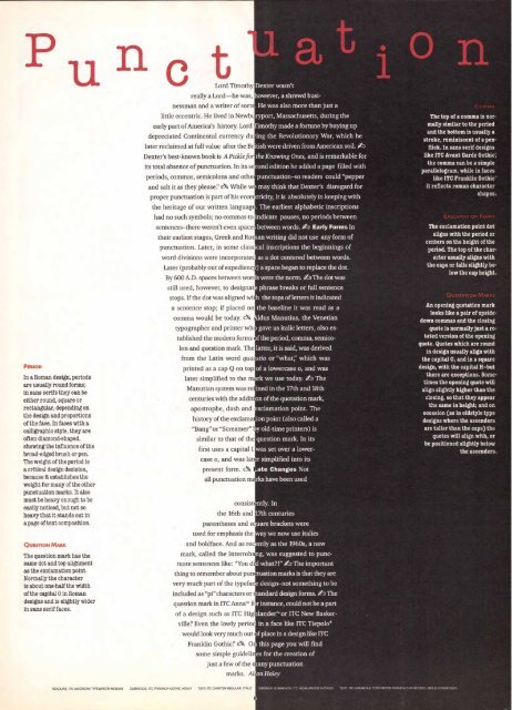
PERIOD<br />
In a Roman design, periods<br />
are usually round forms;<br />
in sans serifs they can be<br />
either round, square or<br />
rectangular, depending on<br />
the design and proportions<br />
of the face. In faces with a<br />
calligraphic style, they are<br />
often diamond-shaped,<br />
showing the influence of' the<br />
broad-edged brush or pen.<br />
The weight of the period is<br />
a critical design decision,<br />
because it establishes the<br />
weight for many of the other<br />
punctuation marks. It also<br />
must be heavy enough to be<br />
easily noticed, but not so<br />
heavy that it stands out in<br />
a page of text composition.<br />
QUESTION MARK<br />
The question mark has the<br />
same dot and top alignment<br />
as the exclamation point.<br />
Normally the character<br />
is about one-half the width<br />
of the capital 0 in Roman<br />
designs and is slightly wider<br />
in sans serif faces.<br />
Lord Timothy<br />
really a Lord—he was, I<br />
nessman and a writer of sort<br />
little eccentric. He lived in Newbu<br />
early part of America's history. Lord'<br />
depreciated Continental currency dui<br />
later reclaimed at full value after the Br<br />
Dexter's best-known book is A Pickle for<br />
its total absence of punctuation. In its se<br />
periods, commas, semicolons and othe<br />
and salt it as they please" A While w<br />
proper punctuation is part of his eccer<br />
the heritage of our written language<br />
had no such symbols; no commas to<br />
sentences–there weren't even spaces<br />
their earliest stages, Greek and Ror<br />
tablished the modern forms<br />
Ion and question mark. The<br />
from the Latin word gum<br />
printed as a cap Q on top<br />
later simplified to the nh.<br />
Manutian system was ref fined in the 17th and 18th<br />
centuries with the additi on of the quotation mark,<br />
apostrophe, dash and xclamation point. The<br />
history of the exclama ion point (also called a<br />
"Bang" or "Screamer" I<br />
similar to that of the<br />
first uses a capital I<br />
case o, and was late<br />
present form. A<br />
all punctuation ma<br />
consist( ntly. In<br />
the 16th and 17th centuries<br />
parentheses and s uare brackets were<br />
used for emphasis the ay we now use italics<br />
and boldface. And as rec ntly as the 1960s, a new<br />
mark, called the Interroba<br />
tuate sentences like: "You di<br />
thing to remember about punu<br />
very much part of the typefac<br />
included as "pi" characters or<br />
question mark in ITC Anna" f<br />
of a design such as ITC Hig<br />
vine! Even the lowly period<br />
would look very much out<br />
Franklin Gothic? A Or<br />
Dexter wasn't<br />
owever, a shrewd busi-<br />
. He was also more than just a<br />
ryport, Massachusetts, during the<br />
imothy made a fortune by buying up<br />
ing the Revolutionary War, which he<br />
*tish were driven from American soil. 4<br />
the Knowing Ones, and is remarkable for<br />
cond edition he added a page filled with<br />
punctuation–so readers could "pepper<br />
may think that Dexter's disregard for<br />
tricity, it is absolutely in keeping with<br />
. The earliest alphabetic inscriptions<br />
indicate pauses, no periods between<br />
between words. 4 Early Forms In<br />
an writing did not use any form of<br />
punctuation. Later, in some class : cal inscriptions the beginnings of<br />
word divisions were incorporatec as a dot centered between words.<br />
Later (probably out of expedienci ) a space began to replace the dot.<br />
By 600 A.D. spaces between woro<br />
still used, however, to designat<br />
stops. If the dot was aligned wi<br />
a sentence stop; if placed on<br />
comma would be today. A<br />
typographer and printer who<br />
s were the norm. 4 The dot was<br />
phrase breaks or full sentence<br />
the tops of letters it indicated<br />
the baseline it was read as a<br />
dus Manutius, the Venetian<br />
gave us italic letters, also es-<br />
f the period, comma, semicolatter,<br />
it is said, was derived<br />
stio or "what;' which was<br />
of a lowercase o, and was<br />
rk we use today. ktp The<br />
y old-time printers) is<br />
question mark. In its<br />
was set over a lowerr<br />
simplified into its<br />
Late Changes Not<br />
rks have been used<br />
ng, was suggested to puncd<br />
what?!" 41) The important<br />
tuation marks is that they are<br />
e design–not something to be<br />
tandard design forms. 40 The<br />
r instance, could not be a part<br />
Lander" or ITC New Baskerin<br />
a face like ITC Tiepolo®<br />
f place in a design like ITC<br />
this page you will find<br />
some simple guidelin es for the creation of<br />
just a few of the n any punctuation<br />
marks. All an Haley<br />
The top of a comma is normally<br />
similar to the period<br />
and the bottom is usually a<br />
stroke, reminiscent of a penflick.<br />
In sans serif designs<br />
like ITC Avant Garde Gothic,<br />
the comma can be a simple<br />
parallelogram, while in faces<br />
like ITC Franklin Gothic<br />
it reflects roman character<br />
shapes.<br />
The exclamation point dot<br />
aligns with the period or<br />
centers on the height of the<br />
period. The top of the character<br />
usually aligns with<br />
the caps or falls slightly below<br />
the cap height.<br />
An opening quotation mark<br />
looks like a pair of upsidedown<br />
commas and the closing<br />
quote is normally just a rotated<br />
version of the opening<br />
quote. Quotes which are round<br />
in design usually align with<br />
the capital 0, and in a square<br />
design, with the capital H-but<br />
there are exceptions. Sometimes<br />
the opening quote will<br />
align slightly higher than the<br />
closing, so that they appear<br />
the same in height; and on<br />
occasion (as in oldstyle type<br />
designs where the ascenders<br />
are taller than the caps) the<br />
quotes will align with, or<br />
be positioned slightly below<br />
the ascenders.<br />
HEADLINE: ITC AMERICAN TYPEWRITER MEDIUM SUBHEADS: RC FRANKLIN GOTHIC HEAVY TER: ITC CHARTER REGULAR, ITALIC SIDEBAR-SUBHEADS: ITC HIGHLANDER MEDIUM TEXT: ITC AMERICAN TYPEWRITER MEDIUM CONDENSED, BOLD CONDENSED


