Downing's Gym
Downing's Gym Rebrand Project
Downing's Gym Rebrand Project

You also want an ePaper? Increase the reach of your titles
YUMPU automatically turns print PDFs into web optimized ePapers that Google loves.
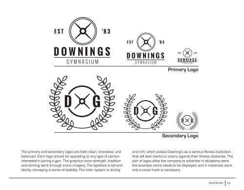
Primary Logo<br />
Secondary Logo<br />
The primary and secondary logos are both clean, innovative, and<br />
balanced. Each logo should be appealing to any type of person<br />
interested in joining a gym. The graphics voice strength, tradition<br />
and winning spirit through iconic imagery. The typeface is tall and<br />
blocky, conveying a sense of stability. The color system is strong<br />
and rich, which poises Downing’s as a serious fitness institution<br />
that will lead clients to victory against their fitness obstacles. The<br />
pair of logos allow the company to advertise in situations were<br />
the business name needs to be displayed, and in instances were<br />
only a visual mark is necessary.<br />
New Brand<br />
18