80th Anniversary Commemorative Book - Singapore Manufacturing ...
80th Anniversary Commemorative Book - Singapore Manufacturing ...
80th Anniversary Commemorative Book - Singapore Manufacturing ...

You also want an ePaper? Increase the reach of your titles
YUMPU automatically turns print PDFs into web optimized ePapers that Google loves.
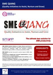
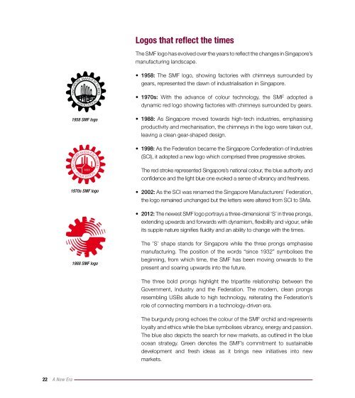
Logos that reflect the timesThe SMF logo has evolved over the years to reflect the changes in <strong>Singapore</strong>’smanufacturing landscape.• 1958: The SMF logo, showing factories with chimneys surrounded bygears, represented the dawn of industrialisation in <strong>Singapore</strong>.• 1970s: With the advance of colour technology, the SMF adopted adynamic red logo showing factories with chimneys surrounded by gears.1958 SMF logo• 1988: As <strong>Singapore</strong> moved towards high-tech industries, emphasisingproductivity and mechanisation, the chimneys in the logo were taken out,leaving a clean gear-shaped design.• 1998: As the Federation became the <strong>Singapore</strong> Confederation of Industries(SCI), it adopted a new logo which comprised three progressive strokes.The red stroke represented <strong>Singapore</strong>’s national colour, the blue authority andconfidence and the light blue one evoked a sense of vibrancy and freshness.1970s SMF logo• 2002: As the SCI was renamed the <strong>Singapore</strong> Manufacturers’ Federation,the logo remained unchanged but the letters were altered from SCI to SMa.• 2012: The newest SMF logo portrays a three-dimensional ‘S’ in three prongs,extending upwards and forwards with dynamism, flexibility and vigour, whileits supple nature signifies fluidity and an ability to change with the times.1988 SMF logoThe ’S’ shape stands for <strong>Singapore</strong> while the three prongs emphasisemanufacturing. The position of the words “since 1932” symbolises thebeginning, from which time, the SMF has been moving onwards to thepresent and soaring upwards into the future.The three bold prongs highlight the tripartite relationship between theGovernment, Industry and the Federation. The modern, clean prongsresembling USBs allude to high technology, reiterating the Federation’srole of connecting members in a technology-driven era.The burgundy prong echoes the colour of the SMF orchid and representsloyalty and ethics while the blue symbolises vibrancy, energy and passion.The blue also depicts the search for new markets, as outlined in the blueocean strategy. Green denotes the SMF’s commitment to sustainabledevelopment and fresh ideas as it brings new initiatives into newmarkets.22 A New Era