1jyF4uV
1jyF4uV
1jyF4uV
Create successful ePaper yourself
Turn your PDF publications into a flip-book with our unique Google optimized e-Paper software.
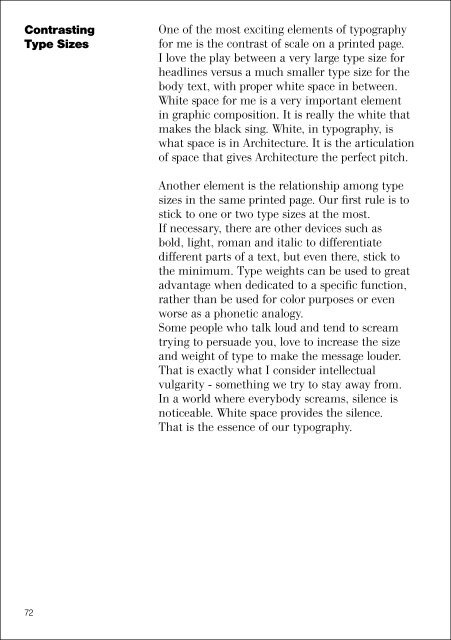
ContrastingType SizesOne of the most exciting elements of typographyfor me is the contrast of scale on a printed page.I love the play between a very large type size forheadlines versus a much smaller type size for thebody text, with proper white space in between.White space for me is a very important elementin graphic composition. It is really the white thatmakes the black sing. White, in typography, iswhat space is in Architecture. It is the articulationof space that gives Architecture the perfect pitch.Another element is the relationship among typesizes in the same printed page. Our first rule is tostick to one or two type sizes at the most.If necessary, there are other devices such asbold, light, roman and italic to differentiatedifferent parts of a text, but even there, stick tothe minimum. Type weights can be used to greatadvantage when dedicated to a specific function,rather than be used for color purposes or evenworse as a phonetic analogy.Some people who talk loud and tend to screamtrying to persuade you, love to increase the sizeand weight of type to make the message louder.That is exactly what I consider intellectualvulgarity - something we try to stay away from.In a world where everybody screams, silence isnoticeable. White space provides the silence.That is the essence of our typography.72


