Operations Guide Tracer AdaptiView⢠Display for Gear ... - Trane
Operations Guide Tracer AdaptiView⢠Display for Gear ... - Trane
Operations Guide Tracer AdaptiView⢠Display for Gear ... - Trane
- No tags were found...

You also want an ePaper? Increase the reach of your titles
YUMPU automatically turns print PDFs into web optimized ePapers that Google loves.
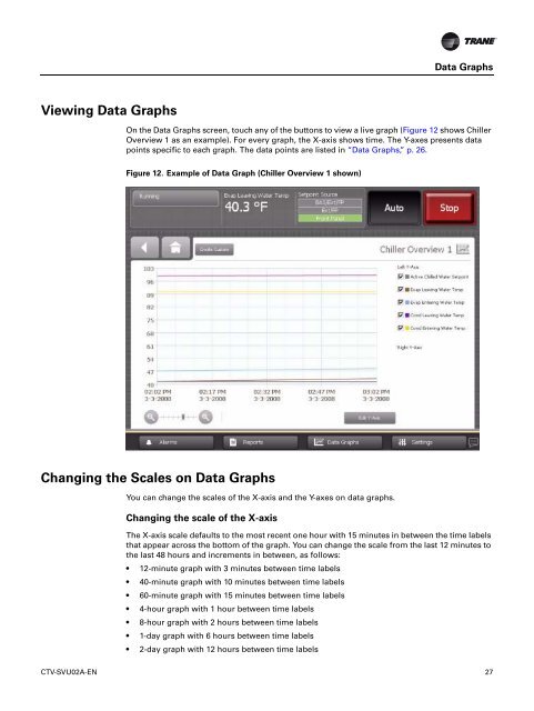
Data GraphsViewing Data GraphsOn the Data Graphs screen, touch any of the buttons to view a live graph (Figure 12 shows ChillerOverview 1 as an example). For every graph, the X-axis shows time. The Y-axes presents datapoints specific to each graph. The data points are listed in “Data Graphs,” p. 26.Figure 12. Example of Data Graph (Chiller Overview 1 shown)Changing the Scales on Data GraphsYou can change the scales of the X-axis and the Y-axes on data graphs.Changing the scale of the X-axisThe X-axis scale defaults to the most recent one hour with 15 minutes in between the time labelsthat appear across the bottom of the graph. You can change the scale from the last 12 minutes tothe last 48 hours and increments in between, as follows:• 12-minute graph with 3 minutes between time labels• 40-minute graph with 10 minutes between time labels• 60-minute graph with 15 minutes between time labels• 4-hour graph with 1 hour between time labels• 8-hour graph with 2 hours between time labels• 1-day graph with 6 hours between time labels• 2-day graph with 12 hours between time labelsCTV-SVU02A-EN 27