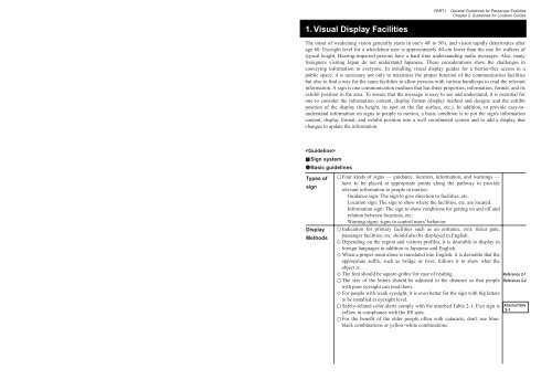
PART IGeneral <strong>Guidelines</strong> <strong>for</strong> Passenger FacilitiesChapter 2. <strong>Guidelines</strong> <strong>for</strong> Location Guides1. Visual Display FacilitiesThe onset of weakening vision generally starts in one's 40' <strong>to</strong> 50's, and vision rapidly deteriorates afterage 60. Eyesight level <strong>for</strong> a wheelchair user is approximately 40-cm lower than the one <strong>for</strong> walkers oftypical height. Hearing-impaired persons have a hard time understanding audio messages. Also, many<strong>for</strong>eigners visiting Japan do not understand Japanese. These considerations show the challenges inconveying in<strong>for</strong>mation <strong>to</strong> everyone. In installing visual display guides <strong>for</strong> a barrier-free access in apublic space, it is necessary not only <strong>to</strong> maximize the proper function of the communication facilitiesbut also <strong>to</strong> find a way <strong>for</strong> the same facilities <strong>to</strong> allow persons with various handicaps <strong>to</strong> read the relevantin<strong>for</strong>mation. A sign is one communication medium that has three properties, in<strong>for</strong>mation, <strong>for</strong>mat, and itsexhibit position in the area. To ensure that the message is easy <strong>to</strong> see and understand, it is essential <strong>for</strong>one <strong>to</strong> consider the in<strong>for</strong>mation content, display <strong>for</strong>mat (display method and design), and the exhibitposition of the display (its height, its spot on the flat surface, etc.). In addition, <strong>to</strong> provide easy-<strong>to</strong>understandin<strong>for</strong>mation on signs <strong>to</strong> people in motion, a basic condition is <strong>to</strong> put the sign's in<strong>for</strong>mationcontent, display <strong>for</strong>mat, and exhibit position in<strong>to</strong> a well coordinated system and <strong>to</strong> add a display thatchanges <strong>to</strong> update the in<strong>for</strong>mation.Sign system●Basic guidelinesTypes ofsignDisplayMethodsFour kinds of signs — guidance, location, in<strong>for</strong>mation, and warnings —have <strong>to</strong> be placed at appropriate points along the pathway <strong>to</strong> providerelevant in<strong>for</strong>mation <strong>to</strong> people in motion.Guidance sign: The sign <strong>to</strong> give direction <strong>to</strong> facilities, etc.Location sign: The sign <strong>to</strong> show where the facilities, etc. are located.In<strong>for</strong>mation sign: The sign <strong>to</strong> show conditions <strong>for</strong> getting on and off andrelation between locations, etc.Warning signs: signs <strong>to</strong> control users’ behavior.Indication <strong>for</strong> primary facilities such as an entrance, exit, ticket gate,passenger facilities, etc. should also be displayed in English.Depending on the region and visi<strong>to</strong>rs profiles, it is desirable <strong>to</strong> display in<strong>for</strong>eign languages in addition <strong>to</strong> Japanese and English.When a proper noun alone is translated in<strong>to</strong> English, it is desirable that theappropriate suffix, such as bridge or river, follows it <strong>to</strong> show what theobject is.The font should be square-gothic <strong>for</strong> ease of reading.The size of the letters should be adjusted <strong>to</strong> the distance so that peoplewith poor eyesight can read them.For people with weak eyesight, it is even better <strong>for</strong> the sign with big letters<strong>to</strong> be installed at eyesight level.Safety-related color alerts comply with the attached Table 2-1. Exit sign isyellow in compliance with the JIS spec.For the benefit of the elder people often with cataracts, don't use blueblackcombinations or yellow-white combinations.Reference 2-1Reference 2-2Attached Table2-1
PART IGeneral <strong>Guidelines</strong> <strong>for</strong> Passenger FacilitiesChapter 2. <strong>Guidelines</strong> <strong>for</strong> Location GuidesIt is even better <strong>to</strong> provide maximum brightness difference between thebackground color and the signs figure color <strong>to</strong> make recognition easier. The sign should be made of a material that allows necessary brightness.Signs seen at close distance should have minimal glare. Pic<strong>to</strong>graphs should use the standard in<strong>for</strong>mation symbols in the attachedTable 2-2, which were set by the general in<strong>for</strong>mation picture-sign studycommittee.Guidance, location signsContents ofin<strong>for</strong>ma-tiondisplayedDesign ofthe displayand <strong>to</strong>olDirectionthe displaysurfaceand heigh<strong>to</strong>f thedisplaypositionSignlocationsanddistance inbetweenThe in<strong>for</strong>mation displayed on guidance signs are available from theattached Table 2-3. If the in<strong>for</strong>mation <strong>to</strong> be displayed on a guidance sign is <strong>to</strong>o much, priorityshall be given <strong>to</strong> key facilities along the pathway and the facilitiesequipped <strong>to</strong> promote barrier-free access. If the target is far away, it is desirable <strong>to</strong> write the distance on the sign. The in<strong>for</strong>mation on a location sign is available from the attached Table 2-4beside the facilities that are also equipped <strong>for</strong> smoother movement. If the in<strong>for</strong>mation <strong>to</strong> be displayed on the location sign is <strong>to</strong>o much, priorityshall be given <strong>to</strong> key spaces consisting of the pathway in addition <strong>to</strong> theabove-mentioned facilities.The design of guidance signs and location signs should be simple, and it iseven better <strong>to</strong> make a uni<strong>for</strong>m design <strong>for</strong> each sign category. Guidance and location signs should face the path that the viewer's follow. The height of the guidance and location sign position should minimize thelook-up angle of the viewer as well as enabling a wheel-chair user withlower eyesight level <strong>to</strong> see it without being blocked <strong>to</strong>o much by a crowdof people walking in front.When two signs are placed with one closely after another facing the pathof the viewers, there should be enough distance between them so that onein front does not block the view of the one in the back. Primary guidance signs indicating the routes should be placed at theentrance, exit, boarding location, unloading location, and various spots inbetween. This is <strong>to</strong> allow continuous provision of necessary in<strong>for</strong>mation <strong>to</strong>the people. Individual guidance signs would be placed at <strong>for</strong>ks in the pathway,between the entrance/exit, and getting-on/off places, at the starting points,both upward and downward, of the staircase, and at turns in the pathway. Along a long passage, even without a <strong>for</strong>k, guidance signs should be put atappropriate intervals.Individual location sign should be placed close <strong>to</strong> the facility it guides <strong>to</strong>.Reference 2-3Reference 2-4Attached Table2-2Attached Table2-3Attached Table2-4Reference 2-5Reference 2-6In<strong>for</strong>mation signContent ofthe in<strong>for</strong>mationdisplayedDesign ofthe displayand <strong>to</strong>olsThe displaydirectionand positionheight ofthe signWhere <strong>to</strong>place thesigns andthe distancein betweenThe in<strong>for</strong>mation of the facilities location guide is available from theattached Table 2-5 beside the facilities equipped <strong>to</strong> ease the movement ofpeople.The facilities location guide should clarify the routes <strong>to</strong> and from thefacilities also equipped <strong>to</strong> promote barrier-free access. The display contents of the map of the passenger facilities, if provided,should be picked up from the attached Table 2-6 when needed. For the traffic services with network system, it is desirable <strong>to</strong> post thenetwork routes at the ticket gate or other places. The design of the in<strong>for</strong>mation sign should be simple, and it is even better<strong>to</strong> have a uni<strong>for</strong>m design <strong>for</strong> each sign category. For the facilities location guide or other guides <strong>for</strong> the area aroundpassenger facilities within walking distance, it is even better <strong>for</strong> the sign <strong>to</strong>be oriented such that left and right on the map correspond <strong>to</strong> left and rightin the actual area. For the wide-area map around passenger facilities, it is even better <strong>to</strong>display the direction in a geographical manner with north pointing up. The signs should face the flow of people so as not <strong>to</strong> obstruct the smoothmovement of the people. If the sign is oriented parallel <strong>to</strong> the flow due <strong>to</strong> space limitations, the attract people's attention in advance. The position height of the area map around passenger facilities, timetable,and facilities location guide should be at a height that is easy <strong>to</strong> see <strong>for</strong>typical walkers and wheelchair users.For the fare table above the ticket vending machine, make its exhibit heightas low as possible <strong>for</strong> wheelchair users <strong>to</strong> be able <strong>to</strong> see it without lookingup with a large angle and minimize the chances of it being blocked bypeople making a line in front <strong>to</strong> the ticket machine. Also, avoid reflectionof light off the sign board.The width of the fare table above the ticket machine should be fixed withina range such that people can read it even from a slight angle <strong>to</strong> the side.Facilities location guides should be placed at the spots posing noobstruction <strong>for</strong> the smooth flow of the people and visible from near theentrance, exit, and ticket gate. The location guide that indicates the transfer route or transfer entranceshould also be placed at the point where the route <strong>to</strong> the transfer entrancebranches off.The area map around passenger facilities should be placed at the pointwhere the route <strong>to</strong> the ticket gate or entrance/exit branches off.In a large passenger facility, it is desirable <strong>to</strong> put facilities location guidesat various spots.Attached Table2-5Attached Table2-6Reference 2-7Reference 2-8Reference 2-9Reference 2-10


