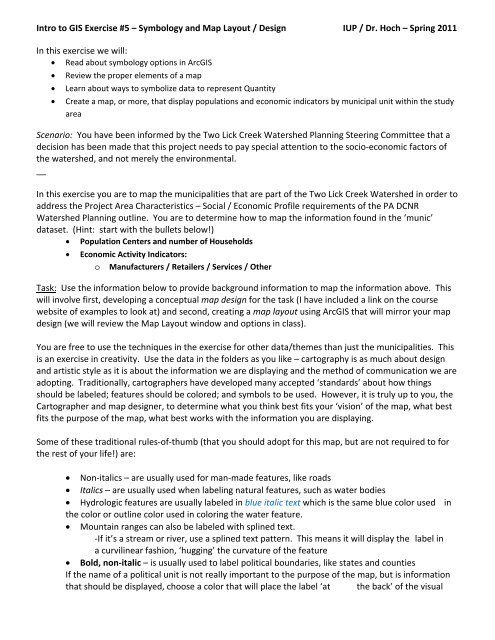
Intro to GIS Exercise #5 – Symbology and Map Layout / Design IUP ...
Intro to GIS Exercise #5 – Symbology and Map Layout / Design IUP ...
Intro to GIS Exercise #5 – Symbology and Map Layout / Design IUP ...

You also want an ePaper? Increase the reach of your titles
YUMPU automatically turns print PDFs into web optimized ePapers that Google loves.
<strong>Intro</strong> <strong>to</strong> <strong>GIS</strong> <strong>Exercise</strong> <strong>#5</strong> <strong>–</strong> <strong>Symbology</strong> <strong>and</strong> <strong>Map</strong> <strong>Layout</strong> / <strong>Design</strong> <strong>IUP</strong> / Dr. Hoch <strong>–</strong> Spring 2011<br />
In this exercise we will:<br />
� Read about symbology options in Arc<strong>GIS</strong><br />
� Review the proper elements of a map<br />
� Learn about ways <strong>to</strong> symbolize data <strong>to</strong> represent Quantity<br />
� Create a map, or more, that display populations <strong>and</strong> economic indica<strong>to</strong>rs by municipal unit within the study<br />
area<br />
Scenario: You have been informed by the Two Lick Creek Watershed Planning Steering Committee that a<br />
decision has been made that this project needs <strong>to</strong> pay special attention <strong>to</strong> the socio‐economic fac<strong>to</strong>rs of<br />
the watershed, <strong>and</strong> not merely the environmental.<br />
__<br />
In this exercise you are <strong>to</strong> map the municipalities that are part of the Two Lick Creek Watershed in order <strong>to</strong><br />
address the Project Area Characteristics <strong>–</strong> Social / Economic Profile requirements of the PA DCNR<br />
Watershed Planning outline. You are <strong>to</strong> determine how <strong>to</strong> map the information found in the ‘munic’<br />
dataset. (Hint: start with the bullets below!)<br />
� Population Centers <strong>and</strong> number of Households<br />
� Economic Activity Indica<strong>to</strong>rs:<br />
o Manufacturers / Retailers / Services / Other<br />
Task: Use the information below <strong>to</strong> provide background information <strong>to</strong> map the information above. This<br />
will involve first, developing a conceptual map design for the task (I have included a link on the course<br />
website of examples <strong>to</strong> look at) <strong>and</strong> second, creating a map layout using Arc<strong>GIS</strong> that will mirror your map<br />
design (we will review the <strong>Map</strong> <strong>Layout</strong> window <strong>and</strong> options in class).<br />
You are free <strong>to</strong> use the techniques in the exercise for other data/themes than just the municipalities. This<br />
is an exercise in creativity. Use the data in the folders as you like <strong>–</strong> car<strong>to</strong>graphy is as much about design<br />
<strong>and</strong> artistic style as it is about the information we are displaying <strong>and</strong> the method of communication we are<br />
adopting. Traditionally, car<strong>to</strong>graphers have developed many accepted ‘st<strong>and</strong>ards’ about how things<br />
should be labeled; features should be colored; <strong>and</strong> symbols <strong>to</strong> be used. However, it is truly up <strong>to</strong> you, the<br />
Car<strong>to</strong>grapher <strong>and</strong> map designer, <strong>to</strong> determine what you think best fits your ‘vision’ of the map, what best<br />
fits the purpose of the map, what best works with the information you are displaying.<br />
Some of these traditional rules‐of‐thumb (that you should adopt for this map, but are not required <strong>to</strong> for<br />
the rest of your life!) are:<br />
� Non‐italics <strong>–</strong> are usually used for man‐made features, like roads<br />
� Italics <strong>–</strong> are usually used when labeling natural features, such as water bodies<br />
� Hydrologic features are usually labeled in blue italic text which is the same blue color used in<br />
the color or outline color used in coloring the water feature.<br />
� Mountain ranges can also be labeled with splined text.<br />
‐If it’s a stream or river, use a splined text pattern. This means it will display the label in<br />
a curvilinear fashion, ‘hugging’ the curvature of the feature<br />
� Bold, non‐italic <strong>–</strong> is usually used <strong>to</strong> label political boundaries, like states <strong>and</strong> counties<br />
If the name of a political unit is not really important <strong>to</strong> the purpose of the map, but is information<br />
that should be displayed, choose a color that will place the label ‘at the back’ of the visual
hierarchy, meaning use a washed‐out color <strong>to</strong> make the label almost disappear from initial view<br />
<strong>and</strong> that is most discernable upon closer inspection. You may also want <strong>to</strong> add more than 1 space<br />
between characters (wide‐spaced) in the label. This spacing, in combination with the dull coloring,<br />
produces a label that can cover a large area (such as a state) that is at the bot<strong>to</strong>m of the visual<br />
hierarchy (or put another way, that seams <strong>to</strong> be farther away from the viewer than other features<br />
in your design). Mountain ranges can be labeled with both splined text <strong>and</strong> wide‐spaced lettering.<br />
Another labeling technique that is almost always necessary <strong>to</strong> use is rotating the text label. Rotated text<br />
should be read from the bot<strong>to</strong>m up, meaning the beginning of the word should begin <strong>to</strong>wards the bot<strong>to</strong>m<br />
of the layout <strong>and</strong> extend <strong>to</strong>ward the <strong>to</strong>p of the design.<br />
Avoid crossing feature lines with text, meaning don’t place a label on a vec<strong>to</strong>r feature. If it is necessary <strong>to</strong><br />
do so, use the ‘halo’ effect in the label properties. The halo effect can also be used with point<br />
symbolization.<br />
Scale: The ratio scale value shows in the <strong>to</strong>p <strong>to</strong>ol bars of the data view. A good place <strong>to</strong> start when trying<br />
<strong>to</strong> determine the best scale <strong>to</strong> display your data in (unless there has been a scale determined in the scope<br />
of work phase) is <strong>to</strong> right‐click on the data feature you are interested in <strong>and</strong> scroll down <strong>to</strong> ‘zoom <strong>to</strong> layer’.<br />
Let’s zoom <strong>to</strong> the TLCW_dissolve feature. The scale <strong>to</strong> which the data frame zooms <strong>to</strong> depends on the<br />
size of your data frame in Arc<strong>Map</strong>… <strong>and</strong> the size of the data frame depends on several things, like: the size<br />
of your hardware display (i.e., moni<strong>to</strong>r) / do you have lots of <strong>to</strong>ol windows open either <strong>to</strong> the <strong>to</strong>p (on the<br />
<strong>to</strong>olbar) or on the sides (i.e., ArcToolbox) /do you have the Arc<strong>Map</strong> program maximized <strong>to</strong> display in all of<br />
the area available on your moni<strong>to</strong>r (maximize by clicking the square between the line (minimize) <strong>and</strong> the<br />
red ‘X’ (close) at the <strong>to</strong>p right of the window (as is done on all Microsoft Windows applications).<br />
The zoom <strong>to</strong> layer comm<strong>and</strong> will fit the entire feature in the available space allotted <strong>to</strong> the data frame.<br />
Most often this is some odd number. The scale will also change when you switch from the data view <strong>to</strong><br />
the layout view <strong>–</strong> this is due <strong>to</strong> the different dimensions of the data frame.<br />
<strong>Layout</strong> view: Once you have chosen the data sets that you want <strong>to</strong> display in your map <strong>and</strong> you have them<br />
added <strong>to</strong> the data view, click the but<strong>to</strong>n at the bot<strong>to</strong>m left of the data frame in the data view that switches<br />
<strong>to</strong> the layout view.<br />
This one!<br />
Should look something like this…<br />
Now, before we go on, let’s go <strong>to</strong> page set up <strong>and</strong> pick<br />
our paper size. Go<strong>to</strong> File <strong>–</strong> Print <strong>and</strong> Page Setup. In this<br />
window choose ‘Tabloid’ in the Paper‐Size pulldown<br />
menu. Hit OK.<br />
Drag the blue squares of the data frame <strong>to</strong> the<br />
appropriate size that you want for the new 17’ by 11’<br />
paper.
Knowing which <strong>to</strong>olbar but<strong>to</strong>ns <strong>to</strong> use here is quite confusing.<br />
The <strong>to</strong>olbar but<strong>to</strong>ns that look like magnifying glasses with paper behind them are for zooming in <strong>and</strong> out<br />
of the layout <strong>–</strong> as if you wanted <strong>to</strong> zoom‐up the size of the piece of paper.<br />
These are for<br />
adjusting the LAYOUT<br />
dimensions!<br />
These are for<br />
adjusting the DATA<br />
FRAME dimensions!<br />
the layout size<br />
The magnifying glasses without the paper behind them are for changing the data frame.<br />
From here, we have <strong>to</strong> determine where we are going <strong>to</strong> place our map elements.<br />
What are map elements? All maps should have the following things that deem them a map:<br />
SCALE: Using a scale bar is best in <strong>GIS</strong> when a particular scale is not an issue because the map can then be<br />
changed in size without losing the reference made <strong>to</strong> scale. You can place both a scale bar <strong>and</strong> a<br />
representative fraction or verbal scale if you desire<br />
ORIENTATION: Generally marked with a north arrow or a compass rose. However, you can really pick any<br />
cardinal direction you like <strong>and</strong> point an arrow that way <strong>–</strong> as long as you mark is as such. An arrow without<br />
any clarifier is usually considered <strong>to</strong> be pointing north. There are times that you may want <strong>to</strong> rotate the<br />
data in the data frame in such a way that the <strong>to</strong>p is not pointing north (for example, if you were making a<br />
map of a stream that ran north‐<strong>to</strong>‐south, but your design required that the space allotted for the map run<br />
east‐<strong>to</strong>‐west. In this case, you could rotate the data frame <strong>to</strong> fit your map design as long as you marked<br />
which way was which way).<br />
TITLE: All maps need titles, <strong>and</strong> the title should be in large font <strong>–</strong> usually the largest font on the layout <strong>–</strong><br />
<strong>and</strong> the title should be descriptive providing purpose <strong>and</strong> location/feature on the map.<br />
BORDER: Also referred <strong>to</strong> as a neatline, this bounding‐box surrounds the geographic extent of your map<br />
graphic <strong>and</strong> differentiates the map for the other map elements. Another bounding‐box that can be<br />
included (<strong>and</strong> is also sometimes referred <strong>to</strong> as a neatline) goes around all of the map components, creating<br />
a ‘frame’ around the entire layout. Experiment with both of these.<br />
LEGEND: These define what the colors, symbols, <strong>and</strong> patterns are representing on the map. Also called a<br />
Key. Making a good legend isn’t as easy as it sounds, because you have <strong>to</strong> choose what you think needs<br />
description <strong>and</strong> not include colors or symbols that may be intuitive <strong>–</strong> like water <strong>–</strong> do we need <strong>to</strong> list ‘water’<br />
on our map legend? Would we distinguish from ‘lake / ocean / river / stream? Or would our labels on the<br />
map take care of this for us? Probably… The more data used in the map, the more cluttered the legend<br />
becomes. If you legend is crowded, this is a good indica<strong>to</strong>r that your map may be over‐crowded <strong>to</strong>o.<br />
MAP CREDITS: Really important component… The following should always be listed<br />
Data Sources <strong>–</strong> not where you got the data, but who published it. If you don’t know you probably<br />
shouldn’t be using the data. Also include vintage (year of data production)<br />
Name <strong>–</strong> of the car<strong>to</strong>grapher. I use my initials (RJH).<br />
Date <strong>–</strong> of the map layout/publication <strong>–</strong> date of the data should be listed under data source.
Projection <strong>–</strong> get in the habit of listing the coordinate system/projection/datum. It may save you job<br />
someday.<br />
File location <strong>–</strong> often used within an agency or private workplace, the file location of the final map product<br />
is sometimes listed on the map itself. This is a good idea when making maps for technical documents <strong>and</strong><br />
research reports. For example, you would list the entire Windows Explorer path name:<br />
E:\RJH\Service\MWA\MWA_mining_project.jpg<br />
This, with your name/initials, will direct others that you work with where the map is in case you are not<br />
around <strong>and</strong> someone needs a copy of it. This is st<strong>and</strong>ard procedure at engineering <strong>and</strong> consulting firms.<br />
LOCATOR MAP: Displayed as an INSET map (a smaller map within the layout that shows a larger area <strong>and</strong><br />
places the main map graphic in a geographic context) is needed when the main map is not easily<br />
recognizable. Do you think you need an inset map for this Two Lick Creek Watershed map? Do this by<br />
making the map in another Arc<strong>Map</strong> session, saving it as a .tiff or .jpeg, then inserting it in<strong>to</strong> your layout as<br />
a picture.<br />
Remember the rules of the visual hierarchy!<br />
First let’s look at the population in each municipality.<br />
Double click on the name of the ‘munic’ dataset <strong>and</strong> when the Layer Properties window appears, click on<br />
the <strong>Symbology</strong> Tab.<br />
On the right side are the different ways in which<br />
the data can be symbolized on the map. For<br />
instance, the Single Symbol way simply displays<br />
the shape of the spatial data in the data frame<br />
view with the options being Fill Color <strong>and</strong><br />
Outline Color (options vary depending on the<br />
type of vec<strong>to</strong>r).<br />
After Single Symbol is Categories. Symbolizing<br />
<strong>and</strong> displaying as categories is best for data that<br />
has some type of qualitative attribute, such as,<br />
L<strong>and</strong>‐cover (grass, impervious, crops, etc.) or<br />
L<strong>and</strong>‐use (agricultural, urban, farm, etc.).<br />
Our data set is quantitative, meaning that all of<br />
the values of our attributes are numerical <strong>and</strong> statistical. So, for this exercise, we won’t be using the<br />
Categories way of symbolizing.<br />
Let’s move on <strong>to</strong> Quantities: Click on the word <strong>and</strong> you see that four different options display below the<br />
word:<br />
1. Graduated Colors<br />
2. Graduated Symbols<br />
3. Proportional Symbols<br />
4. Dot Density
About symbolizing data <strong>to</strong> represent Quantity<br />
When you want your map <strong>to</strong> communicate how much of something there is, you need <strong>to</strong> draw features<br />
using a quantitative measure. This measure might be a count; a ratio, such as a percentage; or a rank, such<br />
as high, medium, or low. There are several methods with which you can represent quantity on a map—<br />
colors, graduated symbols, proportional symbols, dot densities, <strong>and</strong> charts.<br />
Represent quantity using colors<br />
You can represent quantities on a map by varying colors, as a choropleth map. For example, you might use darker<br />
shades of blue <strong>to</strong> represent higher rainfall amounts. When you draw features with graduated colors, the<br />
quantitative values are grouped in<strong>to</strong> classes <strong>and</strong> each class is identified by a particular color. You may want <strong>to</strong> take<br />
advantage of a color ramp <strong>to</strong> symbolize your data.<br />
Represent quantity using symbol sizes<br />
You can represent quantities on a map by varying the symbol size you use <strong>to</strong> draw features. For example,<br />
you might use larger circles <strong>to</strong> represent cities with larger populations. When you draw features with<br />
graduated symbols, the quantitative values are grouped in<strong>to</strong> classes. Within a class, all features are drawn<br />
with the same symbol. You can't discern the value of individual features; you can only tell that its value is<br />
within a certain range.<br />
Proportional symbols represent data values more precisely. The size of a proportional symbol reflects the<br />
actual data value. For example, you might map earthquakes using proportional circles, where the radius of<br />
the circle is proportional <strong>to</strong> the magnitude of the quake. The difficulty with proportional symbols arises<br />
when you have <strong>to</strong>o many values; the differences between symbols may become indistinguishable. In<br />
addition, the symbols for high values can become so large as <strong>to</strong> obscure other symbols.<br />
Represent quantity using dot densities<br />
Another method of representing quantities is with a dot density map. You can use a dot density map <strong>to</strong><br />
show the amount of an attribute within an area. Each dot represents a specified number of features, for<br />
example, 1,000 people or 10 burglaries within an area.<br />
Dot density maps show density graphically rather than showing density value. The dots are distributed<br />
r<strong>and</strong>omly within each area; they don't represent actual feature locations. The closer <strong>to</strong>gether the dots are,<br />
the higher the density of features in that area. Using a dot density map is similar <strong>to</strong> symbolizing with<br />
graduated colors, but instead of the quantity being shown with color, it is shown by the density of dots<br />
within an area.<br />
When creating a dot density map, you specify how many features each dot represents <strong>and</strong> how big the<br />
dots are. You may need <strong>to</strong> try several combinations of dot value <strong>and</strong> dot size <strong>to</strong> see which one best shows<br />
the pattern. In general, you should choose value <strong>and</strong> size combinations that ensure the dots are not so<br />
close as <strong>to</strong> form solid areas that obscure the patterns or so far apart as <strong>to</strong> make the variations in density<br />
hard <strong>to</strong> see.<br />
In most cases, you'll only map one field using dot density maps. In special cases, you may want <strong>to</strong> compare<br />
distributions of different types <strong>and</strong> may choose <strong>to</strong> map two or three fields. When you do this, you should<br />
use different colors <strong>to</strong> distinguish between the attributes.
You have two options for placing dots within an area. Non‐fixed Placement, the default option, indicates<br />
that the dots will be placed r<strong>and</strong>omly each time the map is refreshed, while Fixed Placement freezes the<br />
placement of dots, even if the map is refreshed.<br />
Represent quantity using charts<br />
Bar/Column charts, stacked bar charts, <strong>and</strong> pie charts can present large amounts of quantitative data in an<br />
eye‐catching fashion. Generally, you'll draw a layer with charts when your layer has a number of related<br />
numeric attributes that you want <strong>to</strong> compare. Use pie charts when you want <strong>to</strong> show the relationship of<br />
individual parts <strong>to</strong> the whole. For example, if you are mapping population by county, you can use a pie<br />
chart <strong>to</strong> show the percentage of the population by age for each county. Use bar/column charts <strong>to</strong> show<br />
relative amounts rather than a proportion of a <strong>to</strong>tal. Use stacked charts <strong>to</strong> show relative amounts as well<br />
as the relationship of parts <strong>to</strong> the whole.<br />
When you symbolize a layer with charts, a chart symbol <strong>and</strong> a number are placed in the table of contents<br />
under the layer’s name. The number next <strong>to</strong> the chart symbol represents the attribute value for a chart<br />
symbol of that size on the map. For example, a value of five means a chart on the map that is the same size<br />
as the chart in the table of contents represents 5 data units. Similarly, a chart on the map that is twice as<br />
big as the chart in the table of contents represents 10 data units. The chart symbol <strong>and</strong> value in the table<br />
of contents also appear in the legend.<br />
For bar/column charts, the value refers <strong>to</strong> the highest bar in the bar/column chart symbol. With stacked or<br />
pie charts, it refers <strong>to</strong> the sum of all fields being represented by the stacked or pie chart symbol.<br />
Background Information from the Arc<strong>GIS</strong> Desk<strong>to</strong>p Help Application<br />
Ways <strong>to</strong> map quantitative data<br />
Quantitative data is data that describes features in terms of a quantitative value measuring some<br />
magnitude of the feature. Unlike categorical data, whose features are described by a unique attribute<br />
value, such as a name; quantitative data generally describes counts or amounts, ratios, or ranked values.<br />
For example, data representing precipitation, population, <strong>and</strong> habitat suitability can all be mapped<br />
quantitatively.<br />
Which quantitative value should you map?<br />
Knowing what type of data you have <strong>and</strong> what you want <strong>to</strong> show will help you determine what<br />
quantitative value <strong>to</strong> map. In general, you can follow these guidelines:<br />
� <strong>Map</strong> counts or amounts if you want <strong>to</strong> see actual measured values as well as relative magnitude.<br />
Use care when mapping counts, because the values may be influenced by other fac<strong>to</strong>rs <strong>and</strong> could<br />
yield a misleading map. For example, when making a map showing the <strong>to</strong>tal sales figures of a<br />
product by state, the <strong>to</strong>tal sales figure is likely <strong>to</strong> reflect the differences in population among the<br />
states.<br />
� <strong>Map</strong> ratios if you want <strong>to</strong> minimize differences based on the size of areas or number of features in<br />
each area. Ratios are created by dividing two data values. Using ratios is also referred <strong>to</strong> as
normalizing the data. For example, dividing the 18‐ <strong>to</strong> 30‐year‐old population by the <strong>to</strong>tal<br />
population yields the percentage of people aged 18<strong>–</strong>30. Similarly, dividing a value by the area of<br />
the feature yields a value per unit area, or density.<br />
� <strong>Map</strong> ranks if you are interested in relative measures <strong>and</strong> actual values are not important. For<br />
example, you may know a feature with a rank of 3 is higher than one ranked 2 <strong>and</strong> lower than one<br />
ranked 4, but you can't tell how much higher or lower.<br />
Should you map individual values or group them in classes?<br />
When you map quantitative data, you can either assign each value its own symbol or you can group values<br />
in<strong>to</strong> classes using a different symbol for each class.<br />
If you are only mapping a few values (less than 10), you can assign a unique symbol <strong>to</strong> each value. This may<br />
present a more accurate picture of the data since you are not predetermining which features are grouped<br />
<strong>to</strong>gether. More likely, your data values will be <strong>to</strong>o numerous <strong>to</strong> map individually <strong>and</strong> you'll want <strong>to</strong> group<br />
them in classes, or classify the data. A good example of classified data is a temperature map in a<br />
newspaper. Instead of displaying individual temperatures, these maps show temperature b<strong>and</strong>s, where<br />
each b<strong>and</strong> represents a given range in temperature.<br />
Ways <strong>to</strong> classify your data<br />
How you define the class ranges <strong>and</strong> breaks—the high <strong>and</strong> low values that bracket each class—will<br />
determine which features fall in<strong>to</strong> each class <strong>and</strong> what the map will look like. By changing the classes you<br />
can create very different‐looking maps. Generally, the goal is <strong>to</strong> make sure features with similar values are<br />
in the same class.<br />
Two key fac<strong>to</strong>rs for classifying your data are the classification scheme you use <strong>and</strong> the number of classes<br />
you create. If you know your data well, you can manually define your own classes.<br />
Alternatively, you can let Arc<strong>Map</strong> classify your data using st<strong>and</strong>ard classification schemes. The st<strong>and</strong>ard<br />
classification schemes are:<br />
1. Equal interval<br />
2. Defined interval<br />
3. Quantile<br />
4. Natural breaks (Jenks)<br />
5. Geometrical interval<br />
6. St<strong>and</strong>ard deviation<br />
Equal interval<br />
This classification scheme divides the range of attribute values in<strong>to</strong> equal‐sized subranges, allowing you <strong>to</strong><br />
specify the number of intervals while Arc<strong>Map</strong> determines where the breaks should be. For example, if<br />
features have attribute values ranging from 0 <strong>to</strong> 300 <strong>and</strong> you have three classes, each class represents a<br />
range of 100 with class ranges of 0<strong>–</strong>100, 101<strong>–</strong>200, <strong>and</strong> 201<strong>–</strong>300. This method emphasizes the amount of<br />
an attribute value relative <strong>to</strong> other values, for example, <strong>to</strong> show that a s<strong>to</strong>re is part of the group of s<strong>to</strong>res<br />
that made up the <strong>to</strong>p one‐third of all sales. It's best applied <strong>to</strong> familiar data ranges, such as percentages<br />
<strong>and</strong> temperature.
Defined interval<br />
This classification scheme allows you <strong>to</strong> specify an interval by which <strong>to</strong> equally divide a range of attribute<br />
values. Rather than specifying the number of intervals as in the equal interval classification scheme, with<br />
this scheme, you specify the interval value. Arc<strong>Map</strong> au<strong>to</strong>matically determines the number of classes based<br />
on the interval. The interval specified in the example below is 0.04 (or 4 percent).<br />
Quantile<br />
Each class contains an equal number of features. A quantile classification is well suited <strong>to</strong> linearly<br />
distributed data. Because features are grouped by the number in each class, the resulting map can be<br />
misleading. Similar features can be placed in adjacent classes, or features with widely different values can<br />
be put in the same class. You can minimize this dis<strong>to</strong>rtion by increasing the number of classes.<br />
Quartiles have four groups, quintiles have five groups.<br />
Natural breaks (Jenks)<br />
Classes are based on natural groupings inherent in the data. Arc<strong>Map</strong> identifies break points by picking the<br />
class breaks that best group similar values <strong>and</strong> maximize the differences between classes. The features are<br />
divided in<strong>to</strong> classes whose boundaries are set where there are relatively big jumps in the data values.<br />
Geometrical interval<br />
This is a classification scheme where the class breaks are based on class intervals that have a geometrical<br />
series. The geometric coefficient in this classifier can change once (<strong>to</strong> its inverse) <strong>to</strong> optimize the class<br />
ranges. The algorithm creates these geometrical intervals by minimizing the square sum of element per<br />
class. This ensures that each class range has approximately the same number of values with each class <strong>and</strong><br />
that the change between intervals is fairly consistent.<br />
This algorithm was specifically designed <strong>to</strong> accommodate continuous data. It produces a result that is<br />
visually appealing <strong>and</strong> car<strong>to</strong>graphically comprehensive.
What is a geometric series?<br />
A geometric series is a pattern where a constant coefficient multiplies each value in the series. For<br />
example, a sequence of {0.1, 0.3, 0.9, 2.7, 8.1} is where each value is multiplied by 3. The inverse of 3<br />
would be 0.33333 (or 1/3).<br />
The table below is an example of a geometrical interval classification that was produced in Arc<strong>Map</strong>. The<br />
interval (or bin size) of the class is calculated by subtracting the minimum from the maximum. The<br />
geometric coefficient is calculated by dividing the previous interval by the current interval. There are two<br />
possible geometric coefficients <strong>to</strong> create this classification structure, 1.539927 <strong>and</strong> 0.649382, which are<br />
inverses of each other.<br />
Geometrical Interval Classification Minimum Maximum Interval Coefficient<br />
0.026539462 0.046593756 0.020054<br />
0.046593757 0.059616646 0.013023 1.539927<br />
0.059616647 0.068073471 0.008457 1.539927<br />
0.068073472 0.081096361 0.013023 0.649382<br />
0.081096362 0.101150655 0.020054 0.649382<br />
0.101150656 0.132032793 0.030882 0.649382<br />
0.132032794 0.179589017 0.047556 0.649382<br />
St<strong>and</strong>ard deviation<br />
This classification scheme shows you how much a feature's attribute value varies from the mean. Arc<strong>Map</strong><br />
calculates the mean values <strong>and</strong> the st<strong>and</strong>ard deviations from the mean. Class breaks are then created<br />
using these values. A two‐color ramp helps emphasize values above (shown in one color) <strong>and</strong> below<br />
(shown in another color) the mean.<br />
Setting a classification<br />
About setting a classification<br />
When you classify your data, you can either use one of the st<strong>and</strong>ard classification schemes that Arc<strong>Map</strong><br />
provides (reviewed above) or create cus<strong>to</strong>m classes based on class ranges you specify. If you want Arc<strong>Map</strong><br />
<strong>to</strong> classify the data, simply choose the classification scheme <strong>and</strong> set the number of classes.<br />
Defining your own classes<br />
If you want <strong>to</strong> define your own classes, you can manually add class breaks <strong>and</strong> set class ranges that are<br />
appropriate for your data. Alternatively, you can start with one of the st<strong>and</strong>ard classifications <strong>and</strong> make<br />
adjustments as needed.
Why set class ranges manually?<br />
There may already be certain st<strong>and</strong>ards or guidelines for mapping your data. For example, temperature<br />
maps are often displayed with 10‐degree temperature b<strong>and</strong>s, or you might want <strong>to</strong> emphasize features<br />
with particular values, for example, those above or below a threshold value. Whatever your reason, make<br />
sure you clearly specify what the classes mean on the map.<br />
How <strong>to</strong> set a classification<br />
Setting a st<strong>and</strong>ard classification method<br />
1. Right‐click the layer that shows a quantitative value for which you want <strong>to</strong> change the classification<br />
in the table of contents <strong>and</strong> click Properties.<br />
2. Click the <strong>Symbology</strong> tab <strong>and</strong> click Quantities.<br />
3. Click the Value drop‐down arrow <strong>and</strong> click the field that contains the quantitative value you want<br />
<strong>to</strong> map.<br />
4. Click the Normalization drop‐down arrow <strong>and</strong> click a field <strong>to</strong> normalize the data.<br />
Arc<strong>Map</strong> divides this field in<strong>to</strong> the Value <strong>to</strong> create a ratio.<br />
5. Click Classify.<br />
6. Click the Method drop‐down arrow <strong>and</strong> click the classification method you want <strong>to</strong> use.<br />
7. Click the Classes drop‐down arrow <strong>and</strong> click the number of classes you want <strong>to</strong> display.<br />
8. Click OK on the Classification dialog box.<br />
9. Click OK on the Layer Properties dialog box.<br />
Tip<br />
� Increase the number of columns shown <strong>to</strong> see more data values in the his<strong>to</strong>gram.<br />
Editing a class range<br />
1. Right‐click the layer for which you want <strong>to</strong> set class breaks in the table of contents <strong>and</strong> click Properties.<br />
2. Click the <strong>Symbology</strong> tab.<br />
3. If you have not already set a classification method, follow the steps in "Setting a st<strong>and</strong>ard classification<br />
method".<br />
4. Click the Range you want <strong>to</strong> edit.<br />
5. Make sure <strong>to</strong> click the Range, not the Label.<br />
6. Type a new value.<br />
7. This sets the upper value of the range.<br />
8. Click OK.
Tips<br />
� You can change a break on the Classification dialog box by clicking a value in the<br />
Break Values list <strong>and</strong> typing a new value. Class ranges will be adjusted.<br />
� You can click <strong>and</strong> drag a break in the his<strong>to</strong>gram on the Classification dialog box.<br />
You can also type new breaks in the Break Values list on the right side of the<br />
Classification dialog box.<br />
� Any time you insert, delete, or move class breaks, the classification scheme<br />
au<strong>to</strong>matically switches <strong>to</strong> Manual, no matter what scheme you started with.<br />
� Statistics such as minimum, maximum, sum, <strong>and</strong> st<strong>and</strong>ard deviation appear on the<br />
Classification dialog box. If you check Show Mean, the mean is plotted on the<br />
his<strong>to</strong>gram; checking Show Std. Dev. superimposes st<strong>and</strong>ard deviation lines on the<br />
his<strong>to</strong>gram.<br />
� Checking Snap breaks <strong>to</strong> data values uses actual data values as class breaks when<br />
you insert or move a class break. This option is only available when using a Manual<br />
classification method.<br />
Deleting a class break<br />
1. Right‐click the layer for which you want <strong>to</strong> delete a class break in the table of contents <strong>and</strong> click<br />
Properties.<br />
2. Click the <strong>Symbology</strong> tab <strong>and</strong> click Classify.<br />
3. Click the class break you want <strong>to</strong> delete.<br />
The selected break is highlighted.<br />
4. Right‐click the his<strong>to</strong>gram <strong>and</strong> click Delete Break.<br />
Tips<br />
� Increase the number of columns shown <strong>to</strong> see more data values in the his<strong>to</strong>gram.<br />
� To insert a break, right‐click the his<strong>to</strong>gram on the Classification dialog box <strong>and</strong> click<br />
Insert break.<br />
� Statistics, such as minimum, maximum, sum, <strong>and</strong> st<strong>and</strong>ard deviation, appear on<br />
the Classification dialog box. If you check Show Mean, the mean is plotted on the<br />
his<strong>to</strong>gram; checking Show Std. Dev. superimposes st<strong>and</strong>ard deviation lines on the<br />
his<strong>to</strong>gram.<br />
� Any time you insert, delete, or move class breaks, the classification scheme<br />
au<strong>to</strong>matically switches <strong>to</strong> Manual, no matter what scheme you started with.<br />
Excluding features from the classification<br />
1. Right‐click the layer for which you want <strong>to</strong> exclude features from the classification in the table<br />
of contents <strong>and</strong> click Properties.<br />
2. Click the <strong>Symbology</strong> tab <strong>and</strong> click Classify.
3. Click Exclusion.<br />
4. Double‐click the field you're using <strong>to</strong> draw the layer on the Query tab.<br />
5. Click an opera<strong>to</strong>r.<br />
6. Click Get Unique Values <strong>to</strong> see the values for the selected field <strong>and</strong> double‐click the value you<br />
want <strong>to</strong> exclude.<br />
7. Click OK <strong>to</strong> execute the expression <strong>and</strong> exclude values.<br />
Tips<br />
� Increase the number of columns shown <strong>to</strong> see more data values in the his<strong>to</strong>gram.<br />
� You can click Load <strong>to</strong> add an existing expression in<strong>to</strong> the Data Exclusion Properties<br />
dialog box. You can also check for errors in your expression by clicking the Verify<br />
but<strong>to</strong>n. If you want <strong>to</strong> reuse your expression in another query, click Save.