Intro to GIS Exercise #5 – Symbology and Map Layout / Design IUP ...
Intro to GIS Exercise #5 – Symbology and Map Layout / Design IUP ...
Intro to GIS Exercise #5 – Symbology and Map Layout / Design IUP ...

You also want an ePaper? Increase the reach of your titles
YUMPU automatically turns print PDFs into web optimized ePapers that Google loves.
Projection <strong>–</strong> get in the habit of listing the coordinate system/projection/datum. It may save you job<br />
someday.<br />
File location <strong>–</strong> often used within an agency or private workplace, the file location of the final map product<br />
is sometimes listed on the map itself. This is a good idea when making maps for technical documents <strong>and</strong><br />
research reports. For example, you would list the entire Windows Explorer path name:<br />
E:\RJH\Service\MWA\MWA_mining_project.jpg<br />
This, with your name/initials, will direct others that you work with where the map is in case you are not<br />
around <strong>and</strong> someone needs a copy of it. This is st<strong>and</strong>ard procedure at engineering <strong>and</strong> consulting firms.<br />
LOCATOR MAP: Displayed as an INSET map (a smaller map within the layout that shows a larger area <strong>and</strong><br />
places the main map graphic in a geographic context) is needed when the main map is not easily<br />
recognizable. Do you think you need an inset map for this Two Lick Creek Watershed map? Do this by<br />
making the map in another Arc<strong>Map</strong> session, saving it as a .tiff or .jpeg, then inserting it in<strong>to</strong> your layout as<br />
a picture.<br />
Remember the rules of the visual hierarchy!<br />
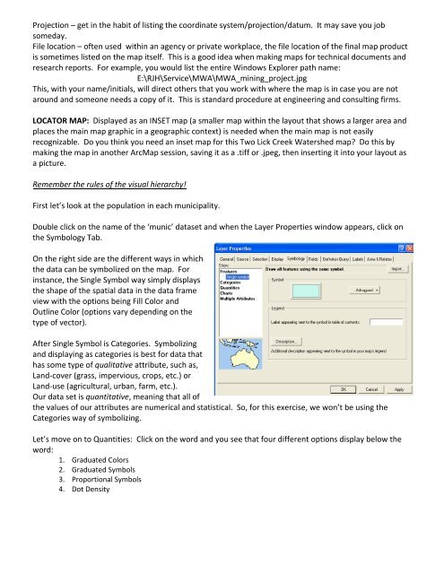
First let’s look at the population in each municipality.<br />
Double click on the name of the ‘munic’ dataset <strong>and</strong> when the Layer Properties window appears, click on<br />
the <strong>Symbology</strong> Tab.<br />
On the right side are the different ways in which<br />
the data can be symbolized on the map. For<br />
instance, the Single Symbol way simply displays<br />
the shape of the spatial data in the data frame<br />
view with the options being Fill Color <strong>and</strong><br />
Outline Color (options vary depending on the<br />
type of vec<strong>to</strong>r).<br />
After Single Symbol is Categories. Symbolizing<br />
<strong>and</strong> displaying as categories is best for data that<br />
has some type of qualitative attribute, such as,<br />
L<strong>and</strong>‐cover (grass, impervious, crops, etc.) or<br />
L<strong>and</strong>‐use (agricultural, urban, farm, etc.).<br />
Our data set is quantitative, meaning that all of<br />
the values of our attributes are numerical <strong>and</strong> statistical. So, for this exercise, we won’t be using the<br />
Categories way of symbolizing.<br />
Let’s move on <strong>to</strong> Quantities: Click on the word <strong>and</strong> you see that four different options display below the<br />
word:<br />
1. Graduated Colors<br />
2. Graduated Symbols<br />
3. Proportional Symbols<br />
4. Dot Density