Intro to GIS Exercise #5 – Symbology and Map Layout / Design IUP ...
Intro to GIS Exercise #5 – Symbology and Map Layout / Design IUP ...
Intro to GIS Exercise #5 – Symbology and Map Layout / Design IUP ...
You also want an ePaper? Increase the reach of your titles
YUMPU automatically turns print PDFs into web optimized ePapers that Google loves.
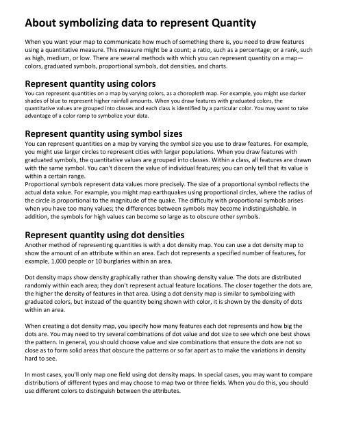
About symbolizing data <strong>to</strong> represent Quantity<br />
When you want your map <strong>to</strong> communicate how much of something there is, you need <strong>to</strong> draw features<br />
using a quantitative measure. This measure might be a count; a ratio, such as a percentage; or a rank, such<br />
as high, medium, or low. There are several methods with which you can represent quantity on a map—<br />
colors, graduated symbols, proportional symbols, dot densities, <strong>and</strong> charts.<br />
Represent quantity using colors<br />
You can represent quantities on a map by varying colors, as a choropleth map. For example, you might use darker<br />
shades of blue <strong>to</strong> represent higher rainfall amounts. When you draw features with graduated colors, the<br />
quantitative values are grouped in<strong>to</strong> classes <strong>and</strong> each class is identified by a particular color. You may want <strong>to</strong> take<br />
advantage of a color ramp <strong>to</strong> symbolize your data.<br />
Represent quantity using symbol sizes<br />
You can represent quantities on a map by varying the symbol size you use <strong>to</strong> draw features. For example,<br />
you might use larger circles <strong>to</strong> represent cities with larger populations. When you draw features with<br />
graduated symbols, the quantitative values are grouped in<strong>to</strong> classes. Within a class, all features are drawn<br />
with the same symbol. You can't discern the value of individual features; you can only tell that its value is<br />
within a certain range.<br />
Proportional symbols represent data values more precisely. The size of a proportional symbol reflects the<br />
actual data value. For example, you might map earthquakes using proportional circles, where the radius of<br />
the circle is proportional <strong>to</strong> the magnitude of the quake. The difficulty with proportional symbols arises<br />
when you have <strong>to</strong>o many values; the differences between symbols may become indistinguishable. In<br />
addition, the symbols for high values can become so large as <strong>to</strong> obscure other symbols.<br />
Represent quantity using dot densities<br />
Another method of representing quantities is with a dot density map. You can use a dot density map <strong>to</strong><br />
show the amount of an attribute within an area. Each dot represents a specified number of features, for<br />
example, 1,000 people or 10 burglaries within an area.<br />
Dot density maps show density graphically rather than showing density value. The dots are distributed<br />
r<strong>and</strong>omly within each area; they don't represent actual feature locations. The closer <strong>to</strong>gether the dots are,<br />
the higher the density of features in that area. Using a dot density map is similar <strong>to</strong> symbolizing with<br />
graduated colors, but instead of the quantity being shown with color, it is shown by the density of dots<br />
within an area.<br />
When creating a dot density map, you specify how many features each dot represents <strong>and</strong> how big the<br />
dots are. You may need <strong>to</strong> try several combinations of dot value <strong>and</strong> dot size <strong>to</strong> see which one best shows<br />
the pattern. In general, you should choose value <strong>and</strong> size combinations that ensure the dots are not so<br />
close as <strong>to</strong> form solid areas that obscure the patterns or so far apart as <strong>to</strong> make the variations in density<br />
hard <strong>to</strong> see.<br />
In most cases, you'll only map one field using dot density maps. In special cases, you may want <strong>to</strong> compare<br />
distributions of different types <strong>and</strong> may choose <strong>to</strong> map two or three fields. When you do this, you should<br />
use different colors <strong>to</strong> distinguish between the attributes.


