PRE-PUBLICA TION EDITION - Nelson Education
PRE-PUBLICA TION EDITION - Nelson Education
PRE-PUBLICA TION EDITION - Nelson Education

Create successful ePaper yourself
Turn your PDF publications into a flip-book with our unique Google optimized e-Paper software.
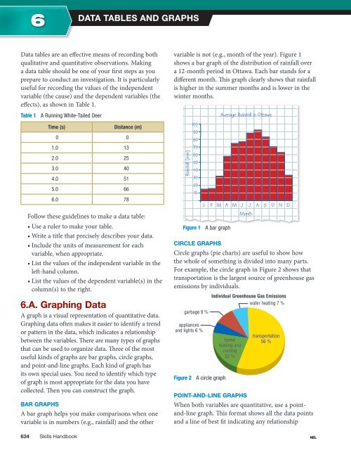
6Data Tables and GraphsData tables are an effective means of recording bothqualitative and quantitative observations. Makinga data table should be one of your first steps as youprepare to conduct an investigation. It is particularlyuseful for recording the values of the independentvariable (the cause) and the dependent variables (theeffects), as shown in Table 1.Table 1 A Running White-Tailed DeerTime (s)Distance (m)0 01.0 132.0 253.0 404.0 515.0 666.0 78Follow these guidelines to make a data table:• Use a ruler to make your table.• Write a title that precisely describes your data.• Include the units of measurement for eachvariable, when appropriate.• List the values of the independent variable in theleft-hand column.• List the values of the dependent variable(s) in thecolumn(s) to the right.6.A. Graphing DataA graph is a visual representation of quantitative data.Graphing data often makes it easier to identify a trendor pattern in the data, which indicates a relationshipbetween the variables. There are many types of graphsthat can be used to organize data. Three of the mostuseful kinds of graphs are bar graphs, circle graphs,and point-and-line graphs. Each kind of graph hasits own special uses. You need to identify which typeof graph is most appropriate for the data you havecollected. Then you can construct the graph.Bar GraphsA bar graph helps you make comparisons when onevariable is in numbers (e.g., rainfall) and the othervariable is not (e.g., month of the year). Figure 1shows a bar graph of the distribution of rainfall overa 12-month period in Ottawa. Each bar stands for adifferent month. This graph clearly shows that rainfallis higher in the summer months and is lower in thewinter months.Rainfall (mm)100908070605040302010Average Rainfall in OttawaJ F M A M J J A S O N DMonthFigure 1 A bar graphCircle GraphsCircle graphs (pie charts) are useful to show howthe whole of something is divided into many parts.For example, the circle graph in Figure 2 shows thattransportation is the largest source of greenhouse gasemissions by individuals.Individual Greenhouse Gas EmissionsIndividual Greenhouse Gas Emissionswater heating 7 %water heating garbage 9 %garbage appliancesandapplianceslights 6 %and lights Figure 2 A circle graphhomeheatinghomeandheatingcoolingandcooling22 %22 transportationtransportation56 %56 Point-and-Line GraphsWhen both variables are quantitative, use a pointand-linegraph. This format shows all the data pointsand a line of best fit indicating any relationship634 Skills Handbook NEL