


Create successful ePaper yourself
Turn your PDF publications into a flip-book with our unique Google optimized e-Paper software.
<strong>Tom</strong> <strong>Thomson</strong><br />
Life & Work by David P. Silcox<br />
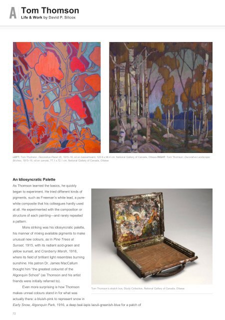
LEFT: <strong>Tom</strong> <strong>Thomson</strong>, Decorative Panel (II), 1915–16, oil on beaverboard, 120.8 x 96.4 cm, National Gallery of Canada, Ottawa RIGHT: <strong>Tom</strong> <strong>Thomson</strong>, Decorative Landscape:<br />
Birches, 1915–16, oil on canvas, 77.1 x 72.1 cm, National Gallery of Canada, Ottawa<br />
An Idiosyncratic Palette<br />
As <strong>Thomson</strong> learned the basics, he quickly<br />
began to experiment. He tried different kinds of<br />
pigments, such as Freeman’s white lead, a purewhite<br />
composite that his colleagues hardly used<br />
at all. He experimented with the composition or<br />
structure of each painting—and rarely repeated<br />
a pattern.<br />
More striking was his idiosyncratic palette,<br />
his manner of mixing available pigments to make<br />
unusual new colours, as in Pine Trees at<br />
Sunset, 1915, with its radiant acid-green and<br />
yellow sunset, and Cranberry Marsh, 1916,<br />
where its field of brilliant light resembles burning<br />
sunshine. His patron Dr. James MacCallum<br />
thought him “the greatest colourist of the<br />
Algonquin School” (as <strong>Thomson</strong> and his artist<br />
friends were initially referred to).<br />
Even more surprising is how <strong>Thomson</strong><br />
makes unreal colours stand in for what was<br />
actually there: a bluish-pink to represent snow in<br />
<strong>Tom</strong> <strong>Thomson</strong>’s sketch box, Study Collection, National Gallery of Canada, Ottawa<br />
Early Snow, Algonquin Park, 1916, a deep teal-lapis lazuli-greenish-blue for a patch of<br />
72