
Create successful ePaper yourself
Turn your PDF publications into a flip-book with our unique Google optimized e-Paper software.
The Prepress Magazine<br />
issue #4 / a u g u s t <strong>2019</strong><br />
The Power of Fashion<br />
Fashion is everywhere<br />
Made with Fire and Water<br />
Packaging to last more than a lifetime<br />
Extruder<br />
Aerial acrobatics with<br />
astonishing results<br />
<strong>Linked</strong>2Brands<br />
Roots and wings for<br />
consistent brand presentation
e d i t o r i a l<br />
issue #4 ©<br />
l i n k e d<br />
3<br />
Dear Reader,<br />
We are delighted that our <strong>magazine</strong> LINKED has aroused so much<br />
interest, and we are also proud to have received the design prize<br />
"Red Dot Award" for LINKED. Both of these facts tell us something<br />
about the status of print products.<br />
At any moment, the POS shows how important absolutely perfect<br />
quality is: three seconds is all the time it takes for a consumer<br />
to make a purchasing decision, so the packaging has to be just right<br />
and the print on it flawless.<br />
This issue of LINKED illuminates the many different aspects of the<br />
world of packaging. It reports on how a medium that has been<br />
declared dead hundreds of times has returned to the cultural stage:<br />
the LP – together with its packaging – is celebrating a major comeback.<br />
Album cover design has long been recognised as an art form.<br />
The articles in this issue of LINKED range from a feature on how<br />
wine barrels – a form of packaging with an additional function –<br />
are made, to descriptions of packaging materials whose consistent<br />
branded print is one of our major challenges.<br />
In order to offer our clients even more flexible support in the uniform<br />
presentation of their brands, we have founded <strong>Linked</strong>2Brands.<br />
Our experts in design adaptation, artwork, repro and exact colour<br />
management are constantly expanding their know-how – all in the<br />
name of a perfect reproduction of your brands.<br />
Encouraged by the Red Dot Award, we have remained true to tradition<br />
in LINKED#4. Once again, you will find a wealth of information<br />
and entertainment in this issue – from inside and outside <strong>Janoschka</strong>.<br />
With this in mind, we wish you an enjoyable read!<br />
Yours,<br />
Alexander <strong>Janoschka</strong><br />
member of the executive board
4 c o n t e n t s<br />
contents issue #4<br />
20<br />
30<br />
6<br />
28<br />
insights<br />
6 The Power of Fashion<br />
Fashion is everywhere<br />
20 Eyes That Hear<br />
Discover the cover<br />
face to face<br />
28 Made with Fire and Water<br />
Packaging to last more than a lifetime<br />
knowledge & competence<br />
30 <strong>Linked</strong>2Brands<br />
Roots and wings for consistent<br />
brand presentation<br />
40 Extruder<br />
Aerial acrobatics<br />
with astonishing results<br />
46 Squaring the Circle<br />
Packaging that does more than just<br />
keep products fresh and sealed
issue #4 ©<br />
l i n k e d<br />
5<br />
58<br />
40<br />
56<br />
network & people<br />
52 The Red Dot<br />
<strong>Janoschka</strong> has won the Red Dot Award<br />
for its high-quality design<br />
<br />
56 Design Trends <strong>2019</strong><br />
Opulent, colourful and back to the 20s<br />
to tell the truth<br />
58 Do You Know Why ...<br />
... pencils are globetrotters?<br />
notes<br />
62 Go East<br />
<strong>Janoschka</strong> extends its footprint in Asia<br />
64 We Do Need Another Hero<br />
Ecommerce goes mobile
6 i n s i g h t s<br />
THE POWER OF<br />
FASHION
issue #4 ©<br />
l i n k e d<br />
7<br />
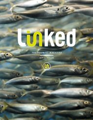
Fashion is everywhere. It appeals to our senses. We use it to set ourselves<br />
apart or to show that we belong. It not only defines our taste, our way<br />
of thinking and feeling, but can even rewire it. After that, nothing is the<br />
same as it was before. In short: fashion has the passion and the power to<br />
create a zeitgeist.<br />
This happens at the major haute couture fashion shows in Paris, Milan<br />
and New York. But it also happens on any small street in our towns and<br />
villages – anywhere in the world that people wear clothes. Levis 501s,<br />
high heels or flip-flops, pin stripes or check shirts, even the humble white<br />
T-shirt: anything we wear is a fashion statement – and always tells a<br />
story about ourselves.<br />
“Always live beyond your wildest<br />
dreams: If there is no style, invent<br />
it, if there is a rule, break it.”<br />
Paul Poiret was the world’s most influential fashion designer<br />
from 1903 until the end of the First World War.<br />
In Paris, he was known as “Le Magnifique”, in America they<br />
reverently called him the “King of Fashion”.<br />
Paul Poirret reveals his low-cut secrets.
8 i n s i g h t s
issue #4 ©<br />
l i n k e d<br />
9<br />
THE<br />
POWER<br />
to Save a Life
10 i n s i g h t s<br />
The Power<br />
to Save a Life<br />
It’s the mid-90s. Street fashion – literally – marks the<br />
street scenes: wide, low-slung trousers, 9XL size<br />
T-shirts as well as hooded T-shirts combined with<br />
sneakers or Timberland boots. The origins of this style<br />
lie in Hip Hop – and thus in the ghettos of US cities.<br />
Clothes needed to be casual and loose so you could<br />
move freely in the Breakdance and graffiti sprayer<br />
scene. The colours were loud and motley.<br />
Shortly before the turn of the millennium, this identification<br />
with the ghettos and underdogs culminated in<br />
Gangsta Rap – in musical terms, the most influential<br />
style of the genre. Consequently, the outfits worn by<br />
street gangs influenced clothing styles: trousers slung<br />
low because the inmates of American prisons were<br />
not allowed to wear belts. Nor were shoelaces permitted,<br />
so shoes were left open to complete the cool look.<br />
At the same time, the slums of Los Angeles were ablaze<br />
and the notorious West Coast gangs were becoming<br />
more radical. They too contributed to the Hip Hop<br />
fashion story. Tattoos were obligatory, the membership<br />
of a certain camp was also indicated by wearing<br />
appropriate colours. Red for the Bloods, blue for the<br />
Cribs. Los Angeles gained the reputation of the<br />
“Gang Capital of America”. Rough estimates put<br />
the number of gangs at up to 1,300 with more than<br />
100,000 members.<br />
"Damn it, G, I'll ... tattoo<br />
that on my heart",<br />
one of his homies replied.<br />
It inspired the title of one<br />
of Gregory Boyle's books.<br />
homeboyindustries.org
issue #4 ©<br />
l i n k e d<br />
11<br />
“Nothing stops<br />
a bullet<br />
like a job”<br />
The greatest danger is growing up in the wrong area.<br />
And the ghettos of Los Angeles are about as wrong as<br />
you can get. If it wasn’t for Father Gregory Boyle, they<br />
would mean certain death for many – even today. The<br />
Jesuit priest is the founder of Homeboy Industries,<br />
the world’s largest rehabilitation project for ex-gang<br />
members. Thanks to Father G, as the homies call him,<br />
they are given the chance to live a different life.<br />
Each year, over 10,000 former gang members and convicts,<br />
mostly muscular young men with striking tattoos,<br />
but also women, from all over Los Angeles pass through<br />
the doors of Homeboy Industries to make a positive<br />
change in their lives. Father G welcomes them. Anyone<br />
who comes to him has his full attention. He gives them<br />
jobs: as bakers in the Homeboy Bakery, as waitresses<br />
at the Homegirl Café, in the manufacture of Homeboy<br />
Apparel and Merchandise or in textile printing at Homeboy<br />
Silkscreen.<br />
Anyone who decides to exchange the dream of fast drug<br />
money for an eight dollar per hour job wears one of the<br />
Homeboy Industries T-shirts. “Nothing stops a bullet like<br />
a job” is Boyle’s bestseller. Homeboy Silkscreen prints<br />
textiles, both custom designs for clients and their own<br />
silk-screen printing “Street Fashion” range. The T-shirts,<br />
hoodies, trousers and baseball caps featuring the company<br />
logo (women get the “Homegirl” print) have developed<br />
into a fast seller generating two-digit growth rates<br />
and an unquantifiable social profit.<br />
Whether “Jobs not Jails”, “Live as though the truth were<br />
true” or a quote from Father Greg – “Sooner or later, we<br />
all discover that kindness is the only strength there is” –<br />
the Street Fashion from Homeboy Industries proclaims<br />
its very own message of hope.
12 i n s i g h t s<br />
Empowerment<br />
of<br />
Women
issue #4 ©<br />
l i n k e d<br />
13
14 i n s i g h t s<br />
Empowerment of Women –<br />
Yves Saint Laurent:<br />
trousers for madame<br />
Paris, 1966: From the bikini to the miniskirt, time<br />
and again fashion items have shocked society.<br />
“Le Smoking” played in its very own sublime<br />
league: when Yves Saint Laurent sent the first<br />
women’s tuxedo out onto the catwalk at his<br />
1966 autumn show, he started a revolution.<br />
Two years before the turbulent Paris riots of<br />
May 1968, a law was still in force that prohibited<br />
women from wearing trousers. Trousers<br />
on women were scandalous and considered<br />
to be “obscene”. So how could the tuxedo, a<br />
very masculine piece of clothing, become the<br />
symbol of female emancipation? It took a revolutionary<br />
– someone like Yves Saint Laurent – to<br />
achieve this. Even as a young designer at Dior he<br />
added his own distinct signature to each of his<br />
designs. Yves Saint Laurent was an artist, a true<br />
talent, who dedicated himself wholeheartedly<br />
to design. This outstanding figure soon caused<br />
a sensation and radically changed the whole<br />
world of fashion.<br />
To this day, Yves Saint Laurent is synonymous<br />
with beauty, style and elegance. In each of his<br />
collections, he created his very own vision of<br />
female grace. In the case of “Le Smoking”, he<br />
was not dealing with androgyny.<br />
On the contrary, the tuxedo subtly underlines<br />
female sensuality and the art of seduction.<br />
“It is virile and at the same time feminine”,<br />
raved Catherine Deneuve. She became the first<br />
customer by ordering her “Le Smoking” immediately<br />
after its première. Like any haute couture<br />
outfit, the suit was made for her and her alone.<br />
Liza Minelli, Lauren Bacall, Loulou de la Falaise<br />
and Angelina Jolie followed. Bianca Jagger wore<br />
a white Saint Laurent smoking when she married<br />
Mick in 1971 – with nothing underneath.<br />
An iconic fusion of art and fashion: The first “Le Smoking”<br />
consisted of a classic dinner jacket worn with trousers<br />
and a ruffled white shirt, black bow tie and a wide<br />
satin cummerbund.
issue #4 ©<br />
l i n k e d<br />
15<br />
For over fifty years, the Yves Saint Laurent house<br />
has created a new interpretation of “Le Smoking”<br />
on an annual basis. It is always cut from fine<br />
“grain de poudre” – a fabric that Saint Laurent<br />
loved – “in which women could travel”.<br />
Featuring almost brushstroke-like outlines, it is<br />
the soft but accentuated shoulder line that gives<br />
“Le Smoking” its incomparable silhouette. With<br />
its simple elegance it is the embodiment of chic.<br />
A cut that managed to turn an era on its head.<br />
Saint Laurent did not invent the trouser suit (Marlene<br />
Dietrich already wore tailor-made suits in<br />
her day), but with his daring design he made it<br />
accessible. As the legendary couturier said at his<br />
farewell show in 2002:<br />
“I always wanted to put myself at the service<br />
of women. I wanted to accompany them in the<br />
great movement for liberation that occurred last<br />
century.”<br />
So what about the law forbidding women from<br />
wearing trousers? It dates back to a very different<br />
revolution. A decree by the Paris authorities<br />
from the 26th Brumaire of the Revolution year<br />
IX (i.e. from 17 November 1800) stipulated that<br />
women “who wish to dress like men” require<br />
permission from the police prefecture. This curious<br />
regulation was abolished almost fifty years<br />
after the debut of Yves Saint Laurent’s legendary<br />
“Le Smoking”. So you could say that Parisian<br />
women have only been able to wear trousers<br />
with official blessing when not riding a bicycle or<br />
a horse since 2013.<br />
James Bond would be unimaginable without his black dinner jacket<br />
with a white shirt and bowtie. To male icons like George Clooney,<br />
Brad Pitt or Russell Crowe the tuxedo adds a sophisticated touch.<br />
Its home is on the red carpet.<br />
“If Chanel gave women their<br />
freedom, it was Saint Laurent who<br />
empowered them.”<br />
Pierre Bergé, long-time friend and<br />
partner of Yves Saint Laurent<br />
The name “Le Smoking” nods to nineteenth-century men’s smoking<br />
jackets, so called because their silk lapels were designed to allow<br />
any ash falling from after-dinner cigars or cigarettes to slide off,<br />
keeping the jacket clean.
16 i n s i g h t s
issue #4 ©<br />
l i n k e d<br />
17<br />
Flower power<br />
Creating a<br />
fashion market
18 i n s i g h t s<br />
Flower power<br />
Creating a fashion market<br />
1965 – 1975. Long hair (on men and women),<br />
flares and colourful dresses. The mix-and-match<br />
aesthetics of the Hippie movement crossed<br />
the Atlantic and paved the way for a new lifestyle.<br />
The miniskirt earned its place as the<br />
decade’s most iconic look, as young women<br />
dared to bare. At the same time, men enjoyed<br />
the new freedom of extravagant clothing: suits<br />
with sweeping lapels on top of shirts in vibrant,<br />
psychedelic colours and combined with highheeled<br />
platform shoes.<br />
The counterculture of the late 60s and early 70s<br />
was an all-embracing cultural phenomenon. In<br />
reaction to the brutality and the victims of the<br />
Vietnam War, a protest movement grew in the<br />
United States that soon spread to the other<br />
industrial nations of the Western world. People<br />
fought for freedom and for civil, women’s and<br />
gay rights. Convinced that they were doing the<br />
right thing morally, they turned against age-old<br />
traditions and demanded changes to authoritarian<br />
social structures. The call for freedom and<br />
a new way of living encompassed all areas:<br />
politics, art, music, fashion, and not least<br />
sex and drugs. It marked the birth of the<br />
modern age.<br />
"Clothes in which you can run<br />
for the bus or dance."<br />
Mary Quant on her invention<br />
of the mini-skirt
issue #4 ©<br />
l i n k e d<br />
19<br />
A new dawning<br />
People expressed their new world view<br />
with their clothes as tokens of their changed<br />
attitudes and their new lifestyle. Until then,<br />
fashion had been dominated by the tastes of<br />
a wealthy and above all, established elite. The<br />
styles worn by young people hardly differed<br />
from their parents’ generation: girls and young<br />
women wore the same dresses and coats as<br />
their mothers – often even made by them – and<br />
went out carrying handbags, gloves and hats.<br />
Then everything changed overnight: the popstars<br />
of the era were absolute gods. Their<br />
clothing and way of life had a major impact<br />
through the young medium of television. At the<br />
same time, increasing financial independence<br />
allowed young people to do what they wanted.<br />
They were able to express their identity<br />
and their feeling of freedom. The fashion<br />
industry quickly responded by creating designs<br />
for young people that no longer simply copied<br />
“grown up” styles. Innovative designers were<br />
seen as creators of fame, sex appeal and glamour.<br />
They created a new market for youth fashion.<br />
A new “business model” was essential for the<br />
full potential of this new kind of youth fashion<br />
to be exploited. As a result, a special type of<br />
boutique emerged in London, i.e. small self-service<br />
shops providing ordinary young people with<br />
affordable fashion. The shopping experience<br />
was a far cry from the more formal outfitters<br />
and old-fashioned department stores.<br />
Their radical new approach with expressive<br />
colours, distinct lines and individual items that<br />
could be combined in a creative way swiftly<br />
spread across the whole Western world. To this<br />
day, this kind of fashion boutique characterises<br />
city centres and our shopping experience. They<br />
were the expression of a wild, revolutionary and<br />
free generation.<br />
Printed fabrics<br />
Textile printing is an old tradition<br />
that has always required expertise<br />
and precision. As the demand for<br />
large-format printed images grew<br />
in the 1920s, textile screen printing<br />
started to develop in Europe and the<br />
United States parallel to the advent<br />
of graphic screen printing.<br />
Rotary screen printing is the technique<br />
of choice when printing fabric<br />
panels. The fabric lies flat, the printing<br />
tool is a sleeve or cylinder. Acting<br />
as a template with a perforated<br />
surface, it allows ink to be applied to<br />
the open sections.<br />
The cylinder rotates in one direction<br />
in sync with the movement of the<br />
fabric. A doctor blade fixed inside<br />
the cylinder applies the ink to the<br />
fabric.<br />
Printing on textile substrates is more<br />
complex than printing on paper because<br />
different fabrics require special<br />
inks and printing tools. The automation<br />
of printing processes has<br />
not changed this. Working closely<br />
with the designer, the engraver perforates<br />
the nickel sleeves for the<br />
cylinders based on the design to be<br />
printed. Since the screen printing<br />
templates often have a maximum<br />
thickness of just 100 µ, but can<br />
measure up to 3.5 metres in width,<br />
the manufacture and handling of<br />
screen-printing templates requires<br />
the utmost care and expertise.
20 i n s i g h t s<br />
Eyes that hear<br />
Discover the cover<br />
by Kai Martin<br />
Christie’s auction house, London. The hall is full and people are waiting with bated breath for the art auction<br />
to begin. The first works are brought onto the stage, the paintings as always completely covered.<br />
The auctioneer taps the frame of the first picture a few times with his little silver hammer. Then he repeats<br />
the process for the next painting. Which frame sounds most attractive?<br />
Which sound sets off a murmur in the audience? Please place your bids!<br />
Difficult to imagine, isn't it? And yet scenarios like this one take place on a daily basis all over the world,<br />
for instance when sales of an LP or a CD are determined by its cover.<br />
A feast for the eyes as well as the ears – in fact, when it comes to records, it is the eyes that decide<br />
whether to buy. We read and hear time and again about people who go solely by the appearance<br />
of the cover when they buy an album. They may be in a minority, but this still proves the point that the<br />
packaging of a recording medium has a tremendous influence on the purchasing behaviour of consumers.<br />
Why is that? Especially before the invention of CDs, record covers acquired a significance that went well<br />
beyond anyone's ideas about what the record was actually intended for. Record covers were<br />
regarded not just as a high-profile playground for extraordinarily creative designers, but by many as an<br />
art form in their own right.
issue #4 ©<br />
l i n k e d<br />
21<br />
Record sleeves in colour – a simple<br />
but ingenious idea<br />
It probably didn't occur to Alex Steinweiss that he was creating a new art form<br />
when he became the first person to illustrate a shellac record cover with a motif<br />
back in 1940. At the time, he was a twenty-three-year-old designer working for<br />
Columbia Records in Connecticut. Before this simple stroke of genius, shellac<br />
records had been packaged in a uniform grey cardboard sleeve. Steinweiss<br />
changed that. His first cover design was for a record by Broadway songwriters<br />
Richard Rodgers and Lorenz Hart. He had a photographer capture the illuminated<br />
lettering "Rodgers & Hart" on a New York theatre on camera; to this he added the<br />
stylised grooves of a shellac record and hey presto: there was his image.<br />
It was an enormous success. Columbia Records experienced a major increase<br />
in sales, and Steinweiss became a leading light in the newly discovered world of<br />
cover design. In an interview with the Süddeutsche Zeitung newspaper in 2010,<br />
he described what was behind his idea: "I wanted people to see the cover and<br />
immediately hear the music." A credo that remains valid to this day. "There’s more<br />
to the picture than meets the eye," is a line from a song by rock legend Neil Young.<br />
And he was quite right, because an image can conjure up more than just sound<br />
in the mind's eye (or ear). A record cover can also be a statement. It has the<br />
power to communicate an attitude and to leave its stamp on an artist's image.<br />
Sometimes on that of an entire generation.<br />
One record company that succeeded in doing this quite early on is the jazz<br />
label Blue Note Records. Alfred Lion and Francis Wolff, two German Jews<br />
who emigrated to the United States, founded the label in 1939. Both were<br />
reputed to have a strong affinity with the world-famous Bauhaus – perhaps<br />
that's why the covers of the albums they released helped them to establish a<br />
design benchmark.
22 i n s i g h t s<br />
Not a jazz fan,<br />
but a talented graphic artist<br />
Reid Miles, an American who worked for Blue Note from 1956, designed legendary<br />
covers, often using photos taken by Blue Note director Wolff. Miles was drawn<br />
to typography, and by combining a visual motif, a colour scheme and lettering,<br />
he succeeded in visualising the cool vibe of jazz. A perfect example of this is the<br />
album Sonny Rollins, Vol. 2 released in 1957. The image is of a man with a huge<br />
saxophone, casually drawing on a cigarette. But it is more than just an album cover:<br />
it is a symbol of an entire musical genre and era.<br />
Joe Jackson’s homage and statement:<br />
The joy of music extends beyond mere melody,<br />
to arrangement, instrumentation and – style.<br />
An interesting aspect of the story is that the music for which Reid Miles created such<br />
perfectly matching packaging wasn't really his cup of tea. A fan of classical music, he<br />
didn't even bother listening to the jazz recordings and instead simply asked his bosses<br />
to explain what was cool about the modern sound.<br />
Individual album covers are often loaded with associations, as the frequency with<br />
which they are quoted suggests. When Joe Jackson, a pop and rock musician with a<br />
penchant for jazz and world music, released his album Body and Soul in 1984, he used<br />
a revamped version of the Sonny Rollins cover from 1957. In this case surely a primarily<br />
musical homage, which is not to deny the charisma of many cover designs.
issue #4 ©<br />
l i n k e d<br />
23<br />
Symbols, Surrealism and<br />
Samba pa Ti<br />
Photography and typography have always been important for record covers,<br />
but painting also had a key role to play. One of the most influential artists during<br />
the era when pop music was making its breakthrough – the late 60s and<br />
early 70s, in other words – was Mati Klarwein. Born in Germany in 1932,<br />
Klarwein emigrated with his parents to Palestine when he was two. After<br />
living in Paris for a while, the much-travelled Klarwein came to New York in<br />
1965. His friends included Salvador Dalí and Jimi Hendrix.<br />
In 1970, two revolutionary albums were released featuring paintings by Mati<br />
Klarwein on their covers: Bitches Brew by Miles Davis, on which the jazz<br />
genius integrated funk and electronic music in his sound for the first time,<br />
and Abraxas by Santana, which included the instrumental number "Samba<br />
pa Ti" and was later to become a world hit. The cover of Abraxas was based<br />
on Klarwein's "Aleph Sanctuary": a sacred space designed for all religions and<br />
intended as a new interpretation of Michelangelo's Sistine Chapel. It was a<br />
work to which the artist devoted many years.<br />
Klarwein died in 2002. Although the oeuvre of this prolific artist evinces influences<br />
of Surrealism, Symbolism and Pop culture, his name is associated<br />
above all with his LP covers.<br />
Mati Klarwein’s place in the history of 20th century<br />
art is unique, nestling at the crossroads of<br />
painting and music. Numerous musicians such as<br />
Miles Davis, Carlos Santana and Jimi Hendrix<br />
recognised a statement of intent in his work and<br />
used it on their record covers as a manifesto.
24 i n s i g h t s<br />
Bananas and zips<br />
When we think of Mati Klarwein<br />
– New York, 1960s, contemporary<br />
art – then another name<br />
readily springs to mind that is inextricably<br />
linked with the design<br />
of music albums: Andy Warhol.<br />
His famous banana cover for the<br />
album The Velvet Underground<br />
& Nico is familiar even to people<br />
who don't know a single song<br />
on the record. The yellow banana<br />
on a white background that<br />
Andy Warhol created in 1967<br />
was to become a classic image<br />
– for the really revolutionary<br />
thing about his design was that<br />
you could actually peel the banana.<br />
The instruction "Peel slowly<br />
and see" was inscribed in the<br />
top right-hand corner of the first<br />
edition. The unpeeled yellow banana<br />
came with a sticker, which<br />
if you peeled it off revealed the<br />
fruit inside – but in pink.<br />
The delay in releasing the album<br />
was apparently due to the technical<br />
difficulties of producing the<br />
cover. And despite all the fuss,<br />
sales figures were rather disappointing<br />
at first. That is remarkable<br />
given that Andy Warhol,<br />
already famous at the time, not<br />
only designed the cover but also<br />
played a key role in developing<br />
the image and public relations<br />
concept for the band. With hindsight,<br />
one would probably say<br />
that both the music and the art<br />
may have been well ahead of<br />
their time. Today, the cover of<br />
The Velvet Underground & Nico<br />
is regarded as one of the most<br />
outstanding of all time.<br />
Four years later, Warhol succeeded<br />
in producing another<br />
album design that has remained<br />
famous to this day and even<br />
dwarfs the famous songs on<br />
the record. Sticky Fingers by the<br />
Rolling Stones shows a man's<br />
pelvis dressed in jeans whose<br />
zip actually functions. More than<br />
thirty years after the appearance<br />
of the first design, the album<br />
cover had become three-dimensional.<br />
Rolling Stones, Sticky Fingers, 1971,<br />
Cover: Andy Warhol<br />
The Banana Album<br />
(so named for its Warholdesigned<br />
cover) by<br />
The Velvet Underground<br />
and Nico, 1967
issue #4 ©<br />
l i n k e d<br />
25<br />
Radical and devoid<br />
of visual content:<br />
The White Album<br />
Artful and minimalist –<br />
The Beatles' White Album<br />
Embossing technology had already allowed some forays in the direction of three-dimensionality.<br />
The Beatles proved to be very open to innovations, not only of a musical<br />
nature. In November 1968, they released an album officially called The Beatles but<br />
better known under the name White Album. This came less than a year after the release<br />
of Sgt. Pepper’s Lonely Hearts Club Band, whose cover carried an abundance of<br />
detail and bright colours. The first few copies of the Fab Four's minimalist white album<br />
were numbered in sequence, with the lettering "The Beatles" embossed on the front.<br />
The design was by the British Pop Art artist Richard Hamilton.<br />
Hamilton's design symbolises the evolution that album covers had undergone. Having<br />
become an art form, and as such divorced from its original purpose of advertising a<br />
product and providing the consumer with information, the cover was now an event in<br />
its own right – a vehicle for artistic expression where information about the music and<br />
musicians faded into insignificance.
26 i n s i g h t s<br />
An event was also what the British electro-pop band Ultravox had in mind when<br />
they designed the graphic concept for their LP U-Vox, released in 1986. Instead<br />
of a photo, the cover was to have just "U-Vox" written in big silver letters on a<br />
red background and composed of horizontal silver lines rather like a barcode.<br />
The clever touch here was to be an additional plastic sleeve, likewise showing<br />
horizontal lines, which would enclose the cover and conceal the lettering.<br />
The idea was that the viewer would initially see just a uniformly red surface;<br />
only when the LP's cardboard cover was pulled out of the plastic sleeve would<br />
the album's title emerge.<br />
But the plan went wrong. Midge Ure, the singer and the musical ideas man in<br />
Ultravox, describes in his autobiography If I Was how an ambitious design was<br />
thwarted by a simple miscommunication: "It was a great idea, except that all the<br />
lines had to be horizontal and somebody forgot to tell that to the ladies who packaged<br />
the album. They put them all in wrong so it ended up with red-and-silver<br />
tartan squares all over the sleeve." Tartan instead of camouflage – in the music<br />
business like anywhere else, the devil is in the details.<br />
Record cover 2.0<br />
The great fascination still exerted both on music fans and<br />
on musicians and designers by record covers even in the<br />
era of the digital revolution and music streaming is illustrated<br />
by the debut album of a young German band called<br />
Yagow. Their first release in 2017 was issued not only as<br />
a CD but also as a black 12-inch vinyl record whose twocolour<br />
cover was enclosed by a protective screen-printed<br />
PVC sleeve. Each time the viewer removed it from its<br />
cover or pushed it back in, an impressive animation effect<br />
of a twisting spiral was triggered, drawing the viewer<br />
into a hypnotic vortex. An old-fashioned and entirely "nondigital"<br />
feast for the eyes. A pity that Andy Warhol did not<br />
live to see it.<br />
“An exploration of vibe and mood,<br />
space-gazing...” This describes the sound<br />
of the rock trio Yagow as well as the<br />
psychedelic features of the cover design.<br />
vimeo.com/178003506
issue #4 ©<br />
l i n k e d<br />
27<br />
Let’s do it again – originals and "forgeries"<br />
Record covers are quoted time and again, sometimes explicitly, sometimes<br />
less so. And it is not only musicians who reference their colleagues.<br />
The artwork of music albums seems to exert a great fascination on<br />
comedians and cabaret artists too.<br />
The early years of Rock ‘n' Roll. Elvis Presley's<br />
first album was simply called after Presley<br />
himself. Unlike many "more flattering"<br />
pictures of the King printed on record sleeves<br />
in later years, this one strove for authenticity.<br />
Euphoria, dedication, passion – a piece of<br />
pop culture captured in a single photo.<br />
Elvis Presley,<br />
Self-titled, 1956<br />
The Clash,<br />
London Calling, 1979<br />
Euphoria, dedication, passion – here<br />
they are again only this time in an<br />
entirely different guise. Many thought<br />
the advent of Punk spelled the end of<br />
Rock ’n‘ Roll. Only later did it become<br />
clear that Punk rock did not signify a<br />
changing of the guard but rather<br />
a rejuvenation of the genre.<br />
Kruder & Dorfmeister,<br />
G-Stoned, 1993<br />
Simon & Garfunkel,<br />
Bookends, 1968<br />
No more and no less: "The song cycle describes the life<br />
and death of the American Dream" − this is how the<br />
record company's website refers to the album Bookends<br />
by Simon & Garfunkel. The youthful innocence<br />
radiating from the cover photo scarcely seems to fit such<br />
grave subject matter. The choice of black and white was<br />
perhaps intended to overcome this discrepancy.<br />
You might think the cover of Kruder & Dorfmeister's<br />
first EP shows a photo of two DJs and producers from<br />
Austria paying tribute to the music of one of the<br />
best singer/songwriter duos in the world. But Peter<br />
Kruder tells a very different story: because Richard<br />
Dorfmeister thought he bore a striking resemblance<br />
to Art Garfunkel, he convinced Kruder to record an<br />
album solely in order to copy the cover. A true story<br />
or snide Viennese humour? The answer is blowing in<br />
the wind<br />
This is not a photo montage: the man on<br />
one of the world's most famous record<br />
covers really was on fire. During the<br />
photo shoot engineered by the British<br />
graphic designer Storm Thorgerson, two<br />
stuntmen were filmed shaking hands.<br />
Thorgerson was co-founder of the design<br />
studio Hipgnosis, which designed a large<br />
number of very famous record covers<br />
between 1968 and 1985.<br />
Pink Floyd,<br />
Wish You Were Here, 1975<br />
Hennes Bender,<br />
Alle Jubeljahre, 2018<br />
Unmistakable: Comedian Hennes Bender,<br />
known as an expert on pop culture,<br />
used the setting of the Pink Floyd motif as<br />
a promotion photo for his "Alle Jubeljahre"<br />
tour. It is unlikely that he actually came<br />
into contact with the flames himself –<br />
thanks to Photoshop.
28<br />
f a c e t o f a c e<br />
Made with<br />
Fire and<br />
Water<br />
Packaging to last<br />
more than a lifetime<br />
The wood smoke from the fire has an aromatic smell.<br />
The water evaporates with a gentle hiss. Flames shine brightly<br />
through the small cracks between the gleaming oak boards.<br />
These are the sensory impressions that accompany Klaus<br />
Pauscha's demanding and physically arduous work.<br />
Klaus Pauscha is a cooper in a small community in the Austrian<br />
region of Carinthia.
issue #4 ©<br />
l i n k e d<br />
29<br />
His work on a barrique barrel is now reaching the critical phase:<br />
Pauscha has just poured water over the wooden planks<br />
arranged in a circle round the fire and held together by a metal hoop.<br />
The planks are known as staves owing to their special shape.<br />
Heat alone is not enough to make the hard, rigid wood malleable,<br />
however. Humidity is required as well.<br />
Only then can the staves be bent to form the barrel's characteristic bellied<br />
shape. During the hour that the two-centimetre-thick staves spend standing<br />
around the fire they need to be watered regularly. The interior walls can reach<br />
temperatures of up to 200°C, and even the outer walls measure a temperature<br />
of 60°C. Pauscha keeps feeling the staves with his hand until he decides they<br />
are hot enough. Using a cable winch and the full weight of his body, the cooper<br />
gradually draws the staves closer together at the bottom end with each pull of<br />
the tensioning device. The cracks close, centimetre by centimetre. When he<br />
has finished, Pauscha turns the barrel over and fixes the other side with an iron<br />
manufacturing hoop, which he hammers firmly into place.<br />
Force and craftmanship is needed<br />
to make these big barrels, which<br />
are used for gentle fermentation of<br />
red wines. The size allows for<br />
manual stamping of the mash.
30 f a c e t o f a c e<br />
pauscha-partner.at
issue #4 ©<br />
l i n k e d<br />
31<br />
Experience, diligence and<br />
the work of centuries<br />
Before the moment comes when the barrel takes on its<br />
typical shape, some careful preparation is required. When<br />
the cooper arranges the staves for the barrel he carefully<br />
checks each one for its grain and cut. Both of these are<br />
key factors in making the barrel impermeable. The number<br />
of staves required as well as the angle at which each<br />
piece of wood is cut depend on the size and shape of the<br />
barrel. Once he has selected the staves he puts them in a<br />
mounting hoop made of metal. If everything fits properly,<br />
each stave supports the adjacent one. The barrel has been<br />
"mounted", now for the fire.<br />
For a cooper, carefully choosing the right wood is the name<br />
of the game, and not only when it comes to making the<br />
barrel: the wood also has a decisive influence on the quality<br />
and flavour of the wine maturing inside it. Originally, winemakers<br />
used barrels made of a whole range of woods:<br />
acacia, beech, chestnut, cherry or poplar. But over time it<br />
transpired that oak and wine make a perfect combination.<br />
Oaks have been growing on almost all the Earth's continents for 60 million years. Of the roughly<br />
400 different species of oak, the European Quercus sessilis or Quercus pedunculator together with the<br />
American Quercus alba are the most suitable for making wine barrels.<br />
Vintners all over the world agree that oak from France is the best – and the most expensive. An oak that<br />
is split to make staves today probably started life as an acorn at the time that Napoleon set out to conquer<br />
the world. Because they grow so slowly, oaks are very hard and stable, but at the same time supple<br />
enough to be bent to a certain extent. Unlike their American sisters, European oaks have to be split into<br />
staves by hand. An oak barrel can be filled and emptied again hundreds of times without changing its<br />
shape. It will last for generations.
32 f a c e t o f a c e<br />
How to make a plank into a stave<br />
Staves are the pieces of wood used to make the walls of a barrel. Wider in the middle and tapered at both ends,<br />
they give barrels their characteristic bellied shape. Their edges are chamfered at a certain angle so that when they are<br />
arranged side by side they form a round or elliptical shape.<br />
The European oak used for making barrels is split along the grain. The structure of the fibres thus remains intact<br />
and ensures that the wood is impermeable. Sawing the wood damages the fibres and makes the wood porous.<br />
Staves need to be seasoned for years before they are made into barrels – preferably outside, since sun,<br />
wind, snow and rain leach undesirable flavours out of the wood and render it harmonious. The staves should be<br />
stored for one year for each centimetre of thickness.<br />
Until well into the 1960s, coopers in many parts of Austria used to stack the staves to dry in artfully layered towers<br />
12–15 m high with between six and twelve corners – so-called " devil's boxes". At the bottom, they left an opening<br />
and inside laid crosses of planks. These enabled them to climb up, floor by floor.
issue #4 ©<br />
l i n k e d<br />
33<br />
Aroma is what<br />
it's all about<br />
Just as locales and grapes all generate their own<br />
very specific taste, every location and every oak is<br />
different and influences the wine in different ways.<br />
"A barrel should enhance the wine and add only the<br />
desired aromas. The wooden barrel responds to every<br />
mistake the cellarer makes with alien notes and<br />
disharmonious nuances". Hildegard Horat speaks from<br />
experience. She has been producing organic wines for<br />
more than thirty-five years at her vineyard "La Grange<br />
de Quatre Sous" in the French Languedoc region. She<br />
uses oak barrels for both her elegant red wines and<br />
her ebullient white ones.<br />
Barrels made out of fine-pored French oak are very<br />
popular for high-quality wines, because oak contains a<br />
lot of tannin. As the grapes ferment in the barrel, the<br />
alcohol gradually draws out the tannin, giving the wine<br />
aromas of vanilla, herbs and fruits and helping it to<br />
develop a full-bodied, harmonious character.<br />
Apart from the tannin contained naturally in the oak,<br />
the cooper himself has a major influence on the<br />
flavours the barrel lends to the wine. After Pauscha<br />
has pulled the barrel together in the traditional way,<br />
he puts it back on a fire again, this time for the socalled<br />
"toasting". Together with the vintner for whom<br />
the barrel is destined, Pauscha decides how strong<br />
the toasting needs to be. These two fields of expertise<br />
complement one another perfectly to create a harmonious<br />
whole: the vintner knows how climate, soil and<br />
grapes interact, how to time the processes of fermentation<br />
and maturation. The cooper knows his wood<br />
and the effect the fire has on it: the length of toasting<br />
determines the most subtle nuances of taste.<br />
The long road to a good wine leads via the soil, together with sun, air and wood.<br />
Each step requires hard work, know-how and dedication.<br />
Barrique<br />
The most well-known type of wine barrel is the barrique. It was laid down<br />
in Bordeaux in 1866 that the barrique should hold exactly 225 litres.<br />
Almost by chance this size turned out to yield an optimal surface ratio between<br />
wood and wine, and this size of barrel was also easy to handle.
34 f a c e t o f a c e<br />
The bottom of the barrel<br />
Before the wine can be filled into the new barrel,<br />
a few more steps are required. It is still open at<br />
both ends. In order to fit the end pieces, the cooper<br />
first mills an indentation into the inside wall of the<br />
barrel at top and bottom. This is called the croze,<br />
which serves as a groove for the end piece. Traditionally,<br />
he measures the exact circumference of<br />
the barrel with dividers on the inside of this groove.<br />
Precision is all important here because it guarantees<br />
the barrel will be impermeable.<br />
Pauscha also makes the ends of the barrels out of<br />
oak. They are held together by wooden dowels.<br />
After taking precise measurements, the cooper<br />
saws them to fit the barrel in either a round or<br />
elliptical shape, tapering them towards the edge.<br />
He applies a paste made of linseed, flour and water<br />
to the croze.<br />
Traditionally, he uses reeds to seal the joins.<br />
Using only natural materials ensures that nothing<br />
can adulterate the taste of the wine that will later<br />
be stored in the barrel. In order to hammer the<br />
ends into the barrel, Pauscha removes the upper<br />
mounting hoop.<br />
Galvanized metal hoops are what ultimately hold<br />
the staves together. Making these is also part<br />
of the cooper's craft. Pauscha rolls the metal<br />
hoops to match the dimensions of the barrel and<br />
rivets them. He then gradually removes the other<br />
mounting hoops from the barrel and hammers the<br />
specially made metal hoops into their final position.<br />
The final hoop, the chime hoop, seals the wall<br />
and the end of the barrel together so tightly that<br />
none of the precious content will be lost even in a<br />
hundred years.
issue #4 ©<br />
l i n k e d<br />
35<br />
Archaeological excavations have shown that people were already making barrels<br />
out of oak around 4,000 years ago. It was a perfect way for traders to transport goods<br />
from A to B. They were more stable than clay amphora, and their round shape,<br />
stabilised with metal hoops, allowed them to be turned and rolled easily because only a<br />
small area of the surface ever touched the ground. Over the centuries they were<br />
probably used to transport everything from meat and fish to flour, oil, spices and salt,<br />
and even books, glass and porcelain were put into barrels.<br />
As wine barrels they serve the function of "packaging with a difference".<br />
They are sealed so tightly that wine can be stored in them and breathe at the same time.<br />
Their wood has an effect on the wine, infusing it with valuable tannins and<br />
lending the wine its character.<br />
Meanwhile, back in the Languedoc the barrels are neatly arranged<br />
in Hildegard Horat's wine cellar. They contain red wine that is still<br />
maturing to perfection. She opens the bung hole of one of her<br />
500-litre wooden barrels. The pipette fills with a deep red liquid<br />
with a purple shimmer. She carefully examines the colour and the<br />
bouquet of her "Les Serrottes". The flavour is reminiscent of dried<br />
plums, gingerbread and tobacco. "Its fine tannin structure is the<br />
result of the subtle interaction between the Syrah and Malbec<br />
grapes and the oak." Horat is satisfied: "Here I can smell and taste<br />
our clayey lime soil, the hot summers, the fruity grape. Everything<br />
– even the tree used to make the barrel – plays a role in how the<br />
wine tastes." Barrels and wine – a celebration of the senses.<br />
quatresous.eu
36 k n o w l e d g e & c o m p e t e n c e
issue #4 ©<br />
l i n k e d<br />
37<br />
<strong>Linked</strong>2Brands<br />
Roots and wings for<br />
consistent brand<br />
presentation<br />
We associate Coca-Cola with its typical red label<br />
and its curly, flowing lettering. A particular shade<br />
of green, on the other hand, immediately makes<br />
us think of Starbucks. We see them, we recognise<br />
them and we connect them with a certain attitude<br />
to life: the colours, logos and imagery that combine<br />
to create a brand – a promise even.<br />
Hardly surprising, then, that consumer goods manufacturers<br />
watch with an eagle eye to make sure the<br />
appearance of their brand is absolutely identical all<br />
over the world, whether in Mumbai, Moscow or<br />
Manhattan. This is the only way for a brand to send<br />
consistent signals that guarantee its unmistakeable<br />
identity in the market and provide the typical<br />
brand experience. In the case of consumer goods<br />
(FMCG), it is the packaging that provides the decisive<br />
interface between brand and consumer. Here,<br />
no matter what the background, the elements that<br />
make up the brand, including the logo, the font and<br />
the colours, must always look the same, sometimes<br />
even on small surfaces. The tiniest deviation<br />
in appearance can cause even the best design<br />
ideas to lose their impact, and the branded product<br />
its persuasive power; in other words, the brand<br />
loses its value.<br />
"Consumers have a particular image in their heads<br />
of products and brands, and this must be preserved.<br />
If consumers do not find what they are<br />
looking for on the shelves, they will buy a different<br />
product," Oliver Thoma, Director of the newly<br />
founded <strong>Linked</strong> company, explains.<br />
"We should not take this lightly because more than<br />
70 per cent of purchase decisions are made at the<br />
point of sale."<br />
<strong>Linked</strong>2Brands GmbH is a 100 per cent subsidiary of <strong>Janoschka</strong> AG.<br />
As a production agency for brand owners, <strong>Linked</strong>2Brands specialises<br />
in design adaptation, artwork and colour separation along the entire<br />
pre-press value creation chain. <strong>Linked</strong>2Brands ensures the exact and<br />
consistent presentation of its customers' brands – worldwide.<br />
The company originated from <strong>Janoschka</strong>, the pre-press experts.
38 k n o w l e d g e & c o m p e t e n c e<br />
A uniform appearance<br />
enhances the<br />
value of the brand<br />
Consistent presentation of a brand is the goal –<br />
always and everywhere. That might sound obvious,<br />
but realising it in practice is actually an extremely<br />
complex process. Consumer goods are usually sold<br />
as part of an extensive range of products in a wide<br />
variety of markets. Yoghurt, for example, comes in<br />
printed plastic pots or with a cardboard banderol.<br />
The lids are made of composite materials or aluminium.<br />
Biscuits come in pouch packs, in metal tins<br />
or in cardboard boxes.<br />
Moreover, a biscuit isn't just a biscuit. Manufacturers<br />
produce all manner of baked goods with a wide<br />
range of flavours in an increasing number of versions:<br />
gluten- and lactose-free, reduced sugar,<br />
vegan, with certified organic chocolate or containing<br />
fair trade ingredients.<br />
All this must be convincingly communicated to the<br />
global consumer, through all channels, whether online<br />
or offline – often in a very small space – in many<br />
languages and on a wide variety of packaging of<br />
different materials and sizes. The fact that the<br />
packaging is usually produced at different printers at<br />
various locations does not make things any easier.<br />
All kinds of expertise – from design adaptation,<br />
photography to artwork and colour separations,<br />
not to mention exact colour management – are required<br />
to reproduce a brand identity with a reliable<br />
degree of coherence.<br />
linked.global
issue #4 © l i n k e d 39<br />
"Whether it's an aluminium lid, a plastic bottle, foldable<br />
cartons, tins or plastic film, even environmental<br />
packaging made from corrugated cardboard should<br />
bear the unmistakeable look and feel of a brand.<br />
The big challenge is that all these already very different<br />
materials are not only printed all over the world in<br />
different print shops, but also using different printing<br />
processes," says Markus Fautz, Operations Manager<br />
<strong>Linked</strong>2Brands in Kippenheim, summarising the<br />
complex processes involved.<br />
Being a spin-off from the original business unit –<br />
the brand team at <strong>Janoschka</strong> Deutschland,<br />
<strong>Linked</strong>2Brands has more than twenty-five years of<br />
experience and solid know-how in the world of artwork<br />
development and design adaptation. Thanks<br />
to this legacy, the specialists already have the entire<br />
pre-press process and the realisation of the design<br />
via different printing processes in mind right from<br />
the start. <strong>Linked</strong>2Brands is there to advise producers<br />
of branded products from the very beginning of<br />
the value creation chain and offer solutions that are<br />
relevant at the end of that chain, when the design<br />
is printed.<br />
"If we – as a one-stop-shop – are on board from<br />
early on, we ensure that efficient solutions are chosen,<br />
thus saving our customers money. Our closely<br />
integrated working practices mean that interfaces<br />
are kept to a minimum. Processes flow into one another<br />
flexibly. For our customers, this means shorter<br />
market launch phases," says Stefan Hilss, Managing<br />
Director <strong>Linked</strong>2Brands. "We ensure that all brandrelevant<br />
content reaches consumers wherever they<br />
come into contact with the brand, whether it's in the<br />
supermarket or while mobile shopping."<br />
Through clear communication and close coordination<br />
processes, <strong>Linked</strong>2Brands coordinates the<br />
activities of all players involved. The experts from<br />
<strong>Linked</strong>2Brands tailor each process individually to<br />
their customers and enable brand owners to make<br />
well-informed decisions, thus making it easy to<br />
create printed and digital brand presentations for<br />
FMCG customers of any size. The company's solid<br />
and extensive expertise ensures the uniform presentation<br />
of a brand: from the preliminary design to<br />
the brand experience.<br />
<strong>Linked</strong>2Brands links brands and consumers.
40 k n o w l e d g e & c o m p e t e n c e<br />
Extruder<br />
aerial acrobatics<br />
with astonishing results
issue #4 ©<br />
l i n k e d<br />
41<br />
A large, transparent balloon rises from the machine, glistening as it floats<br />
ever higher in an elongated shape. The substance being blown 20 metres up<br />
into the air like a gigantic soap bubble is liquid plastic. By the time it reaches<br />
its final height, the tube of film has cured and can be further processed.<br />
The fact that liquid plastic can fly is astonishing in itself. But the fact that,<br />
at 15 μm, it is only half as “thick” as a cigarette paper and yet at the same<br />
time consists of eleven different layers is simply high-tech.<br />
Our everyday lives would be unthinkable without plastic film. Its uses range from vehicle construction,<br />
building and agriculture to logistics, chemicals and pharmaceuticals. Consumers encounter it most<br />
often as packaging: it is the wrapping we find around slices of sausage or cheese, ice cream, ready meals,<br />
bars of chocolate, teas and juices. But cleaning products, hygiene articles, medicines and pet food are<br />
likewise displayed on the supermarket shelves in this protective, easy-to-open material.<br />
The thin end of high-tech<br />
An apparently everyday product<br />
refined down to the final μm.<br />
Plastic film is produced in either blown or casting processes.<br />
First of all, an extruder brings the plastic granulate up to<br />
the required temperature by kneading it mechanically. In the<br />
casting method, a flat slit die spreads the liquid granulate<br />
over a moving, water-cooled roller. In the blown method, an<br />
extrusion die creates a tube of film out of the liquid plastic<br />
with the help of air. This then rises upwards, a film-sizing<br />
cage gives it the desired width and an oscillating haul-off reel<br />
transports the cured tube for further processing.<br />
“Many parameters are decisive in plastic film production,”<br />
says Dr. Philipp Hupka, director of Business Development<br />
Extrusion at Windmöller & Hölscher. The company is one<br />
of the leading suppliers of machines and systems for manufacturing<br />
and processing flexible packaging and an expert in<br />
film extrusion. “In blown film extrusion, the volume of air<br />
and raw material together with the off-take speed determine<br />
the film thickness. There are 5-, 7-, 9- and now even 11-layer<br />
systems combining various materials. This requires comprehensive<br />
and complex know-how. Not only the formulae for<br />
the material combinations, but also the machine settings<br />
essentially determine the specific properties and the function<br />
of high-tech film.”<br />
Blown film generally has very good mechanical properties,<br />
such as a very high retention force, elasticity, restoring force<br />
and puncture resistance. This is a high-performance product,<br />
whose multiple layers fulfil different functions and vary<br />
according to application. Its sealing properties allow the film<br />
to be welded together into the desired shape. Sturdiness<br />
or stiffness give stand-up packaging and pouch packs the<br />
necessary stability so that they look good on the shelves.<br />
Then there are the protective functions, which shield the<br />
packaged product from gaseous or liquid contamination from<br />
outside and thus guarantee both the hygiene and the shelf<br />
life of the product. It is these barrier layers in particular that<br />
allow the flexible packaging to be branded since printer's ink<br />
cannot penetrate the material.
42 k n o w l e d g e & c o m p e t e n c e
issue #4 ©<br />
l i n k e d<br />
43<br />
It depends what you make of it<br />
Blown or cast film? Which method is more efficient?<br />
The answer to these questions depends on which film properties<br />
are required and hence ultimately on the application. Cast<br />
film systems with higher output are particularly efficient for<br />
large batch sizes. Because of the efficient cooling, thicker and<br />
highly transparent film can be optimally produced as cast film,<br />
for example, for deep-drawing applications.<br />
The tower can be more than 20m high<br />
If different formats and thicknesses are required, for example,<br />
for lid film, blown film extrusion is the better option, owing to<br />
its ability to rapidly change the format. Because it is cooled less,<br />
the result is more crystalline, so stiffer film can be produced.
44 k n o w l e d g e & c o m p e t e n c e<br />
Around 1.3 billion tons of food are thrown away each<br />
year – about a third of all produce. Thanks to its evergrowing<br />
range of functions, plastic film technology<br />
offers a promising answer to this problem: barrier film.<br />
This can make an important contribution to reducing<br />
food losses and enabling hygienic packaging. Along the<br />
entire production chain, from harvest or manufacture<br />
to the transportation of the product to the consumer,<br />
the film protects it from environmental influences and<br />
keeps it fresh for longer.<br />
“Packaging has other functions, too: it not only protects<br />
the contents, but also has to provide today's<br />
consumers with extensive information about the product<br />
and should therefore present this in an attractive<br />
way. It needs to have an appealing appearance that<br />
also correctly portrays the main assets of the brand,“<br />
Lutz Braune, Chief Business Officer at <strong>Janoschka</strong>,<br />
explains.<br />
The multiple<br />
advantages of<br />
flexible packaging<br />
“Whether highly transparent, shiny, printed with brand<br />
colours, logos and images or shaped in a unique way;<br />
here, too, film packaging is more flexible than other<br />
kinds of wrapping.”<br />
Since the material and production costs are low and the<br />
range of applications is broad, plastic film is replacing<br />
its more rigid counterparts, such as cartons and metal<br />
packaging. Its light weight saves on resources, and<br />
continuing technical advancements allow the same application<br />
requirements to be met with ever thinner film.<br />
Whereas the film used for babies' nappies weighed<br />
30 g/m 2 a few years ago, that weight has now been<br />
more than halved to 14 g/m 2 .<br />
wuh-lengerich.de
issue #4 ©<br />
l i n k e d<br />
45<br />
The future<br />
of flexible<br />
packaging<br />
is circular<br />
The biggest challenge in the future of flexible packaging remains, however, what<br />
happens at the end of its life: how will it be disposed of or recycled? The strengths of<br />
the plastic film while it is in use – longevity and robustness – become its weaknesses<br />
when it ends up in the environment as waste. That's why leading producers are working<br />
on a recycling economy for plastic packaging. W&H, for example, is testing its own<br />
technology to produce single-source blown and cast film that can be printed and<br />
processed. Film that uses only one family of raw materials such as PE or PP offers the<br />
same protective function but is 100% recyclable.<br />
All of these developments are leading to ever stricter requirements for the packaging<br />
itself and hence for the raw materials producers, machine-builders and packaging<br />
manufacturers. It is a question of gaining the highest degree of flexibility. If this can<br />
be achieved with the amazing technology of film extrusion, then all the better.<br />
Today, plastic film already covers around three quarters of the<br />
global demand for flexible packaging, and that share is increasing.<br />
11.0%<br />
Aluminium foil<br />
1.2%<br />
RCF<br />
2.6% EVOH<br />
PVC<br />
2.1%<br />
PE<br />
32.6%<br />
11.6%<br />
Paper<br />
Market share of all<br />
consumer flexible<br />
packaging, 2009<br />
Source: Pira international Ltd.<br />
26.5%<br />
BOPP<br />
CPP<br />
PA<br />
PET/<br />
BOPET<br />
5.5%<br />
3.9%<br />
3.0%<br />
35,000<br />
30,000<br />
25,000<br />
20,000<br />
15,000<br />
10,000<br />
5,000<br />
0<br />
Forecast of consumer flexible packaging<br />
consumption by product,<br />
2010 – 2020 (thousand metric tons)<br />
Source: Smithers Pira<br />
2010 2011 2012 2013 2014 2015 2020<br />
Following their noses<br />
Food<br />
Cosmetics & Body Care<br />
Beverages<br />
Pharmaceuticals & Medical<br />
Pet Food<br />
Tobacco<br />
Other Non-Food<br />
Packaging for pet food needs to appeal to humans, too, so that they<br />
buy it. At the same time, it has to protect the animal's taste<br />
buds from any nasty surprises. So what does packaging look like<br />
that promises perfect pet food and thus enhances the health and<br />
well-being of our beloved four-legged friends? And, moreover,<br />
even manages to keep this promise after discerning animal noses<br />
have tested it?<br />
Barrier film fulfils this function brilliantly. On the one hand, you<br />
can print high-quality images on its surface with clearly contoured<br />
edge definition. This allows you to reproduce the design in its original<br />
form on the packaging. On the other hand, it protects the food from<br />
undesirable aromas getting in from outside. “Animals are the most<br />
discerning eaters. Even the slightest trace of printer's ink or other<br />
contamination penetrating the packaging can result in the animal<br />
refusing to eat the food. For this reason, the quality demands on the<br />
film are highest in this product segment,” Dr. Philipp Hupka,<br />
Windmöller & Hölscher, confirms.
46 k n o w l e d g e & c o m p e t e n c e<br />
Squaring<br />
the Circle<br />
Packaging that does<br />
more than just<br />
keep products fresh<br />
a n d s e a l e d<br />
In the modern world<br />
people are constantly on the move.<br />
Successful consumer goods (FMCG) move just as quickly and<br />
easily. Eating and drinking on the hoof is a trend that has<br />
become a lifestyle. A tasty snack, a coffee to go or a refreshing<br />
drink can make more of any moment.<br />
The product chosen is the expression of a way of life.<br />
Its packaging entices the consumer, promising pleasure and<br />
arousing emotions.
issue #4 © l i n k e d 47<br />
Whether alcoholic or non-alcoholic, whether<br />
water, juice, dairy products, soft drinks,<br />
energy drinks, drinks to enhance wellbeing<br />
or to accompany breakfast – the<br />
beverages sector is a very complex one.<br />
A highly saturated market with enormous<br />
price pressure and competition. In order to<br />
secure a market share, drinks producers<br />
are relying more than ever before on packaging<br />
as the most important component of<br />
their marketing strategy.<br />
The spectrum of packaging is just as broad<br />
as the range of drinks on offer. From tradition<br />
to innovation: from the classic brown<br />
beer bottle with a swing stopper to film<br />
and composite cartons with added extras<br />
like special pouring and drinking mechanisms<br />
– push-pull caps, for instance.<br />
The best of both worlds<br />
To do well in the highly competitive<br />
drinks market, products must appeal<br />
to consumers directly at the point of<br />
sale. It is precisely here that packaging<br />
has an important role to play that goes<br />
beyond functionality. As a marketing<br />
tool, it conveys the brand image and<br />
is thus a key element in purchasing<br />
decisions. The iconic Coca-Cola hobbleskirt<br />
bottle from 1916, a milestone<br />
in modern packaging design, bears<br />
eloquent testimony to this.<br />
For mobile consumption and instant<br />
gratification, the packaging also needs<br />
to be light and easy to handle. SIG, a<br />
leading system and solutions supplier<br />
for aseptic packaging, has developed<br />
combidome, an LPB product that<br />
meets the requirements of a modern<br />
lifestyle: a foldable bottle.<br />
with a large opening and is re-sealable,<br />
allowing thirsty consumers to pour<br />
out their drink without splashing it or<br />
to drink it directly out of the carton.<br />
Indeed, convenience is the main feature<br />
of the bottle-shaped carton.<br />
The slim package lies perfectly in your<br />
hand and is ideal for enjoying a drink<br />
while on the move.<br />
Available in 500, 750 and 1,000 ml<br />
format, the combidome packaging<br />
with large printable display surfaces is<br />
a valuable addition to the industry.<br />
Its design is more than just a case of<br />
form following function. The cleverly<br />
designed and unconventional shape<br />
of this packaging in itself highlights<br />
the product’s message, enhancing<br />
the brand’s visibility and thus<br />
increasing sales.<br />
The dome, crowned with a 28mm<br />
screw top, lends the packaging its<br />
striking shape. The top is in the centre<br />
Liquid Paper Board / Liquid Packaging Board<br />
is a form of disposable packaging for drinks and<br />
liquid foods made of composite material.
48 k n o w l e d g e & c o m p e t e n c e<br />
Material matters<br />
The materials used in the packaging also have multiple<br />
roles: they not only have to seal the product and keep<br />
it fresh, but must also enhance the brand image and be<br />
environmentally friendly. “Everyone knows the saying:<br />
‘a feast for the eyes’ – the design of the packaging should<br />
thus also have an optical appeal that whets our appetites.<br />
The feel and the appearance of the material are also playing<br />
an increasingly important role, as is its sustainability,” says<br />
Bastian Metzger, Global Account Manager, <strong>Janoschka</strong><br />
Deutschland, explaining how complex the requirements<br />
are. “All these aspects come together. A precise and consistent<br />
presentation of the brand whatever the material or<br />
shape is therefore essential for the brand owner.”<br />
In the future, marketing products to environmentally aware<br />
consumers will increasingly become an important feature<br />
differentiating packaging suppliers and brand owners of<br />
FMCGs. To meet today’s expectations of environmentally<br />
sound products, packaging suppliers must undertake to<br />
comply with clean label standards. According to studies,<br />
the composite carton is the most ecologically appropriate<br />
disposable packaging for drinks and non-perishable foods.<br />
Here, too, SIG’s various drinks and food cartons have set<br />
standards.<br />
With its “SIGnature pack” the company has succeeded<br />
in developing the world’s first aseptic carton packaging<br />
sourced entirely from plant-based sustainable raw<br />
materials: 82 per cent of the FSC ® -certified packaging<br />
is made of unprocessed cardboard derived from wood.<br />
This gives the packaging stability. The unprocessed<br />
cardboard is coated with polymers, which are also the<br />
material used to make the top. The polymers in turn<br />
are based on a mass balance system of renewable<br />
sources of timber from Europe certified by ISCC PLUS<br />
(International Sustainability & Carbon Certification).<br />
Both the composite carton and the top are completely<br />
recyclable and suitable for many recycling and disposal<br />
systems.<br />
Modern packaging is never an end in itself, however,<br />
but always an all-rounder. Its properties are designed<br />
to serve the product and its logistics chain. Its role is to<br />
charge a product with emotions, giving the consumer<br />
an individual purchasing experience. Only in this way<br />
can the packaging give the product a chance to stand<br />
out from the many similar items and be sold.
issue #4 © l i n k e d 49<br />
By 2022, demand for liquid paper board (LPB) will have accelerated significantly,<br />
by 4.5% per year, which, according to current studies* of the sector, will lead to a total<br />
market value of 5.83 billion dollars in 2022.<br />
LPB is produced in only ten countries in the world, but finished cardboard products are<br />
consumed in all corners of the globe: three quarters of all finished LPB is still used<br />
in America and Europe; in Asia the market share in 2016 was moderate, 17%. Demand<br />
for LPB is limited to a few segments: in 2016, more than 70% of LPB was used in the<br />
dairy industry, another 20% in packaging juices. Alternative milk products, such as<br />
soya, cereals and nut drinks and other trends in the beverages sector such as tea, coffee and<br />
energy drinks are tapping new niche markets and stimulating demand for LPB.<br />
* Smithers Pira report, published in “The Future of Liquid Paperboard to 2022”<br />
combidome.com
50<br />
n e t w o r k & p e o p l e<br />
<strong>Janoschka</strong> has won the Red Dot<br />
Award for <strong>Linked</strong>'s high-quality design<br />
Colours and papers, logos and fonts, printing, embossing and refining<br />
processes: the printing industry has many faces.<br />
But the pre-press industry is every bit as sophisticated and innovative<br />
in its production of designs for brands and markets.
issue #4 © l i n k e d 51
52<br />
n e t w o r k & p e o p l e<br />
LINKED is <strong>Janoschka</strong>’s annual client <strong>magazine</strong>.<br />
The editorial concept uses text and design to<br />
open up surprising perspectives on the world of<br />
brands and packaging as well as on a host<br />
of different trades.
issue #4 © l i n k e d 53<br />
With its memorable and moving stories, ranging from innovative technologies<br />
to centuries-old traditions, LINKED is certainly a good read.<br />
It shows how each and every day our joint efforts – whether it's our<br />
attention to detail, our wide-ranging know-how or our innovations –<br />
help to make the industry grow and progress.<br />
red-dot.org
54<br />
n e t w o r k & p e o p l e<br />
annaahnborg.com<br />
Colour<br />
gradients<br />
Together with subtle shades and<br />
tones, skilfully gradated colours<br />
lend a depth to illustrations that<br />
would otherwise remain flat.<br />
Colours a vivid, dreamy palette of colours<br />
"Sociable and spirited, the engaging<br />
nature of PANTONE 16-1546 Living Coral<br />
welcomes and encourages lighthearted<br />
activity. Symbolizing our innate<br />
need for optimism and joyful pursuits,<br />
Pantone 16-1546 Living Coral embodies<br />
our desire for playful expression."<br />
Pantone Color Institute<br />
Duotones<br />
Working with two contrasting colours<br />
has become a little more nuanced<br />
in <strong>2019</strong>. Colour gradations between<br />
the duotones develop a binary<br />
aesthetic without robbing<br />
them of their power.<br />
pantone.com<br />
Flat Design<br />
Plus+<br />
More shadows, more colour<br />
plus 3D creates an individual<br />
look that places<br />
clear orientation points.
issue #4 ©<br />
l i n k e d<br />
55<br />
avivatalmon.co.il<br />
Typo – <strong>2019</strong> the year of the serifs<br />
Daring fonts show strength, innovation and<br />
individuality. Full-bodied serifs, as if cast<br />
in lead, embrace the opulent look and are<br />
complemented by individually designed<br />
fonts. That's what makes a brand stand<br />
out from the crowd.<br />
fontfabric.com<br />
Vintage The 20s are nearly a century old!<br />
Art deco-inspired designs: complex patterns of<br />
lines combined with sharp metal tones are<br />
what characterises the best works of the era.<br />
Jay Gatsby would feel at home.<br />
Asymmetry<br />
Appealing diagonals: compared with strictly<br />
symmetrical compositions, asymmetry<br />
creates tension: the surprise effect on the<br />
eye causes the viewer to dwell on the image<br />
for longer, making it more memorable.<br />
studiojq.dribbble.com<br />
thirstcraft.com<br />
motherdesign.com
56<br />
t o t e l l t h e t r u t h<br />
Do you know why ...<br />
are<br />
globetrotters?<br />
The self-effacing and really quite humble pencil is a simple<br />
tool. Yet as a direct, straightforward and reliable way to<br />
develop new ideas it has what it takes.<br />
The pencil is not just a technological milestone and a<br />
household article owned by pretty much everyone, it is also<br />
a world citizen. Its various components are sourced from a<br />
whole host of different countries: graphite from Sri Lanka,<br />
Siberia, Bavaria or Mexico; clay from Mississippi and Austria;<br />
rubber from Malaysia and the Orient. The wood for<br />
its body is either Californian incense cedar or Brazilian pine,<br />
while South American rubber and Italian pumice stone are<br />
used to make its eraser.<br />
On this point opinions differ, however. The eraser stuck to<br />
the end of a pencil with a ferrule or metal cap are an entirely<br />
American invention. Whereas pencils with this accessory<br />
have dominated the American market since the nineteenth<br />
century, they failed to take off in Europe, as did their typical<br />
yellow colour.<br />
But despite these differing preferences, some pencils<br />
have managed to become legendary nonetheless: take the<br />
Blackwing 902, for example, or the Faber Castell 9000,<br />
the Dixon’s Ticonderoga, the Koh-i-noor, the collectors'<br />
editions by Caran d’Ache or the "Backyards and Gardens of<br />
Portugal Scented Pencils" by Viacro.<br />
Although digital woman or man now swipes, clicks and<br />
types, it is still the pencil that connects our hands directly<br />
with our brains. Indeed, studies have shown that people<br />
who write by hand have a greater capacity to concentrate,<br />
perform better academically, can express themselves<br />
more creatively and are more self-confident.
issue #4 ©<br />
l i n k e d<br />
57<br />
“Backyards and Gardens of Portugal” – the cedar barrels of<br />
these HB pencils are perfumed with nostalgic scents of the<br />
Portuguese landscape, and convincingly so.<br />
Blackwing 602 –<br />
originally manufactured by the Eberhard Faber Pencil<br />
Company and initially sold for 50 cents each.<br />
After production stopped in 1998, single original pencils<br />
were found on eBay for over $100. Originals are<br />
becoming increasingly rare. Since 2012, a pencil under<br />
the same name is again being manufactured by Palomino,<br />
available in packages of 12 for about $20.<br />
CASTELL 9000 – in elegant green a real classic among pencils.<br />
Alexander Graf of Faber-Castell brought it onto the market<br />
in 1905. Quality and the finely graded 16 degrees of hardness<br />
make it the preferred tool for artists and draftsmen.<br />
Caran d'Ache Les Crayons de la Maison Edition No.8 –<br />
includes four HB pencils made from whitewood and lime tree,<br />
scented by the perfume-maker Mizensir with 'Memories of<br />
Schooldays', containing essences of cedar, liquorice, sandalwood<br />
and birch heart.<br />
“Same same – but different“ – It's all " just" carbon.<br />
That's what the Austrian Joseph Hardtmuth thought when<br />
he founded his pencil factory in Vienna back in 1790 and<br />
called his products after one of the most famous diamonds:<br />
KOH-I-NOOR.
58<br />
t o t e l l t h e t r u t h<br />
The pencil is, after all, the tool used by artists, architects<br />
and scientists since time immemorial to communicate their<br />
creations and discoveries to the world. Beethoven notated<br />
his Missa Solemnis with a pencil, "the Golden Gate Bridge<br />
was started with a pencil",* Hemingway wrote with and<br />
about pencils as if he were describing a lover. For Johann<br />
Wolfgang von Goethe, Rudyard Kipling, Vladimir Nabokov,<br />
Truman Capote, John Steinbeck, and many others, it was<br />
the pencil that was capable of conveying feelings, places<br />
and emotions to their readers. Pablo Picasso used a pencil<br />
to make the preliminary sketches for his works, Frank Lloyd<br />
Wright to design spectacular architecture, and Walt Disney<br />
to create unforgettable characters.<br />
In the wake of the attacks in Paris on the caricaturists of the<br />
satirical <strong>magazine</strong> Charlie Hebdo, the pencil ceased to be<br />
simply a writing implement. Instead, it became a symbol<br />
against terrorism and for freedom.<br />
"I only hope that we never lose sight of one<br />
thing – that it was all started by a mouse."<br />
Walt Disney, October 27, 1954<br />
* Advertising slogan for the "Venus Velvet"<br />
by the American Lead Pencil Company, 1934<br />
Frank Lloyd Wright<br />
American architect,<br />
1867-1959
issue #4 ©<br />
l i n k e d<br />
59<br />
Christian Dior sketching a dress
60<br />
n o t e s<br />
1<br />
n e t w o r k : f a c t s<br />
Go East<br />
<strong>Janoschka</strong> Extends Its<br />
Footprint in Asia<br />
<strong>Janoschka</strong> Philippines Inc. boosts the company's<br />
strategic orientation towards the Far East<br />
Societies in Asia are generally young and growing rapidly. Sales of<br />
consumer goods and branded products are booming. At the same<br />
time, Southeast Asia also produces many agricultural products<br />
such as rice, spices, fruit juice, coconuts and seafood. After Brazil,<br />
Vietnam is the world's second-largest coffee producer. A complex<br />
market in which packaging plays a central role: on the one hand,<br />
agricultural products need protective packaging, whether for<br />
domestic distribution or for export. On the other hand, high-quality<br />
packaging confers consumer goods with a brand identity and thus<br />
makes them sought-after articles.<br />
<strong>Janoschka</strong> is represented in three countries in Southeast Asia,<br />
serving the requirements of the local markets with swift, high-quality<br />
solutions. Its strong presence allows <strong>Janoschka</strong> to respond flexibly<br />
to the various customer requirements and guarantee consistently<br />
high quality standards.
issue #4 ©<br />
l i n k e d<br />
61<br />
W<br />
The youngest member of the Southeast Asian<br />
family is <strong>Janoschka</strong> Philippines Inc.<br />
The joint venture sells printing tools and<br />
prepress services to converters and to the<br />
tobacco industry in the Philippines.<br />
City: Manila<br />
Number of employees: 15<br />
Spectrum of services:<br />
Gravure printing cylinders,<br />
Artwork and Colour Separations<br />
Markets: Flexible Packaging<br />
(Food / Non-Food), Tobacco<br />
Annual production:<br />
3,000 gravure printing cylinders<br />
N<br />
The Philippines<br />
S<br />
E<br />
Malaysia<br />
<strong>Janoschka</strong> has taken over a further 50 per cent<br />
of the shares of APE Malaysia from its<br />
former joint venture partner Interprint and<br />
has thus become the sole owner of the Kuala<br />
Lumpur branch, now named <strong>Janoschka</strong><br />
Malaysia. Since 1998, the company has served<br />
as a regional competence centre to support<br />
growth in Asia, especially in Vietnam and the<br />
Philippines, later in Indonesia.<br />
Location: Kuala Lumpur<br />
Number of employees: 150<br />
Spectrum of services: artwork and Colour<br />
Separations, barrel proofing, gravure printing<br />
cylinders and embossing cylinders<br />
Markets: Flexible Packaging (Food / Non-Food),<br />
Tobacco, Decorative Printing<br />
Annual production: 14,000 gravure printing and<br />
embossing cylinders, with state-of-the-art<br />
electro-mechanical engraving and<br />
Laser Technologies<br />
H O N G K O N G<br />
T A I P E H<br />
S H A N G H A I<br />
Vietnam<br />
B A N G K O K<br />
Ho Chi Minh City<br />
MANILA<br />
Kuala Lumpur<br />
<strong>Janoschka</strong> has been active in Vietnam since 2010.<br />
In 2017, it opened a second production location in<br />
Ho Chi Minh City. Based on the company's prepress<br />
expertise, the global, complete local value creation<br />
chain combines all dynamic manufacturing<br />
processes embracing a variety of production steps<br />
and local production sites.<br />
Location: Ho Chi Minh City<br />
Number of employees: 225<br />
Spectrum of services: Artwork and<br />
Colour Separations, production of steel bases<br />
and gravure printing TOOLS<br />
Markets: Flexible Packaging (Food / Non-Food),<br />
Tobacco<br />
Annual production:<br />
40,000 gravure printing cylinders,<br />
30,000 steel bases
62 n o t e s<br />
We DO need<br />
another Hero<br />
eCommerce goes mobile<br />
Market researchers are predicting a global yield of 4.5 billion dollars from<br />
ecommerce by the end of 2021. A growing market with a clear trend towards<br />
mobile commerce. Hardly surprising given that modern people are permanently<br />
on the move. Wherever possible, they take care of things while travelling,<br />
whether it’s making phone calls, gathering information or shopping.
issue #4 © l i n k e d 63<br />
2<br />
t e c h n o l o g y : h e r o i m a g e s<br />
WORLDWIDE<br />
Growth of Retail eCommerce Sales<br />
$ 1,336<br />
$ 1,548<br />
$ 1,845<br />
$ 2,304<br />
$ 2,842<br />
$ 3,453<br />
$ 4,135<br />
$ 4,878<br />
(26.3%)<br />
(25.5%)<br />
(25.6%)<br />
(24.6%)<br />
(23.3%)<br />
(21.5%)<br />
(19.8%)<br />
(18%)<br />
2014<br />
2015<br />
2016<br />
2017<br />
2018<br />
<strong>2019</strong><br />
2020<br />
2021<br />
eCOM BECOMES MOBILE FIRST<br />
Mobile Share of eCommerce Transactions<br />
INDIA<br />
65%<br />
CHINA<br />
57%<br />
JAPAN<br />
55%<br />
UK<br />
53%<br />
SOUTH KOREA<br />
49%<br />
AUSTRALIA<br />
45%<br />
GERMANY<br />
36%<br />
NETHERLANDS<br />
36%<br />
USA<br />
35%<br />
FRANCE<br />
28%<br />
0 % 10 % 20 % 30 % 40 % 50 % 60 % 70 %<br />
Although online shoppers still use stationary desktop computers for<br />
half of their purchases, only 30 per cent of the pre-purchase “traffic”<br />
takes place there. Smartphones are becoming the most important<br />
devices: they are used to search for the object of choice, to compare<br />
prices etc. and in more than a third of cases (38 per cent) to actually<br />
complete the purchase. When it comes to shopping, smartphone<br />
users are overtaking tablet users, and apps are leaving mobile<br />
optimised pages behind.
64 n o t e s<br />
Analog design<br />
Digital first design<br />
This has become a major challenge for many consumer<br />
goods manufacturers and retailers. How can<br />
they continue to offer their customers the familiar<br />
brand and user experience when their online contact<br />
with the brand takes place via a small, mobile screen?<br />
The reduced screen size means that it takes more than<br />
just pack shots to communicate the most important<br />
product features and decision-making factors clearly<br />
to the buyer. The magic word is “user experience” –<br />
but the question remains: “How”?<br />
These image standards enable customers to make<br />
unequivocal buying choices. They reduce the “digital<br />
noise” by emphasising only those details of a product<br />
– brand, format, variant and size – that influence the<br />
purchasing decision. This information is easier to read<br />
if it is customised or enlarged.<br />
Eighty-three retailers in more than forty countries<br />
have now adopted this pioneering achievement of<br />
Cambridge University and its partners.<br />
To find the answer, Cambridge University entered<br />
into partnerships with various consumer goods manufacturers.<br />
Together they developed standards for<br />
ecommerce images. The result was so-called<br />
“mobile-ready hero images”.<br />
cam.ac.uk<br />
unilever.com<br />
For mobile-ready<br />
hero images it is recomended<br />
to show only four or at<br />
most five visual elements.
issue #4 © l i n k e d 65<br />
Eye tracking:<br />
Hero Images allow mobile shoppers<br />
to see details in fast scroll and<br />
to select the right product faster.<br />
What is the brand?<br />
_Magnum<br />
What is it?<br />
_Handheld ice-cream<br />
How much of it is there?<br />
_6 mini ice-creams<br />
Packshot<br />
Hero image<br />
Which variety is it?<br />
_Pack with 3 different sorts
66 i m p r i n t<br />
THE NEXT EDITION OF LINKED WILL APPEAR IN THE SPRING OF 2020.<br />
WE ARE DELIGHTED THAT YOU HAVE READ OUR MAGAZINE.<br />
PLEASE LET US KNOW WHAT YOU THINK ABOUT IT SO THAT WE<br />
CAN DO WHAT WE DO EVEN BETTER.<br />
PLEASE GIVE US YOUR OPINION:<br />
linked@janoschka.com<br />
LINKED is <strong>Janoschka</strong> ’s customer<br />
<strong>magazine</strong> and appears annually.<br />
Owned and published by:<br />
<strong>Janoschka</strong> Holding GmbH<br />
Mattweg 1<br />
77971 Kippenheim<br />
Germany<br />
© <strong>2019</strong> <strong>Janoschka</strong> Holding GmbH<br />
All rights reserved. Reprint or electronic<br />
distribution, including in extracts,<br />
is subject to the publisher’s approval.<br />
Editor-in-Chief (with responsibility<br />
according to German press law) and text:<br />
Corina Prutti, das komm.büro, Munich<br />
www.komm-buero.de<br />
Ideas and Conceptual Design:<br />
Sabine Joachims, <strong>Janoschka</strong> Holding<br />
Corina Prutti, das komm.büro<br />
Art Direction / Layout:<br />
Patrick Brandecker<br />
Print and Binding:<br />
Gotteswinter & Aumaier GmbH, Munich<br />
www.gotteswinter.de<br />
The information contained within this <strong>magazine</strong> has<br />
been prepared with the utmost diligence and verified<br />
for accuracy. However, <strong>Janoschka</strong> does not assume<br />
any liability for inaccurate or incomplete information.<br />
Any liability claim against the organisation due to<br />
inaccurate or incomplete information is excluded.<br />
Image and content copyright:<br />
p. 7, 15, 18, 21, 23, 24, 25, 27, 58, 59: Alamy / p. 32:<br />
Beni Altmüller / graphics p. 45, 46, 47, 49, 63:<br />
Patrick Brandecker / p. 65: Cambridge University<br />
Design Centre / p. 21: Columbia Records / p. 57:<br />
Cult Pens / p. 64 Disney/Pixar / p. 58 Getty Image /<br />
fashion graphics p. 9, 12, 17: Alessandro Helmholdt /<br />
p. 10, 11: Homeboy Industries / p. 33, 35: Hildegard<br />
Horat / p. 27: Martin Huch / p. 4, 5, 8, 13, 16, 19,<br />
20, 31, 56, 60,62, 65, and titel: iStock / p. 4, 36, 38,<br />
39, 50, 52, 53: <strong>Janoschka</strong> archive / p. 6: Kunsthalle<br />
München / p. 26 : Peter Lauer / p. 4, 24: Juan Maiquez /<br />
p. 14: Gérard Pataa / p. 28, 29, 30, 34: Klaus Pauscha &<br />
Partner / p. 22: Arne Reimer / p. 46, 48, 49: SIG<br />
Combibloc Group / p. 4: Thirst Craft / p. 65: Unilever p. 57:<br />
Viarco / p. 4, 40, 42, 43, 44: Windmöller & Hölscher<br />
If you would like to be added<br />
to our distribution list,<br />
please email us: linked@janoschka.com<br />
Please inform us of any change of address or if you<br />
no longer wish to receive <strong>Linked</strong>.
issue #4 / a u g u s t <strong>2019</strong>