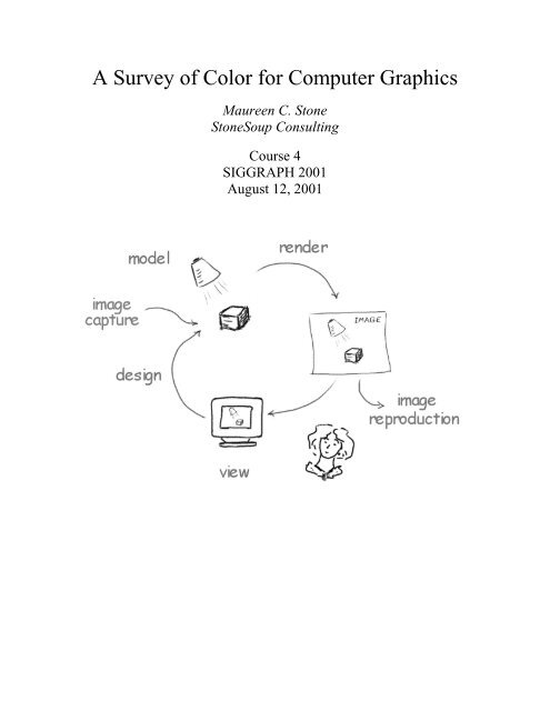
A Survey of Color for Computer Graphics
A Survey of Color for Computer Graphics
A Survey of Color for Computer Graphics

You also want an ePaper? Increase the reach of your titles
YUMPU automatically turns print PDFs into web optimized ePapers that Google loves.
A <strong>Survey</strong> <strong>of</strong> <strong>Color</strong> <strong>for</strong> <strong>Computer</strong> <strong>Graphics</strong><br />
Maureen C. Stone<br />
StoneSoup Consulting<br />
Course 4<br />
SIGGRAPH 2001<br />
August 12, 2001
A <strong>Survey</strong> <strong>of</strong> <strong>Color</strong> <strong>for</strong> <strong>Computer</strong> <strong>Graphics</strong> SIGGRAPH 2001<br />
Description<br />
Presenter<br />
This course will survey color disciplines relevant to <strong>Computer</strong> <strong>Graphics</strong> ranging<br />
from color vision to color design. Participants should leave with a clear overview<br />
<strong>of</strong> the world <strong>of</strong> digital color, plus pointers to in-depth references on a wide range<br />
<strong>of</strong> color topics. For each topic, a brief overview and pointers to further in<strong>for</strong>mation<br />
will be provided. For most topics, I will suggest a standard reference book or<br />
two, augmented by published articles as needed. The course should be <strong>of</strong> value<br />
both to those seeking an introduction to color in computer graphics and to those<br />
knowledgeable in some aspects <strong>of</strong> color who wish to get a broader view <strong>of</strong> the<br />
field.<br />
Maureen Stone is an independent consultant working in the areas <strong>of</strong> digital color,<br />
large <strong>for</strong>mat displays, web graphics, interaction and design. Be<strong>for</strong>e founding<br />
StoneSoup Consulting, she spent 20 years at the Xerox Palo Alto Research Center<br />
where she attained the position <strong>of</strong> Principal Scientist. She has over 30 published<br />
papers plus 12 patents on topics including digital color, user interface technology<br />
and computer graphics. She has taught in SIGGRAPH digital color courses organized<br />
by William Cowan (SIGGRAPH '89) and Charles Poynton (SIGGRAPH<br />
'97), and first presented this survey course at SIGGRAPH '99. She has a BS and<br />
MS in Electrical Engineering from the University <strong>of</strong> Illinois, and a MS in <strong>Computer</strong><br />
Science from Caltech.<br />
Contact In<strong>for</strong>mation<br />
Maureen Stone<br />
StoneSoup Consulting<br />
650-559-9280<br />
http://www.stonesc.com<br />
stone@stonesc.com<br />
Maureen C. Stone 2<br />
StoneSoup Consulting
A <strong>Survey</strong> <strong>of</strong> <strong>Color</strong> <strong>for</strong> <strong>Computer</strong> <strong>Graphics</strong> SIGGRAPH 2001<br />
Schedule<br />
0:00-0:30 <strong>Color</strong> Vision and Appearance<br />
0:30-1:00 <strong>Color</strong> Reproduction and Management<br />
1:00-1:30 <strong>Color</strong> in Rendered <strong>Graphics</strong><br />
1:30-2:00 <strong>Color</strong> Selection and Design<br />
Table <strong>of</strong> Contents<br />
Introduction....................................................................................................................... 4<br />
<strong>Color</strong> Vision....................................................................................................................... 4<br />
Basics .............................................................................................................................. 4<br />
<strong>Color</strong>imetery.................................................................................................................. 5<br />
<strong>Color</strong> Appearance ......................................................................................................... 6<br />
<strong>Color</strong> Reproduction and Management ........................................................................... 9<br />
<strong>Color</strong> reproduction...................................................................................................... 10<br />
Image capture .......................................................................................................................................11<br />
Additive color systems .........................................................................................................................11<br />
Subtractive color systems .....................................................................................................................13<br />
Gamuts and gamut mapping .................................................................................................................14<br />
<strong>Color</strong> Management Systems....................................................................................... 14<br />
<strong>Color</strong> Synthesis................................................................................................................ 15<br />
<strong>Color</strong> in Rendered <strong>Graphics</strong> ...................................................................................... 15<br />
Simulation vs. Design...........................................................................................................................16<br />
RGB vs. Spectral Representations ........................................................................................................17<br />
Viewing Rendered <strong>Graphics</strong>.................................................................................................................18<br />
<strong>Color</strong> Selection............................................................................................................. 20<br />
<strong>Color</strong> Design................................................................................................................. 21<br />
<strong>Color</strong> Harmony.....................................................................................................................................21<br />
Effective use <strong>of</strong> color............................................................................................................................23<br />
Annotated Bibliography ................................................................................................. 25<br />
Introduction ................................................................................................................. 25<br />
<strong>Color</strong> Vision ................................................................................................................. 25<br />
<strong>Color</strong> Reproduction and Management...................................................................... 26<br />
<strong>Color</strong> Synthesis ............................................................................................................ 26<br />
Slides................................................................................................................................. 31<br />
Maureen C. Stone 3<br />
StoneSoup Consulting
A <strong>Survey</strong> <strong>of</strong> <strong>Color</strong> <strong>for</strong> <strong>Computer</strong> <strong>Graphics</strong> SIGGRAPH 2001<br />
Introduction<br />
The goal <strong>of</strong> this course is to provide a broad survey <strong>of</strong> the color disciplines that relate to<br />
computer graphics. <strong>Color</strong> is an enormous field, with applications in almost every area <strong>of</strong><br />
life. The taxonomy I present is designed to match common applications in graphics. It is,<br />
by definition, incomplete and superficial. There<strong>for</strong>e, I base my presentation on standard<br />
texts and references in the field <strong>of</strong> color as much as possible. My hope is that after taking<br />
this course, you will know what there is to learn, and where to learn about it. If some <strong>of</strong><br />
the fundamental principles can be learned just from the presentation, that would be great<br />
also.<br />
These notes are a description <strong>of</strong> the material that will be presented in the course. They<br />
include an extensive, annotated bibliography plus copies <strong>of</strong> the slides. Because <strong>of</strong> the<br />
way the bibliography is structured and annotated, I did not feel that it was necessary to<br />
cite the references from the notes text.<br />
The course is divided into three areas: vision, reproduction and synthesis. The vision section<br />
provides the foundations <strong>for</strong> understanding color and its applications. The<br />
reproduction section discusses color media and color management. The synthesis section<br />
is split into computer graphics rendering, color selection and color design.<br />
<strong>Color</strong> Vision<br />
In this section, I will discuss basic color vision, colorimetery and color appearance. The<br />
reference I use <strong>for</strong> color vision is Brian Wandell’s Foundations <strong>of</strong> Vision, which is structured<br />
in three parts: Encoding, representation 1 and response. What I call “basic color<br />
vision” is essentially the encoding part <strong>of</strong> his taxonomy. <strong>Color</strong>imetery uses these principles<br />
to measure color. Wyszechki and Stiles <strong>Color</strong> Science is considered the standard<br />
reference <strong>for</strong> colorimetery, though most <strong>of</strong> what is presented here can be found in almost<br />
any color text. <strong>Color</strong> appearance is the response <strong>of</strong> the visual system to color. Mark Fairchild’s<br />
<strong>Color</strong> Appearance Models is a recent book on color appearance that includes both<br />
a complete description <strong>of</strong> color appearance as it is currently understood, and a survey <strong>of</strong><br />
computation models that are being developed to address this complex topic.<br />
Basics<br />
Light enters the eye as spectrum <strong>of</strong> colors, distributed by wavelength. This spectral distribution<br />
function impinges on the retina in the back <strong>of</strong> the eye and is absorbed by the<br />
cones. Human beings have three types <strong>of</strong> cones, which respond to different wavelengths<br />
<strong>of</strong> light. These are called either long, medium and short wavelength cones, or, correspondingly,<br />
red, green and blue cones. Each cone absorbs light and sends a signal to the<br />
brain. That is, the spectrum <strong>of</strong> light is encoded into three values that correspond to the<br />
amount <strong>of</strong> light absorbed by each type <strong>of</strong> cone. This is the principle <strong>of</strong> trichromacy—<br />
human vision is 3 dimensional.<br />
It should be clear that the actual distribution <strong>of</strong> the spectrum is only indirectly “seen” by<br />
1 Brian’s representation section focuses on the visual pathways in the brain—I will not address these issues<br />
at all.<br />
Maureen C. Stone 4<br />
StoneSoup Consulting
A <strong>Survey</strong> <strong>of</strong> <strong>Color</strong> <strong>for</strong> <strong>Computer</strong> <strong>Graphics</strong> SIGGRAPH 2001<br />
the eye. The response <strong>of</strong> each cone can be encoded as a function <strong>of</strong> wavelength (the spectral<br />
response curve <strong>for</strong> the cone). Multiplying the spectrum by such a function and<br />
integrating produces the signal that is sent from the eye to the brain. Different spectra can<br />
produce the same signal, and as such, will “look the same.” This principle is called<br />
metamerism.<br />
The principle <strong>of</strong> metamerism underlies all color reproduction technologies. Instead <strong>of</strong> reproducing<br />
the spectral stimulus, they create an equivalent response, or metameric match<br />
by mixing primary colors in a controlled way.<br />
Trichromacy and metamerism can also be applied to the problem <strong>of</strong> measuring color. It is<br />
important in many industries to be able to measure colored materials. If we can create an<br />
instrument that responds in the same way as the human eye, we can have an impartial observer<br />
to define when colors match. From the discussion above, it seems obvious to fit an<br />
instrument with filters and sensors that behave like the cones. However, the precise definition<br />
<strong>of</strong> the cone response was not know until very recently. The science <strong>of</strong> color<br />
measurement is much older, and is based on experiments involving matching colors with<br />
sets <strong>of</strong> three primary lights. This is called colorimetery.<br />
<strong>Color</strong>imetery<br />
The color matching experiments that underlie colorimetery are constructed as follows.<br />
Choose three primary lights (call them red, green and blue). Then, take a set <strong>of</strong> reference<br />
colors such as the monochromatic colors <strong>of</strong> the spectrum, or those generated by filtering<br />
a white light. For any set <strong>of</strong> three independent primaries, you can match any other color.<br />
Period. The only requirement is that you allow the primaries to go negative. In a physical<br />
matching experiment, this means that you shine the “negative” primary on the sample to<br />
be matched. This is a remarkably useful result. It means we can create a representation<br />
<strong>for</strong> color based on three primary lights. Any color can be defined as a set <strong>of</strong> three numbers<br />
that correspond to the power <strong>of</strong> the primaries. These three numbers are called the<br />
tristimulus values <strong>for</strong> the color.<br />
How do we know what primary values match a particular color? Clearly we cannot per<strong>for</strong>m<br />
the color matching experiment on all possible spectra. The answer is to use the fact<br />
that colored light is additive. A spectrum can be constructed by adding a number <strong>of</strong><br />
monochromatic lights together. This seems obvious, but what is less obvious is that the<br />
amount <strong>of</strong> the primaries needed to match colored light is also additive. Specifically, let<br />
the primaries be R, G and B. Let the spectrum be S. If RGB1 matches S1, and RGB2<br />
matches S2, then RGB1+RGB2 will match S1+S2. This principle was first <strong>for</strong>malized by<br />
Grassman, it is called Grassman’s law.<br />
To define the primaries <strong>for</strong> an arbitrary color, we use Grasman’s law to construct a set <strong>of</strong><br />
color matching functions <strong>for</strong> the primaries. We per<strong>for</strong>m the color matching experiment<br />
on each <strong>of</strong> the monochromatic spectral colors (sampled every 2 nm, <strong>for</strong> example). We use<br />
the result to create a set <strong>of</strong> three functions, one <strong>for</strong> each primary. To determine the<br />
amount <strong>of</strong> the primaries needed to match a particular spectrum, multiply the spectrum by<br />
the color matching functions and integrate. Three multiplications and three integrations,<br />
and you have the match. As all the functions described are sampled, this process is quite<br />
simple to implement.<br />
Maureen C. Stone 5<br />
StoneSoup Consulting
A <strong>Survey</strong> <strong>of</strong> <strong>Color</strong> <strong>for</strong> <strong>Computer</strong> <strong>Graphics</strong> SIGGRAPH 2001<br />
What if we decide to use a different set <strong>of</strong> primaries? Do we have to repeat the color<br />
matching experiments? Most wonderfully, the answer is no, we can compute the color<br />
matching functions <strong>for</strong> the new set <strong>of</strong> primaries from the old ones. All we need to know is<br />
the definition <strong>of</strong> the new primaries in terms <strong>of</strong> the old ones. For those <strong>of</strong> you familiar<br />
with linear algebra, this is simply a change <strong>of</strong> basis, and can accomplished <strong>for</strong> a three dimensional<br />
system with a 3x3 trans<strong>for</strong>mation matrix. You apply this matrix to each <strong>of</strong> the<br />
samples in the color matching functions in turn to create the color matching functions <strong>for</strong><br />
the new set <strong>of</strong> primaries.<br />
The color matching functions are remarkably like the spectral response curves <strong>for</strong> the<br />
cones. Multiply each by the viewed spectrum, and integrate to get an encoding into three<br />
numbers. Are these two types <strong>of</strong> curves related? The answer is yes, that the cone response,<br />
too, is linearly related to the set <strong>of</strong> color matching functions. This result was only<br />
recently demonstrated by Bayer, Nunn and Schnapf in 1987.<br />
In 1931, the Commission International de l’Eclairage (CIE) standardized a set <strong>of</strong> primaries<br />
and color matching functions that are the basis <strong>for</strong> most color measurement<br />
instruments used today. They trans<strong>for</strong>med a set <strong>of</strong> color matching functions measured by<br />
Stiles and Burch to create a set <strong>of</strong> curves that were more convenient to use. This set is<br />
positive throughout the entire visible spectrum, and one <strong>of</strong> the curves can be used to<br />
compute the perceived brightness <strong>of</strong> the measured color. The CIE standard tristimulus<br />
values are notated X,Y and Z. They are <strong>of</strong>ten reduced to two dimensions by projecting<br />
them onto the X+Y+Z=1 plane, creating the CIE chromaticity diagram with its corresponding<br />
chromaticity coordinates, x and y.<br />
<strong>Color</strong>ed objects can be described as having spectral reflectance functions that selectively<br />
reflect and absorb light shined on them. A “red” object reflects the red wavelengths <strong>of</strong><br />
light and absorbs the rest. <strong>Color</strong>imetery can be applied directly to the light reflected from<br />
objects. It is sometime applied to the reflectance spectrum (measured by reflecting a<br />
known light <strong>of</strong>f <strong>of</strong> a sample) as well. However, this spectrum cannot be perceived directly.<br />
What is viewed is always a function <strong>of</strong> both the object and the light.<br />
Some <strong>of</strong> the basic concepts <strong>of</strong> vision are demonstrated in the <strong>Color</strong> Playground, created<br />
at Brown University (http://www.cs.brown.edu/exploratory/<strong>Color</strong>Web/). A copy <strong>of</strong> these<br />
demonstrations are included in the CDROM version <strong>of</strong> these notes. They demonstrate 1)<br />
trichromacy 2) reflectance and 3) metamerism.<br />
<strong>Color</strong> Appearance<br />
The models used in colorimetery are remarkably simple. <strong>Color</strong> is a three-dimensional,<br />
linear system that can even be encoded in instruments. However, the truth about the perception<br />
<strong>of</strong> color is much more complex. <strong>Color</strong> matching as described above only works<br />
<strong>for</strong> individual colors viewed under simple, controlled circumstances. It’s definition is<br />
based on the simple perception <strong>of</strong> colored light. In the real world, we see complex arrangements<br />
<strong>of</strong> colors. These colors interact in ways that defy the simple model presented<br />
by colorimetery.<br />
In the slides is a classic photograph taken by John McCann. In it, two standard color<br />
Maureen C. Stone 6<br />
StoneSoup Consulting
A <strong>Survey</strong> <strong>of</strong> <strong>Color</strong> <strong>for</strong> <strong>Computer</strong> <strong>Graphics</strong> SIGGRAPH 2001<br />
charts are seen, one in the sun and one in the shade. The difference in lighting is such that<br />
the measured intensity <strong>of</strong> the black patch in the sun is exactly the same as the white patch<br />
in the shade. That is, two instruments would assign them the same color, but they clearly<br />
look black and white in context. A similar situation exists with the gray step wedge,<br />
which lies across the shadow boundary. In spite <strong>of</strong> the fact that the intensity <strong>of</strong> the light<br />
reflected from the patches actually increases in the sunlight, it appears to show a monotonically<br />
decreasing set <strong>of</strong> gray steps.<br />
Why the appearance <strong>of</strong> colors in the real world is so different than the simple models defined<br />
by the retina is a combination <strong>of</strong> perceptual and cognitive effects. The perceptual<br />
effects are created by the encoding and processing in the brain <strong>of</strong> the original retinal signals,<br />
which is more complex than the simple RGB encoding described so far. Cognitive<br />
effects are based on our knowledge <strong>of</strong> how objects and lights behave in the world.<br />
If you ask people to describe a color, they do not normally speak in terms <strong>of</strong> its red, green<br />
and blue components. They will typically name a hue, such as red, purple, orange or pink.<br />
They may describe it as being light or dark. Or, they may called it vivid, colorful, muted,<br />
or grayish. This perceptual organization <strong>of</strong> color is used to define most “intuitive” color<br />
spaces.<br />
One <strong>of</strong> the best known perceptually organized color space is the Munsell space, which is<br />
roughly spherical in shape. <strong>Color</strong>s are organized with a vertical lightness axis (called<br />
value), hue arranged around the circumference, and chroma (or saturation) defined radially.<br />
Each step in the color space is <strong>of</strong> equal perceptual distance. That is, the difference<br />
between two colors is uni<strong>for</strong>m throughout the space. This is not true <strong>of</strong> the CIE tristimulus<br />
space. The original Munsell definition was created with hand-painted color chips, and<br />
you can still buy The Munsell Book <strong>of</strong> <strong>Color</strong> from the Munsell <strong>Color</strong> division <strong>of</strong> Gretag-<br />
Macbeth (www.munsell.com). The Munsell chip set has also been defined with respect to<br />
the CIE tristimulus space.<br />
There are two uni<strong>for</strong>m color spaces defined by the CIE <strong>for</strong> the measurement <strong>of</strong> color differences.<br />
Called CIELAB and CIELUV, they are non-linear trans<strong>for</strong>mations <strong>of</strong> the CIE<br />
tristimulus values. Like the Munsell space, they are perceptually uni<strong>for</strong>m. They have<br />
been defined such that a unit step in the space is considered a “just noticeable difference”<br />
or JND. Each space has a lightness axis (L*) and two opponent color axis (CIELAB =<br />
L*a*b* and CIELUV = L*u*v*). The equations that define the spaces include the tristimulus<br />
values <strong>for</strong> a reference white. This is necessary to create a single lightness axis.<br />
This perceptual organization <strong>of</strong> color reflects the first level <strong>of</strong> processing applied to the<br />
cone response, called the opponent color model. In this model, the RGB values from the<br />
retina are encoded as lightness plus a red-green and a blue-yellow color difference axis.<br />
This organization <strong>of</strong> color can be seen in the afterimages produced by staring at brightly<br />
colored patches. Stare at a red color, then look at a white surface—you will see a greenish<br />
afterimage caused by saturating the red-green opponent channel. You can create similar<br />
effects with blue-yellow patches, and with light-dark ones.<br />
The opponent color model also well describes the common <strong>for</strong>ms <strong>of</strong> color vision deficiencies.<br />
While these are usually caused because one type <strong>of</strong> cone in the retina is either<br />
missing or weak, they are most easily described in opponent terms. The most common<br />
problems are anomalies in the red-green opponent channel, where either the ability to see<br />
Maureen C. Stone 7<br />
StoneSoup Consulting
A <strong>Survey</strong> <strong>of</strong> <strong>Color</strong> <strong>for</strong> <strong>Computer</strong> <strong>Graphics</strong> SIGGRAPH 2001<br />
red or to see green is impaired. This type <strong>of</strong> deficiency appears in approximately 10% <strong>of</strong><br />
men. A much smaller percentage (1-2%) are weaknesses in the blue-yellow channel, with<br />
very few people actually “color blind,” or unable to see any hues at all. While most color<br />
vision problems are genetic, they can also appear as a side-effect <strong>of</strong> medication or illness.<br />
Opponent color theory was first proposed by Herring, in 1878, but was not accepted until<br />
Dorthea Jameson and Leo Hurvich per<strong>for</strong>med controlled experiments in 1955 that verified<br />
the theory. It is now accepted as the first-level processing <strong>of</strong> the color vision signal<br />
after the cone response. Leo Hurvich has written a textbook, <strong>Color</strong> Vision, that is based<br />
on this theory. It is also the best technical reference I have found <strong>for</strong> the modalities <strong>of</strong><br />
color vision deficiencies.<br />
<strong>Color</strong> appearance phenomenon are caused by the relationship between colors, by adaptation<br />
and by cognitive effects based on our knowledge about lights and objects in the real<br />
world. Simultaneous contrast describes the influence <strong>of</strong> surrounding colors on the perception<br />
<strong>of</strong> a color. There are several simultaneous contrast examples in the slides. The<br />
simplest model <strong>for</strong> simultaneous contrast is that the afterimage <strong>of</strong> the surrounding color is<br />
added into the perception <strong>of</strong> the surrounded color. There<strong>for</strong>e, a gray patch on a dark<br />
background looks lighter (add white) than a gray patch on a white background (add<br />
black). However, the real answer is more complex. In the slides are a set <strong>of</strong> colored<br />
patches on a background <strong>of</strong> alternating colored bars. Which bar the patch appears on<br />
changes its appearance, even though the actual surround is identical. Clearly the cognitive<br />
effect, in which we see a patch as being “on” a particular colored bar, is contributing in<br />
this example.<br />
Even a thin outline <strong>of</strong> a different color can make a big difference in the appearance <strong>of</strong> a<br />
colored region. The slide labeled the “Bezold Effect” demonstrates this. The only difference<br />
between the two patterns is the color <strong>of</strong> the outlines; white in one case and black in<br />
the other. But, the overall difference in appearance is quite dramatic. This effect was<br />
named <strong>for</strong> a 19 th century rug designer, who was able to reuse his designs by this simple<br />
alteration.<br />
Size, or spatial frequency, has a strong impact on the perception <strong>of</strong> a color. The higher<br />
the spatial frequency, the less saturated the color. This is why the paint on the sample<br />
chip looks less vivid than it does on the wall. In the slide, the two colors really are identical.<br />
Human vision is very adaptable. We are capable <strong>of</strong> seeing in both very dim and very<br />
bright light. When we move from bright to dim lighting, or vice versa, we can feel our<br />
visual system adapt. Think <strong>of</strong> this as a gain control on the visual system. For dim lighting,<br />
we turn up the sensitivity. For bright lights, we need to damp it. These phenomena<br />
are called dark adaptation and light adaptation, respectively. In many cases, it is valid to<br />
assume that color appearance is relative to the current black/white levels, and is not effected<br />
by the absolute luminance. However, increasing luminance can produces a<br />
measurable increase in colorfulness (Hunt Effect) and contrast (Stevens Effect).<br />
Chromatic adaptation describes the visual system’s ability to adapt to the color <strong>of</strong> the<br />
light illuminating the scene. Most color is created by shining light <strong>of</strong>f <strong>of</strong> objects. While<br />
the reflected spectrum can be measured with colorimetric instruments, changing the light<br />
will change the measured color, sometimes dramatically. But, as we view the world, we<br />
Maureen C. Stone 8<br />
StoneSoup Consulting
A <strong>Survey</strong> <strong>of</strong> <strong>Color</strong> <strong>for</strong> <strong>Computer</strong> <strong>Graphics</strong> SIGGRAPH 2001<br />
don’t generally perceive objects changing color as the light shifts. Think <strong>of</strong> it as an automatic<br />
white-balancing function <strong>for</strong> the visual system. That is, the gain controls <strong>for</strong> the<br />
three cones are adjusted separately. Modeling chromatic adaptation is very important <strong>for</strong><br />
the accurate reproduction <strong>of</strong> images, which will be discussed in the color media and management<br />
part <strong>of</strong> this tutorial.<br />
The cone response curves physically adapt to the color <strong>of</strong> the light source. This idea was<br />
first proposed by von Kries in 1902. von Kries did not present a mathematical model, but<br />
simply proposed the concept that the cones could independently adapt. Modern interpretations<br />
<strong>of</strong> von Kries are expressed in terms <strong>of</strong> a scalar value, k, that is the inverse <strong>of</strong> the<br />
maximum response <strong>for</strong> each cone, typically the response <strong>for</strong> white.<br />
A color appearance model converts from measured values (such as the tristimulus values<br />
<strong>of</strong> the sample and its surrounding color, the overall illumination level, etc.) to correlates<br />
<strong>of</strong> perceptual attributes <strong>of</strong> color, including hue, chroma, lightness, brightness, etc. All<br />
color appearance models include a way to compensate <strong>for</strong> adaptation to different lighting<br />
conditions. <strong>Color</strong> appearance models are important <strong>for</strong> digital imaging applications, and<br />
are under active development. The CIE has codified a model, called CIECAM97s. Other<br />
models include CIELAB (minimal), RLAB and LLAB (improved CIELAB), Hunt,<br />
Nayatani, Guth and ATG. Mark Fairchild’s book is an excellent reference on this topic.<br />
<strong>Color</strong> Reproduction and Management<br />
<strong>Color</strong> reproduction focuses on the reproduction <strong>of</strong> colored images. It has been defined by<br />
the different technologies used in the traditional color reproduction industries: television,<br />
printing and photography. The best reference <strong>for</strong> this topic I know is Hunt’s Reproduction<br />
<strong>of</strong> Colour. First published in 1957, the fifth edition was published in 1996. Dr. Hunt<br />
is still active in the field, working with the Colour & Imaging Institute at the University<br />
<strong>of</strong> Derby in England. Gary Field has two newer books on the topic, <strong>Color</strong> and Its Reproduction,<br />
2nd Edition and Principles <strong>of</strong> <strong>Color</strong> Reproduction, an update <strong>of</strong> John Yule’s<br />
classic book on printing, which has long been out <strong>of</strong> print.<br />
Traditionally, each color reproduction industry had its own separate technologies and<br />
skills. With the coming <strong>of</strong> digital imaging systems, these industries are being integrated,<br />
both with computing and with each other. It is not unusual to find a graphic arts business<br />
equipped with digital scanners, printers, film recorders, video cameras and video editing<br />
stations. The representation and management <strong>of</strong> color images in digital <strong>for</strong>m was hinted<br />
at in the late 70’s, demonstrated in the early to late ‘80s, and is now an established commercial<br />
domain. <strong>Color</strong> management systems are now part <strong>of</strong> every high-end color<br />
reproduction application, and are becoming more common <strong>for</strong> simple desktop publishing<br />
users. Giorgianni and Madden, both from Kodak, have written a book called Digital<br />
<strong>Color</strong> Management that is an excellent reference <strong>for</strong> this topic.<br />
The color reproduction industries, photography, printing and television, were traditionally<br />
focused on the reproduction <strong>of</strong> natural scenes. Such reproductions are inherently approximations,<br />
as no technology can reproduce the full range <strong>of</strong> colors visible in nature.<br />
Each industry tuned its process to provide the best approximation <strong>of</strong> the real world on its<br />
medium. Now, there is an increasing focus on cross-media reproduction and the integration<br />
<strong>of</strong> purely digital content as well as images <strong>of</strong> nature. This means that color<br />
Maureen C. Stone 9<br />
StoneSoup Consulting
A <strong>Survey</strong> <strong>of</strong> <strong>Color</strong> <strong>for</strong> <strong>Computer</strong> <strong>Graphics</strong> SIGGRAPH 2001<br />
reproduction is becoming less about specific technologies and more about integrating all<br />
<strong>of</strong> them.<br />
<strong>Color</strong> reproduction<br />
The process <strong>of</strong> color reproduction involves capturing the light reflected from or emitted<br />
by an original, then reproducing it <strong>for</strong> viewing. The goal is to make the reproduction look<br />
as much like the original as possible. That is, viewing the reproduction should be as similar<br />
as possible to viewing the original scene, within the limitations <strong>of</strong> the medium. All<br />
media can only reproduce a fraction <strong>of</strong> the human color vision experience, so all reproductions<br />
are approximations. The definition <strong>of</strong> the ideal reproduction ultimately becomes<br />
one <strong>of</strong> preference and context, though there is substantial technical and craft in<strong>for</strong>mation<br />
about creating good reproductions. As well as the books mentioned in the introduction to<br />
this section, there are the publications <strong>of</strong> the Society <strong>for</strong> Imaging Sciences & Technology<br />
(IS&T) and those <strong>of</strong> the Graphic Arts Technical Foundation (GATF).<br />
From our study <strong>of</strong> color matching, we know we can encode the colors reflected from a<br />
scene as three numbers that represent roughly the red, green and blue components <strong>of</strong> the<br />
colors seen. Image capture, there<strong>for</strong>e, is the process <strong>of</strong> capturing and encoding these values<br />
<strong>for</strong> every point across the image. These are the familiar image pixels used in digital<br />
representations <strong>of</strong> images. The separate red, green and blue images are sometimes called<br />
color separations. These separations are reproduced by mixing primary colors <strong>for</strong> the<br />
output medium. For light-producing media such as monitors or digital projectors, the<br />
primaries are red, green and blue light. This is called additive reproduction. For subtractive<br />
media such as film and print, the process involves subtracting the red, green and blue<br />
components from a white light using layers <strong>of</strong> colored filters, or subtractive reproduction.<br />
The primaries <strong>for</strong> the subtractive media are named after the color <strong>of</strong> the filters: cyan, magenta<br />
and yellow.<br />
Good image reproduction maintains the appearance <strong>of</strong> the original. As in color appearance<br />
models, control <strong>of</strong> tone reproduction, which is the reproduction <strong>of</strong> the overall<br />
brightness and contrast (the achromatic axis) is separated from the problem <strong>of</strong> adjusting<br />
hue and saturation. Tone reproduction is simpler to model than color reproduction as it<br />
involves only one dimension and can easily be implemented with table lookup in digital<br />
systems. Many image reproduction problems can be satisfactorily solved simply by controlling<br />
the tone reproduction. In traditional image reproduction industries, careful tone<br />
reproduction was augmented with color correction, a step that simply tried to adjust the<br />
primary input colors to better match the output media. This was usually achieved by<br />
processing each separation independently, as can be done with the RGB (or CMYK)<br />
curves in tools like Adobe’s Photoshop.<br />
<strong>Color</strong> management systems provide a more general mechanism <strong>for</strong> matching colors based<br />
on measurements <strong>of</strong> the gamut, or set <strong>of</strong> all possible colors that can be produced by any<br />
output device (printer, monitor, etc.) Generating such a specification is called characterizing<br />
the device. The characterization data is encoded in a device pr<strong>of</strong>ile that represents<br />
the color reproduction characteristic <strong>for</strong> the device. Modern color management systems<br />
use a colorspace based on the CIE standards <strong>for</strong> this purpose. Most commercial systems<br />
use CIELAB, though some also support the use <strong>of</strong> the standard CIE XYZ tristimulus values.<br />
Future systems will be based on appearance models such as CIECAM97s.<br />
Maureen C. Stone 10<br />
StoneSoup Consulting
A <strong>Survey</strong> <strong>of</strong> <strong>Color</strong> <strong>for</strong> <strong>Computer</strong> <strong>Graphics</strong> SIGGRAPH 2001<br />
Image capture<br />
To per<strong>for</strong>m image capture, the scene is viewed through red, green and blue filters. If the<br />
filters represent color matching functions, the red, green and blue values would be tristimulus<br />
values. Typically, however, image capture filters are not color matching<br />
functions (or colorimetric filters). Such filters are expensive to make and inefficient to<br />
use because they absorb a great deal <strong>of</strong> the incoming light. More <strong>of</strong>ten, the filters are<br />
tuned to match the expected inputs and outputs. Because they are not true color matching<br />
functions, they may mis-code some colors. That is, two colors that look different to a<br />
human viewer may encode to the same RGB triple, and vice versa. However, substantial<br />
engineering ef<strong>for</strong>t has been spent to minimize these effects.<br />
Input devices must be characterized <strong>for</strong> use with color management systems. However,<br />
the characterization can only be general if the device uses colorimetric filters. Otherwise,<br />
the characterization depends on the input spectra used in the measurements. For example,<br />
a scanner could be characterized by scanning a set <strong>of</strong> colored patches with known<br />
CIELAB values and making a correspondence between the resulting RGB pixels and the<br />
CIELAB values. Other values could be interpolated from this set, and the inverse trans<strong>for</strong>mation<br />
generated by inverting the input table. However, patches <strong>of</strong> a different material<br />
(paint vs. a photographic print, <strong>for</strong> example) that have the same CIELAB value might<br />
produce different RGB values in the scanner. Commercially, most scanned material is<br />
photographic prints or other printed materials <strong>of</strong> a standard <strong>for</strong>m so that there are a limited<br />
number <strong>of</strong> characterizations needed in practice.<br />
Additive color systems<br />
Additive color systems reproduce the red, green and blue parts <strong>of</strong> the image by adding<br />
together red, green and blue lights. Such systems include monitors, liquid crystal displays<br />
(LCD) and digital projectors. The traditional additive color reproduction industry is television,<br />
though scanned graphics displayed on a monitor may be more familiar to this<br />
audience. Charles Poynton’s book on Digital Video is a good reference <strong>for</strong> video and<br />
television technology. Lindsay Macdonald and Anthony Lowe have edited a good general<br />
reference on Display Systems <strong>for</strong> those who want more detail about specific display technologies.<br />
The Society <strong>for</strong> In<strong>for</strong>mation Display’s (www.sid.org) conferences and<br />
publications are the standard venue <strong>for</strong> research in display technology.<br />
To achieve a good additive reproduction system we need to match the color and the relative<br />
brightness <strong>of</strong> the input and output primaries. Let’s talk first about intensity, or<br />
brightness. The intensity transfer function (ITF) is the curve that maps input values (pixels<br />
or voltages) to intensity (viewed light). A monitor’s ITF is a non-linear, power<br />
function called a gamma function, which is defined primarily by the physics <strong>of</strong> the electron<br />
beam that excites the phosphors. Most modern monitors are manufactured such that<br />
they have identical gamma functions. The shape <strong>of</strong> the function can be modified, however,<br />
simply by changing the contrast and brightness adjustments on the display.<br />
In the slides is a diagram that describes the ITF’s <strong>for</strong> the television pipeline. The linear<br />
intensity values reflected from the original scene are non-linearly encoded in the camera.<br />
This both optimizes the use <strong>of</strong> pixel values by companding or compressing the intensities,<br />
and creates values that can be fed directly into the television electronics. The original de-<br />
Maureen C. Stone 11<br />
StoneSoup Consulting
A <strong>Survey</strong> <strong>of</strong> <strong>Color</strong> <strong>for</strong> <strong>Computer</strong> <strong>Graphics</strong> SIGGRAPH 2001<br />
sign was to make this encoding is exactly the inverse <strong>of</strong> the gamma function <strong>of</strong> the receiving<br />
monitor. However, studies by Bartleson and Breneman in the 70’s demonstrated<br />
that a slightly non-linear reproduction was perceptually more accurate because <strong>of</strong> the<br />
normally dim viewing environment <strong>for</strong> television. There<strong>for</strong>e, while a typical monitor has<br />
a gamma function <strong>of</strong> 2.5, the camera encodes to the inverse <strong>of</strong> 2.2.<br />
For monitors, the color <strong>of</strong> its primaries is defined by the phosphors used. Most modern<br />
monitors have a similar set <strong>of</strong> primary colors. Liquid crystal displays, however use colored<br />
filters and a backlight to define their pixels. Standards <strong>for</strong> these are still evolving.<br />
Specifically, there is a tension between the desire <strong>for</strong> bright saturated colors (bright, highpowered<br />
backlight, intensely colored filters) and battery life (dimmer, low-powered backlight<br />
and thinner, less saturated filters). The ITF <strong>for</strong> a liquid crystal display is not<br />
inherently a gamma curve, though some manufacturers apply one artificially <strong>for</strong> compatibility<br />
with monitors and video.<br />
Digital projectors are another additive color device that are becoming common. A projector<br />
contains an imaging element such as a small LCD or an array <strong>of</strong> micro-mirrors<br />
(DMD) that modulates the light from a high-intensity light bulb. Most LCD projectors<br />
and the larger DMD projectors contain 3 imaging elements and a dichroic mirror that<br />
splits the white light from the bulb into its red, green and blue components. These are recombined<br />
and displayed simultaneously. The smallest projectors, however, use a single<br />
imaging element and a color wheel <strong>of</strong> filters, so the separations are displayed sequentially.<br />
The DMD projectors based on Digital Light Processing (DLP) from Texas<br />
Instruments can weigh as little as 3 lbs and still produce a bright, crisp, image. Their colorwheel<br />
includes a clear filter that is used to add white to the brighter colors. This<br />
increases the dynamic range <strong>of</strong> the system, but makes it more complex to characterize.<br />
The native ITF <strong>for</strong> a projector is defined by the imaging element. DMD elements actually<br />
pulse encode the grayscale, making them naturally linear. However, like flat panel<br />
displays, most projectors contain image processing hardware that induces a gamma curve<br />
compatible with monitors and video.<br />
There is are diagrams in the slides that plot the typical monitor gamut (yellow solid triangle)<br />
with several different LCD gamuts and a couple <strong>of</strong> digital projector gamuts.<br />
Traditionally RGB reproduction systems assume a common RGB because most displays<br />
were monitors. Now, this is no longer true. However, it is straight<strong>for</strong>ward to trans<strong>for</strong>m<br />
from one RGB system to another by inserting a matrix multiplication in the output pipeline.<br />
This can be implemented in special purpose hardware, as in video systems. Modern<br />
graphics cards, such as the Nvidia G-Force 2 (www.nvidia.com), provide a programmable<br />
function that can be applied to this problem.<br />
Characterization <strong>of</strong> additive systems is fairly easy because there is a linear trans<strong>for</strong>mation<br />
between RGB intensity values and CIE tristimulus values. This trans<strong>for</strong>mation can be<br />
defined by measuring the red, green and blue primaries. For most display technologies,<br />
this creates a 3x3 matrix that trans<strong>for</strong>ms from RGB intensity to XYZ. For projection displays,<br />
it is necessary to include a translate component to compensate <strong>for</strong> the high black<br />
level <strong>of</strong> these devices. This results in a 4x4 homogeneous trans<strong>for</strong>mation matrix. Note<br />
that the trans<strong>for</strong>m must be applied after the ITF is applied, not to the pixel values directly.<br />
The DLP projectors with the clear filter in the colorwheel, however, are not so simply<br />
characterized.<br />
Maureen C. Stone 12<br />
StoneSoup Consulting
A <strong>Survey</strong> <strong>of</strong> <strong>Color</strong> <strong>for</strong> <strong>Computer</strong> <strong>Graphics</strong> SIGGRAPH 2001<br />
Subtractive color systems<br />
Subtractive color systems filter the red, green and blue components <strong>of</strong> the image from<br />
white light. To do this, they use colored filters that in theory modulate only the red, green<br />
and blue components <strong>of</strong> the spectrum. The filter that passes green and blue but modulates<br />
red appears cyan. Similarly the green-modulating filter appears a purplish-red called magenta,<br />
and the blue-modulating filter is yellow. There<strong>for</strong>e, the primaries <strong>of</strong> a subtractive<br />
reproduction system are said to be cyan, magenta and yellow. In printing, black ink is<br />
added as well, to improve the contrast.<br />
The advantage <strong>of</strong> subtractive color systems is that they use a single, white light source<br />
instead <strong>of</strong> three colored ones. Furthermore, <strong>for</strong> reflection prints, this light is simply the<br />
light in the room. While flat-panel displays are getting thinner and lighter, it is hard to<br />
imagine they will ever be as light, convenient and inexpensive as a sheet <strong>of</strong> paper.<br />
In a reflection print, the colored ink or film <strong>for</strong>ms layers on a white background. Light<br />
passes through the layers and is reflected back to the viewer. Compared to light emitted<br />
from a display, or even light passing through a colored transparency (like a 35mm slide),<br />
prints are low-contrast and desaturated. This is caused by scattering as the light passes<br />
through the colored layers twice. Reduced scattering is why colored prints look more<br />
vivid on smooth, coated papers than on matte ones.<br />
The cyan, magenta and yellow filters created with printing inks are far from the ideal filters<br />
described above. That is, the cyan filter, which should only modulate the red part <strong>of</strong><br />
the spectrum, also affects the green part. Similarly, magenta modulates both red and blue<br />
as well as green. This means that there is interaction, or cross-talk between the filters.<br />
They do not function as independent primaries in the same way that RGB lights do. The<br />
result is that it is difficult to predict what color a particular combination <strong>of</strong> inks can produce.<br />
Whereas RGB systems are linear, CMY systems are not.<br />
In printing, black ink is <strong>of</strong>ten added to the cyan, magenta and yellow separations to improve<br />
contrast and to reduce the amount <strong>of</strong> ink spread on the paper. In theory, black and<br />
gray colors can be created by combining equal amounts <strong>of</strong> cyan, magenta and yellow. In<br />
practice, such a combination will <strong>of</strong>ten produce brown or olive green. Gray balancing is<br />
the process <strong>of</strong> determining the correct mixture <strong>of</strong> primaries to create a gray color. The<br />
darkest color produced by mixing the three primaries, black, can be made darker by printing<br />
black ink on top <strong>of</strong> the three primaries. It is also possible to replace some <strong>of</strong> the<br />
colored ink with black, though once again, there is not a simple, linear relationship that<br />
predicts how much black ink is needed to replace a specific blend <strong>of</strong> CMY. The process<br />
<strong>of</strong> substituting black <strong>for</strong> the primaries in the darker colors is called gray component replacement,<br />
or GCR.<br />
Another topic <strong>of</strong> significance <strong>for</strong> printing is halftoning, or the process <strong>of</strong> converting intensity<br />
into dot patterns on the paper. Most printing systems are binary—ink either is<br />
printed or not. To get the appearance <strong>of</strong> gray, the ink is printed as high-resolution patterns<br />
called halftone patterns. Originally made <strong>for</strong> mechanical printers by using a special filter<br />
and films, these patterns are now digitally produced on ultra-high resolution film recorders.<br />
The design and implementation <strong>of</strong> the halftone pattern has an important effect on the<br />
appearance <strong>of</strong> the printed image. Digital printers <strong>of</strong>ten use other patterning techniques<br />
such as dithering, and may have the ability to produce some grayscale on a dot-by-dot<br />
Maureen C. Stone 13<br />
StoneSoup Consulting
A <strong>Survey</strong> <strong>of</strong> <strong>Color</strong> <strong>for</strong> <strong>Computer</strong> <strong>Graphics</strong> SIGGRAPH 2001<br />
bases. For example, an inkjet printer may create each spot with multiple drops. The more<br />
drops used, the darker the color.<br />
There is no simple, linear trans<strong>for</strong>mation that maps subtractive devices to tristimulus<br />
space. Combining filters multiplies their effect rather than adding them. Most subtractive<br />
devices are characterized by measuring a large number <strong>of</strong> color patches then interpolating<br />
between them. Anything that changes the output appearance, such as changing the halftoning<br />
algorithm in printing, will change the characterization.<br />
Gamuts and gamut mapping<br />
The gamut <strong>of</strong> a device creates a volume in the standard space. Only colors that fall within<br />
this volume can be reproduced on that particular device. The slides show several gamut<br />
representations. The scatterplots represent the gamuts as 3D plots, which is the most accurate<br />
way to think about them. Shown are a gamut <strong>for</strong> an additive system (a monitor),<br />
which is a regular shape similar to a cube but with parallelograms <strong>for</strong> faces. This graphically<br />
demonstrates that the trans<strong>for</strong>mation from the RGB color cube to CIEXYZ is a<br />
linear one. The Cromalin print gamut, however, is distinctly non-linear. While there is<br />
some hint <strong>of</strong> the original cube, each face is a different size and some <strong>of</strong> the edges are distinctly<br />
curved. The gamut is actually concave as well as bent. The gamut <strong>for</strong> the DLP<br />
projector shows a basic additive structure plus an extrusion at the white point caused by<br />
selectively adding white. As a result, it is linear in some regions and not in others.<br />
Because the data used to generate the plots was absolute measurement data, the scales are<br />
quite different. However, in color management applications, this data would be converted<br />
to CIELAB, which normalizes it to a common white (but not necessarily black)<br />
value. Another figure in the slides shows gamuts projected onto the CIE chromaticity<br />
diagram. Here, linear systems project as triangles whose vertices are the chromaticity coordinates<br />
<strong>of</strong> the red, green and blue primaries. The print gamut, in contrast, is quite<br />
irregularly shaped.<br />
To map from one device to another, gamut mapping is applied as trans<strong>for</strong>mations in this<br />
common color space. Current practice is to project colors towards the center <strong>of</strong> the<br />
gamut in a way that reduces saturation, and, to a lesser extent, brightness, while maintaining<br />
hue. However, if no in-gamut color is really close, than the reproduction will look<br />
substantially different no matter how clever the gamut mapping algorithm. Only<br />
redesigning the image can really create a good reproduction.<br />
<strong>Color</strong> Management Systems<br />
There are a pair <strong>of</strong> diagrams at the start <strong>of</strong> this section (courtesy <strong>of</strong> Michael Bourgoin <strong>of</strong><br />
Adobe Systems) that succinctly describe the digital color management problem. Given a<br />
set <strong>of</strong> digital input and output devices such as printers, scanners, monitors and film recorders,<br />
how do we convert colors between them without creating a customized<br />
trans<strong>for</strong>m between each pair <strong>of</strong> devices? The answer is to use a single, deviceindependent<br />
color space, such as those defined by the CIE, as the common interchange<br />
<strong>for</strong>mat.<br />
Many companies produce color management systems, including Kodak, Agfa,<br />
Lineotronic and EFI, just to name a few. Apple’s <strong>Color</strong>Sync is built into the Apple oper-<br />
Maureen C. Stone 14<br />
StoneSoup Consulting
A <strong>Survey</strong> <strong>of</strong> <strong>Color</strong> <strong>for</strong> <strong>Computer</strong> <strong>Graphics</strong> SIGGRAPH 2001<br />
ating system in such a way that it can import color management engines from a variety <strong>of</strong><br />
vendors. To support the exchange <strong>of</strong> pr<strong>of</strong>ile in<strong>for</strong>mation across systems, the International<br />
<strong>Color</strong> Consortium (ICC) was <strong>for</strong>med. This industry consortium has defined a standard<br />
pr<strong>of</strong>ile <strong>for</strong>mat that is now commonly used by all commercial systems (www.color.org).<br />
On a Windows machine, the pr<strong>of</strong>iles are .icm files. These typically installed with the device<br />
driver <strong>for</strong> a new printer, monitor, etc. These default pr<strong>of</strong>iles vary in how well they<br />
approximate the actual device, and <strong>of</strong> course, the system depends on the user to correctly<br />
identify the system components. For displays, the contrast and brightness settings must be<br />
correct to get a good match. The setup procedures in Photoshop and similar program are<br />
designed to help maintain this. Serious practitioners must either invest in pr<strong>of</strong>ile generation<br />
instrumentation and s<strong>of</strong>tware, or pay to have custom pr<strong>of</strong>iles created.<br />
The role <strong>of</strong> the color management system is to manage the pr<strong>of</strong>iles and to trans<strong>for</strong>m images<br />
from one device to another based on the pr<strong>of</strong>ile in<strong>for</strong>mation. Because there is no<br />
single “correct” way to make these trans<strong>for</strong>mations unless the gamuts match perfectly,<br />
different systems will give different results.<br />
Matching image colors based on the CIE color matching metrics is not really sufficient.<br />
Image appearance is complex, and while using CIELAB is better than trying to match<br />
tristimulus values, it still falls short <strong>of</strong> being a true image-appearance space. For example,<br />
take an image viewed on a monitor that is set with white at a color temperature <strong>of</strong> D9300<br />
(a very bluish-white that is the default <strong>for</strong> many computer monitors). Now, reproduce it<br />
such that it looks good viewed in normal room lighting (anything from D5000 or<br />
warmer). This requires trans<strong>for</strong>ming the image white point in a way that mimics chromatic<br />
adaptation. The type white point trans<strong>for</strong>mation encoded in CIELAB, however,<br />
causes unexpected hue shifts. Future systems may include the use <strong>of</strong> improved color appearance<br />
models such as CIECAM 97. These models, however, are more complex to<br />
implement than CIELAB, so industry acceptance may be slow.<br />
<strong>Color</strong> Synthesis<br />
In computer graphics, we are <strong>of</strong>ten involved in the synthesis <strong>of</strong> color. Rendering systems<br />
synthesize color from the interaction <strong>of</strong> lights and surfaces. How the color is specified<br />
and represented depends on the rendering model and application. Rendering algorithms<br />
are part <strong>of</strong> graphics systems, where color is represented in a file, rendered, displayed, and<br />
integrated with colors and images from other applications. Application designers <strong>of</strong>ten<br />
provide users tools <strong>for</strong> selecting individual colors <strong>for</strong> illustrations, slides, web pages, or<br />
other designs. Graphic and in<strong>for</strong>mation visualization designers have rules and systems <strong>for</strong><br />
selecting colors, sets <strong>of</strong> colors and their application.<br />
This section <strong>of</strong> the talk will discuss all <strong>of</strong> these areas, which will be presented more as a<br />
set <strong>of</strong> topics rather than as a single, well-integrated story. There are three main sections:<br />
<strong>Color</strong> in rendered graphics, color selection and color design.<br />
<strong>Color</strong> in Rendered <strong>Graphics</strong><br />
<strong>Color</strong>ed lights stimulate the eye directly. However, the light we see when we look at an<br />
object is the product <strong>of</strong> the emission spectrum <strong>of</strong> the light and the reflectance spectrum <strong>of</strong><br />
the object. In the <strong>Color</strong> Playground is a tool that multiplies two spectra to show the sim-<br />
Maureen C. Stone 15<br />
StoneSoup Consulting
A <strong>Survey</strong> <strong>of</strong> <strong>Color</strong> <strong>for</strong> <strong>Computer</strong> <strong>Graphics</strong> SIGGRAPH 2001<br />
plest <strong>for</strong>m <strong>of</strong> this effect. In nature, however, interactions between lights and objects is<br />
more complex. Shiny surfaces have highlights, rough ones appear textured. Particles and<br />
layers as small as the wavelength <strong>of</strong> light produce shimmering interference effects, like a<br />
butterfly wing. Light shining through clouds <strong>of</strong> small particles produce the blue-gray <strong>of</strong><br />
smoke, the colors in the sky, and the blue in a child’s eyes. It is the goal <strong>of</strong> rendering research<br />
to produce effective models <strong>of</strong> these processes that can be used to make<br />
compelling and beautiful images and animations.<br />
Unlike image reproduction, where the focus is on producing images <strong>of</strong> objects in the<br />
world, computer graphics is focused on producing images <strong>of</strong> objects that occur only as<br />
the result <strong>of</strong> numerical models. That is, there are virtual objects, and virtual lights that<br />
must be rendered to produce a visible image. How they are modeled and rendered defines<br />
their appearance. One <strong>of</strong> the most widely referenced books on color in computer graphics<br />
is Roy Hall’s <strong>Color</strong> and Illumination in <strong>Computer</strong> <strong>Graphics</strong> Systems. Un<strong>for</strong>tunately, this<br />
book is out-<strong>of</strong>-print. However, most books on rendering include a discussion <strong>of</strong> color. I<br />
have used Andrew Glassner’s Principles <strong>of</strong> Digital Image Synthesis as my reference <strong>for</strong><br />
rendering.<br />
Simulation vs. Design<br />
Philosophically, computer graphics rendering can be organized between two extreme positions<br />
that I call simulation and design. The goal <strong>of</strong> simulation is to model reality. The<br />
emphasis is on physically correct representations and rendering algorithms, which <strong>for</strong><br />
color means at minimum a spectral model <strong>of</strong> light and surface reflectance. The goal <strong>of</strong><br />
design, on the other hand, is to produce a visual effect. Most design systems have lots <strong>of</strong><br />
knobs, and the designer may do unreal things to create the desired result. One <strong>of</strong> my favorite<br />
stories demonstrating this involves an early graphics system that could not produce<br />
shadows. Yet the designers were making pictures with shadows in them. How did they do<br />
it? They added negative lights. Because the emphasis in design systems is interaction and<br />
flexibility, they typically use computationally efficient, RGB-based models.<br />
In simulation systems, the result should be good enough to measure. Rendering involves<br />
computing the interaction <strong>of</strong> light with a material surface. Both the surfaces and the lights<br />
should be physically accurate, preferably created by measurement. The equations that<br />
control the interaction and scattering <strong>of</strong> the light should also be physically accurate. Radiosity,<br />
and more broadly, global illumination models, are required to describe the<br />
interaction <strong>of</strong> light throughout the scene. To define the visual representation <strong>of</strong> the image,<br />
tristimulus theory at a minimum is used, with more advanced perceptual models a topic<br />
<strong>of</strong> current research.<br />
In design systems, what the final image looks like is the goal. Unreal may be good, as in<br />
the negative lights example above. Designers don’t object to using physically accurate<br />
models, as long as they are efficient and flexible. Because per<strong>for</strong>mance is a paramount<br />
concern, simple lighting and shading models that can be accelerated with special hardware<br />
are the most common in design systems. Most <strong>of</strong> these have their basis in Phong’s<br />
original shading model, which is extended to color simply by applying it to RGB independently.<br />
Paul Strauss created an extension <strong>of</strong> this that has become part <strong>of</strong> SGI’s Open<br />
Inventor (www.sgi.com), which is a widely-used 3D graphics <strong>for</strong>mat. The designer can<br />
either simply paint surfaces or vertices with RGB colors, or apply simple material and<br />
Maureen C. Stone 16<br />
StoneSoup Consulting
A <strong>Survey</strong> <strong>of</strong> <strong>Color</strong> <strong>for</strong> <strong>Computer</strong> <strong>Graphics</strong> SIGGRAPH 2001<br />
lighting models. <strong>Color</strong> is specified <strong>for</strong> the surface, its highlight, and its ambient (shadowed)<br />
components. Lights, too, are colored based on an RGB specification. RGB or<br />
intensity textures can be applied to surfaces. In his original paper, Strauss stated that this<br />
model was created to give designers a useful set <strong>of</strong> parameters <strong>for</strong> controlling the appearance<br />
<strong>of</strong> their graphics.<br />
Recent SIGGRAPH papers have pushed the design end <strong>of</strong> the spectrum even further, into<br />
artistic or non-photorealistic rendering. Gooch shading, presented at SIGGRAPH ‘98, is<br />
a variation <strong>of</strong> the Phong shading model that mimics the type <strong>of</strong> shading a pr<strong>of</strong>essional<br />
illustrator would use. It does not represent a realistic lighting model, but is optimized to<br />
illustrate the shape <strong>of</strong> the object being shaded. Several recent papers from the University<br />
<strong>of</strong> Washington have demonstrated rendering techniques that produce images that look<br />
like drawings made with traditional media such as pen and ink or watercolor. Amy and<br />
Bruce Gooch have now written a book on non-photorealistic rendering that will be published<br />
in 2001.<br />
The commercial program Painter (was Fractal Design, is now Metagraphics at<br />
www.metagraphics.com) is a 2D painting package that does an excellent job <strong>of</strong> mimicking<br />
pens, pencils, paints, and the like. It includes the effect <strong>of</strong> textured paper as well.<br />
While the designers <strong>of</strong> Painter have not published their algorithms, most systems that<br />
model ink and paint rely on the Kubulka-Monk model to create their effects. The<br />
Kubulka-Monk model describes paint (or any other similar colorant) as a sequence <strong>of</strong><br />
thin layers. The model describes a way to compute the scattering and absorption in these<br />
layers. By varying the thickness <strong>of</strong> the layers and other parameters, you can get a good<br />
model <strong>of</strong> painted materials.<br />
RGB vs. Spectral Representations<br />
Within rendering systems, the two main ways to represent color are as spectra or as RGB<br />
triples. A spectral representation provides the only accurate way to model the interaction<br />
<strong>of</strong> light, direct or reflected, with object colors. An RGB triple can be thought <strong>of</strong> as a tristimulus<br />
representation <strong>for</strong> the color, or as a view based on color separations. However,<br />
while colors can be accurately represented by such triples, their interactions at the spectral<br />
level cannot. That is, you can’t predicted the result <strong>of</strong> multiplying spectra by<br />
multiplying their tristimulus values. There<strong>for</strong>e, RGB representations are inherently inaccurate<br />
in rendering systems except <strong>for</strong> the simplest cases. In general, the more spectral<br />
computations needed (to model reflections, <strong>for</strong> example) the less satisfactory the RGB<br />
representation.<br />
So why not always use spectral representations? Because they are expensive. The range<br />
<strong>of</strong> wavelengths that comprise the visible spectrum runs from 370-730 nm. Good color<br />
measurement instruments sample this at 2 nm intervals, though many sample at 10 or<br />
even 20 nm intervals <strong>for</strong> efficiency. An equally-spaced sampling <strong>of</strong> the visible spectrum,<br />
there<strong>for</strong>e, contains from 180 to 18 samples that must be stored <strong>for</strong> every color in the<br />
screen and processed <strong>for</strong> every rendered pixel.<br />
It is possible to generate more efficient representations than uni<strong>for</strong>m sampling if we<br />
know something about the possible shapes <strong>of</strong> the curves we want to represent. The sur-<br />
Maureen C. Stone 17<br />
StoneSoup Consulting
A <strong>Survey</strong> <strong>of</strong> <strong>Color</strong> <strong>for</strong> <strong>Computer</strong> <strong>Graphics</strong> SIGGRAPH 2001<br />
face reflectances <strong>of</strong> non-fluorescent objects 2 are <strong>of</strong>ten very smooth, as is the spectral distribution<br />
<strong>of</strong> daylight or <strong>of</strong> incandescent light. There<strong>for</strong>e it is possible to adapt the<br />
sampling to give a more efficient representation. Gary Meyer, Roy Hall and Andrew<br />
Glassner have all proposed methods <strong>for</strong> doing this, and Roy Hall has a paper surveying<br />
this topic in the July 1999 issue <strong>of</strong> IEEE <strong>Computer</strong> <strong>Graphics</strong> and Applications. The most<br />
efficient representations use as few as 4 samples/spectrum. Note, however, that a more<br />
concise representation may mean a more expensive reconstruction algorithm when the<br />
spectra are actually applied in the rendering.<br />
Another way to create an efficient representation <strong>for</strong> a set <strong>of</strong> curves is to define basis<br />
functions that can be linearly combined. With this approach, only the scalar multipliers<br />
<strong>for</strong> the basis functions need to be stored <strong>for</strong> each color. Maloney and Wandell have applied<br />
this technique to a variety <strong>of</strong> surface datasets, and Mark Peercy has applied this<br />
approach to computer rendering in his SIGGRAPH ’93 article.<br />
To display spectra on a monitor, they must be converted to RGB monitor values. Using<br />
trichromatic theory and the CIE color matching functions, it is straight<strong>for</strong>ward to convert<br />
from spectra to tristimulus values. Because a digital monitor is also a three dimensional<br />
additive color system, there is a linear trans<strong>for</strong>mation that converts from CIE tristimulus<br />
values to the intensity needed <strong>for</strong> each <strong>of</strong> R, G and B. This matrix is derived from the tristimulus<br />
values that describe the monitor primaries, as is shown in the slides.<br />
RGB representations evolved by simply applying grayscale shading models to the red,<br />
green and blue image components independently. The effect is that any color is described<br />
as a linear combination <strong>of</strong> the three display primaries. If all we want to do is specify individual<br />
colors, or additive mixtures <strong>of</strong> them, this is fine. However, in rendering, we<br />
multiply the spectrum <strong>of</strong> the light by the reflectance <strong>of</strong> the surface. This is not guaranteed<br />
to produce another spectrum that can be represented as a linear combination <strong>of</strong> the display<br />
primaries. Said another way, if the RGB values are the tristimulus values <strong>for</strong> the<br />
spectra, the product <strong>of</strong> the tristimulus values does not equal the tristimulus values <strong>of</strong> the<br />
product <strong>of</strong> the spectra. The exception is when one <strong>of</strong> the spectra is an equal energy white,<br />
which is <strong>of</strong>ten the case <strong>for</strong> simple graphics systems. A SIGGRAPH ’91 paper by Carlos<br />
Borges provides an analysis and bound <strong>for</strong> the error created by using an RGB model.<br />
Using an RGB representation <strong>for</strong> color can be very effective. Its failings only really appear<br />
as the lighting and shading models become more complex. The difficulty <strong>of</strong><br />
constructing a simple case where RGB fails can be seen using the demonstrations in the<br />
<strong>Color</strong> Playground from Brown University that are included with the CDROM version <strong>of</strong><br />
these notes.<br />
Viewing Rendered <strong>Graphics</strong><br />
All graphics rendering algorithms must ultimately produce an image that can be displayed<br />
on a monitor or some other digital display device. The rendering color space is an<br />
unbounded, linear intensity space that must be mapped to the bounded, non-linear color<br />
space <strong>of</strong> a display system. As in image reproduction, the issues include definition <strong>of</strong> the<br />
correct RGB primaries, intensity mapping, out-<strong>of</strong>-gamut colors, and appearance consid-<br />
2<br />
Phosphors, which are used in CRT displays or in the coating <strong>of</strong> fluorescent lights, contain high-energy<br />
spikes that must be carefully sampled.<br />
Maureen C. Stone 18<br />
StoneSoup Consulting
A <strong>Survey</strong> <strong>of</strong> <strong>Color</strong> <strong>for</strong> <strong>Computer</strong> <strong>Graphics</strong> SIGGRAPH 2001<br />
erations.<br />
Rendering systems that use spectral representations are specified absolutely. However,<br />
those represented as RGB triples typically are not. For graphics interchange, such as the<br />
VRML graphics standard, it is critical to complete the calibration. Otherwise, it is impossible<br />
to make the rendering look the same across two different display devices. While<br />
many monitors have similar RGB primaries, LCD panels and digital projectors do not.<br />
Also, the RGB specification in the rendering space is linear with respect to intensity,<br />
whereas most display systems are not. There<strong>for</strong>e, both the RGB mapping and the intensity<br />
transfer function (ITF) must be determined to create a correct rendering.<br />
Conversions between RGB systems can be accomplished with a 3x3 matrix trans<strong>for</strong>mation.<br />
For maximum accuracy, this should be per<strong>for</strong>med per pixel. However, as most<br />
rendering systems interpolate colors as they fill, providing the trans<strong>for</strong>m per vertex would<br />
probably be an acceptable approximation. Un<strong>for</strong>tunately, this is more computation than<br />
most graphics systems are designed to apply to this problem.<br />
The intensity mapping can be controlled with 1 or 3 lookup tables. Classic 3D graphics<br />
systems are stand-alone applications. They can use the lookup tables in the display controller<br />
to control the ITF <strong>of</strong> the displayed pixels. This is sometimes called “gamma<br />
correction” because the goal is to “correct” the non-linear gamma curve <strong>of</strong> the monitor to<br />
be the linear response defined by the rendering system. However, a linear ITF is not perceptually<br />
uni<strong>for</strong>m, nor is it an efficient encoding <strong>of</strong> an 8-bit pixel. There<strong>for</strong>e, most<br />
desktop systems are not “gamma corrected” to linear intensity. Furthermore, different<br />
operating systems set different default ITF’s. As a result, colors on a Macintosh are<br />
lighter than those on a PC (actually, it’s a matter <strong>of</strong> contrast) and darker than on an SGI<br />
workstation. There is a slide that summarizes the cross-operating system gamma issues.<br />
Charles Poynton has also written extensively on this topic.<br />
In a multi-window, multi-application system, it is appropriate that the linearity <strong>of</strong> the display<br />
be controlled by the operating system because it is a shared resource. There<strong>for</strong>e, the<br />
issue is not whether the lookup tables in the display controller can be changed by the 3D<br />
rendering application, <strong>for</strong> even if they could, changing them would be a bad idea. Most<br />
desktop applications are designed <strong>for</strong> a non-linear ITF, and would look terrible, or at least<br />
very different, linearized. There<strong>for</strong>e, the rendering pipeline, not the display hardware,<br />
must include the functionality to produce the desired appearance to the viewer.<br />
Classic graphics texts propose displaying the linear intensities produced by the rendering<br />
system directly. However, research in the image reproduction domain by Bartleson &<br />
Breneman suggest that this will only give the best appearance if the viewing environment<br />
matches the original scene. If the viewing environment is darker, the reproduction will<br />
need more contrast to look right. They propose specific increases in contrast, expressed<br />
as gamma values, to accommodate dim and dark surrounding environments. These are<br />
used in the image reproduction industry to improve the appearance <strong>of</strong> television (dim surround)<br />
and projected film (dark surround). Work in web-based graphic standards such as<br />
sRGB recommend a non-linear viewing gamma on computer displays, and color appearance<br />
models such as CIECAM 97 use the Bartleson & Breneman results to model the<br />
effect <strong>of</strong> the surrounding illumination on color appearance.<br />
Work by Jack Tumblin and Holly Rushmeier apply more complex visual models to de-<br />
Maureen C. Stone 19<br />
StoneSoup Consulting
A <strong>Survey</strong> <strong>of</strong> <strong>Color</strong> <strong>for</strong> <strong>Computer</strong> <strong>Graphics</strong> SIGGRAPH 2001<br />
termine the ITF <strong>for</strong> rendered graphics. They describe their results in terms <strong>of</strong> tone reproduction,<br />
and base their results on the Stevens models <strong>of</strong> brightness. In their results, and in<br />
other work by Tumblin, they can more accurately reproduce high-contrast imagery, and<br />
create renderings that reflect the absolute brightness <strong>of</strong> the image. That is, a room lit by a<br />
dim light still looks dim compared to one lit by a bright light. Simpler models would<br />
normalize both images to the same appearance. Clearly, including perceptual models as<br />
part <strong>of</strong> the rendering pipeline is an important part <strong>of</strong> making rendered images look more<br />
realistic.<br />
<strong>Color</strong> Selection<br />
One aspect <strong>of</strong> digital color familiar to almost all users <strong>of</strong> computer systems is the color<br />
selection tool. <strong>Color</strong> is applied to documents, desktops, drawings and web pages. A typical<br />
desktop system might have over a dozen different tools <strong>for</strong> selecting RGB colors<br />
embedded in its applications. I know <strong>of</strong> no textbooks about designing color selection<br />
tools. There are, however, a few ideas that consistently appear. First is the trans<strong>for</strong>mation<br />
<strong>of</strong> the RGB color cube into some approximation <strong>of</strong> a perceptual colorspace. The two<br />
most commonly used are the HSV and HLS systems described in the Foley and van Dam<br />
graphics texts. Second is the mapping <strong>of</strong> a 3D space to a 2D, interactive tool. The simplest<br />
mapping is sliders <strong>for</strong> each dimension such as R, G and B. This can be applied to<br />
any set <strong>of</strong> primaries, so graphic arts systems also include C, M, Y and K sliders. Many<br />
tools map two dimensions to a plane, then include a linear slider <strong>for</strong> the third. Many different<br />
mappings are possible, and the slides show several examples. Finally, color tools<br />
<strong>of</strong>ten include palettes <strong>of</strong> standard colors plus user-defined colors. The standard colors <strong>of</strong>ten<br />
represent the colors available on a display limited to 16 or 256 colors. There is also<br />
usually a pair <strong>of</strong> patches that show the color being changed and its new value.<br />
One <strong>of</strong> the original applications <strong>of</strong> perceptually-based color systems like the Munsell<br />
book <strong>of</strong> color, or the Ostwald system, was <strong>for</strong> color selection. There have been some ef<strong>for</strong>ts<br />
to use perceptual spaces as the basis <strong>for</strong> digital color tools, as well. One <strong>of</strong> the first<br />
that was commercially available was “TekHVC” by Tektronics. The TekHVC space is<br />
similar to CIELUV, and the “Tek<strong>Color</strong> Picker” could show slices <strong>of</strong> the gamuts <strong>of</strong> two<br />
different devices, making it possible to select only in-gamut colors. Giordanno Beretta’s<br />
“MetaPalette” used the CIELAB space to select palettes <strong>of</strong> harmonious colors. His work<br />
influenced the “Canon <strong>Color</strong> Advisor,” a clever tool buried in the print driver <strong>of</strong> Canon<br />
color printers.<br />
Another <strong>for</strong>m <strong>of</strong> color selection is to use color names. There is something fundamental<br />
about naming color. Ask someone to describe a color and they will begin first with a hue<br />
name such as blue or green. Berlin and Kay discovered that color names are common to<br />
human language, and that there are a standard set <strong>of</strong> 11 simple color names that appear in<br />
all mature languages. These are the perceptual primaries (red, green, blue, yellow, black,<br />
white and gray) plus orange, purple, pink and brown. Furthermore, the order the names<br />
are introduced into the language is consistent across languages. Boynton and Olson have<br />
further studied the psychophysics <strong>of</strong> color names with a set <strong>of</strong> color naming experiments.<br />
They found that there was a high degree <strong>of</strong> correlation between the names given colors<br />
across people and cultures. That is, the color patches described as “red” by one person<br />
will also be described as red by another. Of course, not all colors have simple names, and<br />
Maureen C. Stone 20<br />
StoneSoup Consulting
A <strong>Survey</strong> <strong>of</strong> <strong>Color</strong> <strong>for</strong> <strong>Computer</strong> <strong>Graphics</strong> SIGGRAPH 2001<br />
there is less agreement on these. But <strong>for</strong> the agreement <strong>for</strong> the basic colors was very<br />
good. A recent PhD thesis by Johan Lammens, which is available on-line, is an excellent<br />
reference <strong>for</strong> the perceptual basis <strong>for</strong> color names.<br />
<strong>Color</strong> names are also important <strong>for</strong> industrial applications. In 1976, the National Bureau<br />
<strong>of</strong> Standards published A Universal <strong>Color</strong> Language and Dictionary <strong>of</strong> Names, by Kelly<br />
and Judd. This describes both an orderly language <strong>for</strong> specifying color, calibrated to the<br />
Munsell color space, and a mapping into this language <strong>of</strong> thousands <strong>of</strong> industrial color<br />
names. For example, the color “avocado” could be described as “dark olive green.” Berk,<br />
Brownston, and Kaufman published an article in 1982 that introduced a simplified, more<br />
computationally tractable version <strong>of</strong> the NBS <strong>Color</strong> Language. We had an implementation<br />
<strong>of</strong> their system (plus our own improvements) running at Xerox PARC in the 80’s. I<br />
found an advertisement <strong>for</strong> a commercial implementation <strong>of</strong> the NBS <strong>Color</strong> Language as<br />
part <strong>of</strong> the <strong>Color</strong> Science Library, from the CGSD Corporation in Palo Alto, CA<br />
(www.cgsd.com). It looks like a useful package, but I haven’t tried it myself.<br />
In the graphics arts domain, the Pantone Matching System® (www.pantone.com) is a<br />
common way <strong>of</strong> describing colors. Originally published as a book <strong>of</strong> print samples, the<br />
digital <strong>for</strong>m <strong>of</strong> this system is incorporated in most <strong>of</strong> the major graphic arts applications<br />
such as Adobe Illustrator or Quark Express.<br />
Finally, dictionaries <strong>of</strong> color names are starting to be used <strong>for</strong> specifying colors in<br />
HTML, X-Windows and probably other applications. The names I have seen are simply a<br />
binding <strong>of</strong> a text string to an RGB triple. I have some reservations about the names themselves<br />
(what color is “silver” anyway, on a computer monitor?) But, the idea <strong>of</strong> naming is<br />
a good one. Names tend to limit the set <strong>of</strong> colors specified, and this can be good, which is<br />
why specifying hundreds <strong>of</strong> names is bad. In the X-window implementation, the name<br />
dictionary provides a useful level <strong>of</strong> indirection in the color specification Say you design<br />
a tool that includes “brown” text on a “tan” background. You then discover that text becomes<br />
illegible with that combination <strong>of</strong> colors on a 256 color display. You can simply<br />
change the specification <strong>of</strong> the names once, and have the effect appear everywhere.<br />
<strong>Color</strong> Design<br />
I am not a <strong>for</strong>mally trained graphic designer or illustrator, though I’m a pretty experienced<br />
amateur, as are many <strong>of</strong> us in the graphics field. For the discussion on visual<br />
design, I rely on a book by Wucius Wong called Principles <strong>of</strong> <strong>Color</strong> Design. Personally, I<br />
find Wong’s systematic approach to design very clear and compelling. On the other hand,<br />
if you go to the graphic arts section <strong>of</strong> your local bookstore and look <strong>for</strong> a book on color<br />
design, most <strong>of</strong> what you will find is books <strong>of</strong> color schemes represented as color palettes.<br />
Whelan’s, <strong>Color</strong> Harmony 2 came with a palette selection tool (the PalettePicker)<br />
on CDROM, so I chose it as my example <strong>of</strong> such an approach. Edward Tufte is famous<br />
<strong>for</strong> his books on in<strong>for</strong>mation visualization, and Envisioning In<strong>for</strong>mation contains a chapter<br />
on the use <strong>of</strong> color. I will conclude with a brief summary <strong>of</strong> his view on how and why<br />
to use color <strong>for</strong> visualization.<br />
<strong>Color</strong> Harmony<br />
The color circle used by designers is quite similar to the circle <strong>of</strong> hues described in a per-<br />
Maureen C. Stone 21<br />
StoneSoup Consulting
A <strong>Survey</strong> <strong>of</strong> <strong>Color</strong> <strong>for</strong> <strong>Computer</strong> <strong>Graphics</strong> SIGGRAPH 2001<br />
ceptually based color system such as Munsell. The circle is <strong>for</strong>med starting with three<br />
primaries, red, yellow and blue, plus three secondaries created by mixing the primaries<br />
pairwise: orange, green and purple. The full circle contains all the pairwise mixtures <strong>of</strong><br />
these six colors as well. I am <strong>of</strong>ten asked why the primaries are not cyan, magenta and<br />
yellow. The answer may be more a one <strong>of</strong> naming than <strong>of</strong> function. The printing ink magenta<br />
is a slightly purplish red, and the cyan is more or a true blue than its overprint with<br />
magenta, which is a purplish, almost navy blue. To one not familiar with printing terminology,<br />
they could naturally be called blue, red and yellow.<br />
The other reason my be simply one <strong>of</strong> history and application. The cyan, magenta and<br />
yellow primaries used in an image reproduction system are carefully chosen to create the<br />
largest possible gamut. They are subject to strong constraints as to function and cost. The<br />
designer’s colorspace was traditionally <strong>for</strong>med by mixing paints. There is more flexibility<br />
in the exact choice <strong>of</strong> colors, which can be adjusted <strong>for</strong> an individual design. Whether<br />
layered or blended, the mixing principles are similar <strong>for</strong> both sets <strong>of</strong> subtractive primaries.<br />
The other dimensions <strong>of</strong> a designer’s colorspace are lightness and saturation. Again, these<br />
are similar to the perceptual spaces discussed earlier. In fact, Wong uses the Munsell<br />
space and terminology (hue, value and chroma) to describe color design. Knowing that<br />
Munsell was an artist as well as a color scientist, makes this less surprising.<br />
The term tint applies to a color that has been lightened and desaturated by mixing it with<br />
white. A tone is a color grayed and darkened by mixing it with black. The complement <strong>of</strong><br />
a color lies opposite it in the color wheel. A color mixed with its complement will become<br />
neutral, or gray.<br />
The concept <strong>of</strong> color harmony is defined by Wong as “successful color combinations,<br />
whether these please the eye by using analogous colors, or excite the eye with contrasts.”<br />
Analogous colors are similar, contrasting colors are opposites. He then goes on to demonstrate<br />
these principles applied to the hue, value and chroma <strong>of</strong> colors, using many<br />
beautiful examples.<br />
<strong>Color</strong> palettes are sets <strong>of</strong> 2-3 colors, plus their tints and tones, that are used in a design.<br />
They are <strong>of</strong>ten described in terms <strong>of</strong> qualities ranging from semi-scientific (contrast, neutral,<br />
primary) to emotional (warm, elegant, exciting). An important issue when designing<br />
a palette is the message you are trying to convey with your choice <strong>of</strong> color. Now, using<br />
palettes in design is an excellent idea. It provides an overall visual coherence that is very<br />
important. And, people’s emotional response to color is very real. So whether or not you<br />
are com<strong>for</strong>table with labels like “elegant,” having access to predesigned palettes, or better<br />
yet, the ability to custom design effective color palettes, should help improve the appearance<br />
<strong>of</strong> our graphics. It is interesting, however, that all the color tools described in the<br />
previous section really only support selecting one color at a time. Even those that provide<br />
“palettes” do not provide any way to name, manage or reuse those palettes. Pr<strong>of</strong>essional<br />
graphic design systems such as Adobe Illustrator seem to do a somewhat better job in this<br />
area, but I suspect there is far more that could be done to support palettes and other design<br />
principles in our digital tools.<br />
Maureen C. Stone 22<br />
StoneSoup Consulting
A <strong>Survey</strong> <strong>of</strong> <strong>Color</strong> <strong>for</strong> <strong>Computer</strong> <strong>Graphics</strong> SIGGRAPH 2001<br />
Effective use <strong>of</strong> color<br />
The goal in selecting colors is, ultimately, to produce an image that is both attractive and<br />
that conveys its message effectively. It is difficult to describe the “effective” use <strong>of</strong> color<br />
unconstrained by any application. However, there are a few common principles worth<br />
mentioning here.<br />
<strong>Color</strong> is very eye-catching, creating emphasis, clustering, and evoking relationships to the<br />
known world. According to Tufte, the primary rule <strong>for</strong> the use <strong>of</strong> color “do no harm.”<br />
<strong>Color</strong> should be clarifying, not confusing. It should be tasteful, and it should be robust<br />
across media, viewing conditions and viewers.<br />
<strong>Color</strong> can be used to identify or label objects in an illustration. A classic example is<br />
shown in the slides. Take a page <strong>of</strong> numbers and count all the 7’s. Studies have shown<br />
that the amount <strong>of</strong> time to count them is proportional to the number <strong>of</strong> digits on the page.<br />
That is, to count the 7’s you must look at each digit in turn to determine whether or not it<br />
is a 7. Now, color the 7’s some distinctive color such as red. Now the time it takes to<br />
count the 7’s is proportional to the number <strong>of</strong> 7’s on the page. The red color labels the 7’s<br />
so all you have to do is count them up. <strong>Color</strong> works extremely well as this type <strong>of</strong> label as<br />
long as the identifying color is distinct within its context. <strong>Color</strong>ed roadways or icons on<br />
maps, or colored text to identify hyperlinks are examples <strong>of</strong> color labels.<br />
<strong>Color</strong> scales can be used to indicate quantity. There are no real intuitive hue orderings<br />
except possibly one <strong>for</strong> temperature (blue to red), but lightness or saturation scales are<br />
<strong>of</strong>ten effective <strong>for</strong> defining relative values. <strong>Color</strong>s distributed on a plane also create visual<br />
clusters <strong>of</strong> similar values. Examples are thermometer scales or density plots.<br />
The world we see around us is colored, and colors in illustration <strong>of</strong>ten reflect their use in<br />
the physical domain. For example, stop signs and lights are red, so stop “buttons” are<br />
also. Geographic maps tint water blue and earth brown. The icons shown on the slide<br />
mimic the color <strong>of</strong> the fruits they represent, although the colors themselves do not match<br />
the natural object well. This is <strong>of</strong>ten true <strong>of</strong> color in illustrations.<br />
Finally, we use color because it is beautiful. Most people spend some amount <strong>of</strong> ef<strong>for</strong>t to<br />
make the colors in their environment match their aesthetic taste. Look at the way people<br />
decorate their workspaces, or color their computer desktops. <strong>Color</strong> impacts emotions,<br />
which can impact per<strong>for</strong>mance. While the value <strong>of</strong> aesthetics is <strong>of</strong>ten questioned in “practical”<br />
disciplines like science and engineering, it impacts even these fields. An attractive<br />
illustration will be more appealing to look at and will there<strong>for</strong>e be more effective.<br />
Adding color to illustrations and in<strong>for</strong>mation visualization system in a way that is robust<br />
across systems, media and viewers can be very hard. Without color management, a carefully<br />
designed presentation on one medium can become a muddled mess on another. For<br />
example, I had a colleague who used bright green text on a dark green background <strong>for</strong><br />
slides. On the monitor, the text was quite legible and the overall appearance was pleasing.<br />
Transferred to slides using a film recorder, however, the result was overall very dark and<br />
lacked the contrast needed to com<strong>for</strong>tably read the text. Even an excellent color management<br />
system would not have completely saved him, as his text color was far outside <strong>of</strong><br />
the film gamut.<br />
A primary issue <strong>for</strong> effectiveness is legibility, especially <strong>for</strong> text. They key to legibility is<br />
Maureen C. Stone 23<br />
StoneSoup Consulting
A <strong>Survey</strong> <strong>of</strong> <strong>Color</strong> <strong>for</strong> <strong>Computer</strong> <strong>Graphics</strong> SIGGRAPH 2001<br />
brightness contrast, which is why black text on white paper (or white text on dark slides)<br />
is so popular. In fact, an edge defined by only hue difference cannot be seen. Such an example<br />
is difficult to construct, but I can assure you, it is very disconcerting. You can see<br />
that two adjacent regions are differently colored, but it is impossible to find the edge between<br />
them. Another issue <strong>for</strong> text legibility is the distribution and focus <strong>of</strong> the short<br />
wavelength or blue cones as compared to the red and green cones. The blue cones are<br />
much more sparse, and focus on a slightly different plane than the other two. This is why<br />
some colors <strong>of</strong> bright blue text appear blurry—they are stimulating primarily the blue<br />
cones, which do not provide the same acuity as the others. The slides show a diagram<br />
from Mark Fairchild that shows the relative distribution <strong>of</strong> the three cone types. Note that<br />
there are no blue cones in the very center <strong>of</strong> the retina.<br />
Another type <strong>of</strong> cross media problem has to do with grayscale and color-mapped displays.<br />
Grayscale systems, <strong>of</strong> course, must map all colors to gray values. Care must be<br />
taken that these grays will function as replacements <strong>for</strong> the colors. Many desktop systems<br />
display a maximum <strong>of</strong> 256 colors, using dithering to approximate the rest. Dithered text<br />
and other fine features are <strong>of</strong>ten illegible, so it is important to chose colors that will remain<br />
solid. This is also true <strong>for</strong> printers, especially <strong>for</strong> low-resolution digital desktop<br />
systems. Text and fine features are much more crisp when they contain at least one solid<br />
separation, even in <strong>of</strong>fset printing. A rather nice feature <strong>of</strong> the Netscape web browsers is<br />
that they automatically map text to solid colors on dithered displays. I wish more applications<br />
did this.<br />
All viewers are not the same either. As noted in the vision section, a significant part <strong>of</strong><br />
the population has atypical color vision. As the red-green anomalies are the most common,<br />
one rule <strong>of</strong> thumb is to avoid encoding purely with a red-green distinction (an issue<br />
that apparently never occurred to the designers <strong>of</strong> stoplights). However, to ensure that<br />
important in<strong>for</strong>mation can be distinguished by everyone, color should be combined with<br />
shape or other ways <strong>of</strong> encoding the in<strong>for</strong>mation (like a stop sign). Another viewer issue<br />
is poor acuity, or lack <strong>of</strong> focus. Not all acuity problems can be fully corrected with<br />
lenses. Also, the eye gradually looses its ability to change focus as people age, which is<br />
why most people need some <strong>for</strong>m <strong>of</strong> “reading glasses” by the time they are fifty. Avoiding<br />
small, low-contrast text and other features is important to accommodate this problem.<br />
Pill-bottle labels with small colored letters on a colored background should be banned!<br />
In summary, when in doubt, use color conservatively. Duplicate the in<strong>for</strong>mation carried<br />
by the color whenever possible. Know your target media and audience well, and be sure<br />
to test your designs thoroughly.<br />
Maureen C. Stone 24<br />
StoneSoup Consulting
A <strong>Survey</strong> <strong>of</strong> <strong>Color</strong> <strong>for</strong> <strong>Computer</strong> <strong>Graphics</strong> SIGGRAPH 2001<br />
Annotated Bibliography<br />
I have organized this bibliography by section, though there will naturally be some references<br />
that span sections.<br />
Introduction<br />
A good general book on color is Williamson and Cummins Light and <strong>Color</strong> In Nature<br />
and Art. It was designed <strong>for</strong> an undergraduate course and includes in<strong>for</strong>mation on physics<br />
and optics as relates to color, as well as many <strong>of</strong> the topics covered in this tutorial.<br />
1. S. J. Williamson and H. Z. Cummins. Light and <strong>Color</strong> In Nature and Art. John<br />
Wiley & Sons (1983).<br />
<strong>Color</strong> Vision<br />
There are many excellent color vision textbooks. I chose Wandell’s because it is recent<br />
and has a computational flavor that should appeal to the technical members <strong>of</strong> the graphics<br />
audience. I also mentioned the text by Leo Hurvich, which is out-<strong>of</strong>-print but should<br />
be available in academic libraries. There are a couple <strong>of</strong> other vision texts worth mentioning,<br />
though I am personally only familiar with one <strong>of</strong> them. Cornsweet’s 1970 book is a<br />
classic, though now 30 years old. David Marr’s book provides a less conventional yet intriguing<br />
model <strong>for</strong> vision.<br />
Wyszechki and Stiles massive <strong>Color</strong> Science is the standard reference <strong>for</strong> colorimetery<br />
and color psychophysics, though an introduction to these topics is included in almost any<br />
book on color. A substantial amount <strong>of</strong> this book is tables <strong>of</strong> numbers, which nowadays<br />
would be presented on CDROM. Interestingly enough, this book has no color pictures.<br />
Another classic book on color science and its application is Judd and Wyszechki’s <strong>Color</strong><br />
in Business, Science, and Industry.<br />
Mark Fairchild’s book is the best reference on color appearance models. Josef Albers<br />
book, Interaction <strong>of</strong> <strong>Color</strong>, is famous <strong>for</strong> its color illustrations. It comes in two <strong>for</strong>ms, an<br />
expensive hardback ($135) with a full set <strong>of</strong> color plates, or a somewhat abridged paperback<br />
version <strong>for</strong> approximately $10. I have the paperback, and have found it quite useful.<br />
2. Brian Wandell. Foundations <strong>of</strong> Vision. Sinauer Associates Inc. (1995).<br />
3. Leo M. Hurvich. <strong>Color</strong> Vision. Sinauer Associates Inc. (1980).<br />
4. Tom Cornsweet. Visual Perception. Academic Press (1970).<br />
5. David Marr. Vision. W. H. Freemand, San Francisco, CA. (1982).<br />
6. Judd, D. B. and G. Wyszecki. <strong>Color</strong> in Business, Science, and Industry. John<br />
Wiley & Sons (1975).<br />
7. G. Wyszechki and W.S. Stiles. <strong>Color</strong> Science, Second Edition. John Wiley & Sons<br />
(1982).<br />
8. Mark D. Fairchild. <strong>Color</strong> Appearance Models. Addision-Wesley (1998).<br />
9. Josef Albers. Interaction <strong>of</strong> <strong>Color</strong>. Yale University Press (1963).<br />
Maureen C. Stone 25<br />
StoneSoup Consulting
A <strong>Survey</strong> <strong>of</strong> <strong>Color</strong> <strong>for</strong> <strong>Computer</strong> <strong>Graphics</strong> SIGGRAPH 2001<br />
<strong>Color</strong> Reproduction and Management<br />
Robert Hunt’s The Reproduction <strong>of</strong> Colour is an invaluable reference <strong>for</strong> color reproduction<br />
technology. Now in its 5 th edition, it is a must-have <strong>for</strong> anyone interested in this<br />
aspect <strong>of</strong> color. Gary Field has two newer books on the topic, <strong>Color</strong> and Its Reproduction,<br />
2nd Edition and Principles <strong>of</strong> <strong>Color</strong> Reproduction, an update <strong>of</strong> John Yule’s classic<br />
book on printing, which has long been out <strong>of</strong> print. Giorgianni and Madden’s Digital<br />
<strong>Color</strong> Management is a well-written book with a strong engineering orientation. It is<br />
beautifully produced, printed in full color, with some <strong>of</strong> the nicest illustrations around. In<br />
spite <strong>of</strong> the full-color production, it is reasonably priced at around $70. Charles Poynton,<br />
who regularly teaches about digital color at SIGGRAPH, has written a complete reference<br />
on digital video. His courses <strong>of</strong>ten include a section on color reproduction and color<br />
management. There is active research in the area <strong>of</strong> digital color reproduction systems<br />
and color management. Much <strong>of</strong> this work is published at conferences and in publications<br />
supported by the Society <strong>for</strong> Imaging Science and Technology, or IS&T<br />
(www.imaging.org). Their “Recent Progress” Series are bound volumes <strong>of</strong> select papers<br />
on topics such as color management and color science. The Graphic Arts Technical Foundation<br />
(www.gatf.org) is also a good source <strong>of</strong> practical in<strong>for</strong>mation on color and<br />
printing. Its publications can be ordered online through the Graphic Arts In<strong>for</strong>mation<br />
Network (www.gain.org). The Society <strong>of</strong> In<strong>for</strong>mation Display (www.sid.org) is a good<br />
source <strong>of</strong> references on display technologies. I’ve found Display Systems and Projection<br />
Displays, from the Wiley SID Series in Display Technology particularly useful.<br />
10. R.W.G. Hunt. The Reproduction <strong>of</strong> Colour, Fifth Edition. Fountain Press, England<br />
(1996).<br />
11. G. G. Field, <strong>Color</strong> and Its Reproduction, 2nd Edition, GATF Press, 1999.<br />
12. J. A. C. Yule with G. G. Field, Principles <strong>of</strong> <strong>Color</strong> Reproduction: Applied to photomechanical<br />
reproduction, color photography, and the ink, paper, and other<br />
related industries, GATF Press, 2001.<br />
13. E.J. Giorgianni and T. E. Madden. Digital <strong>Color</strong> Management. Addison-Wesley<br />
(1998).<br />
14. C. A. Poynton. A Technical Introduction to Digital Video. John Wiley & Sons<br />
(1996).<br />
15. L.W. MacDonald and A.C. Lowe, Display Systems, John Wiley and Sons (1997).<br />
16. E.H. Stupp and M. S. Brennesholtz, Projection Displays, John Wiley and Sons<br />
(1999).<br />
<strong>Color</strong> Synthesis<br />
The primary reference I used <strong>for</strong> the rendering section <strong>of</strong> this tutorial is Andrew Glassner’s<br />
big, two-volume work, Principles <strong>of</strong> Digital Image Synthesis. I am not a rendering<br />
expert, so I relied heavily on Andrew’s presentation. Andrew’s references are encyclopedic,<br />
but I duplicate a few here <strong>for</strong> convenience. Roy Hall’s book is out <strong>of</strong> print and not as<br />
recent, so I did not use it as much. Roy does have, however, a recent paper on the topic <strong>of</strong><br />
spectral representations <strong>for</strong> rendering in the July 1999 issue <strong>of</strong> CG&A. Murphy and Doherty’s<br />
beautiful book on the <strong>for</strong>ms <strong>of</strong> color in nature can be ordered through the<br />
Exploratorium website (www.exploratorium.com). The McCamy reference is <strong>for</strong> the<br />
Maureen C. Stone 26<br />
StoneSoup Consulting
A <strong>Survey</strong> <strong>of</strong> <strong>Color</strong> <strong>for</strong> <strong>Computer</strong> <strong>Graphics</strong> SIGGRAPH 2001<br />
Macbeth <strong>Color</strong>Checker used in the linear models example, which can be found at many<br />
photography stores or through GretagMacbeth (www.gretagmacbeth.com)<br />
17. Andrew Glassner. Principles <strong>of</strong> Digital Image Synthesis. Morgan Kaufmann, San<br />
Francisco, CA (1995).<br />
18. Gary Meyer. “Wavelength Selection <strong>for</strong> Synthetic Image Generation,” <strong>Computer</strong><br />
Vision, <strong>Graphics</strong>, and Image Processing, vol. 41, pp. 57-79. (1988).<br />
19. Mark Peercy. “Linear color representations <strong>for</strong> full spectral rendering,” <strong>Computer</strong><br />
<strong>Graphics</strong>, 27, 3, 191-198, August 1993.<br />
20. Carlos Borges, “Trichromatic Approximation <strong>for</strong> <strong>Computer</strong> <strong>Graphics</strong> Illumination<br />
Models,” <strong>Computer</strong> <strong>Graphics</strong>, 25,4, July 1991, pp. 101-104 (1991).<br />
21. Paul Strauss, “A realistic lighting model <strong>for</strong> computer animators.” IEEE <strong>Computer</strong><br />
<strong>Graphics</strong> & Applications, 10(11):56-64, November (1990).<br />
22. Roy Hall. Illumination and <strong>Color</strong> in <strong>Computer</strong> Generated Imagery. Springer-<br />
Verlag, NY, NY. 1989.<br />
23. Roy Hall. “A Comparison between XYZ, RGB, and Sampled Spectral <strong>Color</strong><br />
Computation.” IEEE <strong>Computer</strong> <strong>Graphics</strong> and Applications, July, 1999.<br />
24. P. Murphy and P. Doherty, The <strong>Color</strong> <strong>of</strong> Nature, Exploratorium Books (1996).<br />
25. C. S. McCamy, H. Marcus, and J. G. Davidson. “A color-rendition chart.” Journal<br />
<strong>of</strong> Applied Photographic Engineering, 2(3):95-99, summer (1976).<br />
Artistic, or non-photorealistic rendering has been the topic <strong>of</strong> many recent SIGGRAPH<br />
papers from David Salesin’s group at the University <strong>of</strong> Washington. Winkenbach’s work<br />
on applying Salisbury’s pen and ink textures to rendering is one <strong>of</strong> the first in this series<br />
applied directly to 3D rendering. Curtis extends the model to watercolor. The original<br />
Kubelka-Monk reference is difficult to find, but Glassner includes a good explanation in<br />
his book. Gooch shading, presented at SIGGRAPH 98, extends the Phong model to techniques<br />
<strong>for</strong> technical illustration. The Gooches have a written a book on the topic, which<br />
should be available by SIGGRAPH 2001.<br />
26. M. P. Salisbury, S. E. Anderson, R. Barzel and D. H. Salesin. “Interactive Penand-Ink<br />
Illustration,” Proceedings <strong>of</strong> SIGGRAPH 94, (Orlando, FL July 24-29,<br />
1994), in <strong>Computer</strong> <strong>Graphics</strong> Proceedings, ACM SIGGRAPH, pp. 101-118<br />
(1994).<br />
27. G. Winkenbach and D. H. Salesin. “<strong>Computer</strong> Generated Pen-and-Ink Illustration,”<br />
Proceedings <strong>of</strong> SIGGRAPH 94, (Orlando, FL, July 24-29, 1994), in<br />
<strong>Computer</strong> <strong>Graphics</strong> Proceedings, ACM SIGGRAPH, pp. 91-100 (1994).<br />
28. C. Curtis, S. E. Anderson, K. W. Fleischer, D. H. Salesin. “<strong>Computer</strong>-Generated<br />
Watercolor,” Proceedings <strong>of</strong> SIGGRAPH 97, (Los Angeles, CA, August 3-8,<br />
1997), in <strong>Computer</strong> <strong>Graphics</strong> Proceedings, ACM SIGGRAPH, pp. 421-430<br />
(1997).<br />
29. A. Gooch, B. Gooch, P. Shirley, E. Cohen. “A Non-Photorealistic Lighting Model<br />
<strong>for</strong> Automatic Technical Illustration,” Proceedings <strong>of</strong> SIGGRAPH 98, (Orlando,<br />
FL, July 19-24, 1998), in <strong>Computer</strong> <strong>Graphics</strong> Proceedings, ACM SIGGRAPH, pp.<br />
447-452 (1998).<br />
Maureen C. Stone 27<br />
StoneSoup Consulting
A <strong>Survey</strong> <strong>of</strong> <strong>Color</strong> <strong>for</strong> <strong>Computer</strong> <strong>Graphics</strong> SIGGRAPH 2001<br />
30. A. Gooch, B. Gooch, Non-photorealistic rendering, A.K. Peters, Natick, MA,<br />
(2001).<br />
I first explored color issues with the exchange and rendering <strong>of</strong> 3D graphic <strong>for</strong> the web<br />
and desktop environments working with the VRML standard (www.web3d.org). A paper<br />
at the 1997 <strong>Color</strong> Imaging Conference describes it as a “work in progress.” Charles<br />
Poynton has written extensively about gamma, both <strong>for</strong>mally and on his website<br />
(http://www.in<strong>for</strong>amp.net/~poynton/). The sRGB colorspace and recommended practices<br />
have been adopted by the International Electrotechnical Commission (IEC) as IEC<br />
61966-2-1 (http://www.iec.ch/home-e.htm).<br />
31. Maureen Stone. “<strong>Color</strong> in Web-based 3D <strong>Graphics</strong>,” Proceedings <strong>of</strong> the IS&T/SID<br />
<strong>Color</strong> Imaging Conference, Scottsdale, AZ, November (1997).<br />
32. Charles Poynton. The Rehabilitation <strong>of</strong> Gamma,” Proceedings <strong>of</strong> SPIE 3299 (San<br />
Jose, Calif., Jan. 26-30, 1998), 232-249 (Bellingham, Wash.: SPIE, 1998).<br />
Tumblin and Rushmeier’s original paper is available both as an IEEE CG&A journal article<br />
and as a tech report from Georgia Tech. Tumblin has done further work in this area,<br />
some <strong>of</strong> which is reflected in the TOG article listed, his SIGGRAPH 2000 paper, and in<br />
his PhD thesis. Mark Fairchild, together with the Cornell computer graphics group, have<br />
been working to develop a framework <strong>for</strong> appearance and rendering, as was reported in a<br />
SIGGRAPH ‘98 paper.<br />
33. J. Tumblin & H. Rushmeier, “Tone Reproduction <strong>for</strong> Realistic Images” IEEE<br />
<strong>Computer</strong> <strong>Graphics</strong> & Applications, Vol. 14, No. 6, pp.42-48. Nov. 1993. Extended<br />
versions as Ga. Tech GVU Center Technical Report GIT-GVU-91-13, and<br />
92-32.<br />
34. J. Tumblin, J. Hodgins, & B. Guenter. “Two Methods <strong>for</strong> Display <strong>of</strong> High Contrast<br />
Images” ACM Transactions on <strong>Graphics</strong>, 18, 1, January 1999.<br />
35. S. N. Pattanaik, J. Tumblin, H. Yee, D. P. Greenberg, “Time-Dependent Visual<br />
Adaptation <strong>for</strong> Realistic Image Display,” Proceedings <strong>of</strong> SIGGRAPH 2000, (New<br />
Orleans, LA, July 23-28, 2000), in <strong>Computer</strong> <strong>Graphics</strong> Proceedings, ACM<br />
SIGGRAPH, pp. 47-54 (2000).<br />
36. S.N. Pattanaik, J. A. Ferwerda, M.D. Fairchild, D.P. Greenberg. “A Multiscale<br />
Model <strong>for</strong> Adaptation and Spatial Vision <strong>for</strong> Realistic Image Display.” Proceedings<br />
<strong>of</strong> SIGGRAPH 98, (Orlando, FL, July 19-24, 1998), in <strong>Computer</strong> <strong>Graphics</strong><br />
Proceedings, ACM SIGGRAPH, pp. 287-298 (1998).<br />
I know <strong>of</strong> no scholarly references on designing color selection tools, so I relied on my<br />
own observations, which I hope are not too idiosyncratic. The HSV colorspace was invented<br />
by Alvy Ray Smith and presented in a 1978 SIGGRAPH paper. The following<br />
year the HLS space was recommended by the <strong>Computer</strong> <strong>Graphics</strong> Standards Planning<br />
Committee. These spaces are also described in the Foley and van Dam textbooks. Similar<br />
trans<strong>for</strong>mations <strong>of</strong> the RGB color cube have probably been created by many practitioners.<br />
The TekHVC space and the Tek<strong>Color</strong> Picker were developed by Tektronics in the<br />
late 1980’s, as was the work at Xerox on MetaPalette. The MetaPalette evolved into the<br />
Maureen C. Stone 28<br />
StoneSoup Consulting
A <strong>Survey</strong> <strong>of</strong> <strong>Color</strong> <strong>for</strong> <strong>Computer</strong> <strong>Graphics</strong> SIGGRAPH 2001<br />
Canon <strong>Color</strong> Advisor, which was described in at a recent IS&T <strong>Color</strong> Imaging Conference.<br />
37. Alvy Ray Smith “<strong>Color</strong> gamut trans<strong>for</strong>m pairs,” <strong>Computer</strong> <strong>Graphics</strong>, 12(3):12-25.<br />
(1978).<br />
38. “Status Report <strong>of</strong> the <strong>Graphics</strong> Standards Planning Committee,” <strong>Computer</strong><br />
<strong>Graphics</strong> 13(3), August (1979).<br />
39. J. Foley, A. van Dam, S. Feiner and J. Hughes. <strong>Computer</strong> <strong>Graphics</strong> Principles and<br />
Practices. Addison-Wesley (1990).<br />
40. J. M. Taylor, G. M. Murch and P. A. MacManus. “Tektronix HVC: A Uni<strong>for</strong>m<br />
Perceptual <strong>Color</strong> System <strong>for</strong> Display Users,” SID 88 Digest, pp.77-80, May<br />
(1988).<br />
41. G. Beretta. “<strong>Color</strong> Palette Selection Tools,” SPSE's 43rd Annual Conference, The<br />
Society <strong>for</strong> Imaging Science and Technology, 20-25 May 1990, Rochester (New<br />
York, USA) pp. 94-96 (1990).<br />
42. L. Lavendel and T. Kohler. “The Story <strong>of</strong> a <strong>Color</strong> Advisor,” Sixth IS&T/SID<br />
<strong>Color</strong> Imaging Conference (Scottsdale, AZ, November 1998), pp: 228-232.<br />
(1998).<br />
<strong>Color</strong> naming has been well studied. The most complete reference in the psychophysical<br />
domain is Lammen’s thesis. It contains many other references in its bibliography. I include<br />
the reference to Boynton and Olson’s work here also. Berlin and Kay’s<br />
anthropological work on color naming was originally published in 1969, and was reprinted<br />
in 1990. The National Bureau <strong>of</strong> Standards has become NIST, the National<br />
Institute <strong>of</strong> Standards and Technology (www.nist.gov). The Pantone color matching<br />
products can be ordered from Pantone (www.pantone.com).<br />
43. Johan M. Lammens. “A Computational Model <strong>of</strong> <strong>Color</strong> Perception and <strong>Color</strong><br />
Naming,” Ph.D. dissertation, State University <strong>of</strong> New York at Buffalo, <strong>Computer</strong><br />
Science department. (1994).<br />
44. Robert Boynton and Conrad Olson. “Locating basic colors in the OSA space,”<br />
<strong>Color</strong> Research and Application, 12(2):94-105. 1987.<br />
45. Brent Berlin and Paul Kay. Basic <strong>Color</strong> Terms: Their Universality and Evolution,<br />
University <strong>of</strong> Cali<strong>for</strong>nia Press, Berkeley CA, 1991 edition., originally published in<br />
1969.<br />
46. K.L. Kelly and D. B. Judd. <strong>Color</strong>, Universal Language and Dictionary <strong>of</strong> Names,<br />
National Bureau <strong>of</strong> Standards (U.S.) Special Publication 440, Washington, (1976).<br />
47. T. Berk, L. Brownston, and A. Kaufman. “A new color-naming system <strong>for</strong> graphics<br />
languages.” IEEE <strong>Computer</strong> <strong>Graphics</strong> and Applications. 2, 3 (1982).<br />
Wong’s books on design are systematic and elegant in a way that should appeal to many<br />
in the computer graphics field. His Principles <strong>of</strong> <strong>Color</strong> Design is based on the Munsell<br />
(www.munsell.com) color ordering system. Whelen’s <strong>Color</strong> Harmony contains a full set<br />
<strong>of</strong> palettes plus a Windows application called the “Palette Picker” that is also available<br />
from www.lightdream.com. The Palette Picker lets you select palettes in three ways: by<br />
“scientific” name, by “aesthetic” name, or to harmonize with a selected color. The tool is<br />
not bad—it comes up with plausible palettes. It can only display their RGB or CMYK<br />
encoding, however, which then have to be copied by hand into another application. Tufte<br />
Maureen C. Stone 29<br />
StoneSoup Consulting
A <strong>Survey</strong> <strong>of</strong> <strong>Color</strong> <strong>for</strong> <strong>Computer</strong> <strong>Graphics</strong> SIGGRAPH 2001<br />
is famous <strong>for</strong> his books on in<strong>for</strong>mation visualization. The only one <strong>of</strong> his three books that<br />
contains a chapter about color is Envisioning In<strong>for</strong>mation.<br />
48. Wucius Wong. Principles <strong>of</strong> <strong>Color</strong> Design, second edition. John Wiley & Sons,<br />
NY, 1997.<br />
49. Bride M. Whelan, <strong>Color</strong> Harmony 2. Rockport Publishers, Rockport, Mass., 1997.<br />
50. Edward R. Tufte, Envisioning In<strong>for</strong>mation. <strong>Graphics</strong> Press, 1990.<br />
Maureen C. Stone 30<br />
StoneSoup Consulting
A <strong>Survey</strong> <strong>of</strong> <strong>Color</strong> <strong>for</strong> <strong>Computer</strong> <strong>Graphics</strong> SIGGRAPH 2001<br />
Slides<br />
The slides presented in these notes are approximately the version that will be presented in<br />
the course. A final version will be made available on my website at the time <strong>of</strong> the conference.<br />
In the printed version <strong>of</strong> these notes, color plates will appear at the end <strong>of</strong> the slides that<br />
contain selected images and illustrations that only work when seen in color.<br />
Maureen C. Stone 31<br />
StoneSoup Consulting
$ 6XUYH\ RI &RORU IRU &RPSXWHU *UDSKLFV 6,**5$3+<br />
$ 6XUYH\ RI &RORU IRU &RPSXWHU<br />
*UDSKLFV<br />
SIGGRAPH 2001, Course 4<br />
0DXUHHQ 6WRQH<br />
6WRQH6RXS &RQVXOWLQJ<br />
&RORU LQ &RPSXWHU *UDSKLFV<br />
0DXUHHQ 6WRQH 6WRQH6RXS &RQVXOWLQJ
$ 6XUYH\ RI &RORU IRU &RPSXWHU *UDSKLFV 6,**5$3+<br />
&RORULPHWU\<br />
+RZ WR PHDVXUH FRORU<br />
,PDJH 5HSURGXFWLRQ<br />
'LVSOD\ SLFWXUH<br />
0DWFK RULJLQDO VFHQH<br />
5HSURGXFWLRQV PDWFK WRR<br />
&RORU 9LVLRQ<br />
+RZ ZH VHH FRORU<br />
,PDJH &DSWXUH<br />
' ´SLFWXUHµ RI VFHQH<br />
$UUD\ RI SL[HOV<br />
0DXUHHQ 6WRQH 6WRQH6RXS &RQVXOWLQJ
$ 6XUYH\ RI &RORU IRU &RPSXWHU *UDSKLFV 6,**5$3+<br />
'HVLJQ 6HOHFWLRQ<br />
+RZ DQG ZK\<br />
WR FKRRVH FRORUV<br />
&RORU 9LVLRQ<br />
/LJKW HQWHUV WKH H\H<br />
$EVRUEHG E\ FRQHV<br />
7UDQVPLWWHG WR EUDLQ<br />
,QWHUSUHWHG WR SHUFHLYH FRORU<br />
*UDSKLFV 6\VWHPV<br />
5HQGHU REMHFWV OLJKWV<br />
WR FUHDWH DQ LPDJH<br />
Foundations <strong>of</strong> Vision<br />
Brian Wandell<br />
0DXUHHQ 6WRQH 6WRQH6RXS &RQVXOWLQJ
$ 6XUYH\ RI &RORU IRU &RPSXWHU *UDSKLFV 6,**5$3+<br />
6SHFWUDO 'LVWULEXWLRQ<br />
&RQHV DQG 5RGV<br />
&RQHV FRORU YLVLRQ<br />
❑ 3KRWRSLF YLVLRQ<br />
❑ 'D\OLJKW OHYHOV<br />
❑ &RQFHQWUDWHG LQ<br />
IRYHD FHQWHU<br />
5RGV JUD\VFDOH<br />
9DULRXV /LJKW 6RXUFHV<br />
❑ /RZ OLJKW OHYHOV<br />
❑ 6FRWRSLF YLVLRQ YLVLRQ<br />
❑ 3HULSKHUDO YLVLRQ<br />
Fovial cones Cones and rods<br />
Distribution <strong>of</strong> rods and cones<br />
From Foundations <strong>of</strong> Vision, fig 3.1 & 3.4,<br />
© Brian Wandell, Stan<strong>for</strong>d University<br />
0DXUHHQ 6WRQH 6WRQH6RXS &RQVXOWLQJ
$ 6XUYH\ RI &RORU IRU &RPSXWHU *UDSKLFV 6,**5$3+<br />
&RQH 5HVSRQVH &XUYHV<br />
&RQH UHVSRQVH LV D IXQFWLRQ RI ZDYHOHQJWK<br />
)RU D JLYHQ VSHFWUXP<br />
❑ 0XOWLSO\ E\ UHVSRQVH FXUYH<br />
❑ ,QWHJUDWH WR JHW UHVSRQVH<br />
0HWDPHULVP<br />
%UDLQ VHHV RQO\ FRQH UHVSRQVH<br />
'LIIHUHQW VSHFWUD DSSHDU WKH VDPH<br />
= =<br />
)XQGDPHQWDO SULQFLSOH RI<br />
FRORU UHSURGXFWLRQ<br />
0DXUHHQ 6WRQH 6WRQH6RXS &RQVXOWLQJ
$ 6XUYH\ RI &RORU IRU &RPSXWHU *UDSKLFV 6,**5$3+<br />
&RORU:HE 'HPR<br />
-DYD DSSOHWV GHPRQVWUDWLQJ FRORU FRQFHSWV<br />
%URZQ 8QLYHUVLW\ *UDSKLFV *URXS<br />
❑ -RKQ +XJKHV $QQH 6SDOWHU<br />
❑ $GDP 'RSSOHW -HII %HDOO 5REHUW *HRUJH<br />
(OHFWURQLF 6FKRROKRXVH 3OD\JURXQG<br />
0HDVXUHPHQW RI FRORU<br />
&RORULPHWU\<br />
❑ ,QVWUXPHQWV WKDW ZRUN OLNH WKH H\H<br />
❑ ,QGXVWULDO DQG VFLHQWLILF DSSOLFDWLRQ<br />
<strong>Color</strong> Science<br />
Wyszecki & Stiles<br />
0DXUHHQ 6WRQH 6WRQH6RXS &RQVXOWLQJ
$ 6XUYH\ RI &RORU IRU &RPSXWHU *UDSKLFV 6,**5$3+<br />
&RORU 0DWFKLQJ ([SHULPHQWV<br />
0DWFK DQ\ FRORU E\ DGGLQJ DQ\ WKUHH SULPDULHV<br />
7ULVWLPXOXV 9DOXHV<br />
3RZHU RI WKH SULPDULHV<br />
❑ 'HILQH FRORU E\ WKUHH QXPEHUV<br />
❑ 6SHFLILF WR D VHW RI SULPDULHV<br />
6RPH UHVWULFWLRQV DSSO\<br />
❑ 6LQJOH FRORUV<br />
❑ &RPPRQ YLHZLQJ FRQGLWLRQV<br />
❑ 5HVSRQVH QRW DSSHDUDQFH<br />
*Linearly independent<br />
0DXUHHQ 6WRQH 6WRQH6RXS &RQVXOWLQJ
$ 6XUYH\ RI &RORU IRU &RPSXWHU *UDSKLFV 6,**5$3+<br />
&RORU 0DWFKLQJ )XQFWLRQV<br />
7R PDWFK DQ\ VSHFWUXP<br />
❑ 0XOWLSO\ E\ &0)<br />
❑ ,QWHJUDWH WR JHW WKH<br />
WULVWLPXOXV YDOXHV<br />
7R FUHDWH D VHW RI &0)·V<br />
❑ 3LFN WKUHH SULPDULHV<br />
❑ 0DWFK PRQRFKURPDWLF FRORUV<br />
❑ 3ORW YDOXHV YV ZDYHOHQJWK<br />
)RUPDOL]HG FRORU PDWFKLQJ<br />
❑ 6WDQGDUG SULPDULHV<br />
)RUPDOL]HG FRORU PDWFKLQJ<br />
6WDQGDUG SULPDULHV<br />
❑ 6WDQGDUG REVHUYHU<br />
6WDQGDUG UHSUHVHQWDWLRQ<br />
❑ /LQHDU WUDQVIRUP<br />
❑ &0)·V DOO SRVLWLYH<br />
❑ (DV\ WR FRPSXWH<br />
&,( 6WDQGDUG<br />
R=645 nm, G=526 nm, B=444 nm<br />
Styles & Burch<br />
&RPPLVVLRQ ,QWHUQDWLRQDOH GH O·(FODLUDJH<br />
0DXUHHQ 6WRQH 6WRQH6RXS &RQVXOWLQJ
$ 6XUYH\ RI &RORU IRU &RPSXWHU *UDSKLFV 6,**5$3+<br />
6W\OHV DQG %XUFK &,( 6WDQGDUG<br />
0HDVXUHG EDVLV<br />
❑ Monochromatic lights<br />
❑ Physical observations<br />
❑ Negative lobes<br />
&RORU PDWFKLQJ IXQFWLRQV<br />
❑ [ \ ]<br />
❑ $SSO\ WR PHDVXUHG VSHFWUXP<br />
&,( WULVWLPXOXV YDOXHV<br />
❑ ; < =<br />
❑ 3RZHU RI WKH &0)·V<br />
&,( FKURPDWLFLW\ FRRUGLQDWHV<br />
❑ [ \ RU X Y<br />
❑ 6WDQGDUG ' GLDJUDP<br />
7UDQVIRUPHG EDVLV<br />
❑ “Imaginary” lights<br />
❑ All positive, unit area<br />
❑ y( ) is luminance<br />
&,( 6WDQGDUG 1RWDWLRQ<br />
0DXUHHQ 6WRQH 6WRQH6RXS &RQVXOWLQJ
$ 6XUYH\ RI &RORU IRU &RPSXWHU *UDSKLFV 6,**5$3+<br />
&KURPDWLFLW\<br />
&RRUGLQDWHV<br />
3URMHFW ; < = RQ WKH<br />
; < = SODQH<br />
[ ; ; < =<br />
\ < ; < =<br />
] [ \<br />
&RORUIXOQHVV<br />
VHSDUDWH IURP<br />
%ULJKWQHVV<br />
&RXUWHV\ RI 3KRWR 5HVHDUFK<br />
&RORU DV D /LQHDU 6\VWHP<br />
*UDVVPDQ V DGGLWLYLW\ ODZ<br />
❑ 6SHFWUXP V D E<br />
❑ 5HVSRQVH 5*% s = 5*% a + 5*% b<br />
/LQHDU EDVLV<br />
❑ &RORU PDWFKLQJ SULPDULHV<br />
❑ [ PDWUL[ FRQYHUVLRQV<br />
$SSOLHV WR WULVWLPXOXV YDOXHV DQG &0)·V<br />
0DXUHHQ 6WRQH 6WRQH6RXS &RQVXOWLQJ
$ 6XUYH\ RI &RORU IRU &RPSXWHU *UDSKLFV 6,**5$3+<br />
6XPPDU\<br />
)LUVW OHYHO YLVXDO SURFHVVLQJ<br />
❑ 7ULFKURPDF\³7KUHH 7ULFKURPDF\ 7KUHH FRQHV UHVSRQG WR VSHFWUXP<br />
❑ 0HWDPHULVP³UHVSRQVH 0HWDPHULVP UHVSRQVH QRW VSHFWUXP<br />
&RORULPHWU\<br />
❑ &RORU PHDVXUHPHQW<br />
❑ &RORU PDWFKLQJ IXQFWLRQV WULVWLPXOXV YDOXHV<br />
%XW GRHV ZKDW LW /22. OLNH"<br />
Do they match?<br />
Image courtesy <strong>of</strong> John MCann<br />
0DXUHHQ 6WRQH 6WRQH6RXS &RQVXOWLQJ
$ 6XUYH\ RI &RORU IRU &RPSXWHU *UDSKLFV 6,**5$3+<br />
&RORU $SSHDUDQFH<br />
Interaction <strong>of</strong> <strong>Color</strong><br />
Josef Albers<br />
3HUFHSWXDO 2UJDQL]DWLRQ RI &RORU<br />
Lightness<br />
1RW ´5*%µ DV LQ &RORULPHWU\<br />
0DXUHHQ 6WRQH 6WRQH6RXS &RQVXOWLQJ<br />
Hue<br />
<strong>Color</strong>fulness
$ 6XUYH\ RI &RORU IRU &RPSXWHU *UDSKLFV 6,**5$3+<br />
&KURPD +XH 9DOXH<br />
0XQVHOO &RORU 6SDFH<br />
❑ 5 EULJKW UHG<br />
❑ 8QLTXH EODFN ZKLWH<br />
❑ 3HUFHSWXDOO\ XQLIRUP<br />
❑ %RRN RI SDLQWHG FKLSV<br />
0XQVHOO 5HQRWDWLRQ 6\VWHP<br />
0DSV WR &,(;
$ 6XUYH\ RI &RORU IRU &RPSXWHU *UDSKLFV 6,**5$3+<br />
'HILQLWLRQ<br />
2SSRQHQW &RORU<br />
❑ $FKURPDWLF<br />
❑ 5 YV * DQG % YV < D[LV<br />
❑ )LUVW OHYHO SURFHVVLQJ<br />
+LVWRU\<br />
❑ +HUULQJ<br />
❑ -DPHVRQ +XUYLFK<br />
<strong>Color</strong> Vision<br />
Leo Hurvich<br />
A R-G Y-B<br />
0DXUHHQ 6WRQH 6WRQH6RXS &RQVXOWLQJ<br />
L<br />
+<br />
+ +<br />
M<br />
S<br />
- +<br />
+ + + -<br />
Fairchild, Figure 1-13<br />
6XSSRUW IRU 2SSRQHQW &RORU<br />
8QLTXH KXHV<br />
³1R 1R UHGGLVK JUHHQ<br />
$IWHULPDJHV<br />
❑ 5HG JUHHQ<br />
❑ %OXH \HOORZ<br />
&RORU YLVLRQ GHILFLHQFLHV<br />
❑ 5HG JUHHQ DQRPDOLHV<br />
❑ %OXH \HOORZ DQRPDOLHV
$ 6XUYH\ RI &RORU IRU &RPSXWHU *UDSKLFV 6,**5$3+<br />
&RORU $SSHDUDQFH 3KHQRPHQD<br />
5HODWHG FRORUV<br />
❑ 6LPXOWDQHRXV FRQWUDVW<br />
❑ 6SDWLDO IUHTXHQF\<br />
$GDSWDWLRQ<br />
❑ /LJKW GDUN DGDSWDWLRQ<br />
❑ &KURPDWLF DGDSWDWLRQ<br />
3HUFHSWXDO DQG FRJQLWLYH HIIHFWV<br />
6LPXOWDQHRXV &RQWUDVW<br />
´$IWHU LPDJHµ RI VXUURXQG<br />
DGGV WR WKH FRORU<br />
<strong>Color</strong> Appearance Models<br />
Mark Fairchild<br />
&RJQLWLYH FRPSRQHQW<br />
,GHQWLFDO SDWFK DQG VXUURXQG<br />
0DXUHHQ 6WRQH 6WRQH6RXS &RQVXOWLQJ
$ 6XUYH\ RI &RORU IRU &RPSXWHU *UDSKLFV 6,**5$3+<br />
(IIHFW RI 6SDWLDO )UHTXHQF\<br />
´6SUHDGLQJµ (IIHFW<br />
,PSDFW RI 2XWOLQHV<br />
7KH %H]ROG (IIHFW<br />
Redrawn from Foundations <strong>of</strong> Vision, fig 6<br />
0DXUHHQ 6WRQH 6WRQH6RXS &RQVXOWLQJ
$ 6XUYH\ RI &RORU IRU &RPSXWHU *UDSKLFV 6,**5$3+<br />
&KURPDWLF $GDSWDWLRQ<br />
&KDQJH LQ LOOXPLQDWLRQ<br />
$XWRPDWLF ´ZKLWH EDODQFHµ<br />
3HUFHSWXDO<br />
❑ 6FDOH FRQH VHQVLWLYLWLHV<br />
❑ YRQ .ULHV<br />
&RJQLWLYH<br />
❑ 'LVFRXQW WKH LOOXPLQDQW<br />
❑ ´2EMHFW FRQVWDQF\µ<br />
Relative Cone Responsivity<br />
1.25<br />
1<br />
0.75<br />
0.5<br />
0.25<br />
��������<br />
��������<br />
From <strong>Color</strong> Appearance Models, fig 8-1<br />
YRQ .ULHV $GDSWDWLRQ<br />
0<br />
400 450 500 550 600 650 700<br />
Wavelength (nm)<br />
L a = k L L<br />
M a = k M M<br />
S a = k S S<br />
k L= 1/L white, etc.<br />
$GDSWDWLRQ E\ VFDOLQJ WKH FRQH UHVSRQVH FXUYHV<br />
0DXUHHQ 6WRQH 6WRQH6RXS &RQVXOWLQJ
$ 6XUYH\ RI &RORU IRU &RPSXWHU *UDSKLFV 6,**5$3+<br />
&RORU $SSHDUDQFH 0RGHOV<br />
)URP PHDVXUHPHQWV<br />
WR FRORU DSSHDUDQFH<br />
0RGHOV<br />
❑ &,(/$% 5/$% //$%<br />
❑ &,(&$0 V<br />
❑ +XQW<br />
❑ 1D\DWDQL<br />
❑ *XWK $7*<br />
<strong>Color</strong> Appearance Models<br />
Mark Fairchild<br />
Measure physical stimuli<br />
Stimulus, background,<br />
surround, etc.<br />
Calculate tristimulus<br />
values XYZ (LMS)<br />
Stimulus, background,<br />
surround, etc.<br />
Calculate correlates <strong>of</strong><br />
perceptual attributes<br />
Lightness, brightness,chroma,<br />
hue, colorfulness, etc.<br />
&RORU 9LVLRQ 6XPPDU\<br />
)LUVW OHYHO YLVXDO SURFHVVLQJ<br />
❑ /LJKW RQ WKH UHWLQD URGV DQG FRQHV<br />
❑ 7ULFKURPDF\ DQG PHWDPHULVP<br />
❑ &RORU PHDVXUHPHQW<br />
2SSRQHQW FRORU<br />
❑ 5 * % < $<br />
❑ VW OHYHO SHUFHSWXDO RUJDQL]DWLRQ<br />
❑ 3HUFHSWXDO FRORU VSDFHV<br />
0DXUHHQ 6WRQH 6WRQH6RXS &RQVXOWLQJ
$ 6XUYH\ RI &RORU IRU &RPSXWHU *UDSKLFV 6,**5$3+<br />
&RORU 9LVLRQ 6XPPDU\<br />
5HODWHG FRORUV<br />
❑ 6LPXOWDQHRXV FRQWUDVW<br />
❑ 6SDWLDO IUHTXHQF\<br />
$GDSWDWLRQ<br />
❑ /LJKW GDUN<br />
❑ &KURPDWLF YRQ .ULHV<br />
$SSHDUDQFH PRGHOV<br />
,PDJH 5HSURGXFWLRQ<br />
'LVSOD\ SLFWXUH<br />
0DWFK RULJLQDO VFHQH<br />
5HSURGXFWLRQV PDWFK WRR<br />
,PDJH &DSWXUH<br />
' ´SLFWXUHµ RI VFHQH<br />
$UUD\ RI SL[HOV<br />
0DXUHHQ 6WRQH 6WRQH6RXS &RQVXOWLQJ
$ 6XUYH\ RI &RORU IRU &RPSXWHU *UDSKLFV 6,**5$3+<br />
3ULQFLSOHV<br />
&RORU 5HSURGXFWLRQ<br />
❑ &DSWXUH LPDJH DV ´5*%µ FRPSRQHQWV<br />
❑ 5HSURGXFH HDFK FRPSRQHQW<br />
❑ 0HWDPHULF PDWFK WR WKH ´RULJLQDOµ<br />
'LIIHUHQW PHGLD<br />
The Reproduction <strong>of</strong> Colour<br />
Robert Hunt<br />
,PDJH 5HSURGXFWLRQ<br />
❑ $GGLWLYH 9LGHR GLVSOD\V SURMHFWRUV<br />
❑ 6XEWUDFWLYH )LOP SULQWLQJ<br />
5HSURGXFH LPDJH DSSHDUDQFH<br />
❑ 1DWXUH WR PHGLD<br />
❑ $FURVV PHGLD<br />
$OPRVW DOZD\V DQ DSSUR[LPDWLRQ<br />
0DXUHHQ 6WRQH 6WRQH6RXS &RQVXOWLQJ
$ 6XUYH\ RI &RORU IRU &RPSXWHU *UDSKLFV 6,**5$3+<br />
5HSURGXFH ,PDJH $SSHDUDQFH<br />
7RQH UHSURGXFWLRQ<br />
❑ 0DS WKH DFKURPDWLF EULJKWQHVV<br />
❑ 0HGLD OLPLWHG ZLWK UHVSHFW WR QDWXUH<br />
❑ .H\ WR JRRG UHSURGXFWLRQ<br />
&RORU ´FRUUHFWLRQµ<br />
❑ 2ULJLQDOO\ PDNH WKH SULPDULHV PDWFK<br />
❑ 6LPLODU WR 5*% RU &0
$ 6XUYH\ RI &RORU IRU &RPSXWHU *UDSKLFV 6,**5$3+<br />
,PDJH &DSWXUH<br />
&UHDWH 5 * % FRORU VHSDUDWLRQV<br />
❑ 9LHZ WKURXJK 5 * % ILOWHUV<br />
❑ )LOWHUV DFW DV &0)·V<br />
❑ 5DUHO\ FRORULPHWULF<br />
&KDUDFWHUL]H E\ PHDVXULQJ SDWFKHV<br />
❑ 'HSHQGV RQ LQSXW VSHFWUD<br />
❑ ,I QRW FRORULPHWULF WKHQ LQSXW VSHFLILF<br />
,PDJH (QFRGLQJ<br />
(QFRGH 5 * % FRPSRQHQWV<br />
❑ 3L[HO DPRXQW 5*%<br />
❑ 'LJLWDO GDWD ZLOO EH TXDQWL]HG<br />
/LQHDU HQFRGLQJ LV QRW HIILFLHQW<br />
❑ ELWV RU PRUH WR HOLPLQDWH FRQWRXULQJ<br />
❑ 'HQVLW\ FRPSDQGHG LQWHQVLW\<br />
0DXUHHQ 6WRQH 6WRQH6RXS &RQVXOWLQJ<br />
1.0<br />
Intensity<br />
0.0 Pixel values 1.0
$ 6XUYH\ RI &RORU IRU &RPSXWHU *UDSKLFV 6,**5$3+<br />
3ULPDULHV<br />
❑ UHG<br />
❑ JUHHQ<br />
❑ EOXH<br />
$GGLWLYH 5HSURGXFWLRQ<br />
&RPELQH UHG JUHHQ EOXH OLJKWV<br />
White<br />
light<br />
Image<br />
0DXUHHQ 6WRQH 6WRQH6RXS &RQVXOWLQJ<br />
White<br />
light<br />
6XEWUDFWLYH 5HSURGXFWLRQ<br />
)LOWHU ZKLWH OLJKW WR PRGXODWH 5 * %<br />
3ULPDULHV<br />
❑ F\DQ<br />
❑ PDJHQWD<br />
❑ \HOORZ<br />
Image<br />
white light<br />
White<br />
light
$ 6XUYH\ RI &RORU IRU &RPSXWHU *UDSKLFV 6,**5$3+<br />
&57 'LVSOD\V<br />
$GGLWLYH 0HGLD<br />
❑ 5*% SKRVSKRU GRWV DQG HOHFWURQ JXQ<br />
❑ ,QWHQVLW\ GHILQHV JUD\VFDOH<br />
/&' 'LVSOD\V<br />
❑ %DFNOLJKW DQG 5*% ILOWHUV<br />
❑ 'HJUHH RI WUDQVSDUHQF\<br />
,PDJLQJ HOHPHQWV<br />
'LJLWDO 3URMHFWRUV<br />
❑ /&' OLJKW YDOYH<br />
❑ '0' SXOVH HQFRGHG<br />
7KUHH HOHPHQWV<br />
❑ 'LFKURLF PLUURUV VSOLW OLJKW<br />
❑ 2YHUOD\ WR FRPELQH<br />
2QH HOHPHQW<br />
❑ &RORU ZKHHO<br />
❑ &RPELQH VHTXHQWLDOO\<br />
0DXUHHQ 6WRQH 6WRQH6RXS &RQVXOWLQJ
$ 6XUYH\ RI &RORU IRU &RPSXWHU *UDSKLFV 6,**5$3+<br />
7HOHYLVLRQ 9LGHR<br />
&DPHUD FDSWXUHV VHSDUDWLRQV<br />
❑ 6WDQGDUG 5*%<br />
❑ &RPSDQGHG LQWHQVLW\<br />
❑ &RPSUHVVHG WR EULJKWQHVV FRORU ,
$ 6XUYH\ RI &RORU IRU &RPSXWHU *UDSKLFV 6,**5$3+<br />
5*% LV /LQHDU 6SDFH<br />
6LPLODU WR WULVWLPXOXV YDOXHV<br />
(DV\ WR FKDUDFWHUL]H<br />
❑ 0HDVXUH WKH SULPDULHV<br />
❑ 0HDVXUH WKH ,7)·V<br />
❑ 5*% WR ;
$ 6XUYH\ RI &RORU IRU &RPSXWHU *UDSKLFV 6,**5$3+<br />
&0
$ 6XUYH\ RI &RORU IRU &RPSXWHU *UDSKLFV 6,**5$3+<br />
*DPXWV DQG *DPXW 0DSSLQJ<br />
*DPXW<br />
❑ 6HW RI DOO SRVVLEOH FRORUV<br />
❑ ' YROXPH<br />
*DPXW PDSSLQJ<br />
❑ 0DS RXW RI JDPXW FRORUV<br />
❑ )ROORZ WKH SULQFLSOHV RI LPDJH UHSURGXFWLRQ<br />
$GGLWLYH 6\VWHP *DPXWV<br />
0DXUHHQ 6WRQH 6WRQH6RXS &RQVXOWLQJ
$ 6XUYH\ RI &RORU IRU &RPSXWHU *UDSKLFV 6,**5$3+<br />
6XEWUDFWLYH 6\VWHP *DPXWV<br />
+\EULG *DPXW '/3<br />
0DXUHHQ 6WRQH 6WRQH6RXS &RQVXOWLQJ
$ 6XUYH\ RI &RORU IRU &RPSXWHU *UDSKLFV 6,**5$3+<br />
Where does<br />
this color go?<br />
&KURPDWLFLW\ 5HSUHVHQWDWLRQ<br />
Image courtesy <strong>of</strong> ACM TOG<br />
*DPXW 0DSSLQJ<br />
CIELAB<br />
0DXUHHQ 6WRQH 6WRQH6RXS &RQVXOWLQJ
$ 6XUYH\ RI &RORU IRU &RPSXWHU *UDSKLFV 6,**5$3+<br />
'LJLWDO &RORU 0DQDJHPHQW<br />
'HYLFH LQGHSHQGHQW FRORU<br />
❑ %DVHG RQ FRORU SV\FKRSK\VLFV<br />
❑ &,( VWDQGDUGV DQG H[WHQVLRQV<br />
&RORU PDQDJHPHQW V\VWHPV<br />
❑ 6WDQGDUG FRORU VSHFLILFDWLRQ<br />
❑ &KDUDFWHUL]H GHYLFHV SURILOHV<br />
❑ 0DNH FRORUV LPDJHV ´ORRN WKH VDPHµ<br />
7KH 3UREOHP<br />
Digital <strong>Color</strong> Management<br />
Giorgianni & Madden<br />
Copyright 1995-1999 Adobe Systems, Incorporated. All Rights Reserved.<br />
0DXUHHQ 6WRQH 6WRQH6RXS &RQVXOWLQJ
$ 6XUYH\ RI &RORU IRU &RPSXWHU *UDSKLFV 6,**5$3+<br />
7KH 6ROXWLRQ<br />
Copyright 1995-1999 Adobe Systems, Incorporated. All Rights Reserved.<br />
3URILOHV FDOLEUDWLRQ<br />
&06 ,VVXHV<br />
❑ 1DWLYH FRORU VSDFH WR VWDQGDUG<br />
❑ 5HTXLUHV FRORU PHDVXUHPHQW<br />
❑ 0DQ\ YDULDEOHV PDQ\ SURILOHV<br />
6\VWHPV<br />
❑ ,&& VWDQGDUG SURILOHV ZZZ FRORU RUJ<br />
❑ 'LIIHUHQW &06 JLYH GLIIHUHQW UHVXOWV<br />
0DXUHHQ 6WRQH 6WRQH6RXS &RQVXOWLQJ
$ 6XUYH\ RI &RORU IRU &RPSXWHU *UDSKLFV 6,**5$3+<br />
*DPXW 0DSSLQJ ,VVXHV<br />
1R FULVS GHILQLWLRQ IRU ´EHVW UHSURGXFWLRQµ<br />
$SSHDUDQFH PRGHOV<br />
%87<br />
❑ &XUUHQW V\VWHPV XVH &,(/$%<br />
❑ 1H[W JHQHUDWLRQ &,(&$0<br />
❑ $SSHDUDQFH PDWFK PD\ EH LPSRVVLEOH<br />
❑ ([WUHPH PDS LV D UHGHVLJQ<br />
,PDJH 5HSURGXFWLRQ 6XPPDU\<br />
,PDJH FDSWXUH 5*% WR SL[HOV<br />
,PDJH UHSURGXFWLRQ<br />
❑ $GGLWLYH 5*%<br />
❑ 6XEWUDFWLYH &0< .<br />
'LJLWDO FRORU PDQDJHPHQW<br />
❑ &RPPRQ FRORU VSDFH<br />
❑ /RRN WKH VDPH DV SRVVLEOH<br />
0DXUHHQ 6WRQH 6WRQH6RXS &RQVXOWLQJ
$ 6XUYH\ RI &RORU IRU &RPSXWHU *UDSKLFV 6,**5$3+<br />
9LUWXDO REMHFWV<br />
OLJKWV DQG WH[WXUHV<br />
5HQGHUHG WR SURGXFH<br />
D YLVLEOH LPDJH<br />
Illumination and <strong>Color</strong> in<br />
<strong>Computer</strong> Generated Imagery<br />
Roy Hall<br />
5HQGHUHG *UDSKLFV<br />
2EMHFWV /LJKWV<br />
× =<br />
/LJKW × REMHFW = FRORU<br />
5HQGHUHG JUDSKLFV<br />
Principles <strong>of</strong> Digital<br />
Image Synthesis<br />
Andrew Glassner<br />
0DXUHHQ 6WRQH 6WRQH6RXS &RQVXOWLQJ
$ 6XUYH\ RI &RORU IRU &RPSXWHU *UDSKLFV 6,**5$3+<br />
6SHFWUDO &RORU<br />
/LJKWV DQG REMHFW FRORUV<br />
❑ 6DPSOHG IXQFWLRQV<br />
❑ :DYHOHQJWK YV LQWHQVLW\ RU UHIOHFWDQFH<br />
&RQYHUW WR WULVWLPXOXV YDOXHV<br />
❑ &RORU PDWFKLQJ IXQFWLRQV<br />
❑ ,QWHJUDWH<br />
;
$ 6XUYH\ RI &RORU IRU &RPSXWHU *UDSKLFV 6,**5$3+<br />
$GYDQWDJHV<br />
3K\VLFDO 0RGHOV<br />
❑ 5HDOLVP<br />
❑ 3K\VLFDO VLPXODWLRQ<br />
'LVDGYDQWDJH<br />
❑ &RPSOH[LW\<br />
❑ ([SHQVLYH<br />
6LPSOLILHG 0RGHOV<br />
1, 1, 0.8<br />
× =<br />
0.7, 0.3, 1<br />
/LJKW × REMHFW = FRORU<br />
0.7, 0.3, 0.8<br />
%DVHG RQ 5*% WULSOHV<br />
6XUIDFH LQWHUDFWLRQV DOVR VLPSOLILHG<br />
0DXUHHQ 6WRQH 6WRQH6RXS &RQVXOWLQJ
$ 6XUYH\ RI &RORU IRU &RPSXWHU *UDSKLFV 6,**5$3+<br />
5*% 0RGHOV<br />
6LPSOH H[WHQVLRQ RI JUD\VFDOH VKDGLQJ<br />
❑ 5HG JUHHQ DQG EOXH LQWHQVLW\<br />
❑ :RUNV TXLWH ZHOO IRU VLPSOH VKDGLQJ<br />
❑ ,QDFFXUDWH IRU FRPSOH[ PRGHOV<br />
5*% DQDORJ\<br />
❑ /LNH FRORU VHSDUDWLRQV<br />
❑ /LNH WULVWLPXOXV YDOXHV<br />
5*% $FFXUDF\<br />
$FFXUDWHO\ UHSUHVHQWV VLQJOH FRORU<br />
&DQ·W DFFXUDWHO\ UHSUHVHQW LQWHUDFWLRQV<br />
❑ /LJKWV ZLWK VXUIDFHV<br />
❑ 5HIOHFWLRQV<br />
Product <strong>of</strong><br />
Tristimulus values<br />
≠<br />
Tristimulus values <strong>of</strong><br />
Product <strong>of</strong> spectra<br />
“Trichromatic Approximation...”<br />
Carlos Borges, SIGGRAPH ‘91<br />
0DXUHHQ 6WRQH 6WRQH6RXS &RQVXOWLQJ
$ 6XUYH\ RI &RORU IRU &RPSXWHU *UDSKLFV 6,**5$3+<br />
5HIOHFWLYH<br />
&RORU LQ 1DWXUH<br />
❑ +LJKOLJKWV WH[WXUHV<br />
❑ 6XEVXUIDFH VFDWWHULQJ IOXRUHVFHQFH<br />
6KLPPHULQJ<br />
❑ 7KLQ ILOPV PDNH LQWHUIHUHQFH SDWWHUQV<br />
❑ %XWWHUIOLHV VRDS EXEEOHV<br />
6FDWWHUHG<br />
❑ )LQH SDUWLFOHV<br />
❑ 6PRNH VN\ H\HV<br />
6PRNH VN\ H\HV<br />
/LJKWV UDLQERZV<br />
5HQGHULQJ VSDFH<br />
'LVSOD\ WKH ,PDJH<br />
❑ 8QERXQGHG OLQHDU LQWHQVLW\<br />
❑ 0DS WR PHGLD JDPXW<br />
0DSSLQJ SDUDPHWHUV<br />
❑ 5*% PDSSLQJ<br />
❑ ,QWHQVLW\ PDSSLQJ<br />
❑ 'HVLUHG DSSHDUDQFH<br />
The <strong>Color</strong> <strong>of</strong> Nature<br />
Murphy and Doherty<br />
5HQGHUHG JUDSKLFV<br />
0DXUHHQ 6WRQH 6WRQH6RXS &RQVXOWLQJ
$ 6XUYH\ RI &RORU IRU &RPSXWHU *UDSKLFV 6,**5$3+<br />
Rendering<br />
Space, RGB R<br />
RGB monitor<br />
5*% 0DSSLQJ<br />
RGB R<br />
RGB R<br />
to RGB to RGBmonitor monitor<br />
to RGB to RGBLCD LCD<br />
monitor ≠ RGB LCD<br />
Need 3x3 matrix <strong>for</strong> conversion<br />
Monitor<br />
0DXUHHQ 6WRQH 6WRQH6RXS &RQVXOWLQJ<br />
LCD<br />
,QWHQVLW\ 0DSSLQJ<br />
/LQHDU UHQGHULQJ VSDFH<br />
1RQ OLQHDU GLVSOD\ V\VWHP<br />
❑ 'LVSOD\ JDPPD<br />
❑ ´*DPPD FRUUHFWLRQµ<br />
'HVLUHG DSSHDUDQFH<br />
❑ %DUWOHVRQ %UHQHPDQ<br />
❑ 7XPEOLQ DQG 5XVKPHLHU<br />
<strong>Color</strong>s<br />
Match<br />
Data courtesy <strong>of</strong> Tom Fiske
$ 6XUYH\ RI &RORU IRU &RPSXWHU *UDSKLFV 6,**5$3+<br />
7KH *DPPD 3UREOHP<br />
'HYLFH JDPPD<br />
❑ 0RQLWRU I=A(k 1D+k D+k2V) V) γ<br />
❑ Typical monitor γ = 2.5<br />
❑ /&' 1HDUO\ OLQHDU<br />
26 *DPPD<br />
❑ 'HILQHG E\ RSHUDWLQJ V\VWHP<br />
❑ ,QYHUVH JDPPD FXUYH , �� ��γ )<br />
❑ ´*DPPD FRUUHFWLRQµ<br />
'LVSOD\ 6\VWHP *DPPD<br />
3URGXFW RI 'HYLFH DQG 26 FXUYHV<br />
❑ 'LYLGH 'HYLFH E\ 26 JDPPD<br />
❑ γDS DS = γD (1/γ (1/ OS )<br />
'LVSOD\ V\VWHP JDPPD YDULHV<br />
❑ 'LIIHUHQW GHYLFHV GHYLFHV<br />
❑ 'LIIHUHQW 26 26<br />
9LHZLQJ FRQGLWLRQV DOVR DIIHFW<br />
SHUFHSWLRQ RI ´JDPPDµ<br />
0DXUHHQ 6WRQH 6WRQH6RXS &RQVXOWLQJ<br />
1.0<br />
Intensity<br />
1.0<br />
0.0 Voltages 1.0<br />
Voltages<br />
0.0 Pixel values 1.0<br />
PC Mac SGI<br />
1.0 1.4 1.7<br />
Default OS Gamma<br />
PC Mac SGI<br />
2.2 1.6 1.3<br />
Default DS Gamma
$ 6XUYH\ RI &RORU IRU &RPSXWHU *UDSKLFV 6,**5$3+<br />
Rendering<br />
Space<br />
Log reproduced image luminance<br />
I<br />
4<br />
3<br />
2<br />
1<br />
Rendering ITF<br />
,QWHQVLW\ 0DSSLQJ<br />
LUT ITF<br />
(OS gamma)<br />
0DXUHHQ 6WRQH 6WRQH6RXS &RQVXOWLQJ<br />
I 2.5<br />
Display<br />
(Monitor)<br />
=<br />
Desired<br />
mapping<br />
Rendering ITF LUT ITF<br />
(OS gamma)<br />
Display<br />
(LCD)<br />
Perceived<br />
intensities<br />
match<br />
%DUWOHVRQ %UHQHPDQ<br />
Dark surround<br />
gamma = 1.5<br />
Dim surround<br />
gamma = 1.25<br />
Average surround<br />
gamma = 1.0<br />
0 1 2 3<br />
Log original scene luminance<br />
relative to white<br />
,QFUHDVH FRQWUDVW RI<br />
UHSURGXFHG LPDJH DV<br />
IXQFWLRQ RI WKH<br />
YLHZLQJ HQYLURQPHQW
$ 6XUYH\ RI &RORU IRU &RPSXWHU *UDSKLFV 6,**5$3+<br />
7XPEOLQ 5XVKPHLHU<br />
7RQH UHSURGXFWLRQ RSHUDWRU EDVHG RQ KXPDQ<br />
YLVXDO V\VWHP<br />
&RQVLGHUV<br />
❑ $EVROXWH EULJKWQHVV<br />
❑ $GDSWDWLRQ<br />
❑ $FFXUDWH GLVSOD\ PRGHOV<br />
5HVXOWLQJ SLFWXUHV PRUH UHDOLVWLF<br />
5HQGHUHG *UDSKLFV 6XPPDU\<br />
6LPXODWH OLJKWV DQG REMHFWV<br />
❑ 5HSUHVHQWDWLRQ<br />
❑ &UHDWH DQ LPDJH<br />
'LVSOD\ UHSURGXFH WKH LPDJH<br />
❑ /LJKWQHVV DQG 5*% PDSSLQJ<br />
❑ *DPXW LVVXHV<br />
❑ $SSHDUDQFH LVVXHV<br />
0DXUHHQ 6WRQH 6WRQH6RXS &RQVXOWLQJ
$ 6XUYH\ RI &RORU IRU &RPSXWHU *UDSKLFV 6,**5$3+<br />
'HVLJQ 6HOHFWLRQ<br />
9LVXDO GHVLJQHU·V YLHZ<br />
❑ &RORU KDUPRQ\ SDOHWWHV<br />
❑ 9LVXDO IXQFWLRQ RI WKH FRORU<br />
8, GHVLJQHU·V YLHZ<br />
❑ ,QWHUDFWLYH WRROV<br />
❑ 6OLGHUV DQG QDPHV<br />
3ULQFLSOHV RI &RORU 'HVLJQ<br />
6HOHFWLRQ RI JURXSV RI FRORUV<br />
❑ 9LVXDOO\ DSSHDOLQJ<br />
❑ 6HQG D PHVVDJH<br />
%DVLF FRQFHSWV<br />
❑ &RORU WHUPLQRORJ\<br />
❑ &RORU KDUPRQ\<br />
❑ &RORU SDOHWWHV<br />
Principles <strong>of</strong> <strong>Color</strong> Design<br />
Wucius Wong<br />
0DXUHHQ 6WRQH 6WRQH6RXS &RQVXOWLQJ
$ 6XUYH\ RI &RORU IRU &RPSXWHU *UDSKLFV 6,**5$3+<br />
+XH<br />
&RORU 7HUPLQRORJ\<br />
❑ &RORU ZKHHO<br />
❑ 3ULPDU\ VHFRQGDU\ WHUWLDU\<br />
&KURPD VDWXUDWLRQ<br />
❑ ,QWHQVLW\ RU SXULW\<br />
❑ 'LVWDQFH IURP JUD\<br />
9DOXH OLJKWQHVV RU EULJKWQHVV<br />
3ULPDULHV<br />
5HG \HOORZ EOXH<br />
6HFRQGDULHV<br />
2UDQJH JUHHQ SXUSOH<br />
&RPSOHPHQW<br />
&RORU RSSRVLWH<br />
6SOLW FRPSOHPHQW<br />
&RORU :KHHO<br />
7ZR QHDUO\ RSSRVLWH<br />
5HG JUHHQ EOXH \HOORZ JUHHQ<br />
From Principles <strong>of</strong> <strong>Color</strong> Design, © 1997, John Wiley & Sons, Inc.<br />
0DXUHHQ 6WRQH 6WRQH6RXS &RQVXOWLQJ
$ 6XUYH\ RI &RORU IRU &RPSXWHU *UDSKLFV 6,**5$3+<br />
5HG \HOORZ EOXH<br />
❑ 3DLQW PL[WXUH<br />
❑ &DPH ILUVW<br />
&\DQ PDJHQWD \HOORZ<br />
❑ 3ULQWLQJ LQNV<br />
❑ 7UDQVSDUHQW OD\HUV<br />
:K\ 1RW &0
$ 6XUYH\ RI &RORU IRU &RPSXWHU *UDSKLFV 6,**5$3+<br />
&RORU +DUPRQ\<br />
$SSO\ FRQWUDVW DQG DQDORJ\<br />
WR KXH FKURPD DQG YDOXH<br />
Contrasting hues<br />
Analogous hues<br />
From Principles <strong>of</strong> <strong>Color</strong> Design, © 1997, John Wiley & Sons, Inc.<br />
&RORU VHWV<br />
❑ KXHV<br />
❑ 7LQWV DQG WRQHV<br />
3DOHWWHV<br />
'HILQH PRRG RU PHVVDJH<br />
❑ :DUP VRIW HWF<br />
❑ (OHJDQW SURIHVVLRQDO HWF<br />
6SHFLILF KDUPRQ\<br />
❑ 3ULPDU\ DQDORJRXV HWF<br />
elegant<br />
primary<br />
Vary chroma<br />
Vary value<br />
warm<br />
analogous<br />
0DXUHHQ 6WRQH 6WRQH6RXS &RQVXOWLQJ
$ 6XUYH\ RI &RORU IRU &RPSXWHU *UDSKLFV 6,**5$3+<br />
6HOHFW E\ W\SH<br />
3DOHWWH 3LFNHU<br />
❑ $HVWKHWLF 3RZHUIXO IULHQGO\ HWF<br />
❑ 6FLHQWLILF &RPSOHPHQW QHXWUDO HWF<br />
❑ +DUPRQL]H ZLWK D VSHFLILF FRORU<br />
([SRUW FRORU VHW<br />
<strong>Color</strong> Harmony 2<br />
Bride Whelen<br />
www.lightdream.com<br />
&RORU 6HOHFWLRQ 7RROV<br />
6HOHFW SRLQWV LQ D FRORU VSDFH<br />
❑ 'HYLFH VSHFLILF VSDFHV<br />
❑ 3HUFHSWXDO VSDFHV<br />
❑ 6OLGHUV DQG WRROV RI PDQ\ IRUPV<br />
&RORU QDPHV<br />
/LWWOH VXSSRUW IRU GHVLJQ SULQFLSOHV<br />
0DXUHHQ 6WRQH 6WRQH6RXS &RQVXOWLQJ
$ 6XUYH\ RI &RORU IRU &RPSXWHU *UDSKLFV 6,**5$3+<br />
´,QWXLWLYHµ 9LHZV RI 5*%<br />
7UDQVIRUPV RI WKH 5*% FRORU FXEH<br />
+69<br />
+6/<br />
❑ +XH KH[DJRQ SLHFHZLVH OLQHDU<br />
❑ $GG EODFN DGG ZKLWH<br />
❑ 7LQWV DQG WRQHV<br />
❑ + DQG 6 DV LQ +69<br />
❑ /LJKWQHVV PRUH OLNH SHUFHSWXDO VSDFHV<br />
&RPPRQ HOHPHQWV<br />
❑ 0DS ' WR '<br />
,QWHUDFWLYH 7RROV<br />
❑ ,QWHUDFWLYH VOLGHUV<br />
❑ 1XPHULFDO YDOXHV<br />
❑ 6LPSOH SDOHWWHV<br />
0HWDGHVLJQ 3DLQWHU<br />
❑ +XH FLUFOH<br />
❑ 69 WULDQJOH<br />
❑ +69 YDOXHV<br />
0DXUHHQ 6WRQH 6WRQH6RXS &RQVXOWLQJ
$ 6XUYH\ RI &RORU IRU &RPSXWHU *UDSKLFV 6,**5$3+<br />
1HWVFDSH 1DYLJDWRU<br />
0LFURVRIW :LQGRZV<br />
6WDQGDUG DQG FXVWRP SDOHWWHV<br />
+6/ DQG 5*% VHOHFWLRQ<br />
/ VOLGHU +6 VTXDUH<br />
0LFURVRIW 3RZHU3RLQW<br />
%DVLF SDOHWWH<br />
,QFOXGHV ´QRQHµ 0RGLI\ VWDQGDUG<br />
+6 KH[DJRQ JUD\V<br />
1HZ YV FXUUHQW<br />
´6ROLGµ PRGH IRU<br />
WH[W DQG OLQHV<br />
&XVWRP &RORUV<br />
5*% DQG +6/<br />
+6 / VOLGHUV<br />
1HZ YV FXUUHQW<br />
0DXUHHQ 6WRQH 6WRQH6RXS &RQVXOWLQJ
$ 6XUYH\ RI &RORU IRU &RPSXWHU *UDSKLFV 6,**5$3+<br />
-DVF 3DLQW 6KRS 3UR<br />
eyedropper<br />
+XH FLUFOH /6 VTXDUH<br />
5*% DQG +6/ YDOXHV<br />
2OG DQG QHZ SDWFKHV<br />
%DVLF FXVWRP SDOHWWHV<br />
+70/ FRGH<br />
3HUFHSWXDO &RORU 6SDFHV<br />
3HUFHSWXDOO\ XQLIRUP VSDFHV<br />
❑ 0XQVHOO 2VWZDOG<br />
❑ &,(/$% &,(/89<br />
'LJLWDO H[DPSOHV<br />
❑ 7HN+9& 7HN&RORU<br />
❑ 0HWDSDOHWWH<br />
❑ &DQRQ &RORU $GYLVRU<br />
0DXUHHQ 6WRQH 6WRQH6RXS &RQVXOWLQJ
$ 6XUYH\ RI &RORU IRU &RPSXWHU *UDSKLFV 6,**5$3+<br />
&RORU 1DPHV<br />
3HUFHSWXDO OLQJXLVWLF IXQGDPHQWDO<br />
❑ %HUOLQ .D\<br />
❑ -RKDQ /DPPHQV 681<<br />
&RPPHUFLDOO\ XVHG<br />
❑ &RORU 8QLYHUVDO /DQJXDJH DQG 'LFWLRQDU\<br />
RI 1DPHV .HOO\ -XGG 1%6<br />
❑ %HUN %URZQVWRQ .DXIPDQ<br />
❑ 3DQWRQH 0DWFKLQJ 6\VWHPŠ<br />
+70/ QDPHV<br />
2WKHU $SSOLFDWLRQV<br />
❑ 1DPHG 5*% YDOXHV<br />
❑ QDPHV<br />
; :LQGRZV<br />
❑ &RORU QDPH GDWDEDVH<br />
❑ %LQGV QDPH WR YDOXH<br />
❑ XVU OLE ; UJE W[W<br />
black<br />
white<br />
gray<br />
red<br />
green<br />
blue<br />
yellow<br />
orange<br />
purple<br />
brown<br />
pink<br />
0DXUHHQ 6WRQH 6WRQH6RXS &RQVXOWLQJ
$ 6XUYH\ RI &RORU IRU &RPSXWHU *UDSKLFV 6,**5$3+<br />
0DNLQJ &RORU (IIHFWLYH<br />
$YRLG FOXWWHU<br />
(PSKDVL]H OHJLELOLW\<br />
$FFRPPRGDWH<br />
❑ $W\SLFDO FRORU YLVLRQ<br />
❑ &RORU GHILFLHQW GHYLFHV<br />
❑ &URVV PHGLD UHQGHULQJ<br />
3UH DWWHQWLYH ODEHO<br />
“Using <strong>Color</strong> Effectively in <strong>Computer</strong> <strong>Graphics</strong>”<br />
Lindsay MacDonald, CG&A, July 1999<br />
$YRLG &OXWWHU<br />
❑ &RXQW WKH ·V<br />
❑ 7RR PDQ\ FRORUV VSRLOV HIIHFW<br />
([DPSOHV<br />
❑ 0DSV DQG FKDUWV<br />
❑ &RORUHG WH[W ORJRV<br />
67491249754625<br />
49608765723514<br />
65067872614332<br />
64761256127810<br />
46723451215346<br />
60723761428385<br />
0DXUHHQ 6WRQH 6WRQH6RXS &RQVXOWLQJ
$ 6XUYH\ RI &RORU IRU &RPSXWHU *UDSKLFV 6,**5$3+<br />
/XPLQDQFH FRQWUDVW<br />
/HJLELOLW\<br />
❑ +XH DORQH GRHVQ·W PDNH DQ HGJH<br />
❑ 0DNH OHJLEOH LQ JUD\VFDOH<br />
❑ 'URSVKDGRZV DQG VLPLODU WULFNV<br />
OHJLELOLW\<br />
OHJLELOLW\<br />
OHJLELOLW\<br />
OHJLELOLW\<br />
OHJLELOLW\<br />
OHJLELOLW\<br />
OHJLELOLW\<br />
OHJLELOLW\<br />
OHJLELOLW\<br />
OHJLELOLW\<br />
OHJLELOLW\<br />
OHJLELOLW\<br />
OHJLELOLW\<br />
OHJLELOLW\<br />
OHJLELOLW\<br />
OHJLELOLW\<br />
OHJLELOLW\<br />
OHJLELOLW\<br />
7KH ´%OXHµ 3UREOHP<br />
´%OXHµ FRQHV DUH VSDUVHO\ GLVWULEXWHG<br />
)RFXV GLIIHUHQW WKDQ UHG DQG JUHHQ FRQHV<br />
1R EOXH FRQHV LQ WKH FHQWHU<br />
%OXH WH[W FDQ EH<br />
+DUG WR UHDG<br />
'LIIHUHQW )RFXV<br />
'LIIHUHQW )RFXV<br />
'LIIHUHQW )RFXV<br />
'LIIHUHQW )RFXV<br />
OHJLELOLW\<br />
OHJLELOLW\<br />
OHJLELOLW\<br />
OHJLELOLW\<br />
OHJLELOLW\<br />
OHJLELOLW\<br />
With drop shadows<br />
���������� ������ ���<br />
0DXUHHQ 6WRQH 6WRQH6RXS &RQVXOWLQJ
$ 6XUYH\ RI &RORU IRU &RPSXWHU *UDSKLFV 6,**5$3+<br />
$FFRPPRGDWH WKH 9LHZHU<br />
$W\SLFDO FRORU YLVLRQ<br />
❑ 0LQLPL]H UHG JUHHQ HQFRGLQJ<br />
❑ 'XSOLFDWH DOO LQIRUPDWLRQ<br />
❑ 6KRXOG ´UHDG ZHOOµ LQ JUD\VFDOH<br />
&RORU 'HILFLHQW 0HGLD<br />
0RQRFKURPH PHGLD<br />
❑ /XPLQDQFH FRQWUDVW<br />
❑ 'XSOLFDWH LQIRUPDWLRQ<br />
'LWKHU DQG KDOIWRQH SDWWHUQV<br />
❑ 7H[WXUH DQG UDJJHGQHVV<br />
❑ 8VH VROLG FRORUV<br />
❑ 'HIDXOW FRORUPDSV<br />
Netscape Navigator<br />
0DXUHHQ 6WRQH 6WRQH6RXS &RQVXOWLQJ
$ 6XUYH\ RI &RORU IRU &RPSXWHU *UDSKLFV 6,**5$3+<br />
'HVLJQ 6HOHFWLRQ 6XPPDU\<br />
0DQ\ FOHYHU WRROV<br />
❑ 6HOHFWLQJ LQGLYLGXDO FRORUV<br />
❑ *HQHUDOO\ GHYLFH VSHFLILF<br />
0LVVLQJ<br />
❑ )XOO VXSSRUW IRU GHVLJQ SULQFLSOHV<br />
❑ 3DOHWWH VHOHFWLRQ DQG PDQDJHPHQW<br />
❑ /HYHOV RI LQGLUHFWLRQ LQGLUHFWLRQ IXQFWLRQDO IXQFWLRQDO FRORUV<br />
)LQDOH<br />
0DXUHHQ 6WRQH 6WRQH6RXS &RQVXOWLQJ