Capoeira - MA Typeface Design at the University of Reading
Capoeira - MA Typeface Design at the University of Reading
Capoeira - MA Typeface Design at the University of Reading

You also want an ePaper? Increase the reach of your titles
YUMPU automatically turns print PDFs into web optimized ePapers that Google loves.
adhesion<br />
adhesion<br />
adhesion<br />
adhesion<br />
adhesion<br />
adhesion<br />
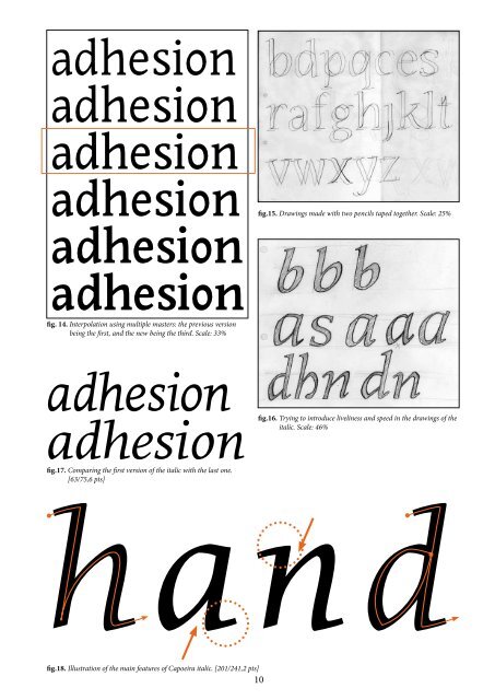
fig. 14. Interpol<strong>at</strong>ion using multiple masters: <strong>the</strong> previous version<br />
being <strong>the</strong> first, and <strong>the</strong> new being <strong>the</strong> third. Scale: 33%<br />
adhesion<br />
adhesion<br />
fig.17. Comparing <strong>the</strong> first version <strong>of</strong> <strong>the</strong> italic with <strong>the</strong> last one.<br />
[63/75,6 pts]<br />
fig.18. Illustr<strong>at</strong>ion <strong>of</strong> <strong>the</strong> main fe<strong>at</strong>ures <strong>of</strong> <strong>Capoeira</strong> italic. [201/241,2 pts]<br />
fig.15. Drawings made with two pencils taped toge<strong>the</strong>r. Scale: 25%<br />
fig.16. Trying to introduce liveliness and speed in <strong>the</strong> drawings <strong>of</strong> <strong>the</strong><br />
italic. Scale: 46%<br />
hand<br />
10<br />
fig.12. Terminal trials (pencil over printout).<br />
Scale: 30%<br />
n<br />
six<br />
fig.19. Unlike <strong>the</strong> lowercases <strong>of</strong> <strong>Capoeira</strong> roman,<br />
<strong>the</strong> italics are strongly influenced by a<br />
handwritten movement: deep joints, smooth<br />
connections, narrow counters and large<br />
instrokes and outsrokes. [190/228 pts]<br />
I also struggled finding <strong>the</strong> correct shape and weight for <strong>the</strong> terminals,<br />
and it took me a while to find a shape th<strong>at</strong> would both follow<br />
<strong>the</strong> general aspect <strong>of</strong> <strong>the</strong> rest <strong>of</strong> <strong>the</strong> typeface, and stand out enough<br />
to be noticed. [fig.12 & 13]<br />
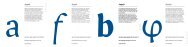
acfjry<br />
fig.13. Current terminals <strong>of</strong> <strong>Capoeira</strong> regular. [84/100,8 pts]<br />
Besides, I had to adjust <strong>the</strong> general weight <strong>of</strong> <strong>the</strong> typeface, which<br />
was too light when set as a text. On his second visit, Gerard suggested<br />
I should <strong>the</strong>refore use <strong>the</strong> multiple master technology, interpol<strong>at</strong>ing<br />
between <strong>the</strong> actual weight and a bolder version <strong>of</strong> it, in order to<br />
find a suitable weight. [fig.14]<br />
d) Building an italic<br />
The design <strong>of</strong> <strong>the</strong> italic was introduced during a workshop held by<br />
Victor Gaultney. We were taught how to give a cursive aspect to<br />
<strong>the</strong> roman, reproducing <strong>the</strong> movement and <strong>the</strong> change <strong>of</strong> direction<br />
<strong>of</strong> a broad nib pen. To do so, we used two pencils taped toge<strong>the</strong>r,<br />
drawing on a slanted version <strong>of</strong> <strong>the</strong> existing roman and adjusting<br />
over <strong>the</strong> curves' transition. [fig.15] At <strong>the</strong> mean time, it was also an<br />
opportunity for me to reintroduce some <strong>of</strong> <strong>the</strong> fe<strong>at</strong>ures <strong>of</strong> <strong>the</strong> roman<br />
abandoned earlier, like <strong>the</strong> deep joints smoothly connecting to <strong>the</strong><br />
stem. In addition to th<strong>at</strong> narrow counter, and large instrokes and<br />
outstrokes were applied as well (losing <strong>the</strong> serif <strong>of</strong> <strong>the</strong> roman, except<br />
on <strong>the</strong> descender <strong>of</strong> <strong>the</strong> letter “p”). [fig.16,17 & 18]<br />
Thus, after adapting <strong>the</strong> overall contrast when set next to <strong>the</strong> roman,<br />
<strong>the</strong> italic ended up looking much more lively and speed, still m<strong>at</strong>ching<br />
nicely with <strong>the</strong> roman. [fig.19 & 20]<br />
big devils from japan<br />
quickly forgot how to<br />
waltz. portez ce whisky au<br />
juge blond qui fume.<br />
fig.20. Comparison <strong>of</strong> <strong>Capoeira</strong> roman and <strong>Capoeira</strong> italic as it is now. [29/34,8 pts]<br />
11