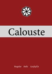
Capoeira - MA Typeface Design at the University of Reading
Capoeira - MA Typeface Design at the University of Reading
Capoeira - MA Typeface Design at the University of Reading

You also want an ePaper? Increase the reach of your titles
YUMPU automatically turns print PDFs into web optimized ePapers that Google loves.
0123456789<br />
0123456789<br />
0123456789<br />
fig.30. <strong>Capoeira</strong> has two sets <strong>of</strong> figures: old style (default) and lining. An italic variant has also been added. [92/110,4 pts]<br />
fig.33. Screenshot <strong>of</strong> FontLab's kerning window with <strong>the</strong> letter combin<strong>at</strong>ion th<strong>at</strong> allows adjusting <strong>the</strong> kerning (“v” being successively replaced<br />
by “a”, “b”, “c”, “d”,etc.). Scale: 53%<br />
16<br />
ÀÁÂÃÄĂÅĆĈČĊĎÈé<br />
ÊĚËĒĔĖĜĞĠĤÌÍÎĨÏE<br />
ĬİĴĹŃŇÑÒÓÔÕÖŎŔŘ<br />
ŚŜŠŤÙÚÛŨÜŪŬŮẀ<br />
ẂŴẄỲÝŶŸŹŽŻÐÞà<br />
áâãäāăåąæaéćĉčċçè<br />
éêěëēĕėęĝğġìíî ĩ ï īįıĵ<br />
ķĺļńňñņòóôõöōŏőø<br />
oeŕŗřśŝšşșßţùúûũü<br />
ūŭůűųẁẃŵẅỳýŷÿźž<br />
żðþàáâaéèéêîôù Ά Έ<br />
Ή Ί Ϊ ΌΎΫΏάέήίϊ ΐ όύ<br />
ΰϋώЙїёіјĥќўѓЃЁЇЌЎй<br />
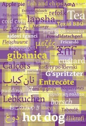
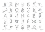
fig. 31. <strong>Capoeira</strong>'s extended character set covers<br />
Unicode” L<strong>at</strong>in extend A block.<br />
[16/19,2pts]<br />
éé<br />
fig.32. The angle and <strong>the</strong> shape <strong>of</strong> <strong>the</strong><br />
diacritical mark changes according to<br />
<strong>the</strong> case. [72/86,4 pts]<br />
3 Expanding <strong>the</strong> character set and adjusting <strong>the</strong> spacing.<br />
a) Small caps/caps<br />
After defining <strong>the</strong> shapes <strong>of</strong> <strong>the</strong> lowercase letters, <strong>the</strong> idea was to<br />
develop small capitals. They were designed slightly taller compared<br />
to <strong>the</strong> x-height, in order to adjust <strong>the</strong> optical balance when set<br />
toge<strong>the</strong>r in a same text. [fig.29] The small capital letters where <strong>the</strong>n<br />
scaled up to cre<strong>at</strong>e <strong>the</strong> uppercase, adjusting <strong>the</strong>ir weights and widths<br />
and some <strong>of</strong> its formal fe<strong>at</strong>ures (larger serifs, stems widths, etc.). The<br />
capital height has been set slightly lower than <strong>the</strong> ascender height,<br />
in order to reduce clumsiness when set in languages with a higher<br />
frequency <strong>of</strong> capitals, like German. Moreover, it allows more space<br />
for capital diacritical marks.<br />
hHhxq2323<br />
fig. 29. <strong>Capoeira</strong>'s proportions. [65/78 pts]<br />
b) <strong>Design</strong>ing figures<br />
During <strong>the</strong> design process two sets <strong>of</strong> figures were cre<strong>at</strong>ed: old style<br />
(also <strong>the</strong> default set) and lining. Based on <strong>the</strong> same design, <strong>the</strong>ir<br />
height has been adapted to <strong>the</strong>ir use, and subtle differences in stroke<br />
endings were cre<strong>at</strong>ed). L<strong>at</strong>er on, an italic version was also added,<br />
with some “wavy” strokes th<strong>at</strong> reproduce <strong>the</strong> calligraphic aspect.<br />
[fig.30]<br />
c) Diacritics<br />
Though not specifically mentioned in <strong>the</strong> brief, I thought th<strong>at</strong> it was<br />
necessary –having already Greek and Cyrillic included in <strong>the</strong> typeface-<br />
to design <strong>the</strong> diacritics used by <strong>the</strong> L<strong>at</strong>in script, in order to<br />
cover <strong>the</strong> majority <strong>of</strong> European languages. The peculiar aspect <strong>of</strong> <strong>the</strong><br />
diacritics lays in <strong>the</strong> fact th<strong>at</strong> <strong>the</strong>y have been design r<strong>at</strong>her short and<br />
bold, and have a rel<strong>at</strong>ively steep angle on lowercases, taking full advantage<br />
<strong>of</strong> <strong>the</strong> ascender space (as opposed to <strong>the</strong> shallow uppercase<br />
diacritics, chosen to save more space in terms <strong>of</strong> leading). [fig.31 &<br />
32]<br />
g) Metrics classes and kerning pairs<br />
Once <strong>the</strong> spacing was fixed for <strong>the</strong> majority <strong>of</strong> <strong>the</strong> letters, <strong>the</strong>re<br />
were still some pairs where <strong>the</strong> space between two letters was ei<strong>the</strong>r<br />
too big or too small. To fix this problem, kerning was applied on a<br />
selection <strong>of</strong> problem<strong>at</strong>ic combin<strong>at</strong>ions. In order to keep <strong>the</strong> number<br />
<strong>of</strong> kerning pairs to a minimum, and given th<strong>at</strong> a number <strong>of</strong> glyphs<br />
shared similar shapes, <strong>the</strong>y where g<strong>at</strong>hered toge<strong>the</strong>r in kerning classes.<br />
[fig.33]<br />
17