Capoeira - MA Typeface Design at the University of Reading
Capoeira - MA Typeface Design at the University of Reading
Capoeira - MA Typeface Design at the University of Reading

Create successful ePaper yourself
Turn your PDF publications into a flip-book with our unique Google optimized e-Paper software.
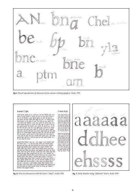
fig.2. Pencil reproduction <strong>of</strong> characters from various existing typefaces .Scale: 70%<br />
fig. 6. First test document (with <strong>the</strong> letters “adep”). Scale: 95% fig. 3. Early sketches using “adhesion” letters. Scale: 93%<br />
6<br />
fig. 4. First sketches for Gerard Unger's first<br />
workshop, experimenting with <strong>the</strong> joining<br />
strokes. Scale: 60%<br />
fig.5. First glyphs drawn in FontLab after<br />
Gerard's workshop.<br />
1.this word has been chosen because it<br />
combines enough characteristic shapes to<br />
define an important number <strong>of</strong> fe<strong>at</strong>ures<br />
and proportions <strong>of</strong> a whole typeface (like<br />
“Hamburgerfonstiv”).<br />
2 <strong>Design</strong> Process<br />
a) Getting familiar with <strong>the</strong> design process<br />
In order to get an idea <strong>of</strong> <strong>the</strong> fe<strong>at</strong>ures <strong>of</strong> this future typeface, I first<br />
started re-drawing characters <strong>of</strong> various existing typefaces, selecting<br />
fe<strong>at</strong>ures th<strong>at</strong> pleased me, and paying special <strong>at</strong>tention on proportions<br />
and consistencies between characters [fig.2]. Those first sketches<br />
were made without any specific idea <strong>of</strong> how <strong>the</strong> typeface would<br />
l<strong>at</strong>er look like, trying out as many combin<strong>at</strong>ions as possible.<br />
As an introductory workshop <strong>at</strong> <strong>the</strong> end <strong>of</strong> October, we were<br />
asked by Gerard Unger to draw a first set <strong>of</strong> letters by hand, in order<br />
to test its efficiency <strong>at</strong> very small sizes (as one can see in dictionaries).<br />
Using <strong>the</strong> usual <strong>MA</strong>TD (Master <strong>of</strong> Arts in <strong>Typeface</strong> <strong>Design</strong>) test<br />
word “adhesion” 1 allowed us some very fast interventions, constantly<br />
reducing <strong>the</strong> scale <strong>at</strong> various stages with a photocopier. [fig.3]<br />
This practice helped us understanding <strong>the</strong> appearance <strong>of</strong> alter<strong>at</strong>ions<br />
due to scale (details disappearing, o<strong>the</strong>rs appearing heavier, dark<br />
spots, spacing issues, etc.) as well as measuring <strong>the</strong> limits <strong>of</strong> customizing<br />
details. [fig.4]<br />
This workshop was also an opportunity to get familiar with Font-<br />
Lab, trying to reproduce <strong>the</strong> shapes <strong>of</strong> <strong>the</strong> drawn letters [fig.5] (<strong>the</strong><br />
sketches were not used in FontLab as a background, in order to gain<br />
confidence using Bezier curves and for <strong>the</strong> eye to get used to <strong>the</strong><br />
fe<strong>at</strong>ures <strong>of</strong> each letter). In addition to th<strong>at</strong>, a first test document was<br />
cre<strong>at</strong>ed, with a selection <strong>of</strong> words using <strong>the</strong> same letters as “adhesion”:<br />
this way, it was even easier to identify <strong>the</strong> main problems<br />
cre<strong>at</strong>ed by <strong>the</strong> scale vari<strong>at</strong>ions. [fig.6]<br />
Once I started building my own design, one <strong>of</strong> <strong>the</strong> first fe<strong>at</strong>ures I<br />
wanted to give to my typeface was a calligraphic aspect (as seen on