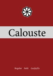
Capoeira - MA Typeface Design at the University of Reading
Capoeira - MA Typeface Design at the University of Reading
Capoeira - MA Typeface Design at the University of Reading

Create successful ePaper yourself
Turn your PDF publications into a flip-book with our unique Google optimized e-Paper software.
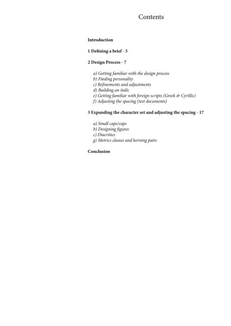
Introduction<br />
1 Defining a brief - 5<br />
2 <strong>Design</strong> Process - 7<br />
Contents<br />
a) Getting familiar with <strong>the</strong> design process<br />
b) Finding personality<br />
c) Refinements and adjustments<br />
d) Building an italic<br />
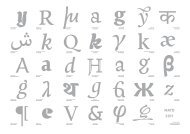
e) Getting familiar with foreign scripts (Greek & Cyrillic)<br />
f) Adjusting <strong>the</strong> spacing (test documents)<br />
3 Expanding <strong>the</strong> character set and adjusting <strong>the</strong> spacing - 17<br />
a) Small caps/caps<br />
b) <strong>Design</strong>ing figures<br />
c) Diacritics<br />
g) Metrics classes and kerning pairs<br />
Conclusion<br />
Introduction<br />
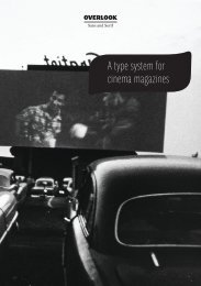
This reflection on practice rel<strong>at</strong>es my year <strong>of</strong> study <strong>at</strong> <strong>the</strong> <strong>MA</strong> <strong>Typeface</strong><br />
<strong>Design</strong> <strong>of</strong> <strong>the</strong> <strong>University</strong> <strong>of</strong> <strong>Reading</strong>. It covers <strong>the</strong> development<br />
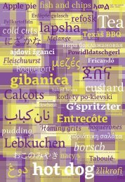
<strong>of</strong> <strong>Capoeira</strong>, a typefamily intended for bilingual public<strong>at</strong>ions such<br />
as brochures, leaflets and magazines, and th<strong>at</strong> includes L<strong>at</strong>in, Greek<br />
and Cyrillic.<br />
Through a constant testing and revising process <strong>Capoeira</strong> was<br />
slowly and gradually refined, improving both its efficiency and<br />
personality. In a first part, I'm explaining <strong>the</strong> brief and <strong>the</strong> purpose<br />
<strong>of</strong> such a typeface. The second parts rel<strong>at</strong>es <strong>the</strong> developement <strong>of</strong> <strong>the</strong><br />
typeface: <strong>the</strong> first constraints I had to face and <strong>the</strong> choices I had to<br />
make. And finally, <strong>the</strong> third part is rel<strong>at</strong>ed to <strong>the</strong> additional char<strong>at</strong>ers<br />
and <strong>the</strong> last adjustment th<strong>at</strong> were done in order for <strong>the</strong> typeface<br />
to be oper<strong>at</strong>ional.<br />
3