Capoeira - MA Typeface Design at the University of Reading
Capoeira - MA Typeface Design at the University of Reading
Capoeira - MA Typeface Design at the University of Reading

You also want an ePaper? Increase the reach of your titles
YUMPU automatically turns print PDFs into web optimized ePapers that Google loves.
Η εμφάνιση του υπουργού Άμυνας<br />
Ge<strong>of</strong>f Hoon ενώπιον της επιτροπής του<br />
δικαστή Hutton που διερευνά τα αίτια<br />
του θανάτου του καθηγητή David Kelly,<br />
ήταν το προσωρινό αποκορύφωμα στις<br />
εργασίες της επιτροπής, καθώς αύριο<br />
κατα- θέτει ο πρωθυπουργός Tony<br />
Blair. Mr Hoon said he did not believe<br />
Dr Kelly had been poorly tre<strong>at</strong>ed. The<br />
defence secretary acknowledged he was<br />
aware <strong>of</strong> <strong>the</strong> media str<strong>at</strong>egy whereby<br />
Dr Kellys name would be confirmed if<br />
it was put to <strong>of</strong>ficers <strong>of</strong> <strong>the</strong> Υπουργειο<br />
Εσωτερικων. Ну, здравствуйте,<br />
здравствуйте. Je vois que je vous fais<br />
peur, садитесь и рассказывайте. Так<br />
говорила в июле 1805 года известная<br />
Анна Павловна Шерер, фрейлина и<br />
приближенная императрицы Марии<br />
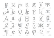
fig.21.Greek, L<strong>at</strong>in and Cyrillic set in a same text [9/10,8 pts]<br />
fig.22. Handwritten letters selected by Gerry. Scale: 140%<br />
Феодоровны, встречая важного и<br />
чиновного князя Василия, первого<br />
приехавшего на ее вечер. Еh bien,<br />
mon prince. Gênes et Lucques ne sont<br />
plus que des apanages, des поместья,<br />
de la famille Buonaparte. Non, je vous<br />
préviens, que si vous ne me dites pas,<br />
que nous avons la guerre, si vous vous<br />
permettez encore de pallier toutes les<br />
infamies, toutes les <strong>at</strong>rocités de cet Antichrist<br />
(ma parole, j”y crois). He said he<br />
did not see how <strong>the</strong> government could<br />
resist calls for Dr Kelly to appear before<br />
<strong>the</strong> Commons foreign affairs committee.<br />
Mr Hoon said he asked <strong>the</strong> committee to<br />
restrict Dr Kellys appearance before it to<br />
minutes out <strong>of</strong> concern for <strong>the</strong> scientist.<br />
Asked about suggestions th<strong>at</strong> he<br />
didnt want Dr Kelly to be questioned on<br />
αεηιµρ<br />
αεηιμρ<br />
fig.24. First experience, and last result <strong>of</strong> <strong>Capoeira</strong> Greek, using <strong>the</strong> letters <strong>of</strong> <strong>the</strong> Greek<br />
“adhesion”. Scale: [105/126 pts]<br />
12<br />
his views about <strong>the</strong> dossier,γείου του,<br />
και τα οποία θα μπορούσαν να οδηγή<br />
σουν ενδεχομένως στην αποκάλυψη<br />
του David Kelly. Σειρά πάντως σήμερα<br />
να καταθέσει στην επιτροπή έχει<br />
ένας μάρτυρας που χαρακτηρίζεται<br />
κλειδί για την υπόθεση. Πρόκειται<br />
για τον επικεφαλής της επιτροπής<br />
που συντονίζει την New Scotland Yard,<br />
John Scarlett. отвечал, нисколько не<br />
смутясь такою встречей, вошедший<br />
князь, в придворном, шитом<br />
мундире, в чулках, башмаках, при<br />
звездах, с светлым выражением<br />
плоского лица. Он говорил на том<br />
изысканном французском языке,<br />
на котором не только говорили,<br />
но и думали наши деды, и с теми<br />
тихими, покровительственными<br />
nη uμ<br />
kκк<br />
НПИ<br />
ЦPЊ<br />
fig. 26. A selection <strong>of</strong> rel<strong>at</strong>ed shapes between<br />
L<strong>at</strong>in, Greek and Cyrillic. [50/60 pts]<br />
fig.23. Analysis <strong>of</strong> selected shapes.<br />
Scale: 71%<br />
2.The reform <strong>of</strong> <strong>the</strong> Russian alphabet underwent<br />
a change when Tsar Peter I <strong>of</strong> Russia<br />
(“Peter <strong>the</strong> Gre<strong>at</strong>”) introduced <strong>the</strong> Civil<br />
Script between 1708 and 1710. The main<br />
aim <strong>of</strong> this reform, was to make easier <strong>the</strong><br />
printing <strong>of</strong> non-Church books essentially<br />
by simplifying some letterforms, introducing<br />
some news forms and dropping<br />
redundant letters and shapes peculiar to<br />
Church writings. Consequently, <strong>the</strong> letterforms<br />
were westernized and adopted by <strong>the</strong><br />
o<strong>the</strong>r languages th<strong>at</strong> were already using <strong>the</strong><br />
alphabet.<br />
e) Getting familiar with foreign scripts (Greek & Cyrillic)<br />
The design <strong>of</strong> <strong>the</strong> Greek and <strong>the</strong> Cyrillic started independently but<br />
through <strong>the</strong> design process <strong>the</strong>y both influenced <strong>the</strong> design <strong>of</strong> <strong>the</strong><br />
L<strong>at</strong>in. Preserving <strong>the</strong>ir singularity, <strong>the</strong>y still share some similar<br />
fe<strong>at</strong>ures (serifs/terminals, rel<strong>at</strong>ive proportions), which allow <strong>the</strong>m to<br />
appear equally important when set toge<strong>the</strong>r on a same page. [fig.21]<br />
First <strong>of</strong> all, we had in <strong>the</strong> last week <strong>of</strong> November, a workshop on<br />
Greek held by Gerry Leonidas, th<strong>at</strong> had a gre<strong>at</strong> impact on <strong>the</strong> l<strong>at</strong>er<br />
design developments. We were first asked to copy by hand series <strong>of</strong><br />
letter combin<strong>at</strong>ions in order to get familiar with <strong>the</strong> script and it's<br />
important influence <strong>of</strong> <strong>the</strong> tool. After selecting <strong>the</strong> letters th<strong>at</strong> had<br />
<strong>the</strong> right shapes and proportions [fig.22 & 23], we were quickly<br />
encouraged to digitalize a group <strong>of</strong> letters (used is <strong>the</strong> same way as<br />
“adhesion”). The result was th<strong>at</strong> <strong>the</strong> first <strong>at</strong>tempts designing Greek<br />
letters showed a very naïve comprehension <strong>of</strong> <strong>the</strong> script, being too<br />
influenced by <strong>the</strong> shapes <strong>of</strong> existing Greek typefaces (th<strong>at</strong> are <strong>of</strong>ten<br />
considered as being “too L<strong>at</strong>inized”, losing <strong>of</strong> <strong>the</strong>ir handwriting<br />
influence) [fig.24]. So I went back to my first drawings, and tried to<br />
reproduce <strong>the</strong> shapes th<strong>at</strong> transl<strong>at</strong>ed <strong>the</strong> best <strong>the</strong> use <strong>of</strong> <strong>the</strong> tool and<br />
<strong>the</strong> stress <strong>of</strong> <strong>the</strong> stroke (instrokes/outsrokes, uninterrupted connections,<br />
etc.). And once I got familiar with <strong>the</strong> script and stopped<br />
focusing on isol<strong>at</strong>ed shapes, it became easier for me to adjust <strong>the</strong><br />
proportions and build a common movement throughout <strong>the</strong> whole<br />
typeface. Still, when set toge<strong>the</strong>r with L<strong>at</strong>in, this l<strong>at</strong>ter appeared<br />
more geometric because <strong>of</strong> rhythm cre<strong>at</strong>ed by <strong>the</strong> repe<strong>at</strong>ed vertical<br />
strokes. Th<strong>at</strong>'s why I had to compens<strong>at</strong>e this effect in Greek, by<br />
condensing some <strong>of</strong> <strong>the</strong> round shapes first, and <strong>the</strong>n adjusting <strong>the</strong><br />
spacing th<strong>at</strong> needed to be optically balanced (in order to reduce <strong>the</strong><br />
condensed effect cre<strong>at</strong>ed by <strong>the</strong> round letters, frequently clashing<br />
against each o<strong>the</strong>r).<br />
αβγδεζηθικλμν<br />
ξοπρσςτυφχψω<br />
fig.25. Preview <strong>of</strong> <strong>the</strong> actual Greek lowercases. [48/57,6 pts]<br />
Even if historically, L<strong>at</strong>in, Greek and Cyrillic scripts are closely rel<strong>at</strong>ed,<br />
Cyrillic has no calligraphic tradition. And since Peter <strong>the</strong> Gre<strong>at</strong>'s<br />
reform 2 , many characters in Cyrillic look very similar to L<strong>at</strong>in (some<br />
<strong>of</strong> <strong>the</strong>m are almost identical, while o<strong>the</strong>rs are strongly influenced by<br />
L<strong>at</strong>in) [fig.26]. Cyrillic lowercases for example, look very much like<br />
L<strong>at</strong>in small caps, and have much fewer ascenders and descenders.<br />
Therefore, I decided to try to distinguish <strong>the</strong> Cyrillic from <strong>the</strong> two<br />
o<strong>the</strong>r script insisting on its strong formal aspect (<strong>the</strong> Greek being<br />
fairly calligraphic and <strong>the</strong> L<strong>at</strong>in sharing both aspects).<br />
13