Untitled - Journal of Lighting Engineering
Untitled - Journal of Lighting Engineering
Untitled - Journal of Lighting Engineering

Create successful ePaper yourself
Turn your PDF publications into a flip-book with our unique Google optimized e-Paper software.
4. Colour preference<br />
Based on the first evaluations by Judd 36 and<br />
Jerome 37 , CIE started research,<br />
investigating what the spectrum <strong>of</strong> a light<br />
source has to be to render the appearance <strong>of</strong><br />
test objects more favourable as the<br />
reference illuminant (Planck source or<br />
phase <strong>of</strong> daylight). Our contributions went<br />
first in the direction to find relationship<br />
between colour rendering and the<br />
impression <strong>of</strong> visual comfort 38 , checking<br />
for the preferred skin tone 39 . We found that<br />
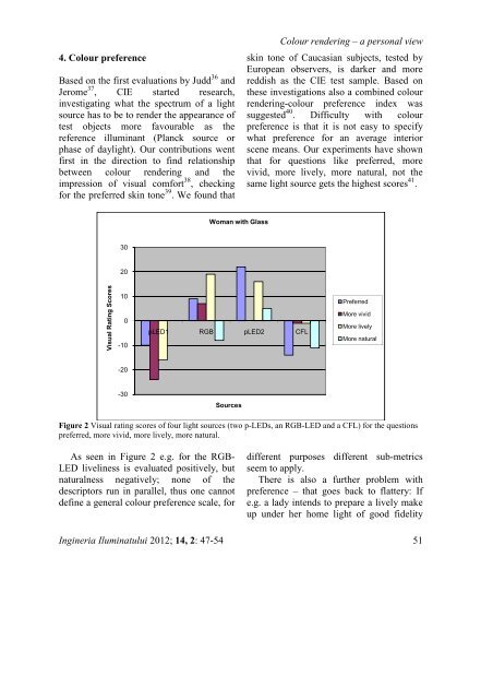
Visual Rating Scores<br />
30<br />
20<br />
10<br />
0<br />
-10<br />
-20<br />
-30<br />
Colour rendering – a personal view<br />
skin tone <strong>of</strong> Caucasian subjects, tested by<br />
European observers, is darker and more<br />
reddish as the CIE test sample. Based on<br />
these investigations also a combined colour<br />
rendering-colour preference index was<br />
suggested 40 . Difficulty with colour<br />
preference is that it is not easy to specify<br />
what preference for an average interior<br />
scene means. Our experiments have shown<br />
that for questions like preferred, more<br />
vivid, more lively, more natural, not the<br />
same light source gets the highest scores 41 .<br />
Figure 2 Visual rating scores <strong>of</strong> four light sources (two p-LEDs, an RGB-LED and a CFL) for the questions<br />
preferred, more vivid, more lively, more natural.<br />
As seen in Figure 2 e.g. for the RGB-<br />
LED liveliness is evaluated positively, but<br />
naturalness negatively; none <strong>of</strong> the<br />
descriptors run in parallel, thus one cannot<br />
define a general colour preference scale, for<br />
Woman with Glass<br />
pLED1 RGB pLED2 CFL<br />
Sources<br />
Preferred<br />
More vivid<br />
More lively<br />
More natural<br />
different purposes different sub-metrics<br />
seem to apply.<br />
There is also a further problem with<br />
preference – that goes back to flattery: If<br />
e.g. a lady intends to prepare a lively make<br />
up under her home light <strong>of</strong> good fidelity<br />
Ingineria Iluminatului 2012; 14, 2: 47-54 51