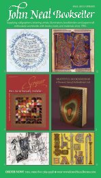
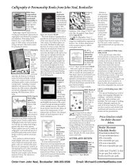
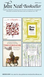
september 2011 update - John Neal, Bookseller
september 2011 update - John Neal, Bookseller
september 2011 update - John Neal, Bookseller

You also want an ePaper? Increase the reach of your titles
YUMPU automatically turns print PDFs into web optimized ePapers that Google loves.
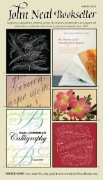
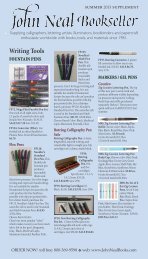
18 GettinG Started<br />
one of the advantages of assembling a<br />
pen is that you can adjust it to suit your<br />
individual requirements. Dismantling,<br />
cleaning, and reassembling it regularly<br />
will also help you to become well<br />
acquainted with your writing<br />
instrument. The assembled pen here<br />
is the standard wide-nib pen used for<br />
ease the nib into the holder. Avoid<br />
putting pressure on the writing edge.<br />
slide the nib in as far as possible. It should<br />
fit closely to the holder’s neck.<br />
brought together.<br />
in a flame and then cool it in cold water.<br />
that it distorts the writing edge. position<br />
the reservoir about 3 mm from the writing<br />
edge, or further back on smaller nib sizes.<br />
Throughout this book, the nib<br />
sizes quoted refer to Mitchell<br />
roundhand nibs, which are<br />
widely used by calligraphers. If<br />
you are using a different brand,<br />
you will need to convert these<br />
sizes to those of your nib.<br />
A simple way of doing this is<br />
to hold each of your nibs against<br />
the size checker here to<br />
determine which Mitchell size it<br />
most closely matches.<br />
new reservoirs need to be adjusted<br />
to ensure they don’t cause the nib to<br />
“split” and impede the flow of ink. gently<br />
bend the reservoir around the tail of the<br />
pen holder and loosen the side flaps with<br />
slight pressure from your finger and thumb<br />
so that it can slide easily onto the nib.<br />
not supply ink to the writing edge.<br />
size 0<br />
size 1<br />
size 1.5<br />
size 2<br />
size 2.5<br />
size 3<br />
size 3.5<br />
size 4<br />
size 5<br />
size 6<br />
nibs get tired with use and you will<br />
eventually need to sharpen them<br />
to ensure the best results. A nib is<br />
blunt when it is no longer capable<br />
of making sharp hairline strokes.<br />
A small Arkansas stone is used for<br />
sharpening nibs. These sharpening<br />
stones are smooth and good quality<br />
and will not damage nibs. A cheap<br />
alternative is grade number 4 wet<br />
and dry paper. sharpening pointed<br />
nibs is not recommended.<br />
The best calligraphy is written with ink<br />
made from Japanese ink sticks. They<br />
are handmade using a traditional<br />
process and are very high quality. The<br />
required amount of ink should be<br />
freshly prepared as it deteriorates<br />
once exposed to air. grinding stones<br />
come in a variety of shapes, sizes, and<br />
qualities. The smallest size is the most<br />
useful. A lid can also be helpful to<br />
prevent the ink from drying out too<br />
quickly, but is not essential.<br />
disperse as evenly as possible. grinding for<br />
too long or with too much pressure can<br />
result in a grainy texture.<br />
place a sharpening stone on a flat<br />
surface and lubricate it with water. place<br />
the nib at 30 degrees, with the top toward<br />
the stone and the underside of<br />
the nib facing you. Keeping the nib at<br />
30 degrees, move it across the stone<br />
10 to 12 times.<br />
Test a stone by applying a small amount<br />
of liquid to it—the slower<br />
the liquid dries, the better the quality<br />
of the stone.<br />
the ink and making a mark. It should flow<br />
smoothly and appear solid black on paper.<br />
Check the<br />
sloping edge of the nib<br />
under a magnifying glass and<br />
sharpen it with the top of the nib<br />
facing you until it is even.<br />
stone. If more ink is required, more<br />
water can be added later in increments of<br />
two drops. It is far easier to make ink too<br />
thick and dilute it than to thicken ink that<br />
is too thin.<br />
you can load your pen with ink by<br />
either dipping the pen in a full ink<br />
well and wiping the excess ink<br />
on the edge of the pot, or<br />
by feeding the nib with a<br />
brush as shown.<br />
PRSRT STD<br />
US Postage<br />
PAID<br />
Ripon, WI<br />
Permit No. 100<br />
current resident or<br />
© <strong>2011</strong><br />
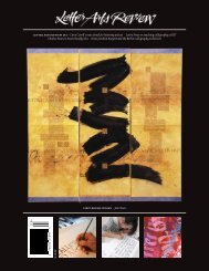
BOOKBINDING CALLIGRAPHY PAPERCRAFT<br />
❧<br />
❧<br />
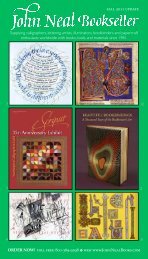
Now Available!<br />
B2769. Foundations of<br />
Calligraphy by Sheila Waters.<br />
2006. 126pp. 9"x11.25".<br />
Hardcover,<br />
concealed spiral $35.00<br />
For more info see page 9.<br />
Narrow Foundational: Exemplar alphabet with pen-angle changes for certain letters.<br />
AsseMblIng your pen<br />
teaching the scripts in this book.<br />
1<br />
offer up the reservoir to the nib,<br />
3 taking great care not to damage<br />
the end of the nib when the two are<br />
With a new nib, be sure to remove<br />
6 the protective lacquer coating—<br />
plunge it into hot water, or hold it briefly<br />
The reservoir should make just<br />
4 enough contact to prevent it from<br />
falling off. It must not grip the nib so tightly<br />
CheCking your nib size<br />
2<br />
If the reservoir is too far forward, it<br />
5 will catch the paper and drag ink<br />
across the surface; if too far back, it will<br />
shArpenIng The nIb<br />
MAKIng InK<br />
grind the stick against the stone.<br />
3 The ink stick should be ground slowly<br />
and rhythmically to enable the pigment to<br />
stop when the ink has thickened.<br />
4 you will need to test the ink to assess<br />
when it is ready by dipping the nib into<br />
1 2<br />
1<br />
Add four drops of water to a grinding<br />
2<br />
Dipping the pen<br />
B3360. Calligraphy in 24 Hours by Veiko Kespersaks.<br />
2010. 176pp. Paper $21.99<br />
Presents a carefully structured series<br />
of 24 one-hour lessons (most to be<br />
followed by additional practice before moving to<br />
the next lesson.) The exercises teach letterforms,<br />
develop consistency & speed, and present projects:<br />
greeting cards, invitations, wall hangings, place<br />
settings, and more. The author is from Finland and<br />
currently works in London.<br />
B3360<br />
Sheila Waters<br />
B3246. Sheila Waters Retrospective. Scripsit<br />
Issue. 2010. 48pp. 8.5"x11". $28.00<br />
Here it is. What we have been waiting years<br />
for – 300 full-color images of Sheila’s life’s<br />
work, designed by Julian Waters. This issue of<br />
Scripsit presents Sheila’s Retrospective Show<br />
of 2009. A great companion to her instructional<br />
book Foundations of Calligraphy. Julian<br />
has designed a new typeface to be used for the<br />
first time in this publication. Scripsit is the<br />
quarterly journal of the Washington (DC) Calligraphers<br />
Guild. This is a special double issue.<br />
64<br />
❧<br />
t o l l f r e e: 800-369-9598 v w e b : www.j o h n n e a l b o o k s.com