Complete issue 10:1 as one pdf - TUG
Complete issue 10:1 as one pdf - TUG
Complete issue 10:1 as one pdf - TUG
Create successful ePaper yourself
Turn your PDF publications into a flip-book with our unique Google optimized e-Paper software.
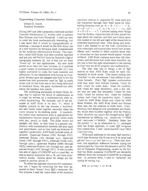
<strong>TUG</strong>boat, Volume <strong>10</strong> (1989), No. 1 3 1<br />
Typesetting Concrete Mathematics<br />
Donald E. Knuth<br />
Stanford University<br />
During 1987 and 1988 I prepared a textbook entitled<br />
Concrete Mathematics [I], written with co-authors<br />
Ron Graham and Oren Pat<strong>as</strong>hnik. I tried my best<br />
to make the book mathematically interesting, but<br />
I also knew that it would be typographically interesting-because<br />
it would be the first major use<br />
of a new typeface by Hermann Zapf, commissi<strong>one</strong>d<br />
by the American Mathematical Society. This typeface,<br />
called AMS Euler, had been carefully digitized<br />
and put into METAFONT form by Stanford's digital<br />
typography students [a]; but it had not yet been<br />
"tuned up" for real applications.<br />
My new book<br />
served <strong>as</strong> an ideal test c<strong>as</strong>e, because (1) it involved<br />
a great variety of mathematical formul<strong>as</strong>; (2) I w<strong>as</strong><br />
highly motivated to make the book readable and<br />
attractive; (3) my experiences with tuning up Computer<br />
Modern gave me insights into how to set the<br />
mysterious font parameters used by TEX in math<br />
mode; and (4) the book w<strong>as</strong> in fact being dedicated<br />
to Leonhard Euler, the great mathematician after<br />
whom the typeface w<strong>as</strong> named.<br />
The underlying philosophy of Zapf's Euler design<br />
w<strong>as</strong> to capture the flavor of mathematics <strong>as</strong><br />
it might be written by a mathematician with excellent<br />
handwriting. For example, <strong>one</strong> of the earmarks<br />
of AMS Euler is its zero, 'O', which is<br />
slightly pointed at the top because a handwritten<br />
zero rarely closes together smoothly when the<br />
curve returns to its starting point. A handwritten<br />
rather than mechanical style is appropriate for<br />
mathematics because people generally create math<br />
with pen, pencil, or chalk. The Euler letters are<br />
upright, not italic, so that there is a general consistency<br />
with mathematical symbols like plus signs<br />
and parentheses, and so that built-up formul<strong>as</strong> fit<br />
together comfortably. AMS Euler includes seven alphabets:<br />
Upperc<strong>as</strong>e Roman (ABC through XYZ),<br />
lowerc<strong>as</strong>e Roman (abc through xyz), upperc<strong>as</strong>e<br />
Greek (ABr through WO), lowerc<strong>as</strong>e Greek (aby<br />
through x+w), upperc<strong>as</strong>e kaktur (UBC through<br />
X!J3), lowerc<strong>as</strong>e Fraktur (abc through ~q), and upperc<strong>as</strong>e<br />
Script (ABC through X2Z). It also includes<br />
two sets of digits (0123456789 and 0123456789)~ <strong>as</strong><br />
well <strong>as</strong> special characters like p, H, and some punctuation<br />
marks. Details about its design are discussed<br />
in another article [7].<br />
To refine the digitized characters for mathematical<br />
use, I began by correcting the way they ap-<br />
peared in their "boxes," from W 'S viewpoint. For<br />
this purpose I used the \math tests of the standard<br />
testfont routine [5, Appendix HI; these tests put<br />
the characters through their b<strong>as</strong>ic paces by typesetting<br />
formul<strong>as</strong> such <strong>as</strong> /A + ,B1 + C + ... + Z1,<br />
a2tb2+c2t..+z2, az+br+c2+...+p,and<br />
3 + 5 + + + . . + 2. I noticed among other things<br />
that the Fraktur characters had all been placed too<br />
high above the b<strong>as</strong>eline, and that more blank space<br />
w<strong>as</strong> needed at the left and right of the characters in<br />
subscript/superscript sizes. After fixing such problems<br />
I also needed to set the italic corrections so<br />
that subscripts and superscripts would have proper<br />
offsets; and I needed to define suitable kerns with<br />
a \skewchar so that accents would appear visually<br />
centered. AMS Euler contains more than 400 characters,<br />
and Hermann had made them beautiful; my<br />
job w<strong>as</strong> to find the right adjustments to the spacing<br />
so that they would fit properly into mathematics.<br />
The next step w<strong>as</strong> to design a set of l)$<br />
macros so that AMS Euler could be used conveniently<br />
in math mode. This meant adding new<br />
"families" to the conventions I had defined in pre-<br />
vious formats. Plain 'I?@ typesets mathematics<br />
with four b<strong>as</strong>ic font families (namely, \f am0 for<br />
text, \fml for math italic, \fm2 for symbols,<br />
and \fm3 for large delimiters), plus a few others<br />
that are used less frequently (\fam4 for text<br />
italic, \f an5 for slanted text, \fam6 for boldface<br />
roman, and \fam7 for typewriter style). I added<br />
\fm8 for AMS Euler Script and \fa9 for AMS<br />
Euler Fraktur; the AMS Euler Greek and Roman<br />
went into the old position of math italic, \fami.<br />
Hermann had designed new parentheses and brackets,<br />
which were bundled together with the Fraktur<br />
fonts; therefore my macro file changed plain W's<br />
conventions by defining, e.g., \mathcode' (="4928<br />
and \delcodec(="928300.<br />
Similarly, Euler h<strong>as</strong><br />
the symbol '6' <strong>as</strong> an alternative to 'I1, packaged<br />
with the Script alphabet; to make TEX recognize<br />
this substitution I said \mathchardef \leq="3814<br />
\let\le=\leq.<br />
With such additions to the plain TEX macros I<br />
could type formul<strong>as</strong> like $\tan(x+y)$ <strong>as</strong> usual and<br />
get not 'tanjzfy)' but 'tan(x+y)'. There w<strong>as</strong>, however,<br />
<strong>one</strong> significant difference between typing the<br />
manuscripts for Concrete Mathematics and for The<br />
Art of Computer Programming, caused by the fact<br />
that the Euler numerals 0123456789 are distinctly<br />
different from the numerals 0123456789 in ordinary<br />
text. In previous work, I used to "optimize" my<br />
typing by saying, e.g.,<br />
$x$ is either 1 or $-I$,


